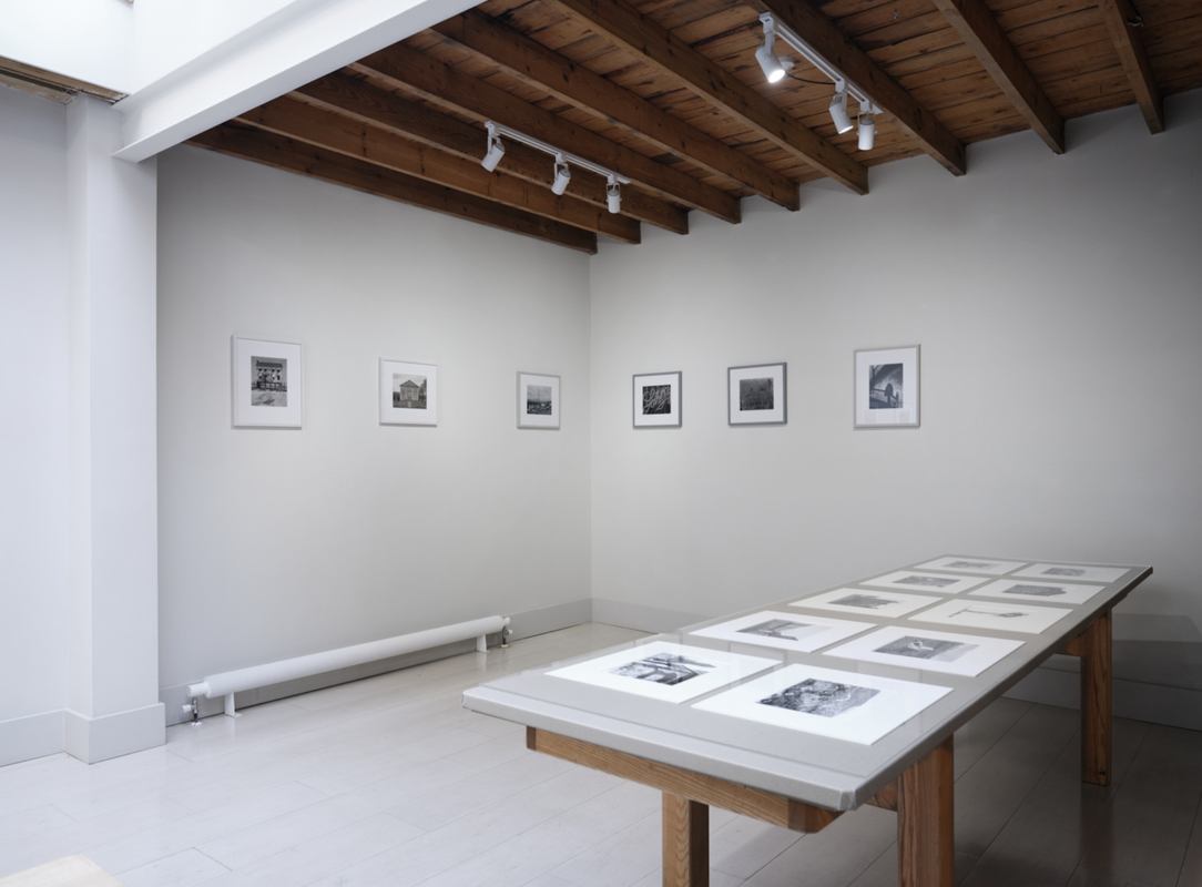
Concluding my personal investigation
This will be the final page dedicated to my Personal Investigation where I intend to bring together the various strands of my visual research. A link to my accompanying essay can be found at the bottom of the page and in the site menu.
Diptychs research (cont.)
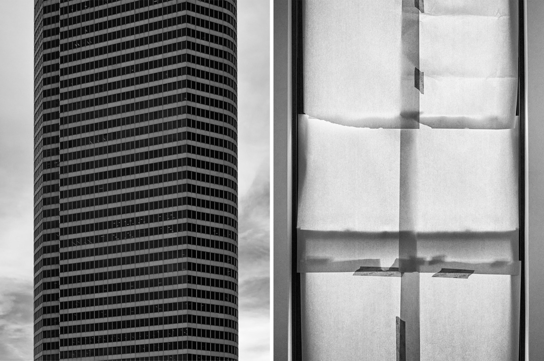
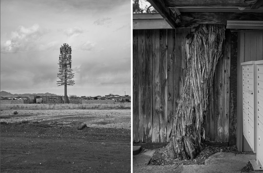
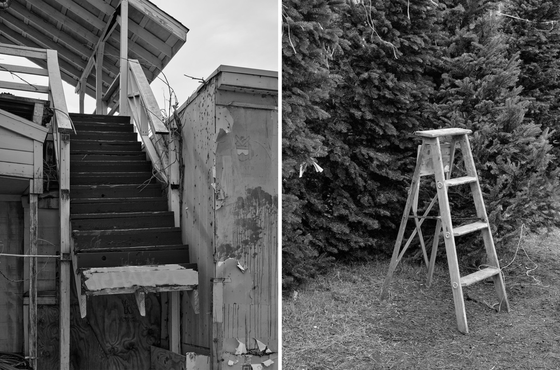
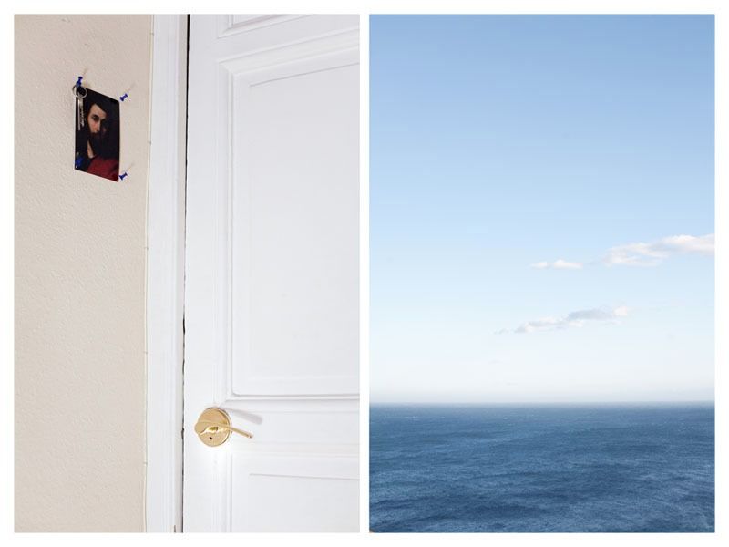
Sherwin Rivera Tabayan's diptychs
Some of my favourite diptychs by this Texas based photographer from his Instagram feed. I really admire the formal qualities of these pairings which are not always obvious. I also enjoy the concentration on the unpopulated landscape but with traces of human presence.
Nina Kling's Duologues
I recently discovered this series of diptychs by Nina Kling. I'm interested in the different strategies she uses to pair her pictures. Some seem to be connected by composition, some by subject matter and others are more poetic associations. Here's what she says about her process:
I love to wander the streets and observe people. My series, Duologues, records fragments of these encounters. It is a play between two images creating meanings belonging to neither— a discovery process each viewer interprets differently. Reminiscent of the idea of synchronicity, an idea that describes meaningful coincidences, my pairings intentionally produce uncanny relationships [...] I match the images by playing a game of Memory: finding in each image shapes, gestures, and symbols that rhyme. The rhyming may occur within the major elements in the image, such as the subject, or in minute details that otherwise might go unnoticed. By pairing two photos that occurred at different moments in time, the story that emerges can bring them together. The final sequence feels deeply connected, even though the encounters on the street were random.
Artist's website
Here are some illuminating comments from two of the book's introductory essays:
Two pictures become one in our mind's process of seeing. Picture magnetism pulls and holds particular images together; they lock together, like the word pieces of poems, on the surface, below the surface, deep inside in that somewhere that is uniquely photographic |
The delight and life of a photograph, then, comes from the acceptance of and successful commingling of these three elements: the literal, the random, and the ambiguous. In this way, photography is more like poetry than prose, and viewers of photographs have an essential and demanding role to play in creating meaning. |
Nikita Pirogov and the "between"
I really like the combination of portraits and landscapes in Pirogov's diptychs. In most of the pairings that I have seen there doesn't seem to be an obvious link between the two pictures. The connections are quite subtle and nuanced - a figure lying on the floor next to an undulating landscape, an evergreen pine tree next to a green t-shirt with mountain view logo or splayed fingers next to drill bits in a toolshed. These associations are left quite open and the viewer's role is significant in completing any potential meanings. I also like what the photographer says about the political (or ethical) aspect of the work and the gap between the images representing a kind of caesura, an in between or liminal space, offering the possibility of connection between seeming differences.
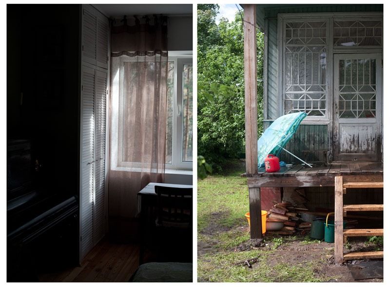
[...] I realised that it is not a question of comparison, but rather of what arises “between" [...] This essence, though, the very purest substance, is impossible to nail down. It can only be found “between" [...] This is a certain attempt to record and nail down this change, visually and substantially, through a poetic metaphor. Only a metaphor can overcome stereotypes and really come to the very core and essence of the issue and thus discover changes and new experiences and overcoming yourself. In this sense the diptych is the combination of past and present, traditions and their new offshoots. It returns to the source of writing as diptychs were first used in Ancient Greece, long before the invention of the printing press. They came in the form of two or more clay boards for recording text or images. In their juxtaposition, they combined to form some third thing, whole, continuous and bearing forth additional meaning between the two juxtaposed sides. This project is an attempt to find a new composition by almost imperceptibly and allegorically combining my very personal experience on these travels and retaining the themes of places and people that became familiar to me.
Lensculture article
Dan Weingrod's diptychs
I follow Dan on Instagram and enjoy seeing his diptychs. They remind me of John MacLean's project Two and Two. I would like to experiment with this technique which explores a subtle change of viewpoint and the passage of time between the two exposures.
Luke Saxon's diptychs
I enjoy looking at Luke Saxon's diptychs on his Instagram feed. They are mostly concerned with colour and form, exploring visual (rather than conceptual or subject related) parallels. They are often witty and make me want to smile. A "smile in the mind" as designer Alan Fletcher might say.
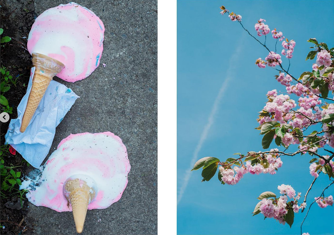
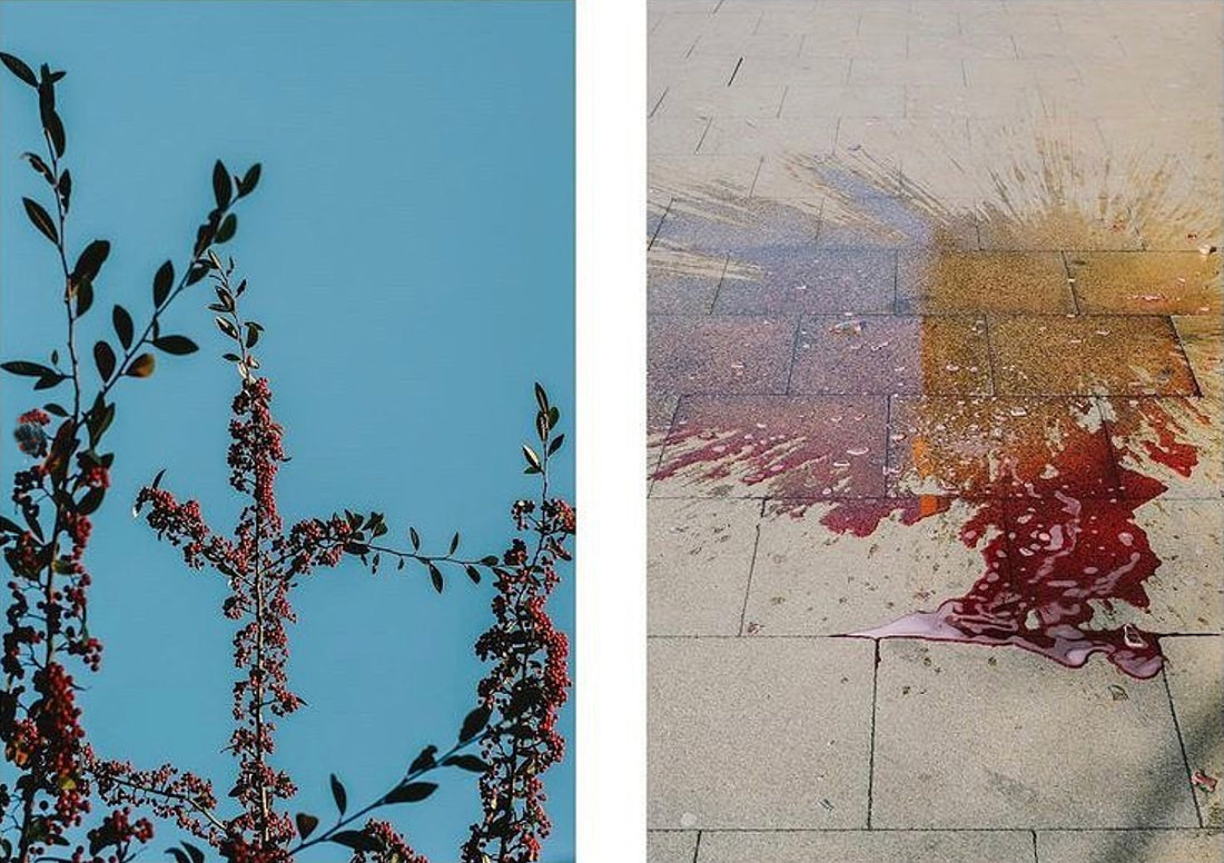
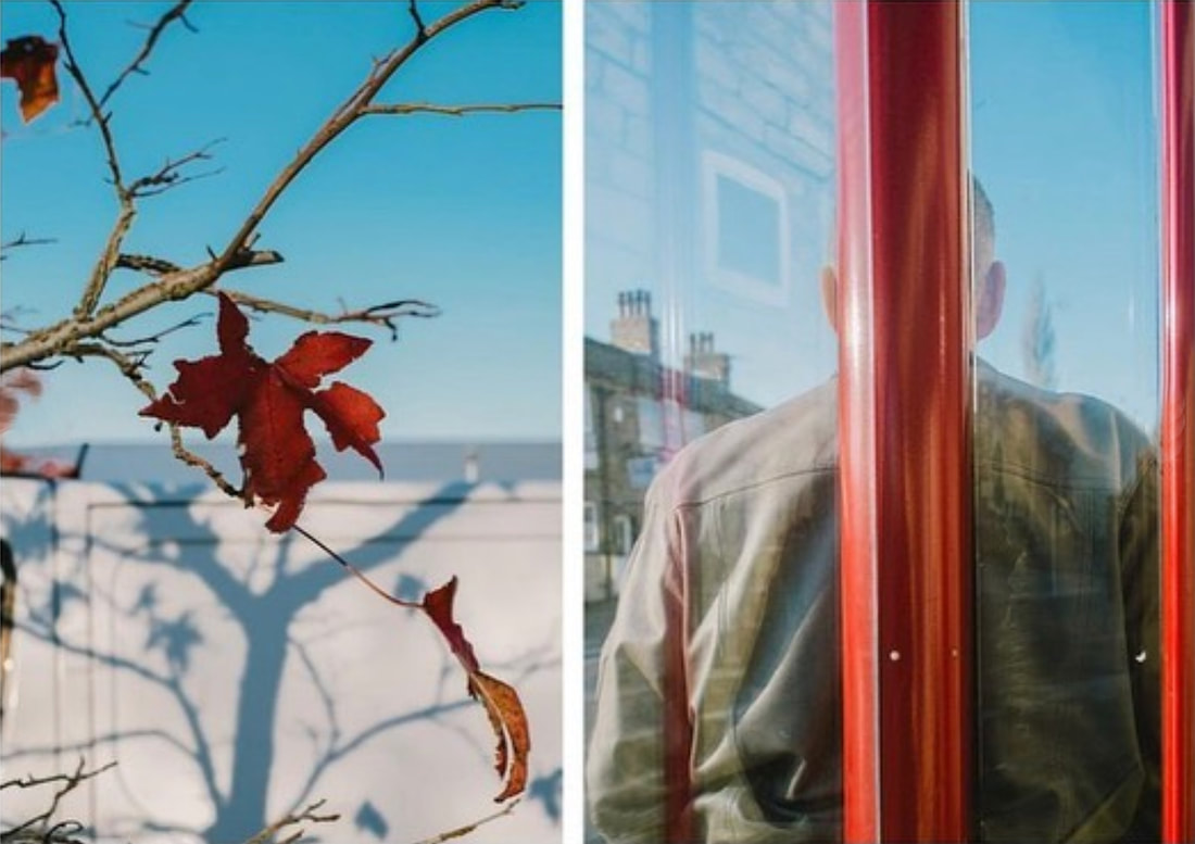
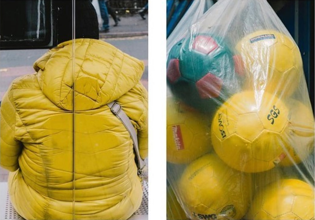
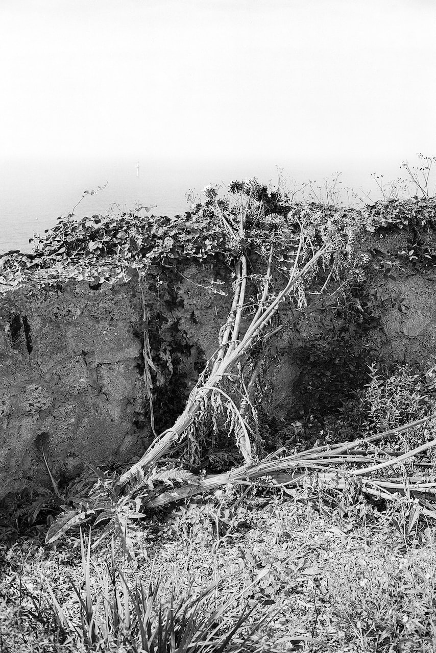
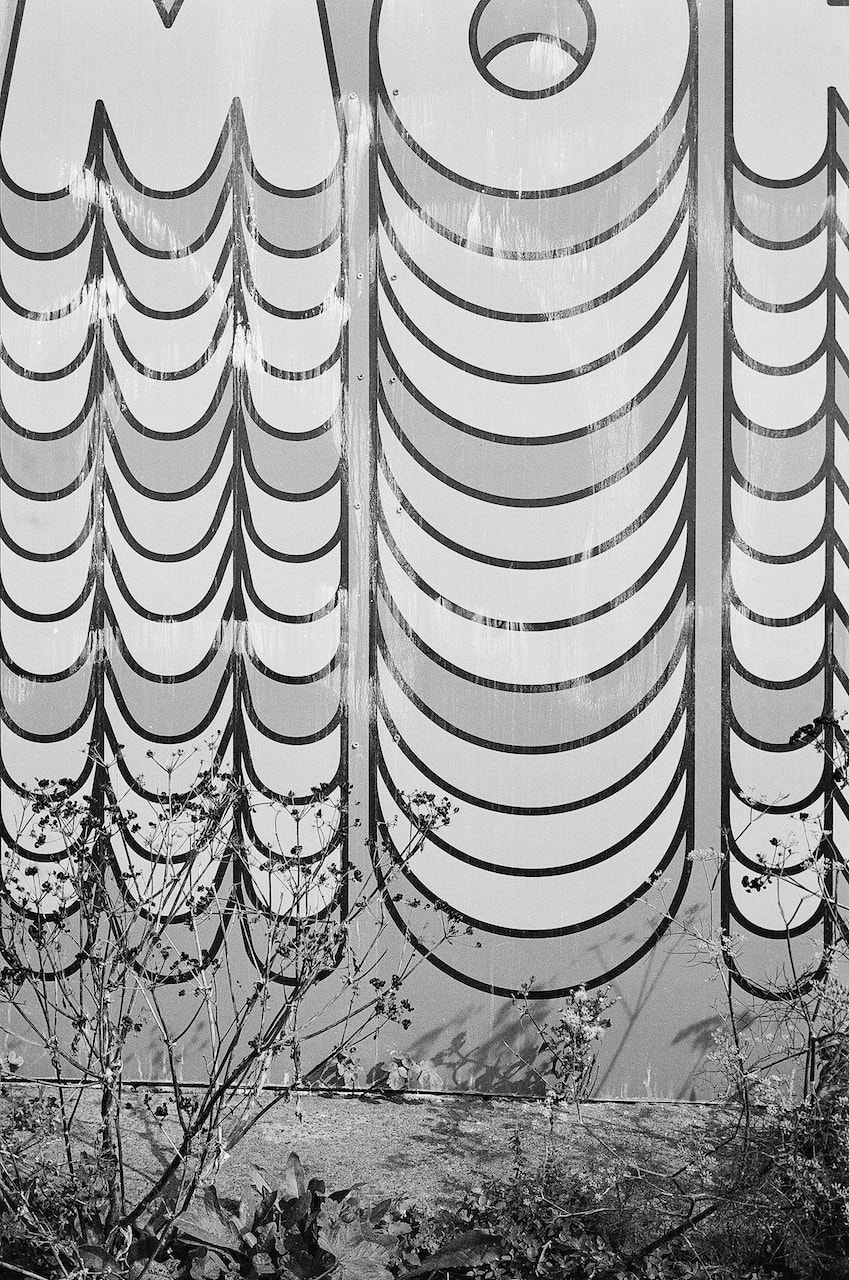
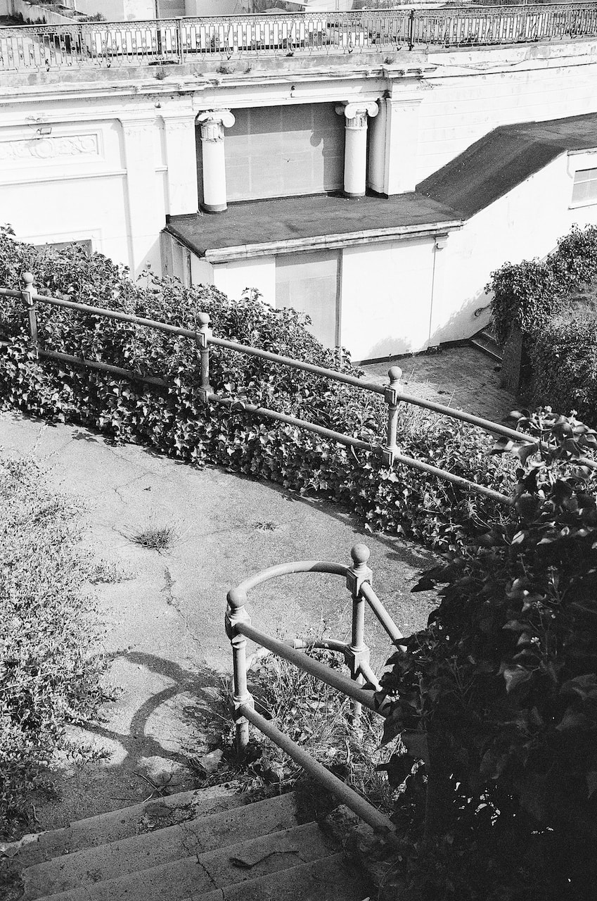
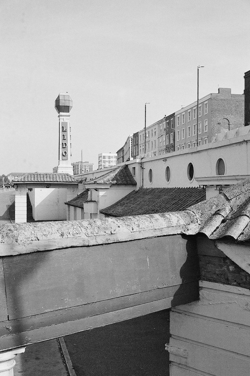
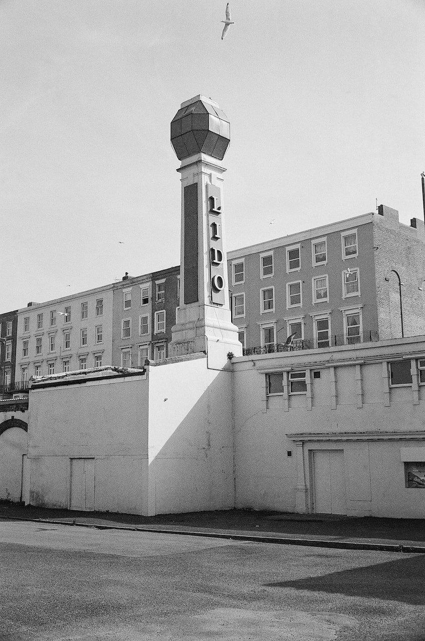
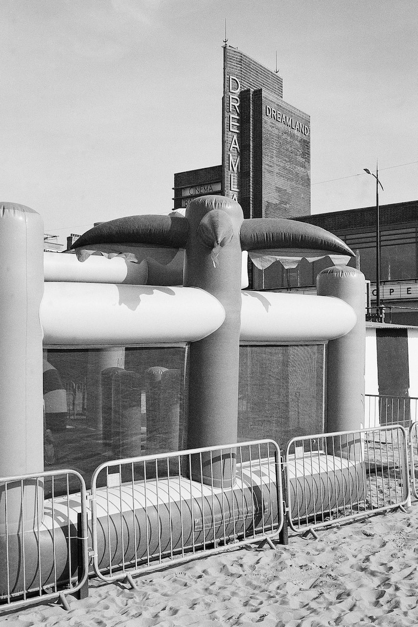
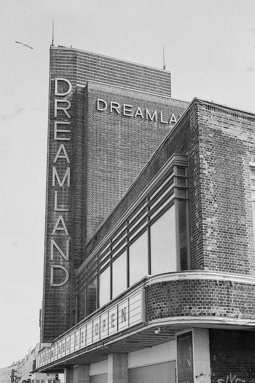
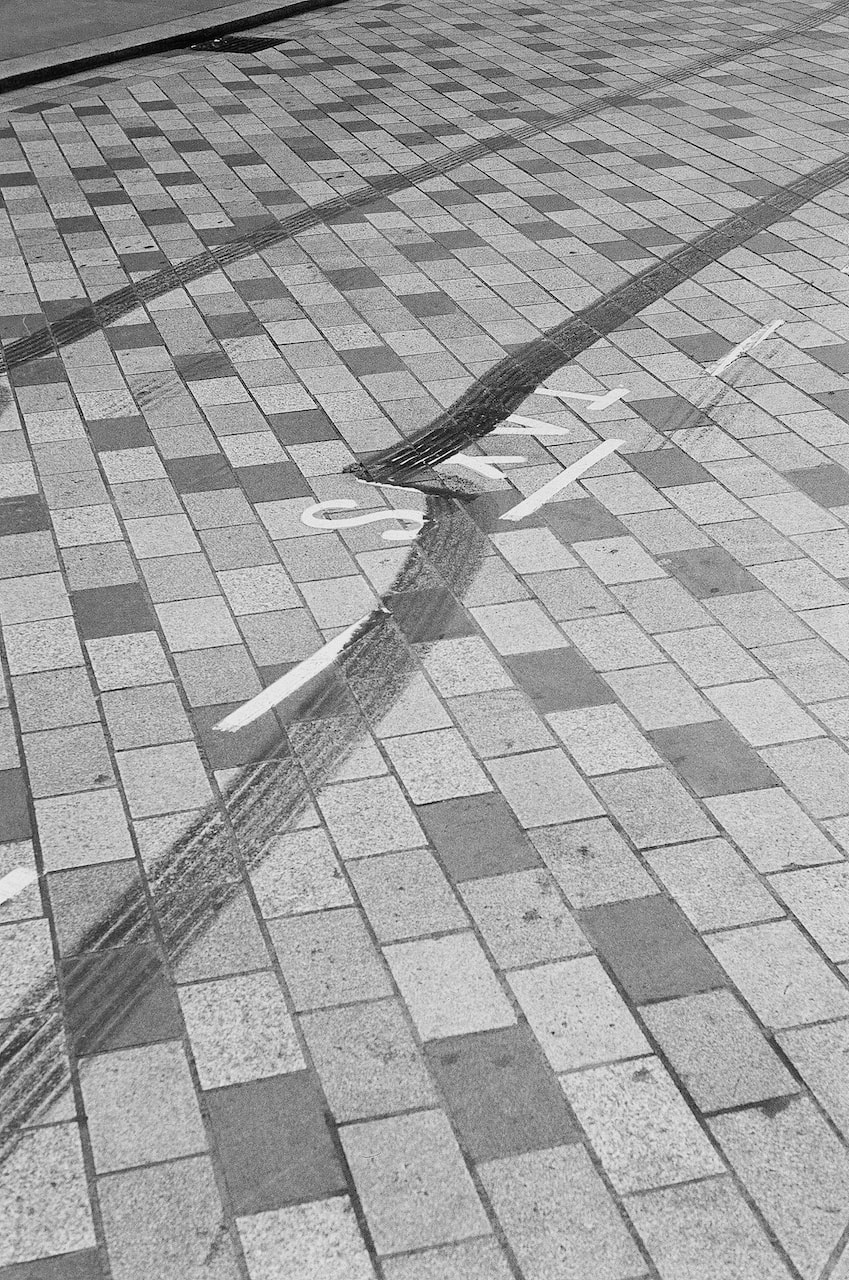
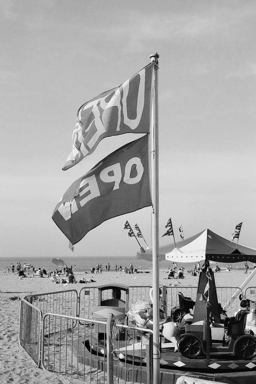
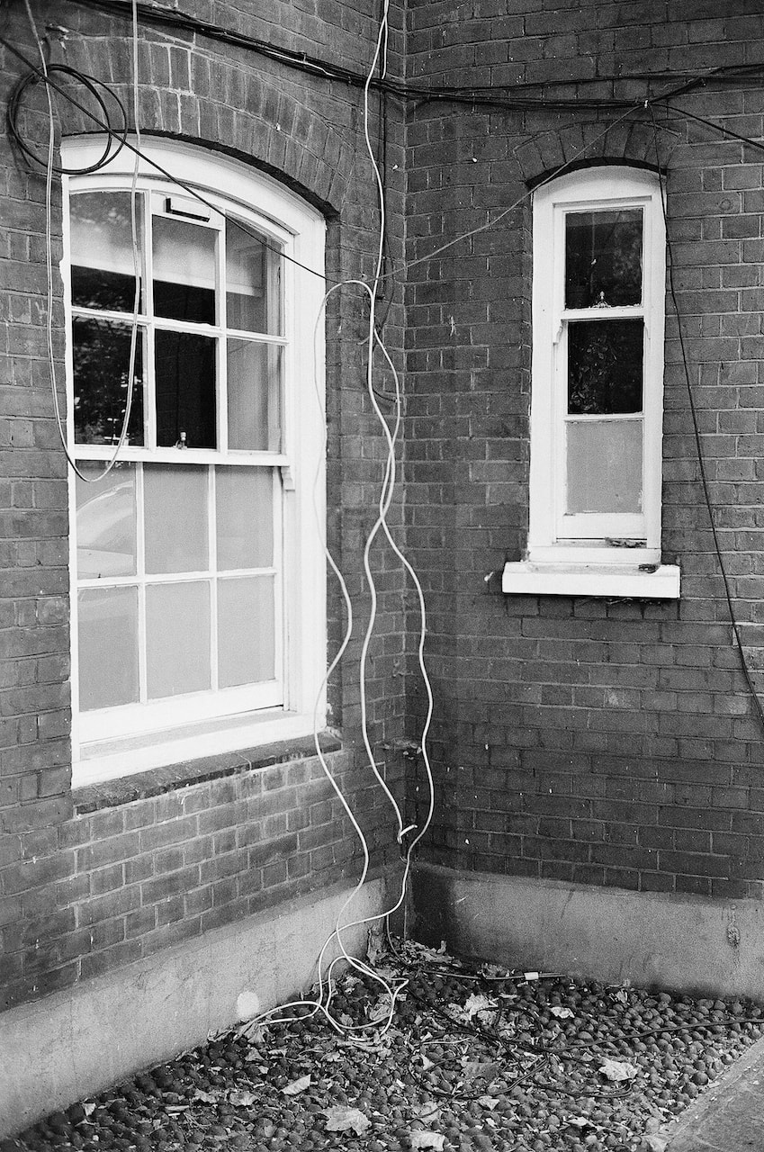
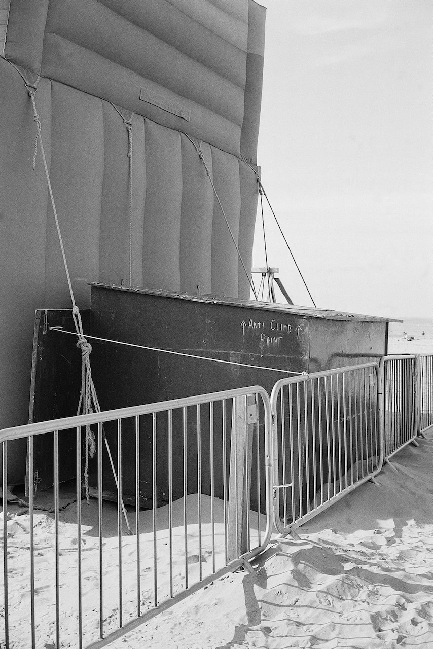
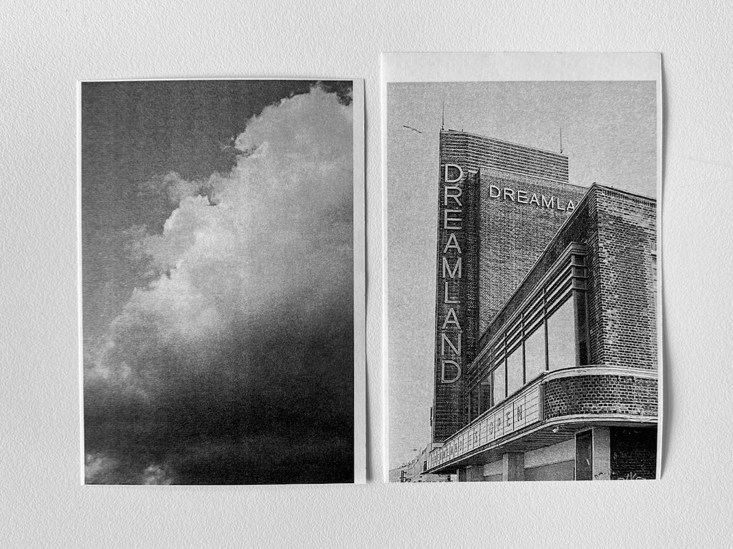
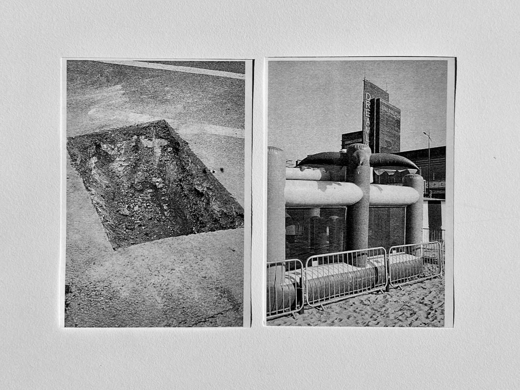
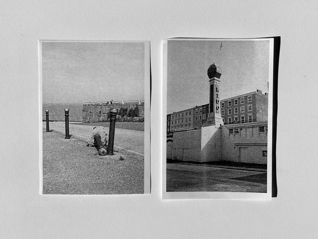
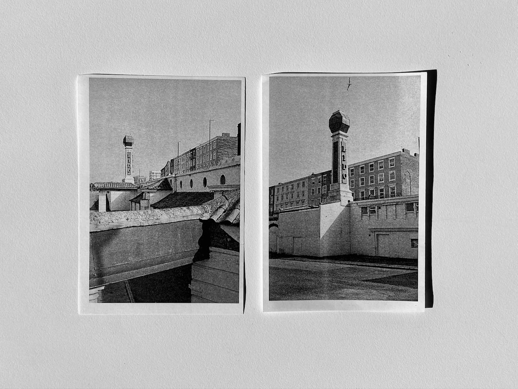
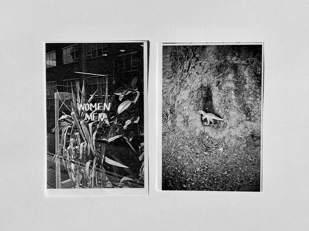
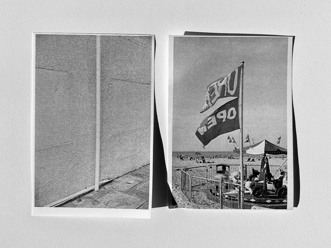
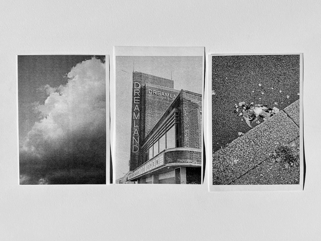
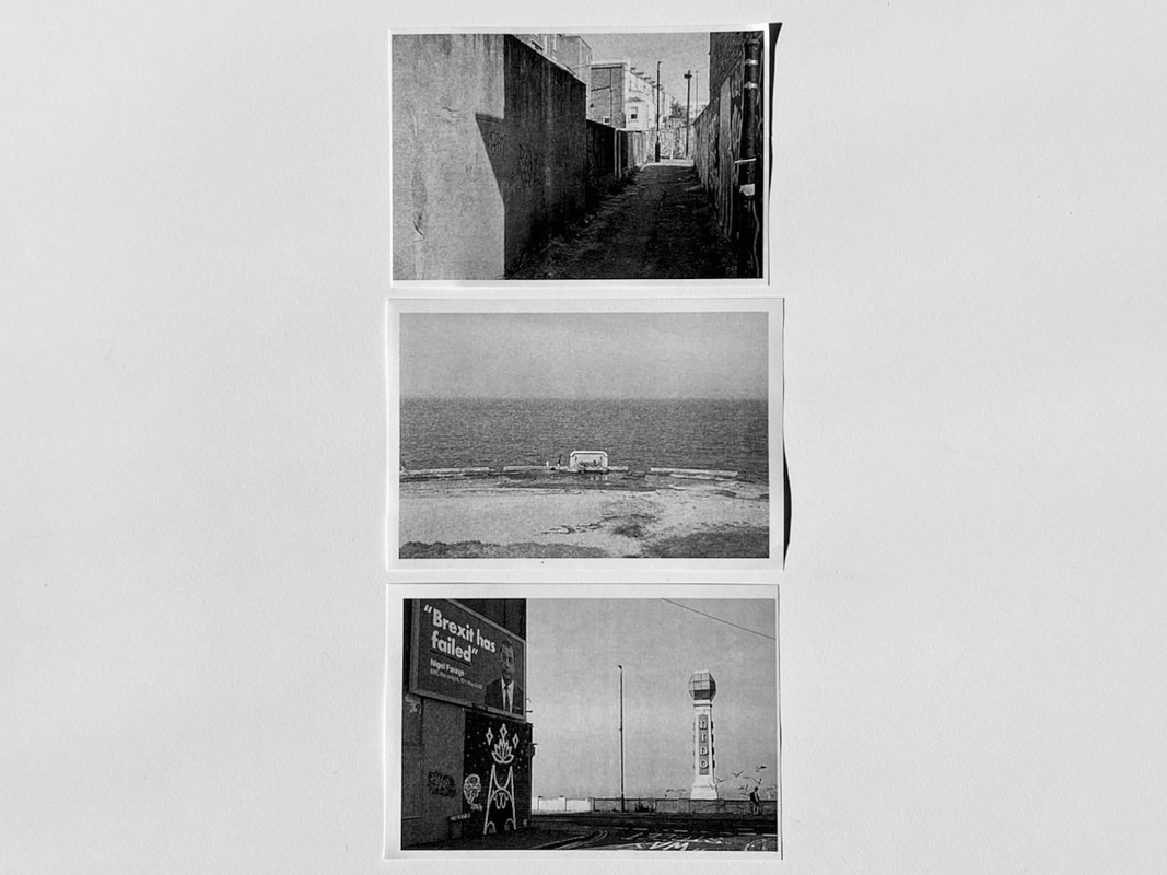
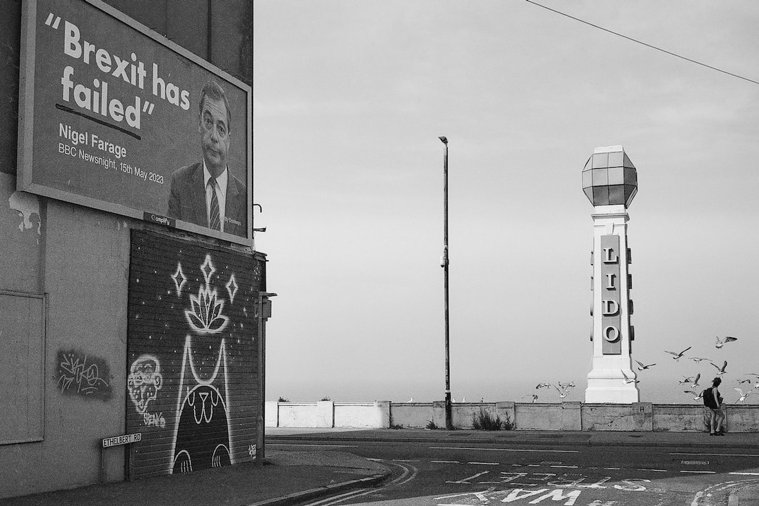
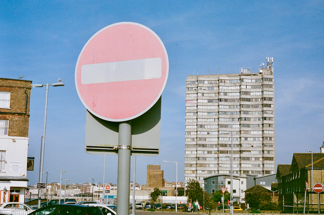
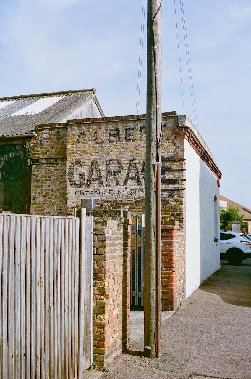
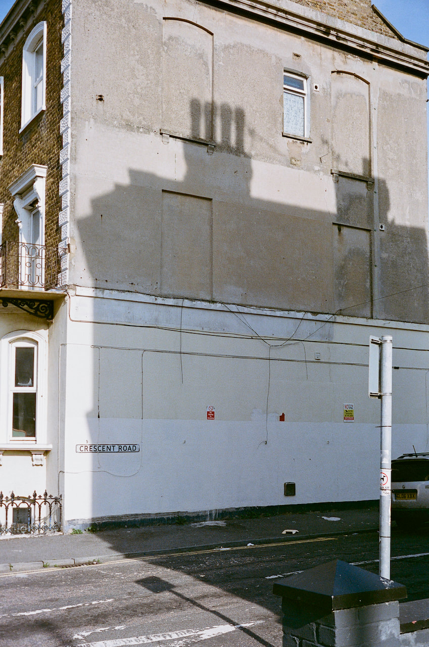
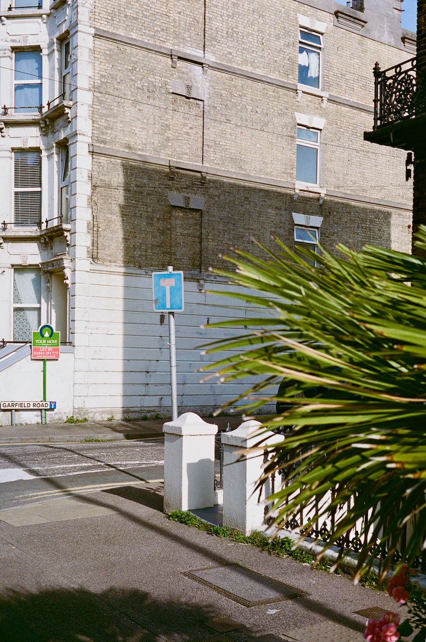
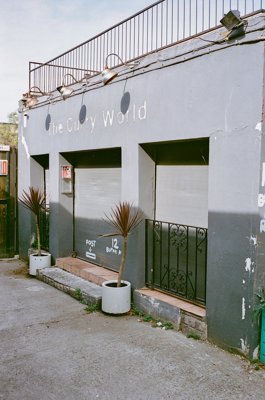
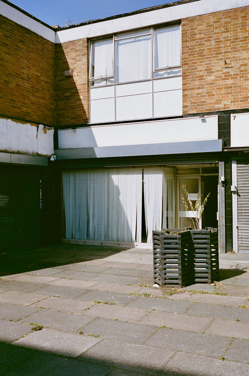
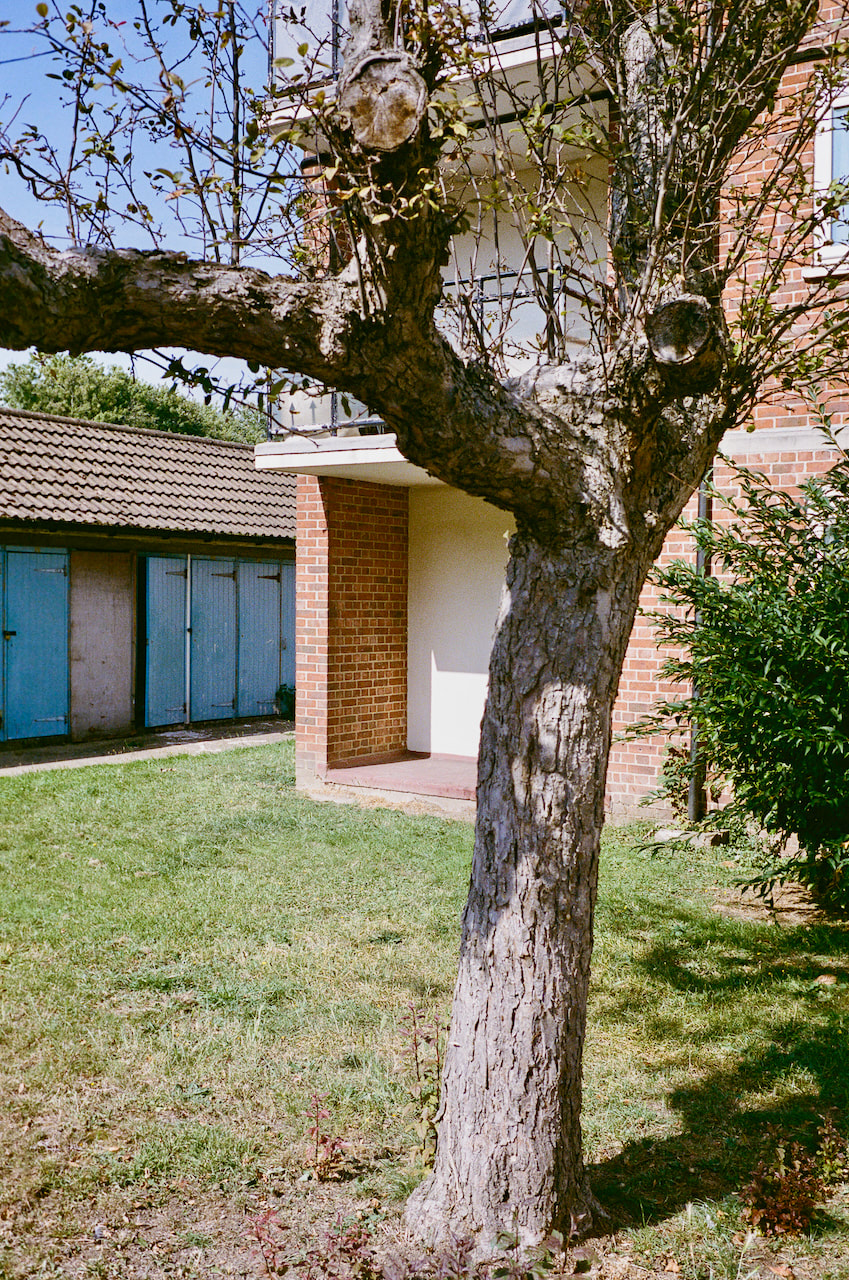
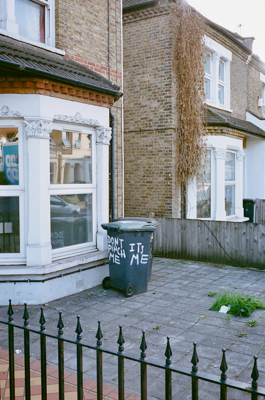
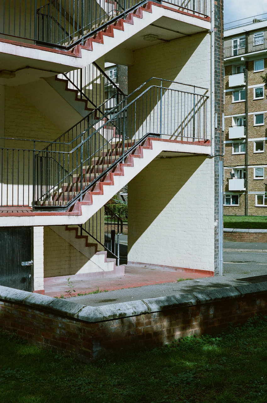
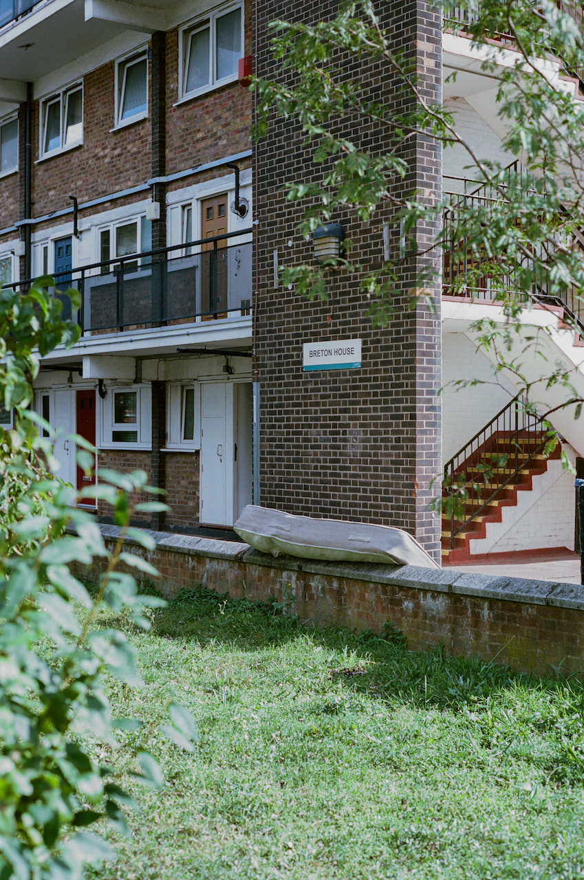
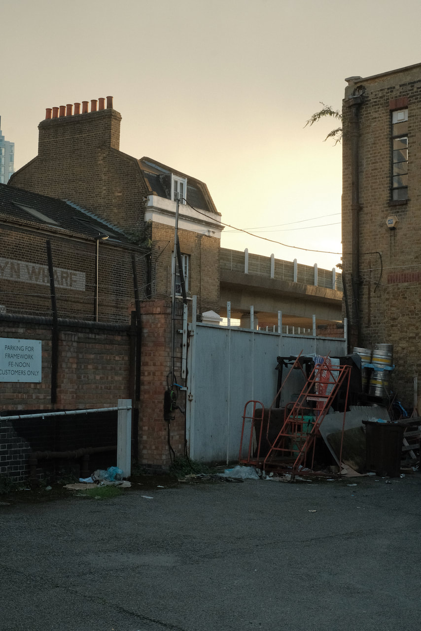
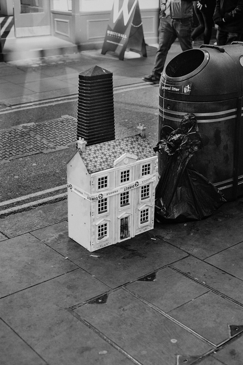
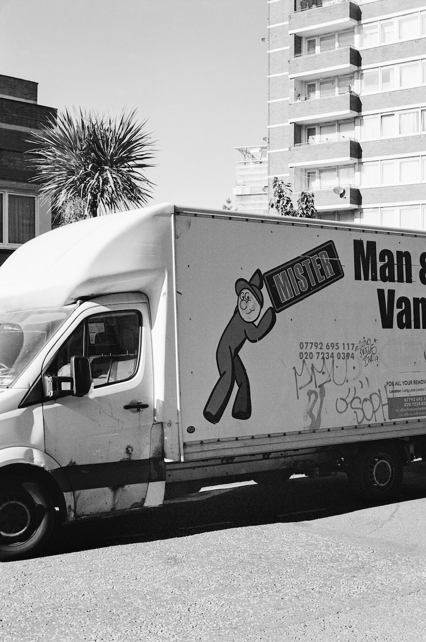
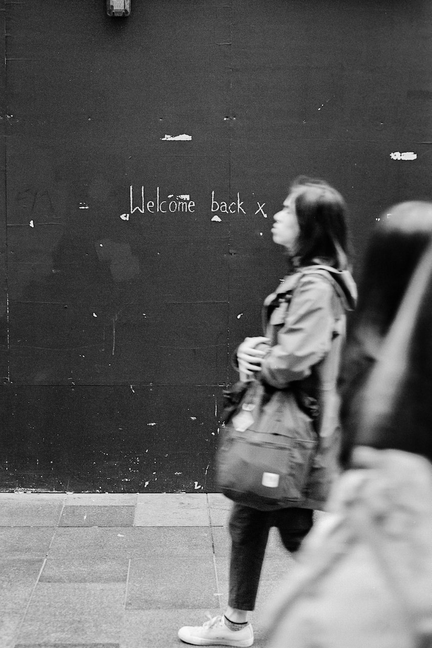
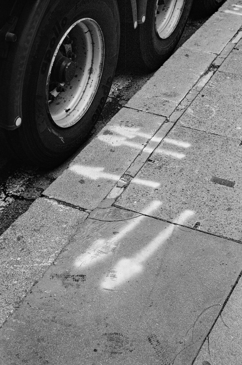
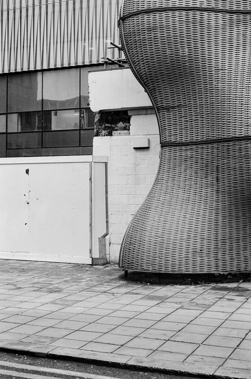
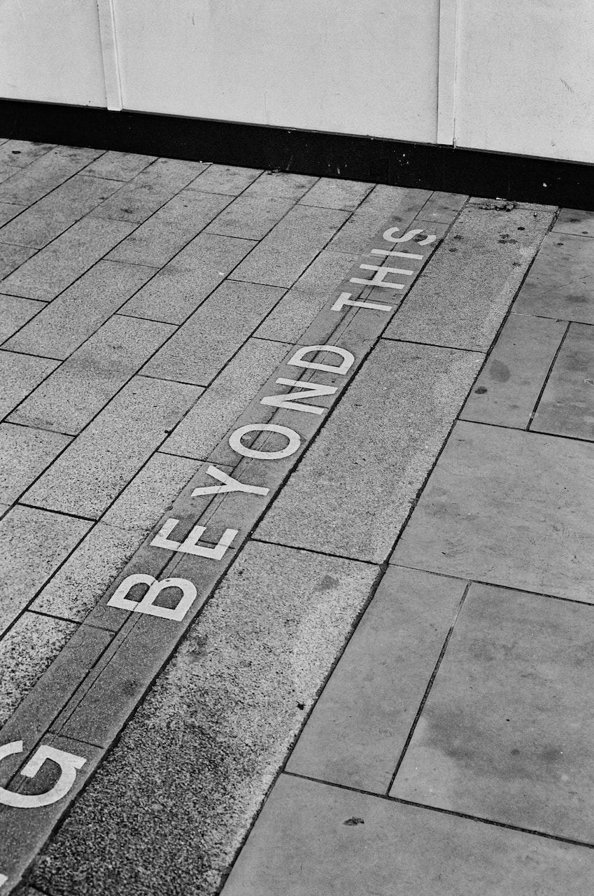
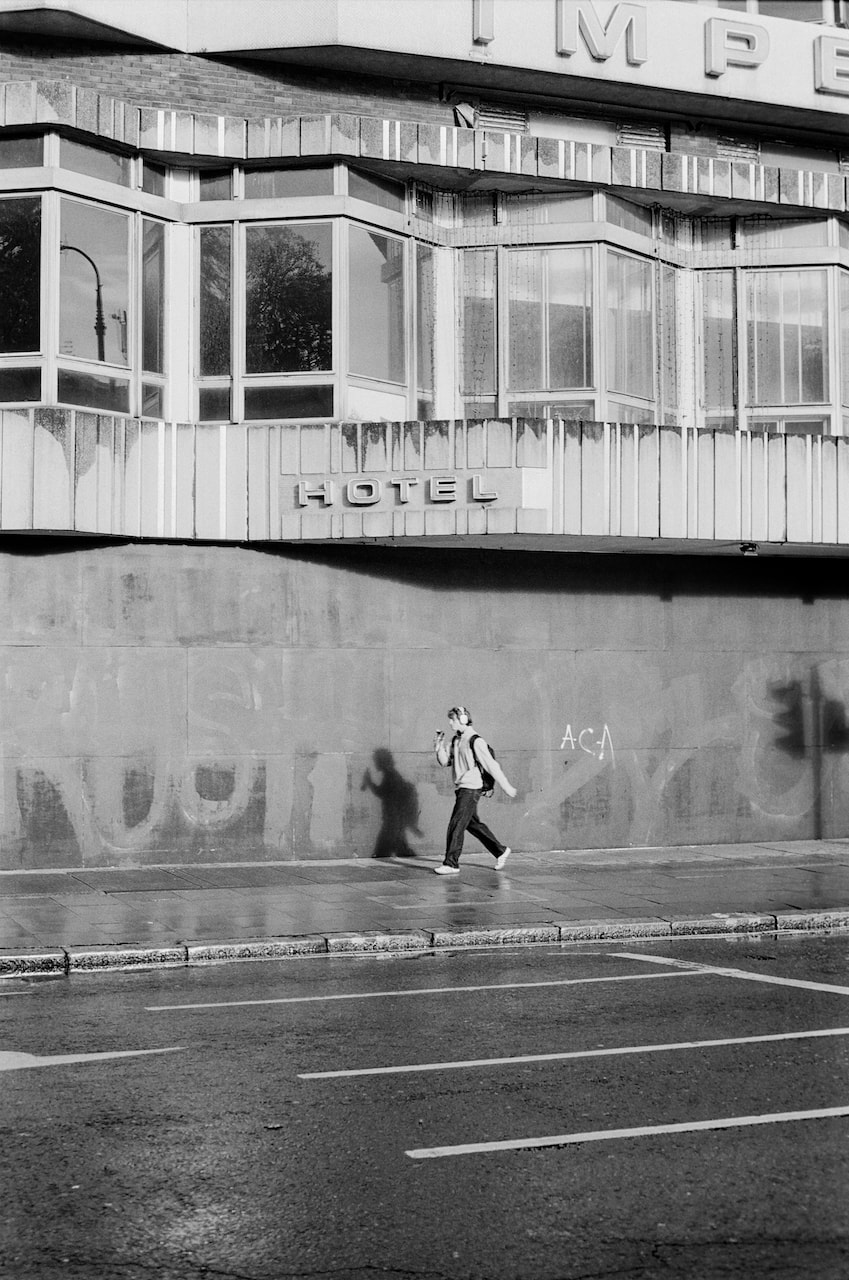
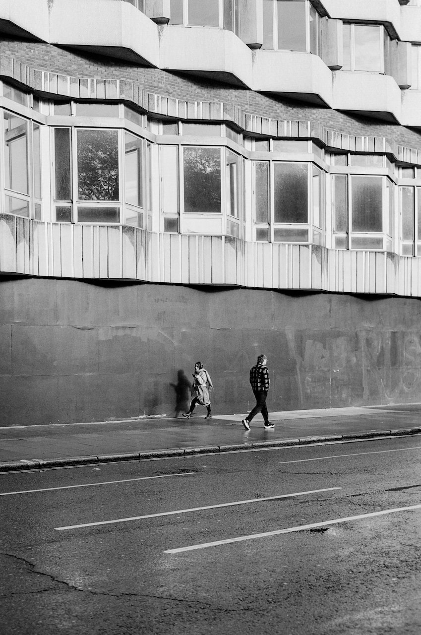
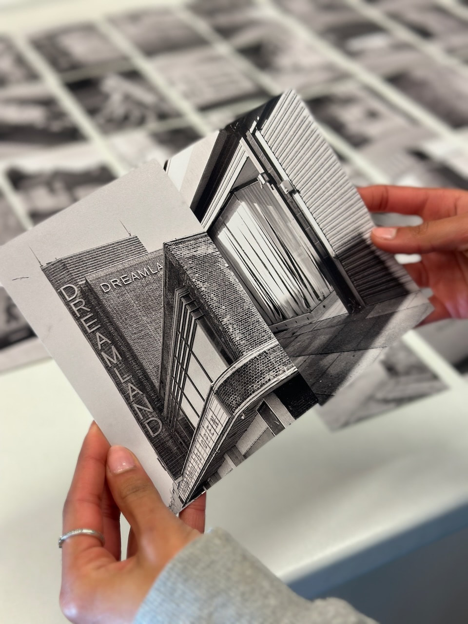
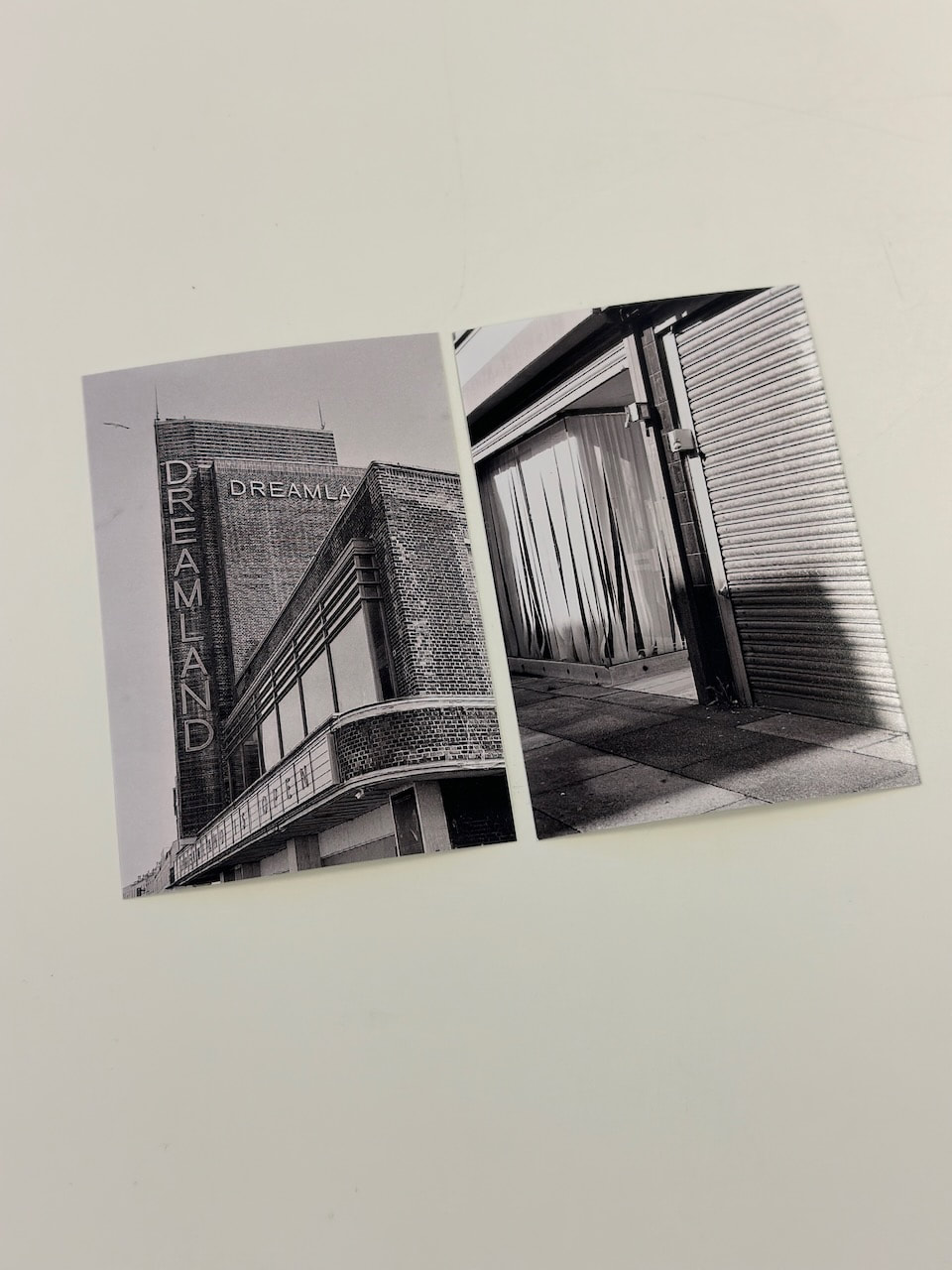
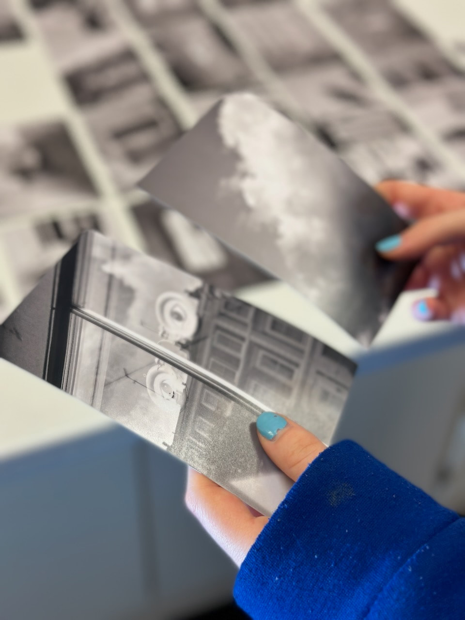
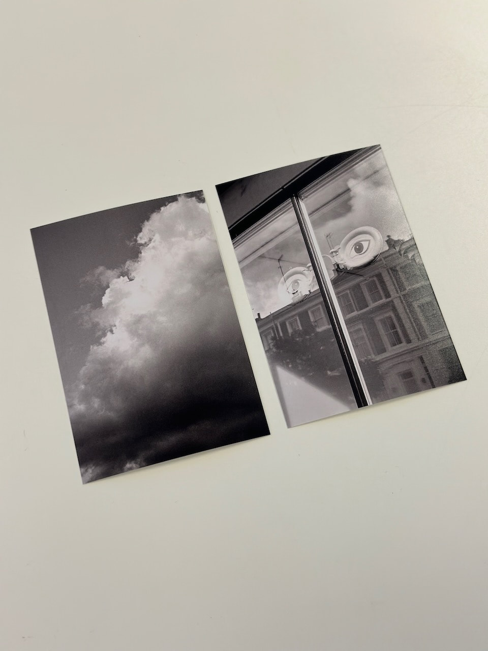
Dreamland
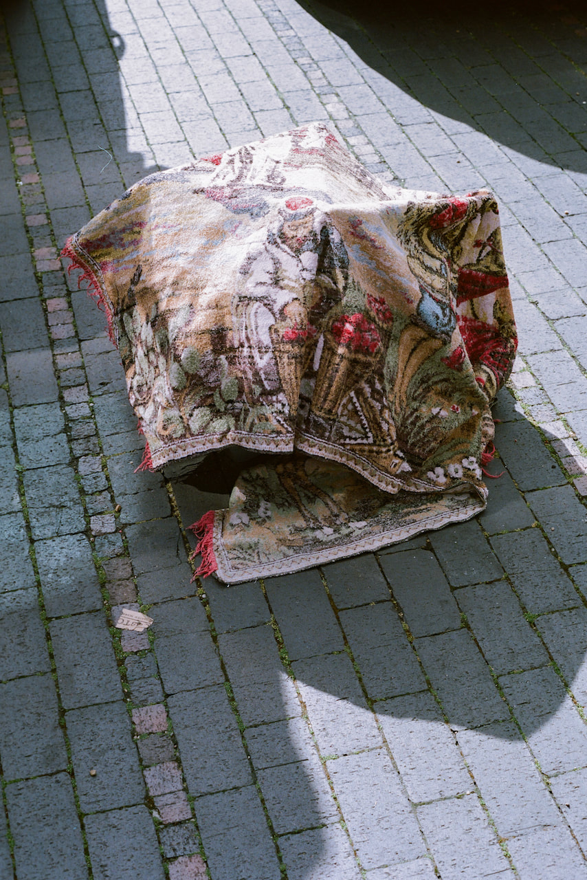
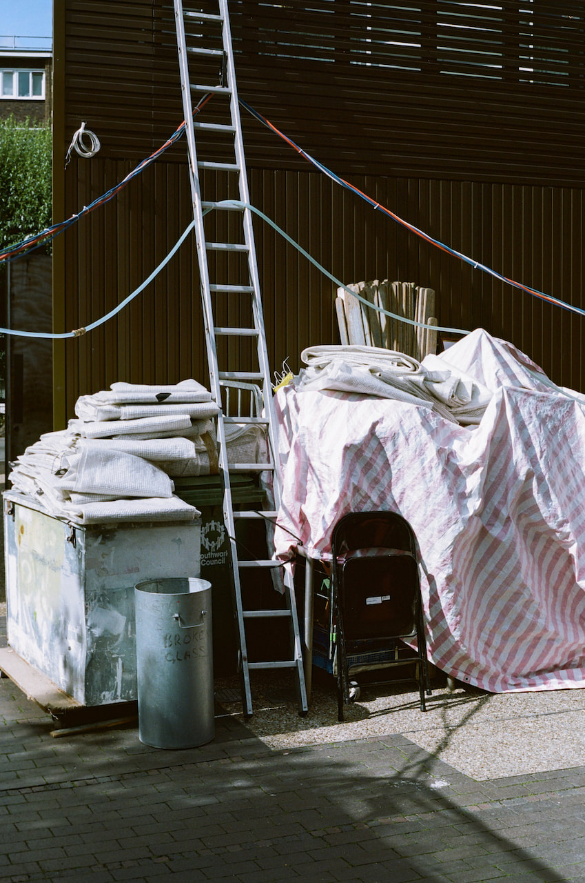
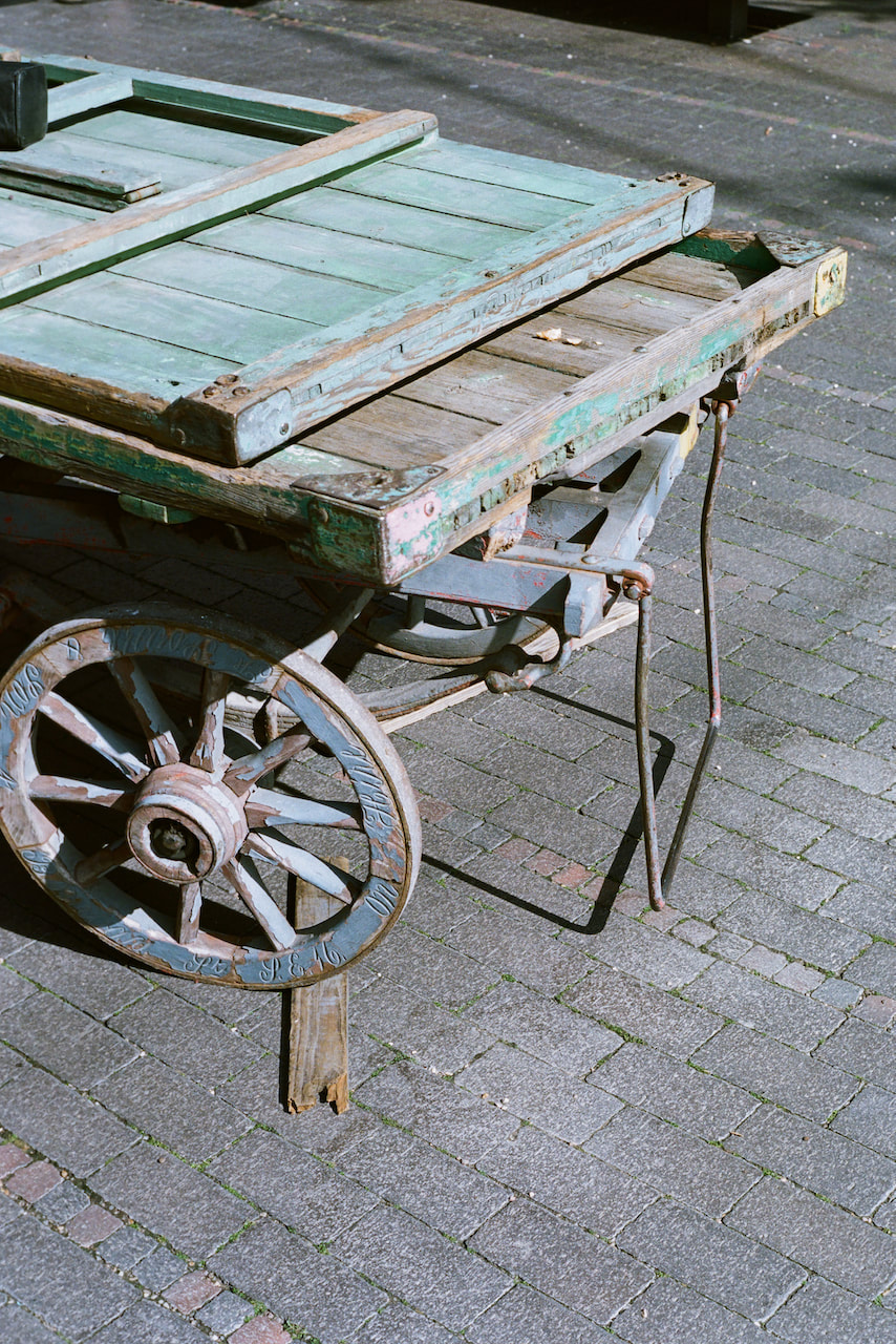
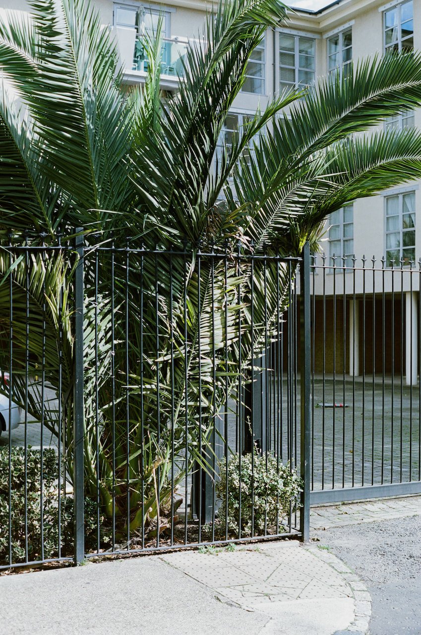
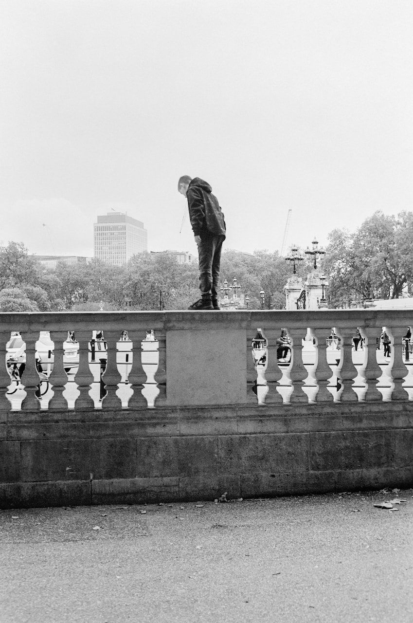
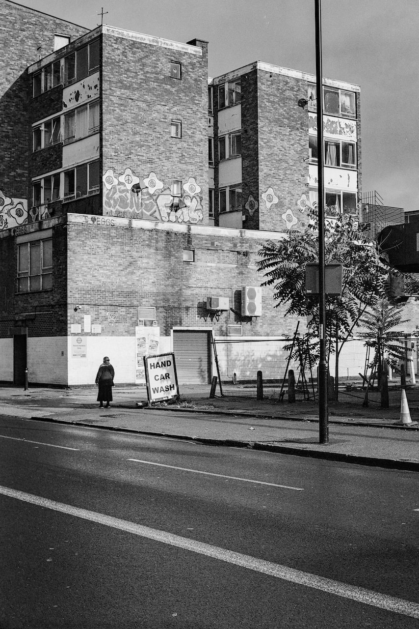
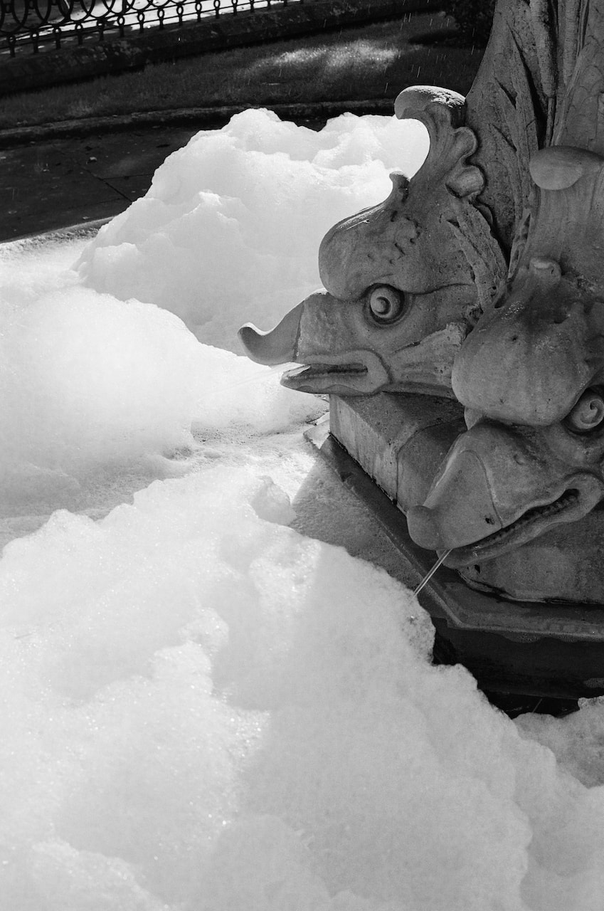
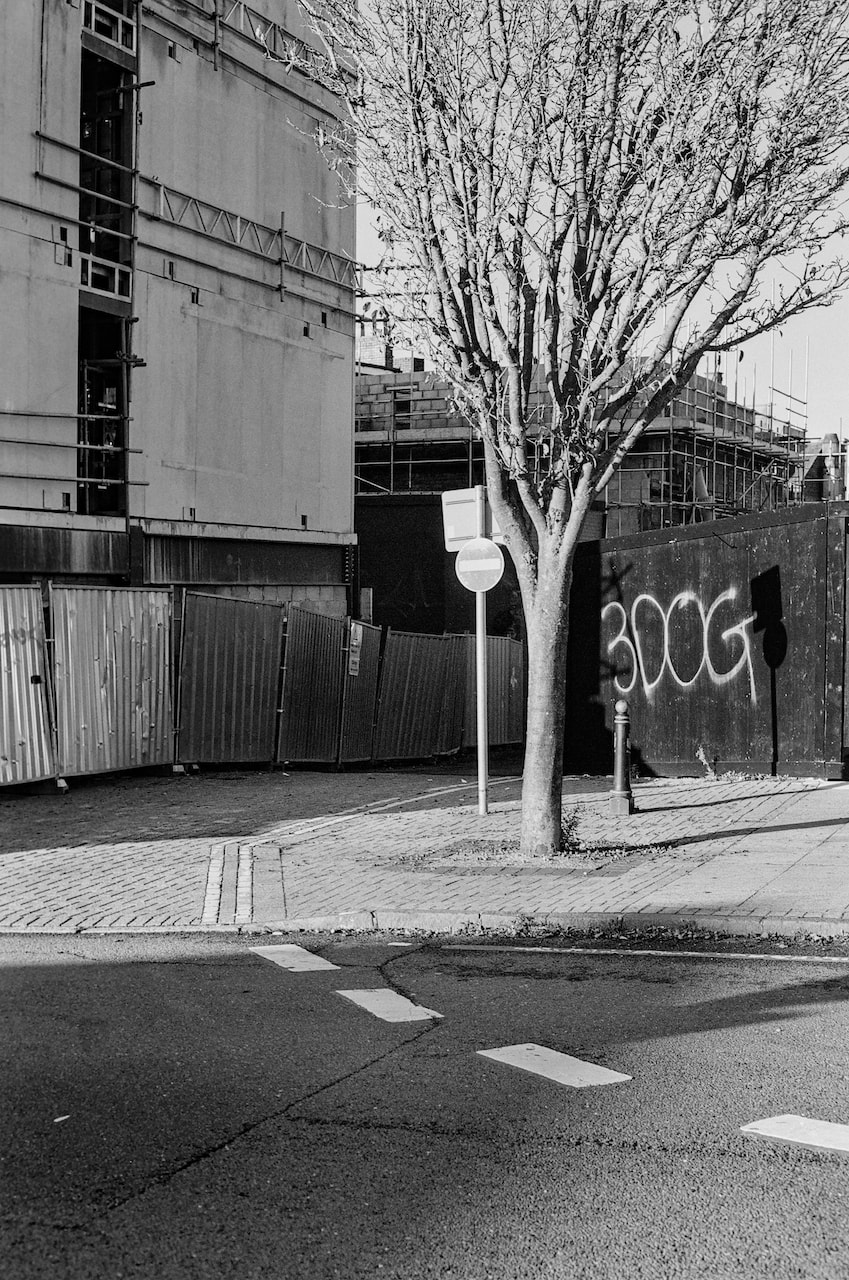
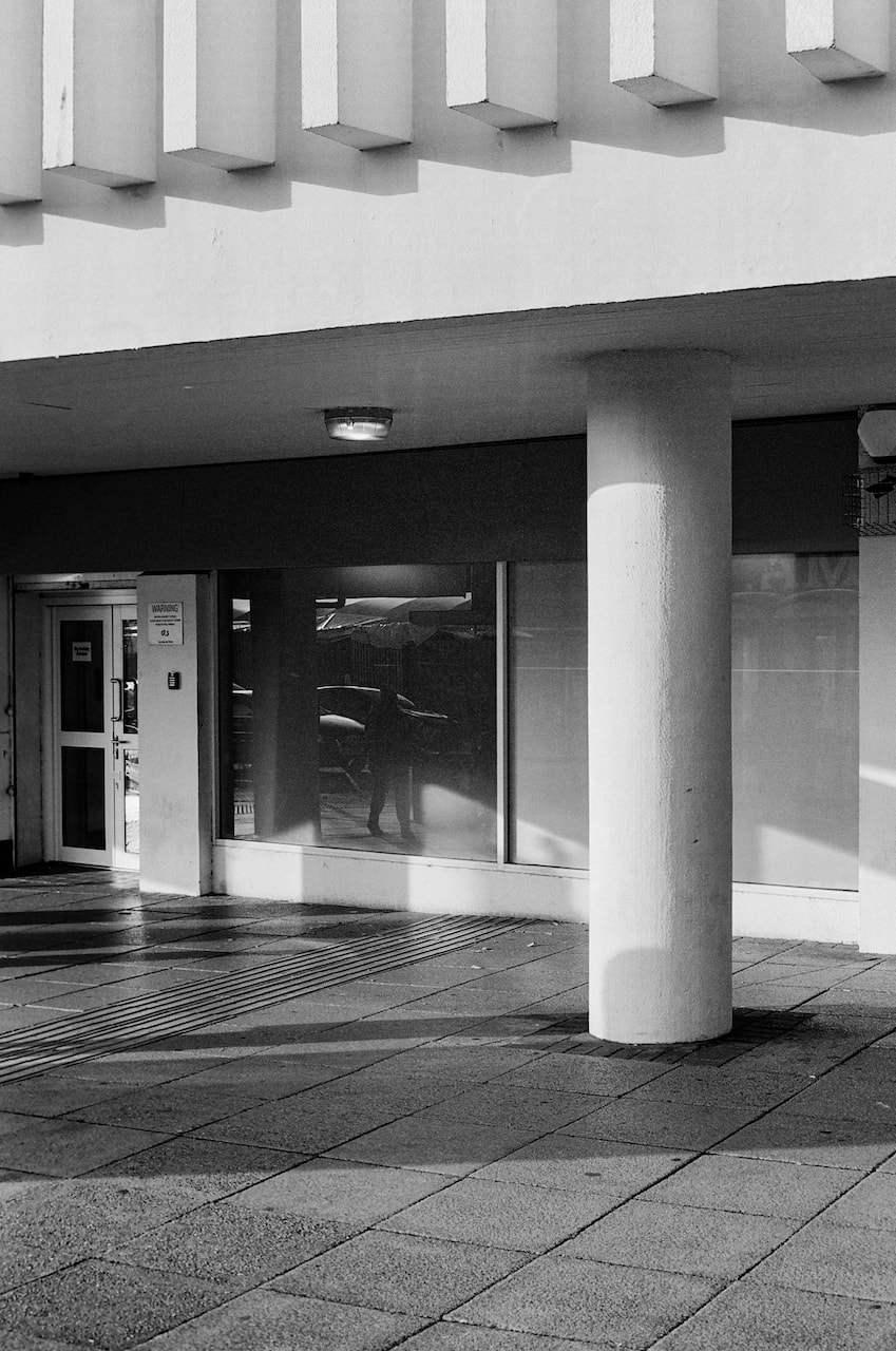
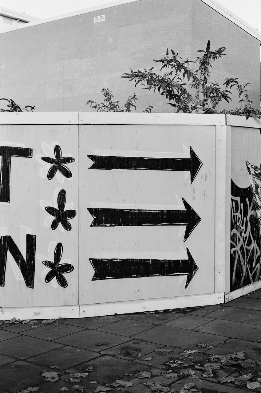
These photos were taken with a 35mm rangefinder camera on Ilford XP2 Super400 film in London and Margate. Dreamland is Margate's amusement park, recently renovated after years of neglect. It's such a fantastic word, especially in the way it relates to photography, that it might make an excellent title for the final phase of my Personal Investigation. Don't all photographs create a kind of dreamland, existing in a 'grey area' between fact and fiction?
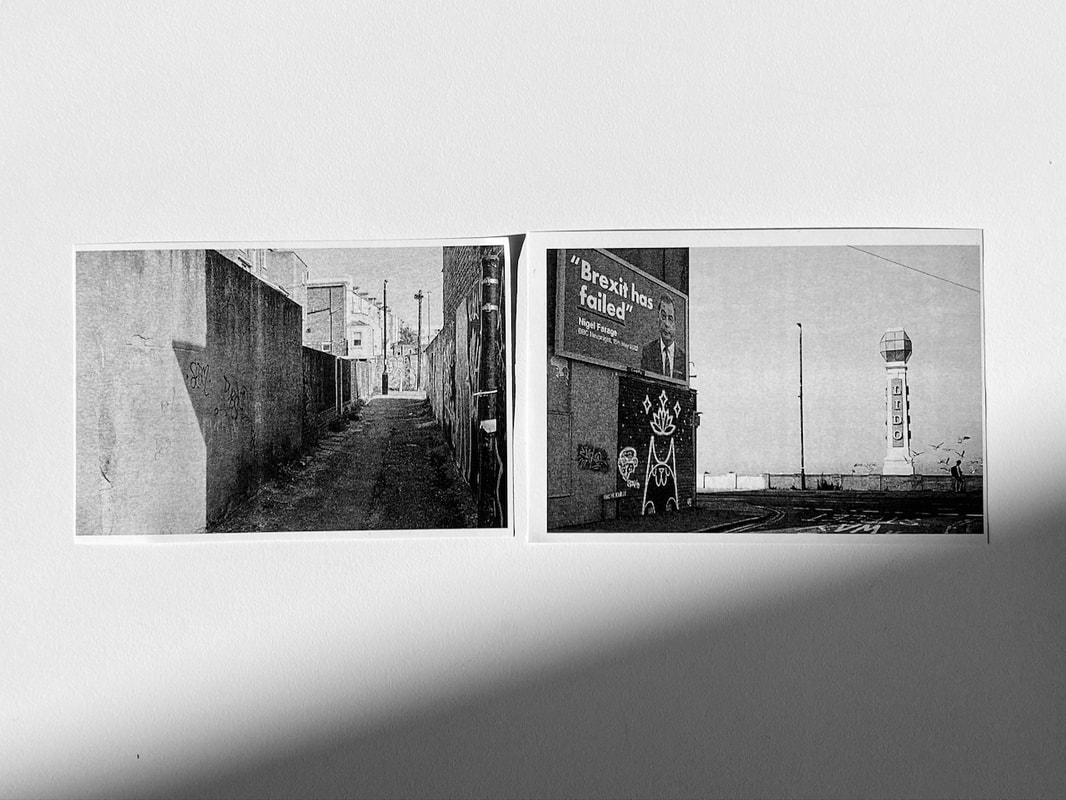
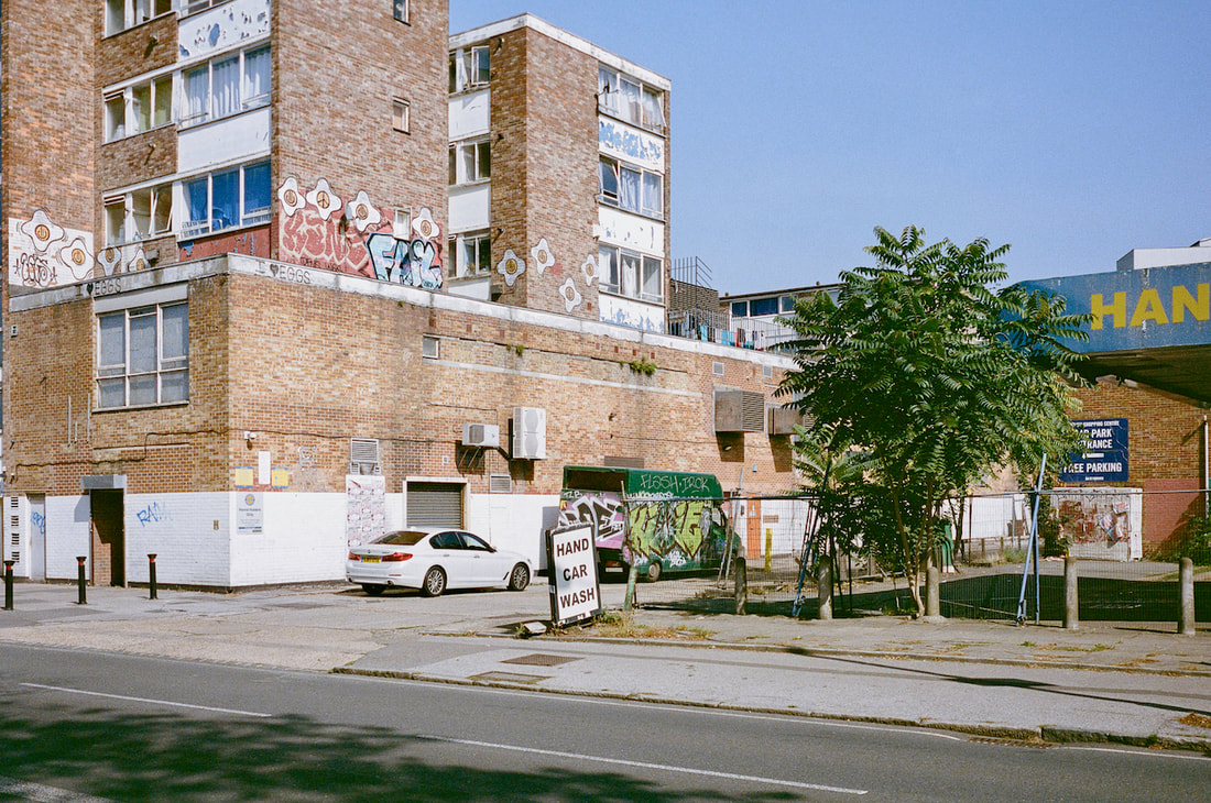
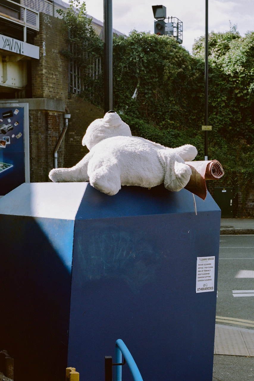
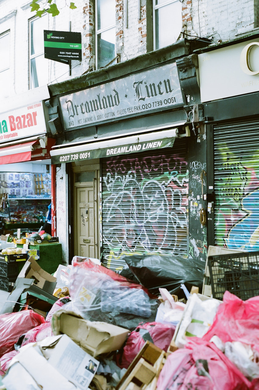
I'd also like to revisit Margate this Autumn and Winter to document the way it changes out of season. I really like Rob Ball's various projects about amusement parks and coastal towns but I'm imagining something less specifically documentary for my project. Coastal towns like Margate have really suffered in recent years, despite attempts to regenerate them. The high street has its fair share of boarded up shops, the Lido and Winter Gardens are in a state of total disrepair and if you walk only a few streets beyond the Old Town you can see that people are living difficult lives. As the LedByDonkeys poster proclaims, "Brexit has failed".
And yet Margate is an attractive location for those looking to relocate from London. There are loads of vintage shops, the Turner Contemporary and Tracey Emin's new studios. There are beautiful old houses waiting to be spruced up using the proceeds of London property sales. The contrast between the down-from-Londoners and the local population is quite stark. What might unite both places - London and Margate - is the growing sense of alienation, dislocation and tension caused by a cost of living crisis, war in Europe, a seemingly irresponsible and incompetent elite political class and the fear of environmental collapse. How might photographs capture and communicate aspects of this existential crisis?
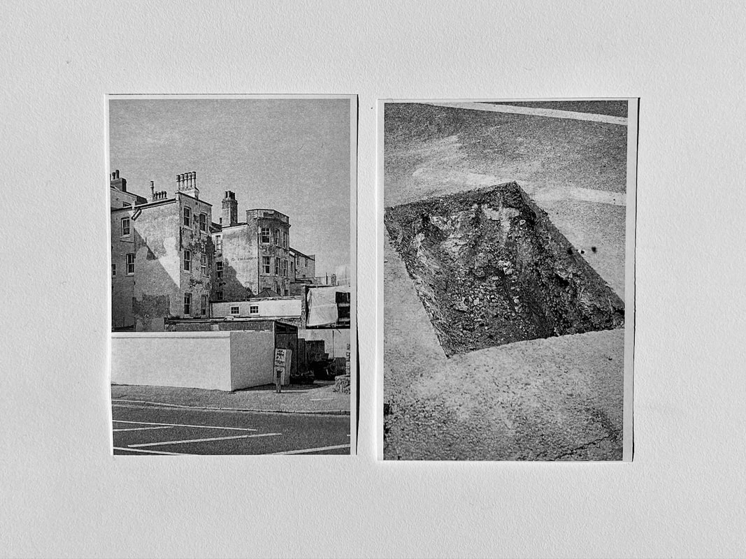
London/Margate diptychs
I'm not sure this idea works but here are some examples of how images taken in London (left) and Margate (right) could be paired:
|
|
|
|
|
|
|
|
|
|
|
|
|
|
|
|
|
|
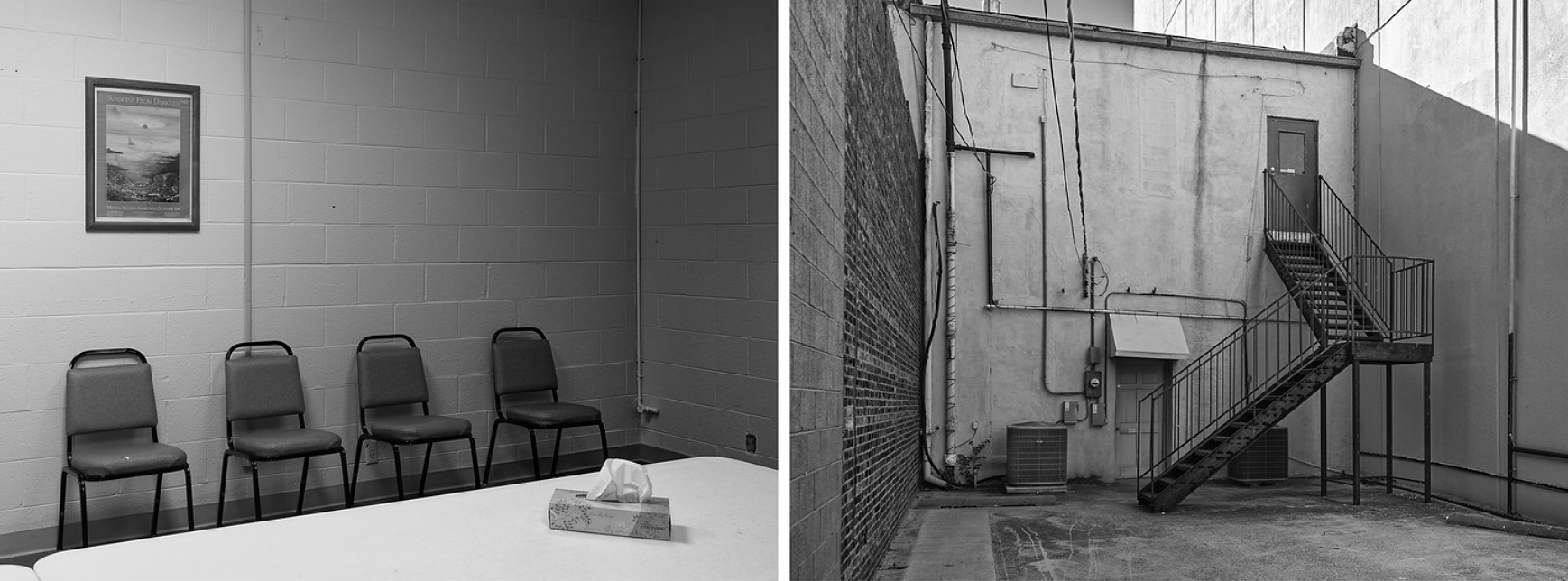
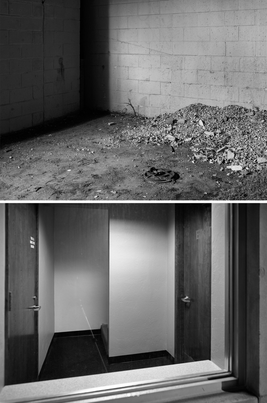
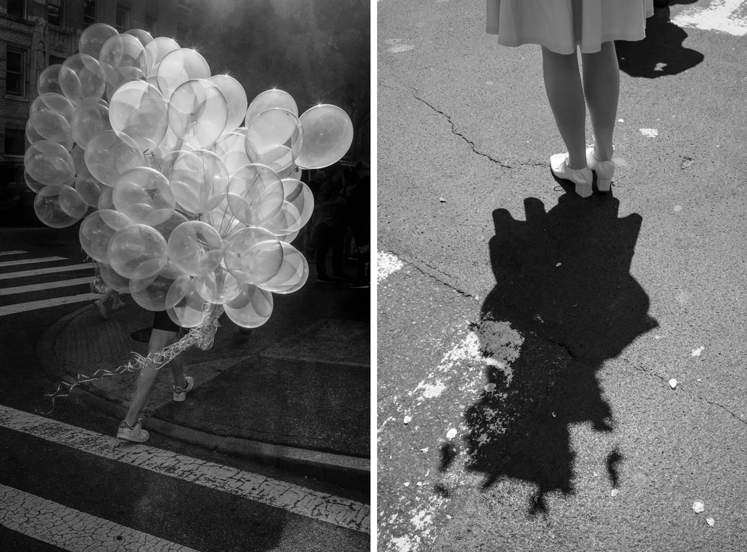
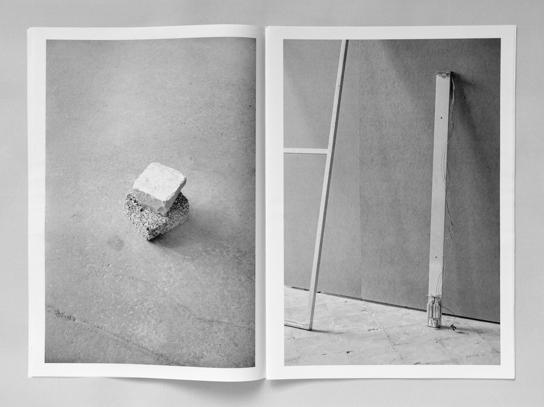
Diptychs & Triptychs
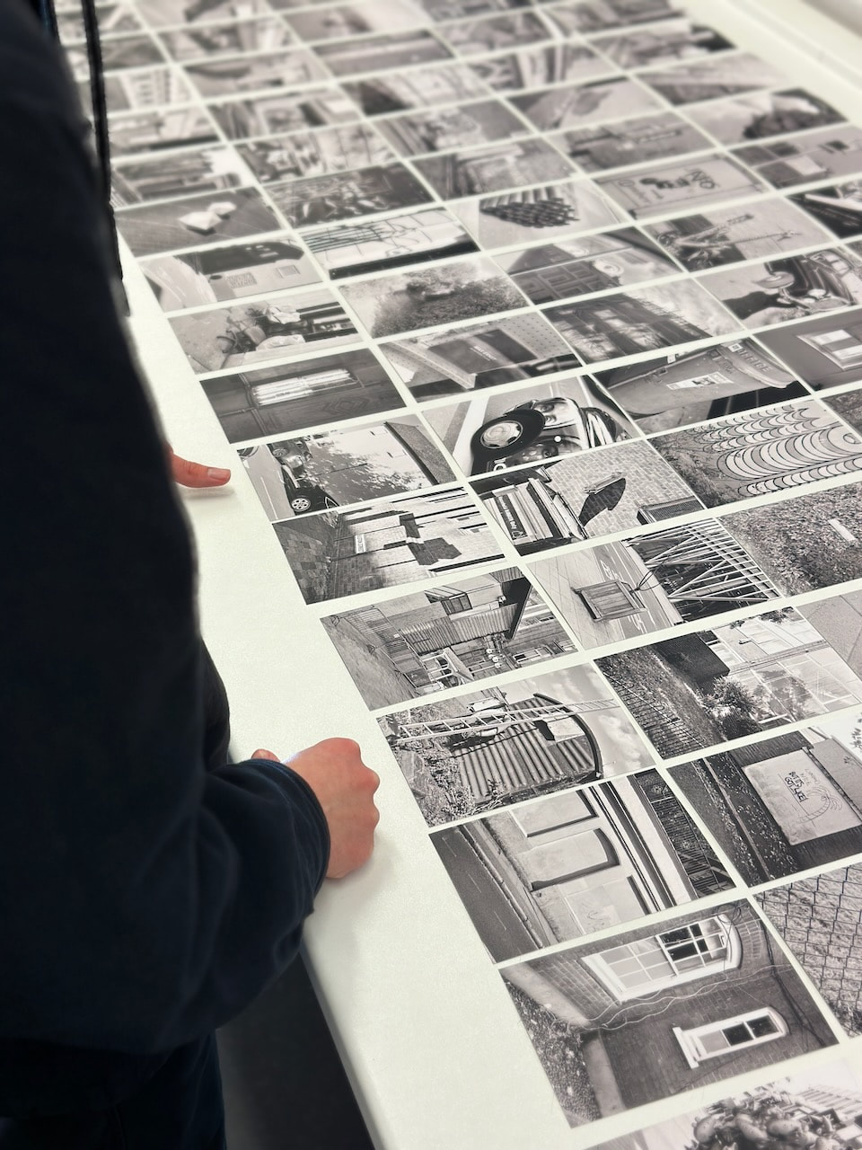
I decided to make small prints of my most recent photoshoot, following the advice of Jörg Colberg, so that I could continue to experiment with making a variety of diptychs (and triptychs):
Favourite diptych
|
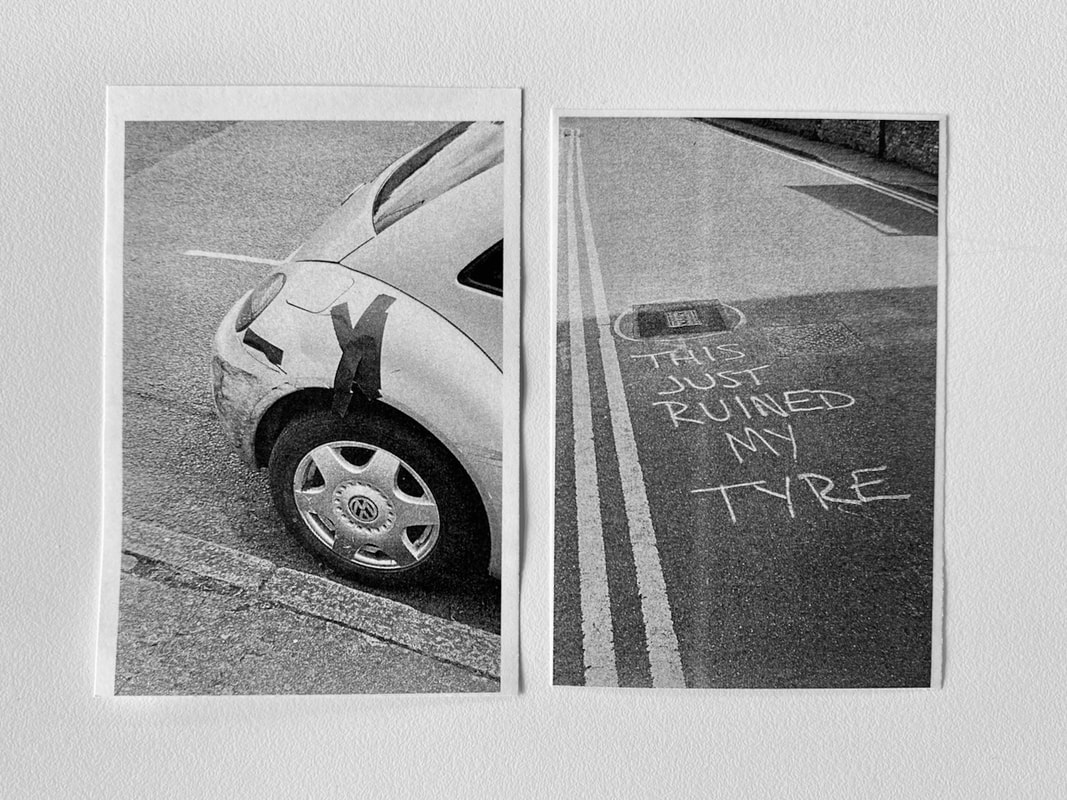
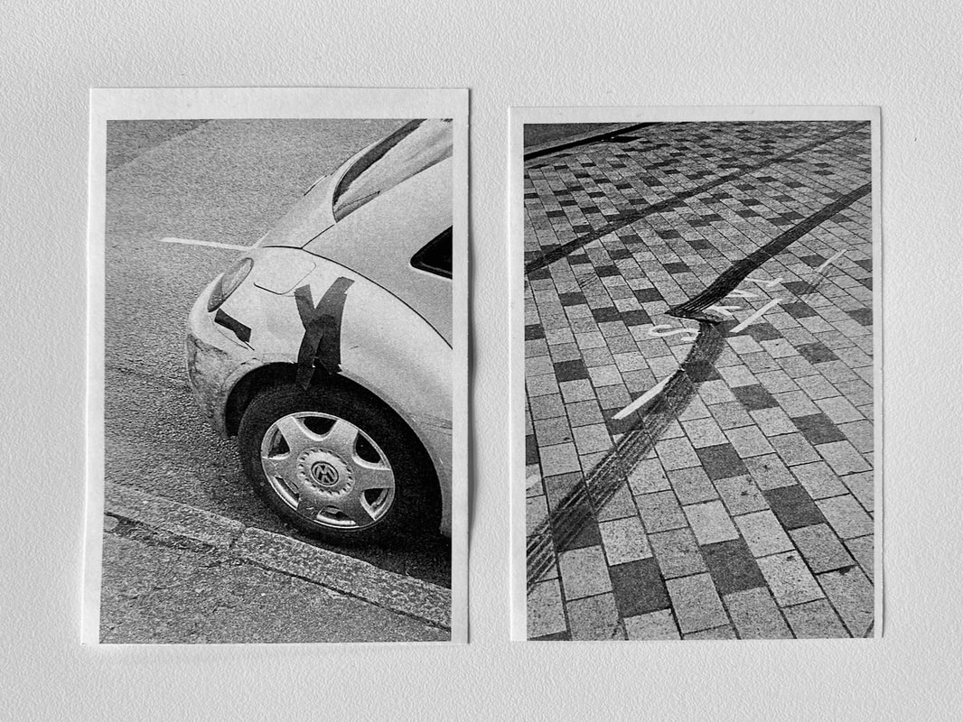
|
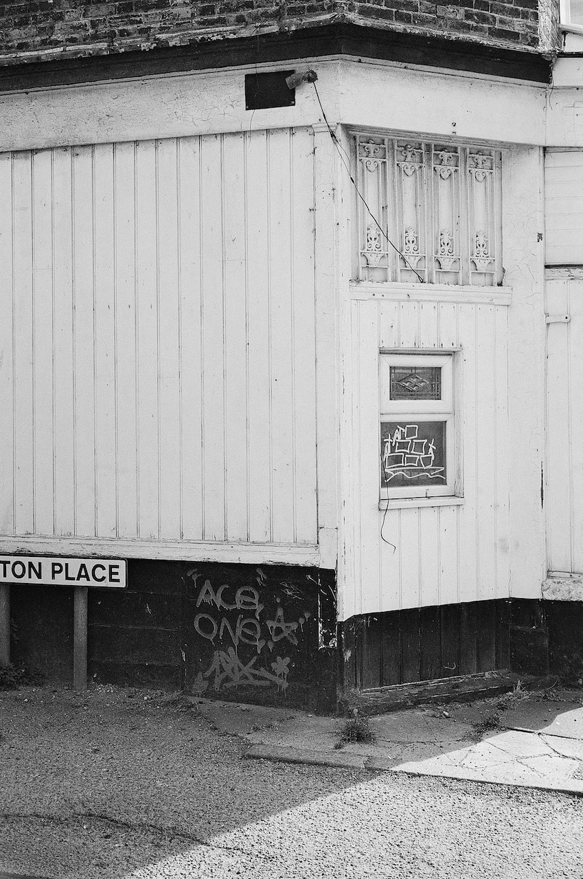
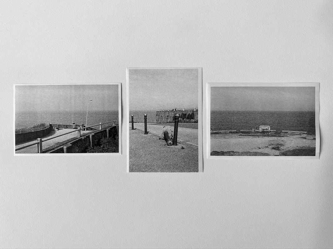
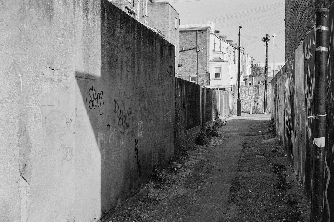
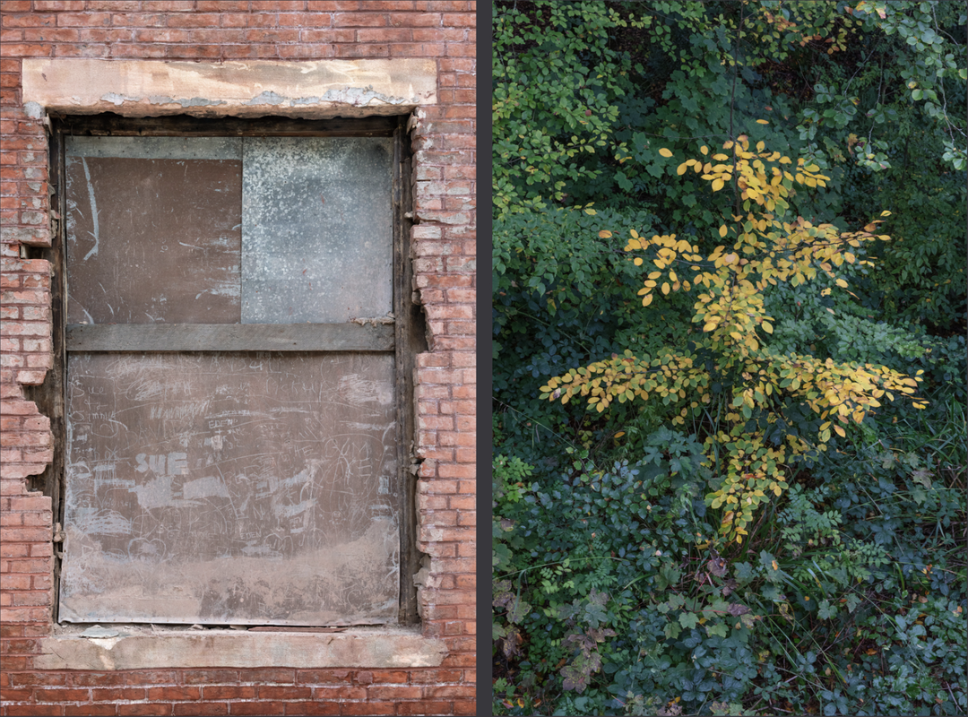
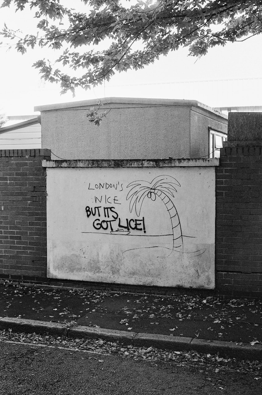
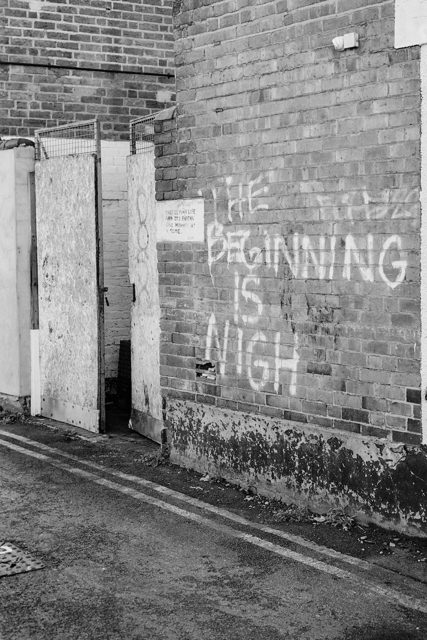
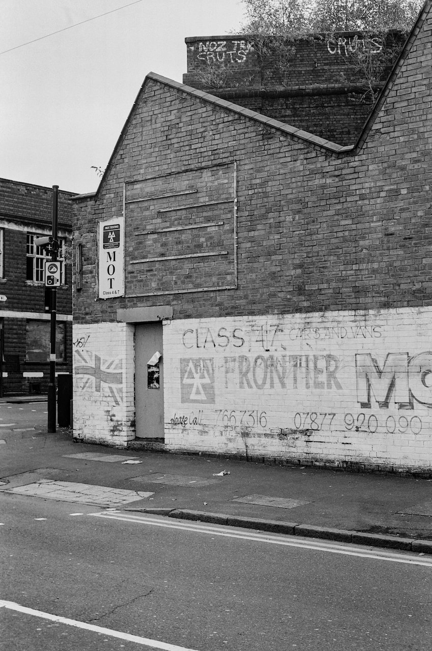
I had previously overlooked landscape diptychs (preferring two portrait images). However, this exercise helped me see this pair. Both images show a road (or path) leading to a wall and vertical structures. Each has a wall on the left hand edge containing messages and drawings. The image on the left is more closed, the space shallower, whereas the image on the right contains the hint of a a deep seascape and open sky. However, both pictures hint at social and political tensions. Brexit (and other issues) have negatively impacted the economies of seaside towns, reducing opportunity for local people. Where do these roads eventually lead? What does the future hold?
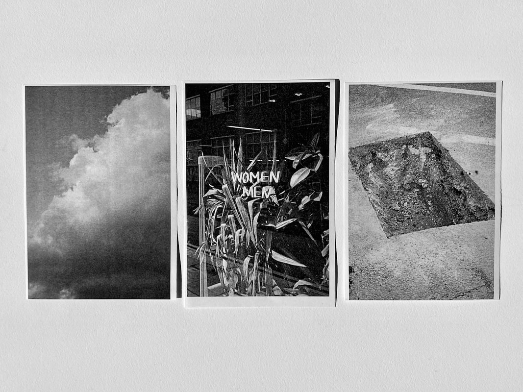
Favourite triptych
|
|
|
I like this combination of landscape and portrait pictures. I think these three work for a couple of reasons:
- they were all taken very close together (in time and space) of the same stretch of seafront
- the horizon lines almost coincide which creates a strong horizontal link
Photographing with (greater) intentionality
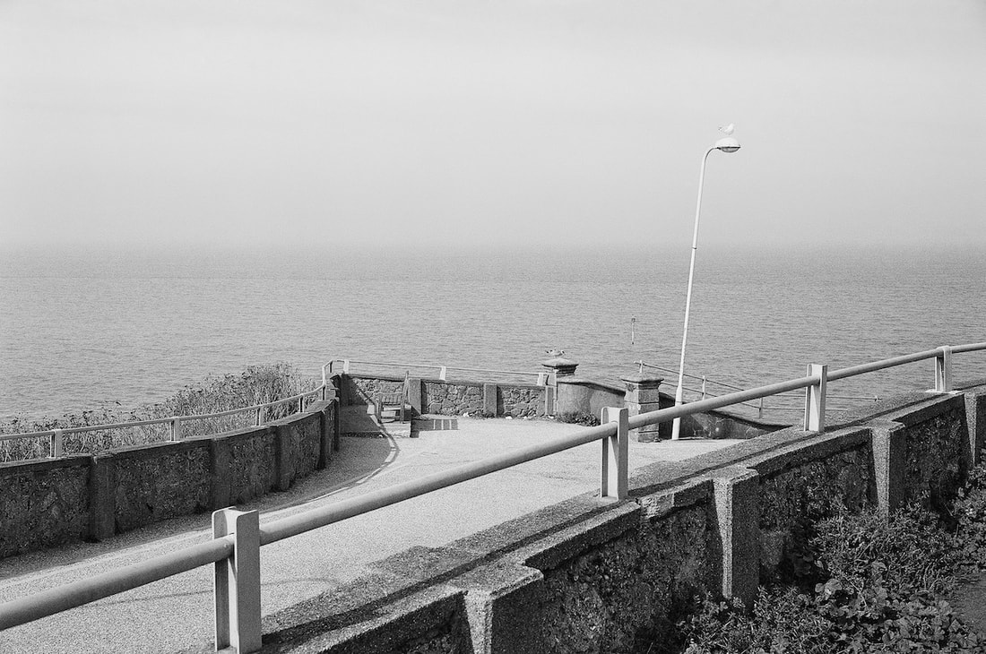
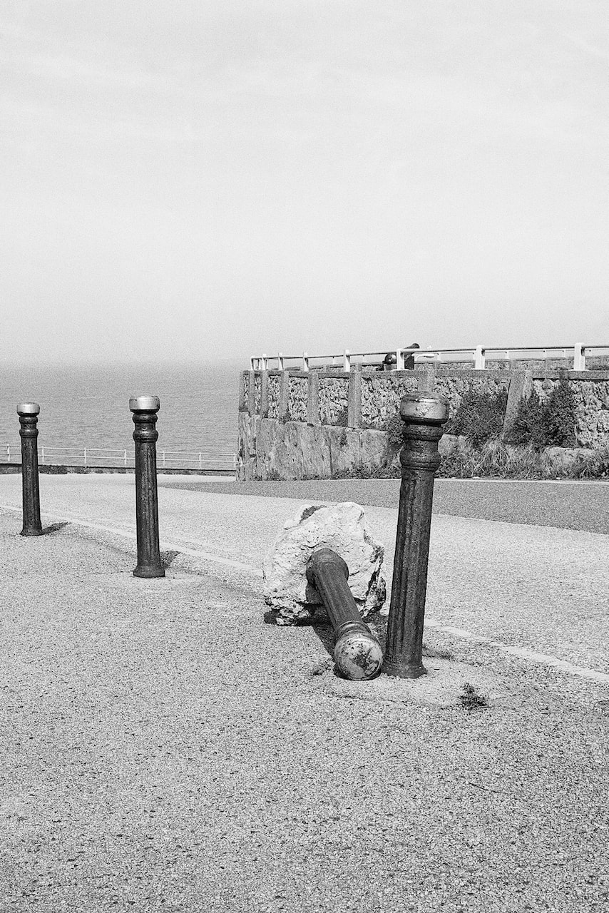
Dreamland (cont.)
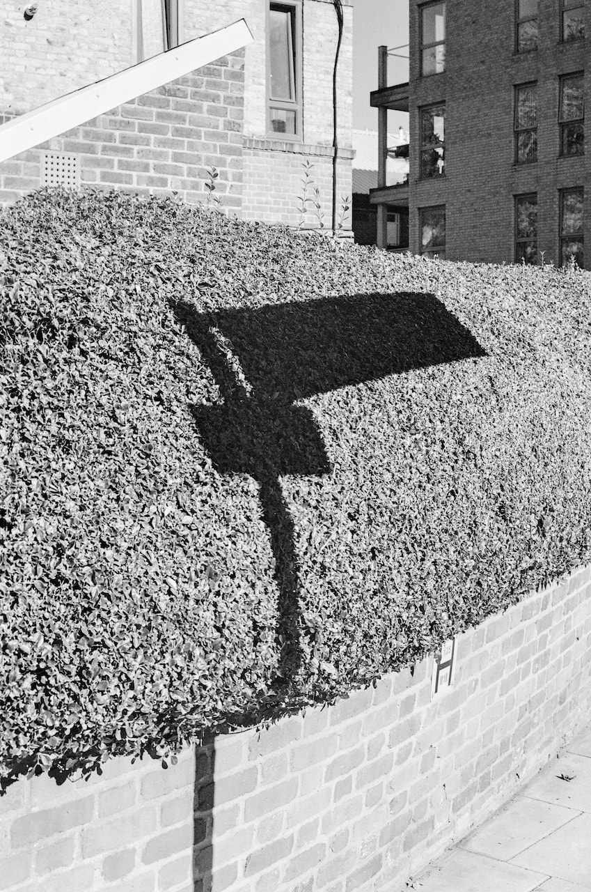
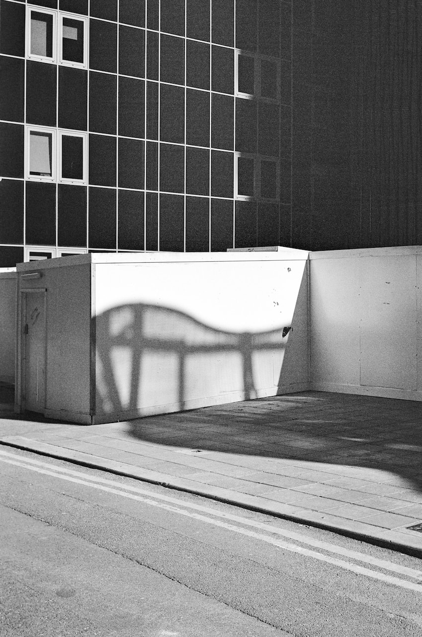
These pictures were made with a 35mm rangefinder camera and Kodak Portra 400 film in Margate and London. I'm not sure whether the title 'Dreamland' will work for my final project outcome but it will do for now.

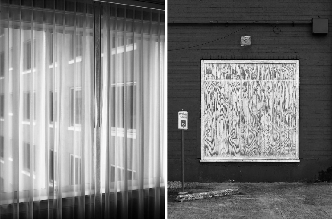
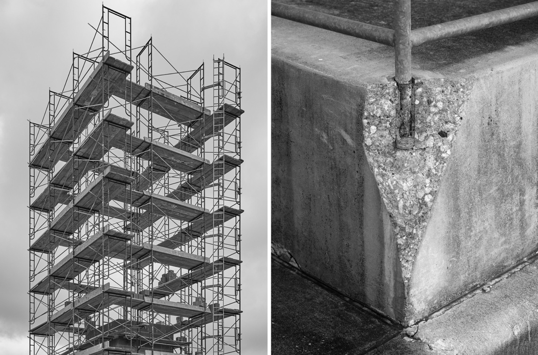
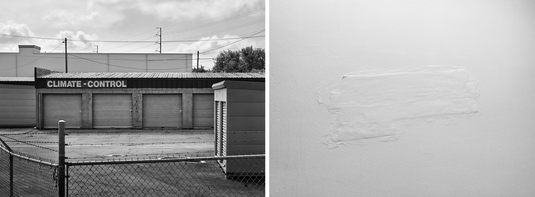
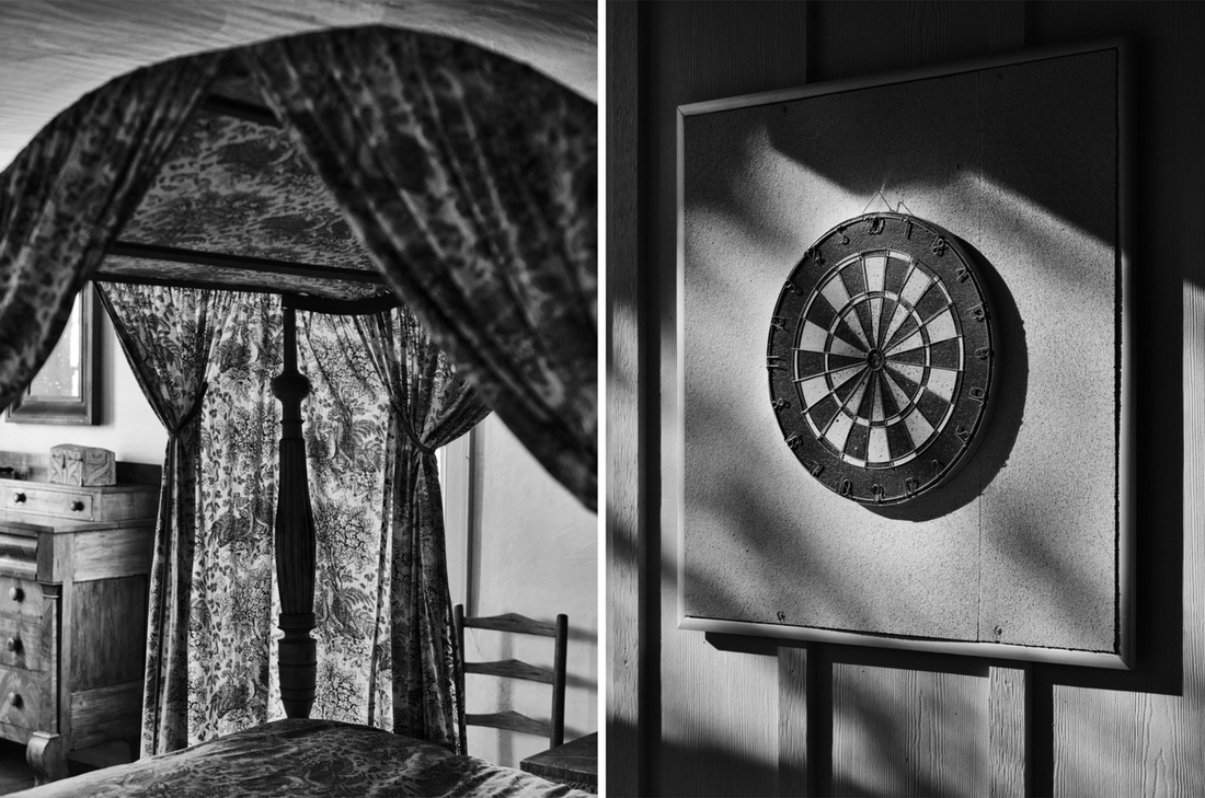
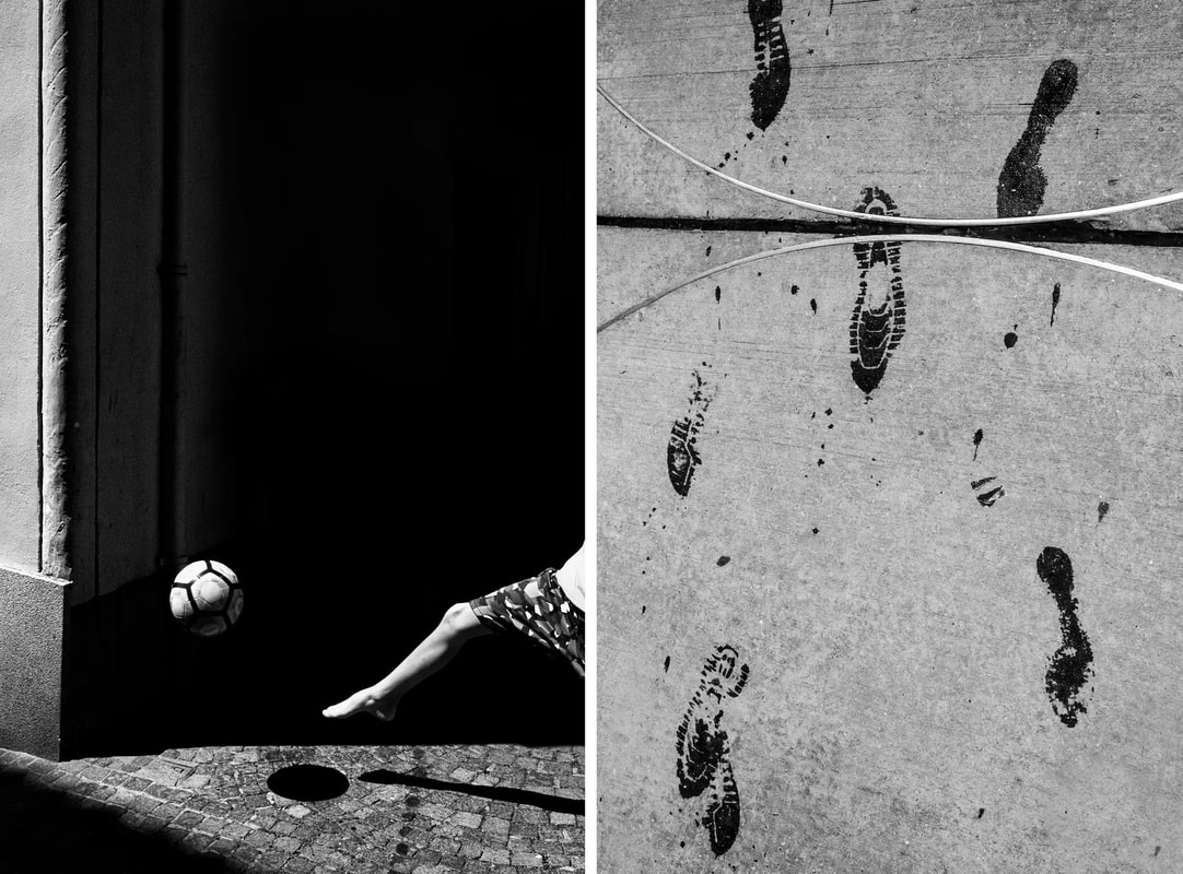
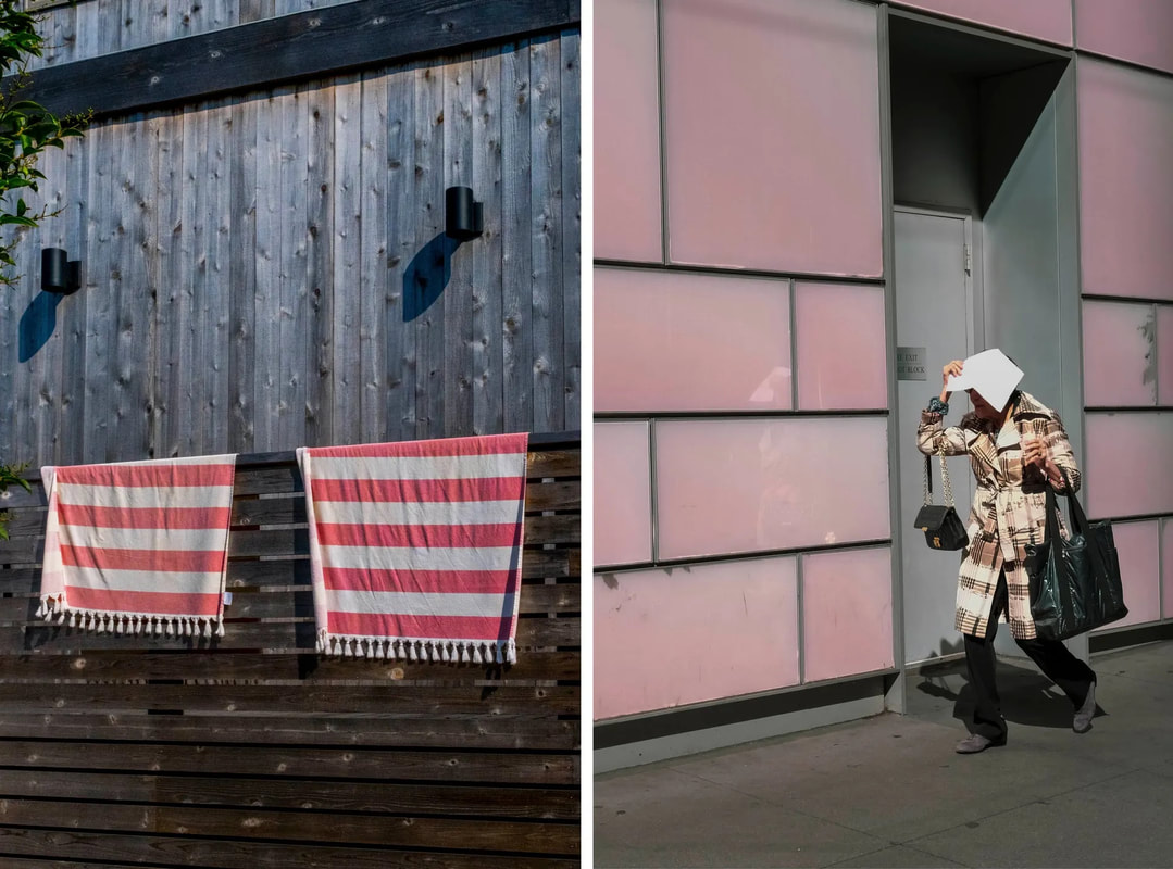
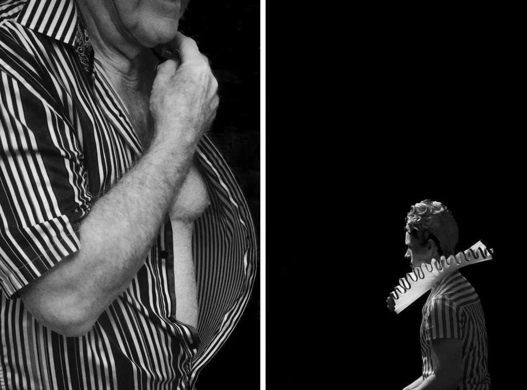
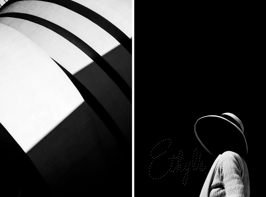
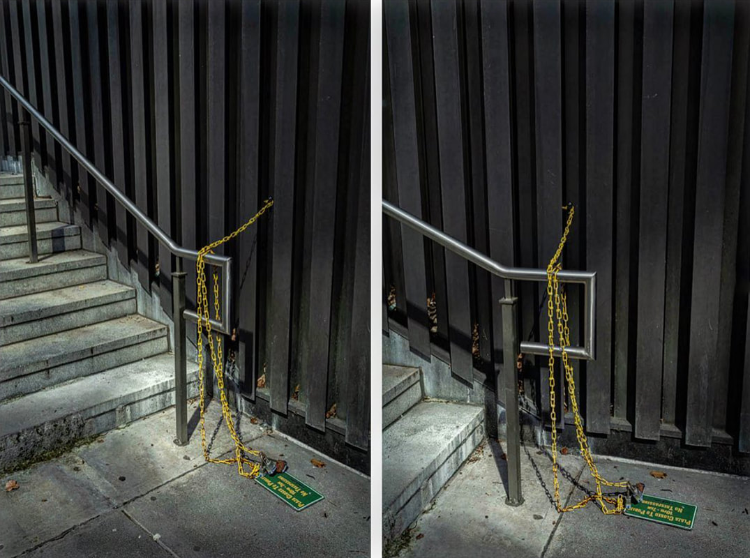
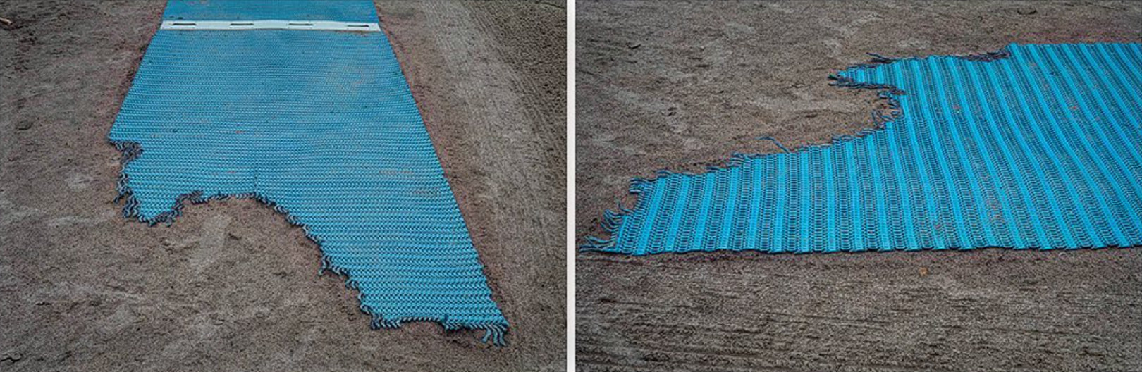
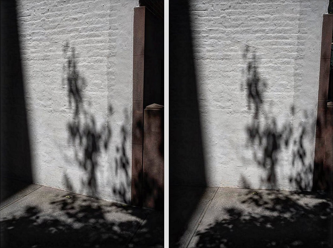
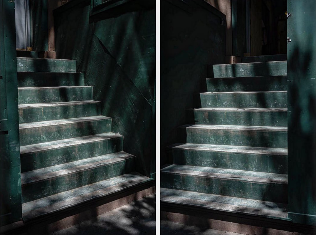
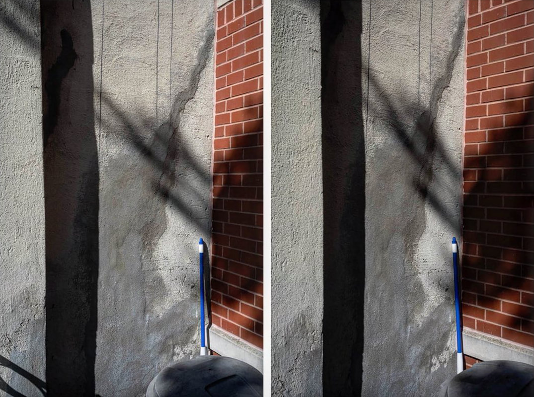
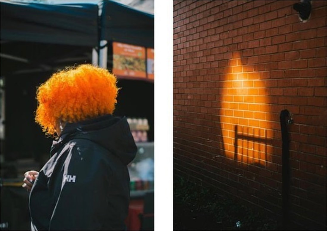
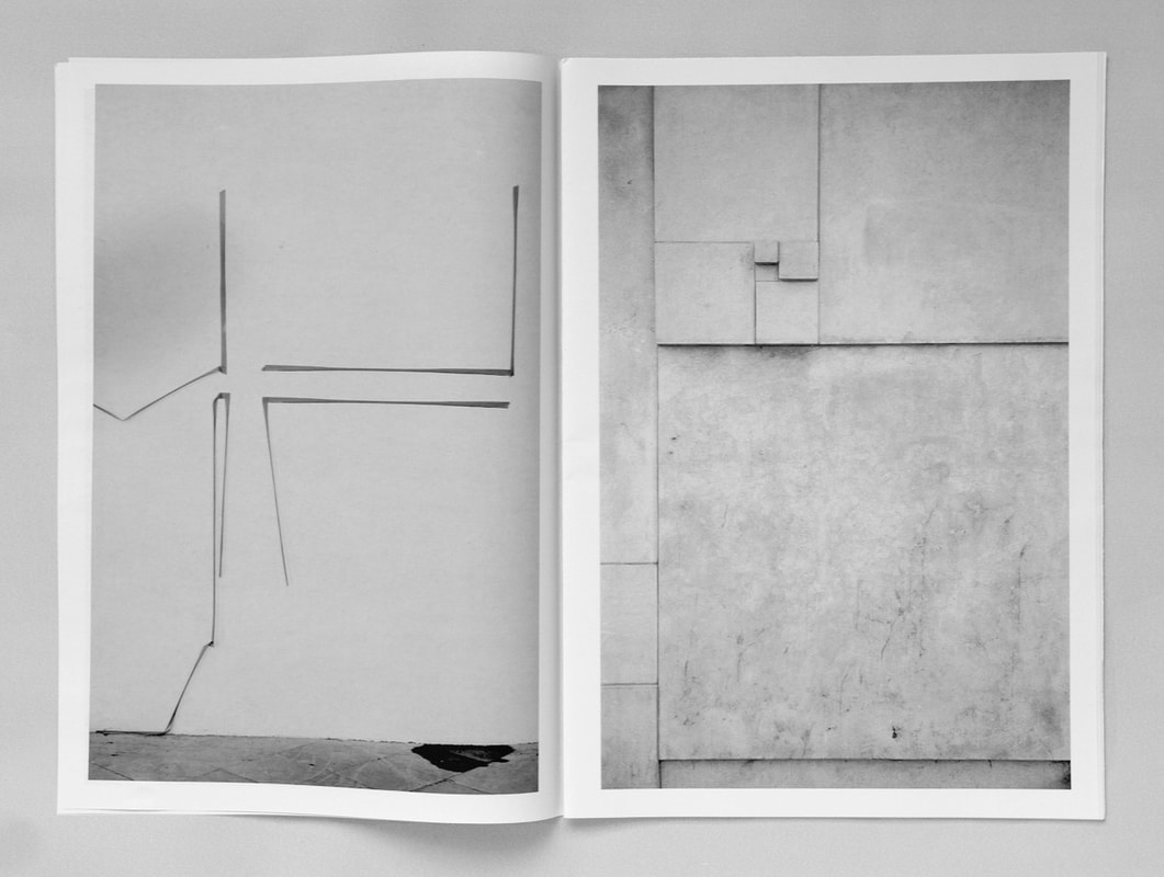
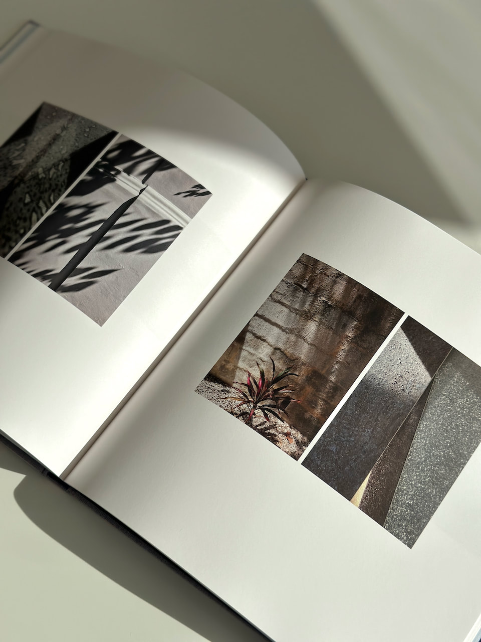
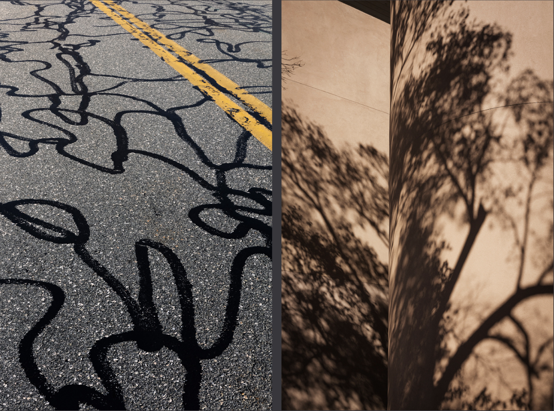
Diptychs & Gestalt Theory
For this series of diptychs I have attempted to analyse the compositions, applying the Gestalt theory of visual hierarchy. I've also taken into consideration photographic concepts such as leading lines, and other formal considerations.
The concept of visual hierarchy is based in Gestalt psychological theory, an early 20th-century German theory that proposes that the human brain has innate organising tendencies that “structure individual elements, shapes or forms into a coherent, organised whole,” especially when processing visual information. The German word Gestalt translates into “form,” “pattern,” or “shape” in English. When an element in a visual field disconnects from the ‘whole’ created by the brain's perceptual organization, it “stands out” to the viewer. |
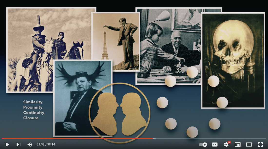
I'm persuaded by the idea that, with diptychs, the whole is greater than the sum of the parts but I was curious to see if I could analyse more precisely why/how these particular pairs of photographs 'work'. Obviously, there are multiple ways of looking at any photograph or pair of photographs. These illustrations are just a way for me to try to better understand the (possibly subconscious) decisions I made when placing them in these arrangements and, also, how some viewers might 'see' them.
|
|
|
|
|
|
|
|
|
|
|
|
|
|
|
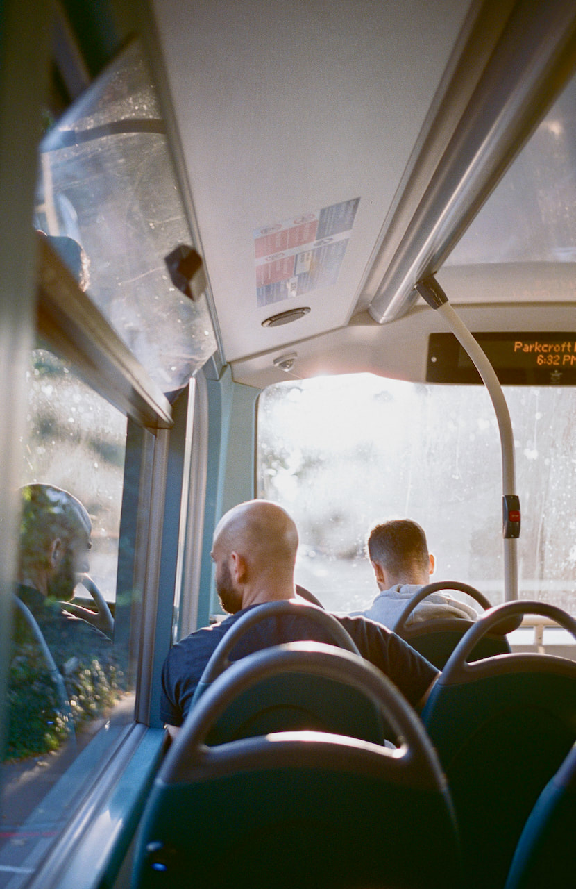
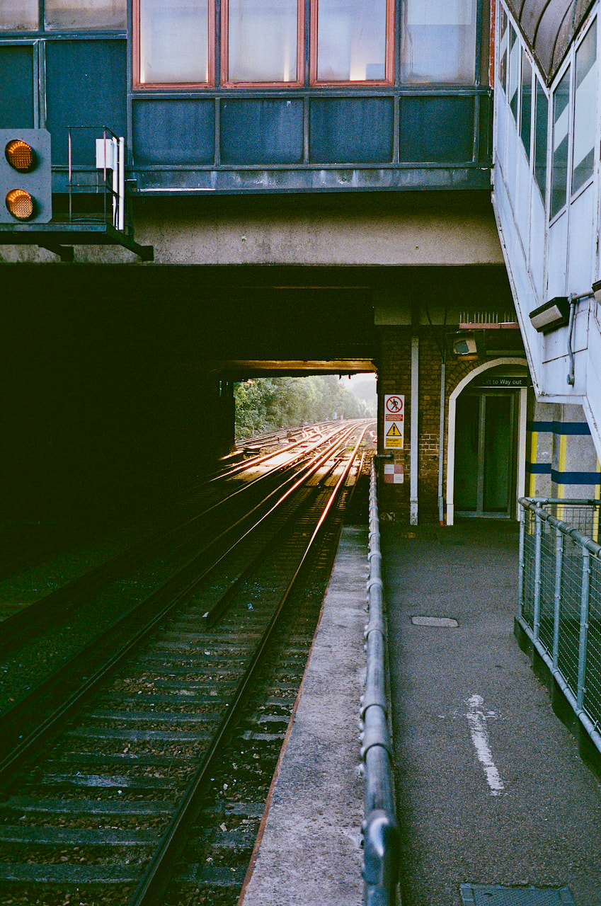
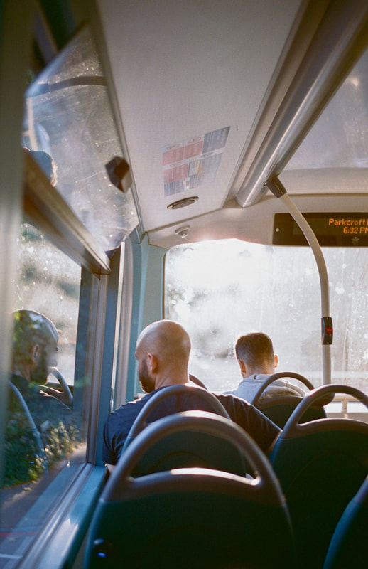
This final example seems to work ion a different way to the others. Whereas they rely to some extent on similarity of composition or the idea of visual echoes, this example pairs tow dissimilar compositions, relying rather on an implied narrative moving from left to right but then back agin, following the man's gaze through the bus window. The quality of the light is similar in both images (both pictures were taken quite close together in early evening on the same day) so this also provides a unifying effect. Perhaps I am relaying too heavily on compositional similarity when pairing photographs. Perhaps I should explore less obvious ways to generate diptych arrangements...?
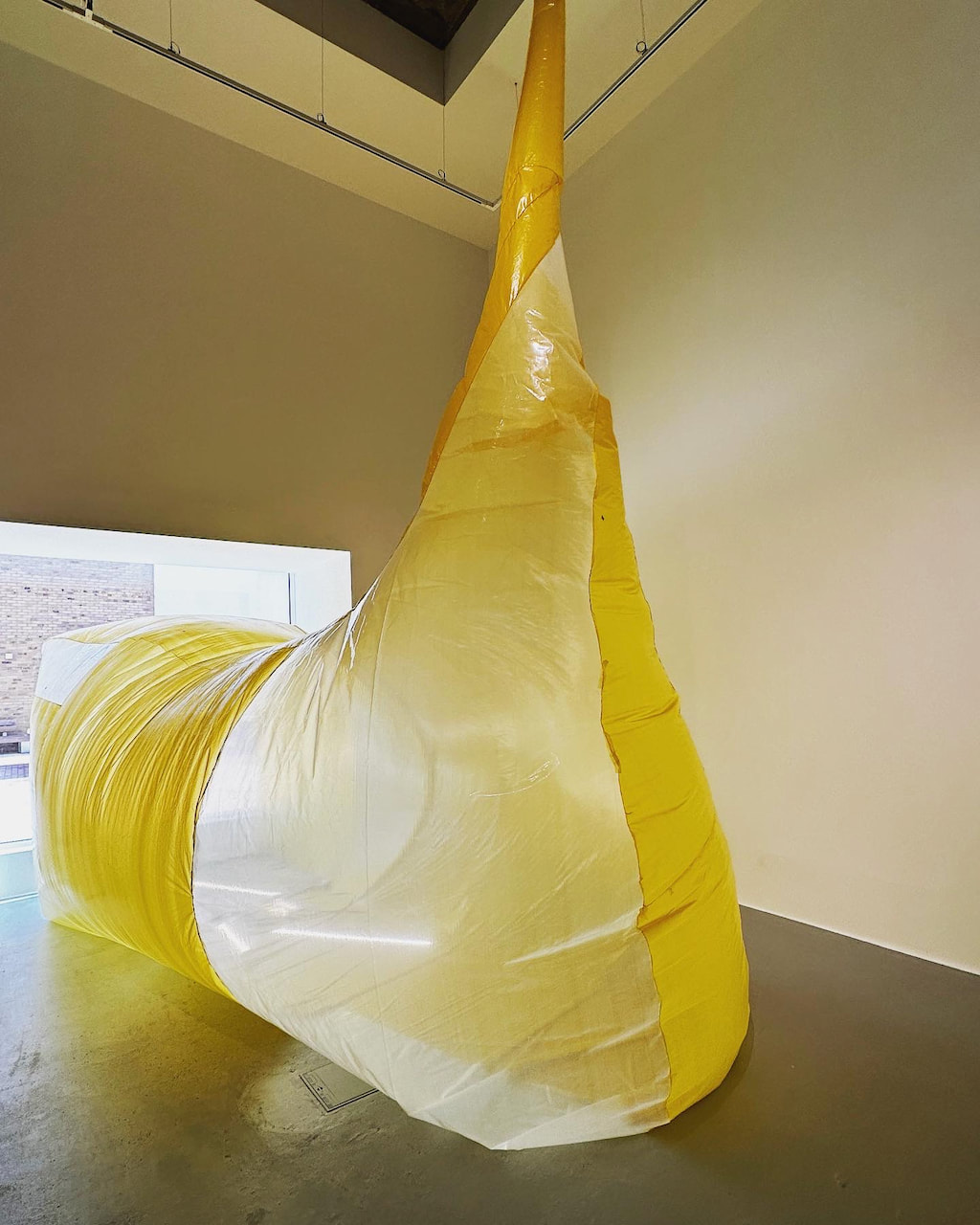
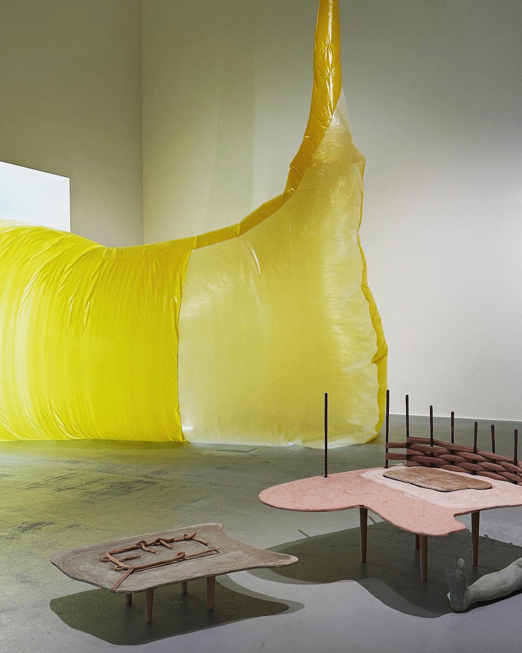
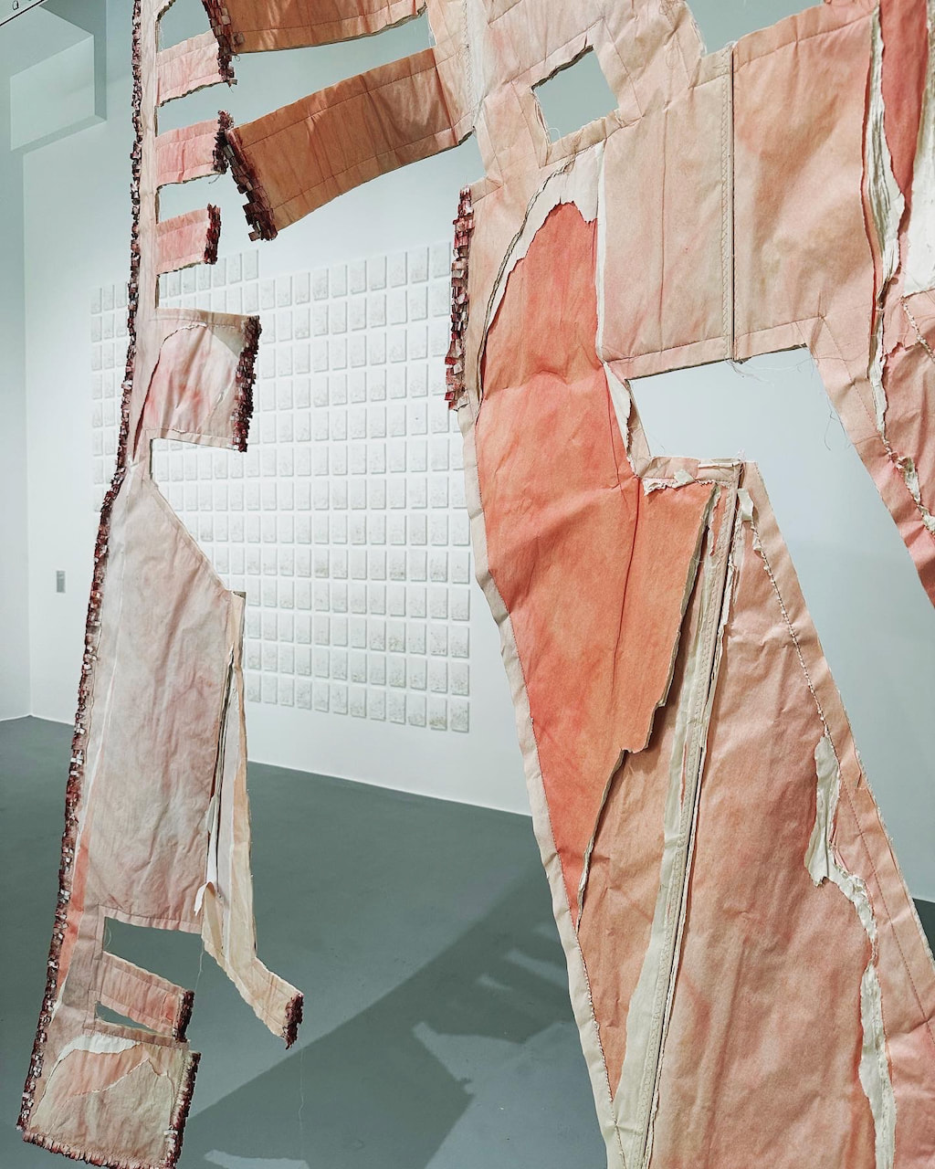
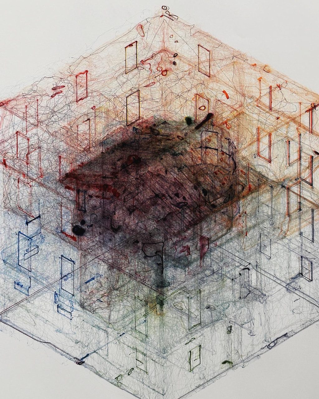
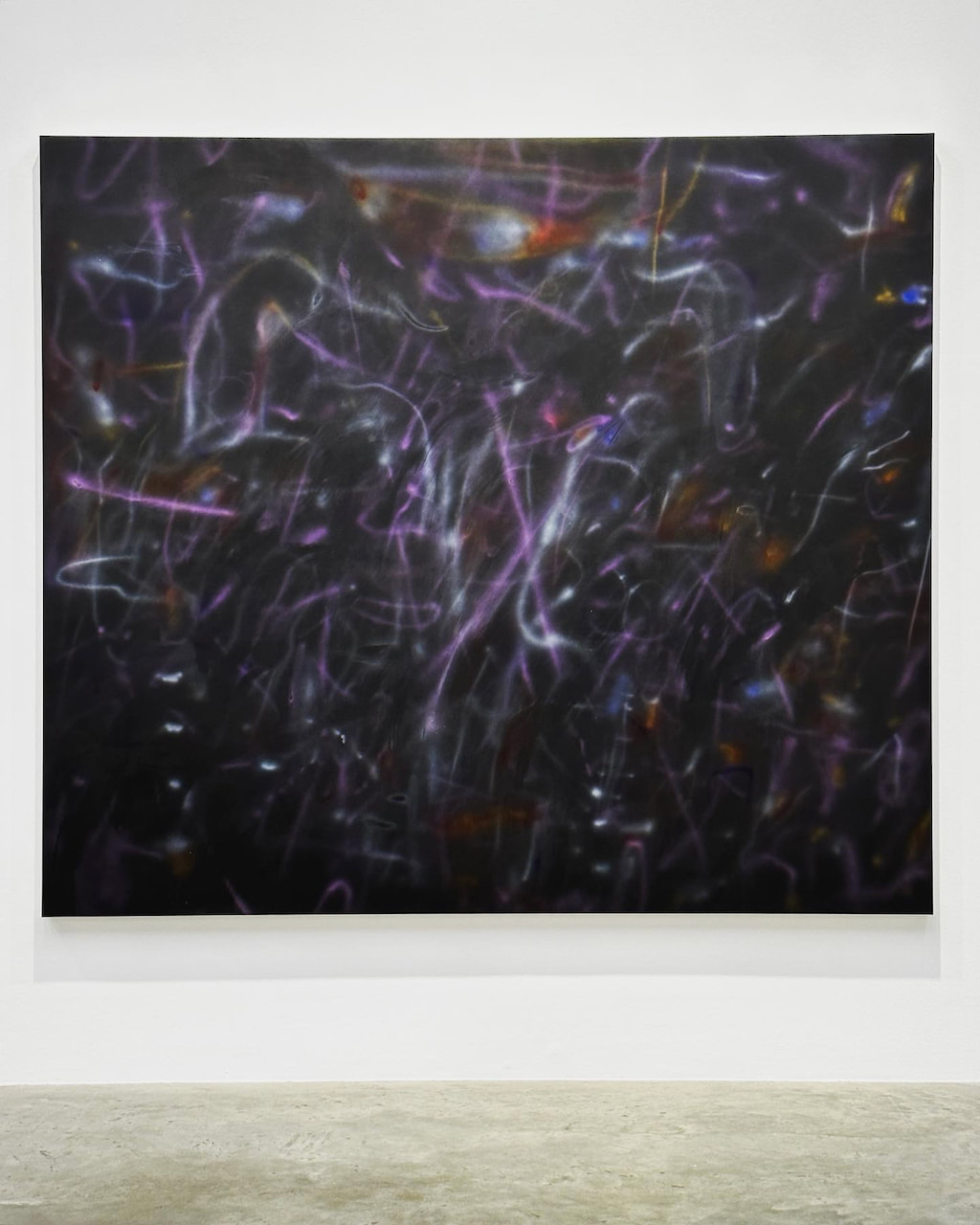
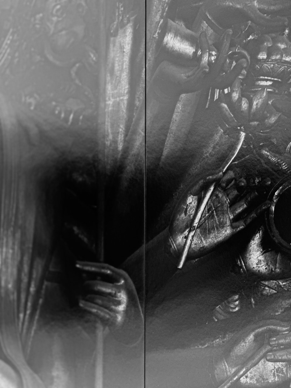
Exhibitions at Drawing Room and White Cube
Both of these exhibitions seemed to be about an expanded type of drawing practice. Drawing Room is a new gallery and this was its first show. I liked the way that ordinary materials were used by the artists to create objects and images referencing architecture. The exhibition at White Cube was less interesting to me and I didn't stay long. However, Mehretu's paintings reminded me of long exposure light painting photographs, like this image by Harry Callahan.
Michel Mazzoni & Adriaan Verwée: DUETS
I discovered this project because of my interest in the work of Belgian artist Michel Mazzoni. There wasn't much information on his website but I was intrigued enough to send him an email, asking him for more pictures of the limited edition newspaper DUETS and a bit more background information. This is his reply:
Dear Jon,
Thank you for the interest in my books! Here are some pictures from newspaper DUETS. This project became a collaboration between Adriaan Verwée & myself during the Covid period. We exchanged images via e-mail for a certain period of time. I sent an image, he replied with an image and vice/versa. Once we had a certain number of images, we did an edit for the DUETS book edition. There was also an exhibition that followed.
My best,
Michel
--
Michel Mazzoni
Visual Artist
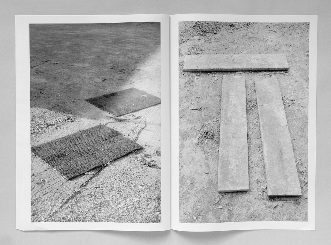
Scott Mead's Equivalents
Scott Mead's Equivalents plays an adroit game in that misty no-man's-land where simile and metaphor overlap [...] I've long felt a fondness toward the mathematical symbol for equivalence: ≅. An equals sign, topped by a wavy line. The symbol seems, wittily, the perfect visual embodiment of "wiggle room." The two line segments of the equals sign are straight and unrelenting. But the wavy flourish above them suggests some give or flexibility inherent in the idea of equivalence, of Mead's equivalents. Not much give or flexibility, perhaps, But space enough for a dream or two, a metaphor or two, to manoeuvre their way inside.
-- Brad Leithauser
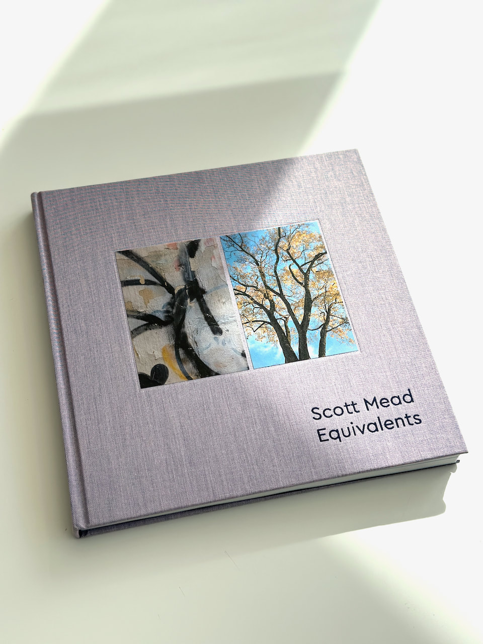
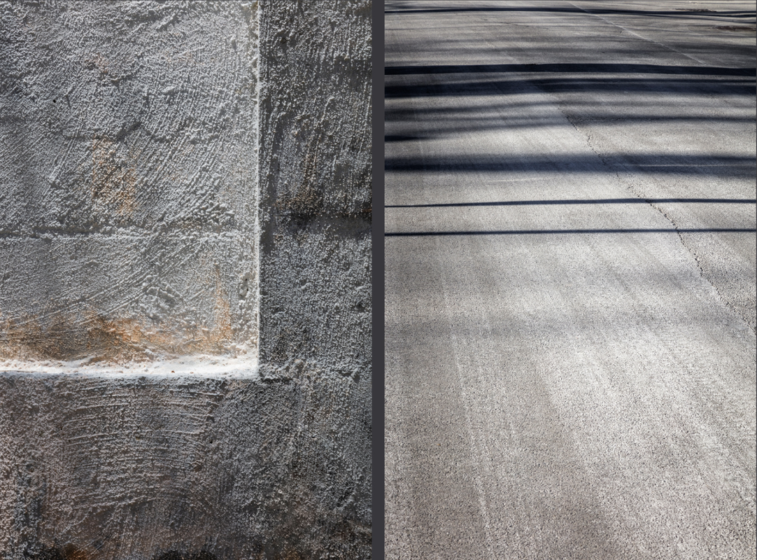
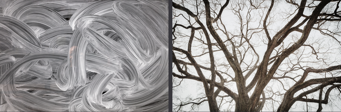
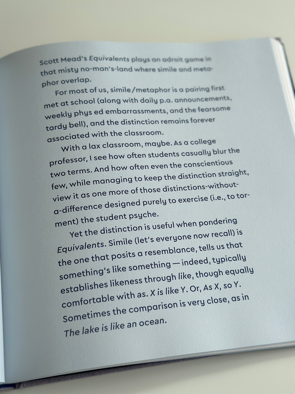
I like the precision and beauty of many of these images but I don't find them particularly exciting or puzzling. They are very refined and competent but also quite decorative and overtly beautiful. This means that they seem to neat and tidy, too perfect and, therefore, not particularly engaging. Trees and worn surfaces are the predominant subjects, clichés almost. I do like the way the book is designed and some of the landscape diptychs work well. I enjoyed the essay by Brad Leithauser which refers to simile, metaphor and the mathematical symbol for equivalence. However, the essay is more interesting than the pictures.
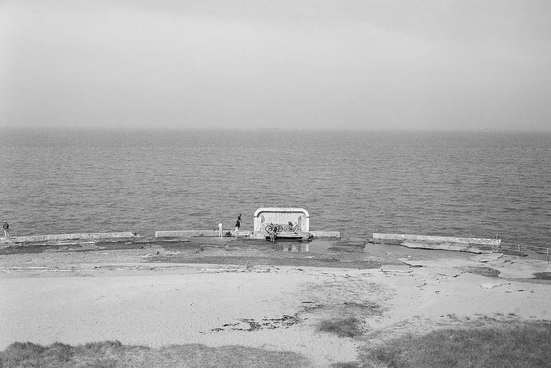
Dreamland (cont.)
These photographs were taken on a 35 rangefinder camera with Kodak Portra 160 colour film.
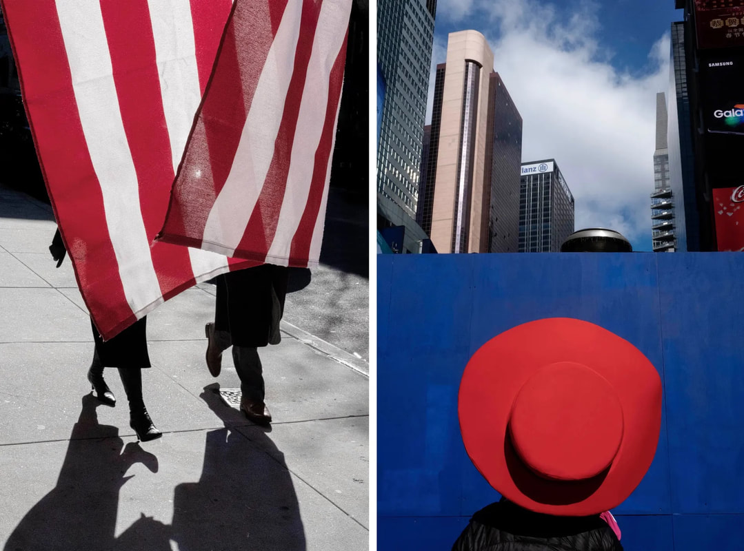
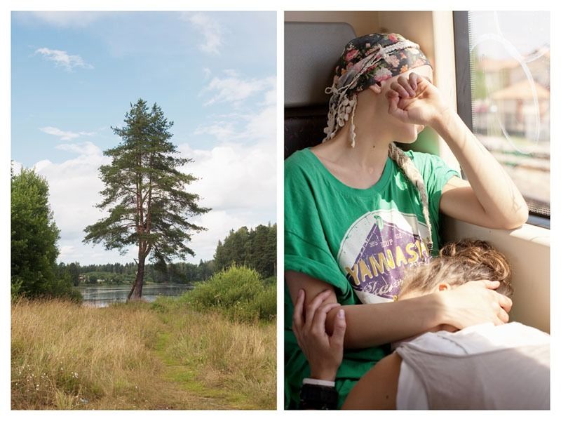
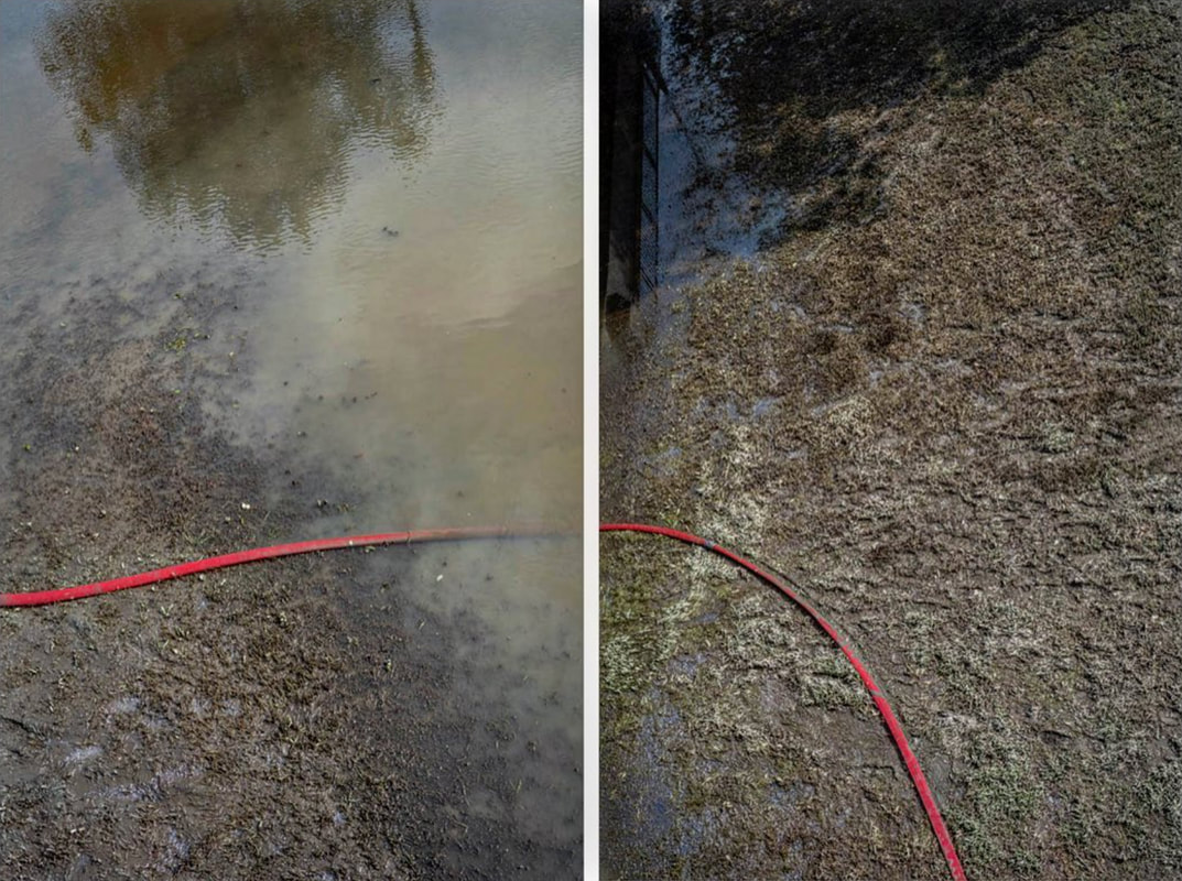
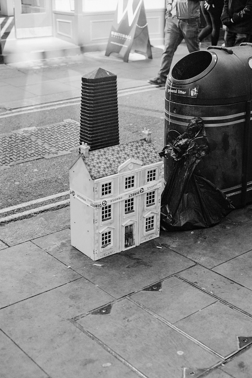
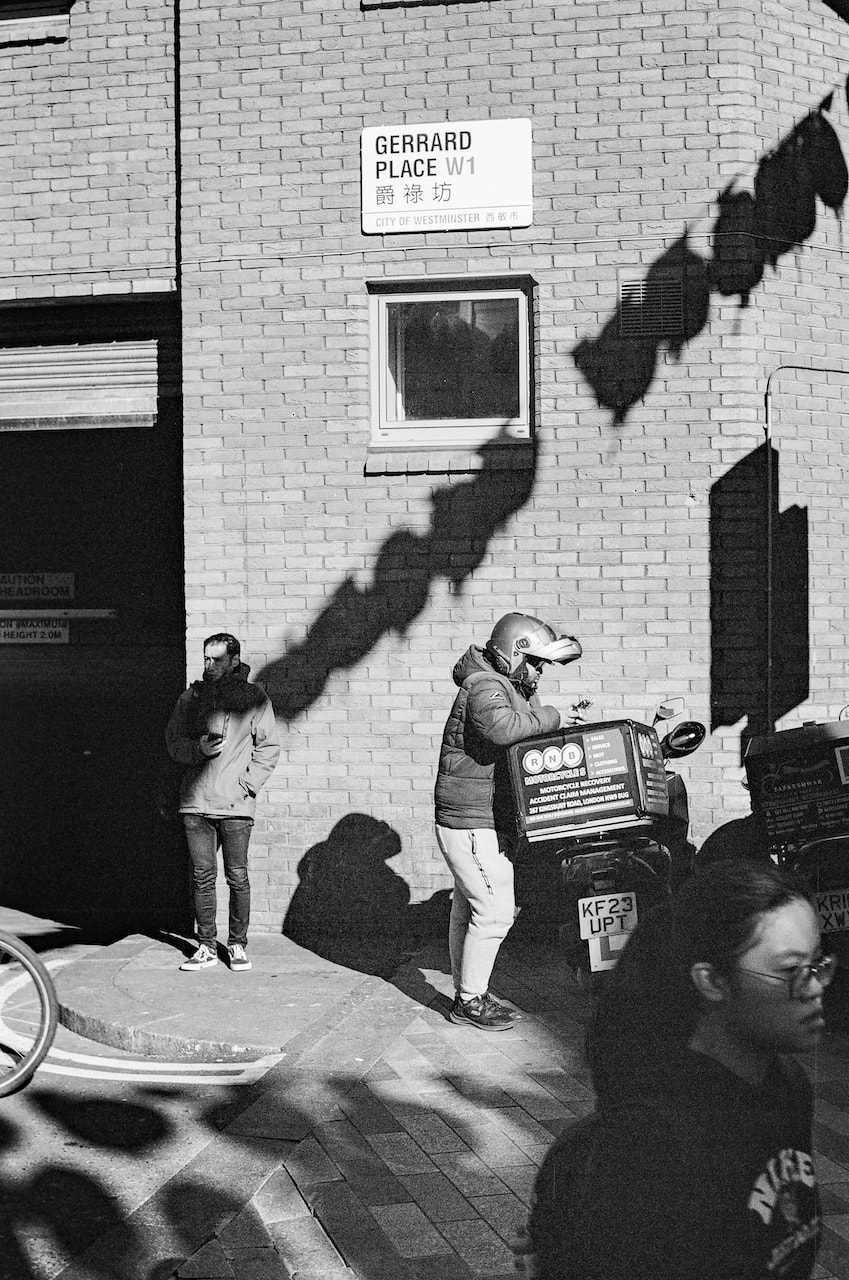
Diptychs
I really enjoy the constraint of having to construct a sequence of diptychs from a single roll of 36 exposures. This limits the options considerably but it really forces me to look for suitable pairings and this helps me notice aspects of the images I had previously overlooked. I also really like the process of swapping images in and out and altering the sequence.
|
|
|
|
|
|
|
|
|
|
|
|
|
|
|
|
|
|

|
|
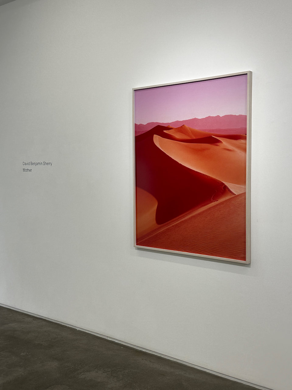
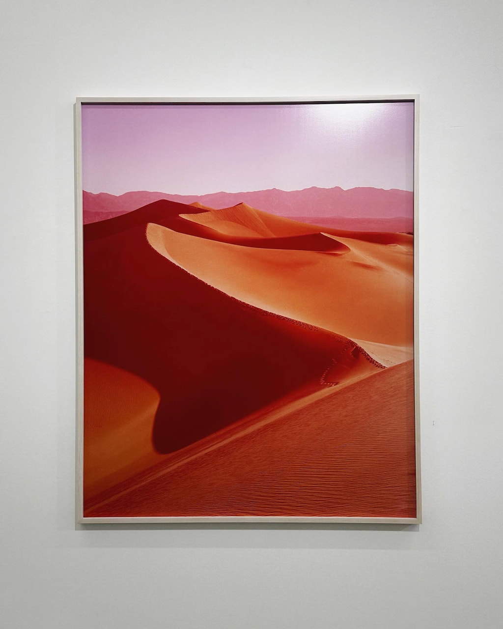
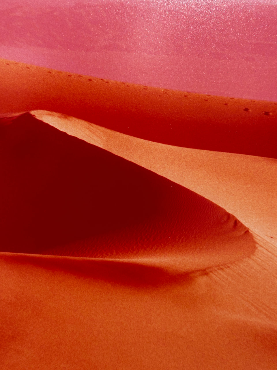
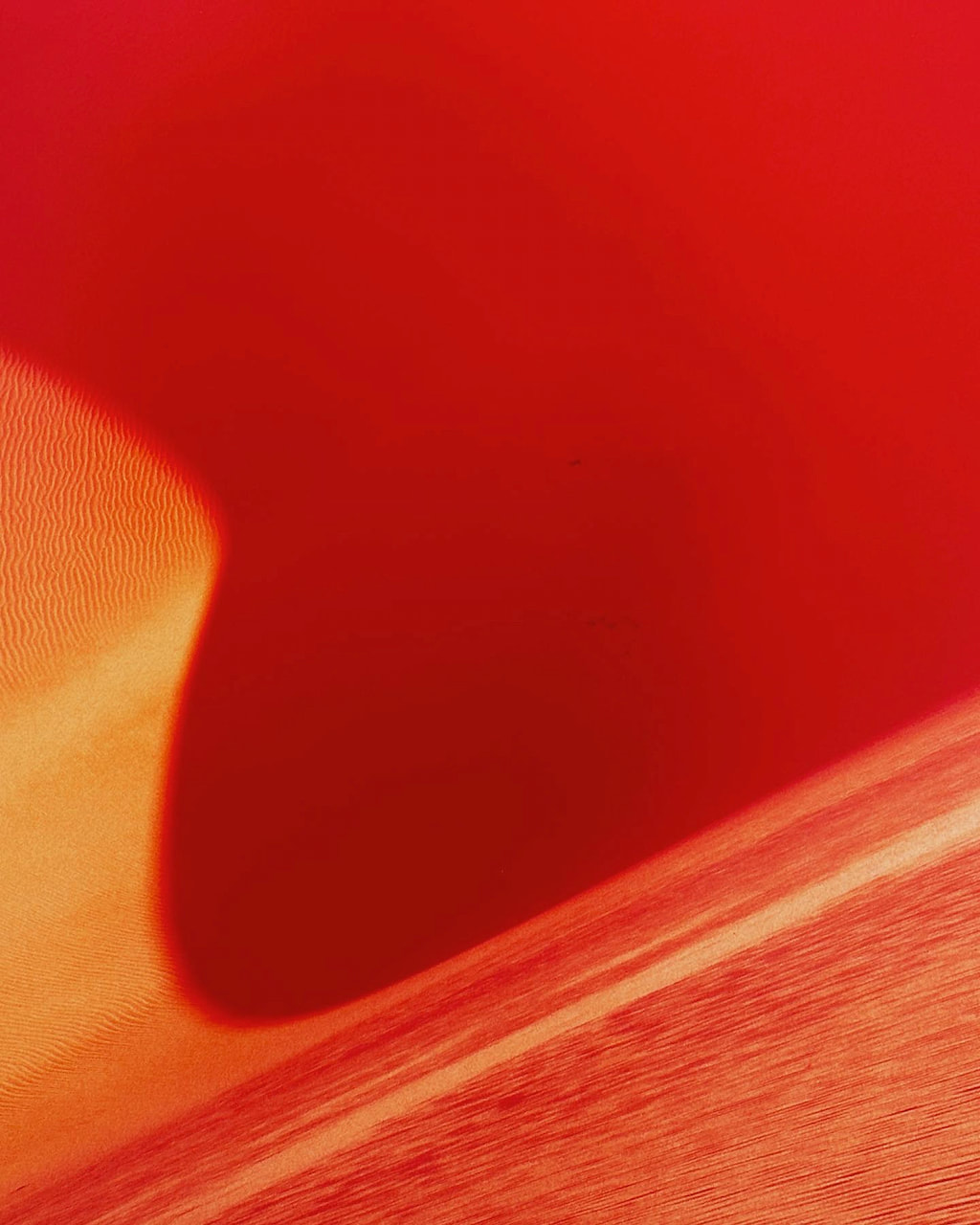
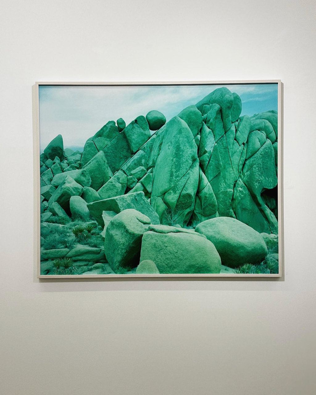
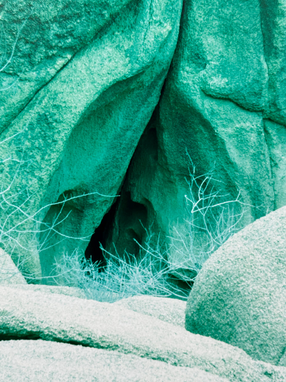
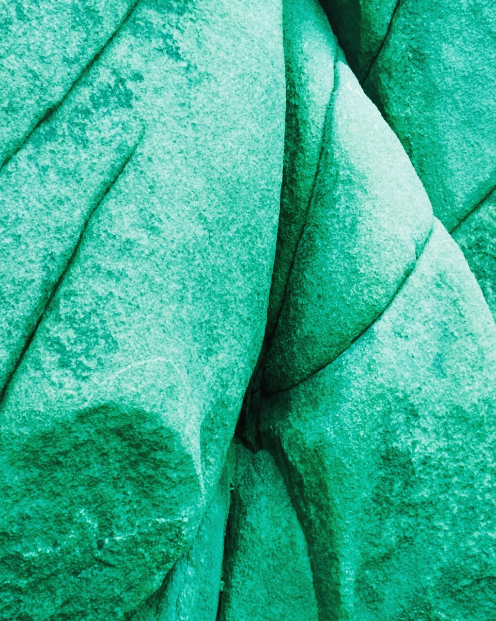
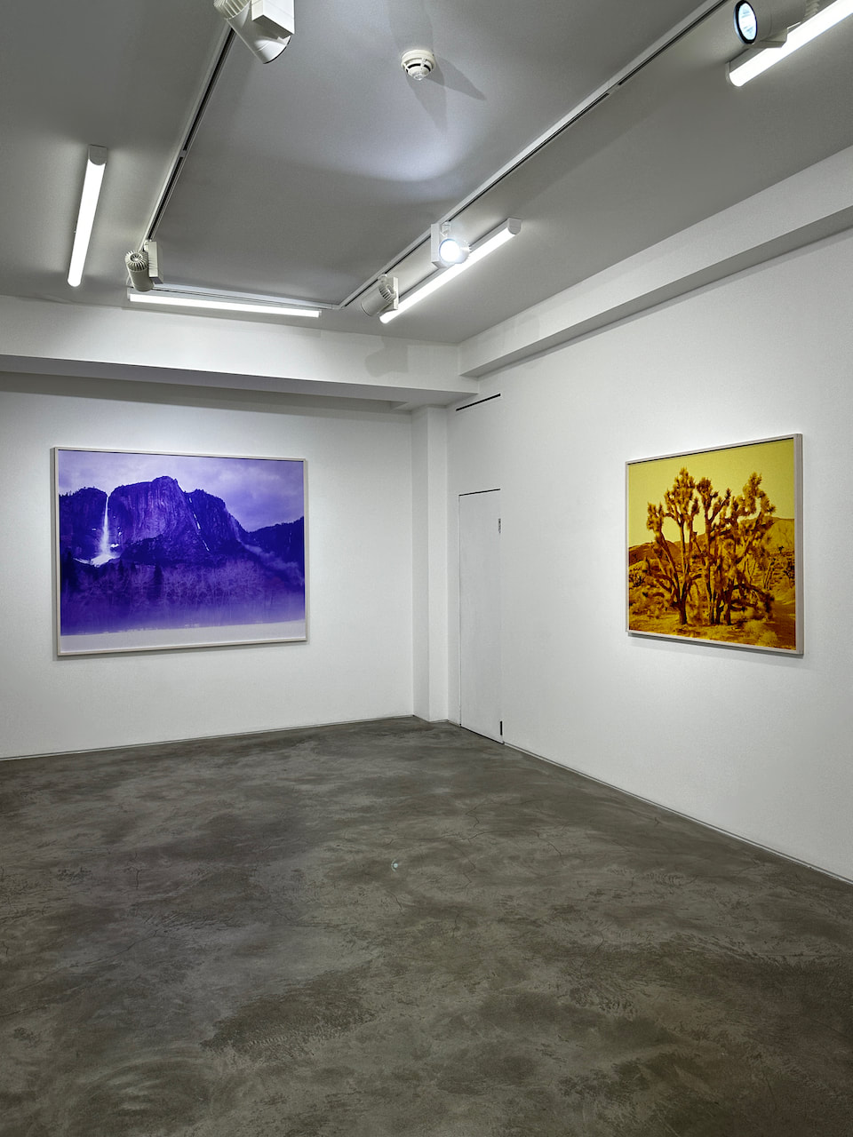
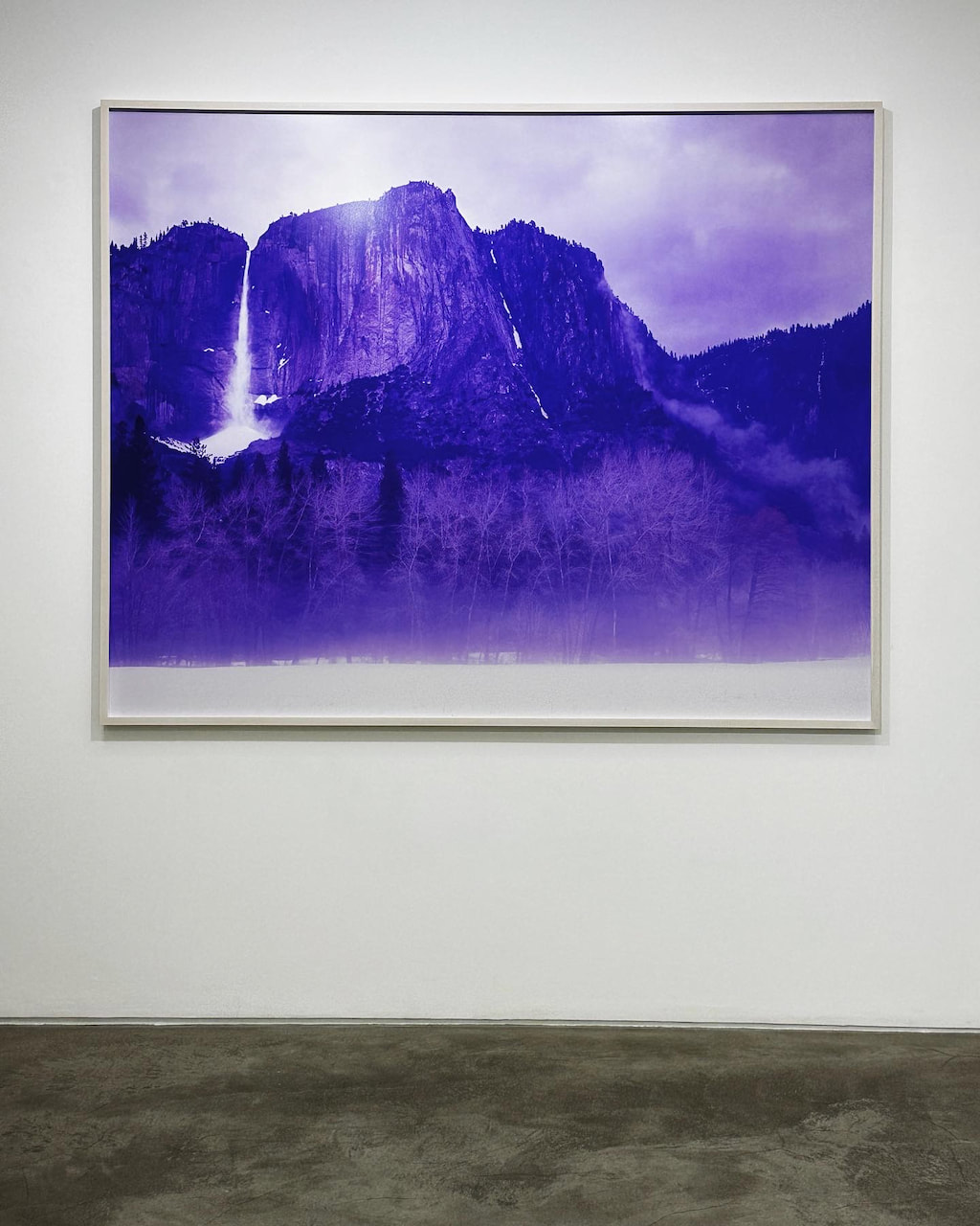
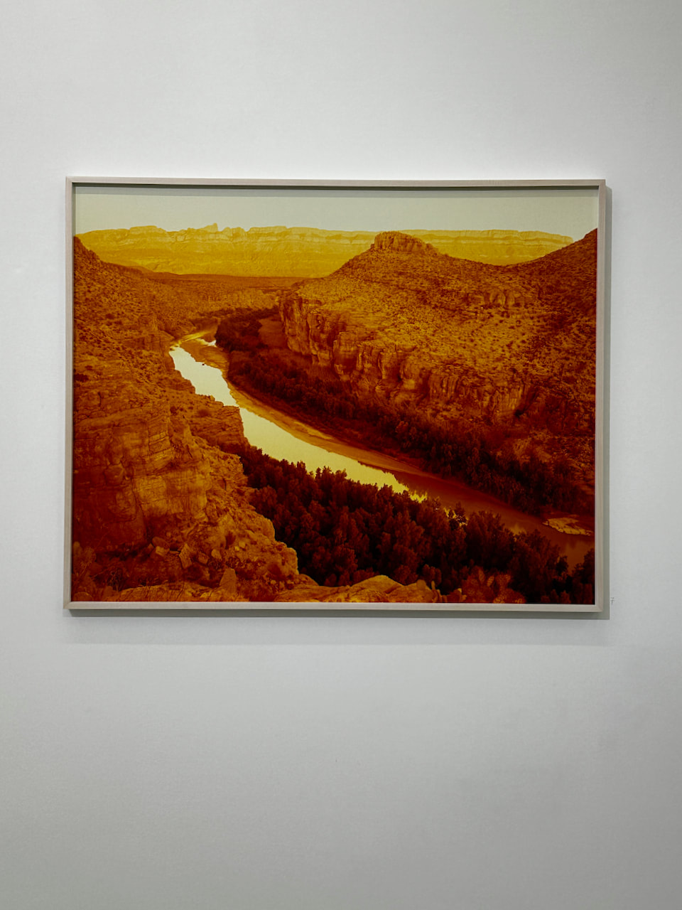
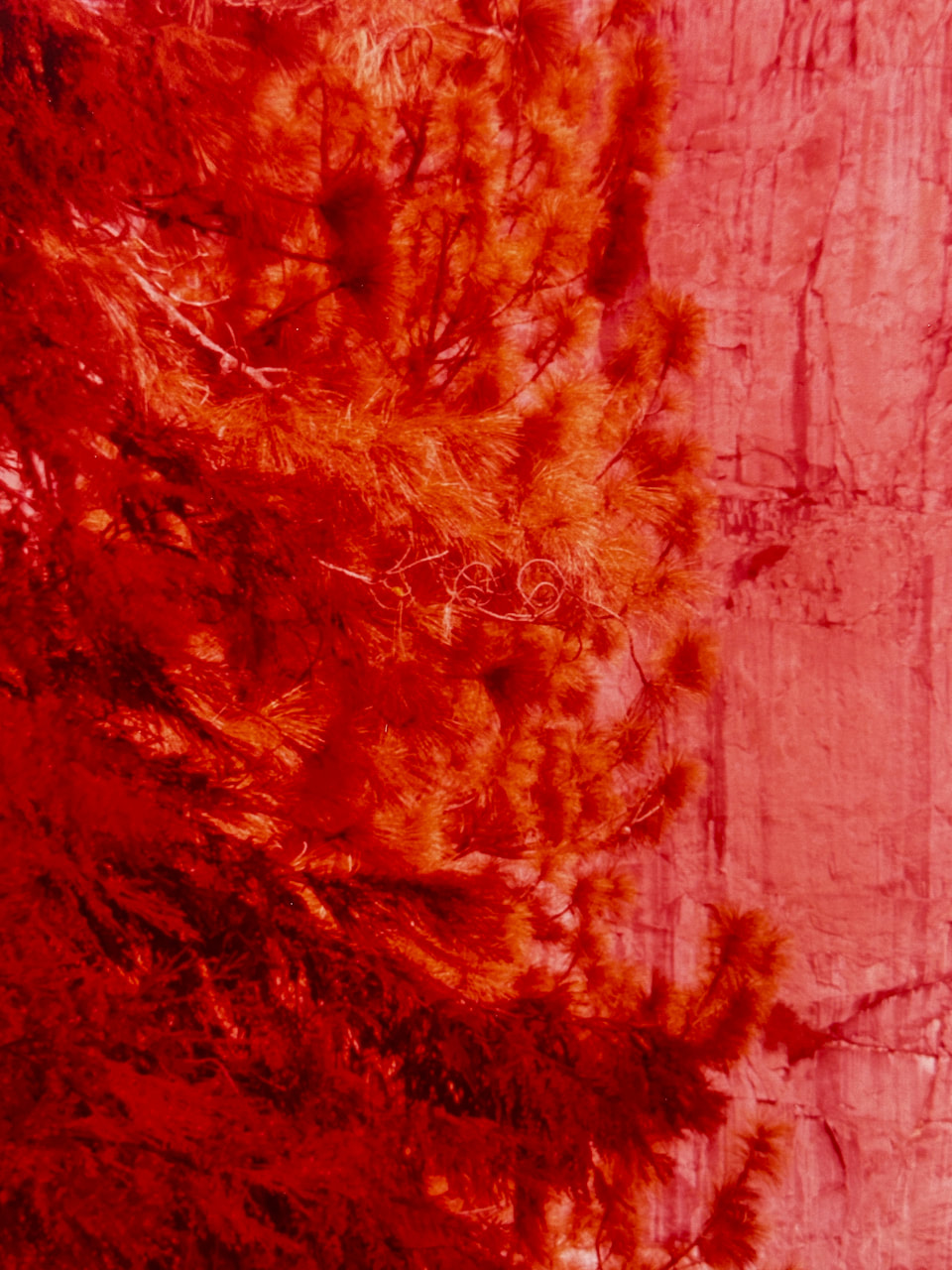
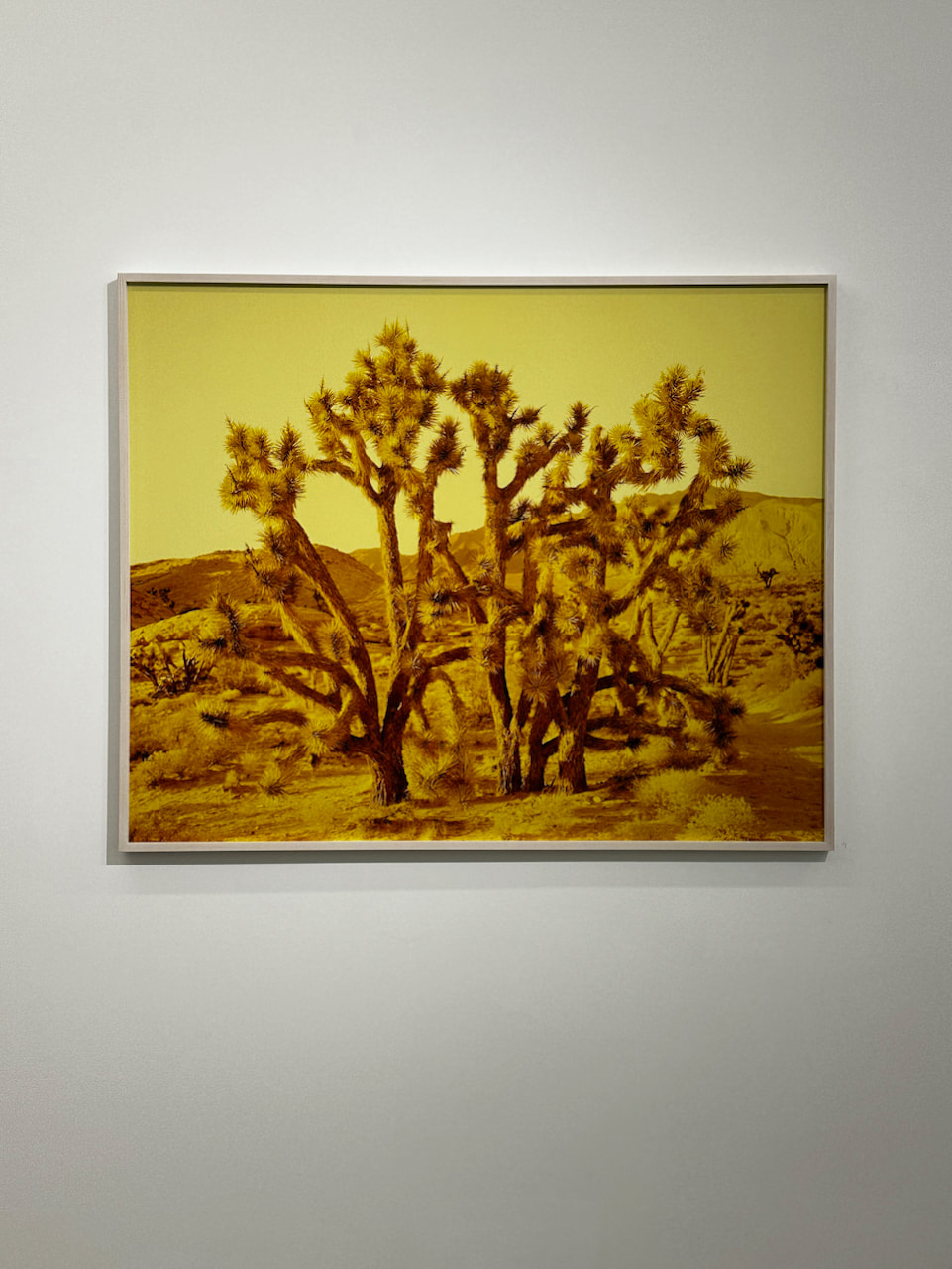
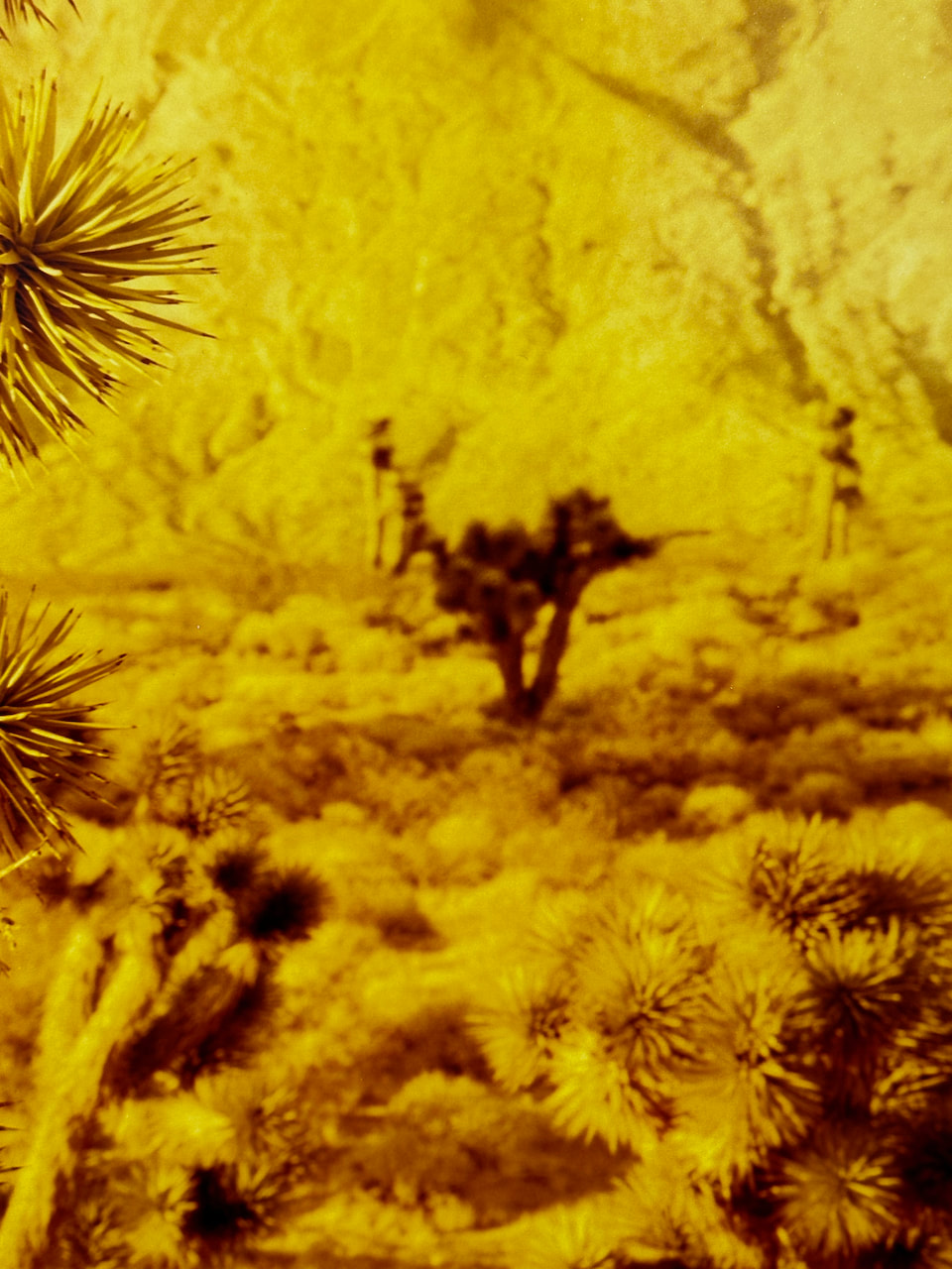
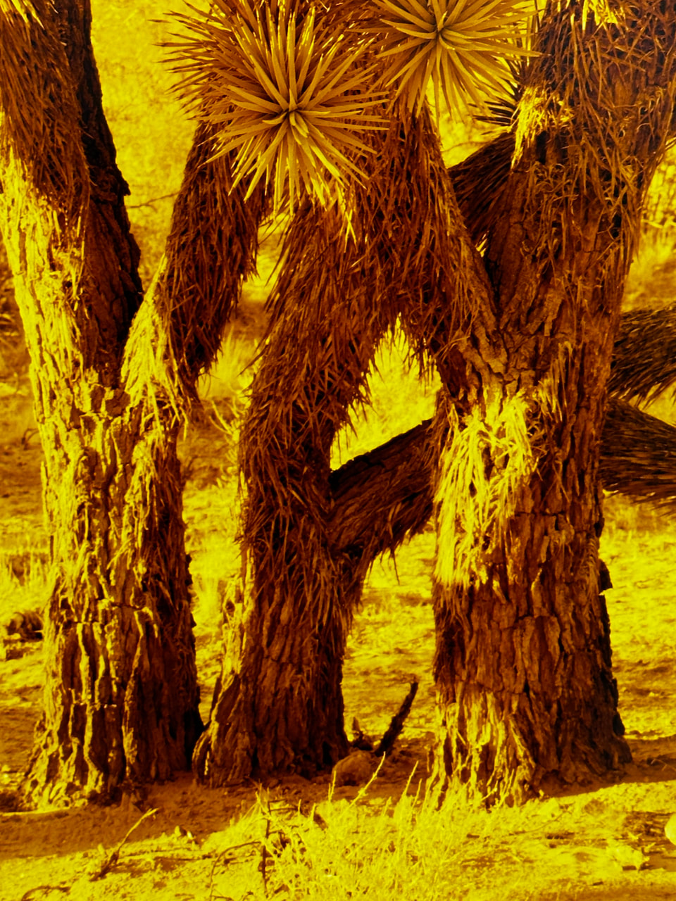
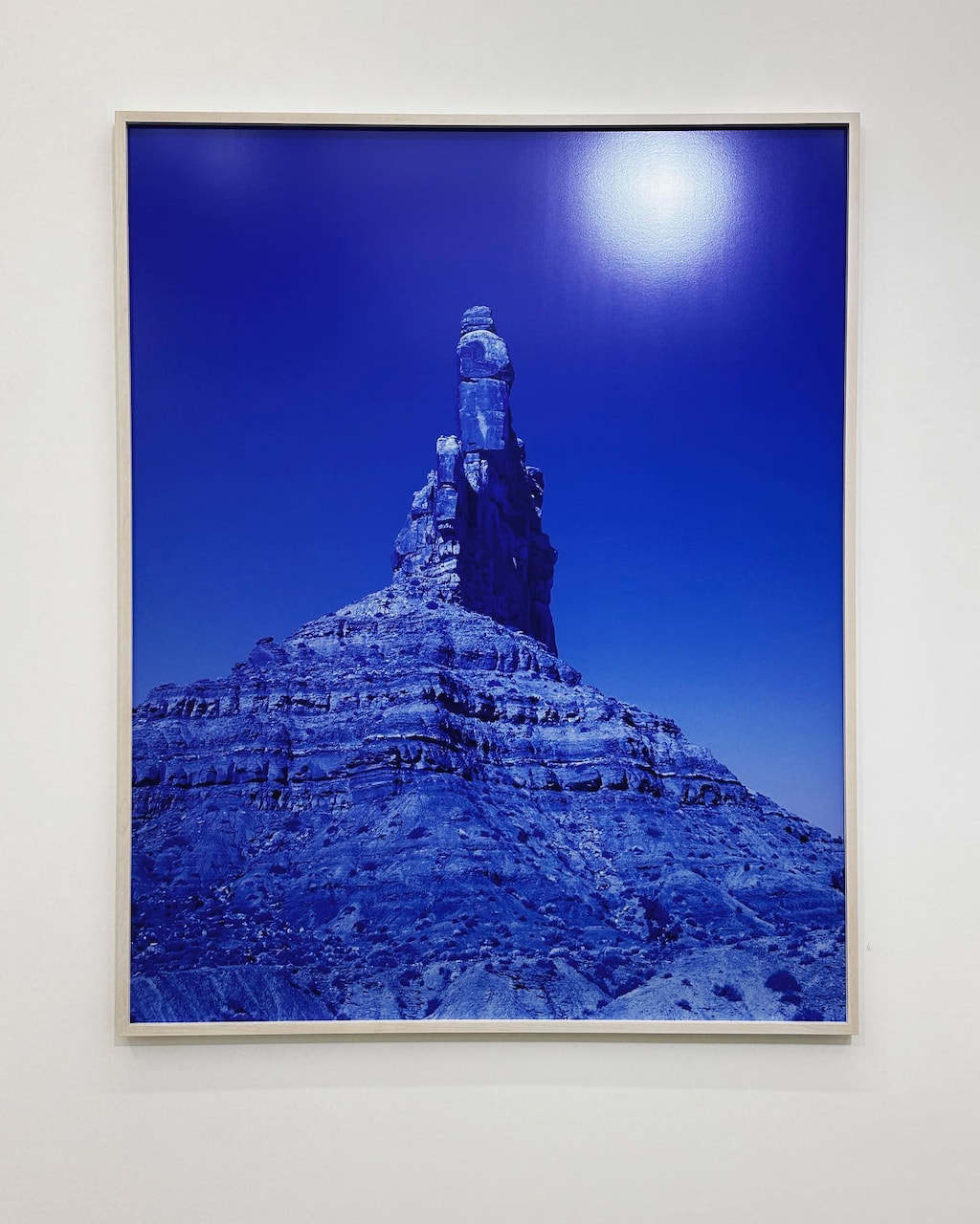
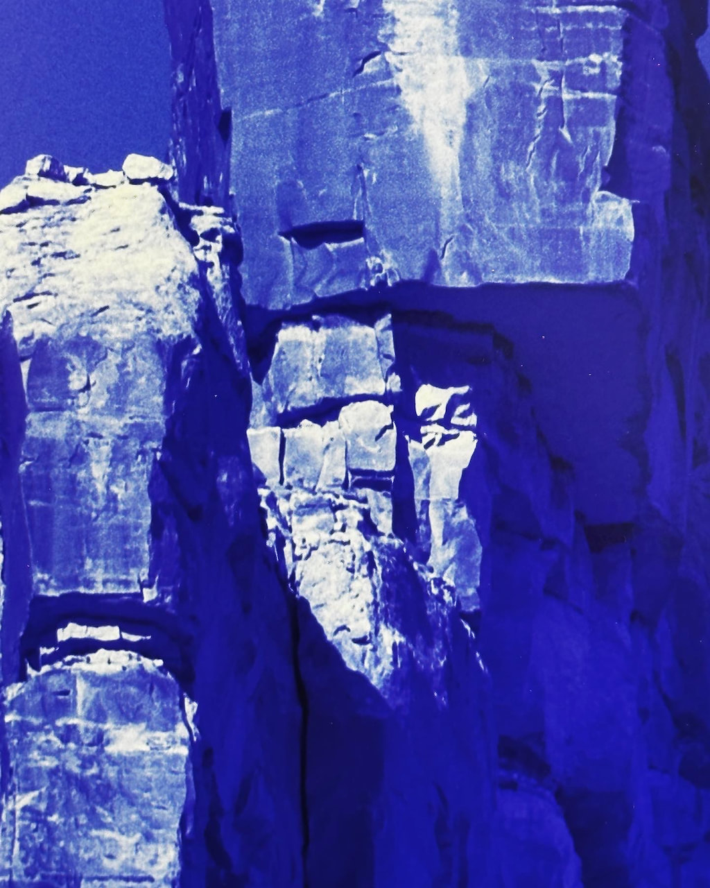
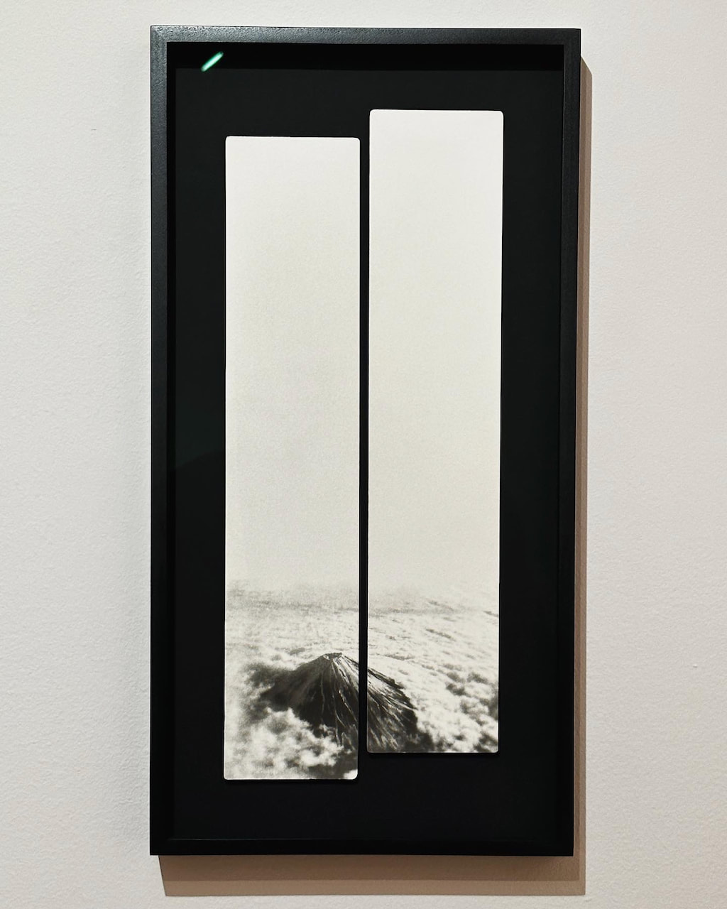
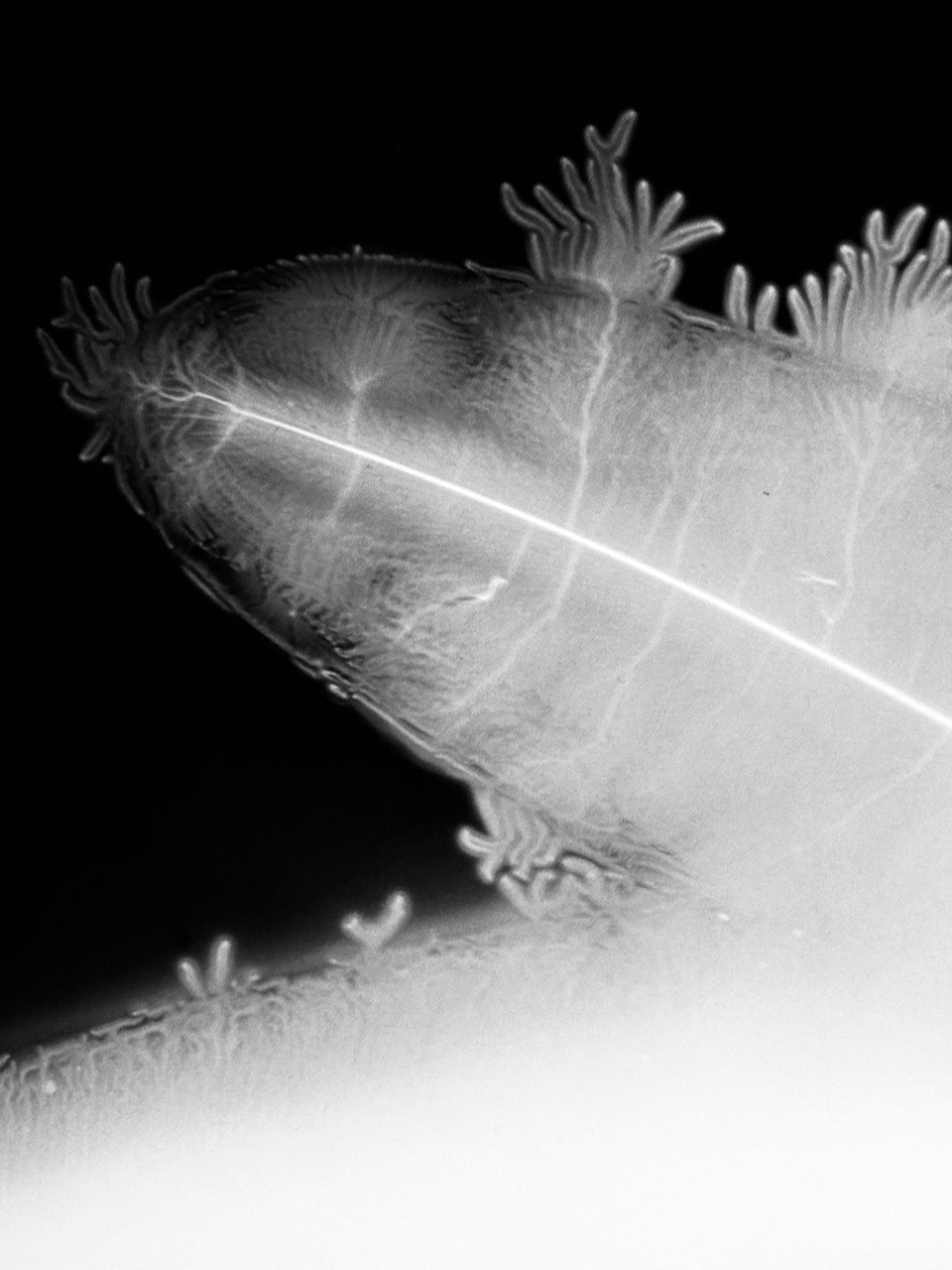
David Benjamin Sherry and Miho Kajioka
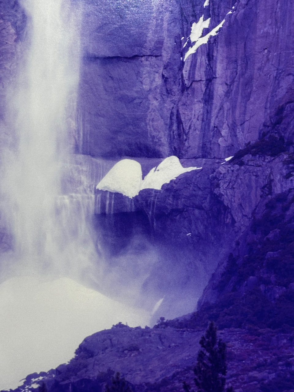
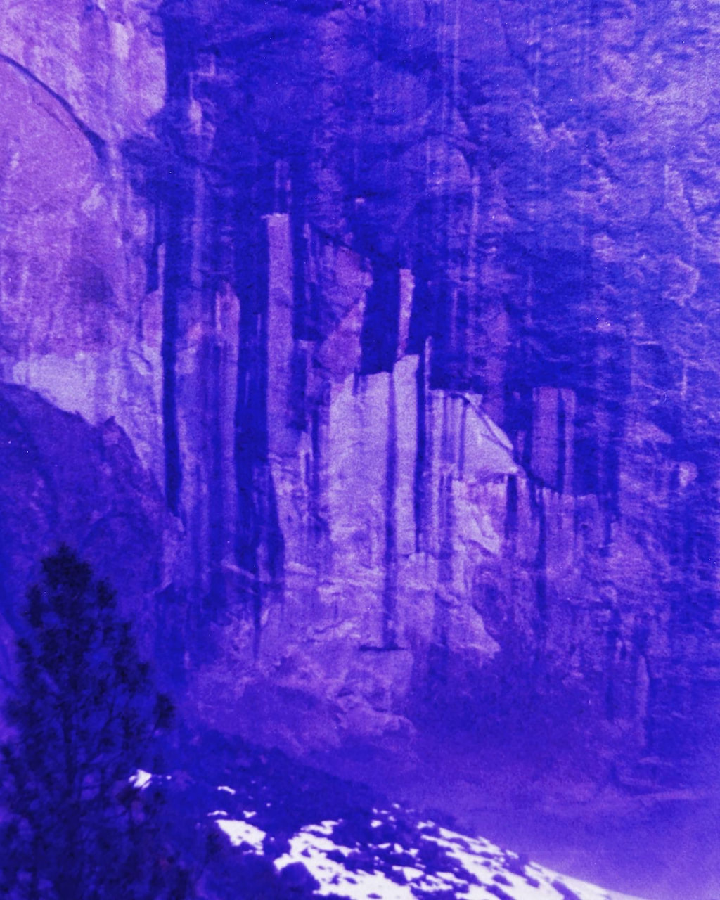
It occurred to me that both of these artists are asking us to reconsider our relationship to the natural world and, crucially, the way we perceive it, using the estranging power of photography. Sherry's aim is to queer the heroic mythology of the American west. This macho, monumental mythology has, in part, been created by successions of American photographers (like Ansel Adams and Edward Weston). Sherry uses intense colour washes across his large format photographs, abstracting the landscapes and making them strangely seductive. I was interested in the details and took a series of close-up photographs of them, mostly concentrating on lines and shapes that suggested other subjects - the human body, ghostly presences and urban surfaces etc.
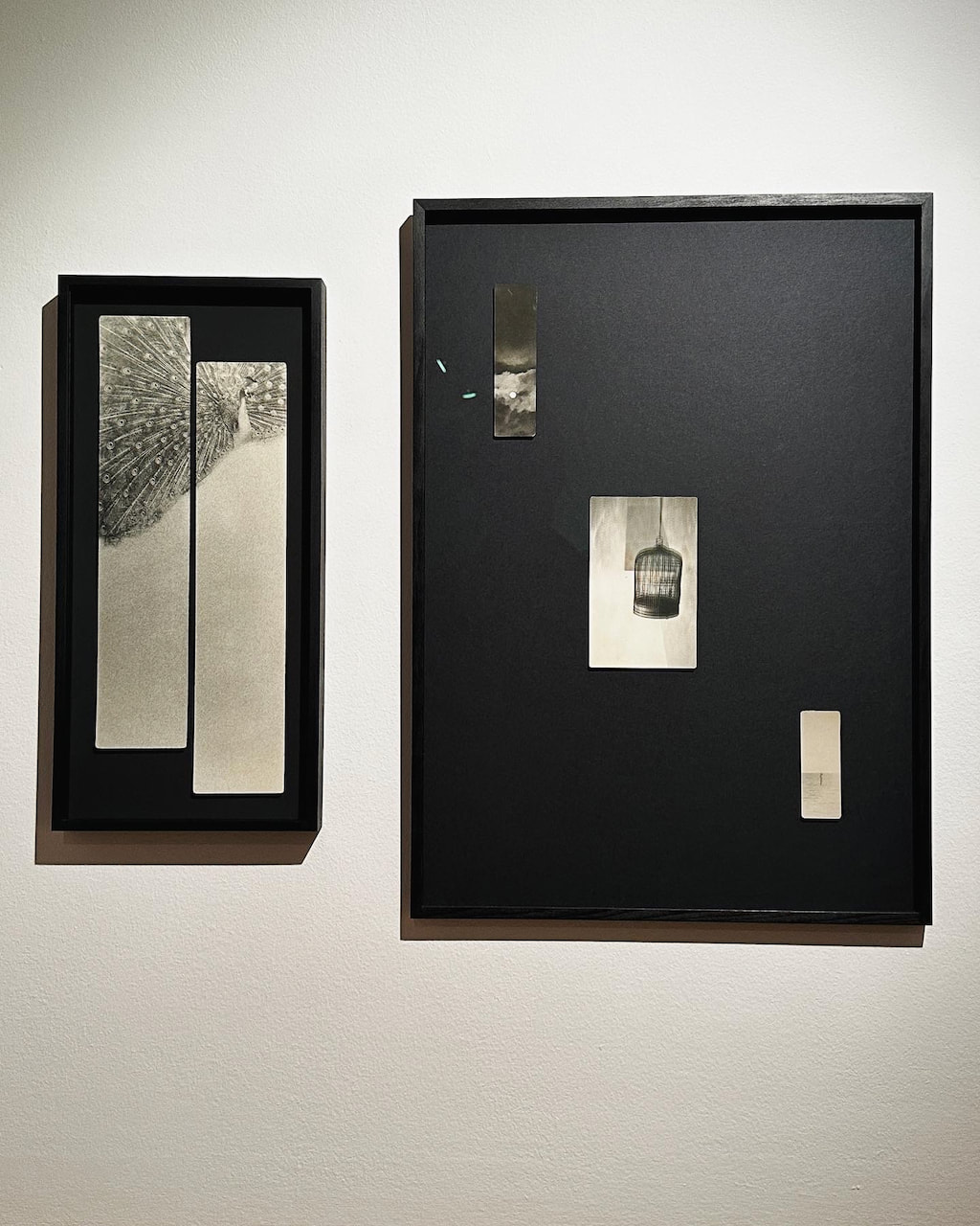
By contrast, Miho Kajioka's work is on a much smaller, more intimate and more subtle. Like Sherry, she makes each print by hand, but her images are inspired by Zen philosophy and have a more overtly 'poetic' quality, obtained through intense looking and careful manipulation in the darkroom. I was particularly interested in the diptych arrangements and unusual print sizes.
By contrast, Miho Kajioka's work is on a much smaller, more intimate and more subtle. Like Sherry, she makes each print by hand, but her images are inspired by Zen philosophy and have a more overtly 'poetic' quality, obtained through intense looking and careful manipulation in the darkroom. I was particularly interested in the diptych arrangements and unusual print sizes.
|
|
Painting with Light exhibition
An interesting show presenting paintings and photographs in dialogue with another. I was especially pleased to see a diptych by Dafna Talmor, whose work I really admire.
The invention of photography allowed painters to see and notice the everyday in a new and casual manner. Without the camera the “snapshot” style and cropped figures rolling over the edge of the canvas may not exist in painting. Conversely, photographs have been wrongly perceived as truth however they are often, and equally, creations of the mind. The intention is not to compare what happens between the painter’s mixing of pigment with linseed oil and the photographer’s exposure of the negative to light, but to explore an often-shared vision and approach to image making. Each artist either borrows from, references, or views their practice through the spectrum of one another’s.
-- Isabelle Young, Curator
A brief digital interlude
This sequence of images was made with a digital SLR. I knew I would be photographing in relatively low light at the end of the day and suspected that my film camera wouldn't cope will without a flash. I converted some of the pictures to black and white in Lightroom.
Diptychs
|
|
|

|
|
|
|
|
|
|
|
|
|

|
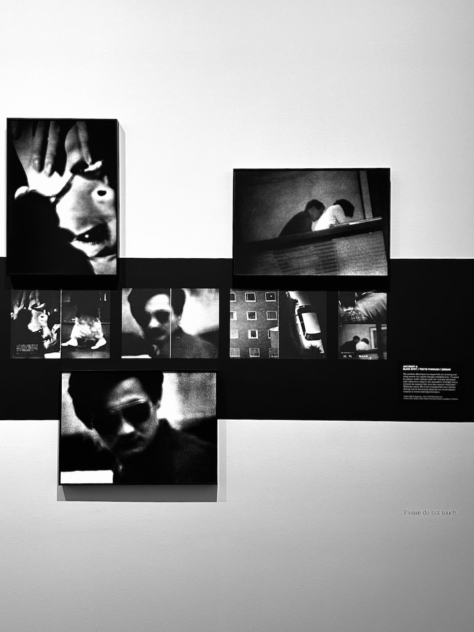
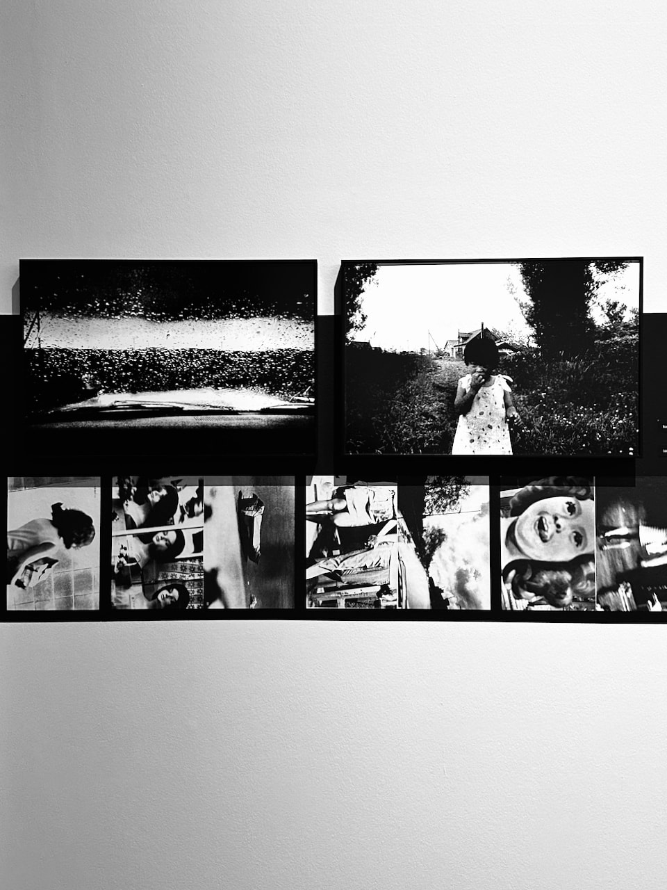
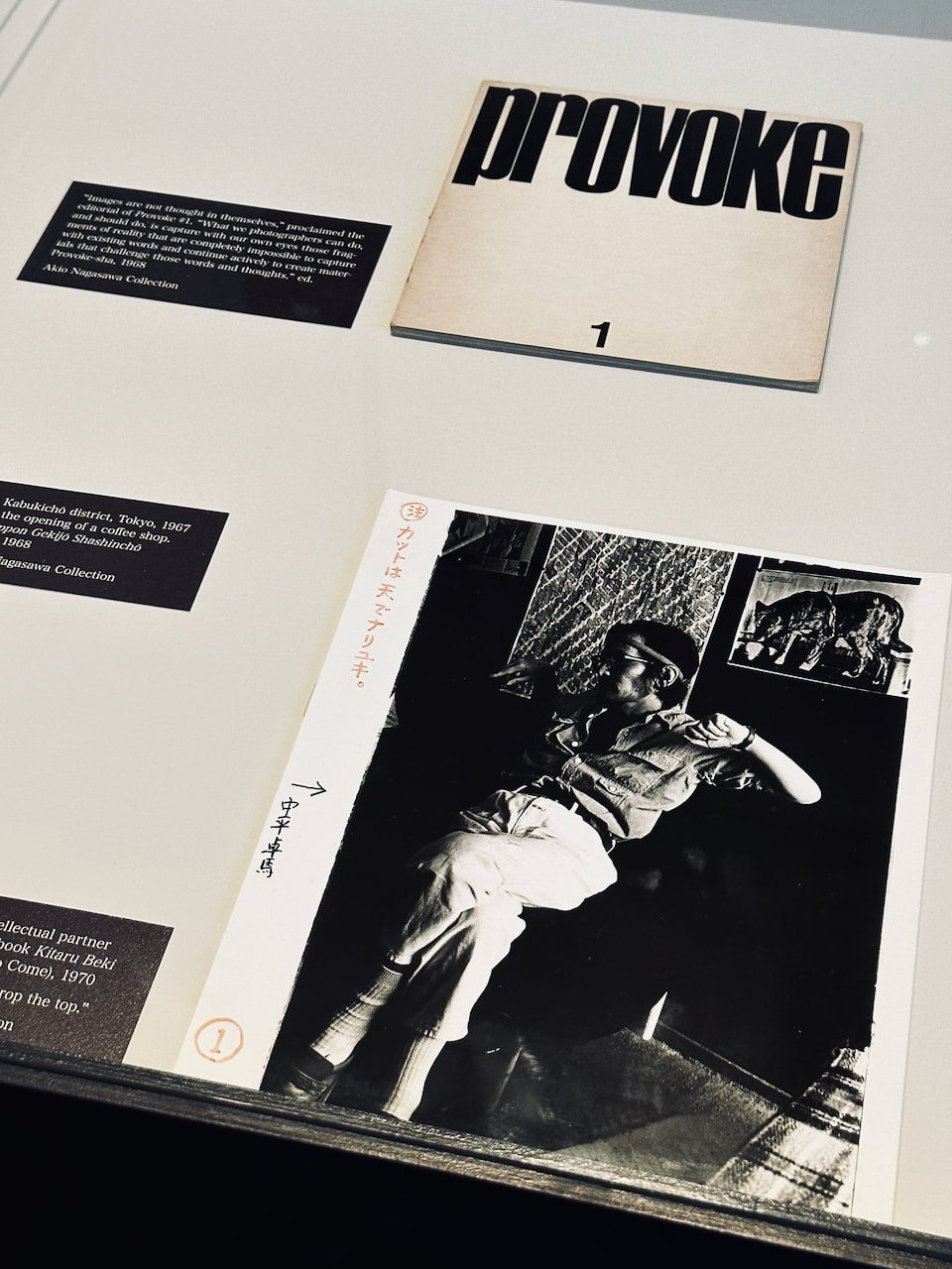
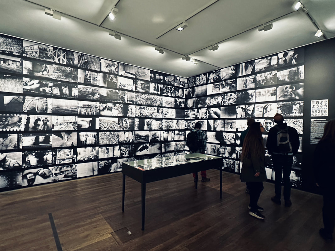
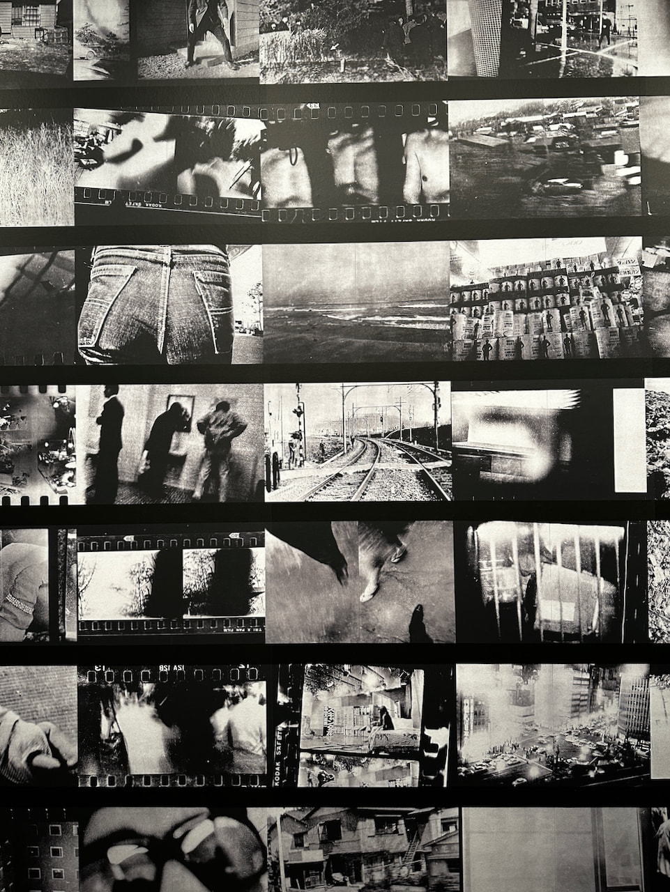
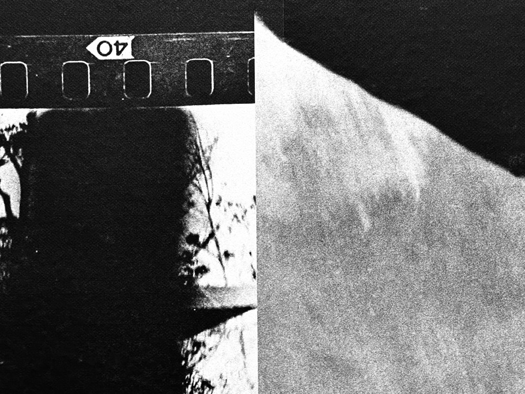
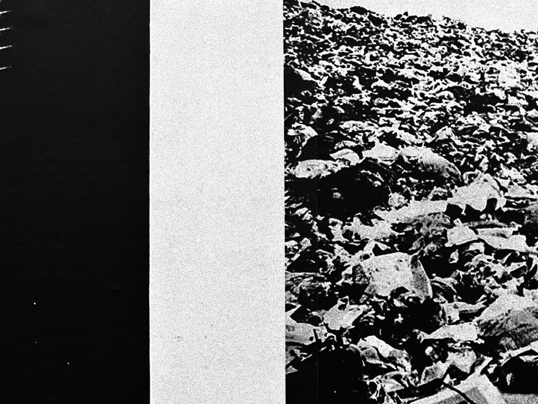
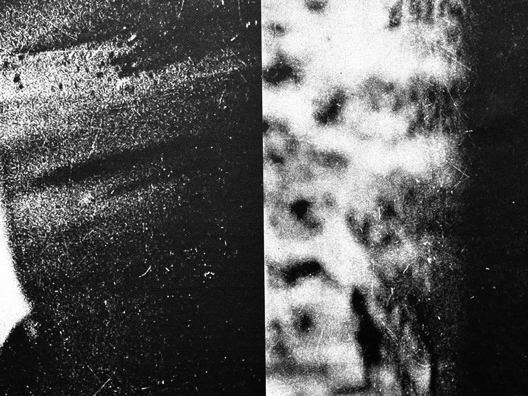
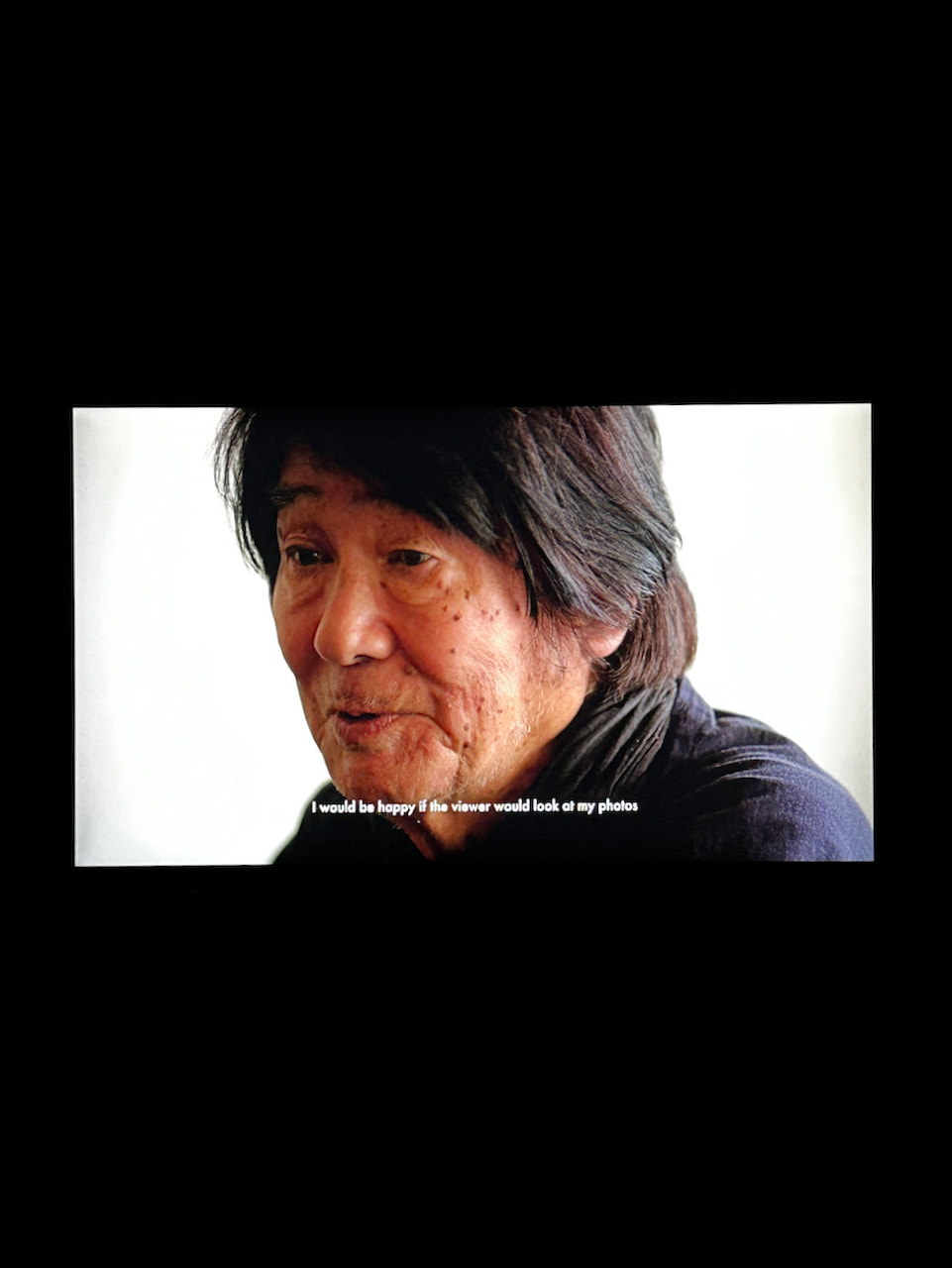
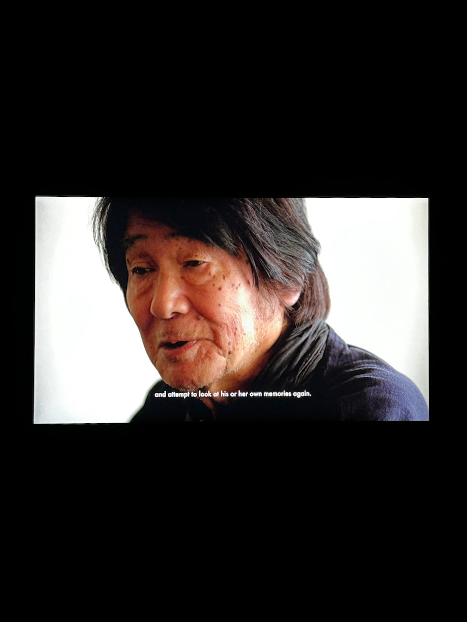
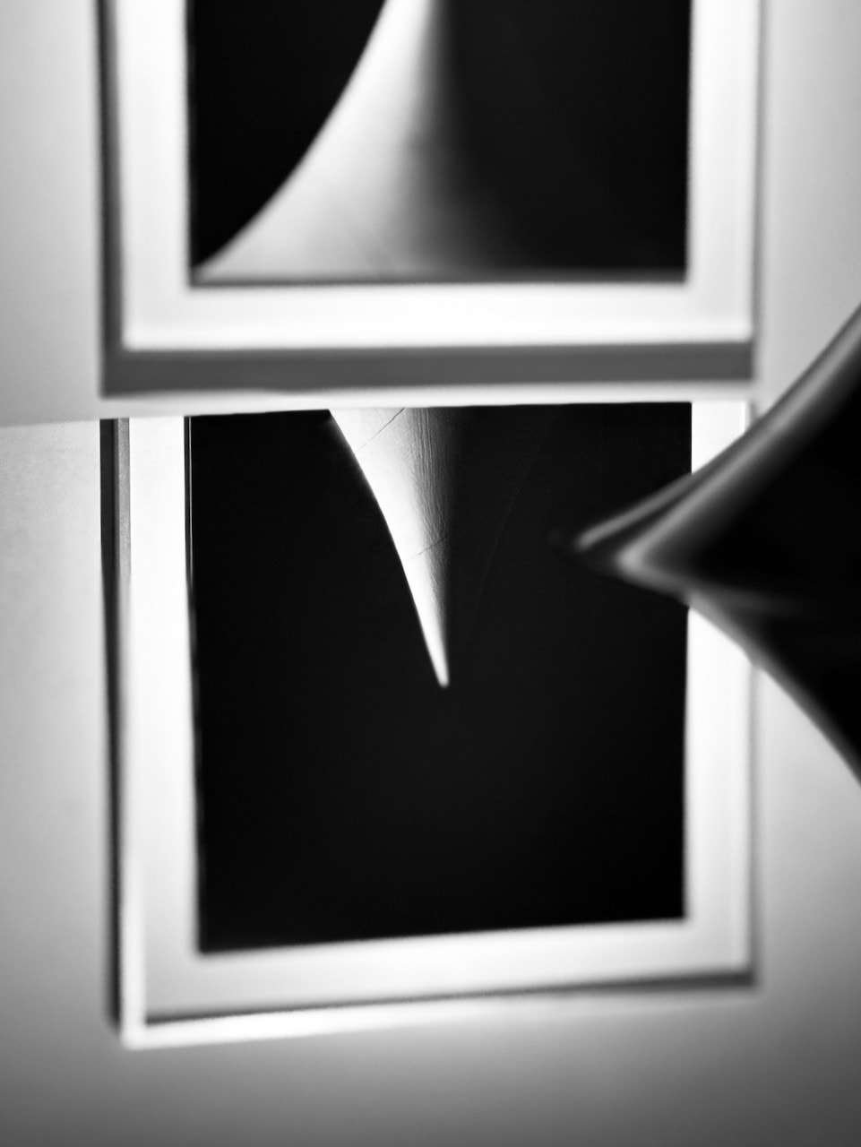
II was very excited to see this retrospective exhibition of the work of Daido Moriyama. Taking over the entire gallery, the show is packed with images from the photographer's 60 year career and imaginatively curated. It was great so many of the publications that have made Moriyama famous and which demonstrate his interest in the distribution of images within the media industry. Given my interest in diptychs, I decided to photograph the joins between pairs of images as a way of making some sense of the visual cacophony. My favourite display was Moriyama's response to Nicéphore Niépce's photograph Point de vue du Gras. Entitled Letttre à St. Loup, Moriyama's images are a kaind of homage to the origins of photography and its language of light and shadow.
To focus on reality or be concerned with memory, choices that, at first glance, seem opposite are, in fact, identical twins for me.
-- Daido Moriyama
Back to film
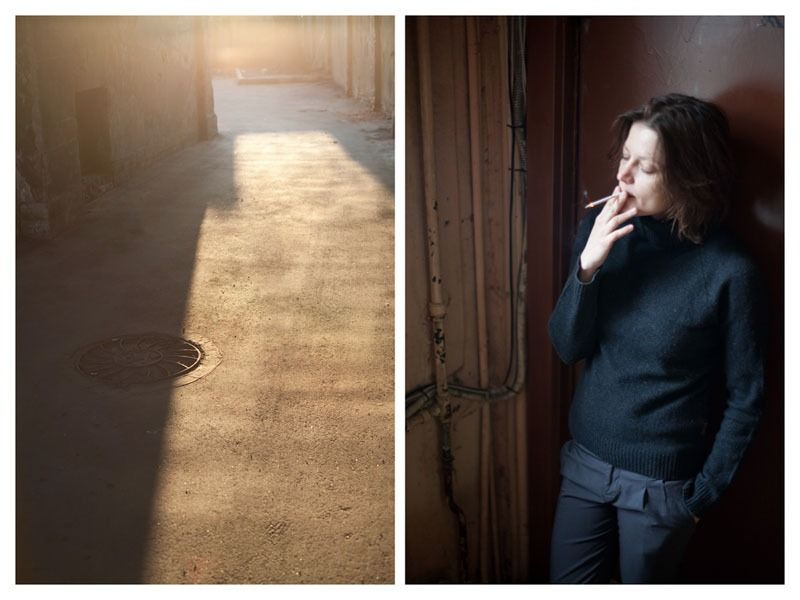
These images were shot on a 35mm rangefinder camera fitted with a 50mm lens and using Ilford XP2 Super 400 film. I experimented with using a yellow filter, not realising that this C41 film would react differently to ordinary black and white film. The scans revealed a yellow cast to the film! I have therefore corrected this in Lightroom. I do like the extra contrast provided by the filter so I would like to experiment with an ordinary black and white film stock at some point, perhaps learning how to develop the film myself.
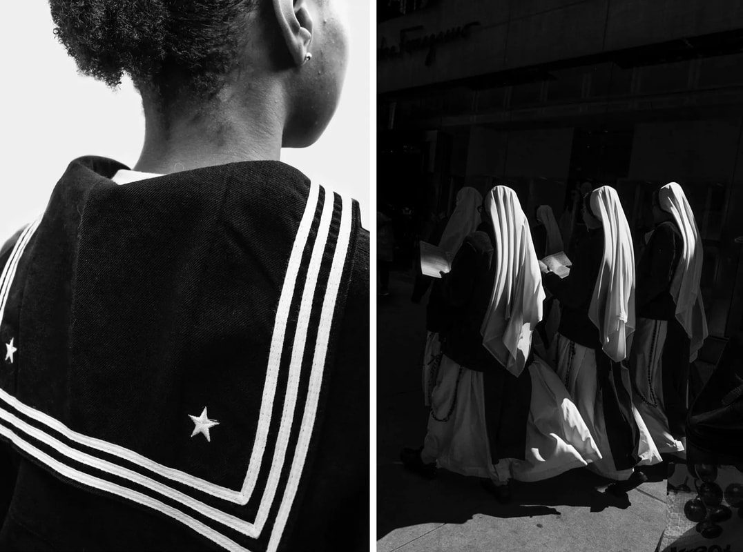
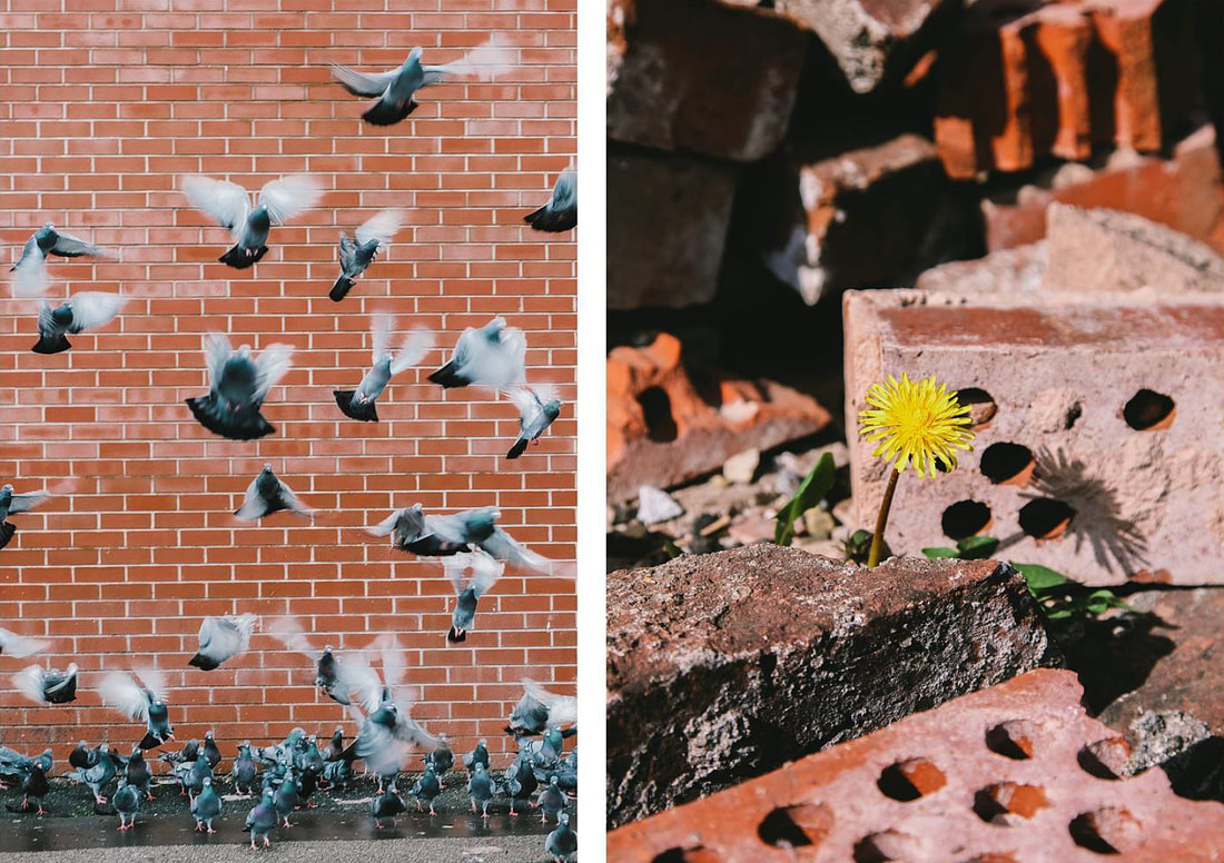
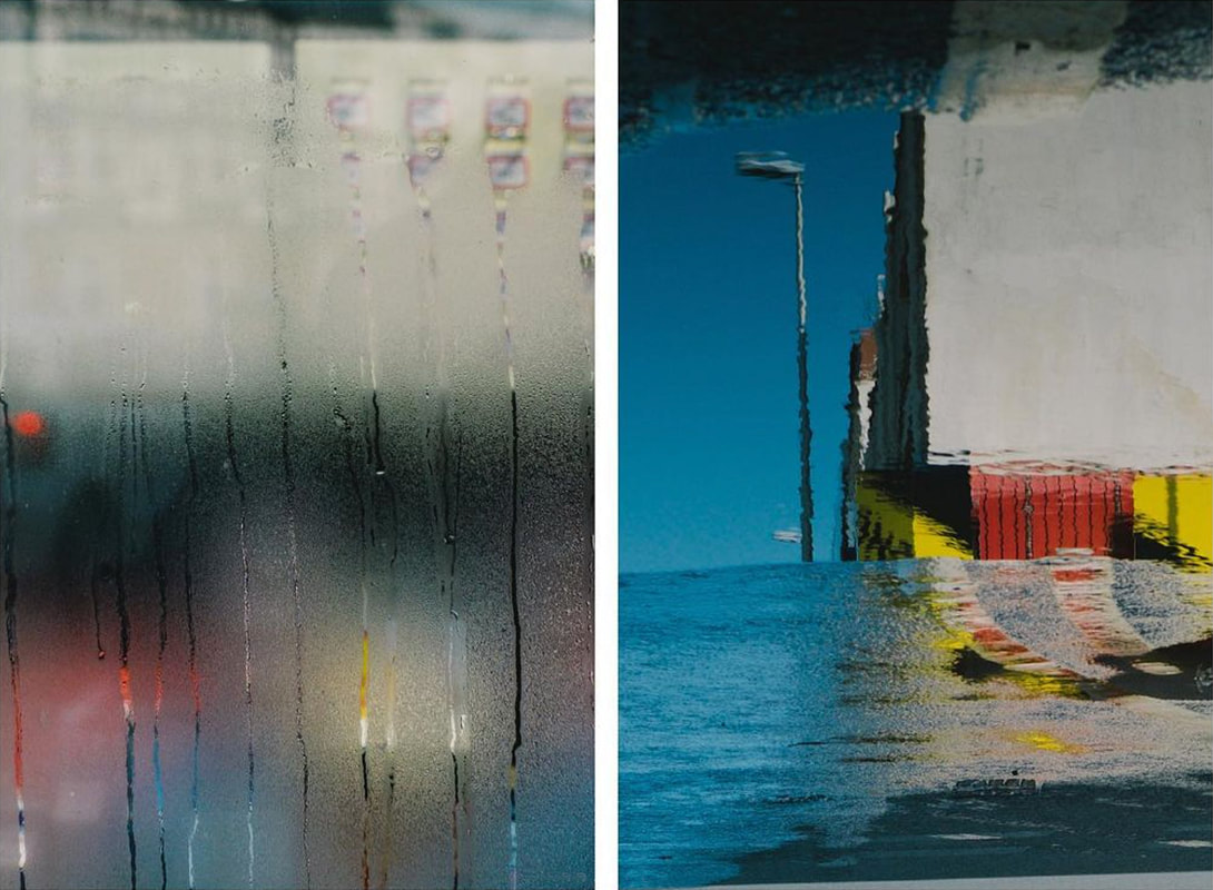
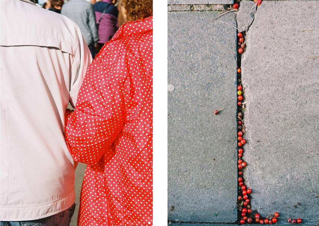
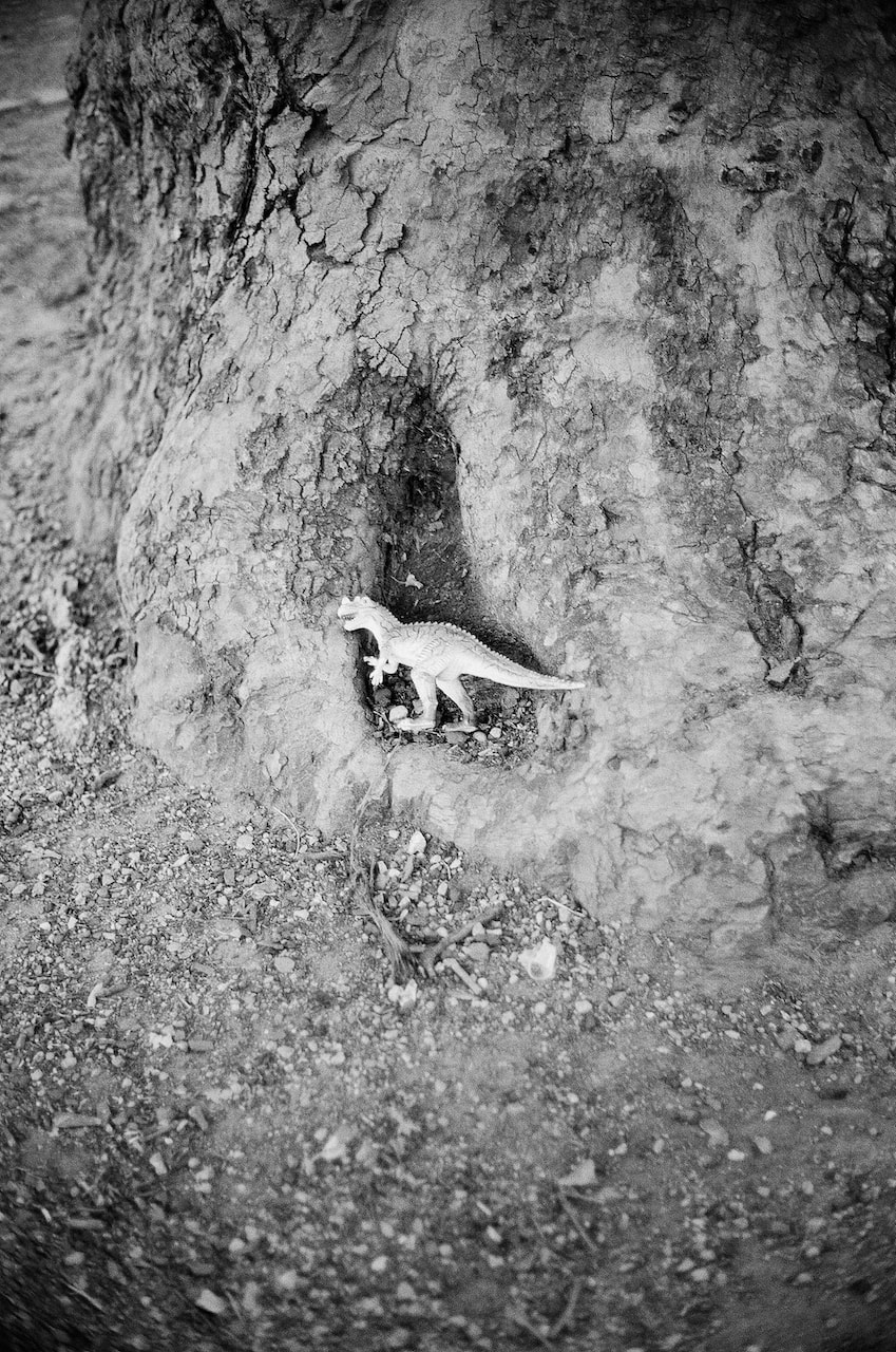
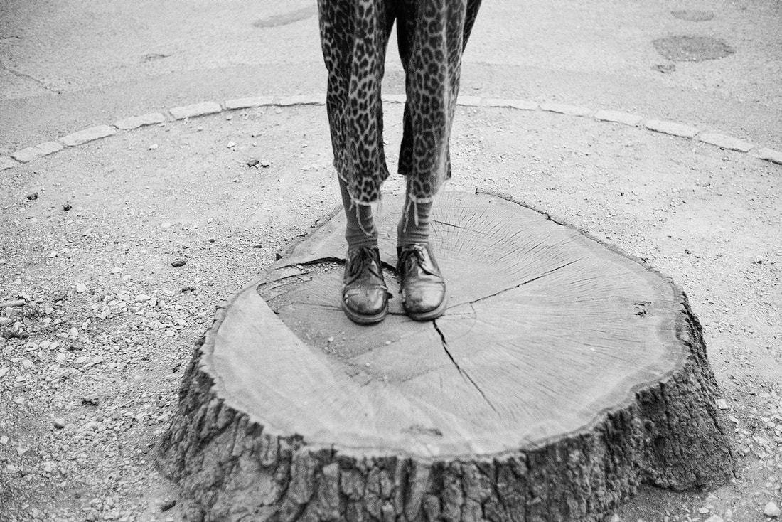
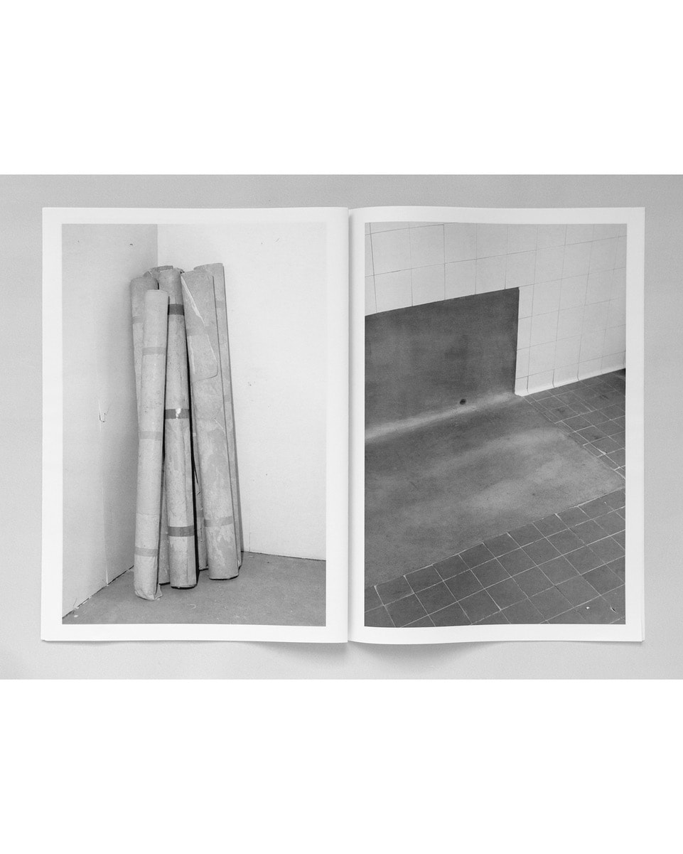
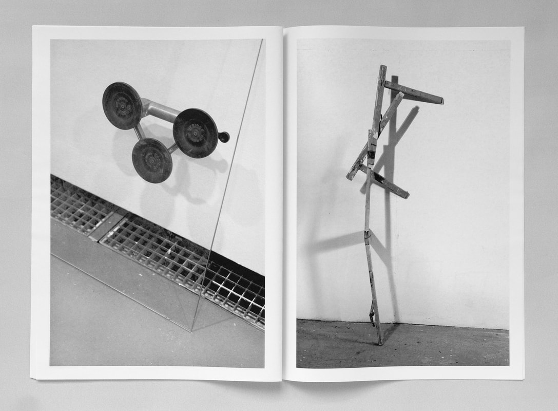
Diptychs
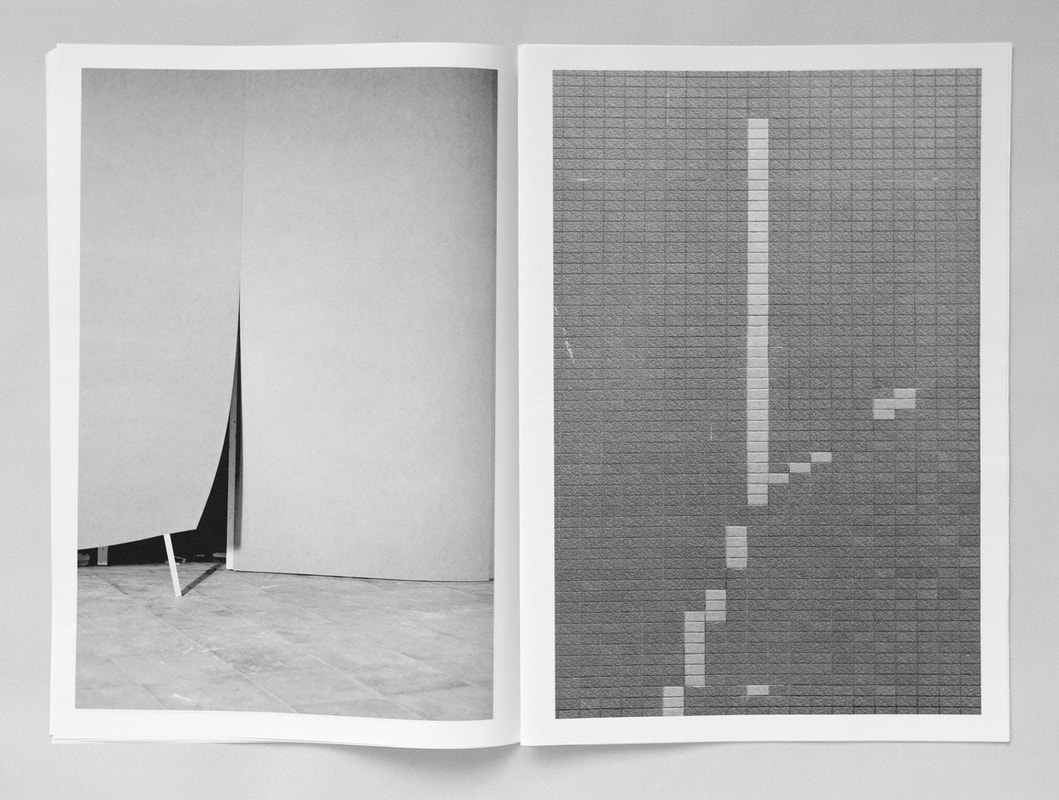
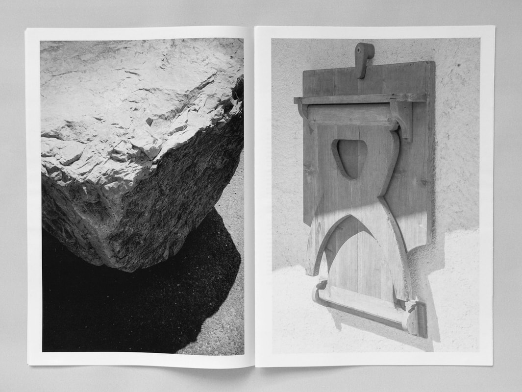
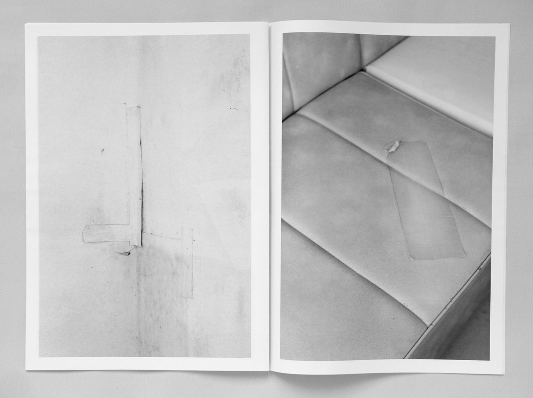
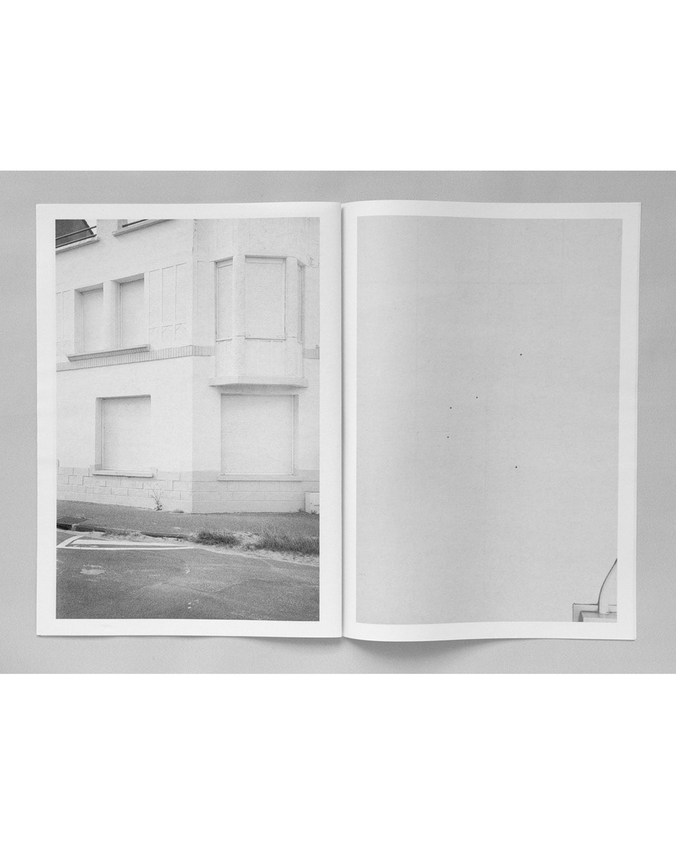
I like the idea that the diptychs I make are open to interpretation. I also enjoy changing particular pairings over time so no one diptych pairing is ever finally fixed. However, in the examples below I have provided a very brief commentary, attempting to explain my reasons for pairing the images.
|
|
|
|
|
|
|
|
|
|
|
|
|
|
|

|

|
|
|
|
|
|

|
|
|
|
|
|
|
|
|
|
Preparing for my final outcome(s)
I'm fairly sure that I want to create a multimedia product for at least one of my final outcomes. Previously, I have used a combination of Photoshop and iMovie but the process of creating the various slides in Photoshop is pretty laborious. I found the following video which explains how to generate diptychs in Lightroom.
I'm hoping this will be a more efficient method for:
- collecting suitable images together
- selecting diptych pairings
- creating and exporting jpeg files
|
Ori Gersht at Michael Hoppen Gallery
For over twenty-five years, Gersht has been exploring the relationships between history, memory and landscape using the language of photography. Often this has meant adopting a poetic, even metaphorical approach to examine the difficulties of visually representing conflict and violent events or histories. Gersht’s work has the ability to transform a seemingly mundane experience to something ethereal and magical.
The Unreality of Time explores Gersht’s innovative use of photography and technology through several bodies of work dedicated to botanical studies. Referencing art history, Gersht's imagery is uncannily beautiful; the viewer is visually seduced by the often violent intervention of an explosion, caught on camera in fractions of seconds. These events are then processed, or rather, re-imagined as incidents in time. To approach this challenge Gersht is often adopting cutting edge technologies which allow him to push the boundaries of photography, questioning its relationship with our notion of reality and claim for truth.
-- Michael Hoppen Gallery website
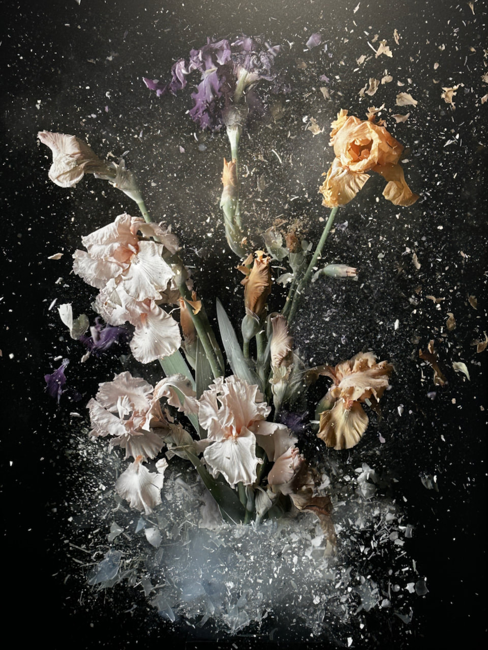
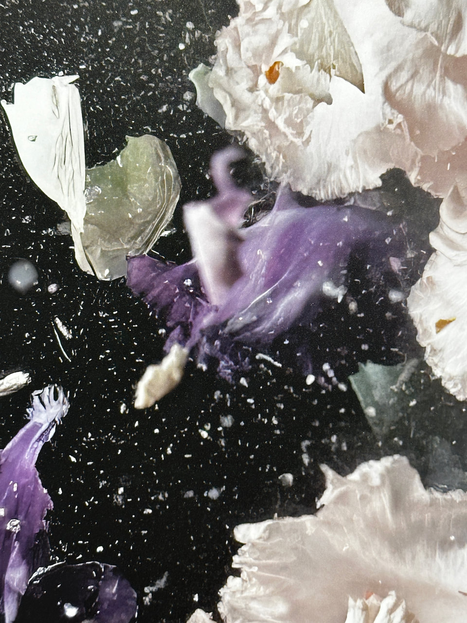
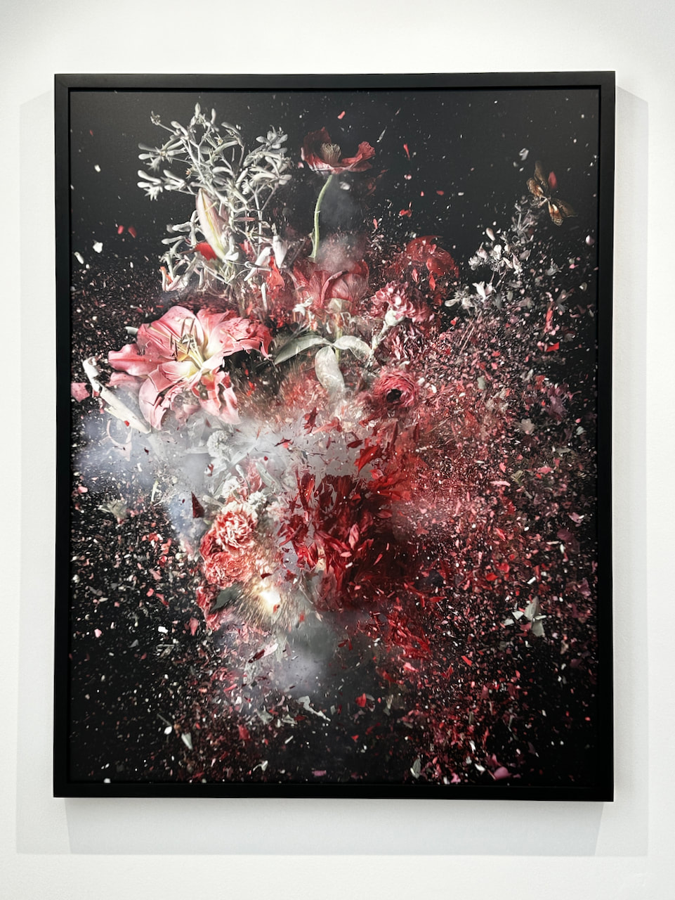
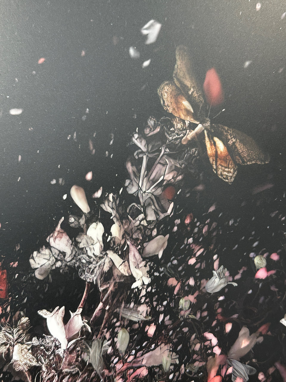
I really enjoyed seeing these images up close. The amount of detail is incredible and I loved the tension between chaos and order, energy and stillness in the exploding flower arrangements.
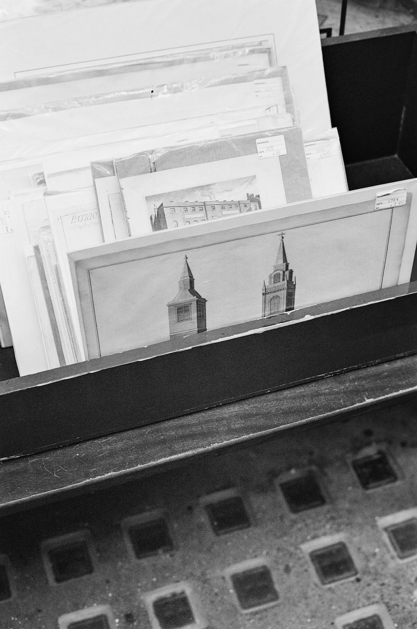
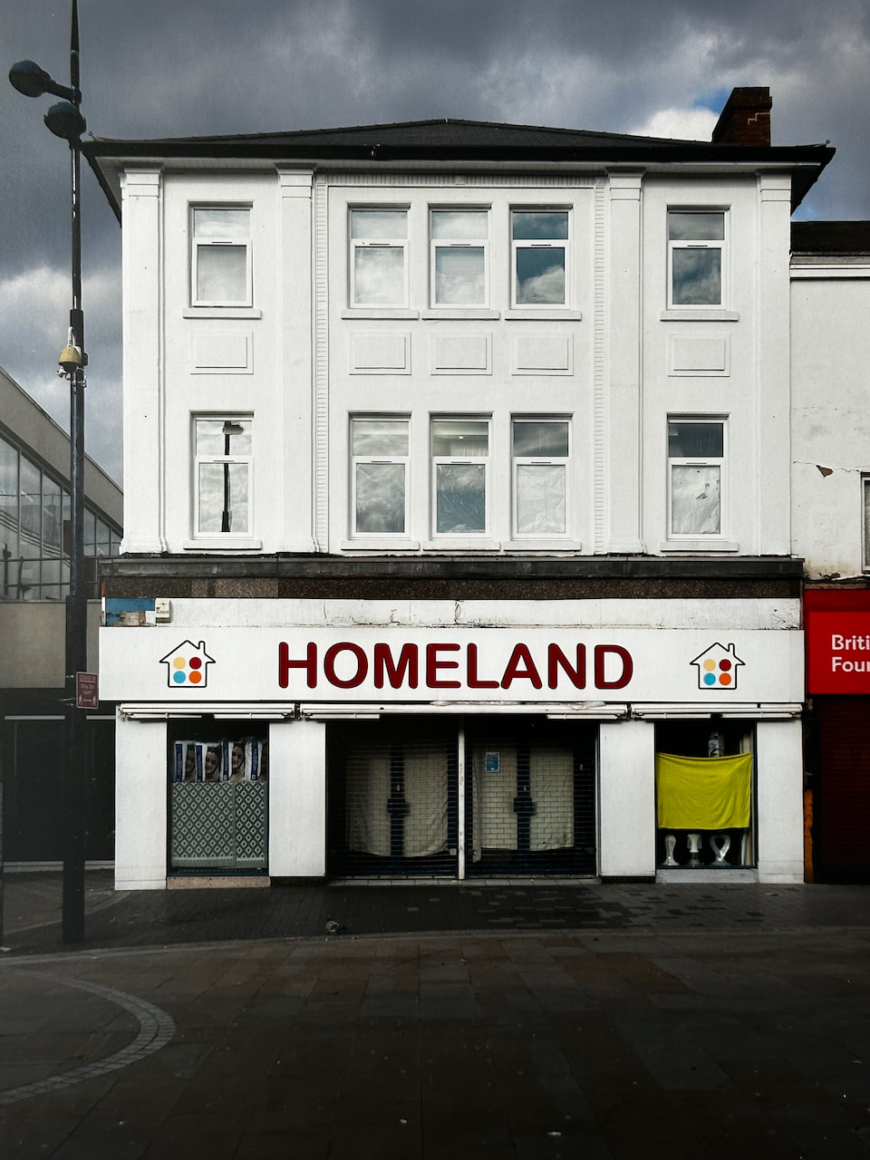
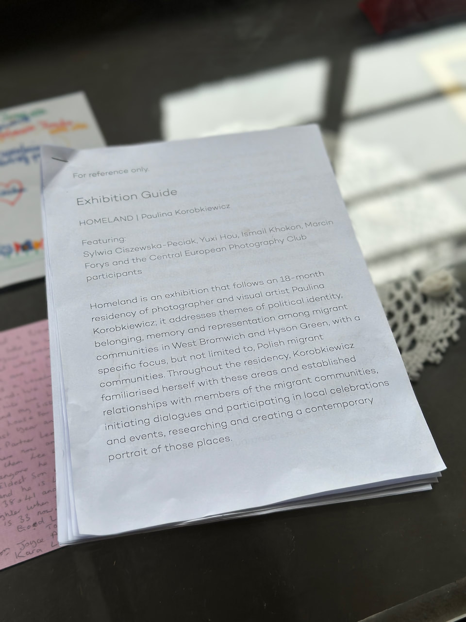
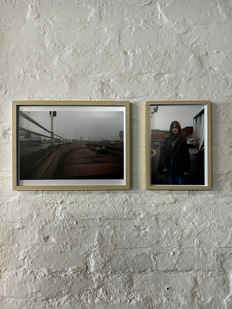
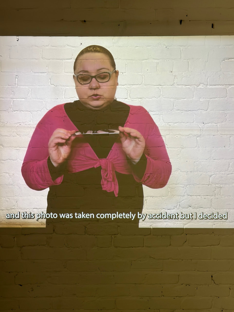
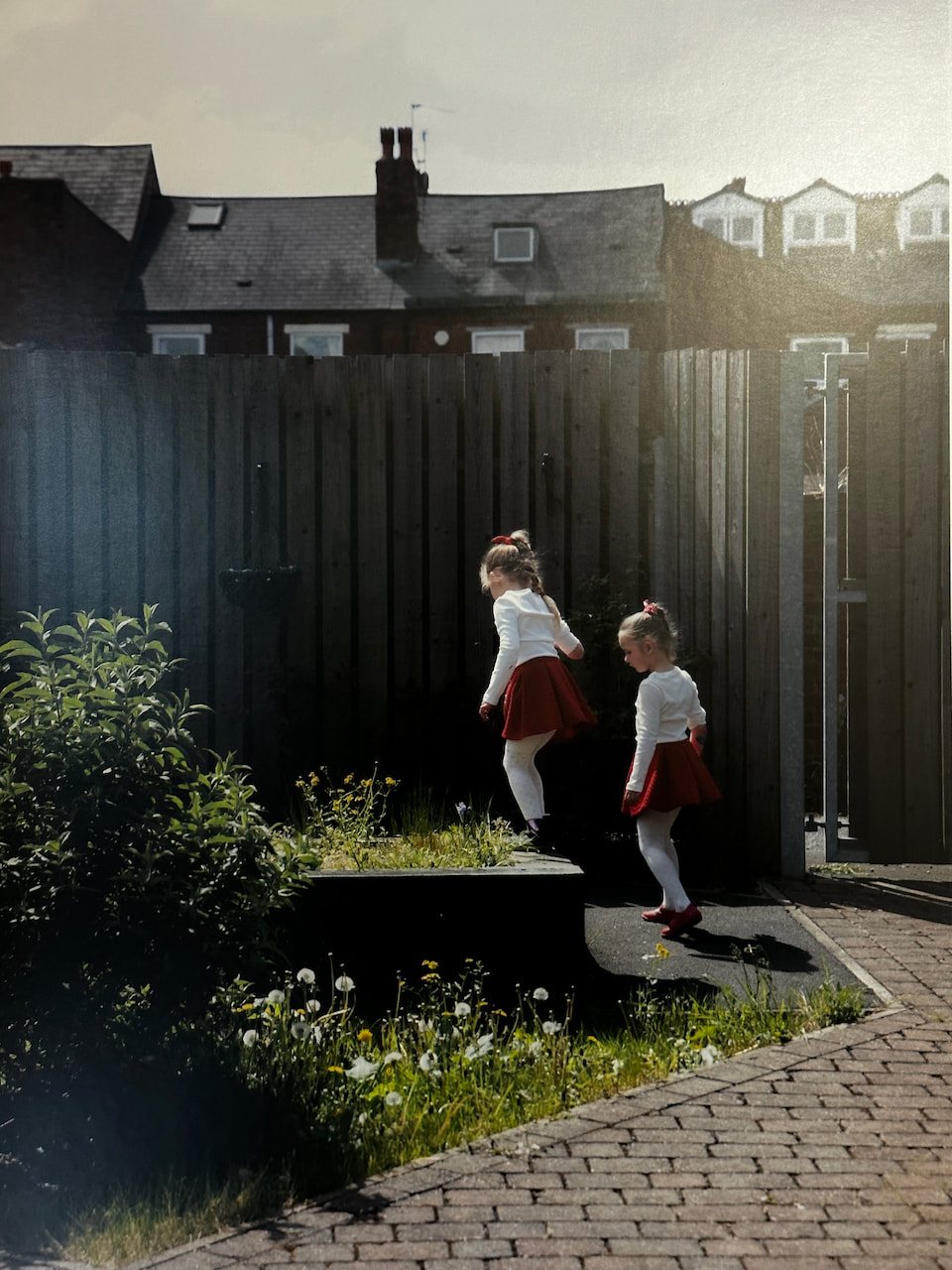
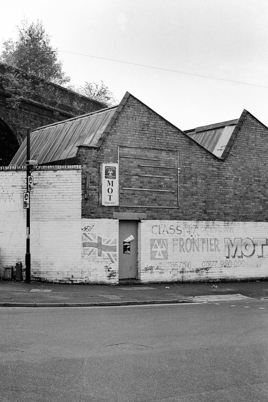
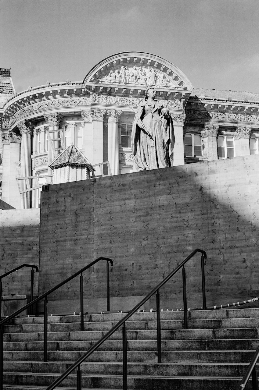
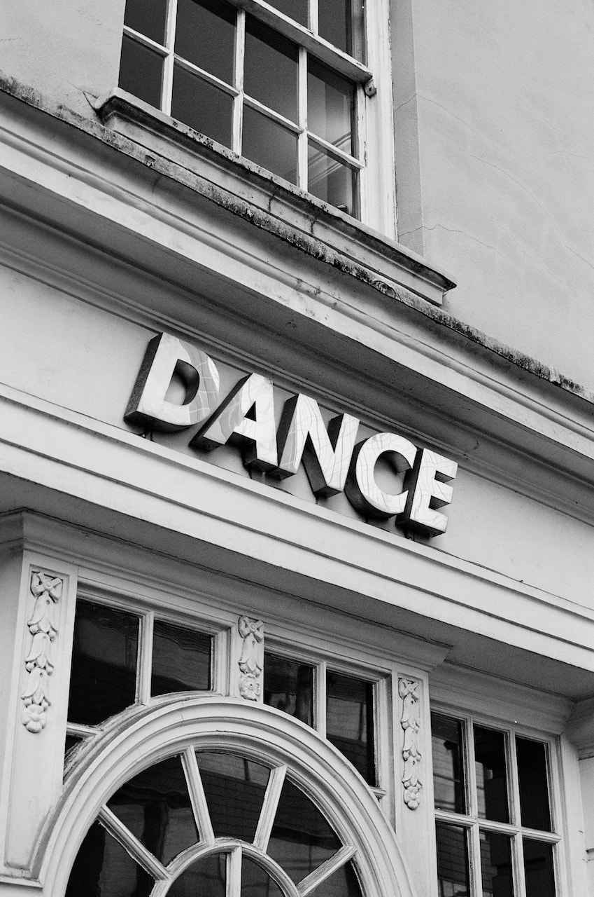
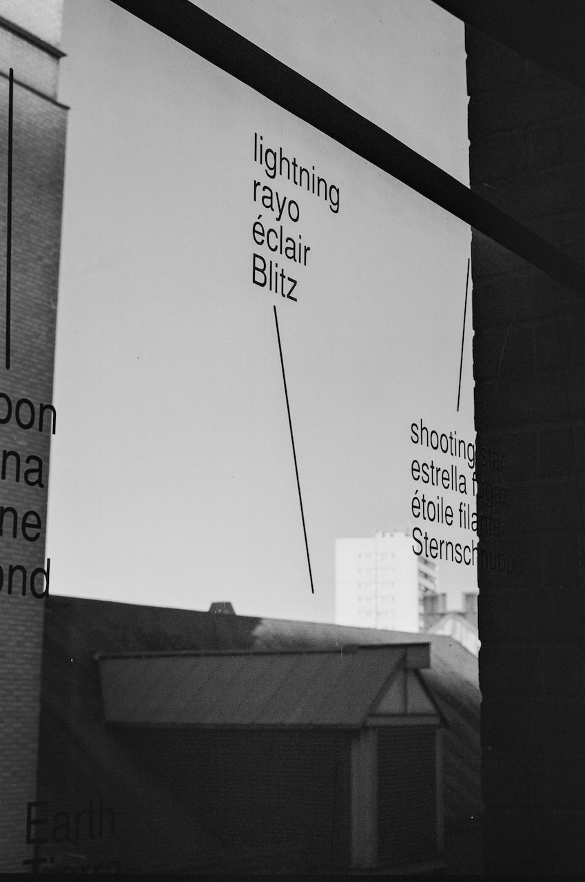
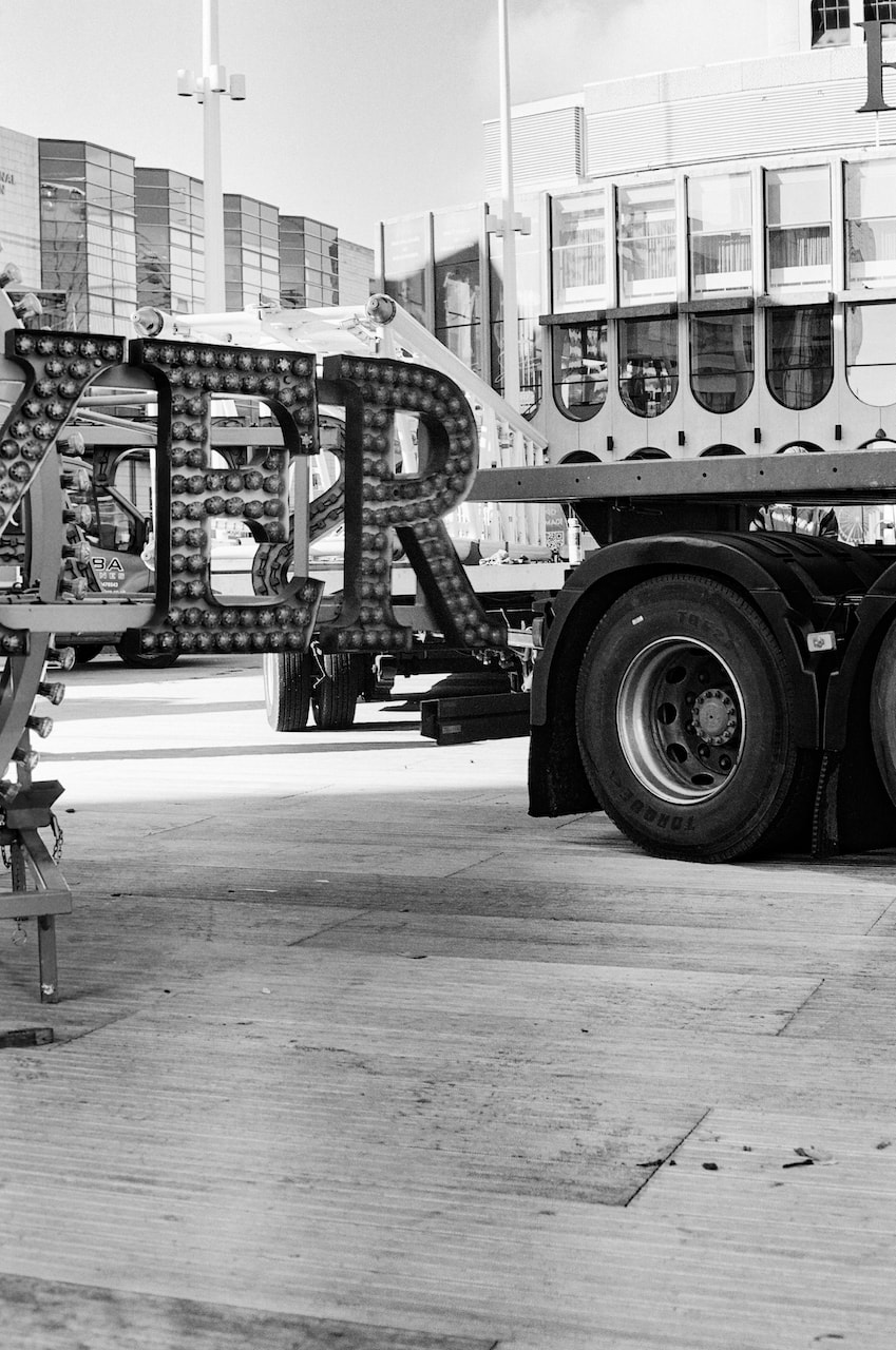
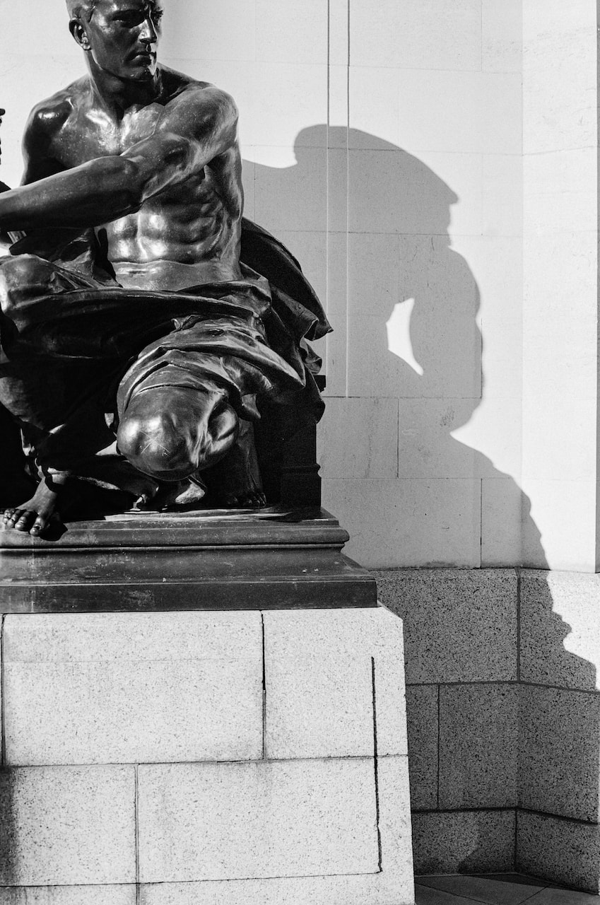
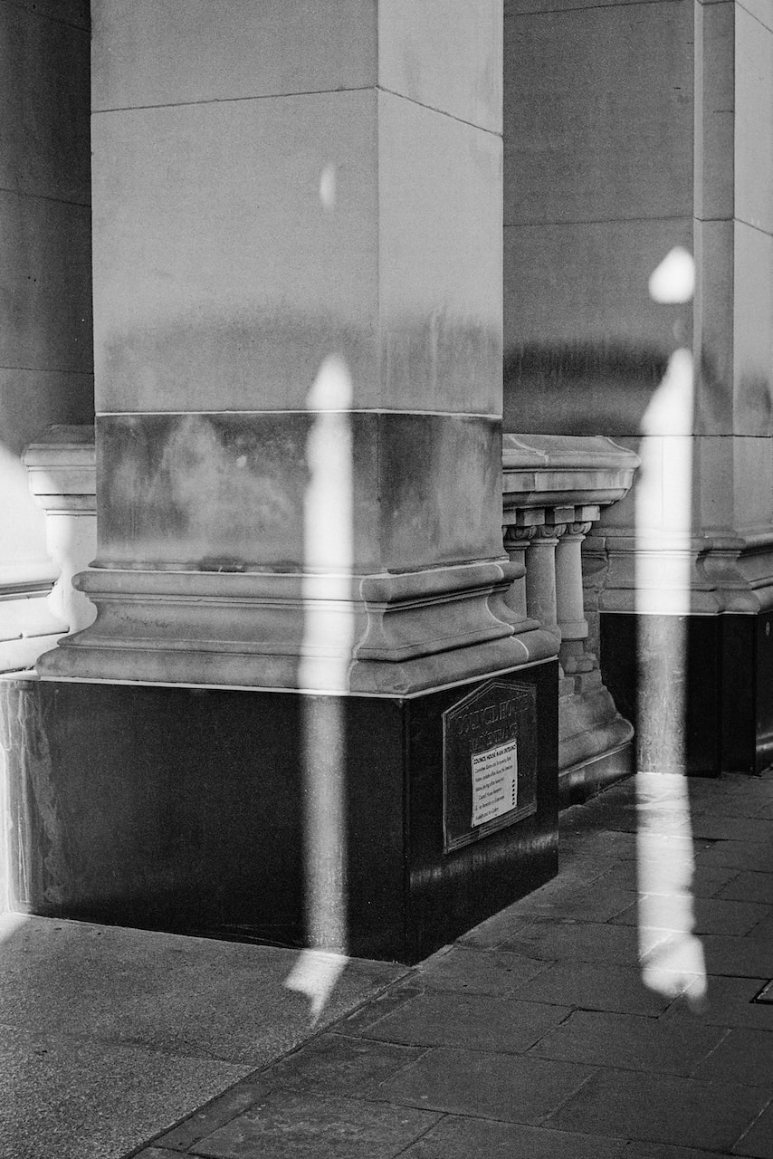
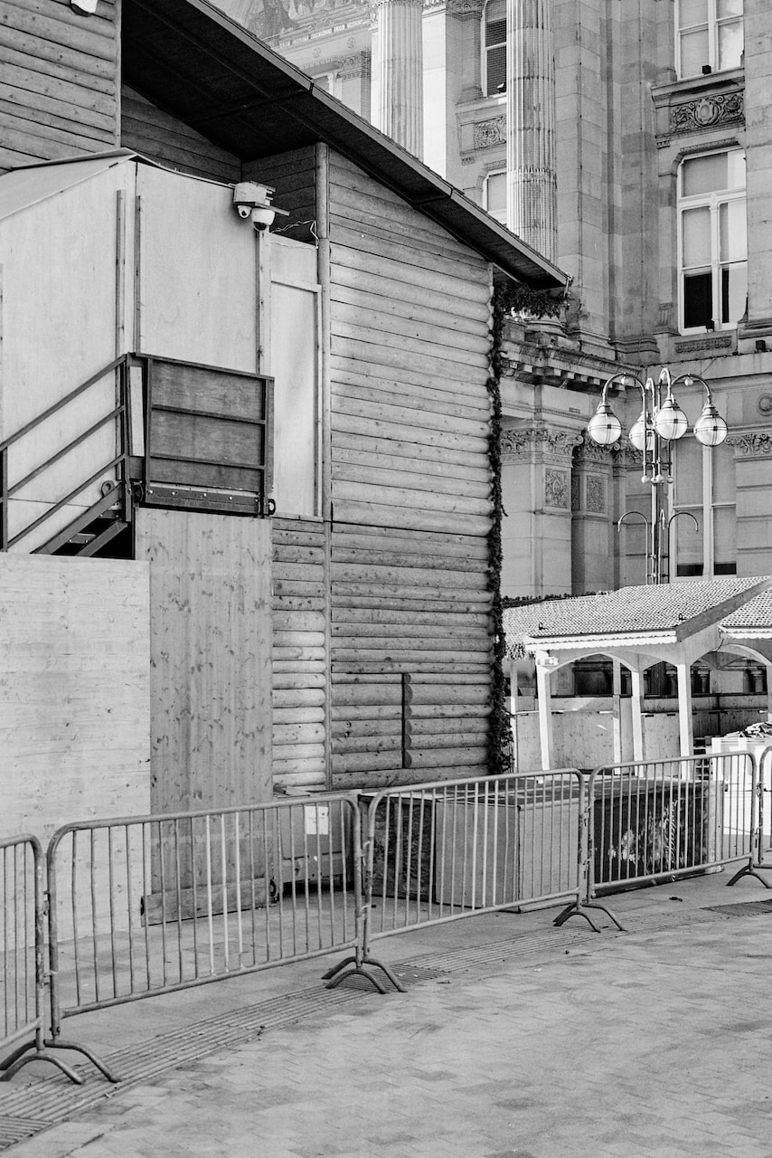
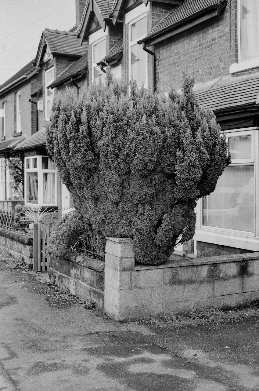
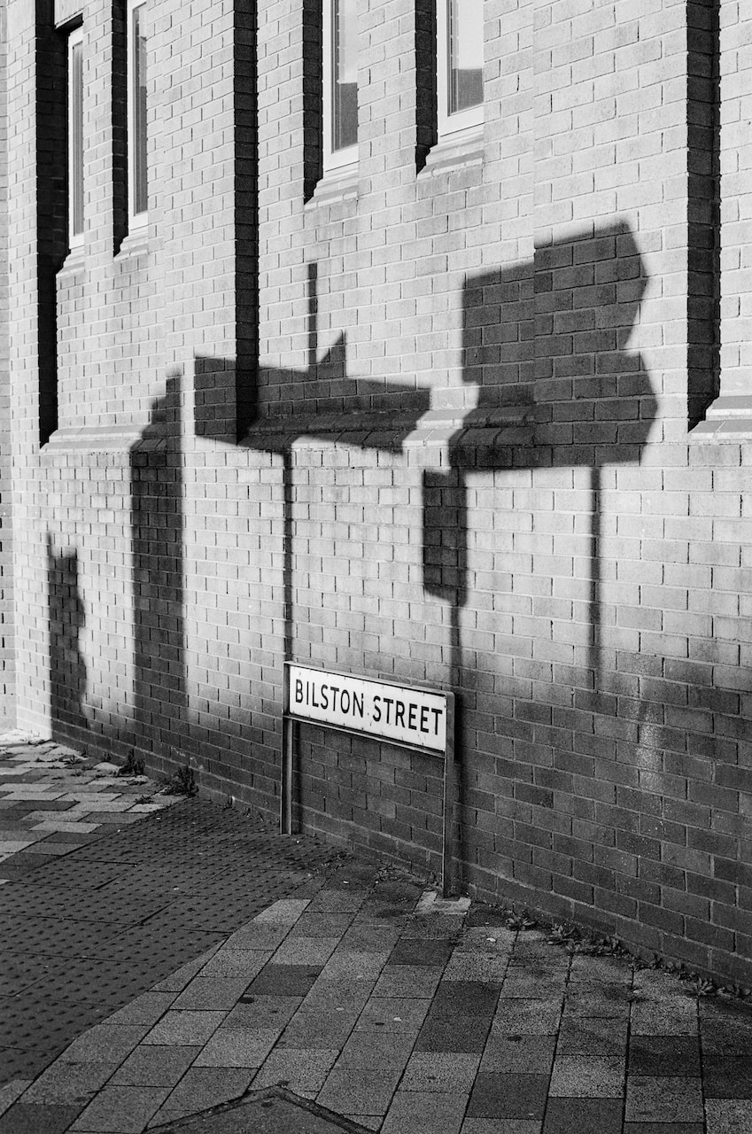
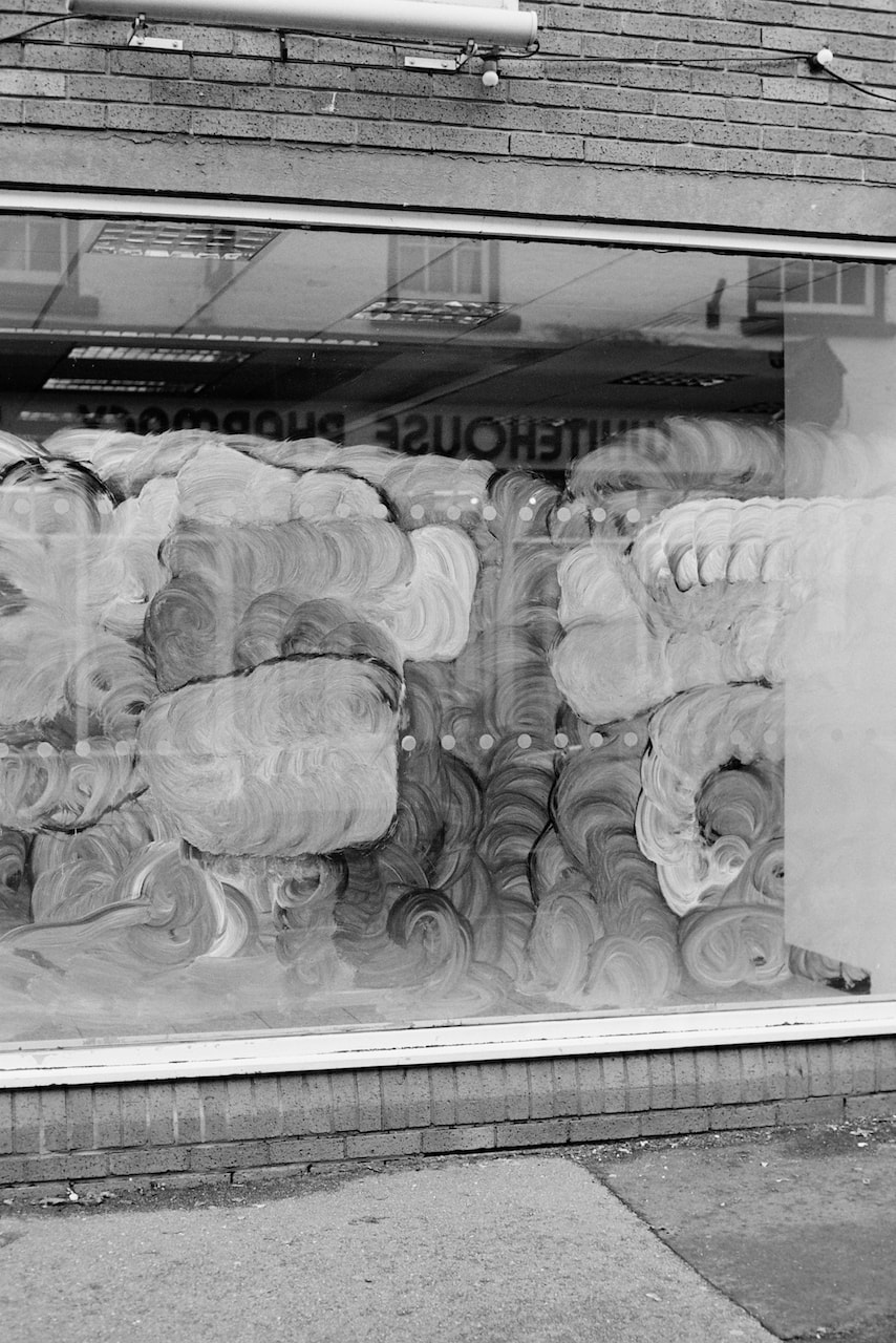
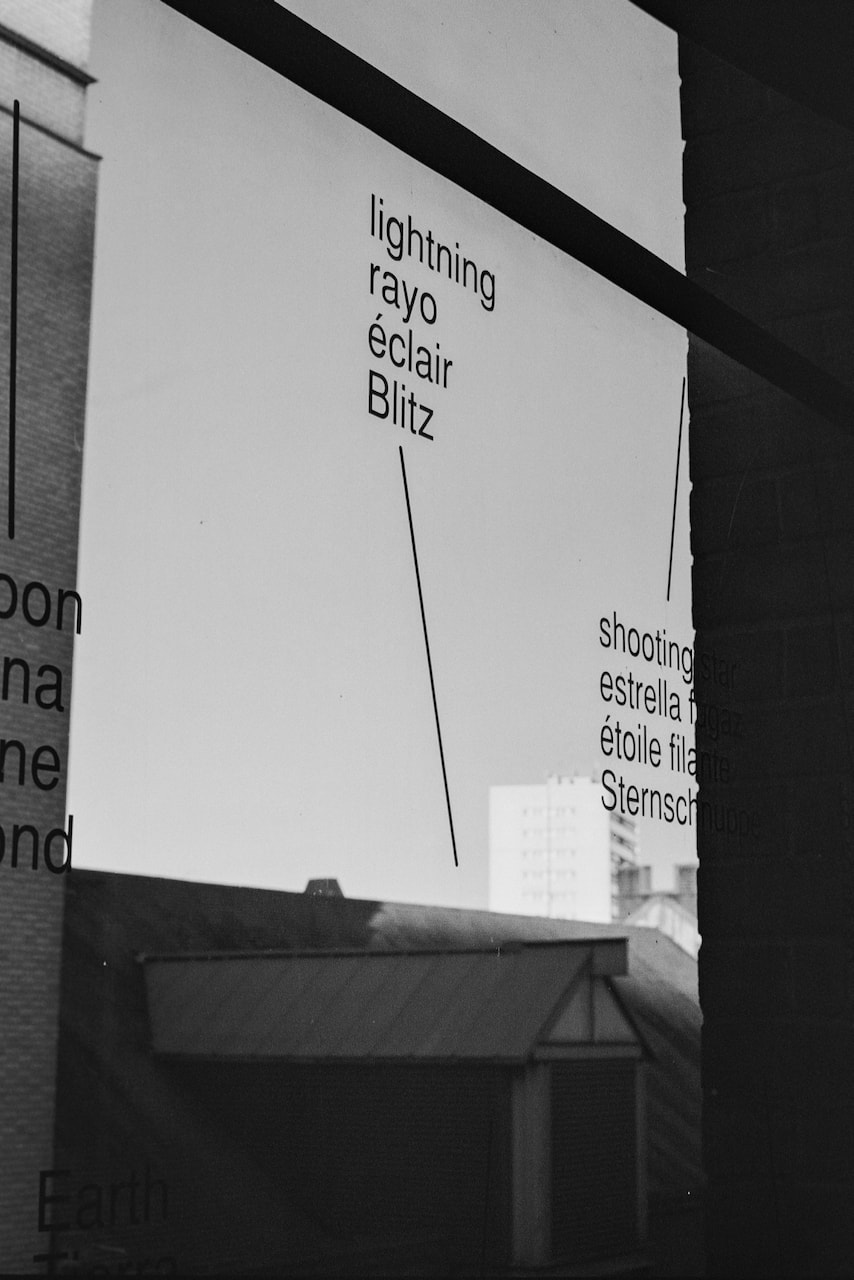
A trip to the Midlands
|

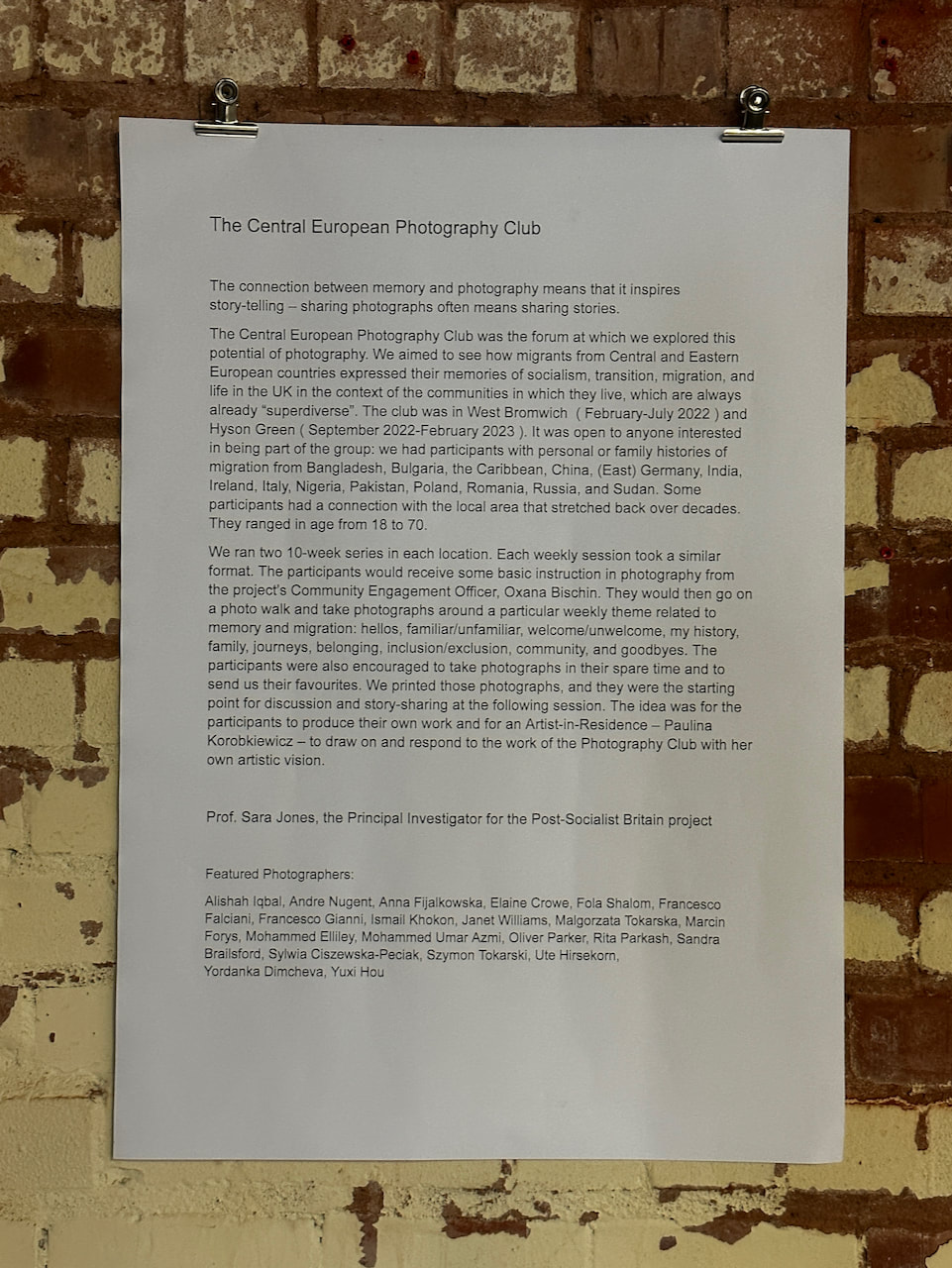
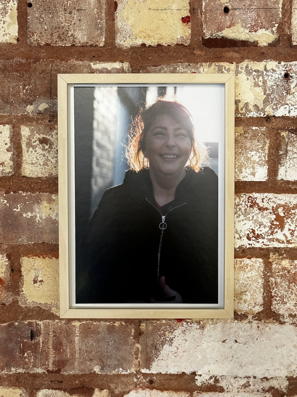
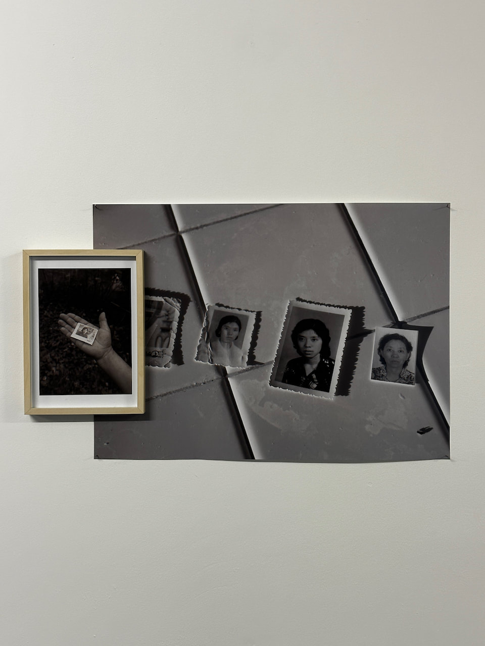
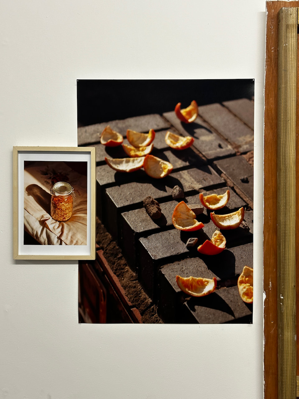
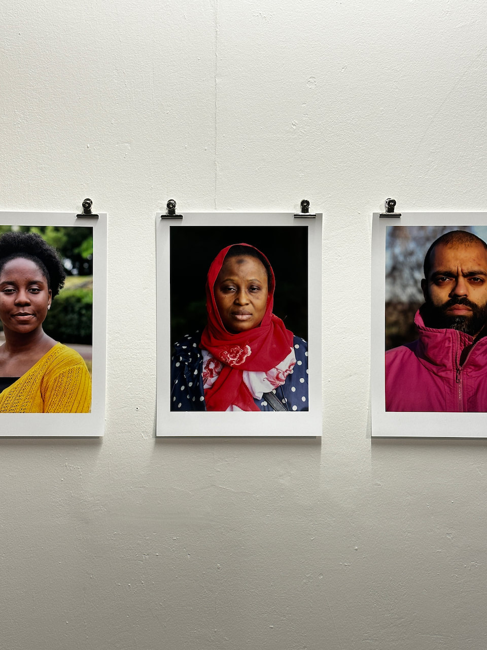
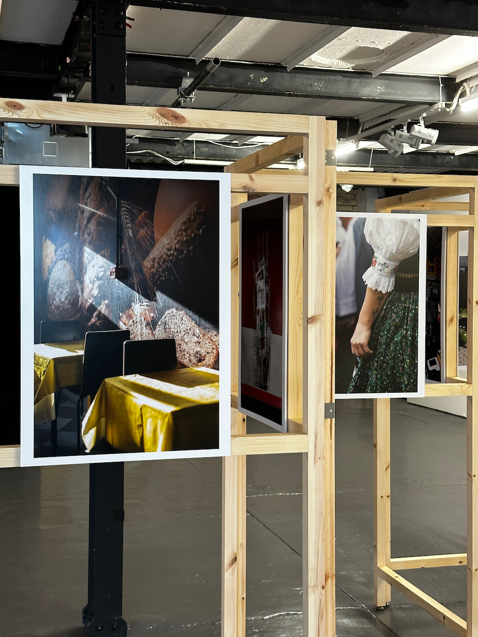
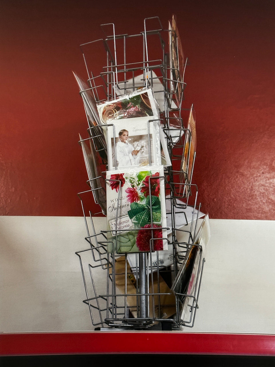
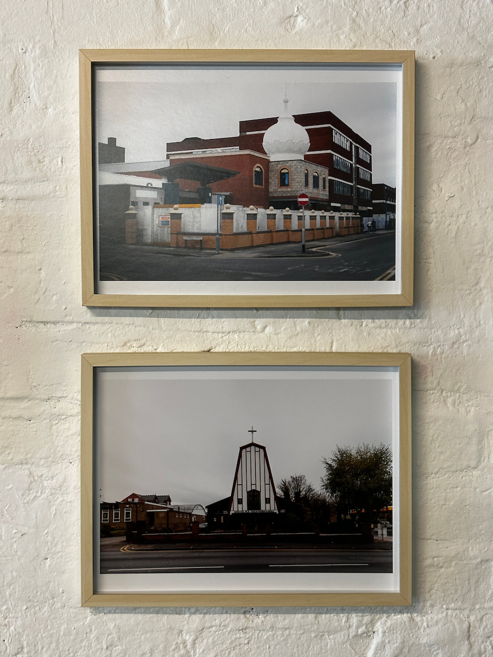
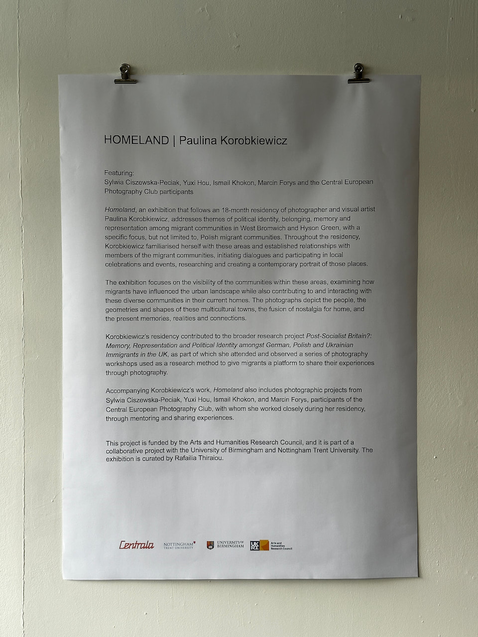
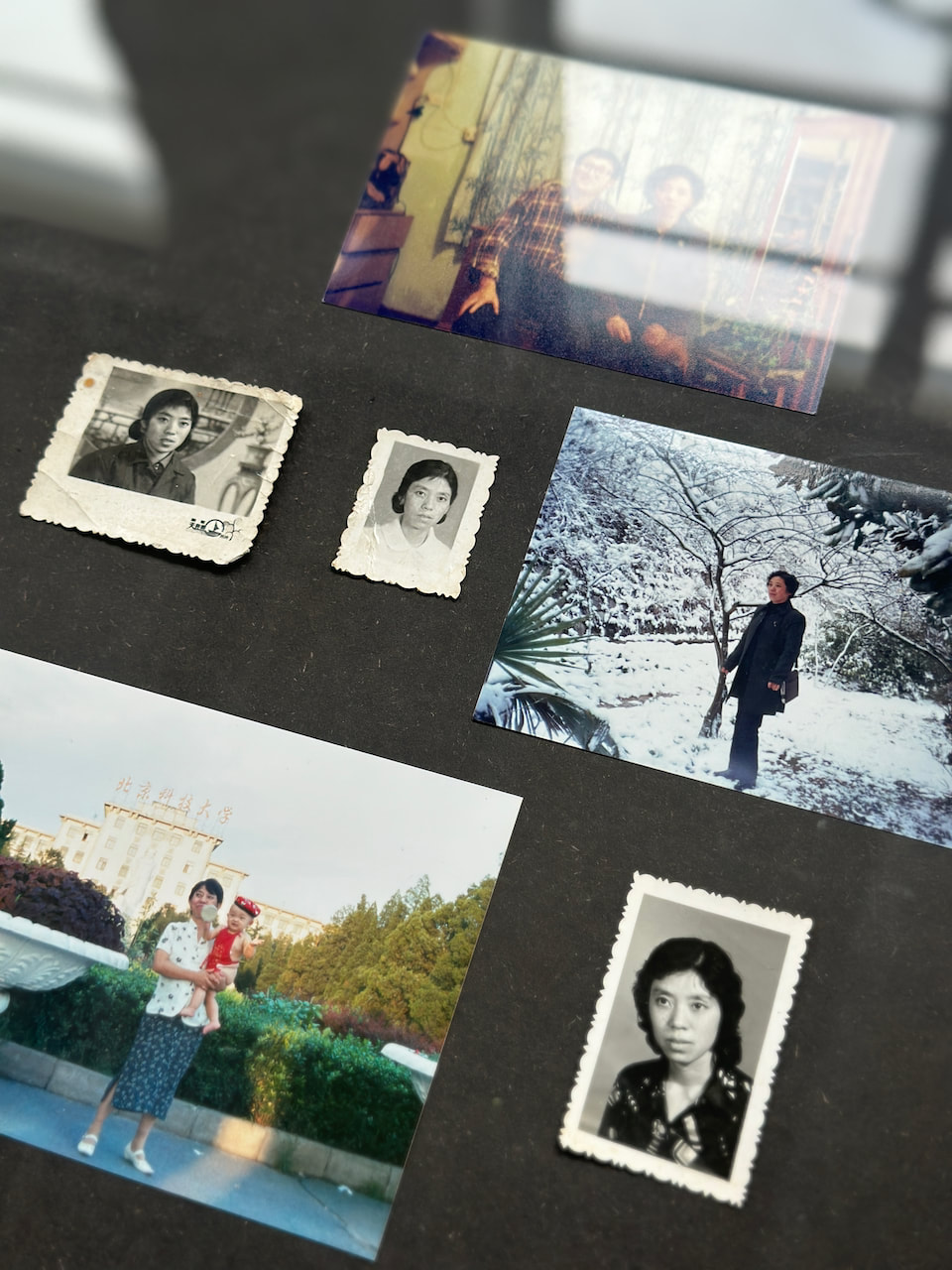
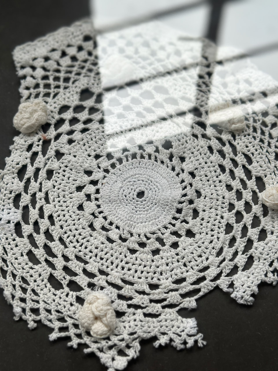
Paulina Korobkiewicz' Homeland at Centrala Space
This collaborative exhibition was an important reminder about the power of photography to bring people together, communicate memories and reinforce community solidarity. I enjoyed the different display strategies - framed prints, objects in a vitrine, projections, prints hanging from clips and a central, sculptural installation.

|
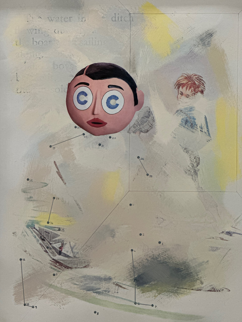
Mali Morris and Dean Kelland at Ikon Gallery
I loved the push and pull of Mali Morris' paintings and the dialogue between opacity and translucency, shape and gesture, rectangular and circular. Dean Kelland's work was less obviously appealing but I found much to admire in his exploration of identity, masks and performance.
|
|
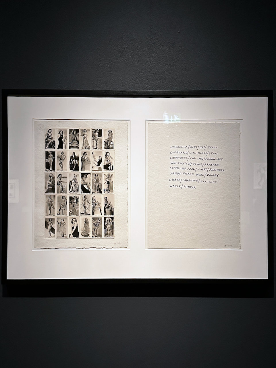
Derek Boshier 'Image in Revolt' at Wolverhampton Art Gallery
This show was visually exciting and thought-provoking. The last room, however, featuring his most recent paintings made inn America, was very disappointing. I enjoyed the various short films made by Boshier and collaborators and made some recordings on my phone. Here's a short split screen montage of my favourite excerpts:

|
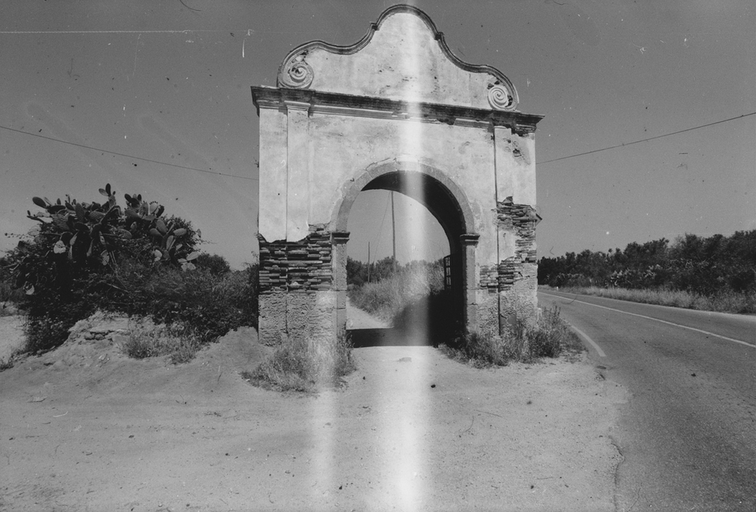
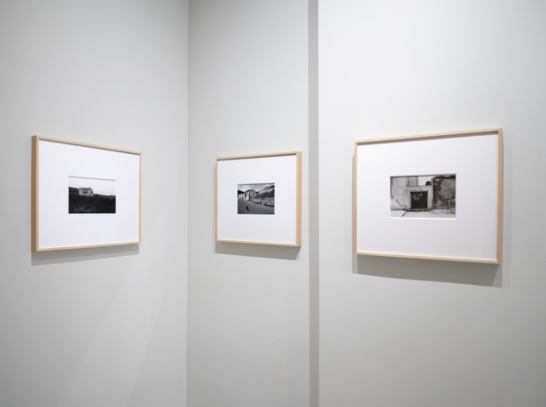
Stepping Stones: Three Photographic Journeys at Large Glass Gallery
Stepping Stones: Three Photographic Journeys connects the work of three photographers: Gerry Johansson, Guido Guidi and Mark Ruwedel. Focusing on a specific journey by each artist, three distinct conceptual, and personal, approaches to capturing place unfold – whether with a care for the overlooked, finding intimacy in one’s everyday surroundings, or surveying humankind’s effect on the landscape [...] Throughout their journeys, walking as much in the footsteps of their predecessors as finding new pathways in photography, these three artists focus on the signs of a human presence, whether implied, evoked, or documented. Their distinct styles come together through their dedicated observations of the places they, and we, move through, looking closely and attentively to capture what is left behind, overlooked and unnoticed.
-- Large Glass Gallery website
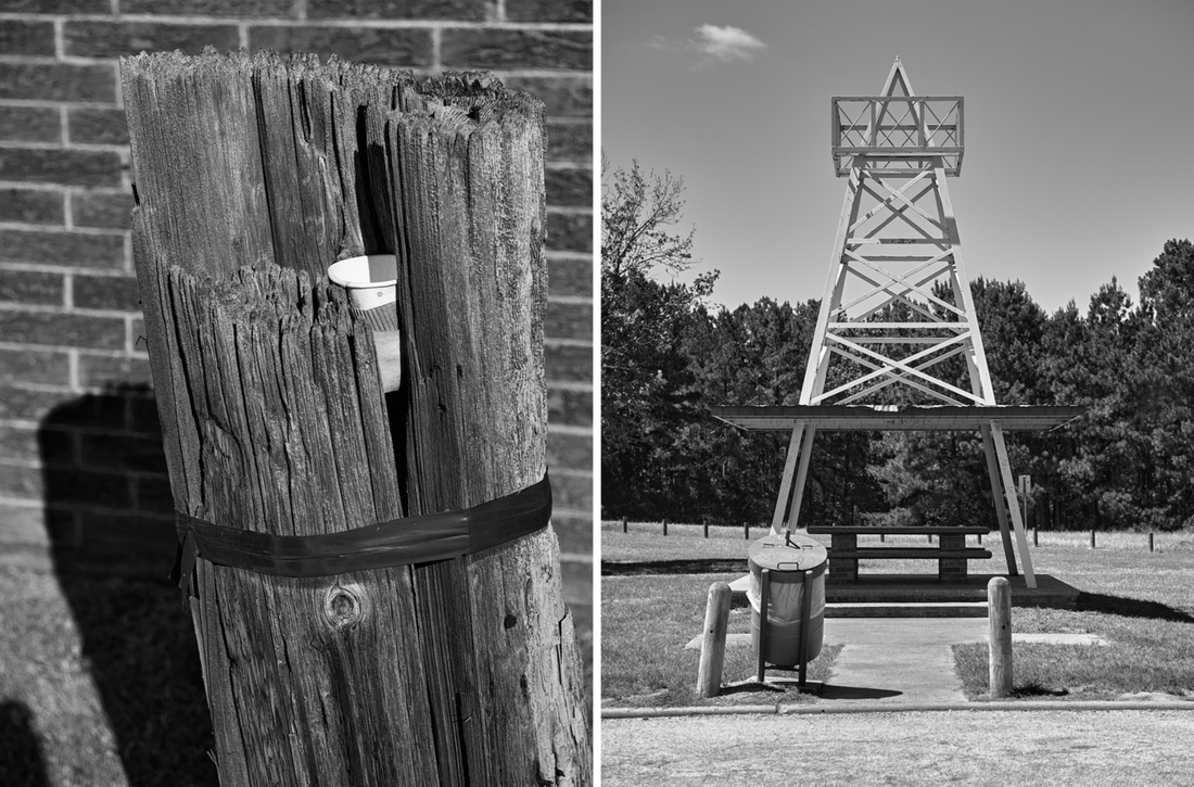
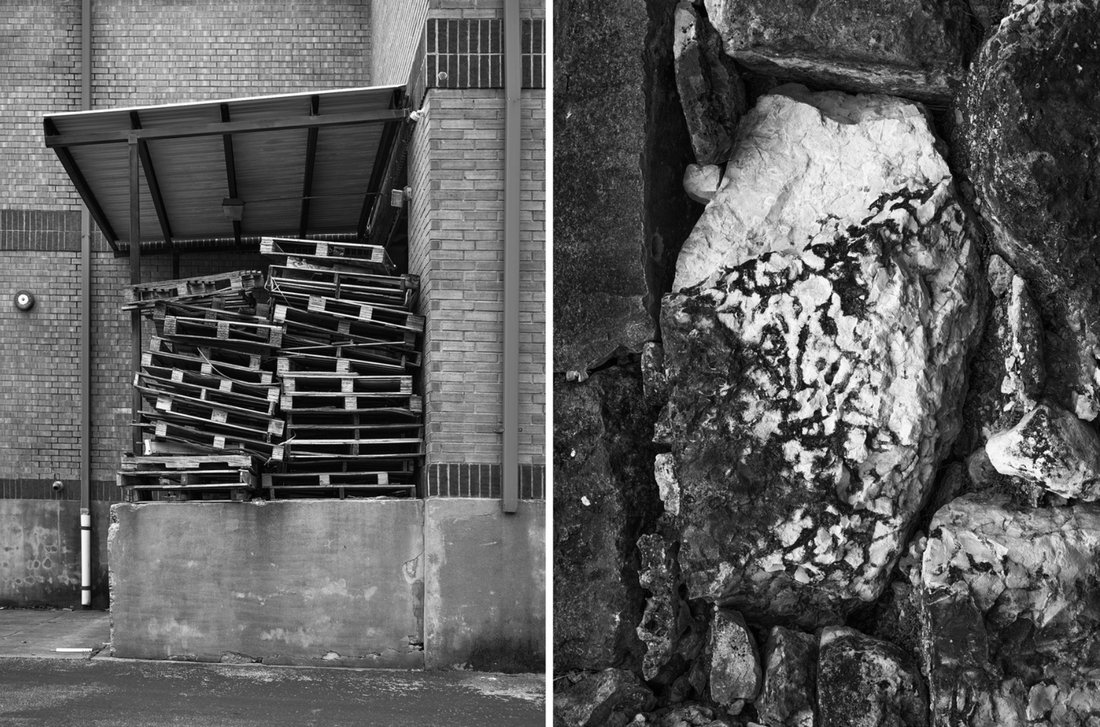
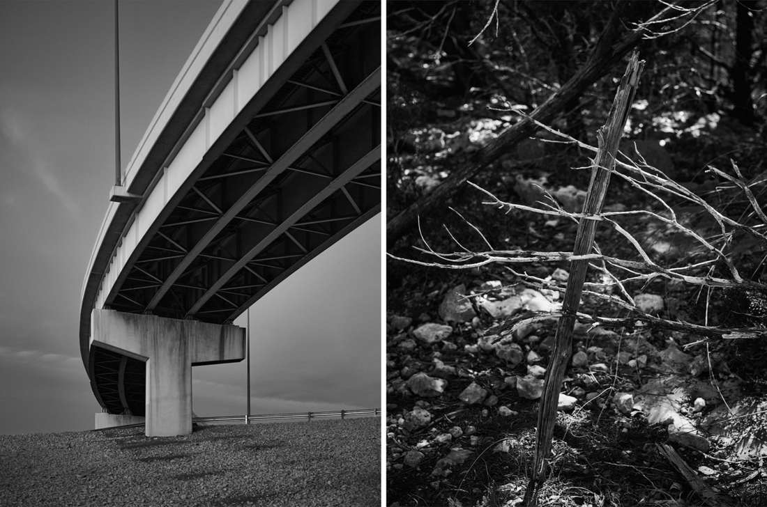
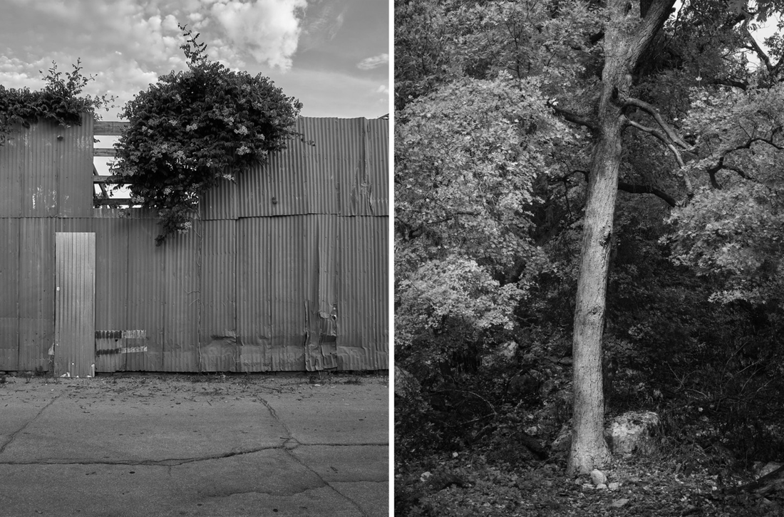
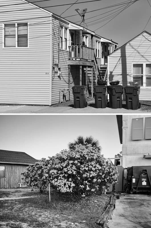
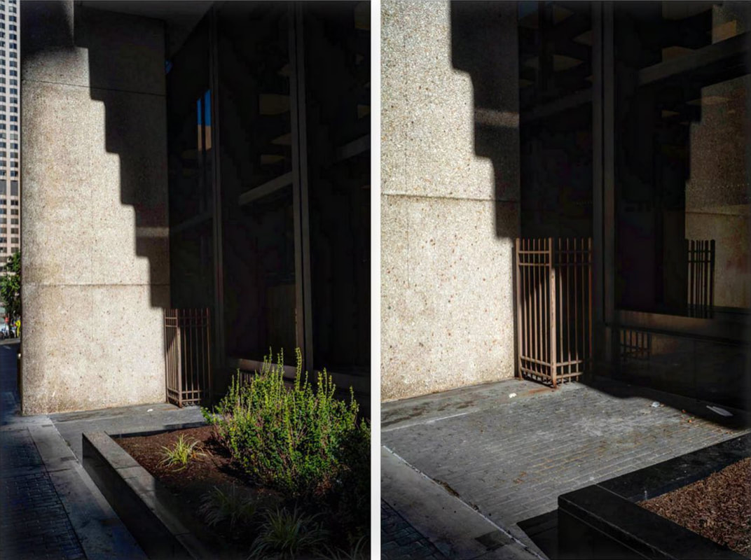
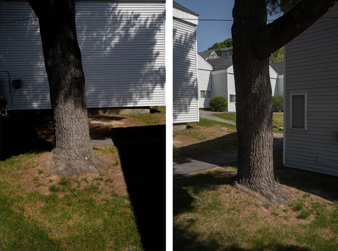
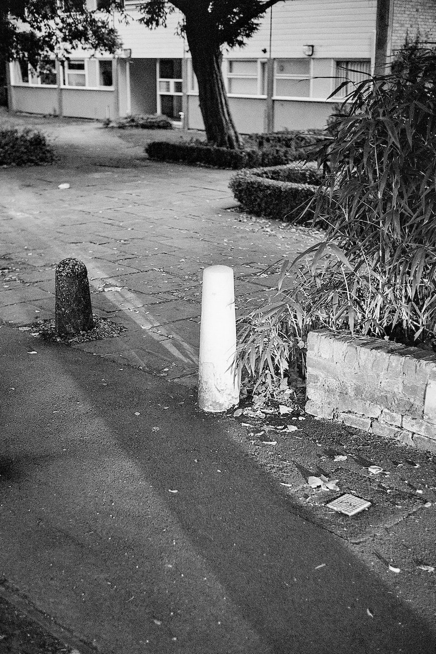
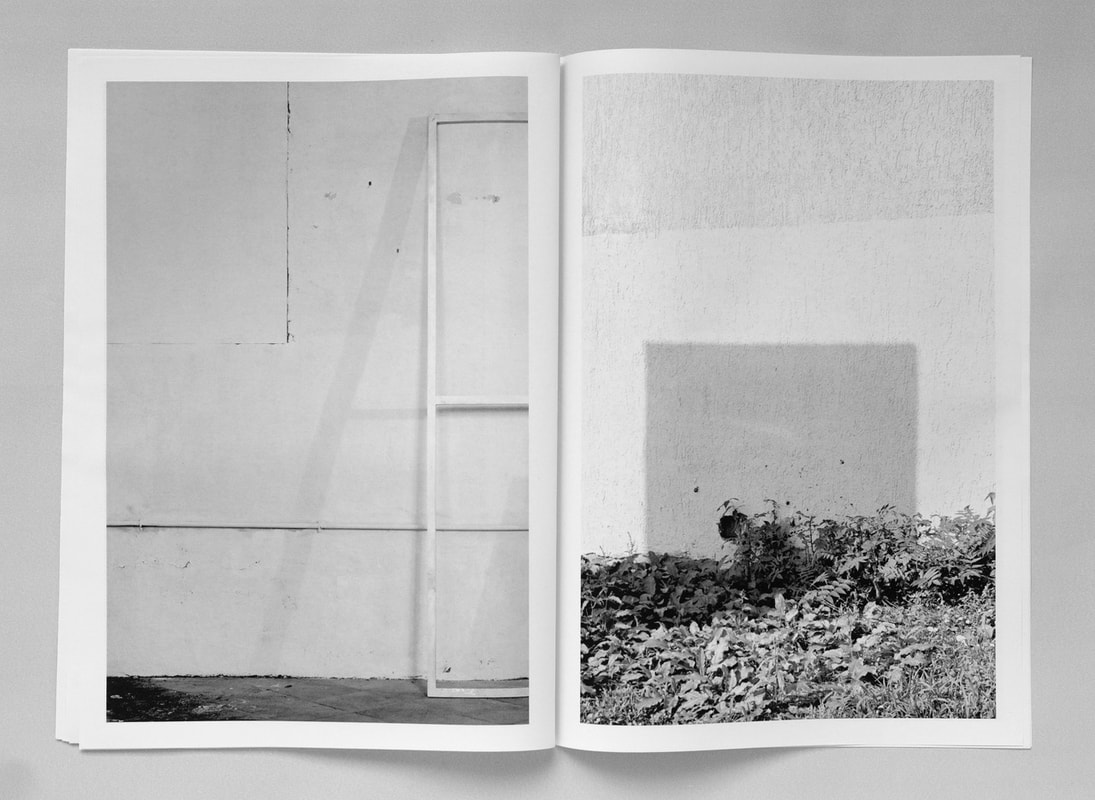
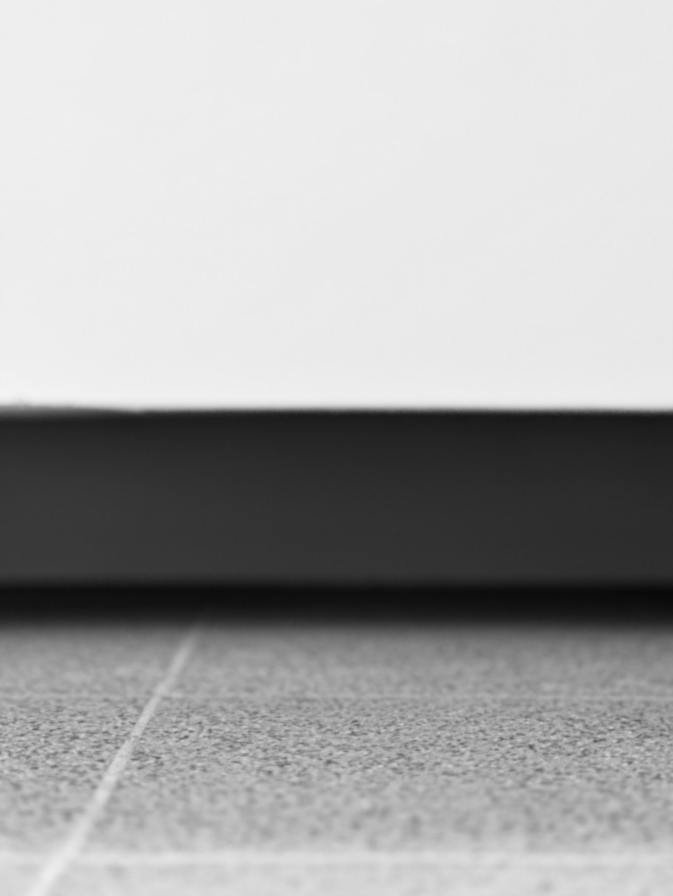
Building a final body of work (cont.)
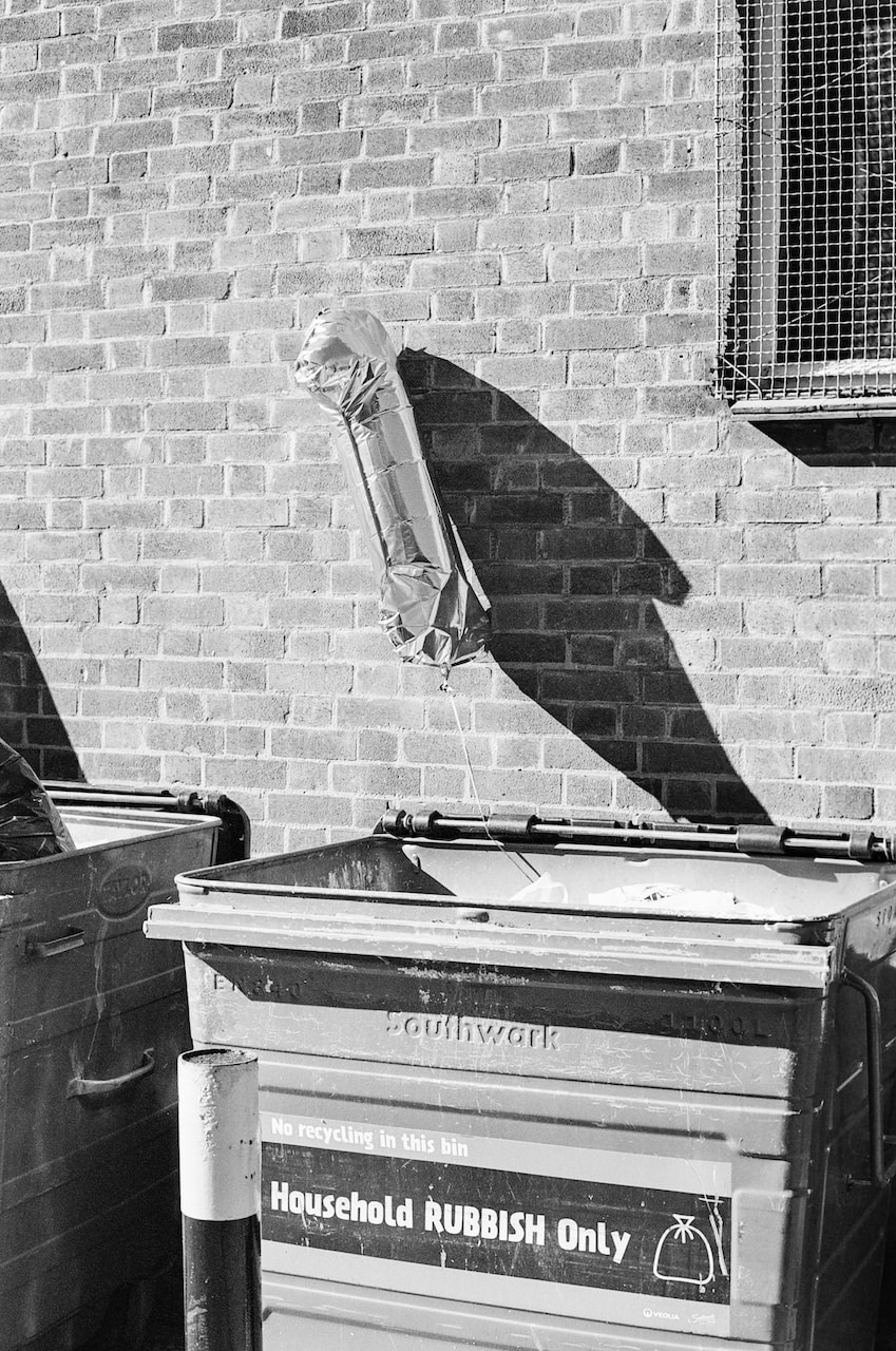
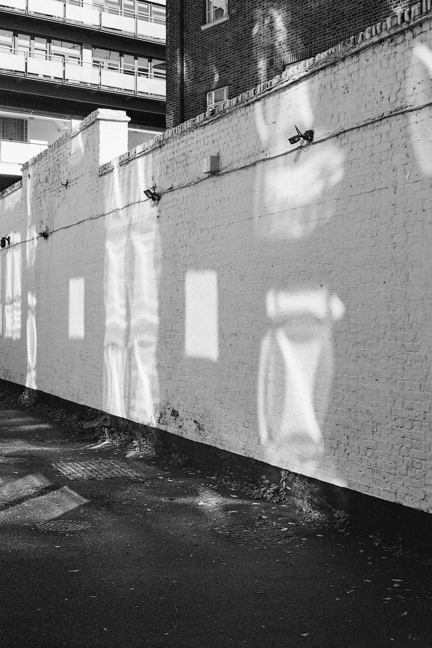
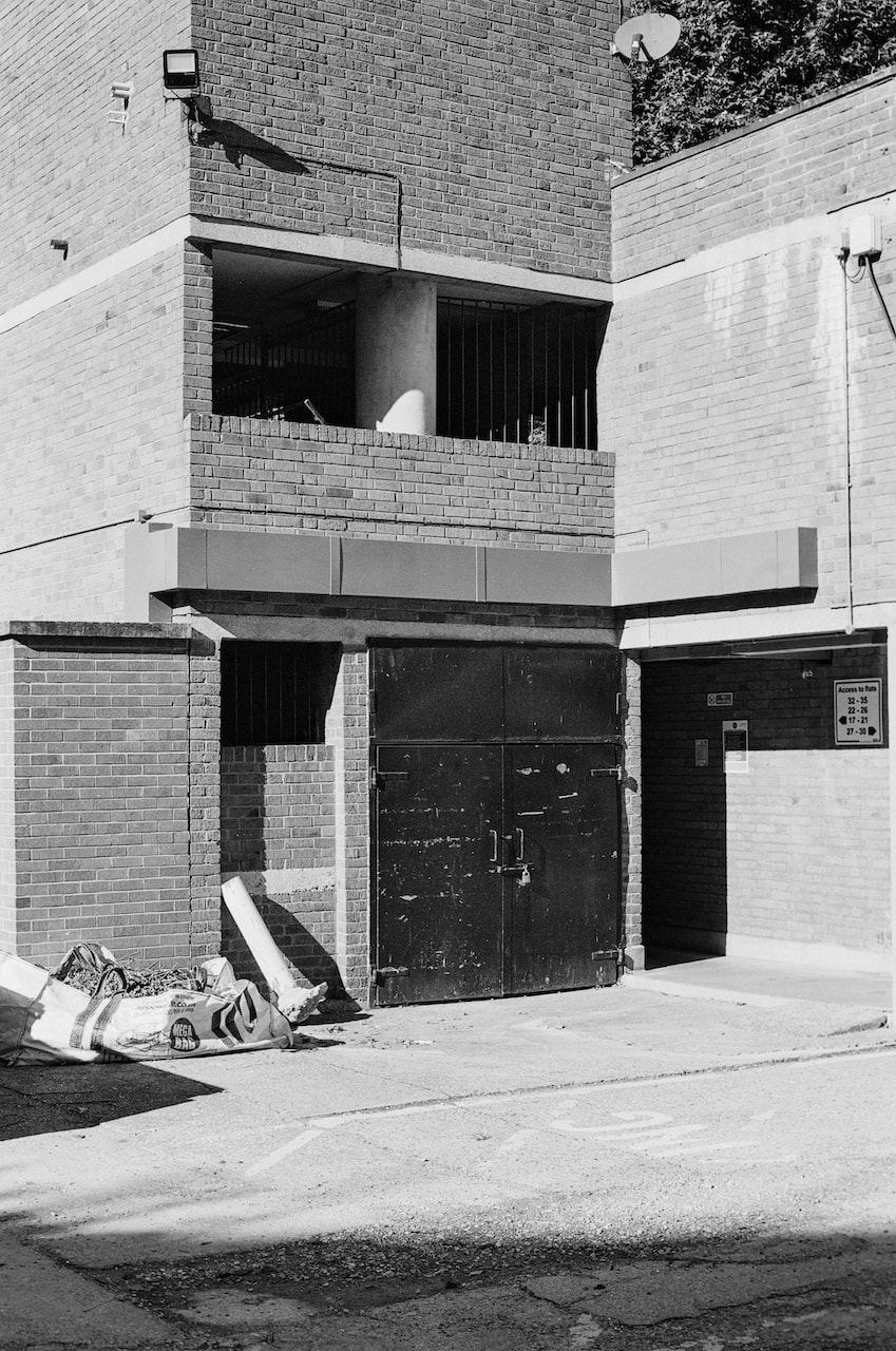
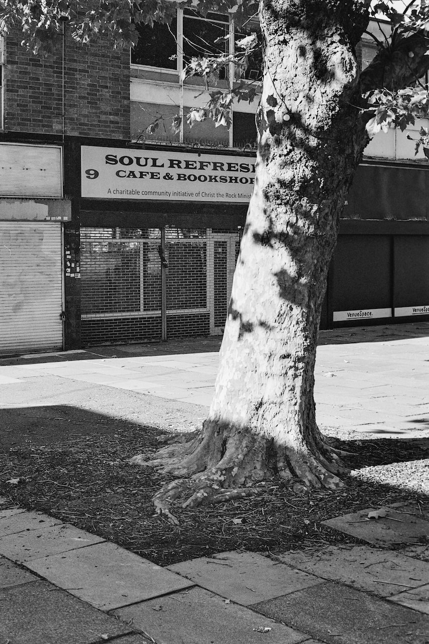
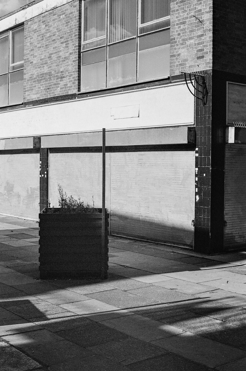
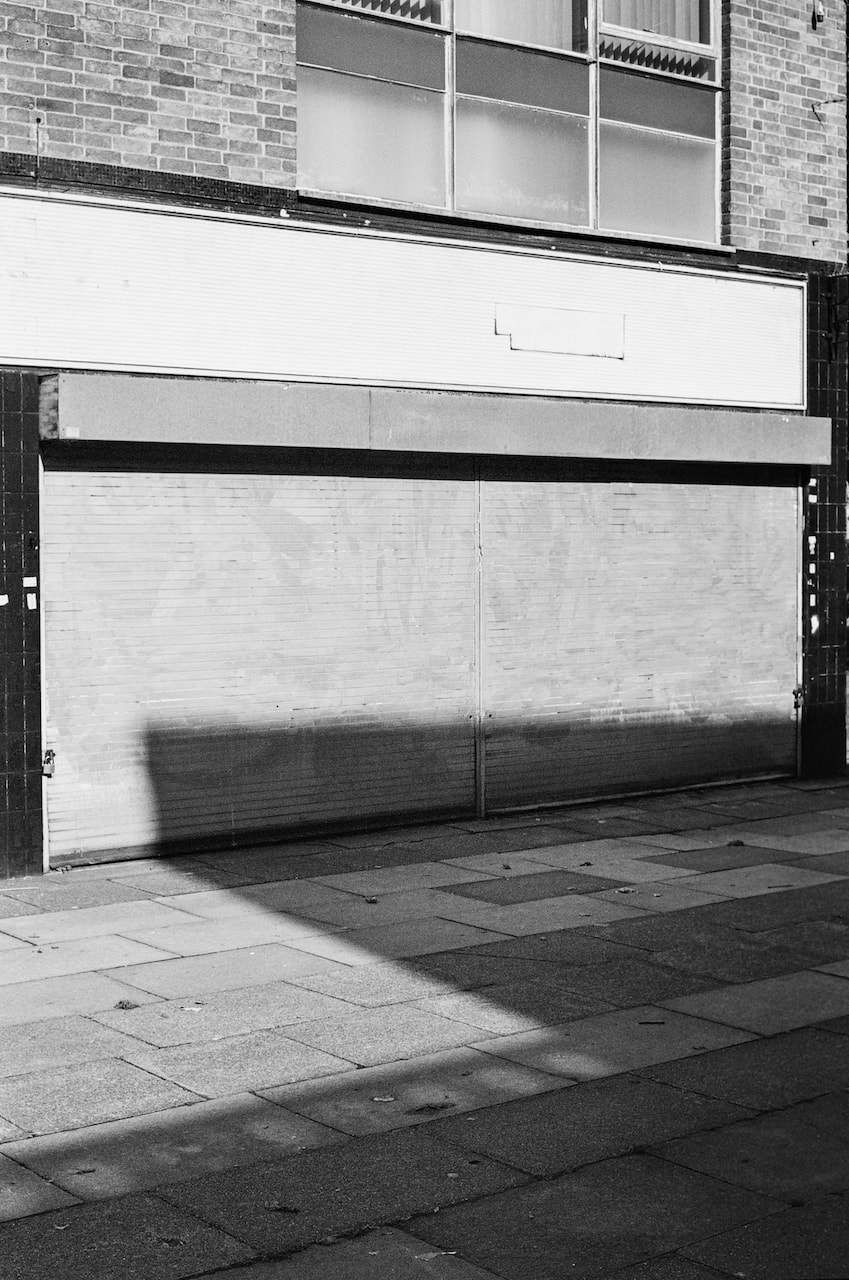
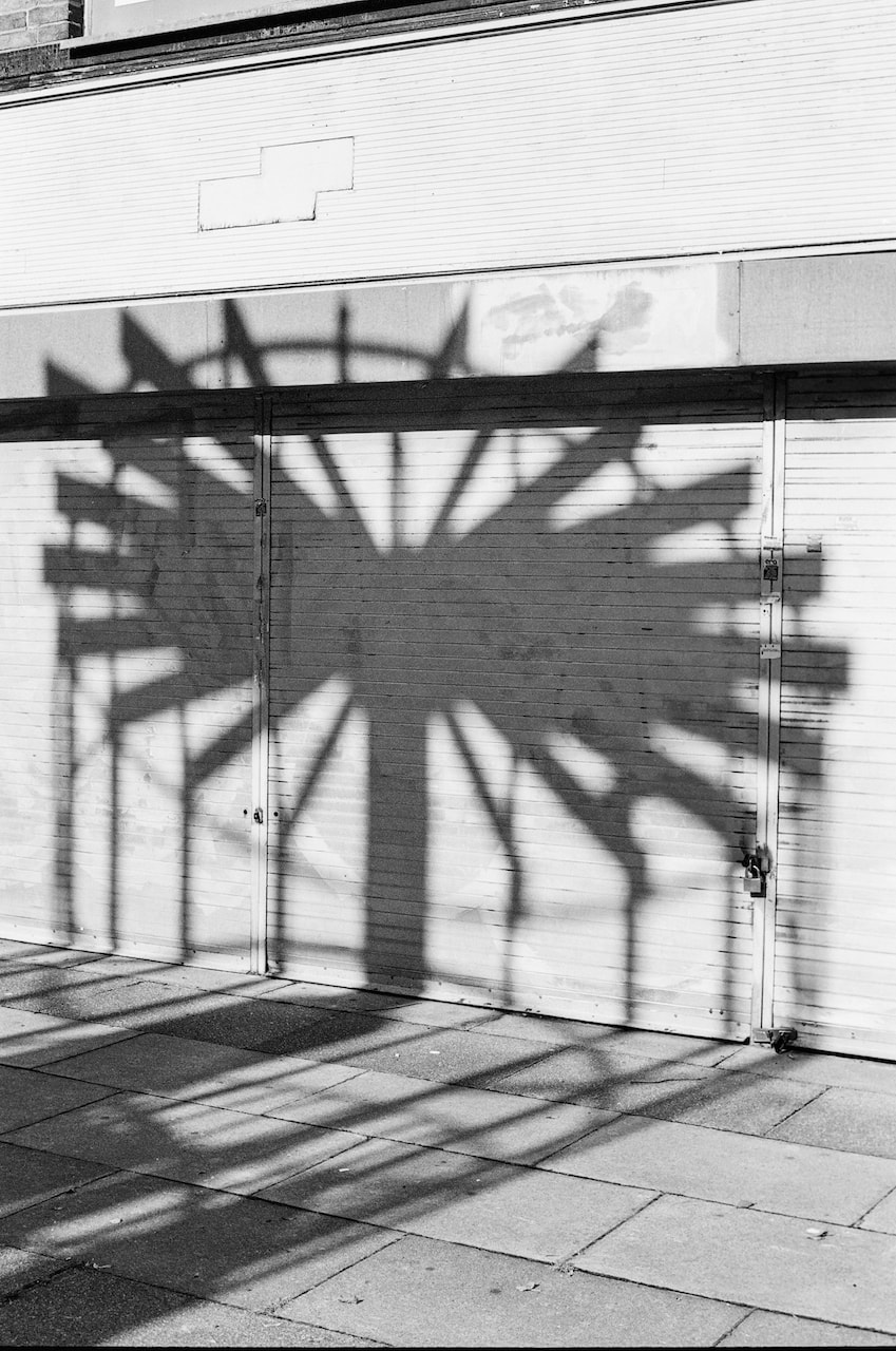
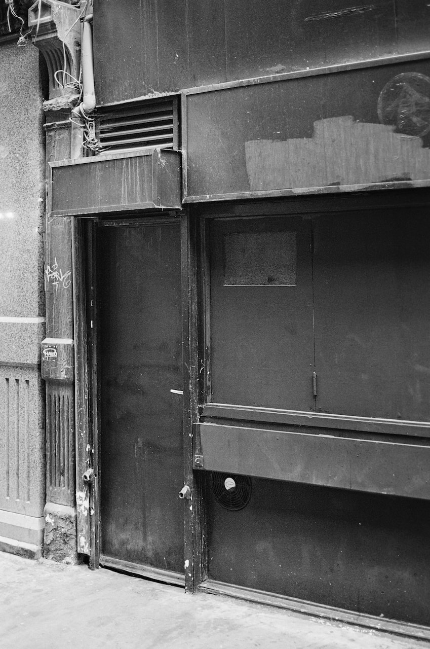
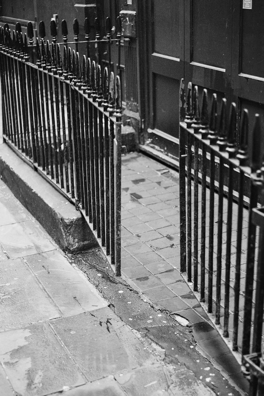
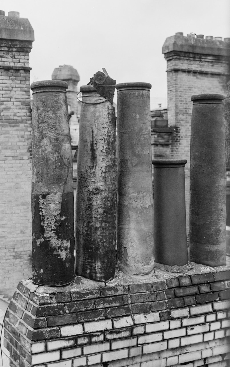
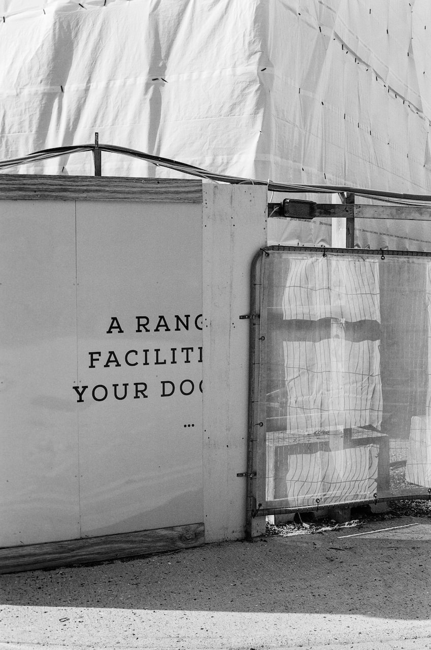
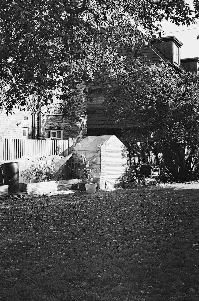
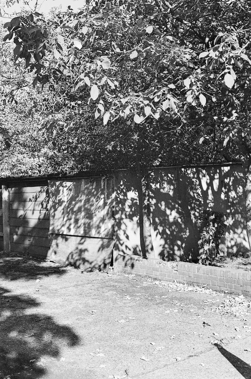
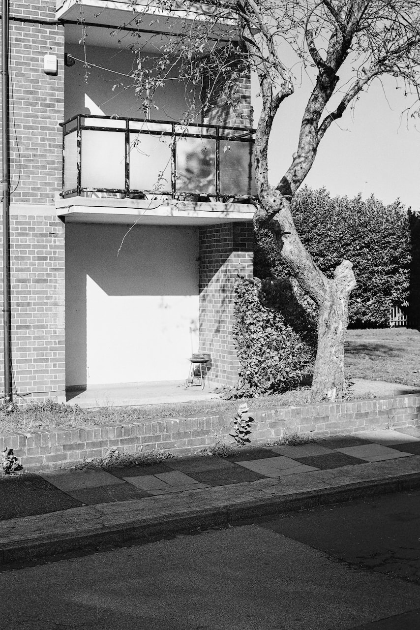
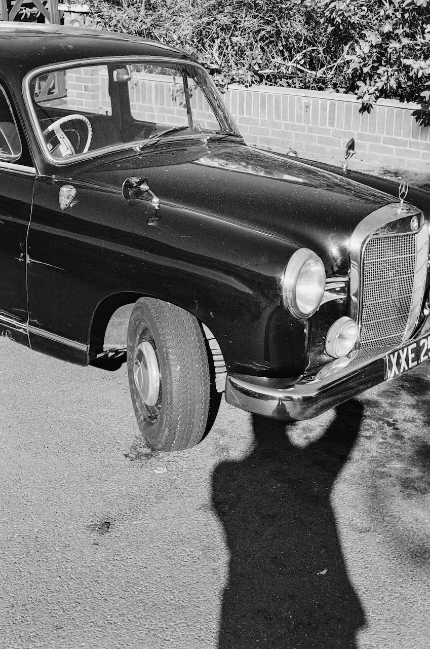
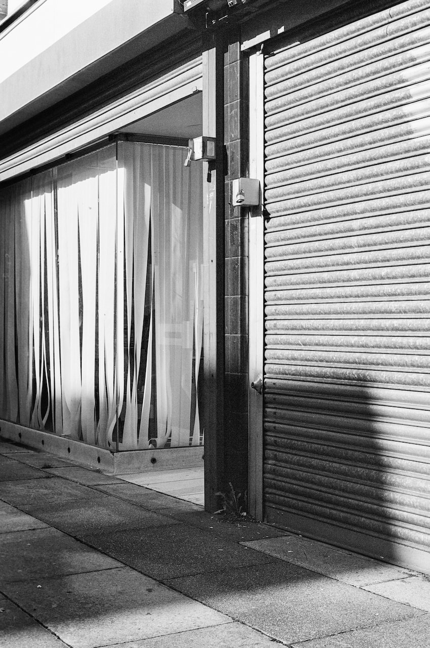
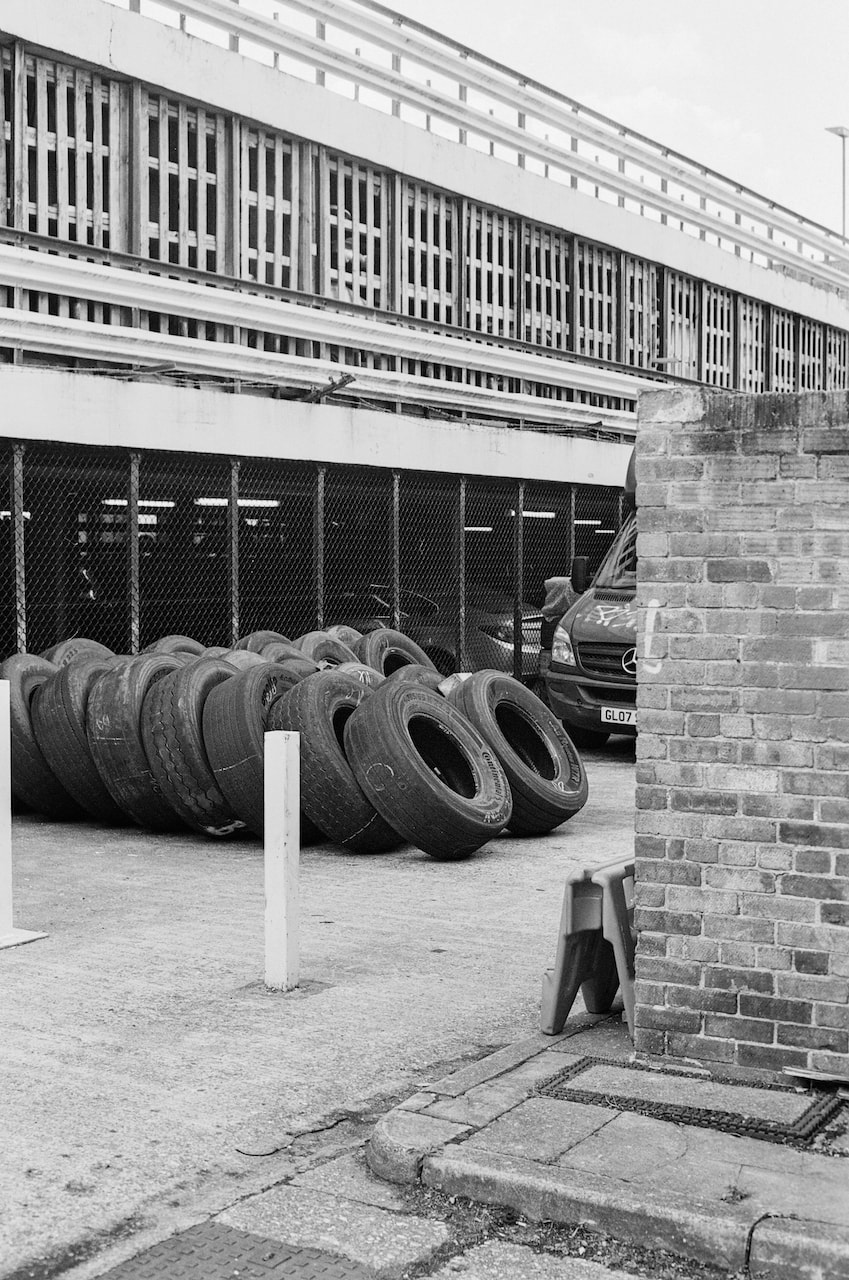
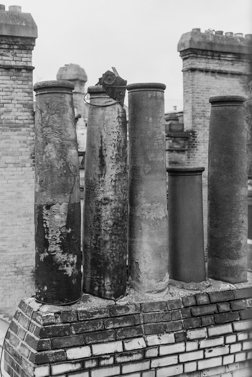
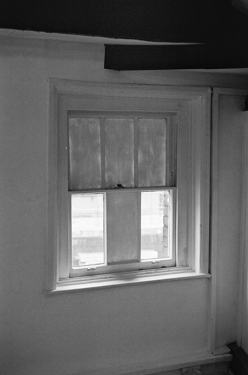
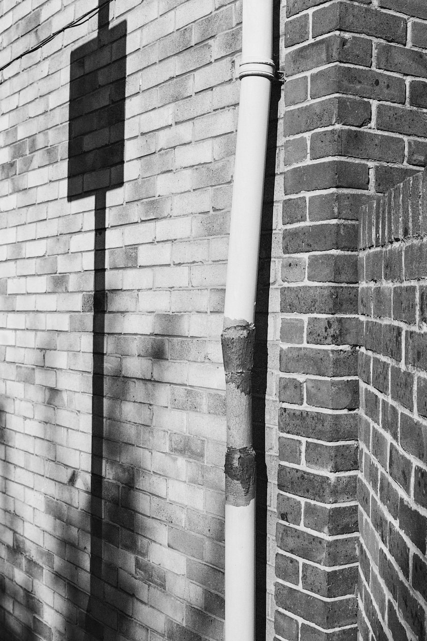
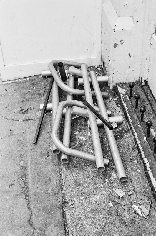
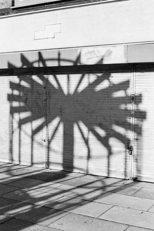
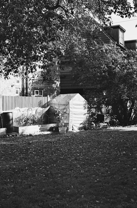
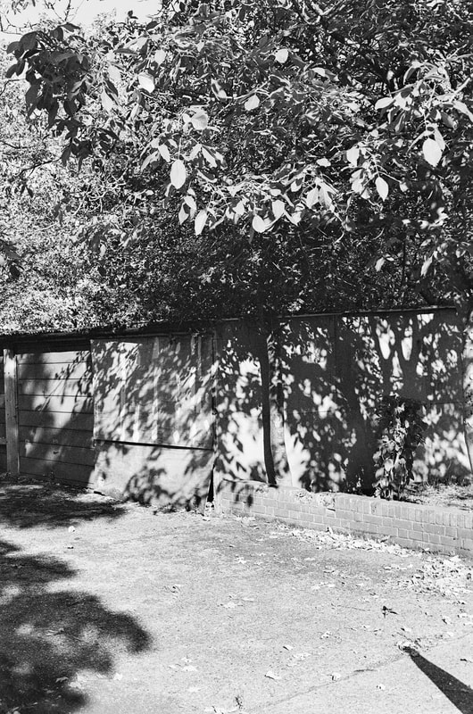
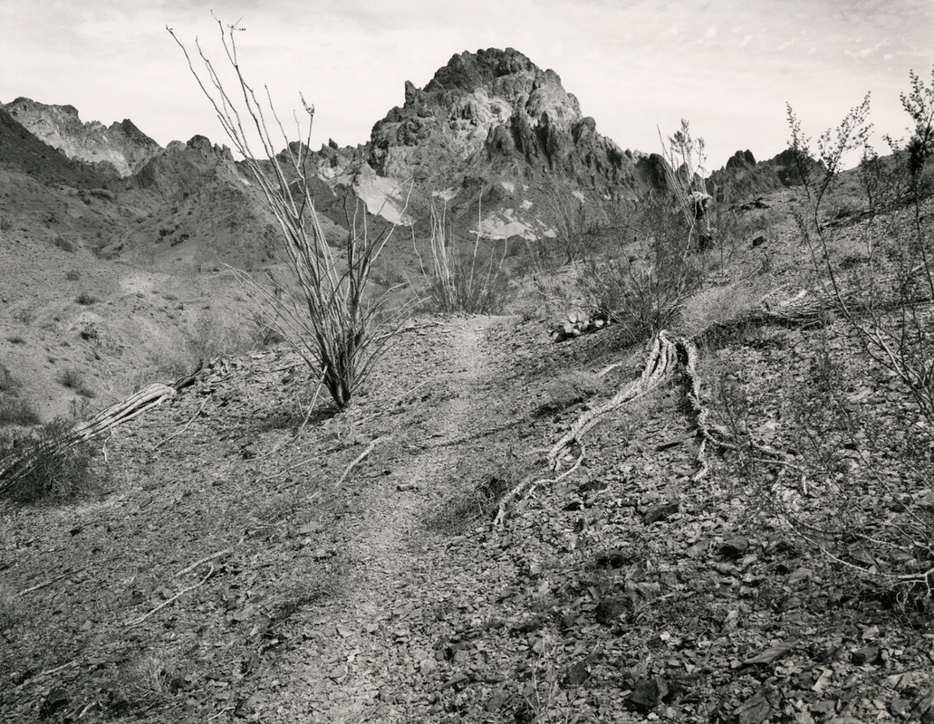
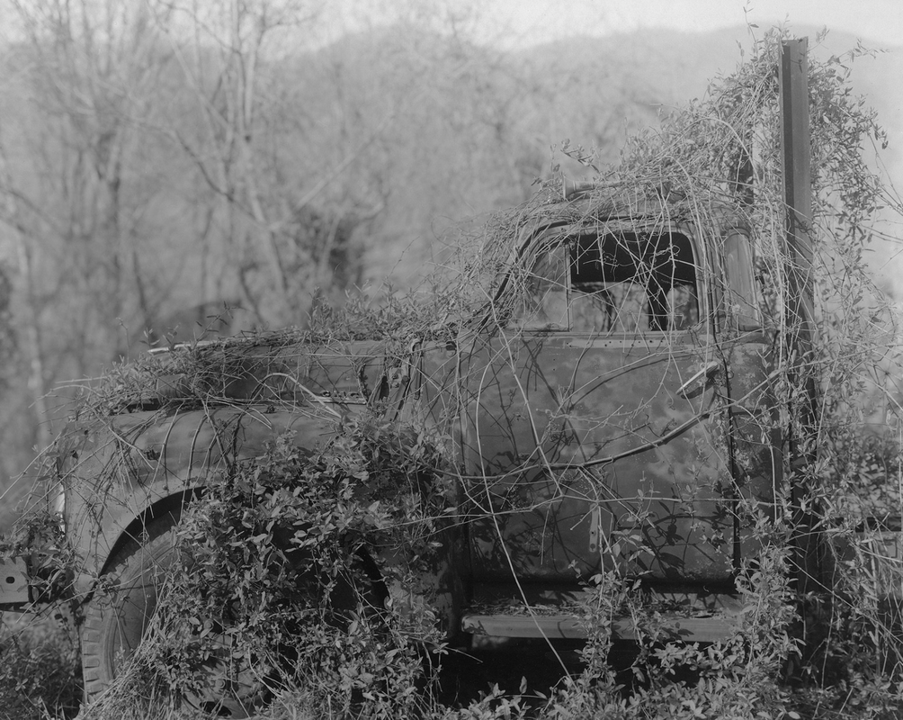
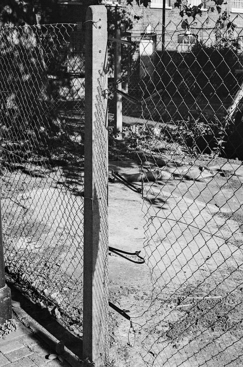
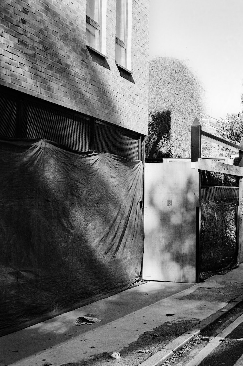
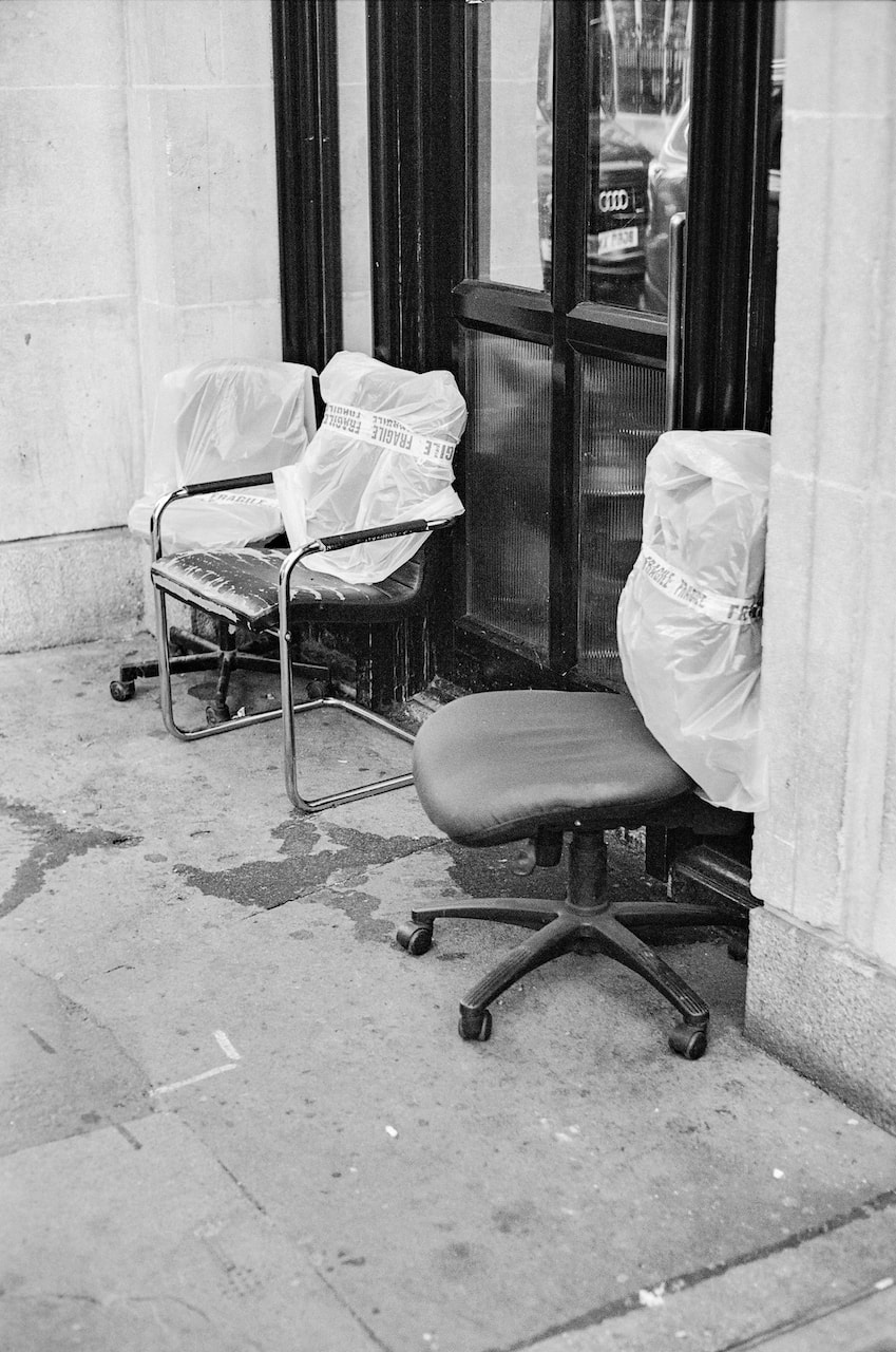
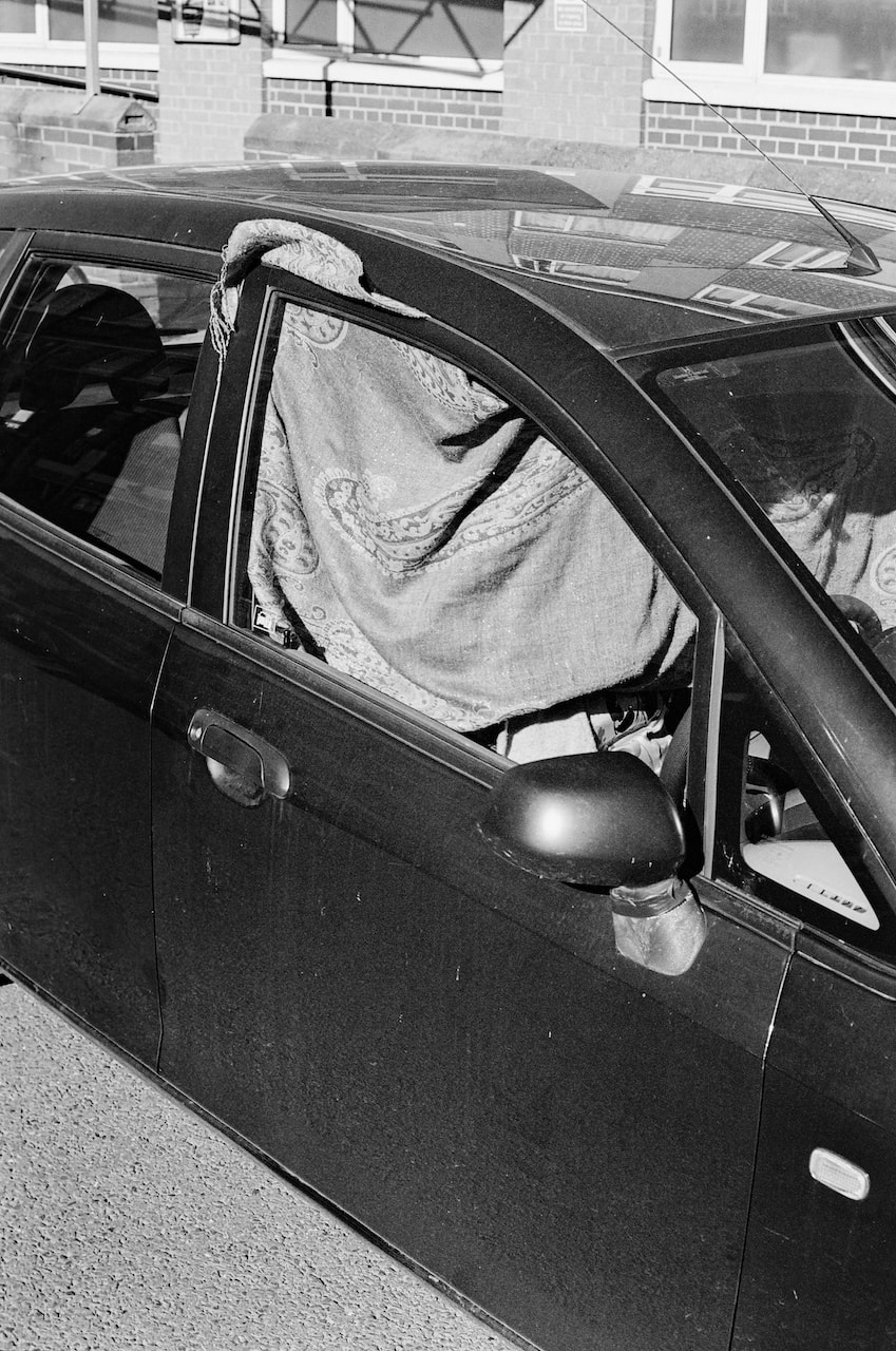
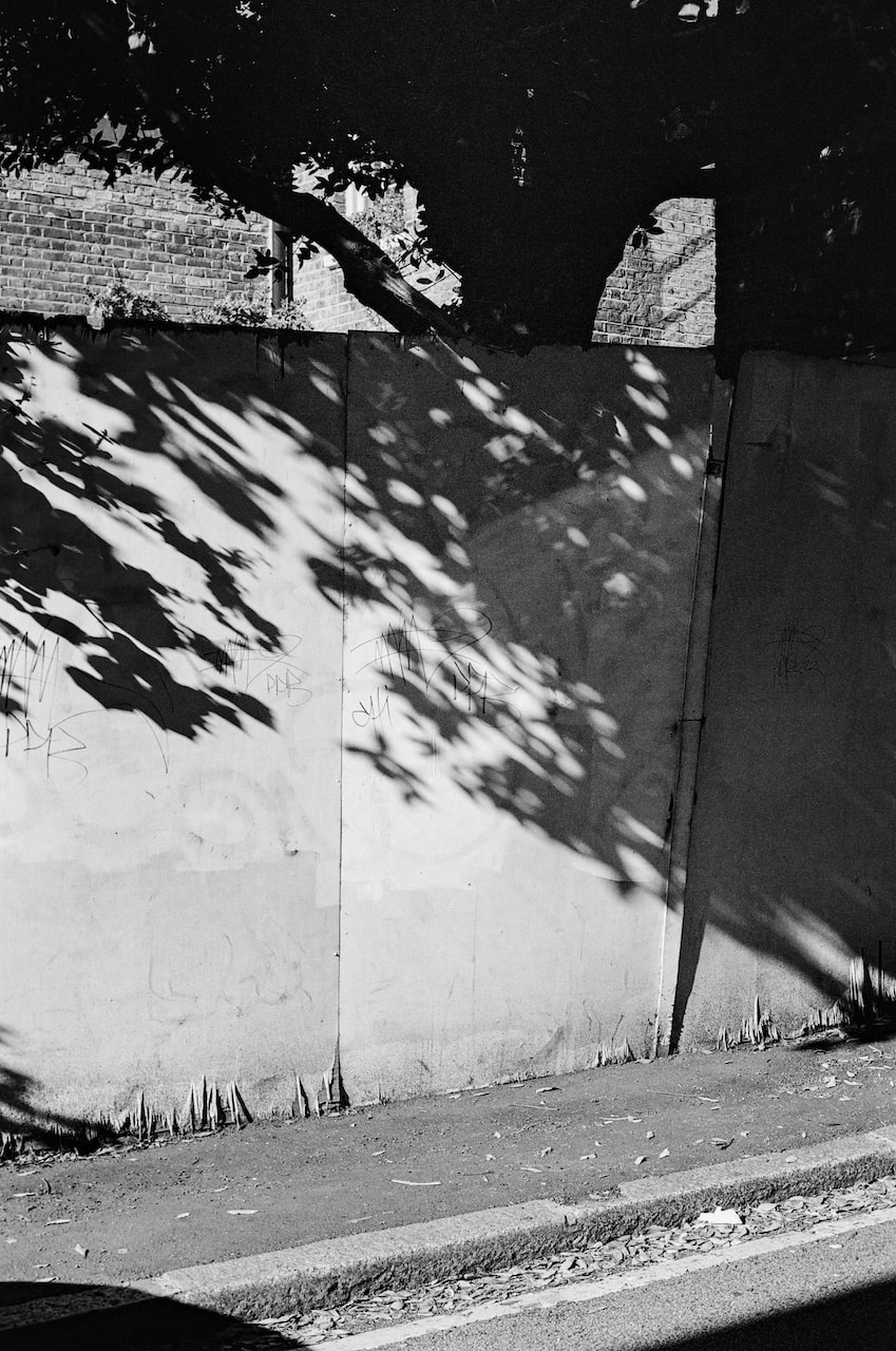
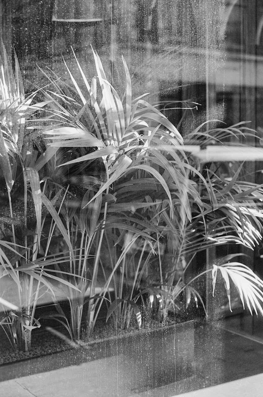
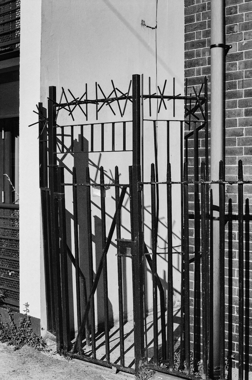
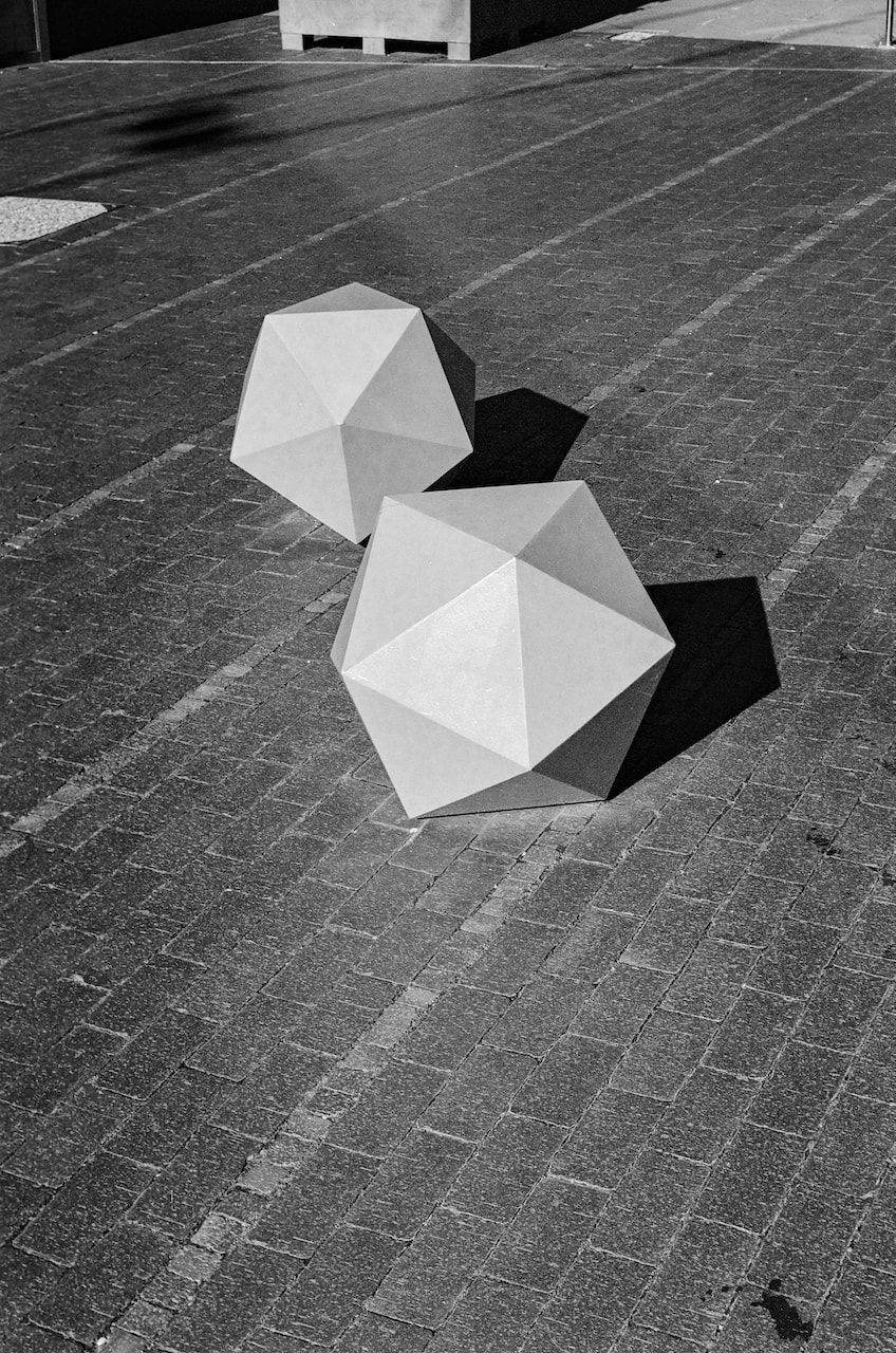
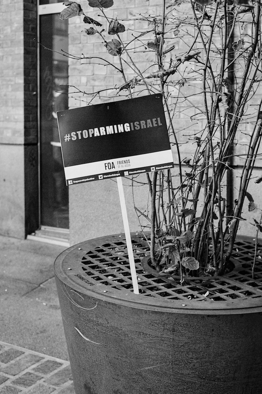
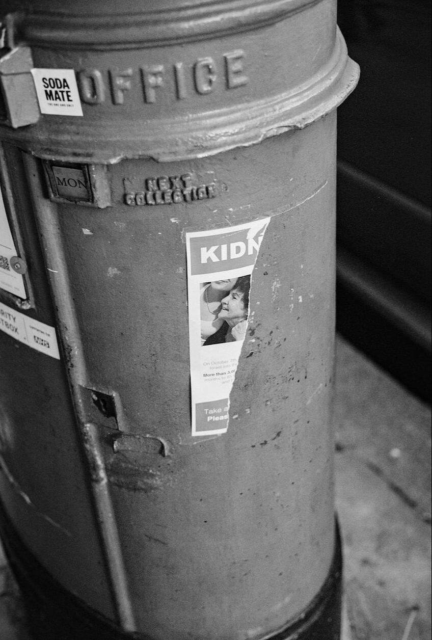
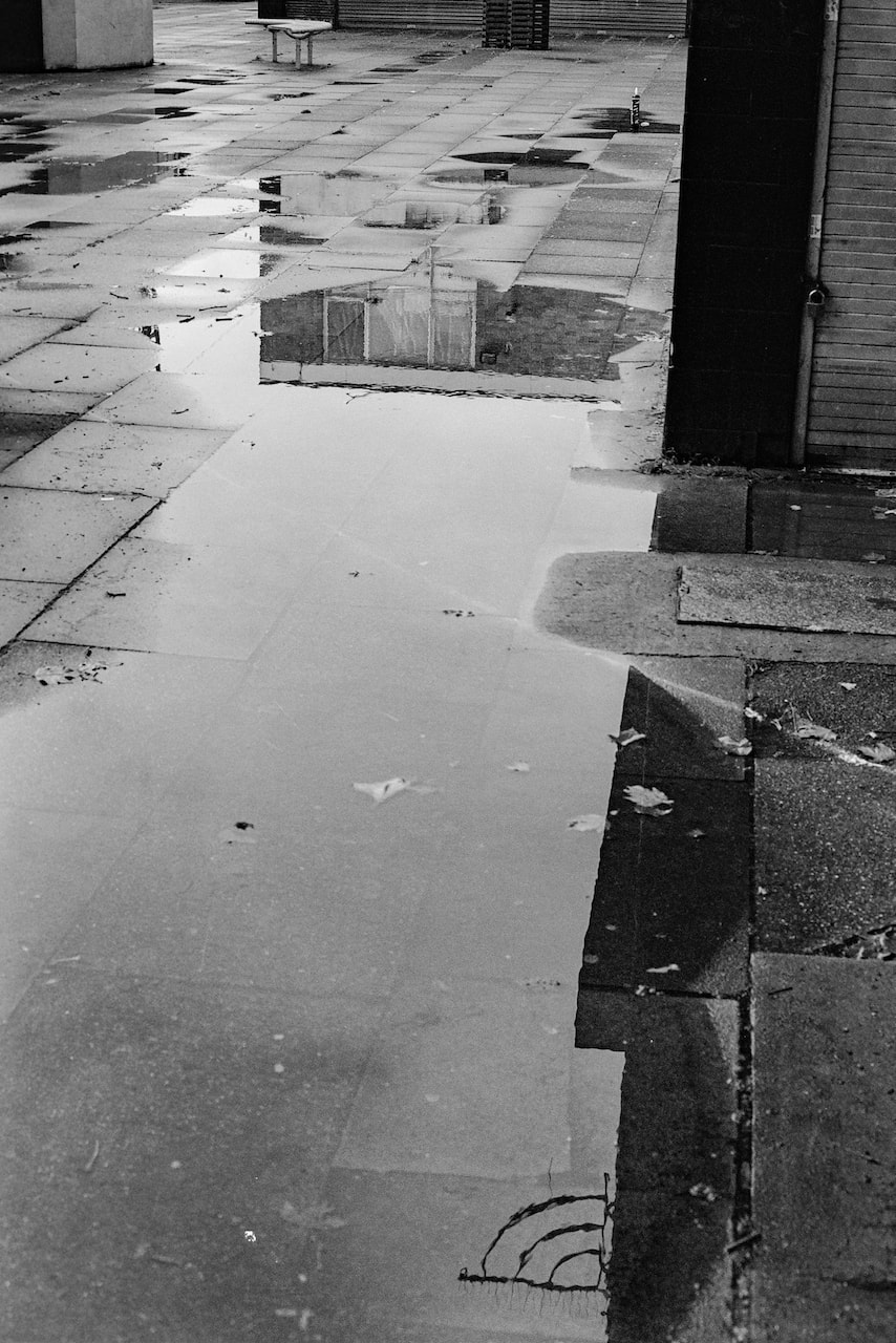
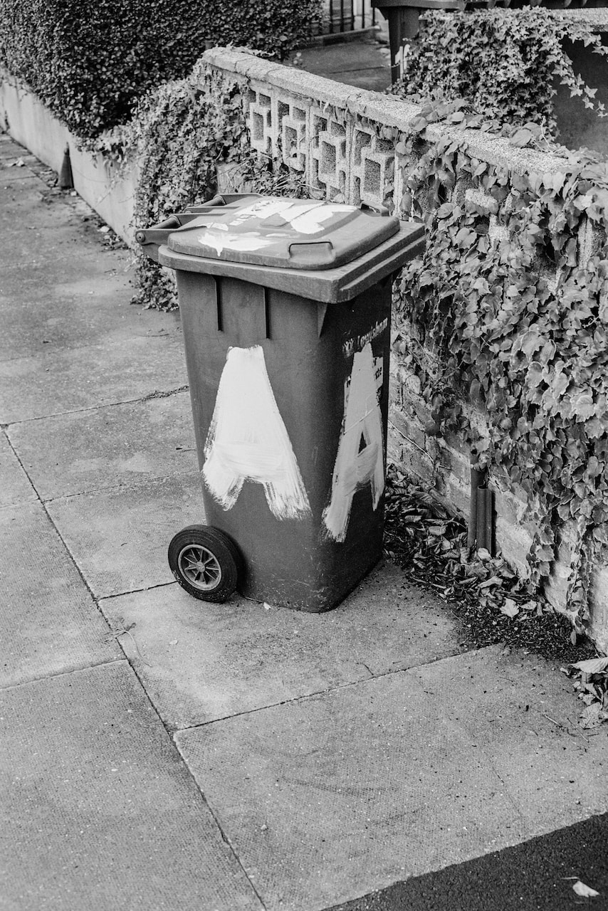
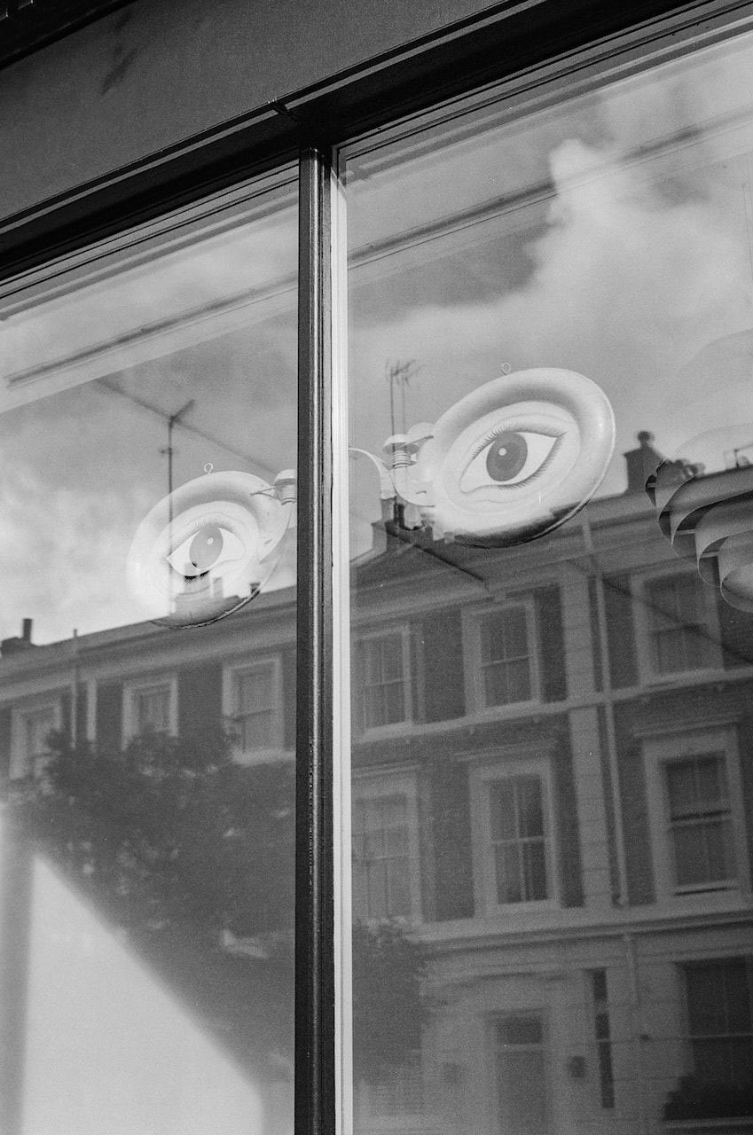
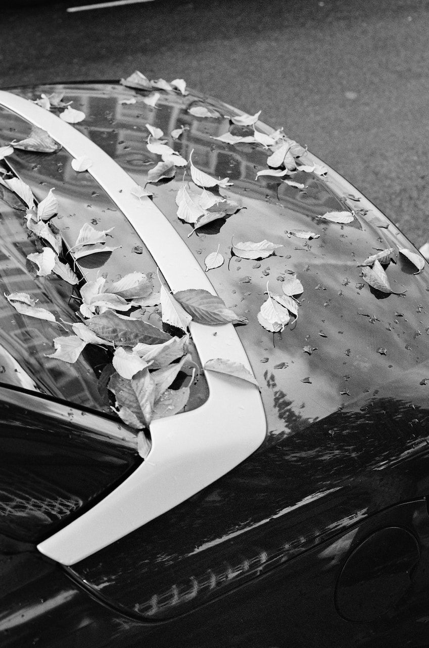
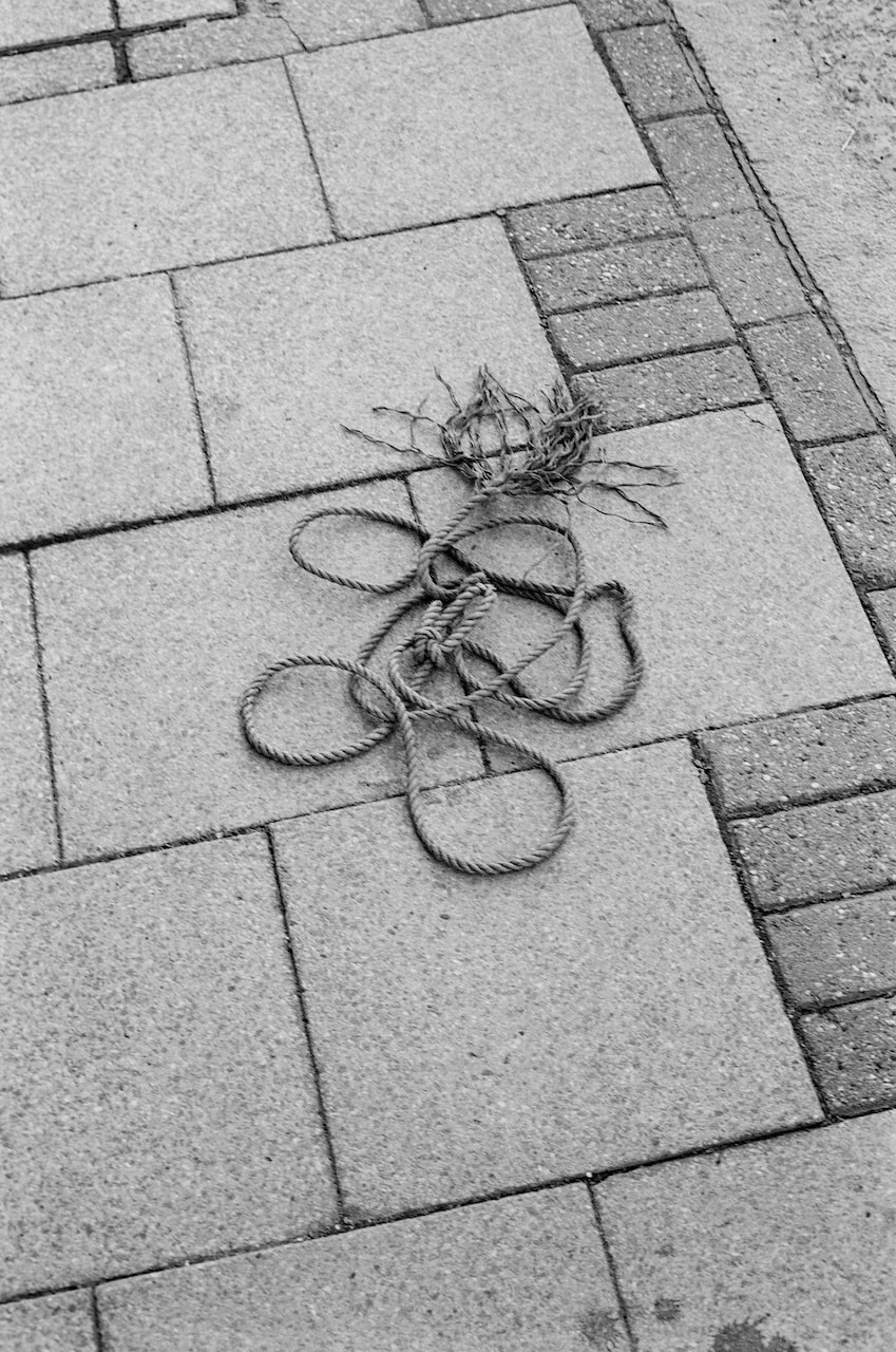
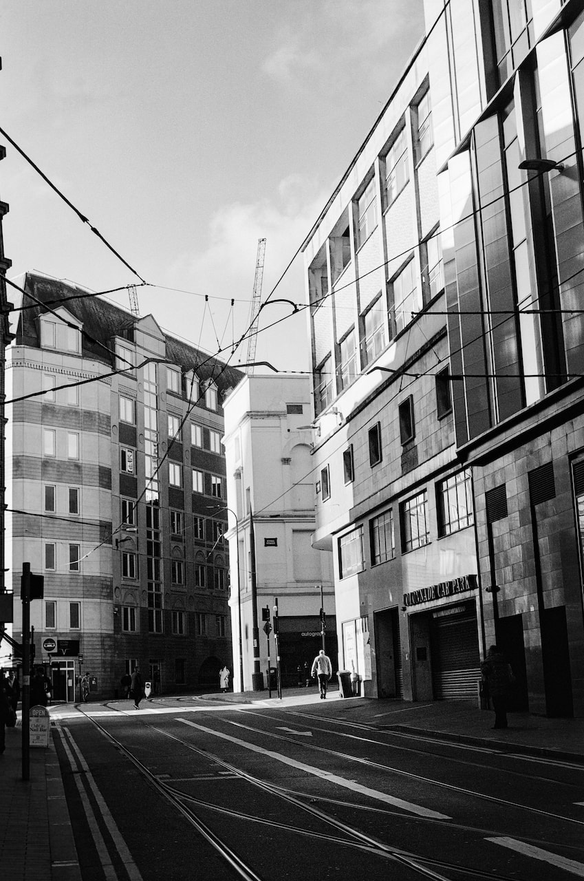
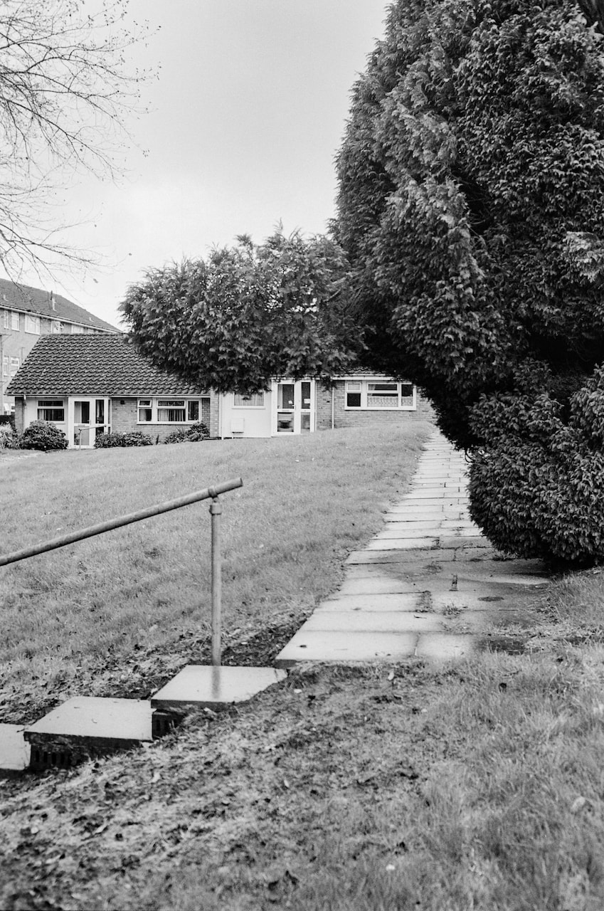
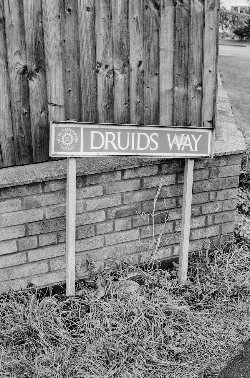
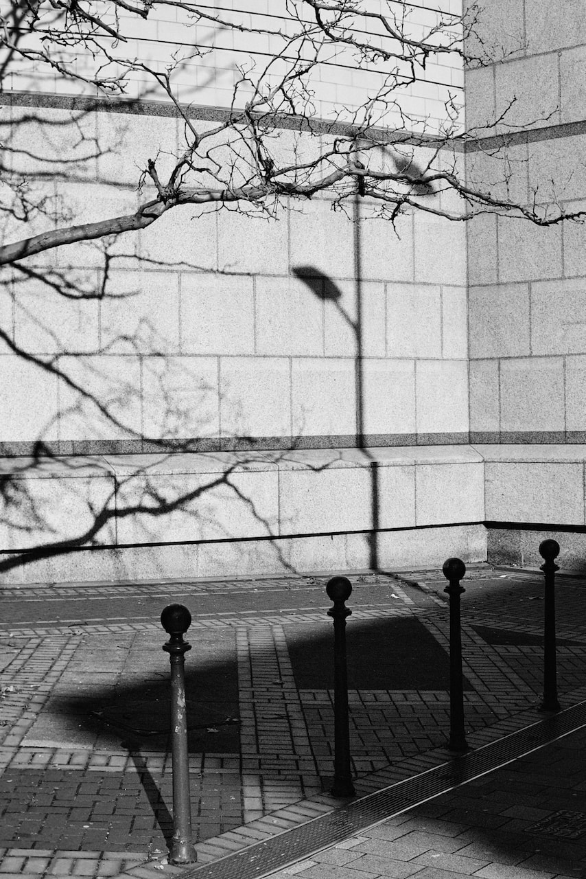
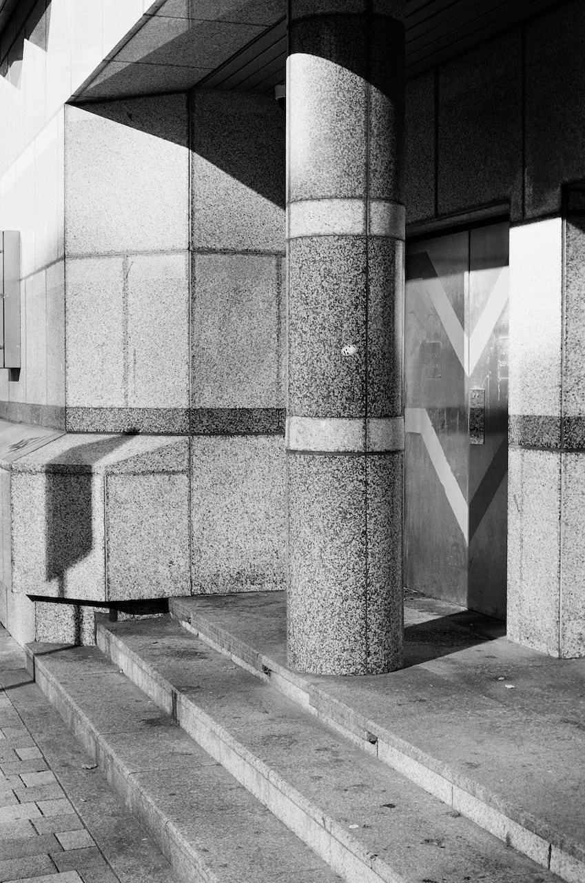
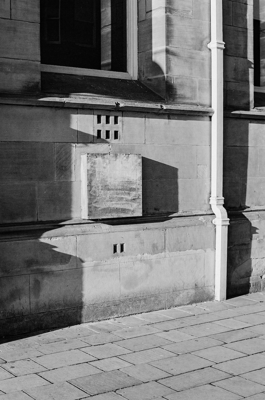
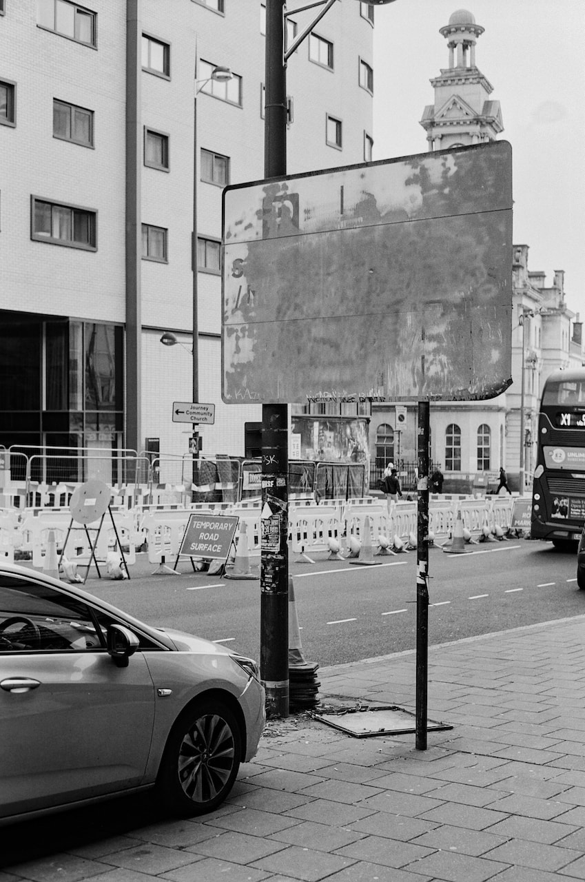
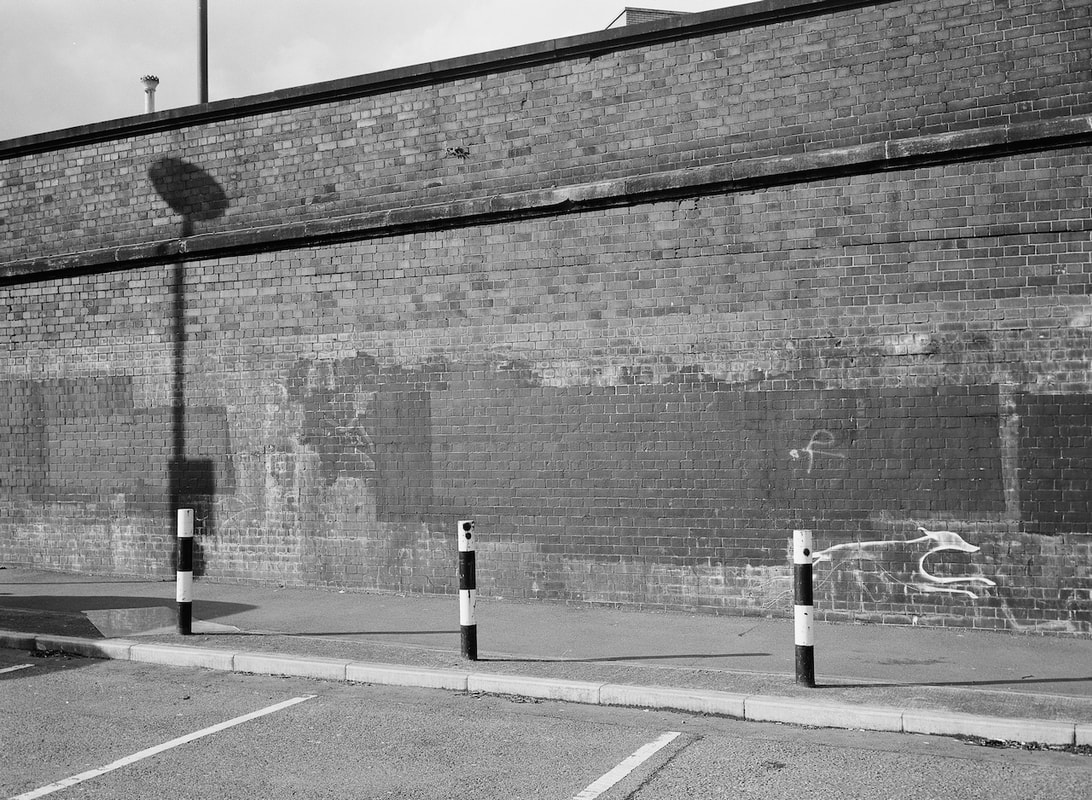
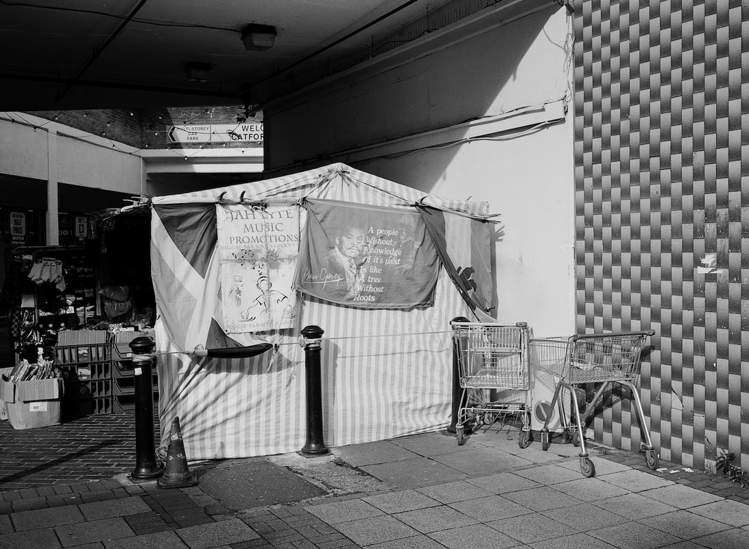
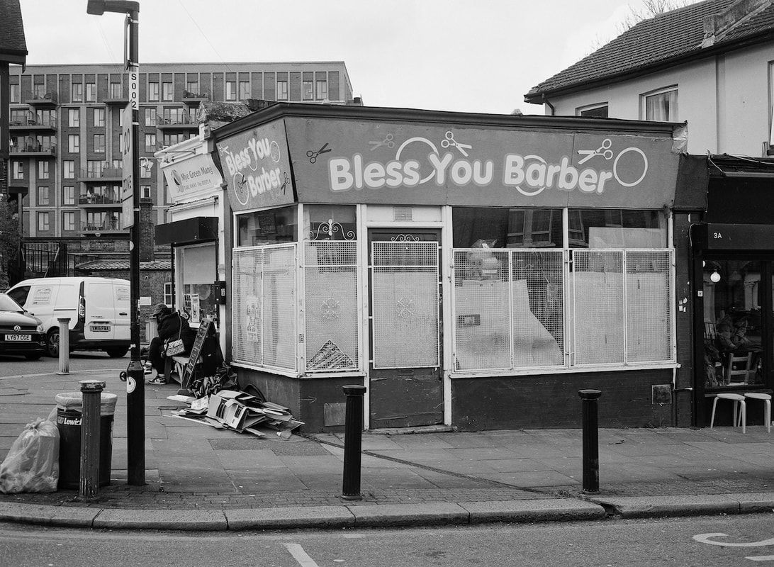
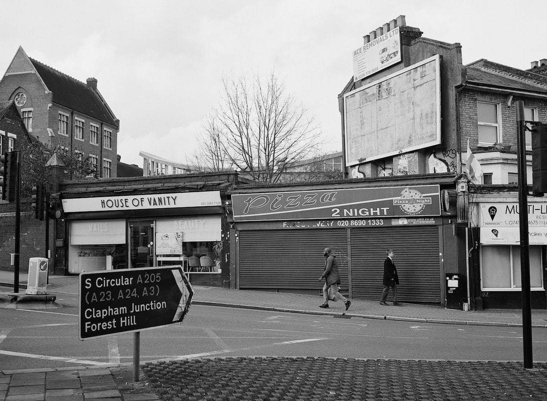
I have decided to stick with 35mm black and white images for my final body of work. I suppose I could use pictures from much earlier in the course, but I'd prefer to continue gathering images until the point where I really need to focus on creating a resolved presentation. These pictures were all taken with a yellow filter and I really like the graphic contrast it provides.
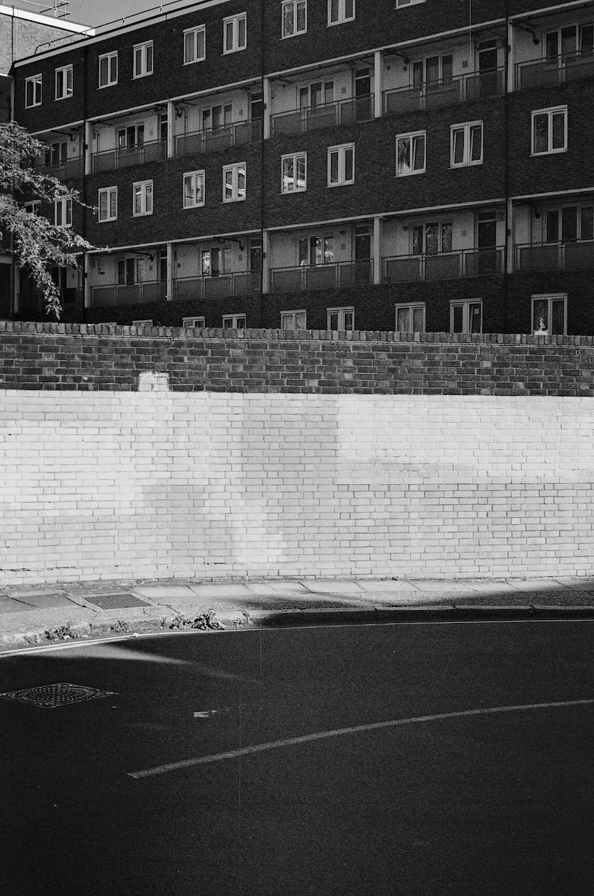
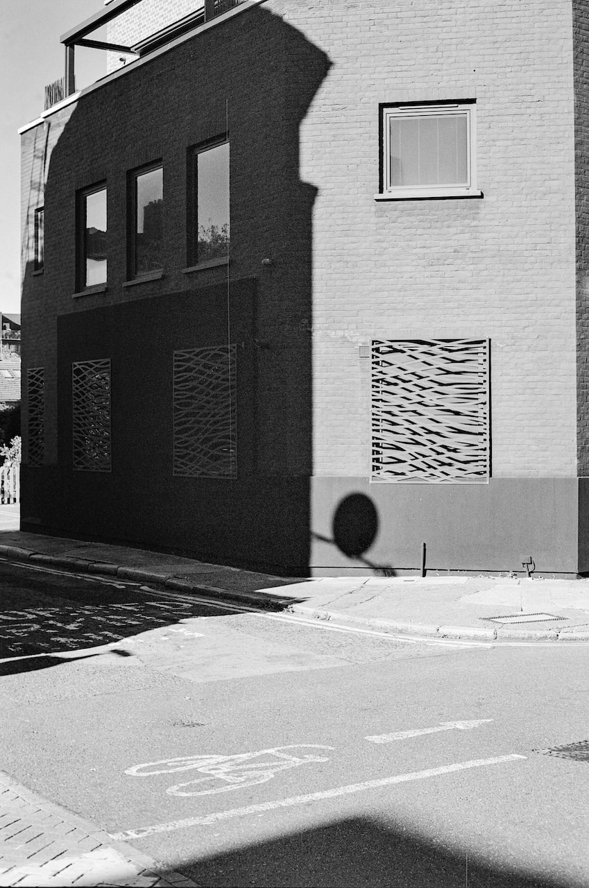
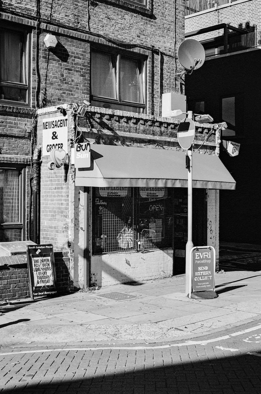
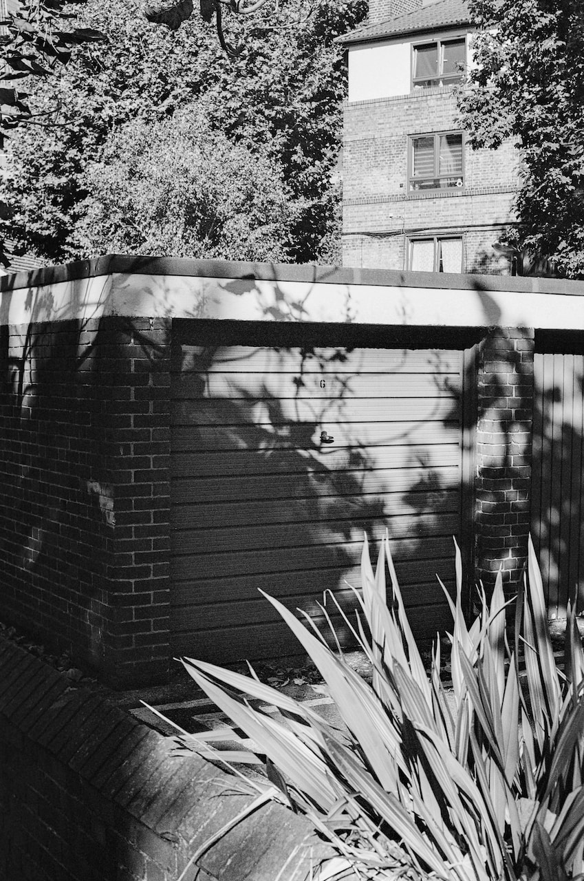
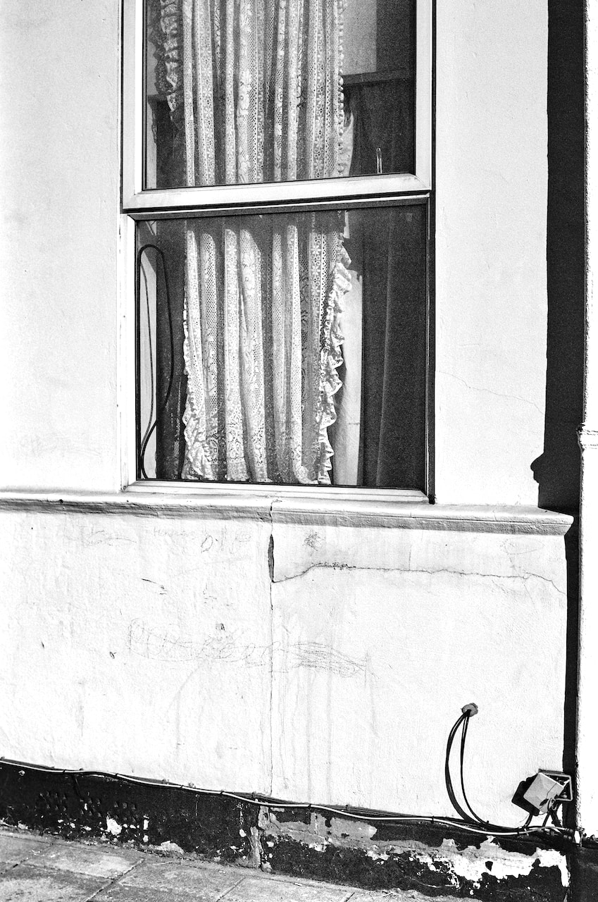
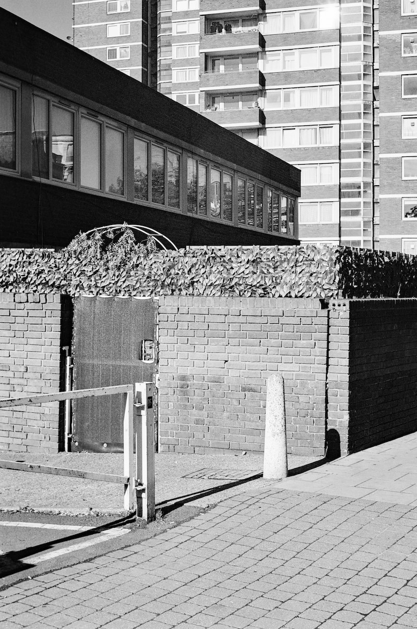
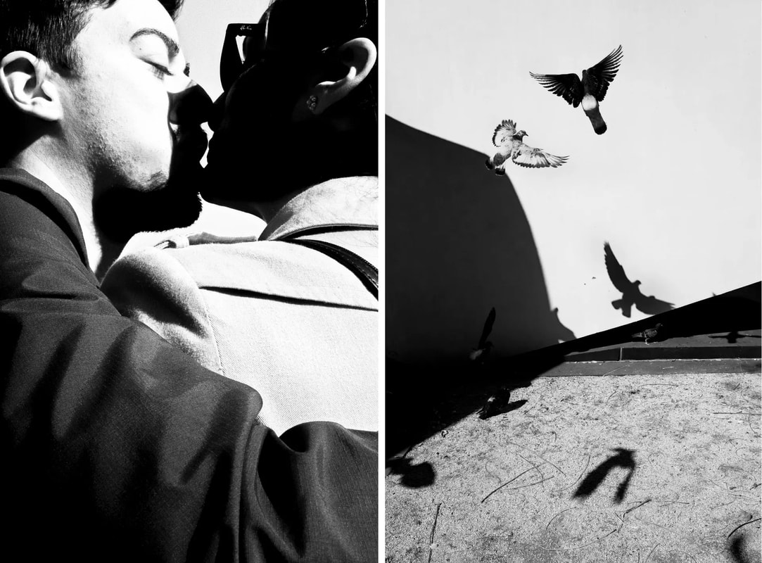
Diptychs
|
|
|
|
|
|
|
|
|
|
|
|
|
|
|
|
|
|
|
|
|
|
|
|
|
|
|
|
|
|
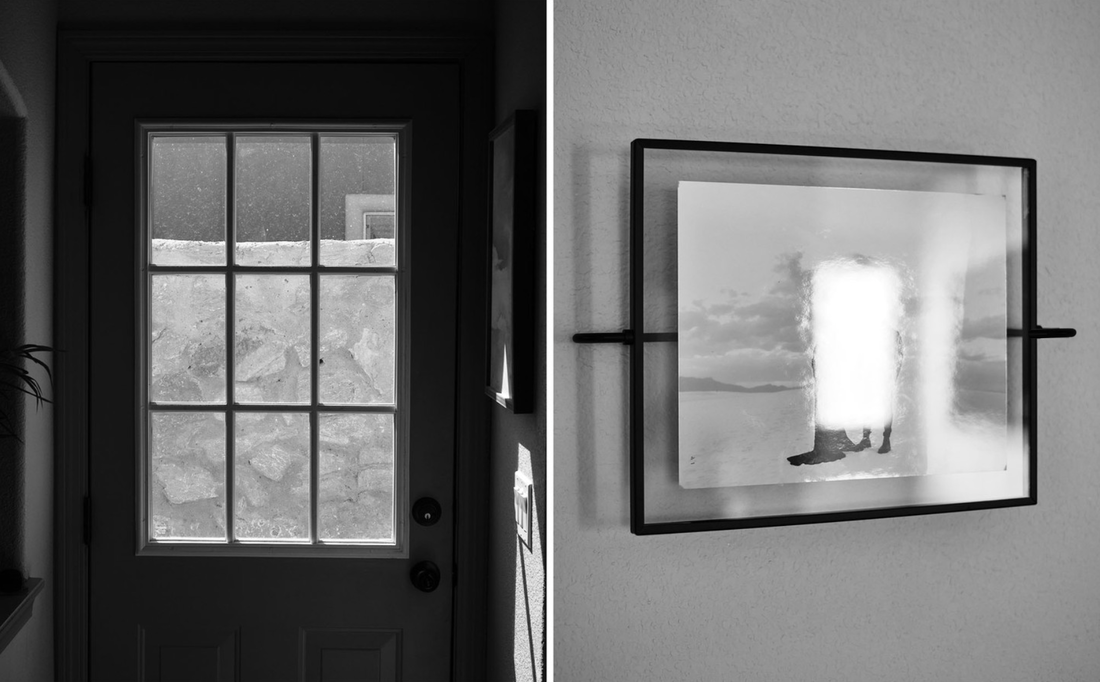
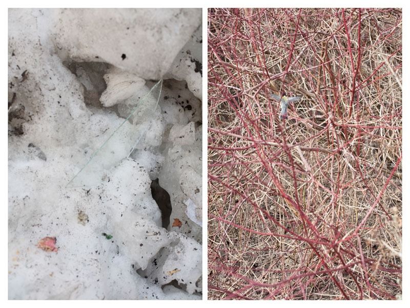
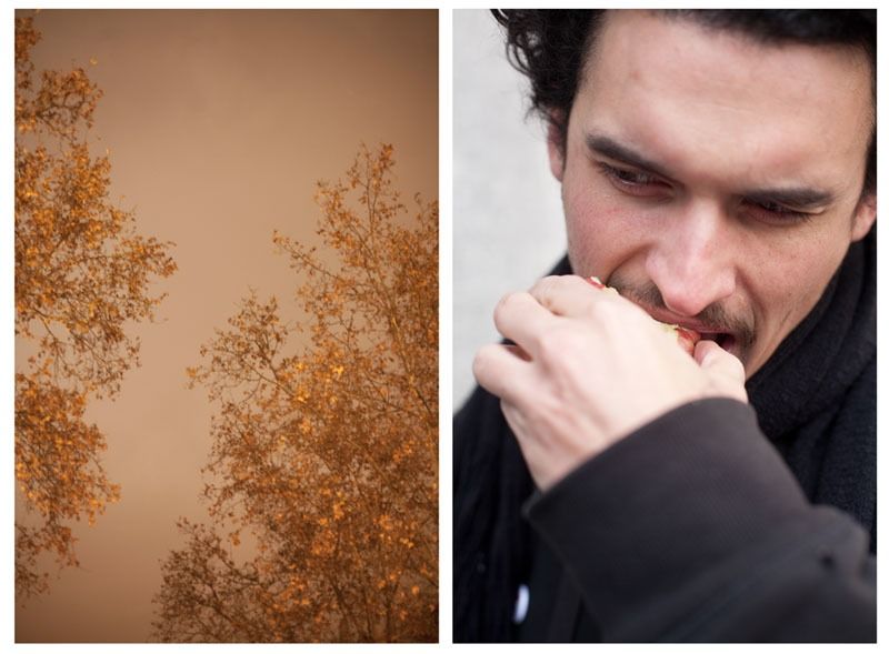
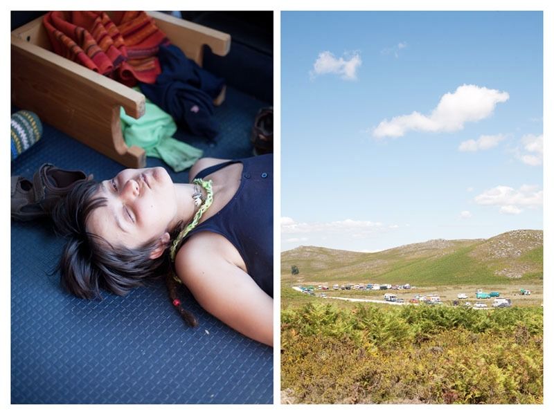
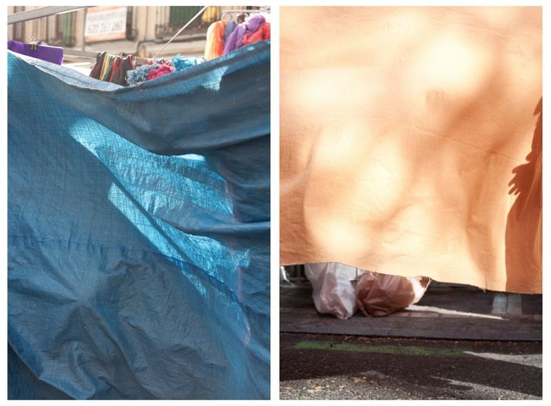
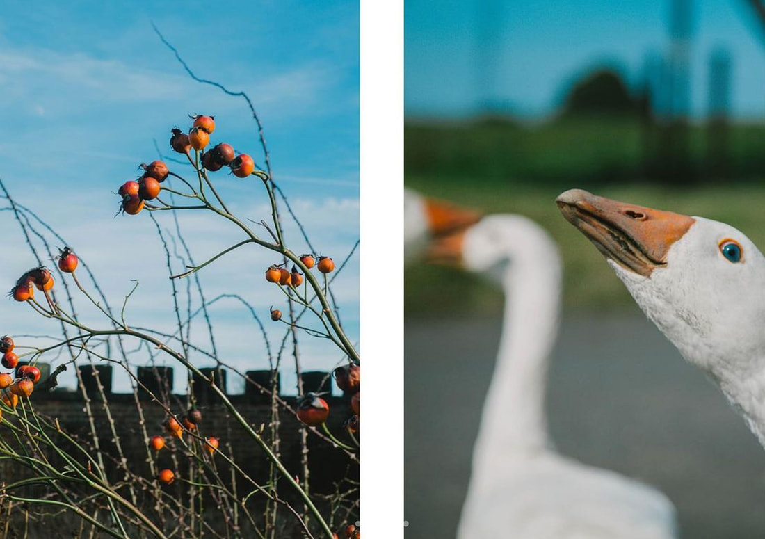
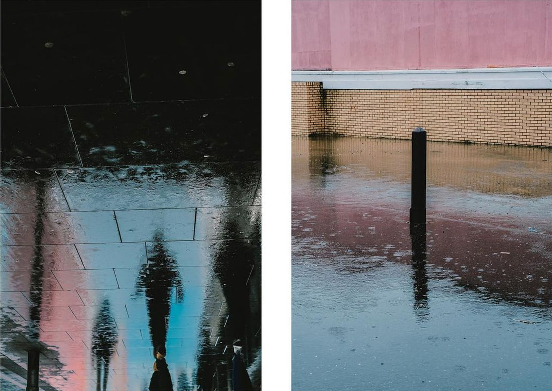
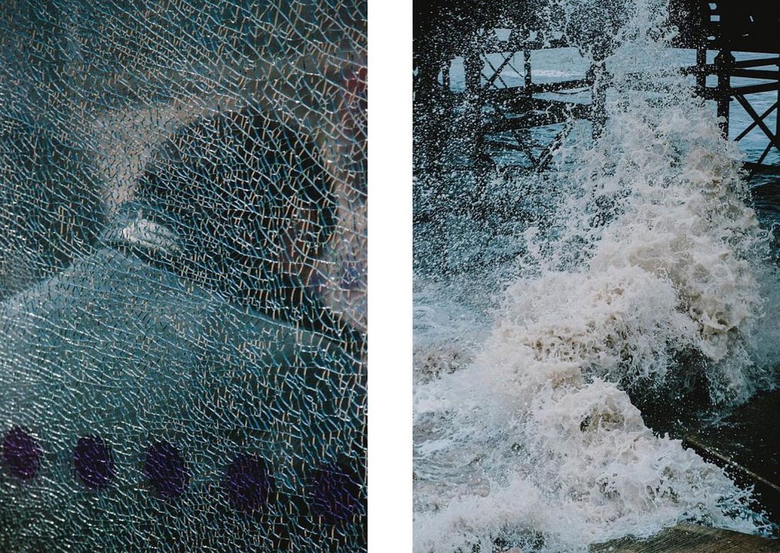
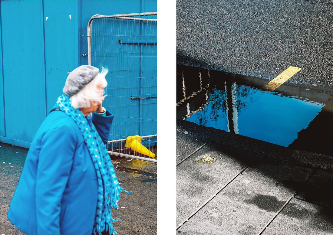
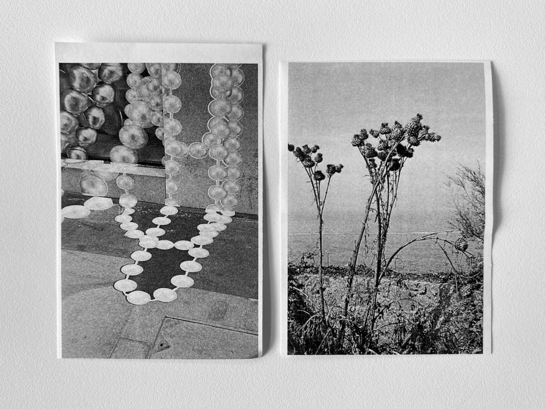
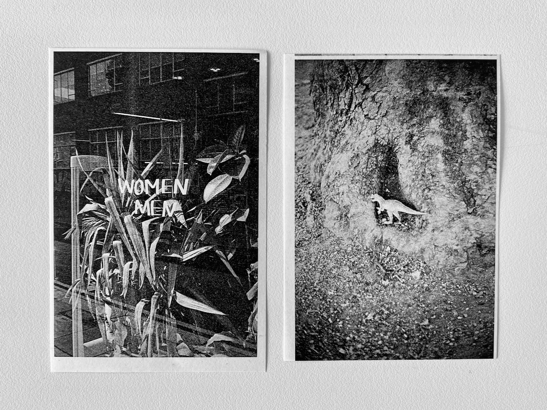
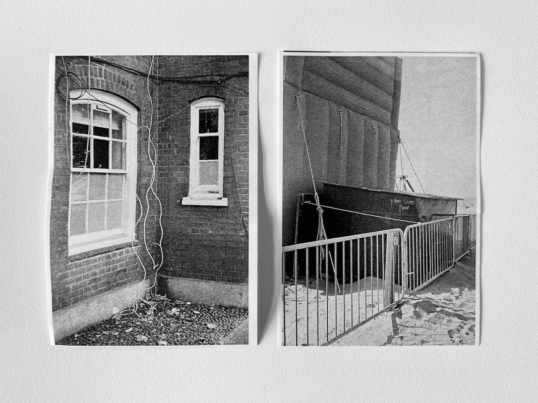
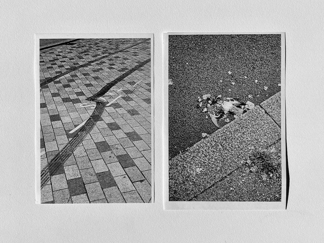
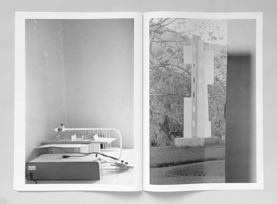
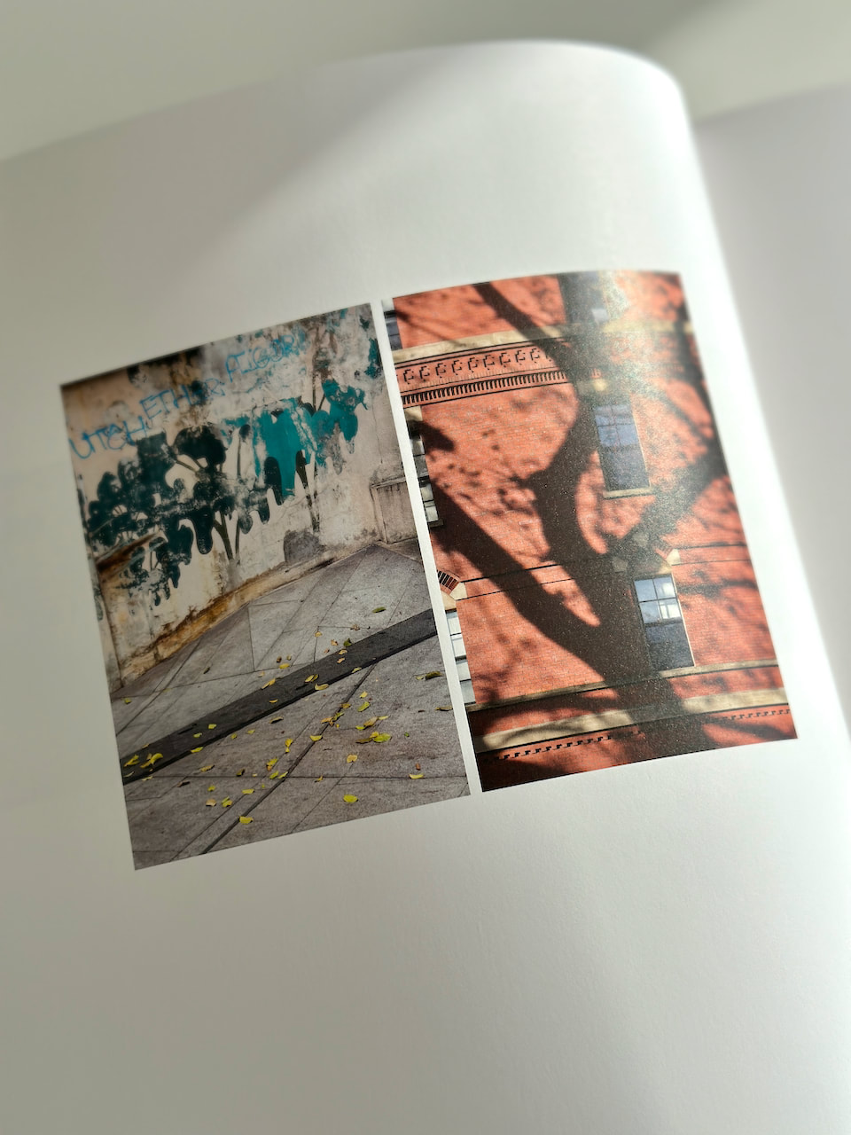
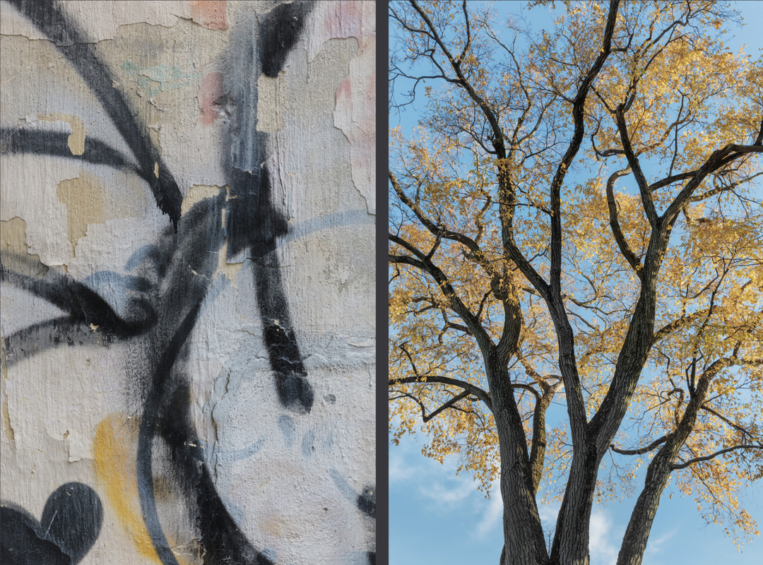
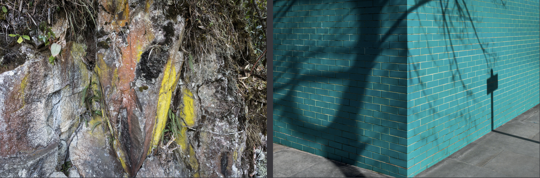
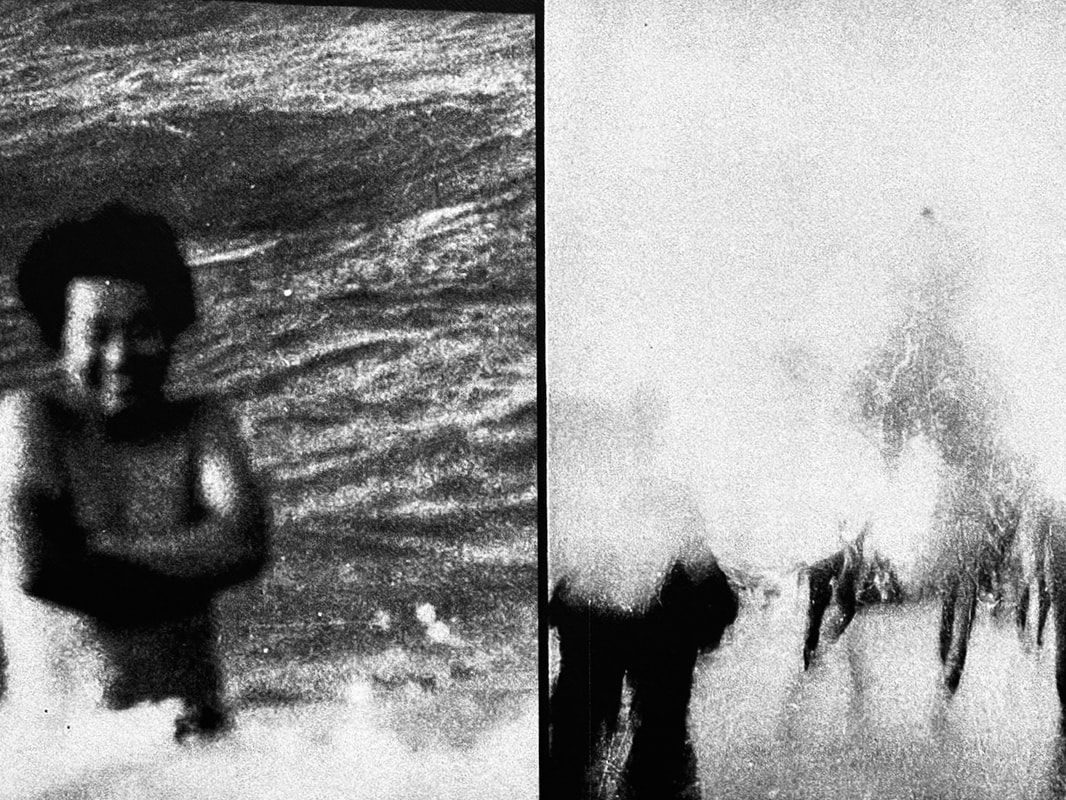
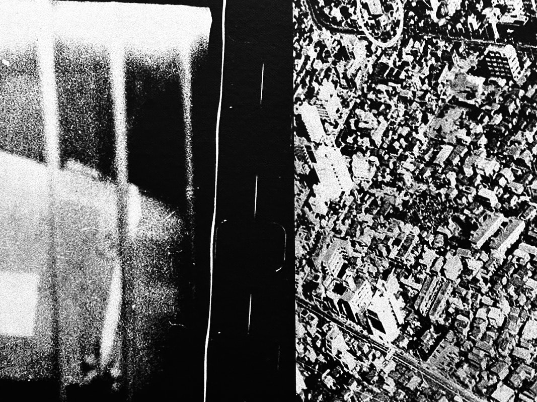
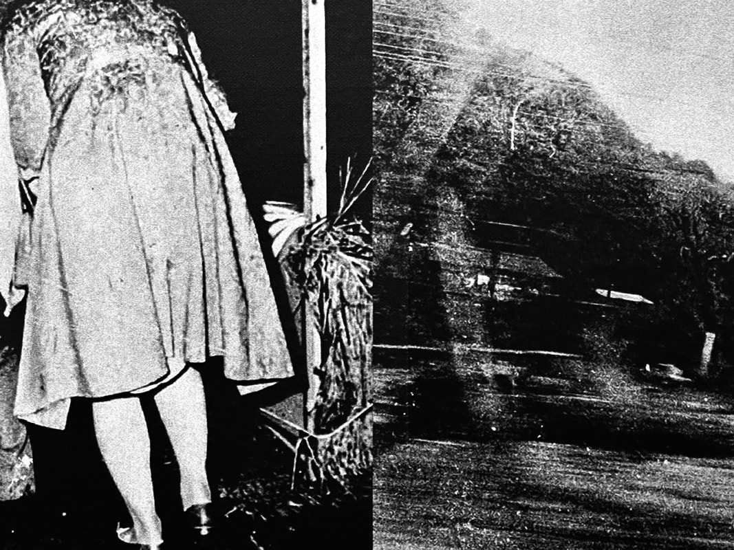
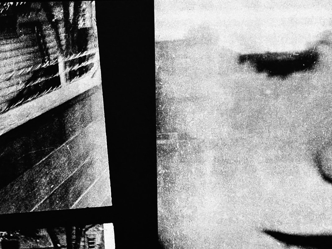
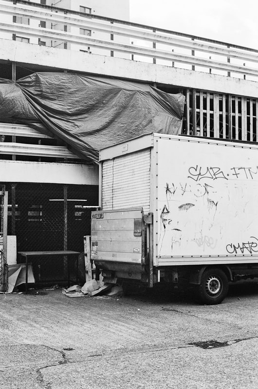
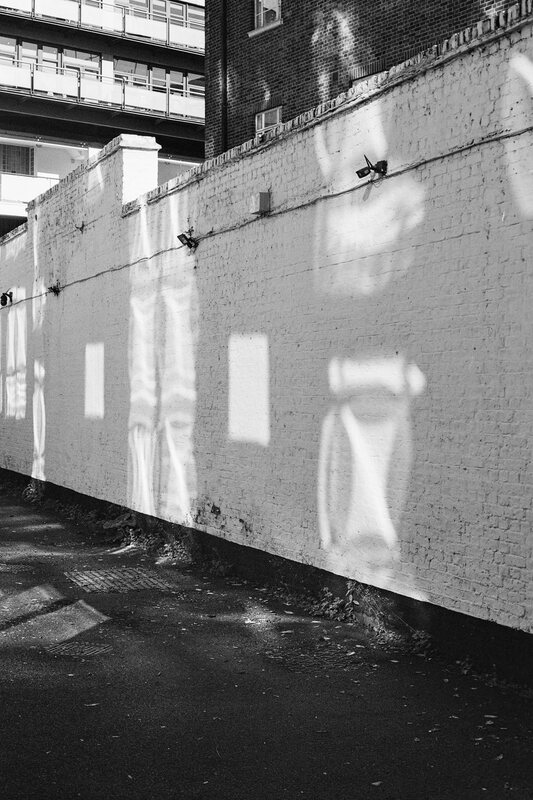
Diptychs
|
|
|
|
|
#2 |
|
|
|
|
|
|
|
|
|
|
|
|
|
|
|
|
|
|
Diptychs
|
|
|
|
|
|
|
|
|
|
|
|
|
|
|
|
|
|
|
|
|
|
|
|
|
|
|
|

|
|
|
|
|
|
|
|
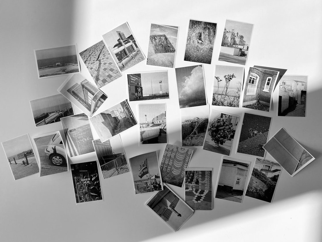
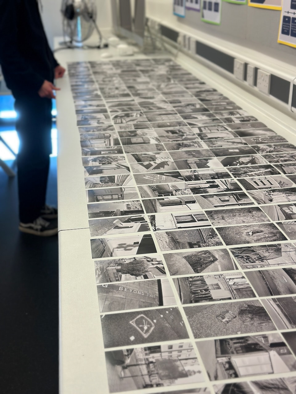
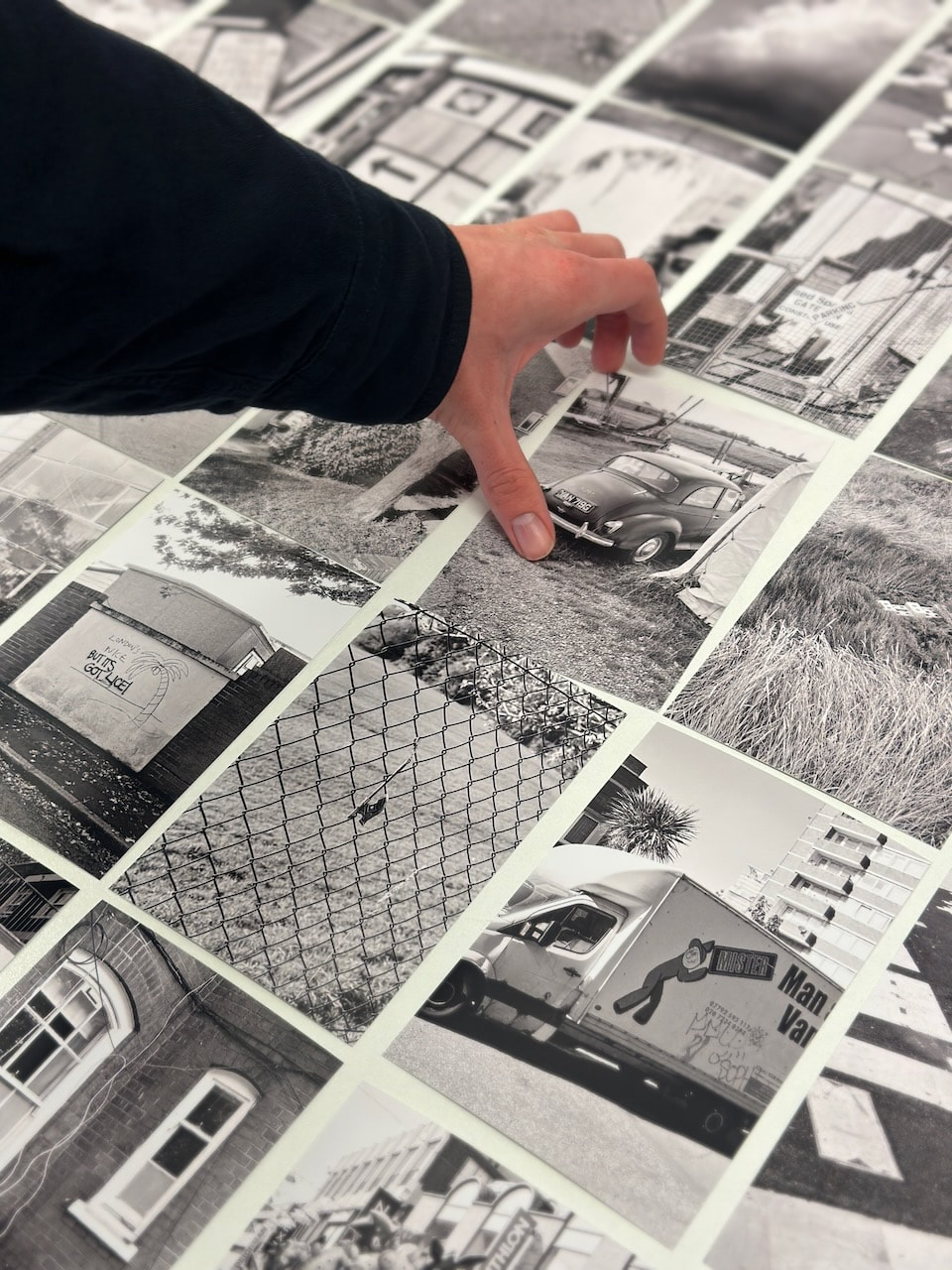
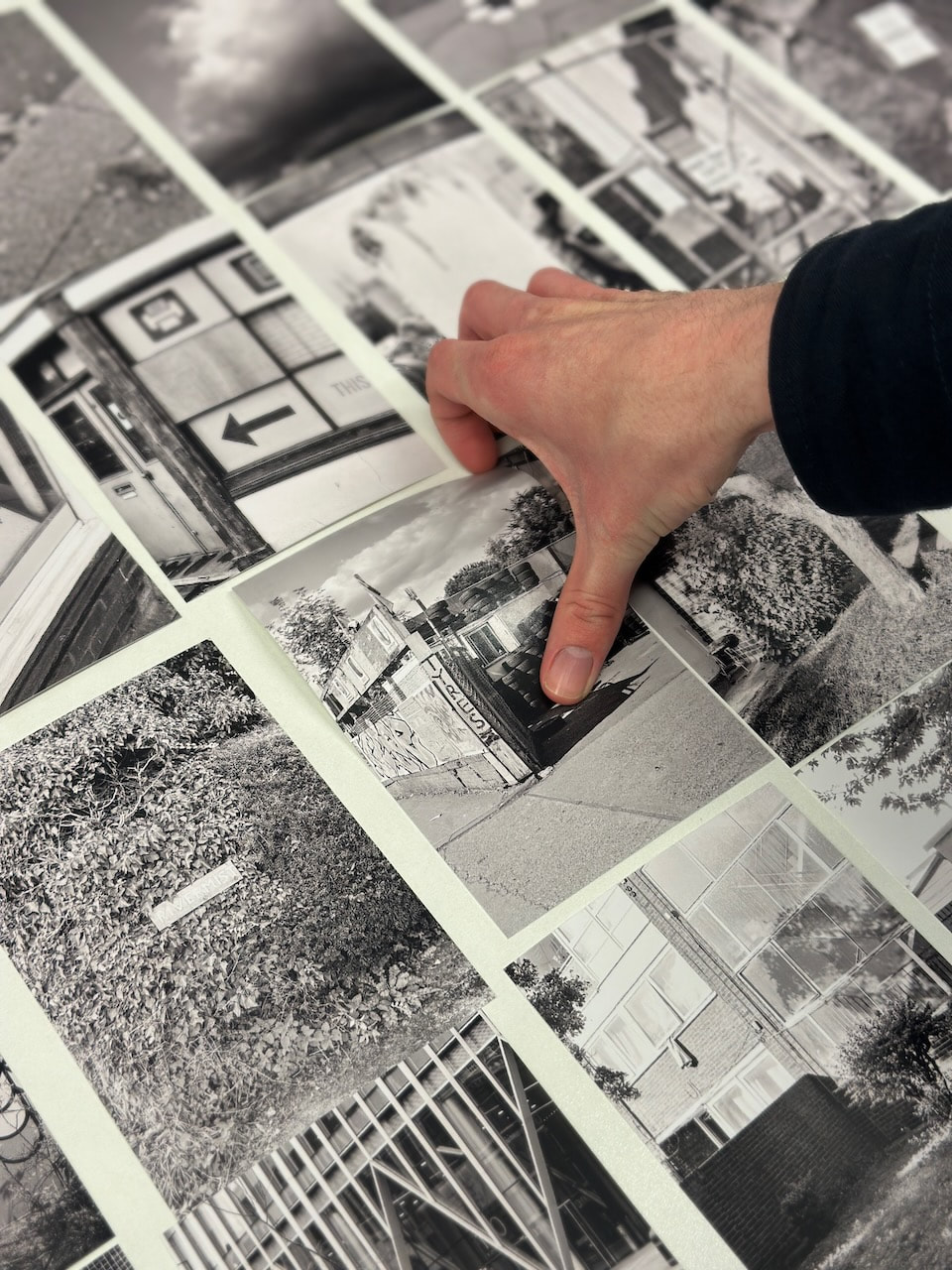
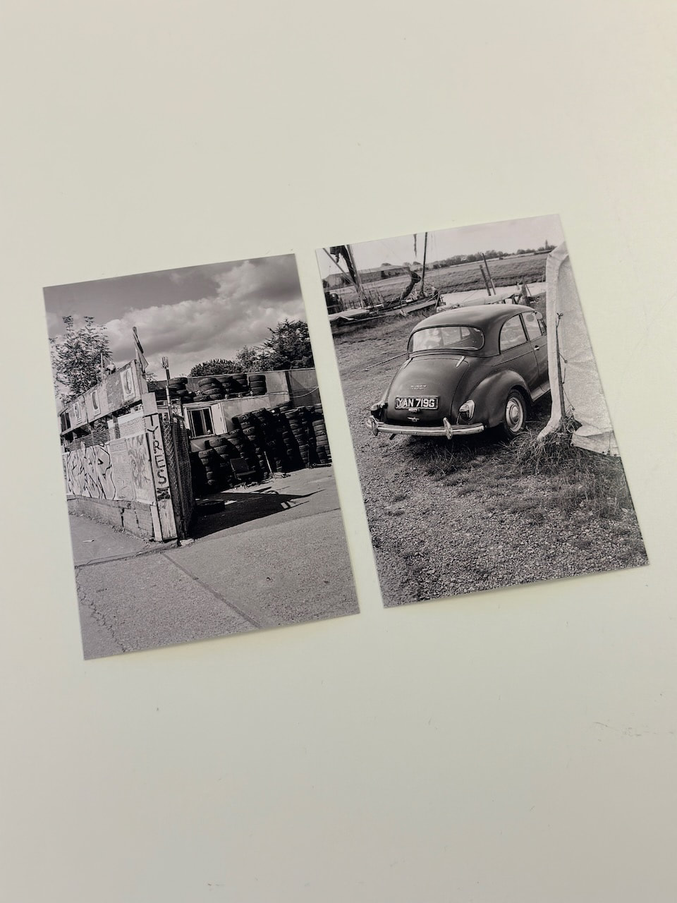
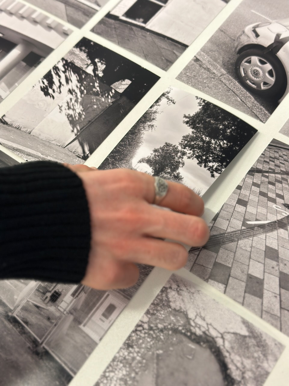
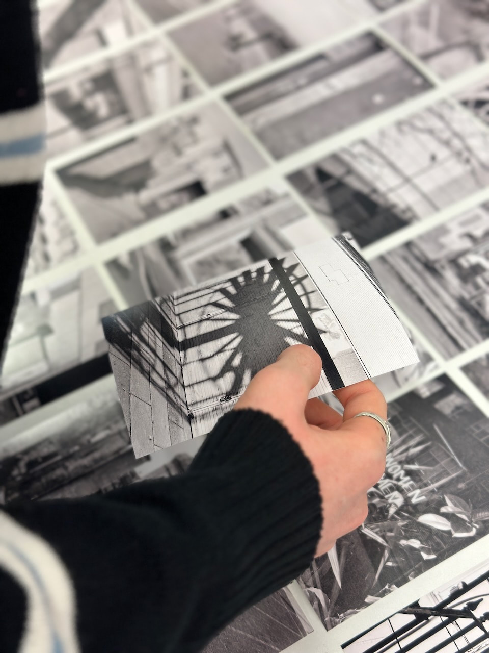
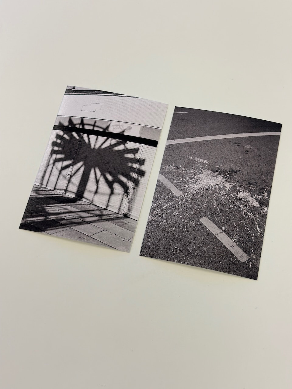
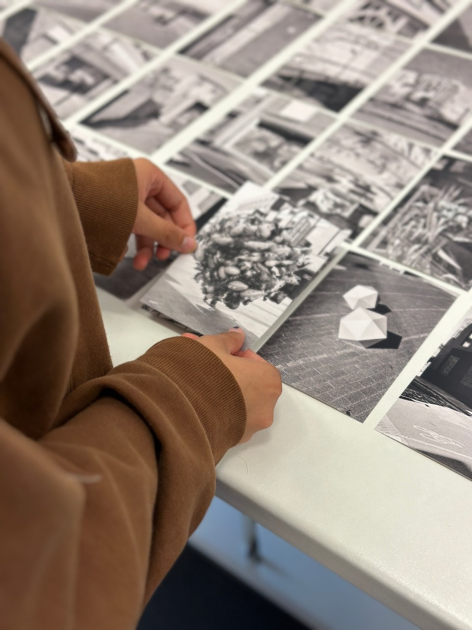
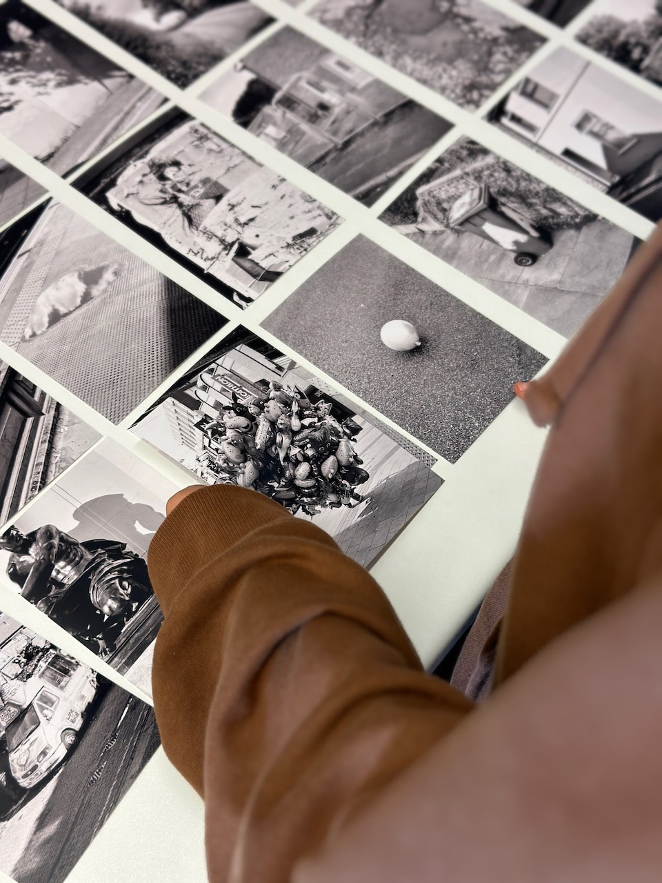
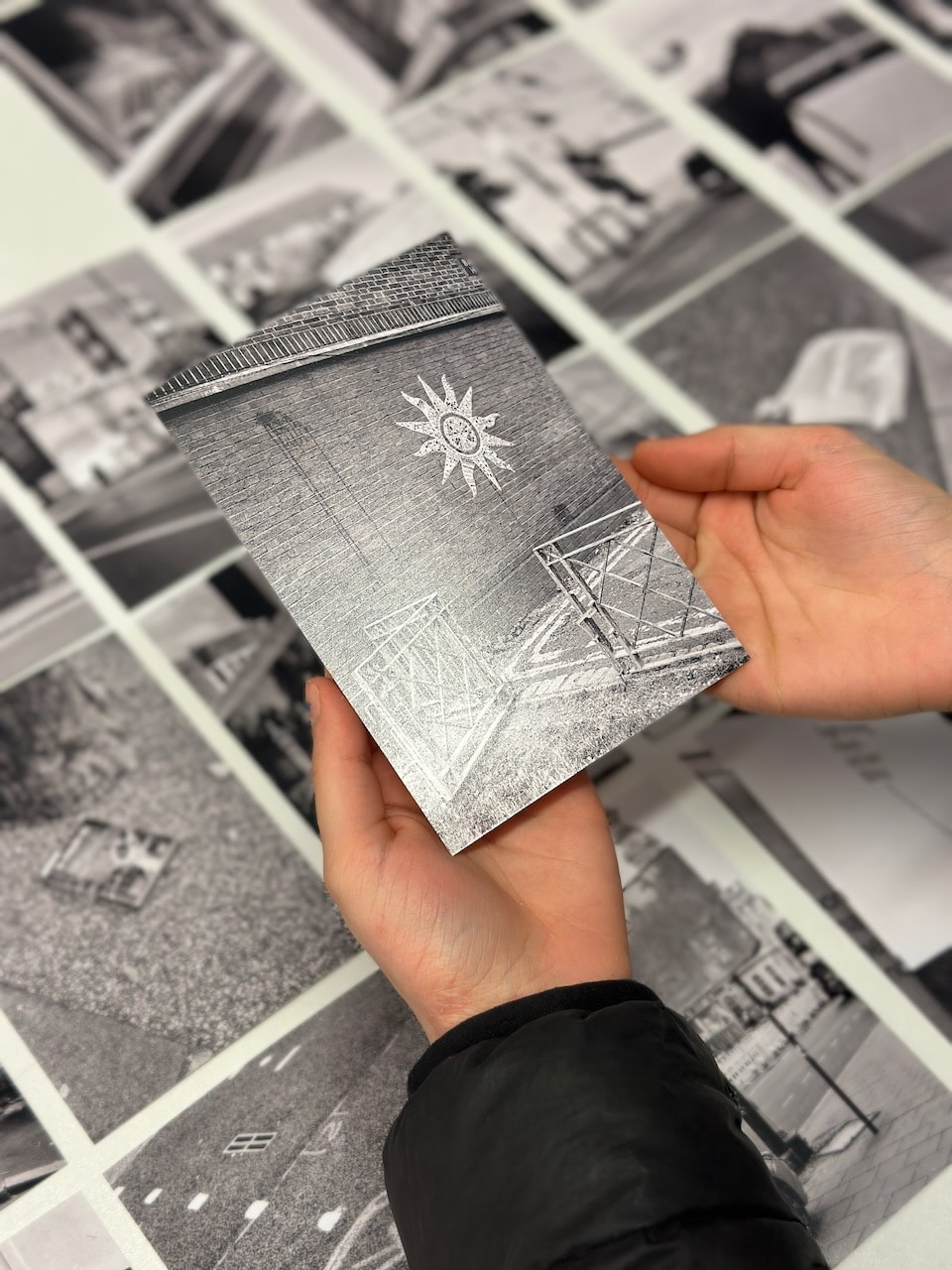
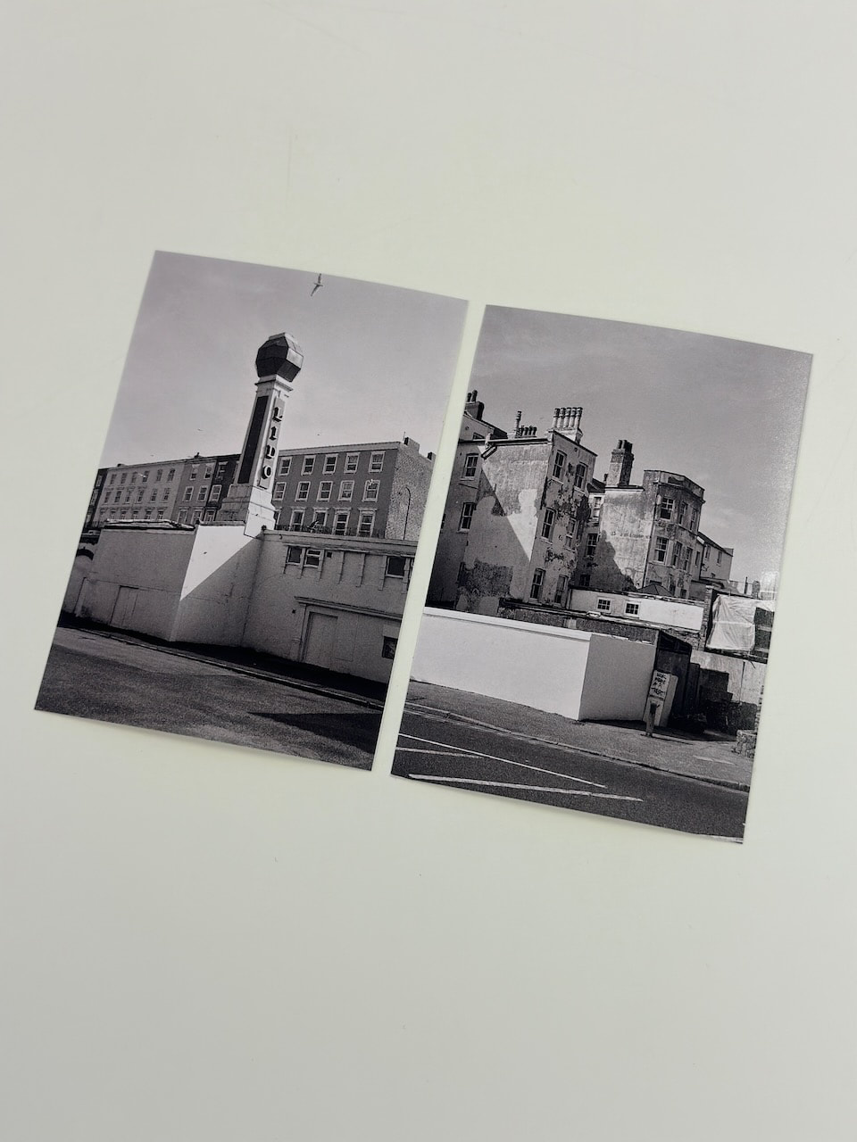
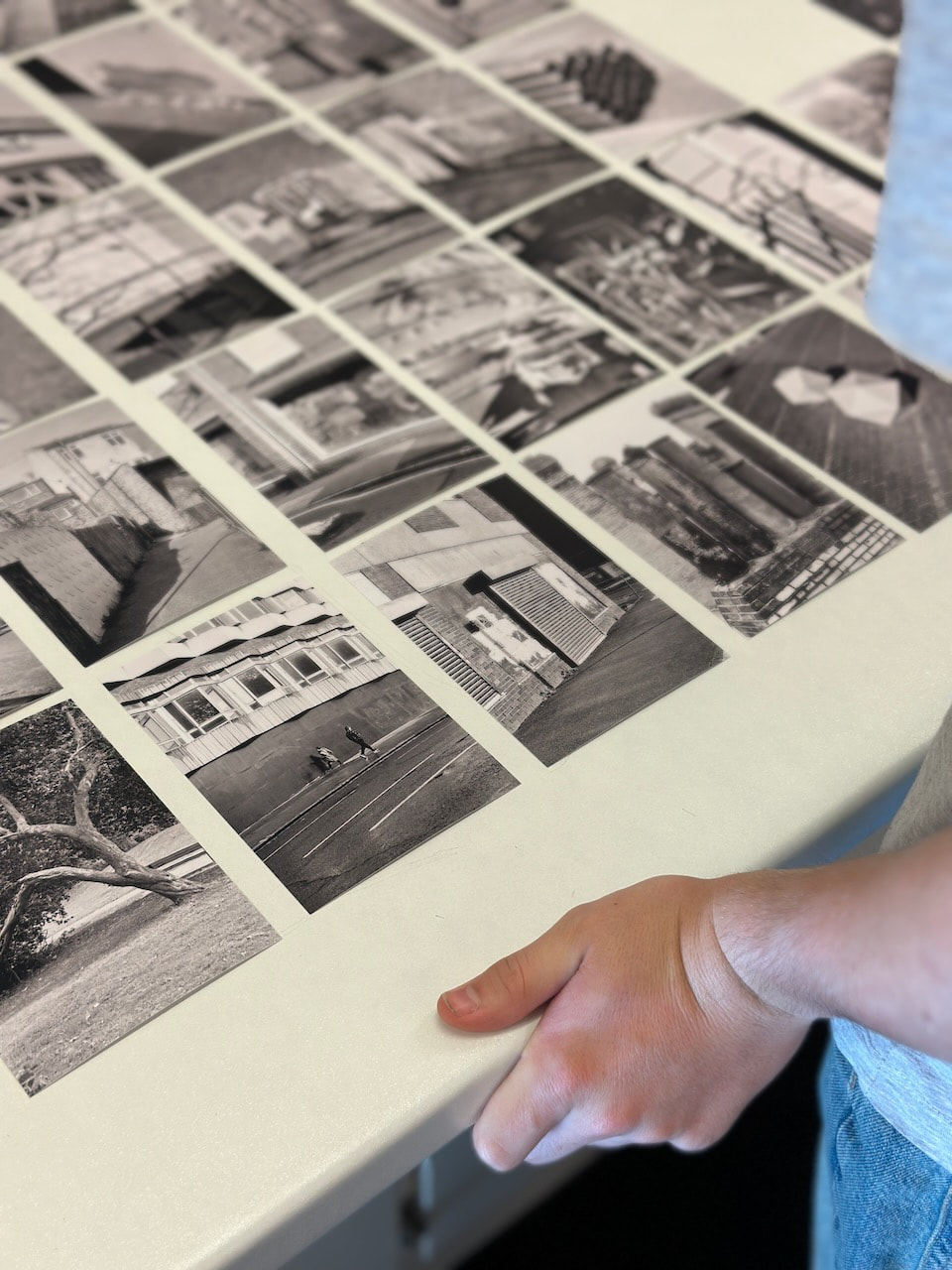
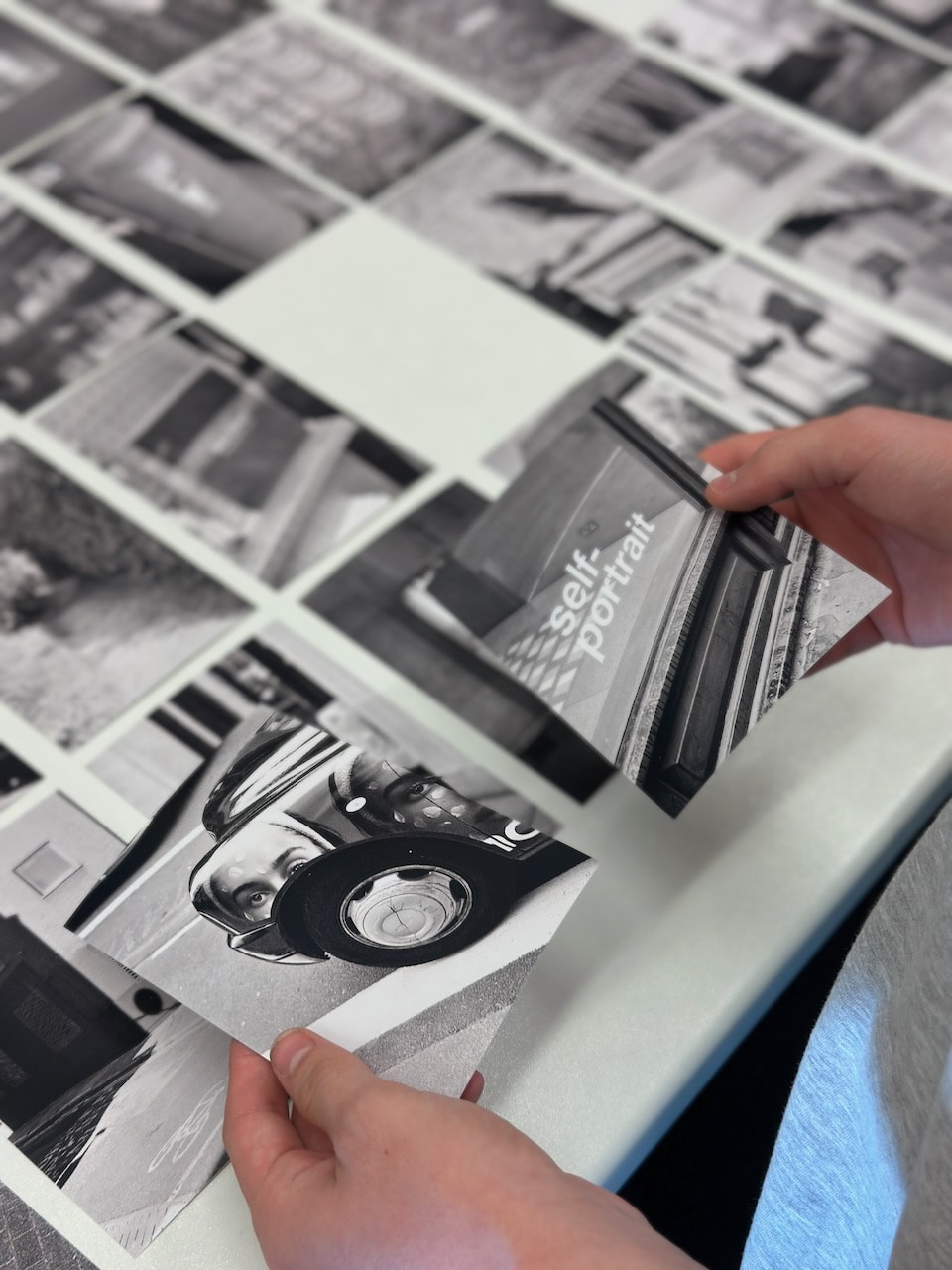
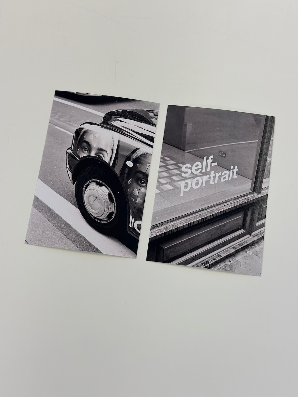
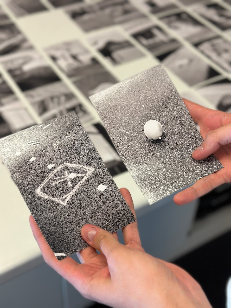
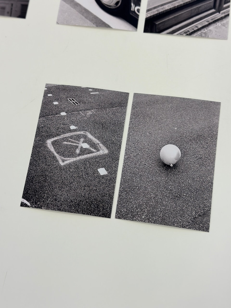
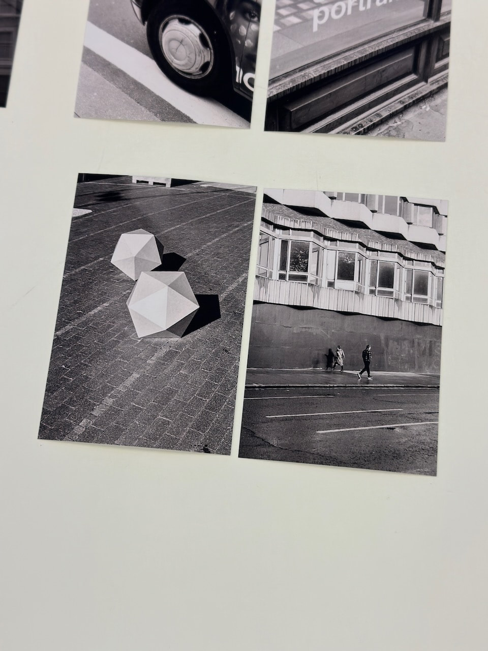
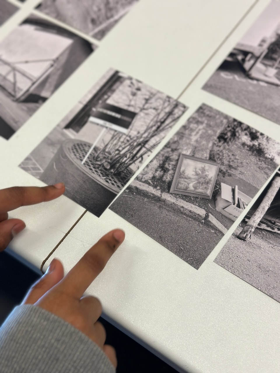
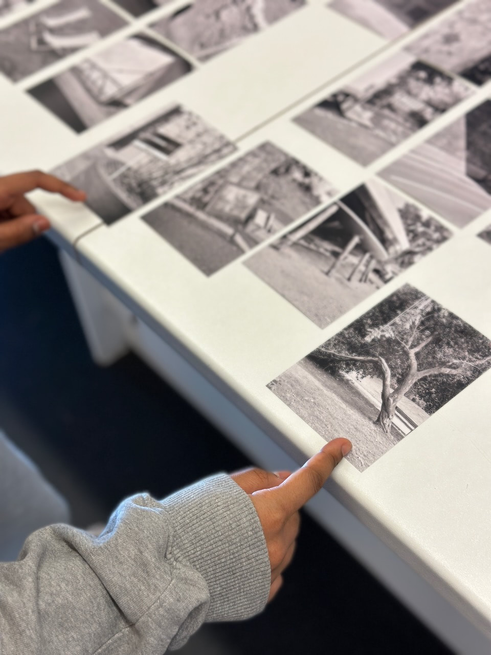
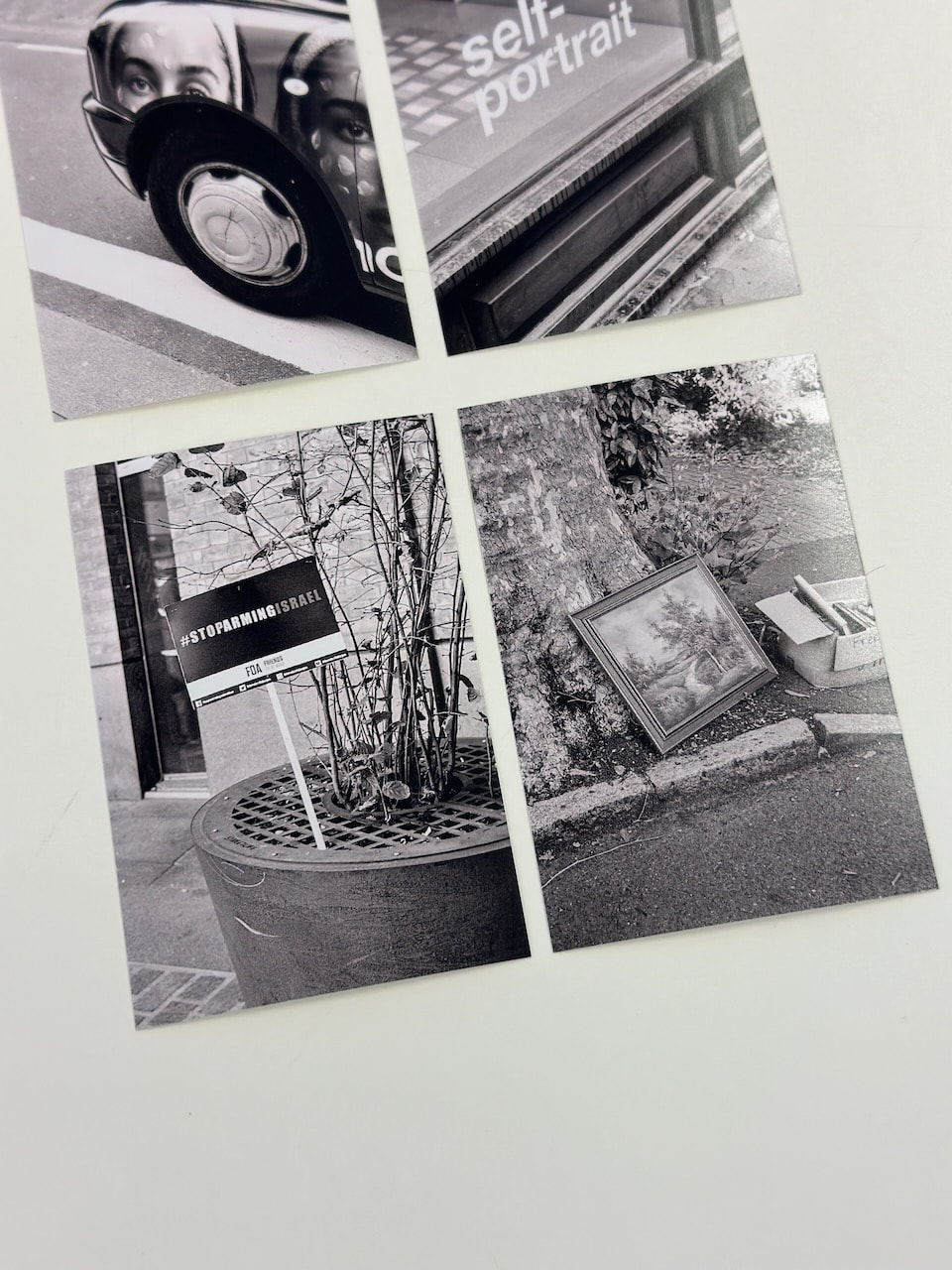
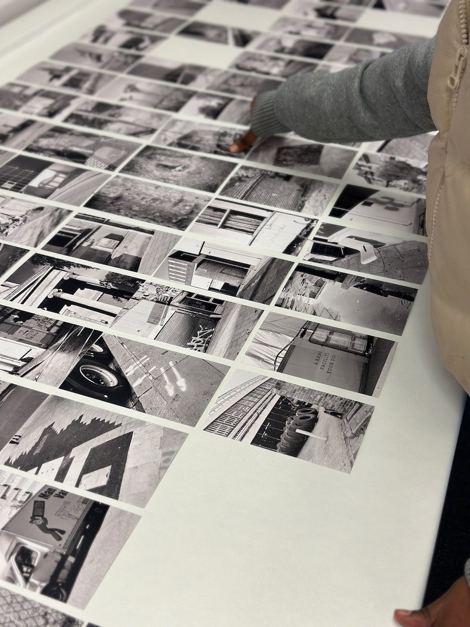
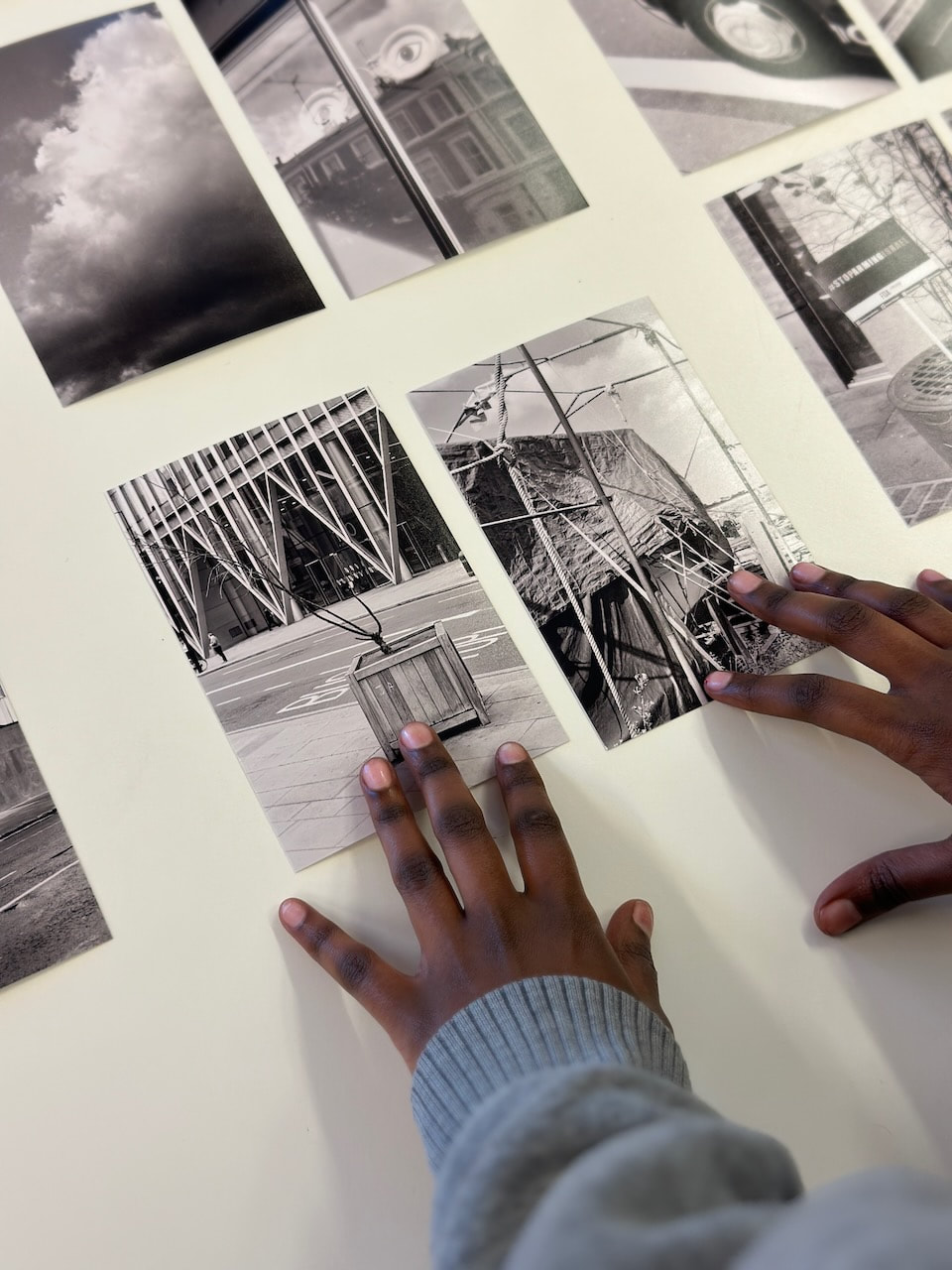
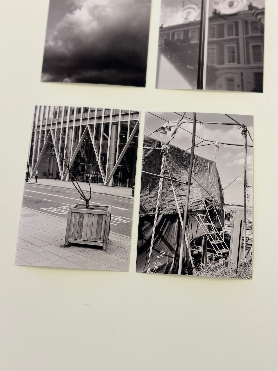
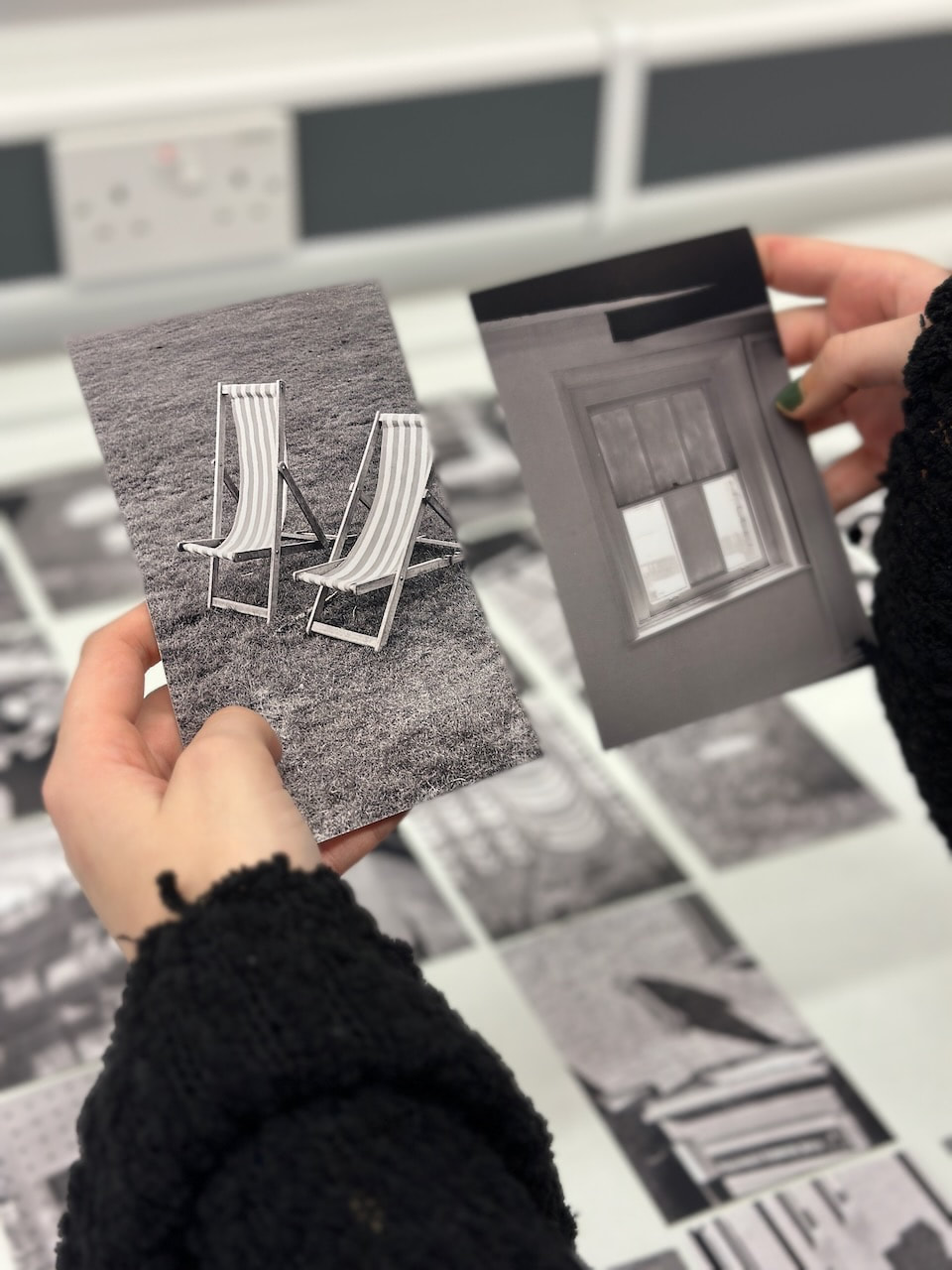
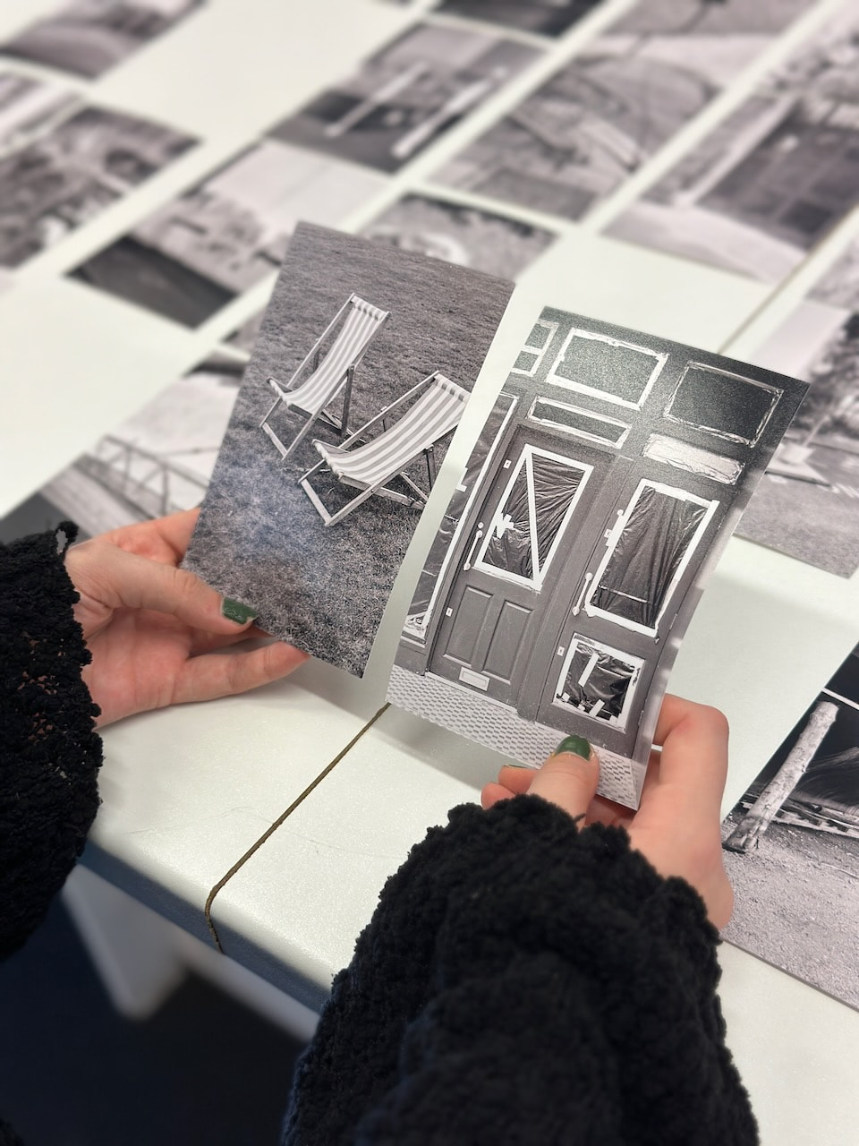
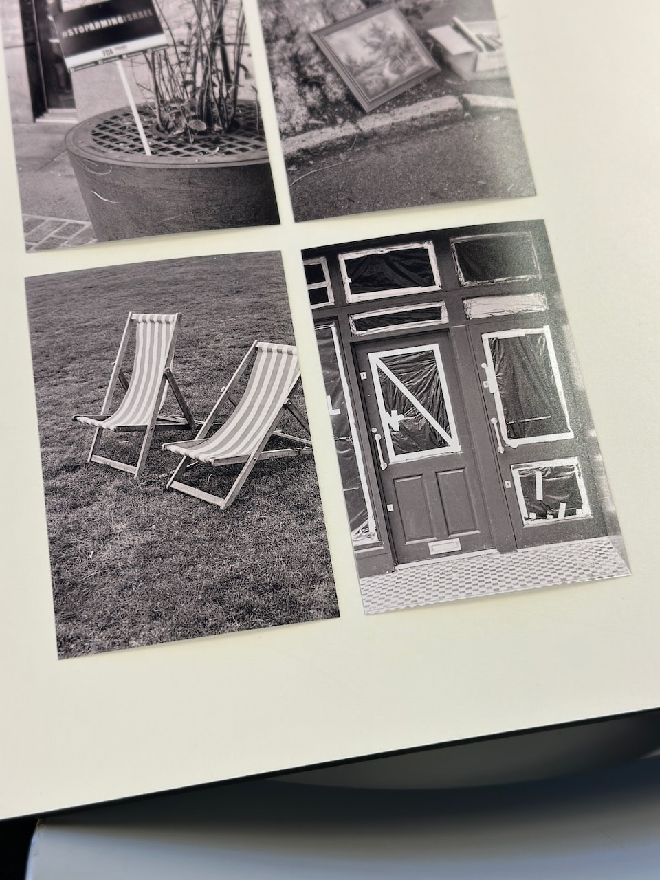
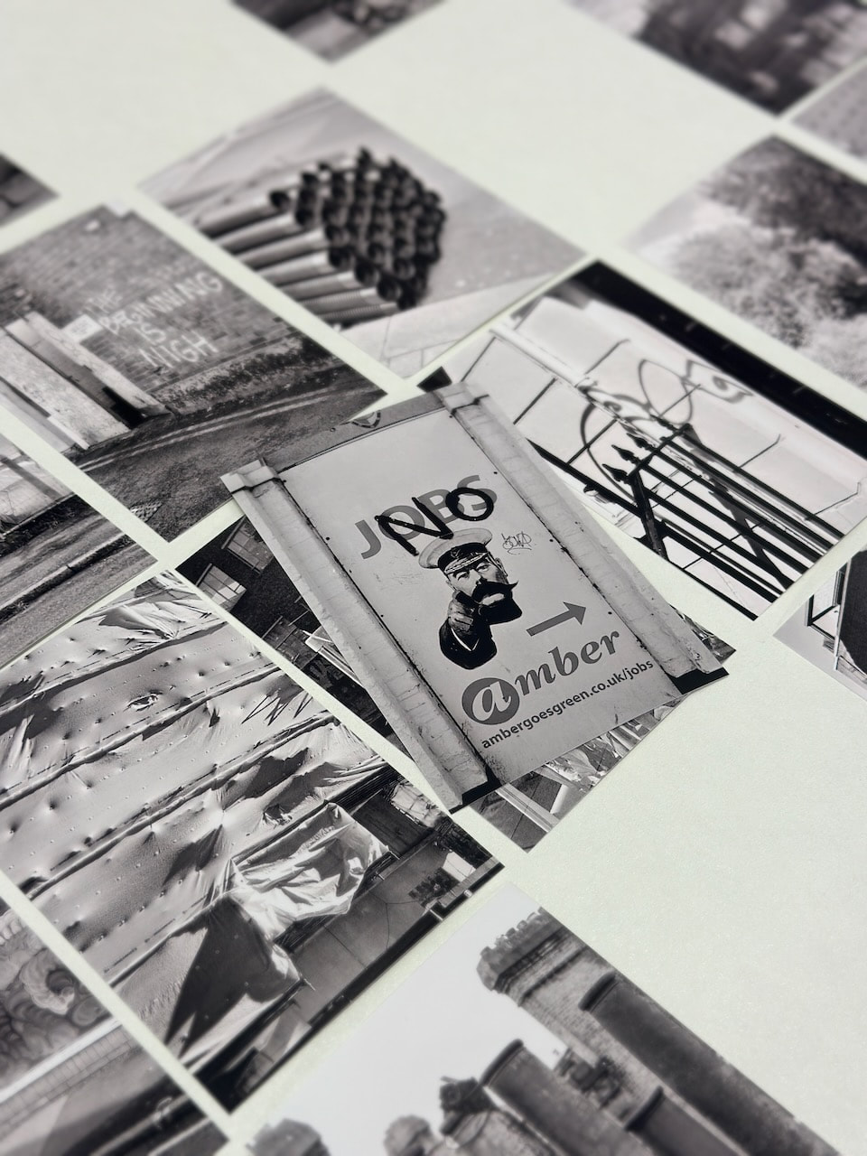
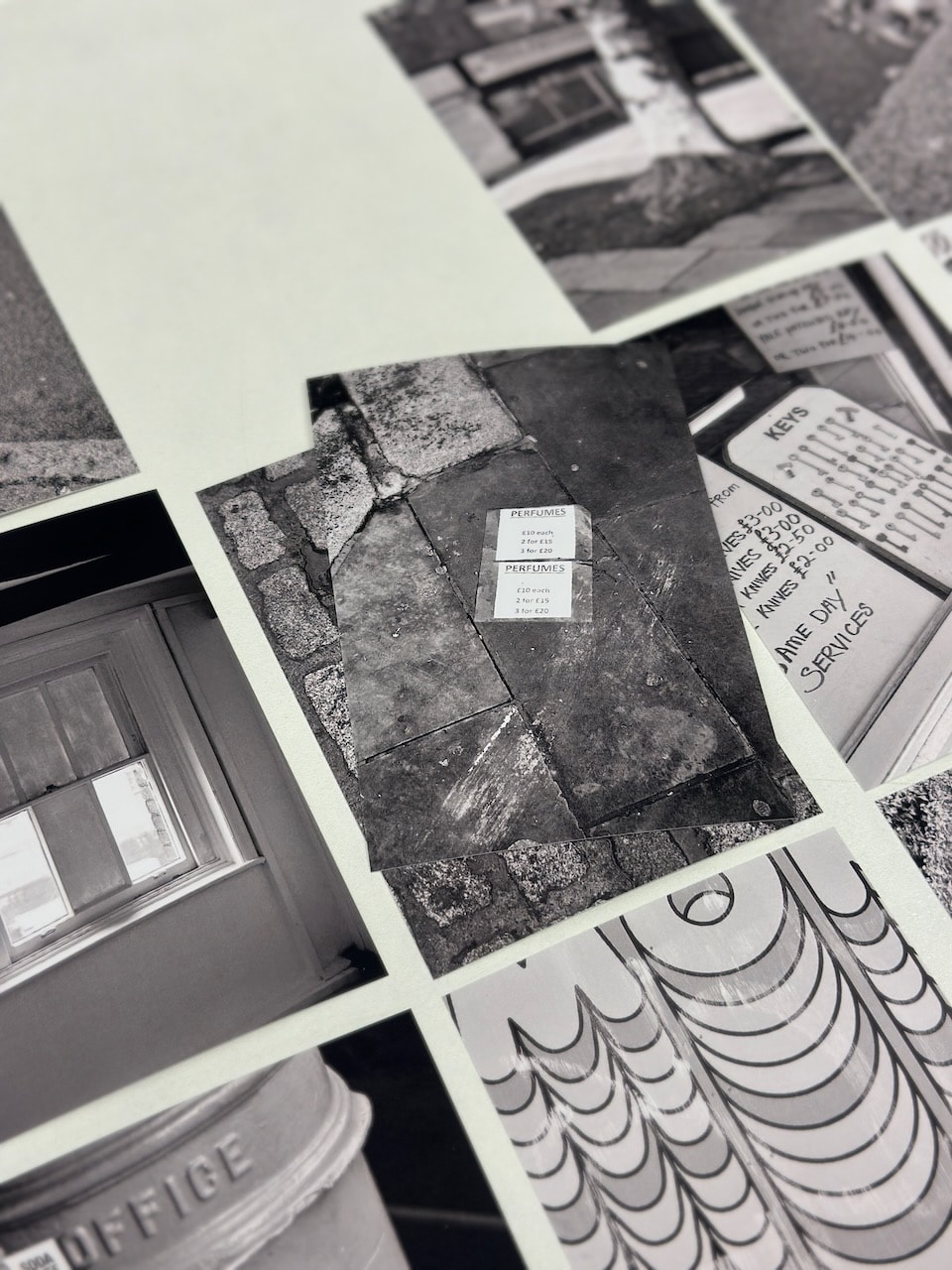
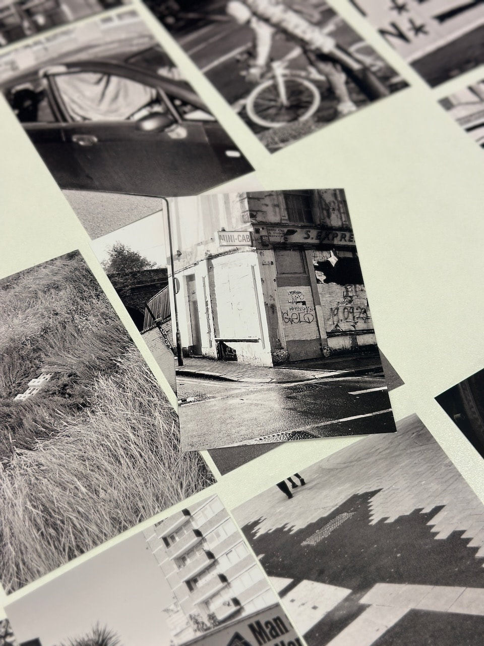
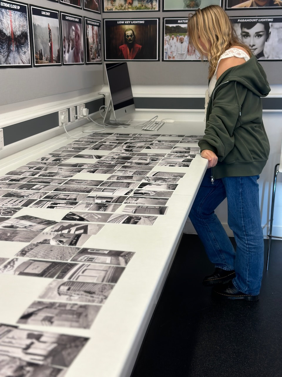
Three Experiments
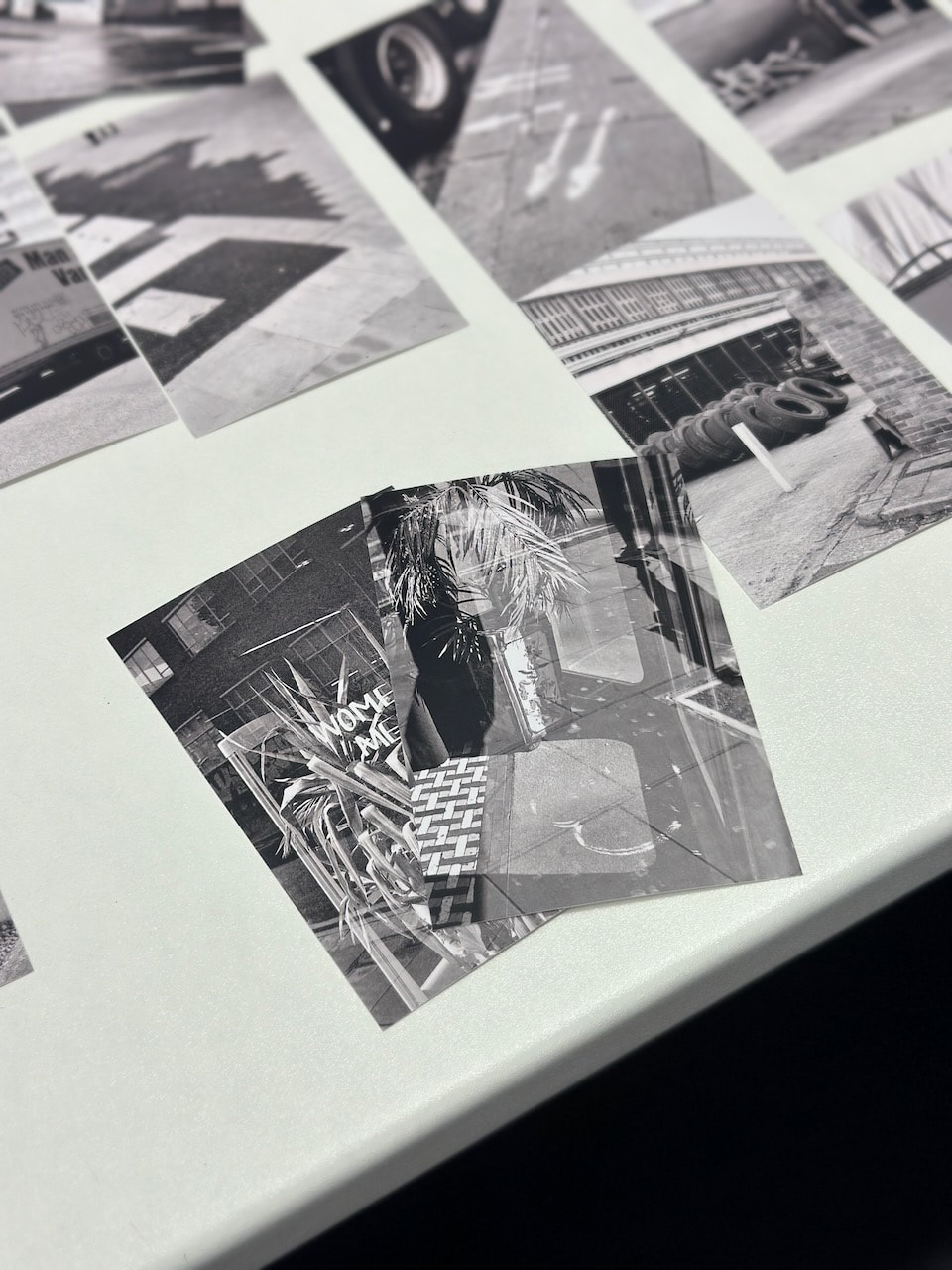
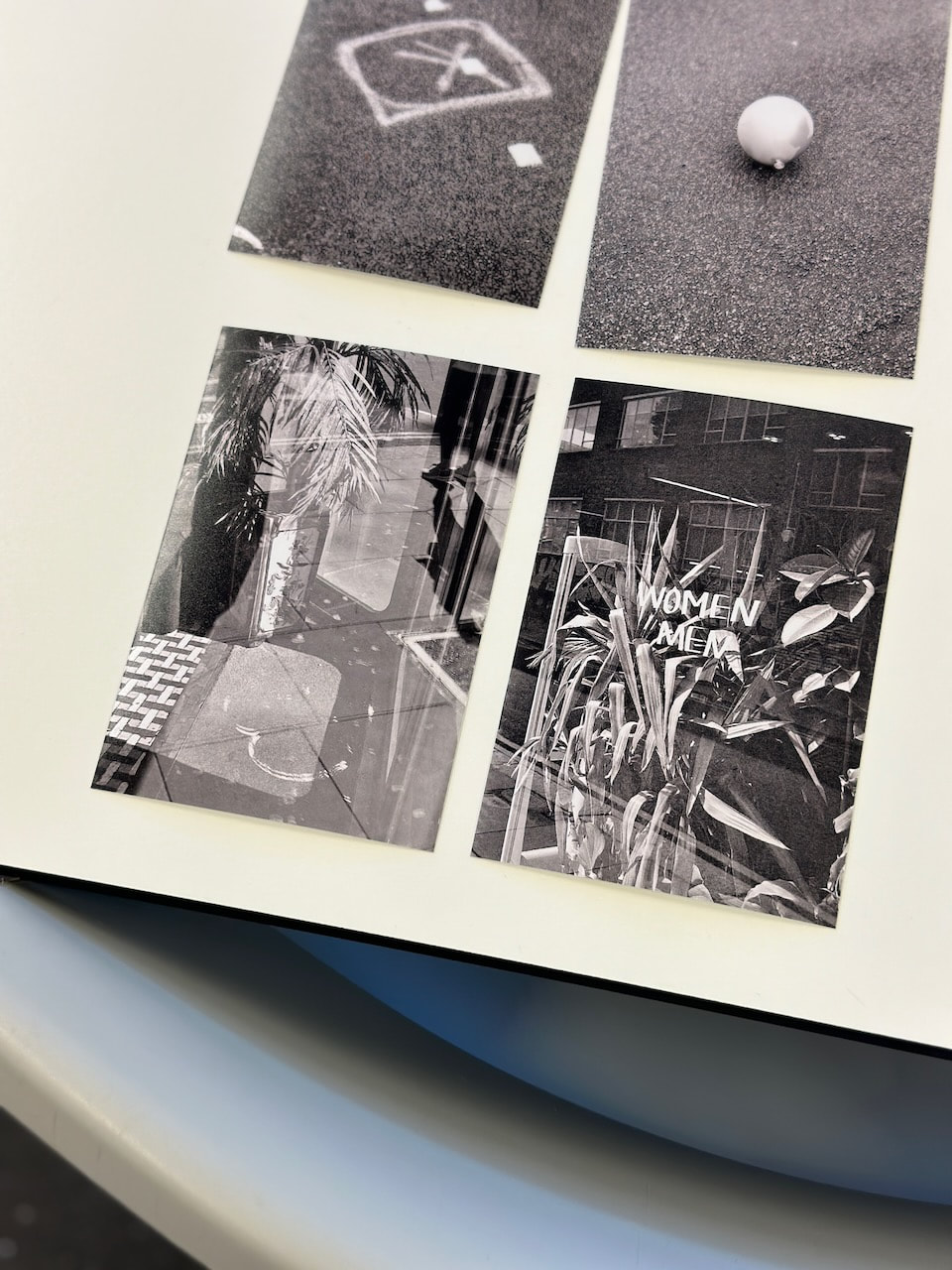
I decided to conduct three experiments with a selection of approximately 200 4x6 machine prints of recent black and white, portrait format photographs. I laid the images out in a large grid on a white bench and invited members of the class to interact with them in various ways.
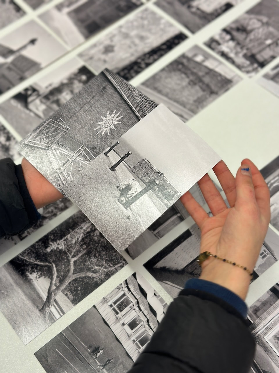
Experiment #1: Free Choice
Players were invited to select any two images from the grid and arrange them in a satisfying pair (diptych).

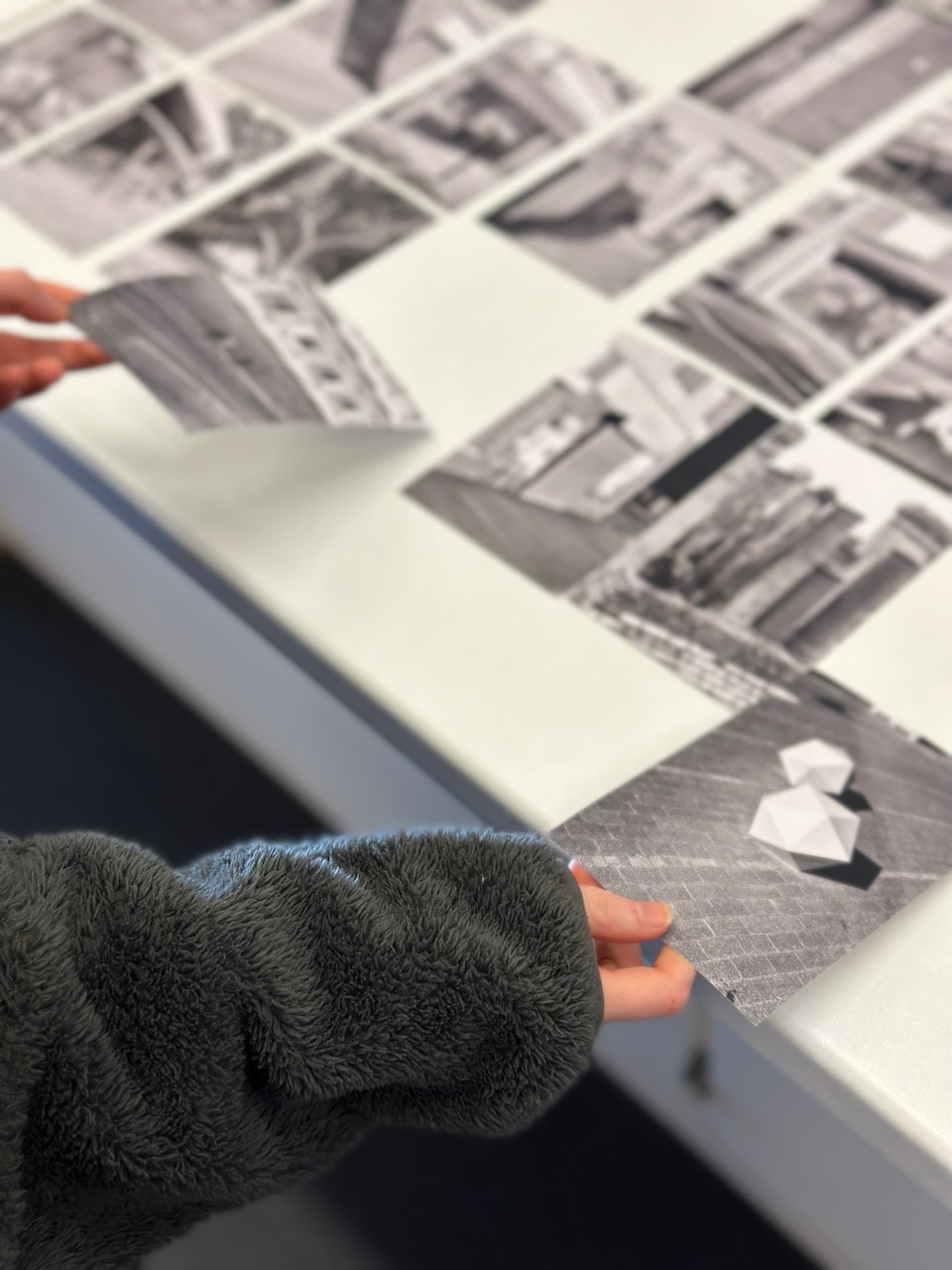
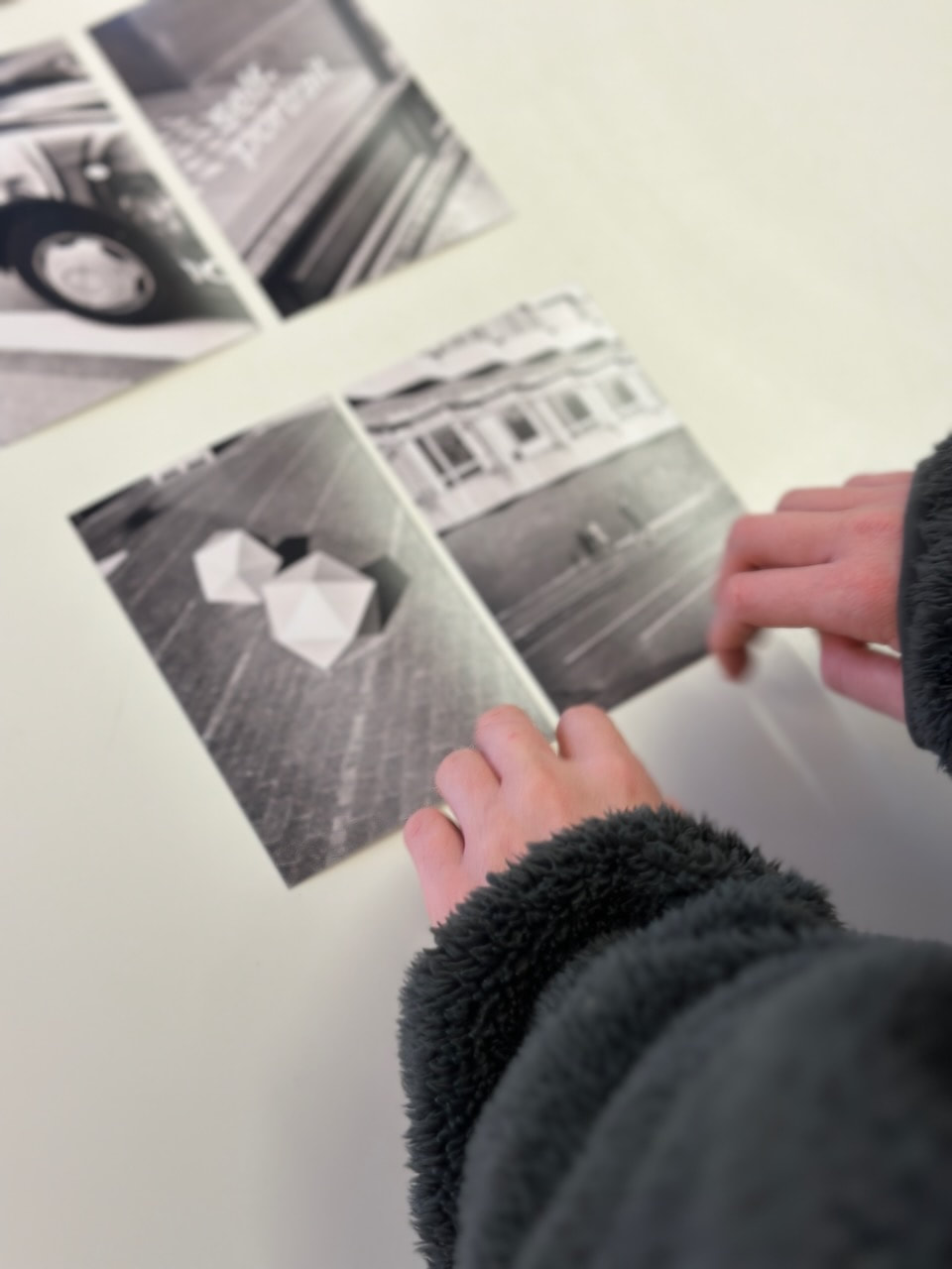
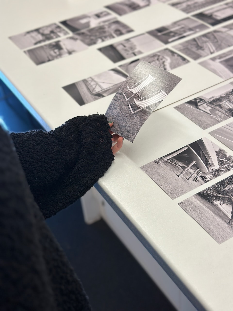
Experiment #2: Snap
I invited two players to shuffle a group of images and deal each other 12 cards. They then played in sequence, one player presenting an image and the other attempting to match it from their hand. This continued until all the cards had been played.
Experiment #3: Random Selection
This time, two players used a Random Number Generator as a means to select pairs from a grid of 100 pictures.
Results and reflections
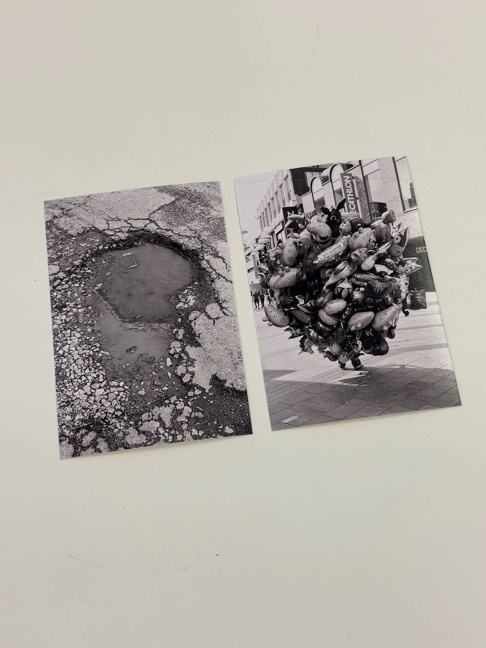
Not surprisingly, each of these experiments produced quite different results. Experiment #1 offered the most control. However, selecting from a massive number of images proved to be challenging for some players. One described it as being like "a kid in a sweetshop" so, hopefully, this conveyed a sense of pleasure alongside the sense of being overwhelmed by choice. Others expressed slight anxiety or pressure in the process of choosing, perhaps because I was watching and photographing them doing it. Most of the resulting diptychs were quite surprising to me and it was interesting to listen to the players' rationale for selecting them. These ranged from formal considerations to symbolic and narrative associations.
Experiment #2 provided more constraint. Players only had 12 images each from which to make their selections. After completion of the game, these players seemed to find this process more rewarding than Experiment #1. The relative lack of choice and game-like scenario (a version of Snap) seemed to generate greater enjoyment and produced some exciting pairings.
Experiment #3 provided total constraint. Each diptych was selected at random (although there are arguments to suggest that a random number generator isn't all that random). These diptychs were perhaps the least successful in conventional terms since no formal consideration was involved. It wax still ijnteresting to observe the players discussing which still 'worked' despite their chance arrangement.
The process I have used to select diptychs so far is a little like Experiment #2 in that I make the selections from a relatively small number of images (usually 36 and never more than 72). I tend to select one image that interests me first and then look for a partner. Sometimes, when viewing the scans together, I notice potential pairings but these can change as I shuffle the images. The process is usually fairly instinctive, not unlike playing a game where decisions are made quickly.
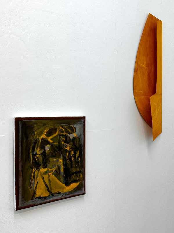
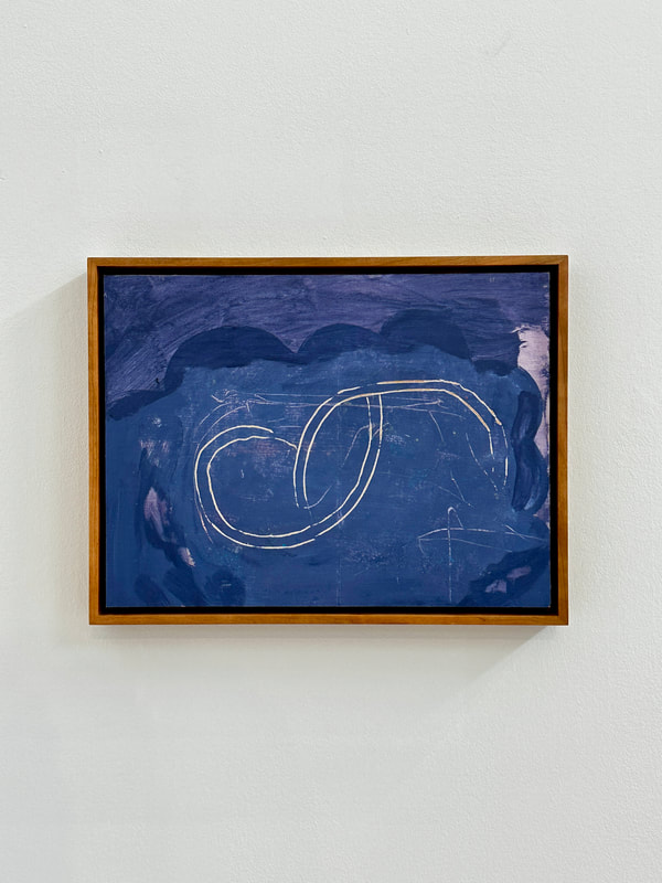
Beyond the walls of one’s own making
I recently visited an exhibition of Vincent Hawkins' work at Sid Motion Gallery in South Bermondsey. Here are some images of the exhibition I took on my phone:

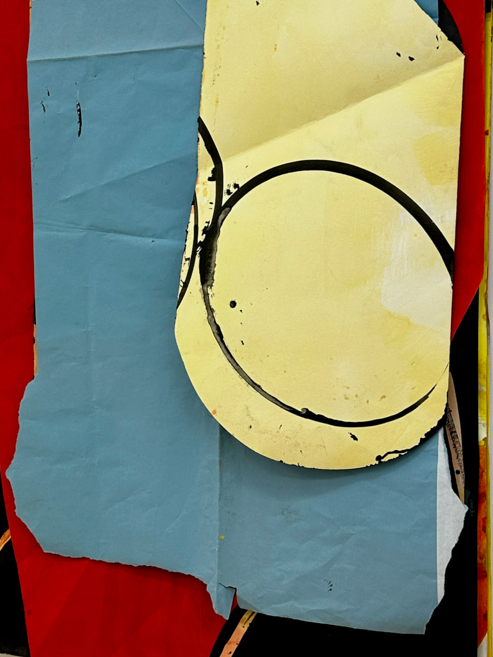
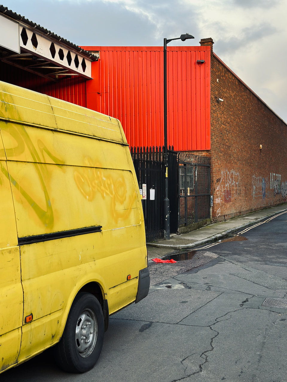
When I left the gallery, I noticed a yellow van parked in front of an industrial building with a bright red wall. I was reminded of one of the art works in the exhibition. Here is the resulting diptych:
|
|
Martin Scorsese on editing
Whenever I go into the editing room I have this excitement about seeing, feeling what happens when you take one image and another image, not the same, but you put the two together and it creates some kind of sensation, a kind of spark..."
I enjoyed listening to Scorsese's comments about film editing which reminded me of the revolutionary Russian montage techniques of Eisenstein. Perhaps Scorsese is attempting to combine his interest in cutting - the juxtaposition of two frames - (intellectual montage) and the emotional, psychological and political meanings it can generate with a parallel interest in continuity editing for narrative purposes.
|
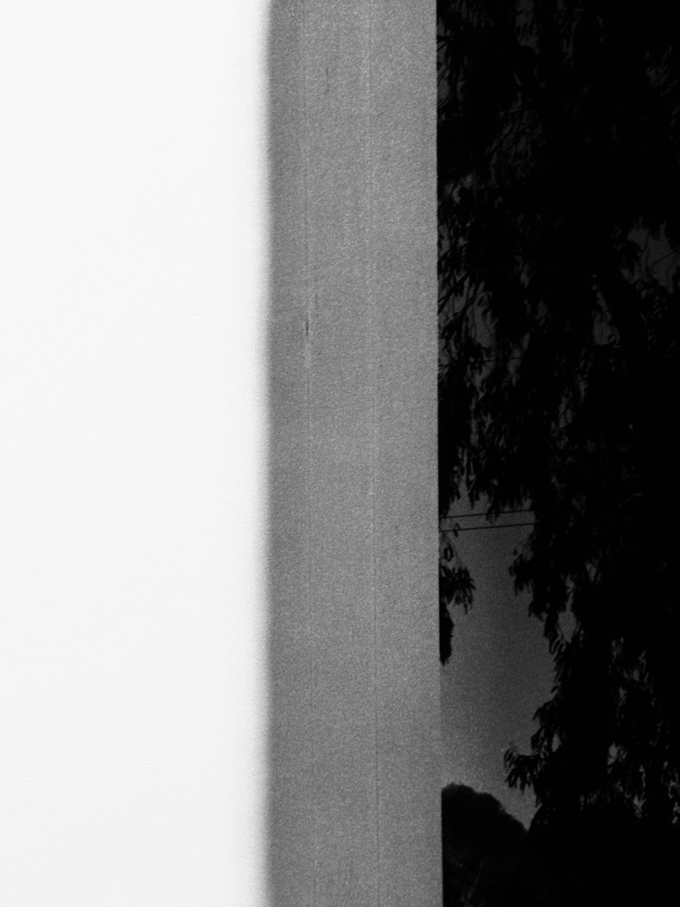
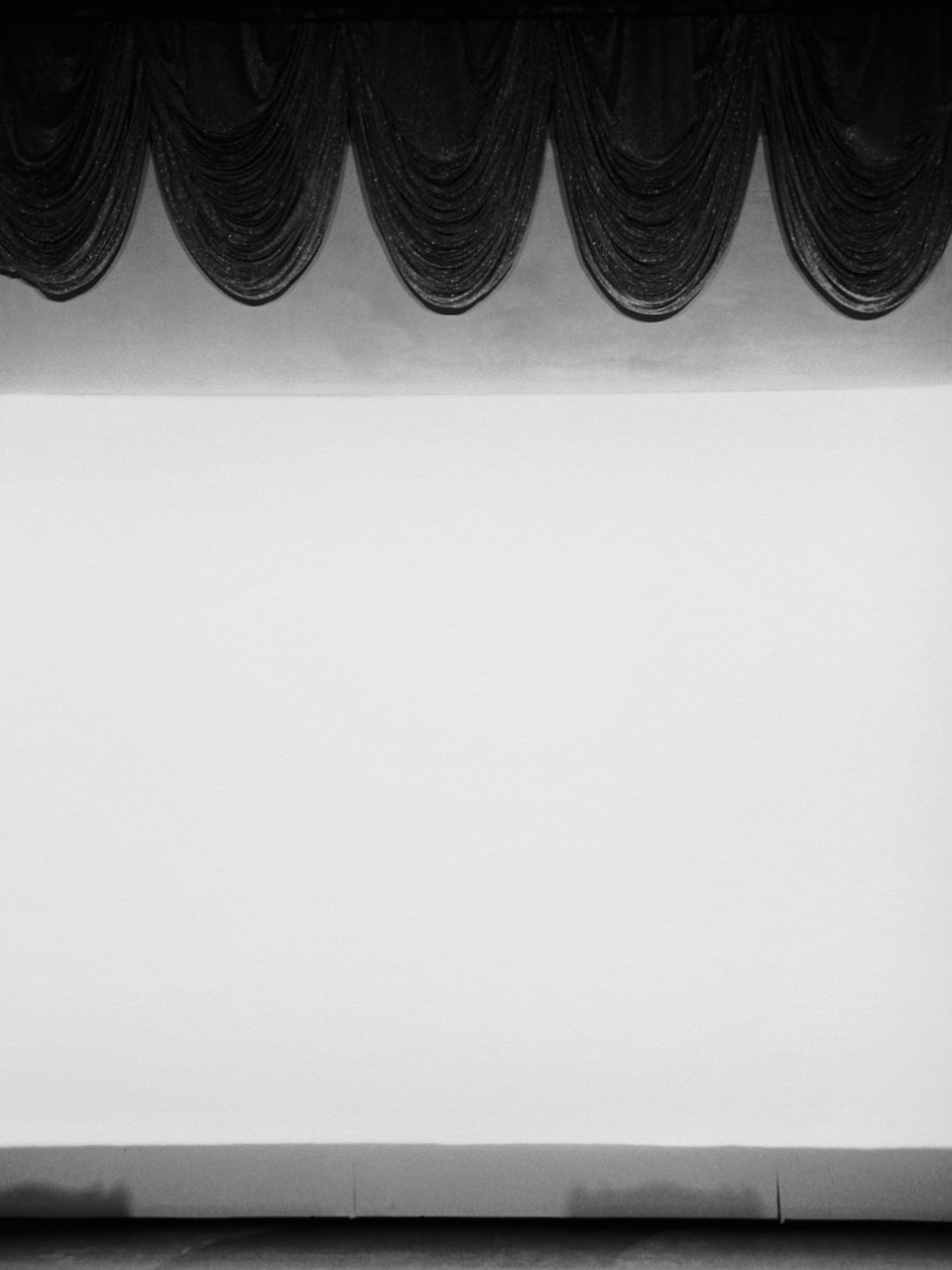
Hiroshi Sugimoto at The Hayward Gallery
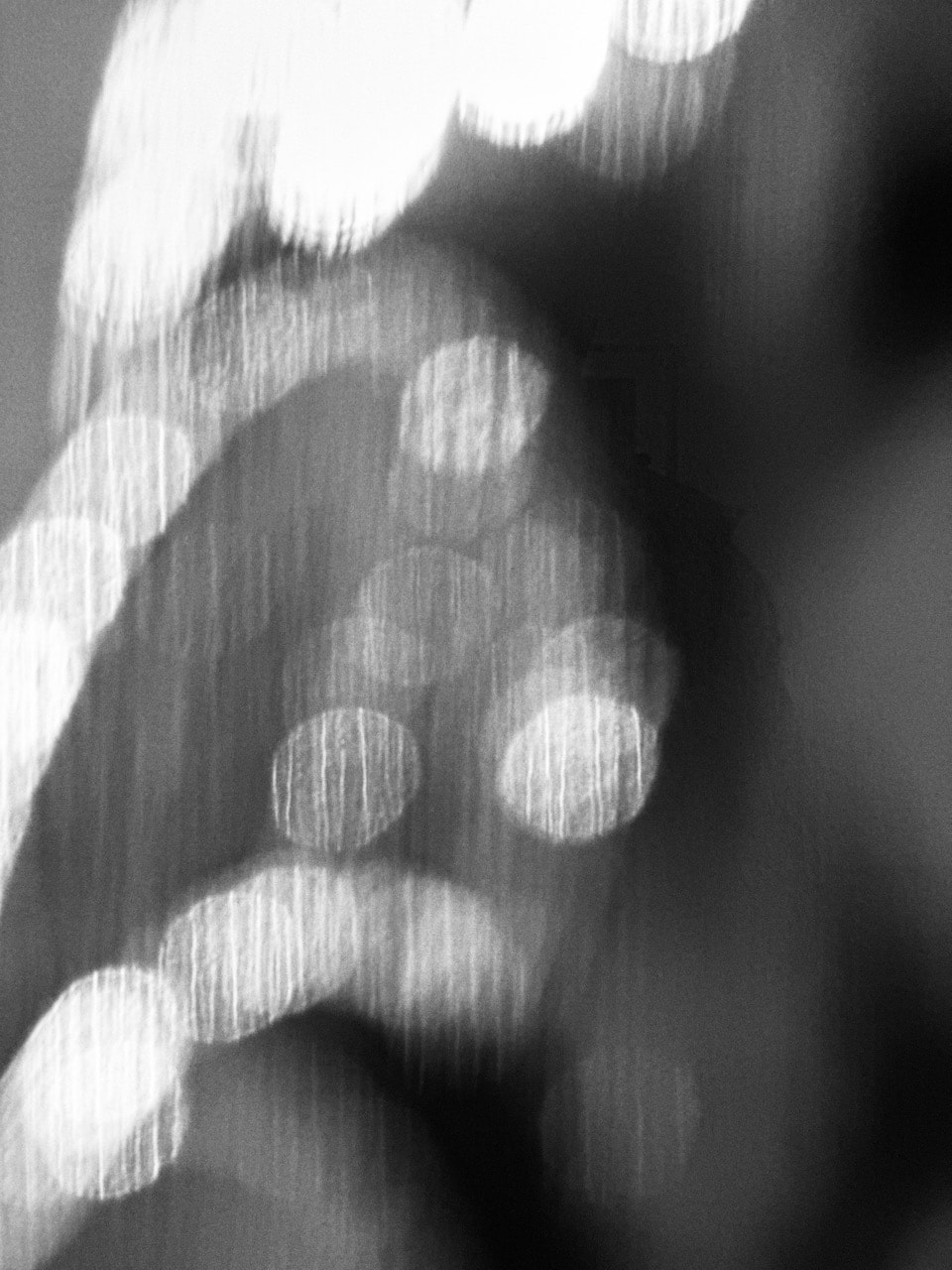
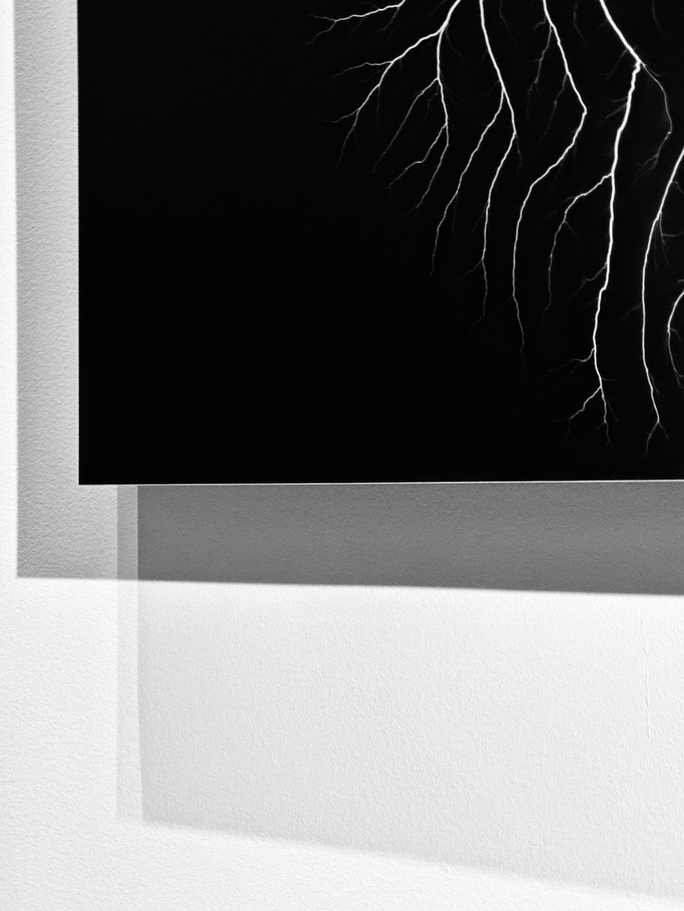
Sugimoto's practice is rigorously conceptual. However, his pictures are also extremely seductive and visually stimulating. He is obsessed with the relationship between photography and time and each project is a kind of self-contained analytical enquiry. I really enjoyed the relationship between the exclusively black and white images and the Brutalist building. The curation was excellent and the lighting superb. A thoroughly enjoyable experience. I decided to take a creative approach to documenting the images using close-ups, dramatic crops, odd angles and finding relationships between the building and the work. This really enhanced my experience of the exhibition.
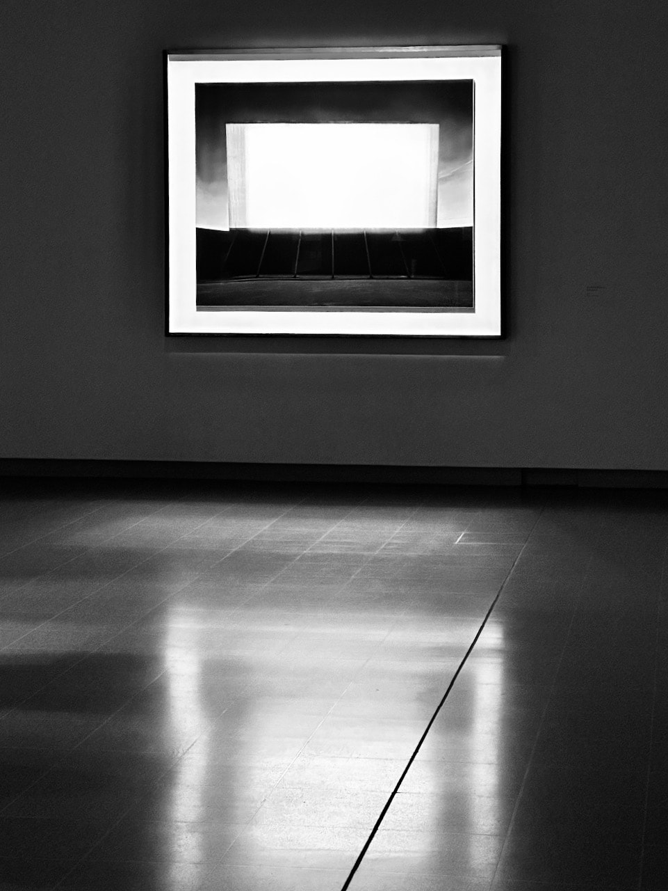
Fossils work almost the same way as photography... as a record of history. The accumulation of time and history becomes a negative of the image. And this negative comes off, and the fossil is the positive side. This is the same as the action of photography.
-- Hiroshi Sugimoto

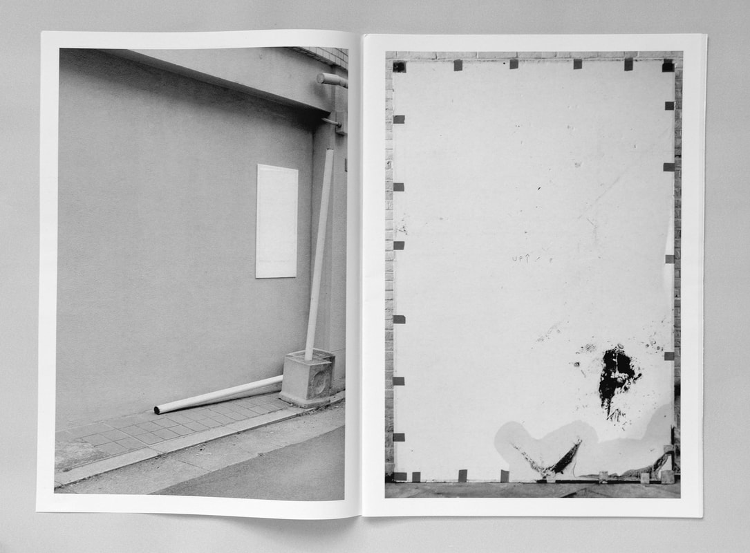
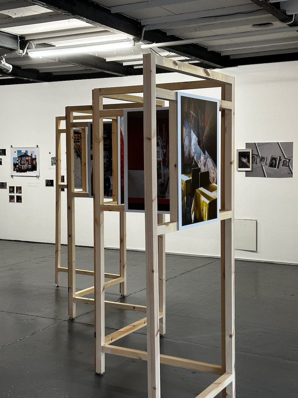
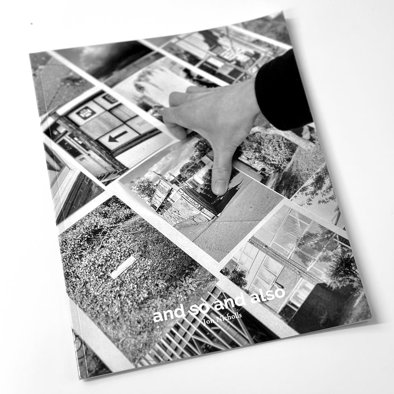
A photobook experiment

|
I decided to present some of my favourite diptychs in a photobook, selecting Blurb as a suitable platform. I opted for an 8x10 Trade book, one of the cheapest options, using the Bookwright software to design the contents. The book is consequently available for purchase on the Blurb website.
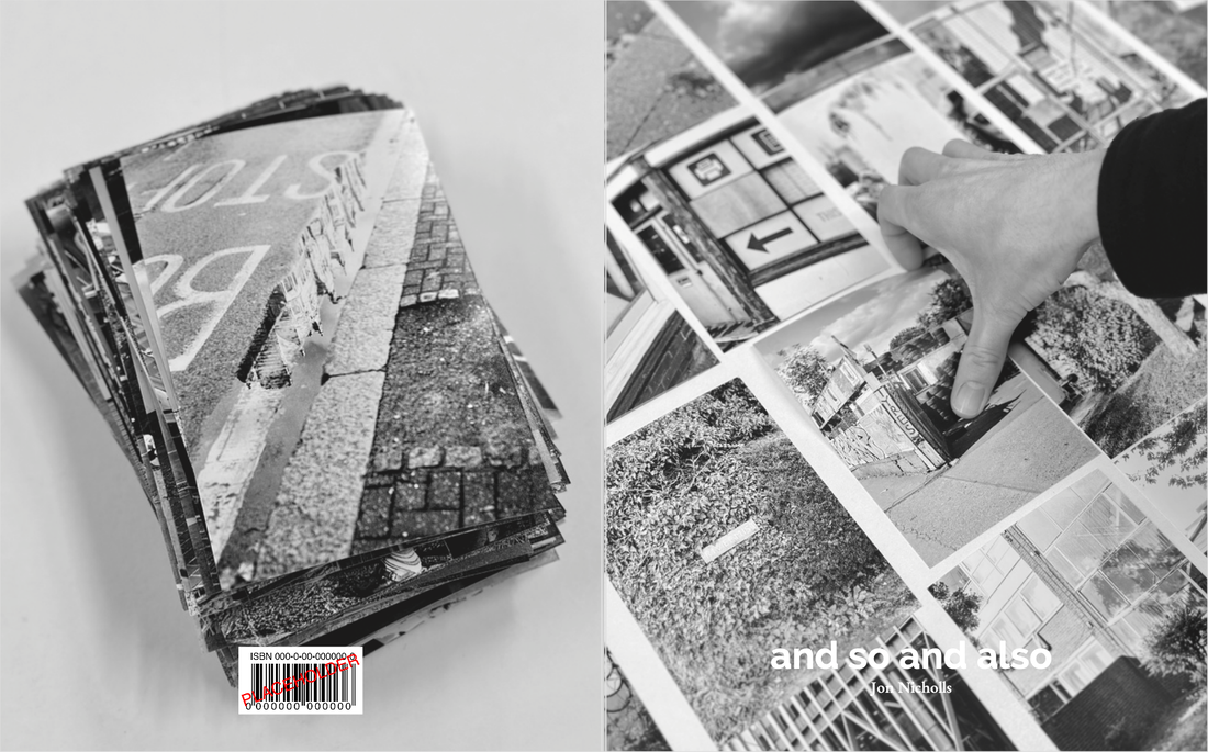
I used two images from the collaborative editing games above for the covers.
|
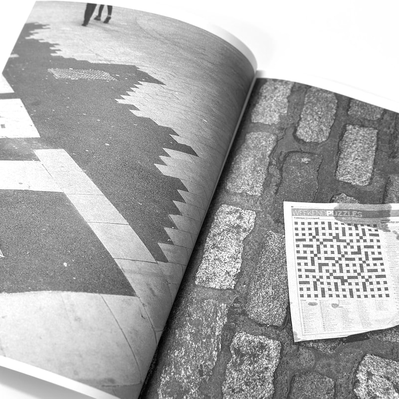
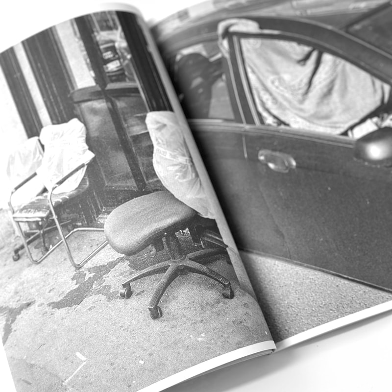
I experimented with the image format, finally opting for an 8x10 crop so that the images were the same ratio as the book pages. I left a slightly larger at the centre so that the pictures would not disappear in the gutter. The title borrows a phrase from the same Gertrude Stein poem that I used as a soundtrack to a previous film and which is also the title of my essay. Here is the final sequence:
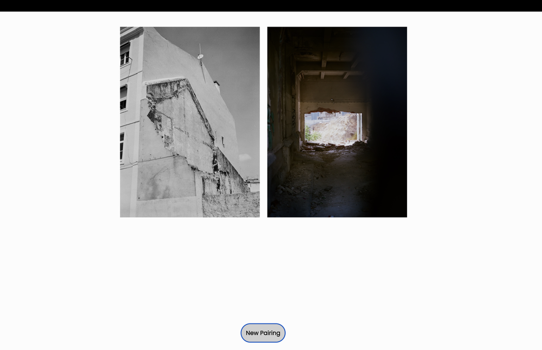
An online Random Diptych GeneratorOne of the advantages of spending a lot of time on Instagram is that, occasionally, you encounter the generosity of strangers. This morning, I happened across this post by @tomroch.e. Intrigued, I followed the link to his website and read the instructions on the wiki. I'm not very skilled with coding but, after downloading some software and organising my images, I had my own working random diptych generator running from my desktop in the browser.
Below is a brief screen recording of my generator in action, featuring 30 images in total (in two groups of 15). Tom's original code contained links to 20 images in total so I'm pleased I was able to extend the size of the galleries. Now I'm excited to further refine this code so that I could sample from even larger galleries and present the generator as one of my final outcomes for my Personal Investigation. |
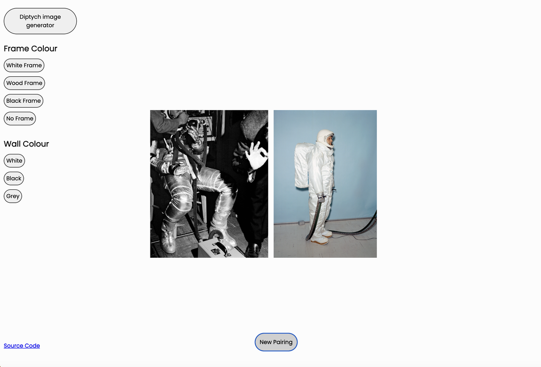
|
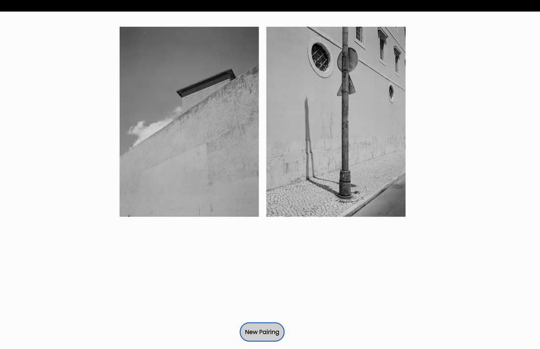
A second experiment
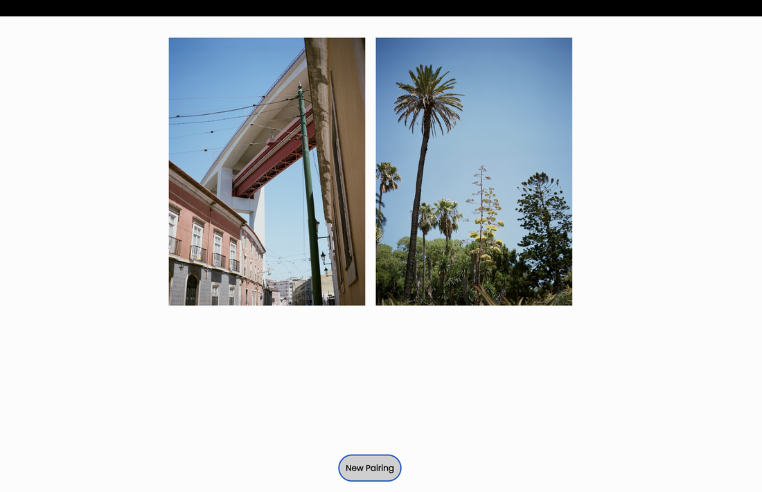
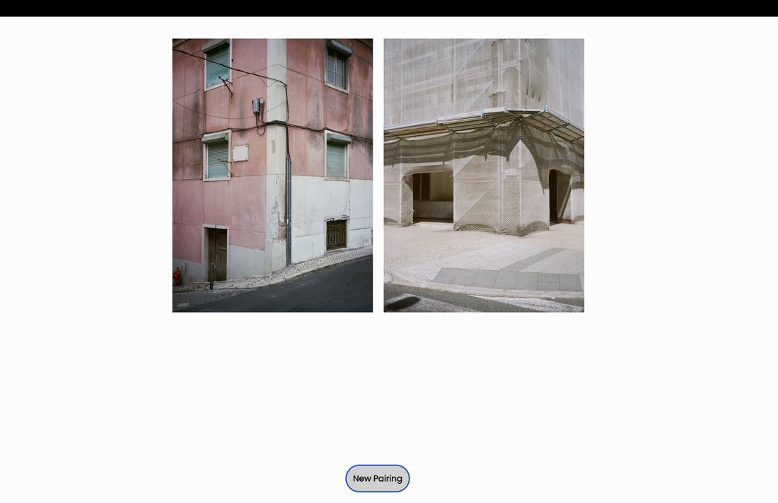
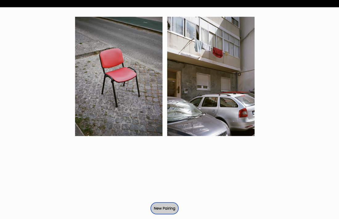
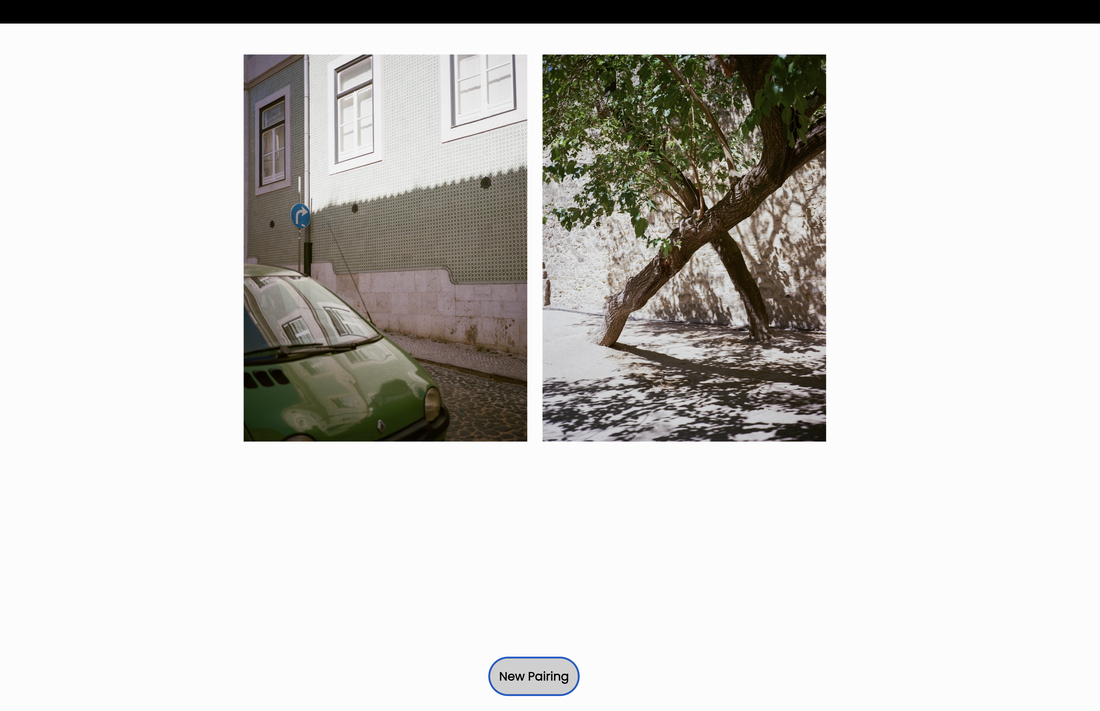
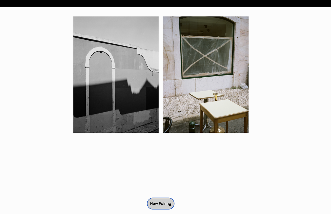
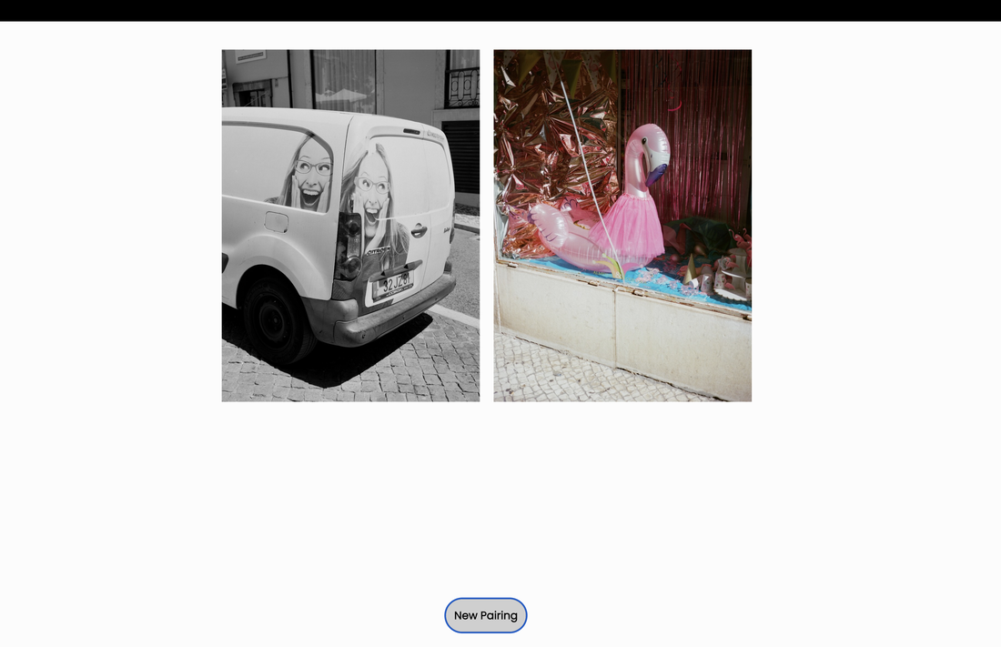
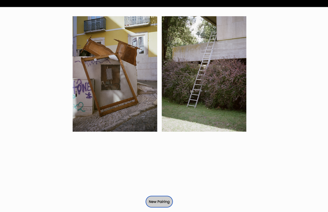
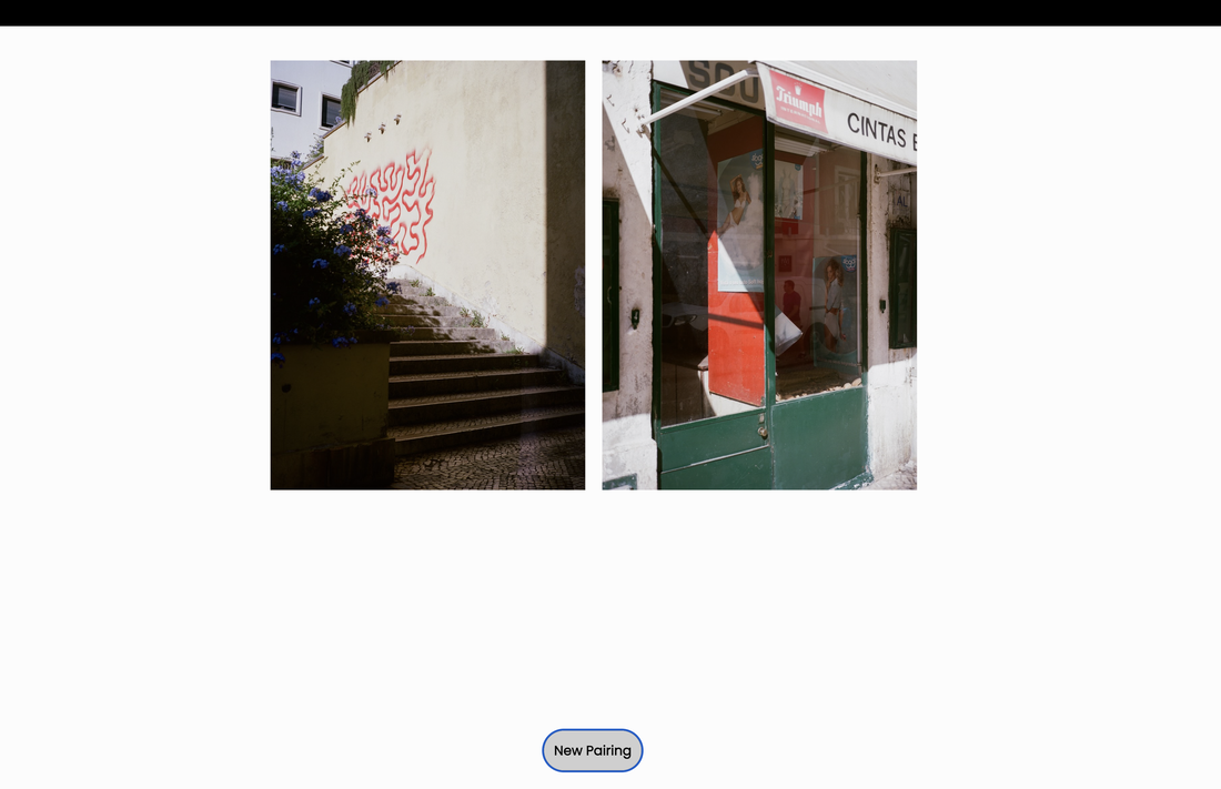
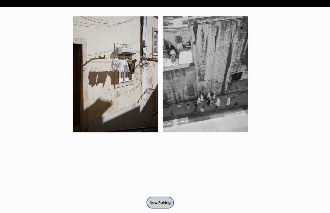
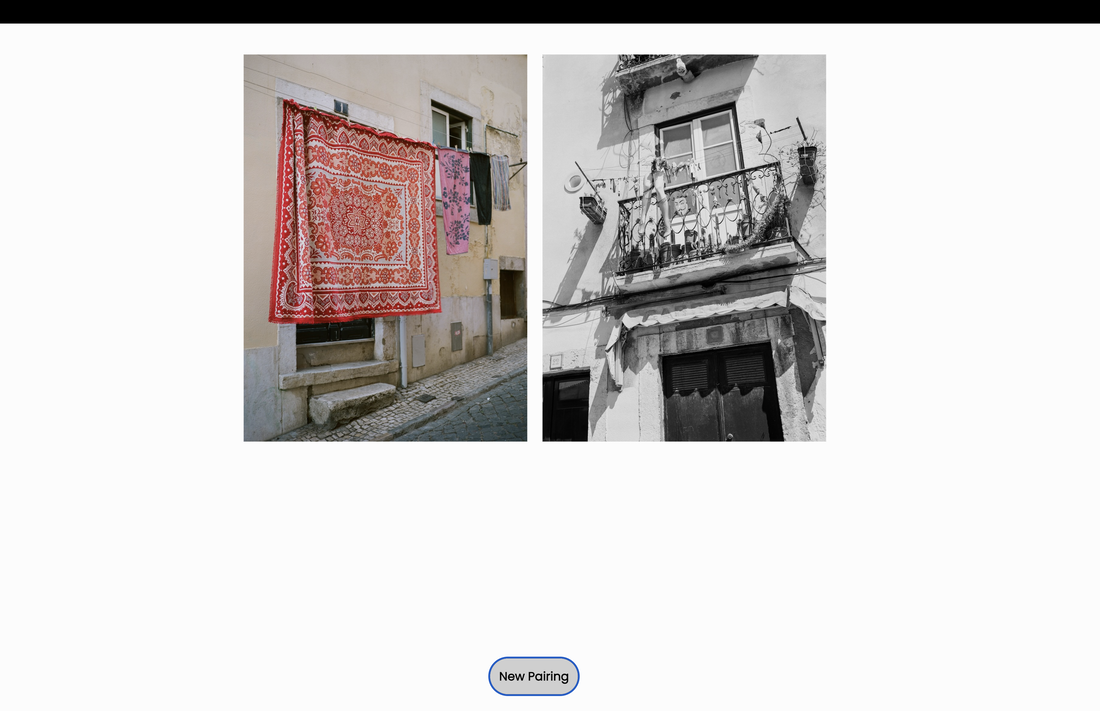
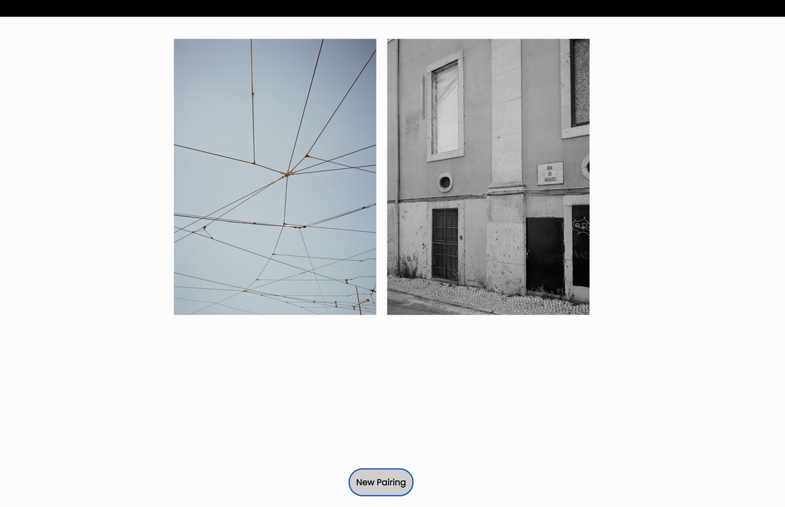
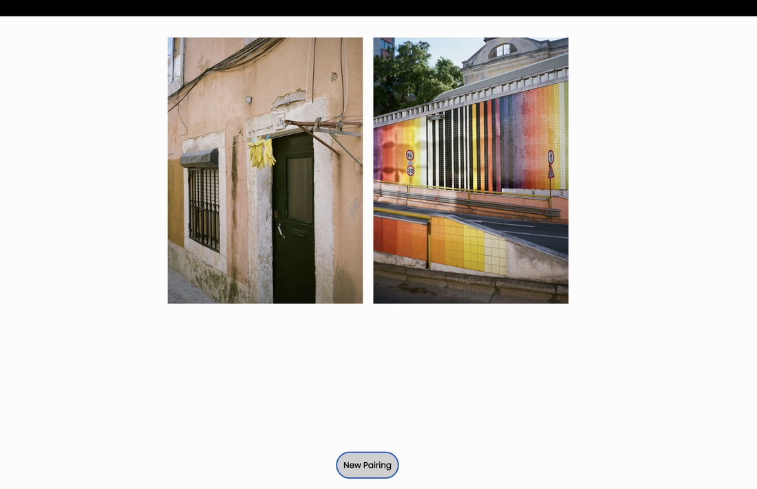
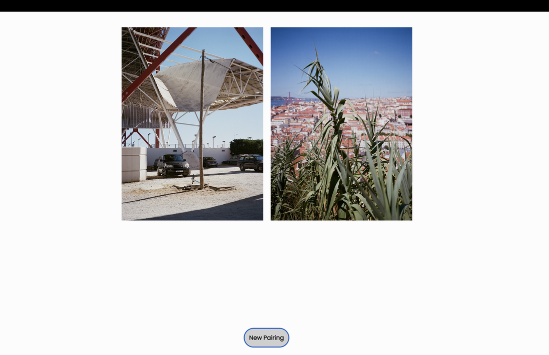
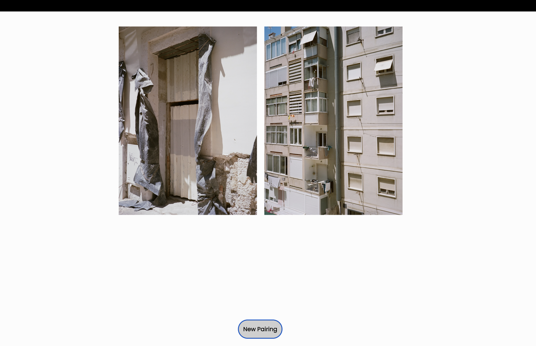
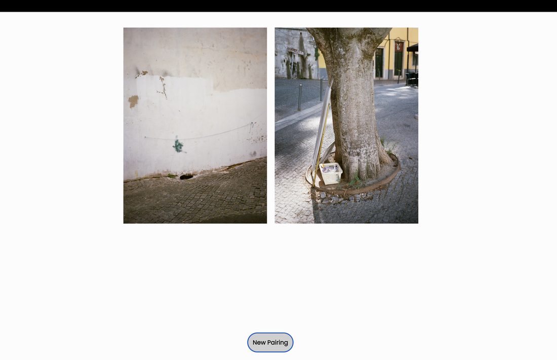
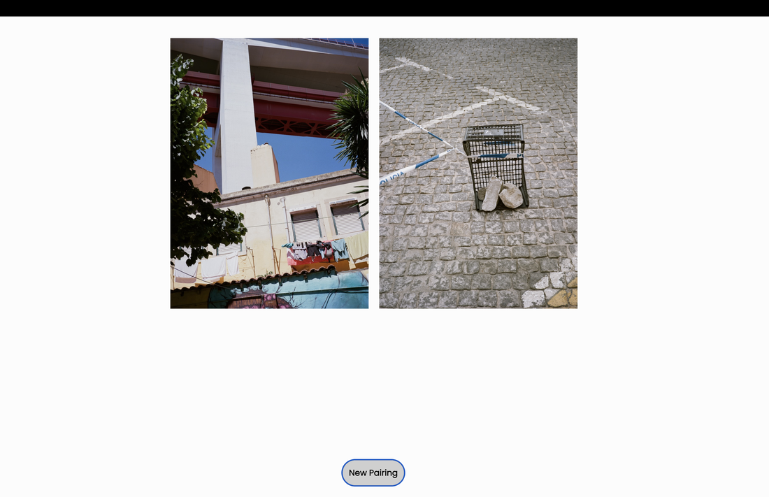
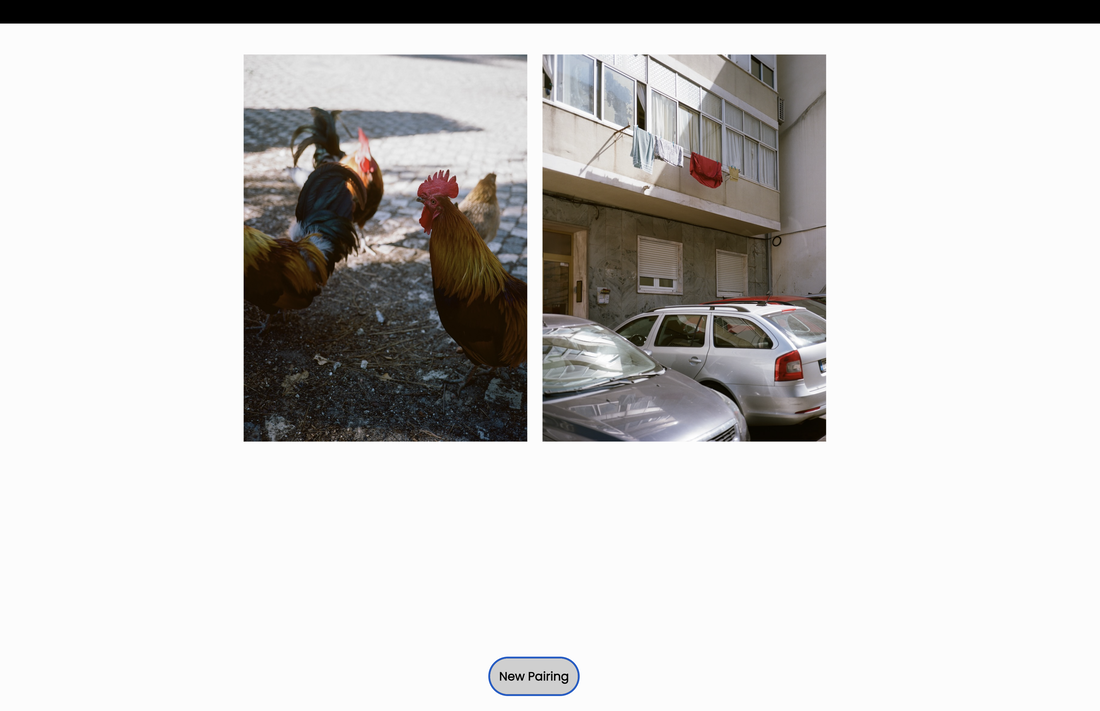
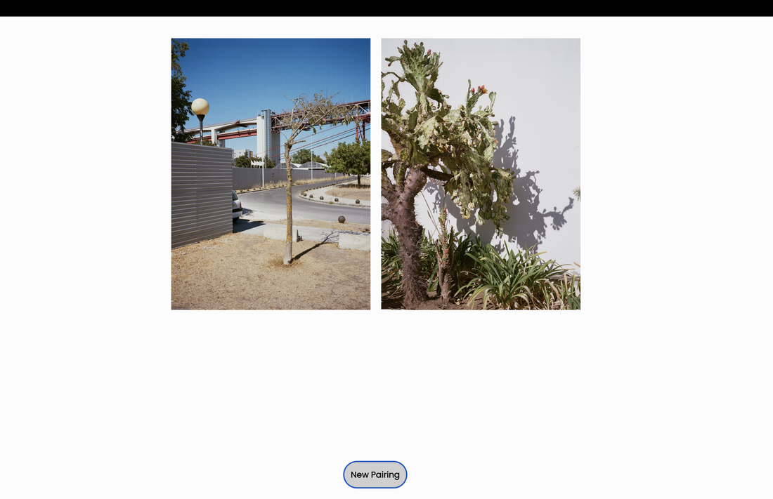
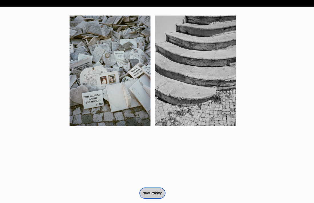
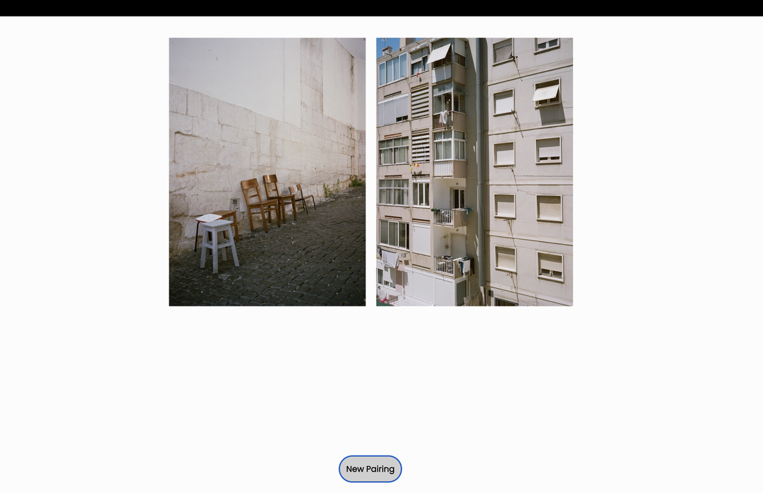
I decided to make a second experiment, further editing the code for the Diptych image generator to expand the range of images and choosing the medium format photographs I made in Lisbon earlier in the year. I selected 100 photographs, splitting them into the two albums, to be randomly arranged by the web app. I struggled a little with the coding, forgetting how pedantic programming languages are. Fortunately, Tom was able to give me some assistance (via email). Below is a screen recording of the diptychs being randomly generated by the app (at the click of a button). I have edited this together with several recordings (from ubuweb and freesound) combining an interview with Marcel Duchamp about his Readymades and the philosophy of Dadaism and field recordings made in Lisbon. The title is taken from something Duchamp says in the interview in response to a question about whether a Readymade can be considered a work of art. It seemed to resonate with the notion of being in a foreign city and with the chance-based, non-human randomness of the image pairings.
Here are some of my favourite image pairings generated by the app. I had not considered any of these combinations myself:
Refining the code for Experiment #1
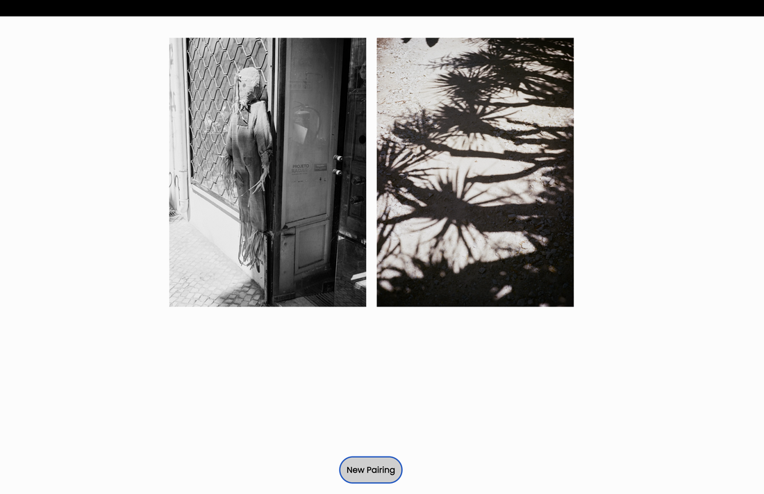
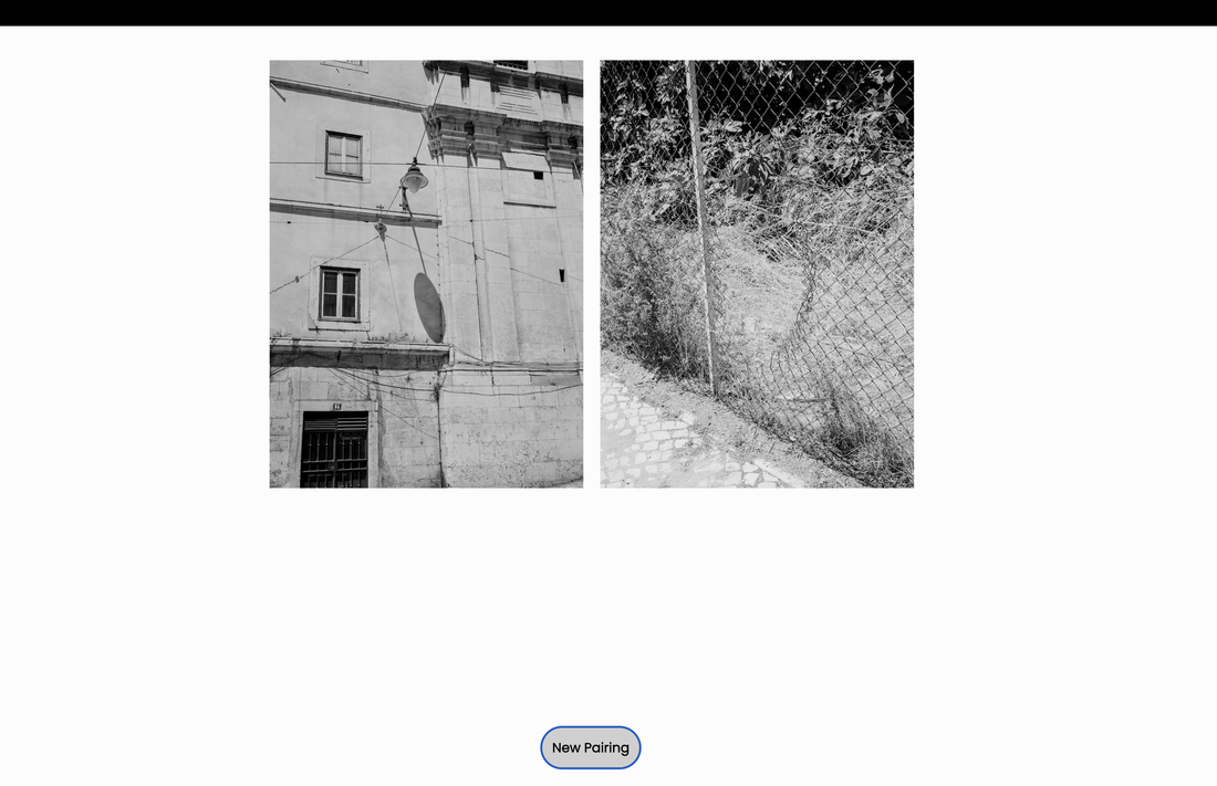
Returning to the code for the black and white photographs experiment, I decided to try to enlarge the images and create a total of 90 images in each gallery. Here are some of my favourite diptychs generated by the app:
PLAN:
Although I have experimented with several different techniques for creating diptychs, I am interested in sharing these most recent experiments with the coding of a Diptych Image Generator as my final outcome.
- Continue to develop and refine the coding and images for the Diptych Image Generator.
- Prepare three sets of images from different geographical places and camera technologies e.g. Belgium (digital SLR), Lisbon (medium format colour and black and white film) and England (35mm black and white film film)
- Screen record the image generators being used and create video documents to share on a web page
- Create a web gallery on which to display the recorded image generator user's interactions
- Write an introductory statement for the gallery page explaining what the recordings represent
- Add a sound file to play automatically once the visitor opens the gallery page
Final Evaluation
I am reasonably satisfied with the presentation of my investigation into the diptych form in photography. The deliberate and chance making of diptychs has given me motivation to make lots of images, rediscovering a love for using film and experimenting with medium format photography in the process. I like the sense of anticipation associated with using film, the way it slows down my image making, helping to photograph more intentionally. I've also really enjoyed the process of constructing diptychs, working with constraints and, sometimes, embracing both chance and collaboration. My research about Gestalt theory is an ongoing interest and I have enjoyed looking at the work of photographers who engage with diptych making in its various forms. In a sense, the making of diptychs is fundamental to the editing process in photography. Putting images side by side is often one stage in the sequencing of a photobook, for example. I like the fact that diptychs are never fixed or the only answer. Images can be swapped in and out so that, with each new pairing, the whole is greater than the sum of the parts.
I have also enjoyed experimenting with multimedia presentations, using the archive of radical sounds available on Ubuweb, often chosen at random to accompany diptych slideshows. Most recently, I discovered Tom Roche's Diptych image generator and this has given me a way of randomising image selections and inviting the viewer to interact with the work. I have shared three different versions of this format on my exhibition page, using particular sets of images made during my investigation. What fascinated me, in the end, was not so much the creation of 'successful' diptychs (however one might define success) but the psychological process of looking at a particular pair of images (randomly generated), noticing the similarities, differences and correspondences between them and then deciding whether or not they 'worked' together. My feeling is that much of this 'thinking' happens subconsciously or instinctively - a kind of sensitivity to visual rightness that is wordless. I really like what photographer Stephen Shore has to say about this kind of visual acuity:
I have also enjoyed experimenting with multimedia presentations, using the archive of radical sounds available on Ubuweb, often chosen at random to accompany diptych slideshows. Most recently, I discovered Tom Roche's Diptych image generator and this has given me a way of randomising image selections and inviting the viewer to interact with the work. I have shared three different versions of this format on my exhibition page, using particular sets of images made during my investigation. What fascinated me, in the end, was not so much the creation of 'successful' diptychs (however one might define success) but the psychological process of looking at a particular pair of images (randomly generated), noticing the similarities, differences and correspondences between them and then deciding whether or not they 'worked' together. My feeling is that much of this 'thinking' happens subconsciously or instinctively - a kind of sensitivity to visual rightness that is wordless. I really like what photographer Stephen Shore has to say about this kind of visual acuity:
There's a kind of visual thinking that goes on without words. Not just words that are not spoken but not even words in one's head. Most people think thinking has to do with words, that little voice in your head. But there's visual thinking that doesn't have that.
-- Stephen Shore, from the film American Beauty
I hope that viewers of my online exhibition are able to imagine, from my screen recordings of the Diptych Image Generator in action, what it might be like to see the random pairings appear on screen and then be replaced at the click of a button with a new pair. I hope they experience a brief sense of what they consider 'works' and that this gives them some aesthetic pleasure. If time and space allows, I am hoping to set up a projector at some point so that visitors might be able to interact with it live. Until then, the online exhibition page will have to suffice.
A range of diptychs selected by students using the three Image Generators (Belgium, Lisbon, London & SE) in December 2023.