Developing my practice (cont.)
This page is an extension of the ongoing development of my Personal Investigation. As before, it will be largely visual, a place to document experiments and record observations of my own and others' work.

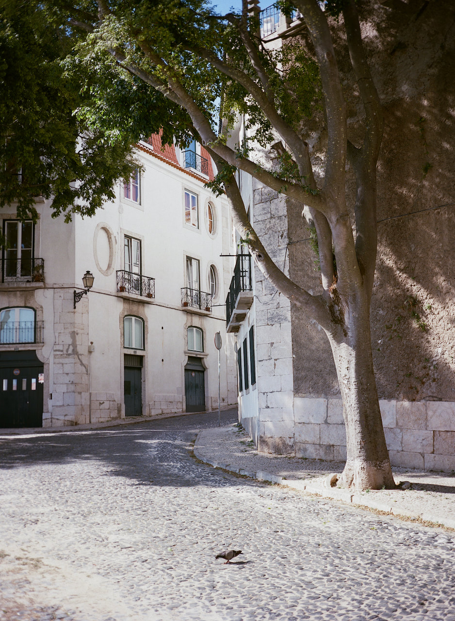
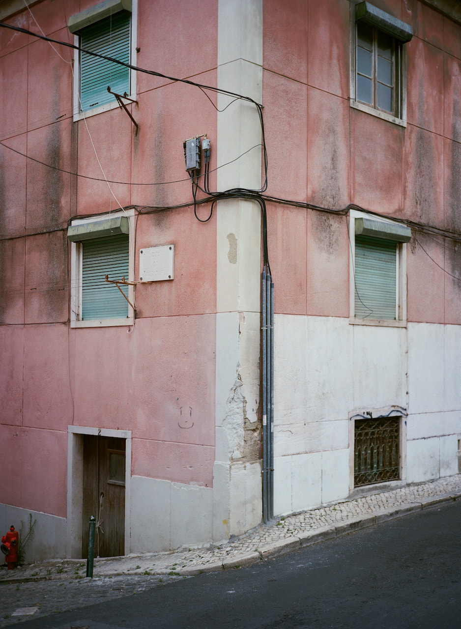
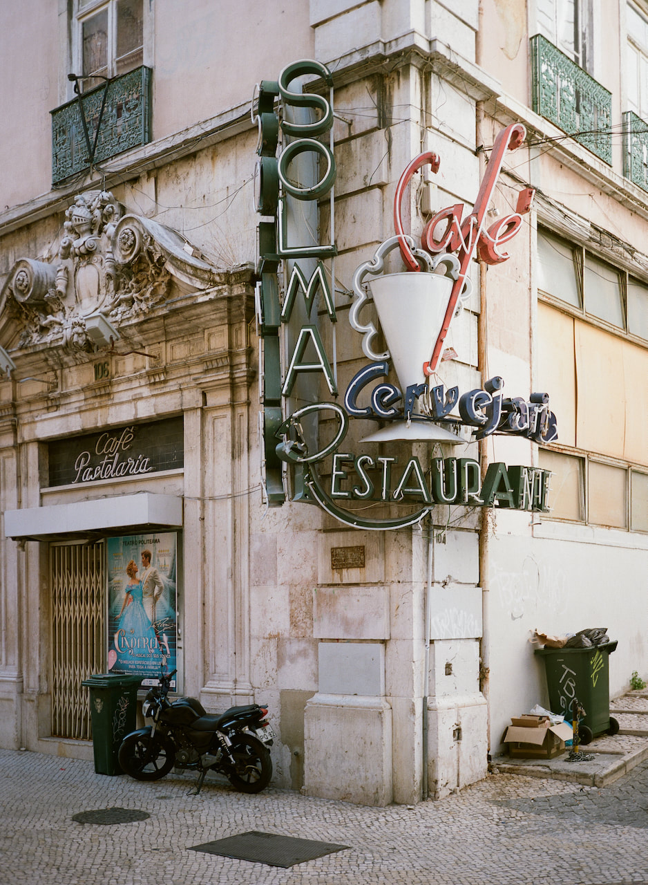
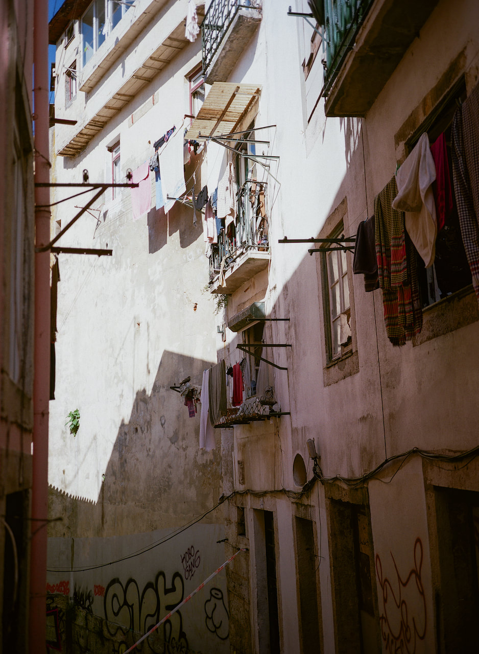
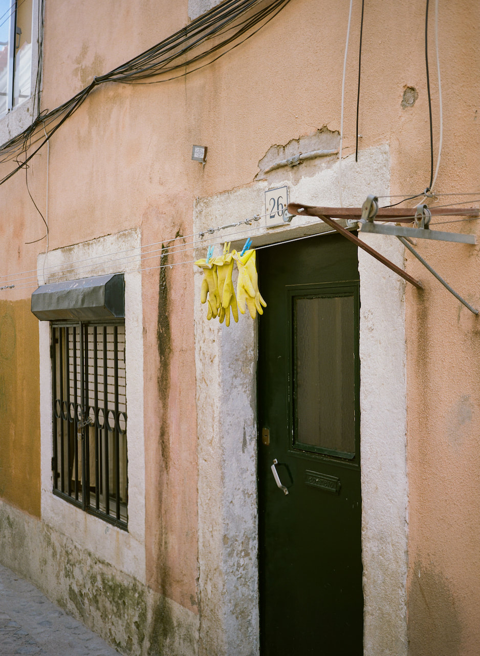
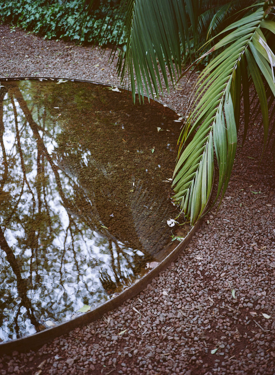
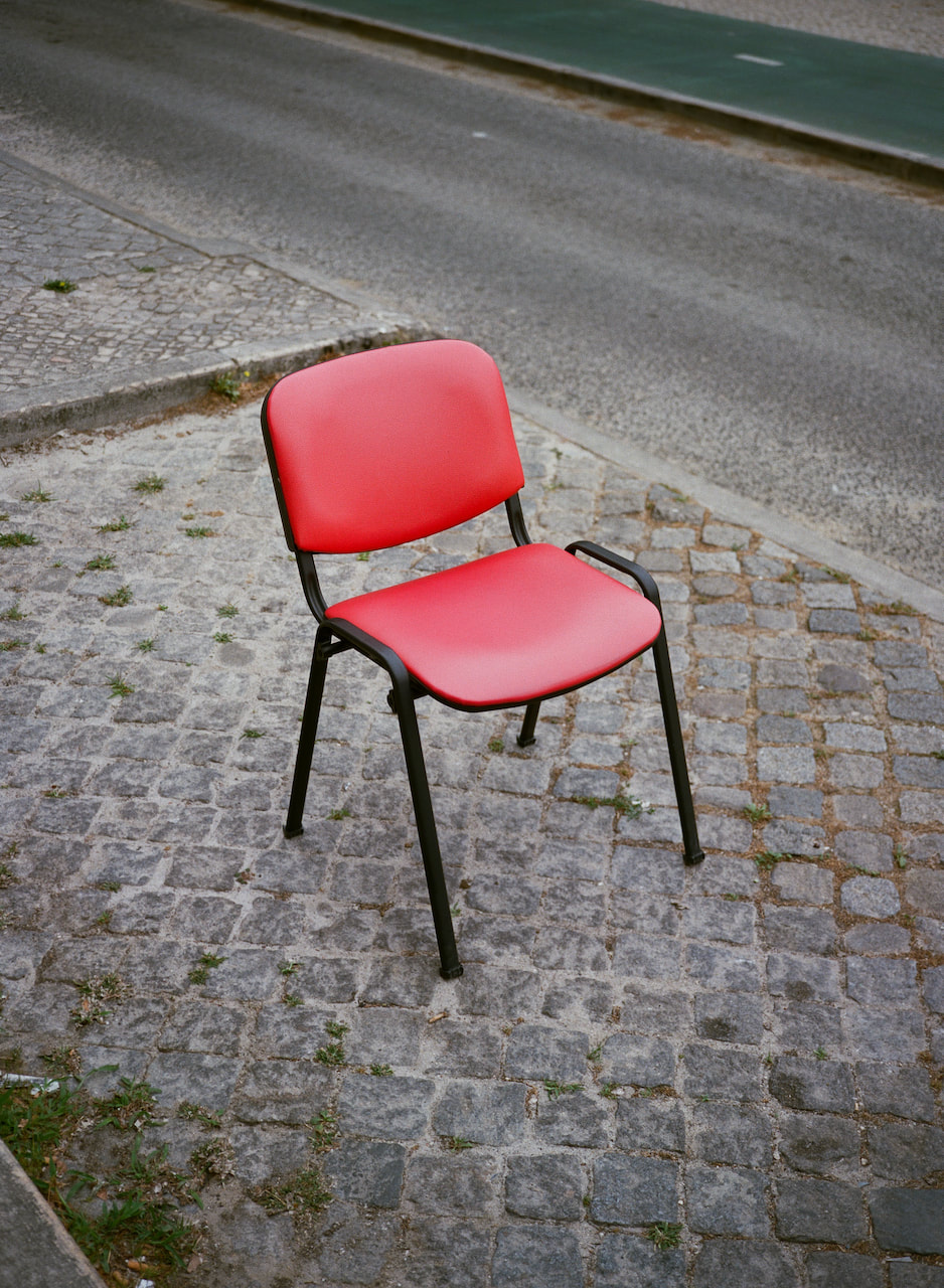
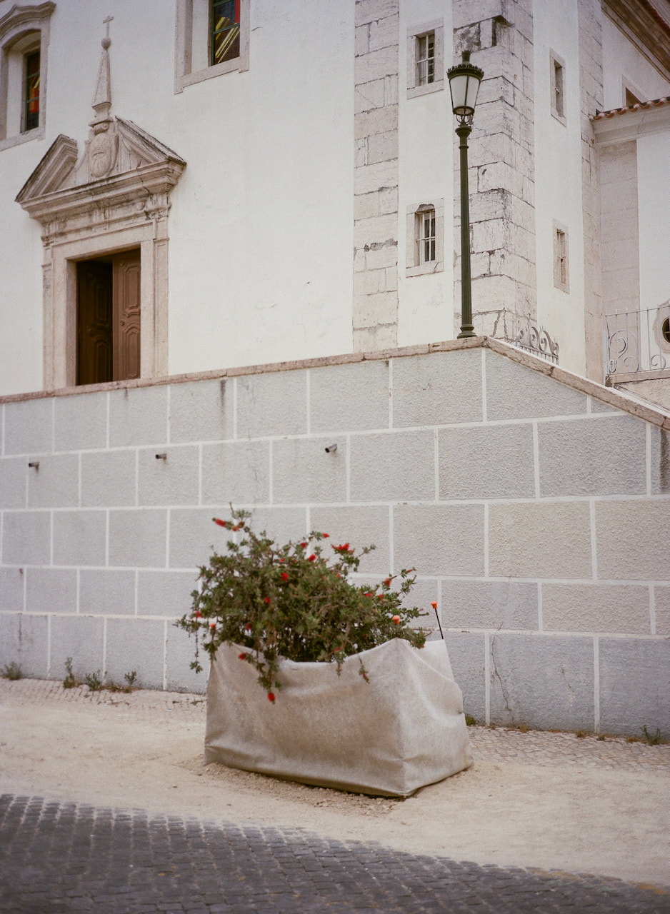
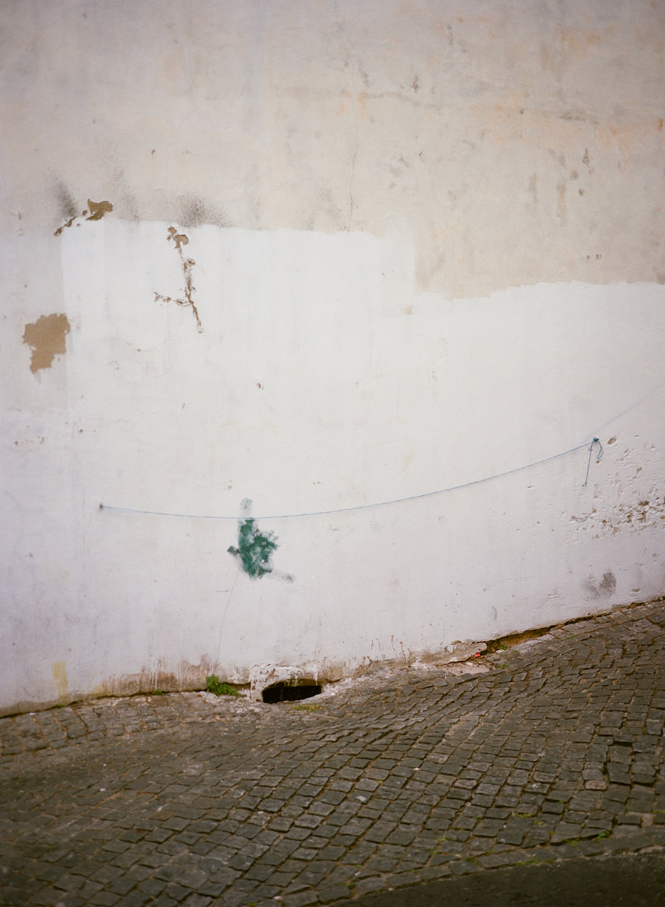
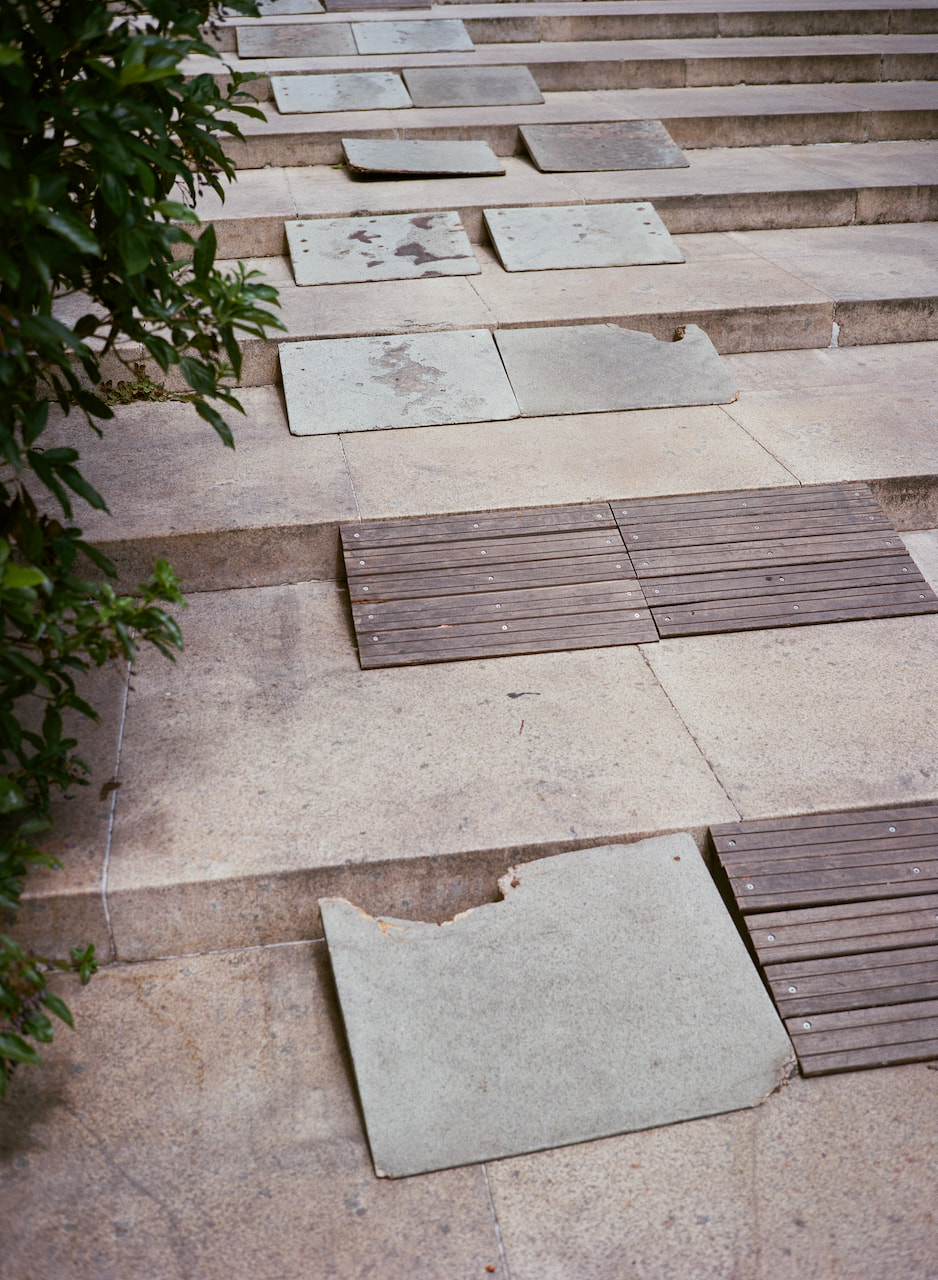
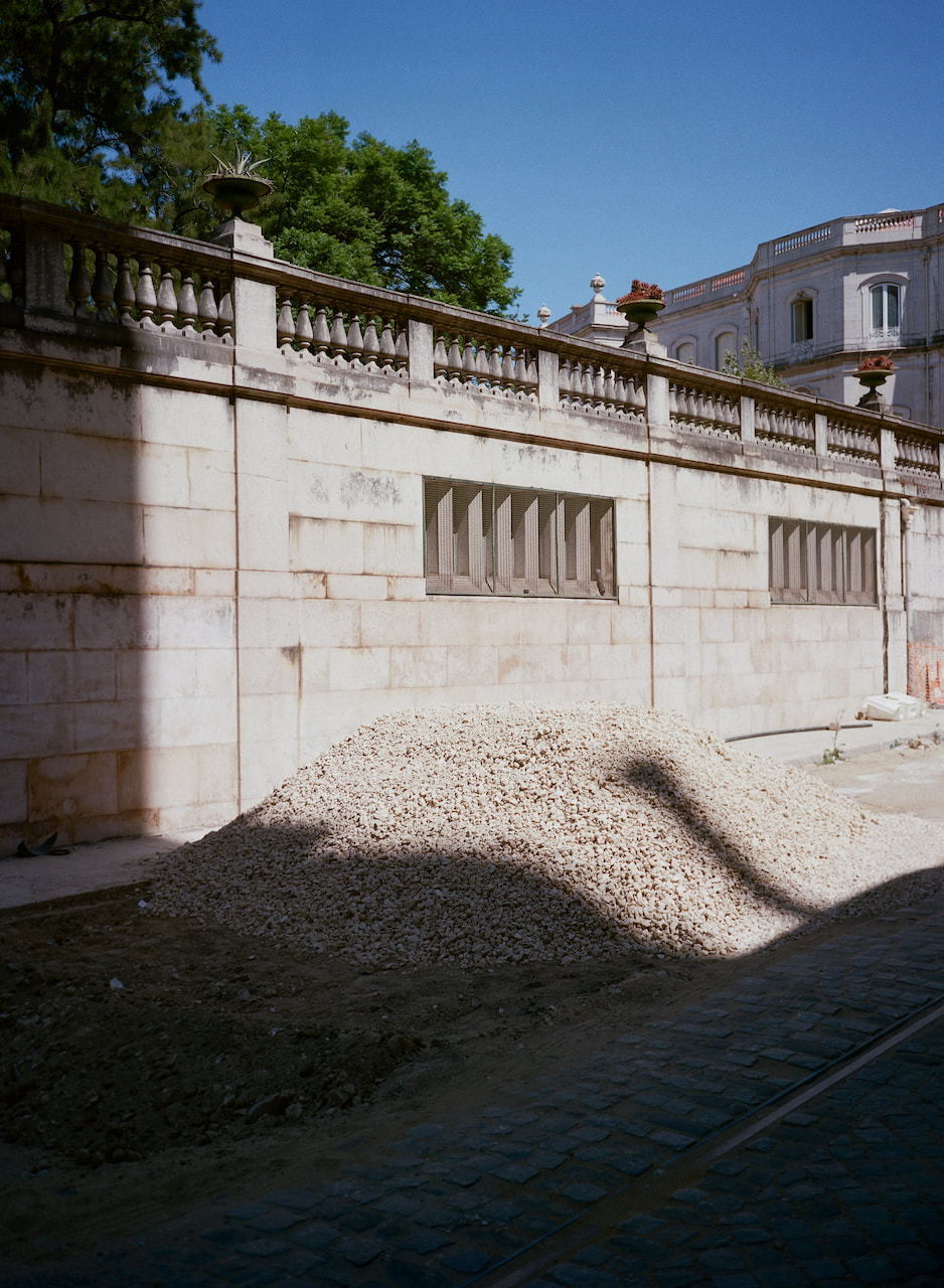
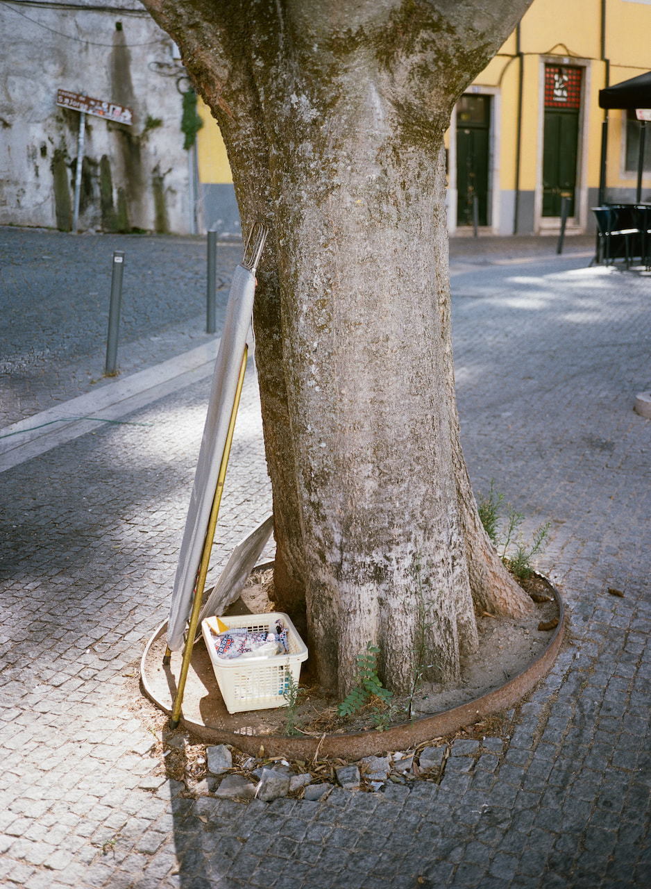
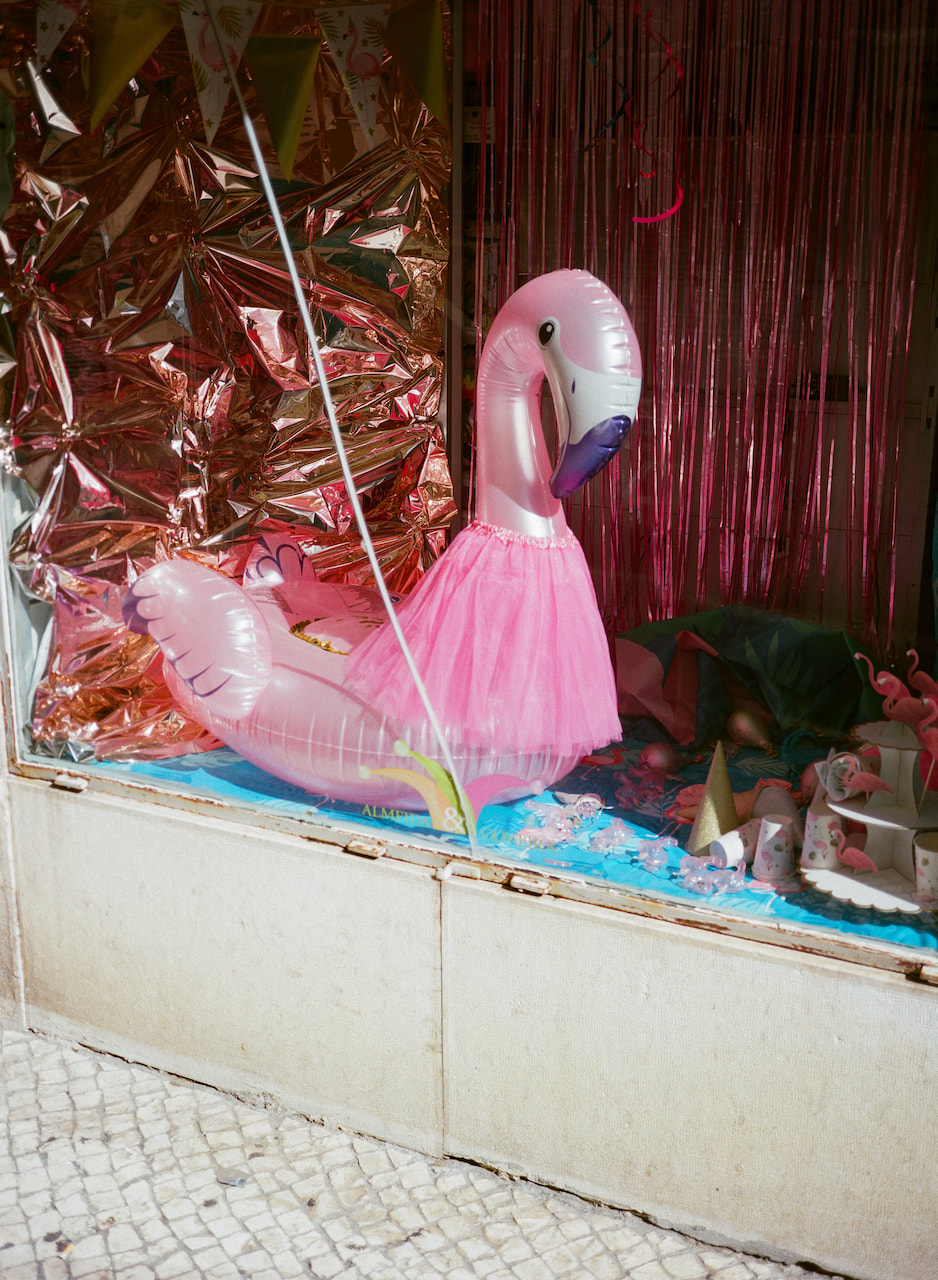
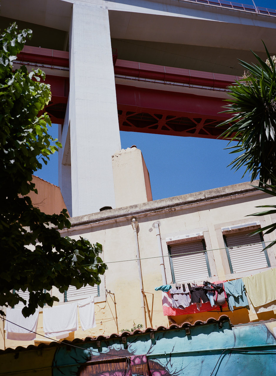
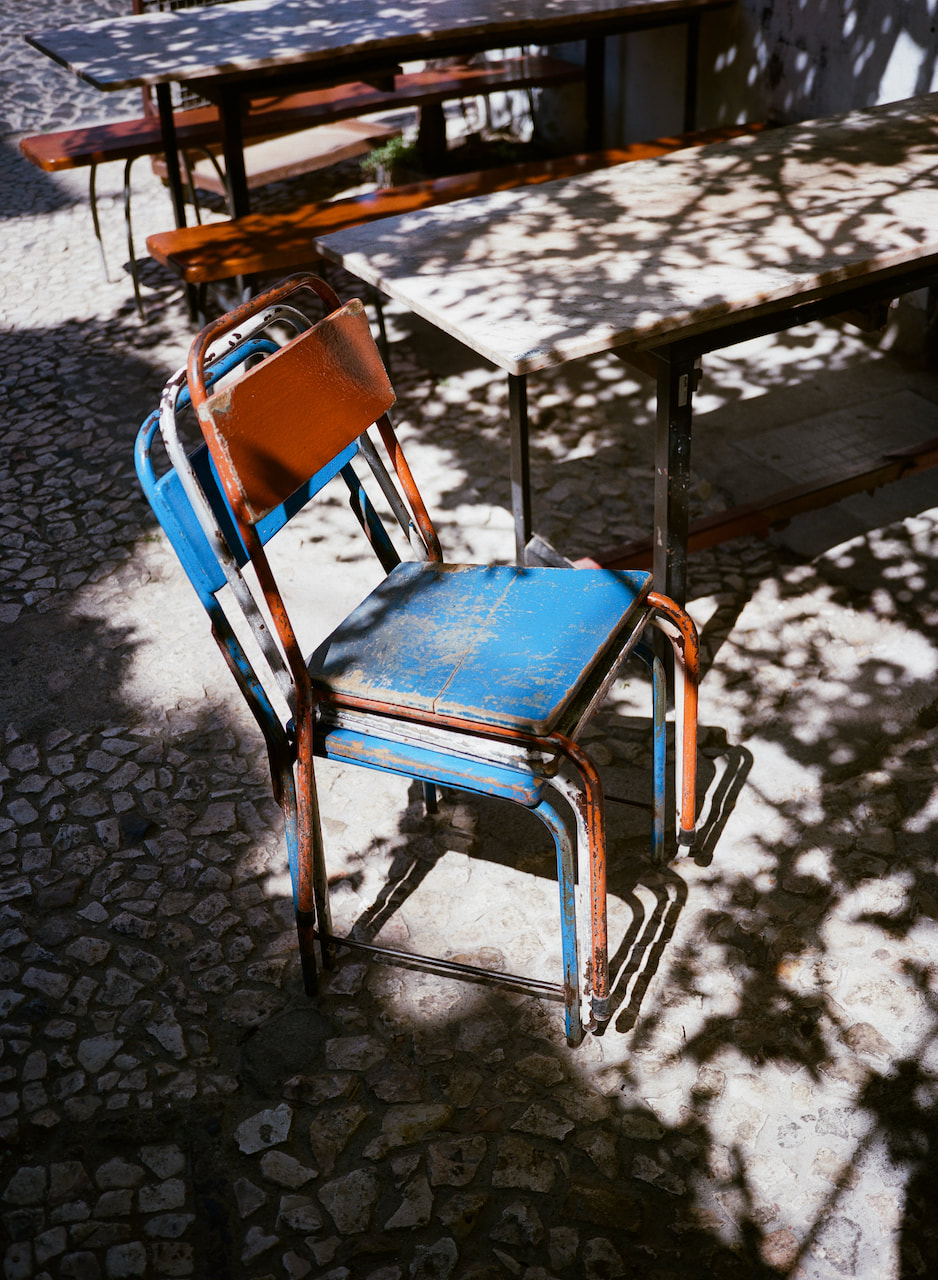
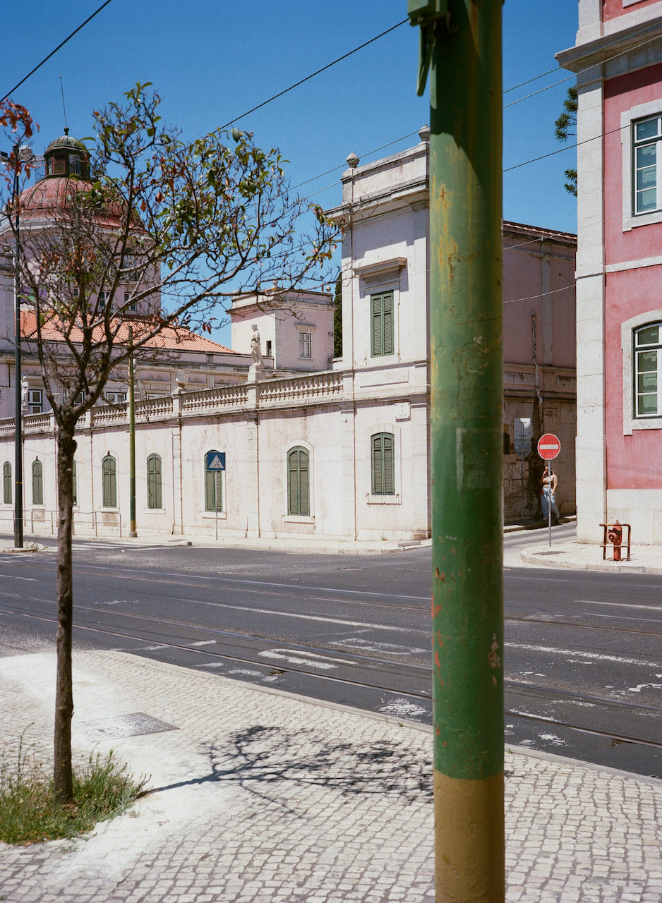
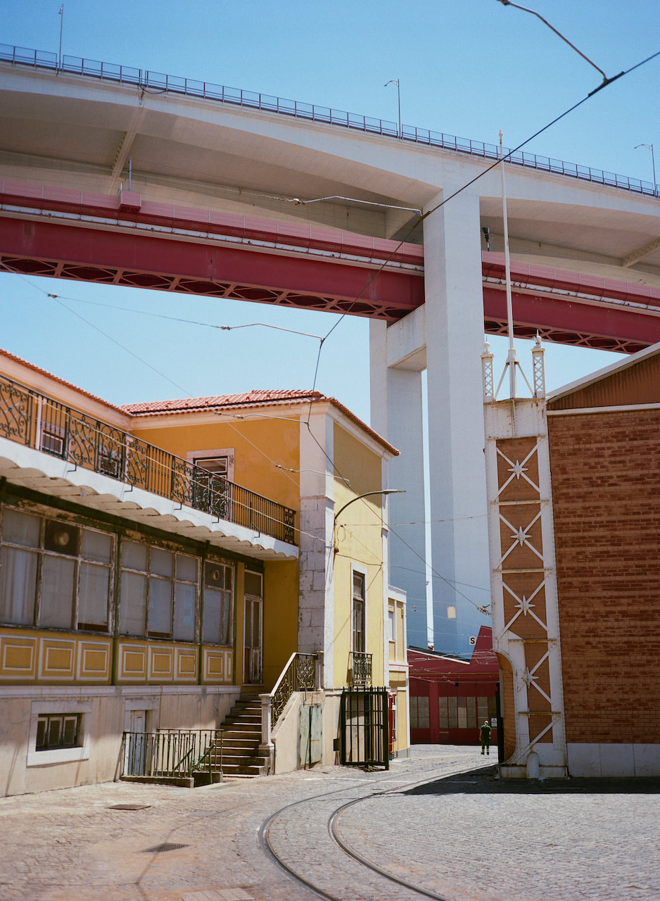
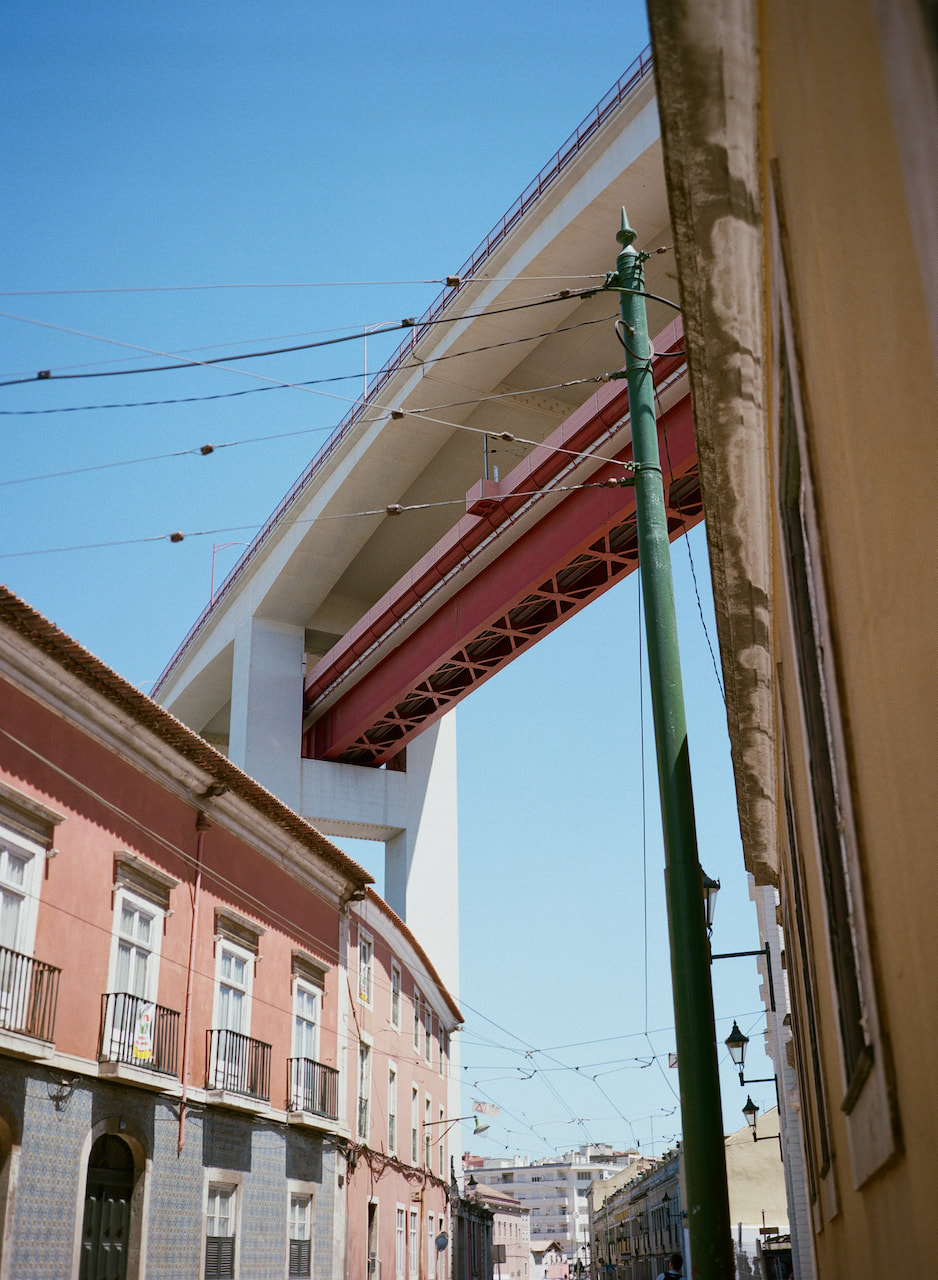
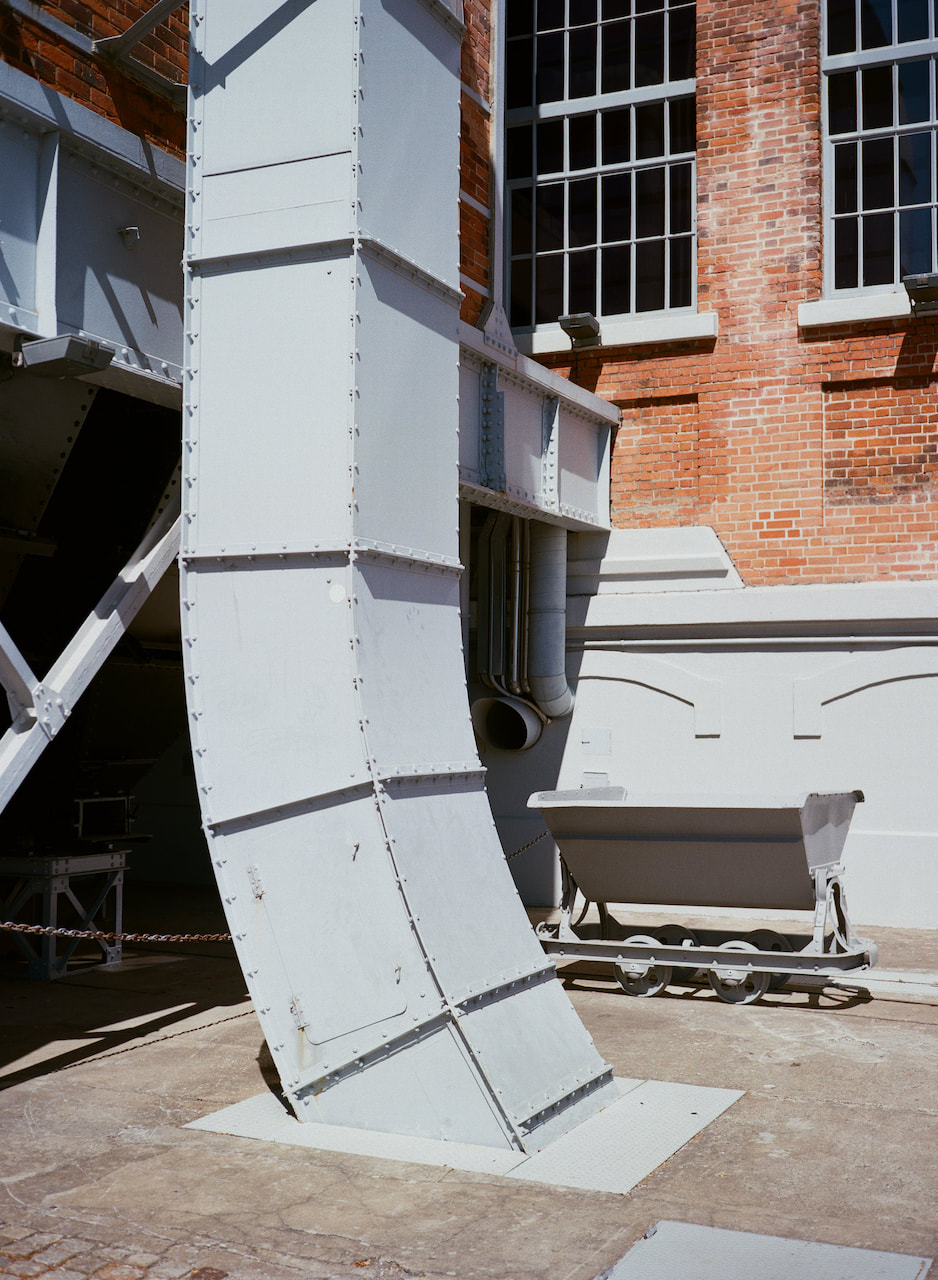
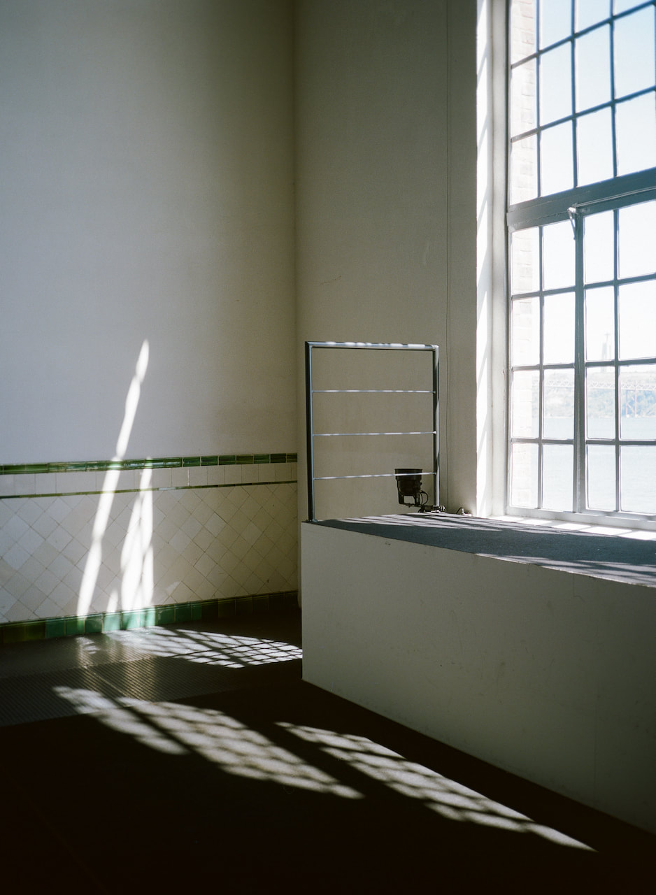
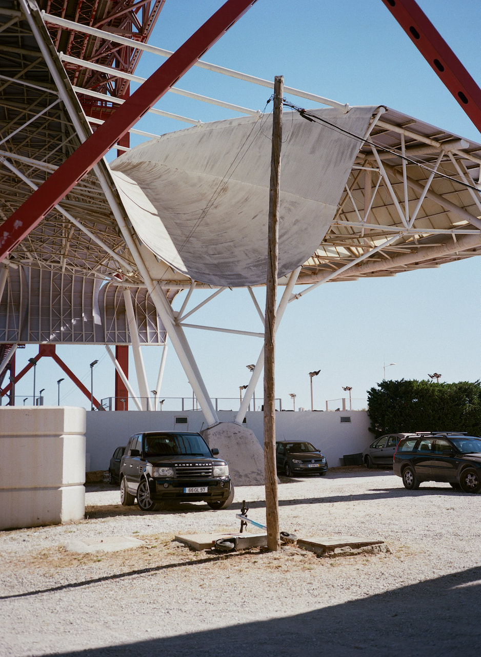
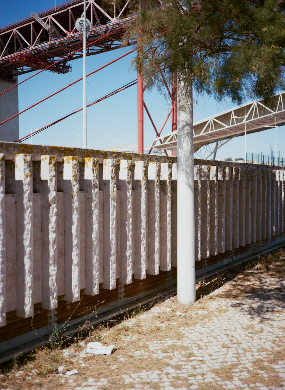
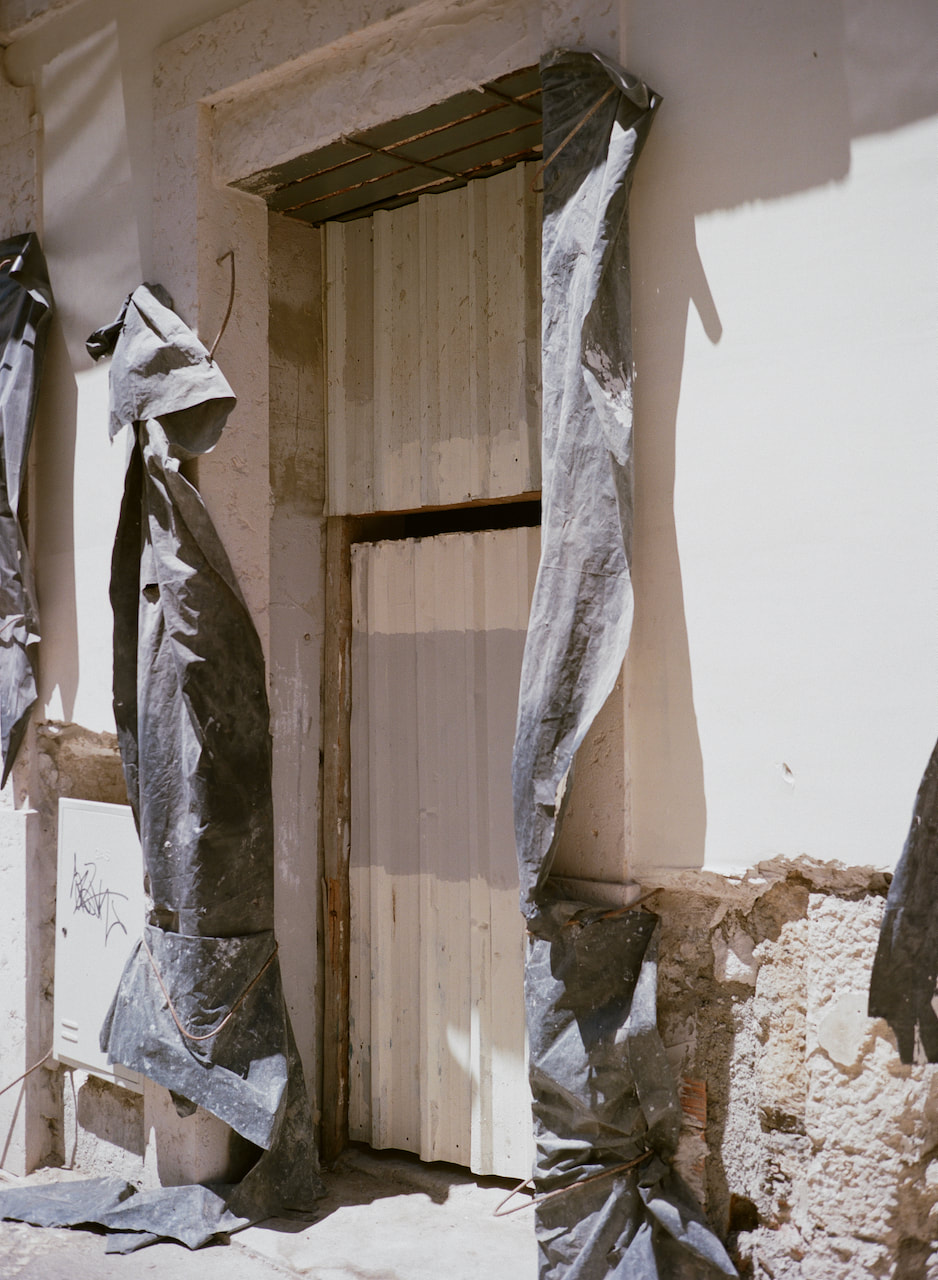
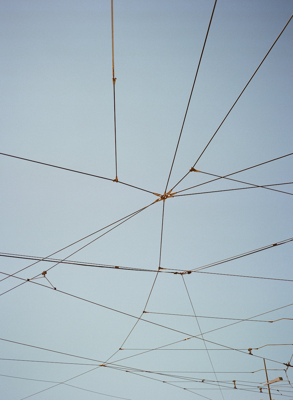
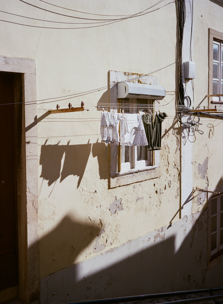
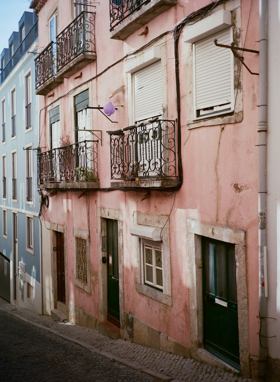
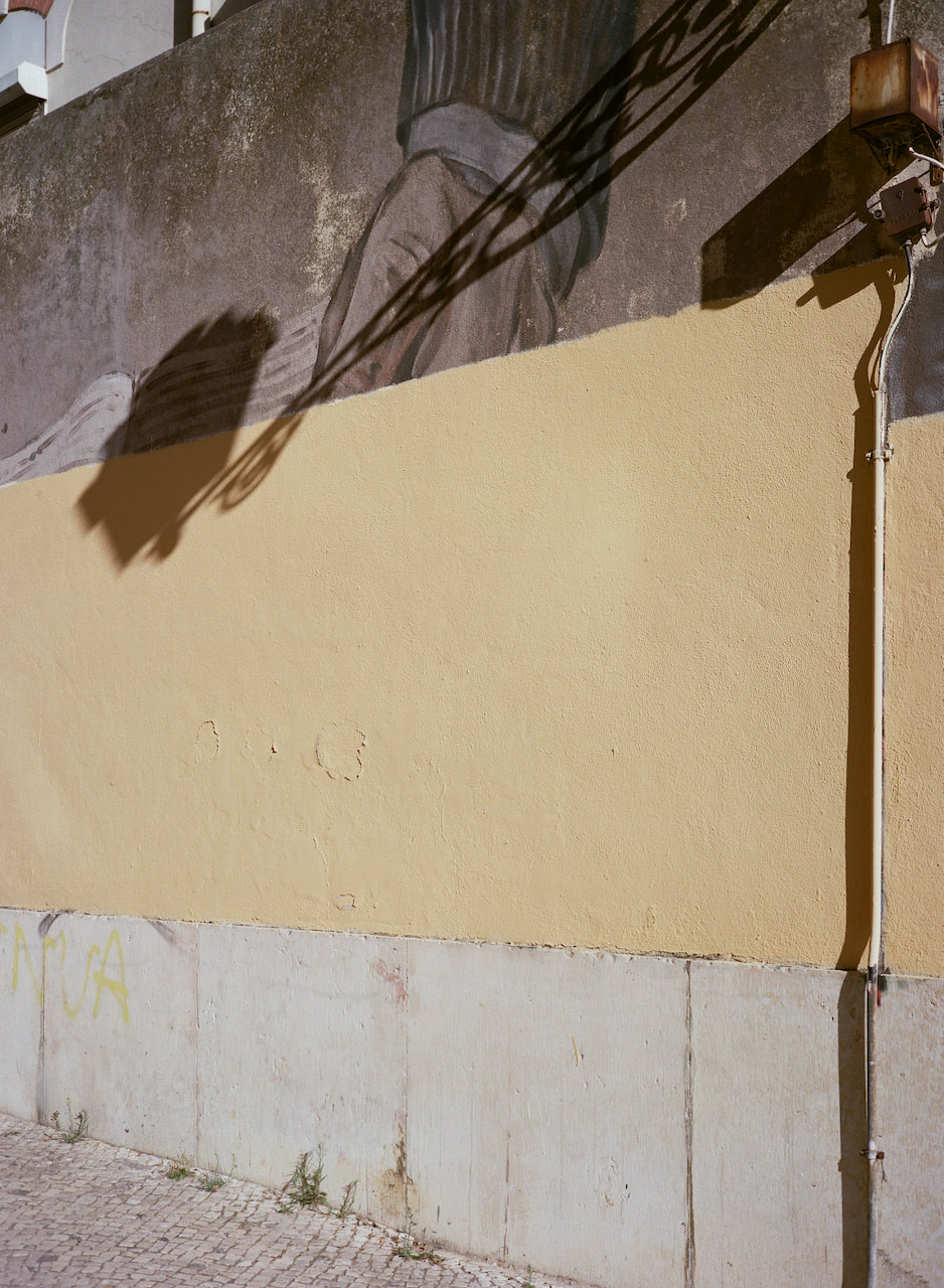
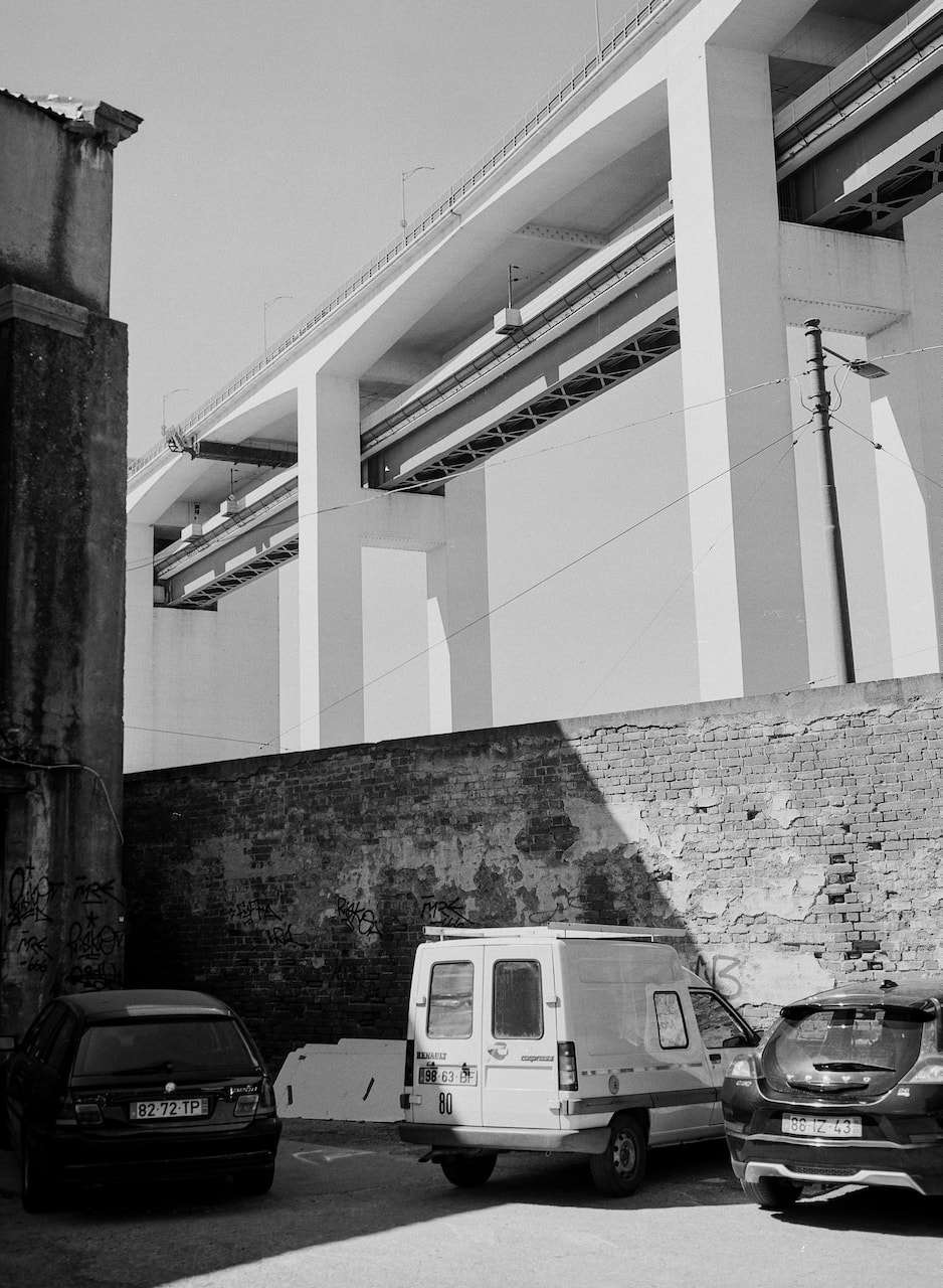
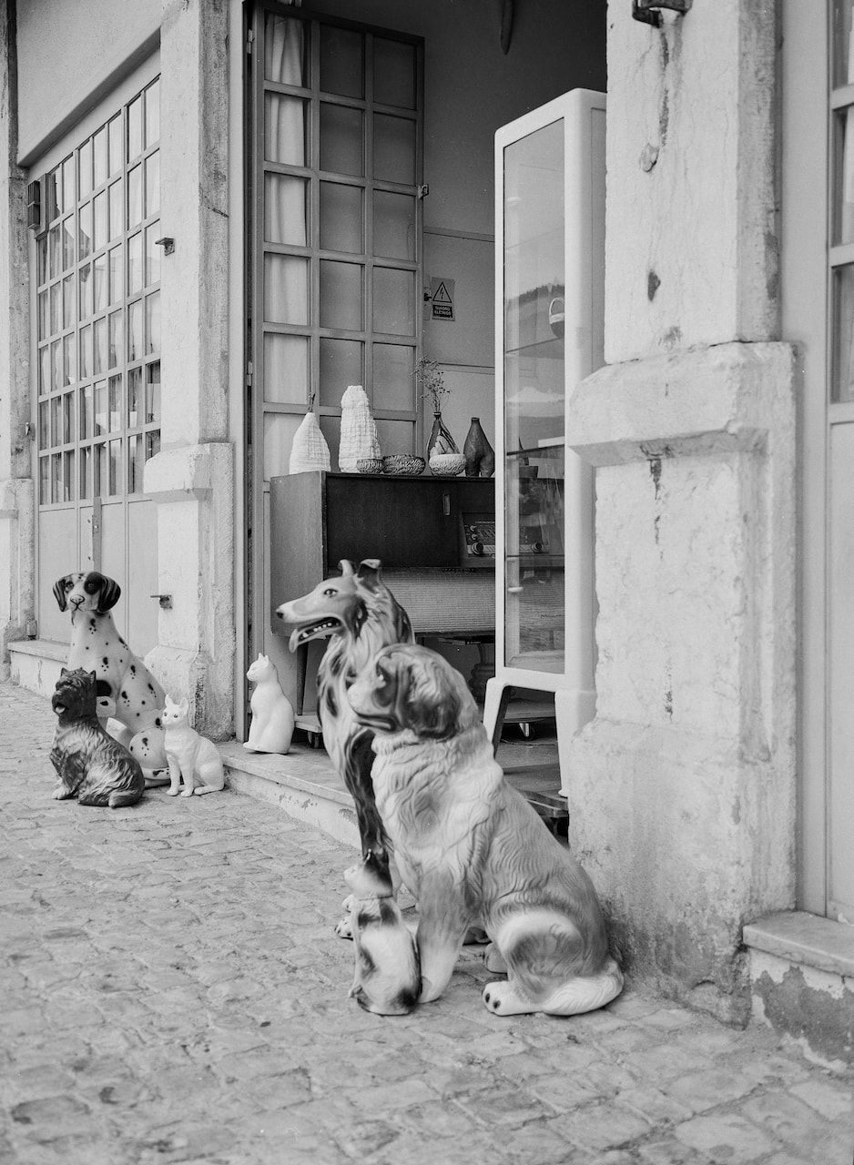
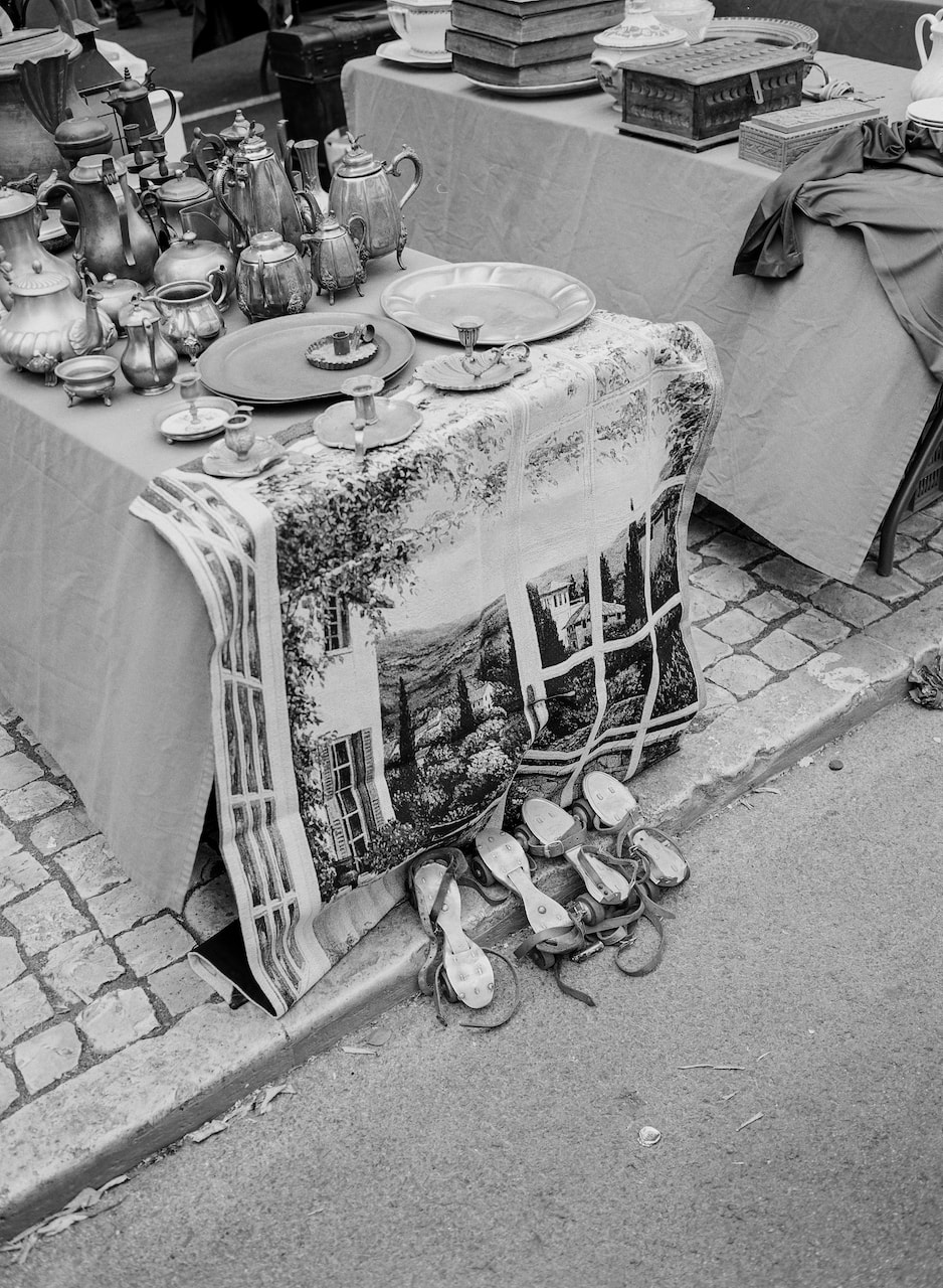
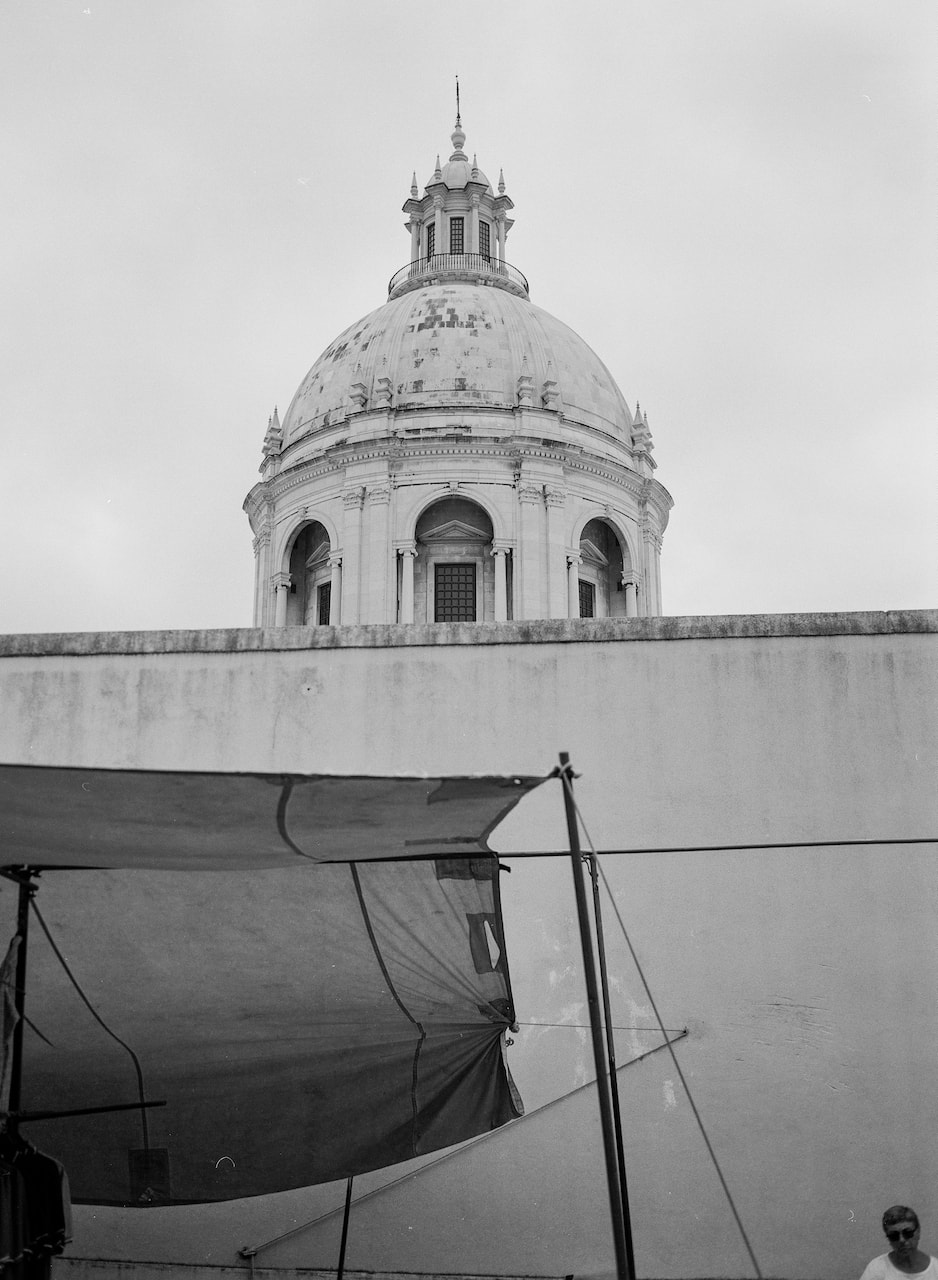
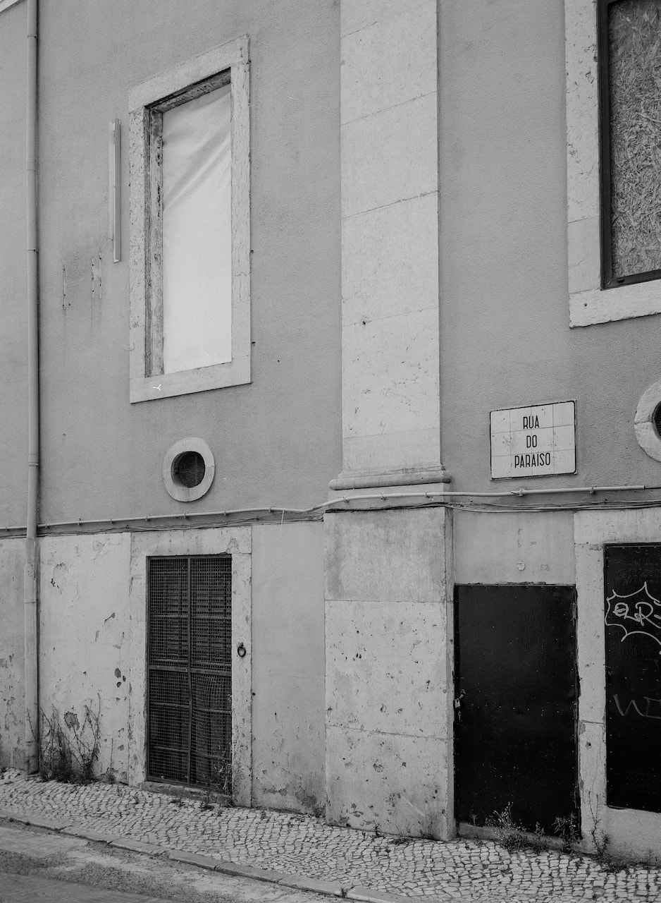
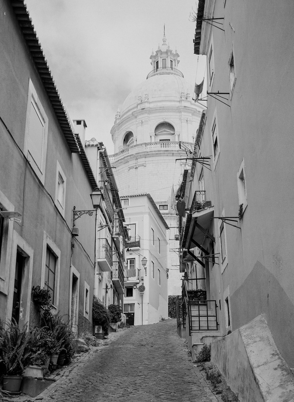
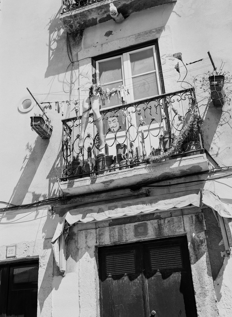
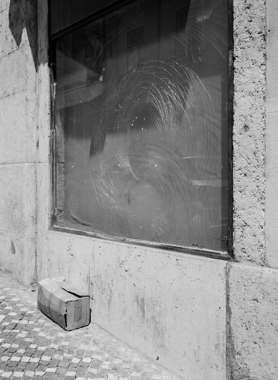
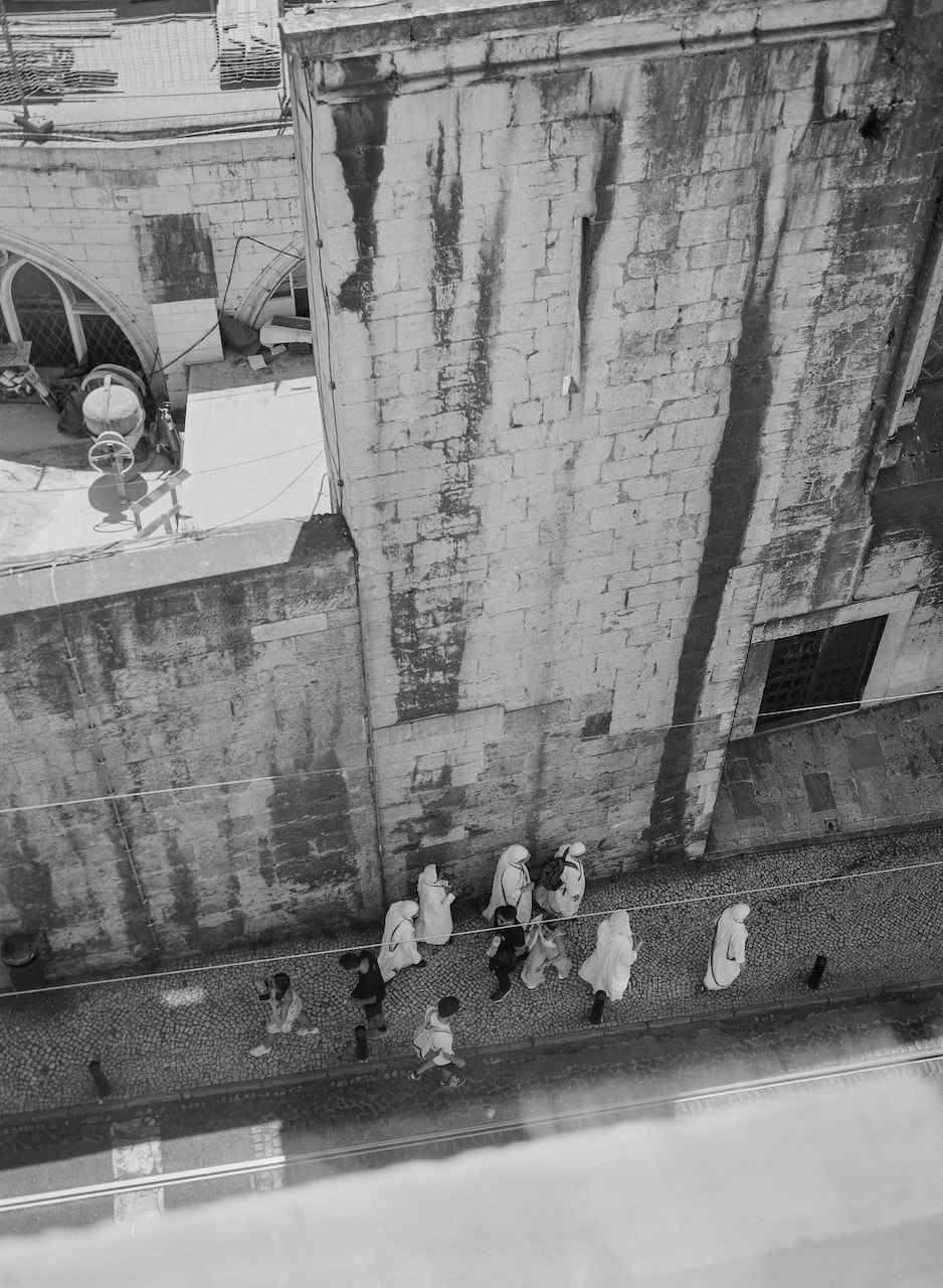
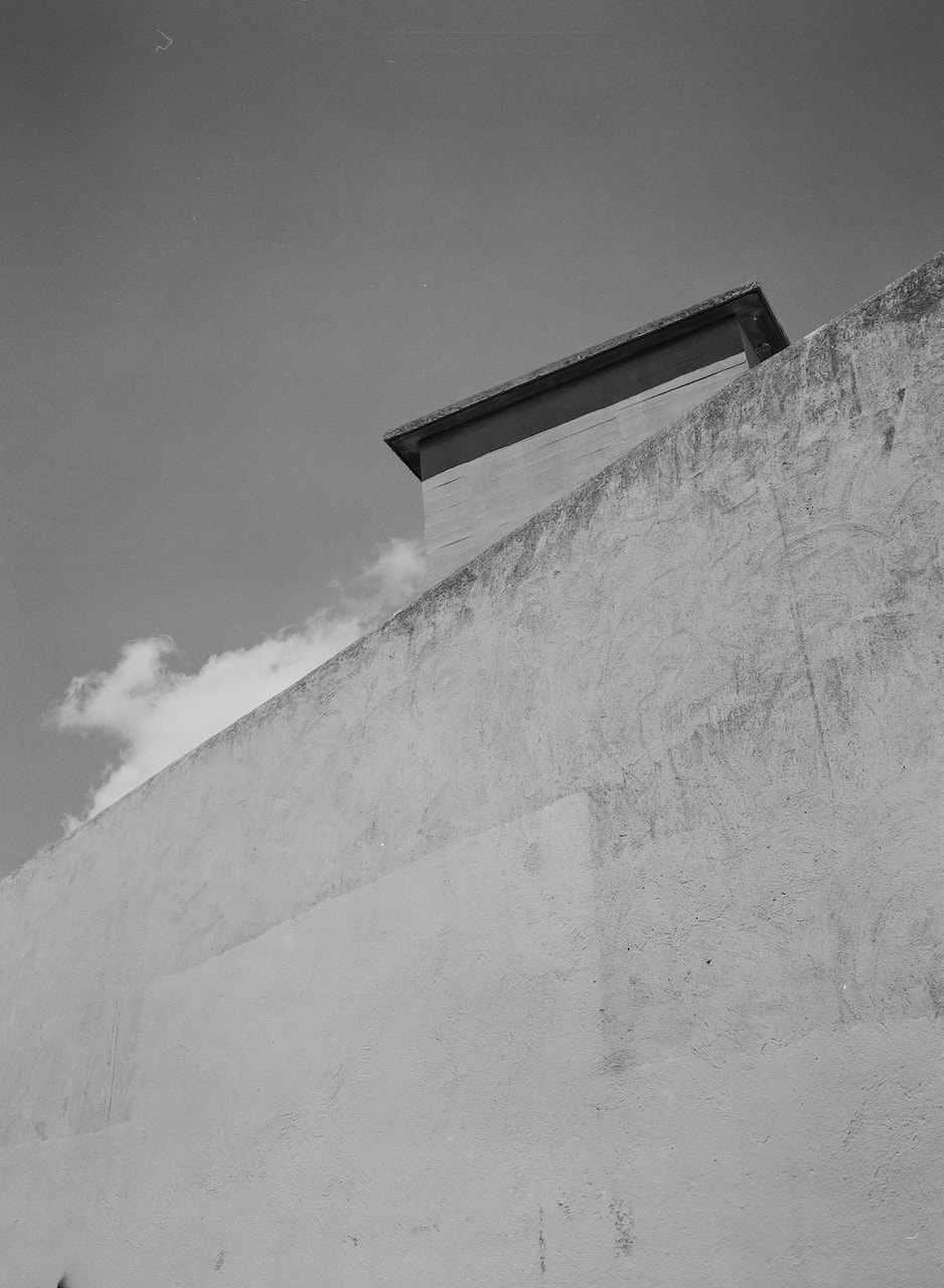
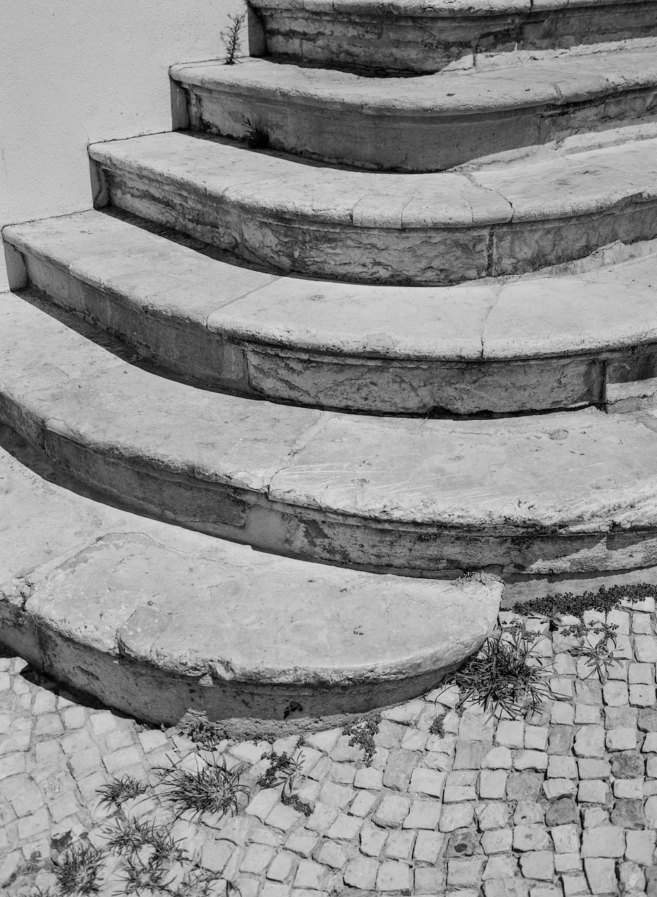
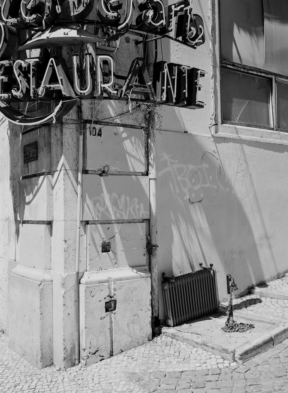
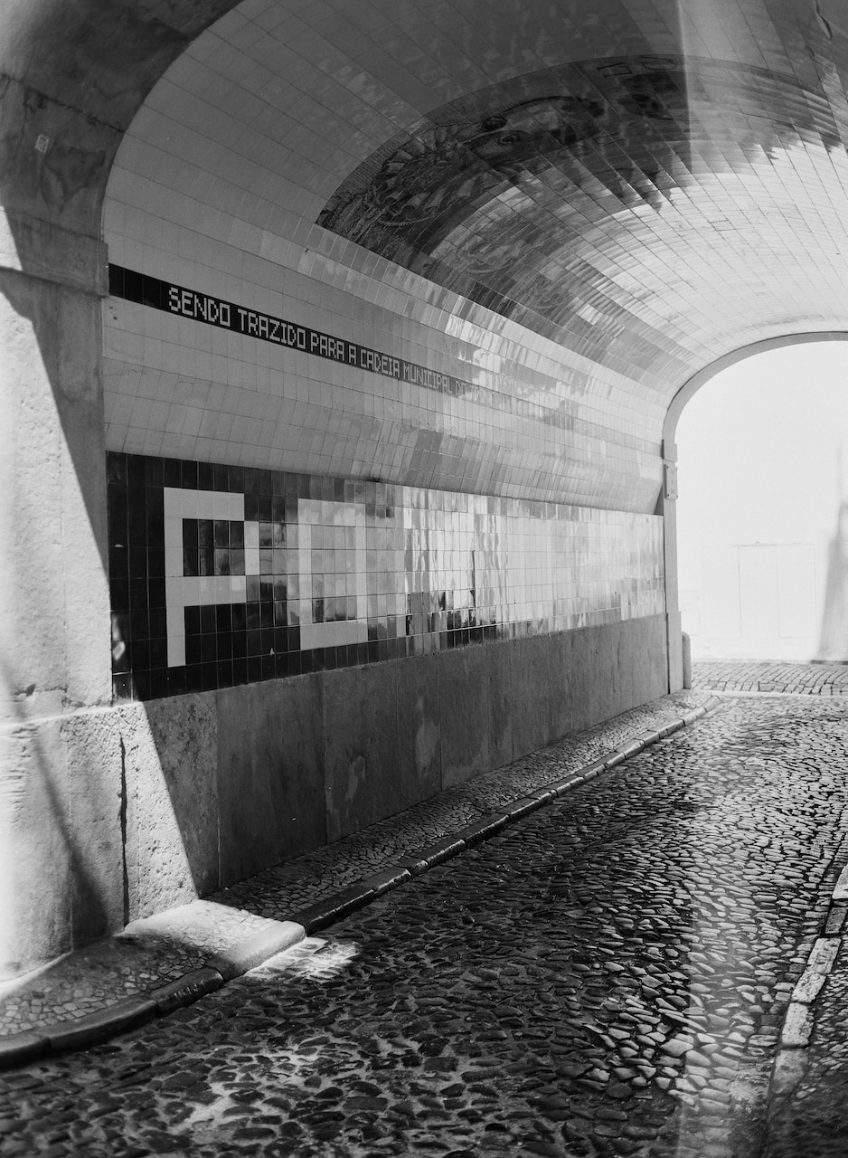
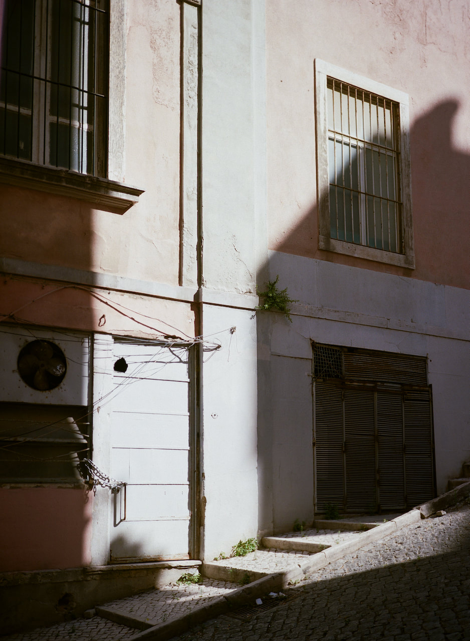
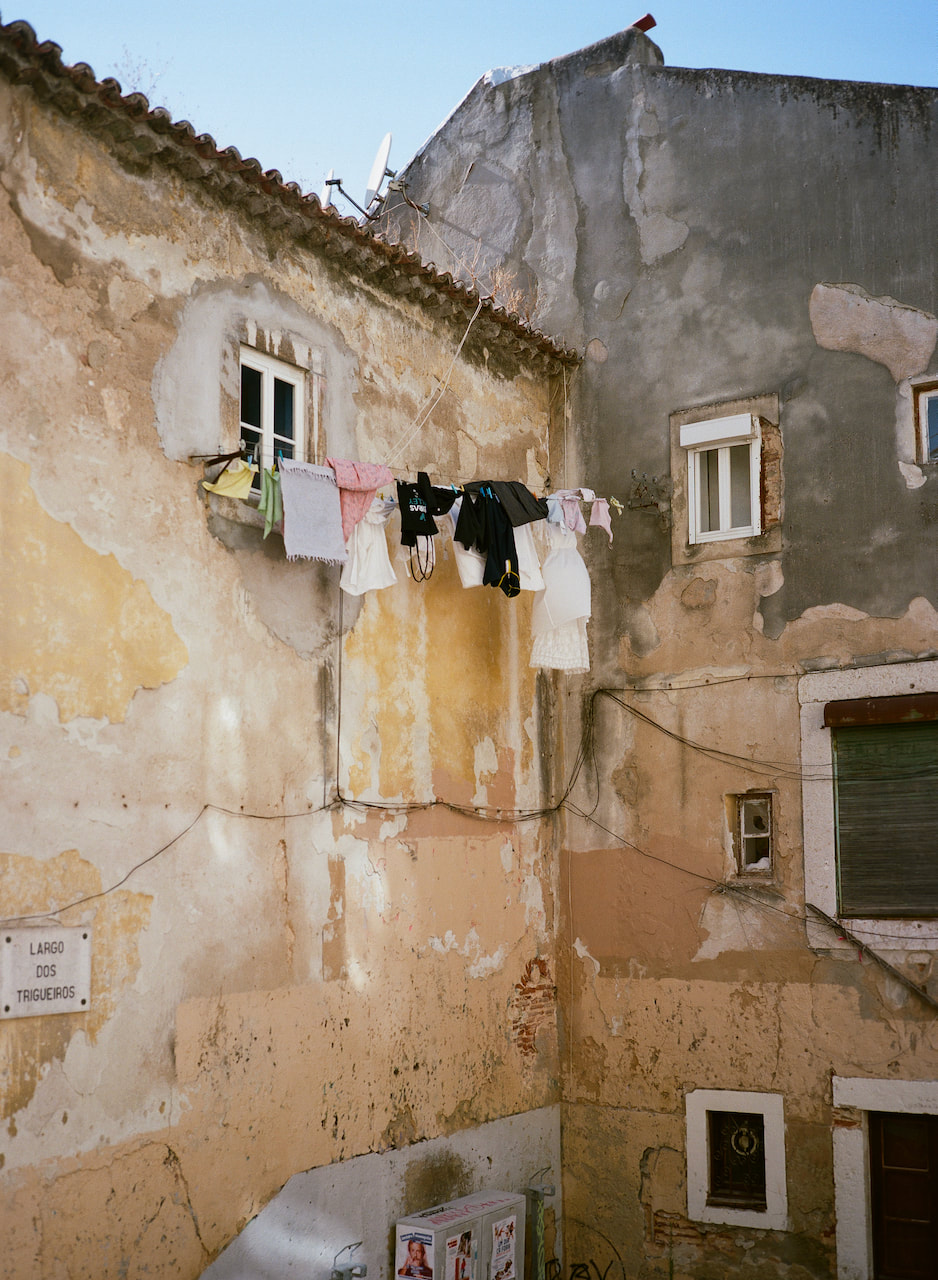
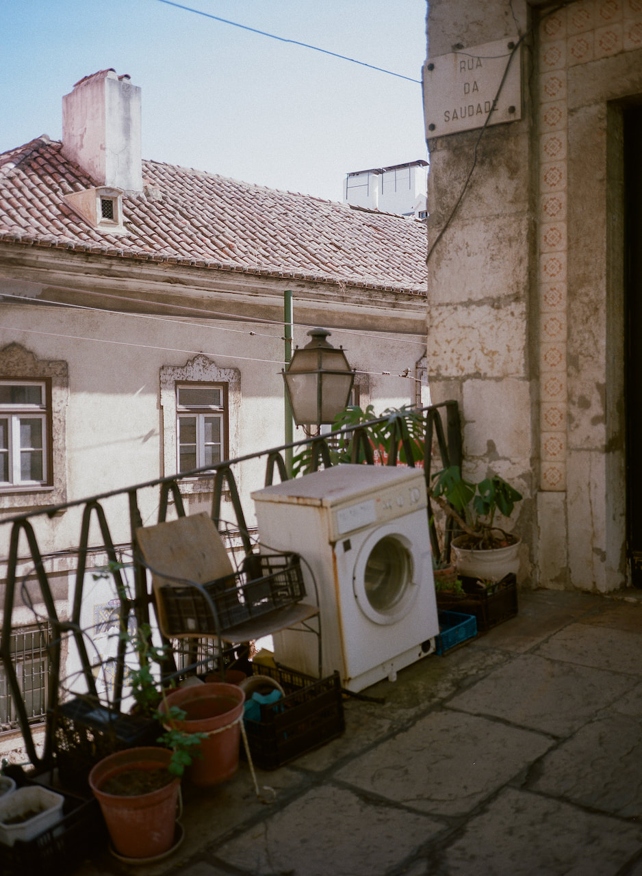
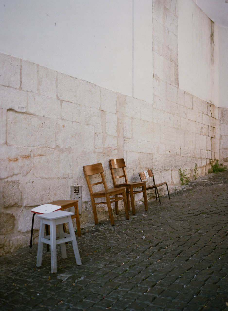
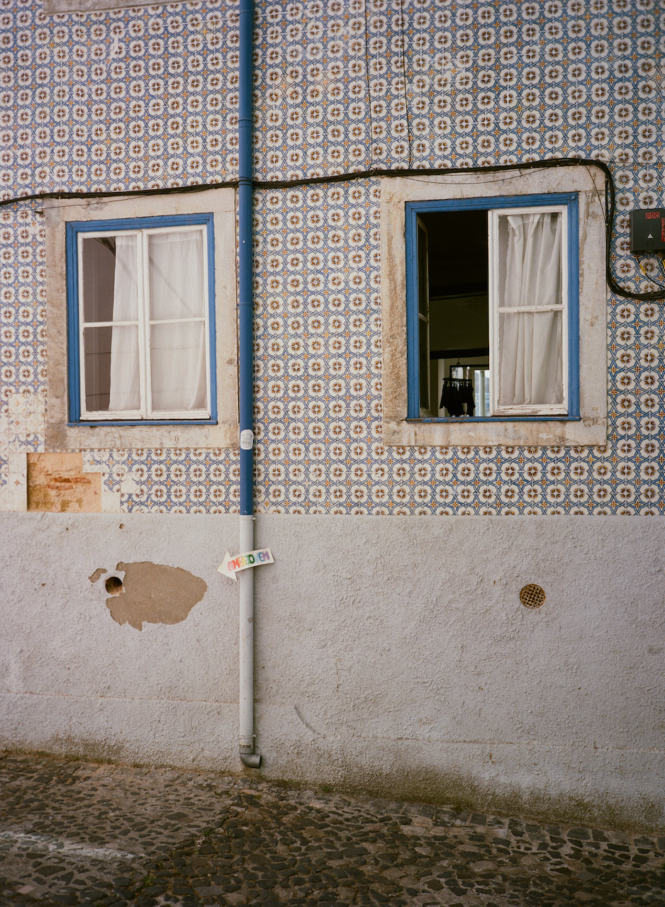
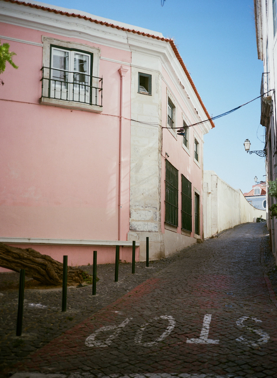
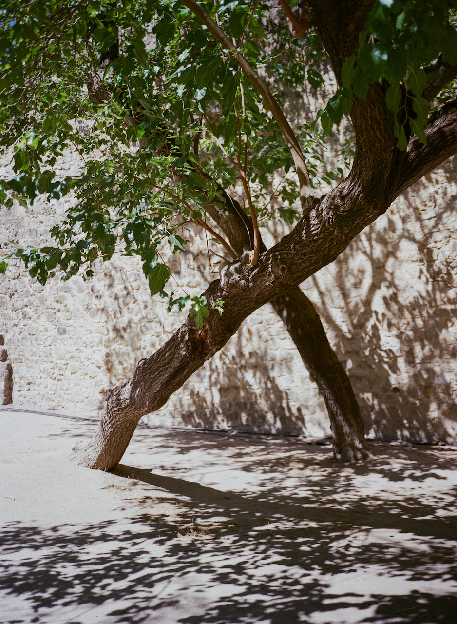
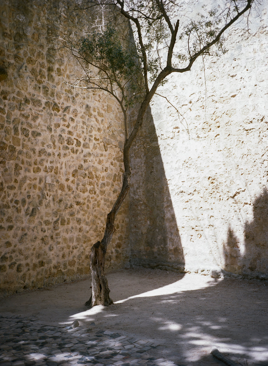
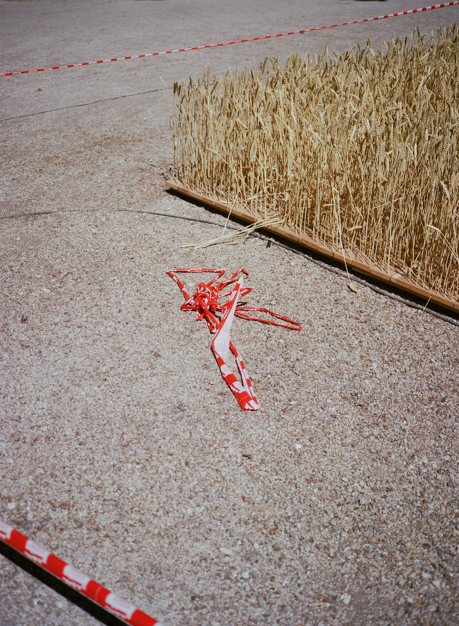
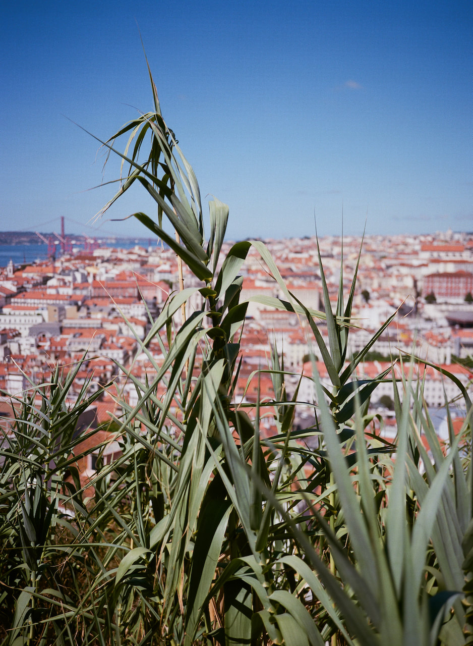
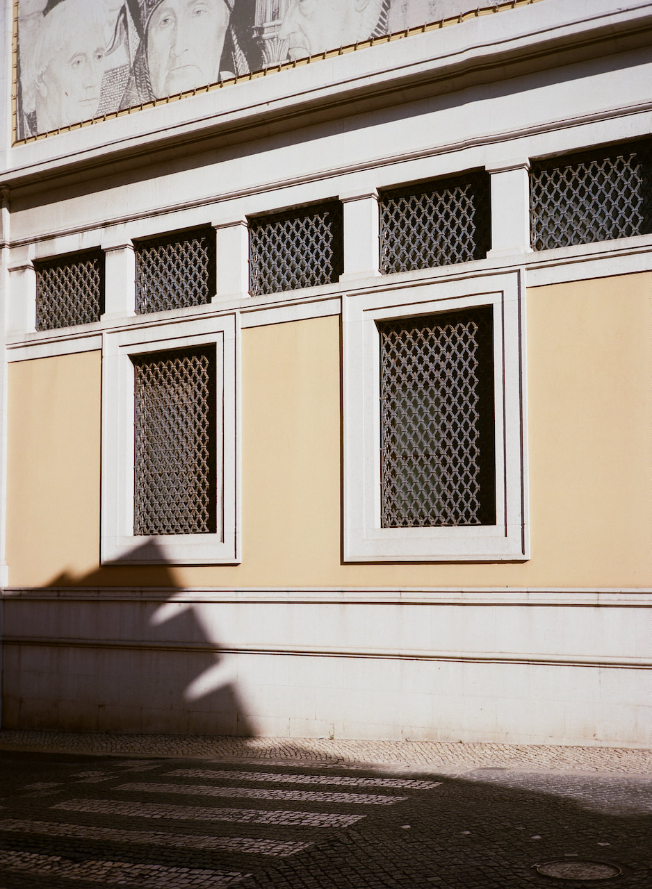
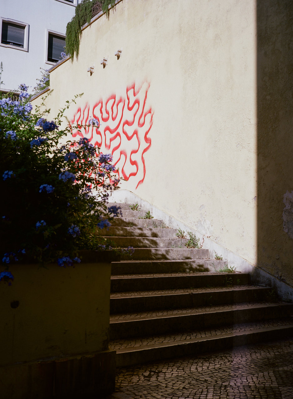
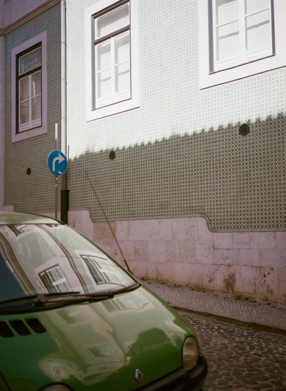
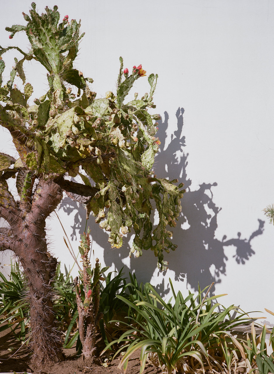
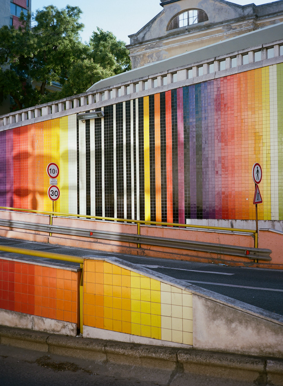
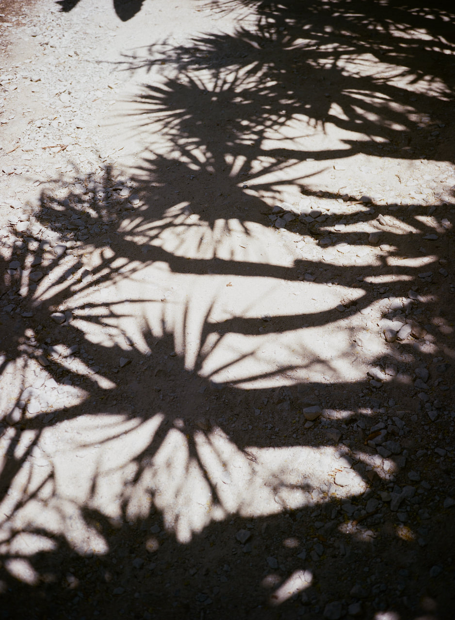
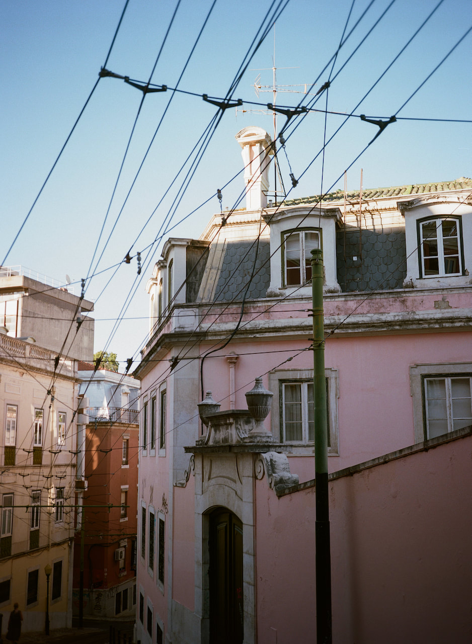
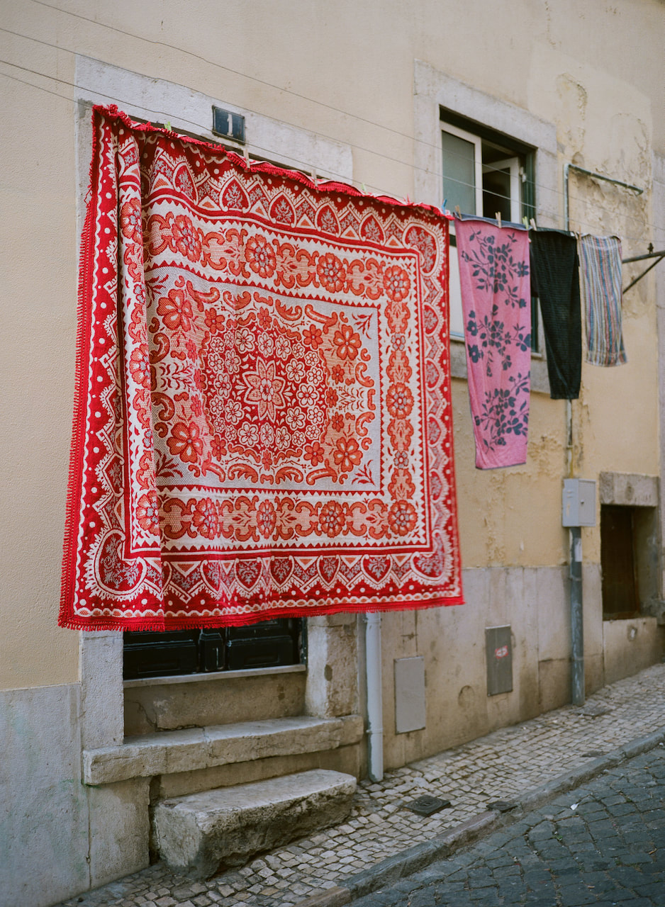
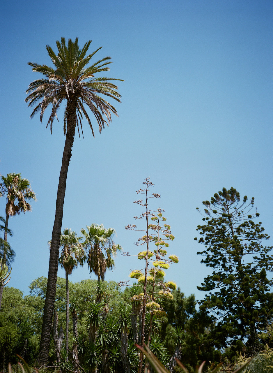
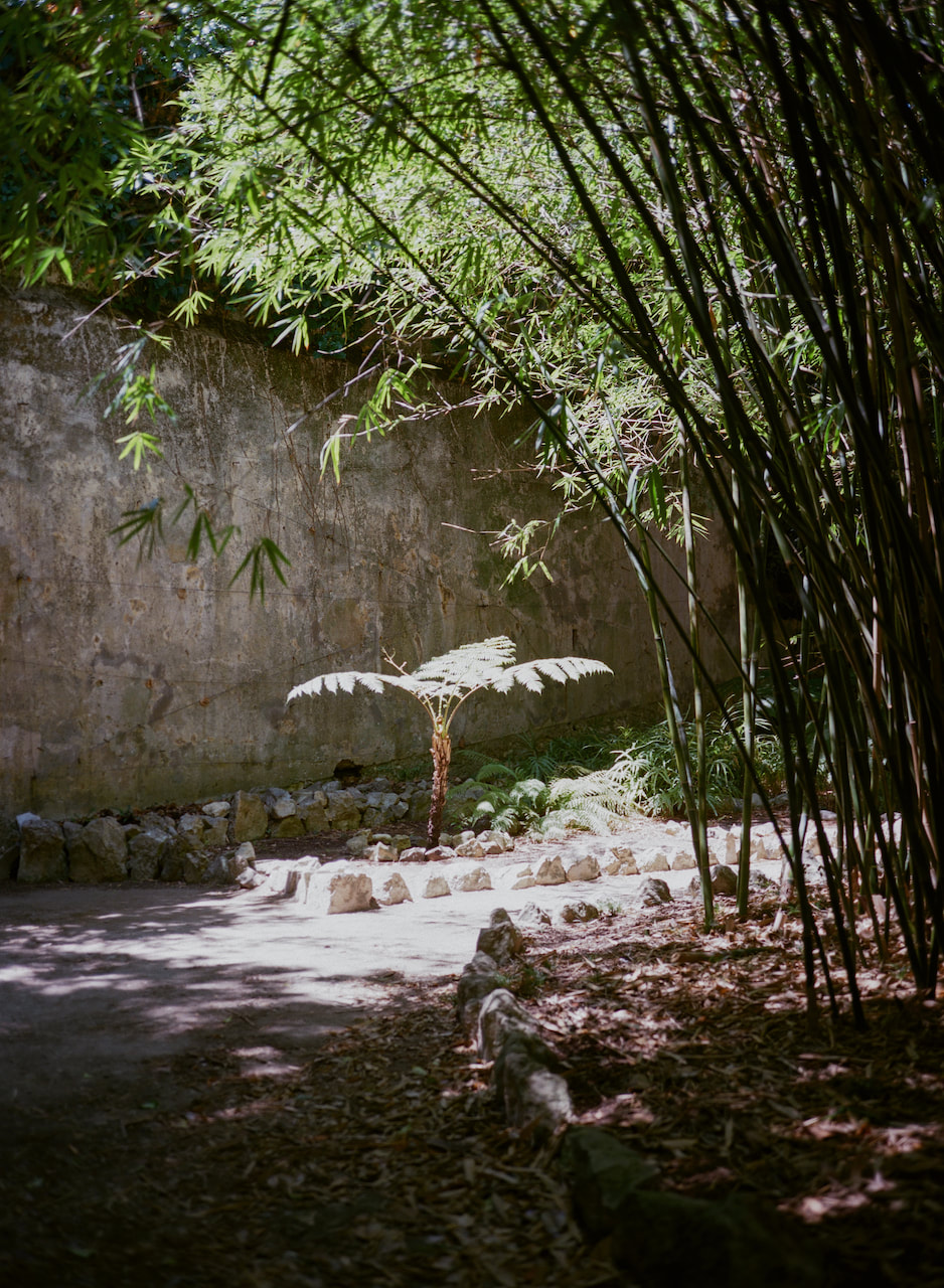
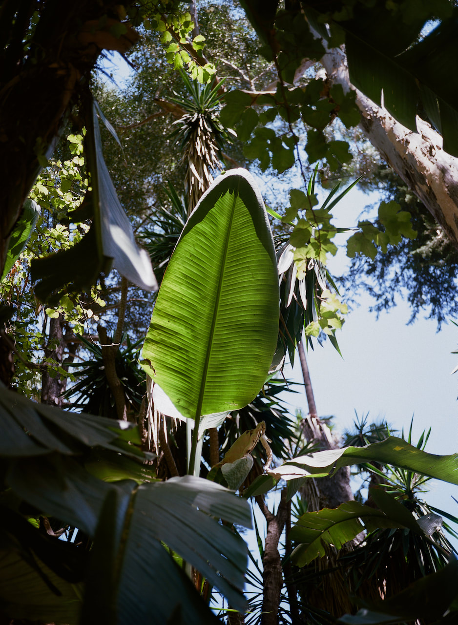
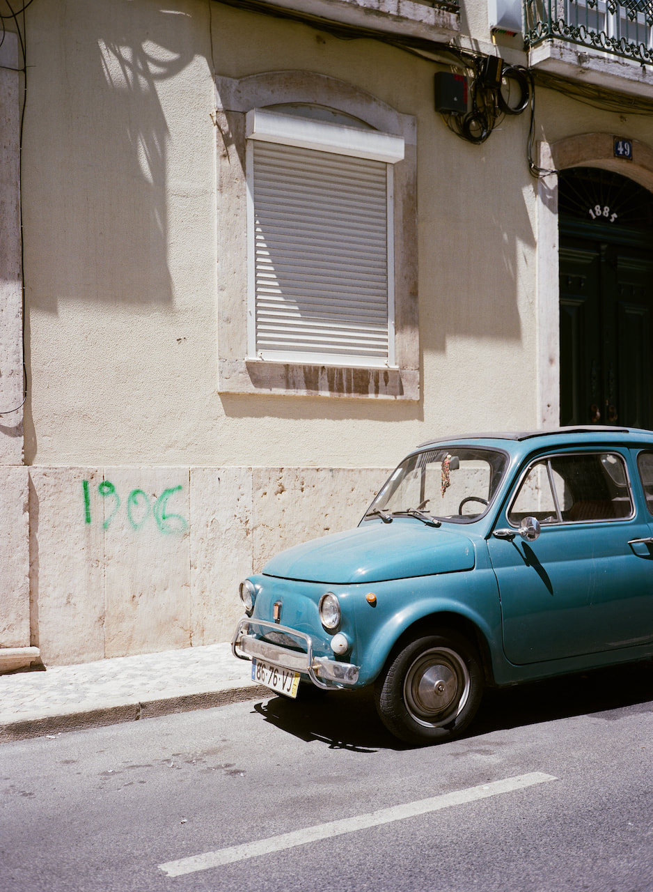
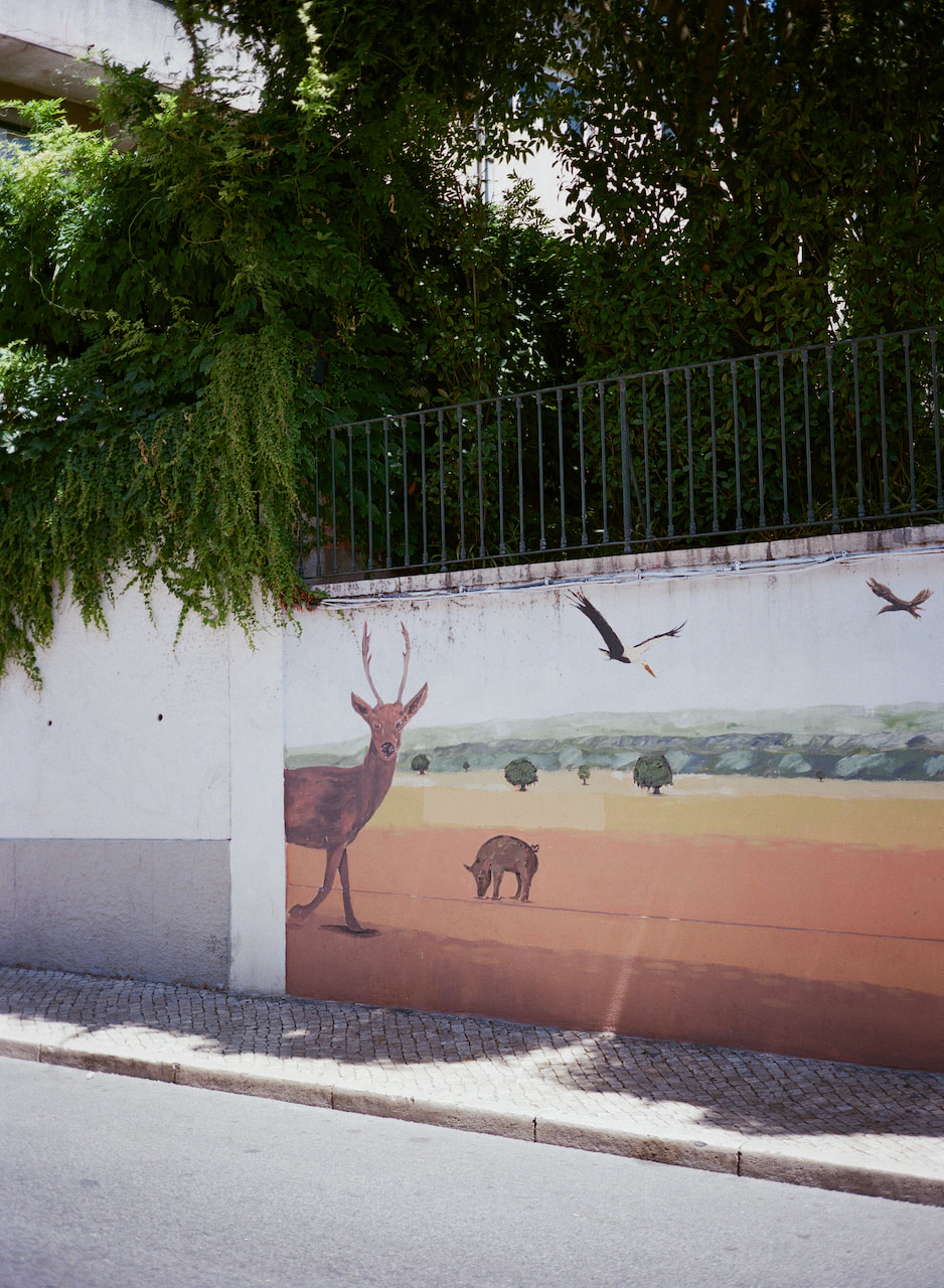
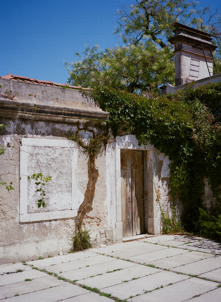
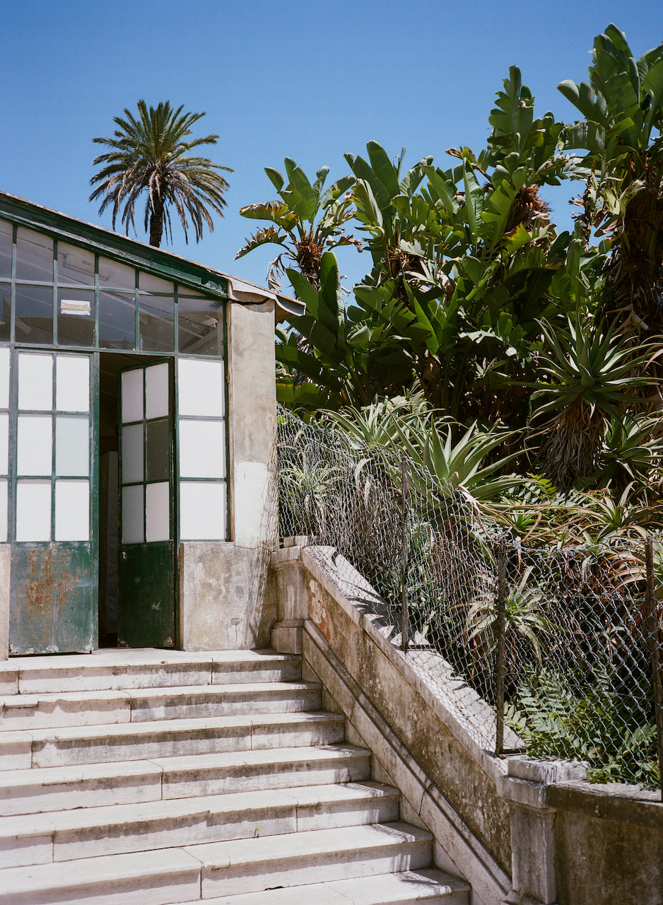
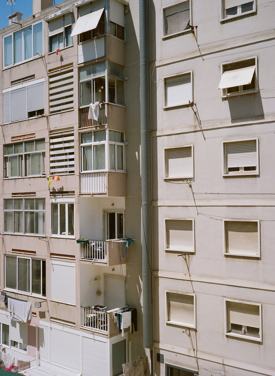
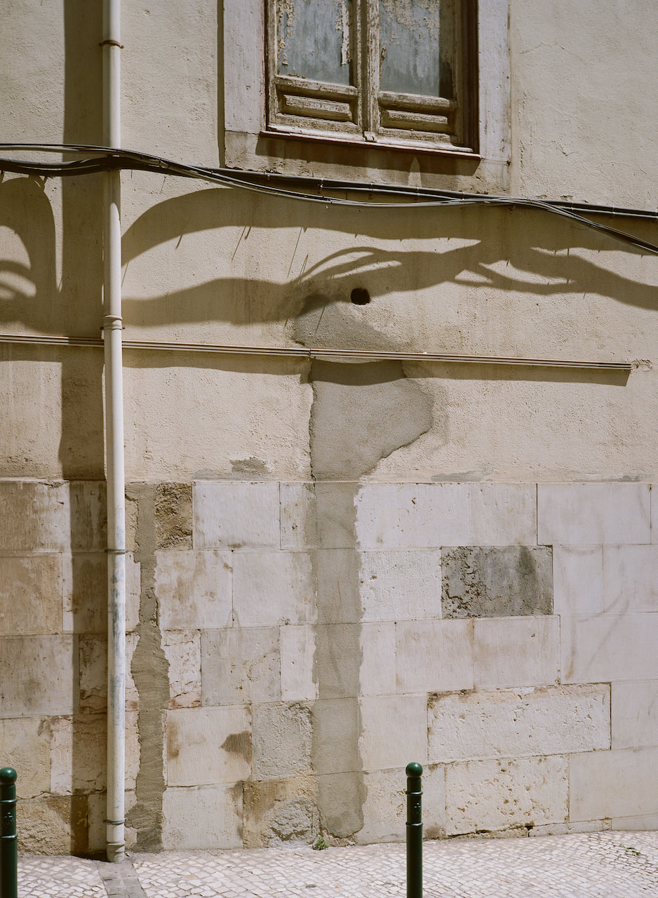
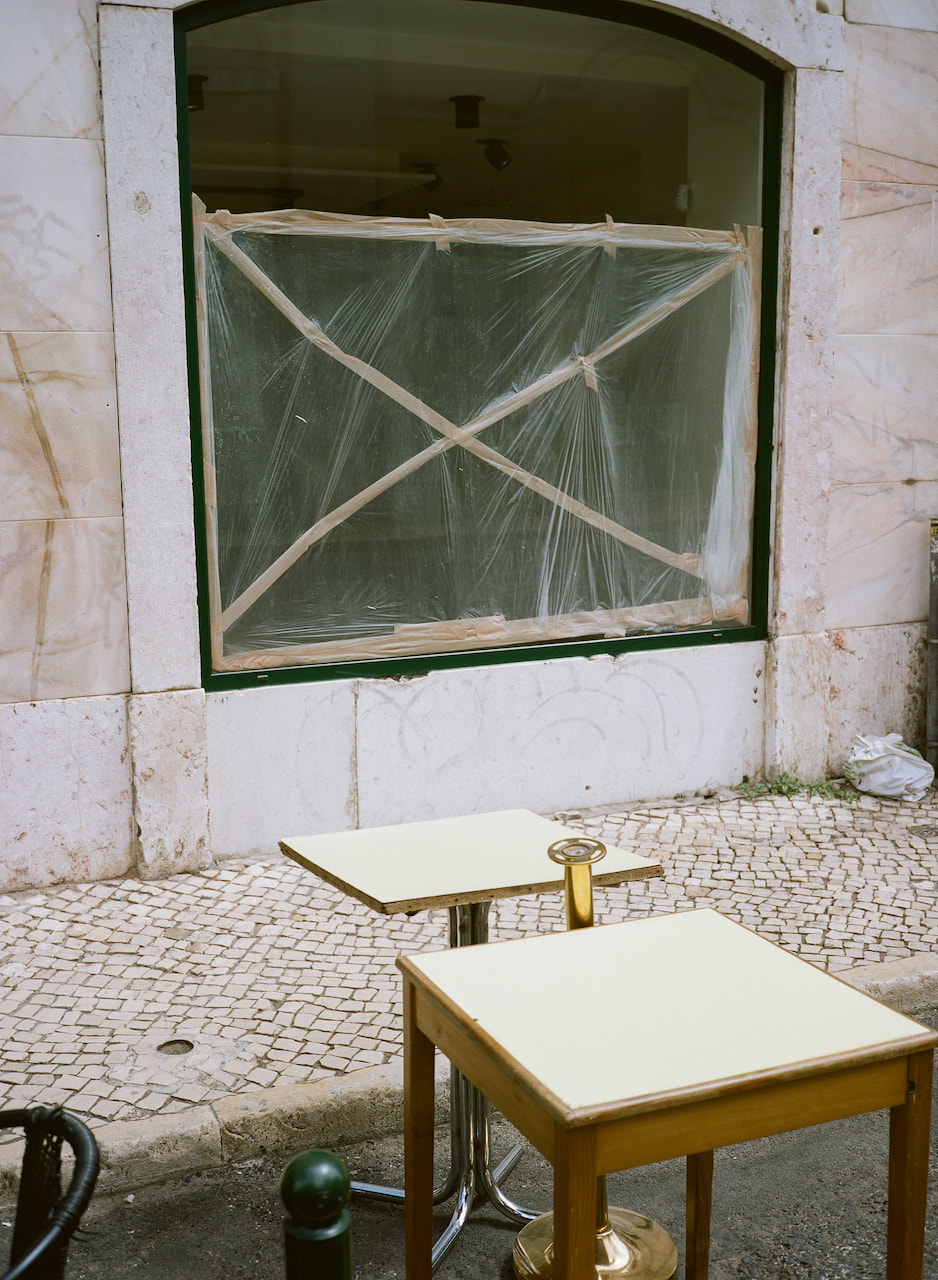
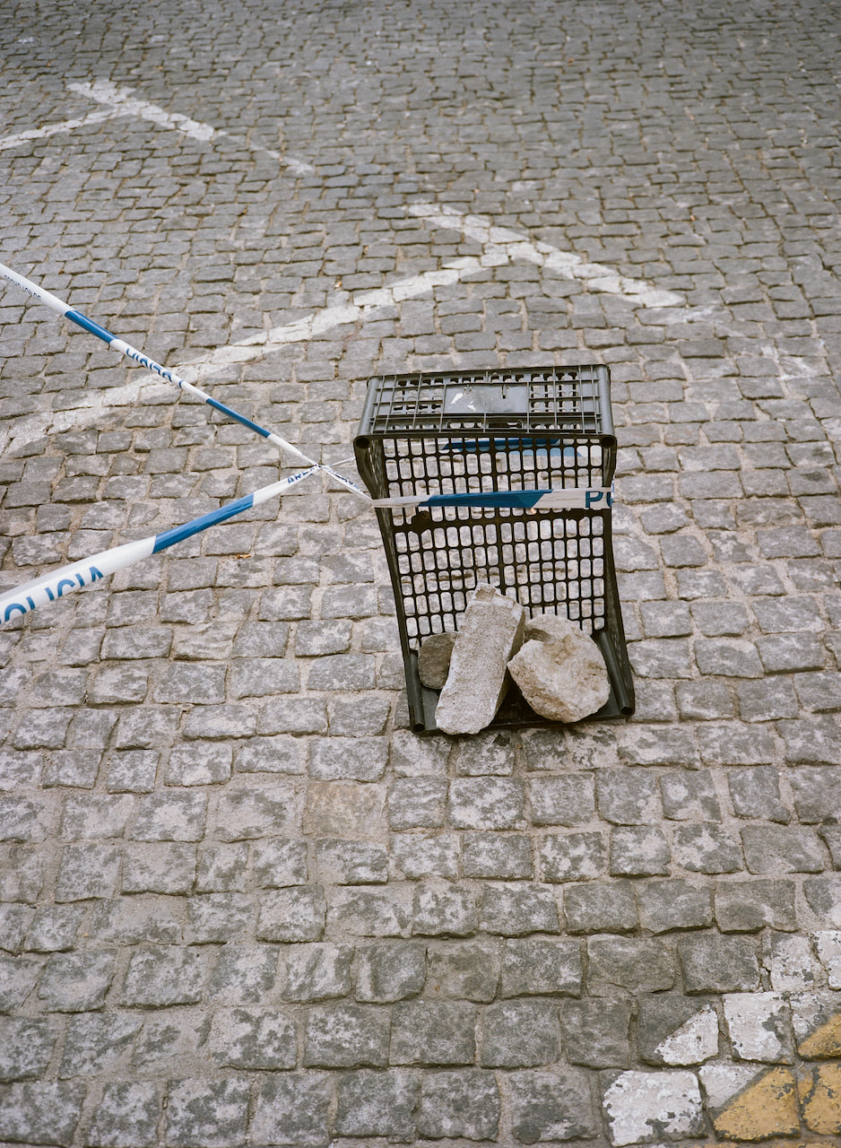
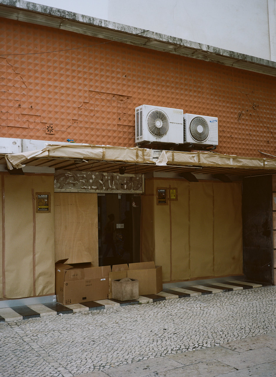
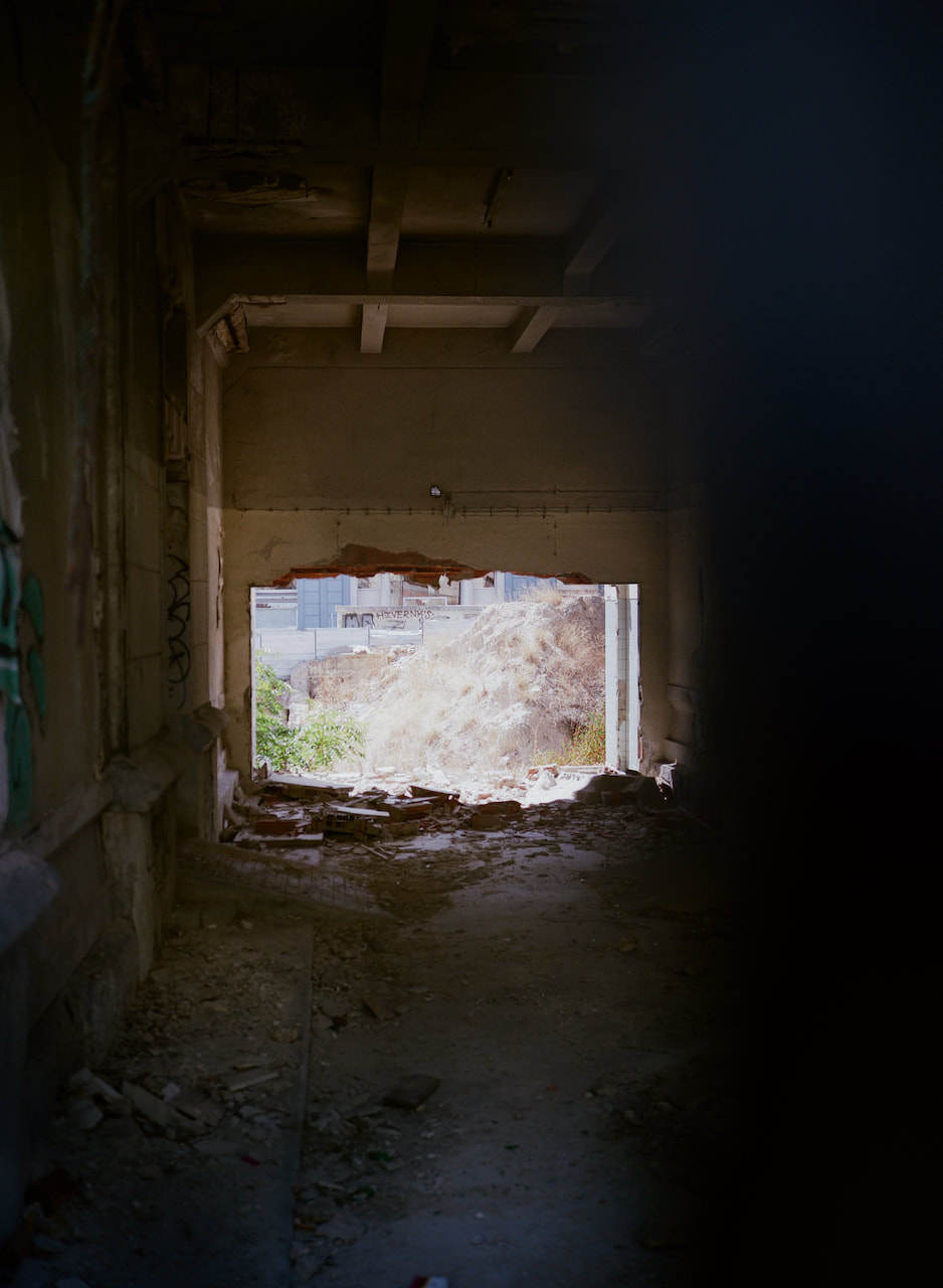
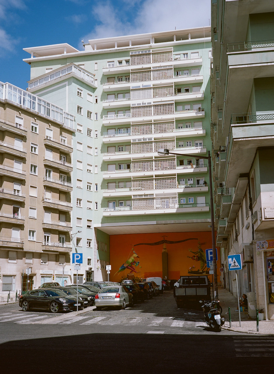
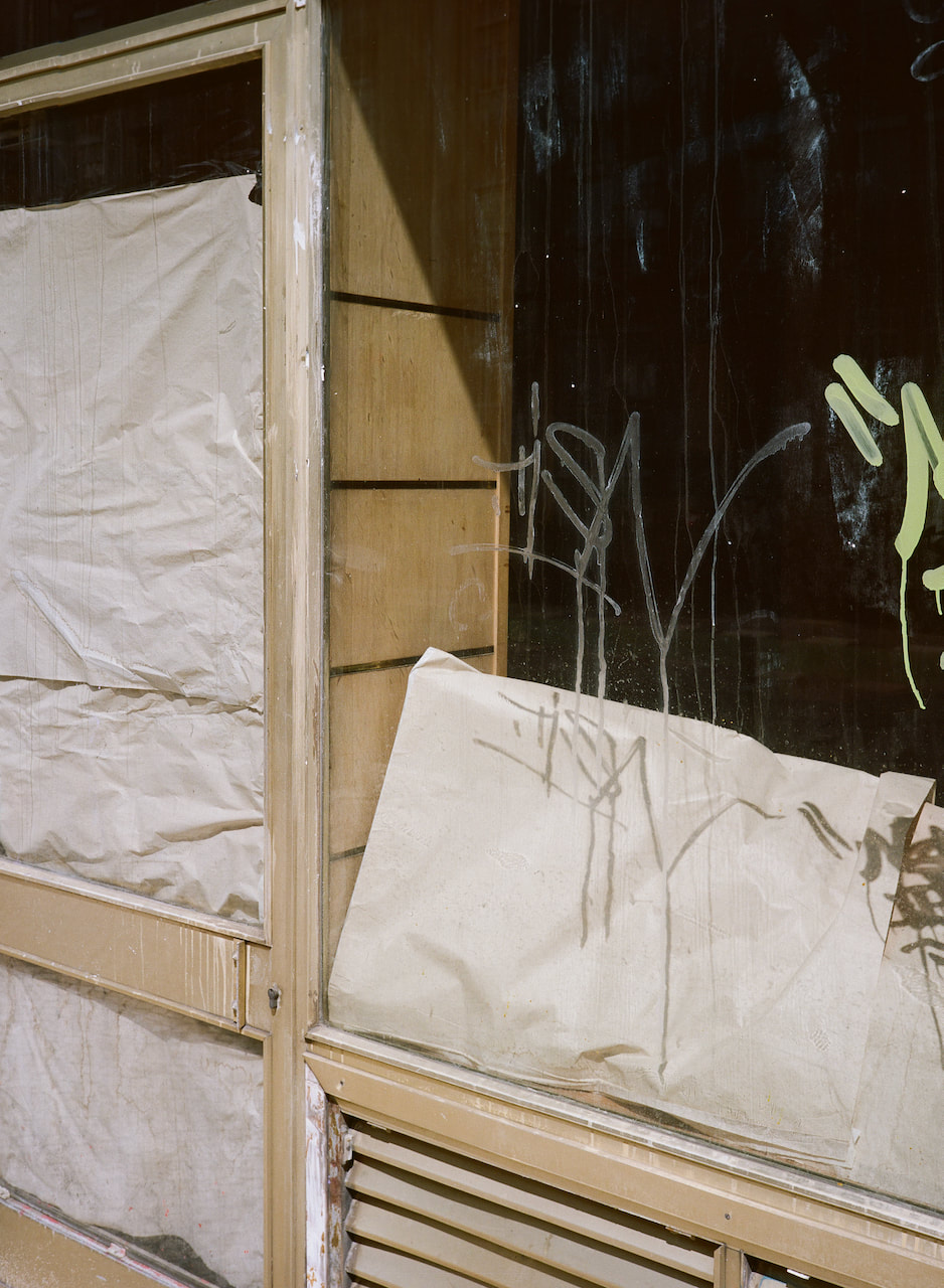
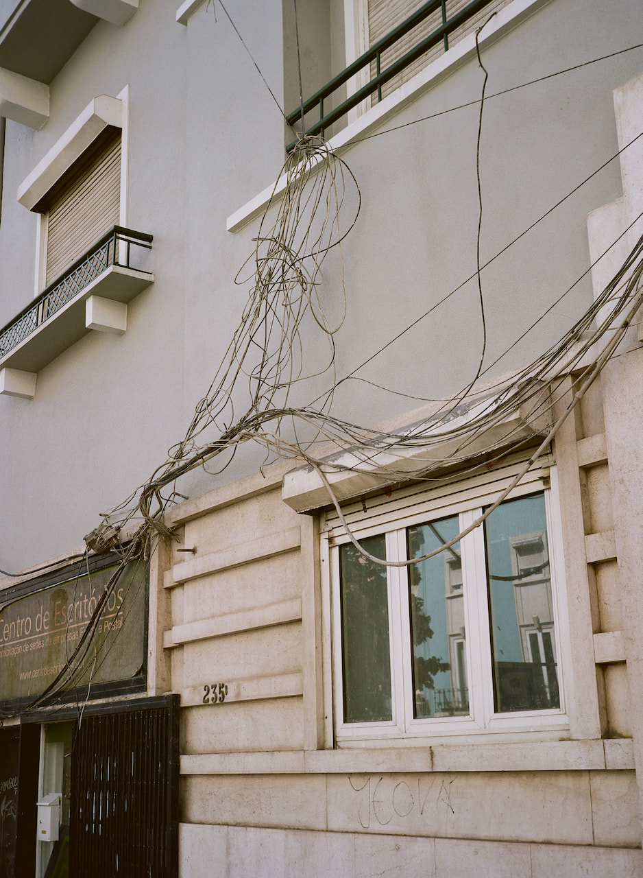
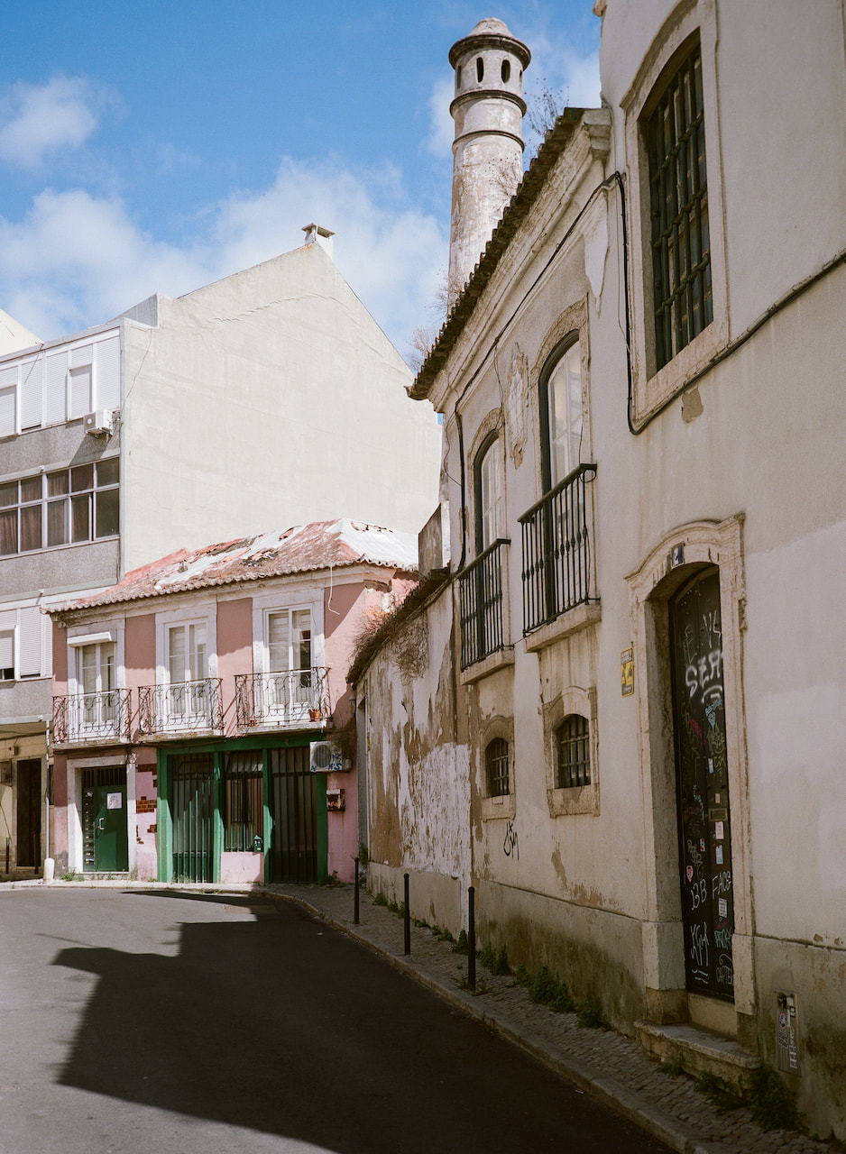
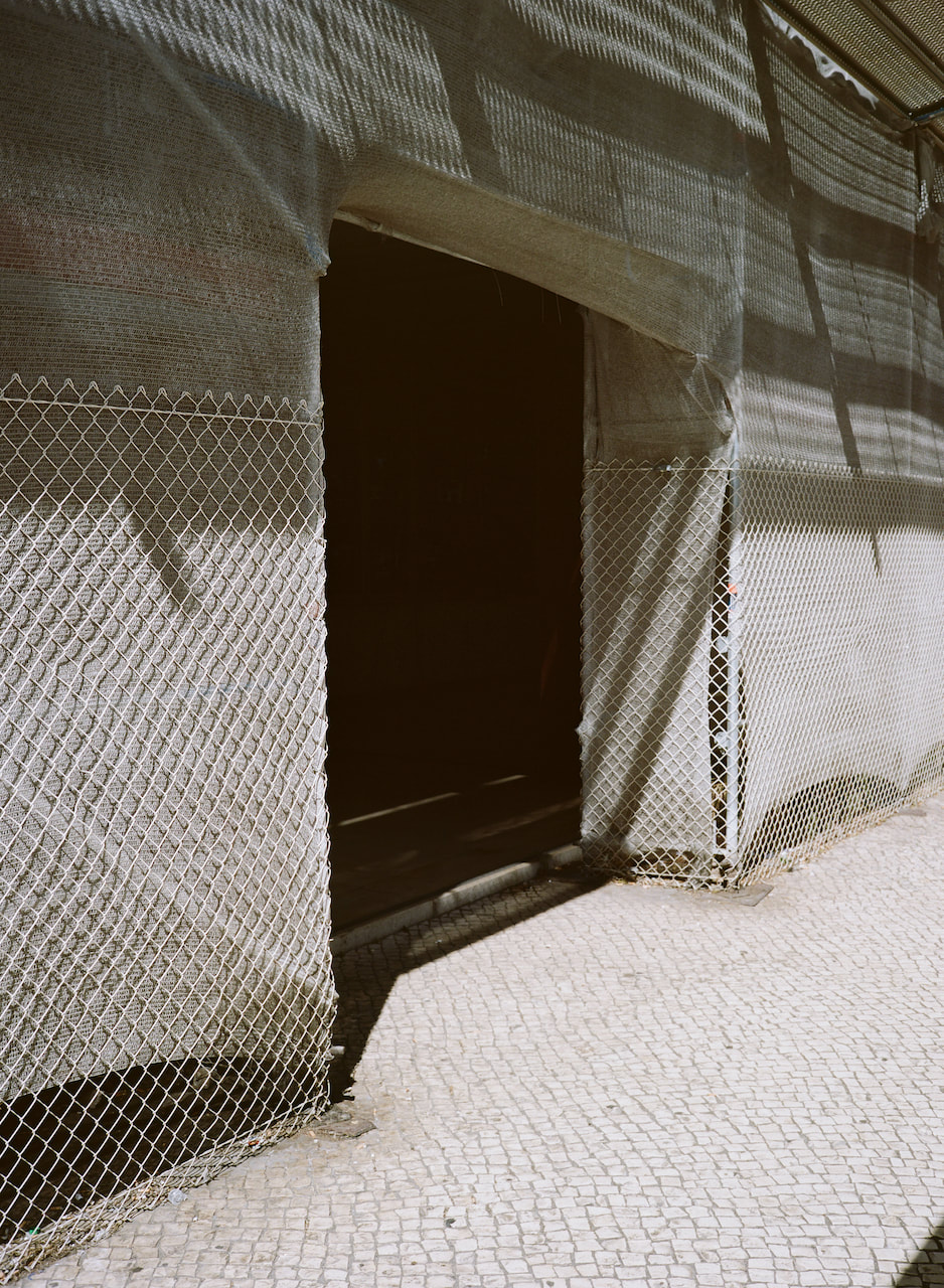
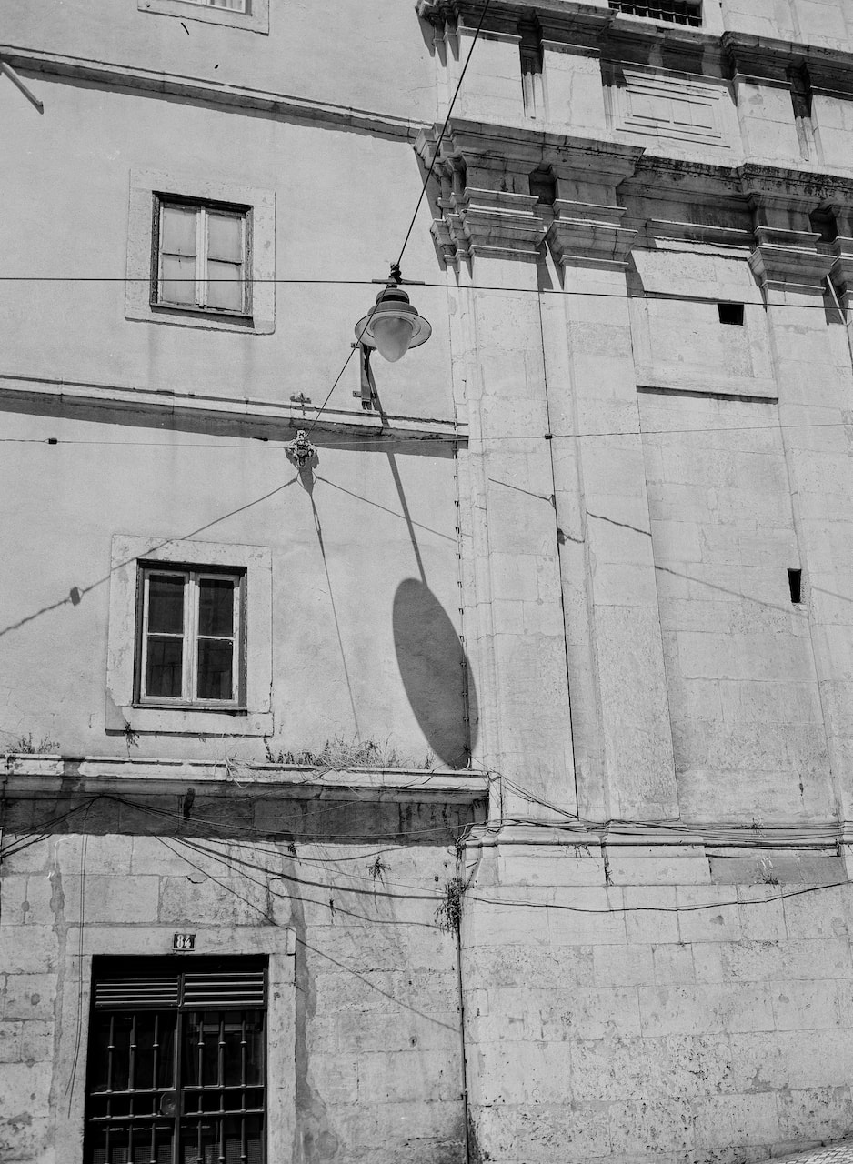
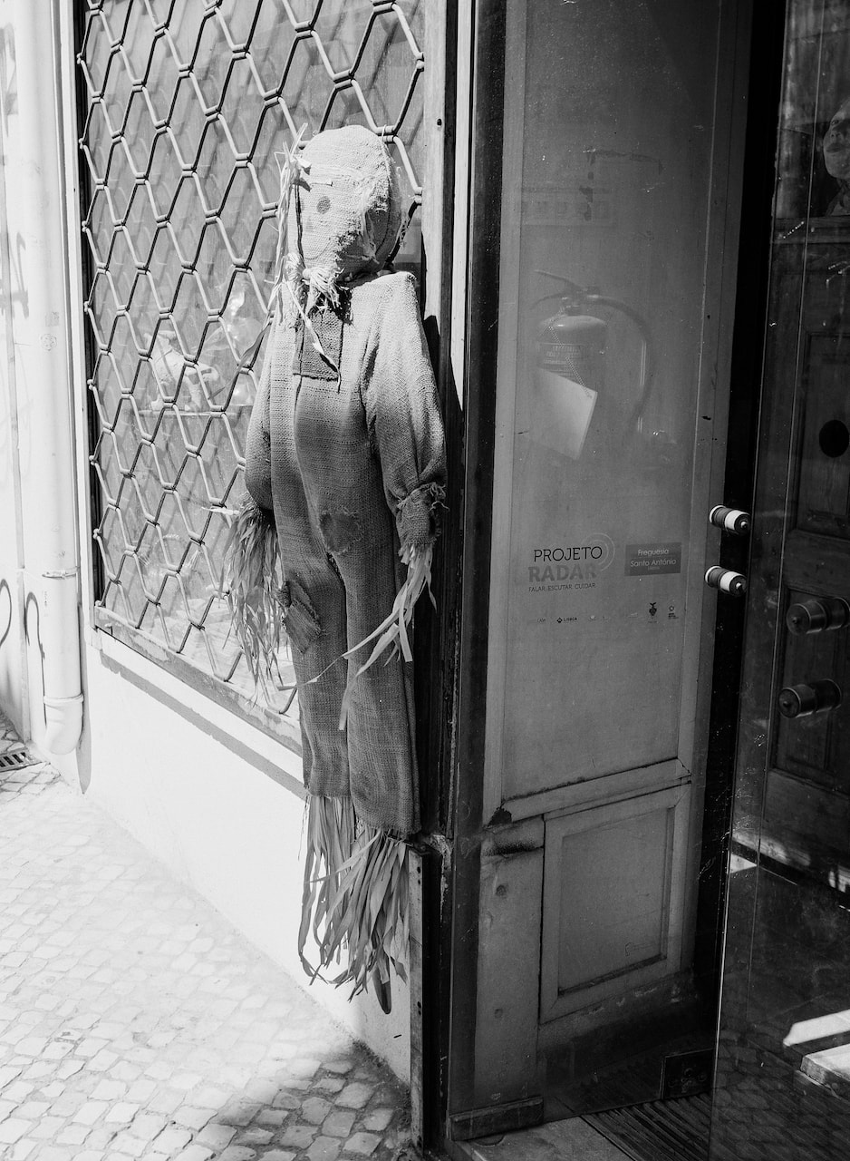
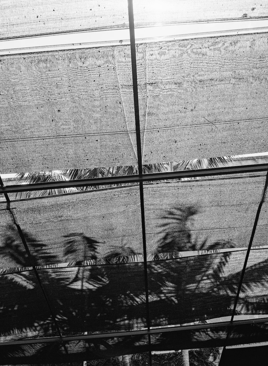
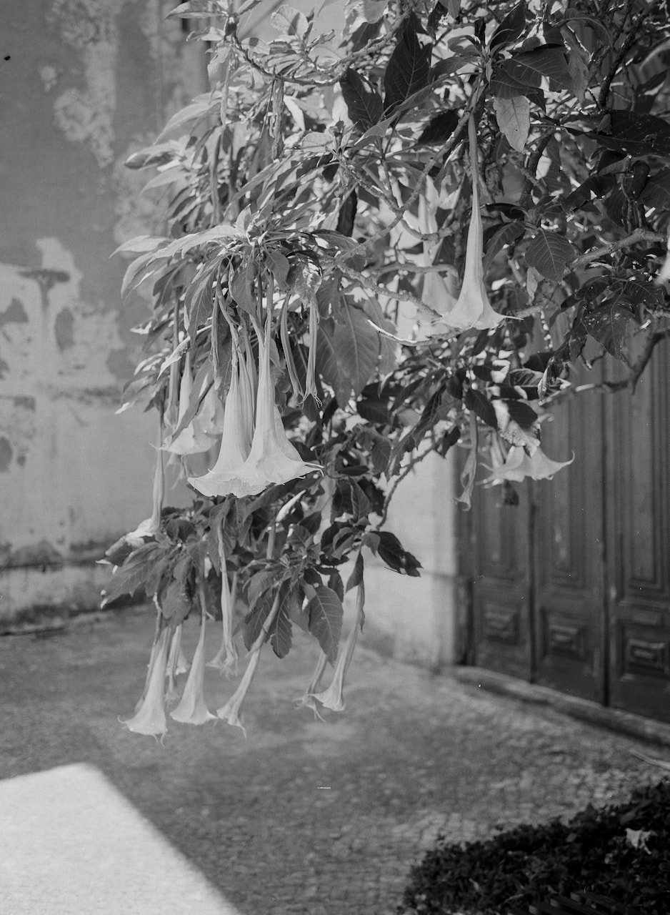
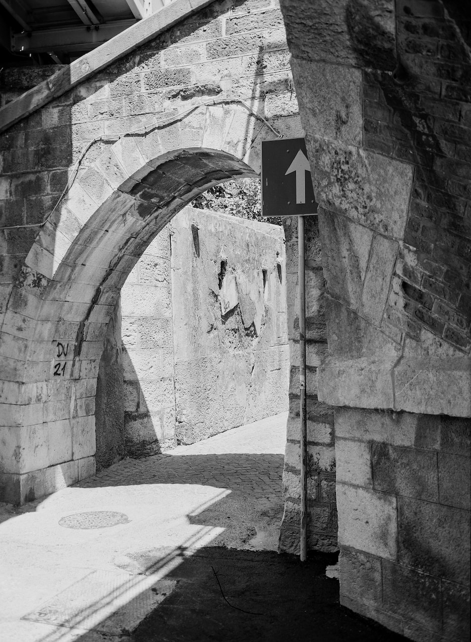
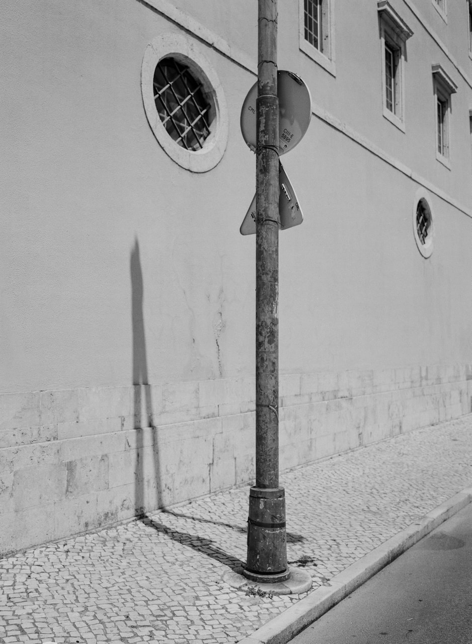
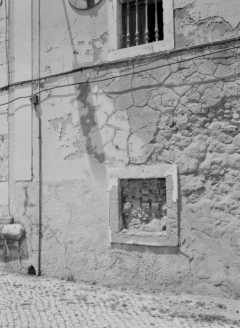
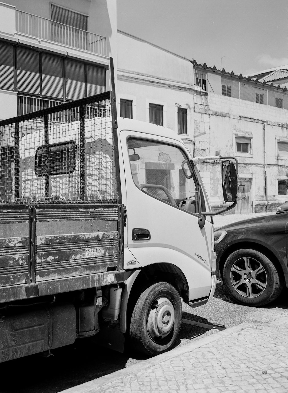
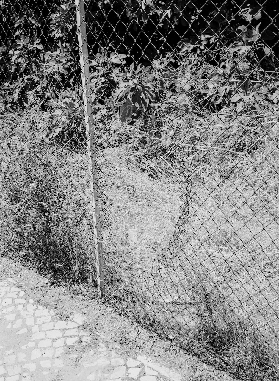
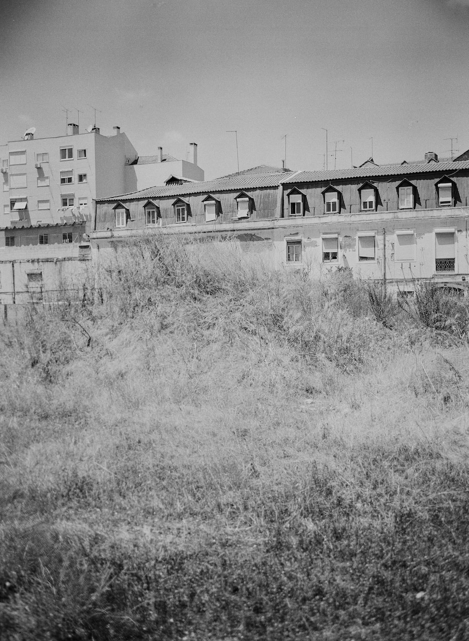
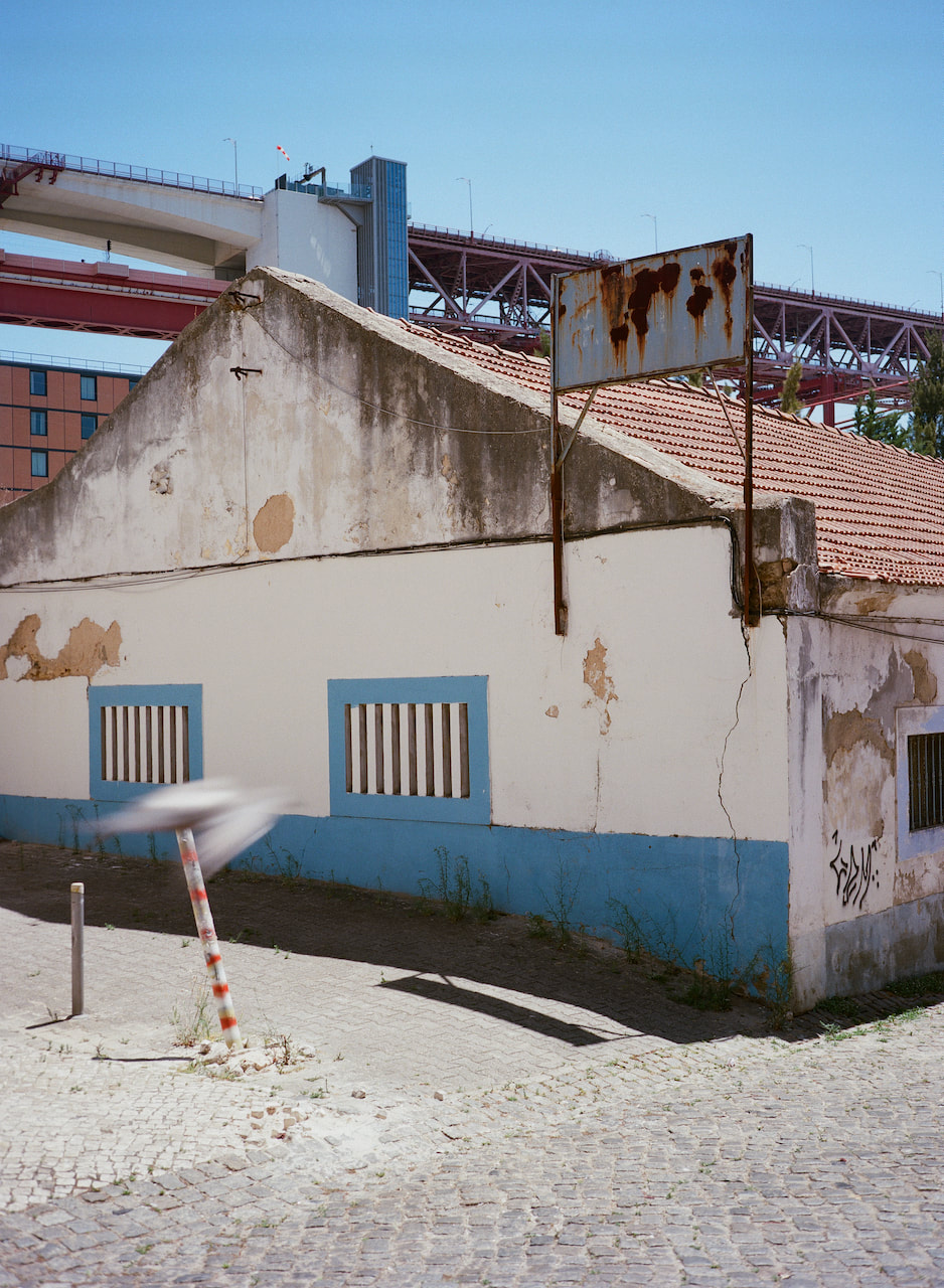
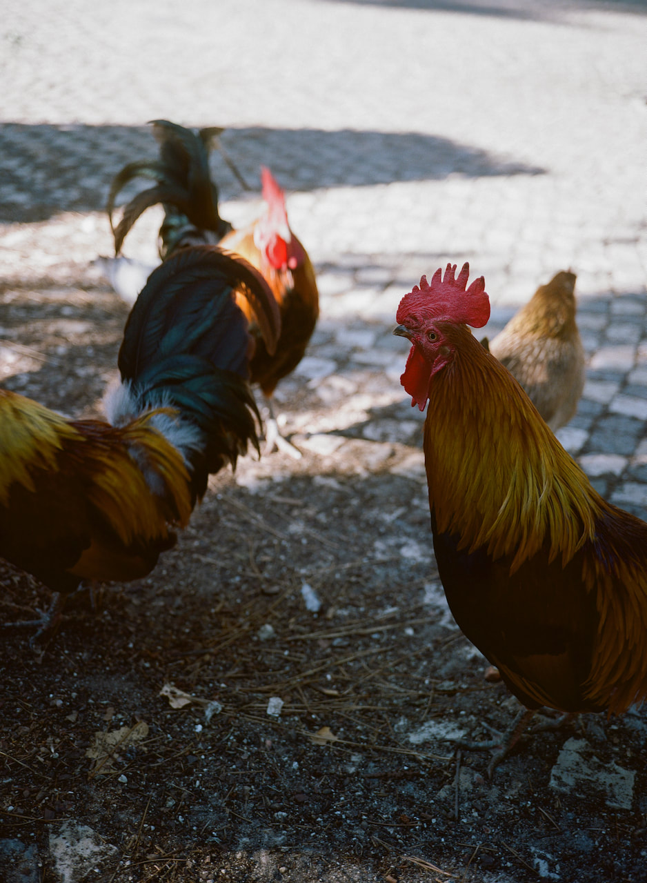
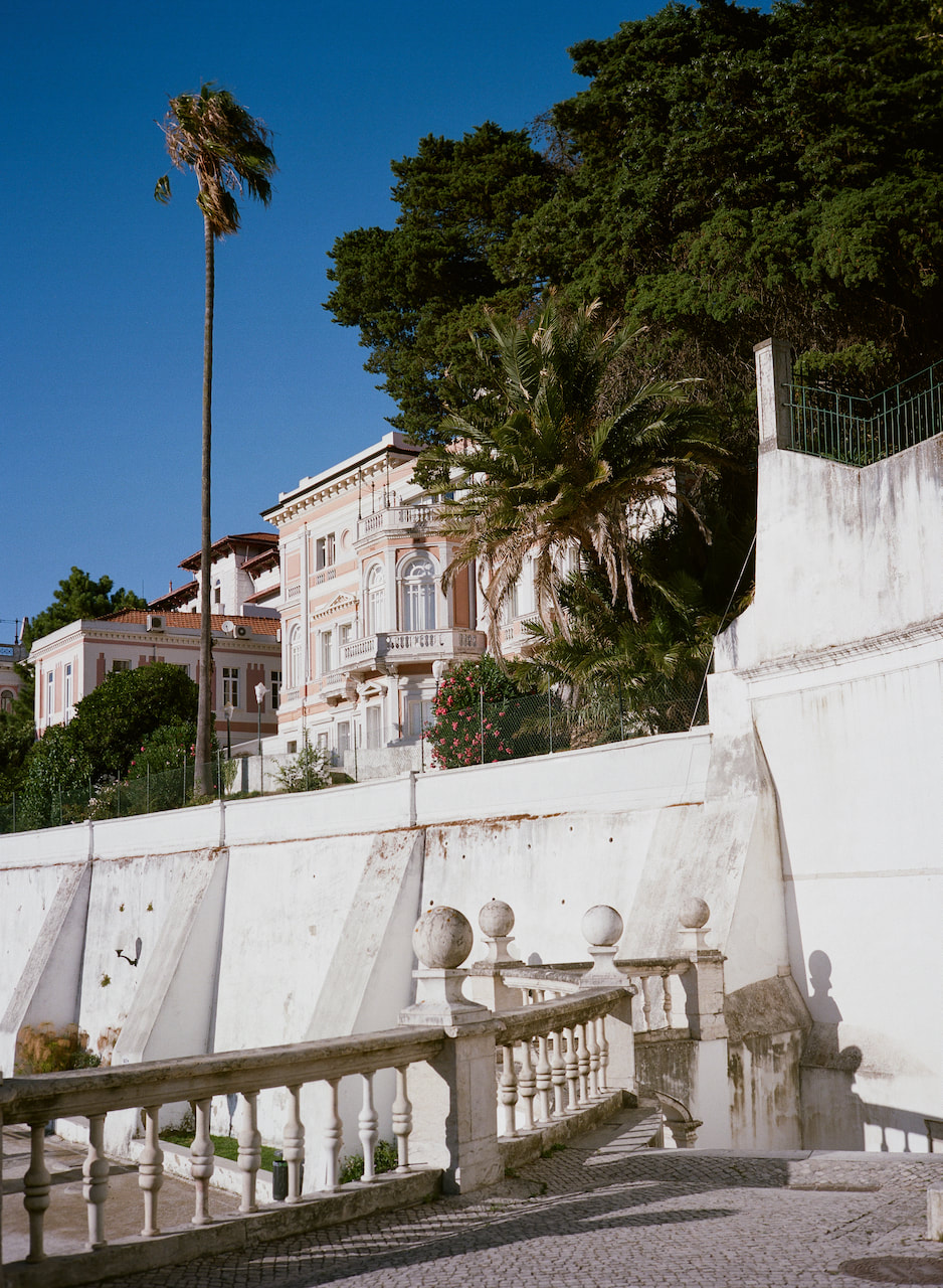
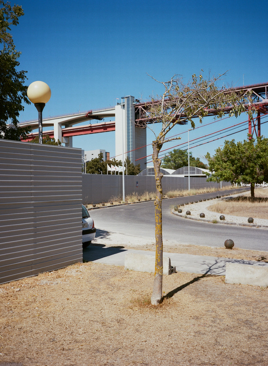
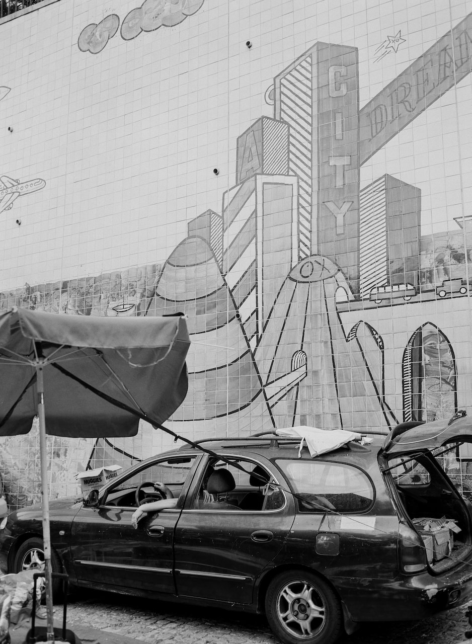
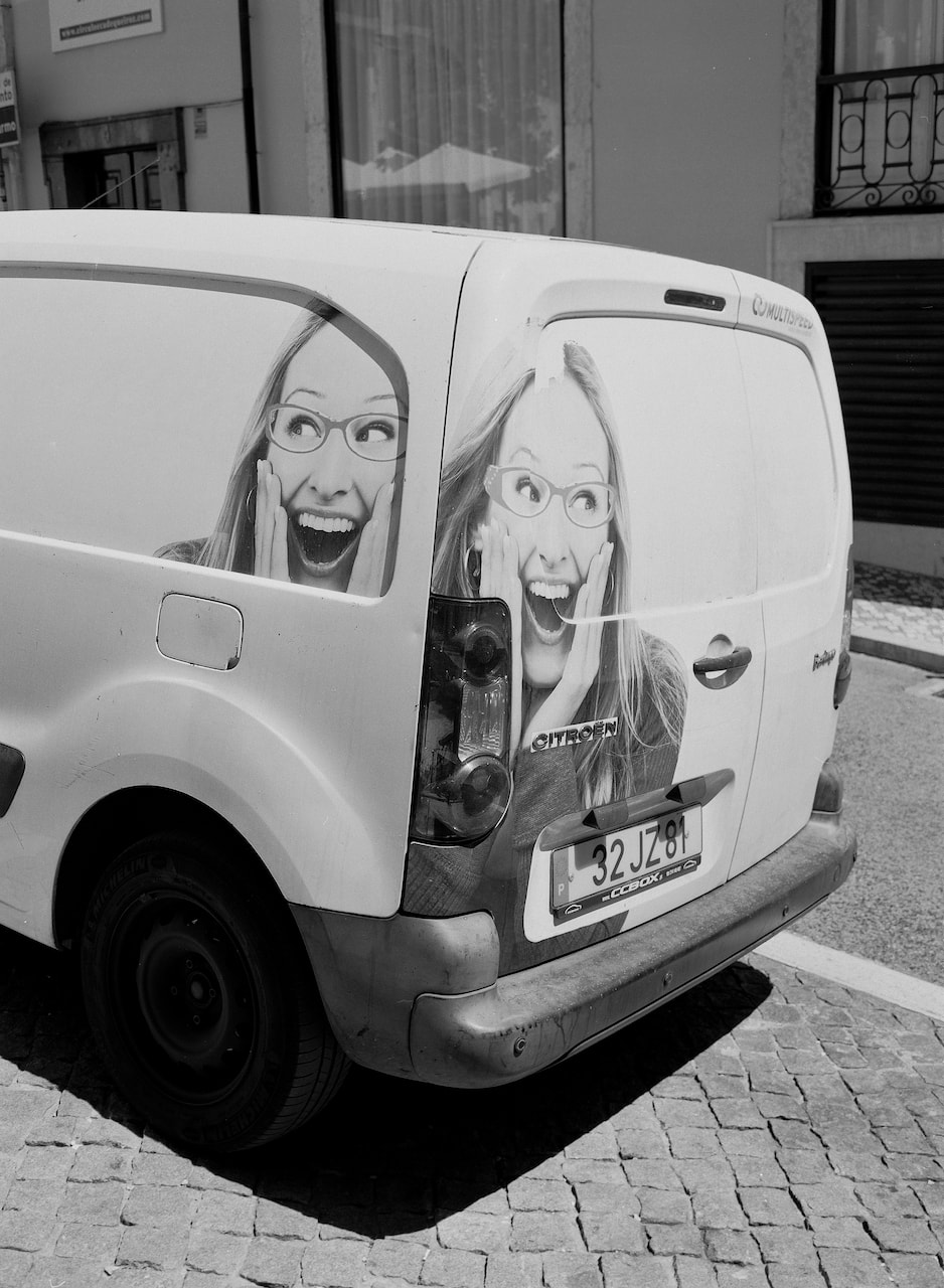
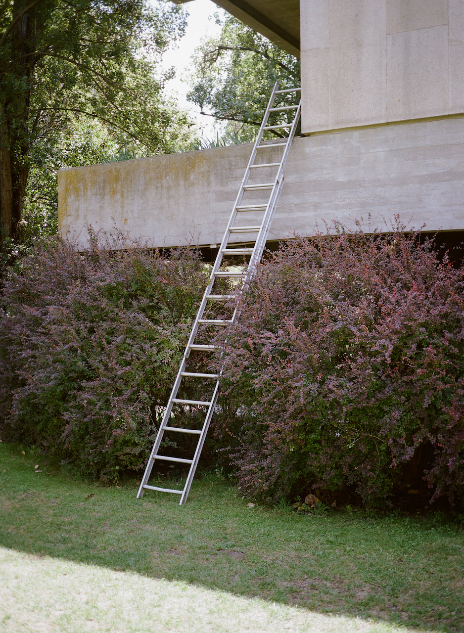
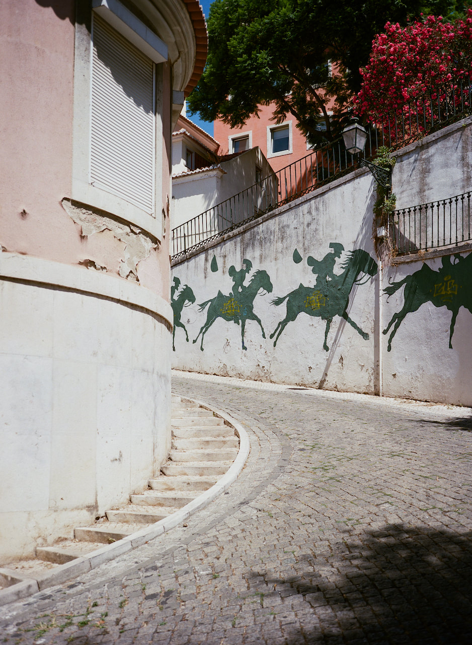
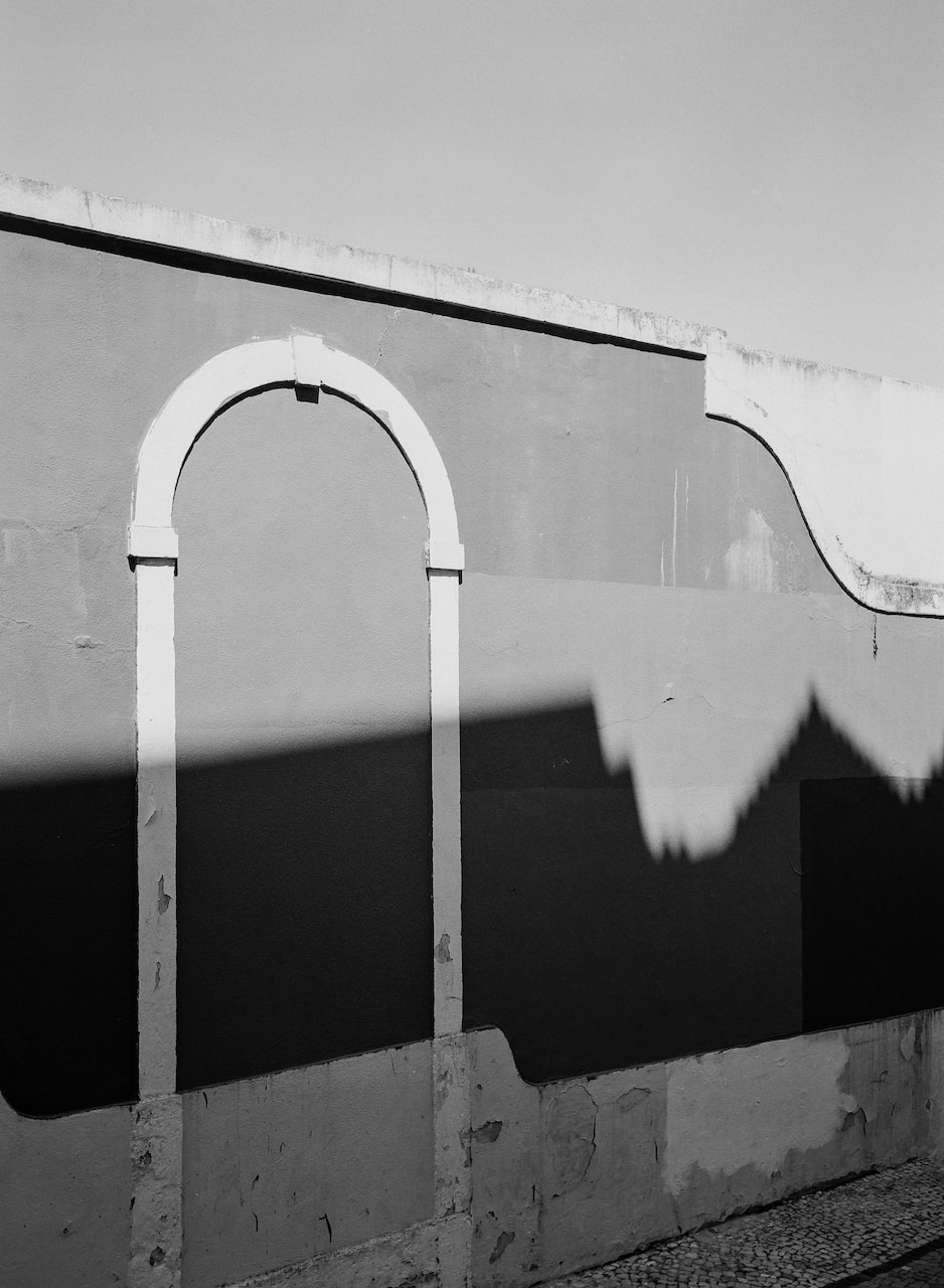
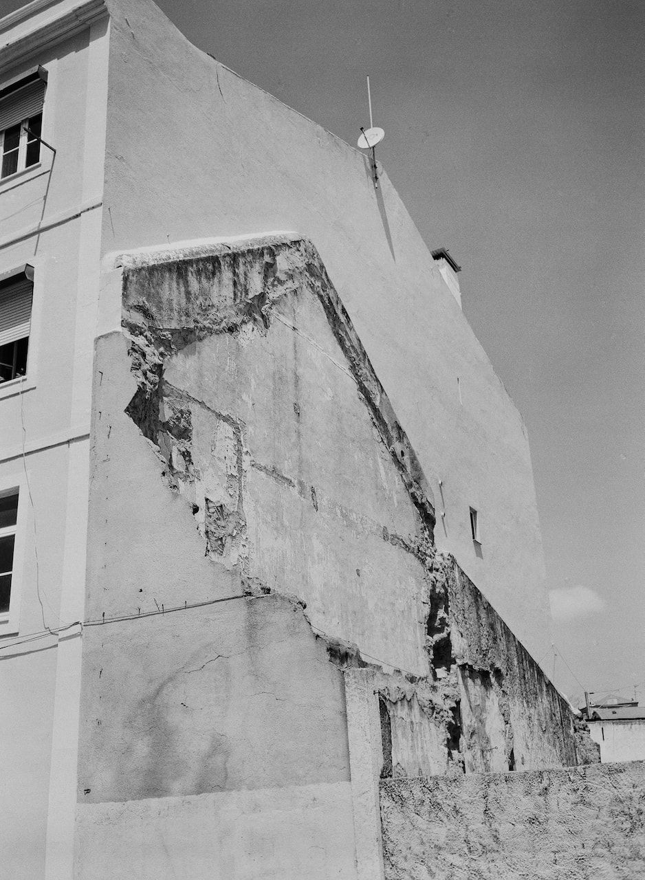
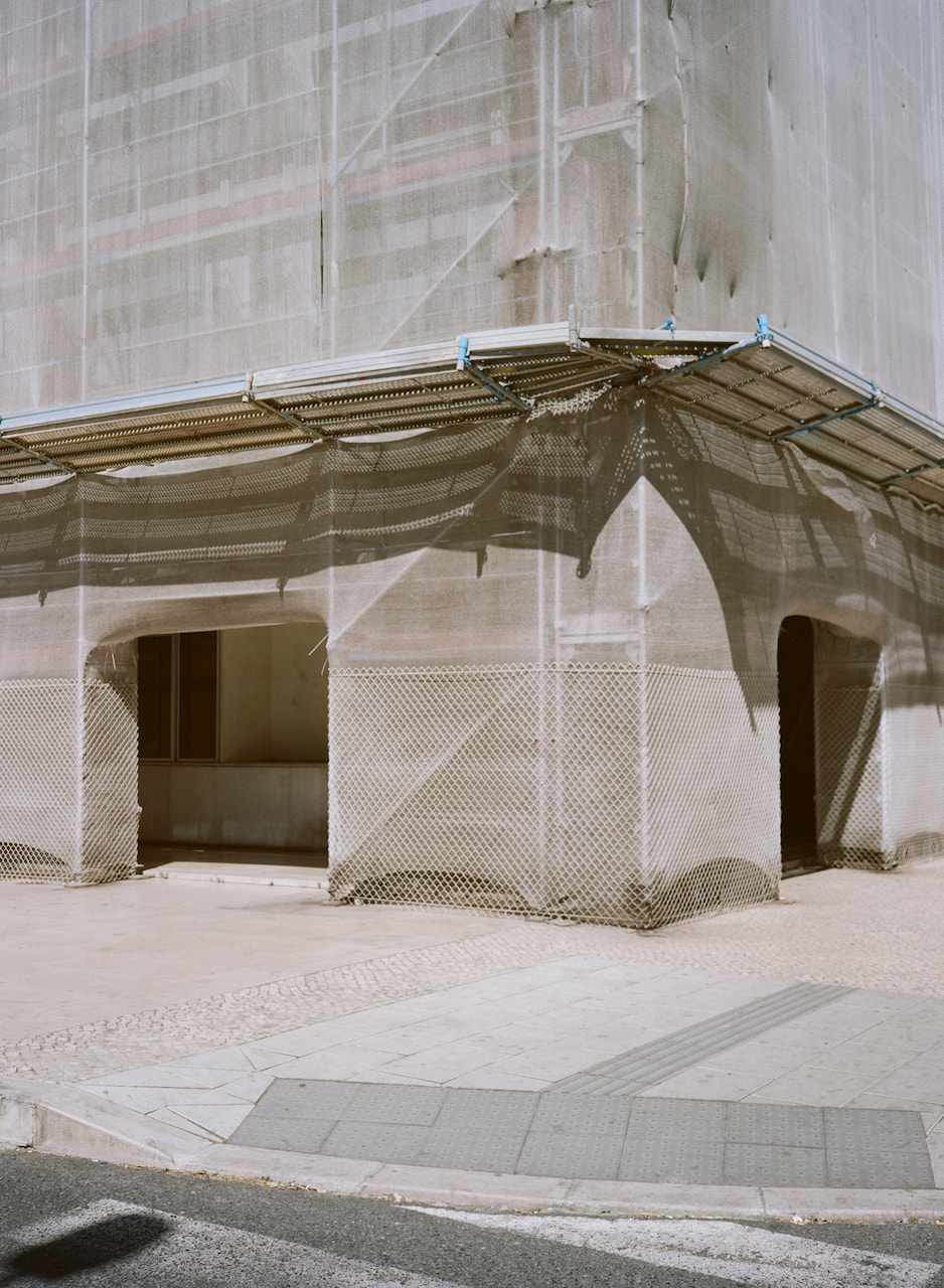
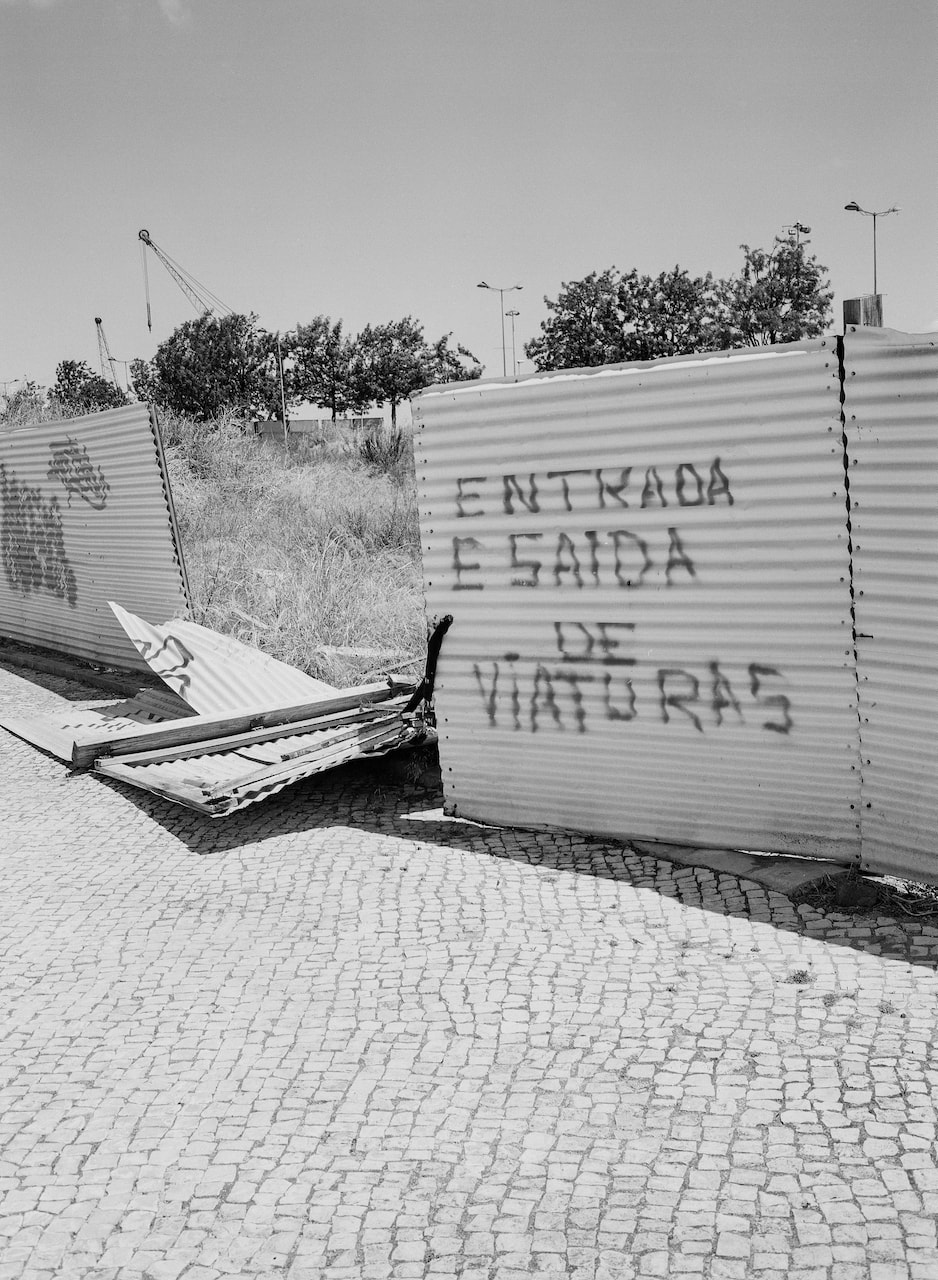
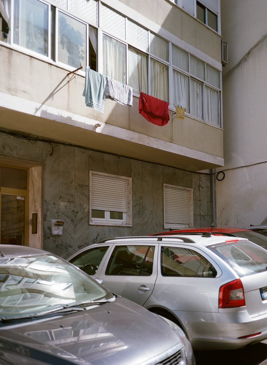
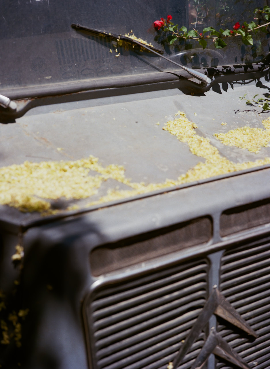
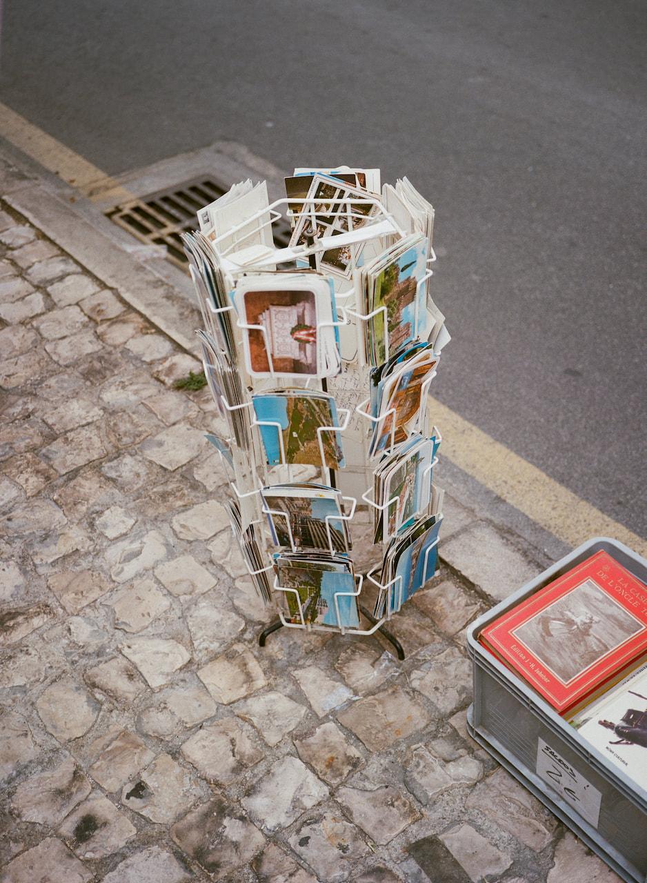
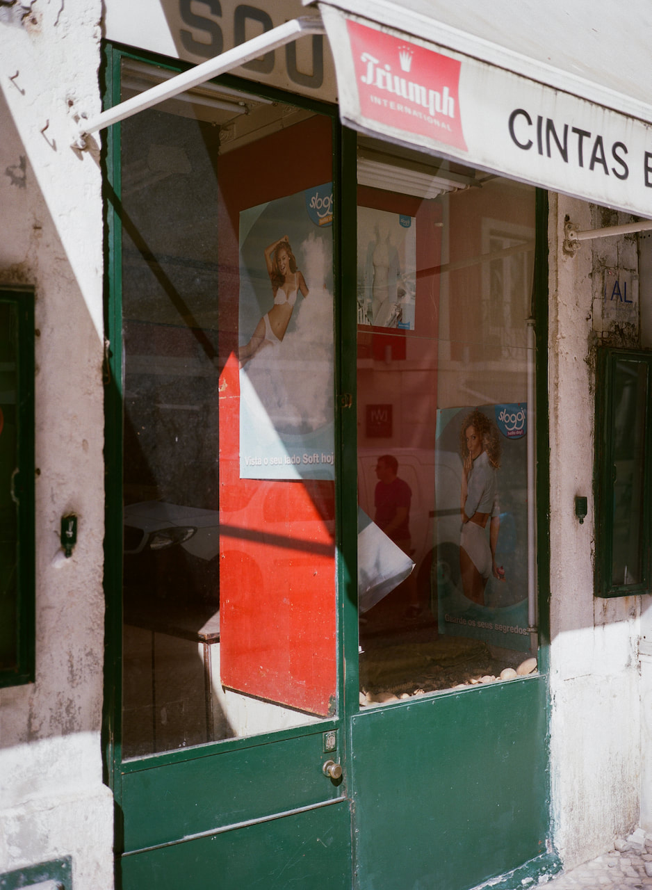
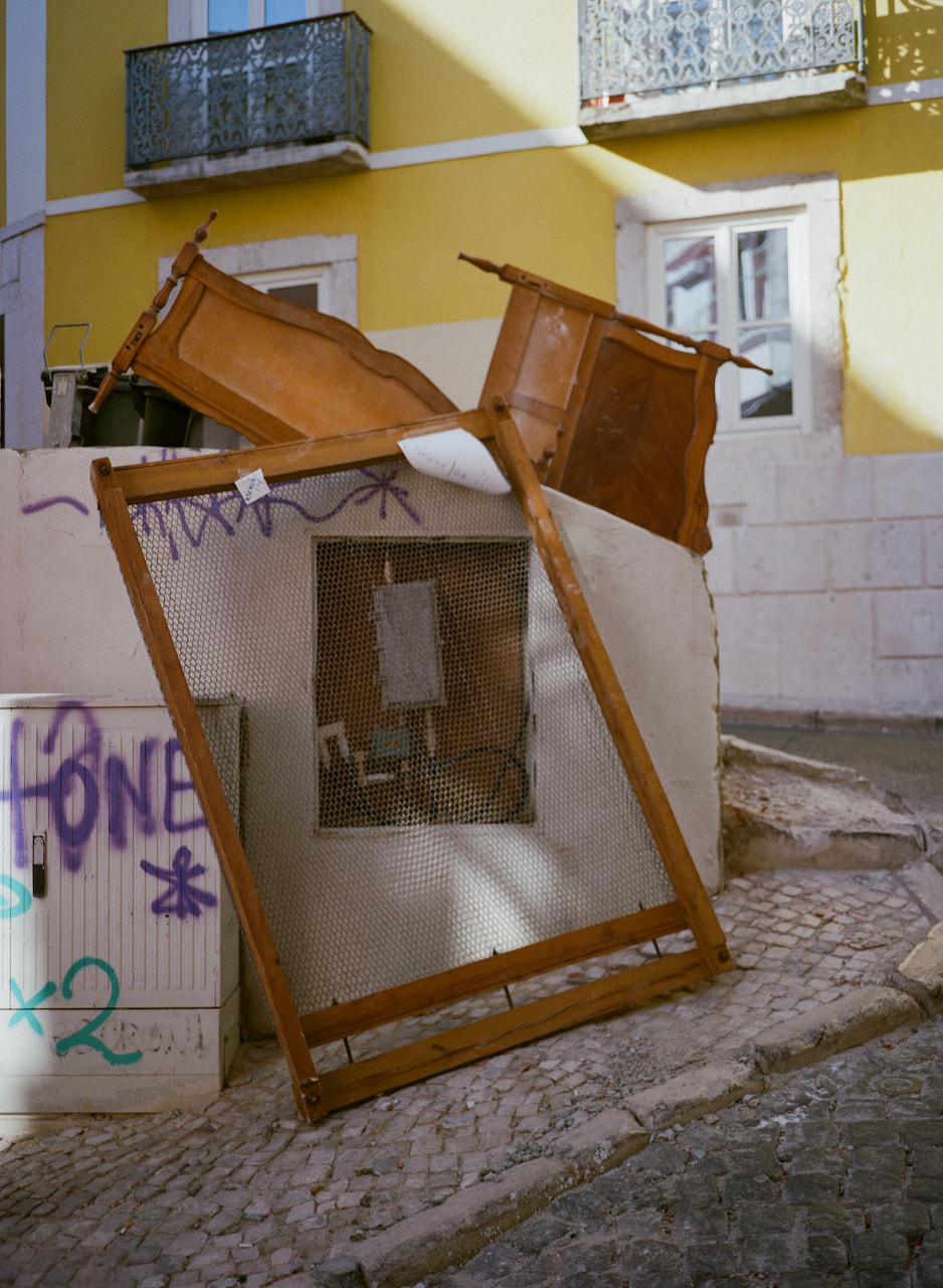
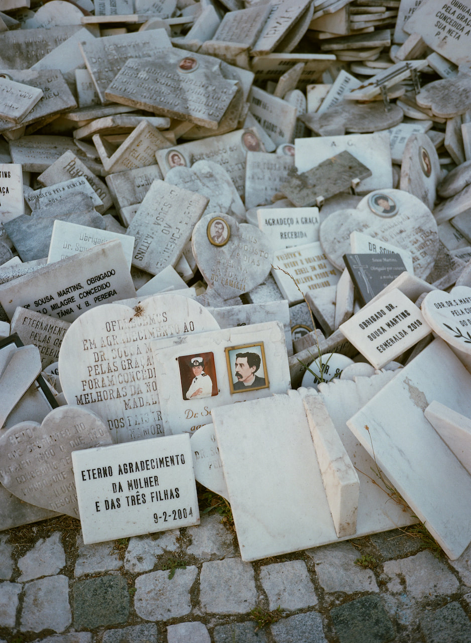
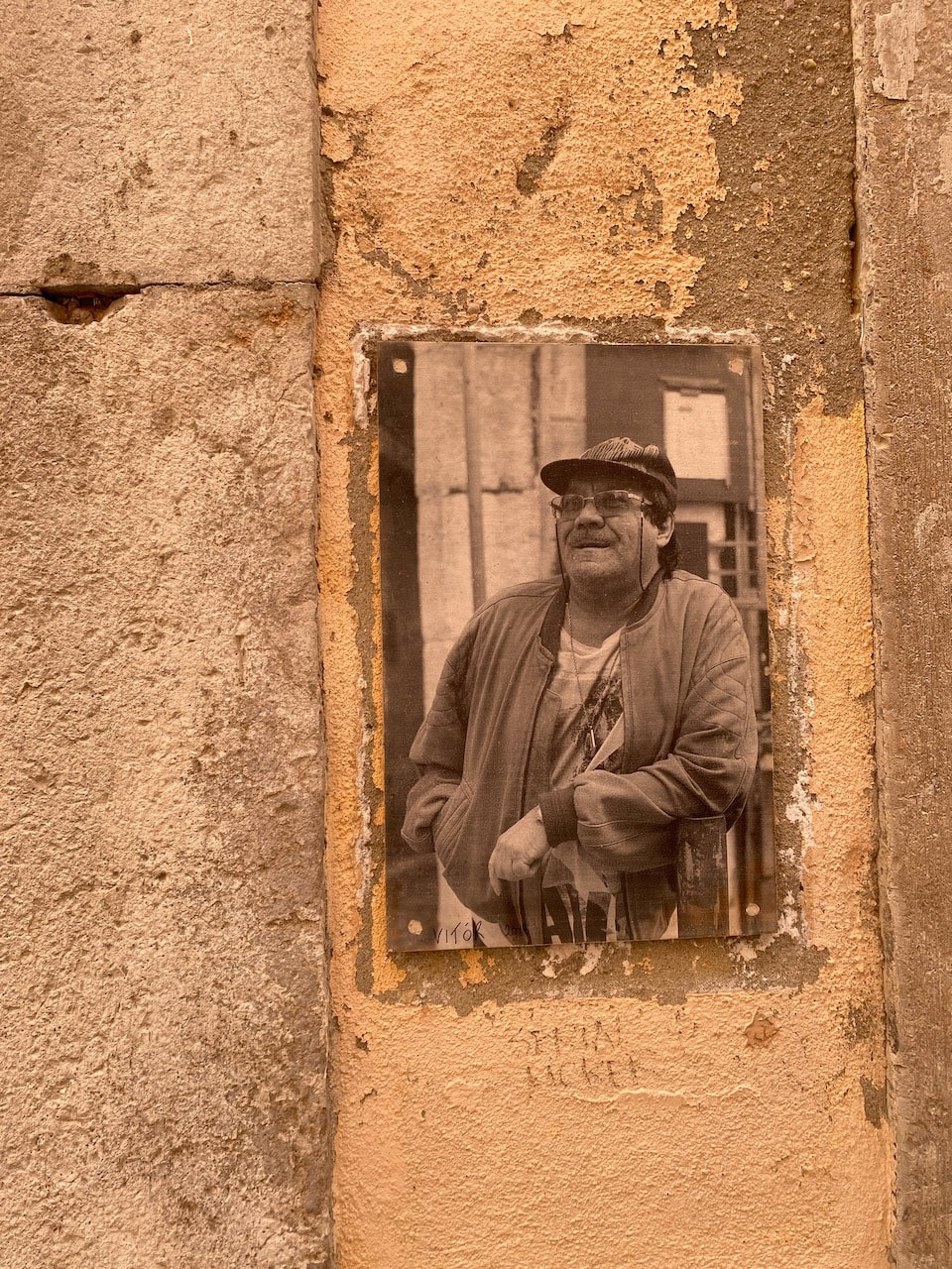
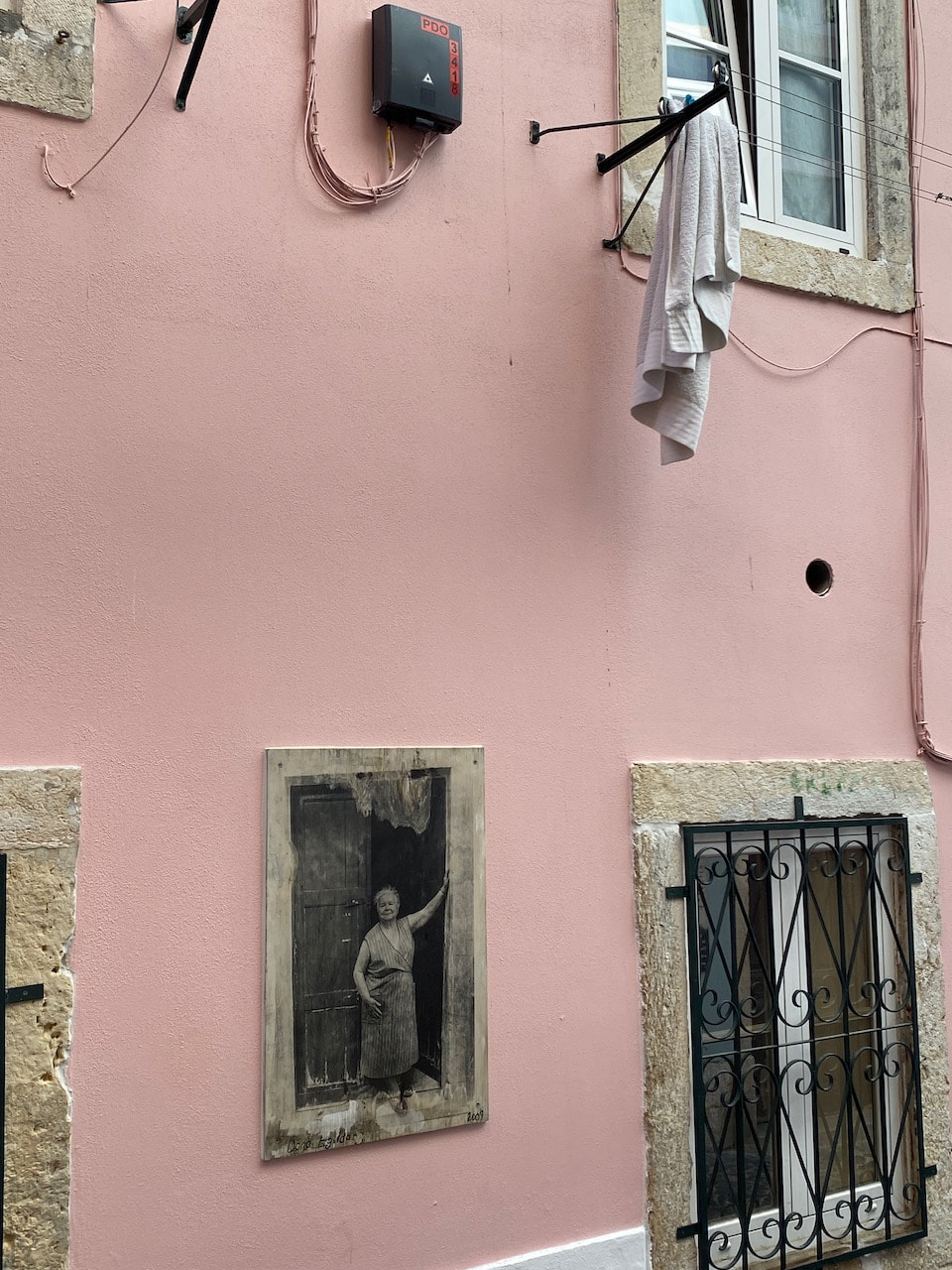
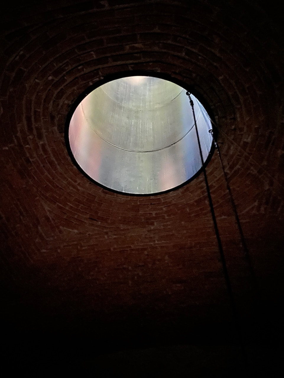
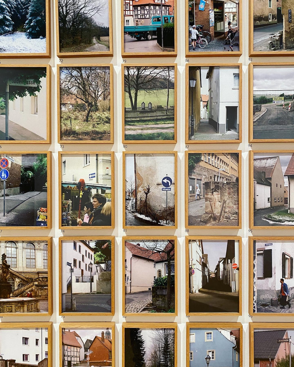
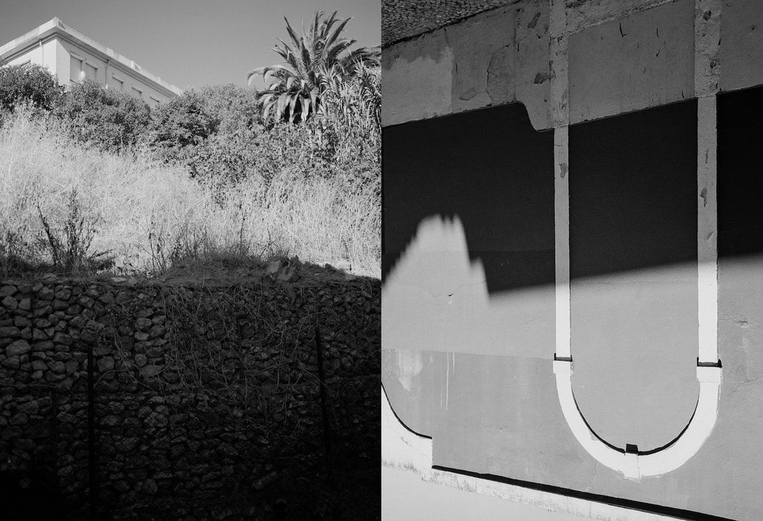
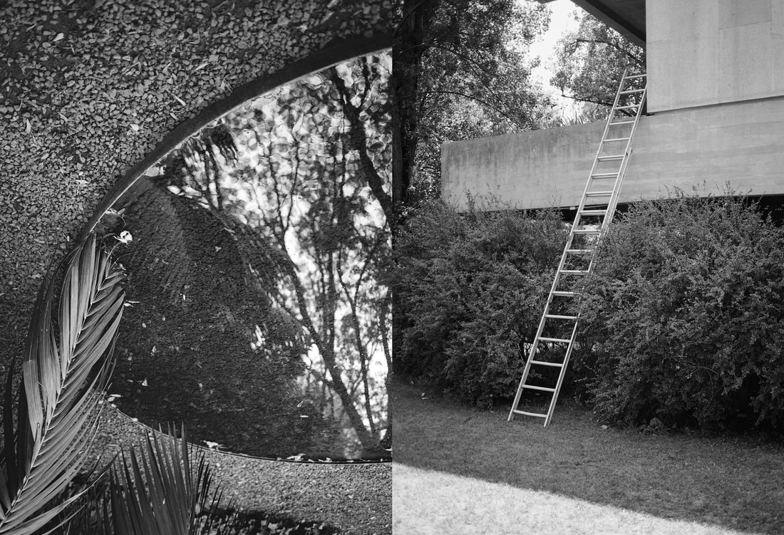
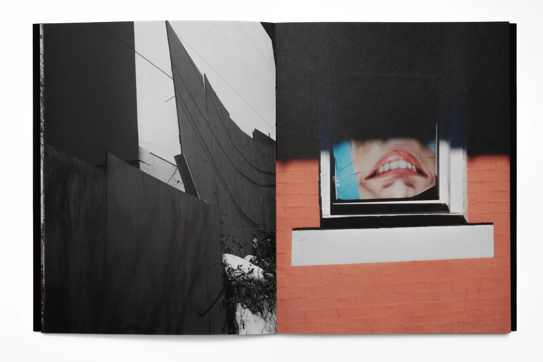
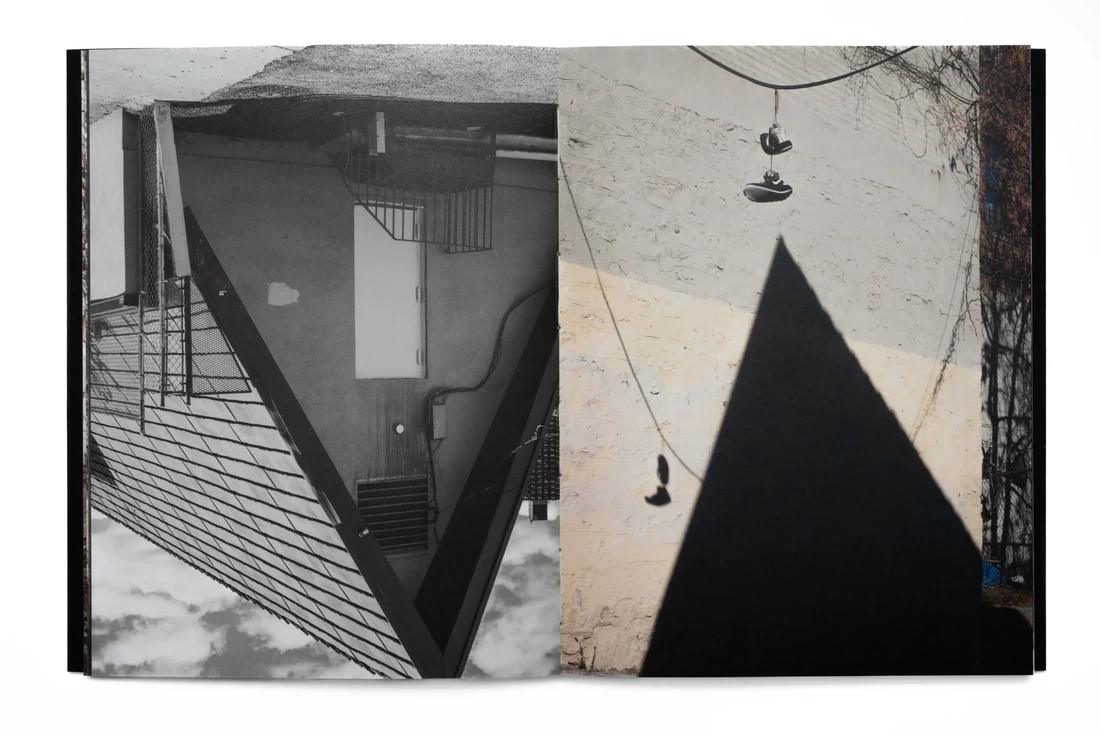
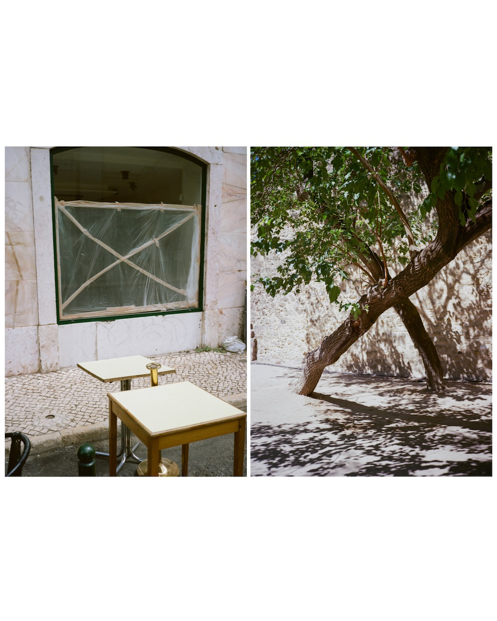
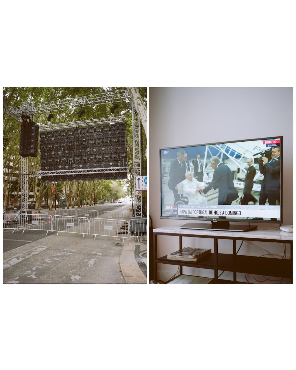
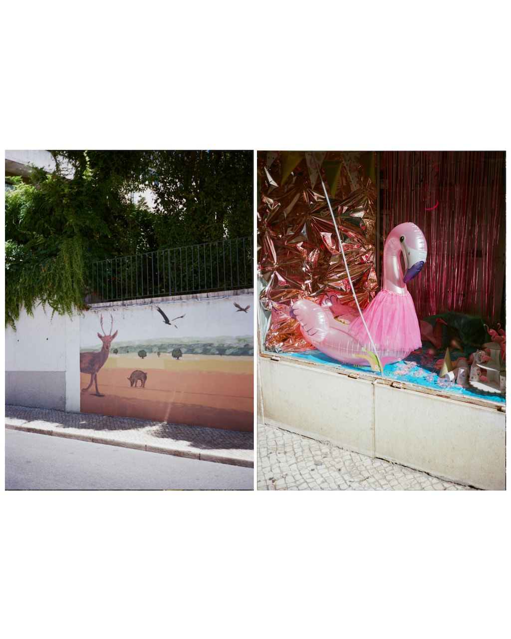
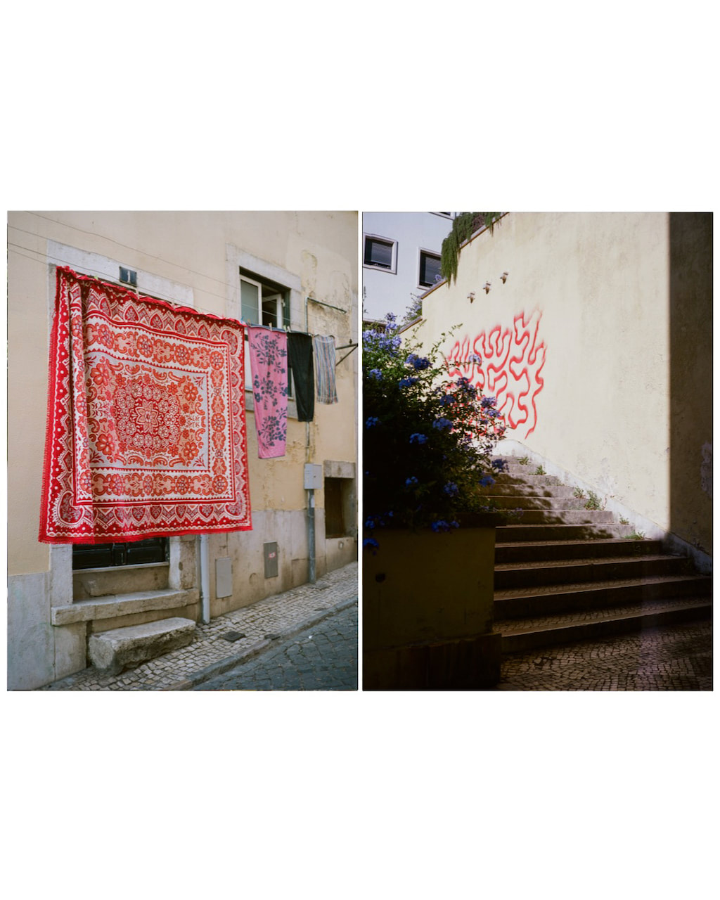
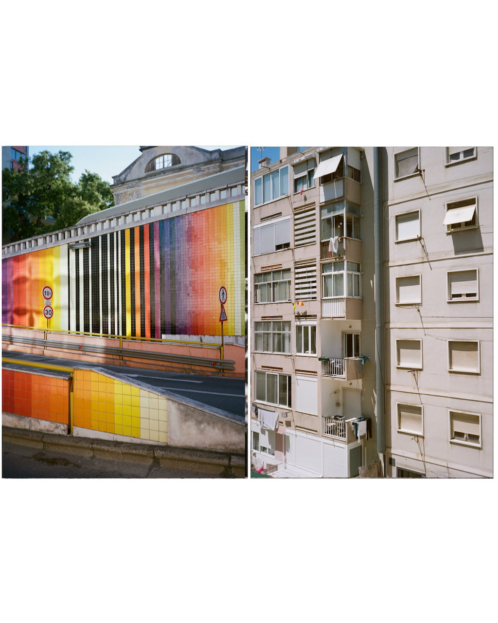
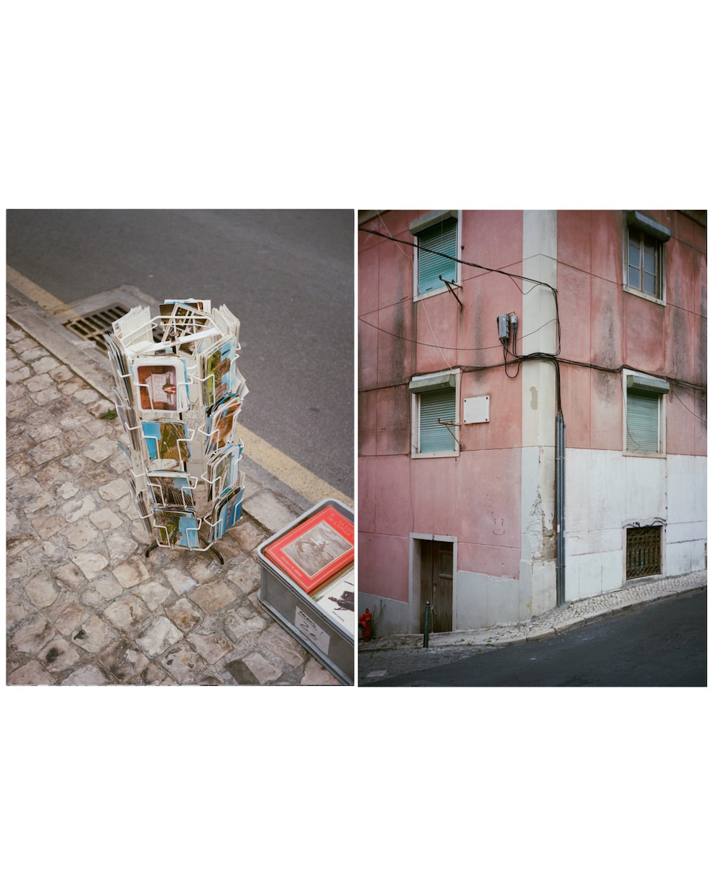
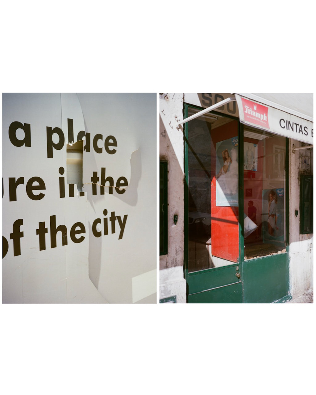
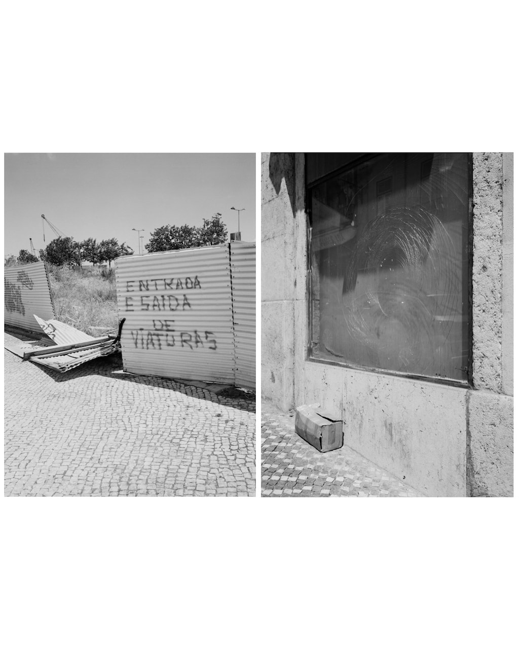
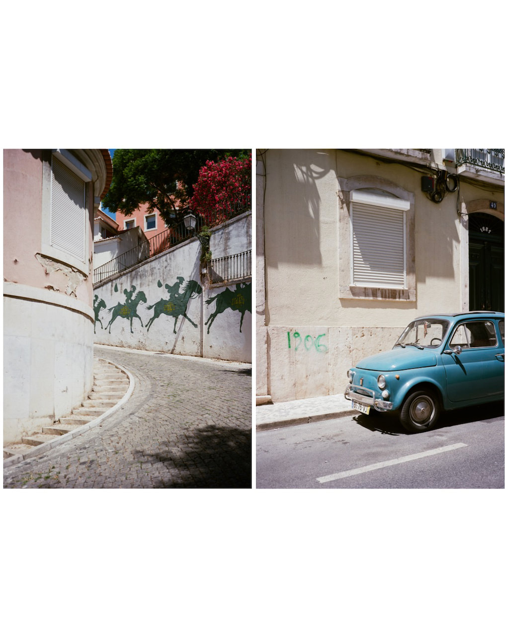
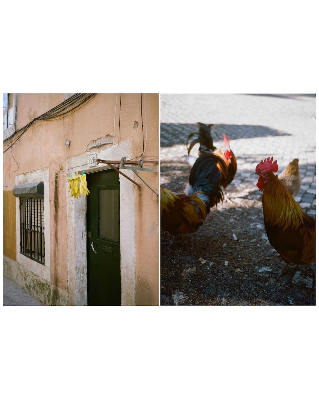
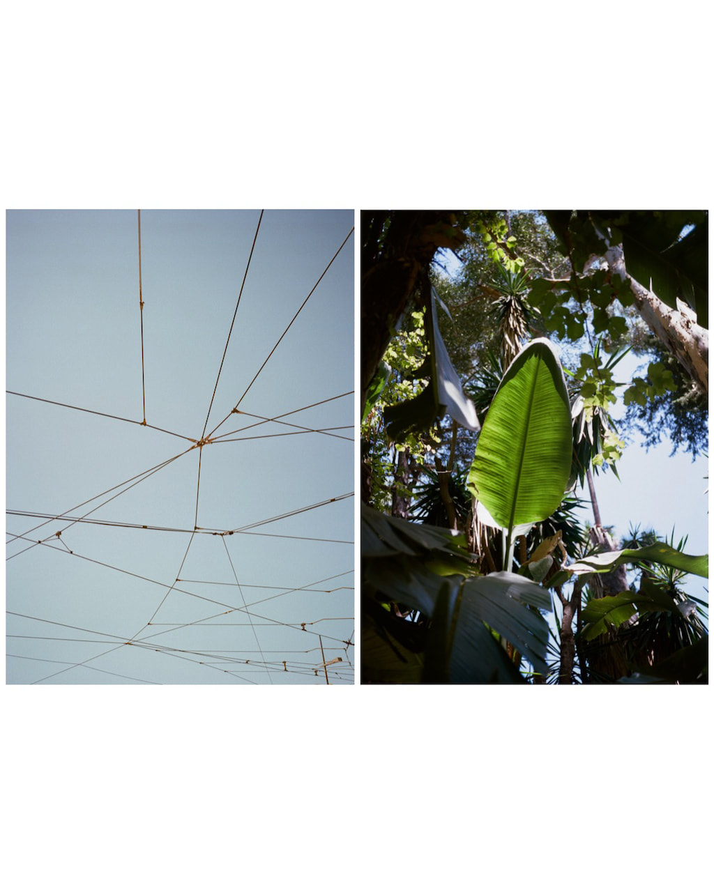
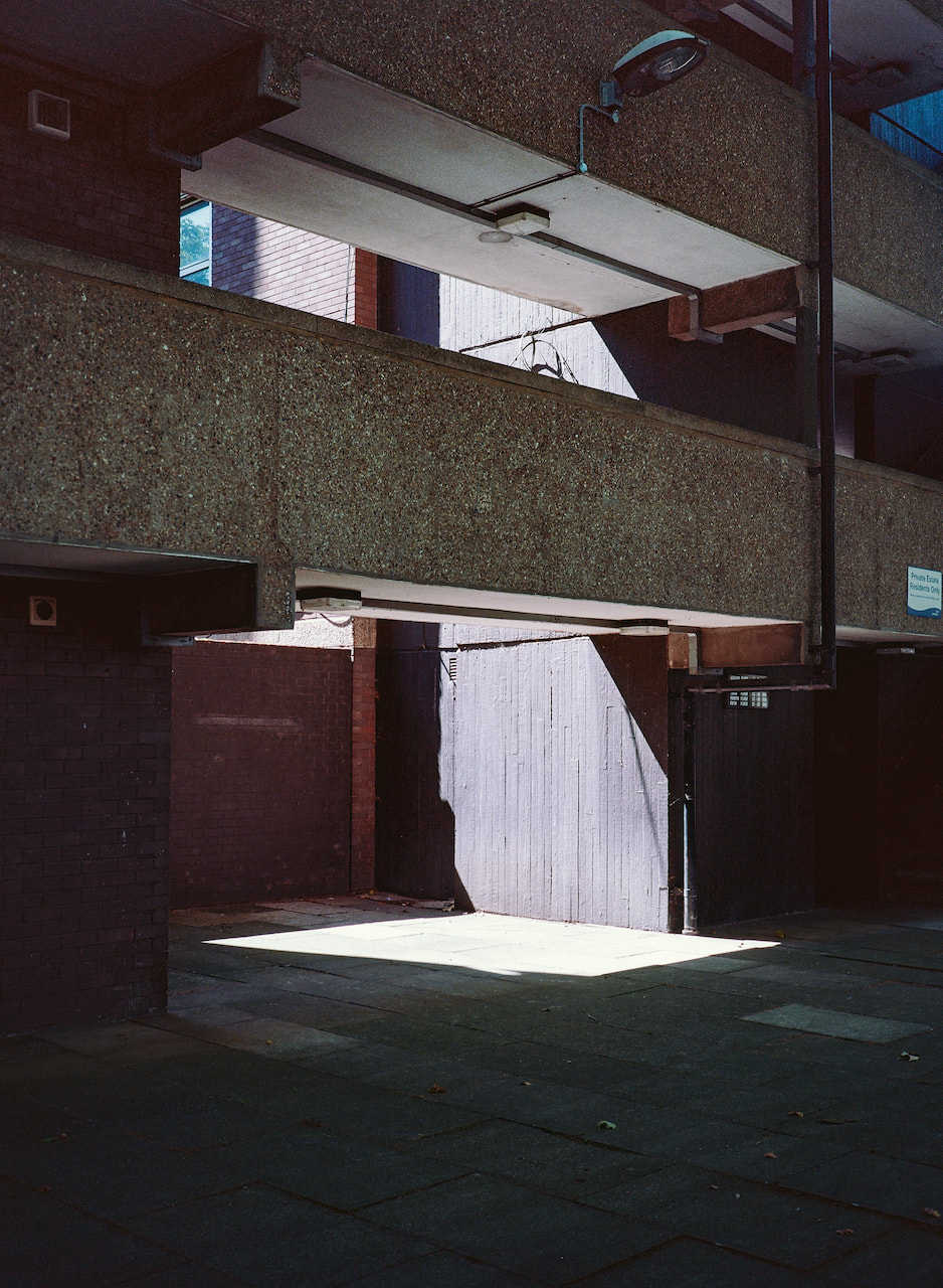
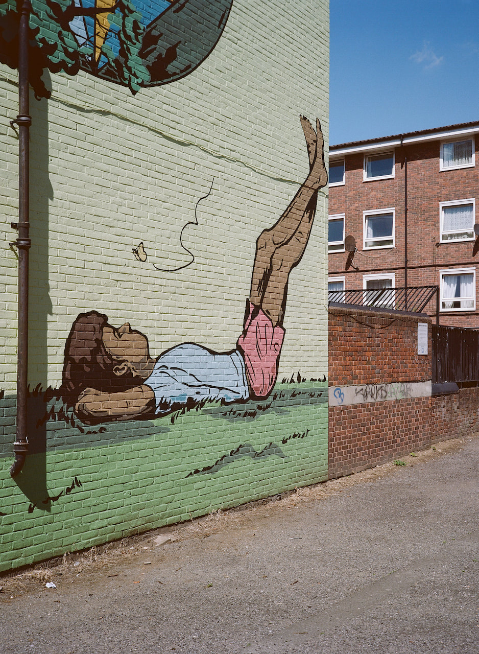
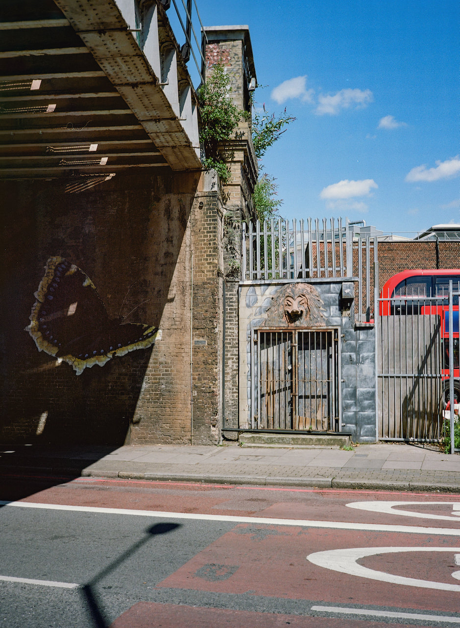
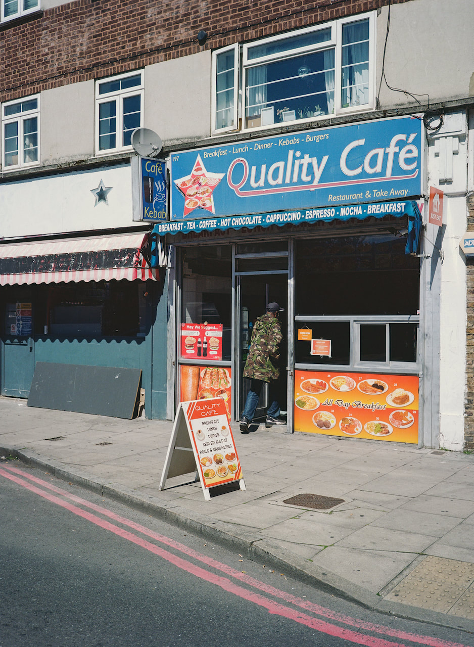
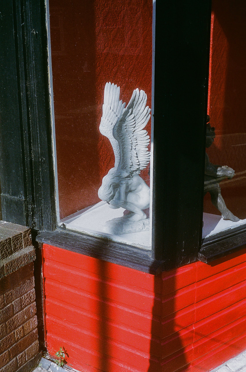
Lisbon
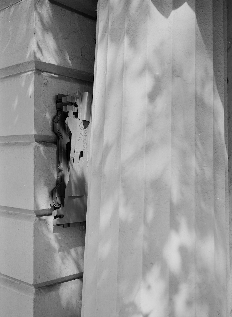
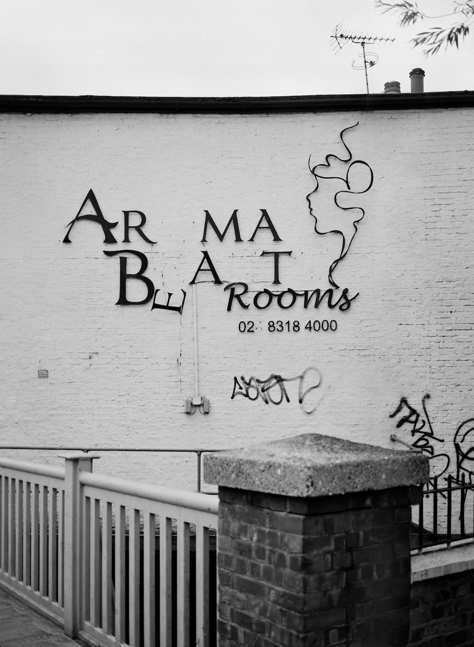
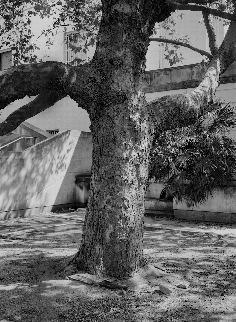
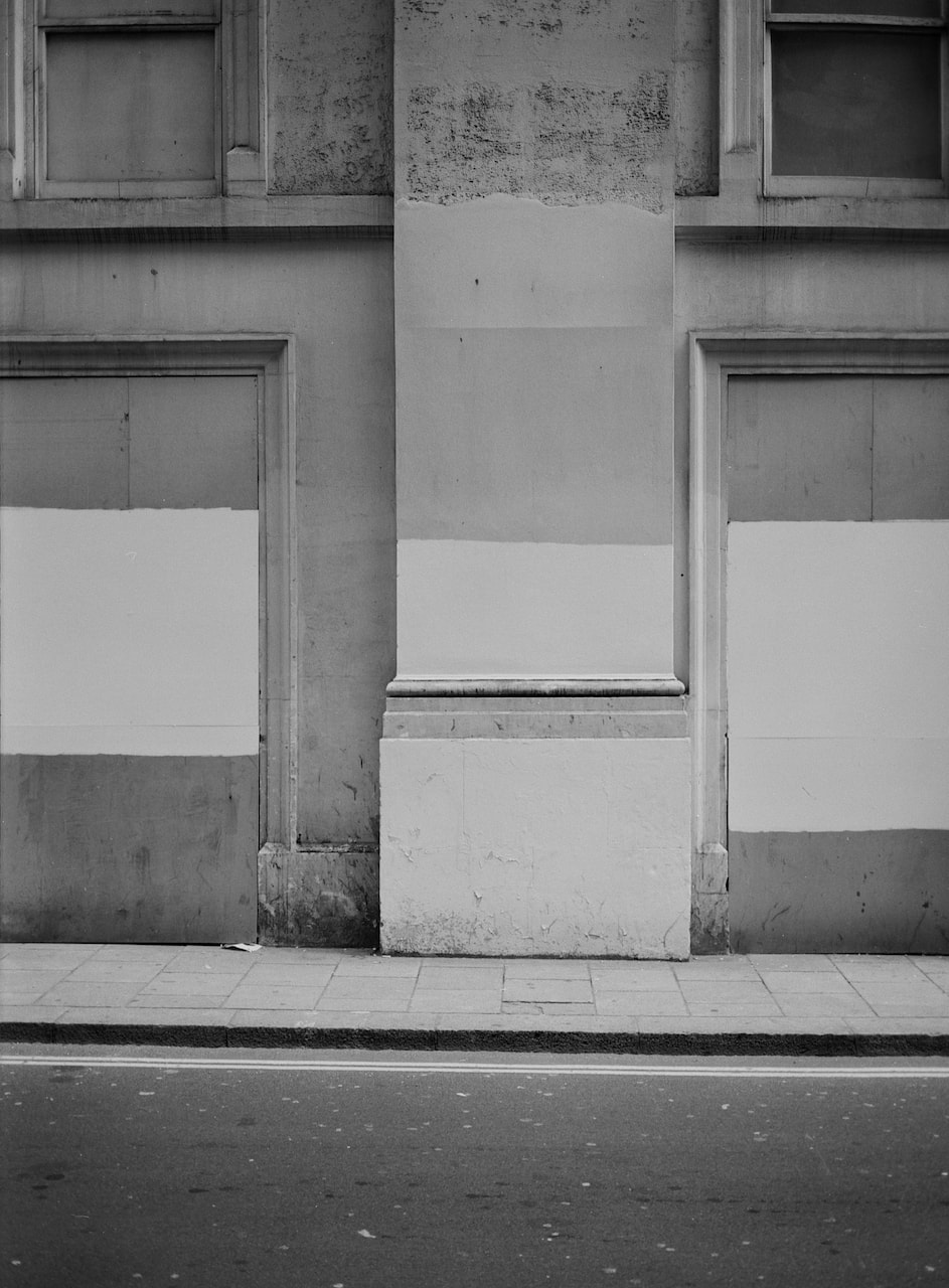
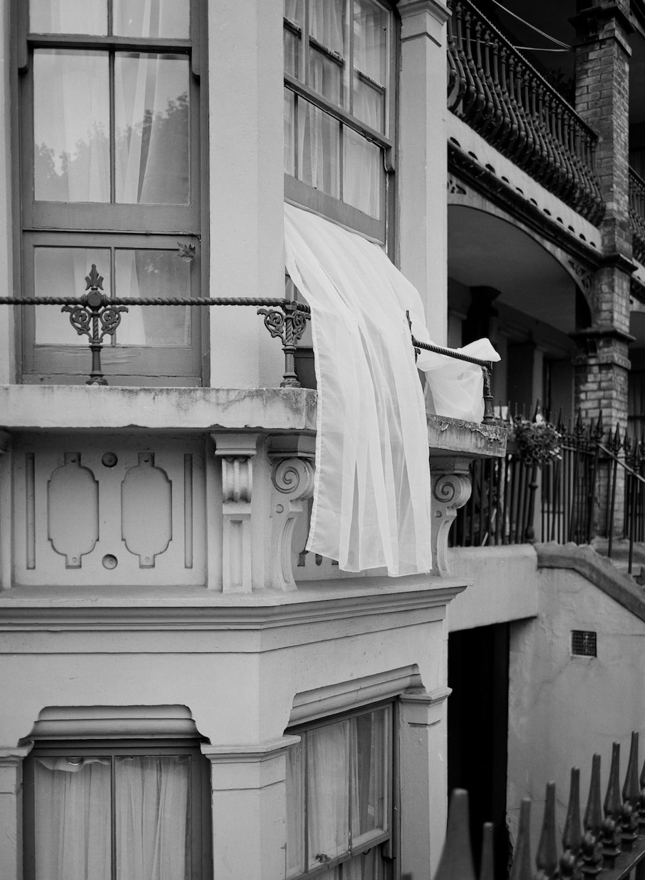
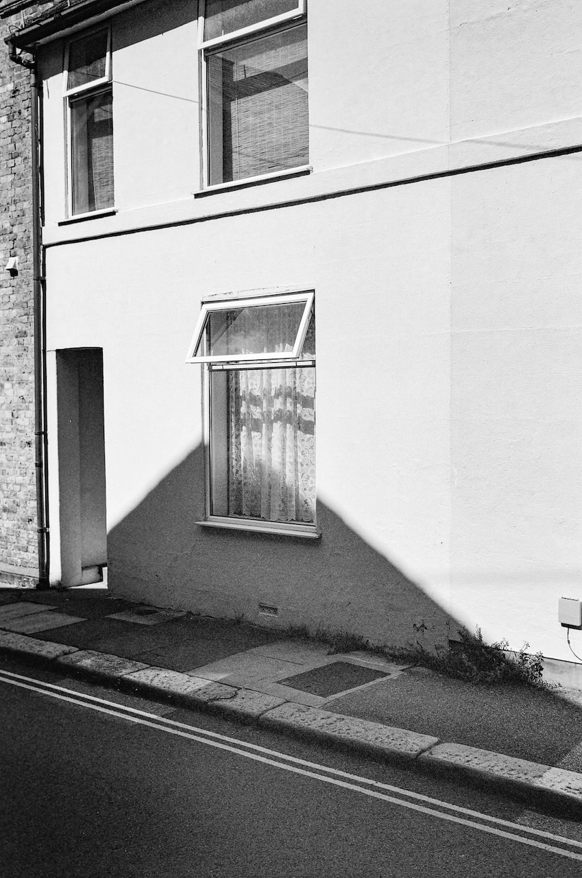
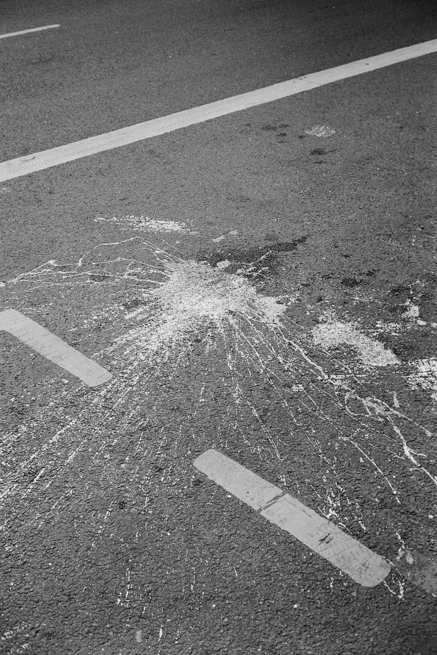
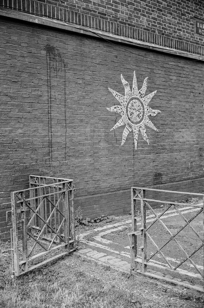
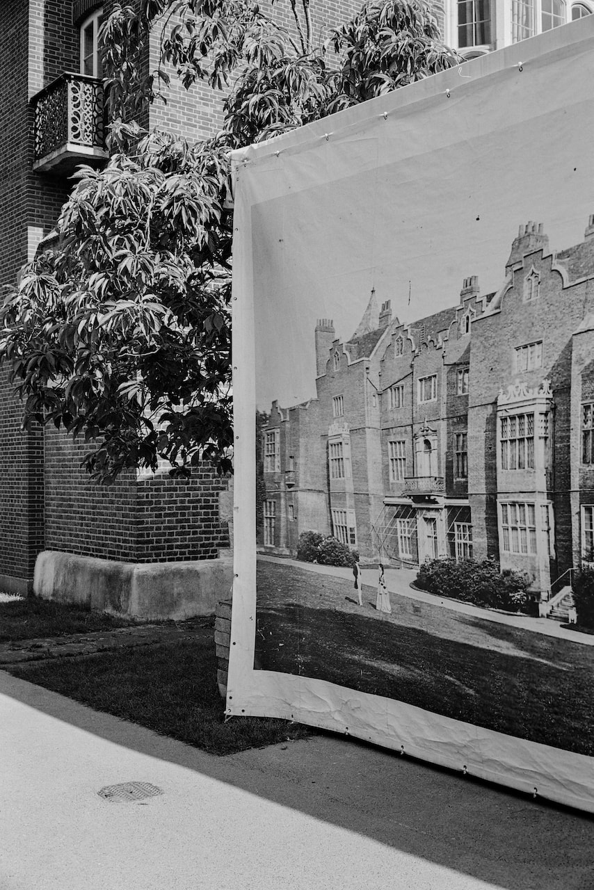
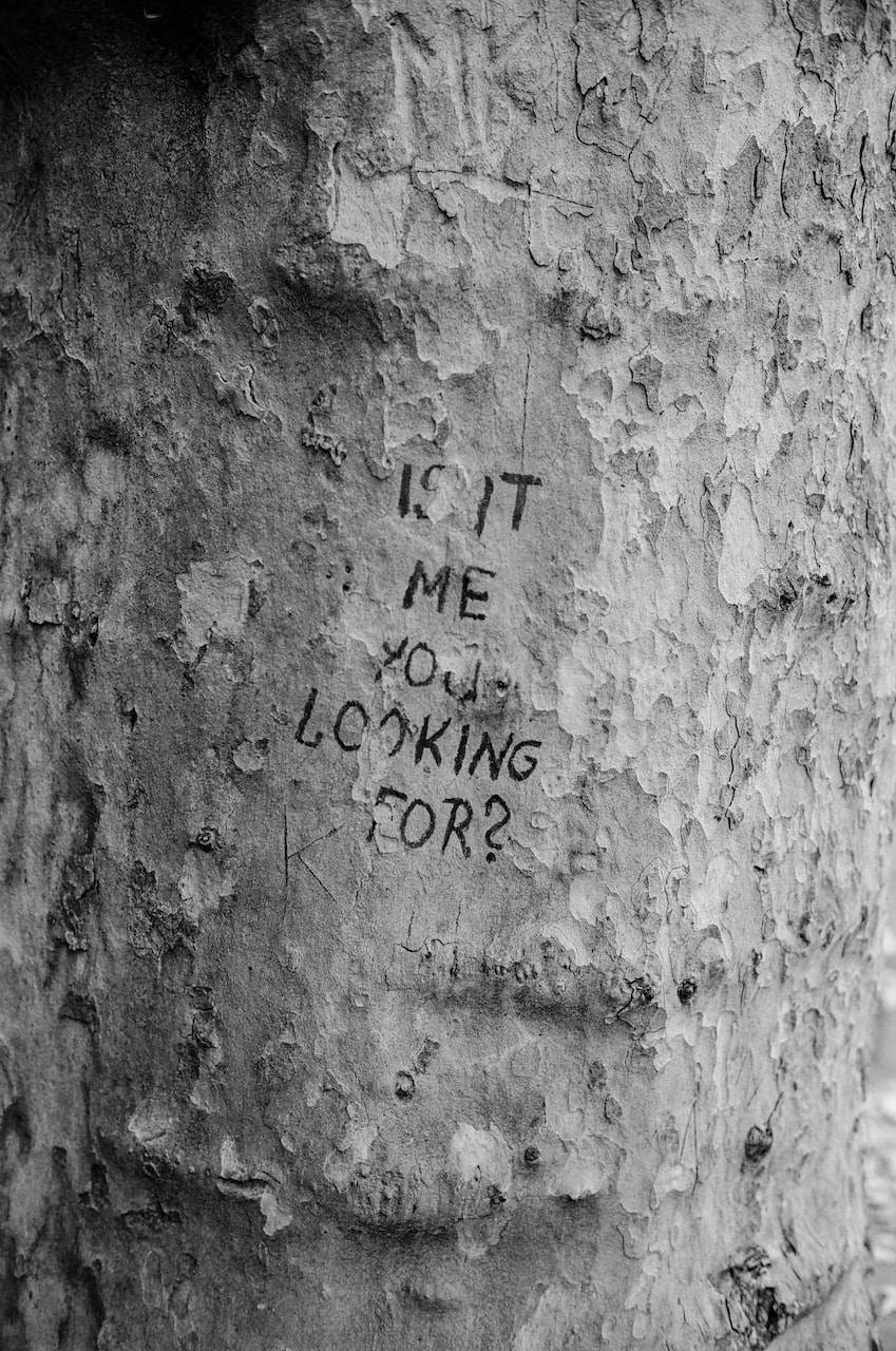
These pictures were made during a week's stay in Lisbon at the start of the summer holidays. I decided to use my Fuji GS645S medium format camera and a combination of Kodak Portra 160 and Ilford XP2 Super 400 film. The pictures were made on daly walks through the city, not always with a clear destination in mind. I was drawn to the amazing light, the relationship between objects and walls/floors and the layers of buildings in a packed urban landscape. Although I was a tourist, I tried to avoid clichés where possible although, in a place as beautiful as Lisbon, this proved quite difficult.
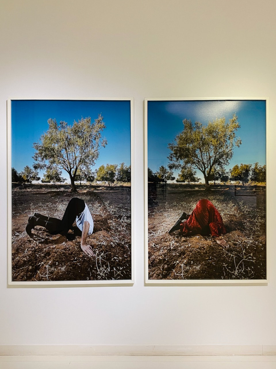
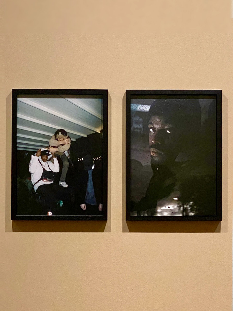
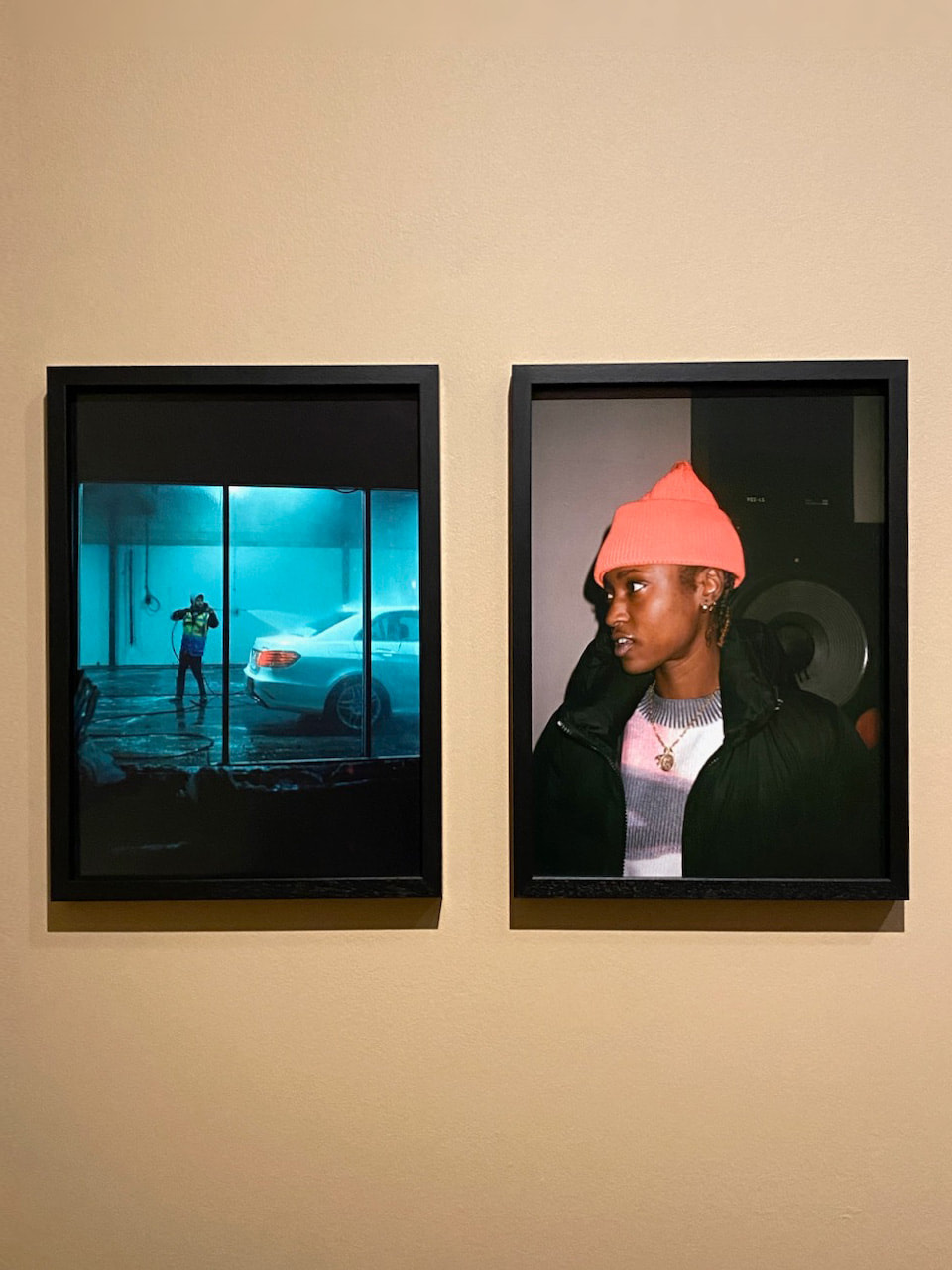
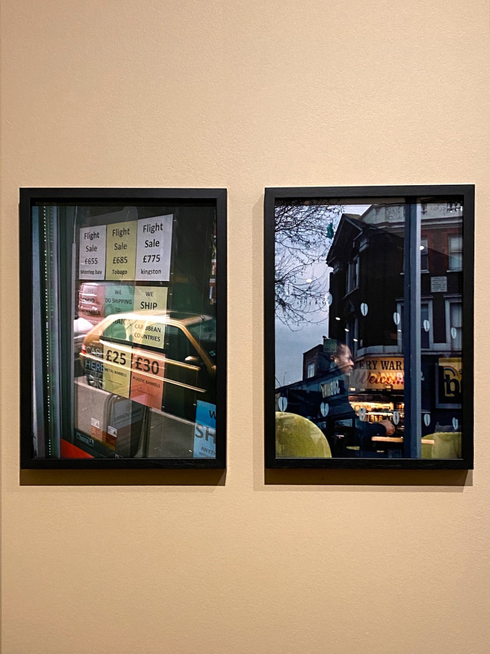
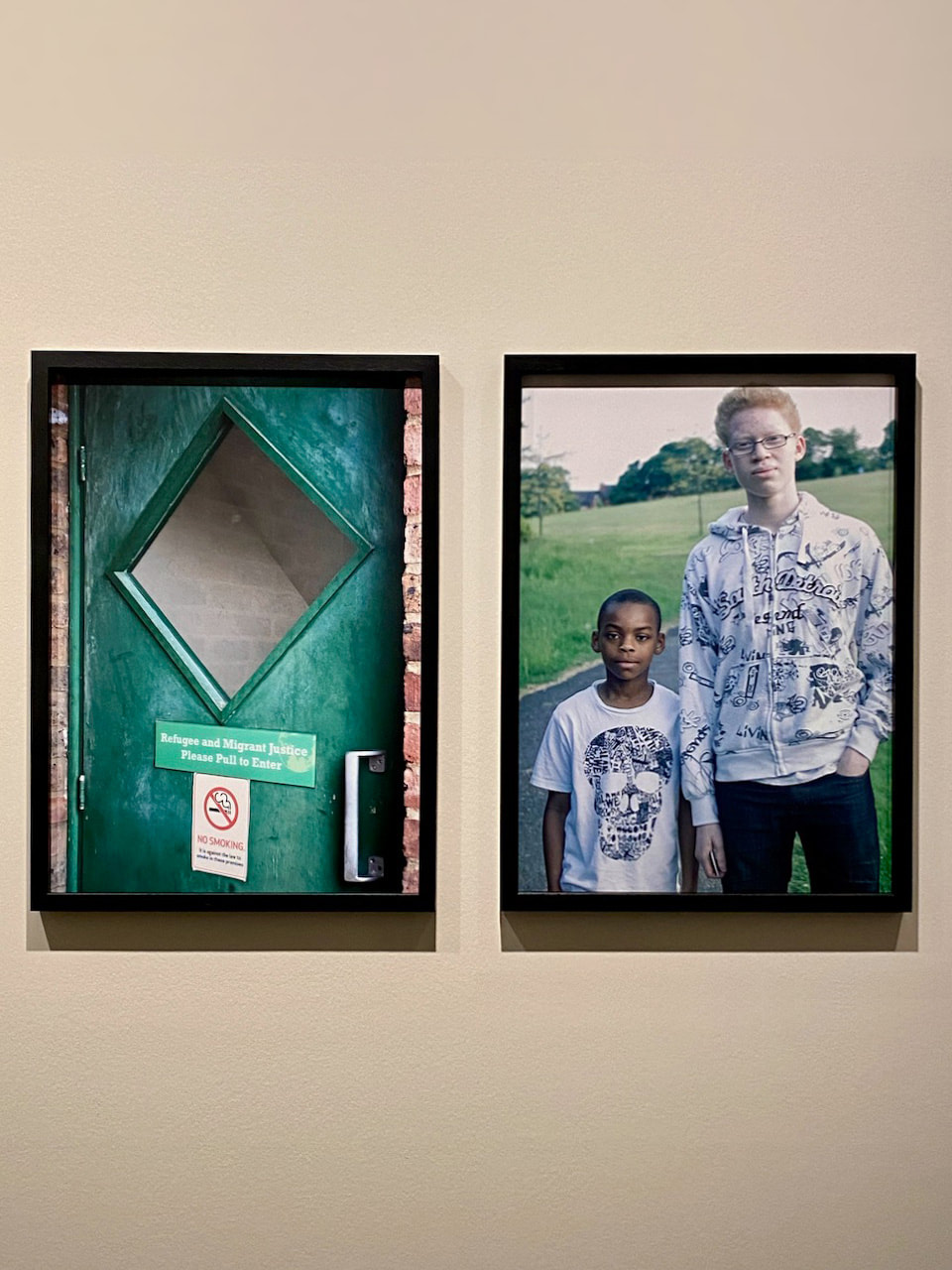
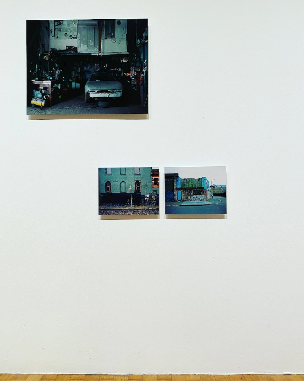
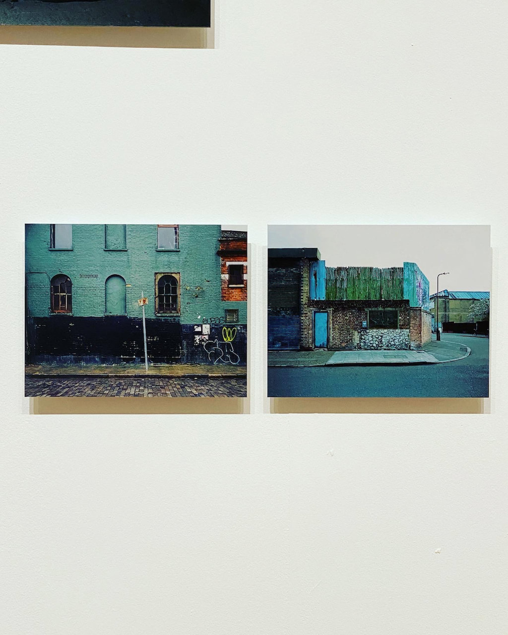
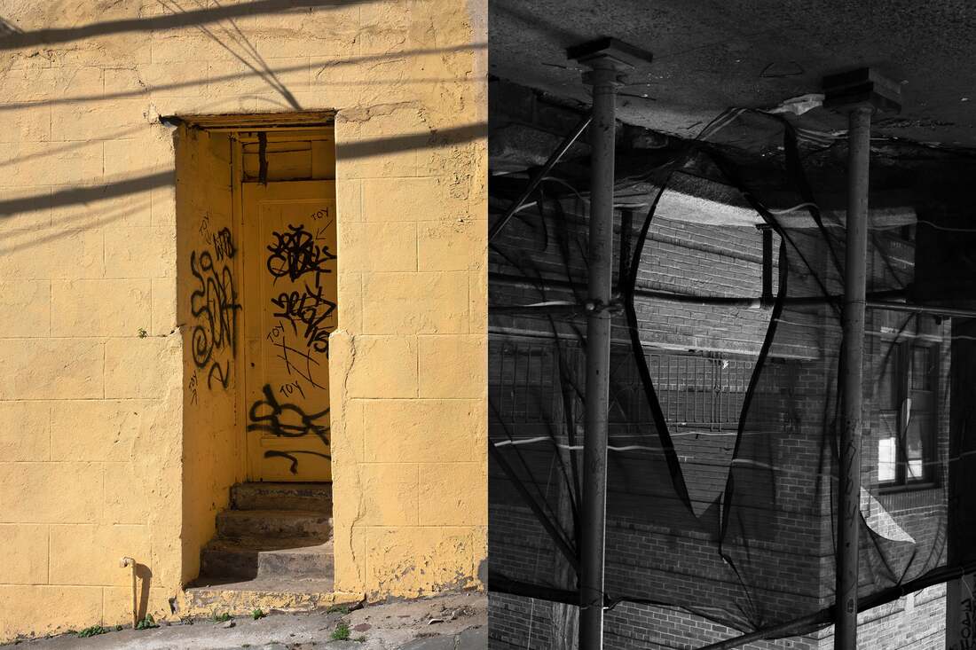
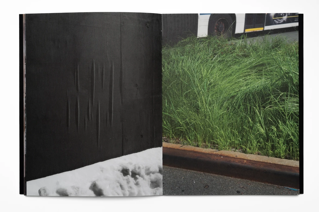
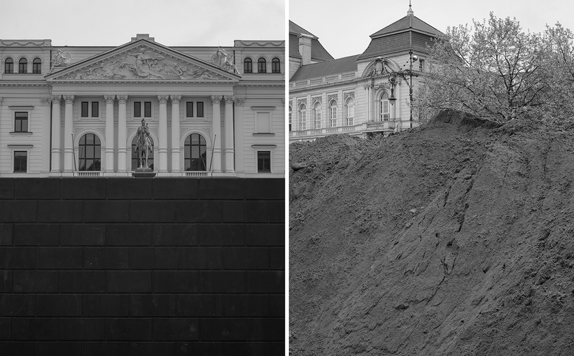
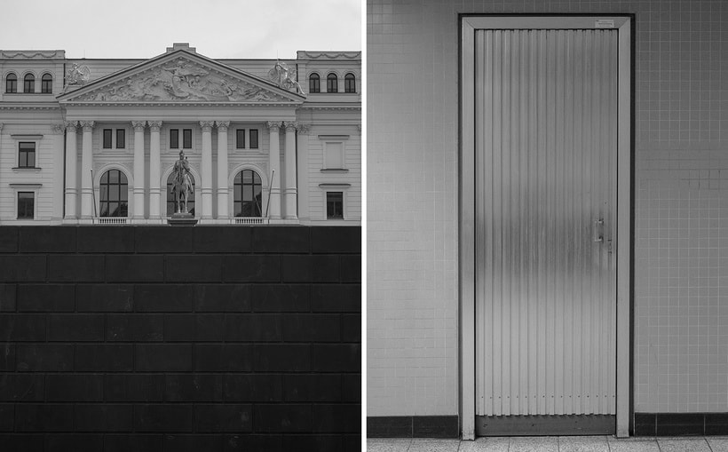
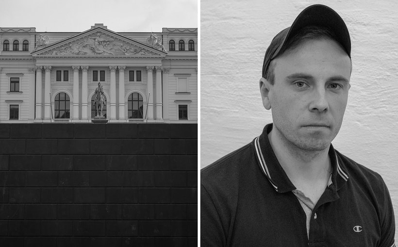
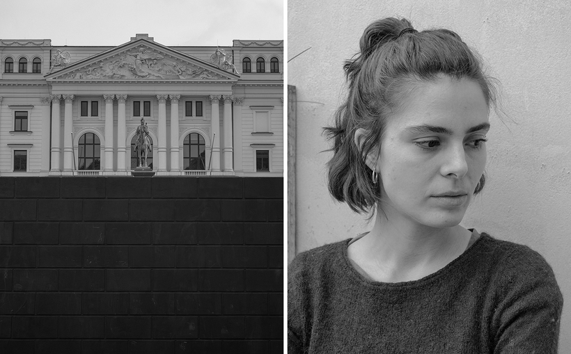
Diptychs
The following diptychs are various experiments in pairing the images above.
|
|
|
|
|
|
|
|
|
|
|
|
|
|
|
|
|
|
|
|
|
|
|
|
|
|
|
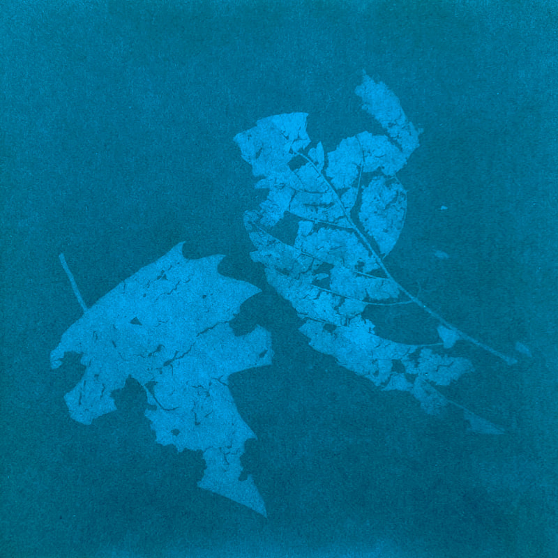
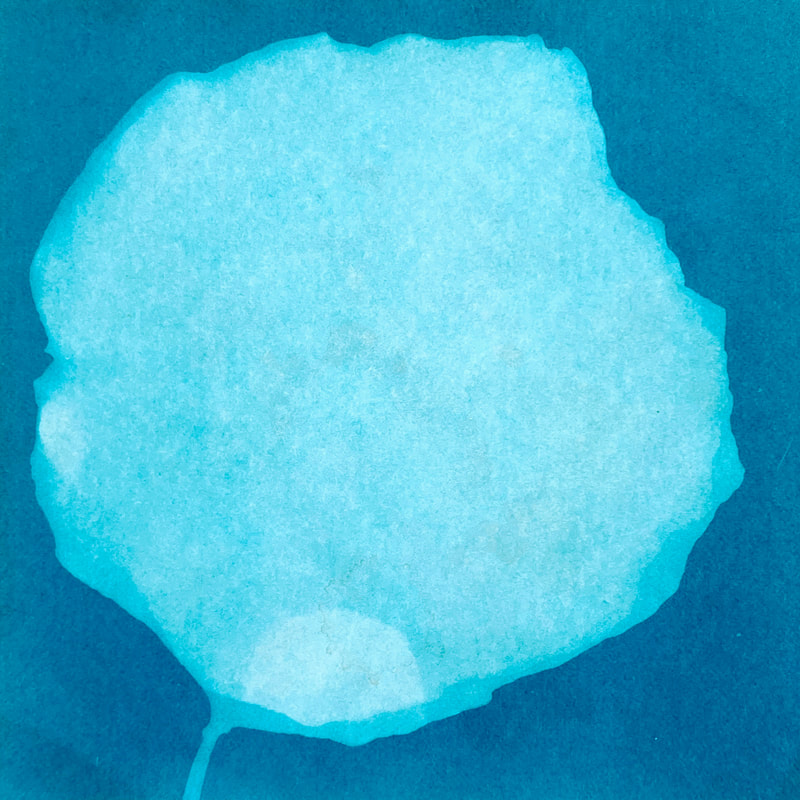
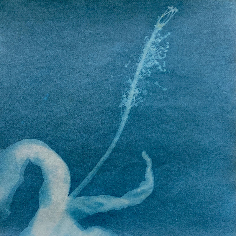
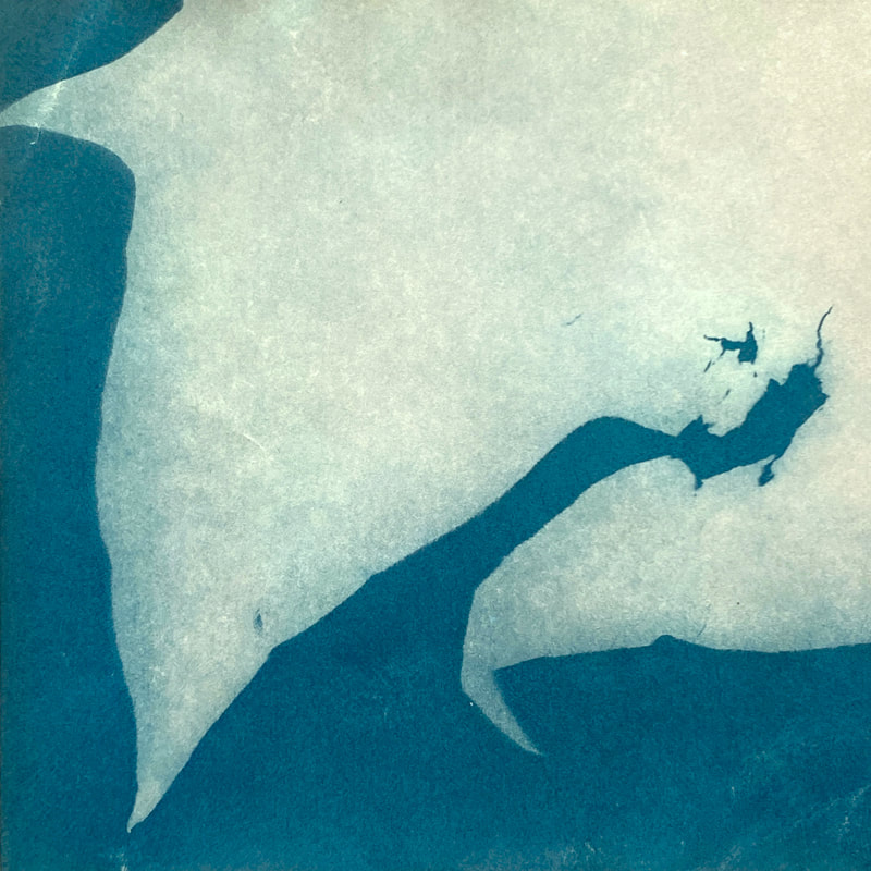
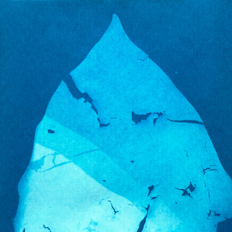
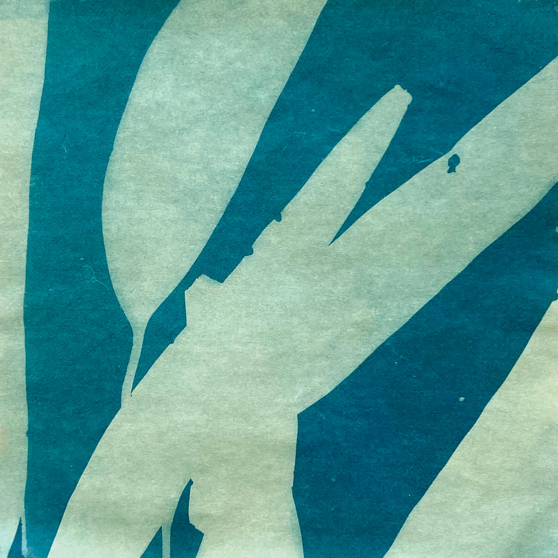
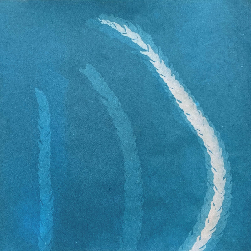
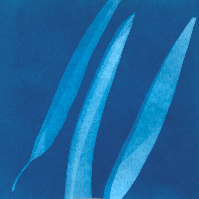
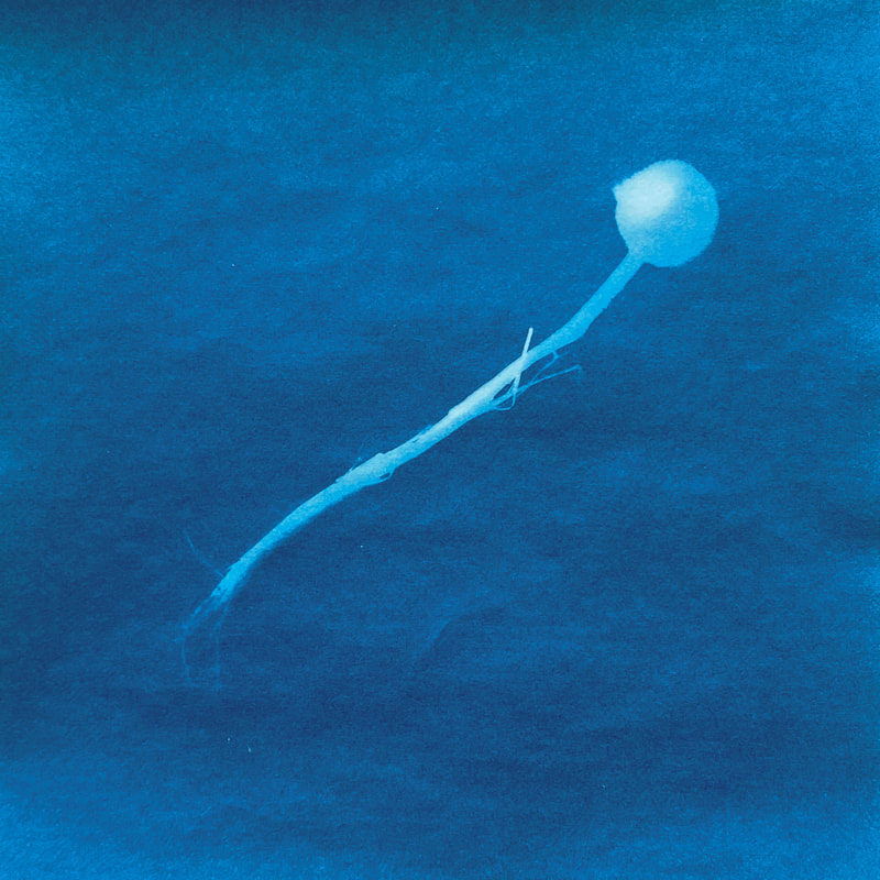
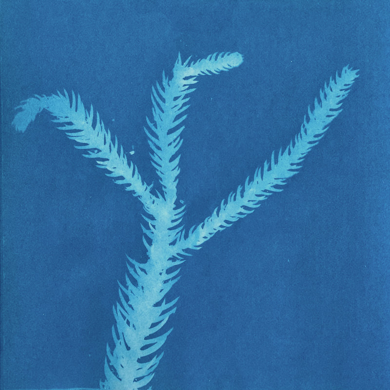
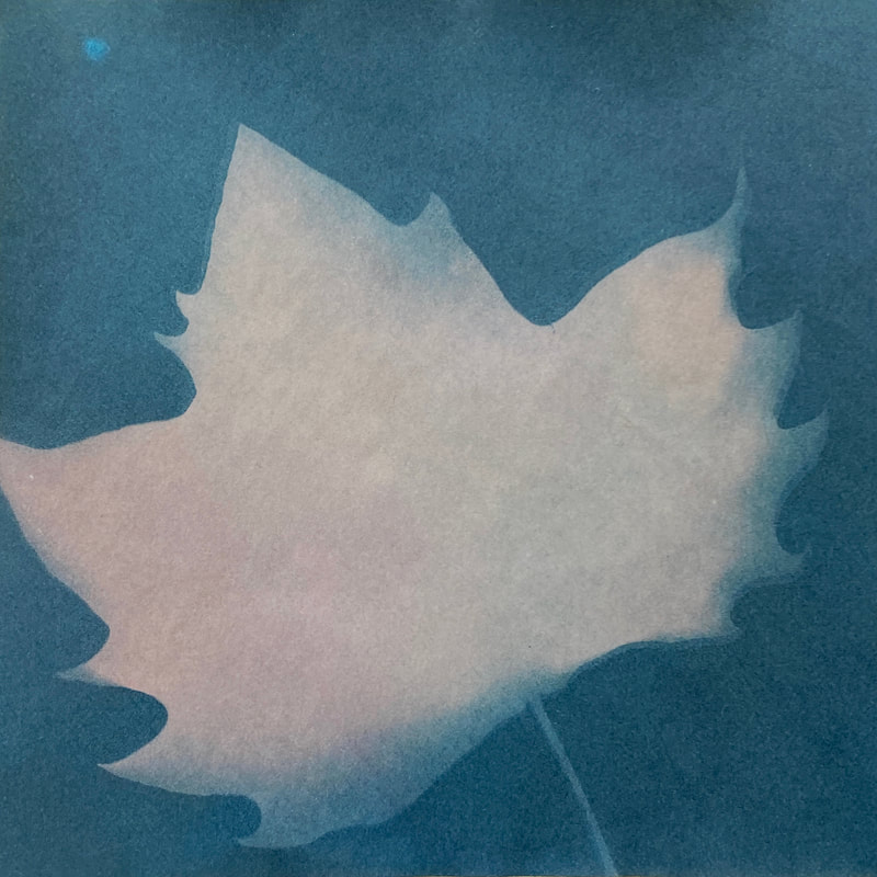
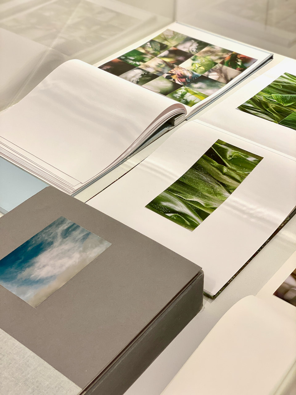
Cyanotypes
I found a small packet of 10 x 10cm cyanotype paper in one of the museum shops. I thought it might be interesting to make some cyanotypes of found material. The following day I visited the botanical gardens and this seemed like the ideal opportunity to make some prints. They were made in situ and then washed and dried later. I decided to 'tone' them with whatever was available where I was staying so selected red wine and instant coffee, toning odd prints to see what might happen. I like the variety of colours and tones this (inexpert) process has produced. I would like to learn how to tone cyanotypes properly at some stage!

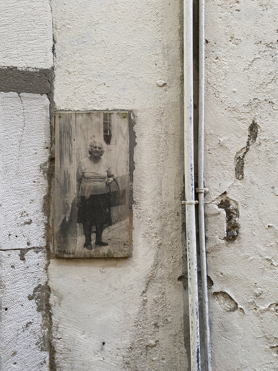
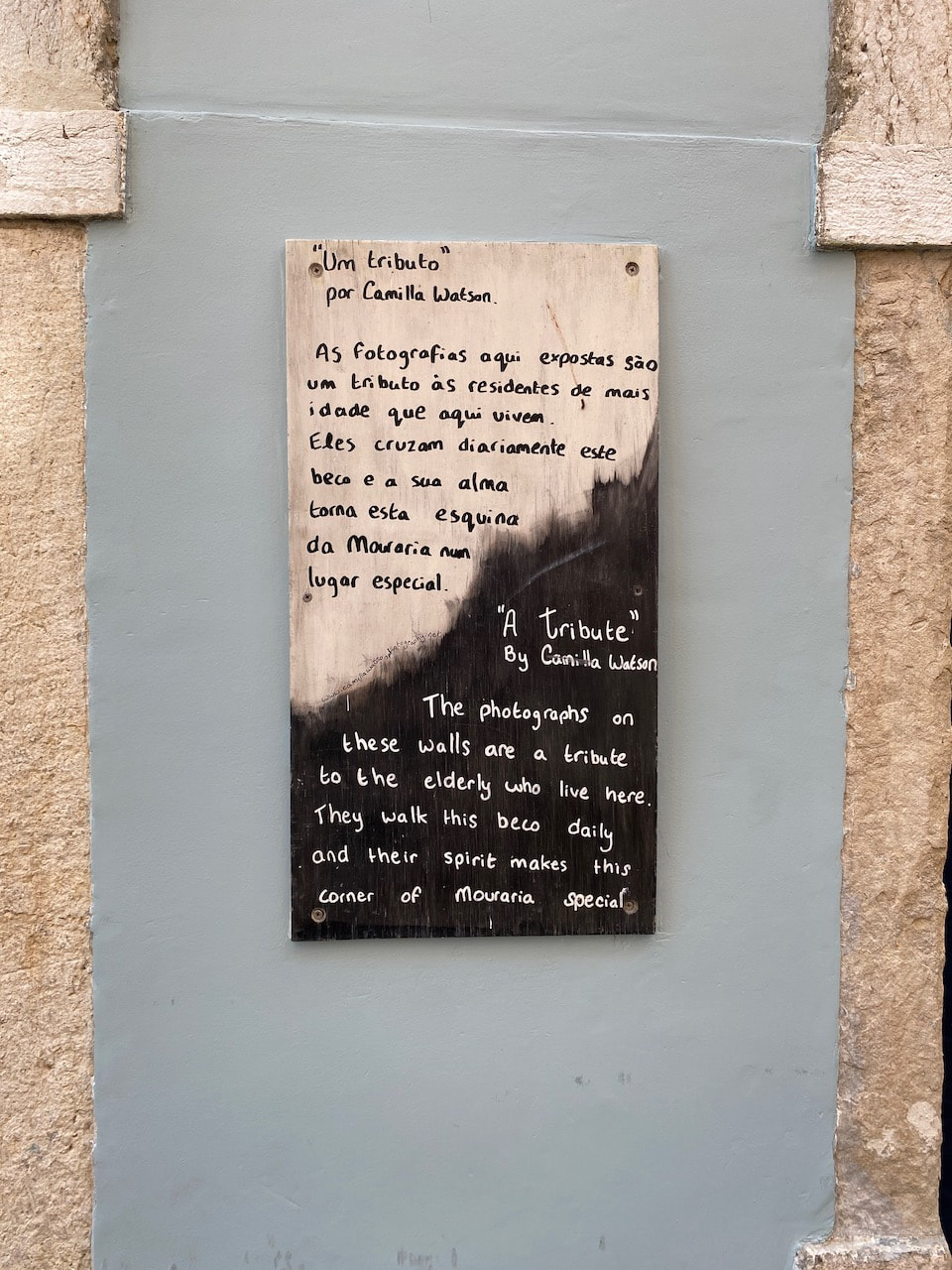
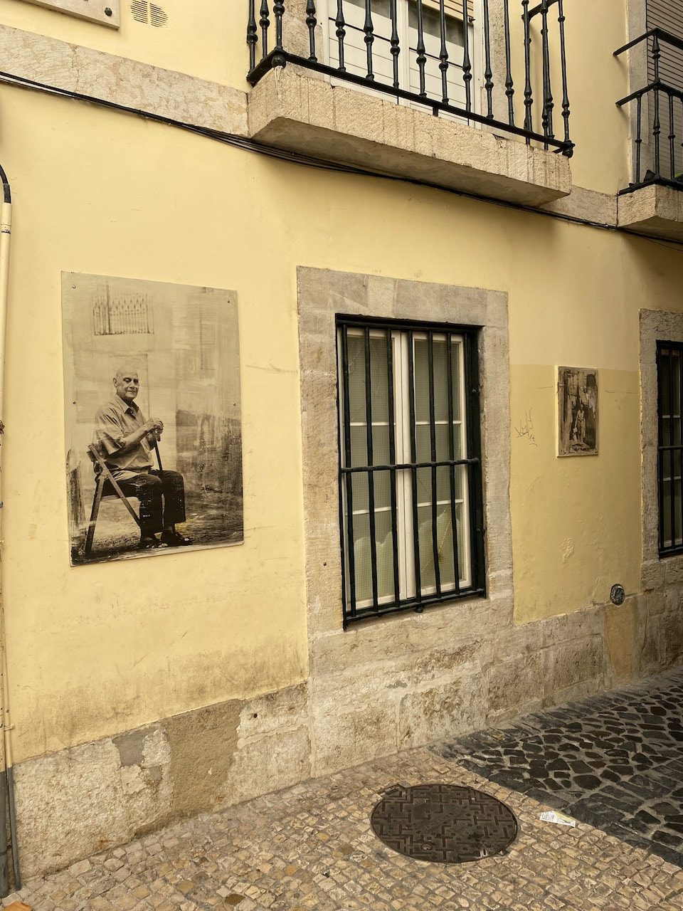
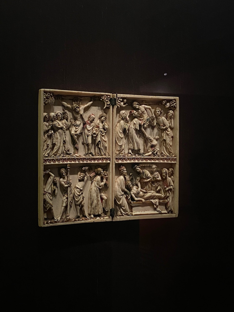
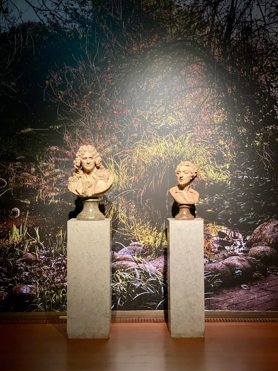
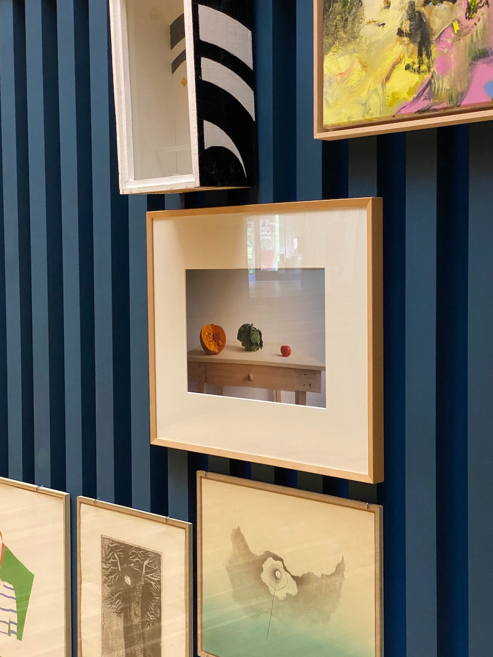
Some other things I saw
Pictures of various exhibitions and works of art I saw and enjoyed in Lisbon taken on my phone as visual notes. Places visited included:
- Camilla Watson's O Tributo exhibition on the streets of Mouraria
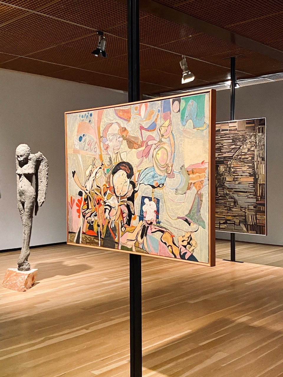
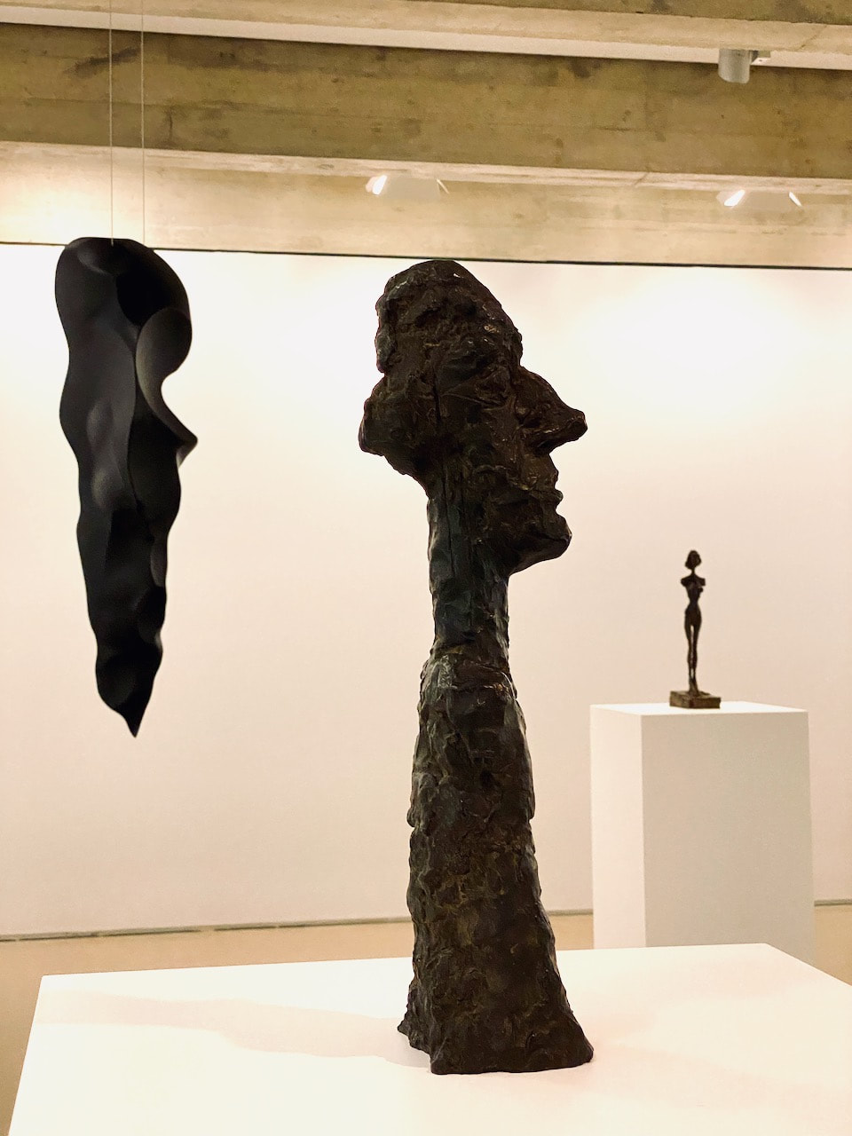
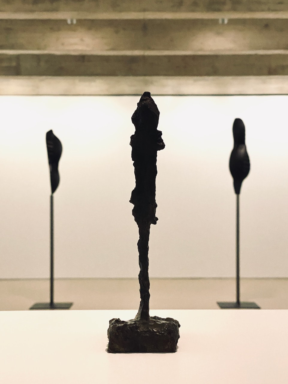
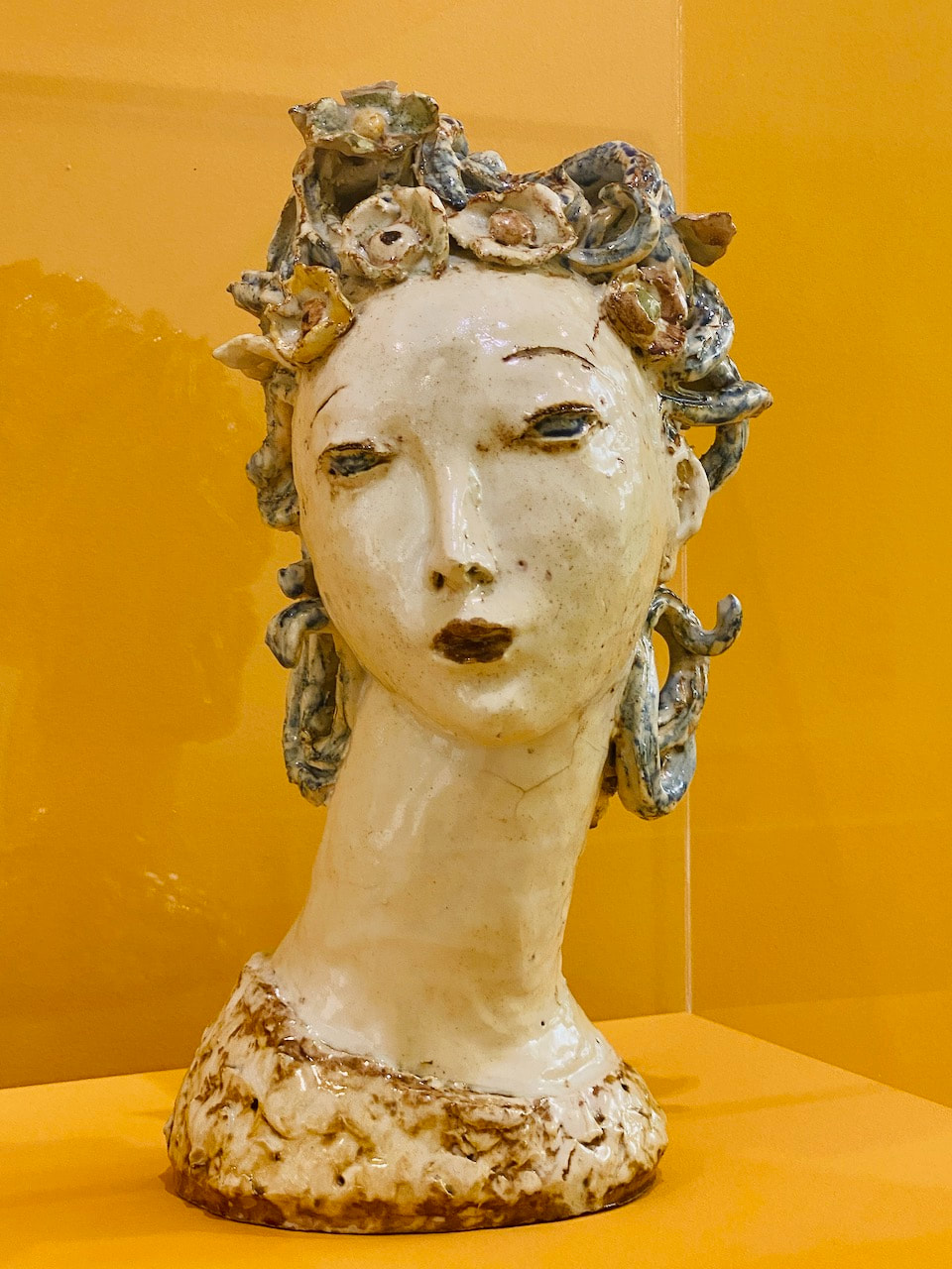
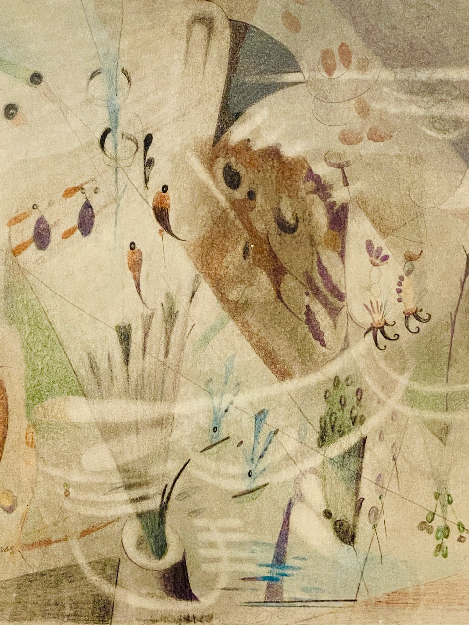
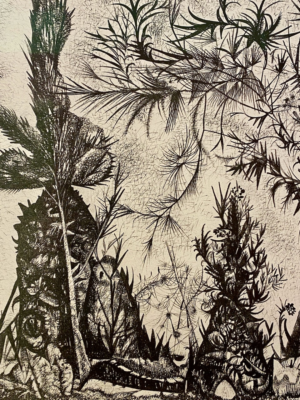
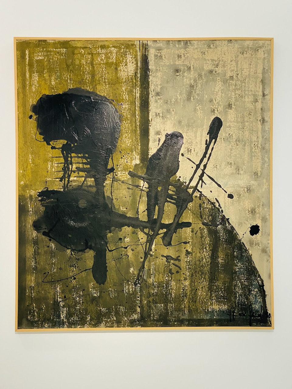
- The Calouste Gulbenkian Foundation collection plus an exhibition of the work of both Alberto Giacometti and Rui Chafes
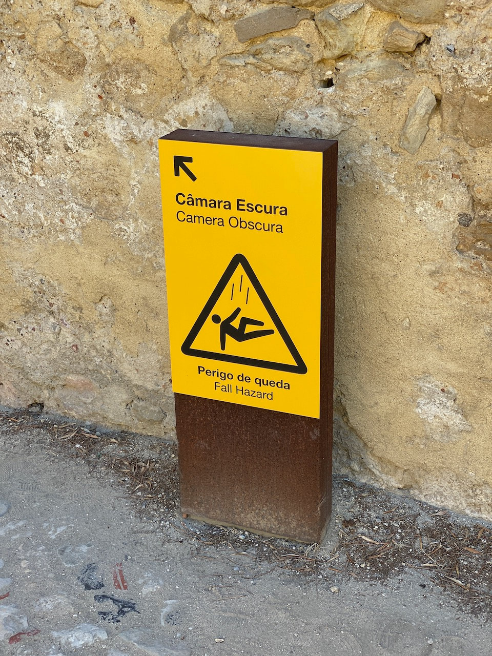
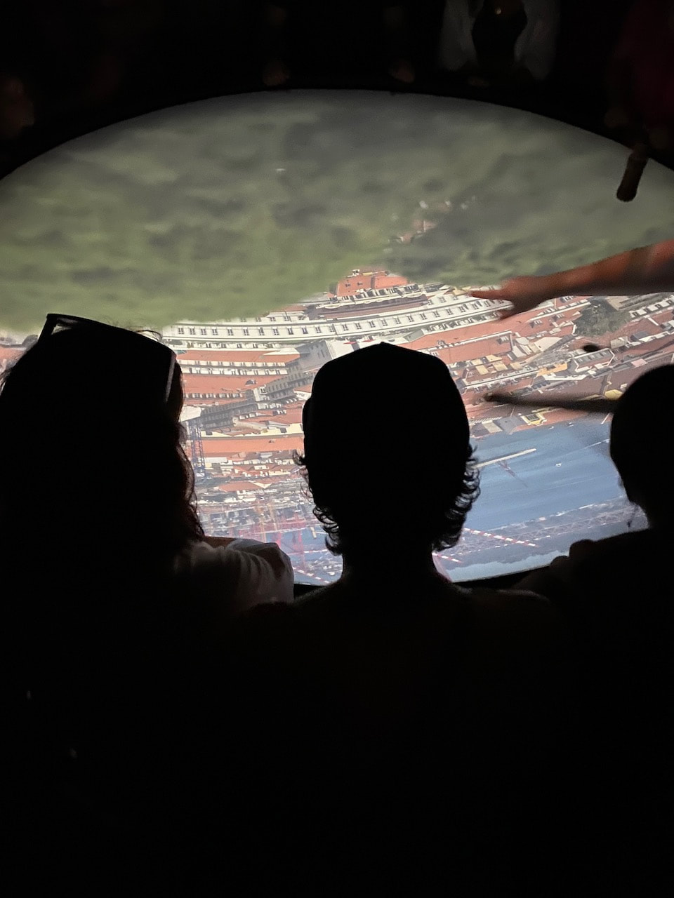
- The Camera Obscura in Castelo São George
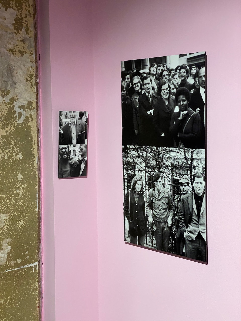
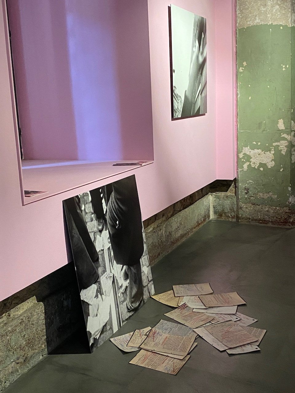
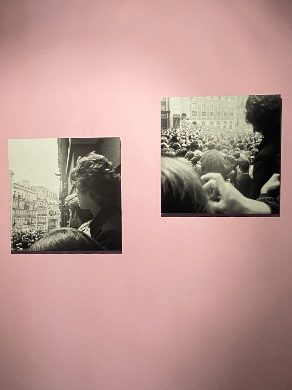
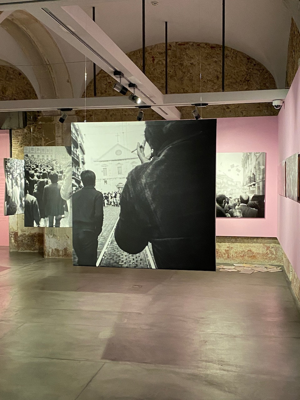
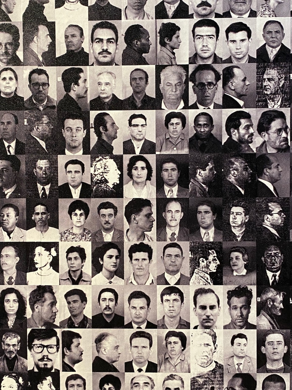
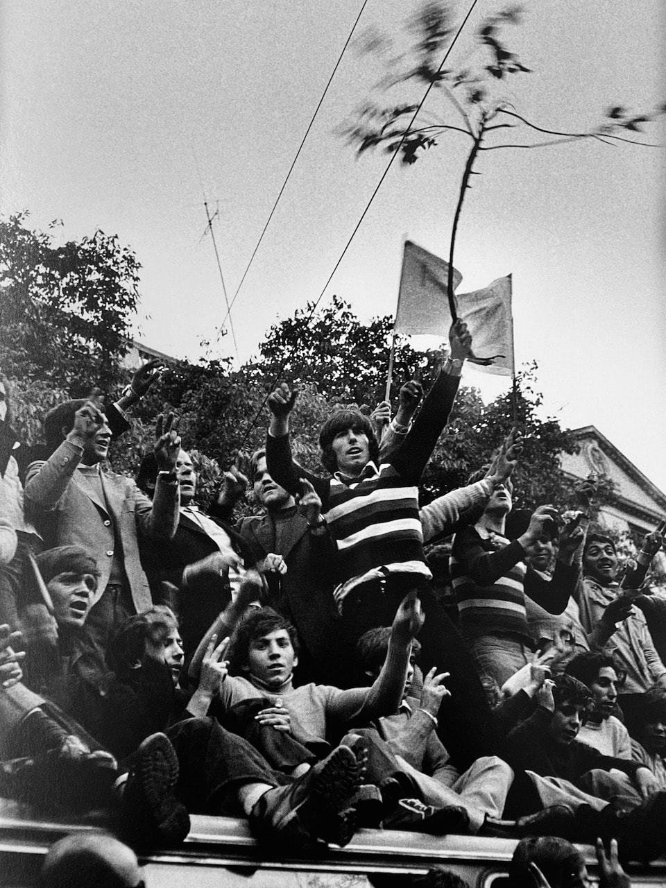
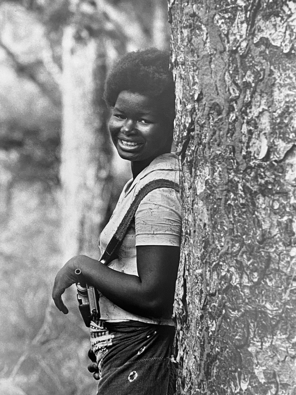
- The work of Ana Hatherly and Uliano Lucas at the Museo do Aljube - Resistência e Liberdade
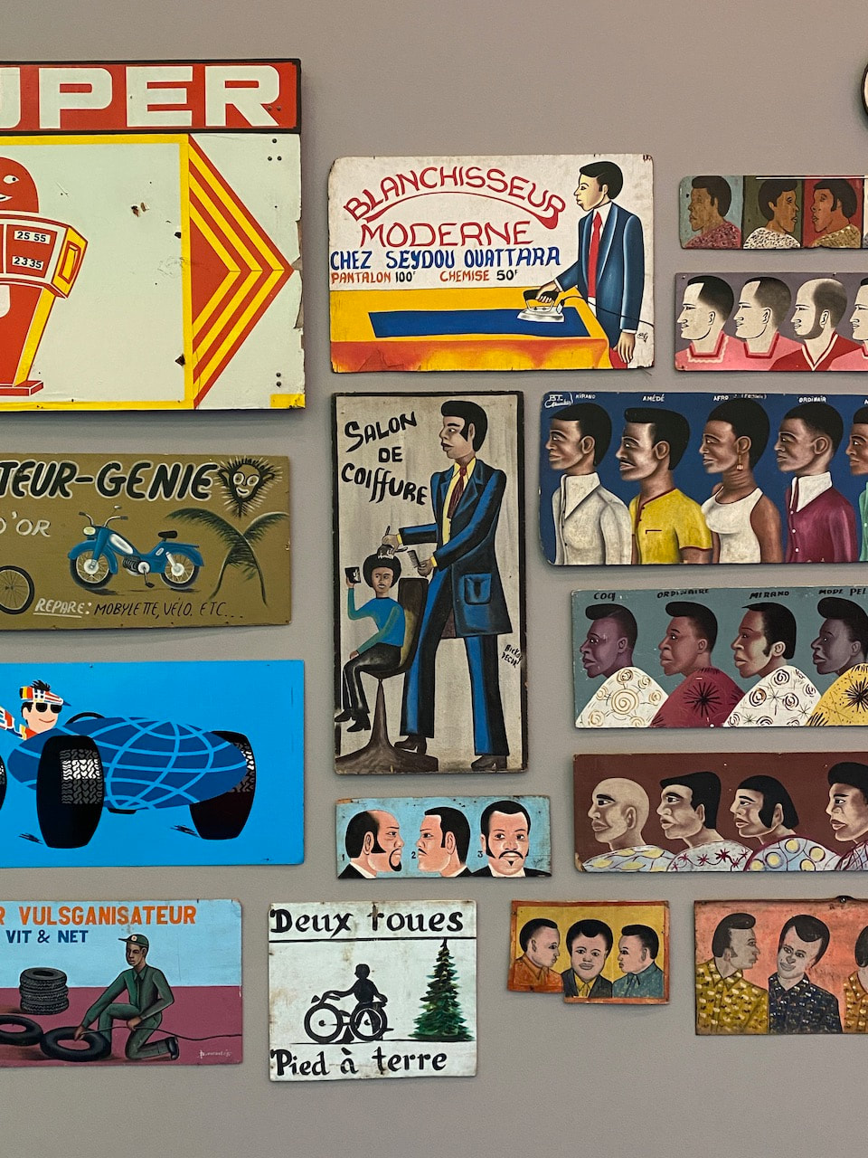
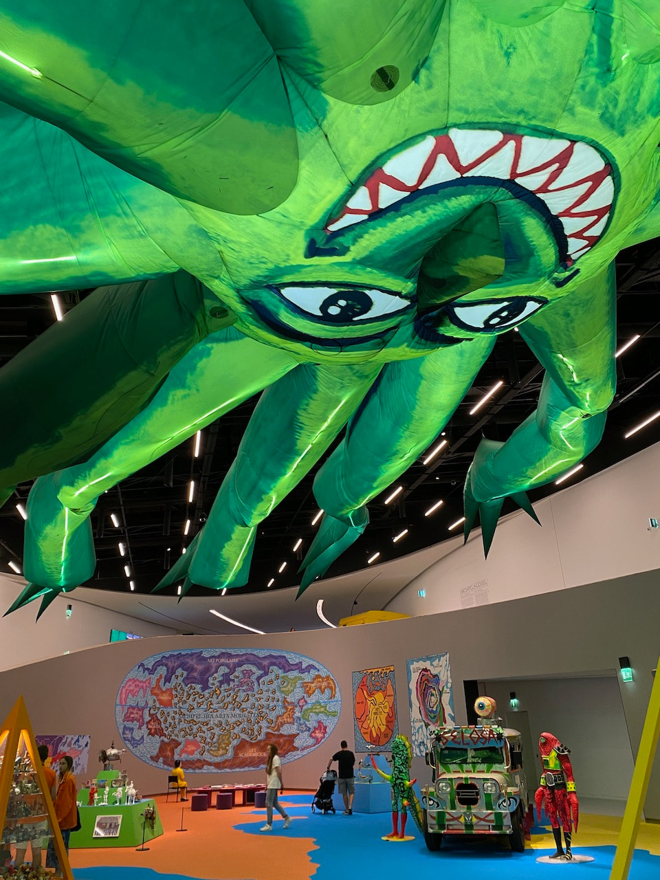
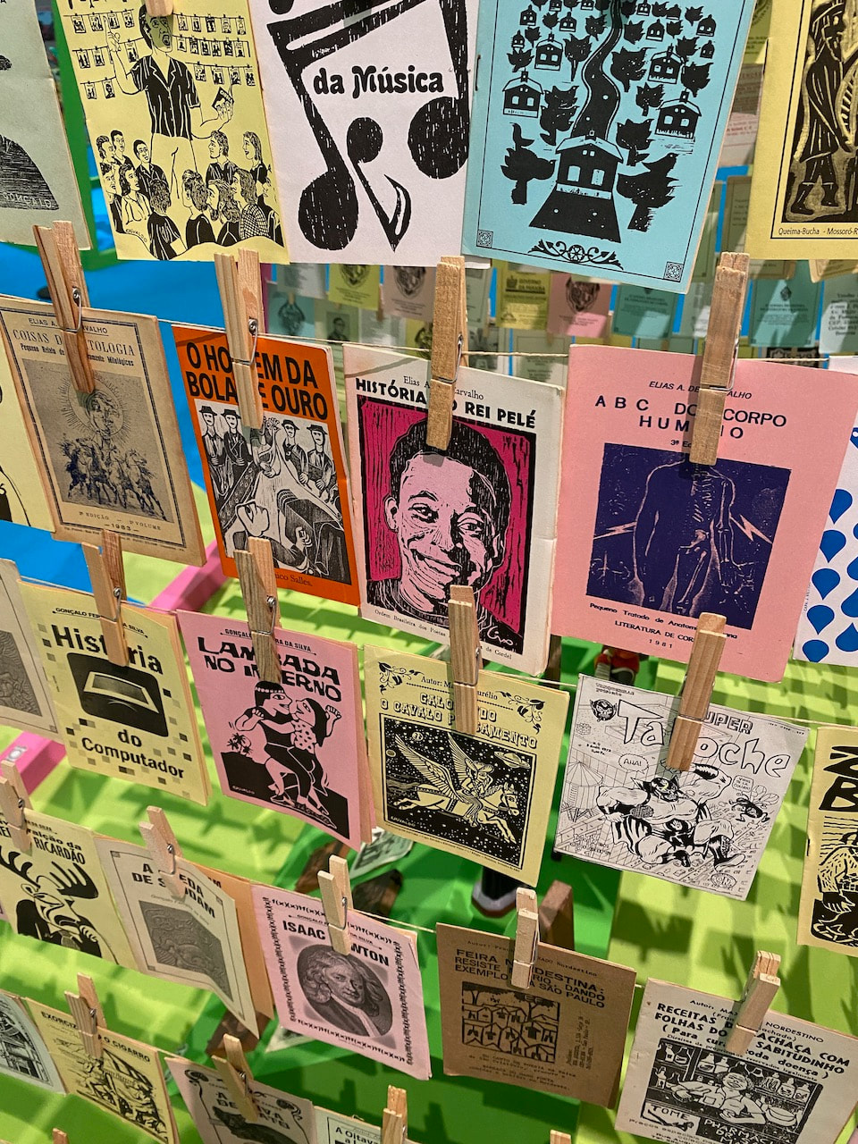
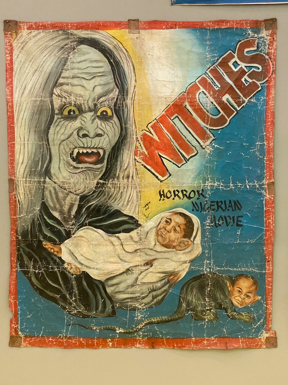
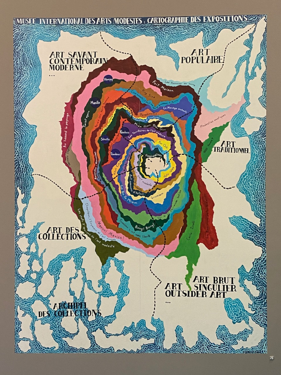
- Work by Luisa Cunha, Sandra Rocha and Ana Cardosa at MAAT - the Museum of Art, Architecture and Technology, plus an exhibition of popular arts from the Musée International des Arts Modestes (MIAM)
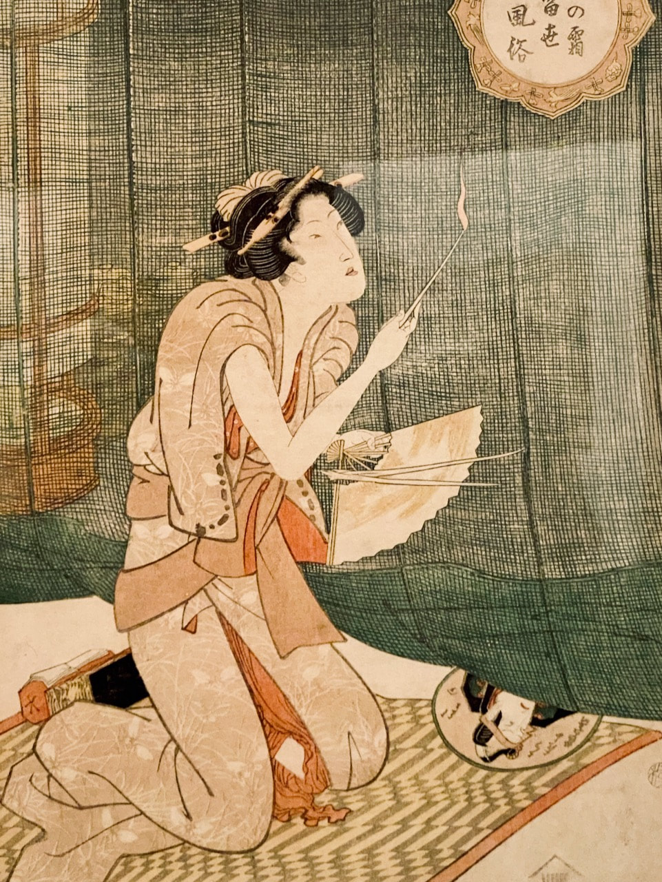
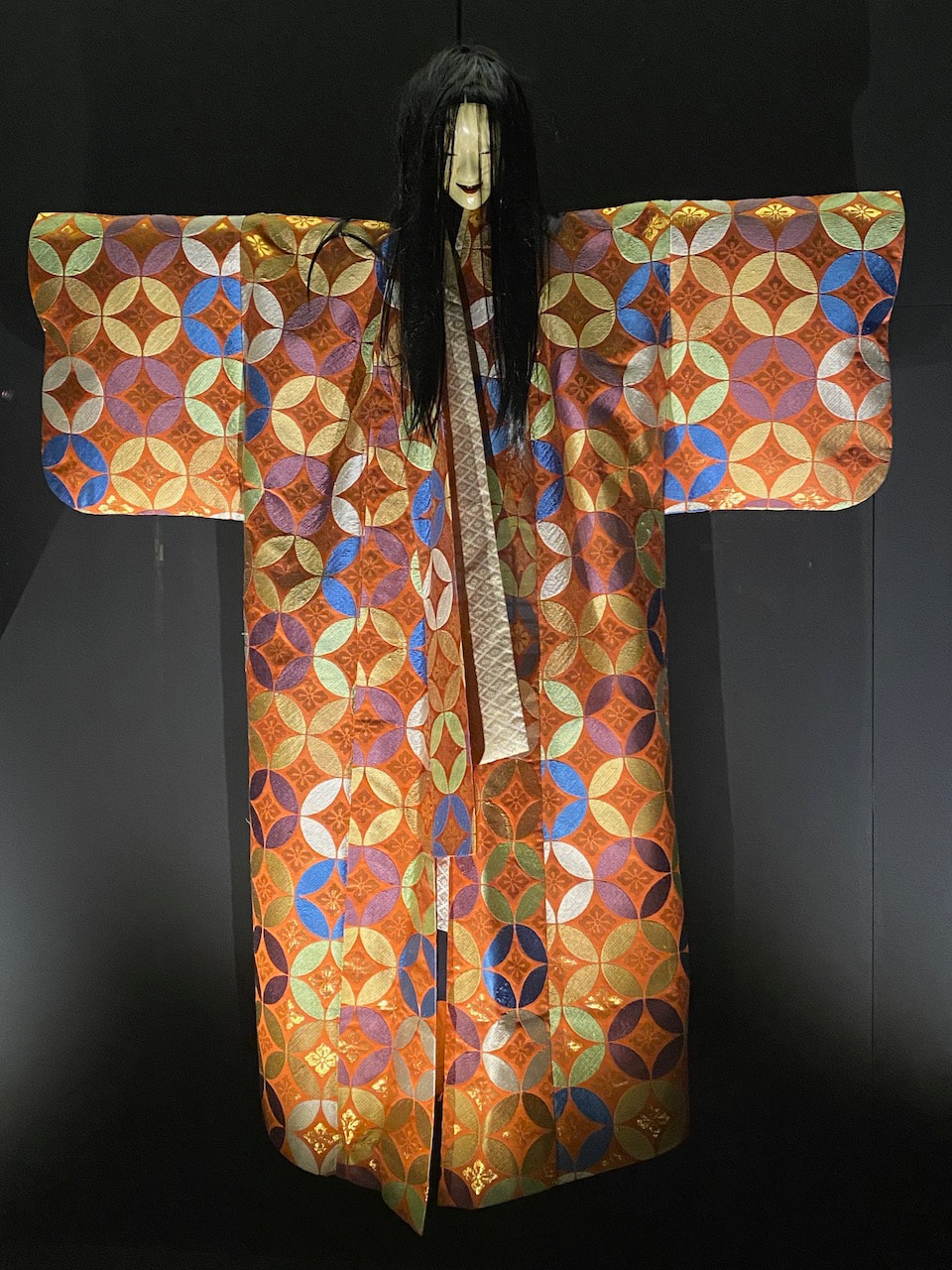
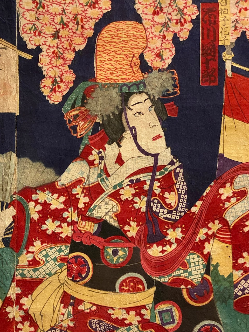
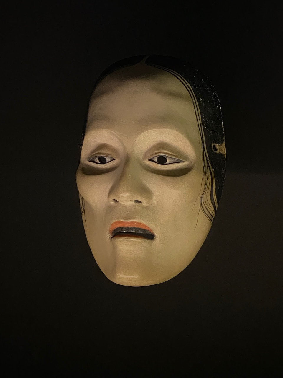
- An exhibition about Japanese festivals at the Fundação Oriente
- Work by Critstina Ataíde, Jorge Barradas and contemporary Moroccan artists at the Museo Nacional de Contemporânea do Chiado
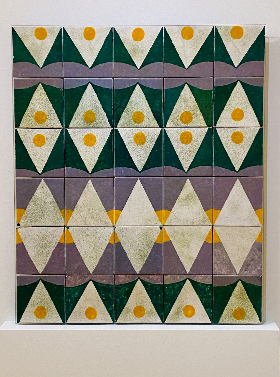
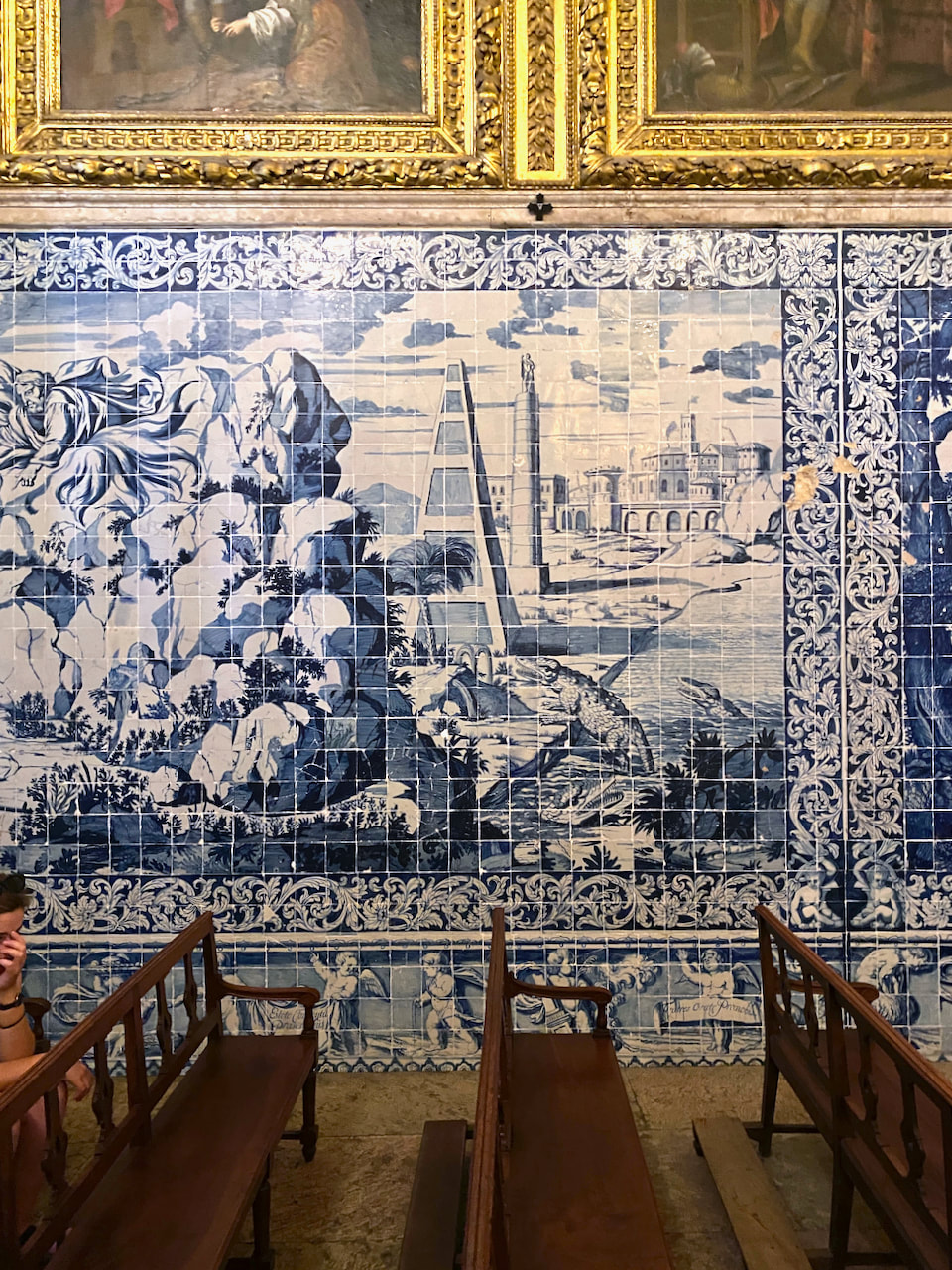
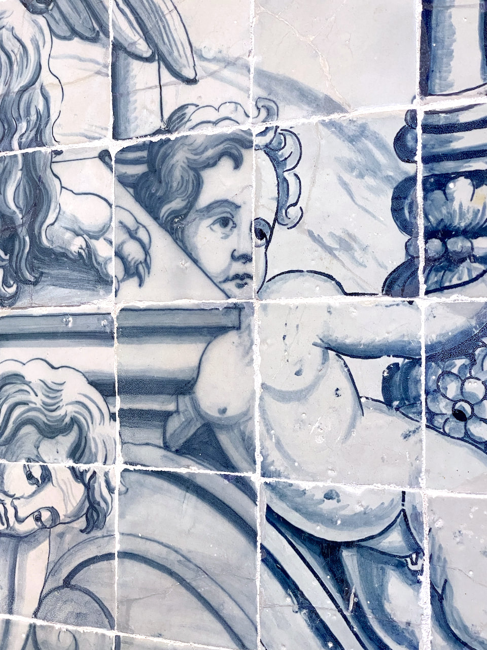
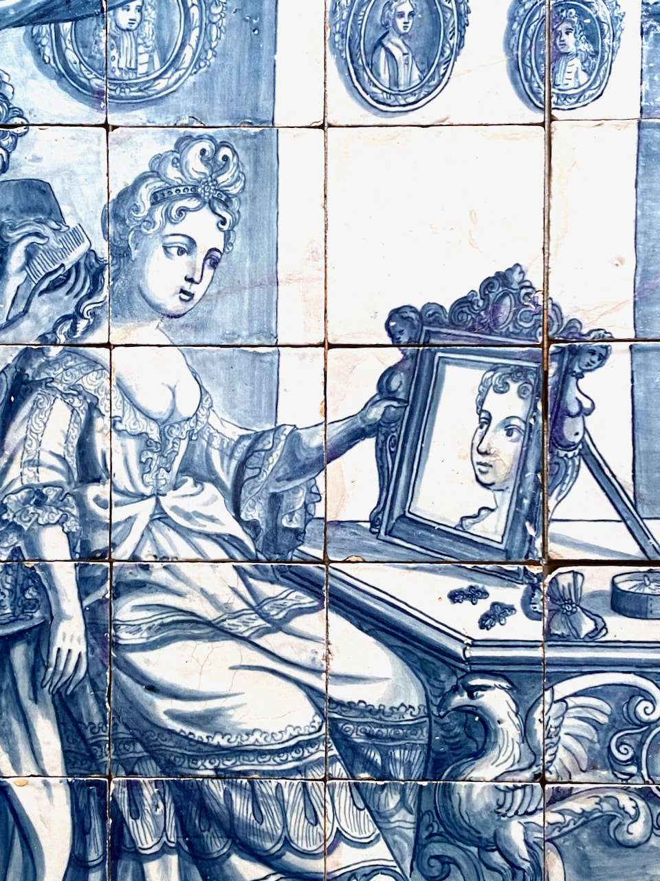
- The Museo Nacional do Azulejo

Some other summer holiday gallery visits:
|
|
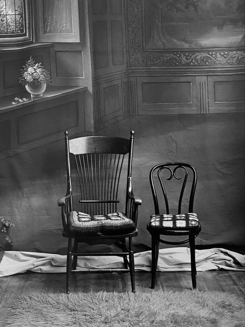
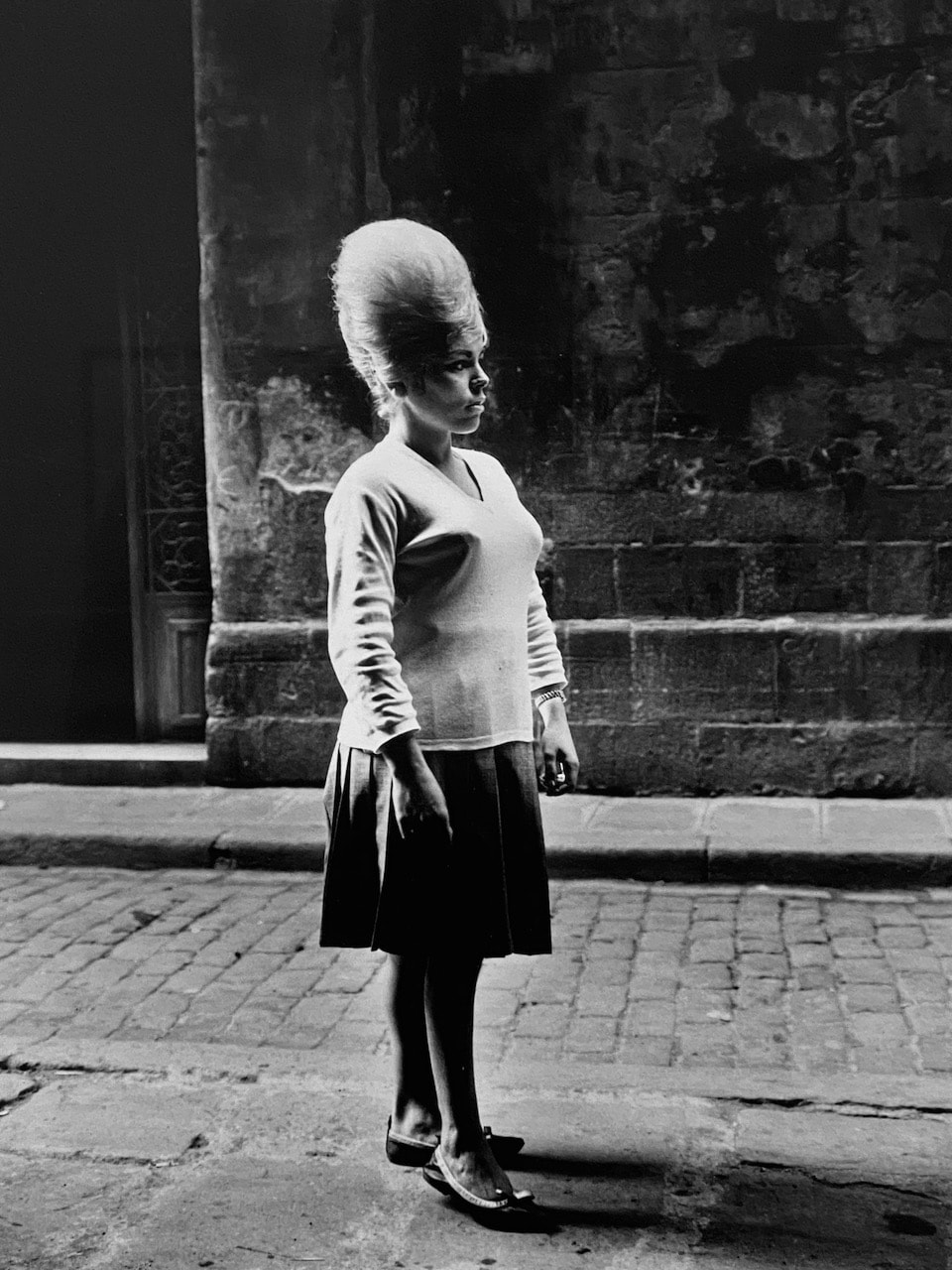
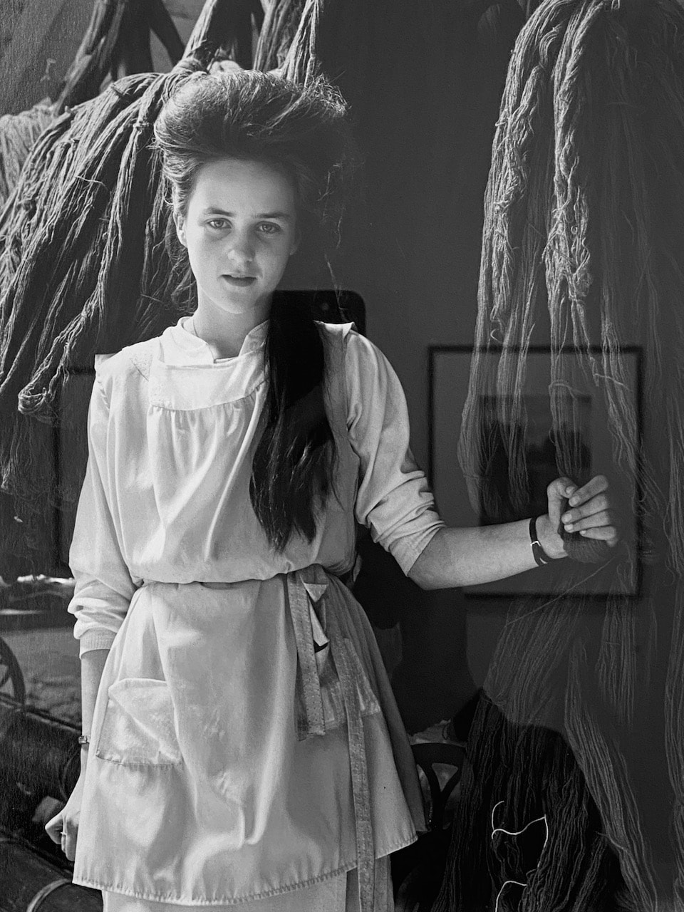
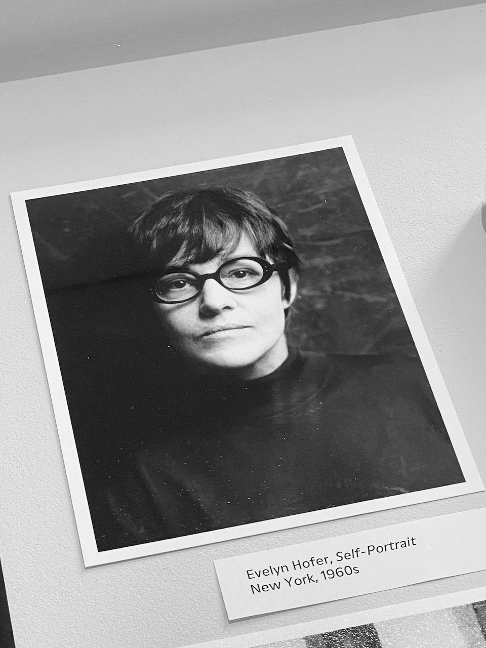
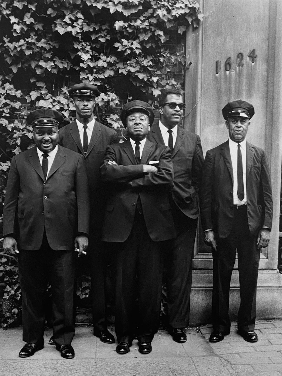
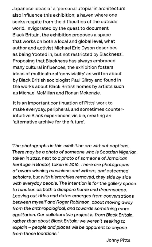
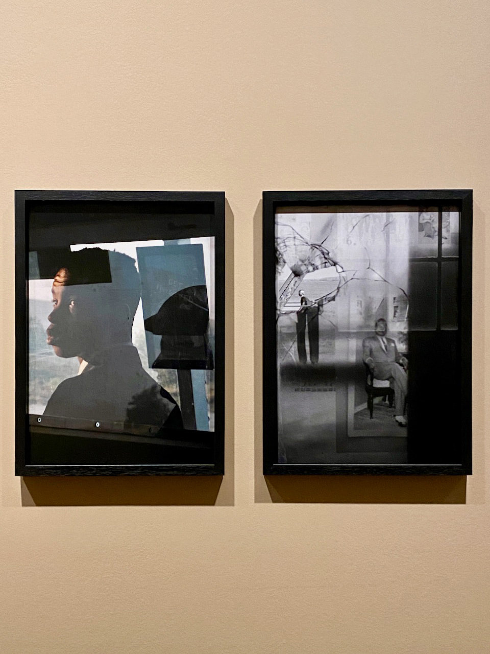
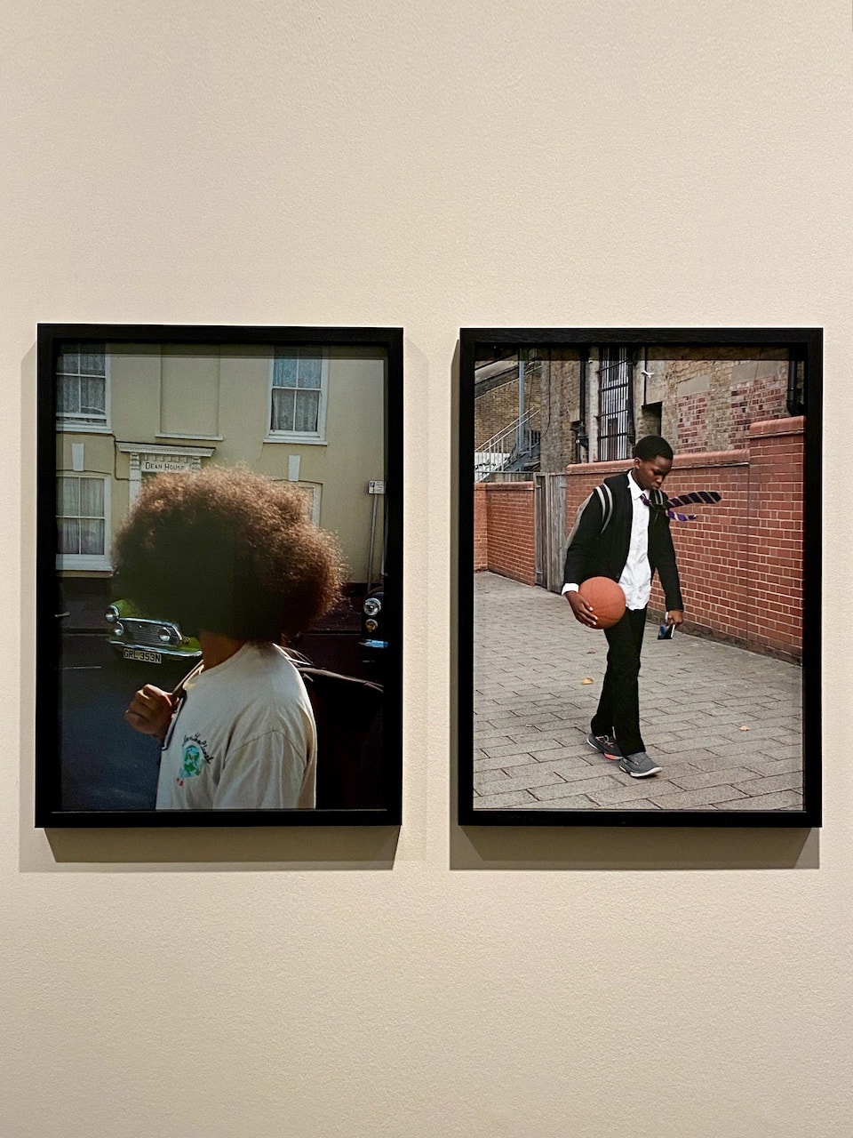
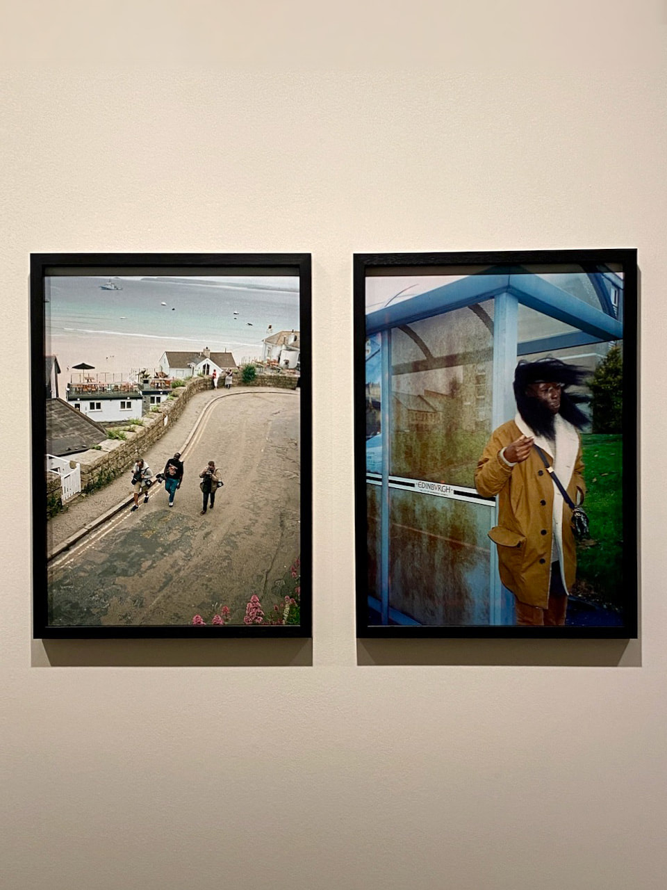
Exhibitions by Evelyn Hofer and Johnny Pitts
I enjoyed both these shows for different reasons. Evelyn Hofer's mostly large format photographs are incredibly poised, carefully posed and elegant visions of various subjects. I found myself creating imaginary diptychs from the pictures on display or zooming into details. I was impressed by her empathy and brilliant use of light. She managed to invest even the most humble subjects with great power and dignity. Johnny Pitts (with Roger Robinson) presents a vision of black Britain that celebrates multicultural 'conviviality' and an expanded sense of home. I was particularly drawn to the arrangement of several images in pairs and the reference to subjects presented 'side by side'. There is a pleasing sense of informality in the work which makes the show very welcoming, despite the low key, ambient lighting in many of the pictures.
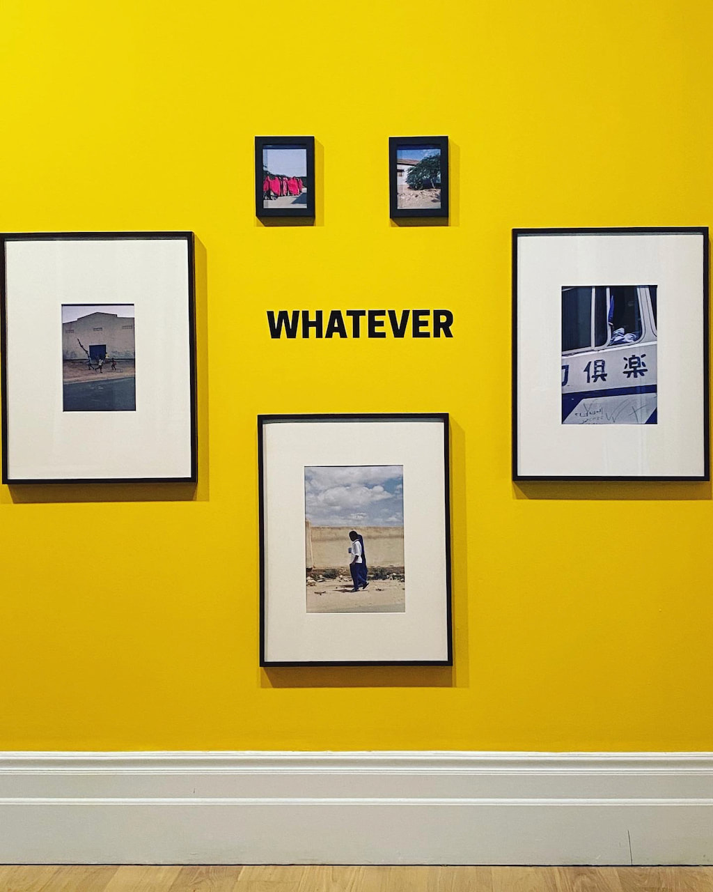
I briefly visited the Whitechapel Gallery exhibition, paying particular attention to the photographs and films on display. As the website describes, "Life Is More Important Than Art explores the intersection of art and everyday life and the role of the contemporary art institution at a time of uncertainty and change. The title of the season takes inspiration from African-American writer and novelist James Baldwin, who proposed that life is more important than art … and yet that is why art is important. At a time when the cost-of-living crisis is causing severe financial hardship and the after-effects of the pandemic are still being felt, we consider the role of art and the art institution in everyday life. What importance can we attach to art alongside more pressing concerns? The exhibition maps dynamic histories of migration and difference, with a focus on London and the East End. Life Is More Important Than Art points to the critical role that art can play in both reflecting lived experience and opening up new possibilities for thinking, feeling and dreaming." I also visited the Somali Museum UK exhibition. "Presenting a selection of film, photography, music and sound media, Somali Museum: Any-Space-Whatever is the first exhibition of the museum."
|
|

|
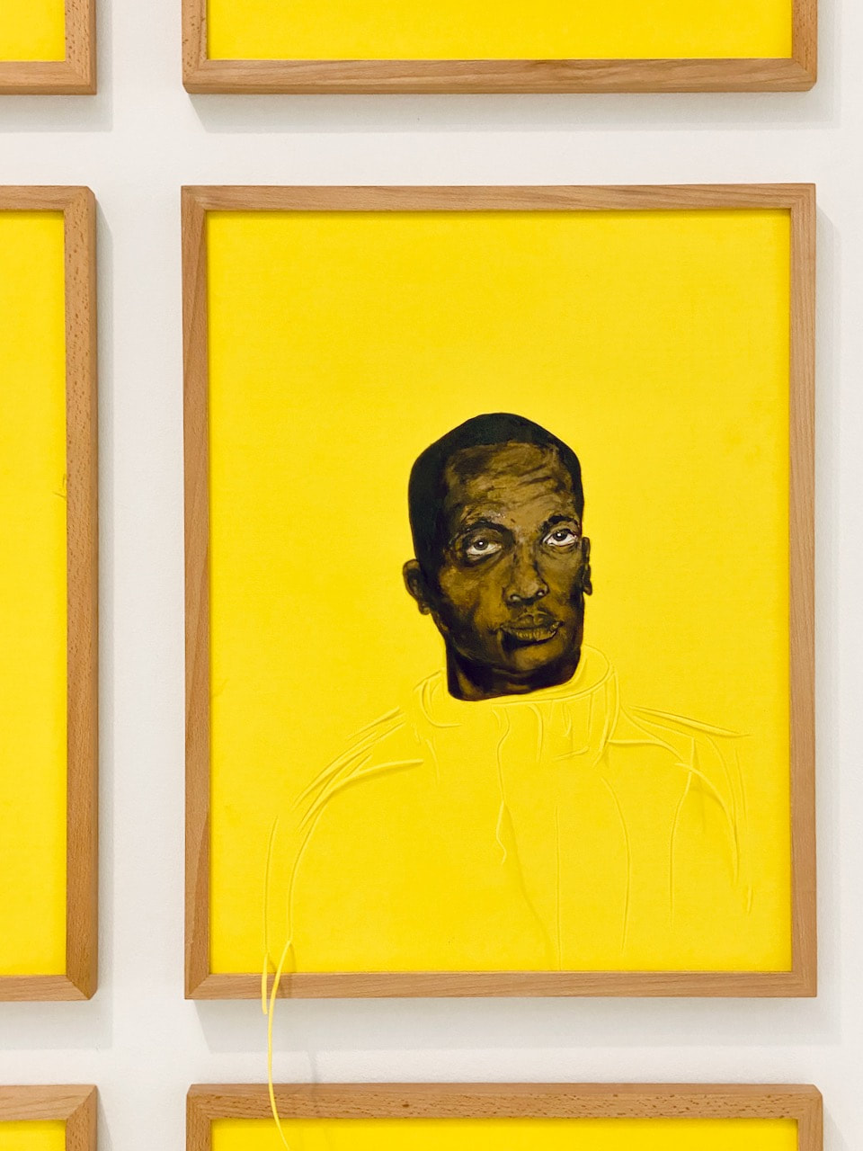
Lagos, Peckham, Repeat: Pilgrimage to the Lakes and Anselm Kiefer: Finnegans Wake
I enjoyed the show at the South London Gallery which included lots of still and moving image work about the experience of Londoners with Nigerian ancestry. Peckham has one of the largest Nigerian populations in London. I was particularly drawn to the two films on display in the Fire Station, especially one about a film archive in Lagos. Lots of the small, commercially printed photographs were displayed in cheap, off-the-shelf, domestic quality frames - the sort of thing you might see in anyone's living room. Other images in the Lagos show received the contemporary art treatment - presented as high quality framed prints, as wall-sized or in perspex vitrines.
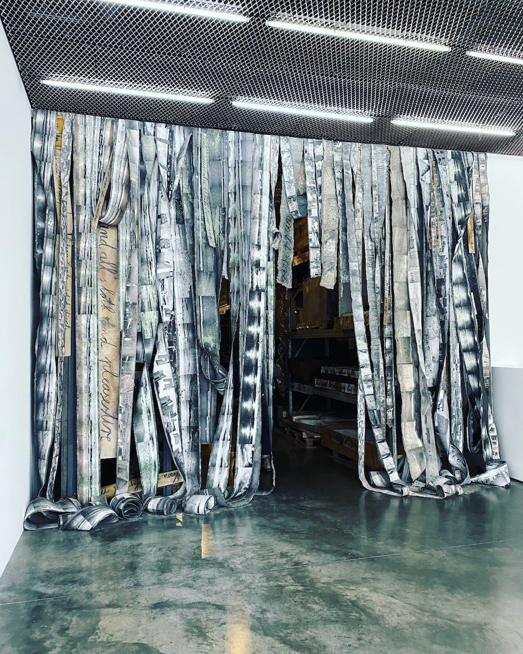
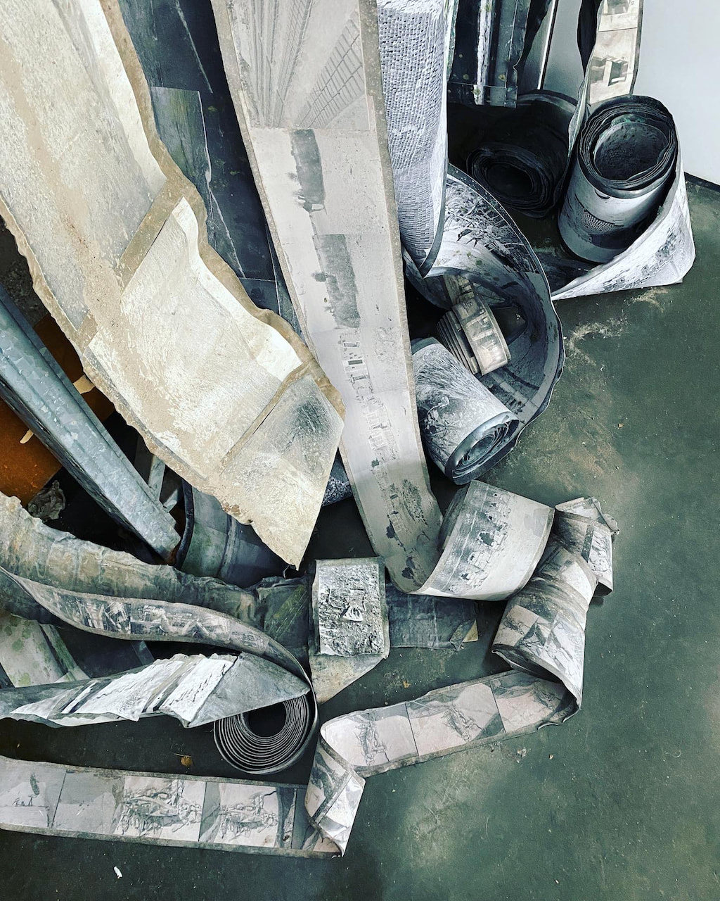
I found the Anselm Kiefer show at The White Cube a bit overwhelming, theatrical and bombastic. I don't know anyone, including me, who has ever read James Joyce's novel Finnegans Wake so I'm not sure if any visitors to the show would really understand the connection between the work and the book. There were some photographs buried amongst lots of other industrial materials. They seemed to provide brief glimpses of humanity in what appeared to be a kind of post-apocalyptic (post-human?) assemblage. I particularly admired the curtain of photographs attached to long, curling strips of metal that formed the entrance (and exit) to the installation. Both shows presented photographs in unusual ways (damaged negatives on a light box, printed on acetate and hanging from the ceiling and attached to strips of metal) and it was interesting to be reminded that photographs are flexible, democratic and indeterminate cultural objects.
I found the Anselm Kiefer show at The White Cube a bit overwhelming, theatrical and bombastic. I don't know anyone, including me, who has ever read James Joyce's novel Finnegans Wake so I'm not sure if any visitors to the show would really understand the connection between the work and the book. There were some photographs buried amongst lots of other industrial materials. They seemed to provide brief glimpses of humanity in what appeared to be a kind of post-apocalyptic (post-human?) assemblage. I particularly admired the curtain of photographs attached to long, curling strips of metal that formed the entrance (and exit) to the installation. Both shows presented photographs in unusual ways (damaged negatives on a light box, printed on acetate and hanging from the ceiling and attached to strips of metal) and it was interesting to be reminded that photographs are flexible, democratic and indeterminate cultural objects.
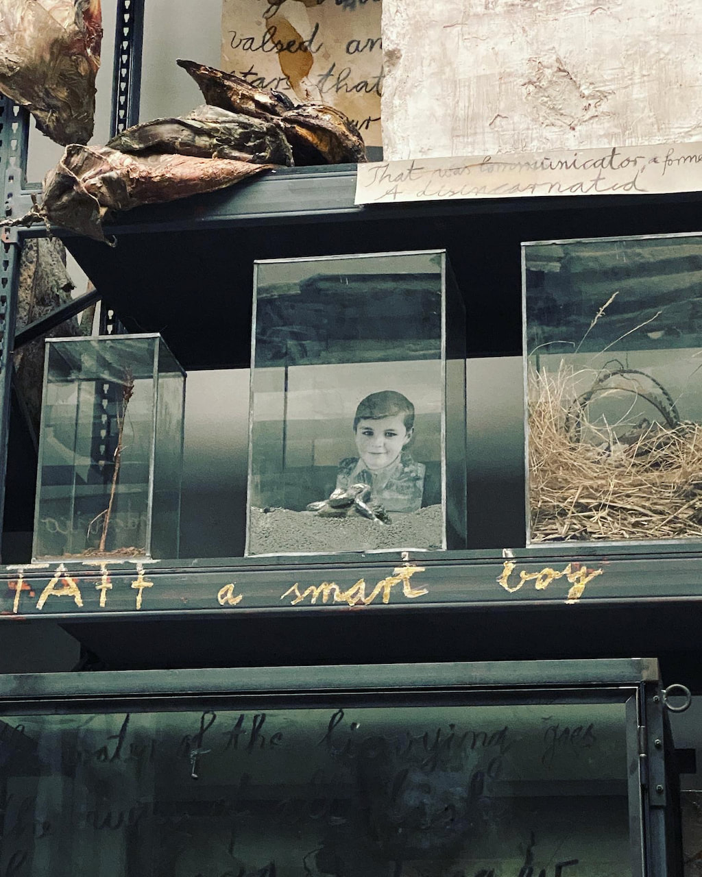
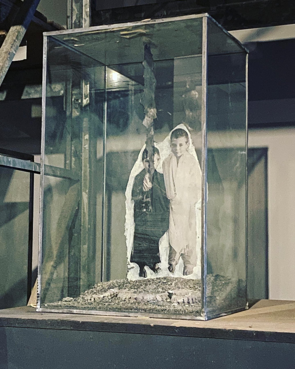

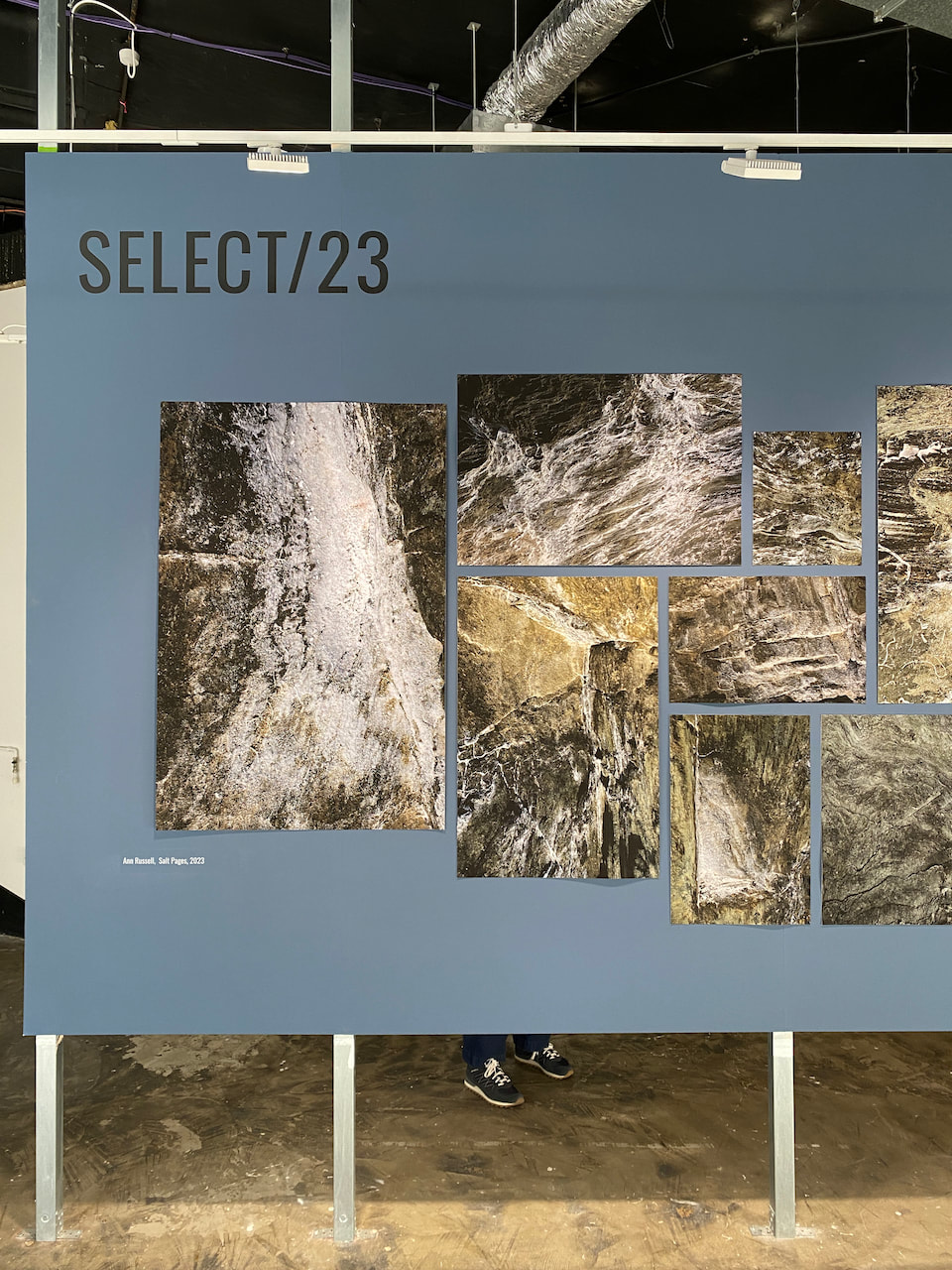
This group exhibition features the work of five artists – Paul Graville, Viktorija Pociute Kunigelyte, Ryan Prince, Ann Russell and Angus Stewart – who were selected from the artists exhibiting in Photofusion’s Salon/23 to present their projects more fully.
While neither Salon or Select feature any particular theme, the work of these five artists is, coincidentally, thematically entangled. Family histories, the home as a political space, and the familiar (from the Latin familia, meaning family and household servants) are woven throughout much of this work. Many of the stories are difficult, but home is both a story of complexity and of simplicity.
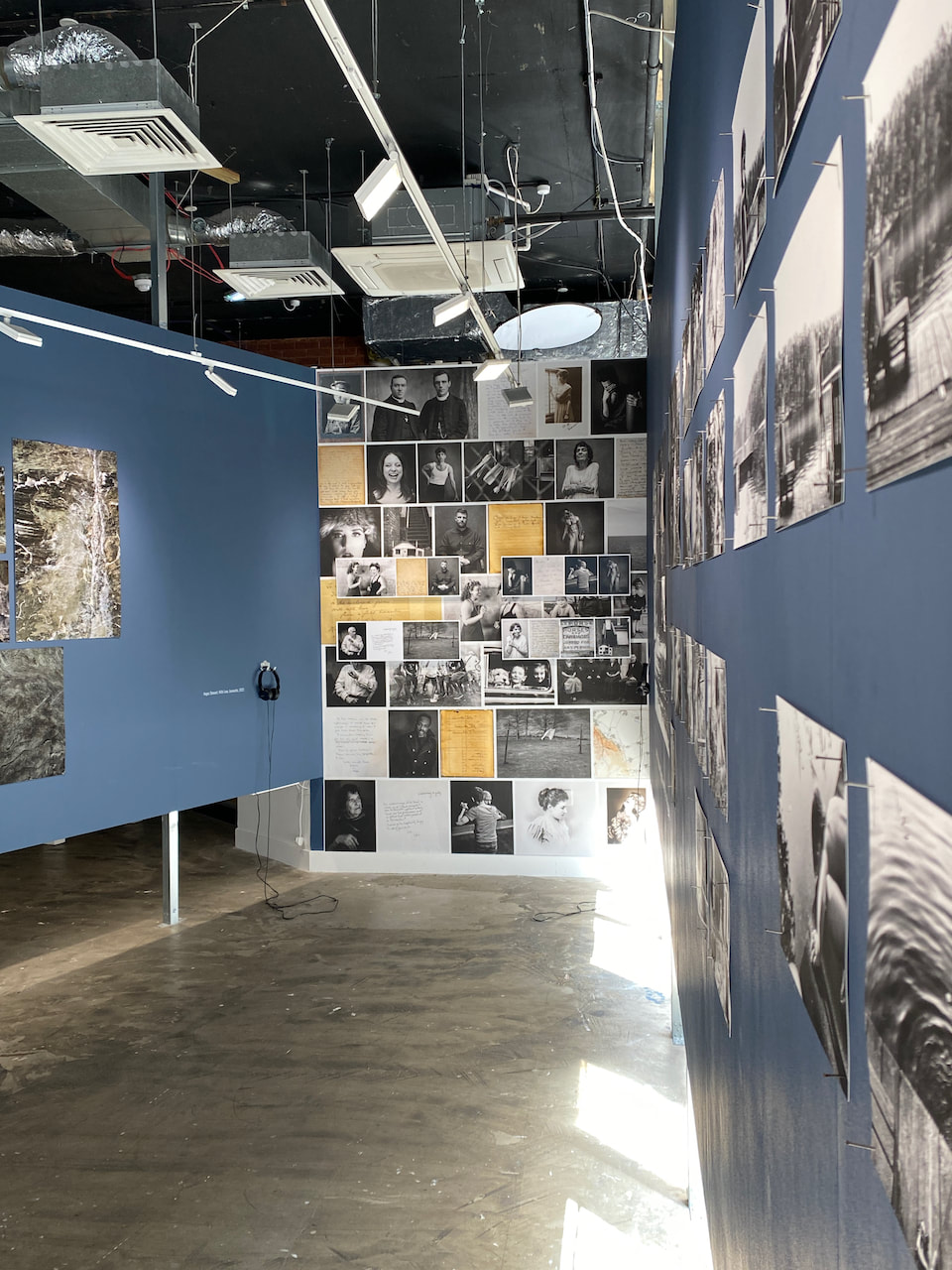
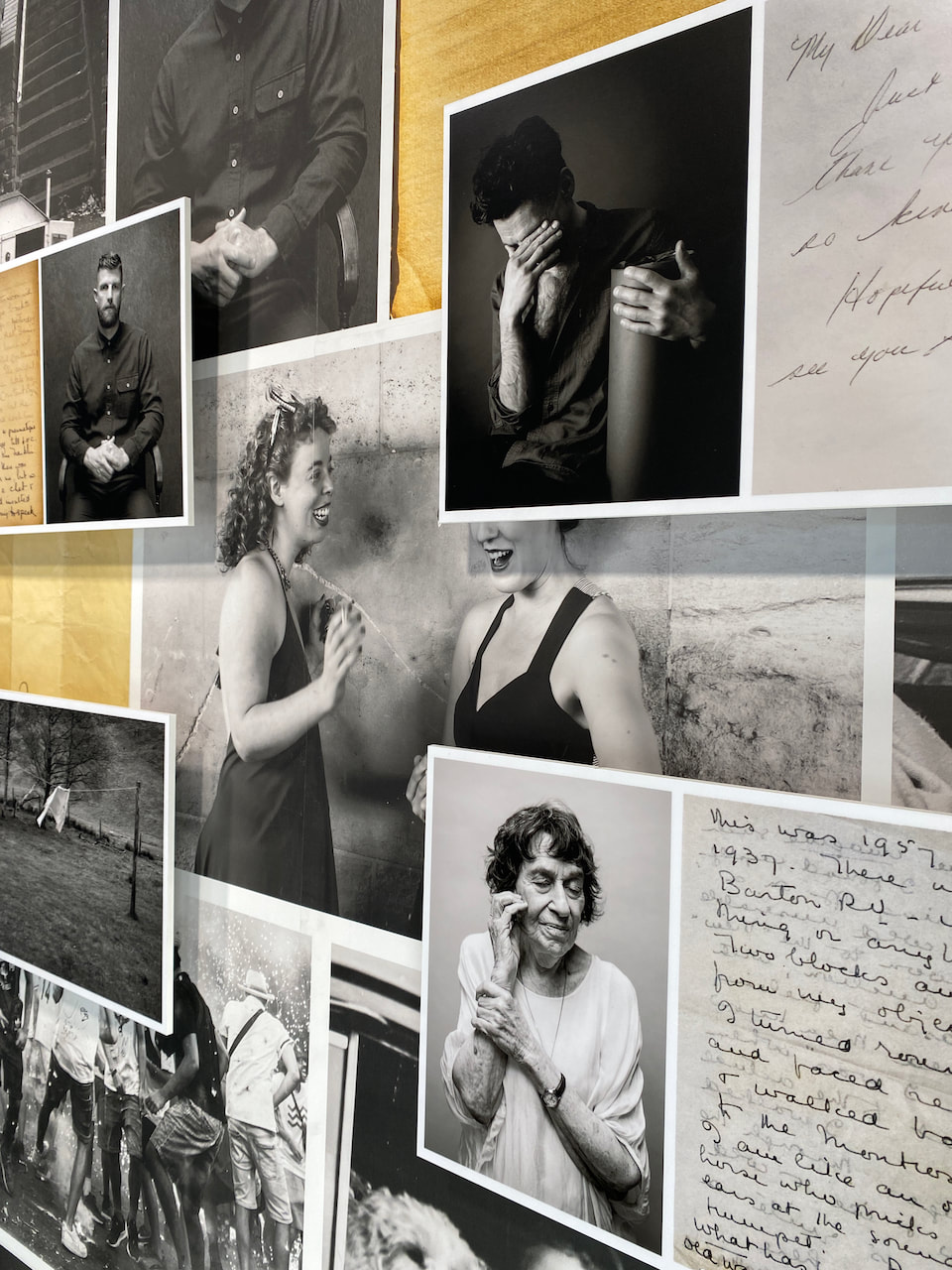
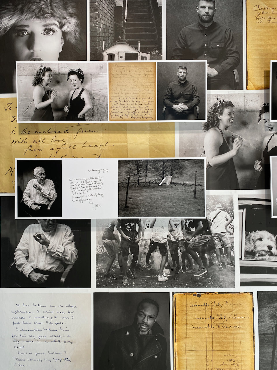
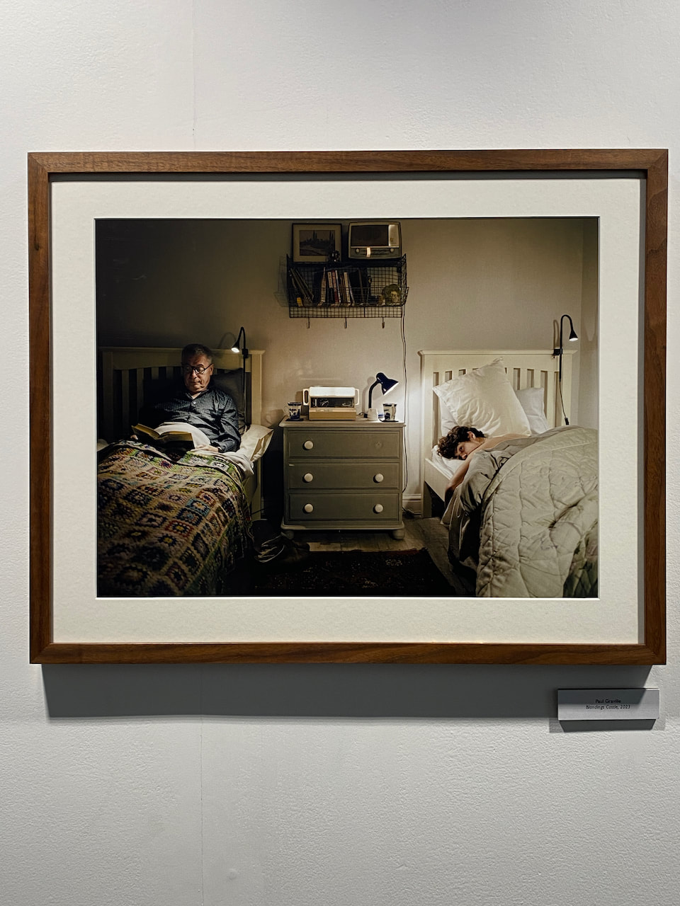
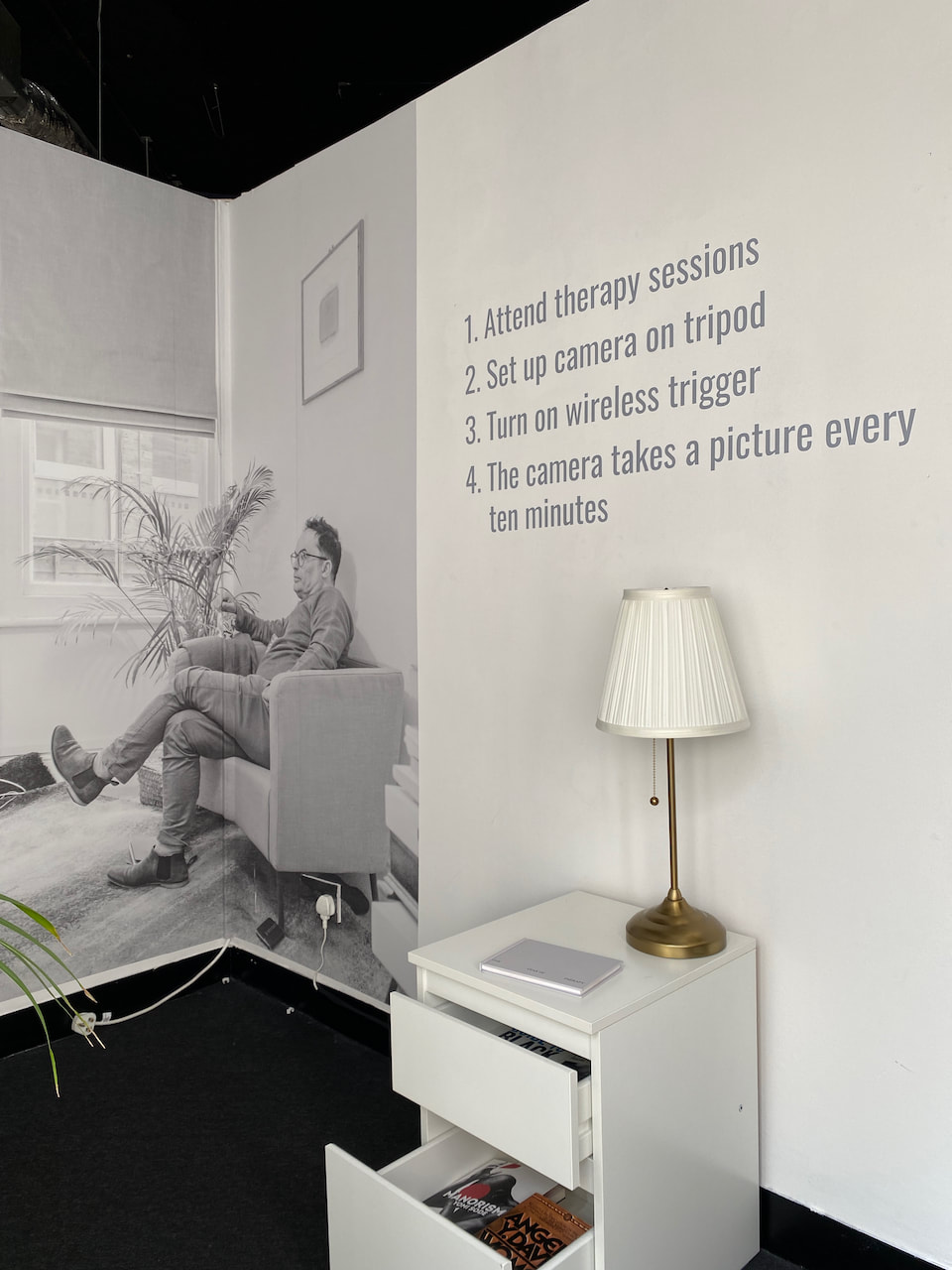
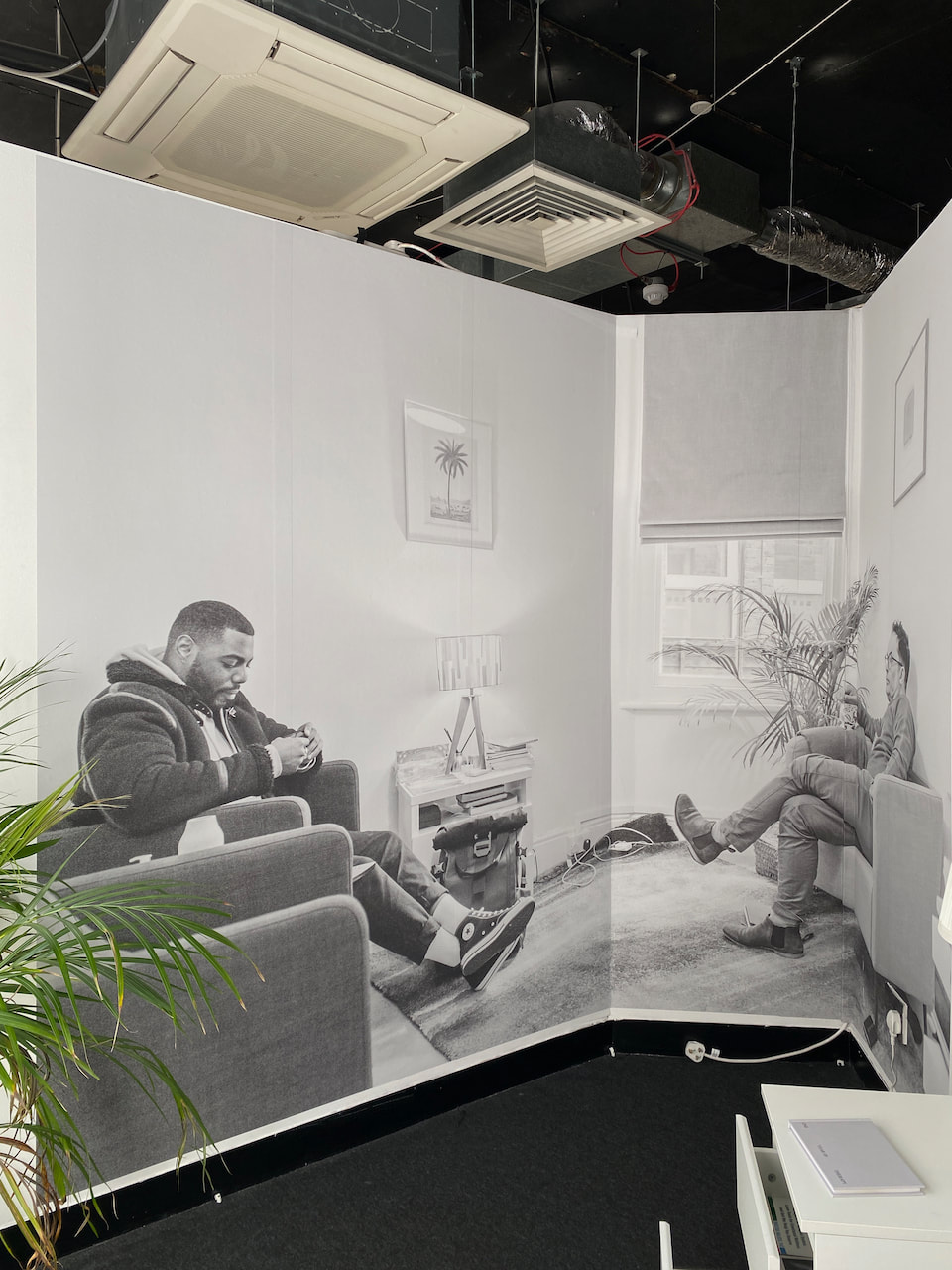
I enjoyed the curation of this exhibition. Photofusion gallery is a tight space but this has been used to good advantage. Each artist's work is given sufficient breathing room and yet appears to sit well with the others. I particularly enjoyed Ryan Prince's One Year of Therapy which employs the following construct: "1. Attend therapy sessions, 2. Set up camera on tripod, 3. Turn on wireless trigger, 4. The camera takes a picture every ten minutes." The work is installed in an alcove at the top of some stairs and includes a chair, pot plant, chest of drawers (with document contents), a lamp, a large wall-based image from the series, a photobook of the project and wall text, thus creating a mock-up of the counselling room where the images were made. This stage set emphasised the strange combination of intimacy, performance, tension and indeterminacy of the entire project.
|
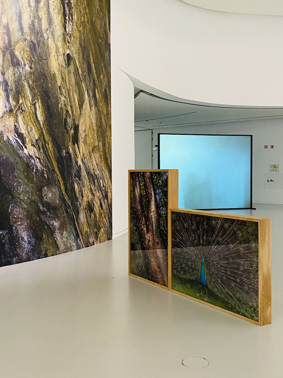
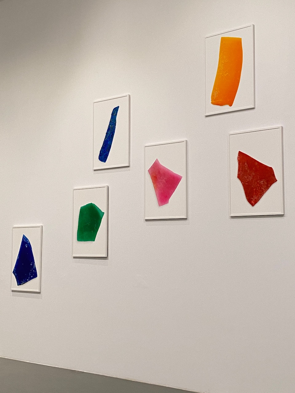
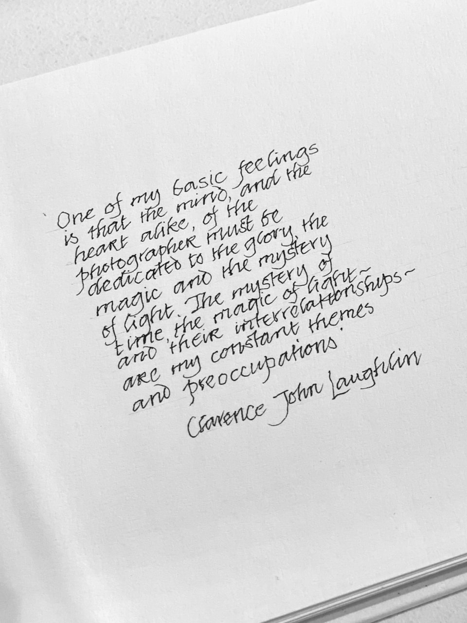
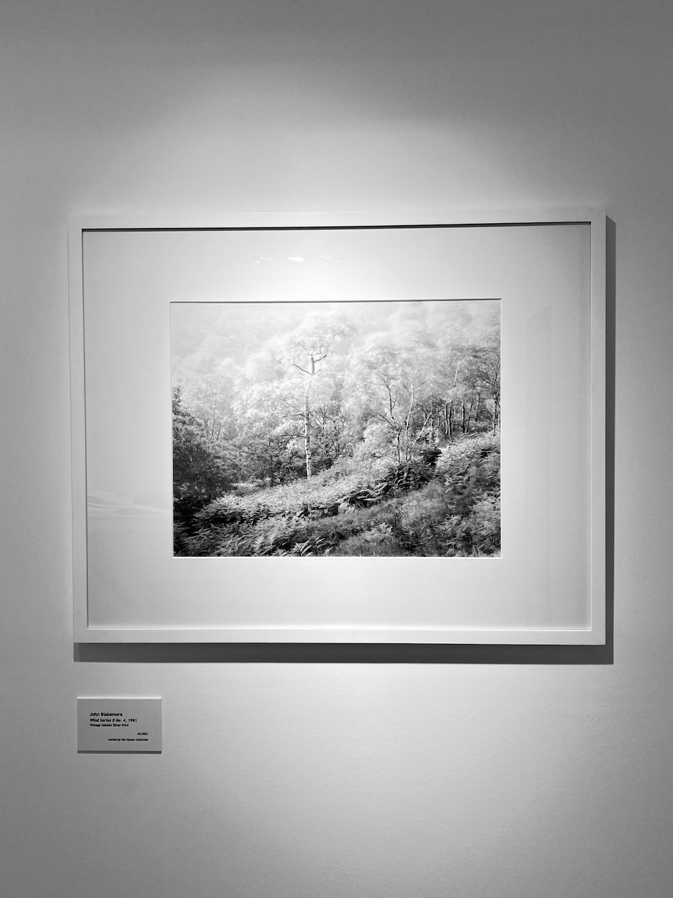
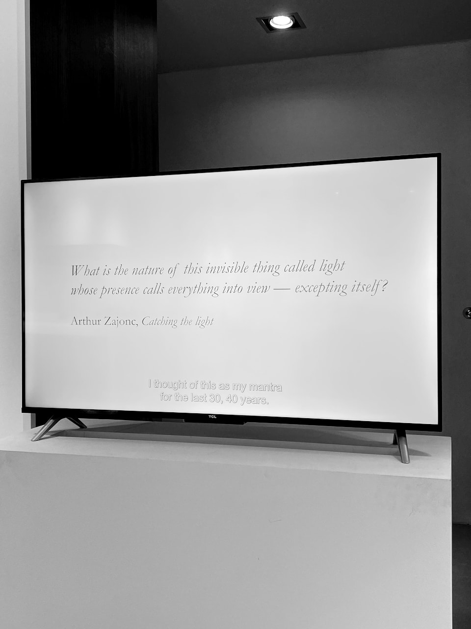
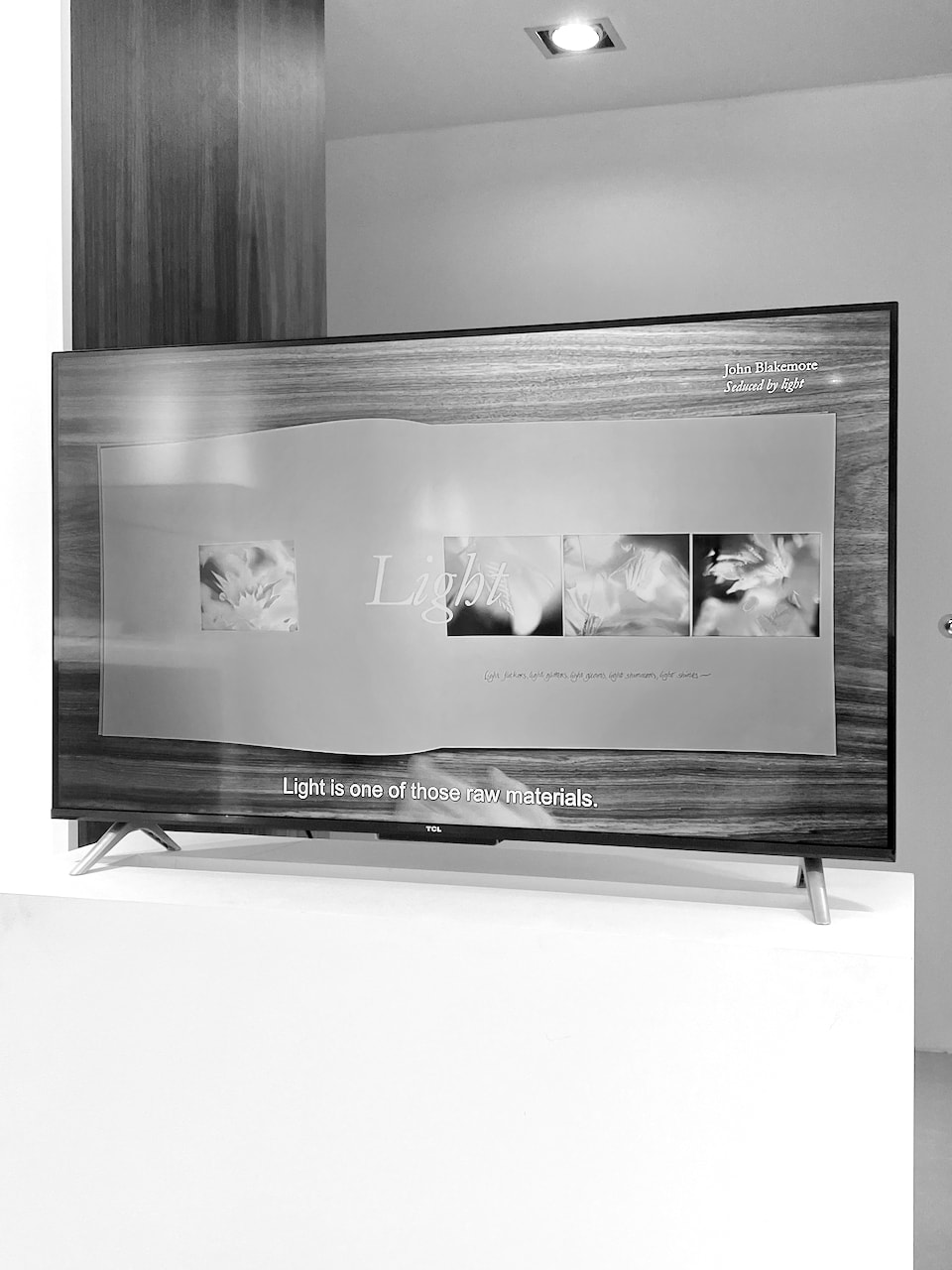
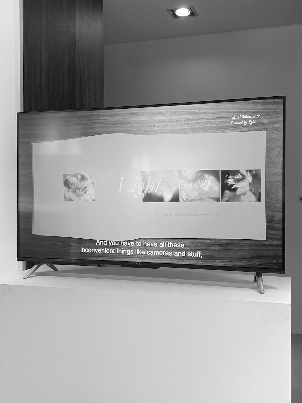
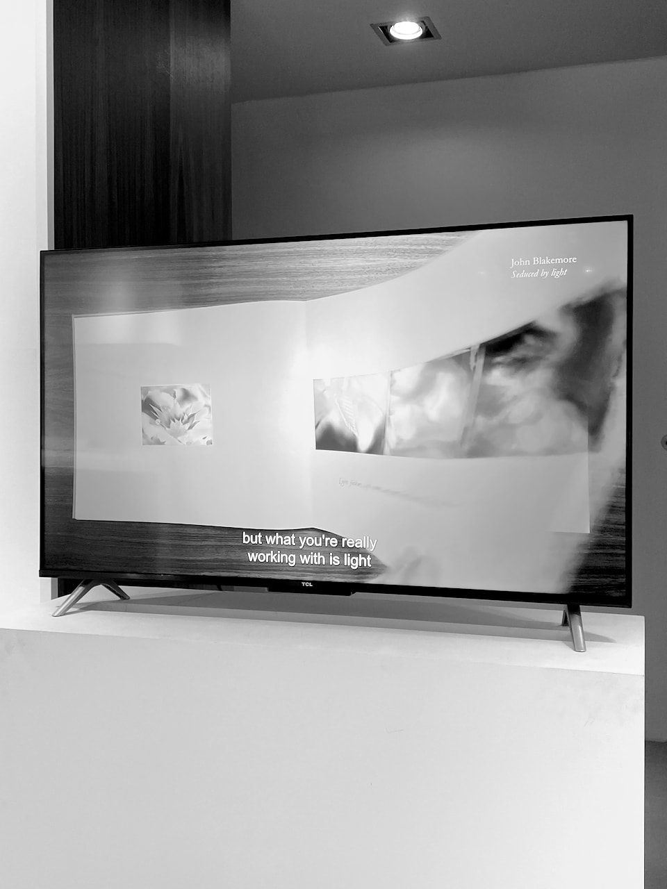
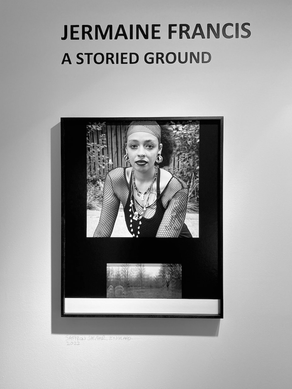
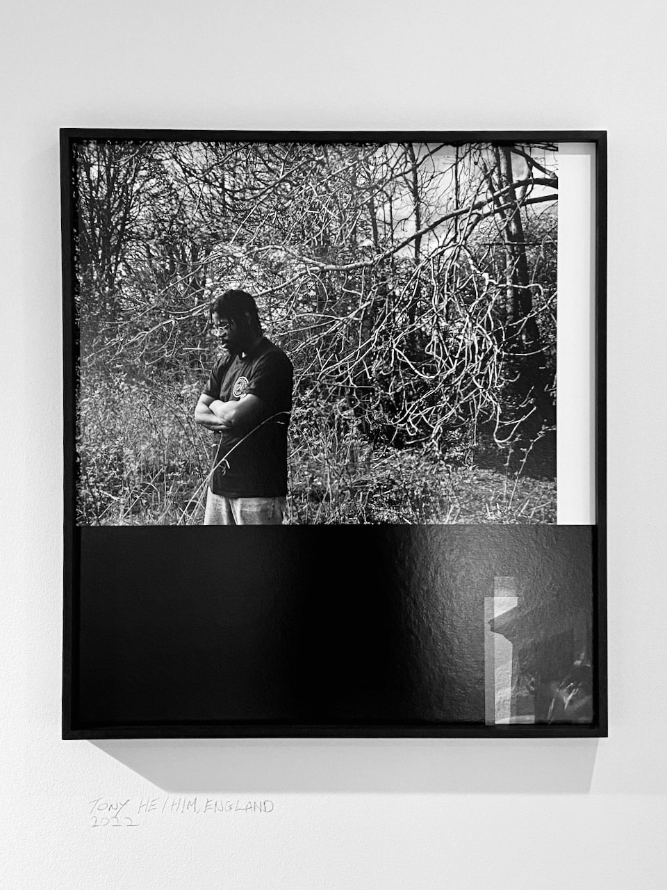
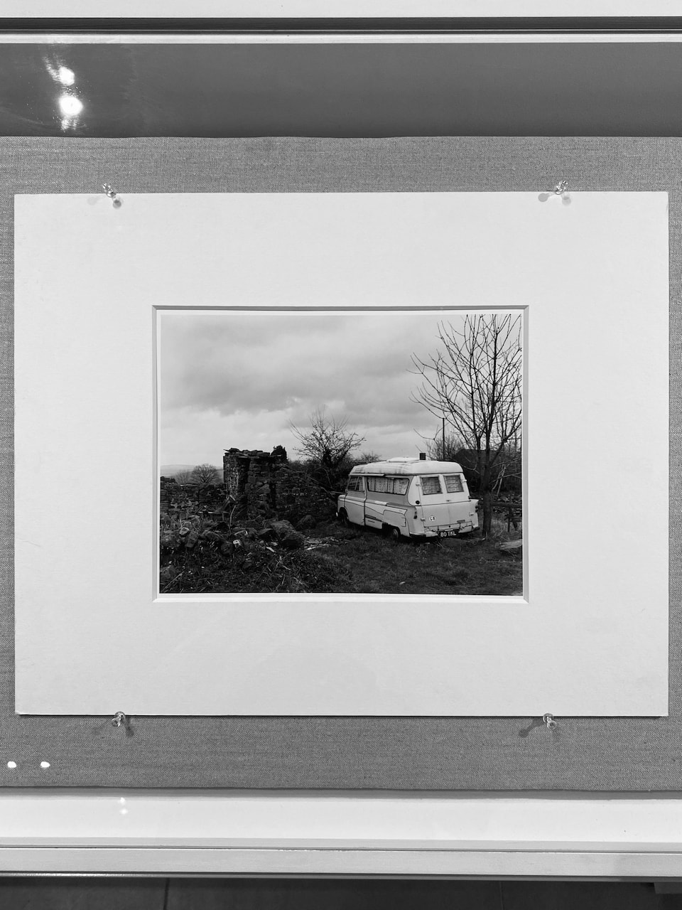
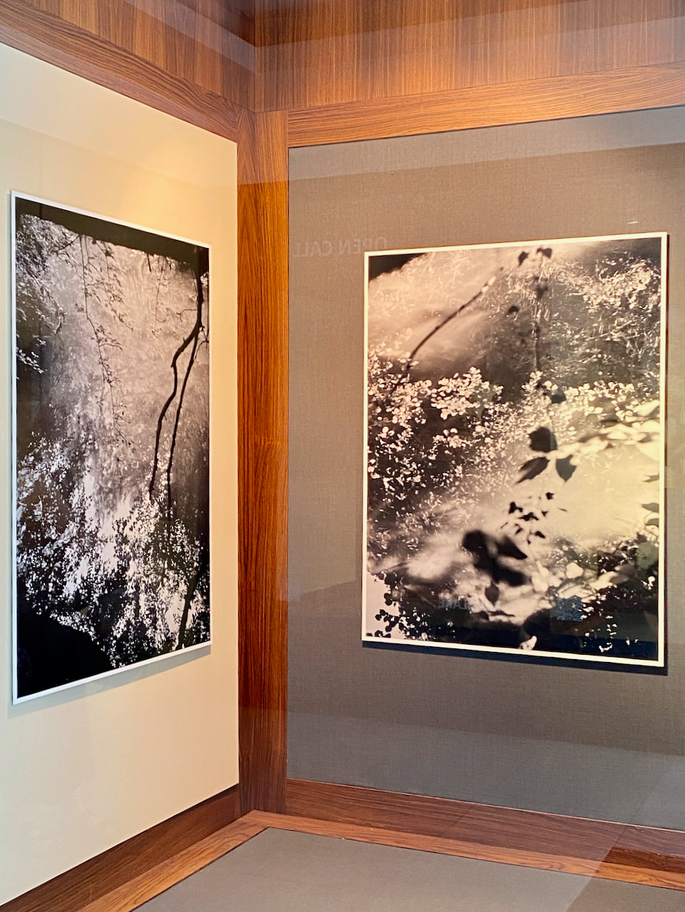
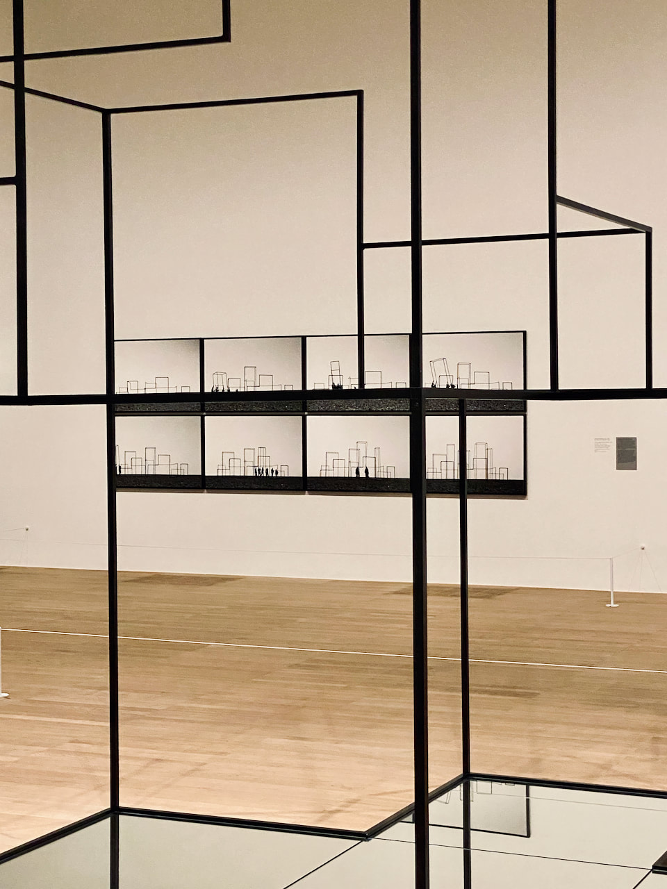
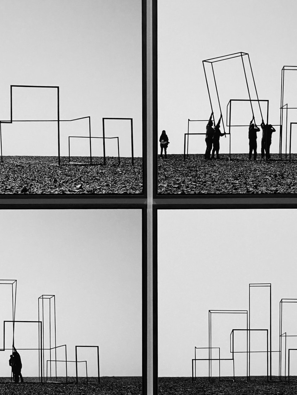
I enjoyed all the exhibits currently on display at the Centre for British Photography. However, I was particularly drawn to the work of John Blakemore. The video interview with him was illuminating and I enjoyed hearing about his struggles with the medium, his decision-making processes and his obsession with tulips! I really admired his dedication to his craft and his interest in making light manifest in his work. The multiple exposure landscapes about the effects of wind were particularly inspiring. I also enjoyed three large photographs by Aaaron Schuman, the work of Jermaine Francis and one of Keith Arnatt's images from the series ANOB (Area of Outstanding Natural Beauty).
What is the nature of this invisible thing called light whose presence calls everything into view - excepting itself? |
|
|
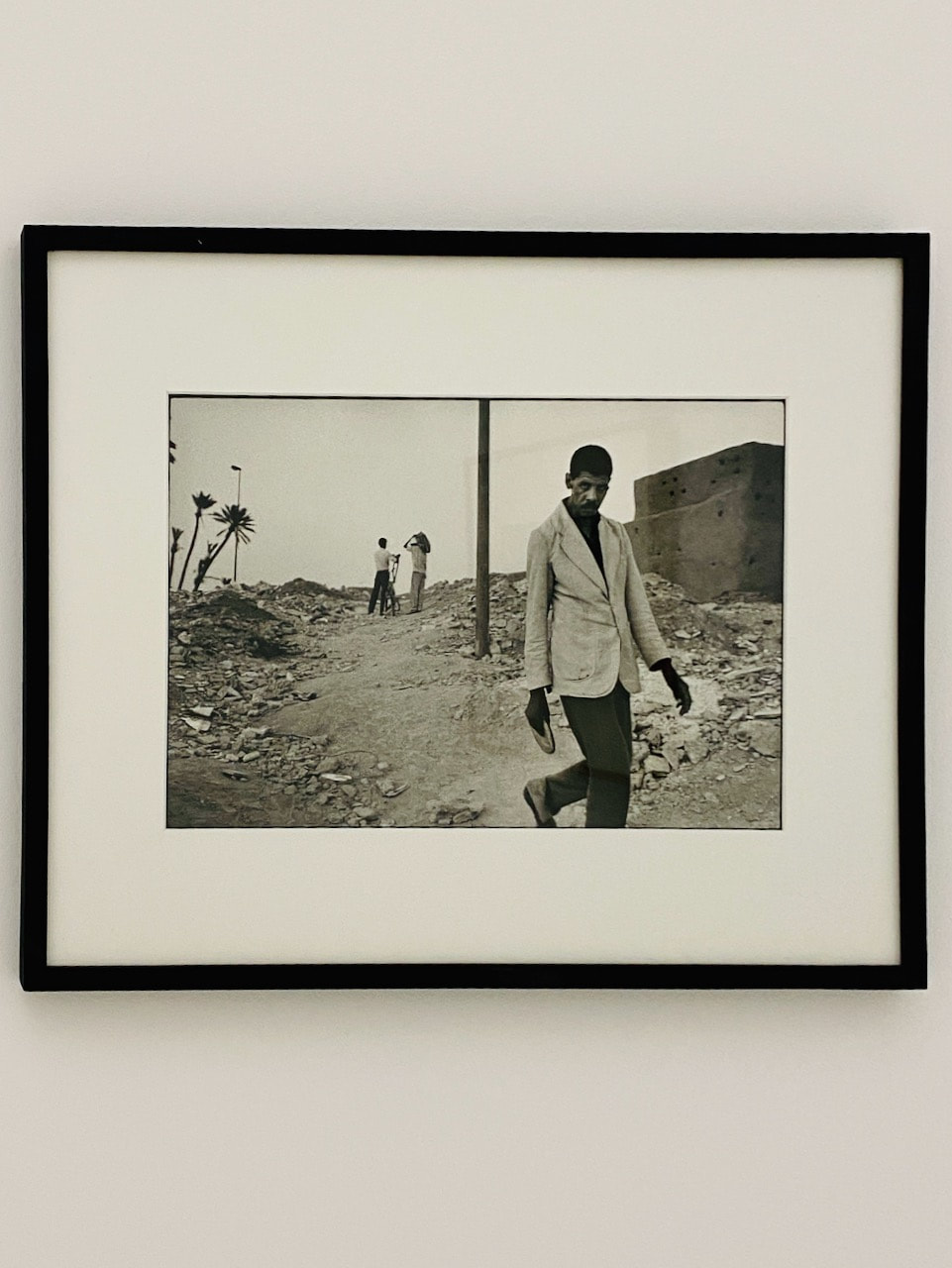
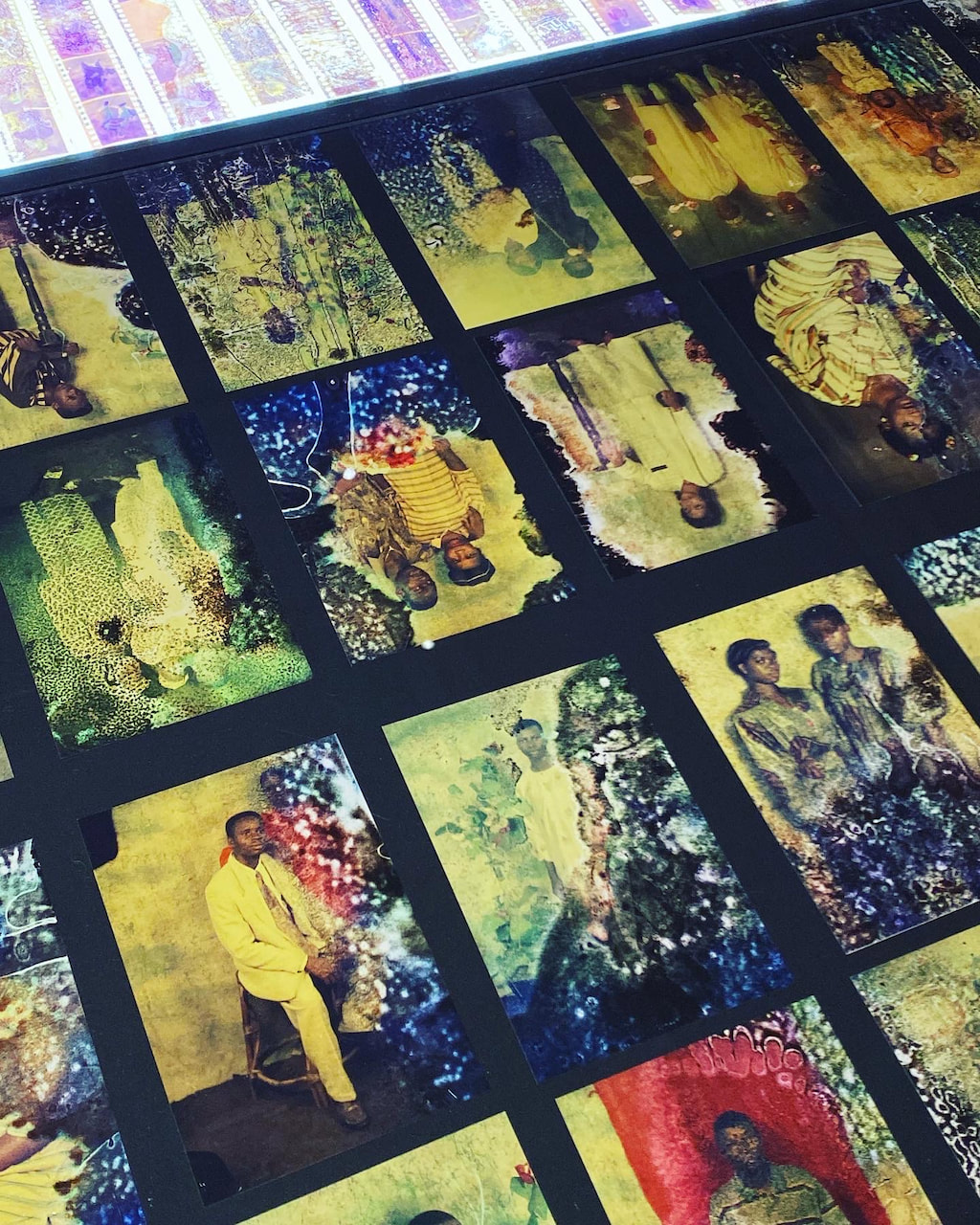
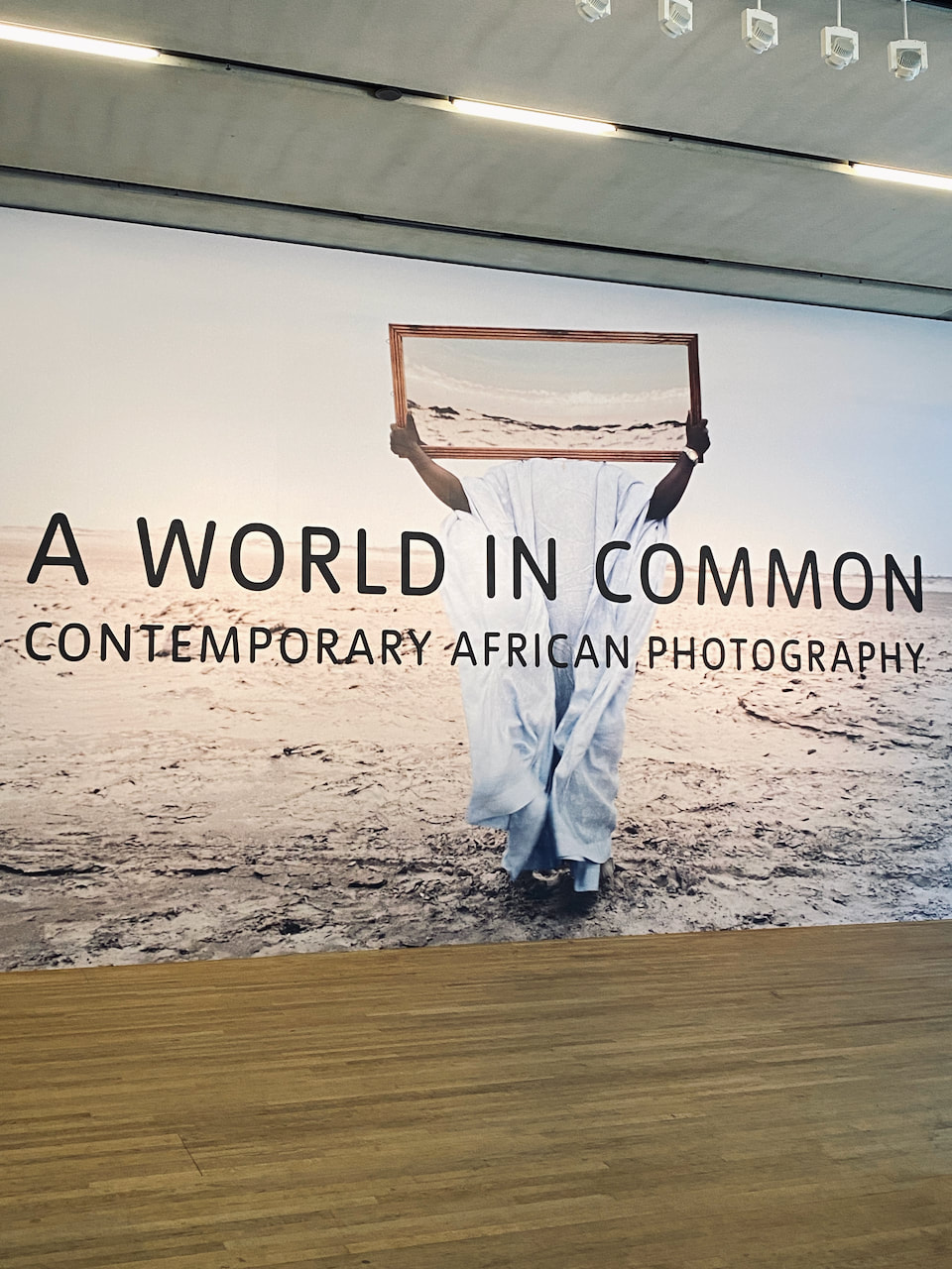
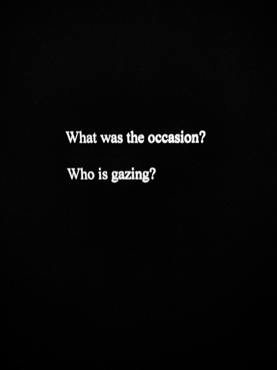
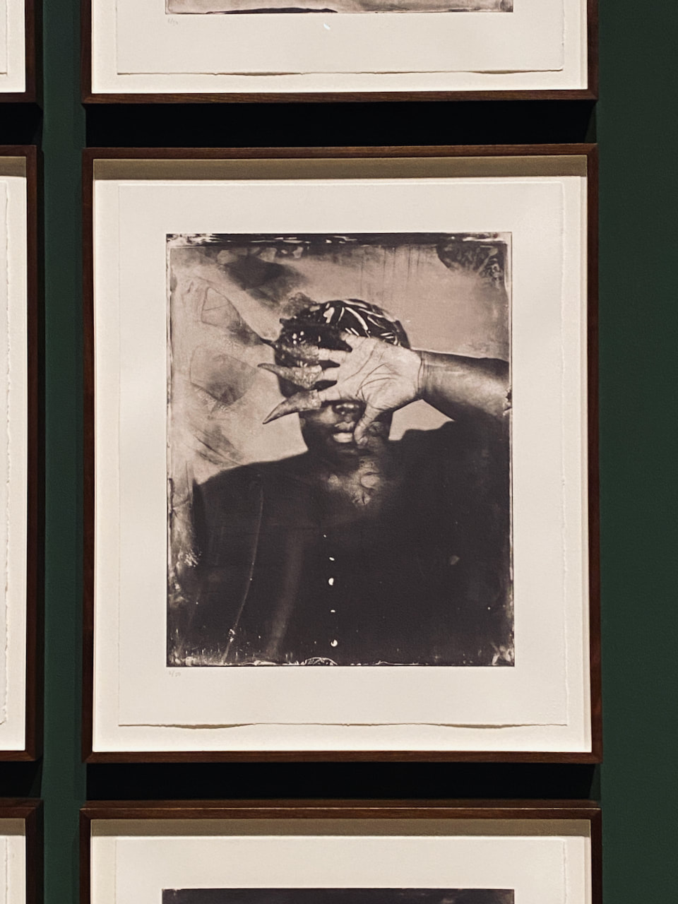
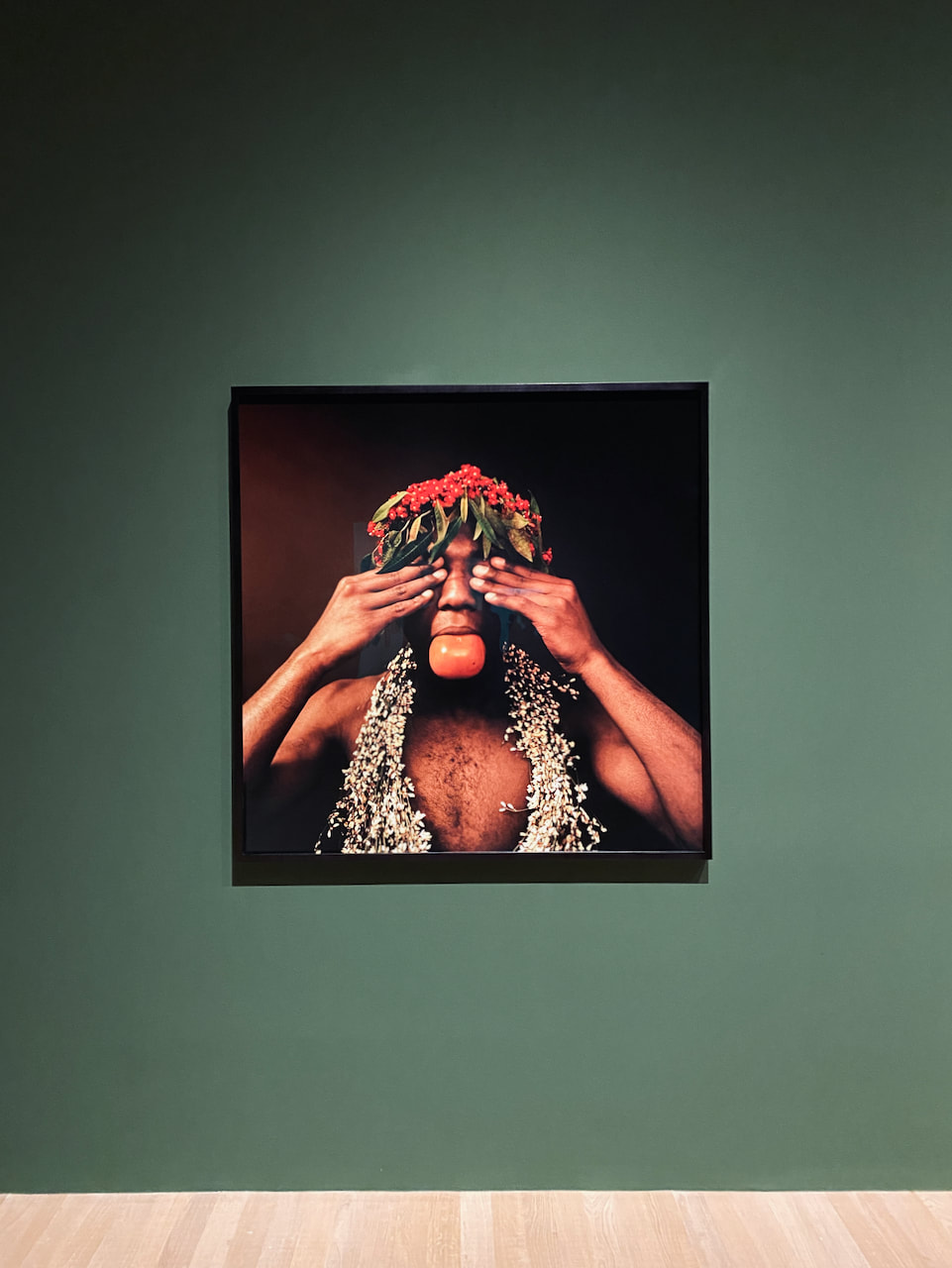
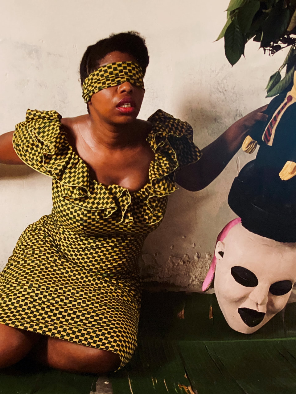
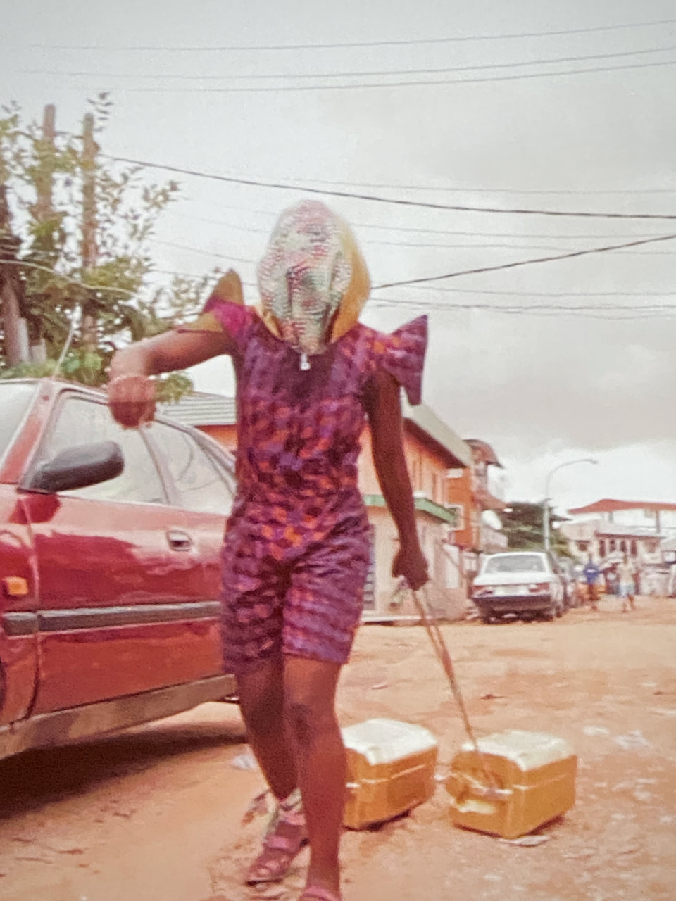
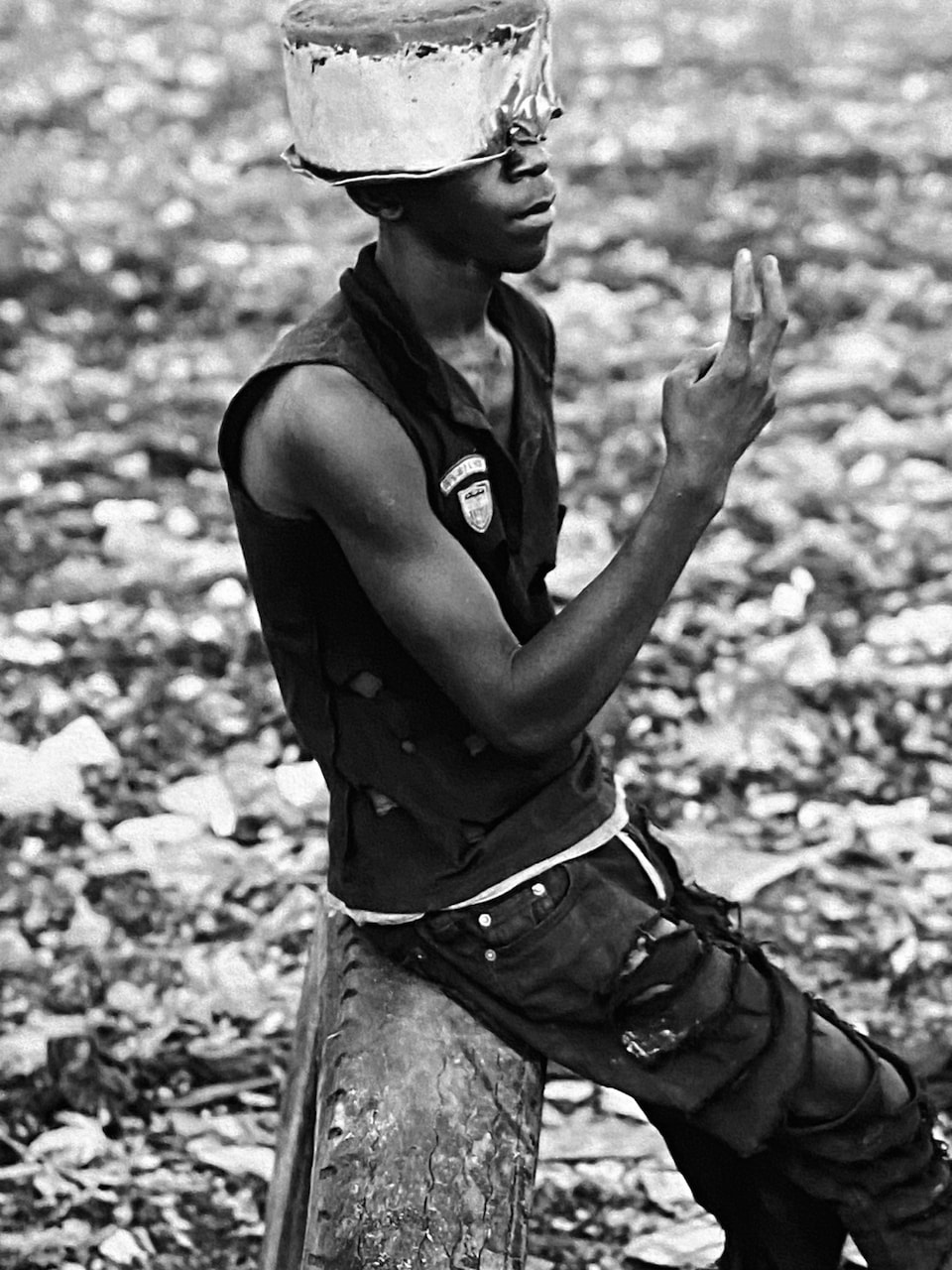
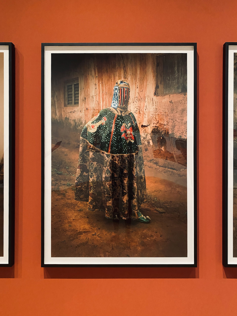
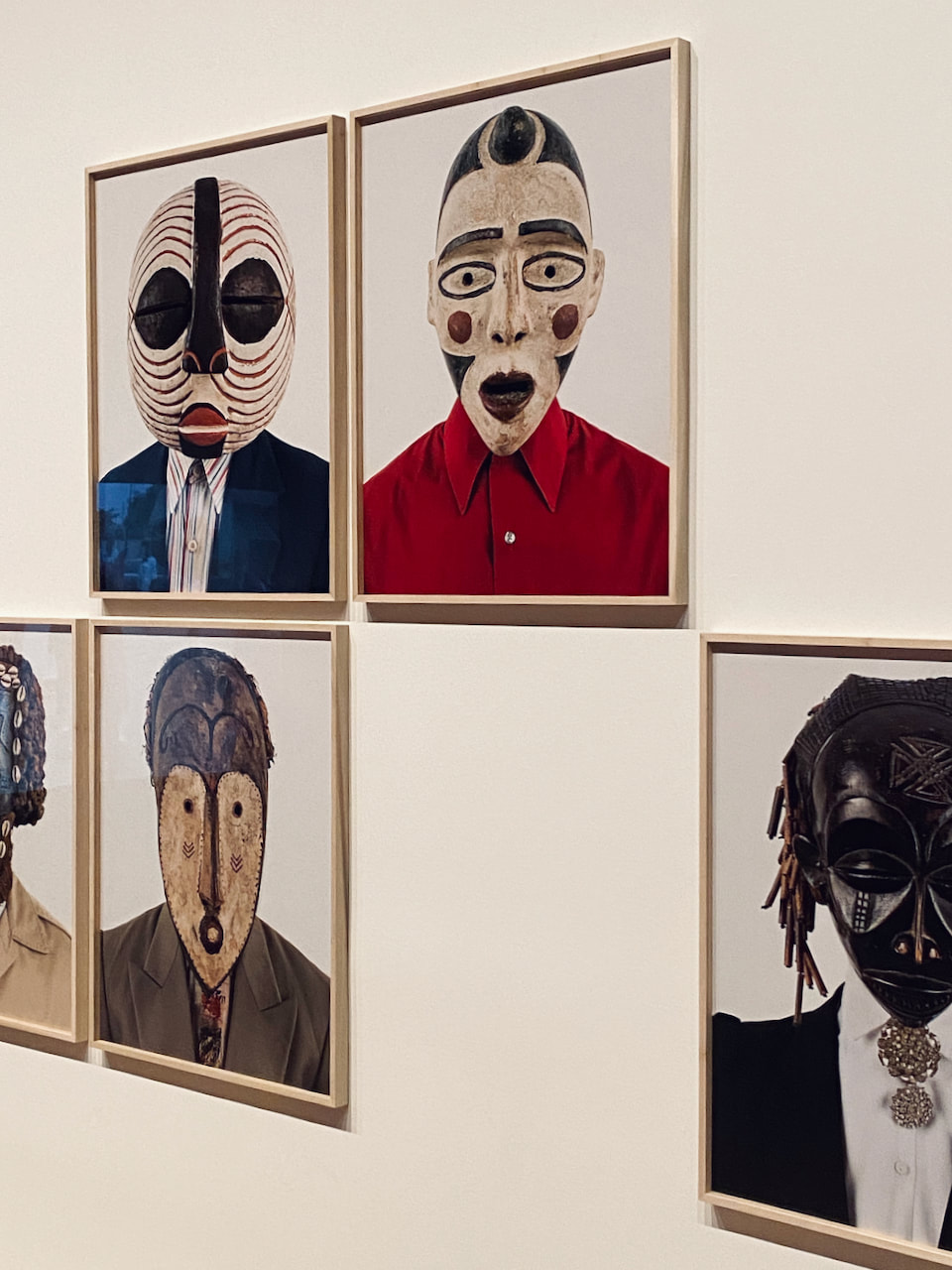
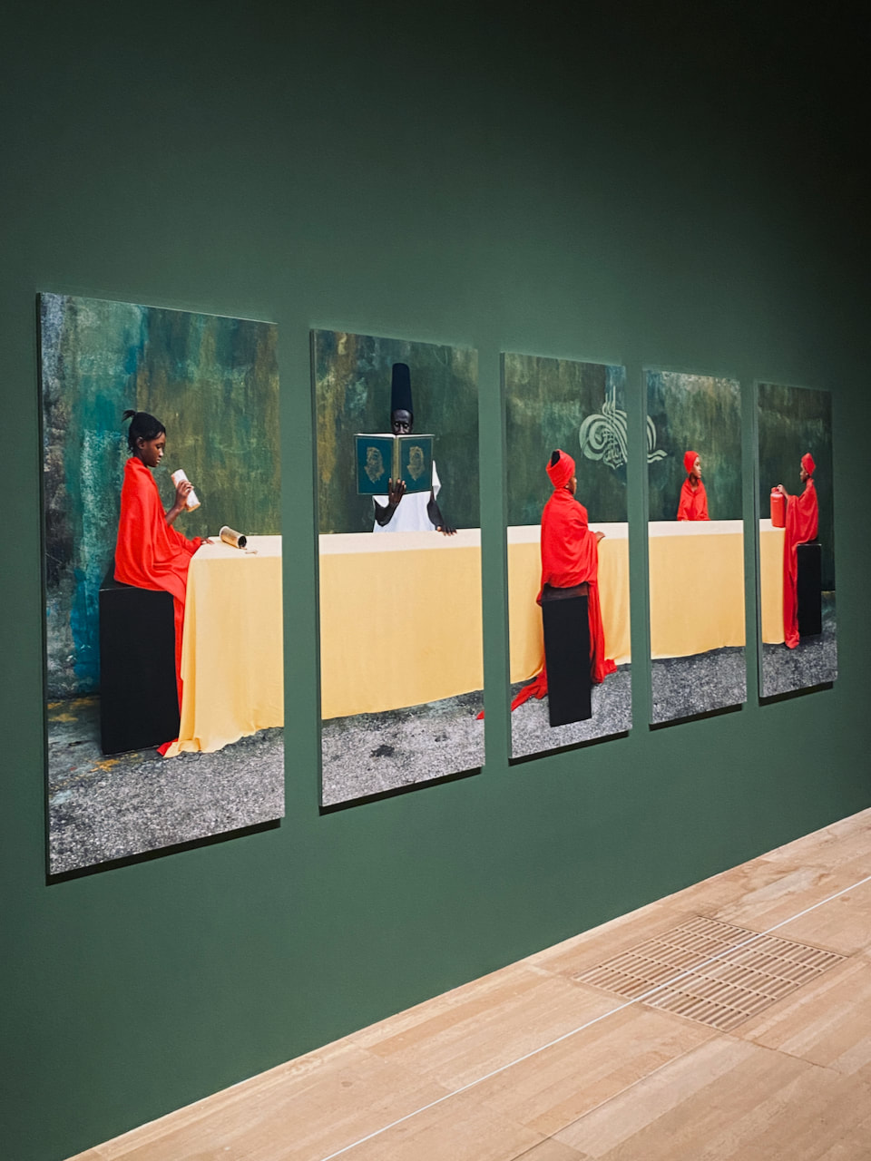
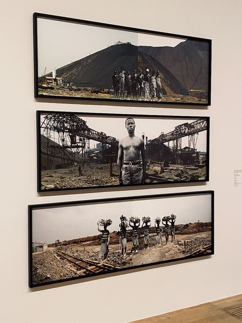
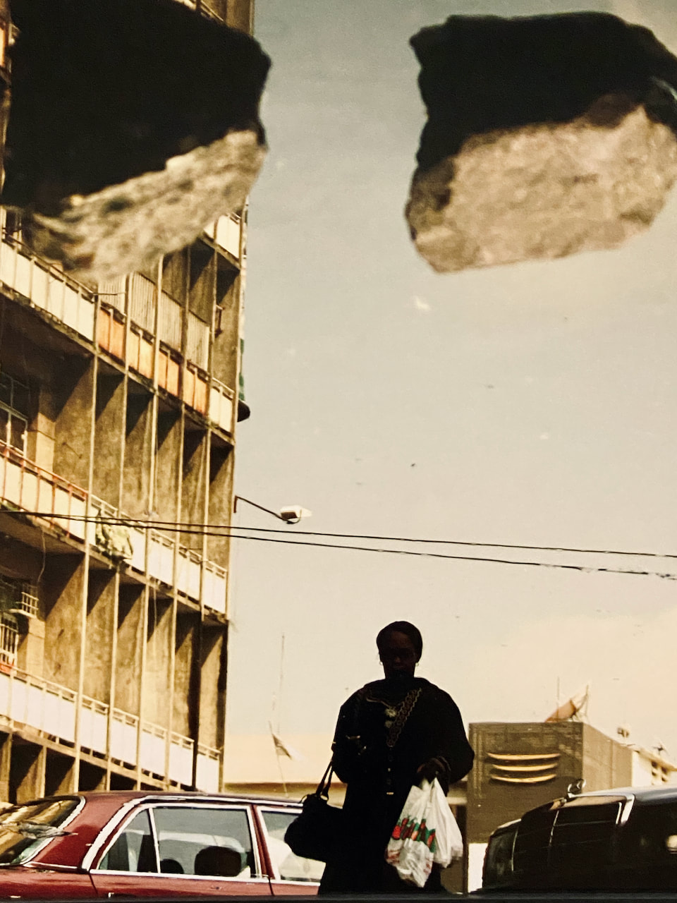
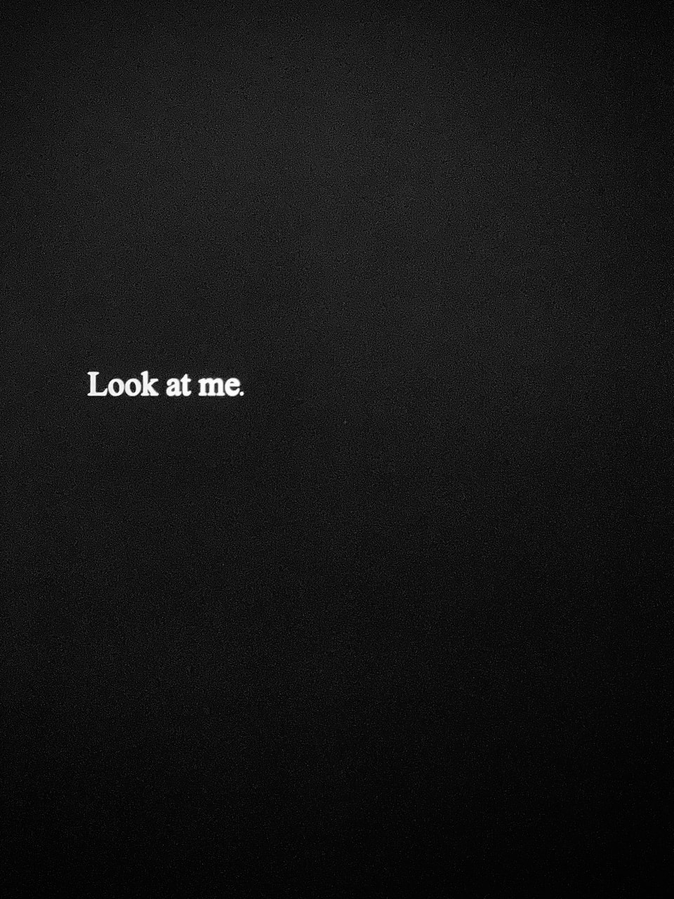
A World in Common: Contemporary African Photography at Tate Modern
This show was a pretty spectacular survey of contemporary African photography. The prints were (mostly) large and given plenty of room. The issue of the colonial gaze is clearly a central concern for many contemporary photographers. This was foregrounded in one slideshow which shared images from the colonial archive alongside provocative statements like "Who is gazing?" and "Look at me". I was expecting lots of portrait photographs and references to masks but I was struck by the focus on obstructed vision, blindfolds and closed eyes. This seemed to have a spiritual dimension (in the sense of inner sight) but it also suggested to me the risks associated with looking and being looked at. The curation seemed fairly conventional as you might expect in a major museum show designed to rise the status of African photography. This show provided an interesting parallel to the 'Lagos' show at SLG.
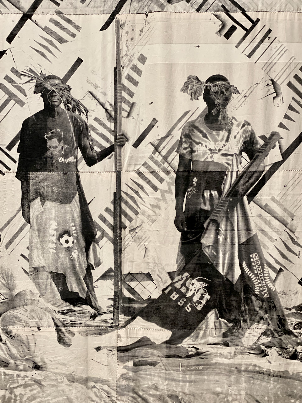
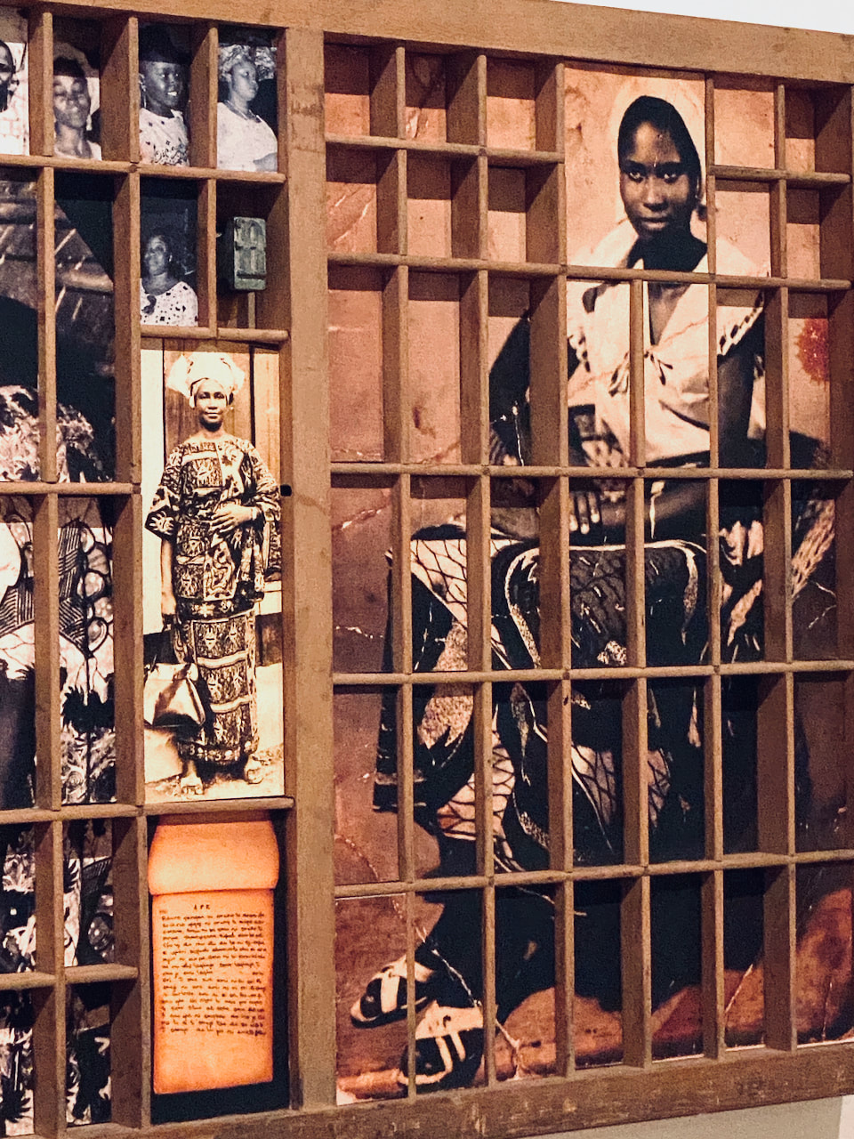
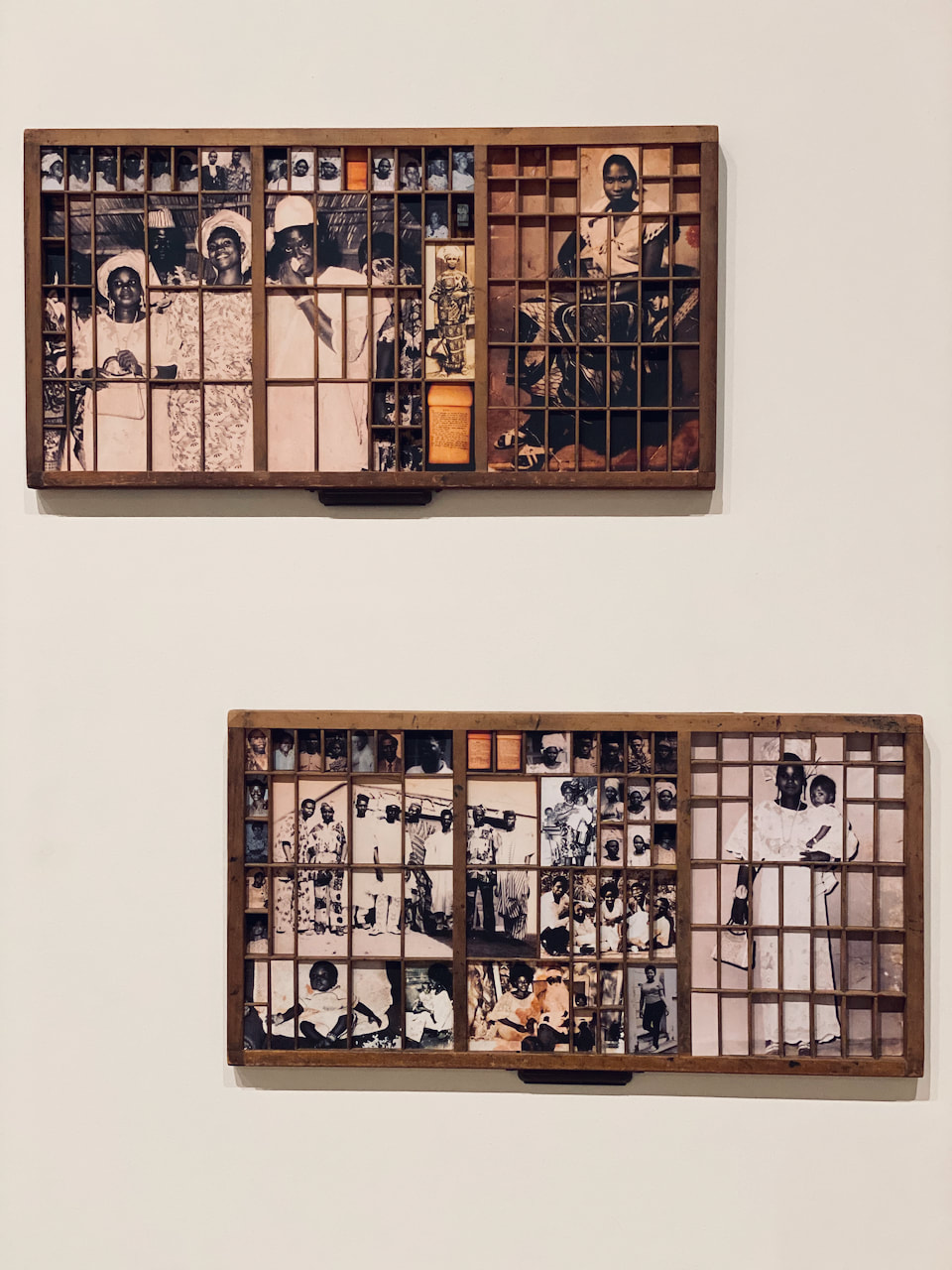
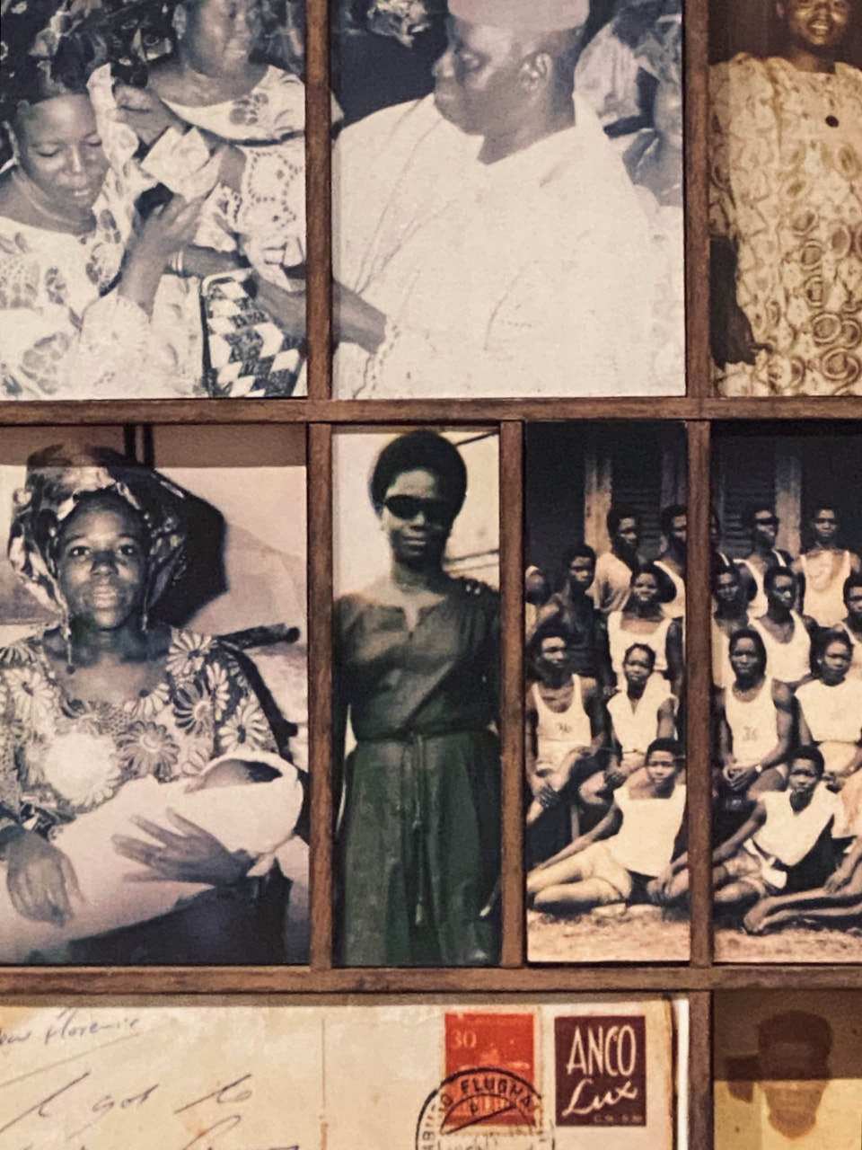
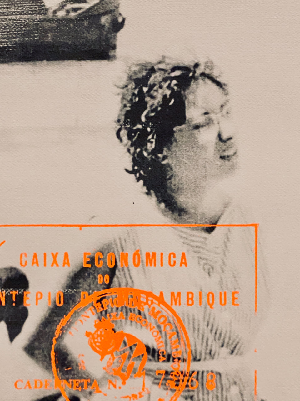
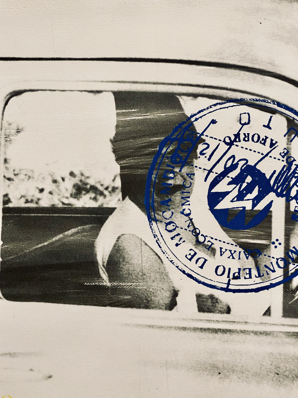

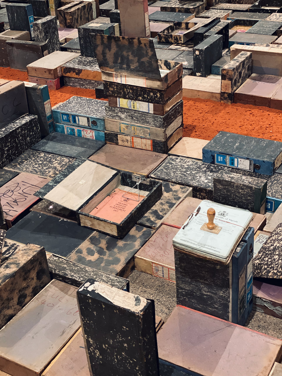
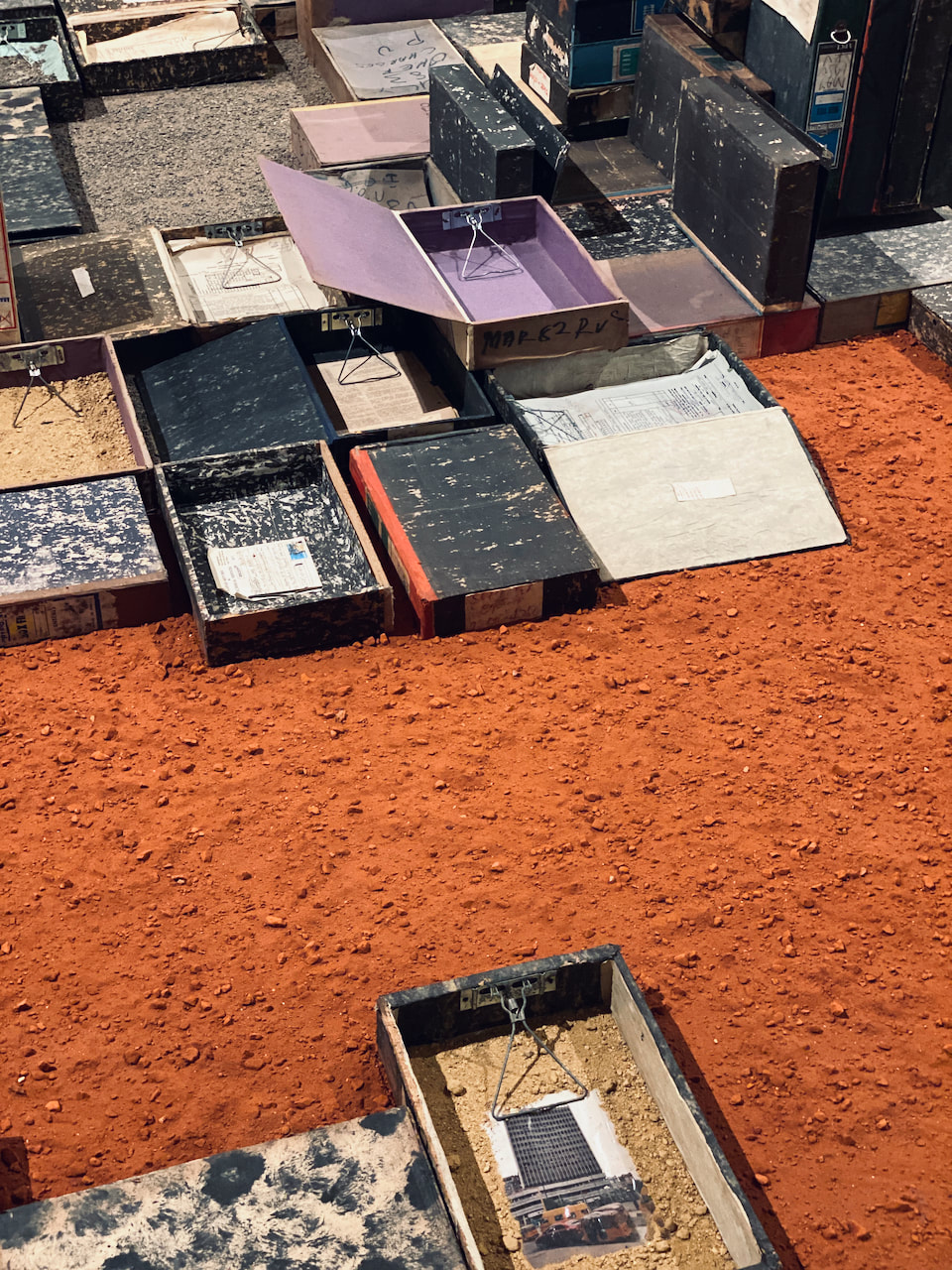
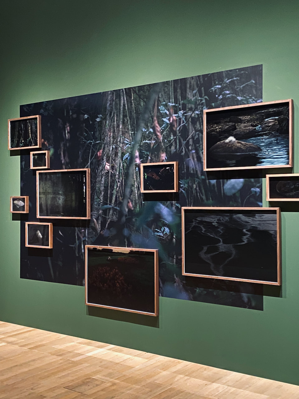

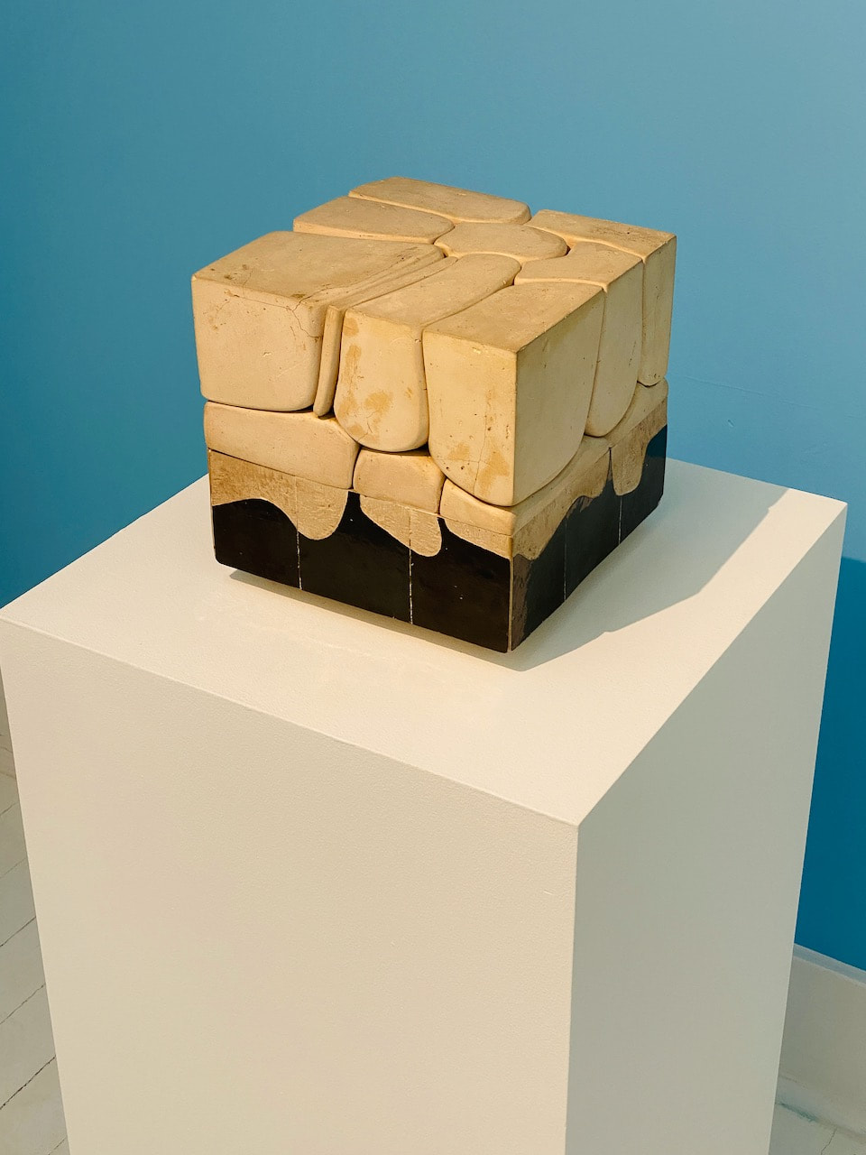
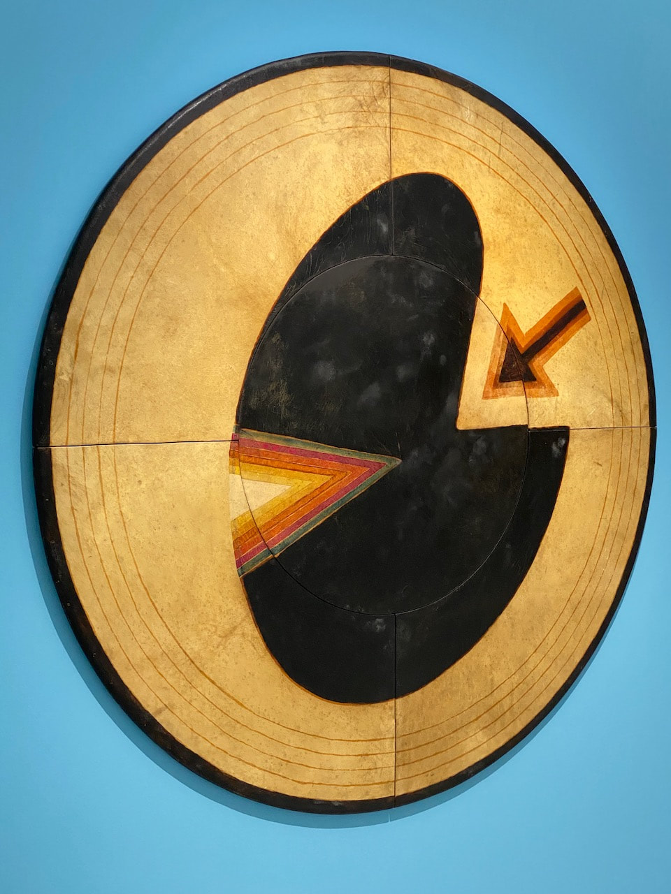
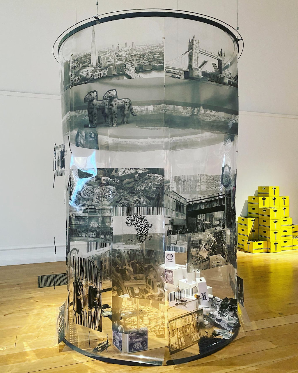
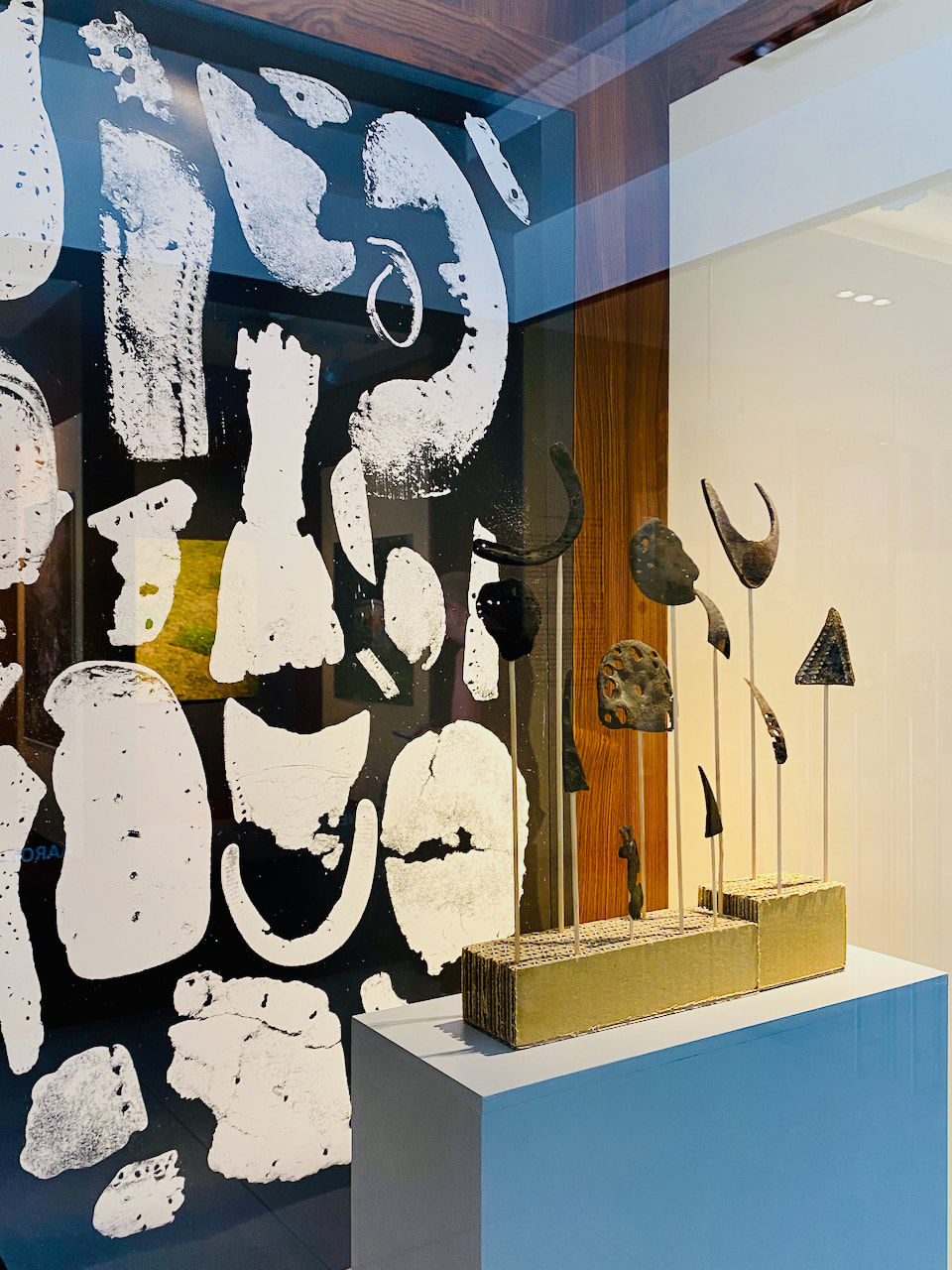
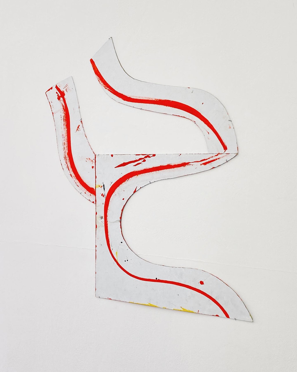
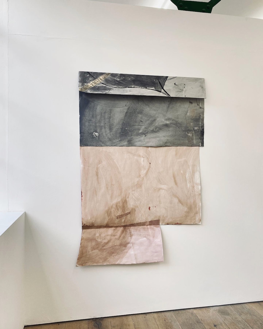
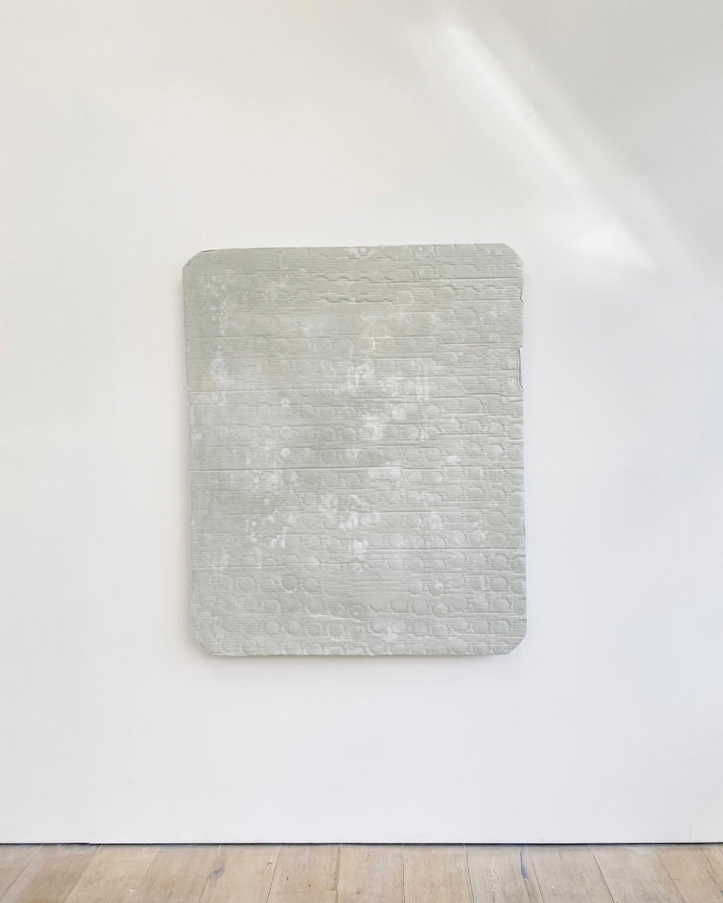
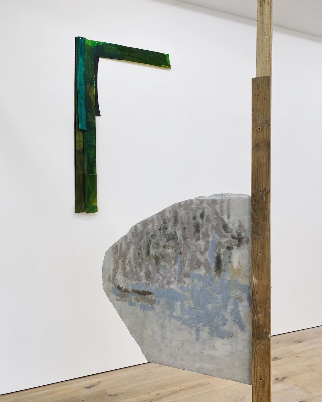
I particularly enjoyed the relationship between the works on display in this exhibition and the way they responded to the architectural spaces of the gallery. Whether mounted on the wall, the floor or on a wooden structure, each object seemed to animate the space around it. Works 'spoke' to others, either by the same or a different artist and there were no frames or fancy vitrines to get in the way. The artists seem to have been inspired by the material experiments of Arte Povera and their work raised questions about the relationship between sculpture, painting and collage. I was intrigued by the materials used including jesmonite, shellac ink, glass, aluminium and denim. The marks and shapes were mostly soft, subtle and organic although there were clearly also references to construction, engineering and packaging. A quiet and beautiful show!
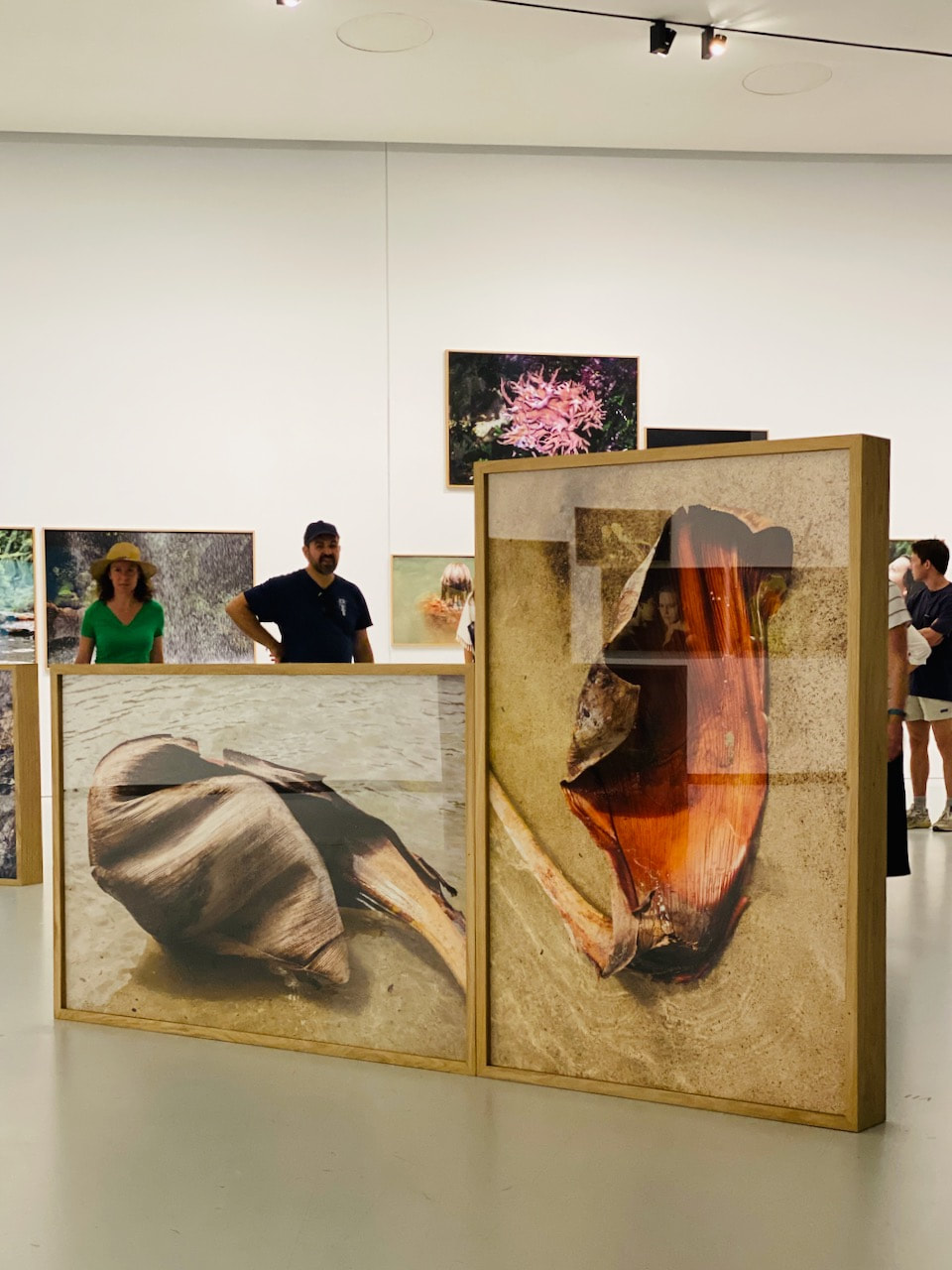
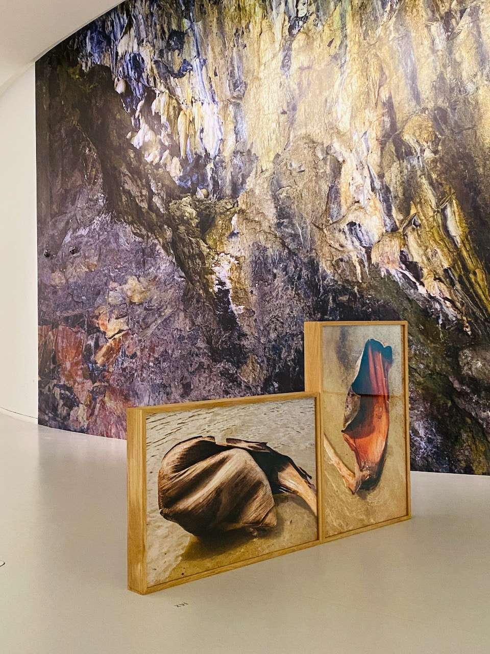
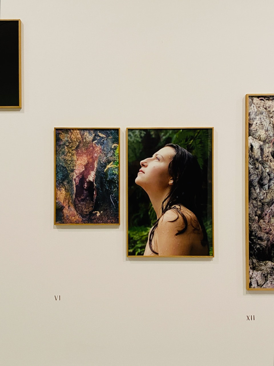
Diptychs research (cont.)
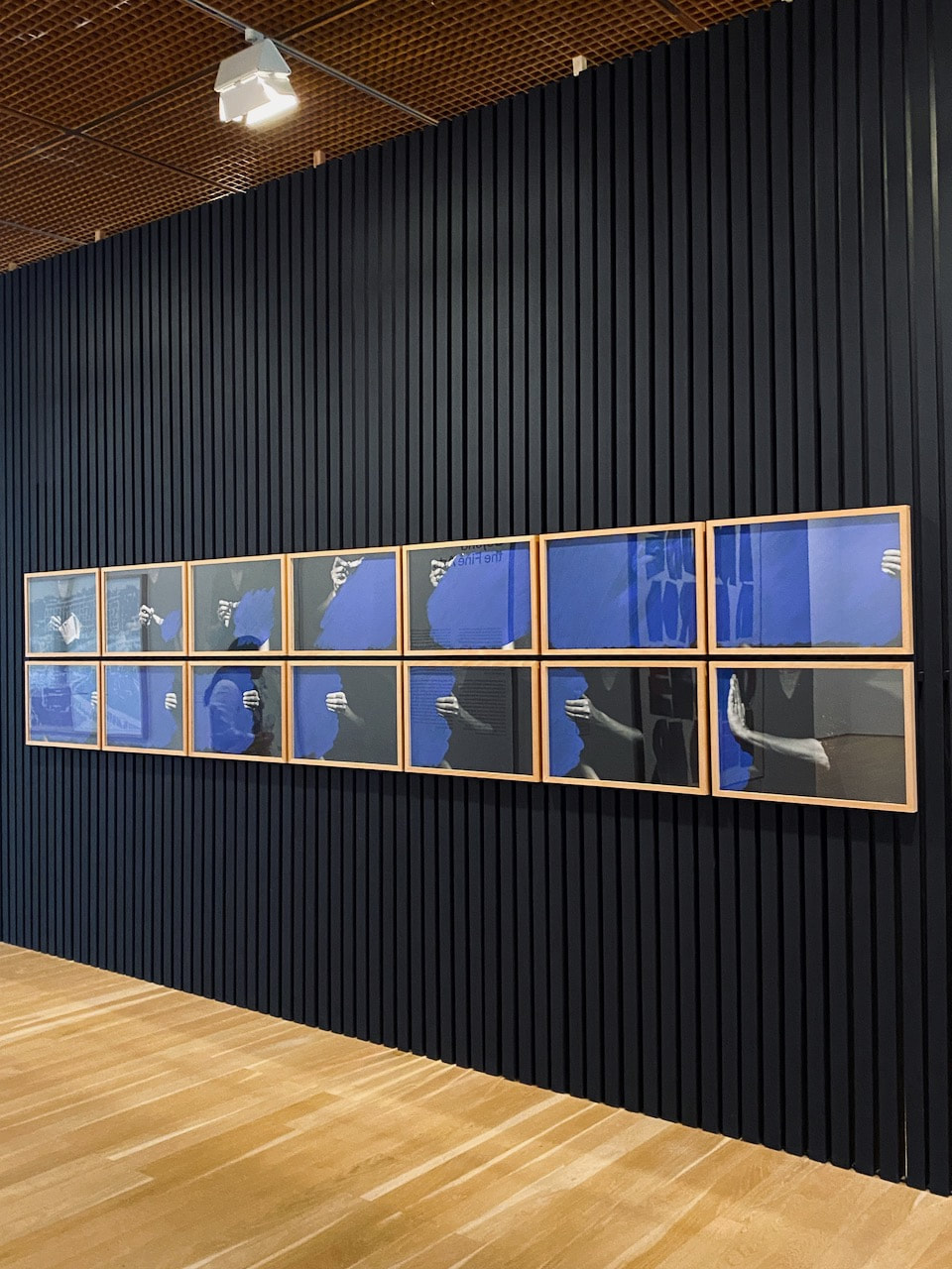
The following screenshots are taken from a flip-through video of Paul Bogaers' book Upset Down.
On every right page, a photograph is reproduced upright, while every left page bears an upside down photograph. This remains unchanged of course when the book is turned around, although every picture will be reversed in position. In this way, the book presents two different but closely interconnected expeditions – parallel journeys along unexplored phenomena, the starting point of the first being the reversed destination of the second and vice versa. Both journeys can be tracked from either end of the book, which as a consequence has two frontsides and no back. The consistency with which this organising principle is applied brings many a things into daylight that would otherwise have remained hidden behind the apparently average.
-- Paul Bogaers website
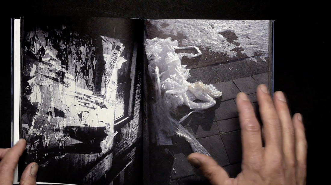
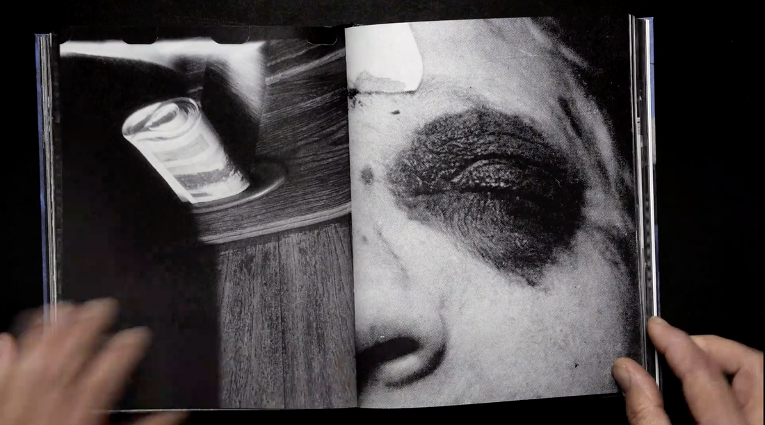
Jörg Colberg has written about this book commenting on the way that it highlights what might be at stake when we pair two images. He argues that there might be different rationales for doing this. "In a nutshell, you can connect pictures based on form, content, or a combination of both [...] The more you look at the book, the more you understand that maybe thinking about a "right" way to look at pictures isn't the best idea. Or maybe it's limiting? [...] One of the problems I have when I discuss pairings in too much detail is that I get confused myself. Furthermore, I will claim that a pairing might work not because the two pictures work with each other but because they work against each other [...] Where does this leave us? At the very least, I think you can make a very convincing case for Upset Down to be an incredibly useful book to study the pairing of photographs. There are elements of the this-looks-like-that approach. Formal aspects dominate. But the fact that one picture is always upside down complicates the aspect of content quite a bit."
My response
For the purposes of this experiment I decided to make all images black and white. I've also adjusted the framing to make the connections between the images across the gutter more obvious. Looking at photographs upside down is an odd experience but I think Jörg Colberg is right in claiming that shouldn't be a "right way to look at pictures" and one advantage of pairing images in this way is that the viewer is encouraged to explore the formal, abstract qualities of the pictures (relegating the importance of subject matter) and that the whole (composition) might be greater than the sum of the parts. I have chosen to place the 'right' way up pictures on both the left and right of the 'upside down' images since we might be tempted to place more importance on the right hand image (given our tendency to read from left to right).
I don't consider this experiment to be a success. However, as with most experiments, I feel I have learned something interesting about the construction of diptychs.
I don't consider this experiment to be a success. However, as with most experiments, I feel I have learned something interesting about the construction of diptychs.
Michael Snow's Cover to Cover is a famous example of a photobook that can be read in both directions:
Flipping through Cover to Cover, which is composed entirely of photographs in narrative sequence, one might describe it as a book made by a filmmaker. Snow himself has called the piece “a quasi-movie,” structured around a precise recto-verso montage.
Each page features a distinct moment, seen from one perspective on the front, and from a diametrically opposed angle on the back, occasionally pivoting, for instance, between interior and exterior spaces. This organizing principle is complicated by the fact that a given image might be a depiction of the physical environment surrounding the camera or, at other times, a photograph of a photograph. Midway through, the scene is inverted such that the volume must be turned upside-down to be looked at right-side up. The result is an elegant, disorienting study in simultaneity that allows the viewer to enter the work from either end.
-- Primary Information website
Glacial Erratics by Darin Mickey and Michael Vahrenwald is a recent example of the influence of Michael White's experiments. The photographers agreed to photograph the same area of New York over the period of two years, not looking at each other's images during that period. The book was then sequenced as a series of full bleed diptychs, "interwoven into a “loop” i.e., a book which can be started from one end, read through, flipped over and the read in the other direction."
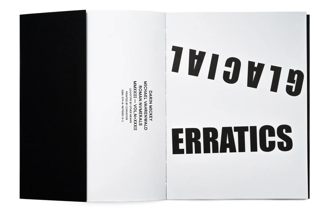
I am really interested in this strategy and enjoy the combination of colour and black and white images. I like the collaborative element of the 'game' too which reminds me of Same Page by Lark Ford and T J Tambellini.
Jörg Colberg's editing advice
In a recent post on Patreon, Jörg Colberg offers some advice about how to pair images (as a first stage in editing a possible photobook collection). He illustrates his advice with a sequence of pairs drawn from his Vaterland project.
I think that editing is tricky because you need to balance how two photographs work alongside each other. A pair might work formally — the (in)famous this-looks-like-that approach. But if this really looks like that or rather if this looks too much like that, then a pair falls flat: you’re basically seeing the same picture twice. What’s the point? [...] What I’m trying to get at here is that it’s going to be impossible for me to give you strict rules for what you can or cannot do. In the end, you always need to see, and you have to make smart decisions based on the work at hand. The basic principles remain valid; but (ideally) it’s visual art, and visual art should be complicated.
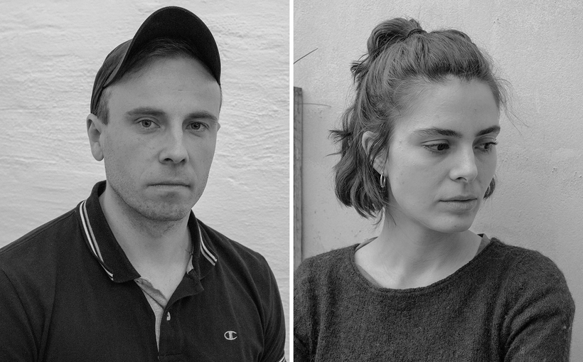
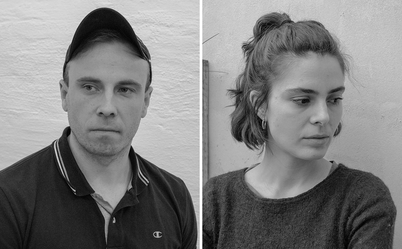
Colberg offers the following pairs and describes how they might work together. He finds issues with all of them, discussing their strengths and weaknesses. It's an interesting process and illustrates the many subtle decisions that are involved in creating these pairs. Too similar? Too different? He discusses the relationship between form and content and seems to need a particular type of tension that holds a particular pair of images together. I was particularly interested in what he says about the addition of portraits since I don't tend to photograph people. This is something I should commit to in the near future.
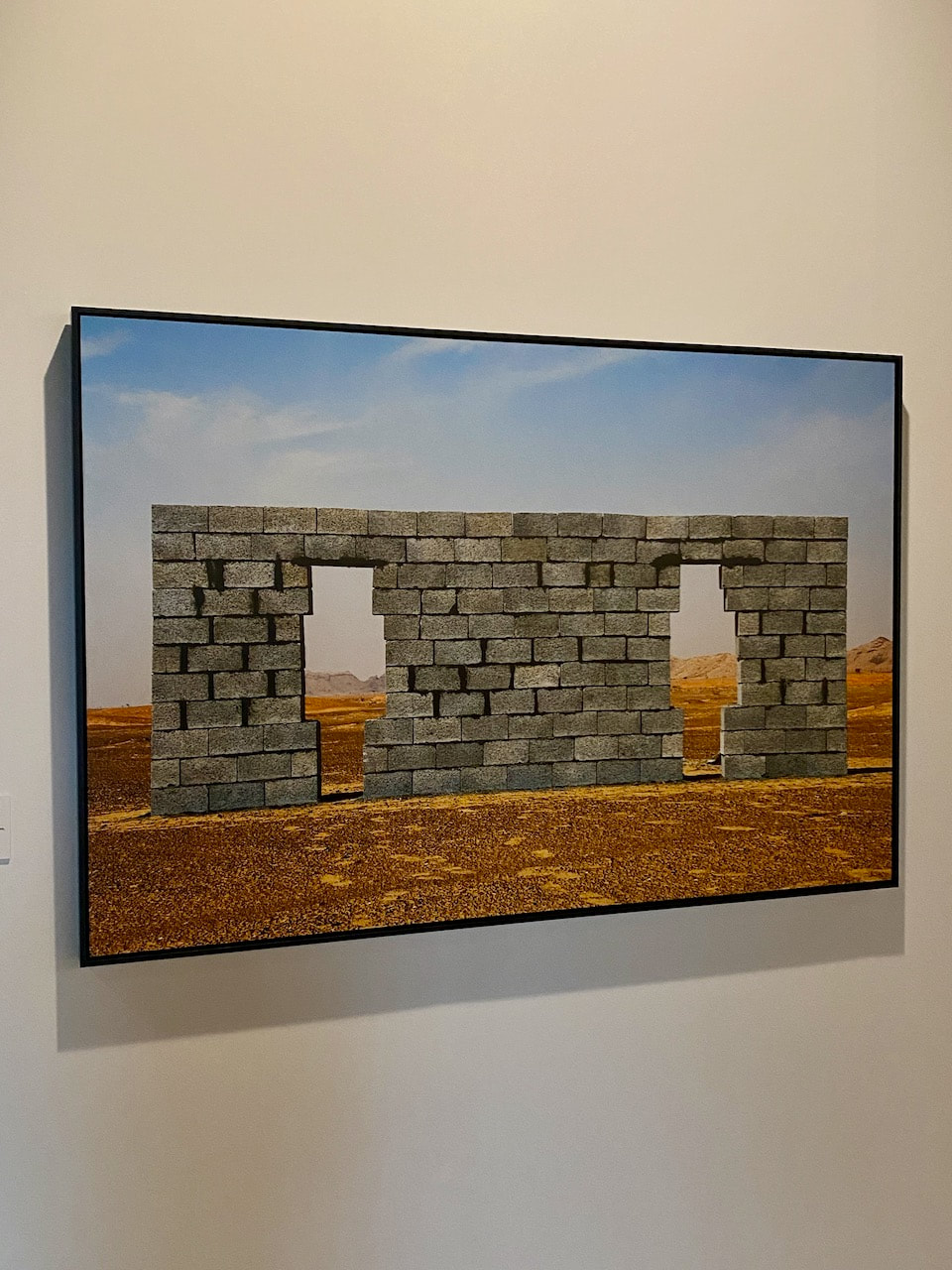
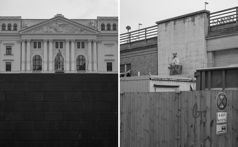
Susequently, Colberg offers a close analysis of one particular pair of images:
Susequently, Colberg offers a close analysis of one particular pair of images:
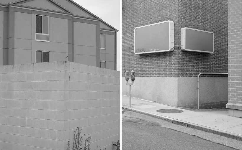
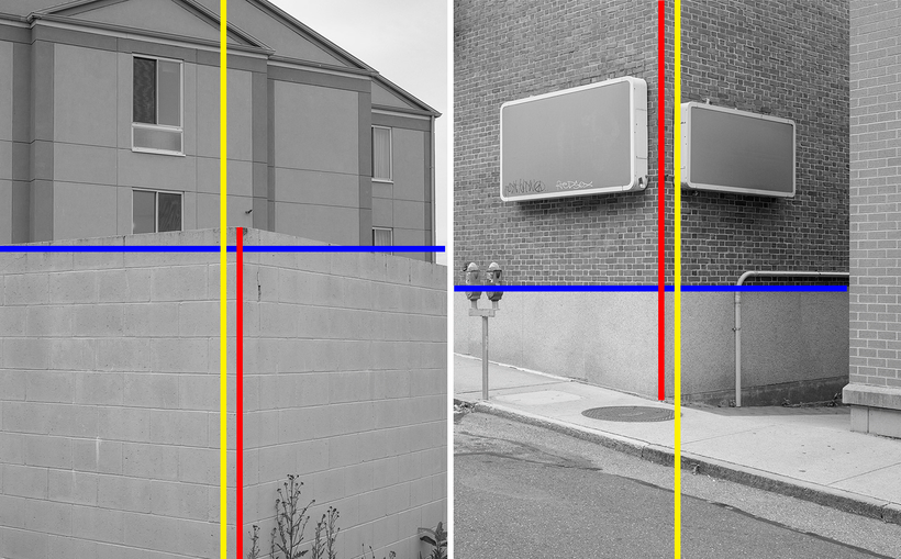
In both photographs, we see a lot of surfaces made from brick or other building materials. I often describe pictures by invoking senses other than the visual one. For me, both pictures evoke the same idea of tactility. Both pictures feel very similar to me on that level. Obviously, this idea is at least one step removed from form and content, and the photographs might evoke different feelings for you (or maybe you simply don’t consider photographs in that fashion). But I think that even if you don’t think about tactility, you can understand what I mean. If I had told you instead that both pictures make me think of the smell of grass after a rain shower, you probably would respond differently. Both pictures are also bisected in similar ways. There is a prominent line in the centre that runs through the picture on the right and cuts it into a top and bottom part. The picture on the left also has a top and bottom part, but it’s not cut into two equal parts. The upper part is smaller. The pictures also cut into two parts vertically. Or rather, parts of them are. Maybe all of this is easier to see if I add some lines to the pair. The two blue lines are where the photographs are cut into an upper and lower part. Now, you can see why it doesn’t work so well on the left. The two blue lines are at different heights (the one on the right is in the middle of the frame). The two yellow lines are the actual vertical centre lines of the photographs. I also added two red lines that sit at the corners of the wall on the left and the building on the right. As you can see, these two (red) lines do not lie on top of the (yellow) centre lines. Interestingly, though, they are offset by about the same amount. And in this configuration, the (red) line on the left is shifted to the right, whereas the (red) line on the right is shifted to the left, making the pictures (vertically) asymmetric in the same fashion. I maintain that you can see what I see. Obviously, the presence of the colourful lines changes the whole pair. If you go back to the pair without the lines, the vertical construction for me creates a dynamic that pulls the pictures toward each other. The problem remains that that prominent wall on the left does not cut the picture in half. I am still intrigued by the pair, and I still don’t know whether it works or whether I’m just imagining something. As I said, you can now see what I see, and you can decide for yourself whether this works or not.
-- Jörg Colberg, Patreon post, 4.9.23
Instagram diptychs
I have been sharing some of my recent diptych experiments on Instagram, creating them on an iPhone app and sharing them at low resolution. I like the low stakes playfulness of social media. These experiments don't feel like final solutions but more like a game - a way of cutting the deck and shuffling cards into different arrangements. Here are some examples:
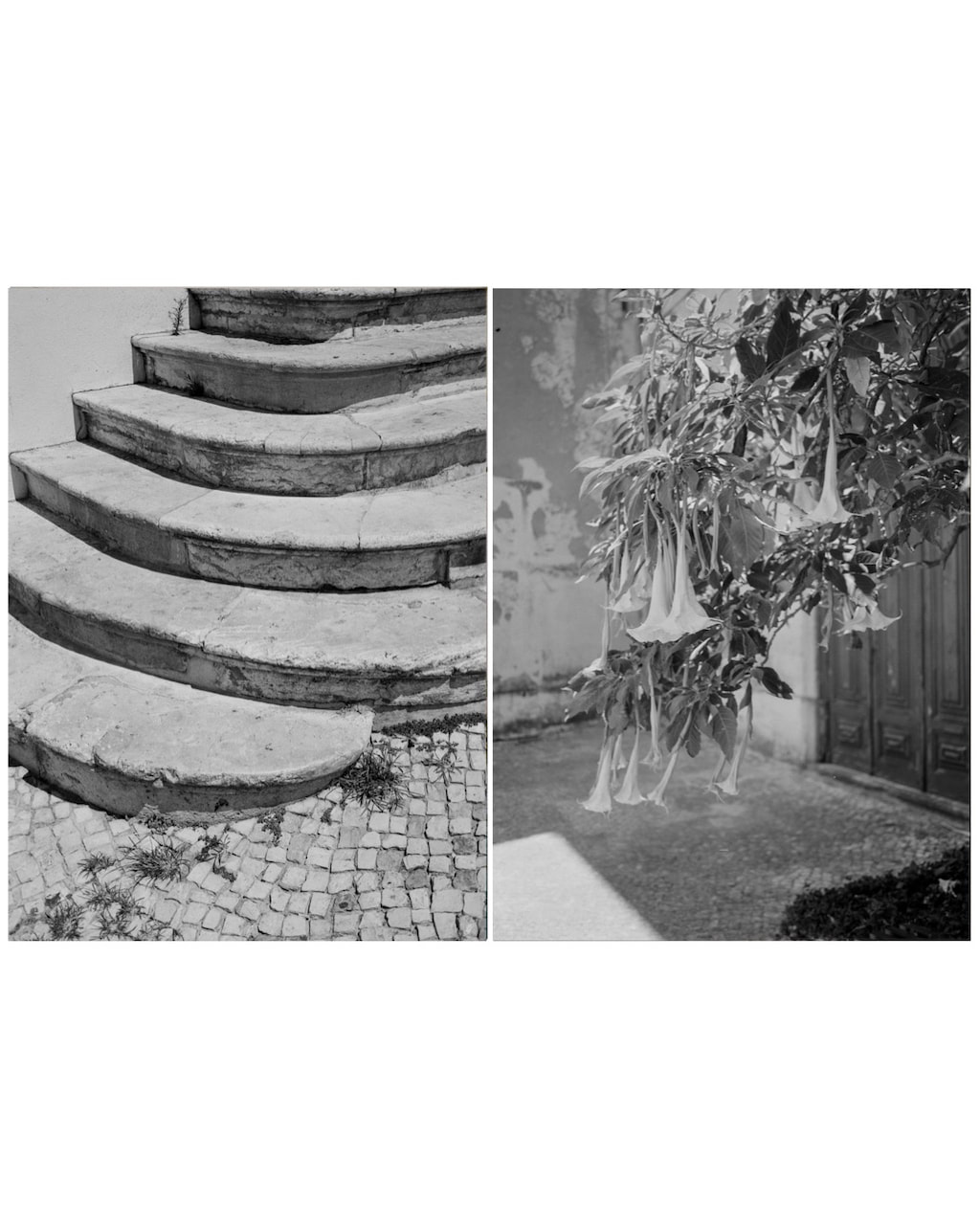
I received a few comments about the pairings, including this example with reference to #5:
The different levels that the flowers hang at look like steps. They really match up. And there’s something about the combination that makes it feel like both the steps and the flowers are dropping? They’re kind of the same shape too, the stairs and the flowers and they come from the same corner which is really nice.
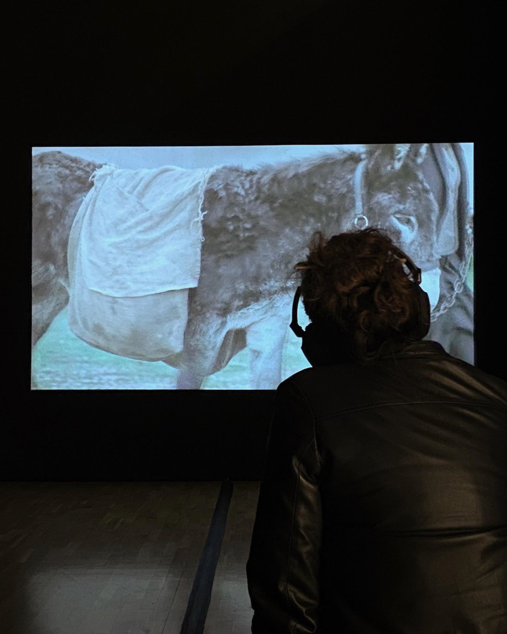
Video experiment
I decided to experiment with presenting a few diptychs in the form of a slideshow. I had previously made something similar and liked how it turned out. I made the images in Photoshop (left image, right image and both together) and found a suitable soundtrack on Ubuweb.
I'm quite pleased with this experiment. My intention was to give a bit more emphasis to the image on the left of each diptych. As readers from left to right we might tend to expect the right hand image to be the stronger of the two, looking at it for longer. I wanted to rebalance this tendency by showing the left hand hand image, taking it away and then reshowing it to complete the diptych. I also really like the soundtrack ad the way this adds another dimension to the experience of watching the diptychs being made.
I may now experiment with sharing more diptychs in this form (i.e. creating a slightly longer slideshow) and also alter the timings of particular images. I like the idea that my final outcome could be in the form of a slideshow with soundtrack rather than a more conventional set of prints.
I may now experiment with sharing more diptychs in this form (i.e. creating a slightly longer slideshow) and also alter the timings of particular images. I like the idea that my final outcome could be in the form of a slideshow with soundtrack rather than a more conventional set of prints.
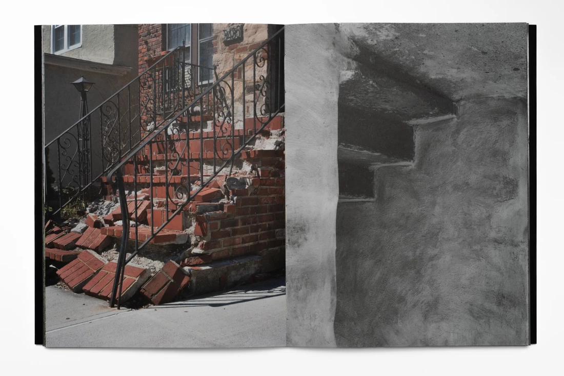
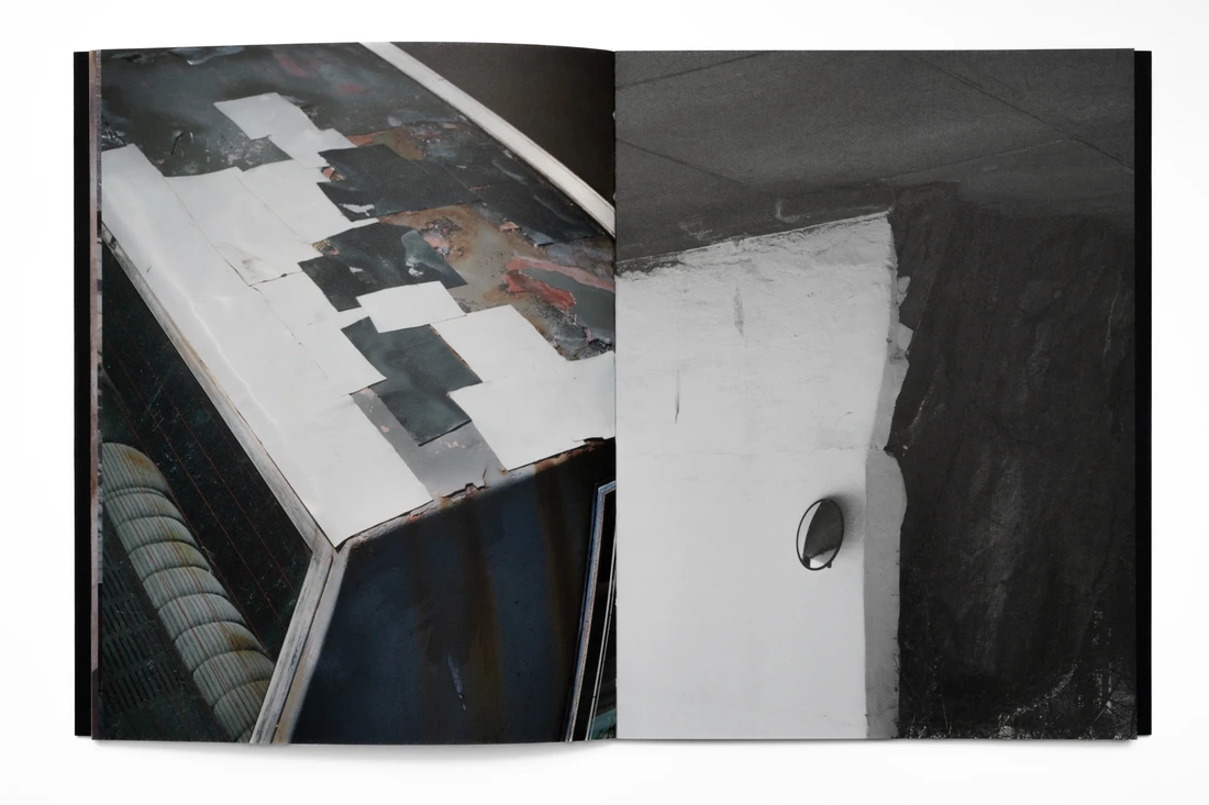
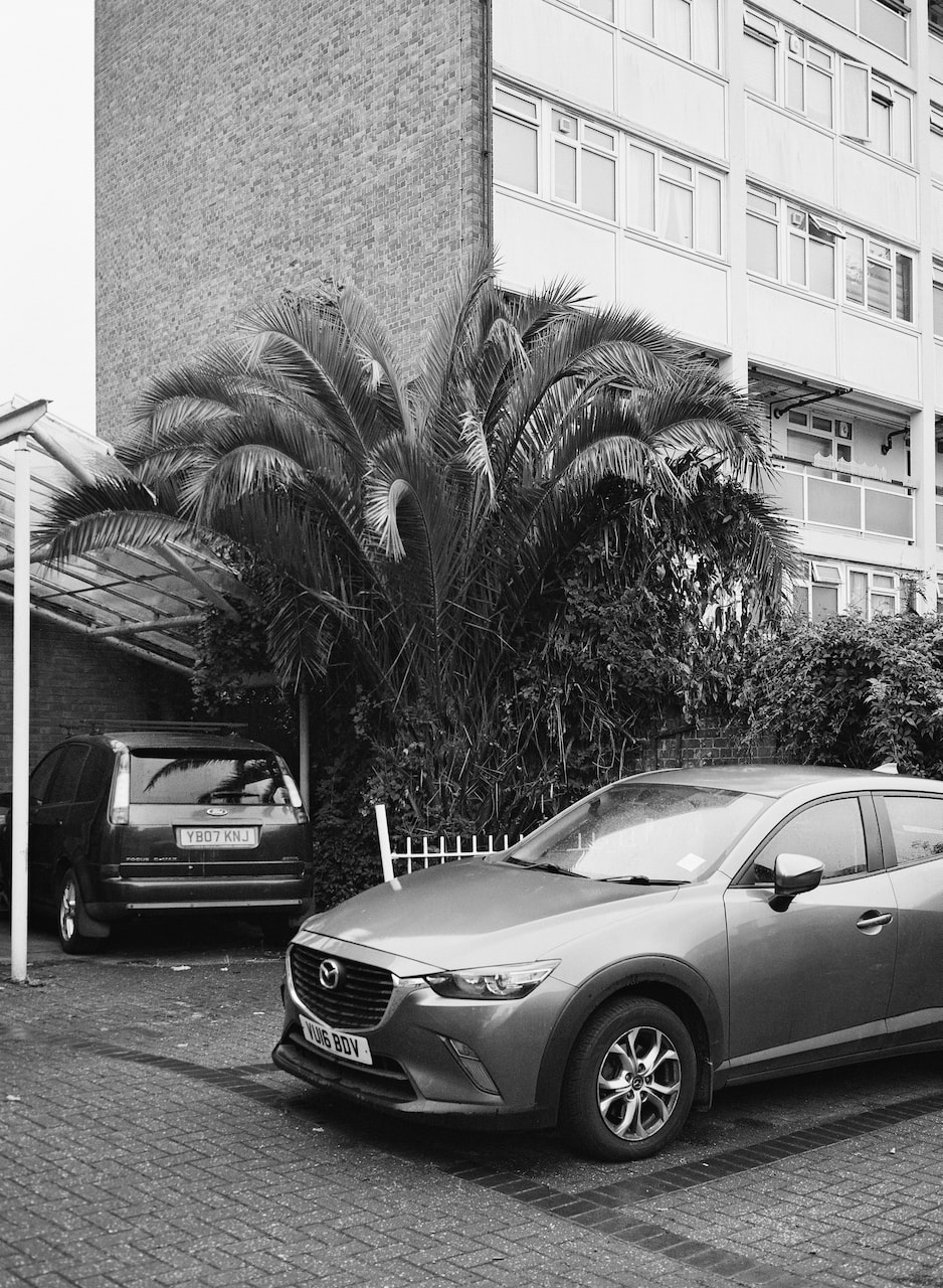
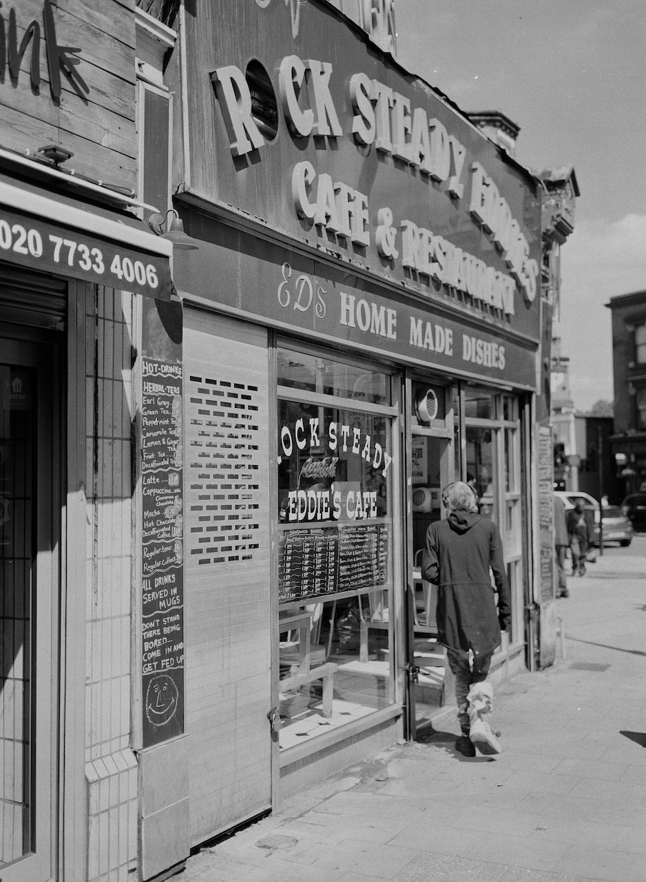
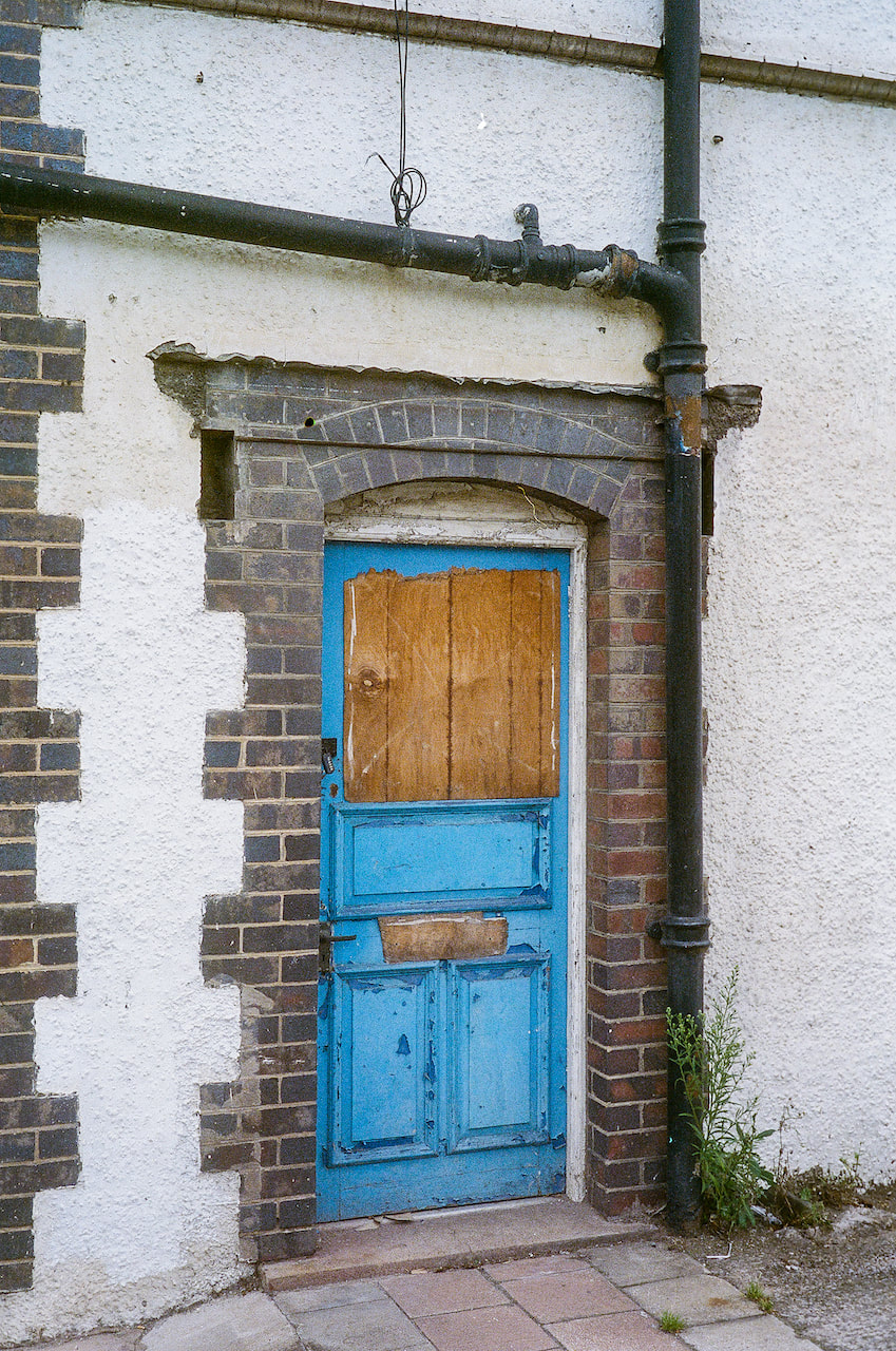
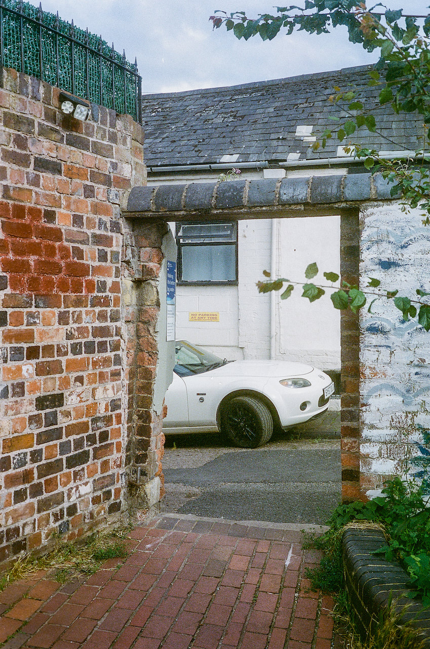
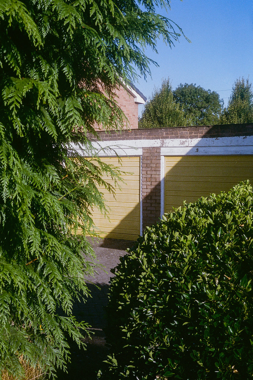
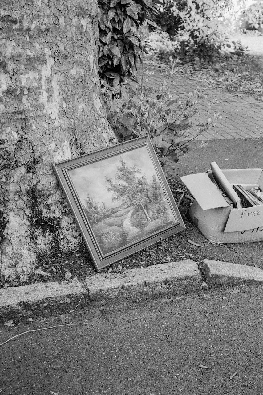
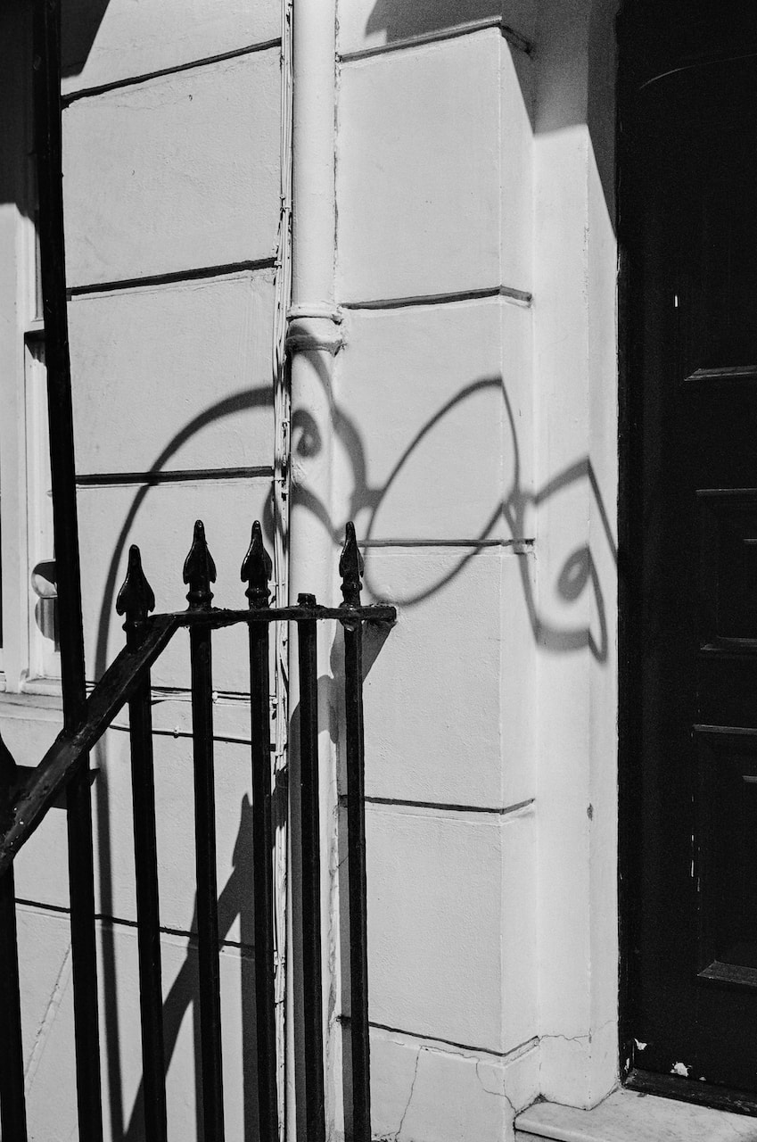
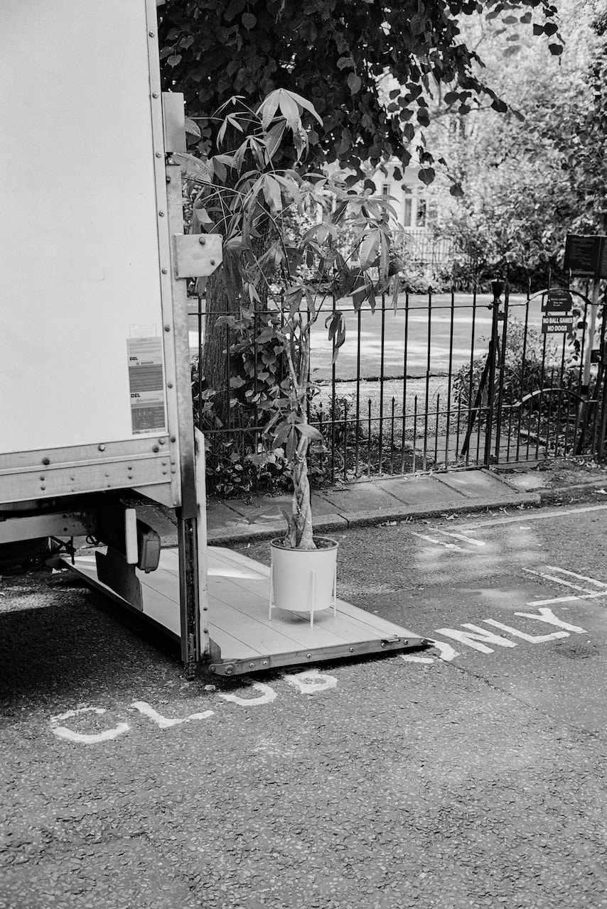
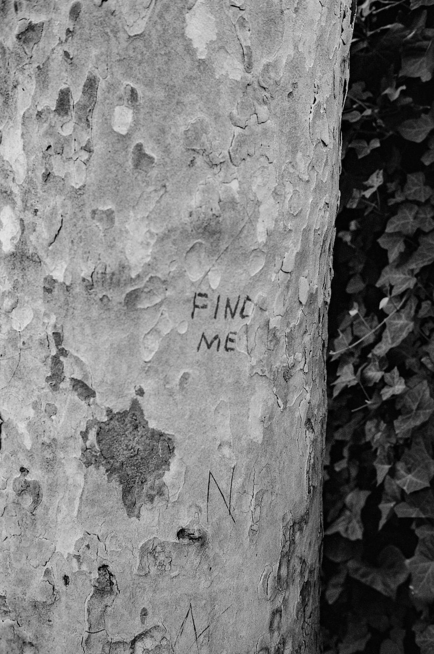
More medium format
These pictures were taken with a medium format camera on Kodak Portra 160 and Ilford XP2 Super400 120 film. I mistakenly rated the colour 160 film at 400 ISO. Consequently, the images are a little underexposed and the colours are a bit off in some cases, particularly in the shadows.
Diptychs
|
|
|
|
|
|
|
|
|
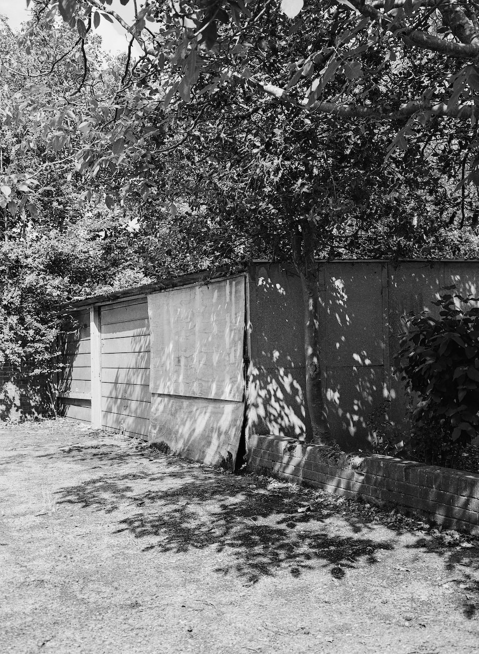
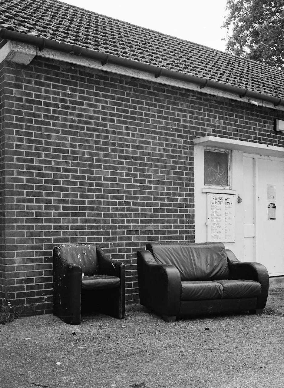
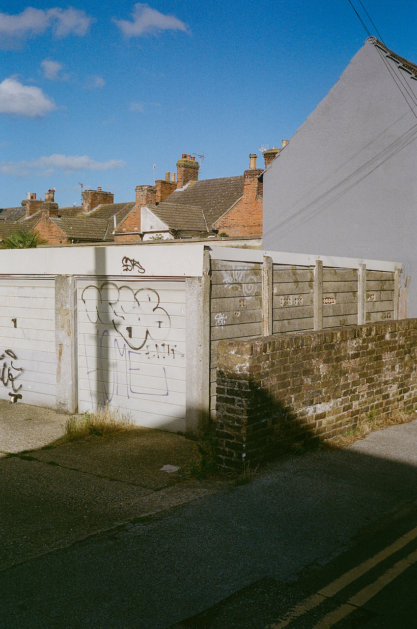
Diptych analysis
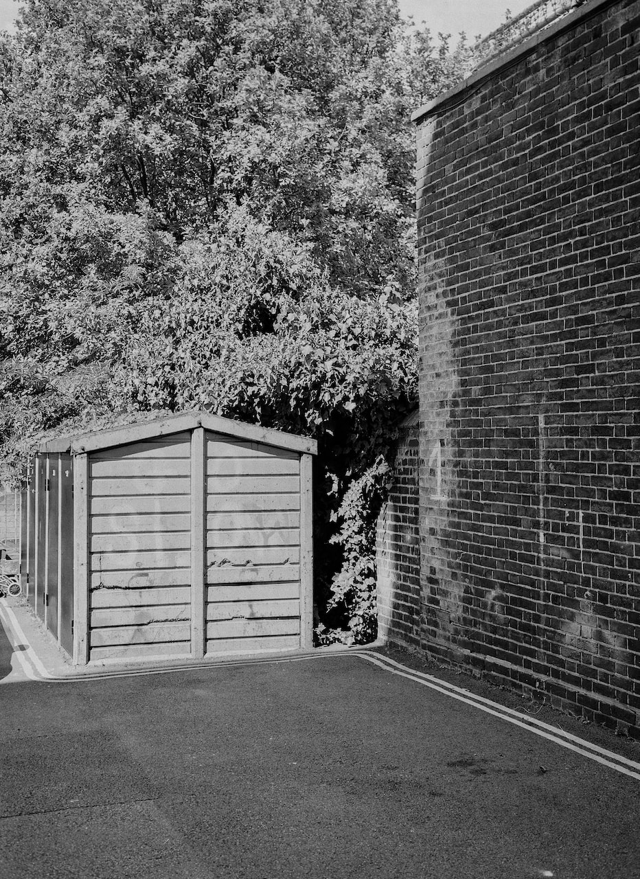
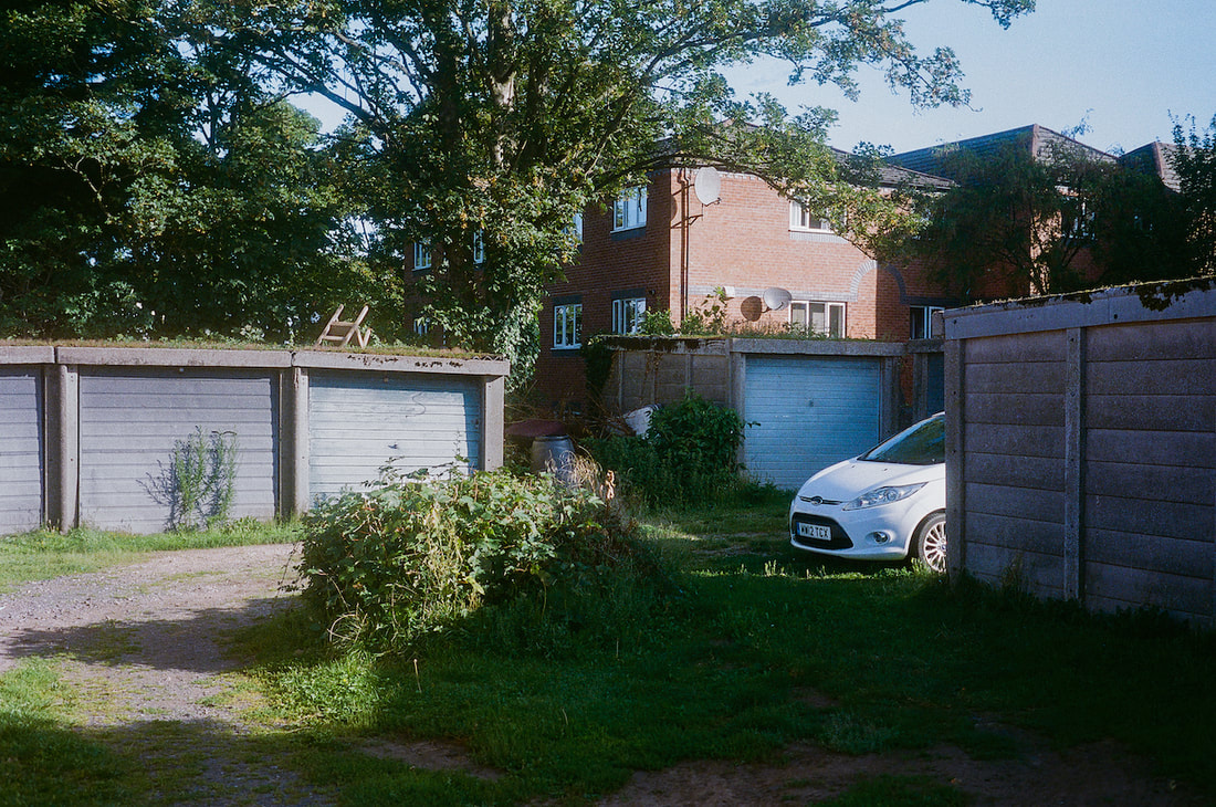
Both of these pictures were taken near to where I live within a few yards of one another on the same day but at different times and in different lighting conditions, one in the morning and the other in the late afternoon. They are both locations I photograph a lot for a variety of reasons.
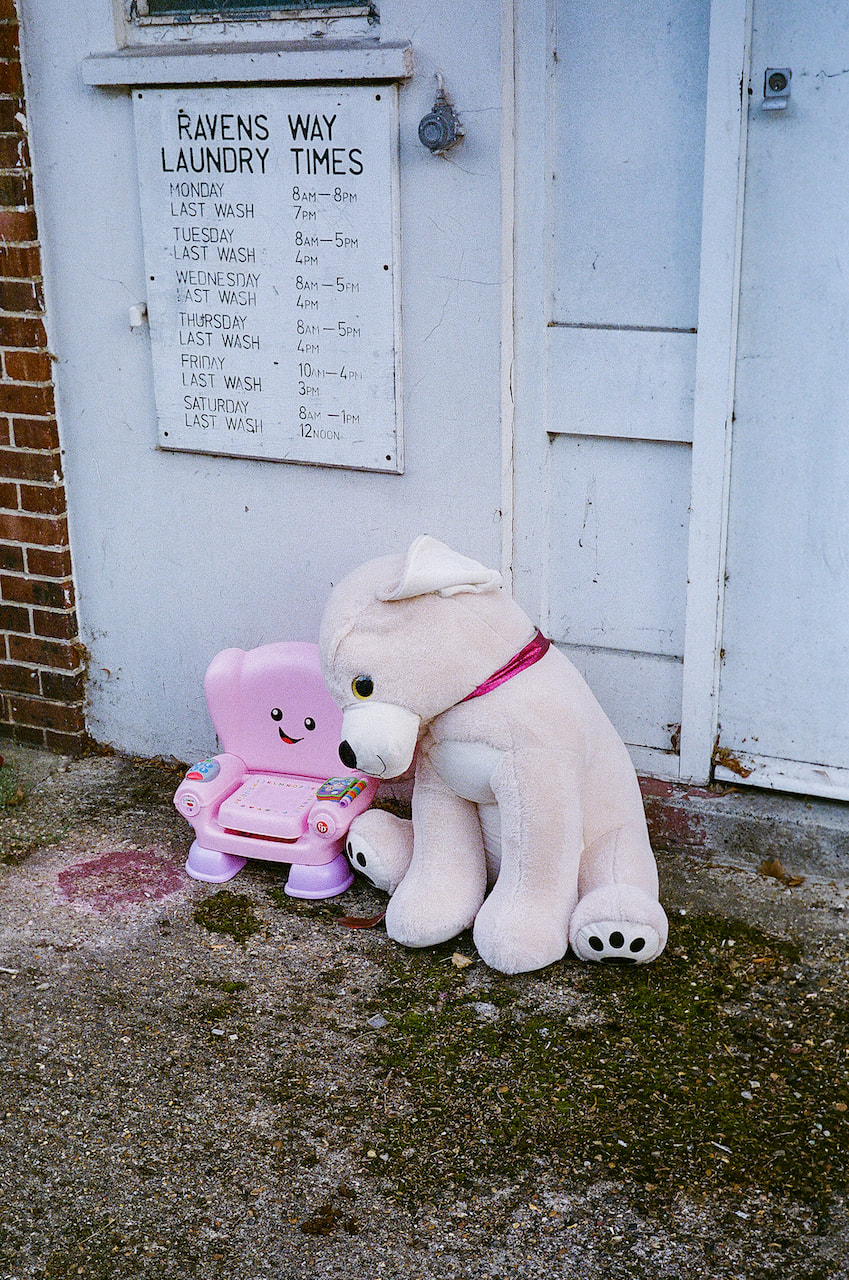
The street is called Ravens Way which I find poetic and slightly sinister. Ravens are the subject of one of the greatest photobooks ever made and appear frequently in art and literature as symbols of both bad luck and rebirth. The garages on the corner are like an outdoor gallery space, the doors like abstract paintings. For some reason the light is always interesting here - a combination of worn surfaces and complex shadows. Just down the road is a an old laundry which used to service the nearby flats (presumably before everyone had their own washing machine). It's now unused and recently had some asbestos removed. It's where the locals leave their unwanted household items - furniture mostly, but also the odd toy or item of clothing - to be collected by the council. The effect is like a sculpture court. Items are clearly not meant to be viewed as art but I like to imagine that an artist/curator has had a hand in their arrangement.
So, this diptych works for me in terms of its subject matter (adjacent locations on Ravens Way) narrative (a walk down the same street on the same day but in different directions and at different times) and also its metaphorical or symbolic potential (mundane public spaces and objects interpreted as subconscious art). I also hope that the diptych works formally as a satisfying composition (see animation below).
|
|
The animation below is an attempt to explain why this pairing of pictures might work compositionally mostly in terms of leading lines, perspective and repetition. I particularly like the way the laundry gutter appears to connect (across the gutter separating the two pictures) with a tree branch in the garages picture. I also like the relationship between the damaged garage door and smashed laundry window.
The images are, in fact, arranged in reverse chronology. The garages picture was taken at the end of the day, the laundry at the beginning. In a sense, therefore, this arrangement -'read' from left to right - is like travelling back in time.
The images are, in fact, arranged in reverse chronology. The garages picture was taken at the end of the day, the laundry at the beginning. In a sense, therefore, this arrangement -'read' from left to right - is like travelling back in time.
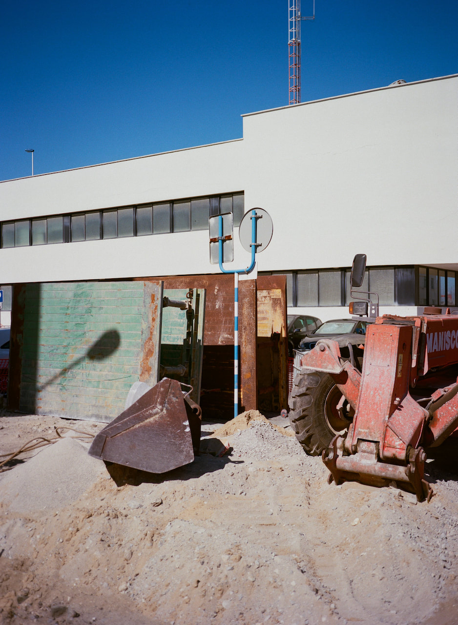
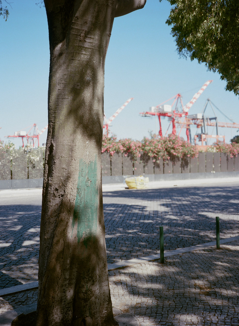
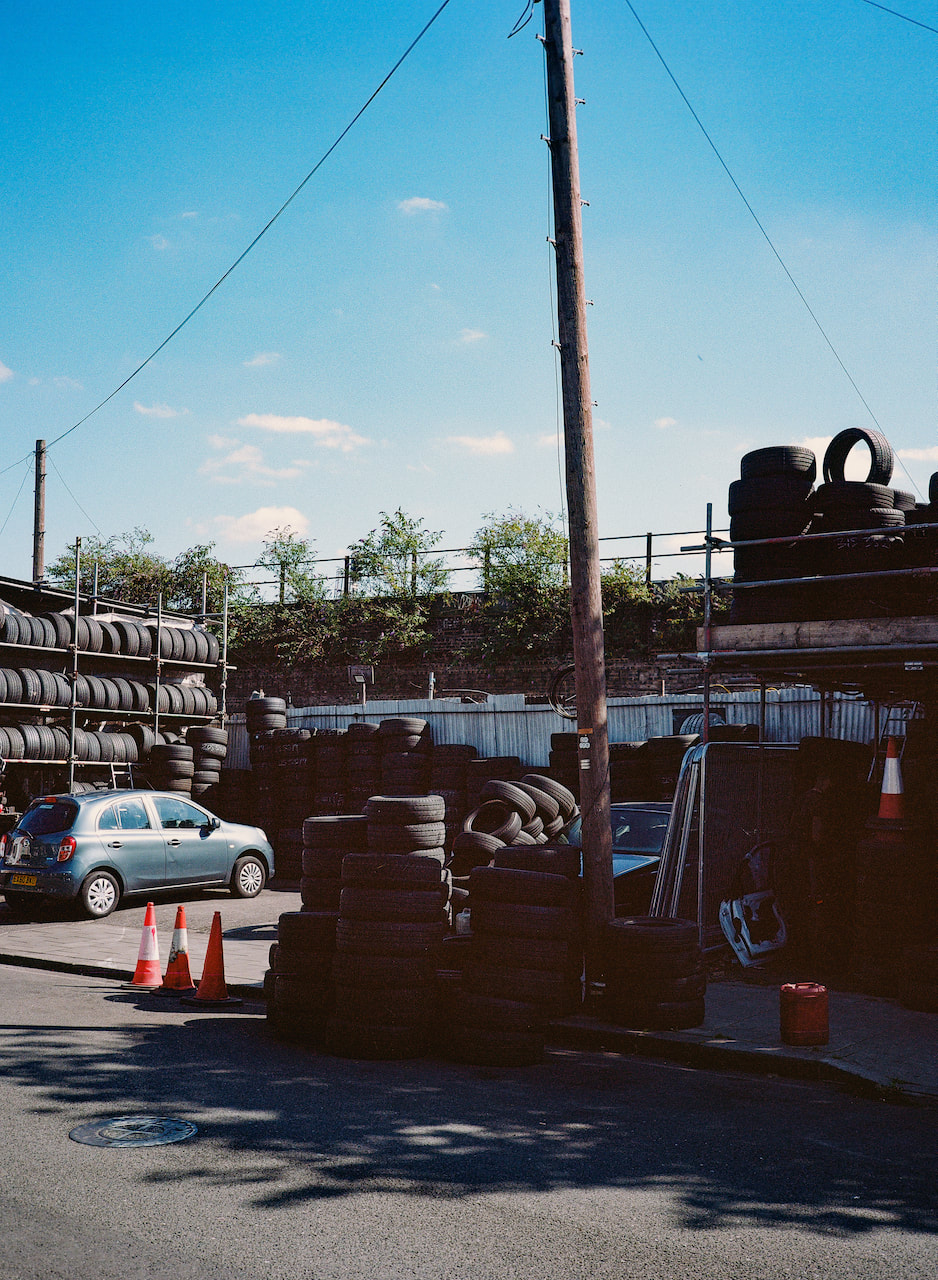
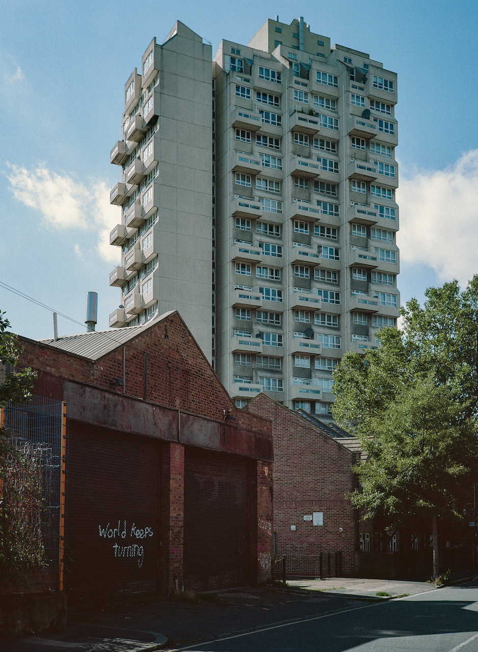
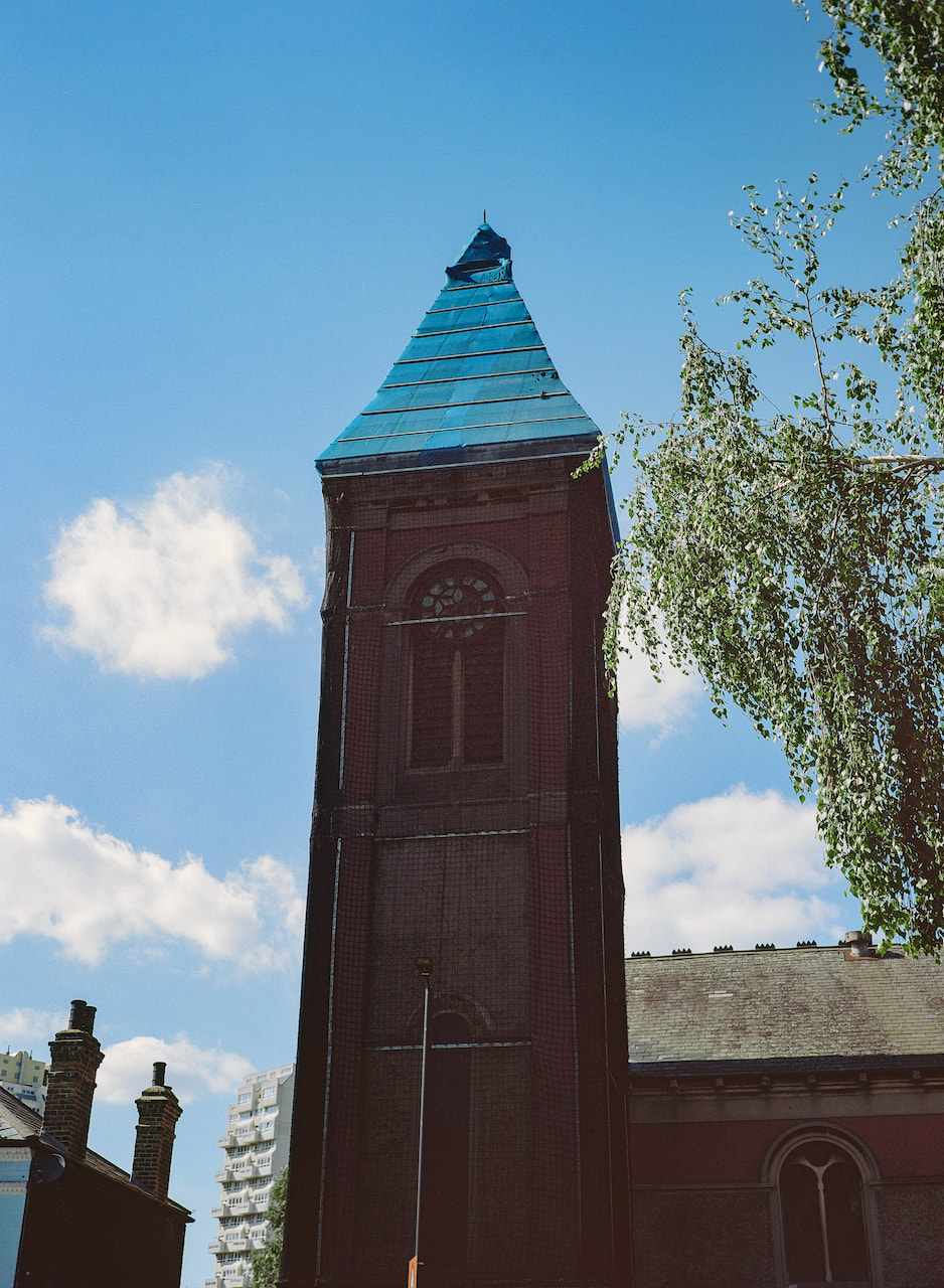
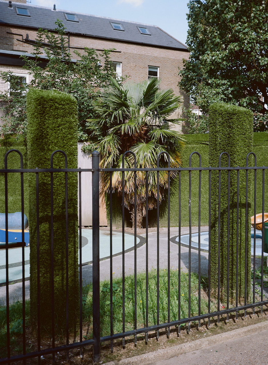
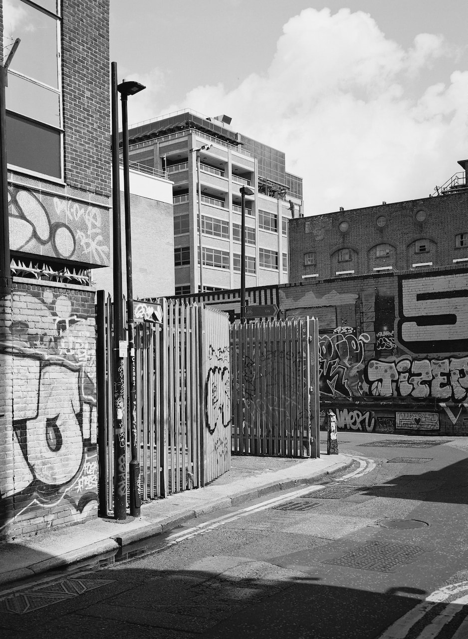
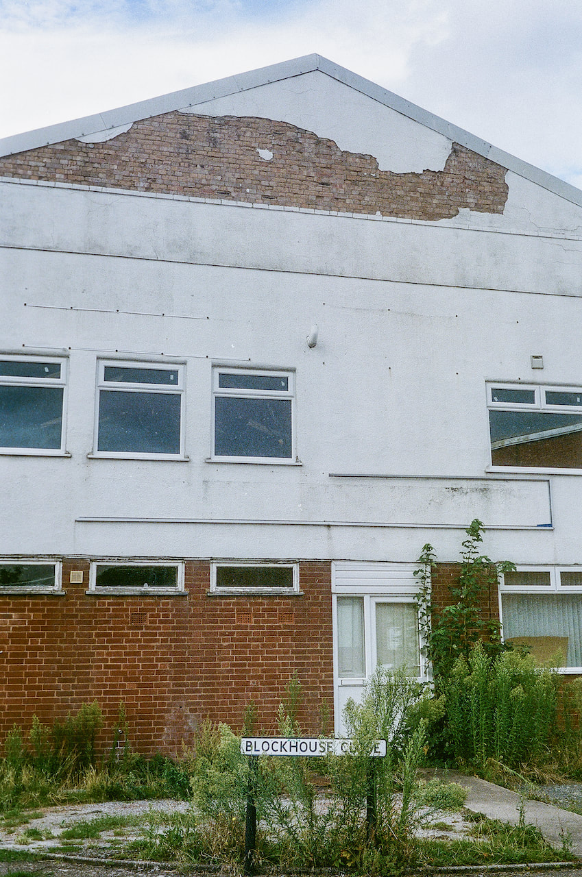
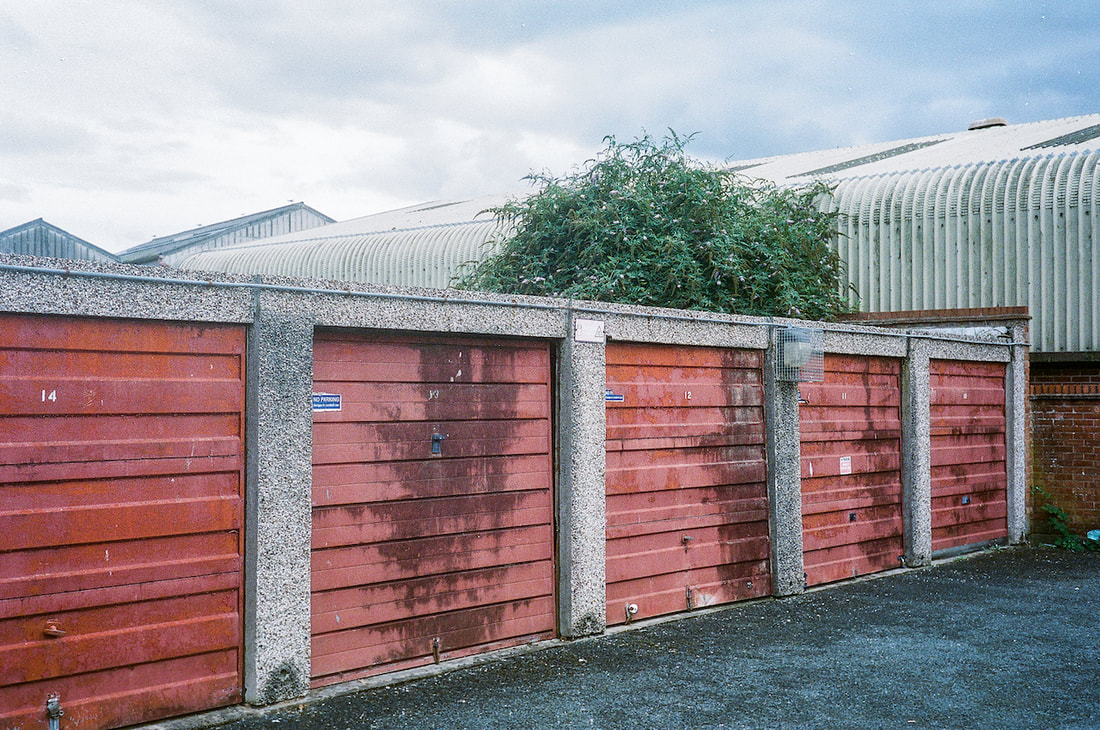
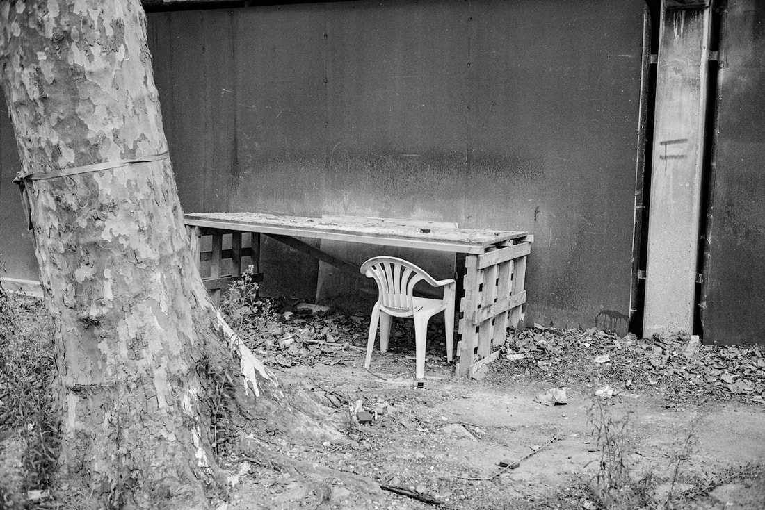
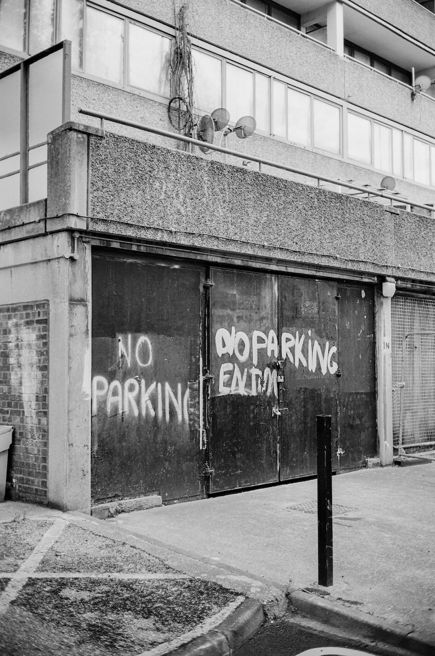
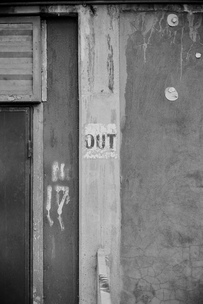
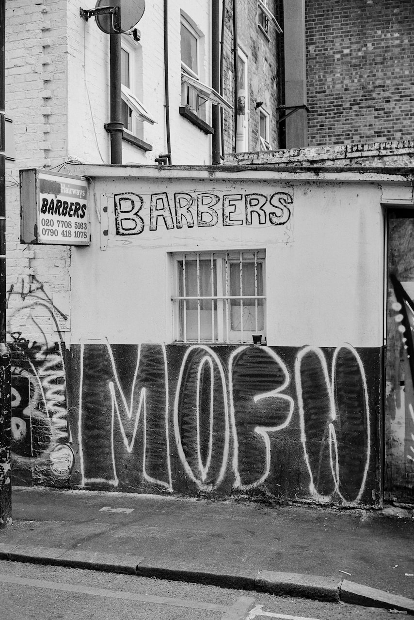
South & East
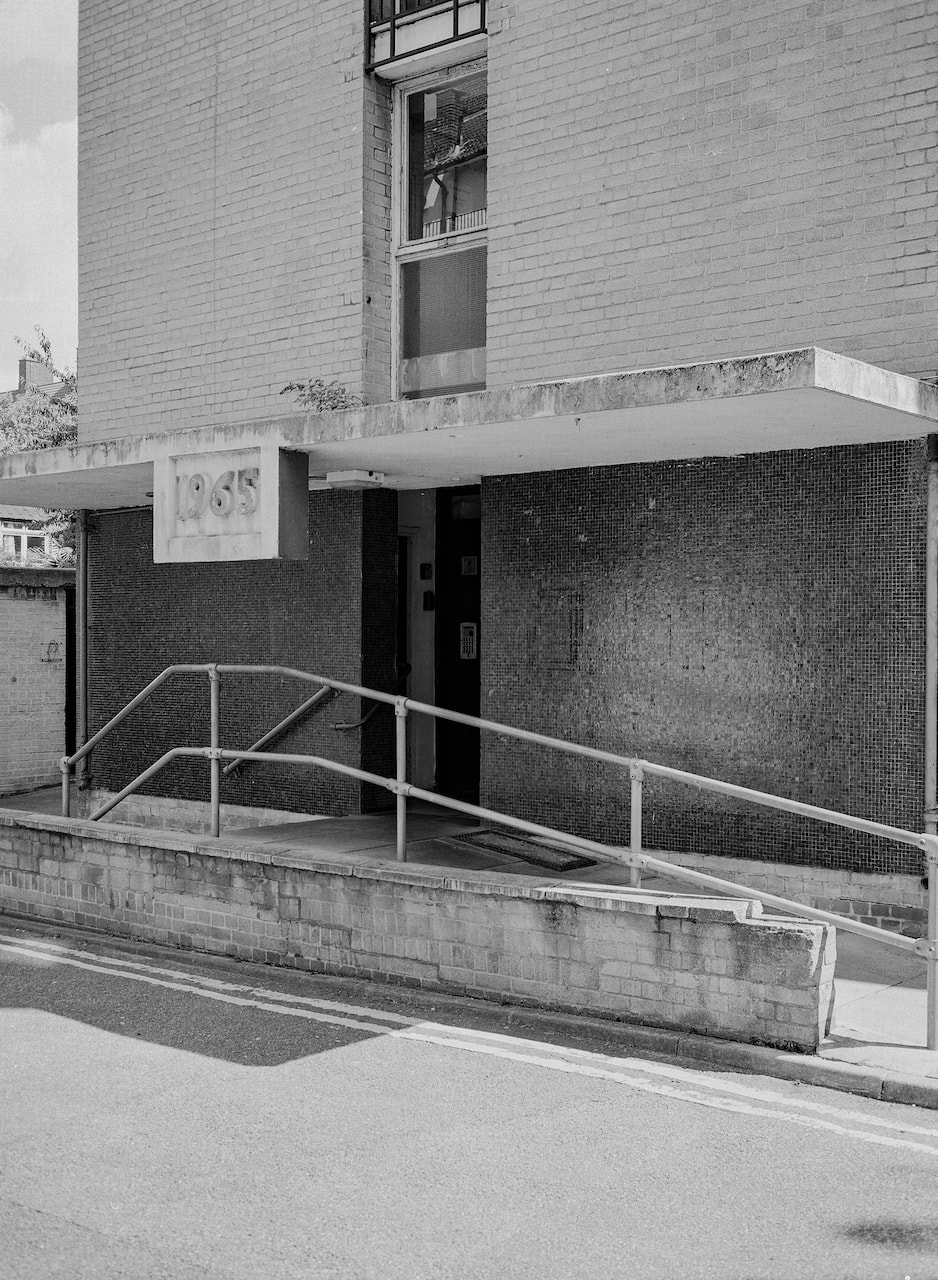
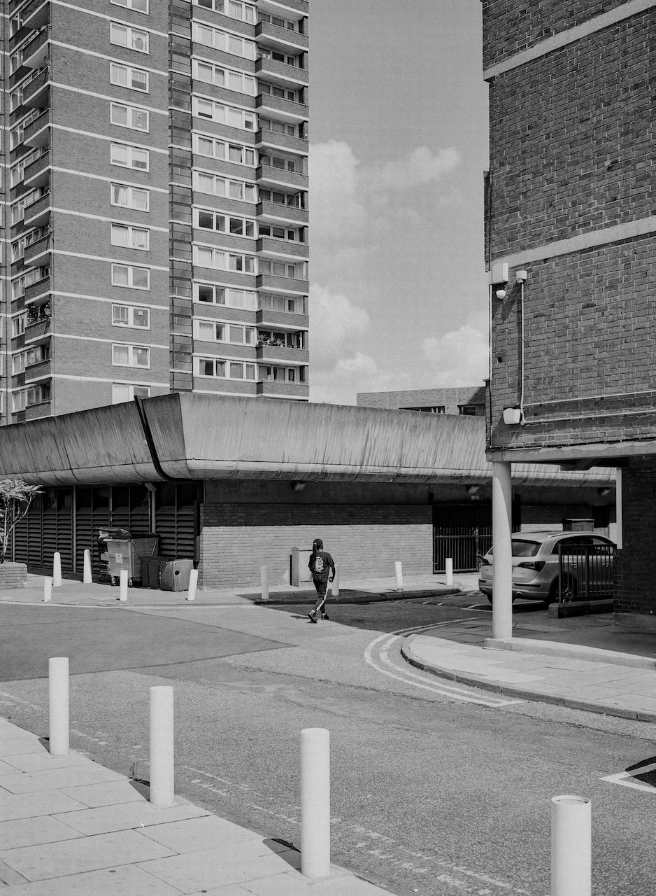
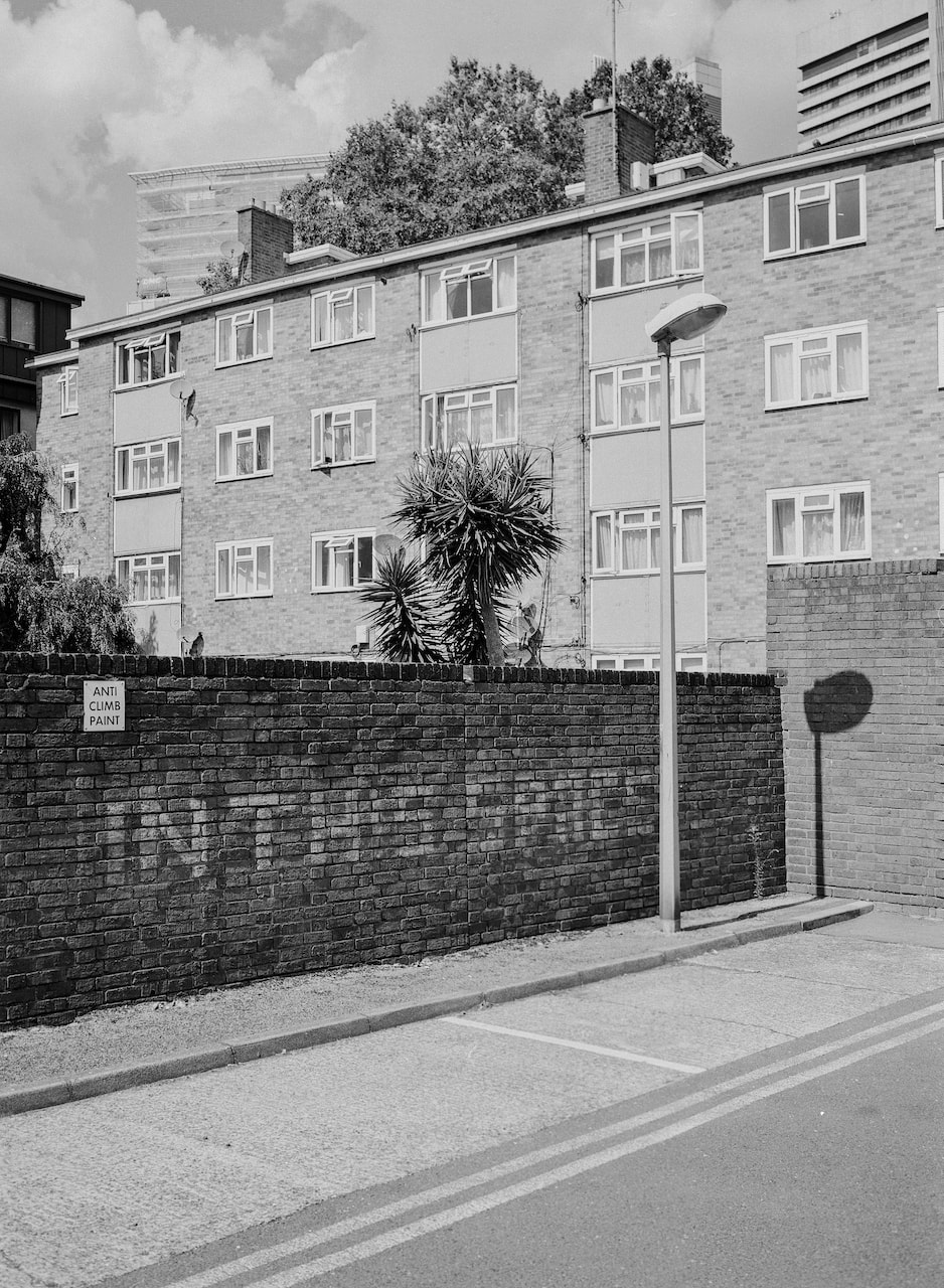
These pictures were made during a couple of walks in south east and east London with my medium format camera on Ilford XP2 Super400 120 film. A couple of the images had light leaks so I've cropped where possible touched up the scans a little in Lightroom and Photoshop.
Diptychs
|
|
|
|

|

|

|

|
|
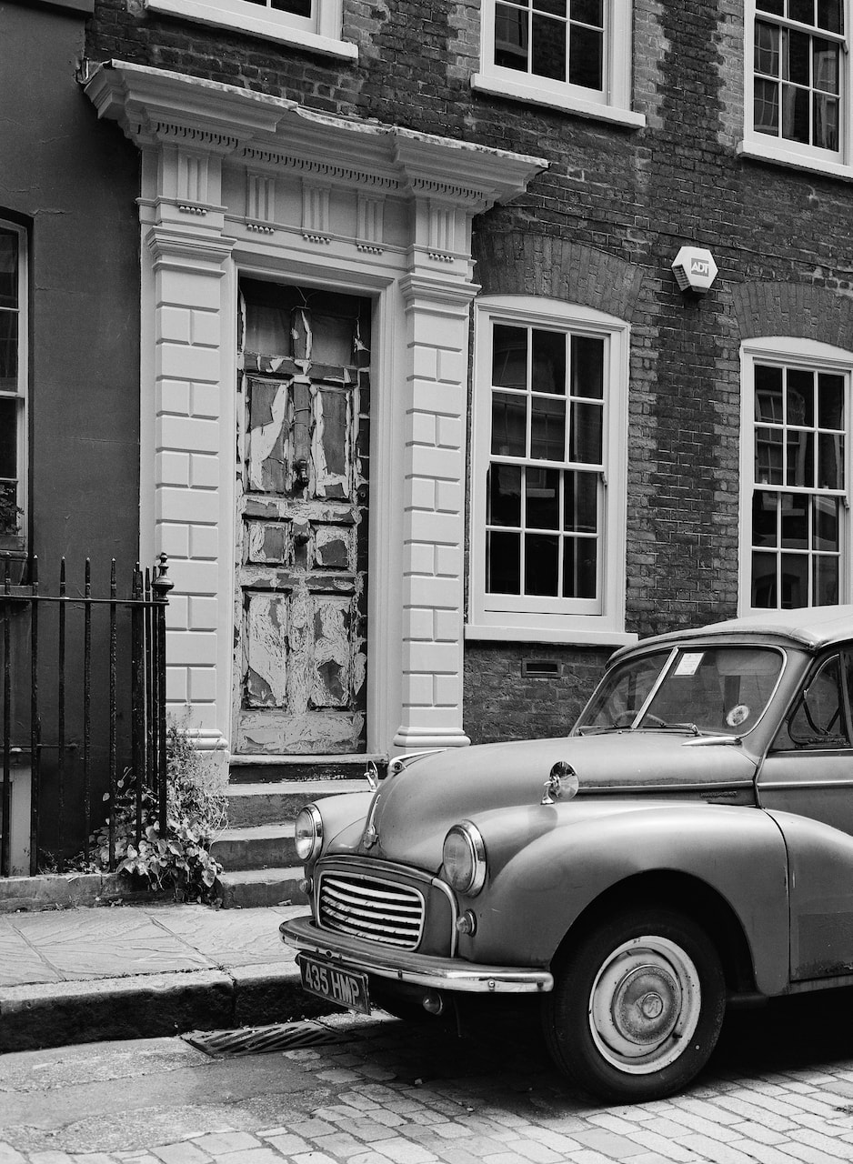
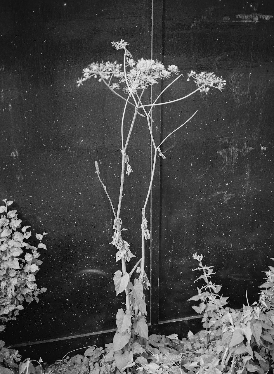
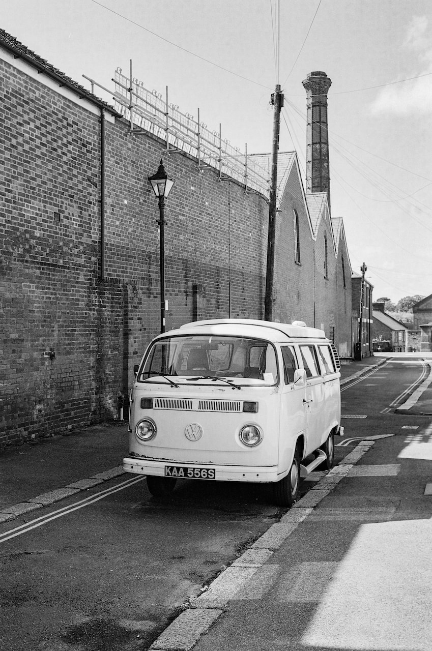
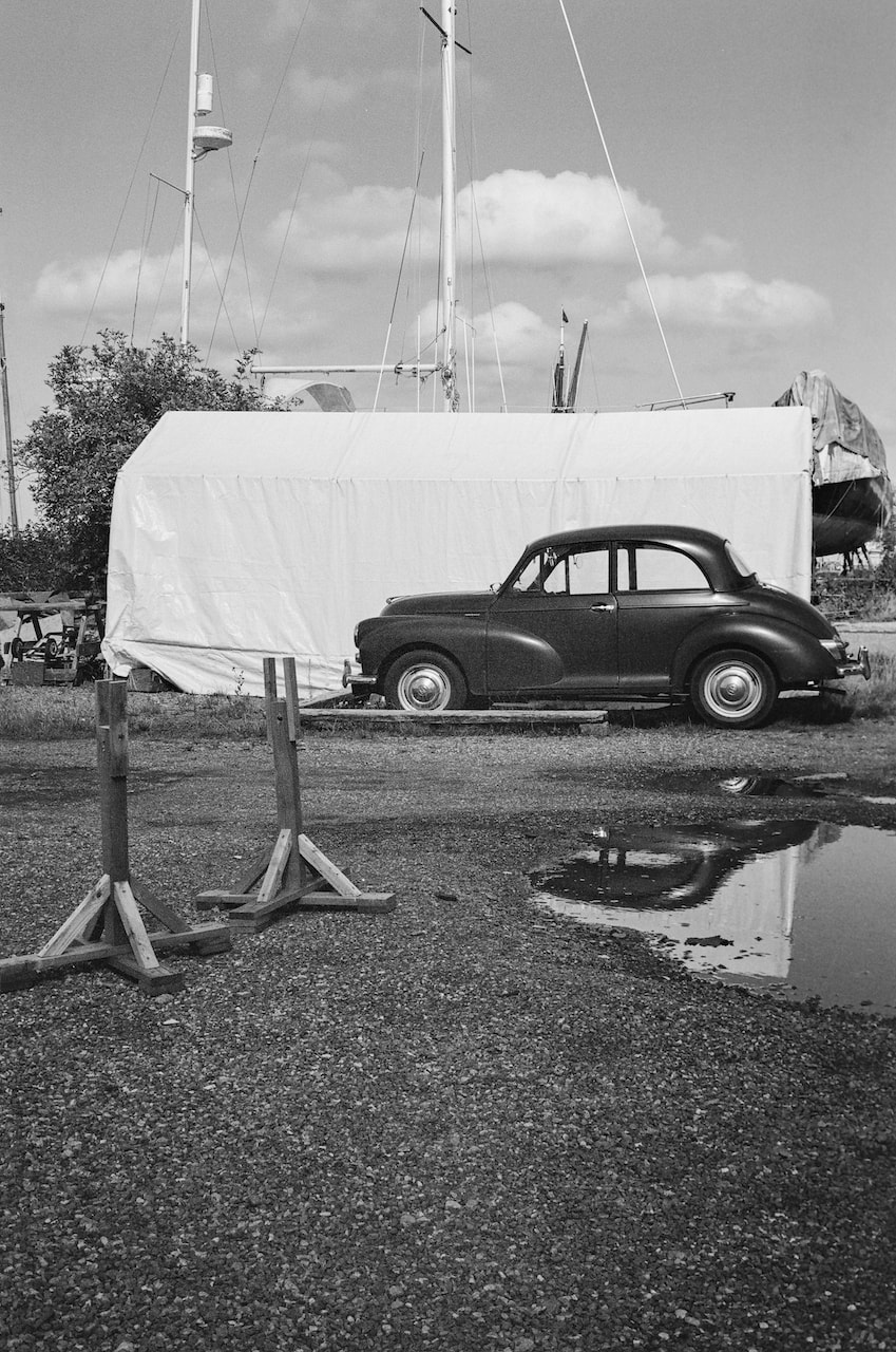
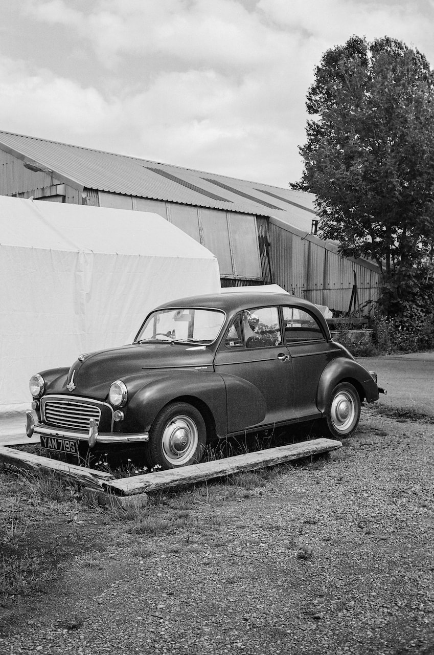
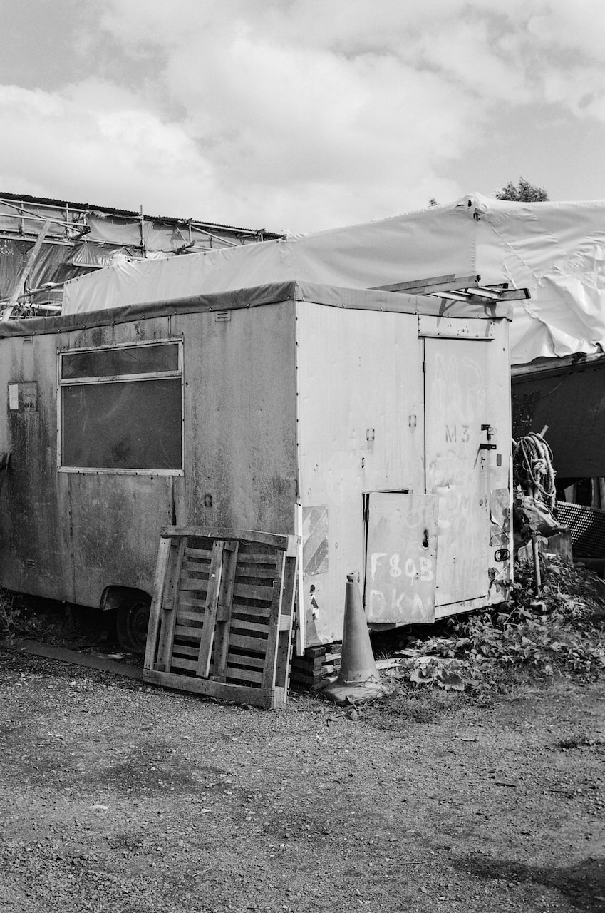
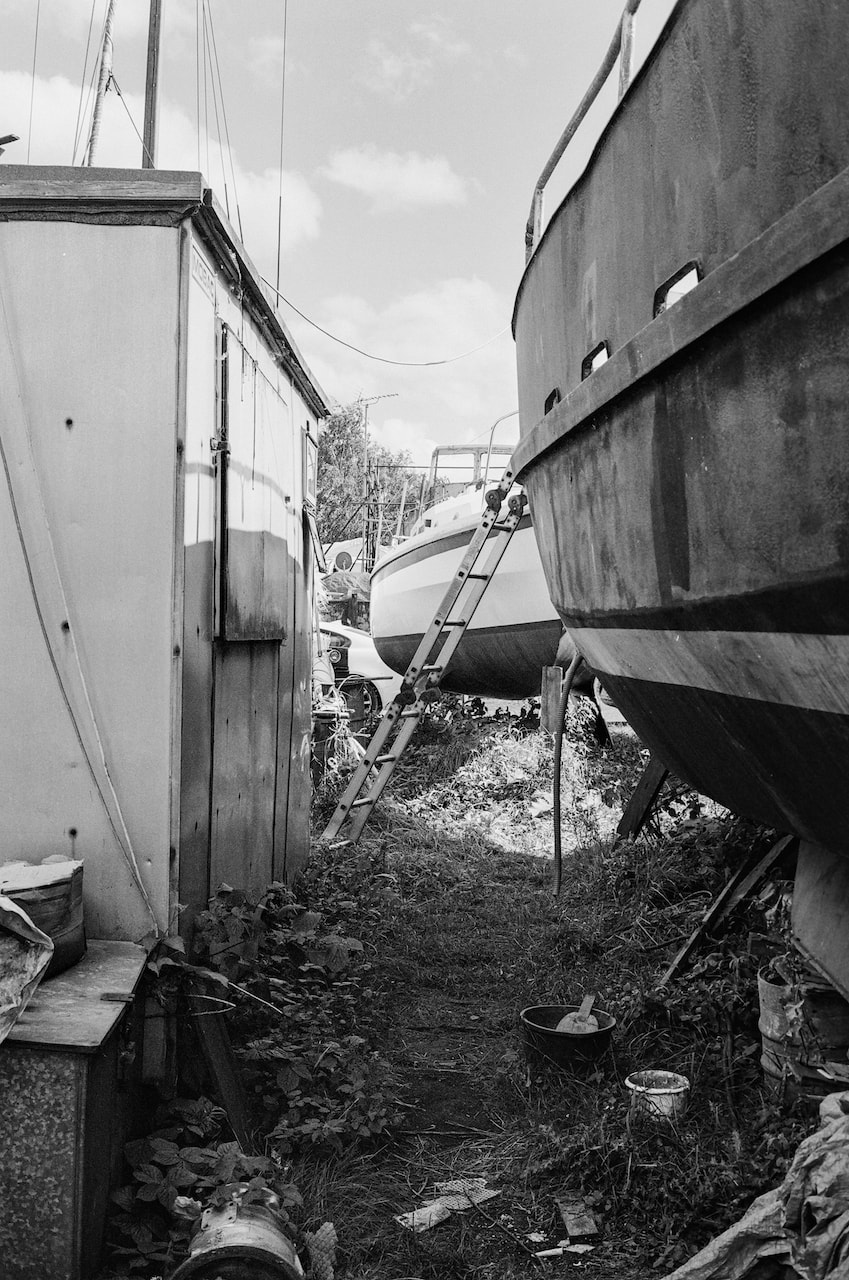
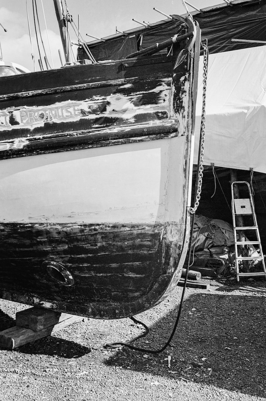
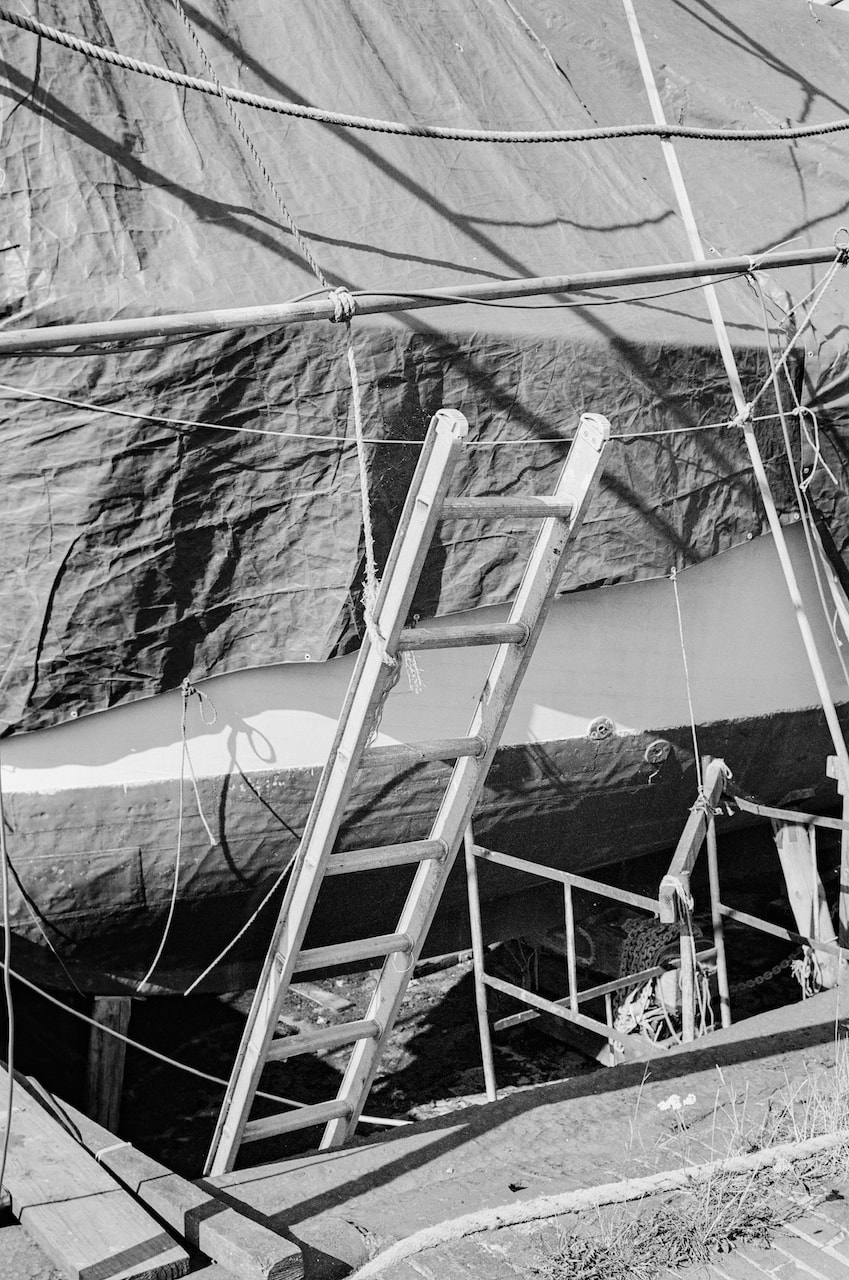
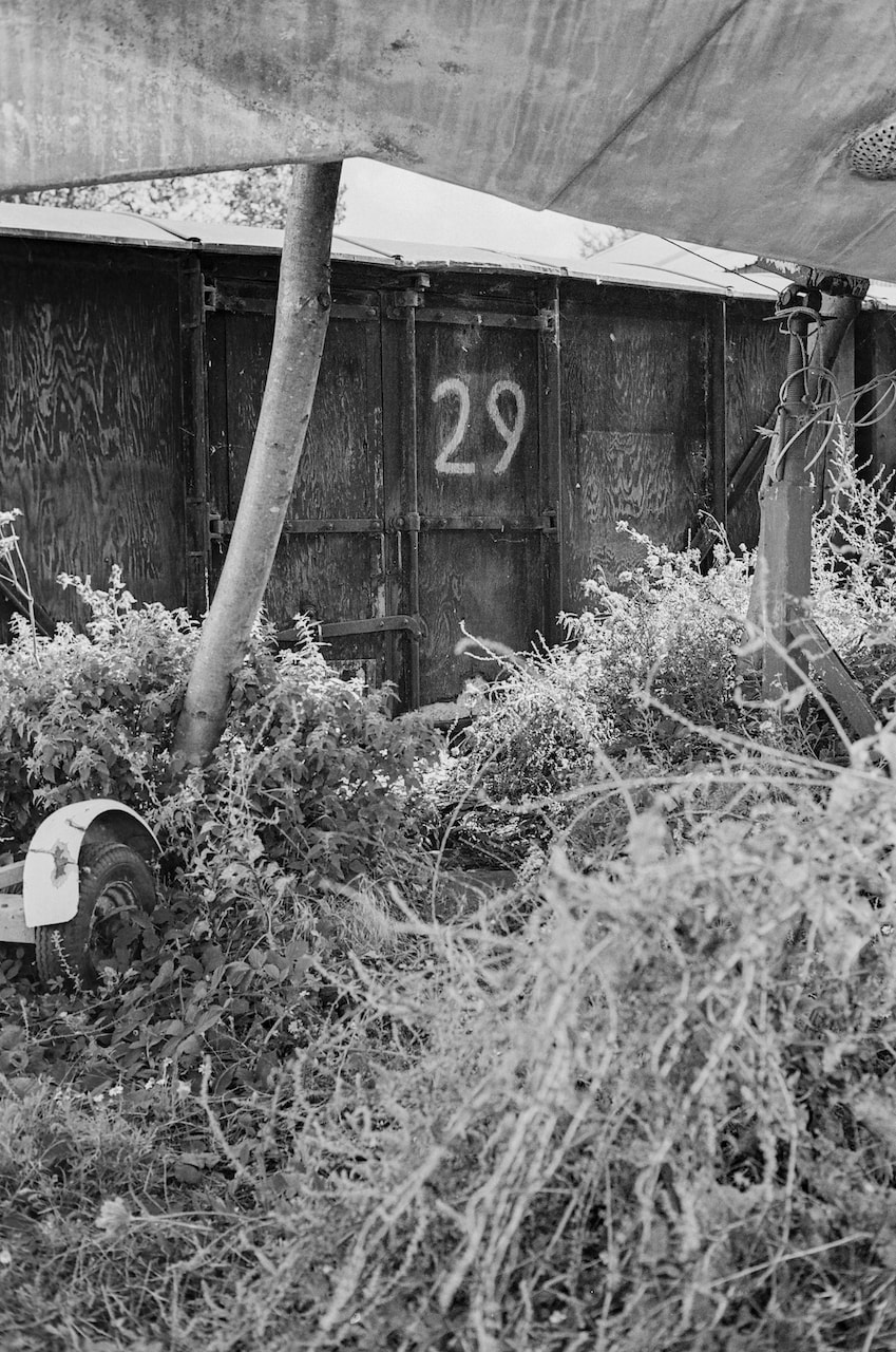
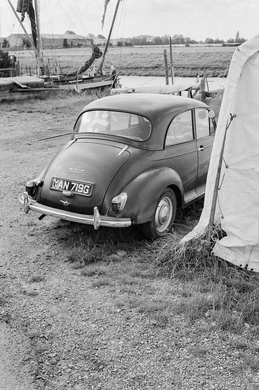
Back to 35mm
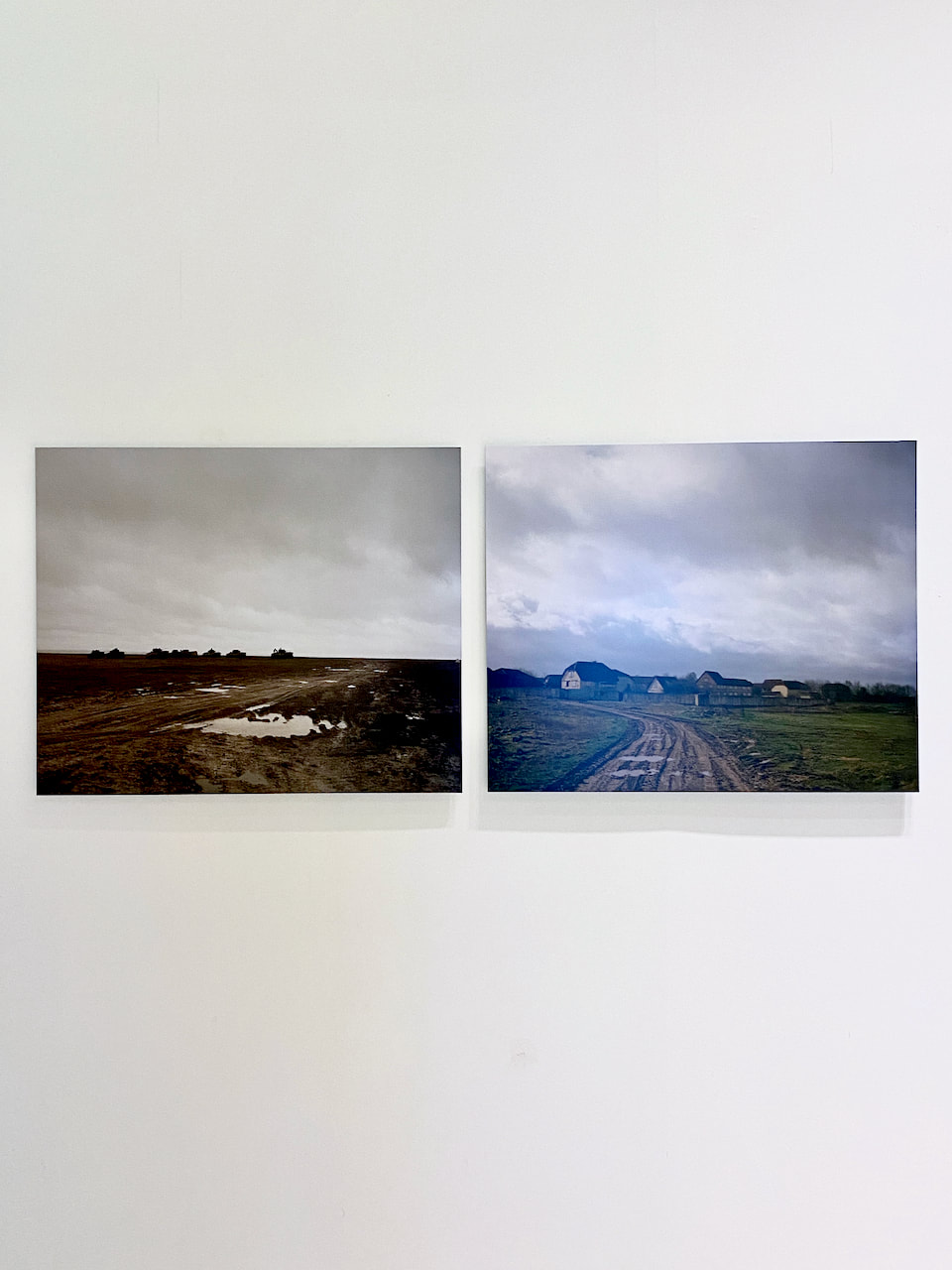
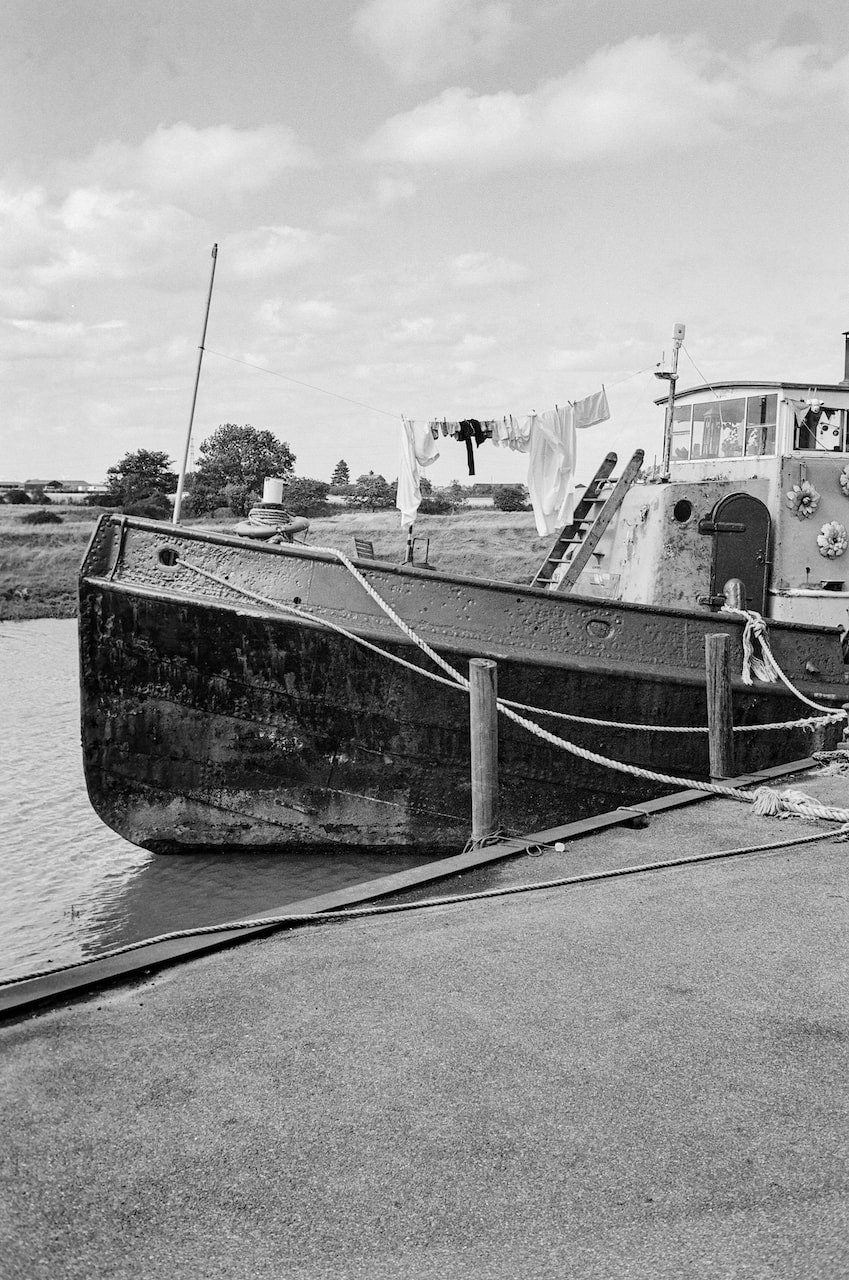
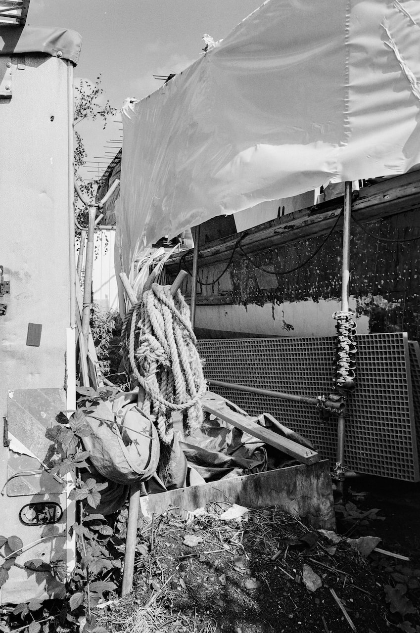
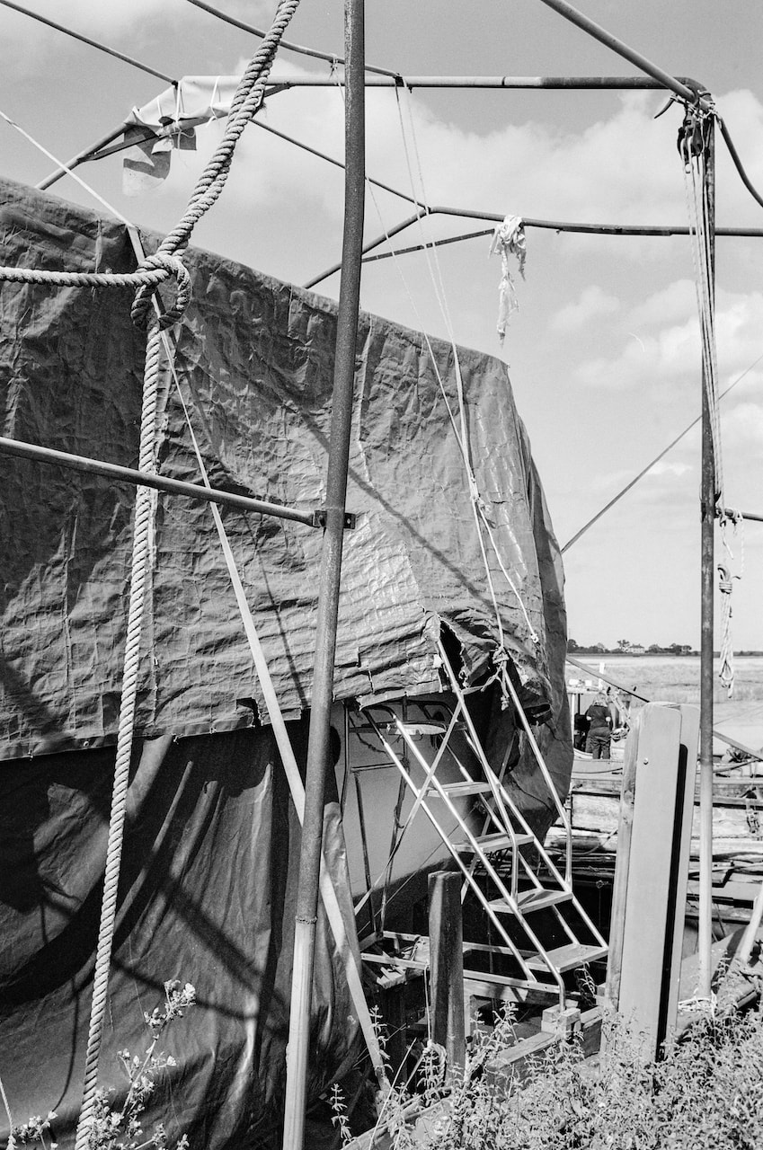
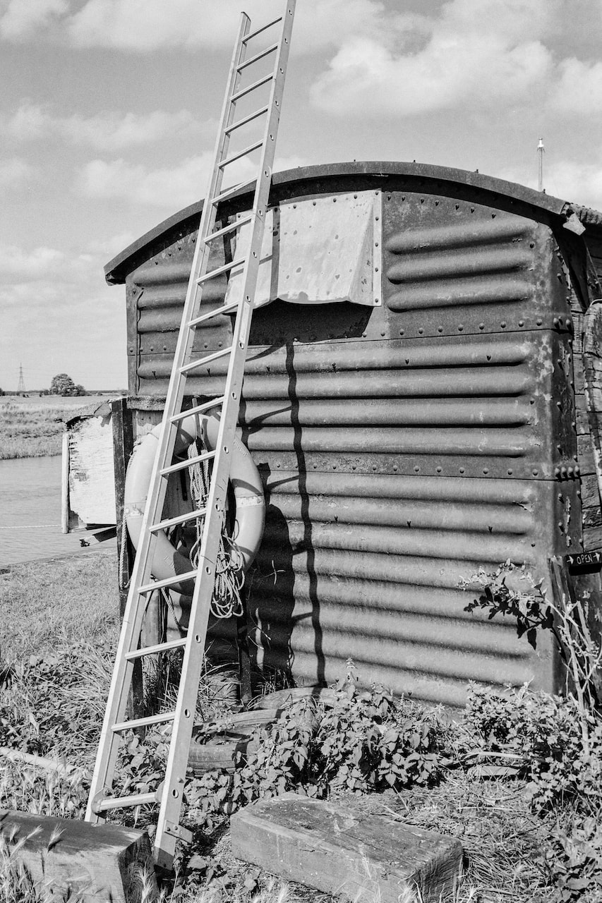
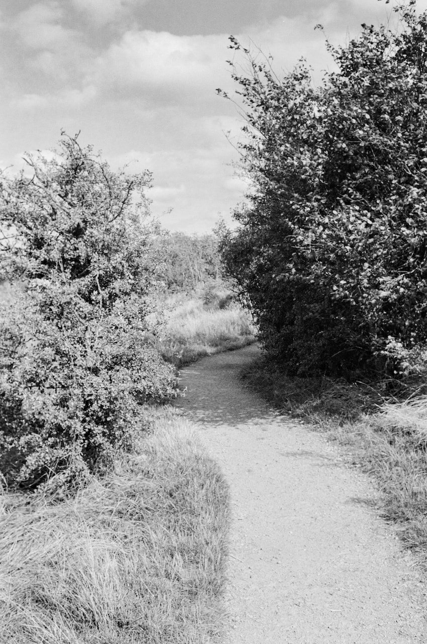
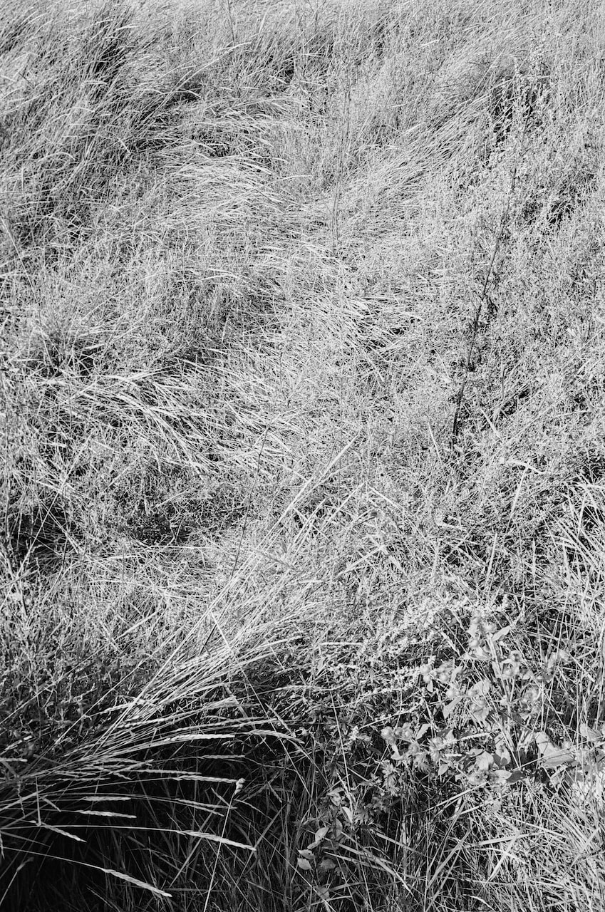
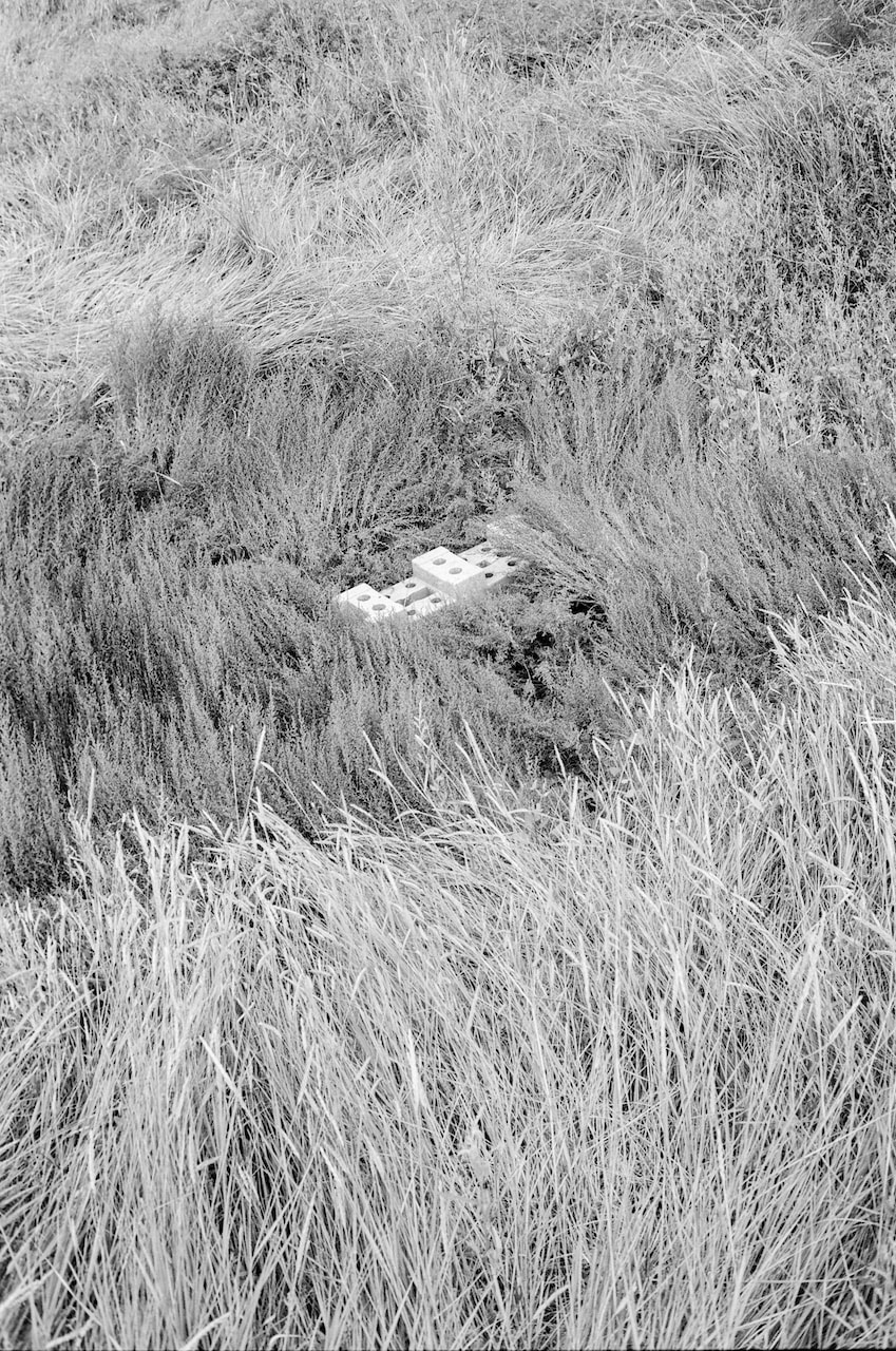
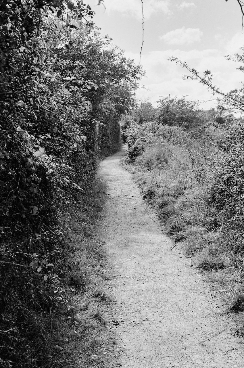
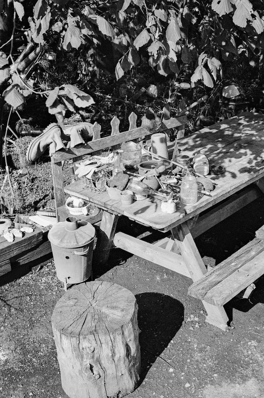
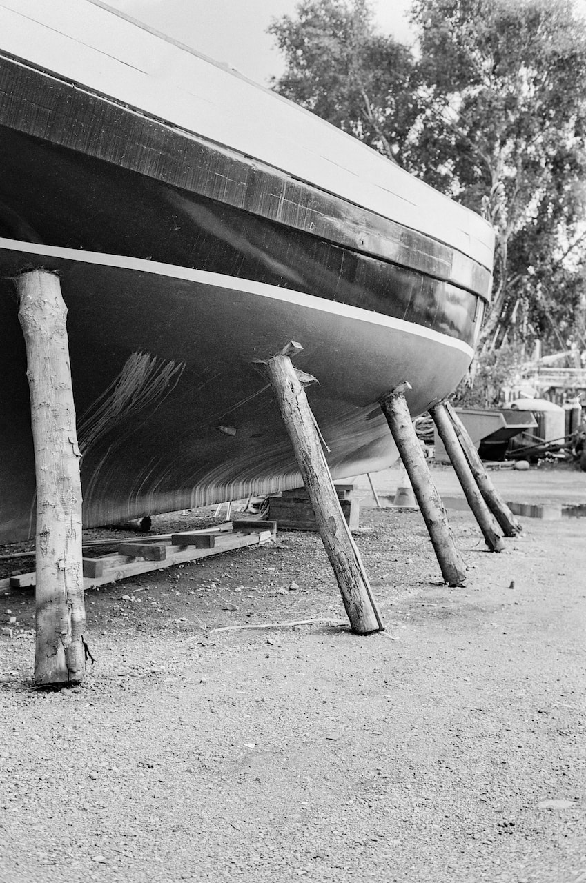
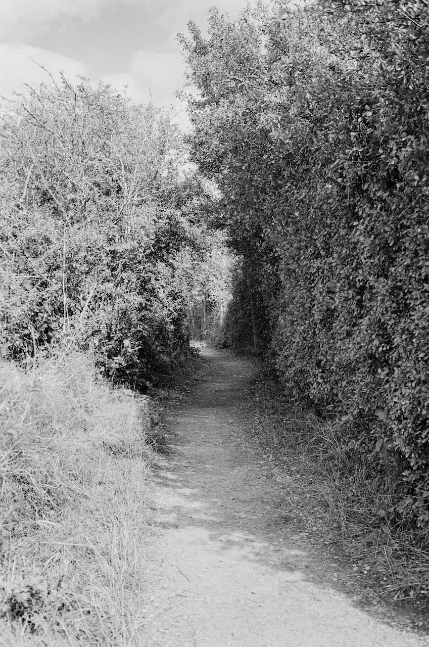
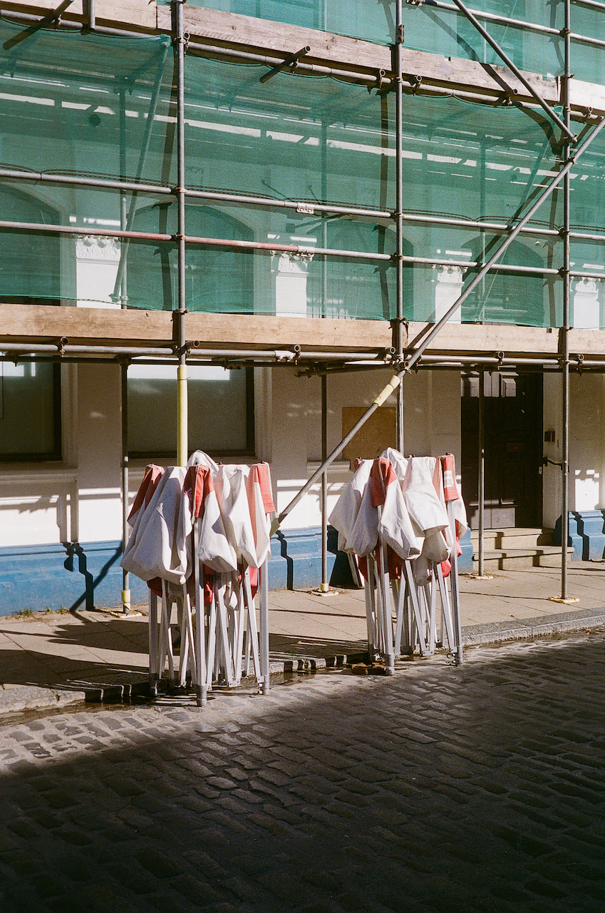
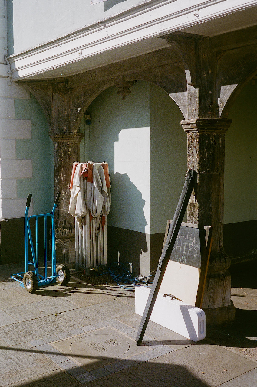
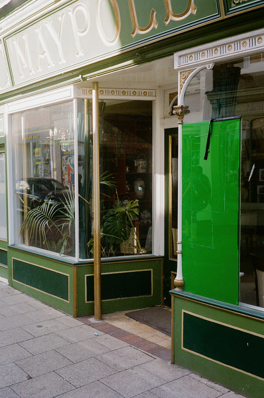
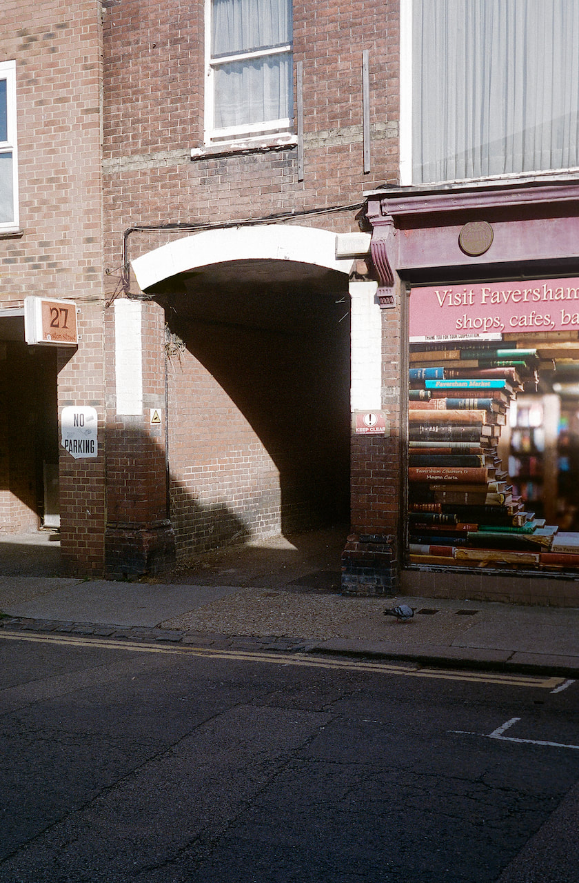
These pictures were taken with a 35mm rangefinder camera on Ilford XP2 Super400 film on a day trip to Faversham in Kent. My medium format camera is also a rangefinder so I'm used to the focusing process. I had a to guesstimate the compositions because the 40mm lens I used didn't have corresponding frame lines in my camera. However, it seems like my guesses were mostly OK. I really enjoyed the boat yard and walk out into the marshes so this is a place I'd like to return to soon to photograph some more.
Diptychs
|
|
|
|
|
|
|
|
|
|
|
|
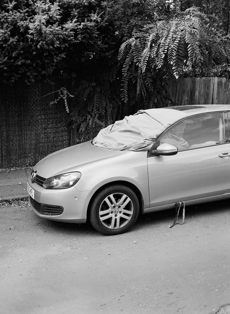
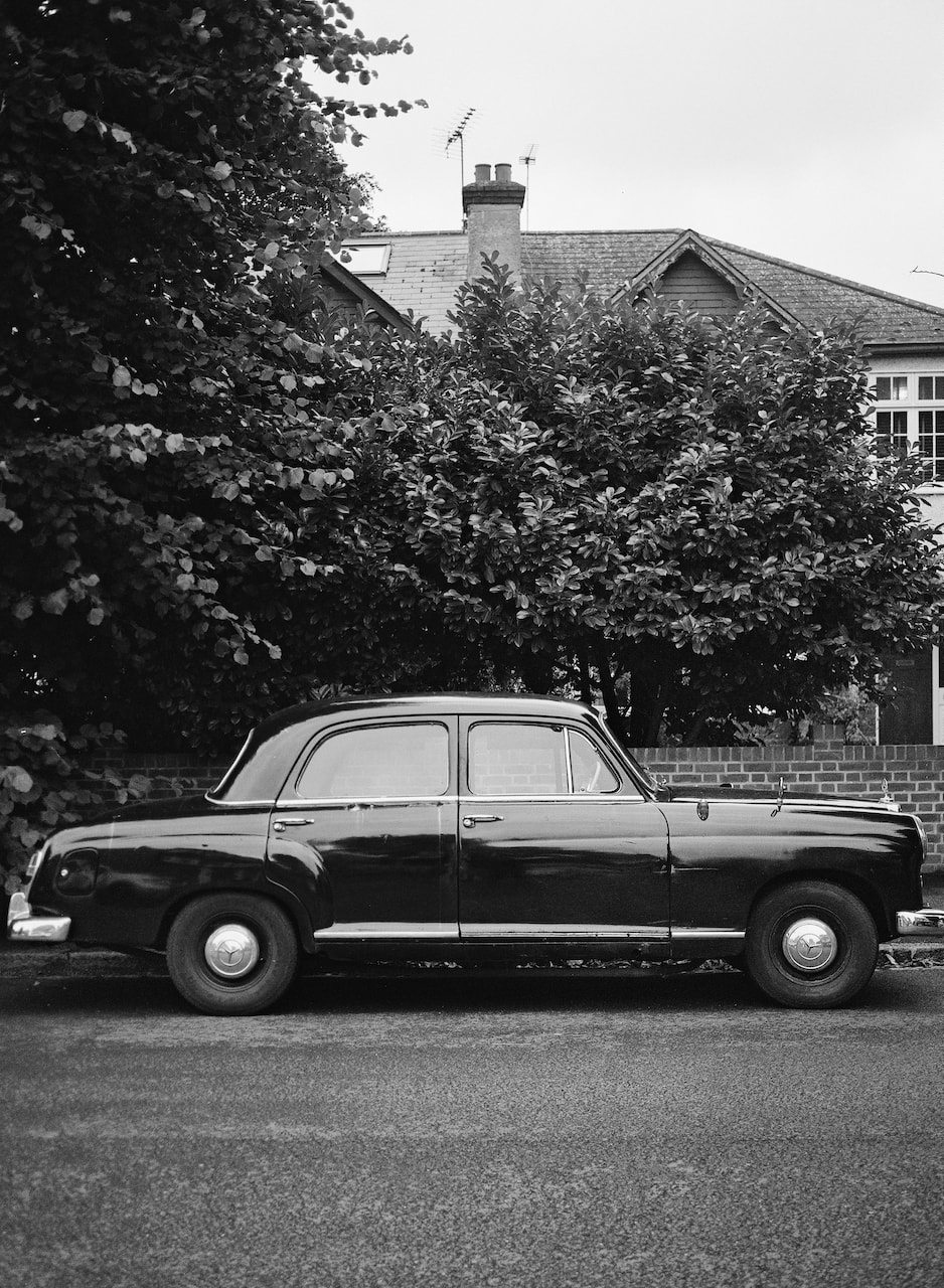
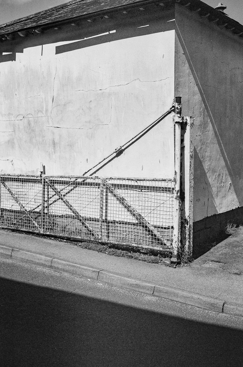
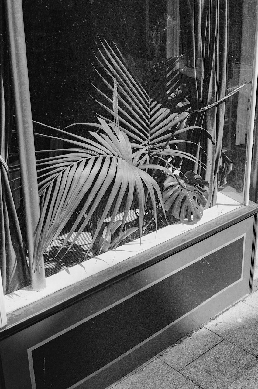
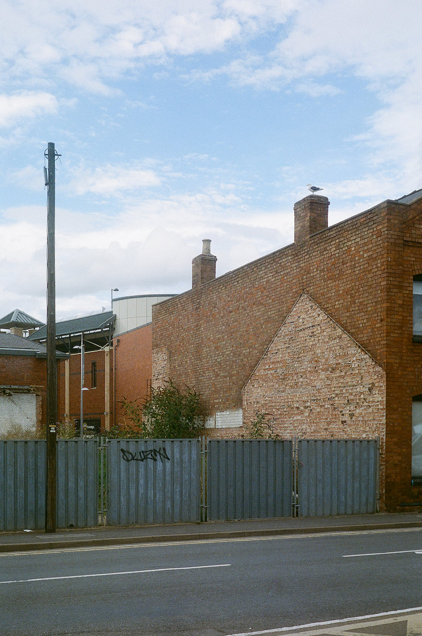
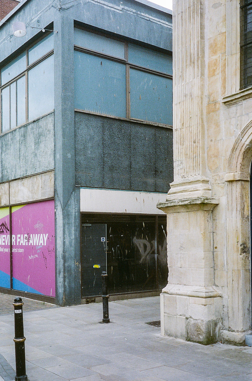
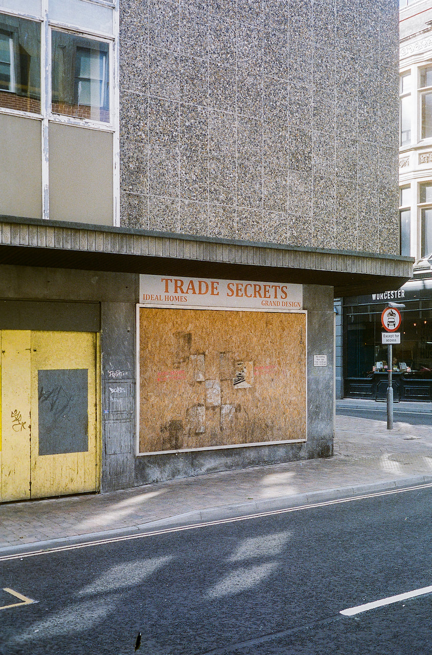
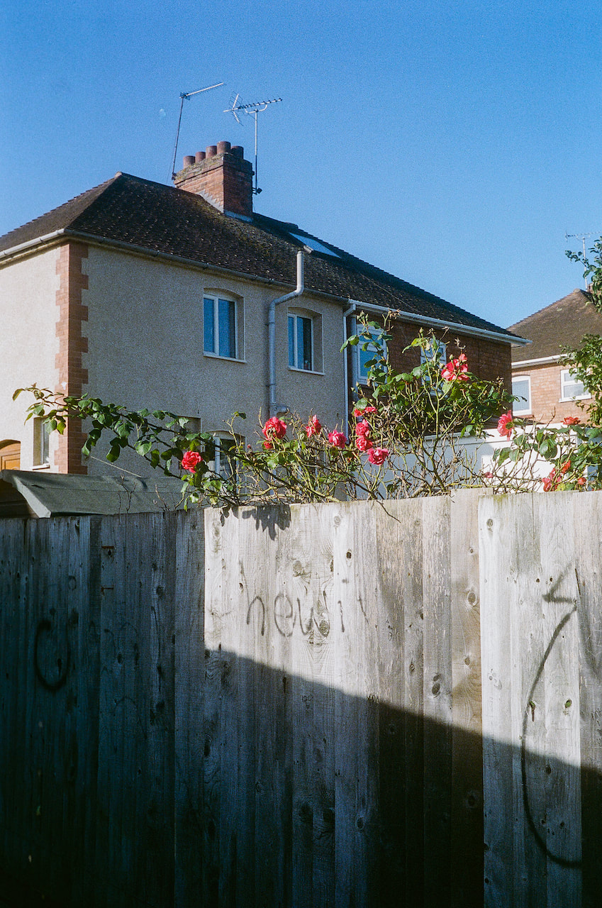
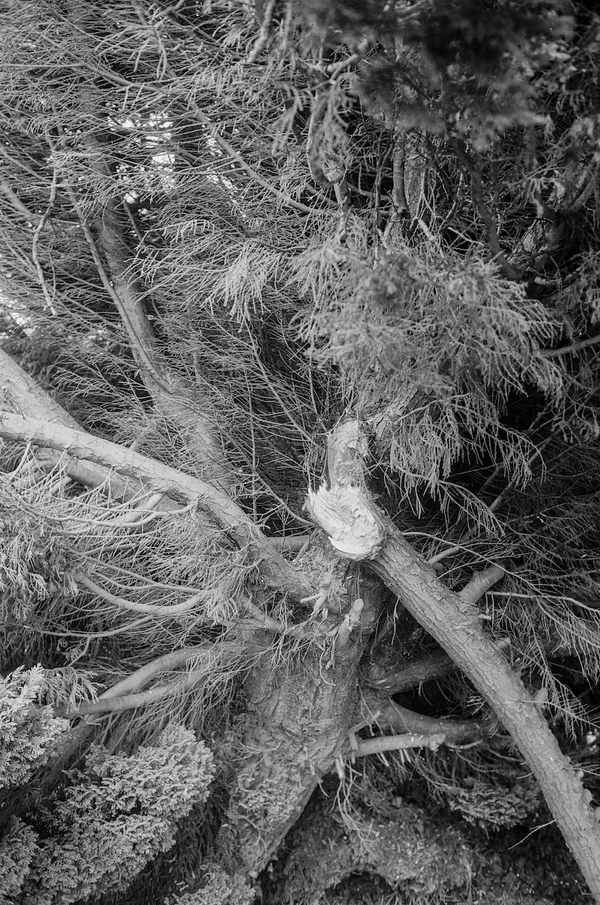
More 35mm
These pictures were shot on the same rangefinder camera as above on Portra 400. I began the roll in Faversham and completed it on a trip to Worcester.
Diptychs
|
|
|
|
|
|
|
|
|
|
|
|
|
|
|
|
|
|
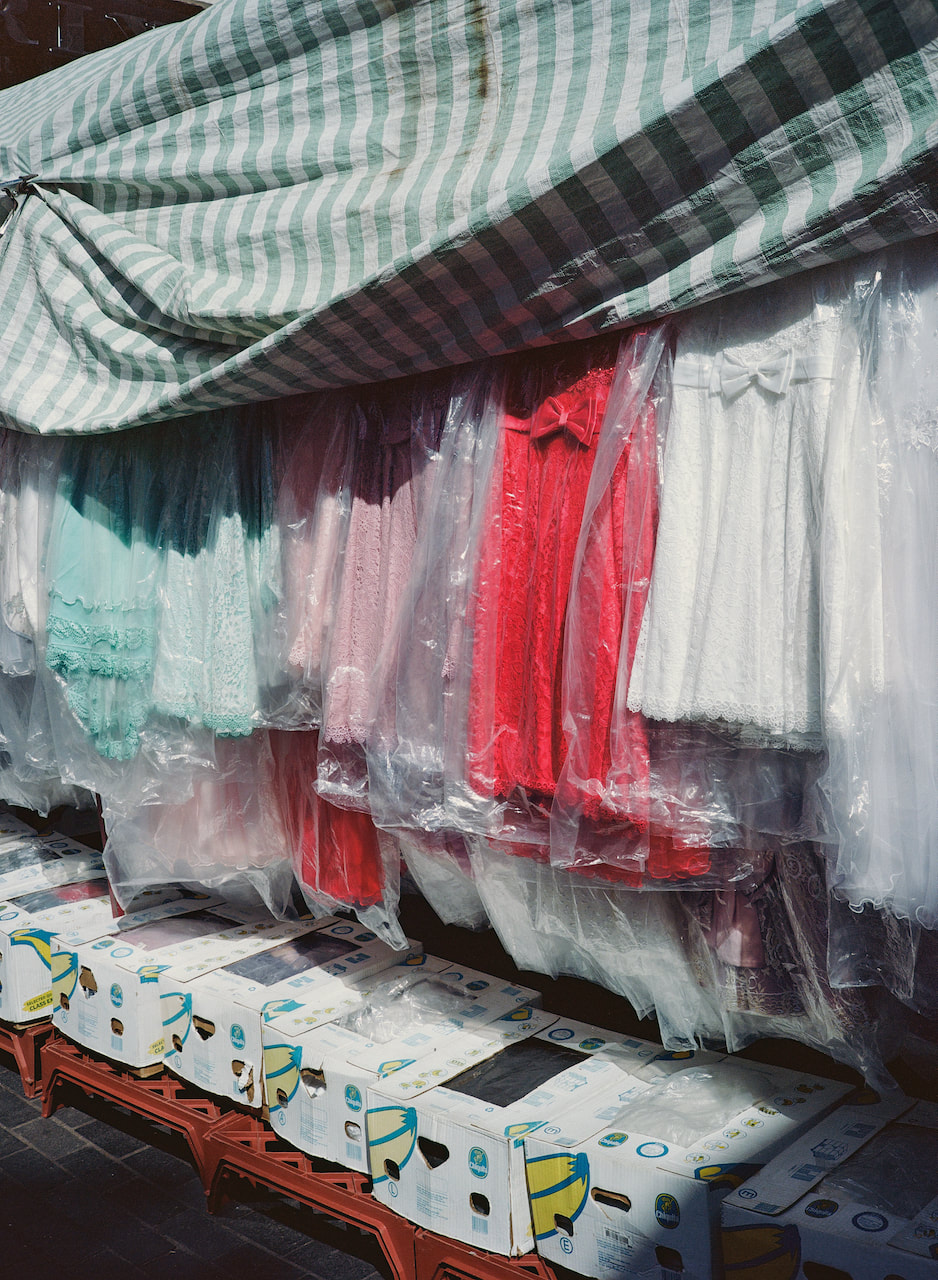
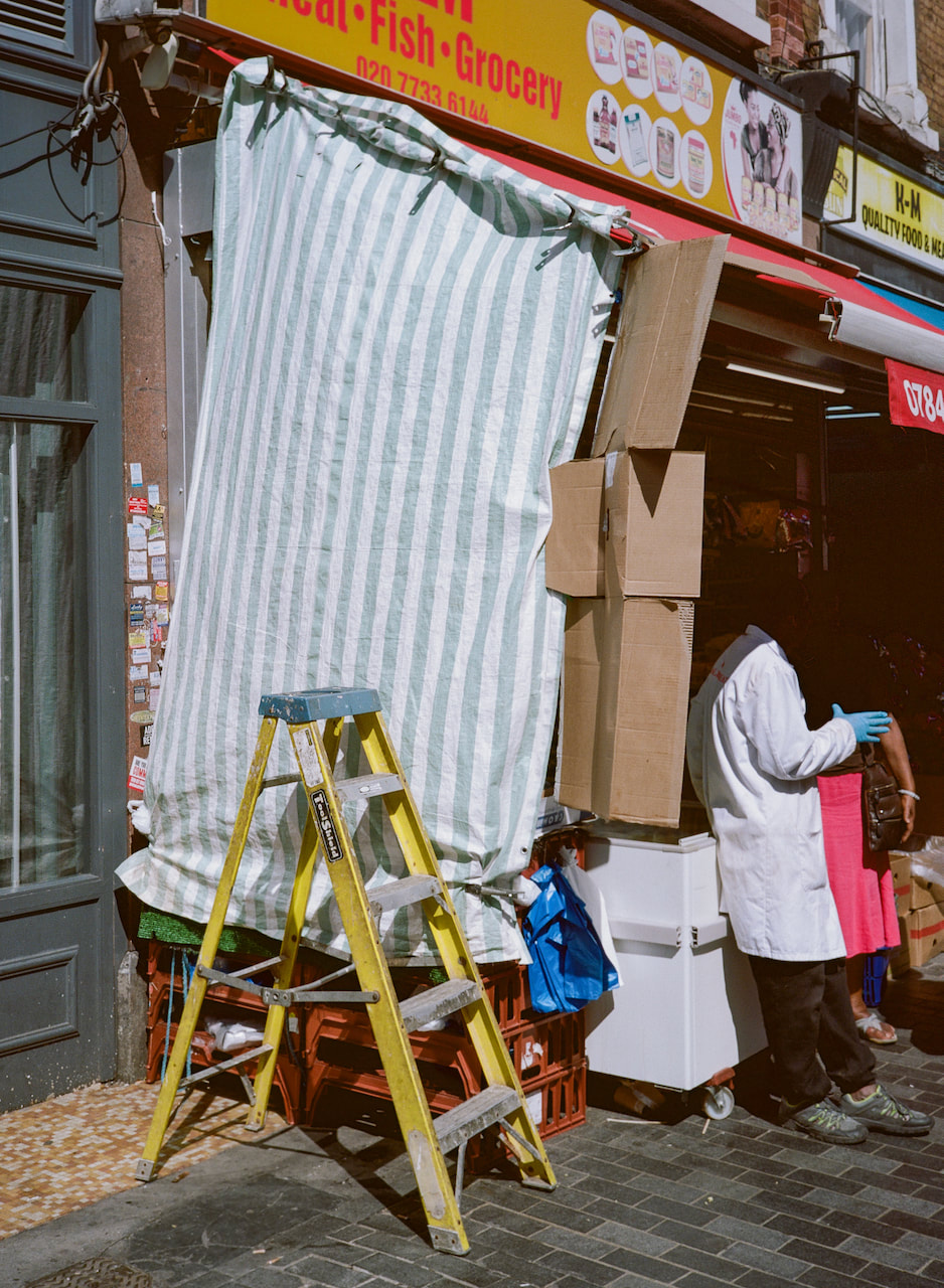
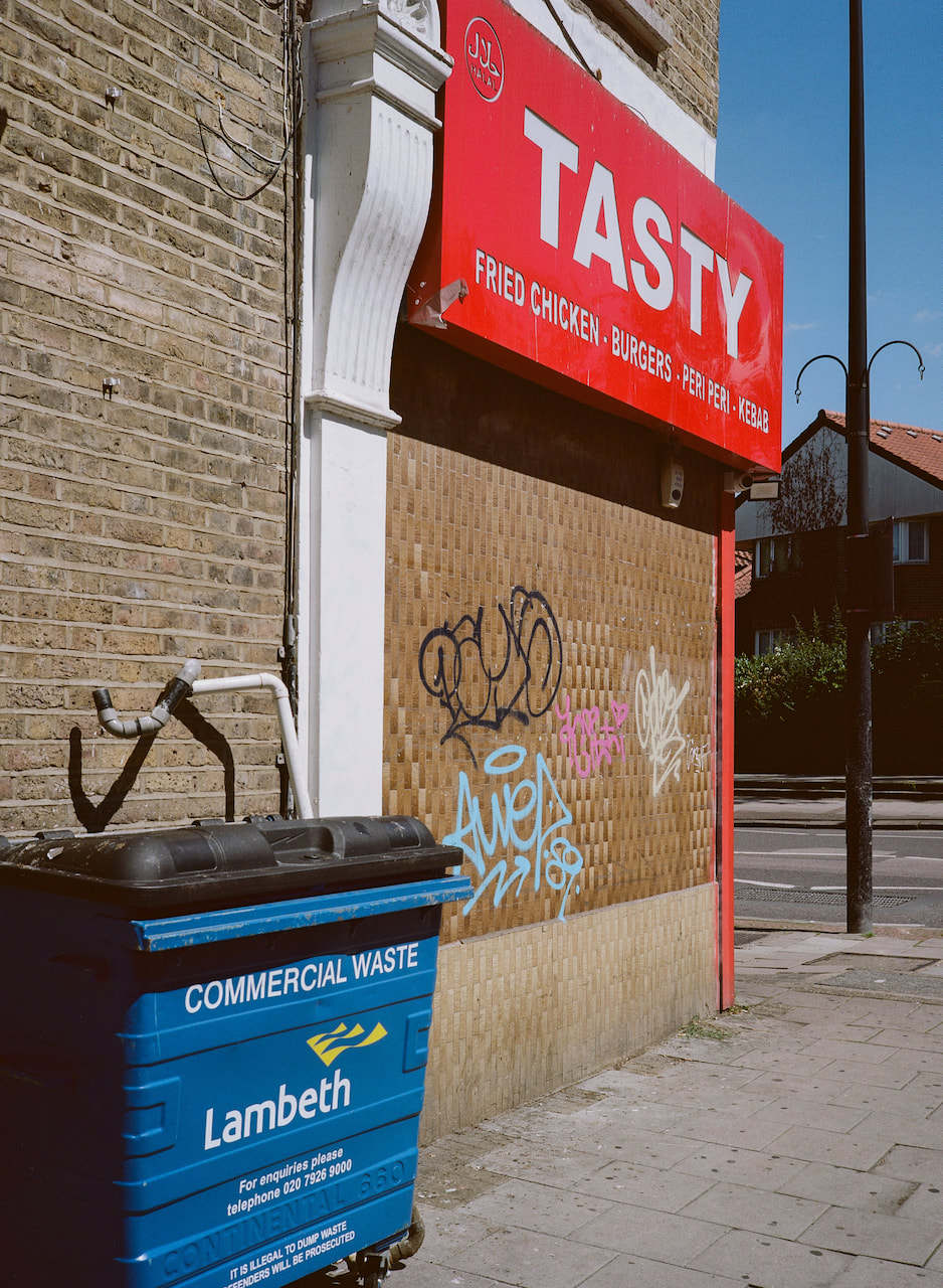
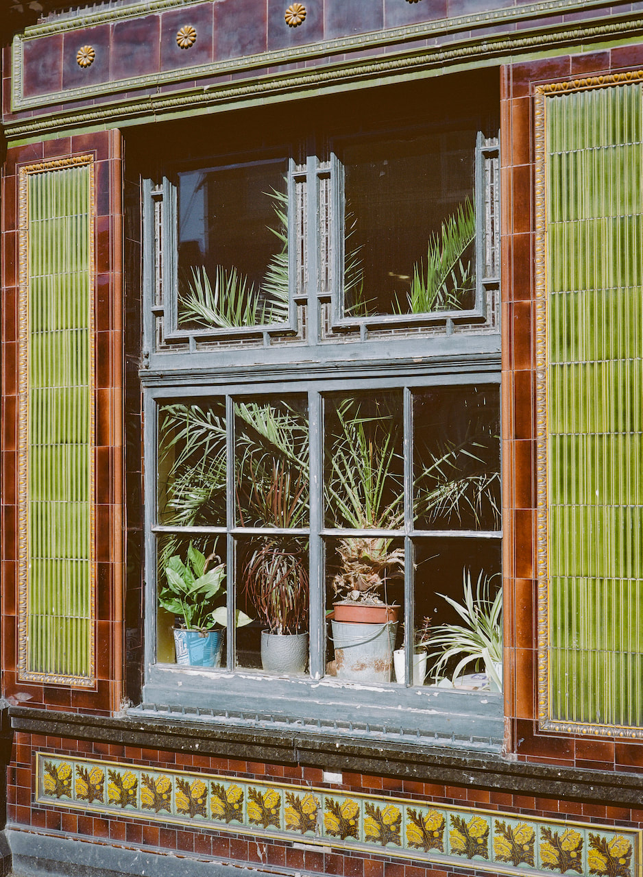
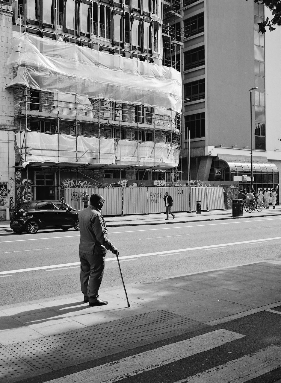
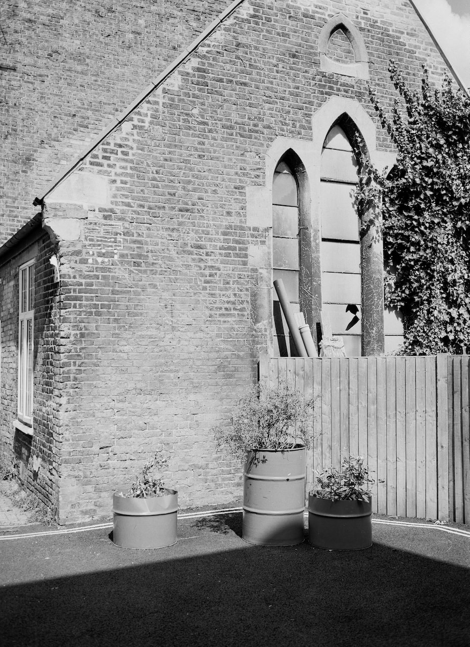
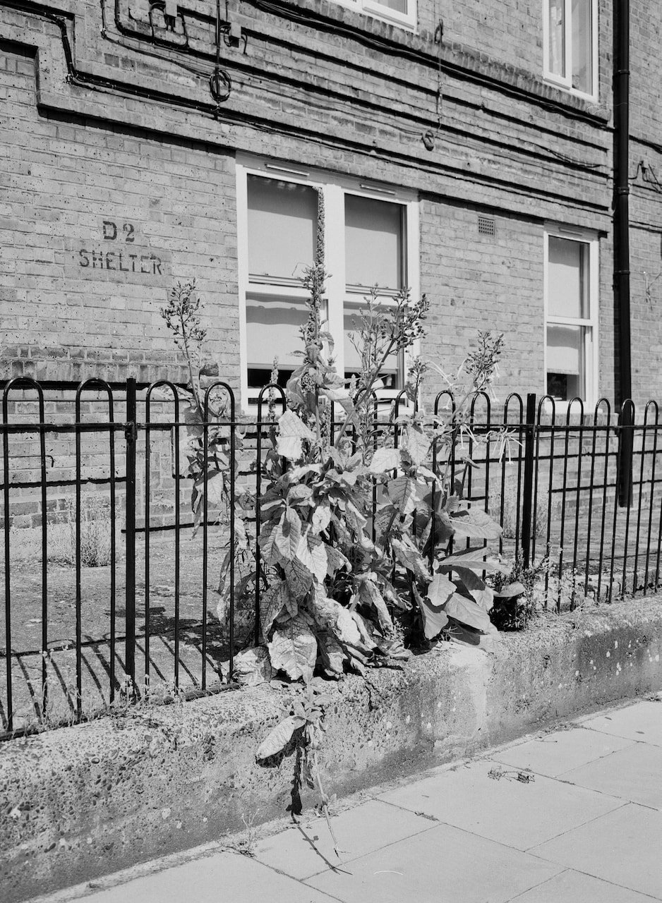
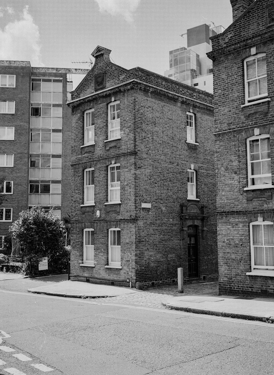
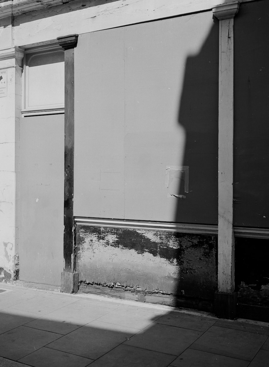
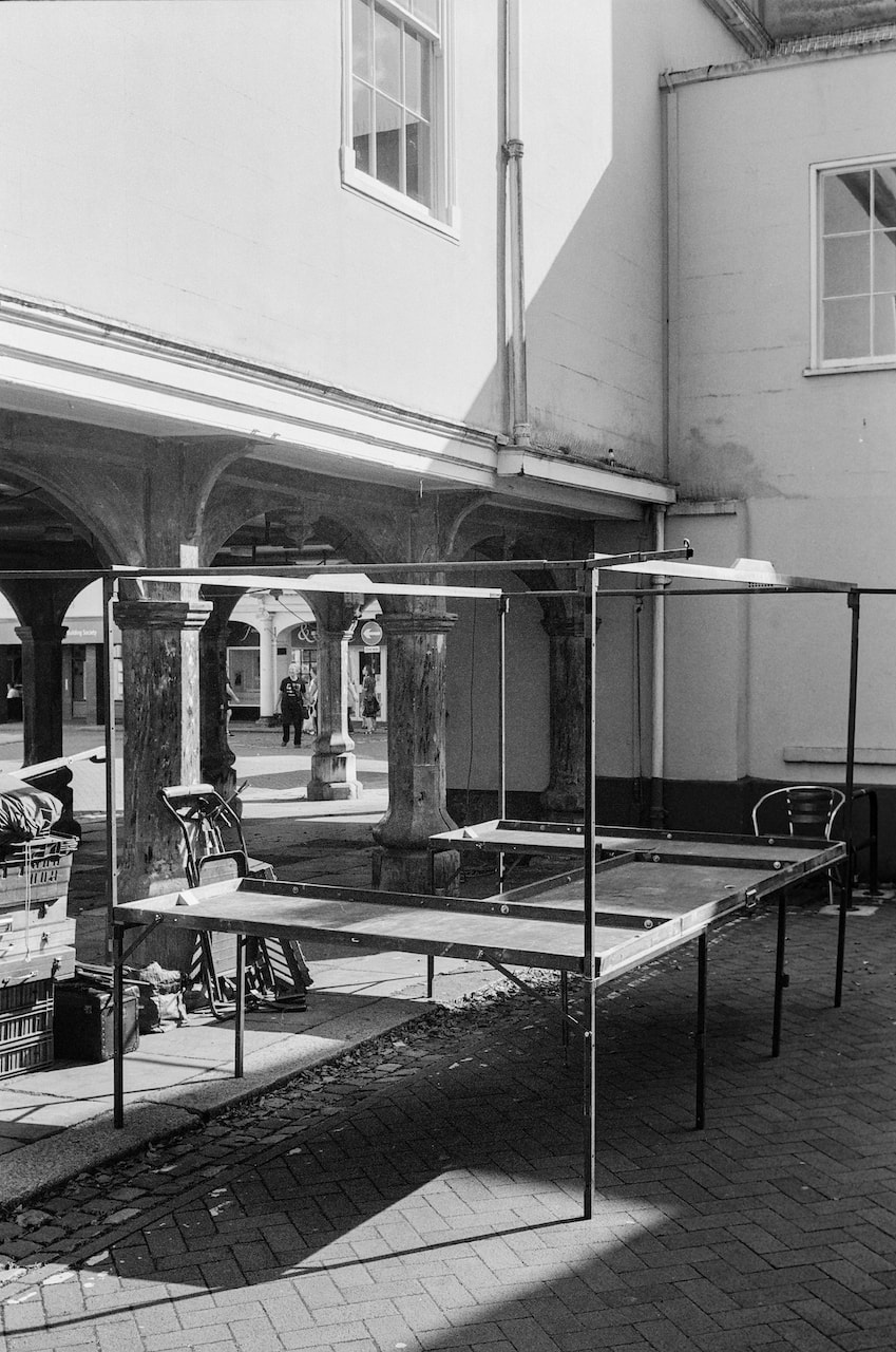
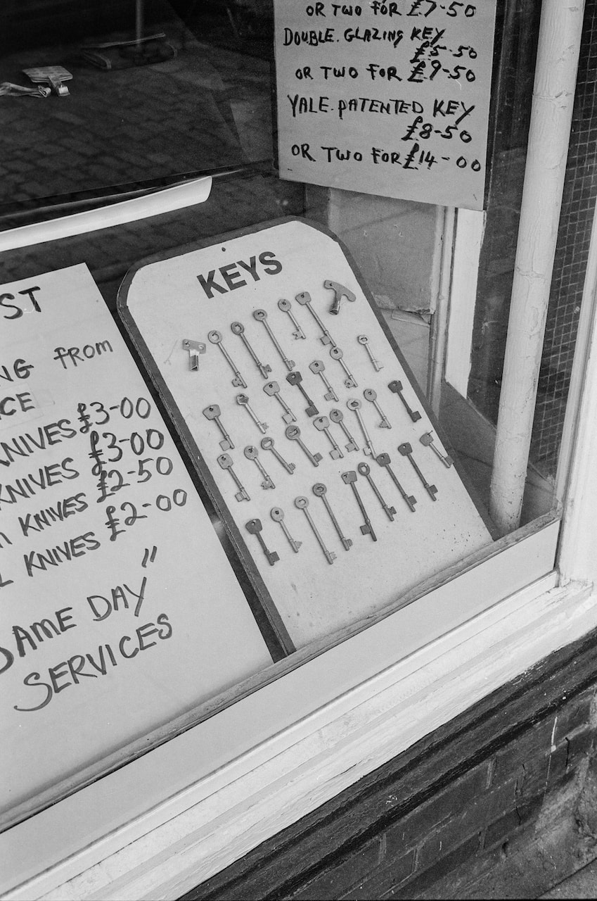
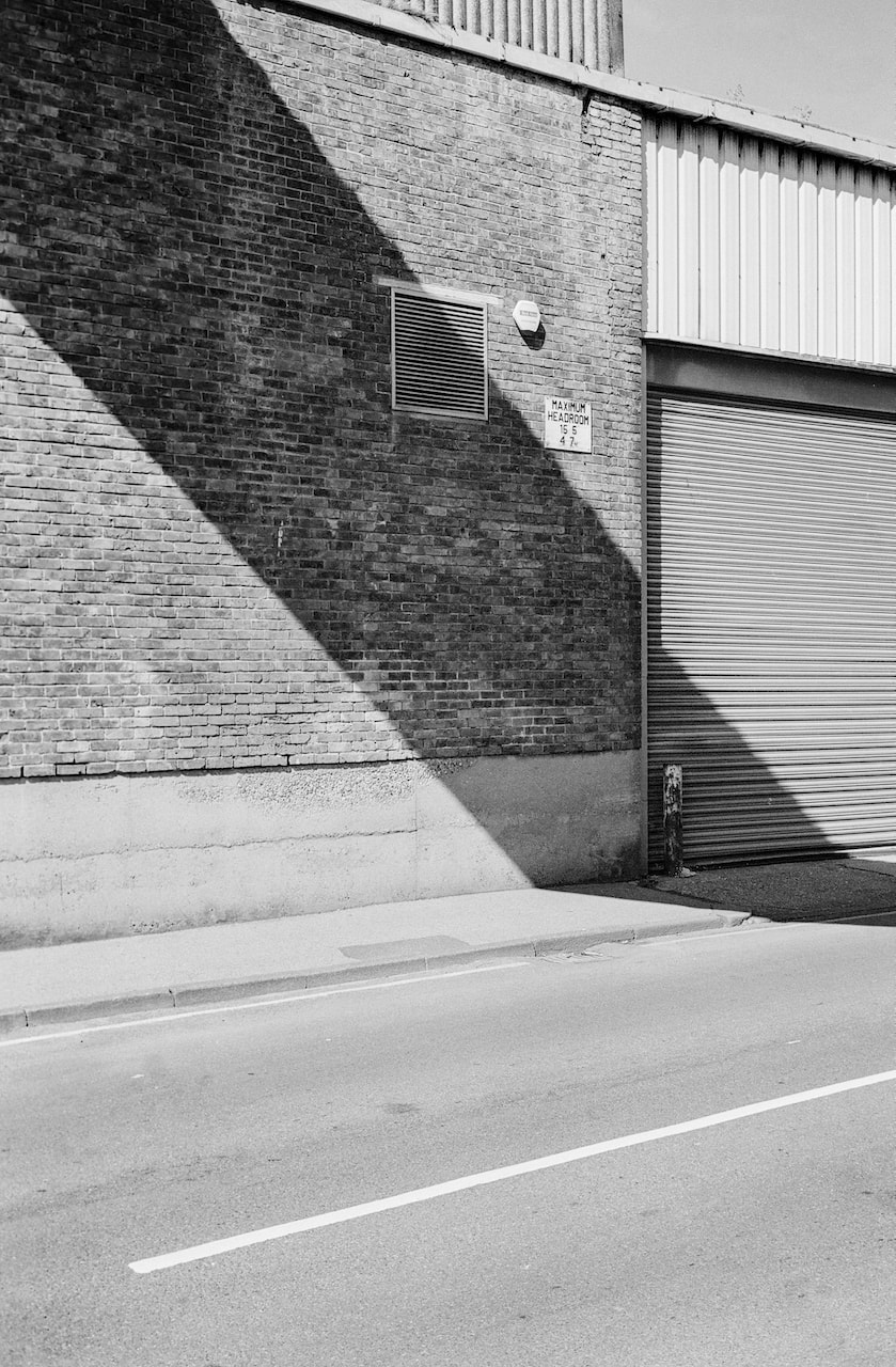
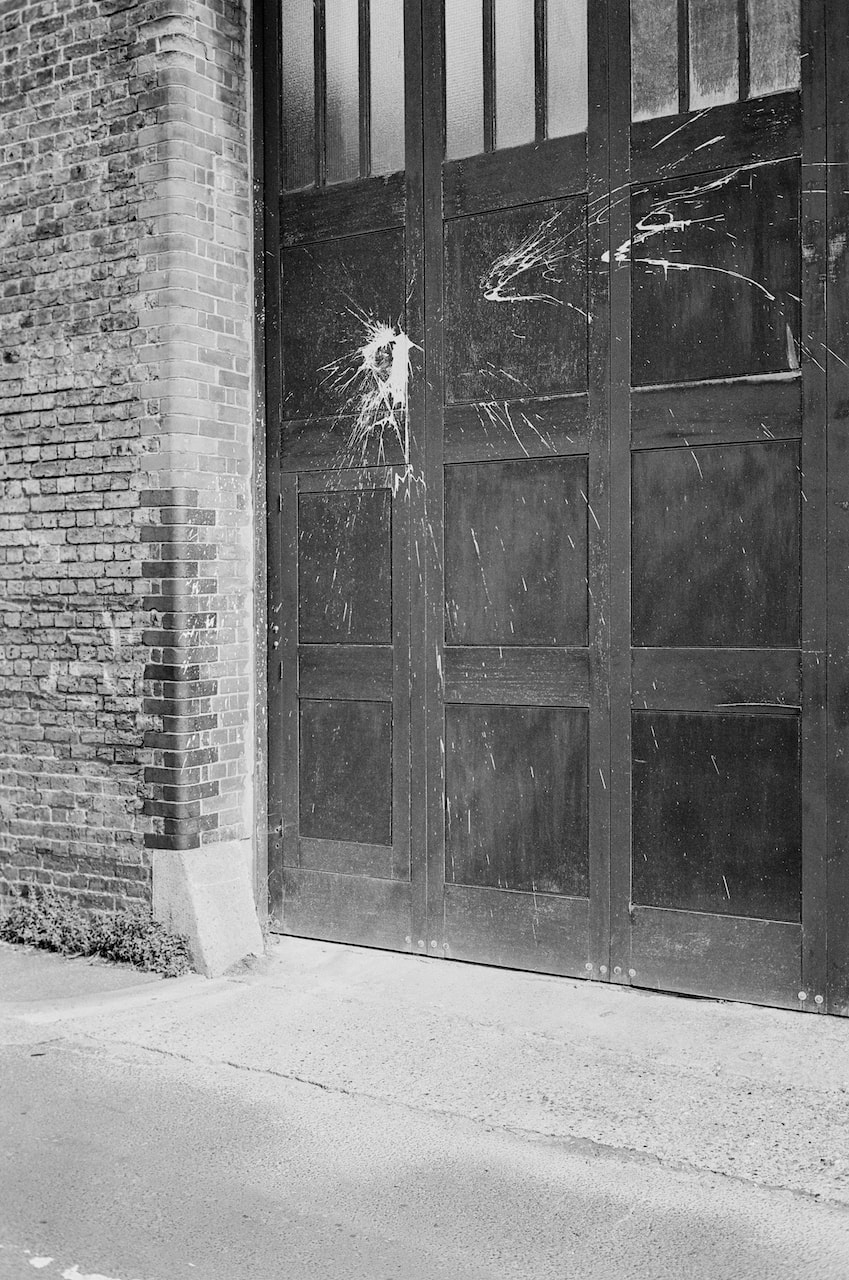
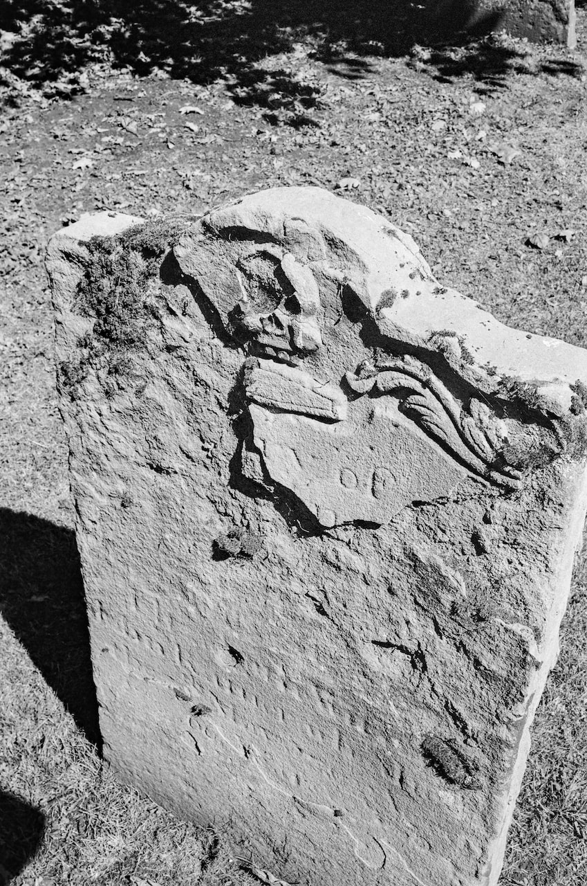
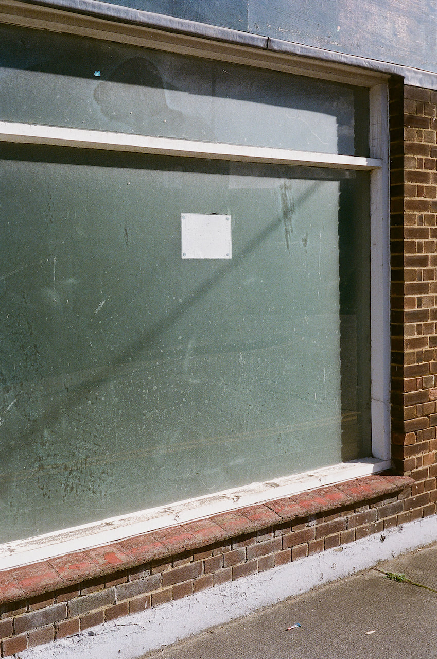
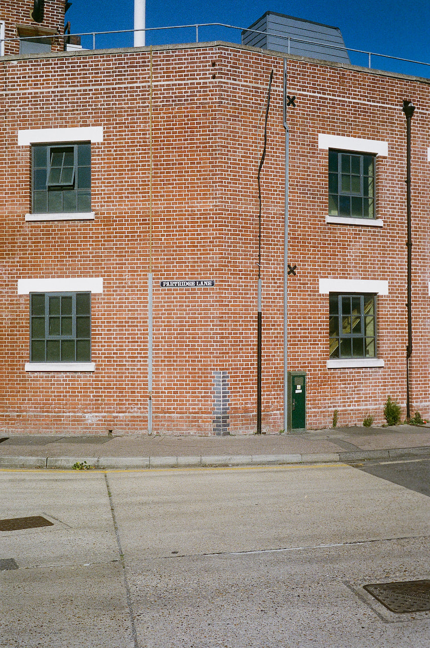
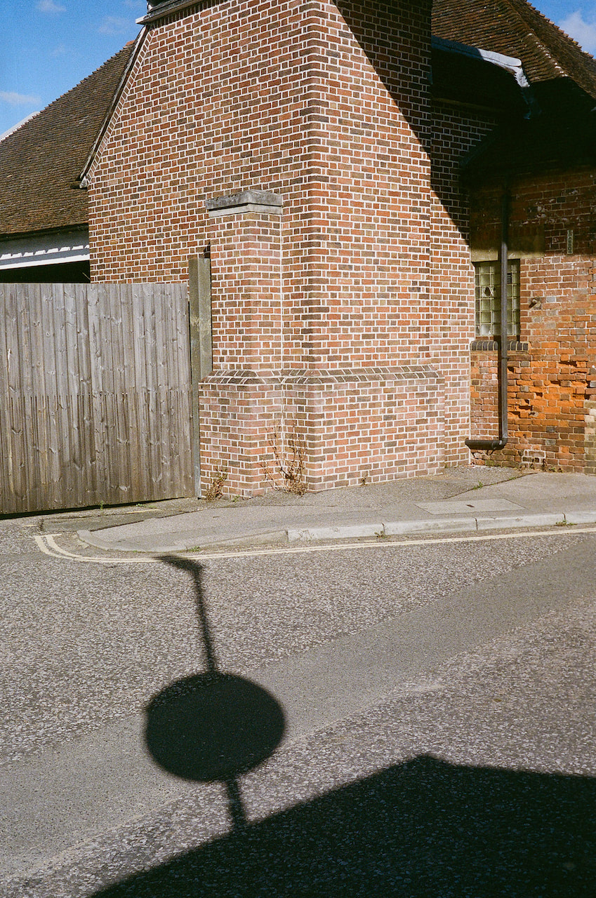
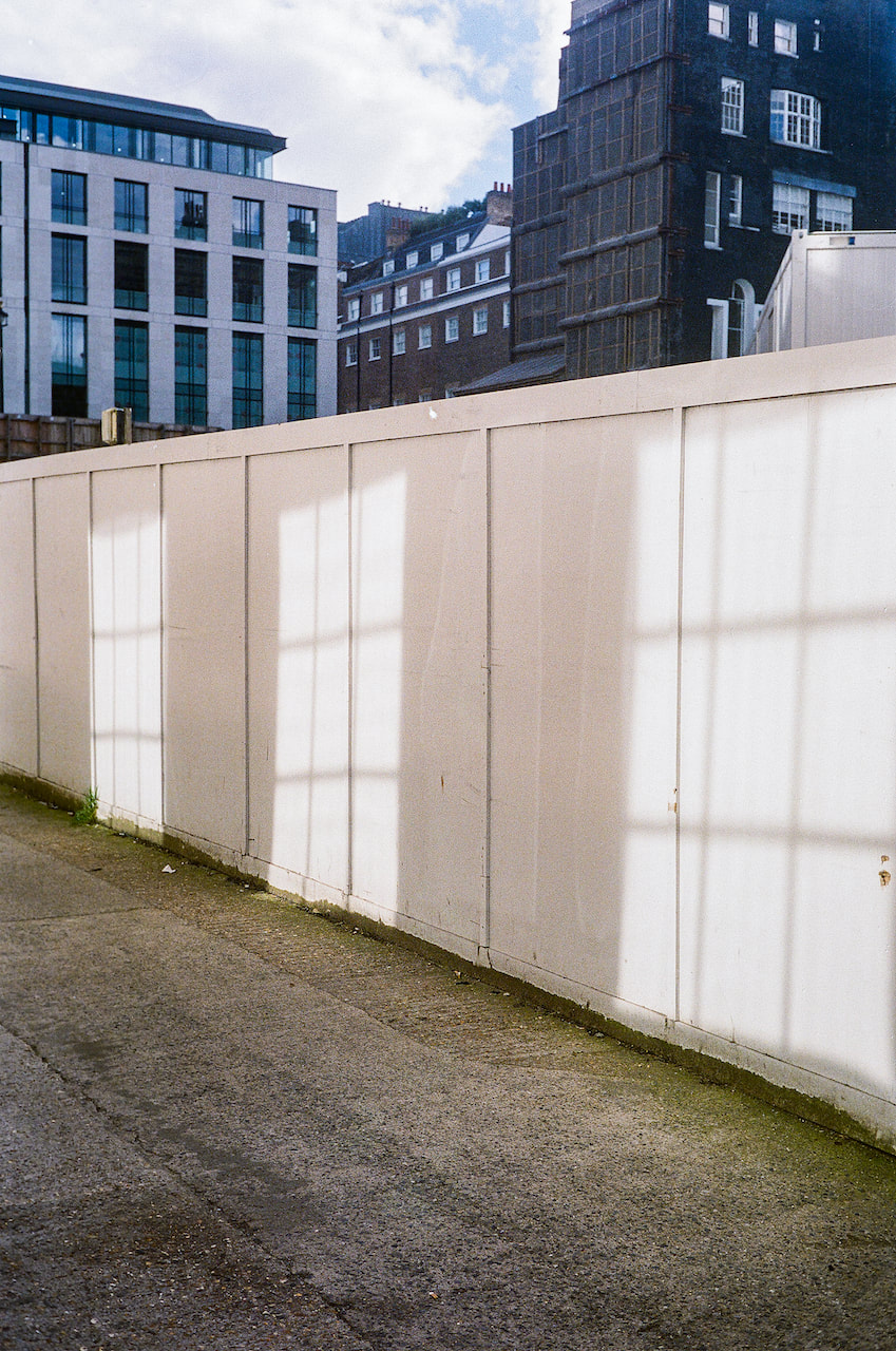
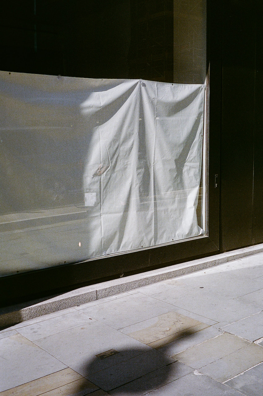
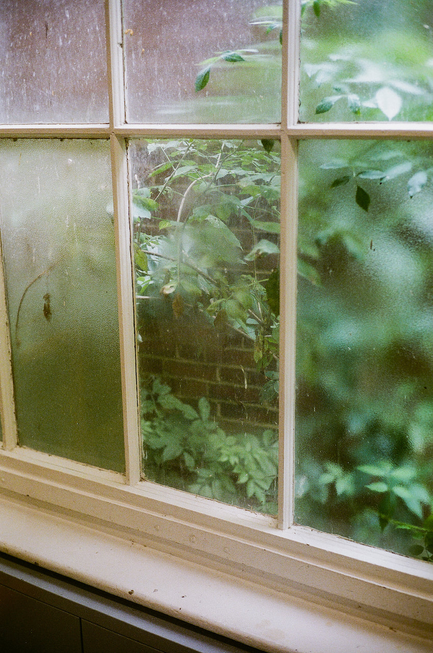
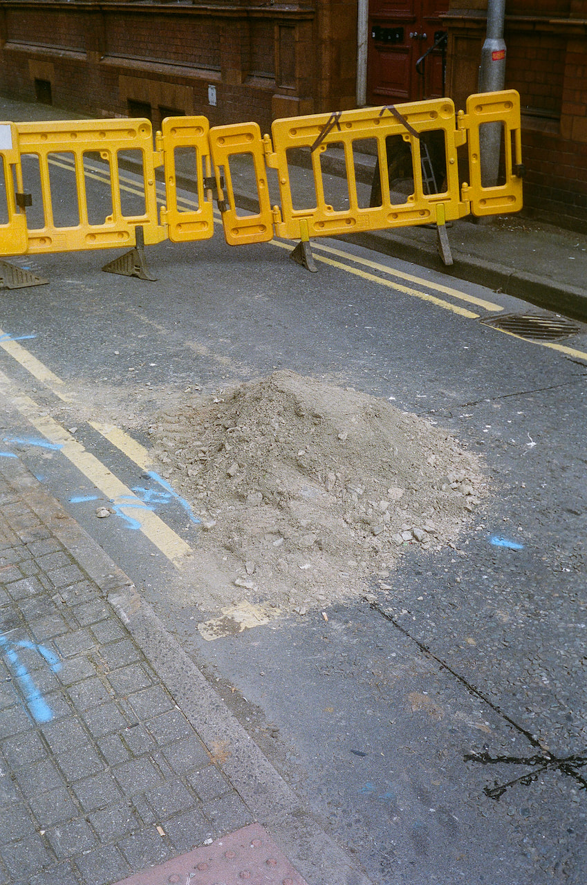
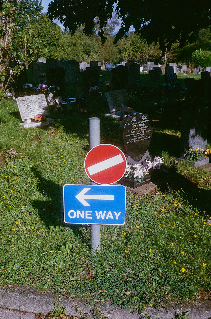
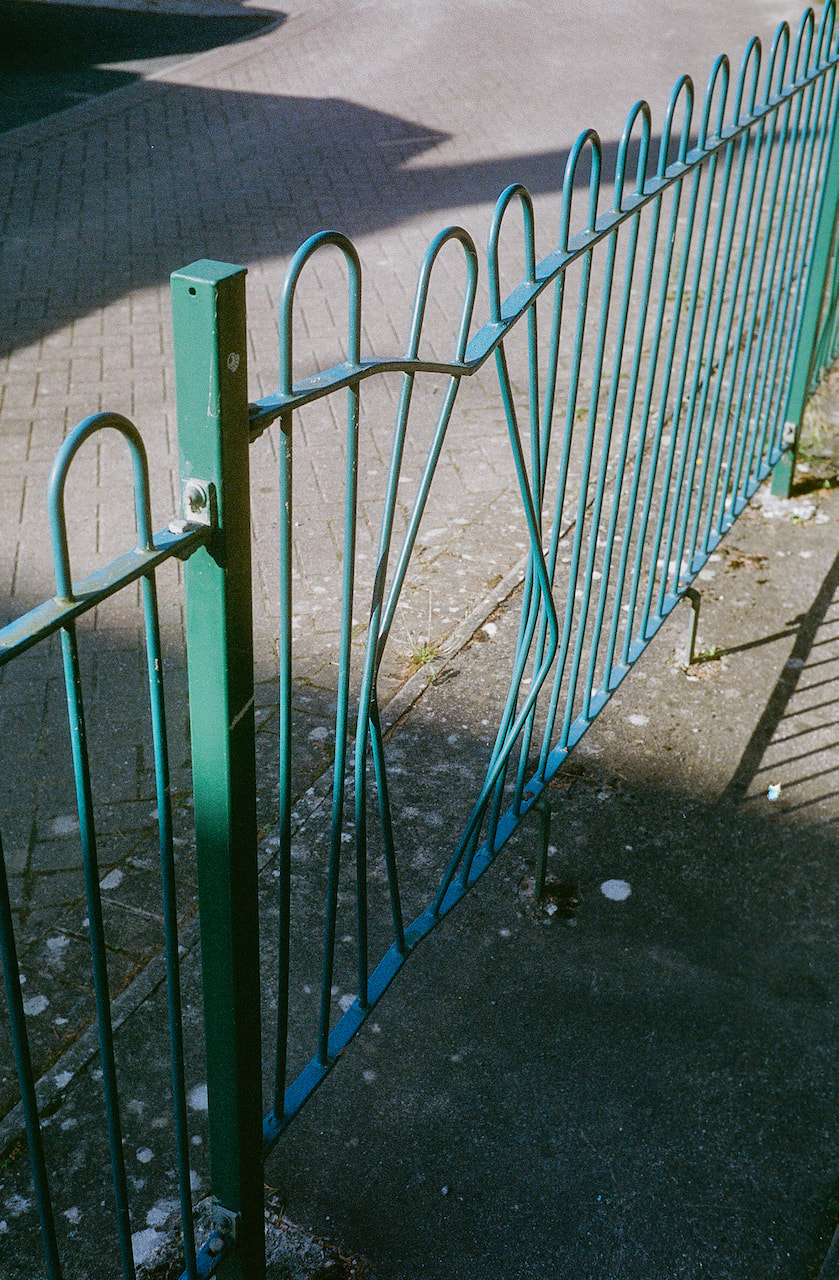
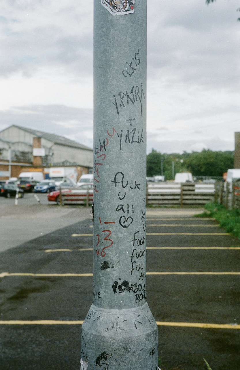
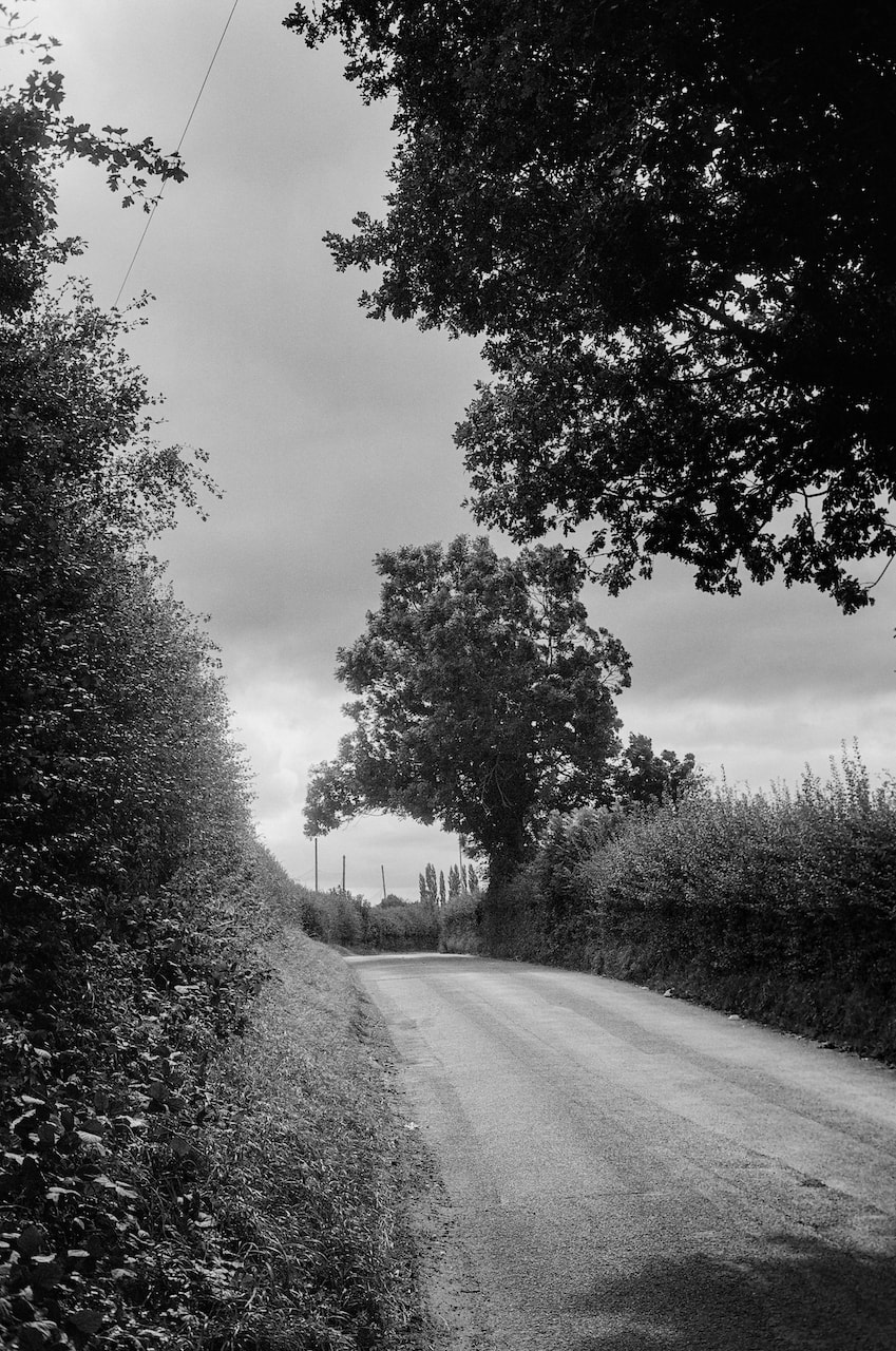
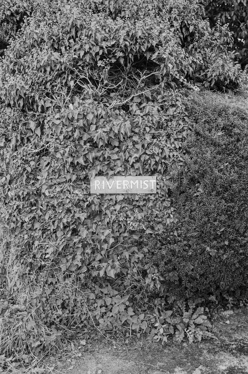
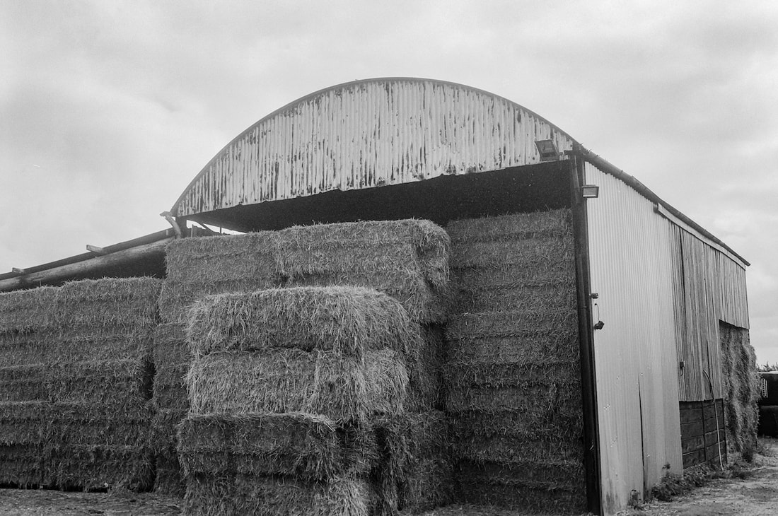
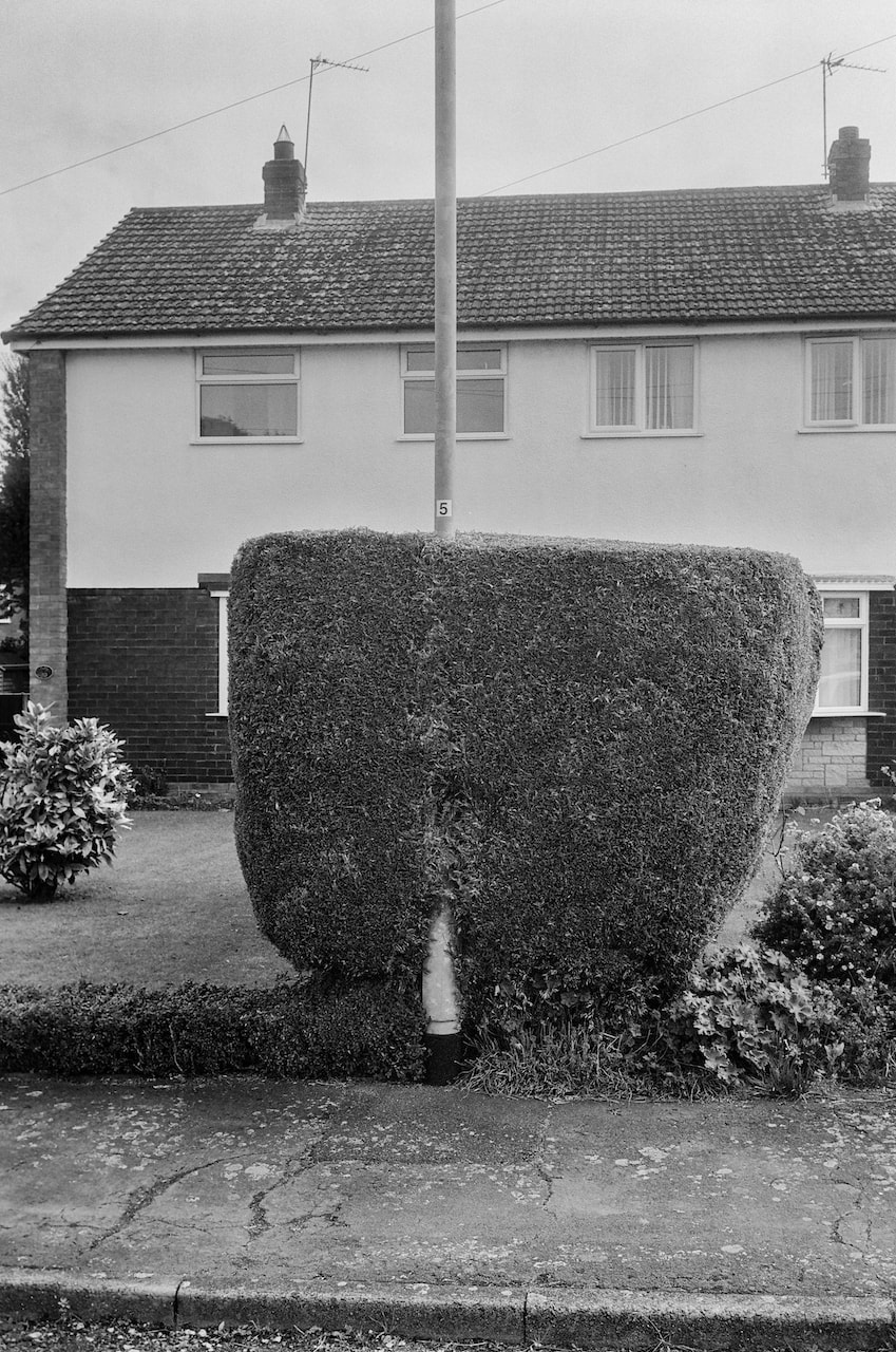
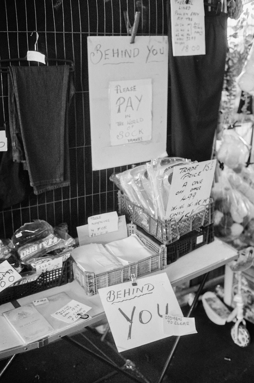
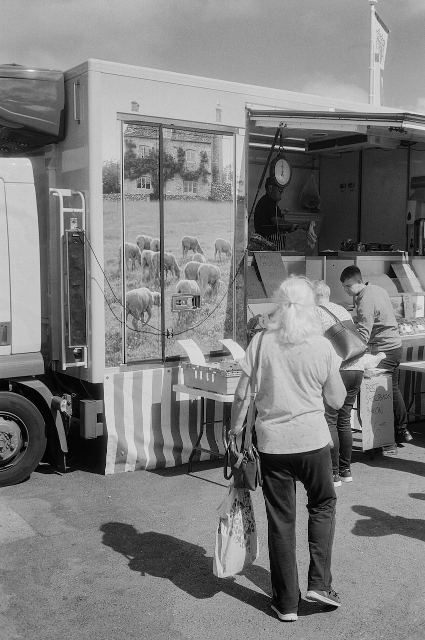
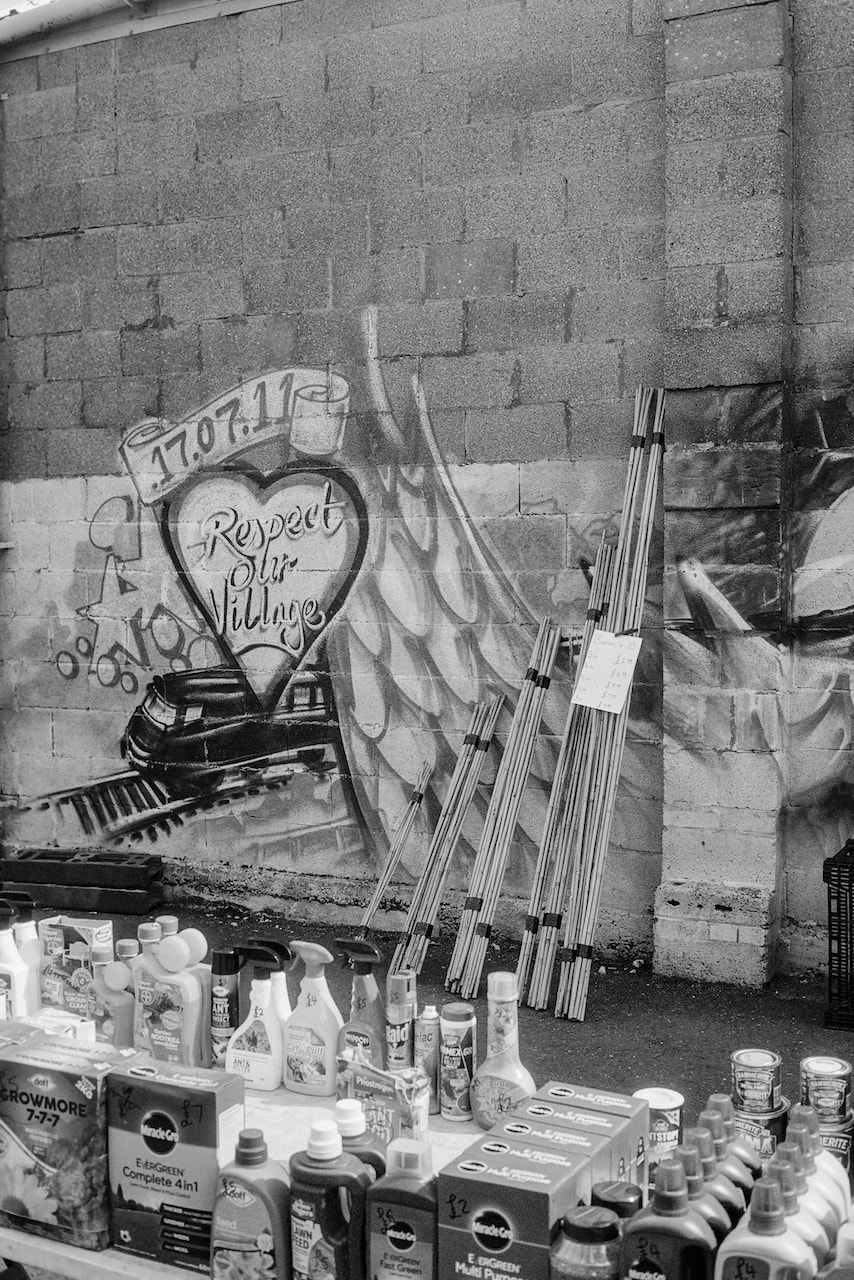
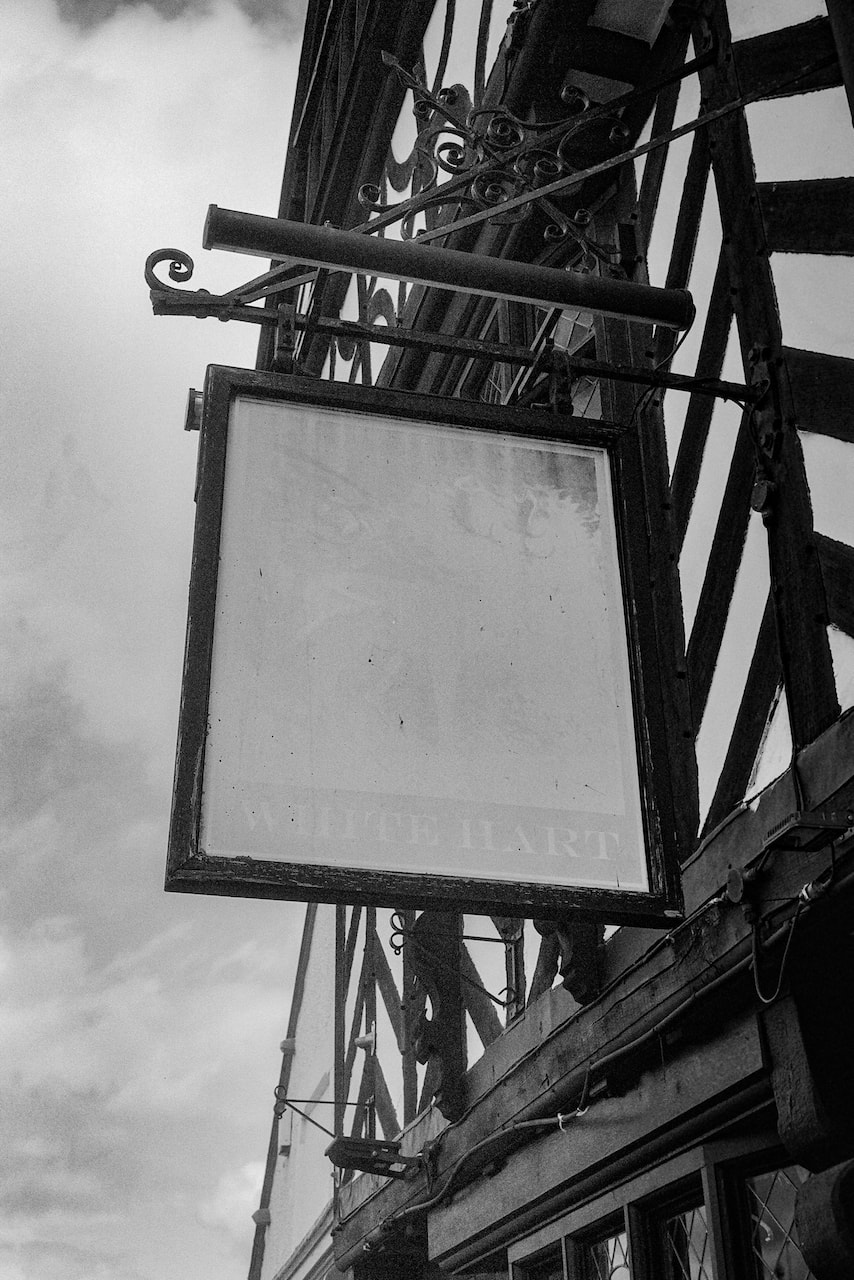
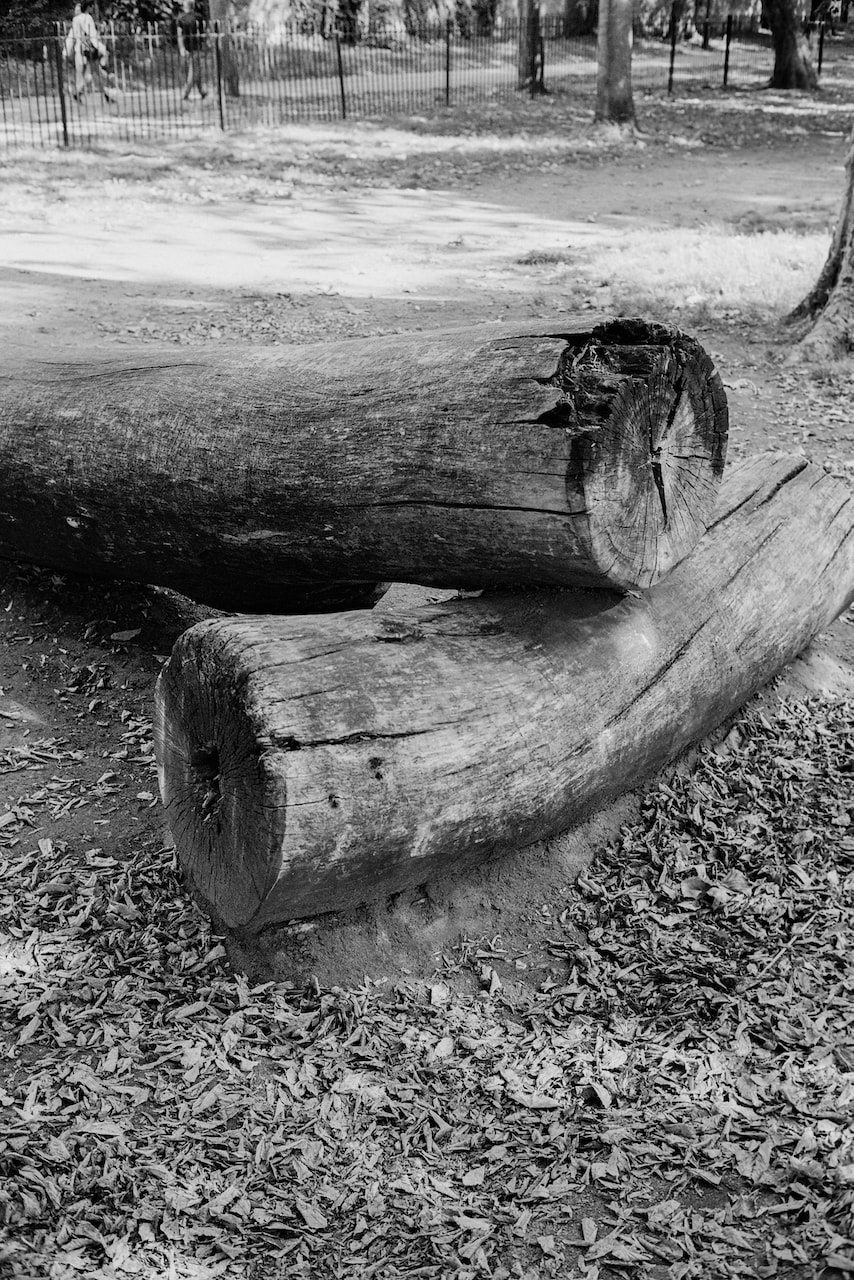
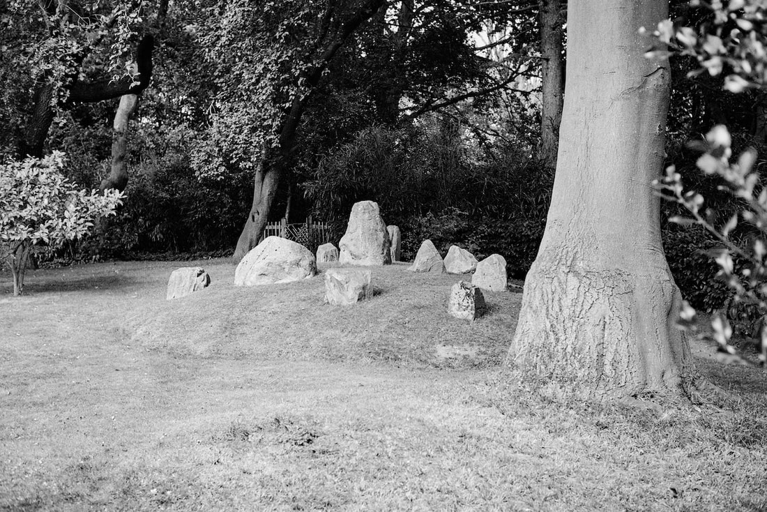
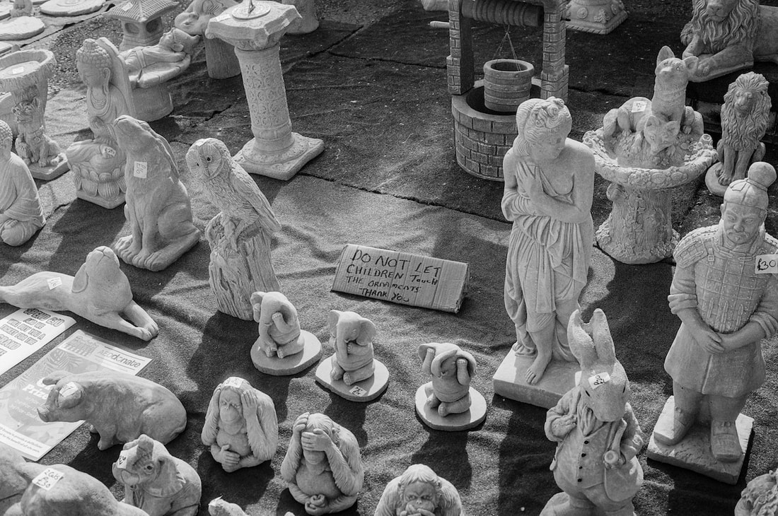
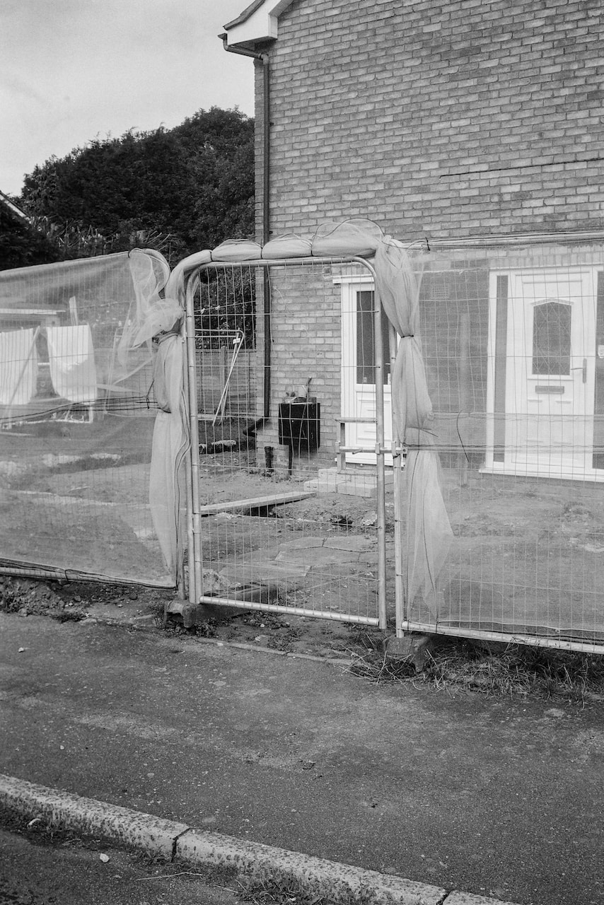
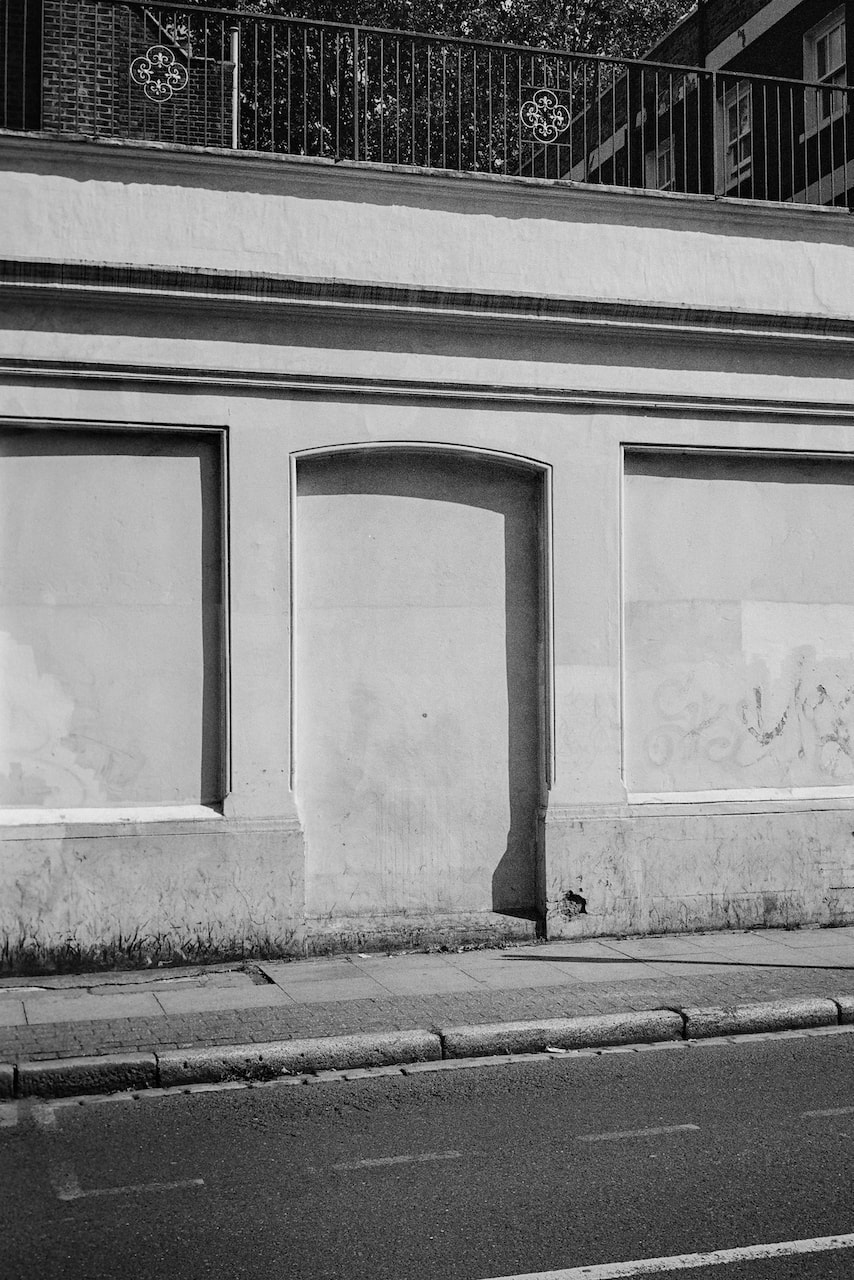
These pictures were made in the midlands and London with a 35mm rangefinder camera and Ilford XP2 Super400 film.
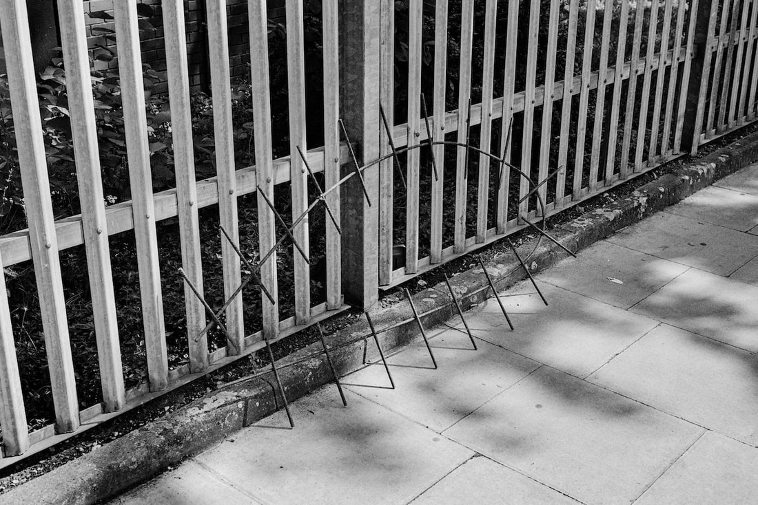
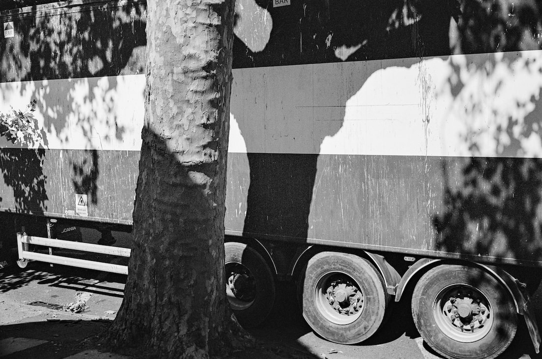
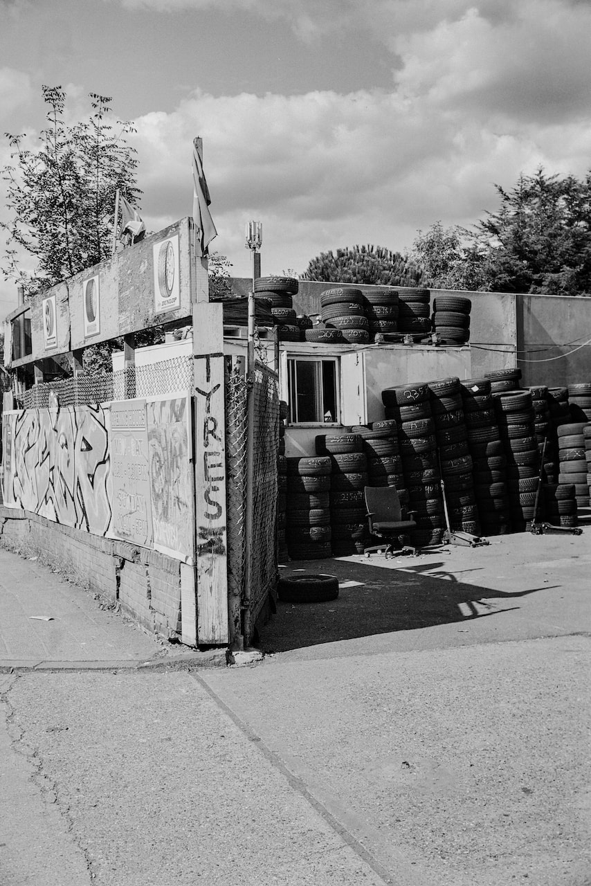
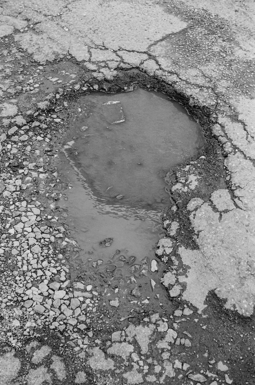
Diptychs
|
|
|
|
|
|
|
|
|
|
|
|
|
|
|
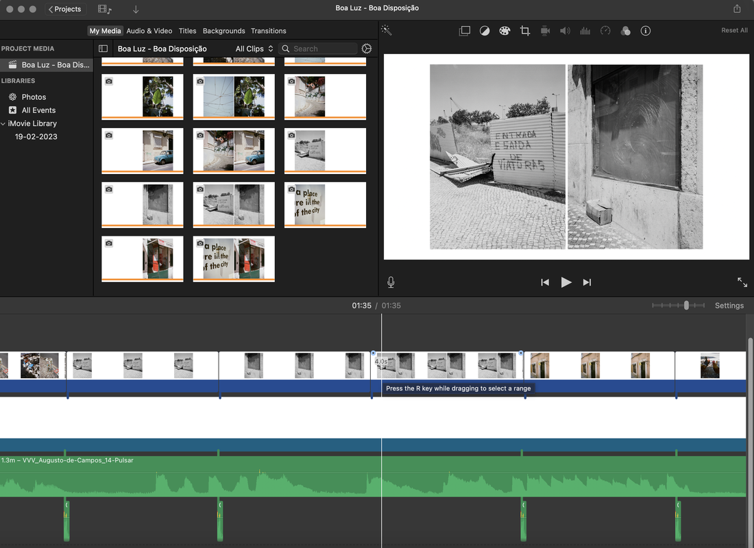
Video experiment
The following video is an attempt to represent the decision-making process in the creation of photographic diptychs; the placing of one picture next to another (for a variety of reasons) and then adjusting this pairing either with another image or by re-arranging the sequence. The images used in this video were all taken with a 35mm rangefinder camera in the latter stages of the summer holidays on a combination of black and white and colour film. None of the pairings is intended to be definitive. Rather, the video suggests that the process of creating these diptychs is open, continuous and unscientific. The Laurie Anderson soundtrack was found on Ubuweb.
I really enjoy making these videos. I like the way they animate the photos and rescue them from a static presentation on a wall. I also enjoy finding unusual soundtracks and the interplay between images, sounds and, sometimes, text (lyrics). This process is something I would like to continue to experiment with and refine in the final stage of my personal investigation.