Developing my practice
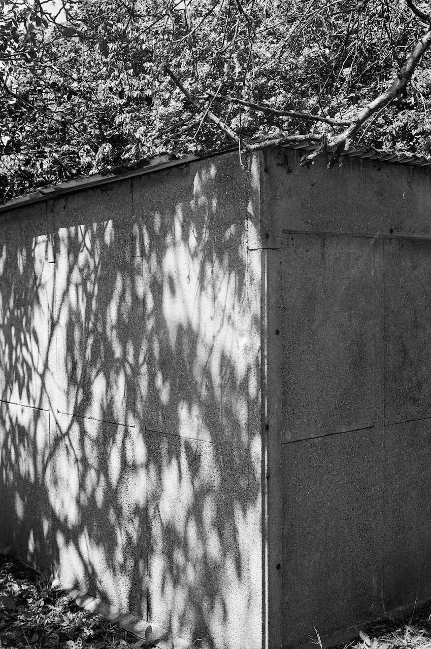
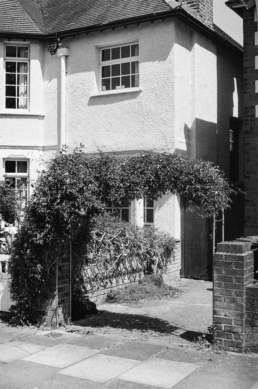
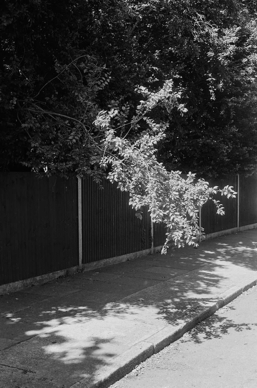
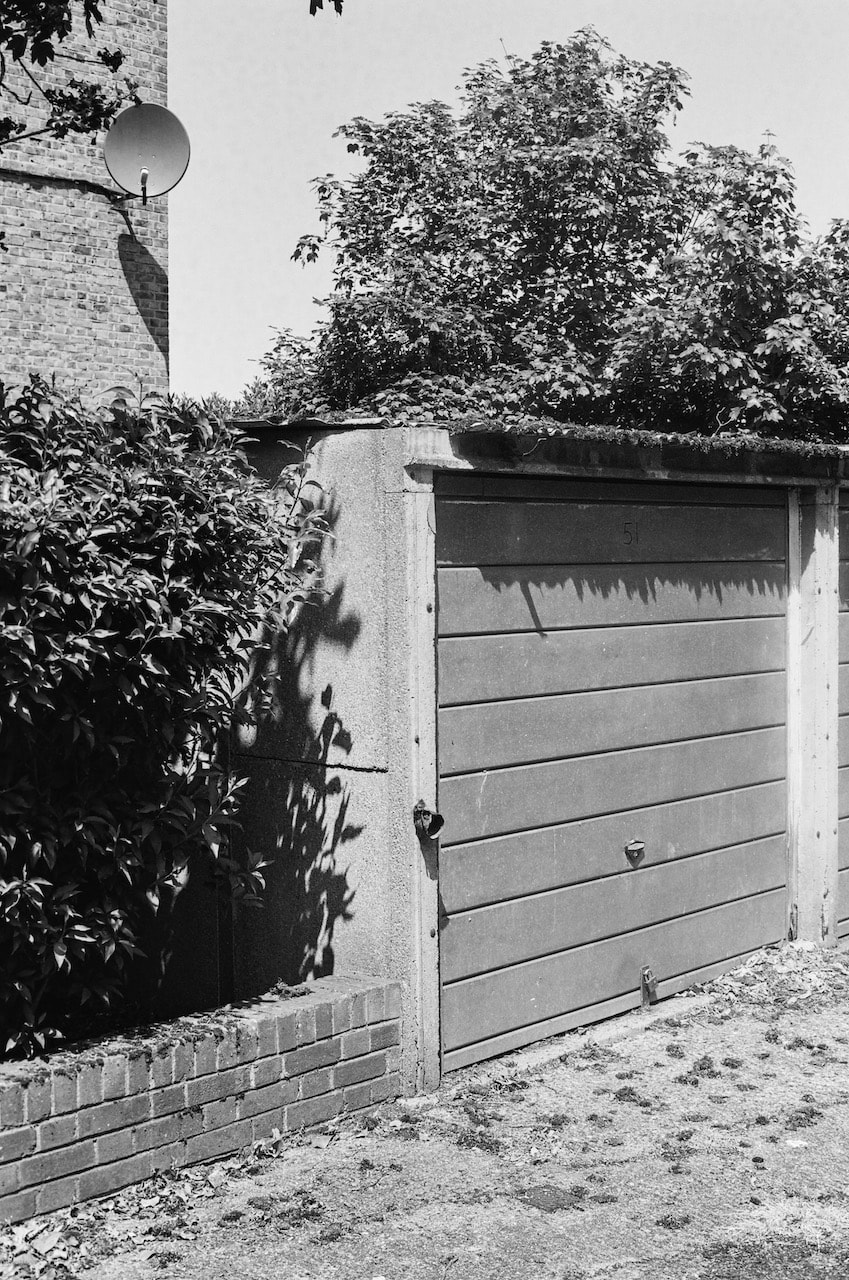
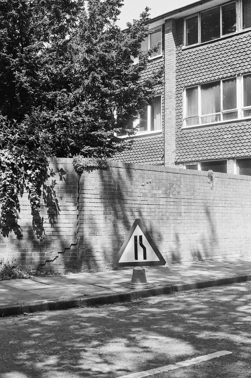
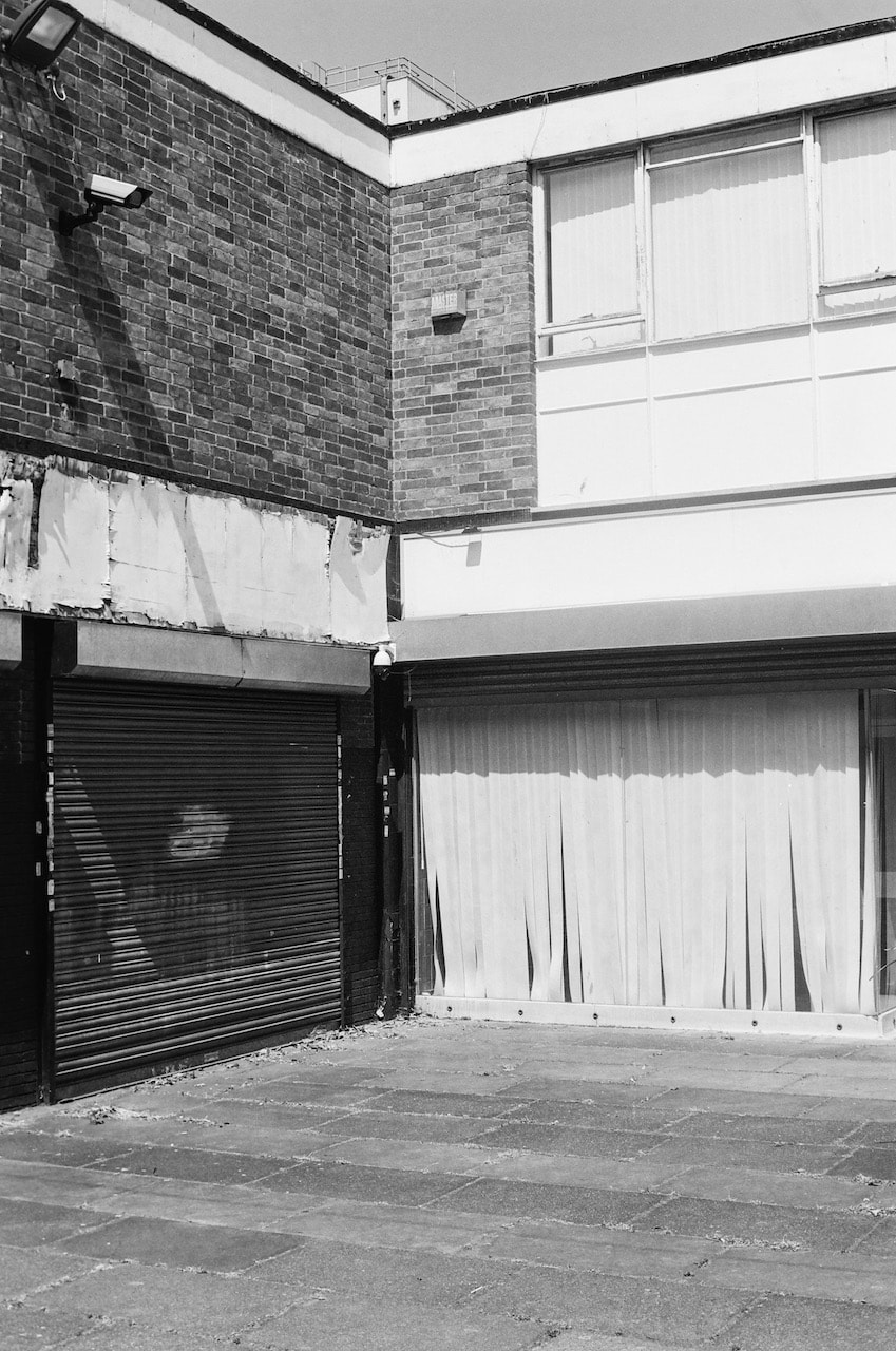
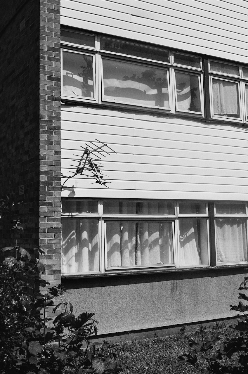
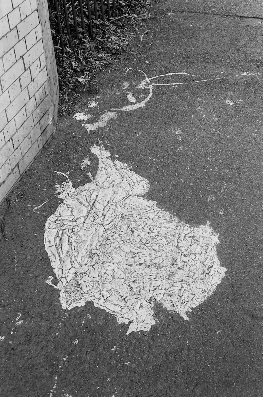
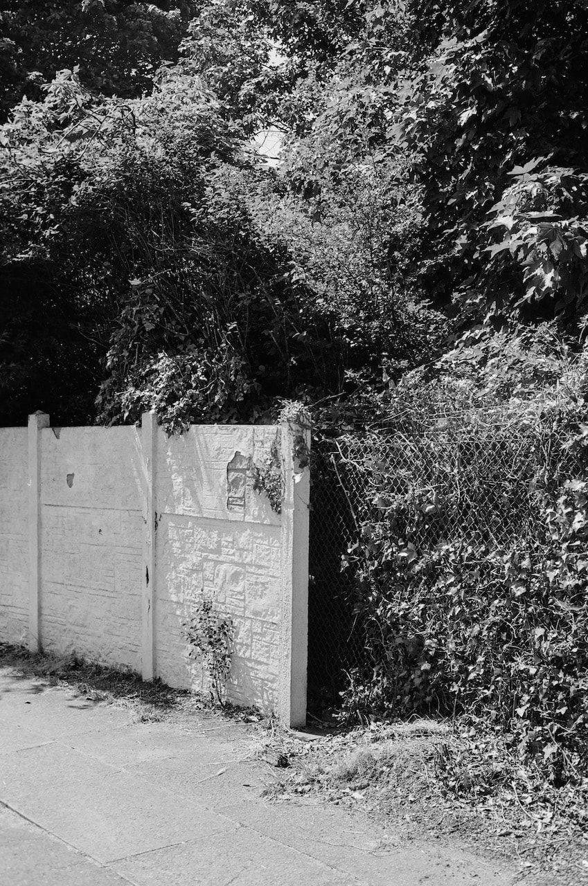
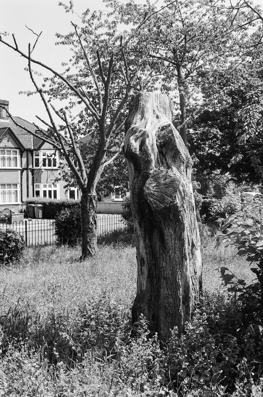
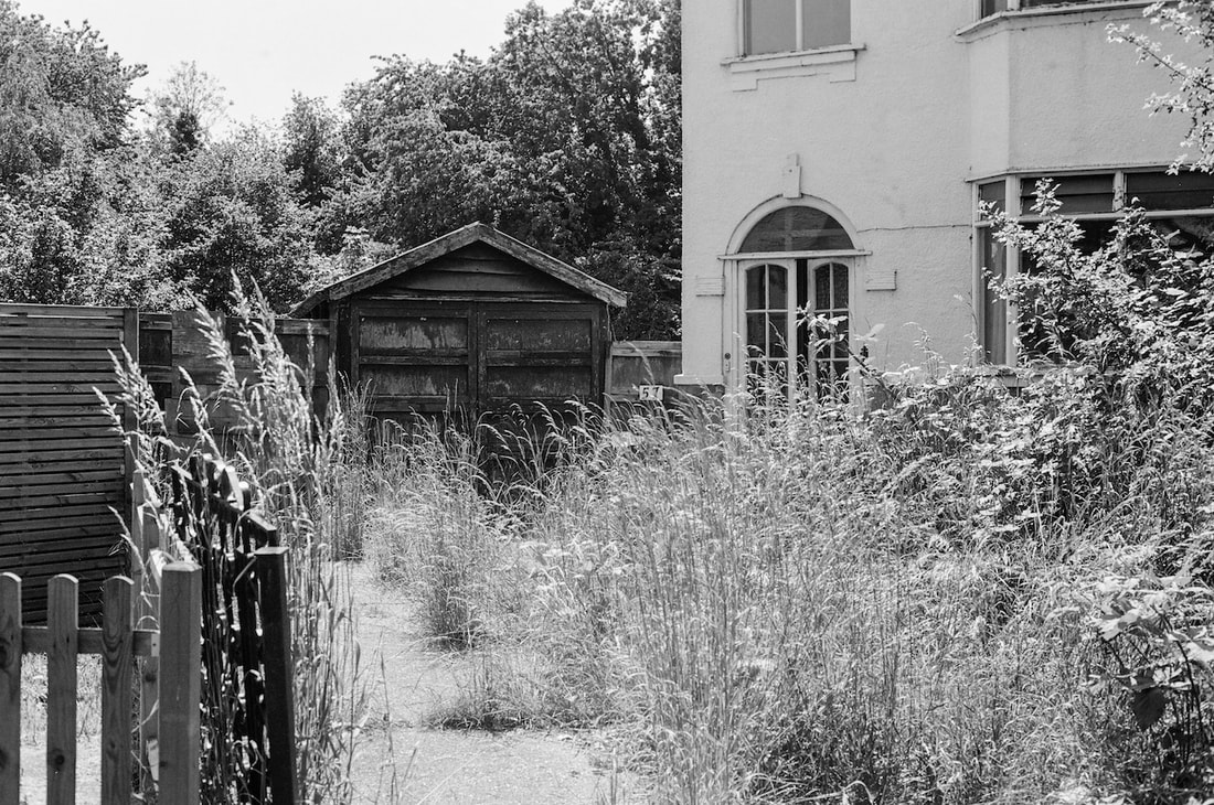
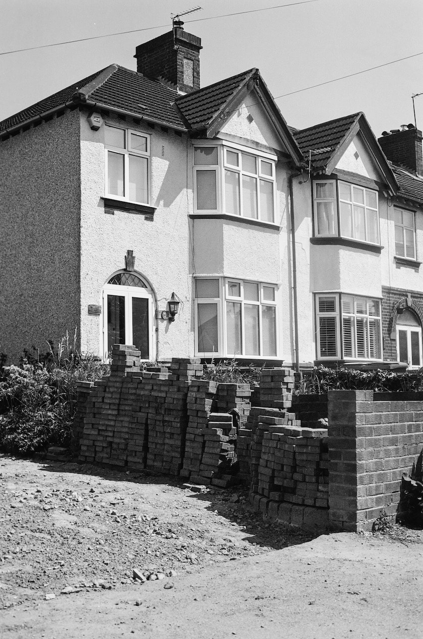
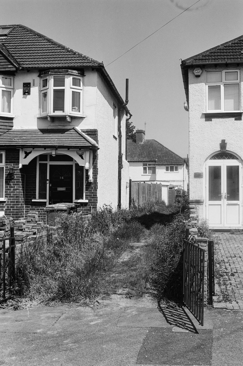
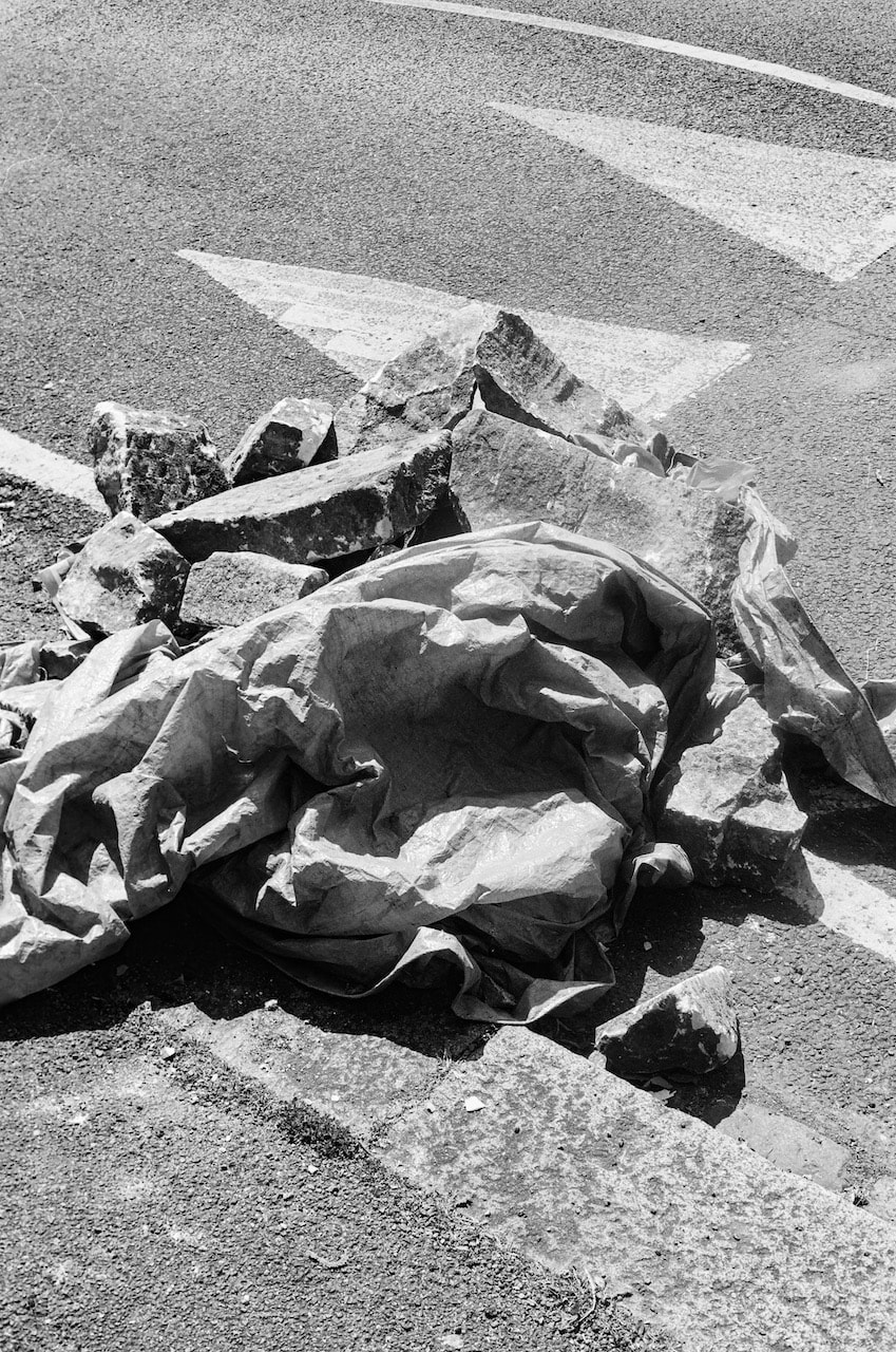
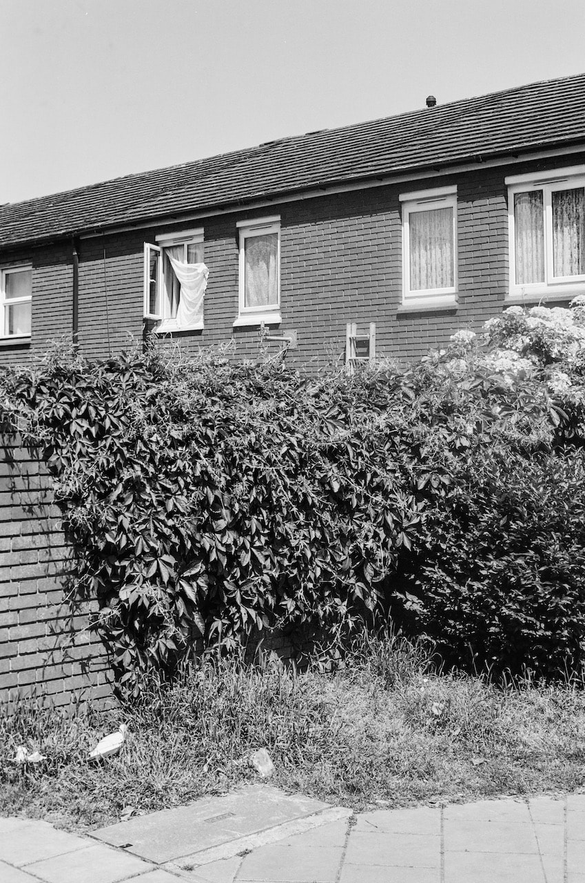
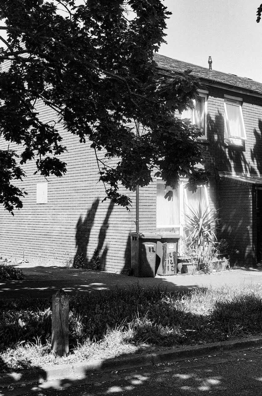
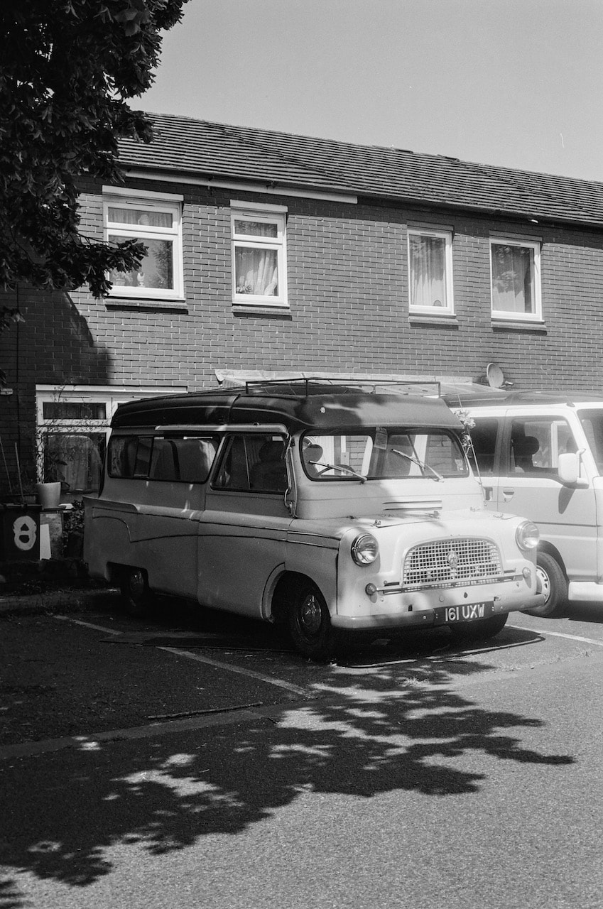
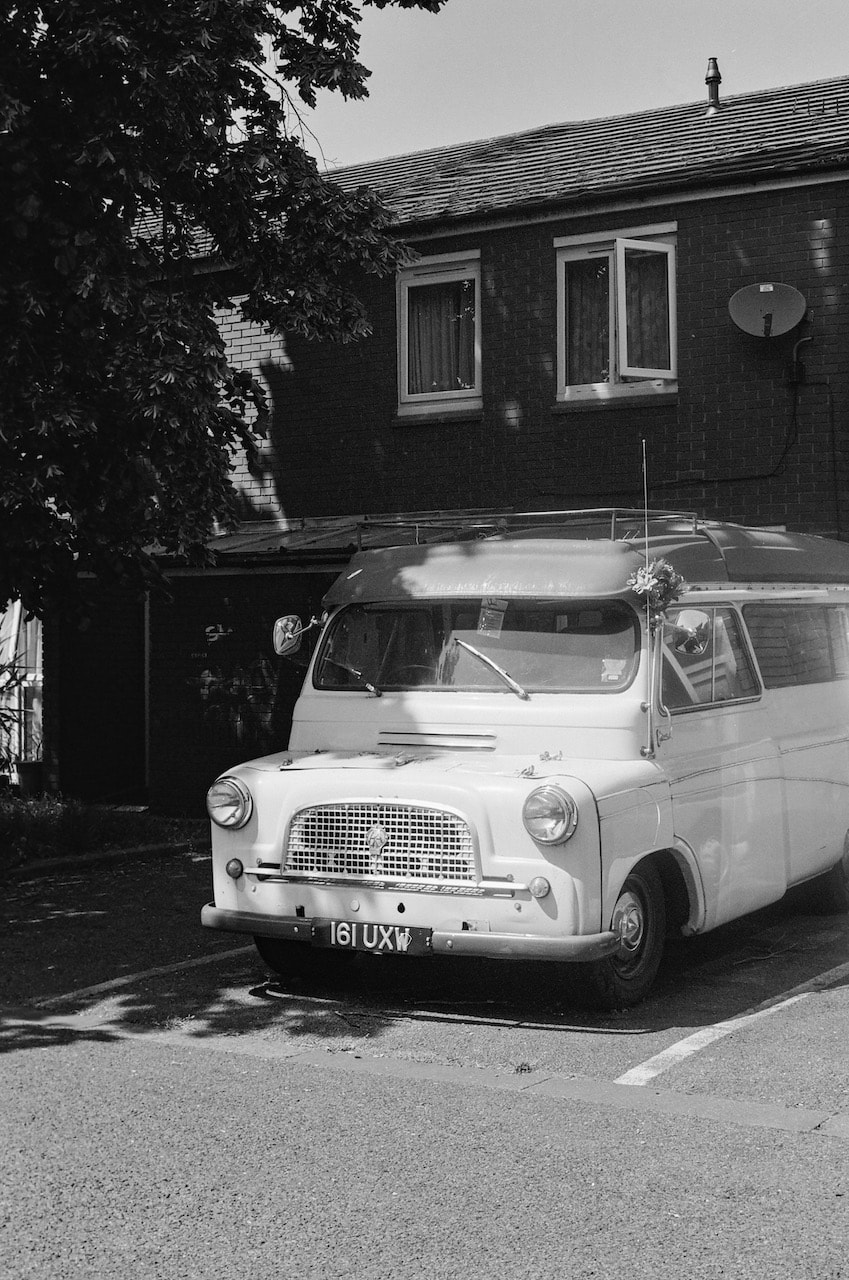
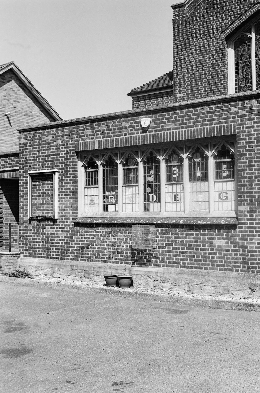
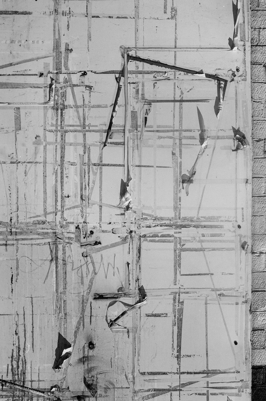
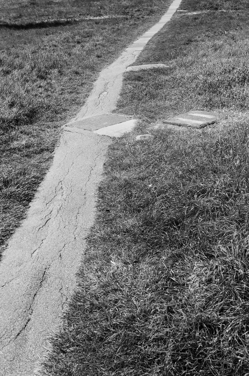
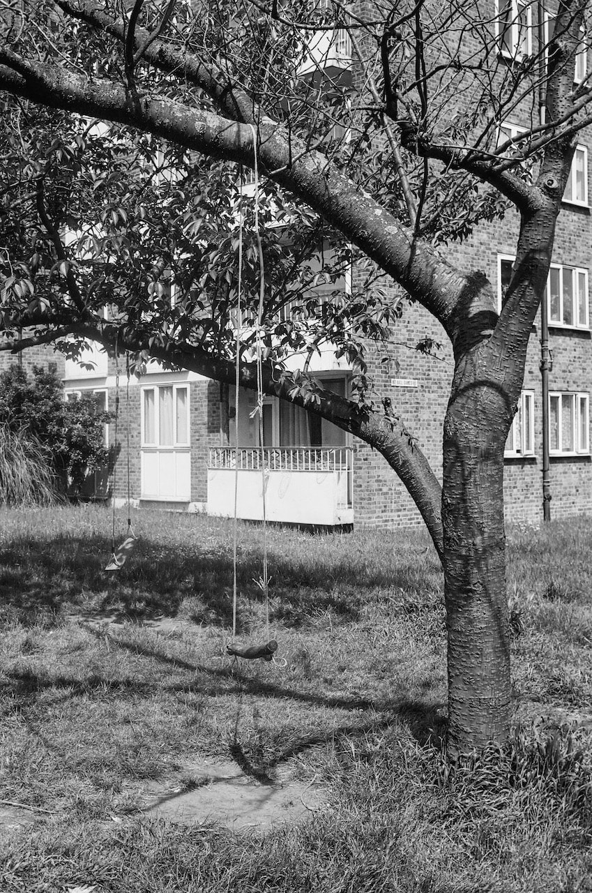
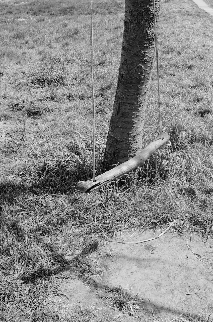
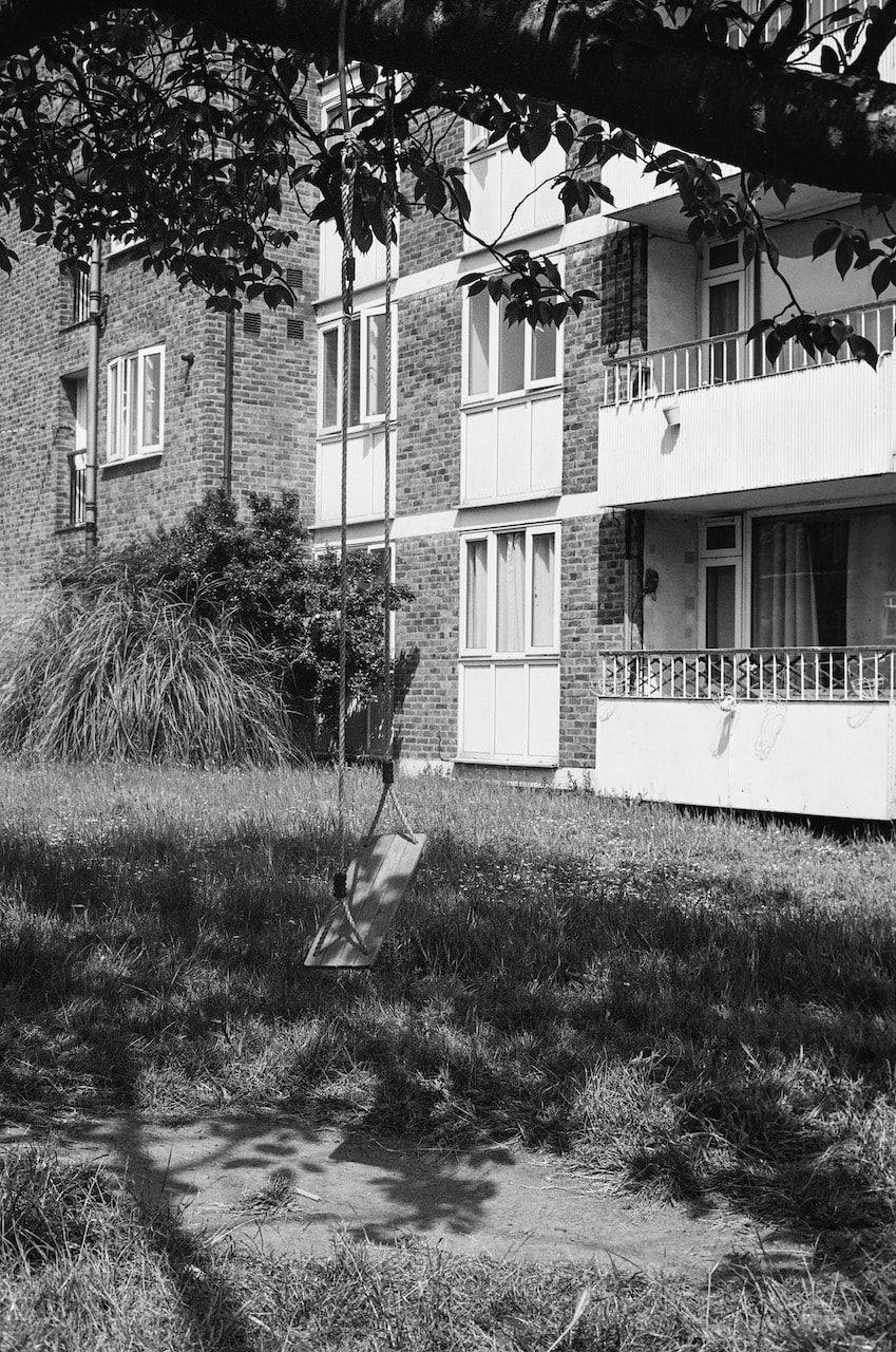
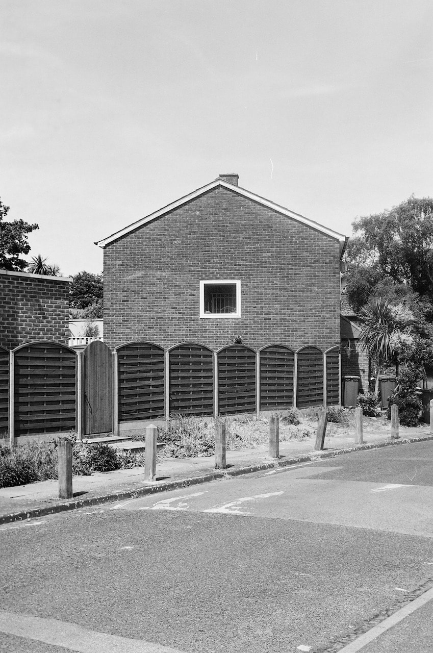
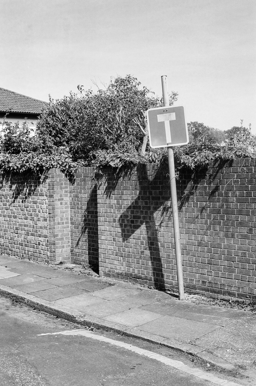
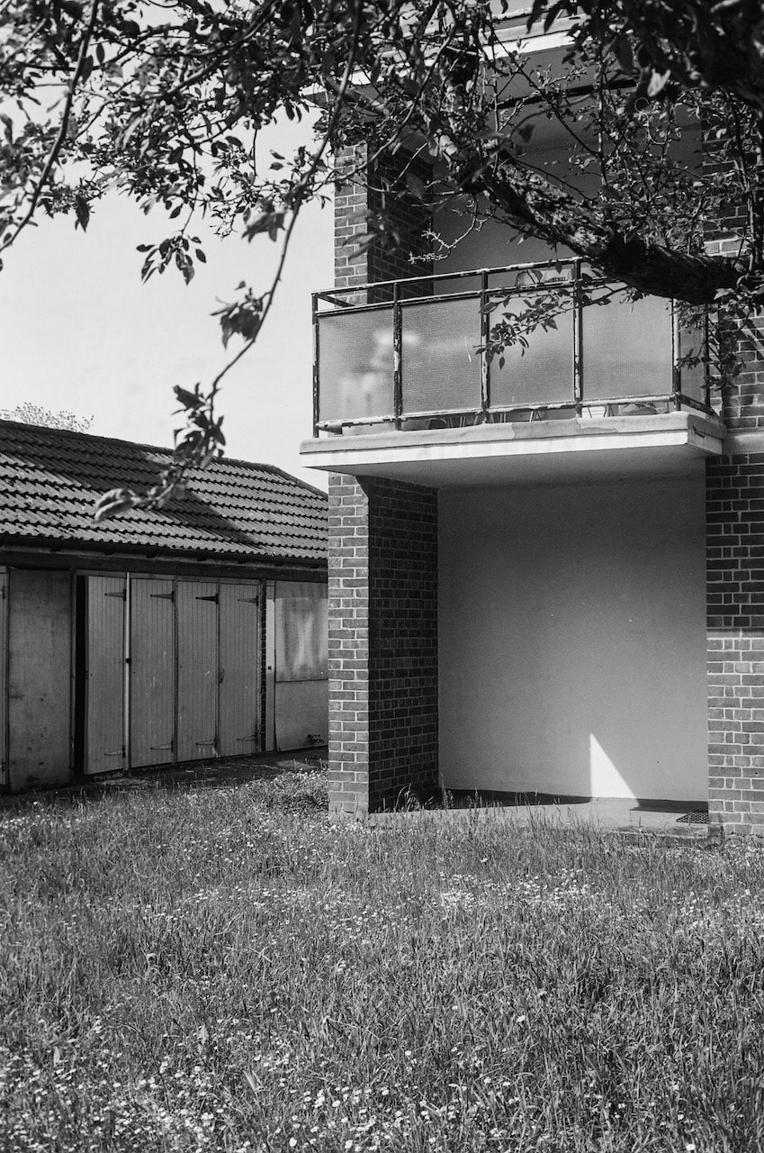
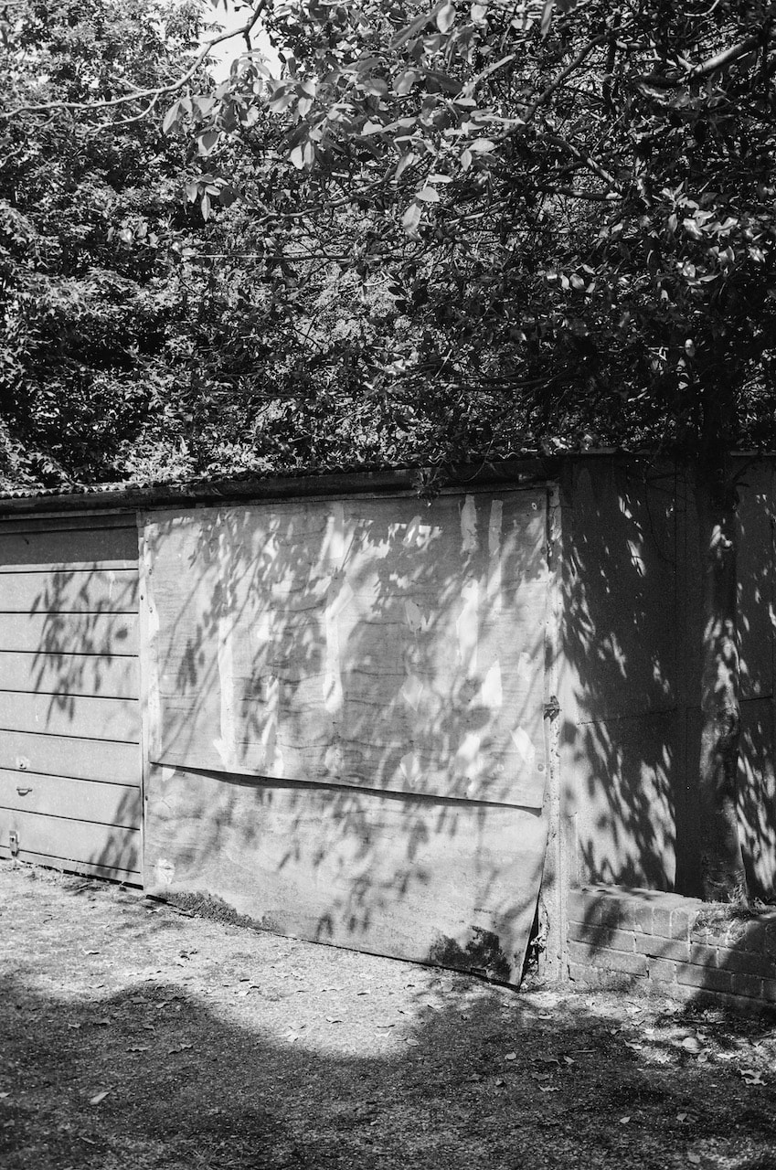
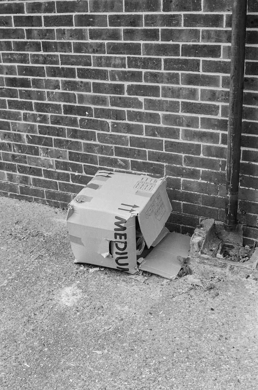
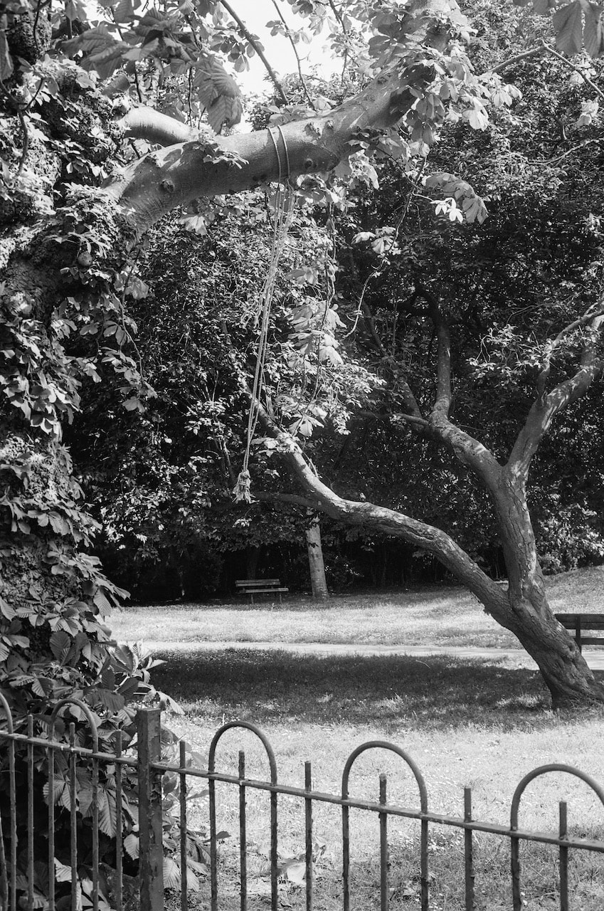
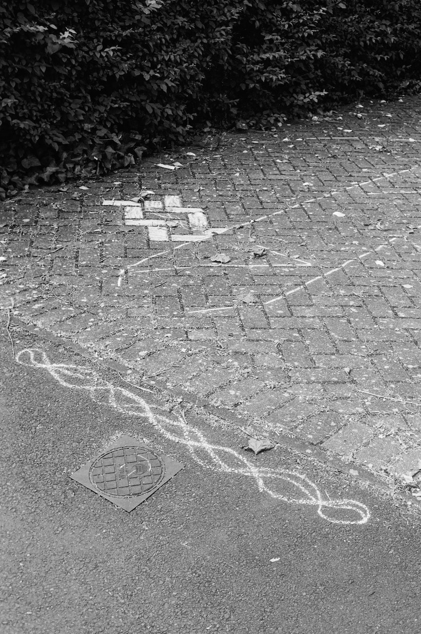
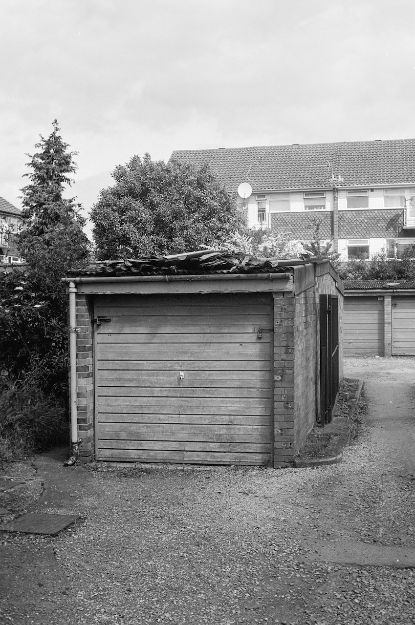
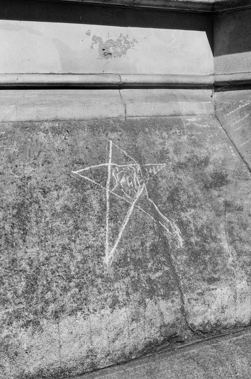
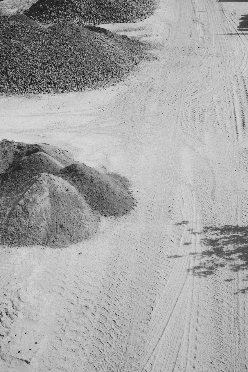
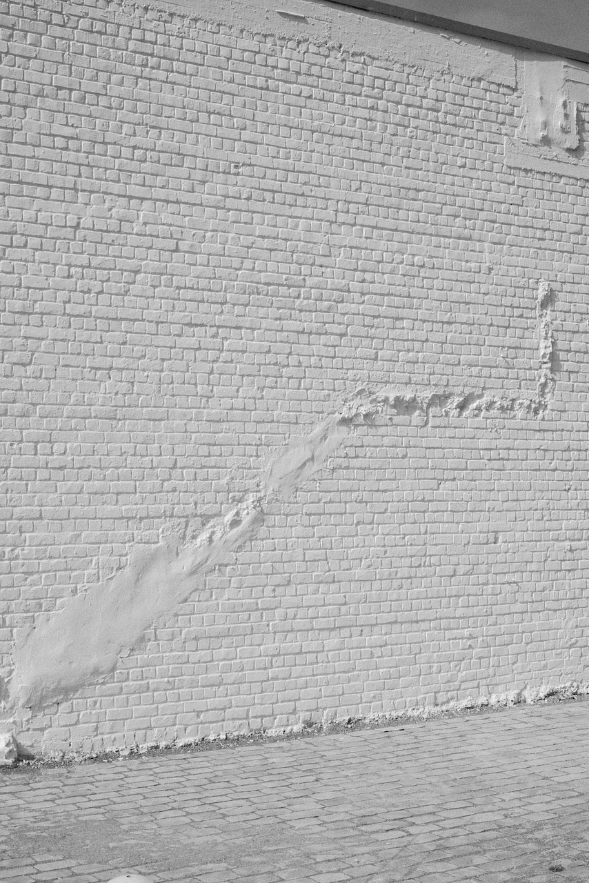
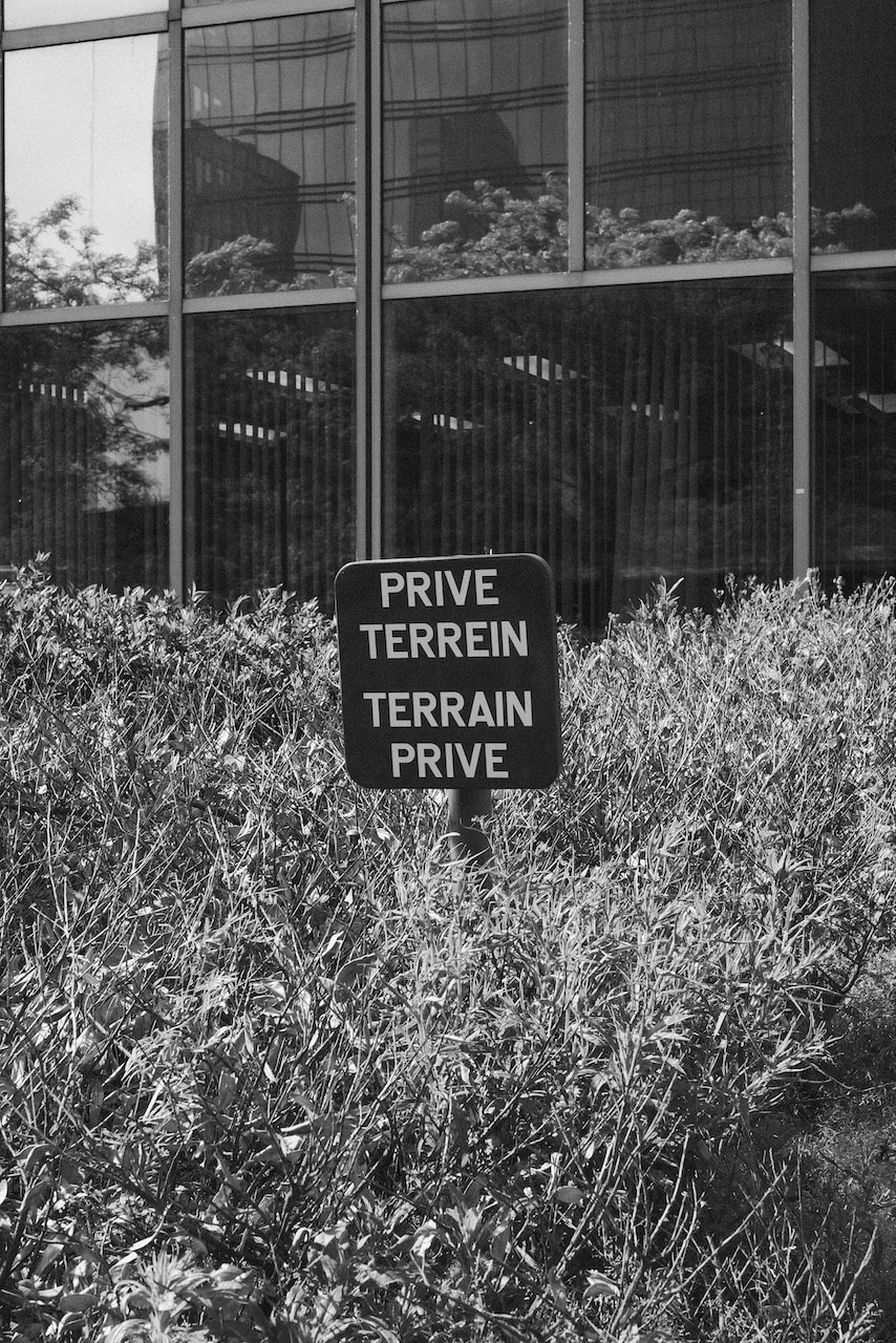
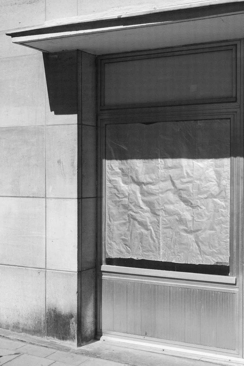
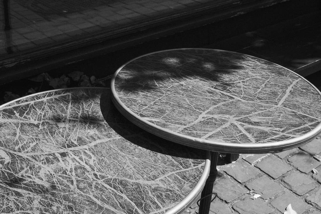
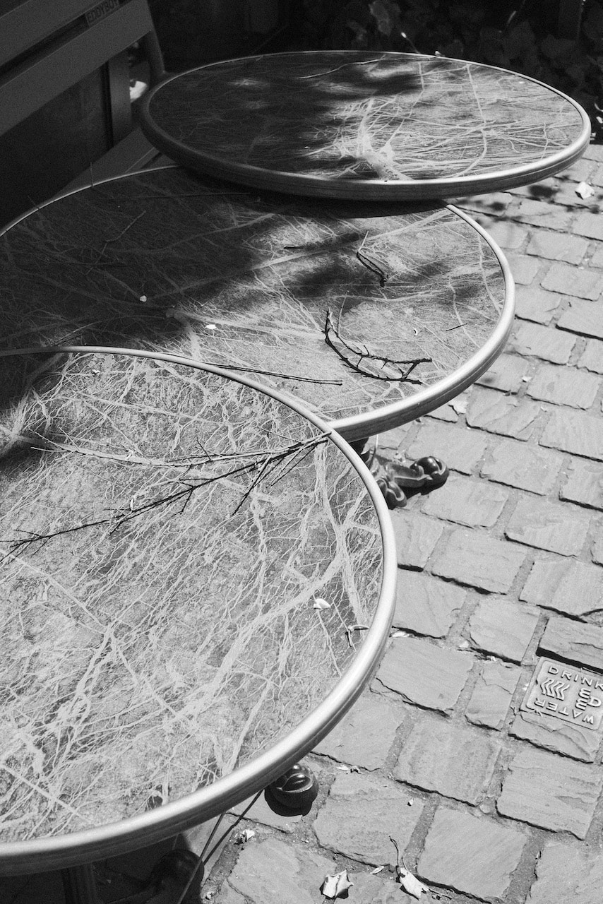
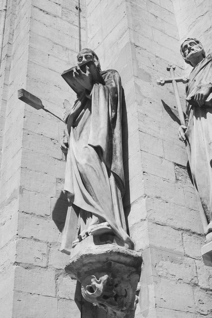
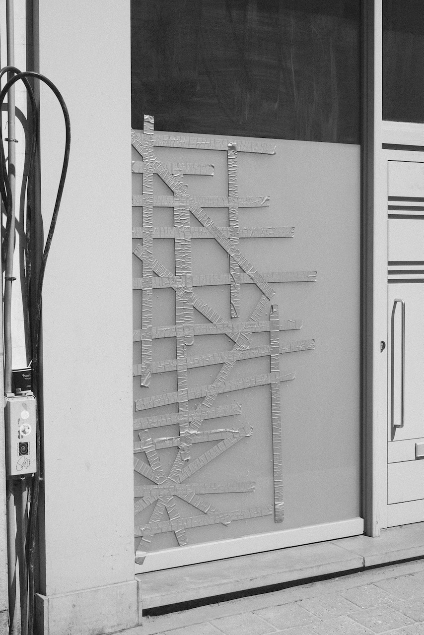
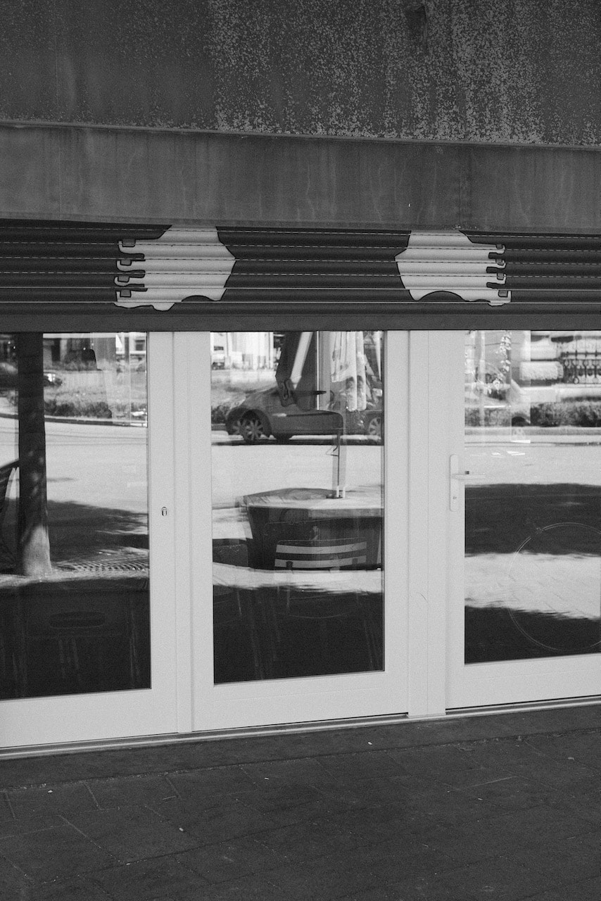
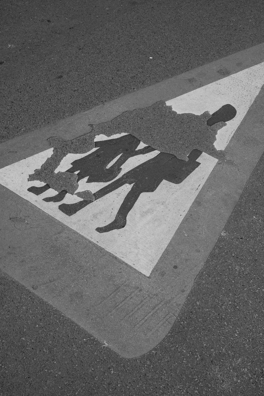
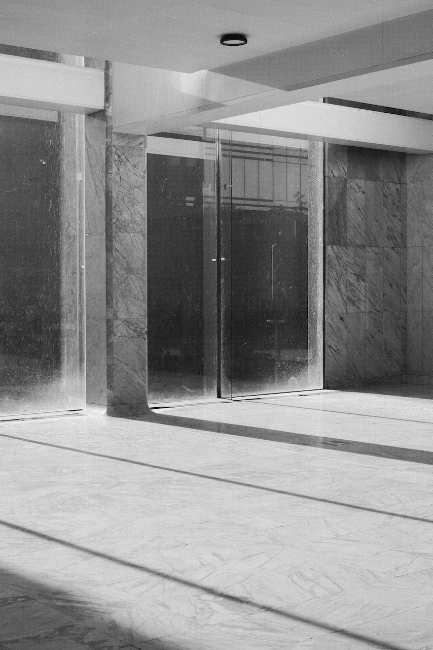
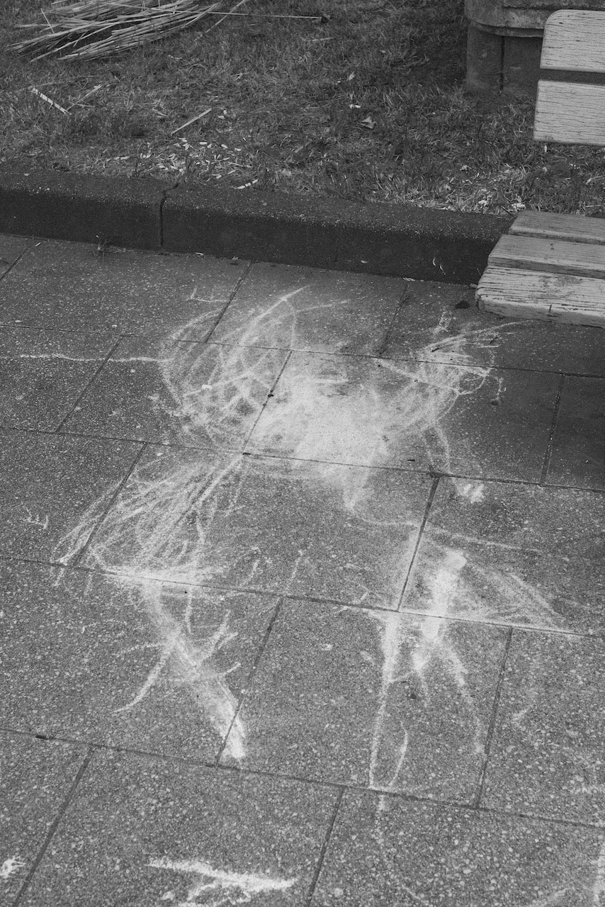
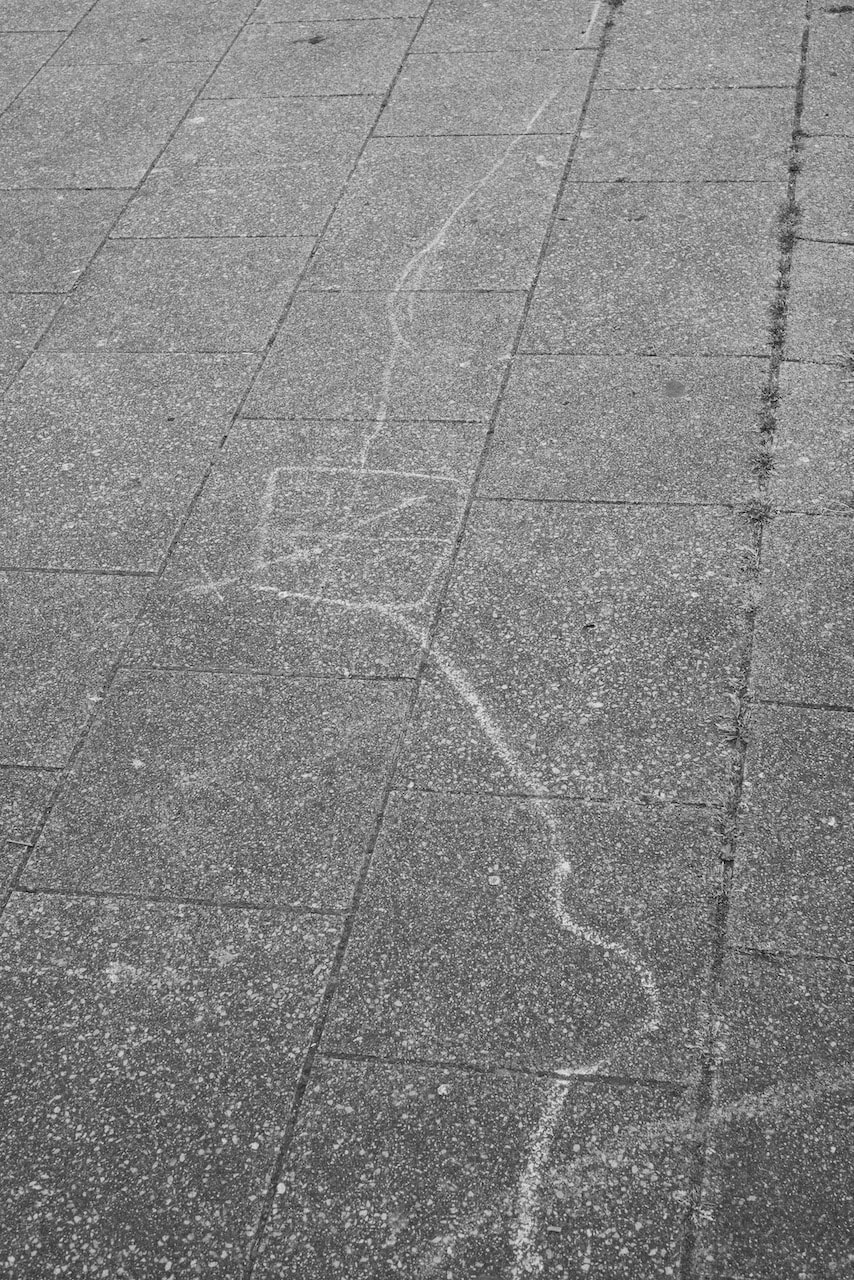
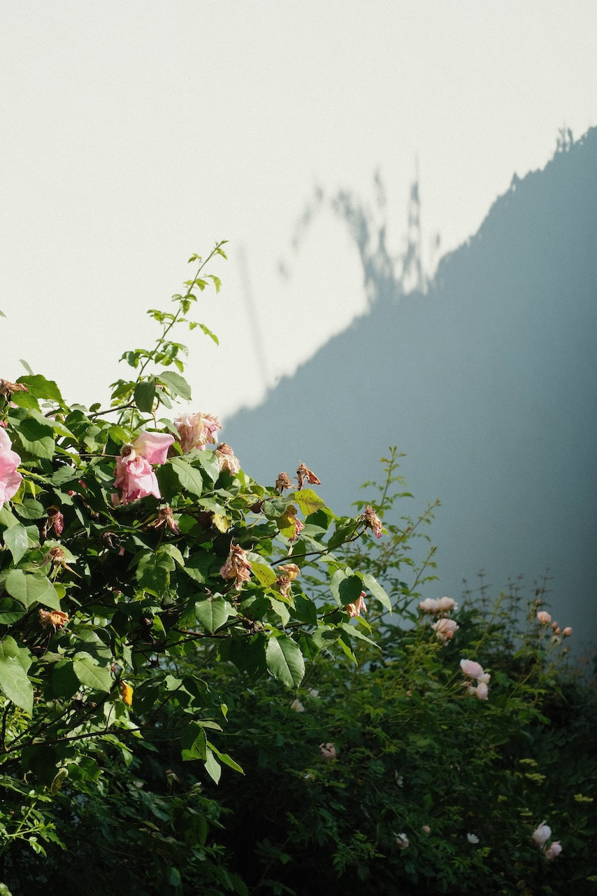
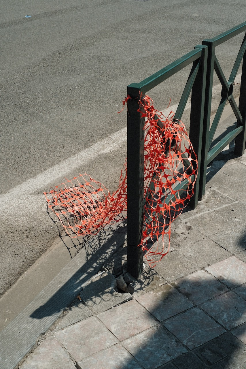
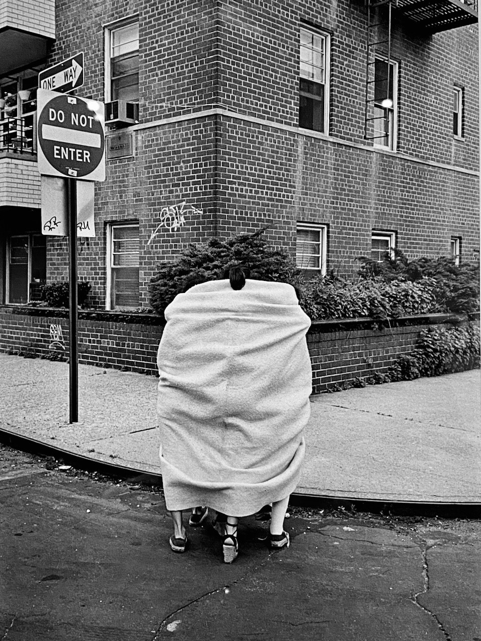
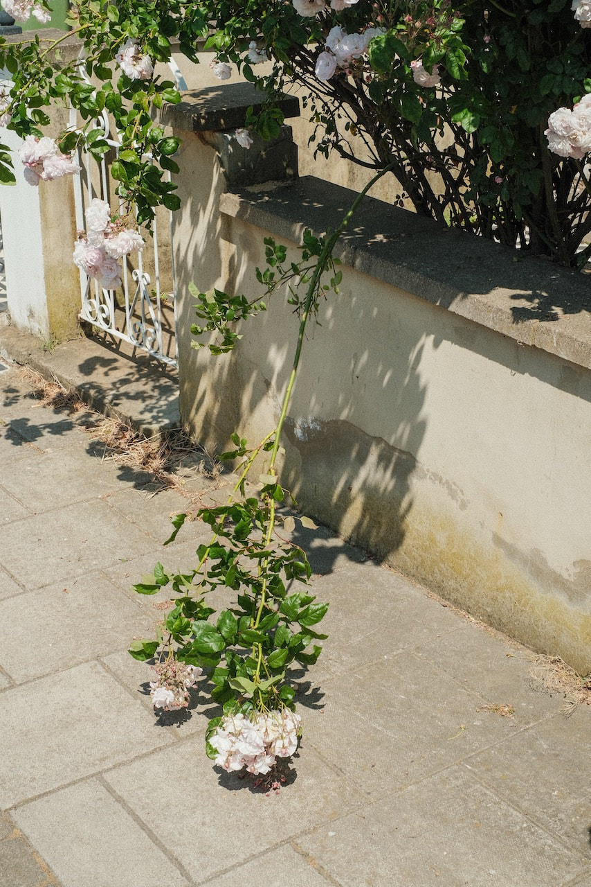
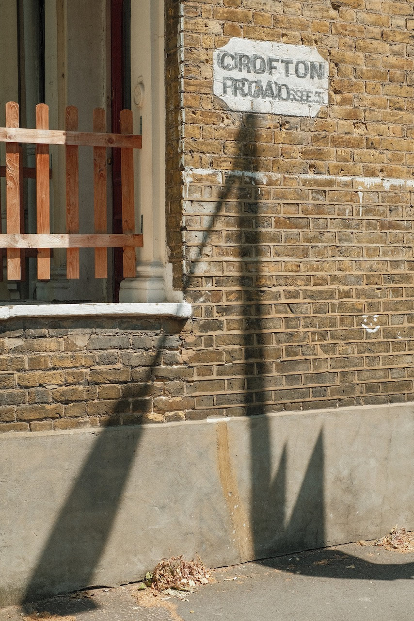
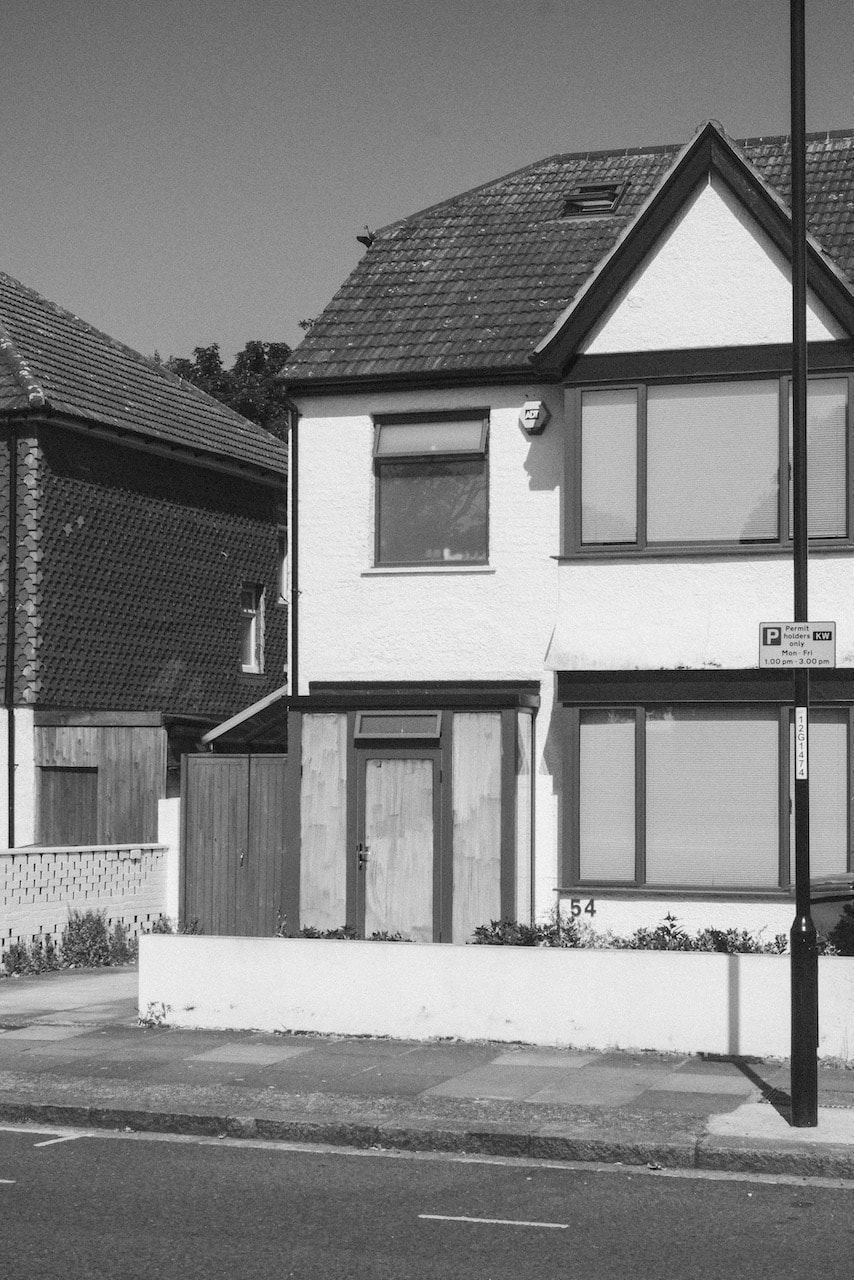
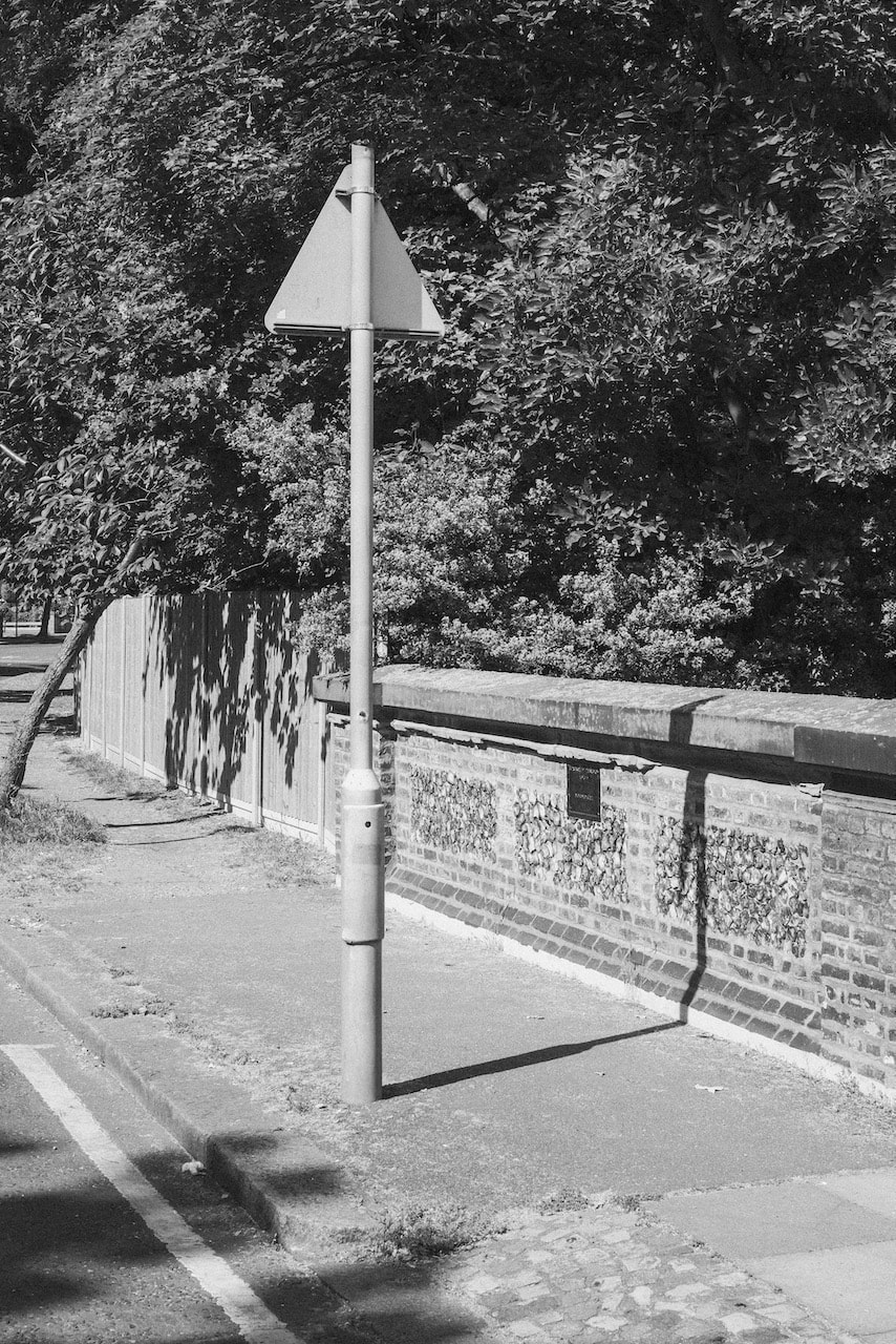
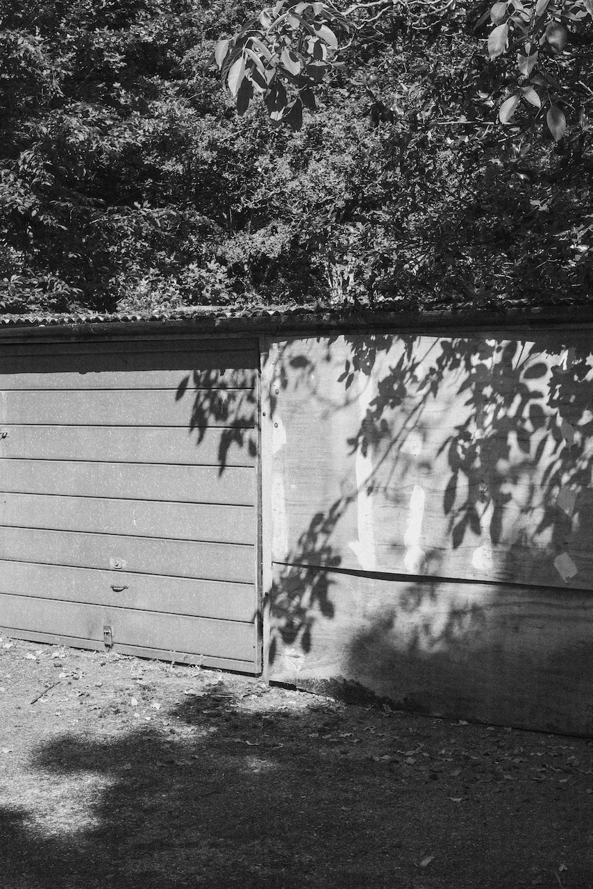
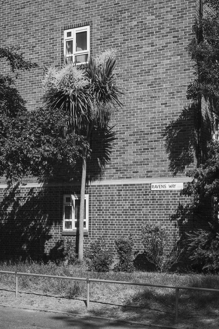
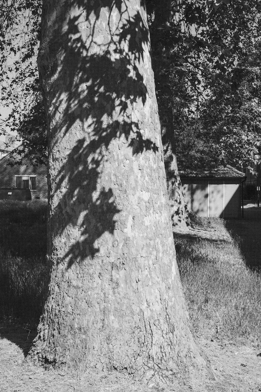
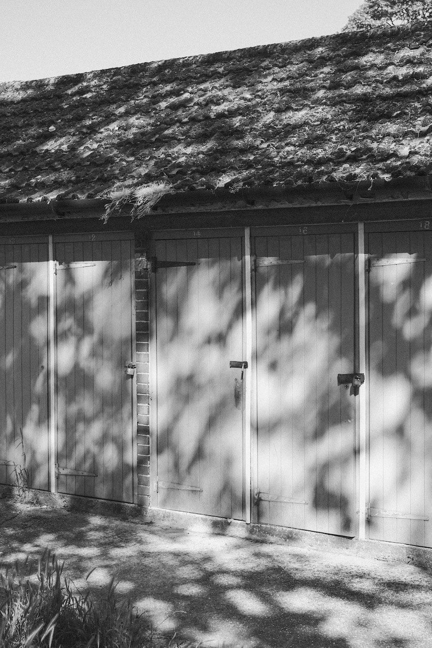
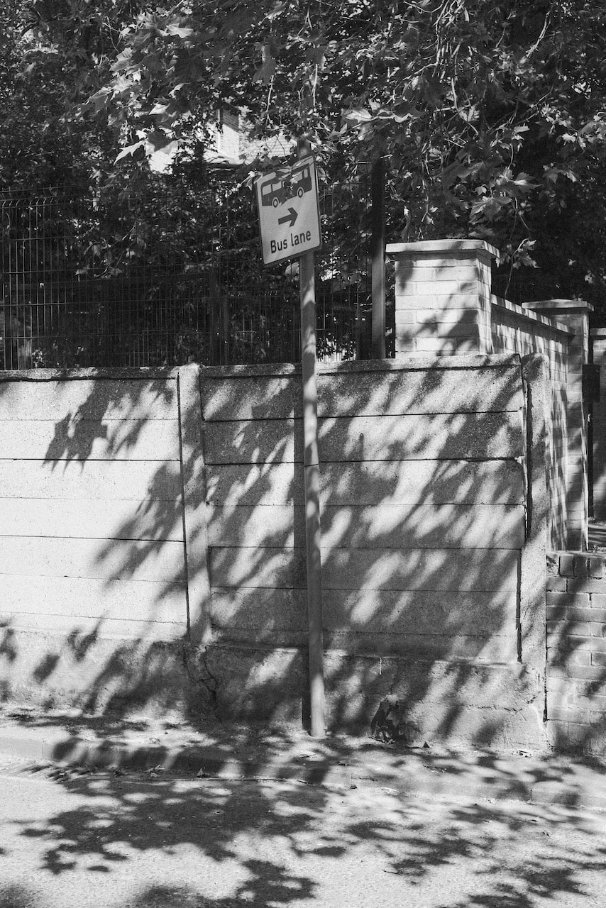
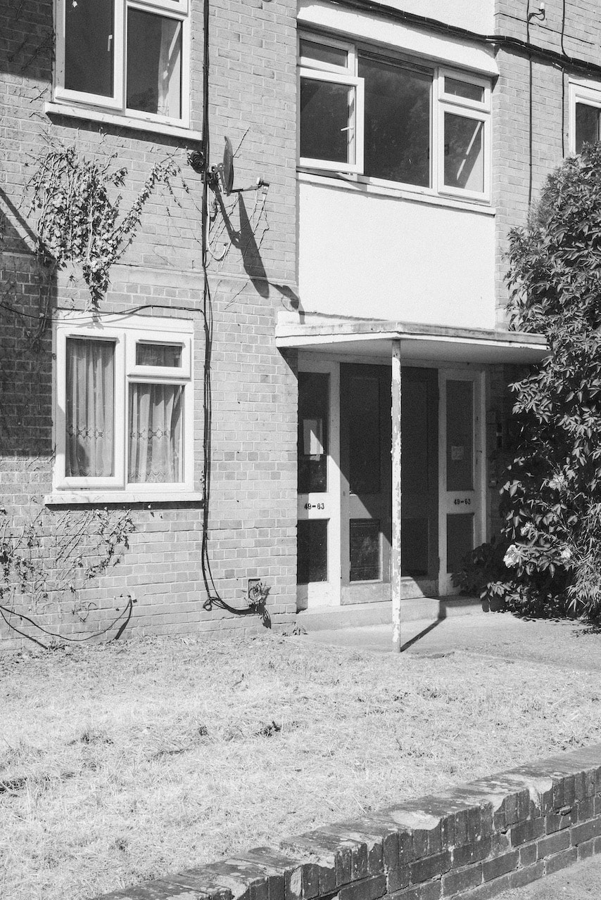
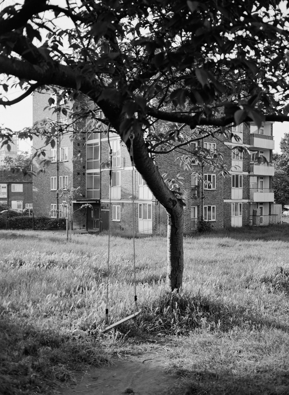
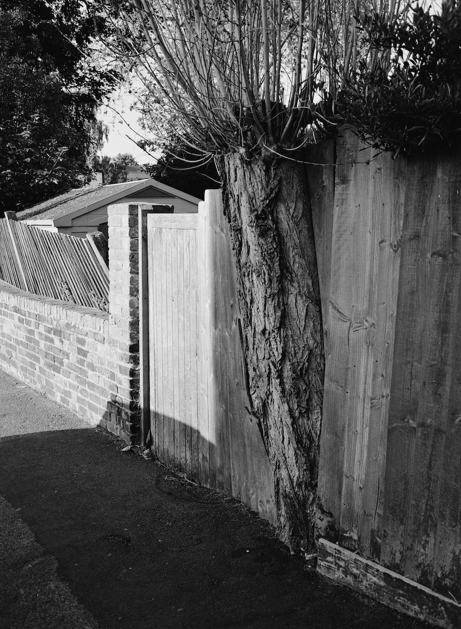
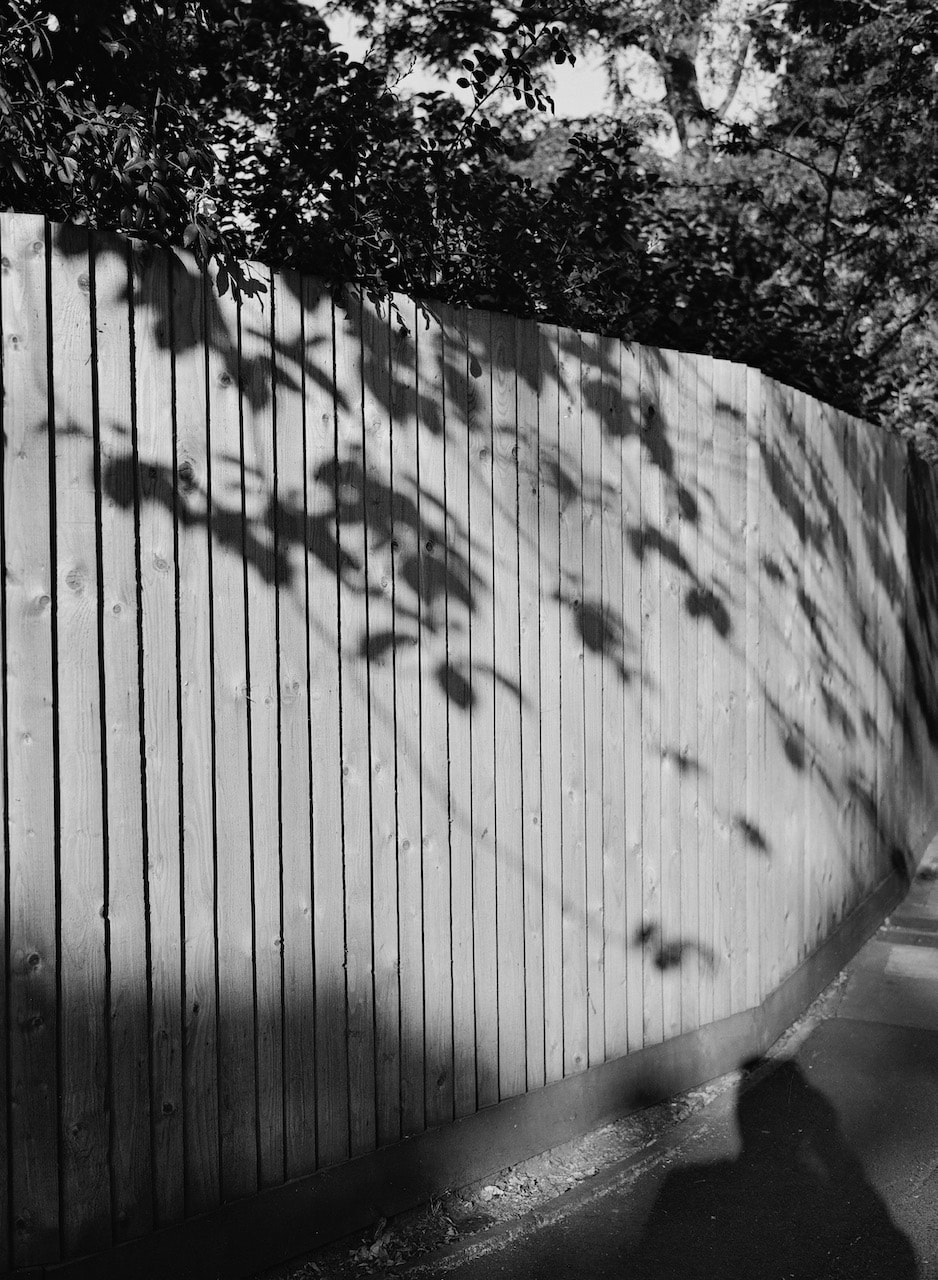
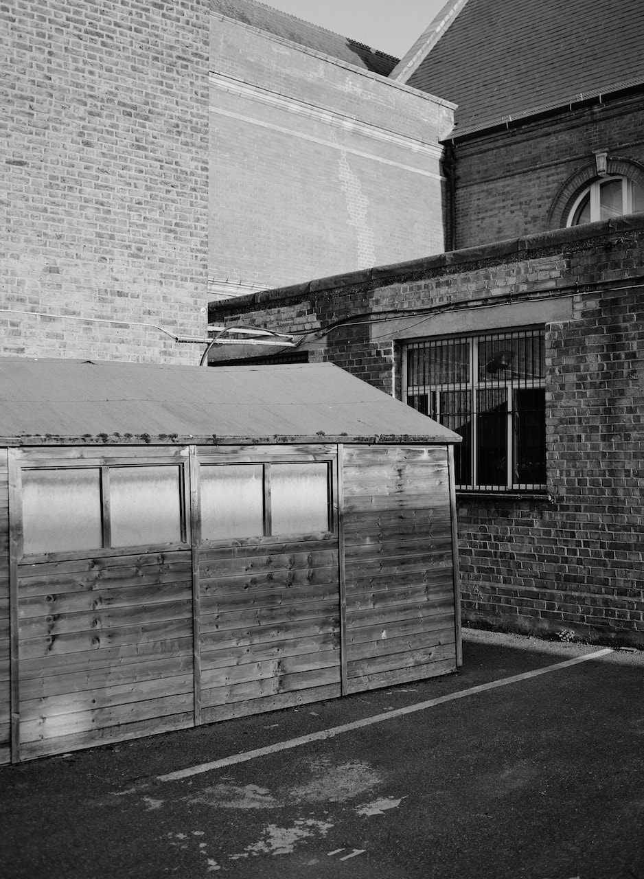
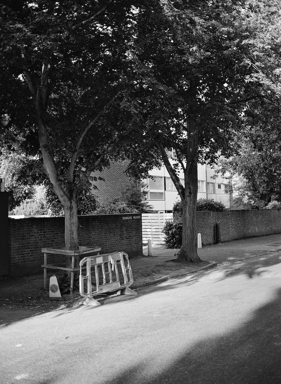
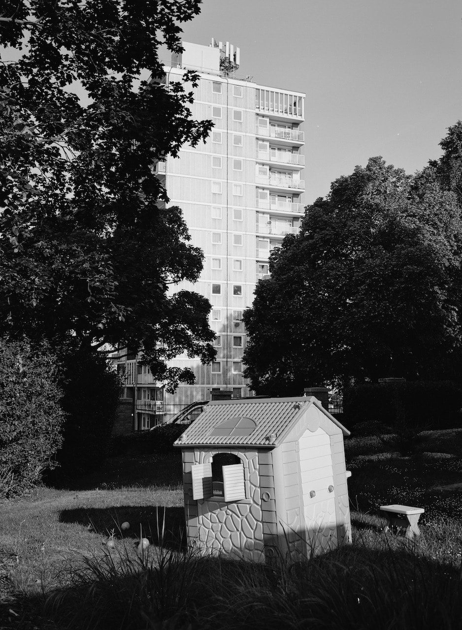
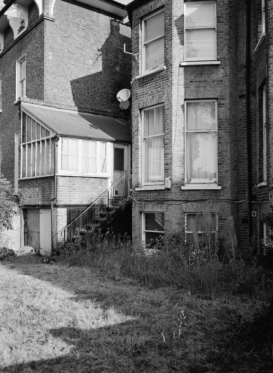
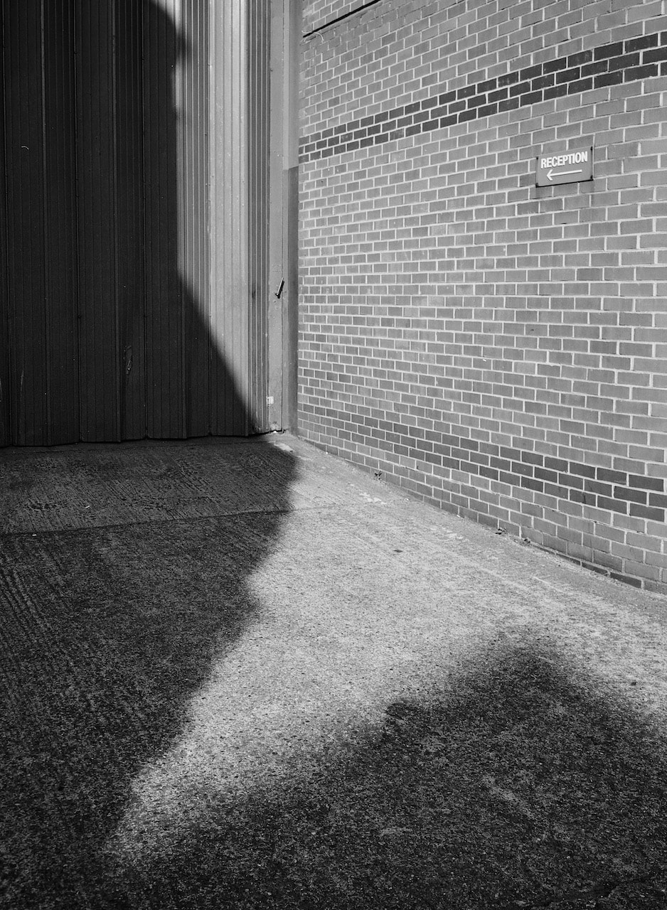
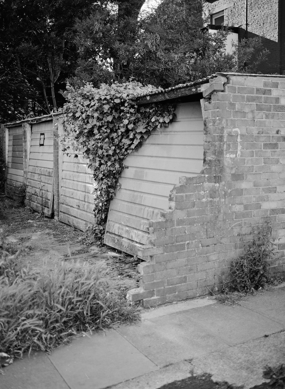
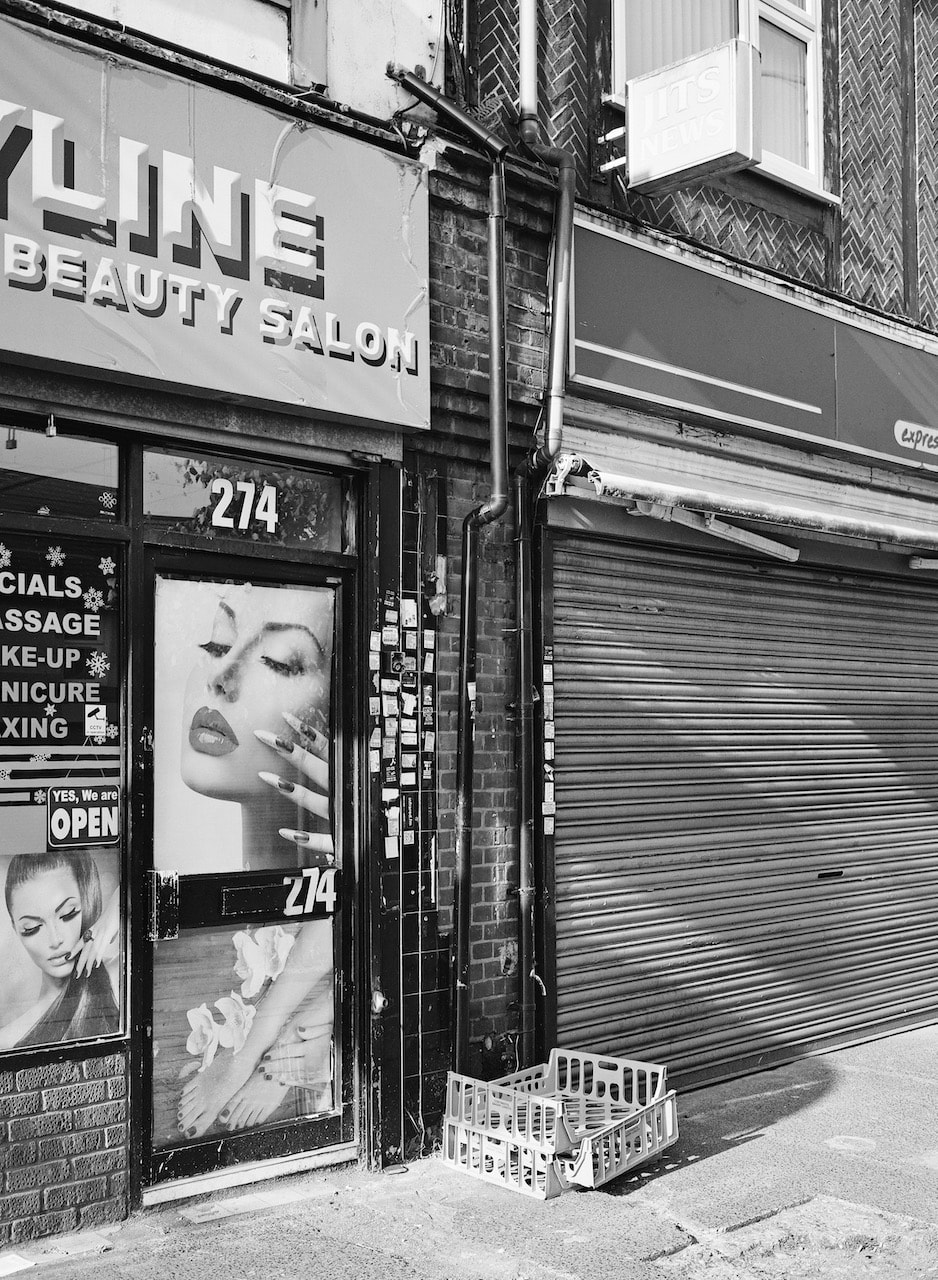
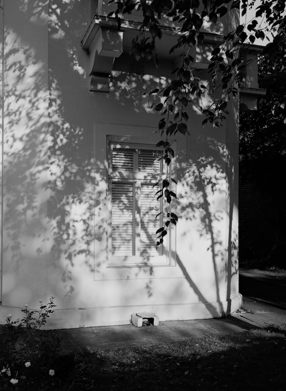
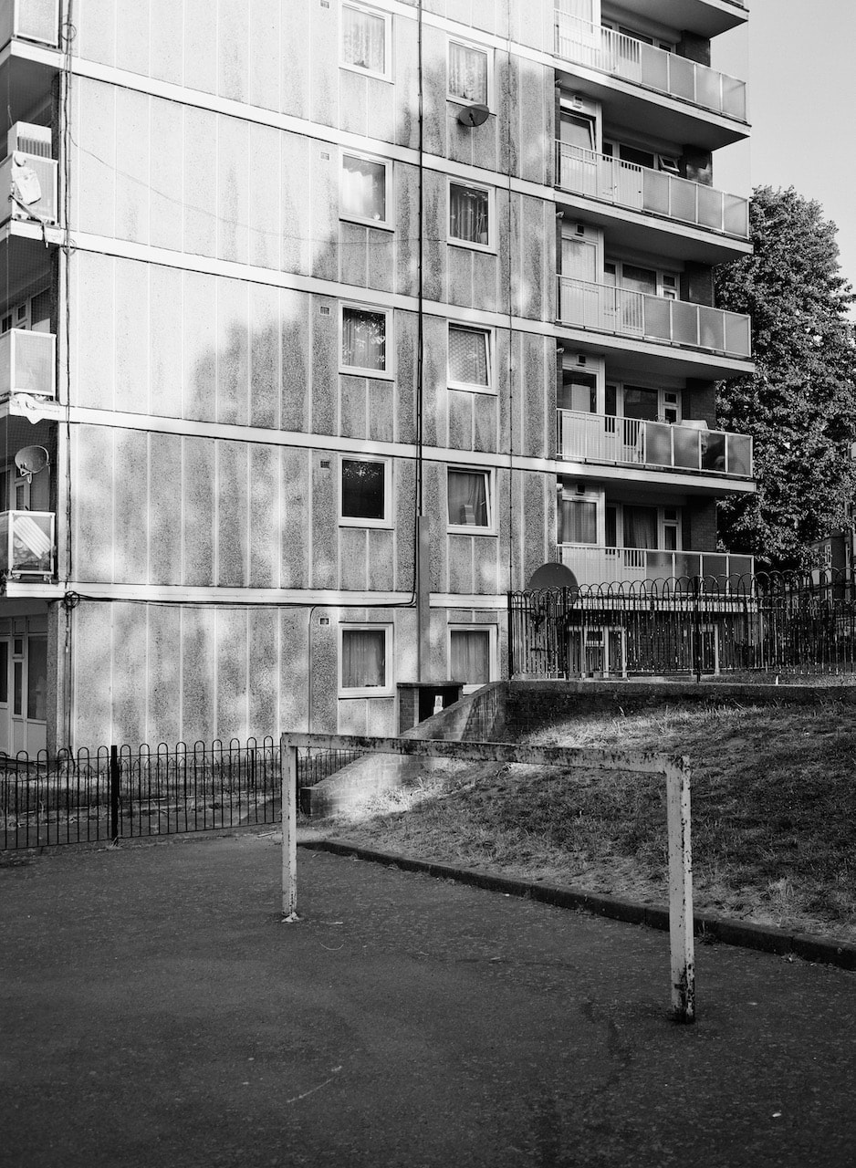
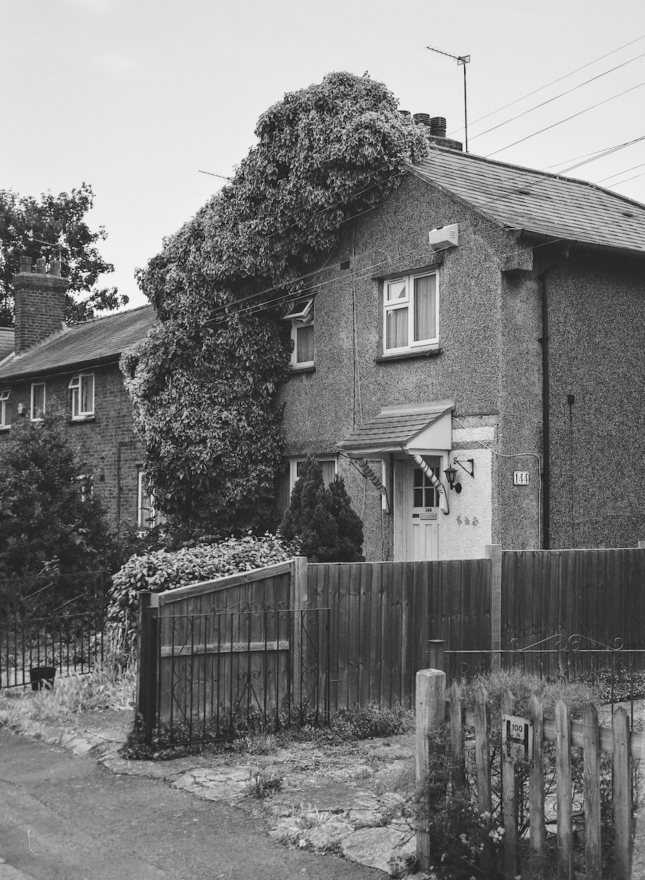
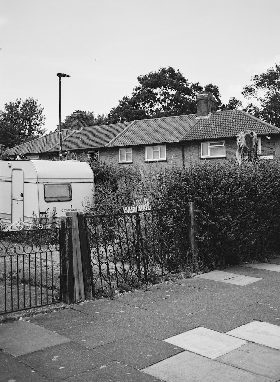
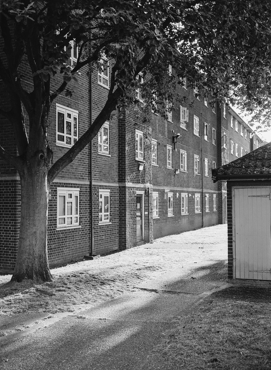
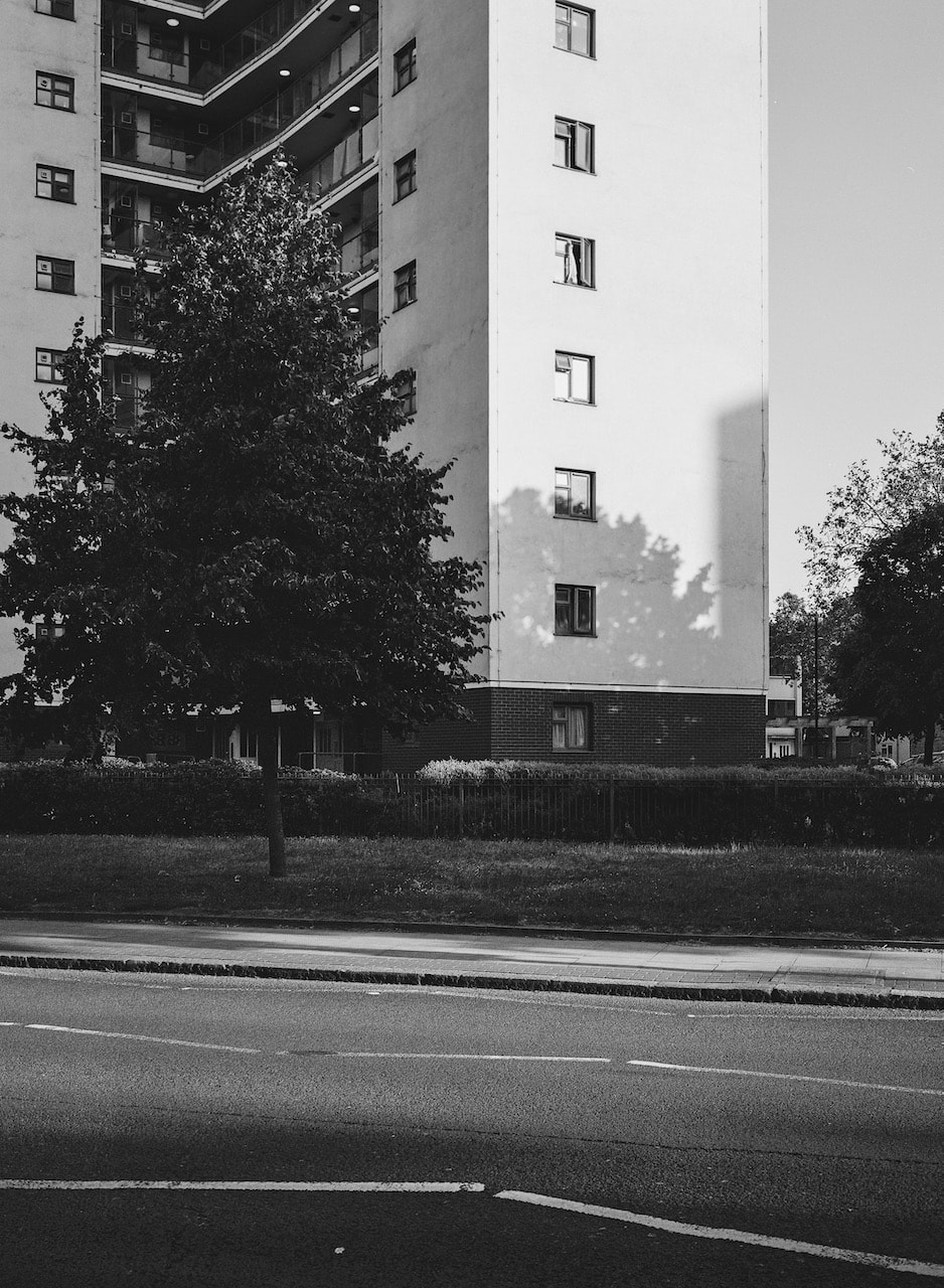
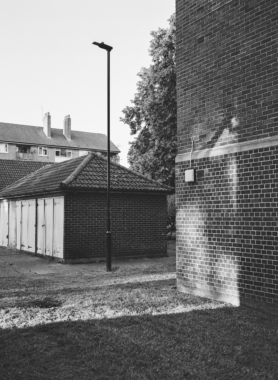
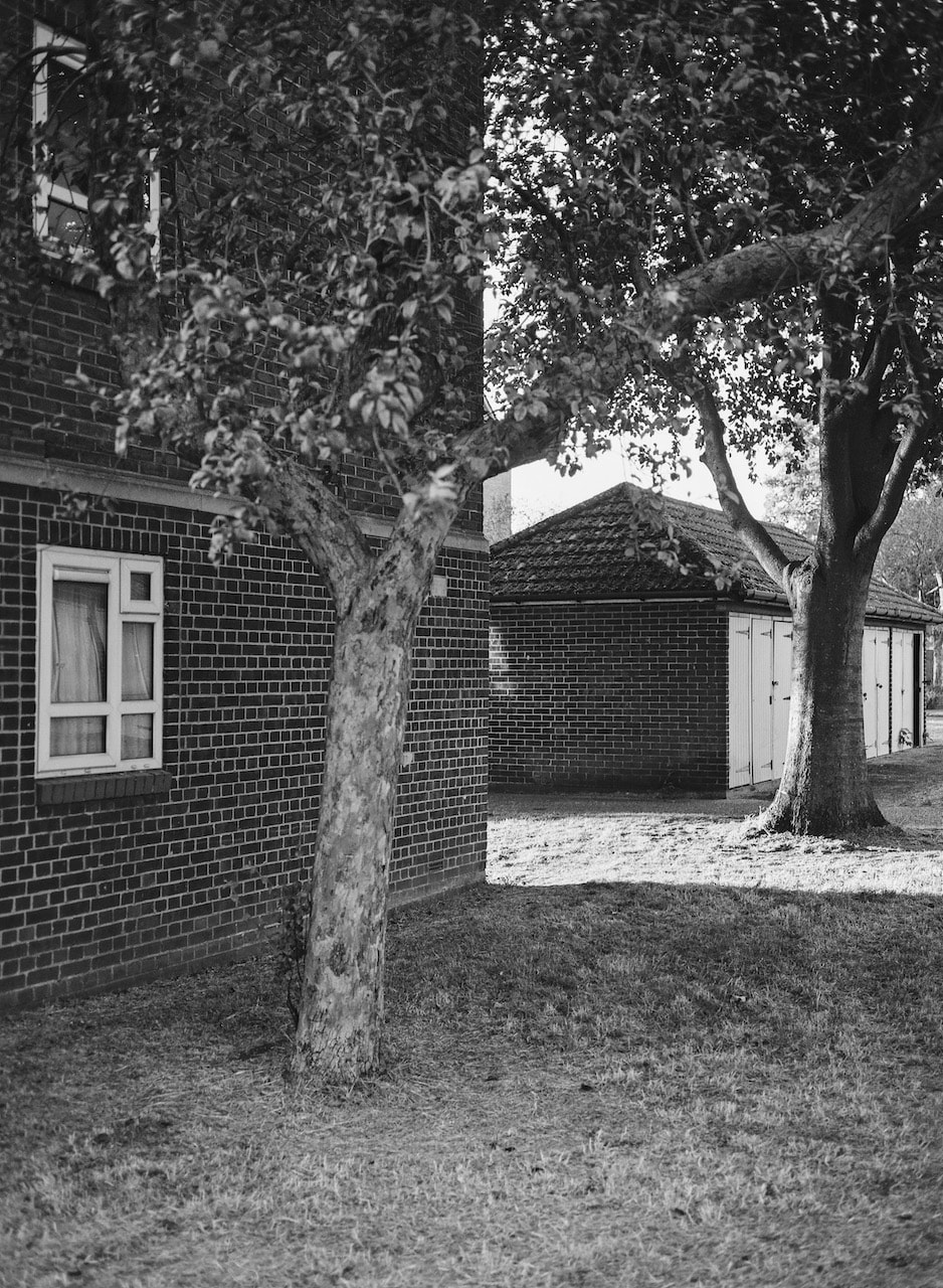
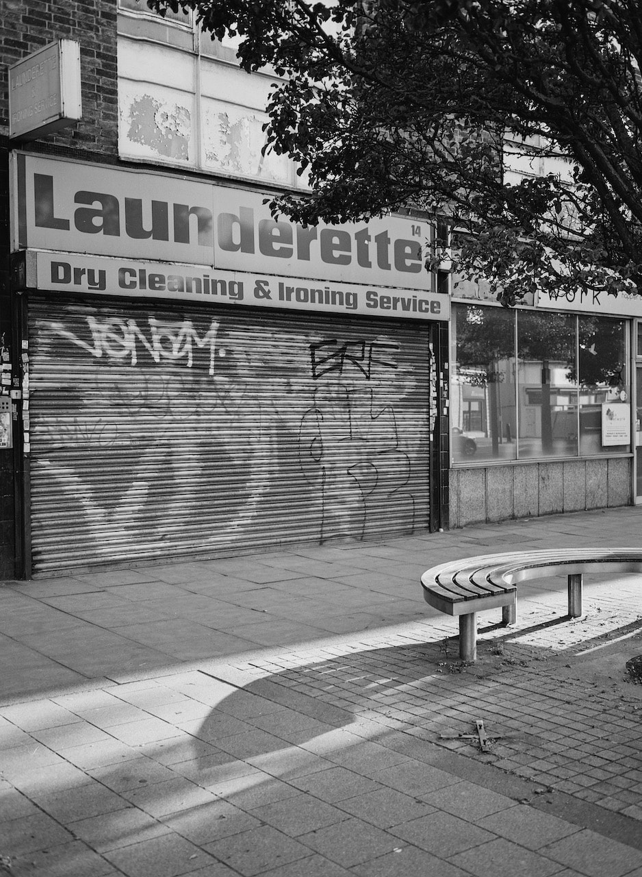
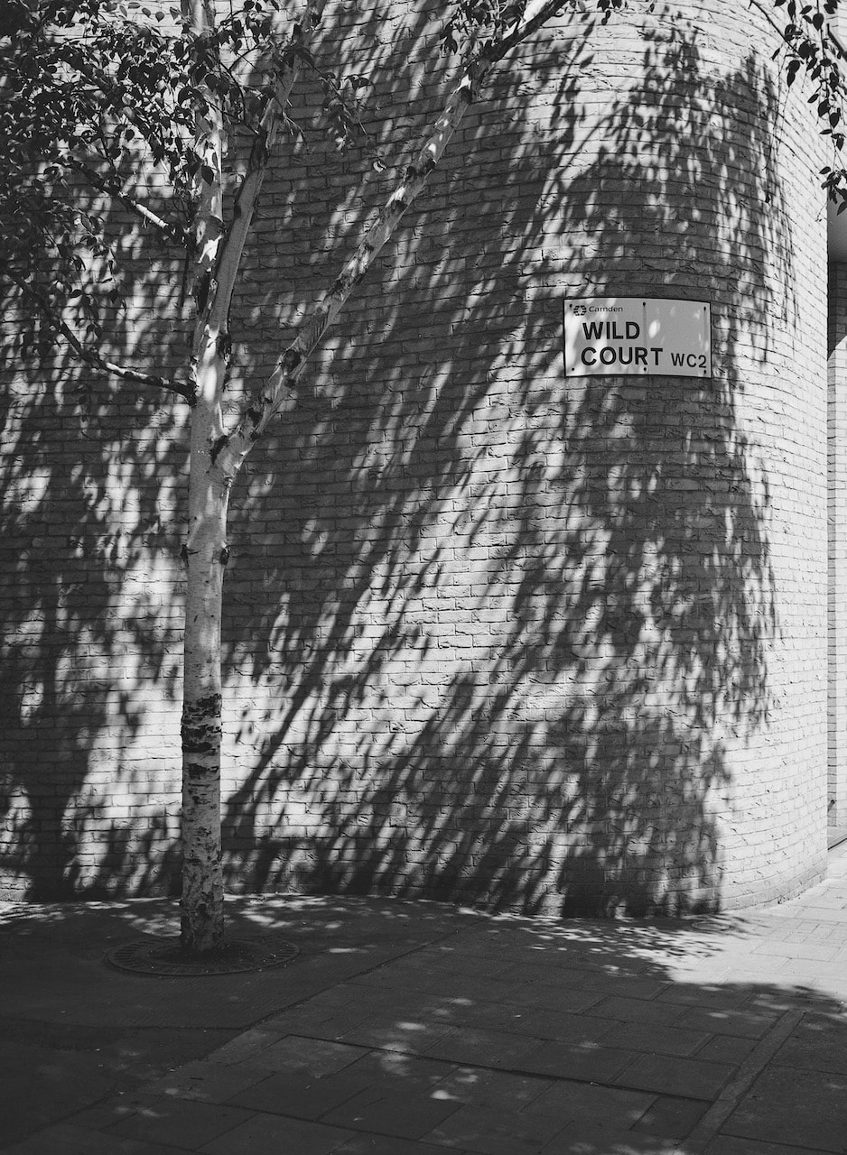
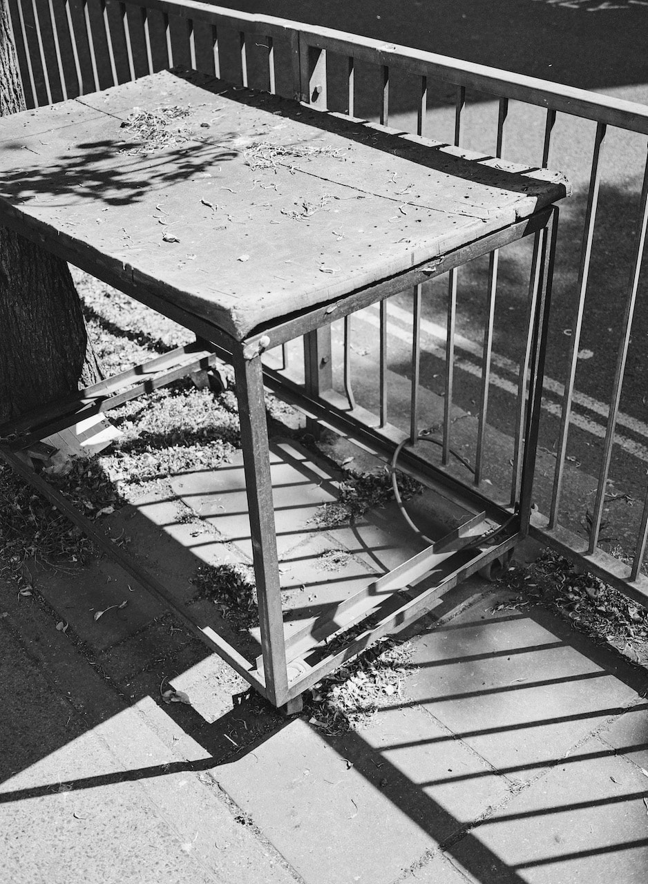
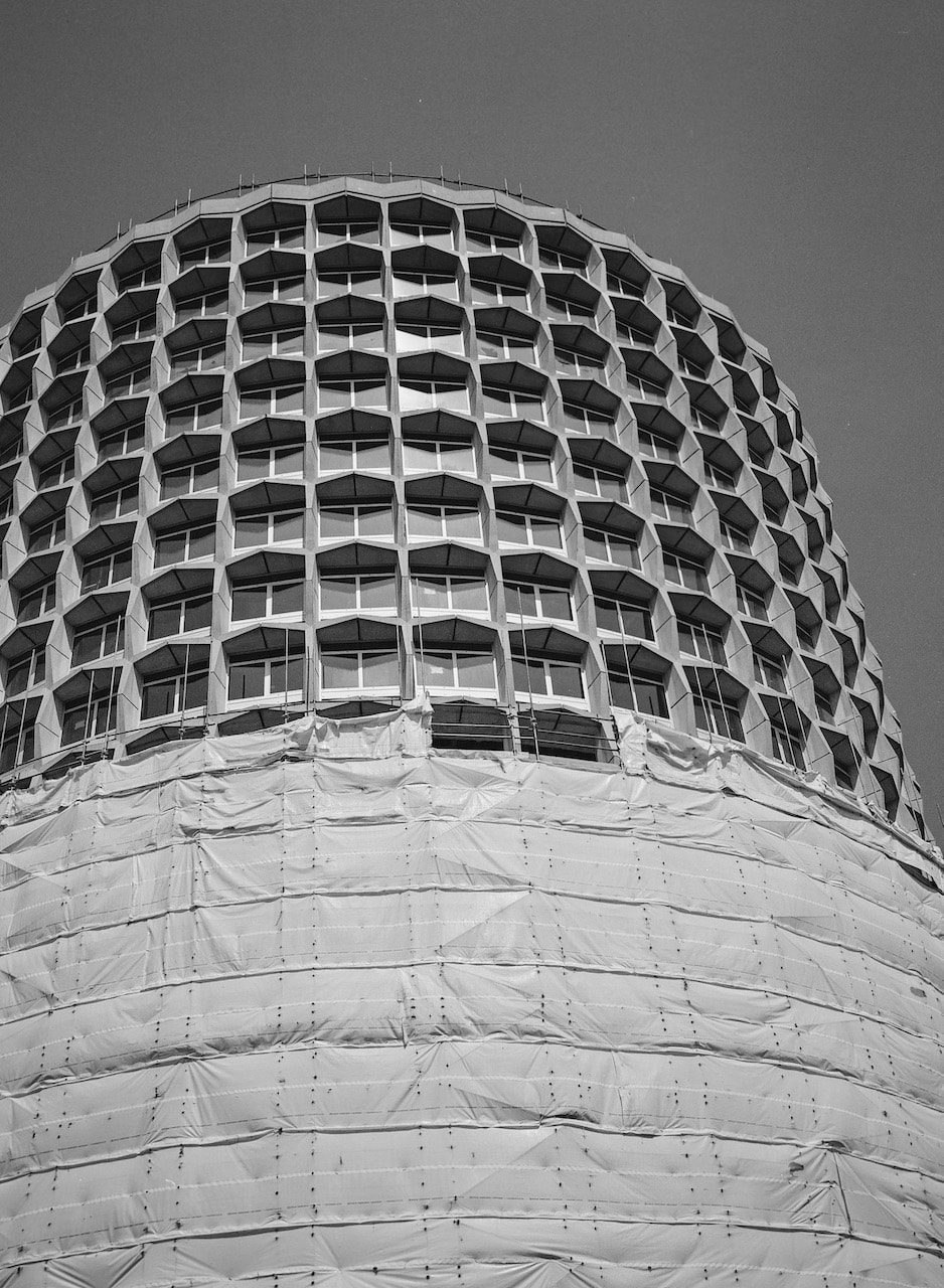
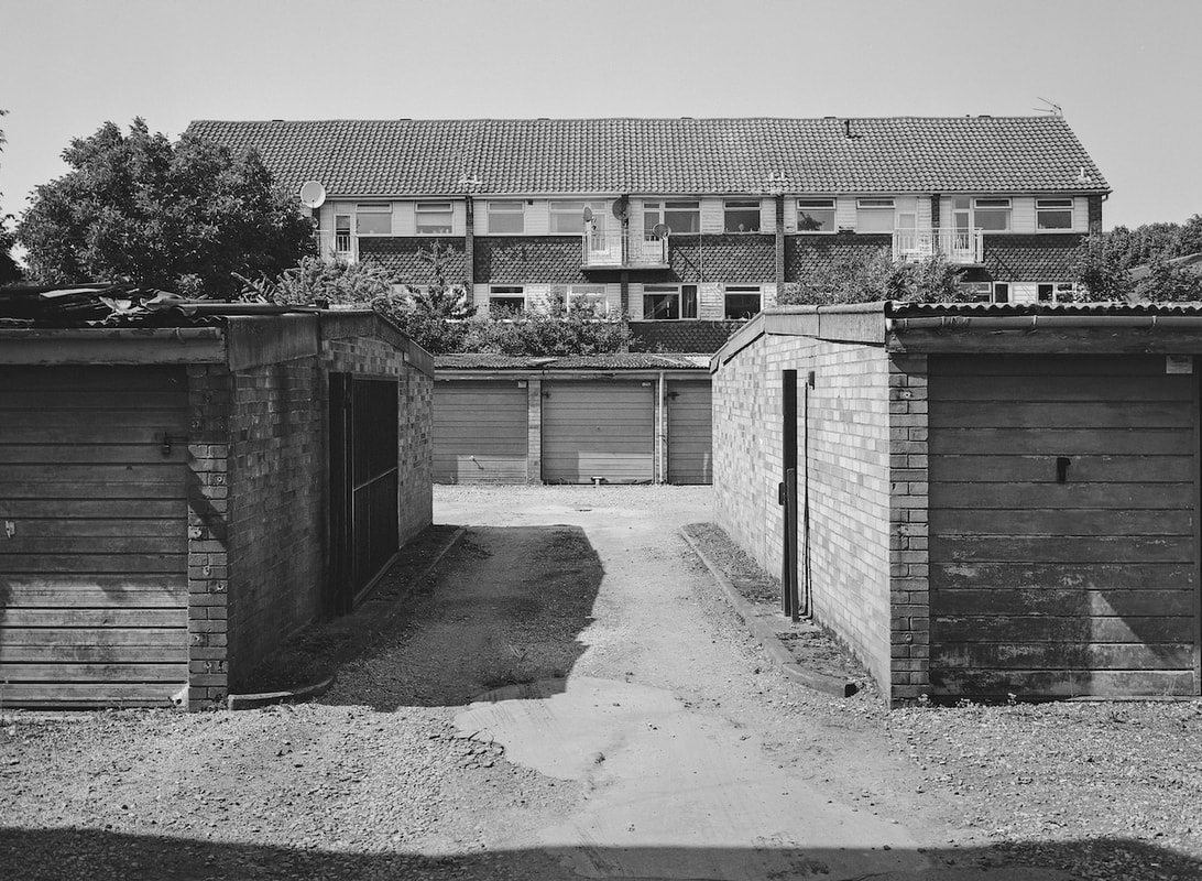
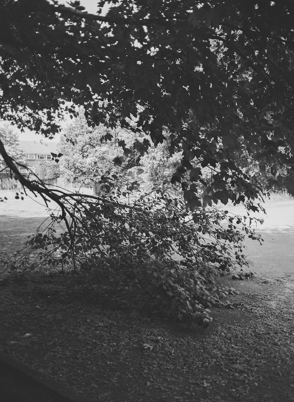
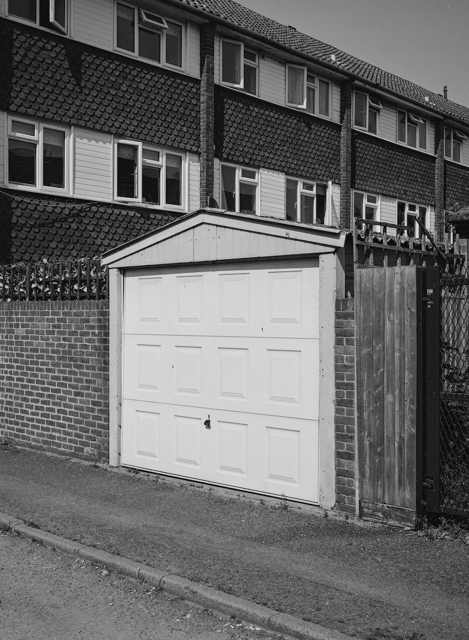
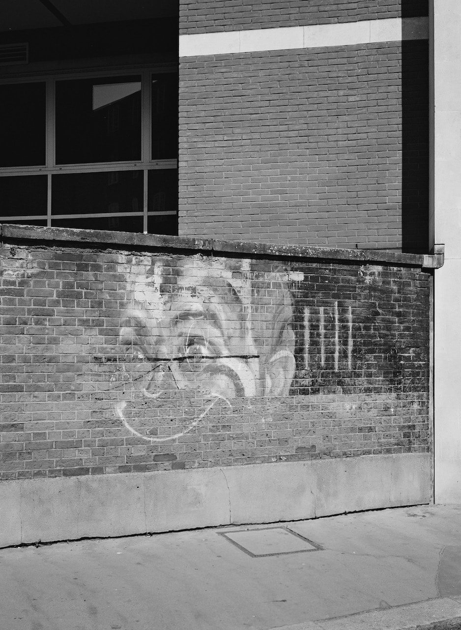
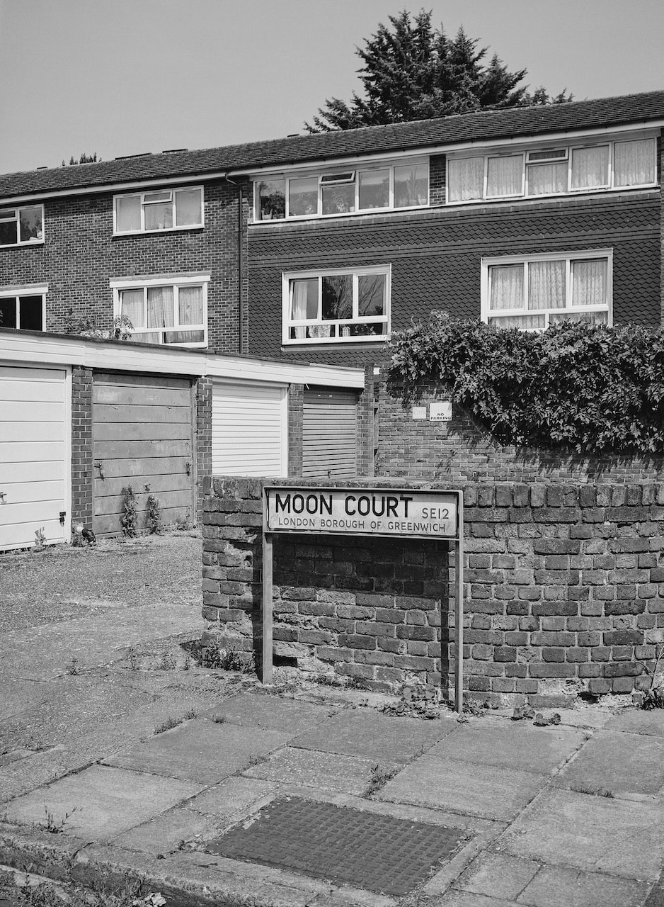
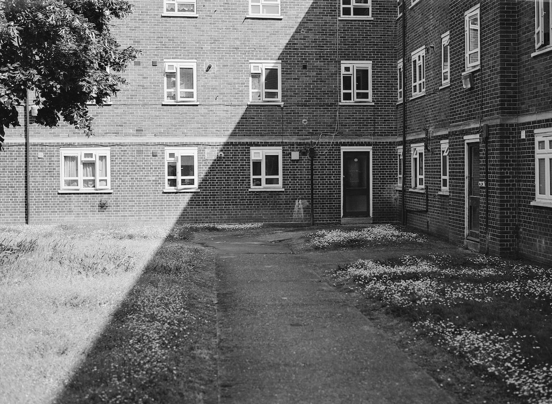
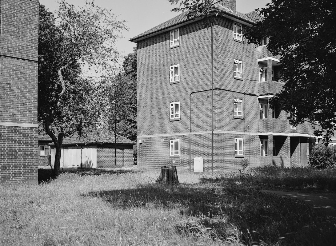
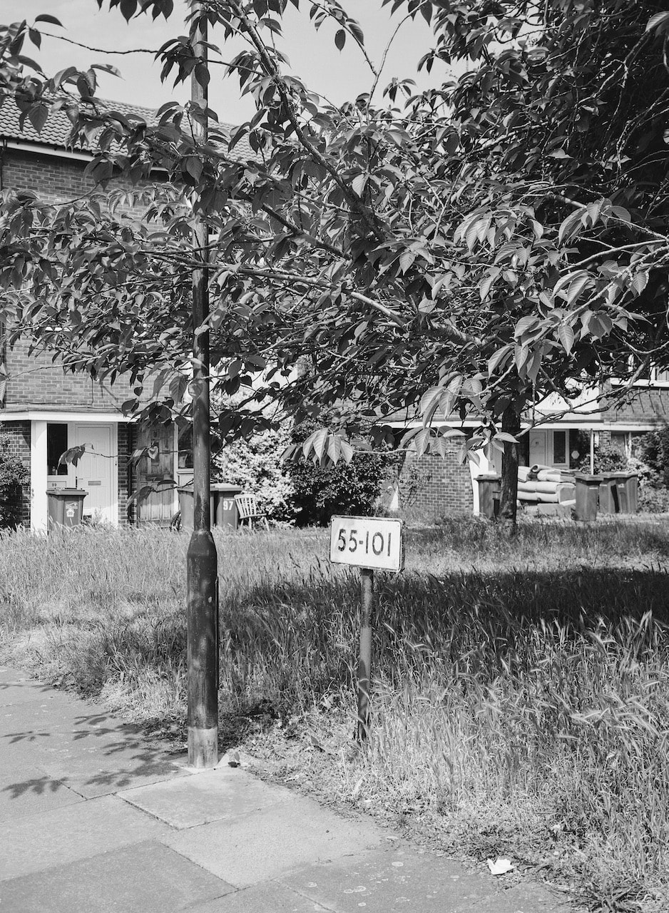
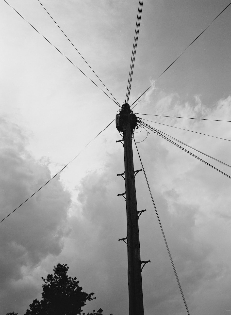
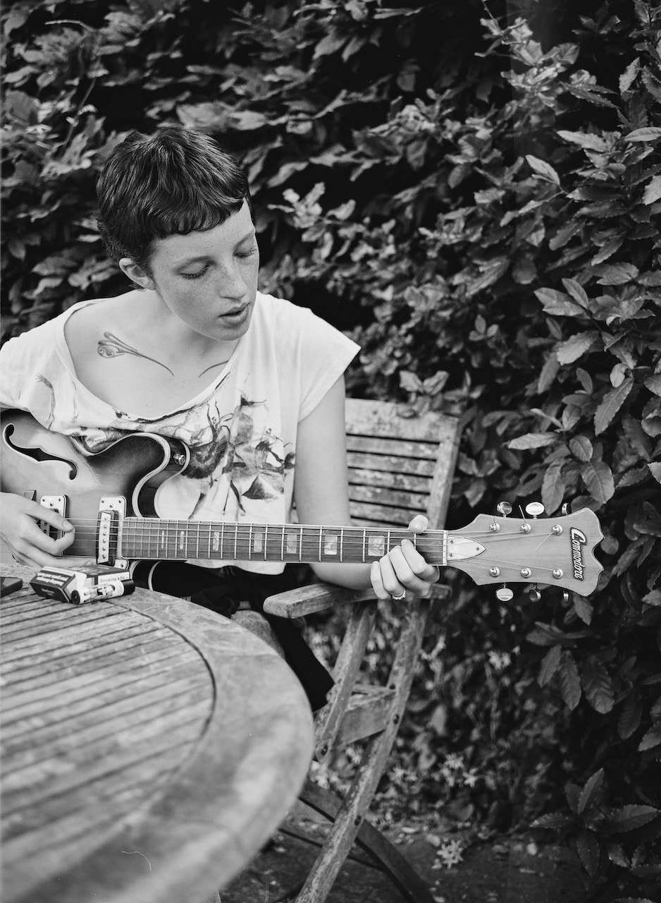
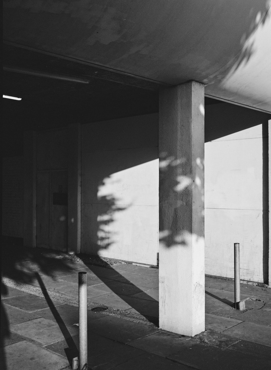
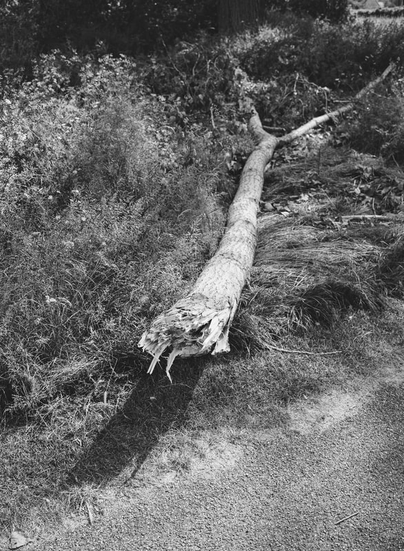
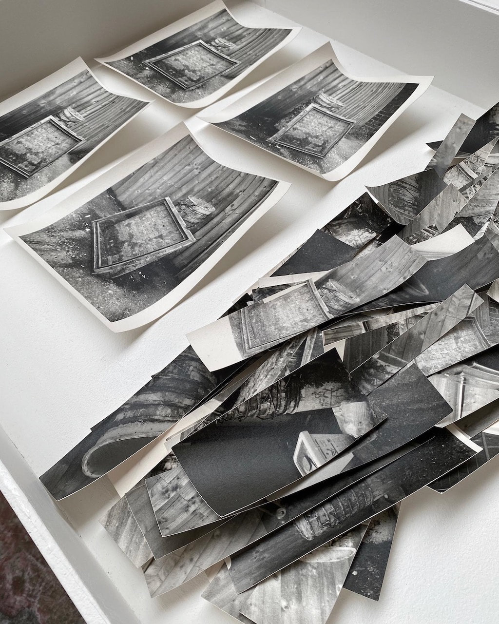
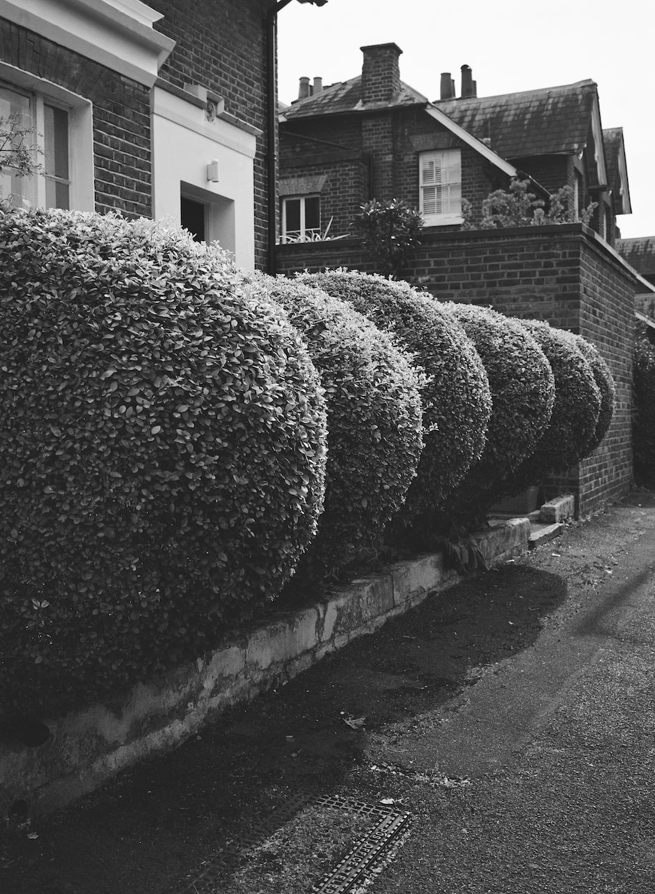
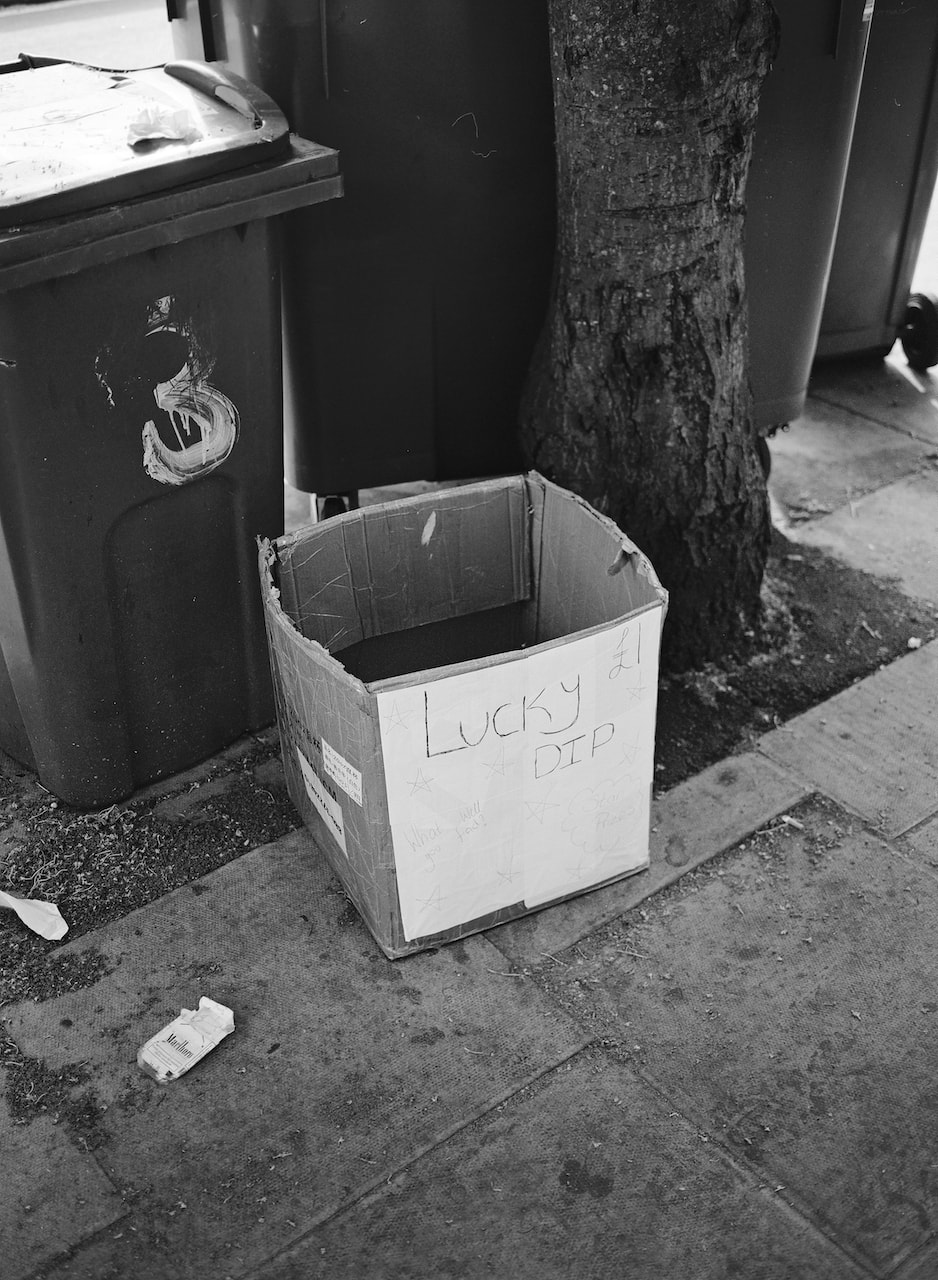
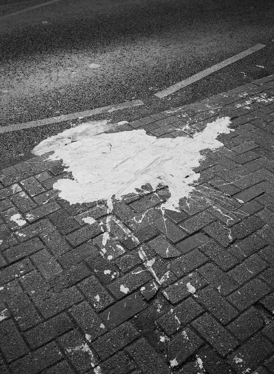
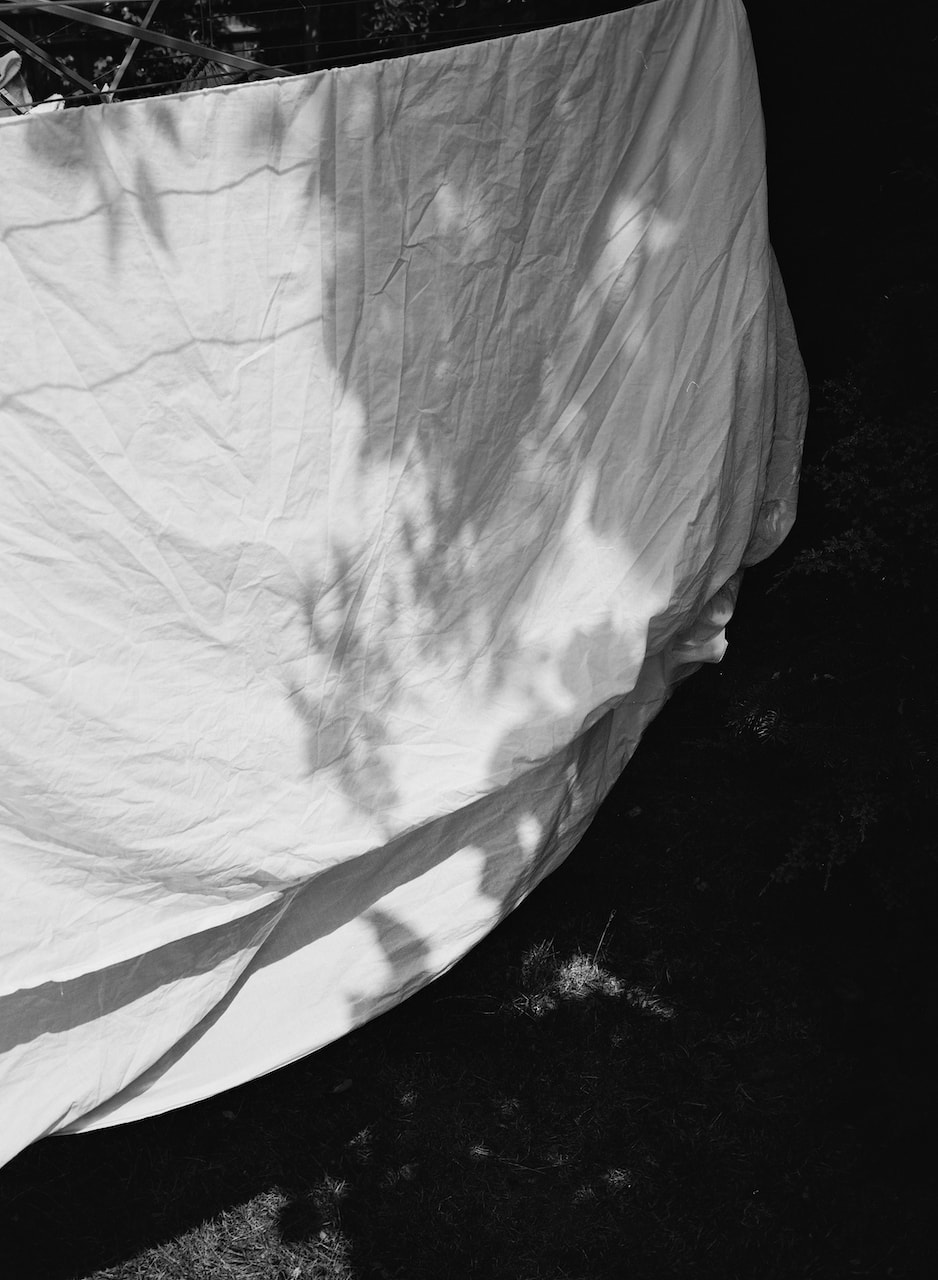
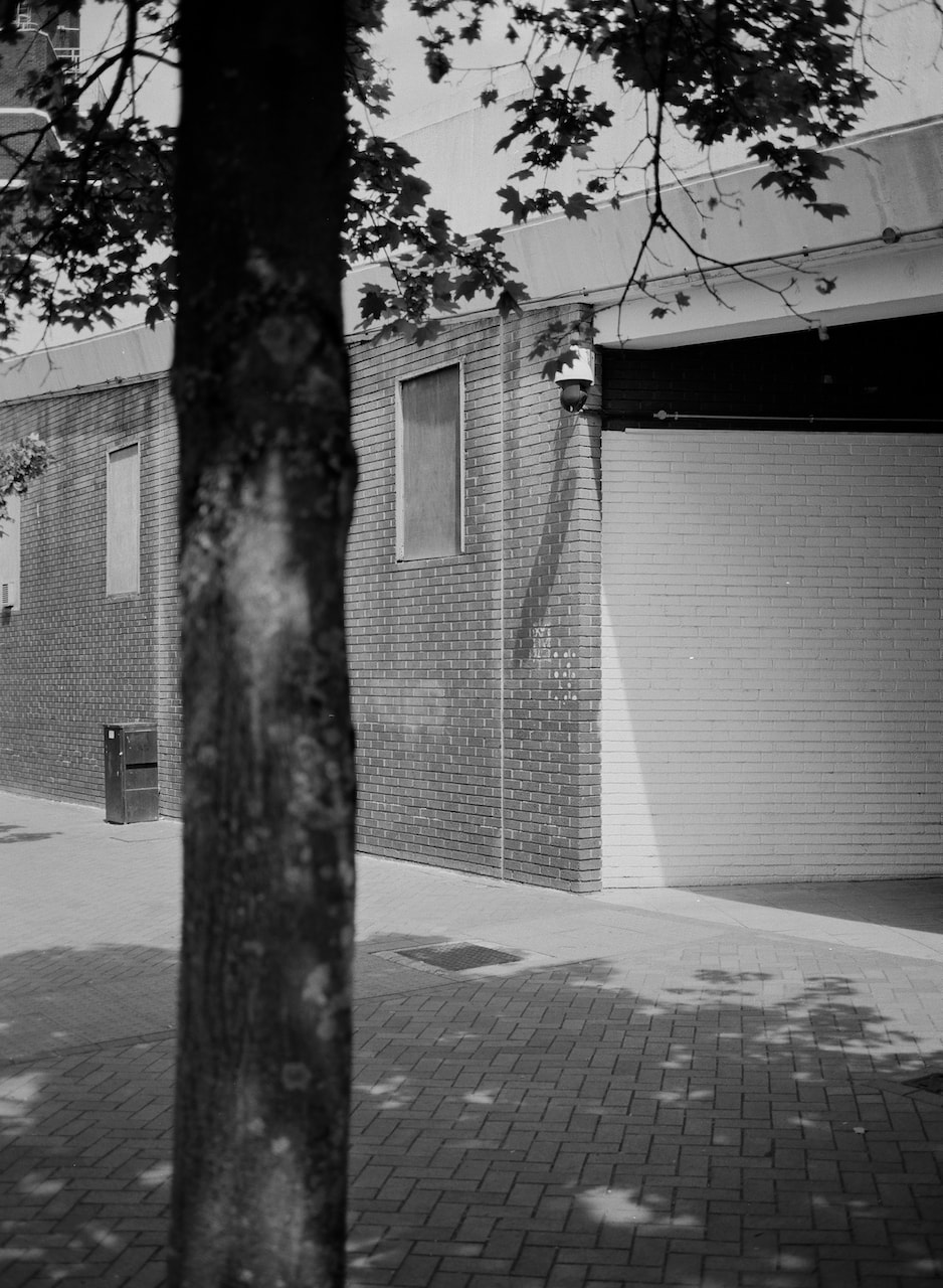
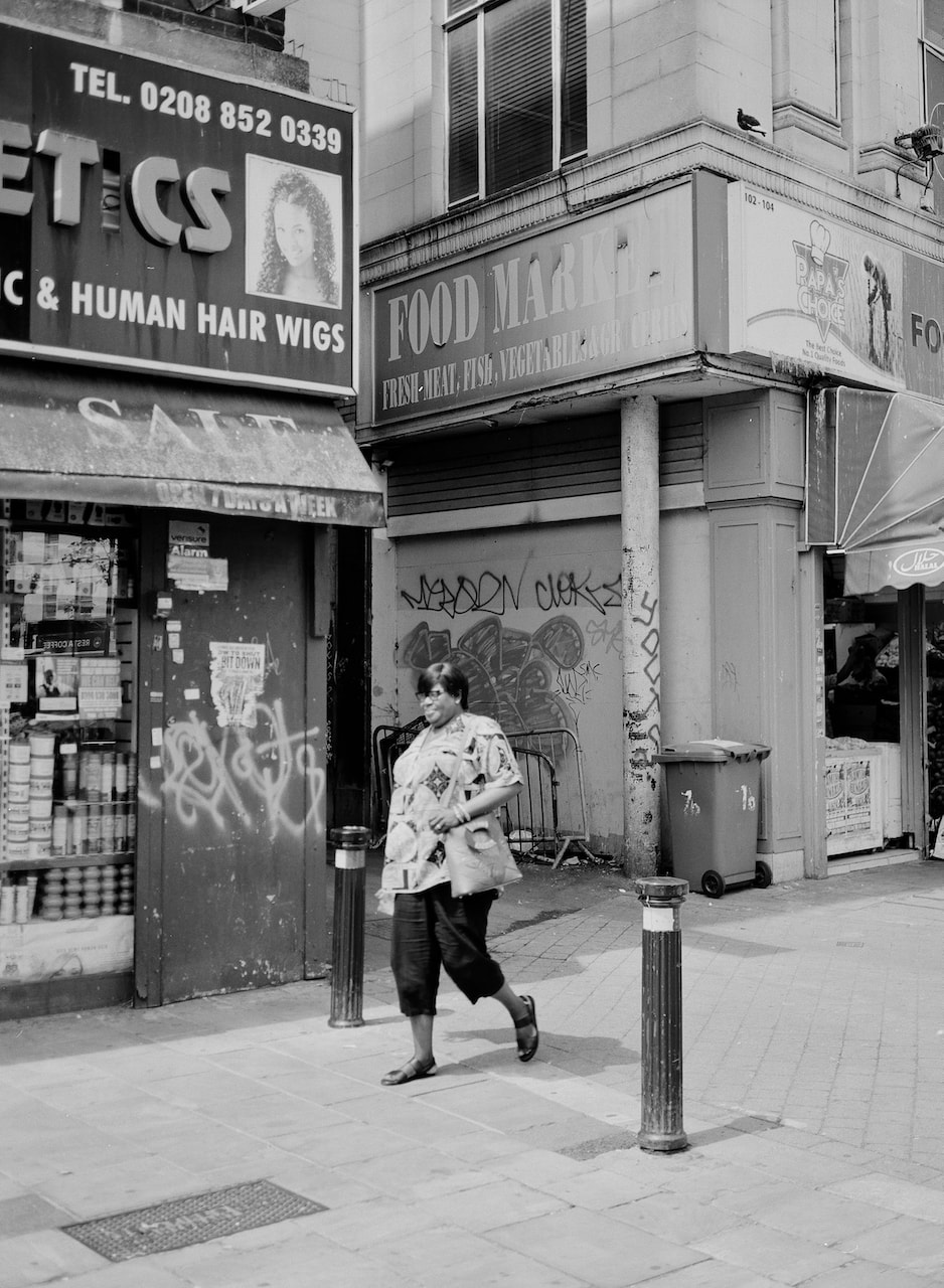
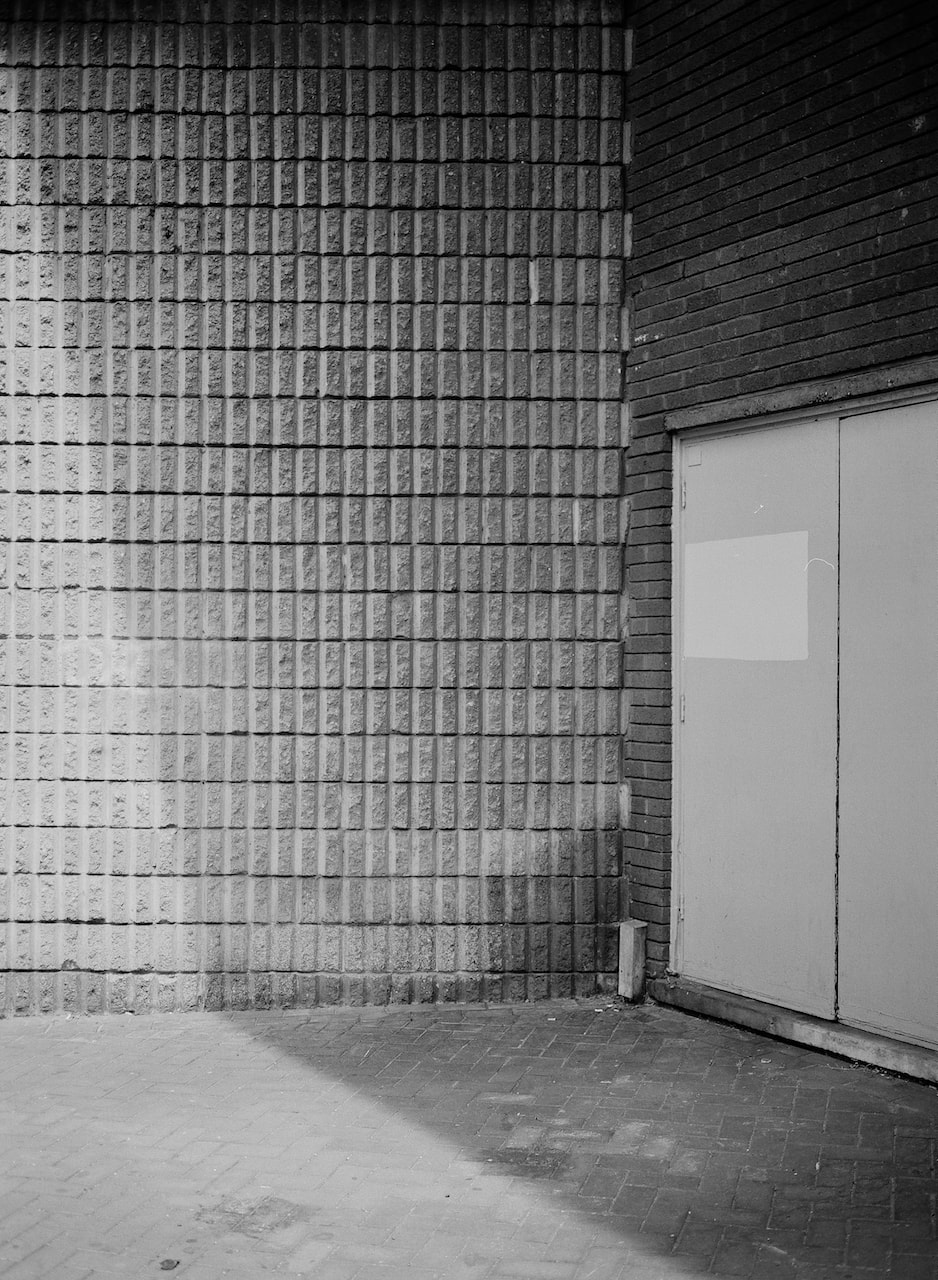
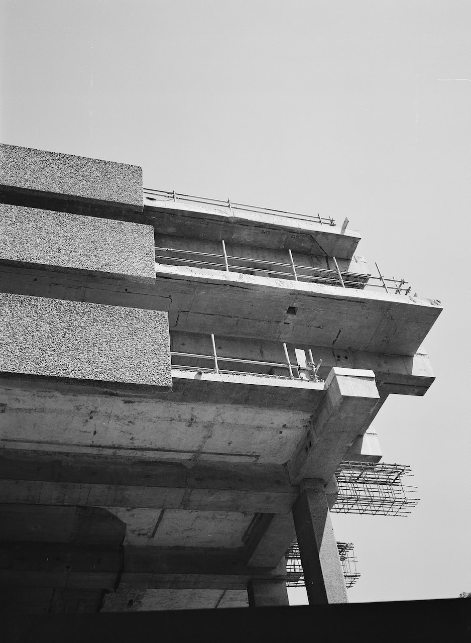
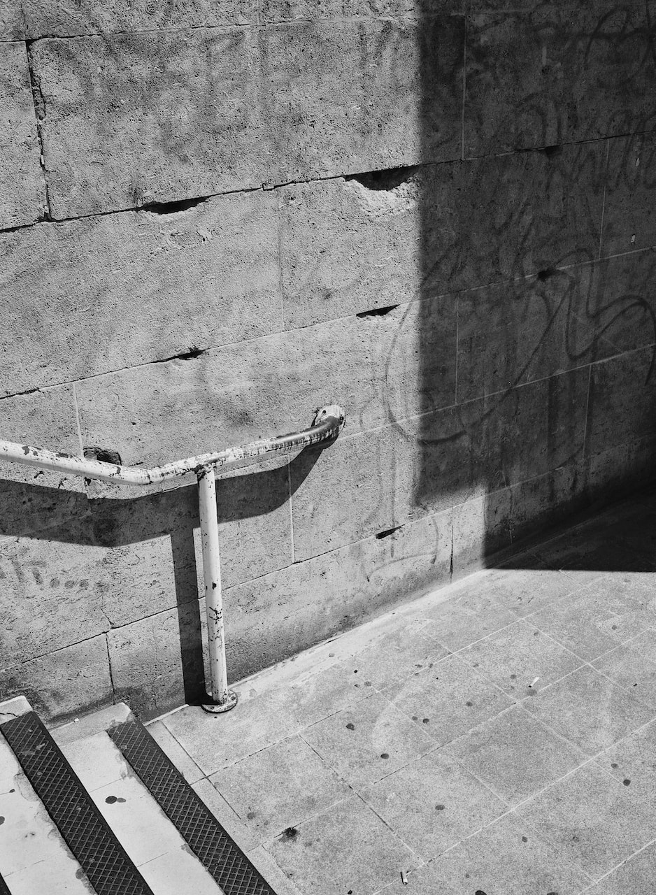
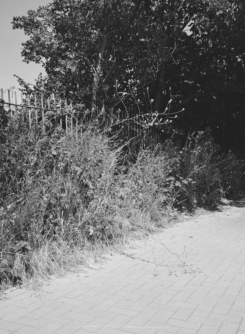
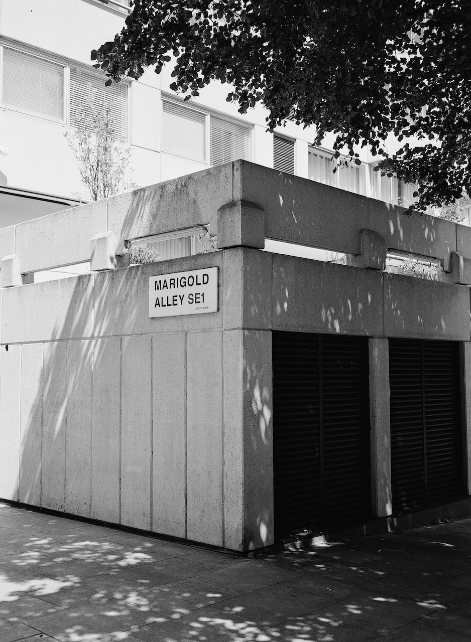
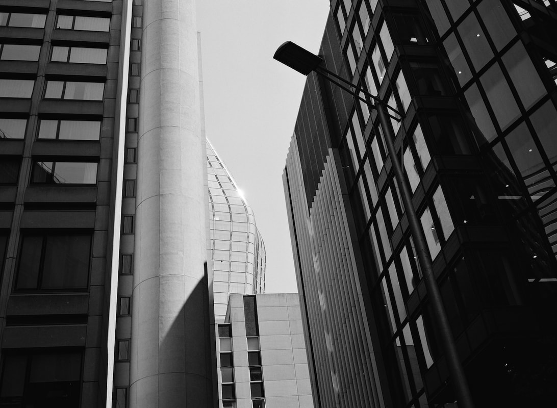
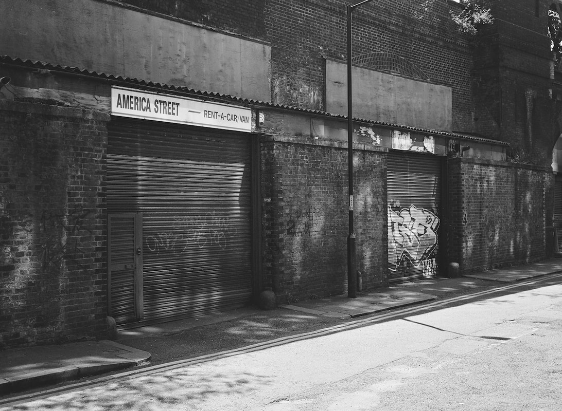
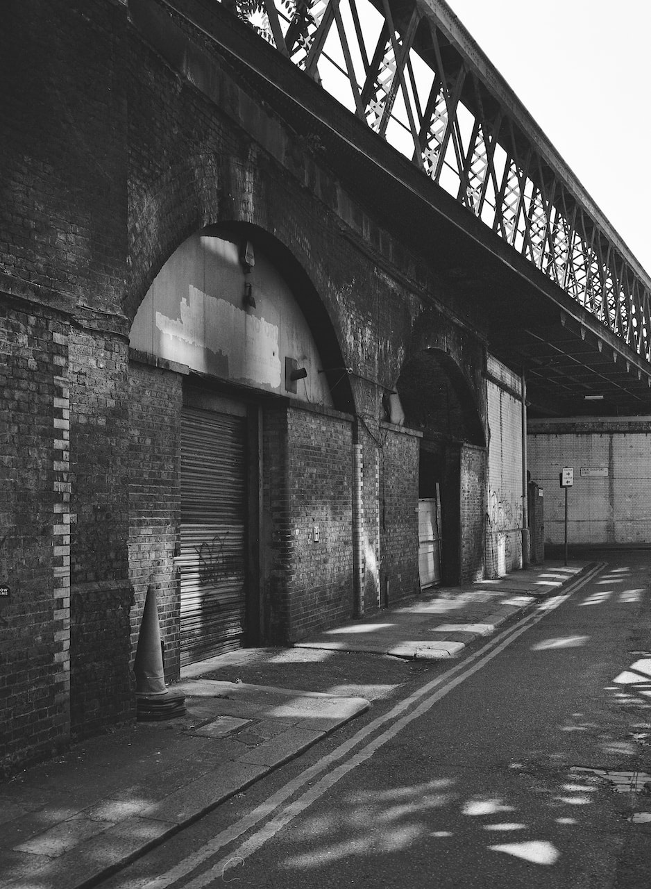
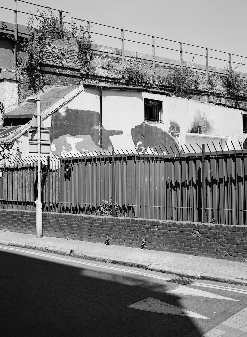
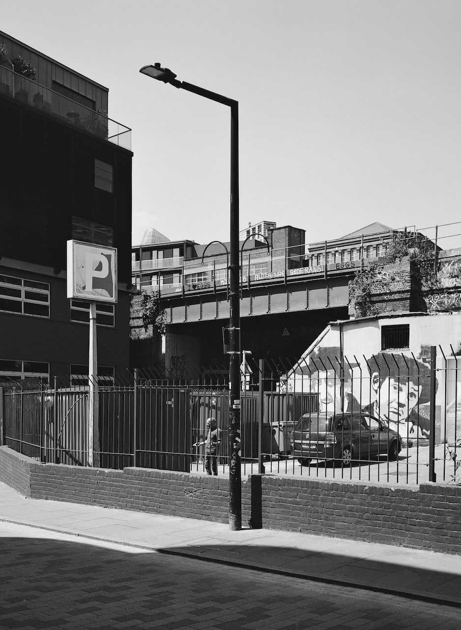
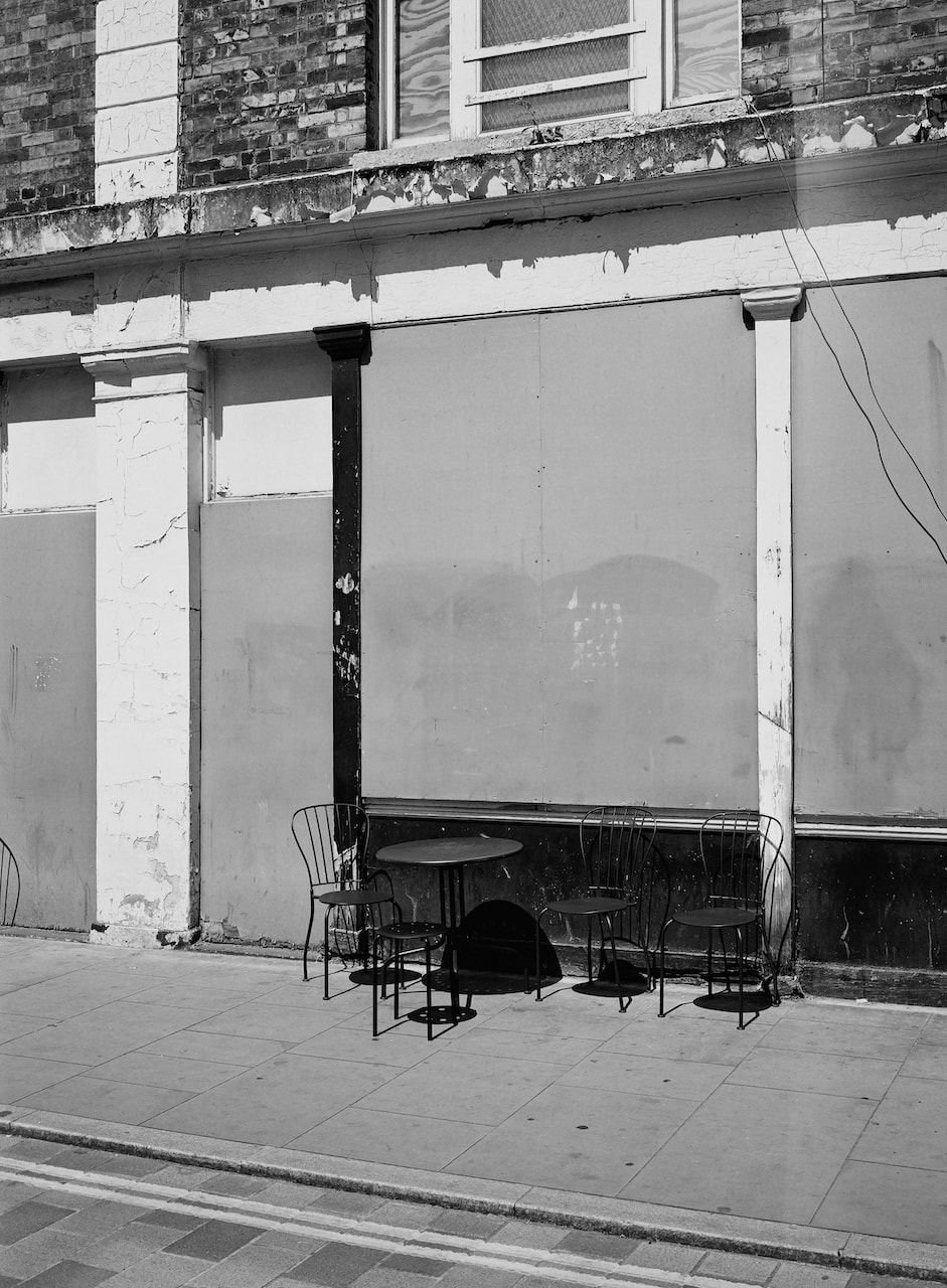
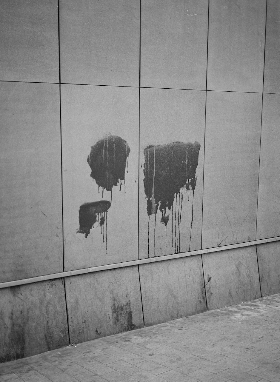
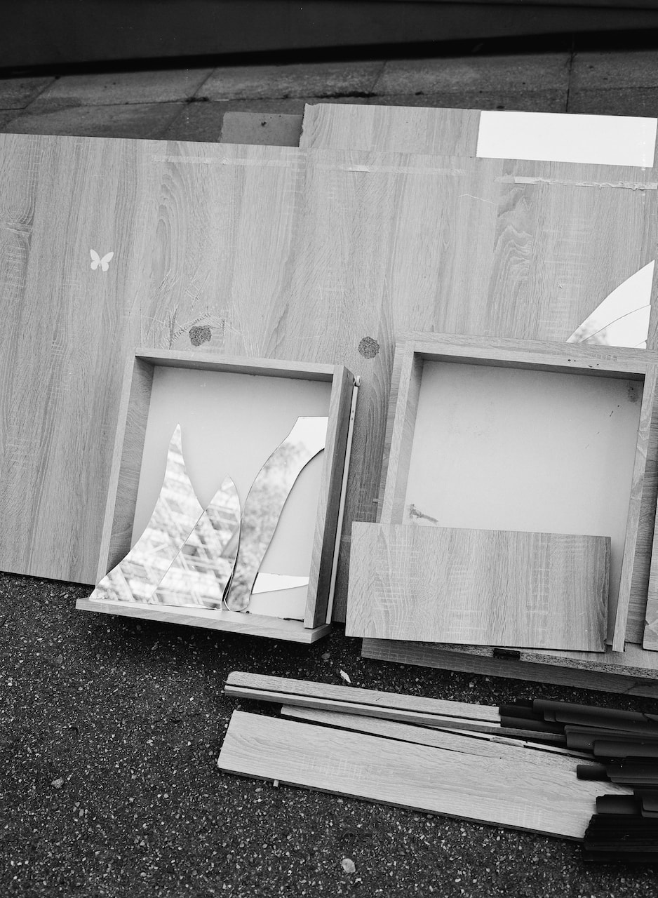
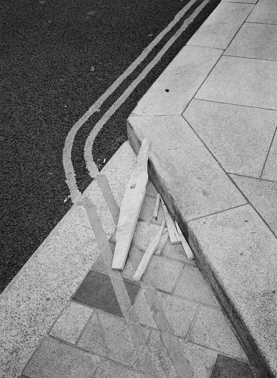
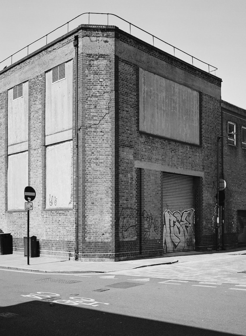
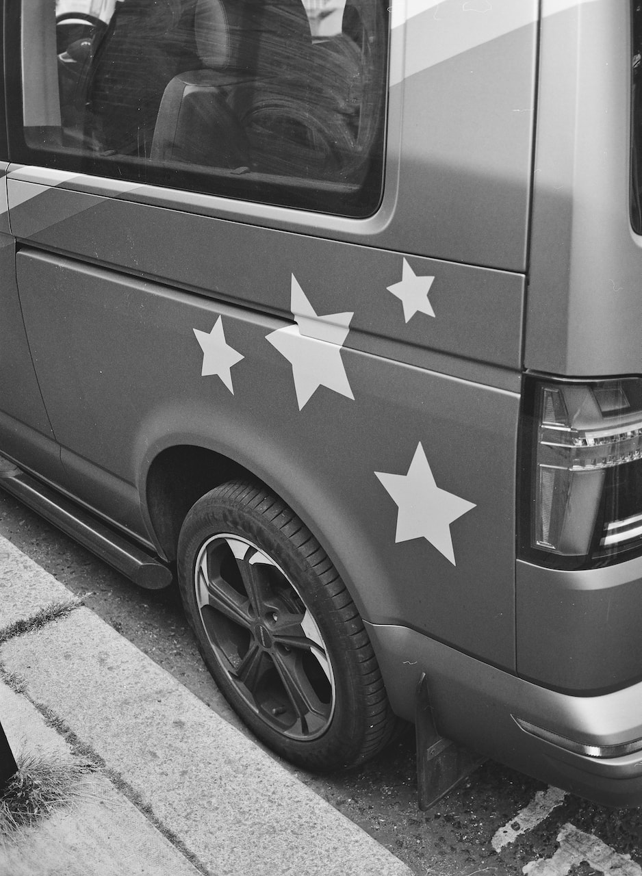
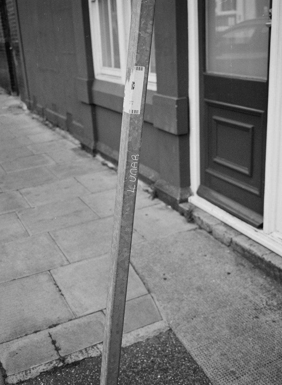
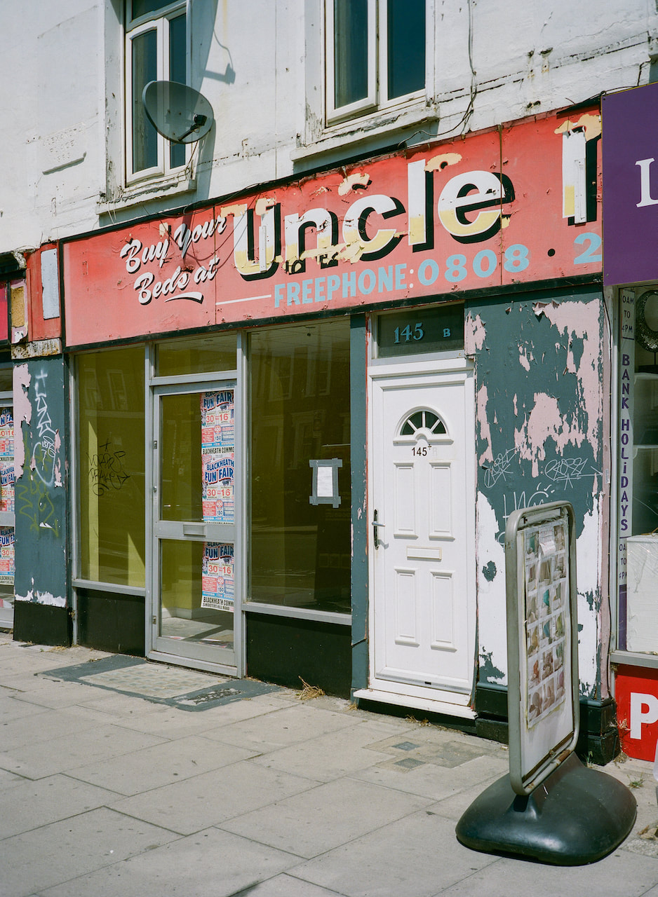
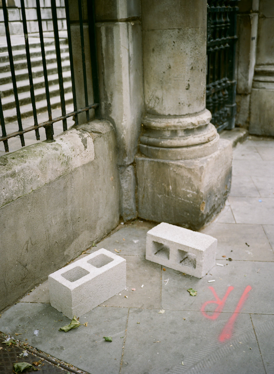
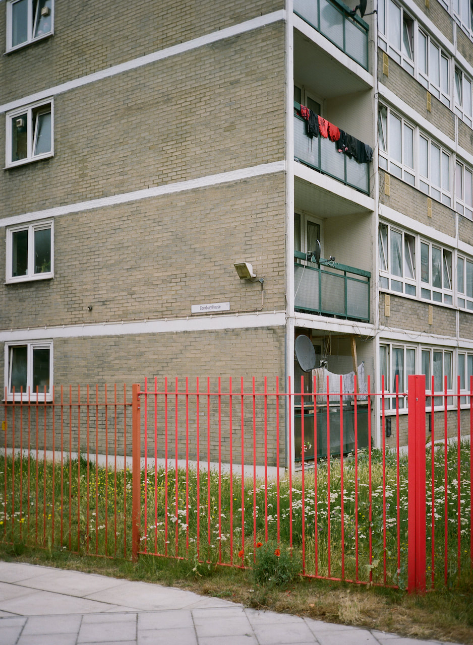
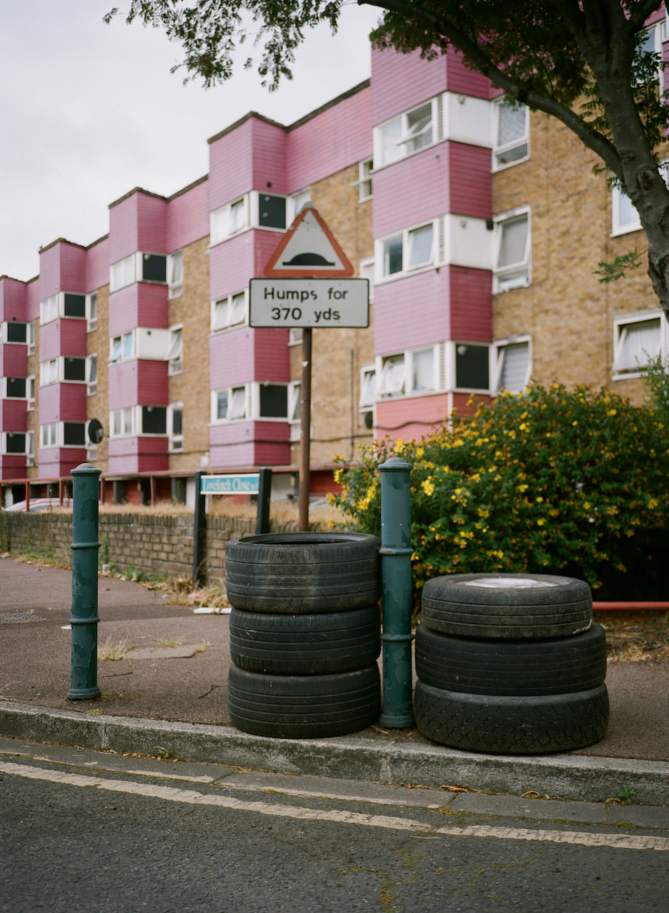
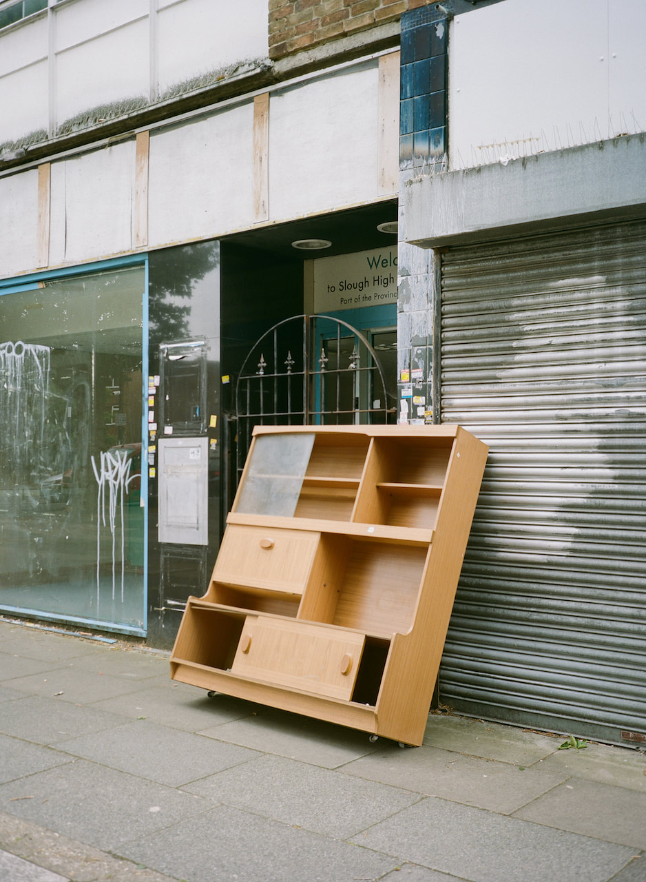
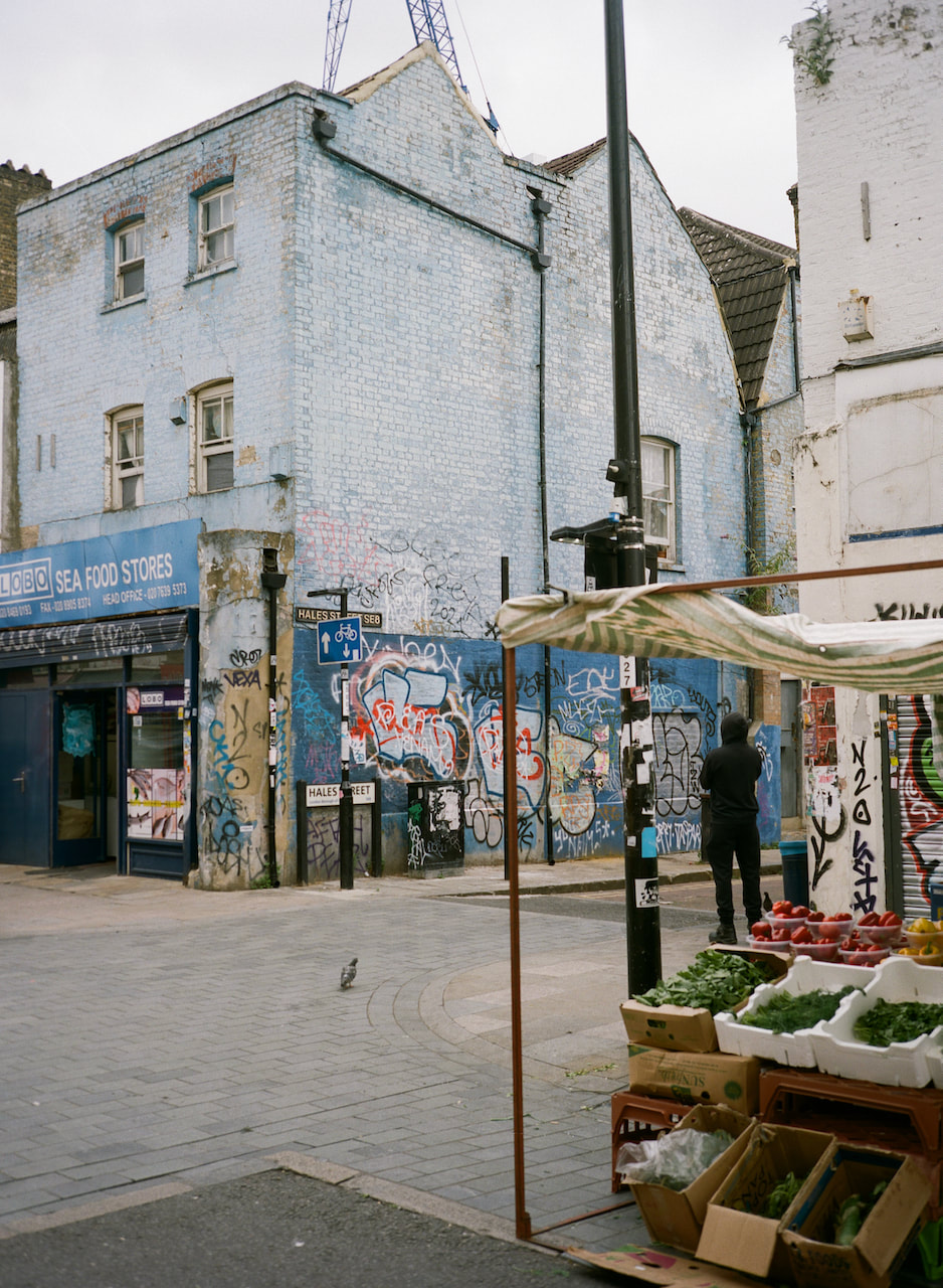
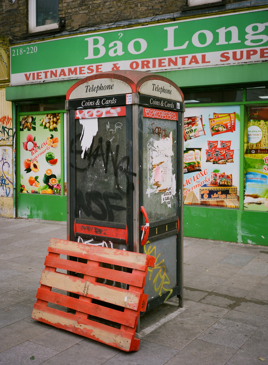
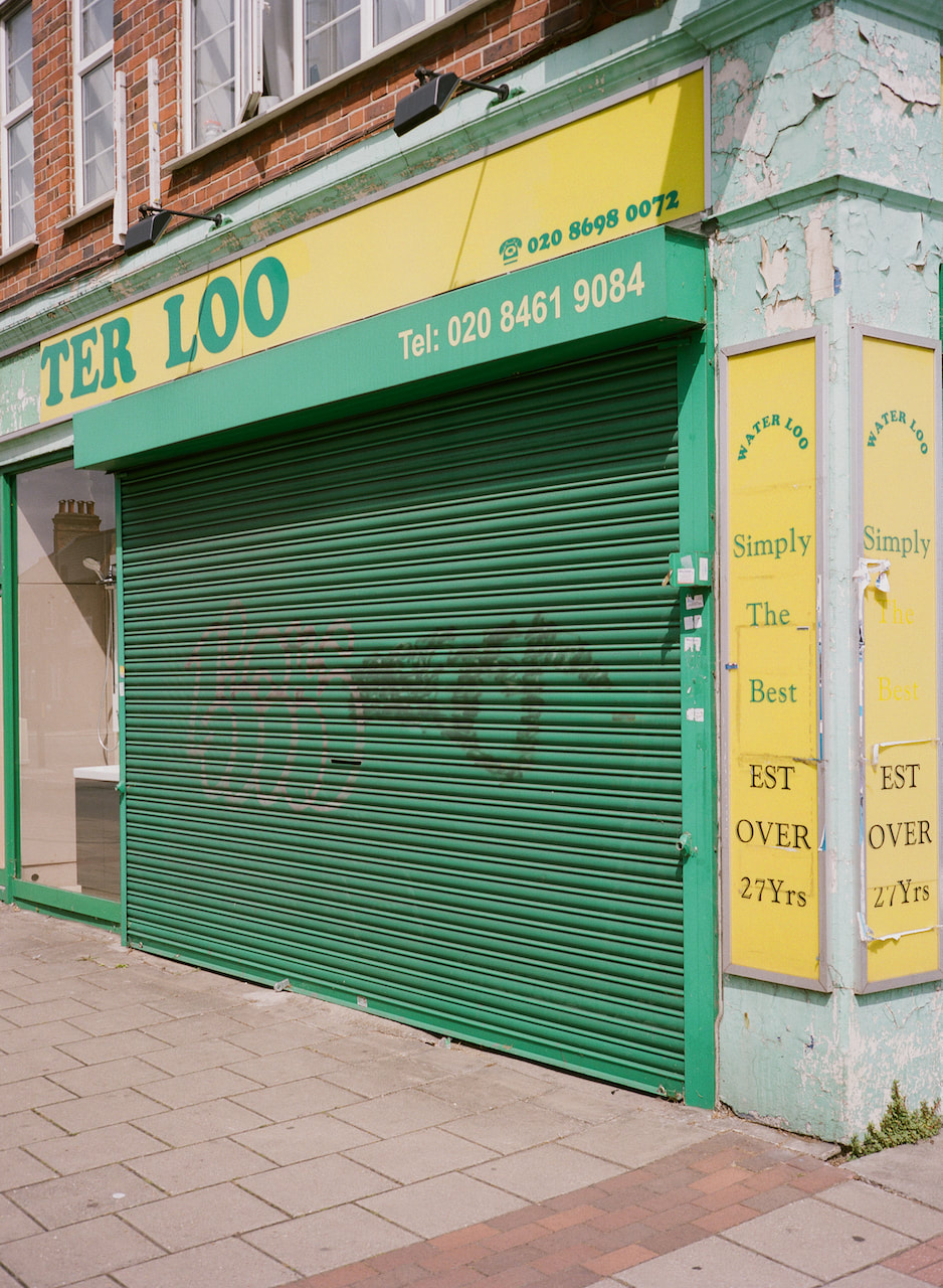
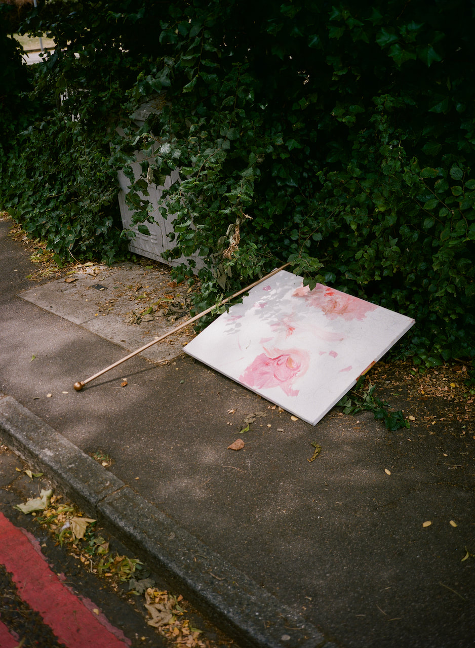
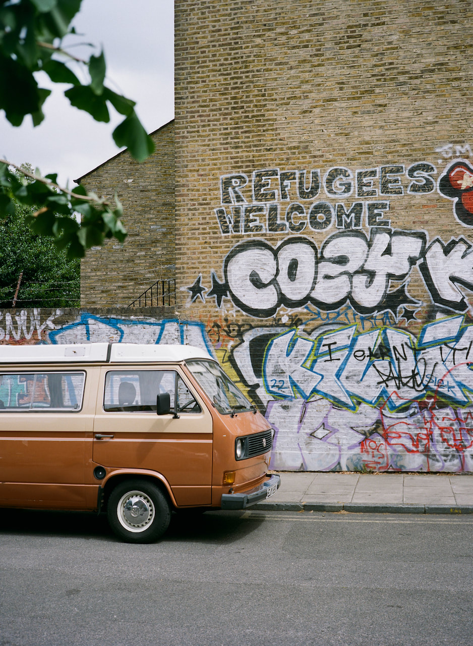
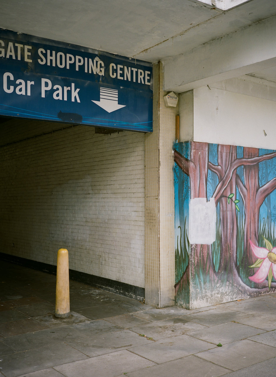
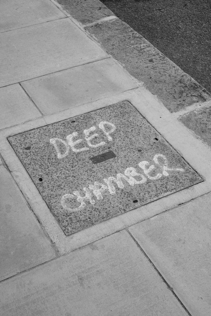
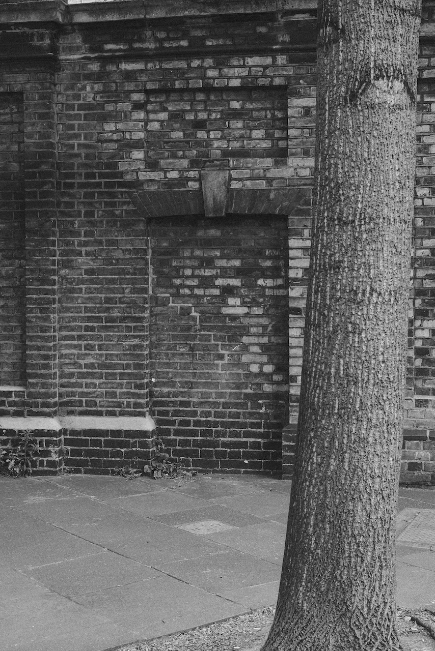
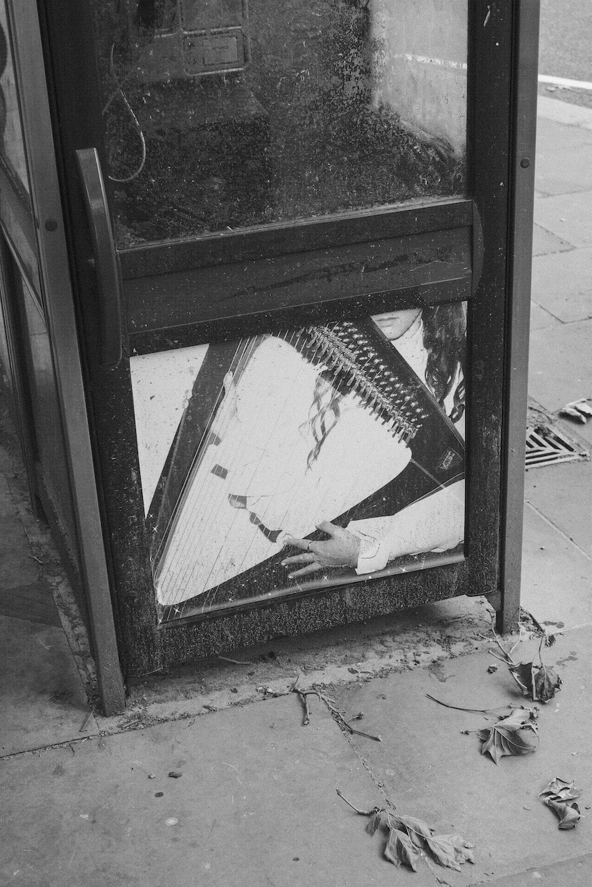
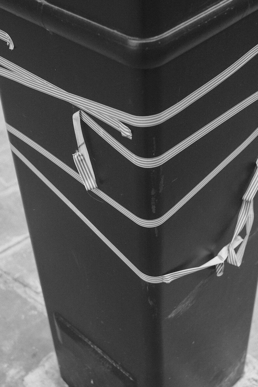
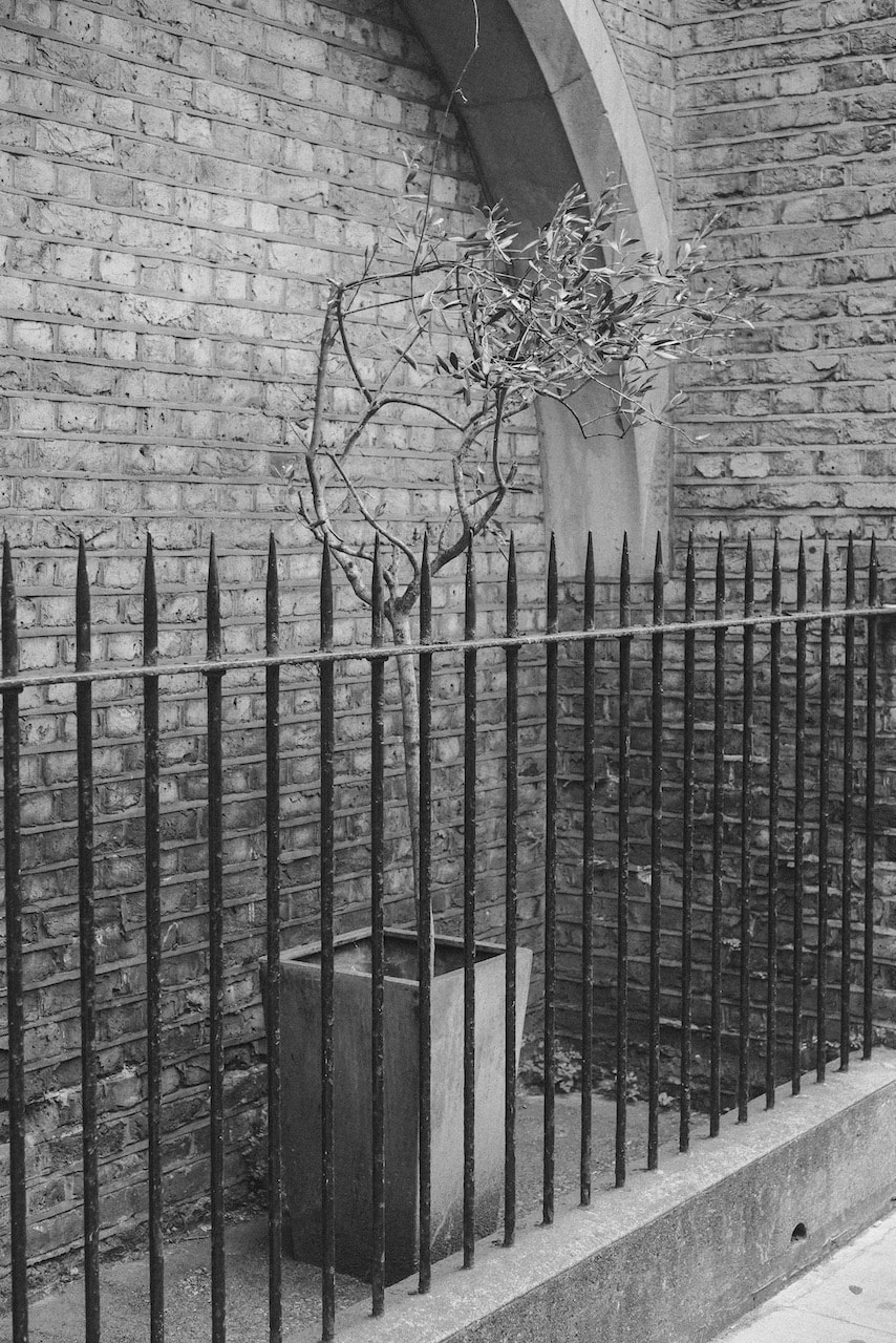
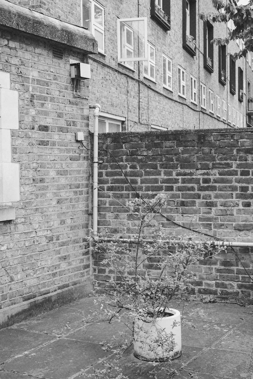
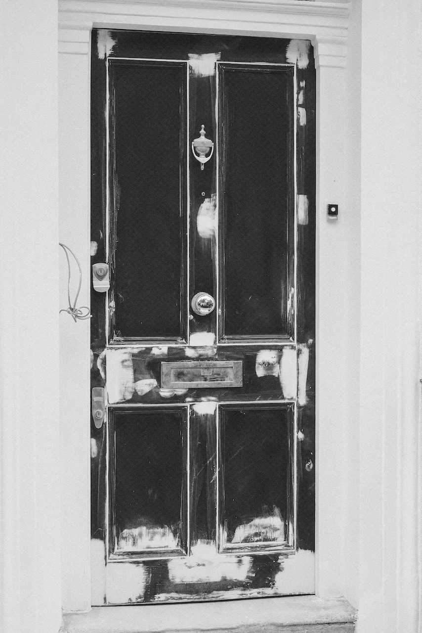
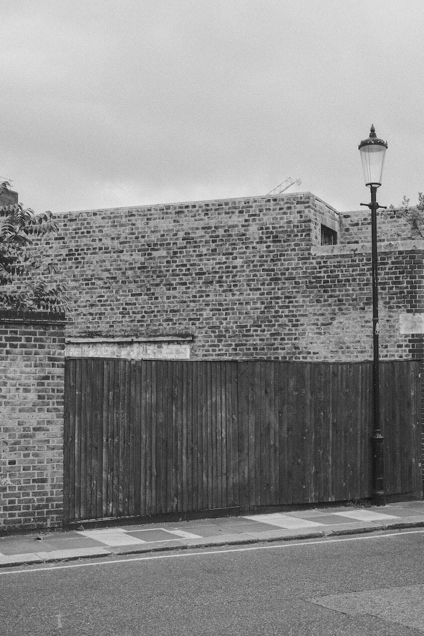
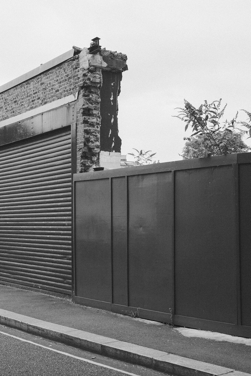
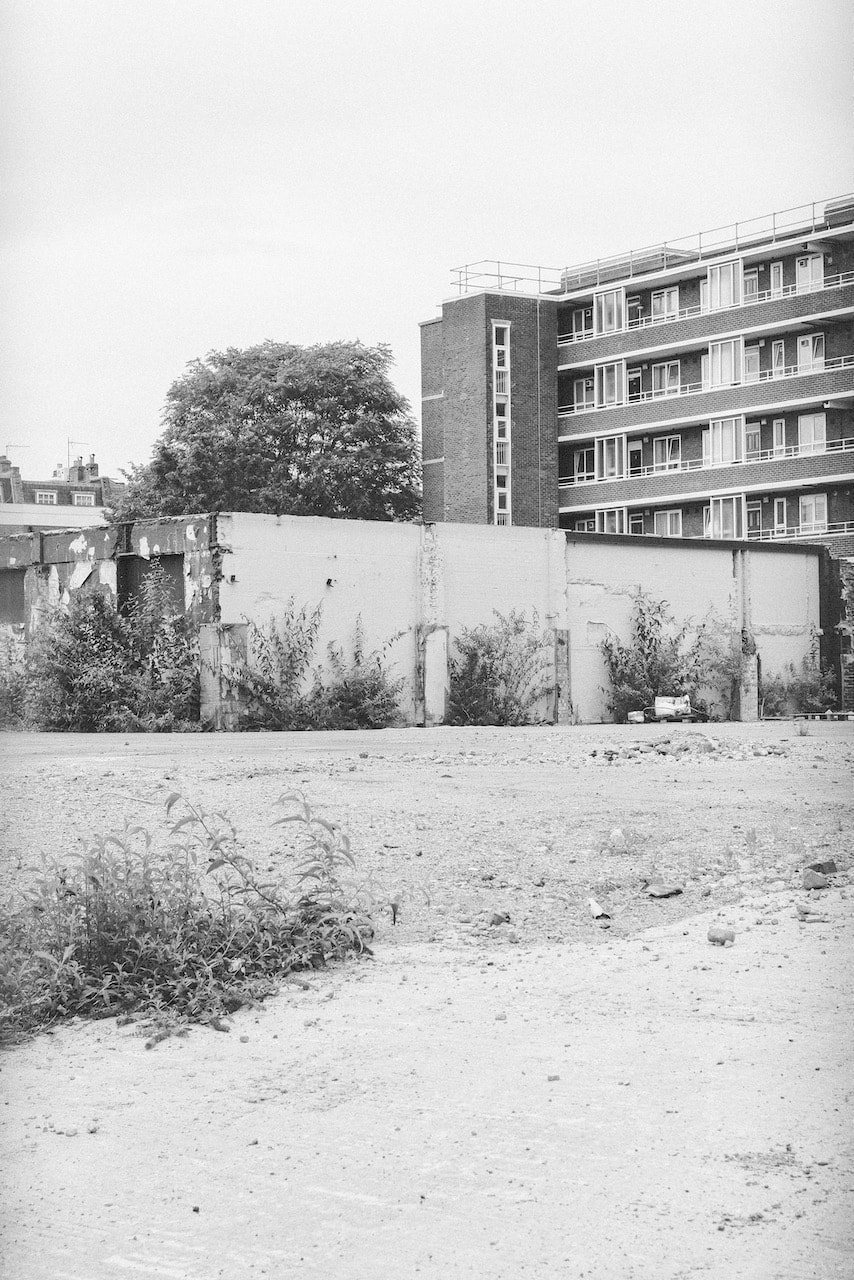
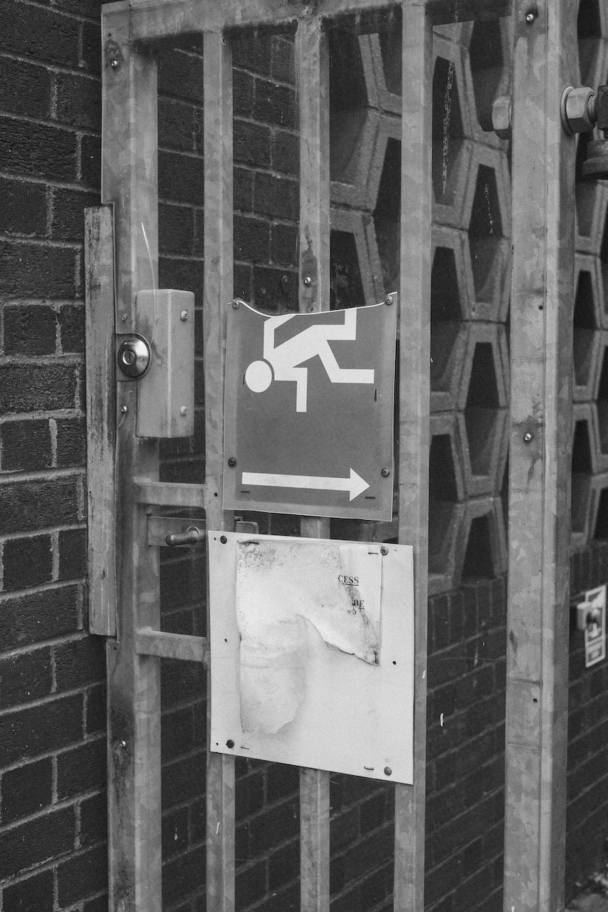
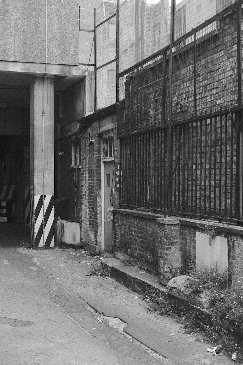
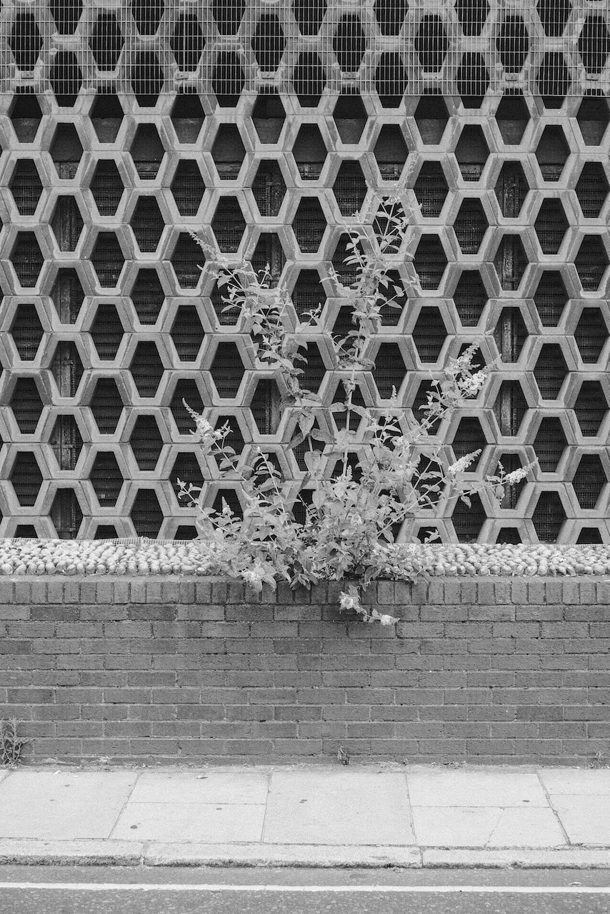
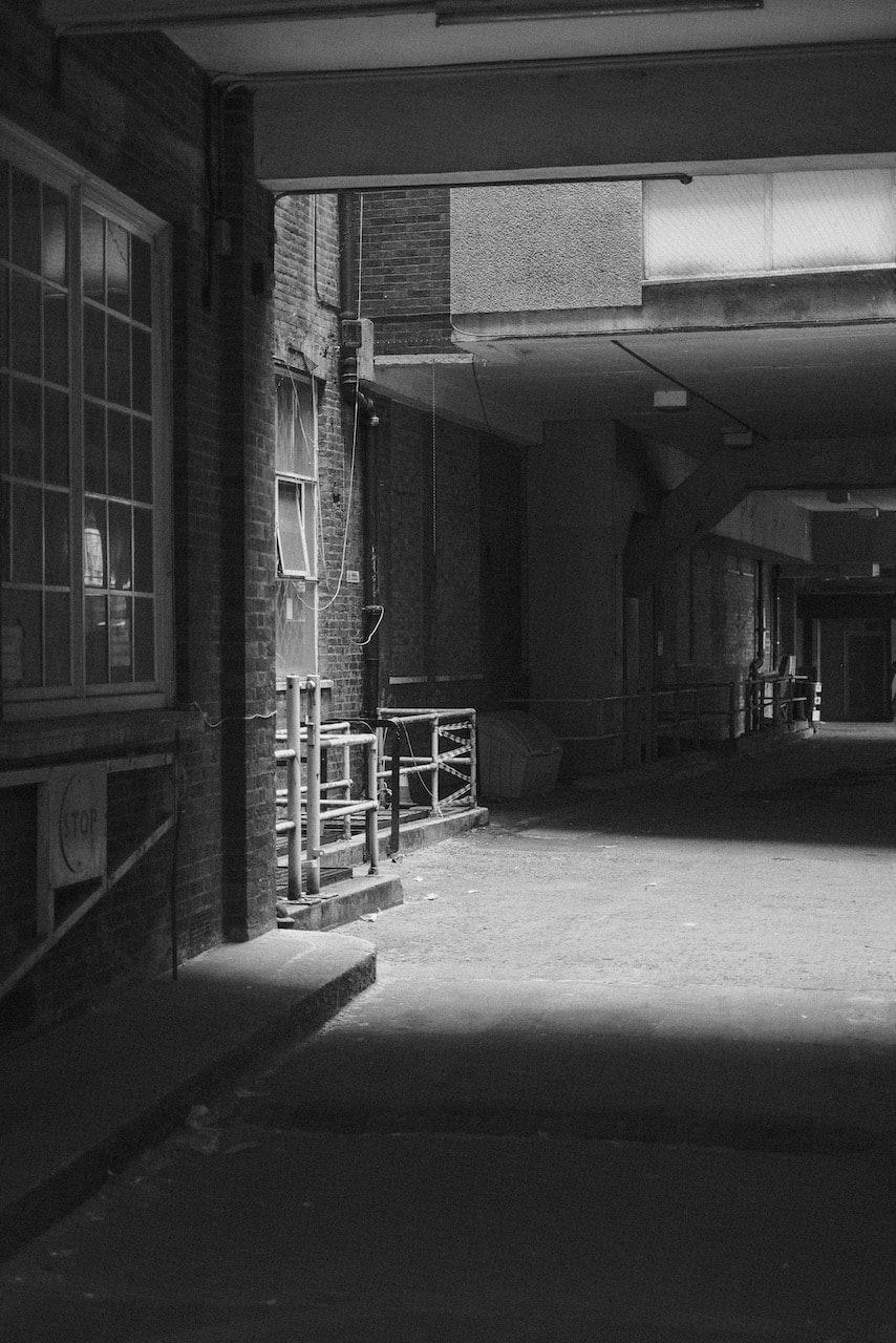
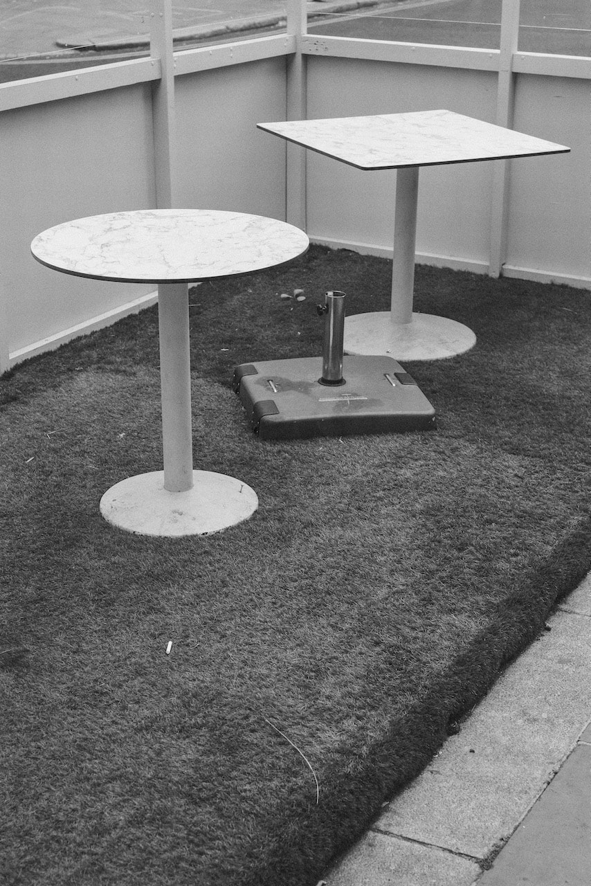
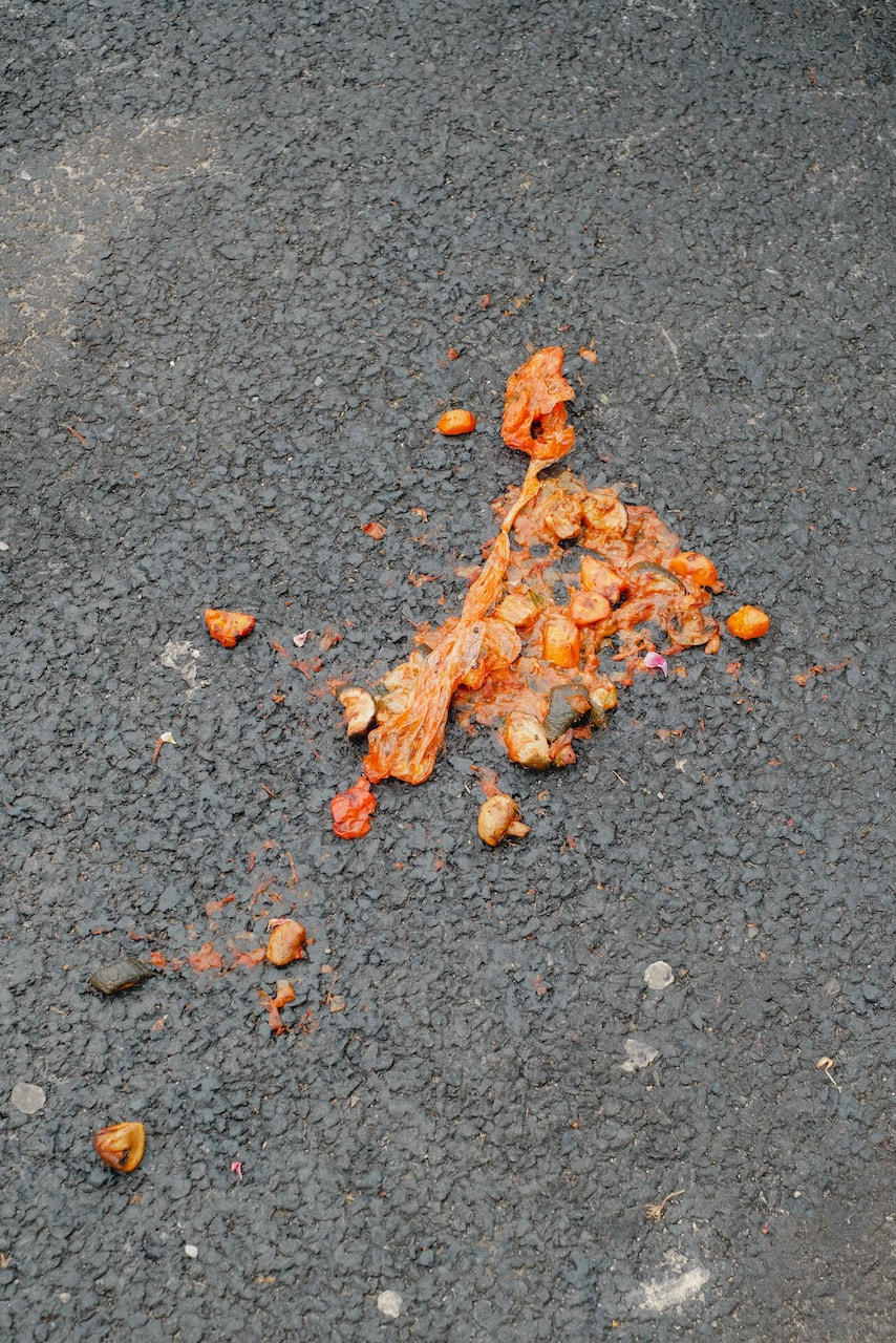
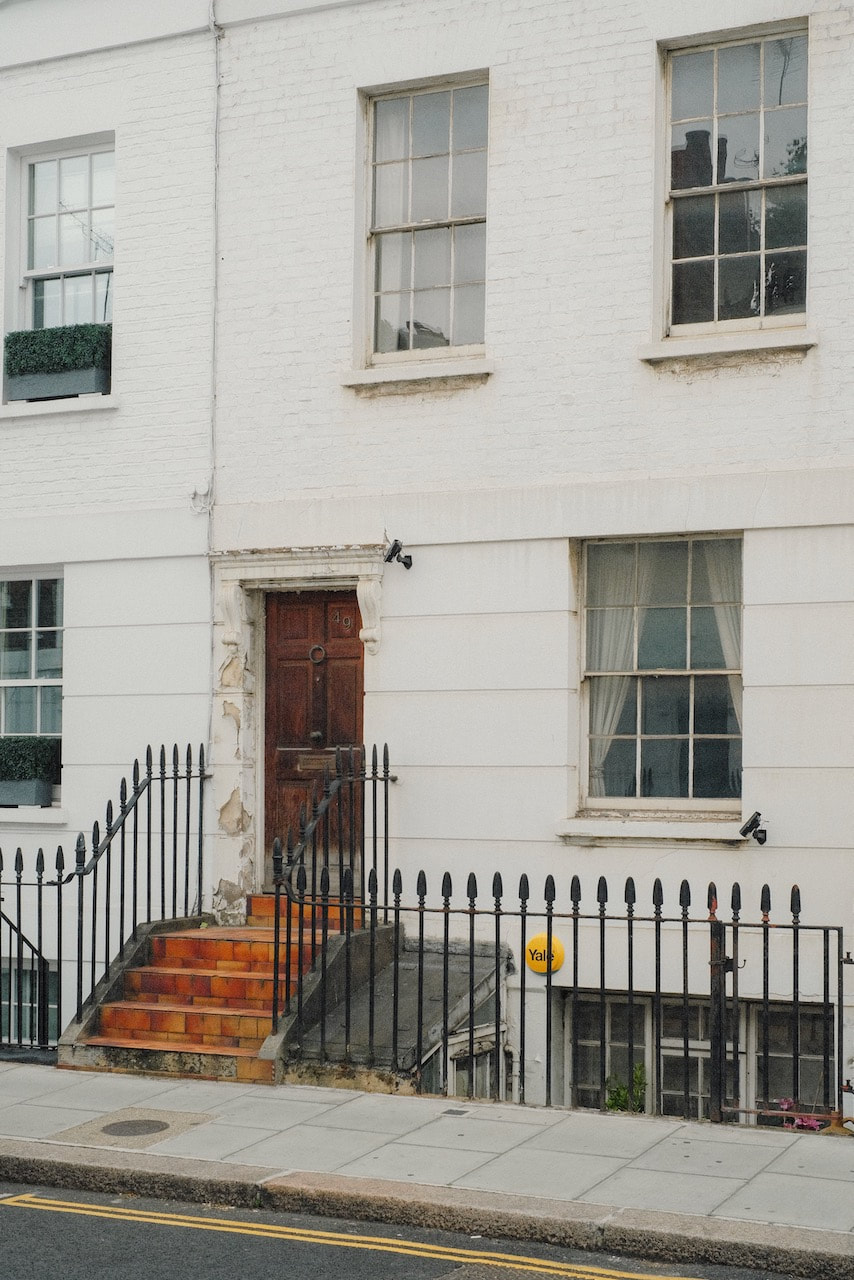
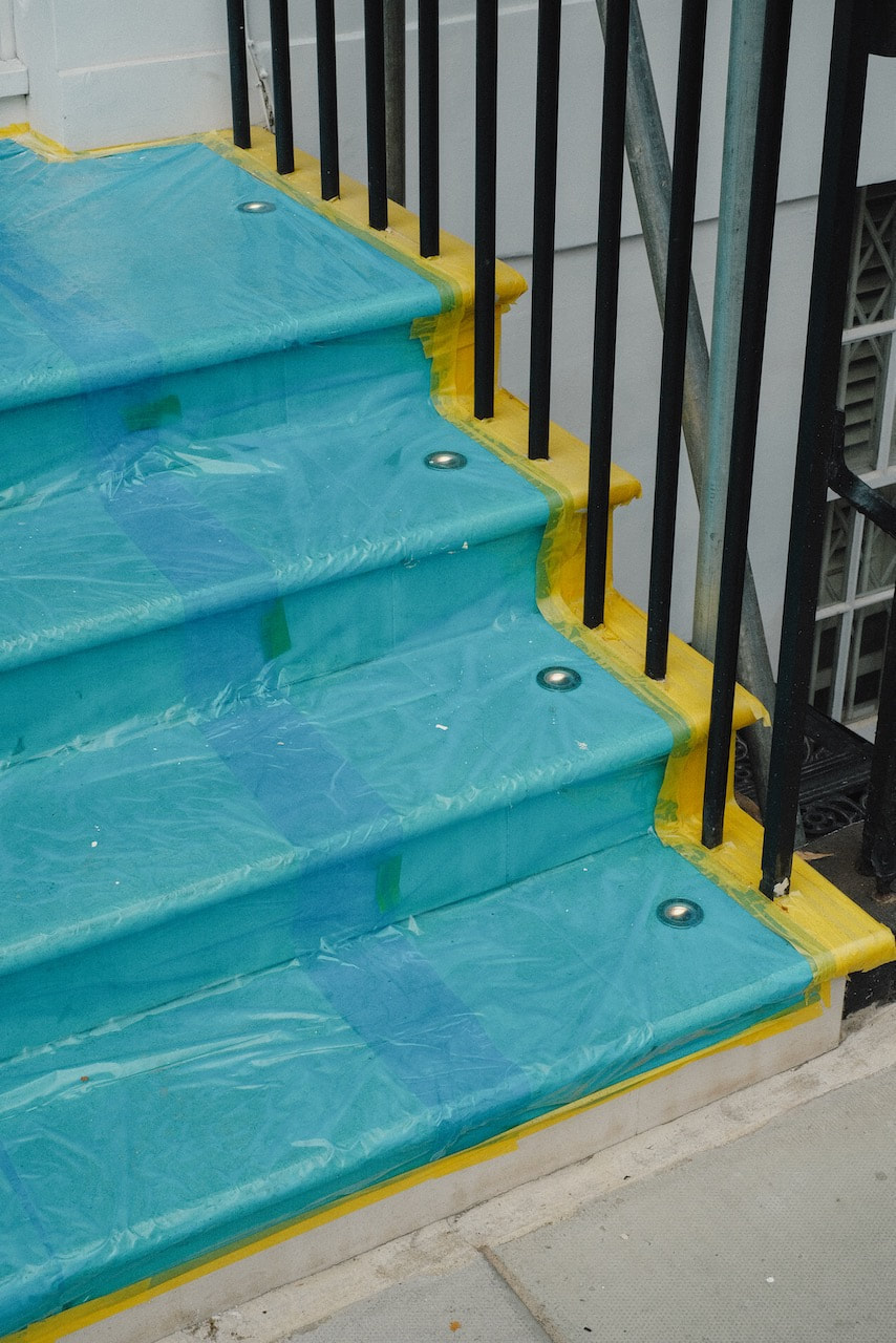
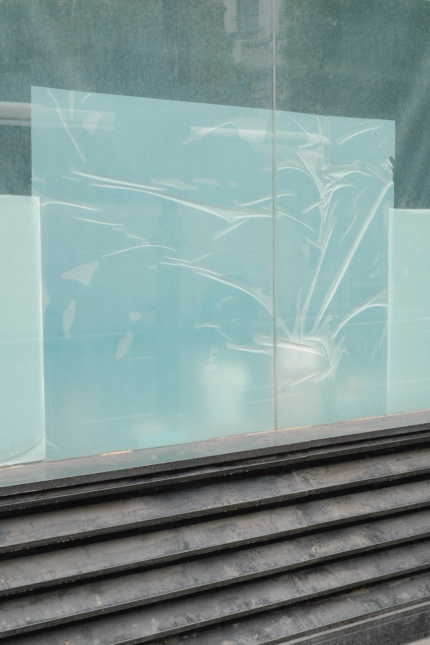
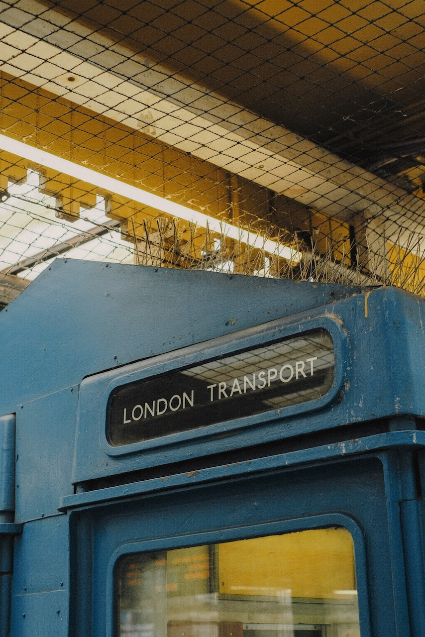
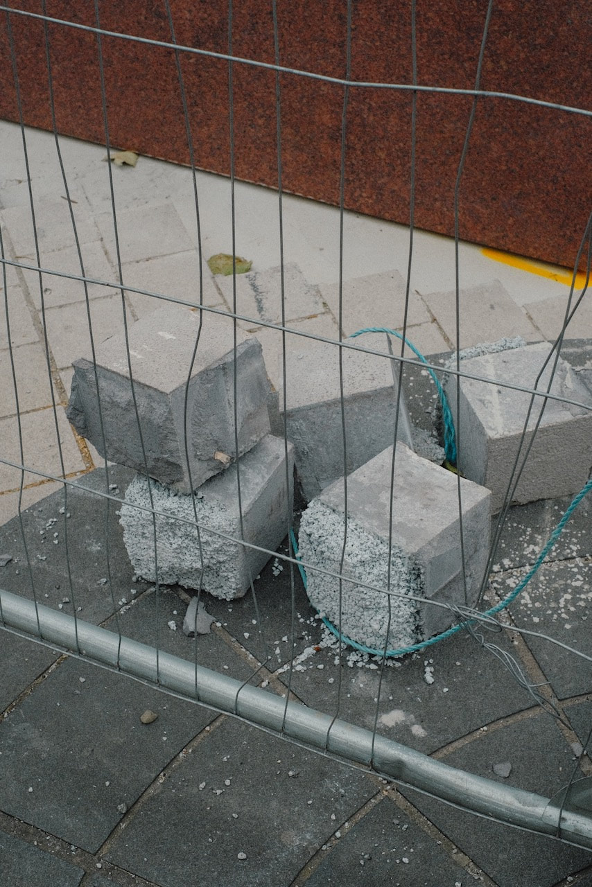
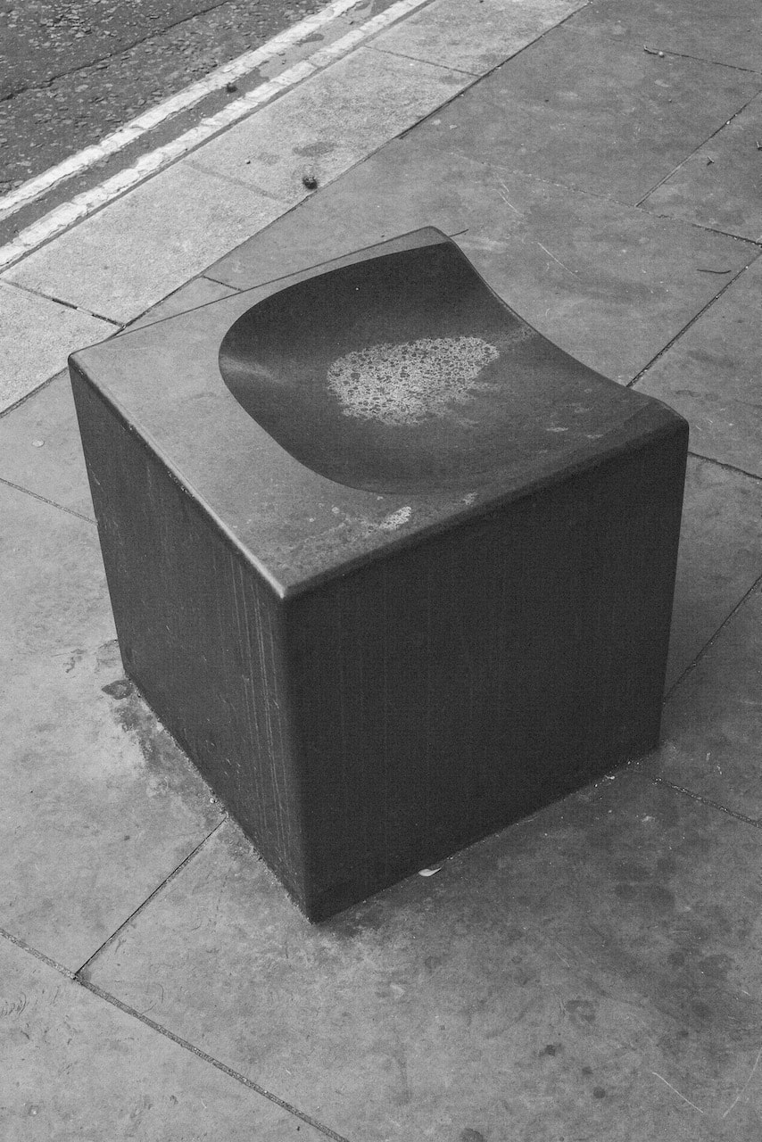
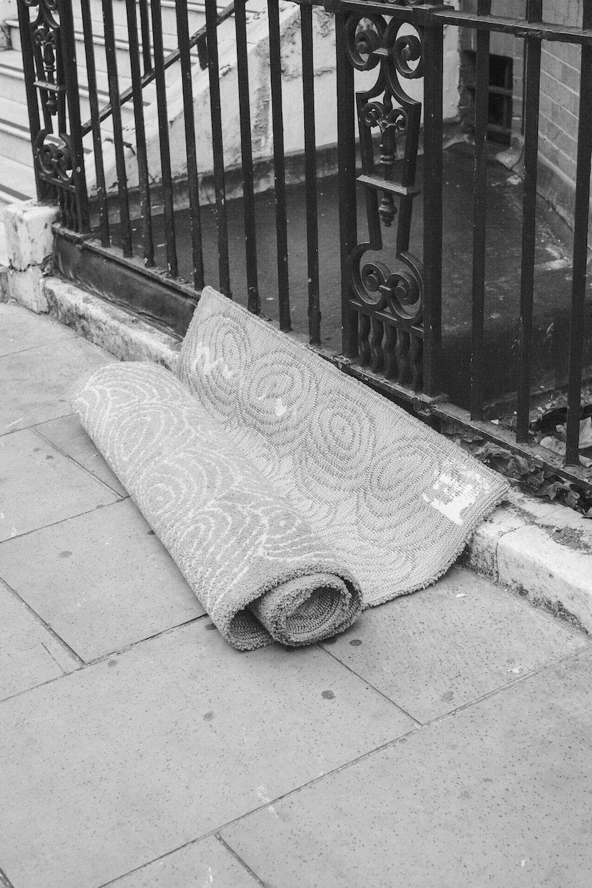
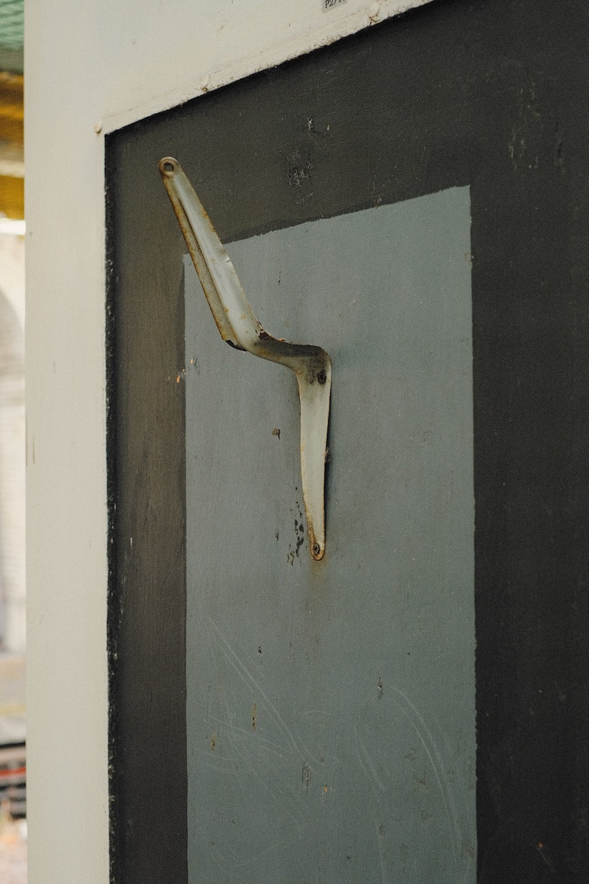
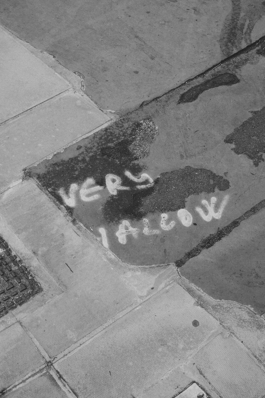
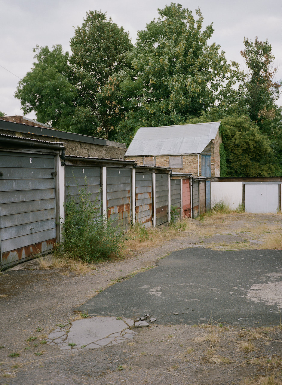
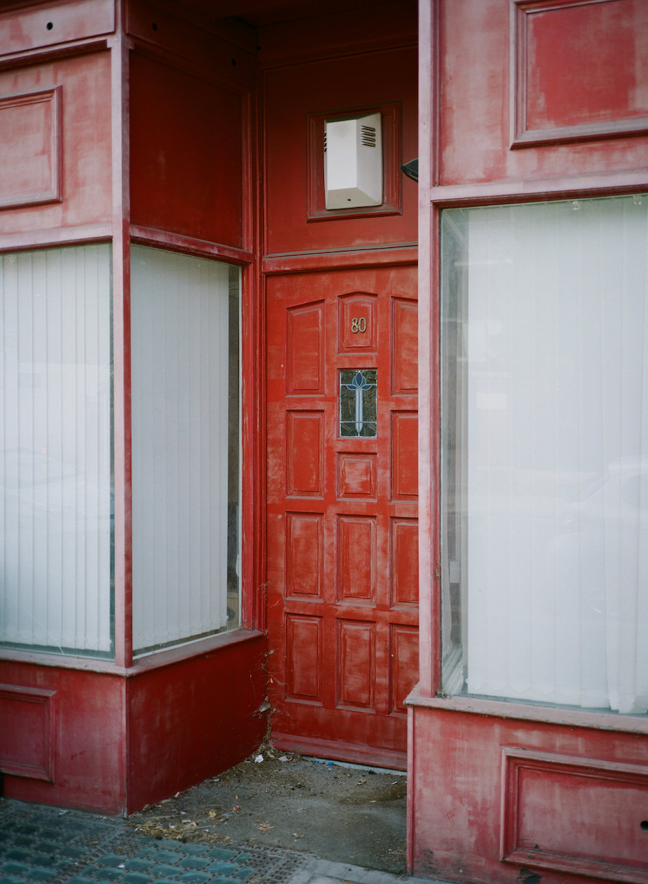
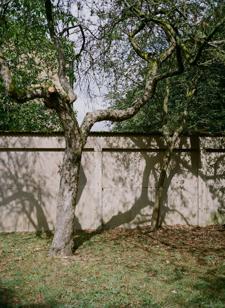
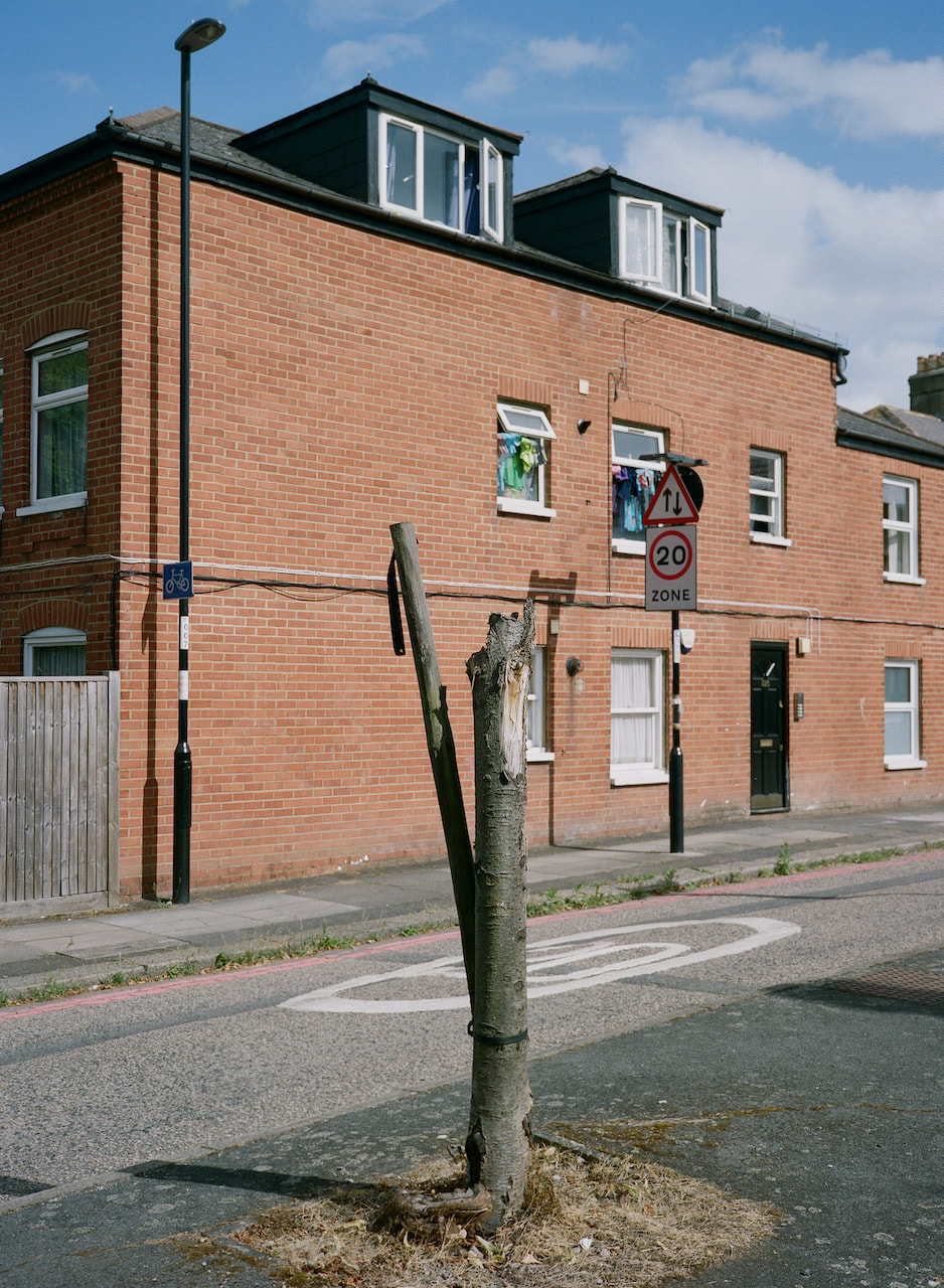
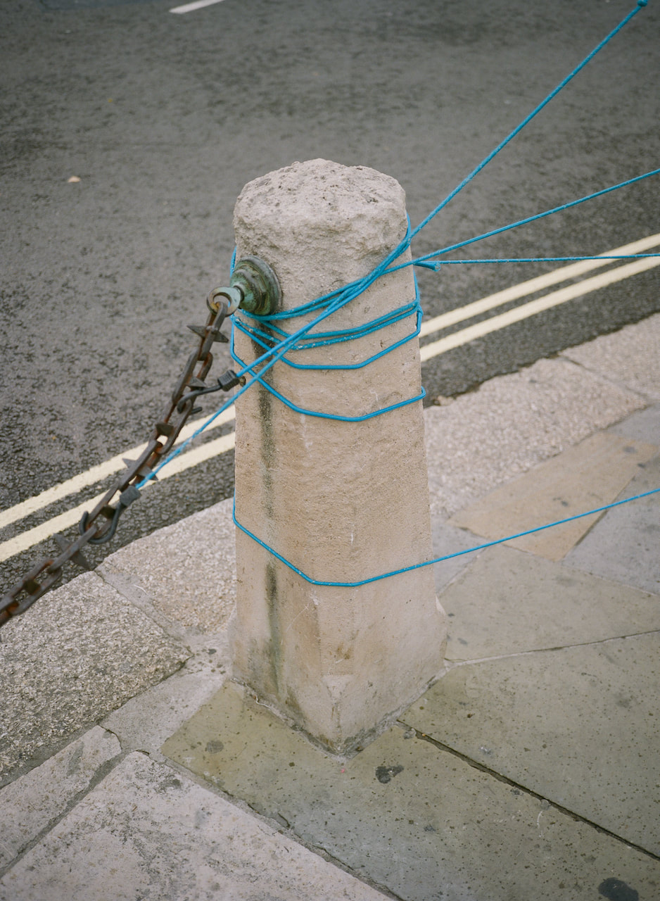
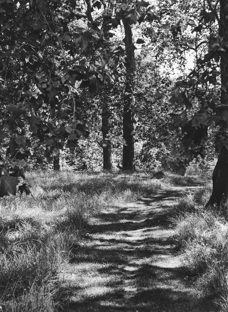
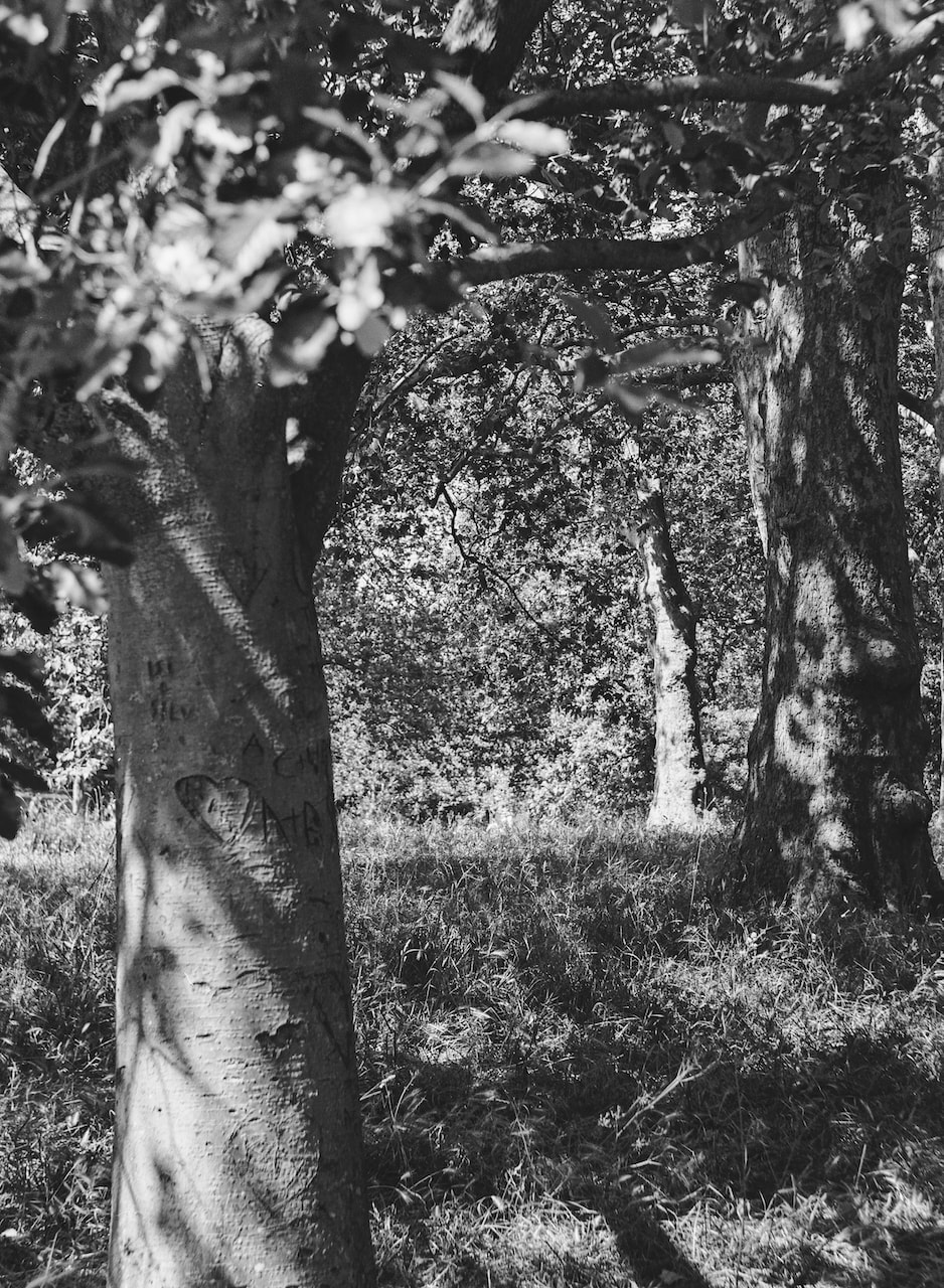
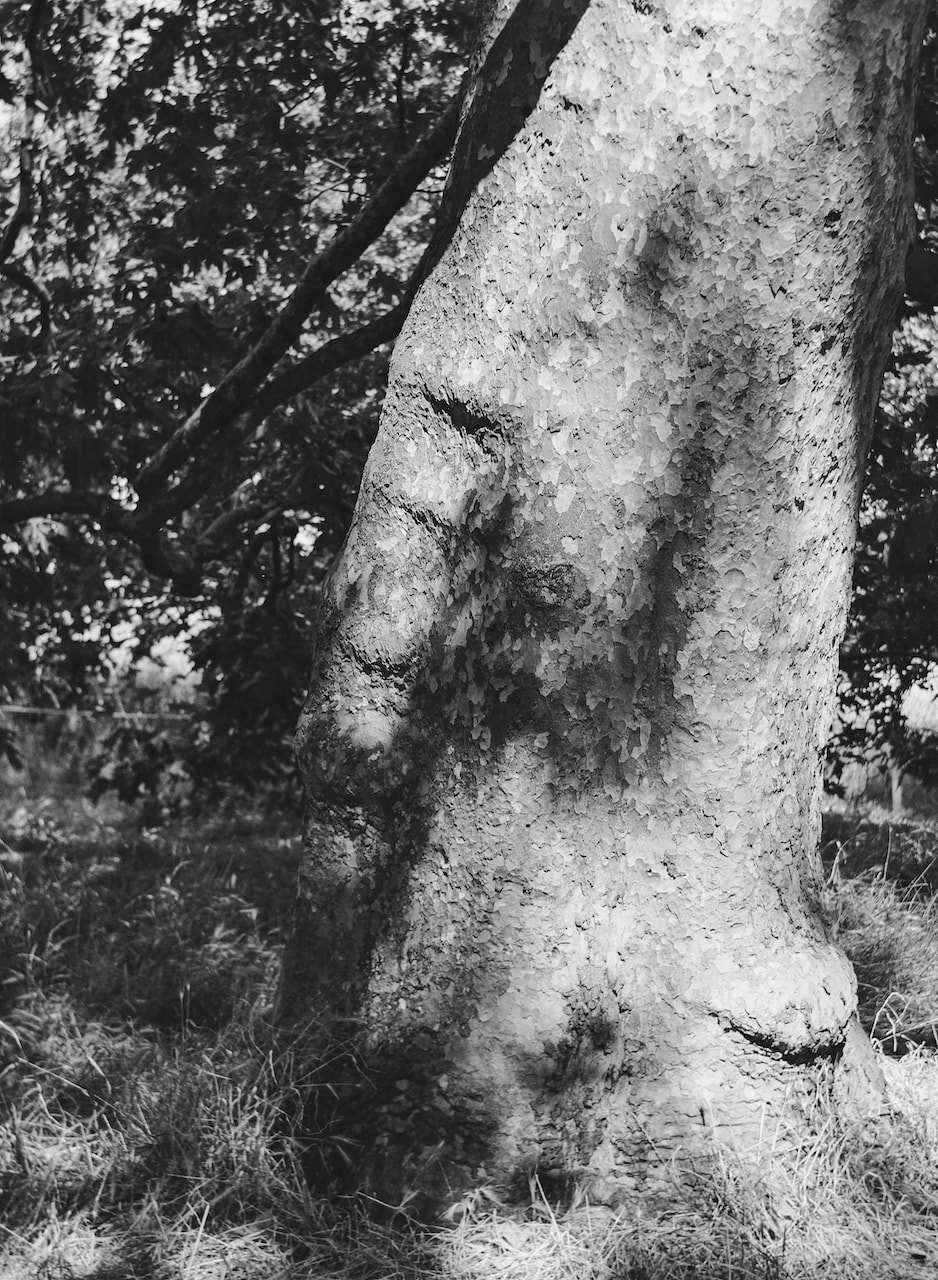
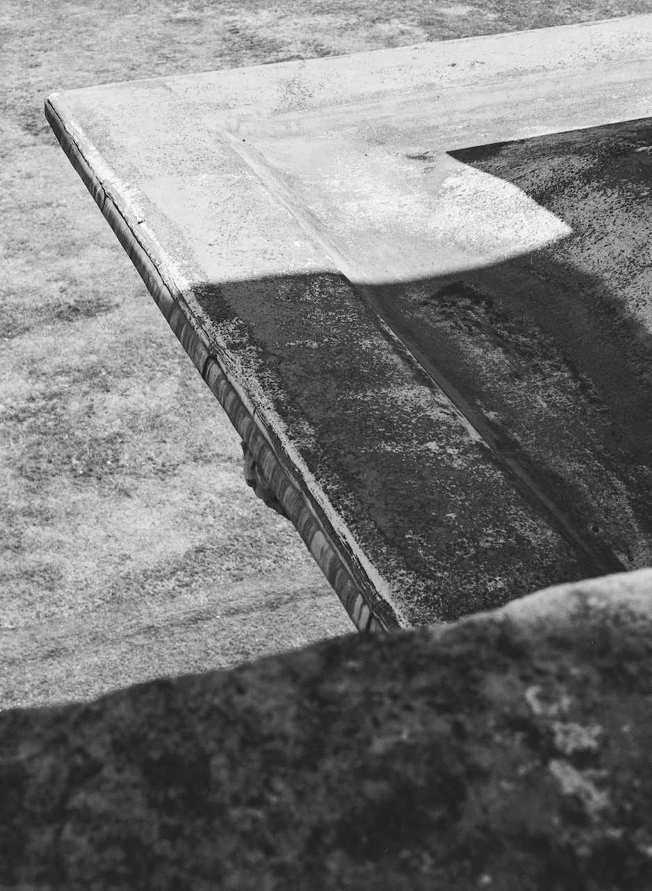
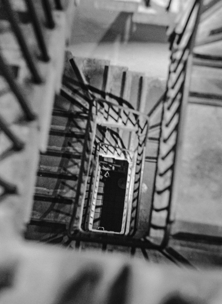
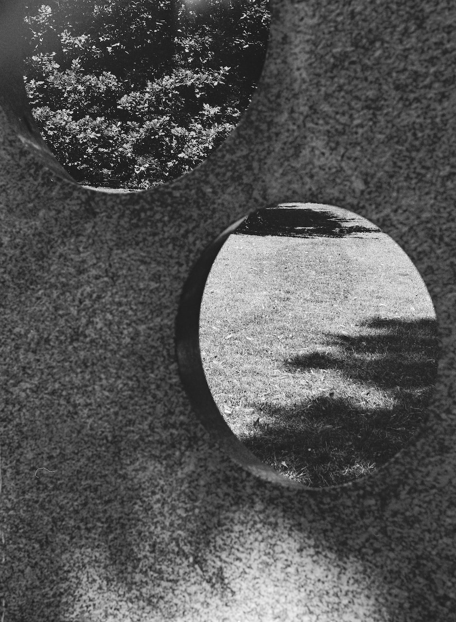
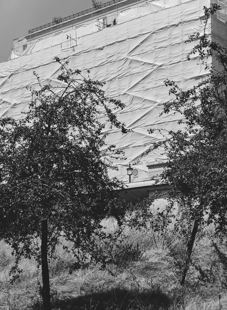
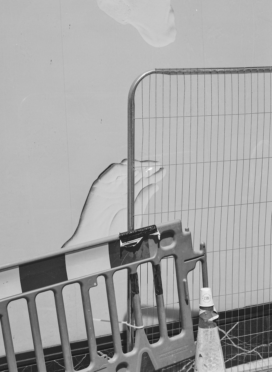
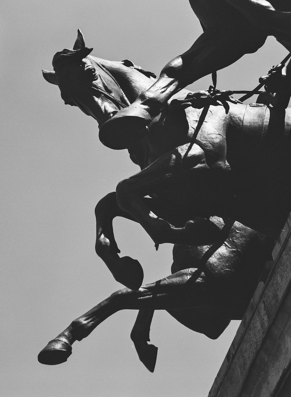
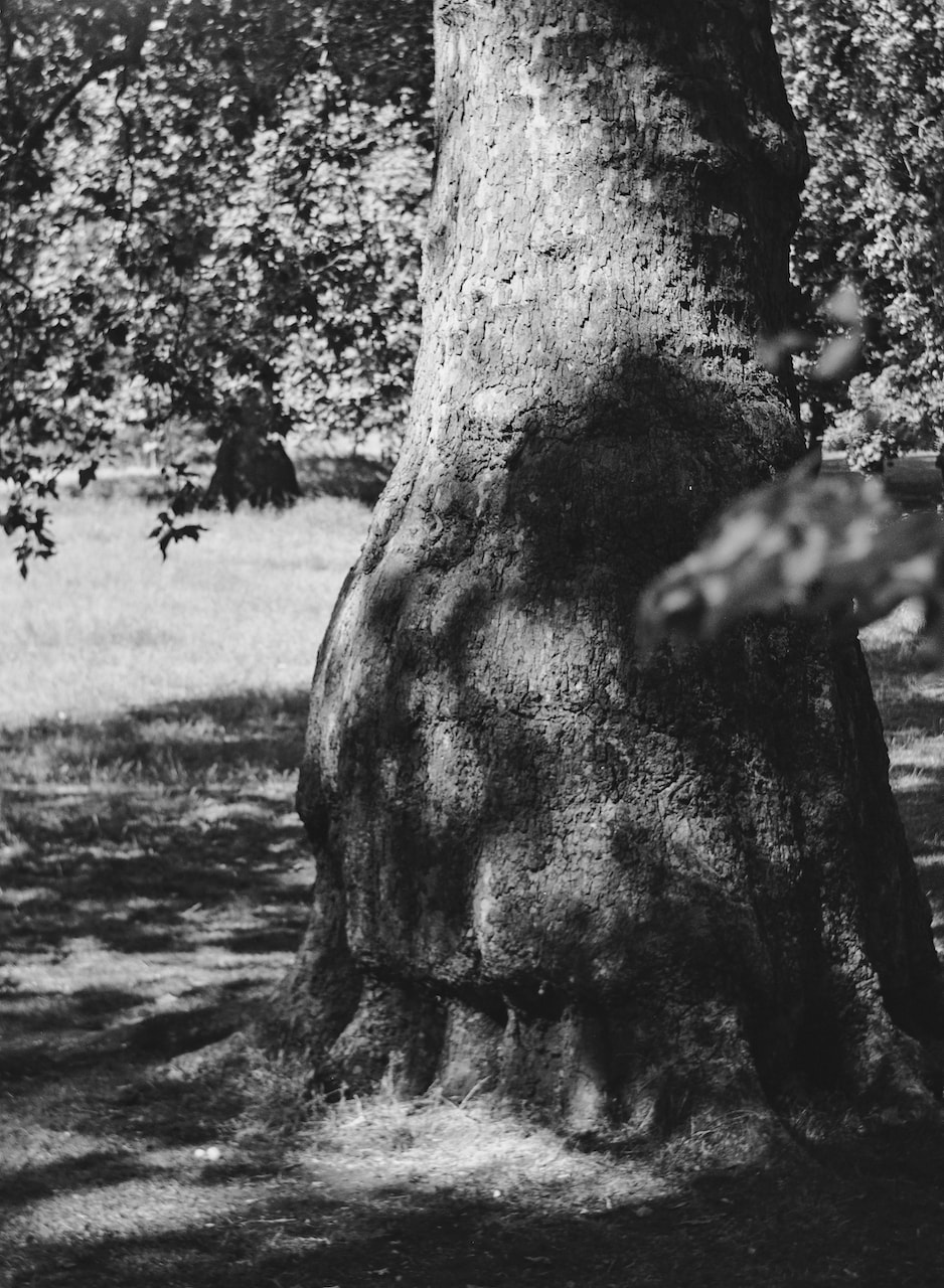
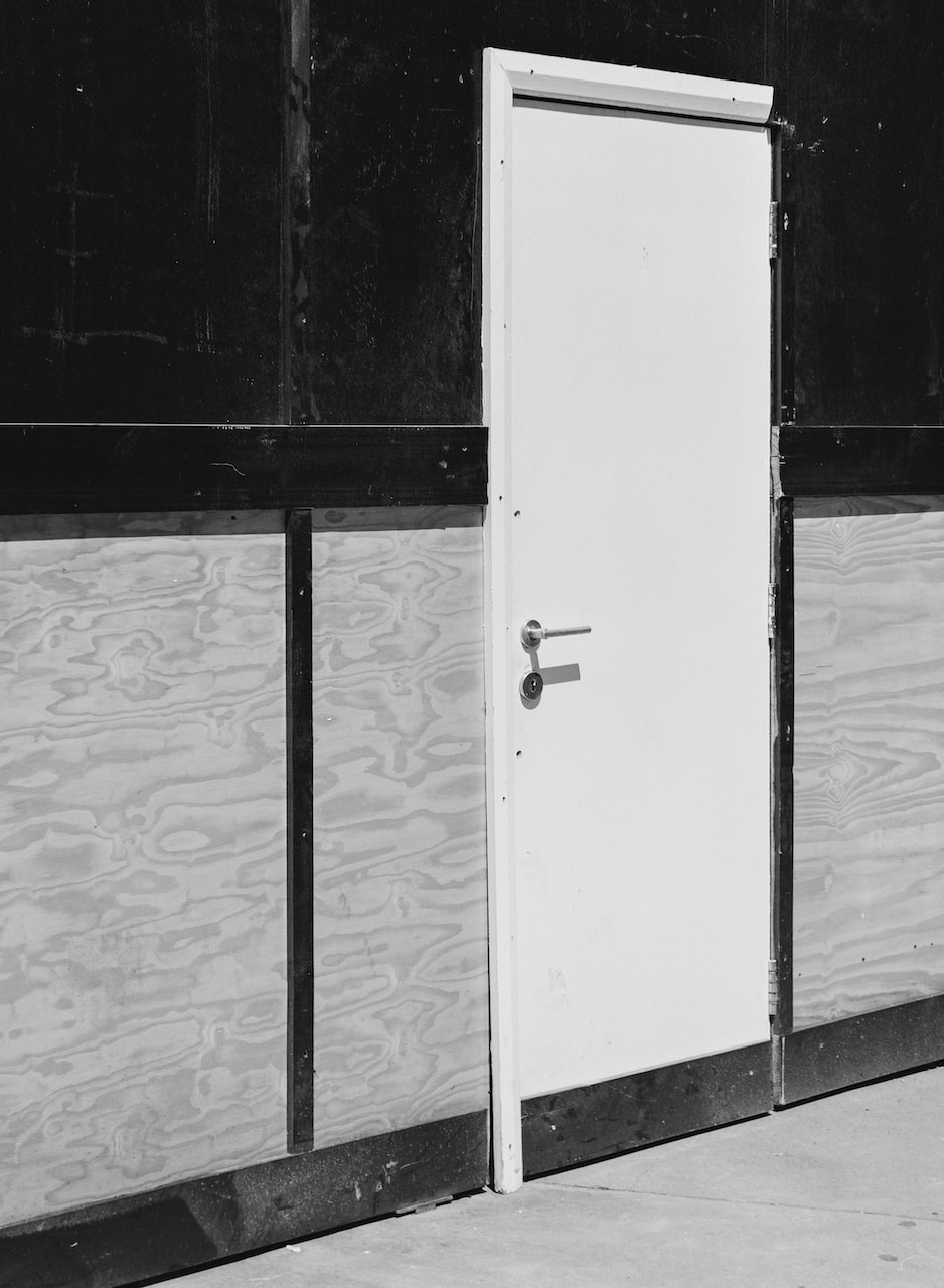
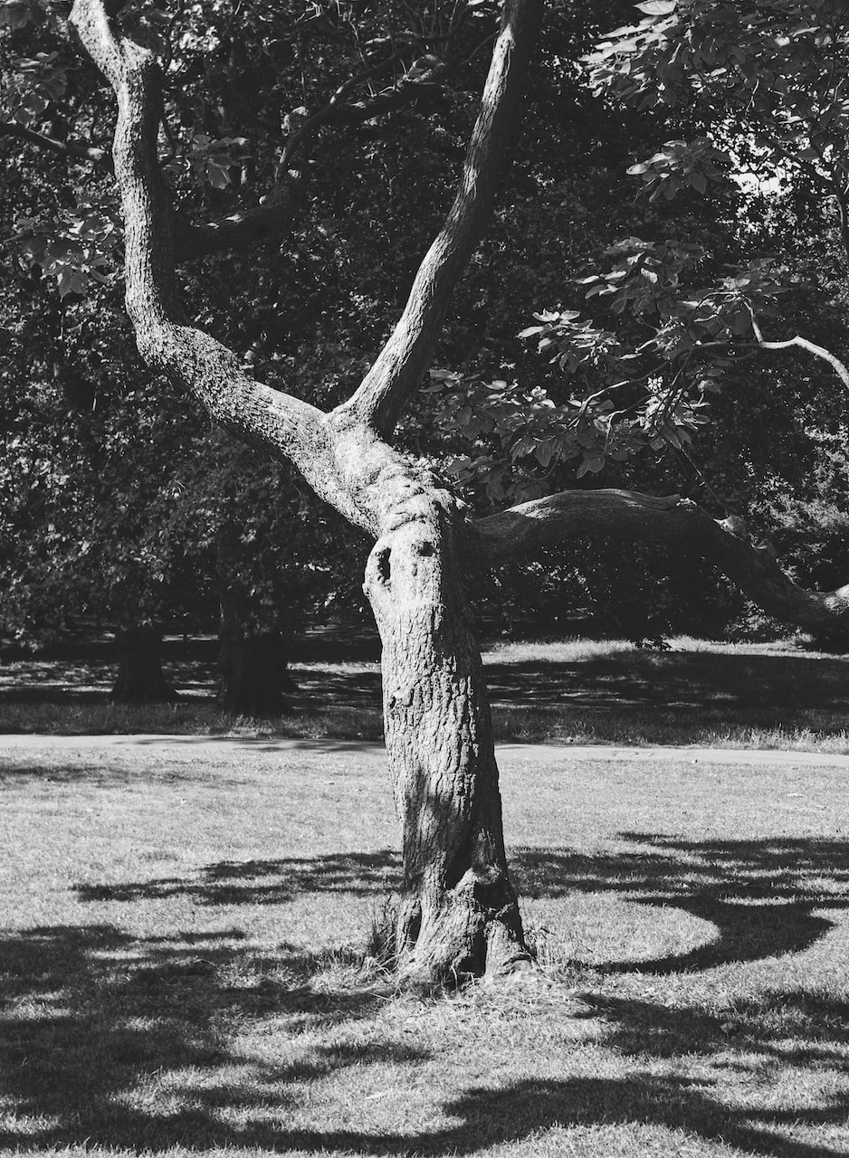
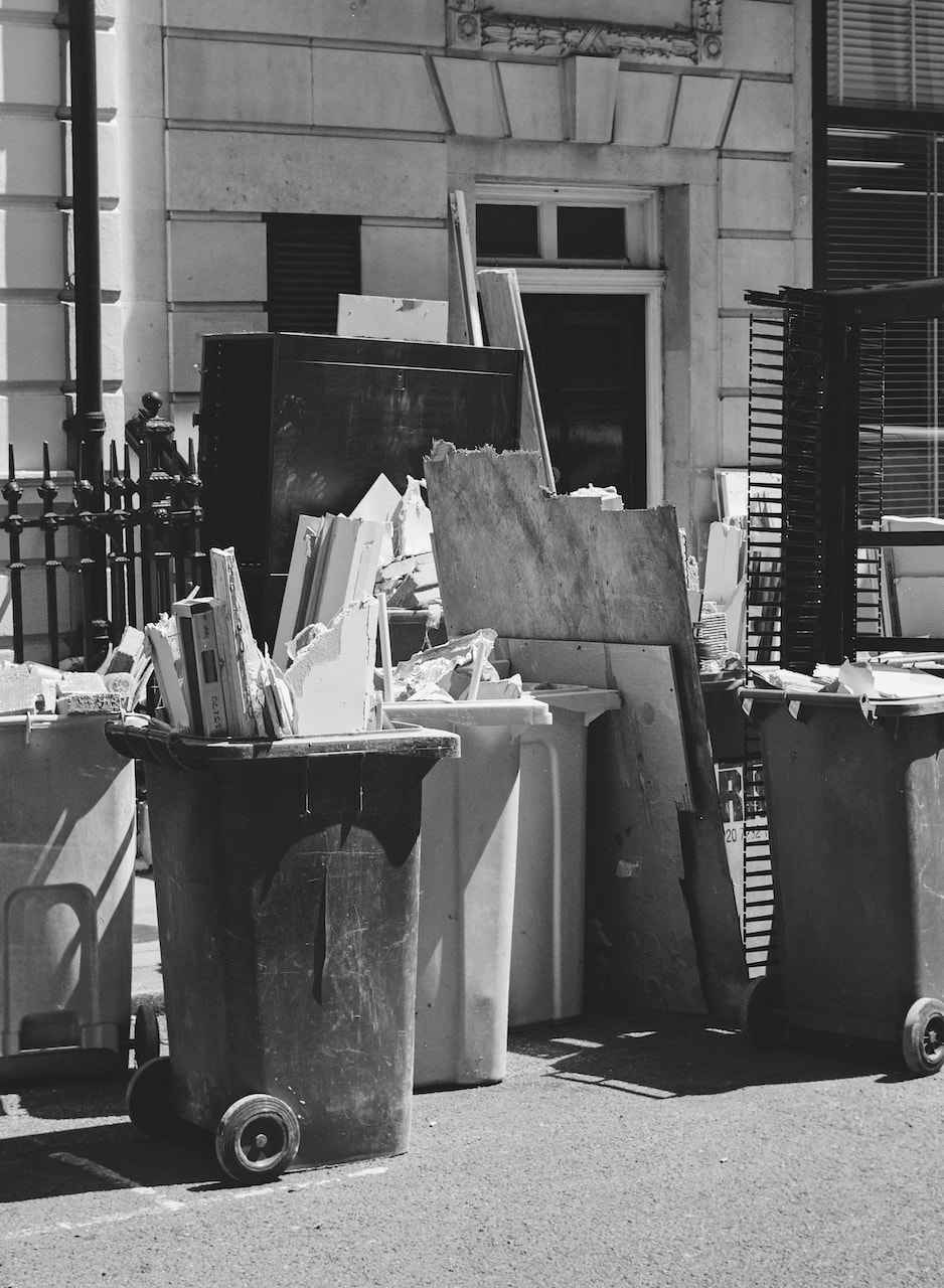
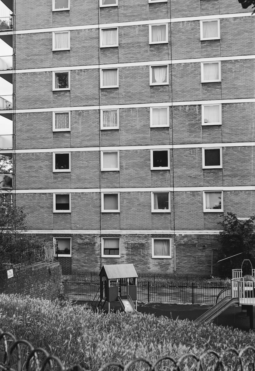
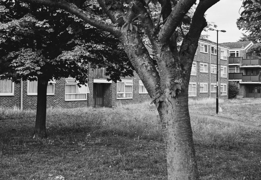
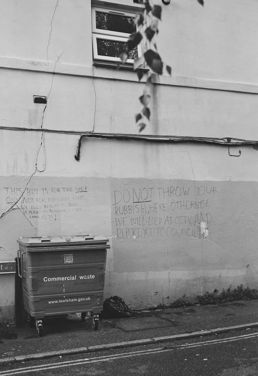
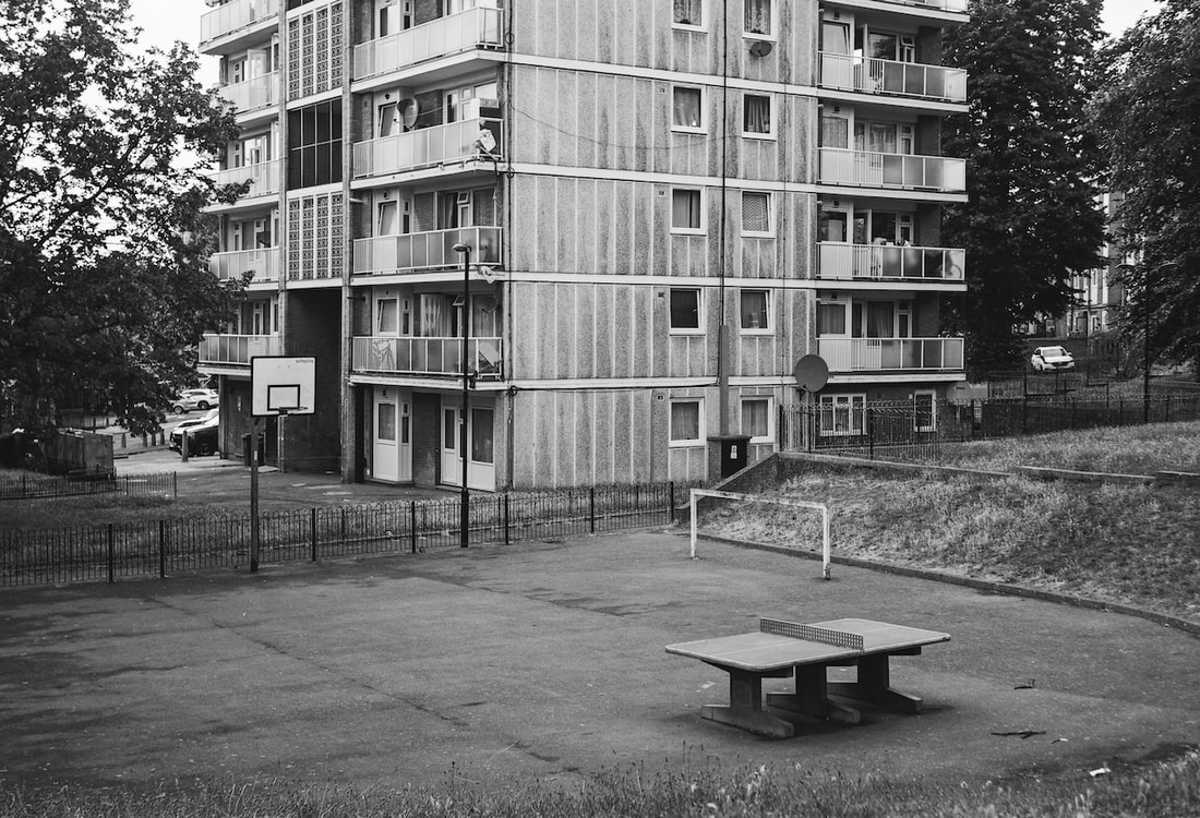
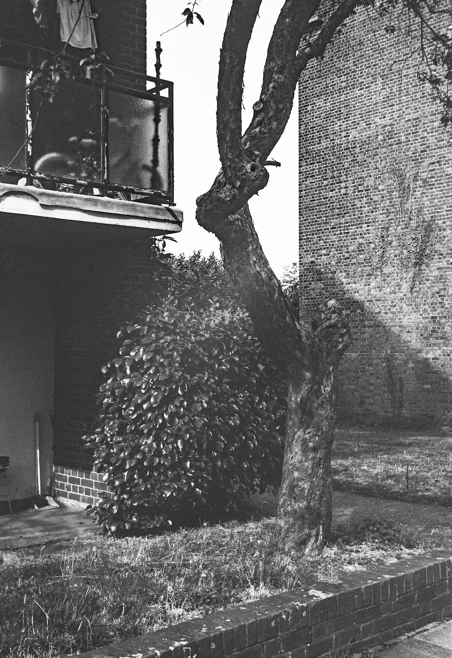
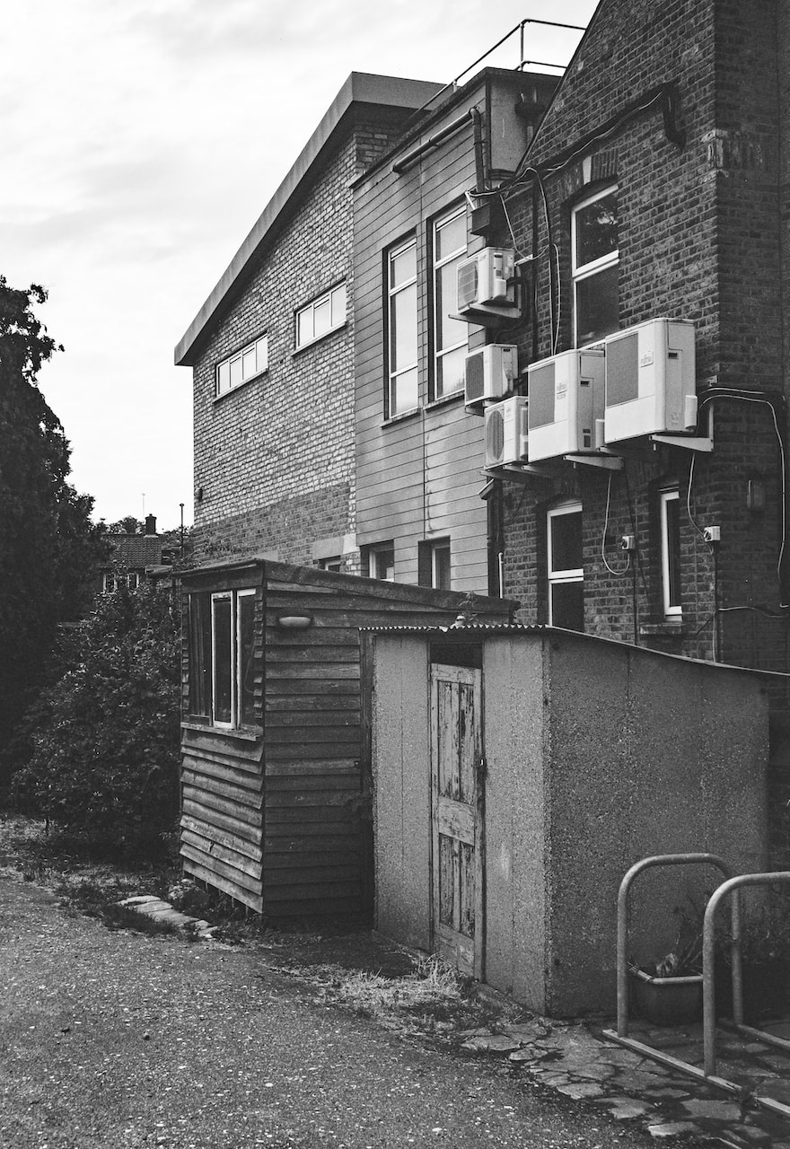
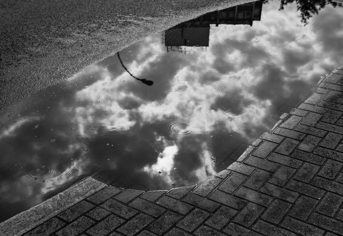
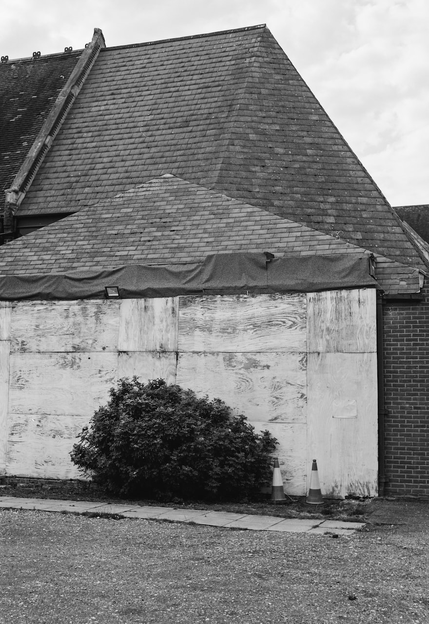
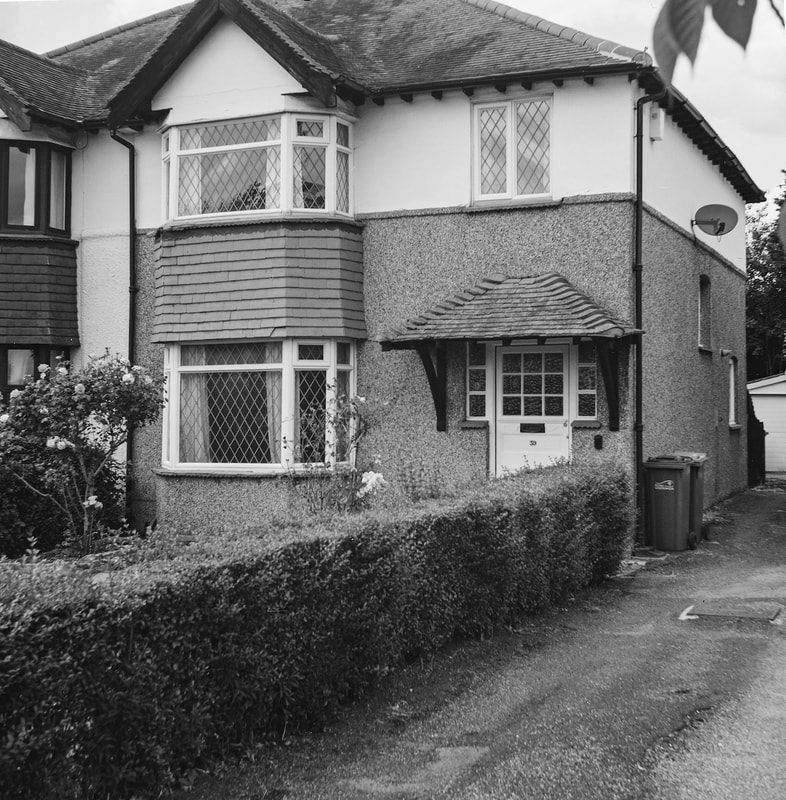
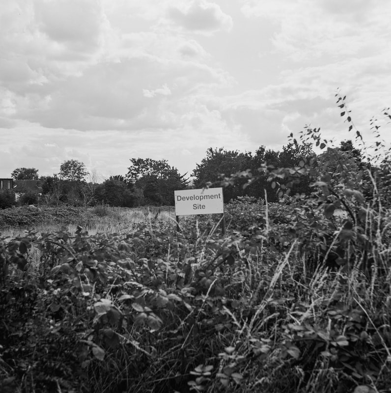
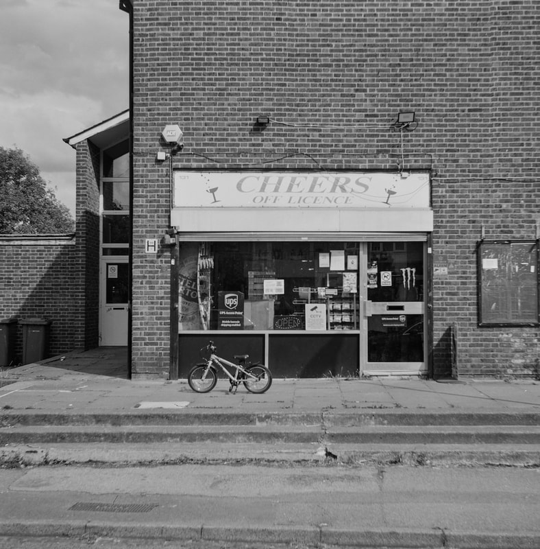
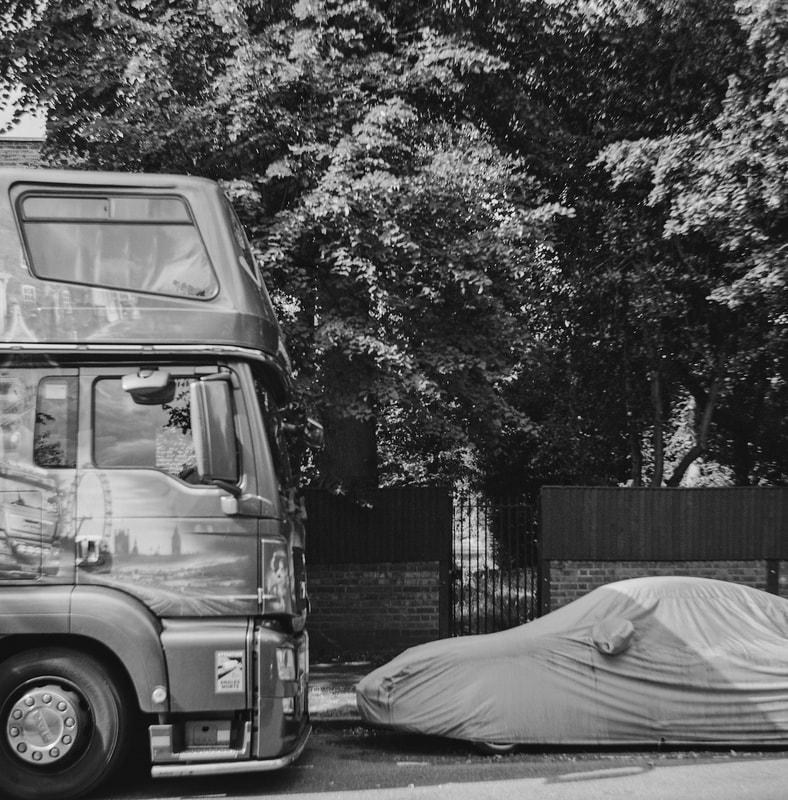
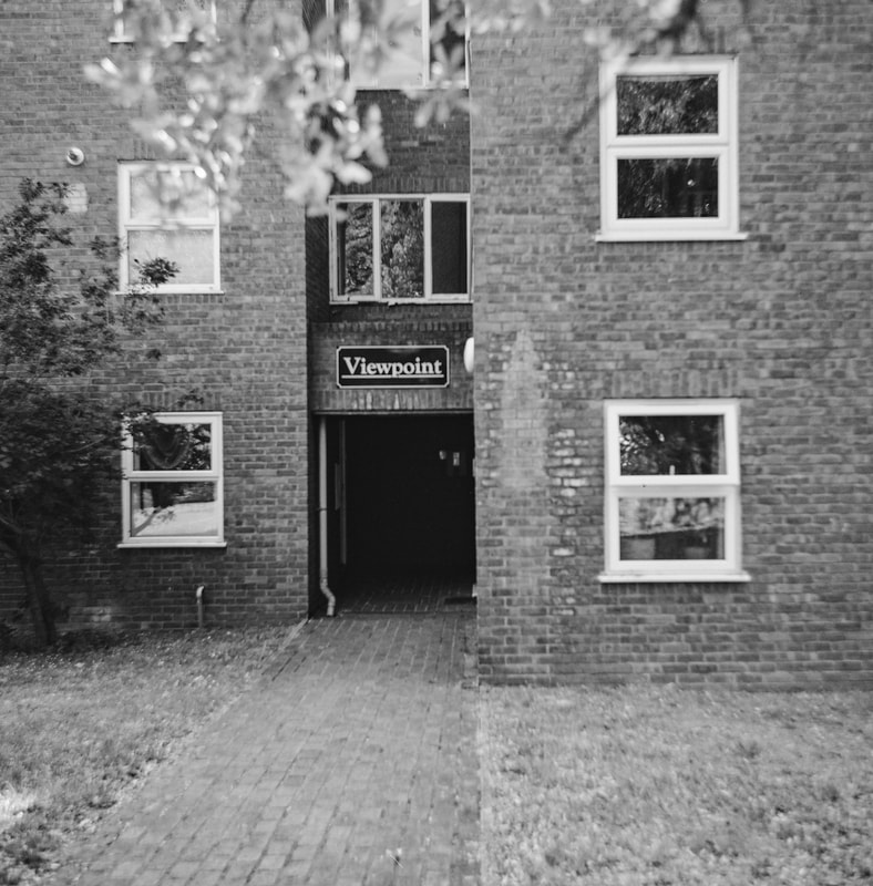
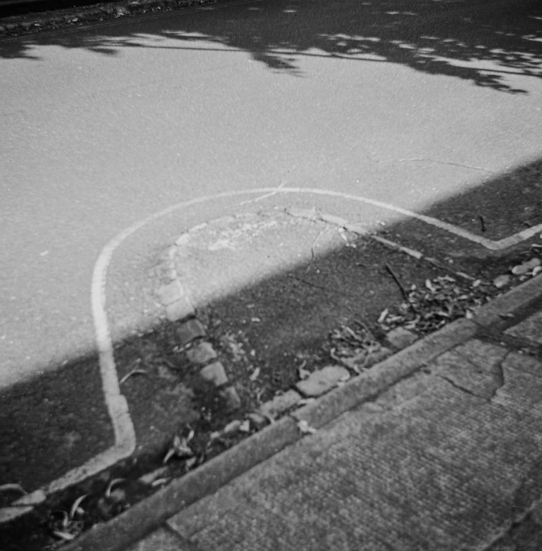
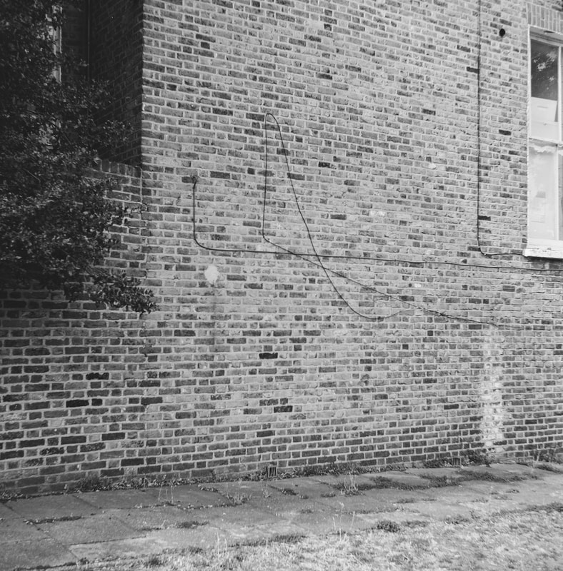
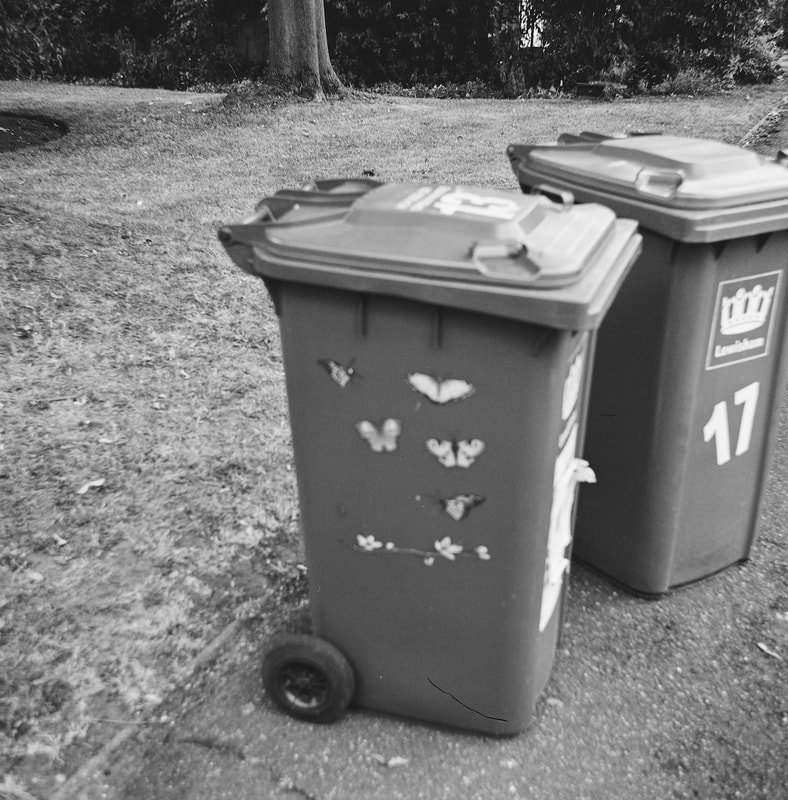
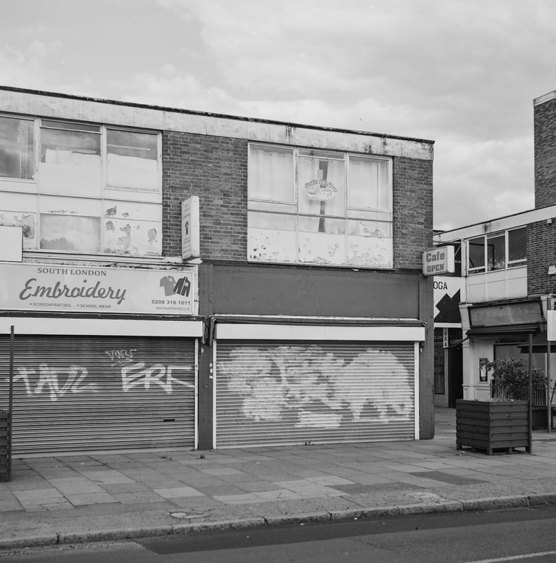
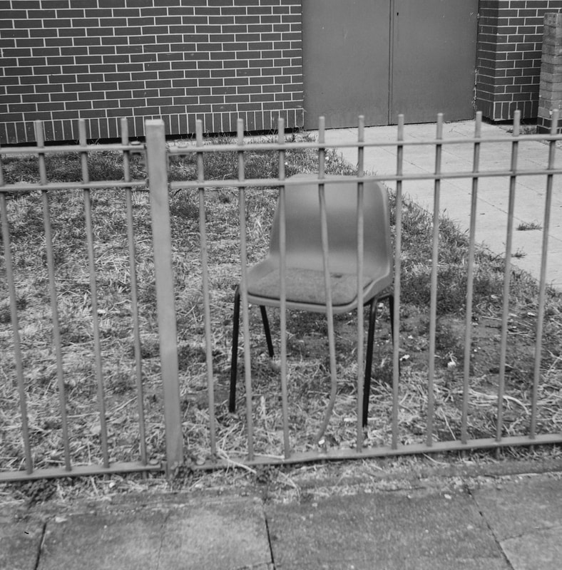
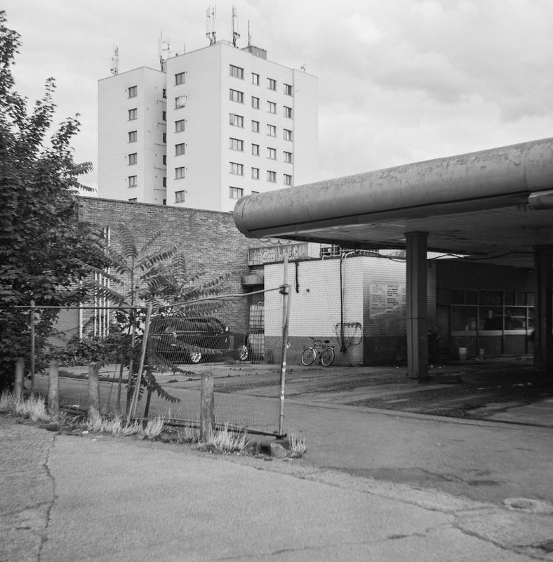
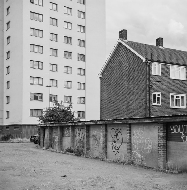
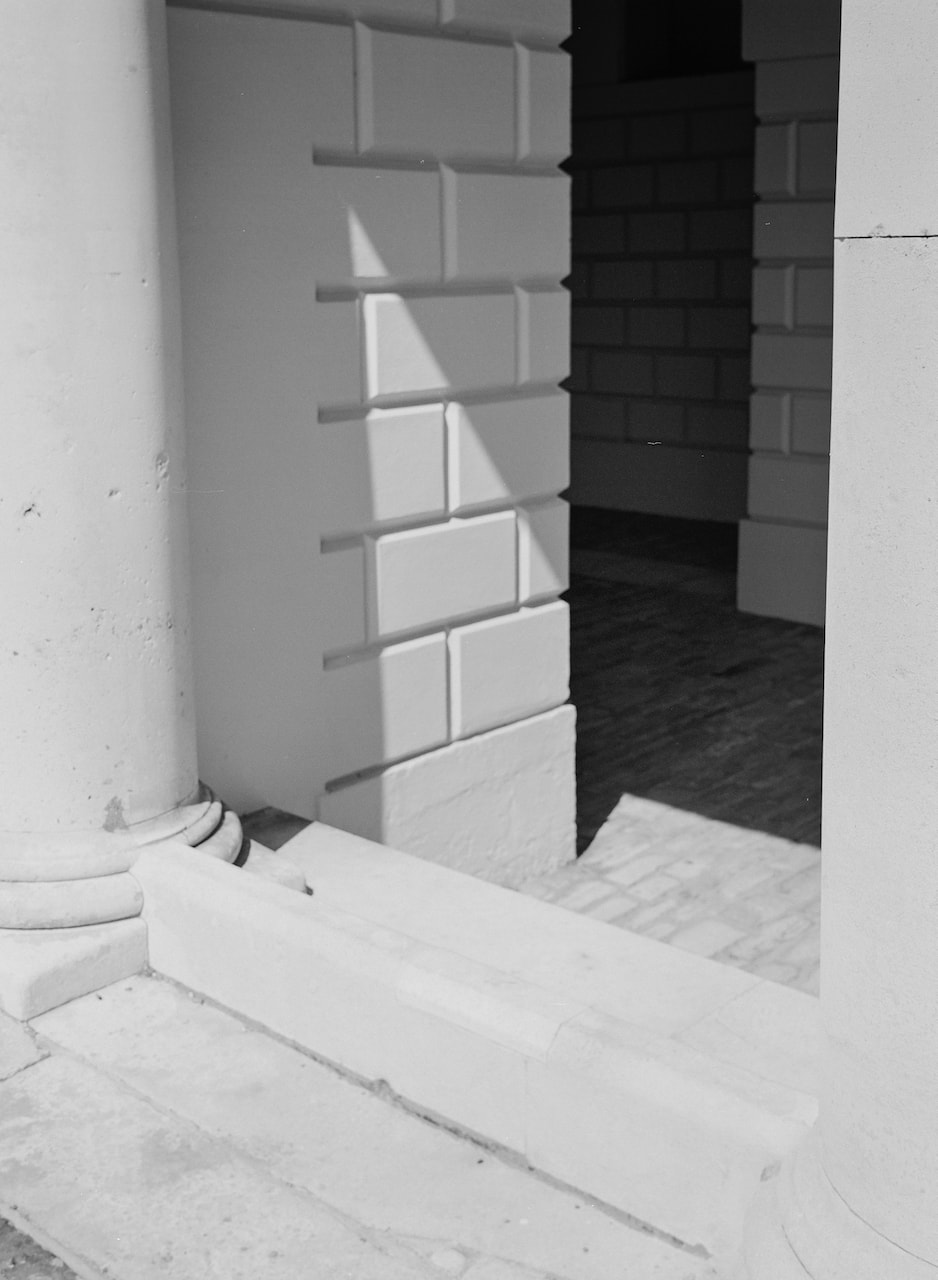
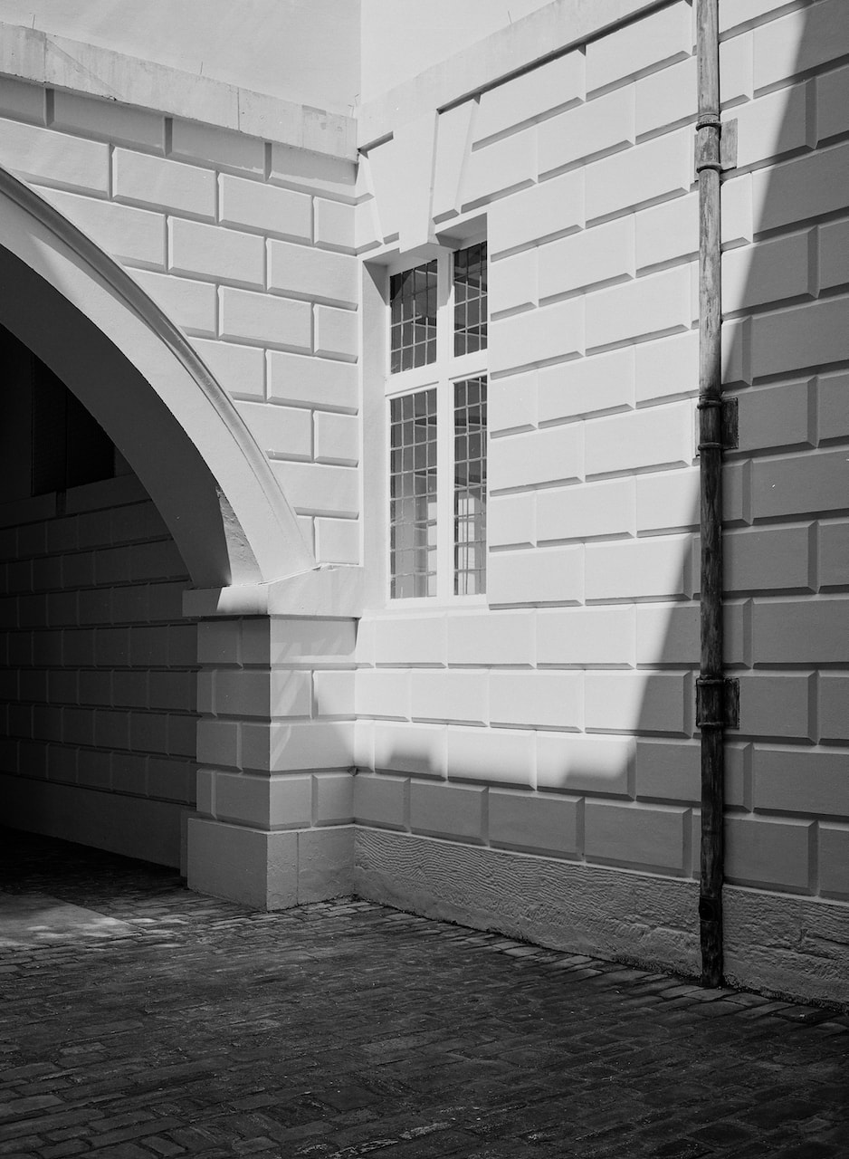
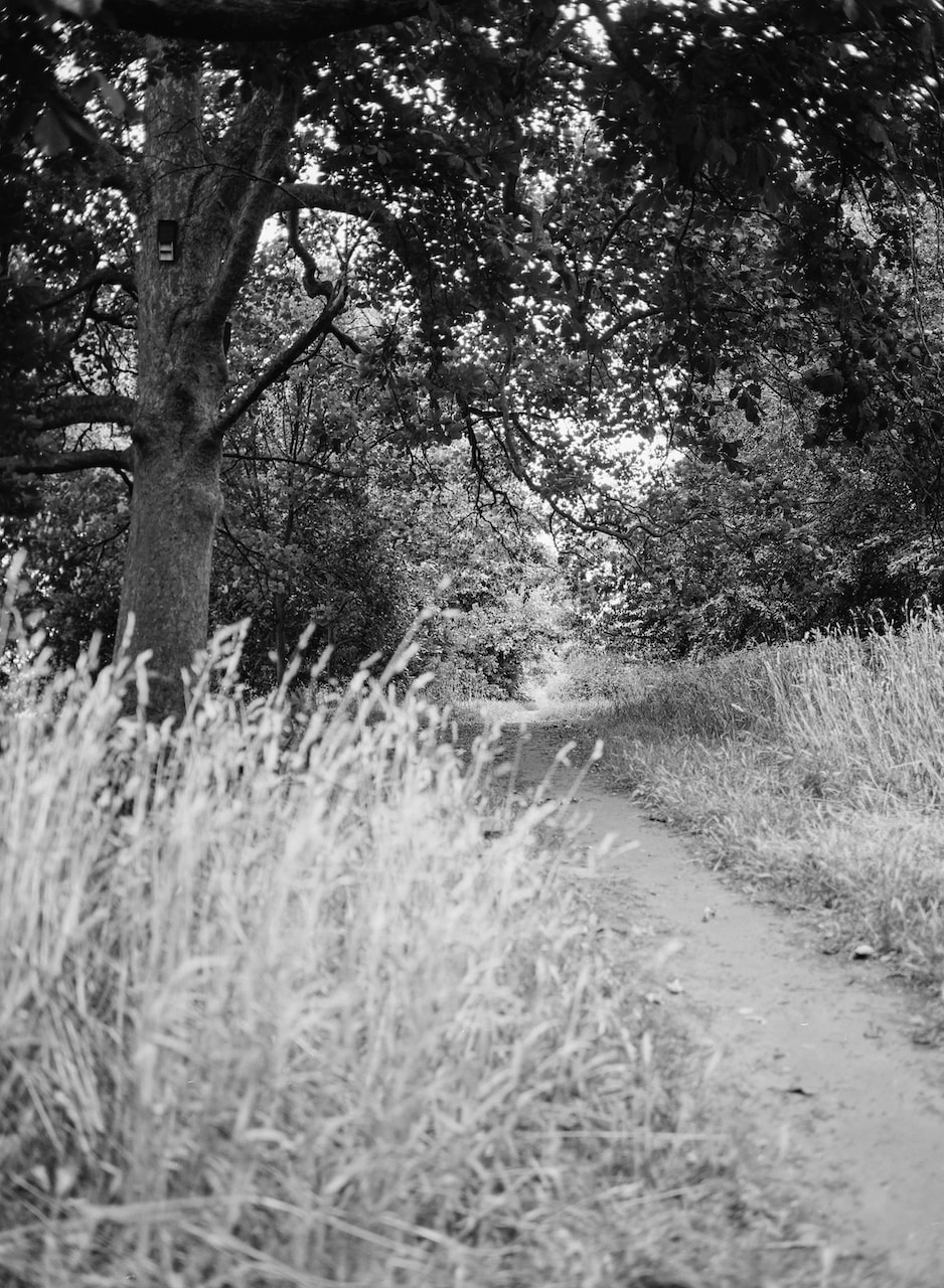
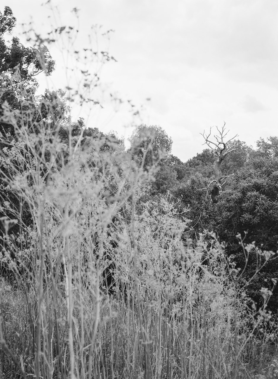
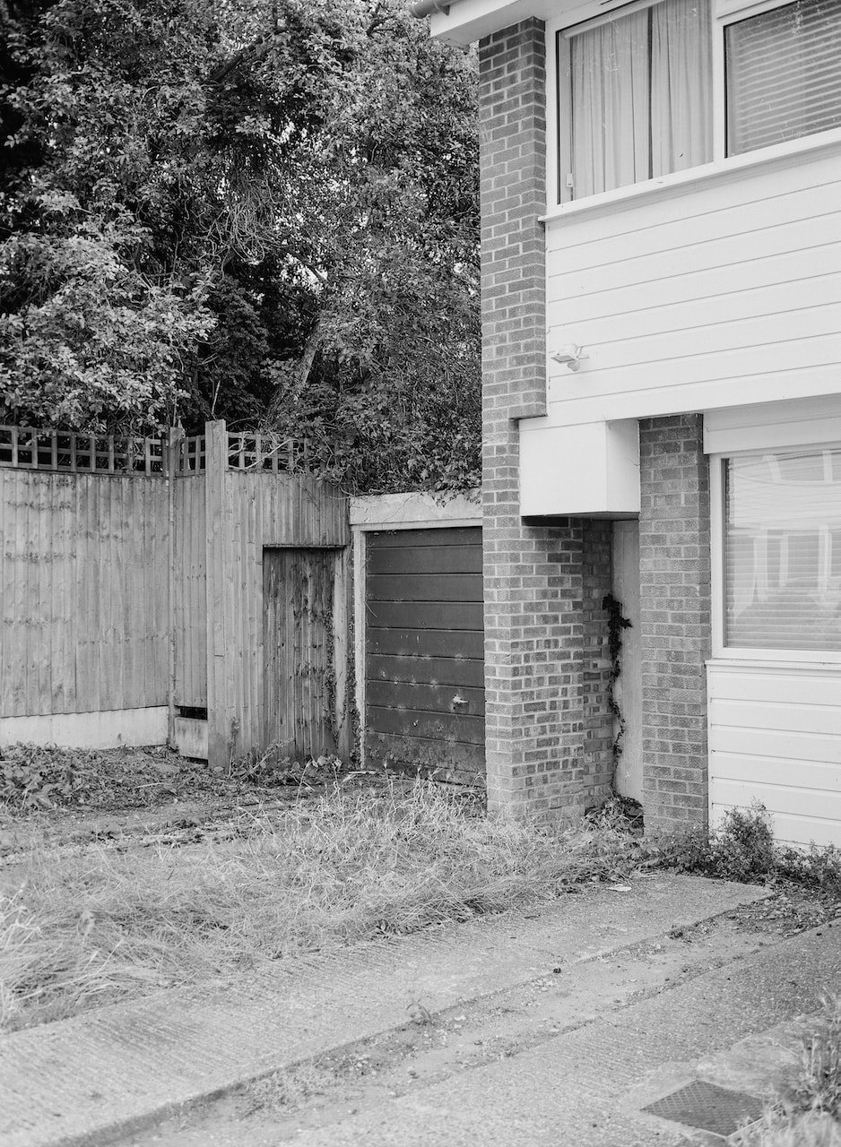
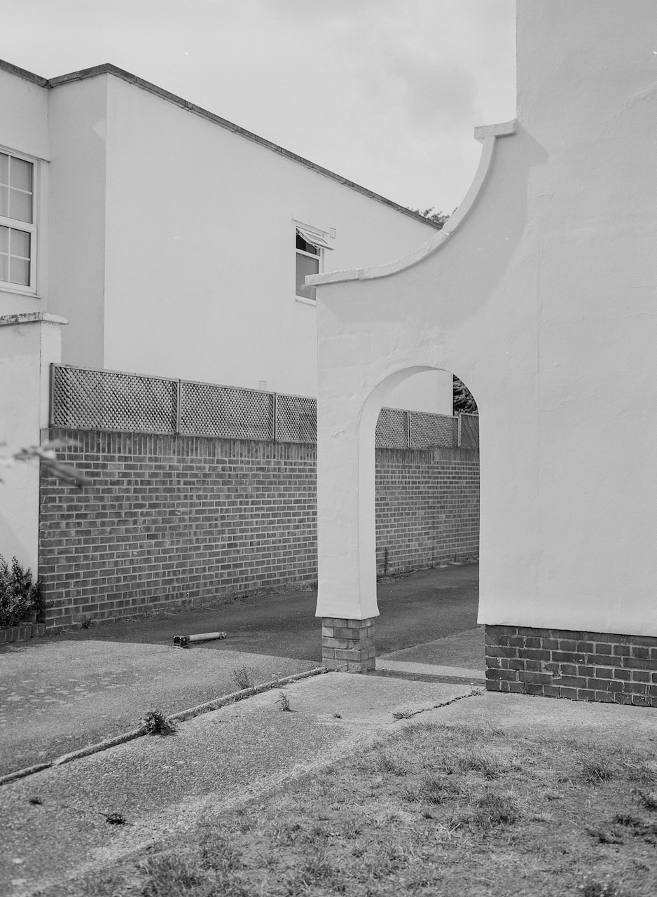
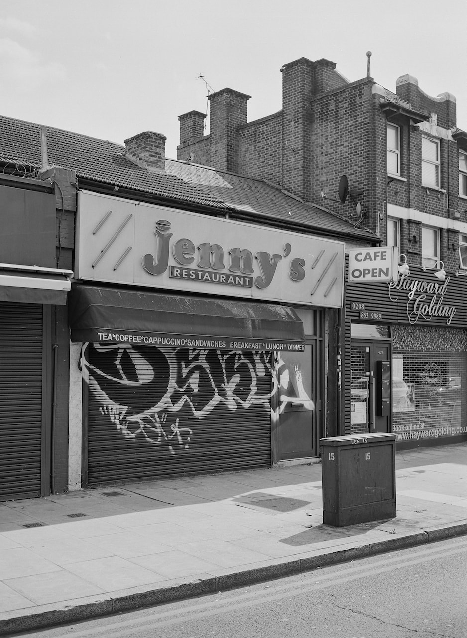
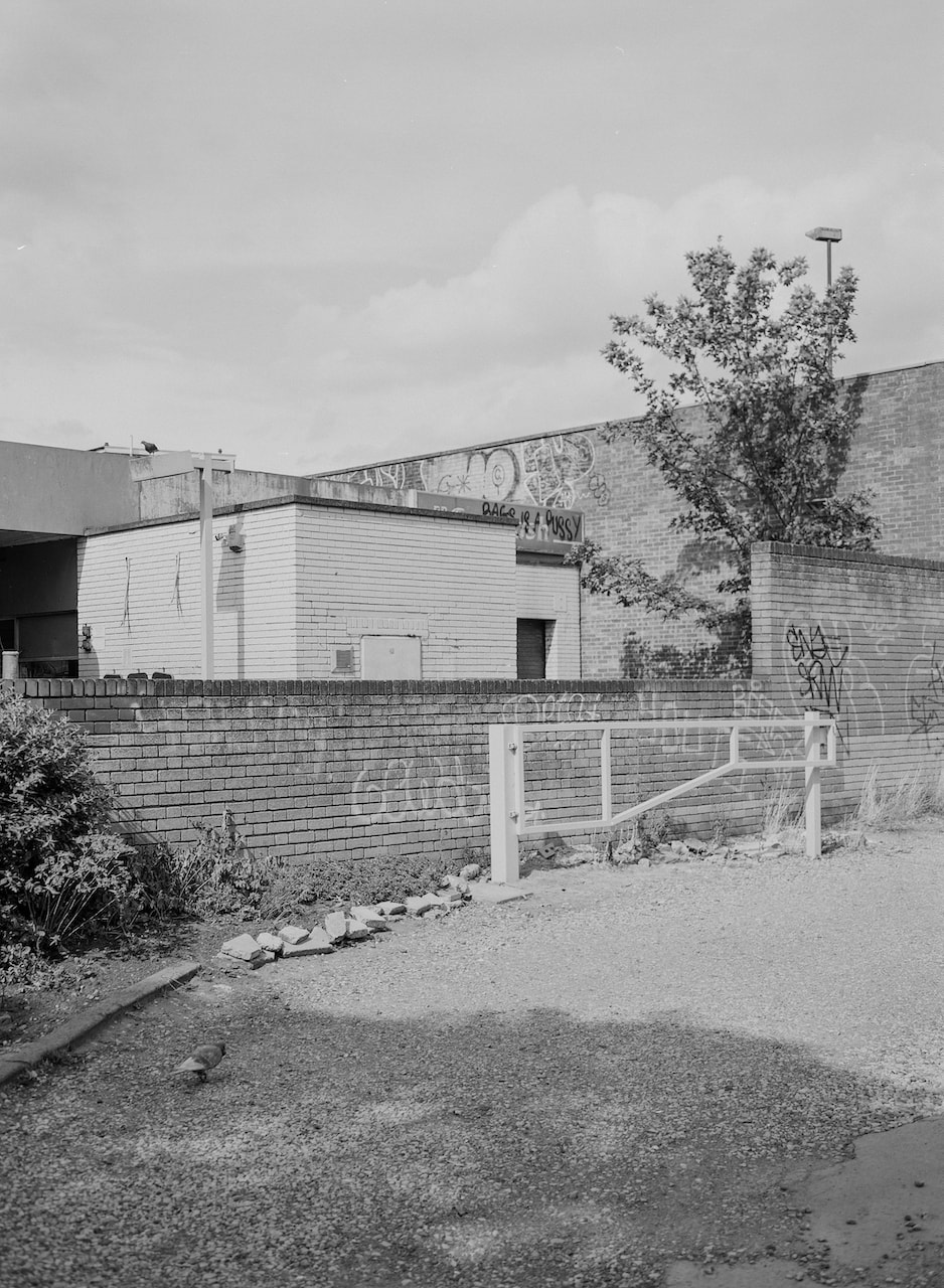
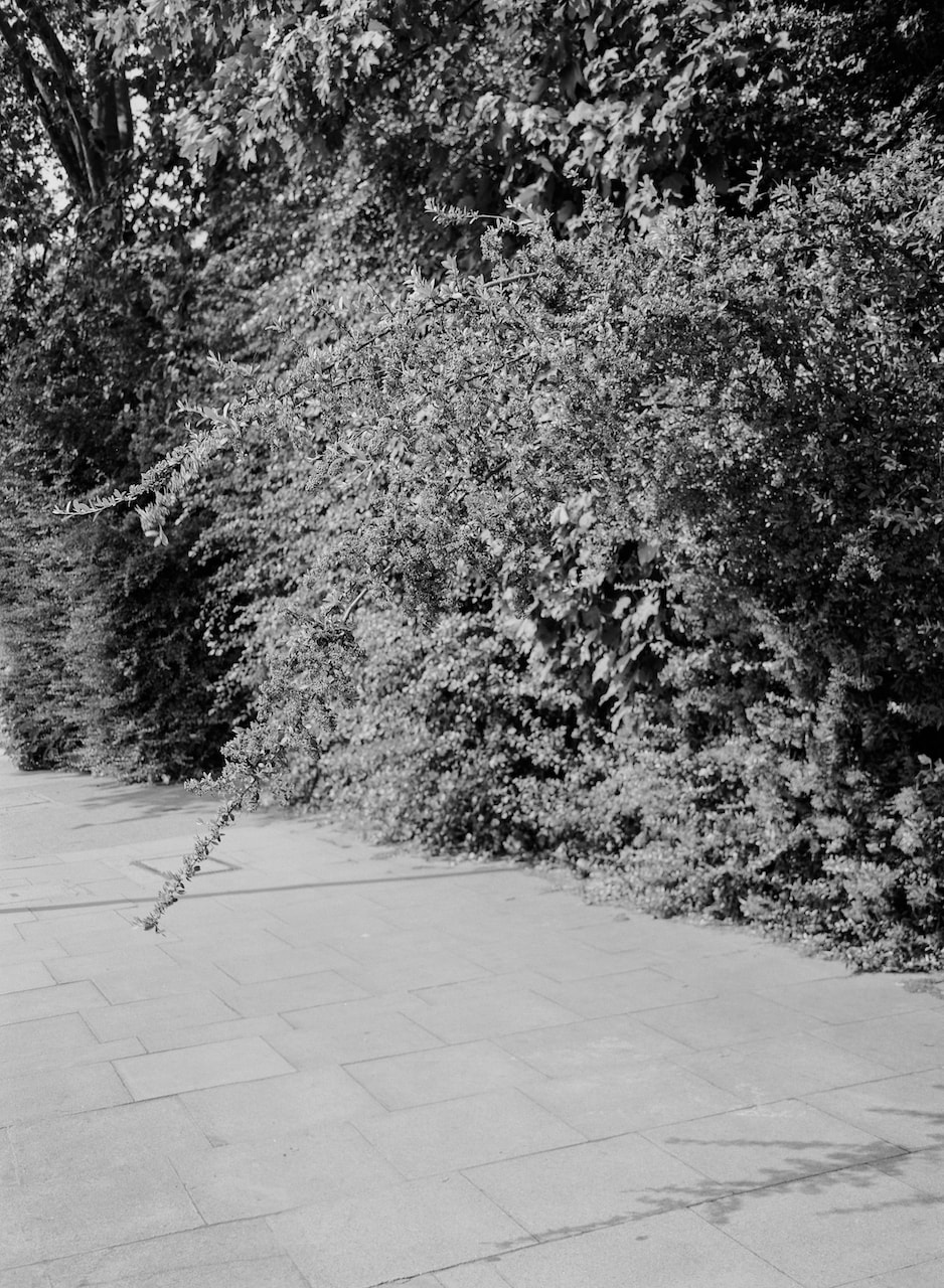
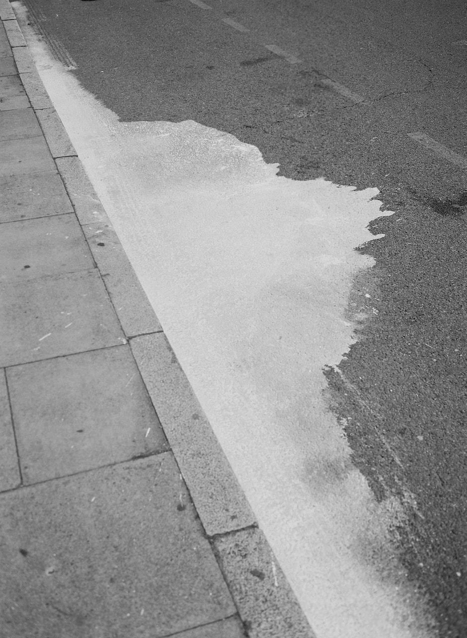
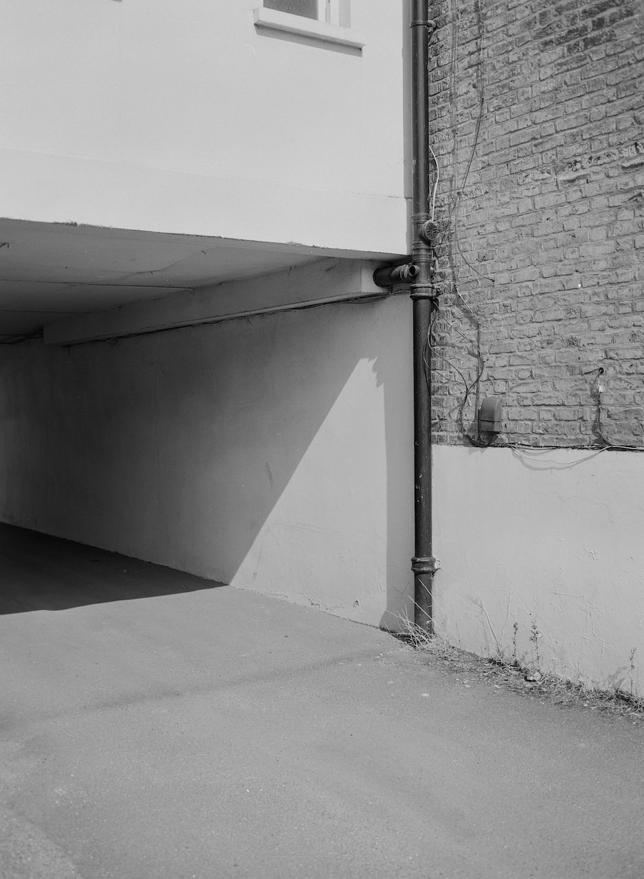
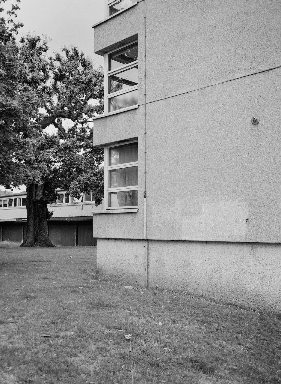
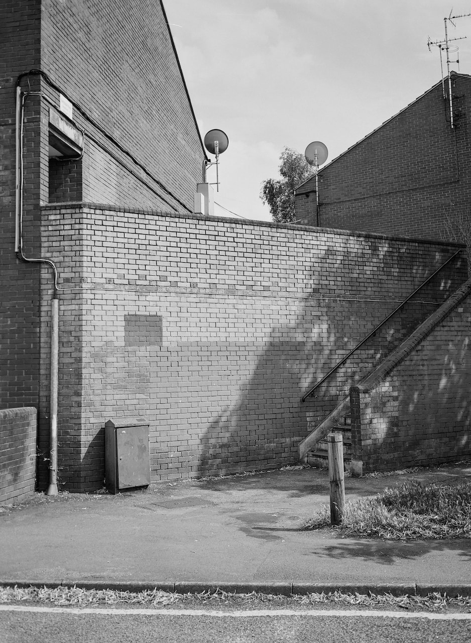
This page is dedicated to developing and refining my Personal Investigation. It will be largely visual, since I will also be writing an essay exploring the historical and theoretical aspects of my research. It will be a kind of visual diary but will also attempt to describe the decisions I make about my pictures. It begins in the second half of the summer term of 2023 with this set of black and white photos of south east London, mostly shot within a mile of my house, shot on a manual SLR loaded with Ilford XP2 Super 400 film.
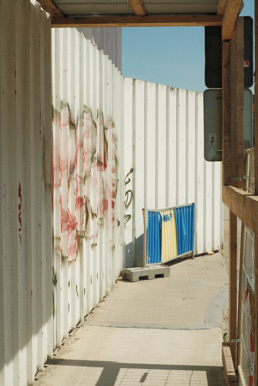
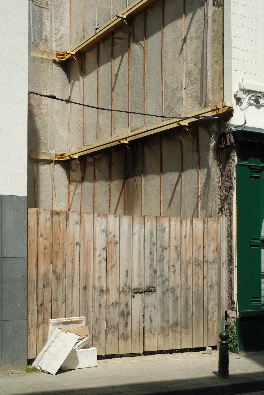
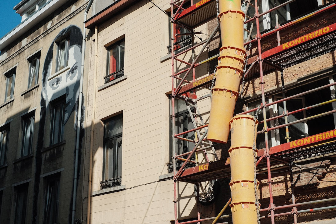
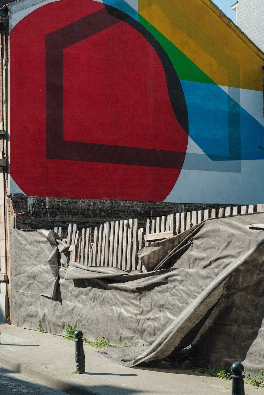
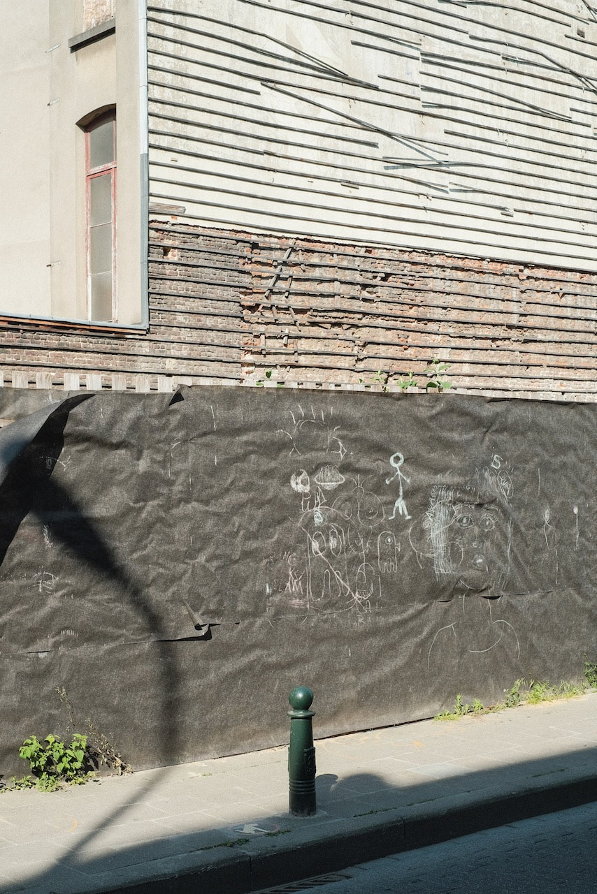
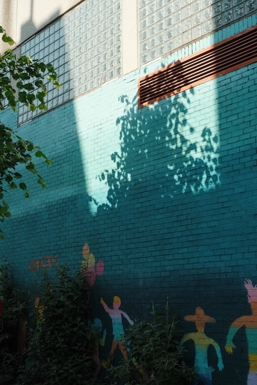
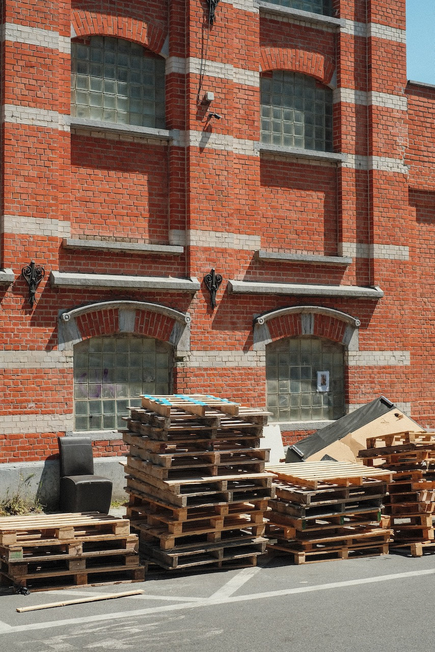
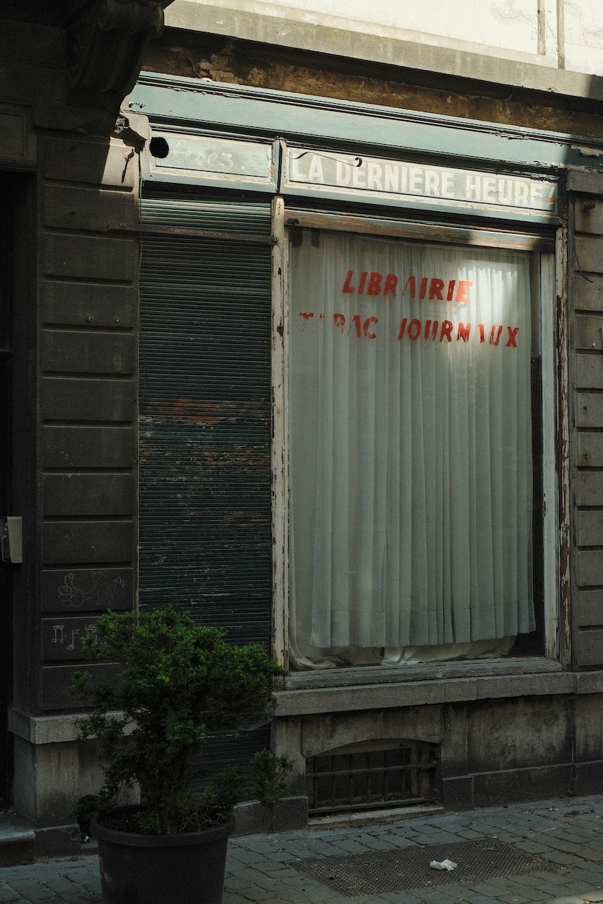
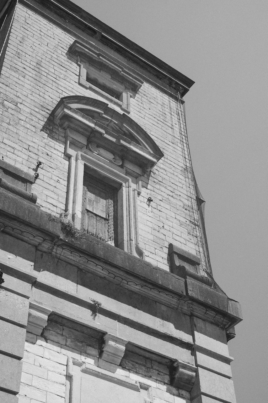
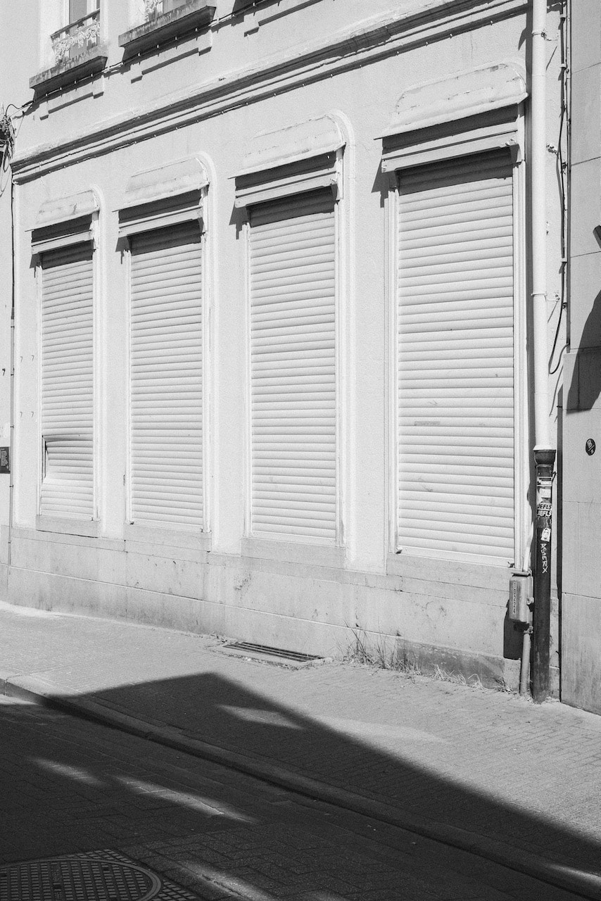
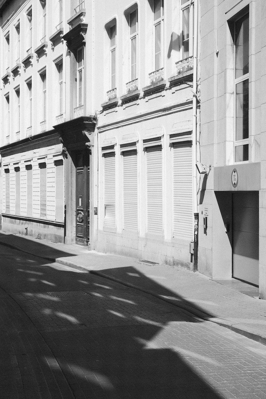
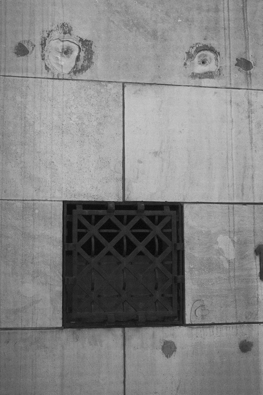
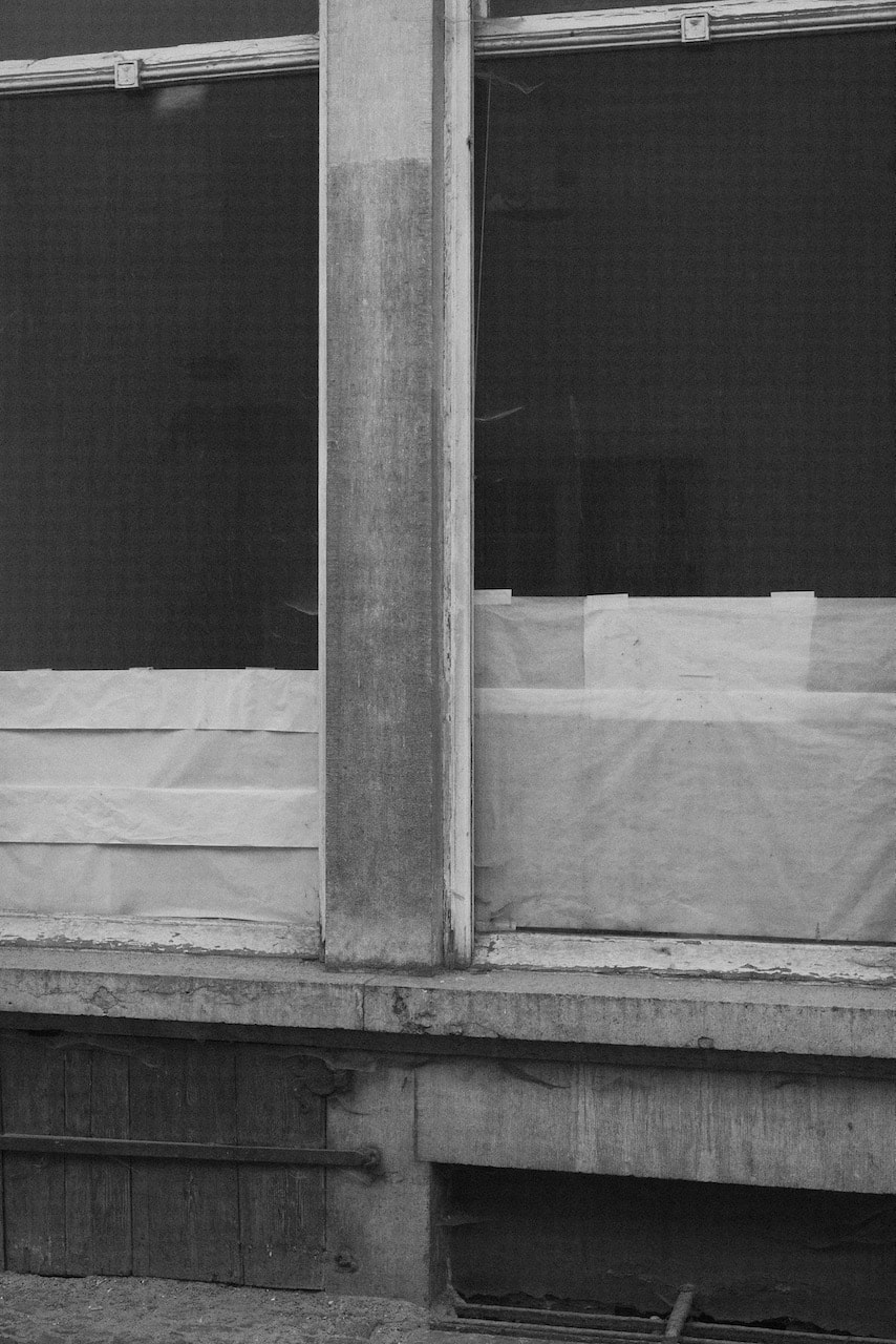
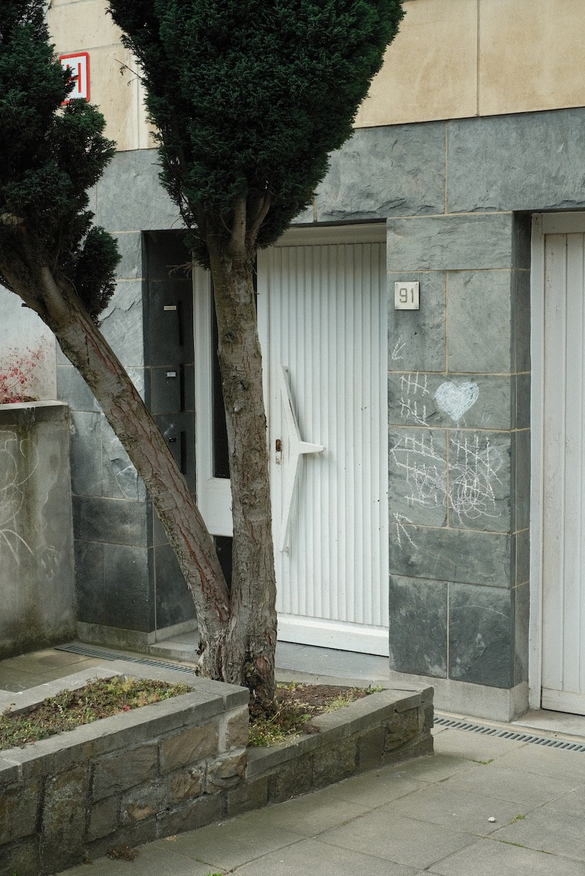
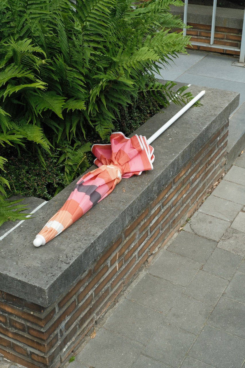
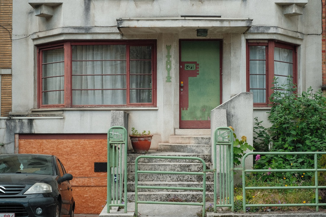
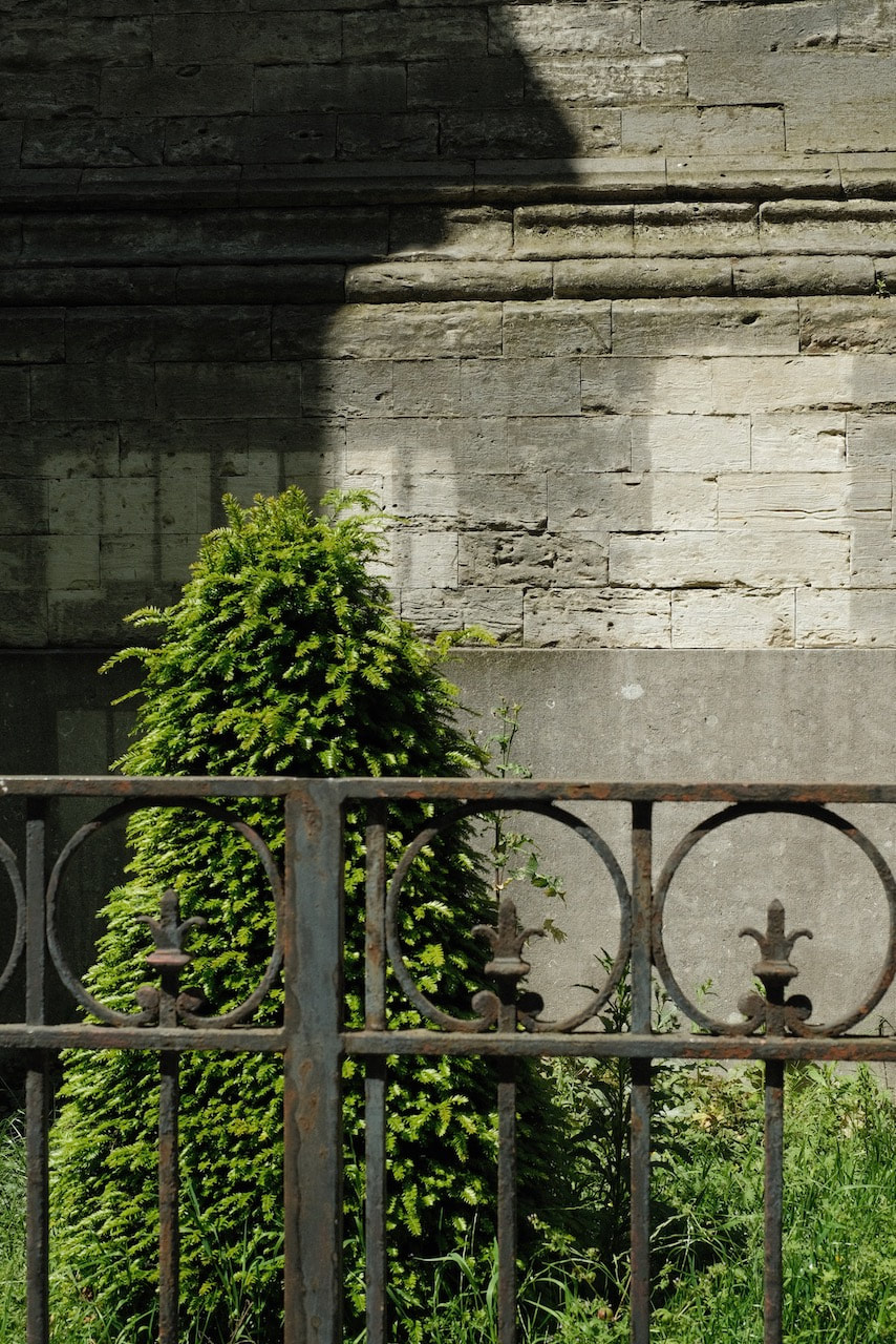
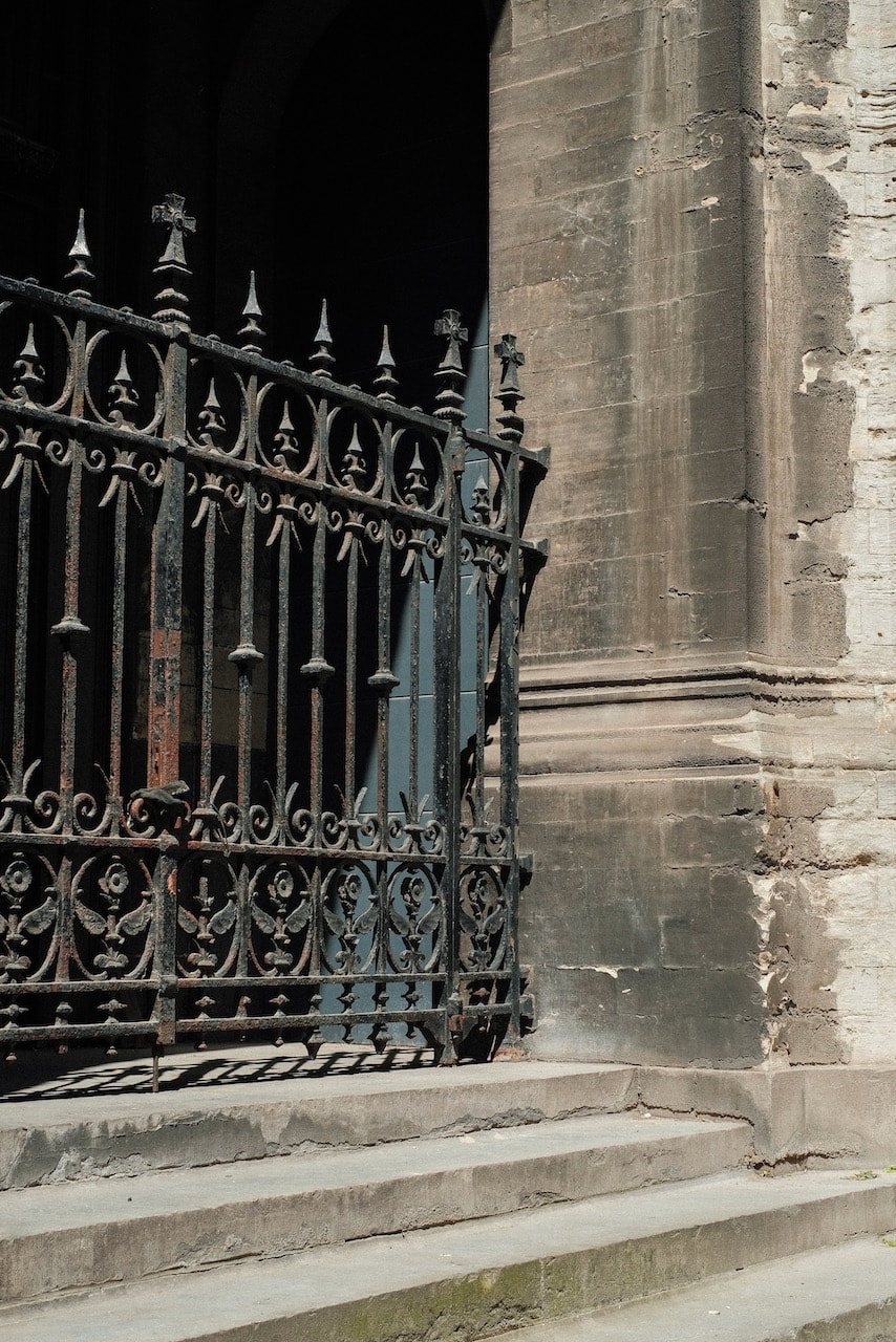
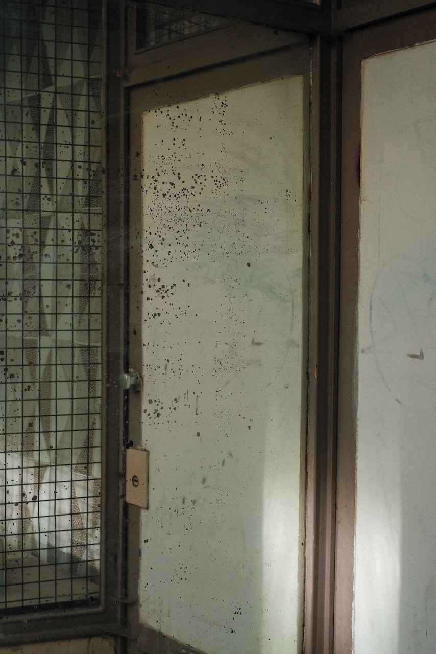
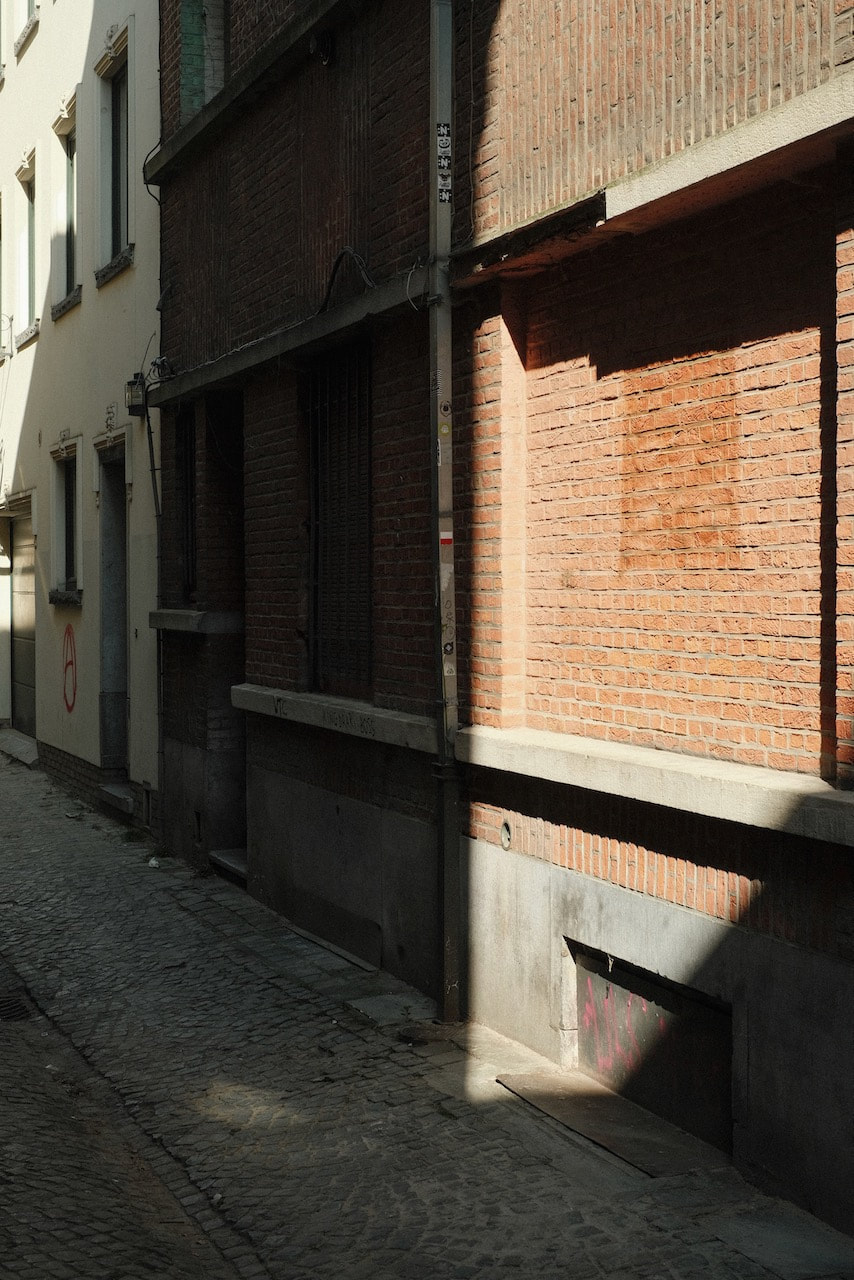
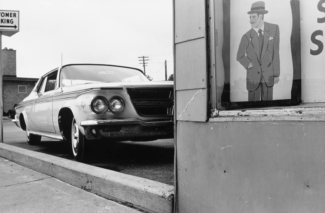
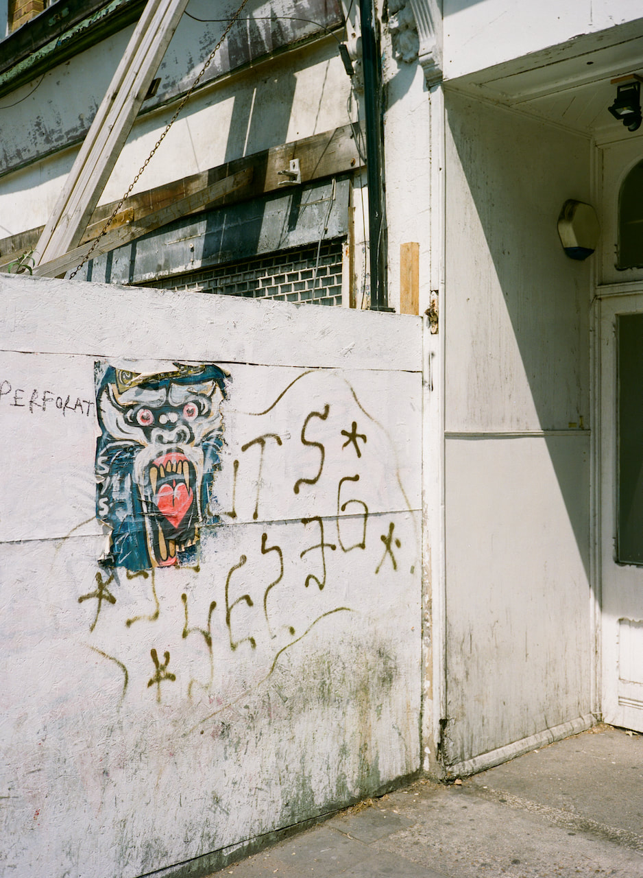
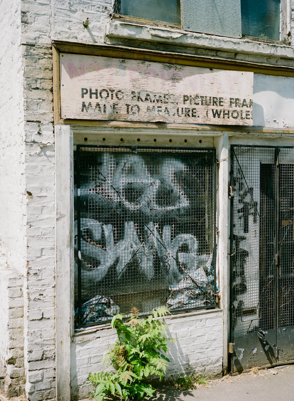
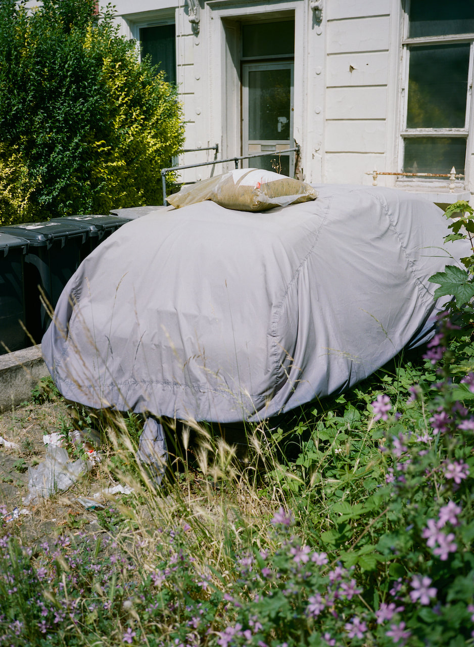
Belgium
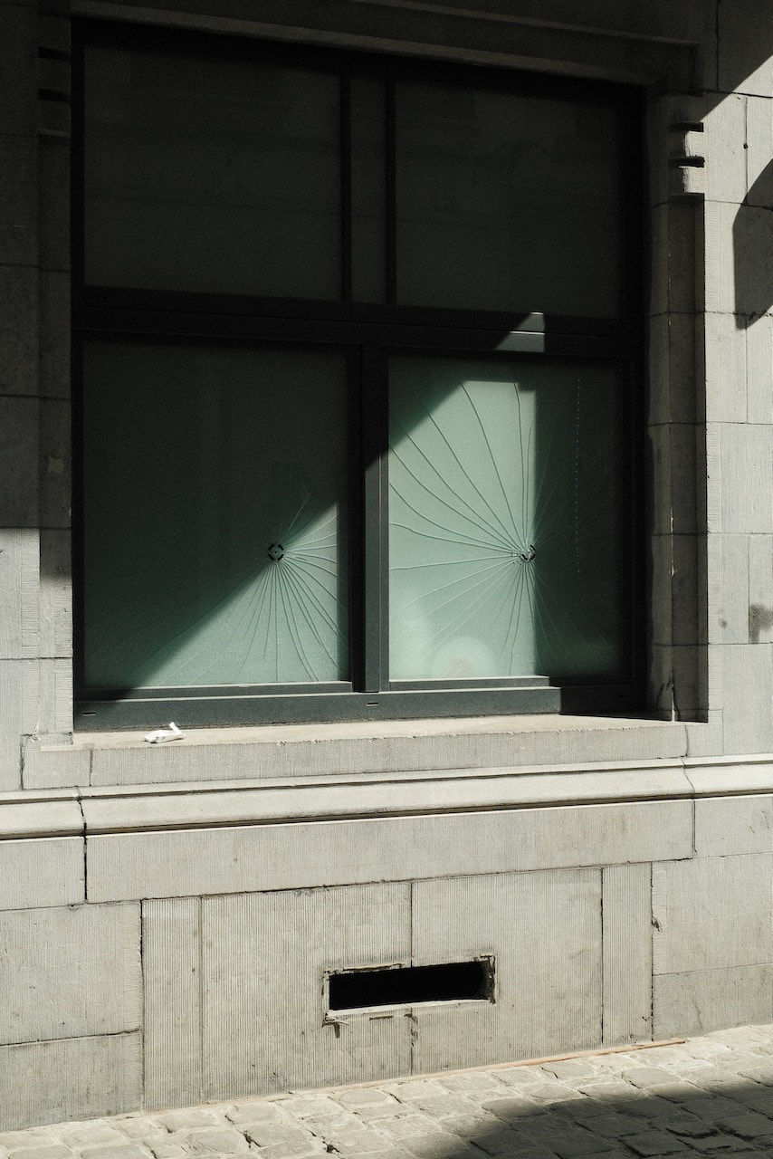
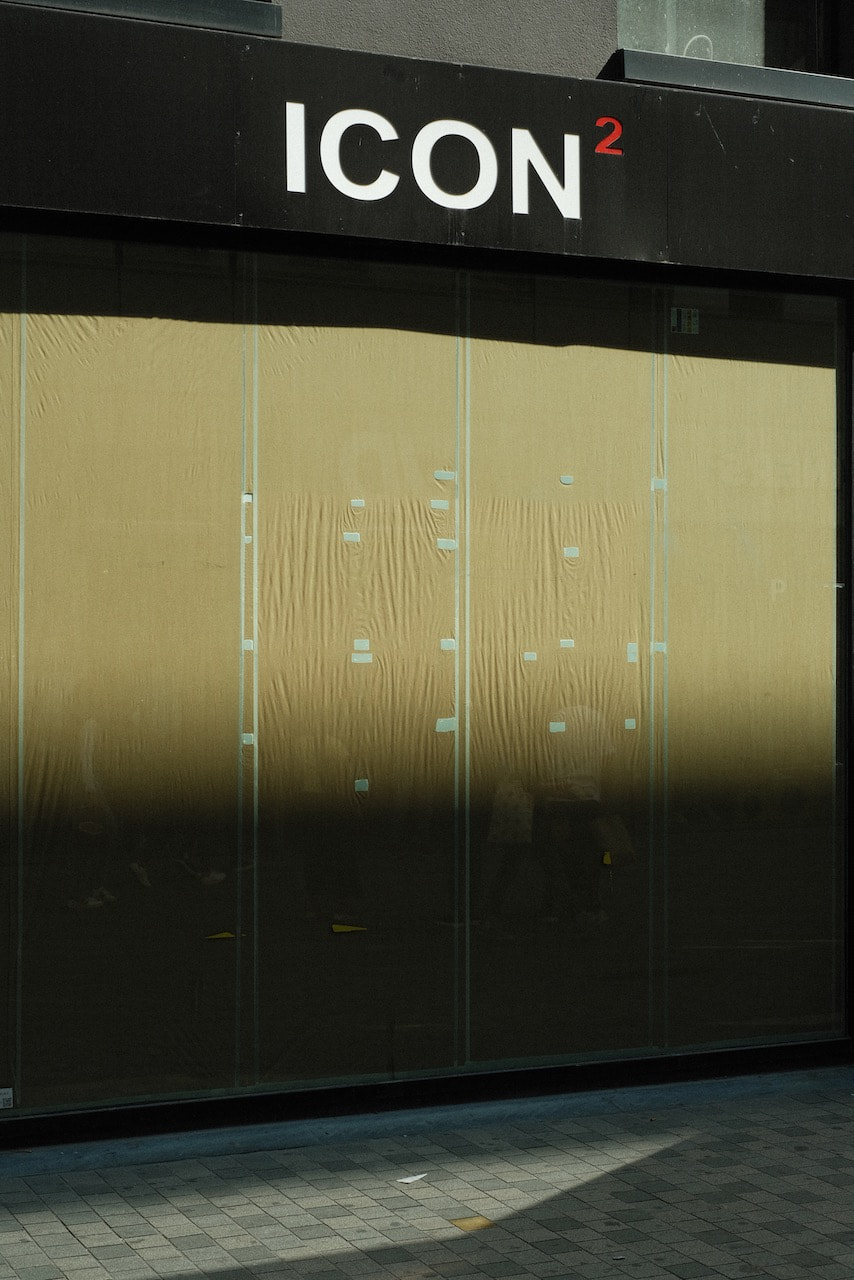
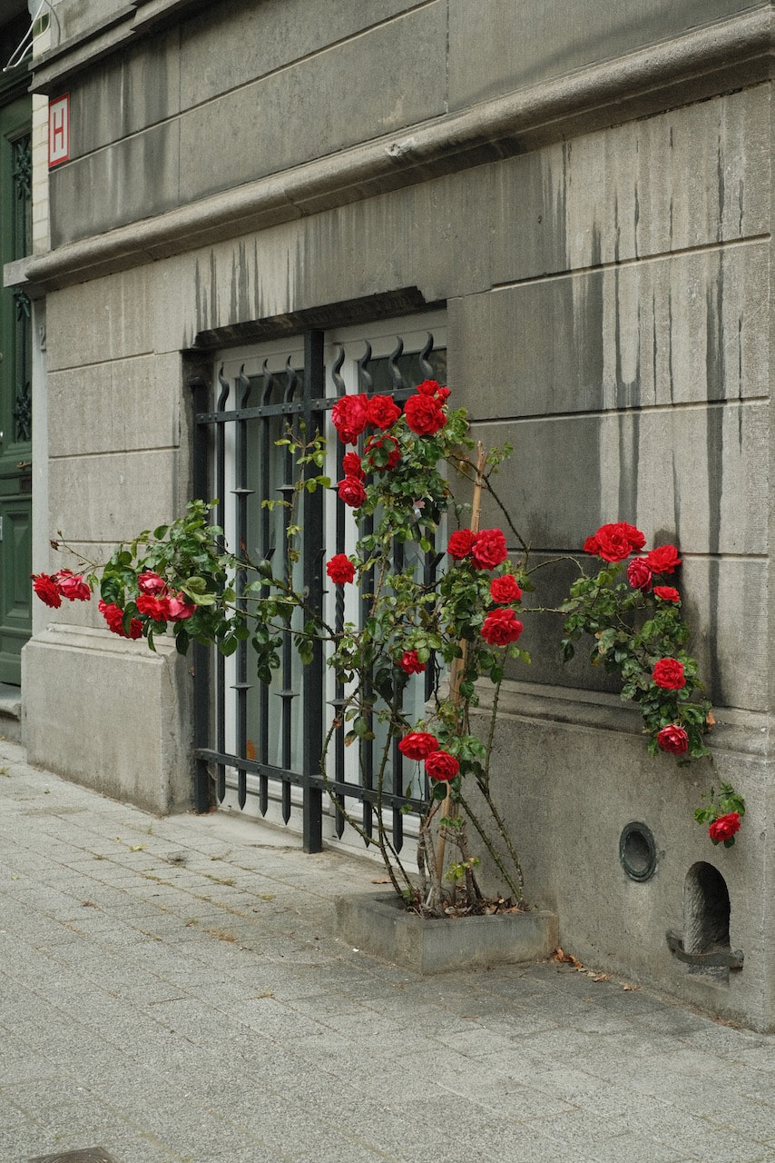
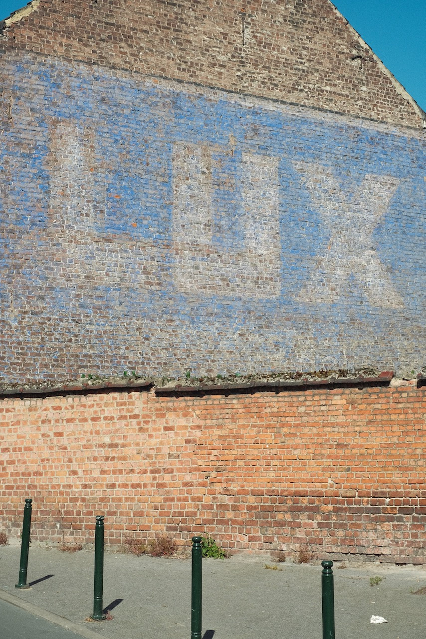
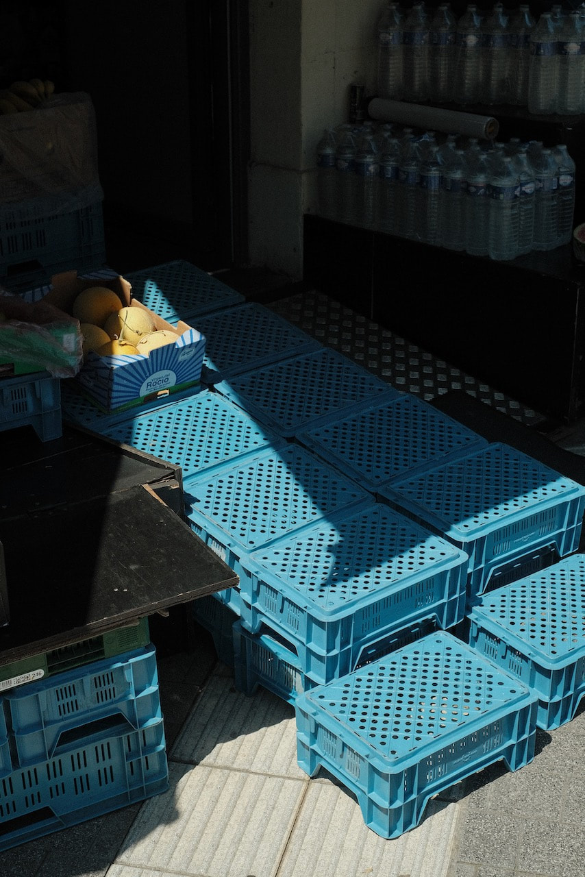
Photographs of Brussels and Antwerp taken with a digital camera using two film recipes (Portra 400 and Ilford XP2 Super 400) with small amount of post production in Lightroom. I took a digital camera for convenience and to save money. However, I decided I would try to use it like an old SLR. This meant deciding whether to shoot colour or black and white and only changing from one to the other after approximately 36 pictures. I also imagined that each photograph would cost me approximately £2. This helped me be a bit more selective. I also tended to shoot only one (or maybe two) pictures of the same subject. In total, I made just over 160 photographs which would have translated to 4.5 rolls of film (3 colour and 1 black and white), approximately a roll per day of my stay. I had no preconceived plan for what to photograph. I simply responded to my surroundings and tried to make well-composed pictures of whatever grabbed my attention.
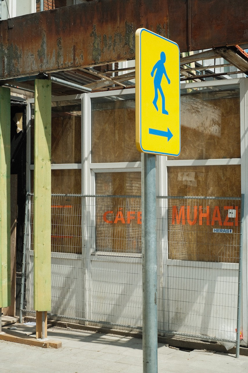
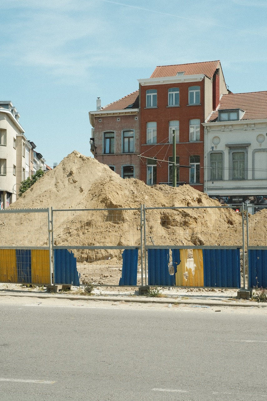
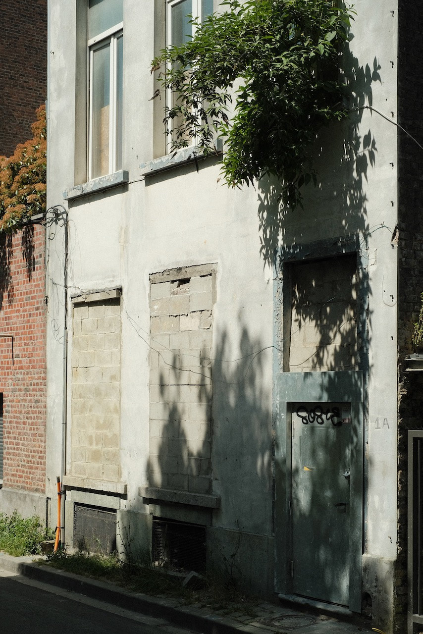
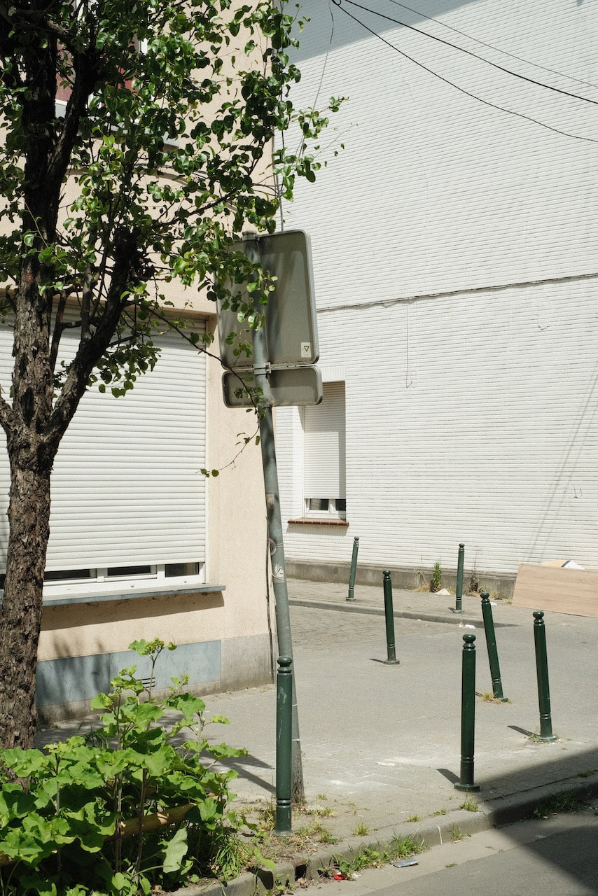
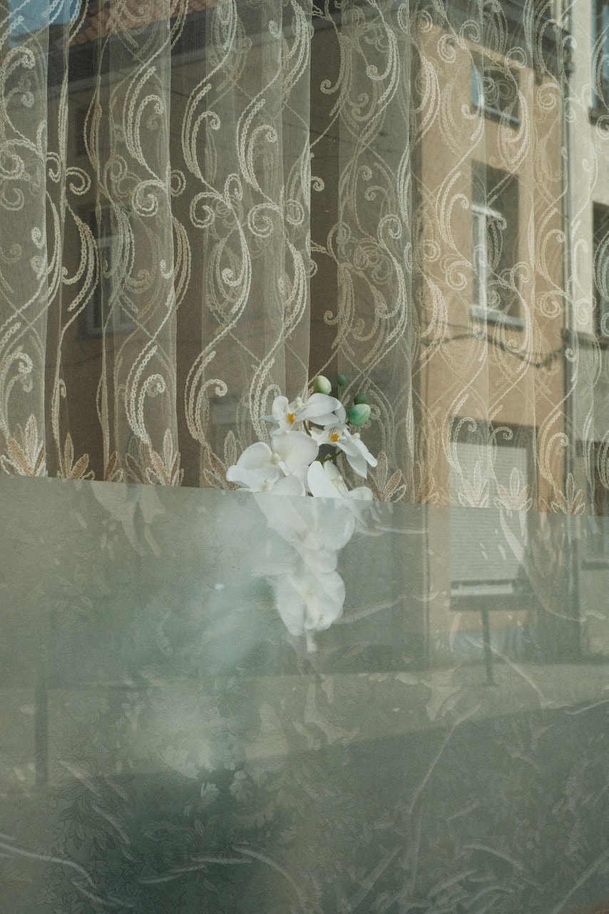
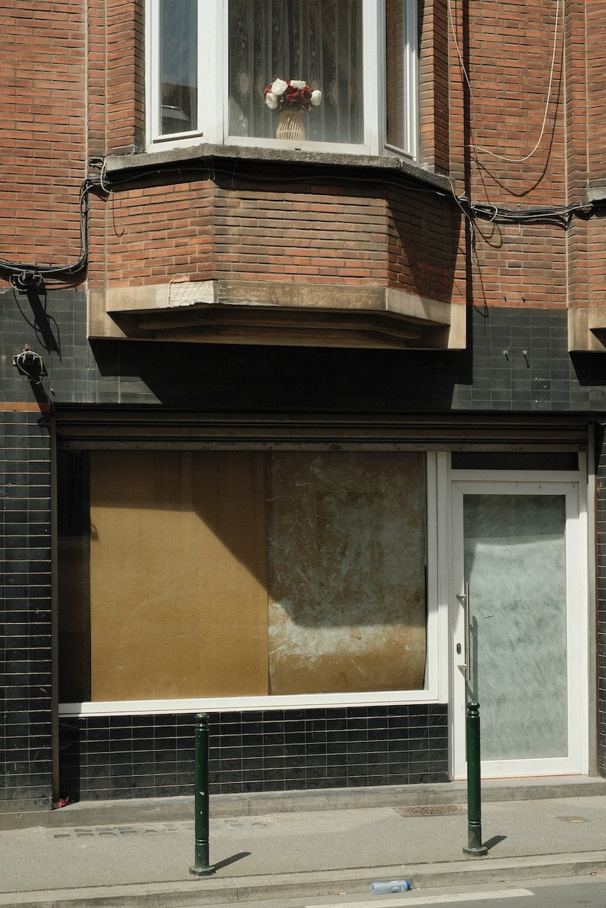
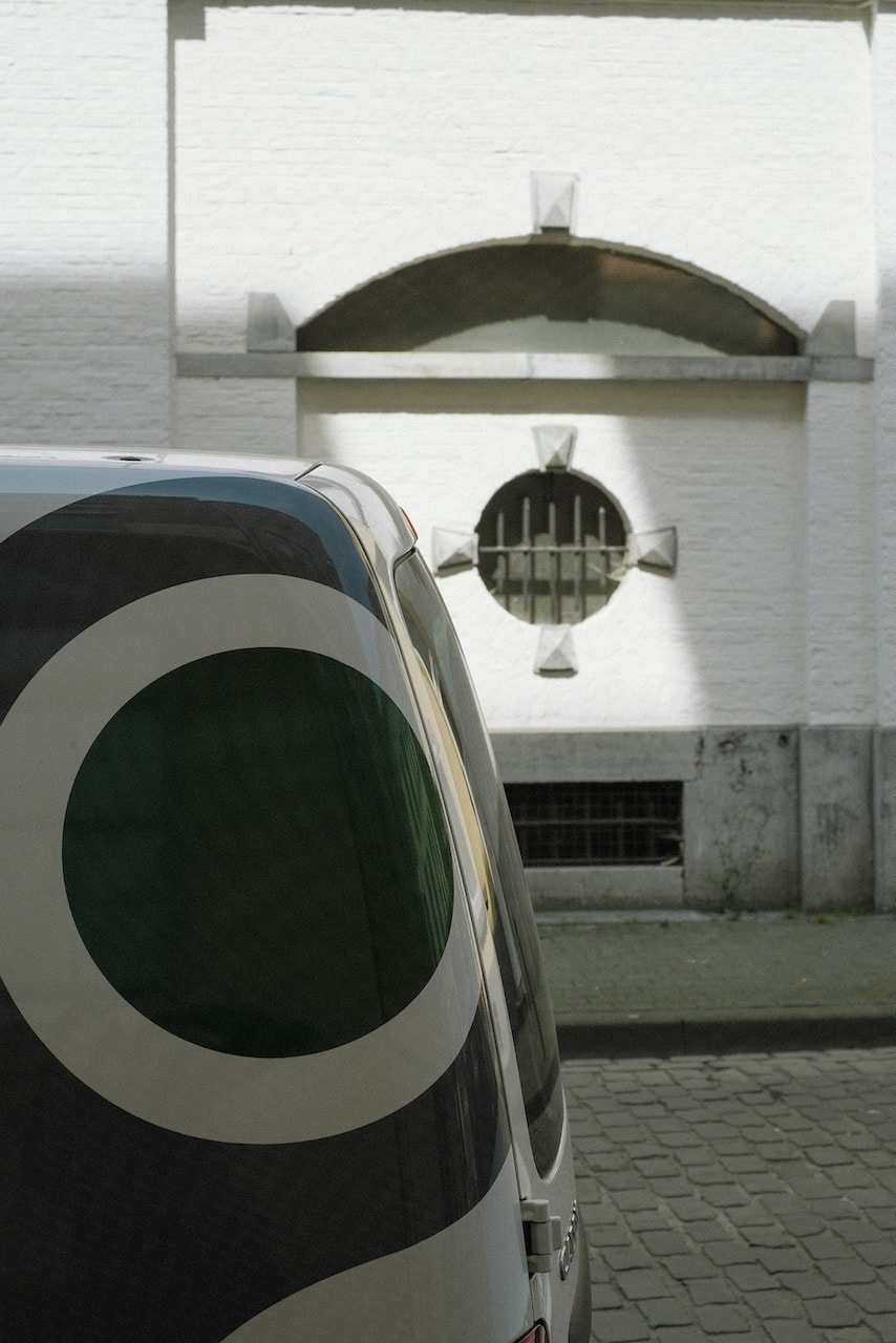
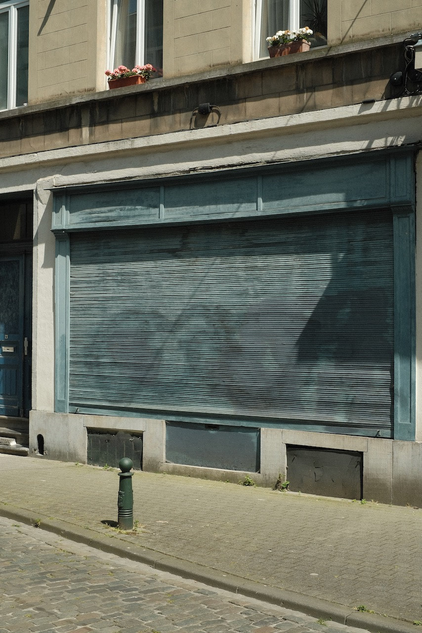
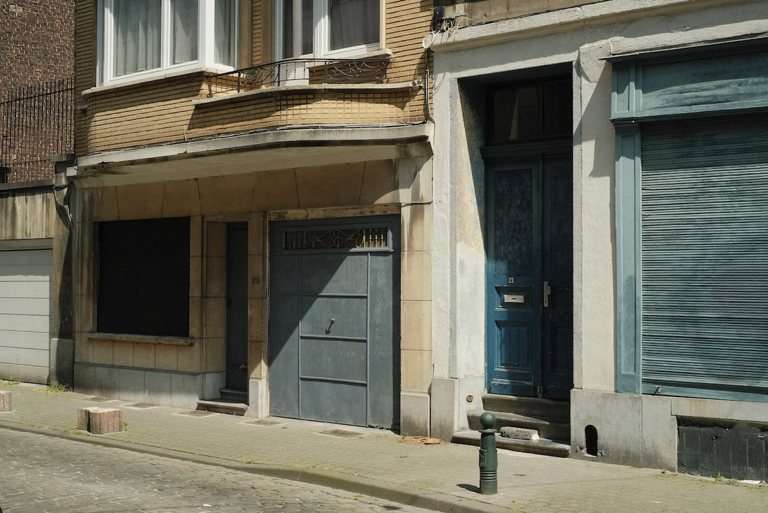
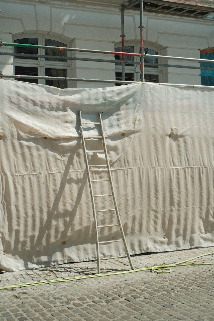
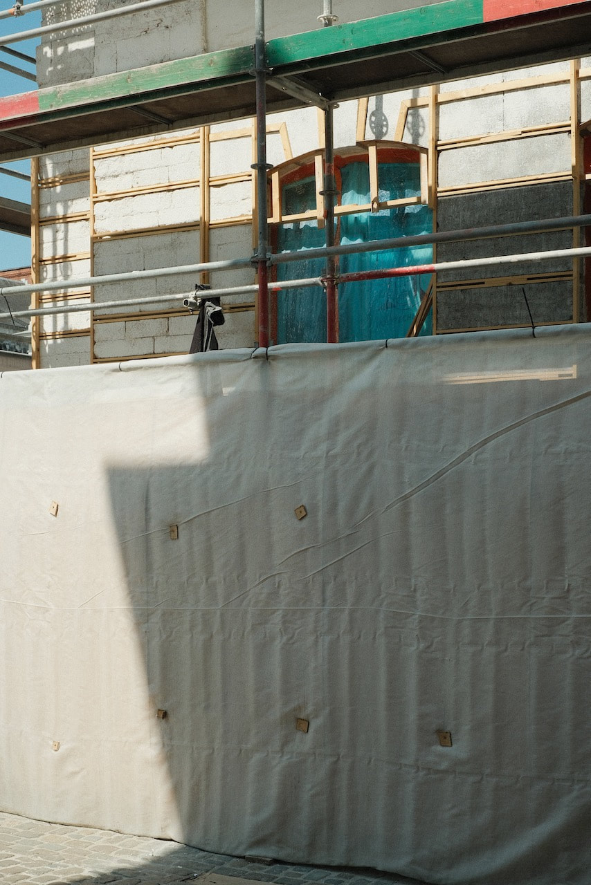
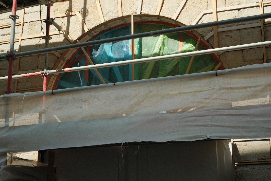
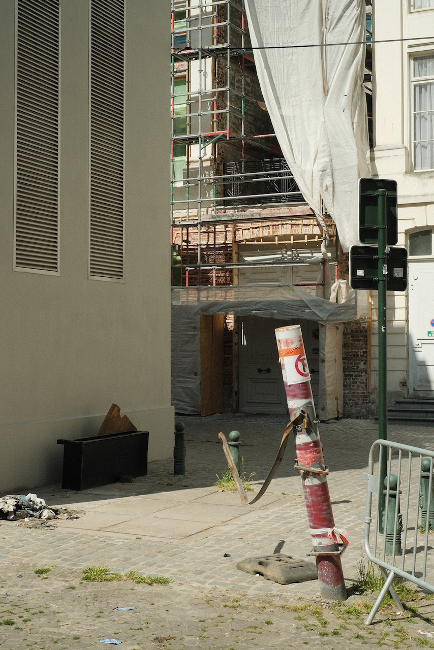
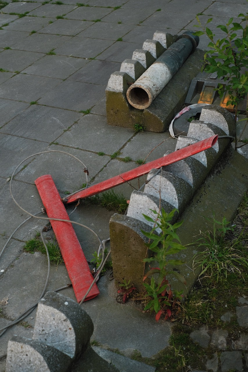
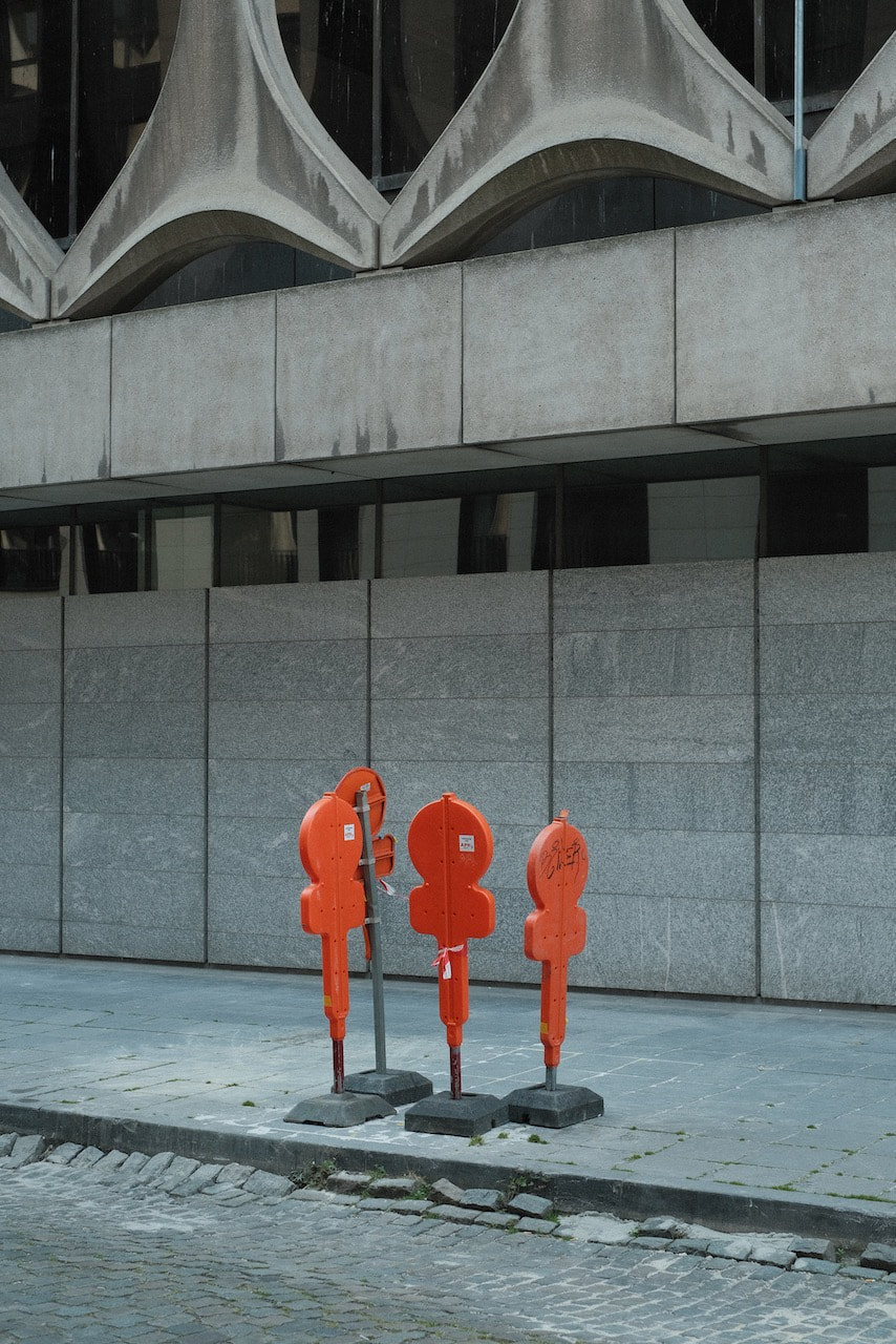
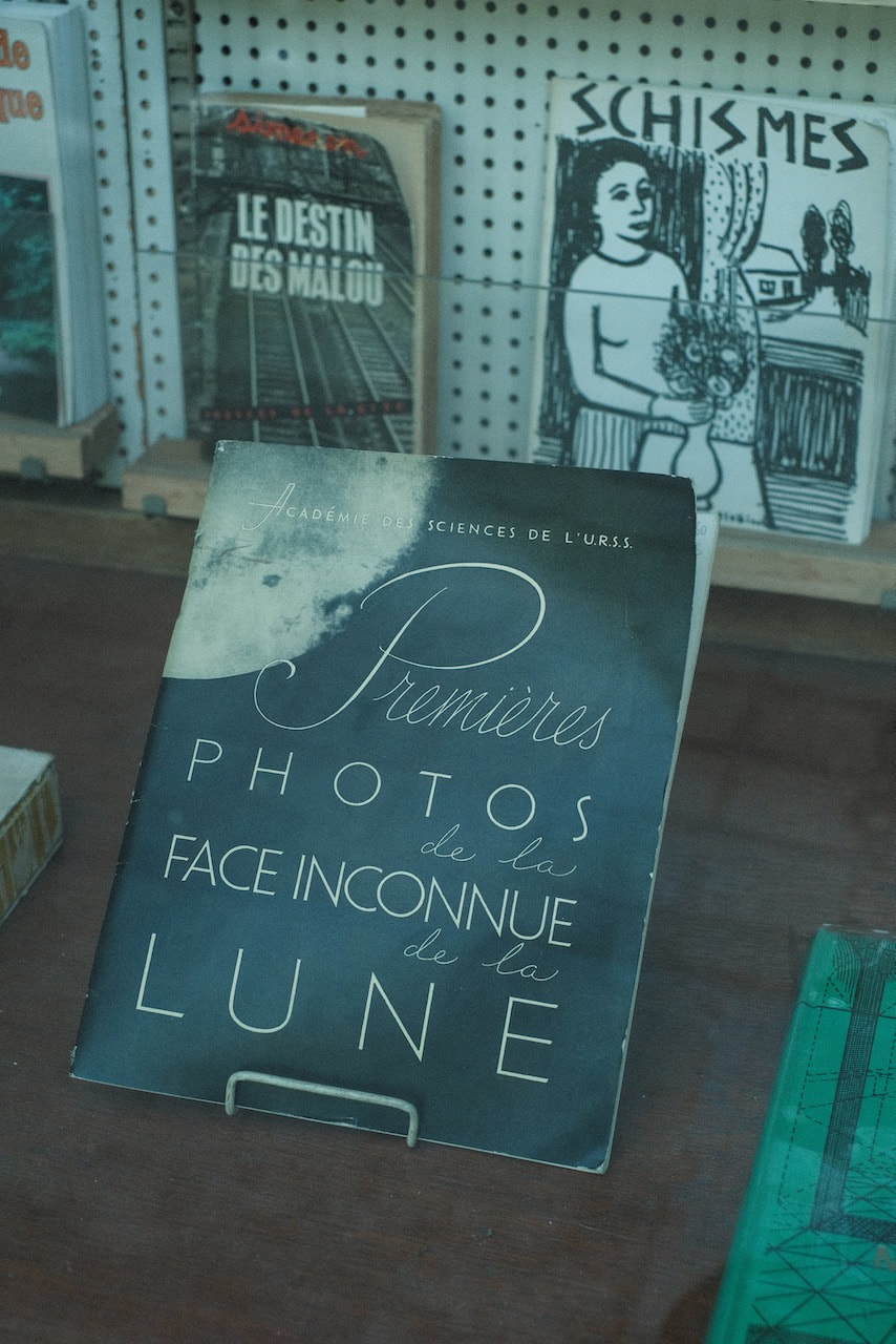
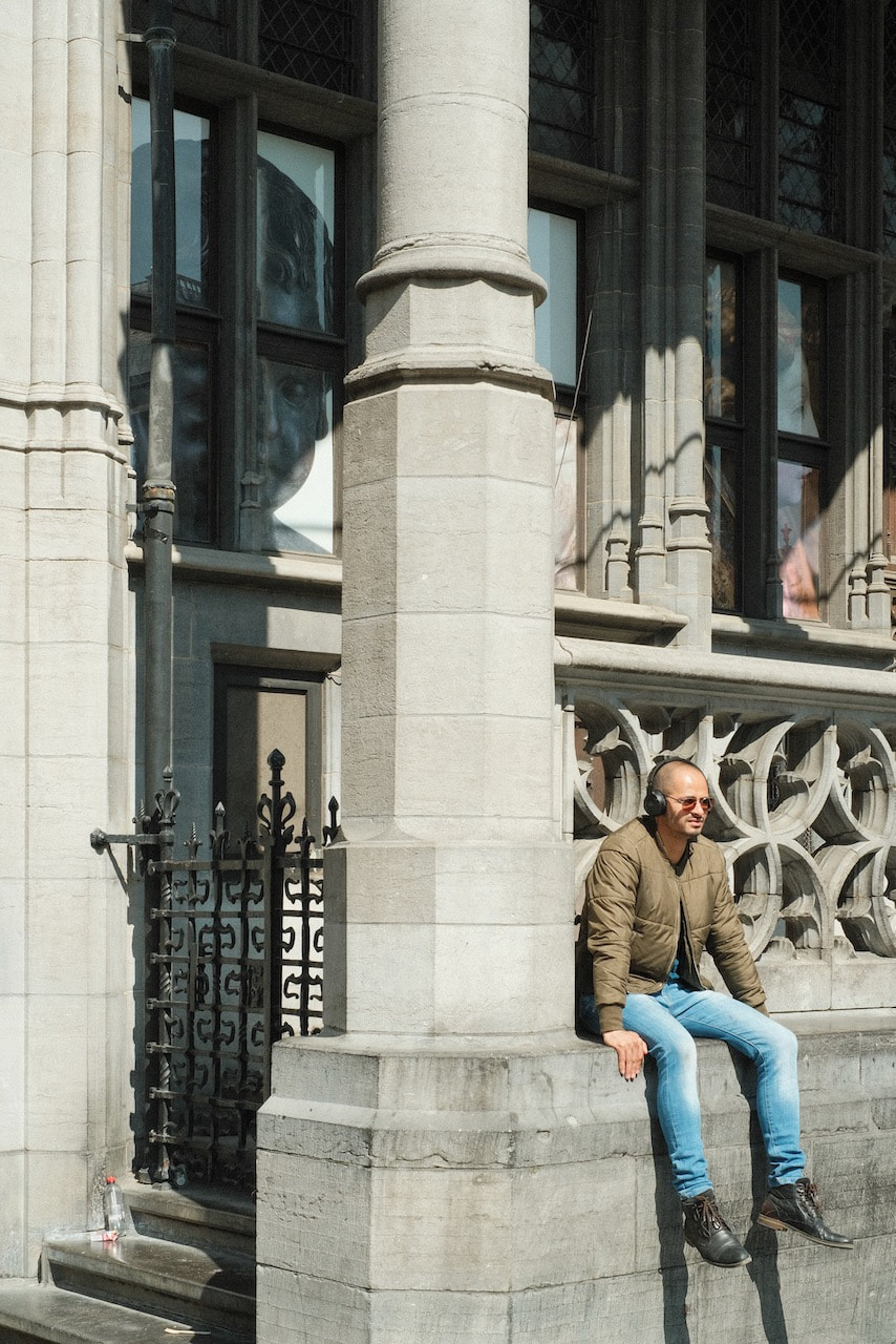
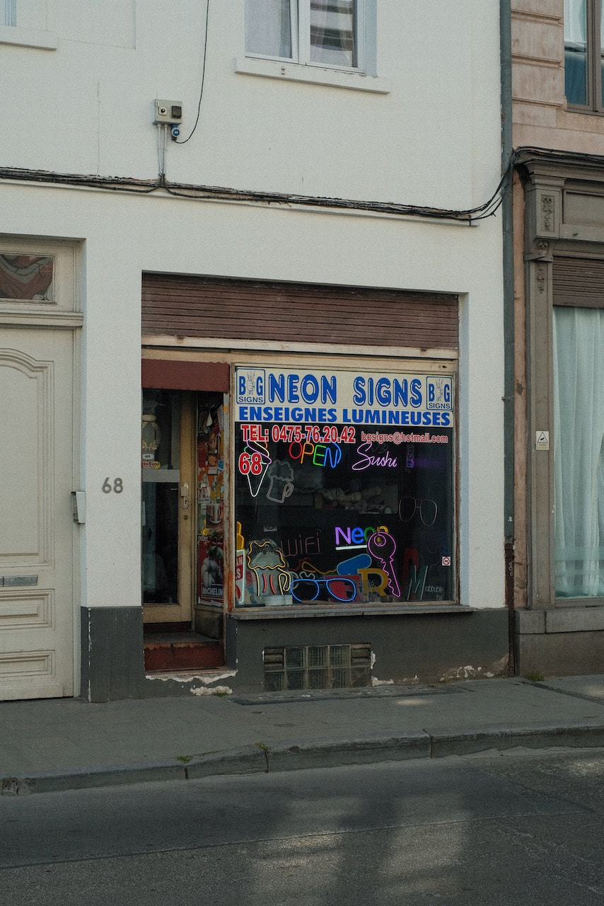
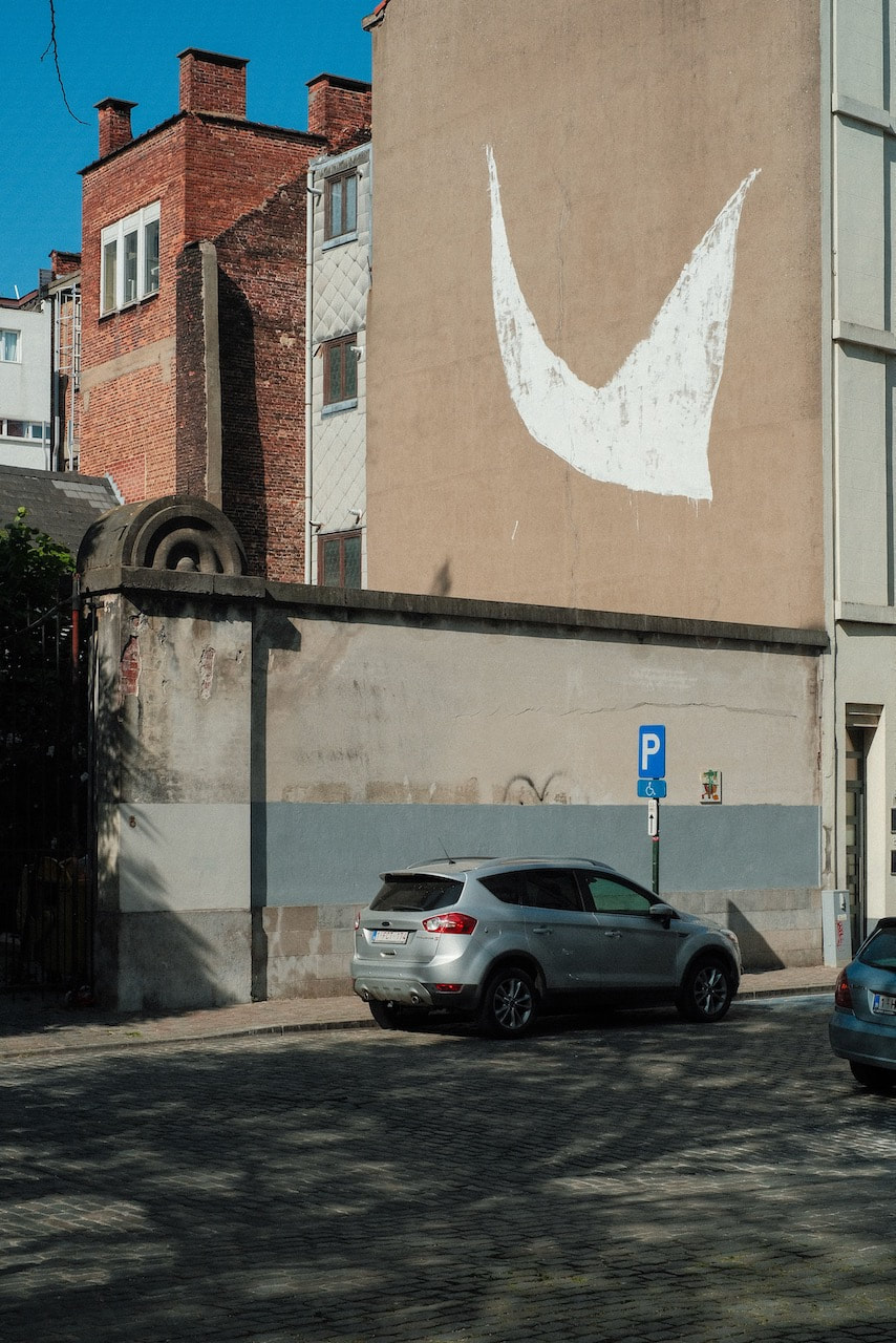
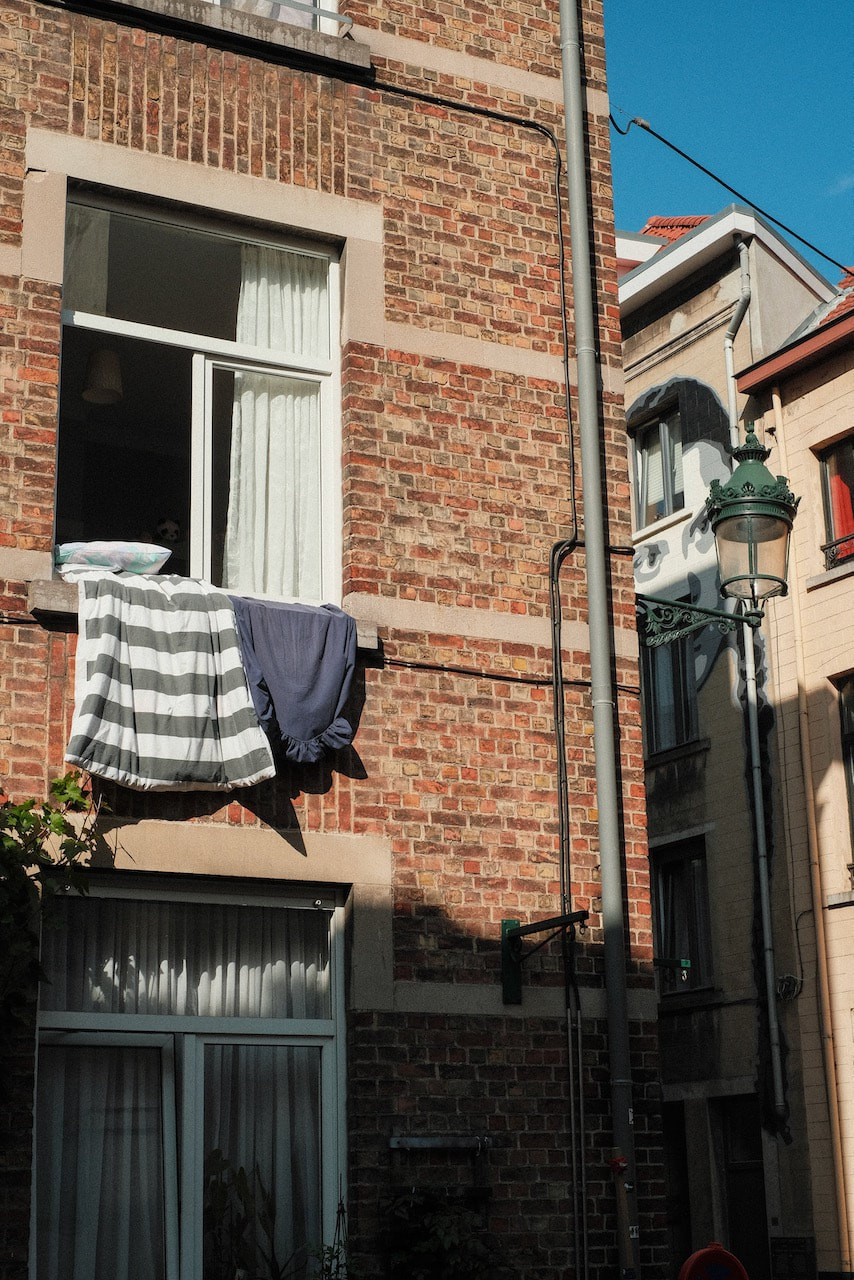
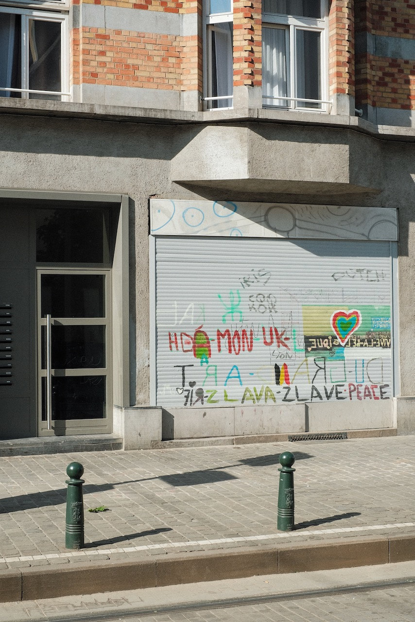
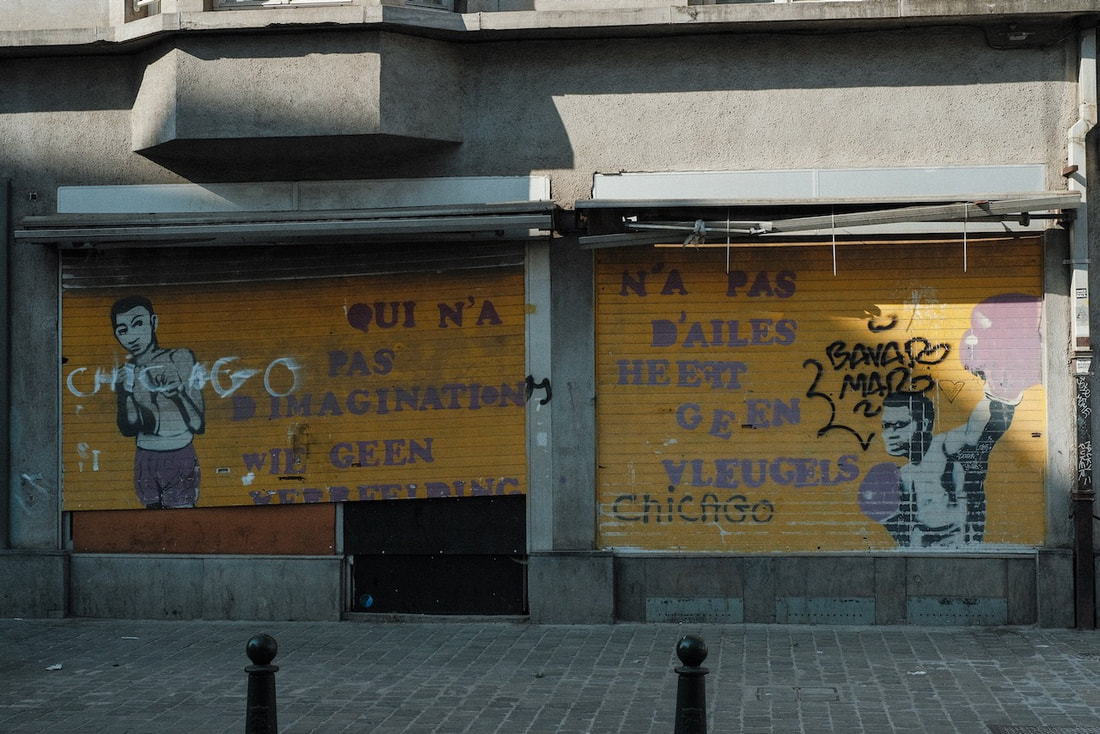
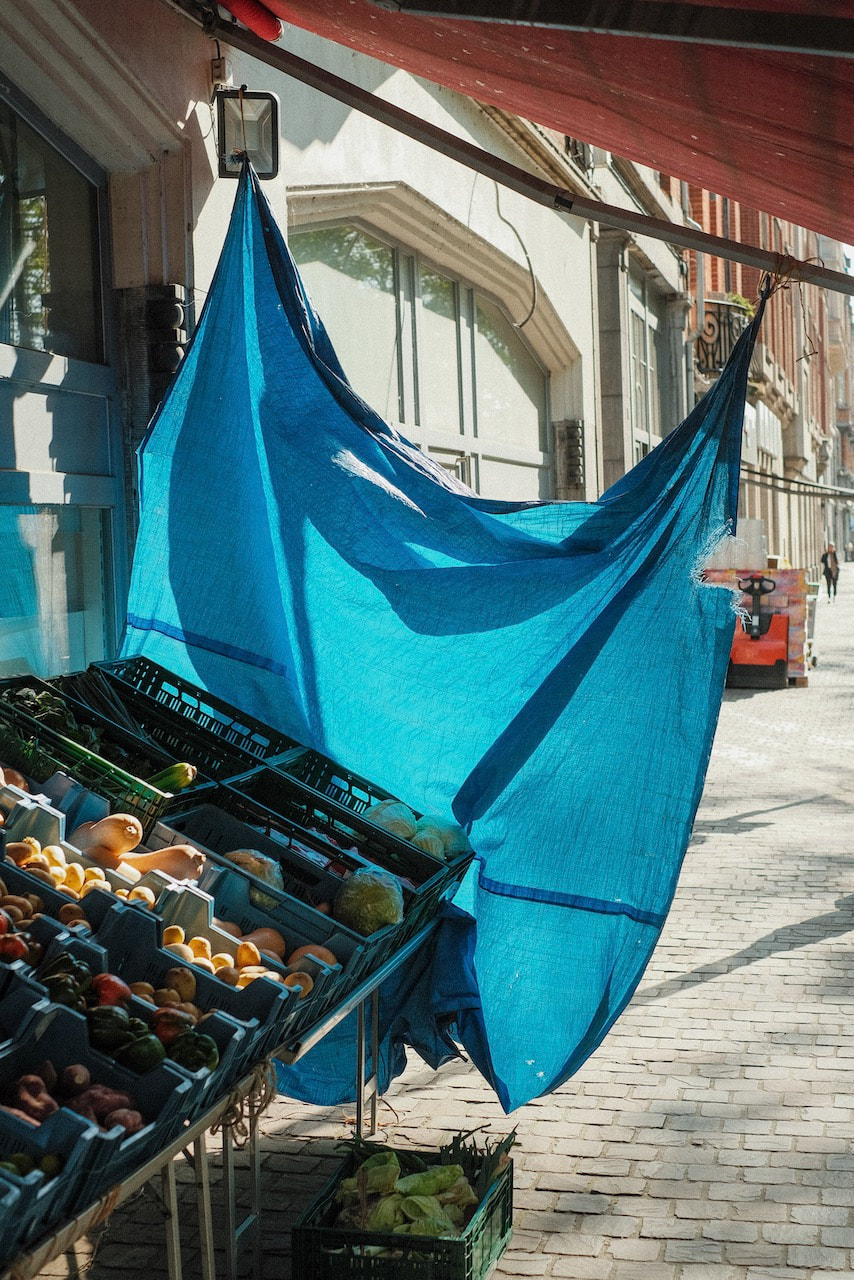
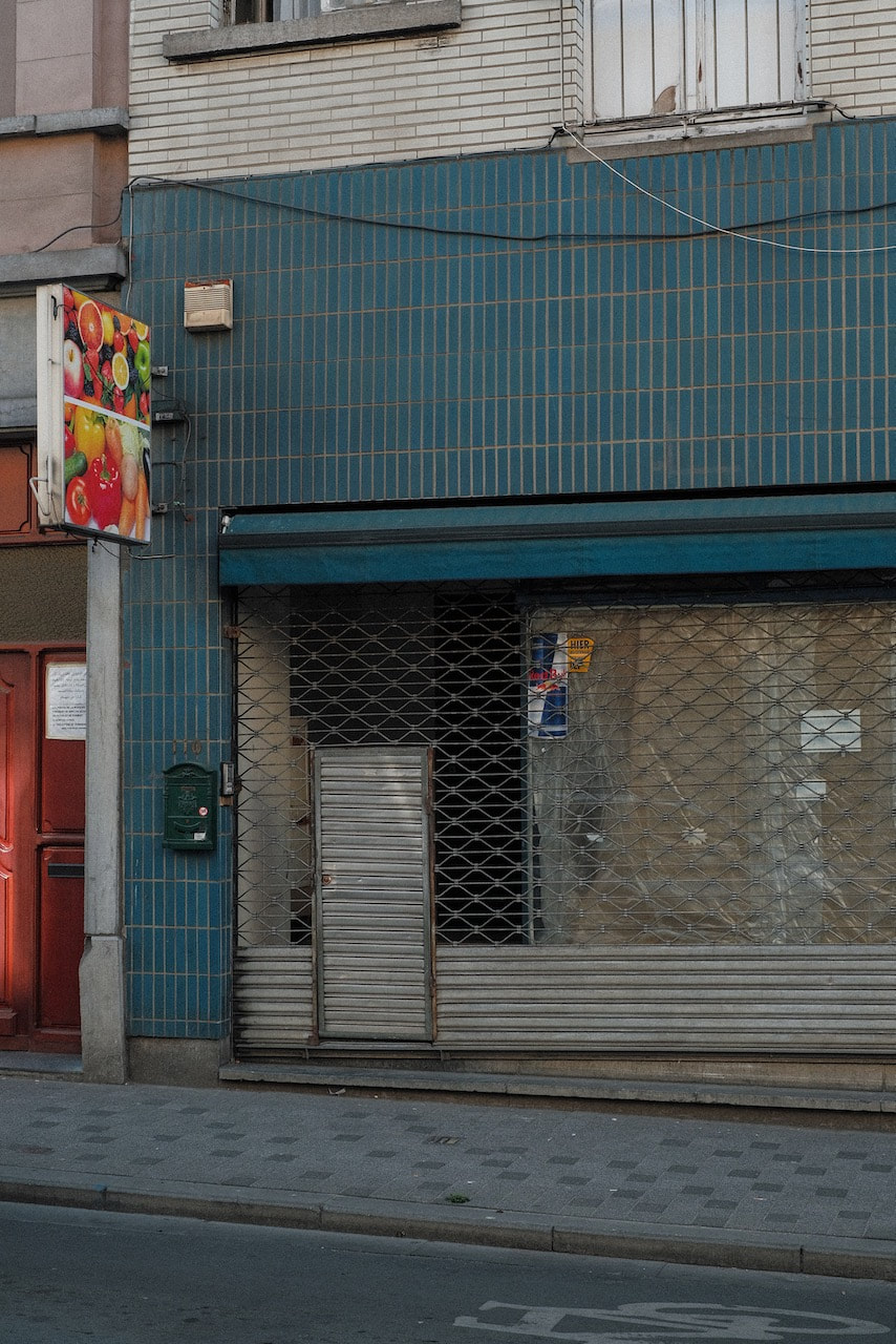
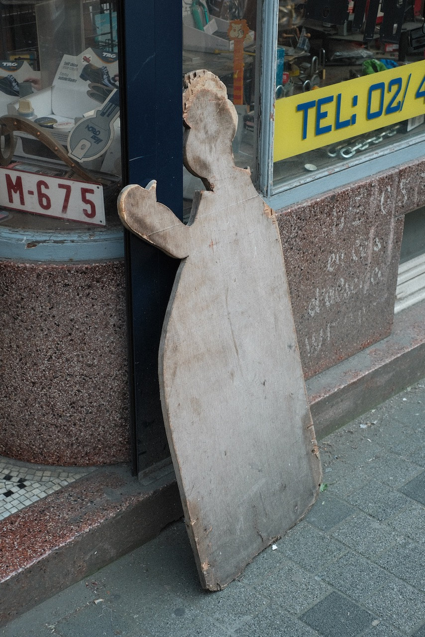
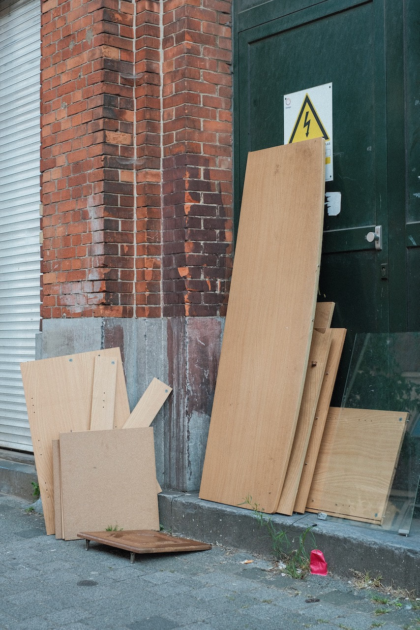
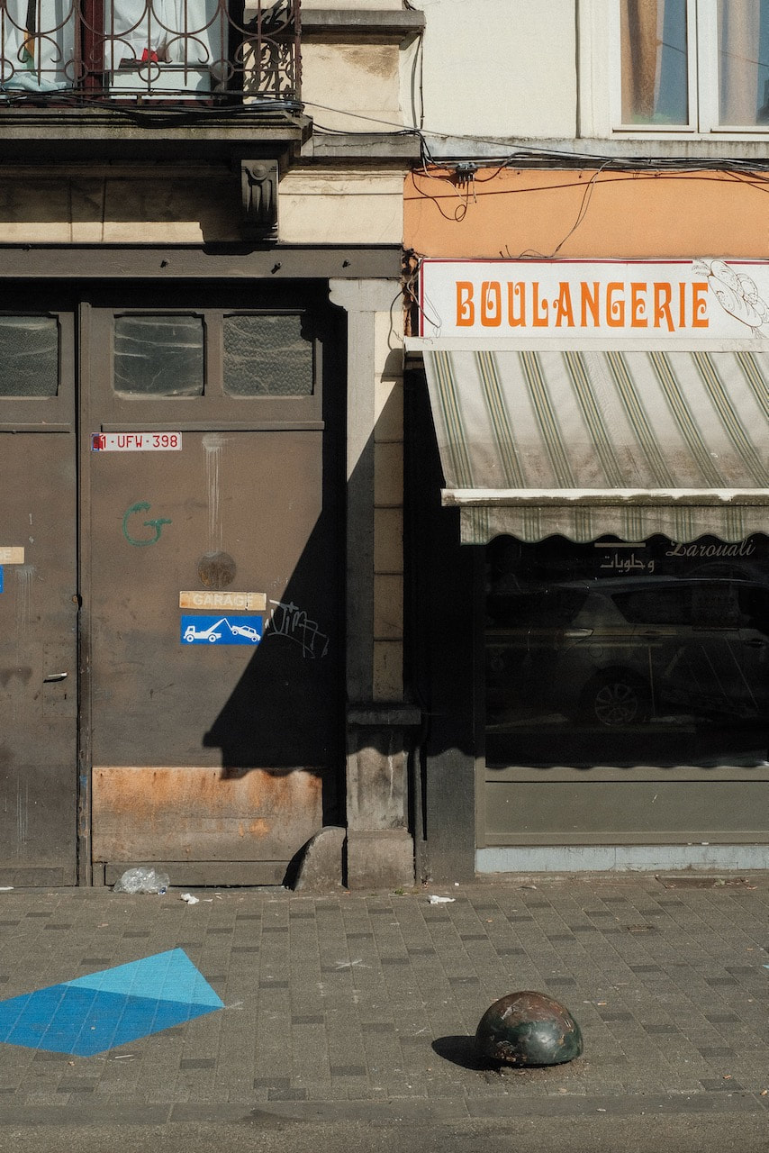
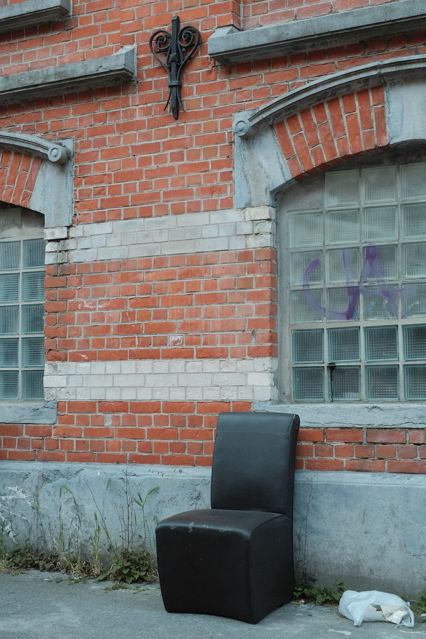
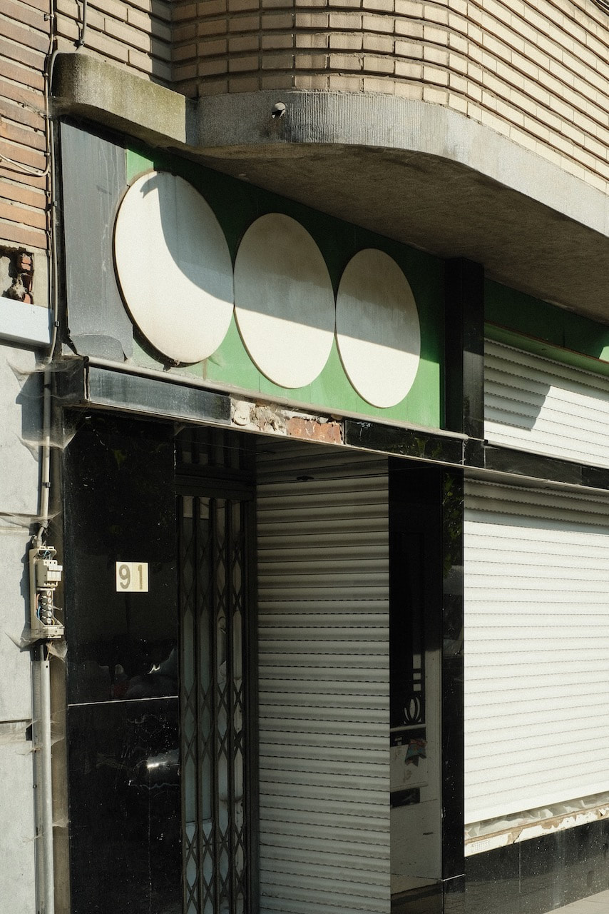
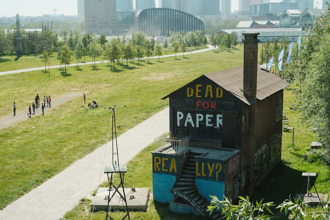
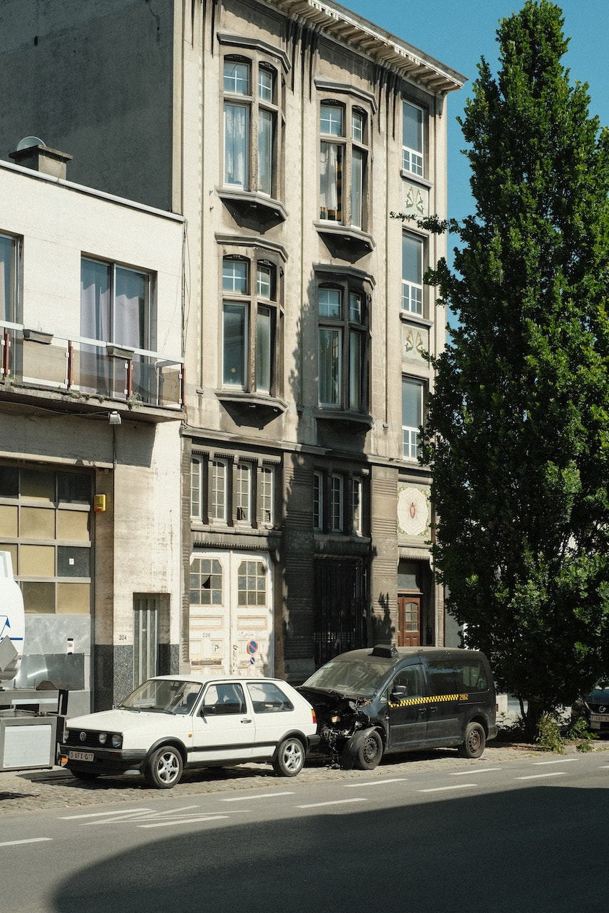
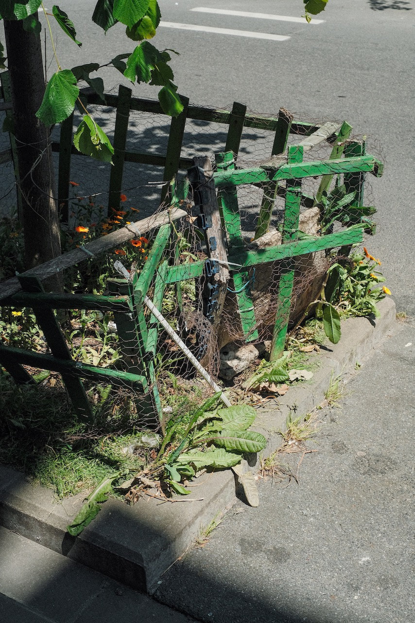
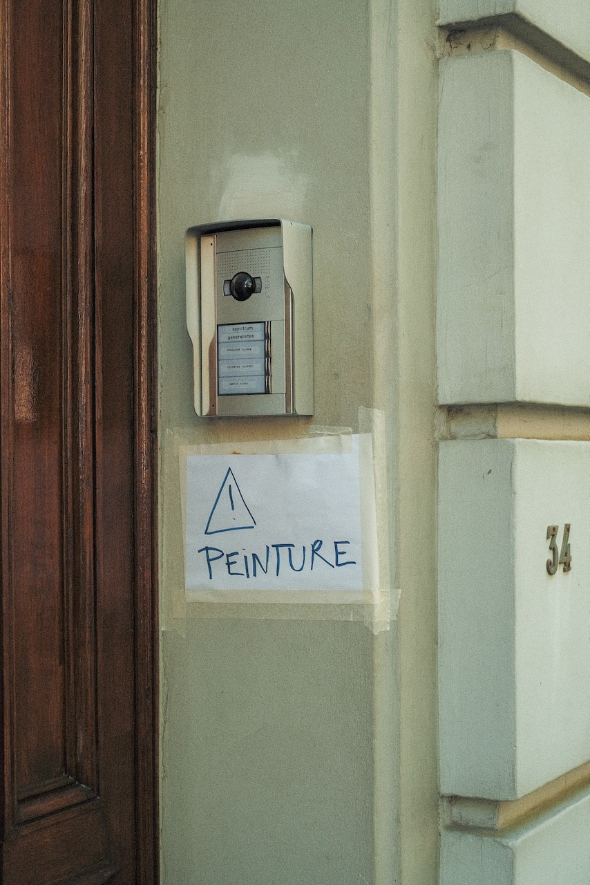
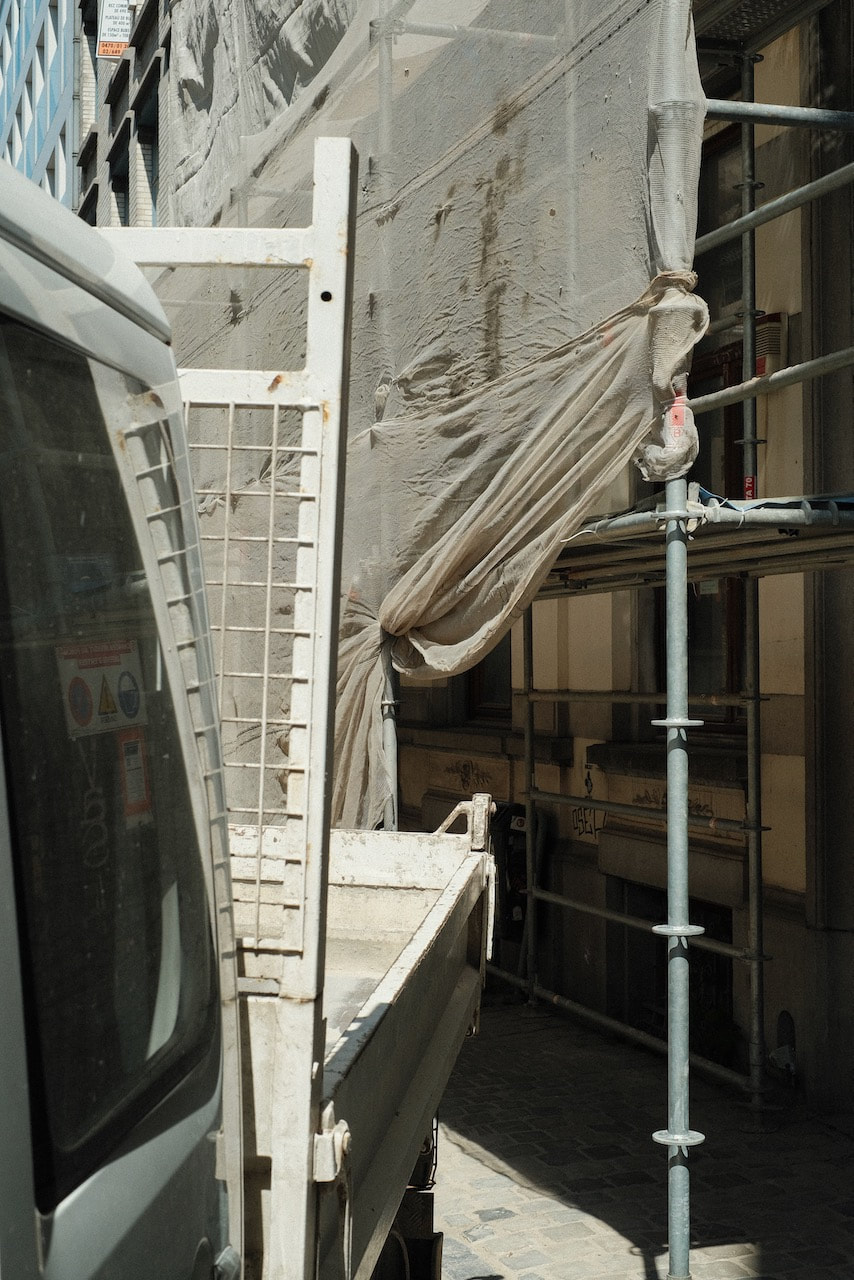
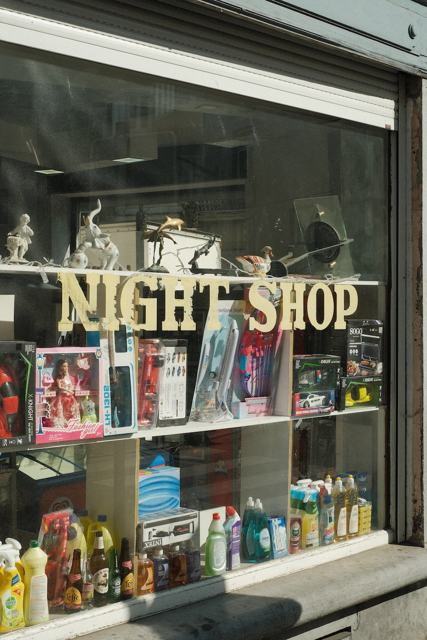
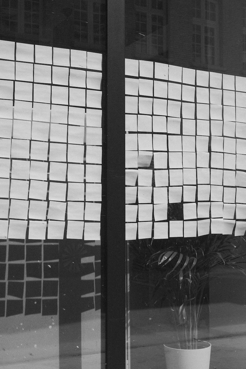
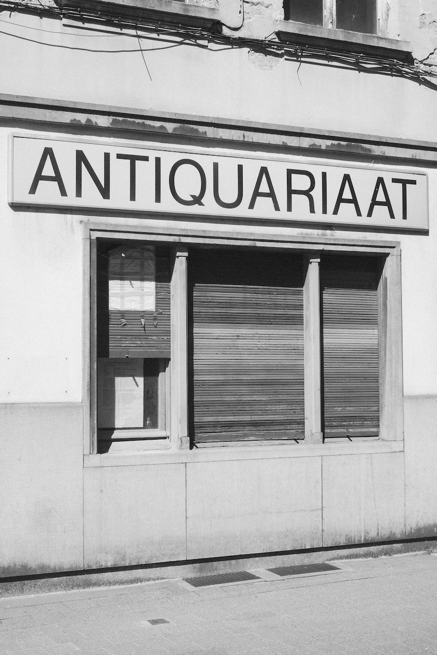
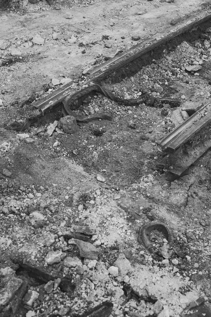
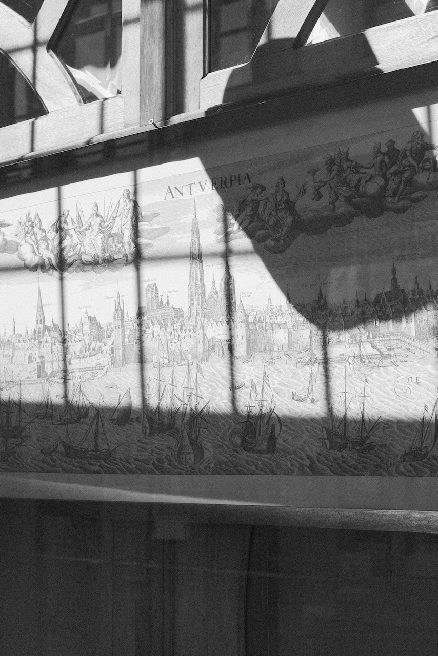
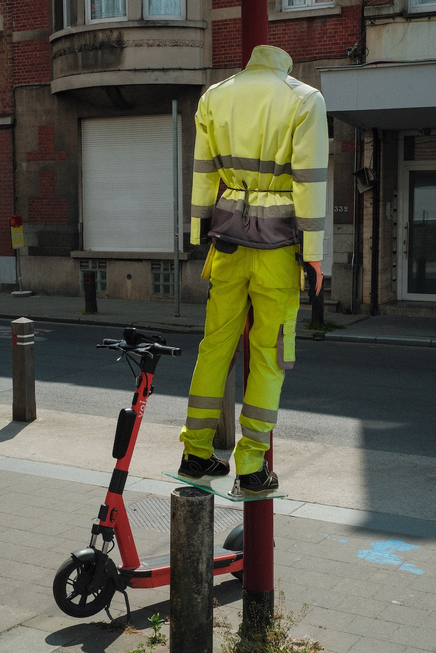
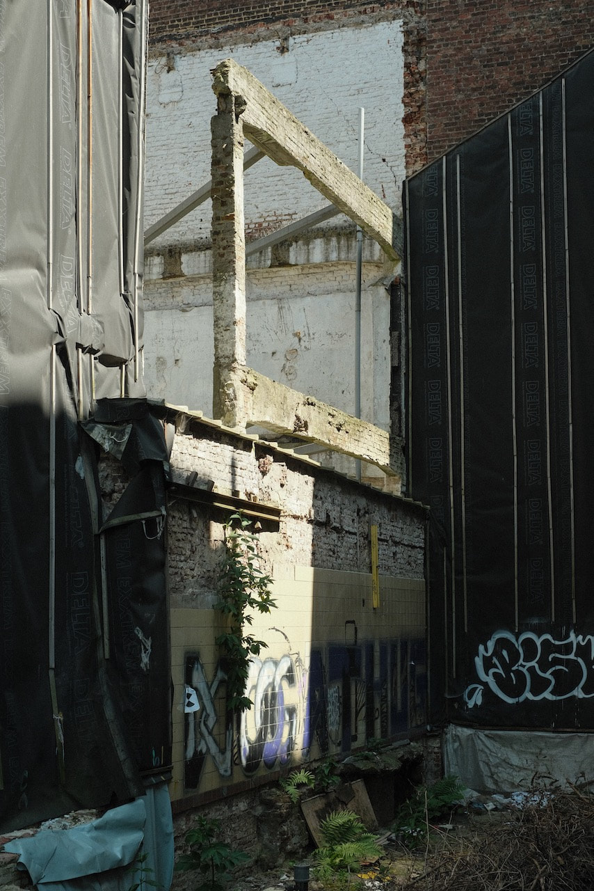

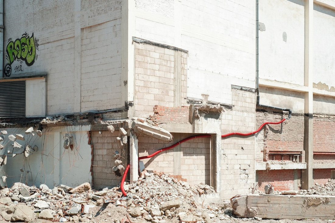
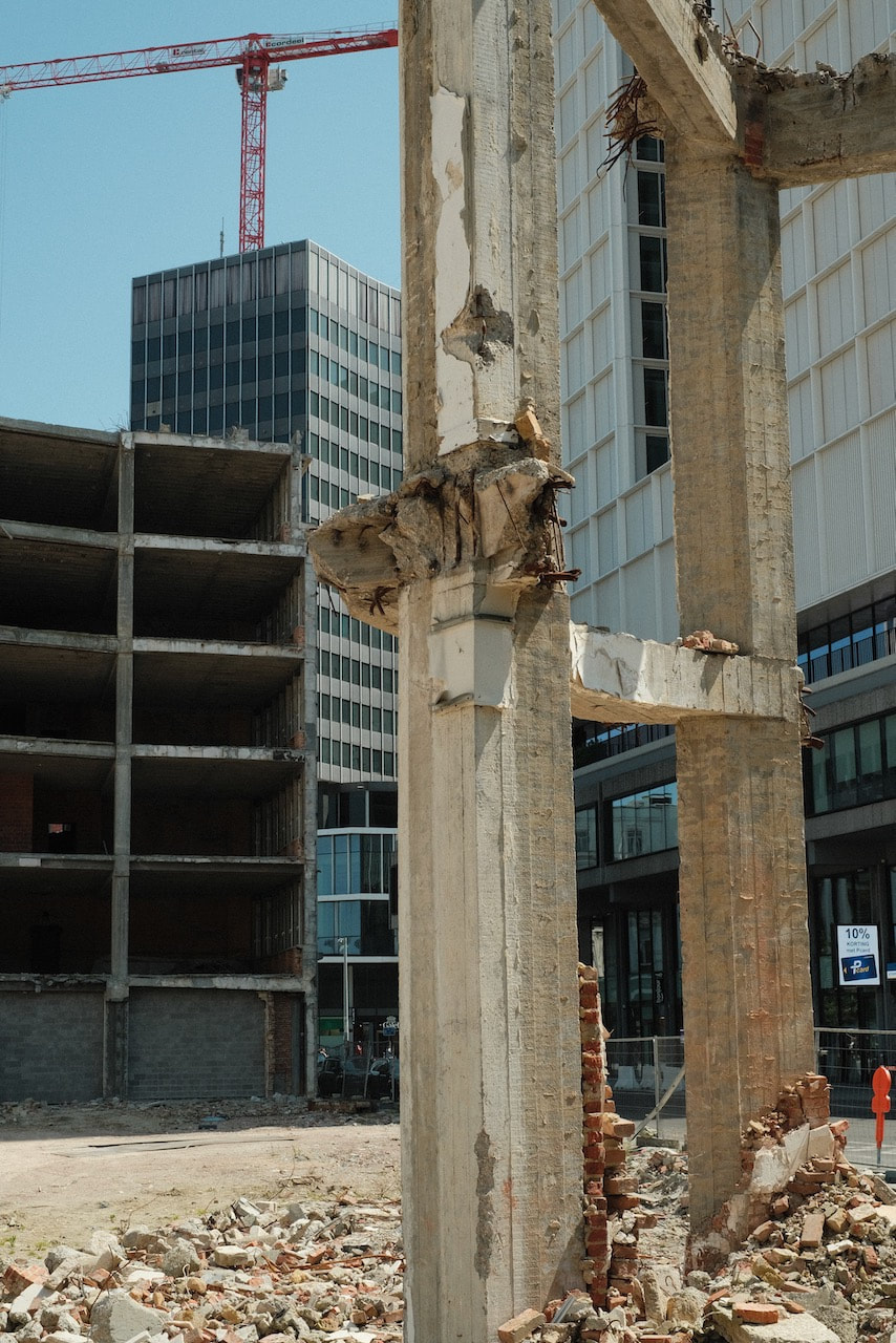
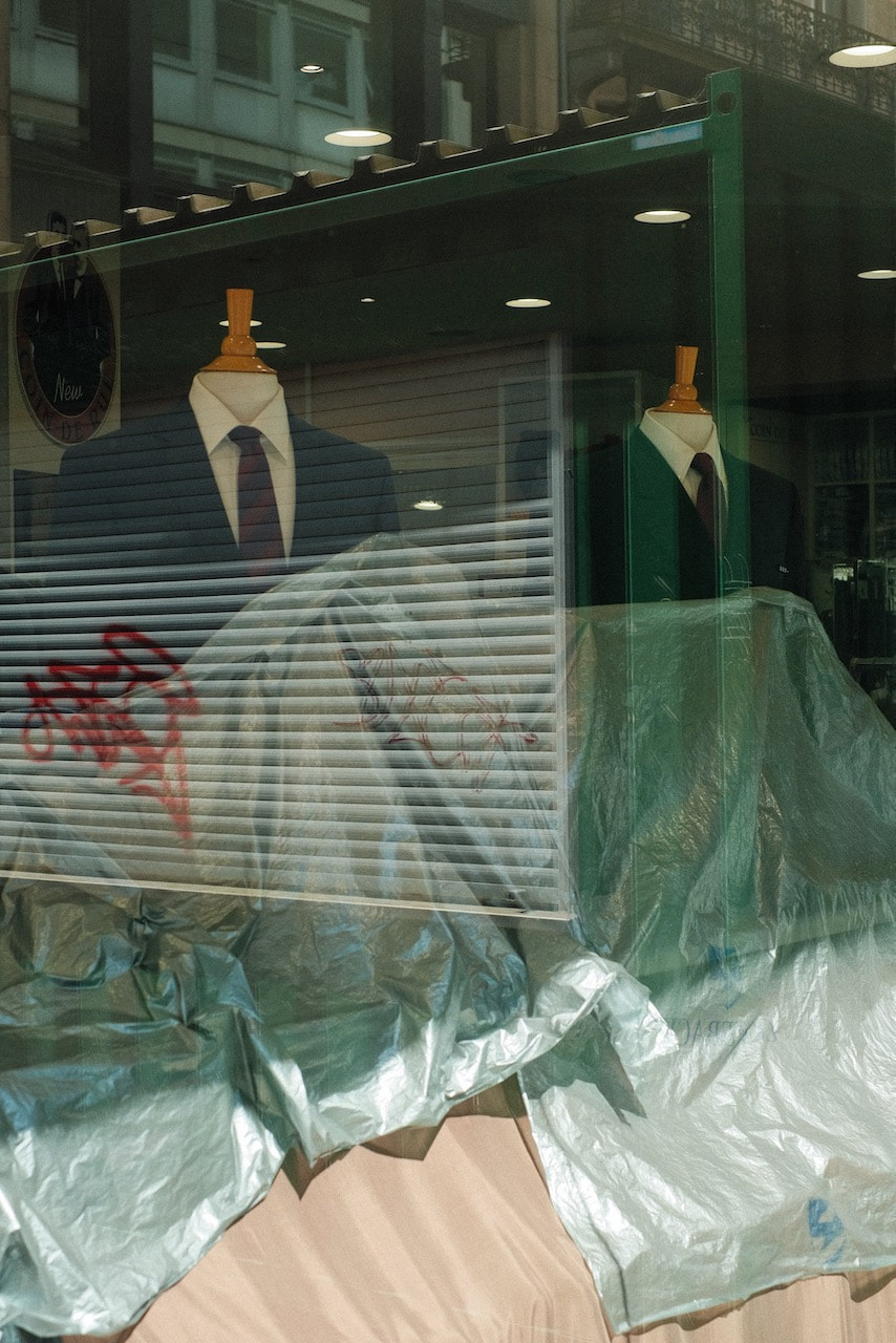
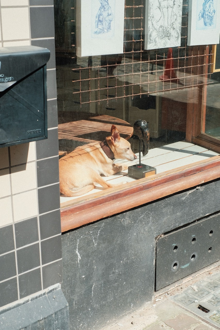
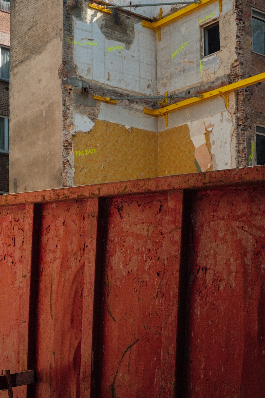
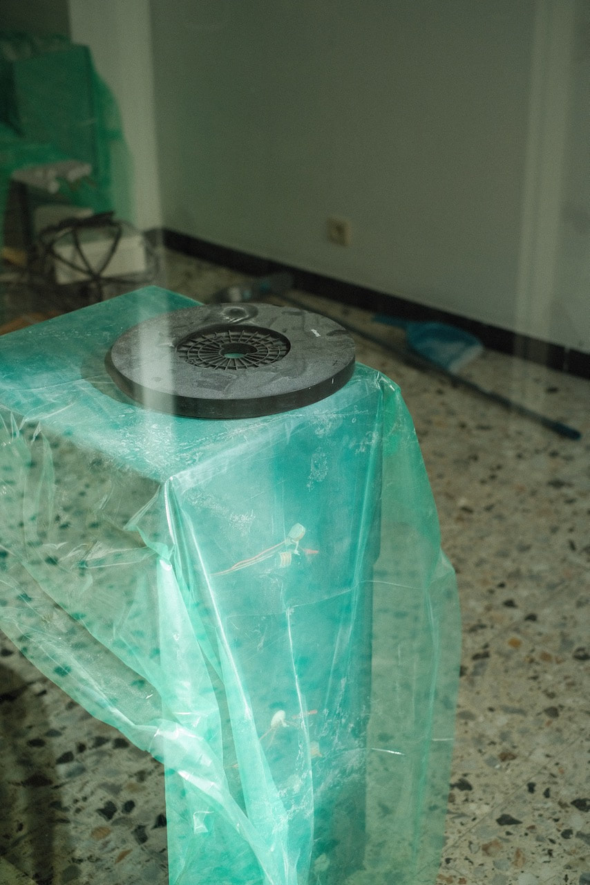
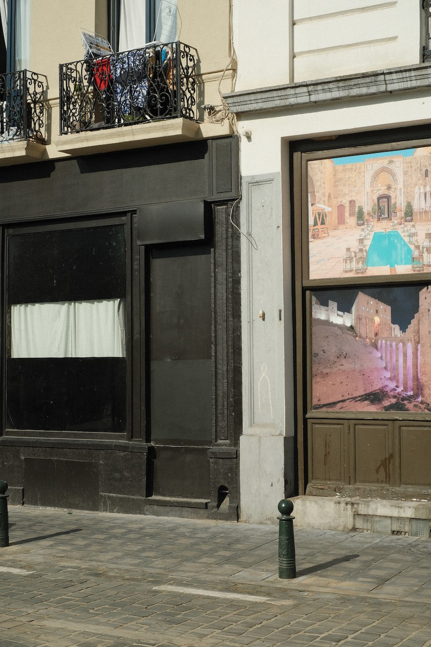
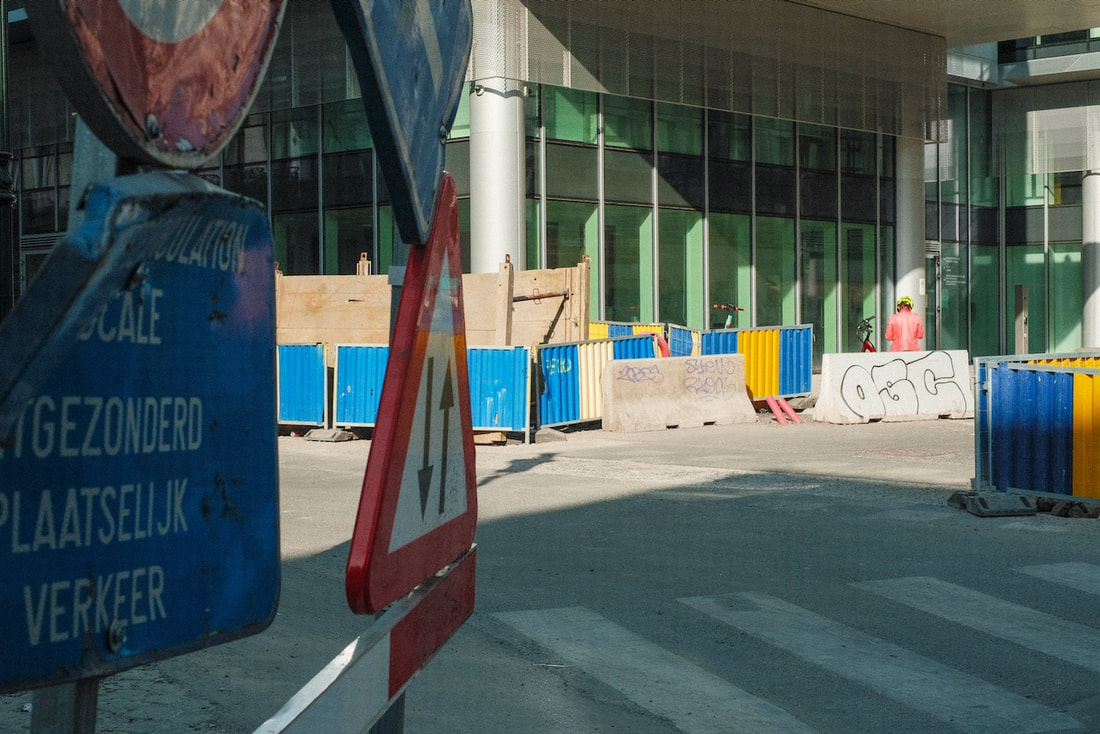
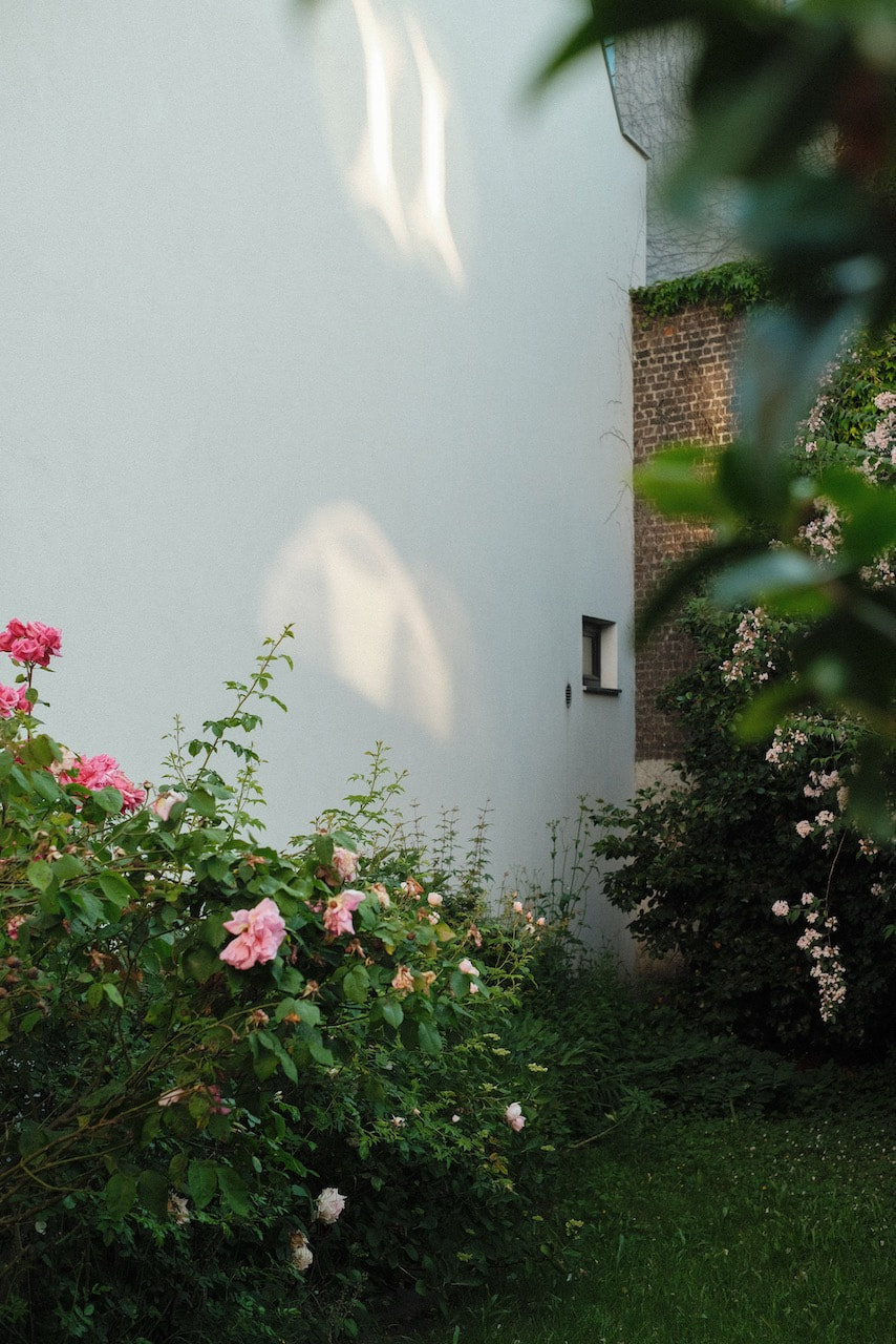
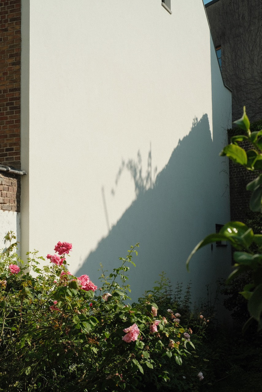
I am generally pleased with these images. I found Brussels to be quite a difficult city to navigate. There was a lot of construction and sharp distinctions between affluent and poorer neighbourhoods. Places that looked closed were open and it was customary to pay to use a public toilet. On the way to a train station I was interviewed for an Internet youth channel about a murdered prostitute and a new street that had been named after her. The René Magritte collection had been moved to the cold basement of a nearby museum whilst its home was being renovated. At the painter's home (now also a museum) I was twice scolded for stepping too close to a painting and not wearing plastic coverings to prevent my shoes scratching the highly polished floors. Brussels is the bureaucratic and political heart of Europe. It's also the home of an ex-colonial empire responsible for some of the worst atrocities committed by a European power on African soil. It has a large immigrant population and the city is a vibrant mix of cultures and ethnicities, visual evidence of which can be seen in the clothes, food and architecture of each neighbourhood.
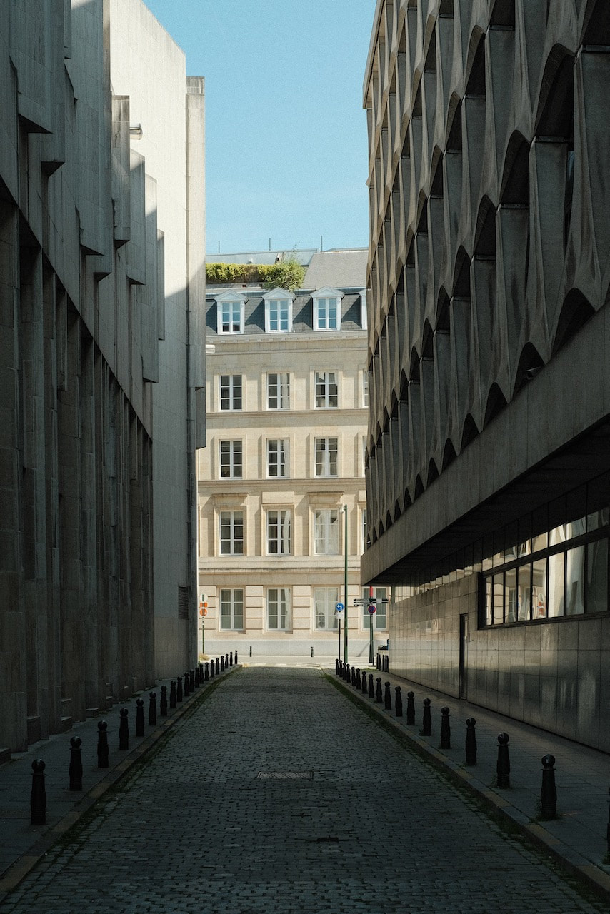
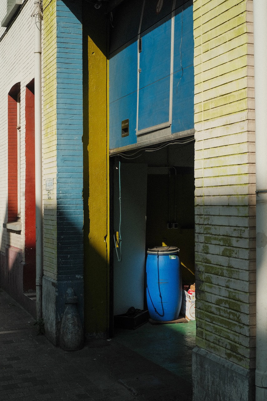
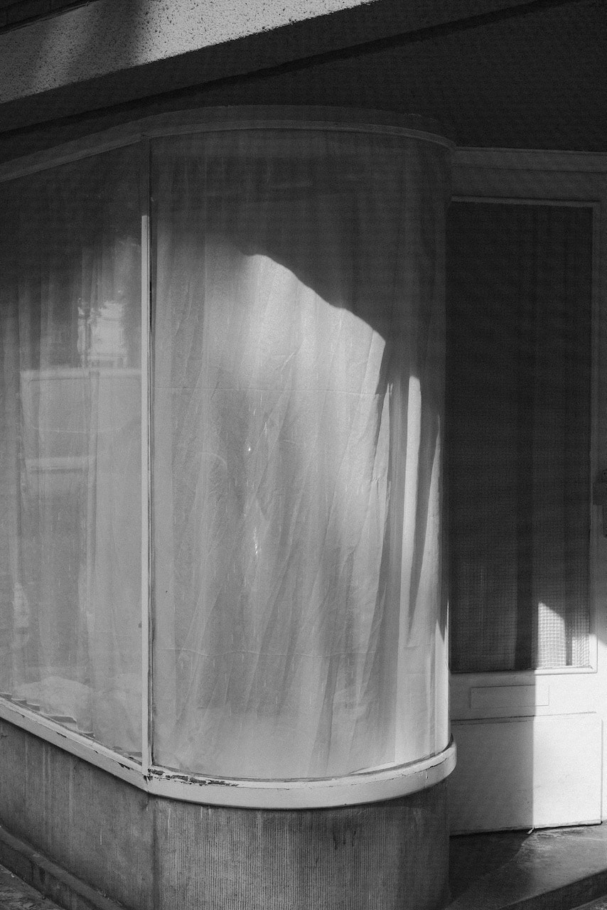
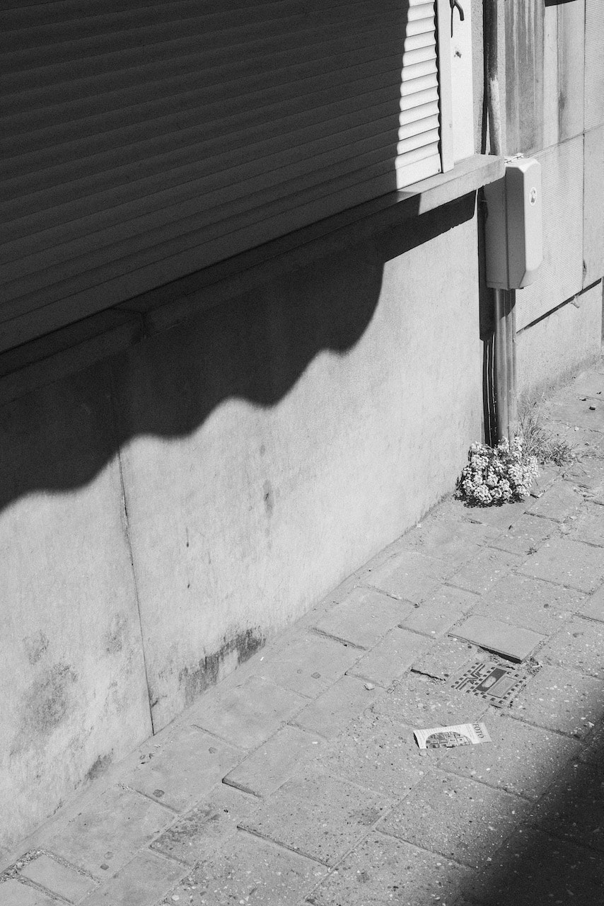
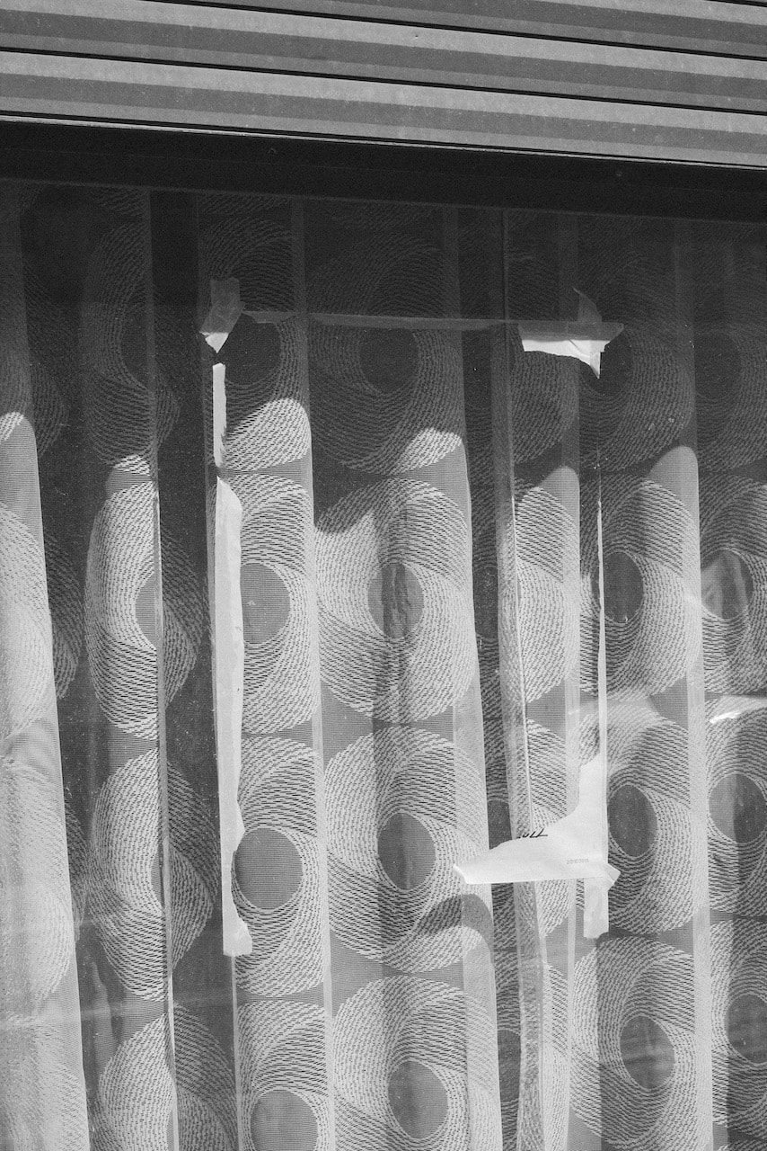
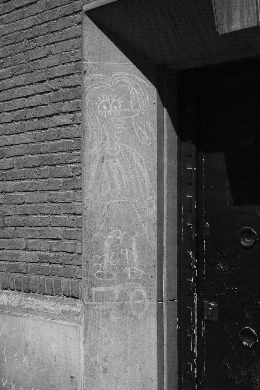
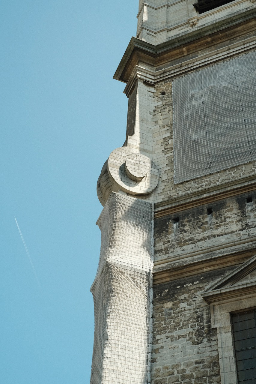
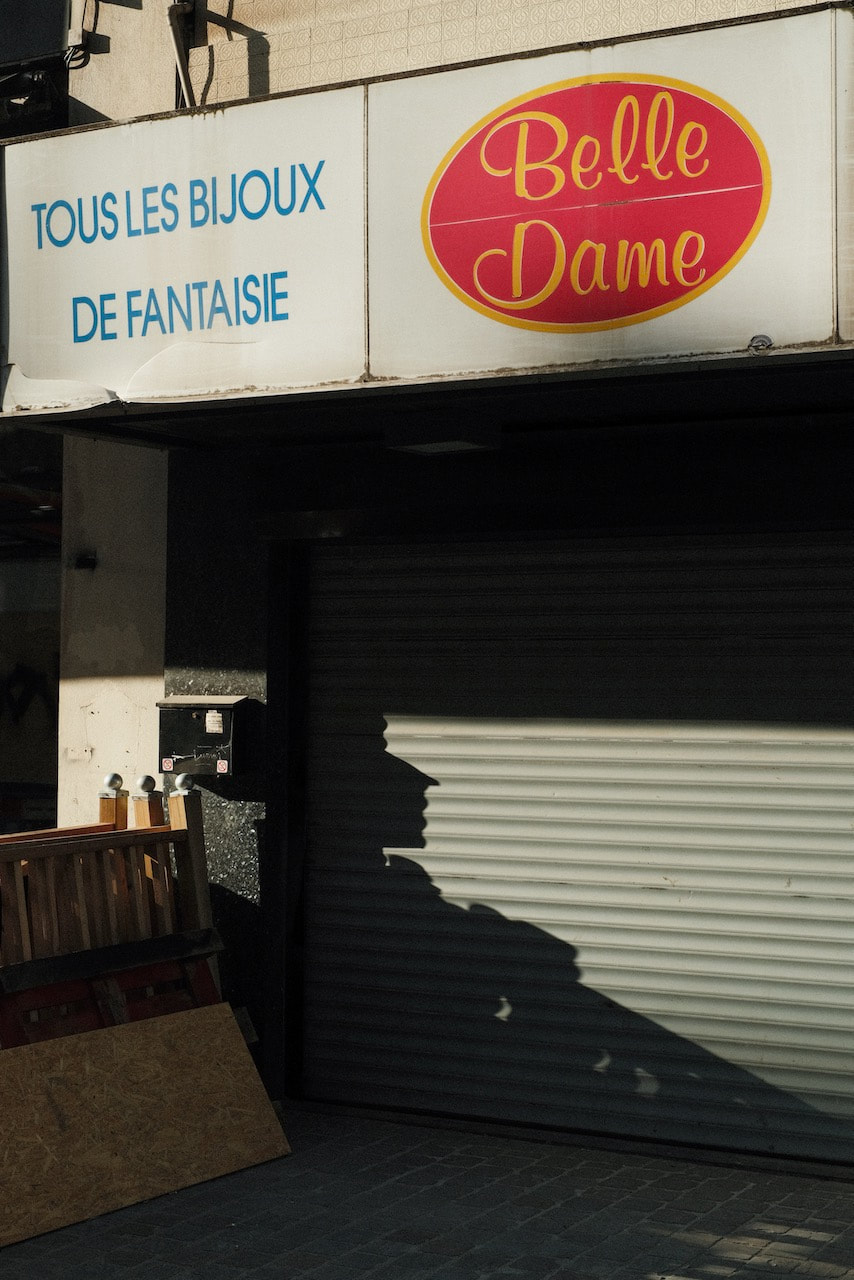
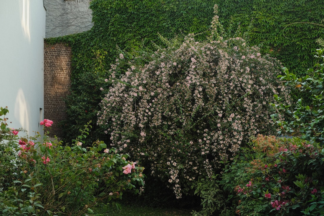
A slight sense of alienation is part of the experience of travelling to a new place so taking pictures was, for me, a way to forge a connection with my surroundings. I spent most of my time wandering the streets (as I do in London) photographing whatever called out to me. The light was strong and bright and this made the textures of various surfaces seem extra defined. The colour palette seemed different to London - more earthy colours and tones. There were lots of impressive Art Nouveau and Art Deco buildings but I was more drawn to the less flamboyant but equally beautiful buildings in ordinary, working-class neighbourhoods and the centre of the city. I spent a day in Antwerp shooting only black and white pictures. The atmosphere was quite different to Brussels - more relaxed and, seemingly, less ethnically diverse.
A slight sense of alienation is part of the experience of travelling to a new place so taking pictures was, for me, a way to forge a connection with my surroundings. I spent most of my time wandering the streets (as I do in London) photographing whatever called out to me. The light was strong and bright and this made the textures of various surfaces seem extra defined. The colour palette seemed different to London - more earthy colours and tones. There were lots of impressive Art Nouveau and Art Deco buildings but I was more drawn to the less flamboyant but equally beautiful buildings in ordinary, working-class neighbourhoods and the centre of the city. I spent a day in Antwerp shooting only black and white pictures. The atmosphere was quite different to Brussels - more relaxed and, seemingly, less ethnically diverse.
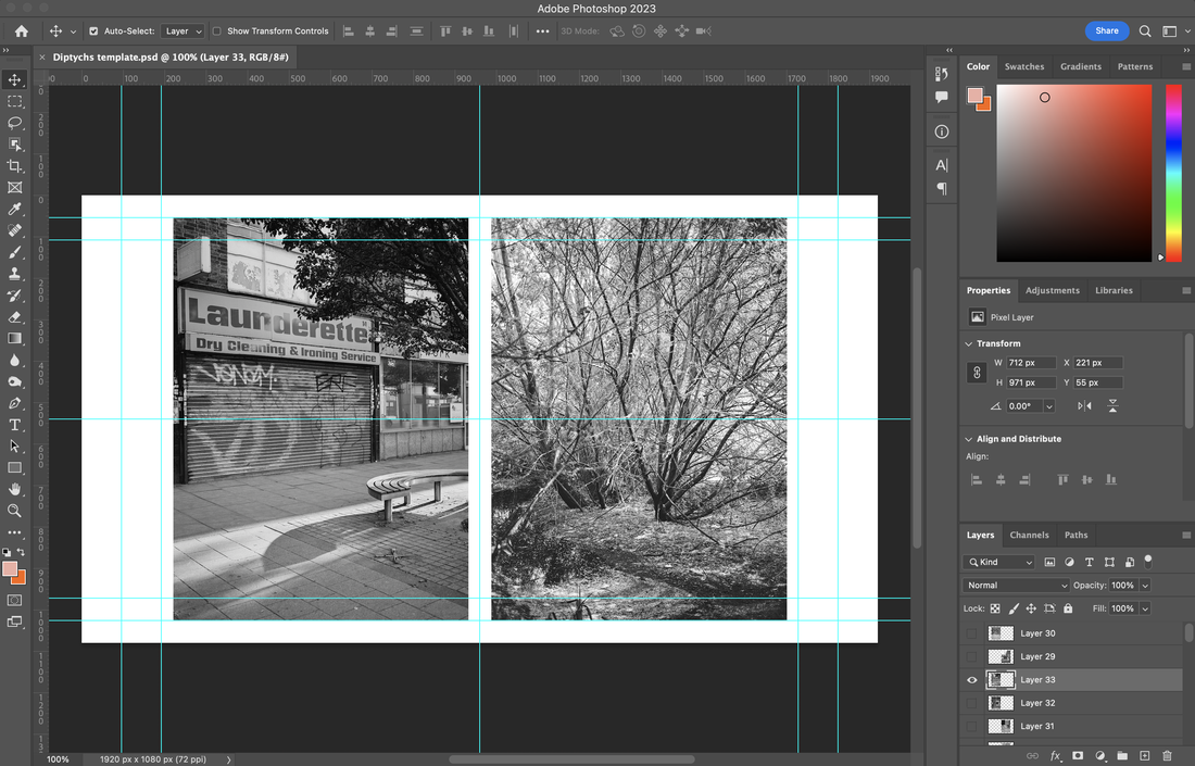
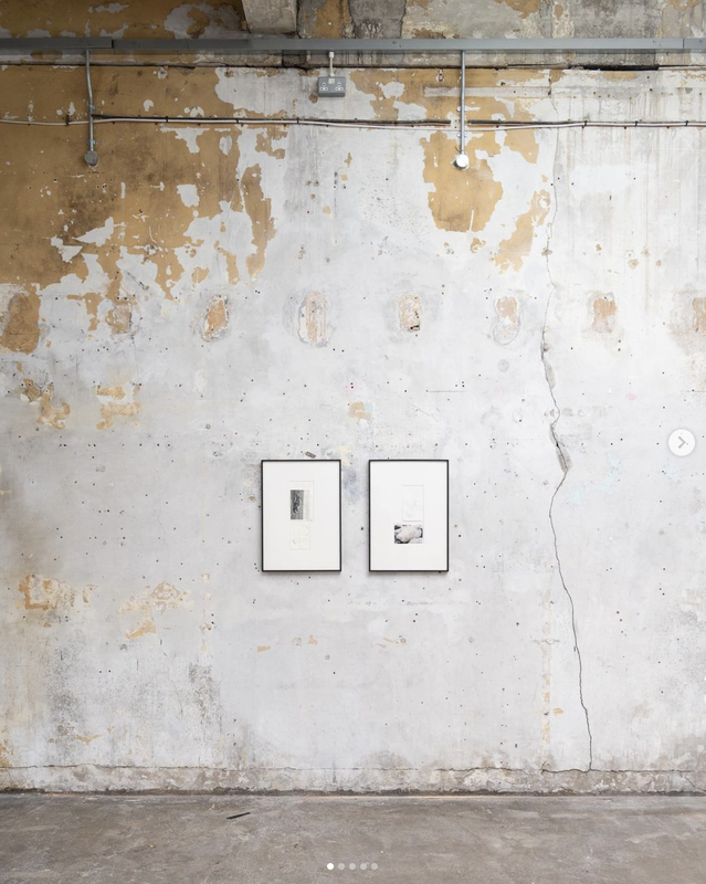
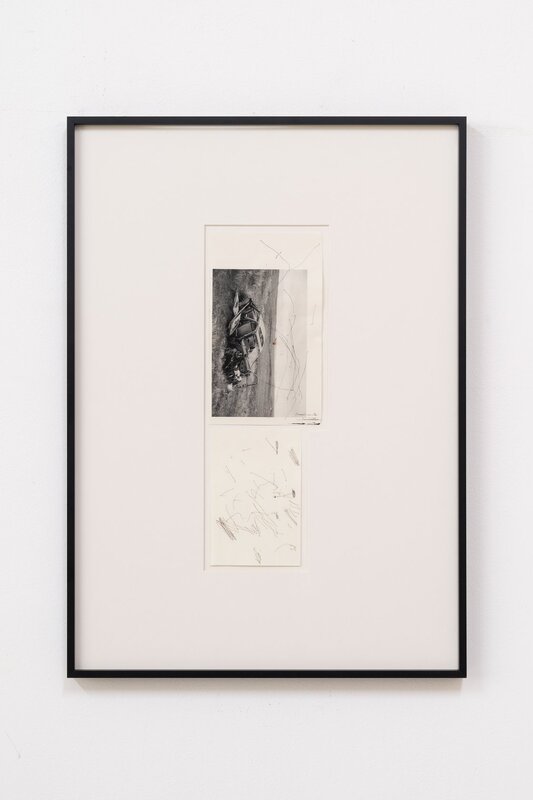
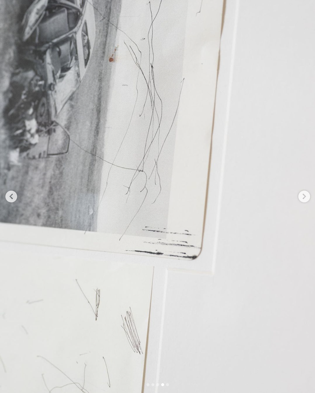
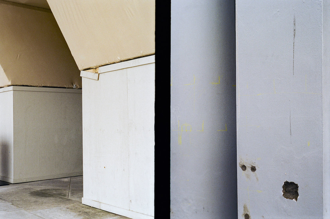
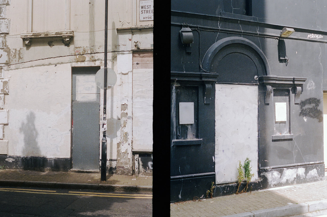
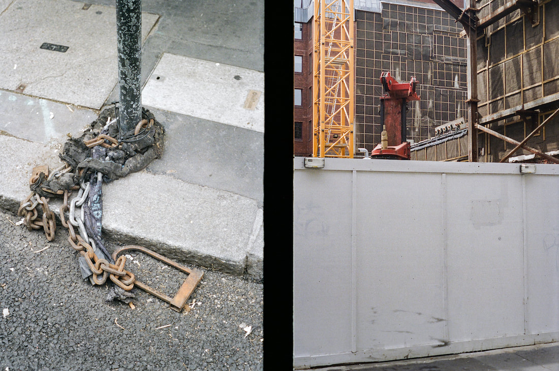
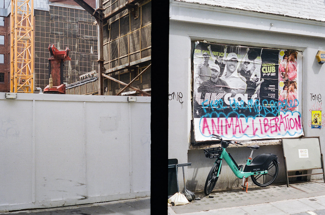
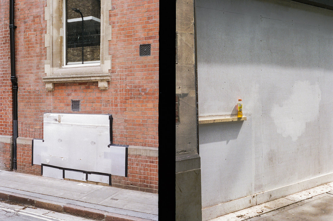
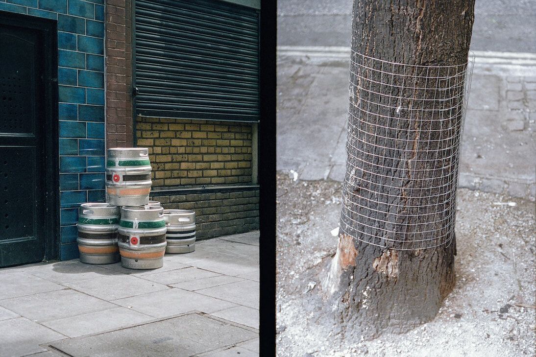
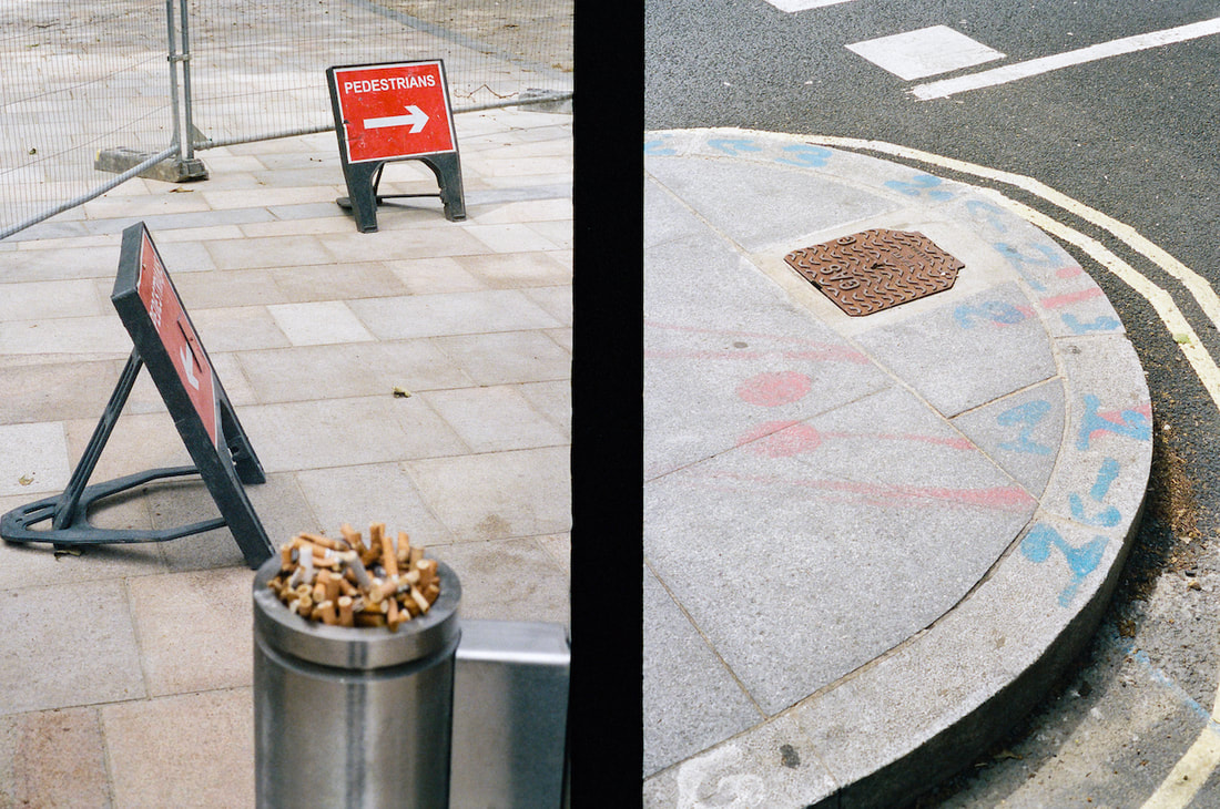
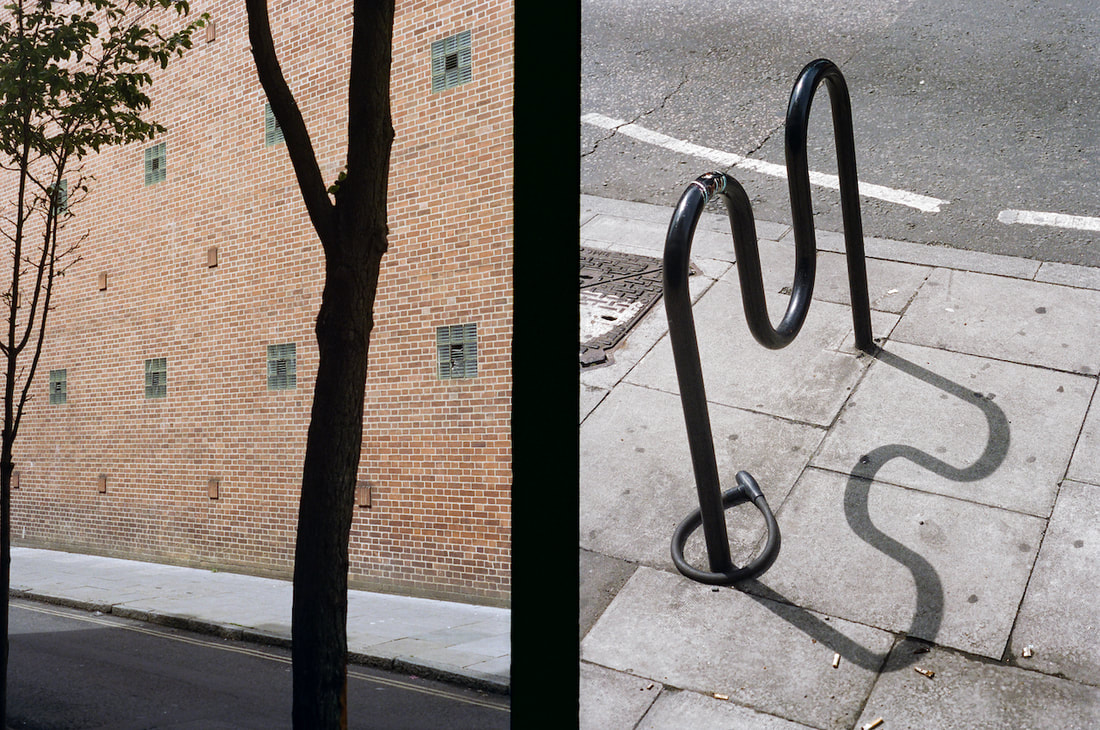
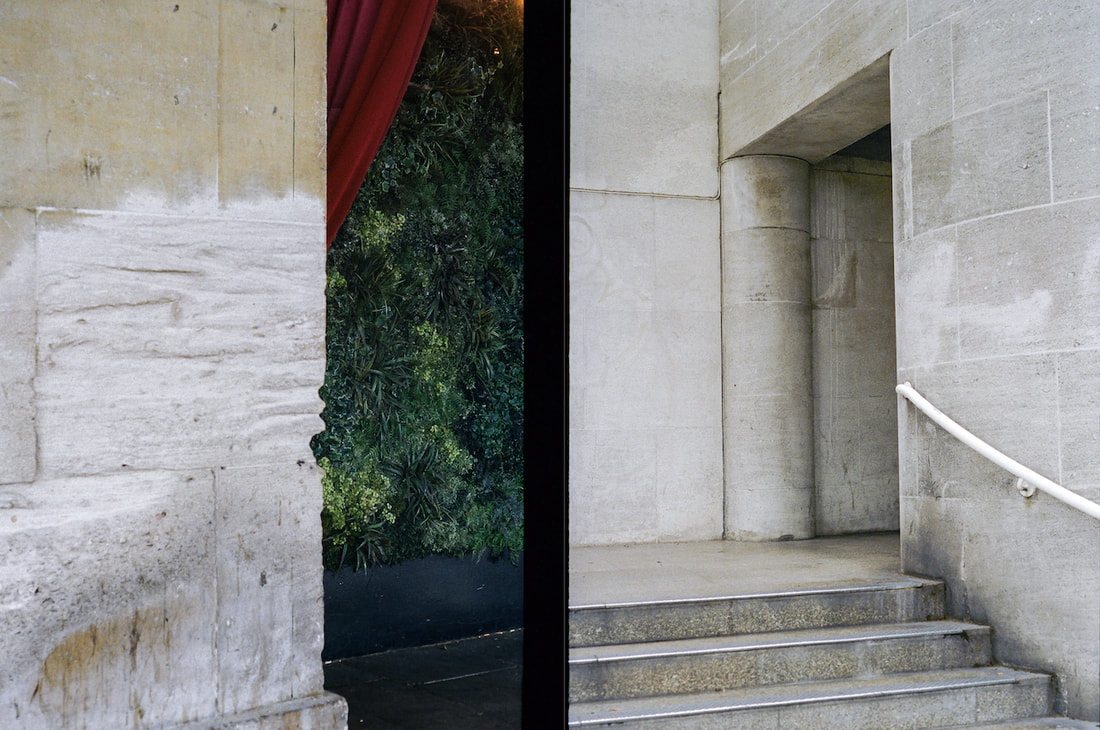
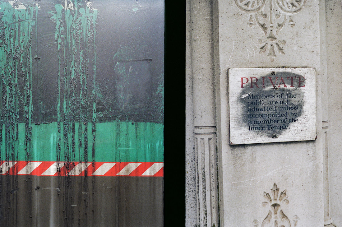
Diptychs
|
|
|
|
|
|
|
|
|
|
|
|
|
|
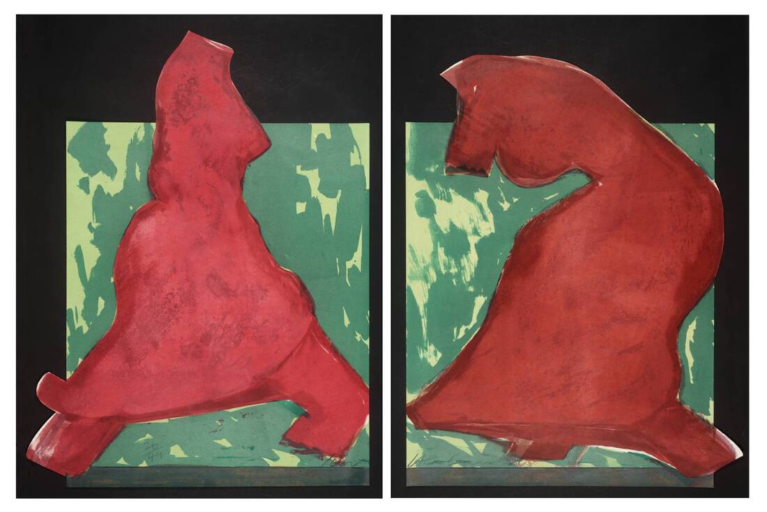
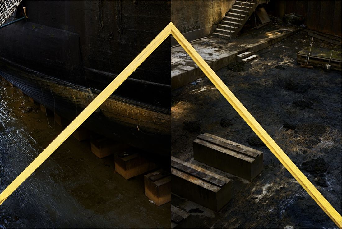
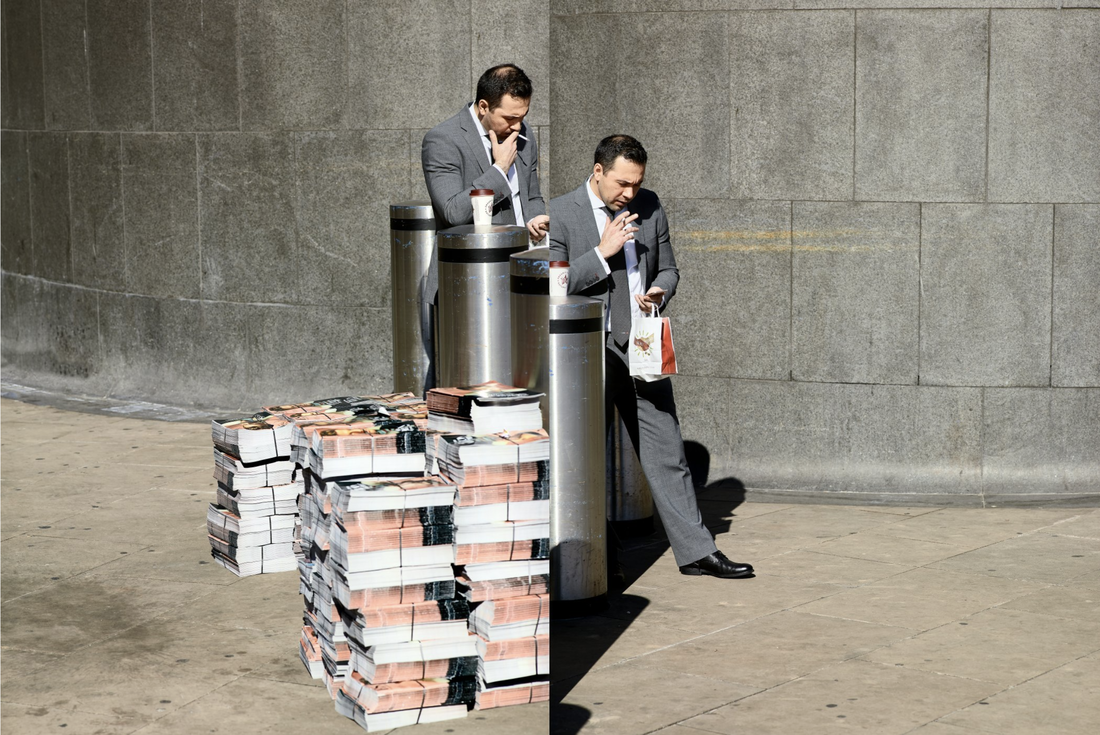
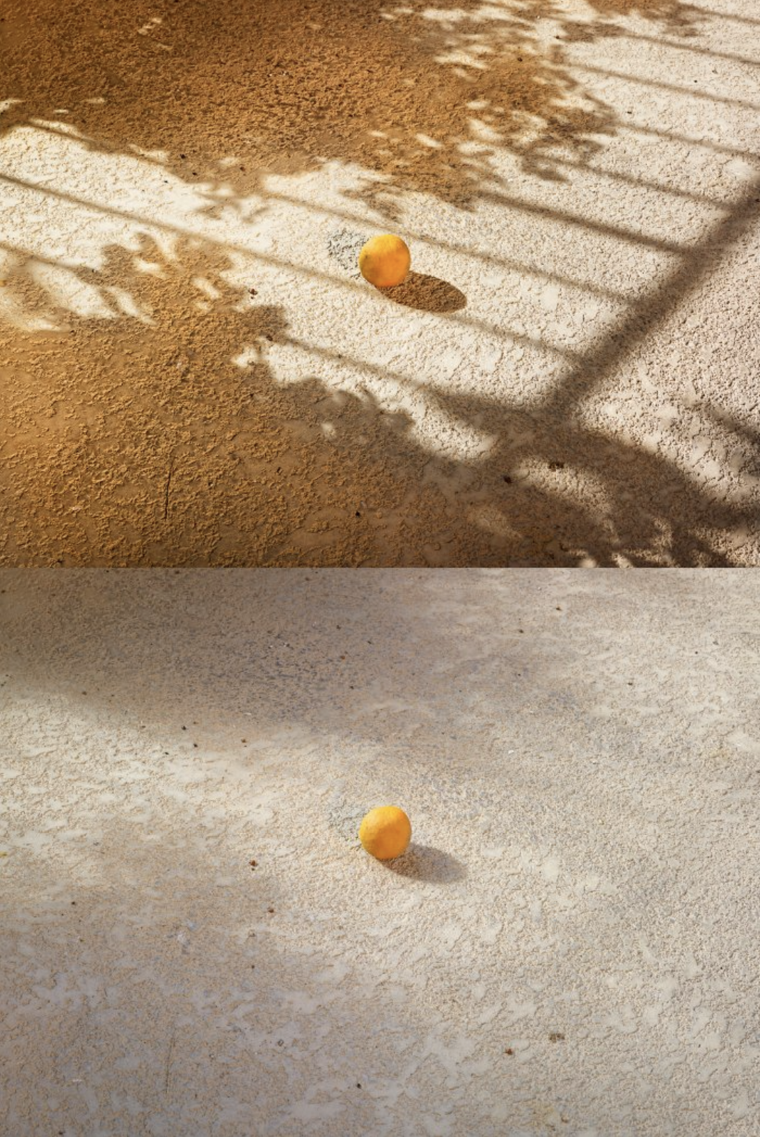
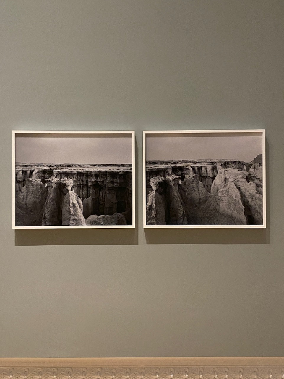
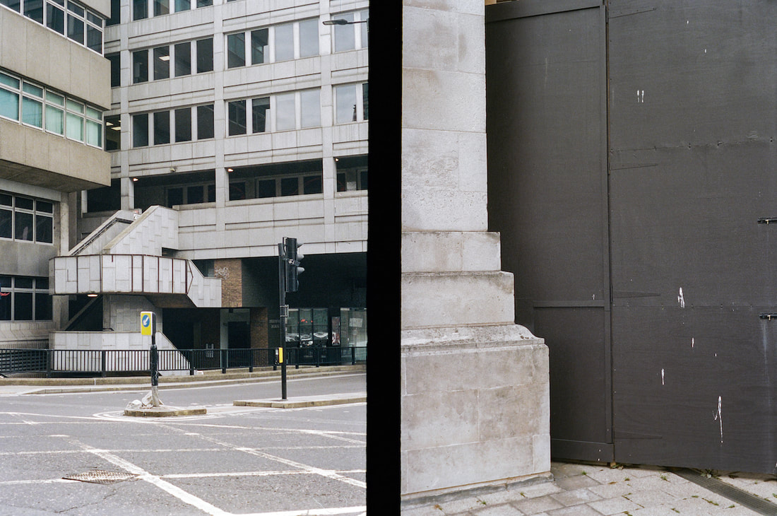
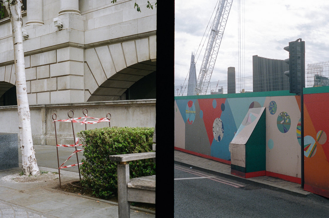
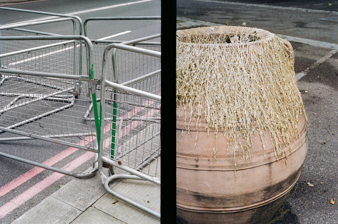
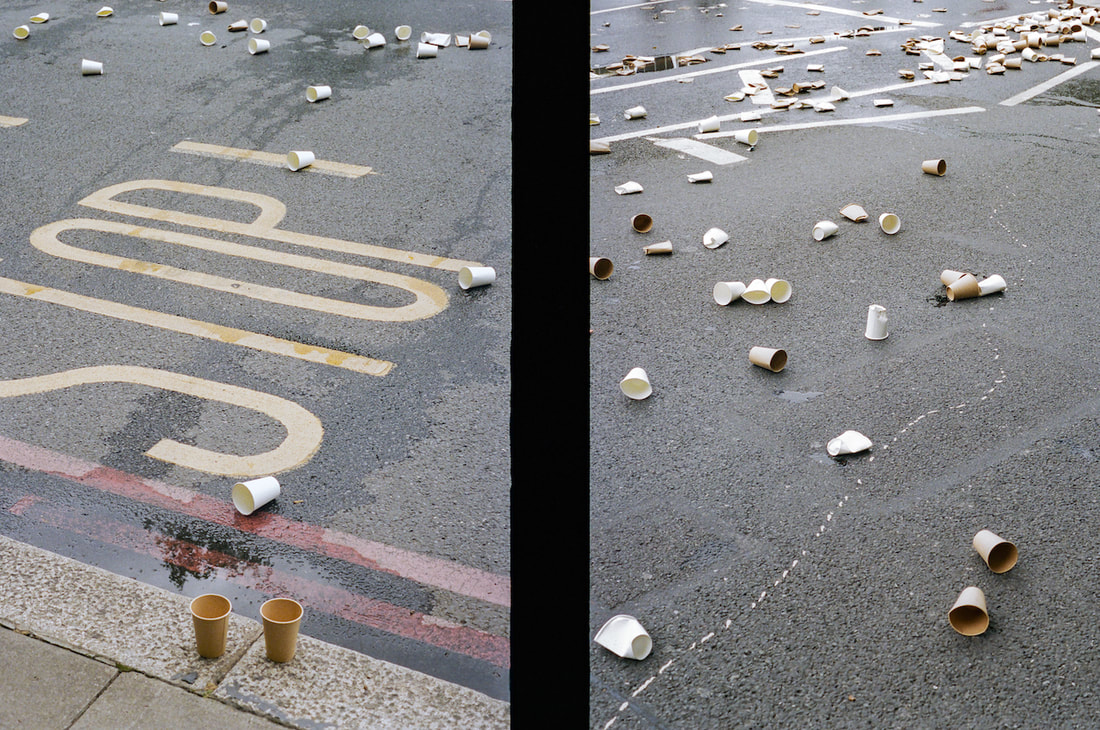
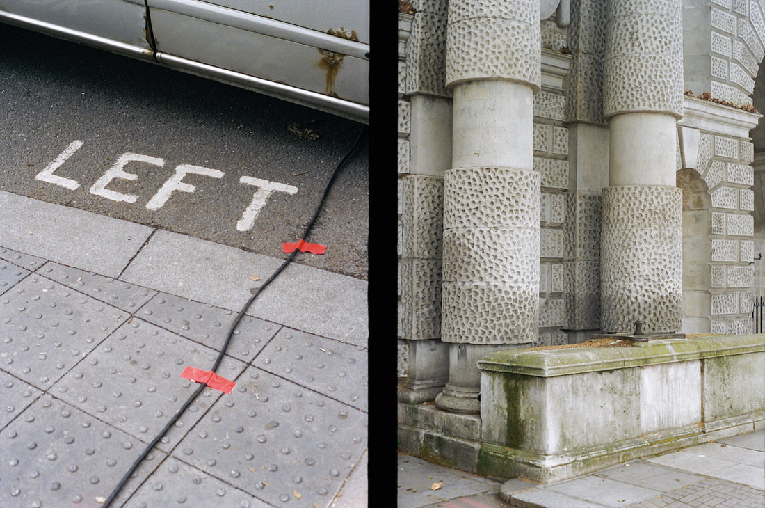
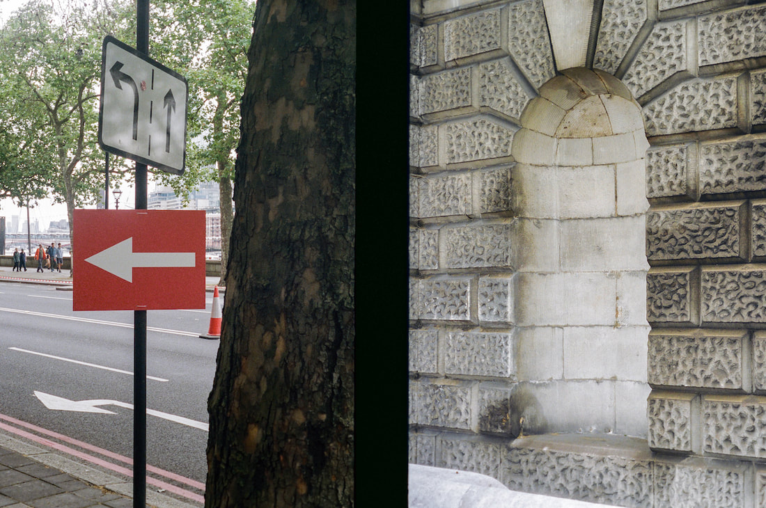
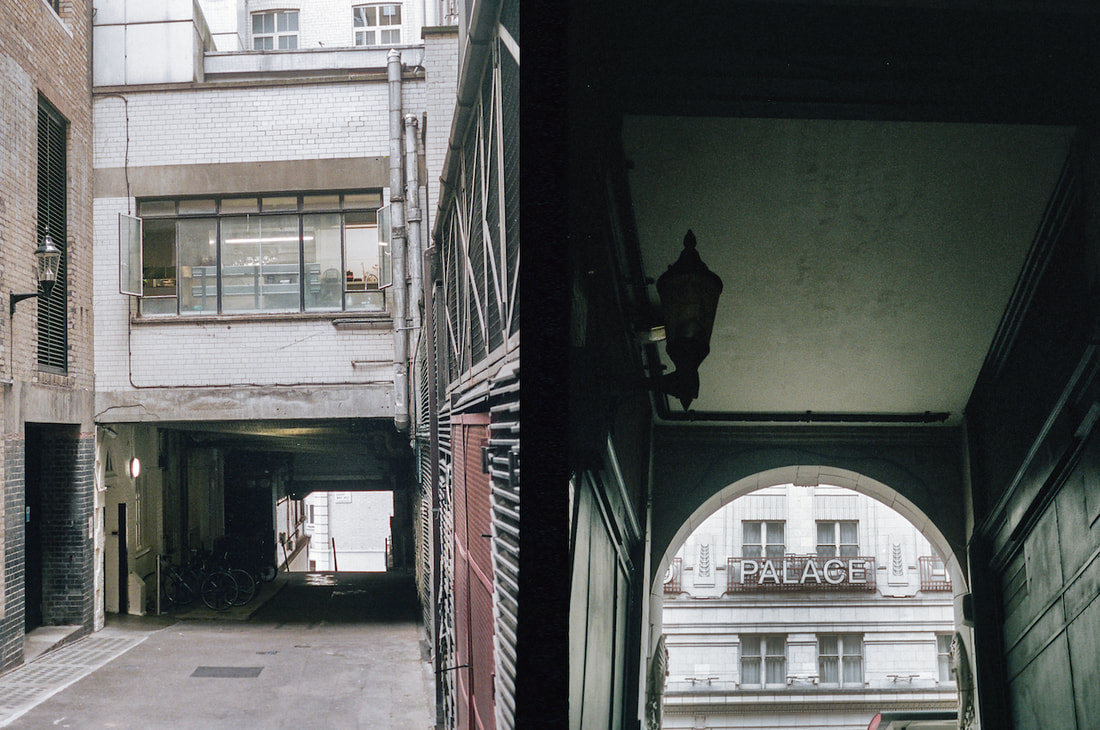
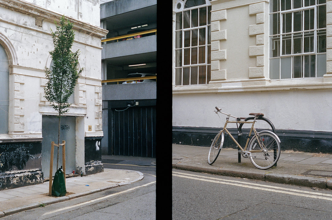
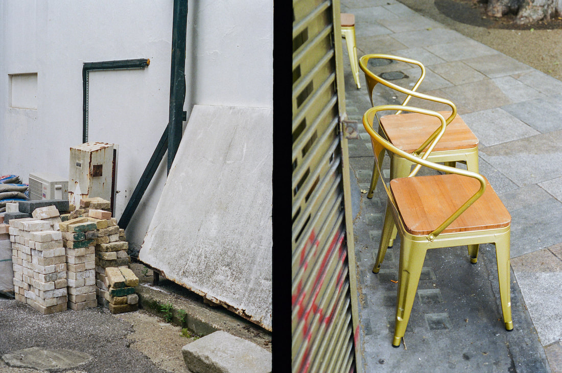
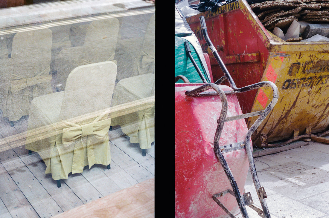
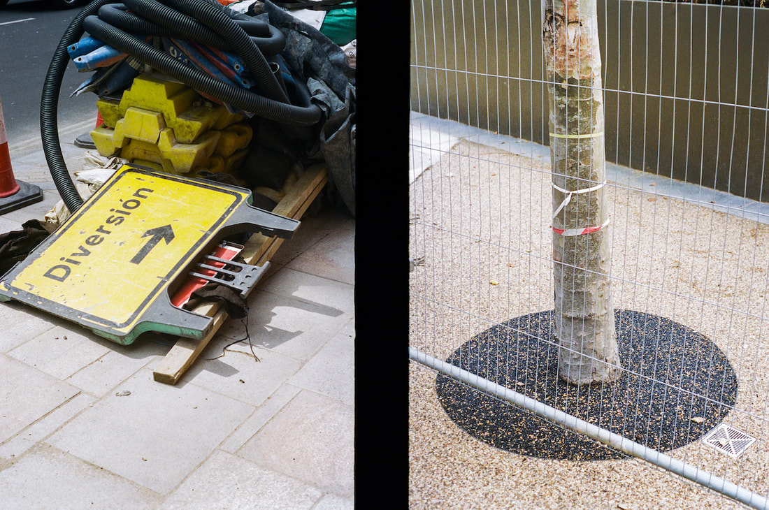
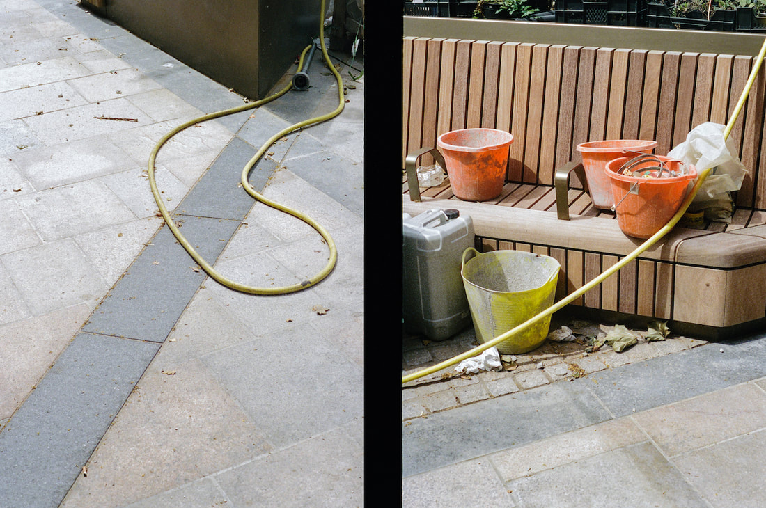
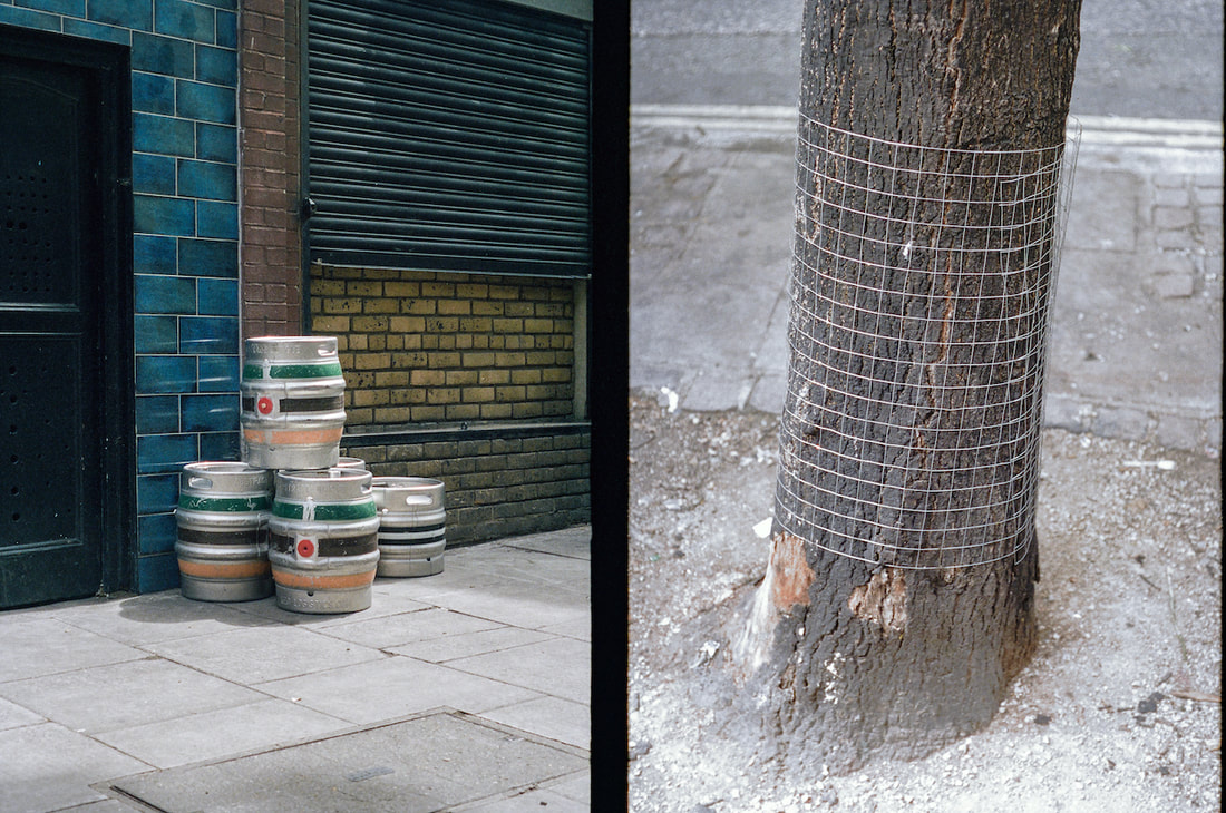
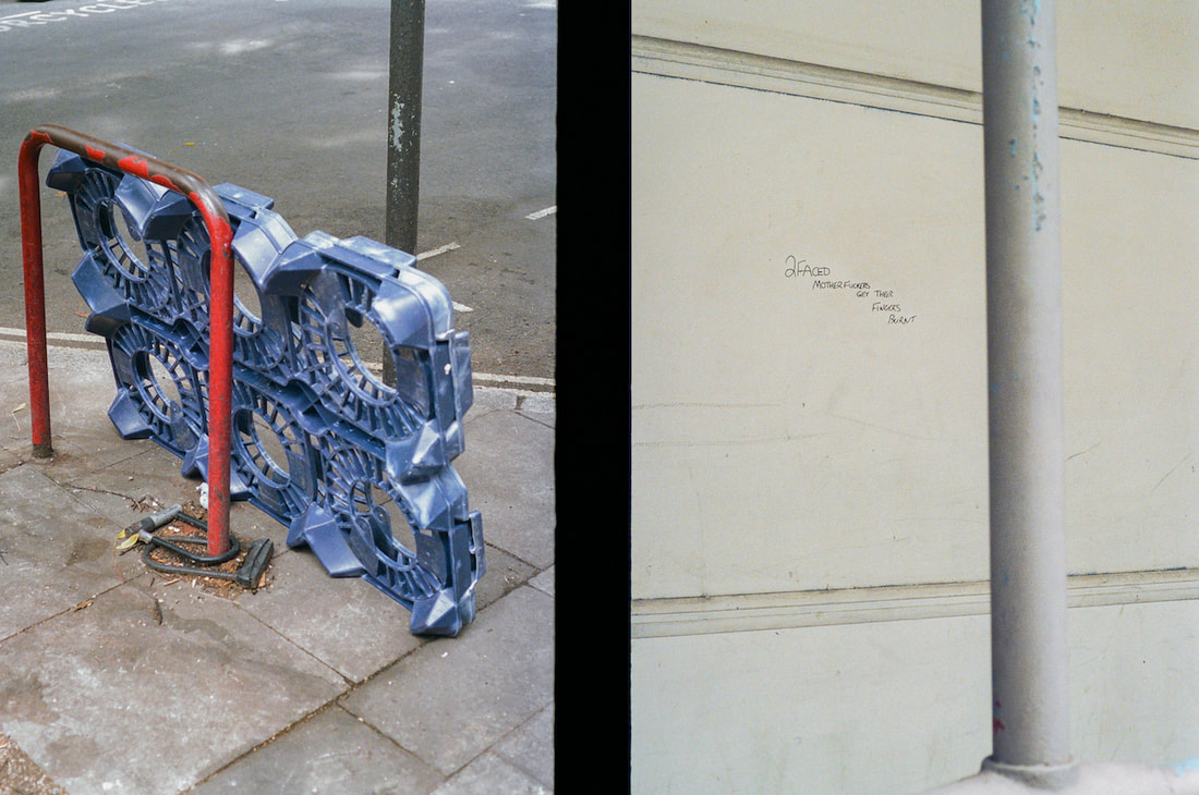
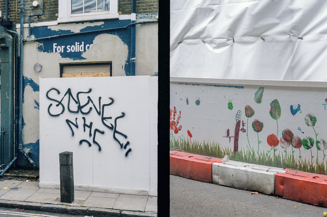
I really enjoy the process of pairing images. I like the tension or friction that's generated when two images are placed next to one another. It's not always the strongest individual images that work well in diptychs. I'm interested in the poetic qualities of diptychs and the way they can spark associations in the mind of the viewer, as the compressed, metaphoric and allusive writing does in a successful poem. Portrait format images, placed side by side, tend to work better than landscape format. This suits me since most of the images I make are portrait format.
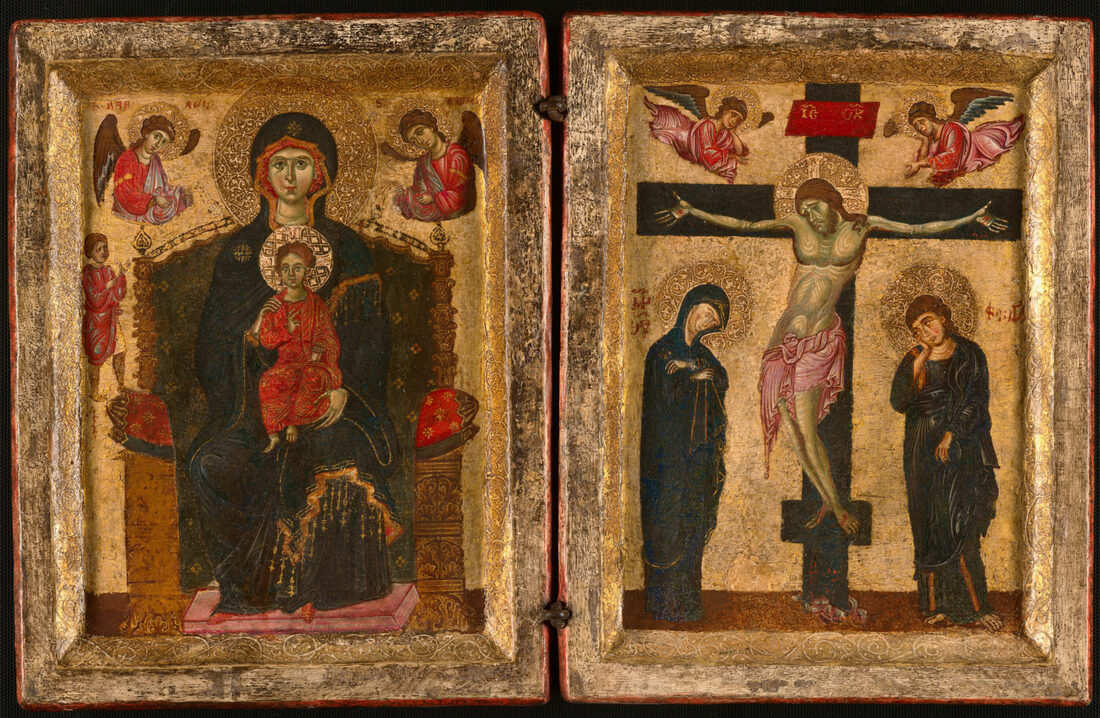
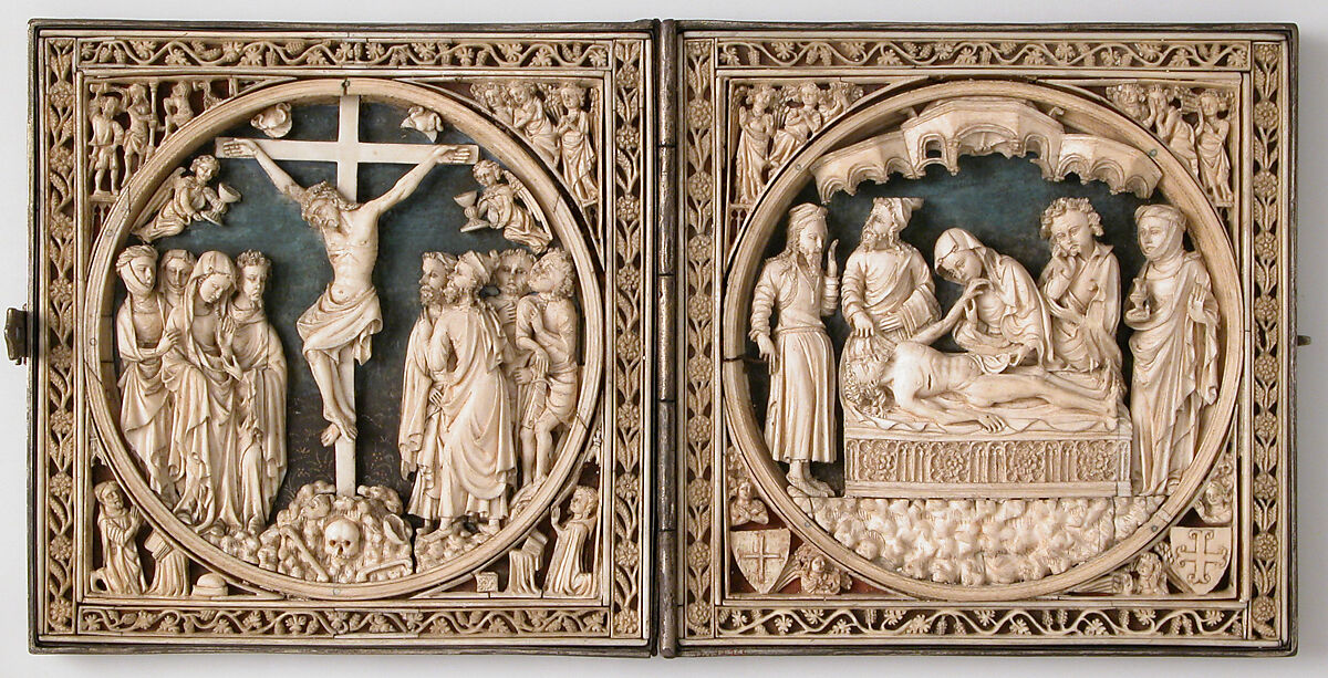
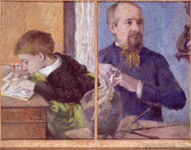
Diptychs were originally hinged Roman writing tablets and then became popular during the middle ages as portable religious devotional objects. The practice of pairing images in this way has been used by modern and contemporary artists.
Diptychs were originally hinged Roman writing tablets and then became popular during the middle ages as portable religious devotional objects. The practice of pairing images in this way has been used by modern and contemporary artists.
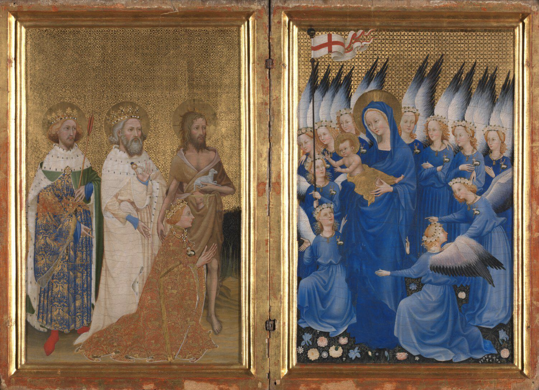
The Wilton Diptych, c. 1395–1399
|
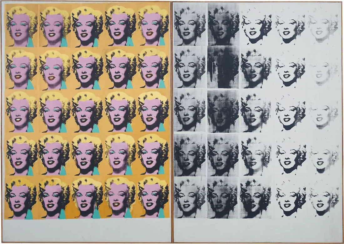
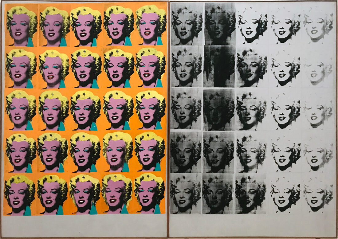
Andy Warhol - Marilyn Diptych, 1962
|
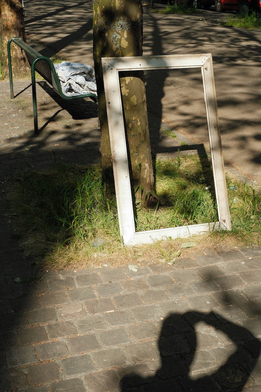
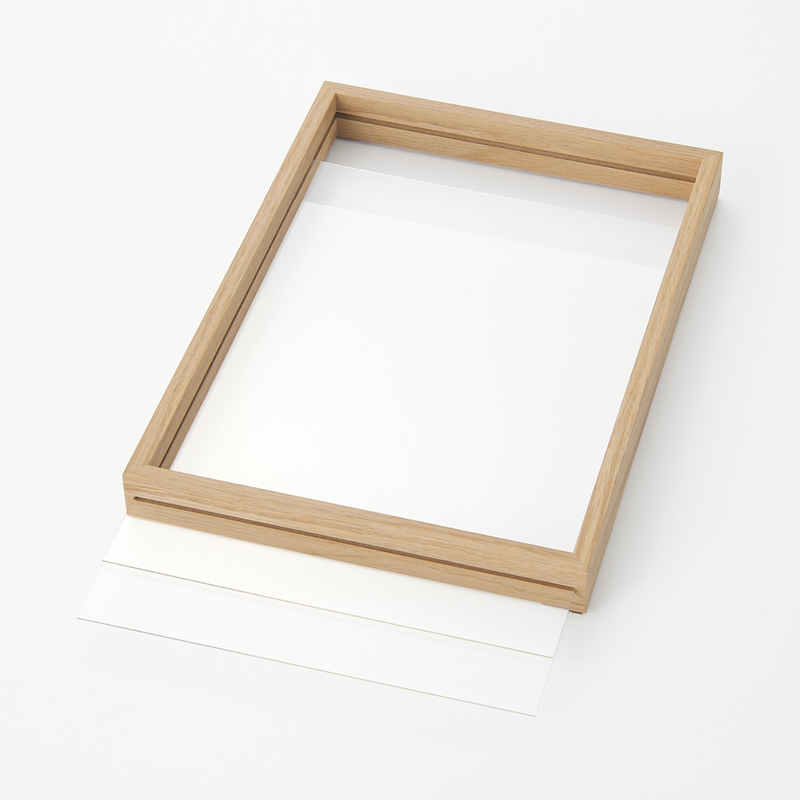
I would like to experiment with creating physical diptych objects but with the added element that viewers could swap the images in and out, creating diptychs of their own choosing. The following frame, sold by a high street retailer, could be easily adapted to create a hinged diptych with replaceable images.
|
|
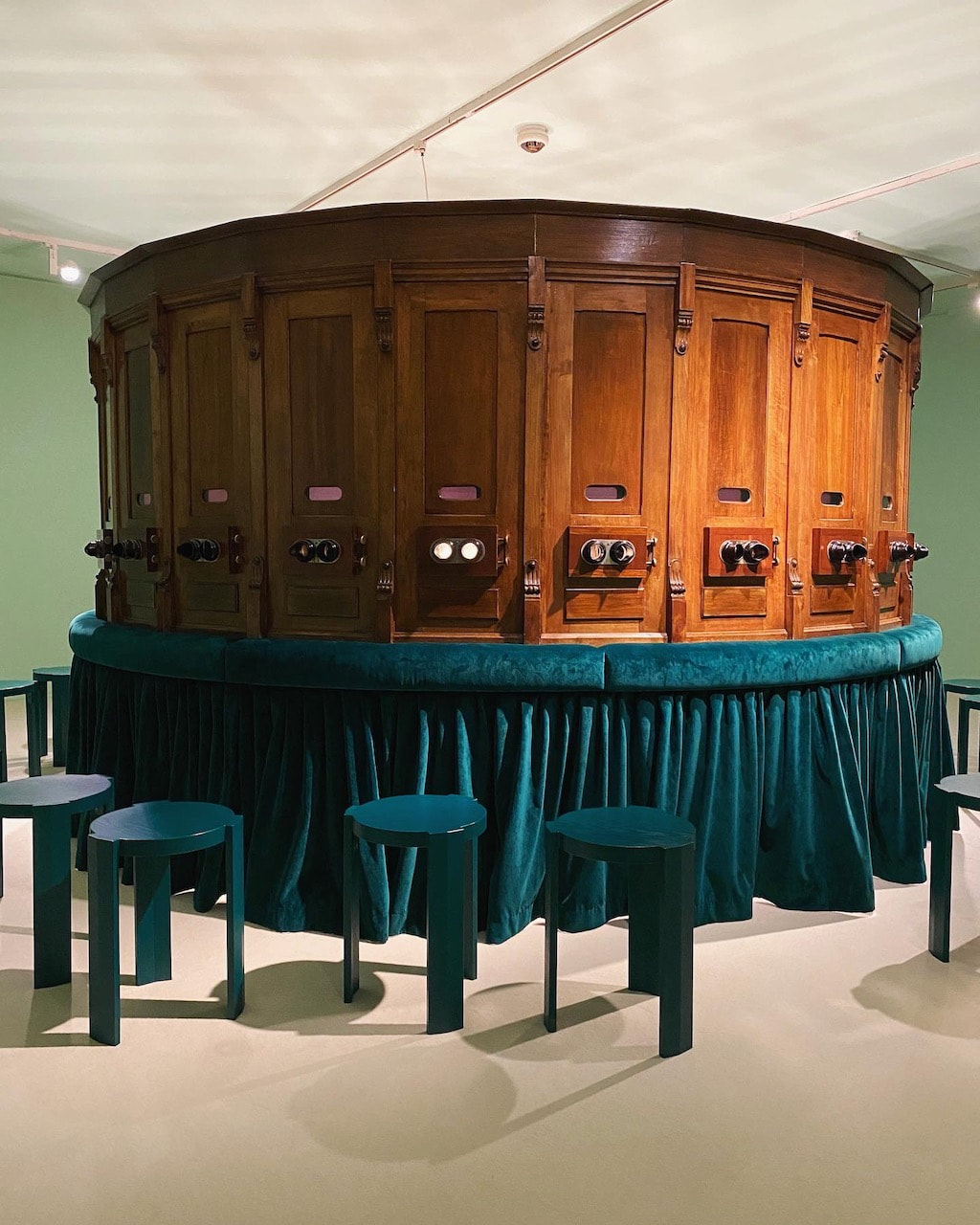
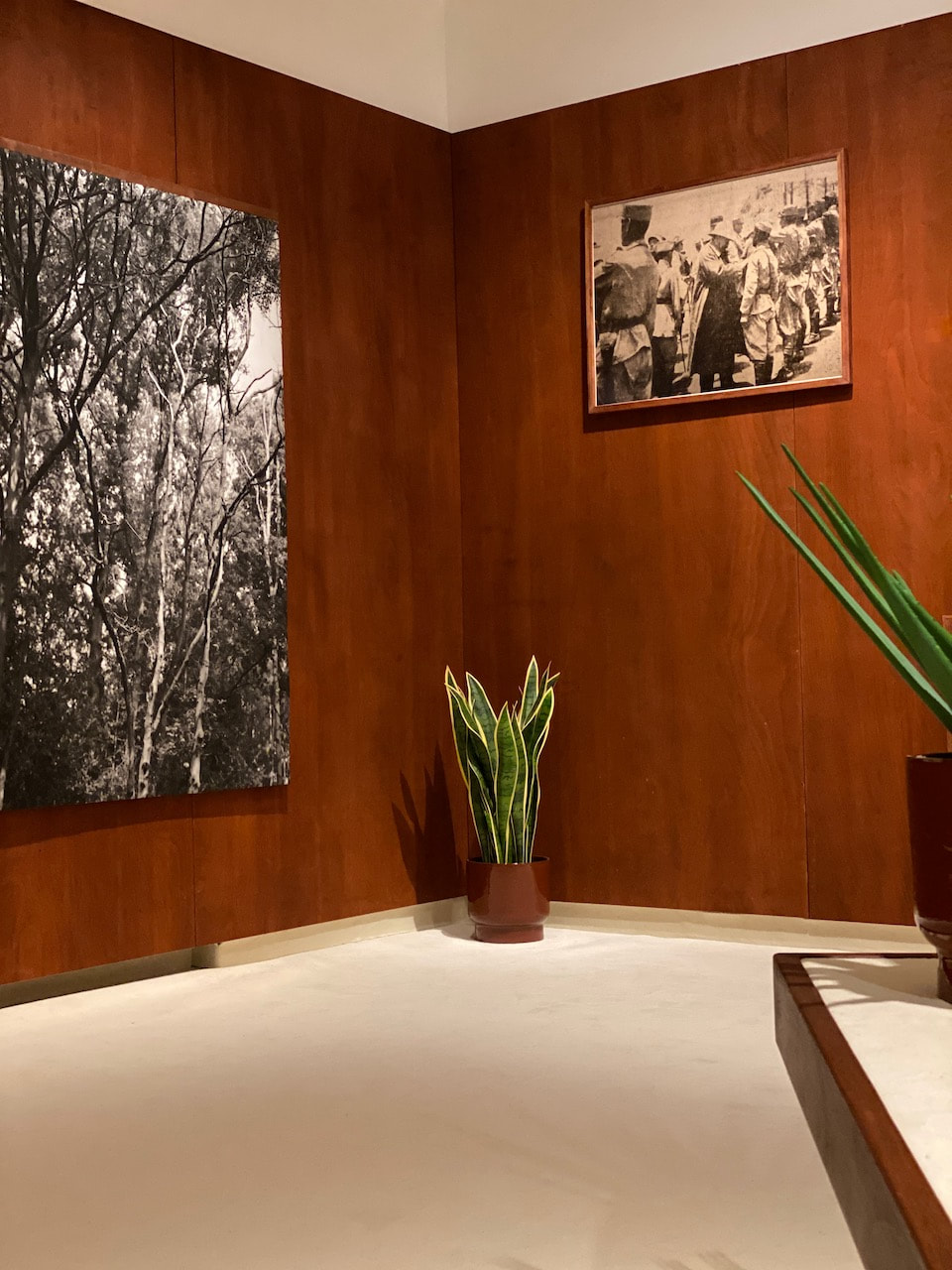
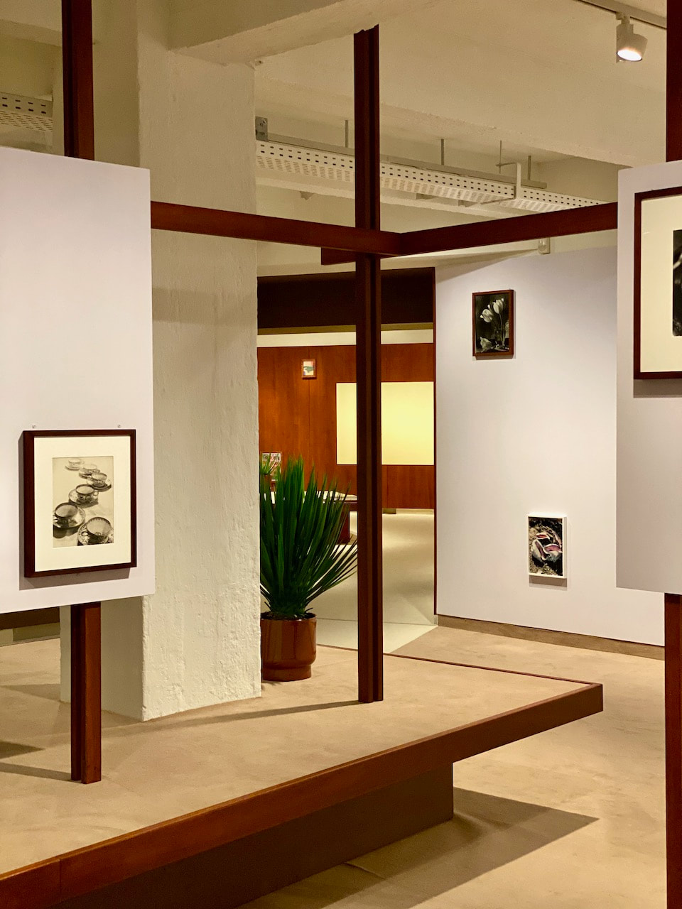
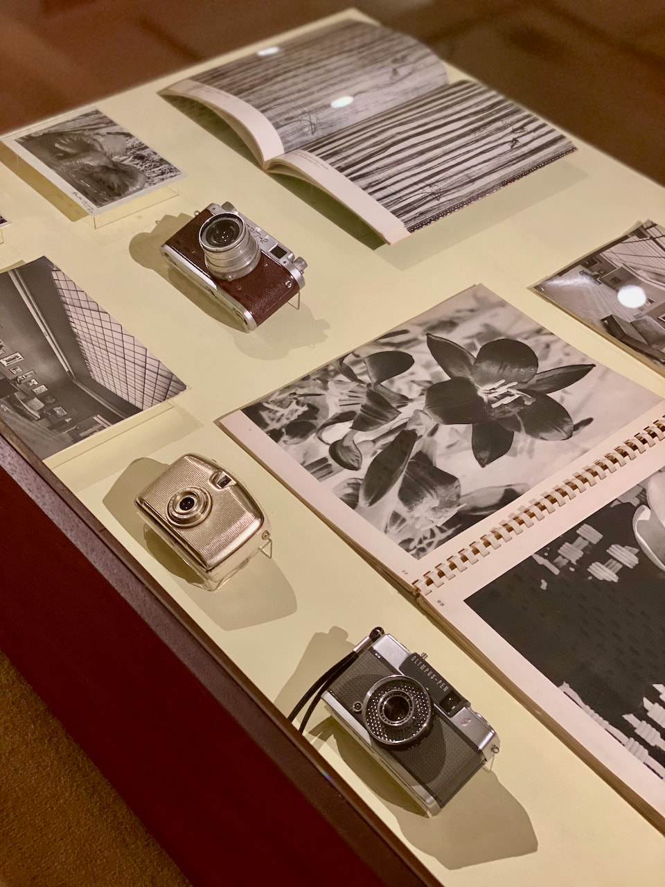
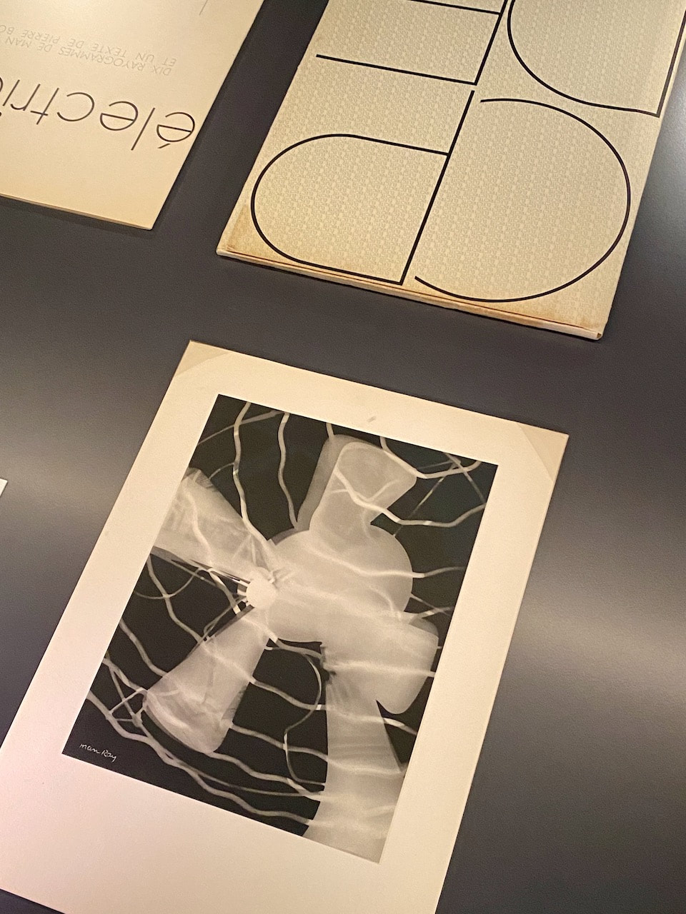
Exhibitions
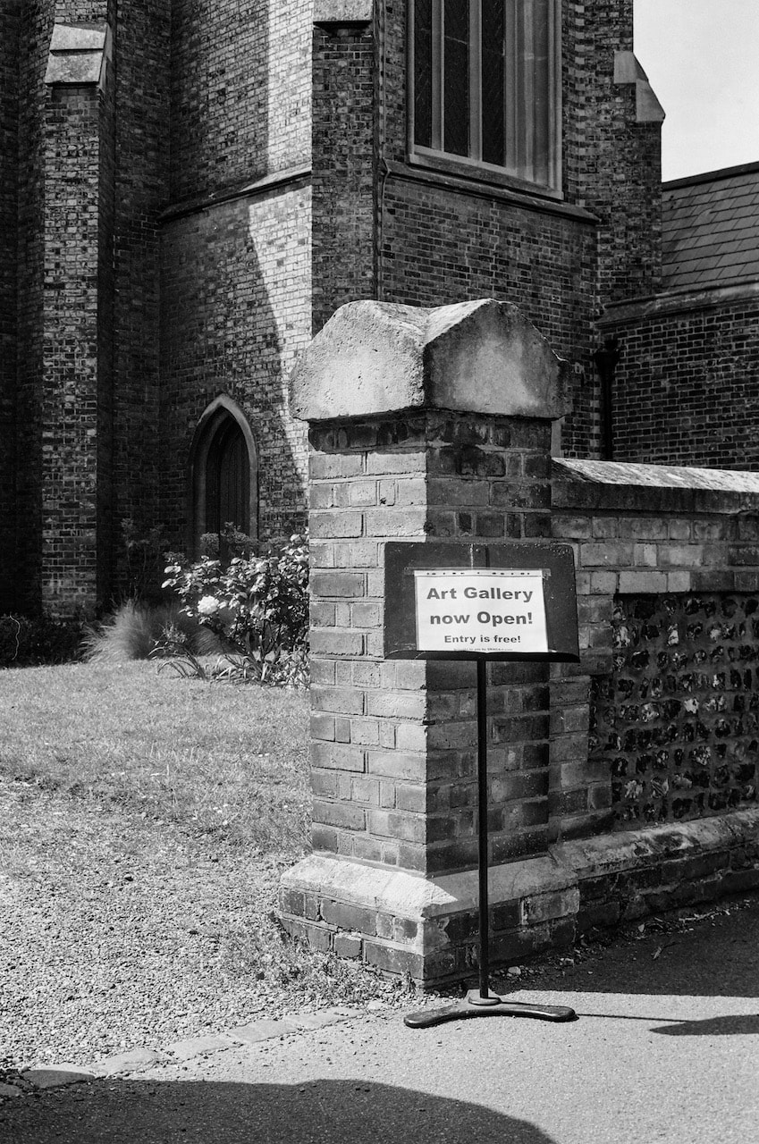
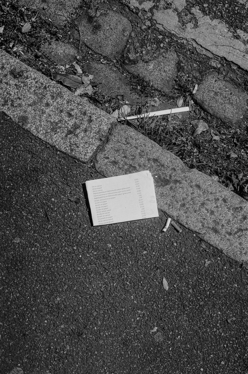
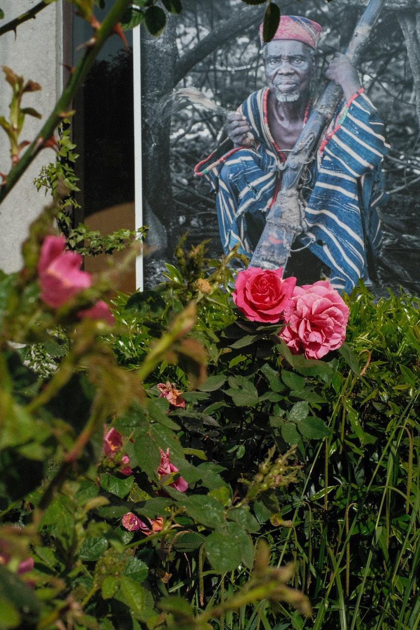
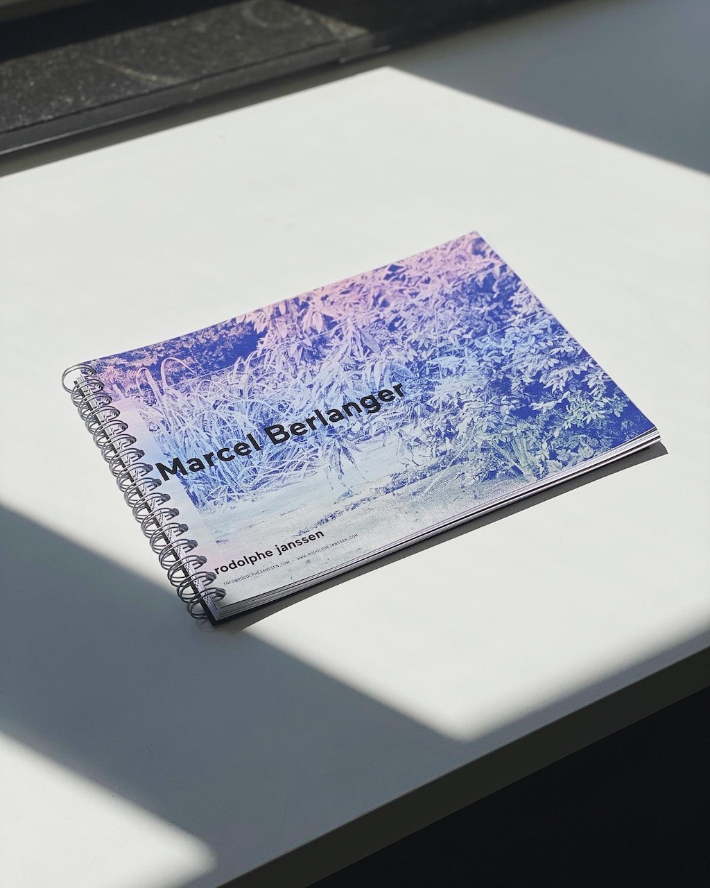
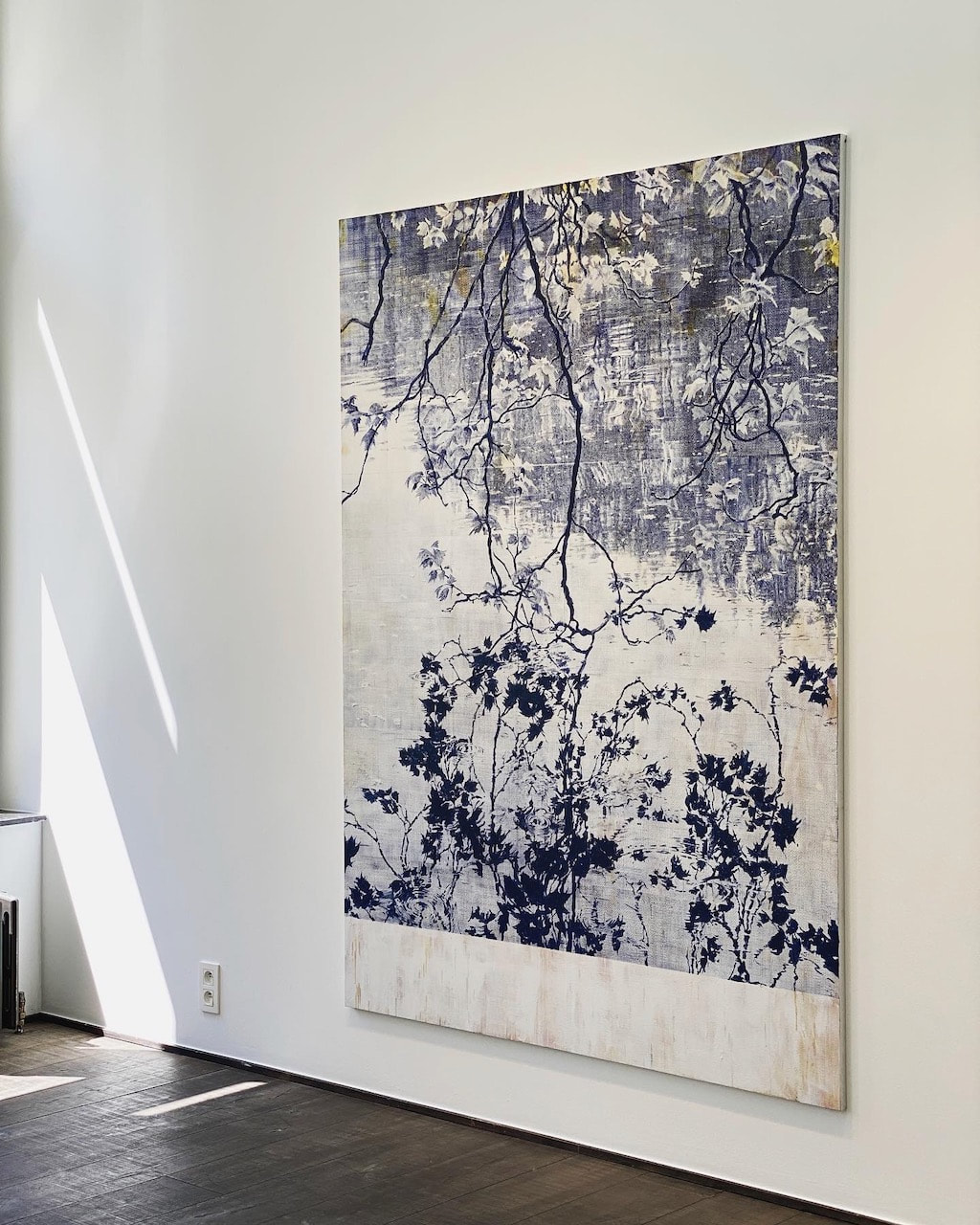
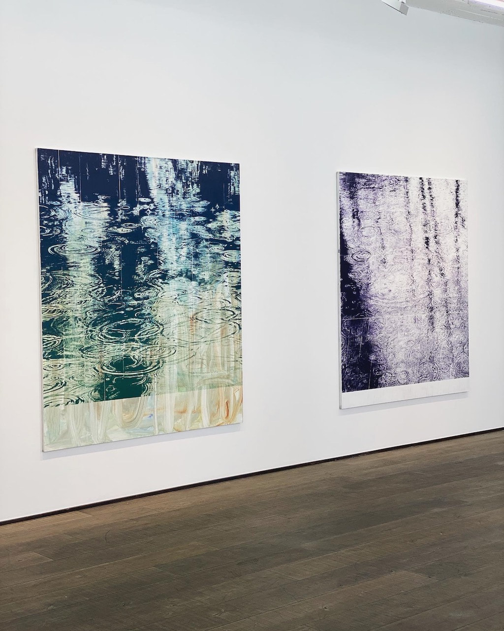
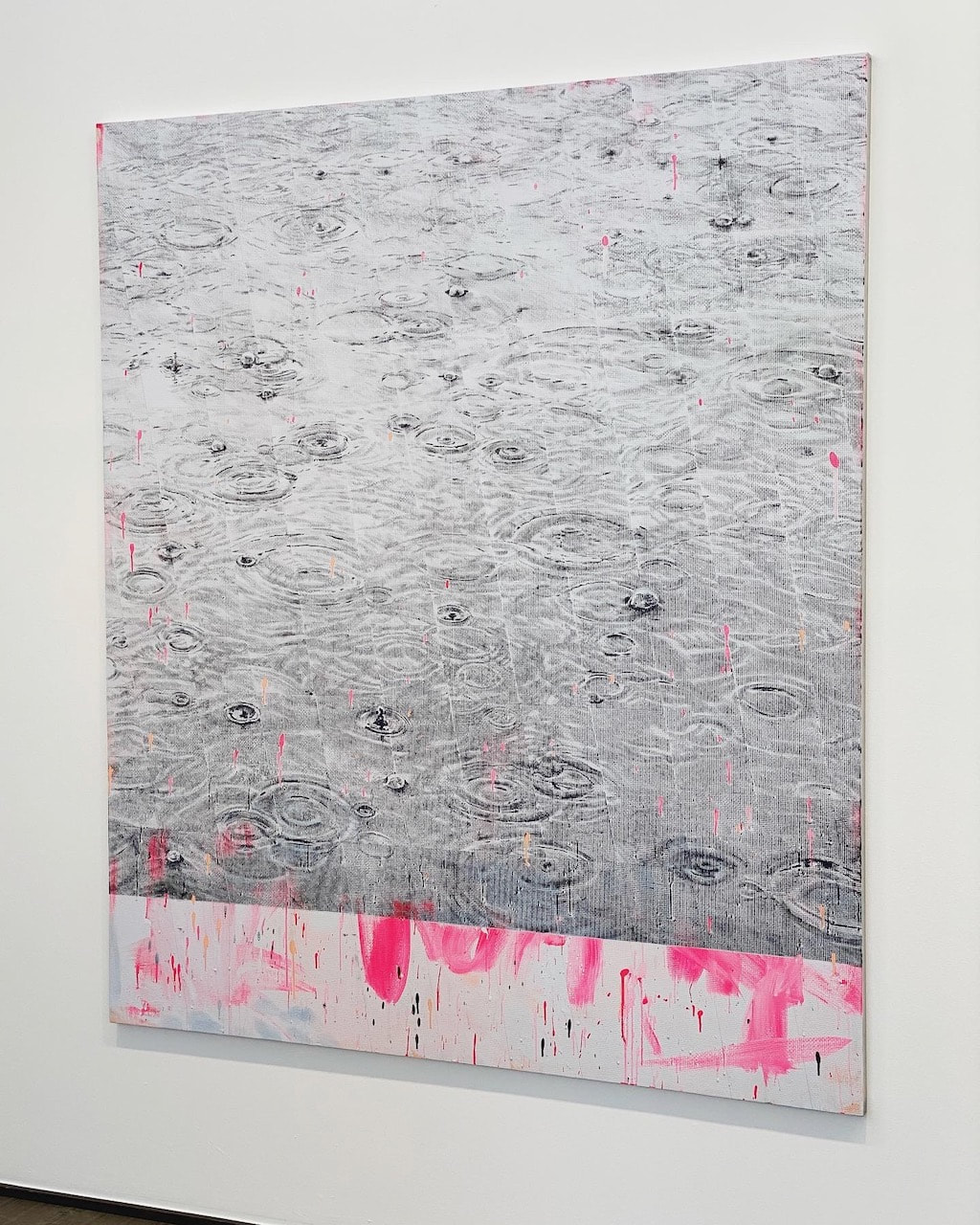
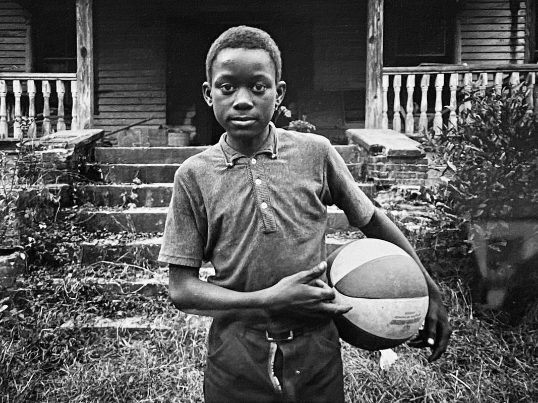
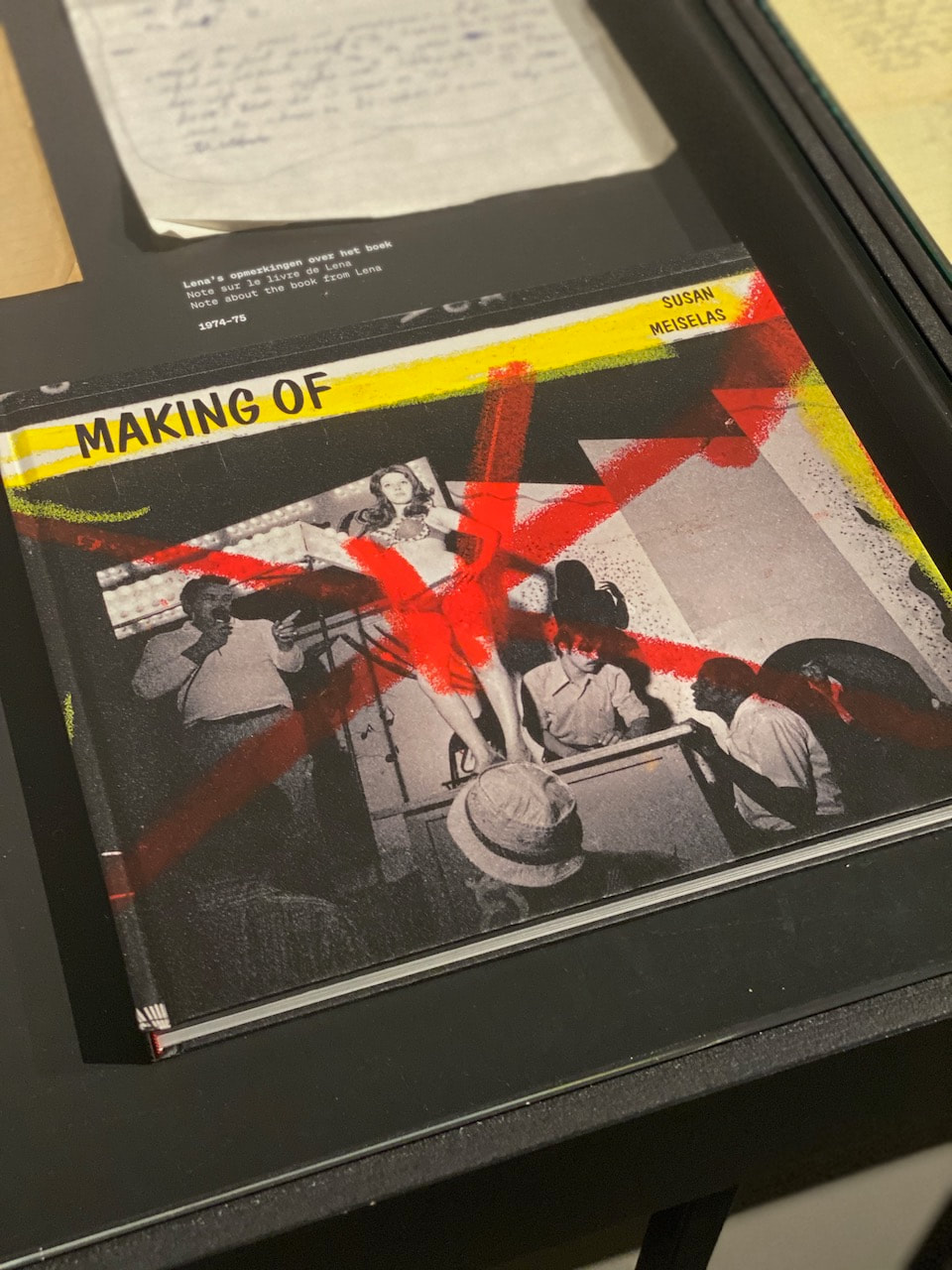
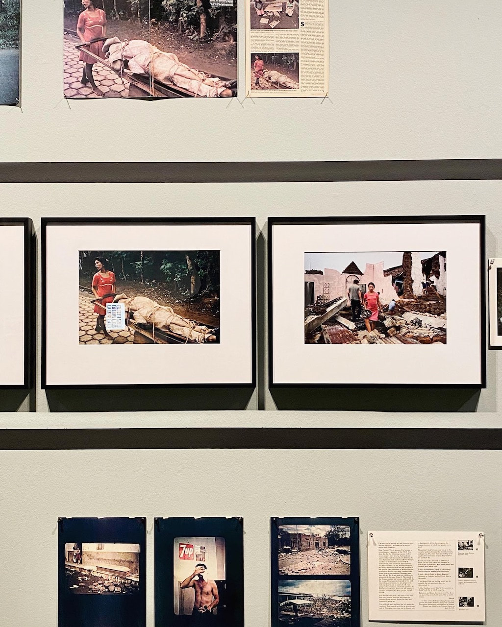
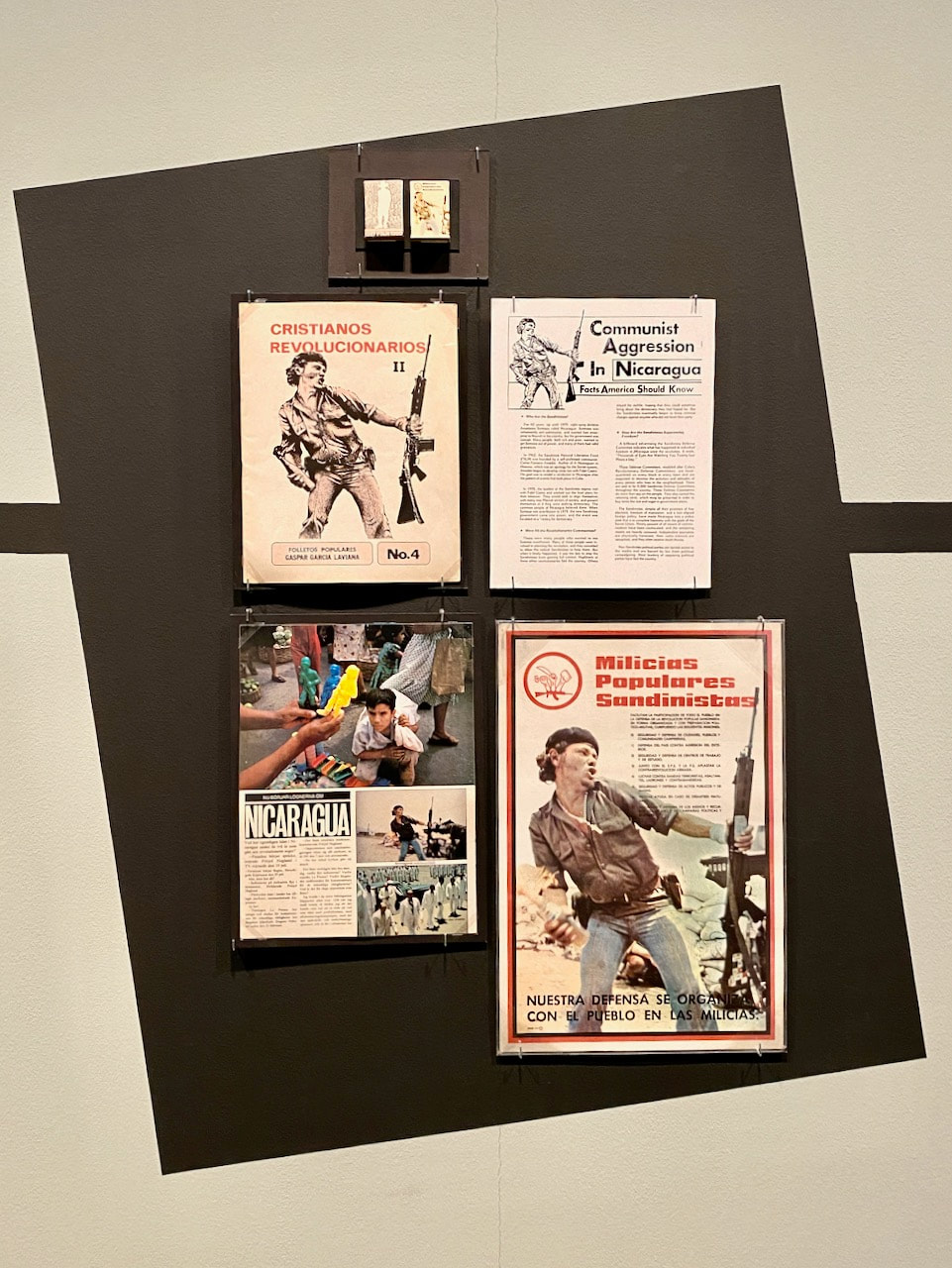
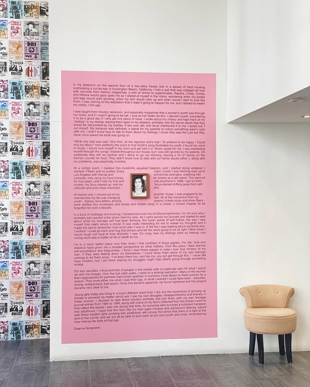
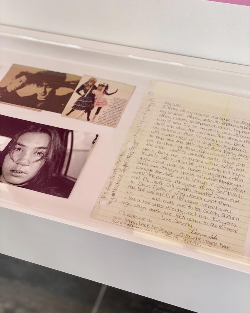
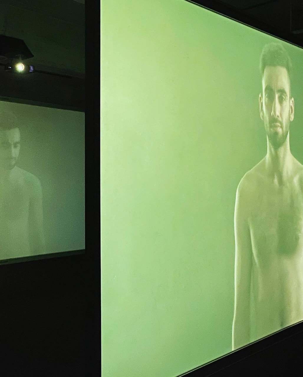
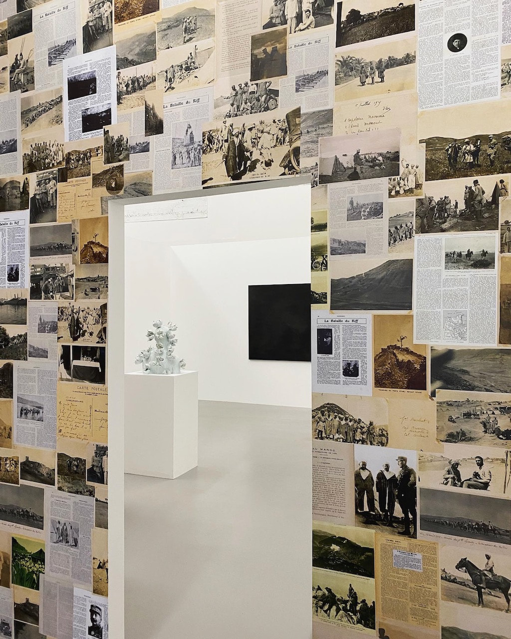
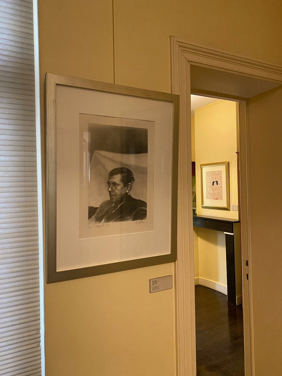
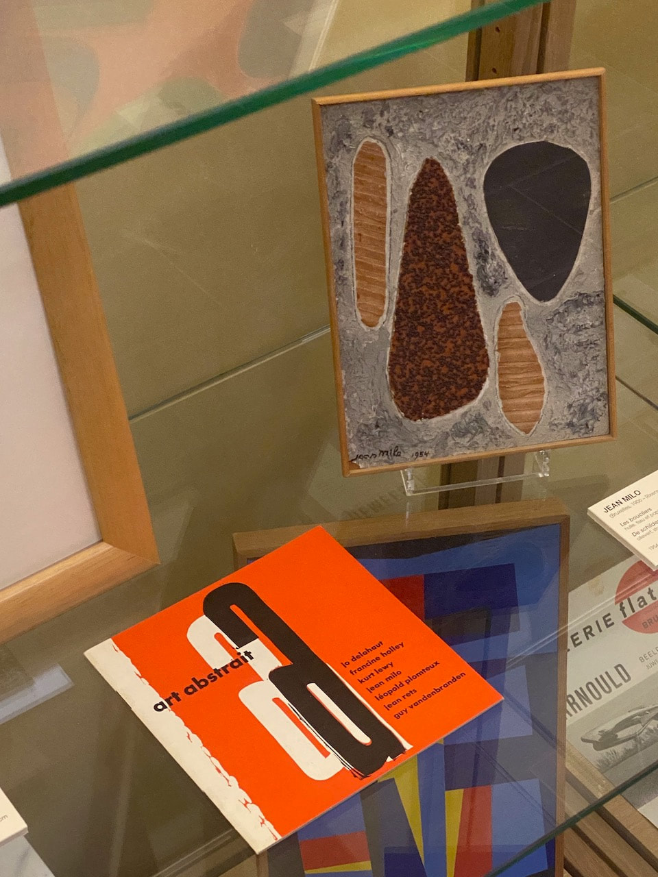
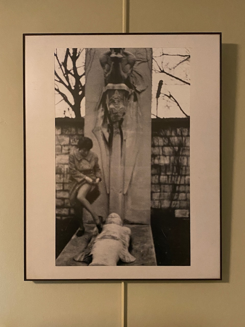
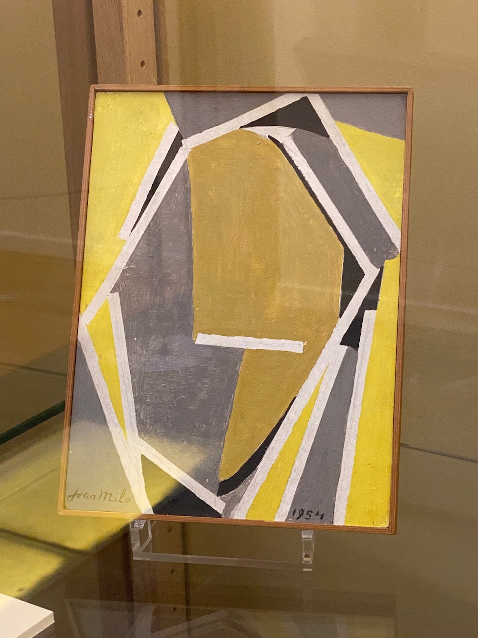
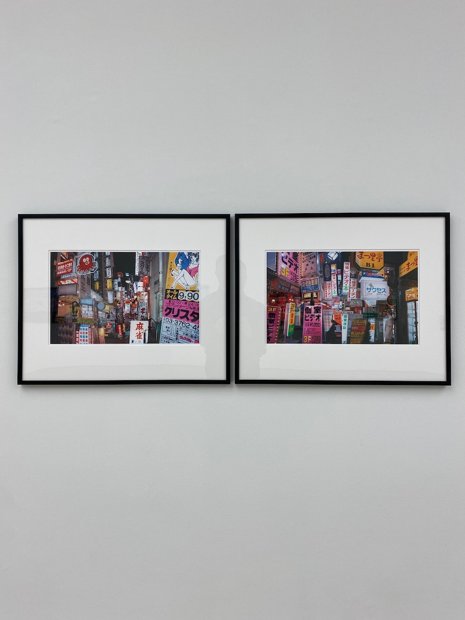
I saw several exhibitions in both Brussels and Antwerp. Annoyingly, I missed the Hans-Peter Feldmann exhibition. He died the same week were in Belgium. The shows I did see are indicated below. I took photos as aides memoire and for sharing on Instagram which is also a kind of visual diary for me. Here are some of the ideas or themes suggested by the exhibitions:
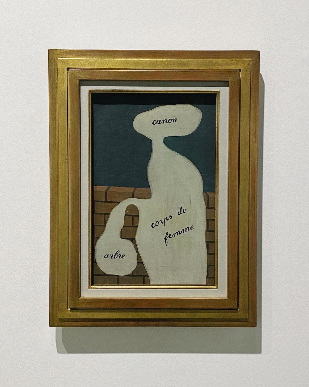
- Paintings/drawings referencing photography (Berlanger and Manigaud)
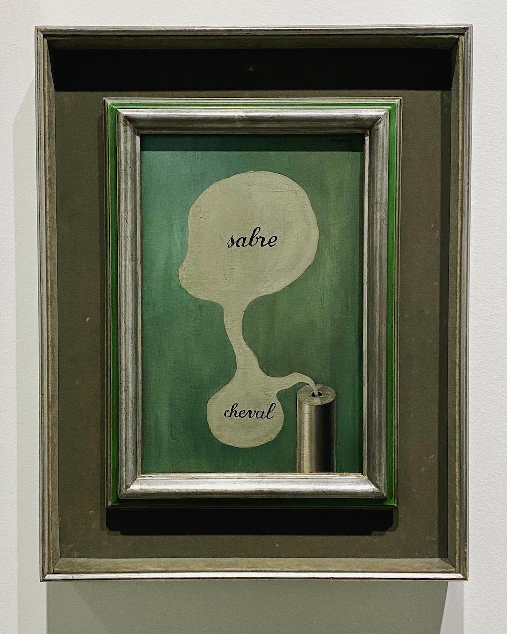
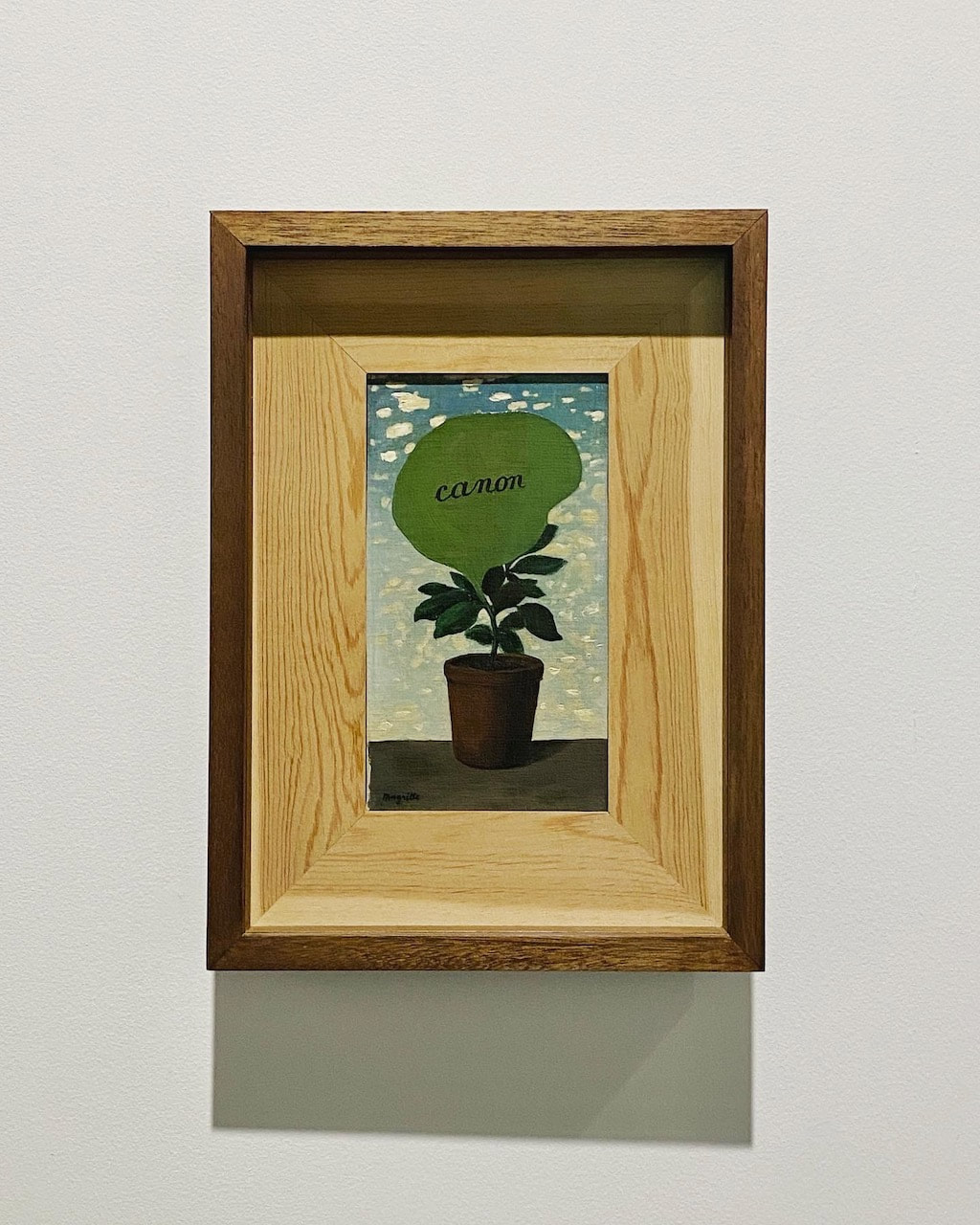
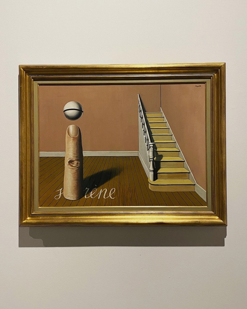
- Word and image (Magritte, Bolajo, Kassay andTempleton)
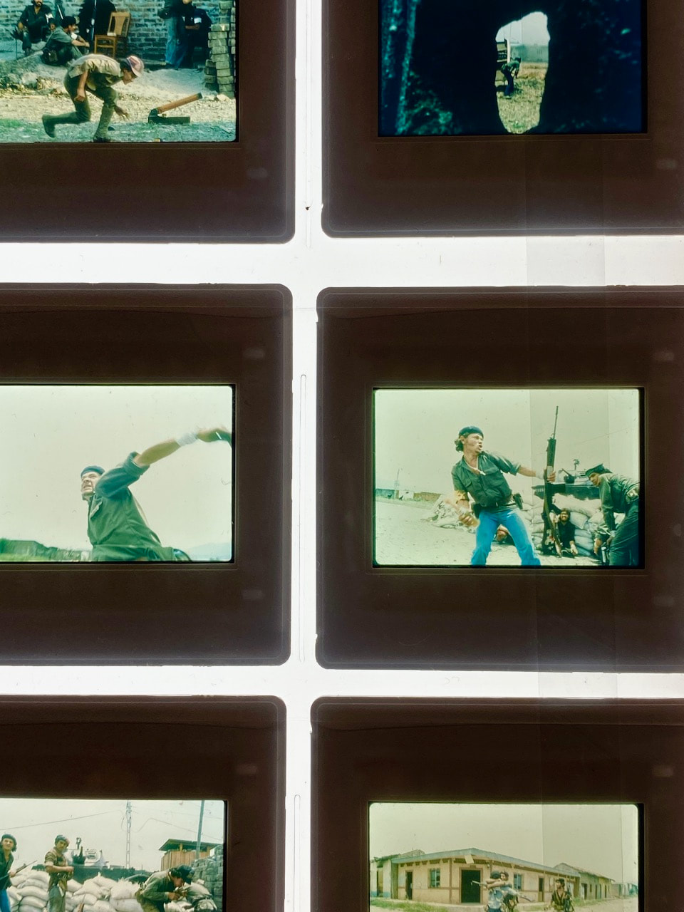
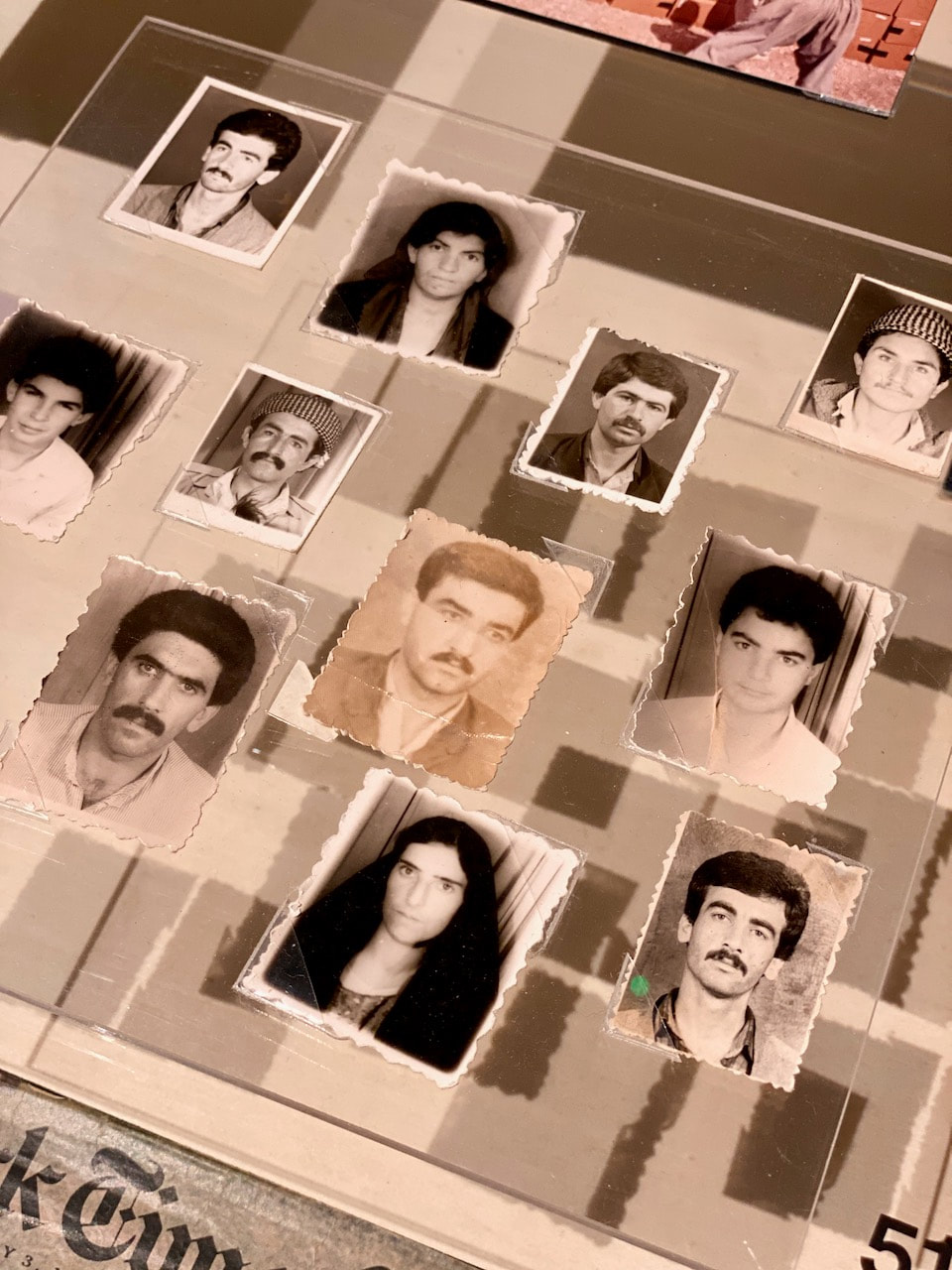
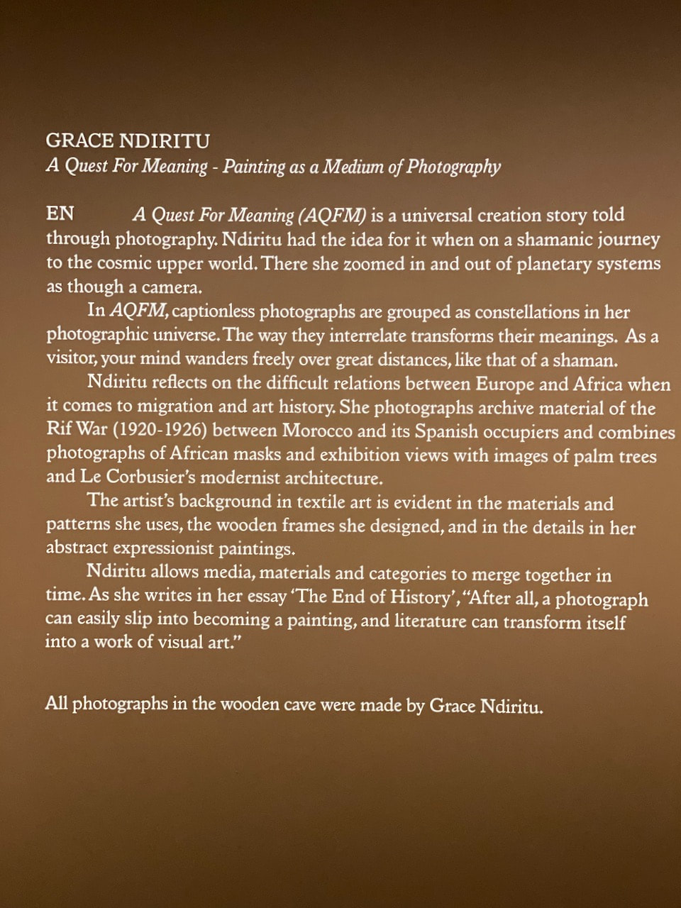
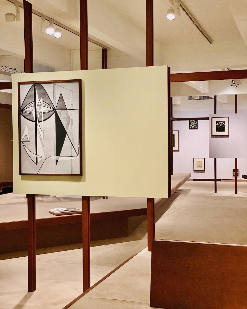
- Mediation, representation and the archive (Meiselas, Ndiritu, Manigaud and Lahlou)
- Abstraction (Berlanger, Lahlou, Ndiritu and Kassay)
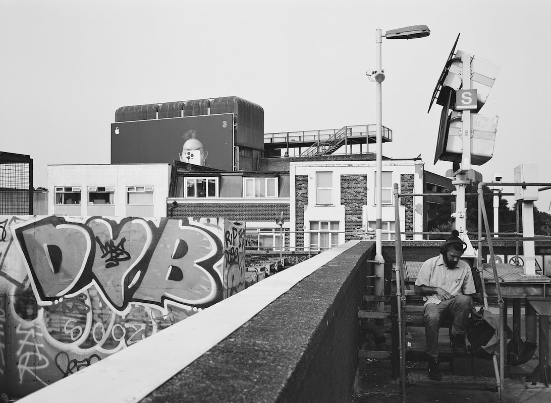
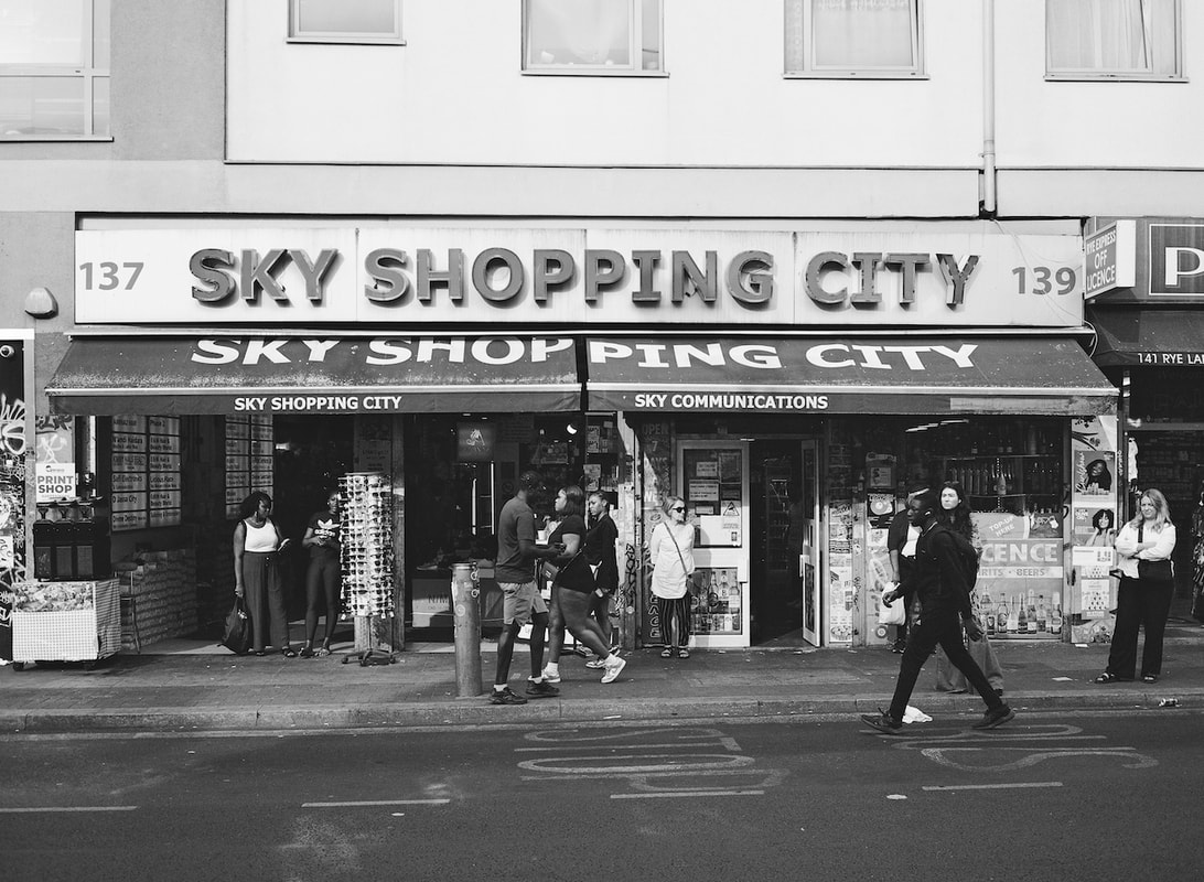
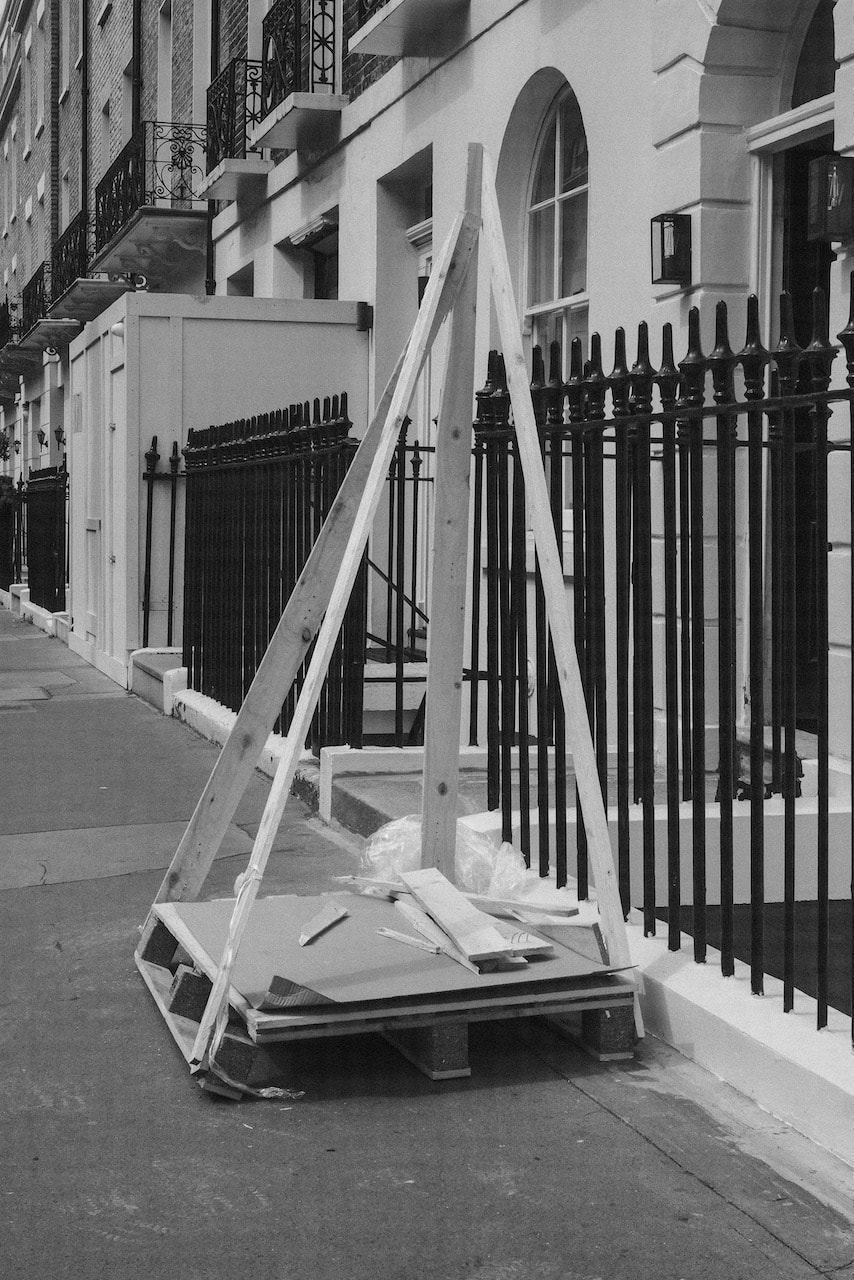
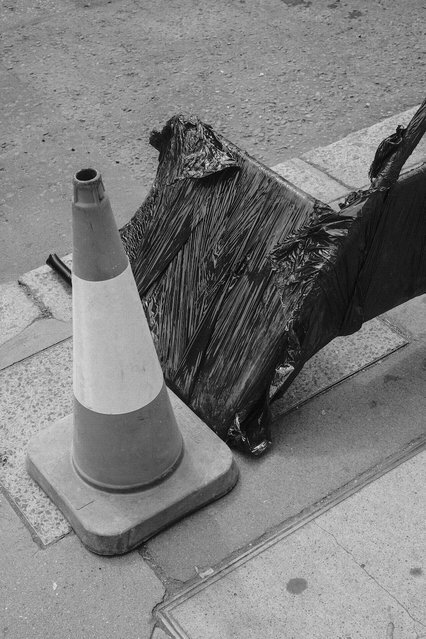
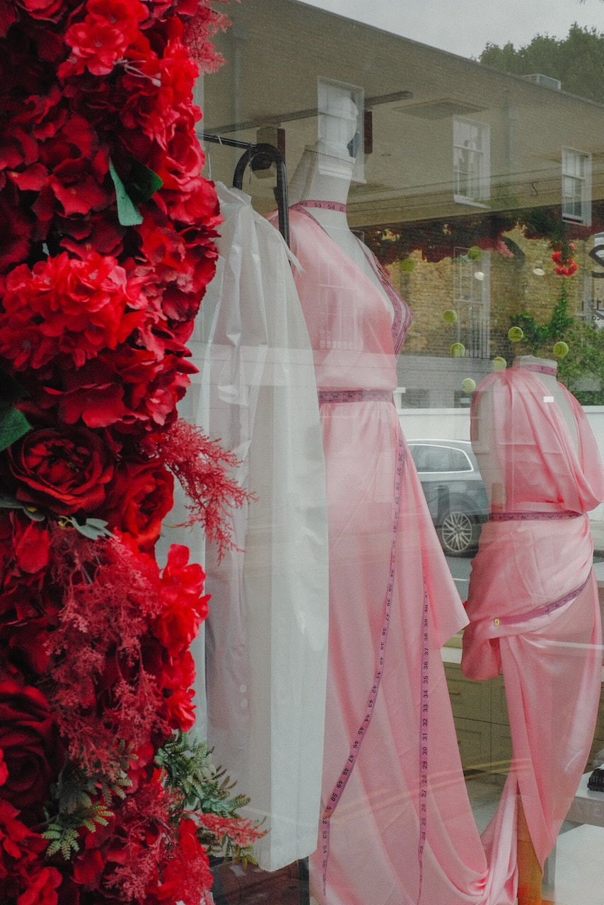
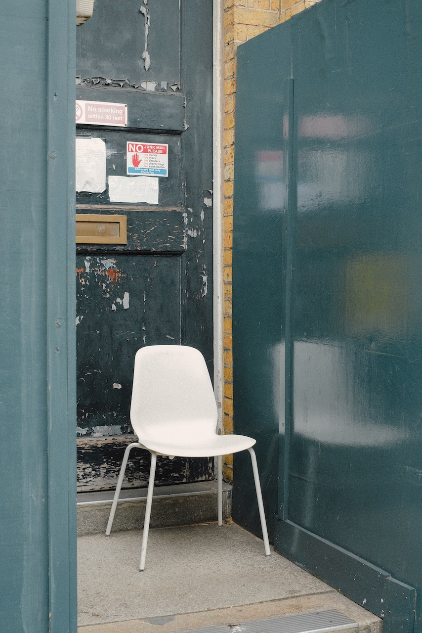
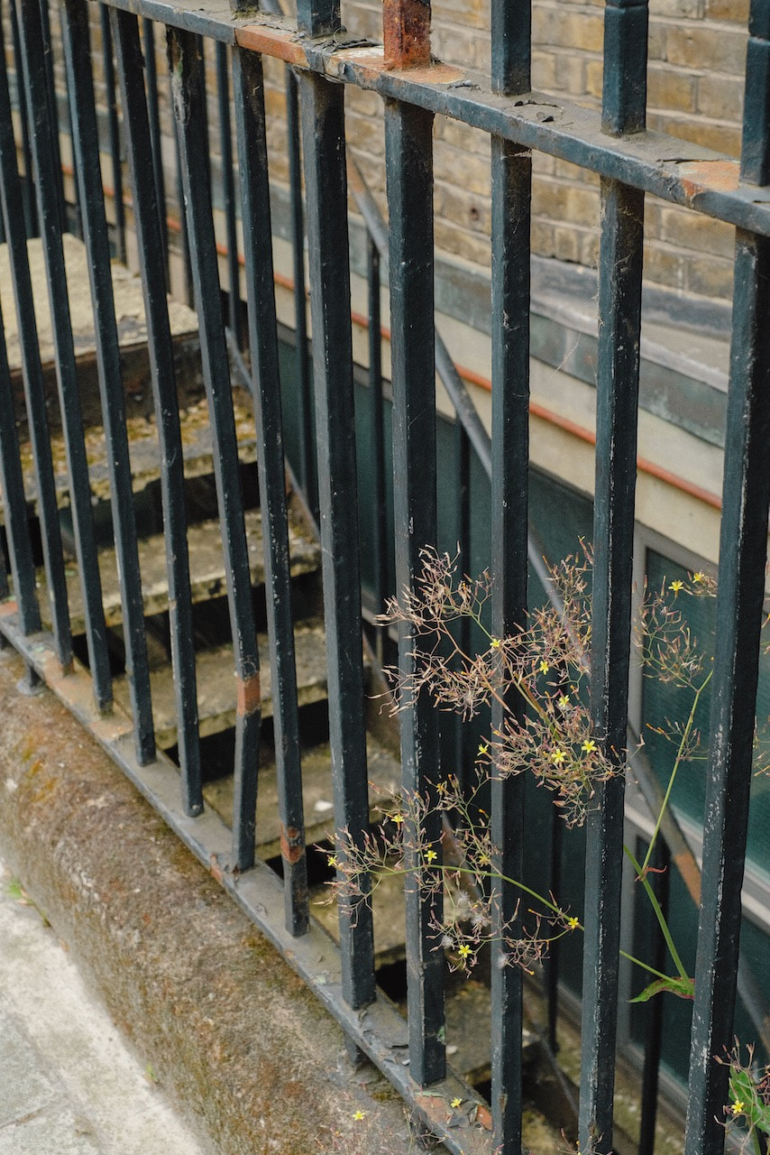
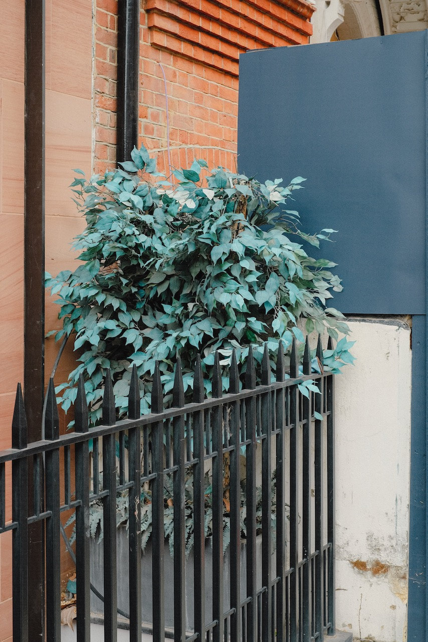
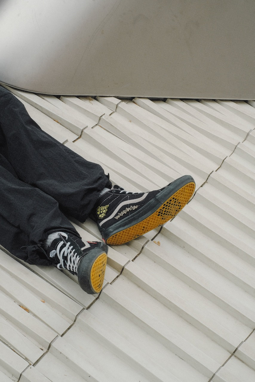
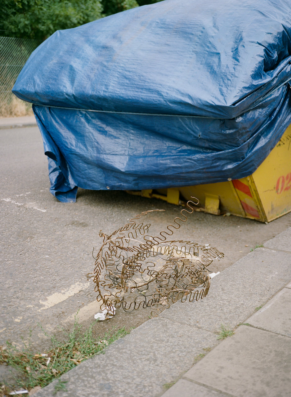
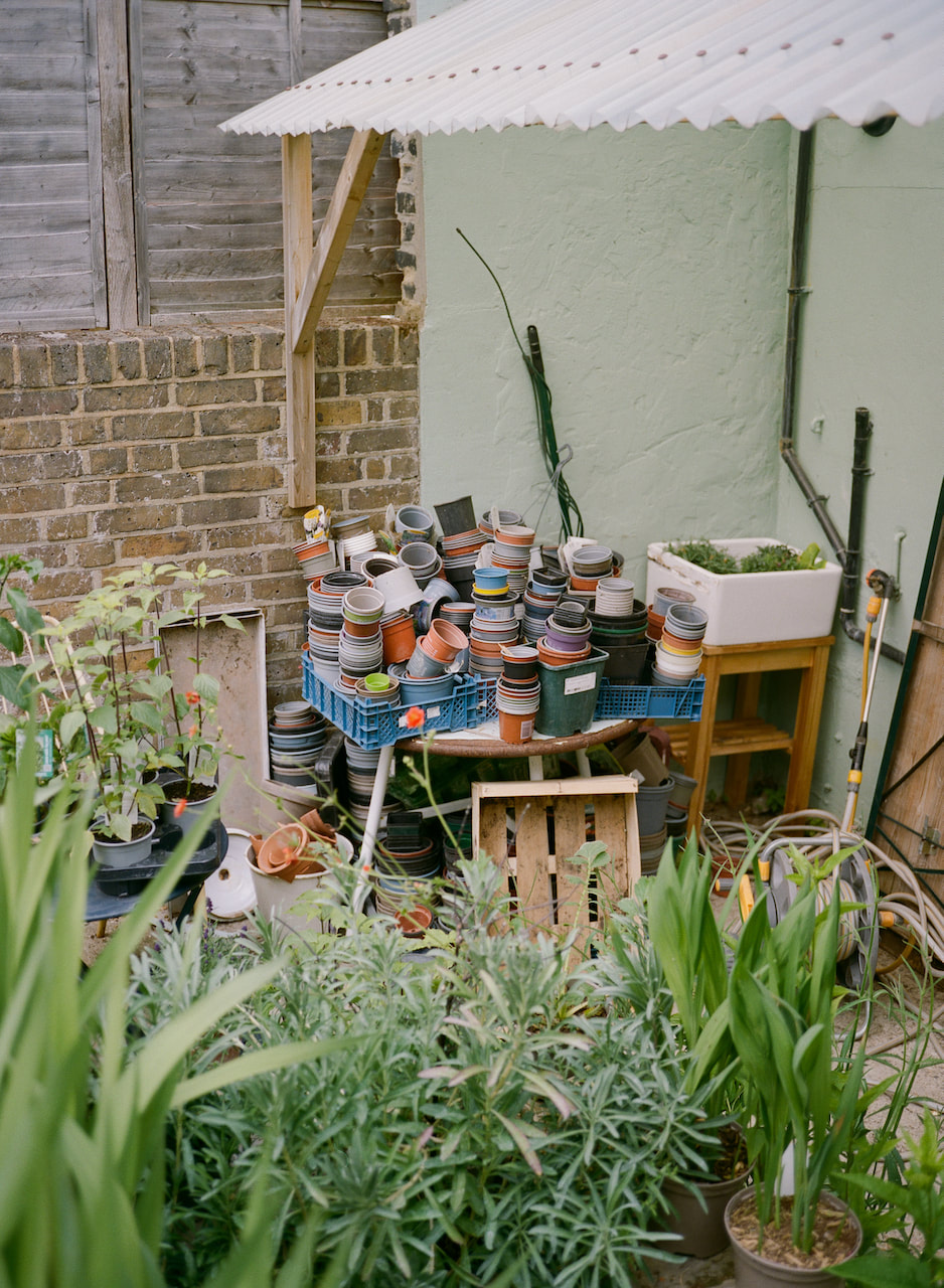
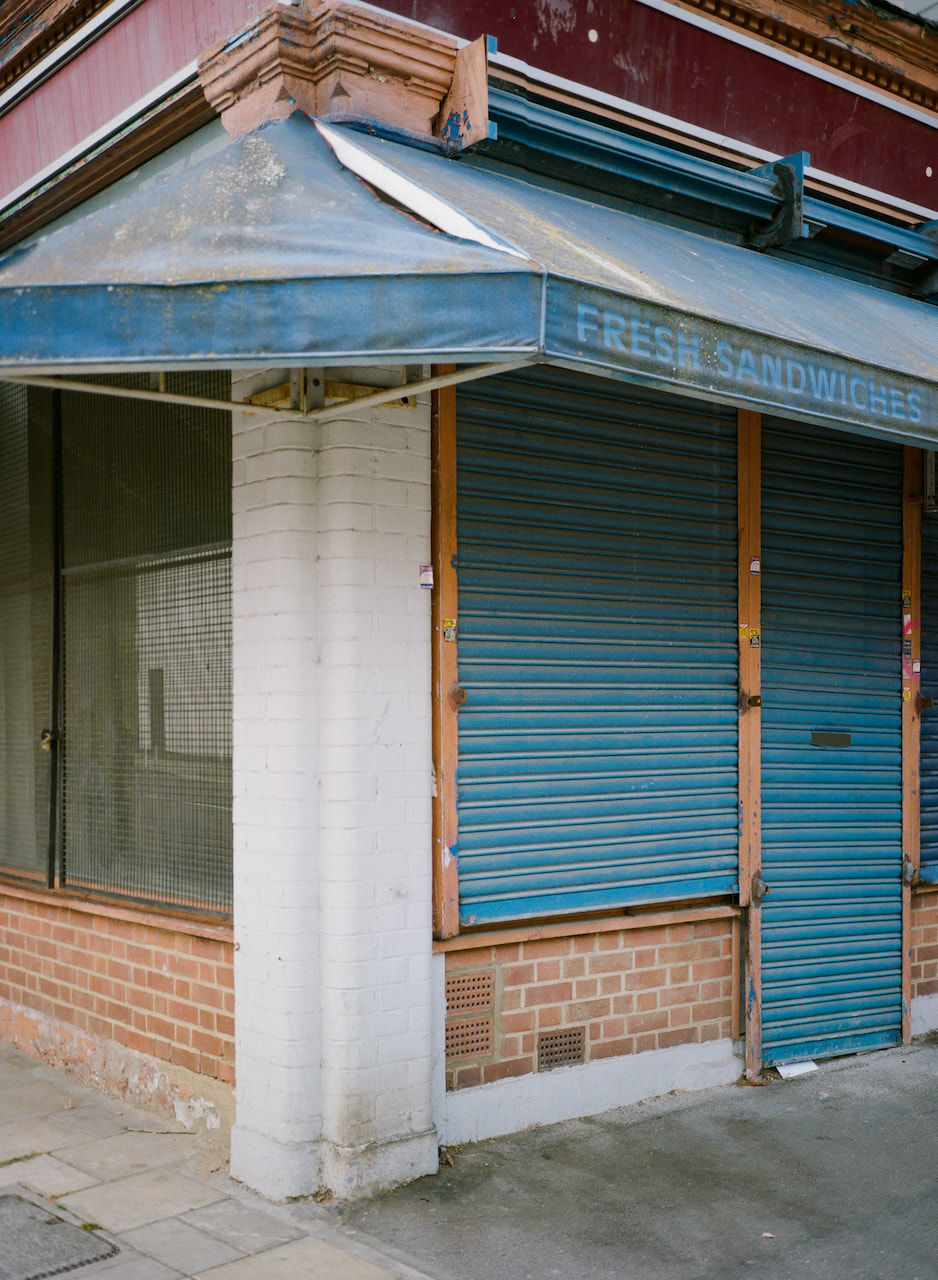
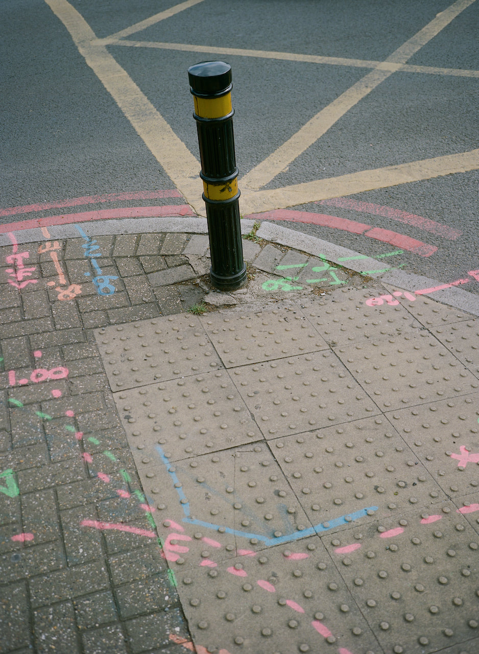
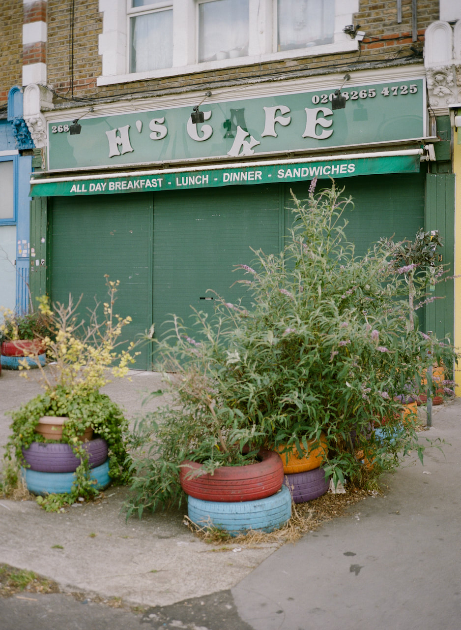
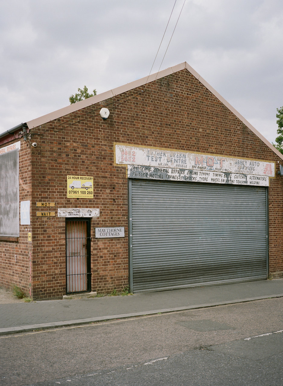
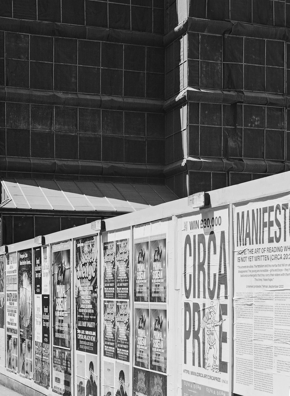
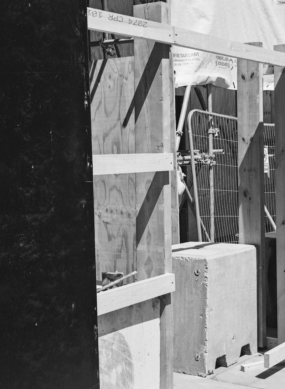
Strolls through south east London
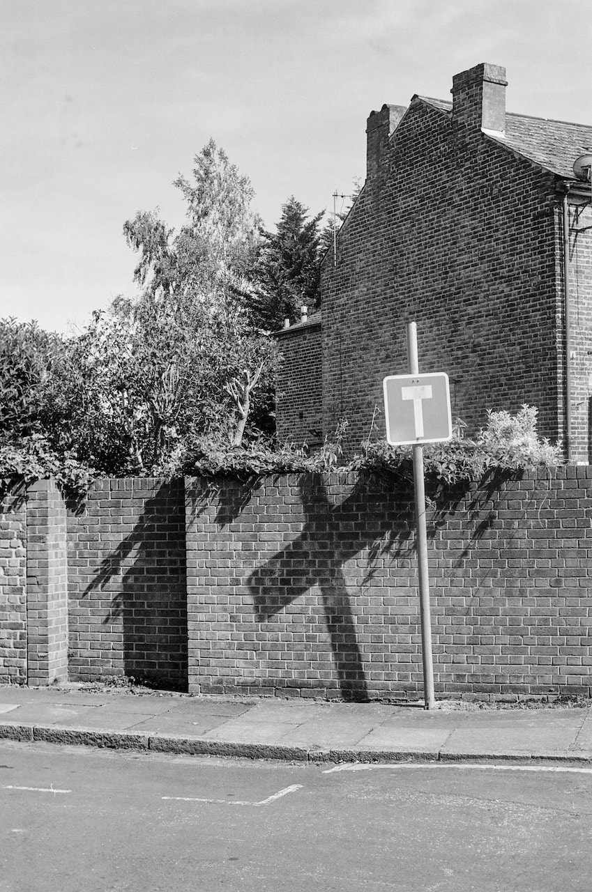
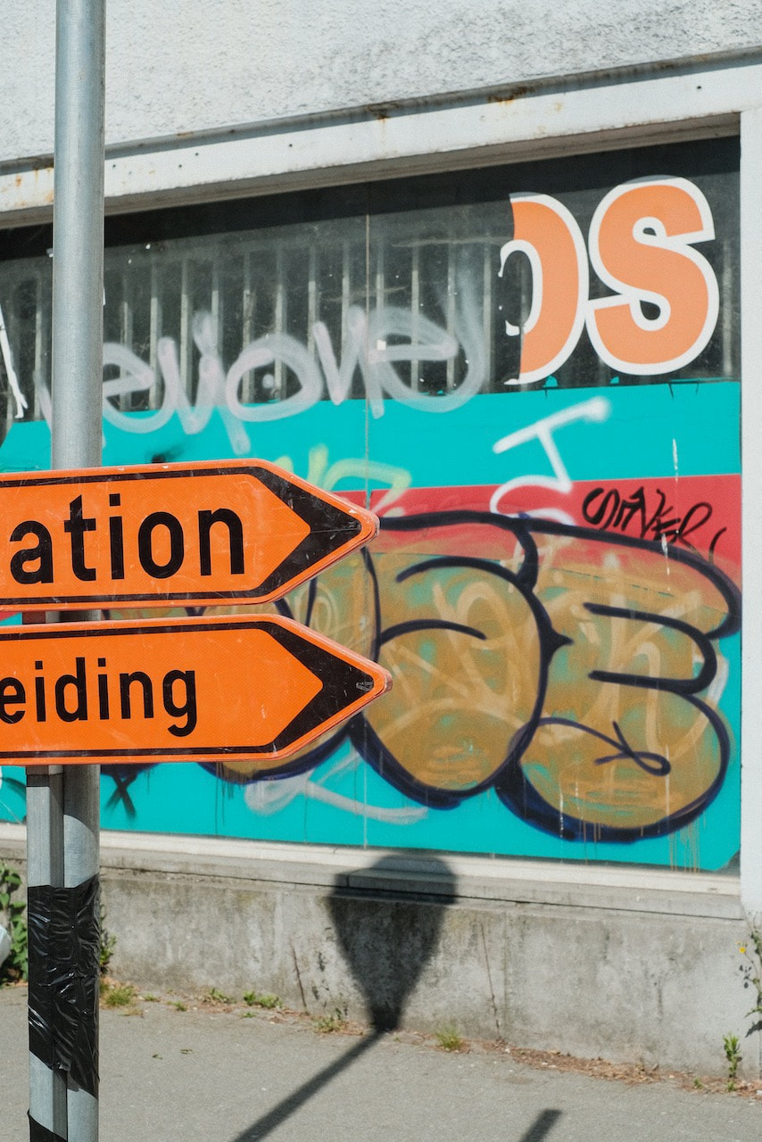
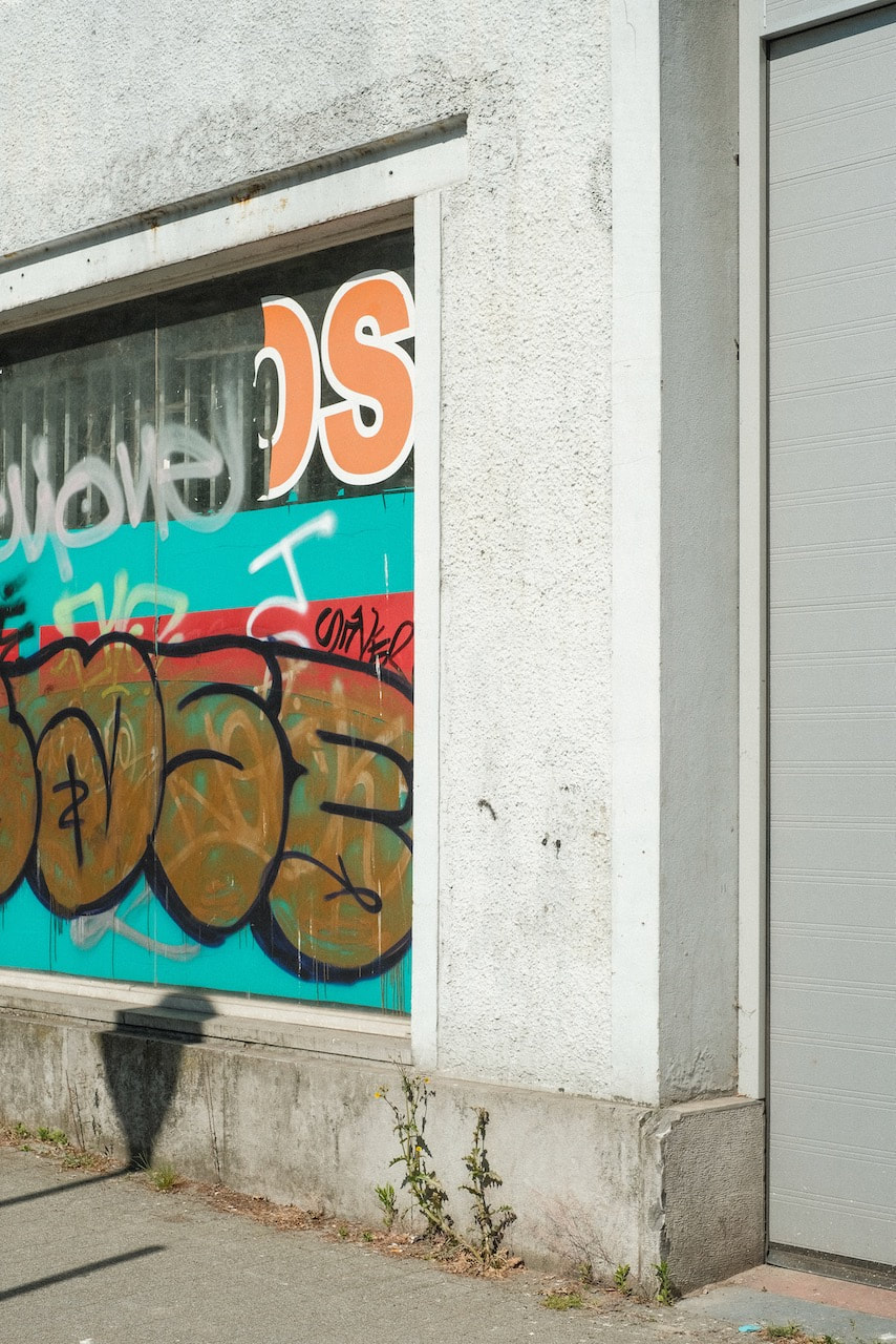
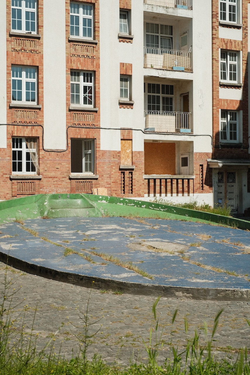
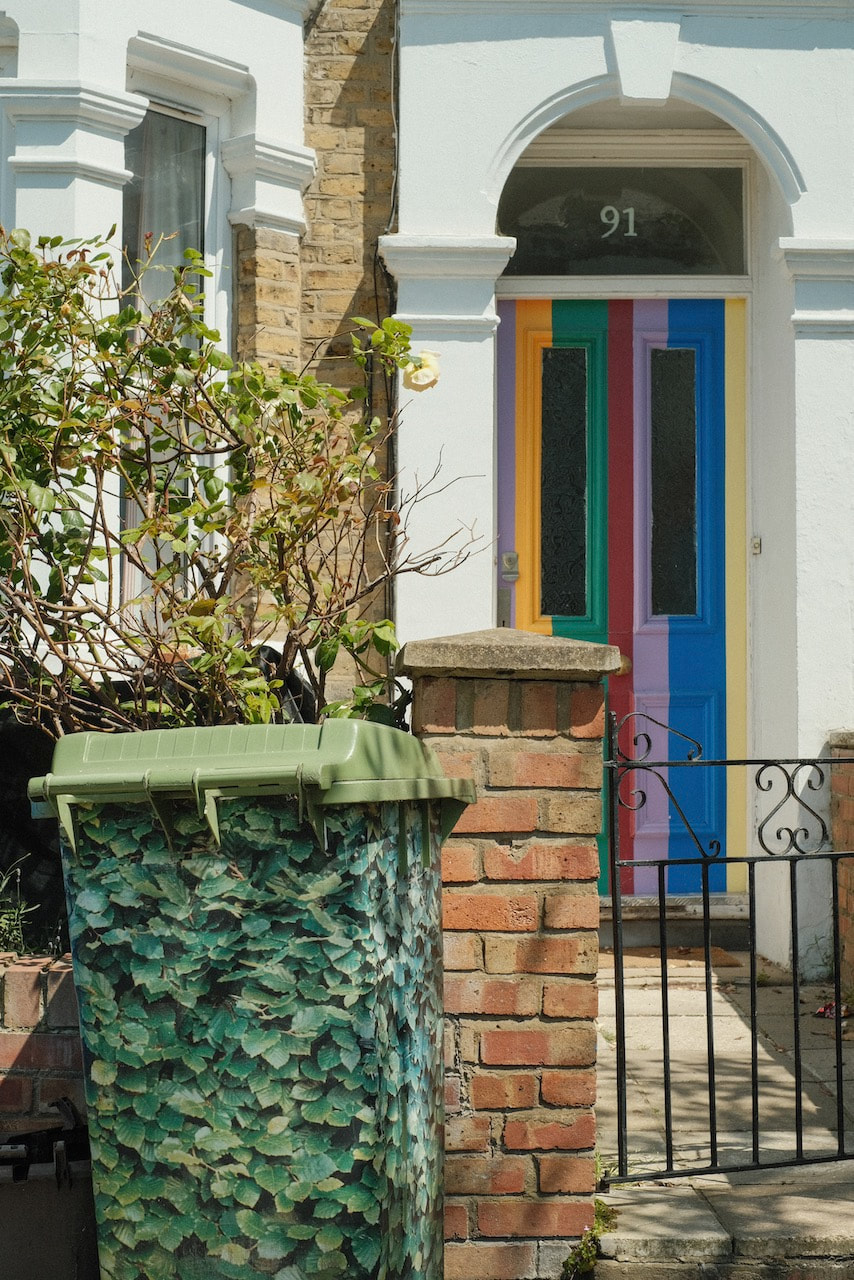
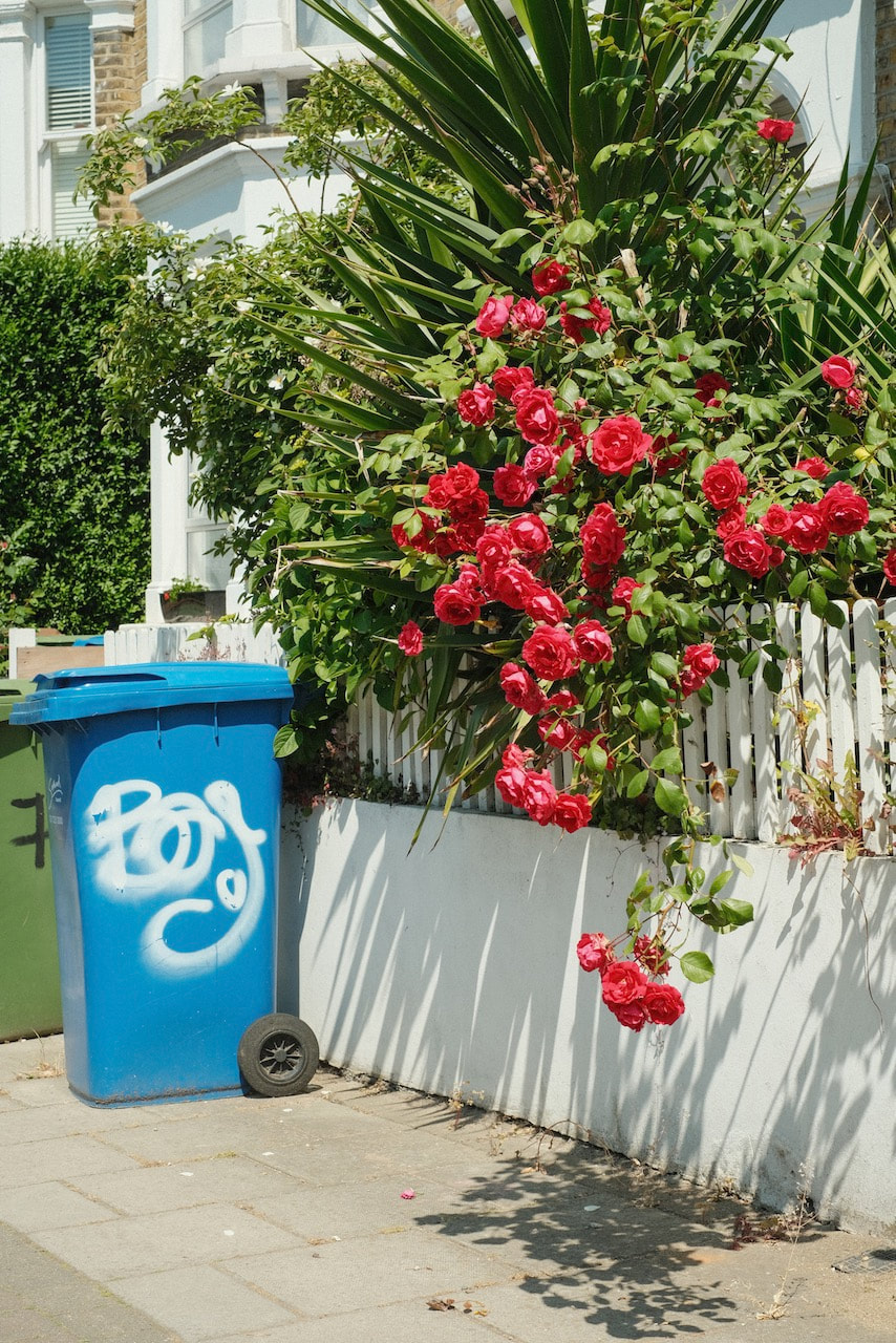
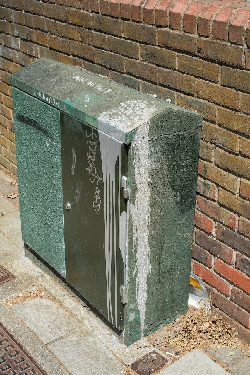
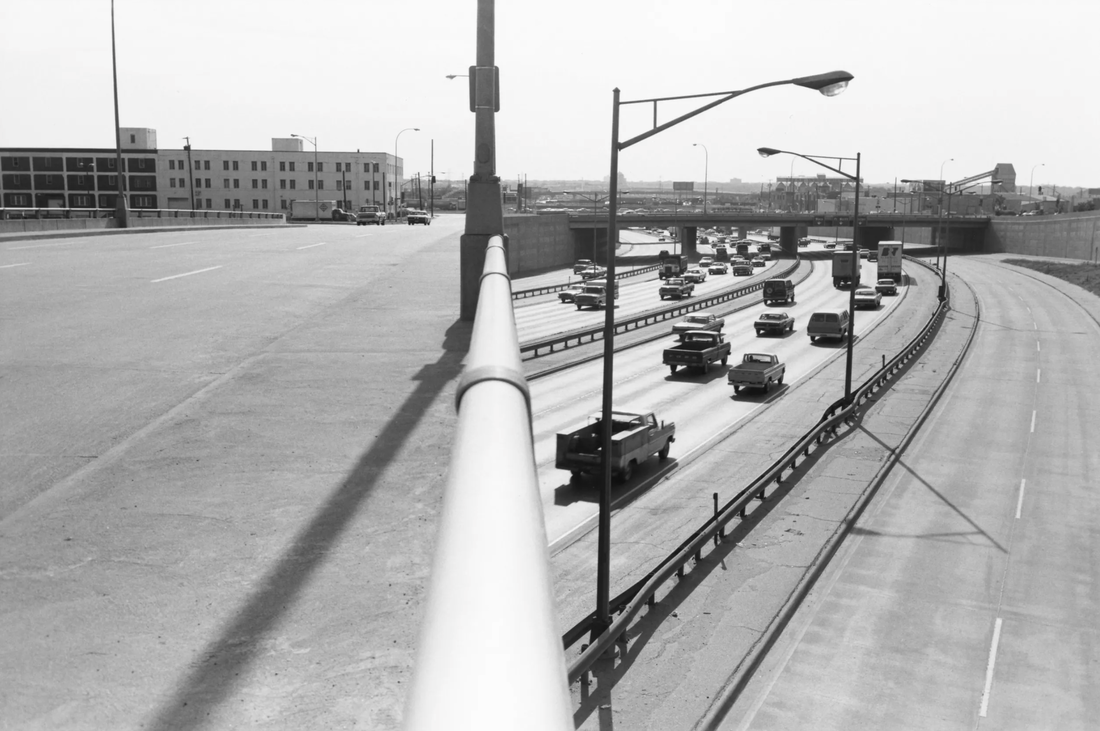
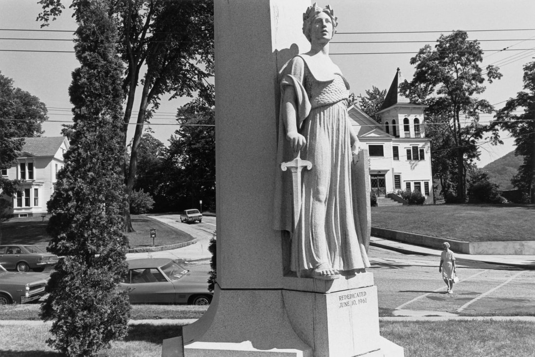
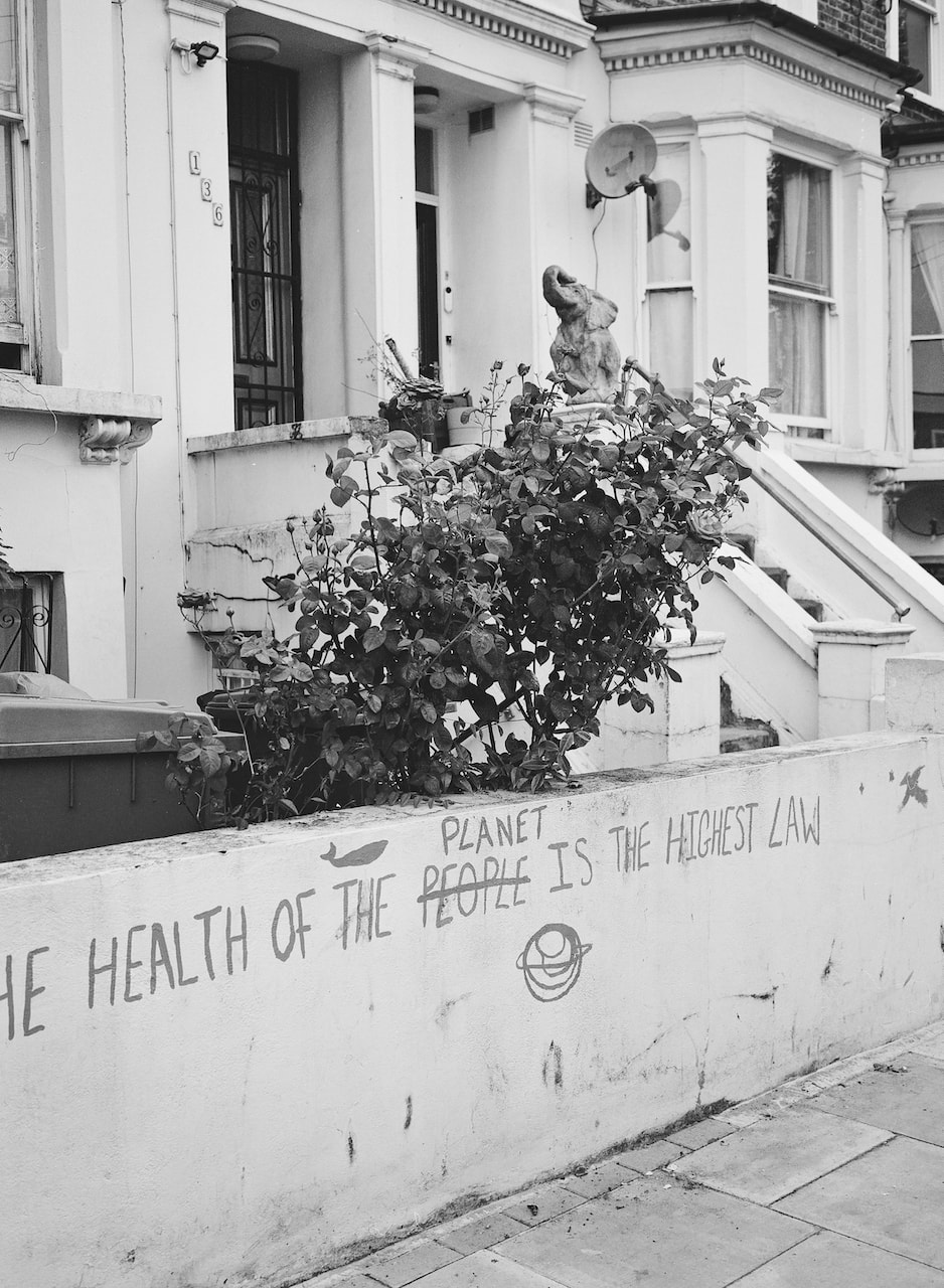
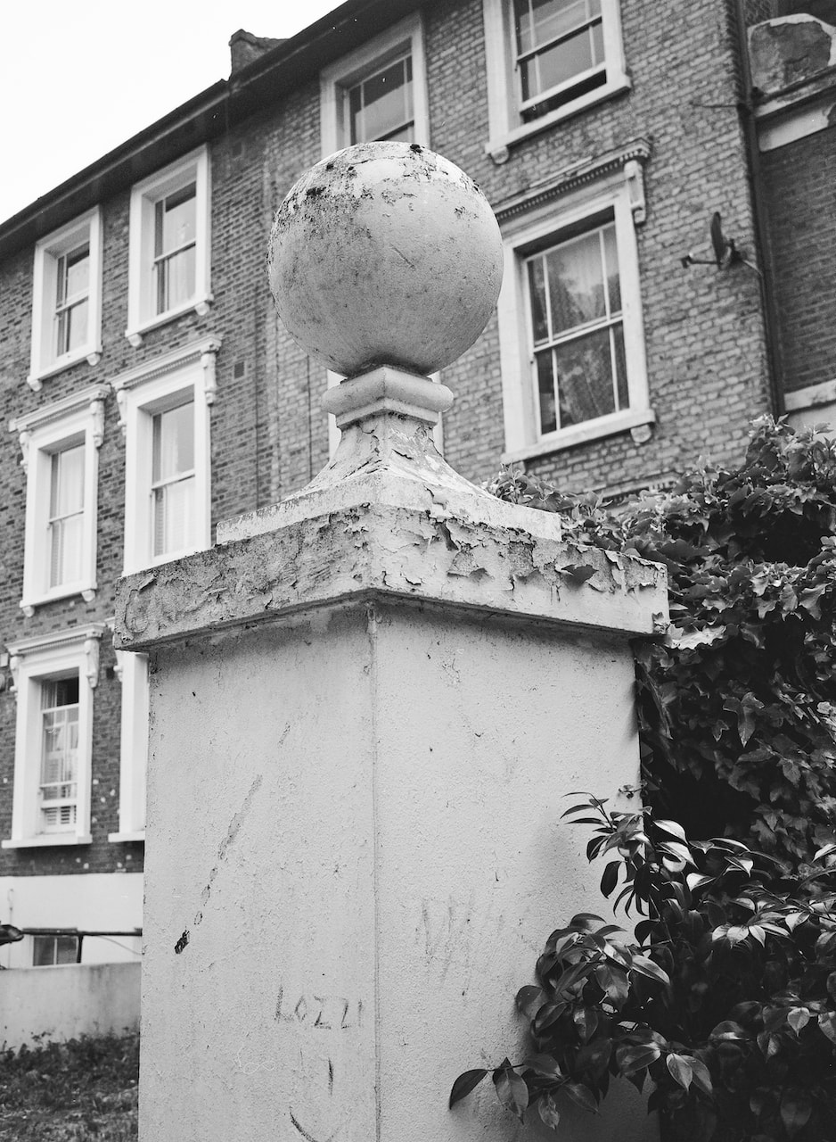
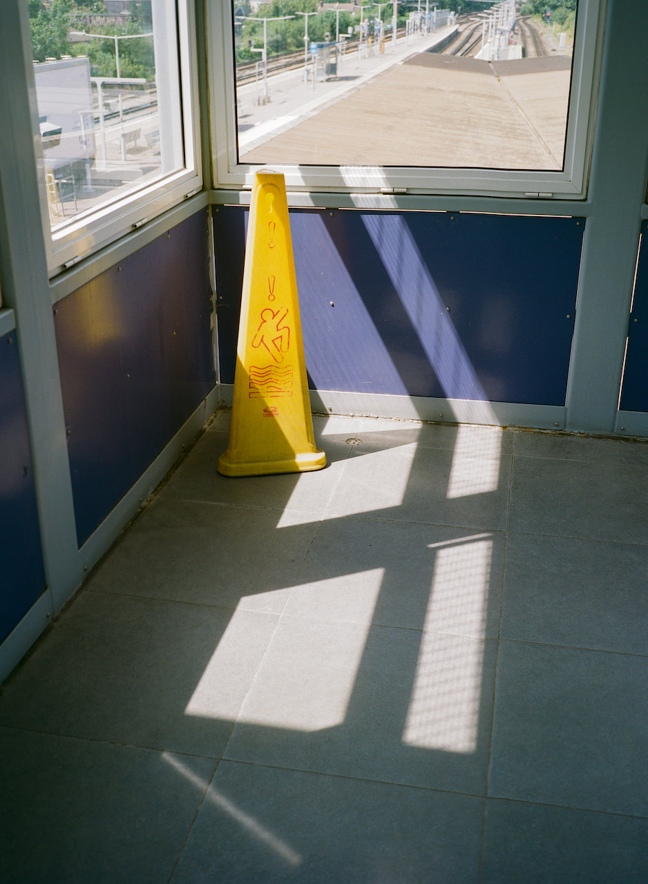
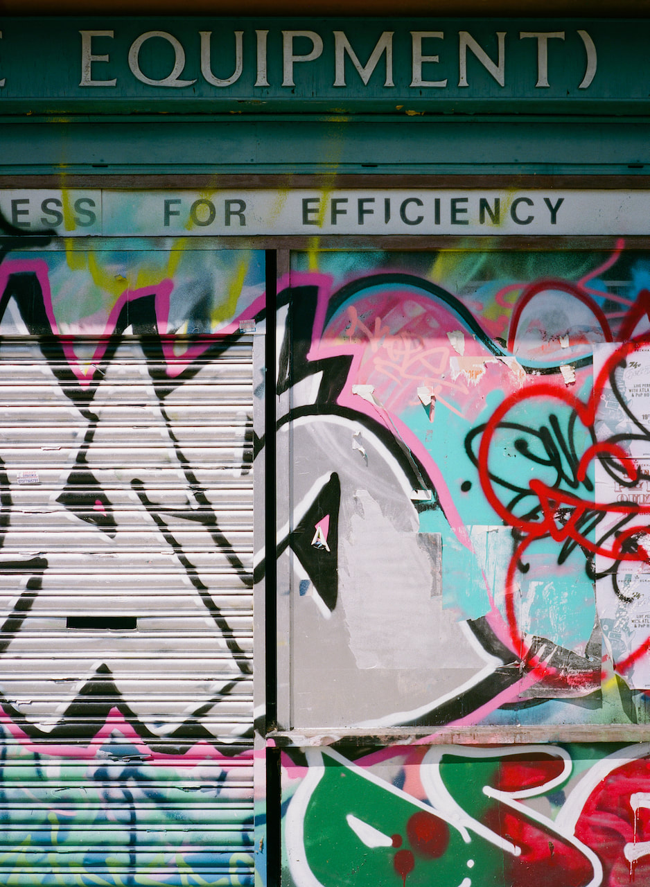
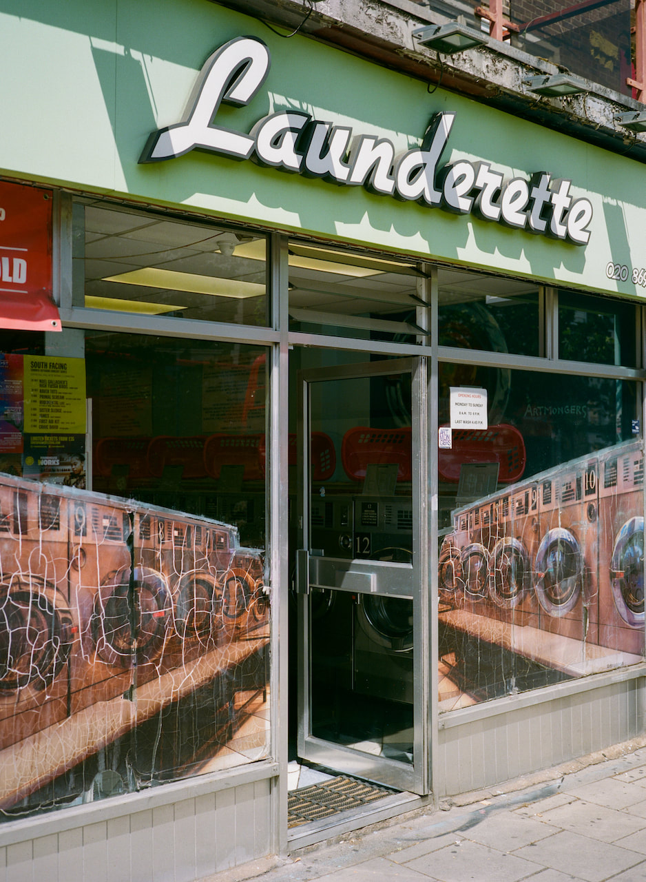
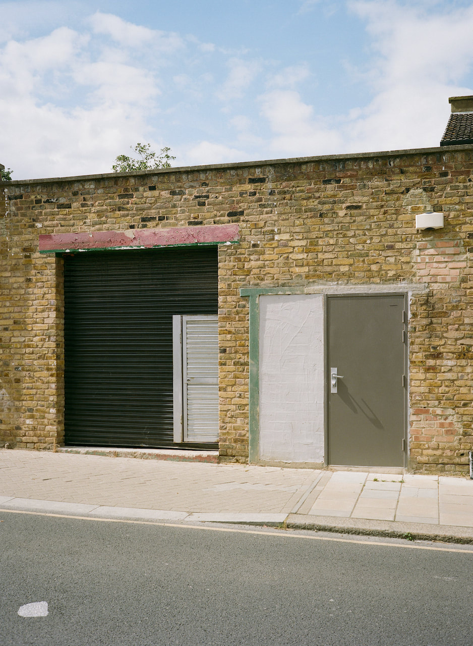
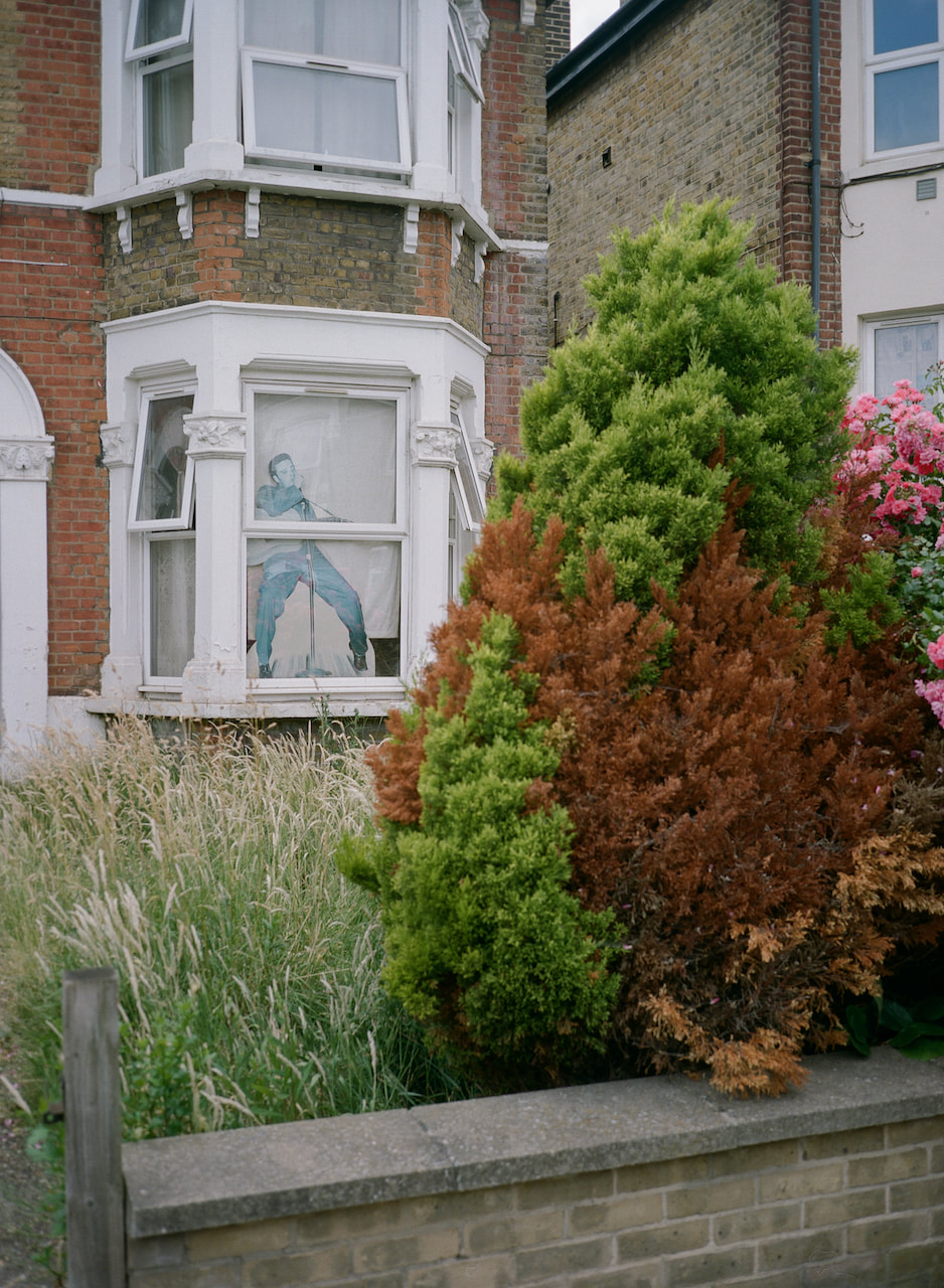
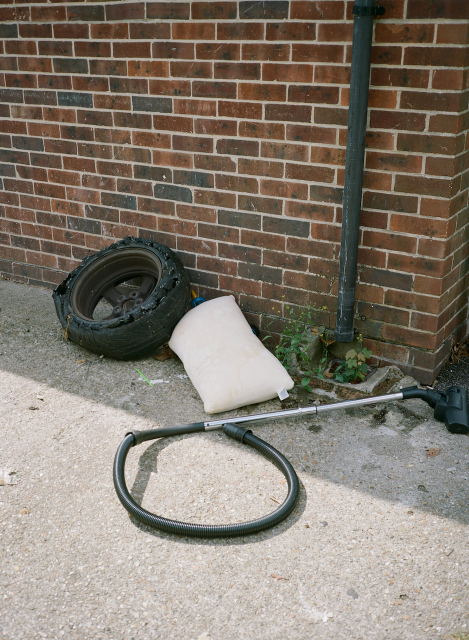
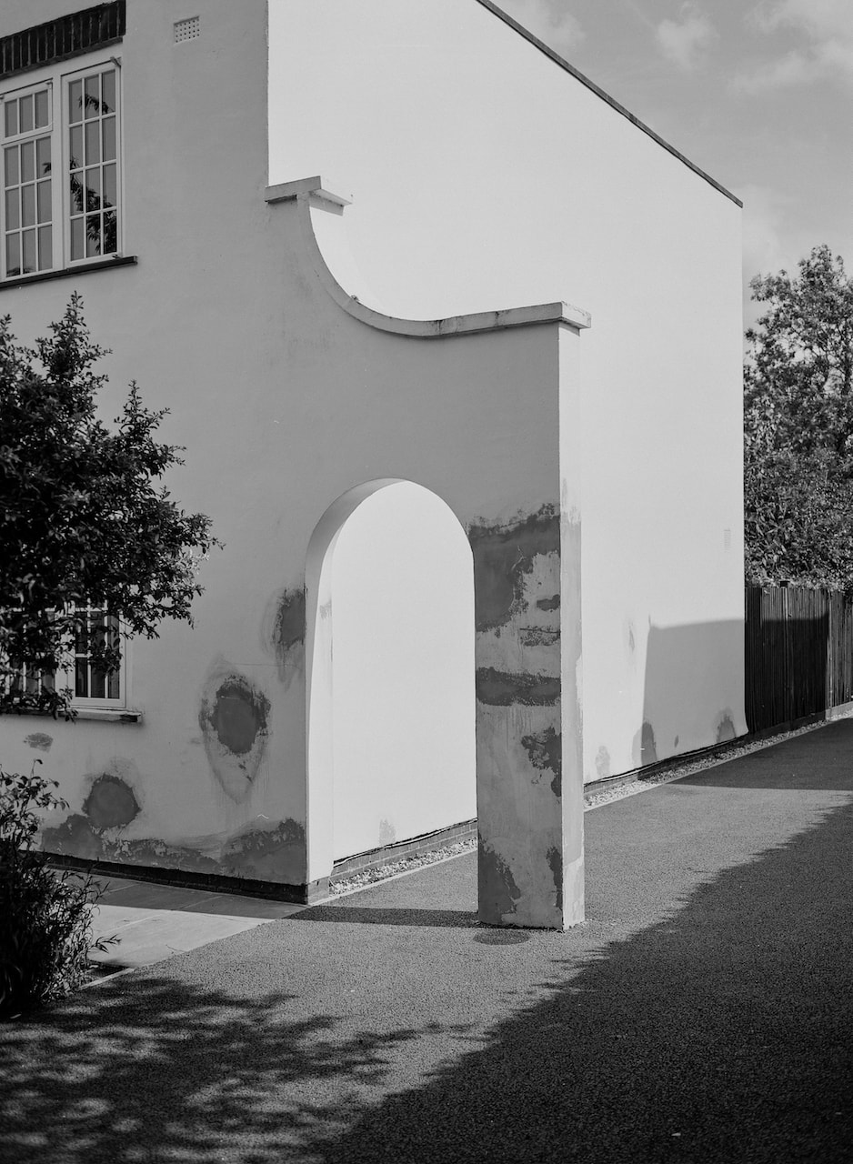
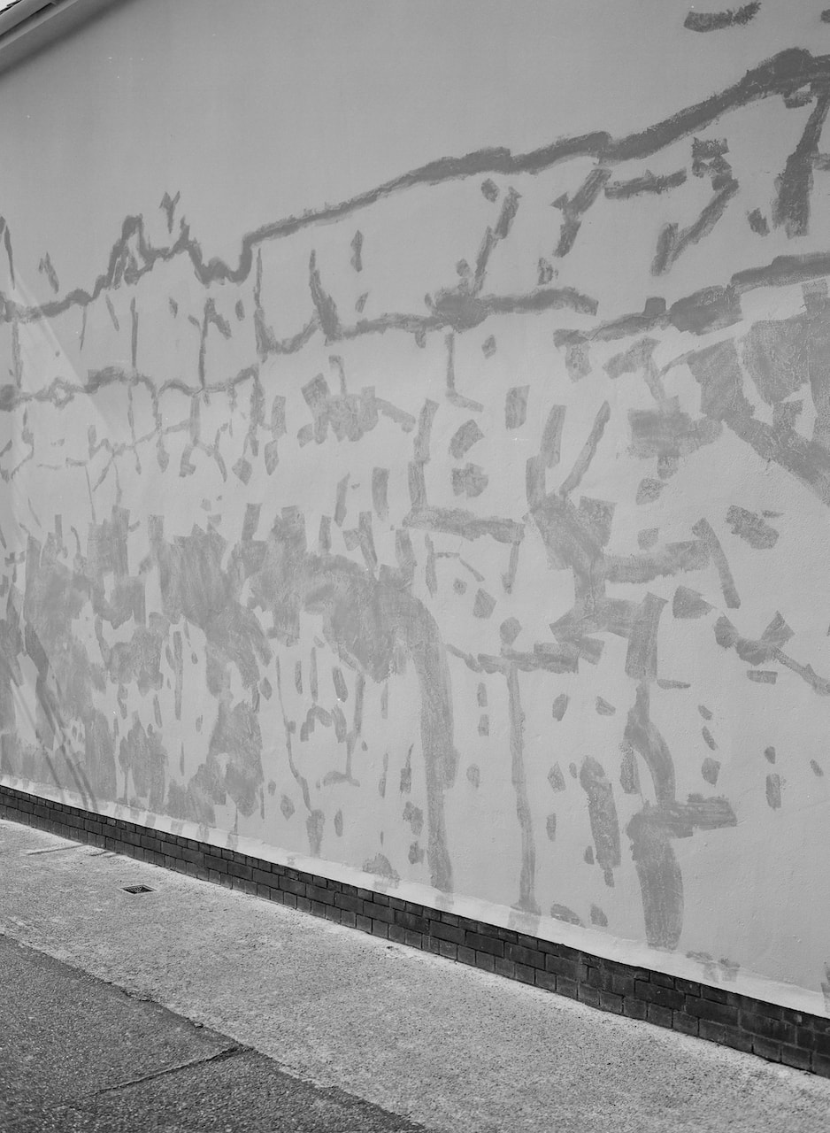
A couple of recent strolls through south East London (Peckham, Camberwell and Lee) shooting jpegs on a digital SLR and Portra 400 and Fuji XP2 Super 400 film recipes. I tend to take a camera with me wherever I go during my free time. I really like the look of the jpegs produced in camera using colour and black and white Fujifilm recipes. I do only a minor amount of post processing, making small colour corrections and opening up the shadows slightly.


Diptychs
|
|

|

|
Experimenting with Medium Format
These pictures were taken with a Fuji GS645S medium format rangefinder on Ilford XP2 Super 400 120 film. The camera has a 60mm f./4 lens which is roughly equivalent to a 35mm field of view on a 35mm camera. This is the first roll put through the camera and I'm relatively pleased with the results. The focus patch is quite small which makes it a bit tricky to use in bright light. All of the controls are on the lens barrel (aperture, shutter speed, focus and ISO) and it took me a while to get used to which ring was which! I managed to underexpose one picture and another is completely out of focus. I have done some very minor post processing on the scans in Lightroom. Using this camera really helped me to slow down and compose the shot carefully, constantly checking all the settings. The built in light meter seems very accurate and the lens is sharp. This is a wider field of view than I'm used to so it was interesting composing shots with more information in them. I'm excited to take some more pictures with this camera in the coming weeks.
Diptych
|
|
Diptychs Research
A diptych (from the Greek δίπτυχον, di "two" + ptychē "fold") is any object with two flat plates which form a pair, often attached by hinge. Wikipedia
According to the Gestalt principle of “proximity,” when we see two things next to each other, our mind assumes some kind of relationship between them. Otherwise, why would they be together? That assumption deepens when viewing artistic works, because we believe the artist placed the two pieces together for a reason. The meaning of the juxtaposition might be obvious. In other cases, we might find ourselves scratching our heads.
-- John Suler
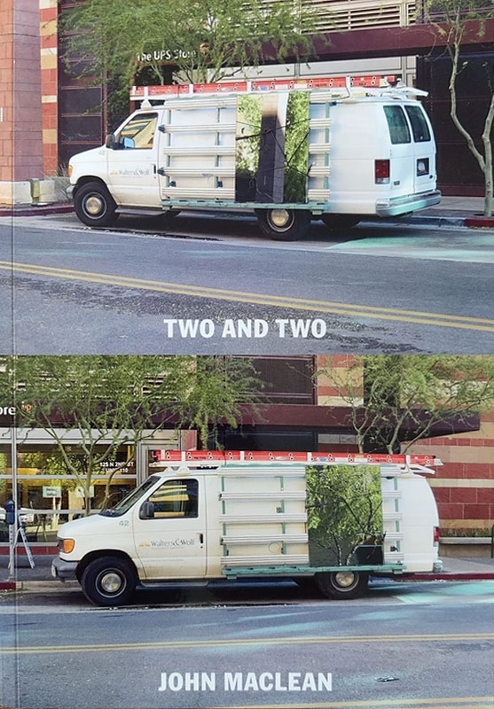
John MacLean's Two and Two
|
|
We can list, as examples of types of conflicts within the form-characteristic for the conflict within the shot, as well as for the conflict between colliding shots, or, montage:
1. Graphic conflict
2. Conflict of planes
3. Conflict of volumes
4. Spatial conflict
5. Light conflict
6. Tempo conflict, and so on.
-- Sergei Eisenstein, A Dialectic Approach to Film Form
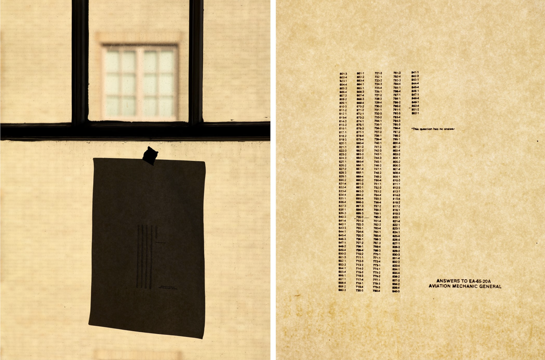
Luke Fowler's Two Frame Films
[Montage is] an idea that derives from the collision between two shots that are independent of one another.
art is always conflict […] It is art's task to make manifest the contradictions of Being. To form equitable views by stirring up contradictions within the spectator's mind, and to forge accurate intellectual concepts from the dynamic clash of opposing passions.
-- Sergei Eisenstein, A Dialectic Approach to Film Form
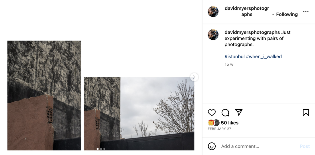
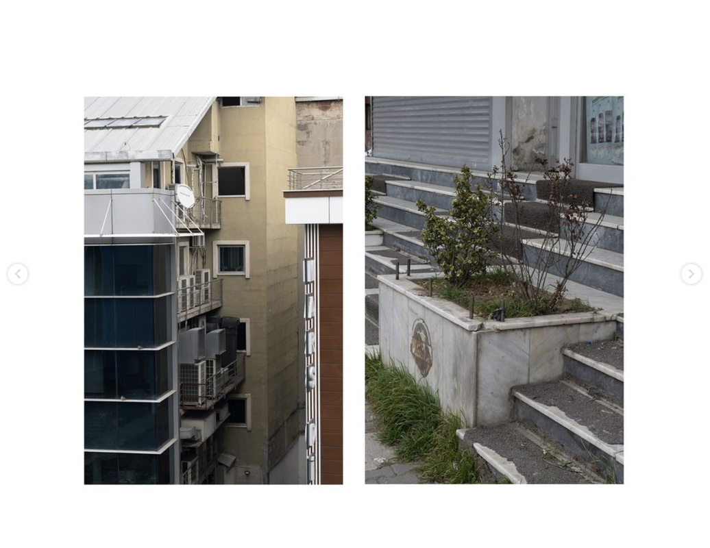
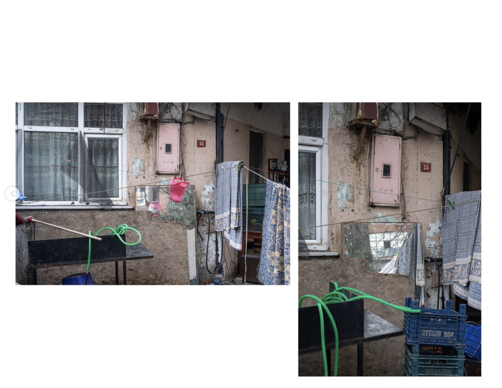
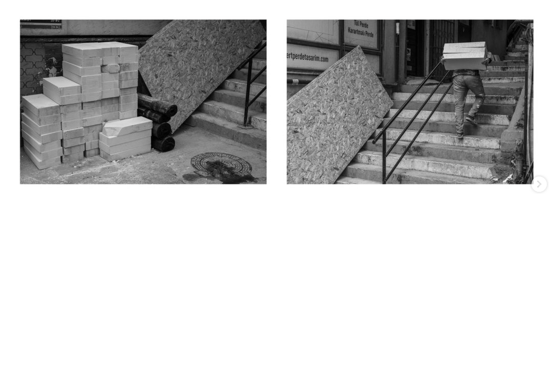
David Myers' Instagram Experiments
Medium Format continued...

Diptychs
|
|
|
|
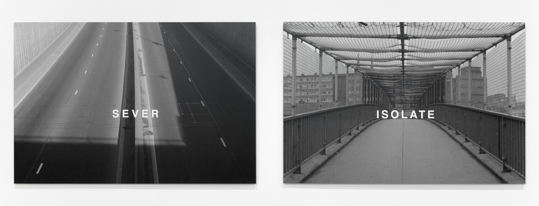
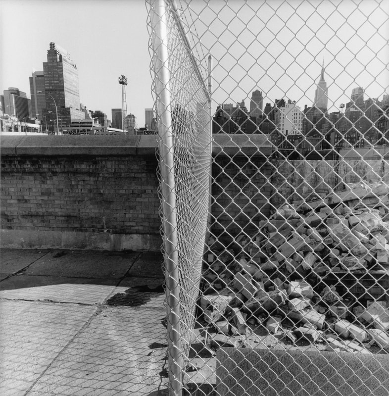
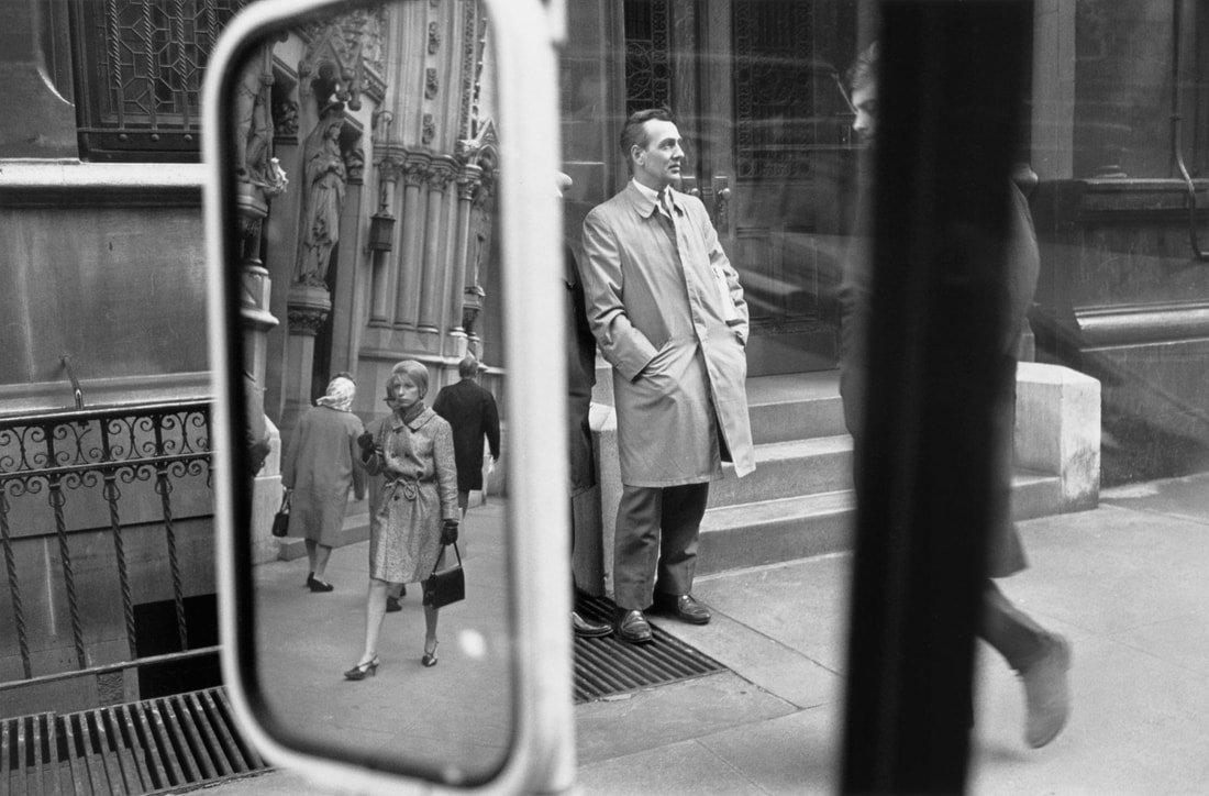
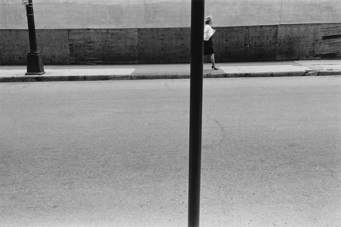
Lee Friedlander's framing
A new exhibition of Lee Friedlander's work, curated by film maker Joel Coen, presents the photographer's fascination for compositions in which the subject is seemingly split in half, creating a kind of diptych.
As a filmmaker, I liked the idea of creating a sequence that would highlight Lee’s unusual approach to framing—his splitting, splintering, repeating, fracturing, and reassembling elements into new and impossible compositions.
-- Joel Coen
I love Friedlander's pictures but this selection of images makes it clear how often he used this strategy of splitting the composition down the centre, positioning himself in such a way that an object in the scene - the edge of a wall, a signpost, a fence or window frame - bisects the view. In this way, he is able to suggest the diptych form in a single frame. This is something I might try in the near future.
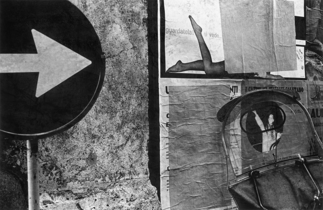
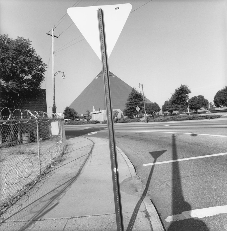
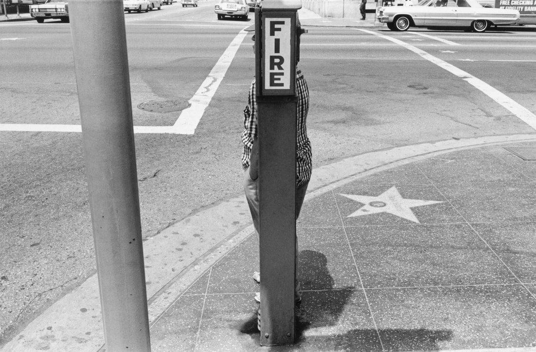
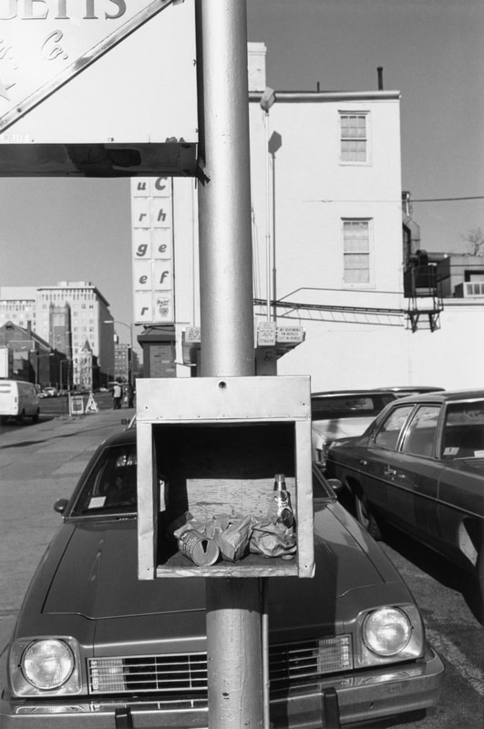
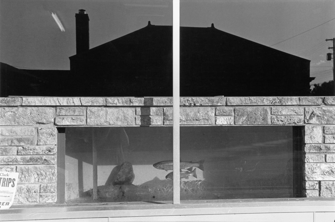
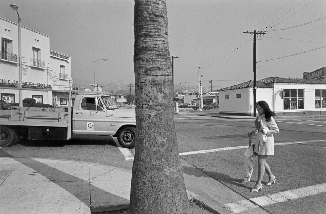
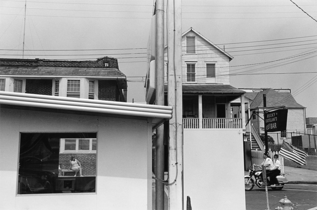
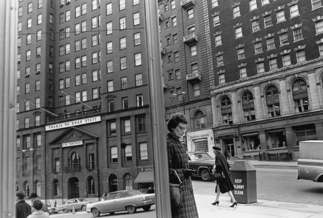
The exhibition also featured a slideshow of Friedlander's pictures, edited by Coen. I really like the way the director has selected, sequenced and arranged the images to further exemplify the central division of many of the compositions and creating diptychs of pseudo diptychs:
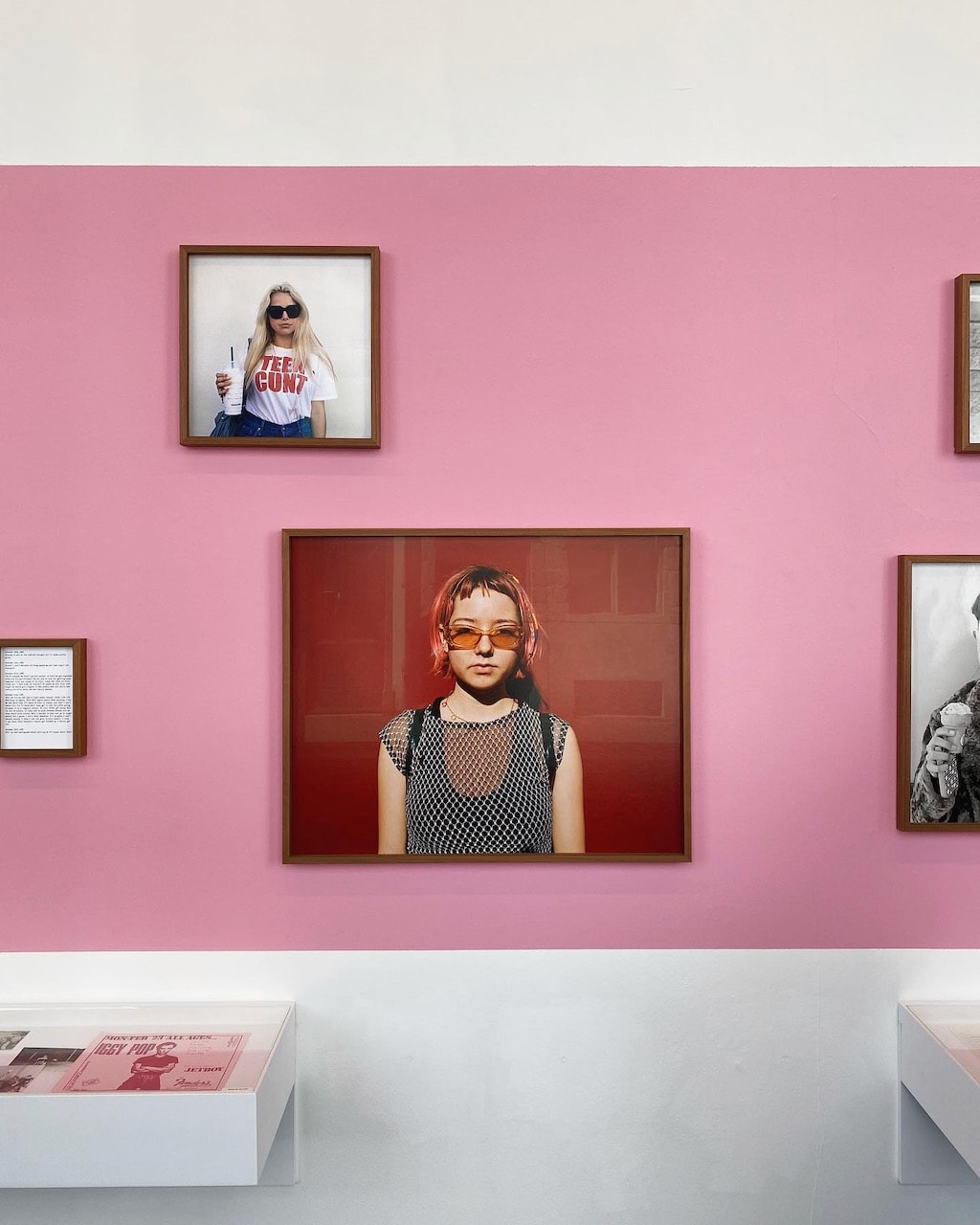
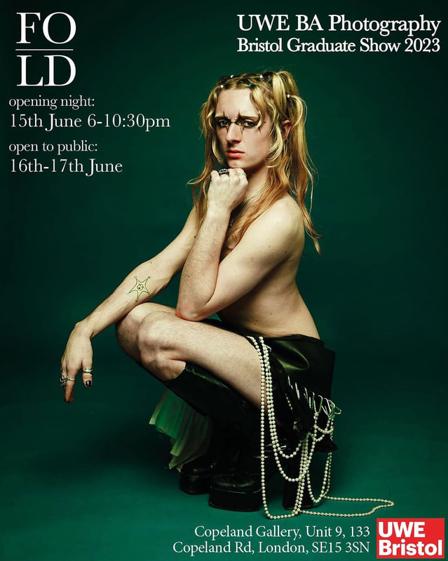
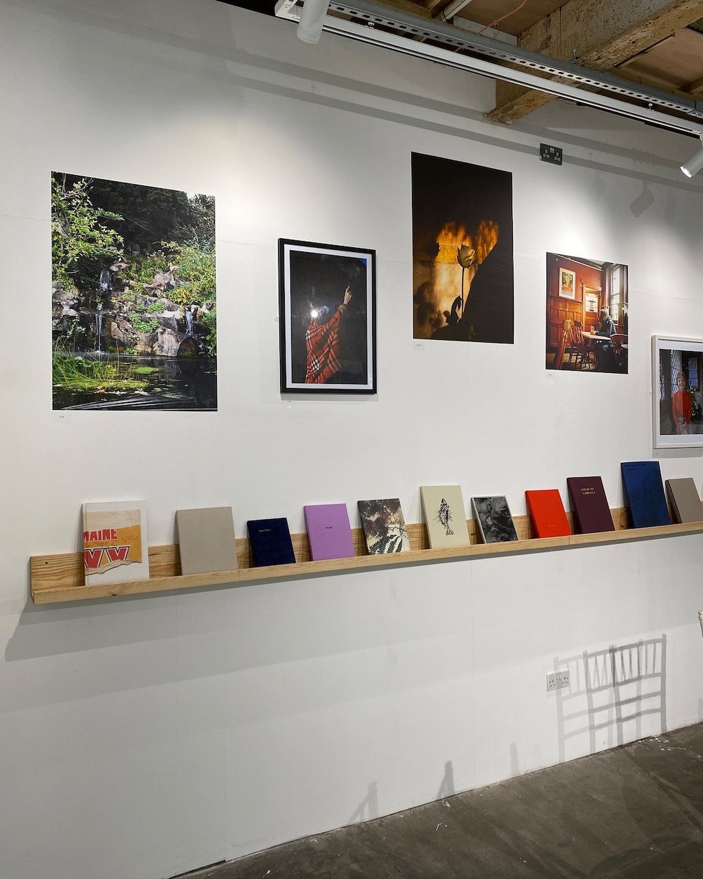
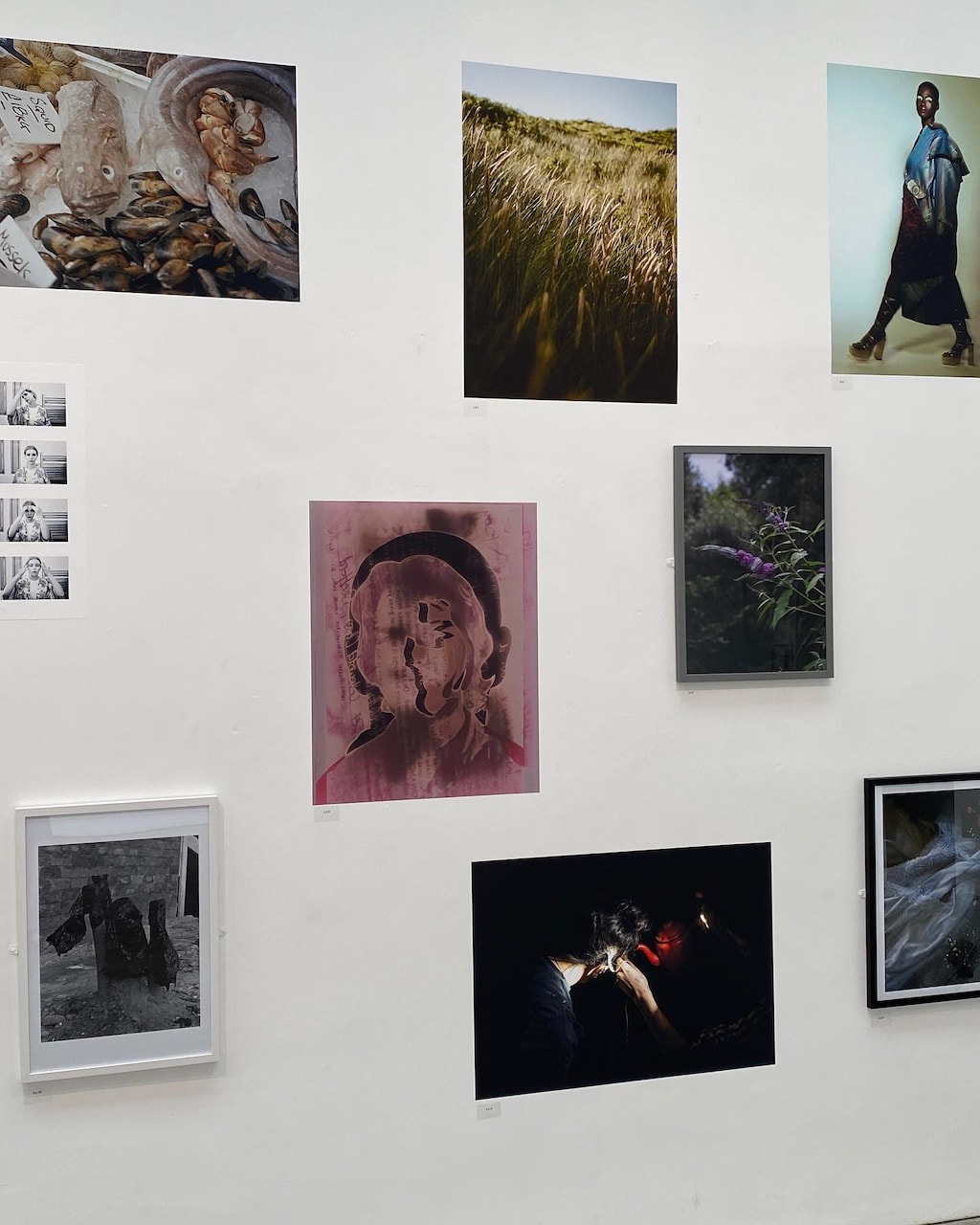
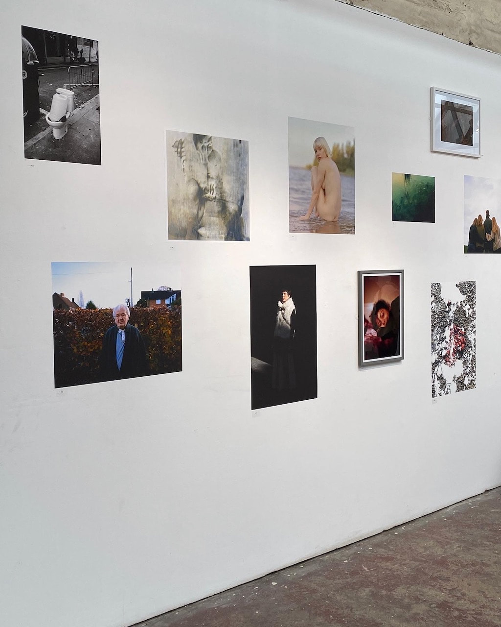
University of the West of England BA Photography Graduate Show 2023
Copeland Gallery, Peckham 17.6.23
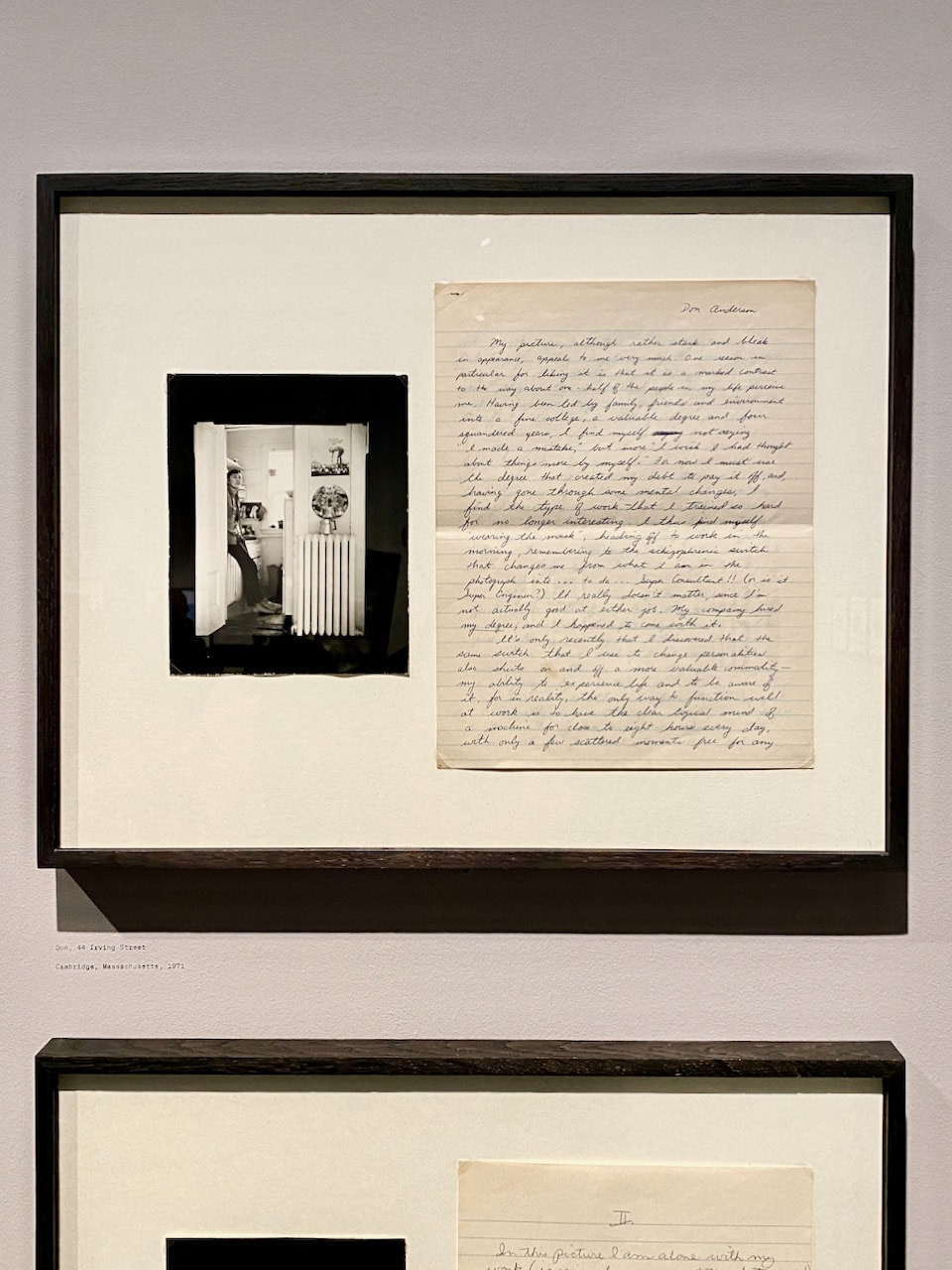
I really enjoyed this show of recent graduate work because it included photobooks, portfolios and process documents - sketchbooks, exercises, experiments and ephemera. Since the students are based in Bristol, an exhibition in London was presumably an opportunity for them to meet industry professionals and begin to network. The show was very democratic in that all the students seemed to have an equal opportunity to showcase their work. The hang mixed up the work in a combination of prints stuck directly to the walls and in frames. I was surprised by the emphasis on physical sketchbooks and wondered whether this was a requirement of the course. Several students had opted to experiment with the materiality of photography and I particularly enjoyed the work about a personal experience of diabetes and the resulting images which seemed to be encased in translucent resin. I was very tempted to buy a photobook and/or print in the shop on the way out but managed to resist. All of the work on display seemed to be of a very high standard both conceptually and technically.
|
|
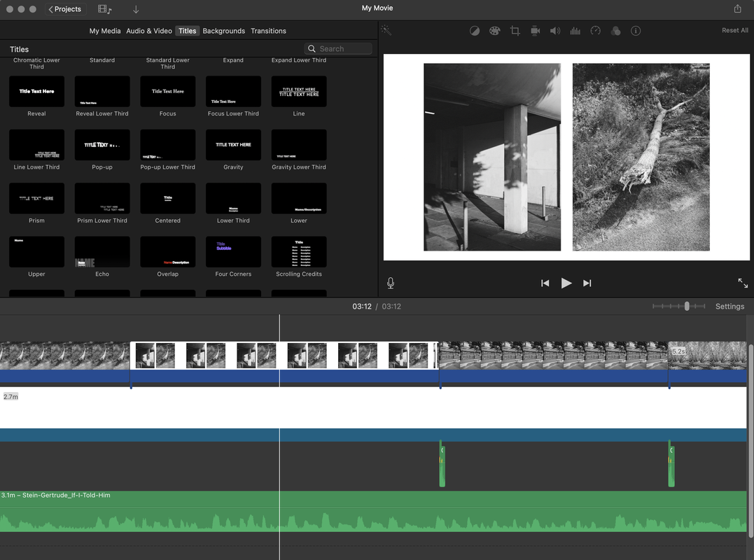
Everyday Diptychs slideshow
I really enjoyed the slideshow of Lee Friedlander's photographs created by Joel Coen and so decided to have a go at making one of my own using recent medium format pictures. I created a set of diptychs in Photoshop and then assembled the slideshow in iMovie using the picture in picture feature. I added a camera shutter sound and, after watching it through a few times, realised that it needed a soundtrack. I liked the idea of using found sounds and searched on Ubuweb for something interesting. I discovered a recording from 1935 of Gertrude Stein, the famous art collector and writer, reading one of her poems. I liked the sound of her voice and some of the language seemed to fit (by chance) with the images in the slideshow:
|
Shutters shut and open so do queens. Shutters shut and shutters and so shutters shut and shutters and so and so shutters and so shutters shut and so shutters shut and shutters and so. And so shutters shut and so and also. And also and so and so and also.
Exact resemblance to exact resemblance the exact resemblance as exact resemblance, exactly as resembling, exactly resembling, exactly in resemblance exactly and resemblance. For this is so. Because. Now actively repeat at all, now actively repeat at all, now actively repeat at all. Have hold and hear, actively repeat at all. I judge judge. |
I'm pleased with the finished slideshow and excited by the potential for this sort of display strategy.
|
|
More Medium Format
Another couple of rolls of Ilford XP2 Super 400 through the Fuji GS645S.
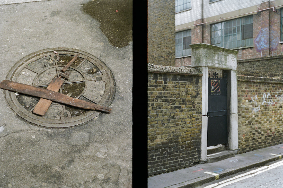
Diptychs
A simple experiment in offsetting the heights of images in diptychs.
|
|
|
|
|
|
Medium Format in Colour
Pictures made with the Fuji GS645S and Portra 400 120 film.
Diptychs
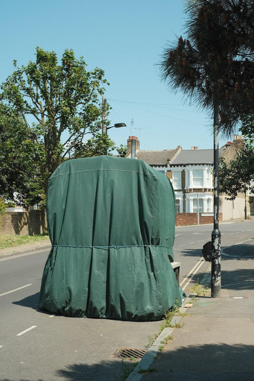
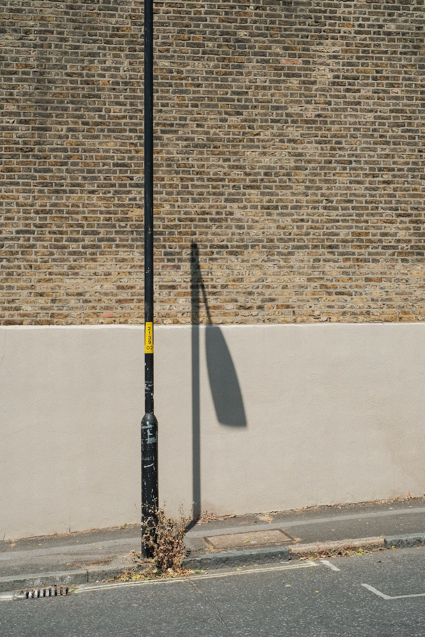
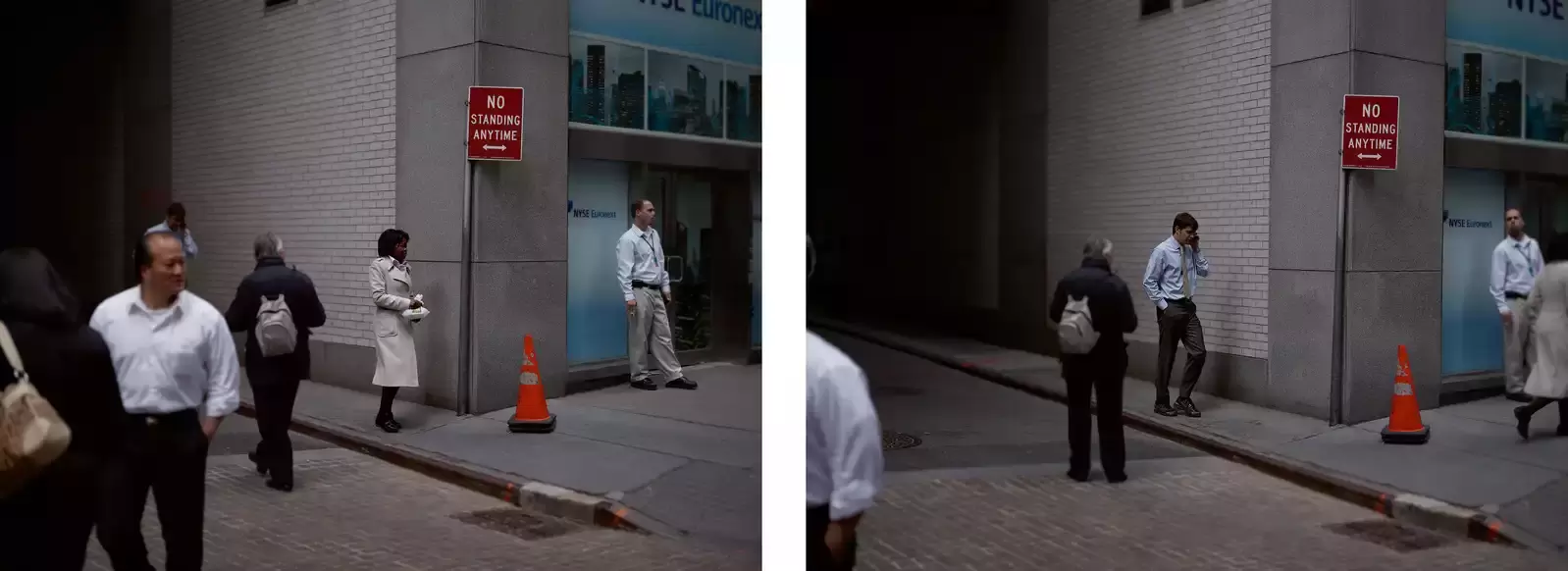
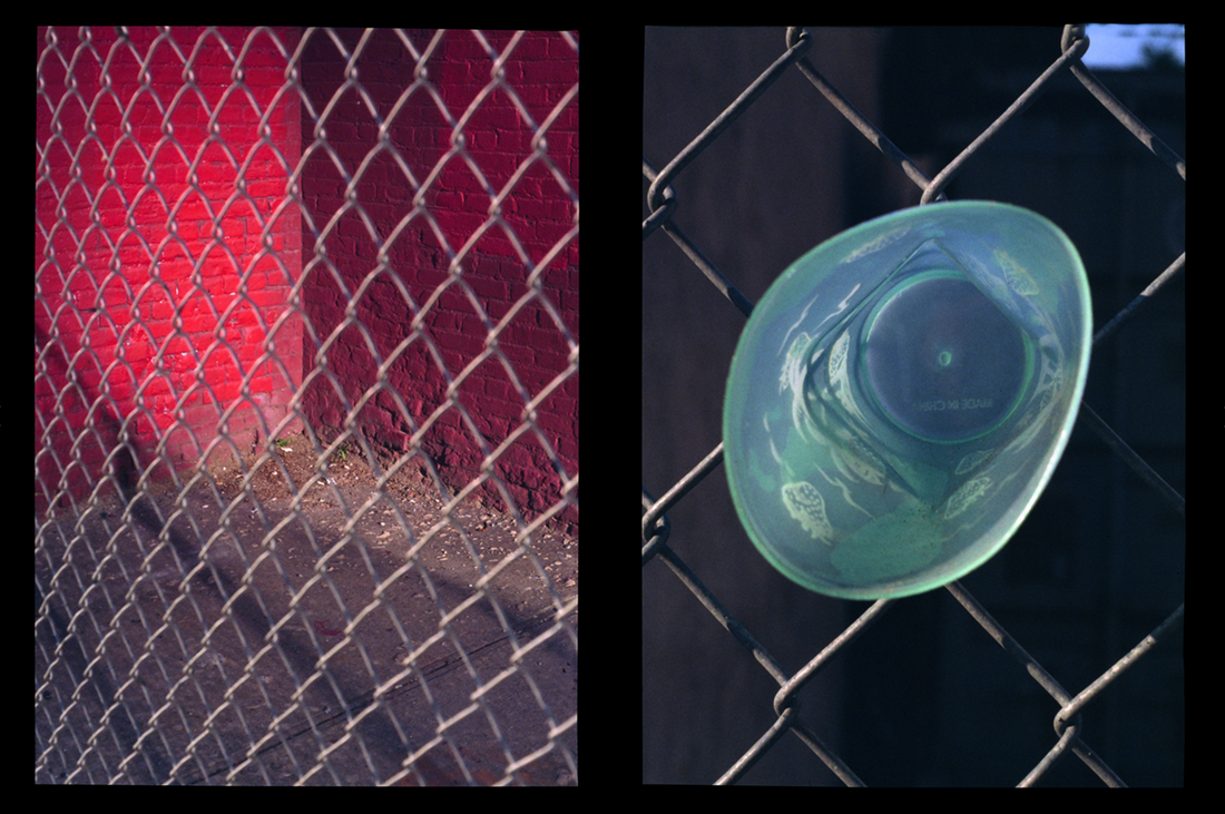
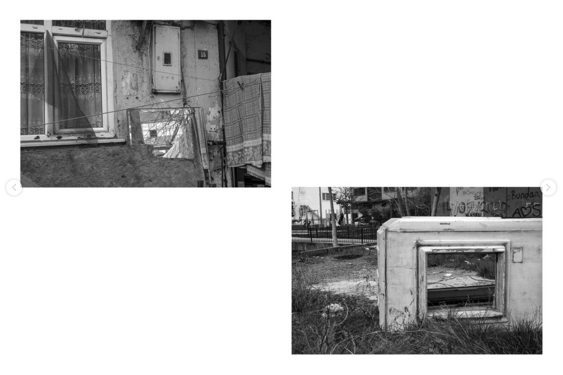
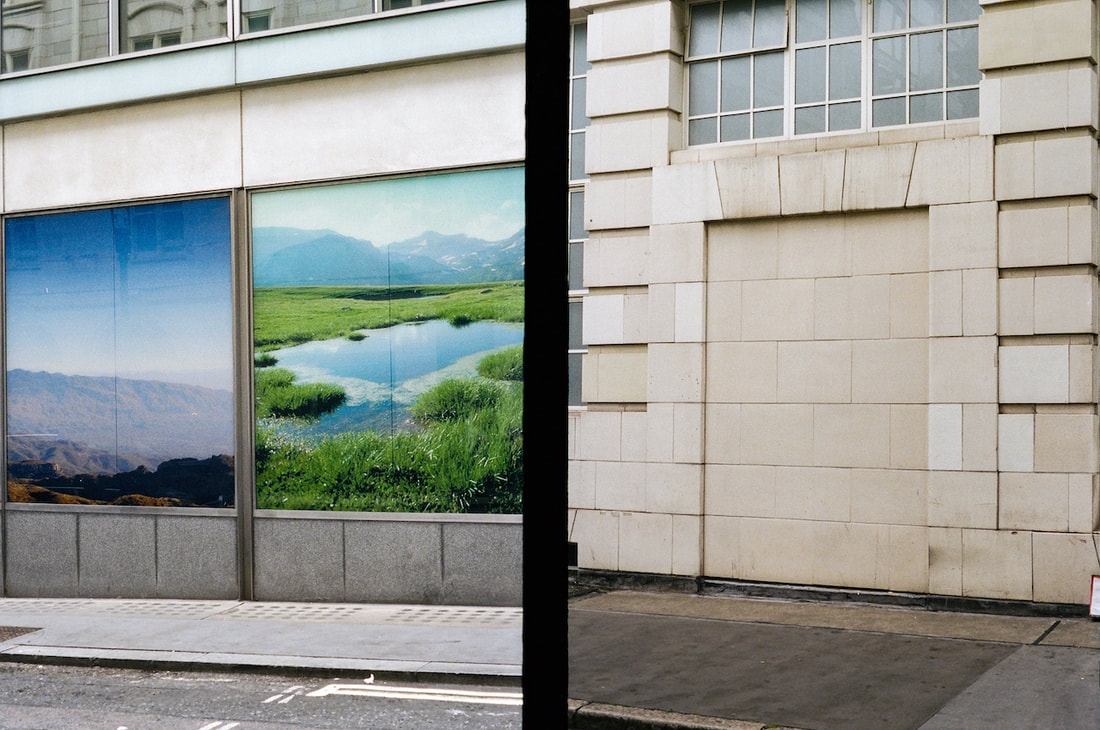
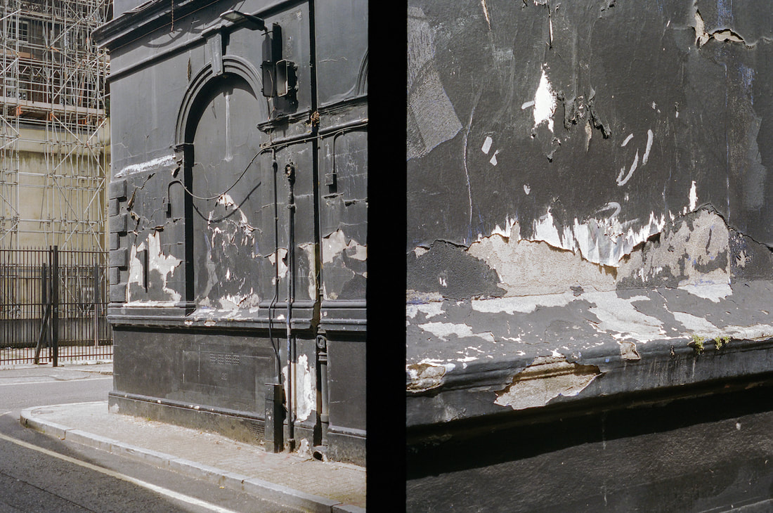
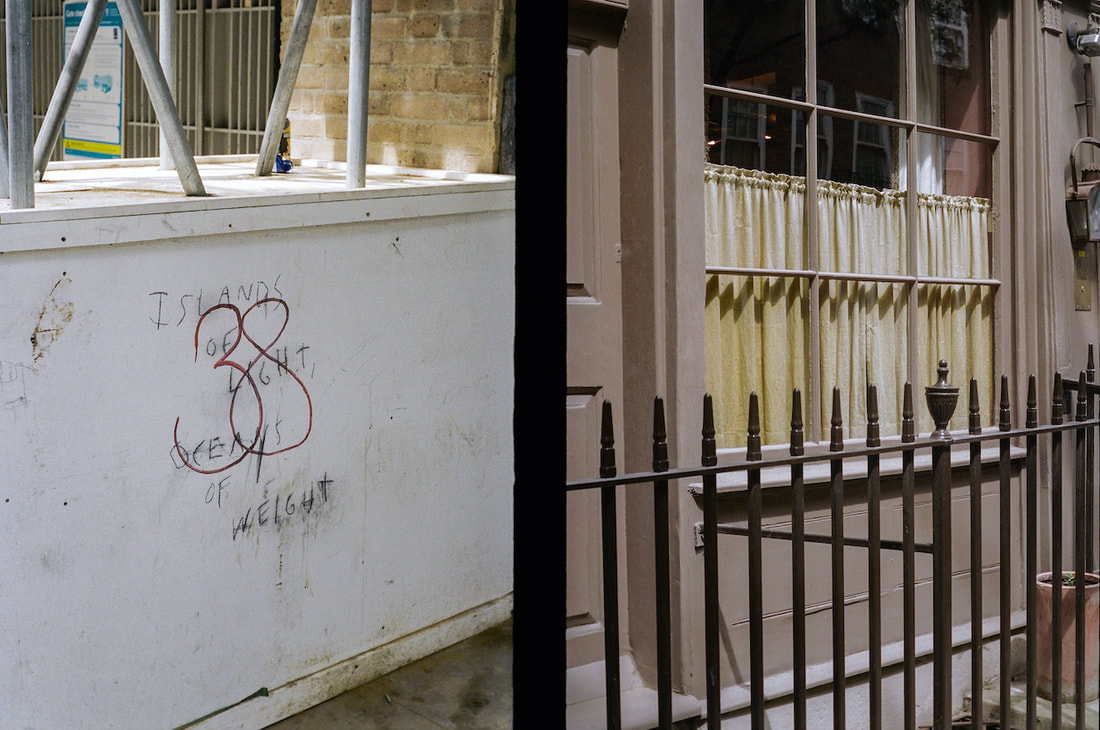
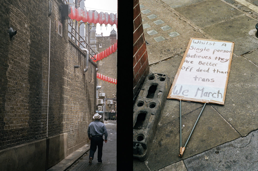
What criteria do we use when we decide to pair images as diptychs. Here are three examples which show how the same photograph could be paired with three different images. I would argue that each of these pairings 'works' but for different reasons.
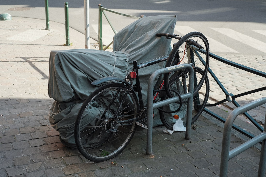
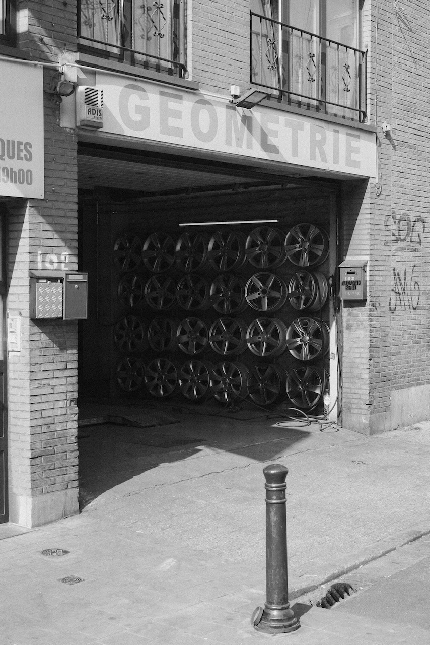
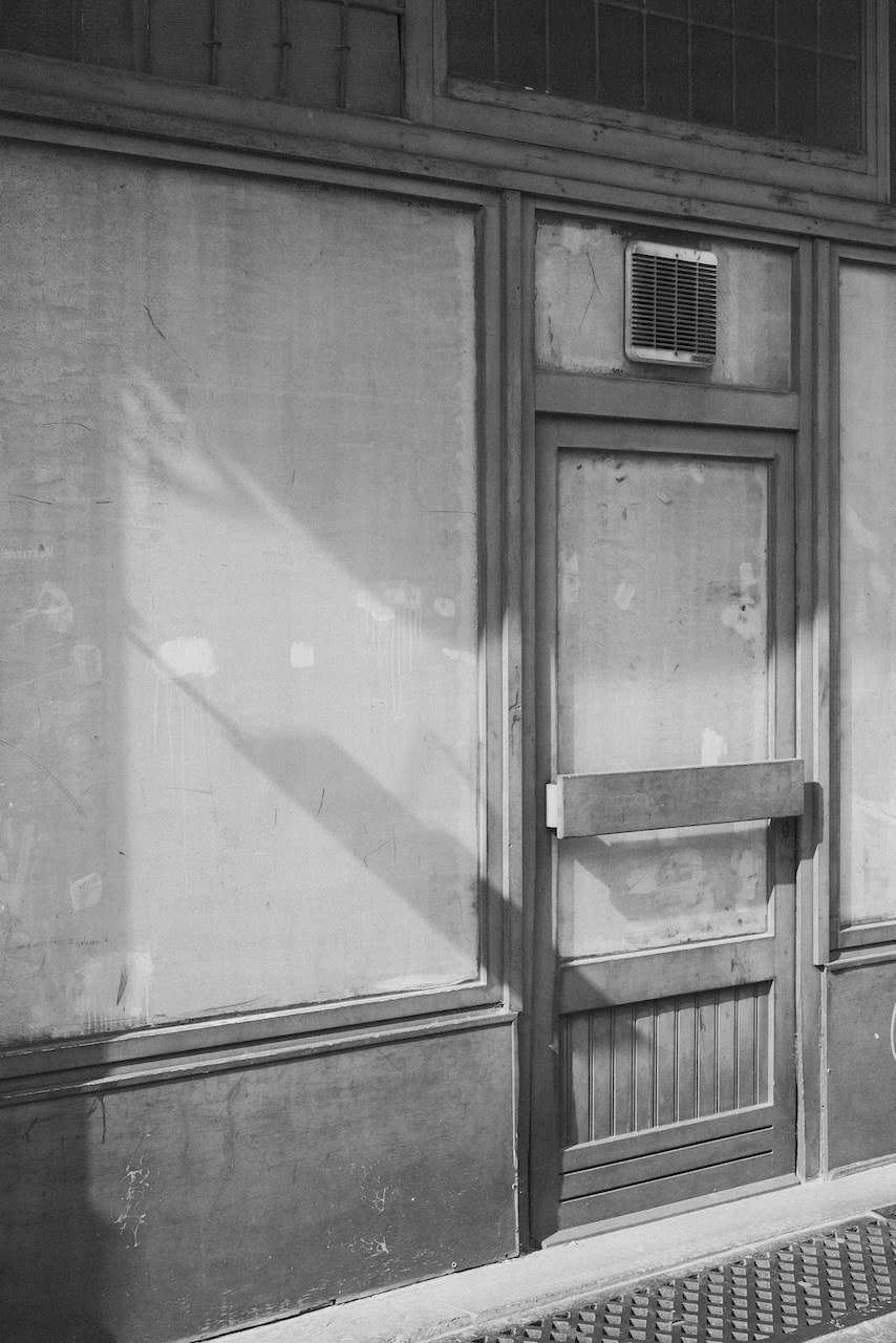
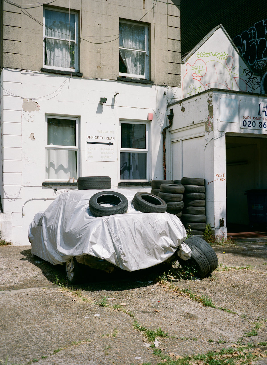
#01The colour palette is similar in both these pictures. They were taken very near to one another on the same day so the light is consistent. The bricked up window and shrouded car both suggest a barrier to seeing. Even the windows in the second image are curtained. The circular shape of the air vent in the first image is mirrored by the tyres in the second and the idea of doubles is reflected in both the wire and its shadow in image one and the pairs of tyres in image two.
|
|
|
|
|
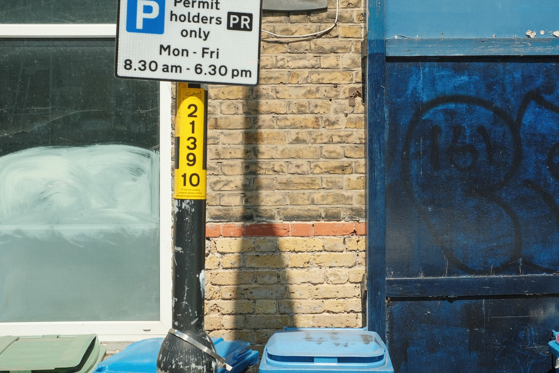
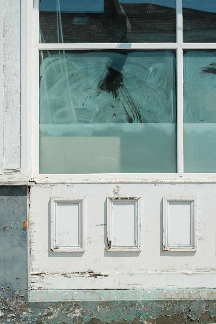
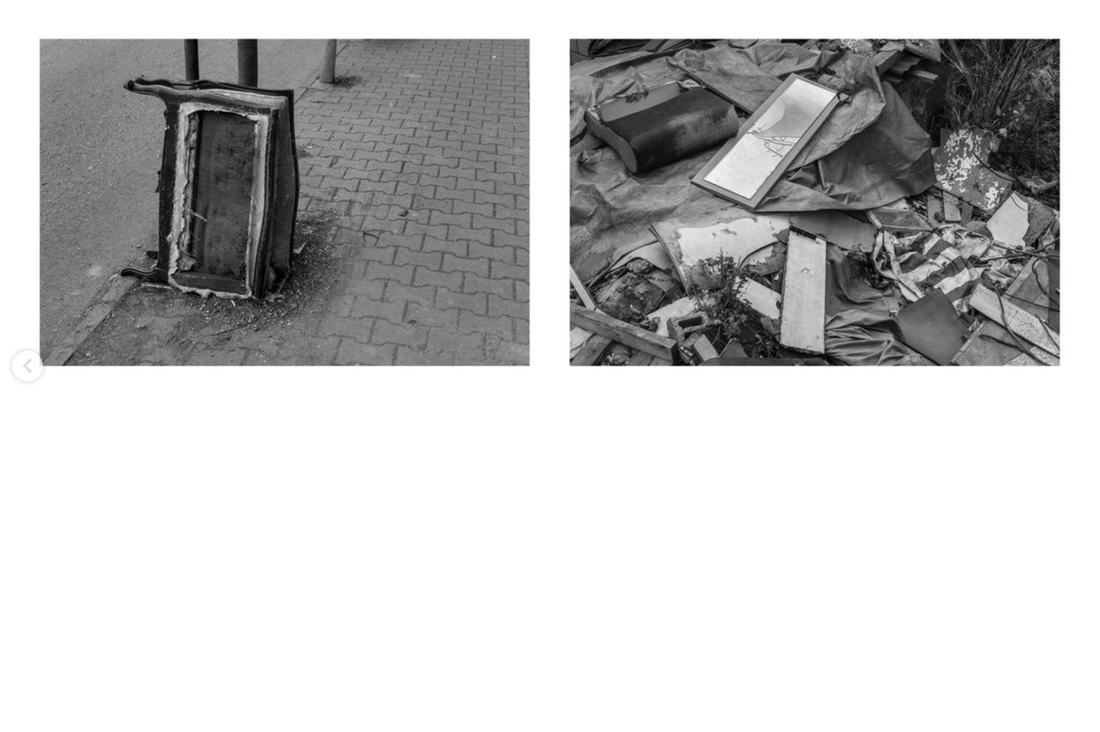
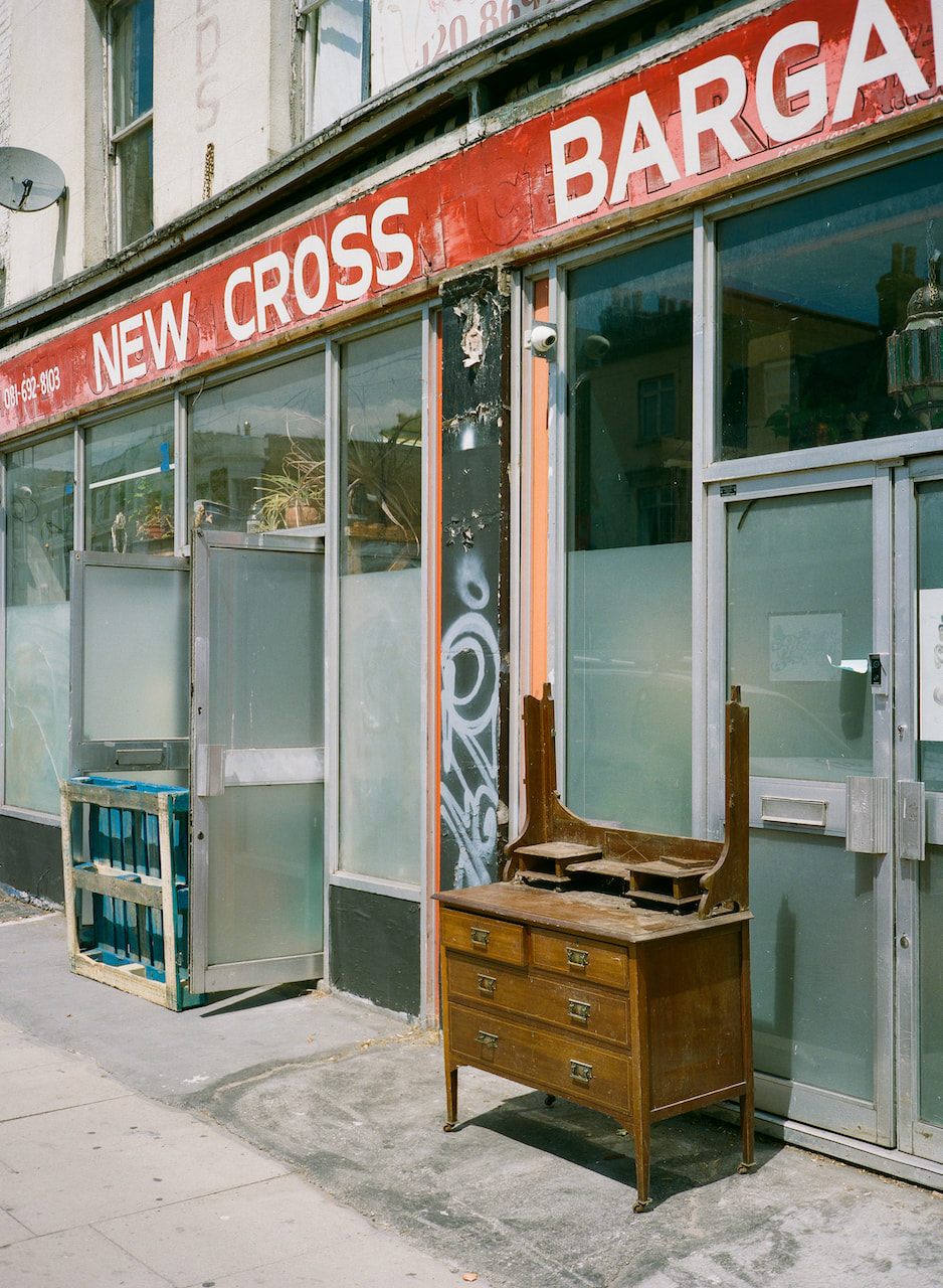
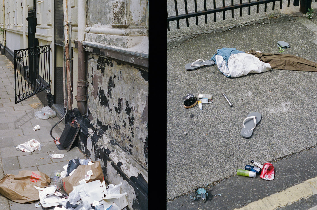
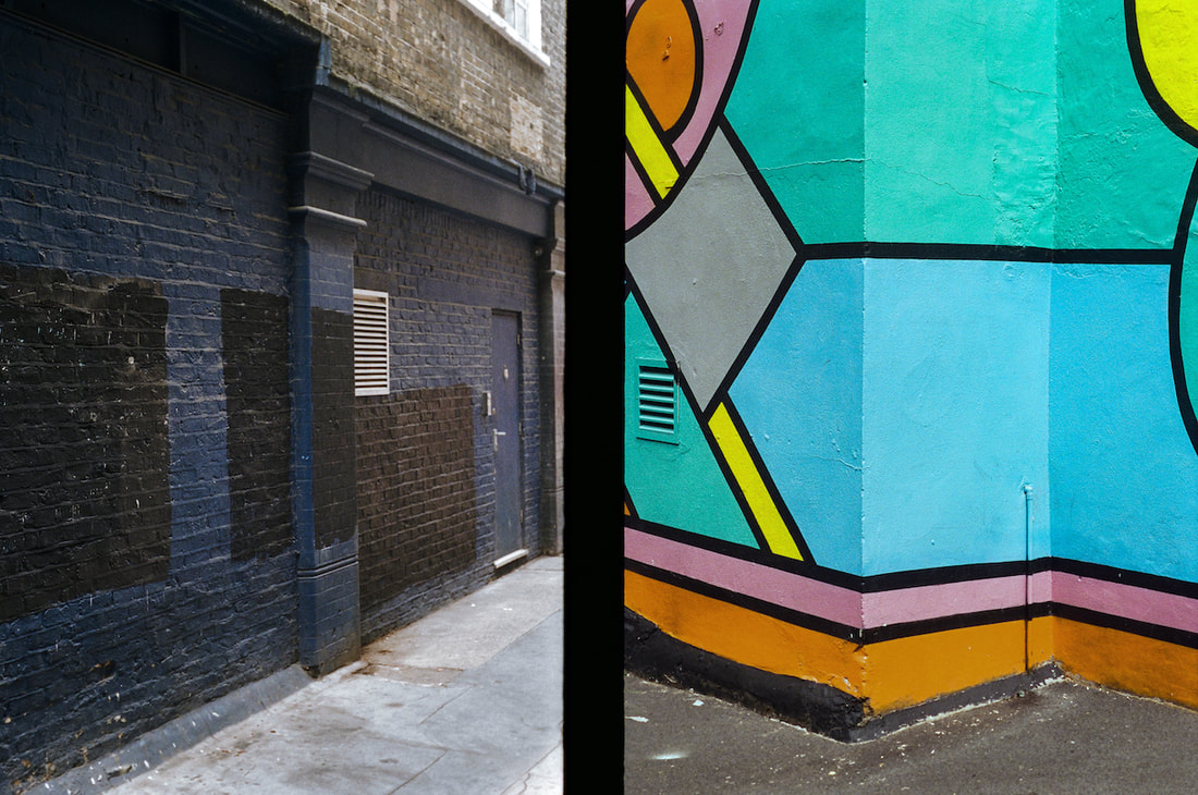
#02These pictures appear to different from one another. The light is similar but the colours are much bolder in image one. The viewpoints are flipped - one right, the other left. However, the bottom of the door in the first picture lines up almost exactly with the pavement in the second, as does the shop sign with the dark section of wall. The barricaded doorway and missing mirror in image could find their parallel in the bricked up window.
|
#03This is my favourite of the three pairs and yet the images seem to have the least connection. However, for some reason, these pictures look good together. I can think of two reasons:
|
|
|
More medium format in colour
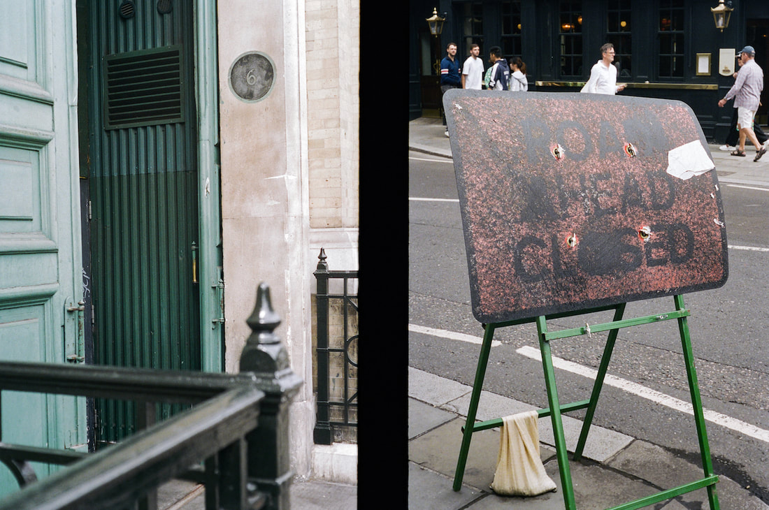
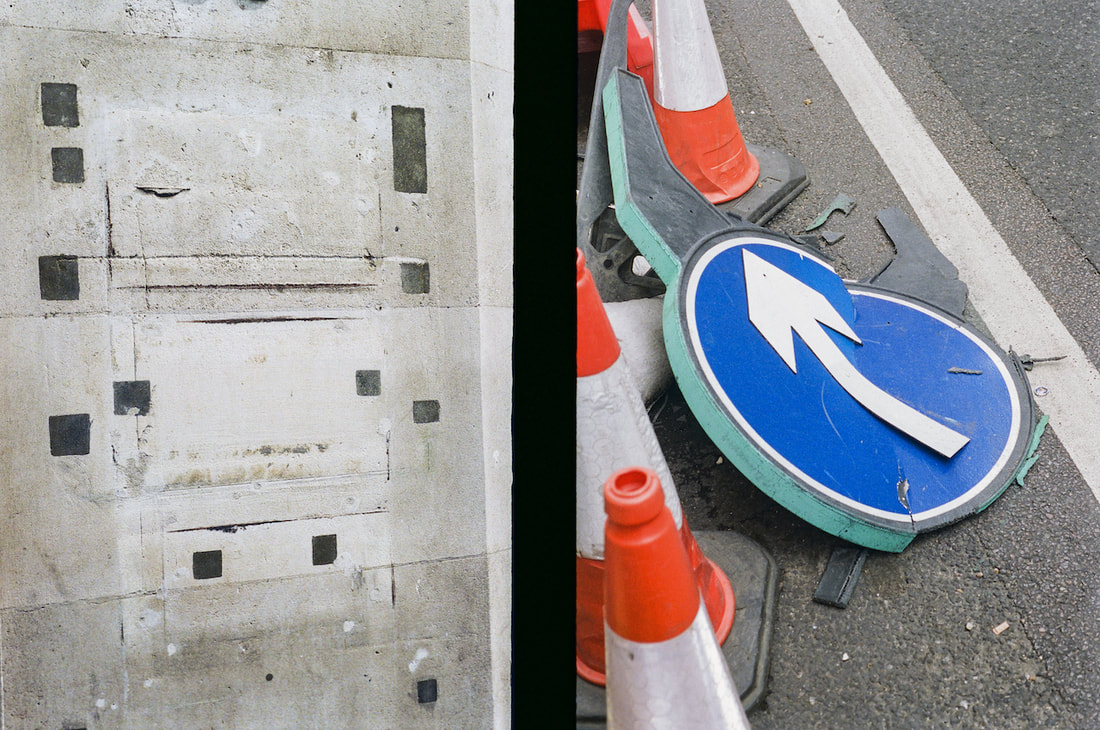
Diptychs
I've been thinking about different ways to create diptychs. My tendency so far has been to find some kind of formal relationship between the two images - shapes, lines, patterns, colours etc. related to Gestalt theory. These examples are a bit different and is influenced by a suggestion from Chat GPT to consider other theoretical perspectives, namely semiotics and narrative/conceptual frameworks.
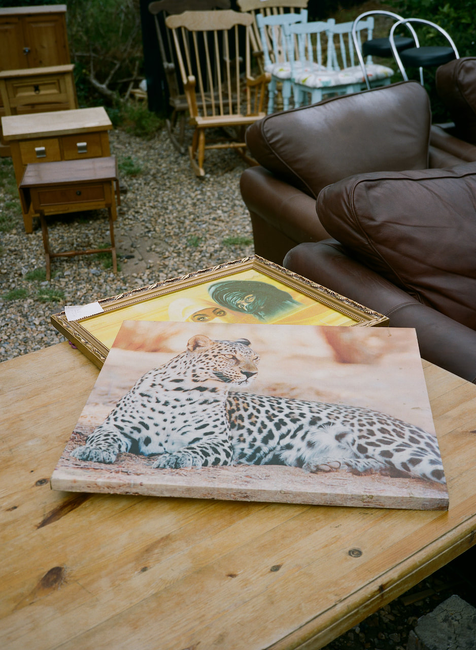
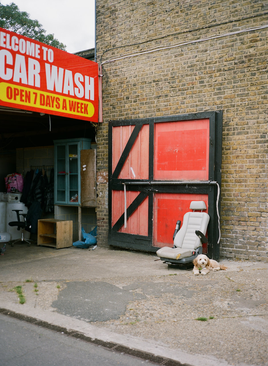
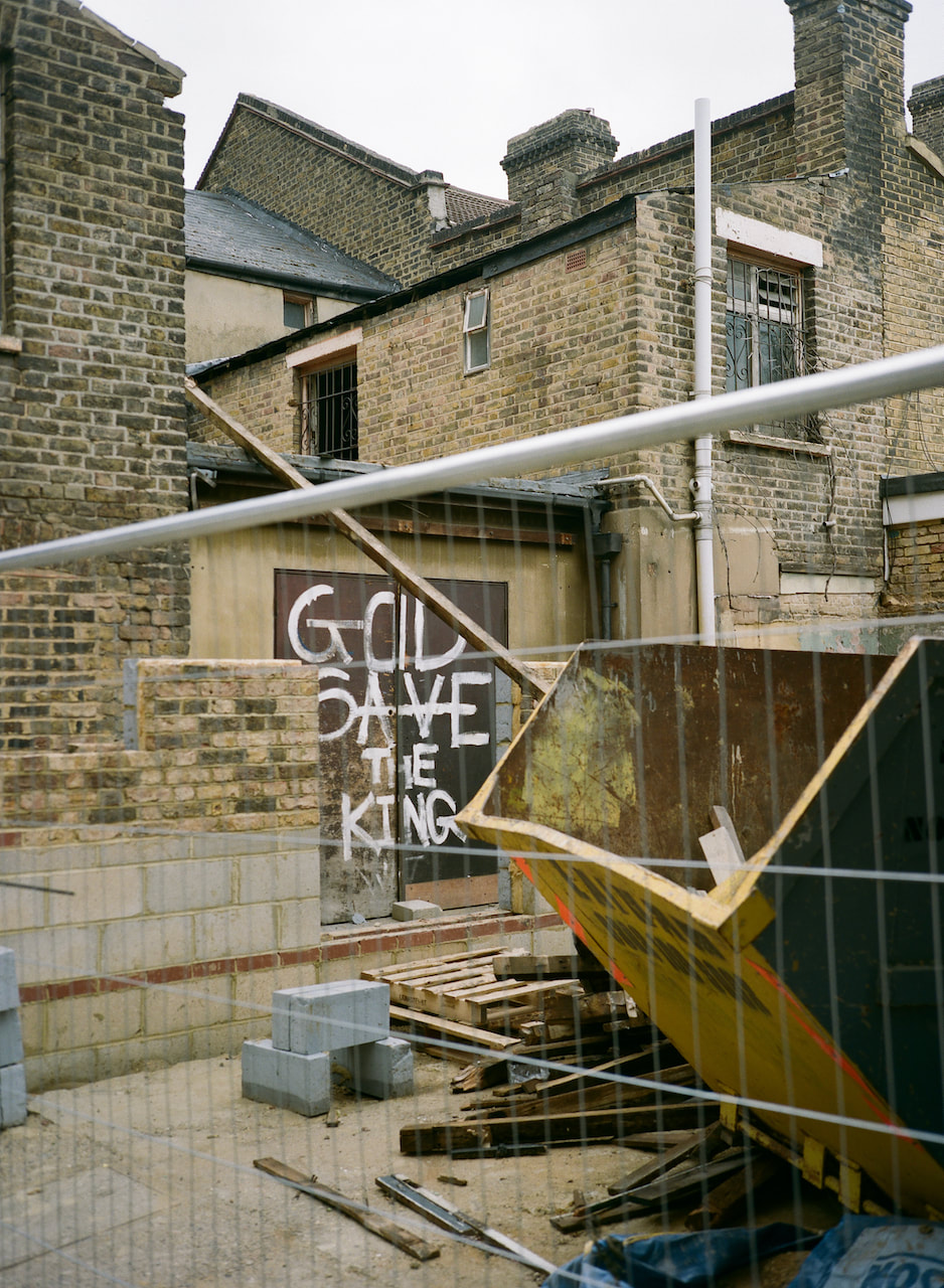
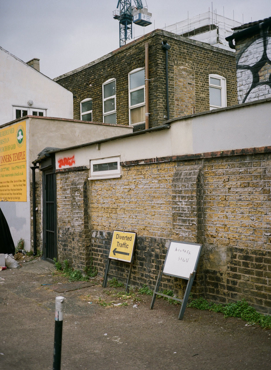
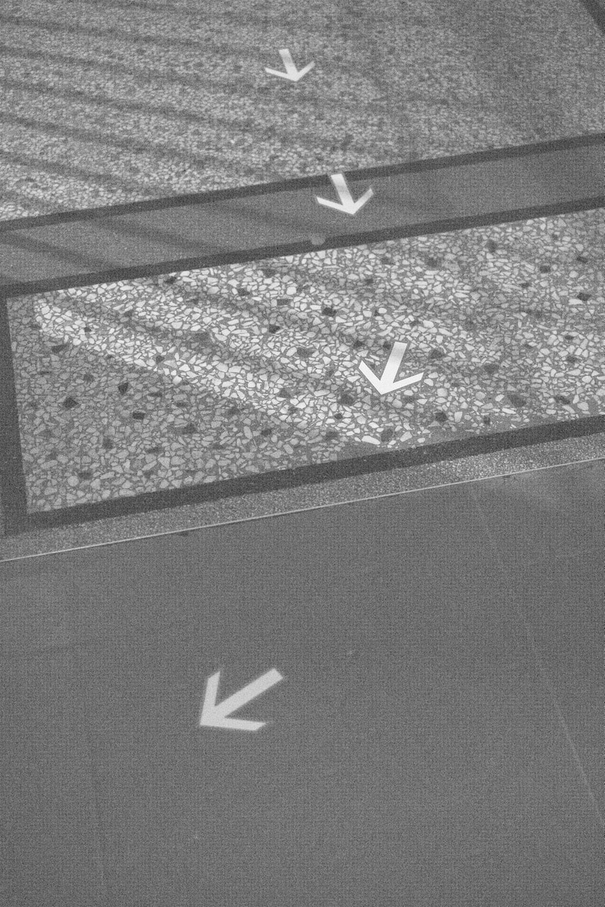
In the first example I'm interested in the relationship between the phrase "Refugees Welcome" and the two pictures of African subjects on the table. Both of these photographs were made in New Cross, a multicultural area of south east London. In the second example, a throne-like chair and lapdog appear outside a local car wash next to a photograph of a building site emblazoned with the phrase "God Save the King". The third example plays with the semiotic concept of signs and signifiers. Arrows point the way but are they just "another sign"?
The text in all these diptychs acts as a kind of caption. They first two diptychs explore ideas of power and privilege in (hopefully) humorous ways, juxtaposing unlikely combinations of things and encouraging the viewer to forge possible connections (or contradictions) in their own minds. The third example has some fun with signs and signage and signification. These diptychs employ semiotic and conceptual frameworks. I also hope that they contain formal associations and create coherent compositions.
|
|
|
|
|
|
#03 |
|
|
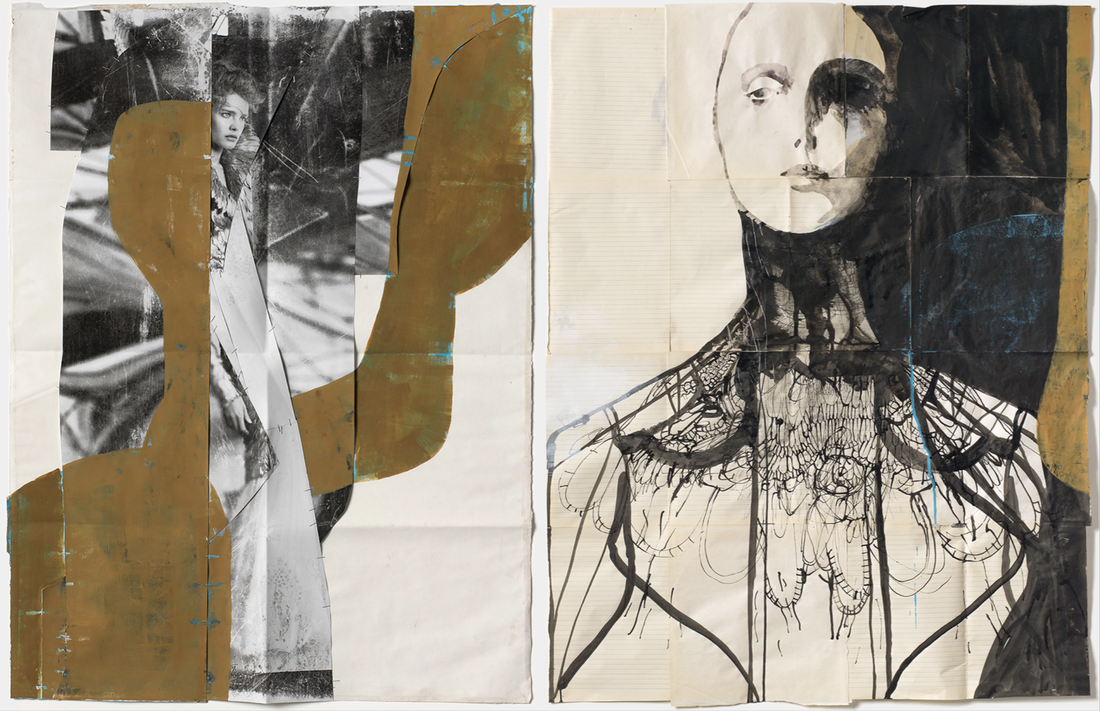
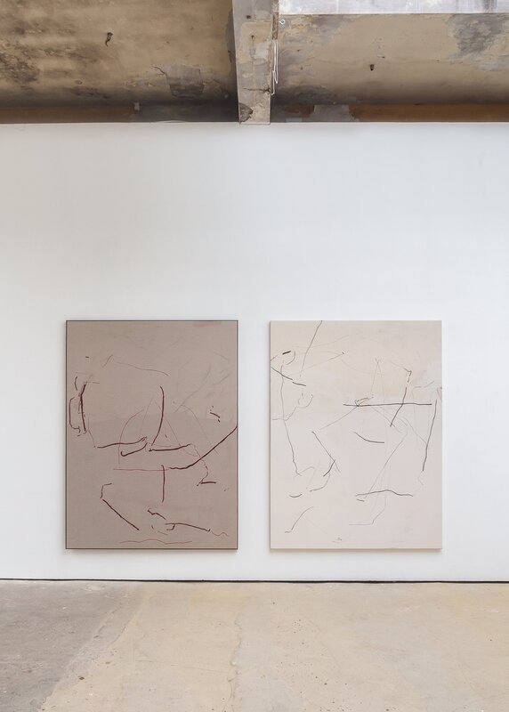
Struan Teague's diptychs
I've recently discovered the work of Scottish artist Struan Teague. He is primarily an abstract painter but photographs also form part of his practice and, sometimes, he pairs small drawings with photographs in diptychs. I've also noticed that his exhibitions often feature canvases hung close together and publications featuring pairs of photographs and/or drawings. The drawing/photograph diptychs are slightly different sizes and offset, both side by side and one above the other. Here are some examples from his website and Instagram feed:
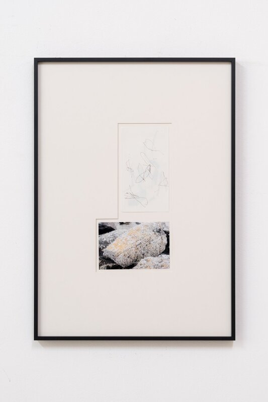
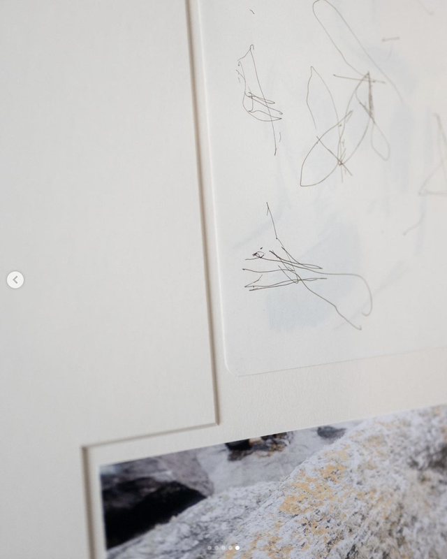
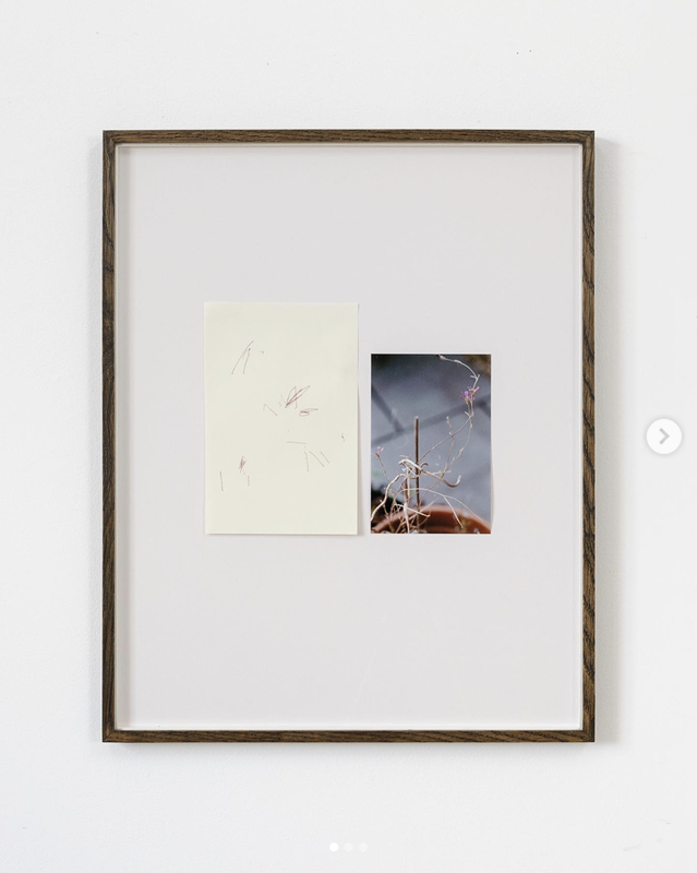
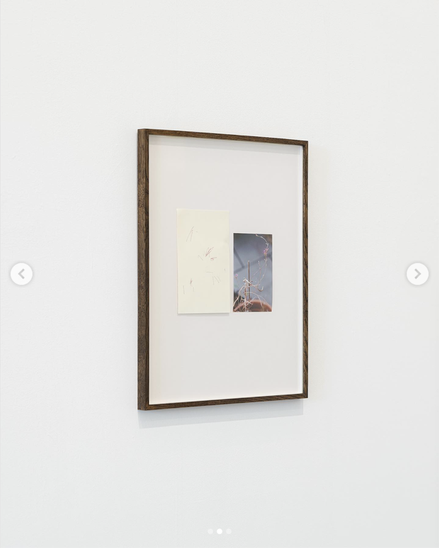
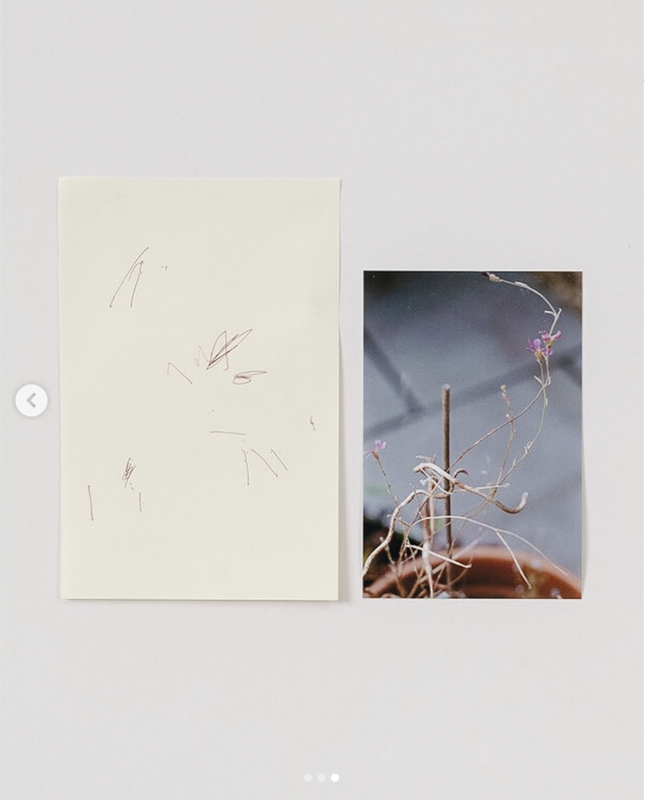
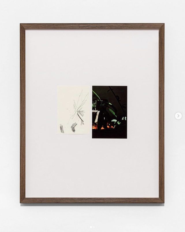
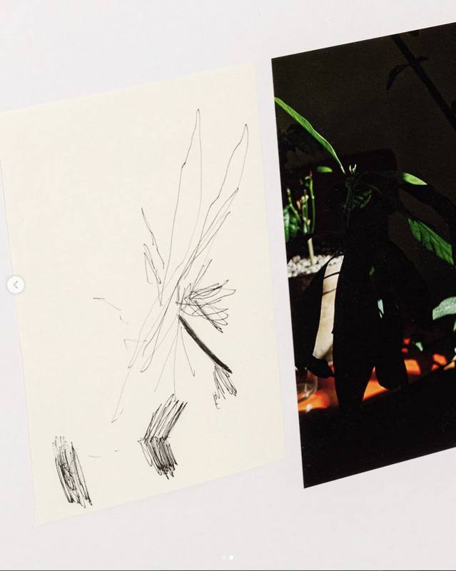
I'm really interested in the relationship between the small gestural drawings and the photographs. I wonder whether they are directly connected or placed together in the editing or curation process? Not knowing the answer is a little frustrating but perhaps I can experiment with a variety of possible solutions in relation to my own photographs? For example, I could:
- ask someone to describe one of my photographs to a partner for them to draw but without ever seeing the original
- draw a version of one of my photographs on my partner's back for them to draw on paper
- ask someone to draw one of my photographs but with their weaker hand or even with the pencil/charcoal taped to the end of a long stick
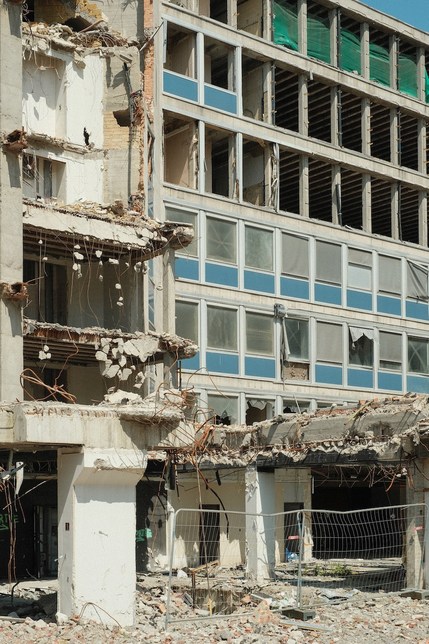
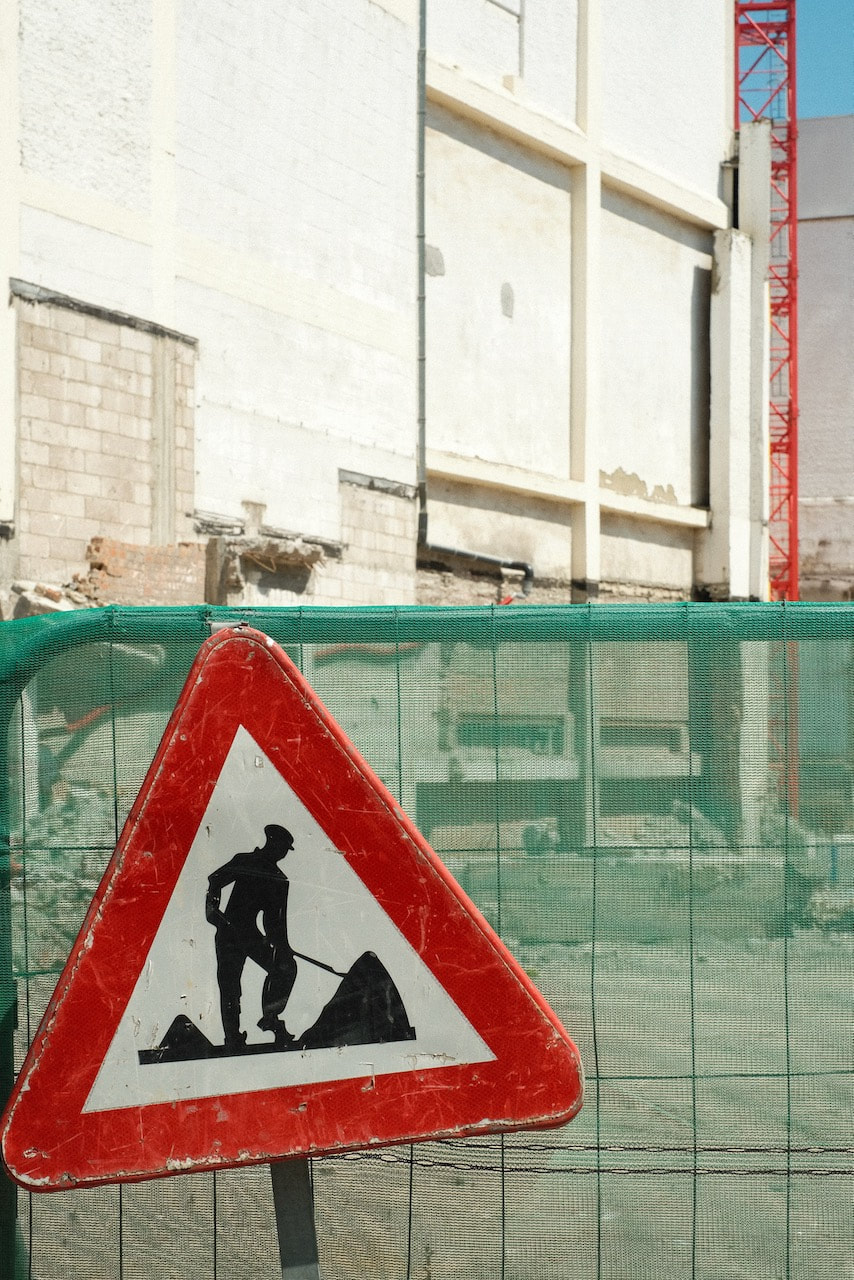
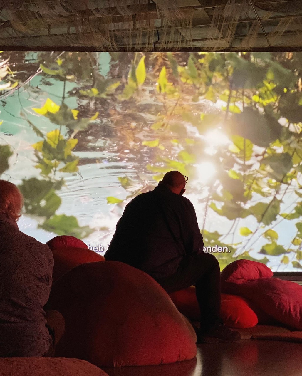
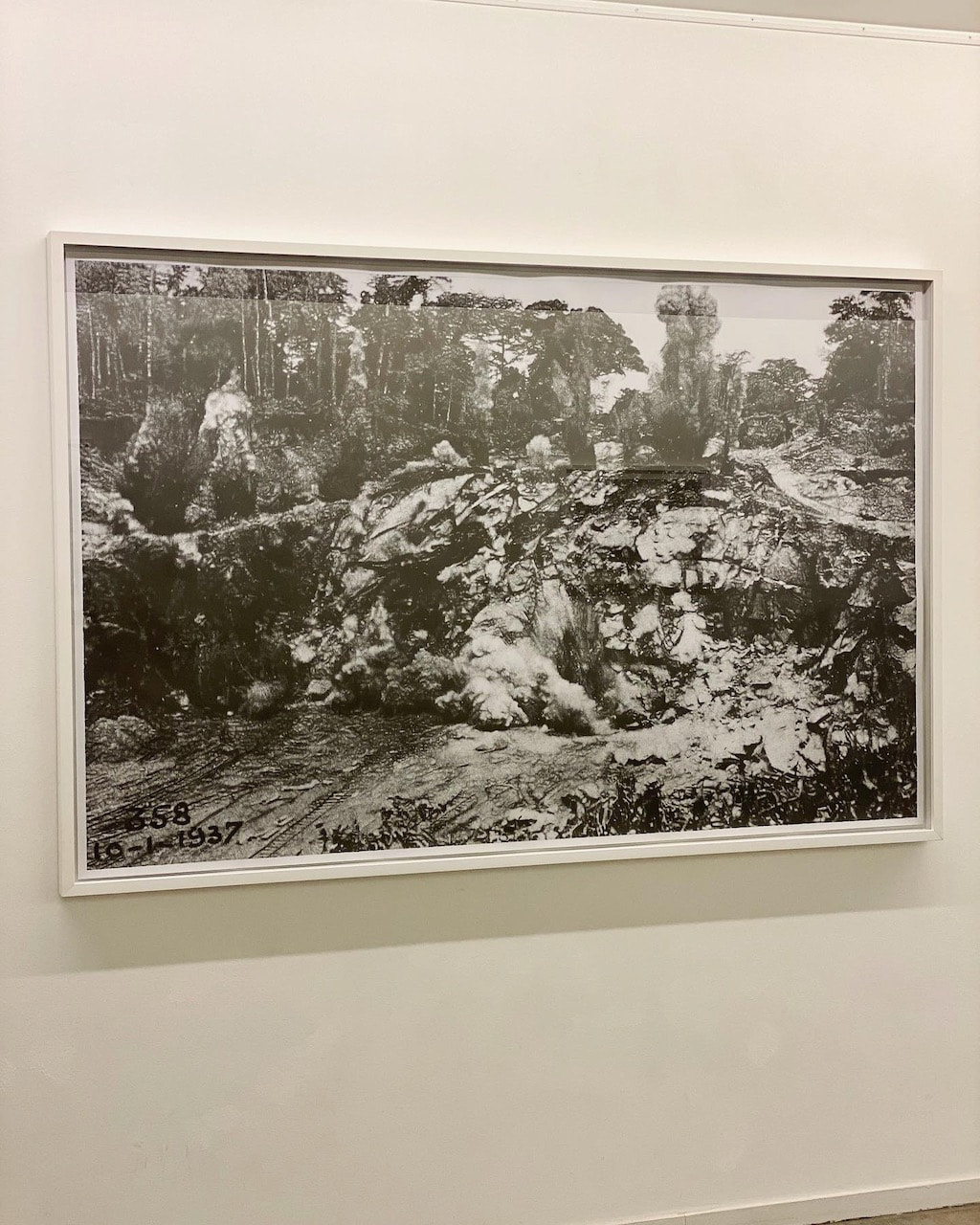
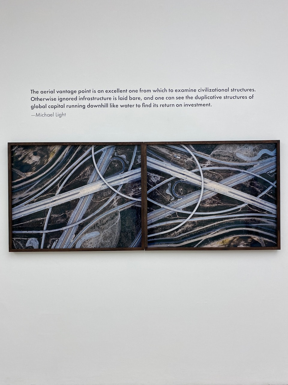
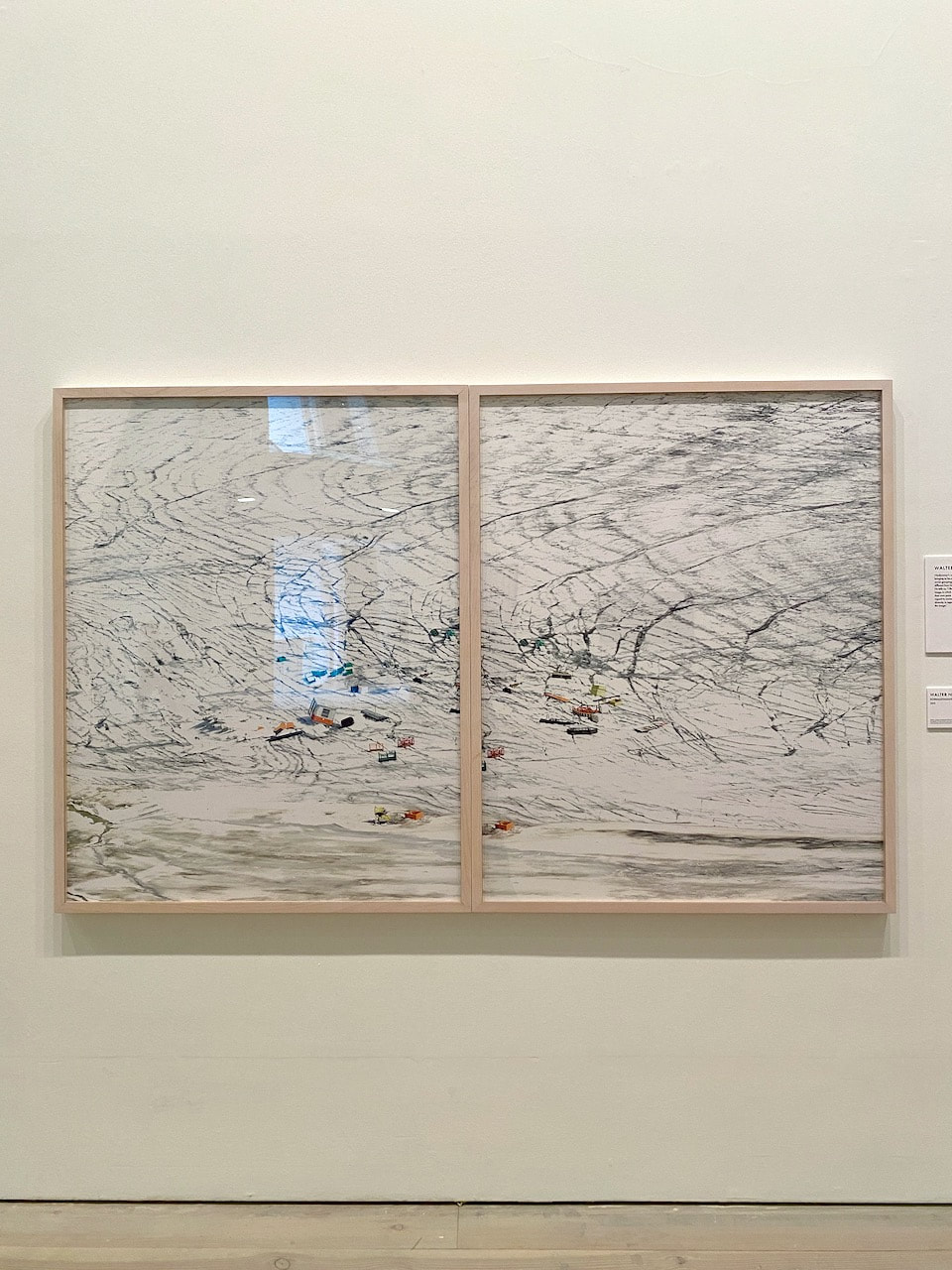
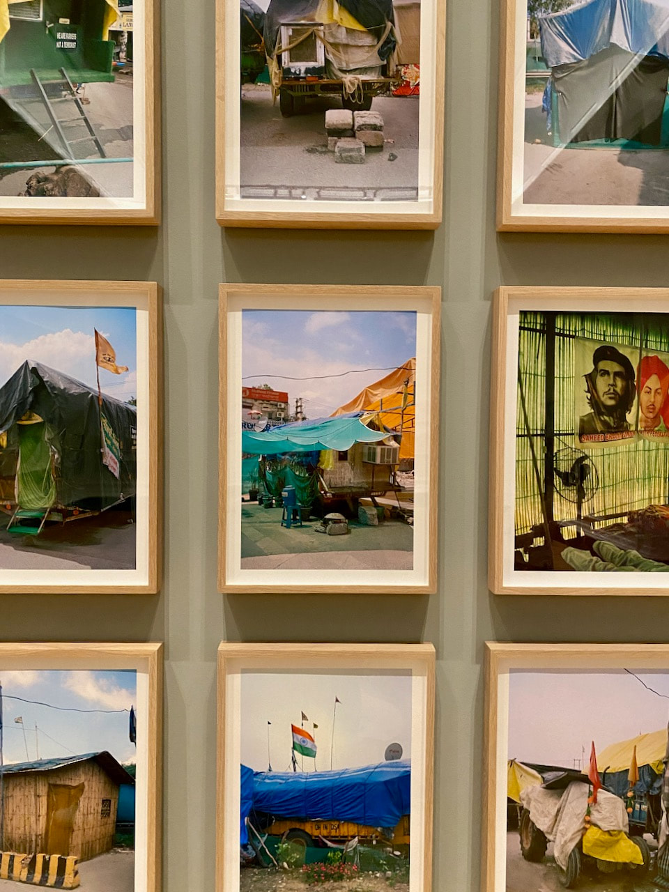
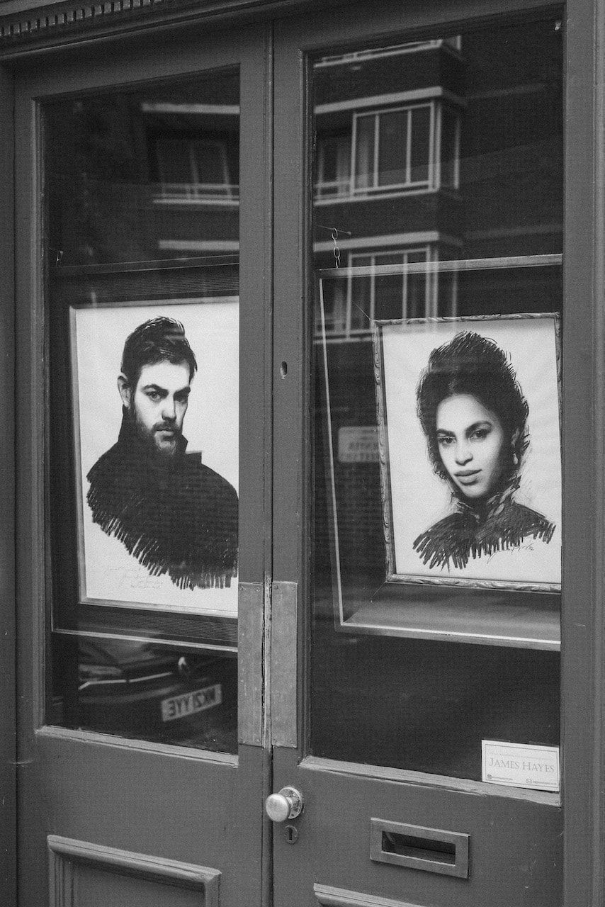
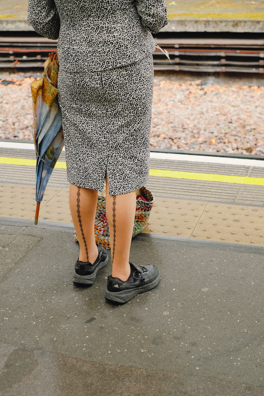
Two exhibition visits and a dérive

|
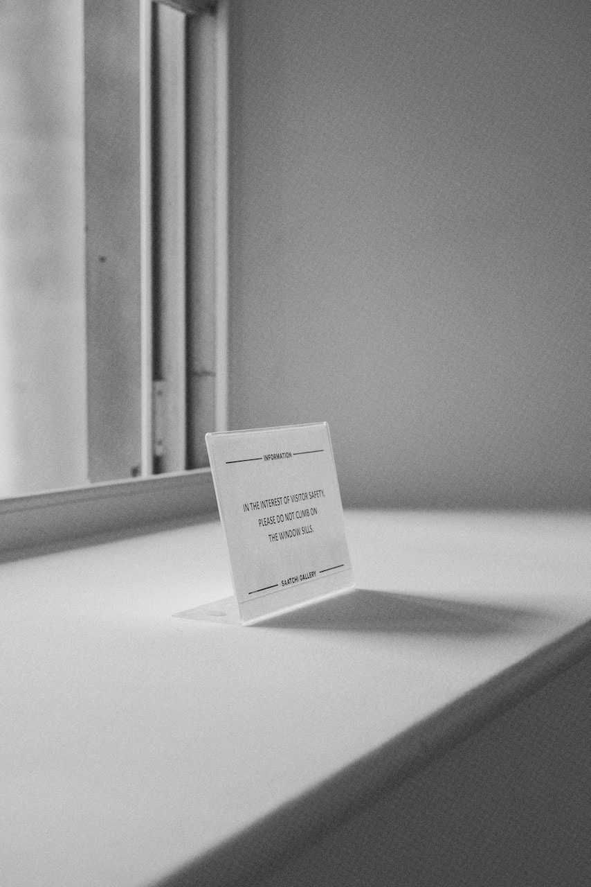
The exhibition Civilization: The Way We Live Now at the Saatchi Gallery was enormous, featuring the work of 150 photographers and making reference to the famous Family of Man exhibition at MoMA. It was interesting to me to see how many of the works on display were arranged in diptych format. I suspect not all of them were conceived as diptychs in the true sense but several seemed to work in this way, including a double video screening about prison life. Much of the work was epic in scale and ambition and, frankly, left me a bit cold. However, dotted here and there were images I really enjoyed, particularly by Alejandro Cartagena, Siân Davey, Nigel Shafran and George Georgiou.
|
|
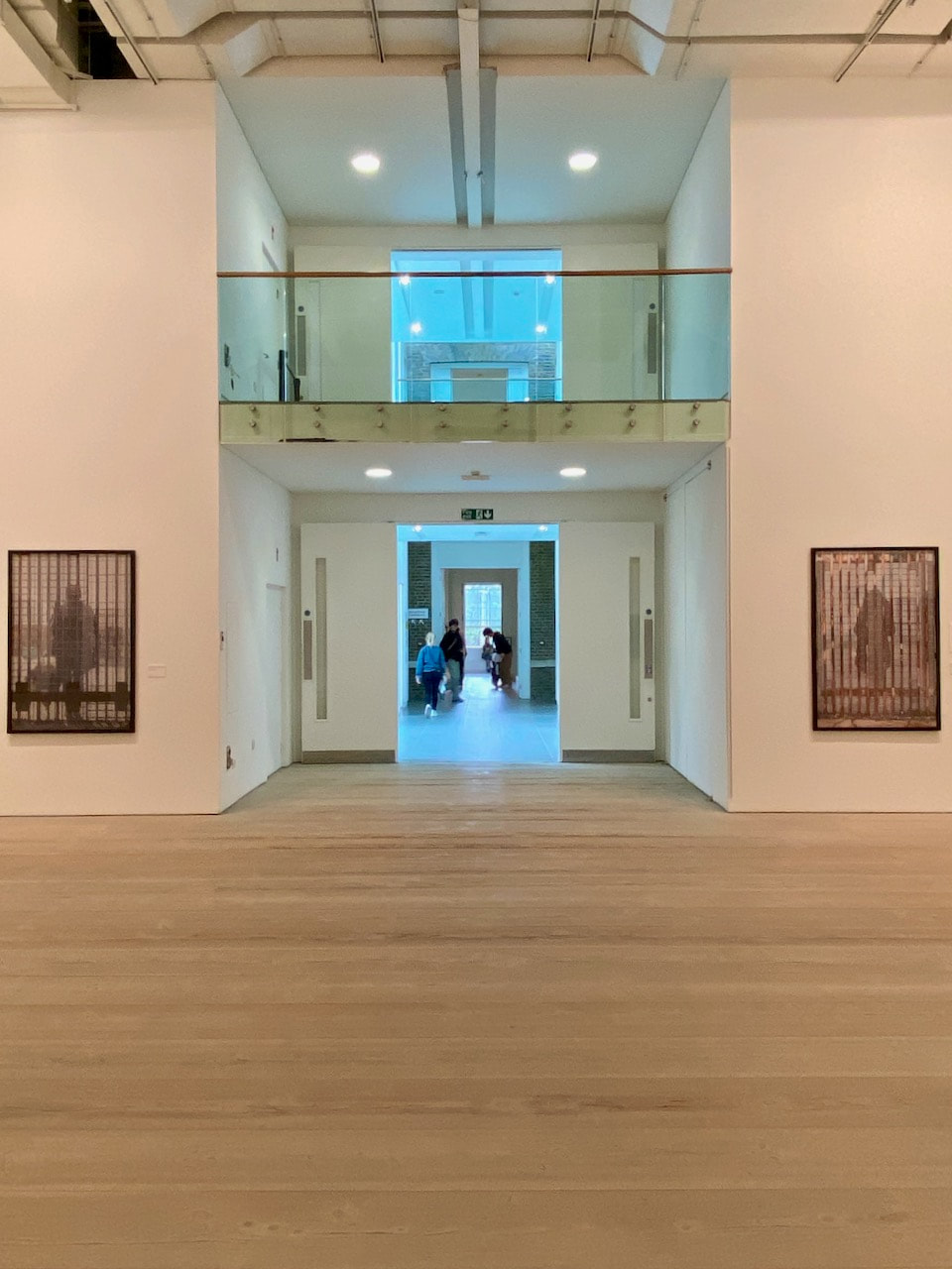
The recently expanded Photography Centre at the V&A is a treasure trove of historical and contemporary images, objects, books and ephemera, charting the history of the medium. I particularly enjoyed the themed exhibition of pictures entitled Energy: Sparks from the Collection and the work of contemporary photographer Hoda Afshar.
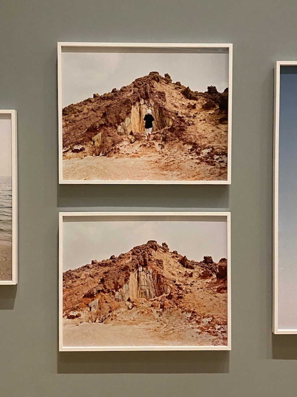
A dérive through Kensington and Chelsea
These pictures were mostly made on a short 45 minute walk from the King's Road to South Kensington. I used a digital camera and two film recipes: Kodak Tri-X and Kodak Portra 400. I was interested in noticing the ambience of the area, documenting details and textures that struck me as interesting or unusual. I tried to respond as instinctively as possible to what I saw without over thinking. I made both black and white and colour images with the intention of creating diptychs featuring one of each afterwards (see below).
Diptychs
|
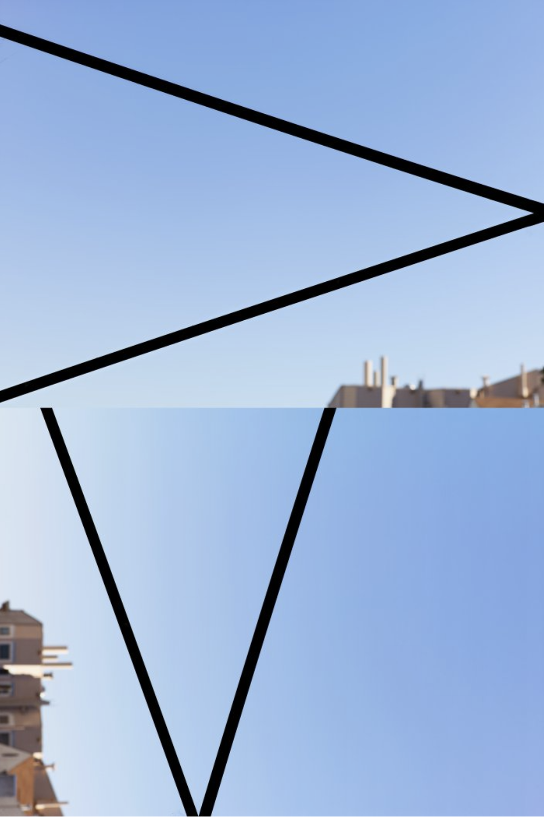
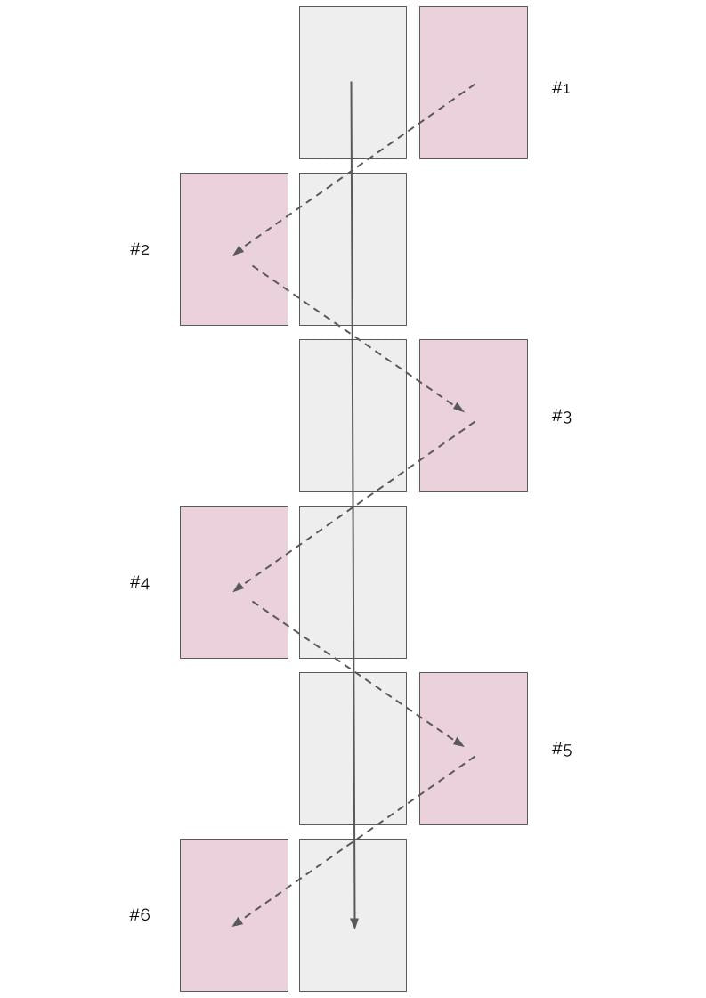
Exhibition strategyPartly influenced by the interesting arrangements of images in both of the above exhibitions, I decided to try to display a series of diptychs taken on my dérive in a more complex way.
I was interested to see if the images could be read as diptych pairs horizontally but also as a sequence of black and white images vertically and colour images diagonally. The illustration on the left tries to demonstrate how this was intended to work. I'm relatively pleased with both the diptychs and the diagonal colour image associations. I'm less sure about the vertical black and white sequence. However, I think this is an interesting idea and I might return to it at a later date. |
|
|
|
|
|
|
|
|
|
|
|
|
Back to medium format colour
Diptychs
|
|
|
|
|
|
|
|
|
|
Experimenting with a new (old) camera
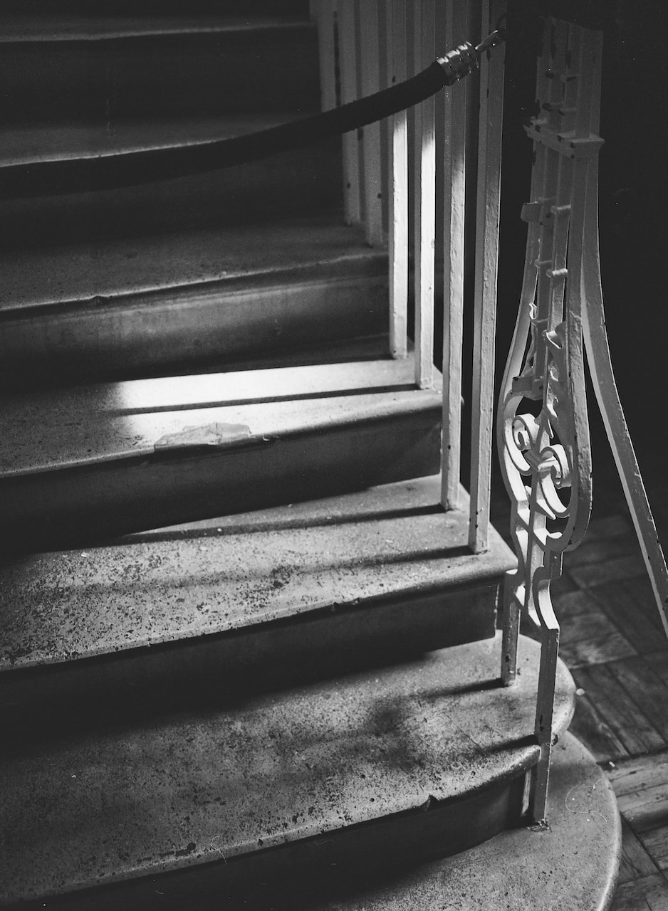
I recently got hold of a Voigtlander Bessa I folding camera, made in the early 1950s, making it about 70 years old. It can make huge 6x9 or 6x4.5 cm negatives. My copy has the 6x4.5 mask and I also have an external rangefinder that attaches to the cold shoe. These are my first test rolls through the camera, both shot on Ilford XP2 Super 400 120 film.
6 x 4.5
With the 6 x 4.5 mask slotted into the back of the camera I can get 16 exposures from a roll of 120 film.
I shot these quite quickly just to test the camera so I'm pleased with the results. The lens appears very sharp and, despite being all manual, the camera is relatively easy and fun to operate.
Diptychs
|
|
|
|
|
|
6 x 9
6 x 9 is the largest of all the medium format negatives. I was keen to see how much detail could be achieved at this size.
I managed to underexpose about half the shots, I think because I was using a light meter on my phone rathet than trusting my eyes. I used the smallest aperture possible for each shot because I wanted a large depth of field but the largest aperture on this camera is f/5.6 so I didn't have much room for manoeuvre. Consequently, I have adjusted the exposure slightly in Lightroom. I'll know better next time. The level of detail in a 6x9 negative is remarkable given the age of the camera. The real test would be to try and print one or two of these images in the darkroom but I'm not sure we have a suitable mask for the negative holder!
Half-Frame Experiment
At the very opposite end of the film negative scale from the Voigtlander 6x9 is the half frame camera which can produce 72 images on a roll of 35mm film. Having been inspired by Luke Fowler's Two Frame Films (see above), I decided to make a sequence of half frame pictures and to deliberately embrace the role of chance in the diptych-making process.
These images were all made in a single day on a walk from Canon Street to Covent Garden and are displayed in the order that they were taken.
When I received the scans, the first frame was blank (with the image of the eyes on the road crossing on the right). I decided to put images one and two together (using Photoshop) but then couldn't re-order the entire sequence so the first and second half frame diptychs contain the same image:
|
|
A similar doubling appeared in the final two images of the sequence, another example of the important role of chance in the creation of these half frame diptychs:
|
|
Favourites
|
|
|
|
|
|
Two different medium formats
6x6
These pictures were taken on a Voigtlander Perkeo I 6x6 folding camera on Ilford XP2 Super400 film. I bought the camera on eBay for £20 (complete with ever ready case) which was quite a bargain. It seems to work perfectly and there are no light leaks through the bellows. It's a fun camera to use and definitely slows down the process plus you only get 12 images per roll. There's no rangefinder or light meter so it's range focusing and guesswork (mostly). I've got the focal length and exposure completely wrong in a couple of these shots. The viewfinder is also hopelessly small so composing is also challenging. However, I'm pretty pleased with some of these pictures. Not bad for a 70 year old camera.
Diptych
|
|
6x4.5
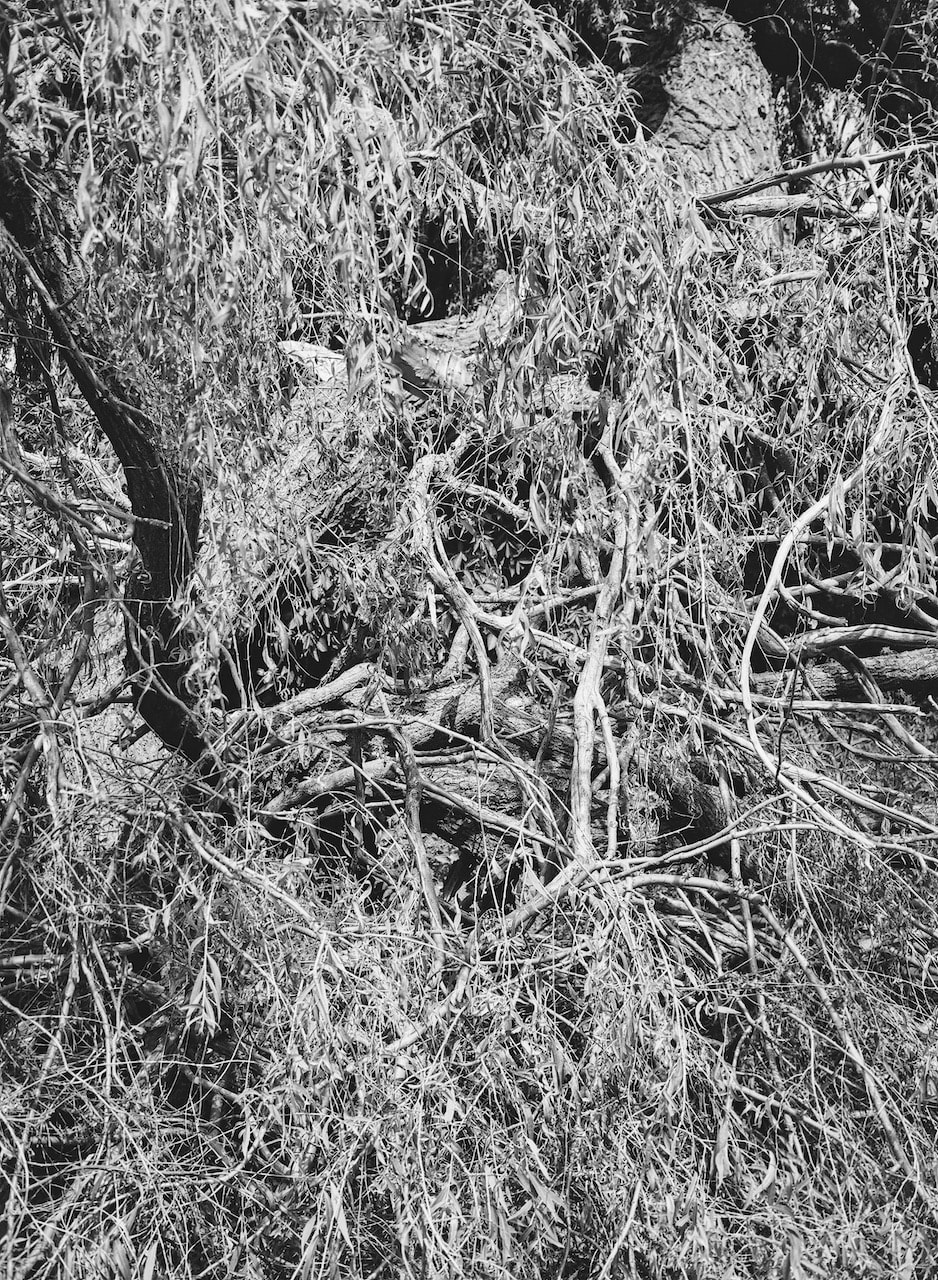
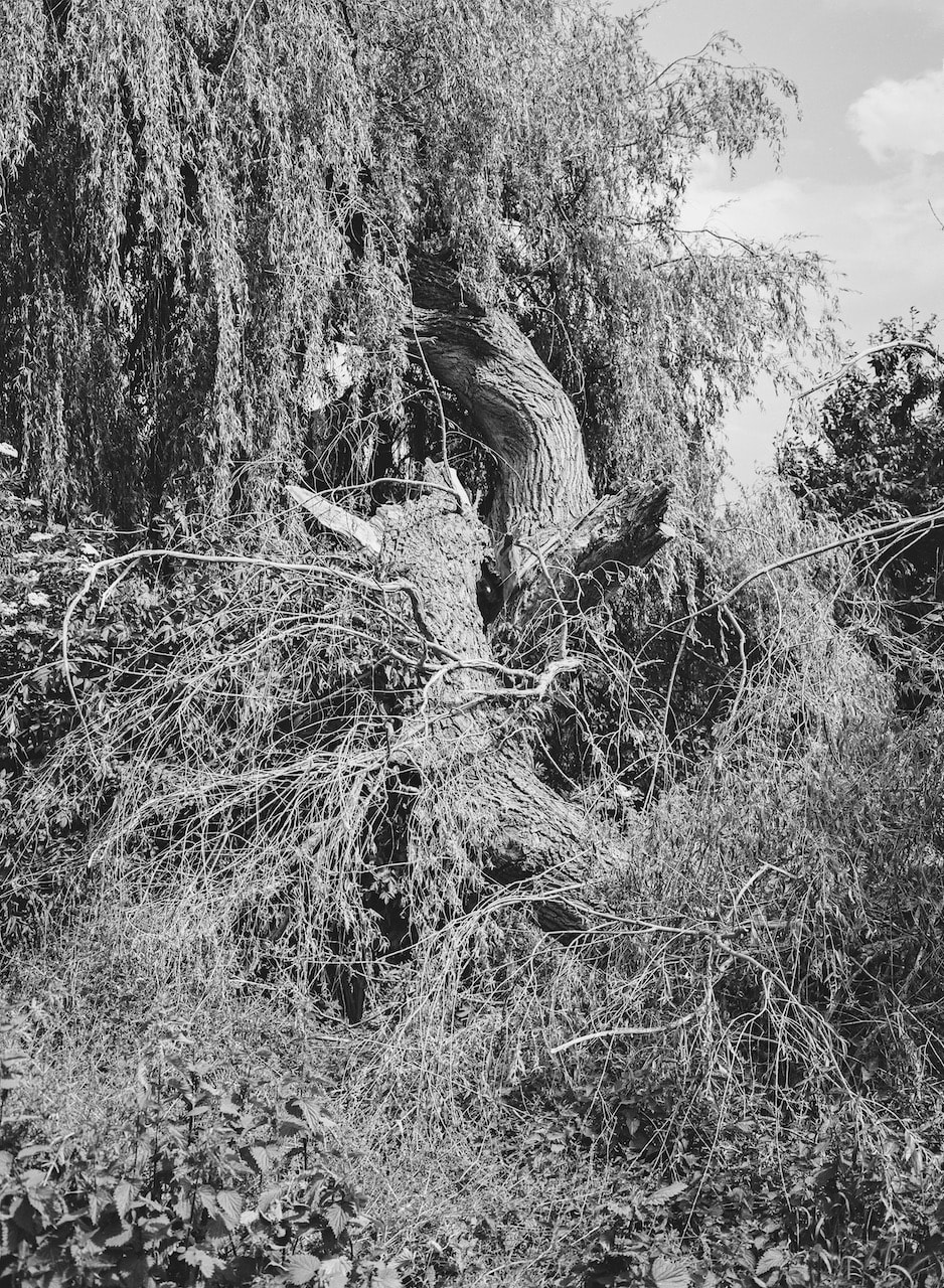
Here's another set of pictures taken with the FujiGS645S. I really enjoy using this camera and the way it makes the world look. The lens is super sharp and the wide angle of view really helps when photographing buildings and landscapes. I'd like to try a few more landscapes with the camera this summer.
Diptychs
|
|
|
|
|
|