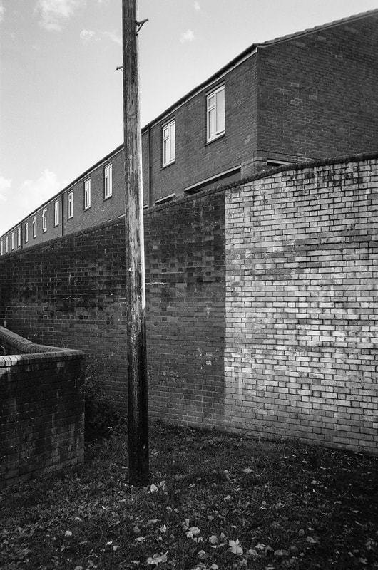
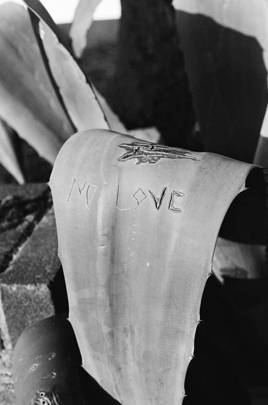
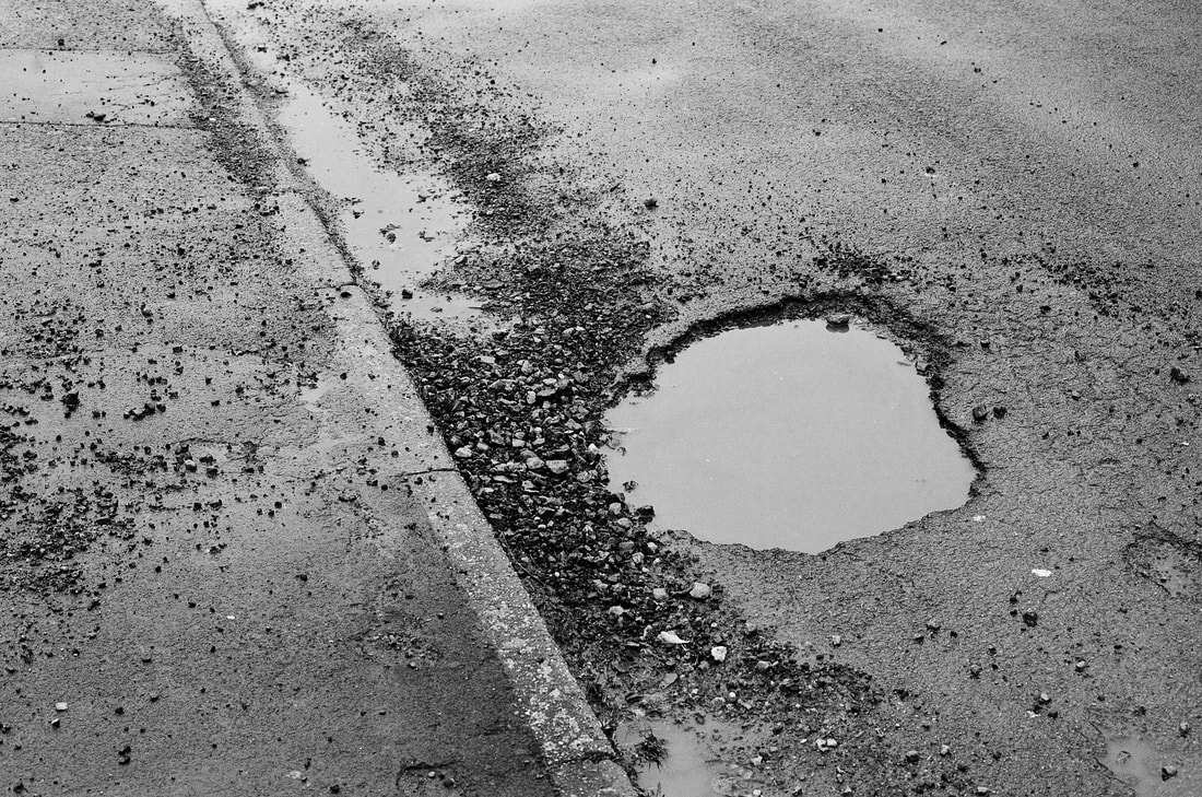
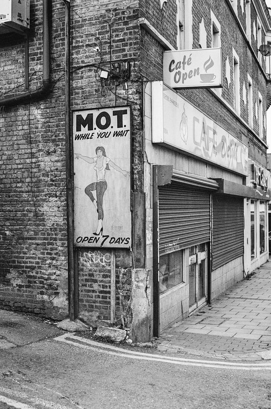
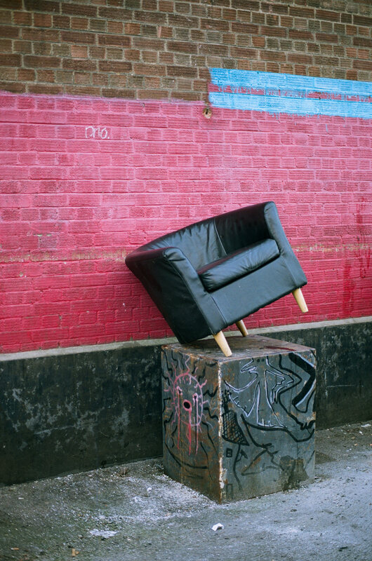
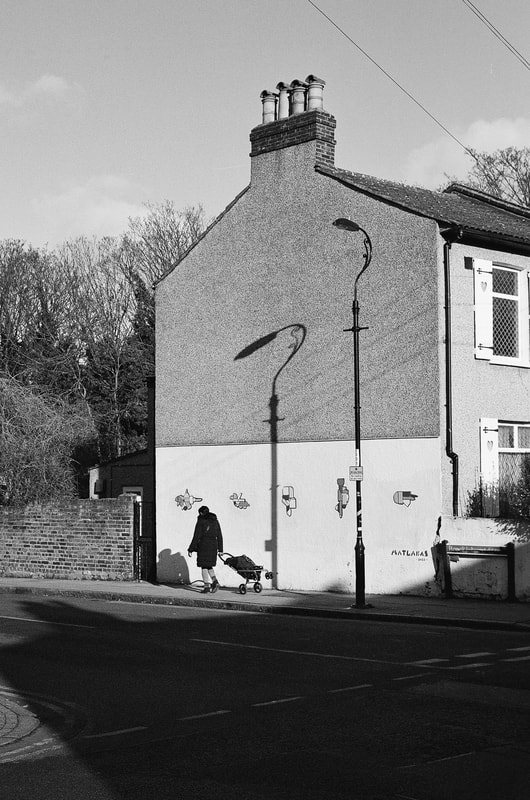
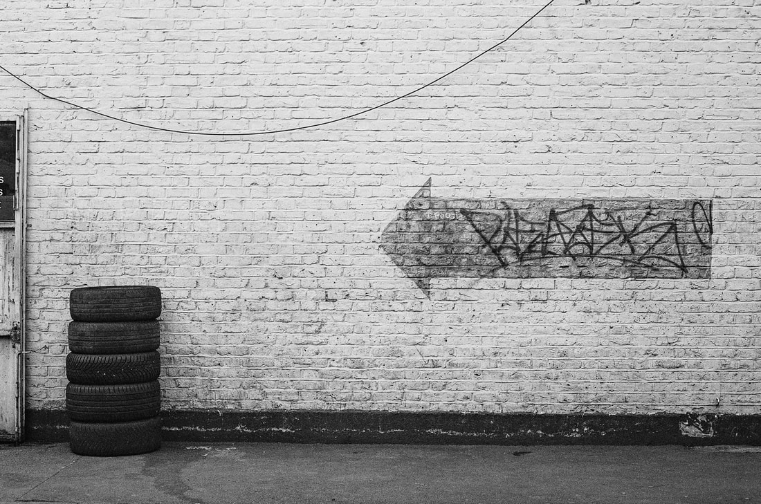
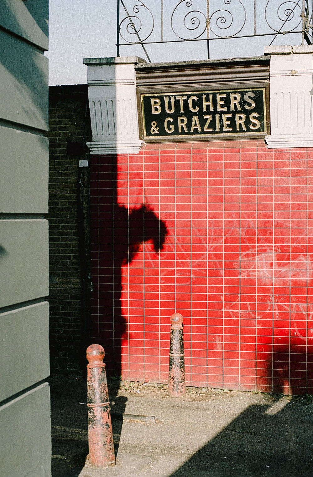
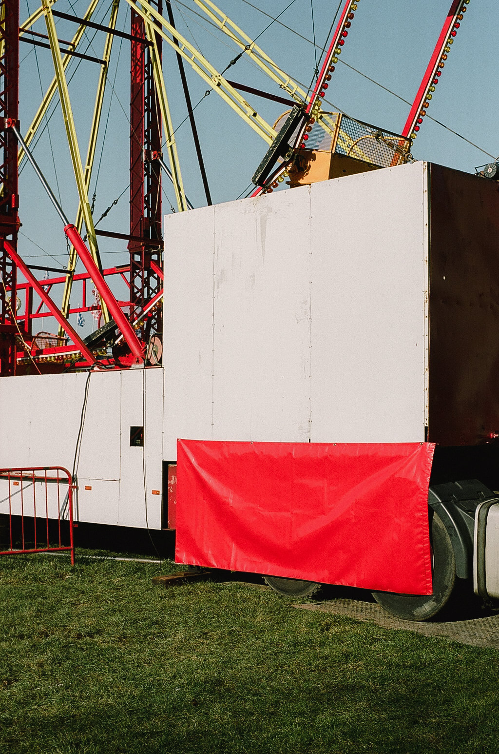
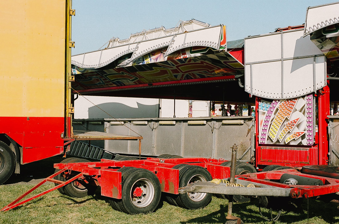
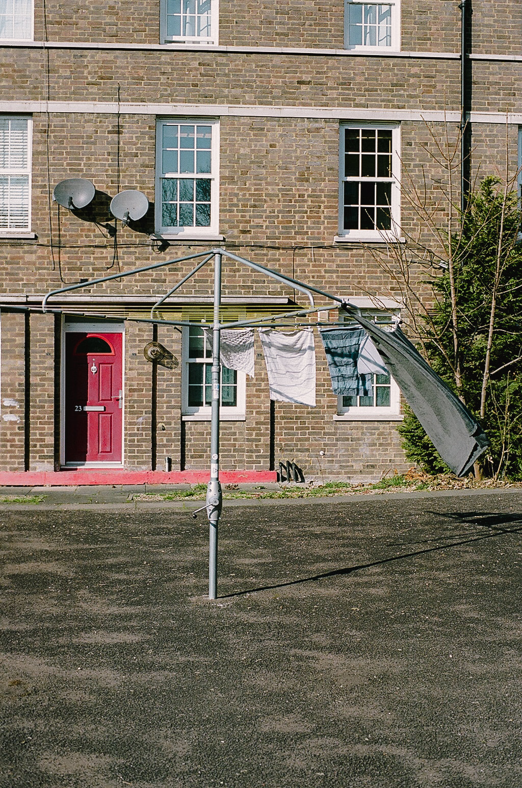
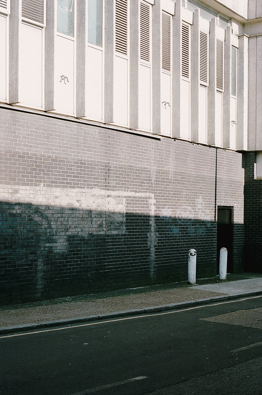
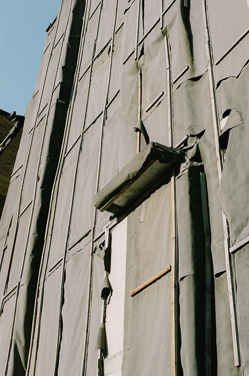
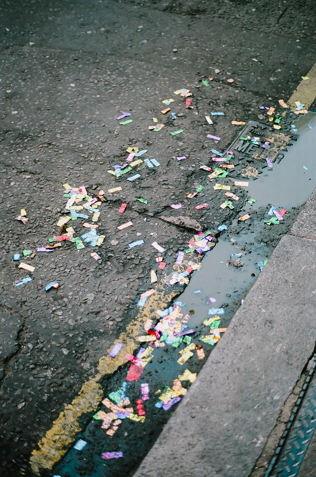
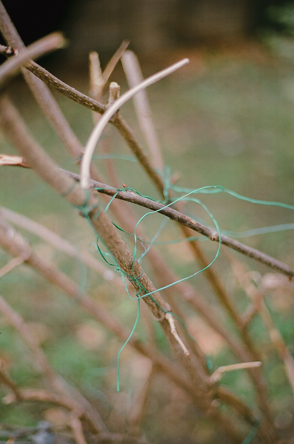
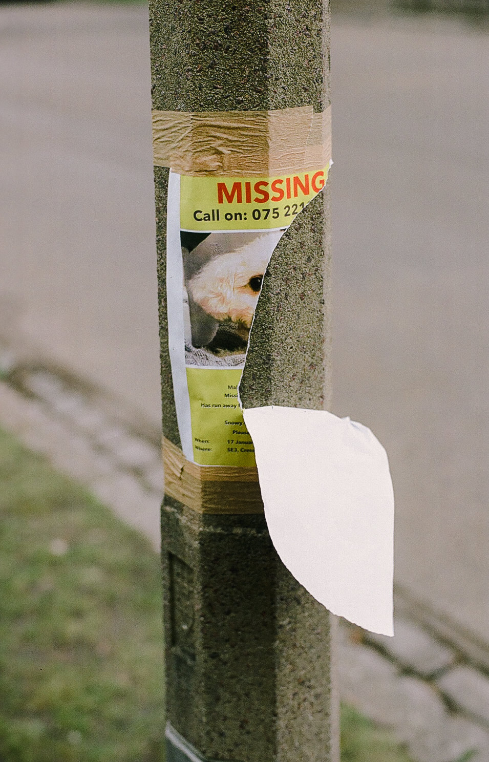
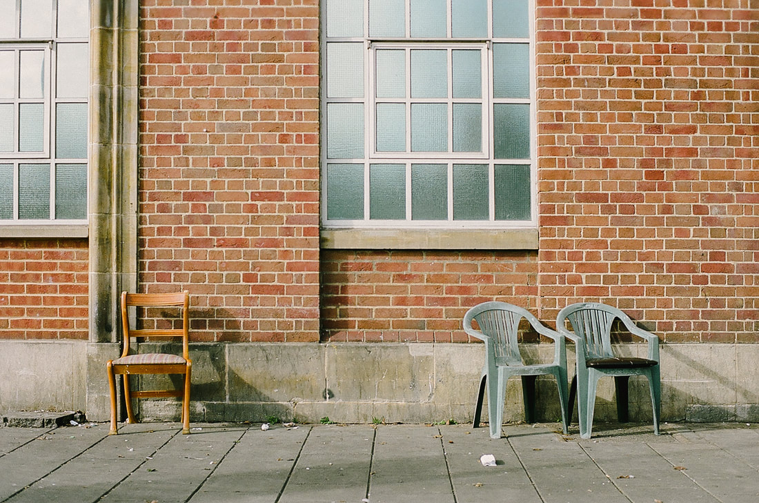
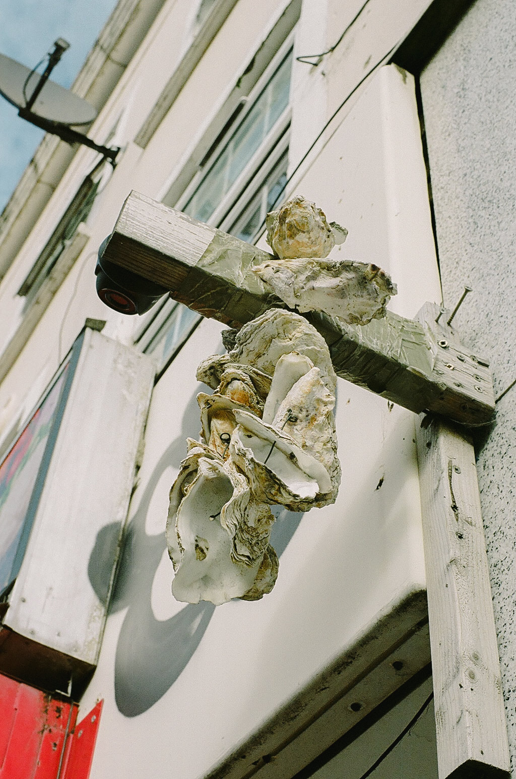
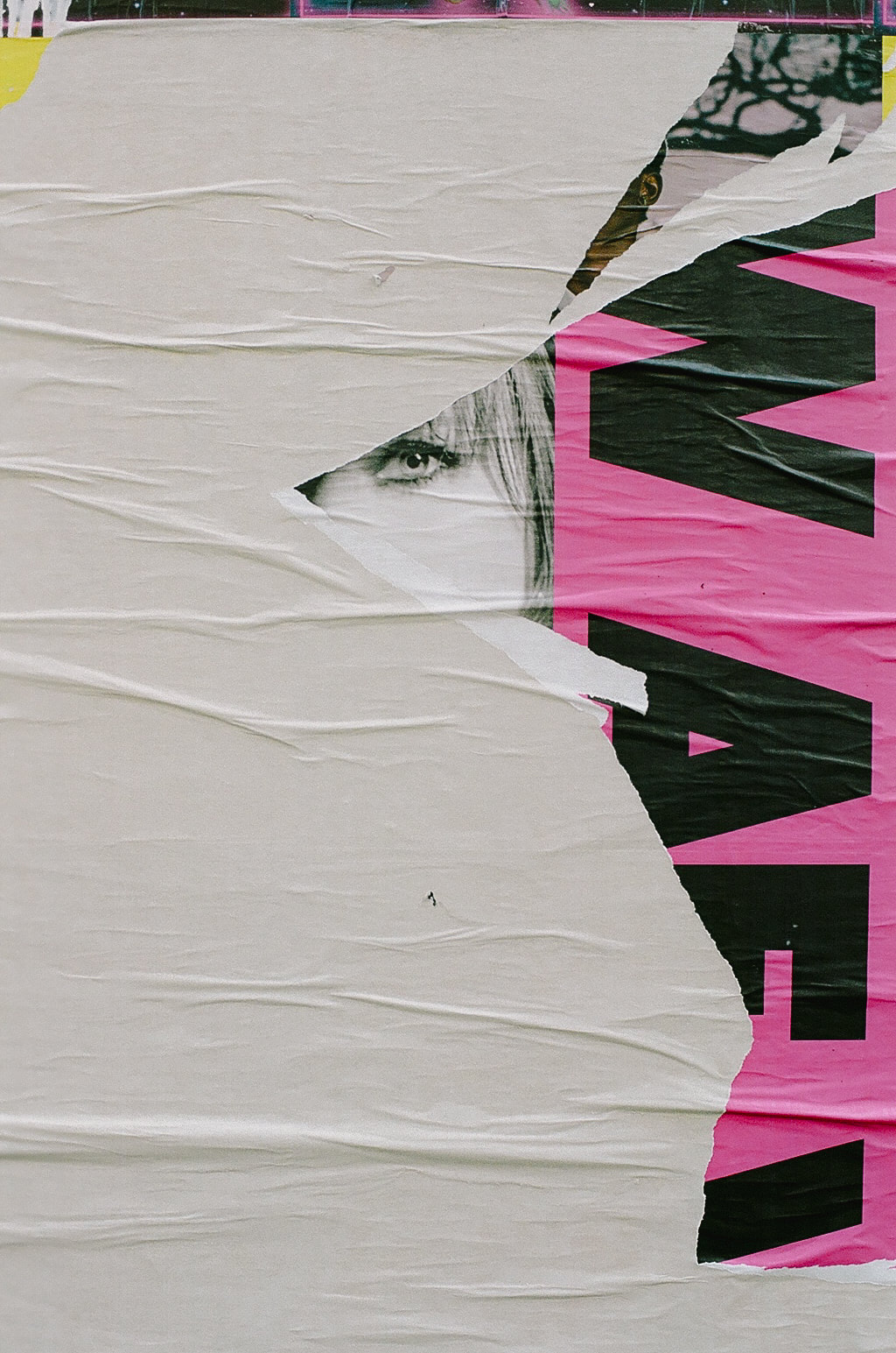
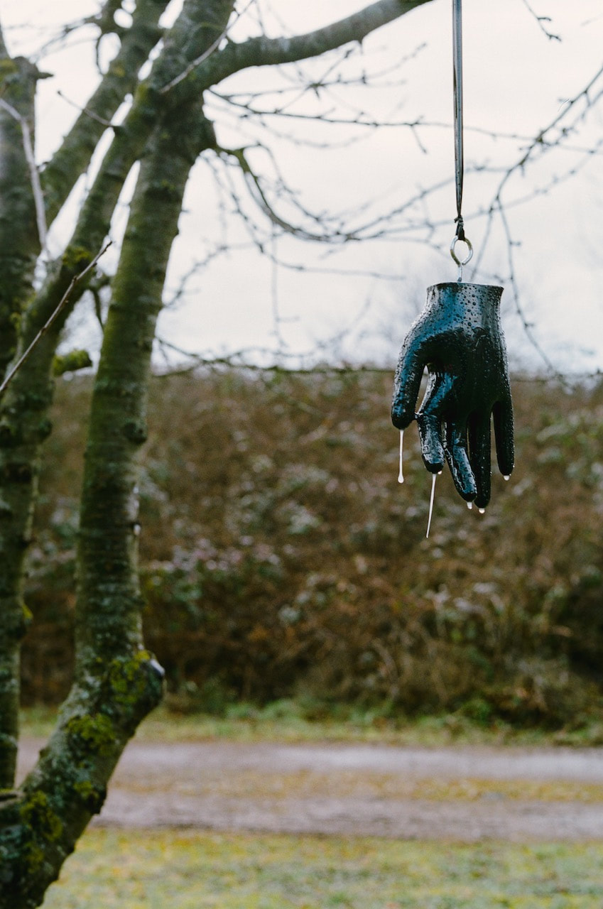
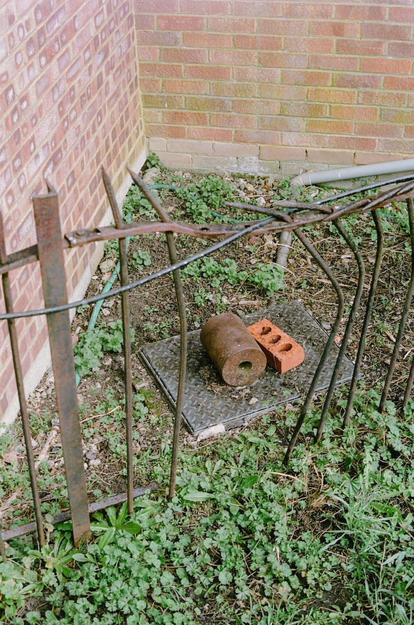
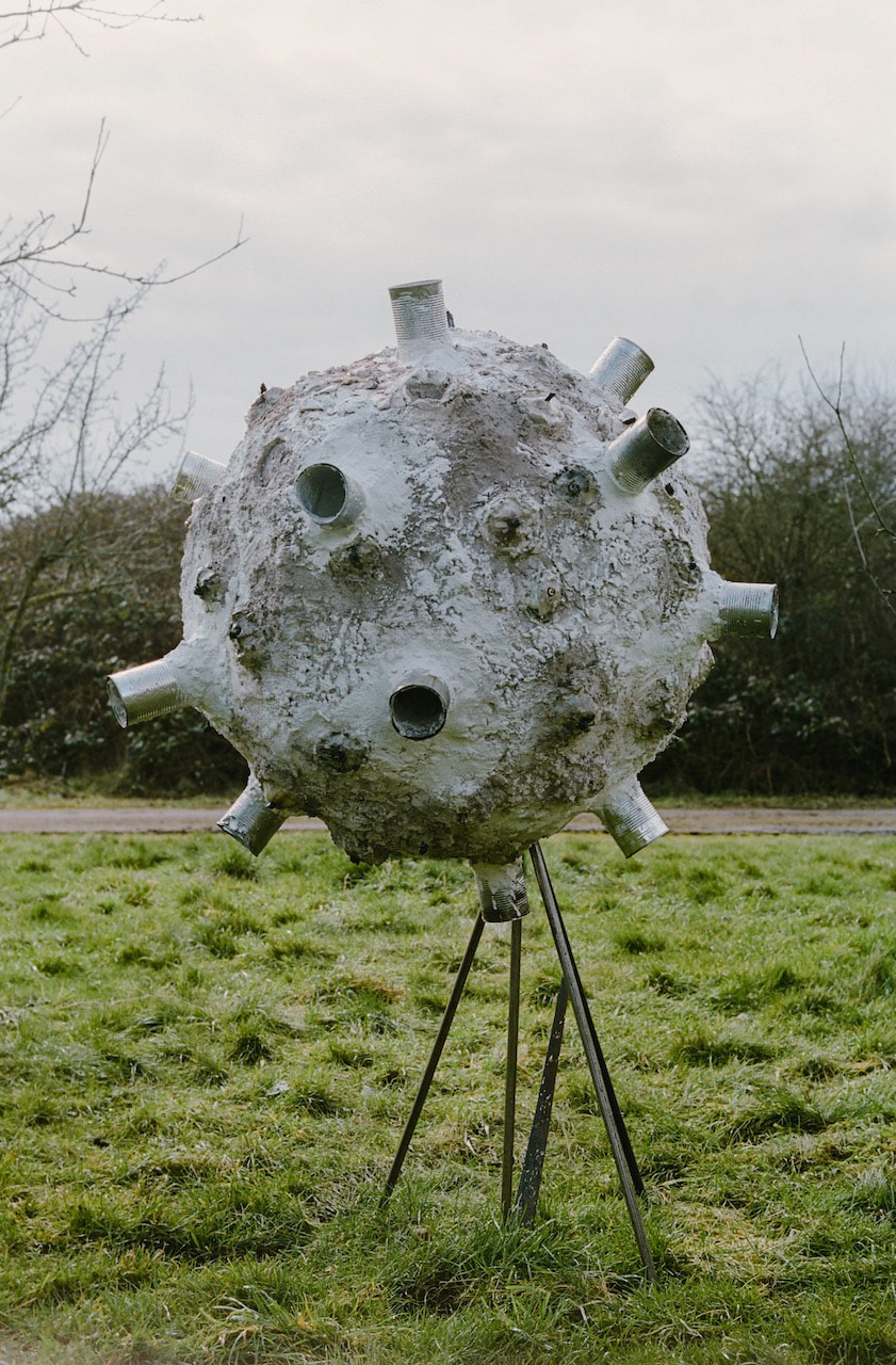
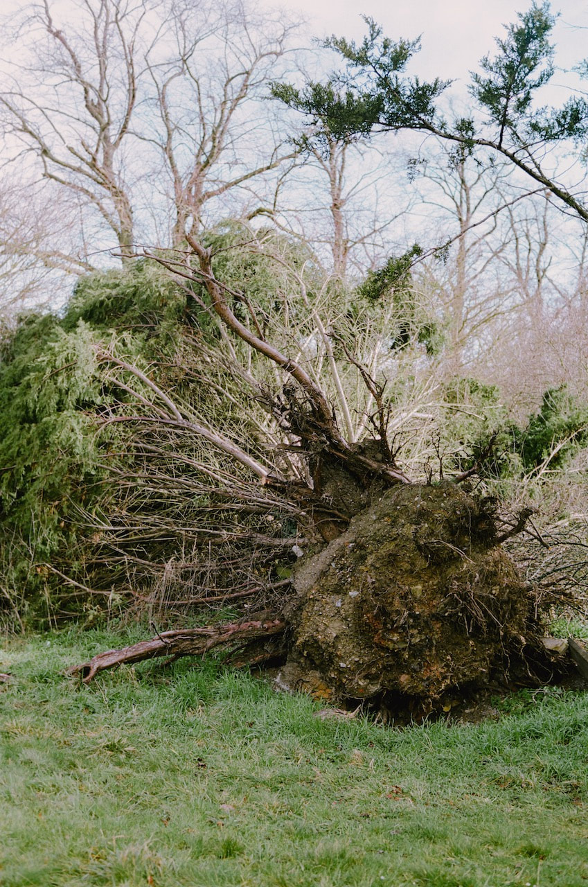
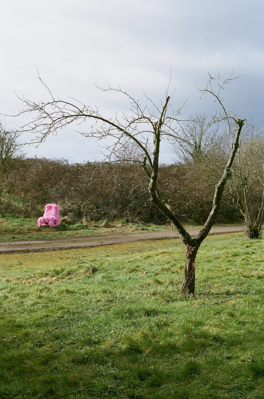
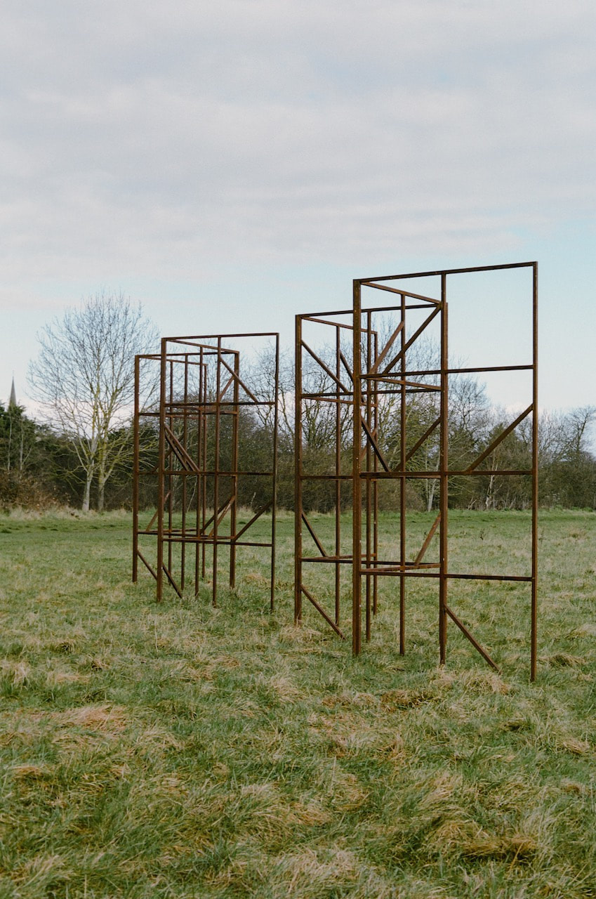
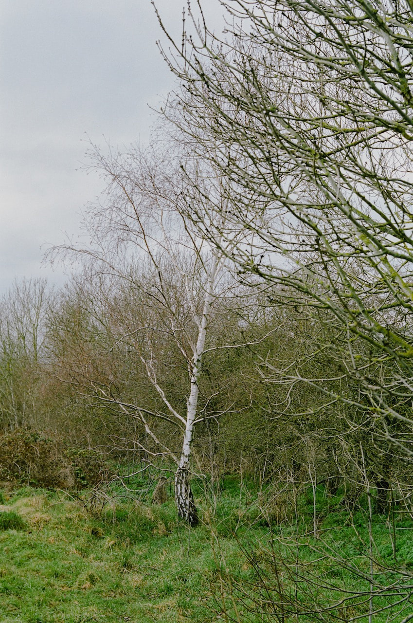
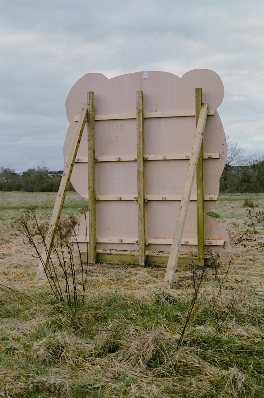
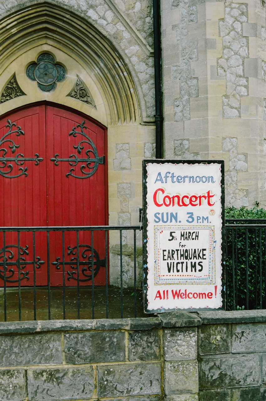
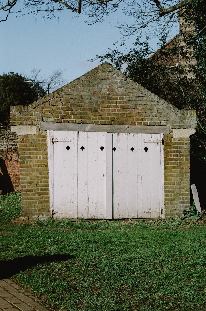
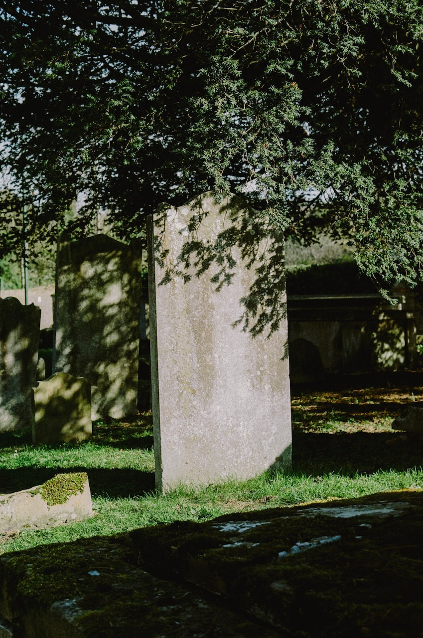
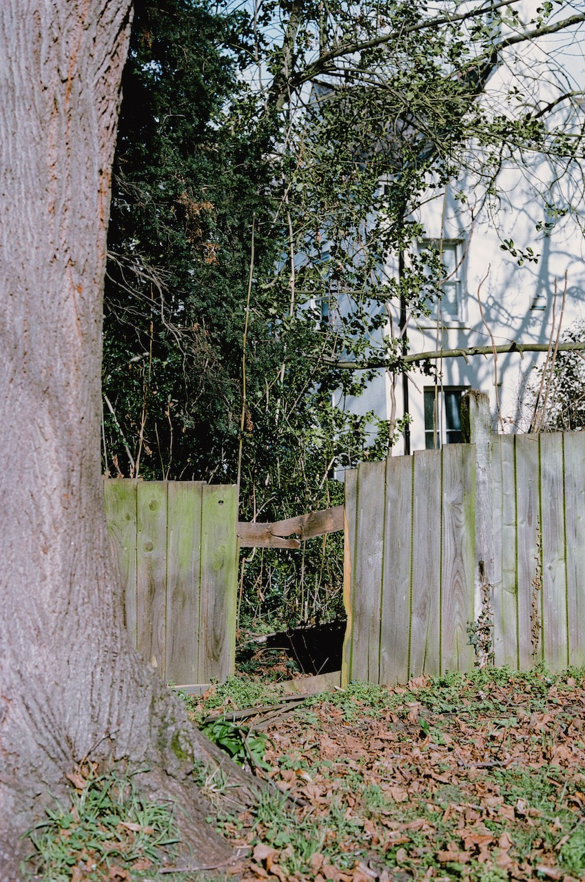
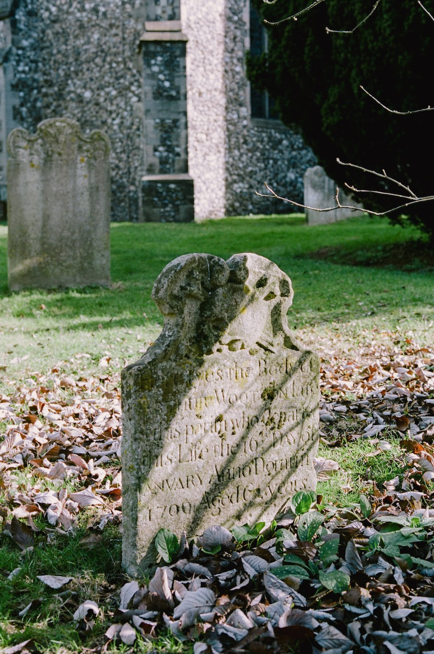
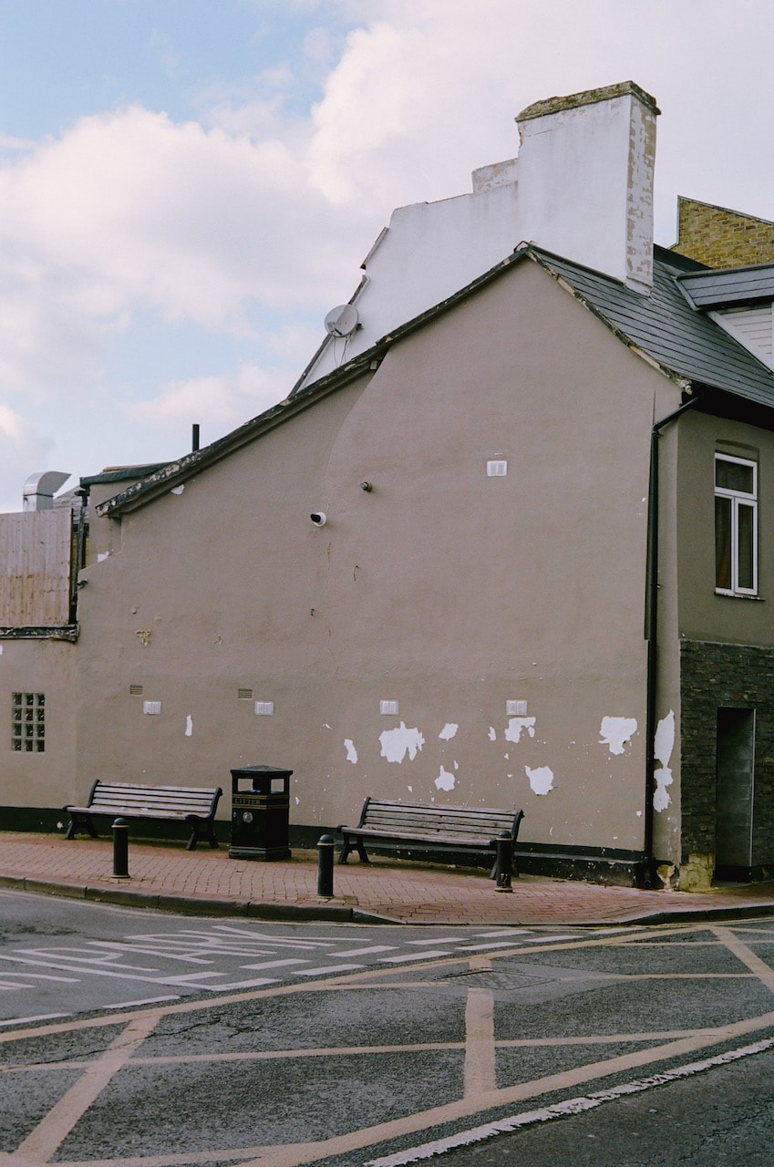
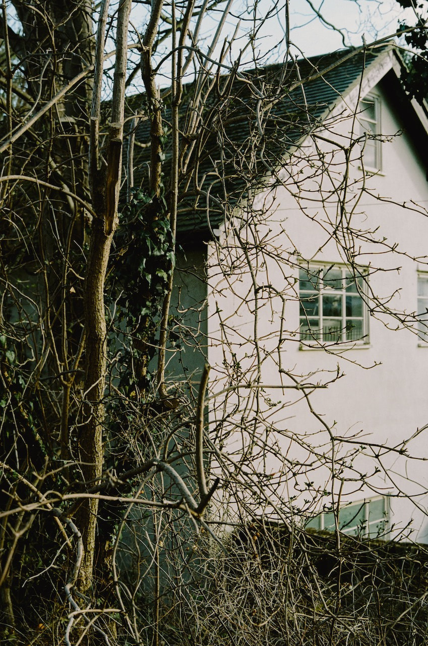
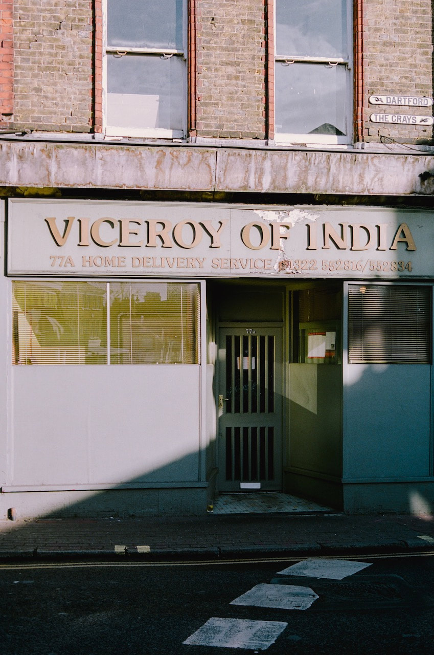
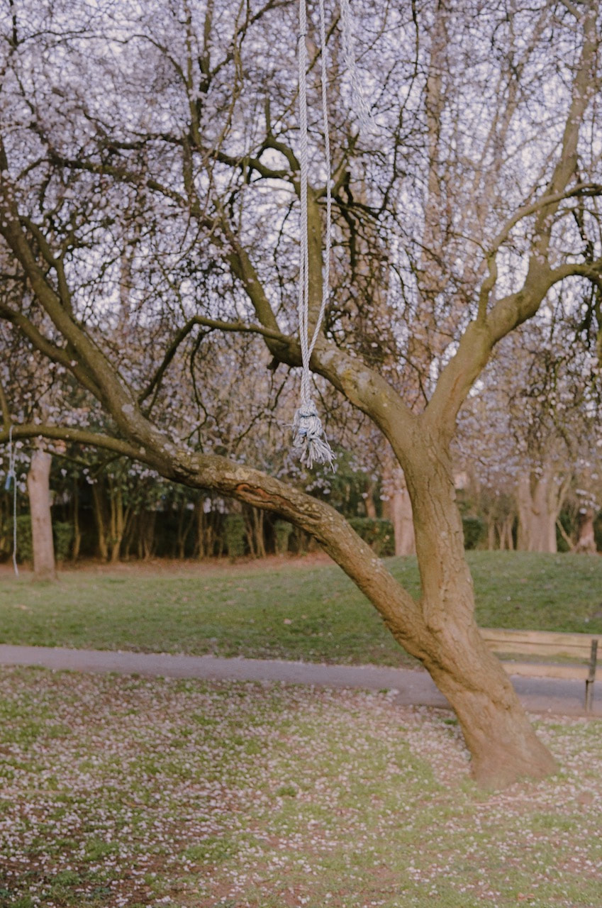
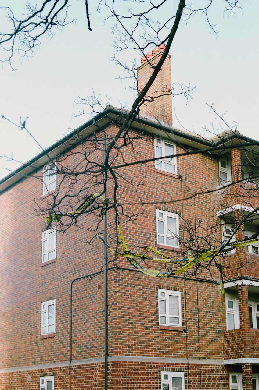
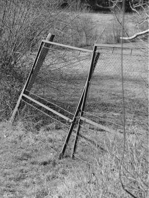
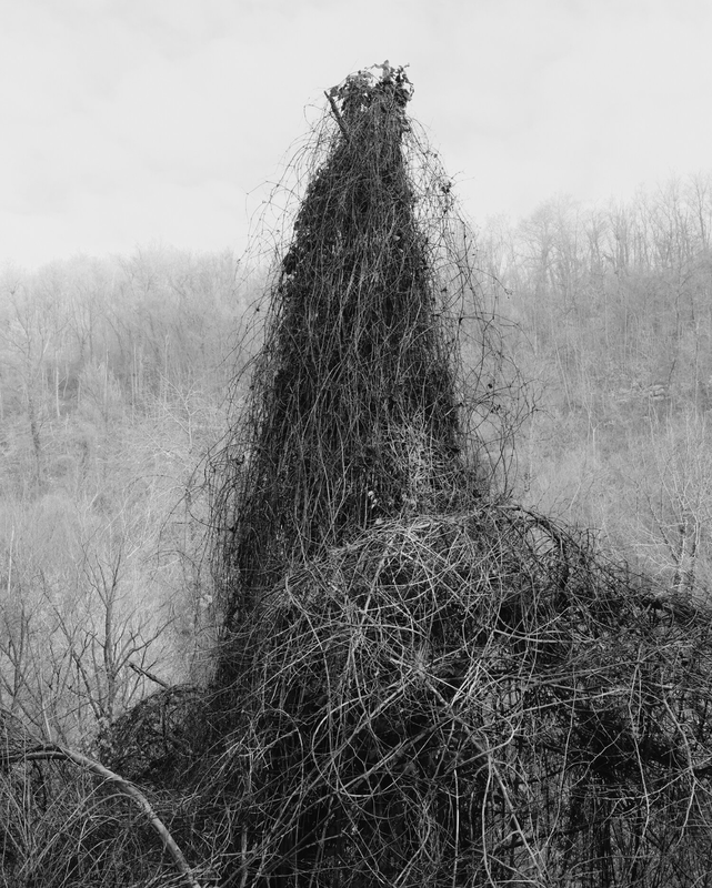
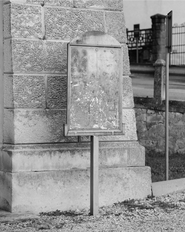
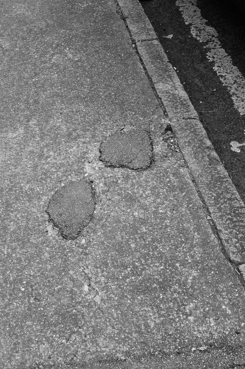
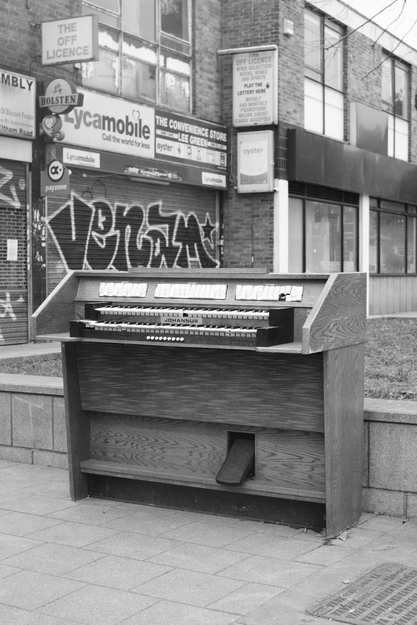
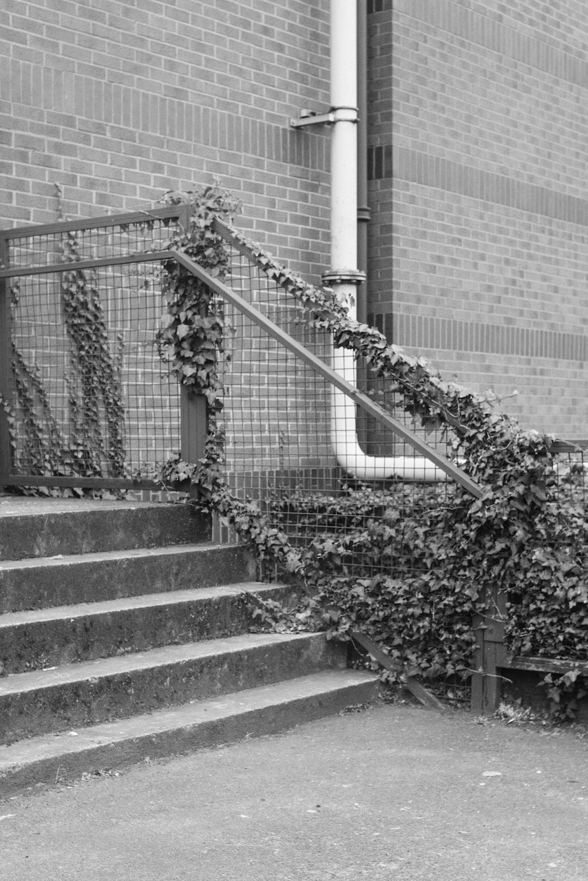
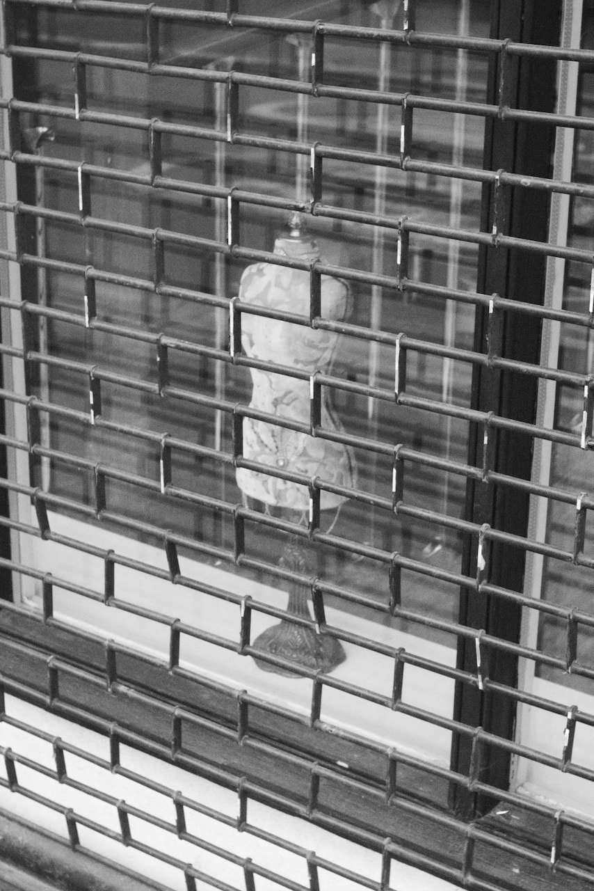
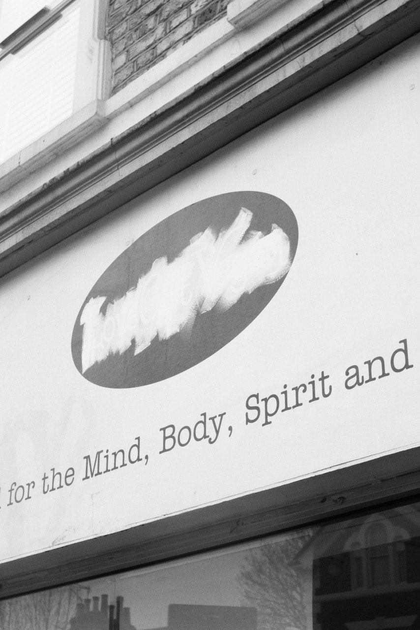
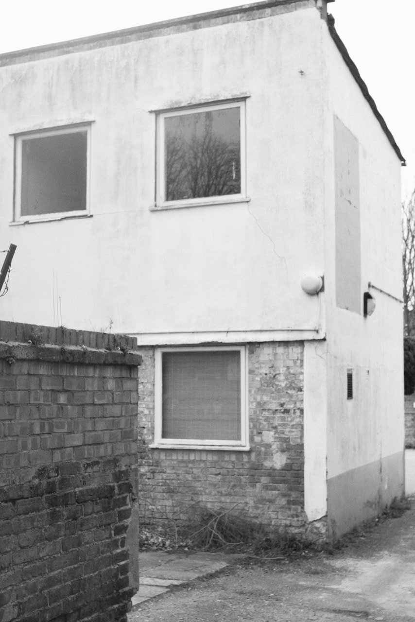
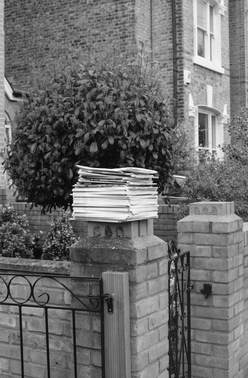
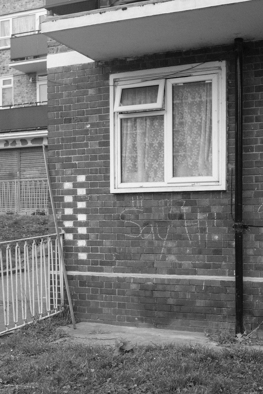
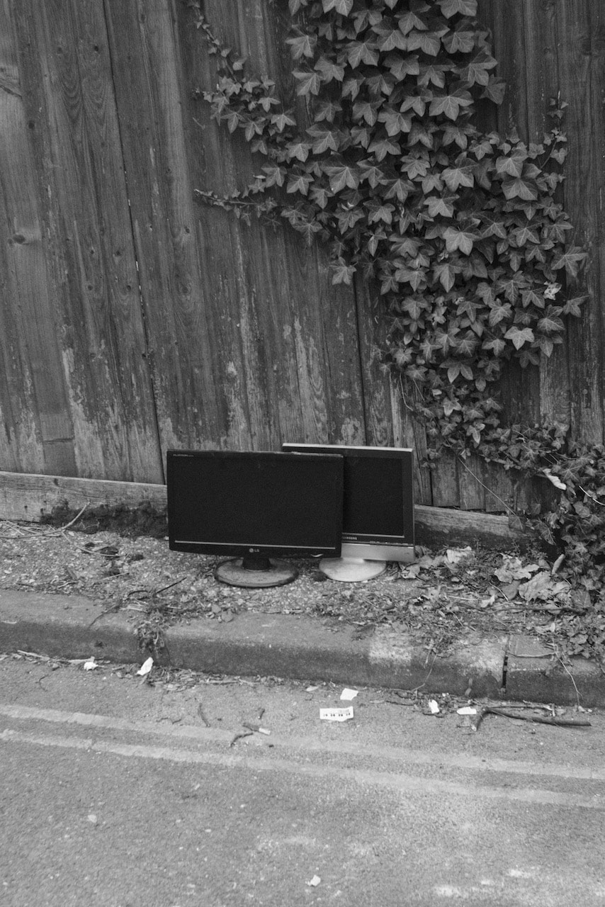
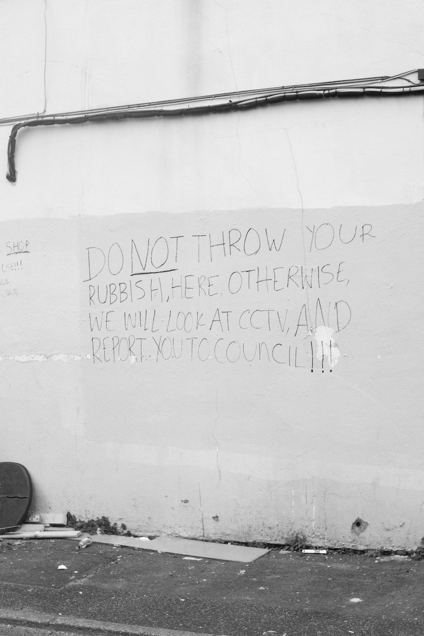
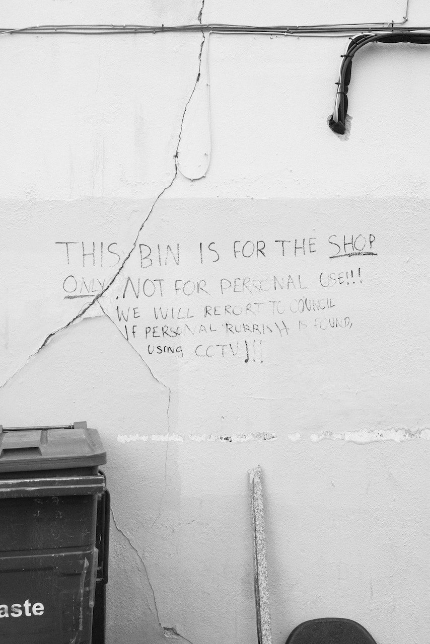
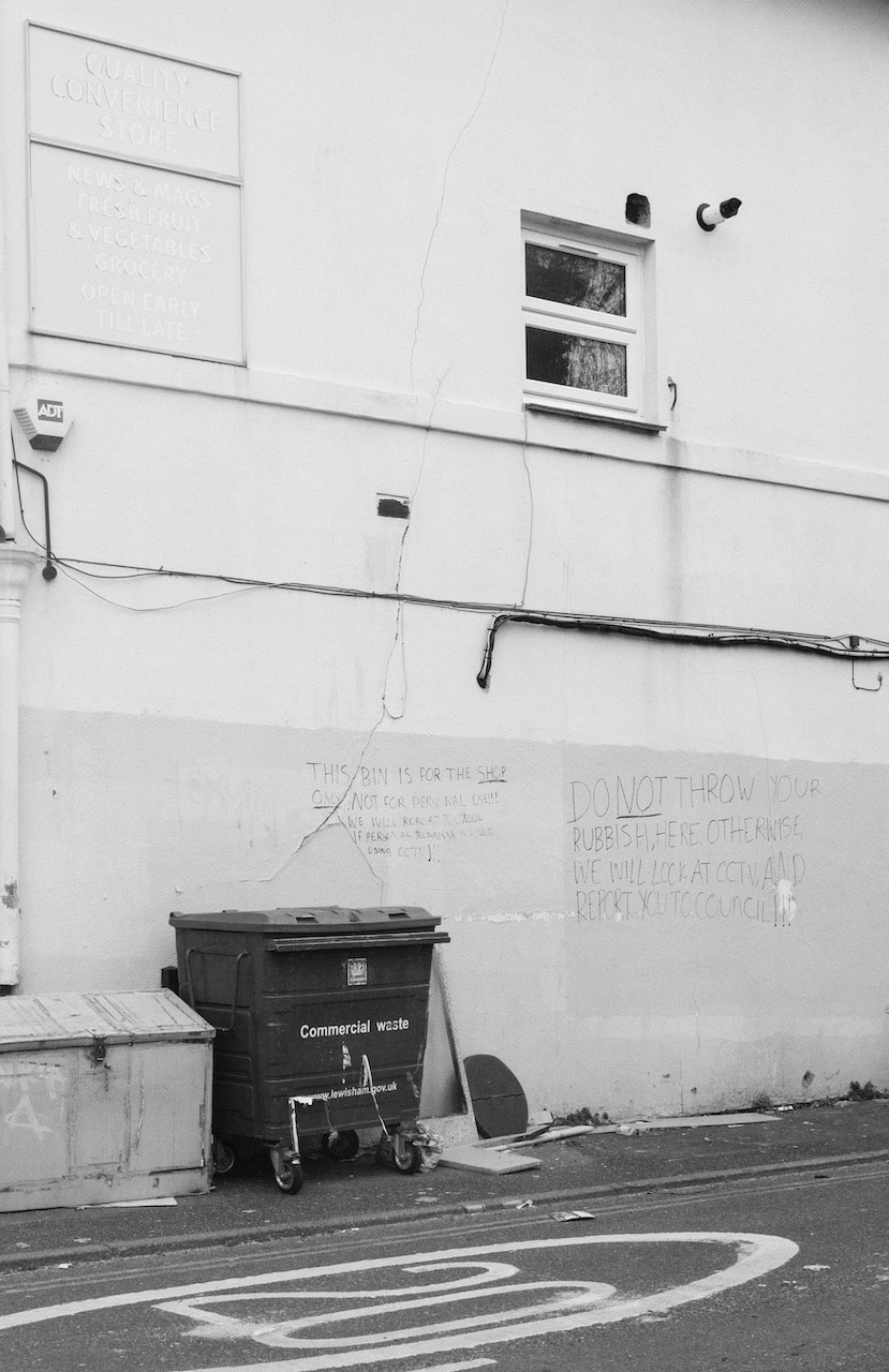
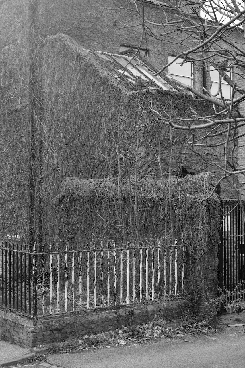
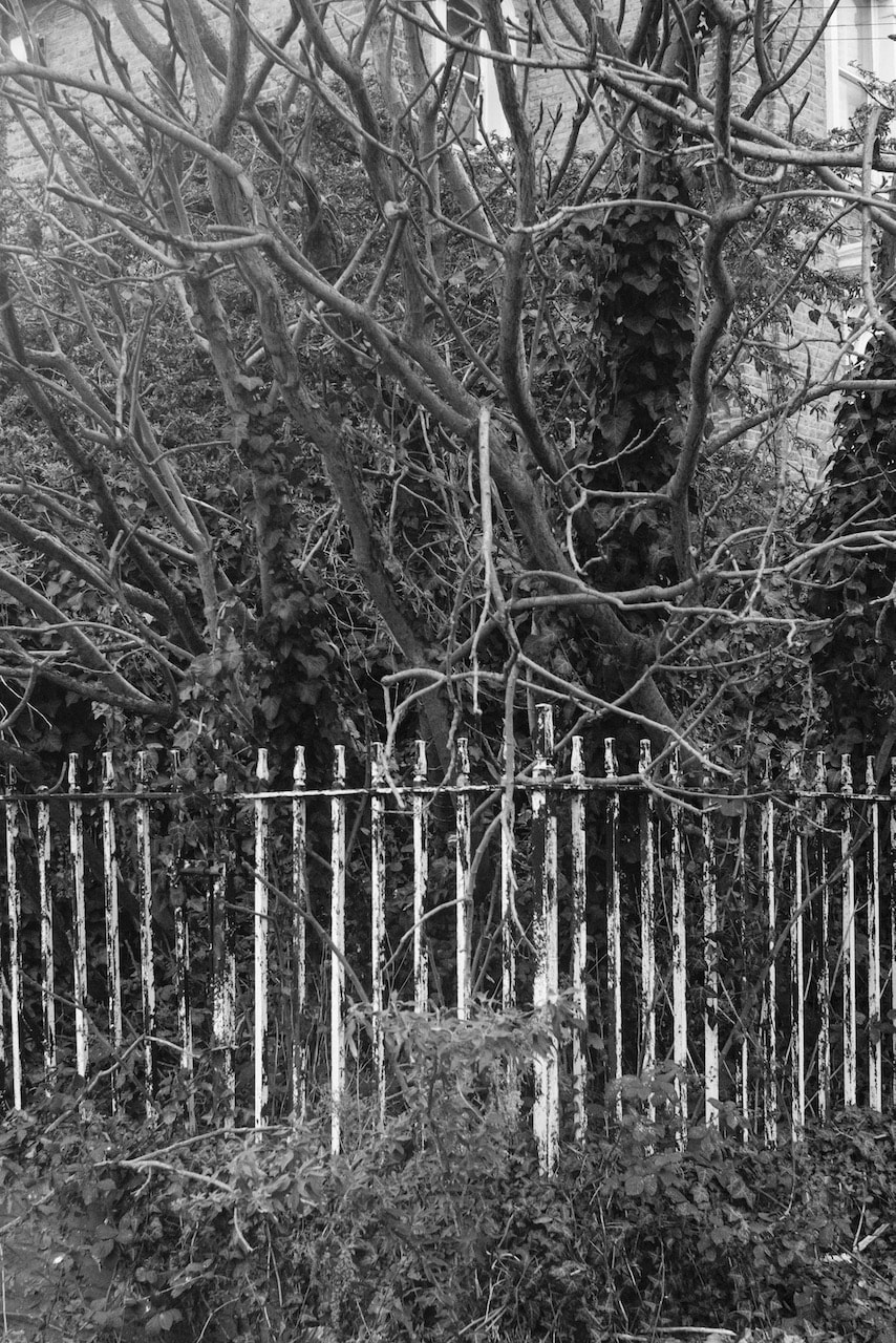
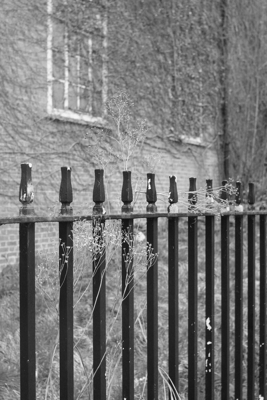
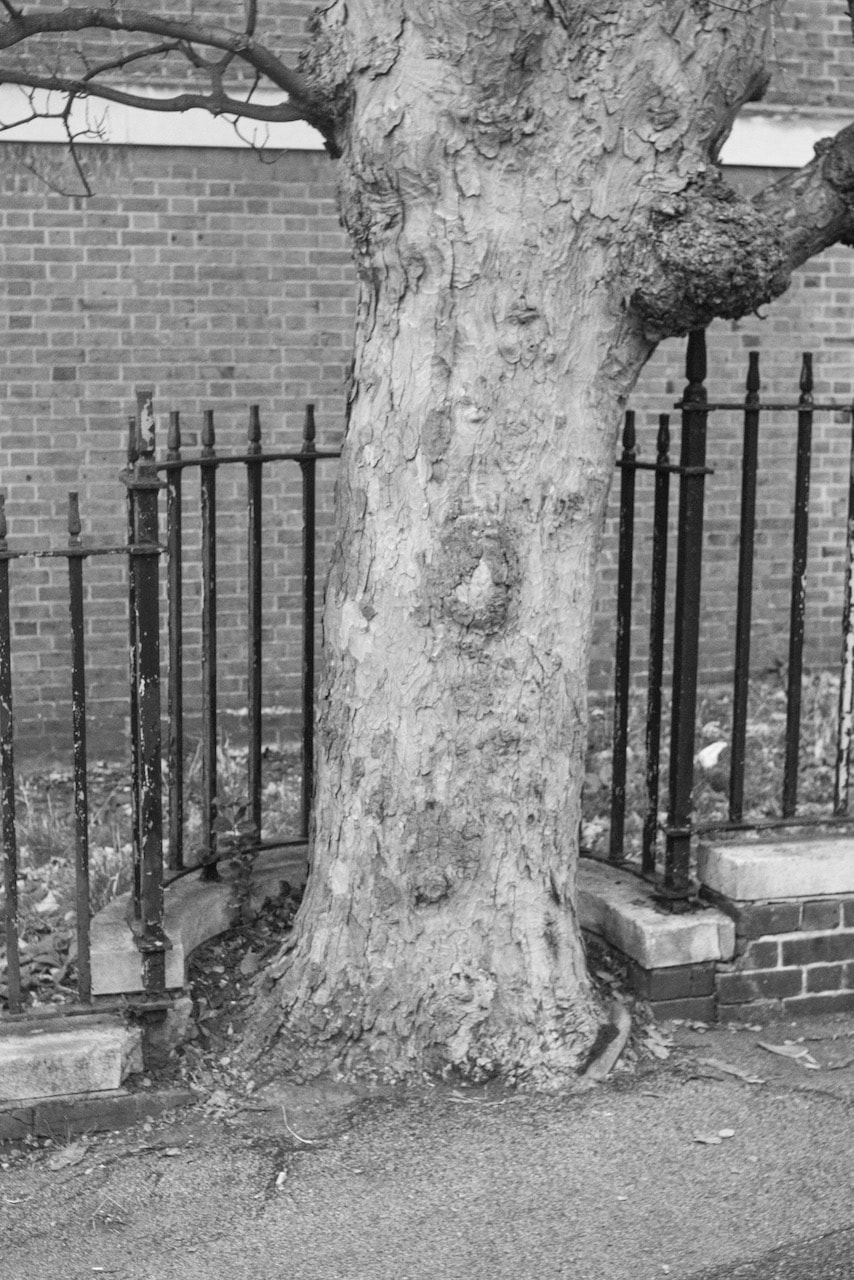
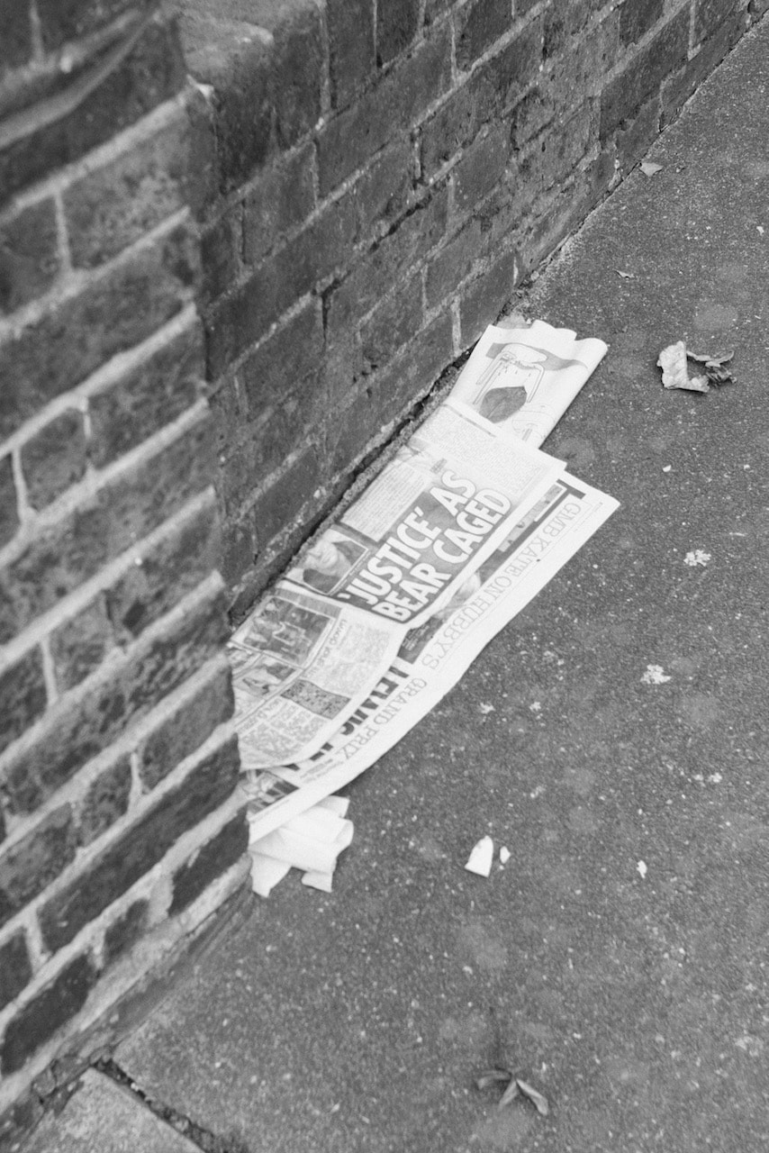
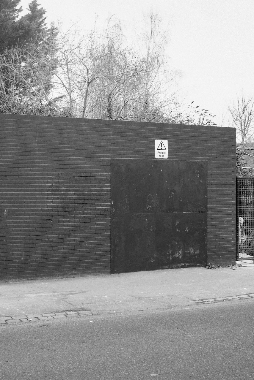
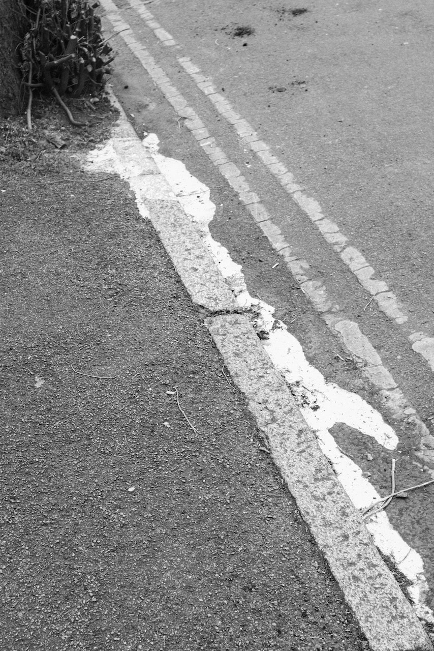
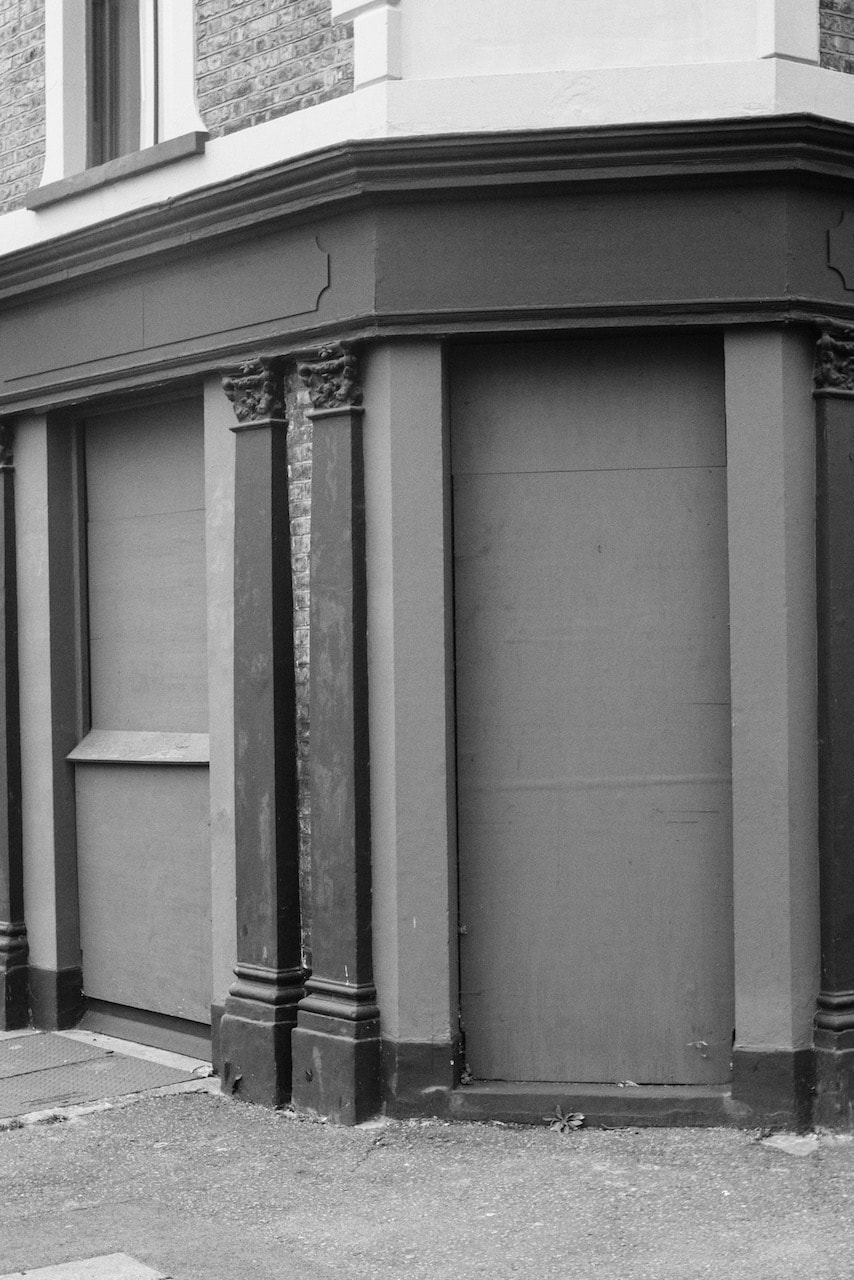
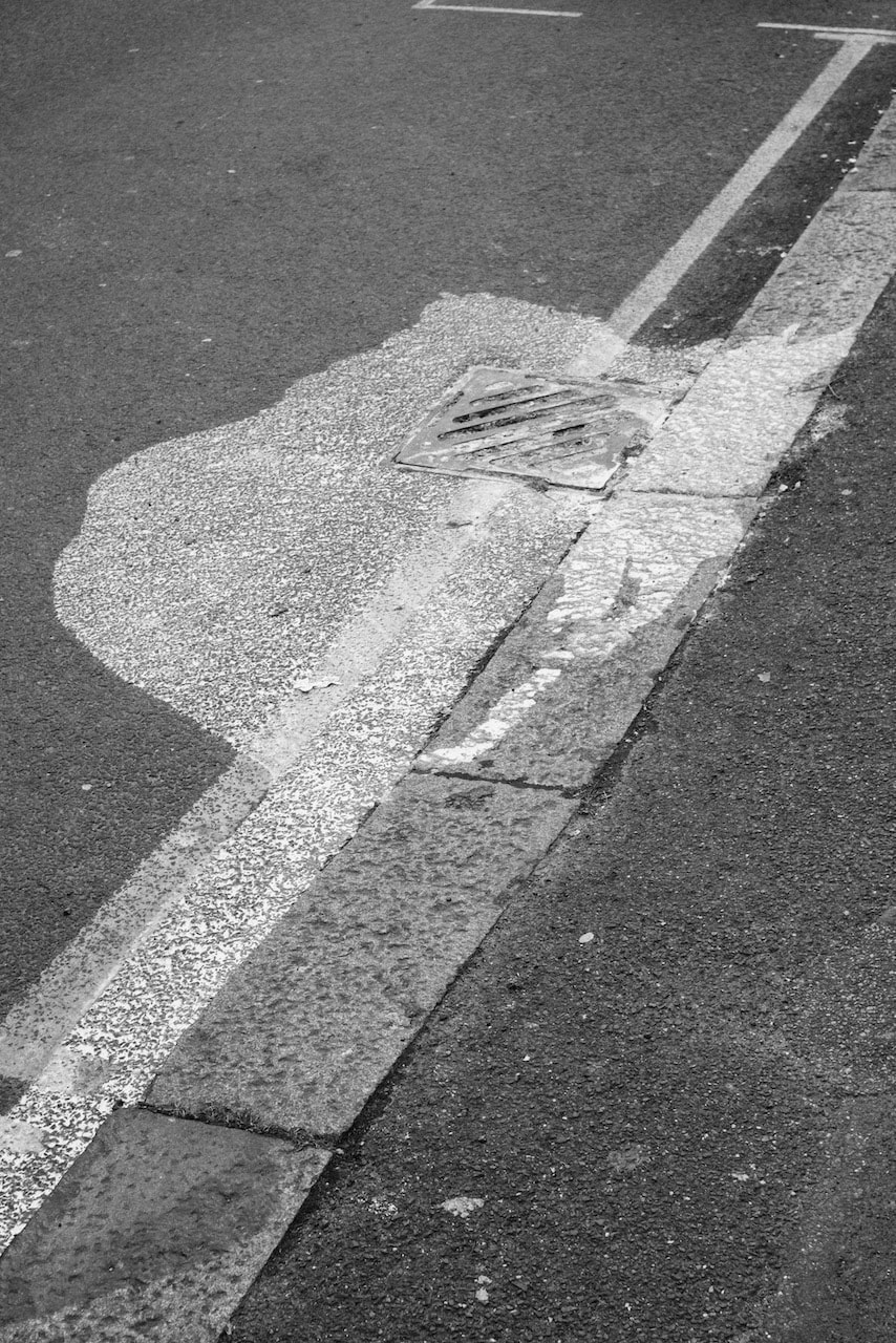
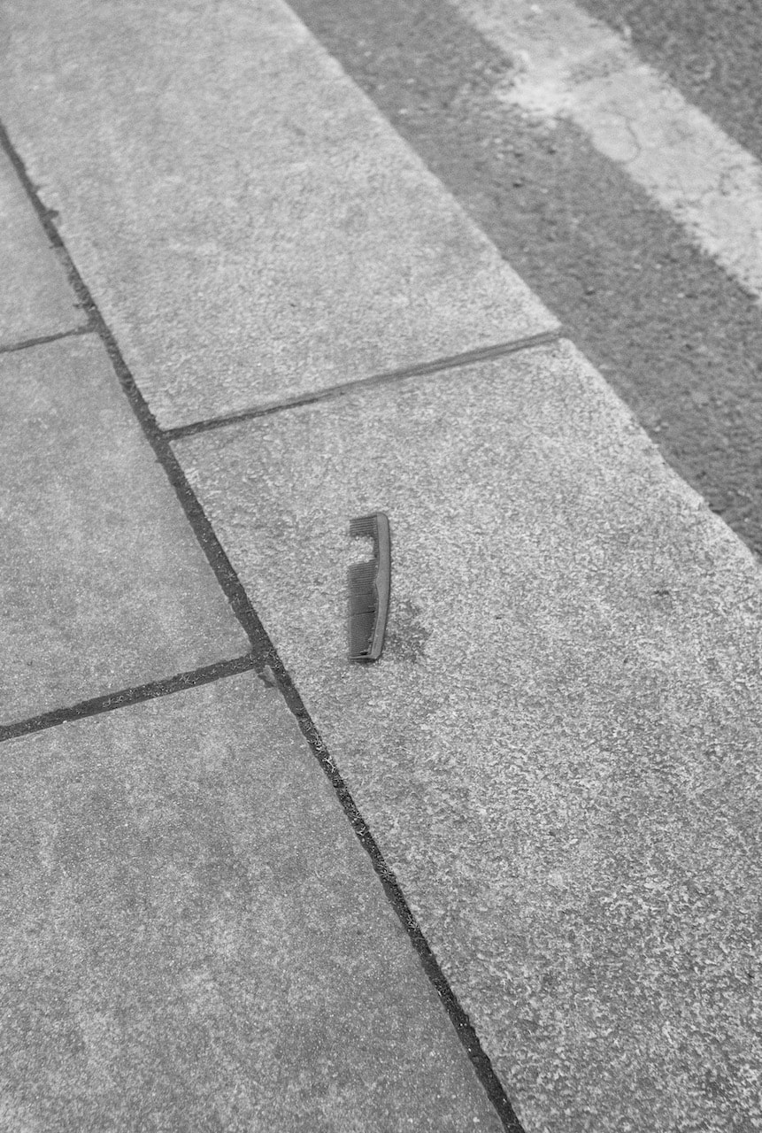
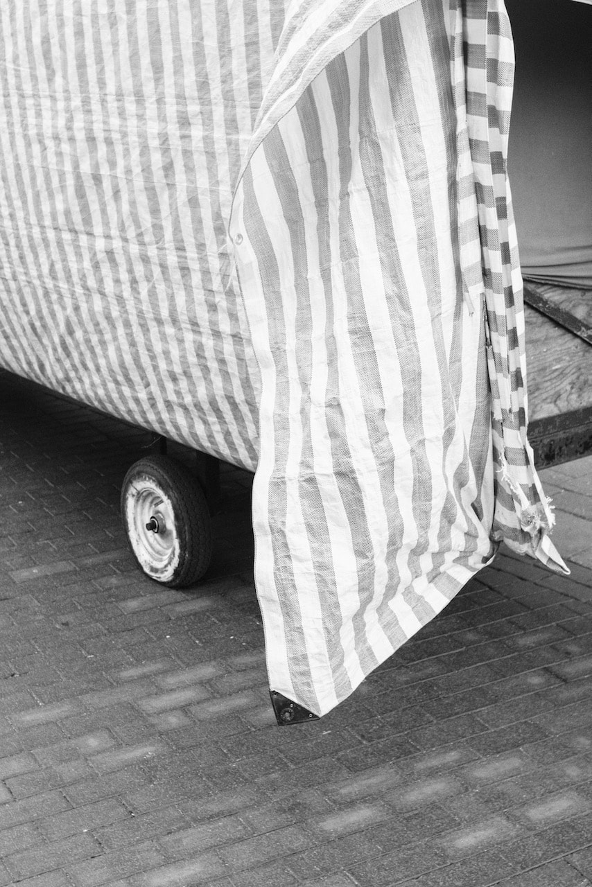
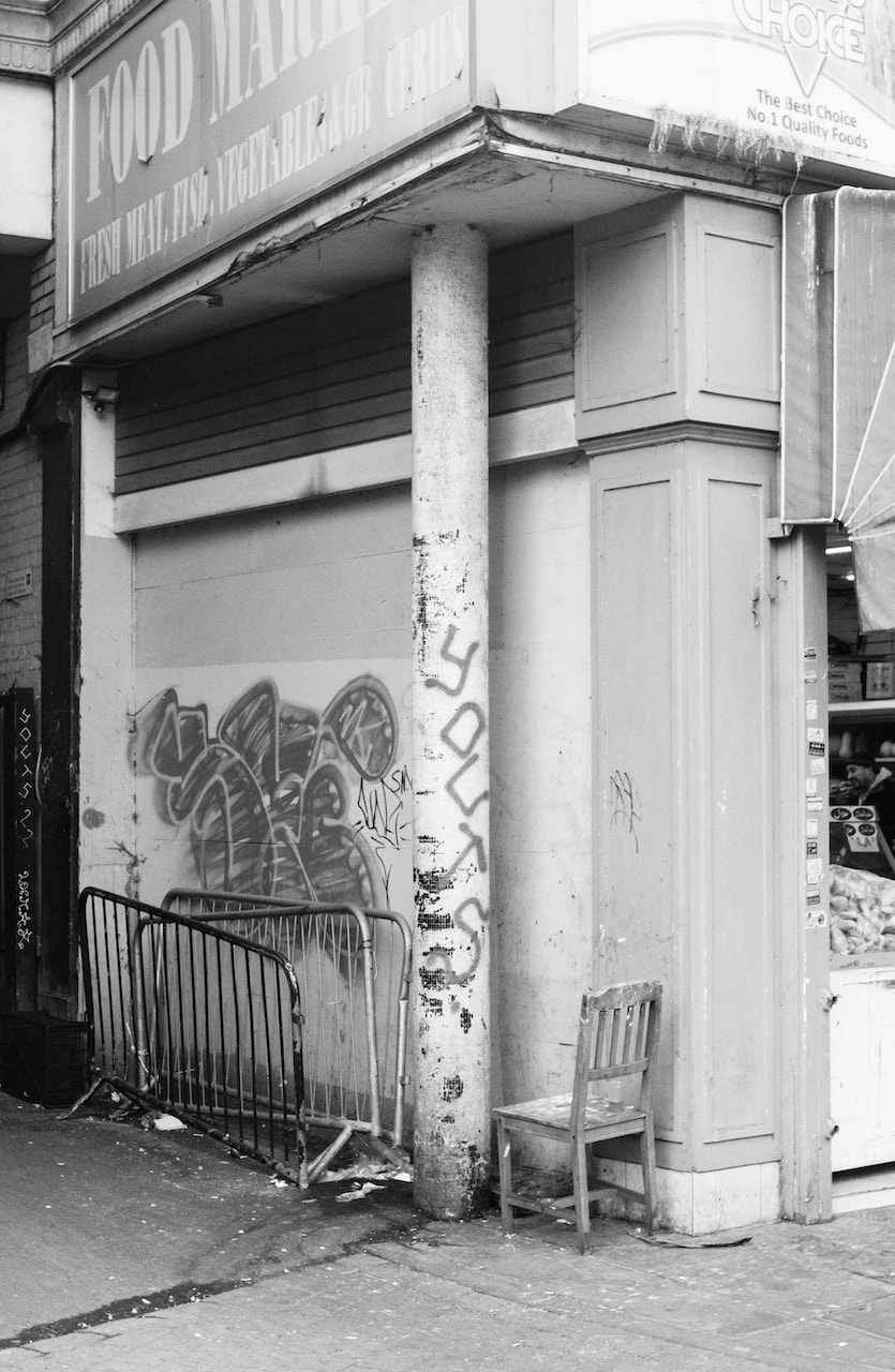
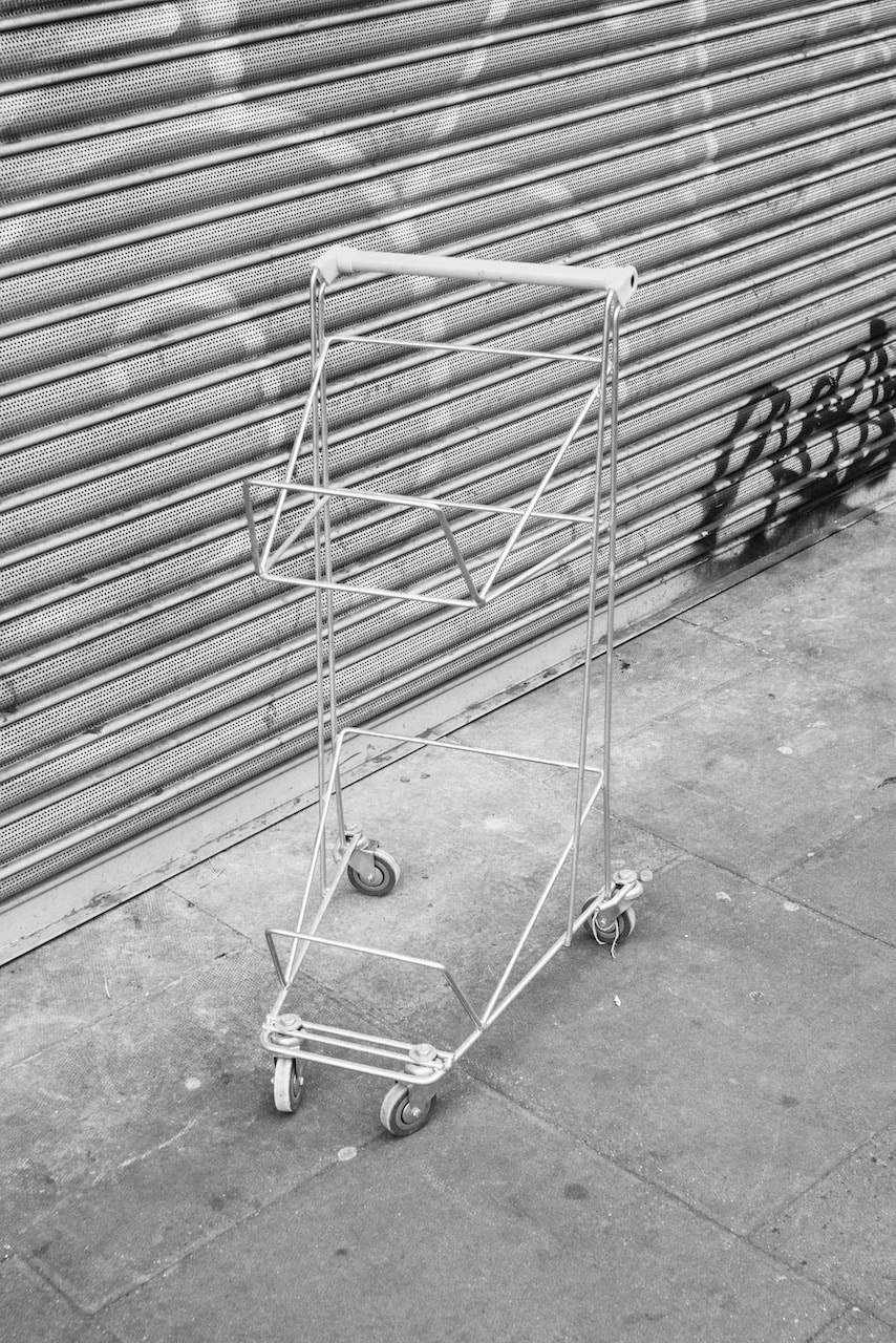
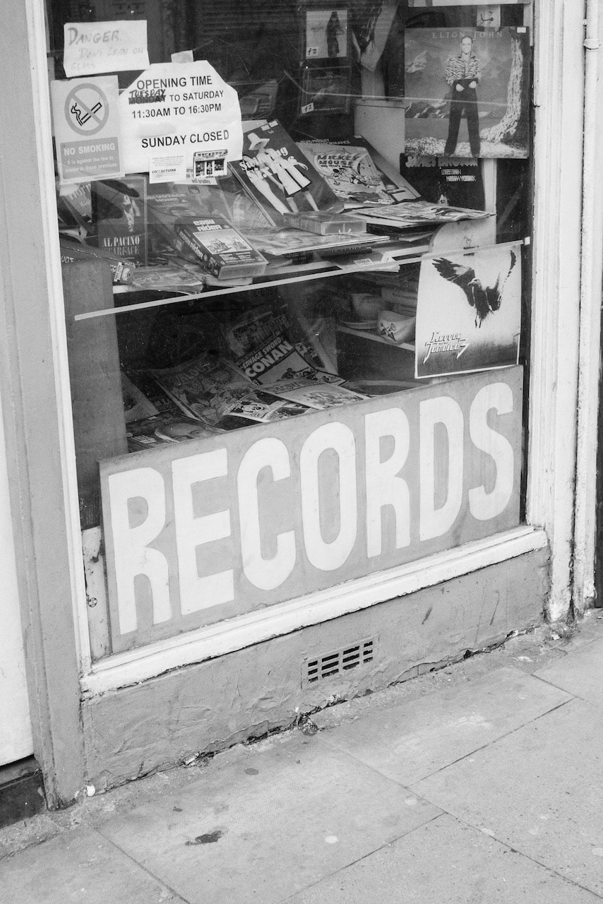
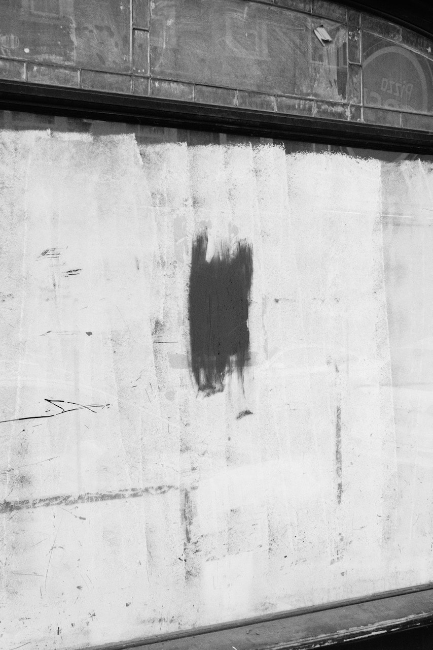
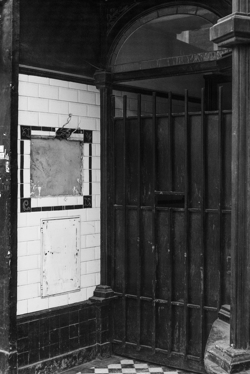
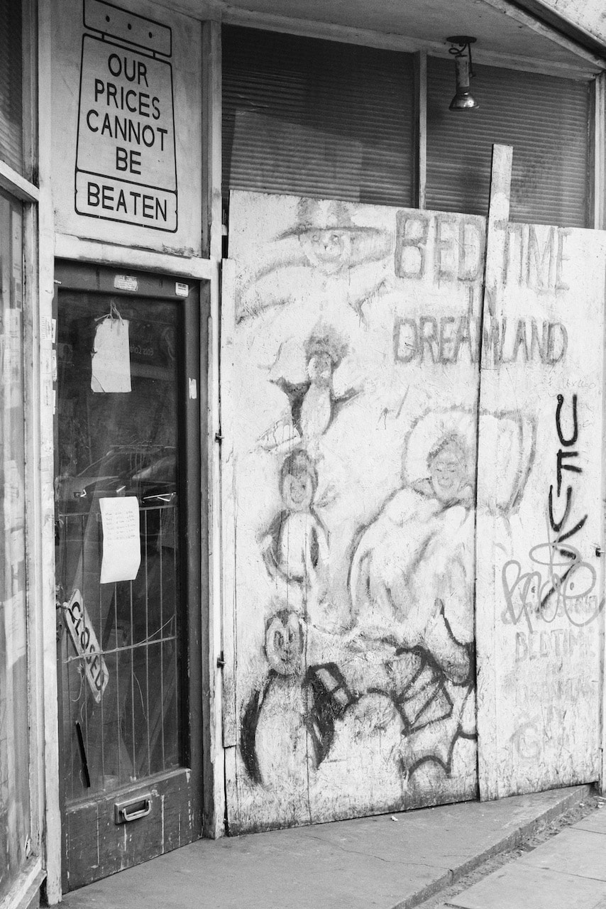
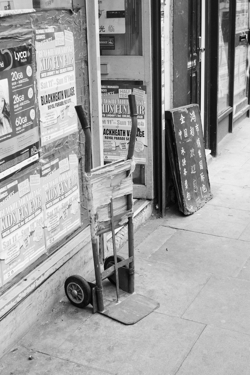
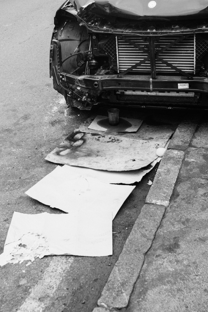
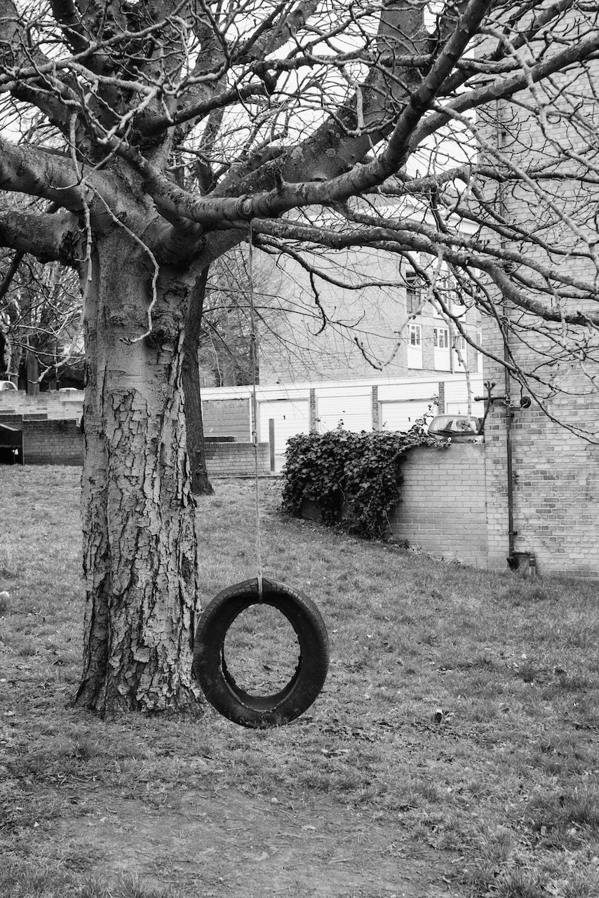
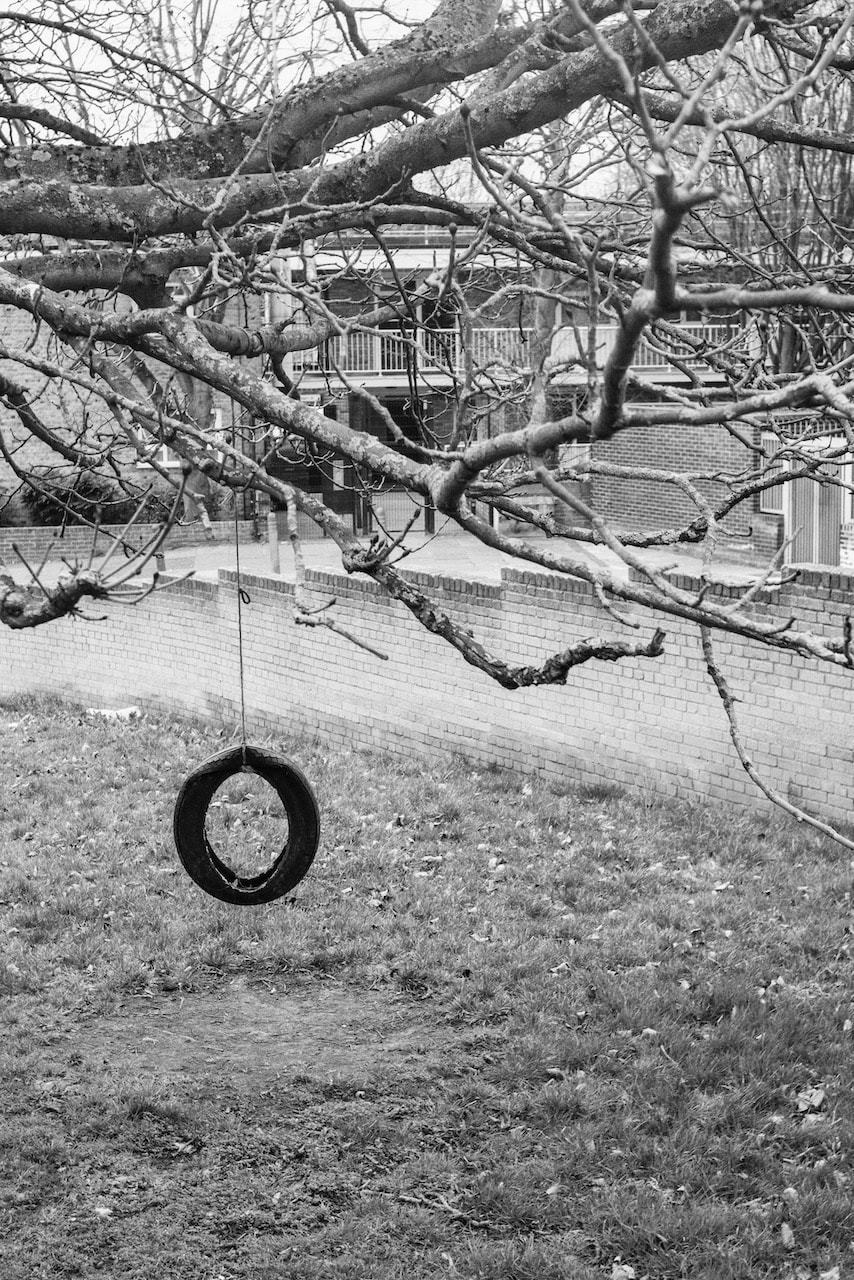
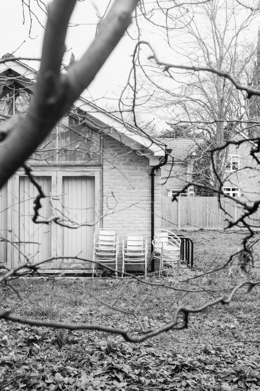
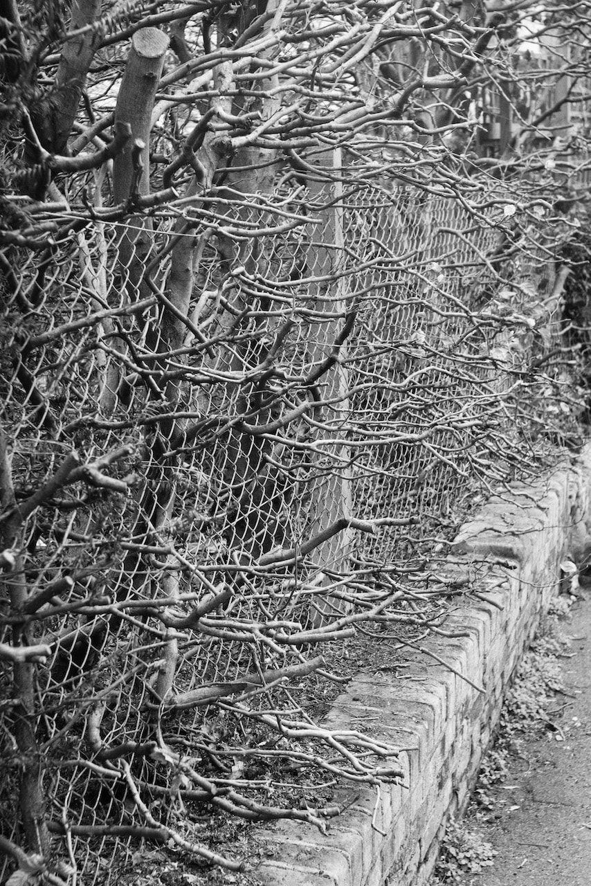
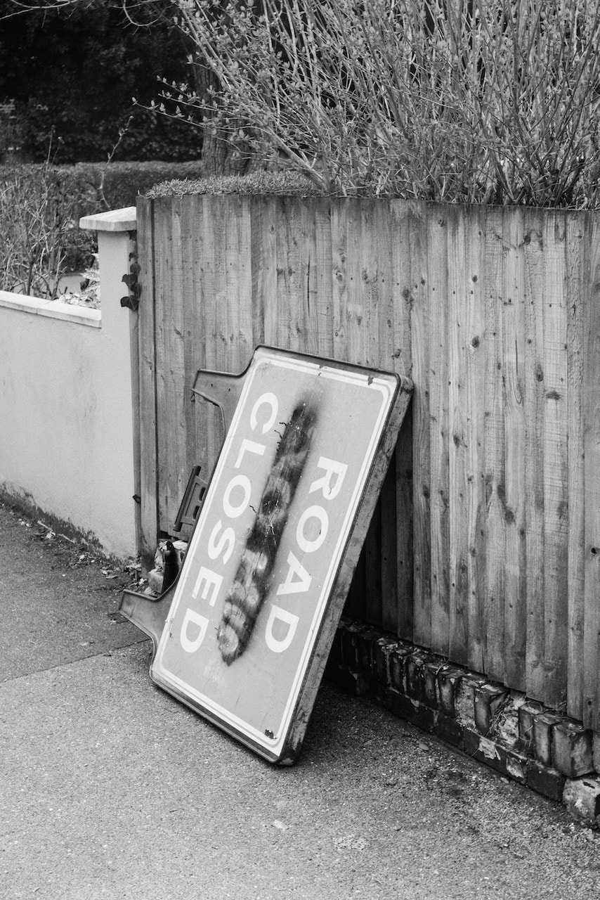
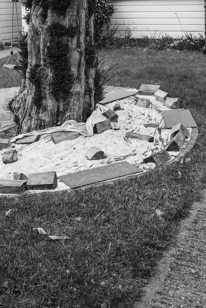
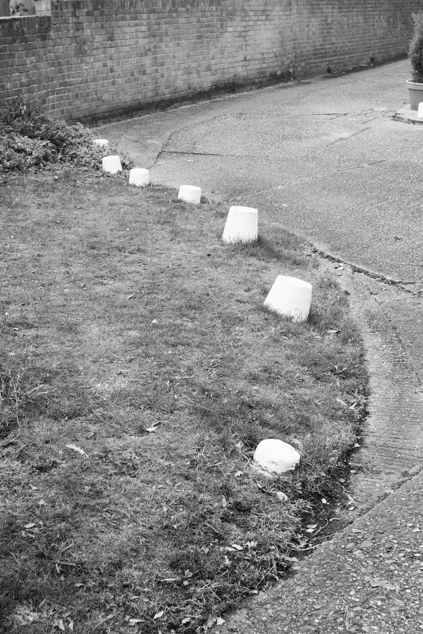
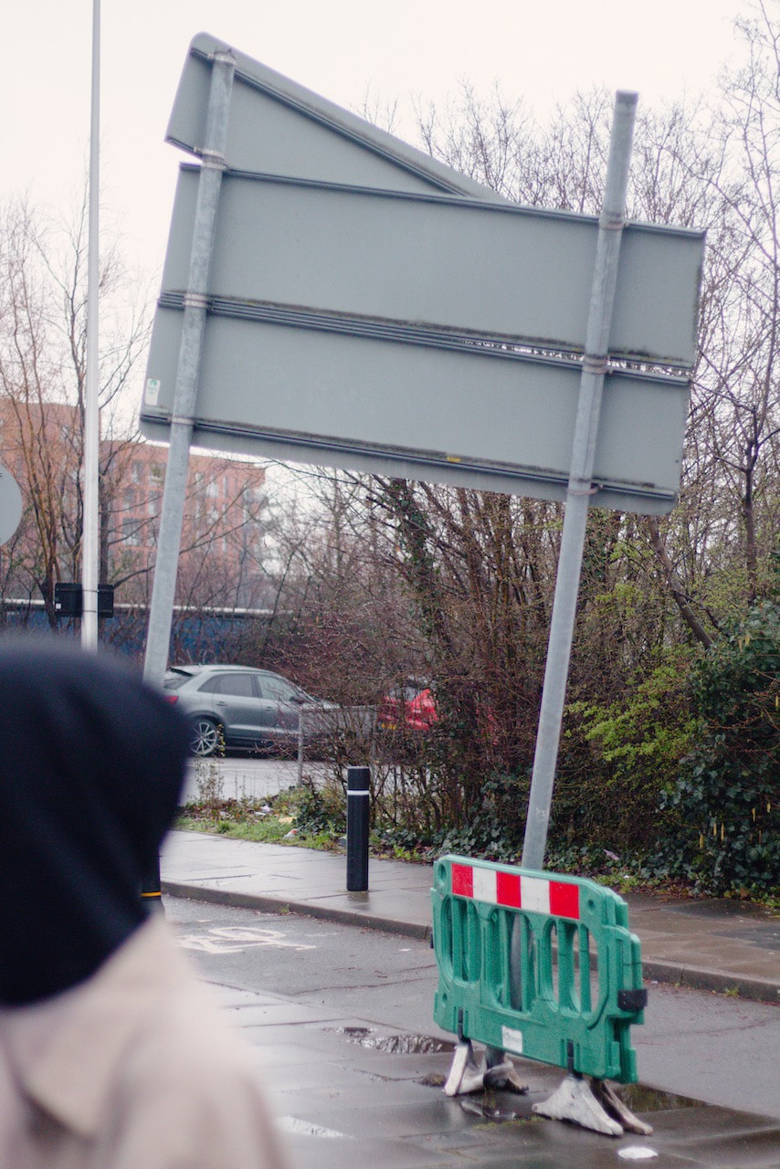
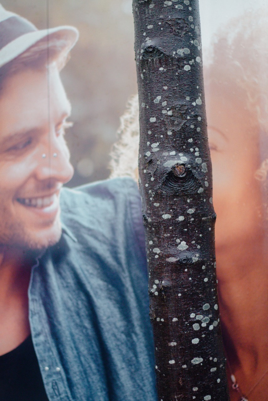
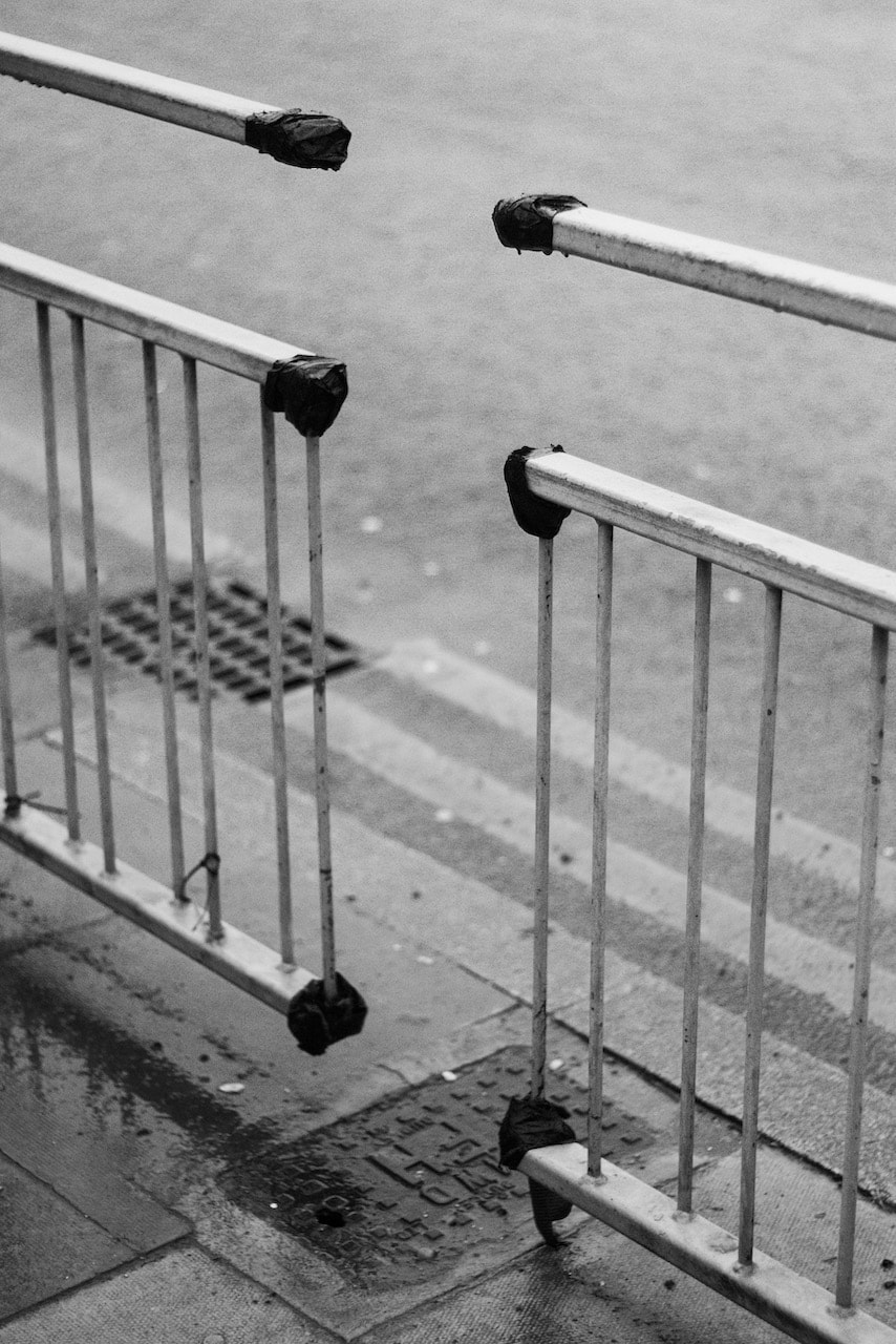
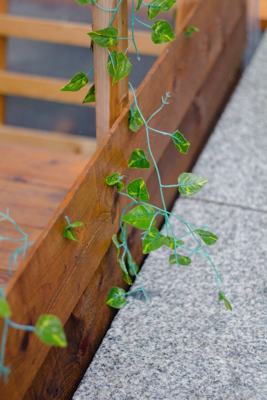
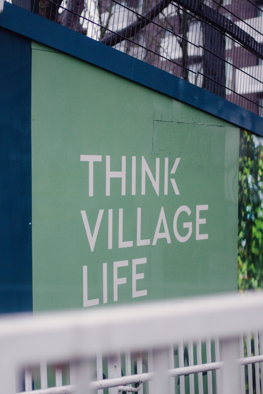
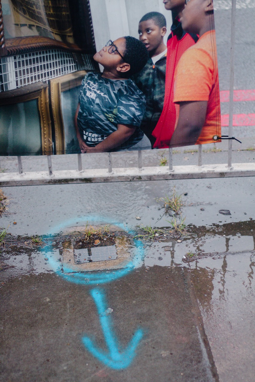
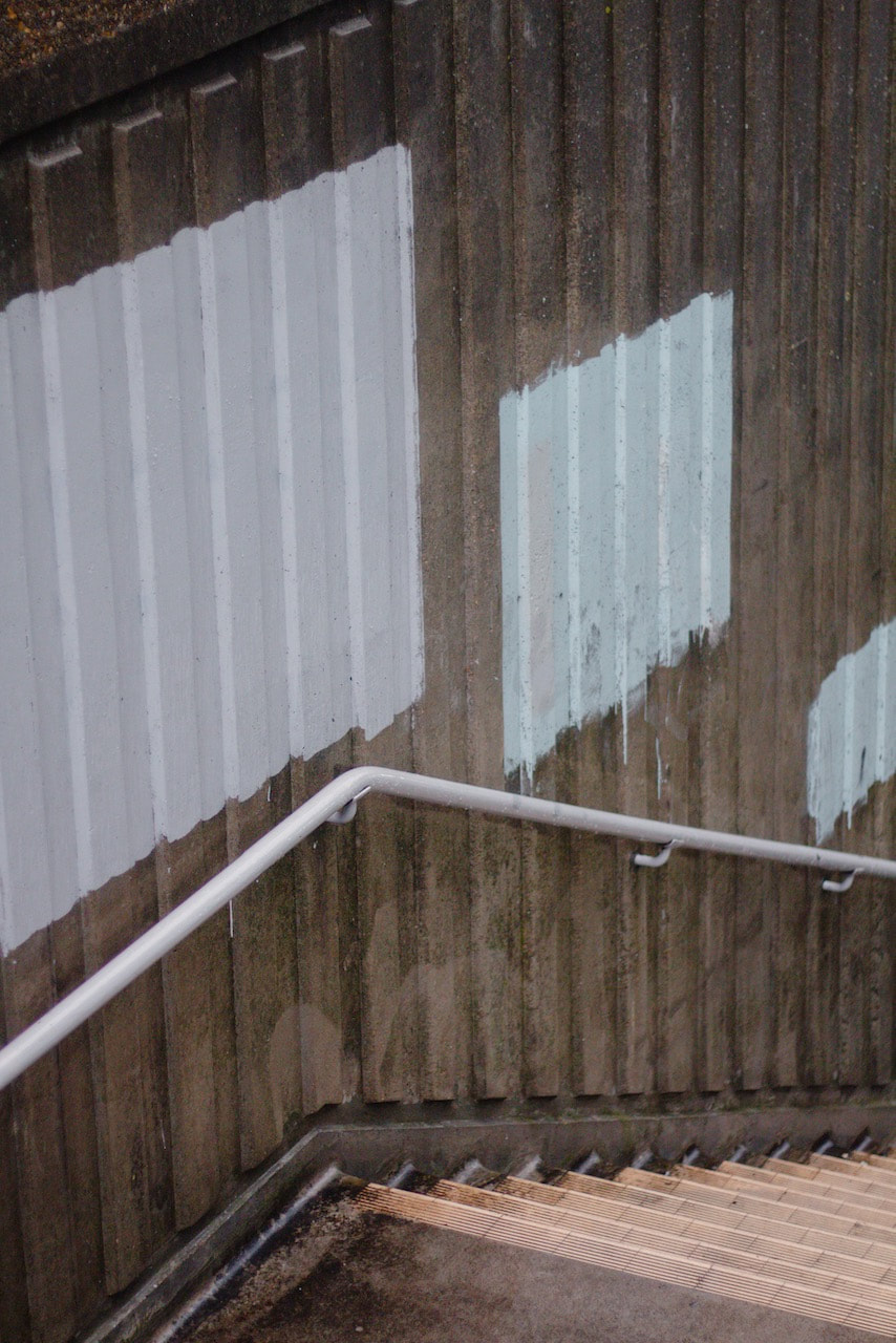
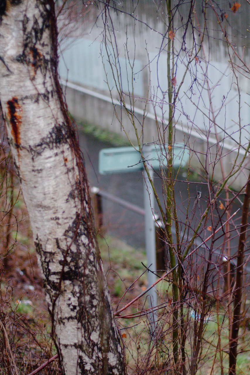
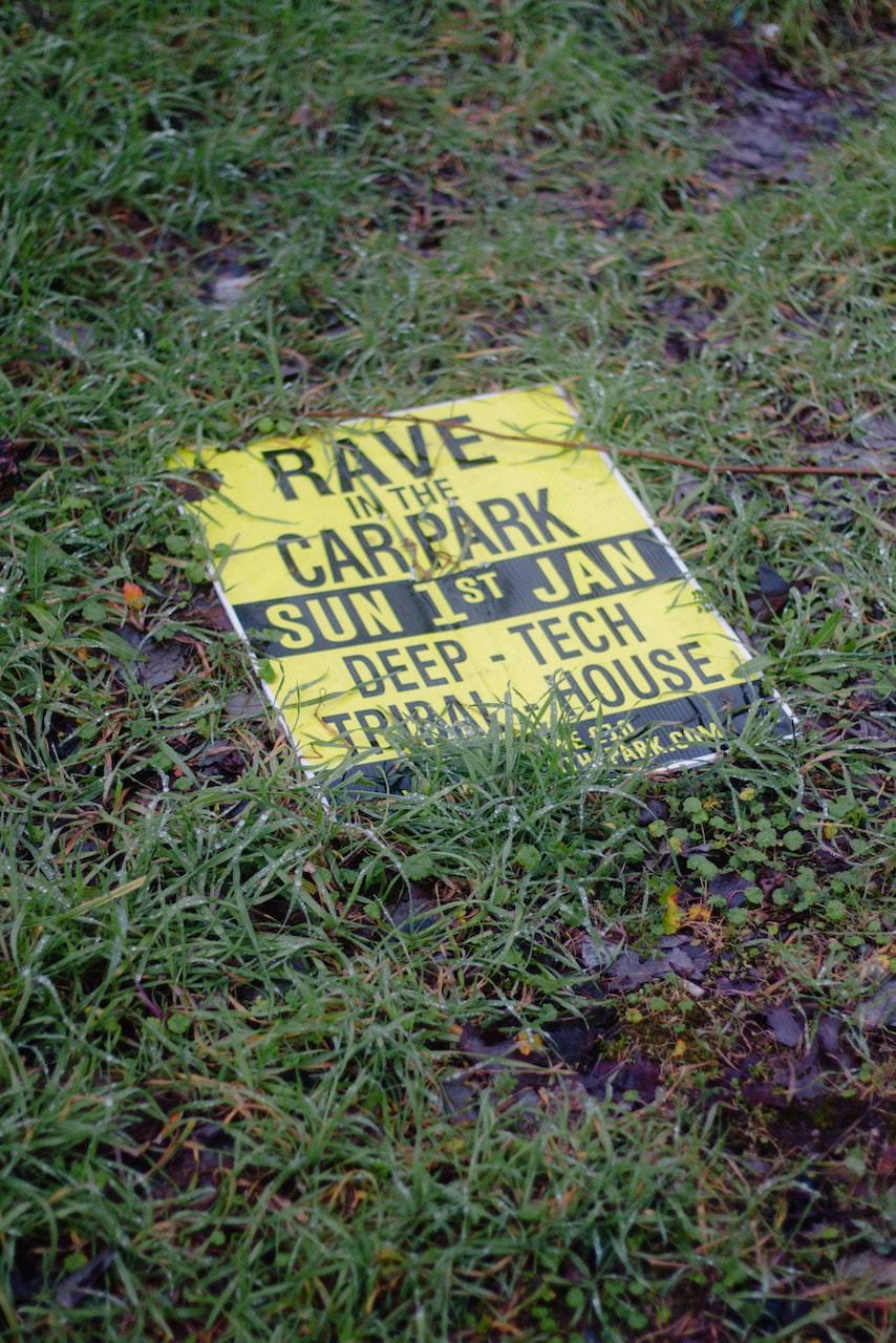
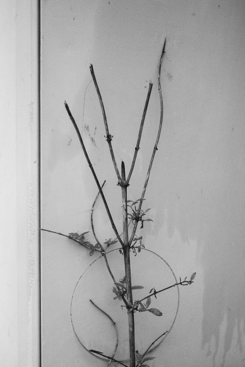
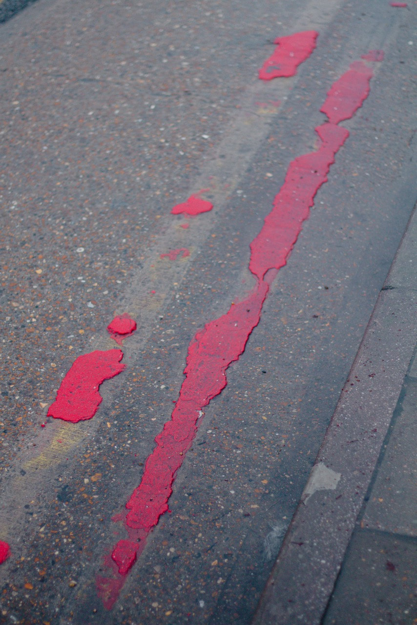
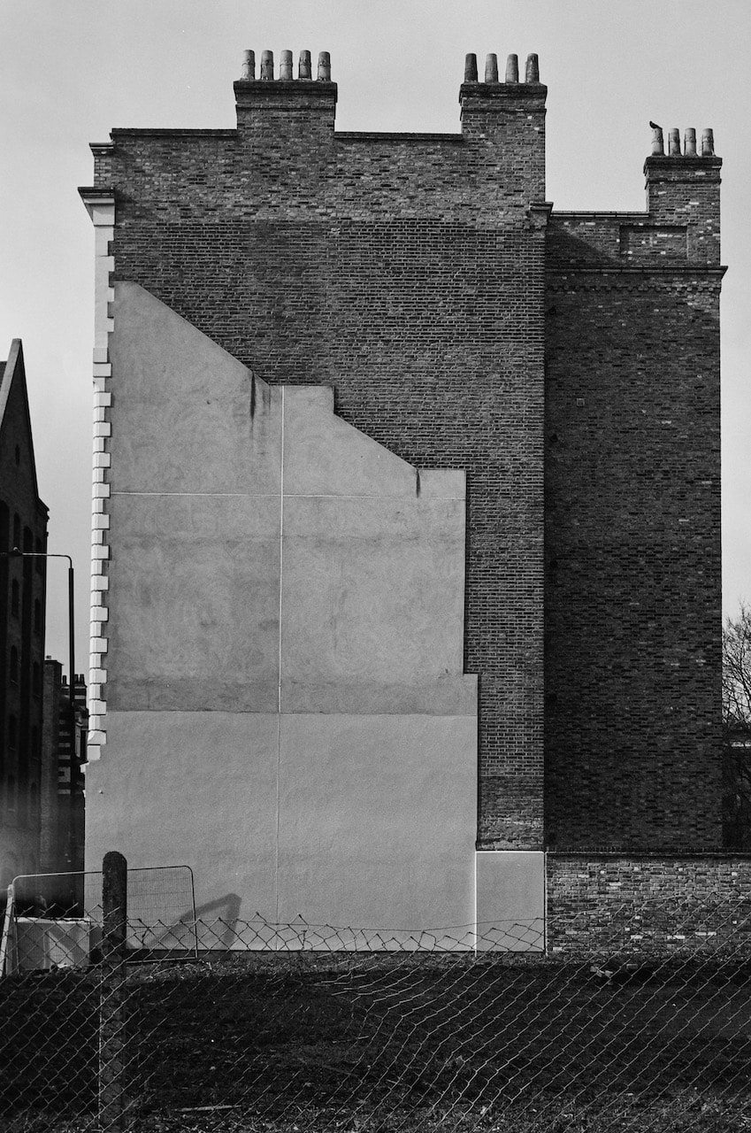
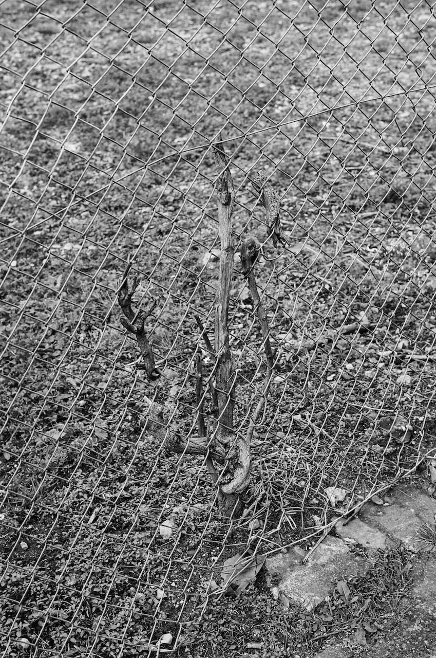
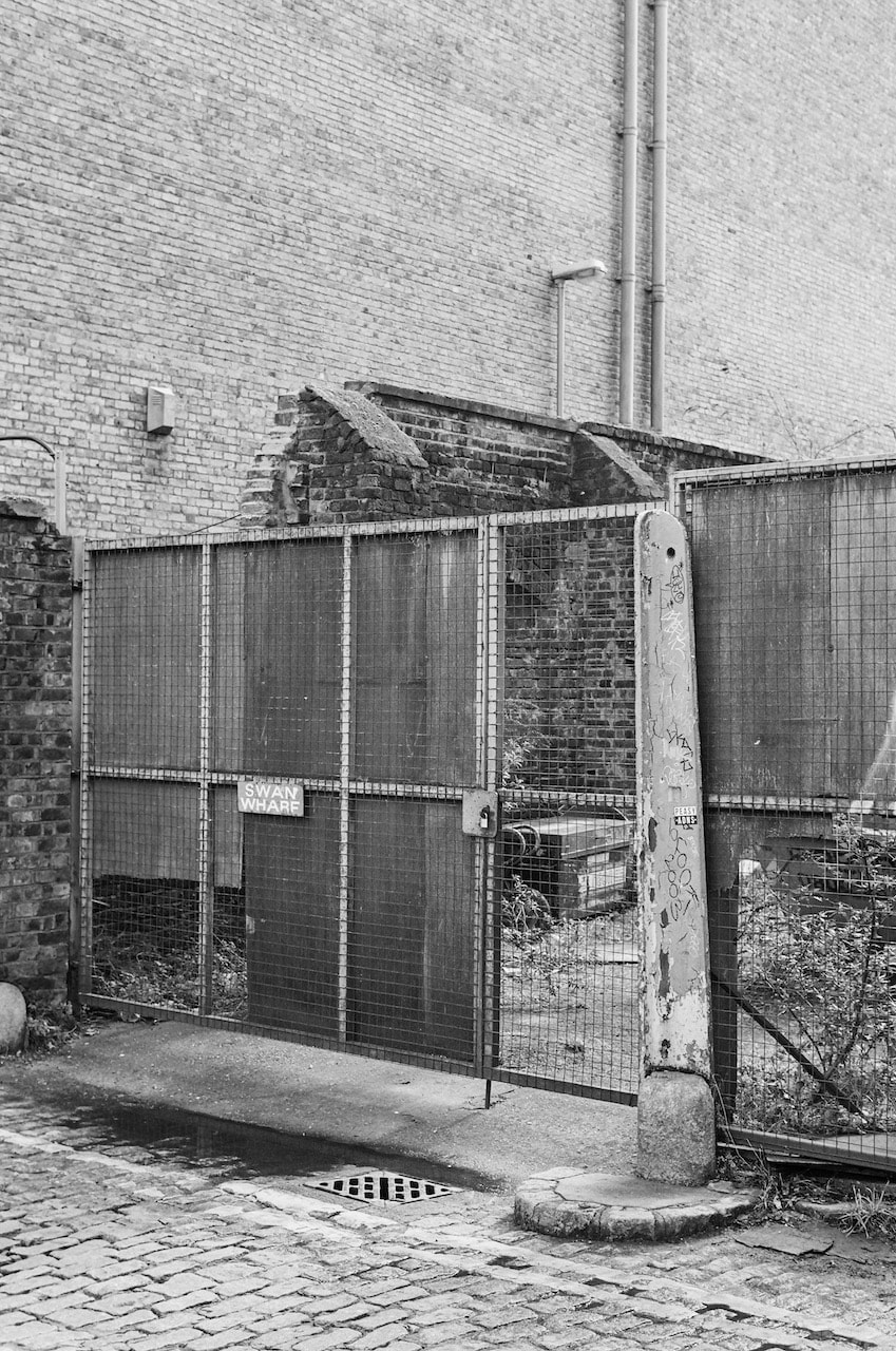
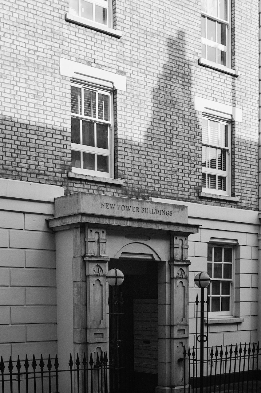
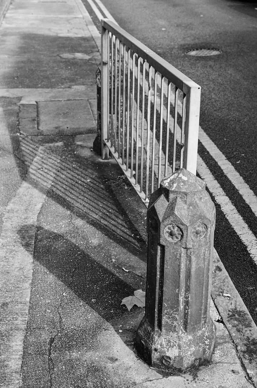
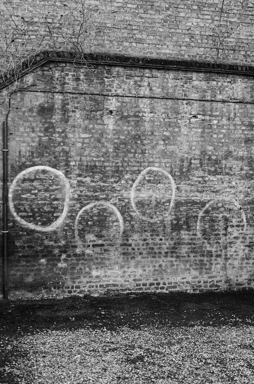
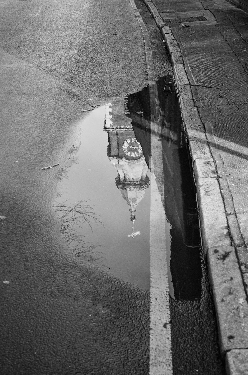
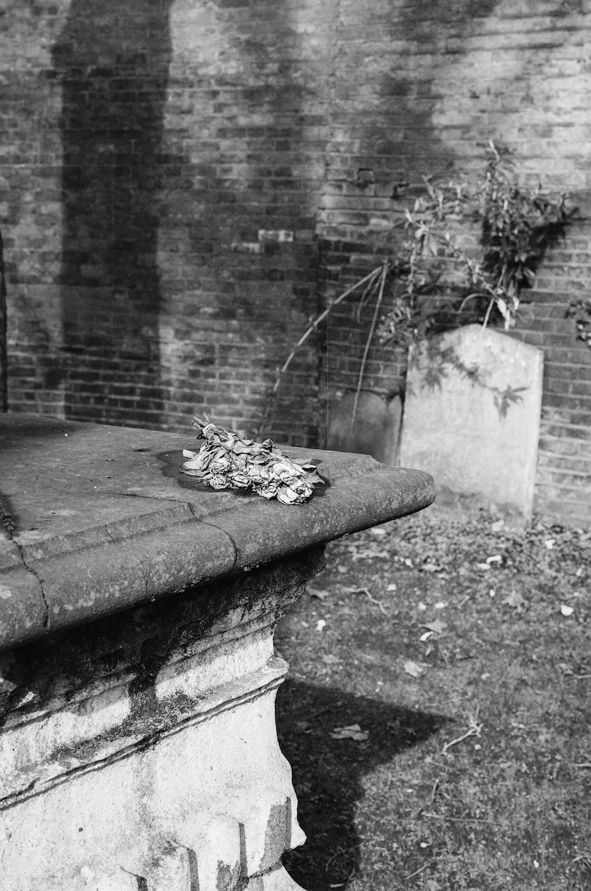
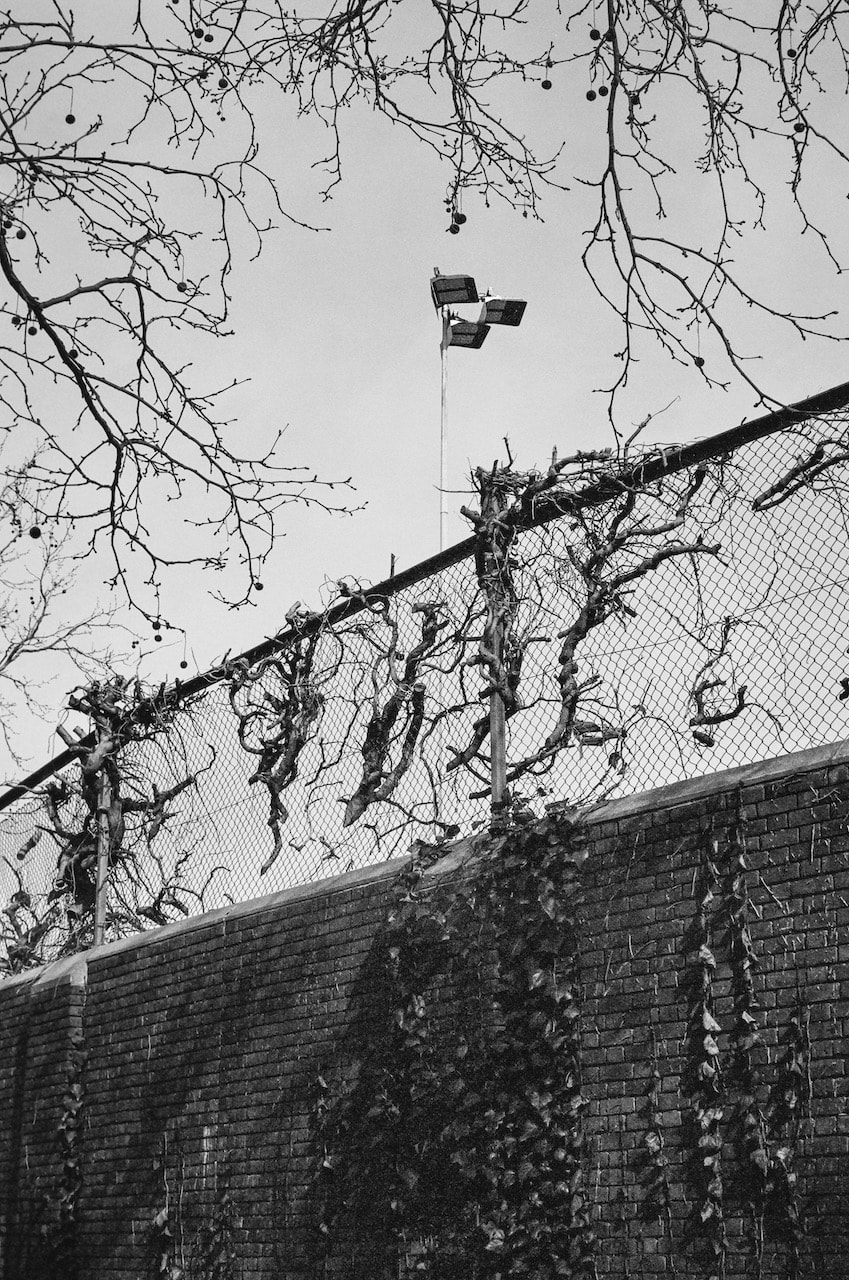
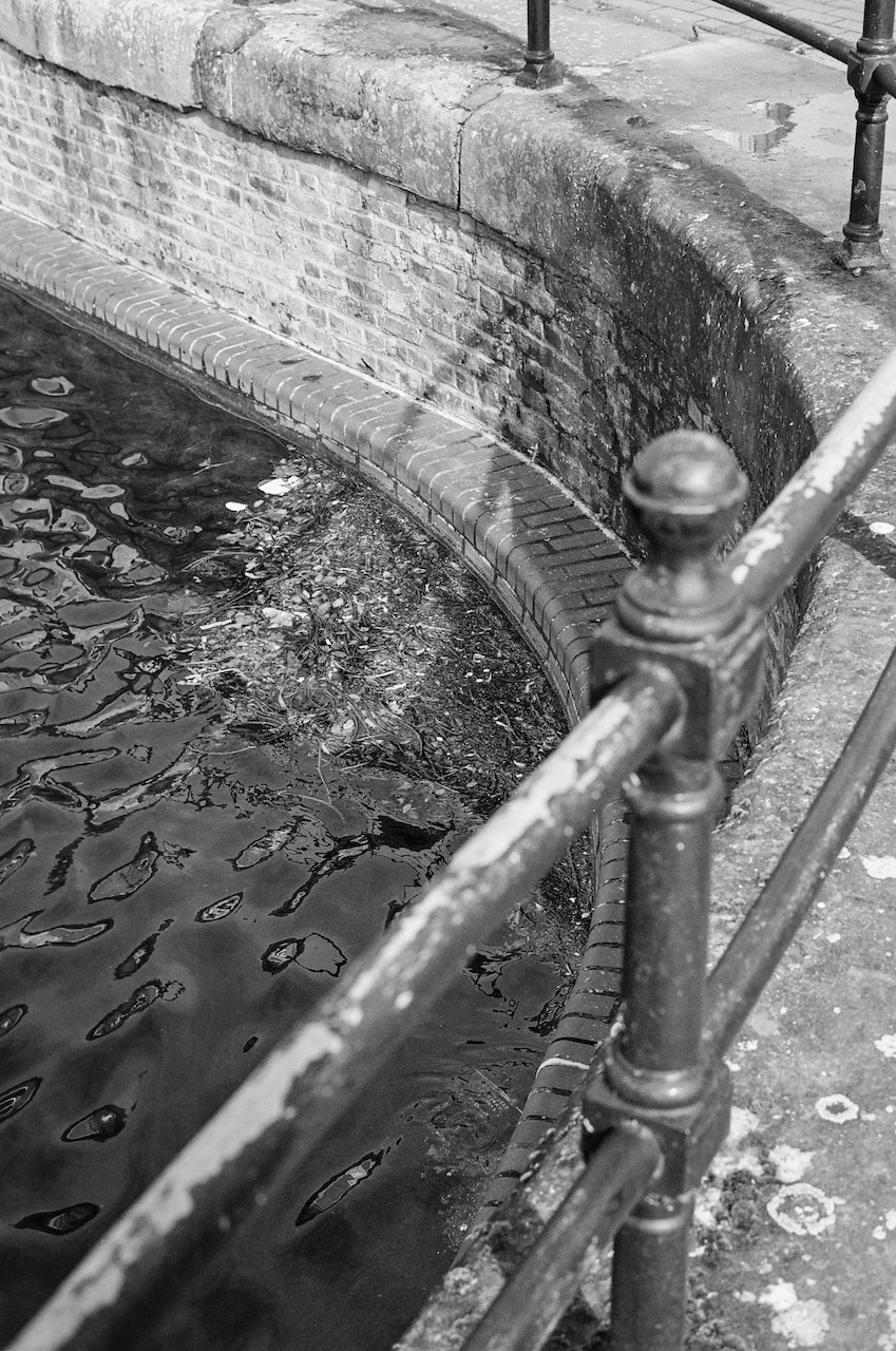
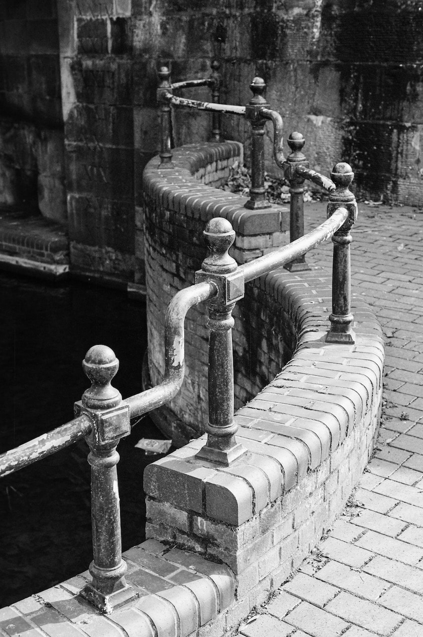
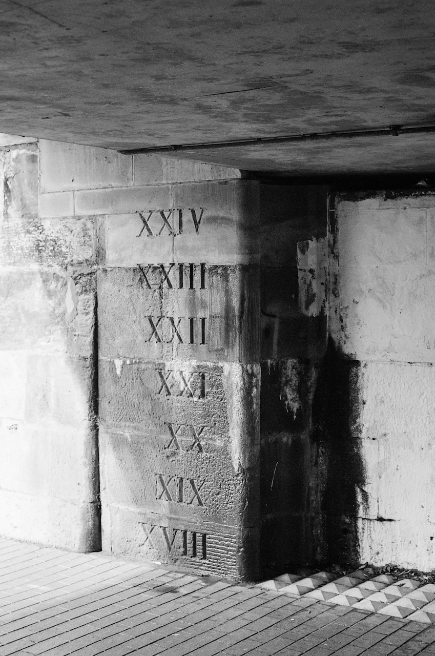
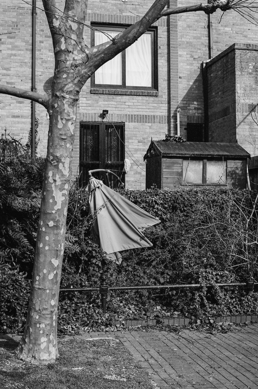
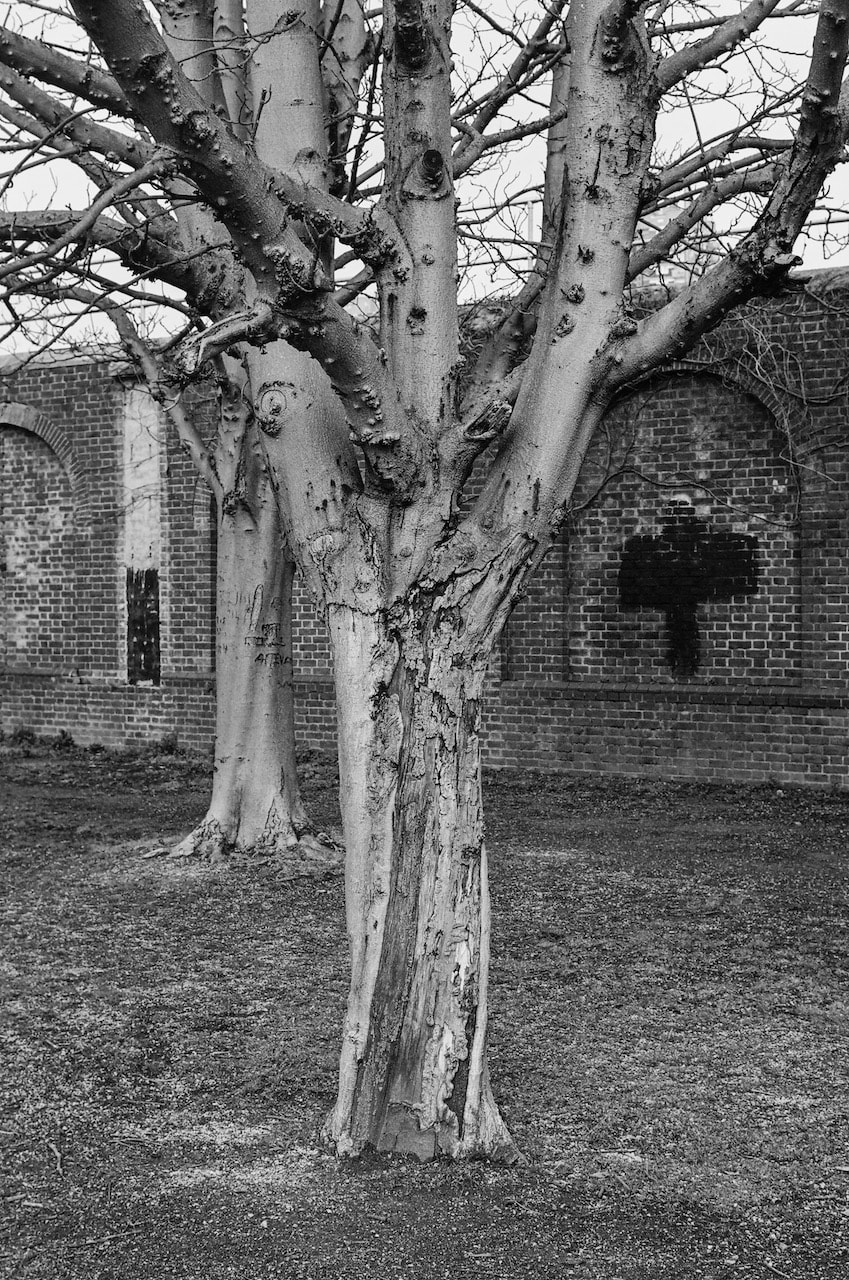
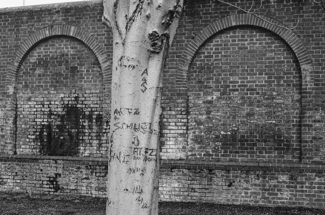
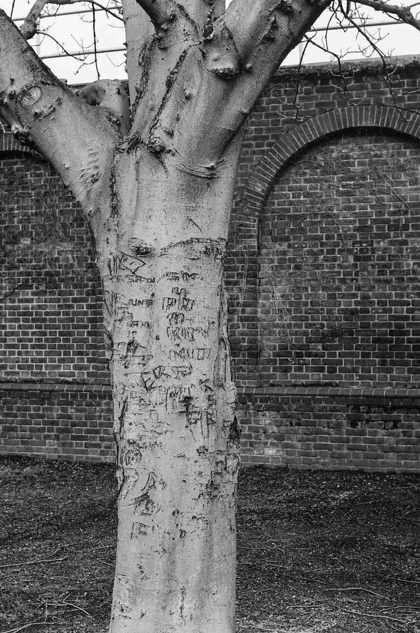
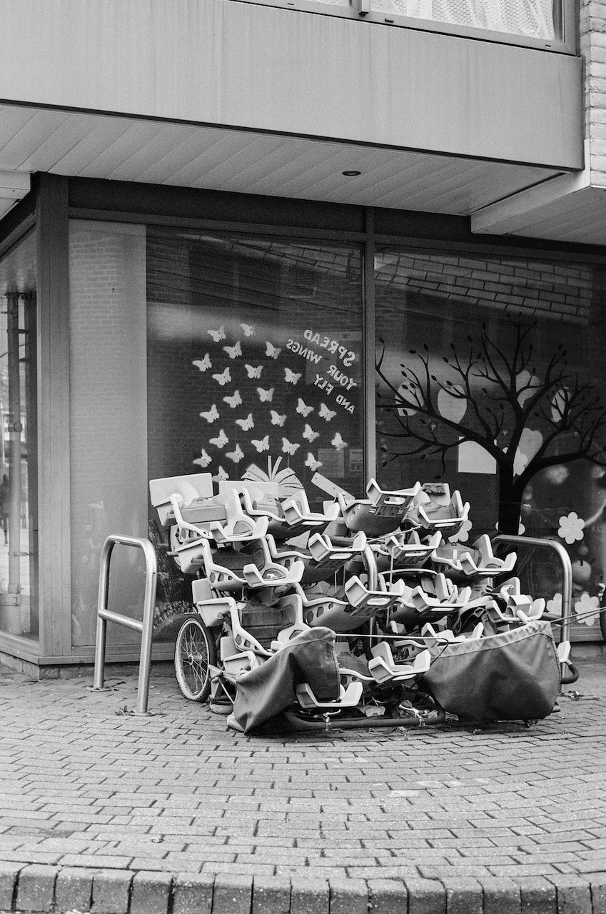
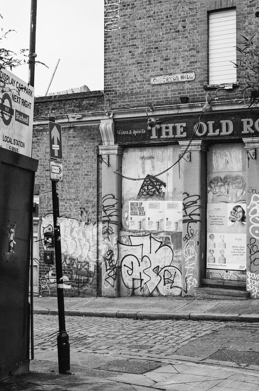
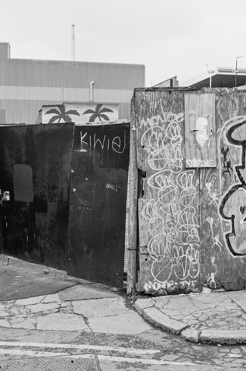
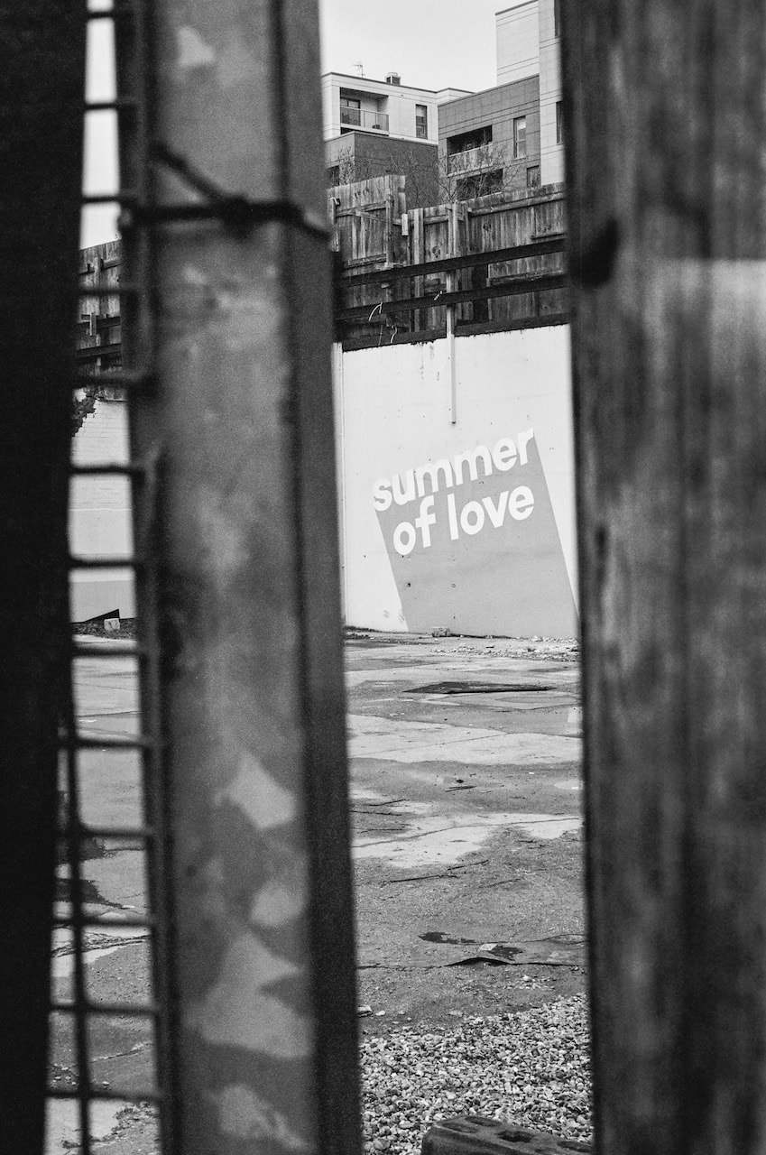
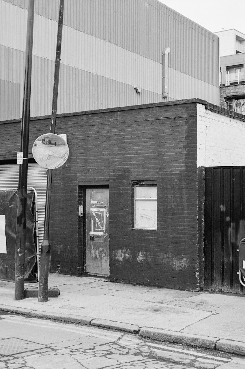
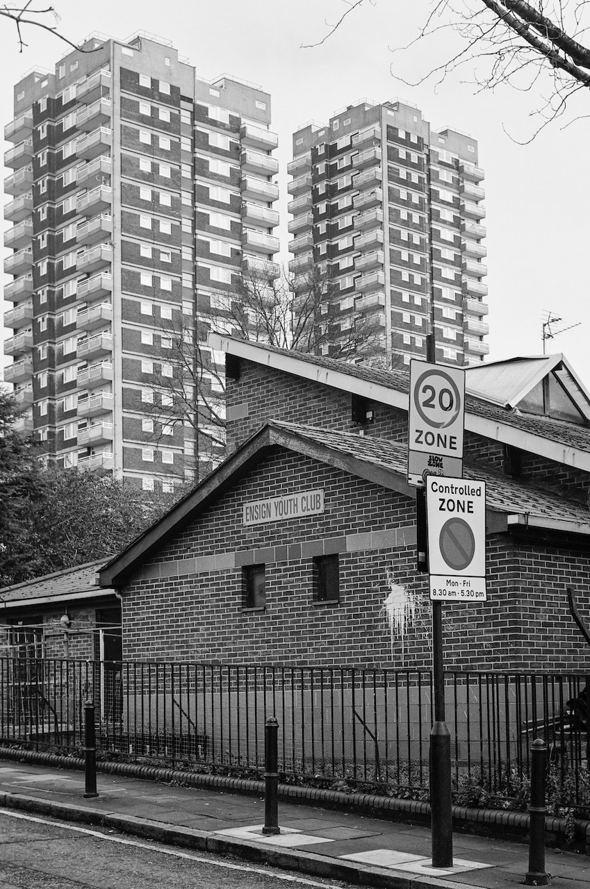
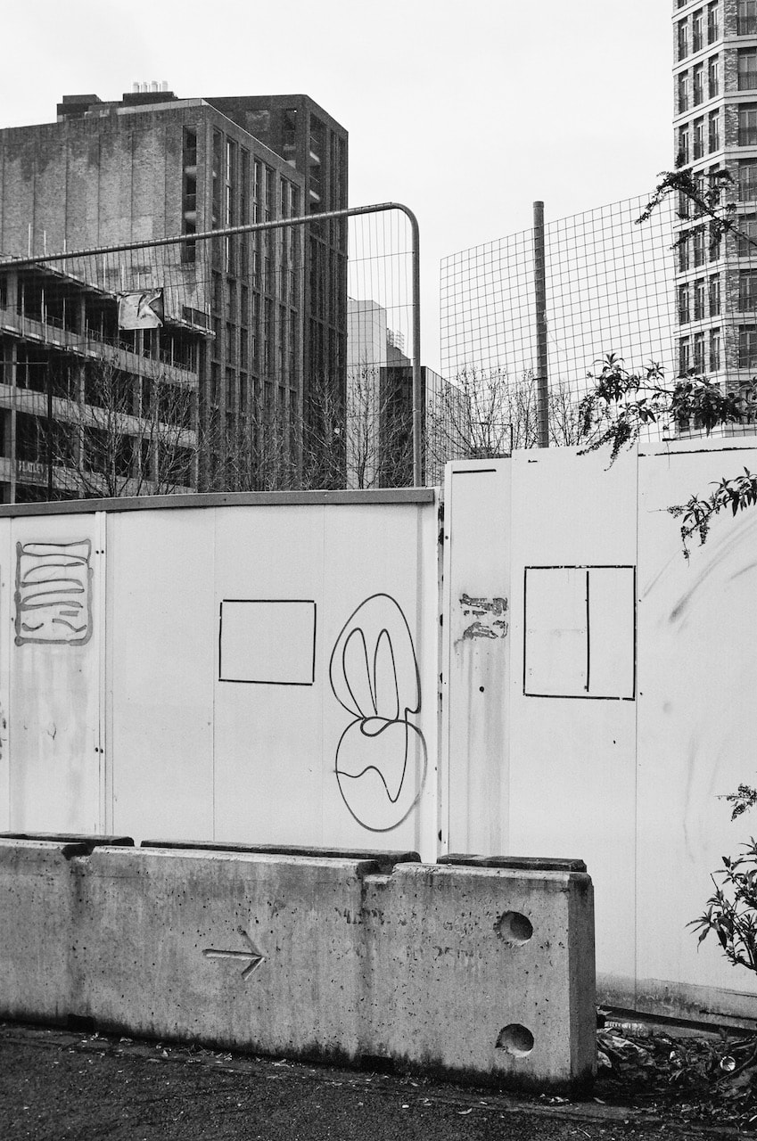
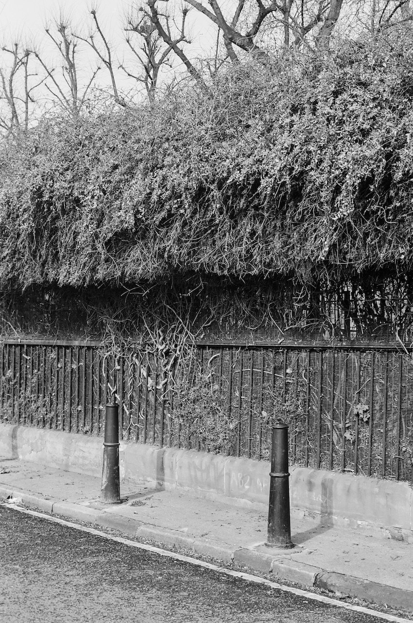
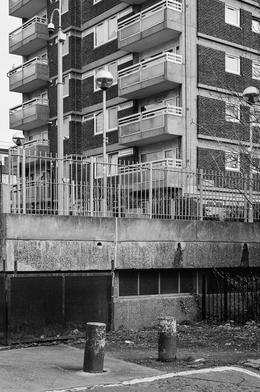
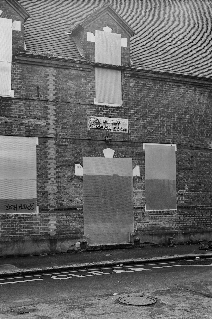
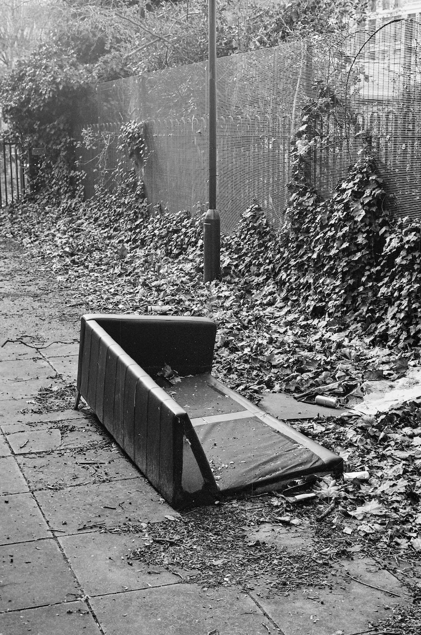
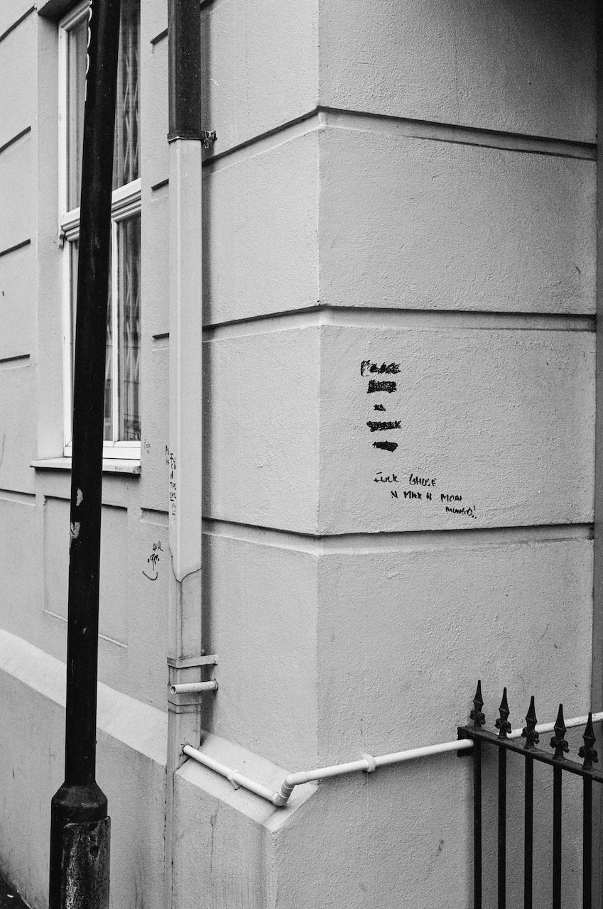
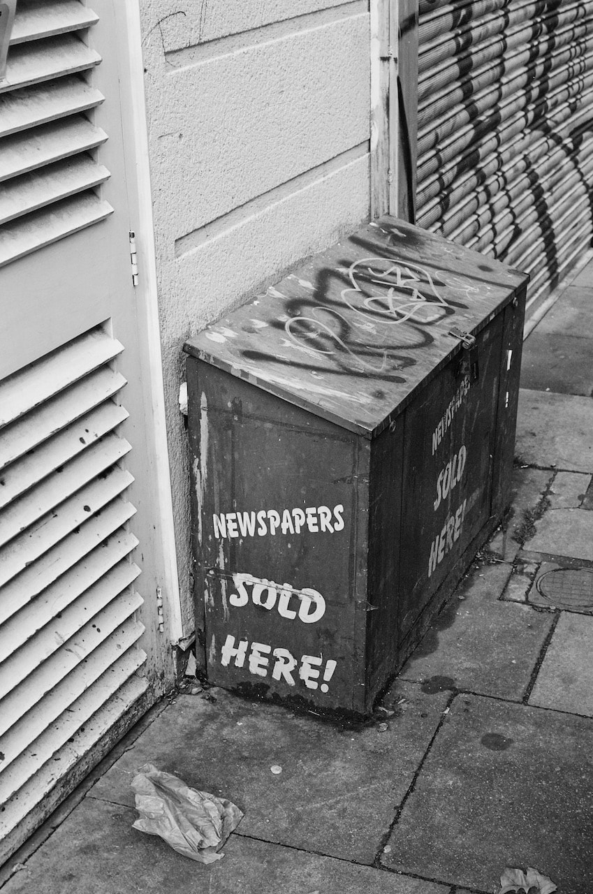
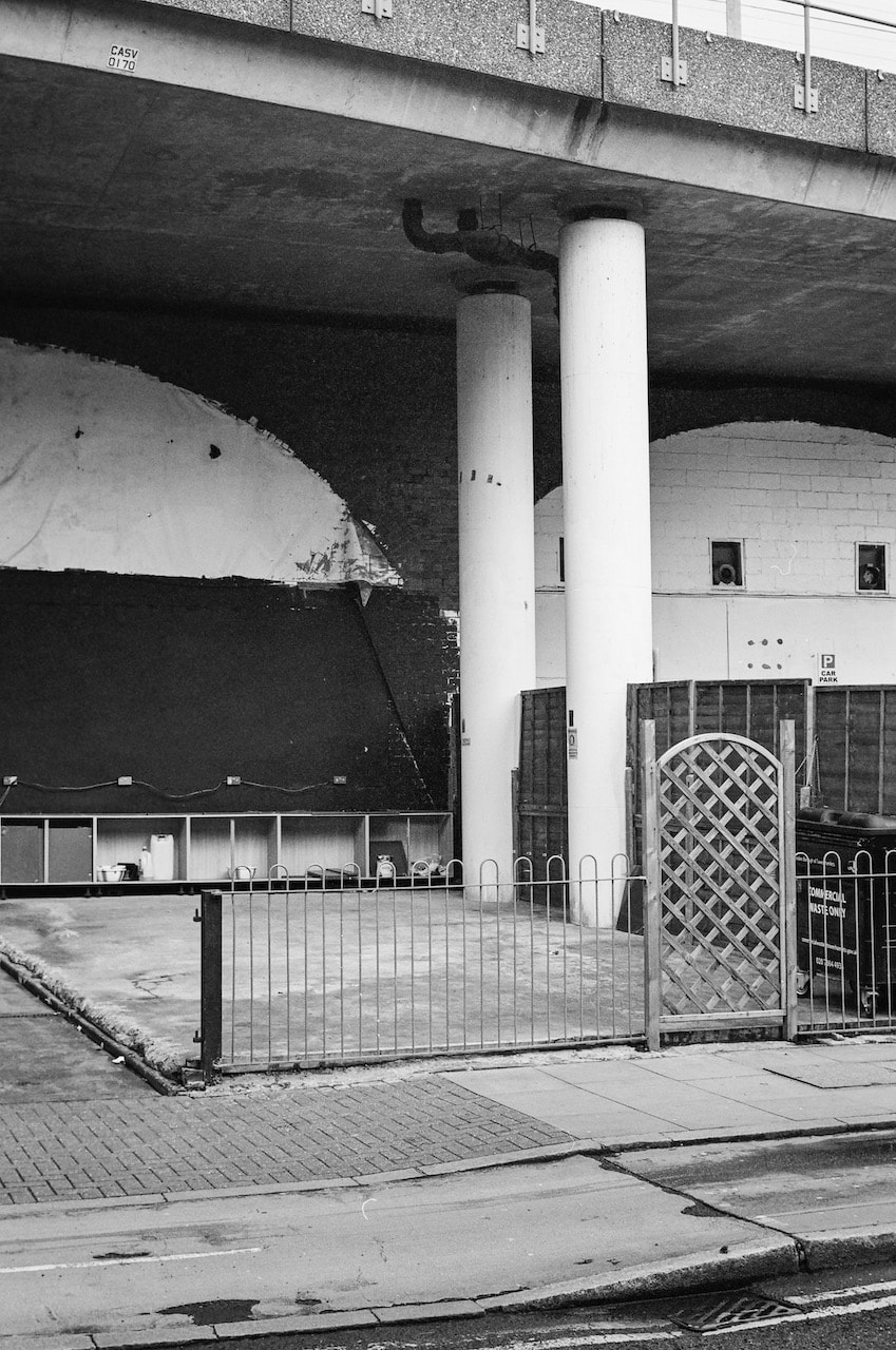
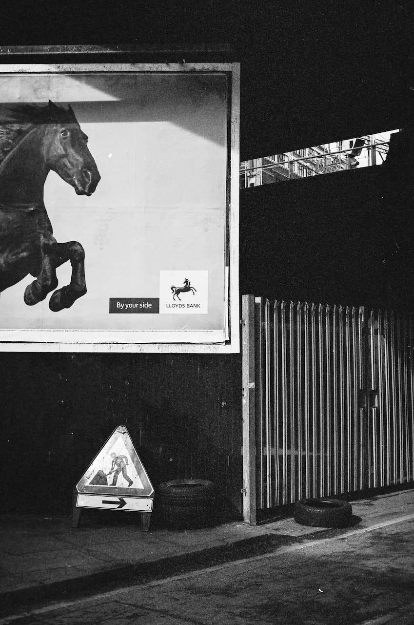
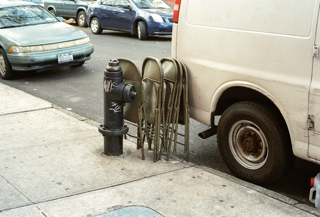
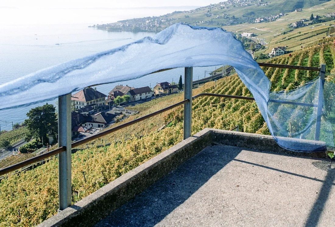
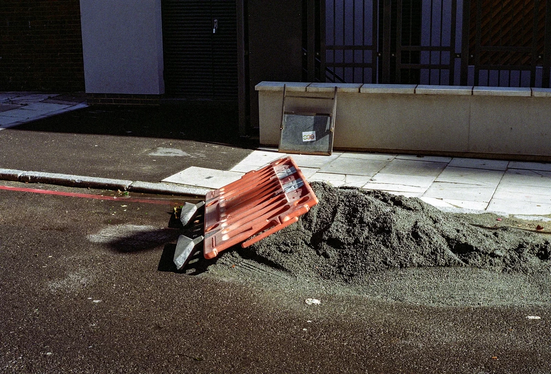
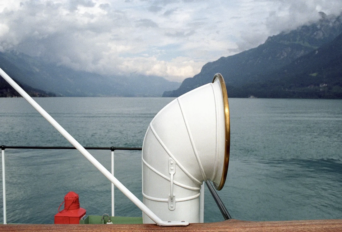
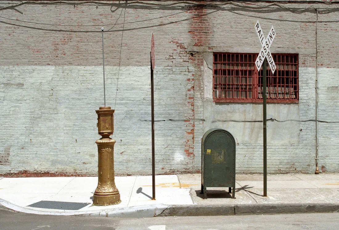
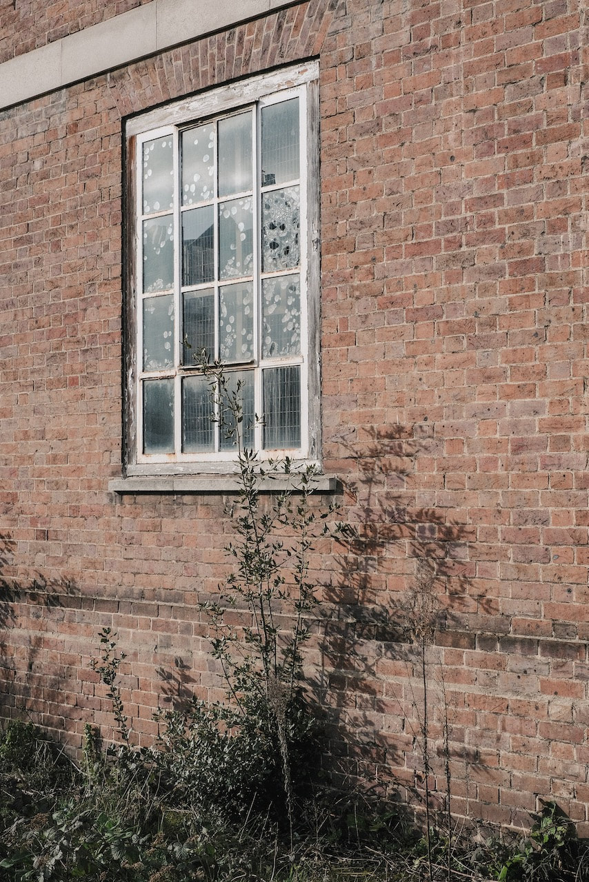
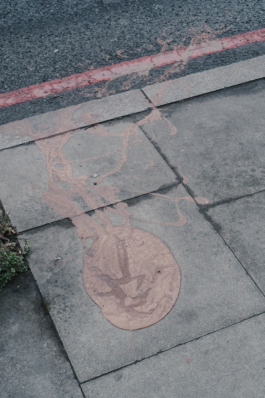
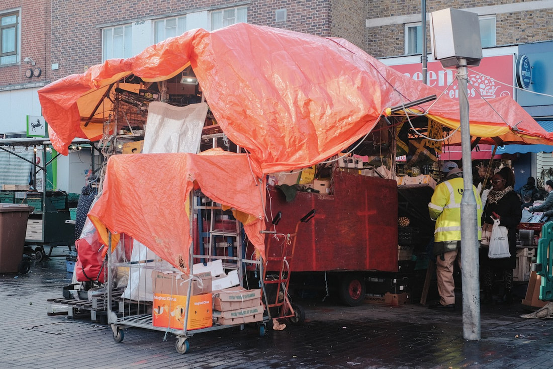
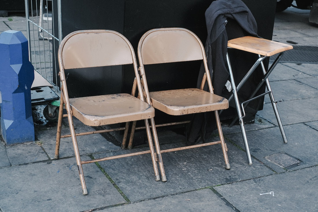
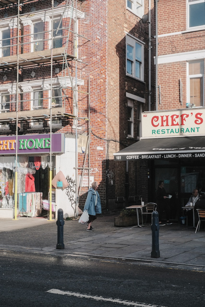
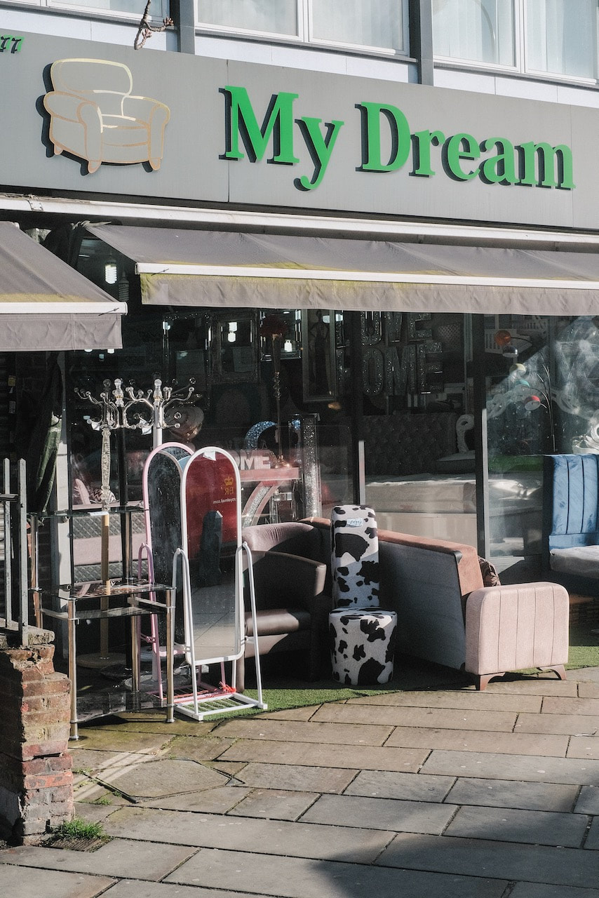
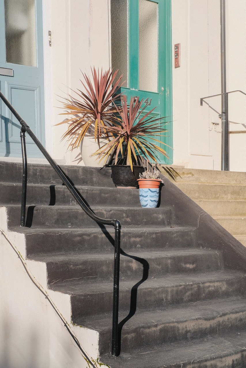
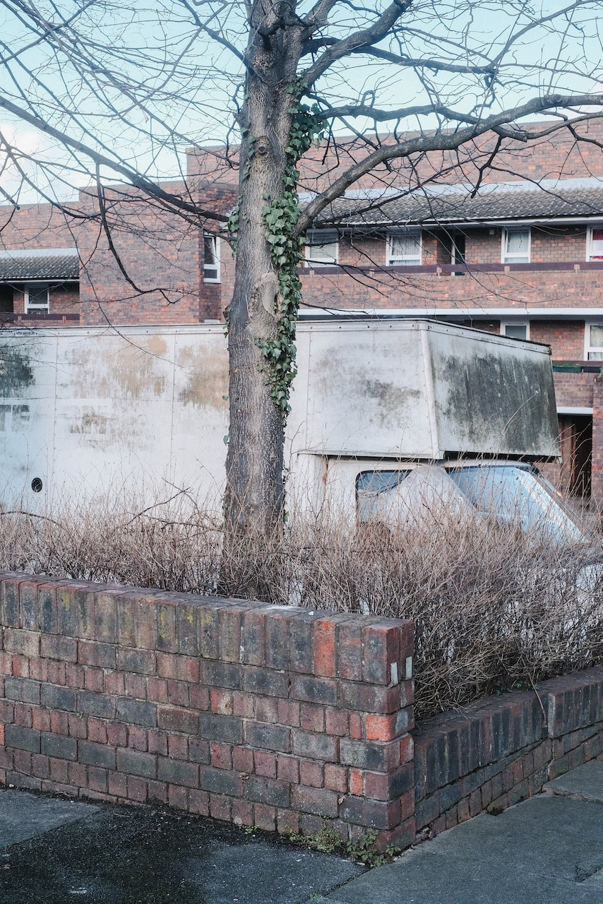
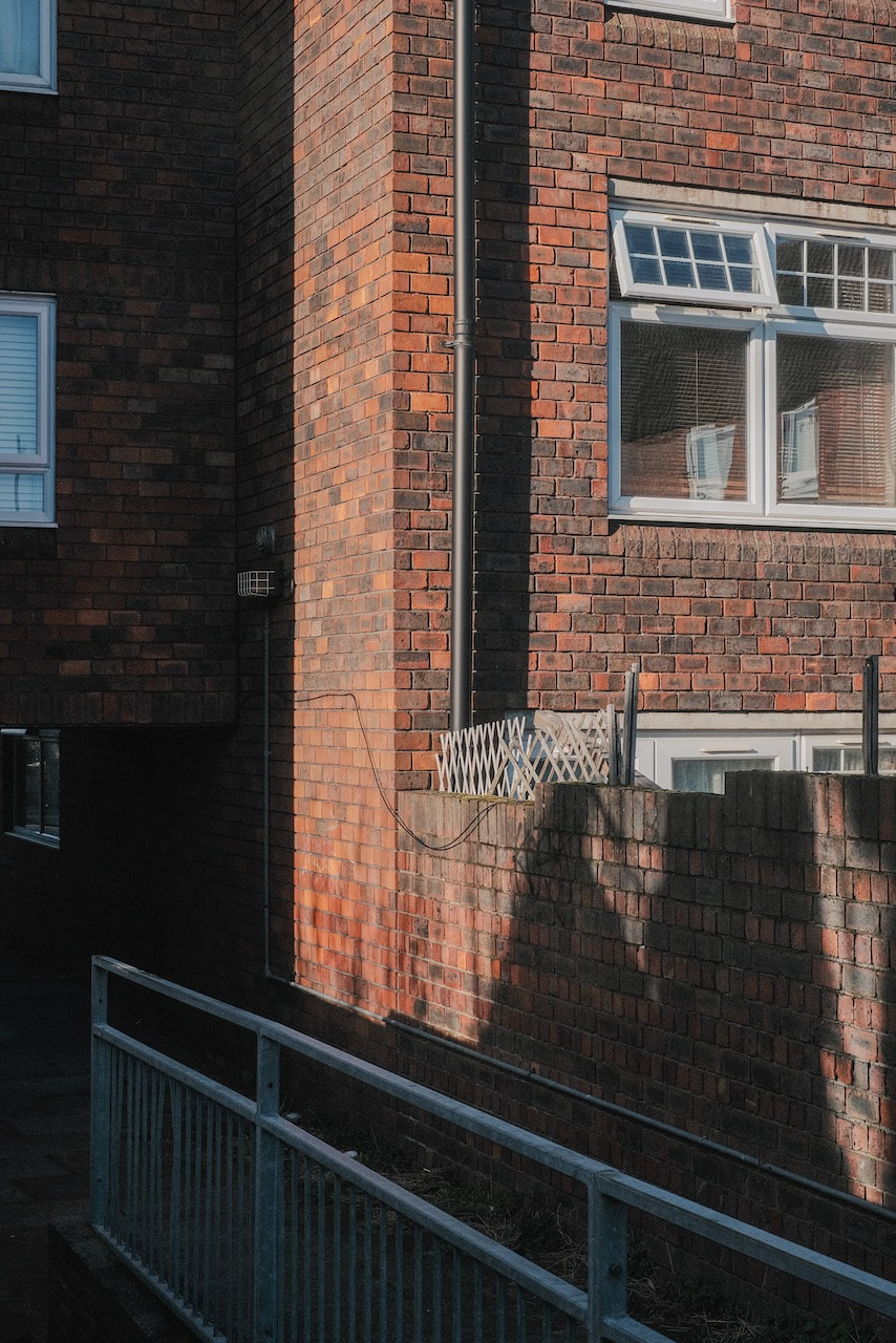
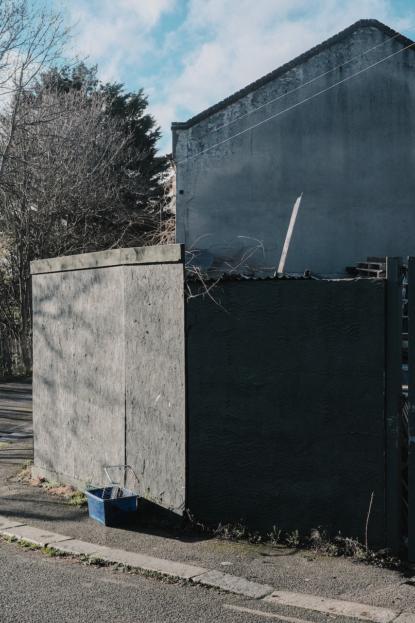
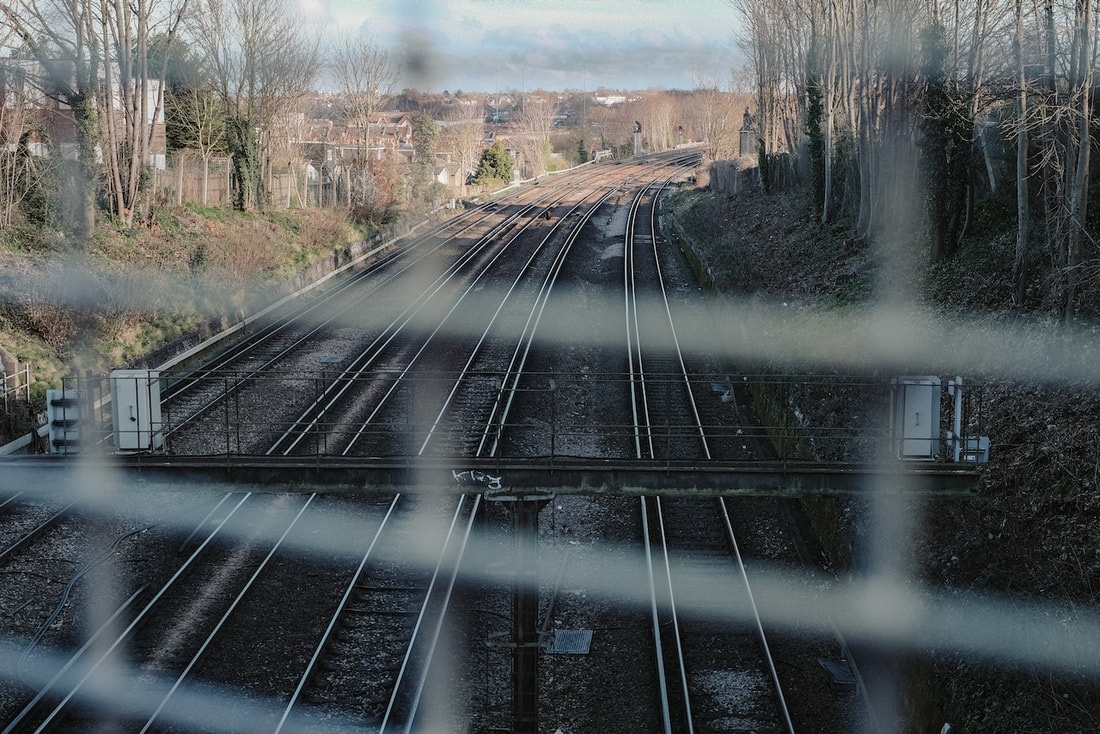
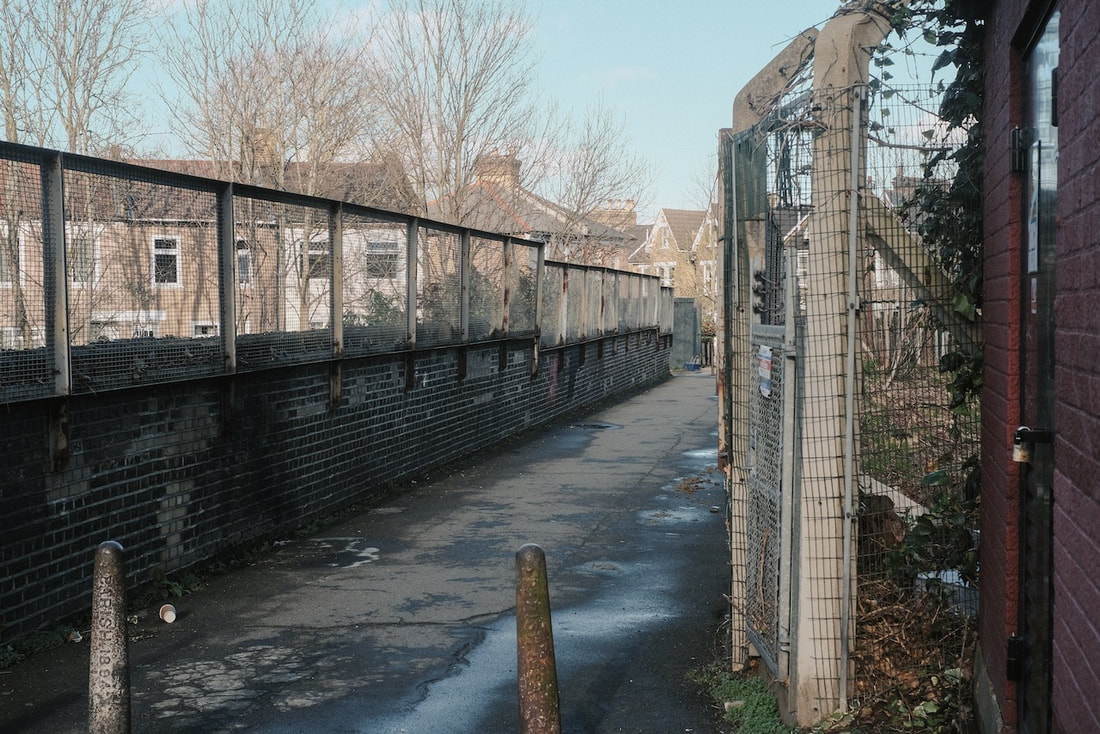
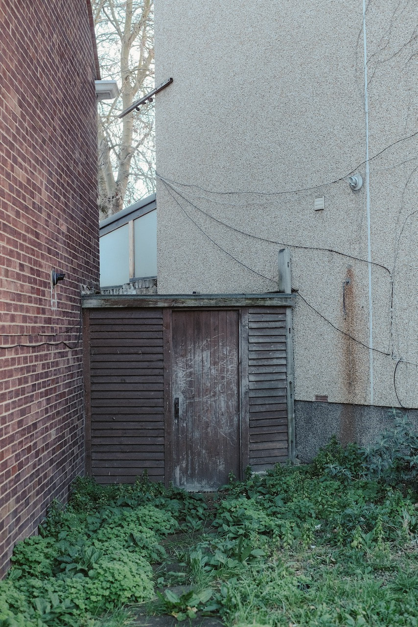
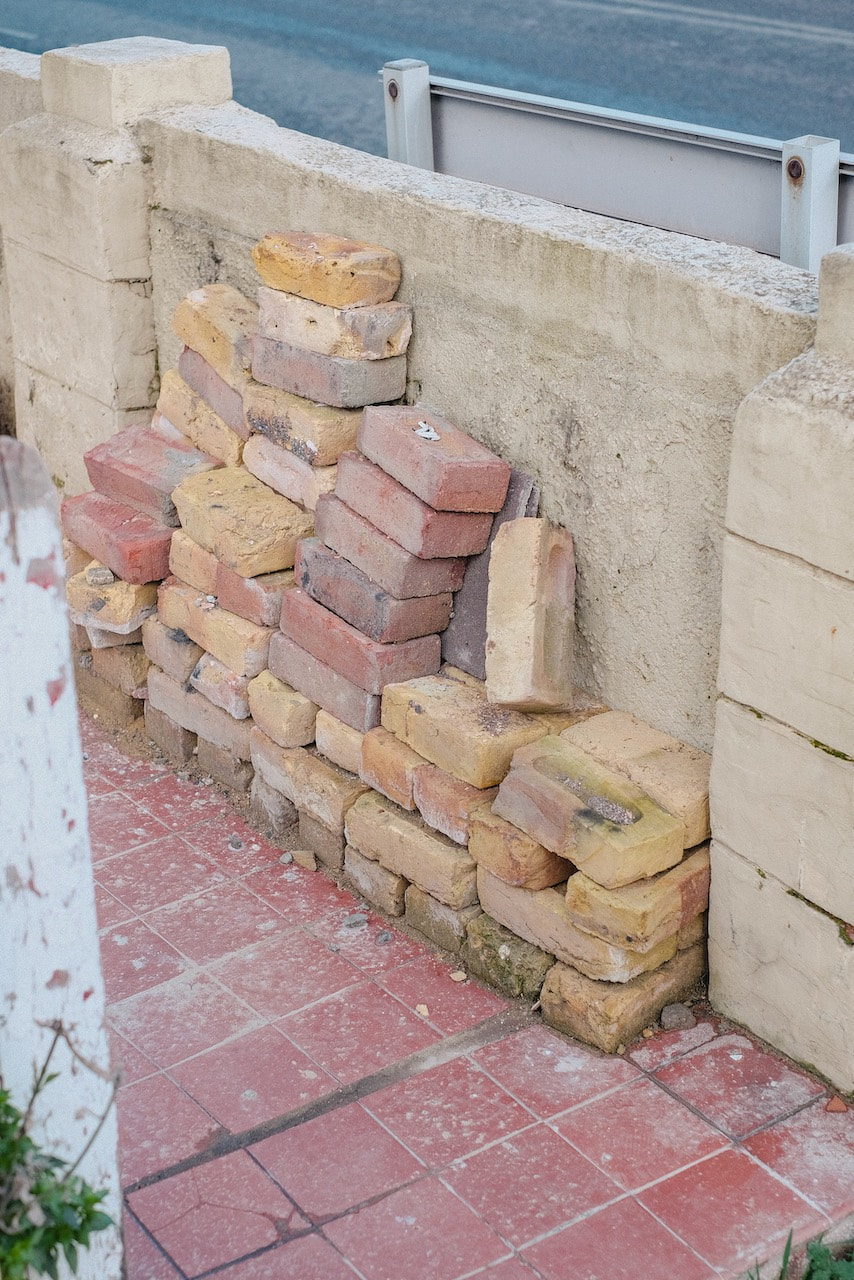
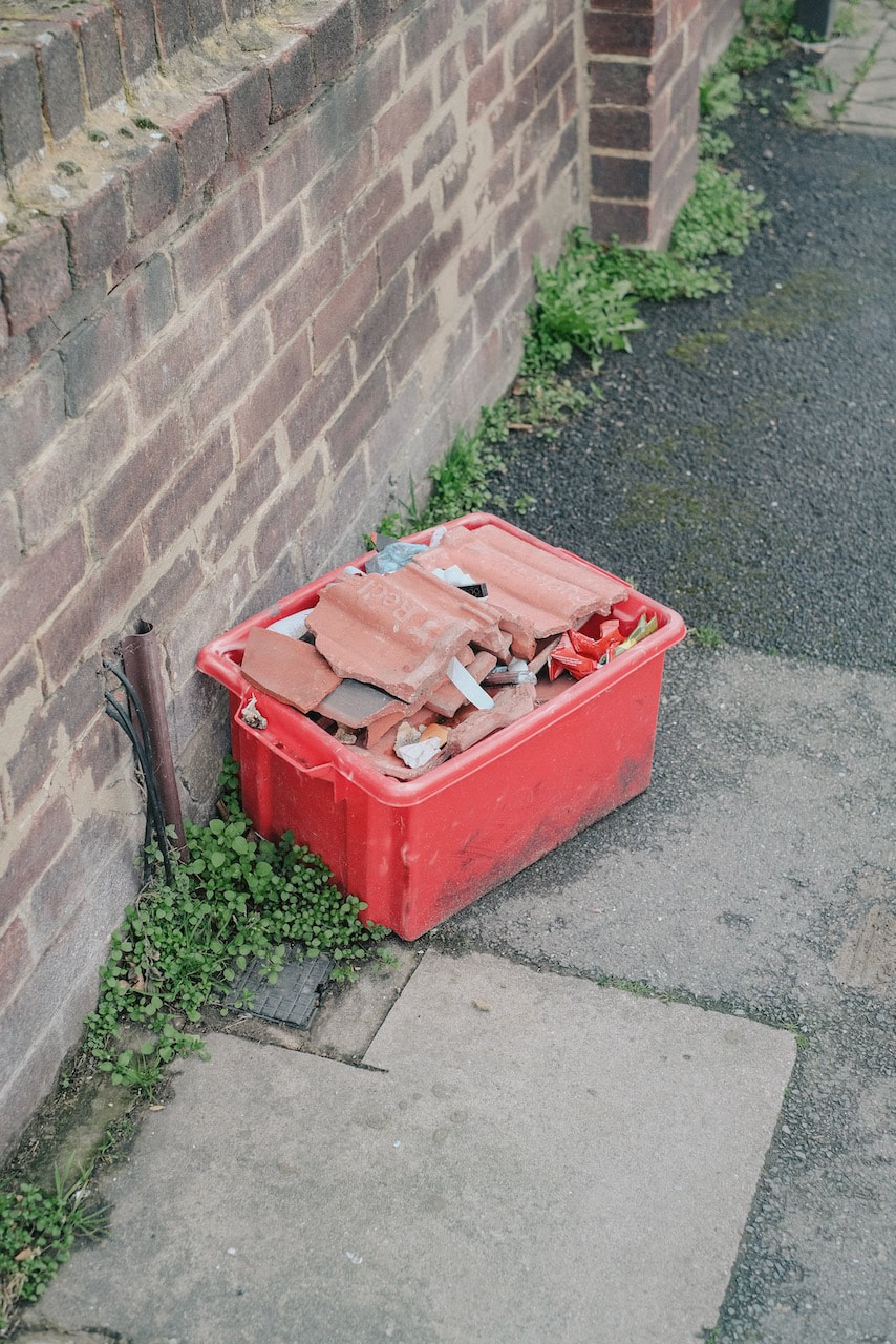
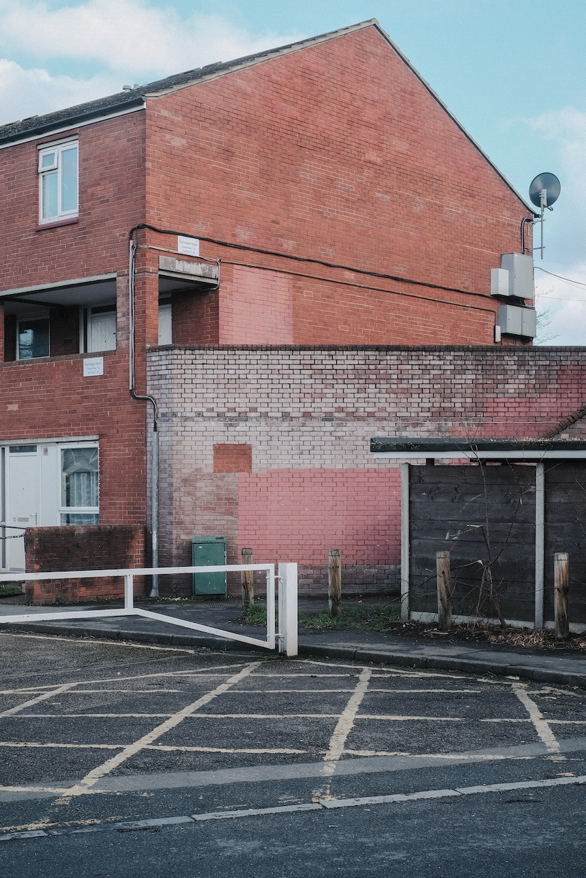
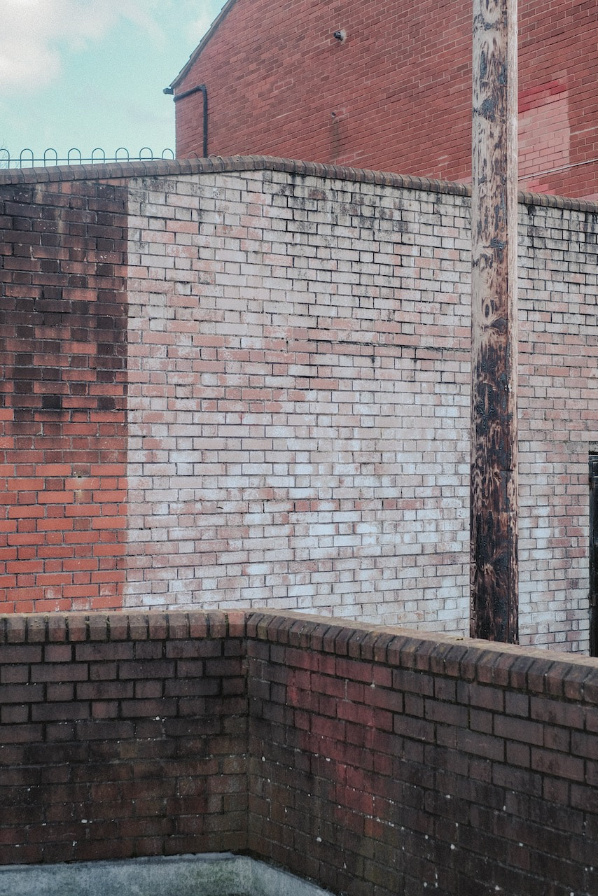
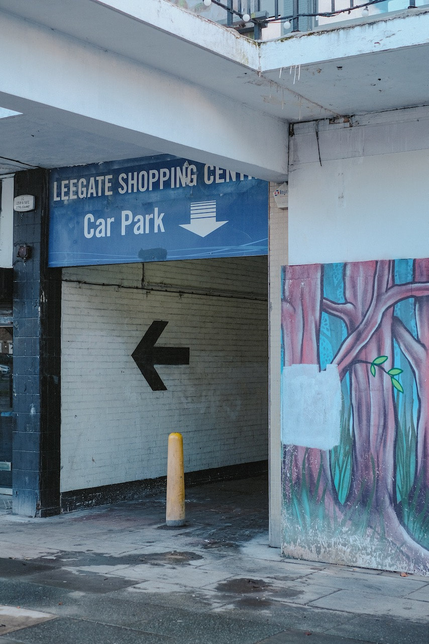
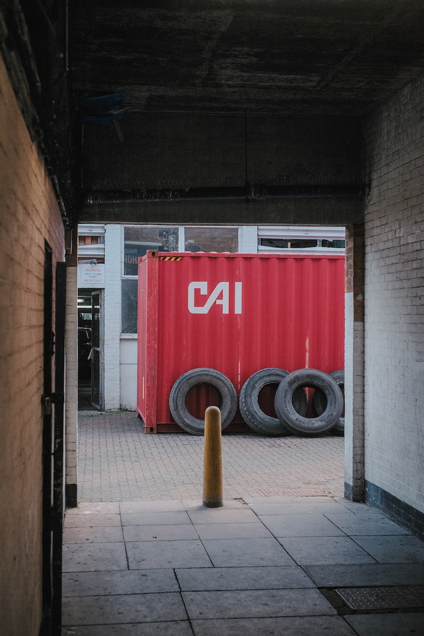
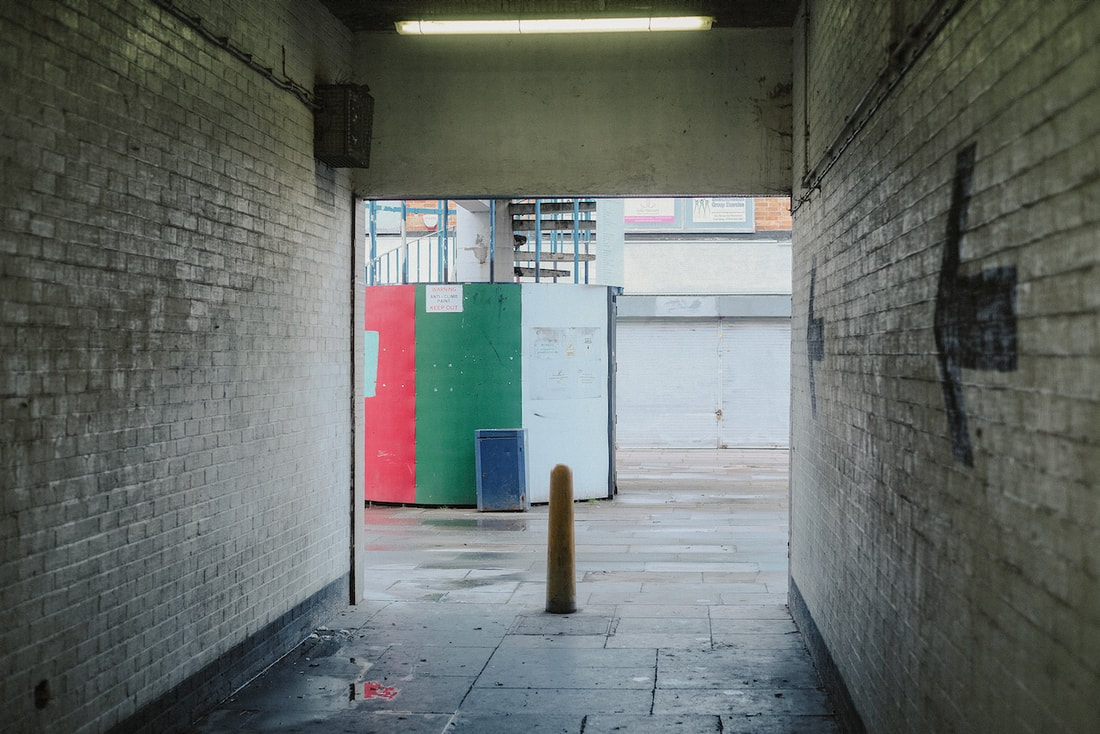
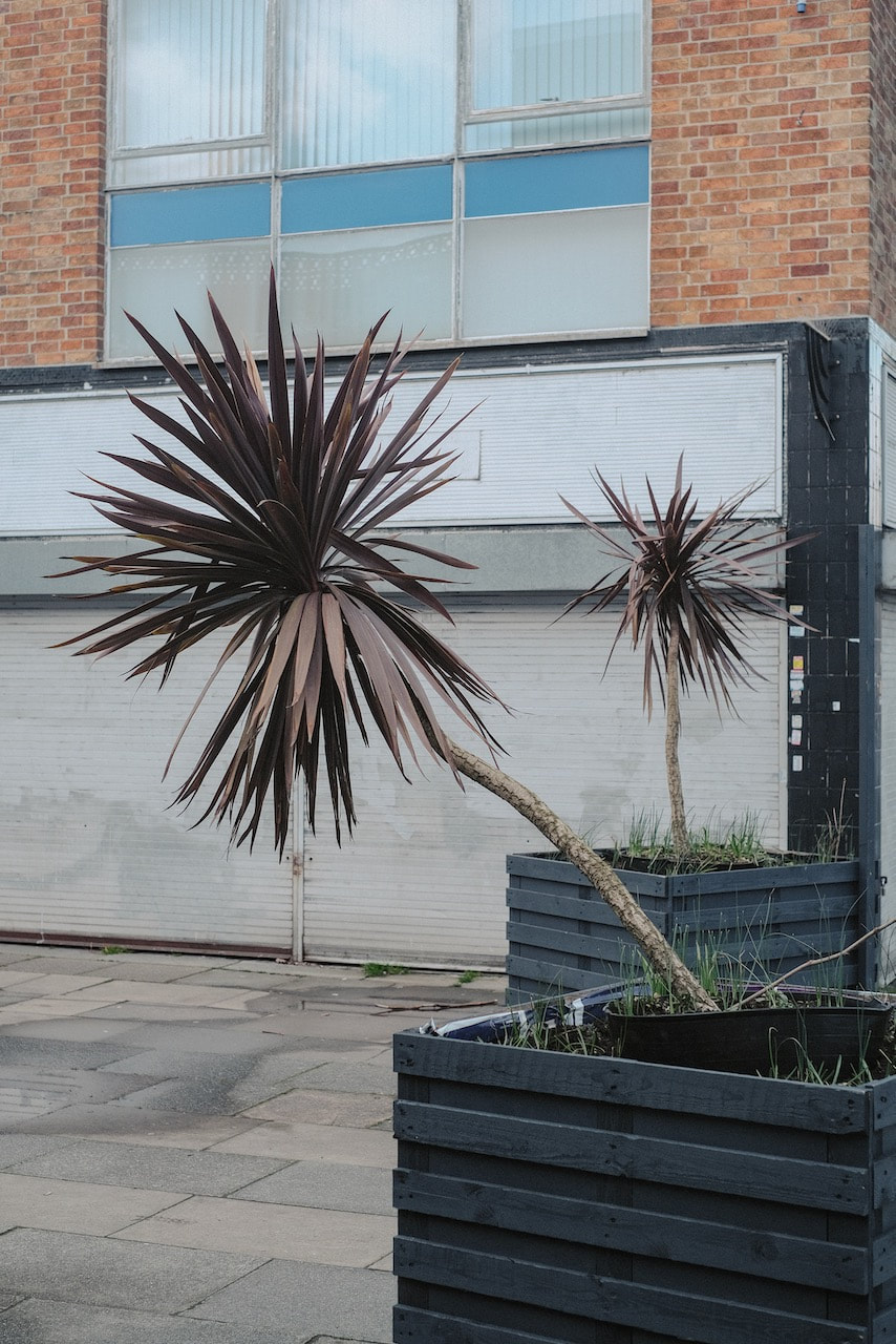
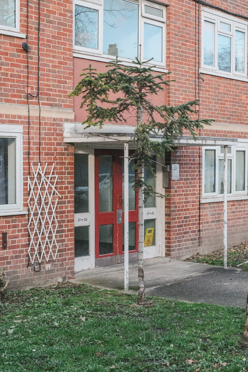
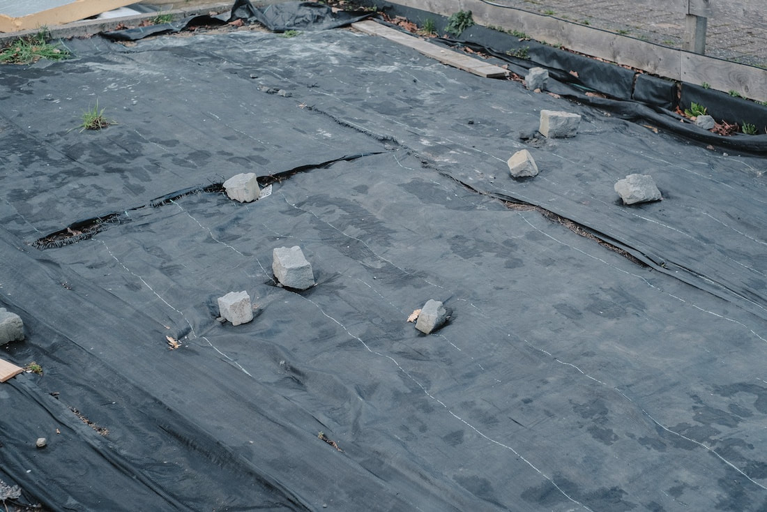
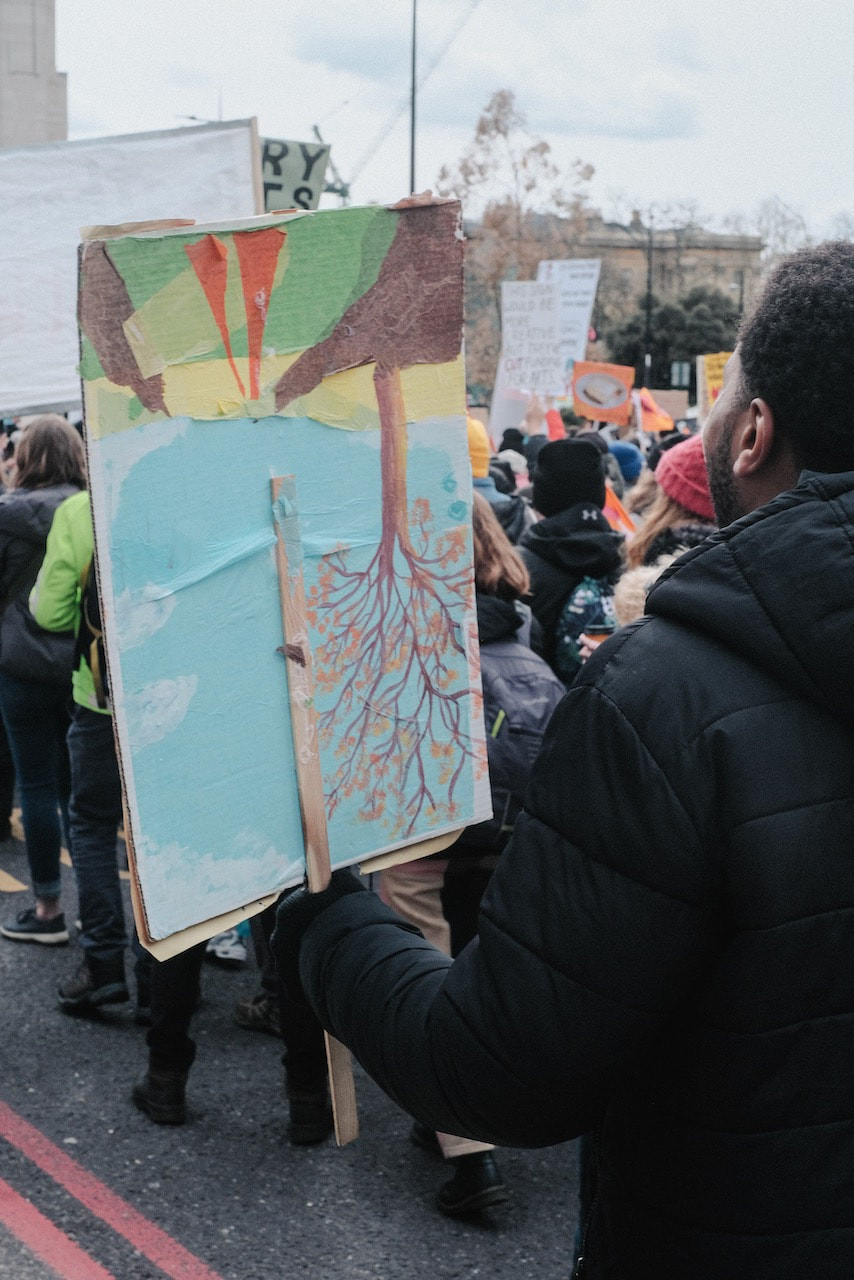
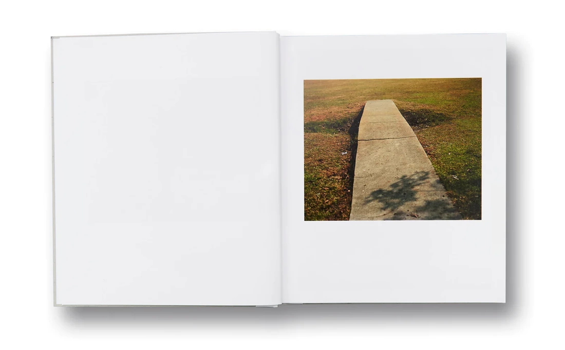
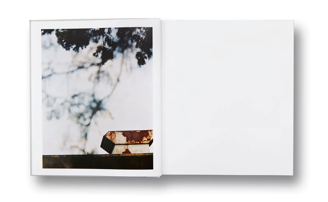
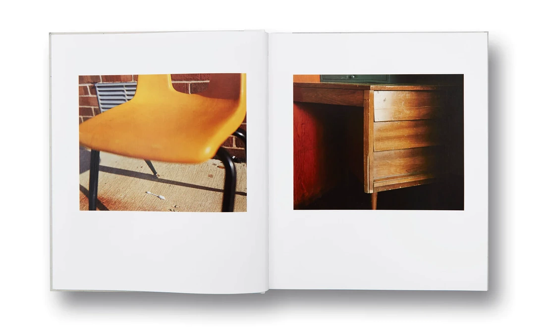
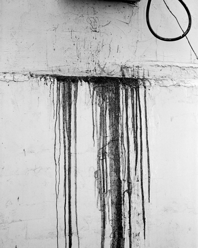
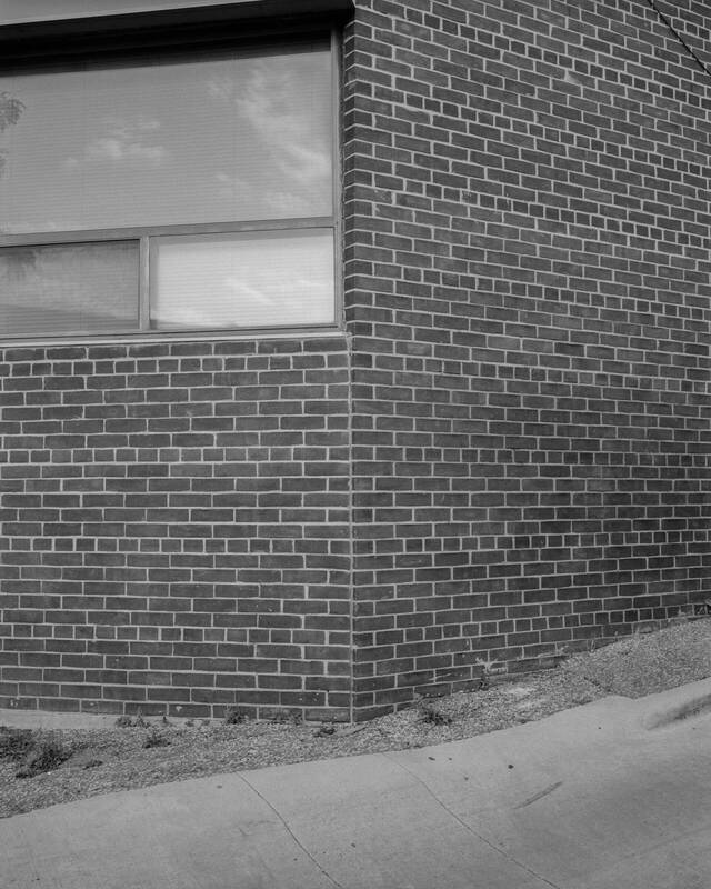
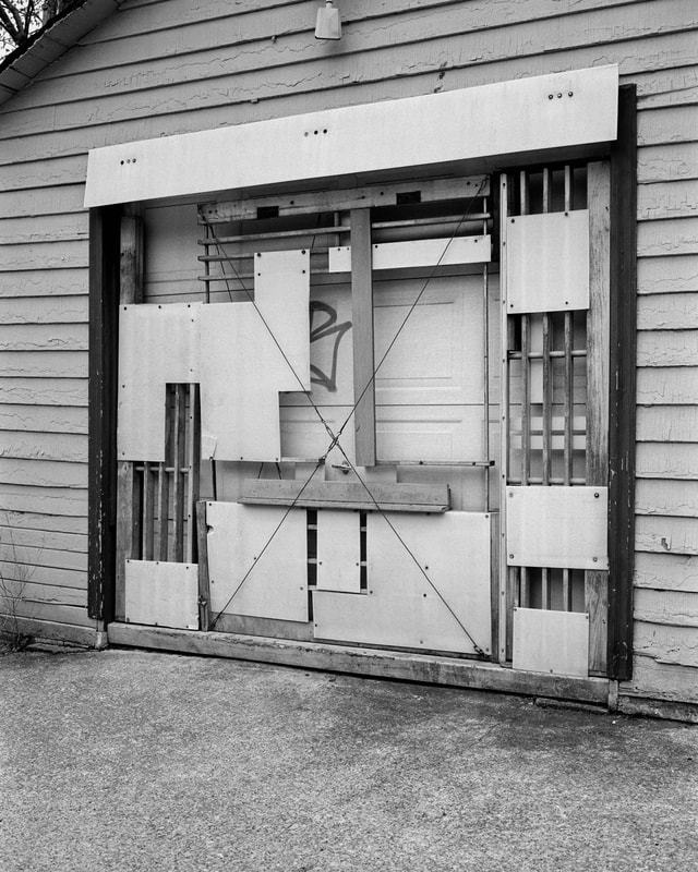
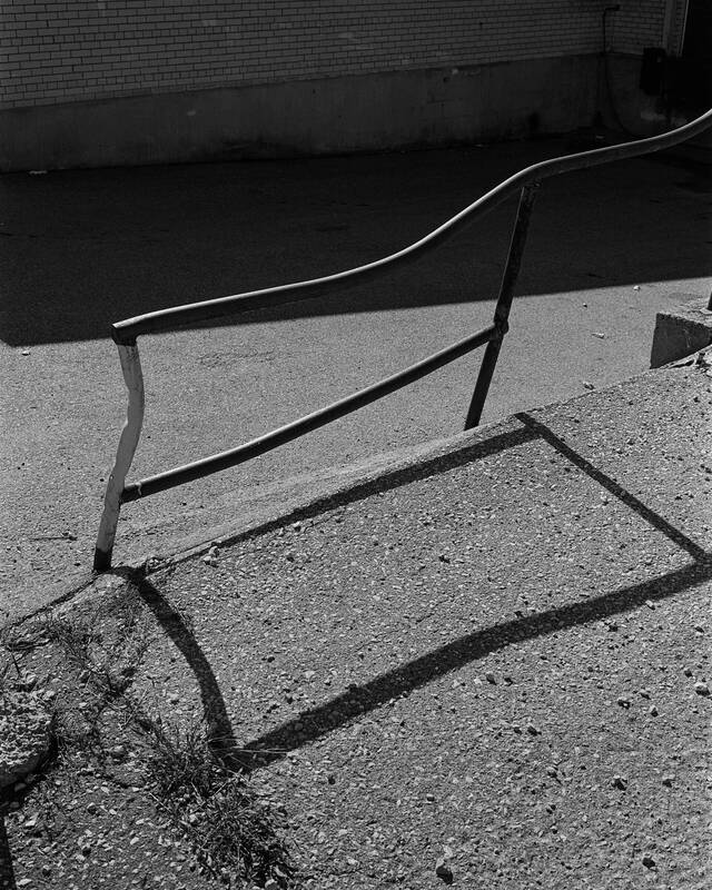
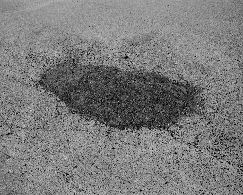
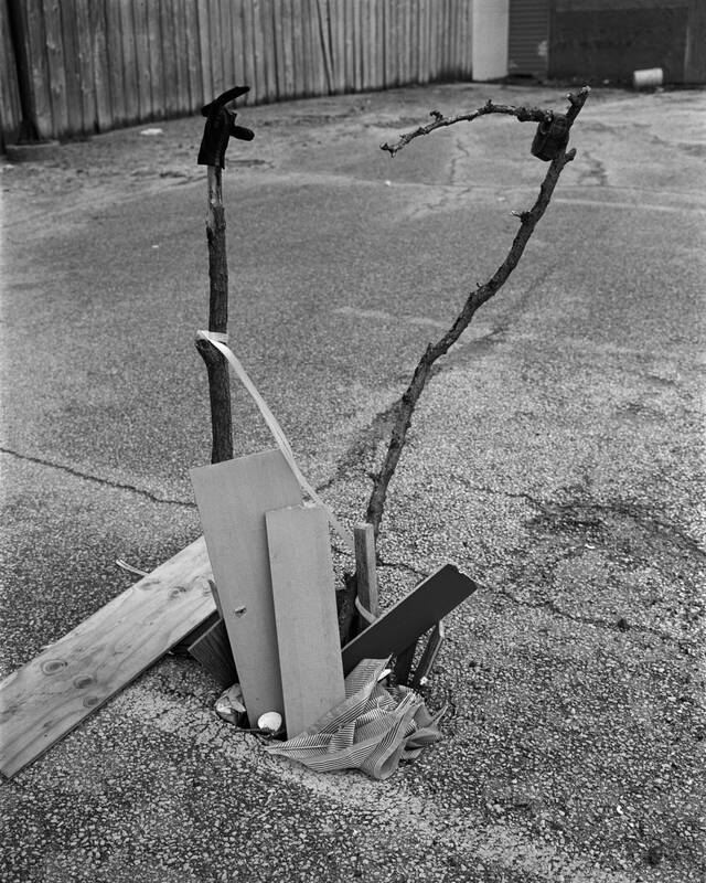
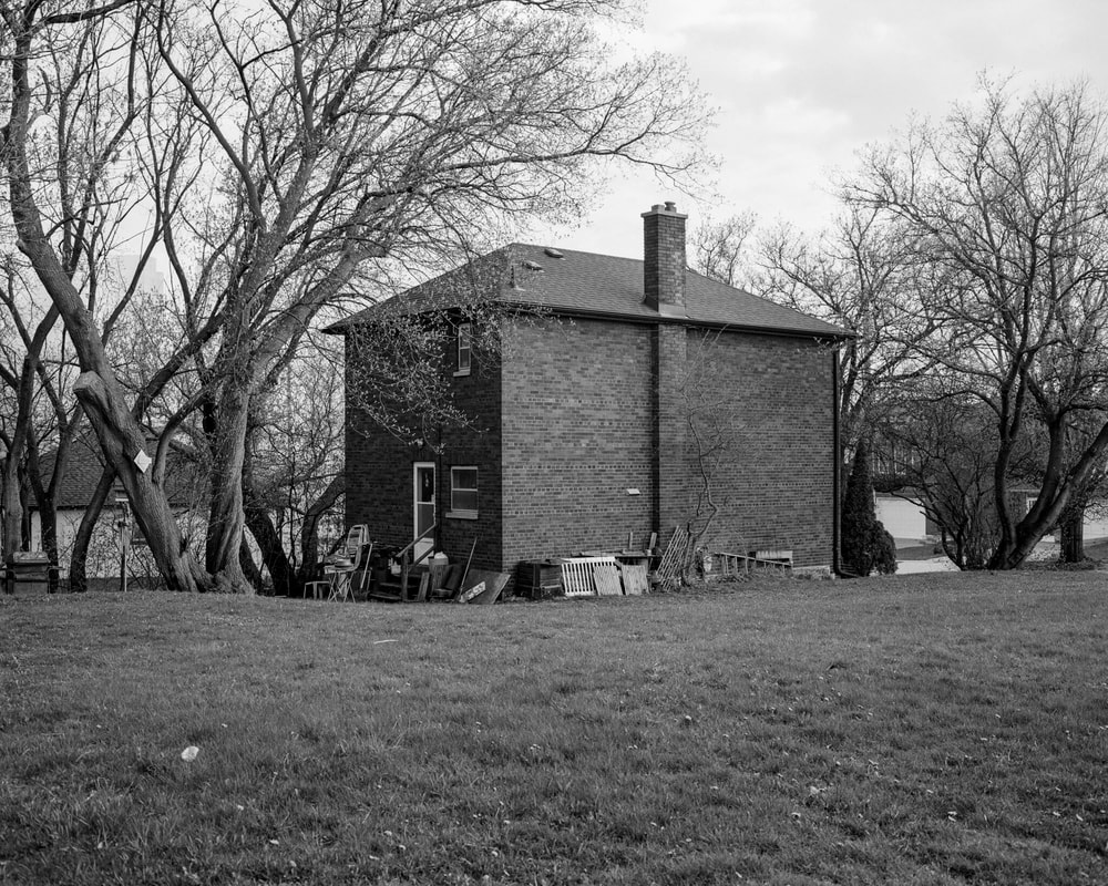
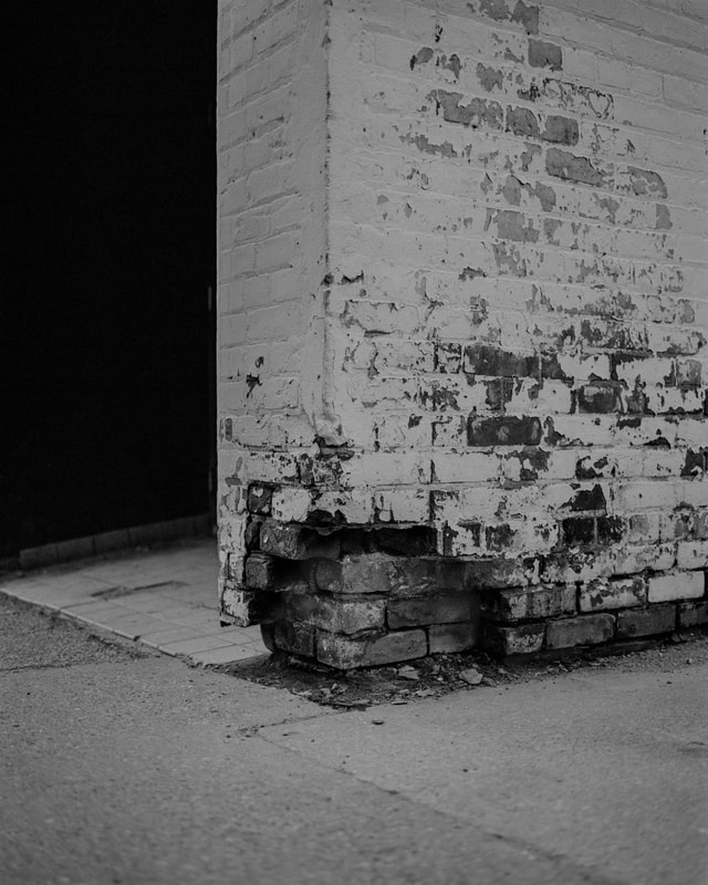
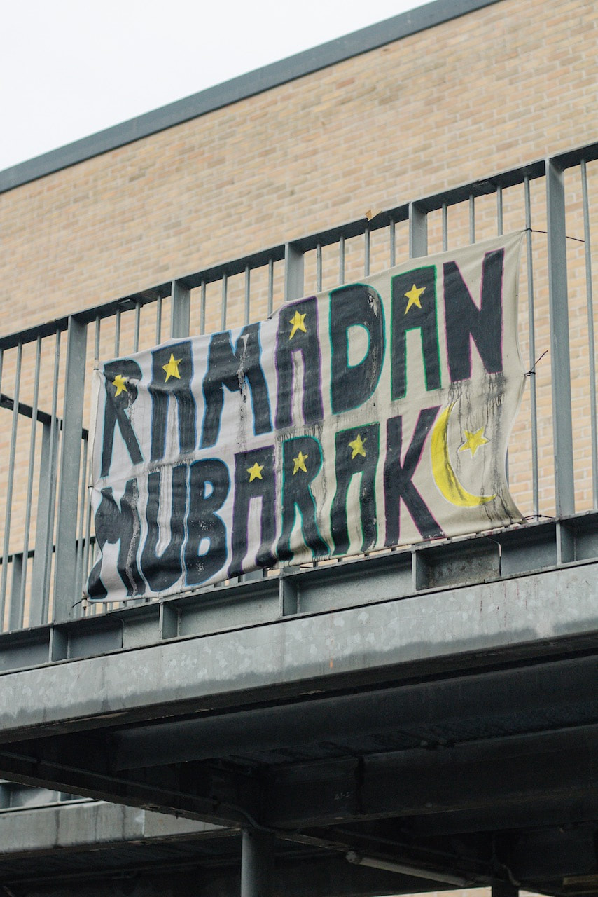
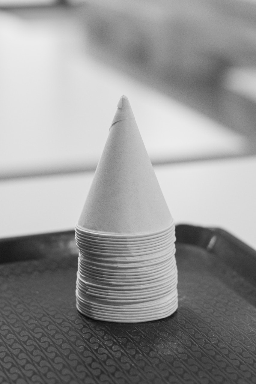
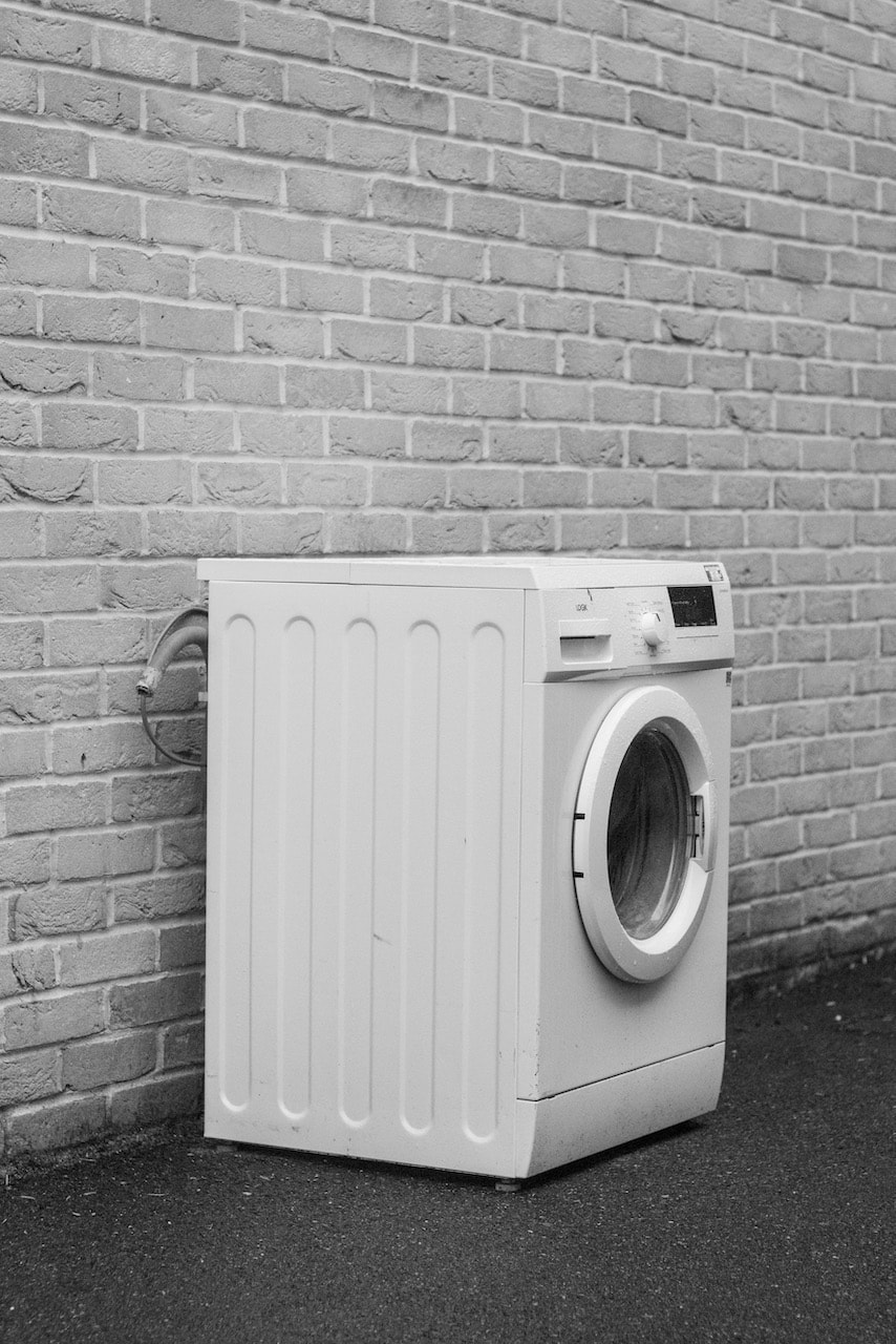
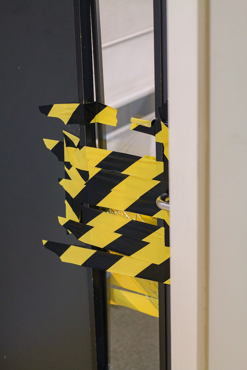
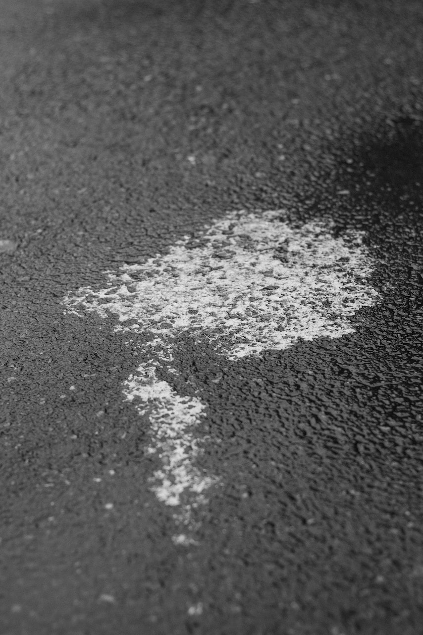
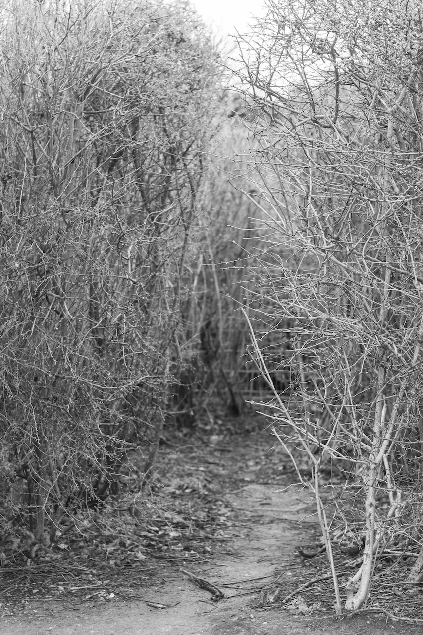
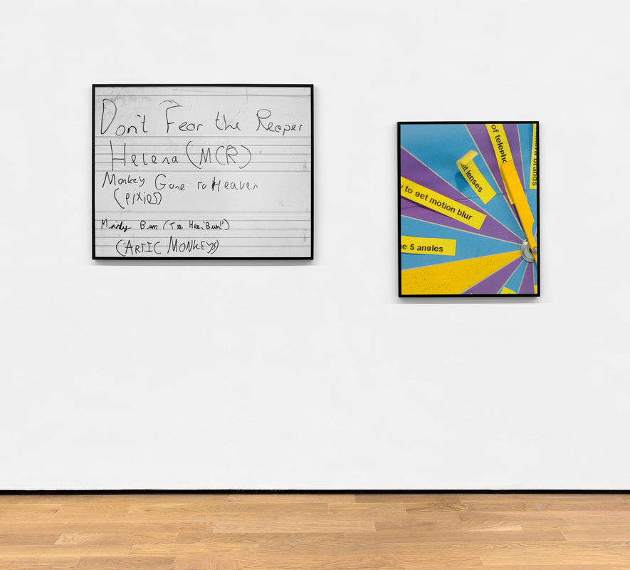
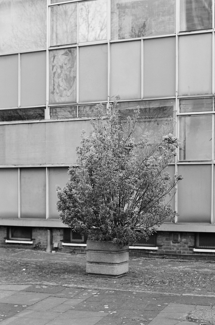
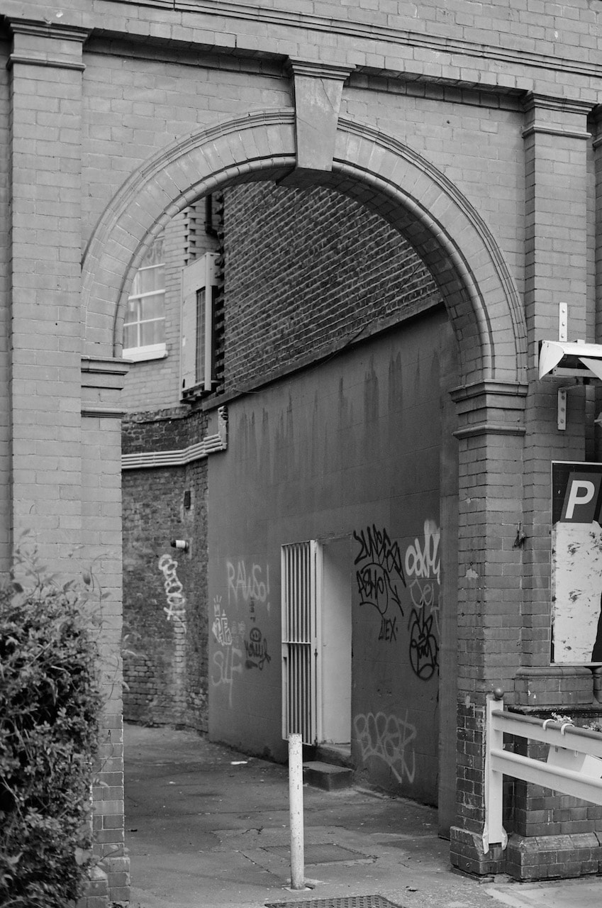
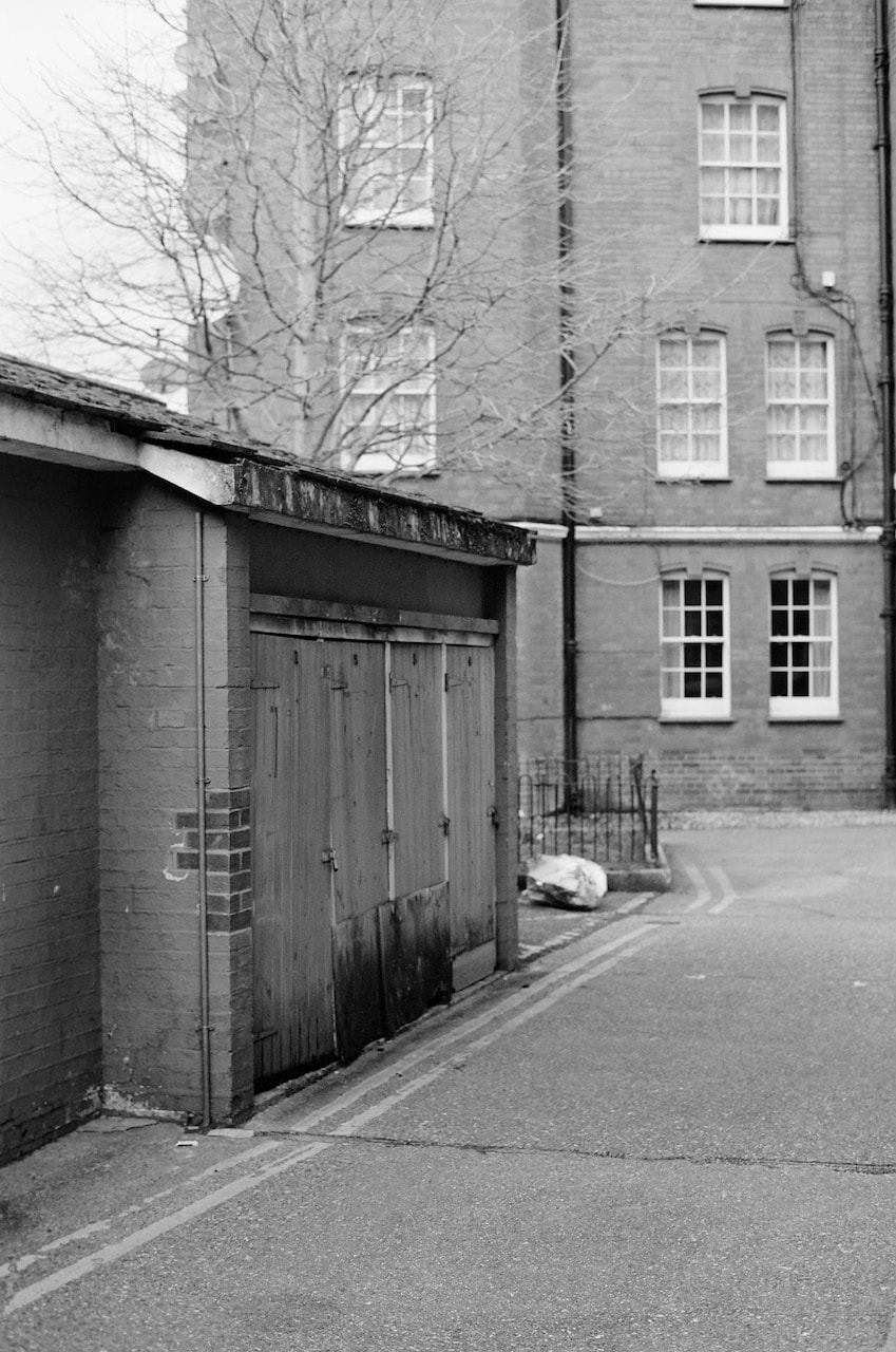
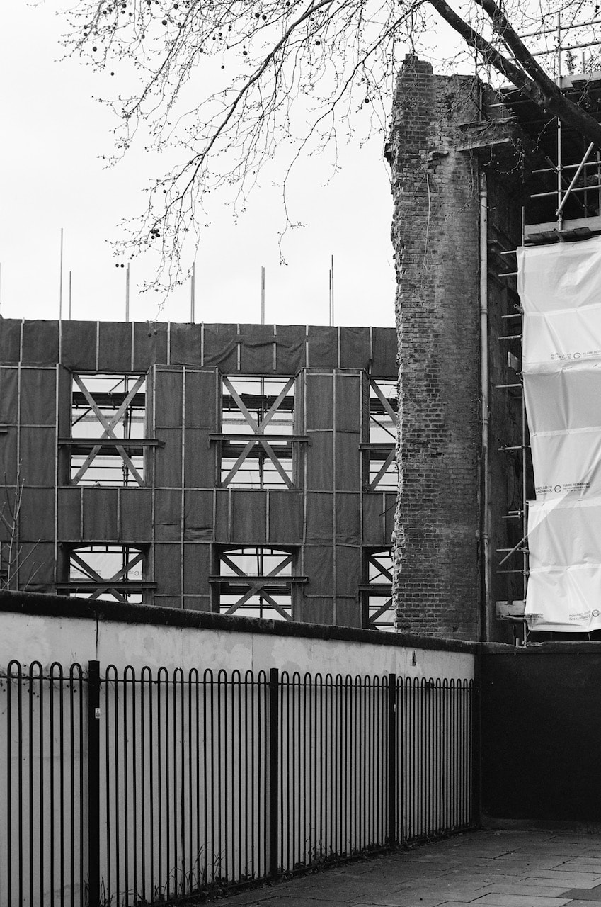
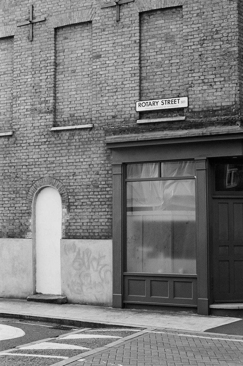
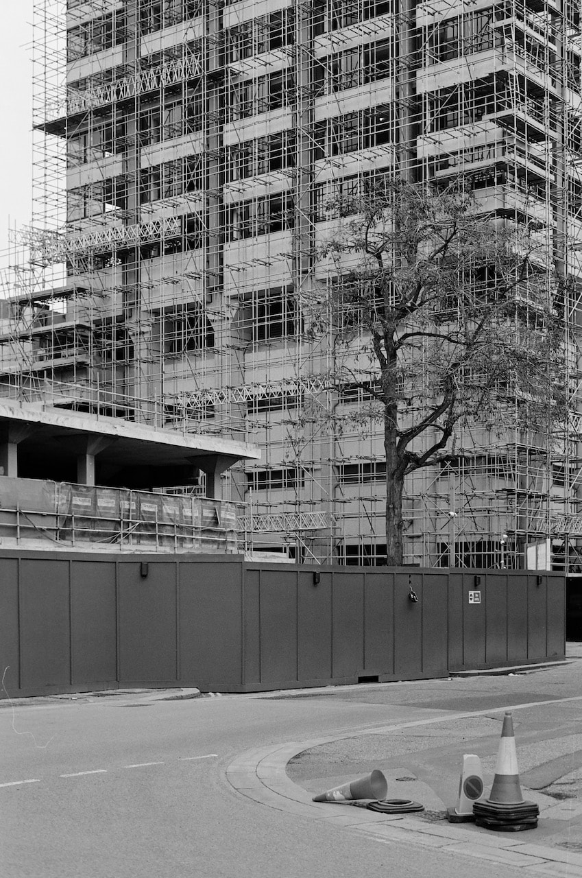
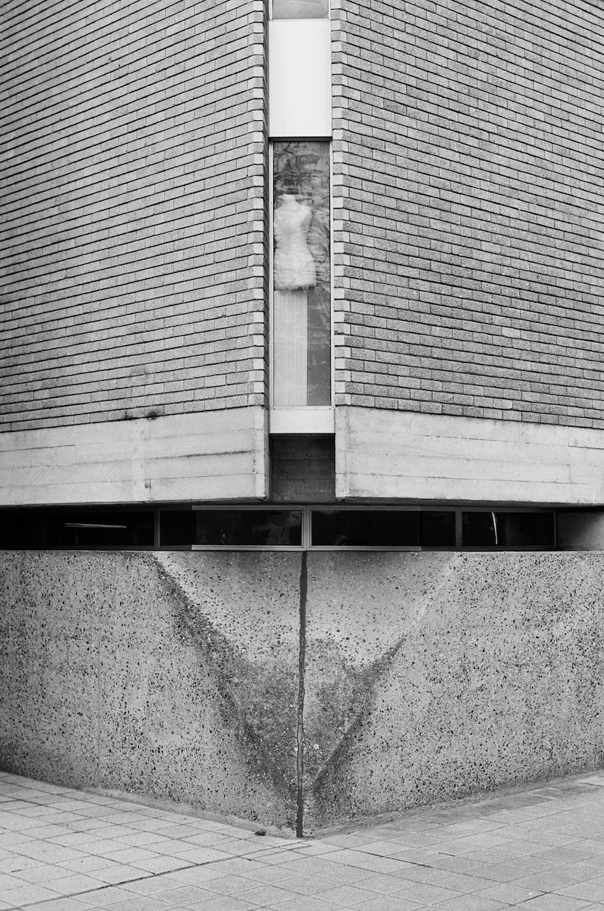
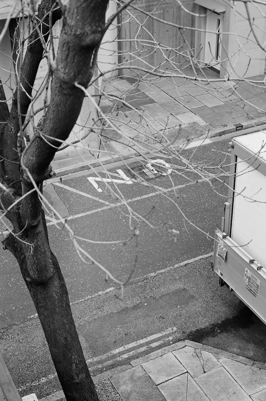
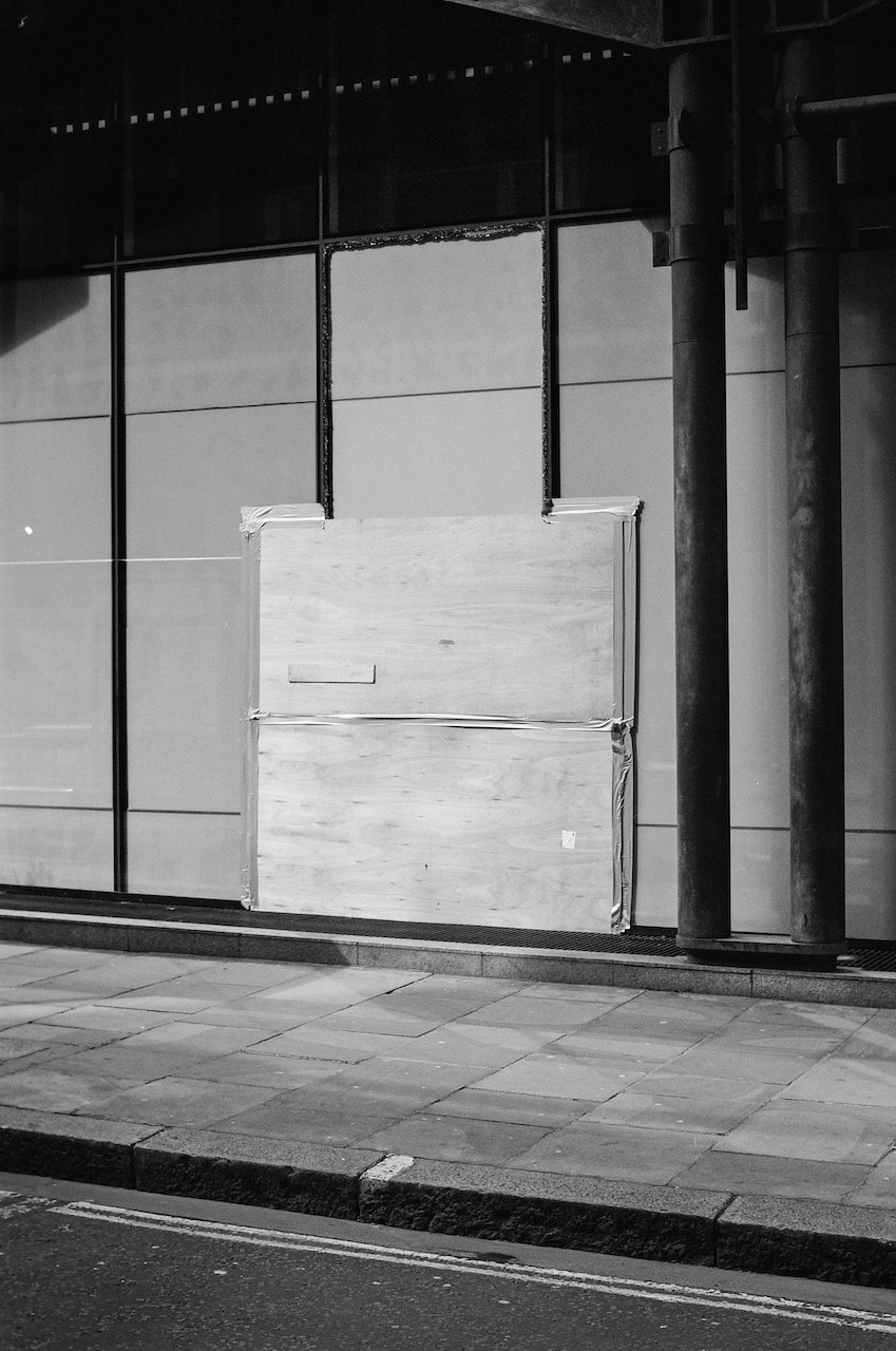
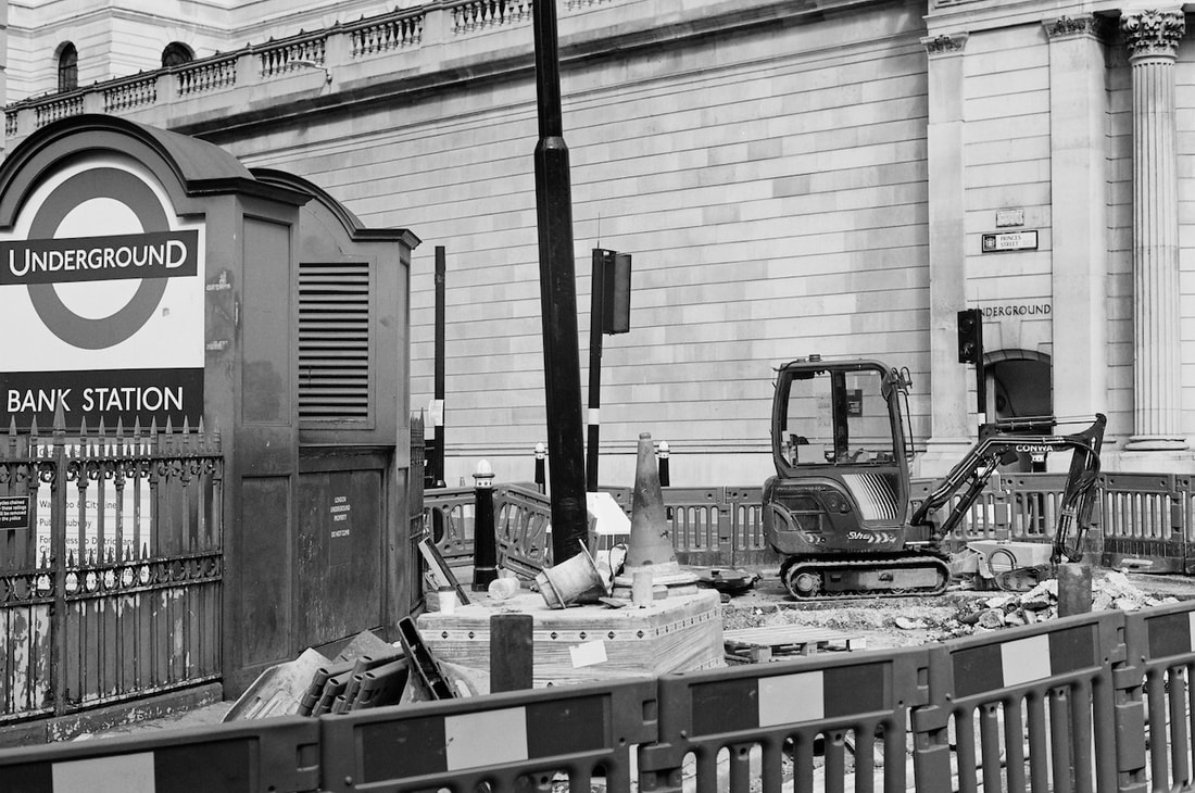
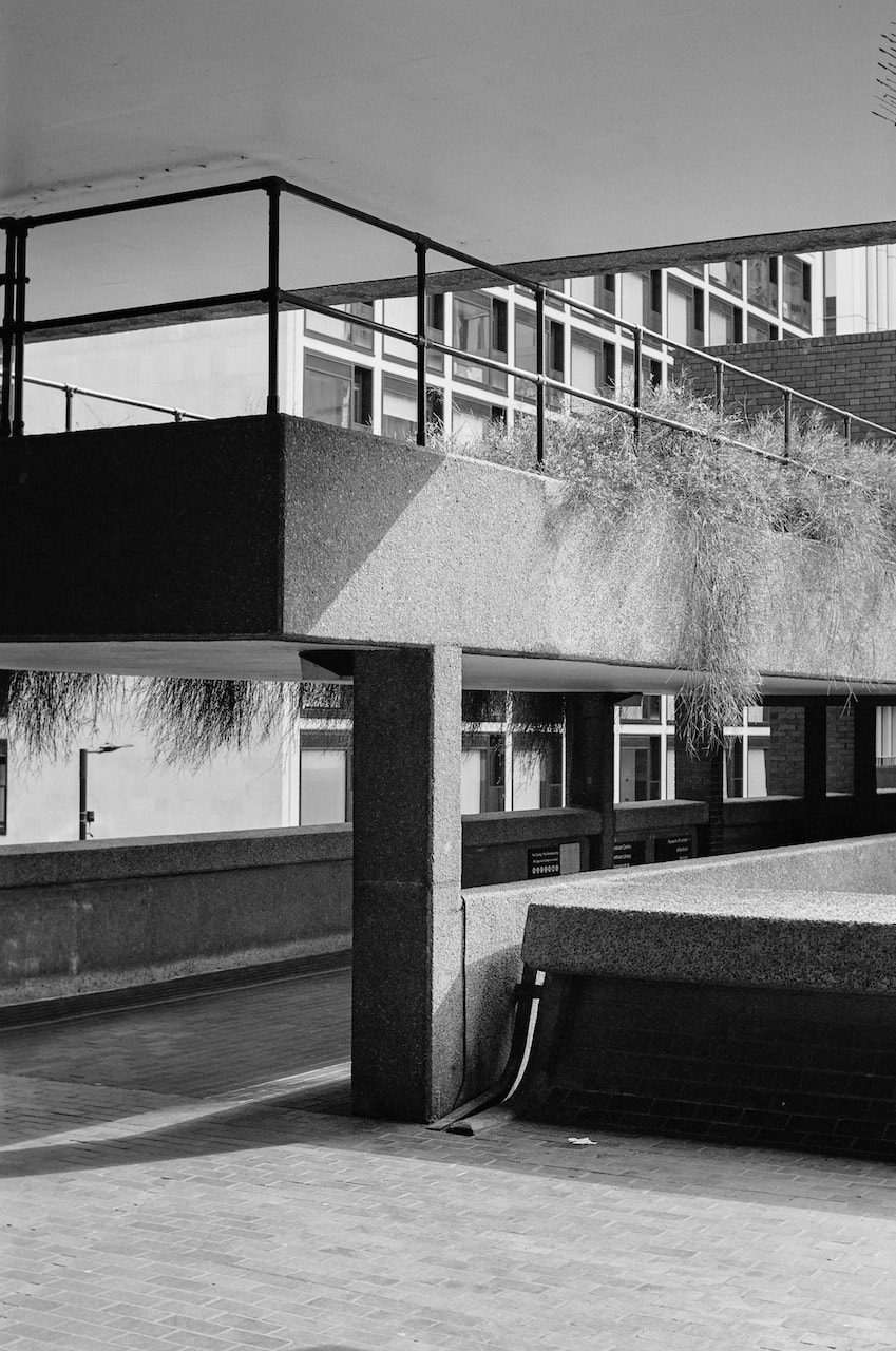
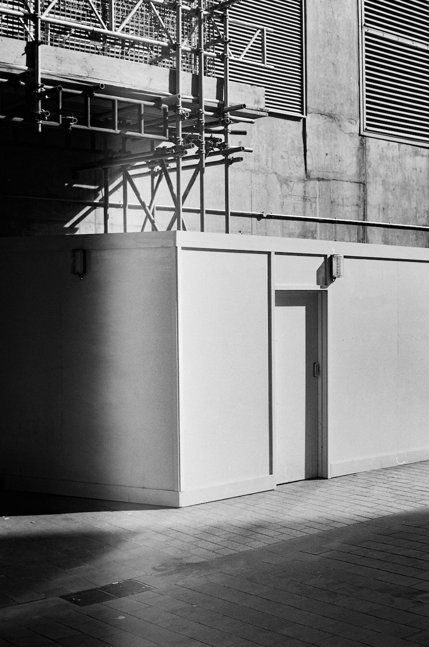
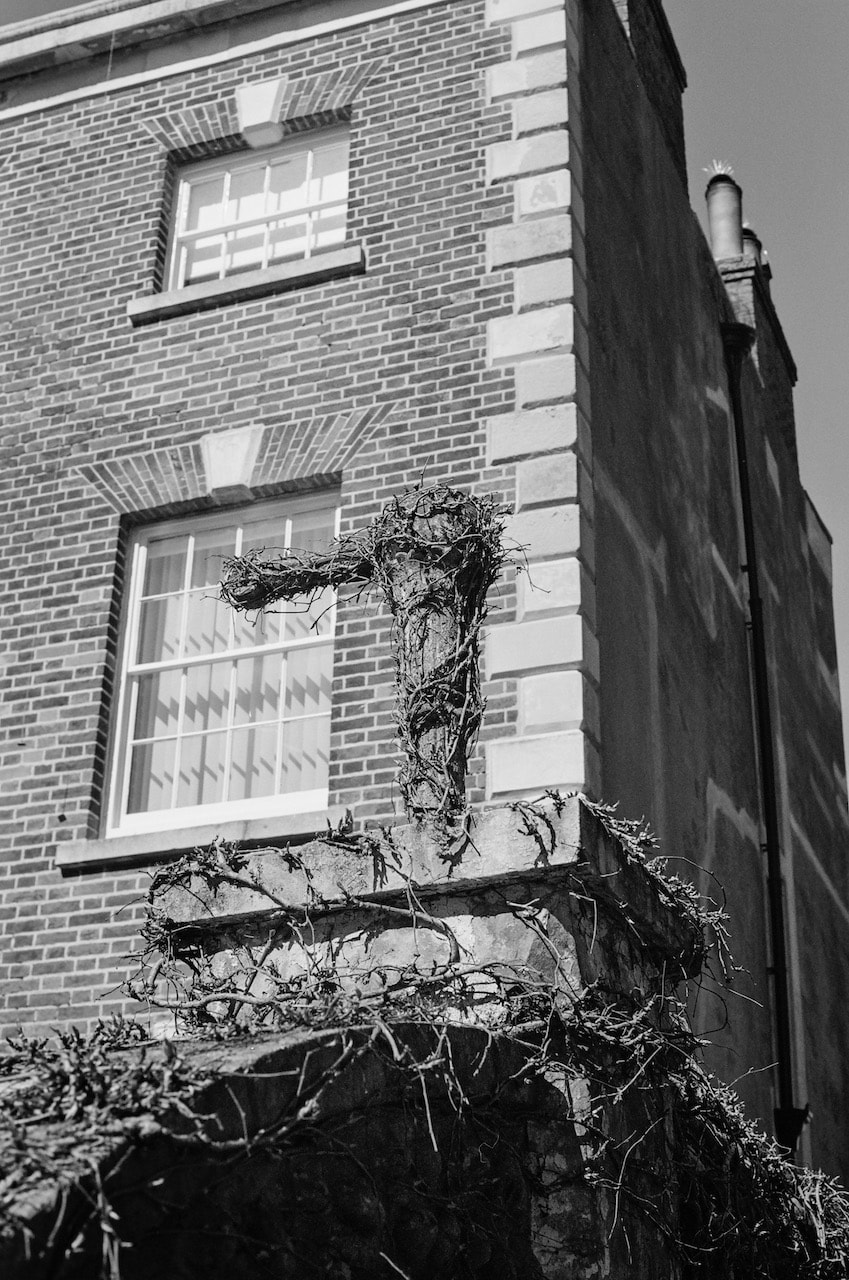
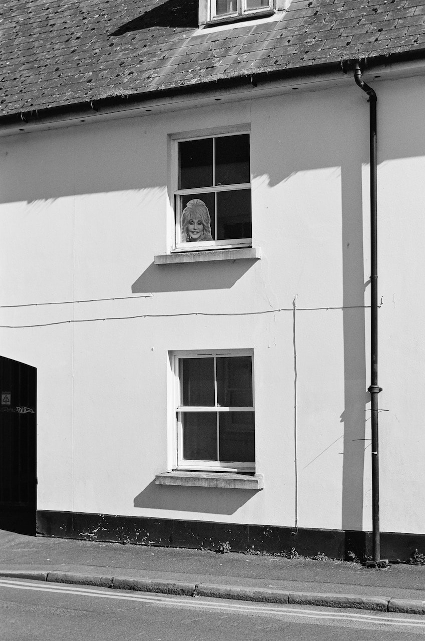
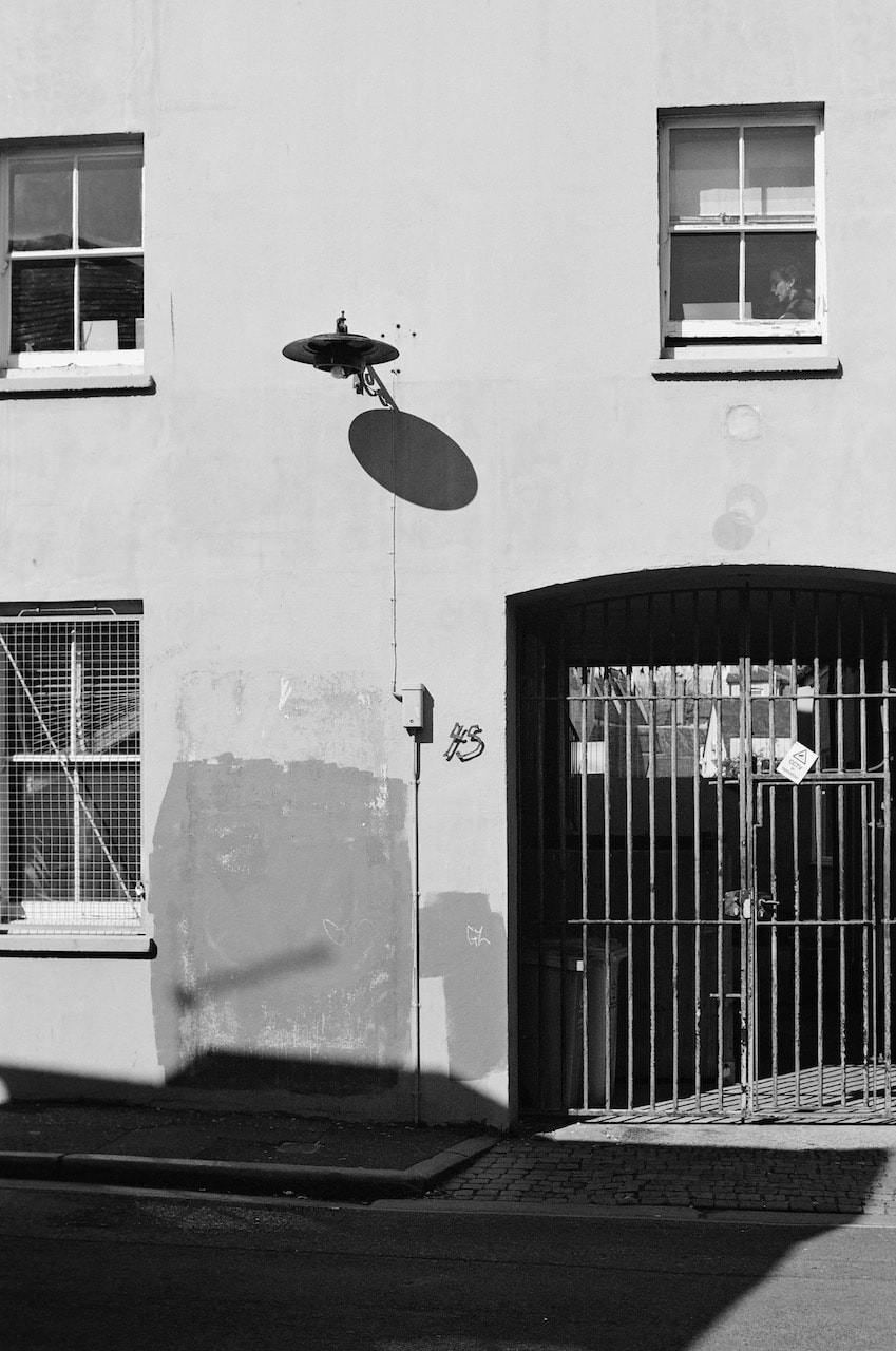
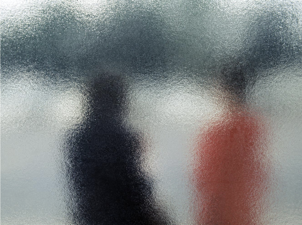
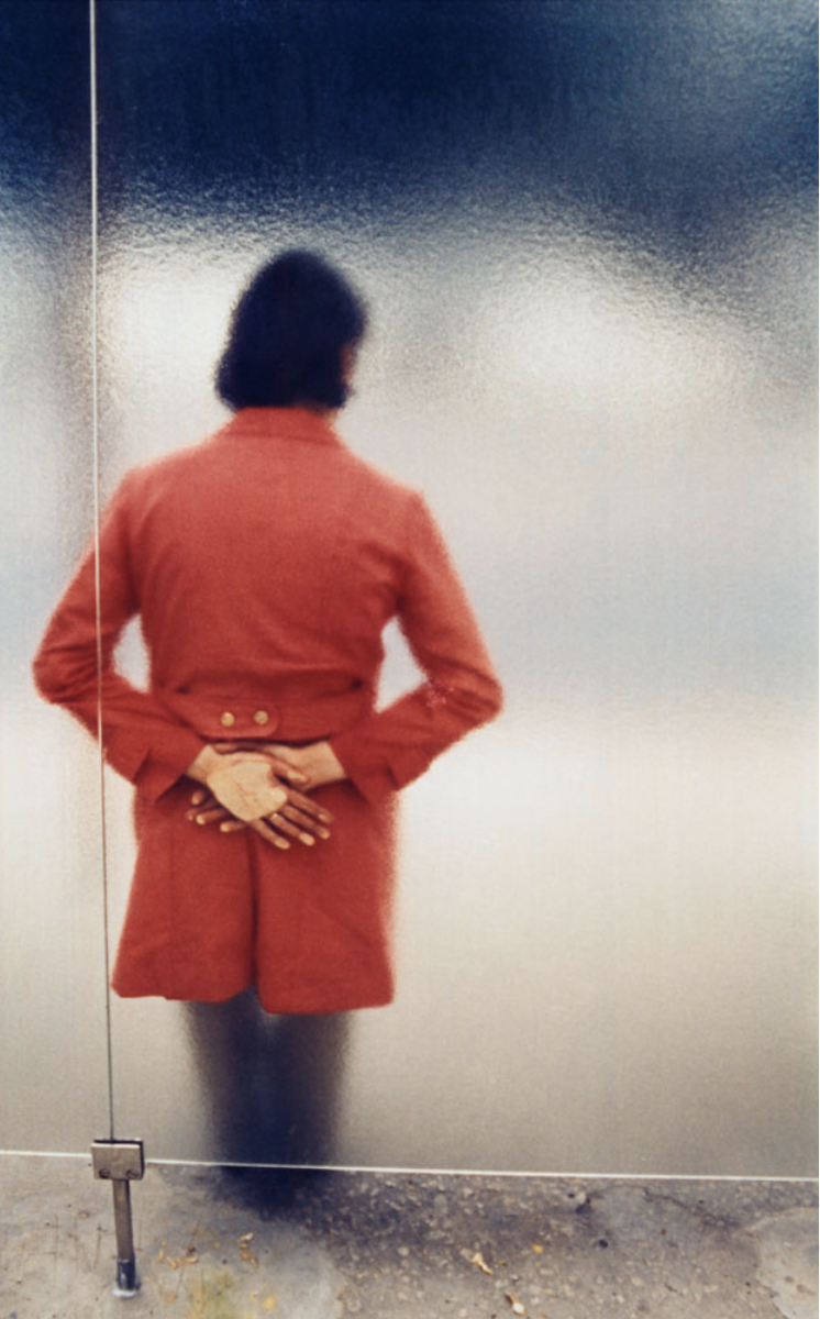
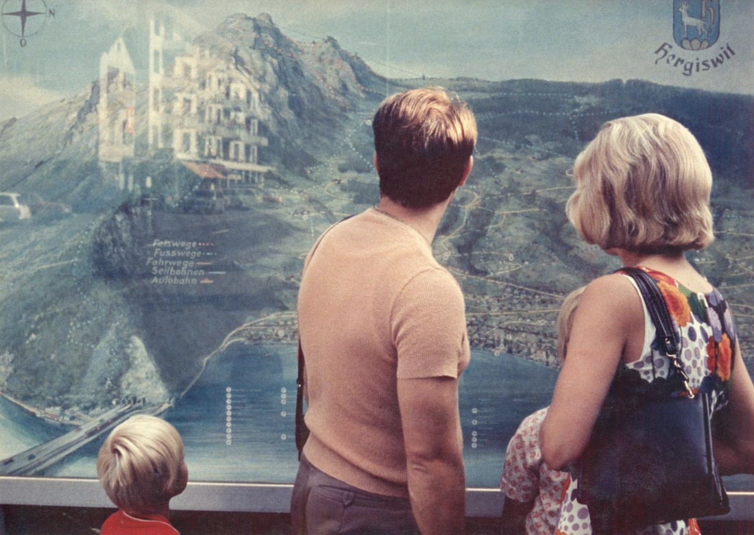
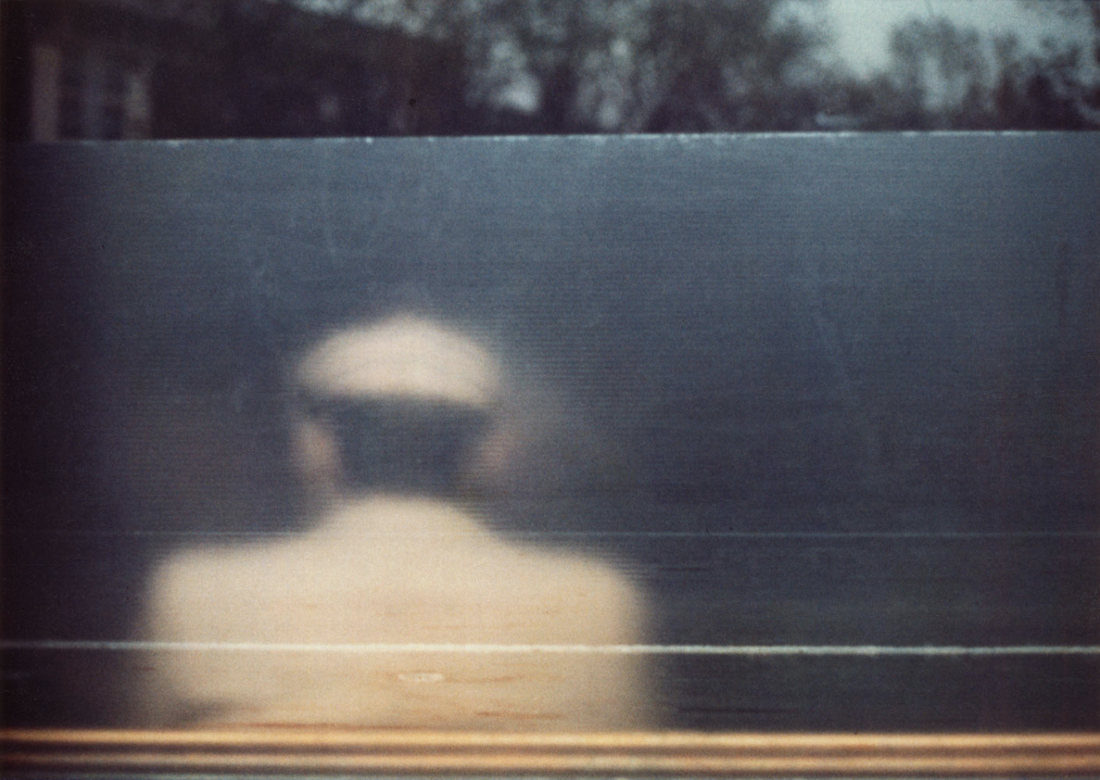
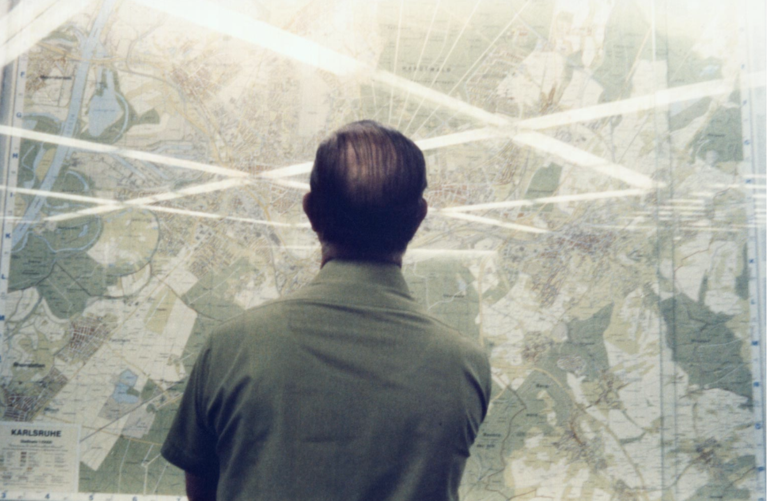
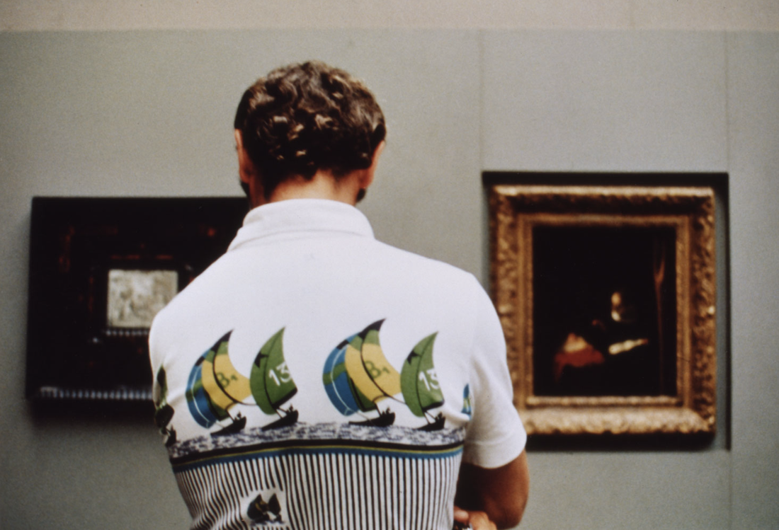
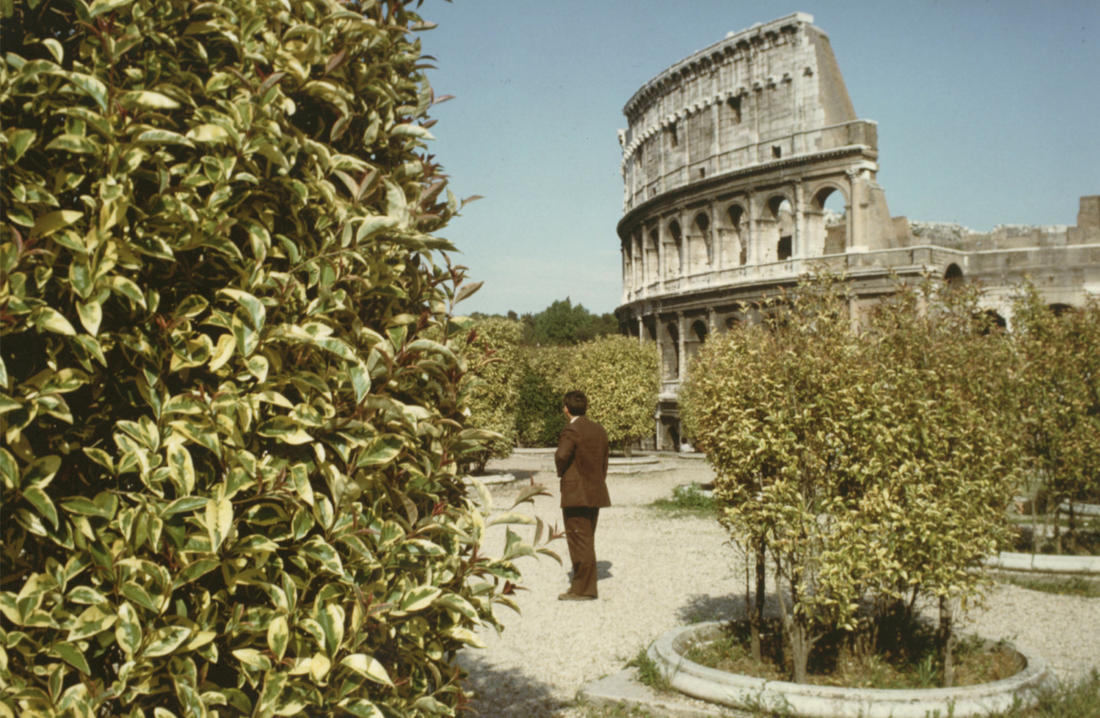
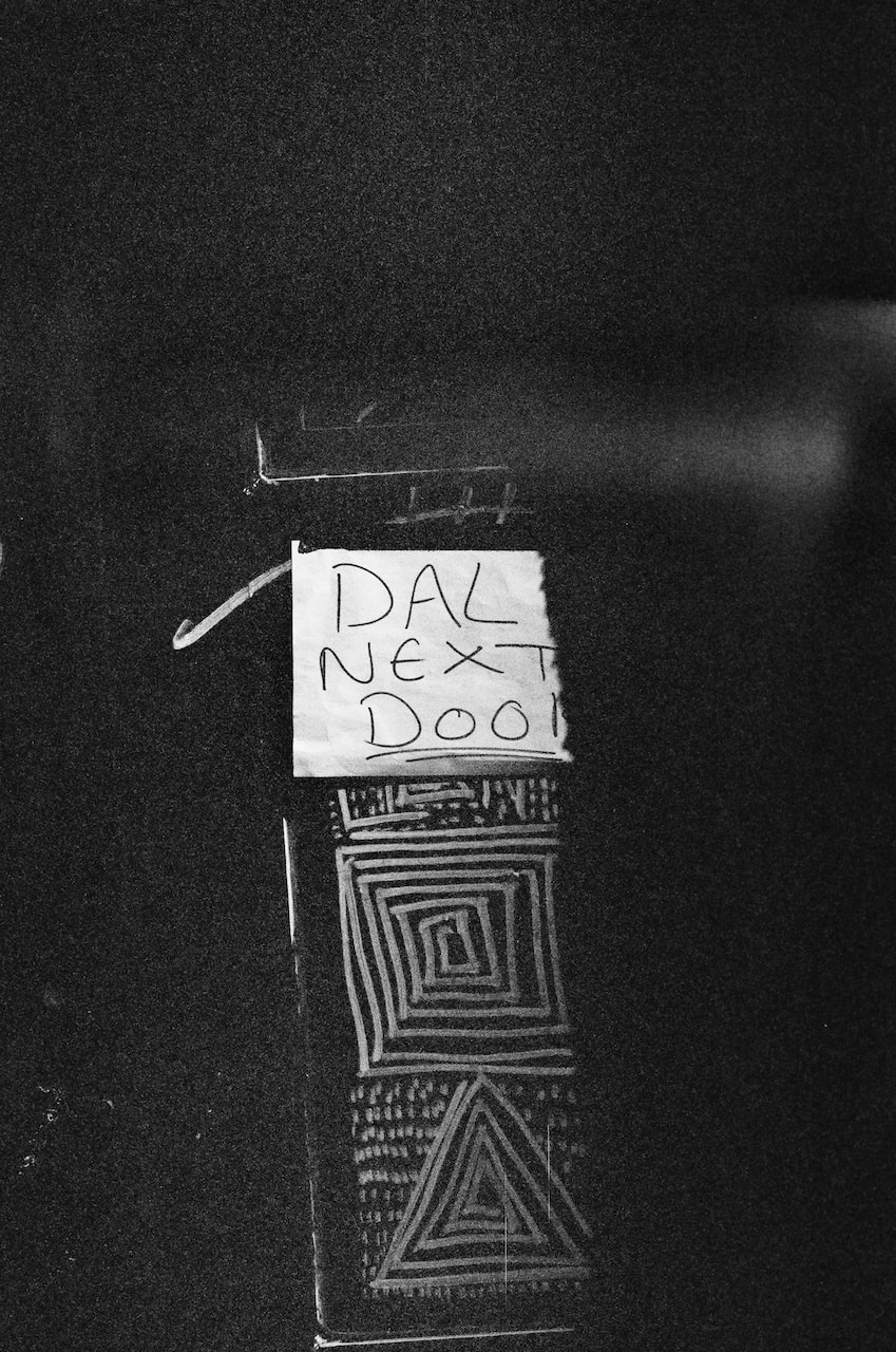
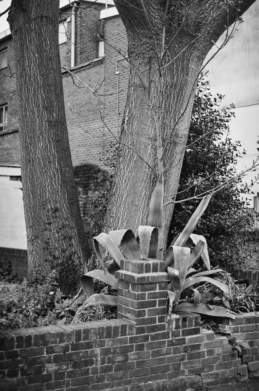
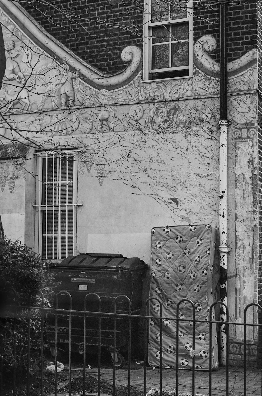
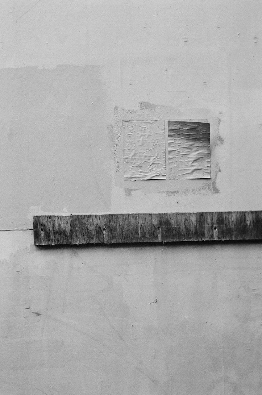
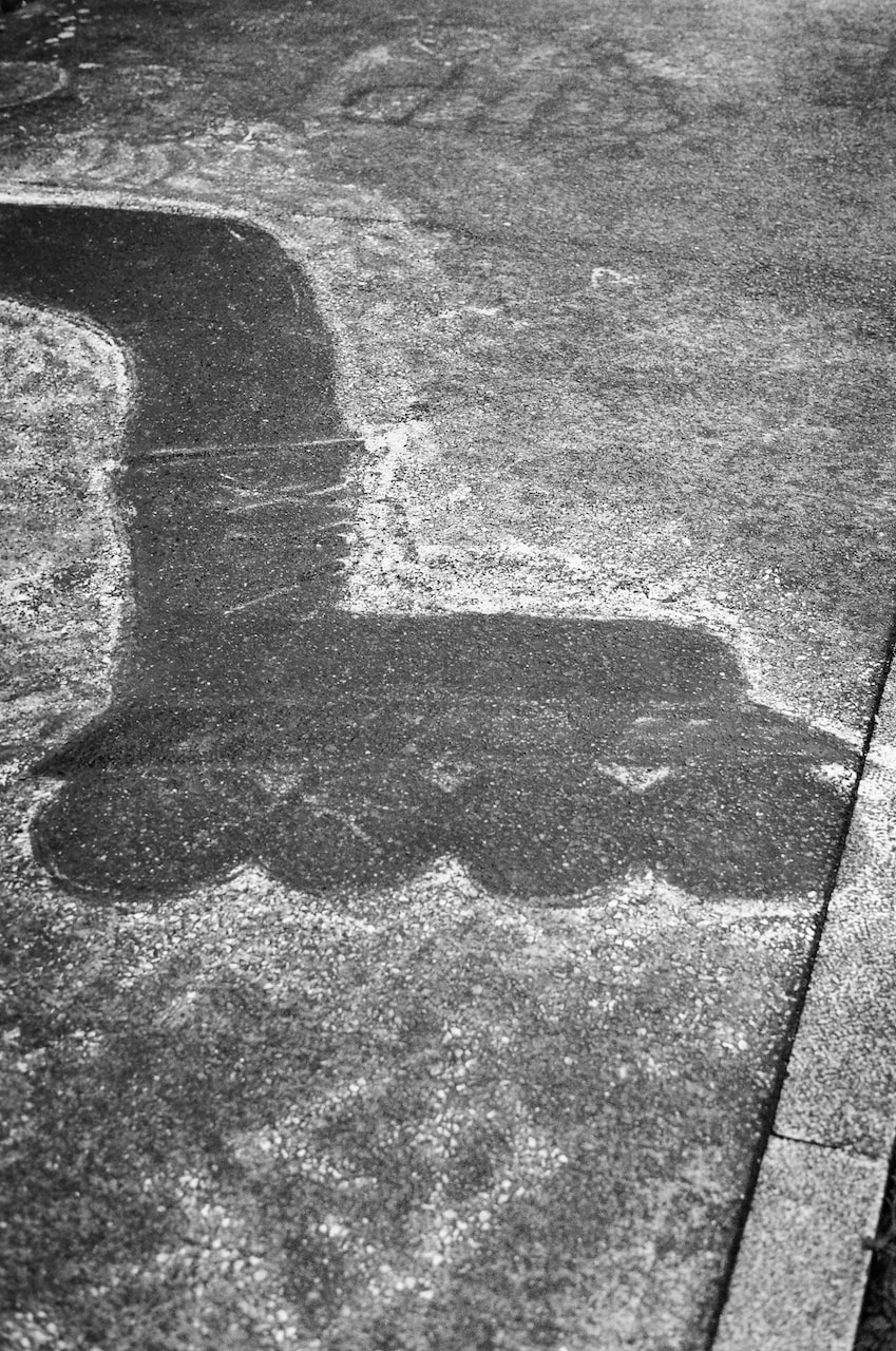
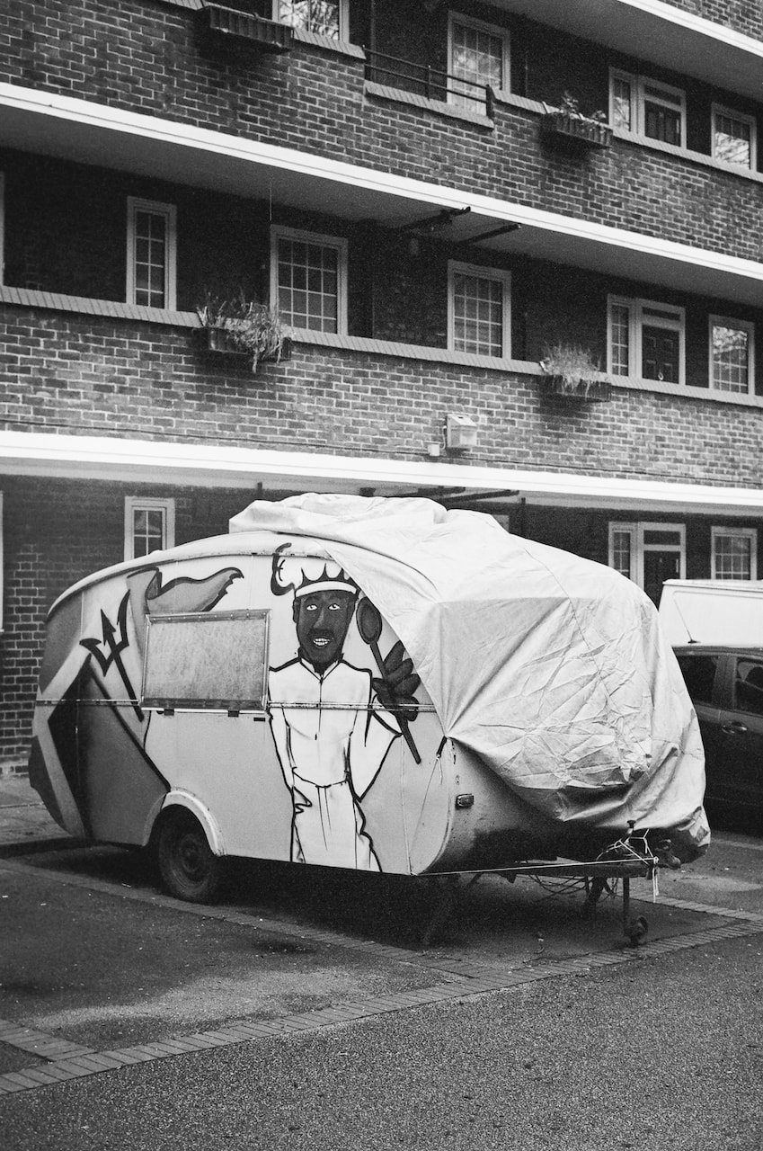
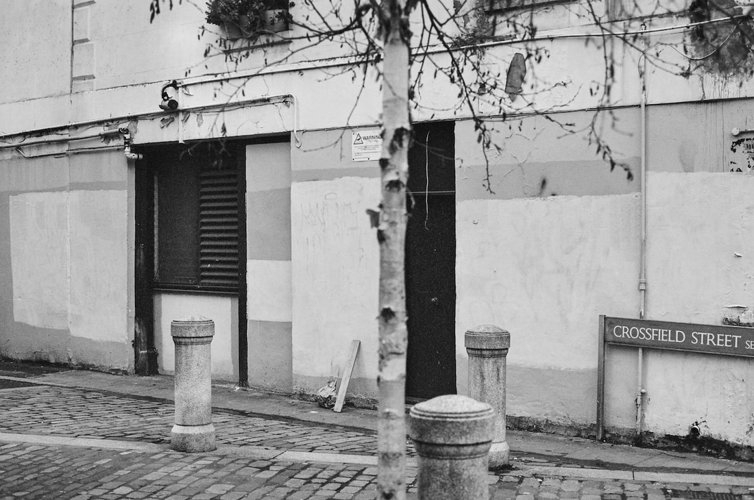
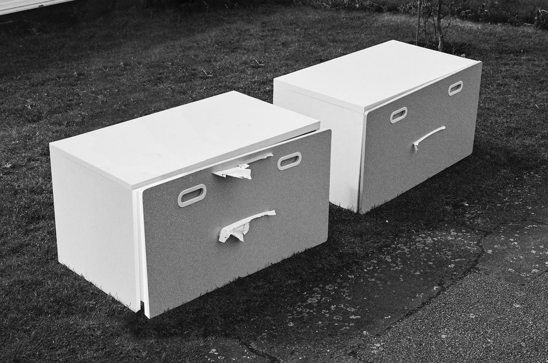
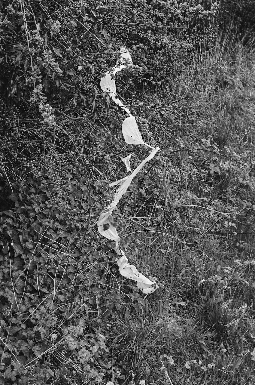
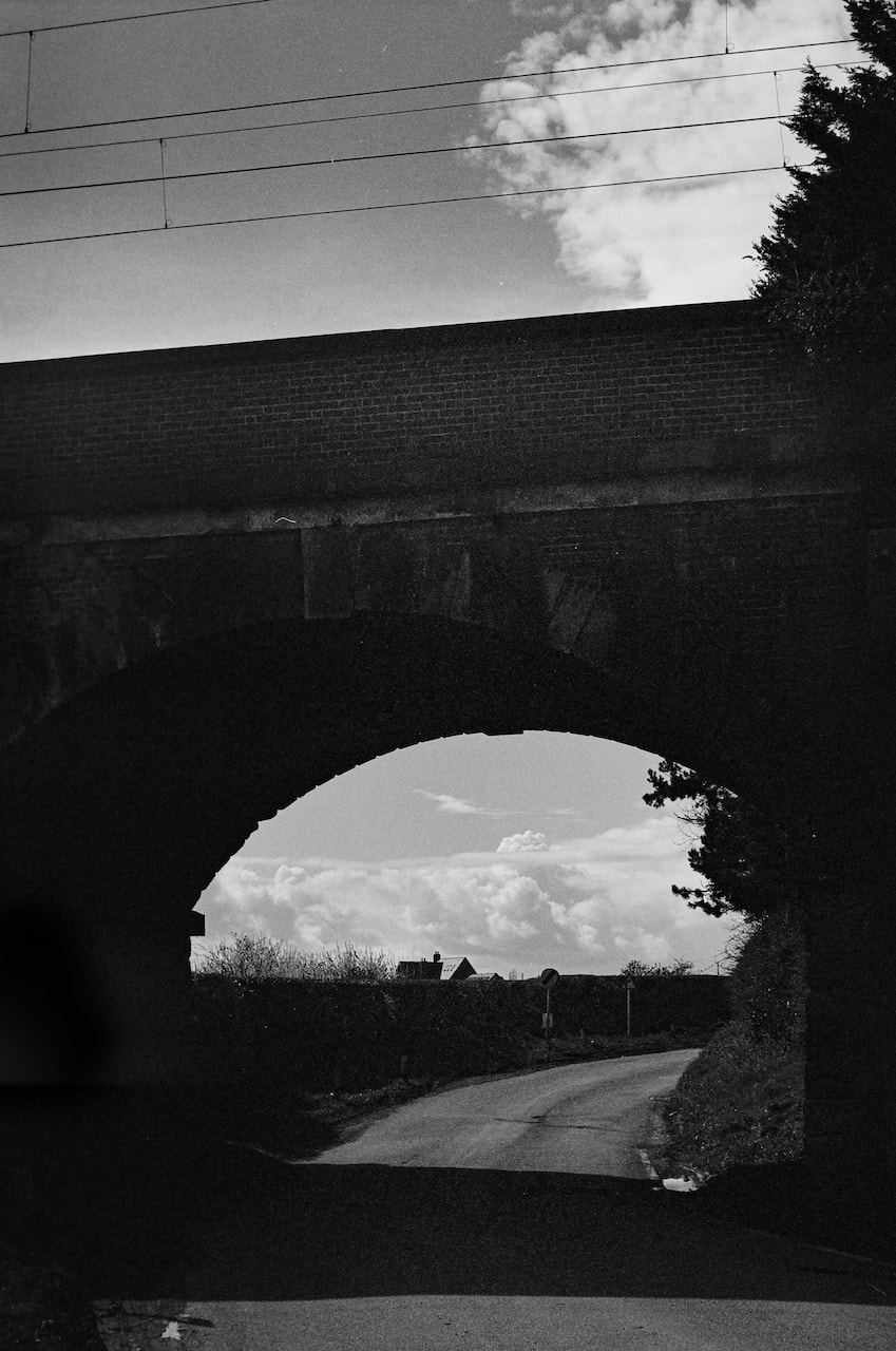
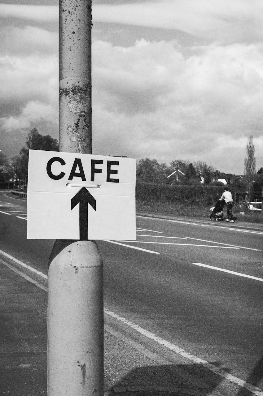
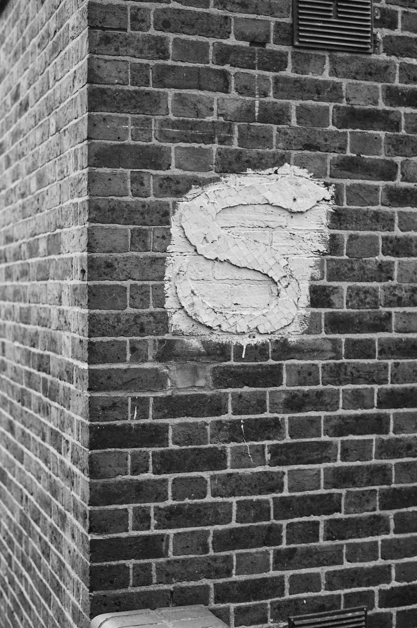
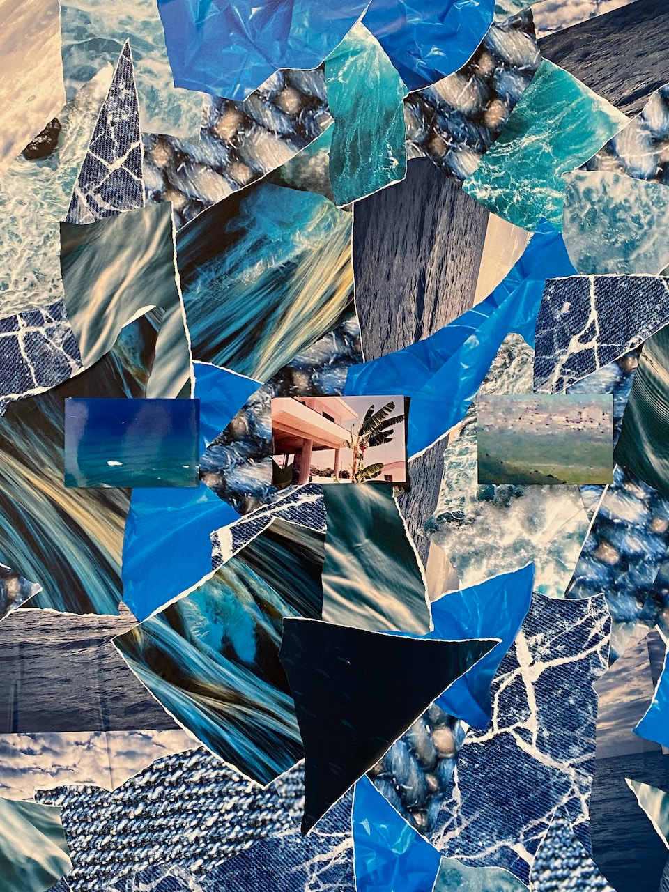
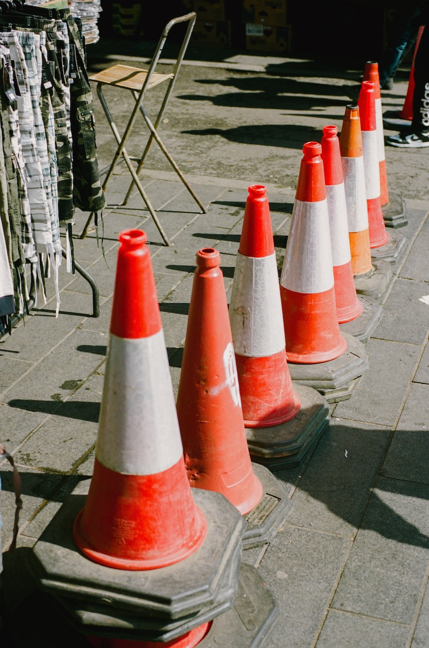
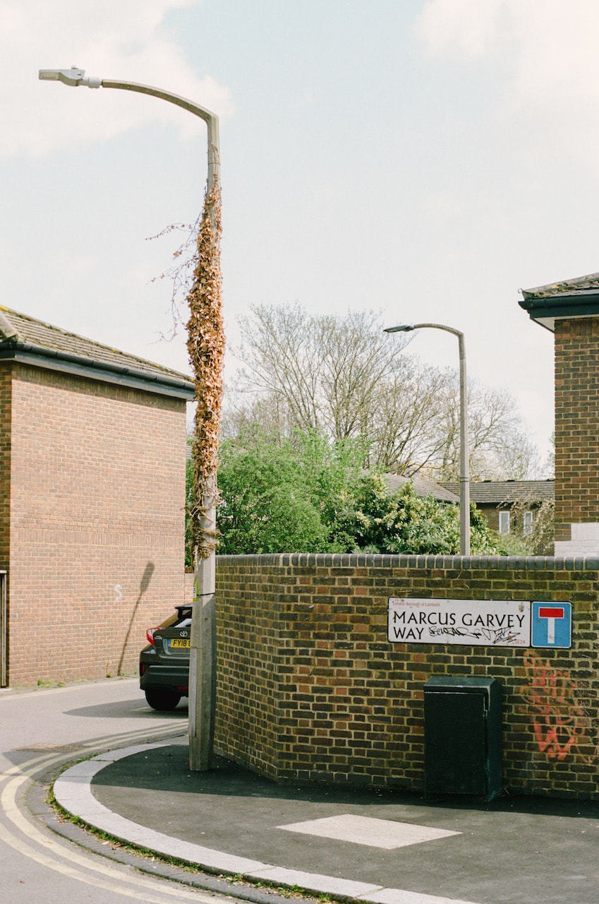
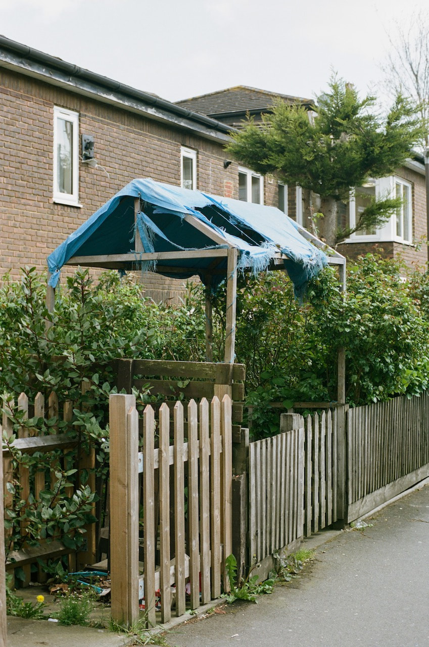
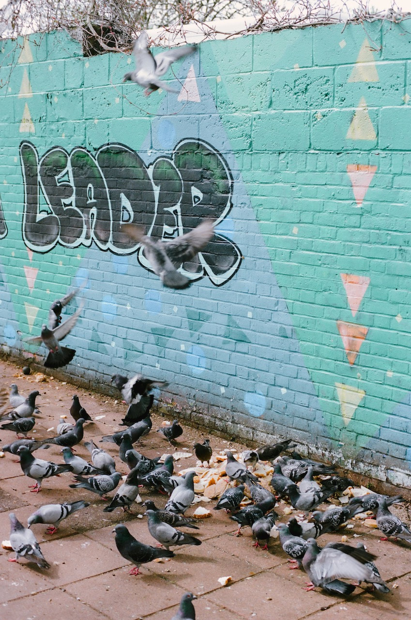
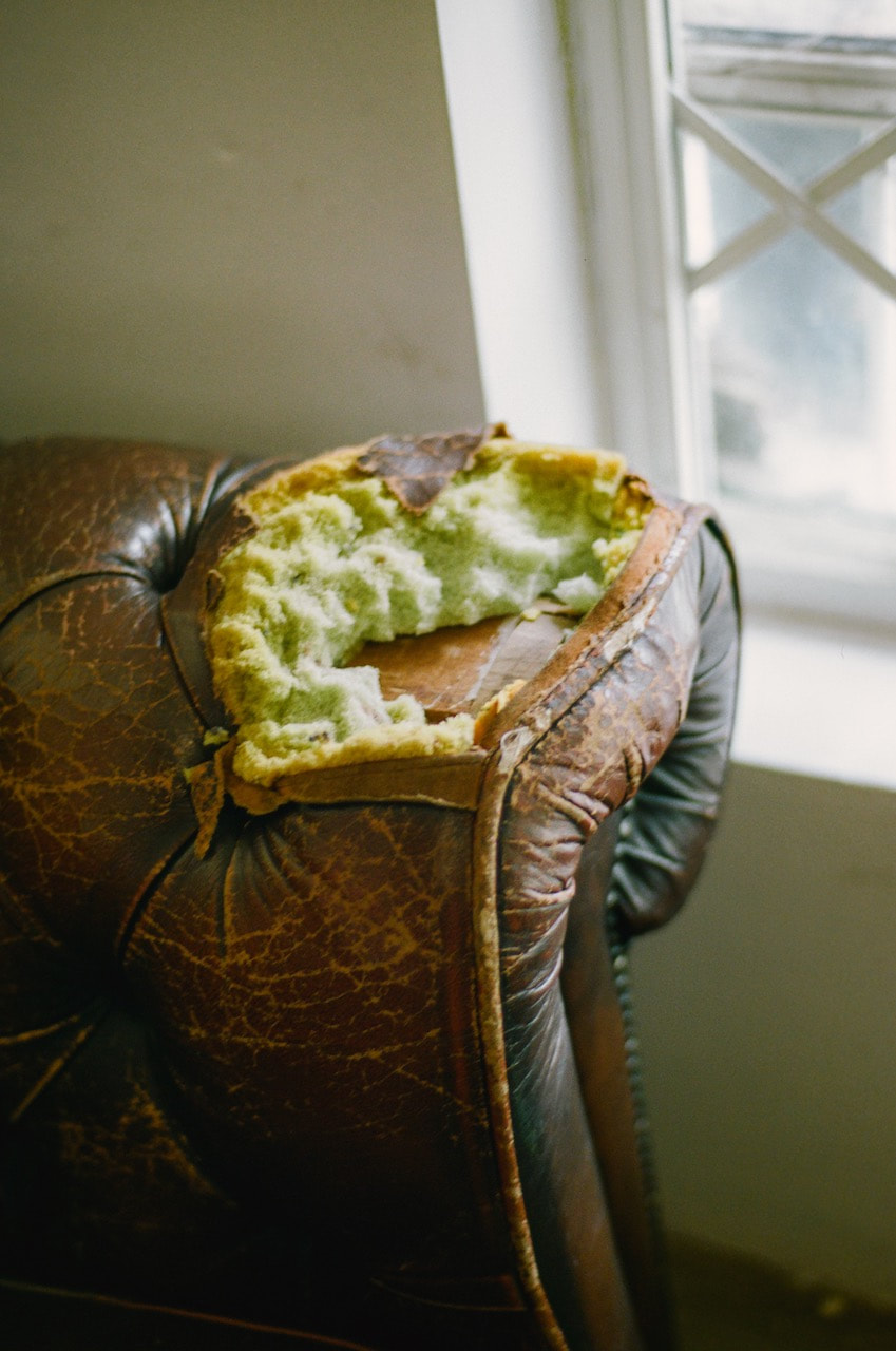
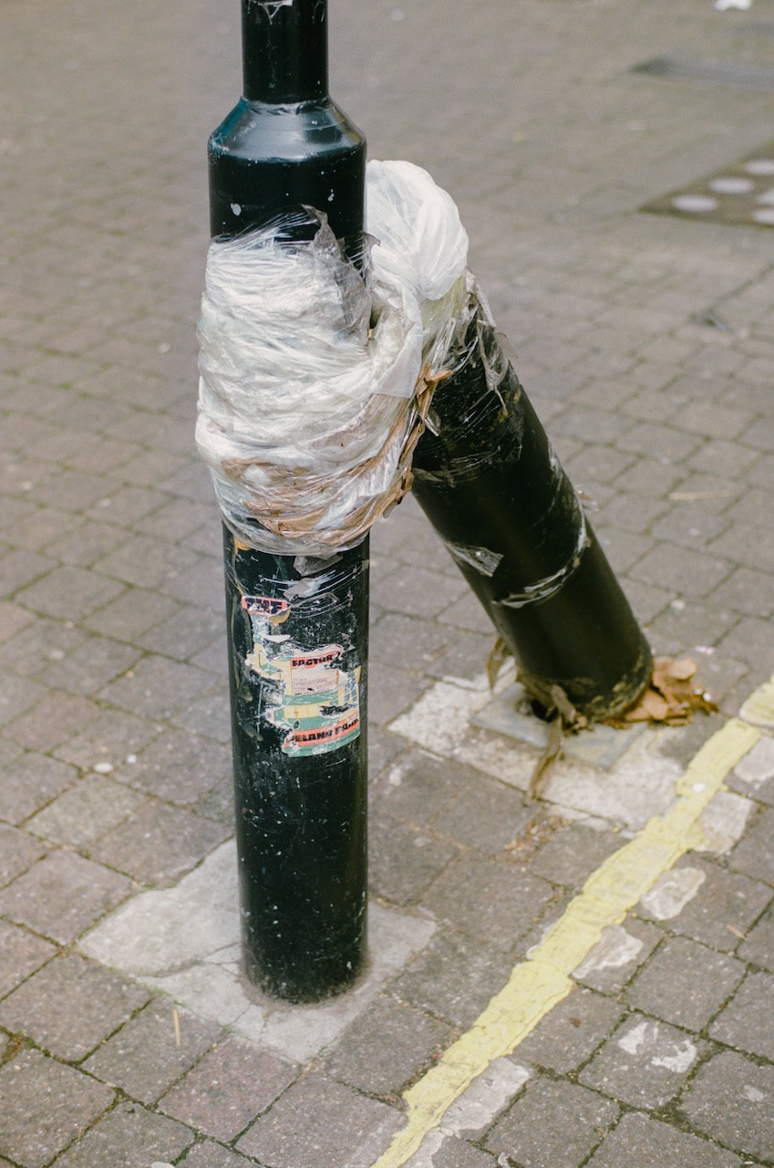
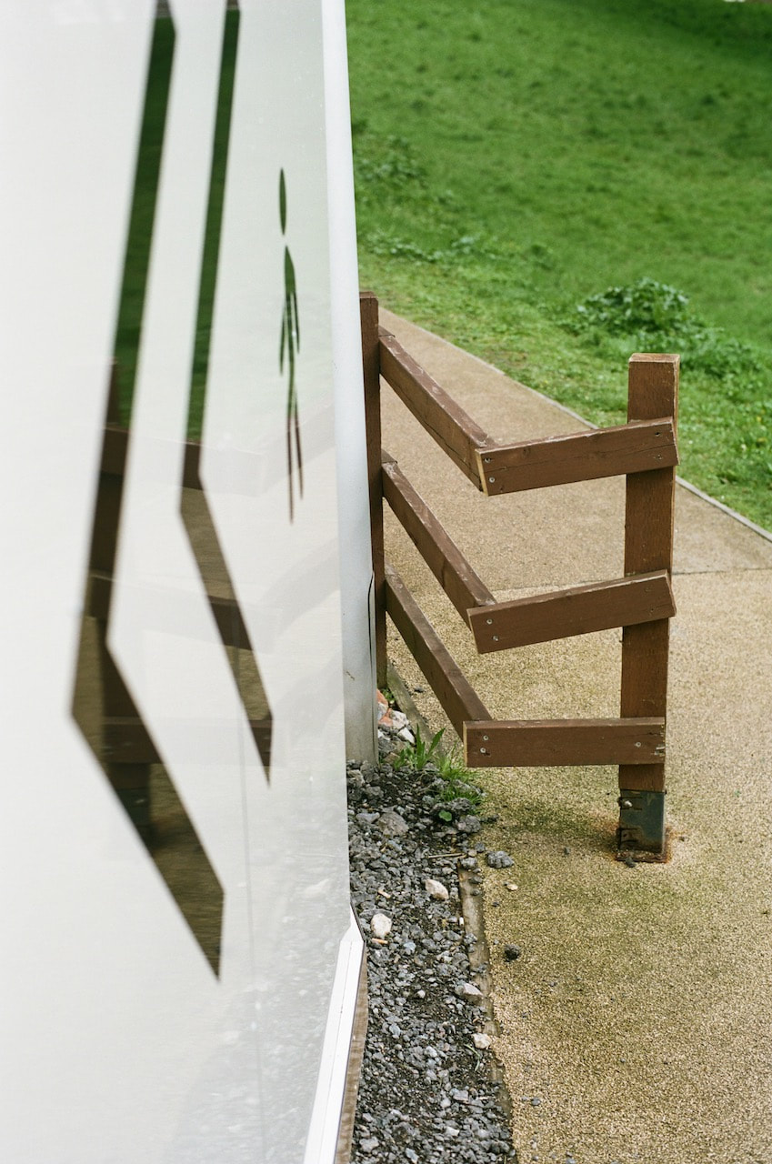
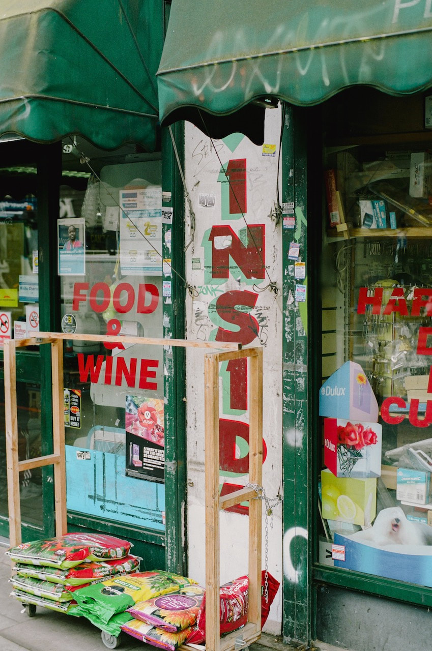
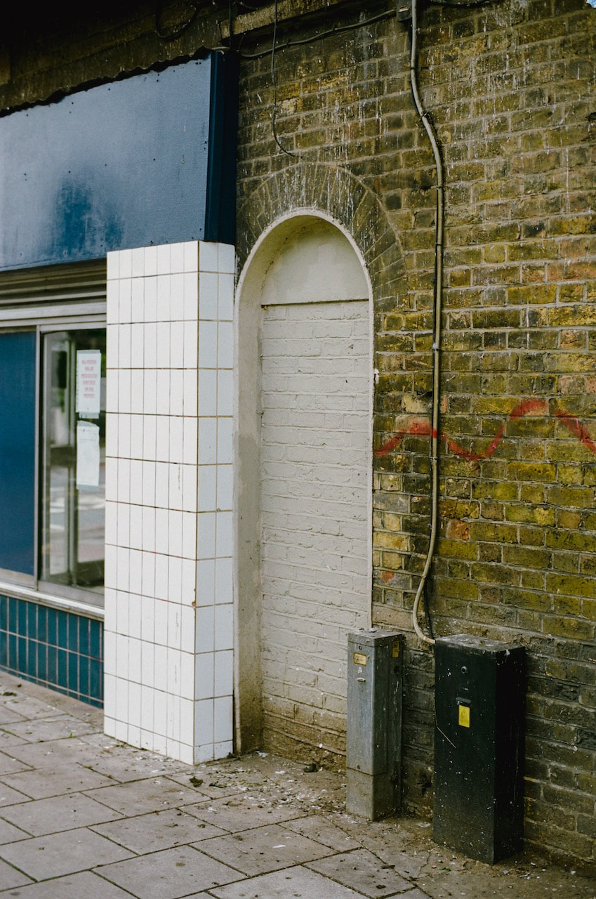
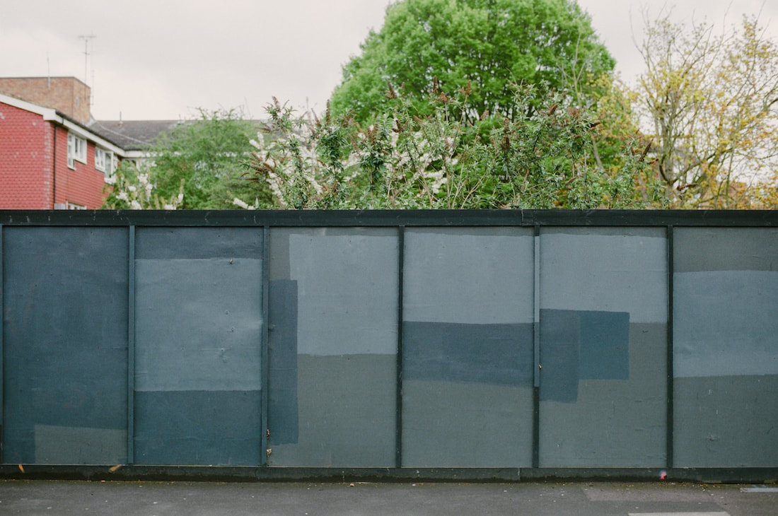
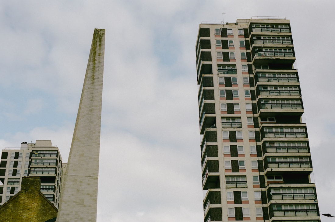
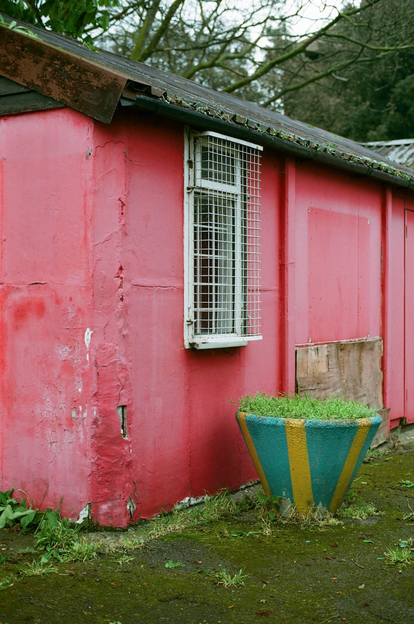
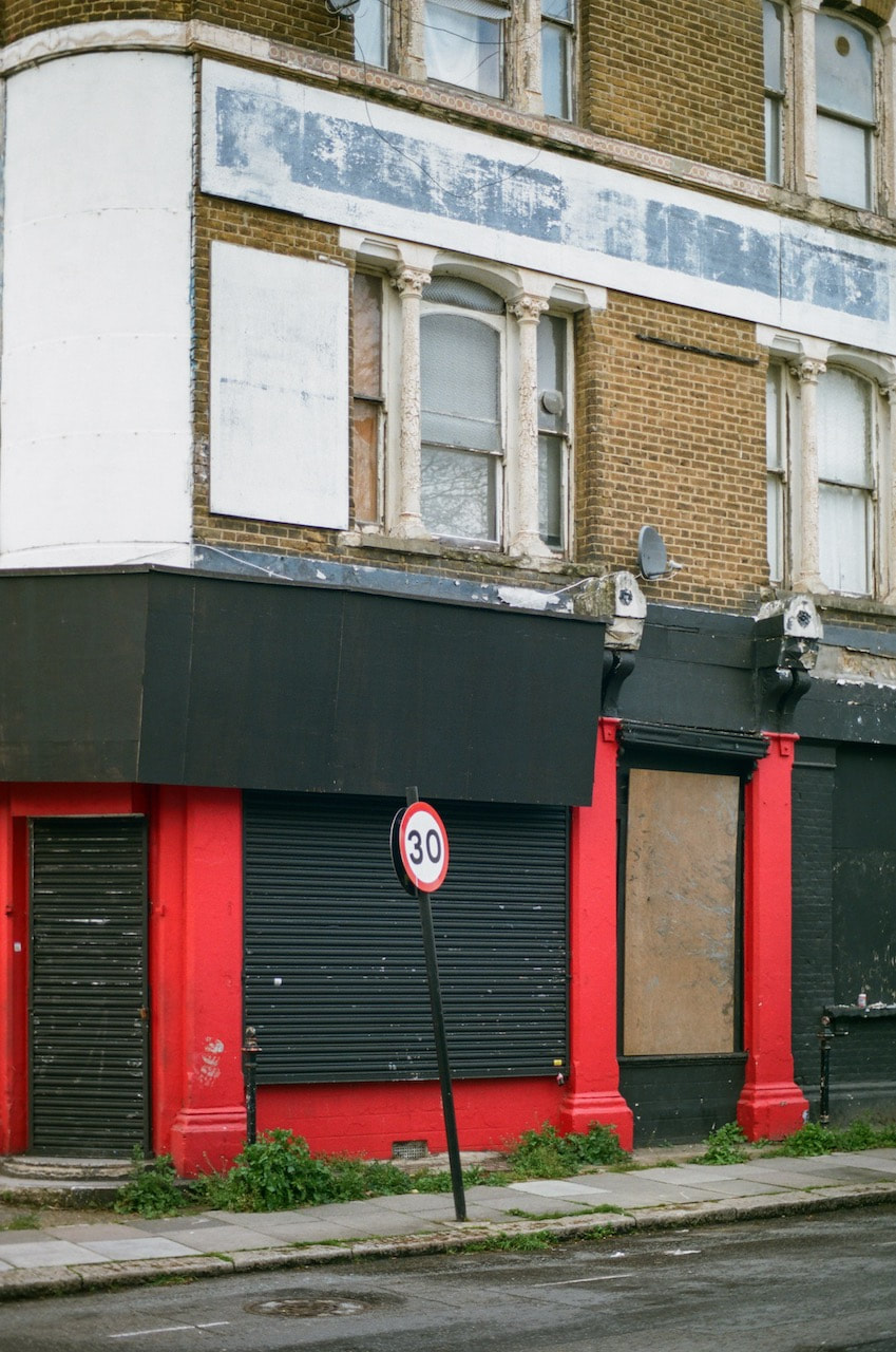
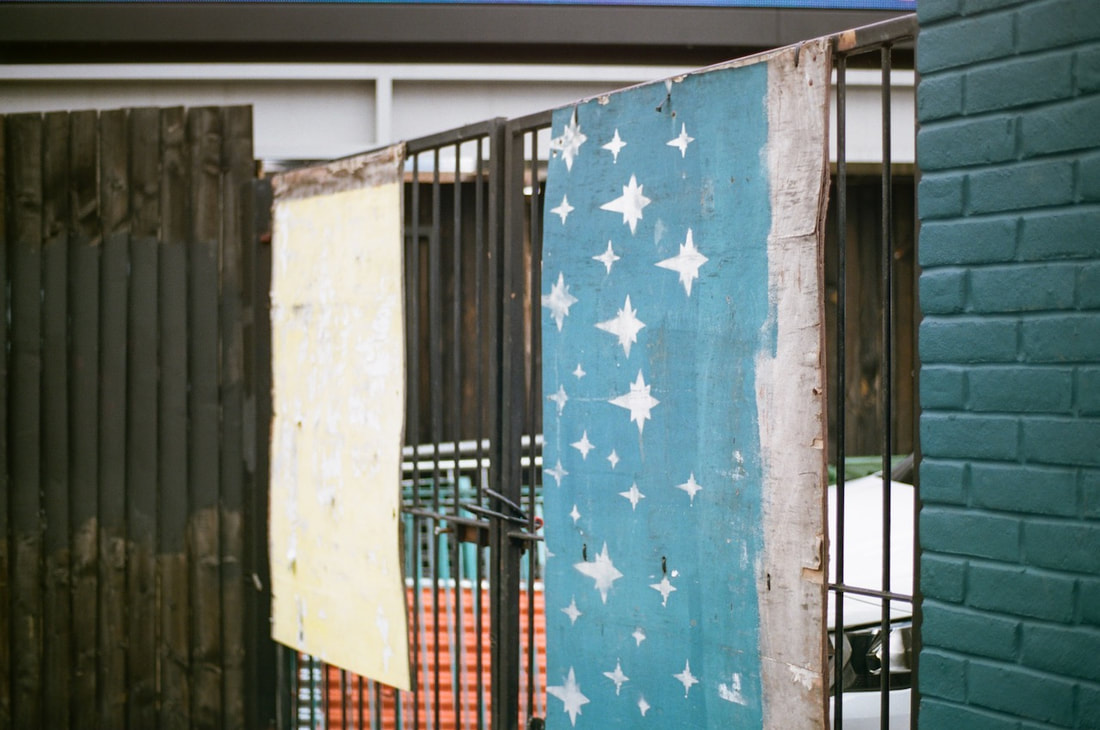
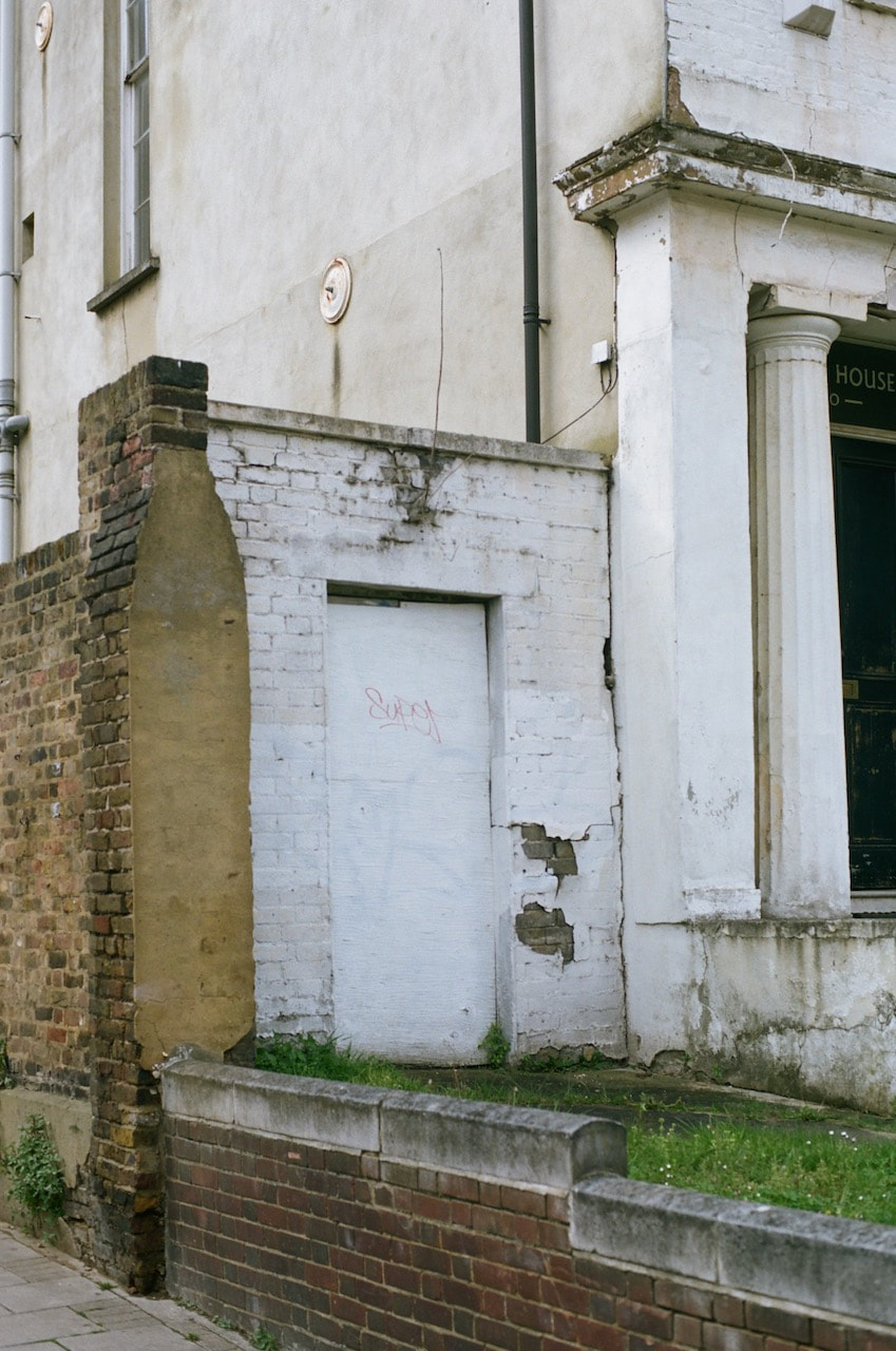
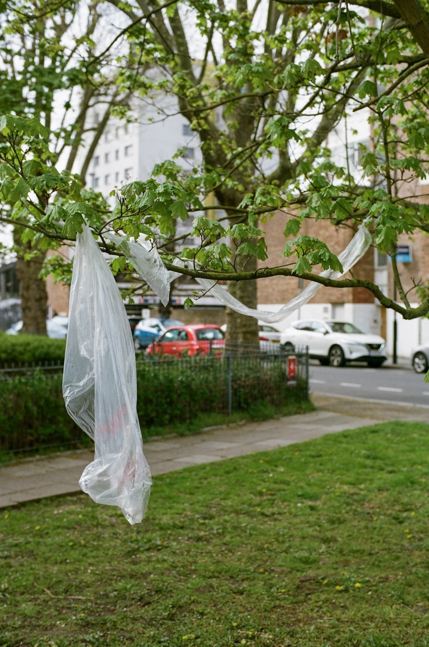
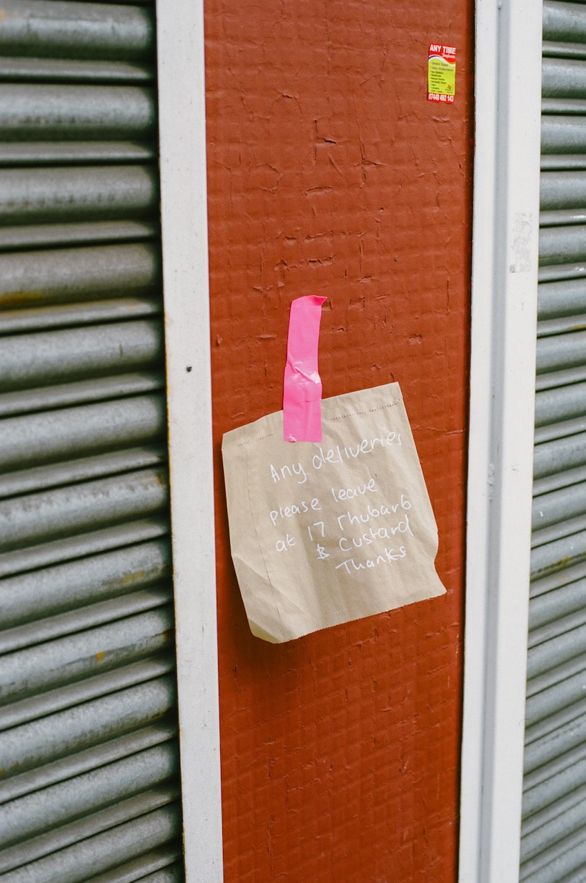
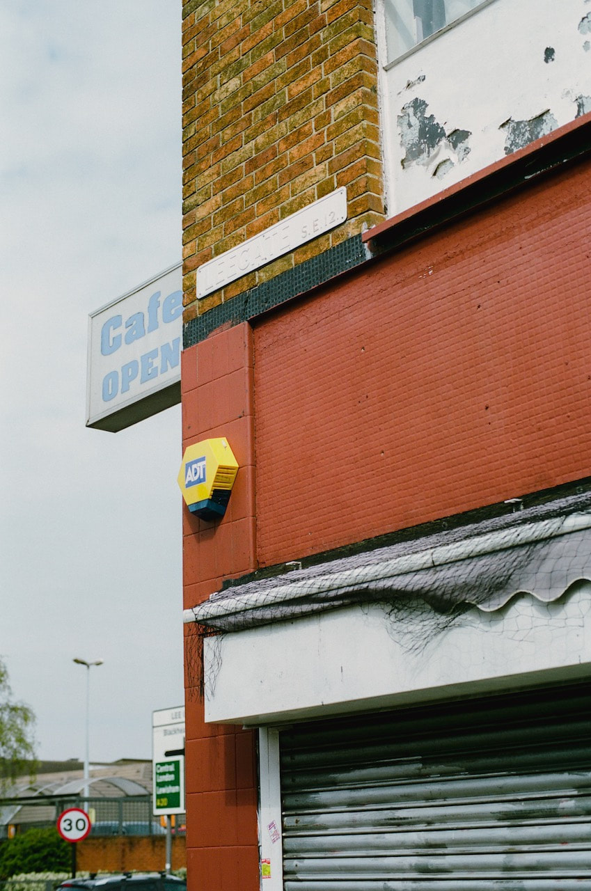
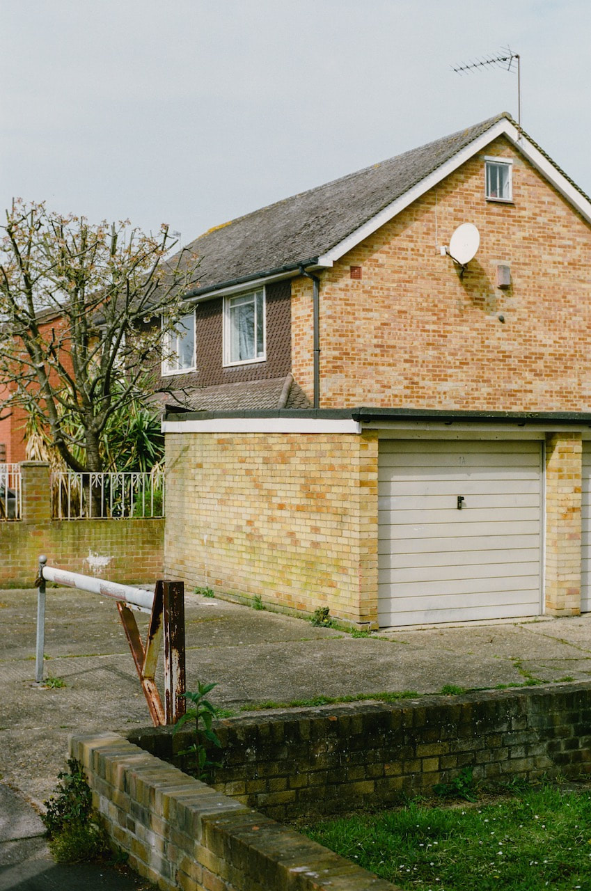
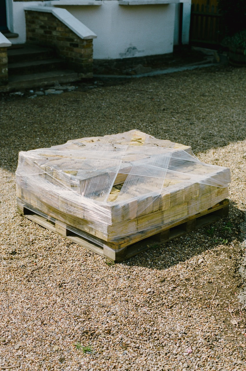
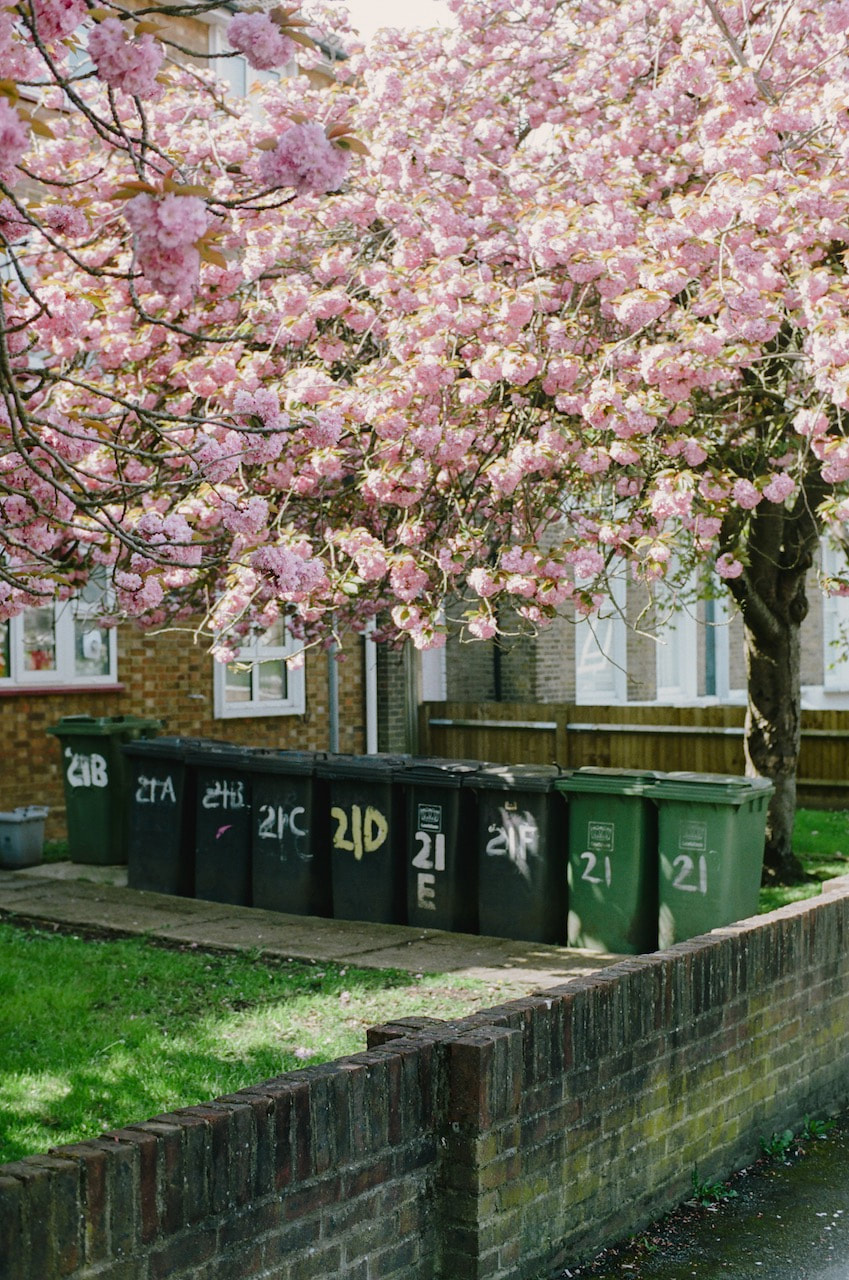
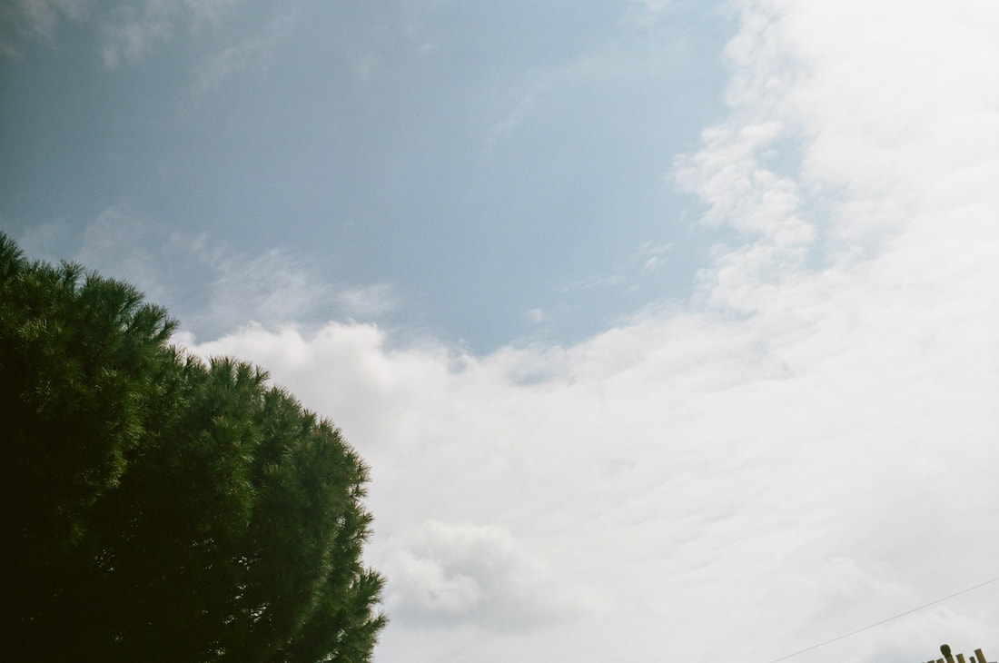
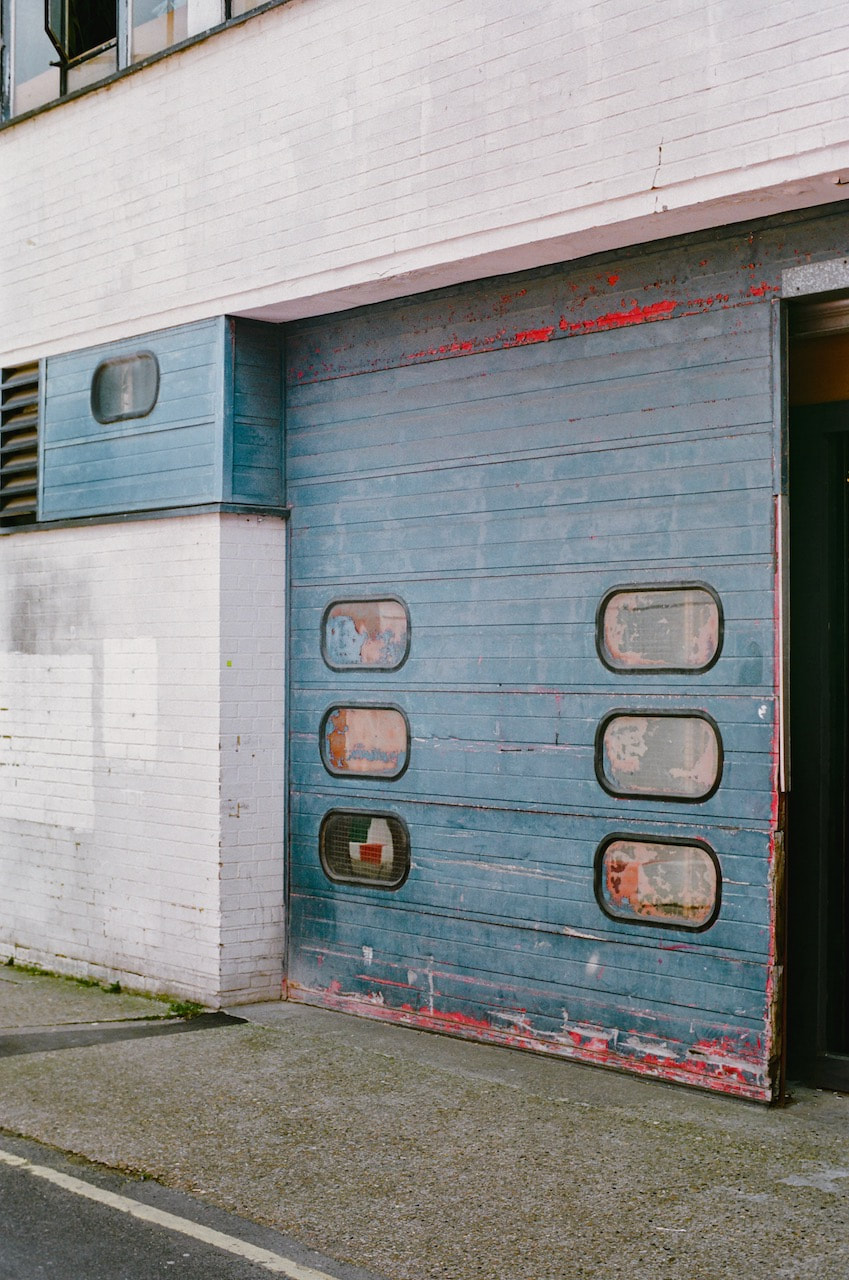
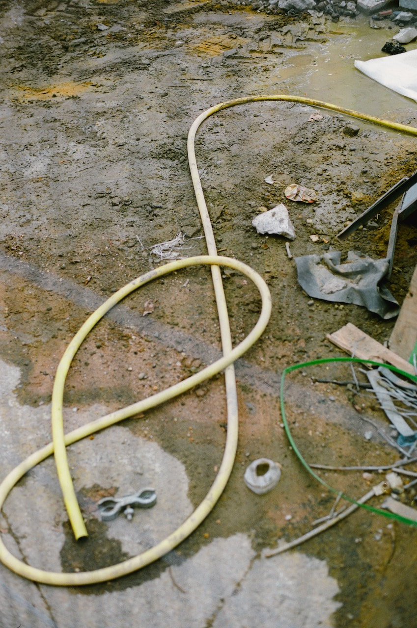
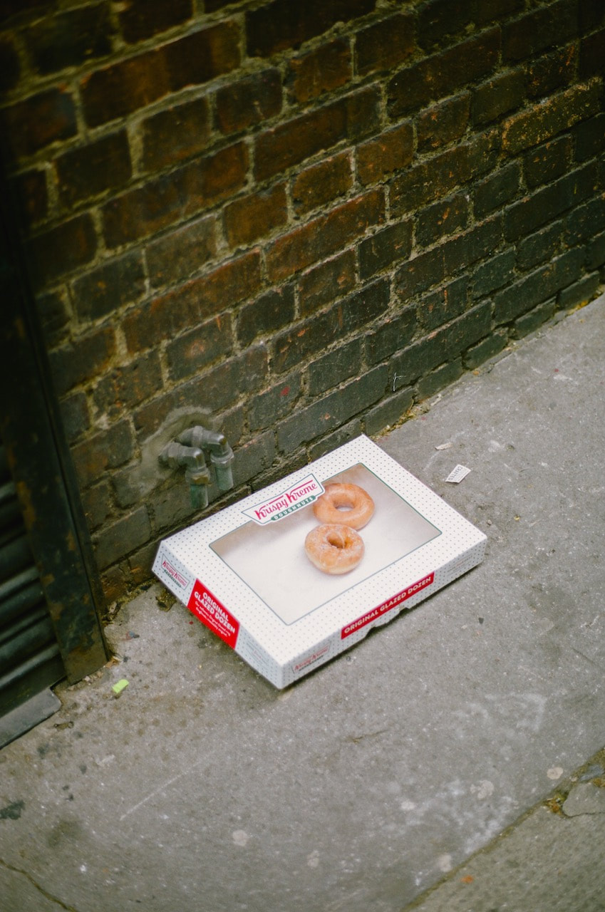
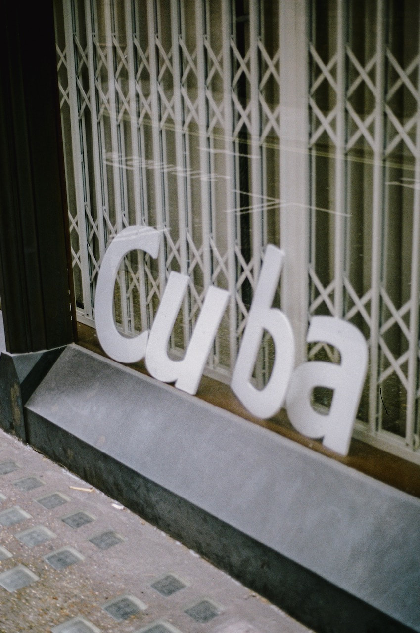
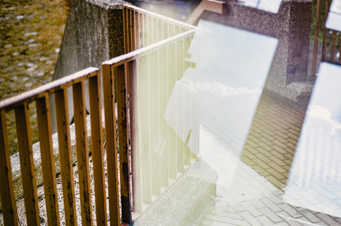
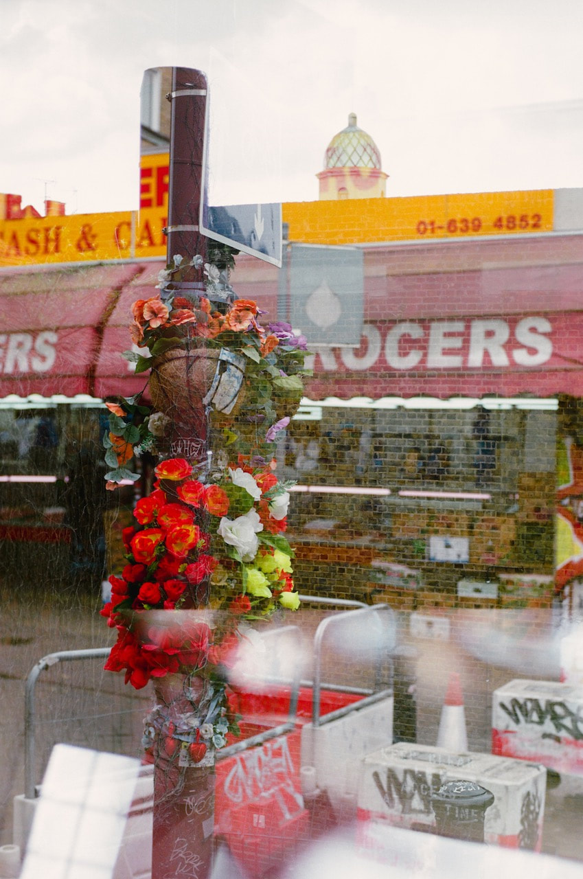
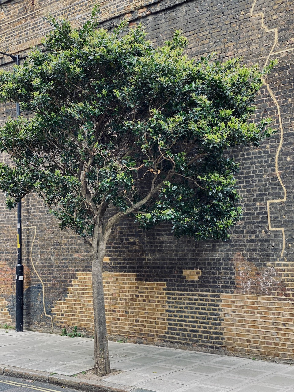
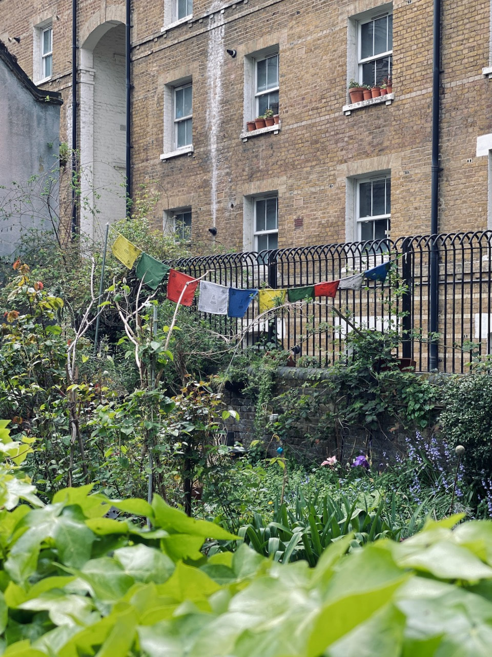
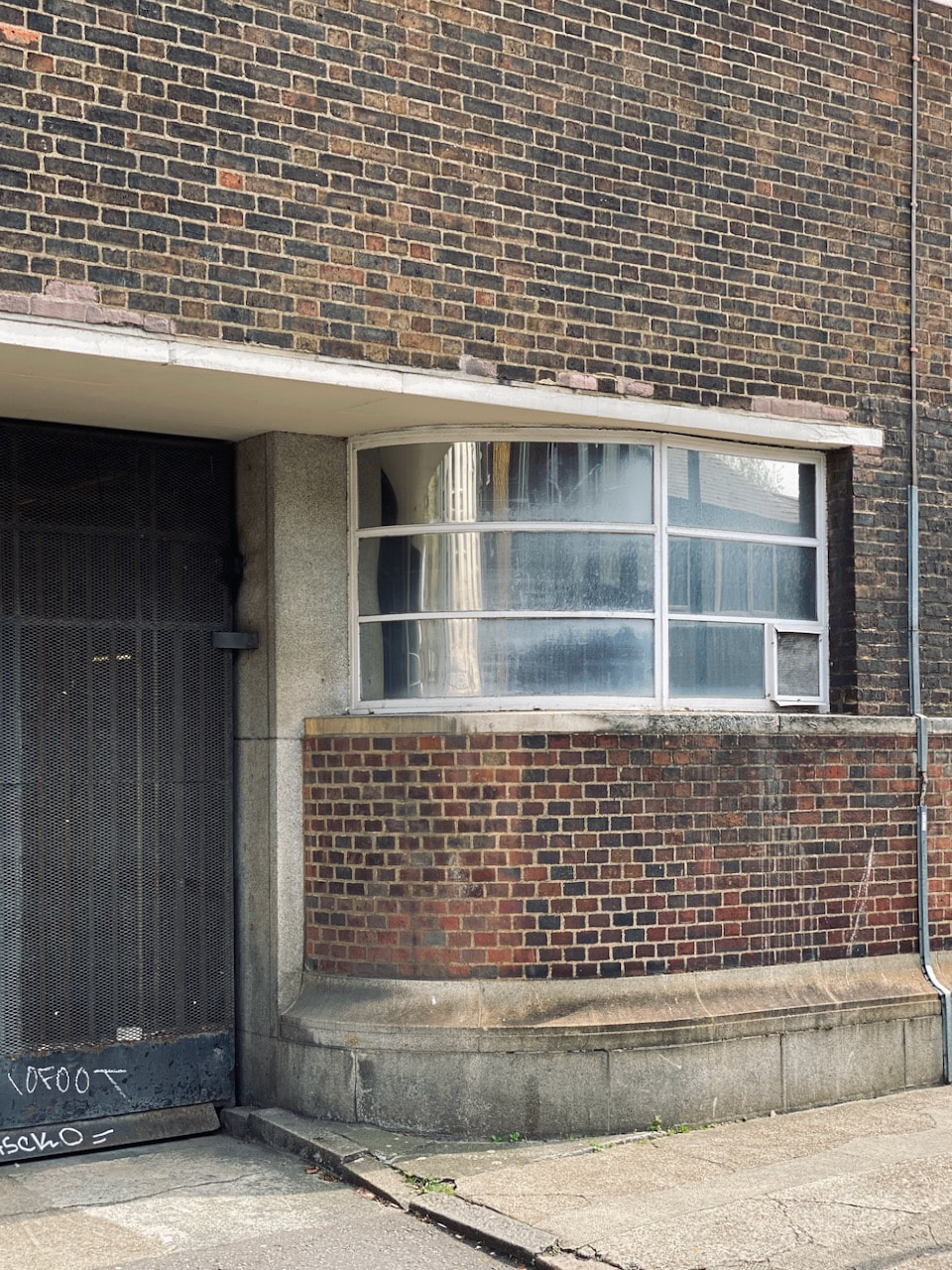
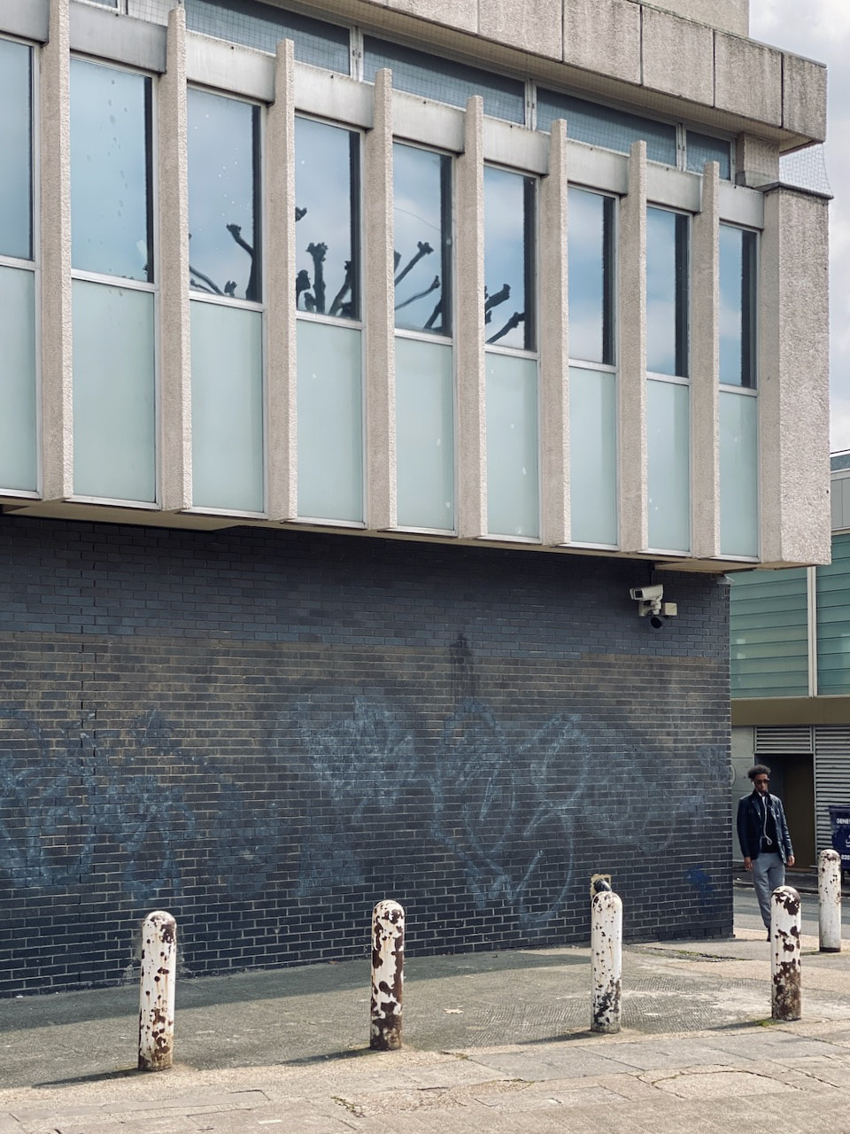
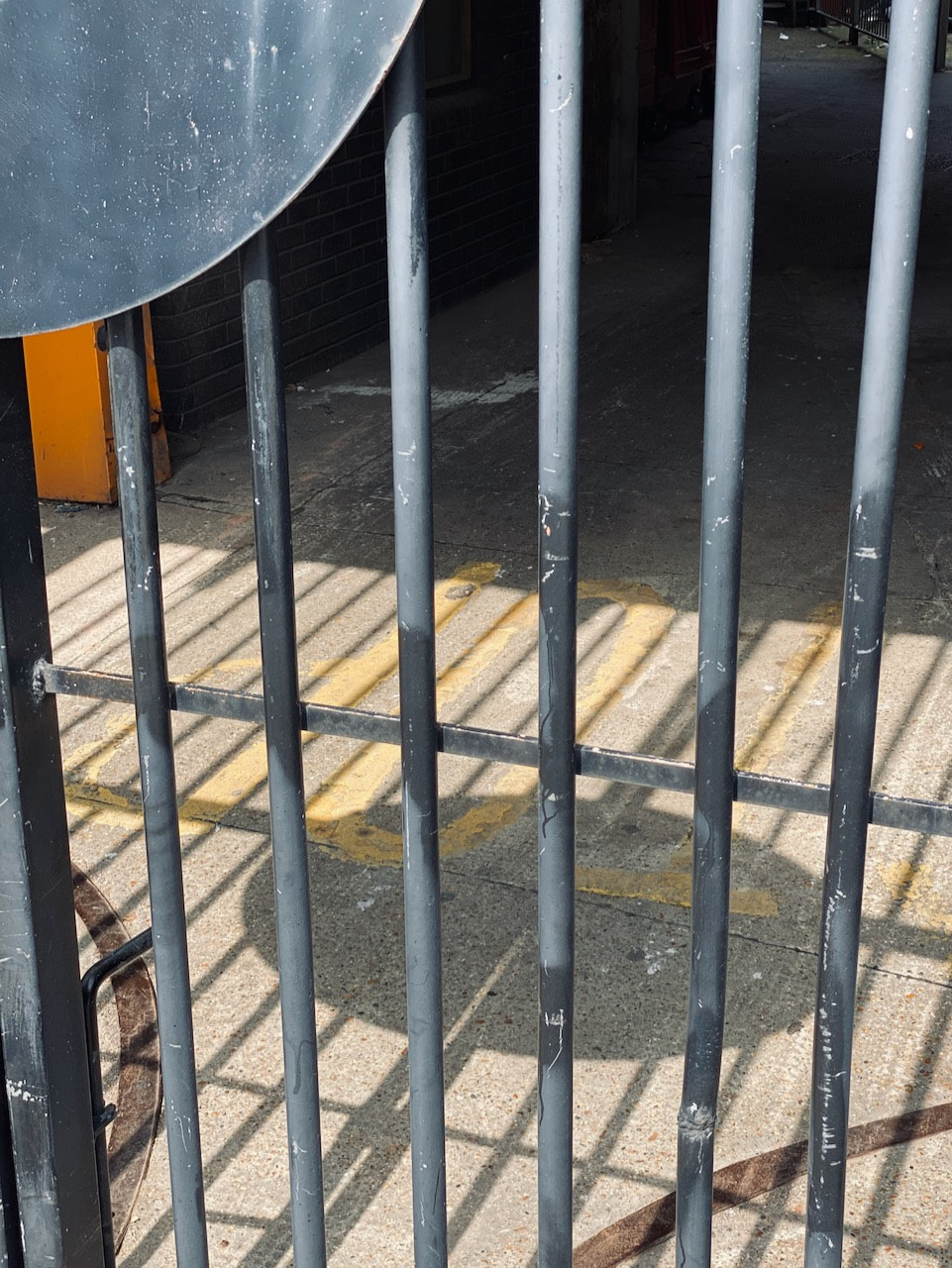
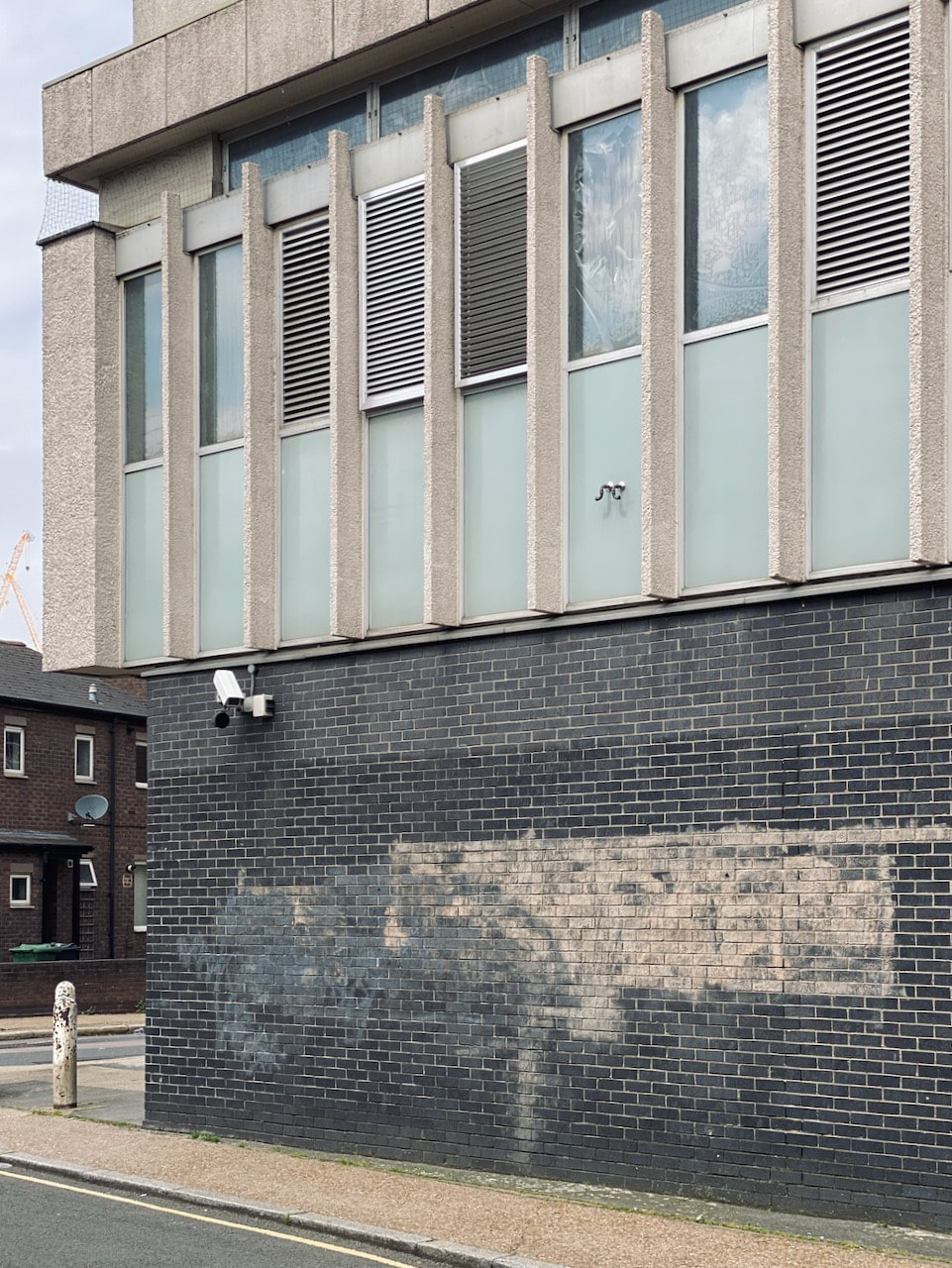
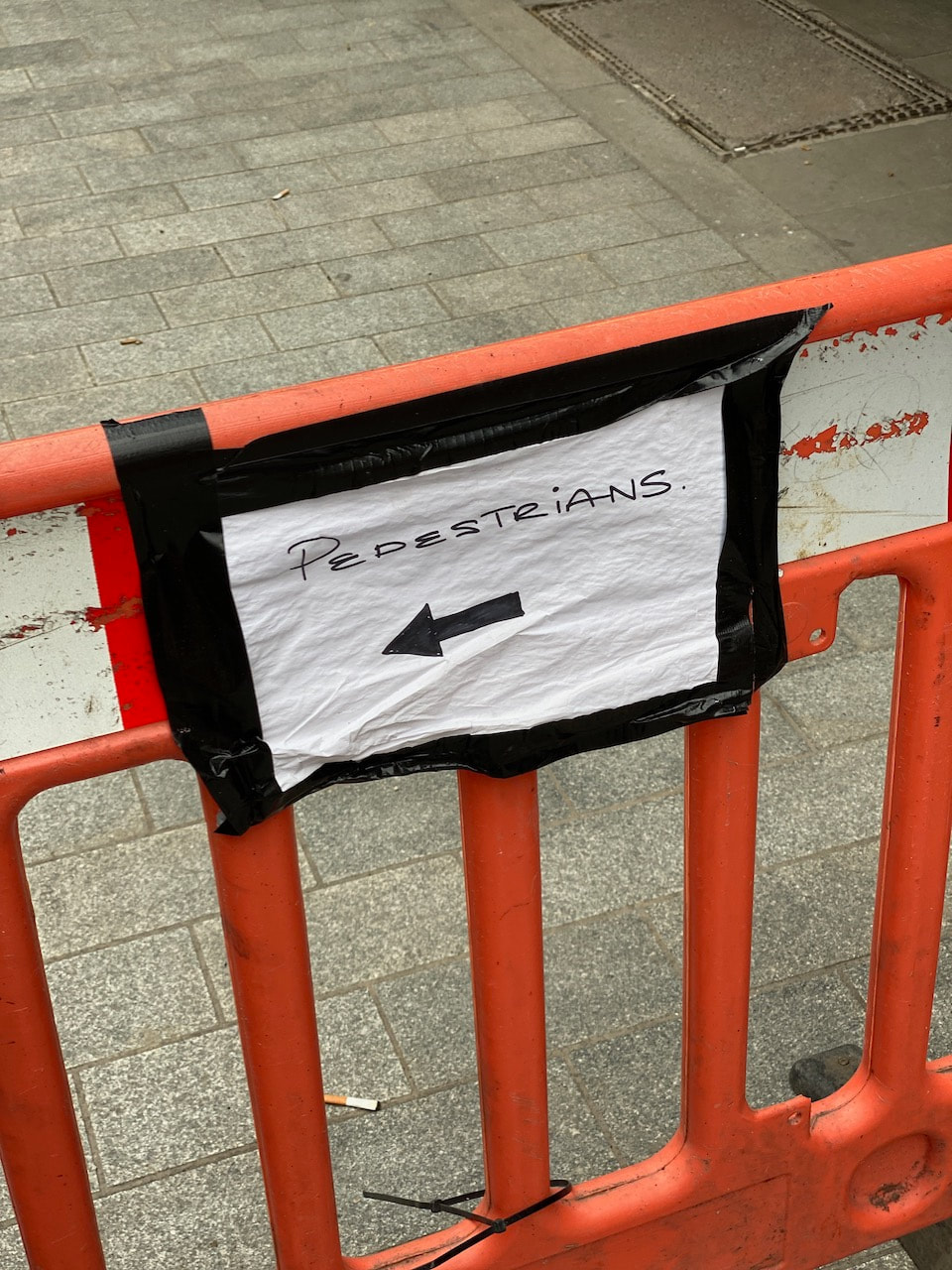
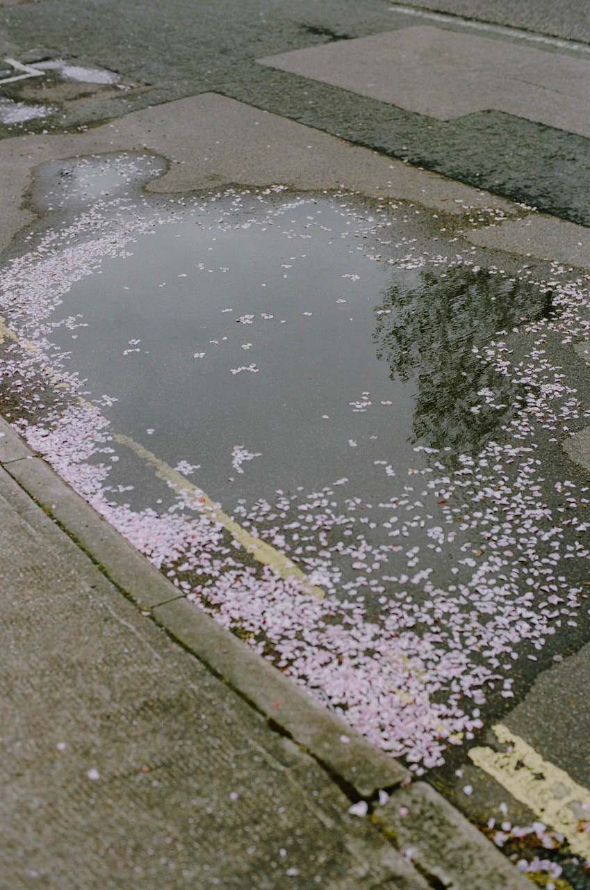
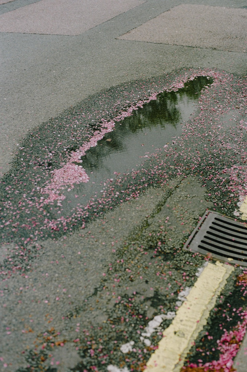
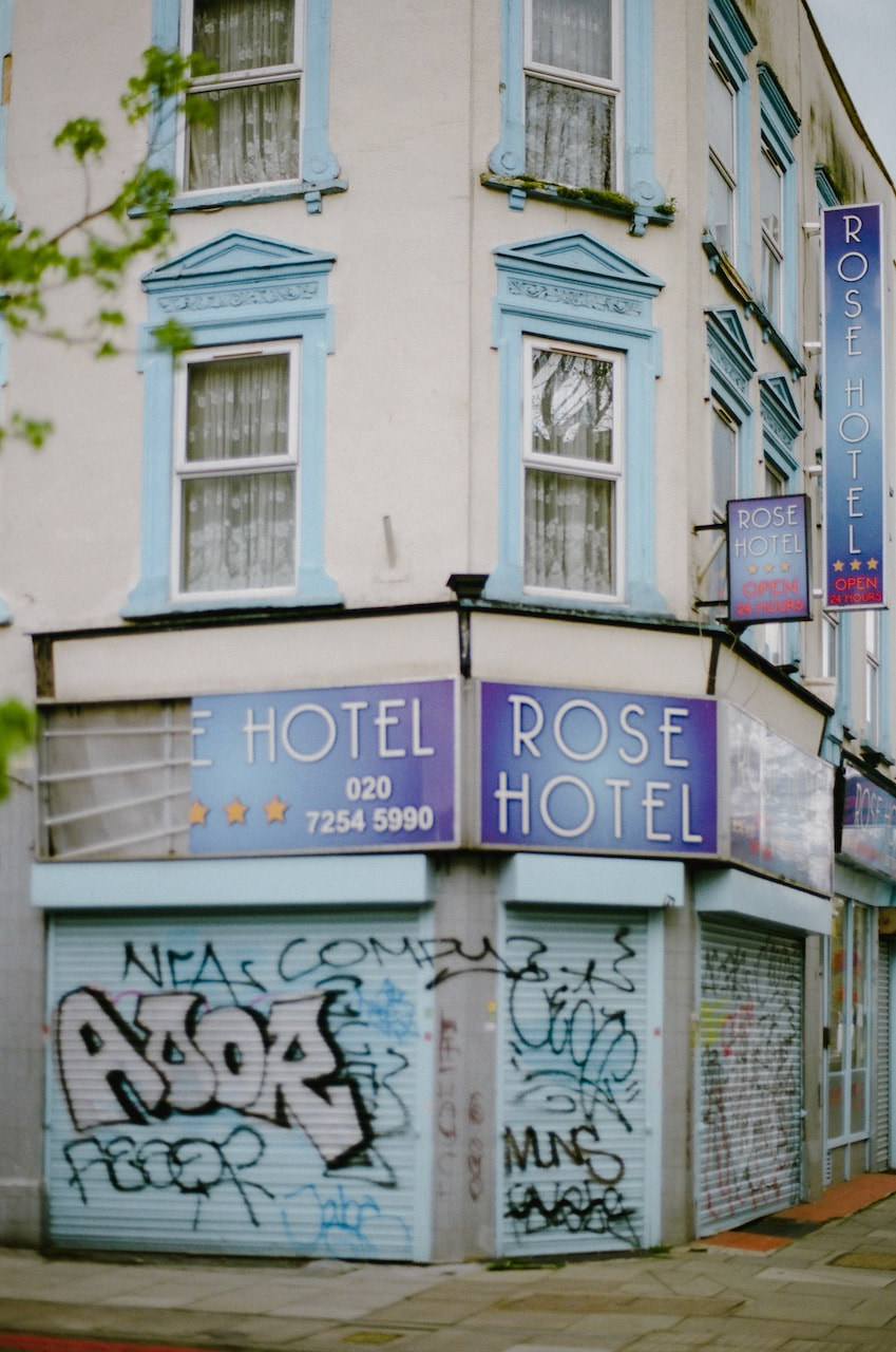
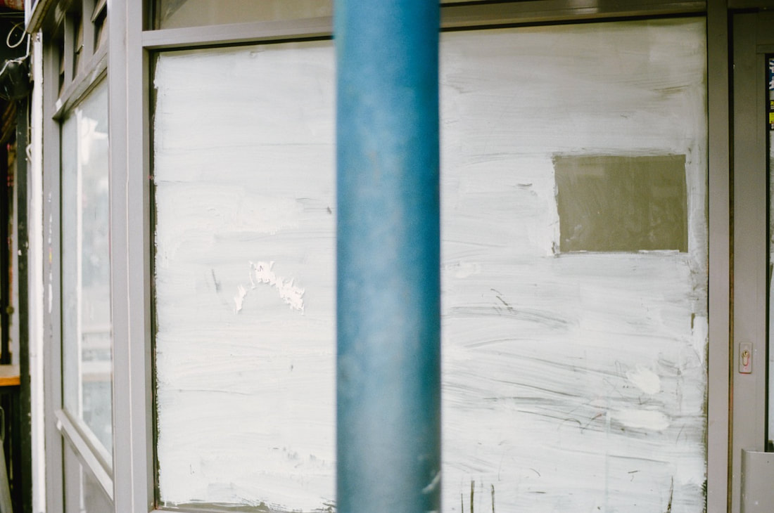
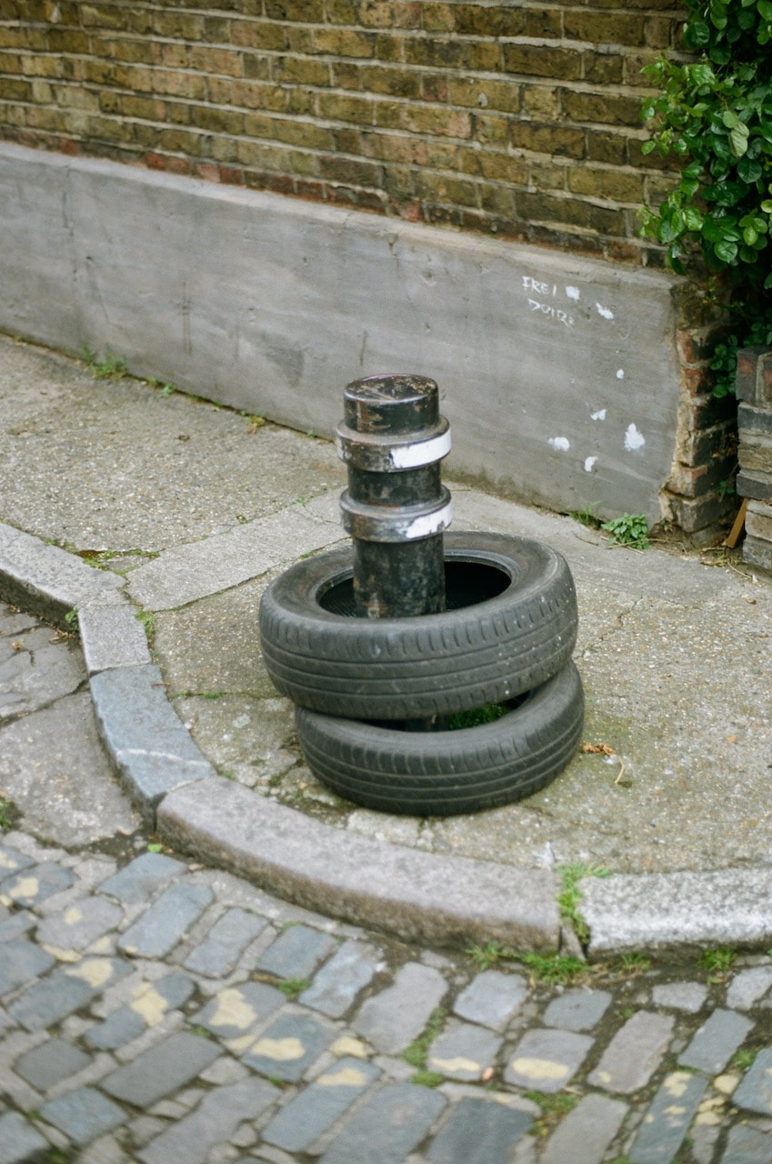
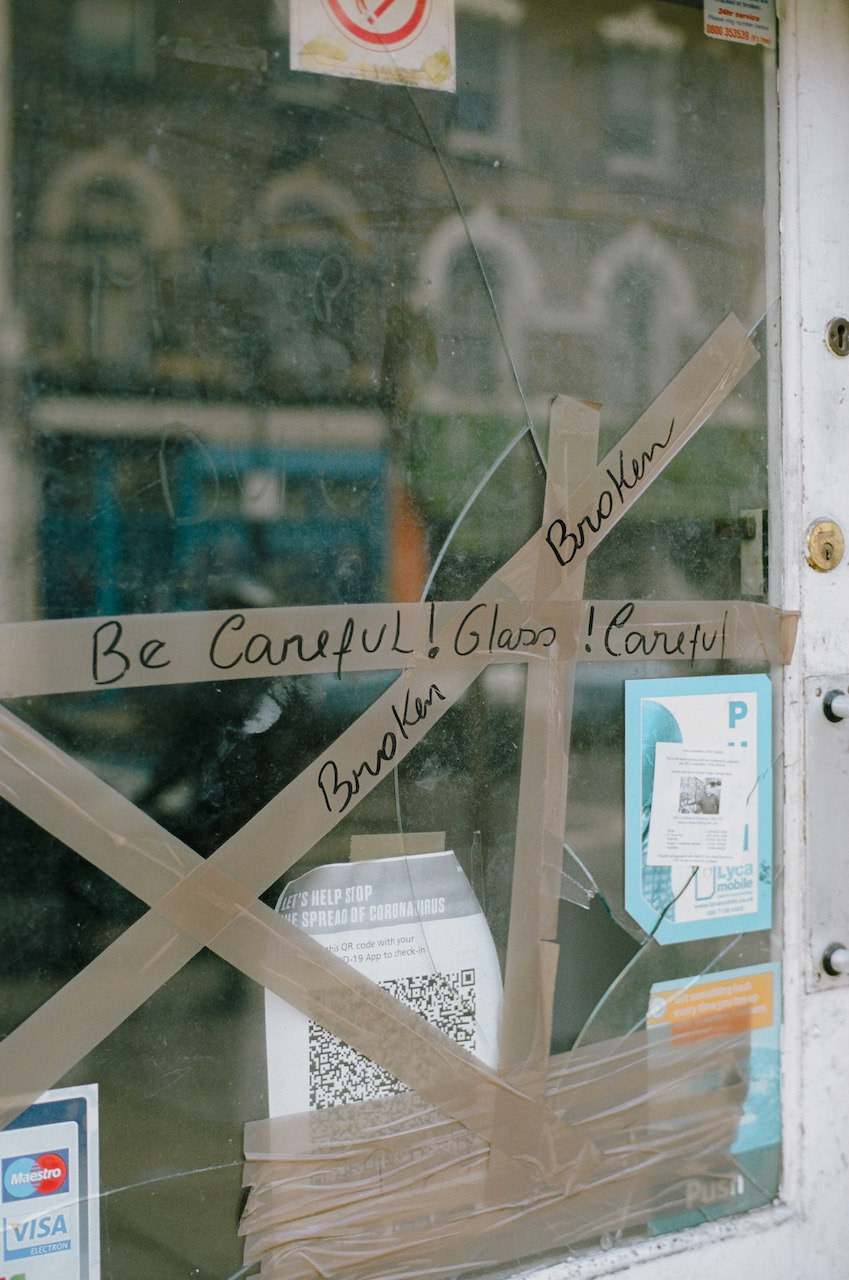
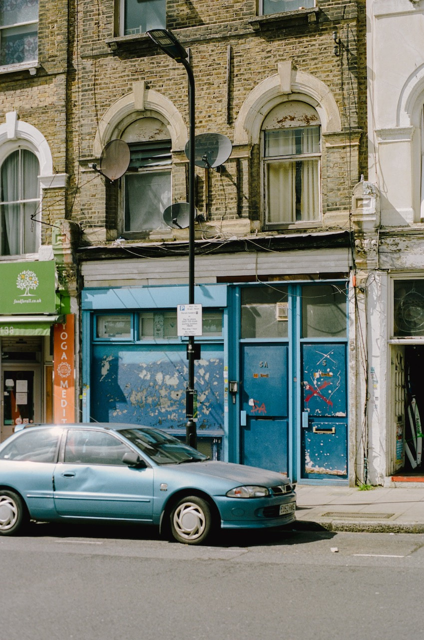
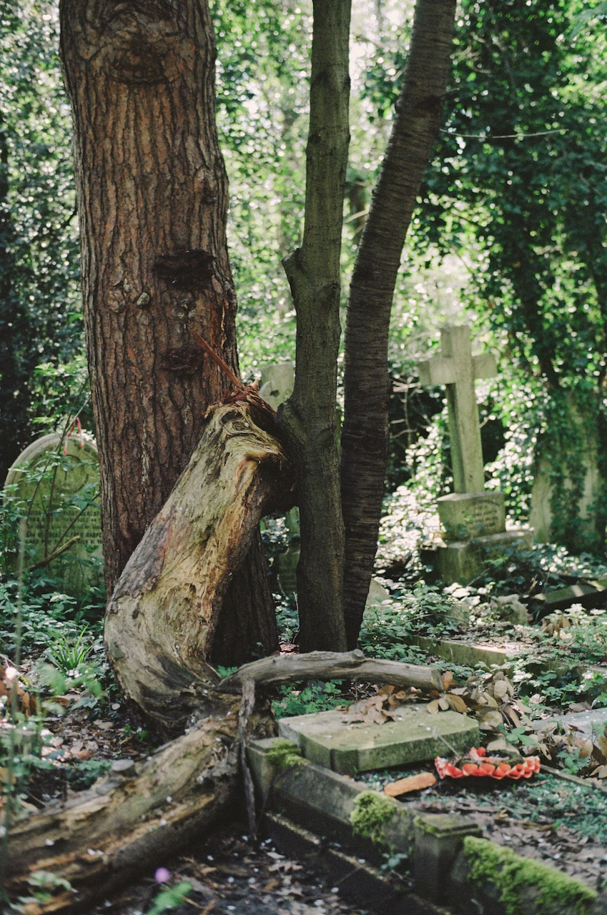
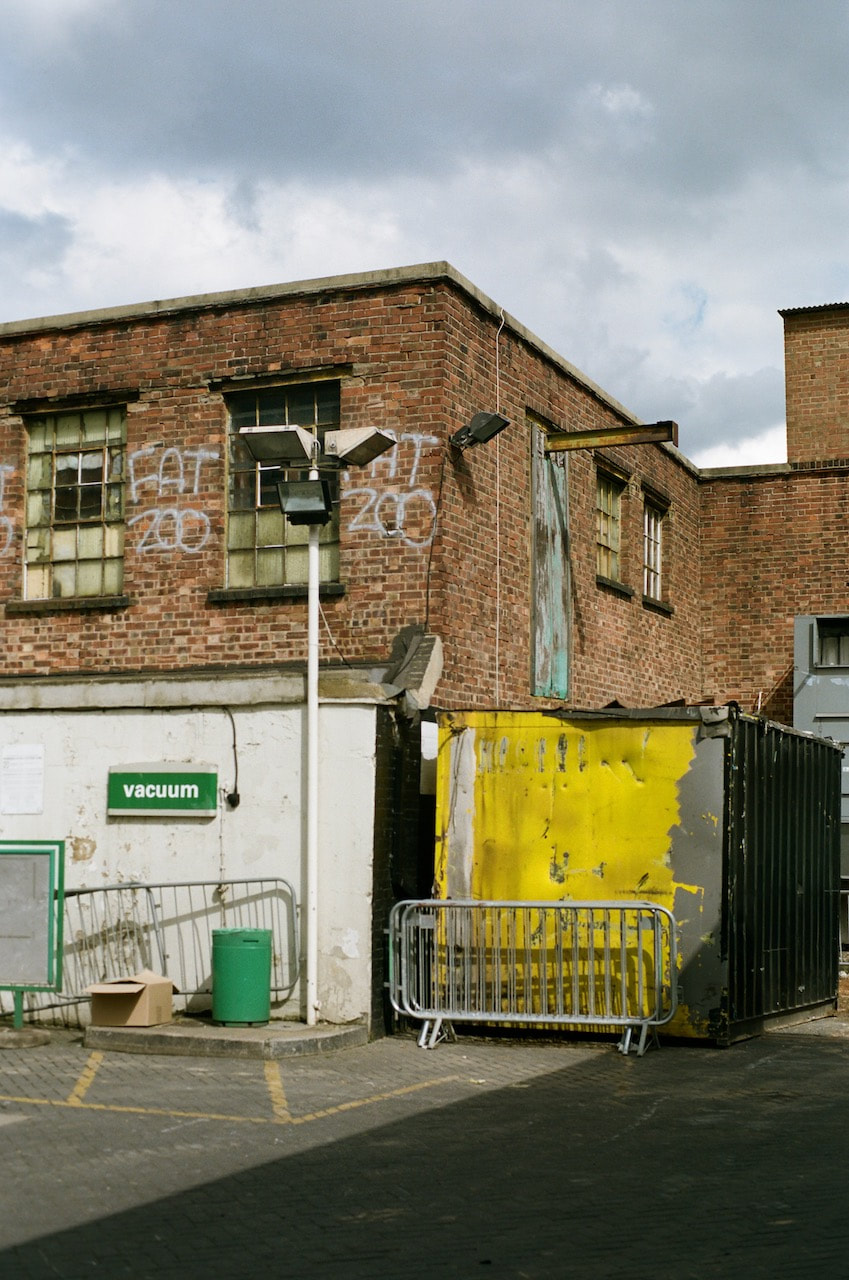
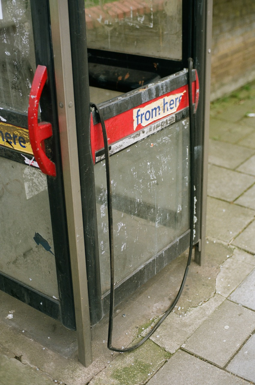
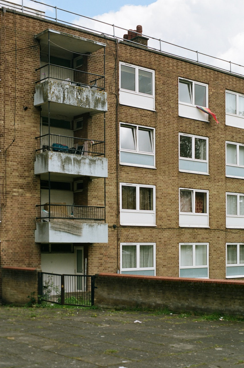
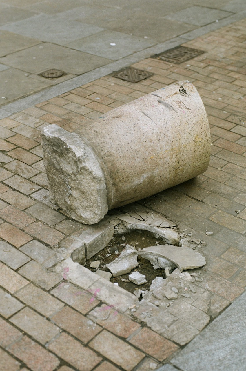
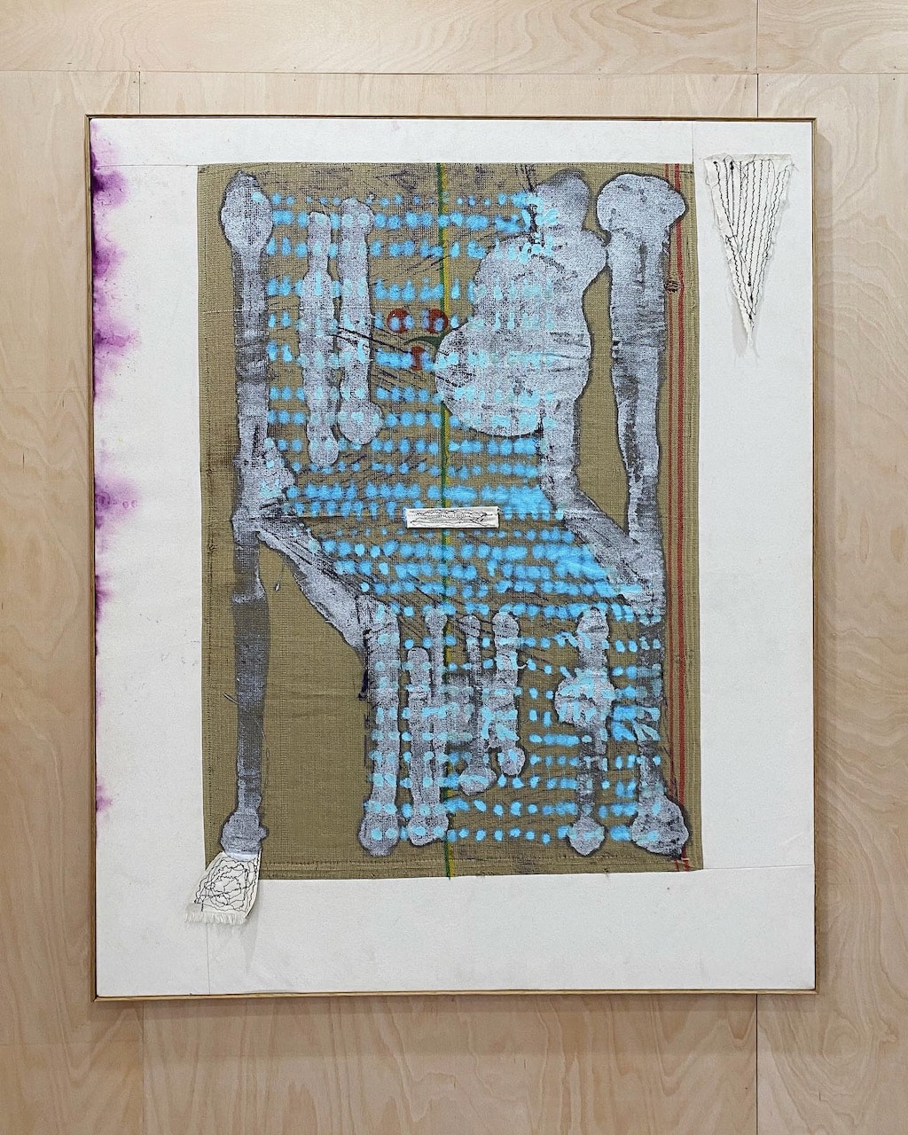
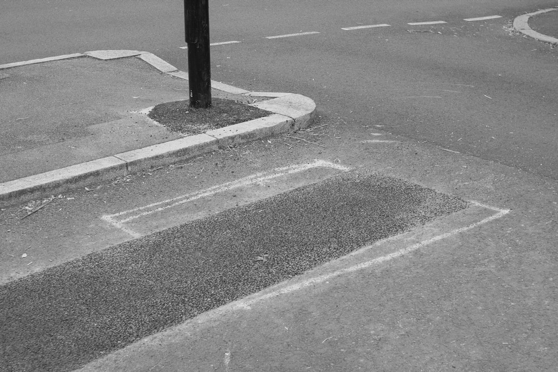
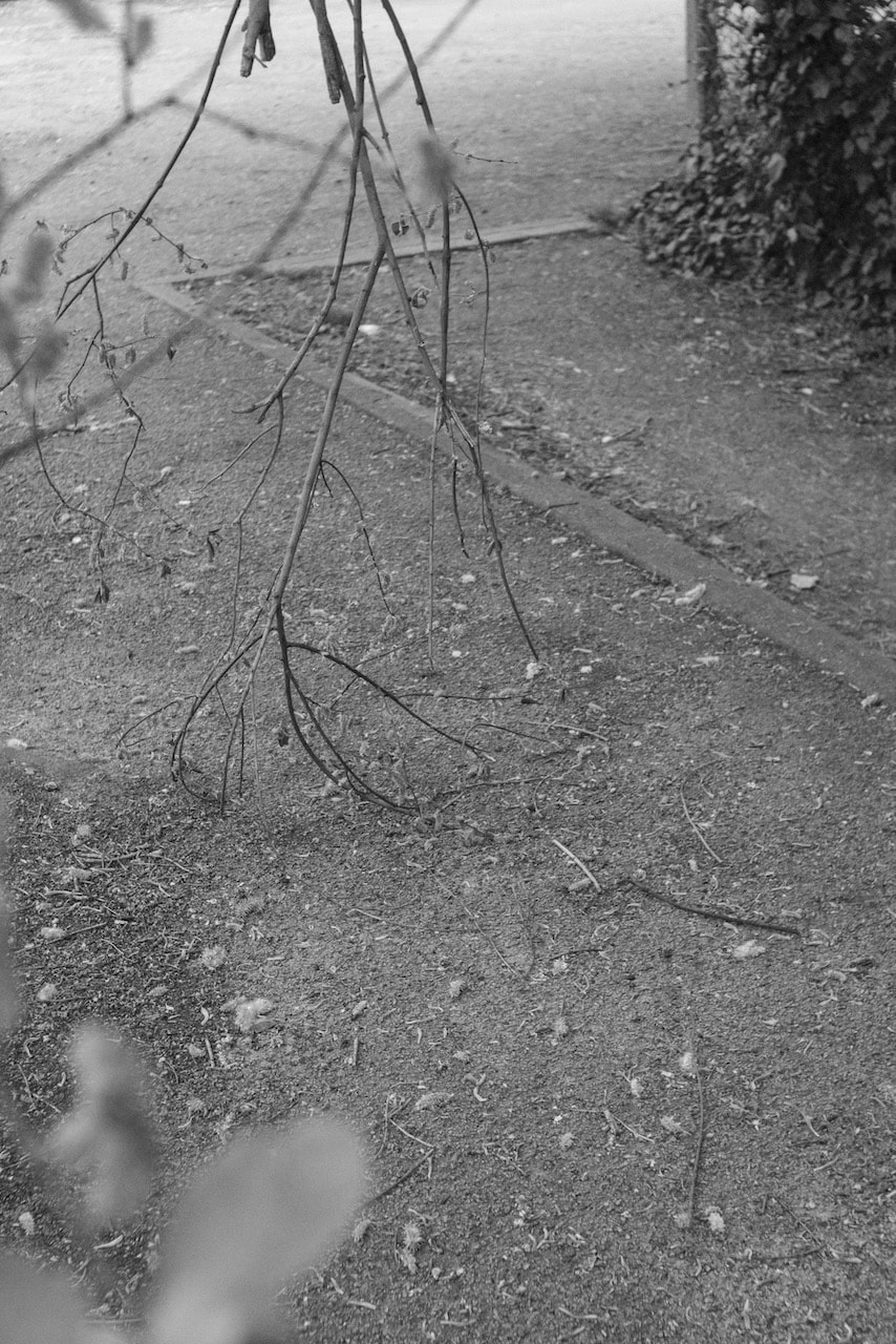
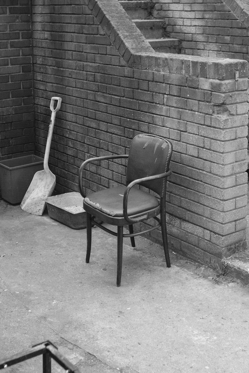
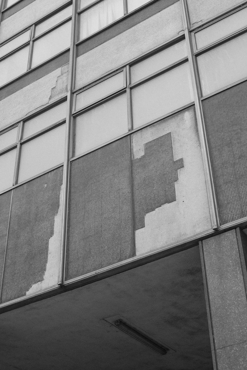
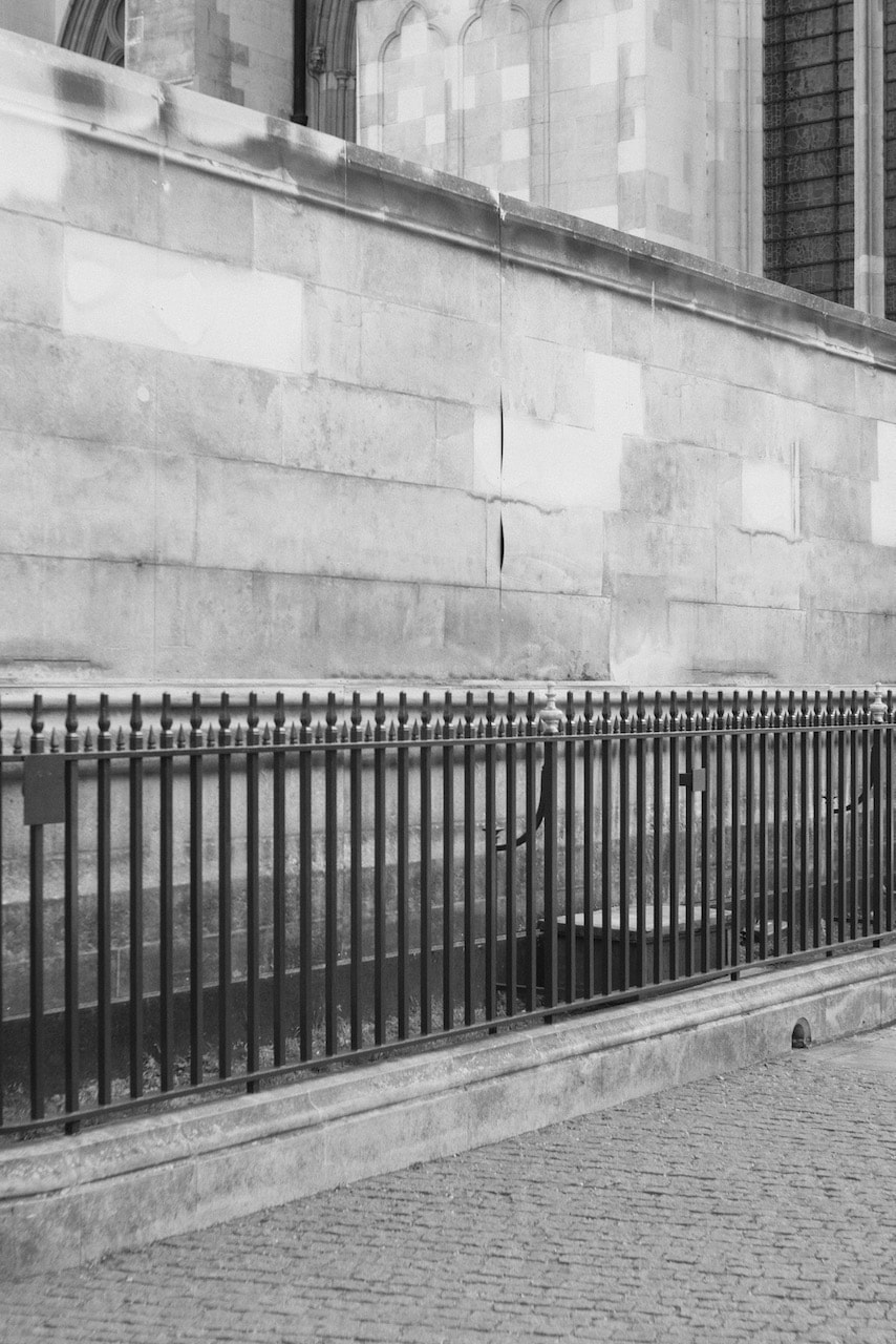
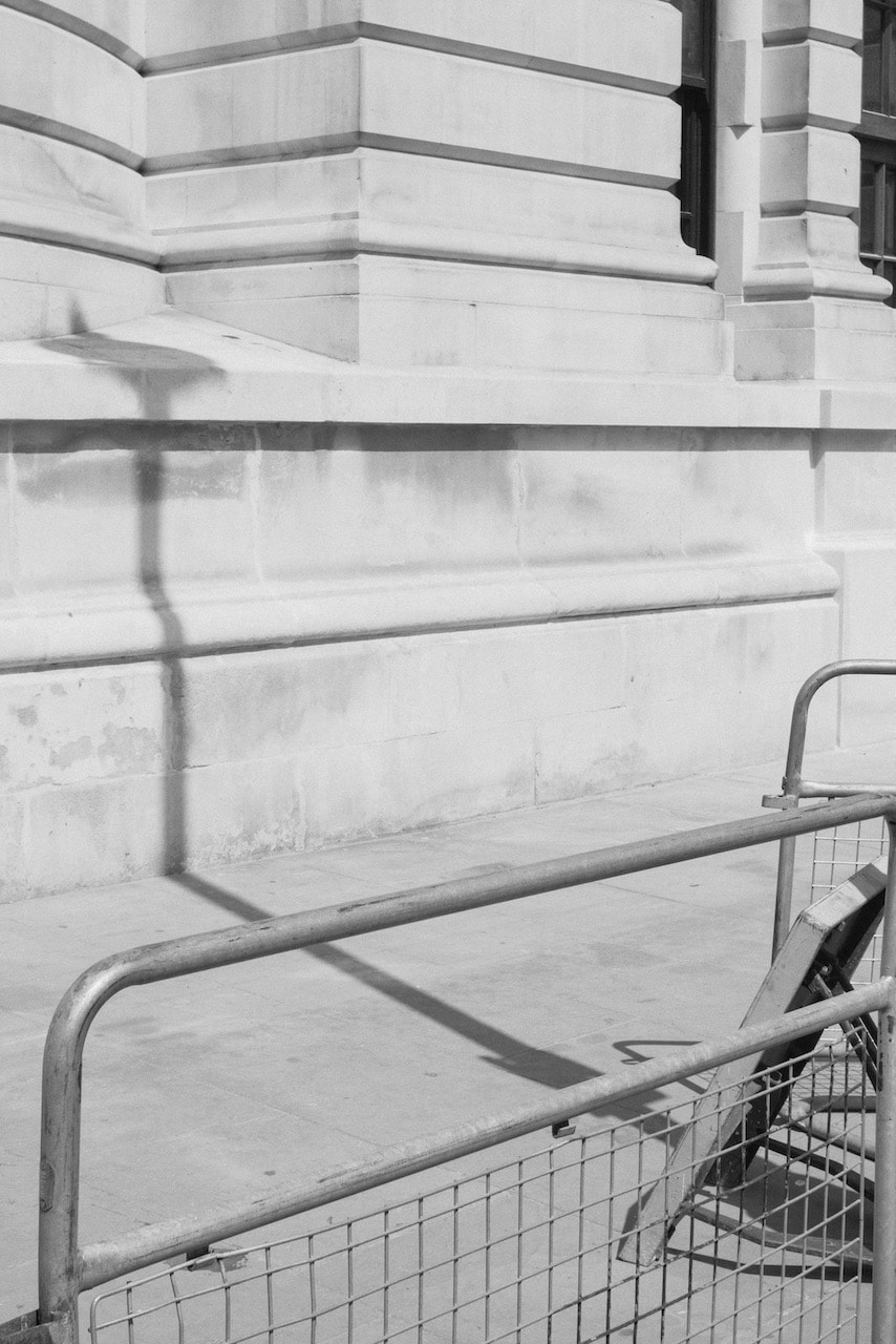
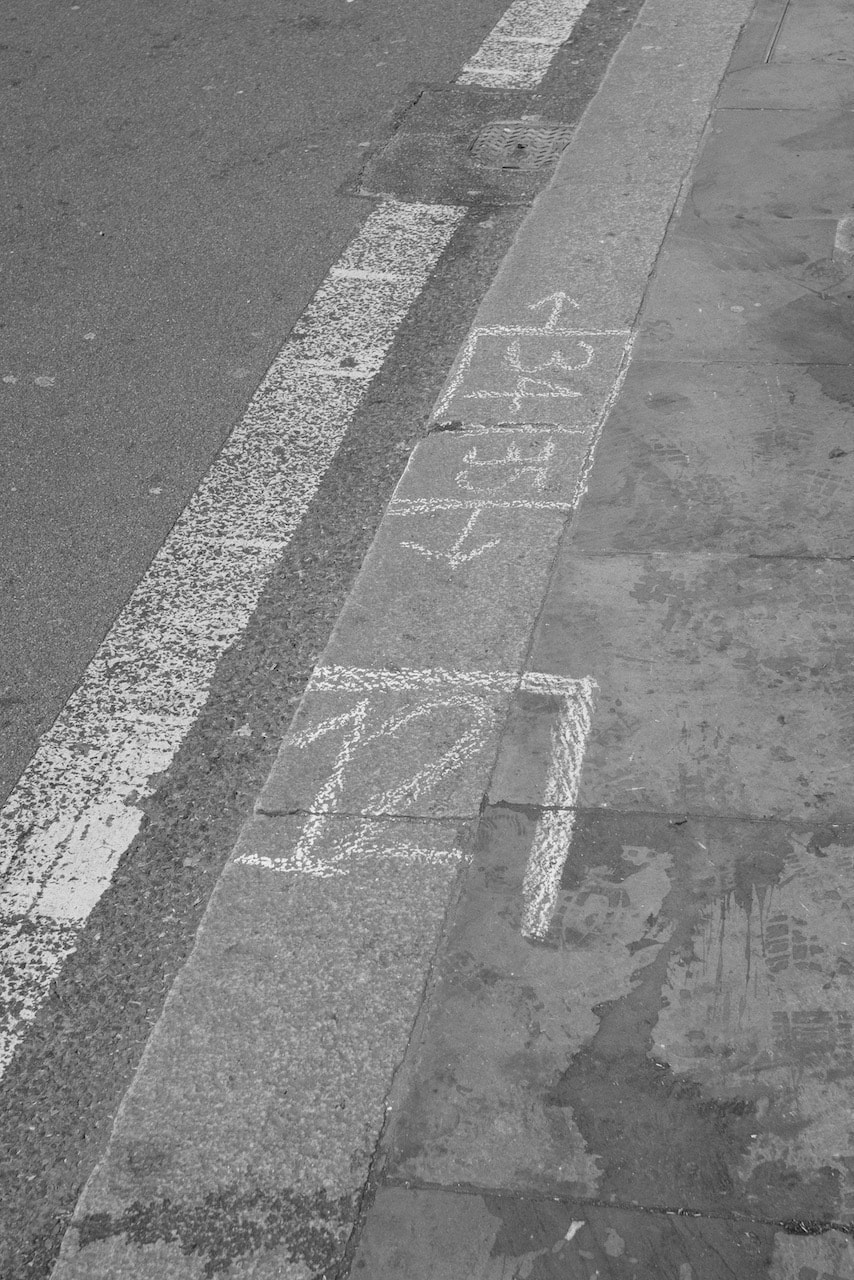
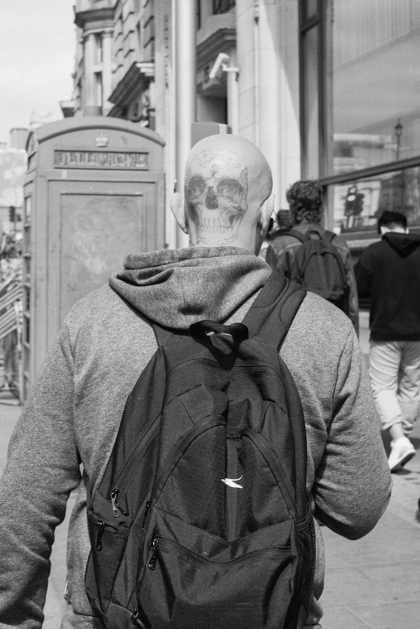
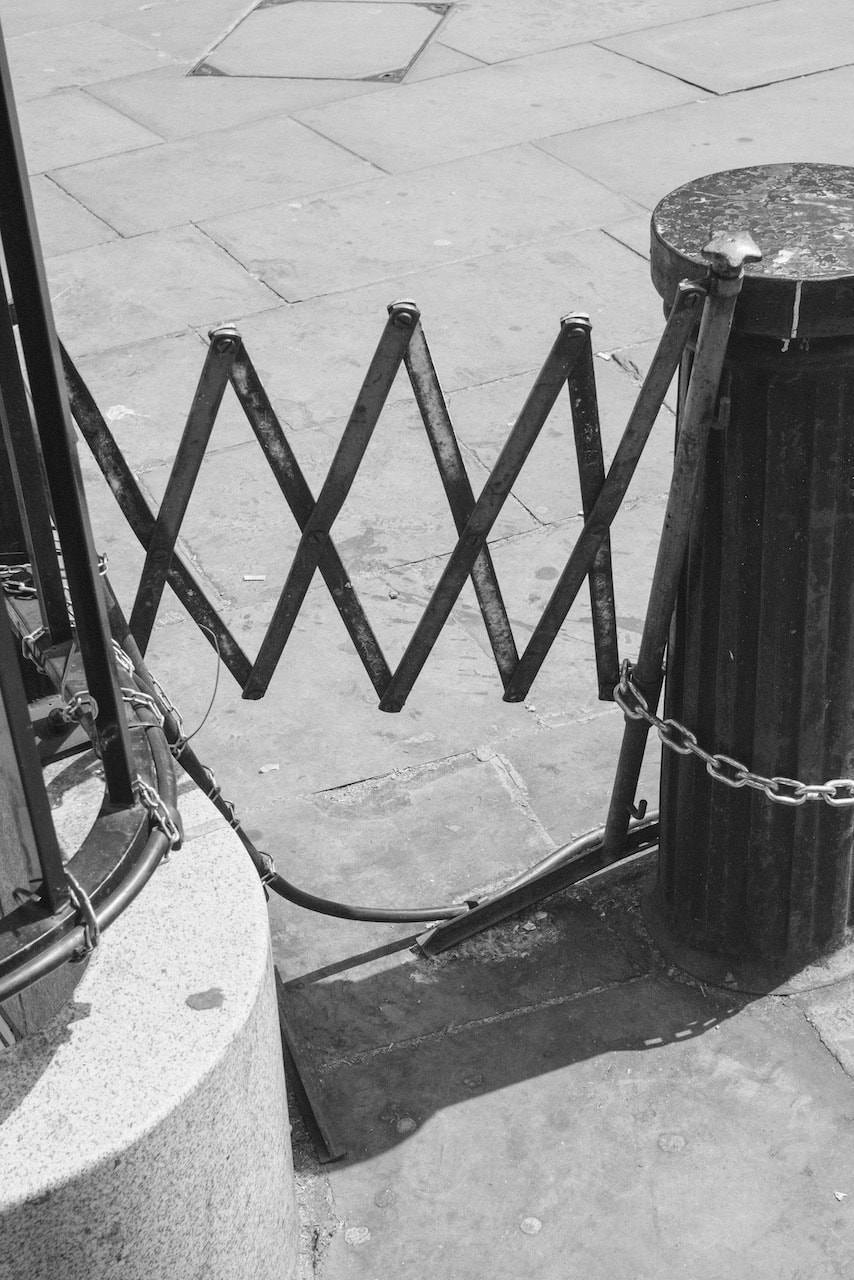
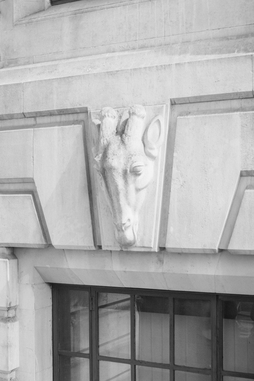
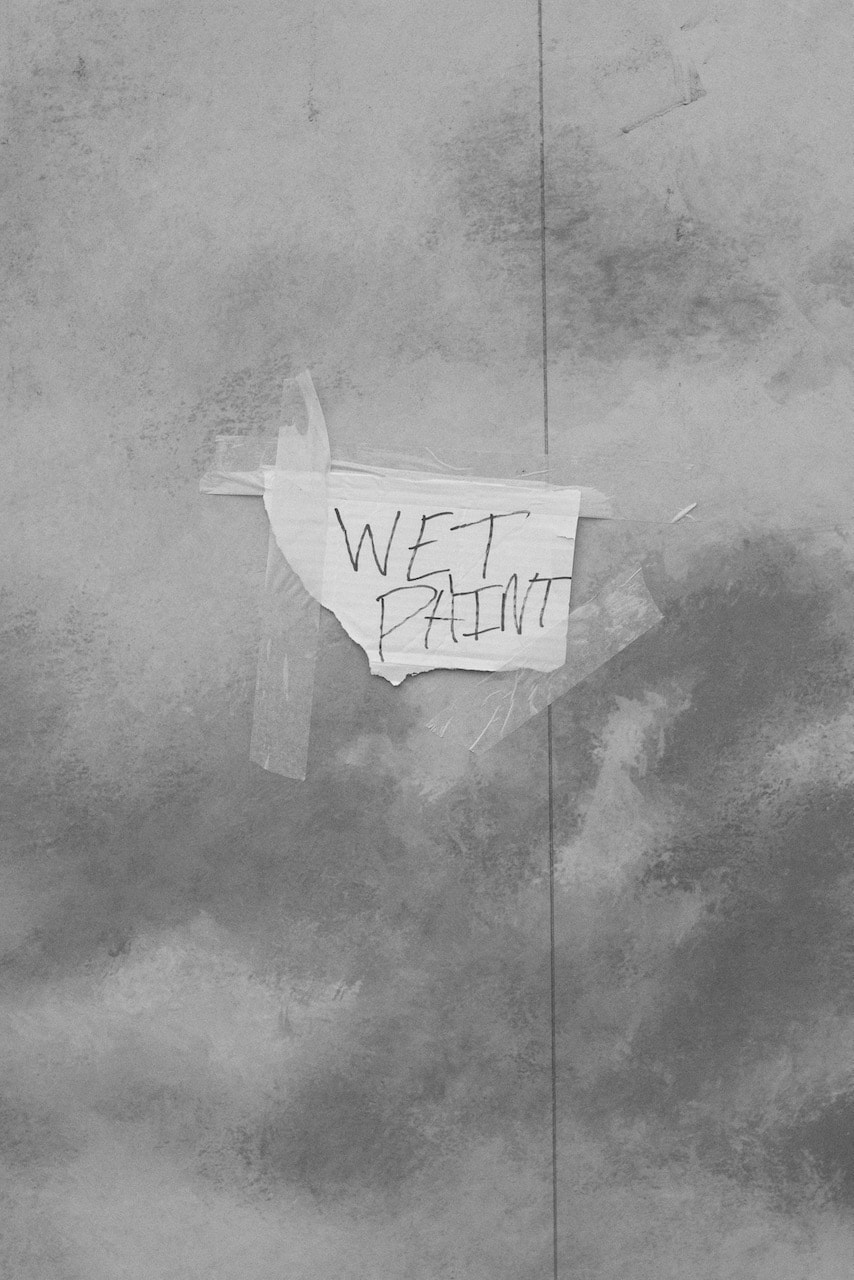
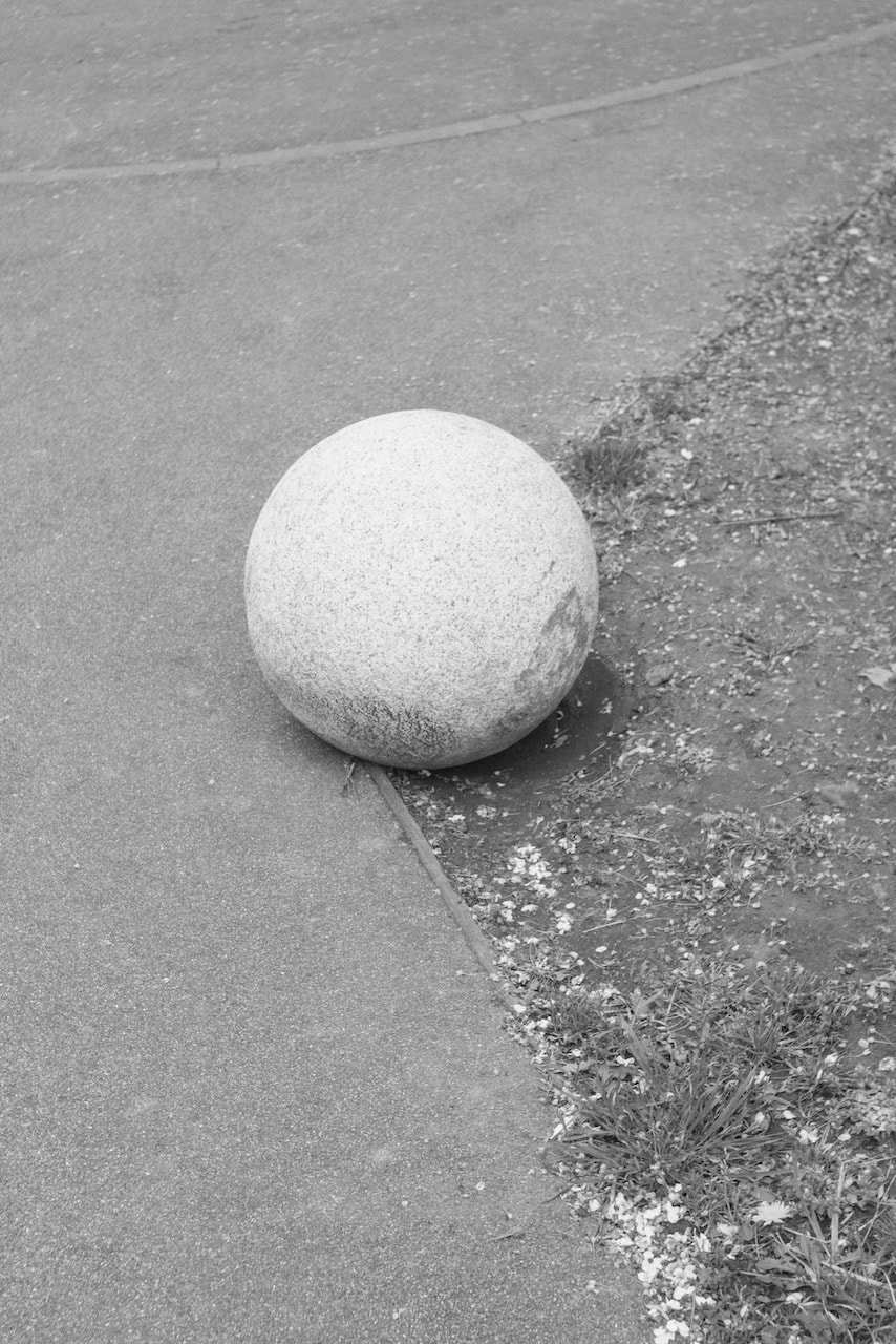
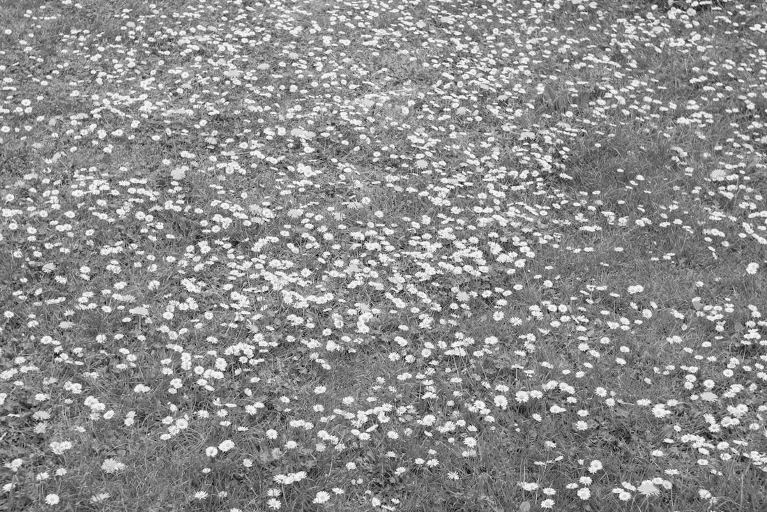
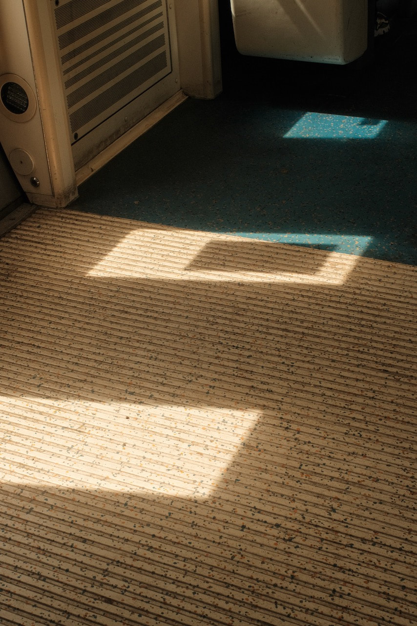
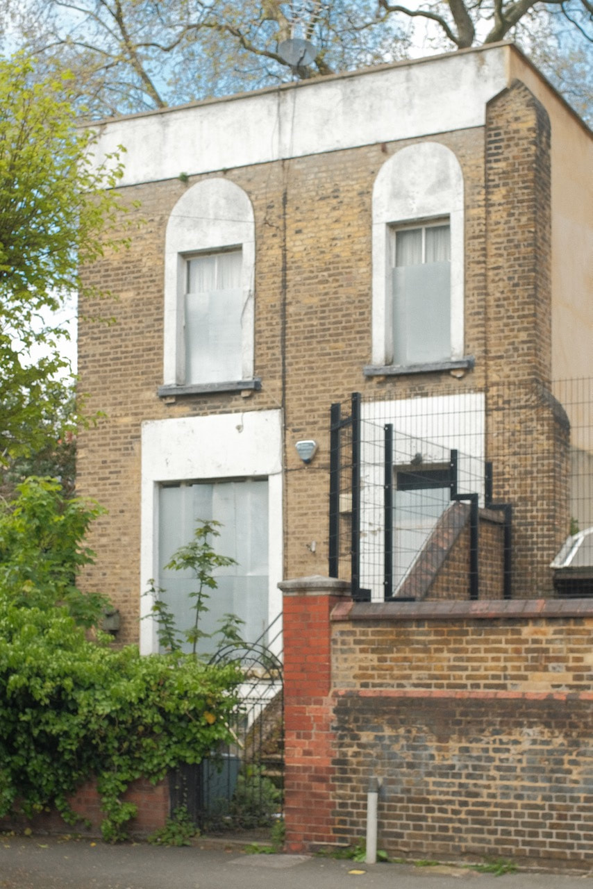
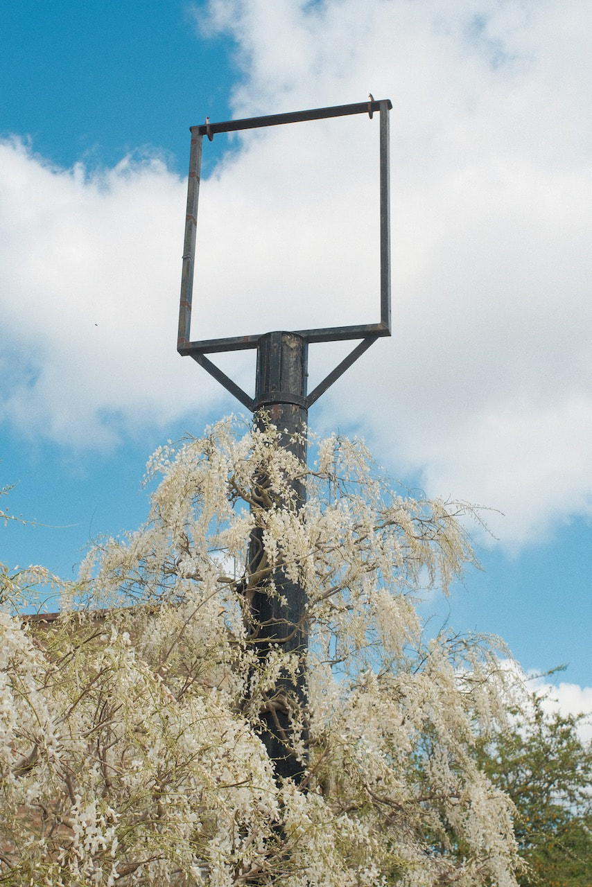
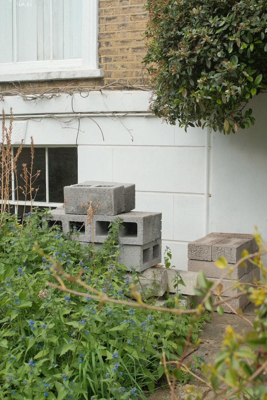
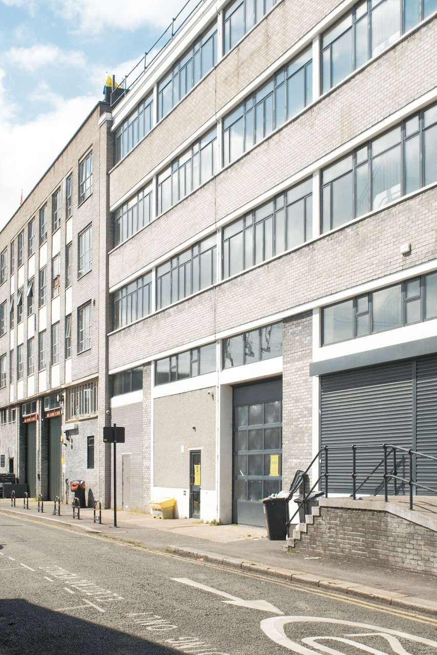
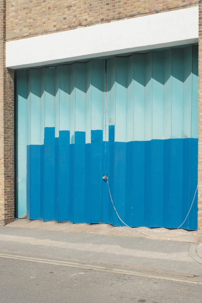
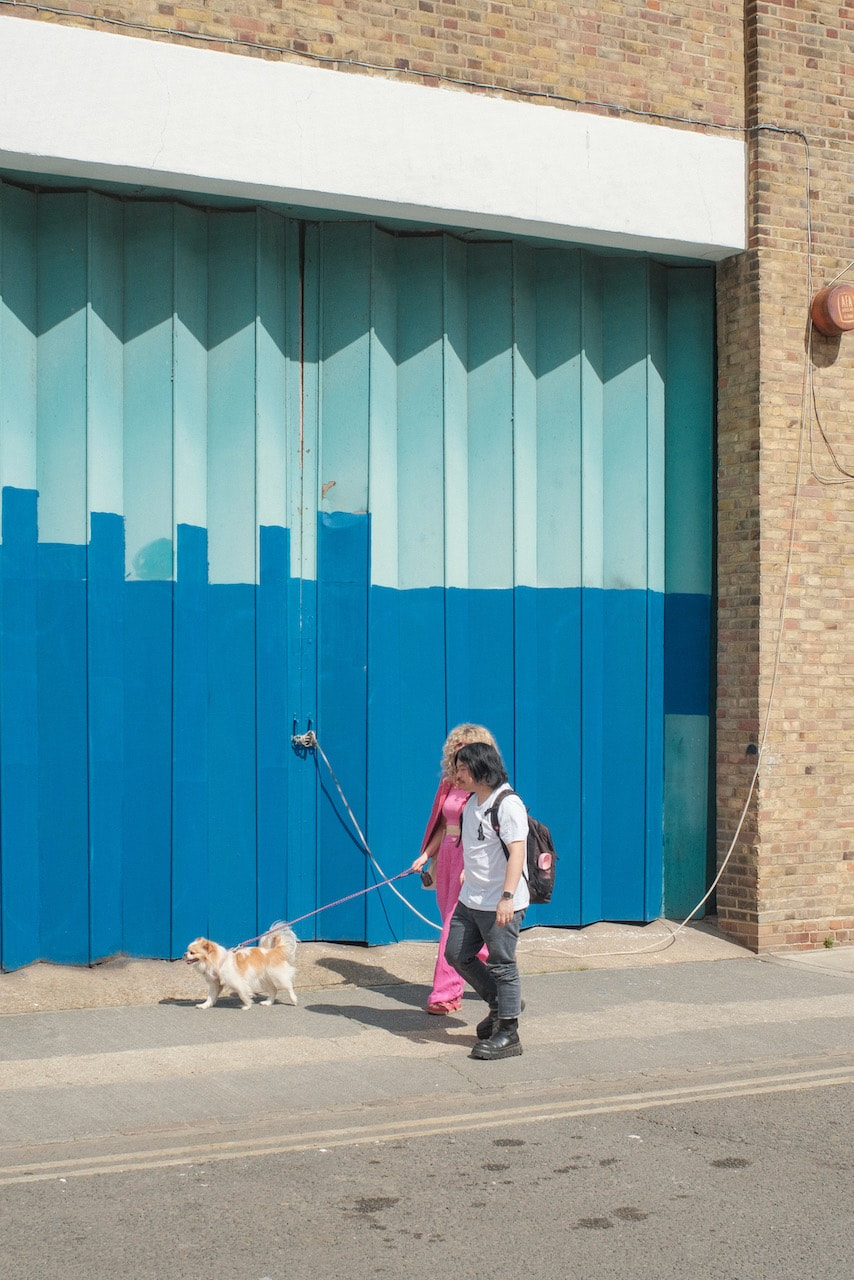
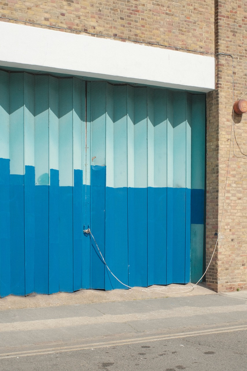
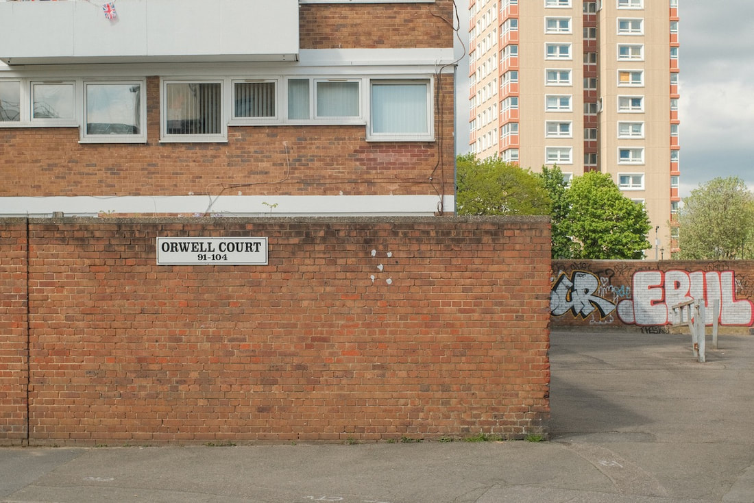
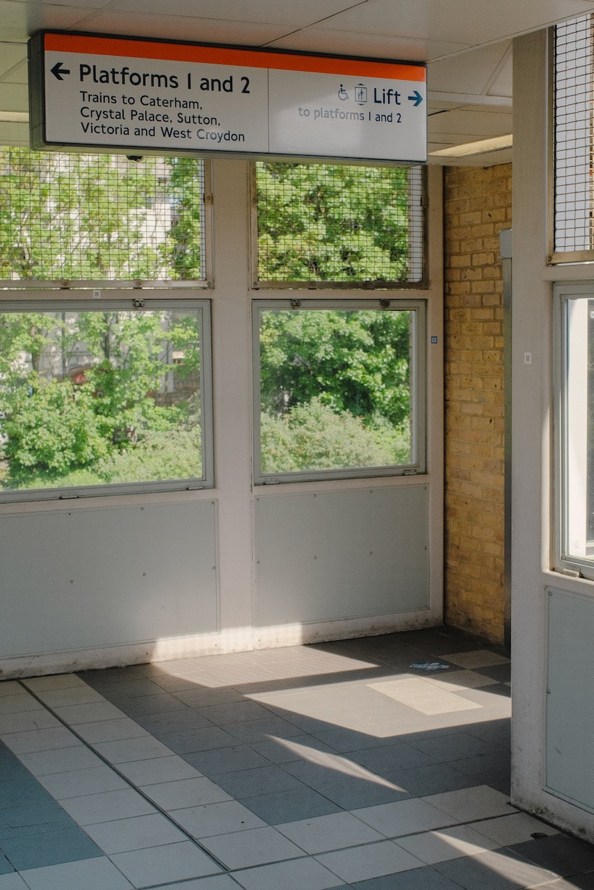
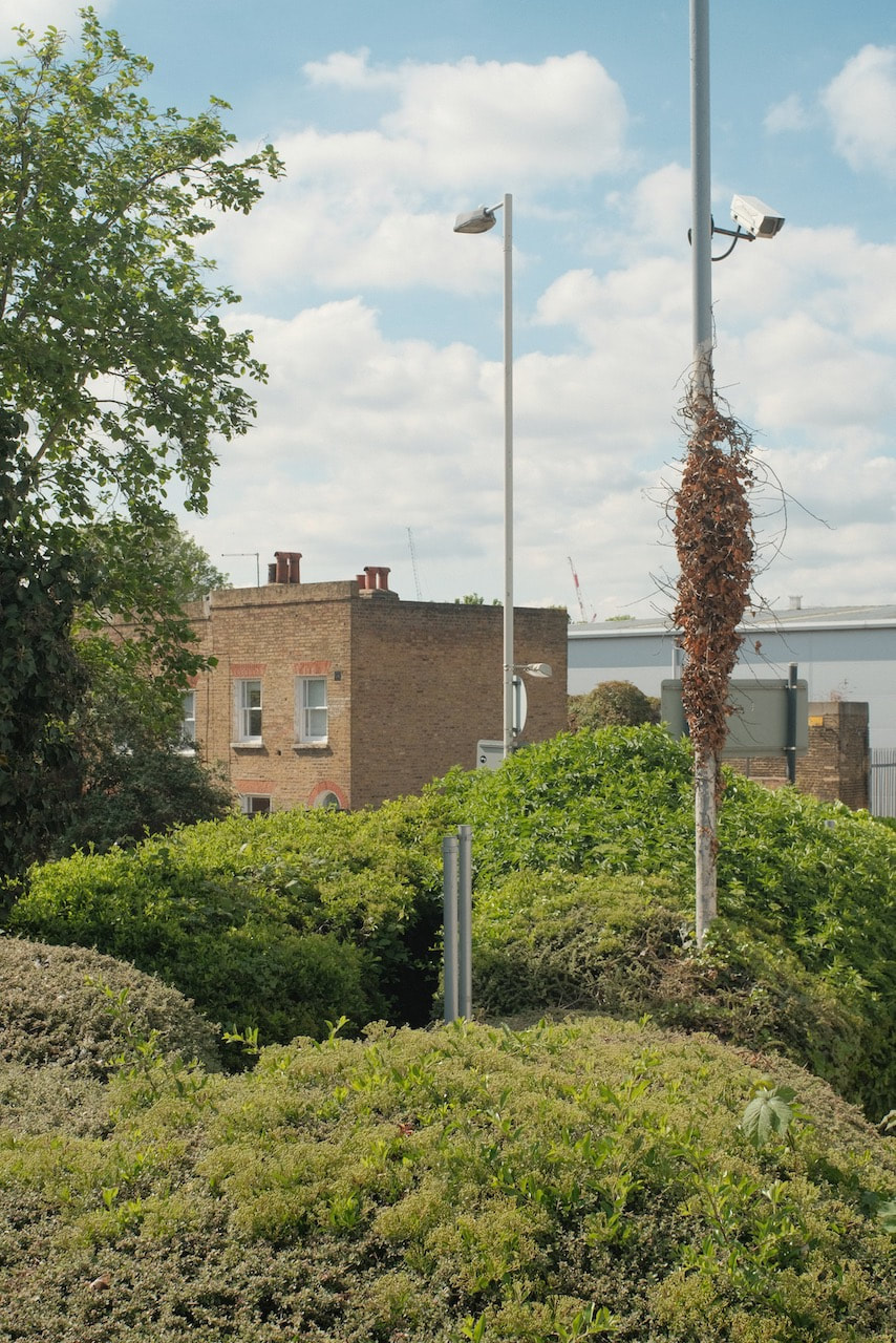
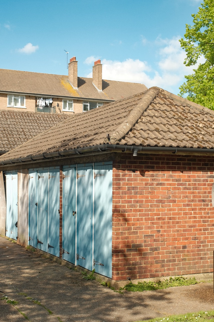
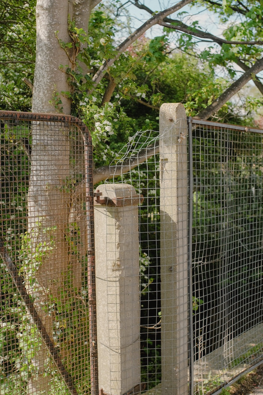
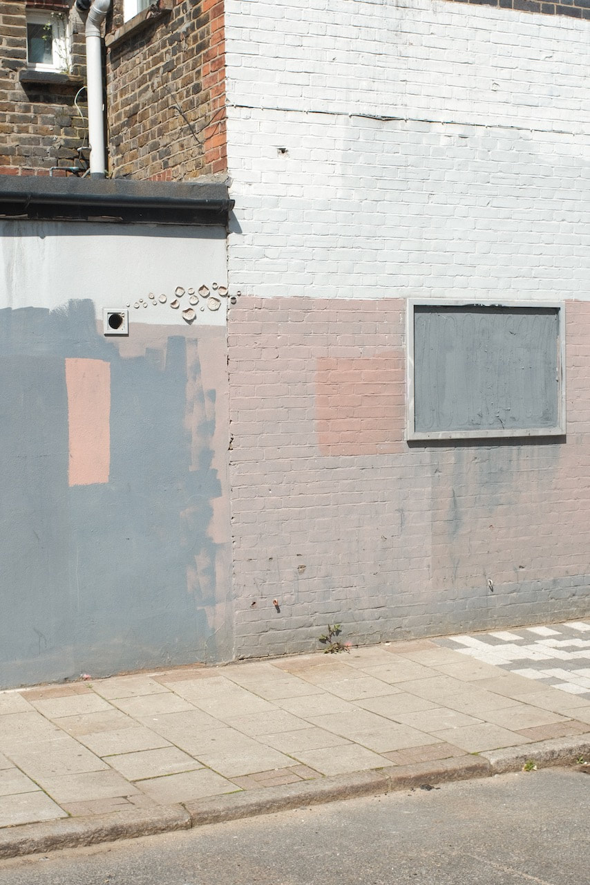
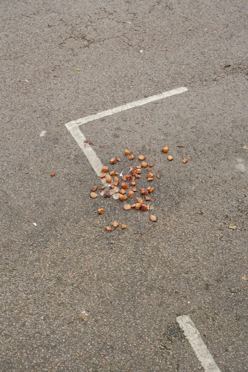
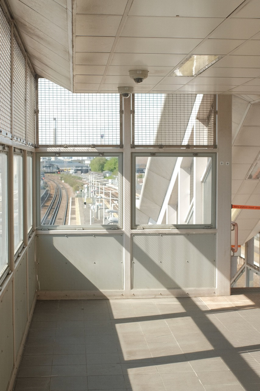
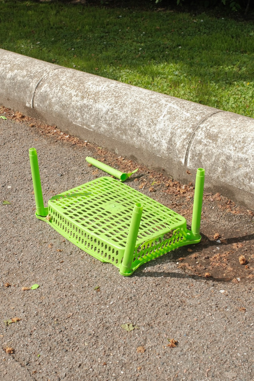
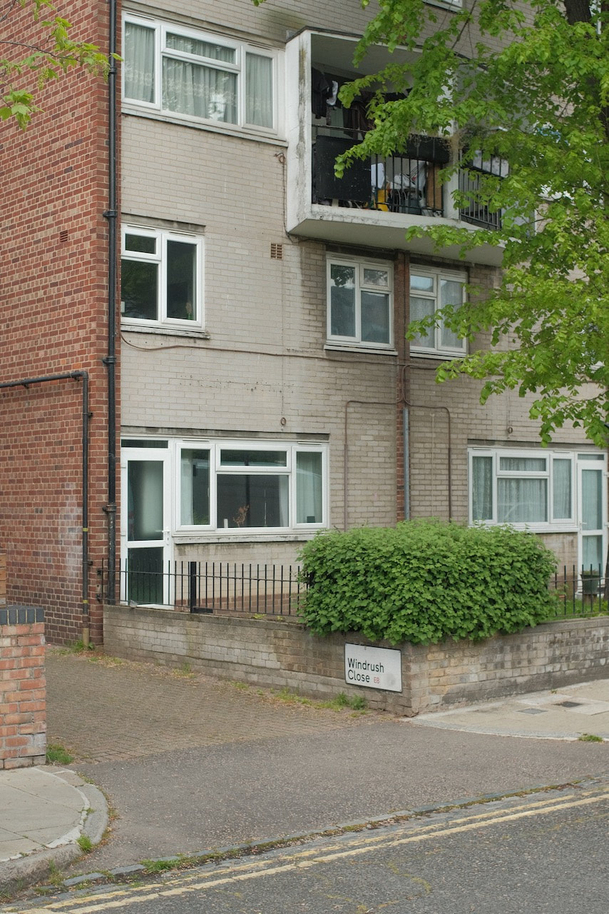
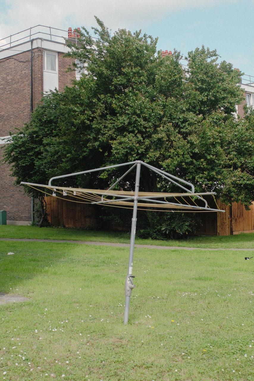
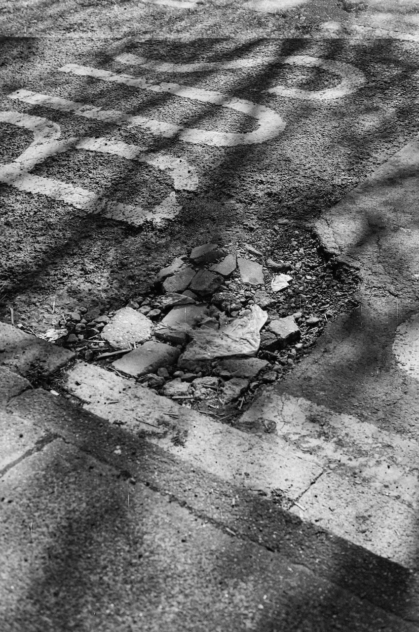
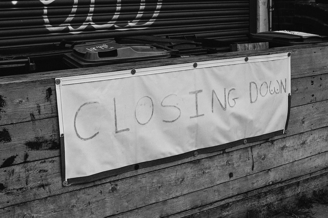
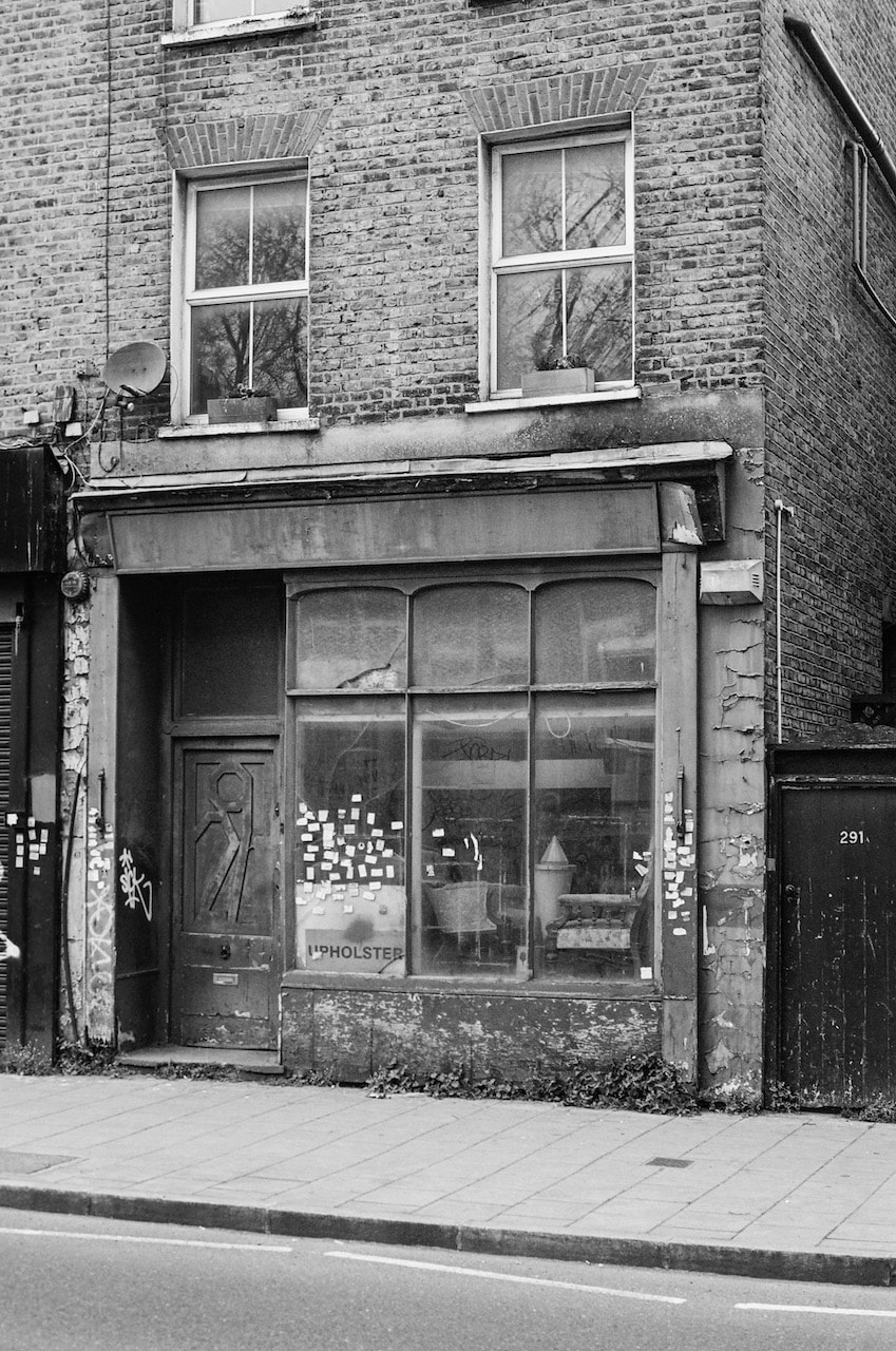
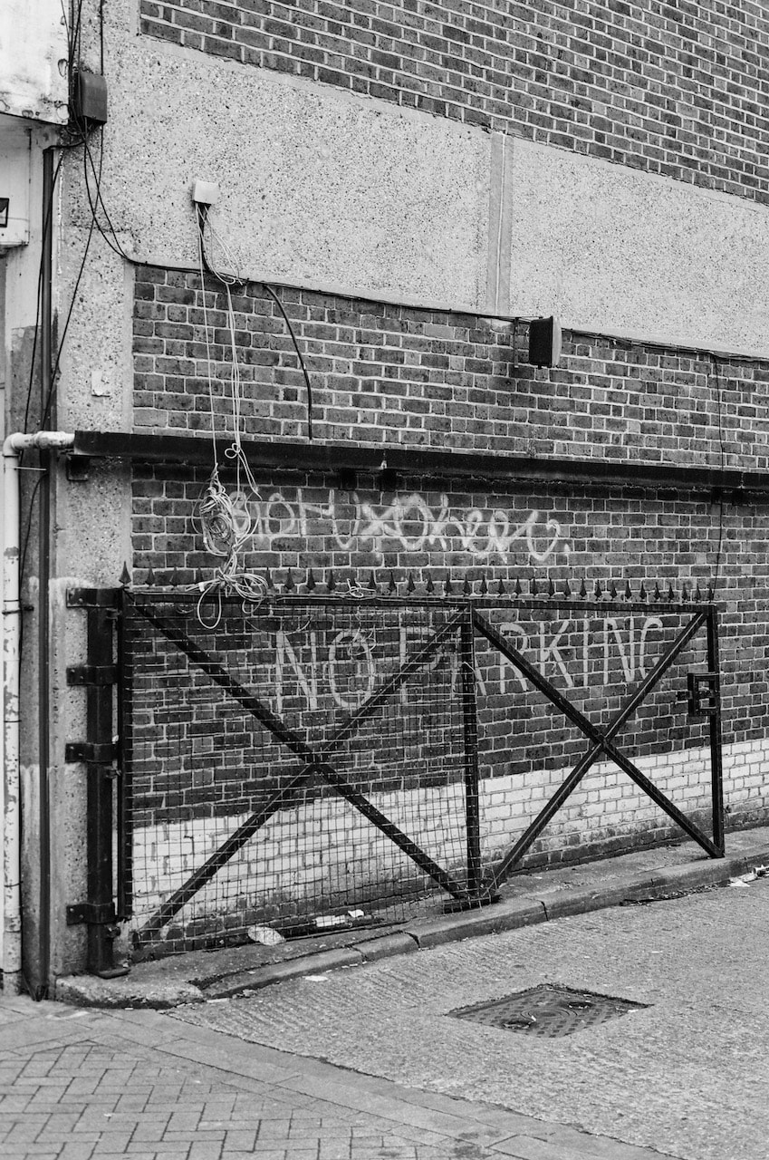
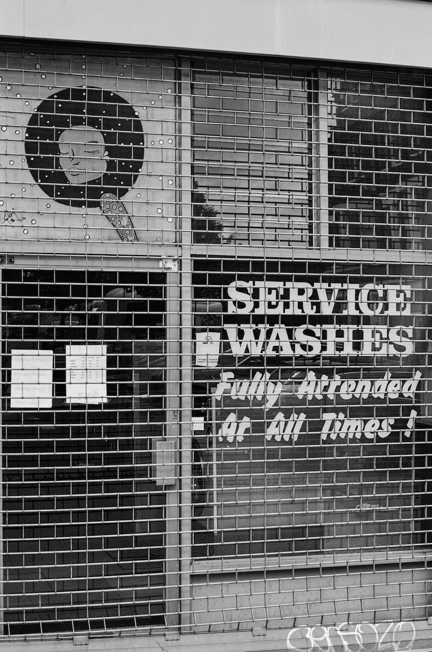
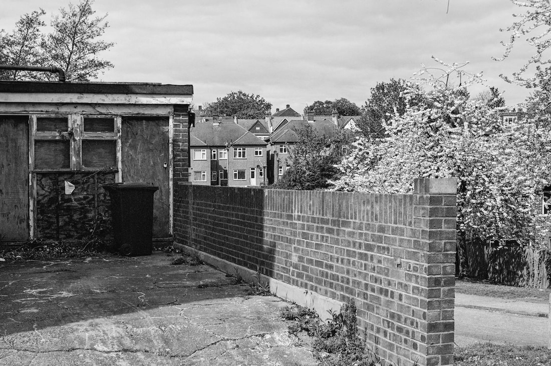
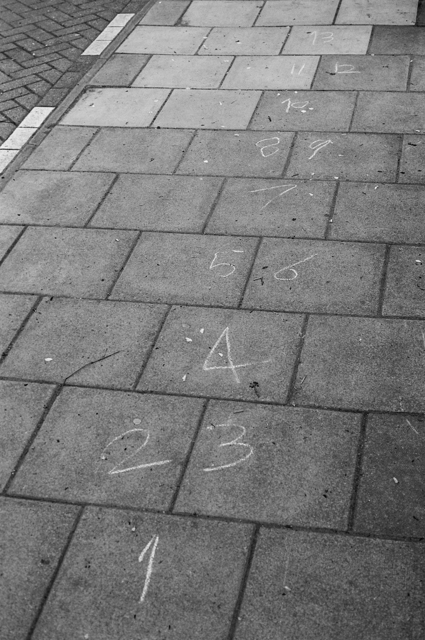
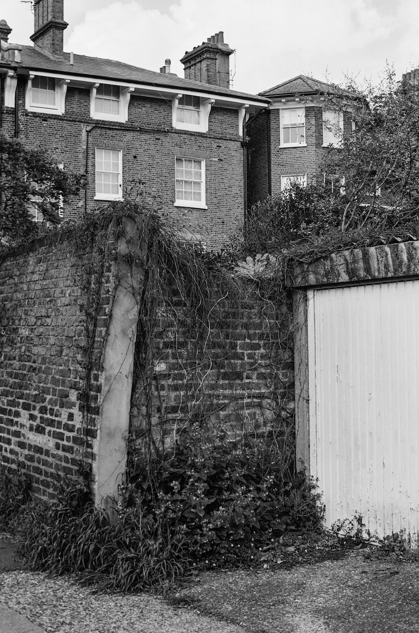
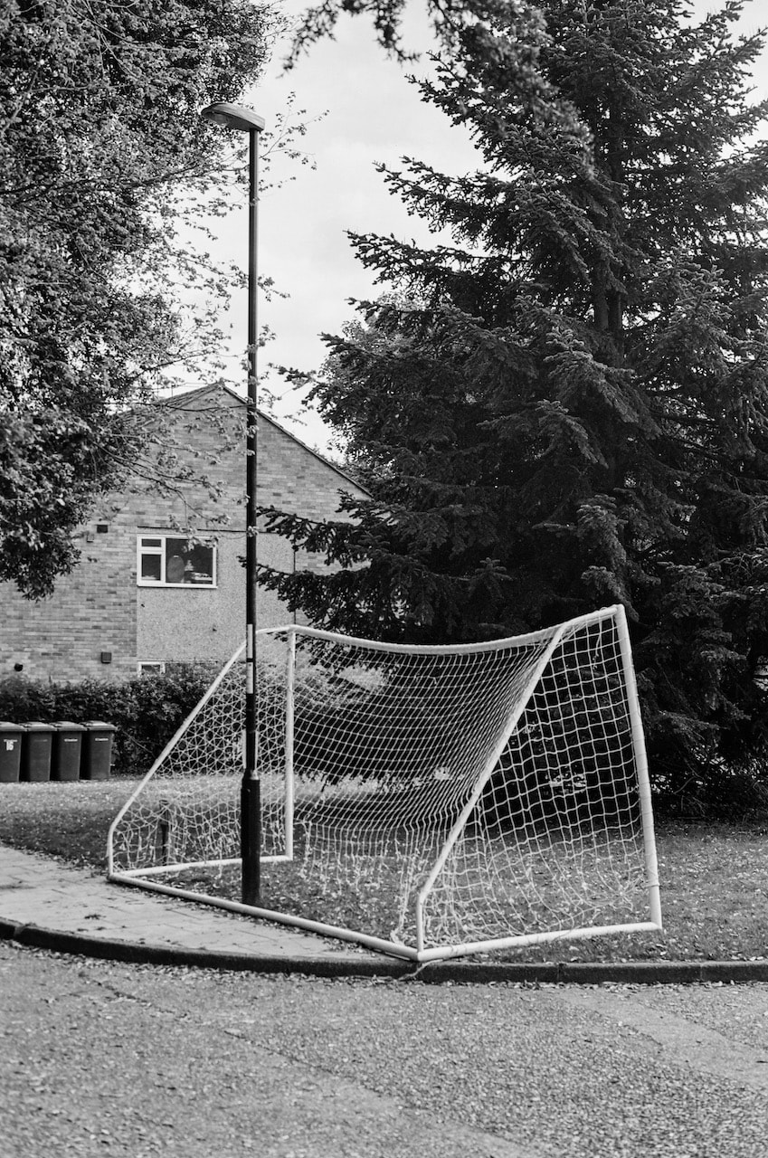
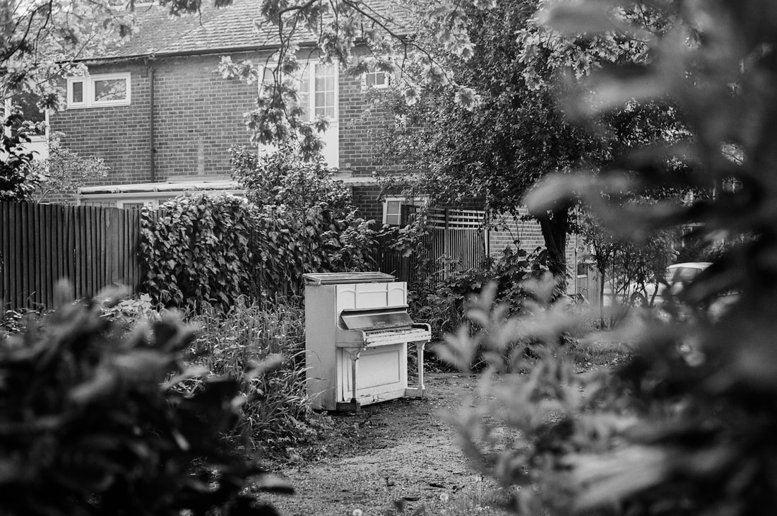
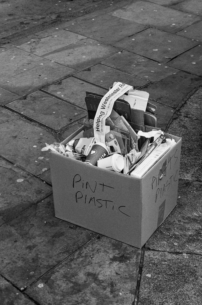
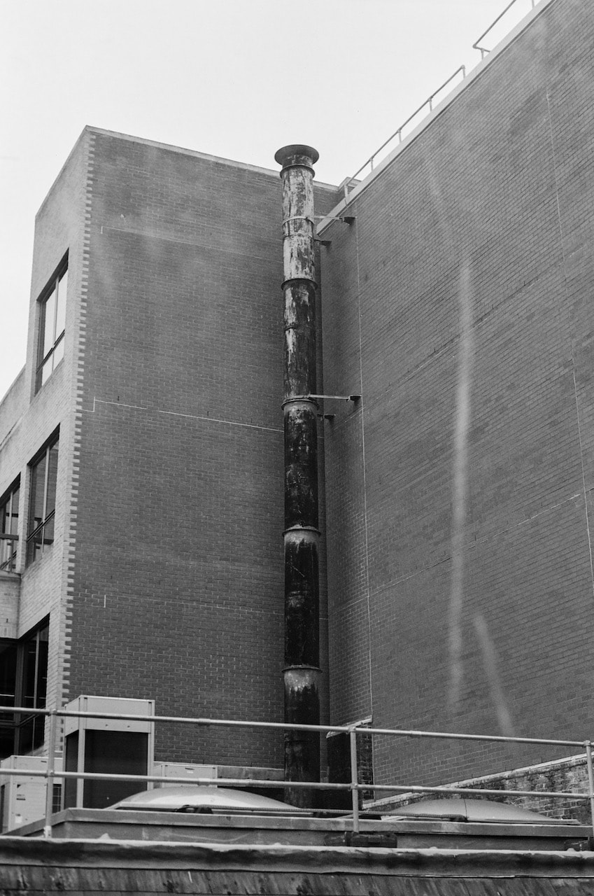
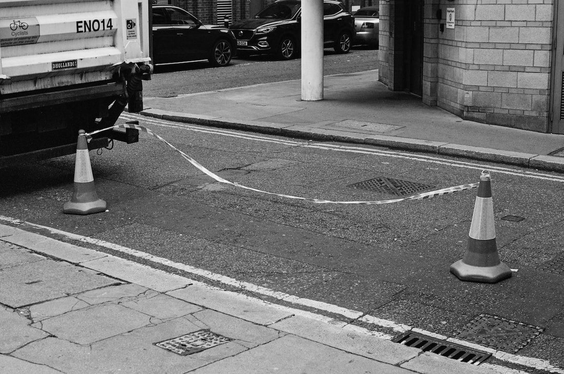
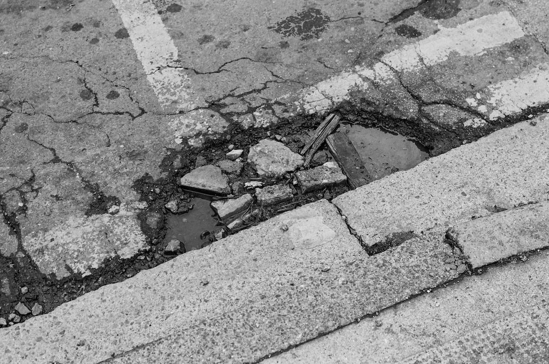
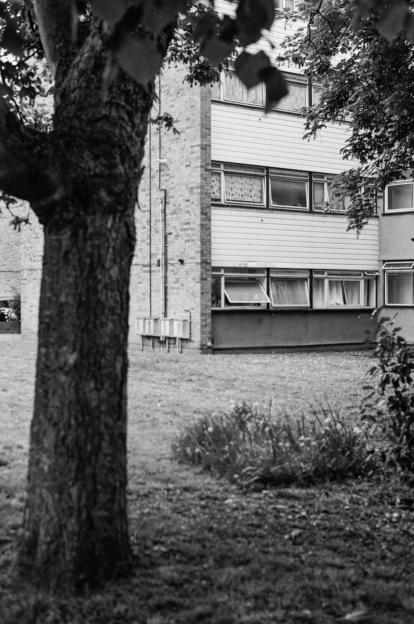
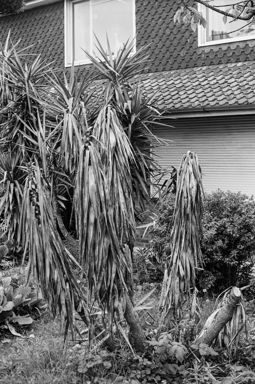
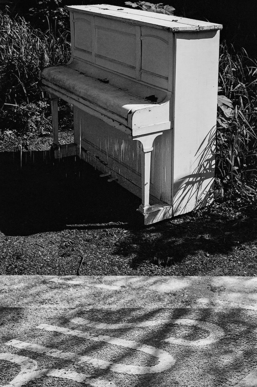
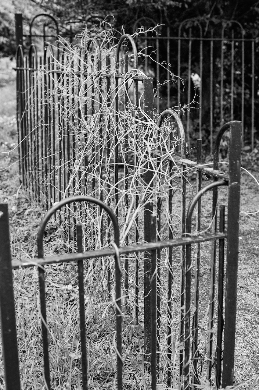
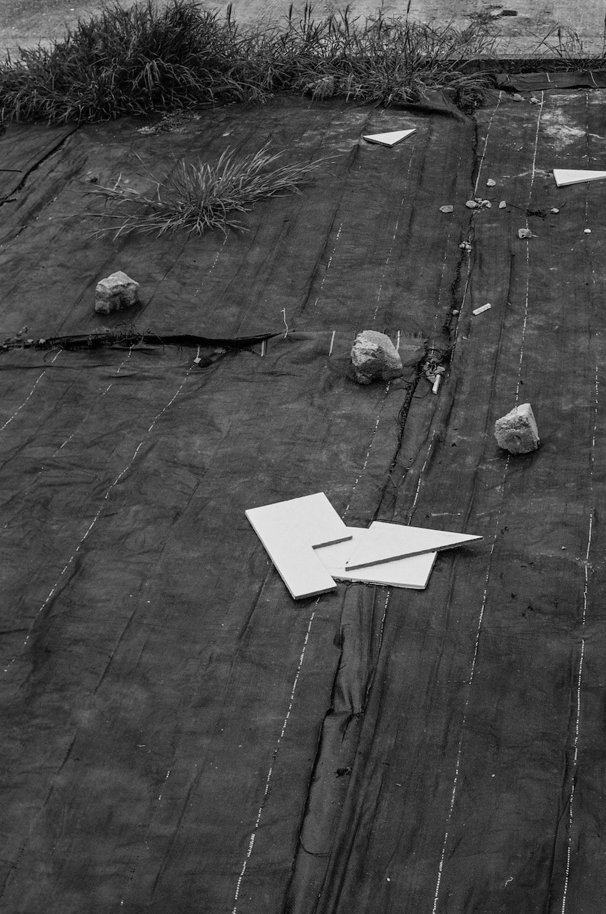
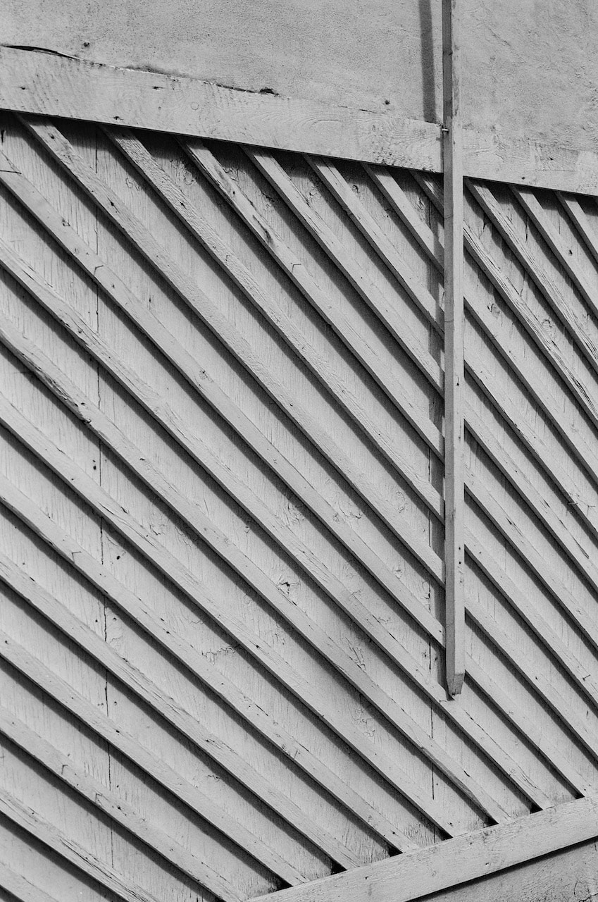
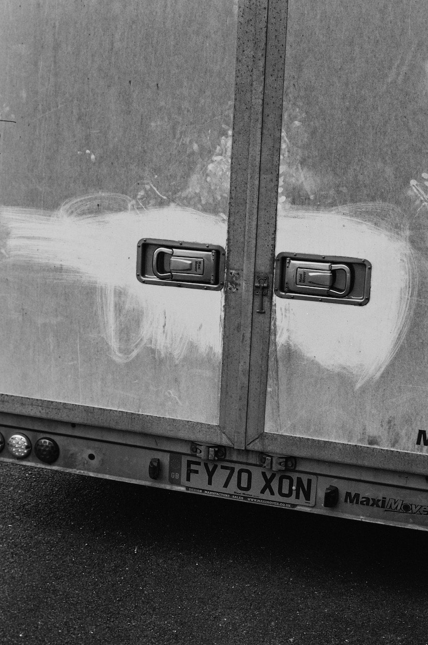
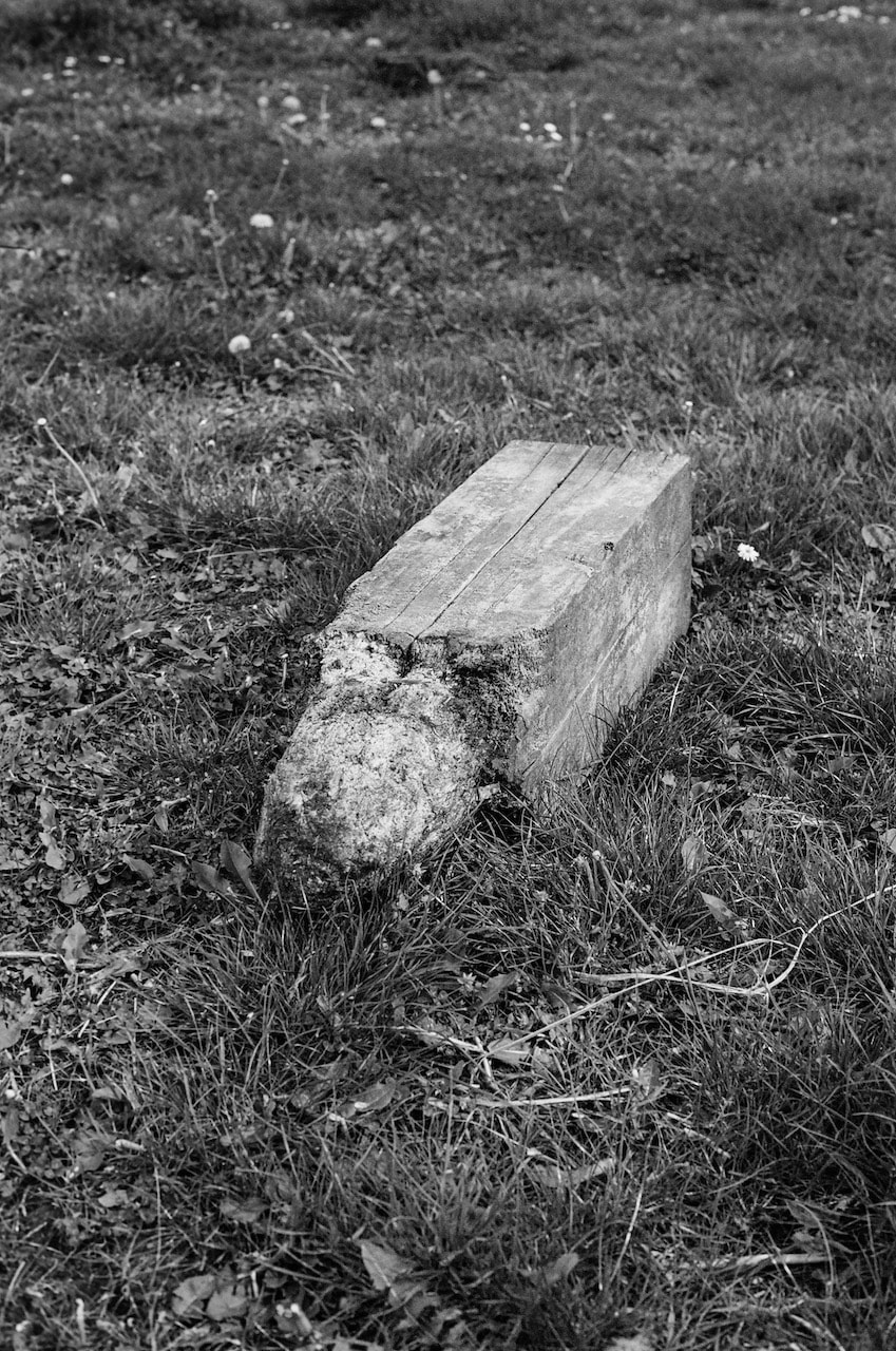
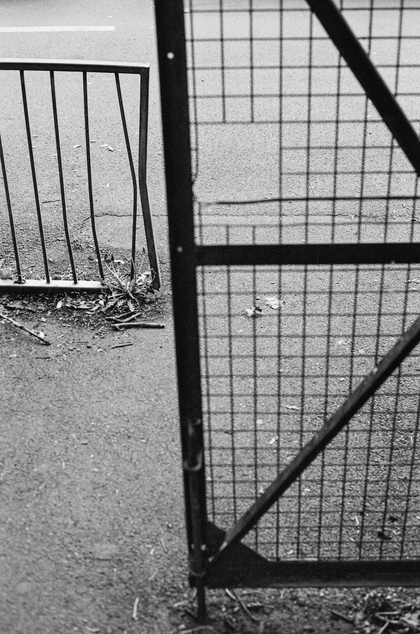
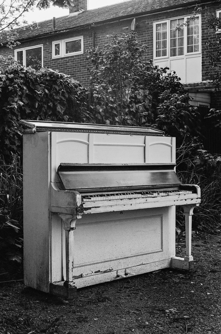
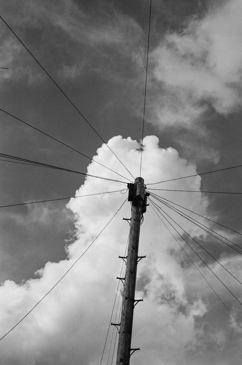
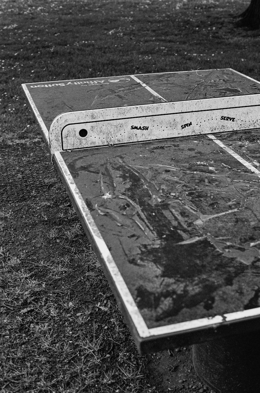
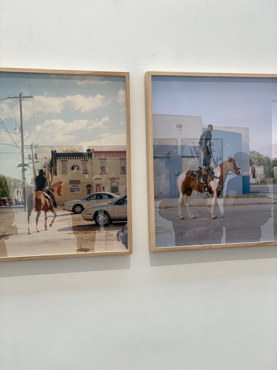
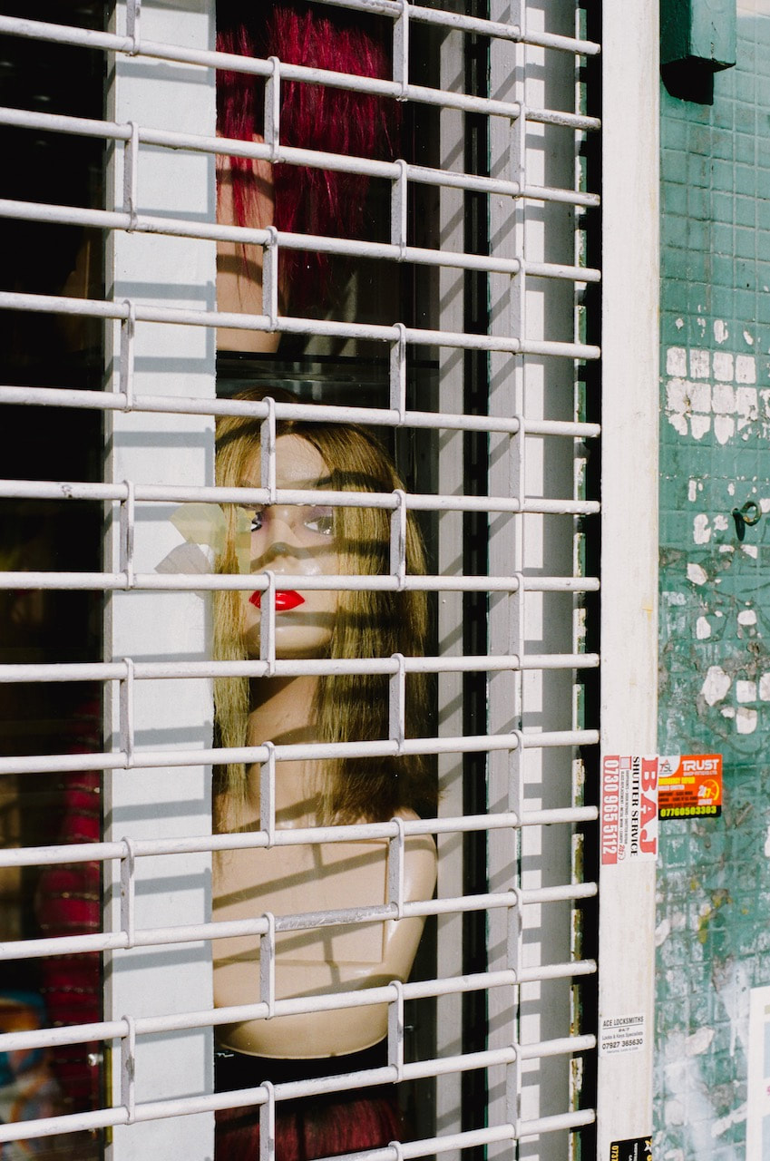
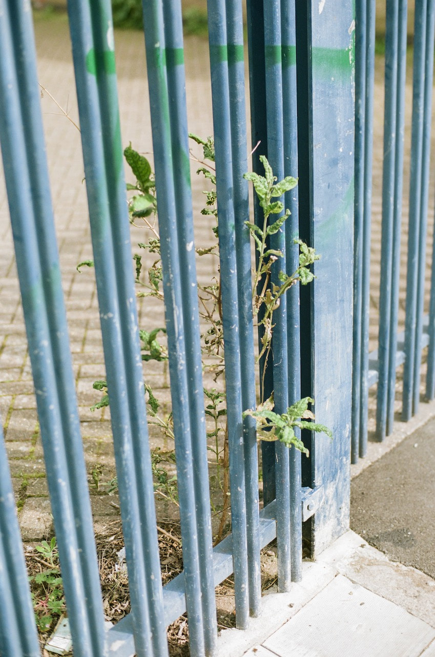
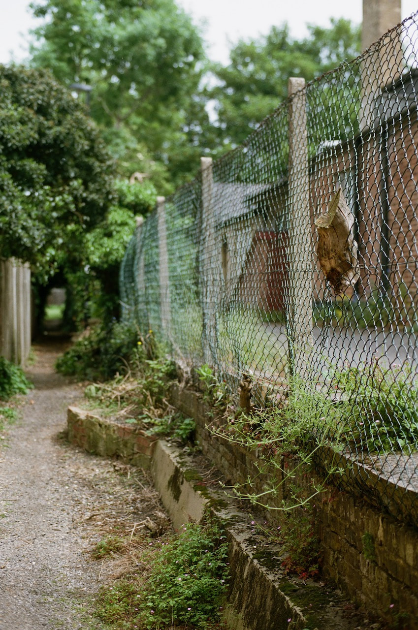
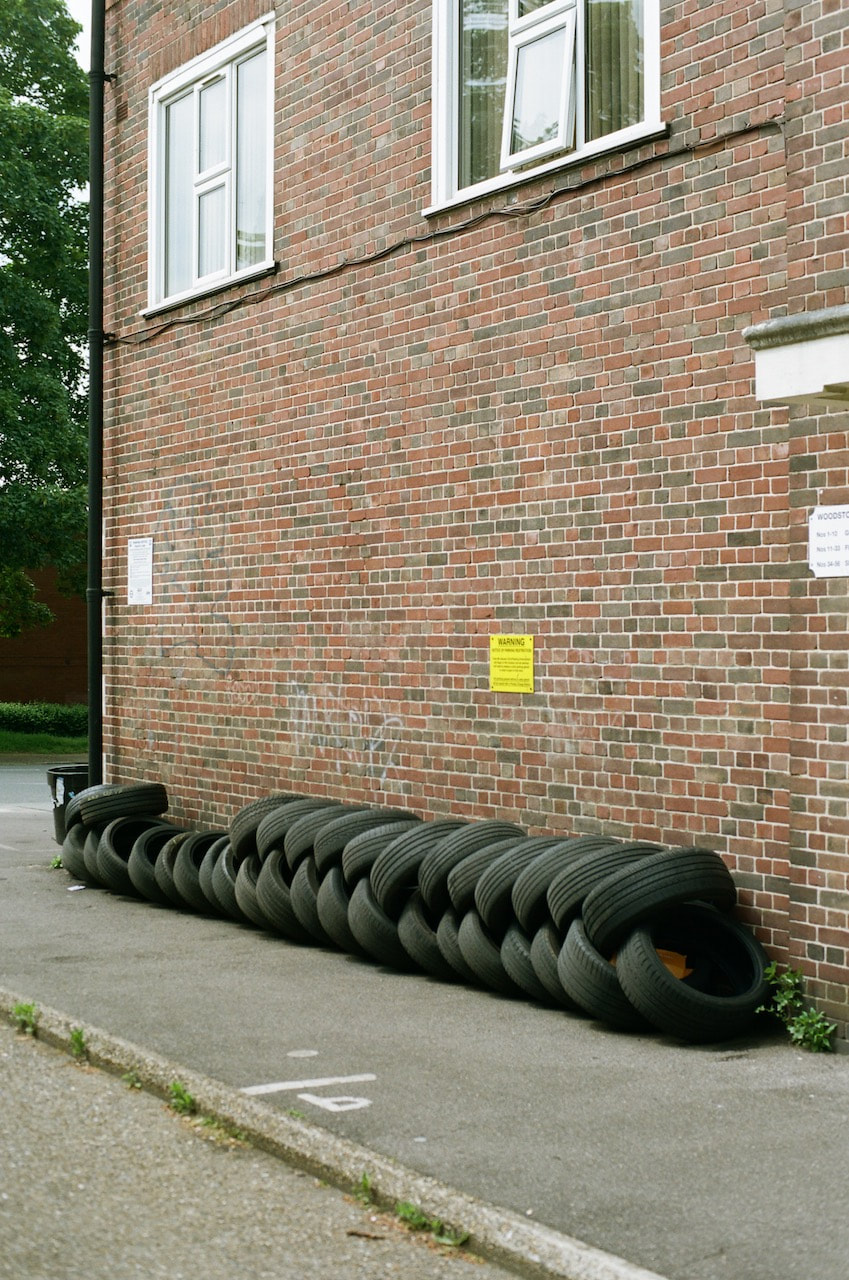
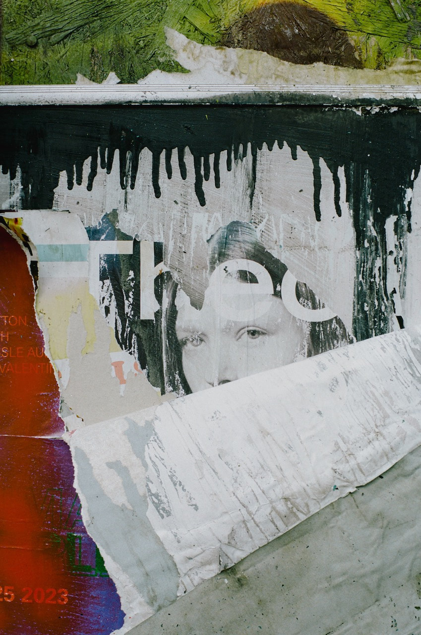
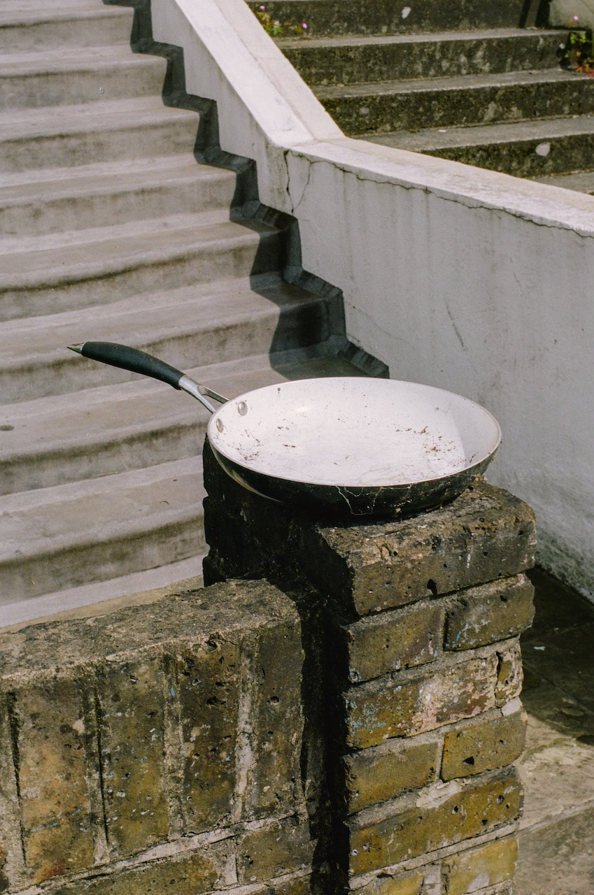
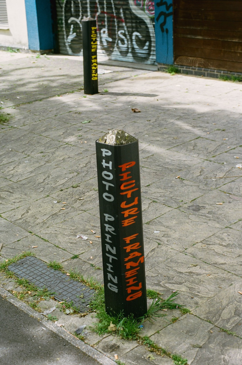
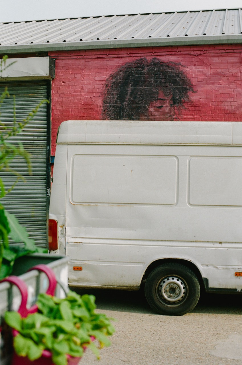
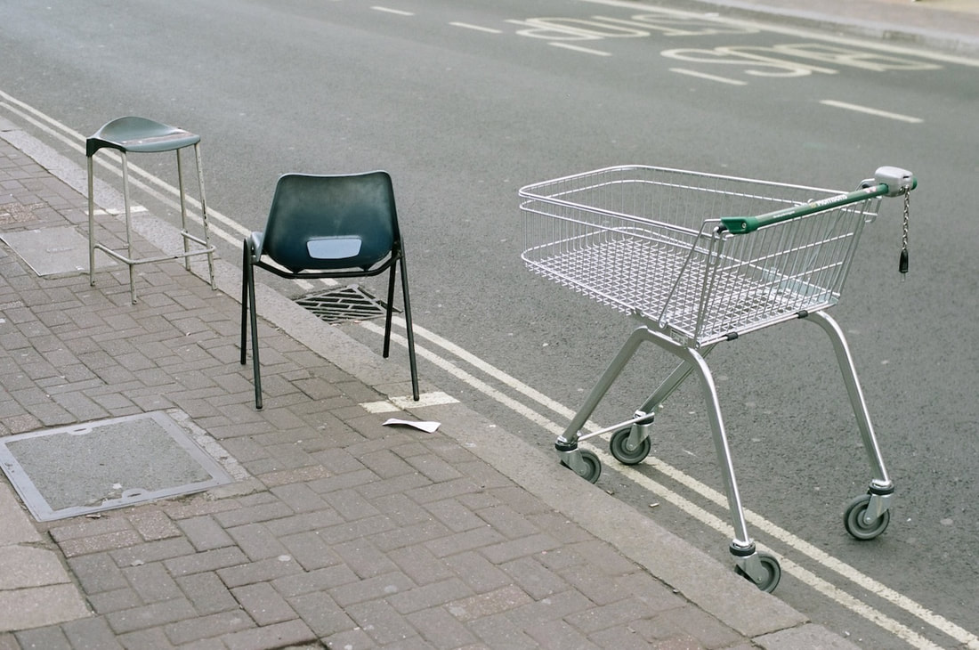
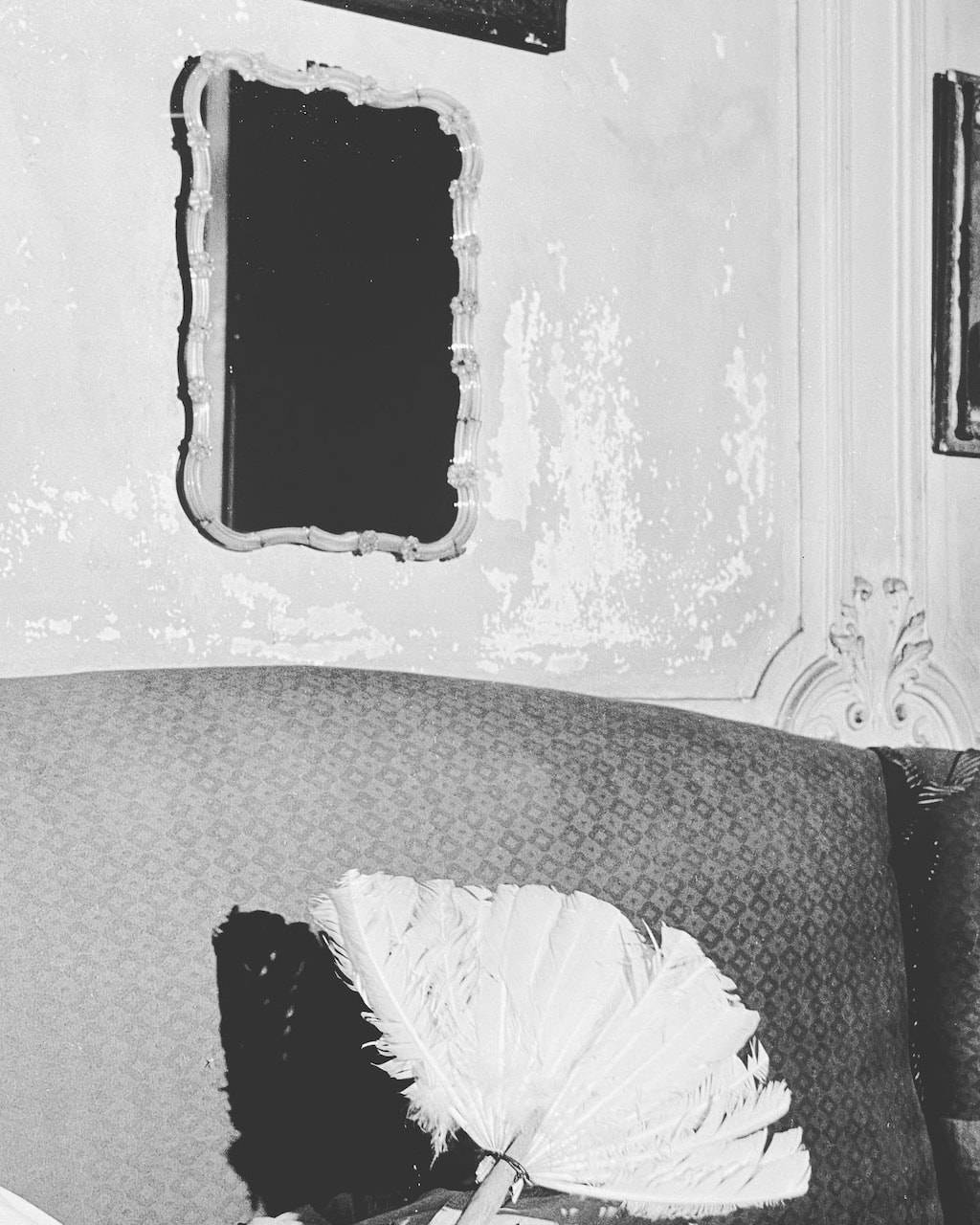
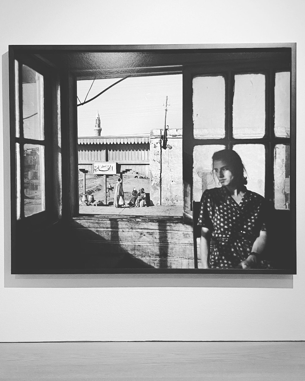
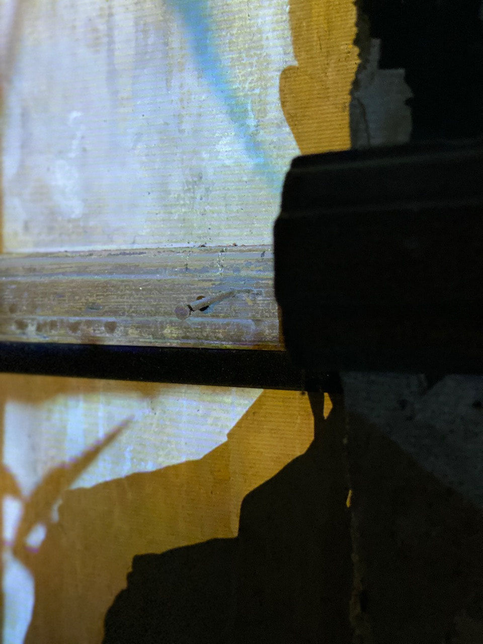
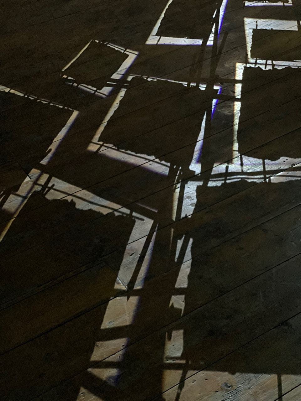
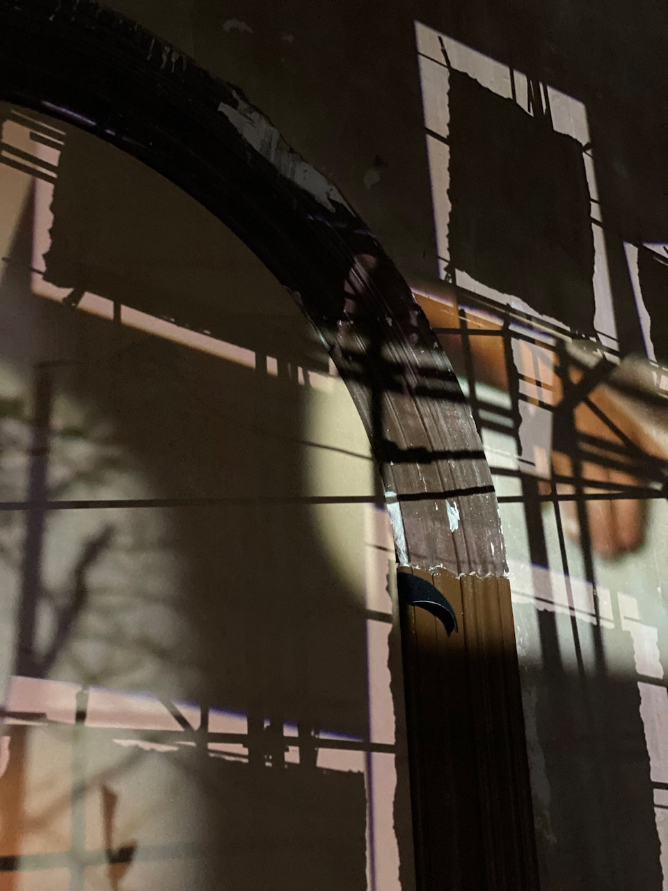
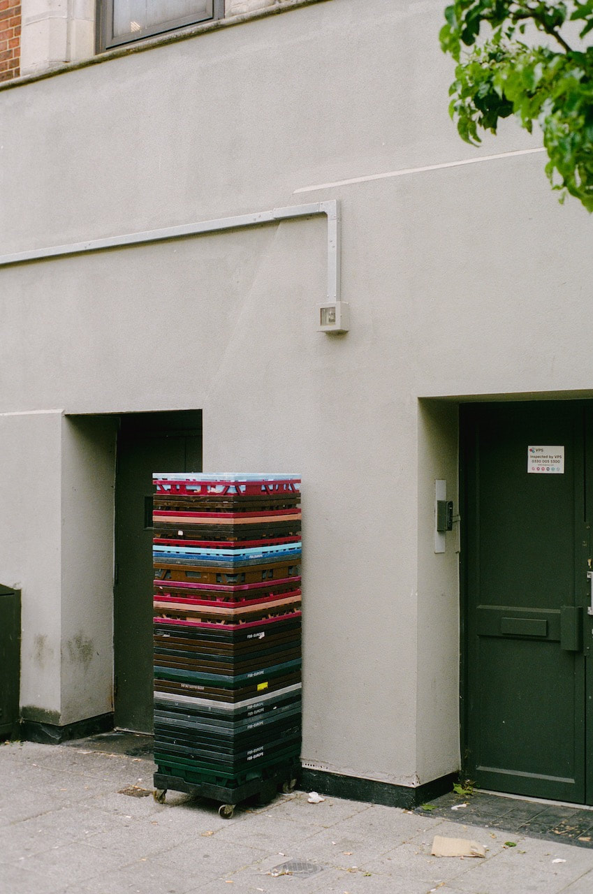
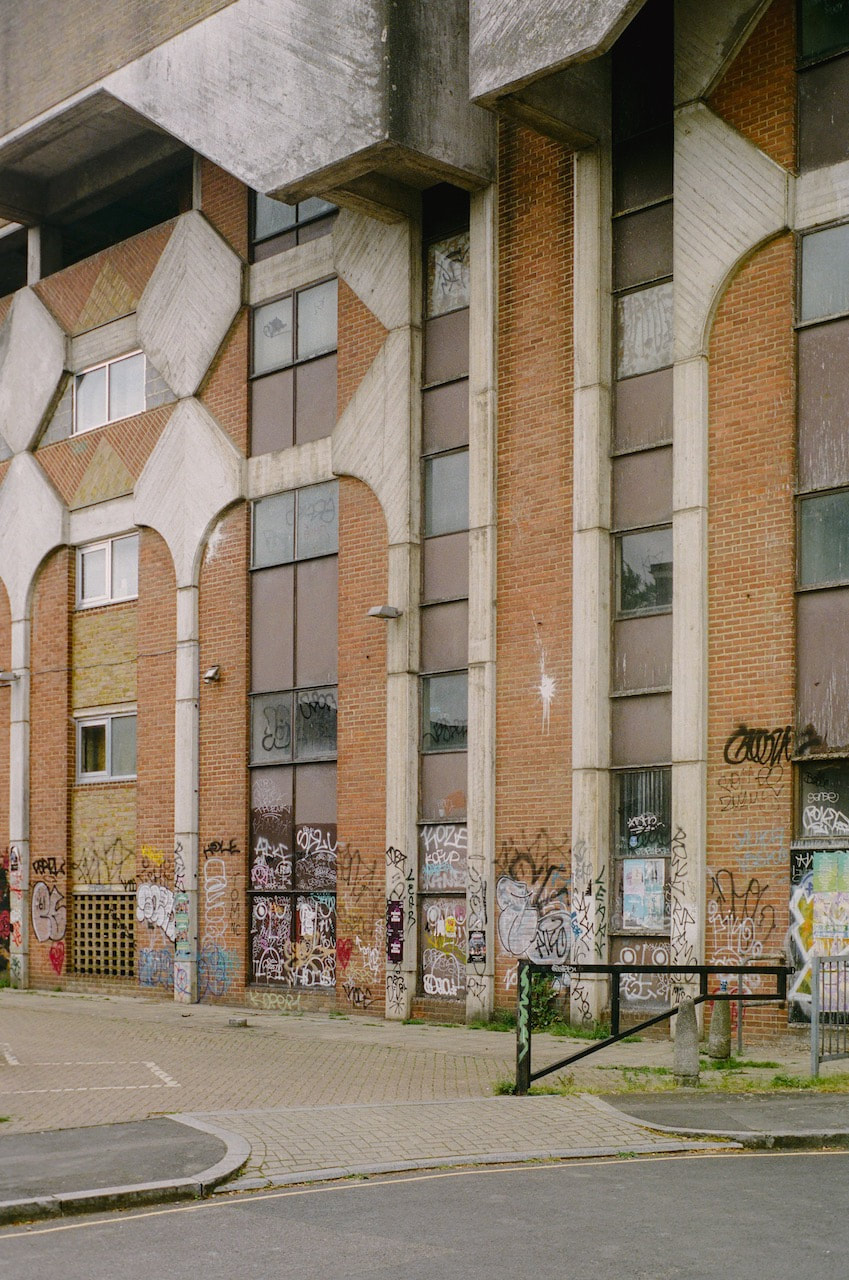
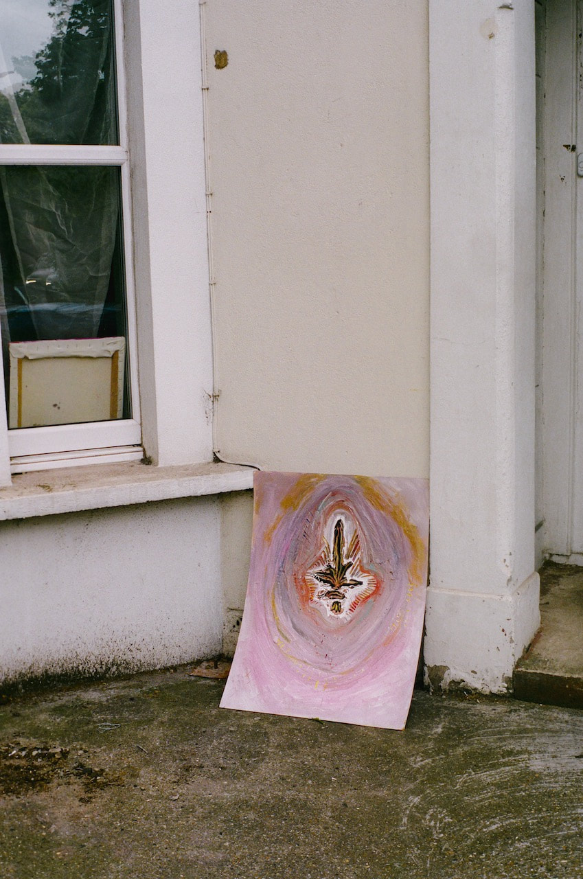
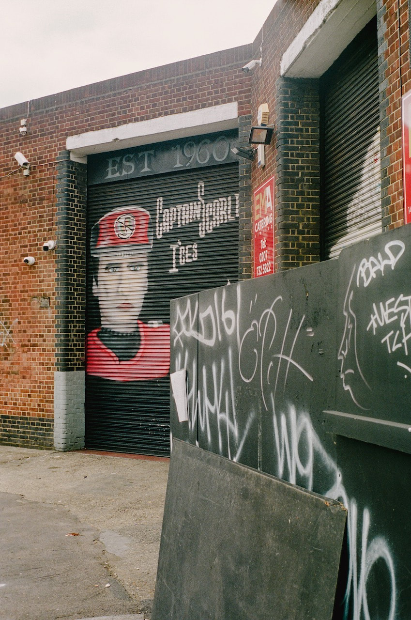
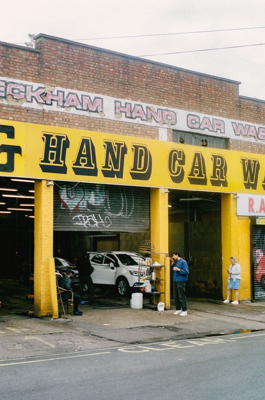
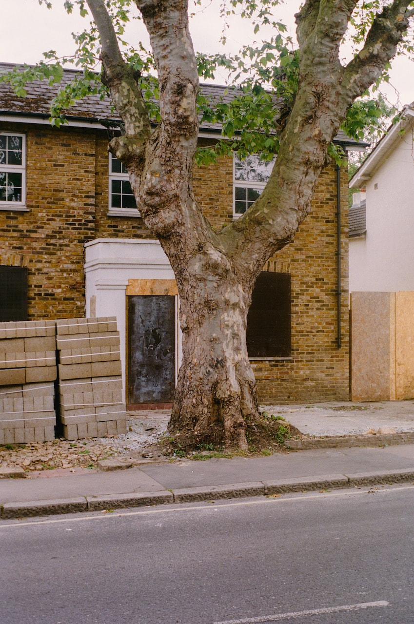
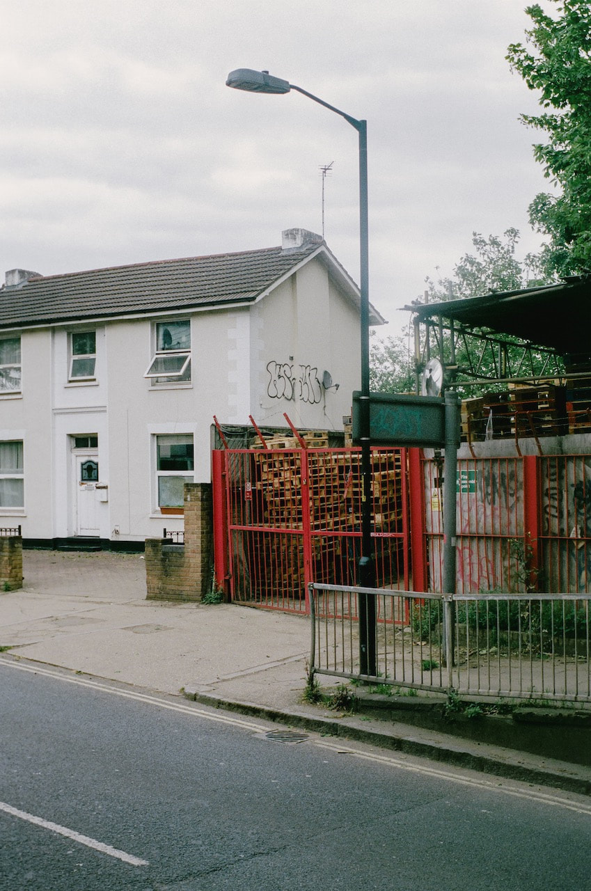
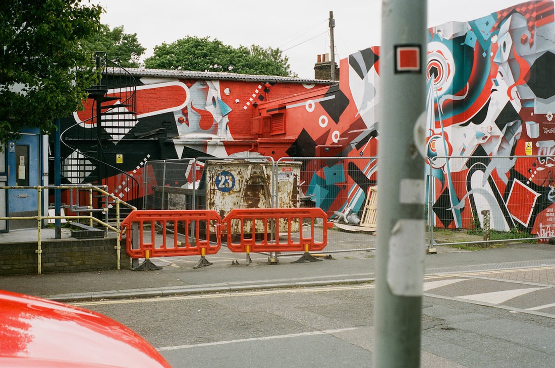
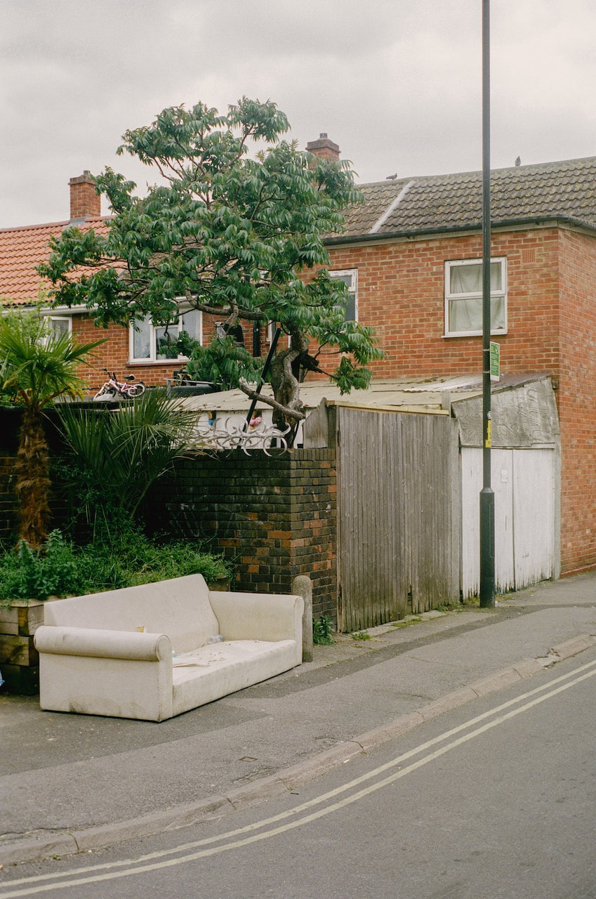
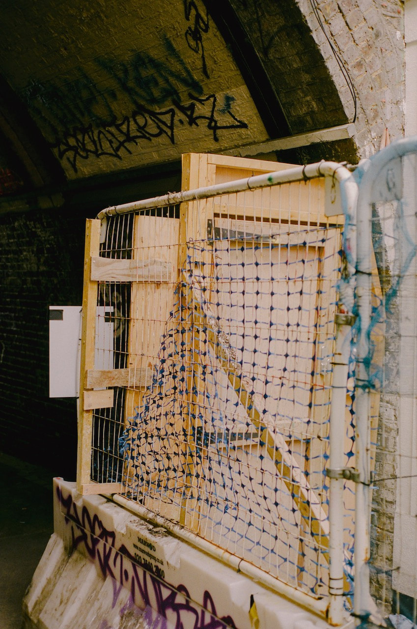
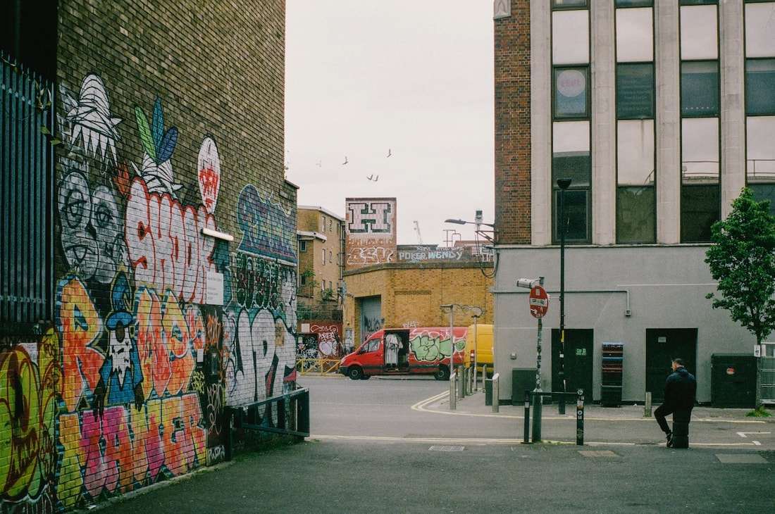
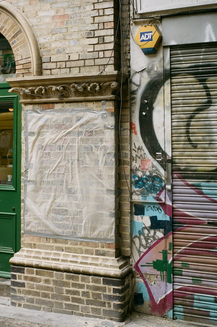
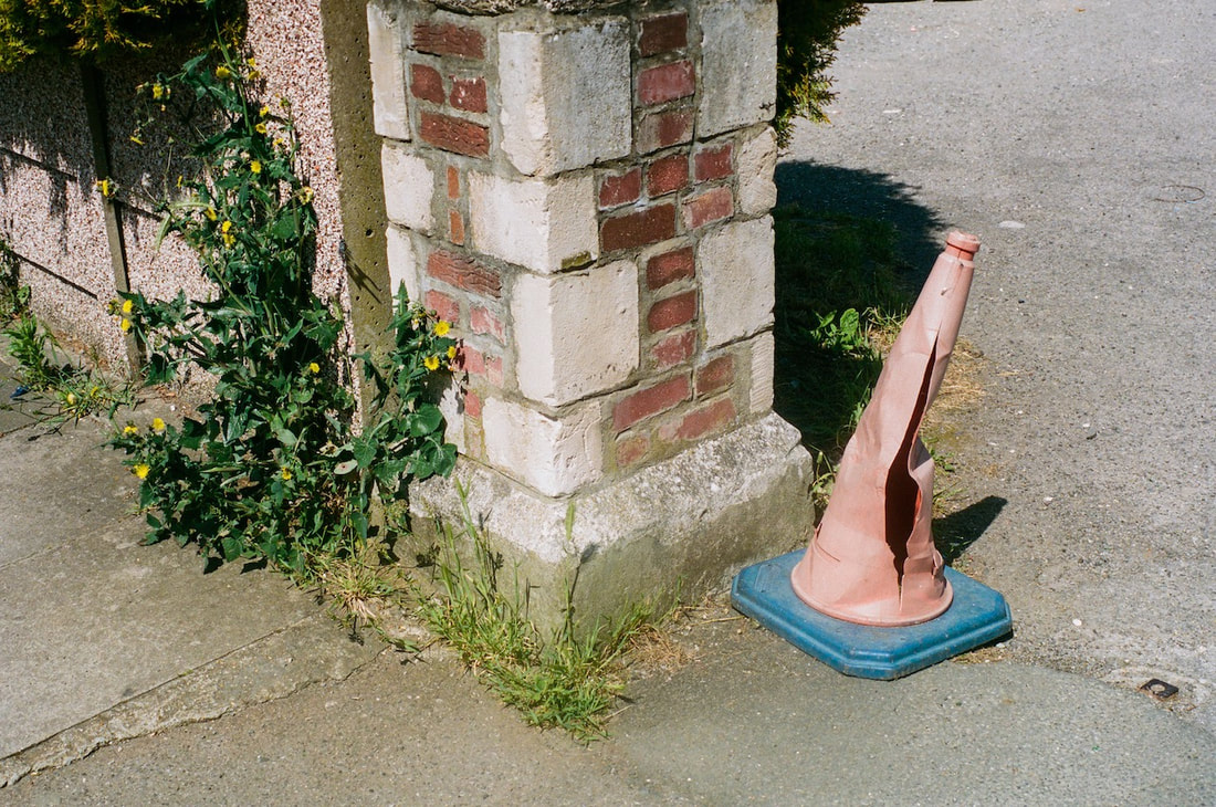
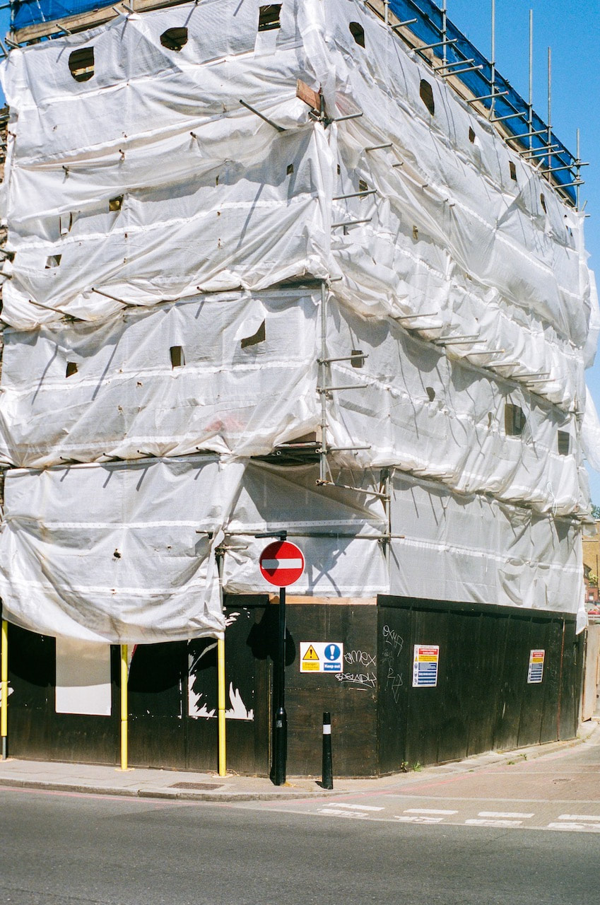
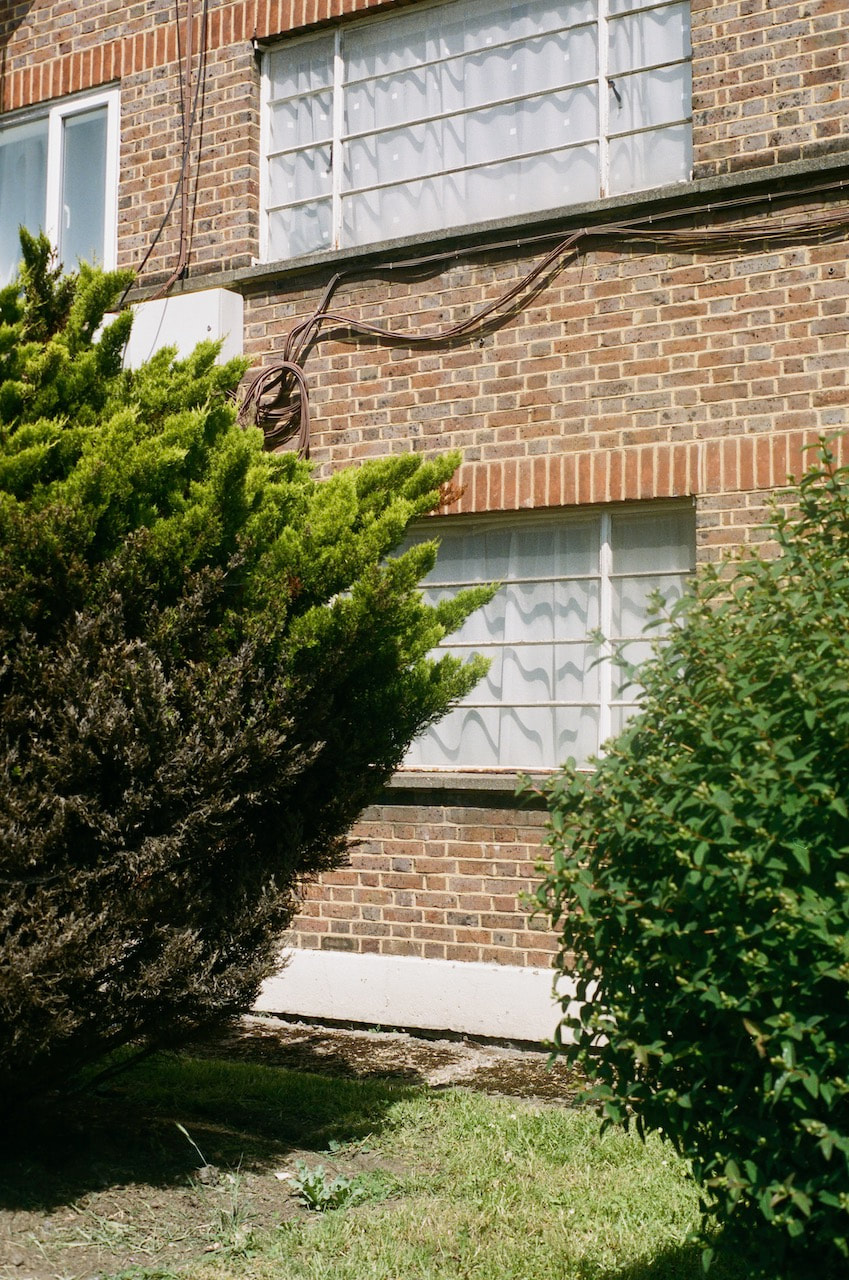
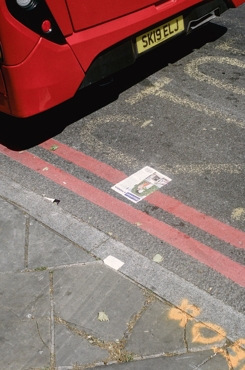
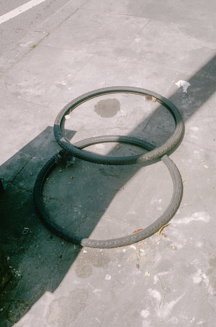
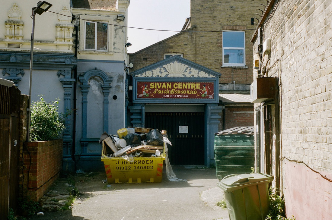
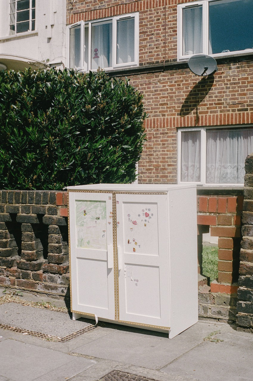
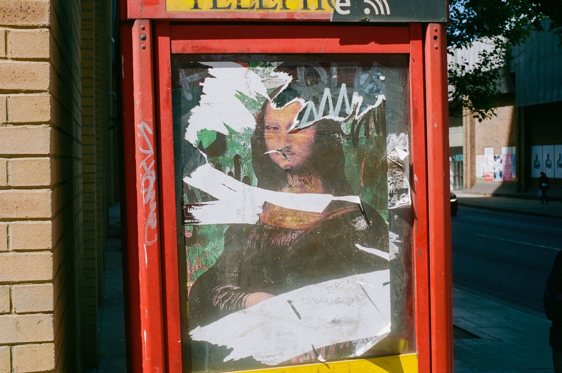
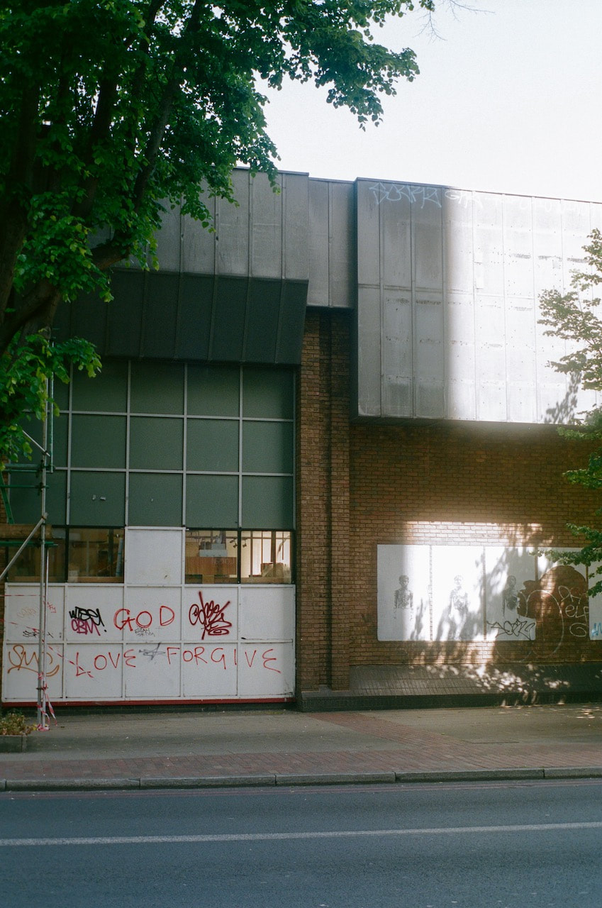
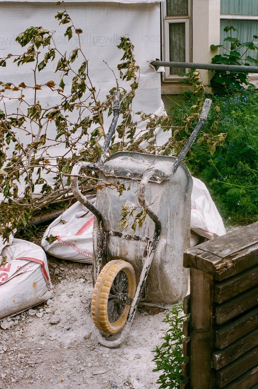
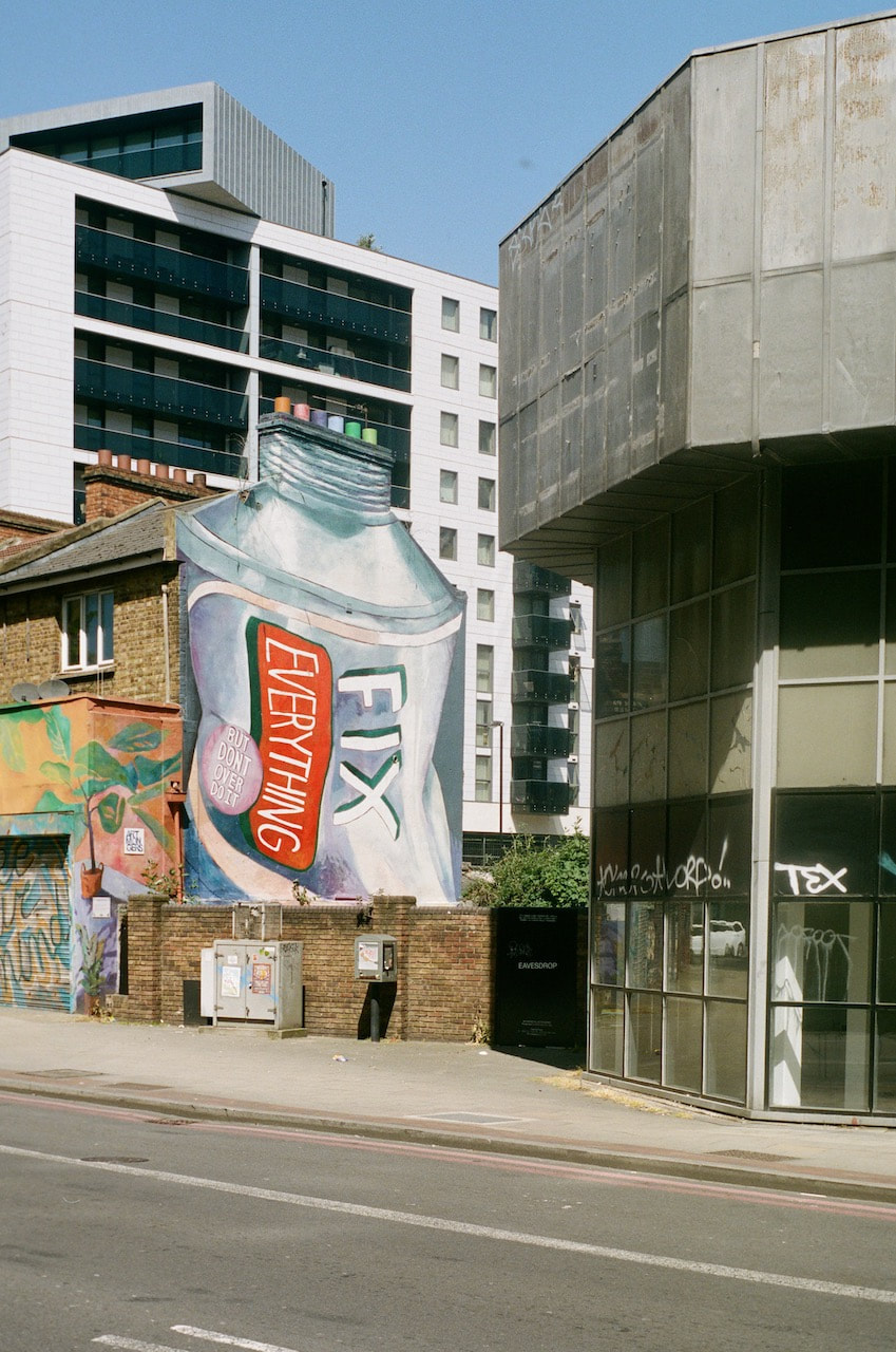
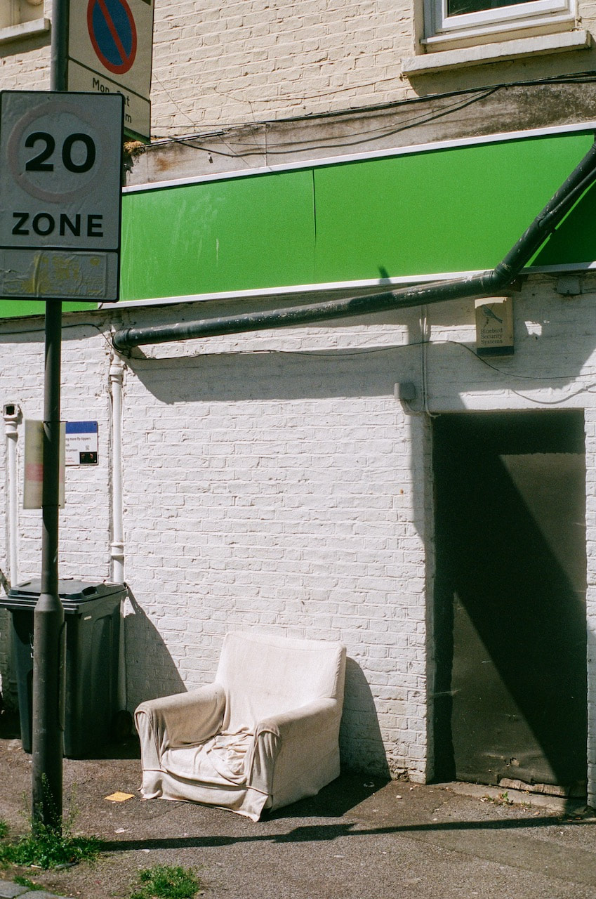
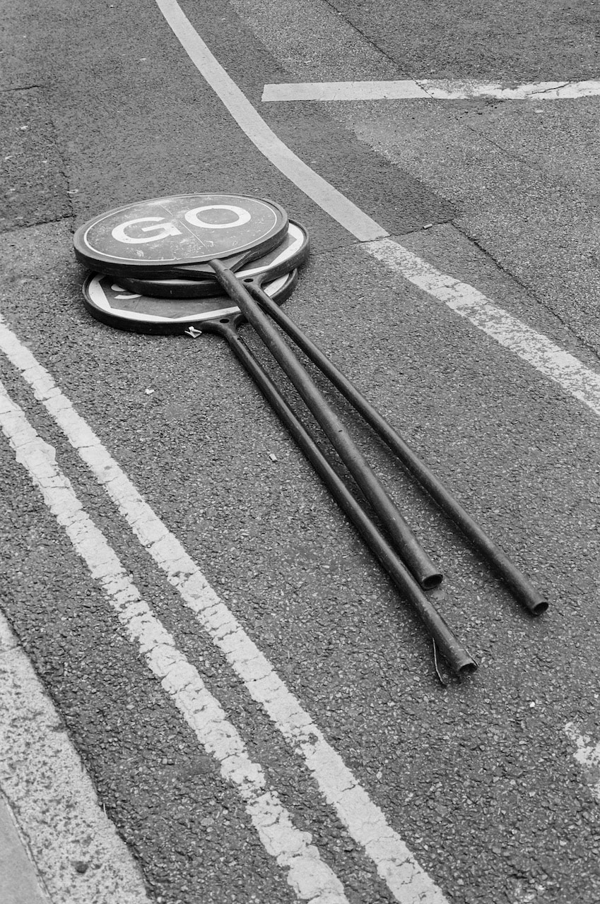
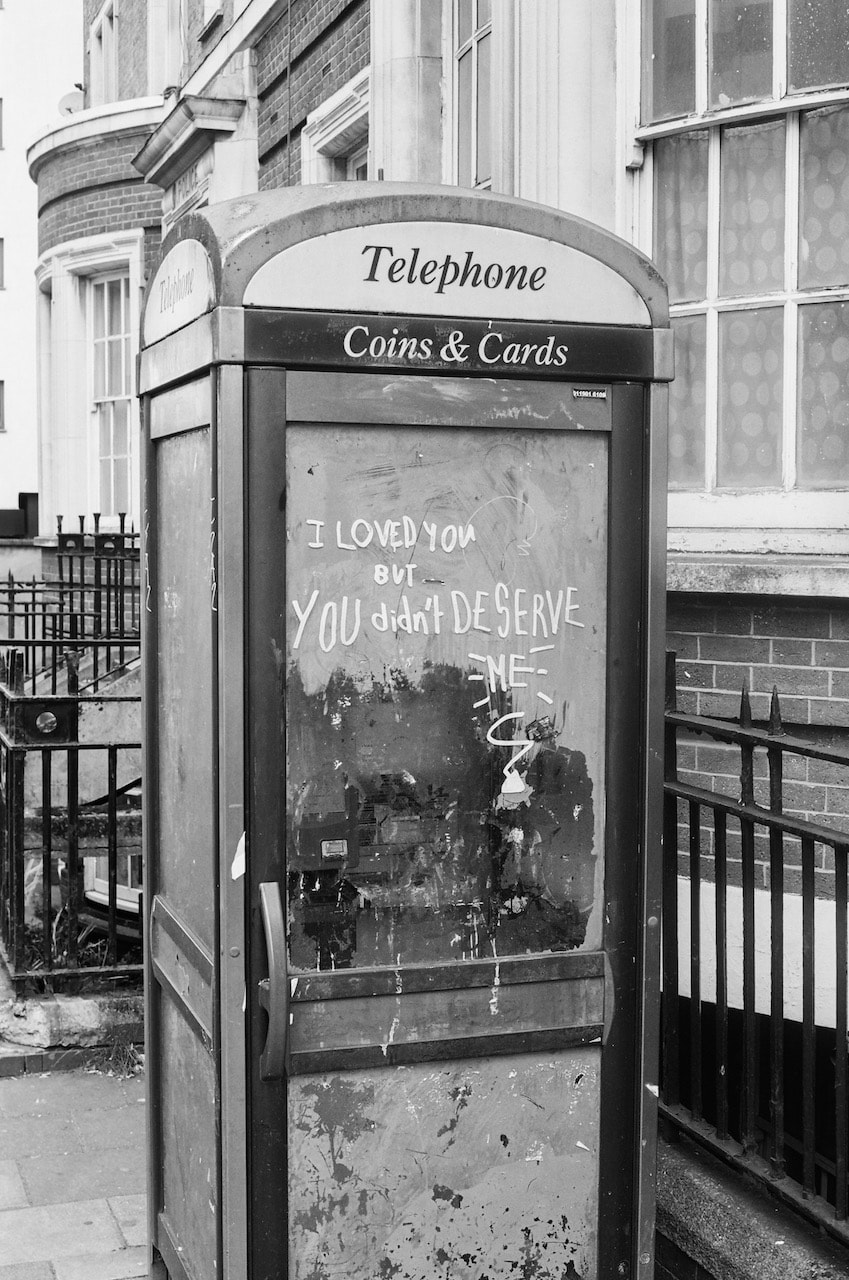
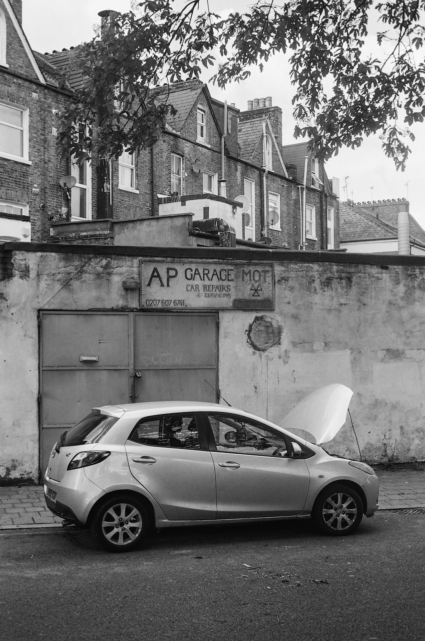
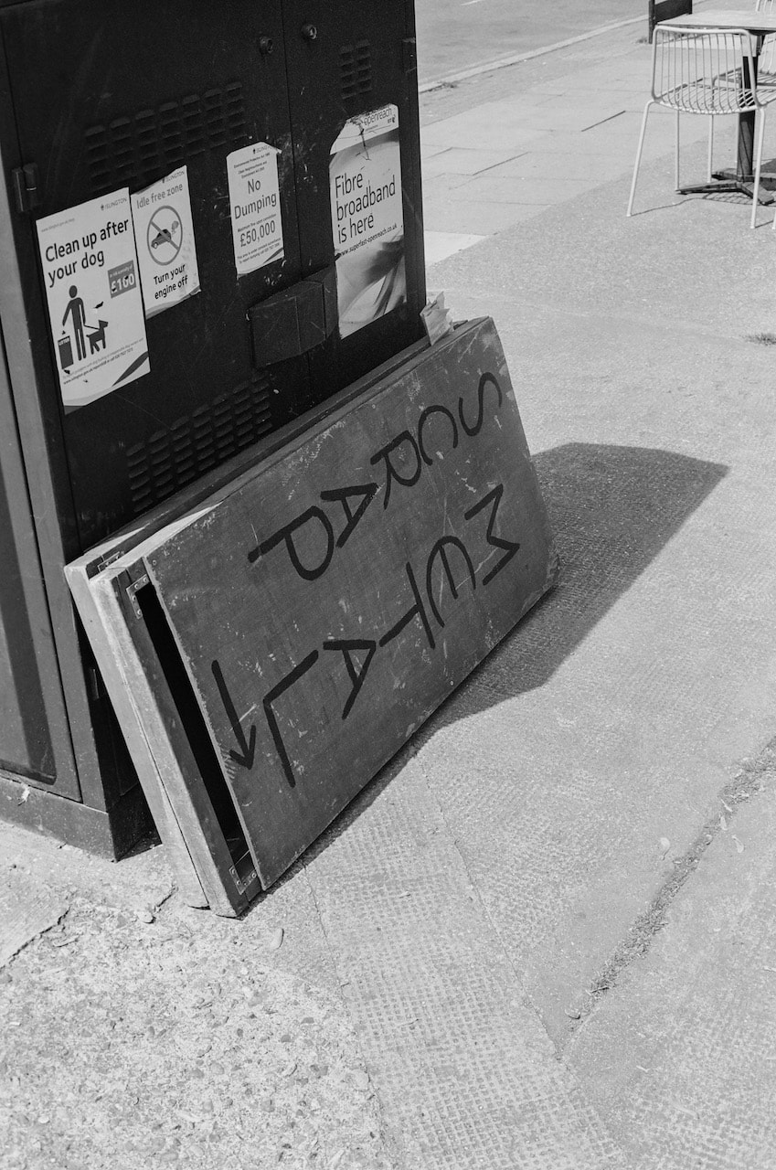
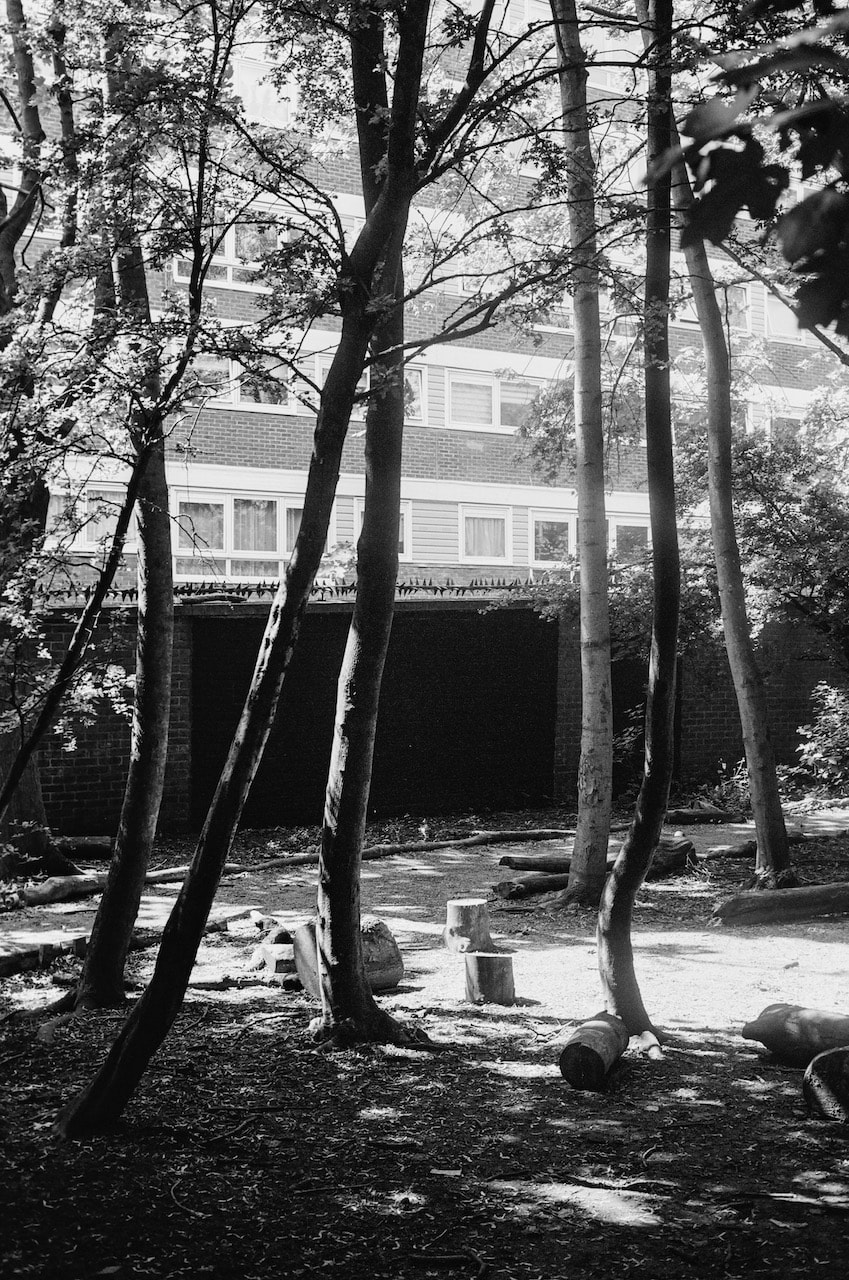
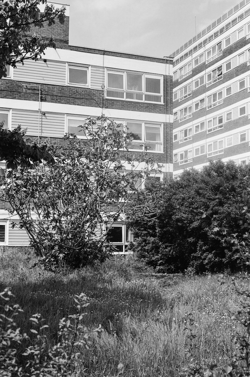
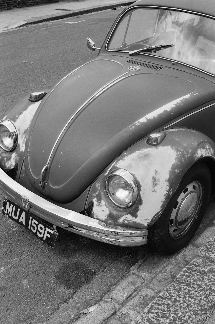
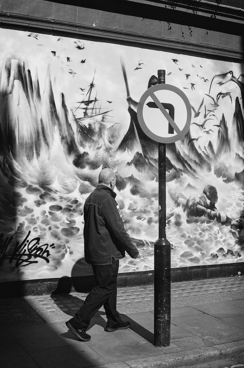
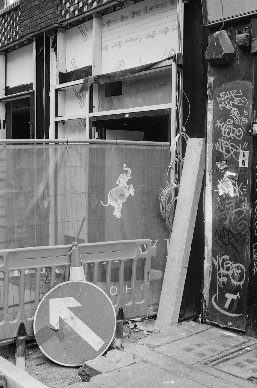
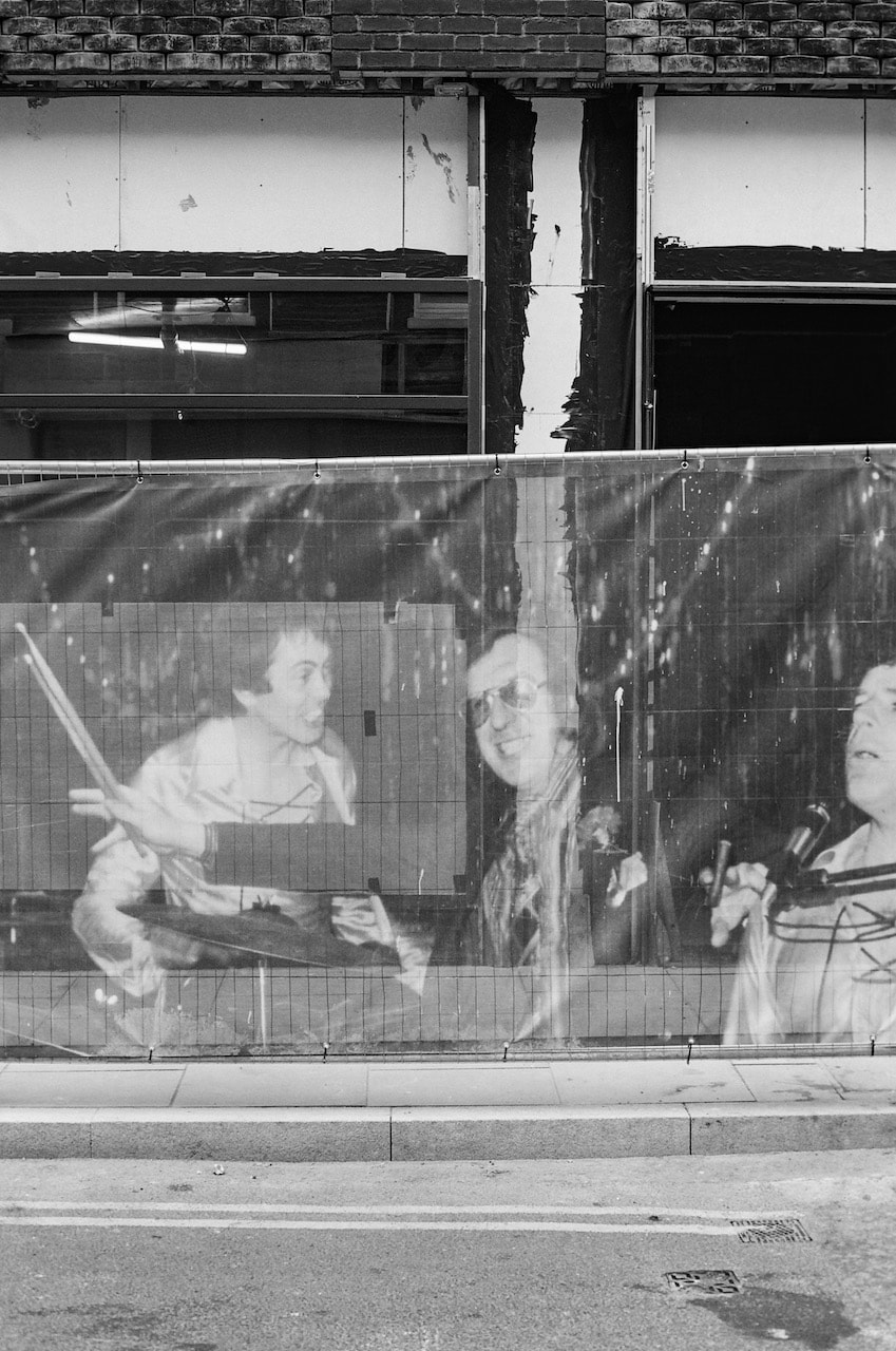
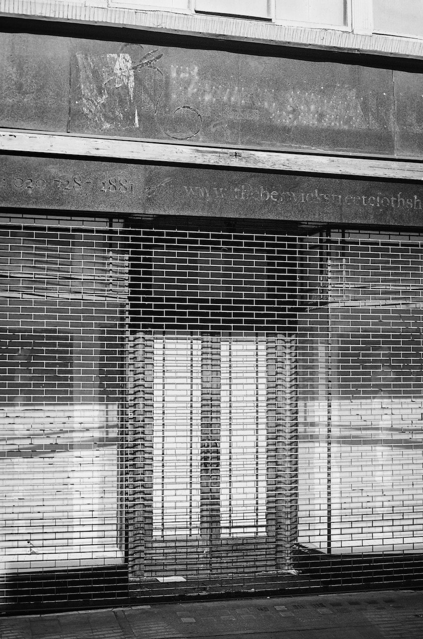
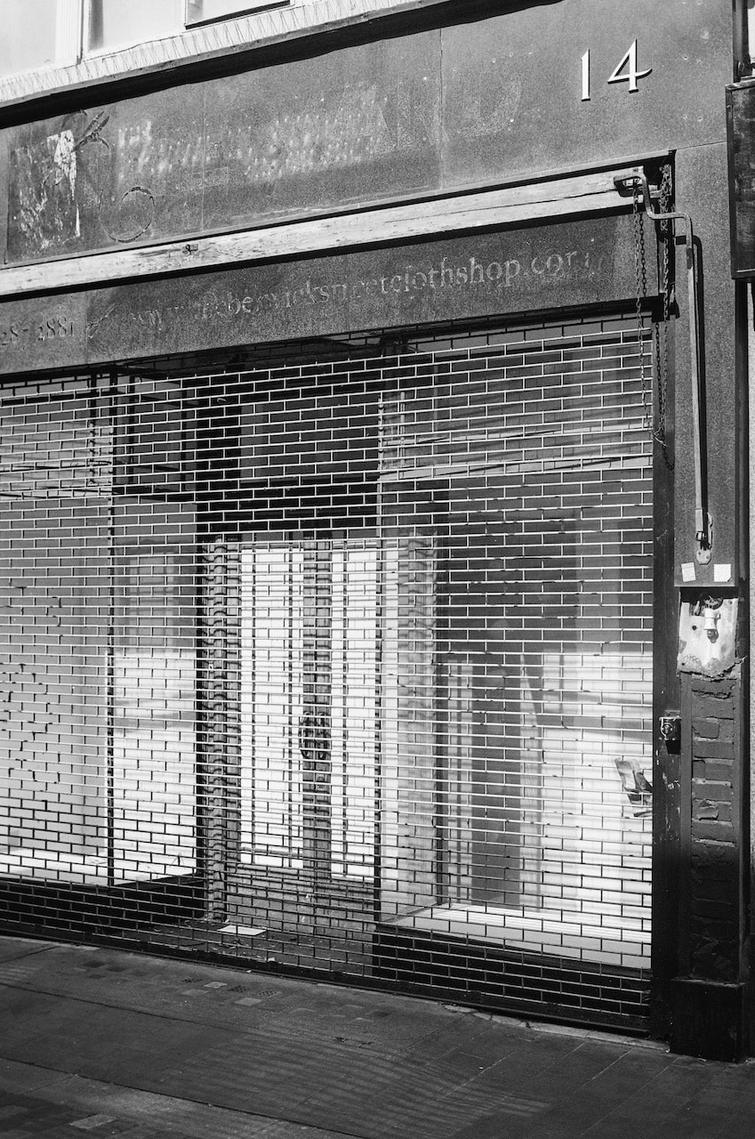
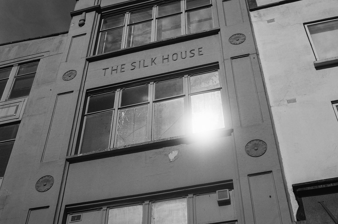
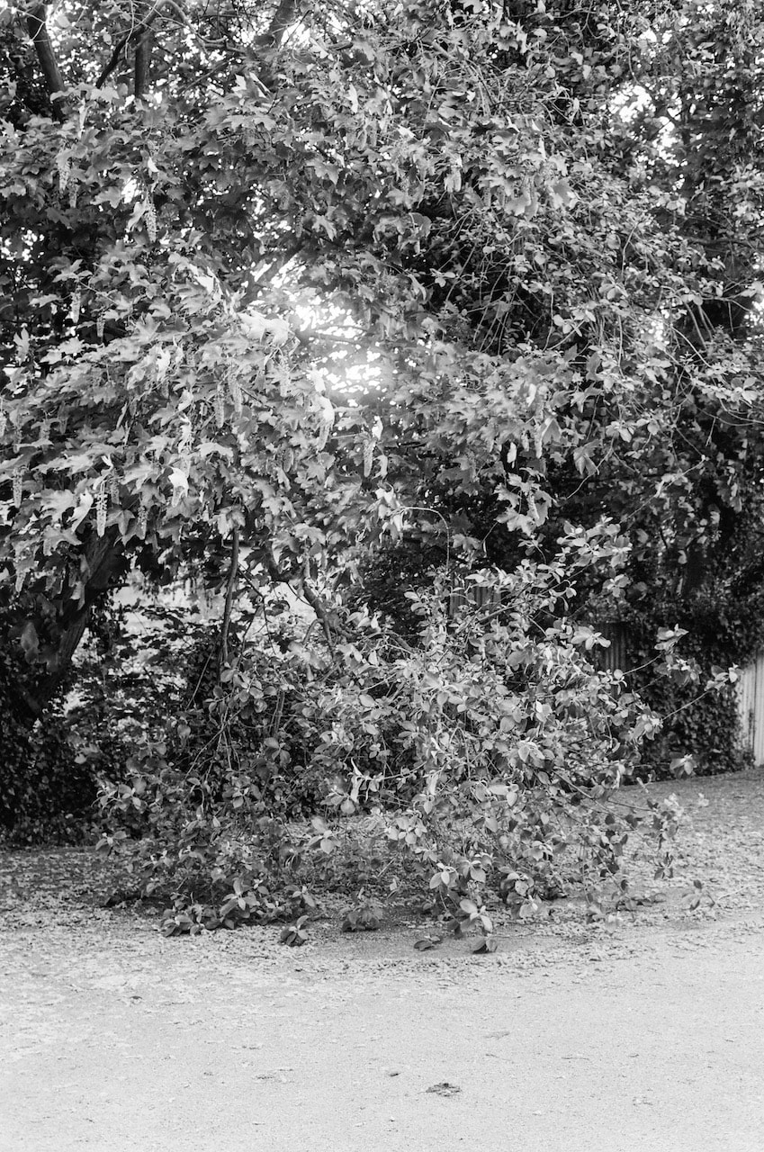
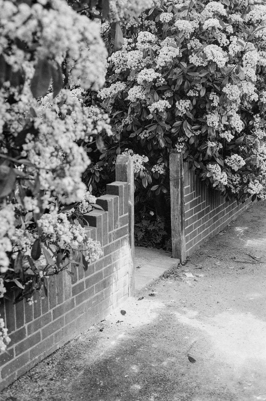
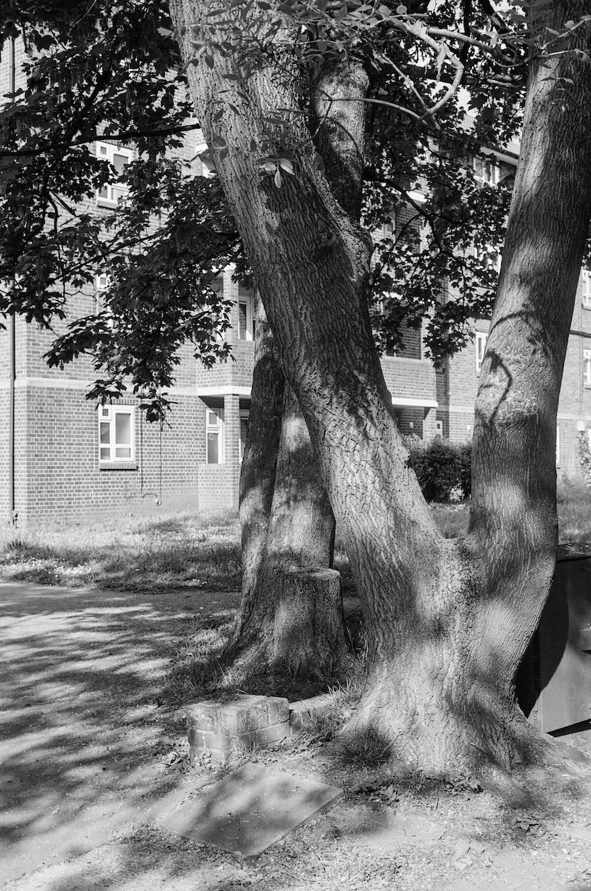
Some of my favourite images so far...
These are just a few of my favourite photographs made since September 2022. They are an indication of the kinds of photographs I enjoy making. I'm often not sure what causes me to want to stop and take a photograph but I try not to question the instinct and just make a careful record of whatever it is that has called out to me.
Photobook analysis:
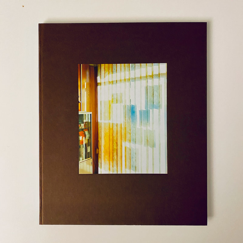
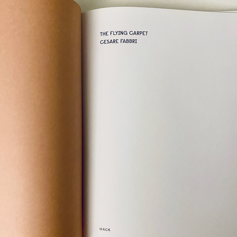
The Flying Carpet by Cesare Fabbri. MACK, 2017
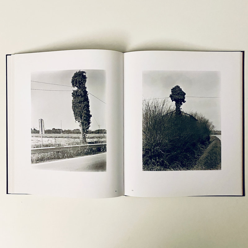
The book presents 77 colour and black and white photographs of the Italian landscape, its buildings, signs, fences, trees and other objects associated with rural life. The cover is mid brown paper covered board, like the colour of soil, with a tipped in colour photograph of a window blind taking up about a third of the space and placed centrally. The title and author only appear on the spine.
The photographs are of places and things. There are no people, although we see the traces of their presence everywhere. I like their apparent simplicity. Subjects are often placed in the centre of the frame and documented in an apparently straightforward way. At the back of the book, the photographer includes a quotation and a short statement. He refers to a text entitled Flying Carpets by Cristina Campo who suggests that we can reach "the order of the spirit, of contemplative mathematics" through the real. Fabbri writes:
Photography, so preciously ambiguous, both simple and mysterious, embodies the same magic. Sometimes, something too familiar becomes invisible. Photography allows us to discover and see for the first time something that was right before our eyes.
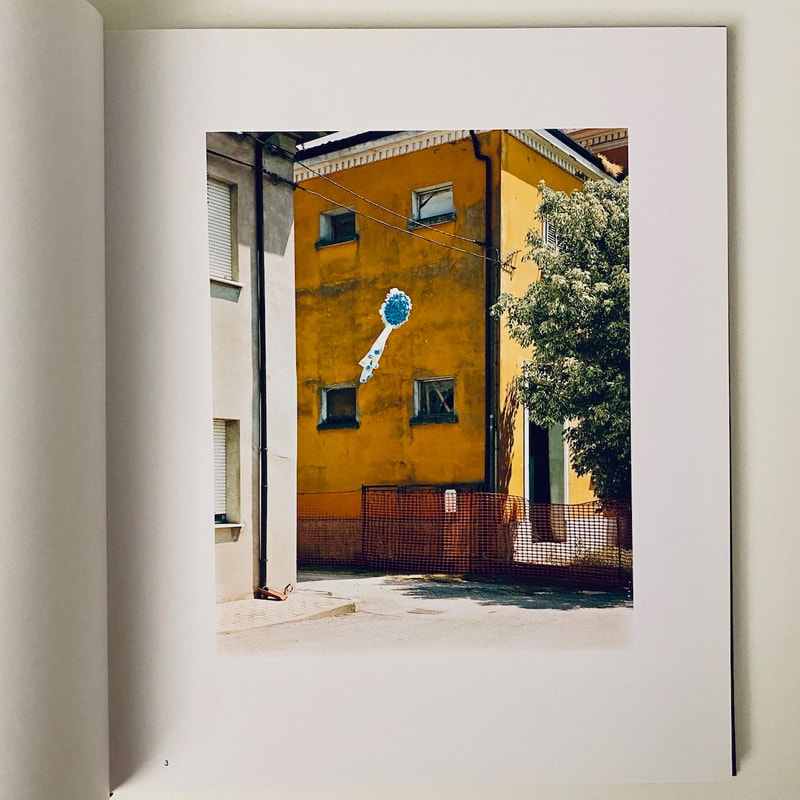
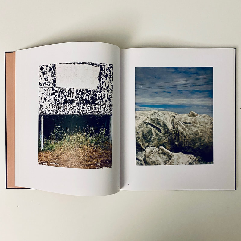
At first glance, we might assume that these pictures are simple documents of things the photographer has seen whilst exploring the Italian landscape. However, with repeated viewing, there is a kind of intensity of vision, a complete focus on the seemingly mundane, that transforms these subjects into small miracles. The pictures appear to have been made with a medium or large format film camera, mostly square in format. The pictures are sharp and detailed and the photographer sometimes uses a shallow depth of field which isolates objects from their surroundings. Individually, the photographs aren't always super sophisticated but, taken together, they seem to talk to one another, the sum being greater than the parts. Sometimes, we are shown a real tree or building. In other pictures, we see representations of them - pictures of pictures. Fabbri seems to be exploring the way photographs of things are not the same as the things themselves. This is a complex issue about the way we see reality and use photographs.
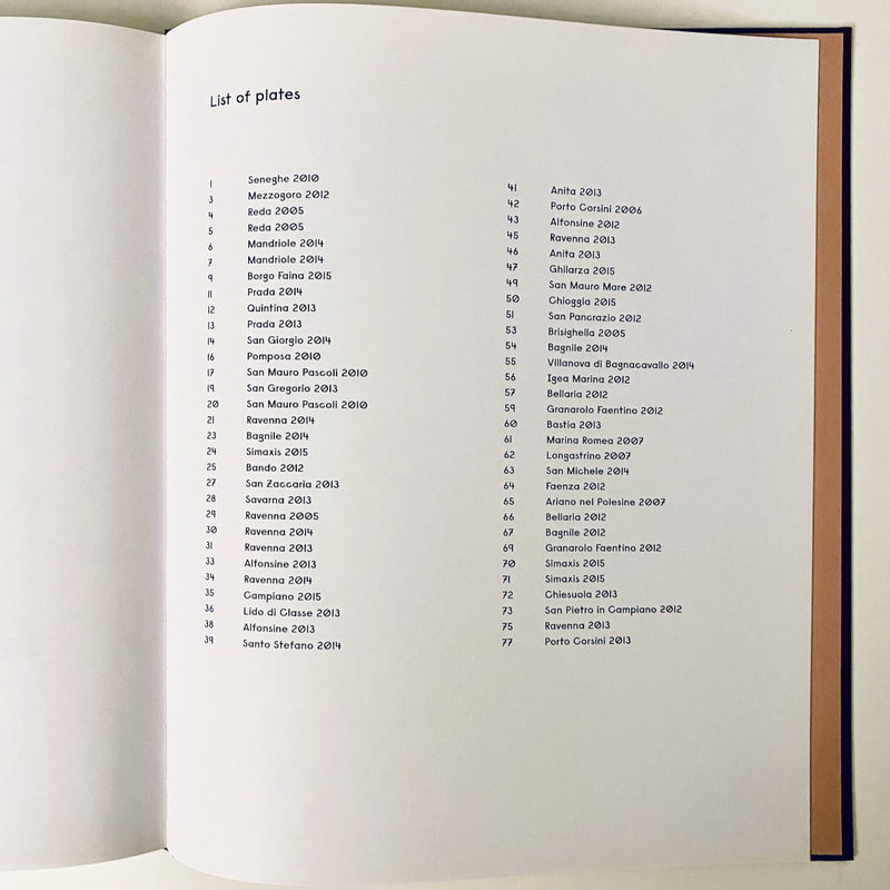
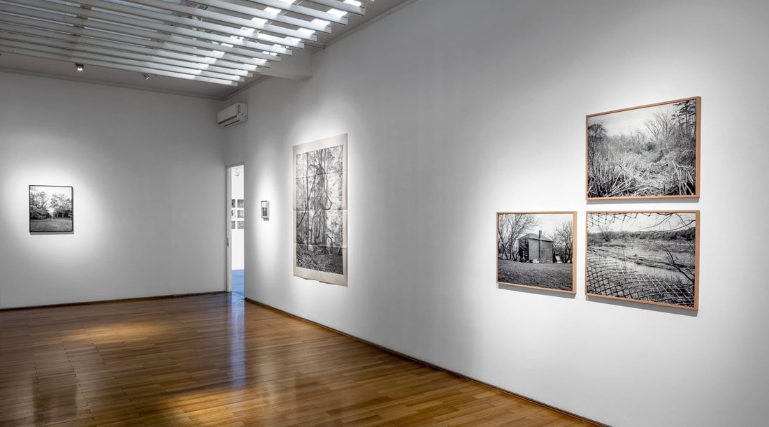
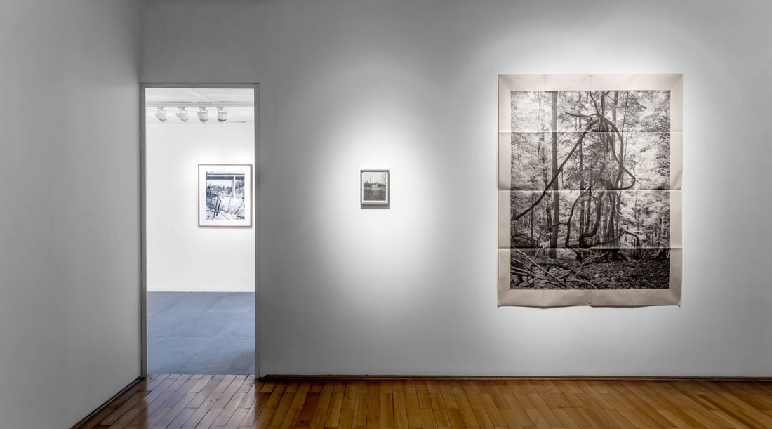
Most the photographs appear singly, centrally placed on the right hand side of the double spread with plenty of white space around them. Occasionally we are presented with images on facing pages which we might choose to read as diptychs. The black and white pictures appear near the centre of the book and the final image is also black and white. There are no captions. The locations appear after the final photograph. The layout is not particularly innovative or unusual and viewing the book is not that dissimilar to viewing an exhibition of framed prints.
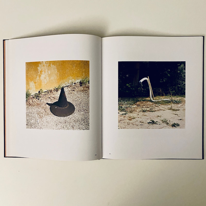
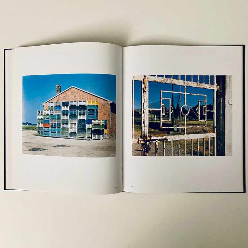
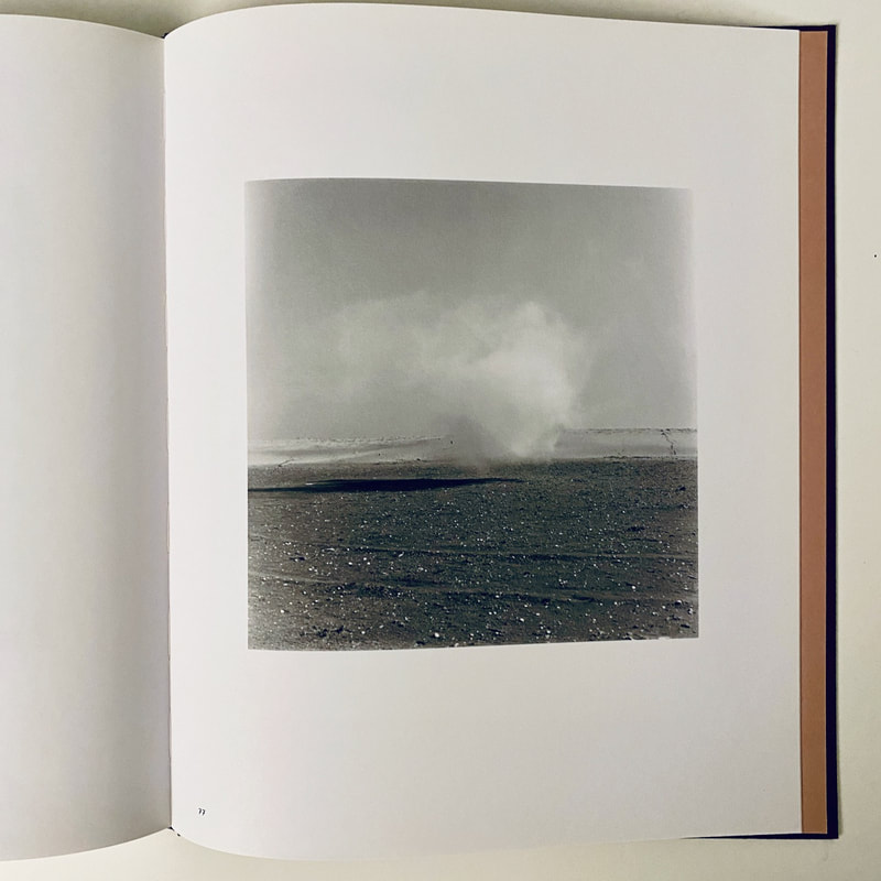
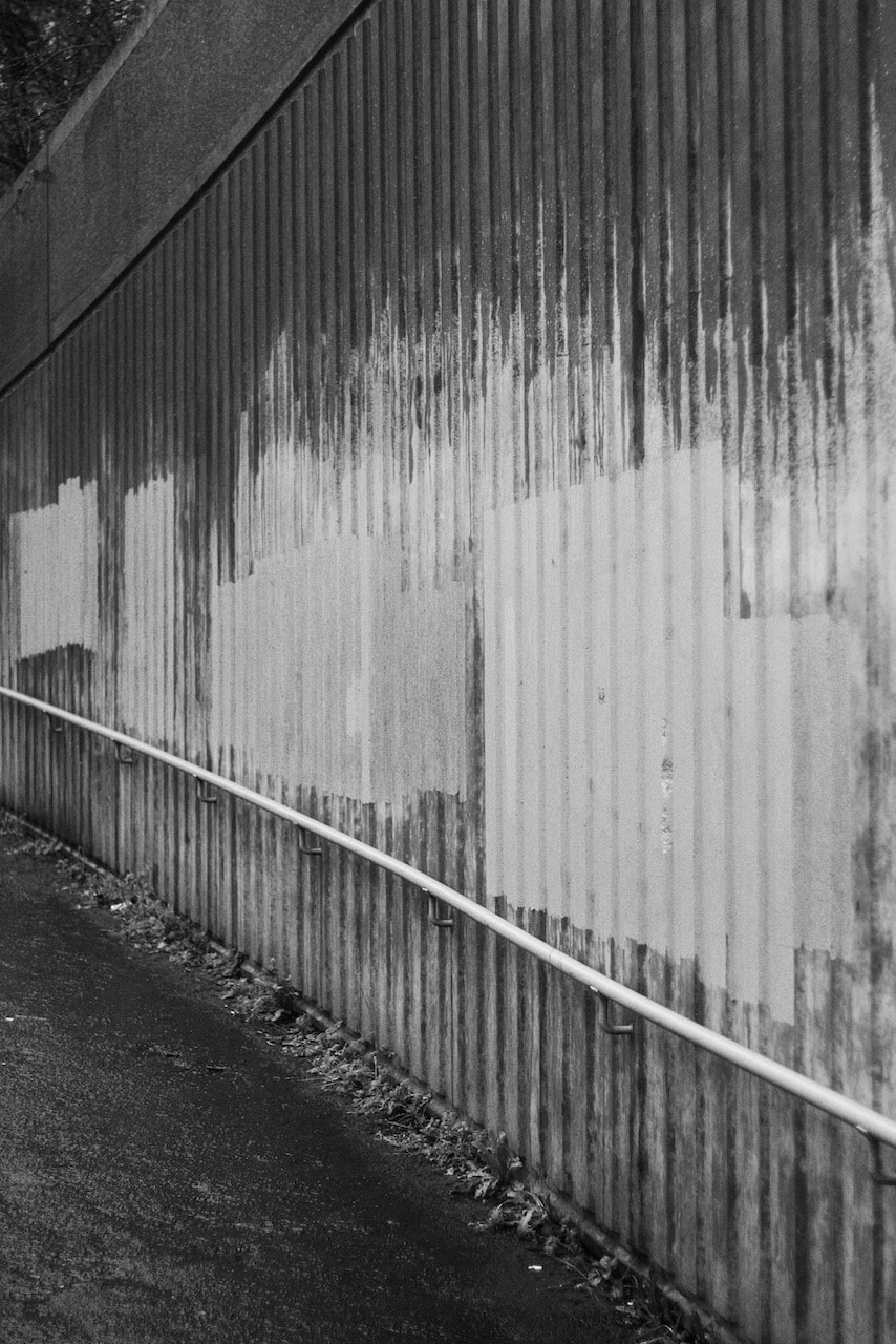
The font is quite unusual. I couldn't identify it. There is very little text in the book. Fabbri seems to have thought carefully about the sequencing of the pictures. They relate to one another in various ways, by colour, or subject matter or composition, for example. The book begins with images of buildings then we move out into the fields where we encounter birds, scarecrows and signs. We then return to a town where we see trees and bushes juxtaposed against buildings. The focus then shifts to a mixture of ordinary objects taken out of context - storage tanks, a climbing frame, a witch's hat and pipe - that seem quite sculptural and surreal. We are shown pictures of things painted on walls, an eye, a rocket and a Virgin Mary. A (magic) carpet hangs from a metal frame. There is a short sequence of pictures of vegetation in both colour and black and white, followed by posts and signs. More strange structures appear near the end. Perhaps they have been damaged and lost their original function. The final sequence of images is the most ambiguous and dream-like: a jet of steam rising rising from the ground, childlike drawings of smoking chimneys, cloud wallpaper in a shop front and, last of all, a cloud of smoke hovering just above the ground. Everything solid seems have melted into the air.
Most the photographs appear singly, centrally placed on the right hand side of the double spread with plenty of white space around them. Occasionally we are presented with images on facing pages which we might choose to read as diptychs. The black and white pictures appear near the centre of the book and the final image is also black and white. There are no captions. The locations appear after the final photograph. The layout is not particularly innovative or unusual and viewing the book is not that dissimilar to viewing an exhibition of framed prints.
The font is quite unusual. I couldn't identify it. There is very little text in the book. Fabbri seems to have thought carefully about the sequencing of the pictures. They relate to one another in various ways, by colour, or subject matter or composition, for example. The book begins with images of buildings then we move out into the fields where we encounter birds, scarecrows and signs. We then return to a town where we see trees and bushes juxtaposed against buildings. The focus then shifts to a mixture of ordinary objects taken out of context - storage tanks, a climbing frame, a witch's hat and pipe - that seem quite sculptural and surreal. We are shown pictures of things painted on walls, an eye, a rocket and a Virgin Mary. A (magic) carpet hangs from a metal frame. There is a short sequence of pictures of vegetation in both colour and black and white, followed by posts and signs. More strange structures appear near the end. Perhaps they have been damaged and lost their original function. The final sequence of images is the most ambiguous and dream-like: a jet of steam rising rising from the ground, childlike drawings of smoking chimneys, cloud wallpaper in a shop front and, last of all, a cloud of smoke hovering just above the ground. Everything solid seems have melted into the air.
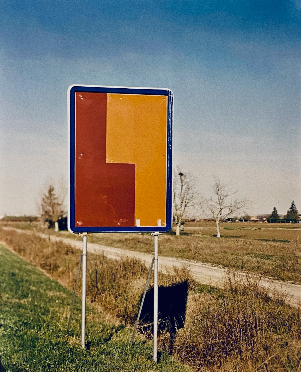
Cesare Fabbri - San Gregorio, 2013
|
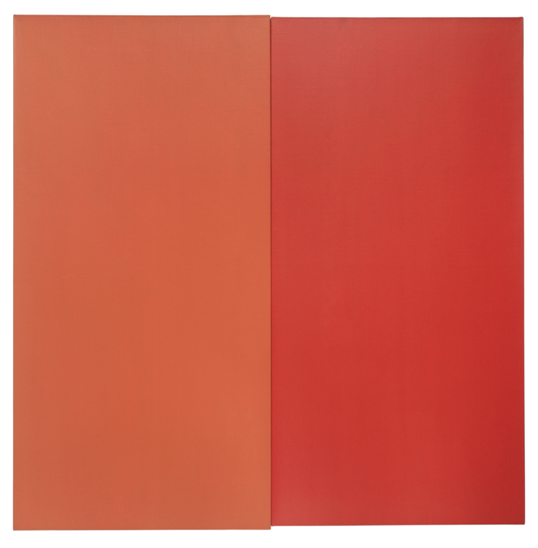
Ellsworth Kelly - Orange Red Relief 1959, Oil on canvas, two joined panels
|
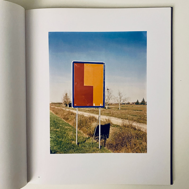
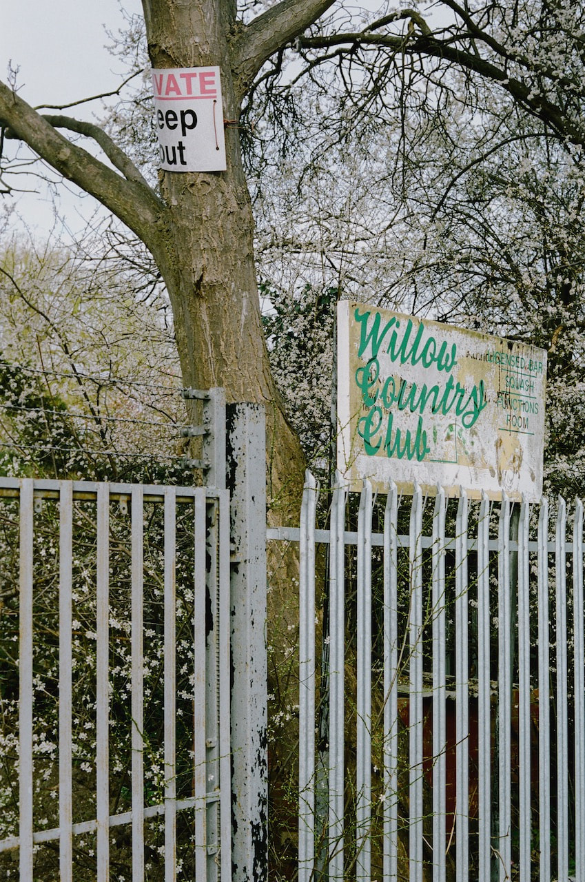
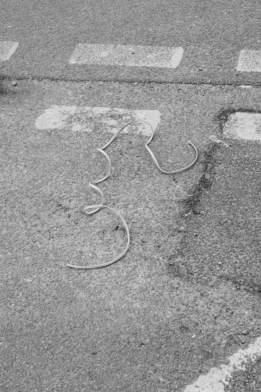
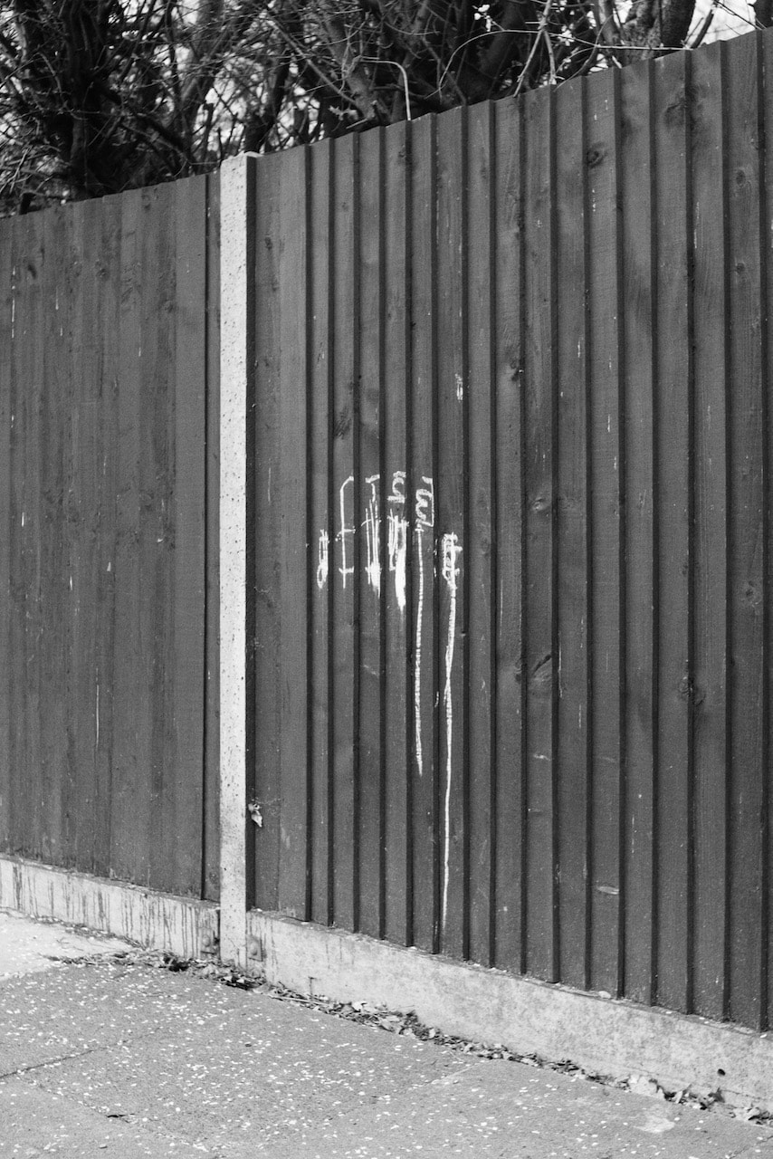
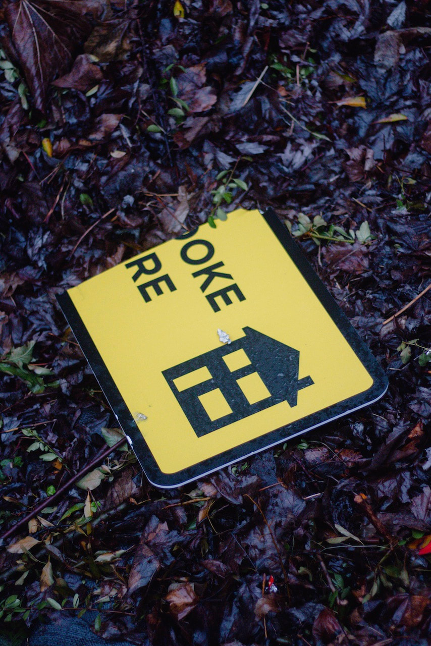
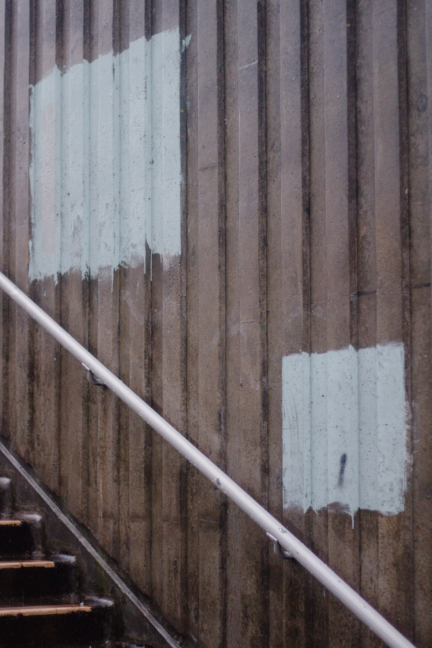
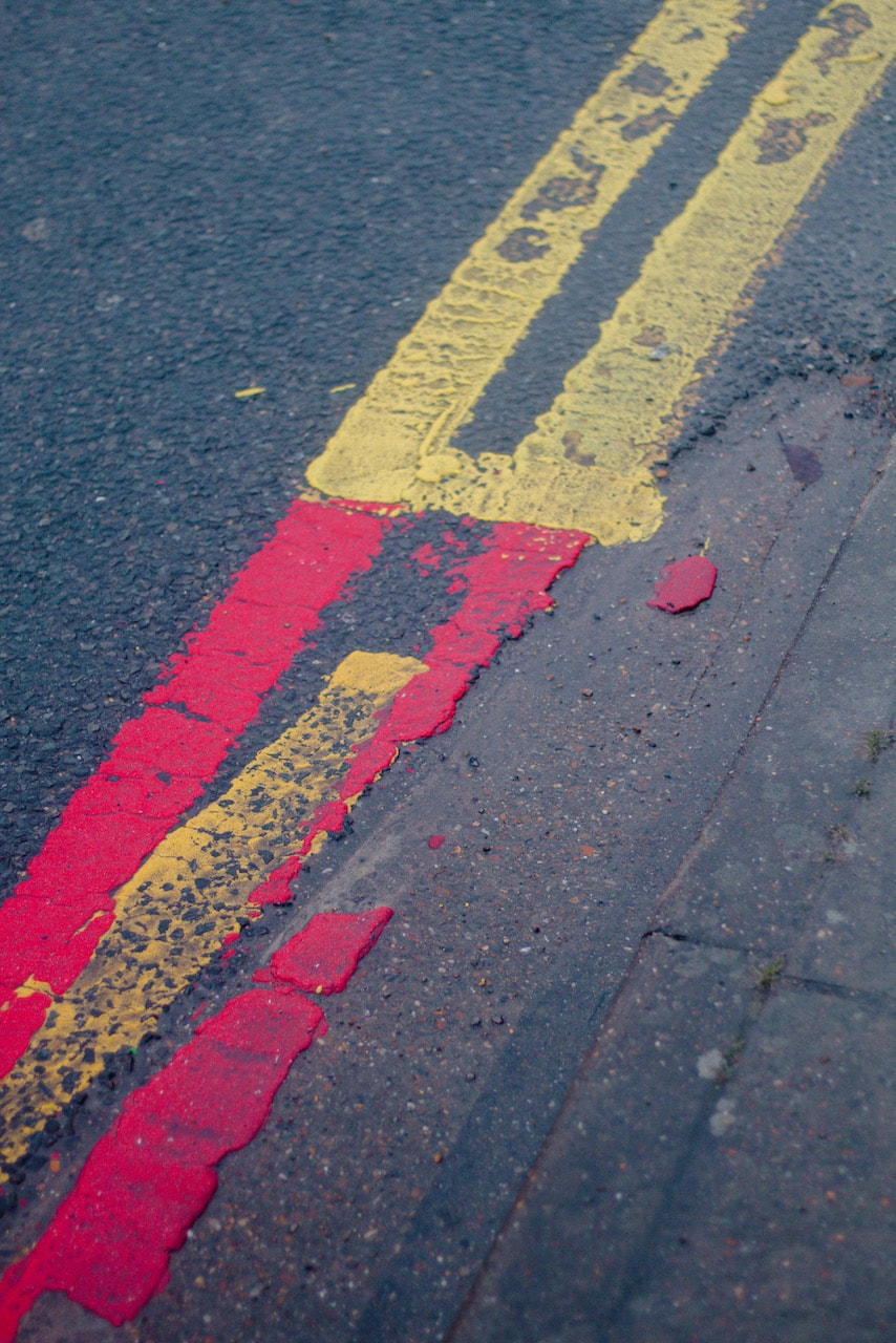
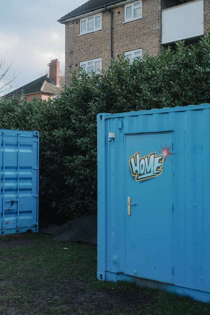
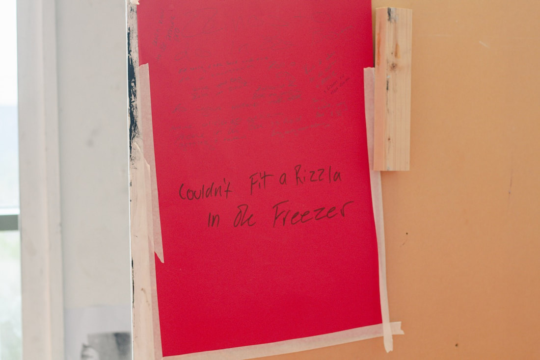
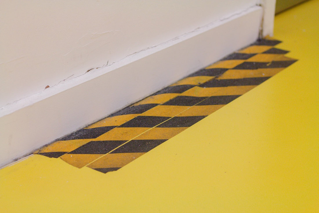
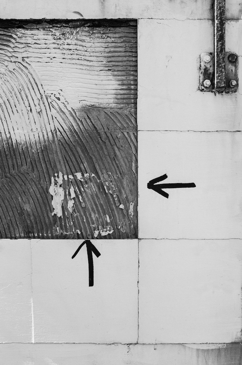
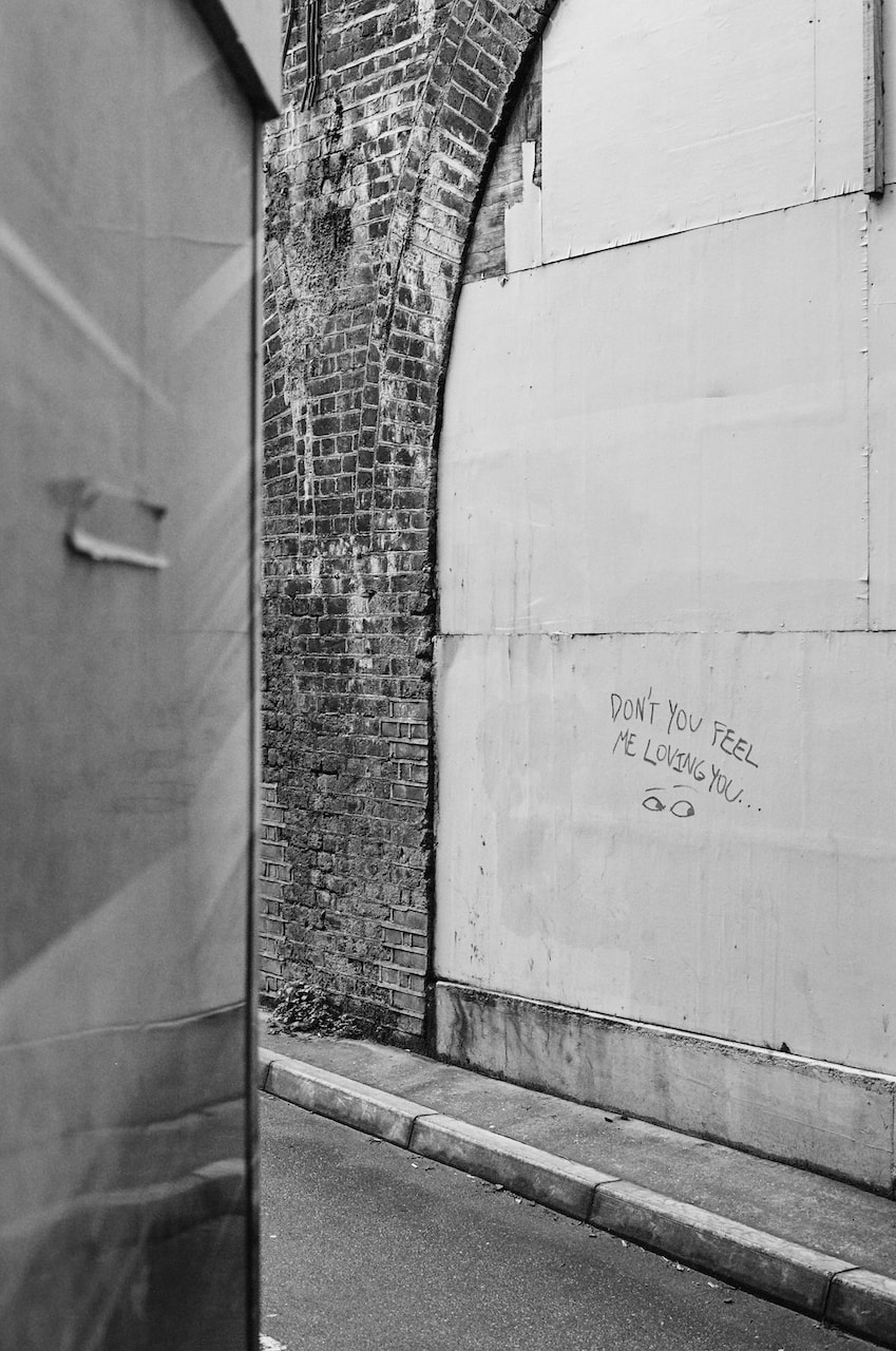
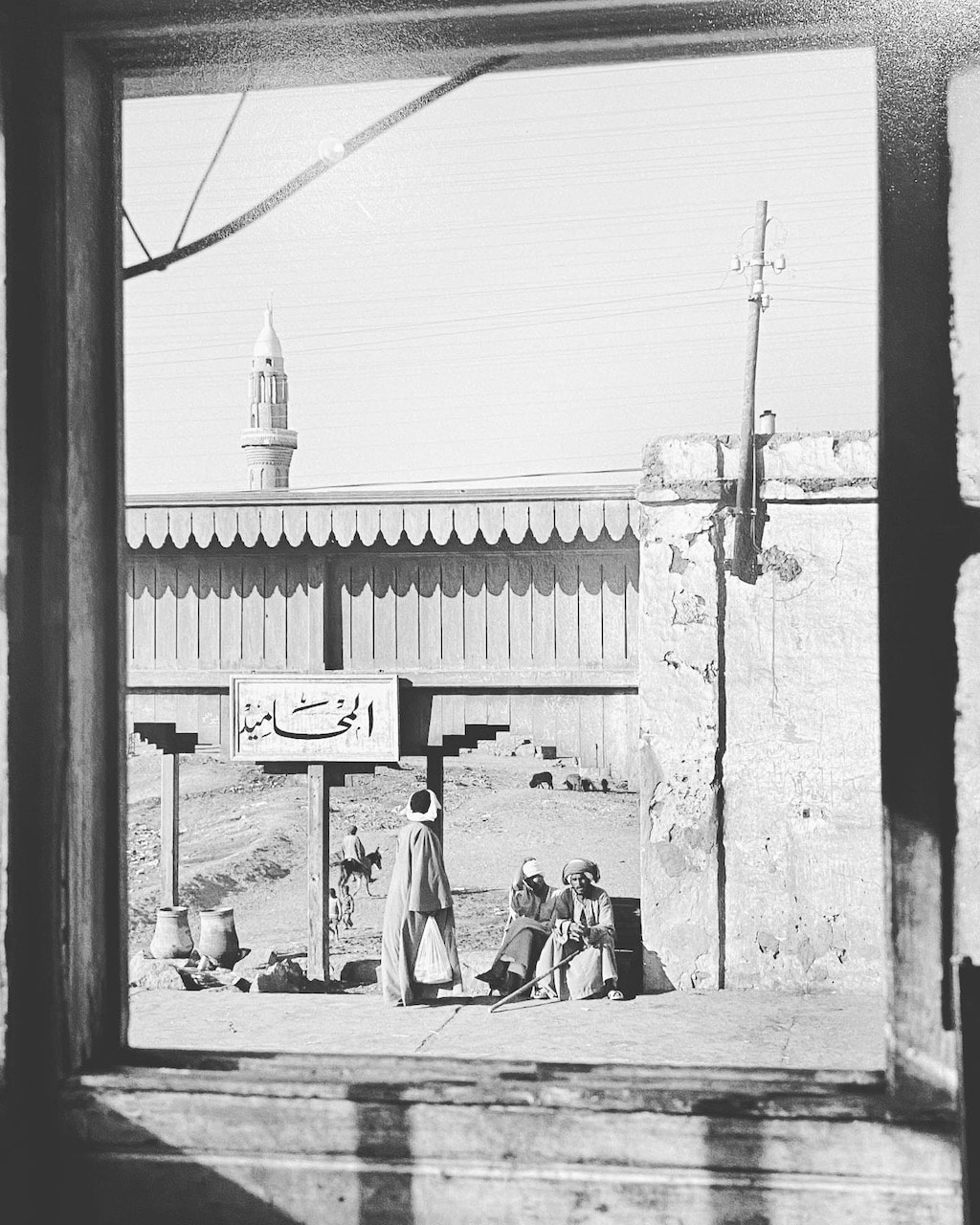
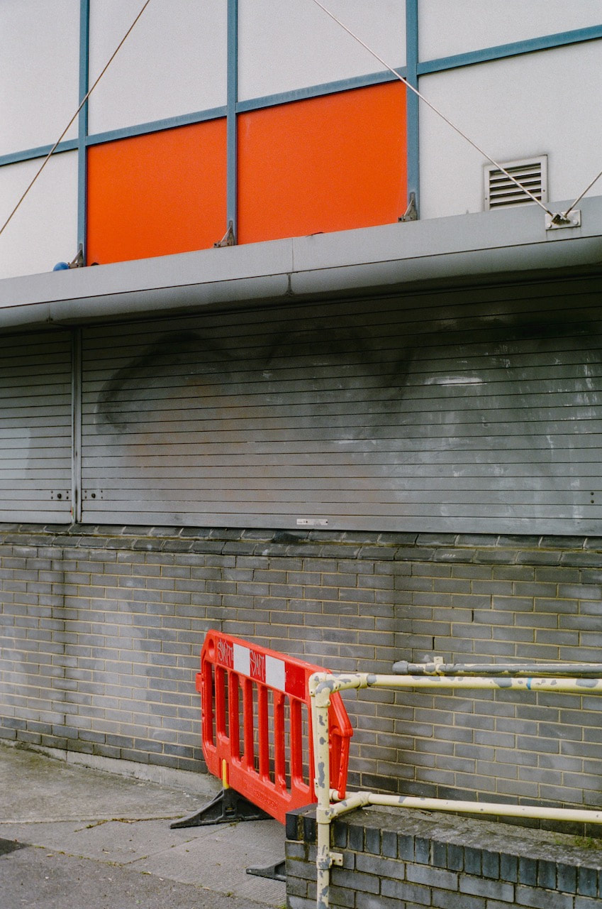
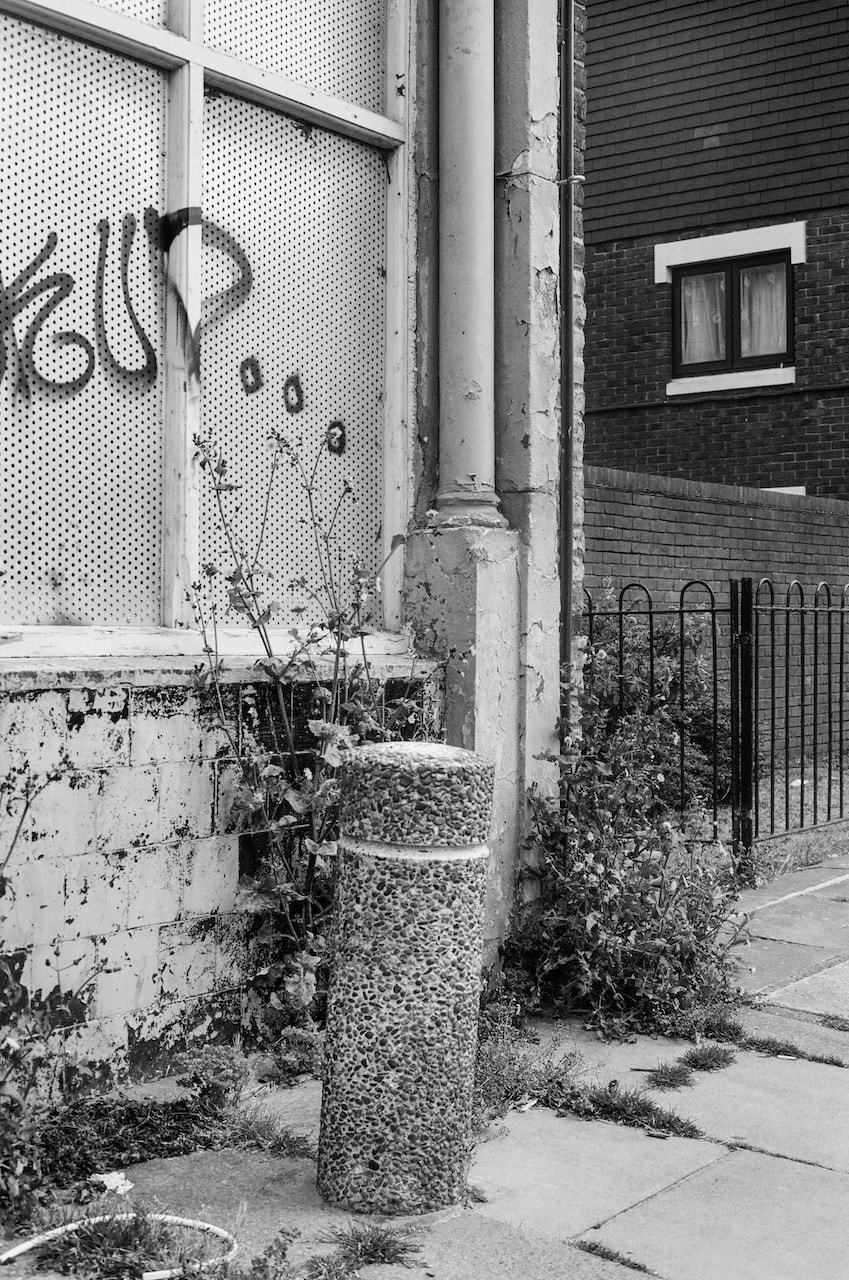
This (far left) is my favourite photograph, which appears on page 19. It is one of several photographs of signs. This one appears to be located on the side of ditch, next to a rough track through a field. The landscape is relatively open with a few scattered trees and a large expanse of sky. The base of the sign almost touches the bottom of the picture frame. The subject and purpose of the sign is obscure. The arrangement of orange and red rectilinear shapes, without anchoring text or symbols of any kind, looks more like an example of a hard-edged abstract painting (left). No matter how hard we look at this sign, we might never understand what it is trying to tell us.
There is a strange kind of alchemy at work in this book. Nothing is quite what it seems and the pictures continued to work on my imagination long after I had looked at them. I immediately wanted to look at the sequence of pictures again to try to wrk out why I loved them so much. They are simultaneously clear and mysterious, obvious and surreal. The book is a good size, about A4 in height and almost square. It isn't too long and there aren't hundreds of pictures. I imagine Cesare Fabbri was fairly ruthless in editing the images down to those that felt were essential. |
What I like most of all is the way the pictures begin with concrete reality and end in a cloud of vapour, as if the world is becoming more mysterious the longer you look at it.
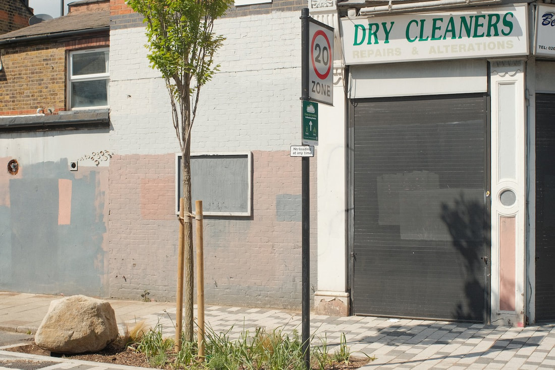
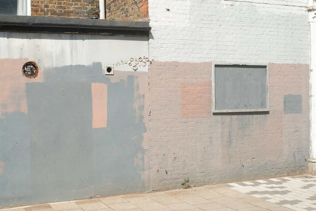
My response to The Flying Carpet
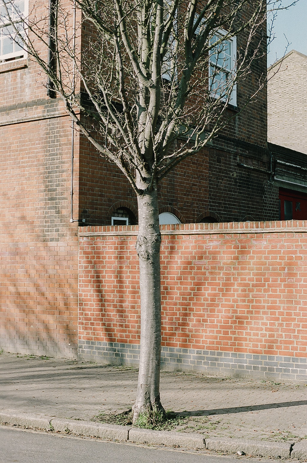
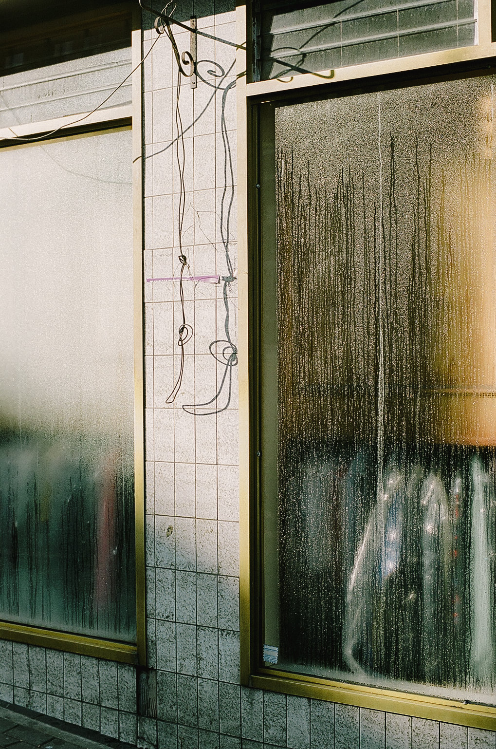
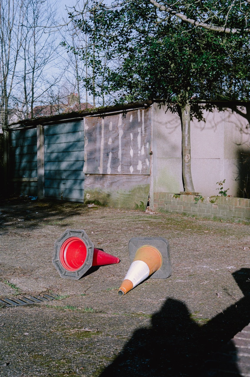
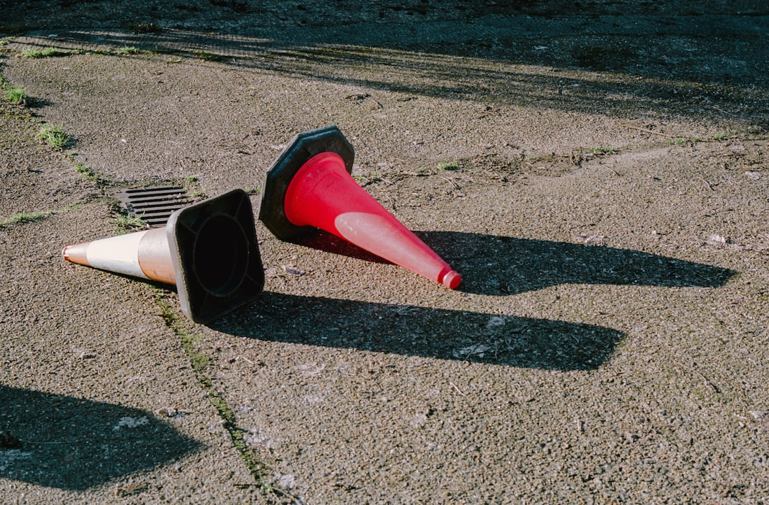
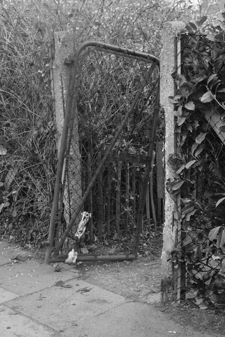
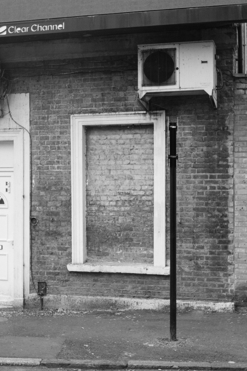
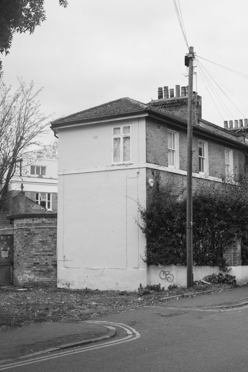
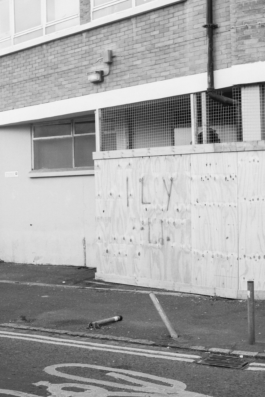
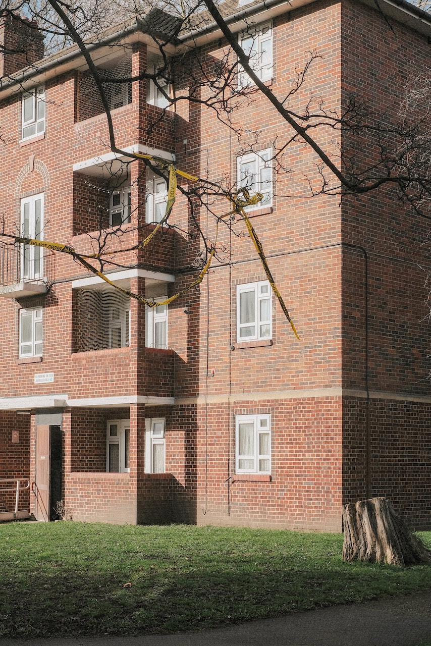
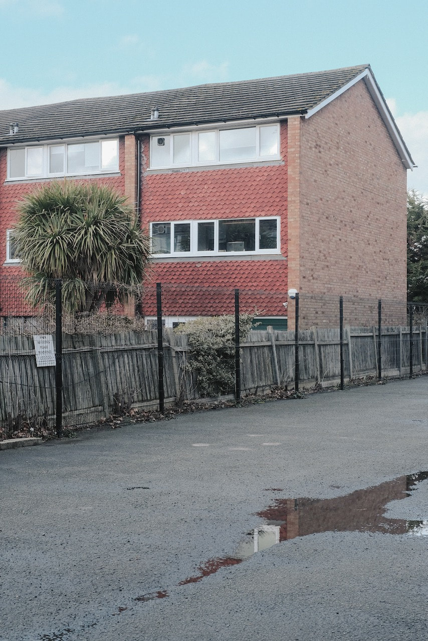
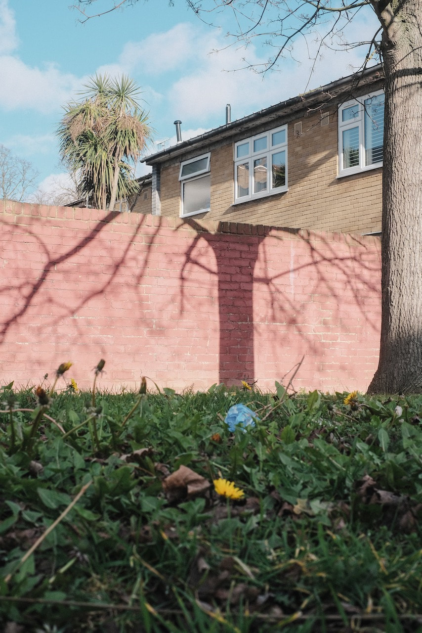
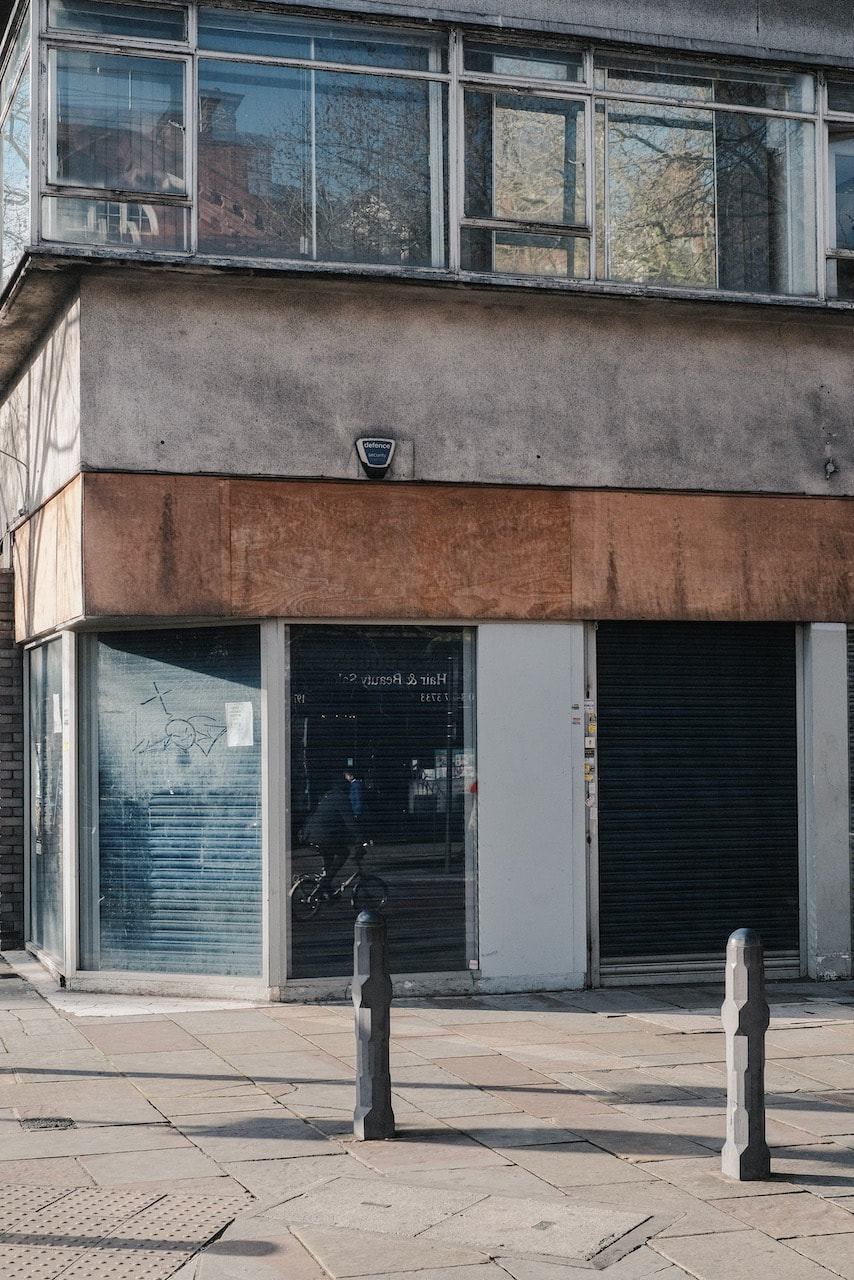
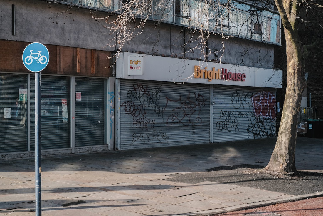
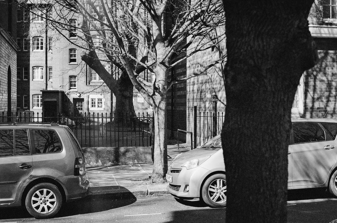
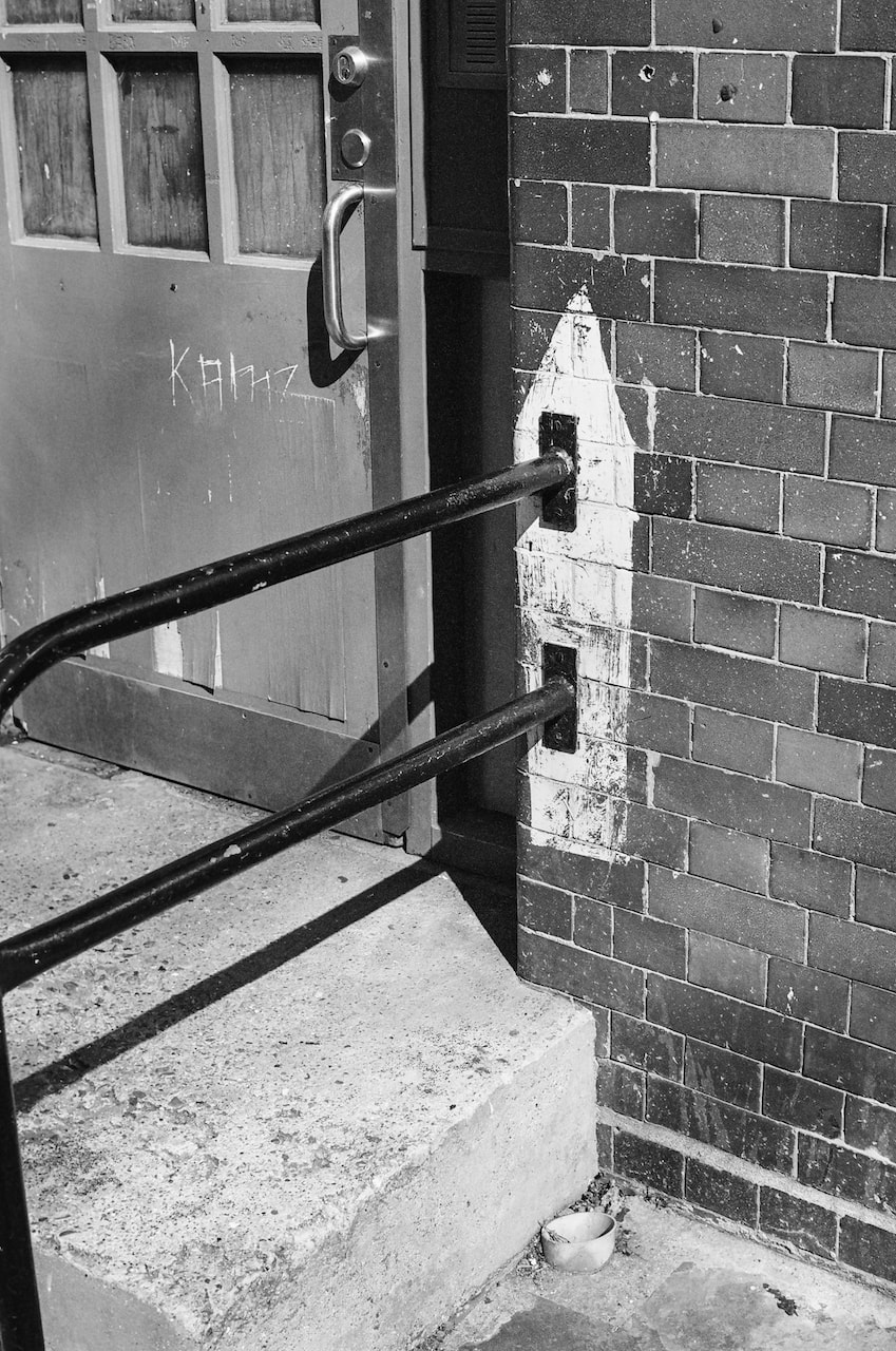
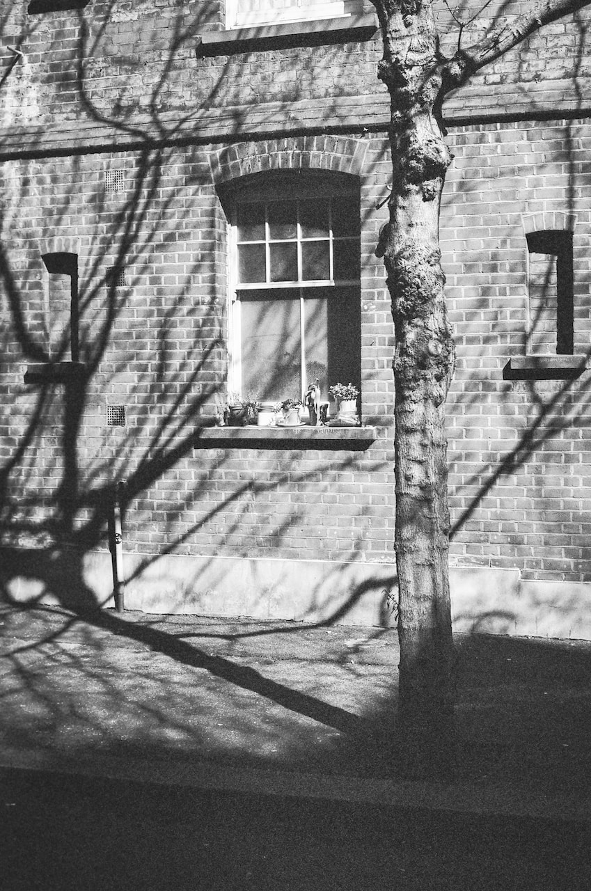
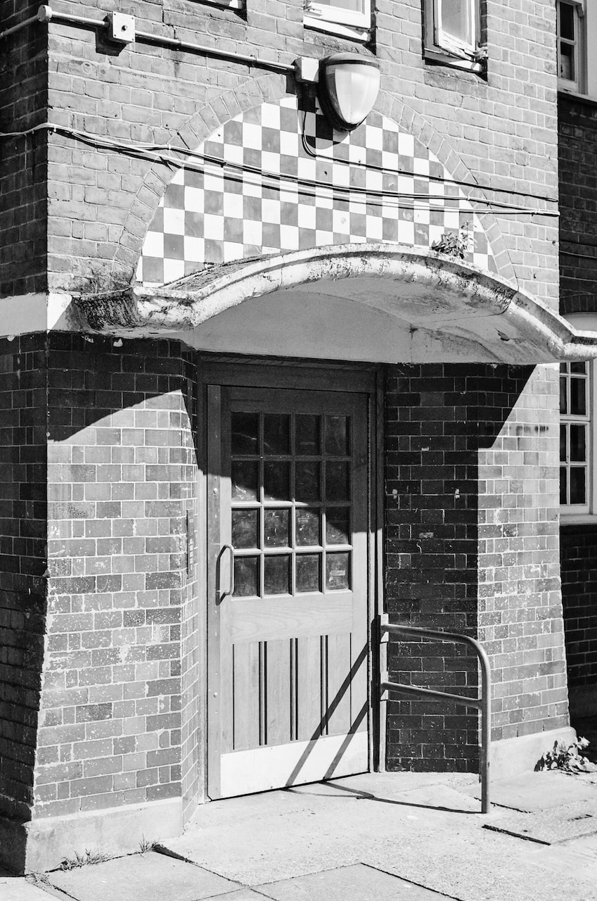
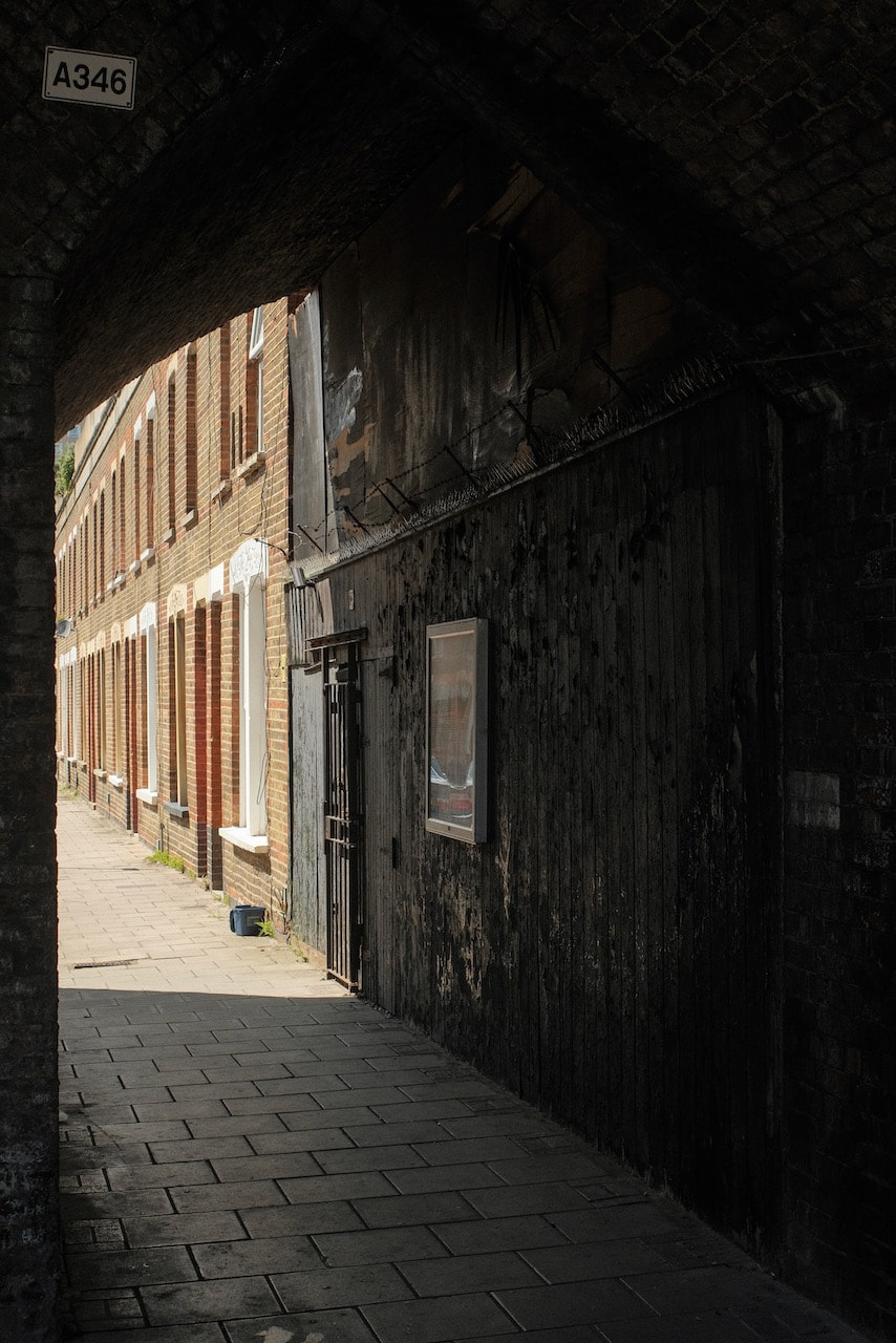
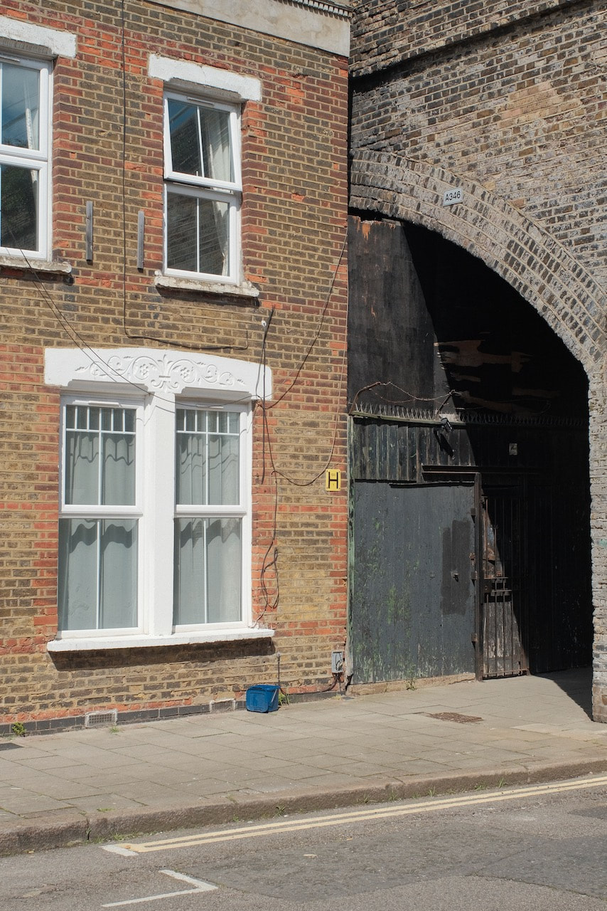
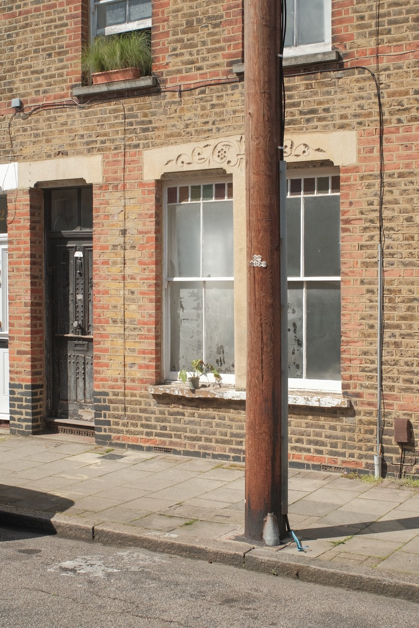
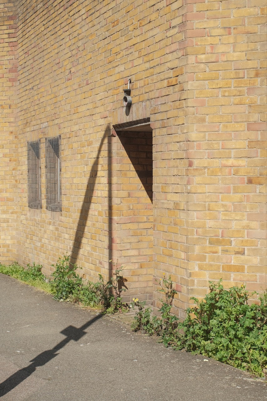
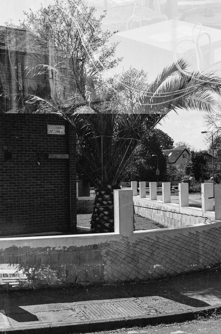
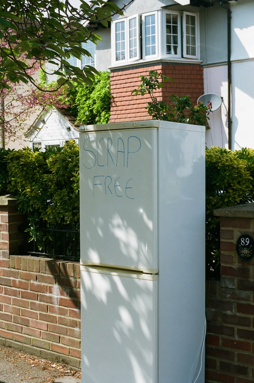
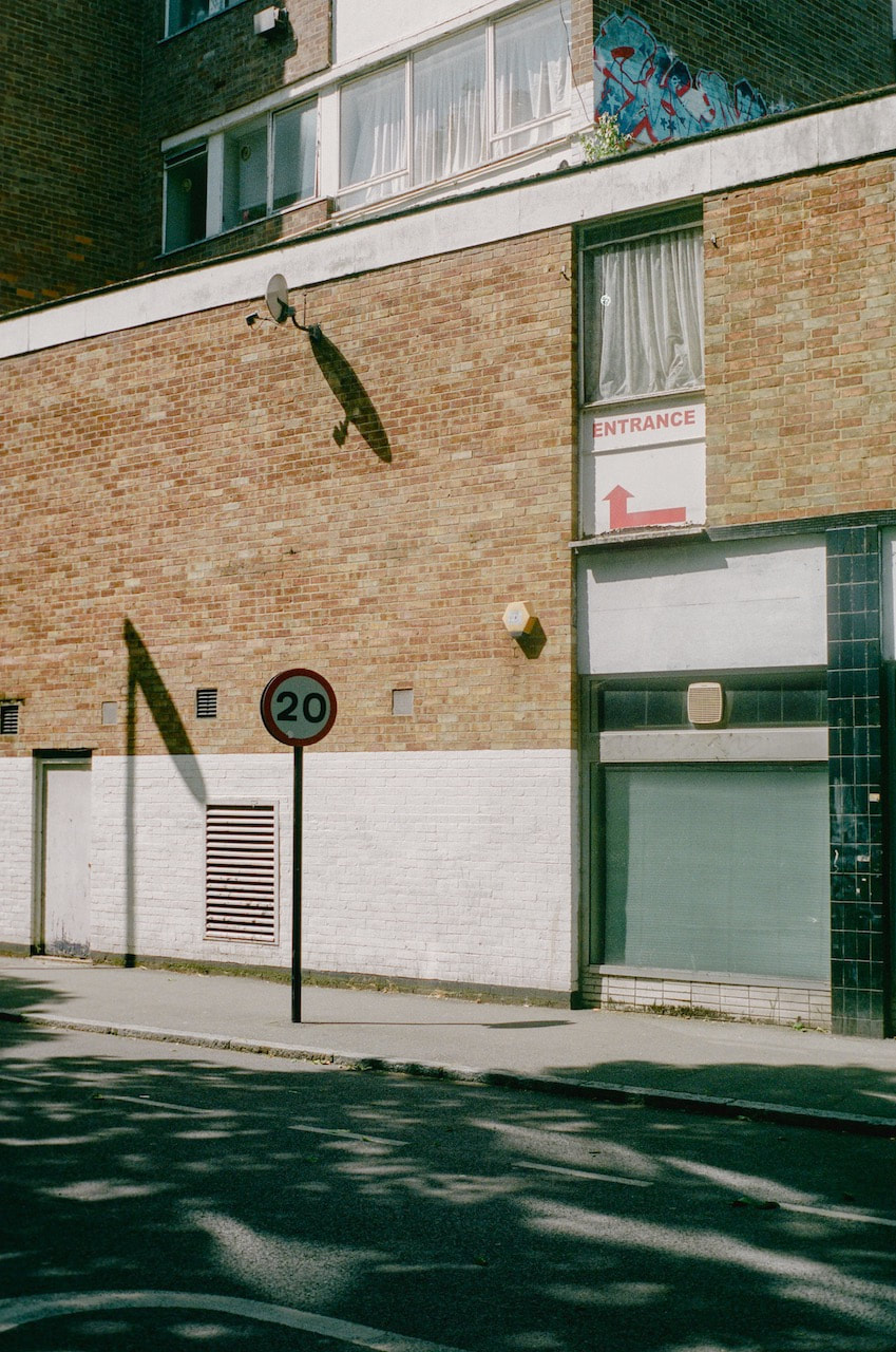
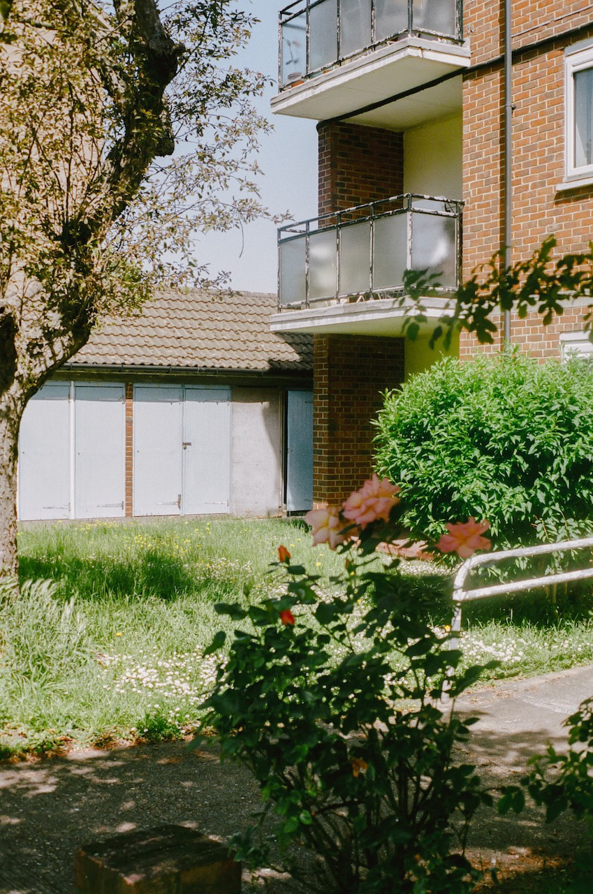
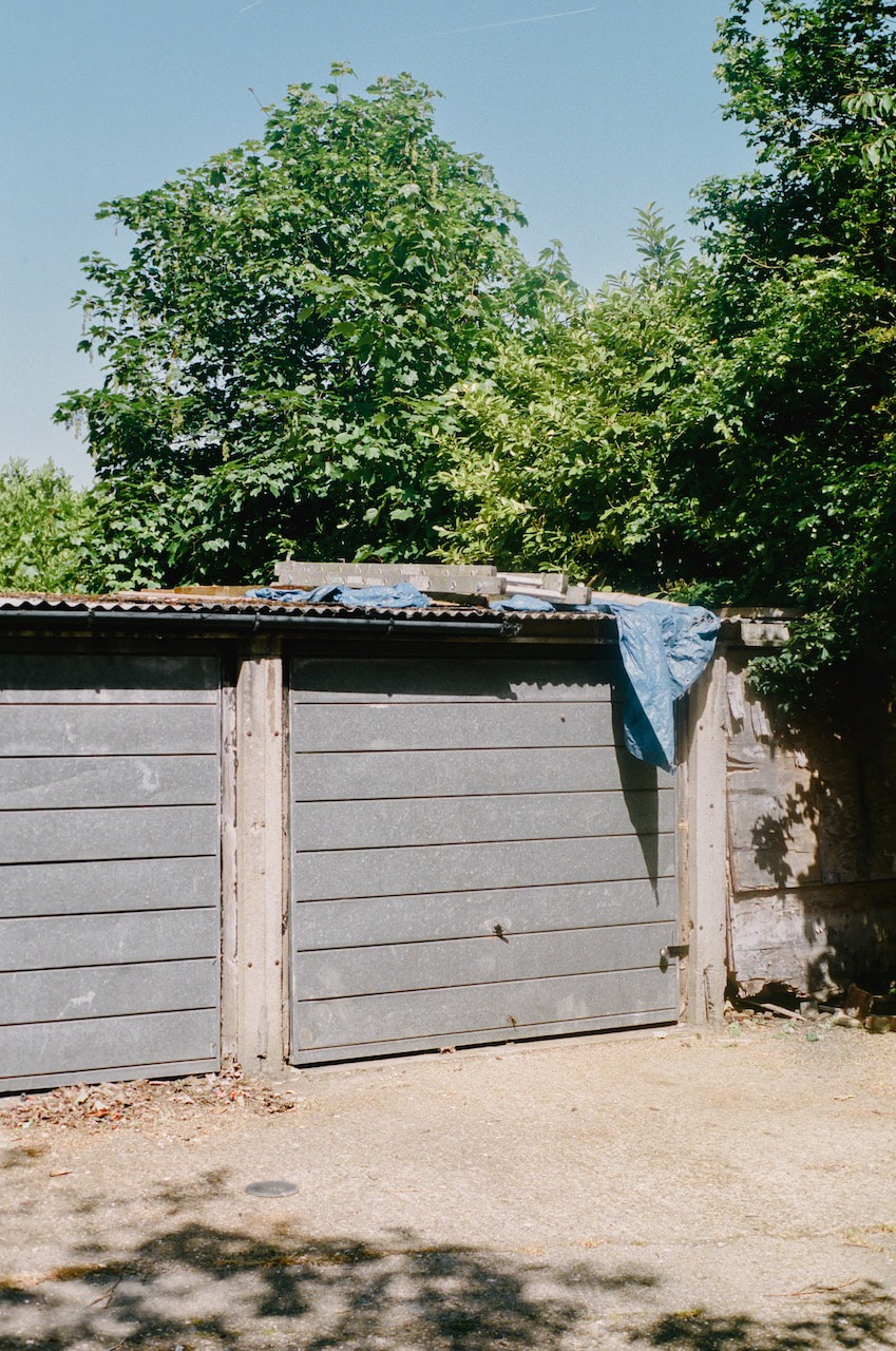
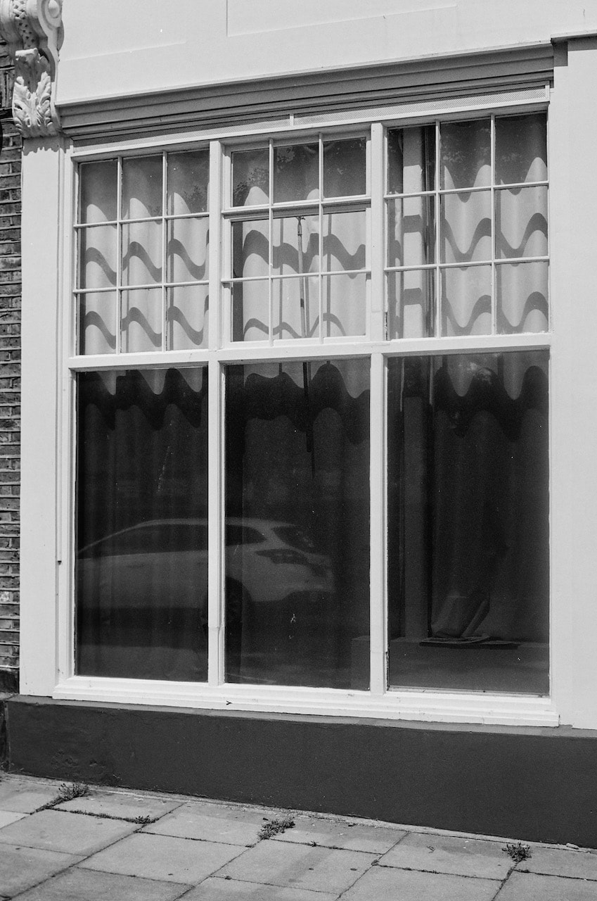
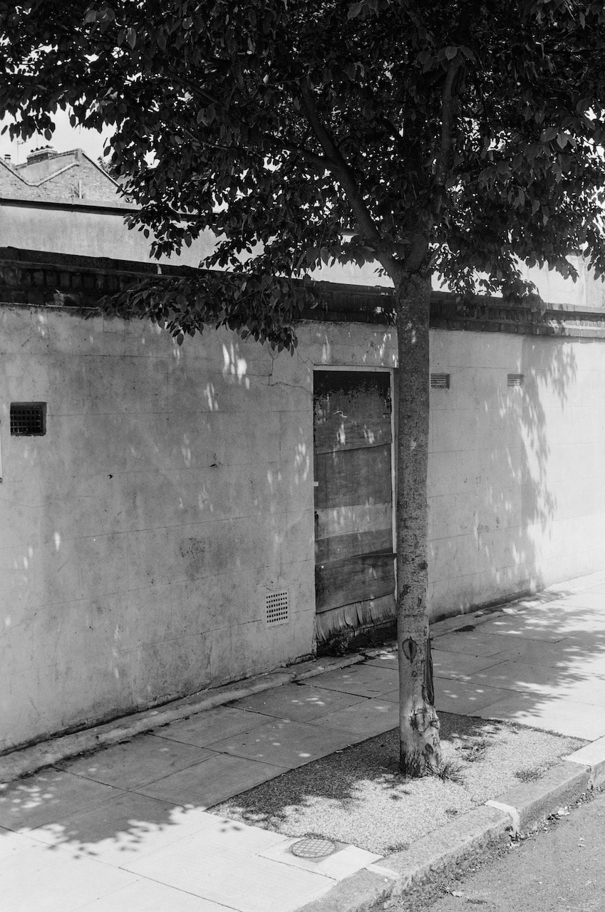
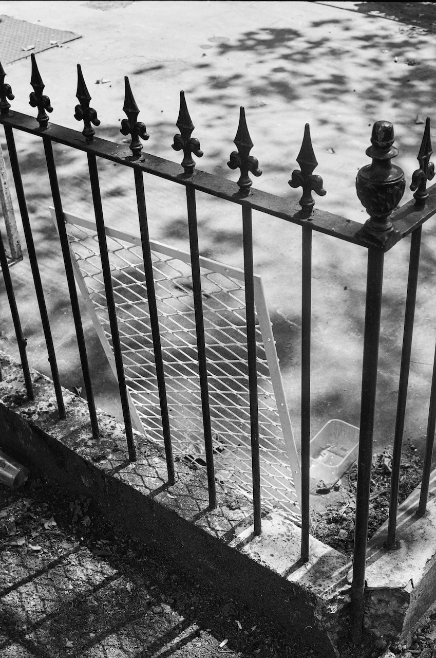
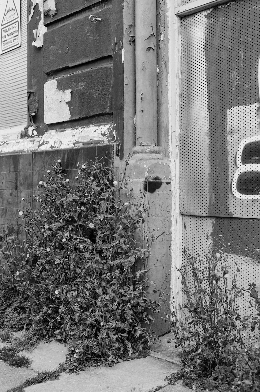
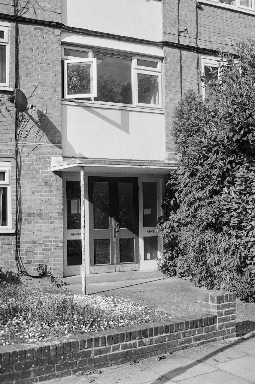
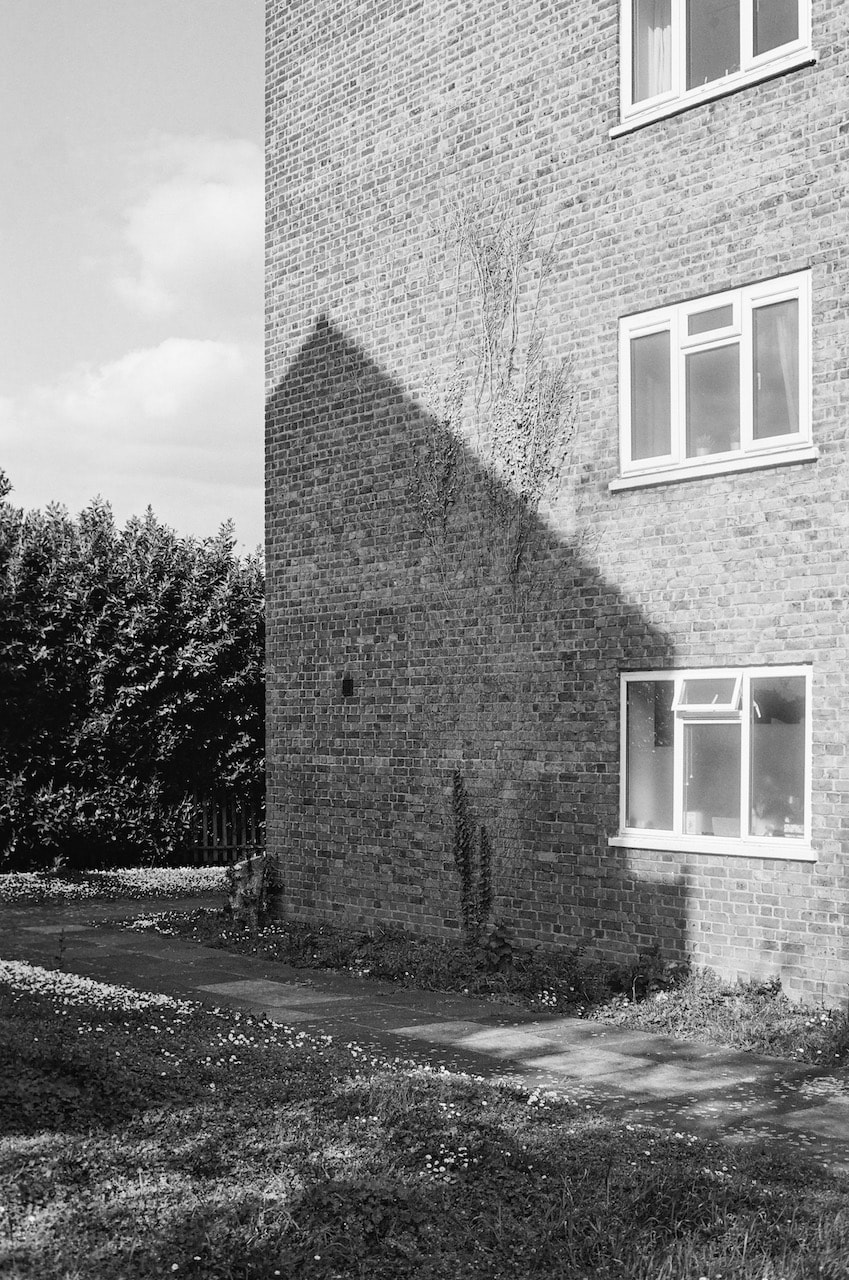
My plan for this photoshoot was to take a walk through a particular suburban neighbourhood and, like Fabbri, attempt to notice aspects of the landscape that, when photographed and slightly isolated from their surroundings, had the potential to be ambiguous or mysterious. I would give myself a time limit of a couple of hours and only travel on foot. I planned to photograph in a suburban part of London because it felt to me as though Fabbri's pictures were often made in liminal, ill-defined or edge spaces.
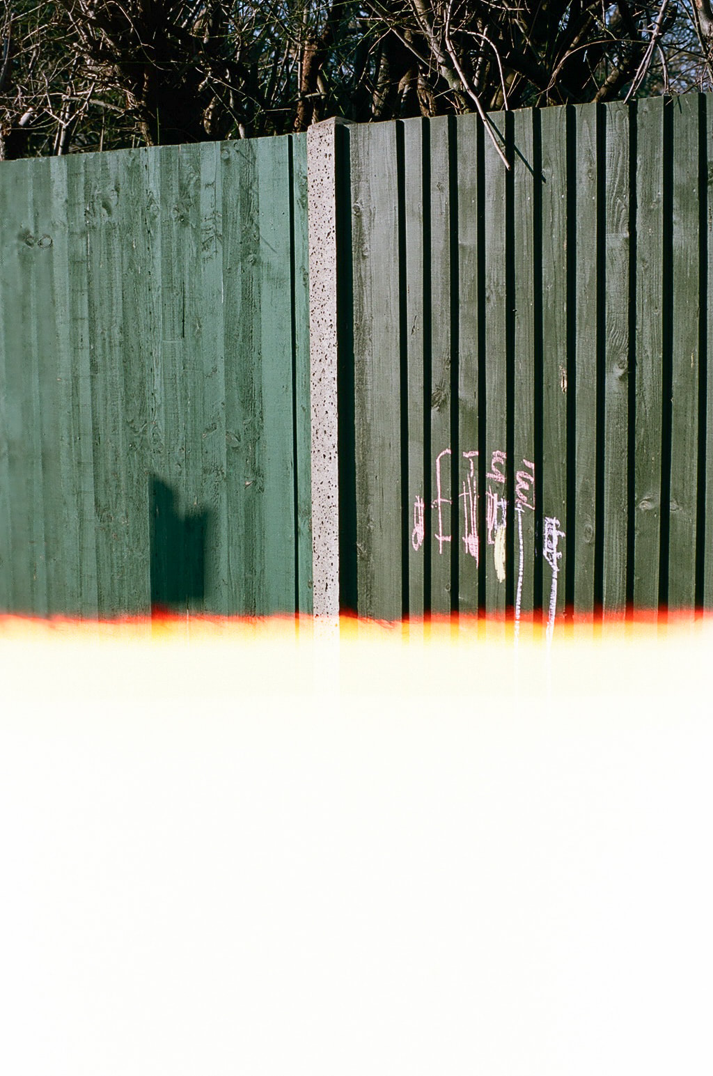
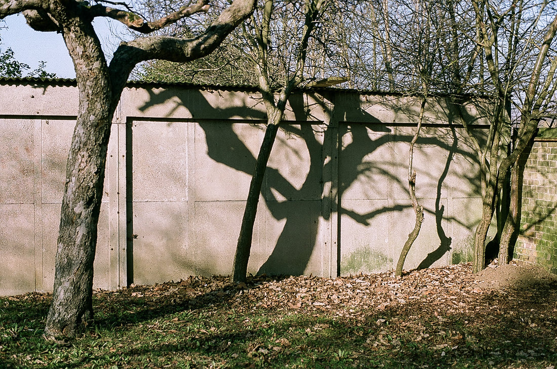
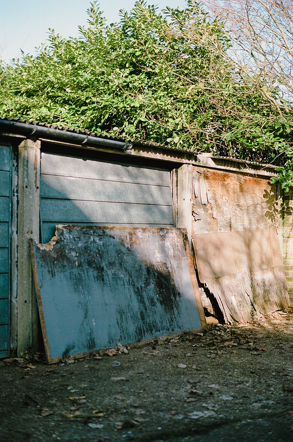
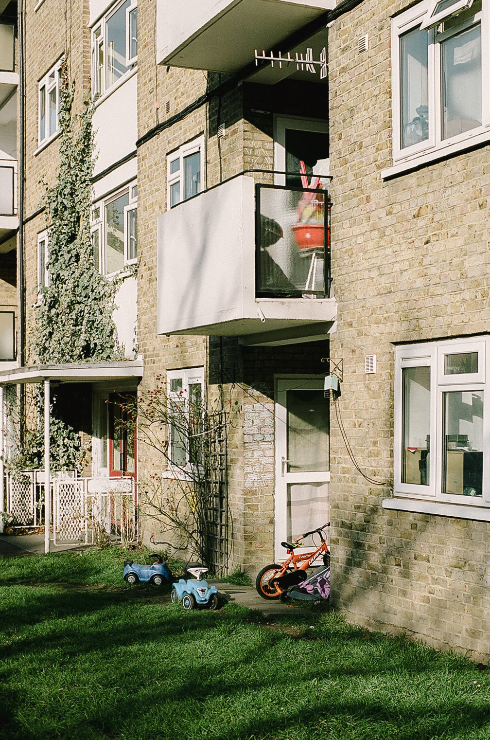
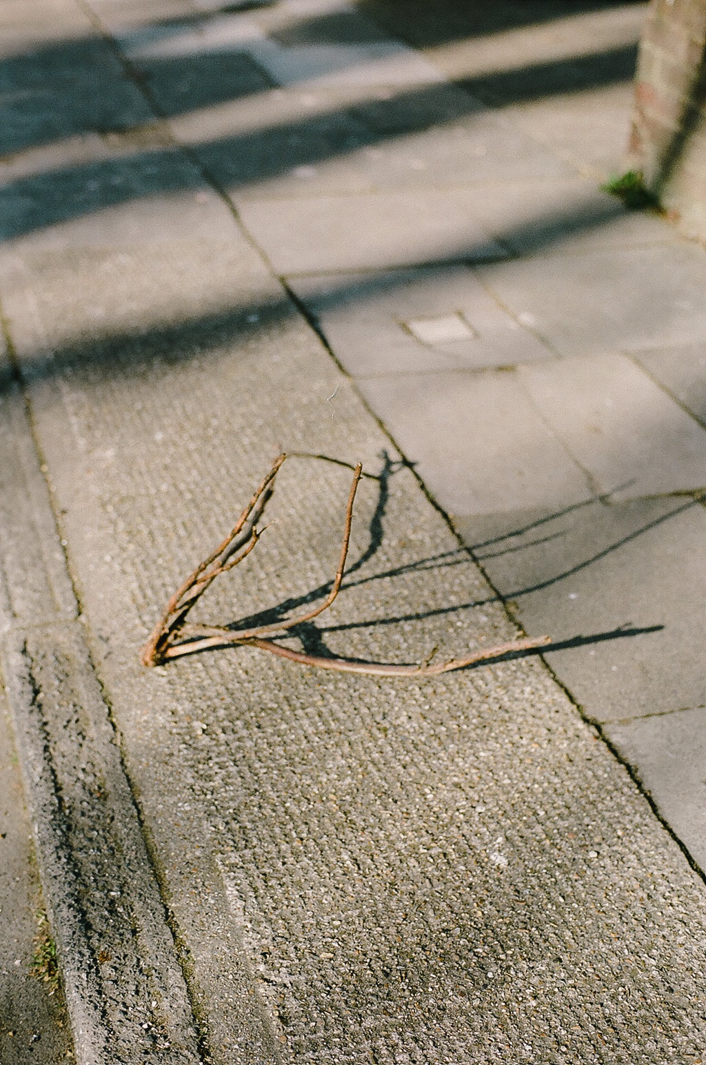
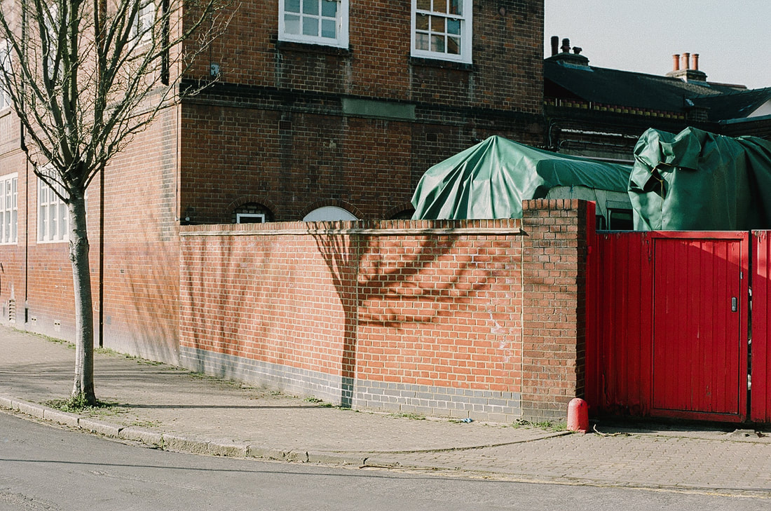
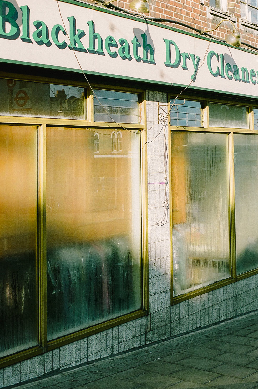
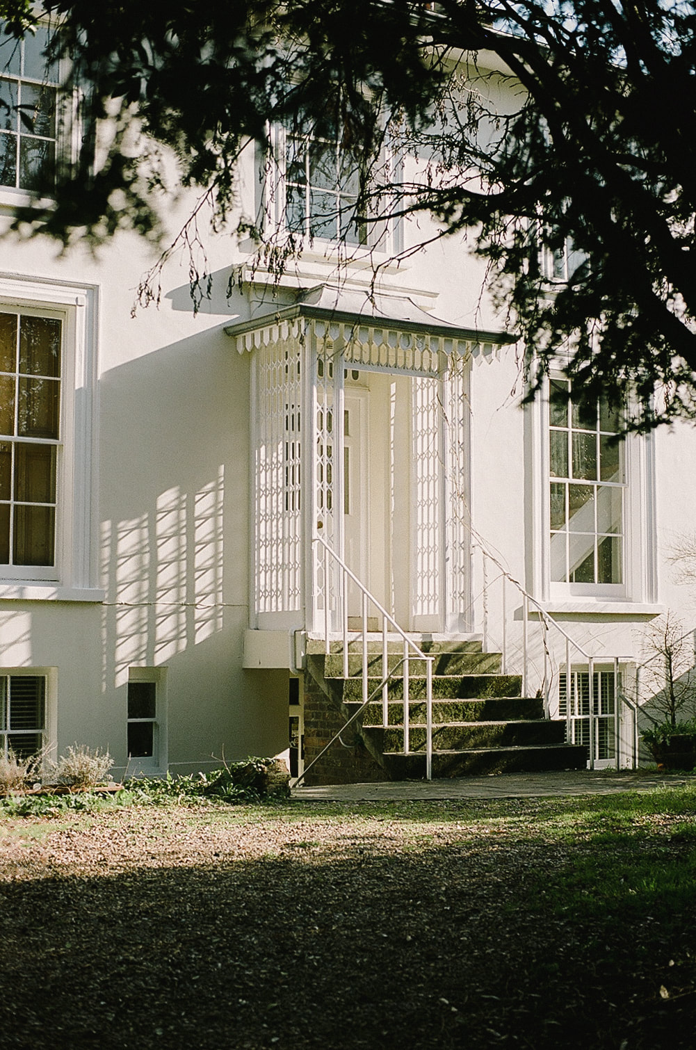
These pictures were taken with a Yashica FX3 SLR and 50mm f/1.7 lens with Kodak Portra 160 film, rated at 100. Post processing was done in Lightoom but mainly to do some minor colour correcting and sharpening of the commercially scanned jpegs. They were taken on three separate walks, all in south London. Most of the images were shot very near my home. I'm quite pleased with the results. I was thinking about Fabri's pictures when making my own, carefully framing my subjects so that they might cause the viewer to be a little puzzled by their ambiguity. I was lucky with the light.
|
|
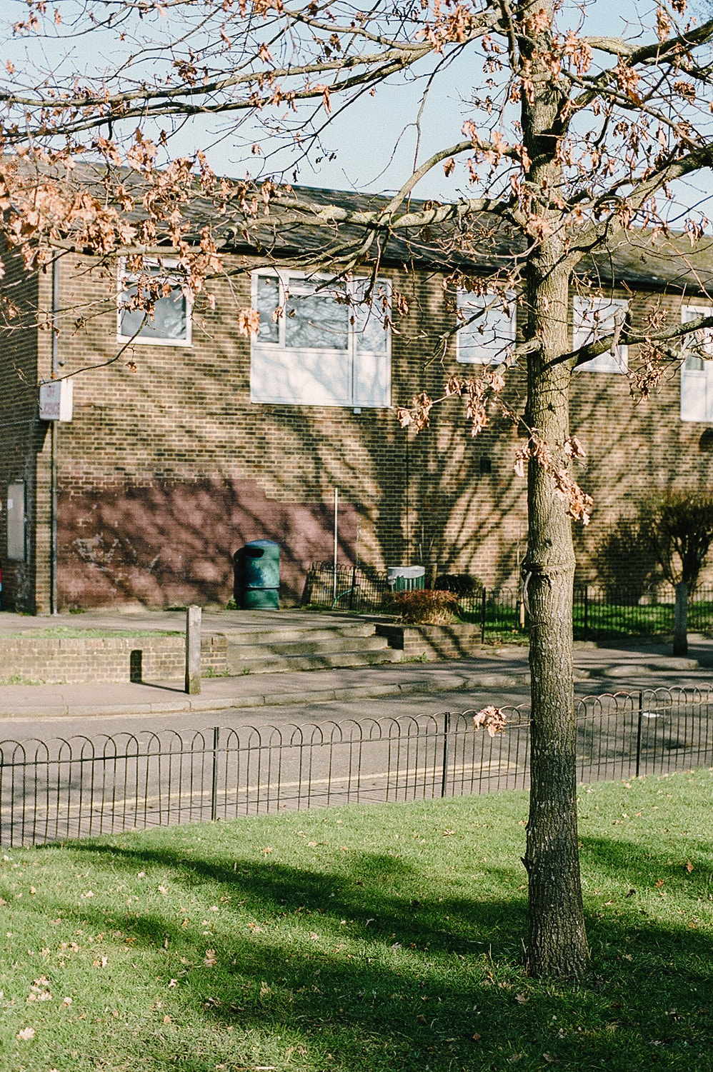
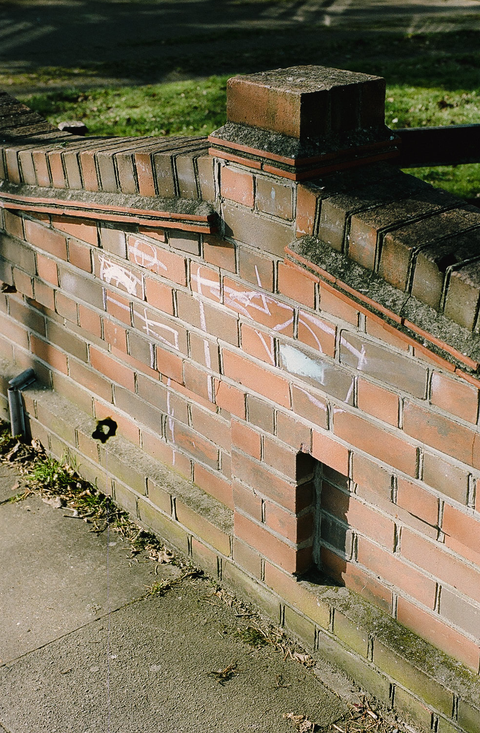
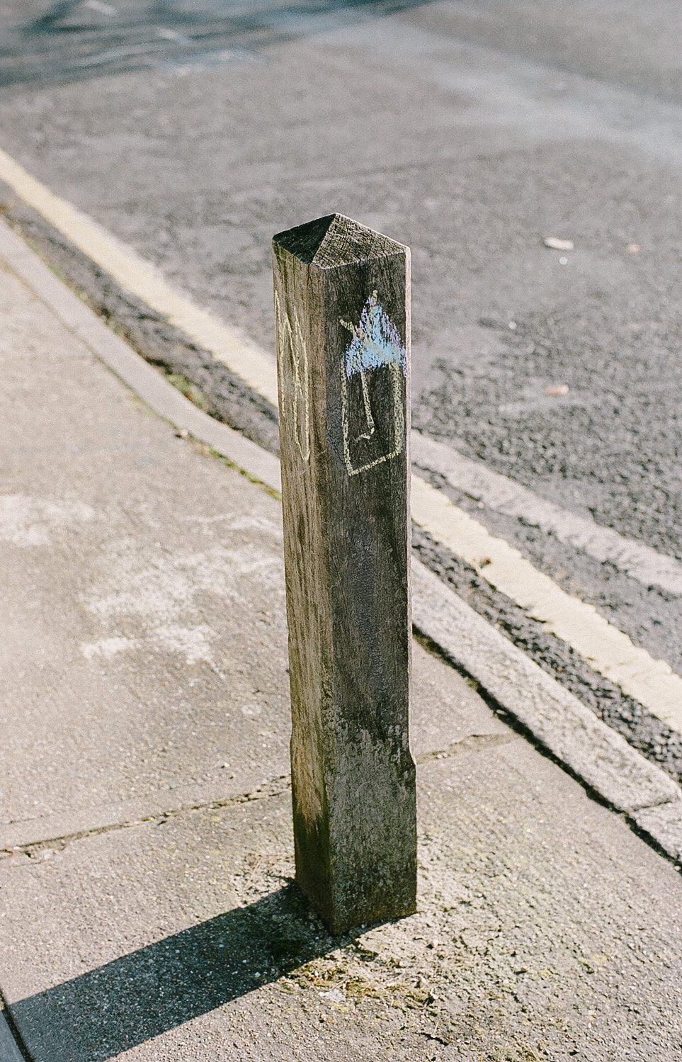
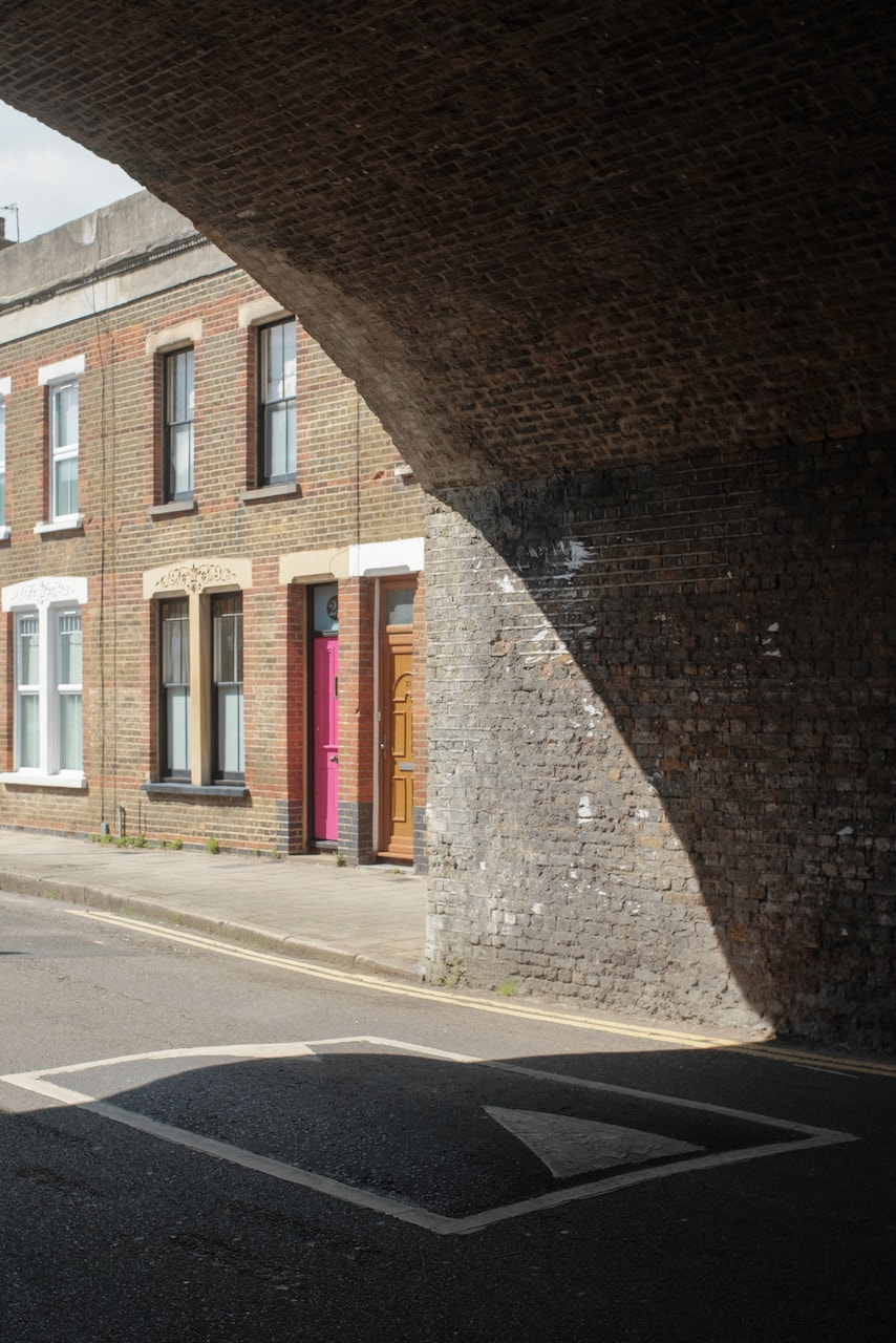
These are my favourite pictures. There is something about the clarity of the light, the sharpness of the lines, that reminds me of Fabbri's photographs. There isn't too much information and we are not really located in a particular place. No street names or shop signs. The strong vertical lines remind me of those in 'The Flying Carpet' - the uprights of trees, signs, gates and walls. I really love the experience of waiting to see what photographs look like. One of the advantages of using film is that there is often a delay between taking the picture and seeing the results. I recognise the subjects of these photographs and vaguely remember deciding to take them, but the photographs themselves look different to the real tree, walls and windows. I think it's this mysterious relationship between reality and photographs that so intrigues me. A photograph often looks so much like the world but it is also separate from it, a new thing. Maybe Cesare Fabbri was referring to photographs as flying carpets, able to transport us magically to new destinations...? |
A second response
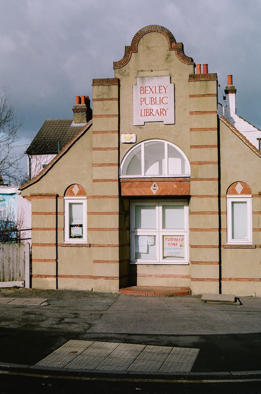
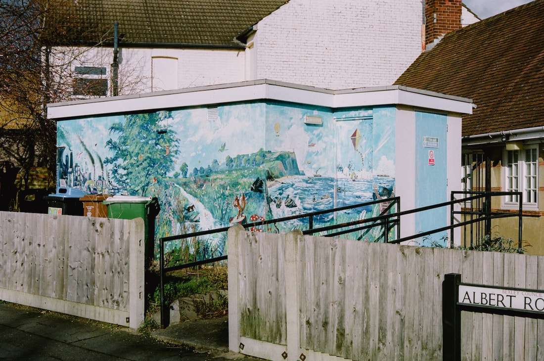
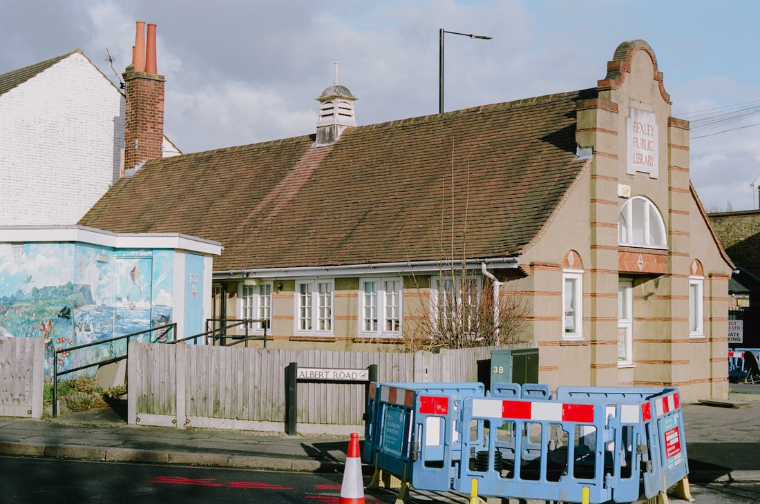
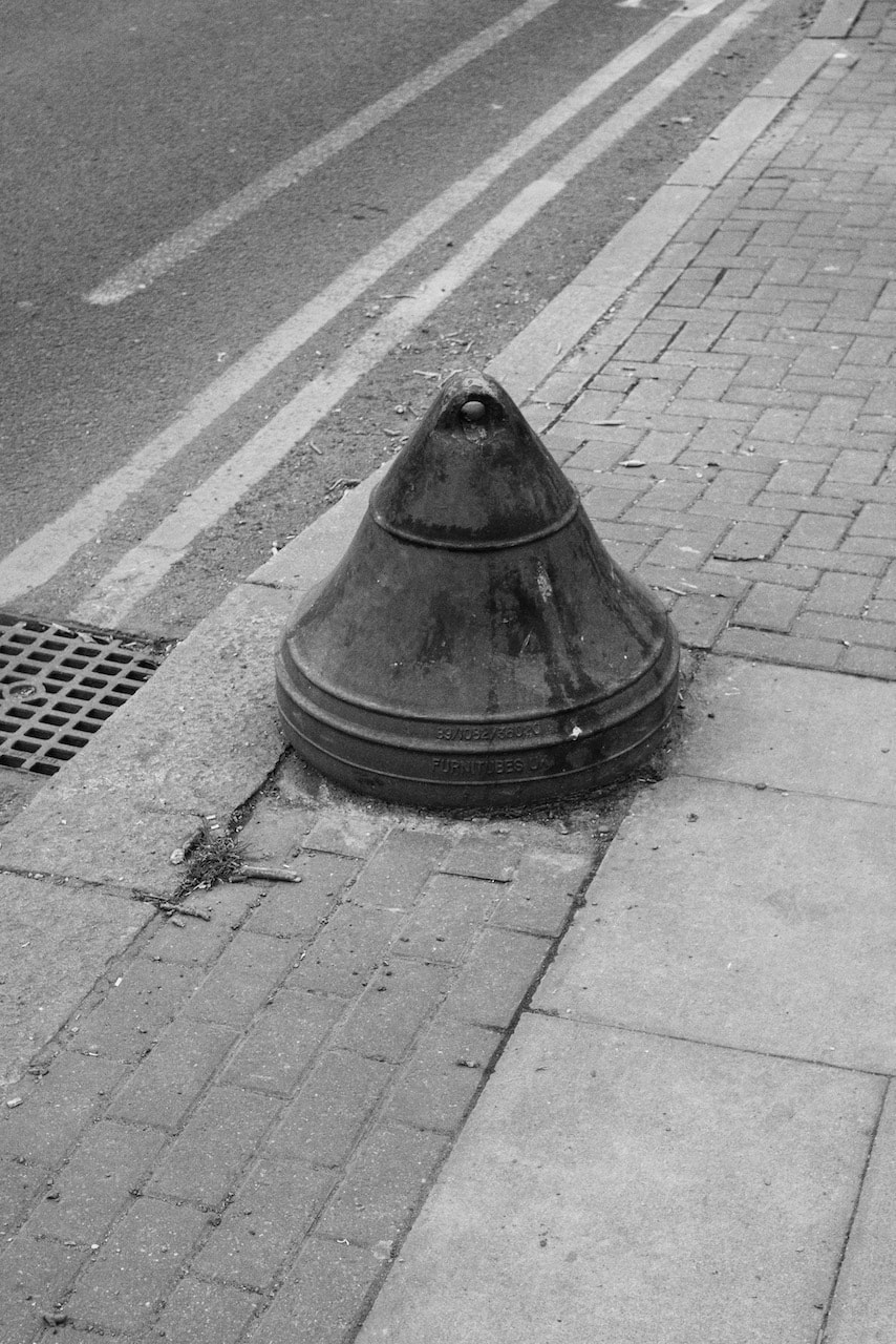
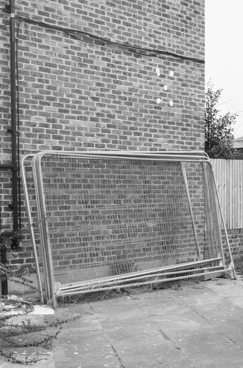
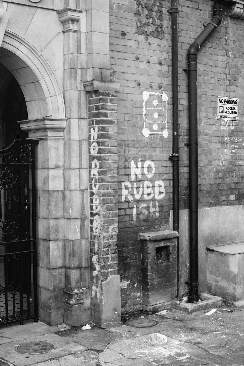
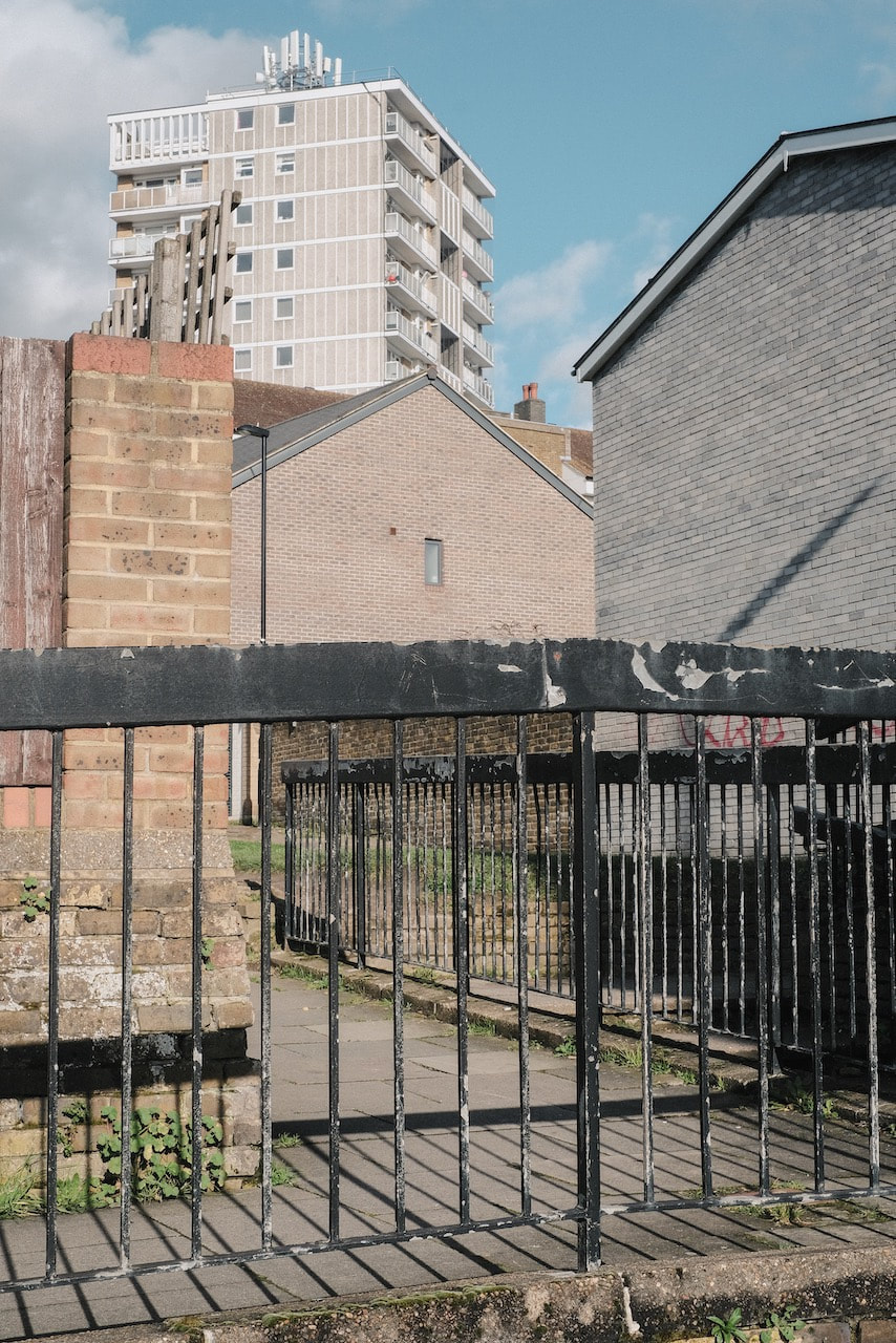
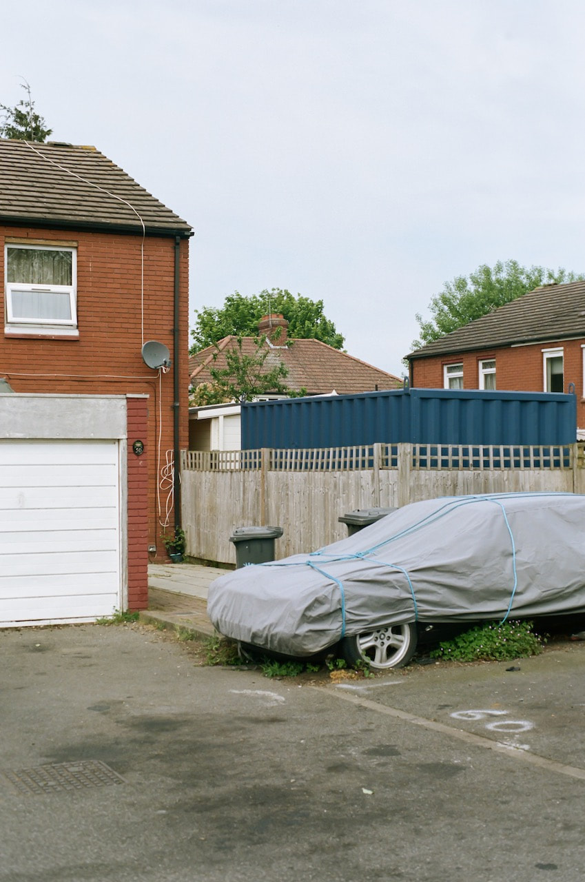
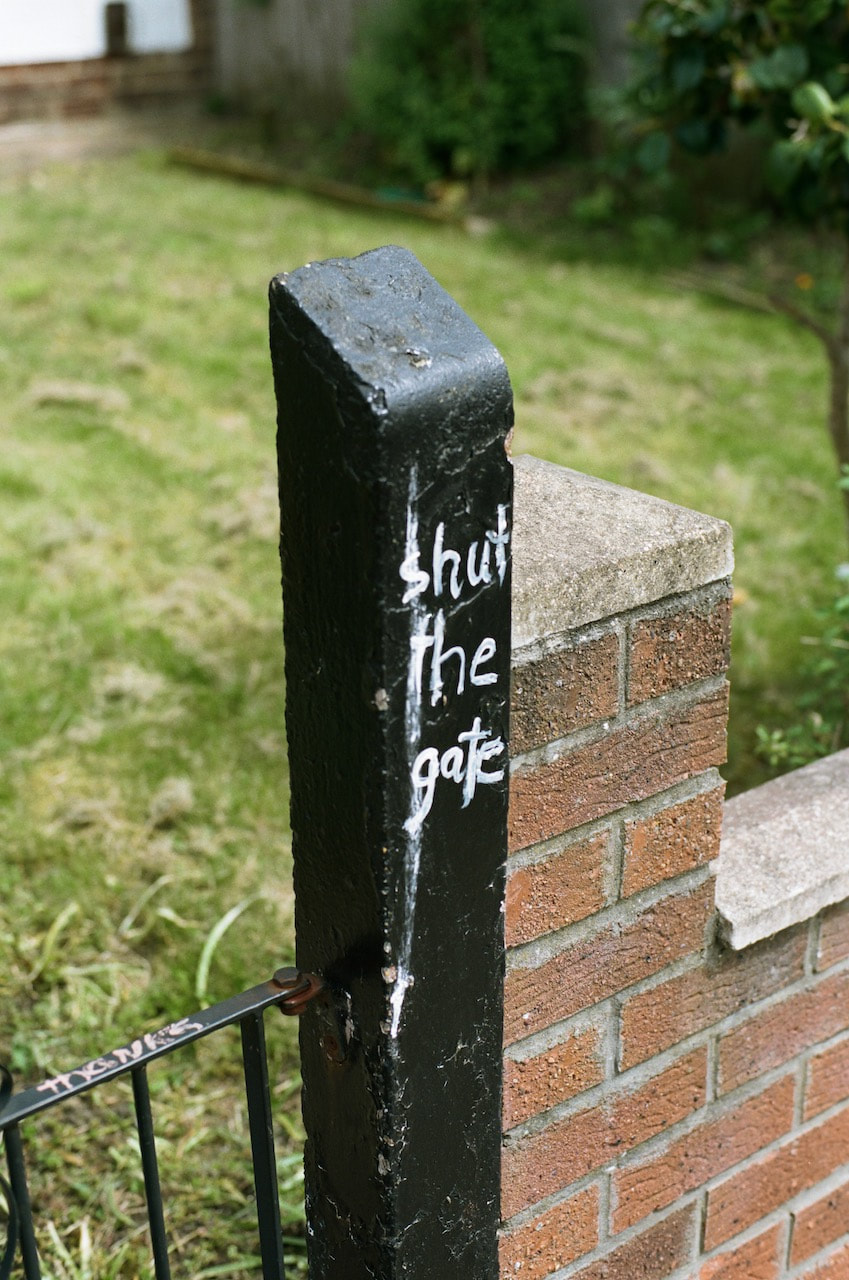
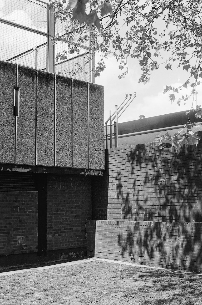
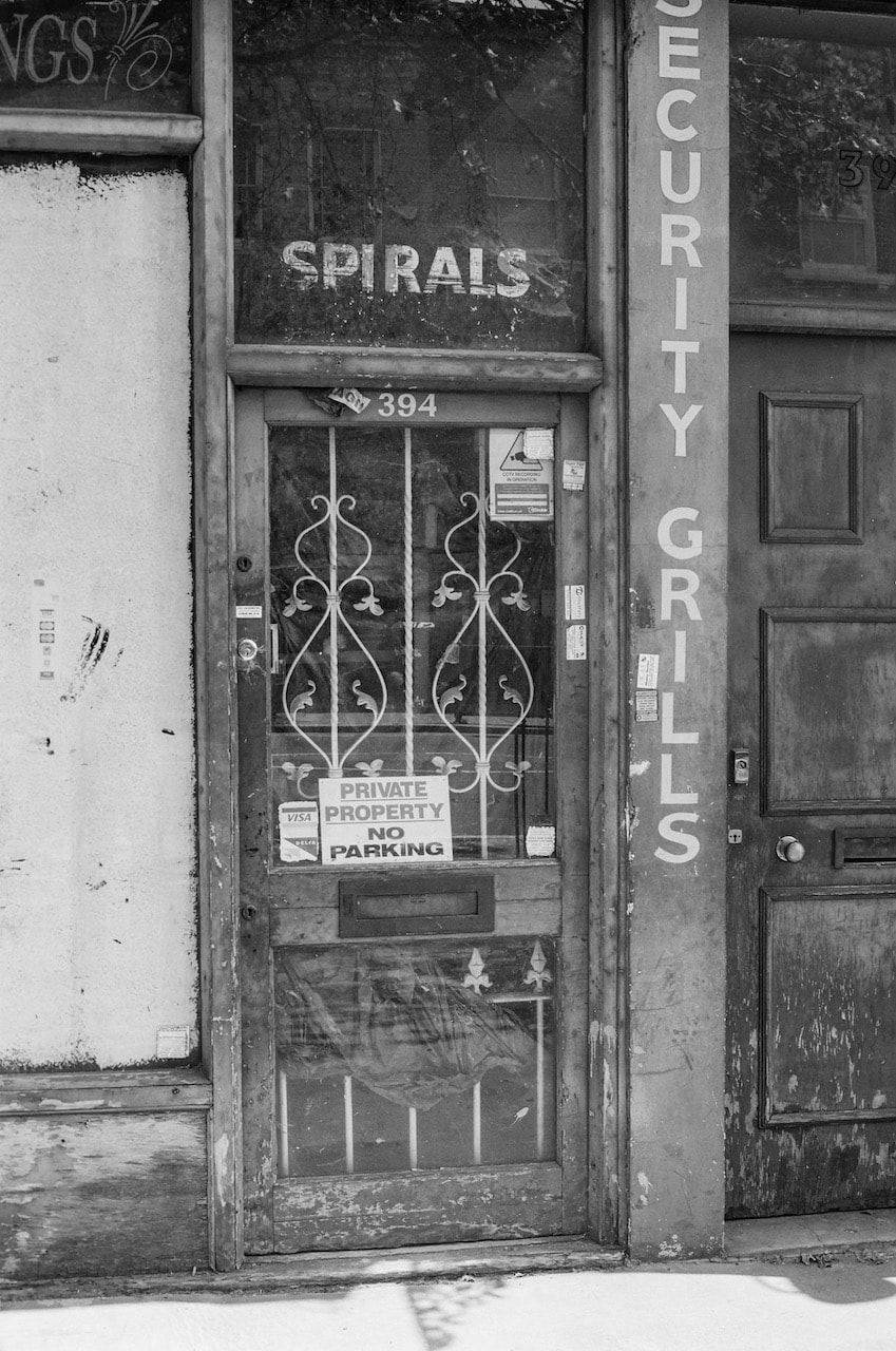
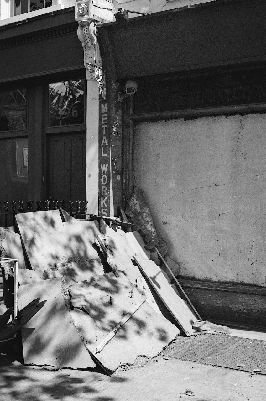
These pictures were taken on an excursion to Bexley to see an exhibition of outdoor sculpture. They were shot on Kodak Portra 160 film and commercially scanned. I made a few small adjustments in Lightroom.

|
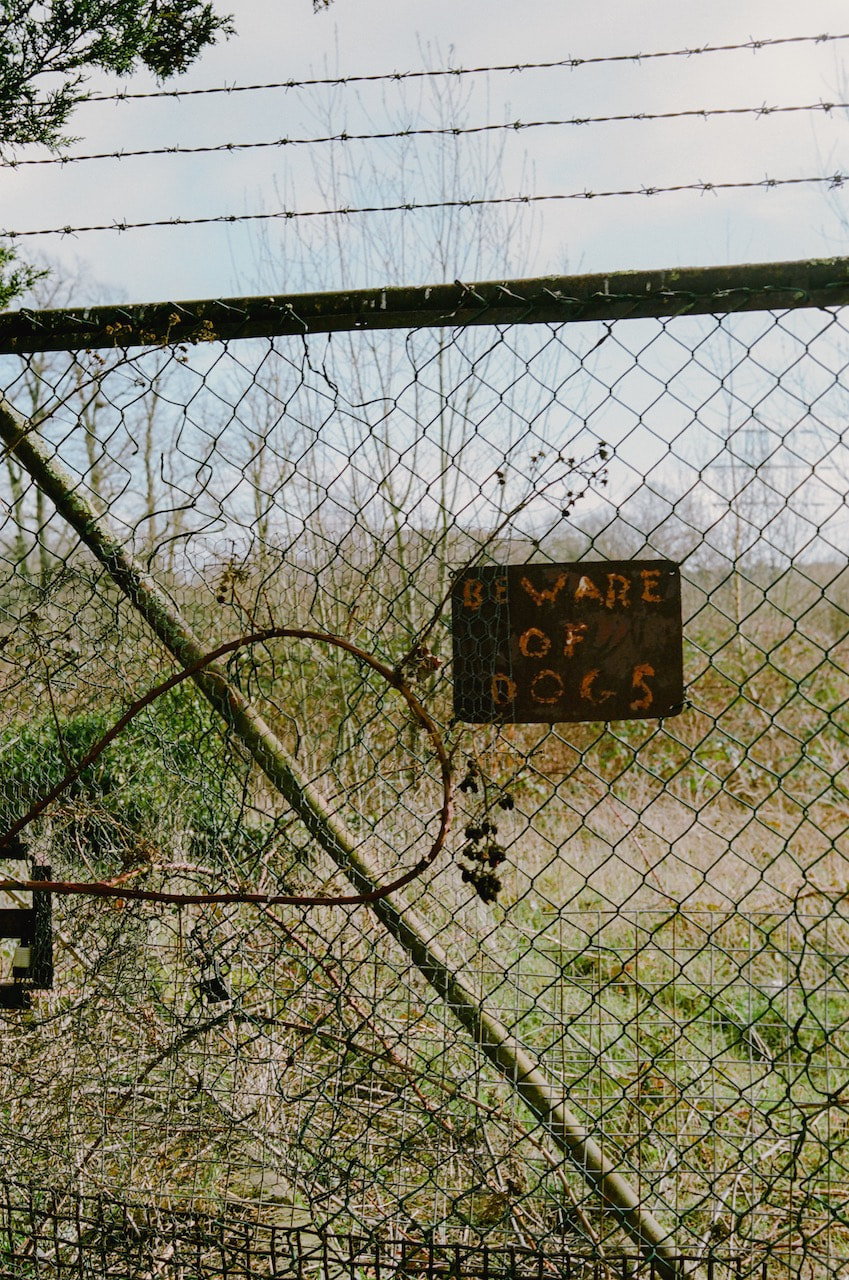
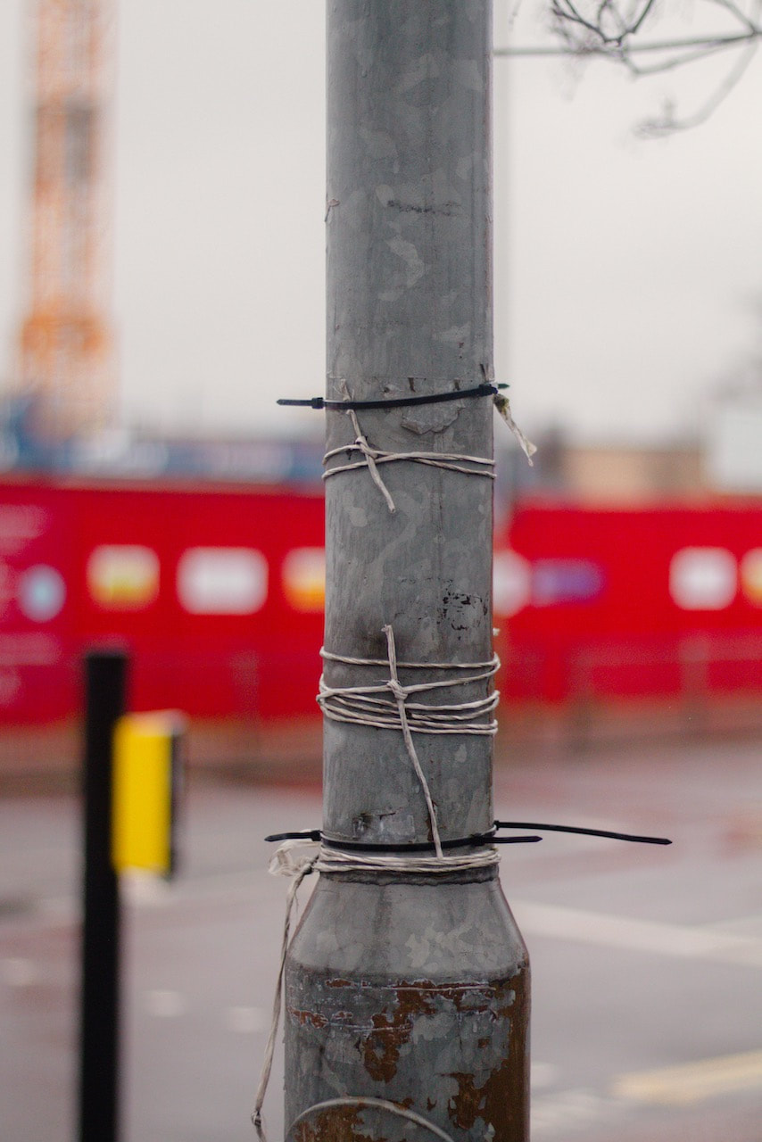
These are my two favourite images from this sequence. I was still thinking about the Cesare Fabbri pictures, especially his interest in signs. I like the contrast between the semi-rural and more urban locations.
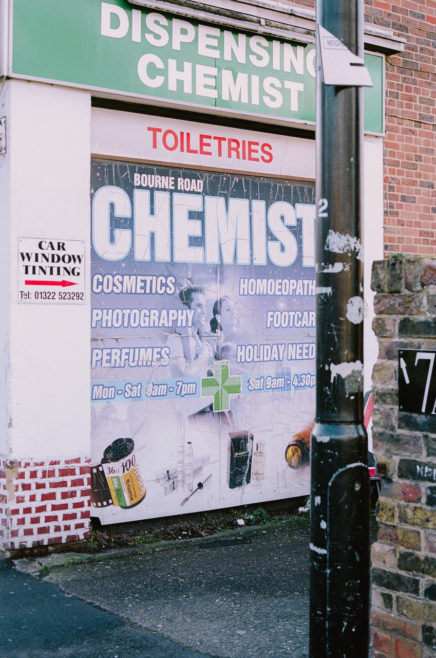
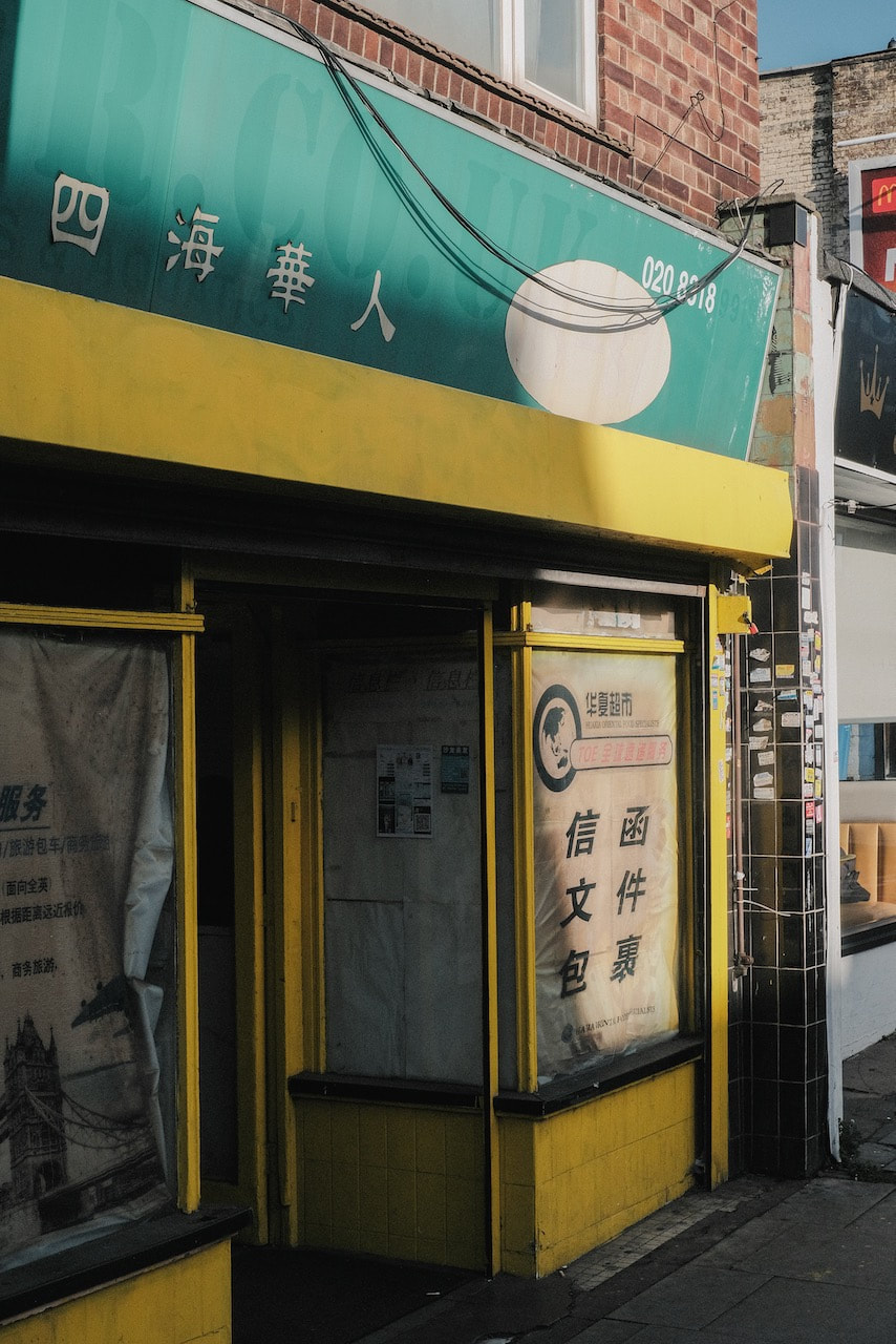
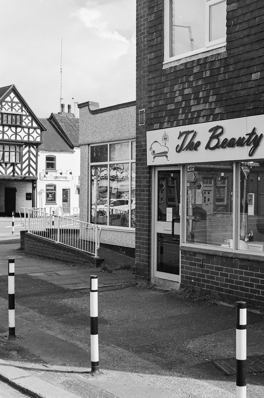
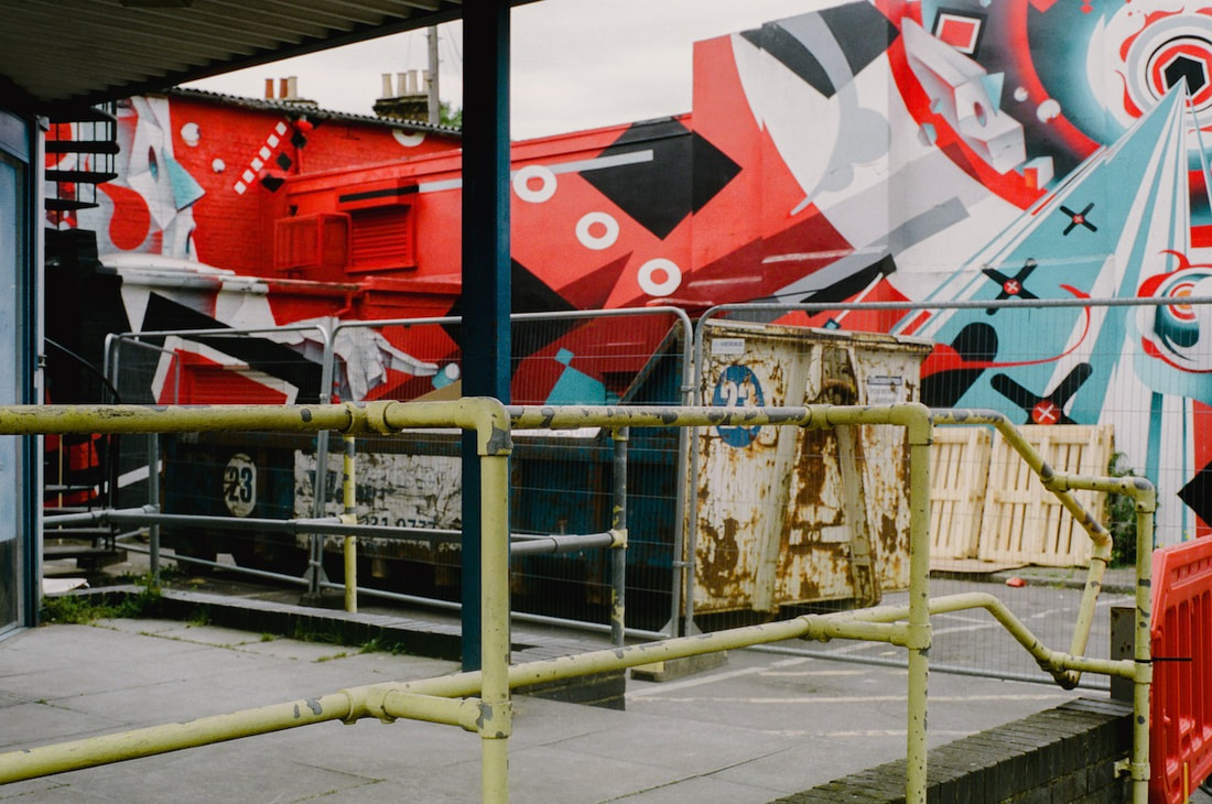
Both images present types of obstruction - fences, walls, barbed wire and a street lamp. One barrier allows you to look through it, to the landscape beyond, whereas the other is a kind of full stop, although a arrow invites you to discover 'Car Window Tinting' just round the corner. One tells you to keep out ('Beware of Dogs') whereas the other is an invitation to take advantage of various local services - COSMETICS, PHOTOGRAPHY, PERFUMES, HOMOEOPATHY, FOOTCARE, HOLIDAY NEEDS. I really like the role that photography plays in this list as a kind of beauty product or lifestyle accessory. I like the roll of Fujifilm Reala 100 in the left hand corner of the advertisement, adjacent to a concrete wall that has been painted (badly) to look like bricks. I don't think I would have looked twice at this shop front had I note been carrying a camera. "Photography allows us to discover and see for the first time something that was right before our eyes." -- Cesare Fabbri |
|

|
Photographer research:
Andrea Simonato
I do nothing but walk around trying to get in empathy with the surroundings. Most of the time I have no clue of what I intend to photograph until I get in front of it. But that's where the beauty lies, it is in the pleasure of an unexpected discovery [...] what counts is to be curious, you have to study the work of other photographers, buy their books, read a lot, try to gather all kind of things that may help you to develop your personal point of view, because what really matters is what came before the moment you press the shutter button of your camera.
-- Andrea Simonato
I really like the way that Simonato photographs his local landscape in northern Italy. I imagine him wandering around with his camera, sensitive to his environment and ready to frame and capture those details that catch his attention. He describes being attracted to the "mysterious" and it's interesting that he chooses not include people but rather focusing on the traces of human presence. There is almost a sense of a landscape that has been abandoned by people. The images above were mostly made during the COVID-19 lockdown so that might explain this absence or sense of abandonment. Simonato's first book is entitled 'Il Malocchio' which translates as 'the evil eye'. Simonato explains, "What I look for in a subject is to catch its enigmatic character, what it seems to be hiding rather than what it lets you see. Photographing in black and white helps me to abstract reality more easily by creating a sort of parallel world that is precisely that of the photographic narrative itself."
My response to Andrea Simonato
These pictures were made on a digital camera during a two hour walk from my home to Lewisham and back. The pictures were shot in black and white and post processed in Lightroom. I attempted to find the "enigmatic character" in my everyday surroundings.
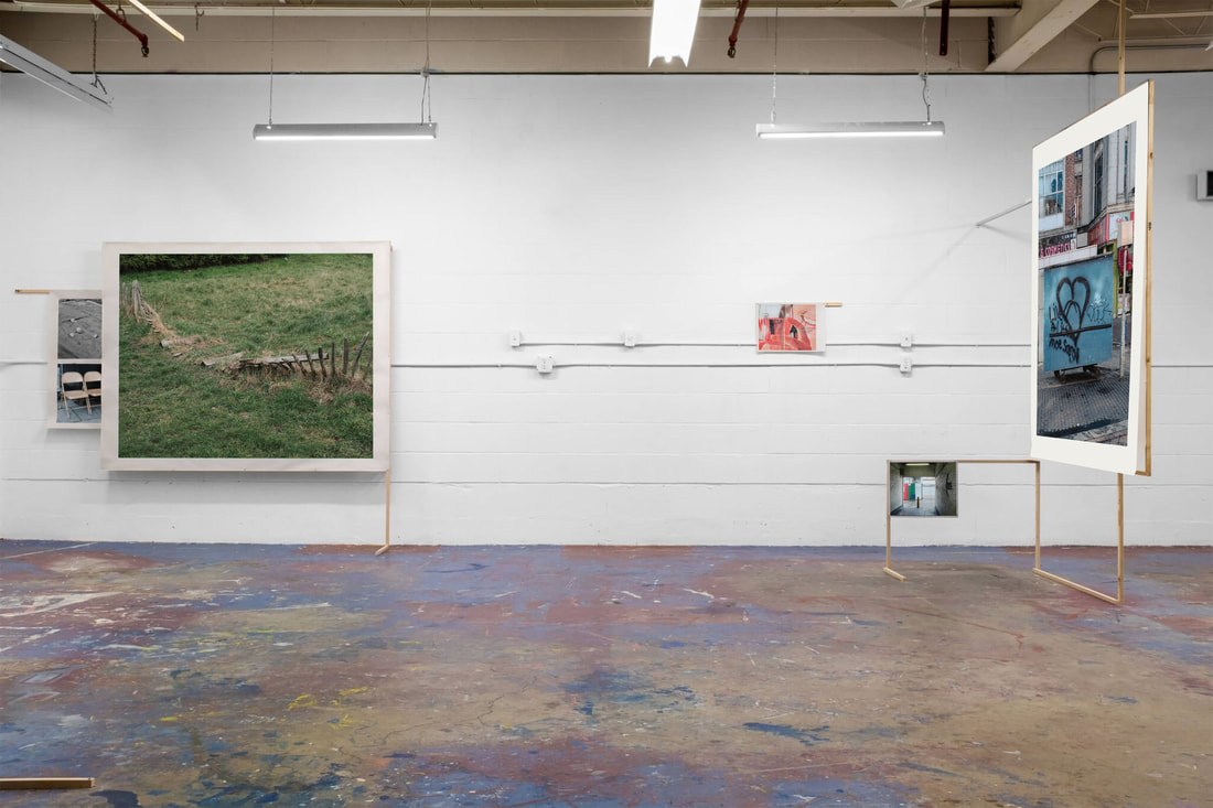
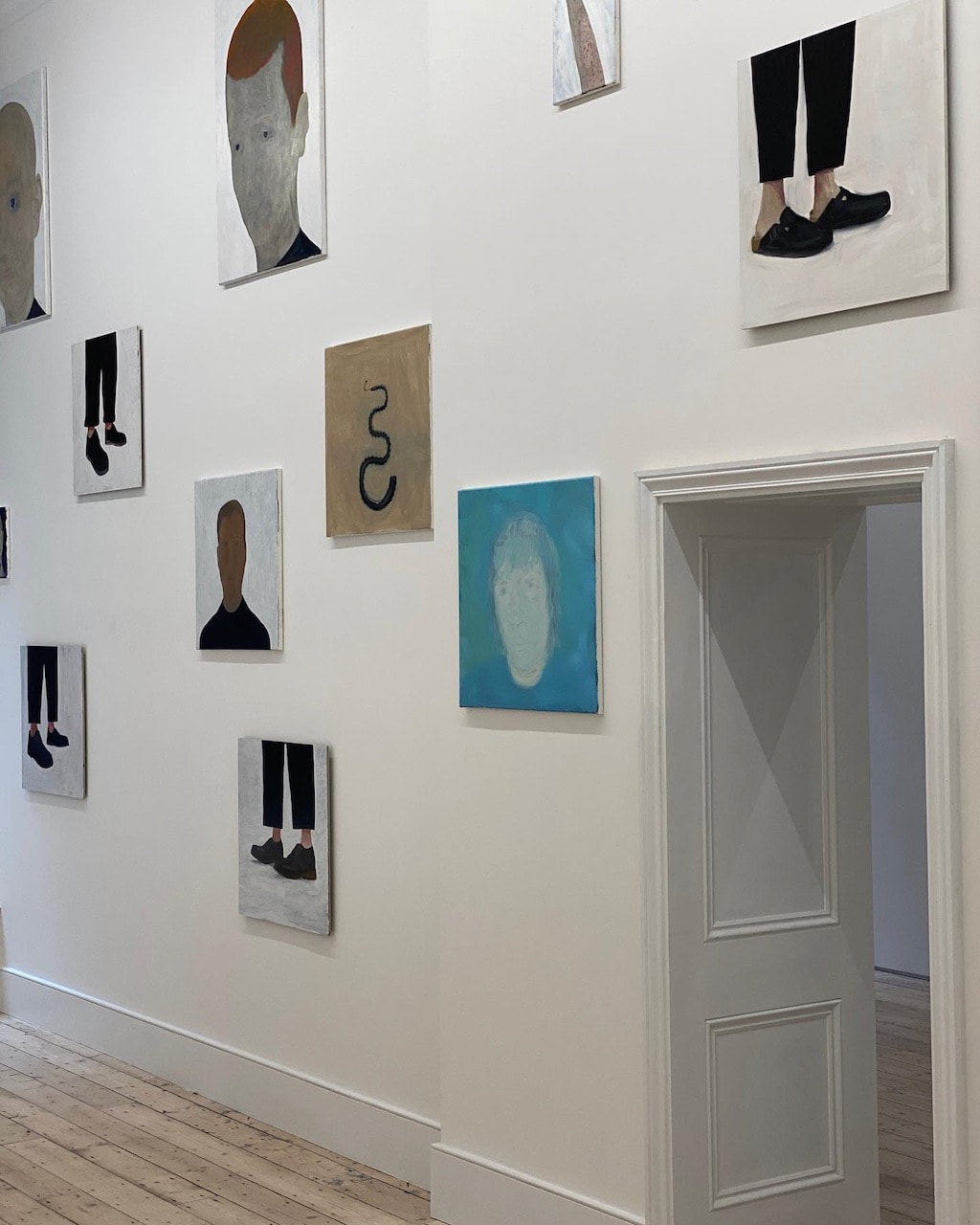
An imaginary exhibition
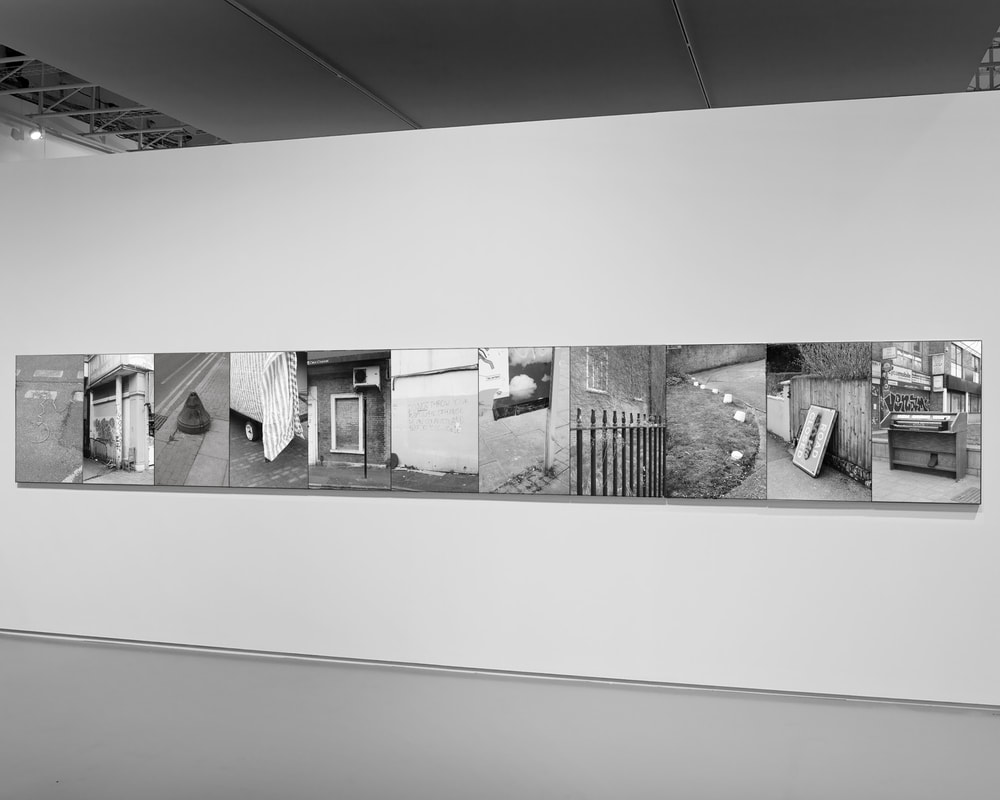
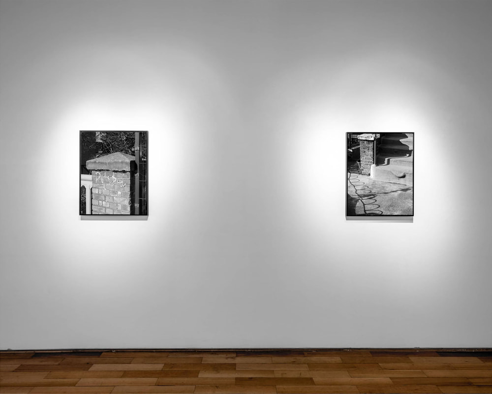
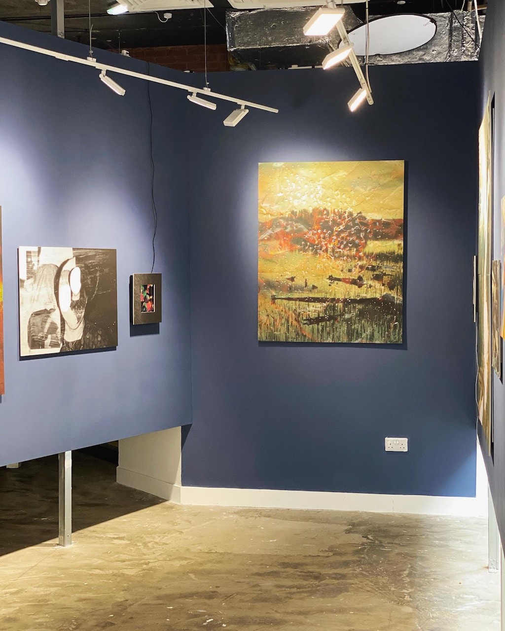
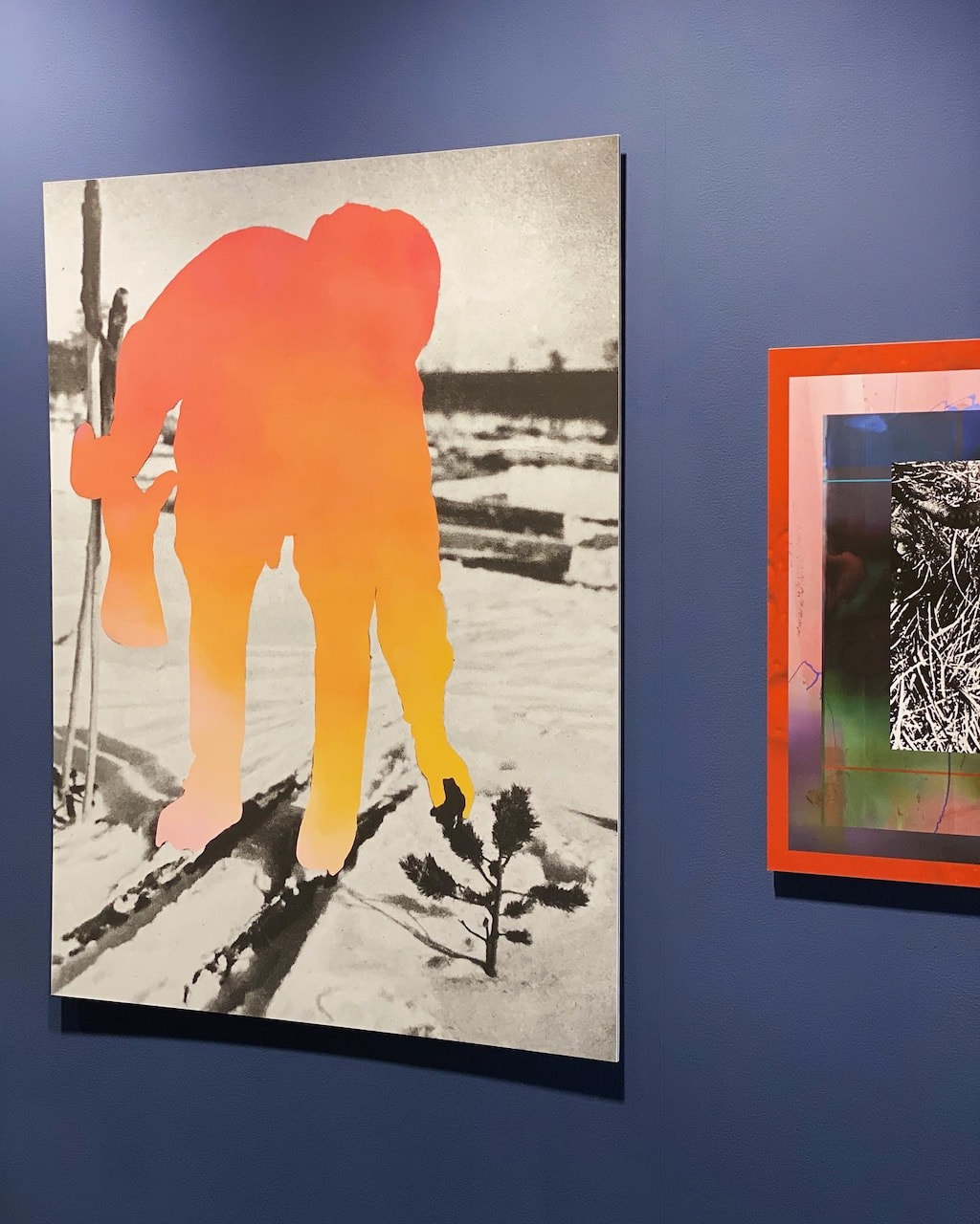
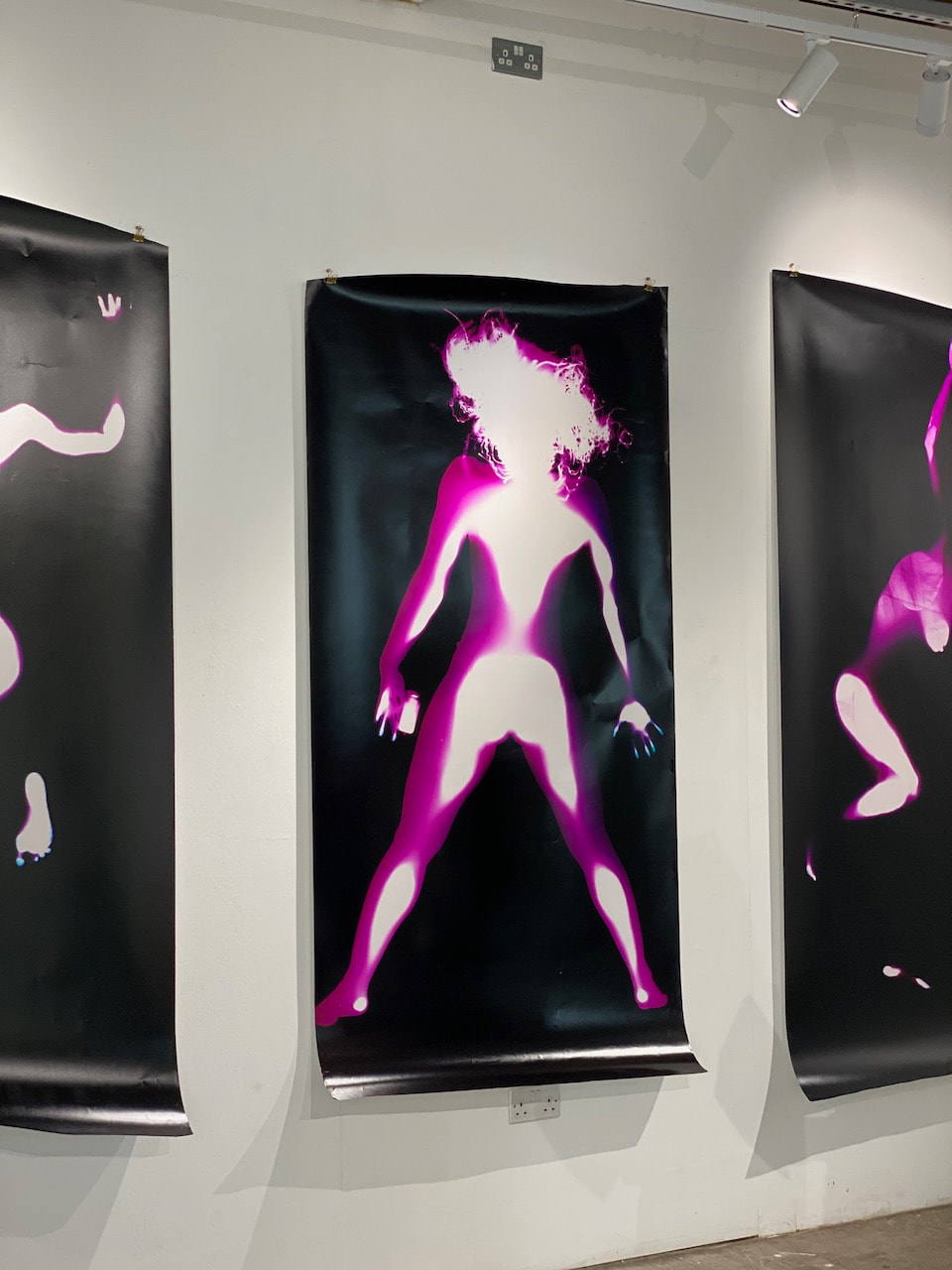
I wondered what it might be like to present some of these images in an exhibition. I 'borrowed' a couple of installation shots from Bertrand Cavalier's website, replacing his images with mine. Obviously, I don't have the funds to be able to realise such an exhibition so this is one way of speculating about what it might be like if I did.
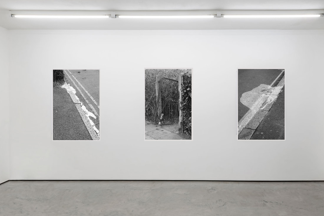
Imaginary exhibition installation #1
|
Here, I imagine a triptych of pictures printed as A1 posters with a white border, simply pinned to the wall without frames.
|
|
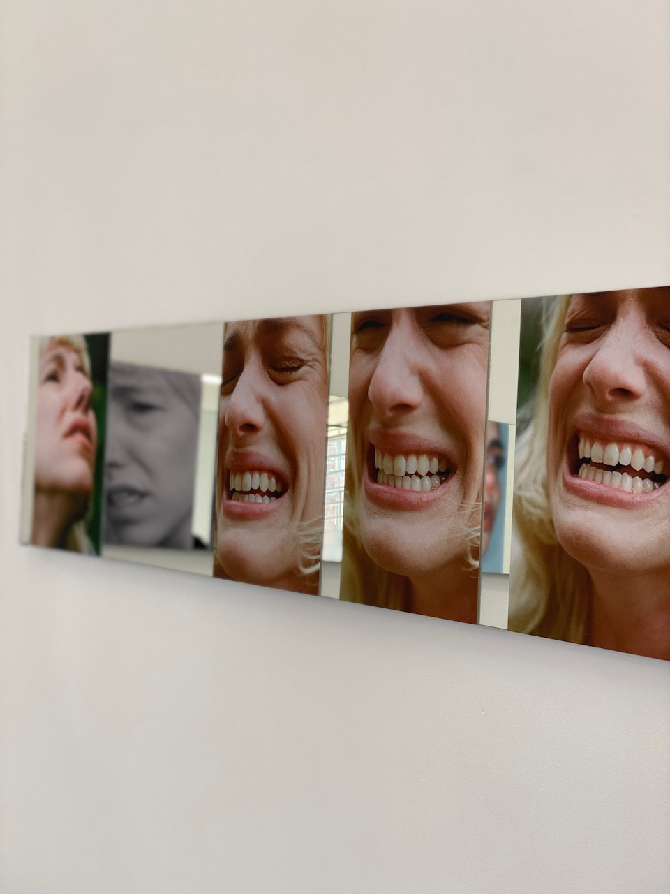
Here, a row of pictures is presented in simple dark metal frames with no gaps.
|
Imaginary exhibition installation #2
|
Psychogeography and the dérive
I have been researching the practice of psychogeography, specifically the dérive, a method for drifting aimlessly through physical spaces, paying close attention to shifts in atmosphere and allowing oneself to be attracted and repelled by its various stimuli. Deriving from late 19th century ideas about cities and Baudelaire's description of the flâneur, plus the Surrealists' wanderings through terrain vague, it was the Situationist International and its lead theorist Guy Debord who, in the 1960s, began to develop theories which supported attempts to resist the increasing commodification of public space. To dérive is to dismiss the many enticements of advertising, to ignore signage or disciplinary instructions and to create situations in the city that generate surprise and a new, poetic engagement with the built environment.
ONE OF THE BASIC situationist practices is the dérive [literally: “drifting”], a technique of rapid passage through varied ambiances. Dérives involve playful-constructive behavior and awareness of psychogeographical effects, and are thus quite different from the classic notions of journey or stroll. In a dérive one or more persons during a certain period drop their relations, their work and leisure activities, and all their other usual motives for movement and action, and let themselves be drawn by the attractions of the terrain and the encounters they find there.
-- Guy Debord, Theory of the Dérive, 1956
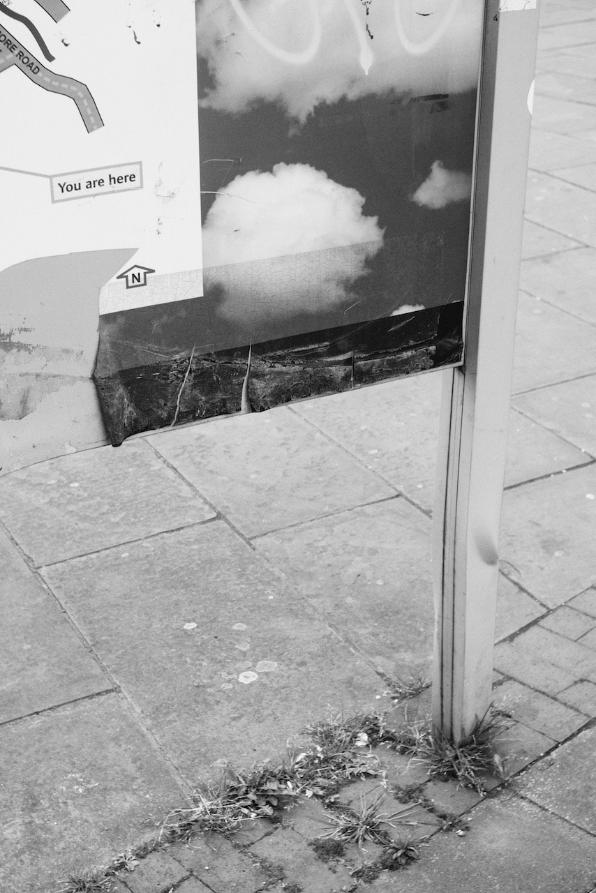
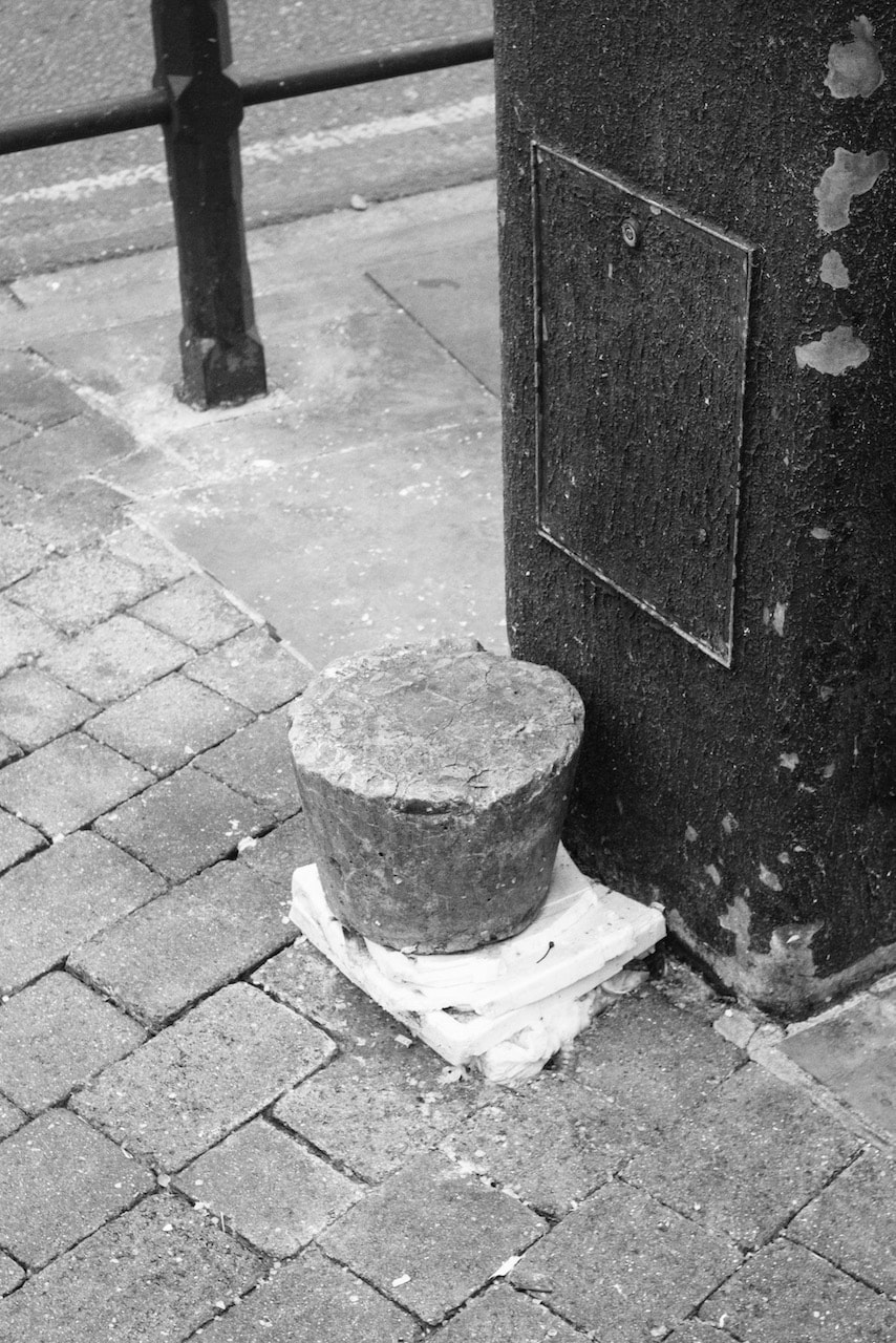
On Thursday 9th March 2023, the members of my photography class conducted a dérive in Kidbrooke, south east London. We left class, despite the wet weather, and collectively drifted through the local landscape, each person taking the lead for a short period. We were taking part in the school's community day research about our sense of place and, as such, were gathering photographic evidence of the environment. These are the photos I made, partly inspired by the work of Andrea Simonato:
A Kidbrooke dérive
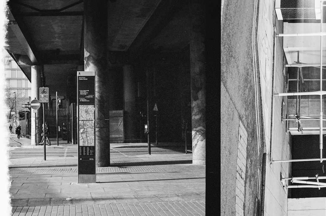
A Wapping dérive
A two hour dérive starting at Wapping station and drifting north west towards Aldgate. The pictures were made with a Leica R4, 50mm lens and Ilford XP2 Super400 film.
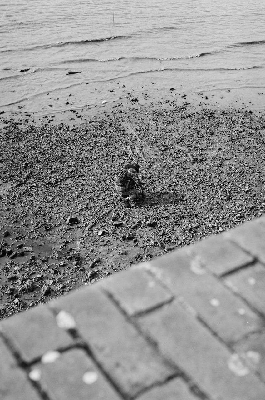
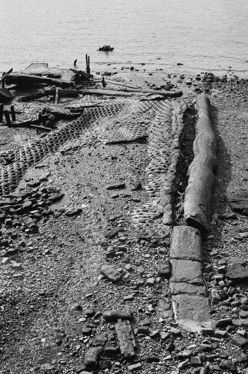
Mudlarking, gleaning & dérive-ing

Mudlarking on the Thames riverbed
|
On my dérive along the Thames path I photographed someone mudlarking, combing the exposed river bed for buried treasure. When I looked at this picture later it reminded me of the film 'The Gleaners and I' by Agnes Varda.
Varda explores the history of gleaning, beginning with the famous Millet painting, tracing the roots of this practice in agricultural France up to the present day urban gleaners who pick up what's left after the Parisian street markets have closed down. The film maker makes a kind of comparison between these scavengers, whose aim is to avoid food waste and make use of every scrap of useful material left on the streets, with her own use of the camera to gather together scraps of human stories.
She is entirely sympathetic with the gleaners, ordinary working class people trying to make ends meet and pushing back against the worst excesses of industrialised food production. I wonder if the practice of making photographs on a dérive is in any way comparable to both mudlarking (finding buried treasure) and gleaning (picking up scraps)? All three practices are linked through an uncommon connection to the landscape and an interest in removing what is of value, changing its status in the process. This is something I'd like to explore further in my investigation. |
Teju Cole's Sacred Looking
São Paulo
Years later, I lost faith. One form of binocular vision gave way to another. The world was now a series of interleaved apparitions. The thing was an image that could also bear an image. If one of the advantages of irreligion was an acceptance of others, that benefit was strangely echoed in the visual plane, which granted the things seen within the photographic rectangle a radical equality. This in part was why signs, pictures, ads, and murals came to mean so much: they were neither more nor less than the “real” elements by which they were framed. They were not to be excluded, nor were the spaces between things.
-- Teju Cole, from Blind Spot
Cole has so many fascinating and wise things to say in this talk about his practice as a photographer and writer. I was really struck by his comments on the types of subjects that attract him. He talks about "objects, and scenarios and landscapes" and the way they "speak to us, remind us of things, create a kind of tension that opens up interpretation." He enjoys, he says, "pictures of landscapes that look as if they are not ordinary pictures of landscapes, that look as if they are pictures of pictures."
Some of my favourite landscapes from 'Blind Spot'
There are no people in these pictures but the evidence of their presence is everywhere. Cole opts to shoot on film, an attempt, he says, to slow down and disrupt the intense flow of visual information. There is something sculptural or installation-like about the objects in these images, the way they are stacked, lean and are juxtaposed with one another. Perhaps it's the opposite and that contemporary artists draw on aspects of the everyday to inform their practice. The spaces in these pictures are a little like stage sets. The walls and floors act like backdrops and flats so that we, the 'audience', are presented with a dramatic encounter with object actors. Suddenly, the everyday, isolated from its context in reality by the edges of the photograph, becomes mysterious or 'miraculous' (to use one Cole's favourite words).
One of the things that interests me when I'm photographing is the mysterious moment of recognition that causes me to want to stop and take a picture. What is it that I have seen, or sensed, that is worth taking the time to record, first with my eyes and then through the camera lens? I very rarely question this impetus which I don't often understand but I think there might be something in the scene in front of me that I instinctively recognise, even if I've never been to that location before. Perhaps it has something to do with having seen something like it before in a picture. What I decided to do was to go for a walk and make at least 36 pictures, as instinctively as possible, inspired by Teju Cole's idea of "pictures of landscapes that look as if they are not ordinary pictures of landscapes, that look as if they are pictures of pictures."
My response:
These pictures were taken with a digital SLR on a walk from my house to Lewisham and back. It had been a very wet day but, by about 3pm, the sun had come out and I decided to take a stroll without any real destination in mind. I was thinking about Teju Cole's notion of "pictures of landscapes that look as if they are not ordinary pictures of landscapes, that look as if they are pictures of pictures." I'm still not really sure what this means but it helped me look at my surroundings in a slightly different way. In each case, I thought really hard about my viewpoint and where to put the edges of the image. I lined up the verticals as best I could so that the pictures had a stable feeling. I was lucky with the light which cast deep shadows and threw objects into sharp relief. I processed the RAW files in Lightroom, using a preset I made that tries to mimic the look of Kodak Portra 400 film.
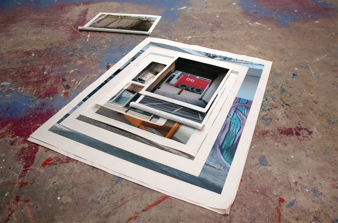
An imaginary exhibition
As with the images above, I was interested to see what these pictures might look like in an exhibition context. I appropriated some installation shots from Cristian Ordóñez' website, inserting my own photographs from the sequence above.
|
|
|
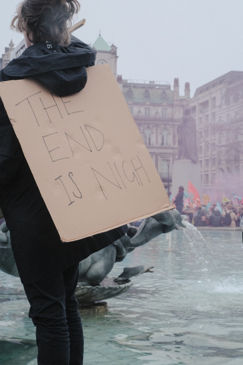
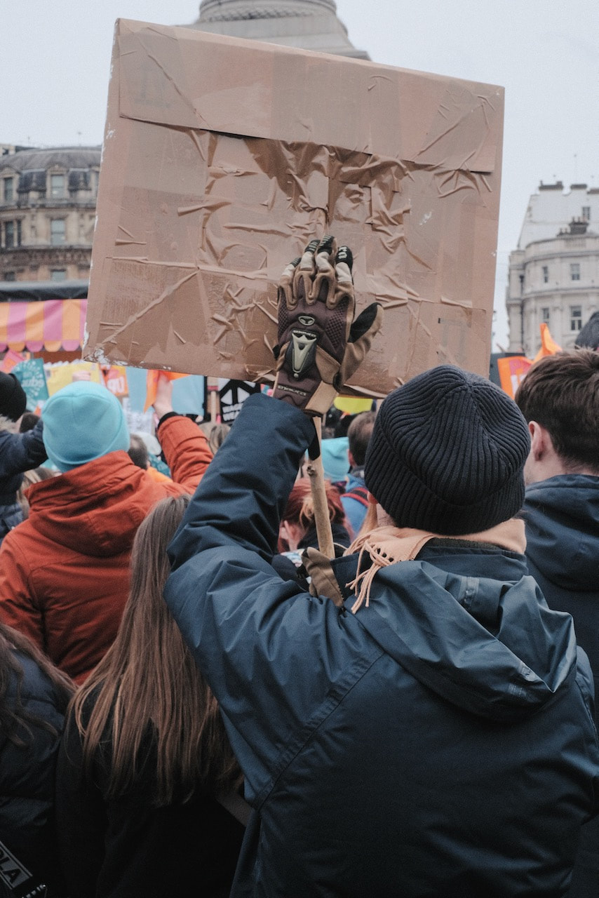
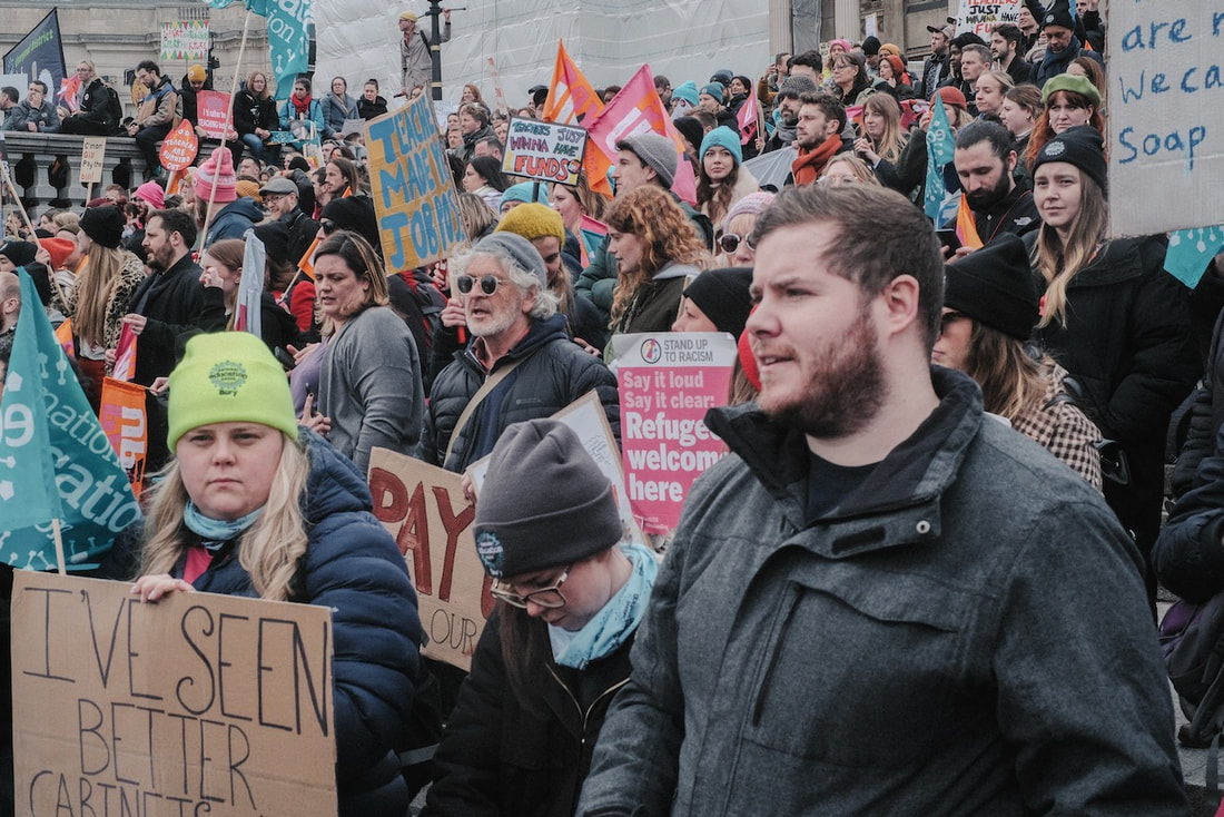
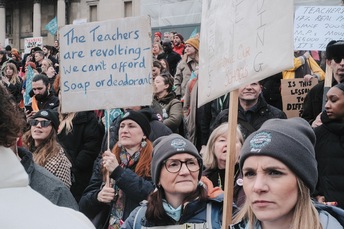
The End is Nigh
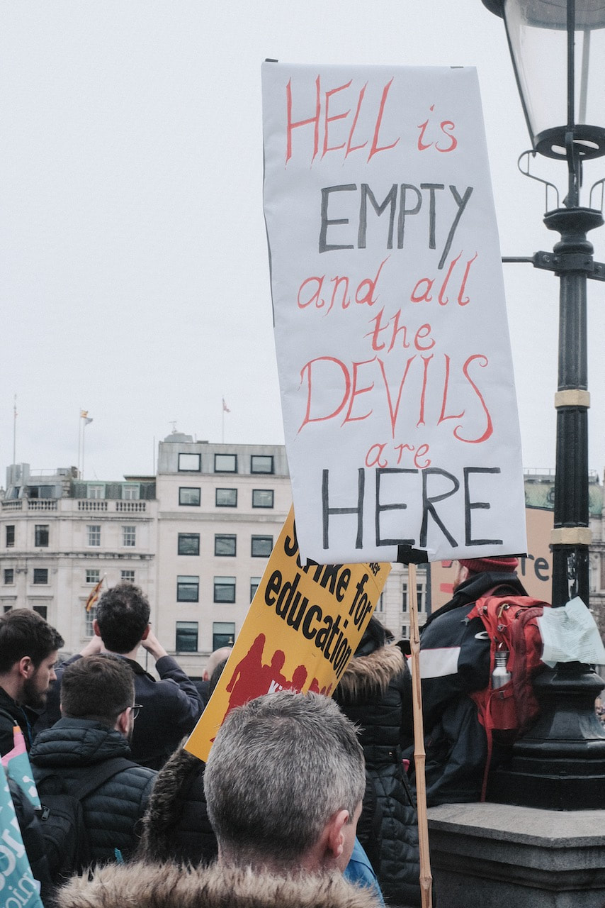
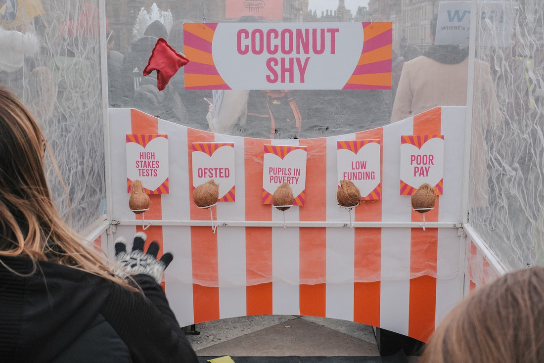
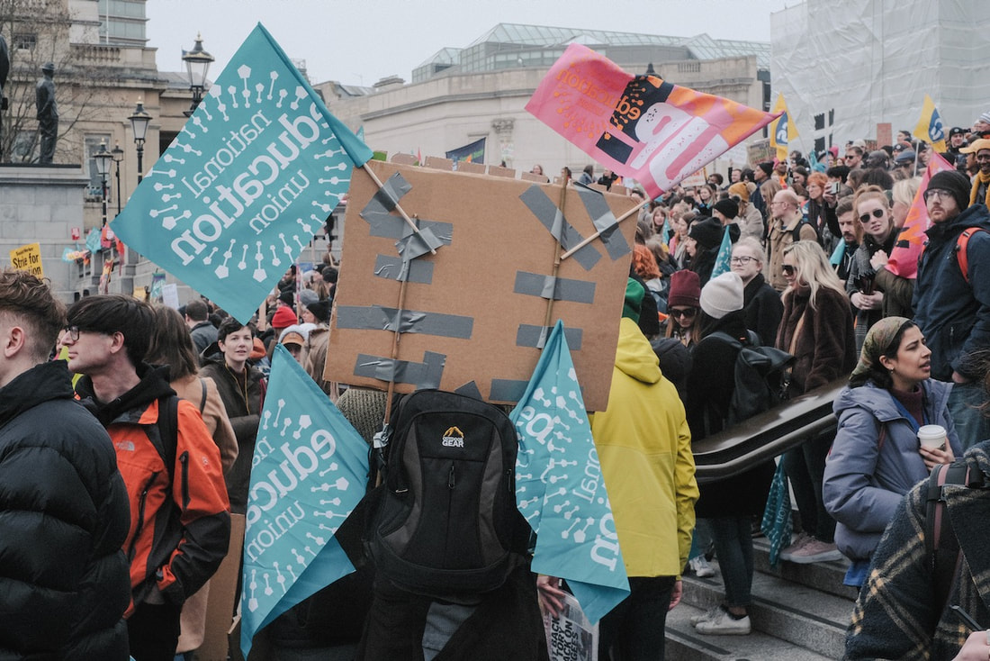
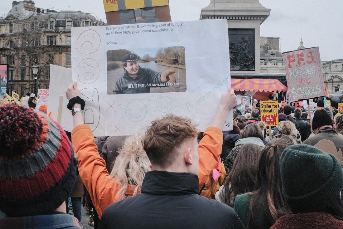
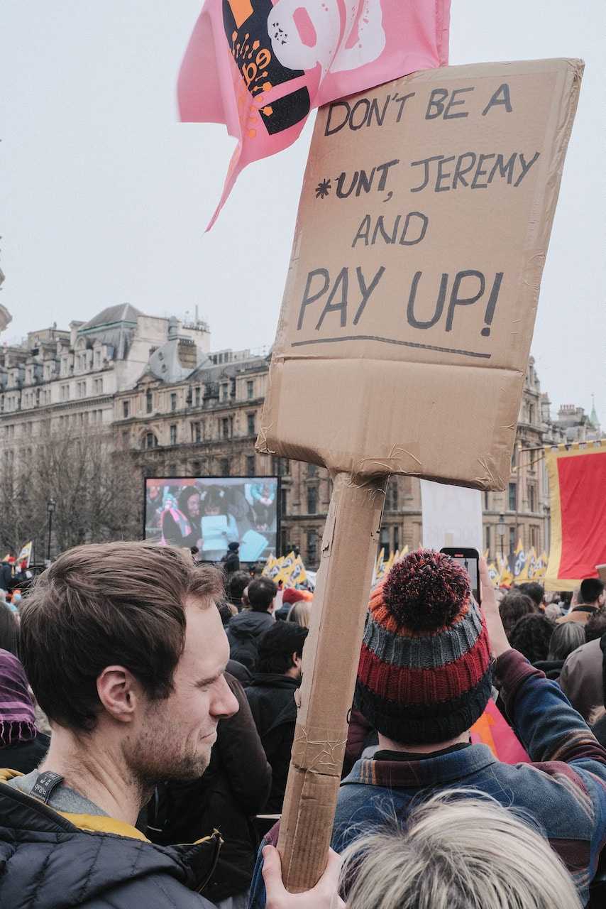
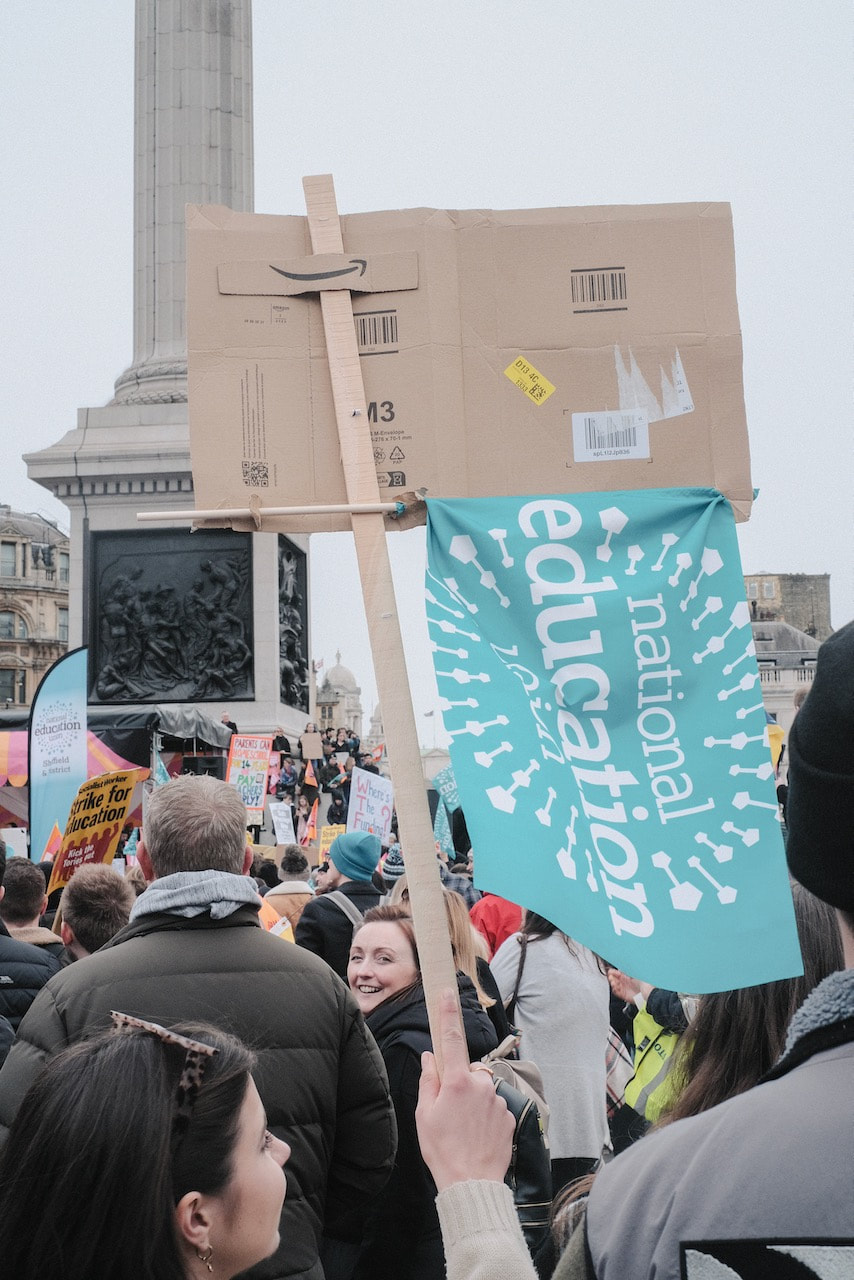
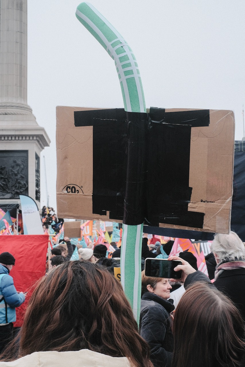
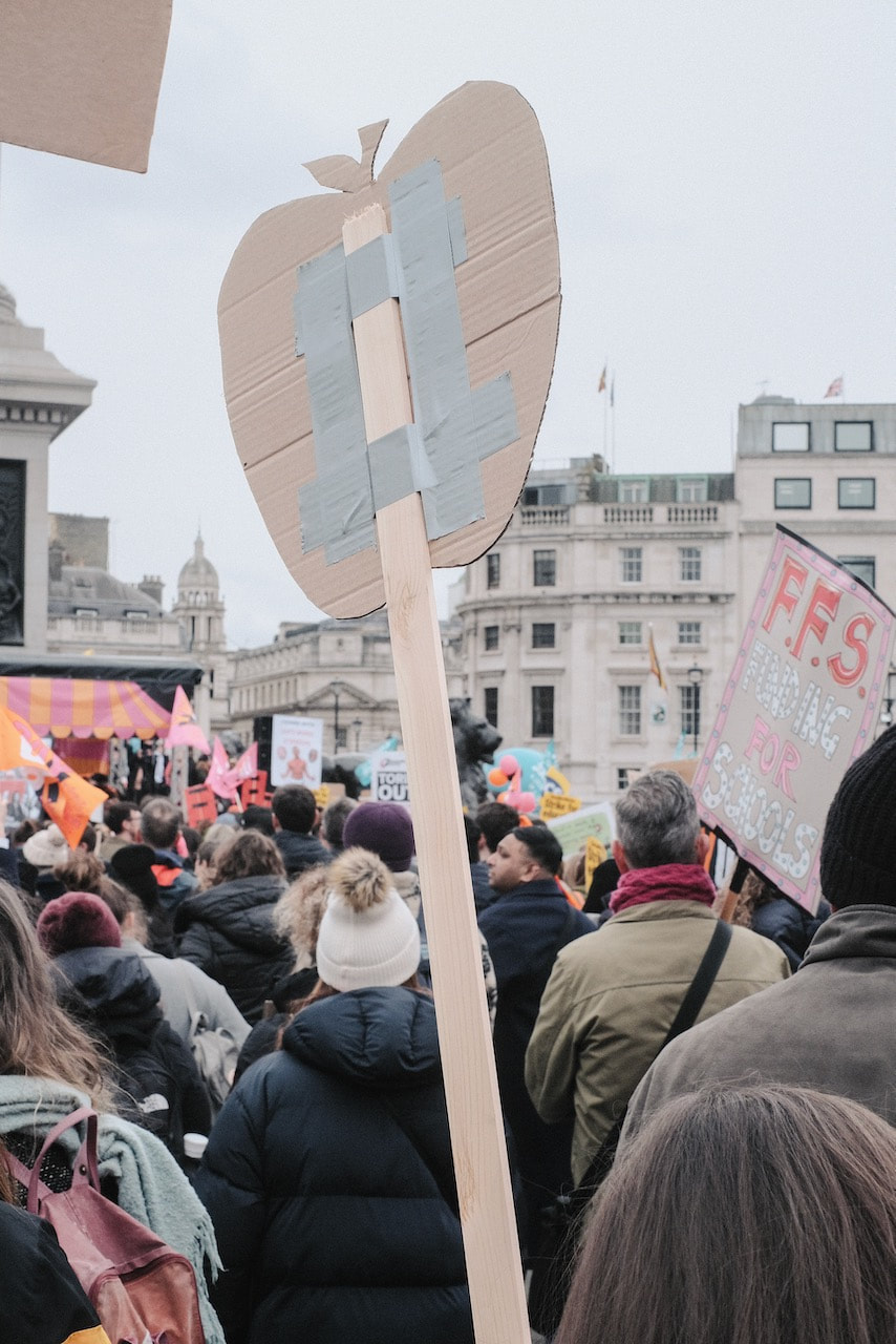
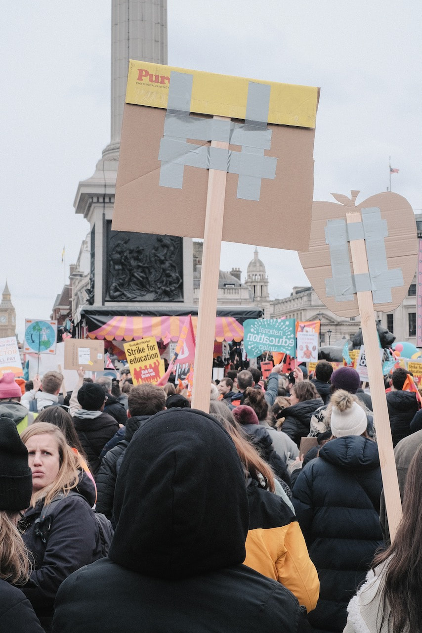
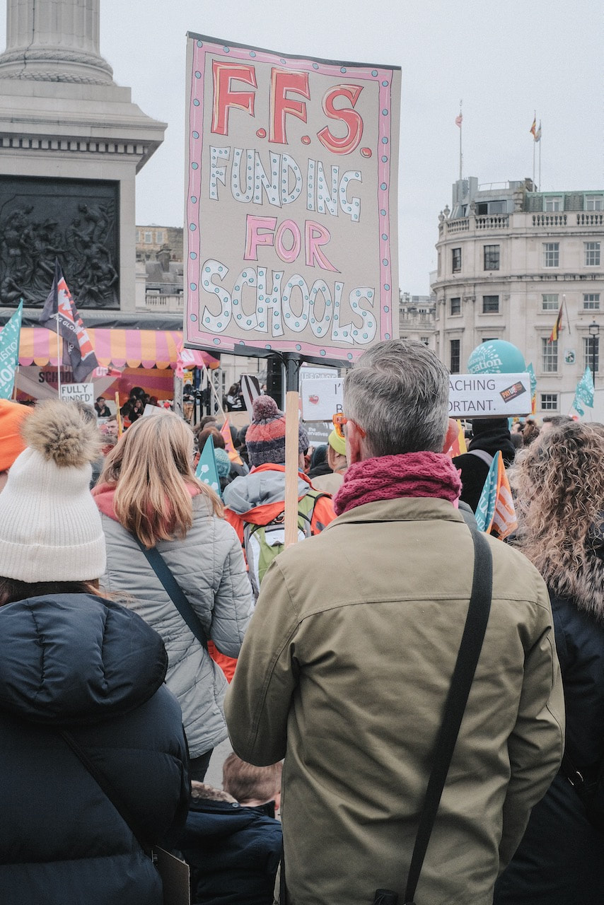
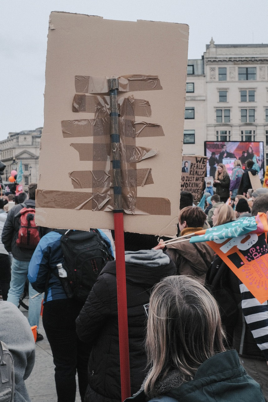
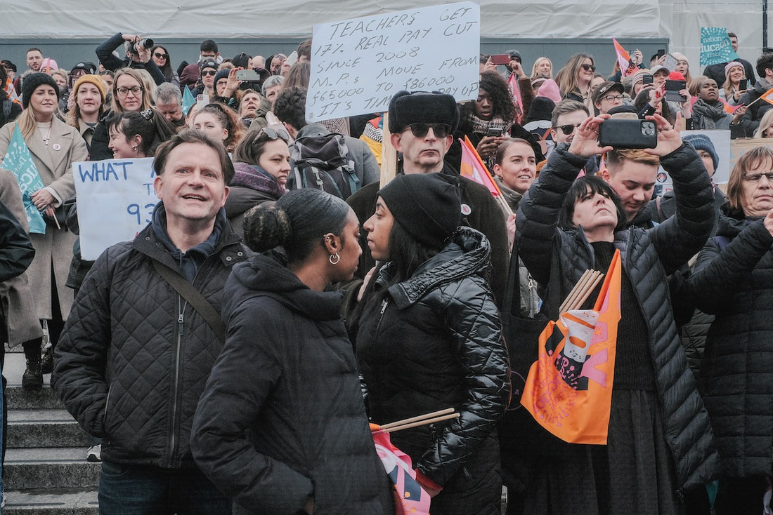
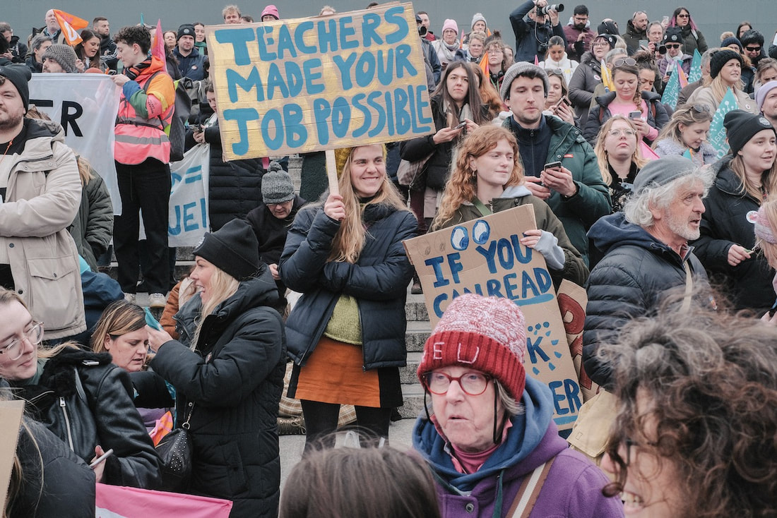
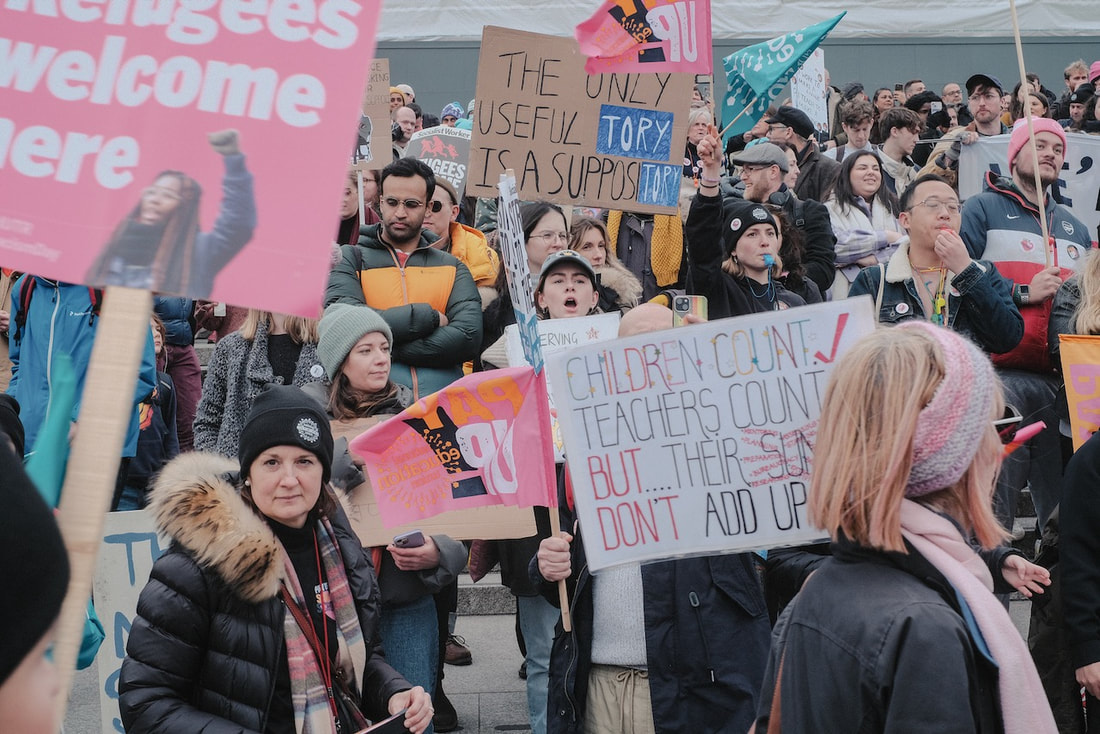
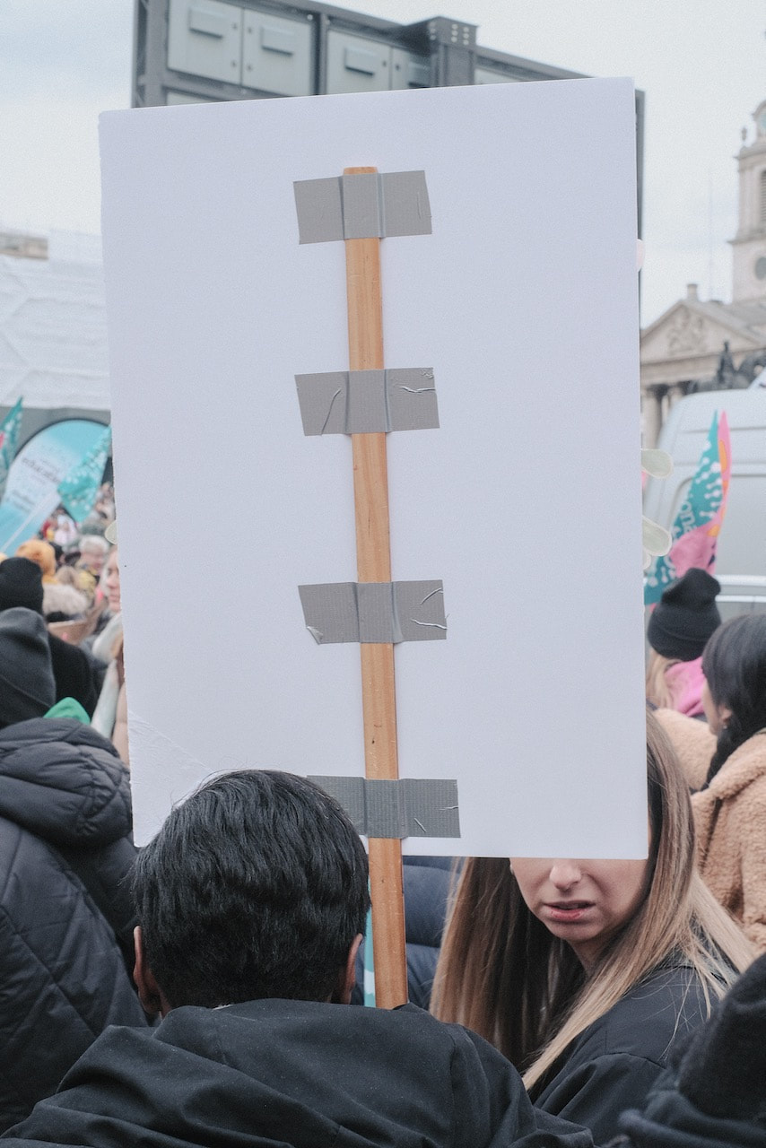
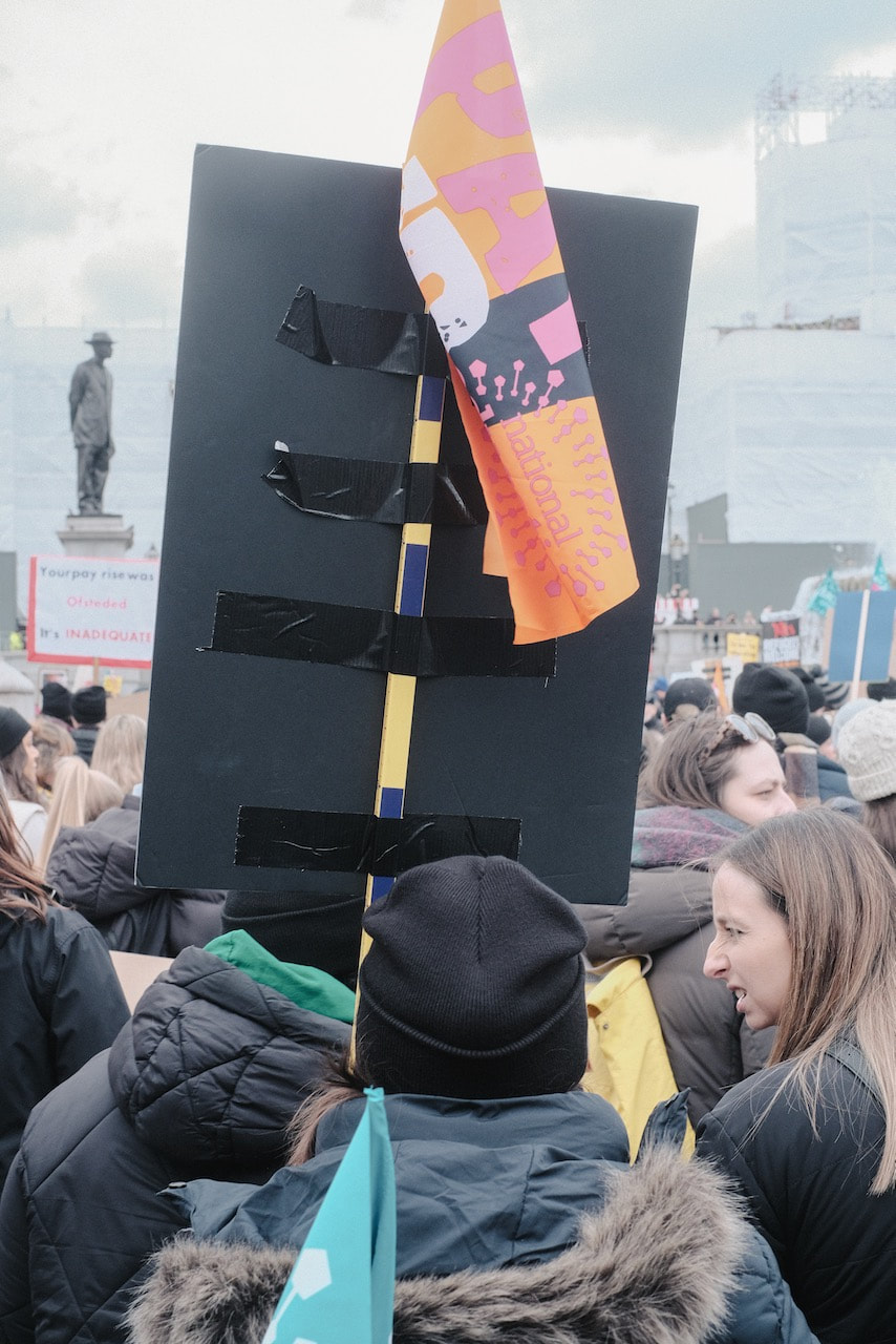
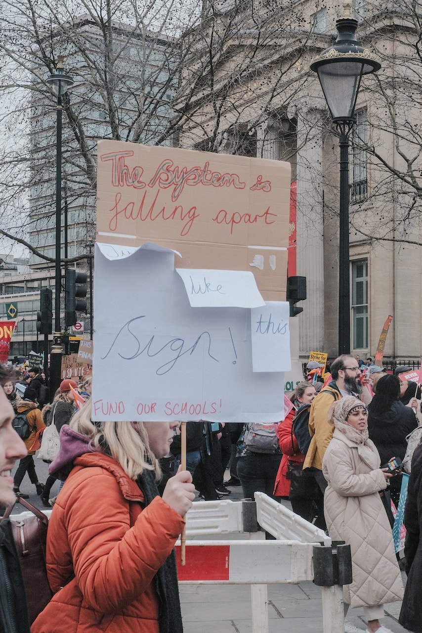
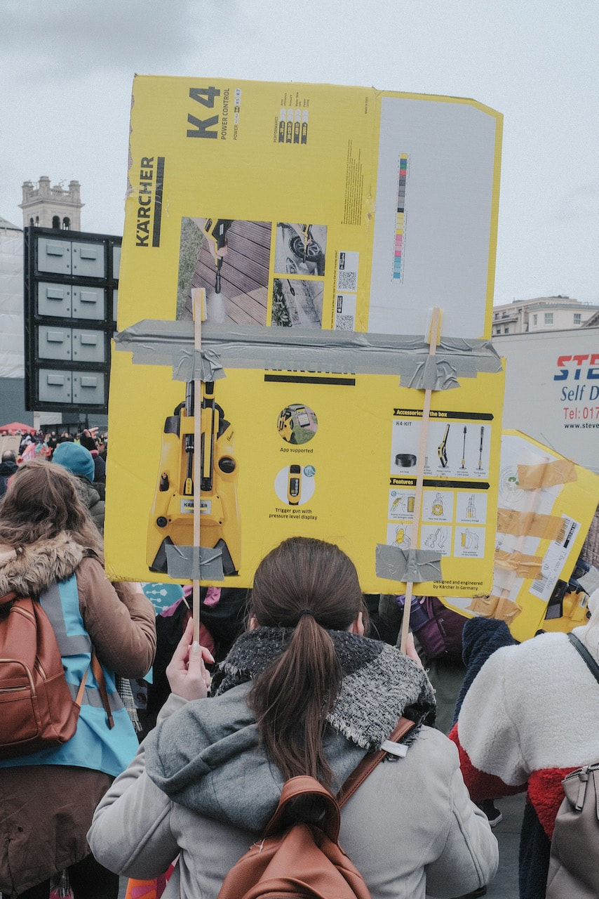
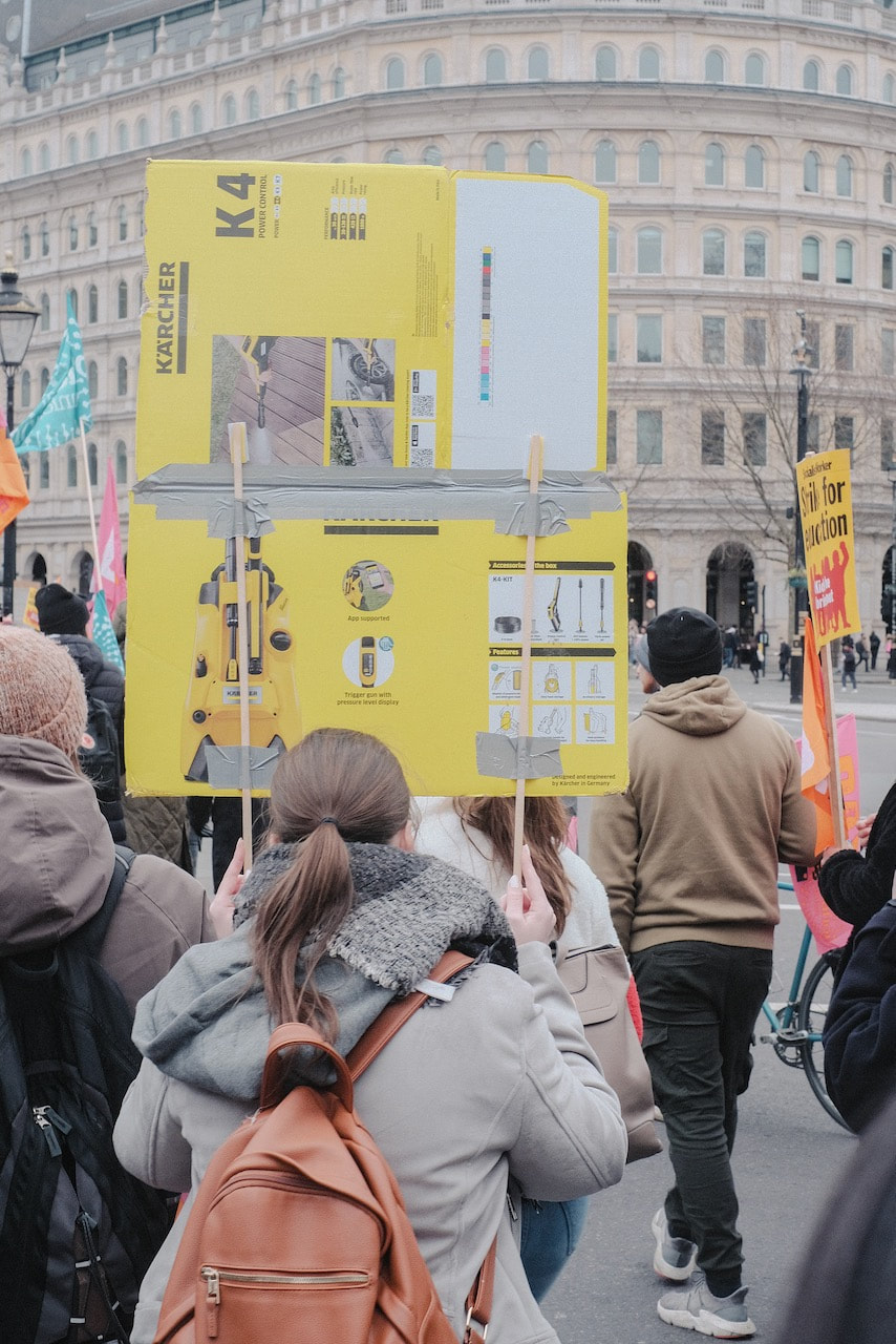
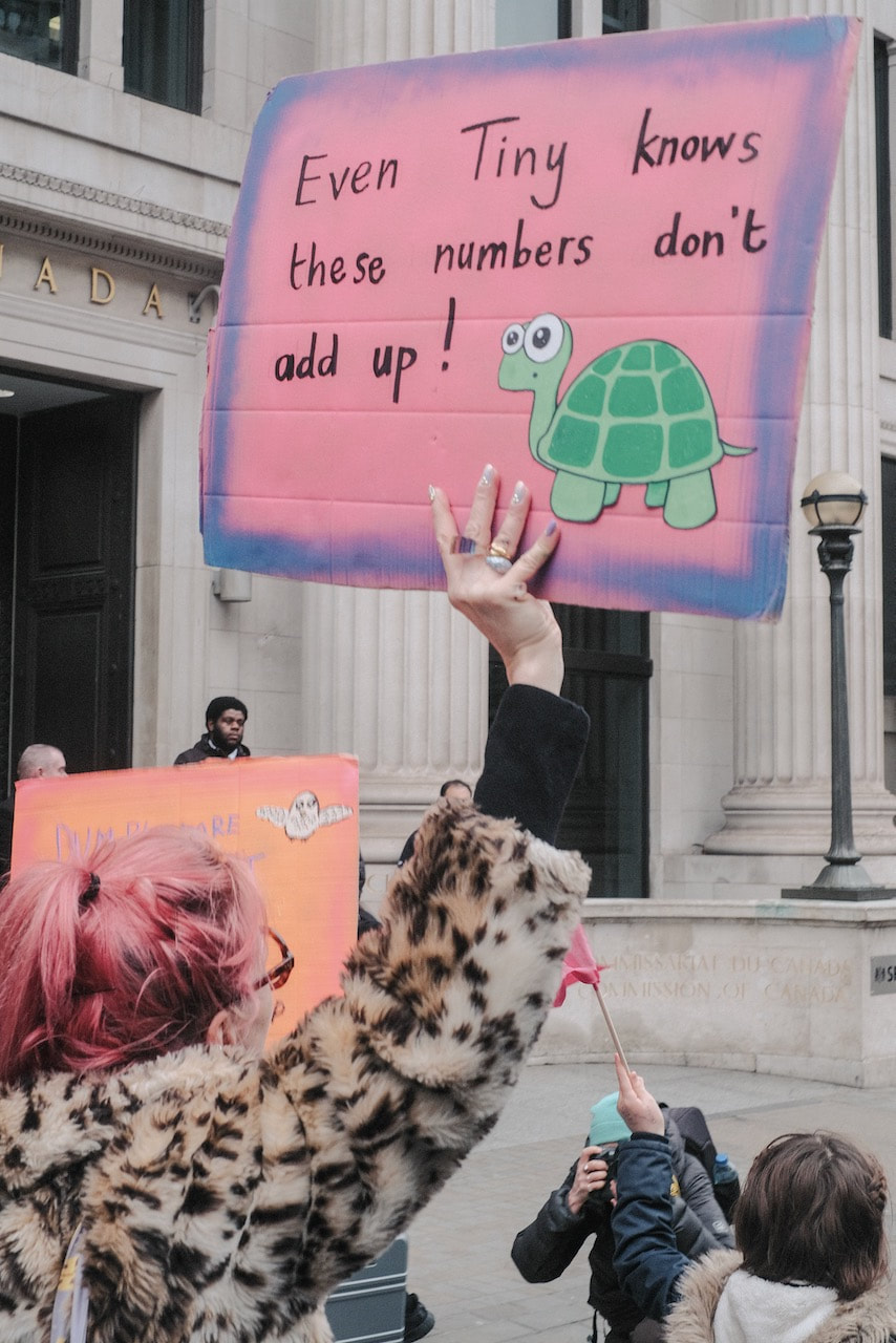
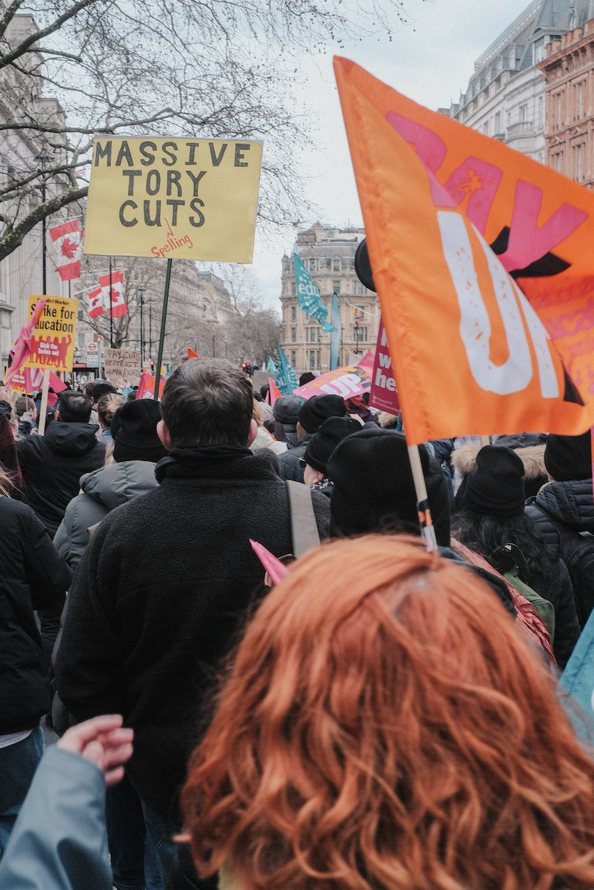
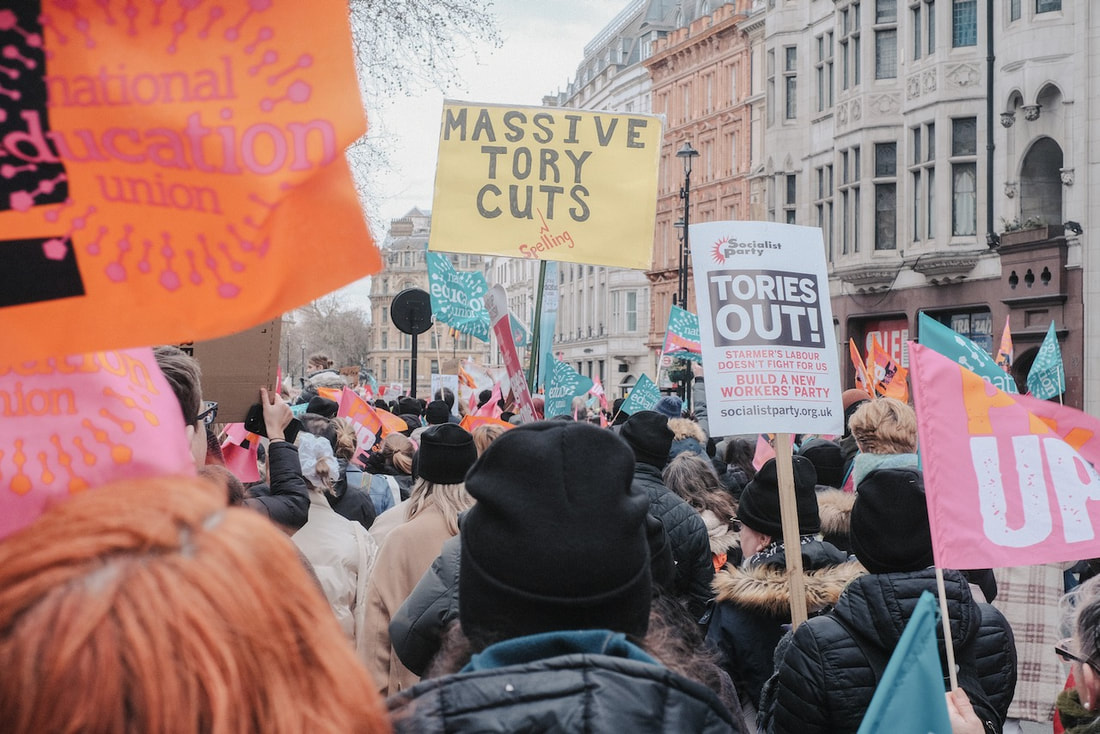
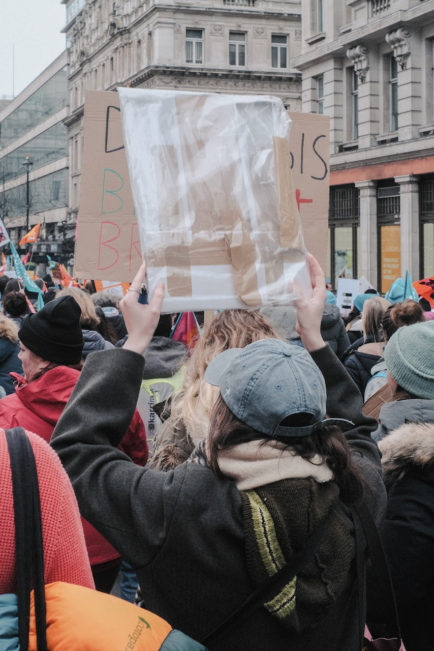
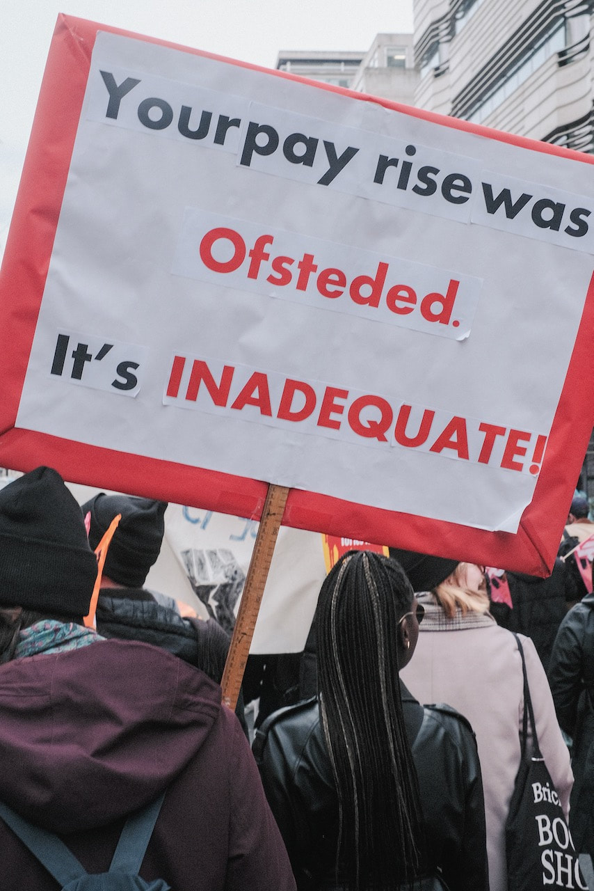
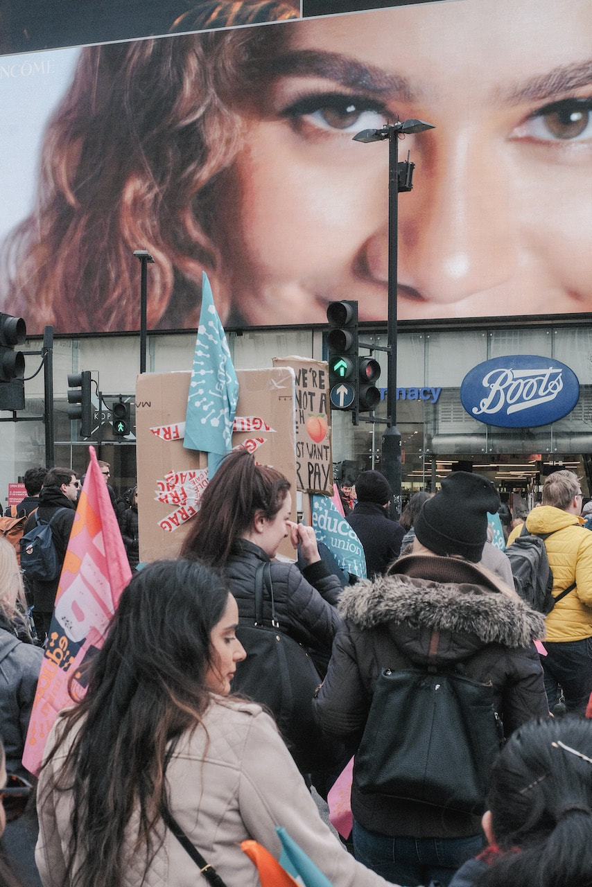
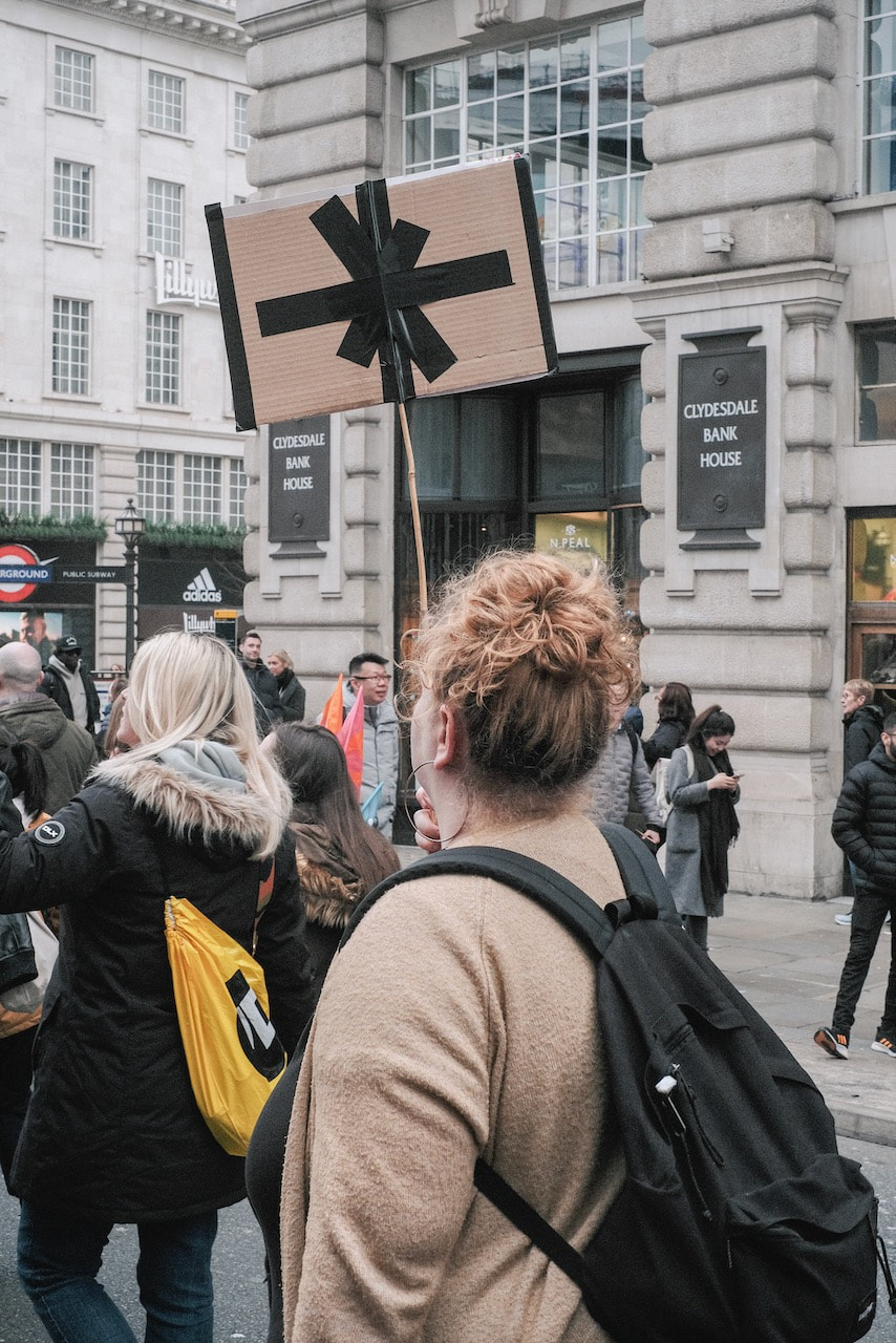
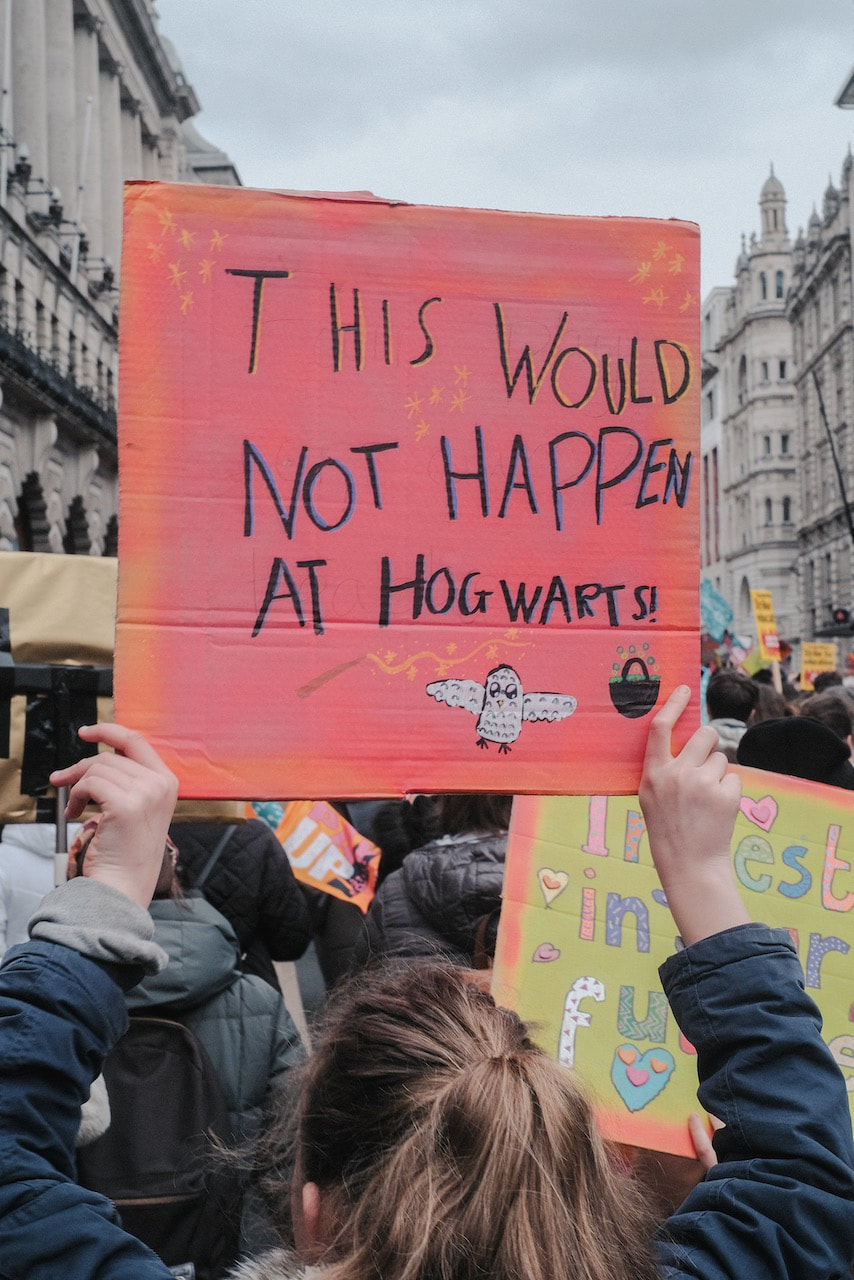
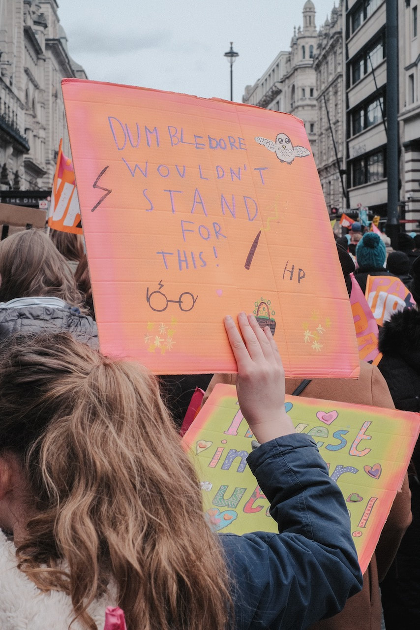
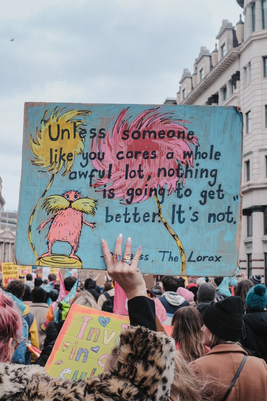
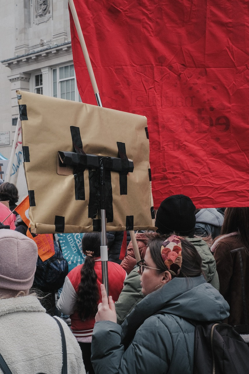
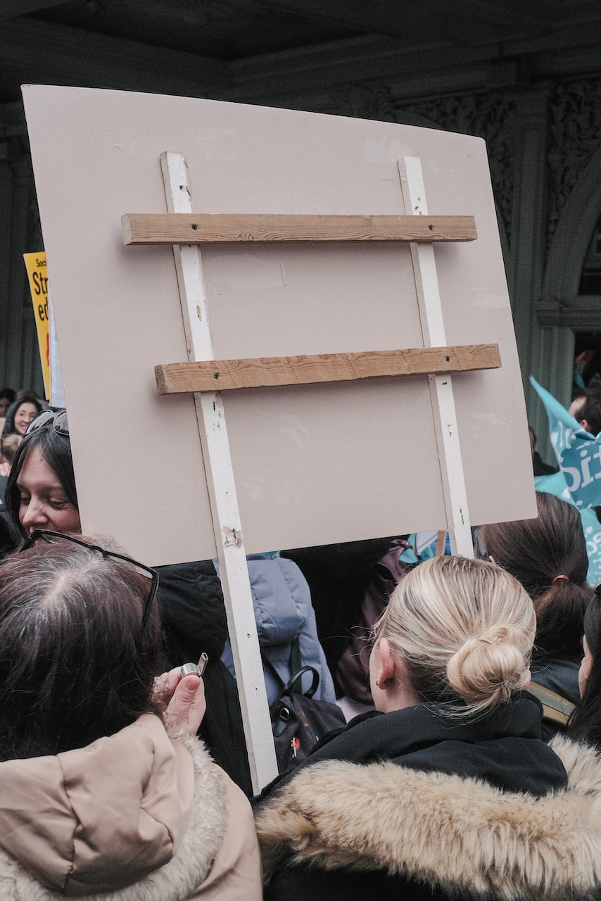
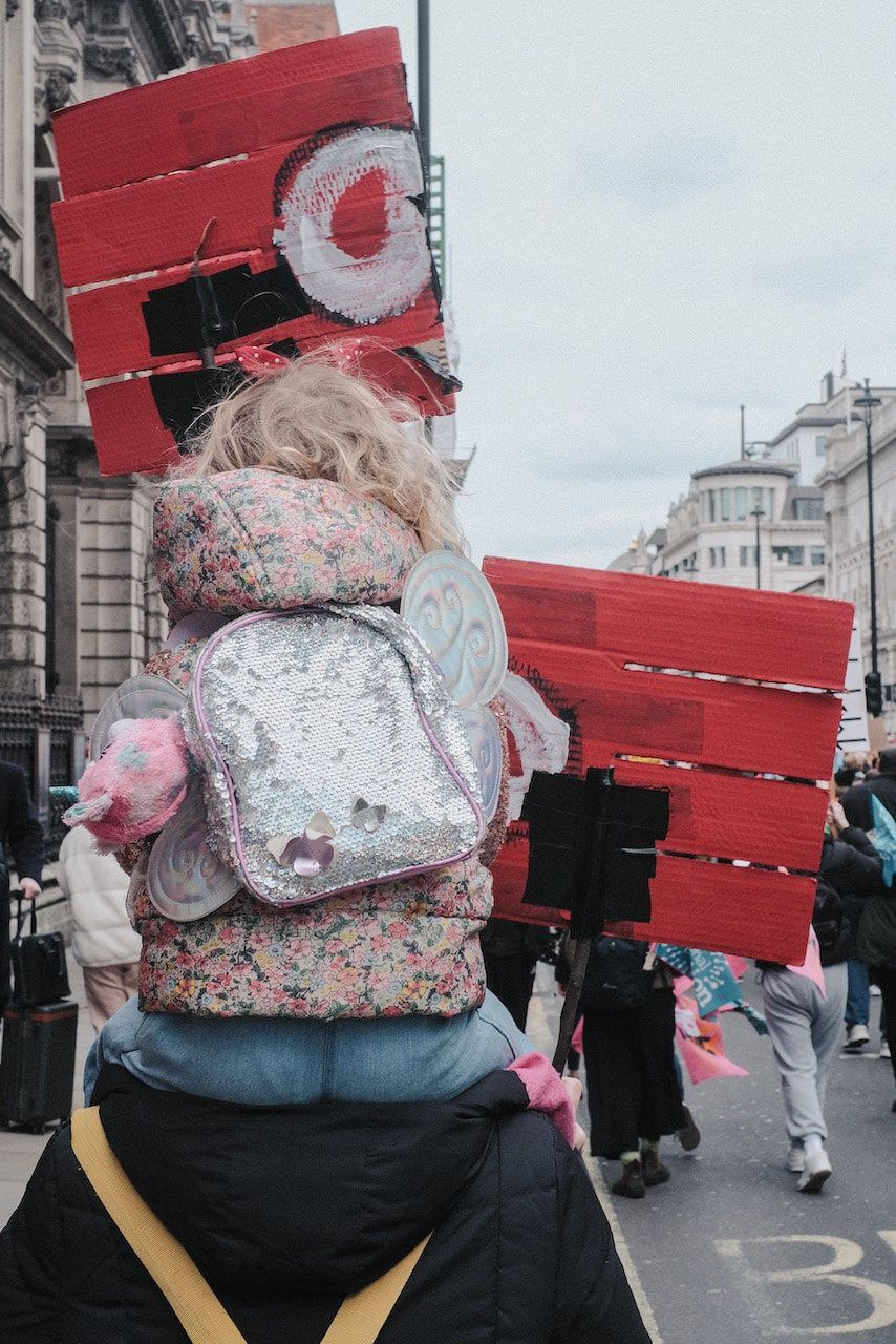
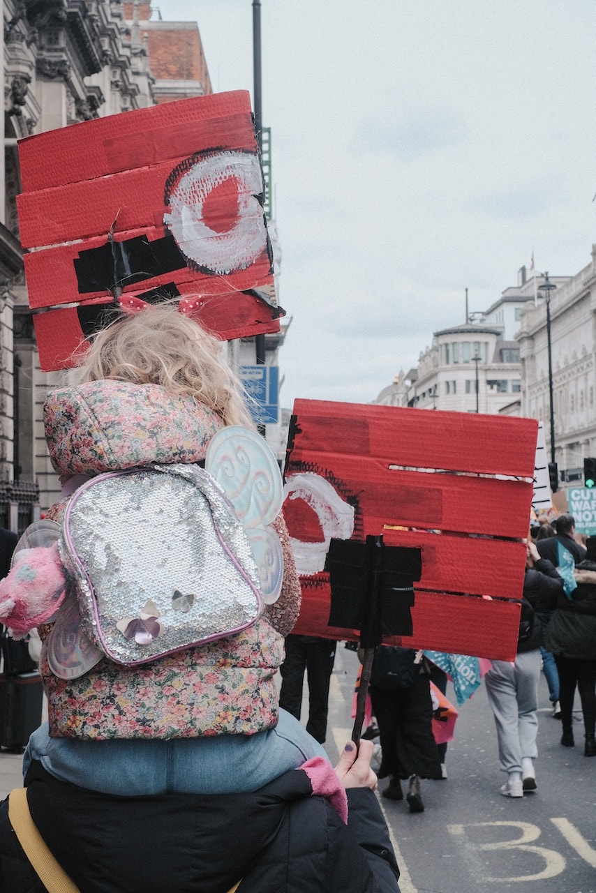
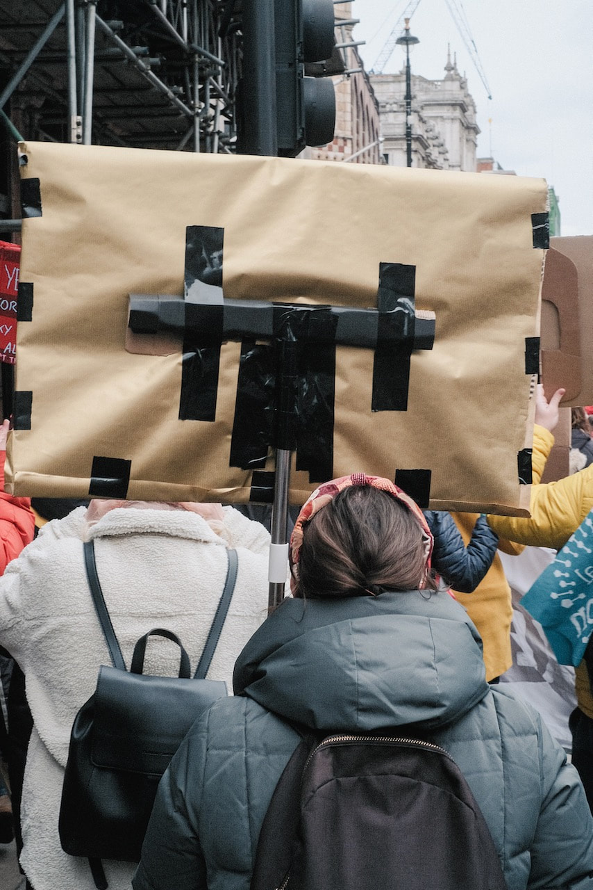
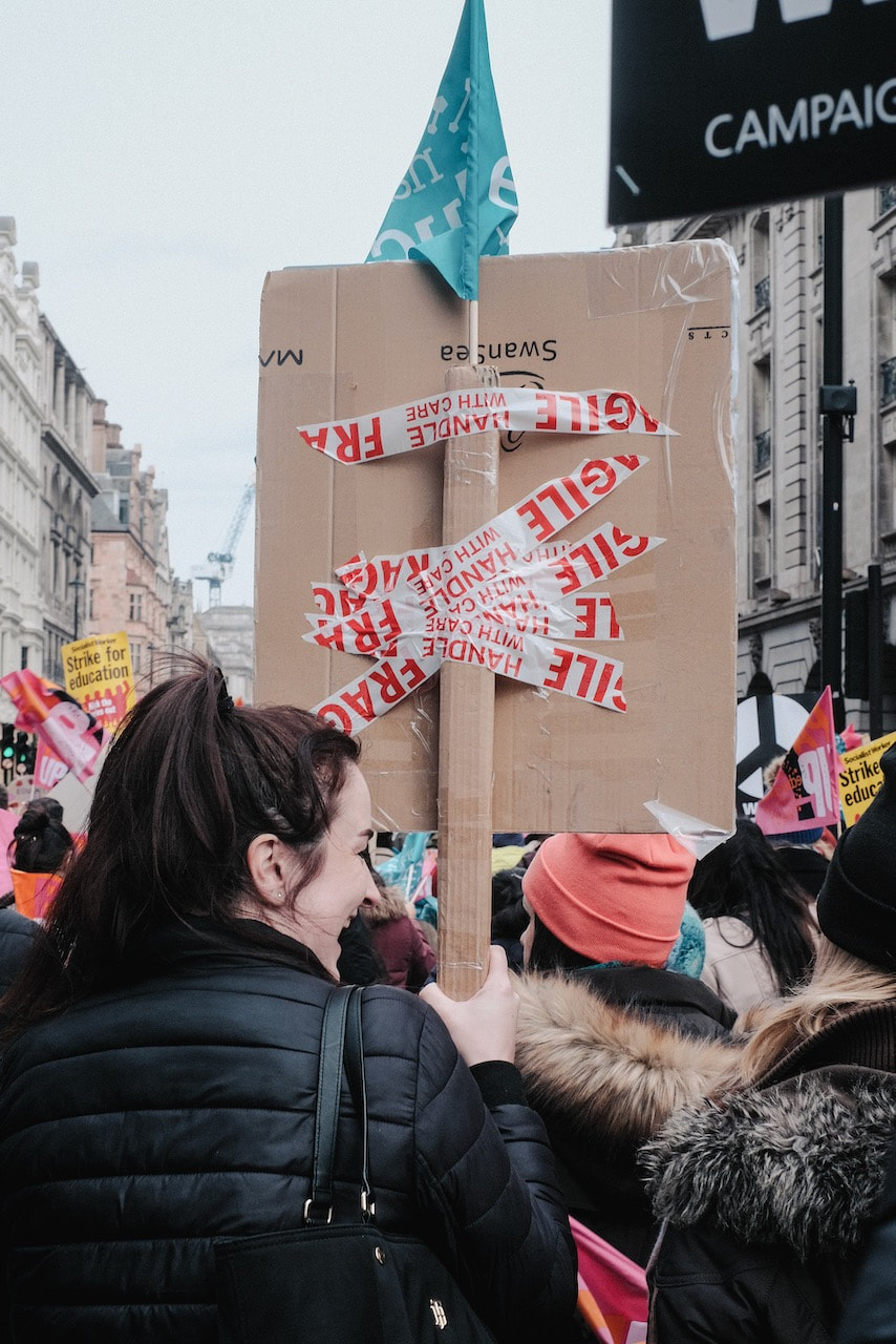
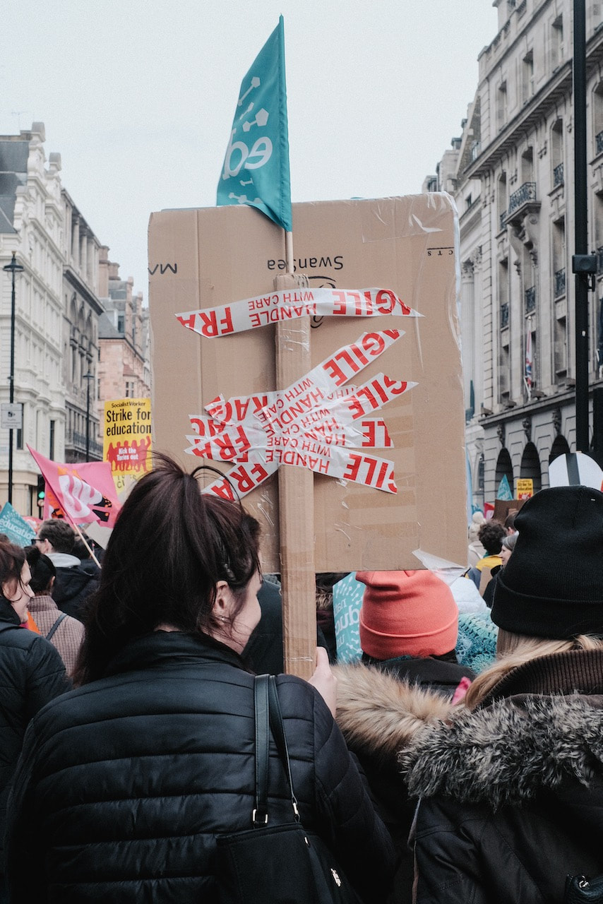
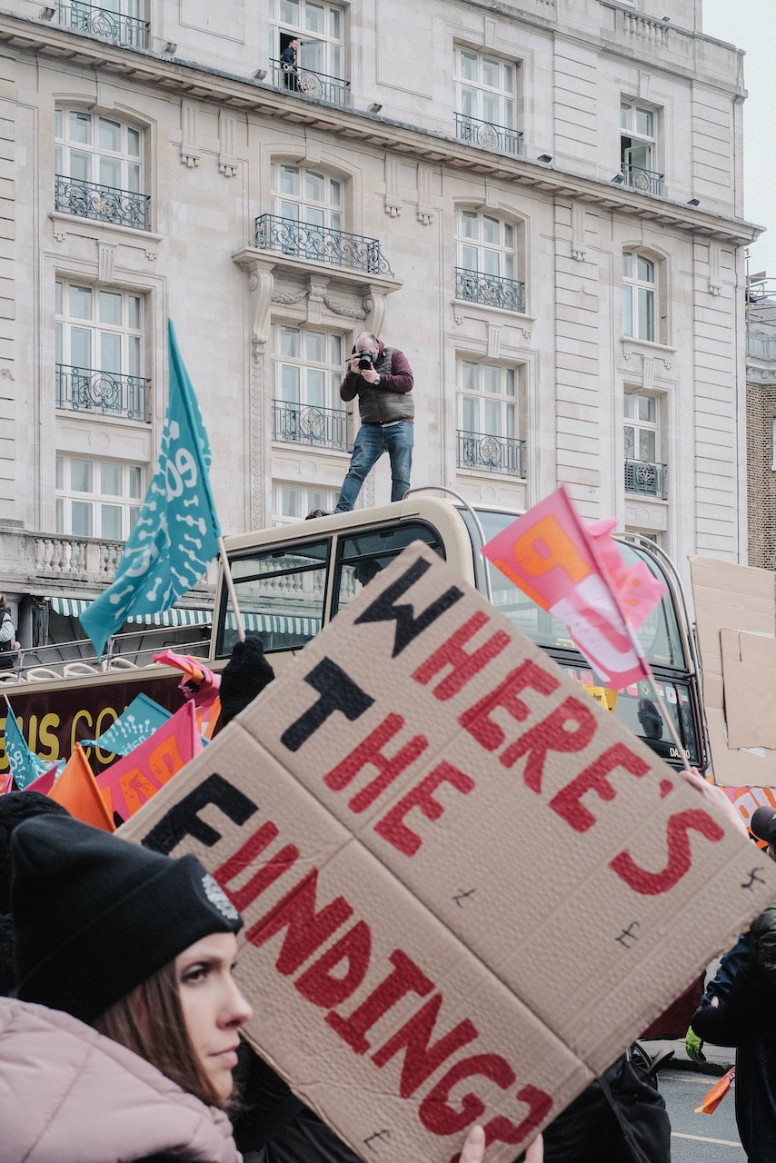
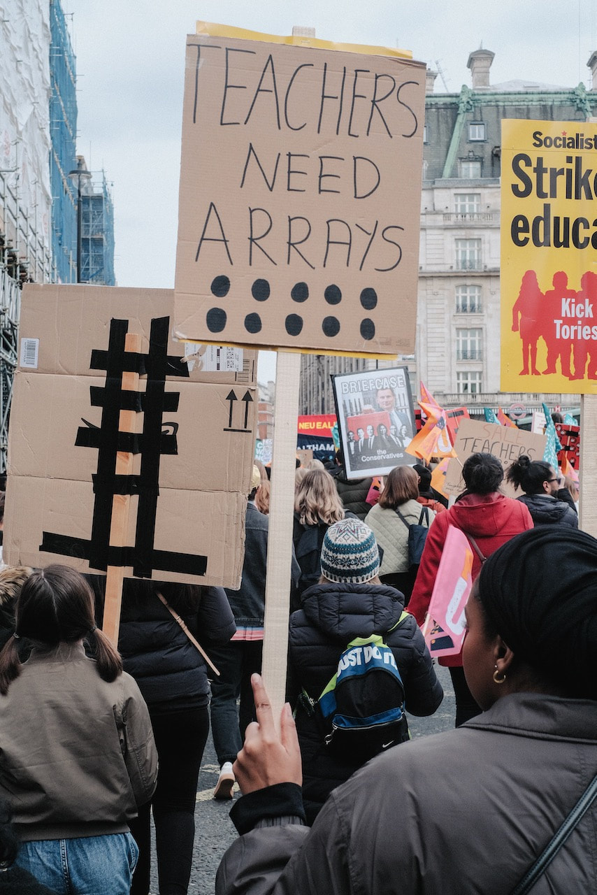
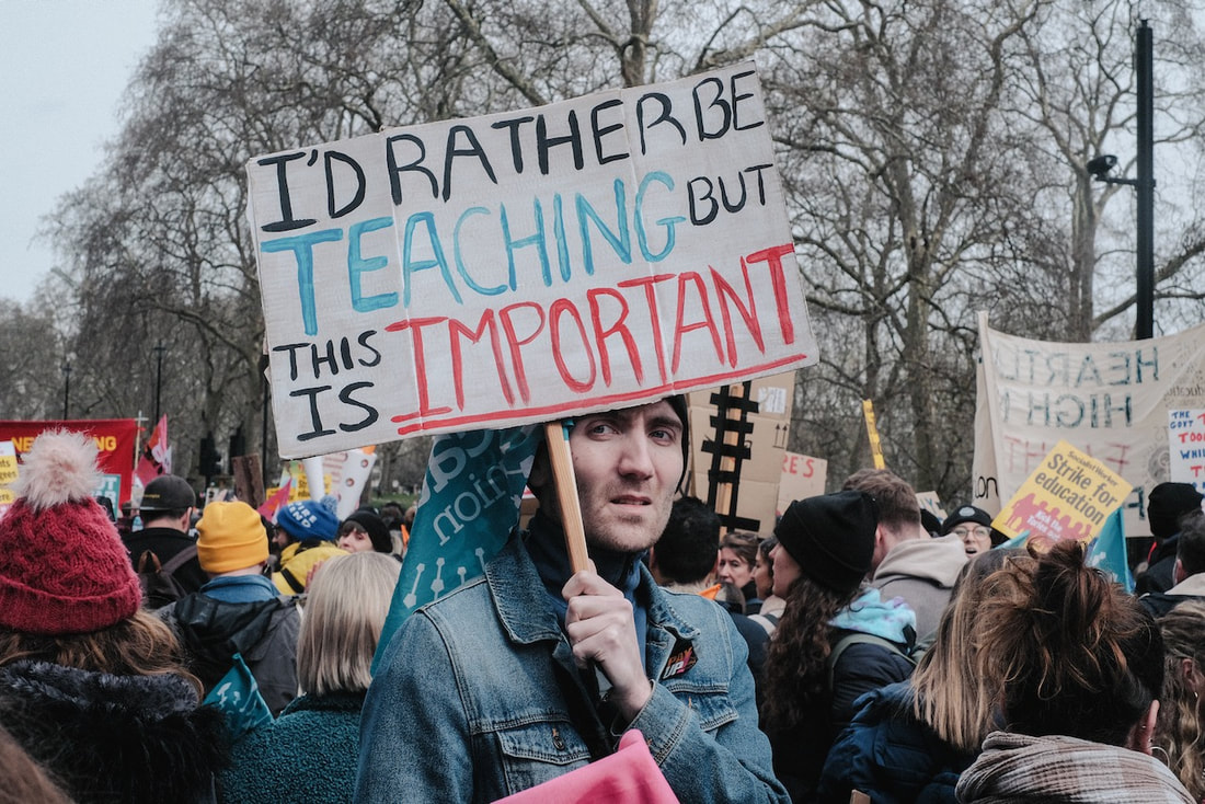
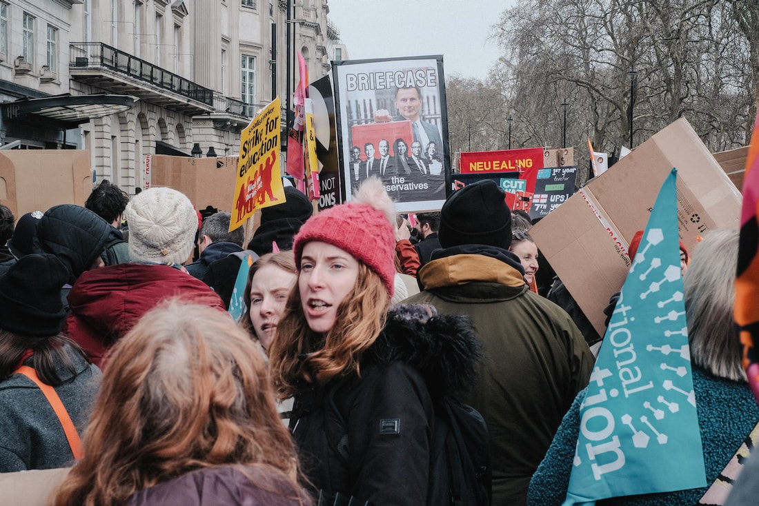
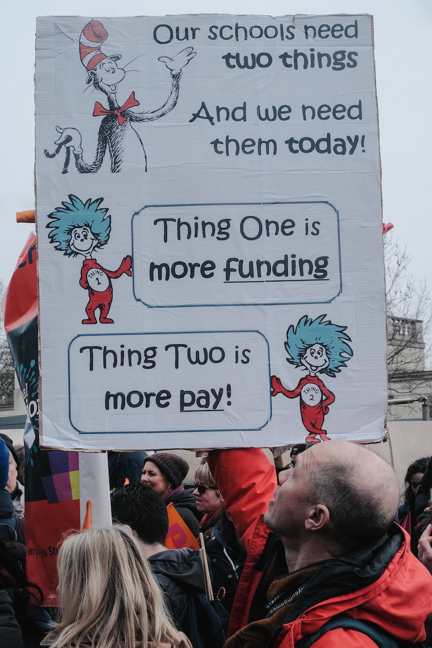
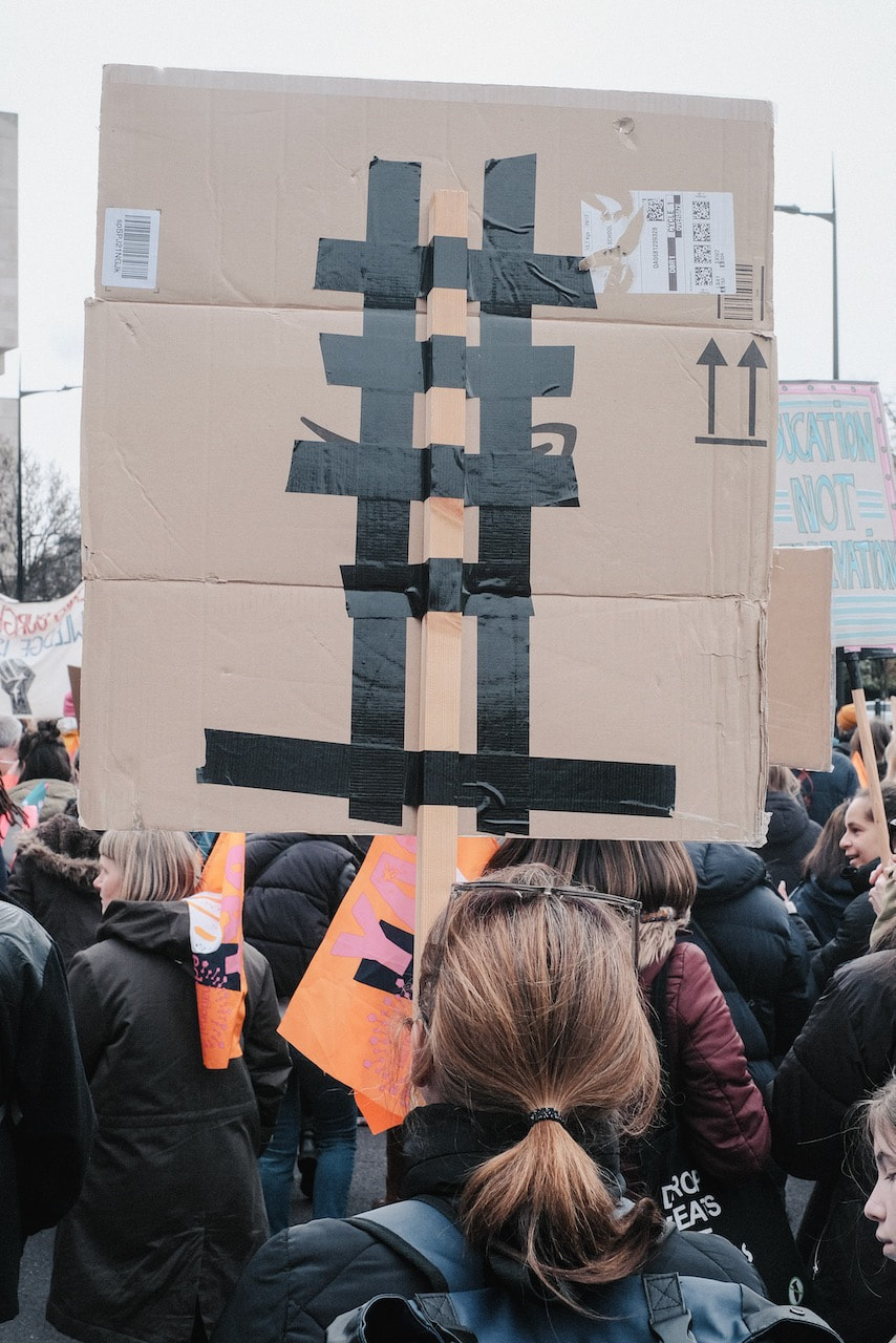
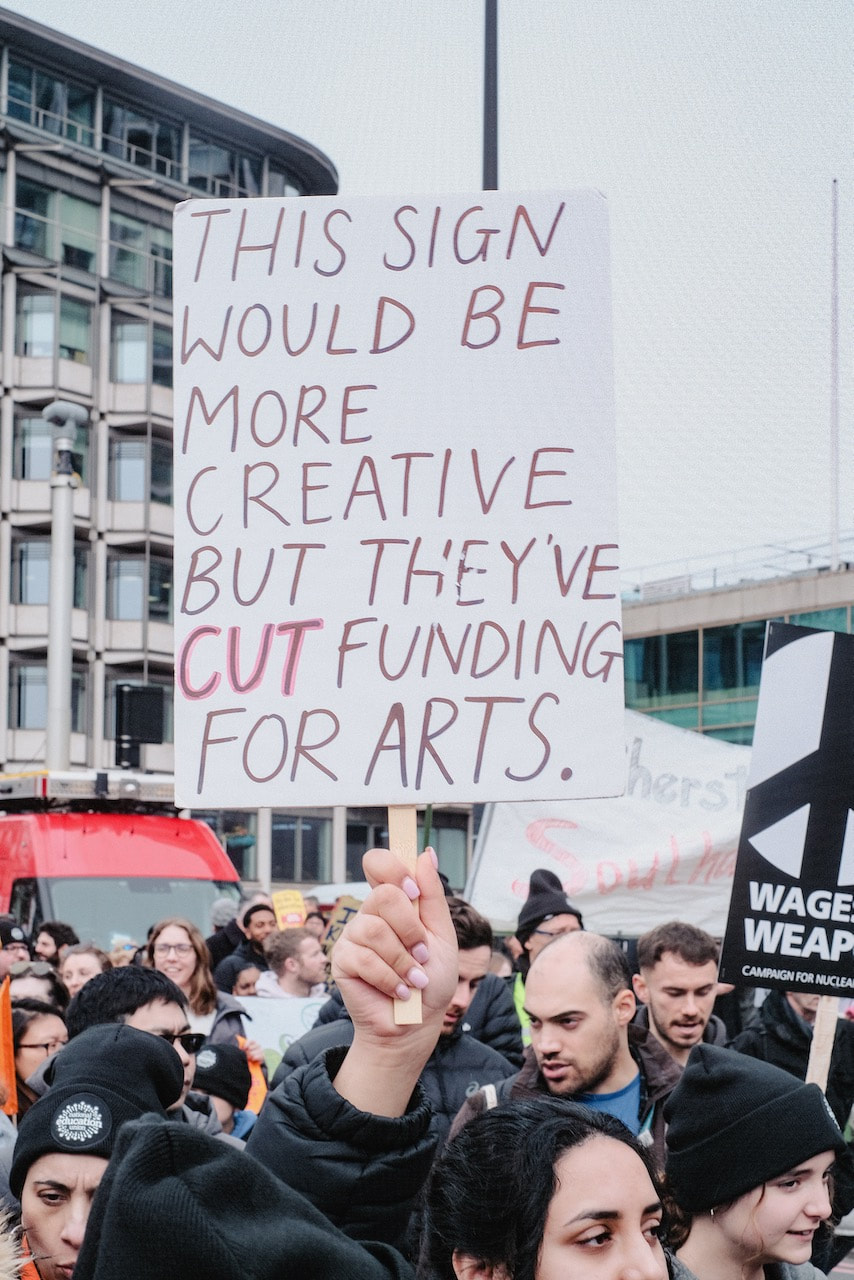
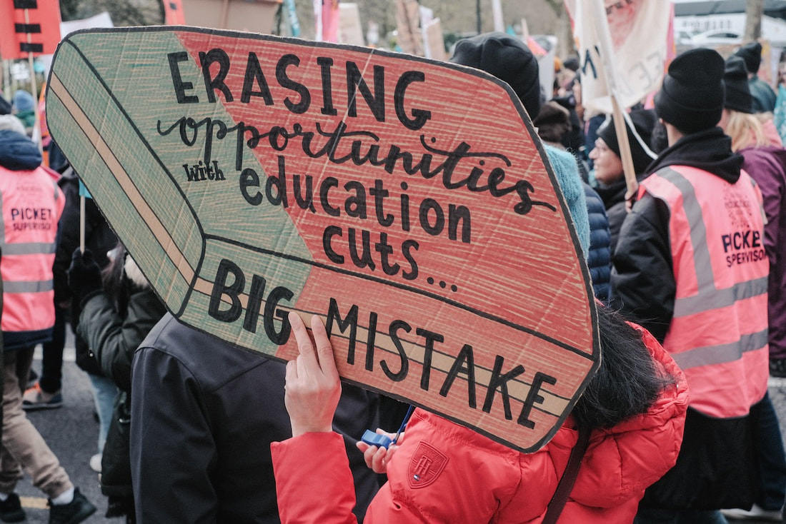
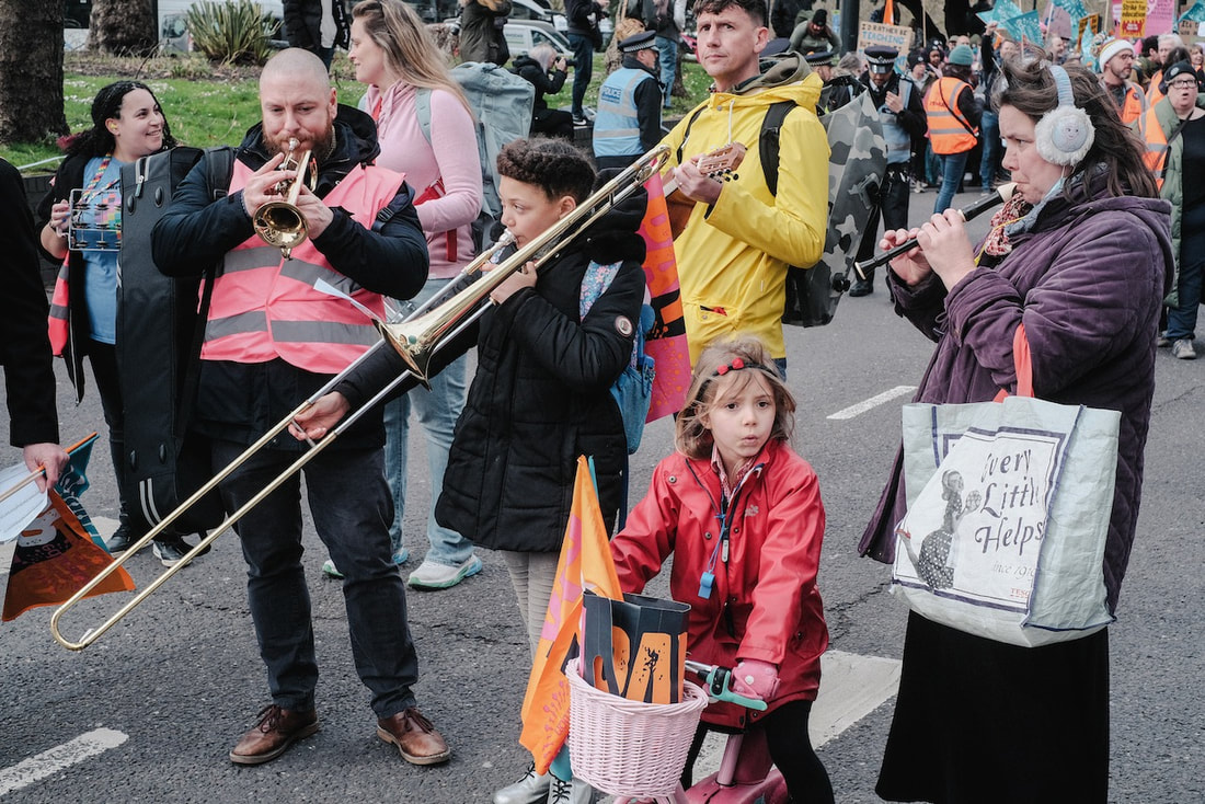
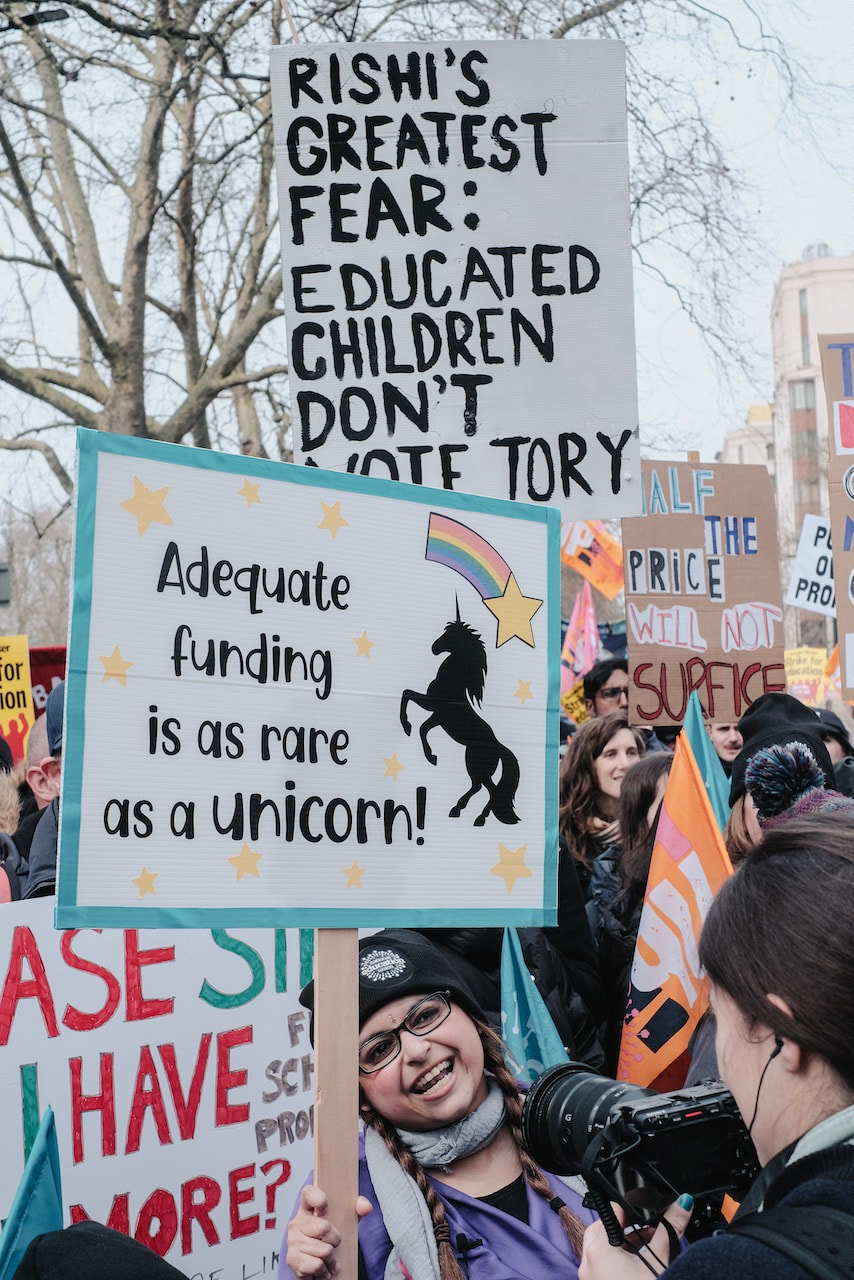
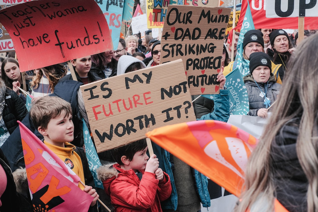
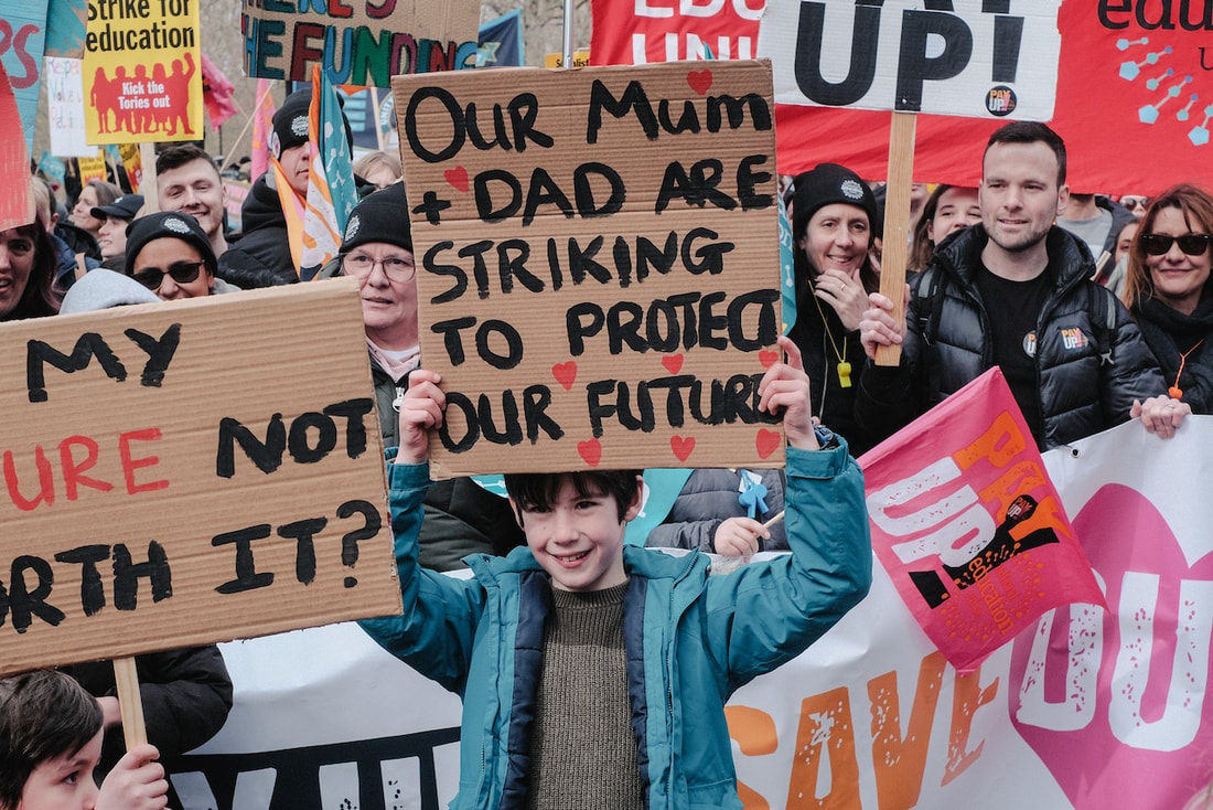
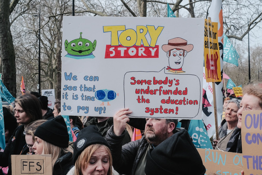
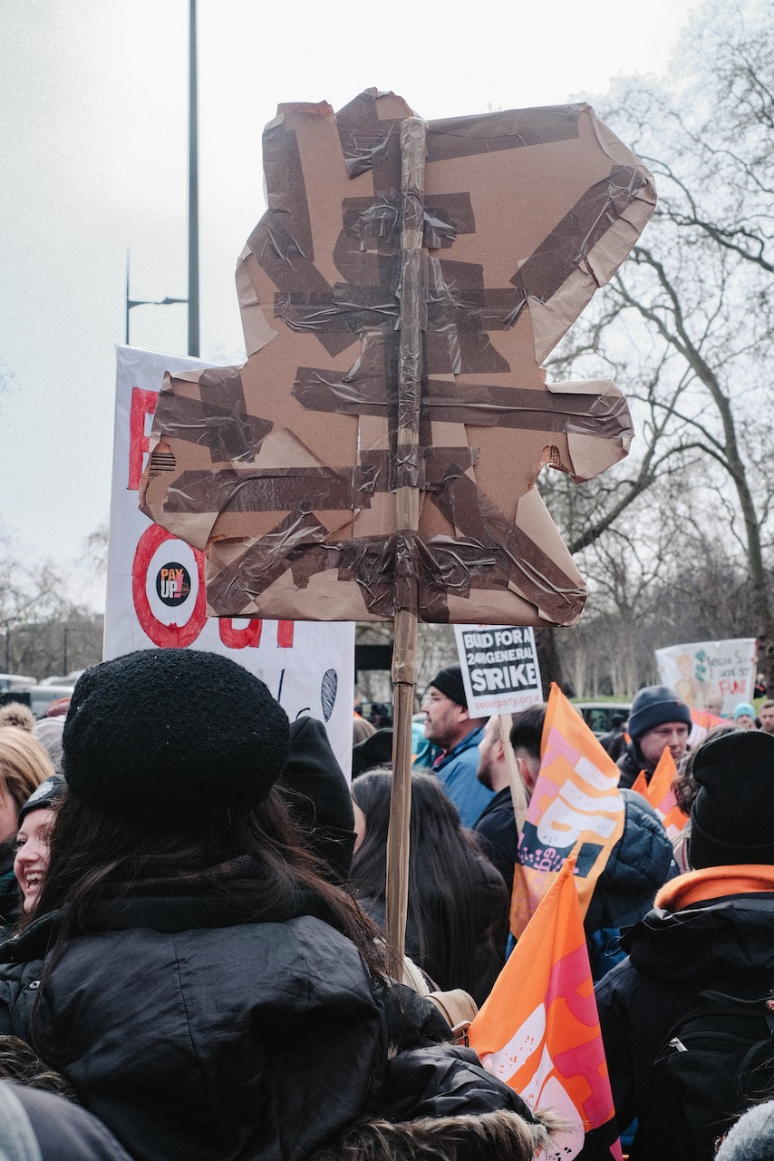
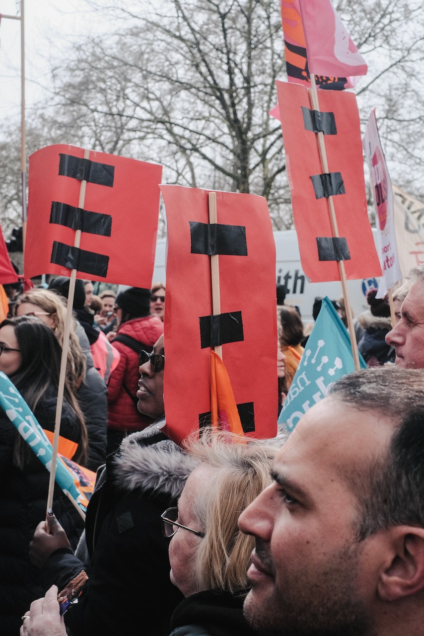
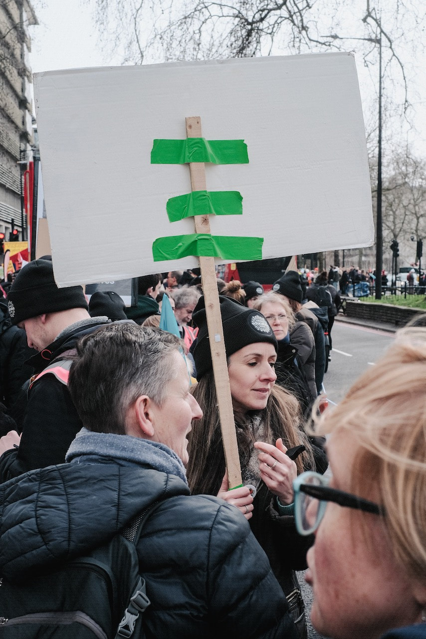
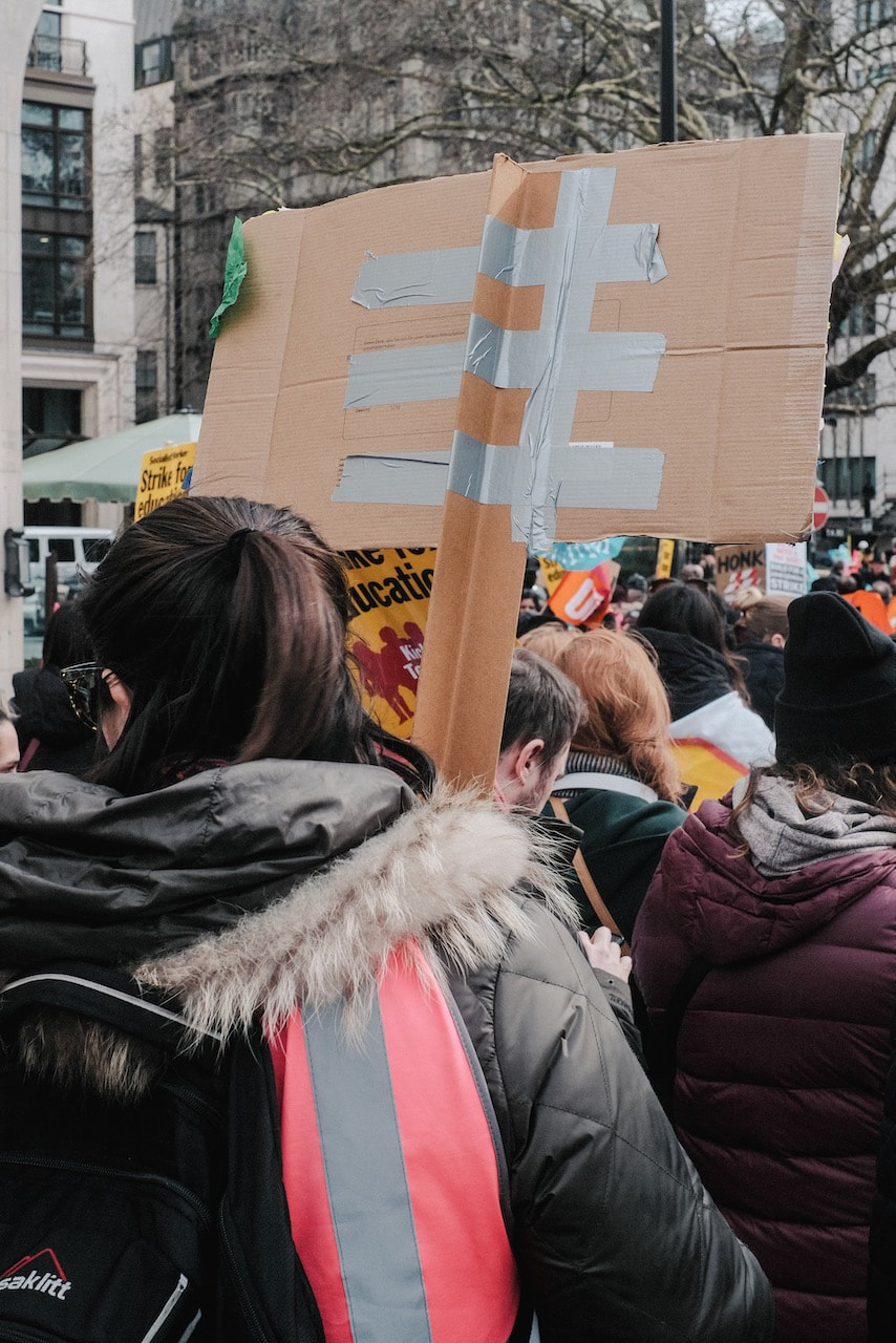
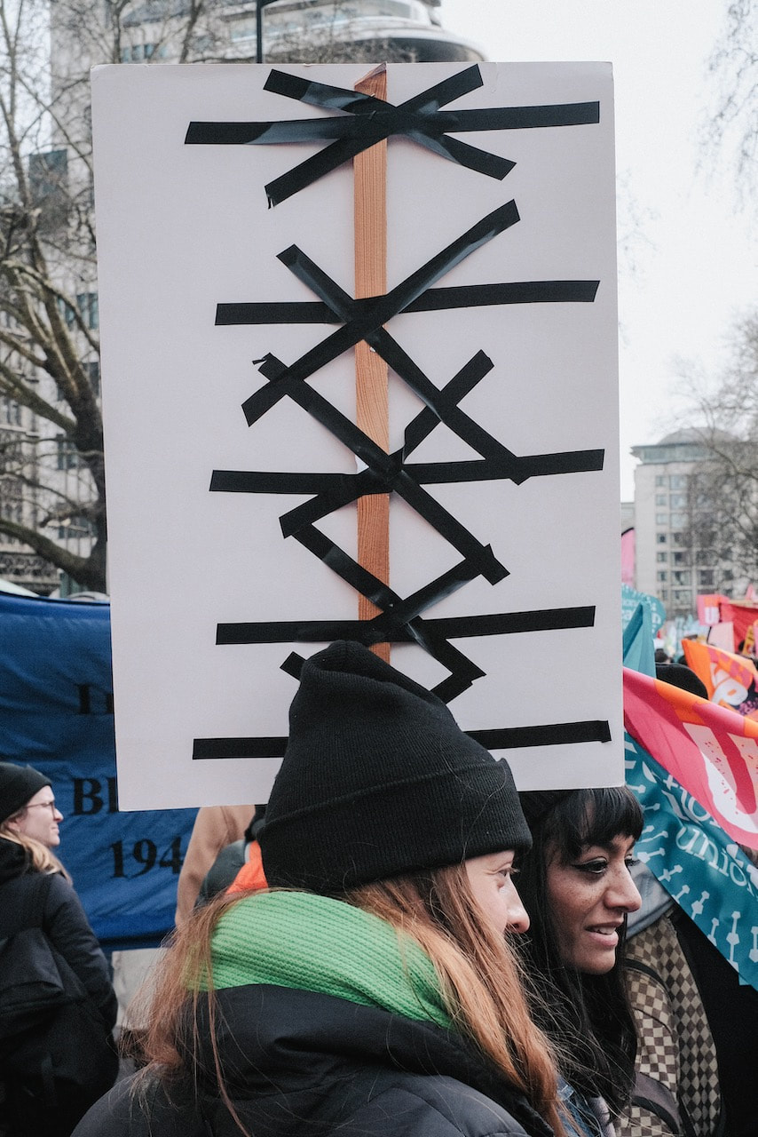
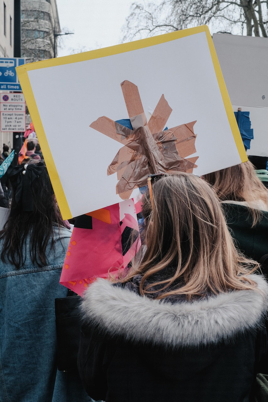
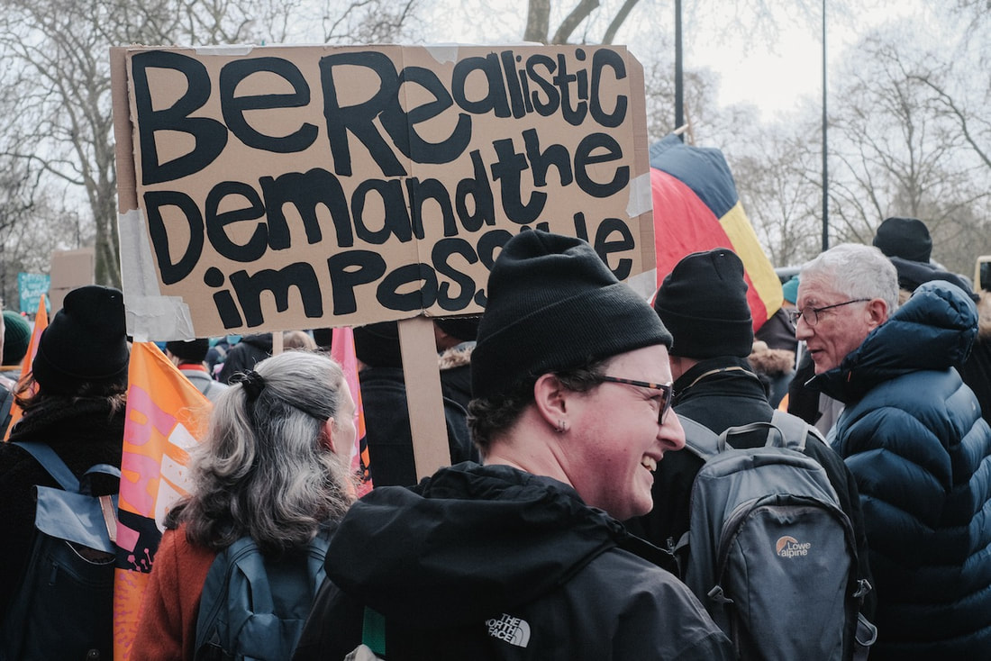
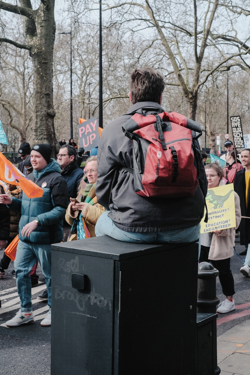
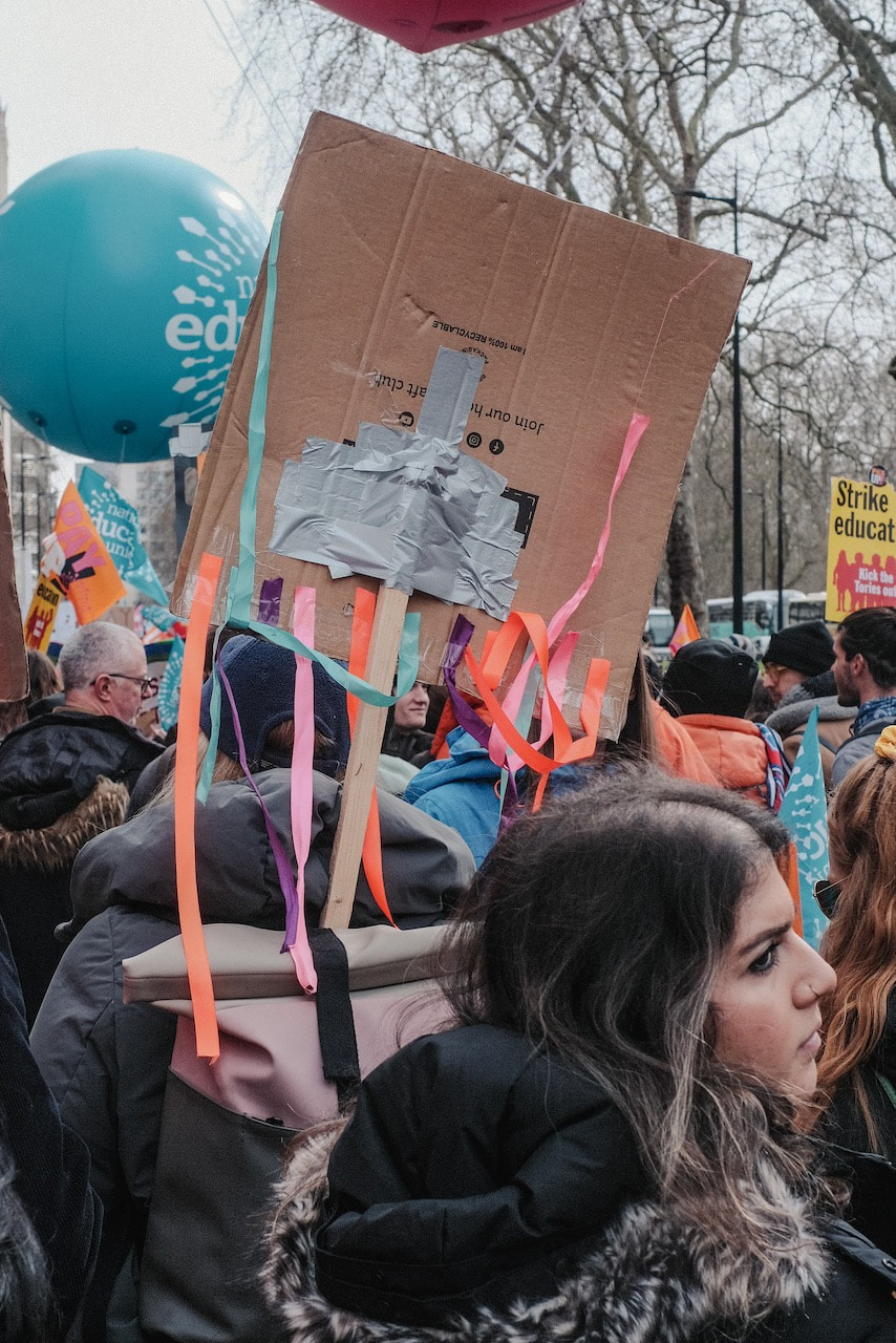
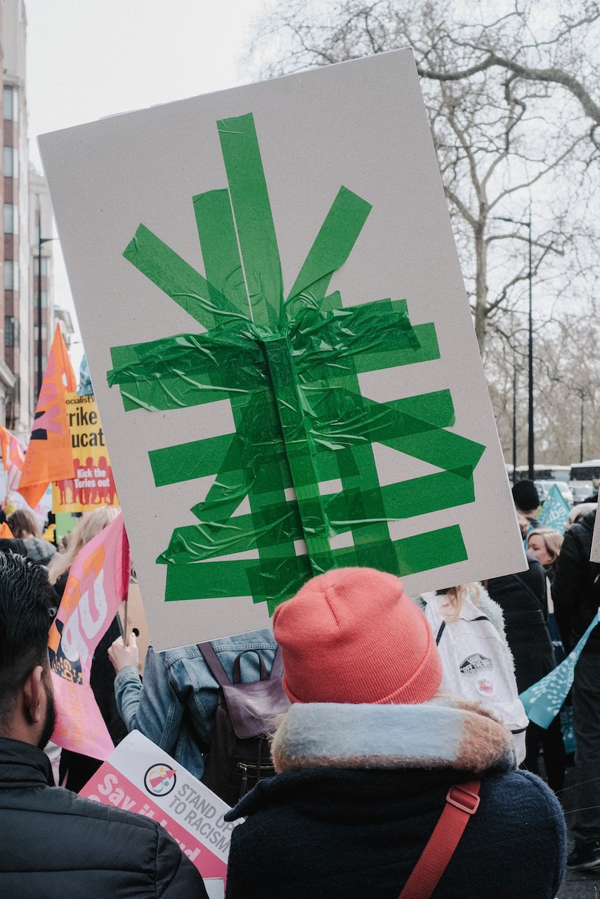
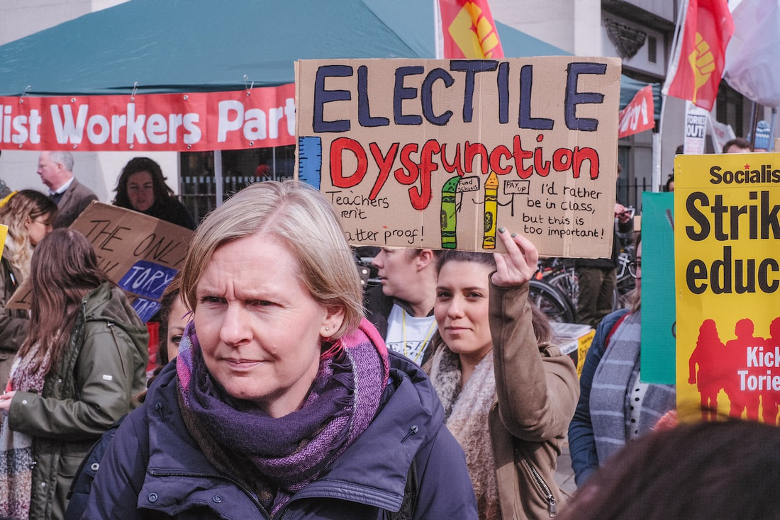
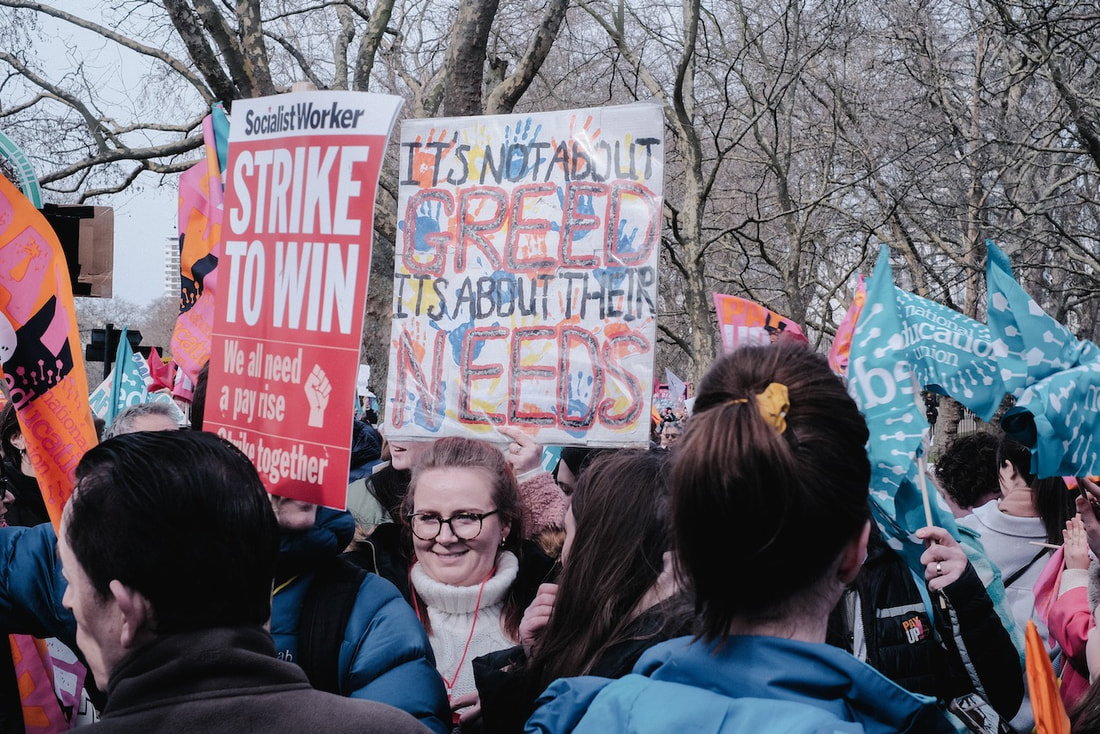
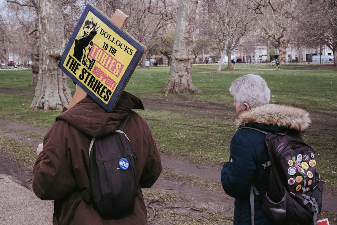
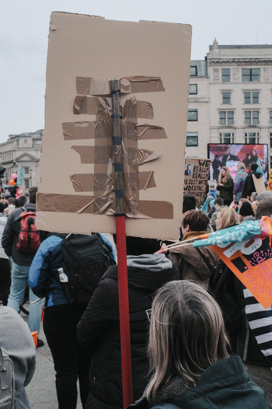
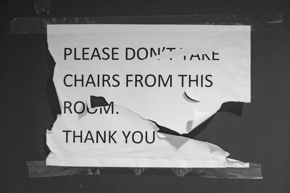
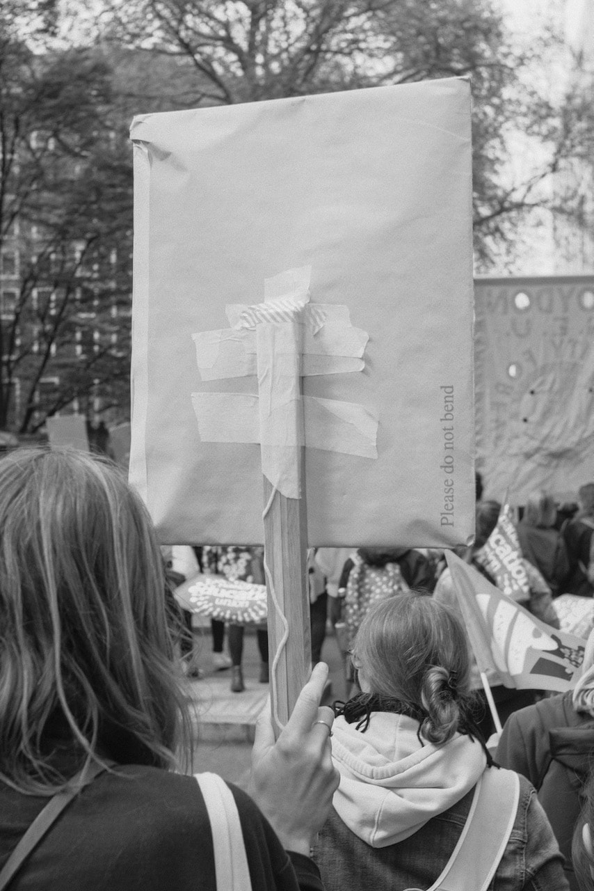
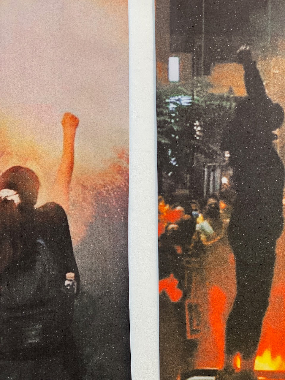
These pictures document the National Education Union march in central London on 15 March 2023, a day of strike action. I was really struck by the hand made signs that teachers were carrying, especially the backs which had been braced with tape, creating a different type of design to the often witty, carefully designed and sometimes confrontational messages on the front. The pictures were shot with a digital camera and post-processed in Lightroom. They are presented here in reverse order. This was unintentional but I like the way it tells the story of the march beginning at the end (with the rally and speeches in Trafalgar Square) and tracing its way back to the start in Hyde Park. The title 'The End is Nigh' is taken from one of the messages on the signs.

Eloquent signs triptych
|
|
|
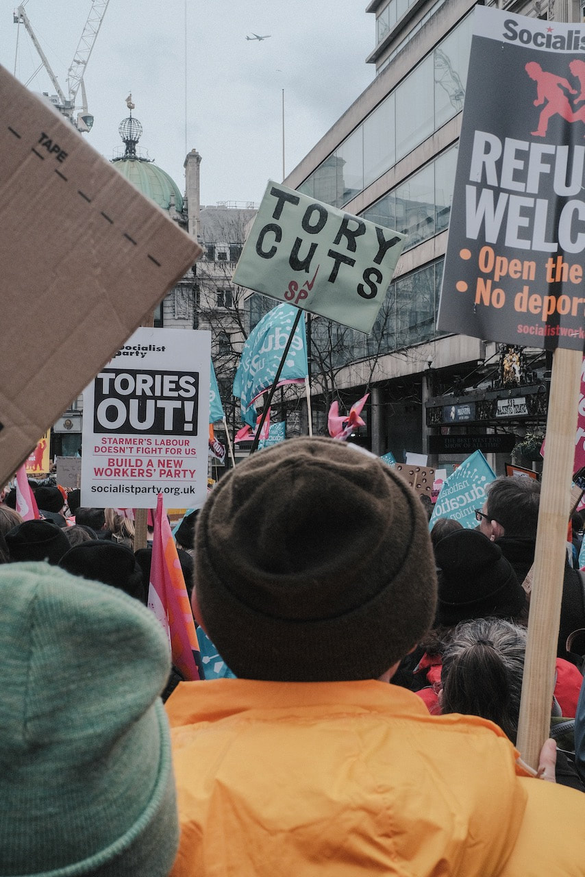
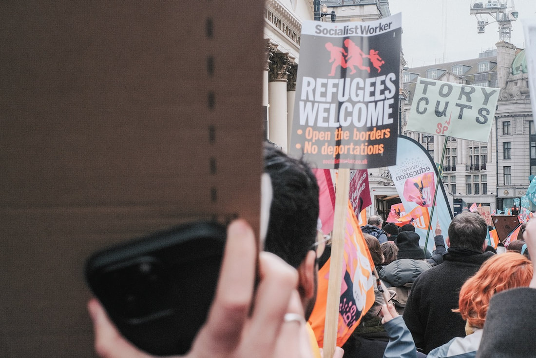
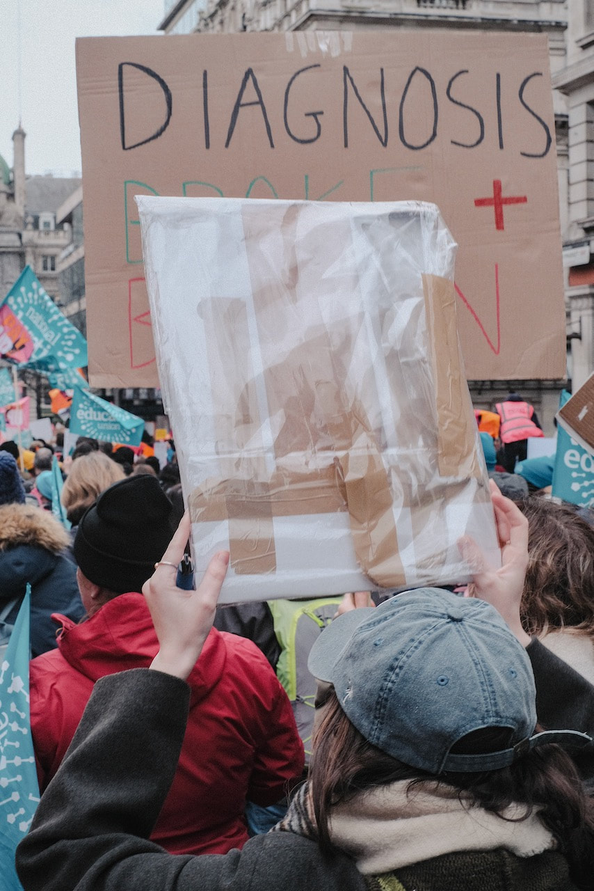
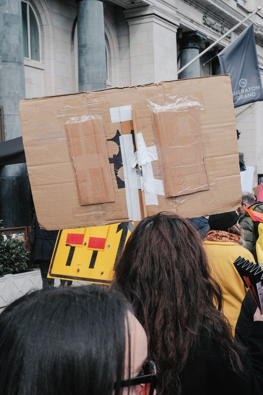
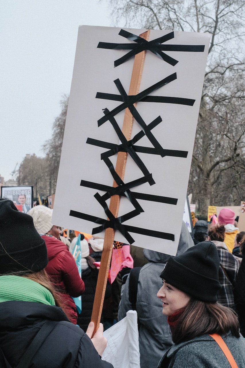
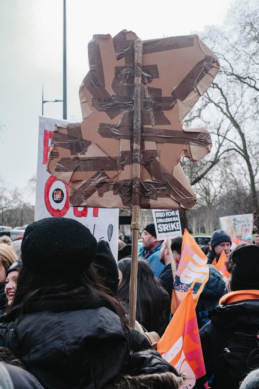
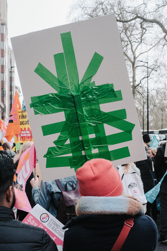
During the march, I noticed that the backs of hand made signs were made up of elaborate tape designs. I began to think of these as unconscious works of art since their role was to secure the designs on the front of the signs to the pole or stick to which they were attached. They had no deliberate aesthetic value and yet they were beautiful (to me). My viewpoint, as a participant rather than just an observer, of the march was mostly of the backs of signs held by my fellow marchers. The above triptych selects three of my favourite signs showing three different taping techniques. I have called then "eloquent" signs because I think they communicate something about the care and passion and love of the marchers, desperately trying to communicate their feelings about the state of public education to the wider world.
Rone Jude's Nausea
Sticking with the theme of education, I discovered Ron Jude's book 'Nausea' which contains pictures of abandoned American public schools in Baton Rouge, Louisiana and Atlanta, Georgia from 1990-92. The title comes from a famous novel by existentialist philosopher Jean-Paul Sartre, a surprising association. In reading about the novel I discovered Sartre's idea that the writer relies on the active participation of the reader to generate meaning. He wrote, "On the one hand, the literary object has no substance but the reader's subjectivity ... But, on the other hand, the words are there like traps to arouse our feelings and to reflect them towards us ... Thus, the writer appeals to the reader's freedom to collaborate in the production of the work." Existentialism is a philosophy of freedom. In the absence of God, people are free to decide how they want to live their lives but this also comes with a terrible burden of responsibility. Perhaps Ron Jude's photos of empty schools are a way of exploring the spaces in which we learn how to be free and the crucial role that school plays in our lives, for good or bad.
Taking as his subject the banality of institutional learning, the monotonous spaces and objects captured in Nausea serve as a platform for exploring the nexus between the narrative limitations of photography and consciousness. Employing a distinctive visual language, marked by an acute sense of colour, radical framing and shallow focus, Jude created a world both familiar and uncanny, imbued with a pervasive sense of unease.
MACK website
Cristian Ordóñez' Frequencies
I focused on walking routines in a variety of places mostly around my close surroundings. This methodology became a constant and repetitive act, as a kind of therapy to refresh and ease the mind, an act that gave me the opportunity to distance myself from the worries and anxieties in the environment [...] In terms of ideas, most of them came on their own by the accumulation of work I was making. In a very organic and intuitive way I started to see patterns and topics in them, understanding where my focus was going. The monotonous process I was following helped me to see these connections and helped me form or decide how to approach my next walk.
-- Cristian Ordóñez C4 Journal website
Collaboration with Justin Pape
I was really interested to discover that the photographer had collaborated with a sound artist. The exhibition of Frequencies was accompanied by a sound recording.
Composed by improvisational guitar recordings and field recordings in Ontario, Canada, by Justin Pape.
Part of the show "Frecuencia" at Galería Animal, Santiago de Chile.
Part of the show "Frecuencia" at Galería Animal, Santiago de Chile.
Several recordings were then released as limited edition artworks ( see below). The inclusion of a hand printed photograph, debris picked up on daily walks materials such as coffee grounds and human hair struck me as really unusual and exciting. Each of these represents a different type of trace or memory of the experience of the city (of Toronto, Canada).
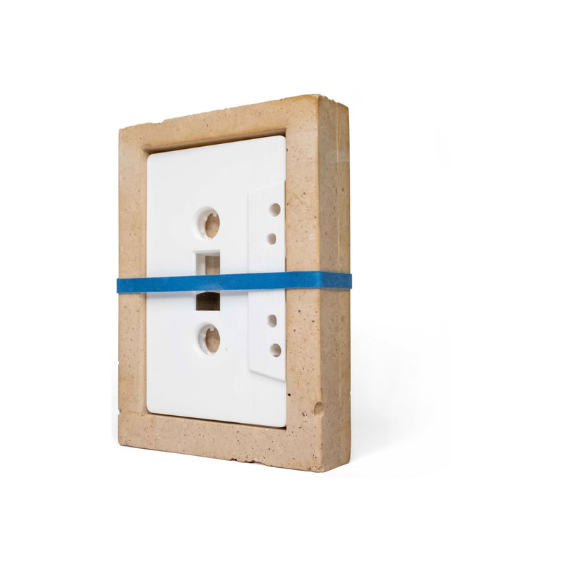
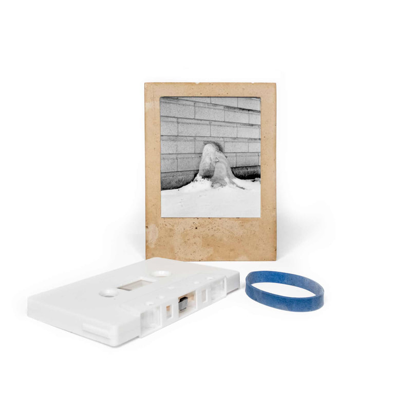
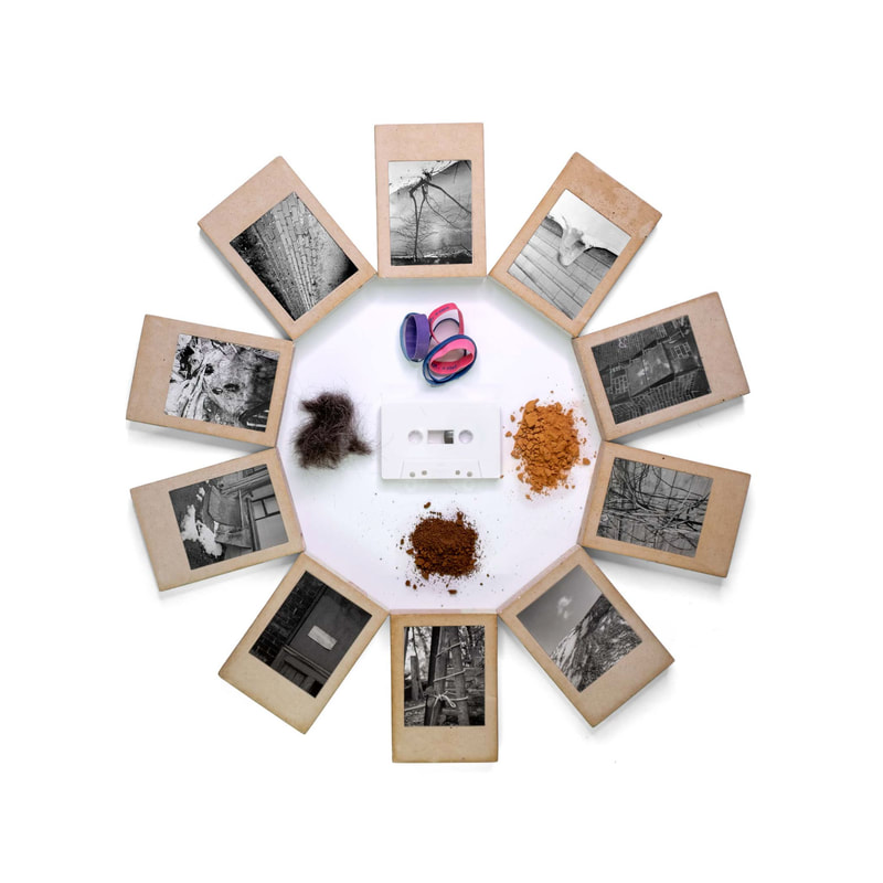
A series of improvised recordings comprising of single recorded tracks, sometimes layered with field recordings that capture thoughtless moments in time. Released on cassette, a medium that will decay and disappear over time, it is housed inside a small sculpture that is made of:
- Construction debris collected on daily walks
- Used coffee grounds from my daily coffee
- My hair that was grown and cut during this period of time
- One of 10 different hand printed silver gelatine photos by Cristian Ordóñez.
My response
My plan was to explore the spaces in my own school, inspired by Ron Jude's Nausea, to see if I could make a set of pictures that communicate my feelings about public education. I didn't want the photos to be simple illustrations though so, like Jude, I aimed to make ambiguous and unusually framed images. I also aimed to shoot the pictures on one day in a relatively short period of time. I hoped this would concentrate my vision and give the pictures a kind of visual coherence. Influenced by Justin Pape's collaboration with Cristian Ordóñez, I also planned to make field recordings of various locations and gather discarded objects to accompany the images and sounds in some kind of exhibition or object.
The following gallery represents the 36 pictures I have selected from the 63 I made. The whole album of pictures can be viewed by clicking on the button below.
The photographs were taken with a DSLR and 50mm lens set to a wider aperture (mostly f/2.8) so that I could generate a relatively shallow depth of field in some images, inspired by Ron Jude's approach in Nausea.
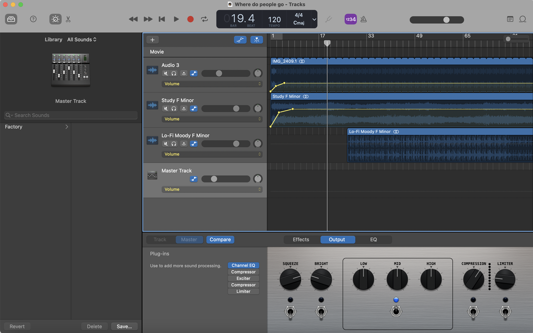
I decided to create a separate page for my exhibition, selecting fewer of the above images and experimenting with an irregular layout. I also made a soundtrack, featuring ambient noises recorded in the school building, to play automatically. I used a free AI Music generation tool to create a couple of ambient sound files which I then combined in Garageband with the field recordings. I uploaded the finished composition to Soundcloud where I was able to generate an embed code for the audio and set it to autoplay on the exhibition page.
|
|
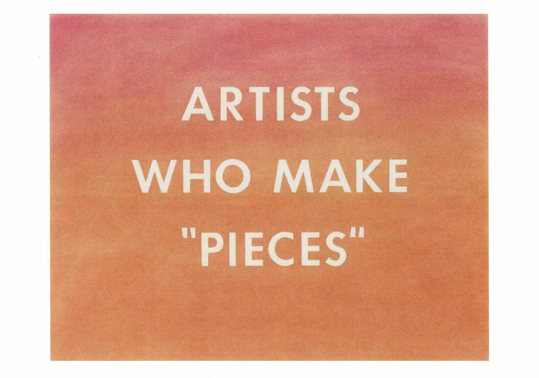
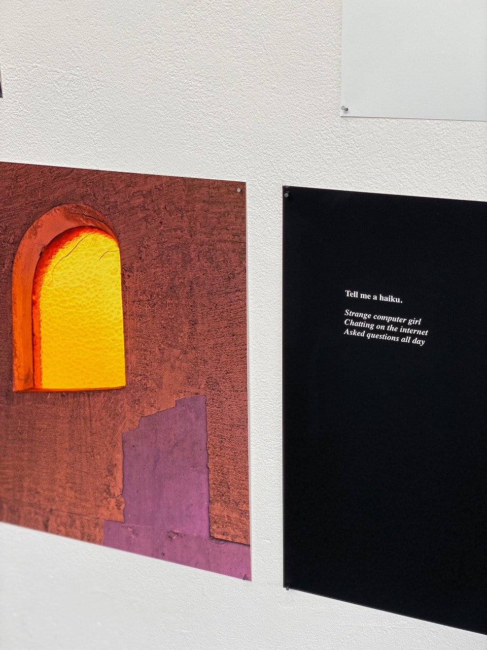
Ed Ruscha - Artists Who Make Pieces, 1976
|
At the start of the day, I selected this Ed Ruscha postcard from a range of images in response to the questions, "Which image are you most drawn to and how might this reflect your plans for the day?" I liked the flatness of the pinky/orange colour field and the way this is combined with the text statement. My intention was to make relatively abstract pictures with a shallow focus and to capture excerpts of text from various surfaces in school. In some ways, the photograph that contains the title of my exhibition (below) bears an uncanny similarity with Ruscha's work above.
|
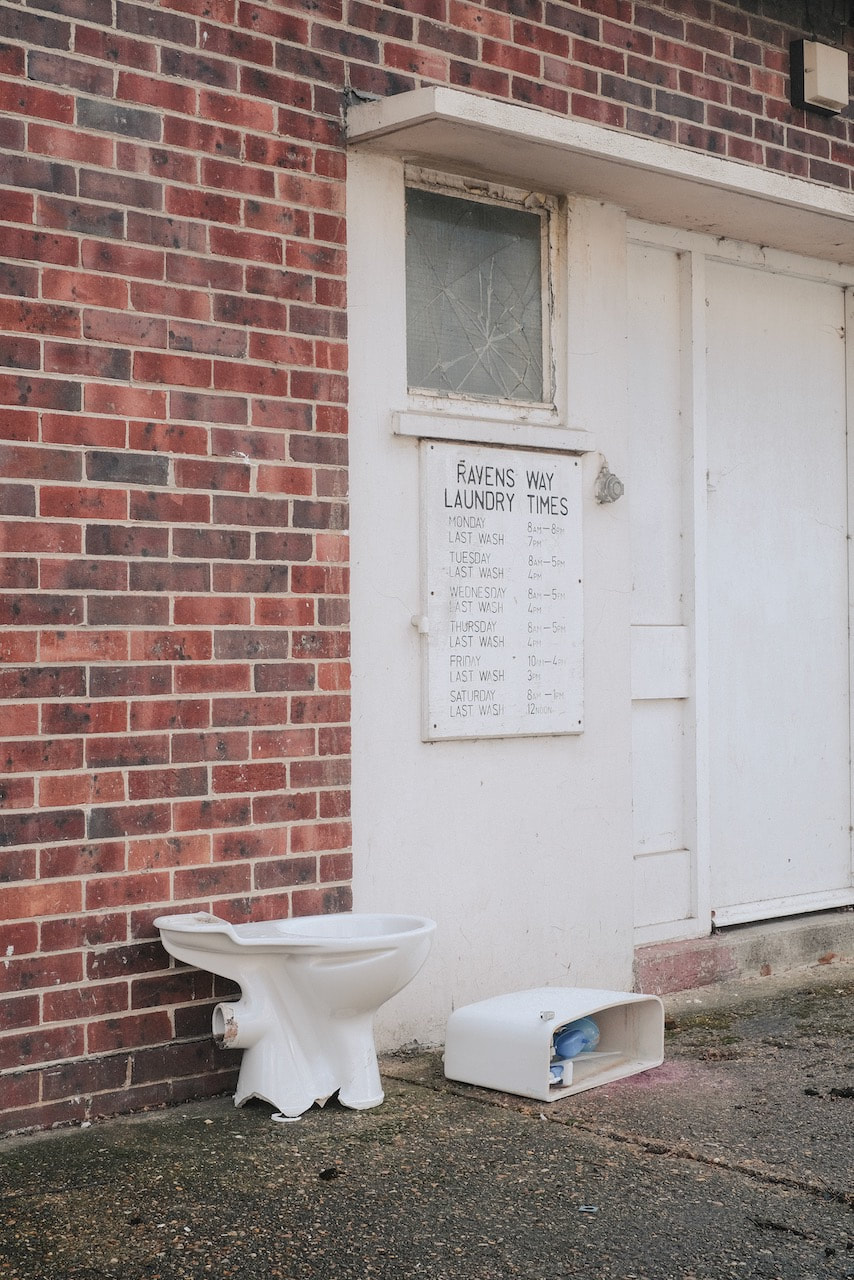
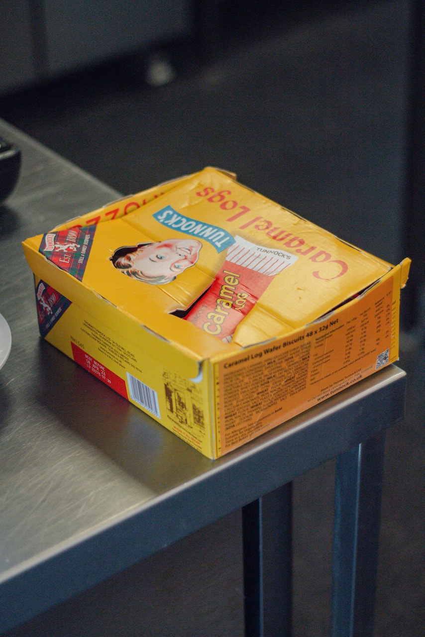
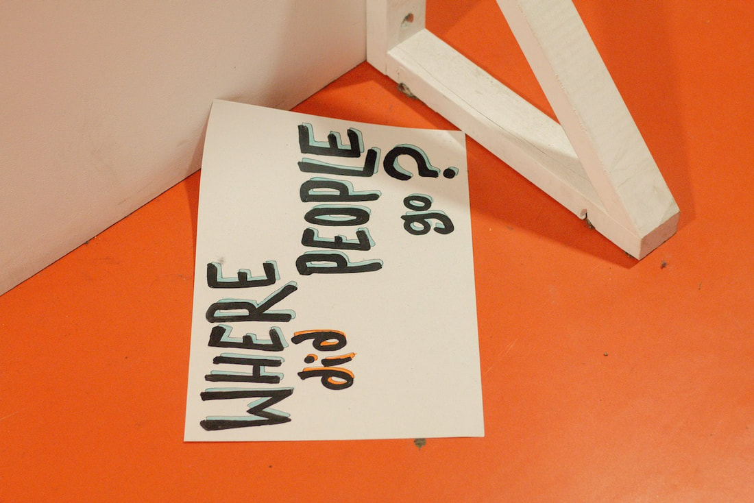
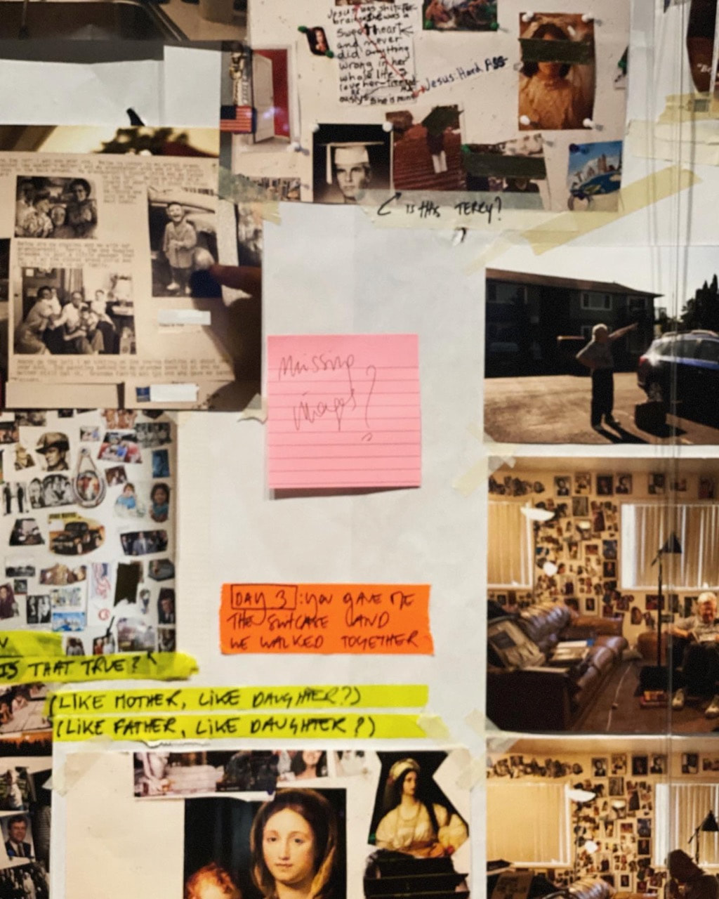
I have titled the exhibition Where Did People Go? taking the words from the poster in the photograph above. I am relatively pleased with the results. I tried to respond to whatever grabbed my attention during the 2 hours I was shooting. I visited most areas of the school, inside and out, and the shallow depth of field from the wide aperture setting allowed me to abstract some details. I was interested in surface details, erasures and the marks of human presence. Some of the pictures suggest an absence of one kind or another, something missing or lost. Some pictures reference the idea of cataloguing or sorting. There are some broken or damaged things and hazards. The head decapitated from the toilet sign miraculously reappears on a box of wafers! There are flashes of colour and fragments of text. Some of the images are black and white. The audio creates a particular atmosphere which, I hope, helps to shape the viewer's experience of the images. I am interested to know what viewers think of the photographs, their relationships to one another and the overall impression they give of a school environment. I feel very positively about the school and its ambition to teach students to understand the world so that they can change it for the better. However, I am less sure about the education system as a whole which is severely underfunded and creaking at the seams. I hope some of this ambiguity of feeling is communicated through the photographs.
I didn't manage to gather any suitable objects to accompany the photographs and sound (like Justin Pape) so this is something I'd like to return to in a future experiment.
I didn't manage to gather any suitable objects to accompany the photographs and sound (like Justin Pape) so this is something I'd like to return to in a future experiment.
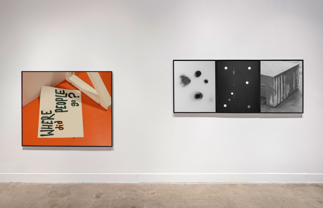
Imaginary exhibition installation
|
Imaginary exhibition installation
|
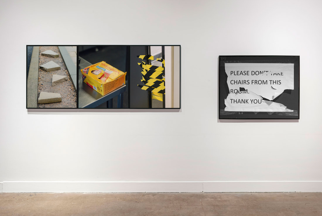
Imaginary exhibition installation
|
What next...?
- I am really interested in the idea of creative constraints - limitations that provide focus i.e. time, equipment, subject matter etc. I'd like to incorporate this into my practice. For example, could I restrict myself to one type of camera, one lens, one focal length etc.?
- I am interested in the (new) theme of education. Most of my pictures so far have been made in the city on various walks. I wonder if I could also make a parallel series of images in school since this is where I spend a lot of my time. I wonder what this might reveal about the relationship between schools and the outside world? It seems to me that some of the same issues that affect education (poverty, underfunding, lack of value, racism etc.) are also issues that affect wider society. I will continue to photograph in the city but will keep this other theme of education in mind as I do so. In what ways might the city itself be educational? I will also now begin to photograph in school more regularly.
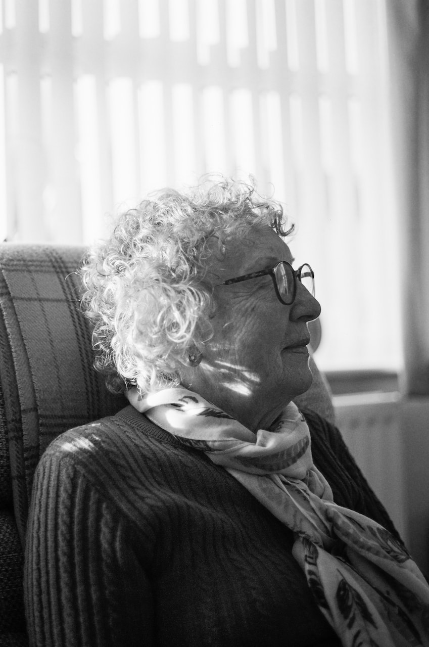
- I am aware that I don't tend to make portraits. I would like to experiment with portraiture in the near future.
- I really enjoyed using sound alongside my pictures in the online exhibition. This is something I'd like to experiment with further.
- I'm also interested in using objects (found or otherwise) in parallel with images and sounds. I'm not really sure quite how yet...
London to Brighton
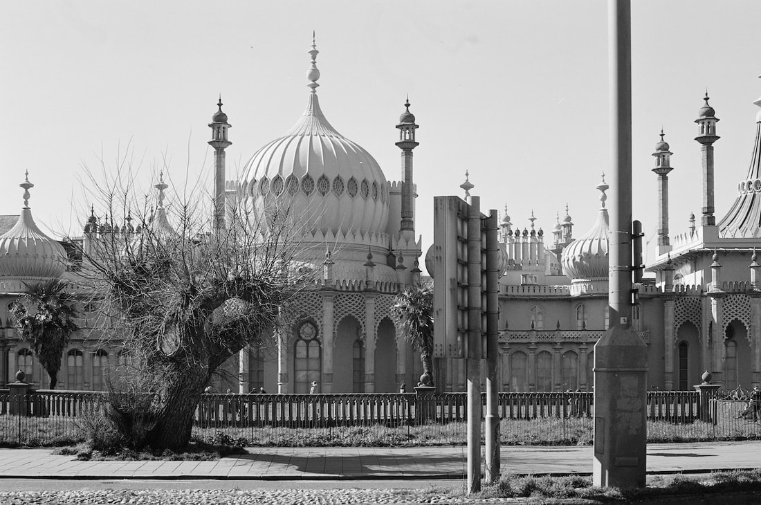
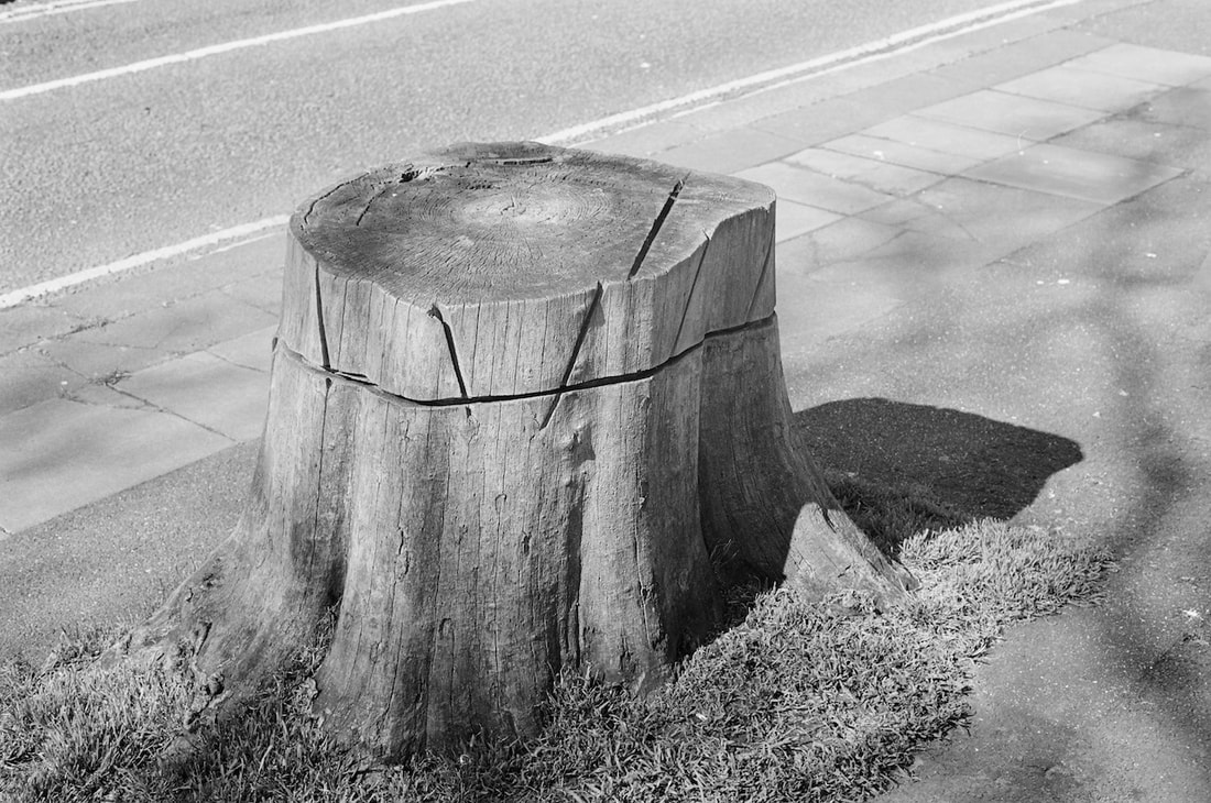
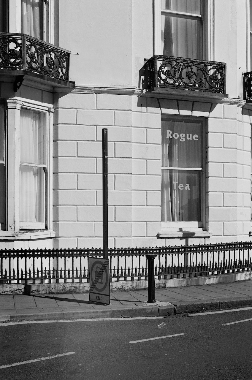
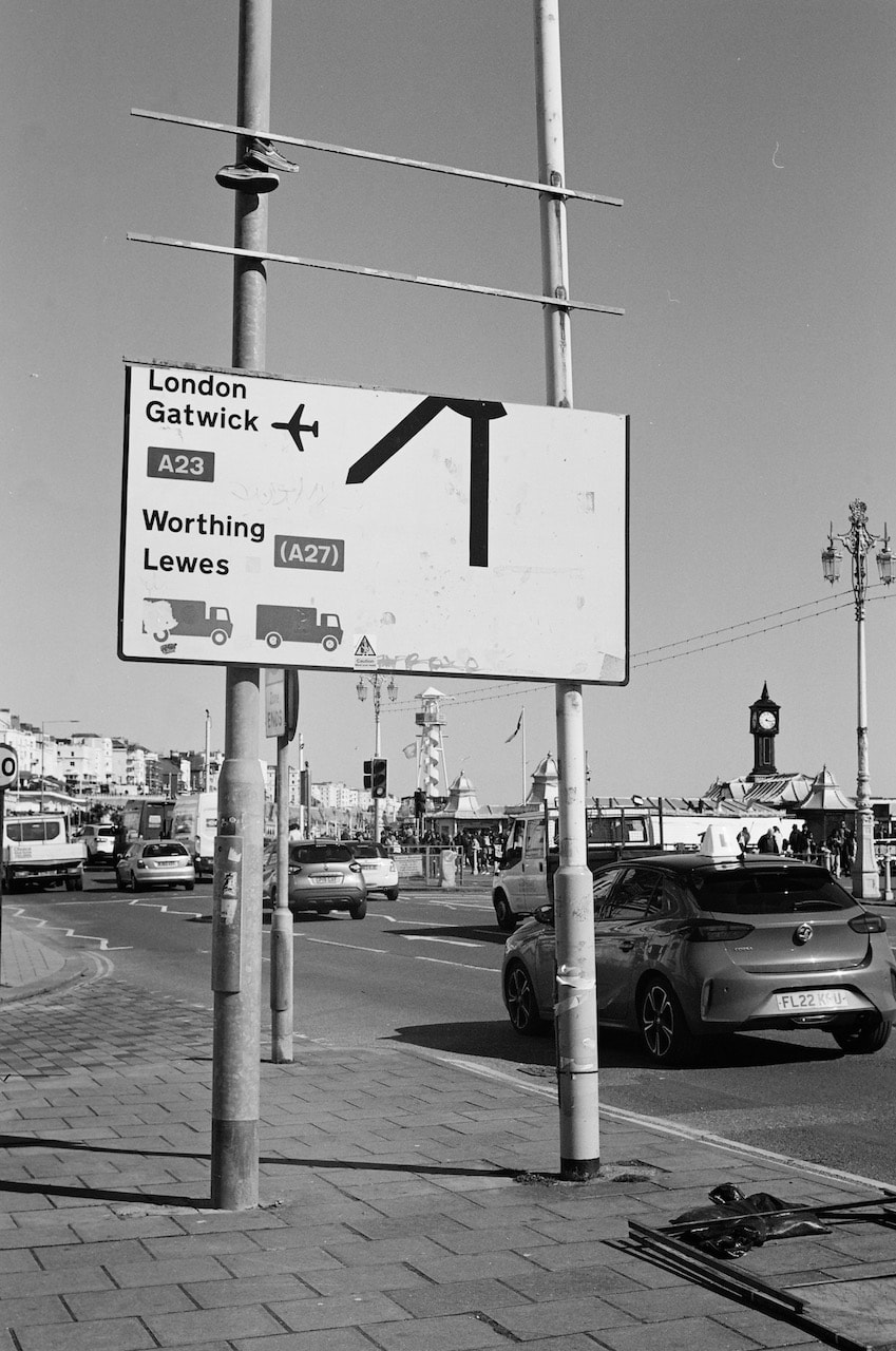
These pictures were taken with a manual SLR (Contax RTS) and 50mm f/1.7 lens on Ilford XP2 Super400 film over a couple of days in London and Brighton. I took advantage of the strong sunlight in Brighton to experiment with shadows and contrast.
Triptych
|
|
|
This is a playful experiment in combing a variety of different subjects in the form of a triptych. It seems possible to combine these and other images in numerous ways, exploring visual and symbolic associations. Pictures displayed together like this inevitably suggest some kind of narrative or logic even if their placement is entirely by chance. I really like the open-ended and ambiguous nature of this dynamic because it relies on the sensitivity and imagination of the viewer who completes the process of meaning-making begun by the photographer at the moment of exposure. Offsetting the pictures further adds to this sense of imbalance or incompleteness, as if the images are in the process of being shuffled or reorganised, their positions not being fixed or static.
Sunday 2 April, 2023
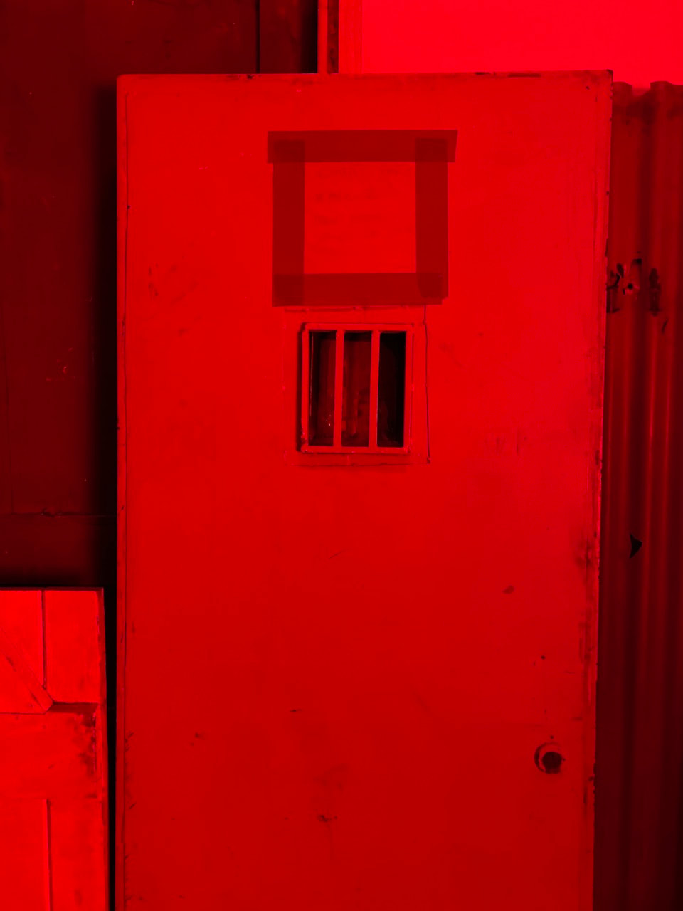
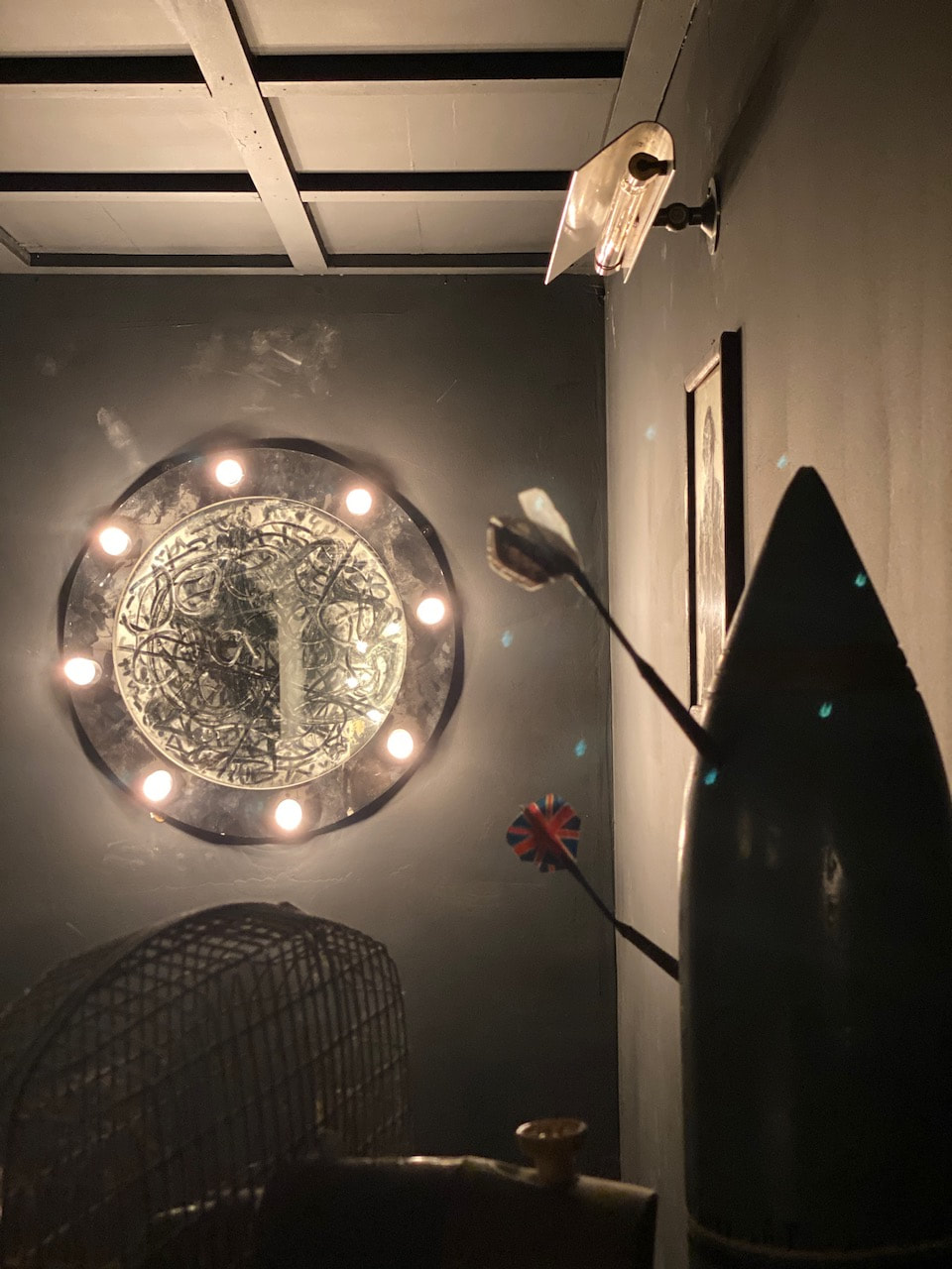
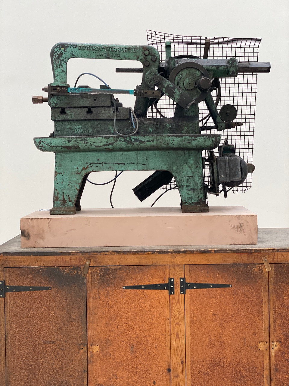
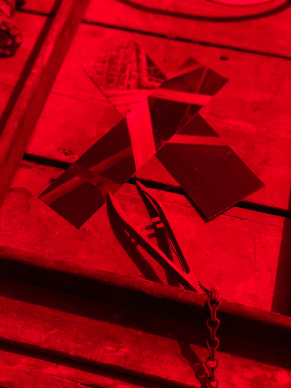
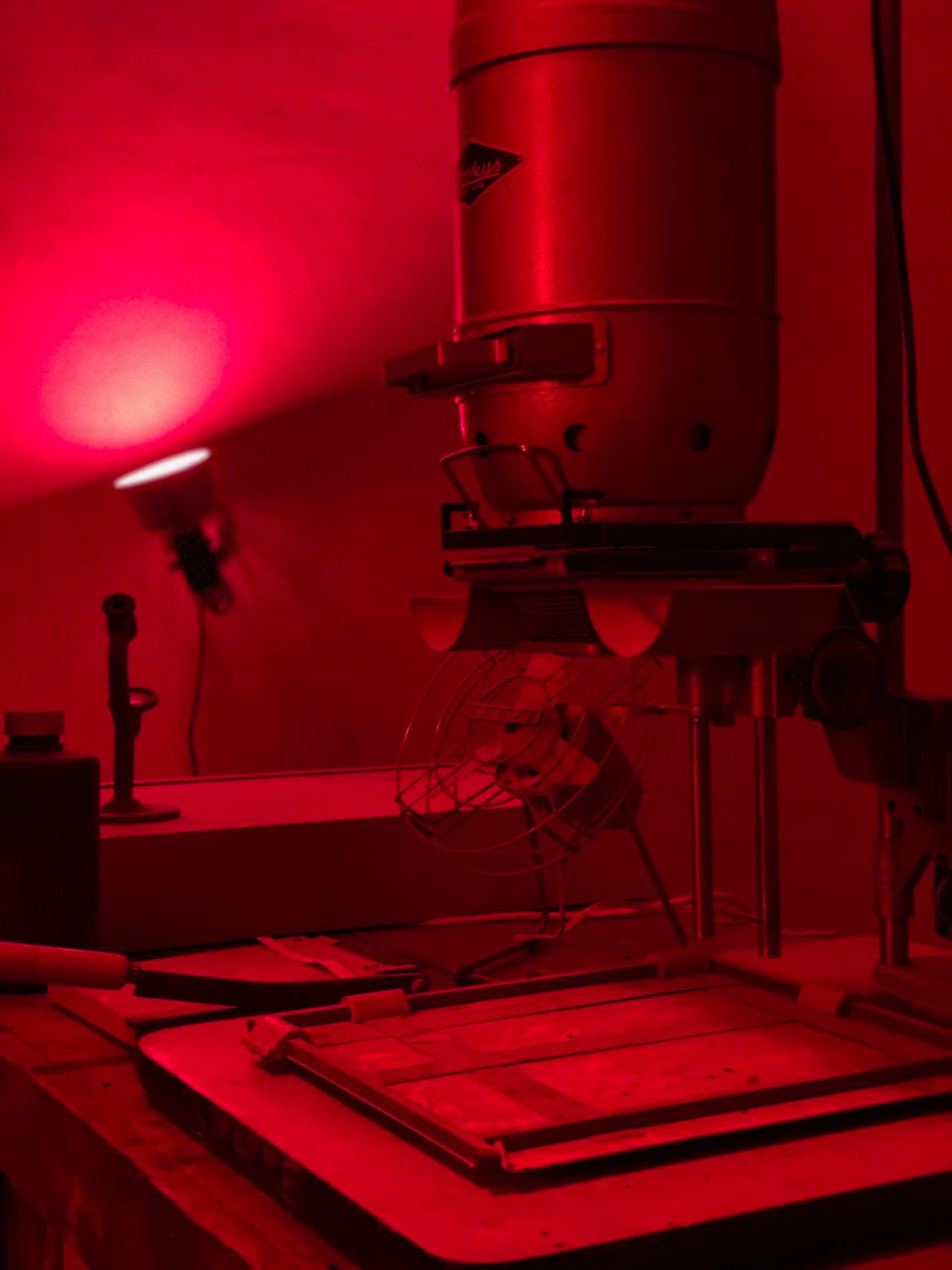
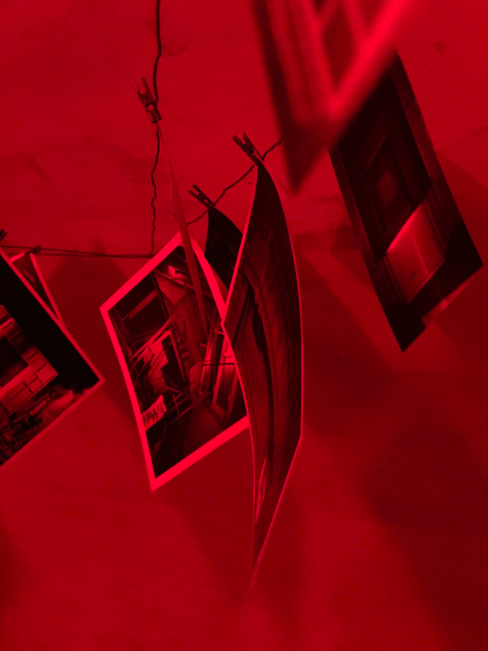
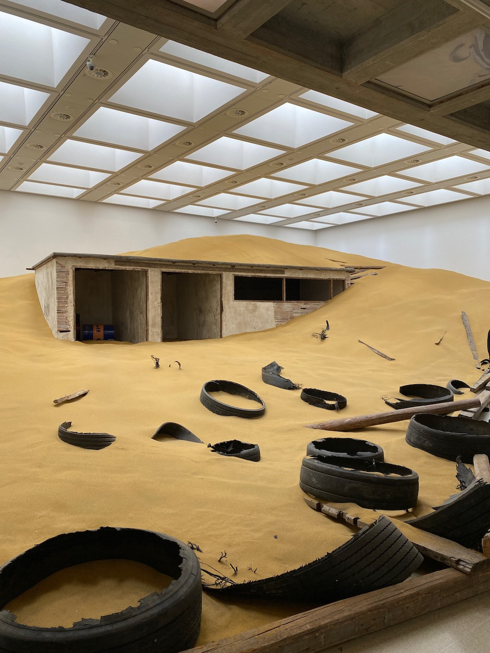
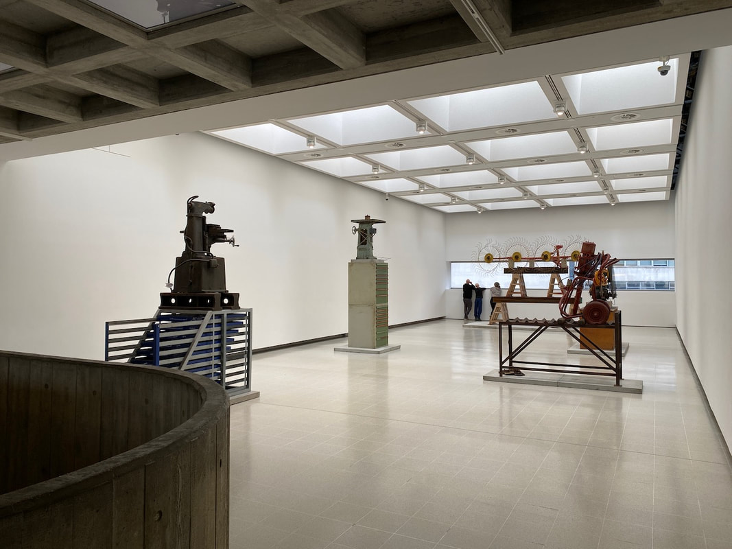
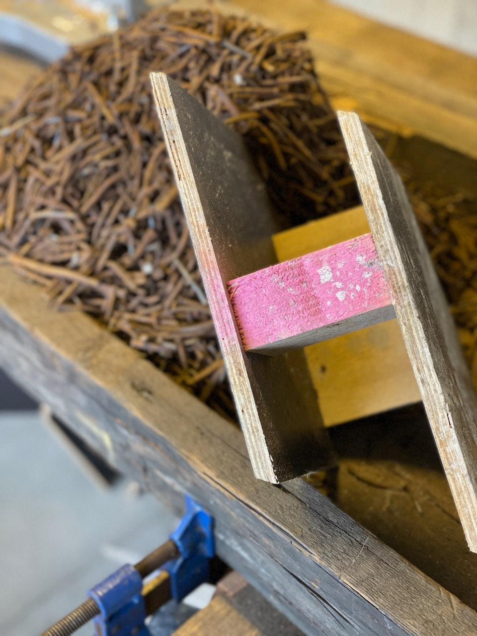
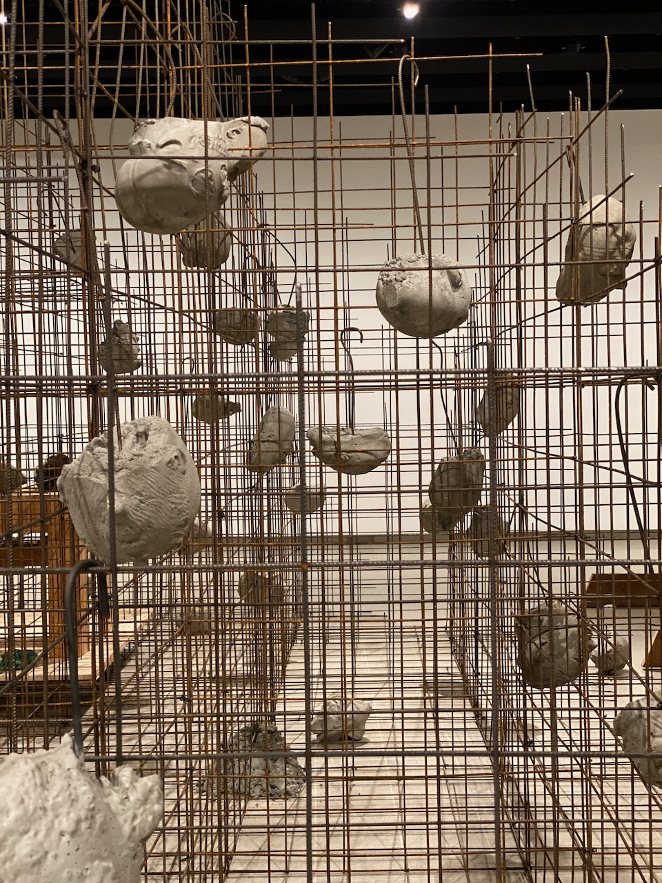
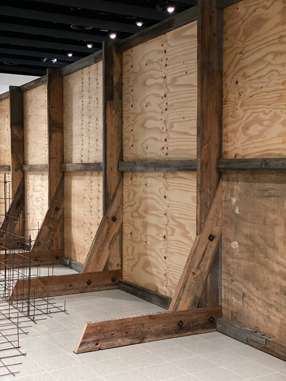
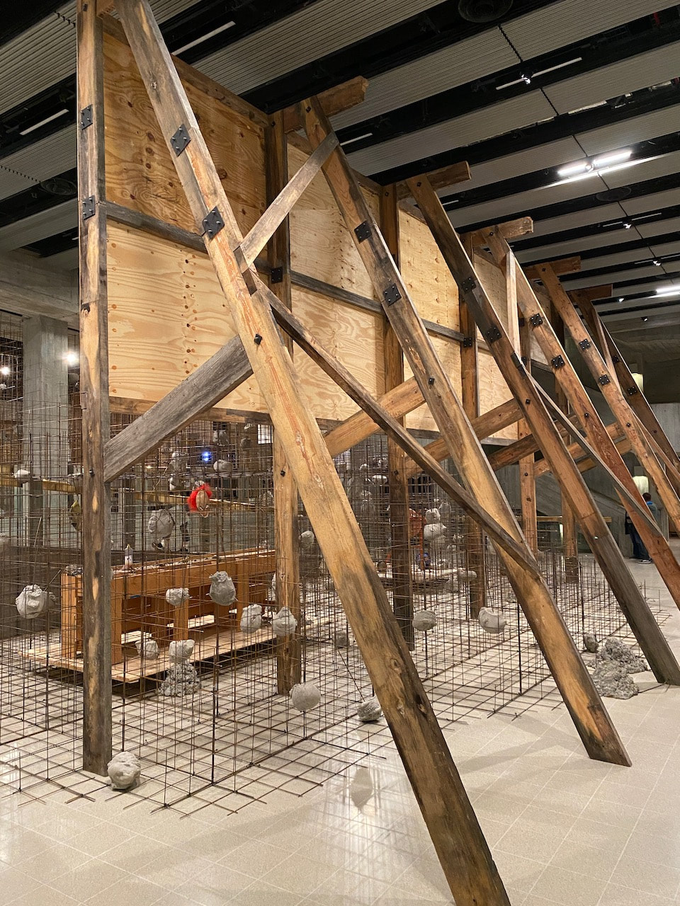
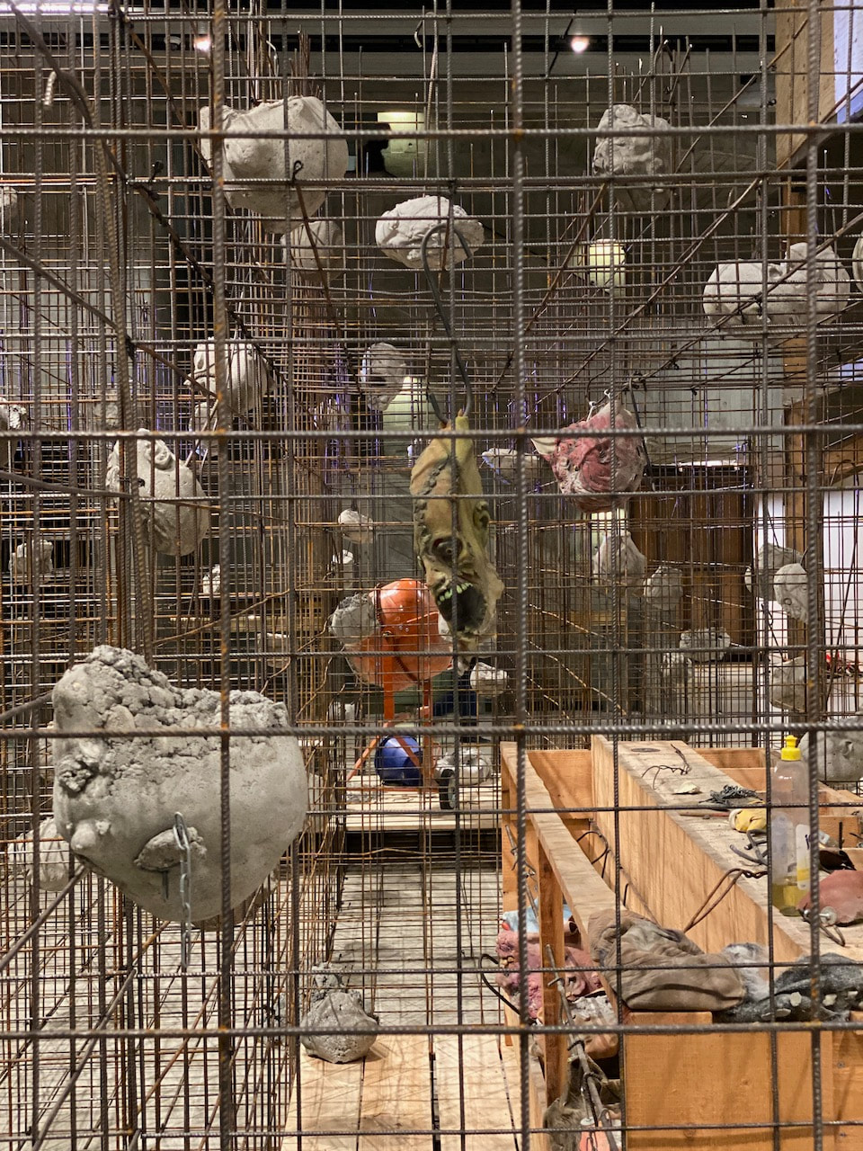
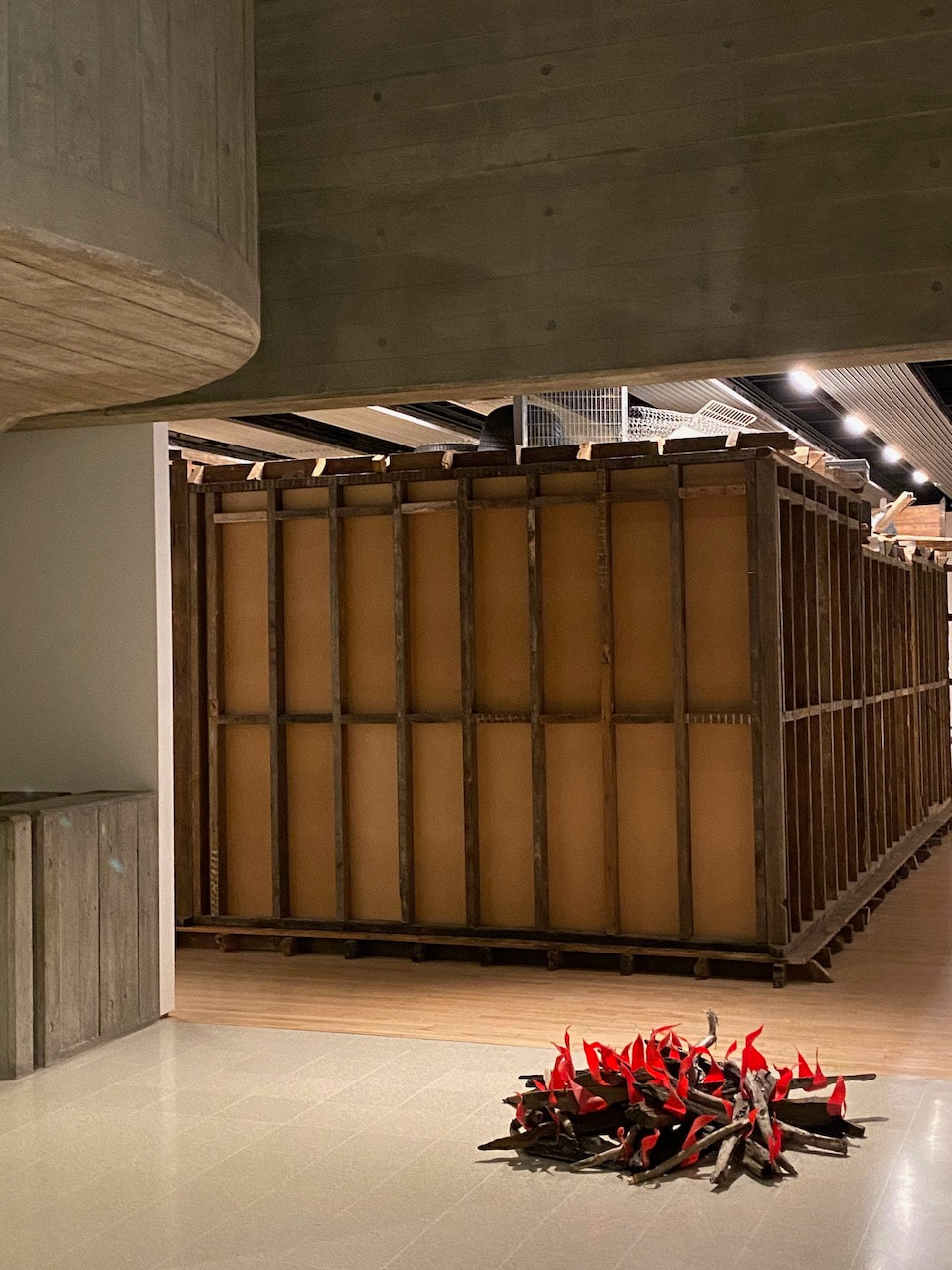
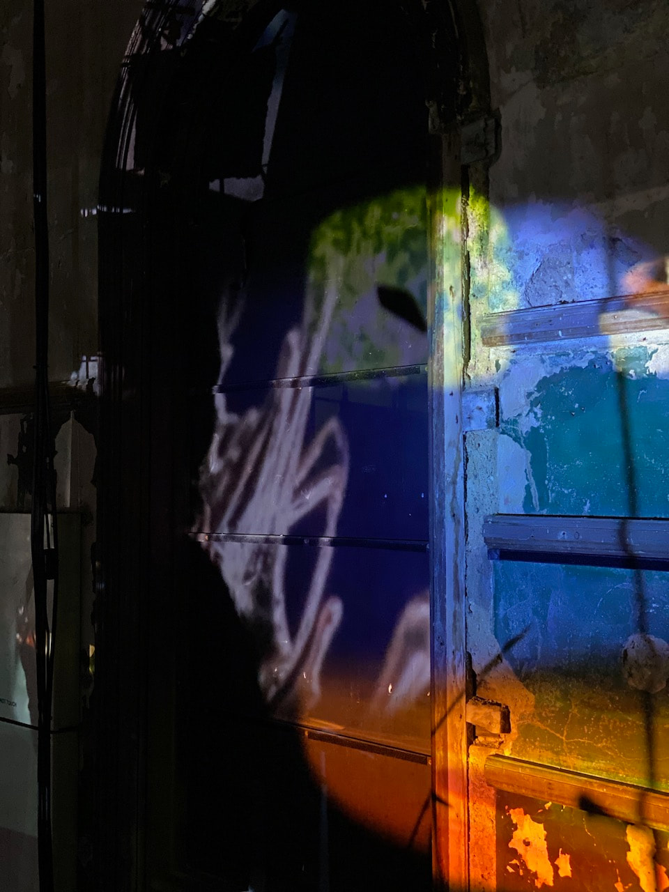
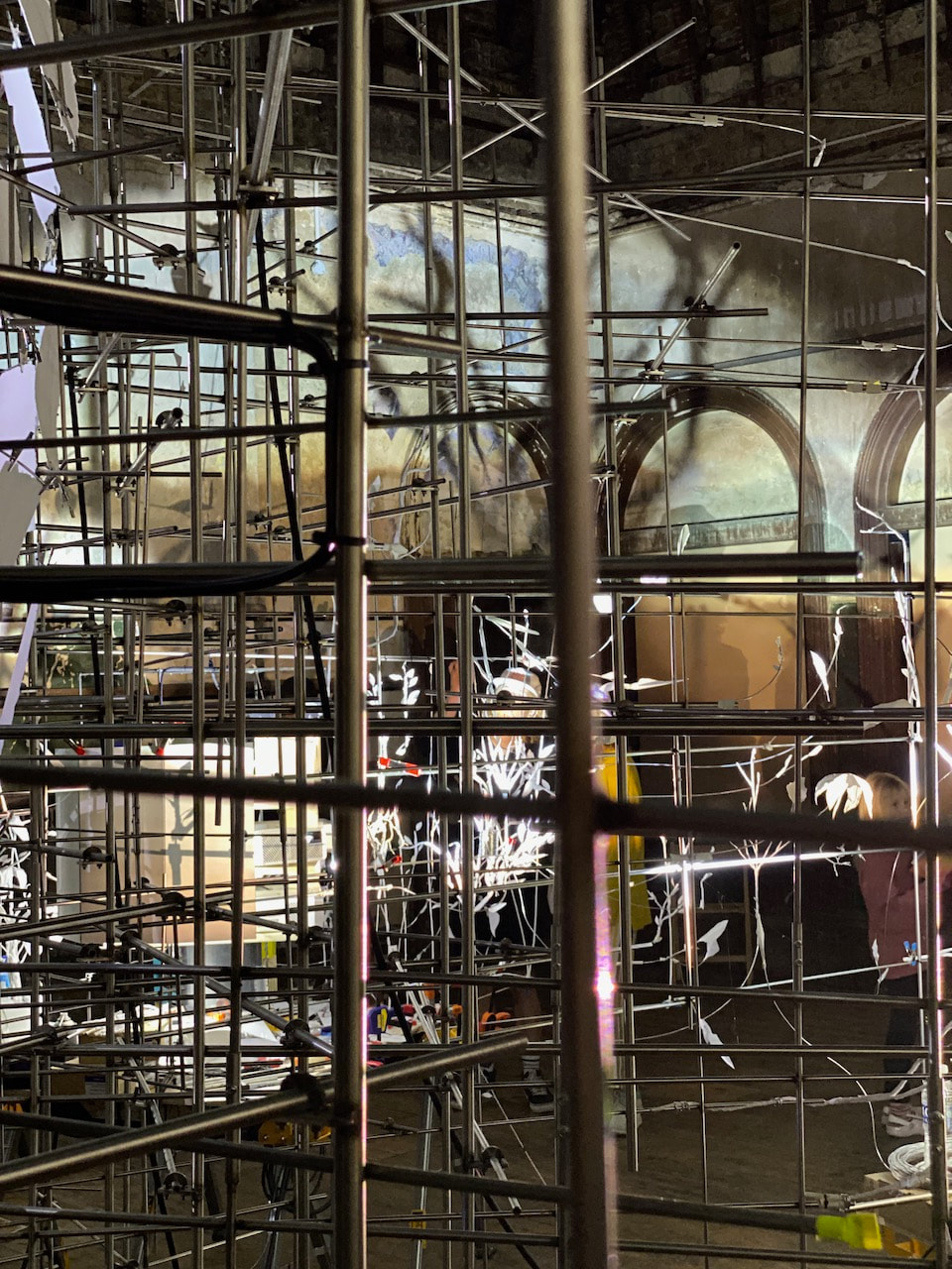
Mike Nelson's retrospective exhibition at the Hayward Gallery presents several large-scale works that fill the gallery space. Using industrial materials bought at auction from disused factories, Nelson constructs immersive environments and massive sculptures. The work is impressive, spectacular and dramatic. The first space is a warren of rooms that have various imaginary functions - a prayer space, a travel agency and a bar, for example - as well as corridors and relatively empty rooms. The smells and sounds are almost overwhelming and a little claustrophobic. On the day I visited, the gallery was busy so moving through the spaces involved lots of close bodily contact and the constant sound of squeaking doors. The scale and ambition of the works is impressive. There is a strong sense of nostalgia for a lost industrial culture.
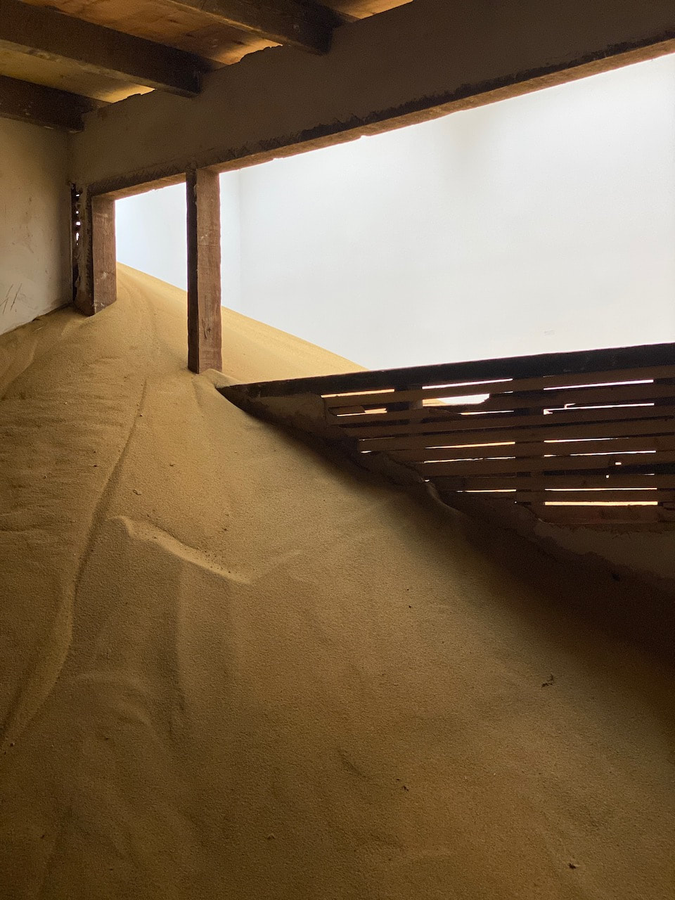
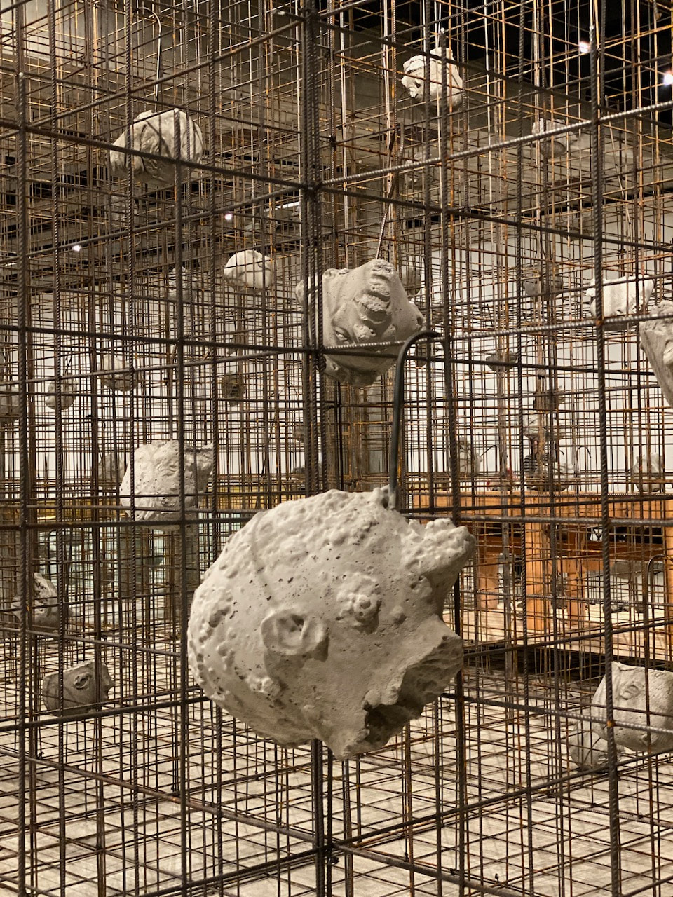
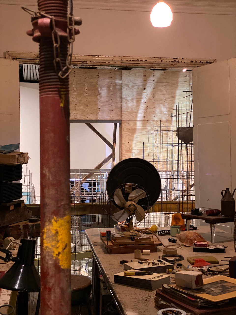
The artist constructs modernist style sculptures from huge, hulking bits of found industrial machinery. These seem both menacing and sad, like dying monsters. Underneath the gallery's roof lights, Nelson has created a post-apocalyptic, abandoned desert structure, half buried in sand, beneath which he has hollowed out a subterranean photographic darkroom space. The pictures on display in here seemed to be a combination of documentary images of the exhibition installation, photographs of industrial spaces and various landscapes. The glowing red safe light and tight, cluttered space made this was a particularly spooky experience. Downstairs, the main gallery was filled with a lattice-work of reinforcing steel on which were suspended a series of concrete heads cast from carnival masks. At the heart of this space was a reconstruction of the artist's former living room and studio. Rather like the darkroom, this gave me a behind-the-scenes viewpoint, a bit like seeing behind the wizard's curtain. I particularly liked the massive, billboard type wooden display screens in the main space, especially their backs.
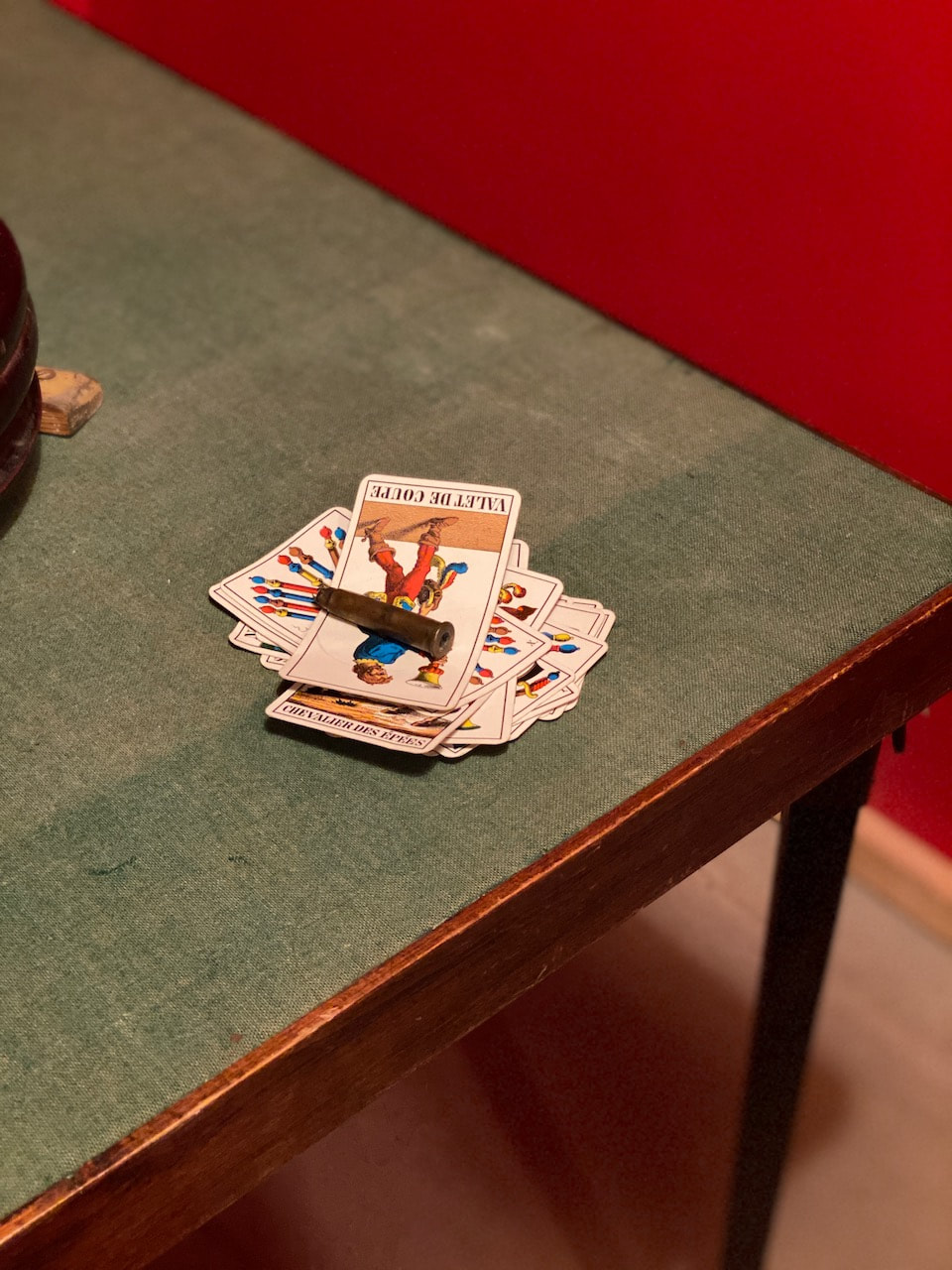
This work all looked great in the Hayward space, a Brutalist building which is, itself, constructed from angular, rough-textured concrete. I really enjoyed the inside-outness of the work. The spaces felt like theatre sets in which the visitor plays a walk-on role, somehow activating the environments. Apparently, two items in the first space had been stolen by visitors - a jacket and a Tarot card. I found this quite shocking but I can also see that someone less used to visiting art like this might be confused about the status of the objects on display. It's not like seeing paintings on walls or bronze sculptures on marble plinths. Everything in all the exhibits had been constructed from found, everyday materials.
The architecture of the exhibition and the gallery space both appealed to me. I have been making photographs of buildings for a while, especially those that seem to have a story to tell. Mike Nelson's work exposes the industrial guts of modern life - a hidden history of working class manufacturing culture. The next time I find myself photographing the exterior of an old industrial building, I will try a bit harder to imagine the sounds, smells and textures of its interior history, the blood and muscles that once sat below its surface.
The artist constructs modernist style sculptures from huge, hulking bits of found industrial machinery. These seem both menacing and sad, like dying monsters. Underneath the gallery's roof lights, Nelson has created a post-apocalyptic, abandoned desert structure, half buried in sand, beneath which he has hollowed out a subterranean photographic darkroom space. The pictures on display in here seemed to be a combination of documentary images of the exhibition installation, photographs of industrial spaces and various landscapes. The glowing red safe light and tight, cluttered space made this was a particularly spooky experience. Downstairs, the main gallery was filled with a lattice-work of reinforcing steel on which were suspended a series of concrete heads cast from carnival masks. At the heart of this space was a reconstruction of the artist's former living room and studio. Rather like the darkroom, this gave me a behind-the-scenes viewpoint, a bit like seeing behind the wizard's curtain. I particularly liked the massive, billboard type wooden display screens in the main space, especially their backs.
This work all looked great in the Hayward space, a Brutalist building which is, itself, constructed from angular, rough-textured concrete. I really enjoyed the inside-outness of the work. The spaces felt like theatre sets in which the visitor plays a walk-on role, somehow activating the environments. Apparently, two items in the first space had been stolen by visitors - a jacket and a Tarot card. I found this quite shocking but I can also see that someone less used to visiting art like this might be confused about the status of the objects on display. It's not like seeing paintings on walls or bronze sculptures on marble plinths. Everything in all the exhibits had been constructed from found, everyday materials.
The architecture of the exhibition and the gallery space both appealed to me. I have been making photographs of buildings for a while, especially those that seem to have a story to tell. Mike Nelson's work exposes the industrial guts of modern life - a hidden history of working class manufacturing culture. The next time I find myself photographing the exterior of an old industrial building, I will try a bit harder to imagine the sounds, smells and textures of its interior history, the blood and muscles that once sat below its surface.
|
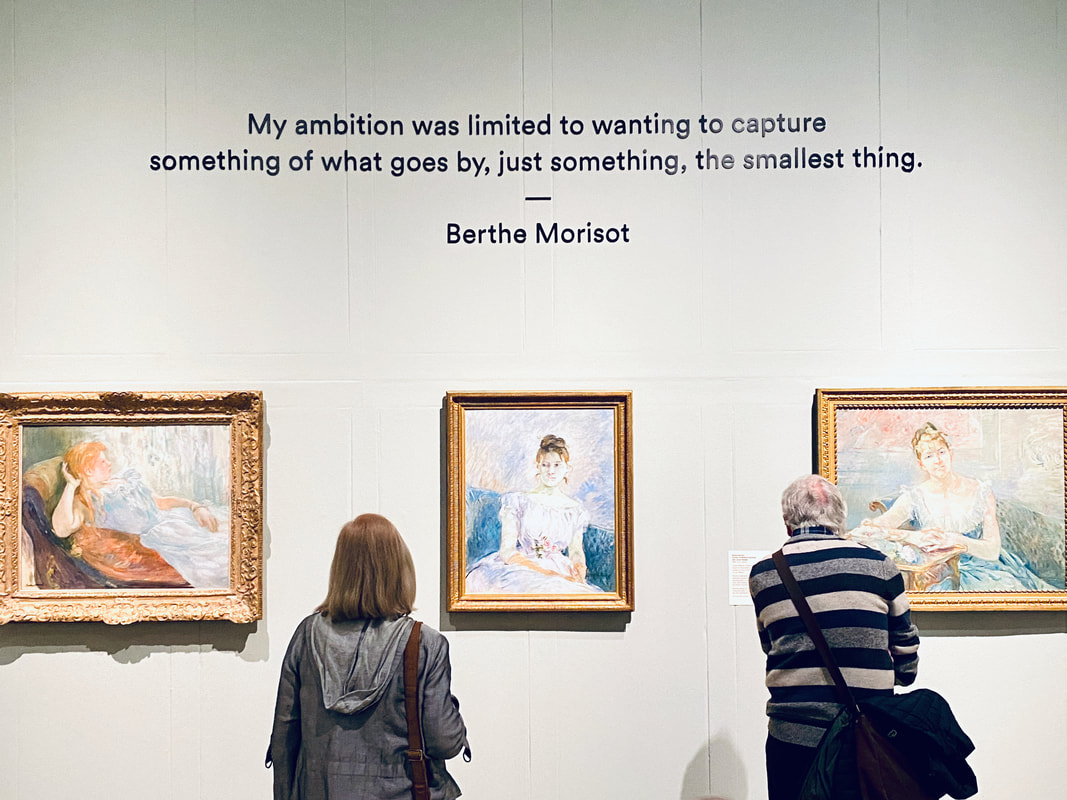
Berthe Morisot: Shaping Impressionism
Wednesday 5 April 2023
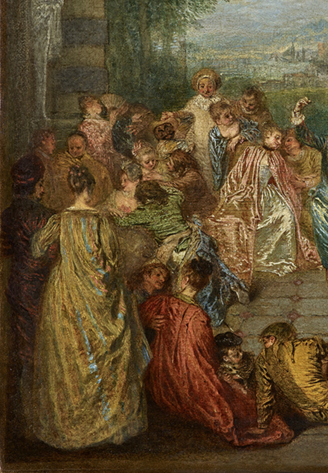
Jean-Antoine Watteau - Les Plaisirs du Bal, c. 1717 (detail)
|
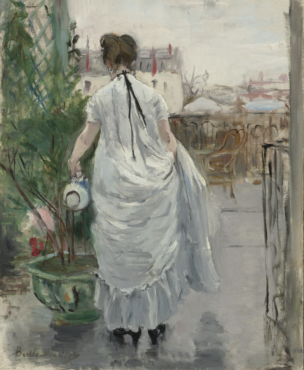
Berthe Morisot - Young Woman Watering a Shrub, 1876
|
I enjoyed this small exhibition about one of the two women members of the Impressionists, Berthe Morisot. I was struck by her attention to the minute details of everyday life, nuances of light and colour and an awareness of time passing. Her pictures of children were particularly beautiful. The exhibition presented her work alongside paintings by other artists, mostly from the 18th century, whom she admired. The above example was my favourite juxtaposition. Watteau's famous fête galante painting (left) features several women seen from the back wearing billowing dresses. The curators of the exhibition argued that Morisot may have been influenced, either directly or subconsciously, by this particular device. These reminded me of some photographs by Luigi Ghirri who often features people seen from behind in his pictures, especially in the series Diaframma 11, 1/125 luce naturale:
“I wanted to give the person an infinite number of identities,” he [Ghirri] wrote in the introduction to Diaframma. “From photographer to subject, from being looked at to being an onlooker.” The people he chose to photograph are irrelevant. They are mostly anonymous, their faces obscured. Rather than trying to photograph people, he was using them to express that there is another point of view available, besides the one you see. It’s both the same as your point of view, as you’re looking at the same thing, and different, because they are in the picture.
Friends of Friends website
I'm keen to incorporate portraits into my work but I wonder if making pictures of people looking at things might be an interesting place to start...?
Easter
These pictures were taken in London and the Midlands over the Easter break. My camera developed a light leak which affected some of the images (not included here).
Diptychs
|
|
|
|
|
|
Michelle Williams Gamaker & John Costi at South London Gallery
16 April 2023
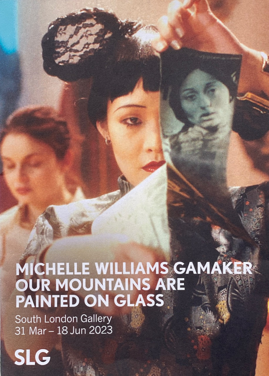
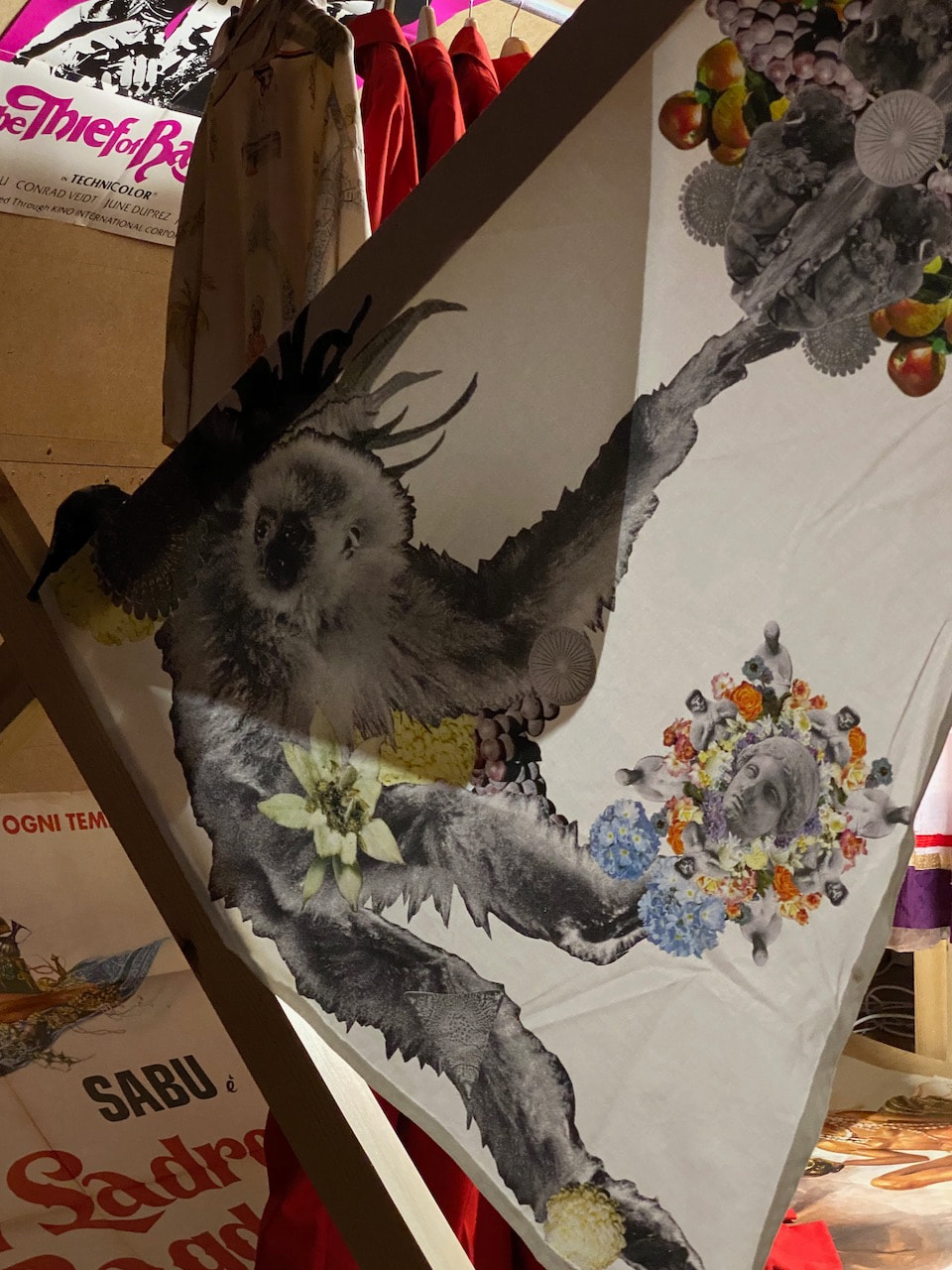
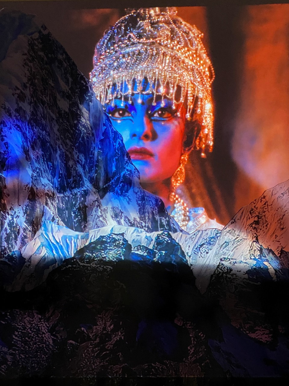
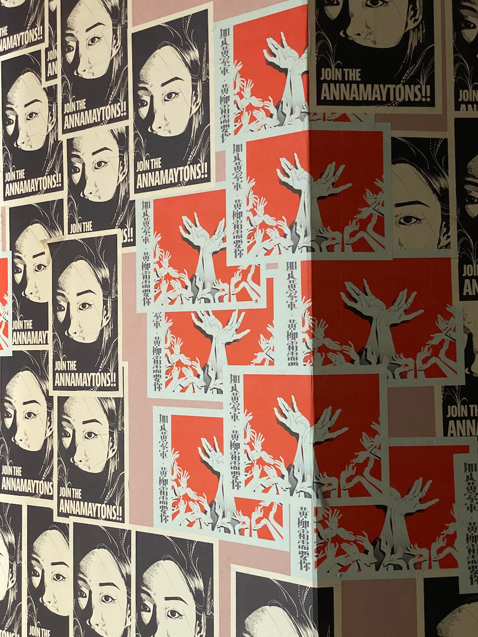
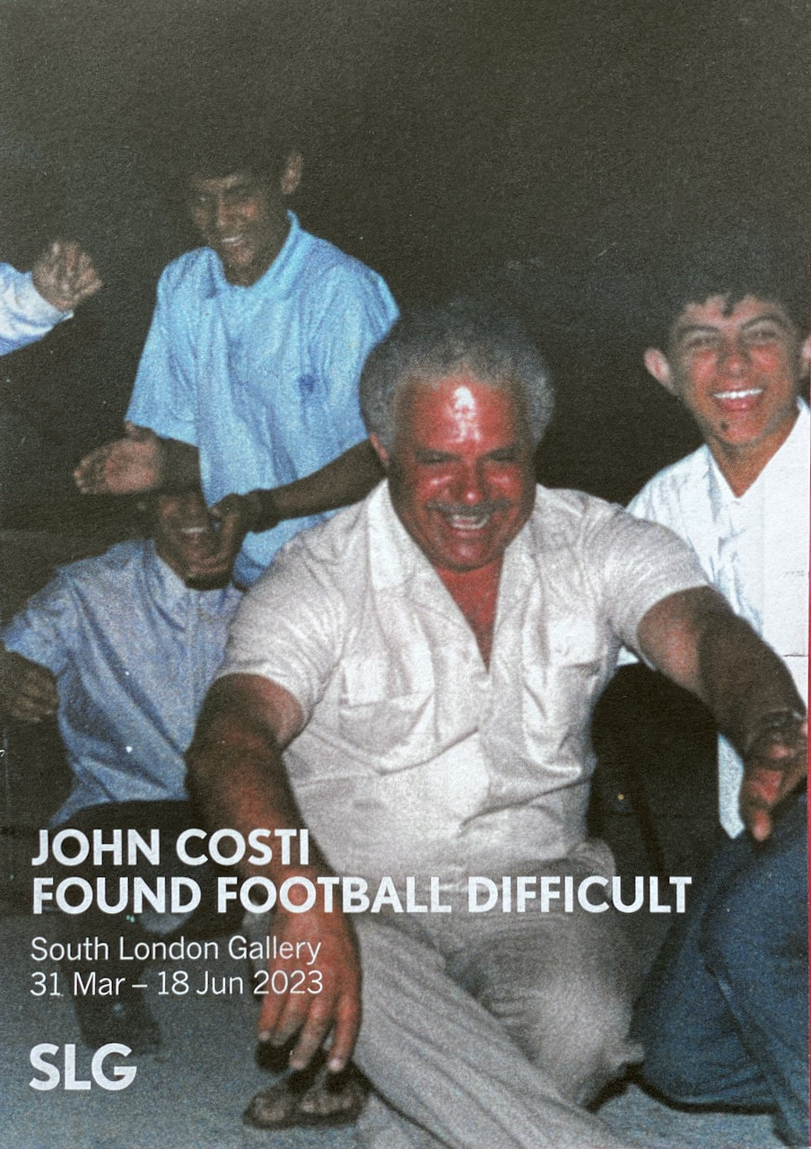
I really enjoyed the multi-layered, multi-sensory quality of both these exhibitions. Both artists use combinations of images, objects and sounds (even smells, in the case of John Costi) to immerse the viewer in stimulating installations. I couldn't spend enough time really exploring the shows so I am looking forward to re-visiting soon.
More aimless wandering...
I've realised that the thing I most like to do is go for long, aimless walks with my camera, stopping to take pictures whenever something calls out to me. I try not to overthink this process or question whether or not I should take the picture. I only ever take one picture of something, unlike a photojournalist or street photographer who might wish to "work the scene" (I think this was Henri Cartier-Bresson's advice). These pictures were taken with a Contax RTS fitted with a 50mm lens and Kodak Portra 160 film (rated at 100 ASA). Periodically, this camera gets stuck and I have to take off the bottom plate a fiddle around with the various parts to free it up. This often causes an additional shutter release and double exposure. I have included a couple of examples underneath the main gallery.

Accidental double exposures caused by camera malfunction
iPhone backup
When my camera malfunctioned yesterday the only way I could make images was with my iPhone. I decided to try to photograph with it as if it was an SLR. This meant slowing down, avoiding snapshots, framing the composition as carefully as possible and imagining that each exposure had a financial cost. These are the pictures I took in the space of about an hour, walking from London Bridge to Waterloo.
Maria Ahmed & Bedwyr Williams exhibitions
|
|
|
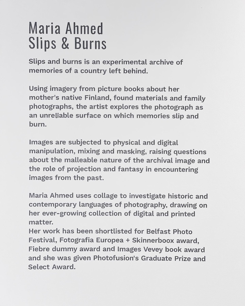
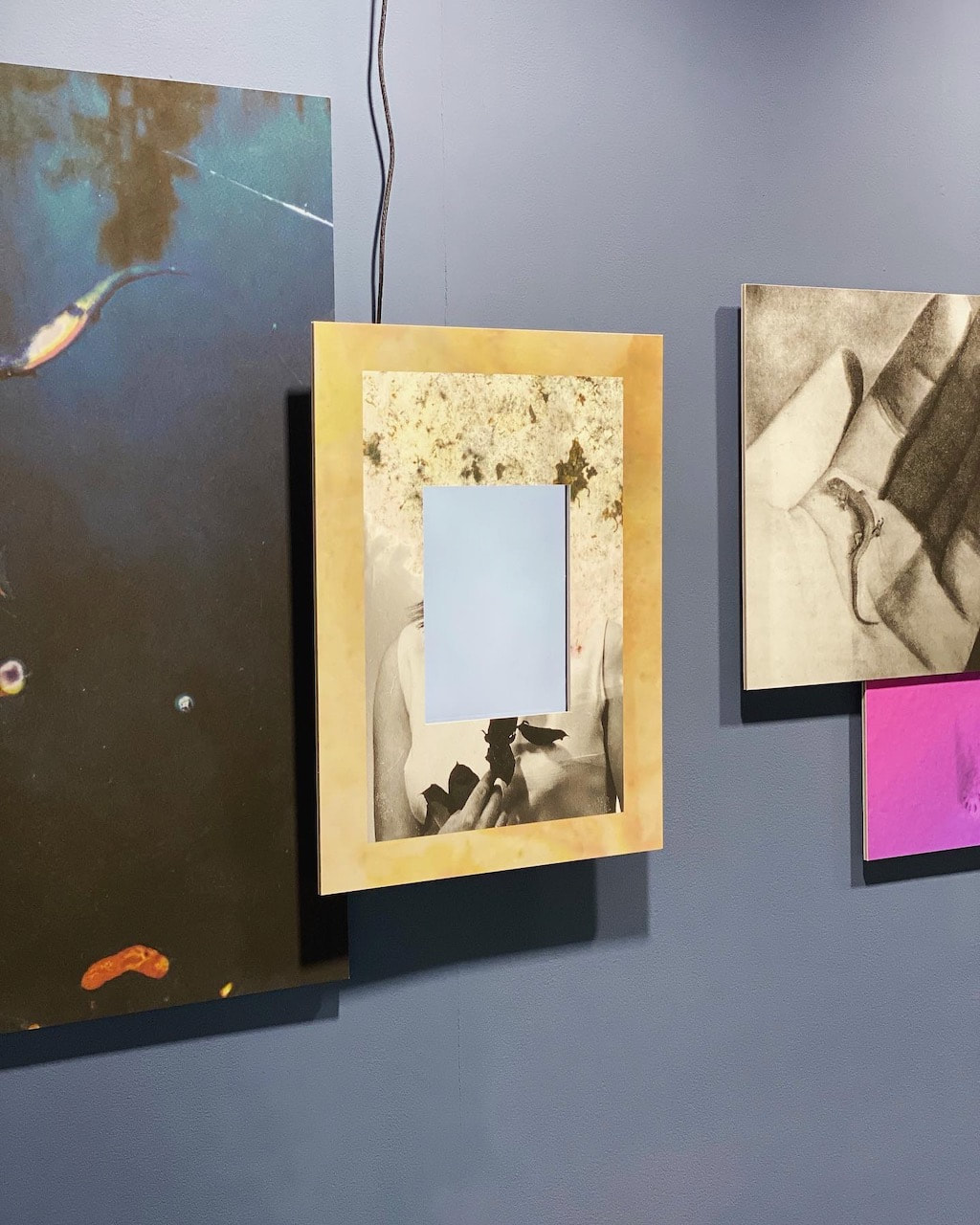
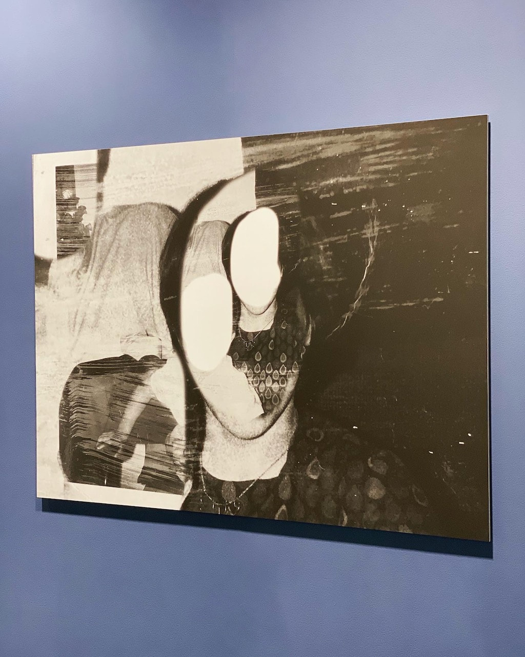

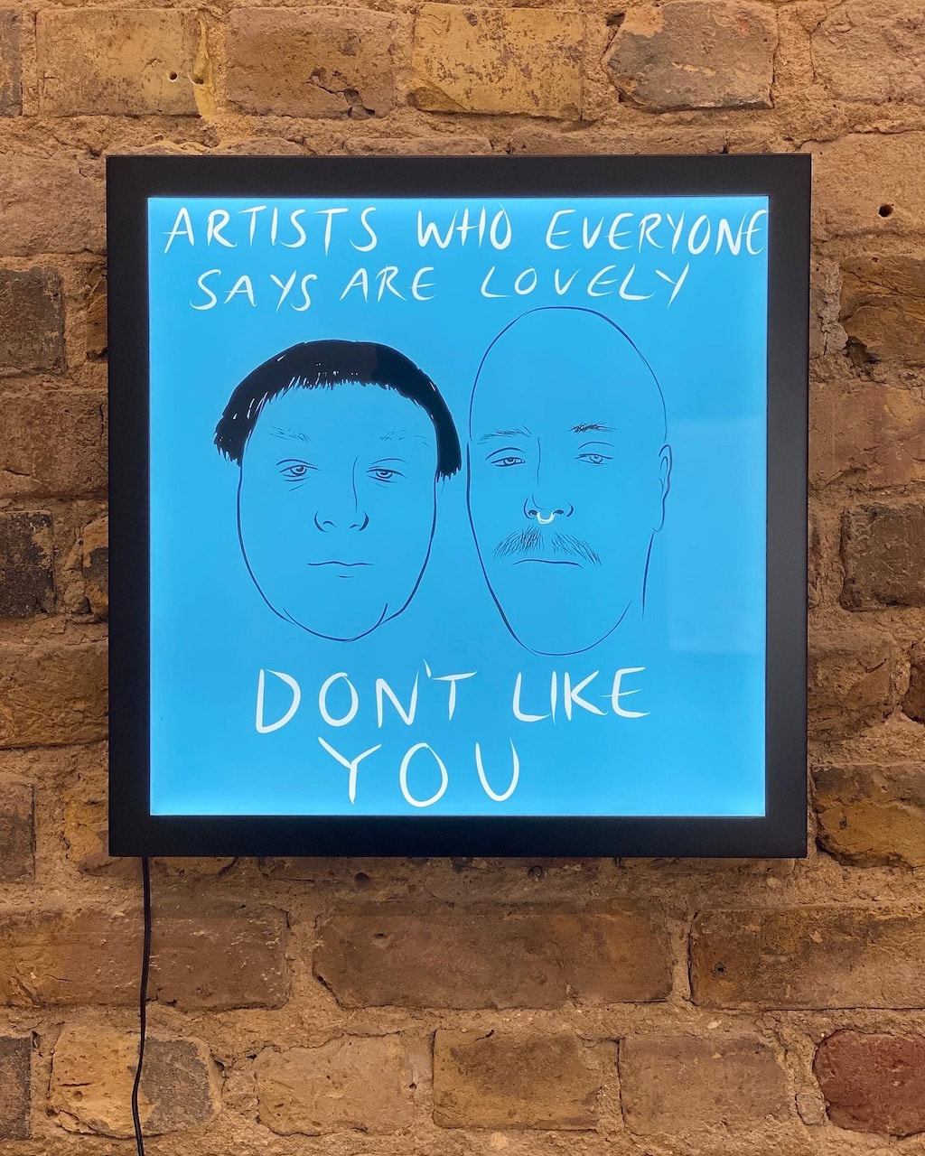
I discovered both of these artists on Instagram so it was exciting to see their work in gallery exhibitions. I'd never been to either gallery before so I enjoyed the opportunity to visit new spaces, one in Brixton and one in central London.I enjoyed both, very different, displays of work. Ahmed's exhibition presents images re-worked from her personal archive. Photographs have been heavily manipulated using both digital and analogue techniques. Images are layered together combining still and moving elements and a vitrine displayed a variety of materials in what looked like a provisional studio desktop arrangement. William's work explores a range of characters and their relationship to Wales and Welshness. He makes fun of arty types who have relocated to Wales but who are insensitive about their new context and the history and culture of the environment they have adopted. Drawings made for Instagram are translated into lightboxes and a slideshow with ambient, Welsh countryside soundscape. A gallery wall of paintings present cropped views of sockless shoes and trousers, scumbled faces, amongst other slightly disturbing details. Williams' digital drawings (presumably made with an Apple pen on a screen) are elegant and always accompanied by an acerbic caption. They work brilliantly on a platform like Instagram (as do Maria Ahmed's multimedia works). However, I also really enjoyed the physical exhibition. It's not often I find myself laughing out loud at an art show!
A journey north
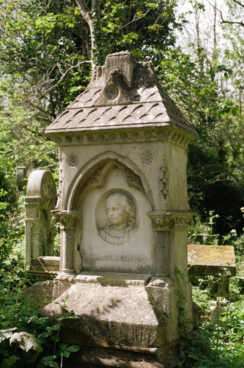
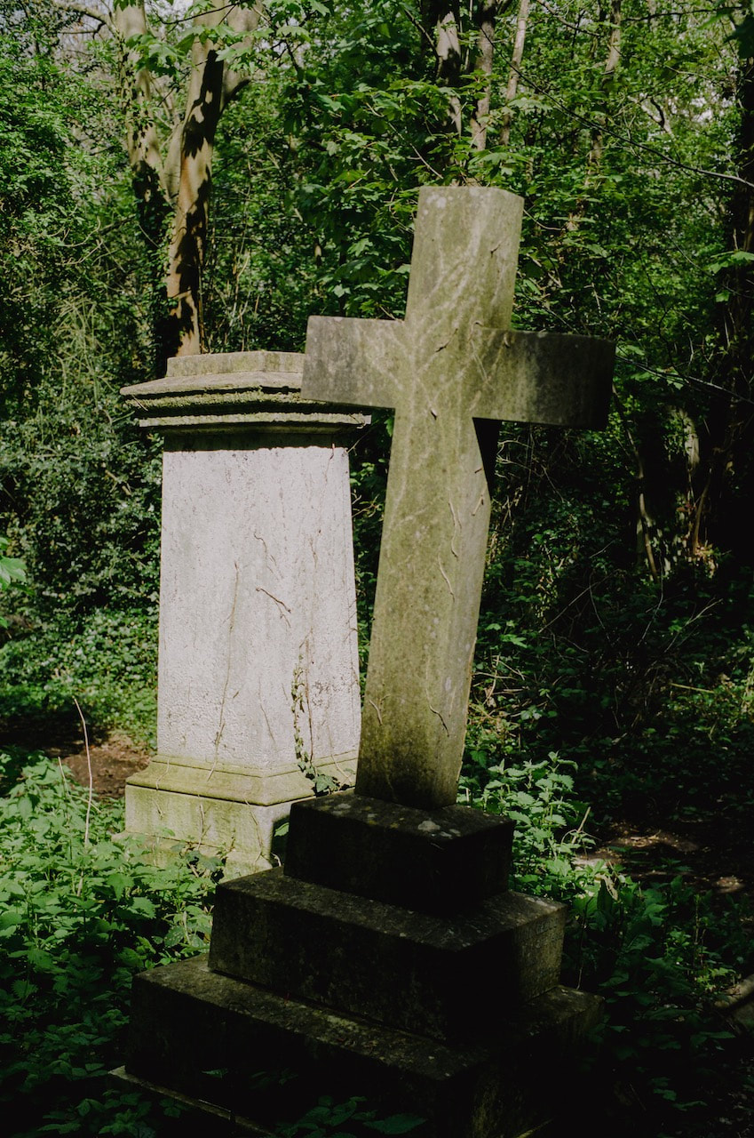
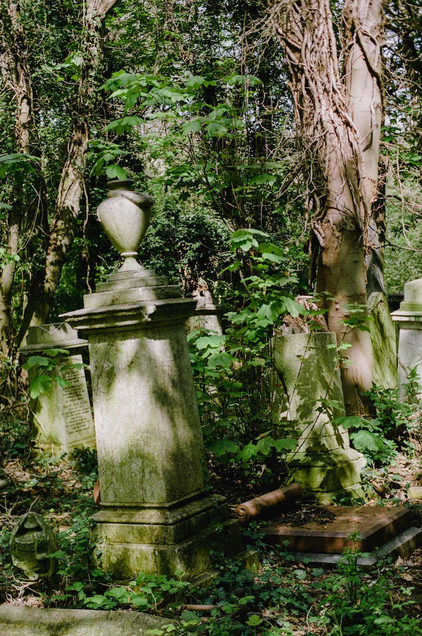
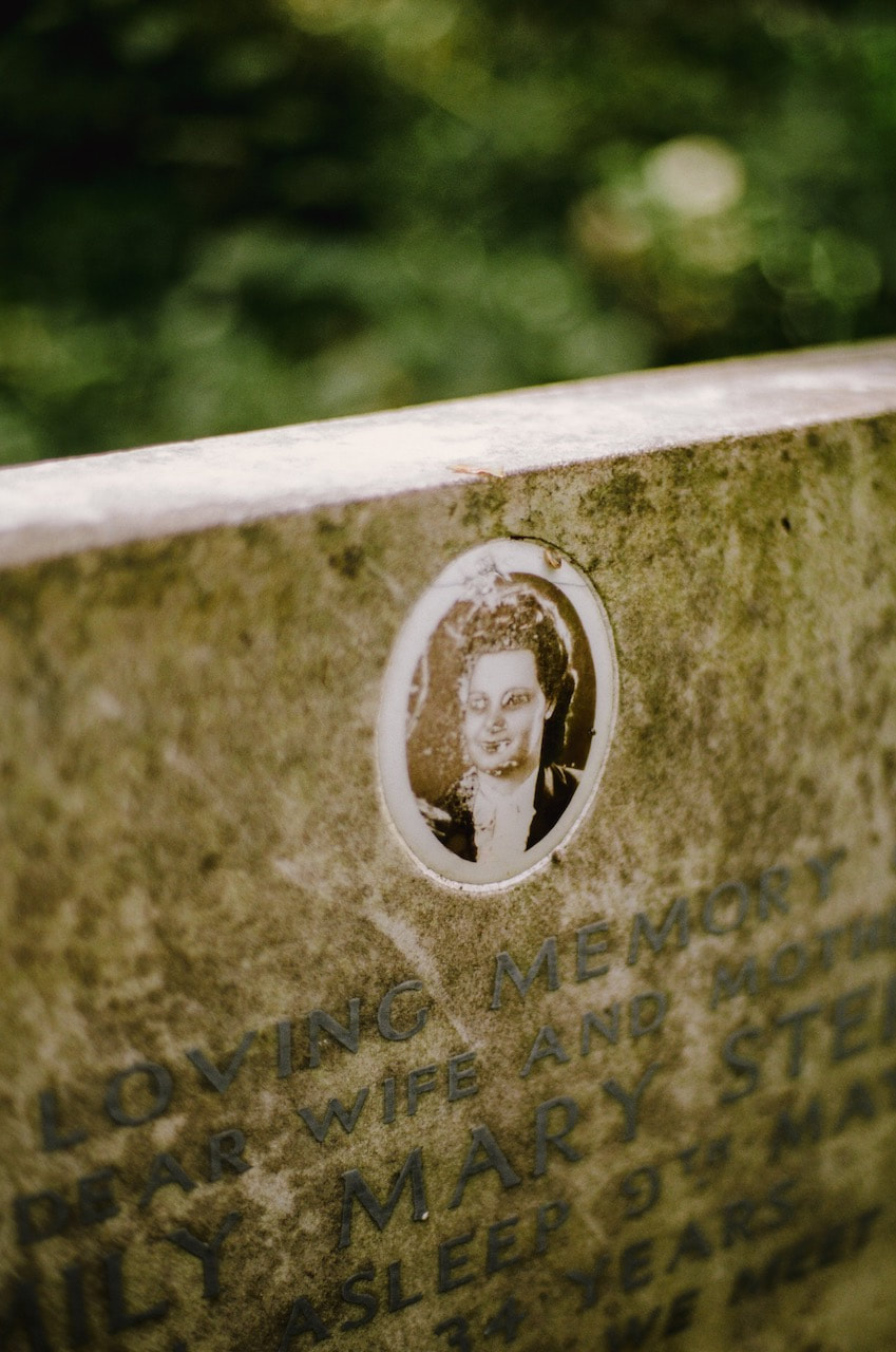
The majority of these images were made in north London, between Dalston and Stoke Newington. I used a Yashica SLR and Kodak Portra 160 film. The reason for the trip was to visit the 'Twenty-nineteen' exhibition at Campbell Works (images below). I had a conversation with one of the exhibiting artists who told me about Abney Park, one of the 'Magnificent Seven' London cemeteries currently undergoing renovation, so I decided to visit on the way back.
'Twenty-nineteen' group show at Campbell Works
Imagine a world that has not experienced the ravages of covid, remember that moment just before we all grappled with new realities, Twenty-nineteen takes a look back to the year just before we all took stock of life, to the moment of collective innocence of a future not yet begun. Campbell Works presents a time-travel group show where all the works are from a single year – 2019, an awkward interval in that the works are neither freshly made nor old enough to have the privilege of historical context.
-- Campbell Works website
|
|
|
NEU Strike March - 2 May 2023
These pictures were all taken on the day of the National Education Union Strike march in central London, May 2023. They chart my journey from home to Waterloo, along the route and back home. I decided beforehand to photograph in black and white (with a digital camera and old manual lens) and to photograph incidental details, rather than attempt to document the march itself.
A Haggerston Dérive
These pictures were made with a Fujifilm camera fitted with an old manual focus 35mm lens and a Portra 160 Fuji film recipe. They were then post-processed in Lightroom. It was a beautiful, sunny day and I'm pleased with the way the pictures record the quality of the light. I walked in a large circle around Haggerston train station, coming home via New Cross. Unusually, for me, I occasionally chose to make several exposures in the same location, moving my position slightly each time. This is something I may do more in future.
Triptychs
#1
|
|
|
#2
|
|
|
A trip to The Photographers' Gallery
|
|
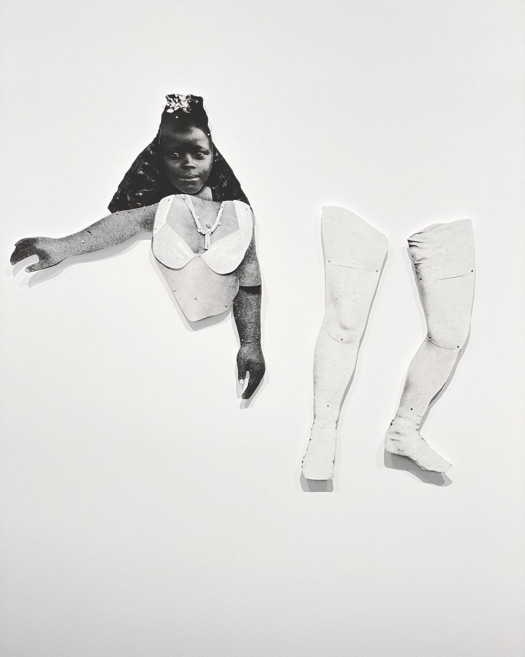
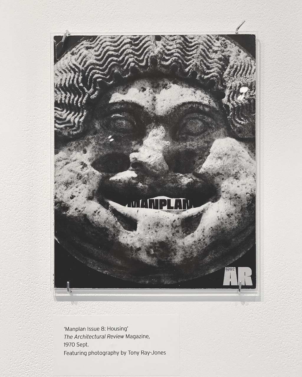
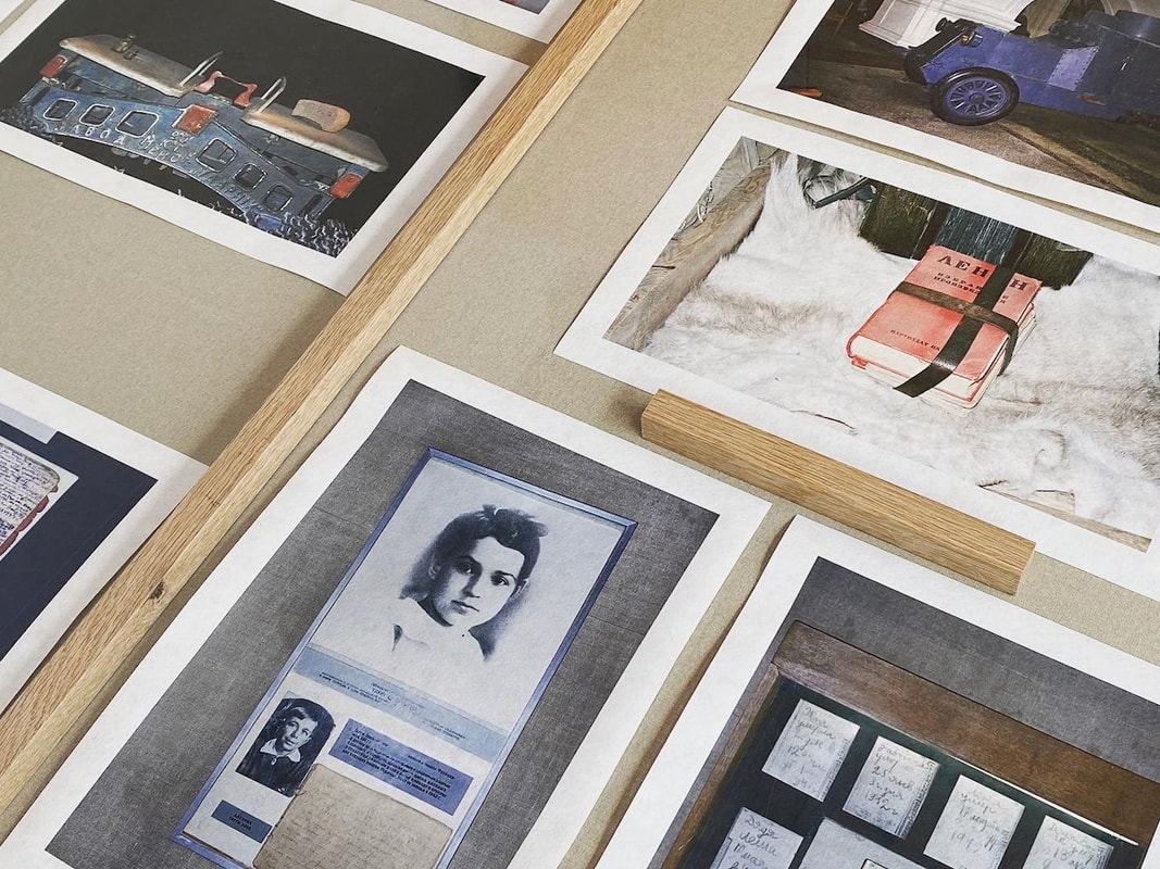
I was keen to to see the Deutsche Börse prize nominees and I'd heard about the exhibition featuring images of Thamesmead and other social housing projects from the late 60s and early 70s. I enjoyed the work of the four featured artists, particularly Frida Orupabo's disconcerting archival collages of black women's bodies and Bieke Depoorter's poignant narratives exploring her deep engagement with figures on the margins of society (which approached the notion of the archive from a very different perspective). I was really struck by the physical presence of both sets of images, thanks in part to the curatorial team at the gallery. By comparison, the displays by Arthur Jafa and Samuel Fosso seemed fairly conventional.
I was very struck by the exhibition about social housing, partly because it featured the estate in Thamesmead made famous by the film 'A Clockwork Orange'. The exhibition featured photographs by Ian Berry, Patrick Ward, Tim Street-Porter and Tony Ray-Jones, copies of the Architectural Review and an archive film featuring the story of the Thamesmead development from 1970 (see below left).
|
|
|
The contest between form and content
I recently came across a fascinating interview between photographer Garry Winogrand and some students from the Rochester Institute of Technology, recorded in 1970 and transcribed fro publication online in 2012. Winogrand is questioned about his practice by the students, some of whom are clearly struggling to understand his methods and the meaning of his images. Winogrand is typically blunt but also extremely precise in his replies. He seems dedicated to a particular view of the photographer and the possibilities of a photograph. At one point he is asked about photographers he admires and particular photographs that have taught him something. He talks about Robert Frank's picture of a gas station from his book 'The Americans' (see below).
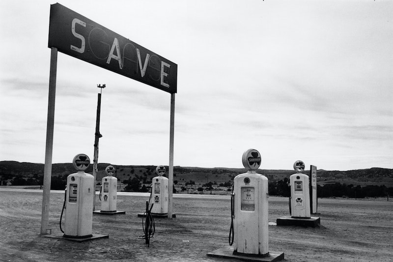
Robert Frank - Santa Fe, New Mexico, 1955 from 'The Americans'
|
That [the gasoline station] photograph, in the first place, is an exercise in, ah—it’s a lesson, number one, in just camera operation, in a sense. It’s a lesson in how responsible that machine is for how photographs can look. Begin with that. To me that was one of the most important pictures in the book. It’s also a photograph of nothing, there’s nothing happening there. I mean, the subject matter has no dramatic ability of its own whatsoever and yet somehow it looks, what it is, it’s the most mundane—and there’s nothing happening, there’s no physical action. |
He admires Frank's ability to see the possibility of this subject becoming a photograph. He reminds us that Frank could not have known that it worked as an image until he returned to his darkroom to develop the film and look at the contact sheet. Despite the fact that nothing dramatic is happening in the picture, it works because of the relationship between what the picture is about, the content (an empty gas station in a desert) and its form (the arrangement of shapes in relation to the photograph's edge). For Winogrand, this is what defines the job of the photographer:
The contest between form and content is what, is what art is about— it’s art history. That’s what basically everybody has ever contended with. The problem is uniquely complex in still photography.
Later, he goes on to make one of his most famous statements about why he makes photographs (my italics):
When he [Robert Frank] took that photograph he couldn’t possibly know—he just could not know that it would work, that it would be a photograph. He knew he probably had a chance. In other words, he cannot know what that’s going to look like as a photograph. I mean, understanding fully that he’s going to render what he sees, he still does not know what it’s going to look like as a photograph. Something, the fact of photographing something changes—I mean, when you photograph—if I photograph you I don’t have you, I have a photograph of you. It’s got its own thing. That’s really what photography, still photography, is about. In the simplest sentence, I photograph to find out what something will look like photographed. Basically, that’s why I photograph, in the simplest language. That’s the beginning of it and then we get to play the games.
I've been reflecting on some of the reasons why I make photographs. Reading this interview helped me clarify my own thoughts. When I am out walking around with my camera, I stop to consider making a photograph when I see something that 'speaks' to me. I don't really understand what this is but it might be the way the light is falling across a particular surface. I am sensitive to patterns and repetition, to surface texture and marks. I like abstract art so I often see the city as a kind of canvas on which various people have left evidence of their presence over time. However, I'm also thinking about what might happen if I make a photograph of a particular thing. In other words, what might happen to this corner of the world if I enclose it in a frame. Part of the reason why I like to photograph on film is because it forces me to slow down and really consider precisely where I should stand and when I should press the shutter. One of the most exciting things about photography is not knowing whether the picture you have made of something will work. It might look great but will it make a successful picture?
|
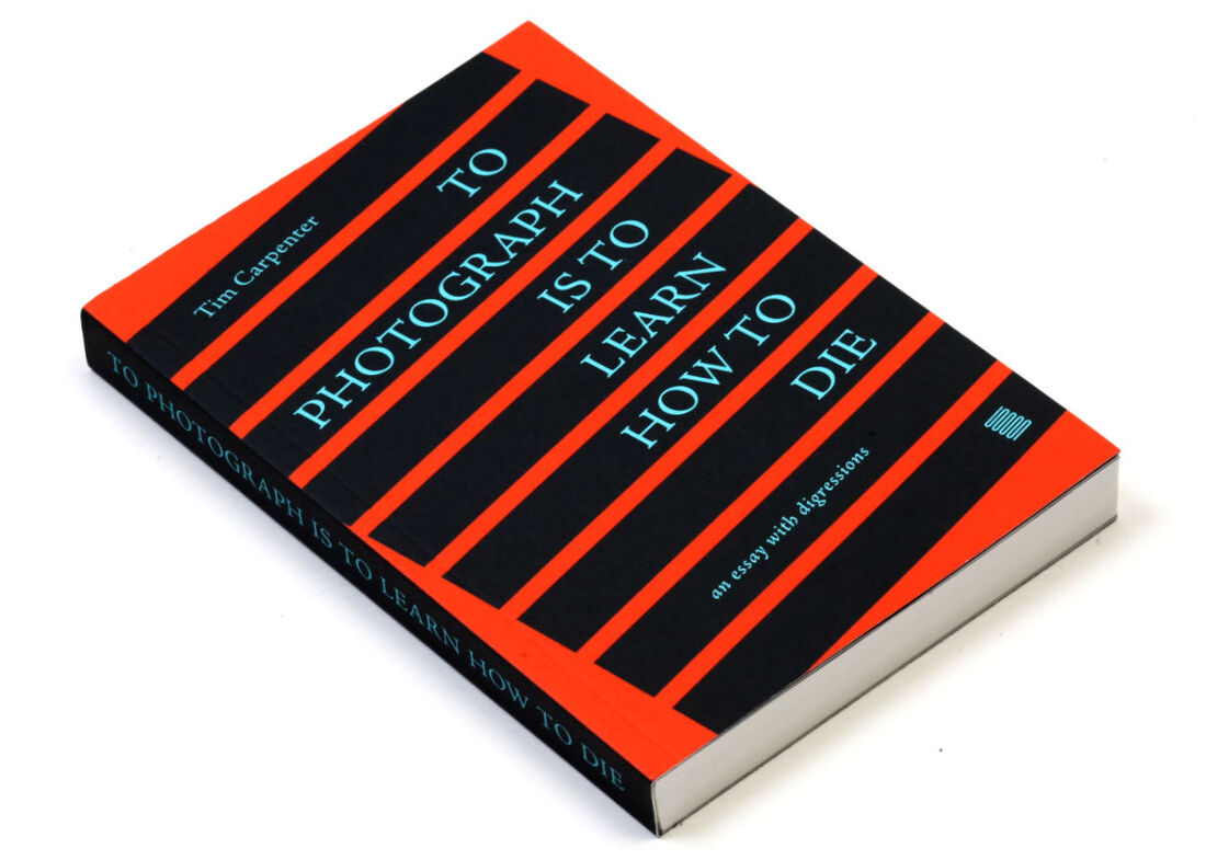
Another text that's helping me think about photography is Tim Carpenter's To Photograph is to Learn How to Die. It's a tricky book, partly because there are four interlocking strands of text (printed in different colours) presenting his argument.
Carpenter quotes liberally from various poets (and other writers) to make the case that photography is perfectly suited to negotiating the difference between the self and all that is not self. The camera is a device for connecting the imagination of the viewer to the resistance of the world and the job of the photographer is to create an image with "significant form". This is not dissimilar to Garry Winogrand's idea of setting himself formal "problems" and "playing the game". Ultimately, Carpenter argues, photography is a way of dealing with our mortality because photographers face reality and deal with its contingencies - light and time. Everything, including photographs themselves, is ephemeral but the practice of facing reality and making images of it is a kind of consolation. Photography can help us create a kind of poetic meaning from an otherwise meaningless reality. |
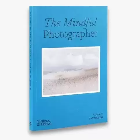
How does this impact on my Personal Investigation?I am interested in responding to the ideas in Tim Carpenter's book as part of my investigation. I've also been doing some reading about mindfulness in photography and this has caused me to reflect on the way that making photographs affects how I feel. I'm less interested in the lifestyle aspects of mindfulness theory but I do think that the relationship between photography and good mental health is an interesting one, how photography can help us to slow down, pay attention, live in the moment etc.
Some of the questions raised by both these books, therefore, include:
I think these, and other, questions might help me think about photography, specifically the kinds of pictures I like to make, more philosophically. What are the purposes of my photographs? What difference does the act of photographing make to me? |
|
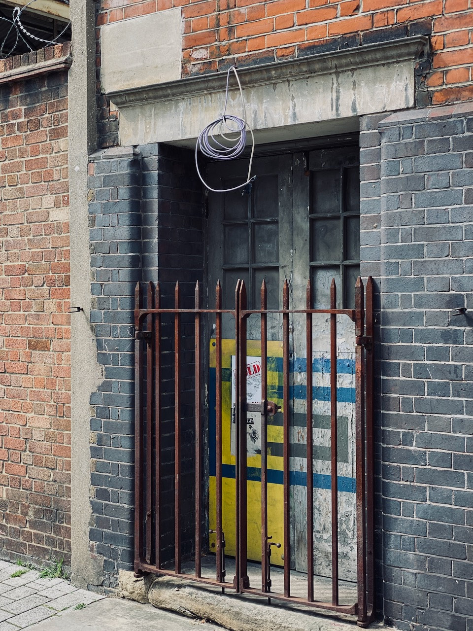
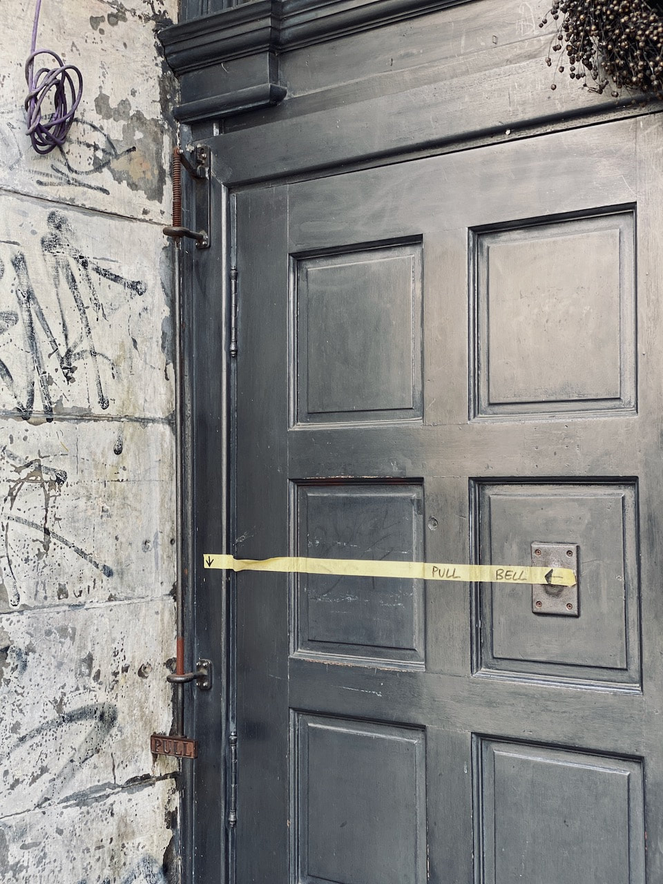
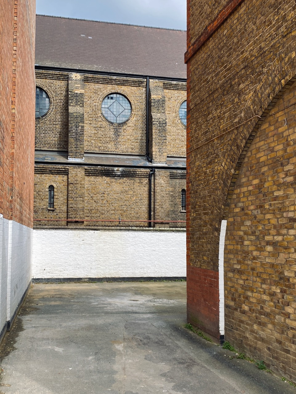
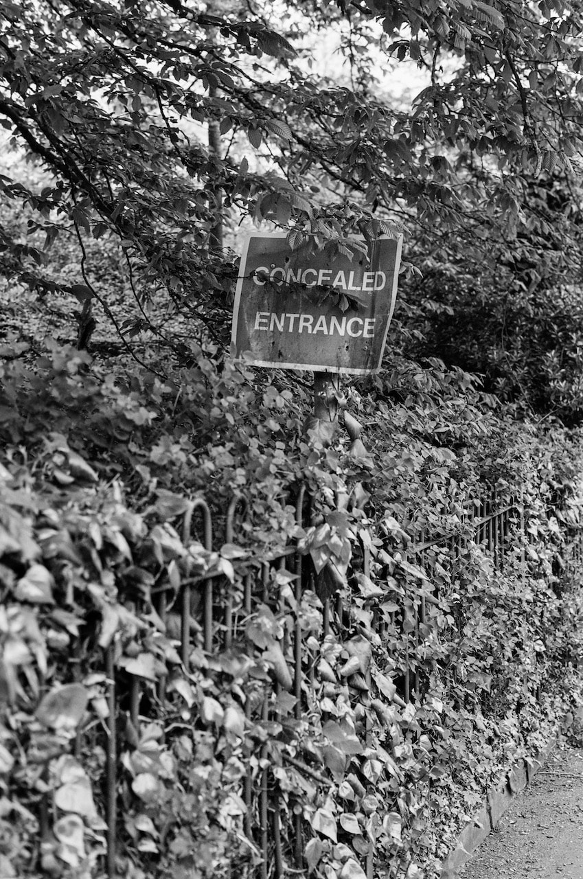
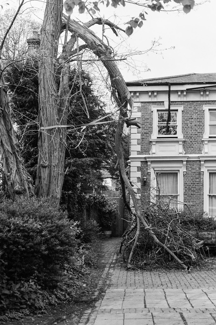
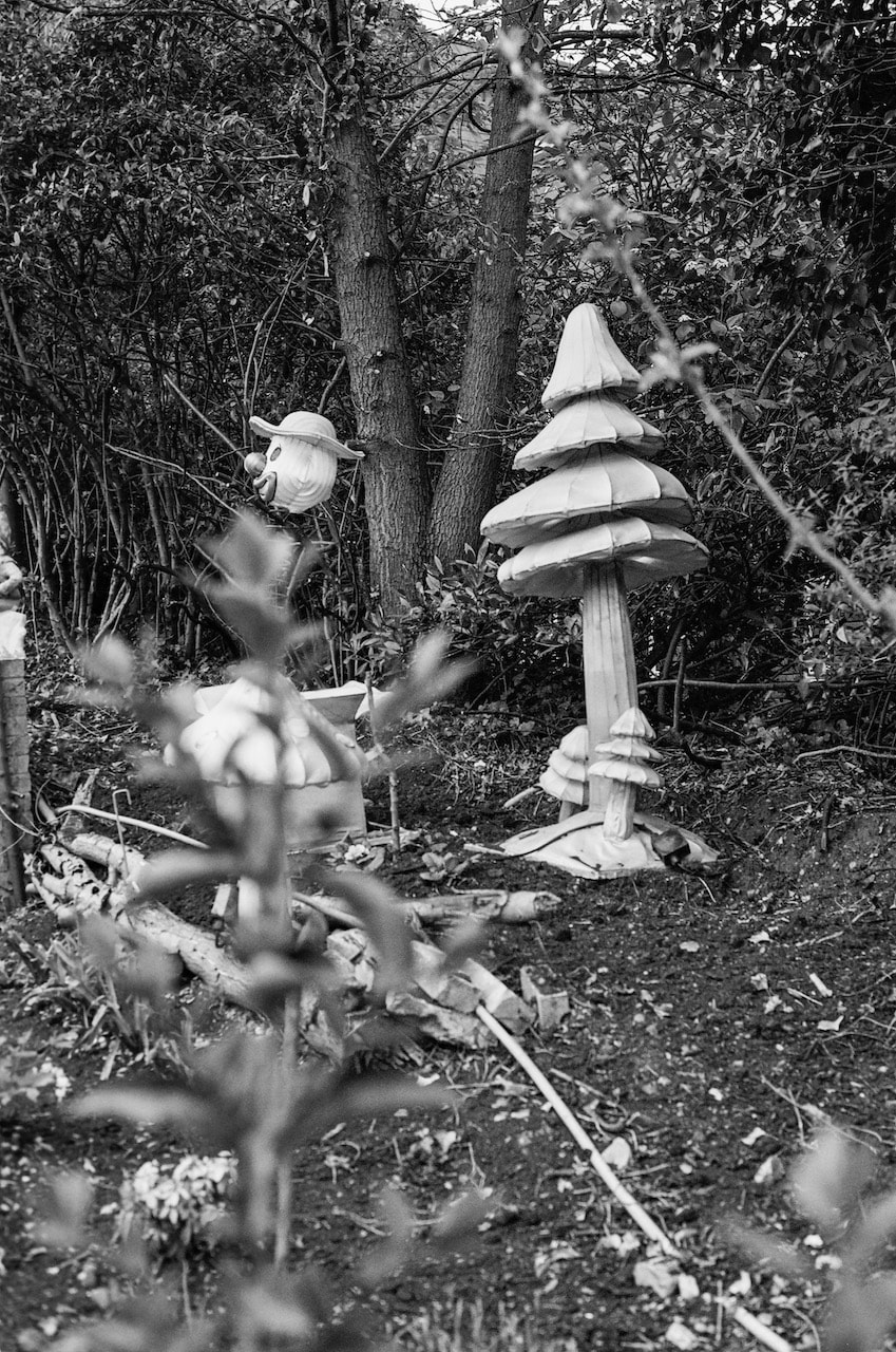
Concealed Entrance
These photographs were made in south east London (Sydenham, Blackheath & Lee, mostly) with a manual SLR, 50mm lens and Ilford XP2 Supper 400 film. After a few frames, I noticed that the film wasn't winding on properly. I wound it back into the canister, reloaded it and continued shooting. This produced some misprints and double exposures (see below).
Misprints & double exposures
Triptychs
|
|
|
|
|
|
|
|
|
I really enjoy the process of selecting and sequencing photographs and the triptych format is a concentrated version. It's hard to explain why a particular arrangement of three images works and another one doesn't. Obviously, this is partly a matter of taste but it might also have something to do with issues of form, the relationship between positive and negative space, leading lines, the push and pull of tones etc. The business of shuffling the images into different arrangements is really enjoyable - a kind of game. I really like the way Stephen Shore describes the way that this feeling of visual rightness exists outside or beyond language:
There's a kind of visual thinking that goes on that is without words and not just words spoken but not even words in one's head. Most people think thinking has to do with words, this little voice in your head, but there's a visual thinking that doesn't have that.
-- Stephen Shore in the film American Beauty
And here is the opening to John Berger's famous book Ways of Seeing:
Seeing comes before words. The child looks and recognises before it can speak.
But there is also another sense in which seeing comes before words. It is seeing which establishes our place in the surrounding world; we explain that world with words, but words can never undo the fact that we are surrounded by it. The relation between what we see and what we know is never settled. Each evening we see the sun set. We know that the earth is turning away from it. Yet the knowledge, the explanation, never quite fits the sight.
-- John Berger, Way of Seeing

|
|
Across photography exhibitions and a related performance programme artists will respond to this year's theme of BODY LANGUAGE. From the body politic and performed identities to the disembodied spaces of online dating and chatbots, the works on display consider the body and its gestures in all its multiplicity. Ultimately going beyond the boundaries of the singular, the artists included in BODY LANGUAGE consider the social conditions under which our bodies are made, and the ways in which such oppressive structures can be rebelled against.
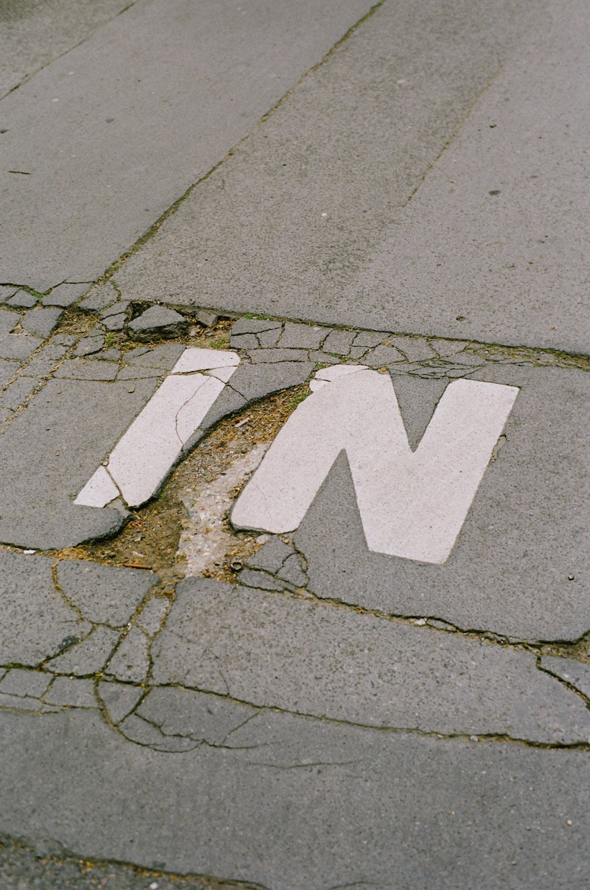
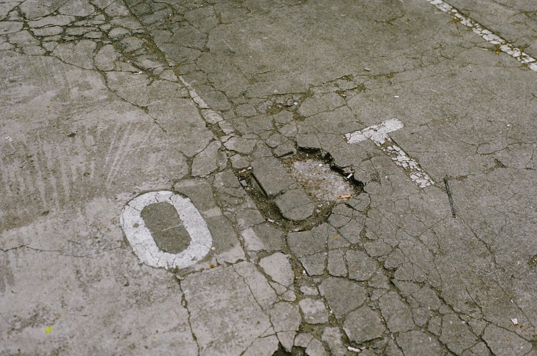
IN/OUT
This sequence of pictures were mostly made the weekend of Peckham 24 using a manual SLR, 50mm lens and Kodak Portra 160 film.

|
|
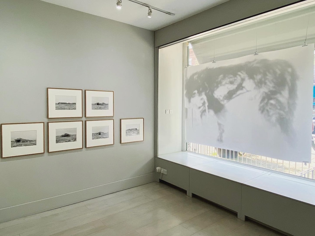
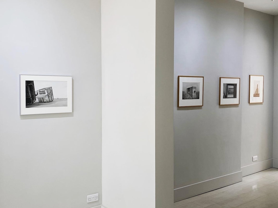
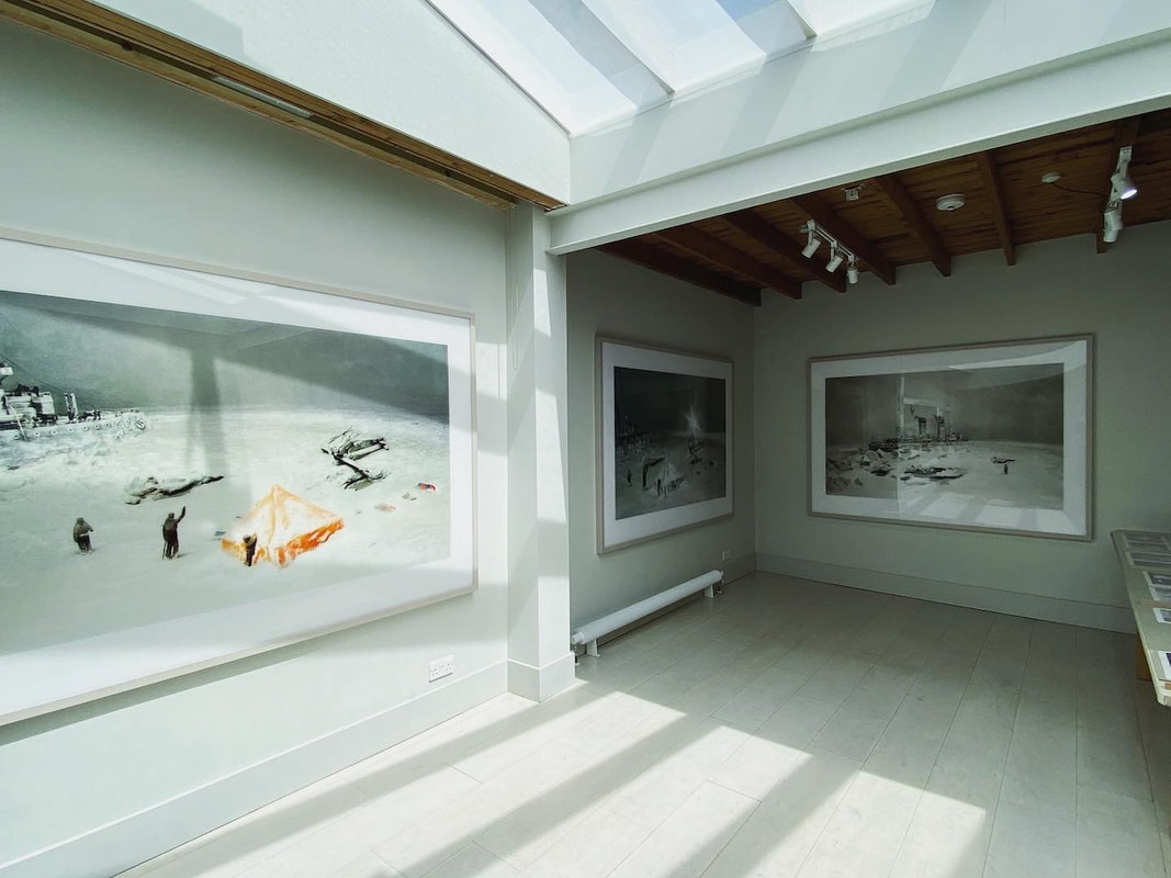
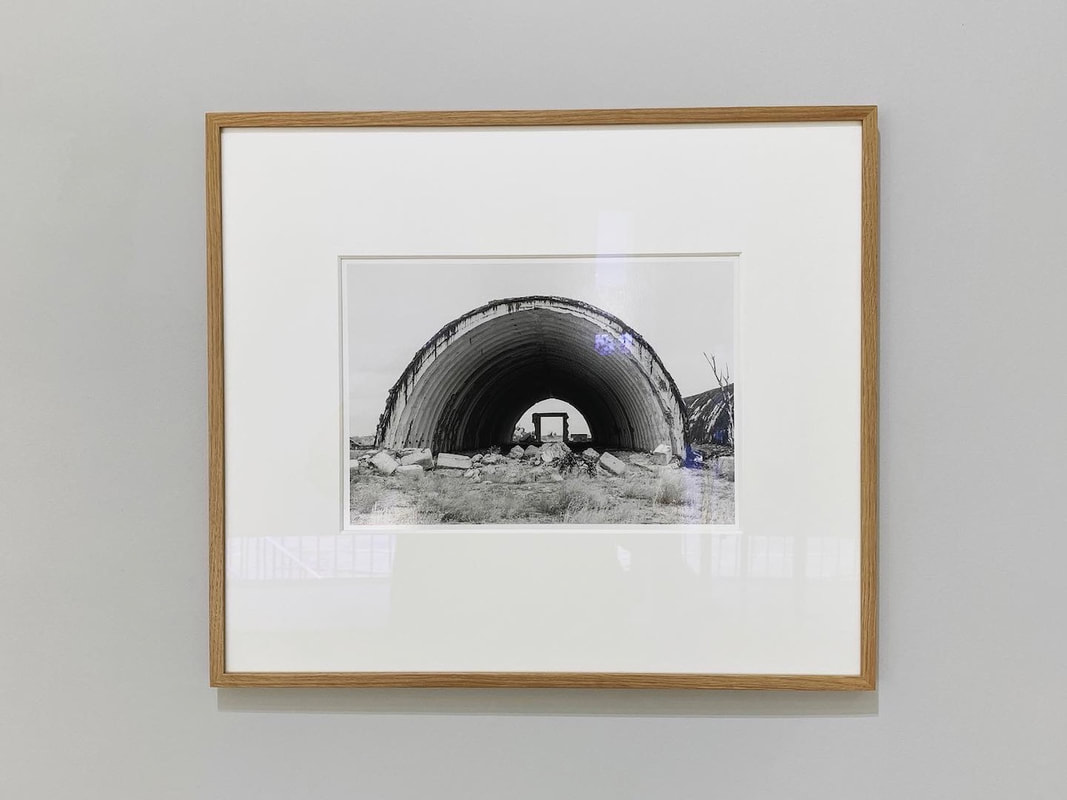
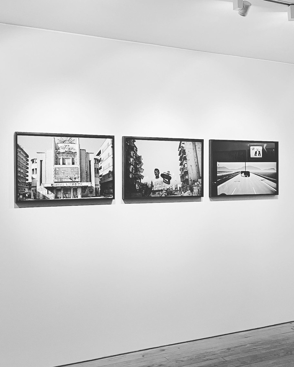
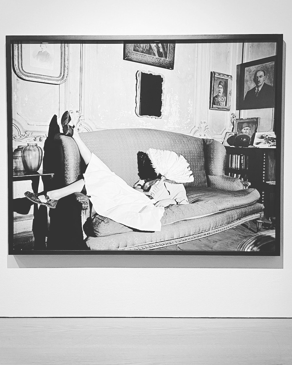
I enjoyed visits to the Ursula Shulz-Dornburg exhibition at Large Glass Gallery and Fouad Elkoury at The Photographers' Gallery. I was particularly impressed by the curation of both exhibitions, especially the Elkoury show in which I sent a long time spotting a set of common shapes and motifs. I was really struck by the spaces between the images in both shows and tried to imagine the decisions made by each of the curators. The images in both exhibitions were predominantly black and white but printed very differently. Shulz-Dornburg's images seem very rational an coolly observed, almost scientific studies of architectural remains. They have an eerie beauty. Elkoury's pictures seem more seductive and expressionistic, almost surreal in their strange juxtapositions. Both photographers have documented the effects of state violence and the impact of war and destruction on the lives of ordinary people. Shulz-Dornburg has been particularly fascinated by the ways in which architecture acts as a mute witness to historical events in remote parts of the world. Elkoury seems interested in the fabric of everyday life on the streets of Beirut. In his pictures we see the human actors moving on the urban stage. Nevertheless, I found both sets of pictures very moving.
|
|
I’ve always been interested in certain times throughout history where our relationship to the way we experience time and space in the world speeds up radically. The invention of the aeroplane, the invention of the train, you see really interesting work coming out of that time, in film, visual arts and writing. We are in the middle of an extreme hurricane where we are learning to speak through images at an exponential pace.
-- Sarah Sze, Artangel website
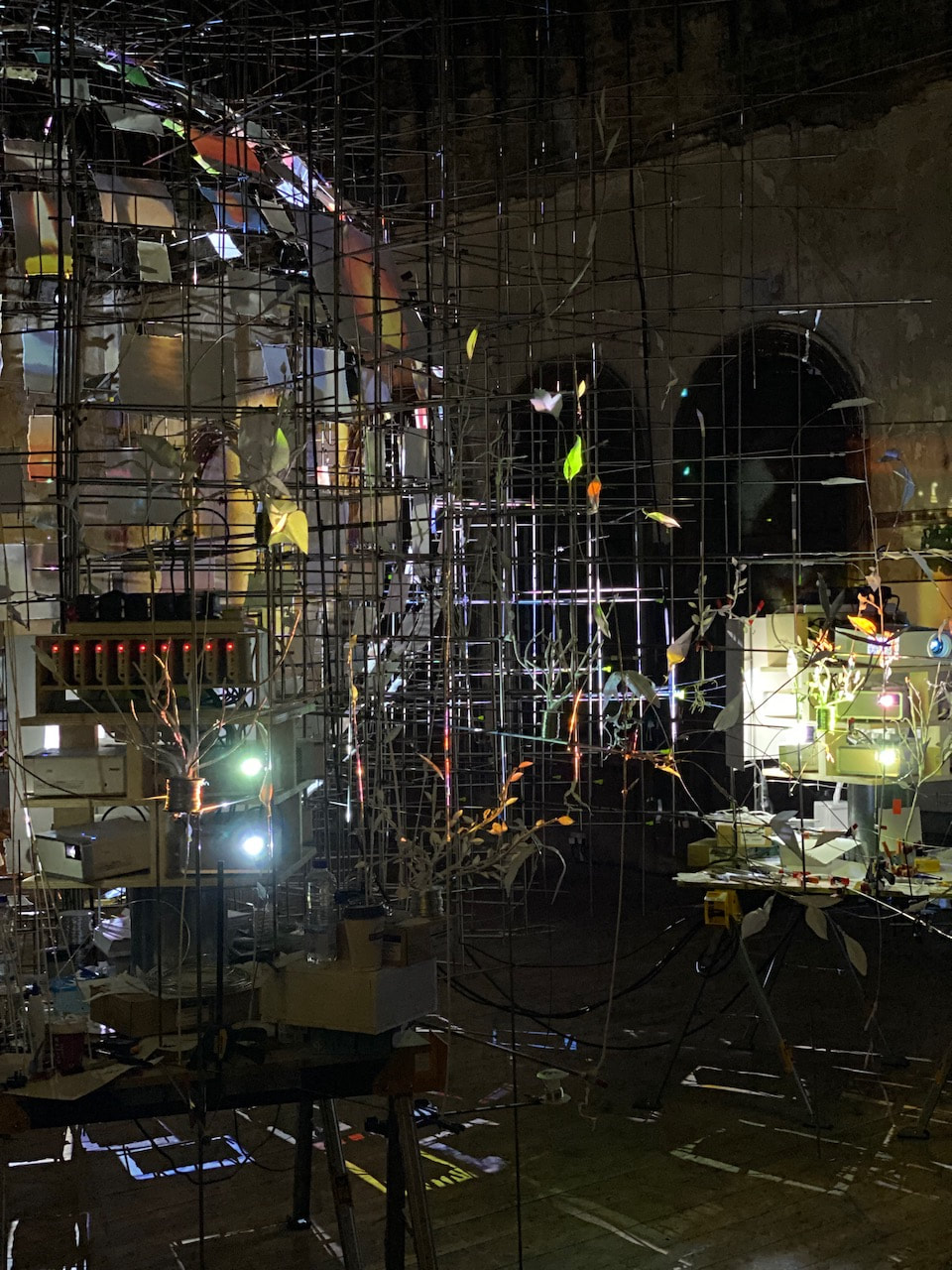
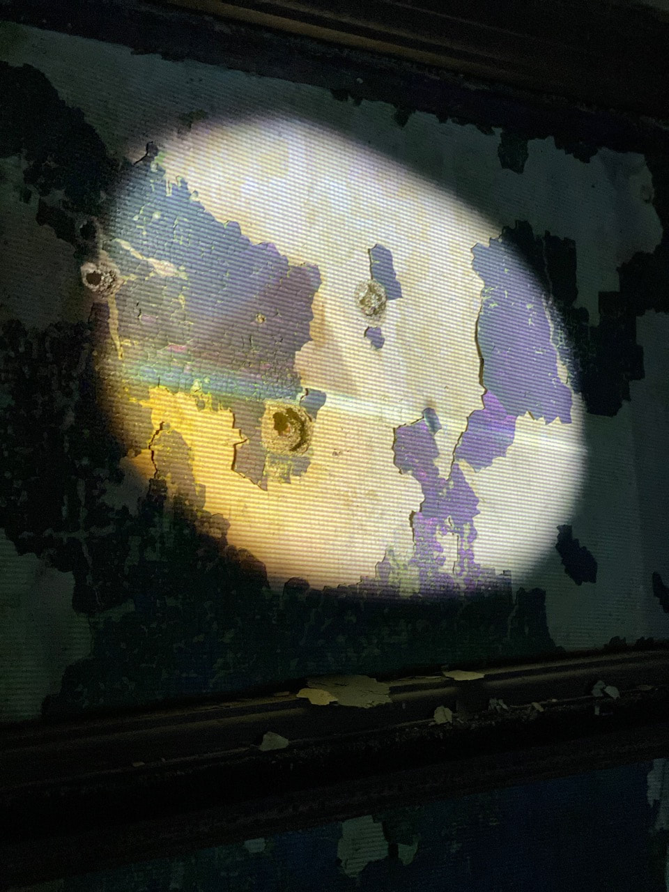
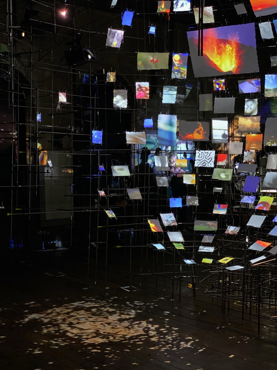
This immersive installation in a cavernous upper room at Peckham Rye train station is the latest in a series of site specific art works arranged by Artangel. Sarah Sze is well known for her fantastically detailed, materially complex installations. This example is no exception including metal structures, video projections, photographs and other objects in a dense, interconnected matrix. The room is dark but illuminated by flickering lights and projections. Visitors can sit and watch from a distance but are also free to wander through the space. It feels a little like being trapped inside a computer or TV.
Locating yourself in time and space is incredibly complex right now ... I think sculpture has to address this volatility of place [...] cultivate the value of a concrete experience in space, in real time ... grounded in the physical experience of the world and play with things such as space, touch, location, intimacy and memory.
-- Sarah Sze, quoted in the exhibition handout
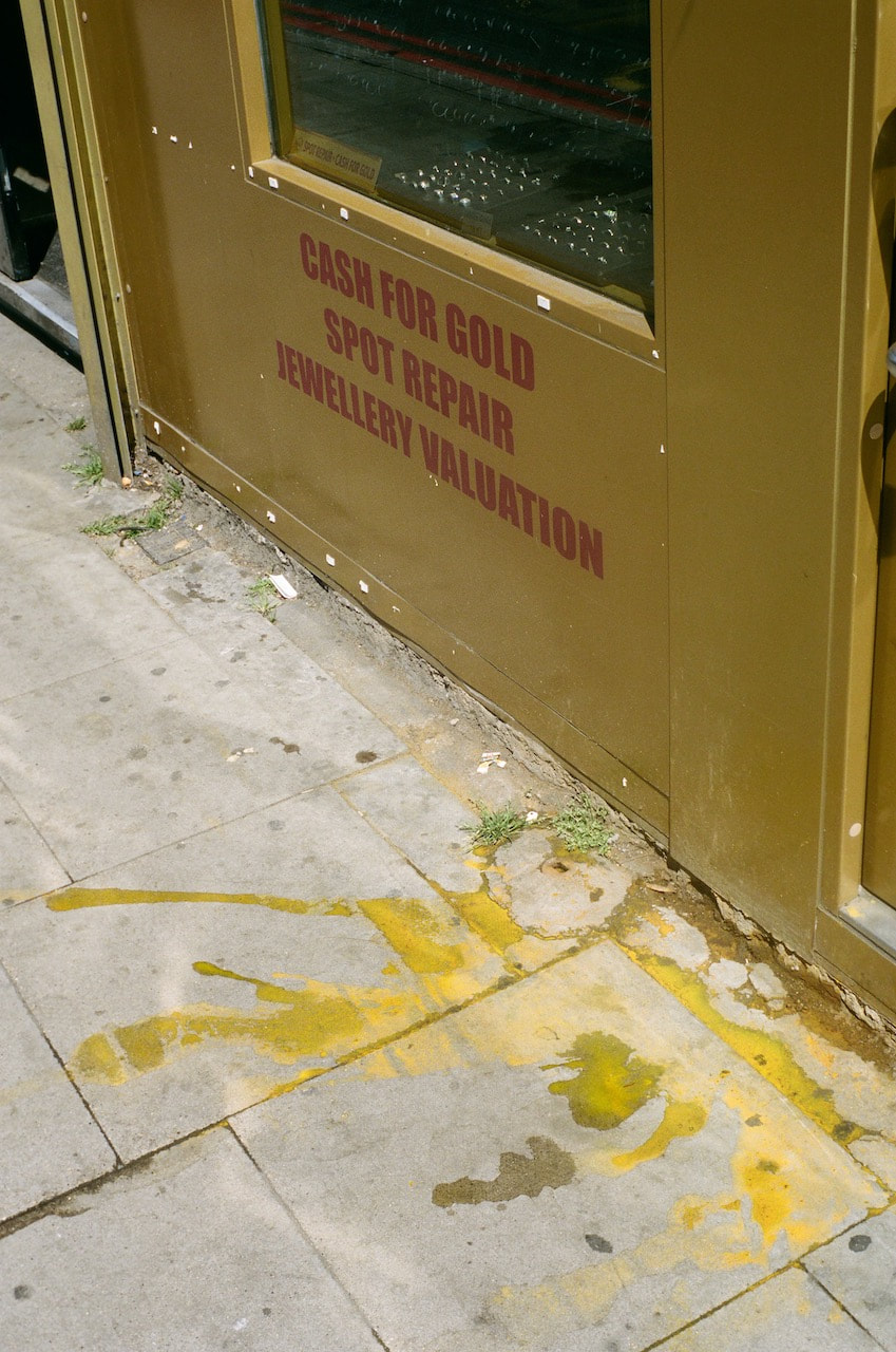
Colour vs Black and White
I tend to alternate between using colour and black and white film. I also sometimes choose to shoot in black and white on my digital camera (rather than shooting in colour and converting afterwards). Obviously, with a manual camera, I am seeing the subject in colour and having to imagine what it might look like as a black and white image.
The following images were all taken with a manual SLR and either Kodak Portra 400 colour or Ilford XP2 Super 400 black and white film. The subject matter is similar - architectural details, urban landscapes, abandoned objects, signs etc. At the moment, I am undecided about whether to continue to shoot both colour and black and white for my Personal Investigation, or whether to concentrate on one or the other. In this case, I much prefer the black and white pictures.
The following images were all taken with a manual SLR and either Kodak Portra 400 colour or Ilford XP2 Super 400 black and white film. The subject matter is similar - architectural details, urban landscapes, abandoned objects, signs etc. At the moment, I am undecided about whether to continue to shoot both colour and black and white for my Personal Investigation, or whether to concentrate on one or the other. In this case, I much prefer the black and white pictures.
|
|
|
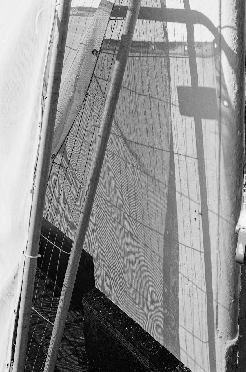
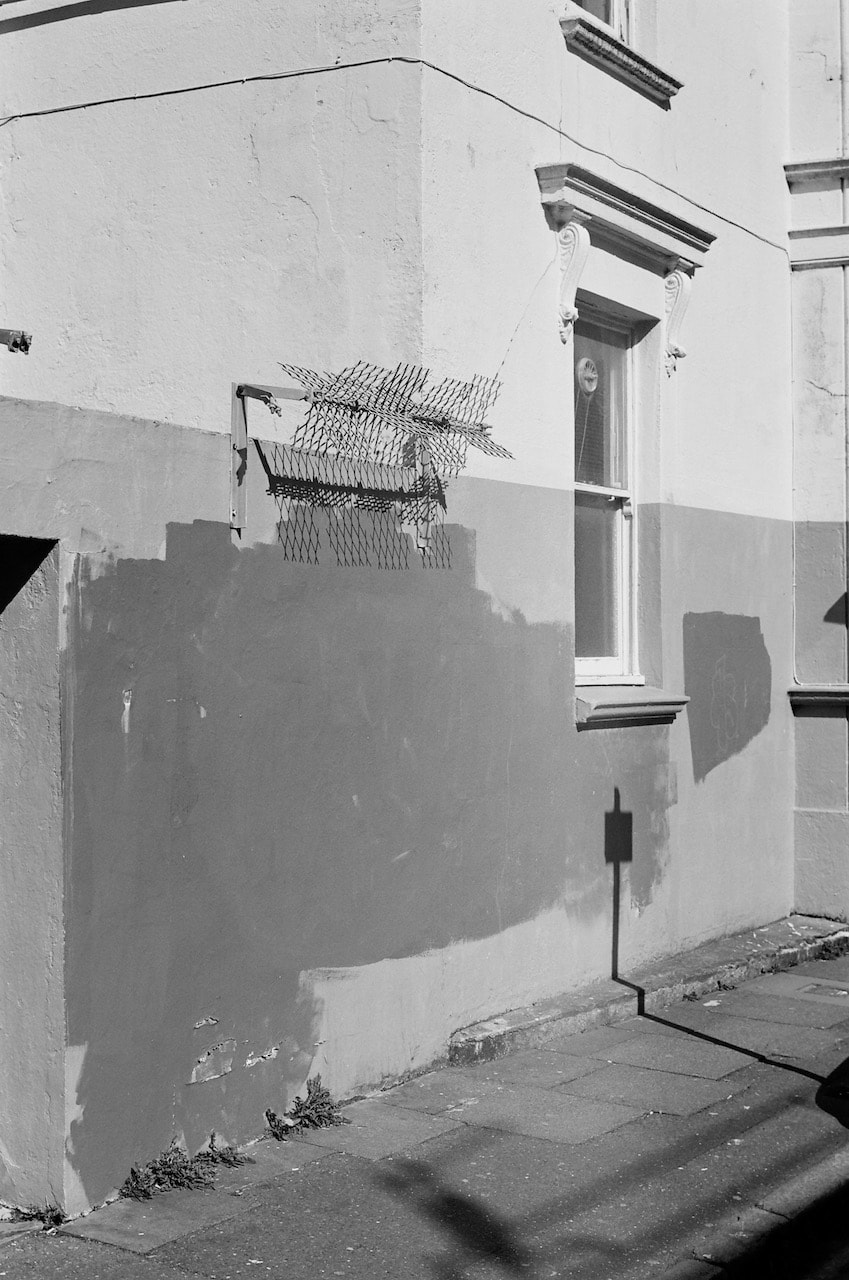
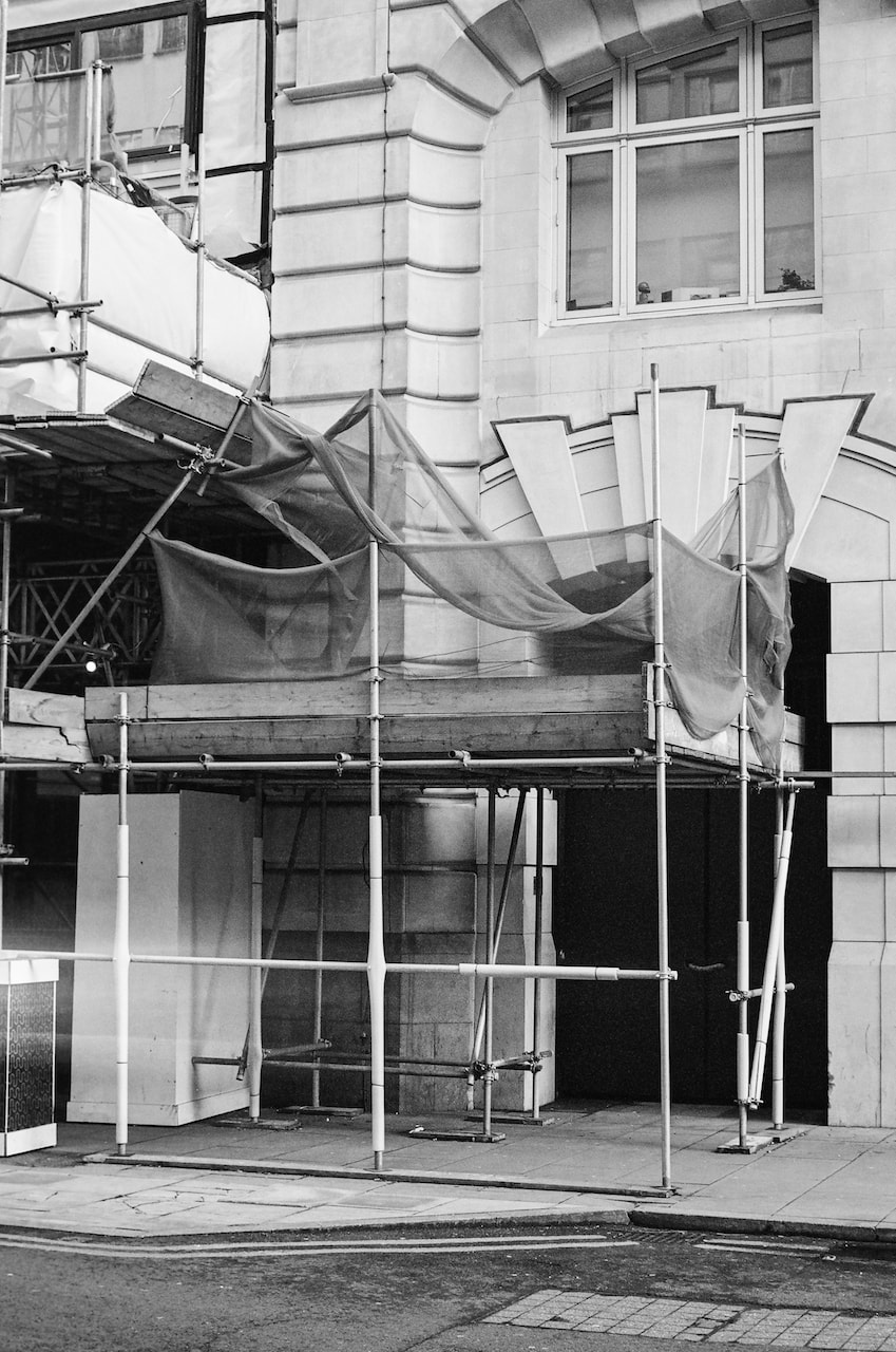
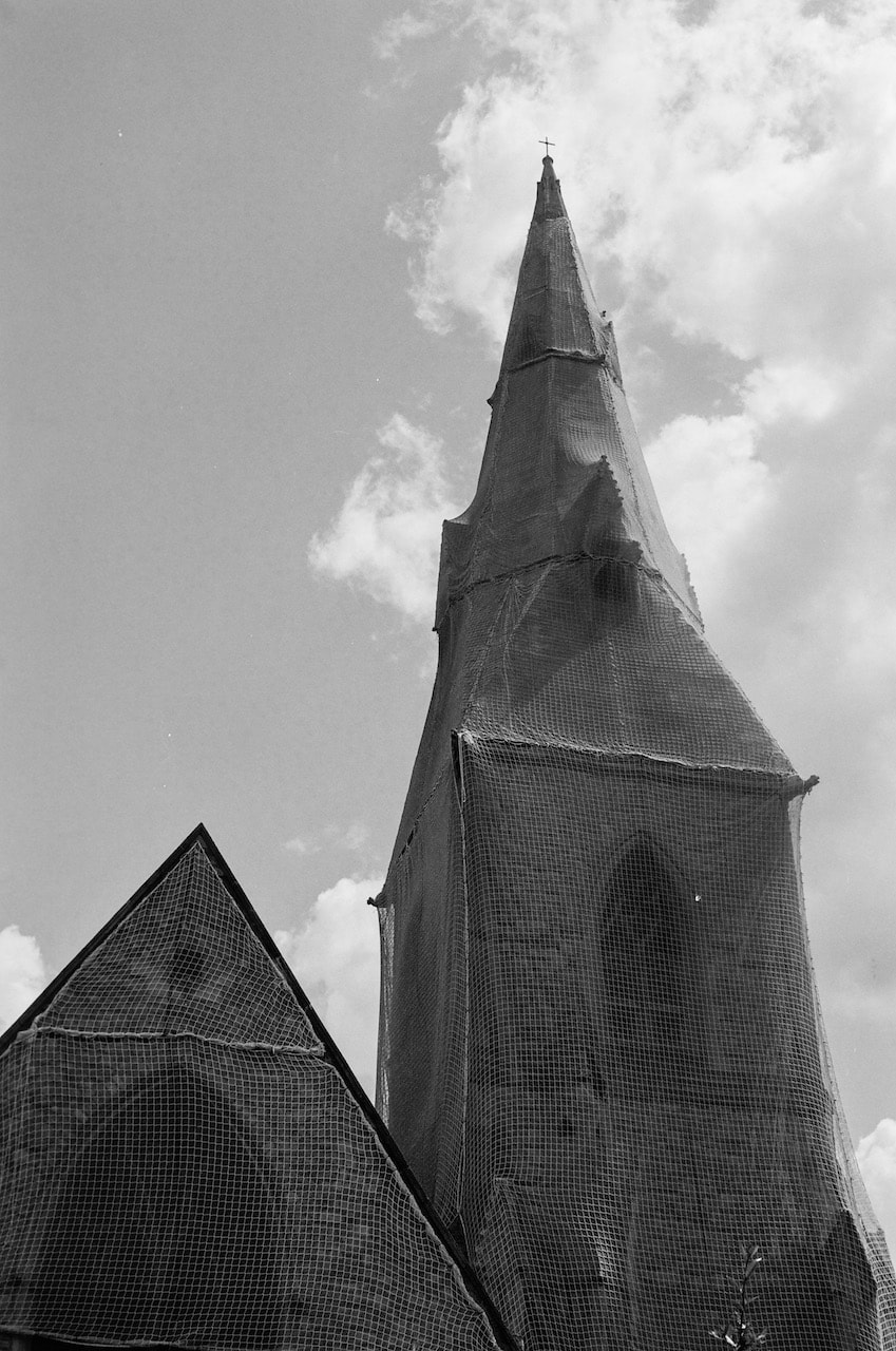
The image on the left would make no sense in black and white since its a visual pun about gold. The gold painted shop front and phrases "cash for gold" and "spot repair" gain additional visual interest from the gold coloured stain on the floor and the particular quality of warm light streaming down the road. This is a picture about the association of word and colour. The photograph of the church tower wrapped in netting works perfectly well in black and white. In fact, it could be argued that the absence of colour in this image focuses the viewer's attention on the angular forms and strange, almost surreal, tension between the building and its shroud, perhaps reminiscent of Man Ray's sewing machine.
Using film, therefore, generates certain constraints which I enjoy. The decision to load either a colour or black and white film in my camera dictates, to some extent, the kids of subjects that I am able to photograph. The film causes me to see in a particular way for the time it takes t make 36 exposures. The cost is also a big factor since each exposure is worth approximately £2 (film, processing, scanning). This causes me to be a little more careful than I would be with digital photography. But it's the impact on my choice of subjects that is the most significant. |
Man Ray - L’Enigme d’Isidore Ducasse, 1920, remade 1972
|
Putting these two images (above) next to one another has caused me to reflect on the enjoyment I get from 'poetic' associations or juxtapositions and the way that a photograph can bring seemingly disparate elements of the urban landscape into relationship. The photograph puts a frame, a constraining edge. around things in the world, a bit like a fisher's net. This is a feeling I enjoy most when I'm out photographing - seeing some kind of relationship between things and using the camera to fence it off. This is made possible by the way that a photograph flattens three dimensional space so that everything from front to back and side to side (in reality) is placed on the same picture plane (in the image). This is true even if the image describes deep space and uses a shallow depth of field, although the effect is greater when the majority of the photograph is in focus.
|

|
|
For example, these three recent images were all made because I saw the possibility of creating a meaningful frame around a particular set of visual facts. Interestingly, they each contain frames within frames which I've only just realised! These pictures also have other details in common - walls, signs, repeating shapes, the traces of human presence etc. I sometimes wonder if my pictures ought to be a bit looser compositionally, more casually framed. However, it's always so exciting to encounter these types of scenes that it seems important to take the time to frame them carefully. Perhaps the trick is to select and sequence different types of images so that there is sufficient variety for the viewer. This is something to bare in mind when I get closer to sharing a final set of images for my Personal Investigation.