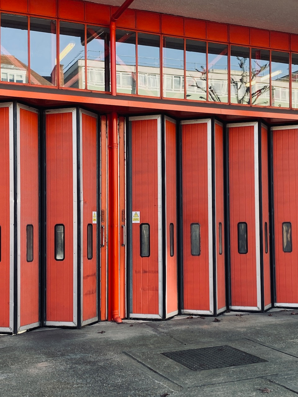
03: Floors, walls & ceilings
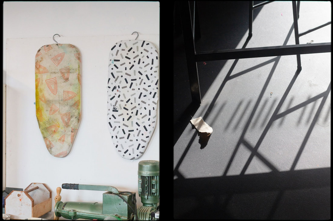
Some photographers have chosen to direct their attention down at floors, straight ahead at walls or upwards towards ceilings. In his project Art School, Paul Winstanley has recorded the structure and lighting of walls and ceilings in empty art studio spaces. In the project Supervisions by Andreas Gefeller, a wide variety of both ceilings and floors have been recorded in detail, often using collage techniques. In many of the photographs by Helen Levitt, drawings on walls, objects on pavements and the design of awnings provide distinctive elements in her observations of daily activity. Investigate appropriate sources and produce your own response to Floors, walls and ceilings.
Initial thoughts
Floors, walls and ceilings:
- create a kind of stage set in which life happens.
- often go unnoticed and unseen because they provide a background for (seemingly) more important stuff. Photography is one way of drawing attention to them, bringing them into the foreground as actors (rather than them being viewed merely as scenery)
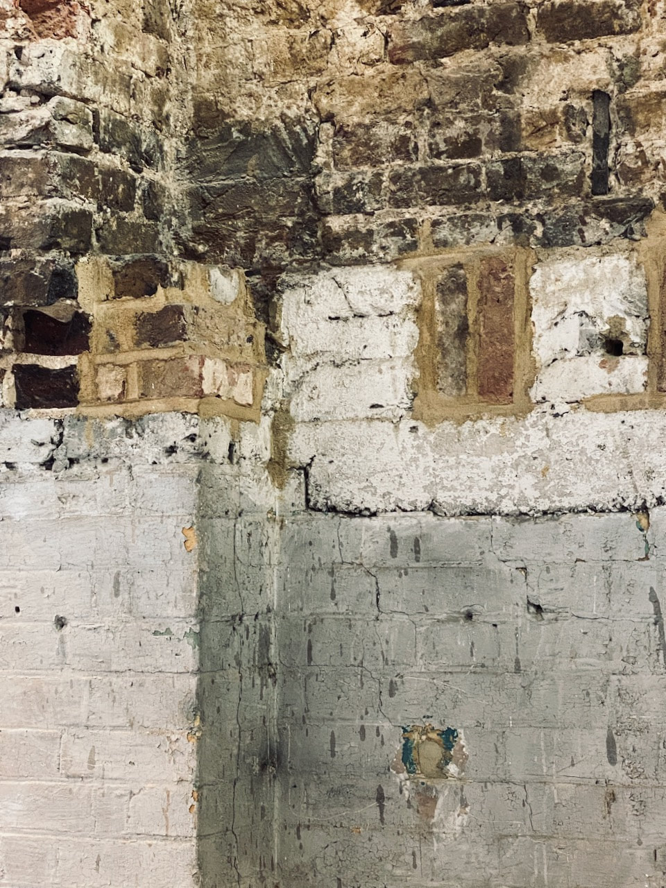
- are surfaces (like photographs) which pick up the traces of human presence - marks, scuffs, stains etc. In this sense, they are like metaphors for photographs which contain traces of light.
- can look very different when photographed from unusual angles. They can appear strange, surreal or disconcerting.
- can look very different when photographed at different times of the day/year as the light changes.
- are repositories of images in the form of advertising, posters, signs, pictures, even photographs.
- can be seen inside (domestic) or outside (public).
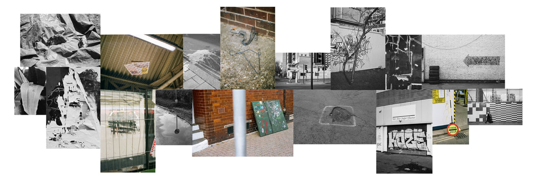
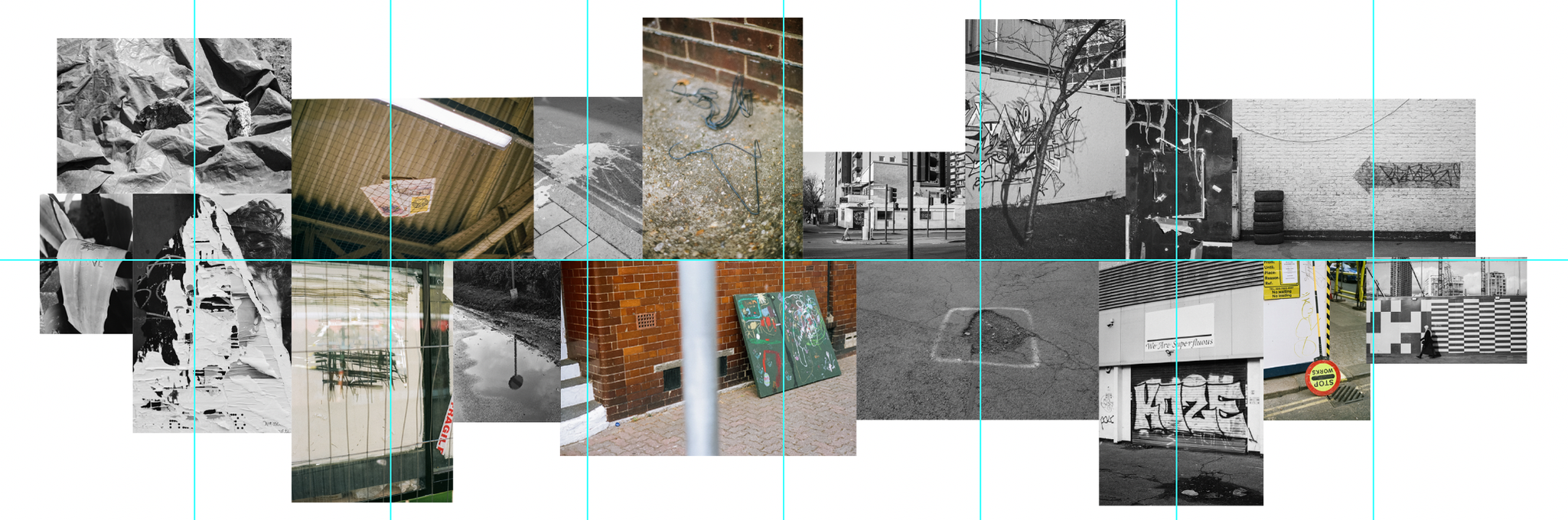
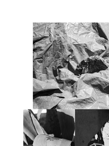
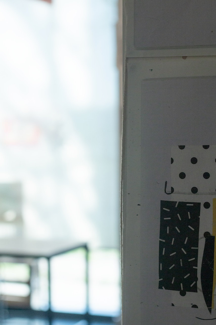
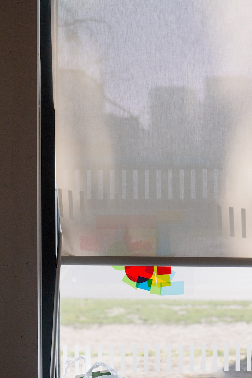
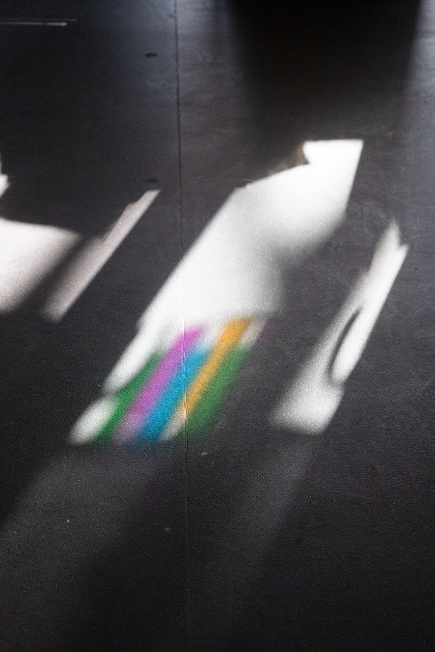
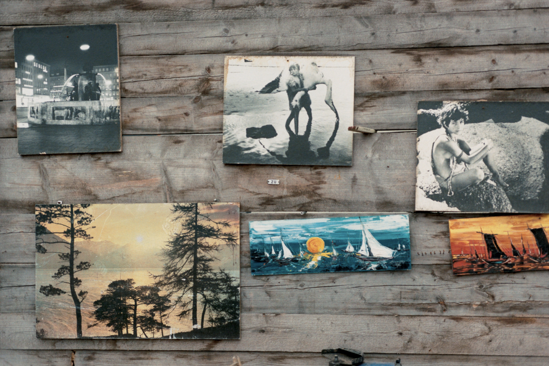
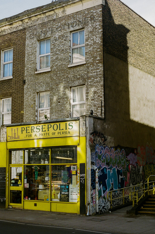
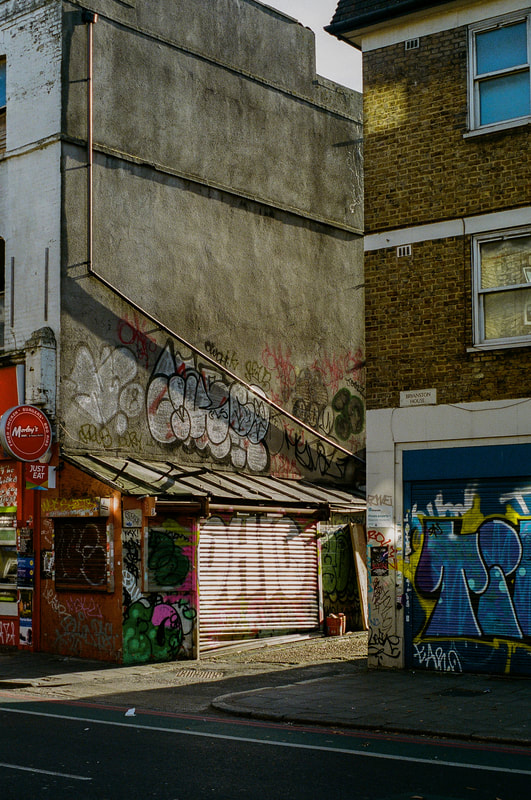
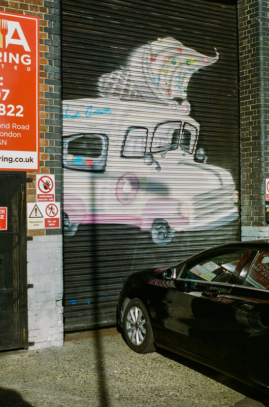
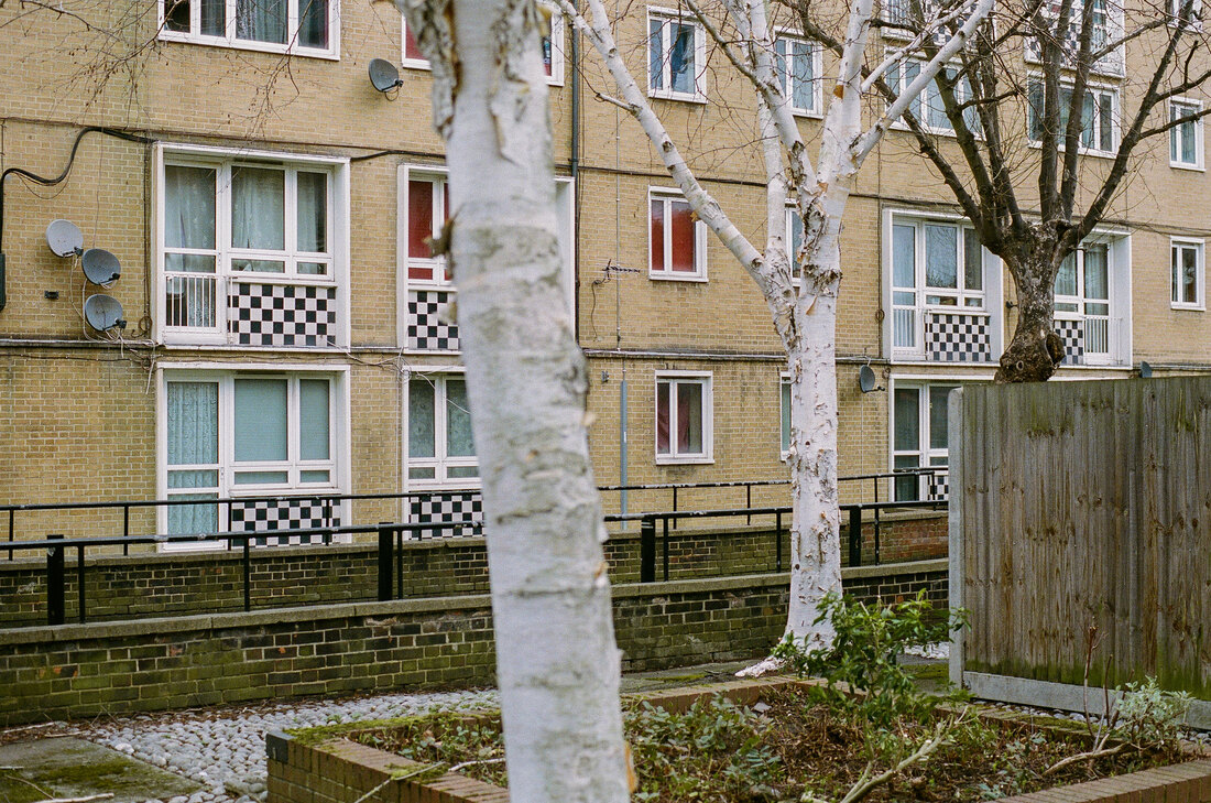
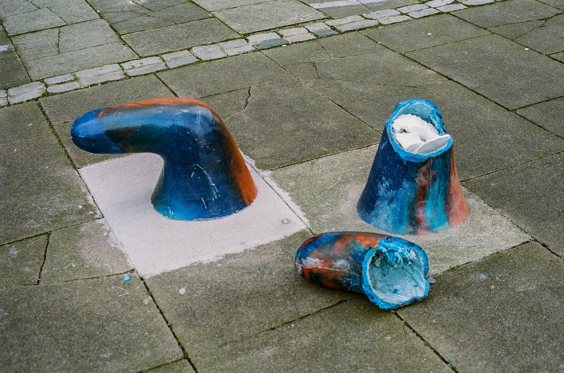
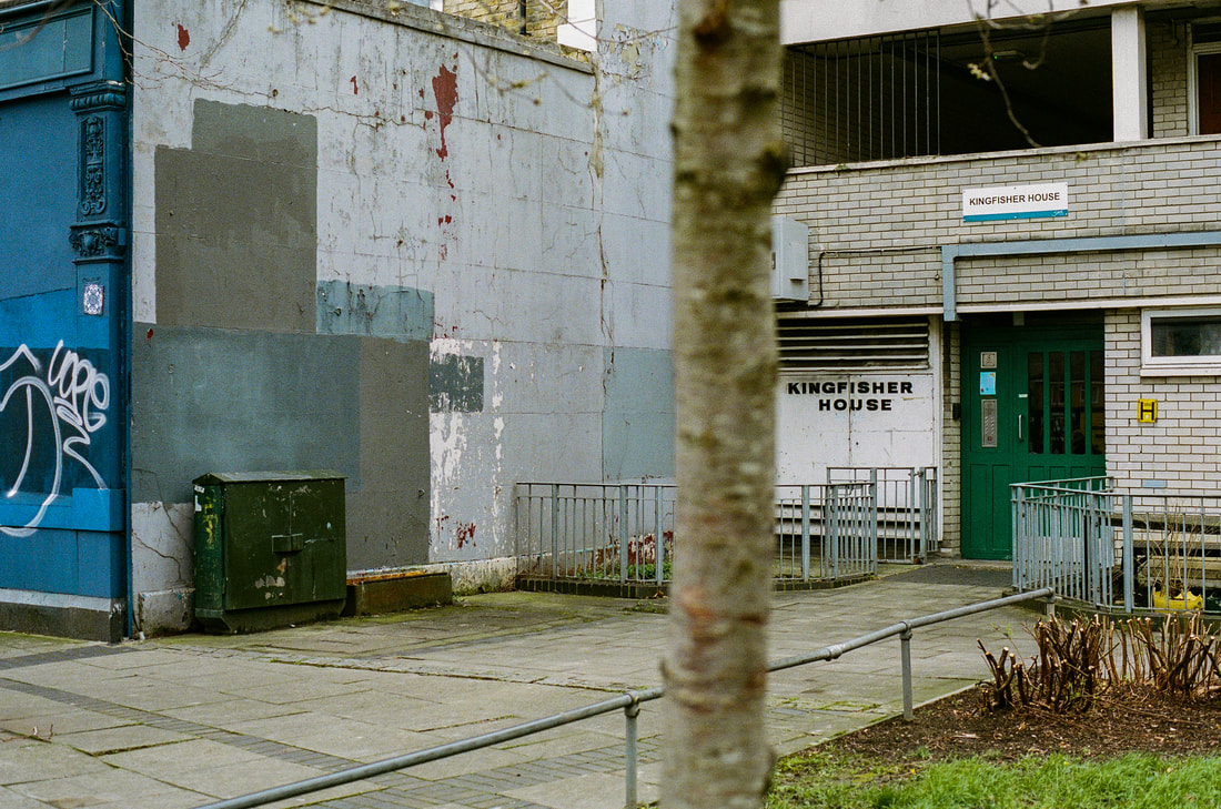
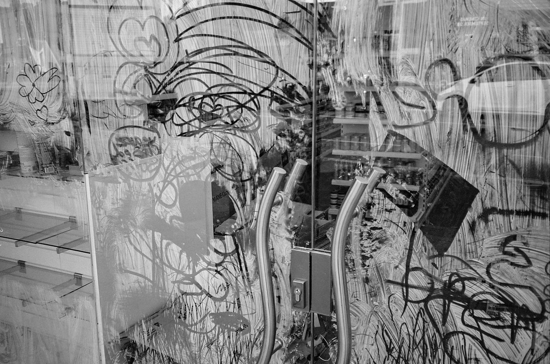
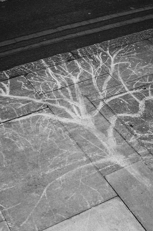
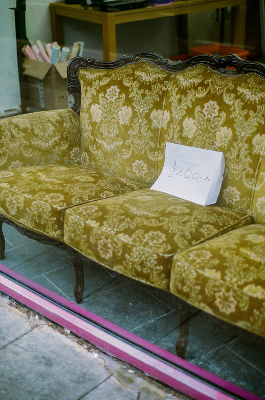
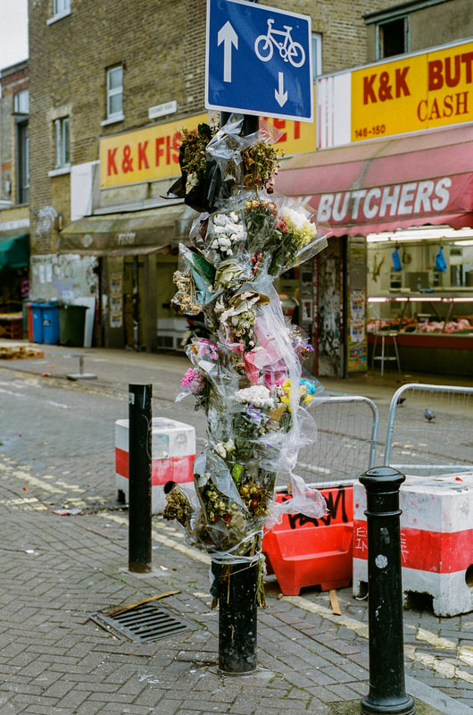
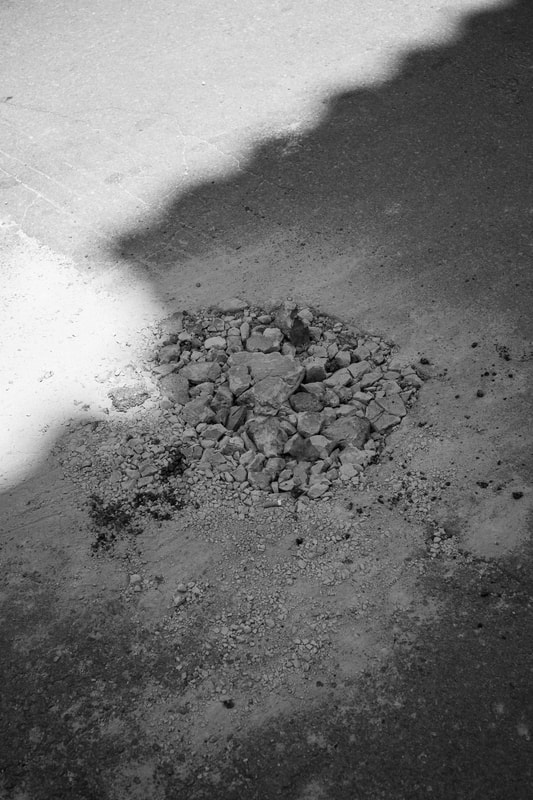
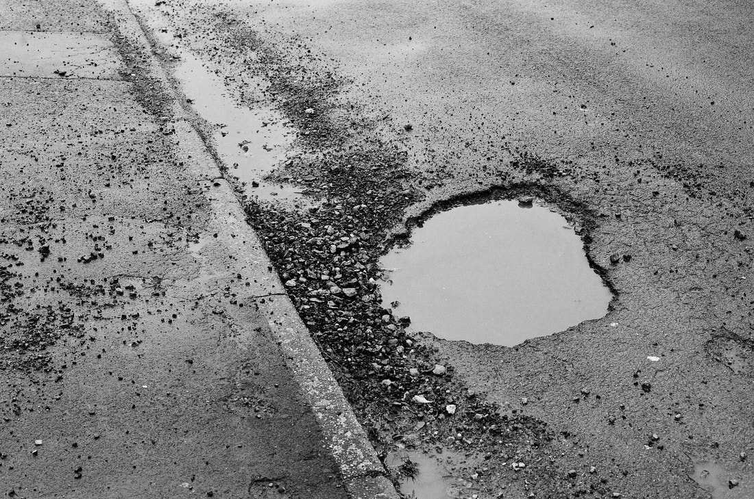
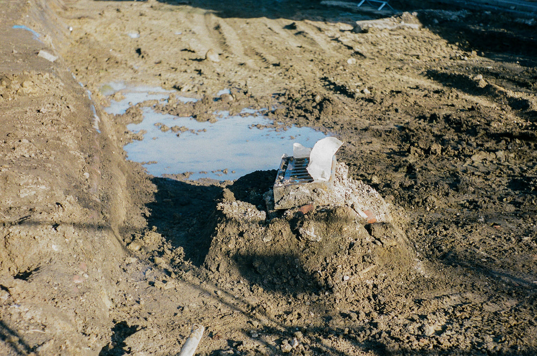
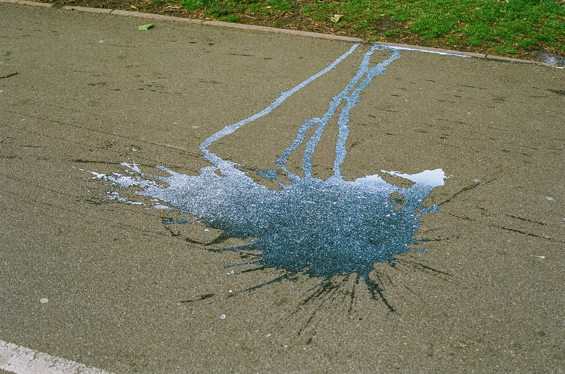
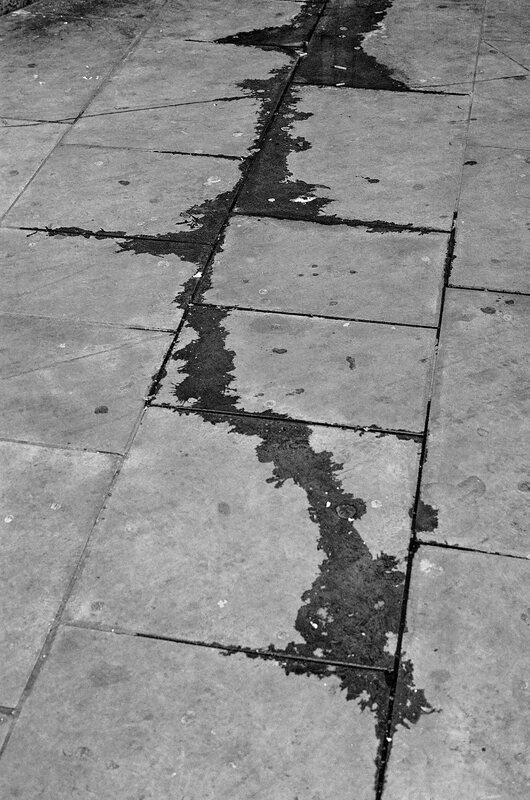
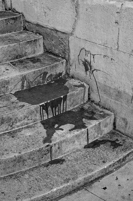
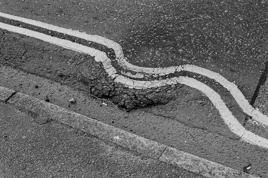
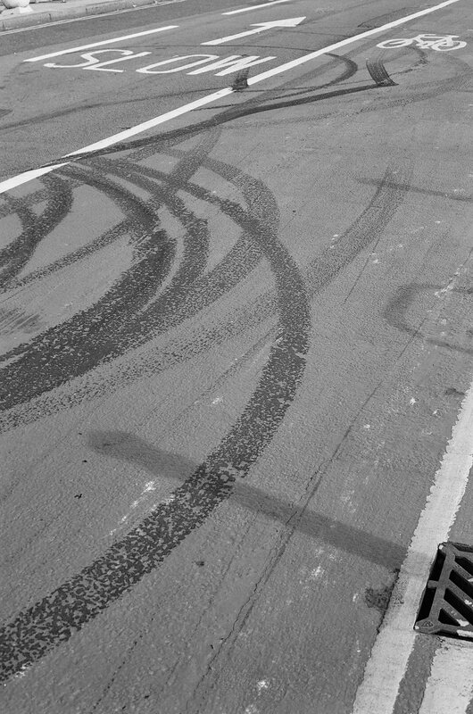
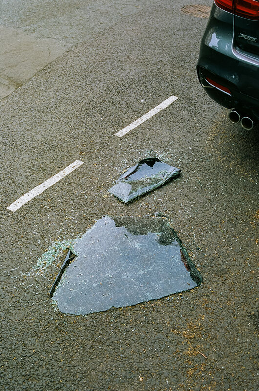
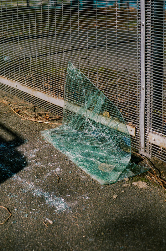
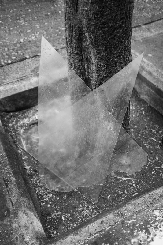
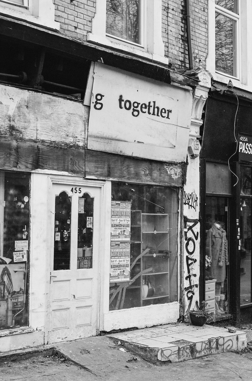
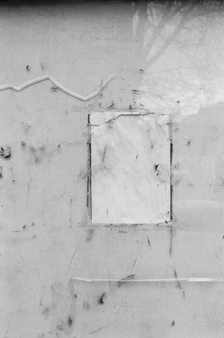
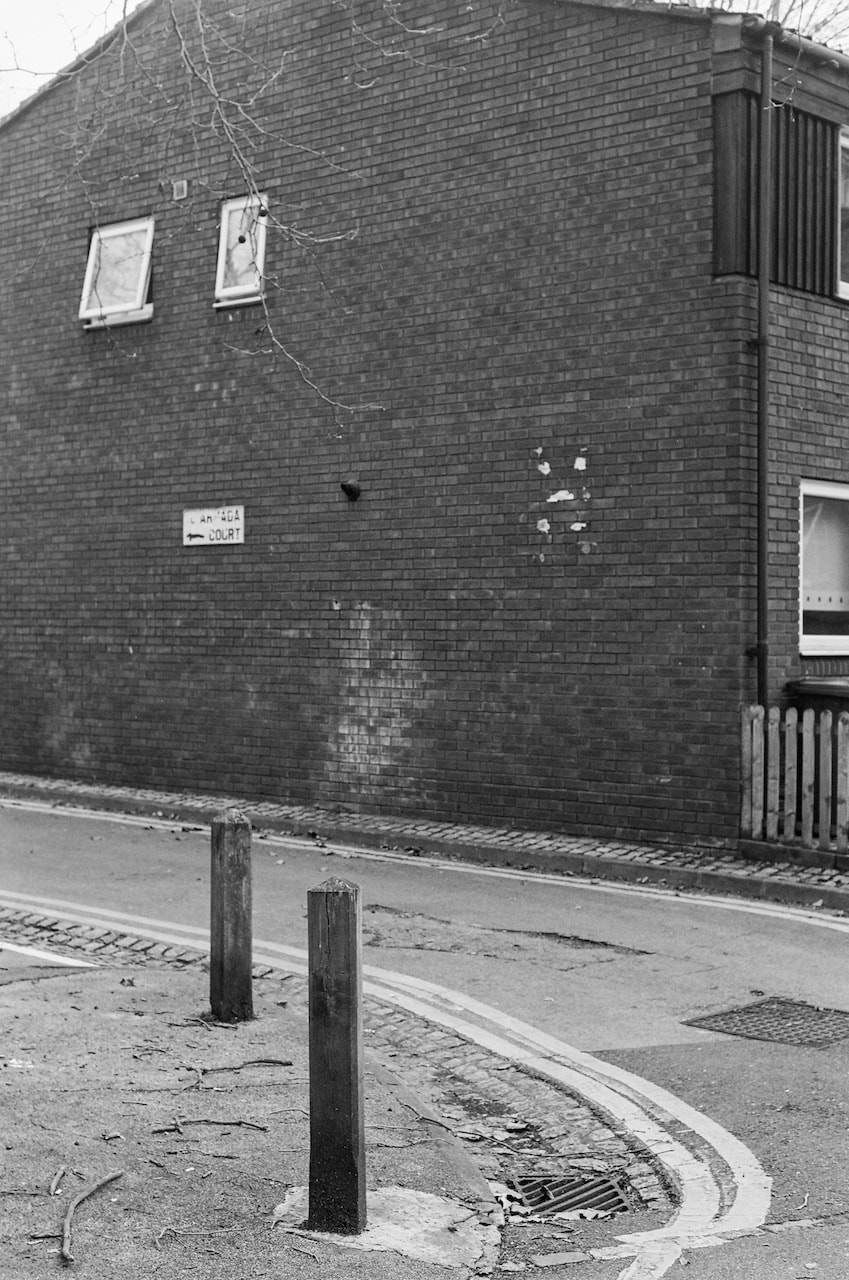
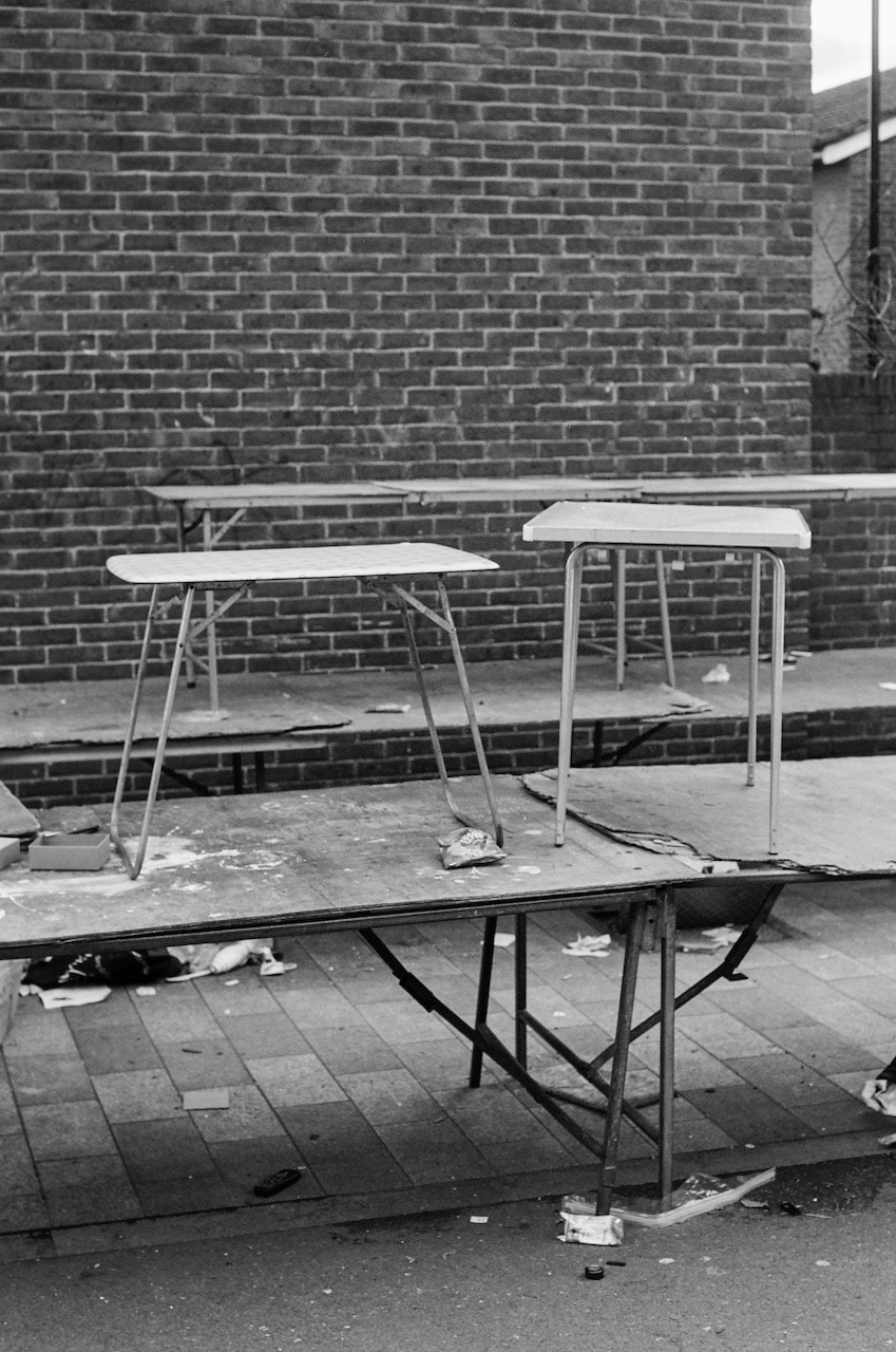
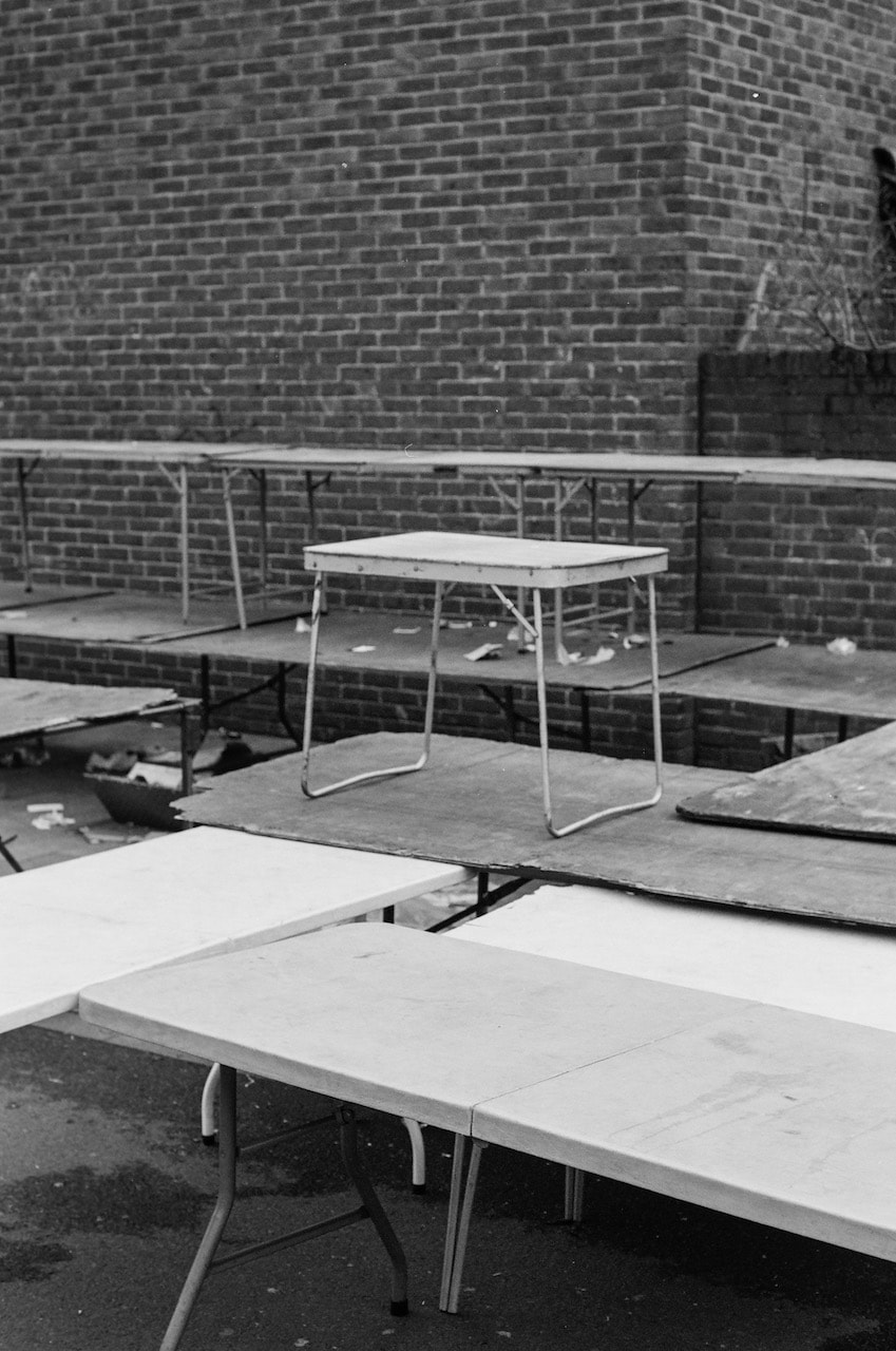
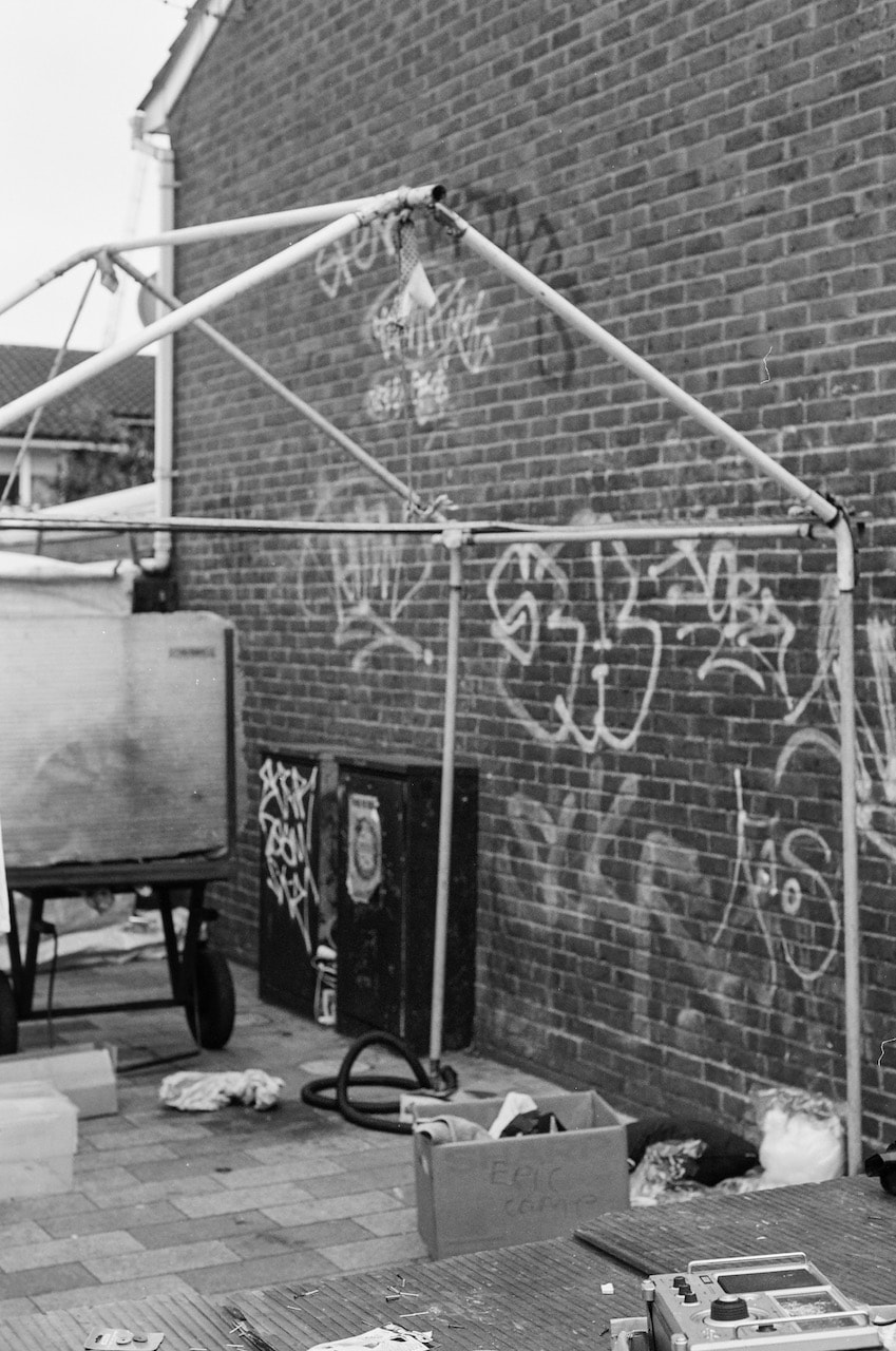
Some recent pictures
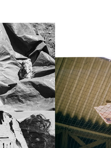
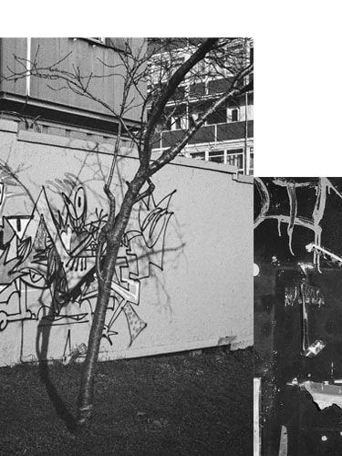
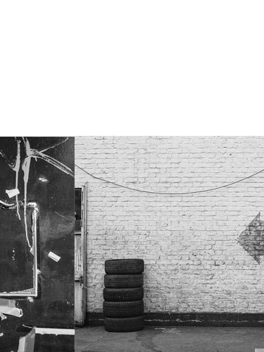
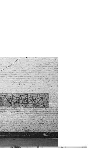
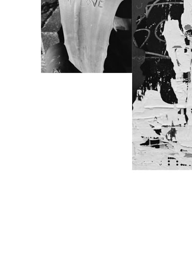
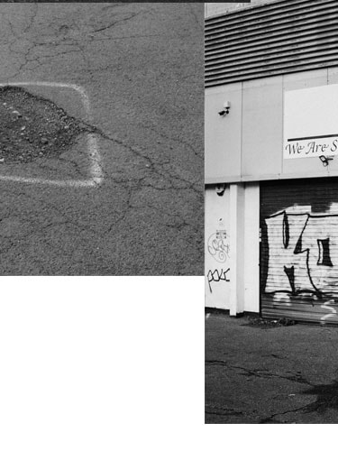
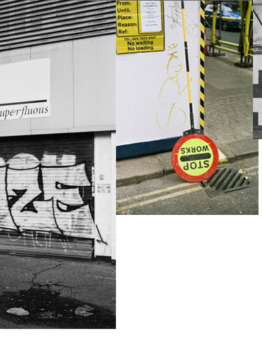
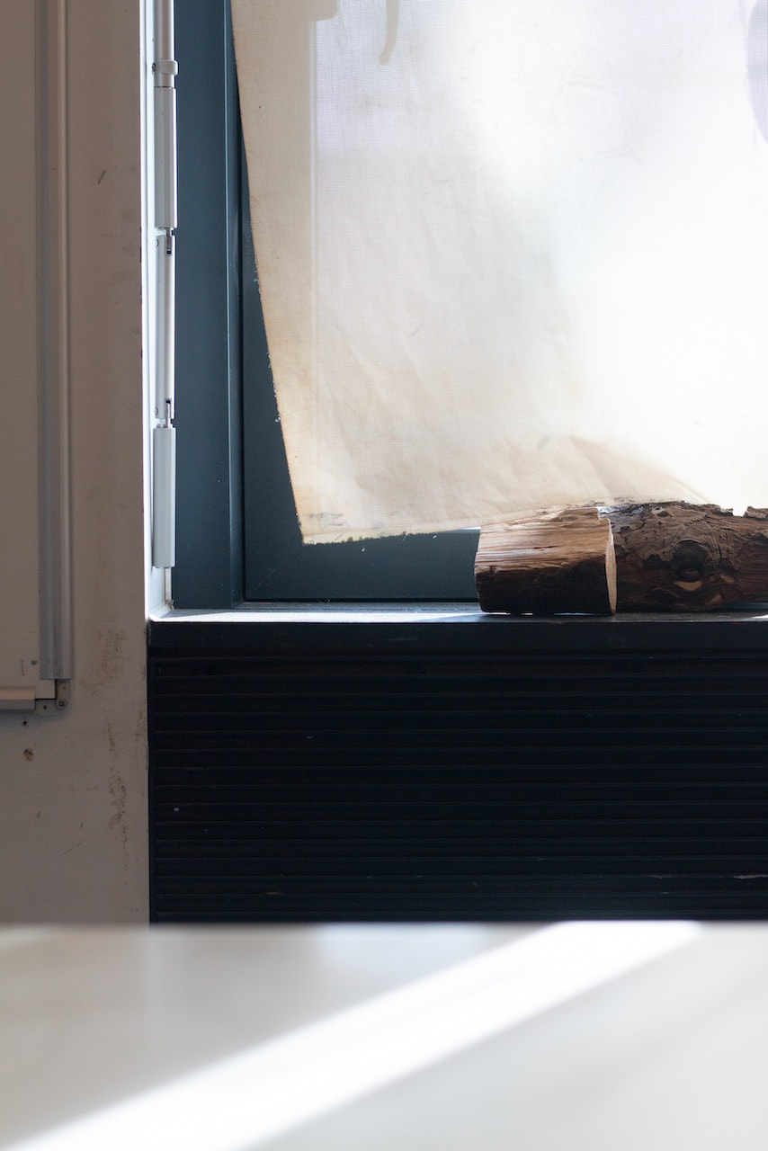
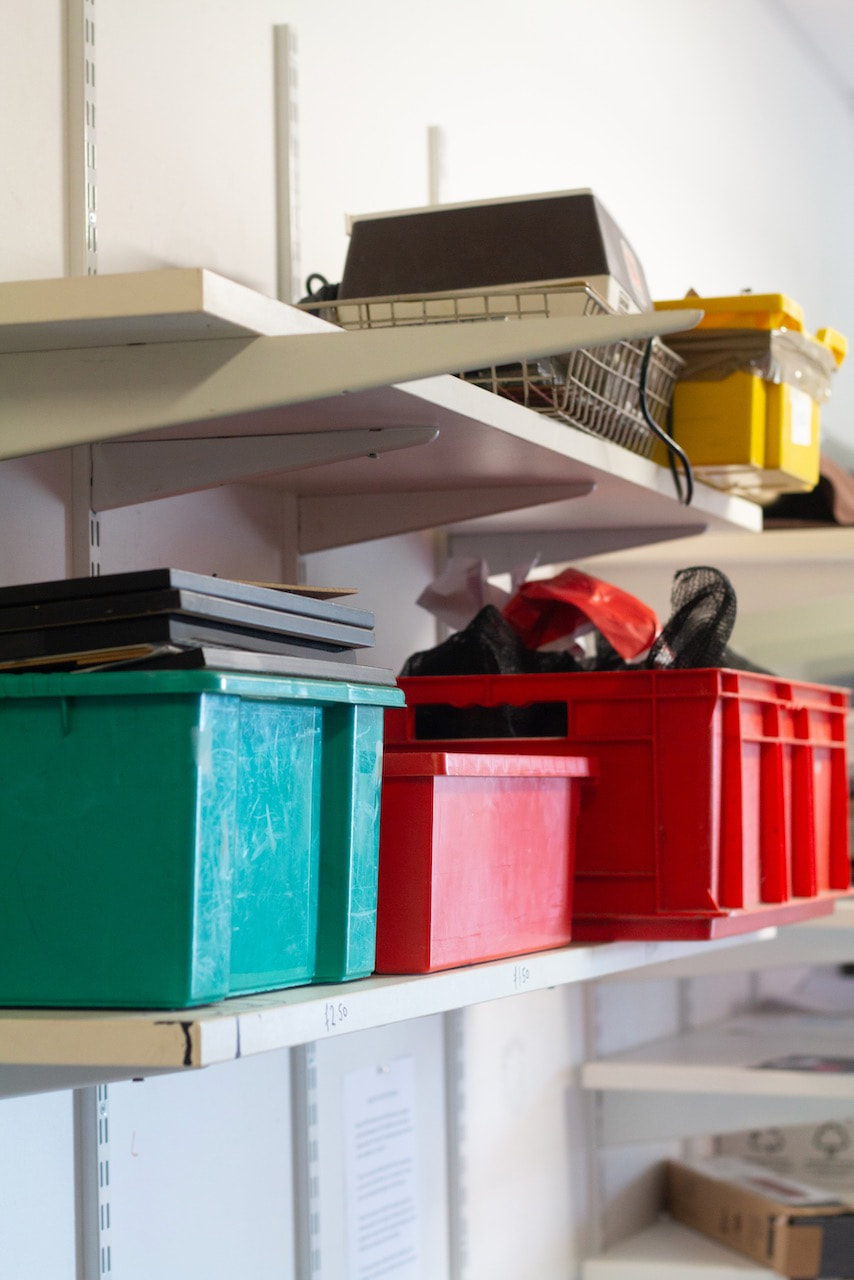
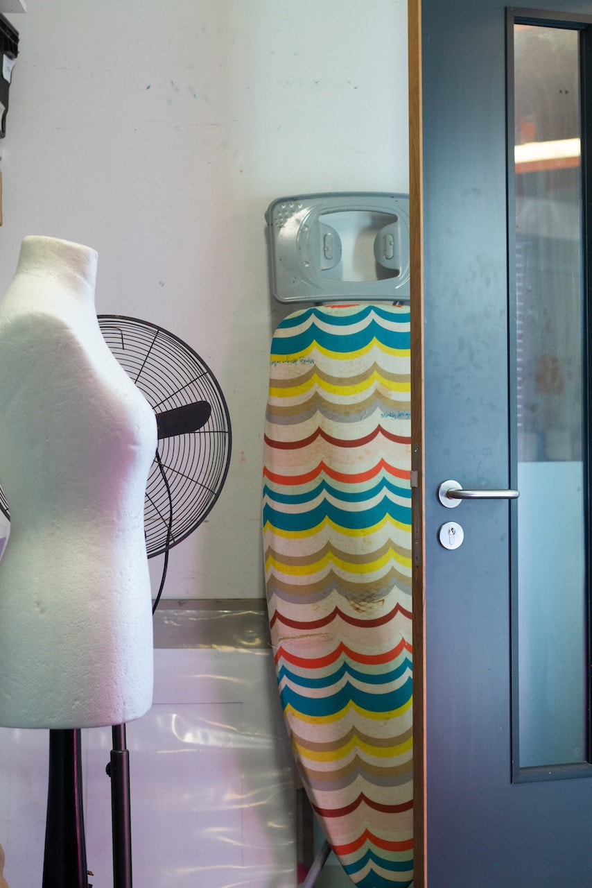
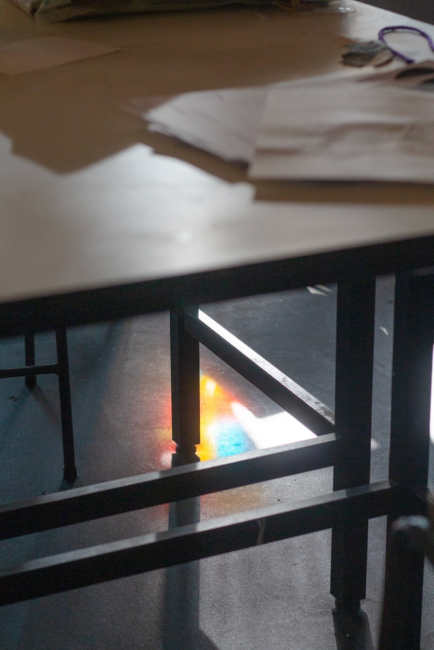
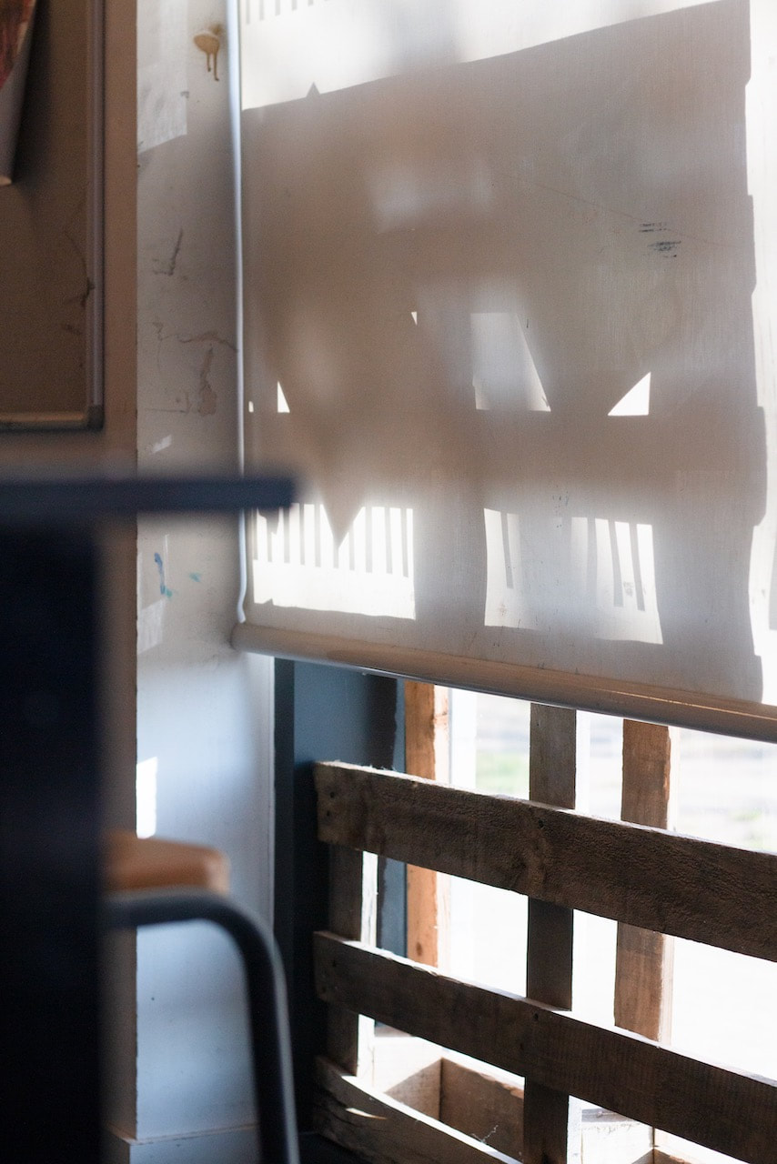
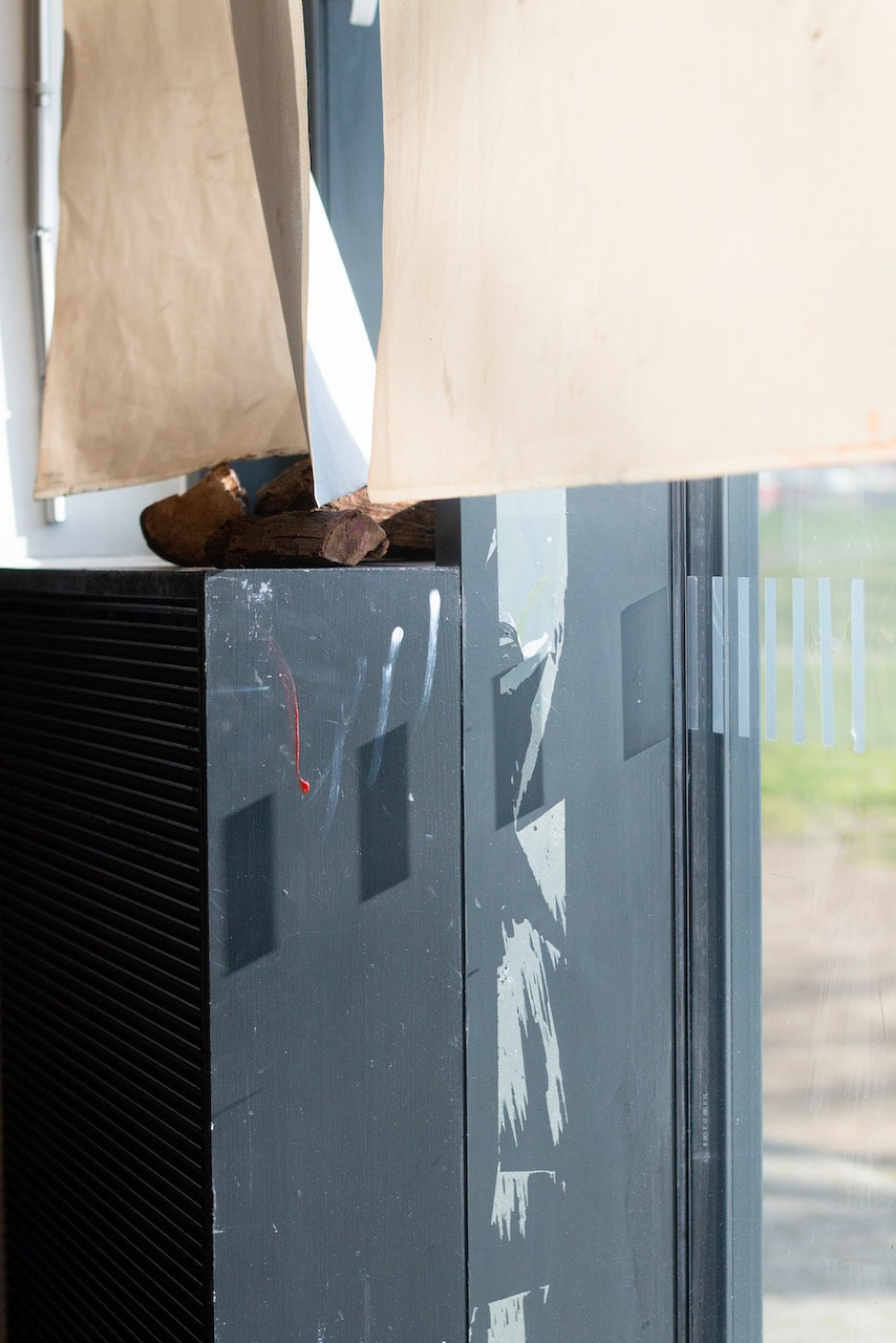
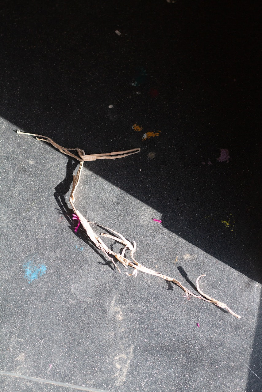
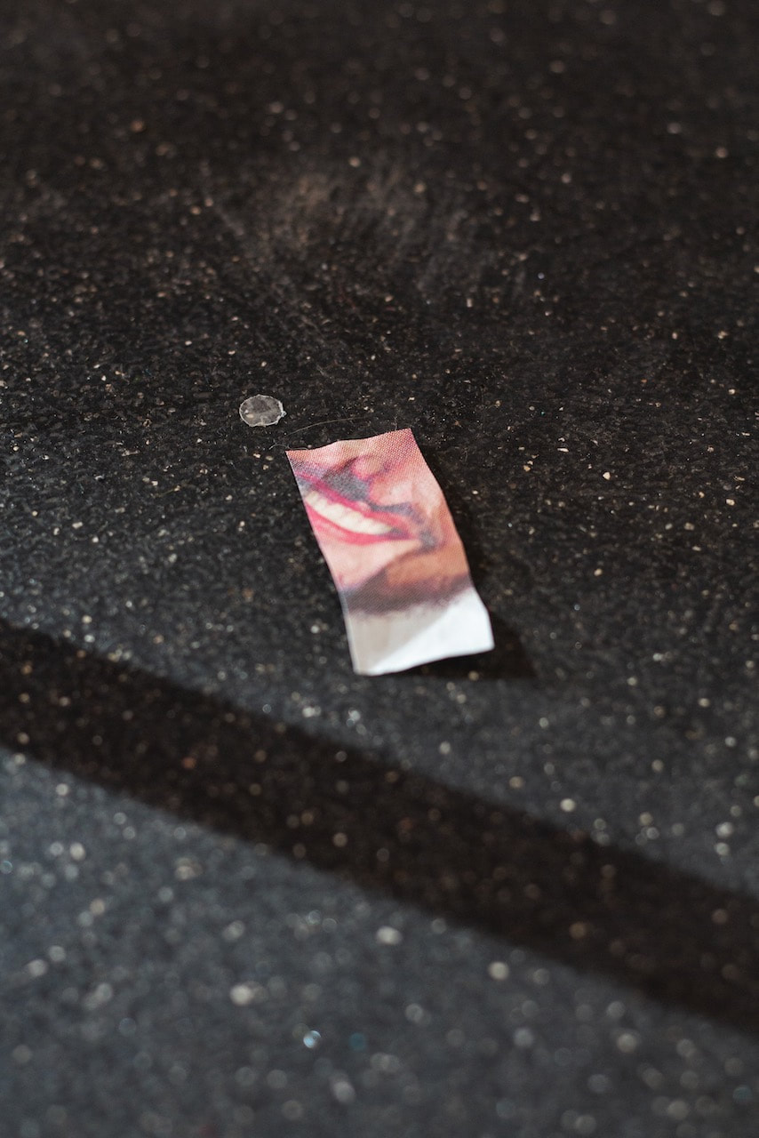
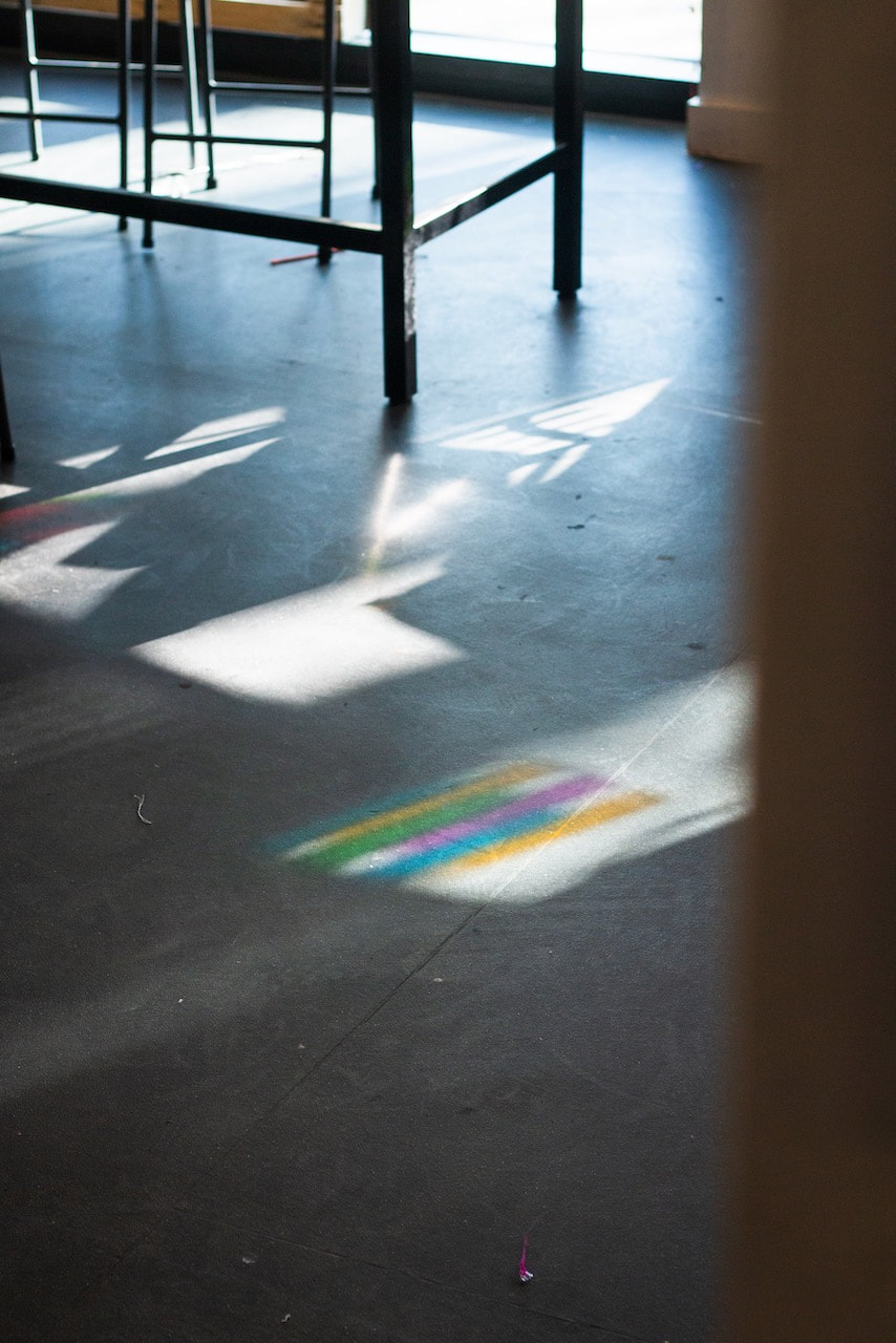
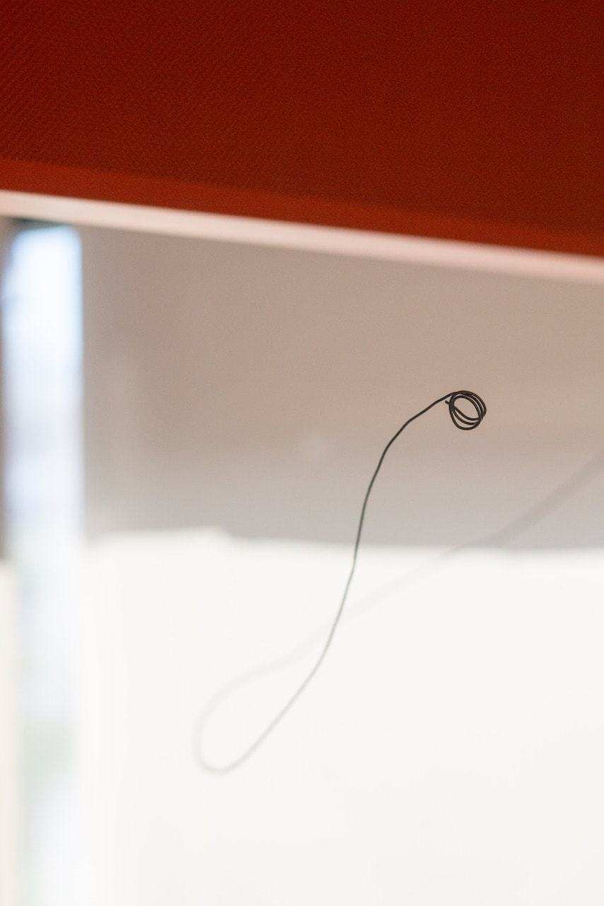
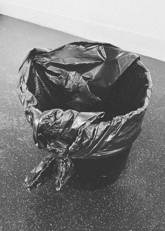
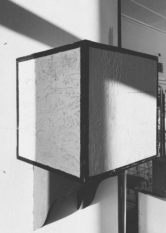
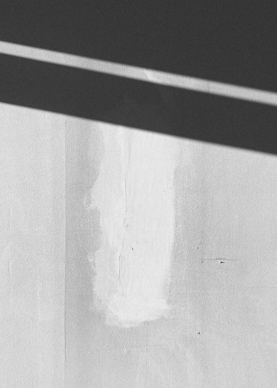
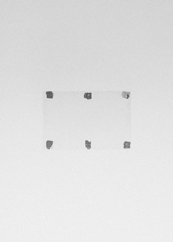
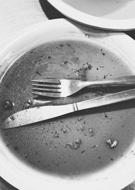
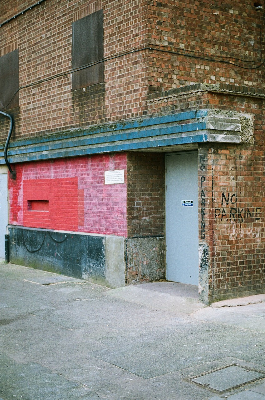
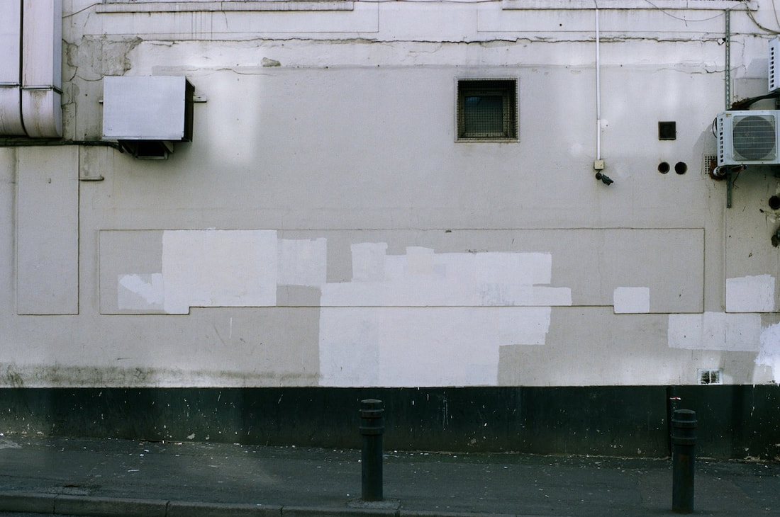
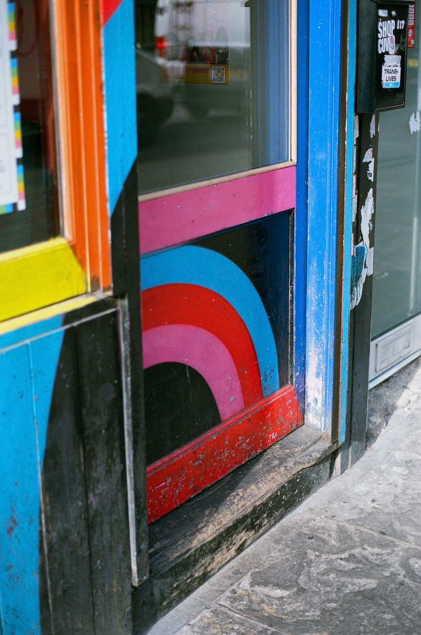
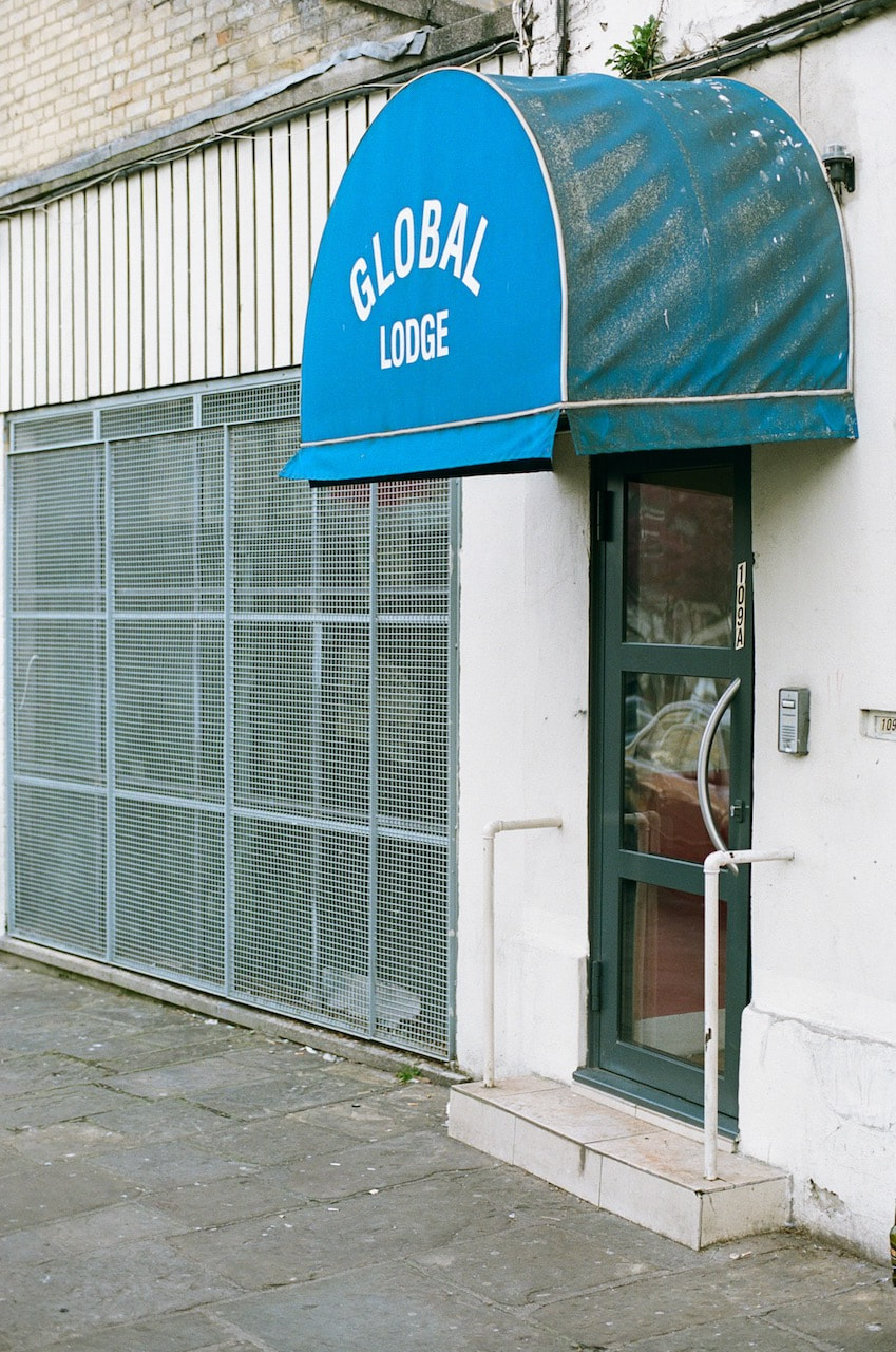
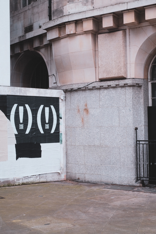
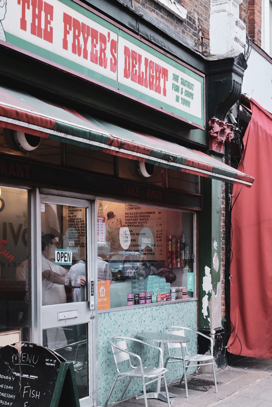
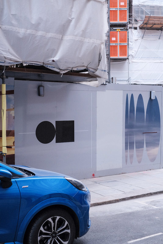
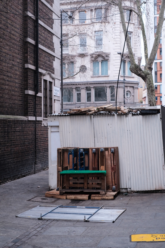
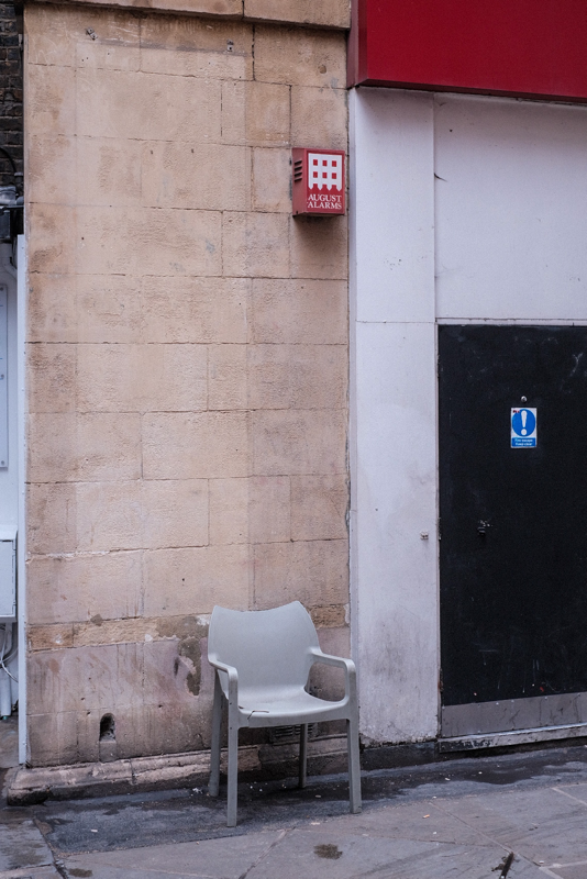
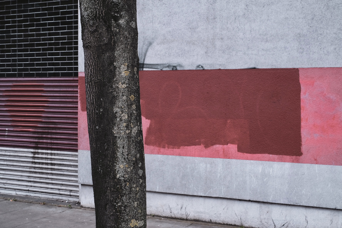
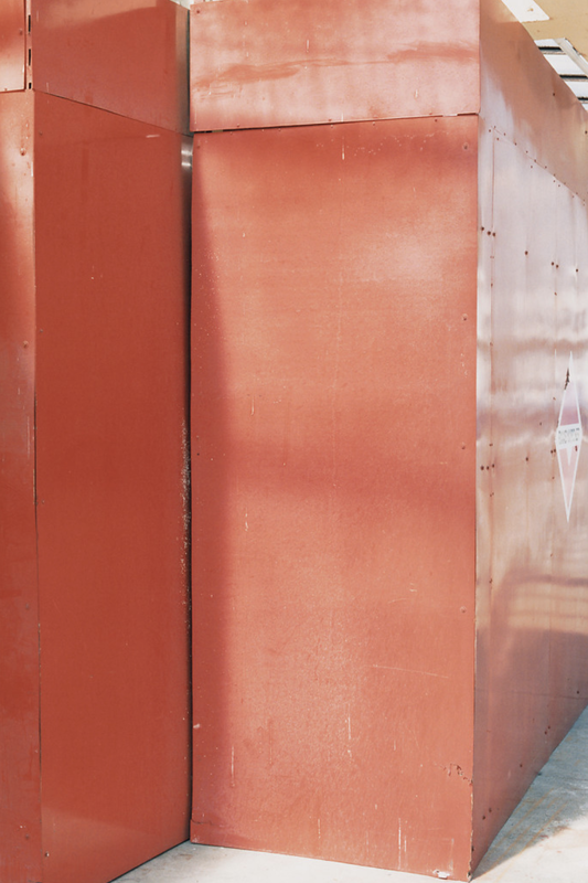
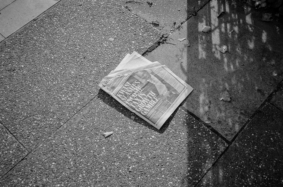
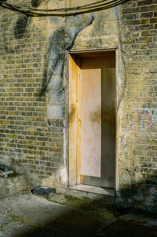
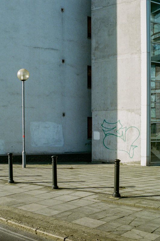
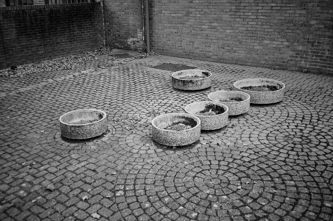
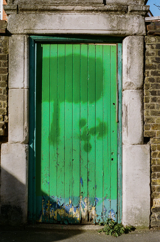
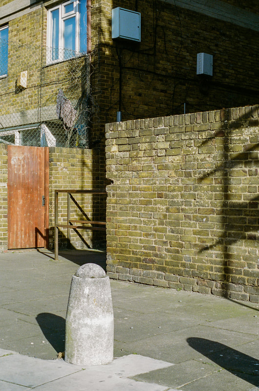
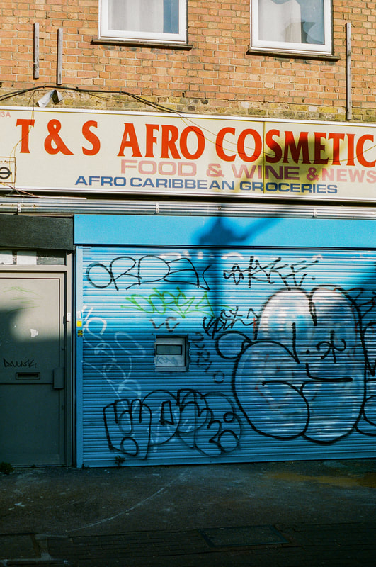
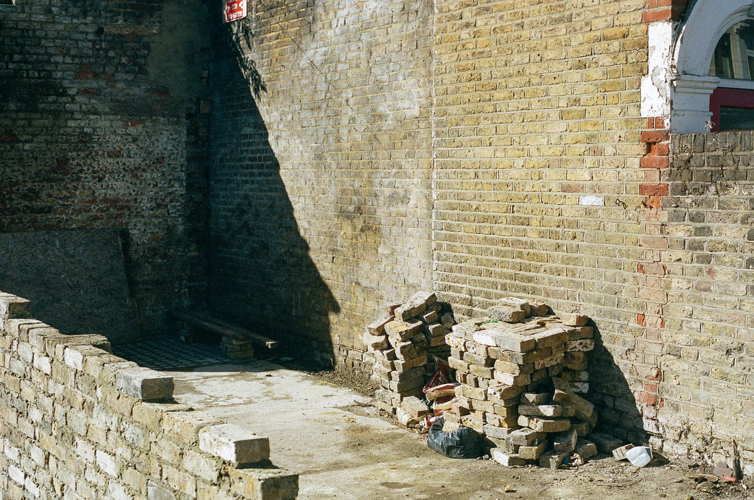
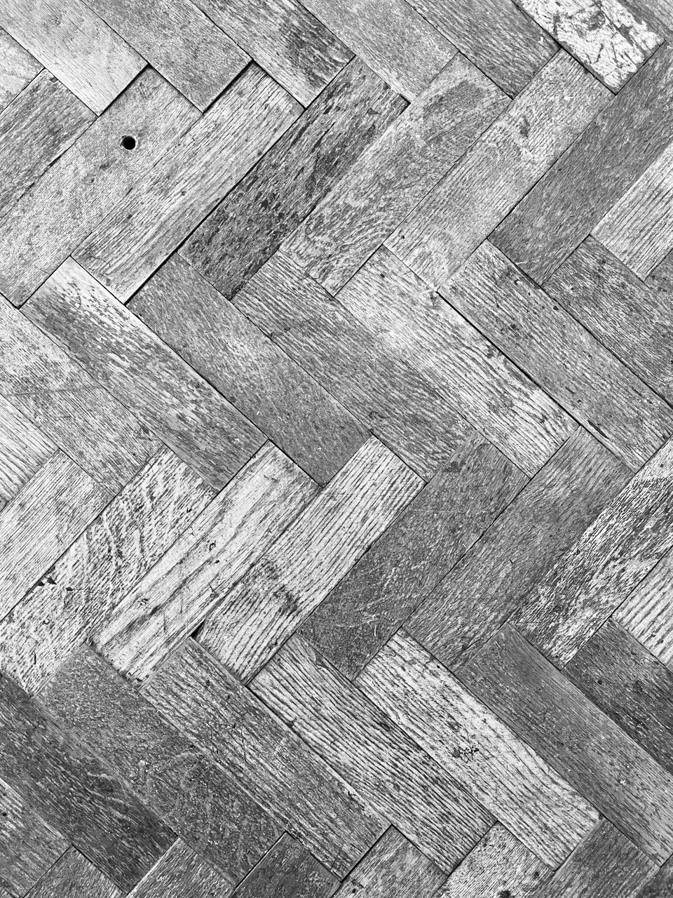
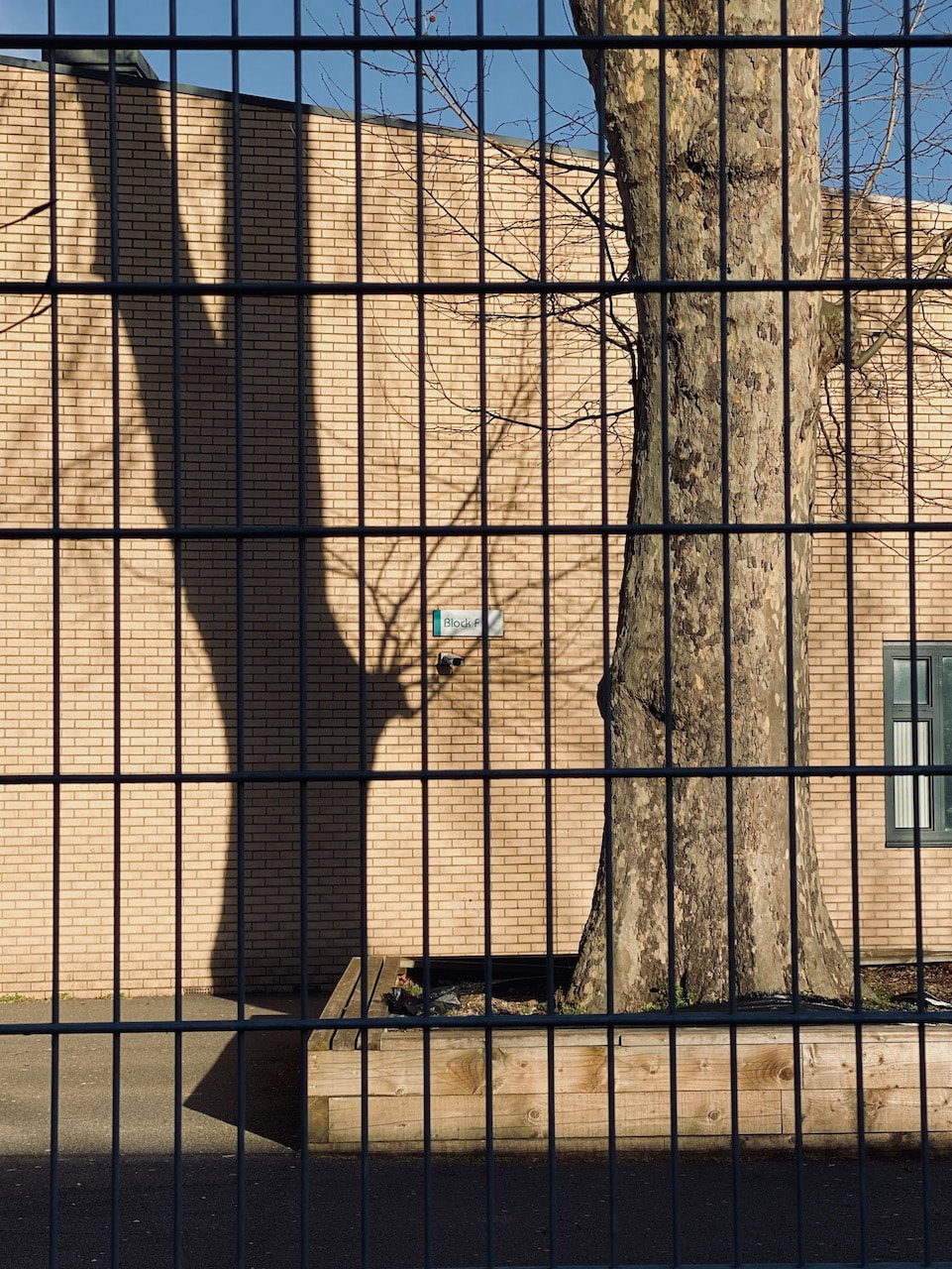
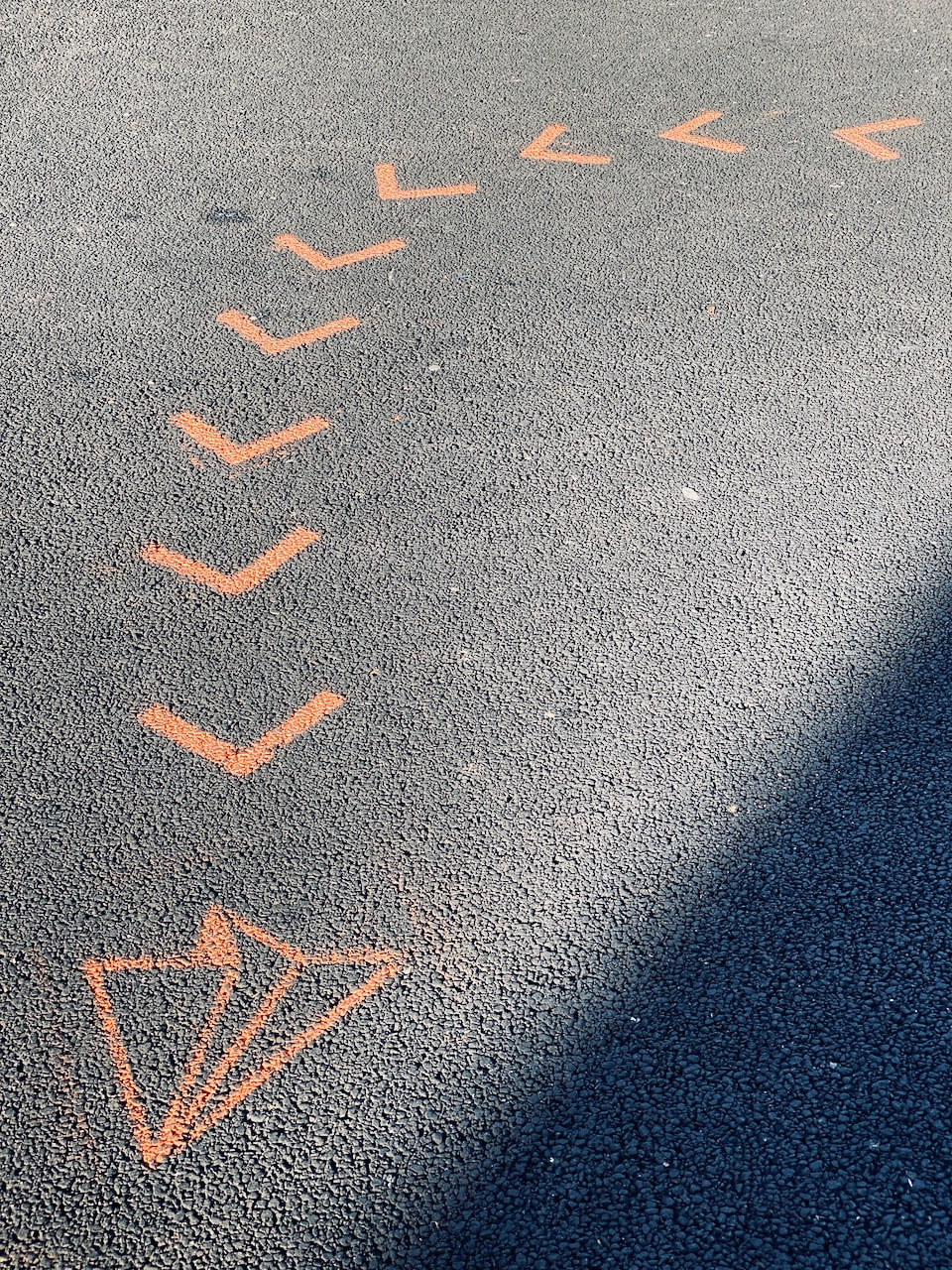
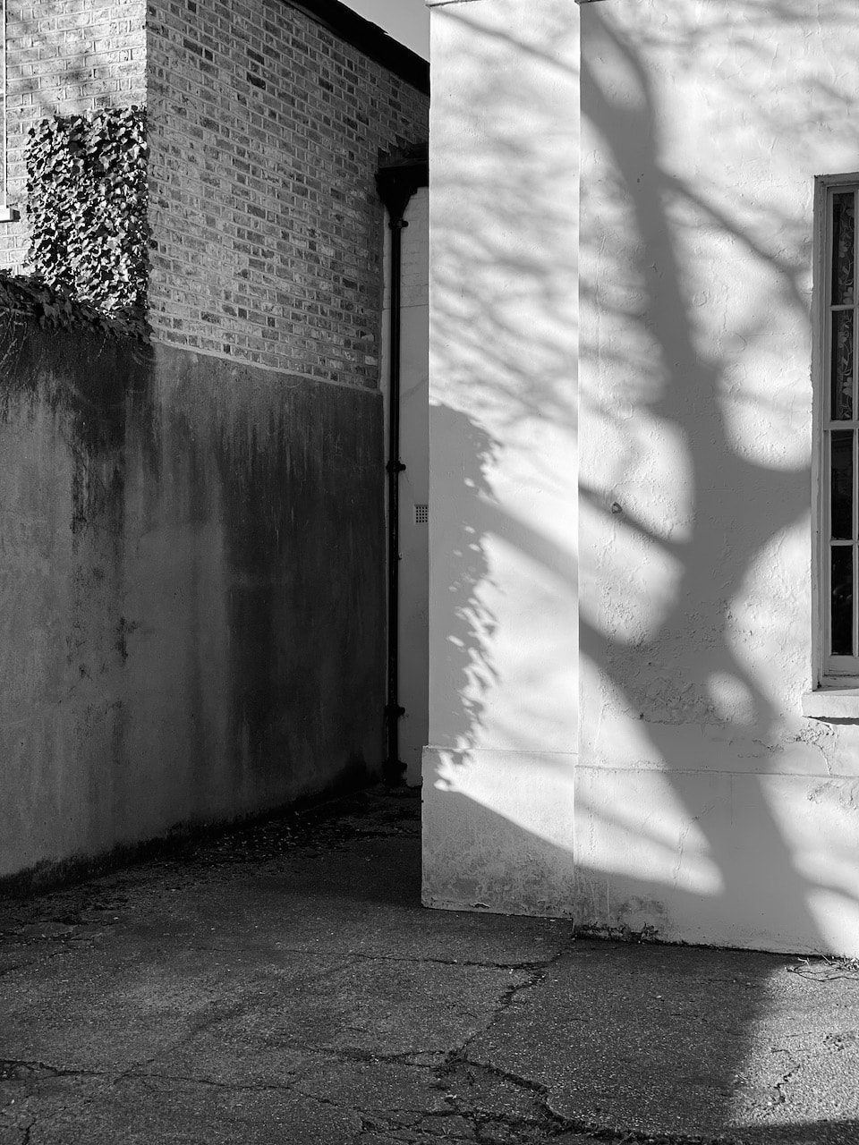
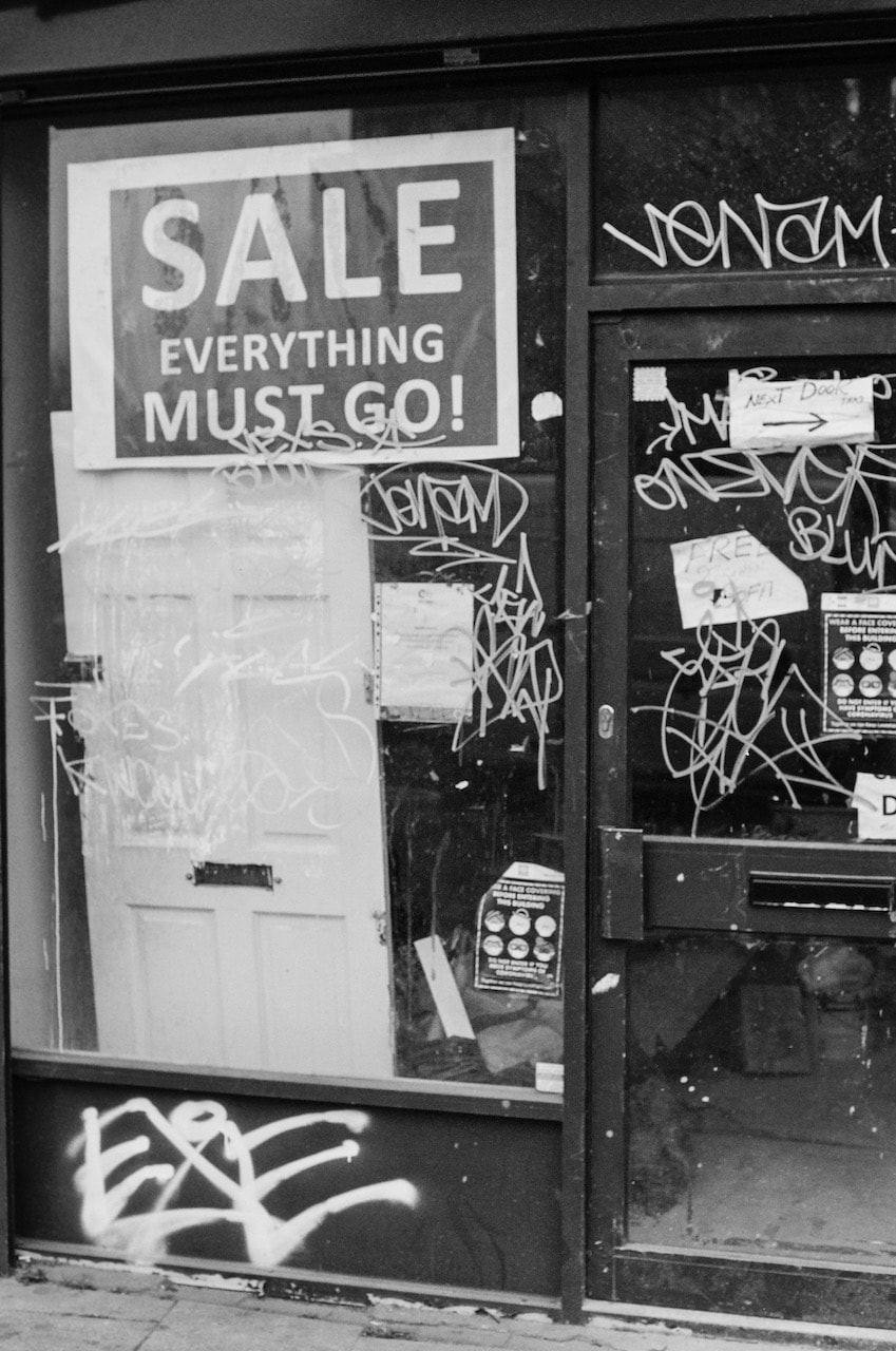
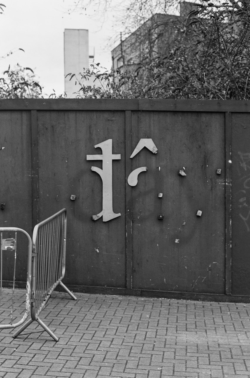
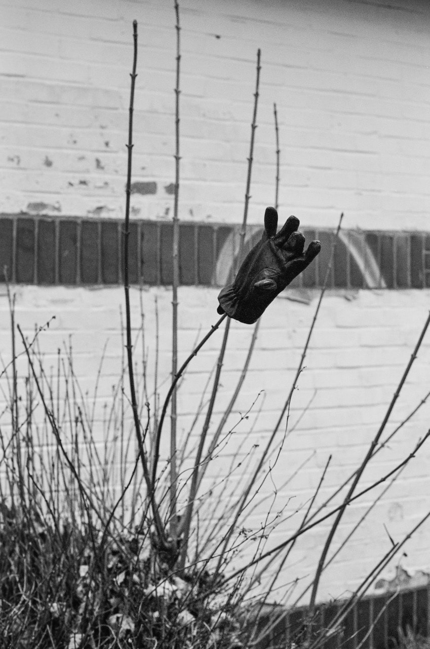
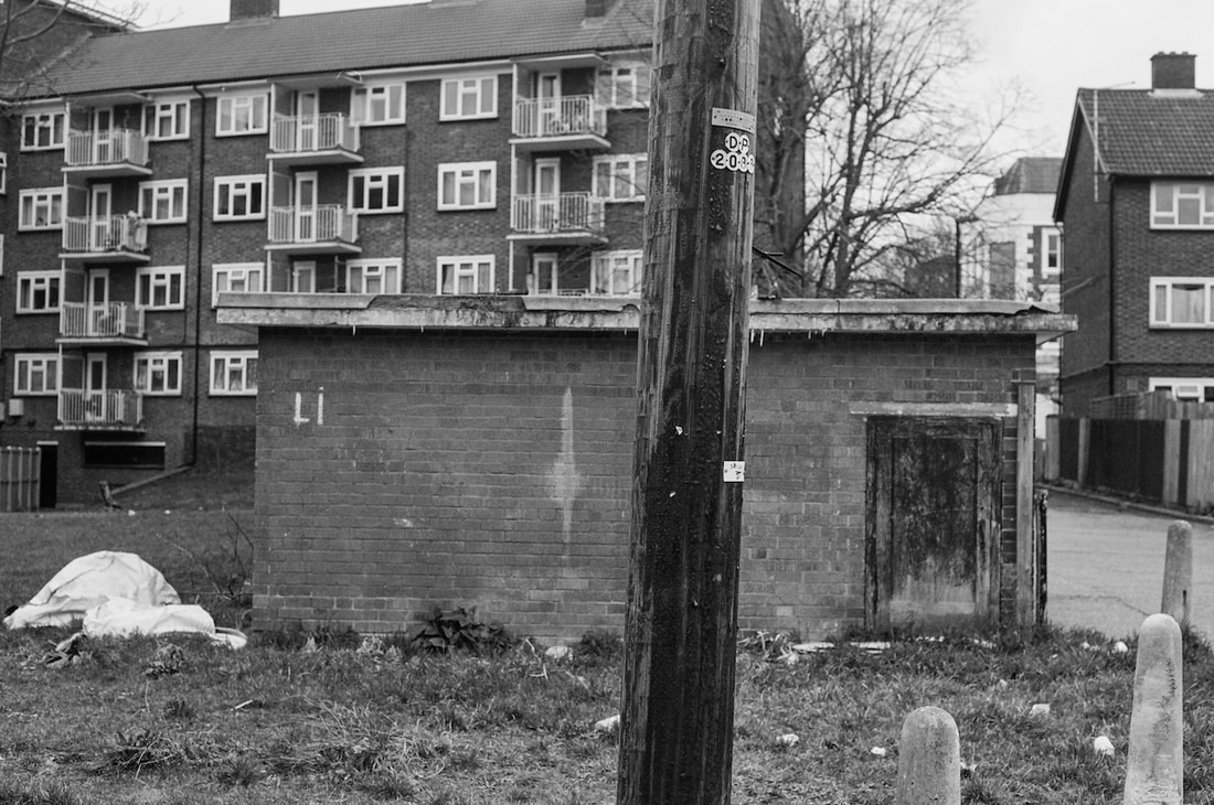
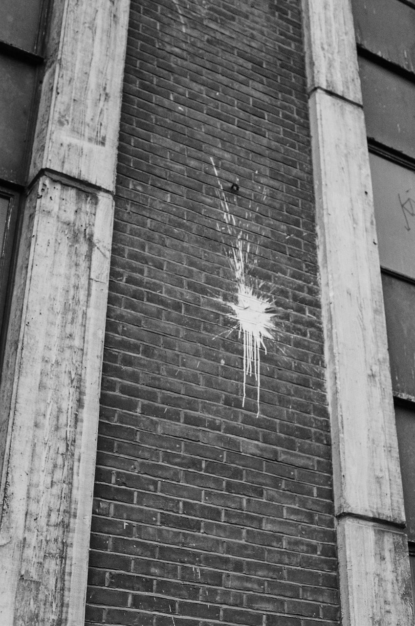
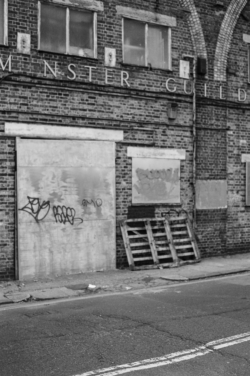
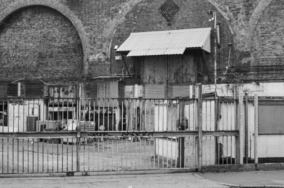
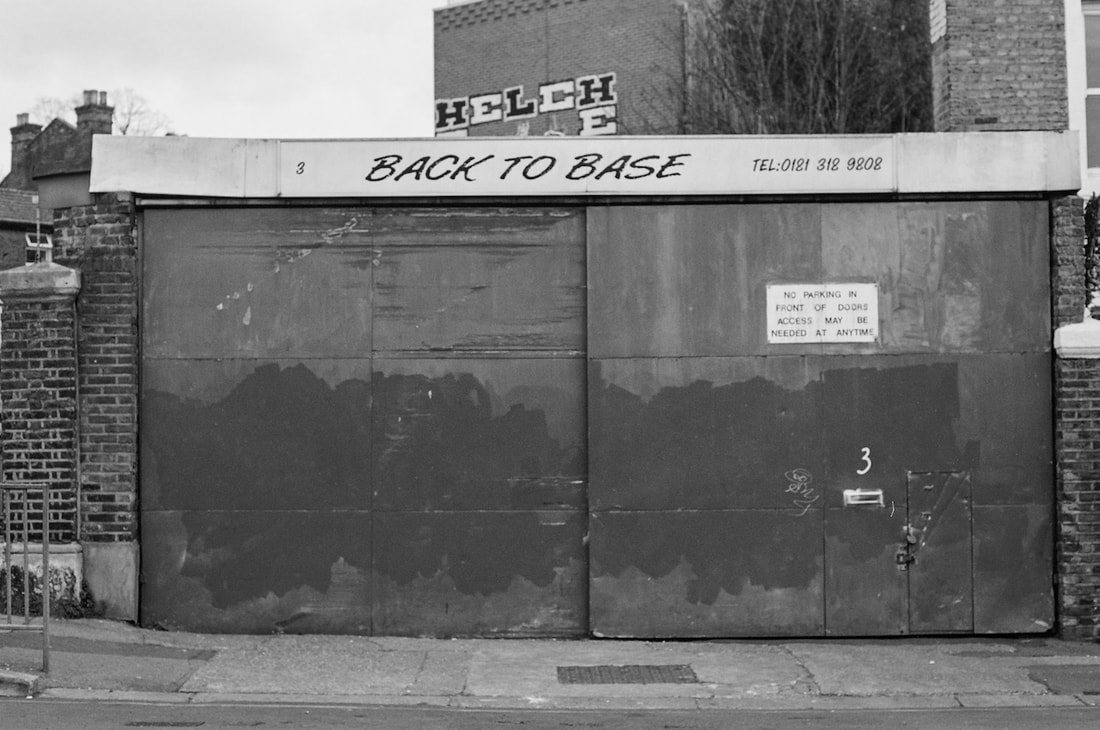
These pictures were all taken on several walks in the last few weeks using Ilford XP2 Super 400 film before I was aware of the ESA. It seems that I enjoy making pictures of walls and floors at least!
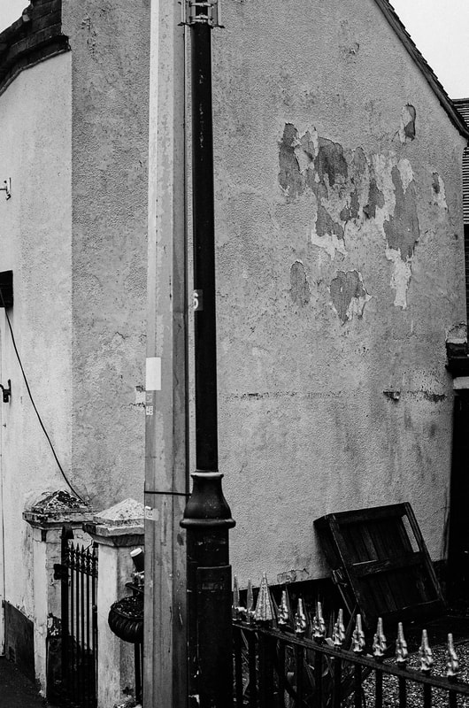
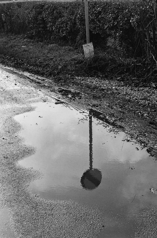
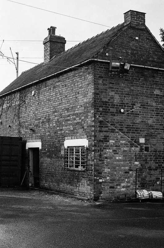

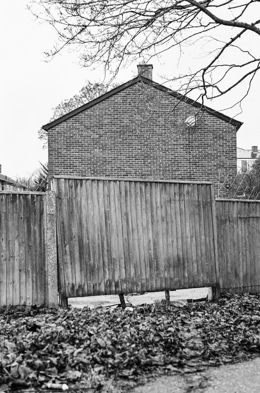
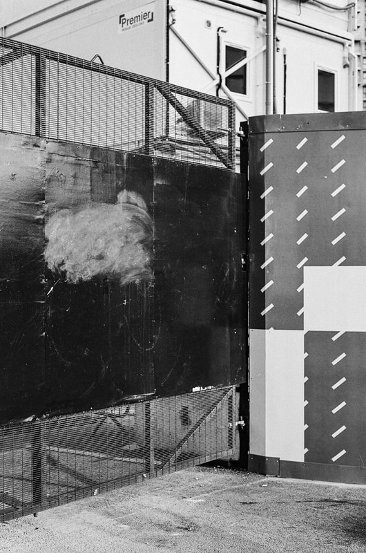
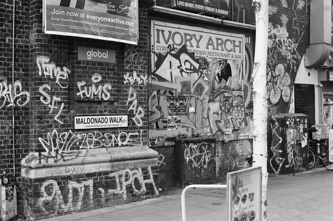
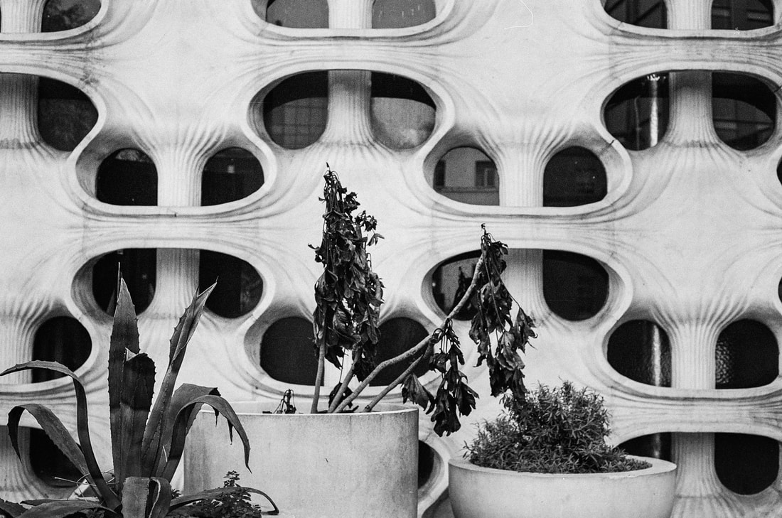
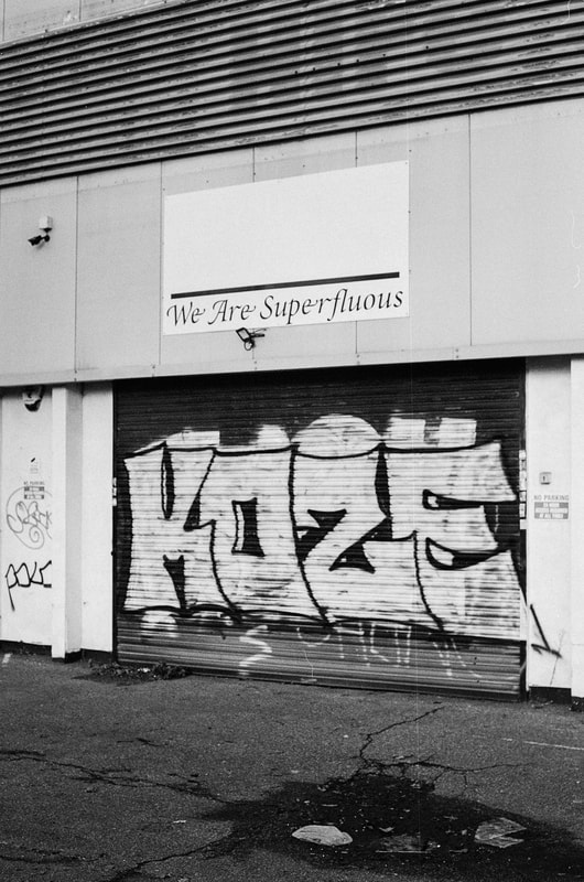
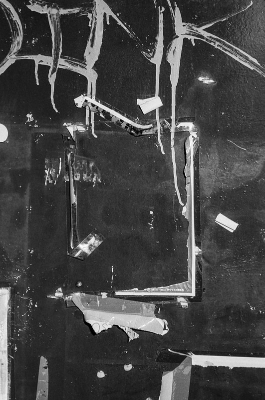
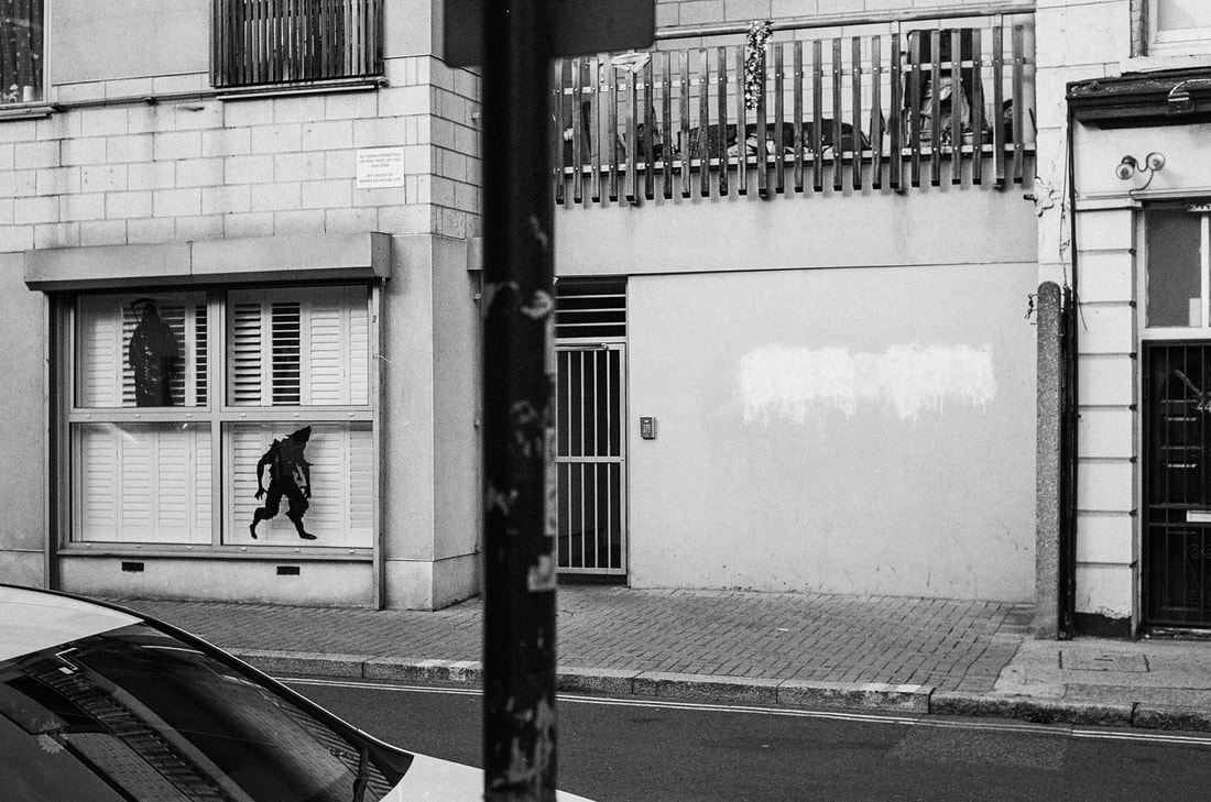
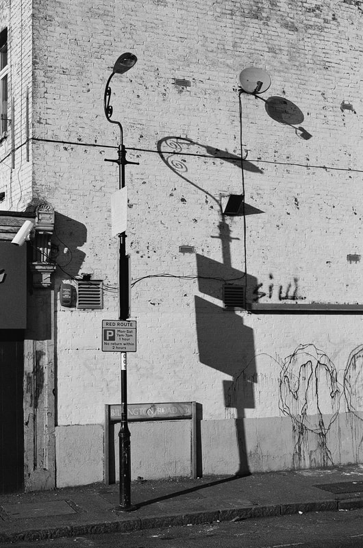
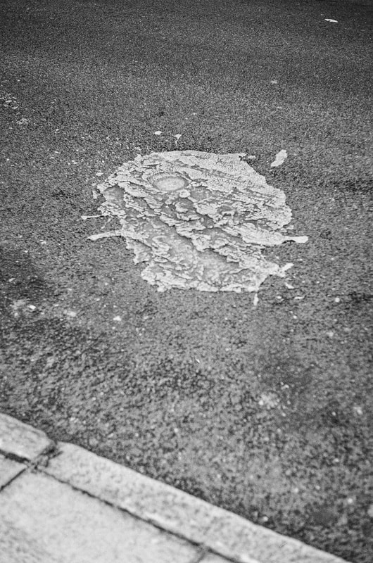
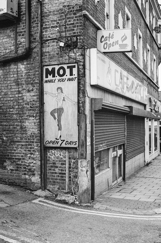
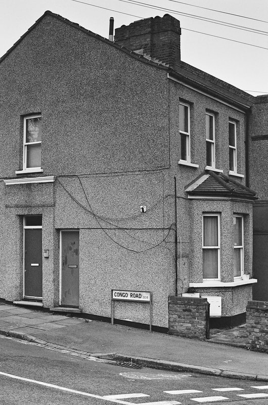
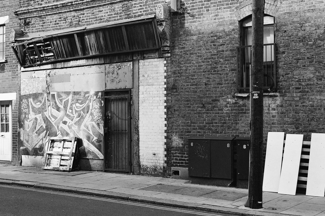
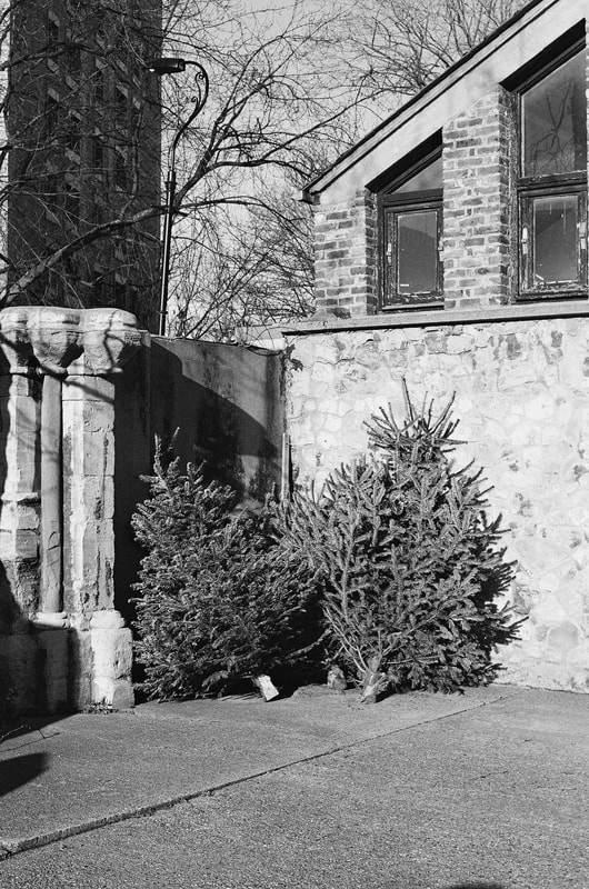
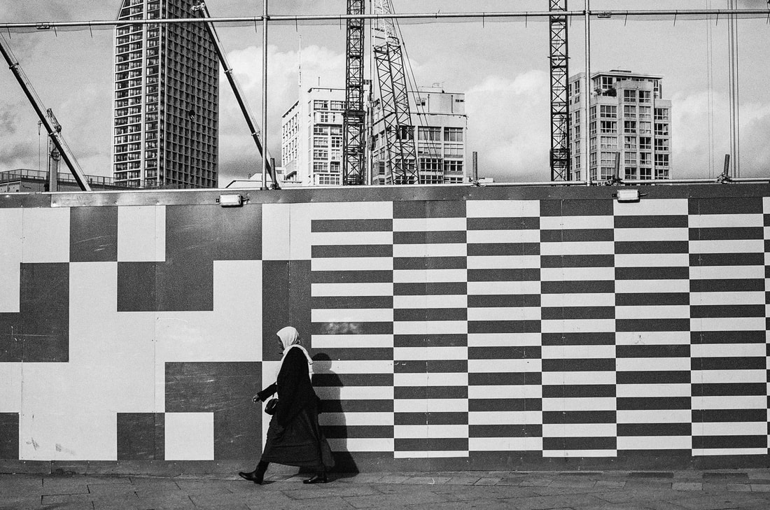
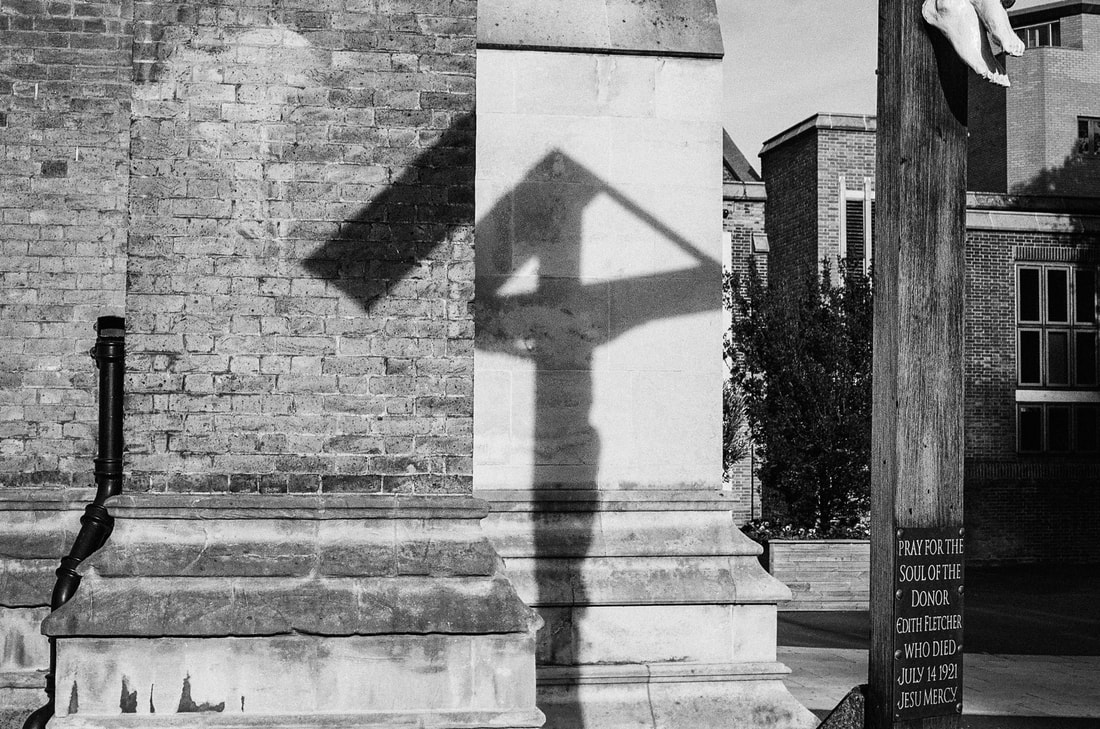
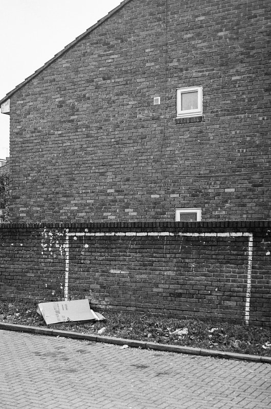
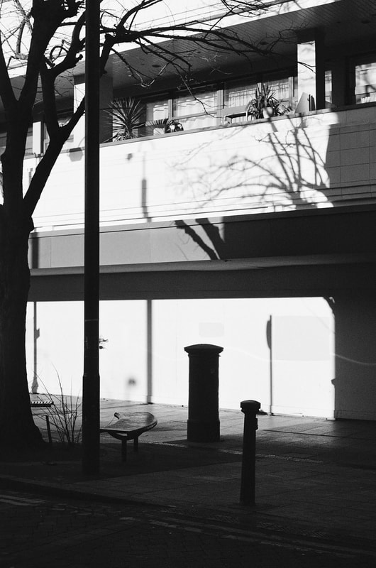
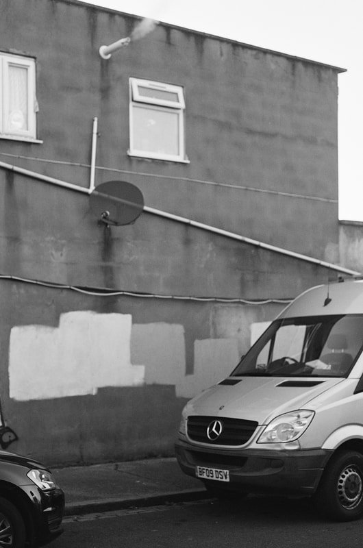
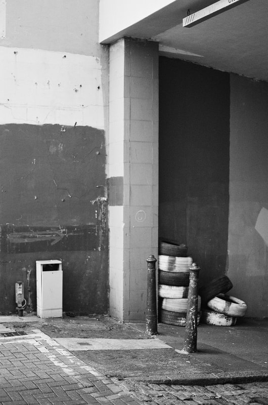
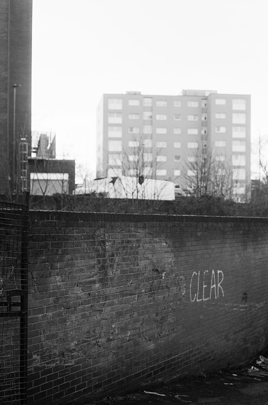
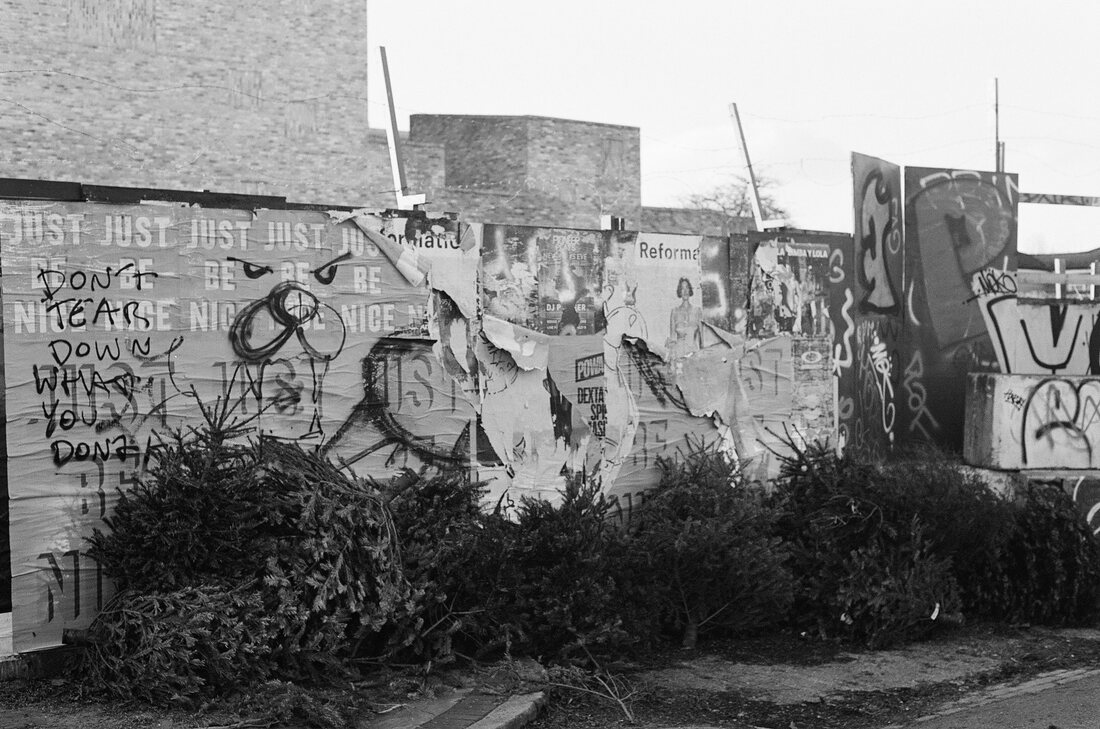
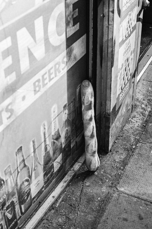
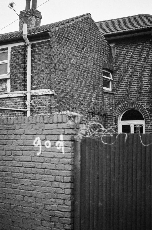

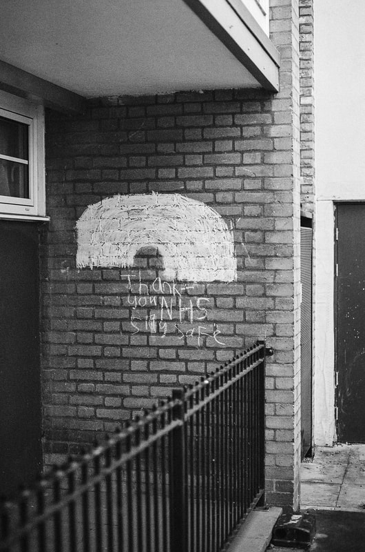
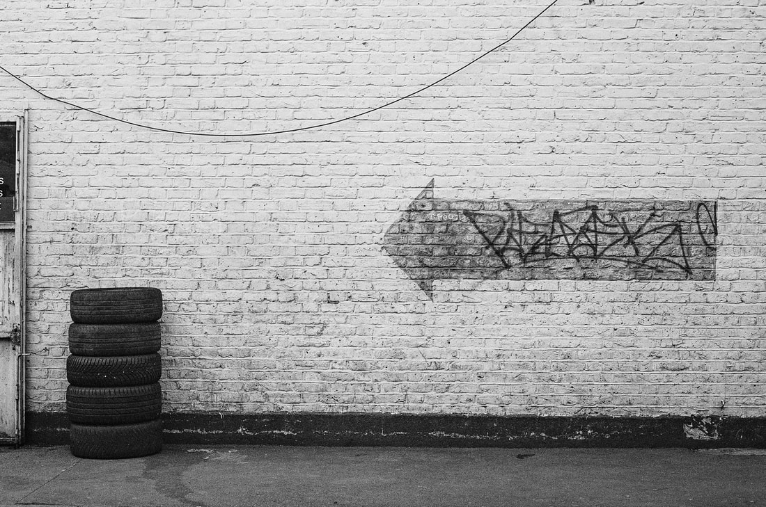
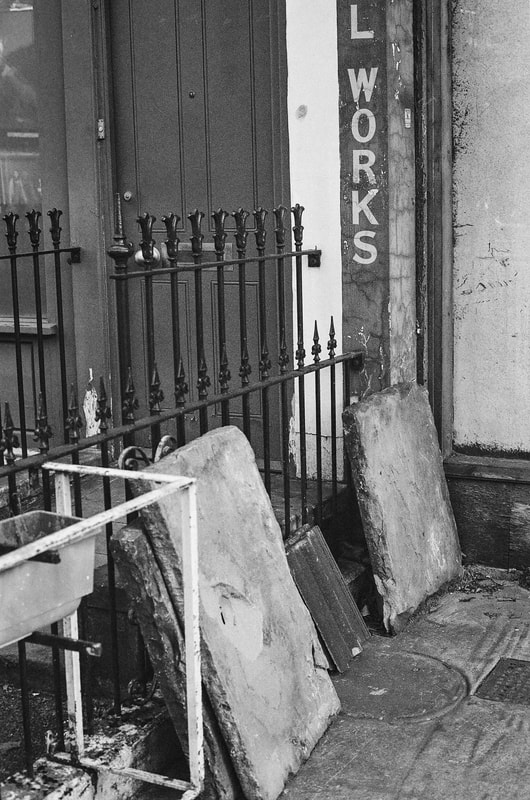
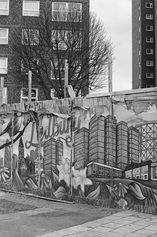
They could be categorised as follows:
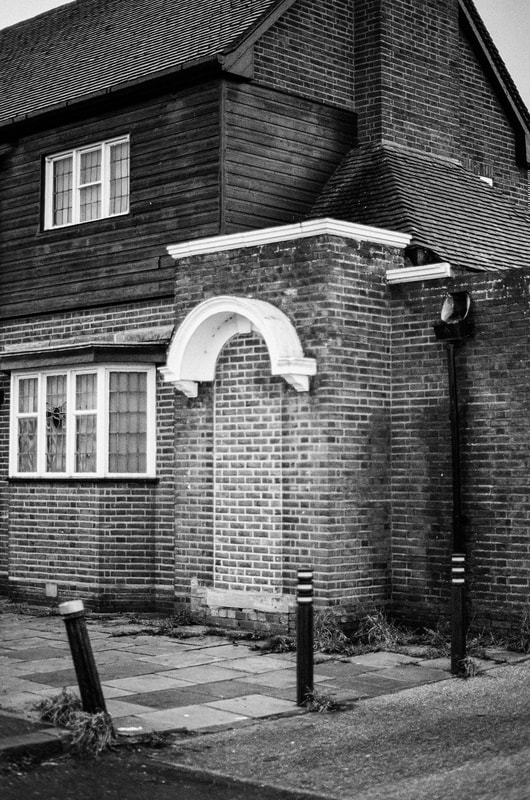
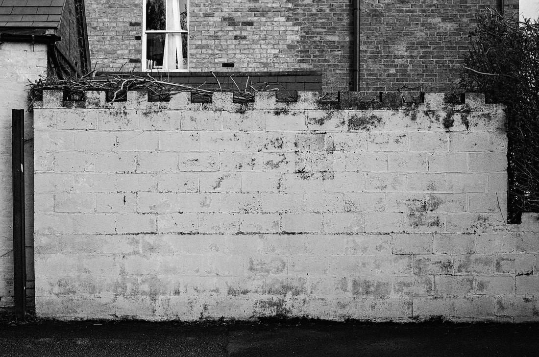
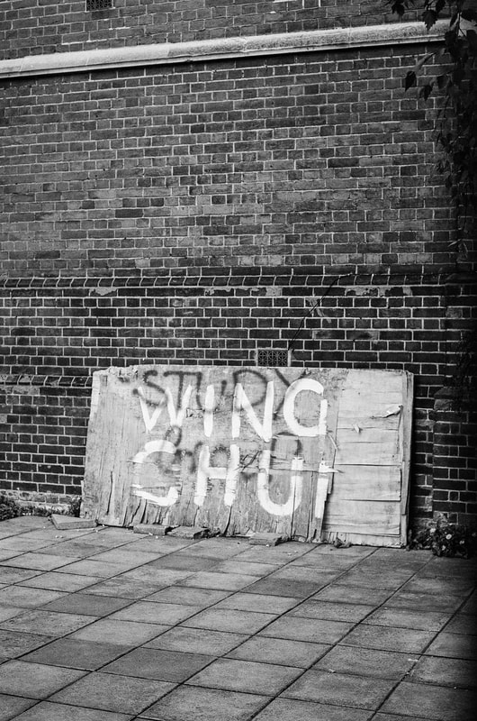
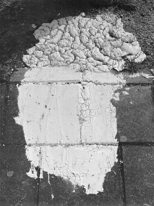
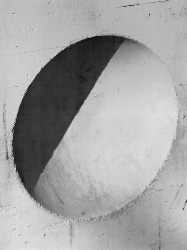
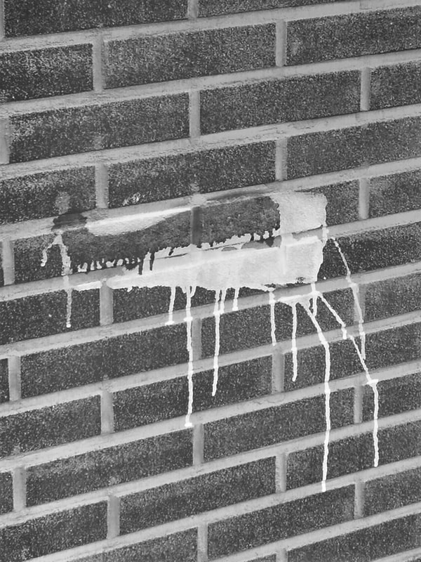
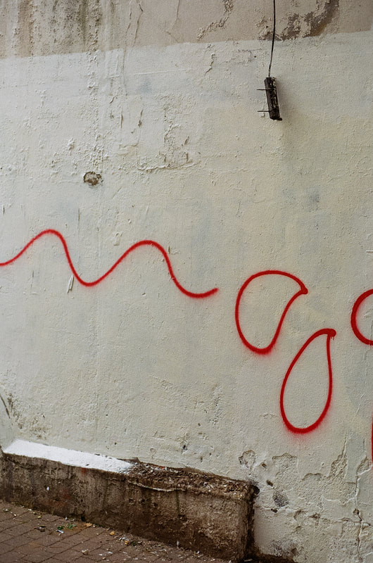
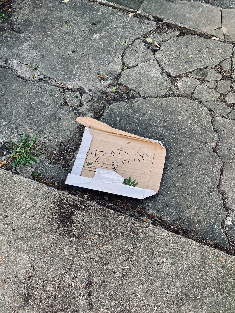
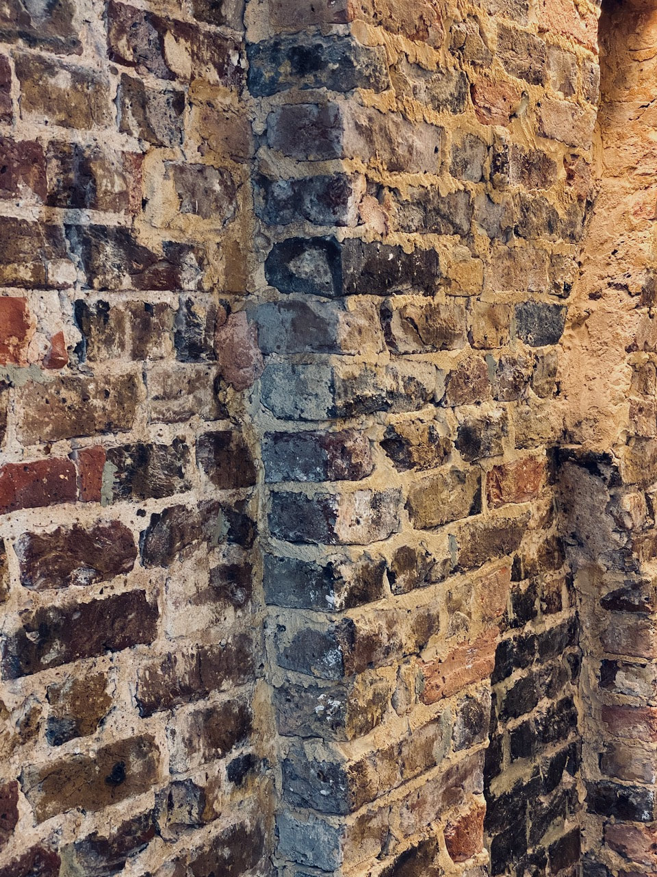
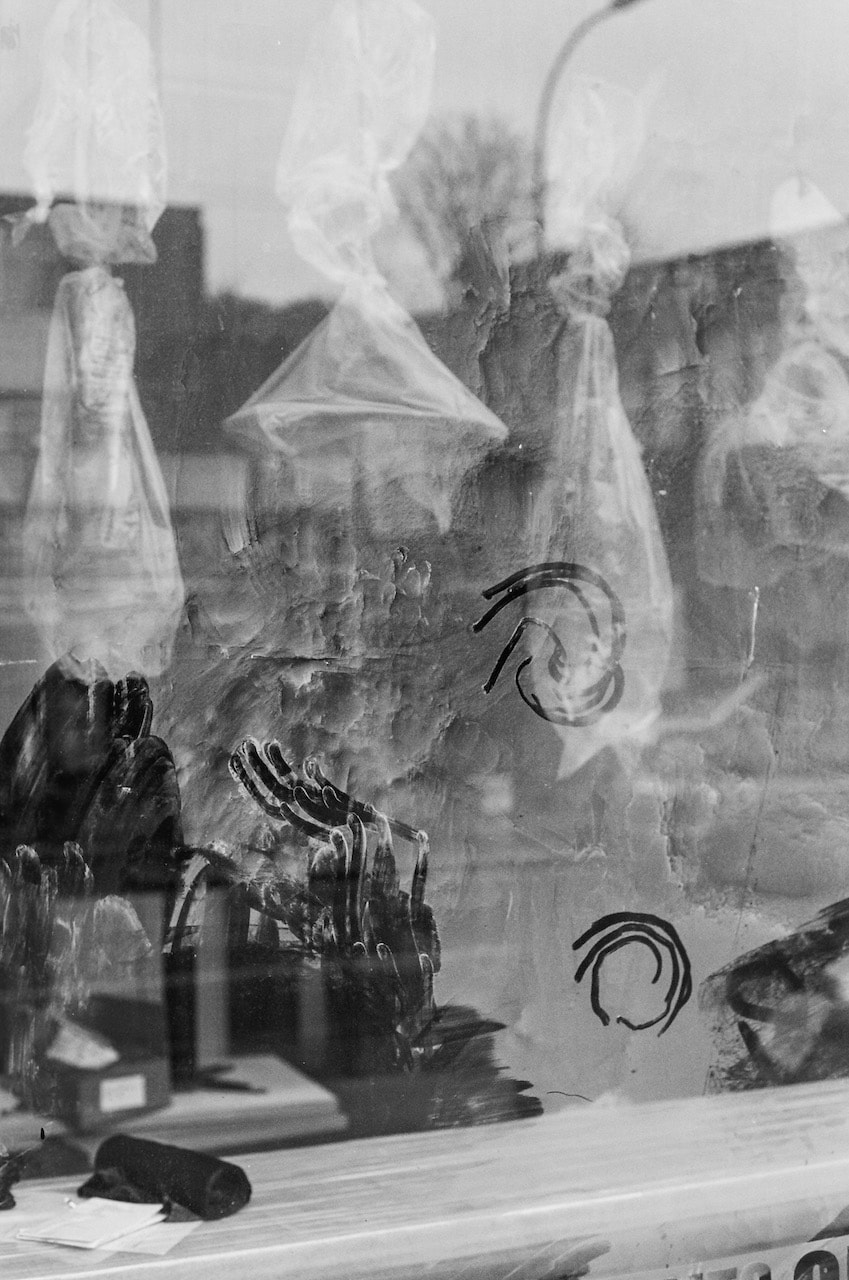
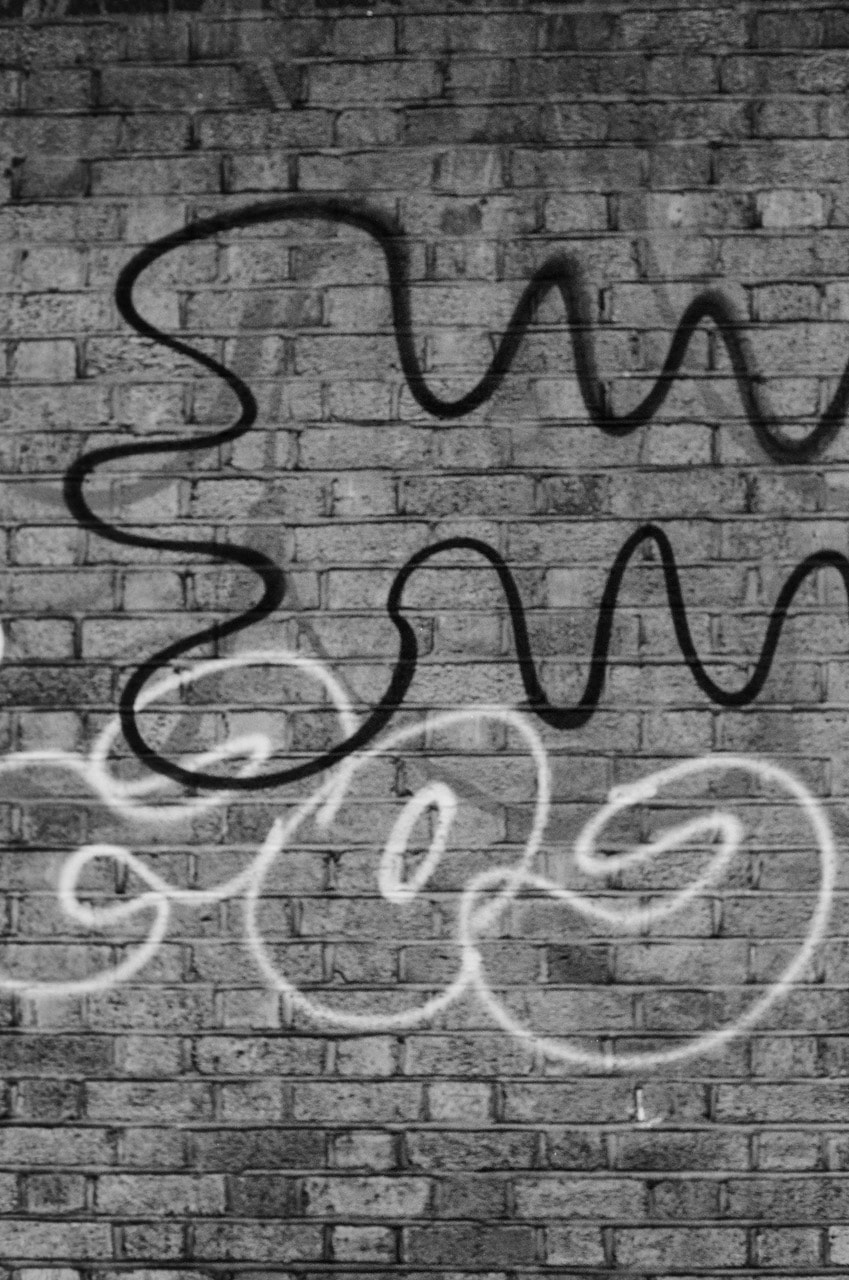
- Writing and other (involuntary) marks on walls and floors
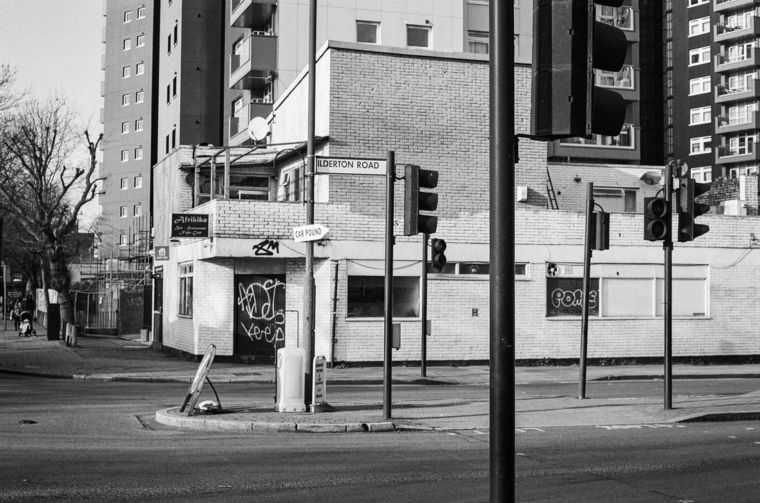
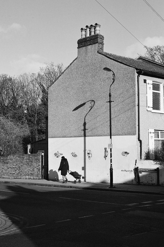
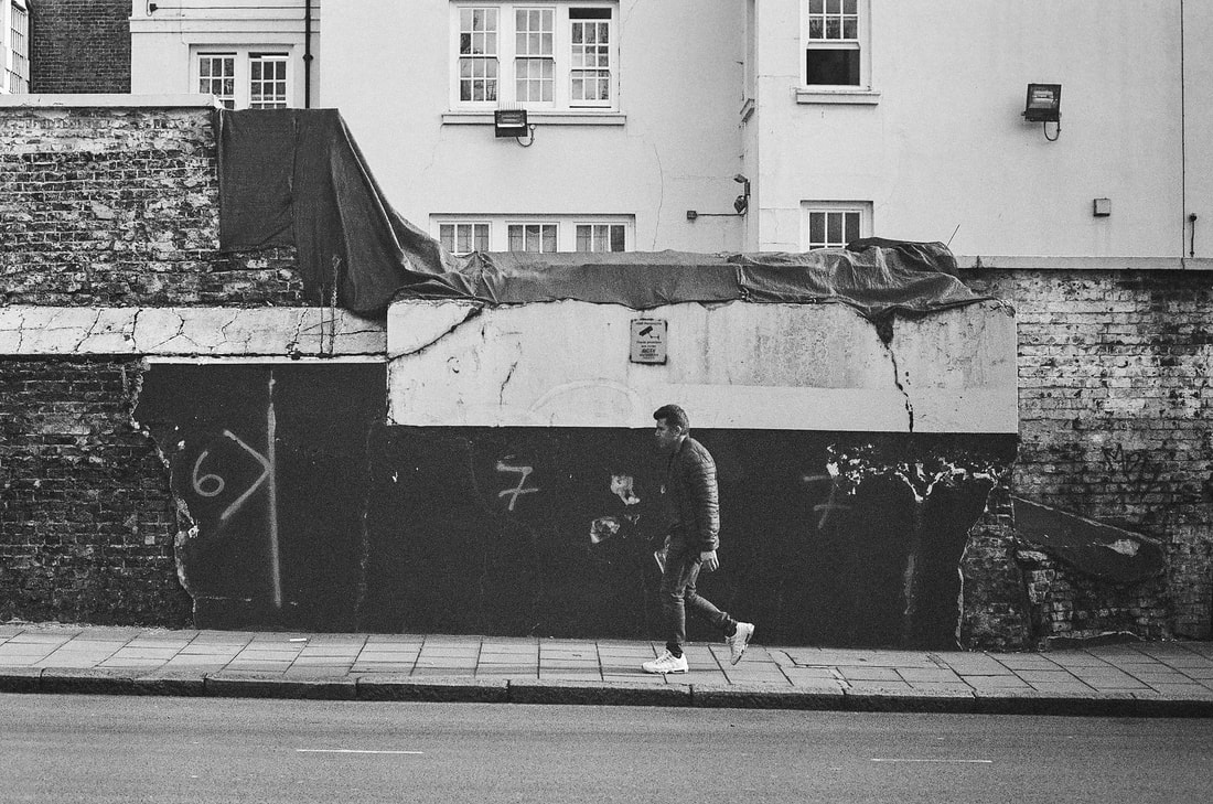
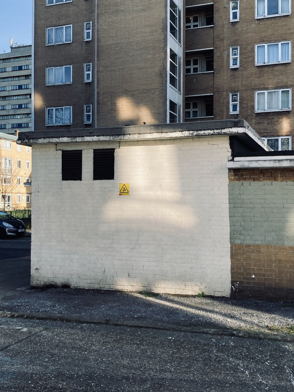
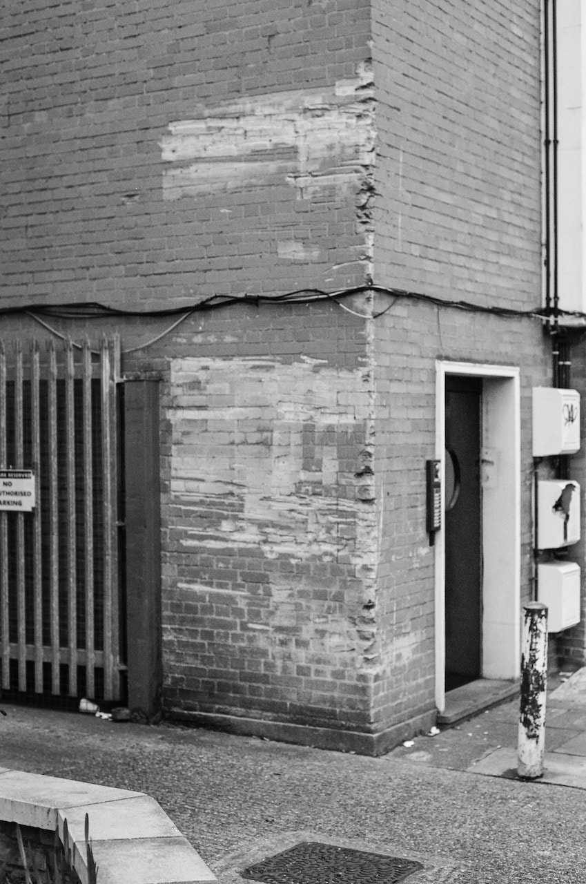
- Walls of buildings with the occasional passing pedestrian
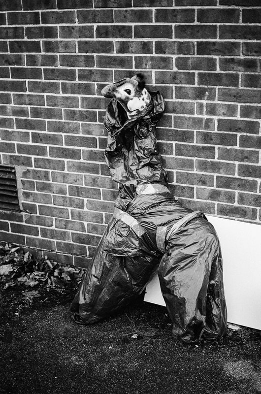
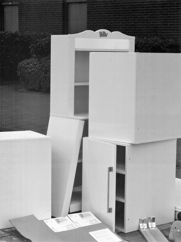
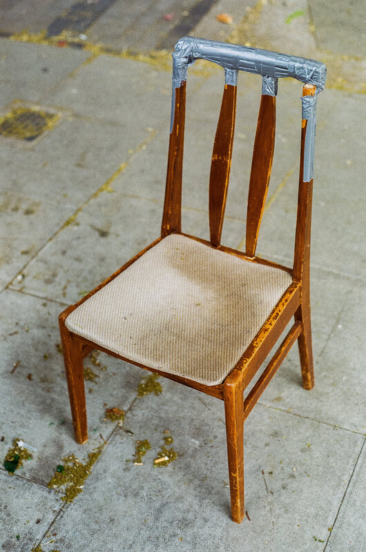
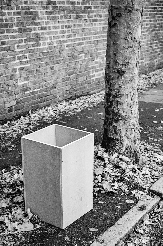
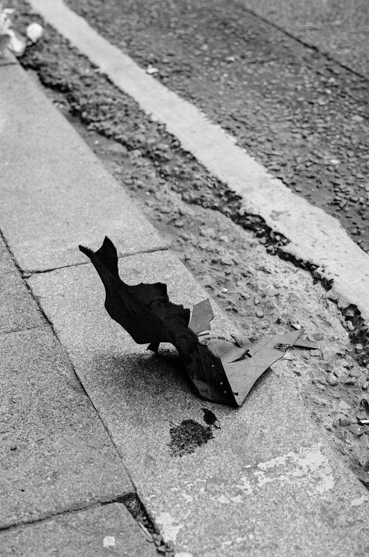
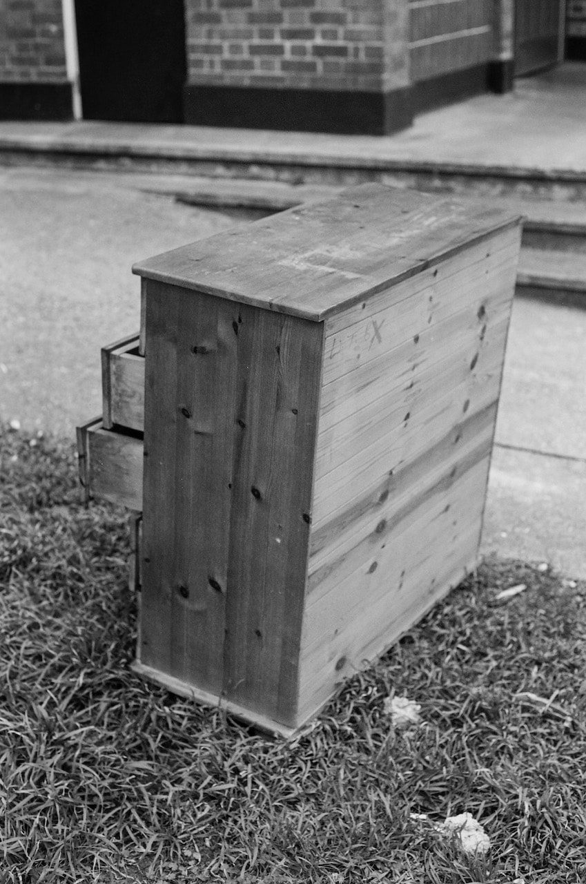
- Objects on the floor, leaning
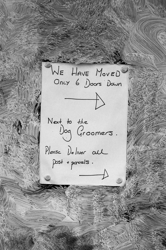
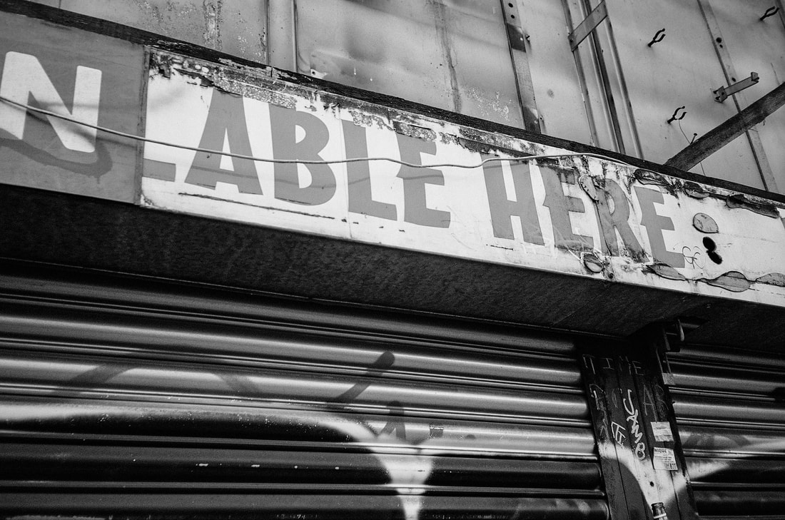
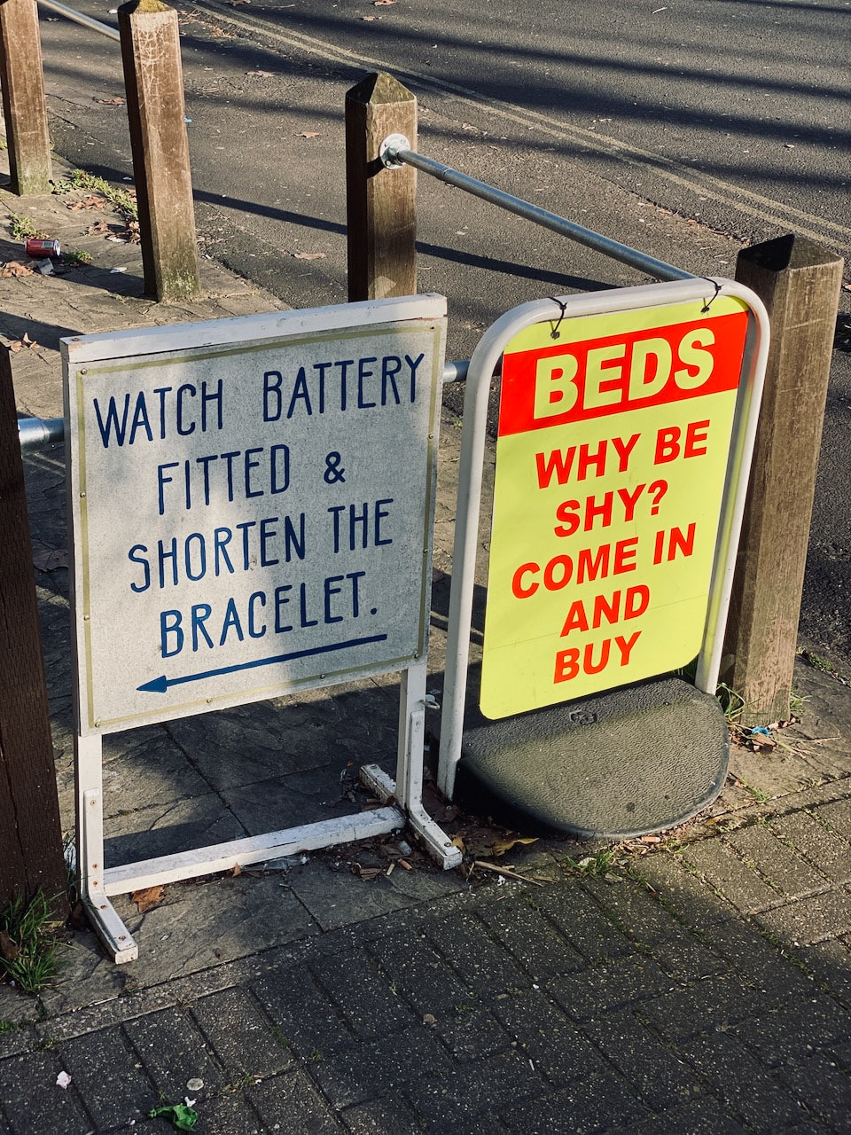
- Signs
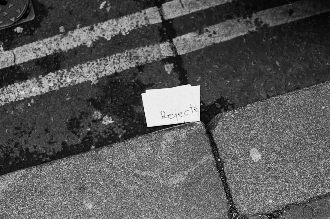
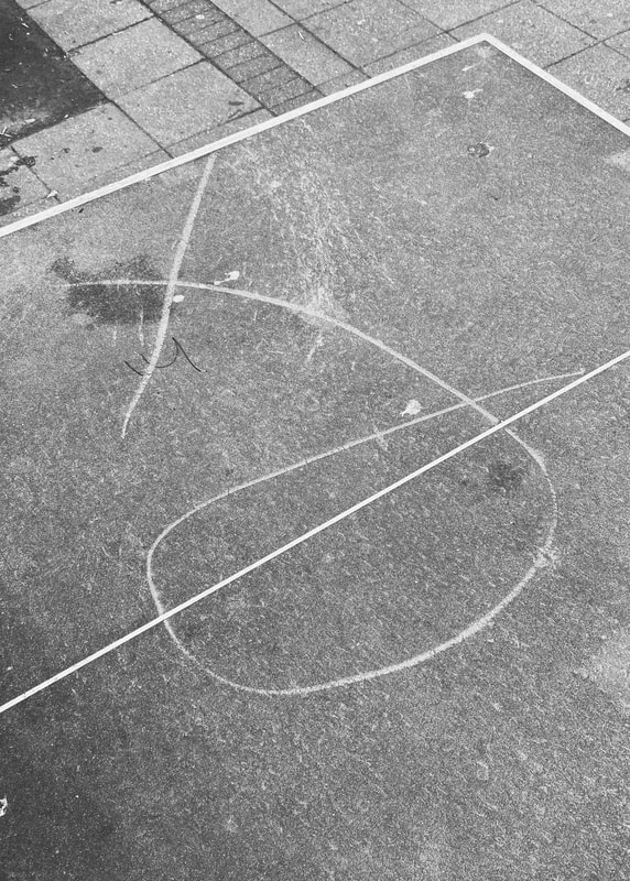
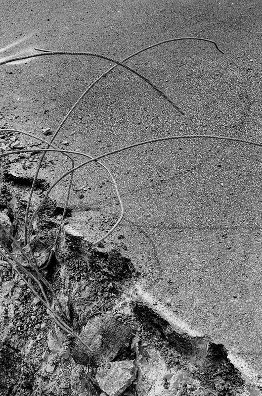
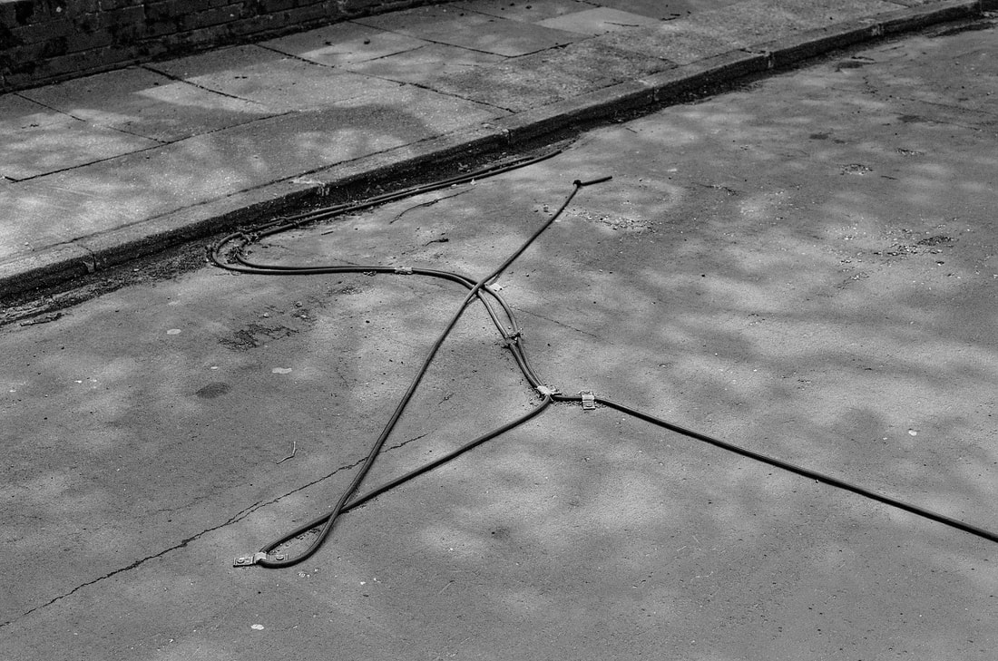
- Objects/marks in the road
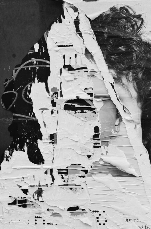
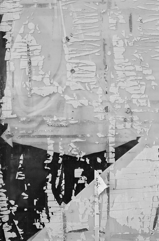
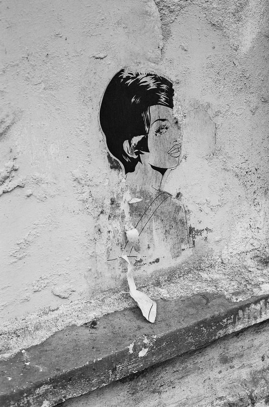
- Torn posters
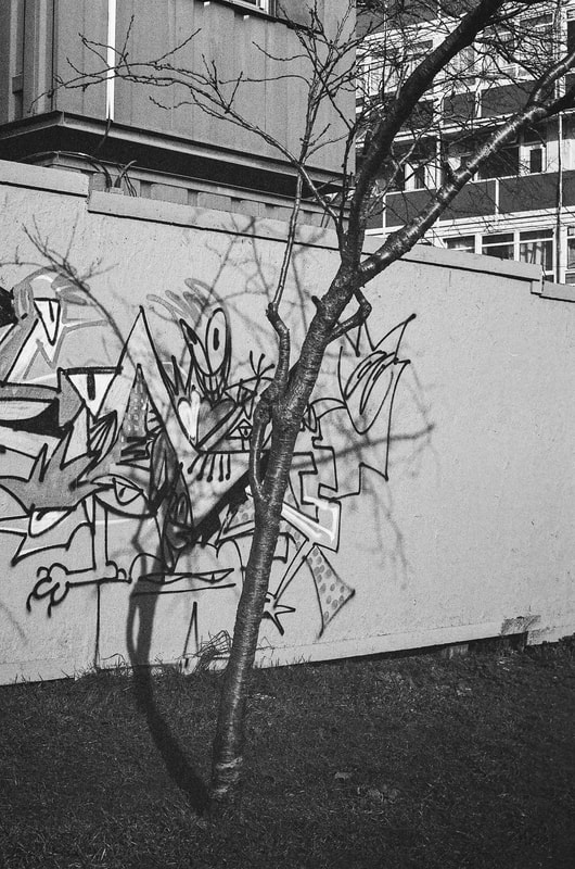
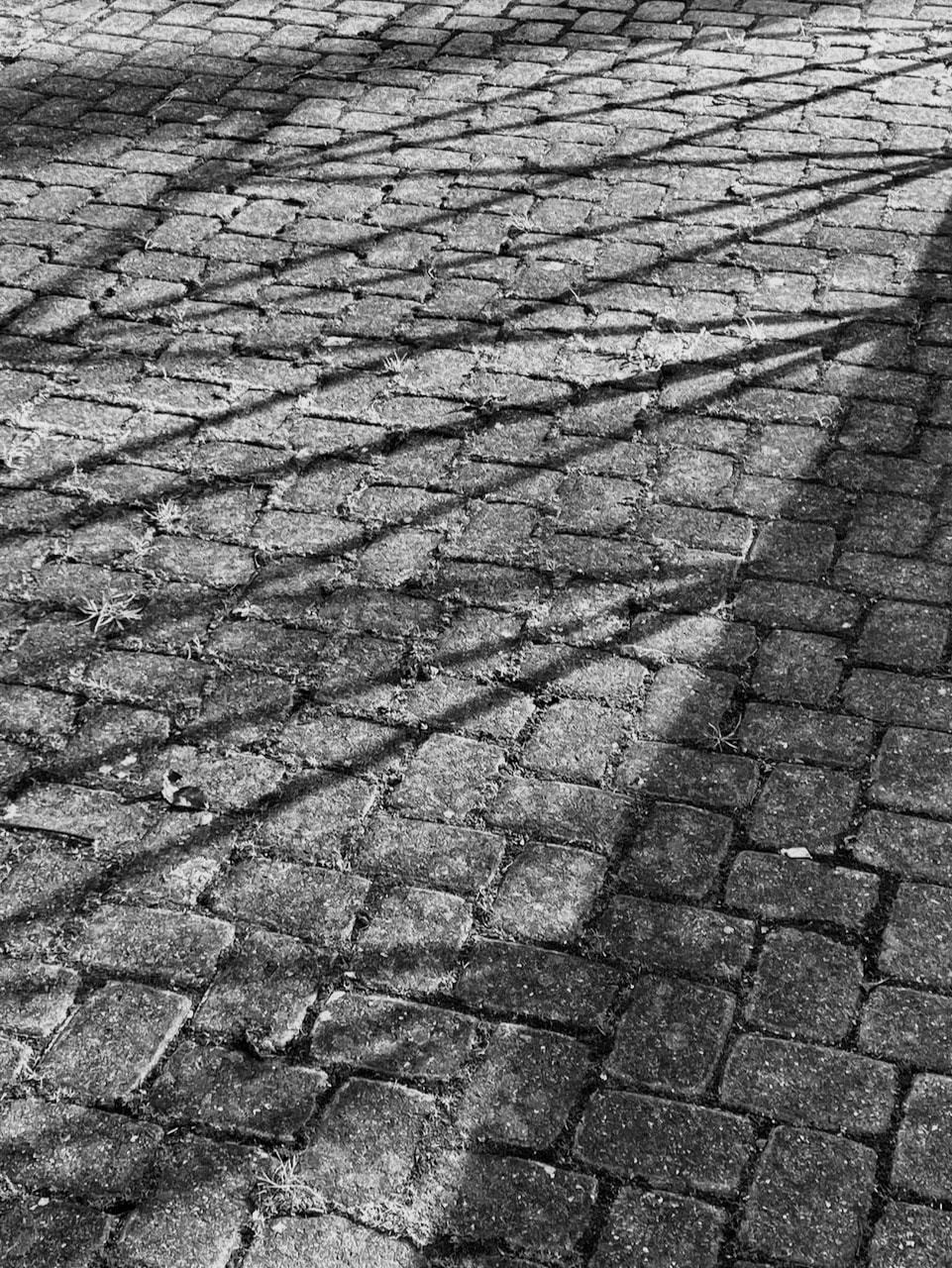
- Tree and lamp post shadows
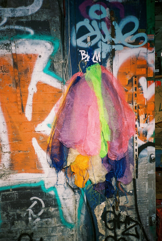
- Overpainted graffiti
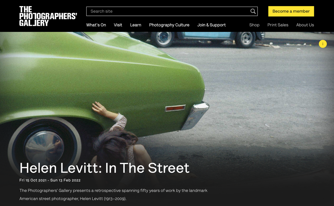
Helen Levitt
|
I visited this retrospective exhibition of Helen Levitt's work three times last year. I particularly liked the slideshow of colour transparencies. Levitt's work seemed very playful and acutely observed.
She seemed particularly drawn to young people playing in the streets. Children are closer to the ground than adults and there were several pictures of kids crouched on the pavement or looking down at something of interest to them but not to nearby adults. She seems to have been trusted by those she photographed. It wouldn't be so easy (or appropriate) these days for a contemporary photographer to point their camera at young people playing in the street. Also, children don't seem to have the freedom or license to play in public as they did in earlier days. Levitt's pictures document a more innocent (or perhaps less fearful) time and their gentle humour derives from the mischievousness of the young people she captures as they interact with their urban environment. |
|
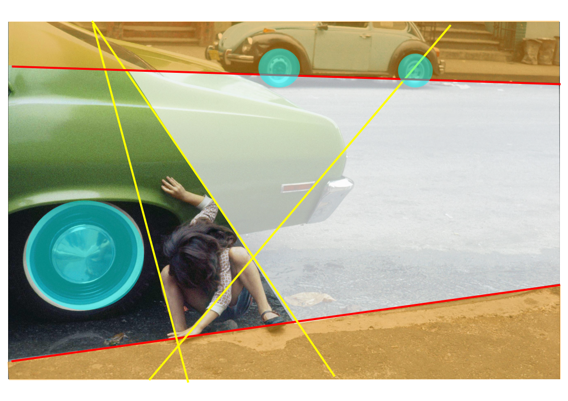
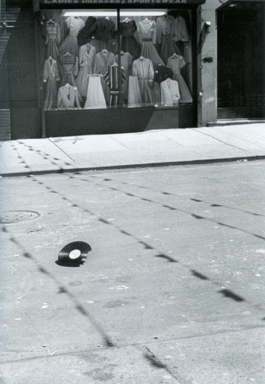
Floored
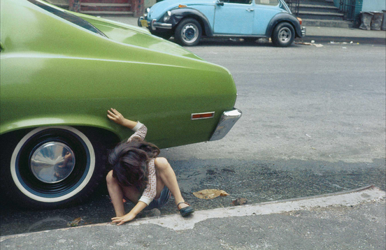
Helen Levitt - New York, 1980
|
This is one of my favourite pictures from the exhibition. It seems to be quite a famous image since it was used in the gallery's publicity materials.
The illustration below is an attempt to describe the way I understand the composition of the picture. It's quite unusual because the right hand side of the image seems almost empty, whereas the left hand side is packed with information. The colour harmony of the green and blue cars is very pleasing. There are strong diagonal lines leading down from the left as the road stretches beyond the picture frame. Everything in this photograph appears to be leaning and unsteady. Levitt is often referred to as a 'street' photographer and she must have reacted quickly to this scene unfolding in front of her. This off kilter type of framing is quite common in other street photographs. There is a real sense of drama in the picture, caused by the gesture of the young girl, the contrast between her delicate form and both the large metal chassis of the car and the expanse of tarmac beneath them. Levitt draws our attention to her hands, which she's using to keep her balance. She seems to be looking for something (a lost ball?) in the gutter or perhaps under the car. Despite the early 1980s vehicles, there is something timeless about this picture. A child absorbed in a game, unaware of potential danger. |
|
|
|
Favourite pictures
Here are some other favourite pictures by Helen Levitt. They describe the activities of young children in New York in the middle of the 20th century. The city is a kind of playground and they seem remarkably free to interact with it in any way they choose. perhaps this also describes Helen Levitt approach to photography.
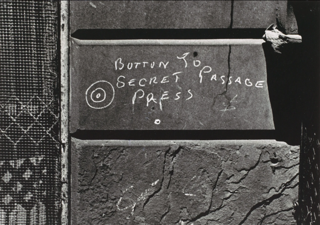
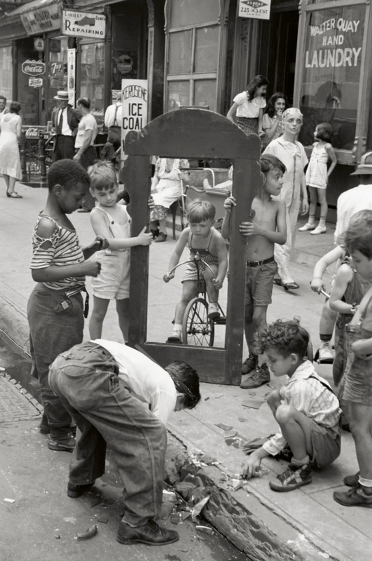
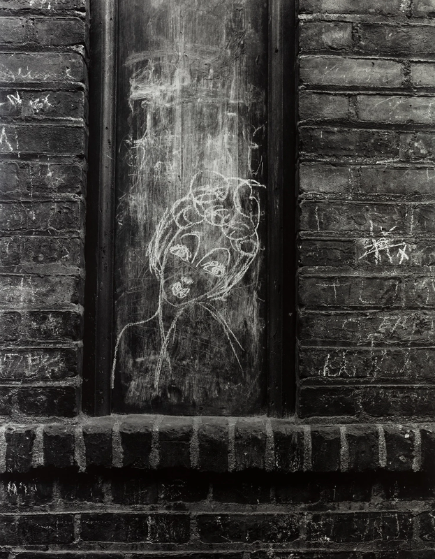
I've sequenced these images deliberately, attempting to draw attention to repeated patterns in Levitt's pictures. The photographs at either end use the motif of circles inside circles in the form of the "secret button" and rolling record. The central pairing both feature a vertical frame (mirror and window) in which we see a figure - a boy on a bicycle and a chalk drawn woman.
My own sequence
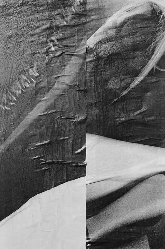
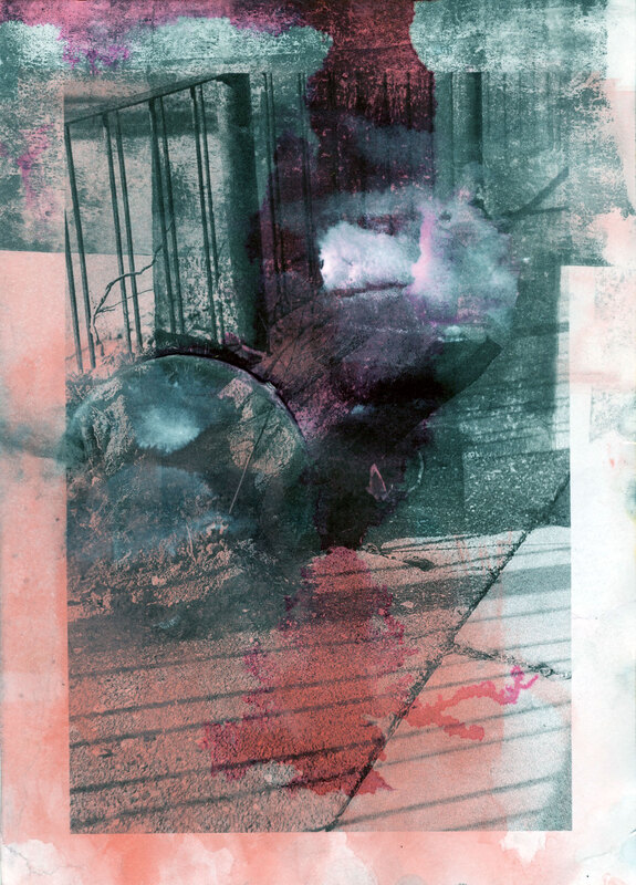
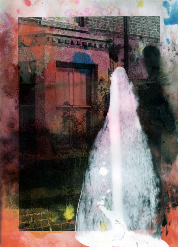
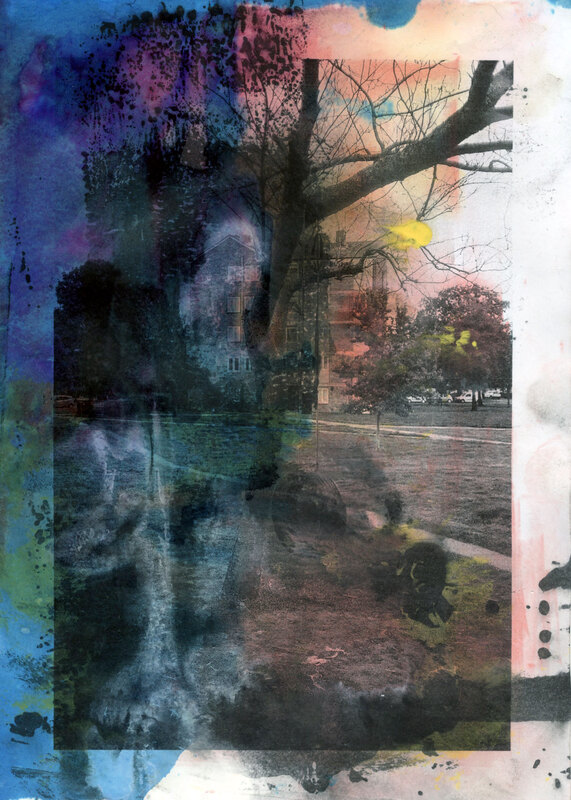
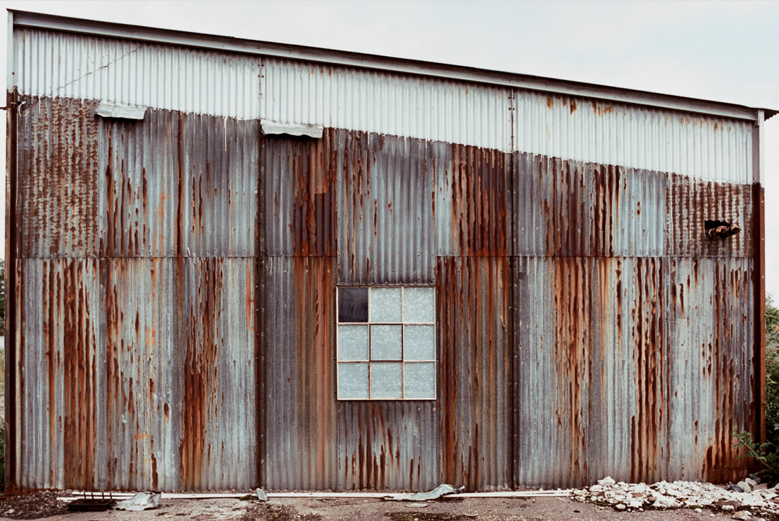
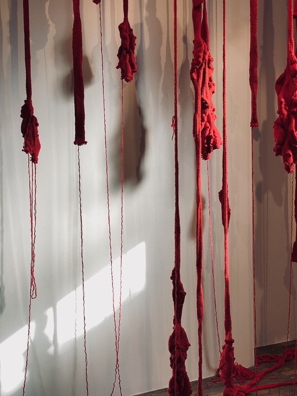
This is a quick experiment in sequencing a set of images from my archive, related to the theme of floors, walls and ceilings. I was interested, like Helen Levitt, in the ways in which the surfaces of a city (mainly its floors and walls) are marked over time. The tone of these images is less playful than Levitt. The absence of people (especially children) perhaps gives them a slightly menacing quality.


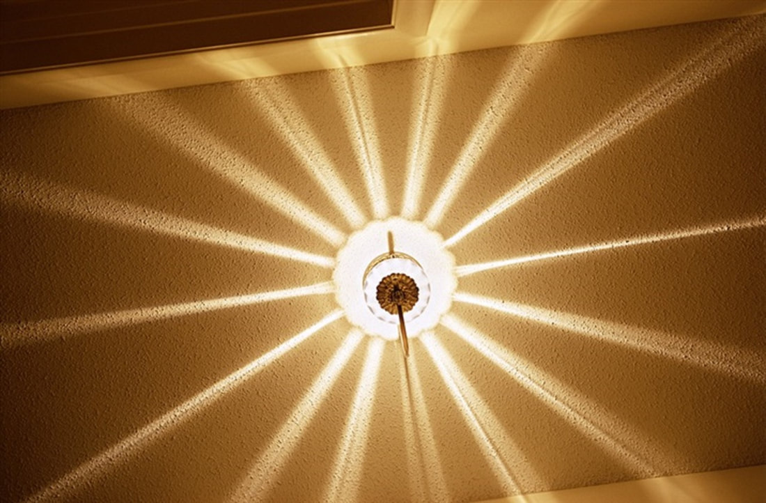
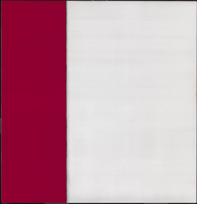
The most famous ceiling in photography
William Eggleston's dye transfer print of this Kodachrome transparency, often referred to simply as 'The Red Ceiling', is one of the most famous images, let alone famous ceilings, in the history of photography. Some have argued that it changed the course of photography in paving the way for the acceptance of colour as a legitimate form of art photography.
I quite frequently don’t look through the camera, which is very close to being blind. |
The intensity and depth of colour achieved by the expensive dye transfer process (previously reserved for advertising) makes this image almost overwhelming. The strange viewpoint, flag-like composition, with lines radiating our of a slightly off-centre subject and decadent details (the cheap poster of zodiac sexual positions), created quite a stir in the early 1970s. It's a kind of fly's eye view, the camera seeming to hover, unattached from the photographer's eye, and drawn to the light bulb.
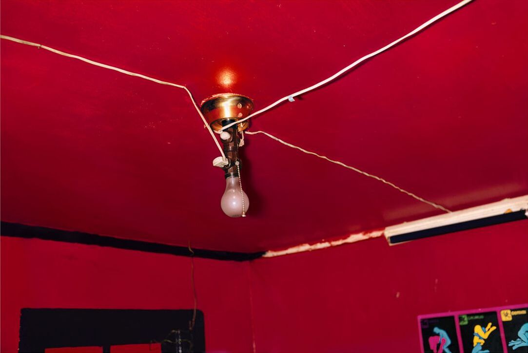
William Eggleston, 'Red Ceiling', Greenwood, Mississippi, 1973
A fly's eye view
I've discovered a few other examples of Eggleston's fly's eye view approach to photography. He occasionally talks about not looking through the viewfinder at the moment of exposure, comparing this to firing a gun (another interest of his) since you aim a gun slightly ahead of the target, allowing for the time it takes for the bullet to travel through the air. I like the idea that the camera (or gun) is a kind of extension of the human body, a prosthesis, as if the photographer is reaching out to grab part of the visible world.
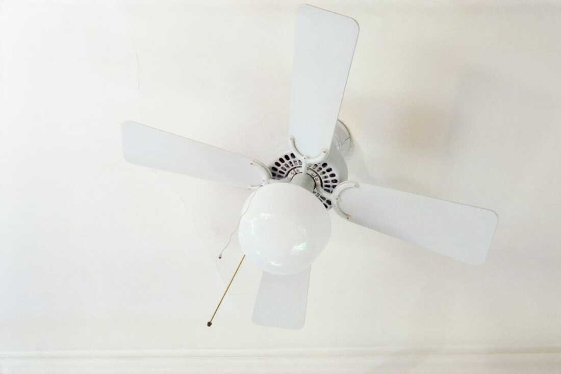
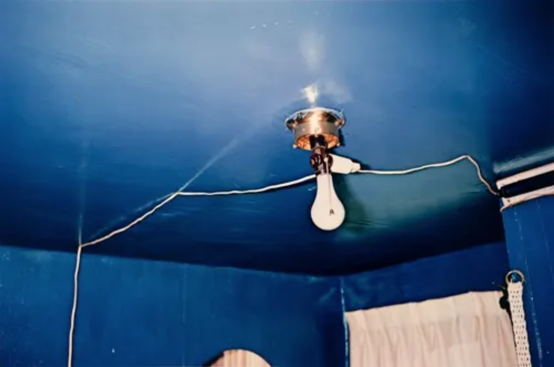
I wonder if this approach to photographing floors, walls and ceilings (i.e. not looking through the viewfinder and, possibly, using a flash) might work for me?
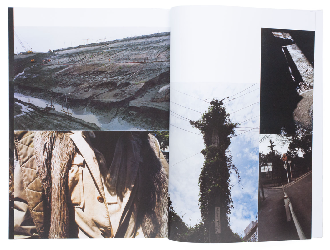
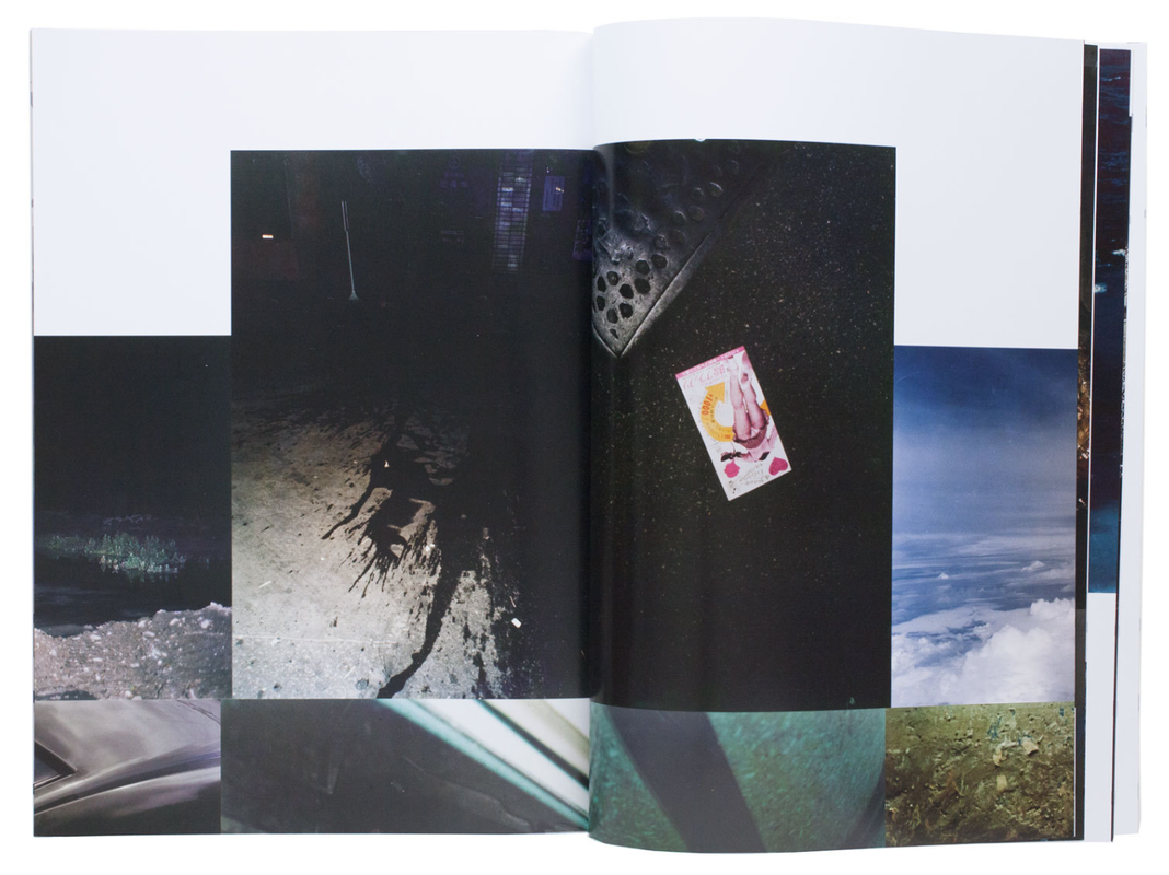
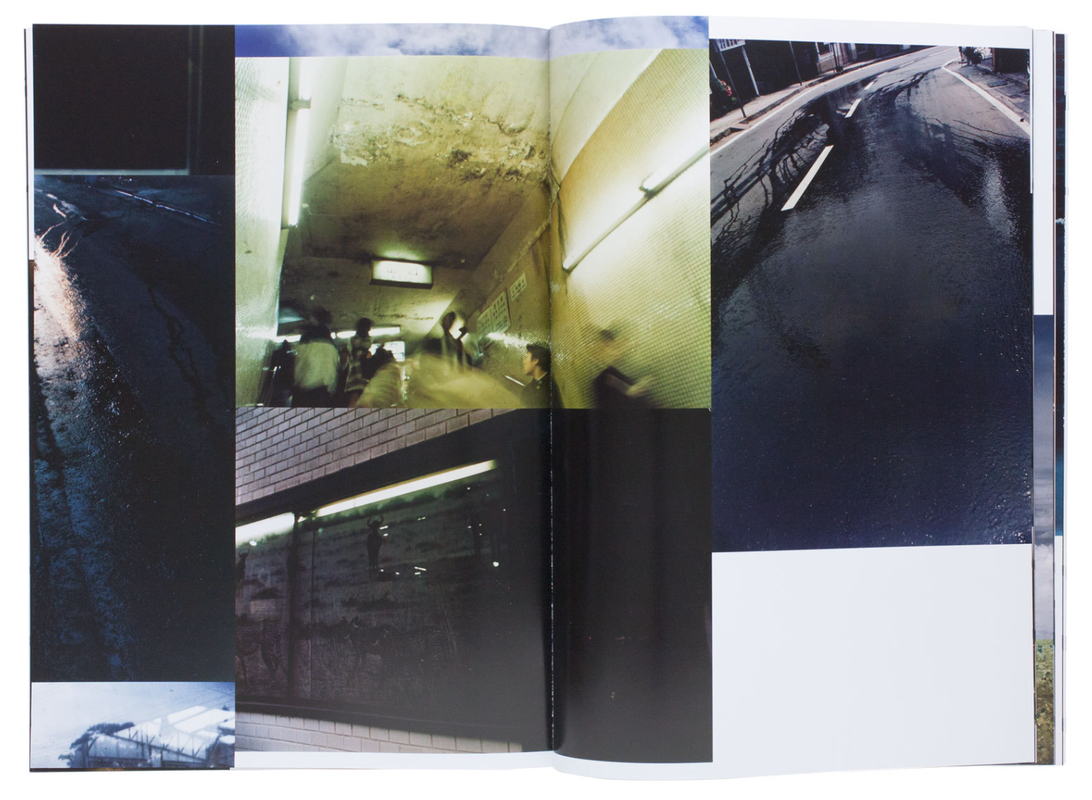
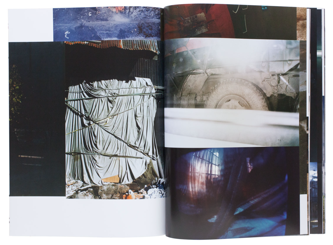
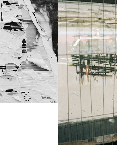
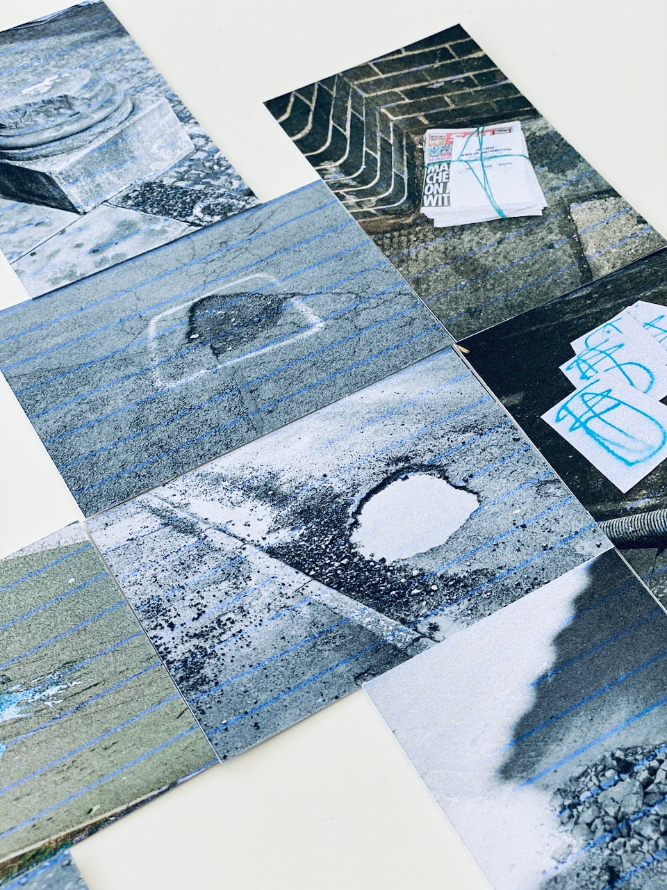
Takuma Nakahira's 'Overflow'
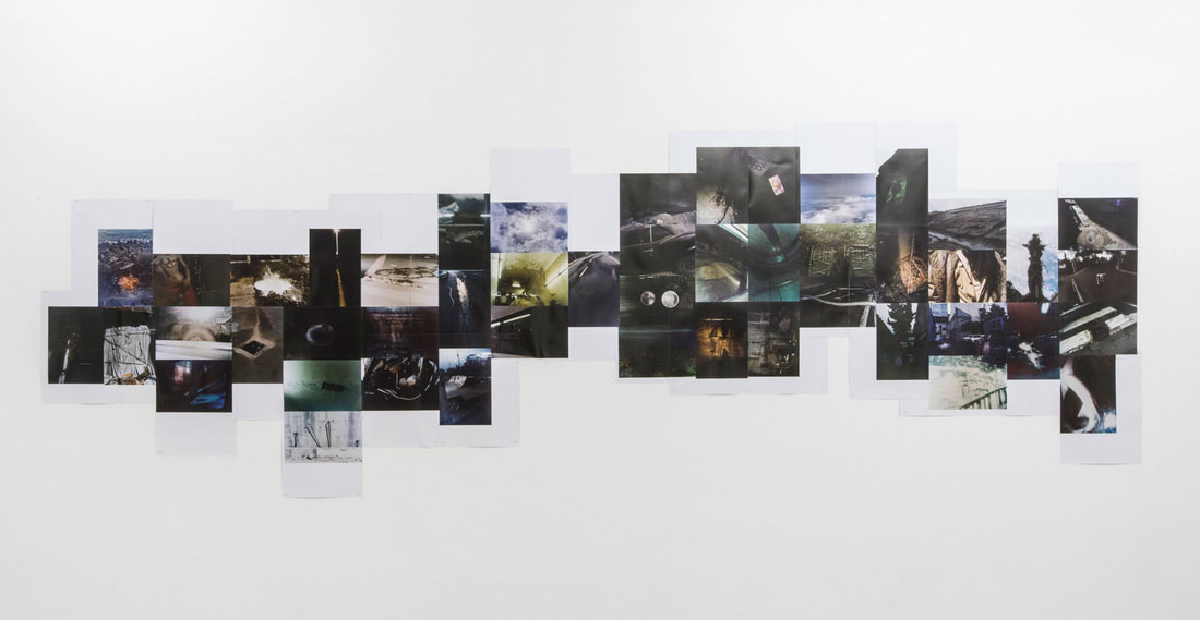
Nakahira’s series Overflow was originally presented as an installation during the 1974 exhibition Fifteen Photographers Today (National Museum of Modern Art, Tokyo). The work consisted of 48 colour photographs that were arranged on a wall 6 meters wide and 1.6 meters high. The photographs show elements of a city - eery rifts in a space overflowing with objects, commodities and information - that Nakahira encountered and captured in his everyday life, from ivy creeping across walls and manhole covers in the streets to the tire of a large truck, from a pale-bellied shark floating in the transparent darkness behind the glass of an aquarium to close-up shots of a subway station. The photobook’s layout strictly mimics each photo’s position in the installation piece in order to replicate the series’ original experience within the confines of a book. |
|
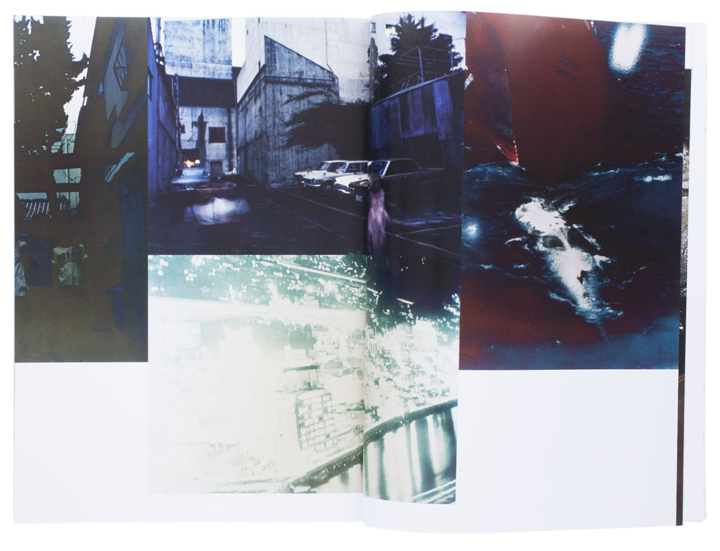
My response
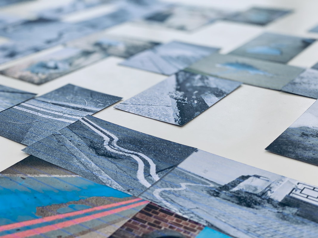
I really liked the idea of a multi-photo installation but decided to construct this in Photoshop. My idea was to try to create a publication like the one above. Once the collage was completed, I used the guide lines in Photoshop to divide it up into 16 sections. I printed each of these A4 and bound them together to create a rough maquette.
|
|
The completed maquette
I'm relatively pleased with the outcome although I neglected to print one of the pages! The images are quite pixelated but the overall idea of a disrupted collage, with images split across pages, has worked reasonably well. This may be something I return to later.
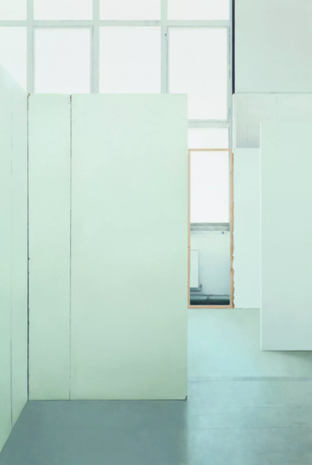
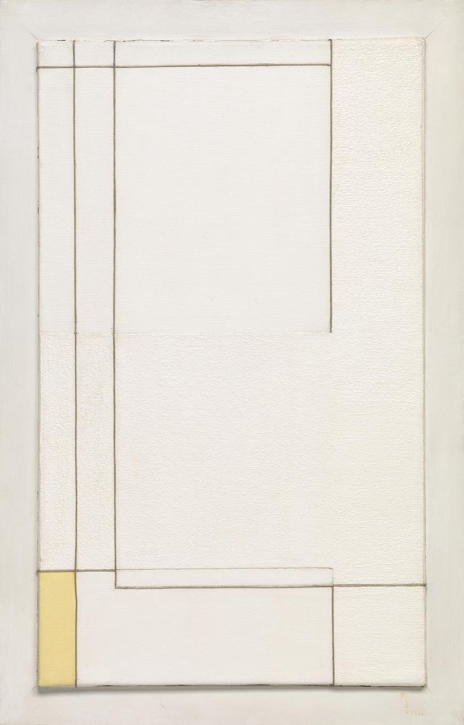
Paul Winstanley's Empty Art Rooms
Winstanley's images of empty art school rooms remind me of various examples of abstract painting. This is not surprising since Winstanley's photographs are subsequently used as source material for panel paintings. It's not always clear to me from reproductions which are the documentary photographs and which the paintings since he uses a photorealistic technique.
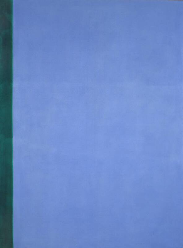
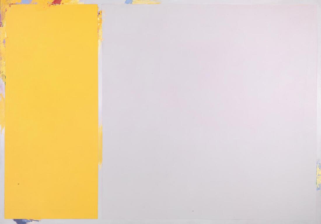
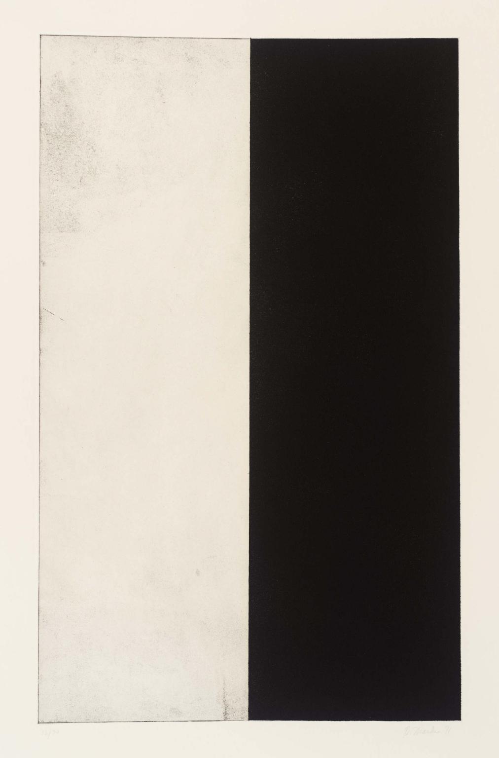
Here are two sets of images, the first from Winstanley's project followed by examples of geometric abstract painting and printmaking from the Tate collection. I've attempted to match the corresponding pairs to demonstrate how similar the compositions and colours are.
Here are two sets of images, the first from Winstanley's project followed by examples of geometric abstract painting and printmaking from the Tate collection. I've attempted to match the corresponding pairs to demonstrate how similar the compositions and colours are.
At a very simple level I just wanted to show what that [the British art school model of education] looked like.
-- Paul Winstanley
It's interesting to me that all the geometric abstract art works above are by men with the exception of Marlow Moss, a non binary artist. Was Winstanley consciously or subconsciously drawn to interiors that reminded him of abstract art works or do art schools lend themselves to the creation of (empty) spaces that resemble abstract paintings? To some extent, they need to provide a 'blank canvas' for each generation of artists and yet the traces of previous activity always remain. Do these particular interiors represent typical art room environments or, through a process of selection and careful framing, has the artist captured only those spaces that seem to be in dialogue with the history of geometric abstraction?
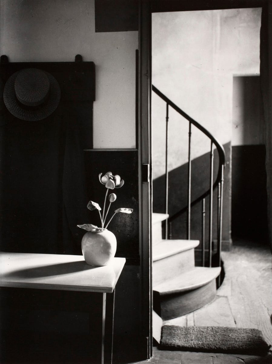
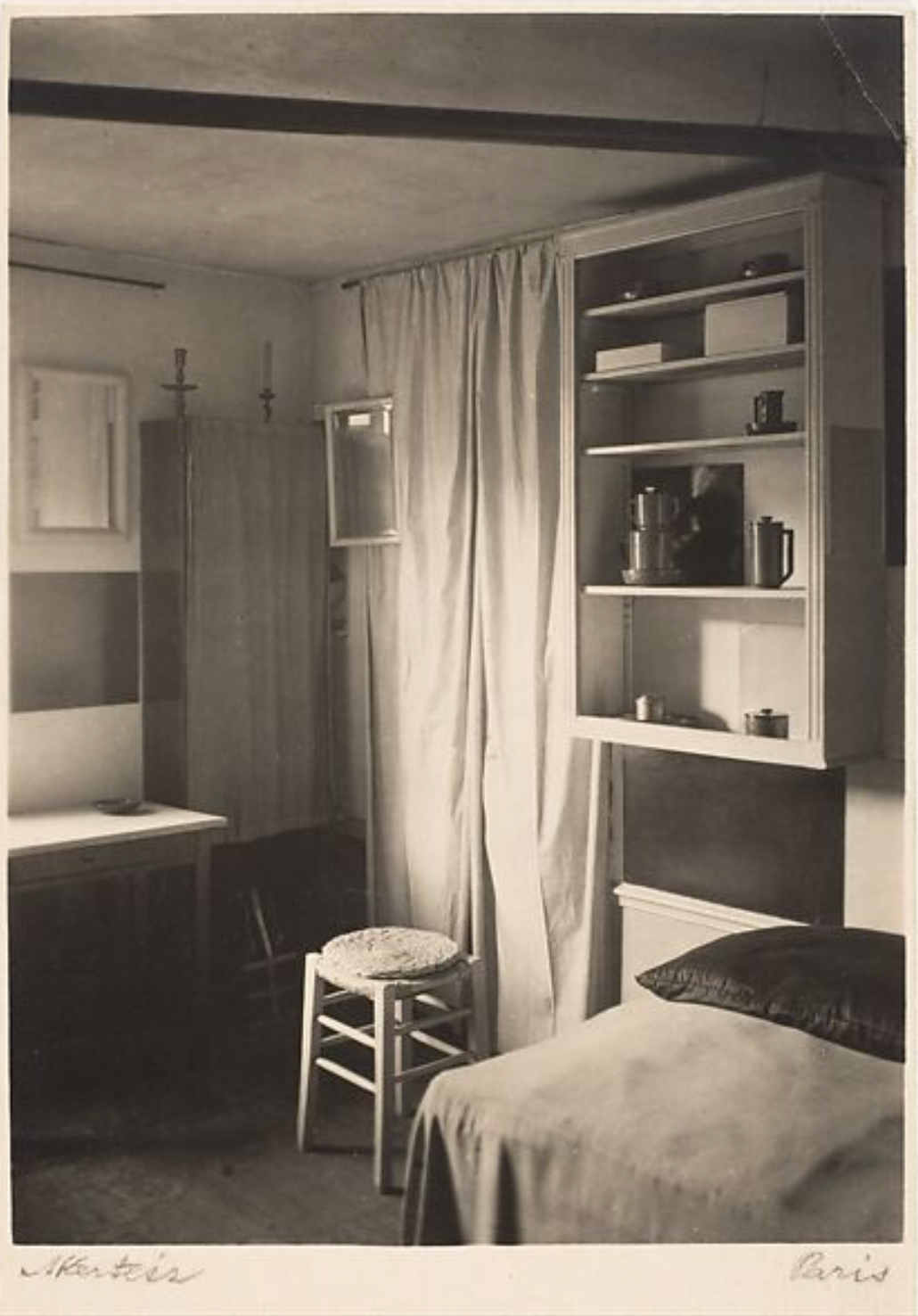
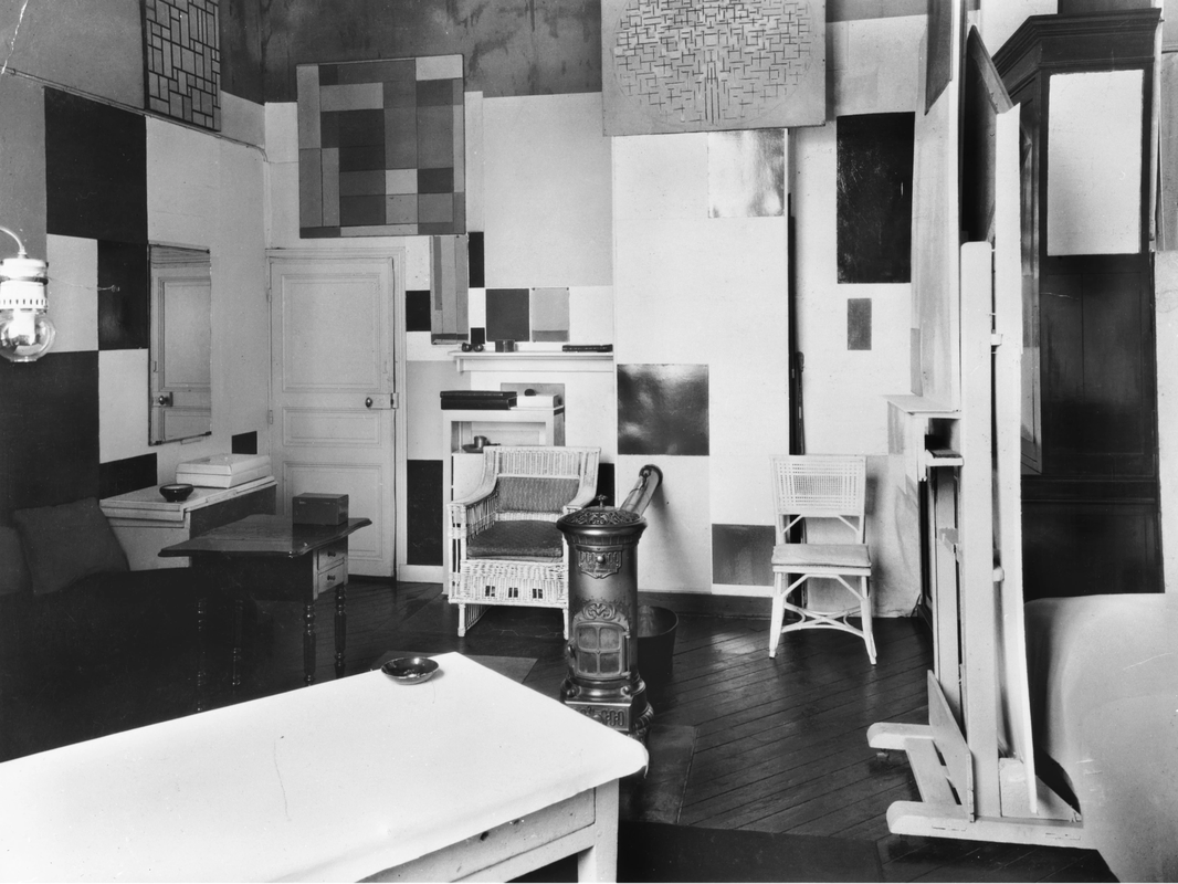
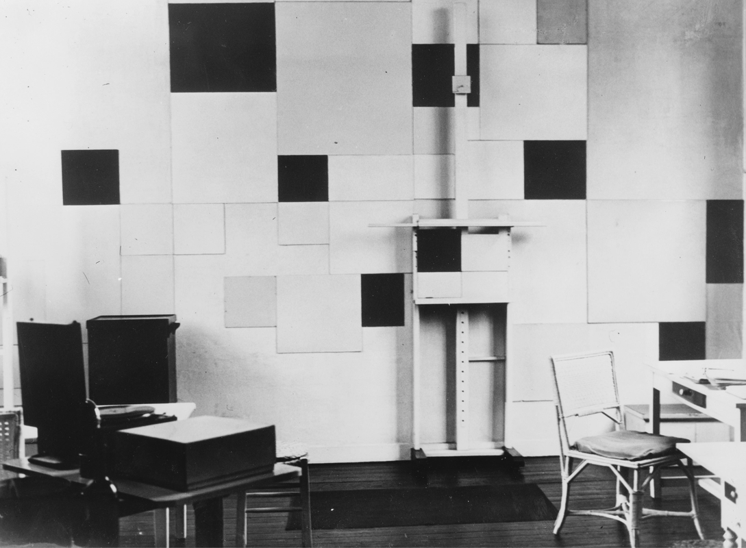
I discovered these photographs of Piet Mondrain's Paris studio (1921-36). The first and second images are by André Kertész. They reveal a kind of tension between the constructivist tendencies of the artist's taste in interior decoration (the tulip is painted white) and the 19th century architecture (the curved balustrade). Mondrian was keen for photographers to document his studio. The third and fourth images show how the space has become a kind of extruded version of his paintings.
I began to wonder what it might be like to photograph empty art room in school, and what these images might say about my own tastes, preferences and identity.
I began to wonder what it might be like to photograph empty art room in school, and what these images might say about my own tastes, preferences and identity.
My empty art rooms
Diptychs
I wondered what a selection of these images might look like as diptychs. I have experimented previously with a half frame camera and I like the way the pictures end up printed next to one another separated by a black border of unexposed film. I created the following examples in Photoshop, 'borrowing' the black frame from a scanned half frame print. I may return to using a real half frame camera later in the project.
|
|
|
|
|
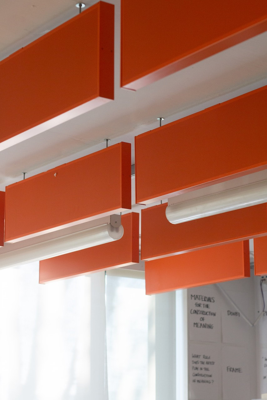
The art rooms at my school reflect the interests of the classroom teacher and display work by students, alongside posters and reproductions of professional artists' work. The floors are orange, as are the sound baffles on the ceiling. Consequently, the light has a warm cast and the floor to ceiling windows and white table tops help to create a bright, airy ambience. The rooms are packed with visual information, unlike Winstanley's minimalist interiors. I made these photographs with a DSLR and 50mm f/1.8 lens which meant I could achieve a fairly shallow depth of field. This is in contrast to Winstanley's mostly flat, frontal compositions. I have made use of diagonal lines whereas Winstanley's compositions use parallel and perpendicular linear arrangements. The diptych format allows me to contrast walls, floors and ceilings.
A speculative exhibitionI tried to imagine what these images might look like printed quite large and displayed in an exhibition.
I found this image on Bertrand Cavalier's website and have replaced his images with mine using Photoshop. Obviously, I don't have the resources to realise this kind of exhibition but it's interesting to speculate about how such a display might look. This type of installation would obviously also suit the theme of floors, walls and ceilings. |
|
Bertrand Cavalier
I discovered Cavalier's work on Instagram. I was particularly drawn to these recent images made in Holland on a mobile phone.
Permanent Concern is a series of smartphone photographs made in the Netherlands. [...] Bricks, concrete and plastic sometimes constitute the physical materiality of the objects that he’s photographing. Using a maximum zoom and monochrome laser prints, Cavalier reveals their inherent structure and shows them activated by people or nature.
SOURCE
My response
I took these pictures in school on my iPhone. They were then processed in Lightroom. I plan to make monochrome laser prints (like Cavalier) to test their material properties. It was interesting to consider the relationship between the materials of the school building (the floors and walls in particular) and the objects and surfaces within it and the ways in which people have interacted with them. Influenced by Cavalier's practice, I photographed at quite close range, sometimes using the zoom, and with a sense of the volumetric forms and geometric shapes of the subject matter.
Again, I was keen to experiment with ways of exhibiting these images. Here are two examples of speculative exhibition displays of my images. Both illustrations were created in Photoshop using images found on the Internet.
|
|
|
The Poetics of SpaceEvery corner in a house, every angle in a room, every inch of secluded space in which we like to hide, or withdraw into ourselves, is a symbol of solitude for the imagination; that is to say, it is the germ of a room, or of a house. |
Gudo Guidi - From the Interior
Guidi's sequence of 16 photographs, made with a large format camera in Preganziol, Italy, is a study of the light entering an empty room from two small windows. The pictures measure the passage of time in a deliberate and contemplative way. Guidi is a photographer who pays close attention to ordinary surroundings. Here we see floors, walls and ceilings uninterrupted by furniture. The room is a kind of metaphor for the camera itself - a box which allows light to enter through an aperture. It might also be a metaphor for the inner eye (the imagination or perceptual faculty) of the photographer
In the moment that I take a photograph of something I feel that I am that thing; … I am what I photograph in the moment that I am photographing it. At least it is an attempt to be it, even if it is imperfect and imprecise. It is as if I am praying.
-- Guido Guidi
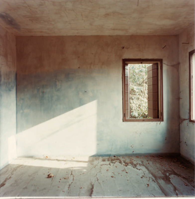
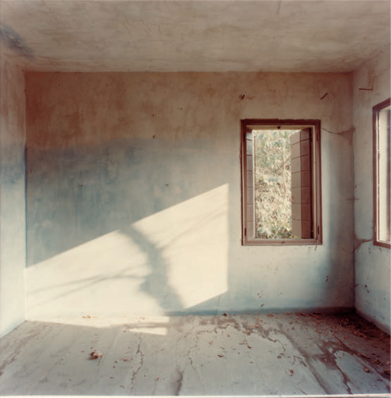
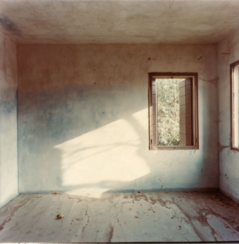
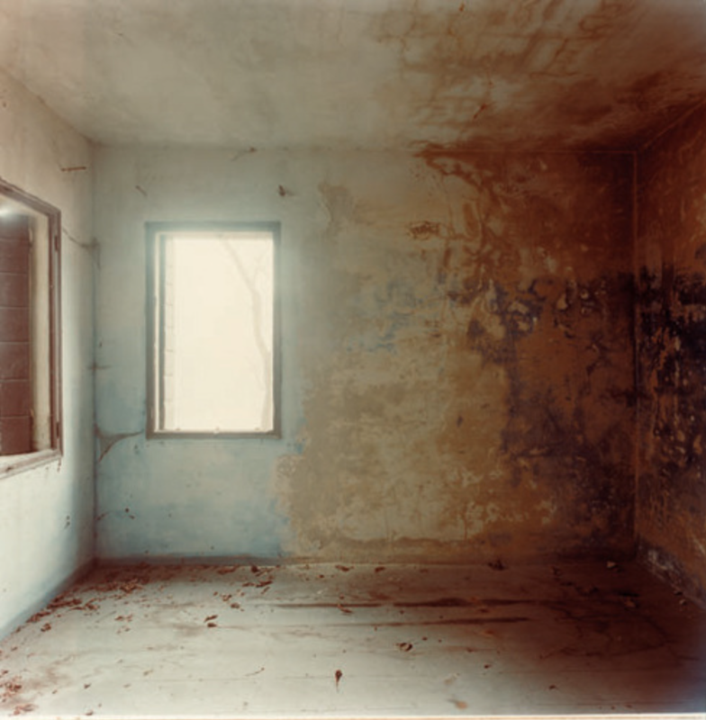
My response
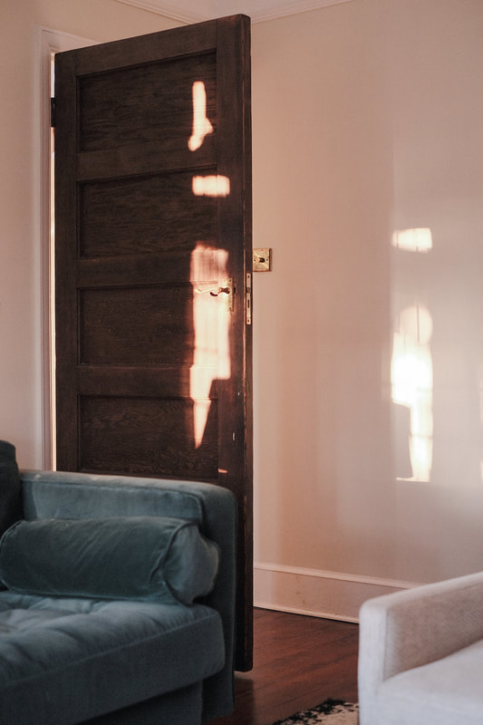
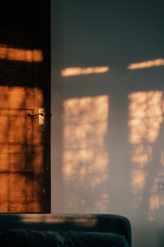
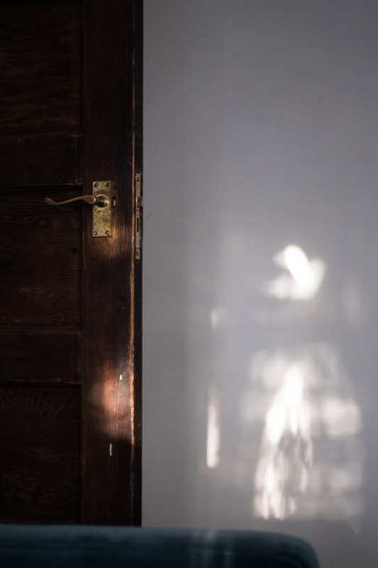
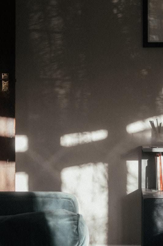
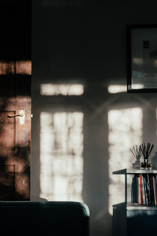
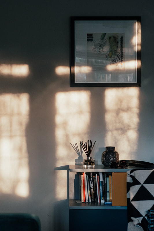
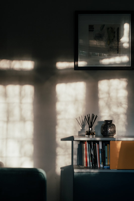
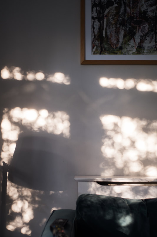
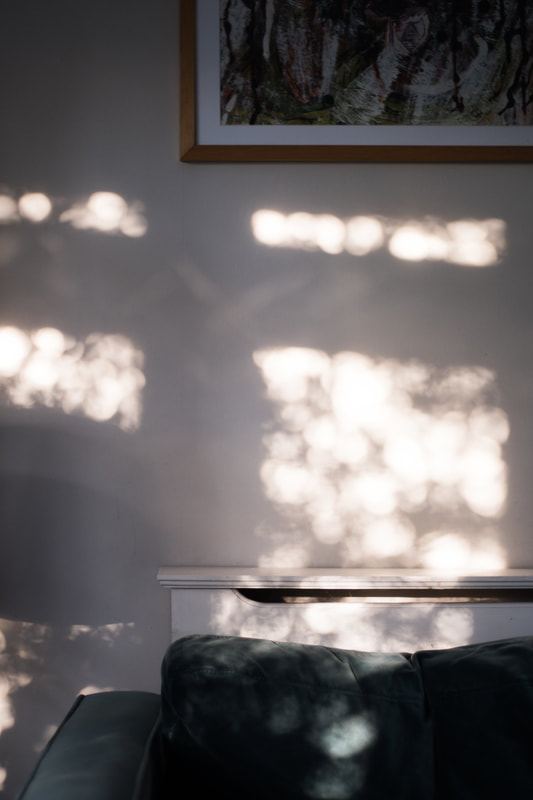
These are photographs of the light falling across the walls and door in the living room of my home. The house faces south east, so the front room gets the strong early morning sunlight. There is a large tree outside through which the light is filtered. I recently learned that a poem or song that celebrates the dawn or early morning is called an 'Aubade'. This would be a good title for these pictures. Unlike Guidi, my photographs only really show the walls (and door). I don't have access to an empty room and I didn't want the compositions to be too cluttered with furniture and objects. It would be interesting to photograph an empty space so that the walls, floor and ceiling were visible.
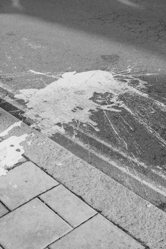
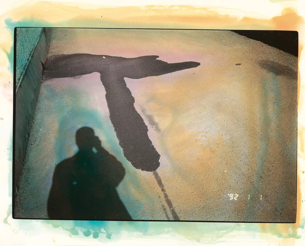
Masahisa Fukase's Everyday Streets
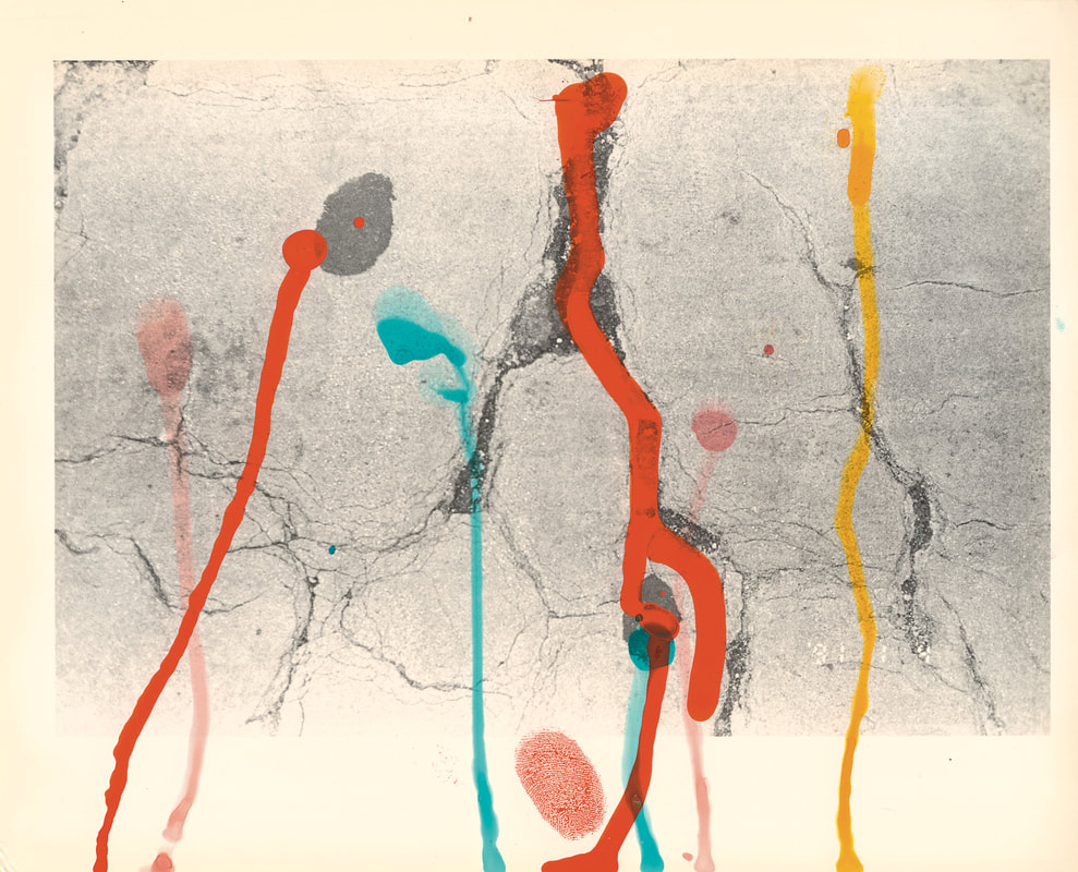
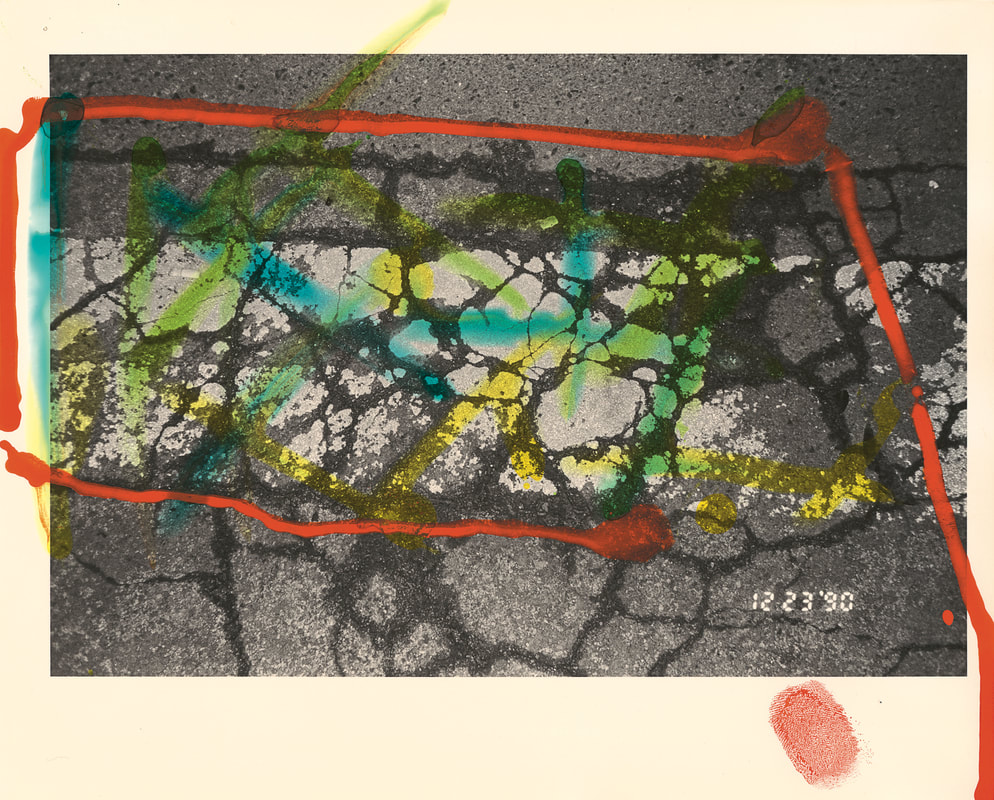
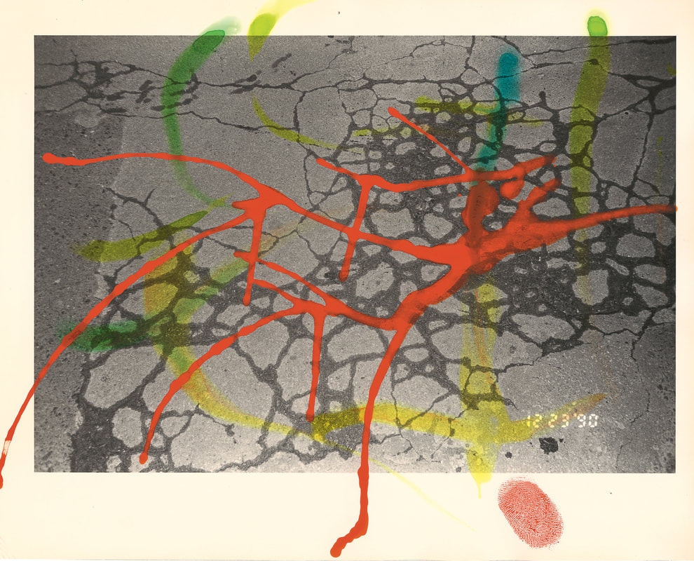
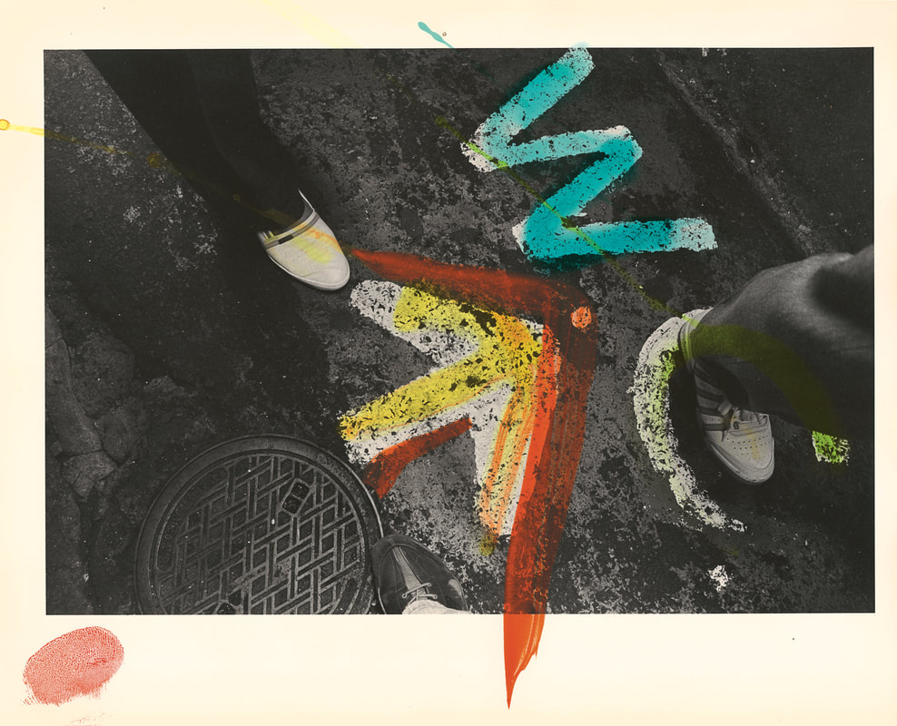
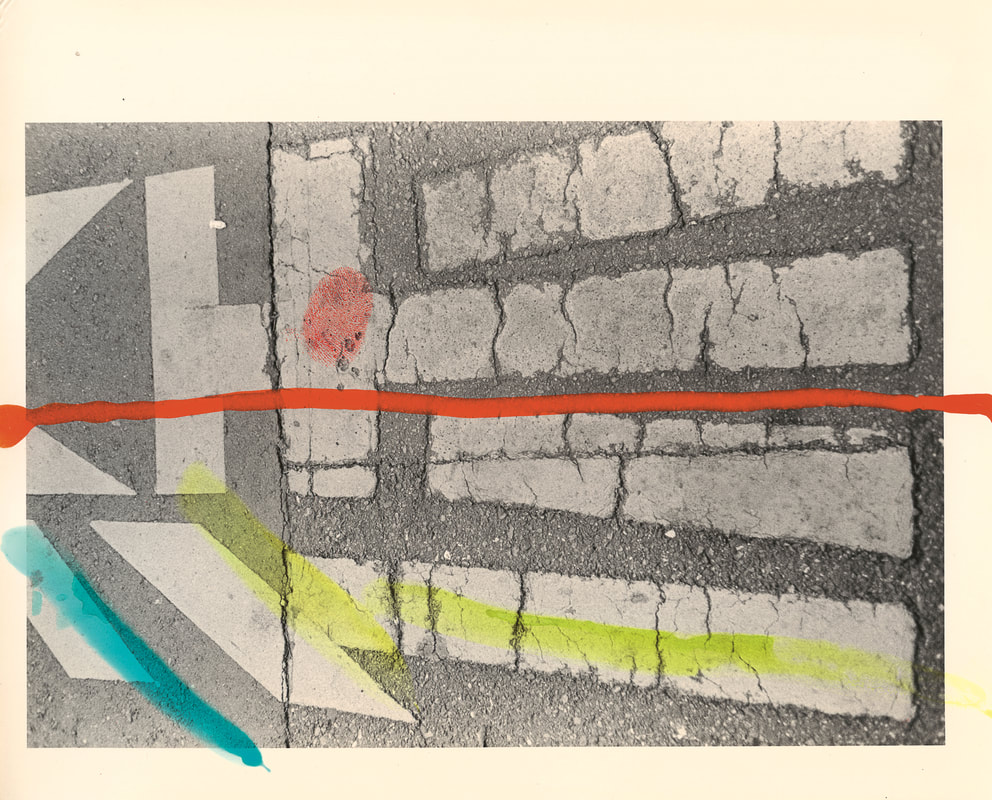
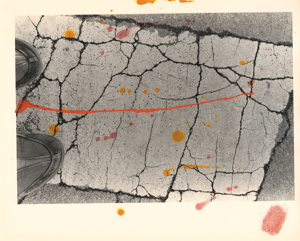
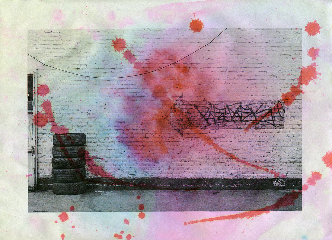
'Hibi' means everyday or daily in Japanese. The title of this sequence of pictures by Masahisa Fukase suggests the daily practice of photographing the ground on which he walked through the streets of Tokyo. Once printed in the darkroom, Fukase added splatters, dribbles and fingerprints of brightly coloured paint to their surfaces, perhaps mimicking the abstract, chaotic patterns of cracks and marks on the surfaces of roads and pavements.
|
Threshold Concept #6Fukase's pictures are a reminder that all photographs rely on chance, more or less.
Fukase has photographed the flat surfaces of roads and pavements disrupted by an abstract network of lines. Sometimes he includes a shadow self-portrait to mark his presence as the author of these images. These images were made on walks through the city and, presumably, the photographer could not anticipate or control these encounters. Rather, he responded to the patterns and marks he witnessed, creating relatively informal snapshot-like images. The shadow self-portraits show him using the camera with one arm. This suggests that it was a type of point-and-shoot device. Making the picture was a momentary gesture (unlike the very careful process of using a large format camera). These chance encounters were further randomised after the images were printed by the addition of ink and paint. Again, the application of these colours appears chance-based. There is no attempt to colour in the images or achieve any kind of neat and tidy outcome. The photographer seems instead to be interested in the gestural application of the paint in parallel with the gesture of making the original image. It's almost as if he has 'painted' with his camera and then painted on top of the results. |
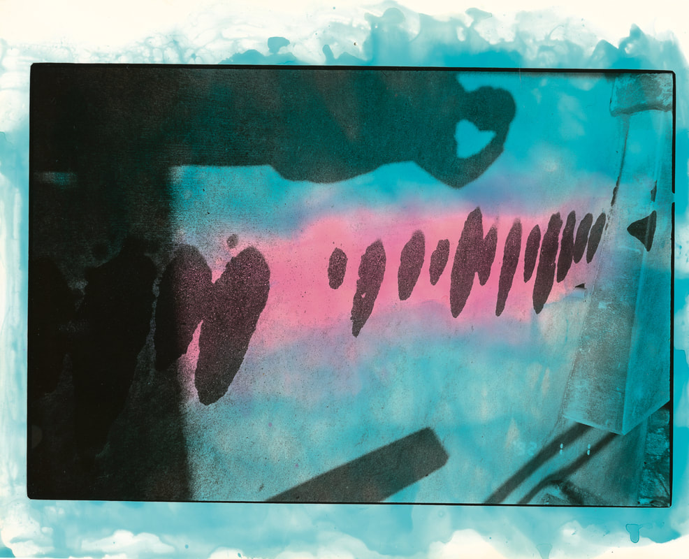
My first response
For this experiment, I chose a small selection of black and white photographs of walls and floors, printing them on cartridge paper. I tried applying drawing ink to the images when they were both dry and wet. The most successful strategy involved dropping the ink into a wet sink and placing the images upside down on top. This meant that I couldn't really control where the colour was applied to the image. In a couple of cases I then applied the ink with a brush to the drying paper. I was keen to achieve a combination of intentional and chance marks, soft areas of diffuse colour combined with more opaque, drawn elements. I'm relatively pleased with the results although I'm not sure it's an experiment I will repeat. Compared with the conceptual rigour of Fukase's series, these pictures might be said to be too decorative. Nevertheless, I do think that the chance application of colour to the black and white photographs changes how we 'read' them. They are no longer simply documents of observable reality.
|
|
|
|
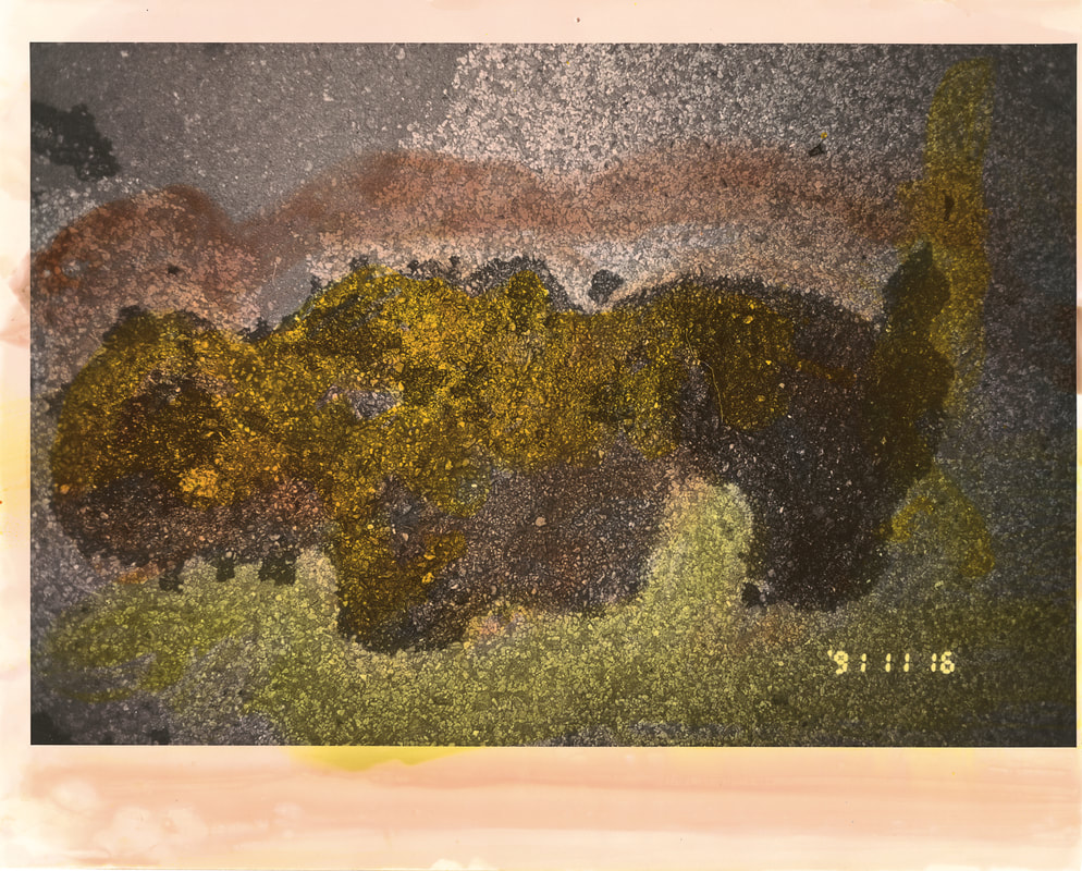
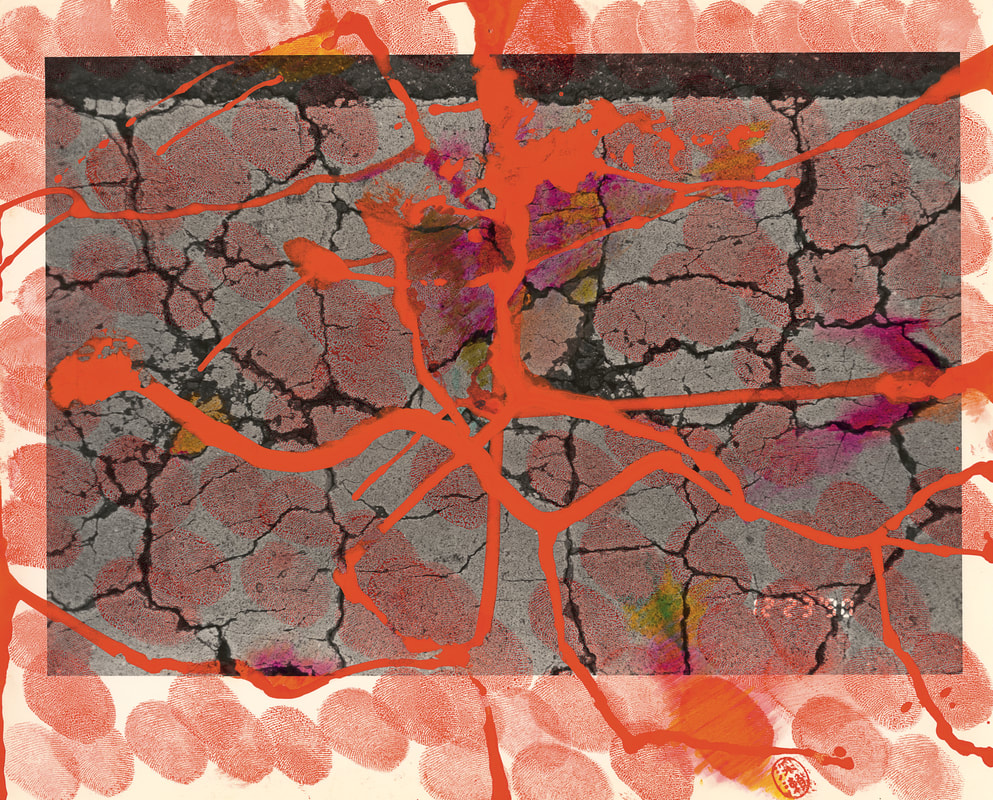
Response #2
For this experiment I used a roller and acrylic screen printing ink to first disguise the images. I then added layers of coloured drawing ink to the wet surface. The subjects of these images are significantly more disguised than those above. The two larger images are my favourites.
|
|
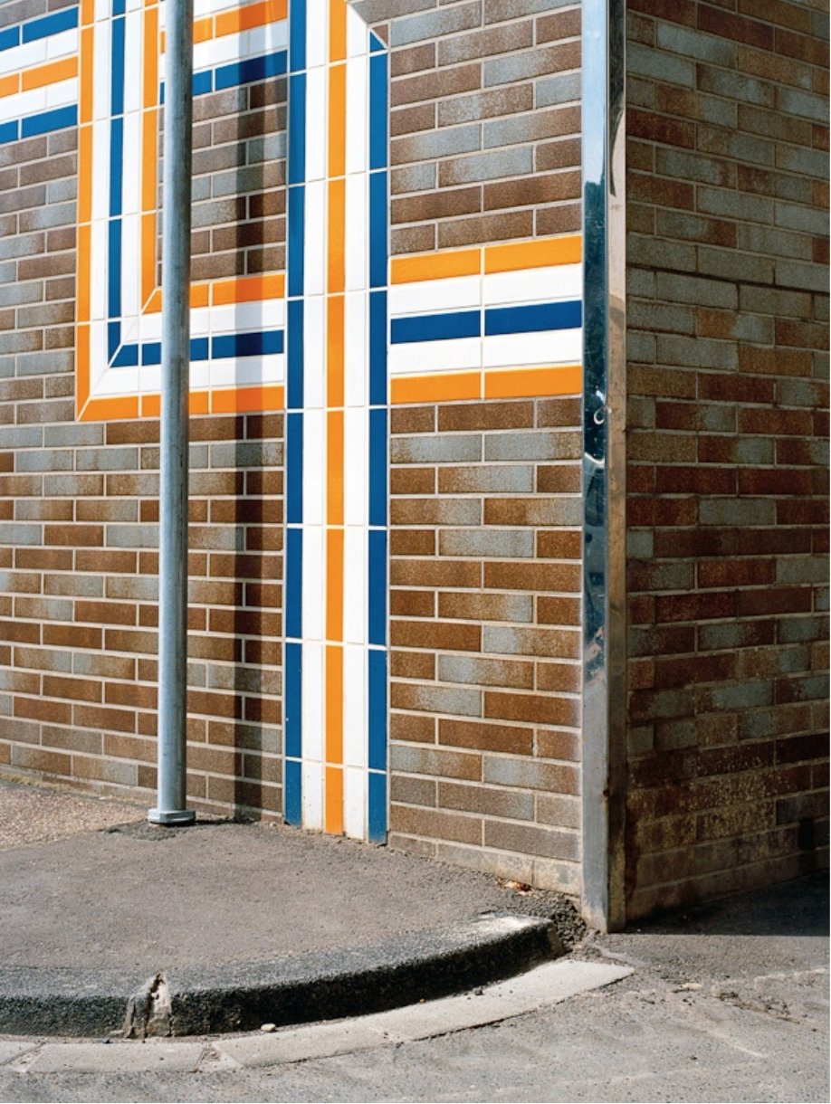
Andrea Grüetzner's Corners
Graphic art, painting, collage, or photography? In her work, Andrea Gruetzner focuses on public spaces and architecture. For “the corner”, she explored the city of Koblenz with her camera and directs viewers’ eyes off the beaten track and to the graphic structure of the urban architecture. Grüetzner’s concentrated image details — painterly, abstract, and surreal — [...] open up new perspectives on German postwar architecture and on historical artifacts.
SOURCE
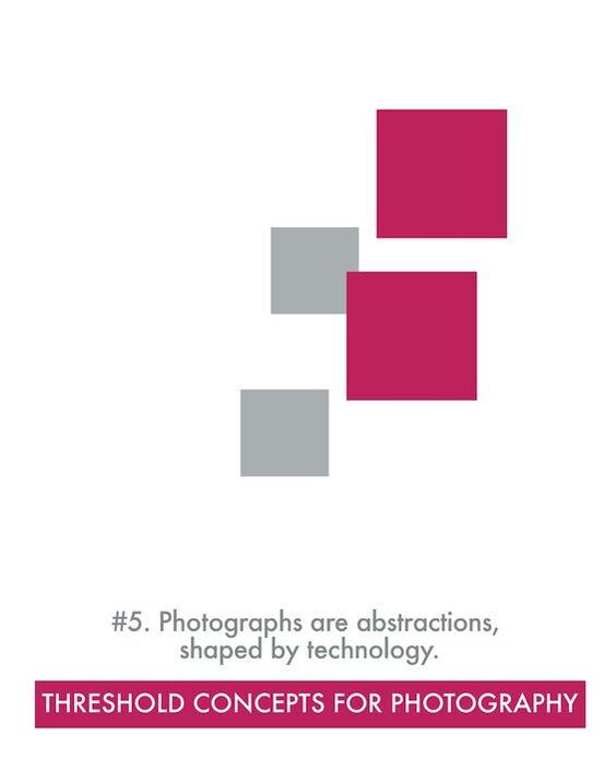
Threshold Concept #5It might seem odd to state that all photographs are abstractions. And in what sense are they 'shaped by technology'?
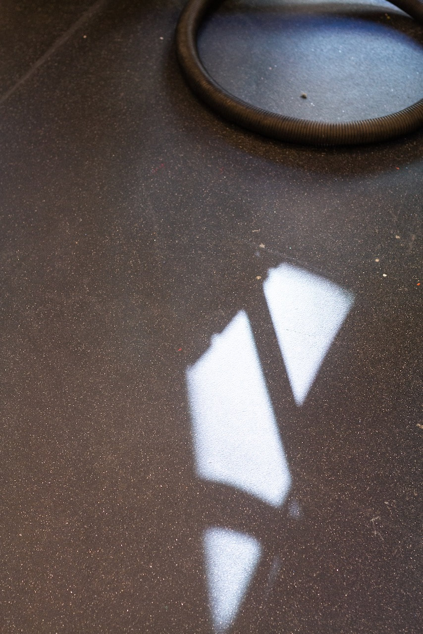
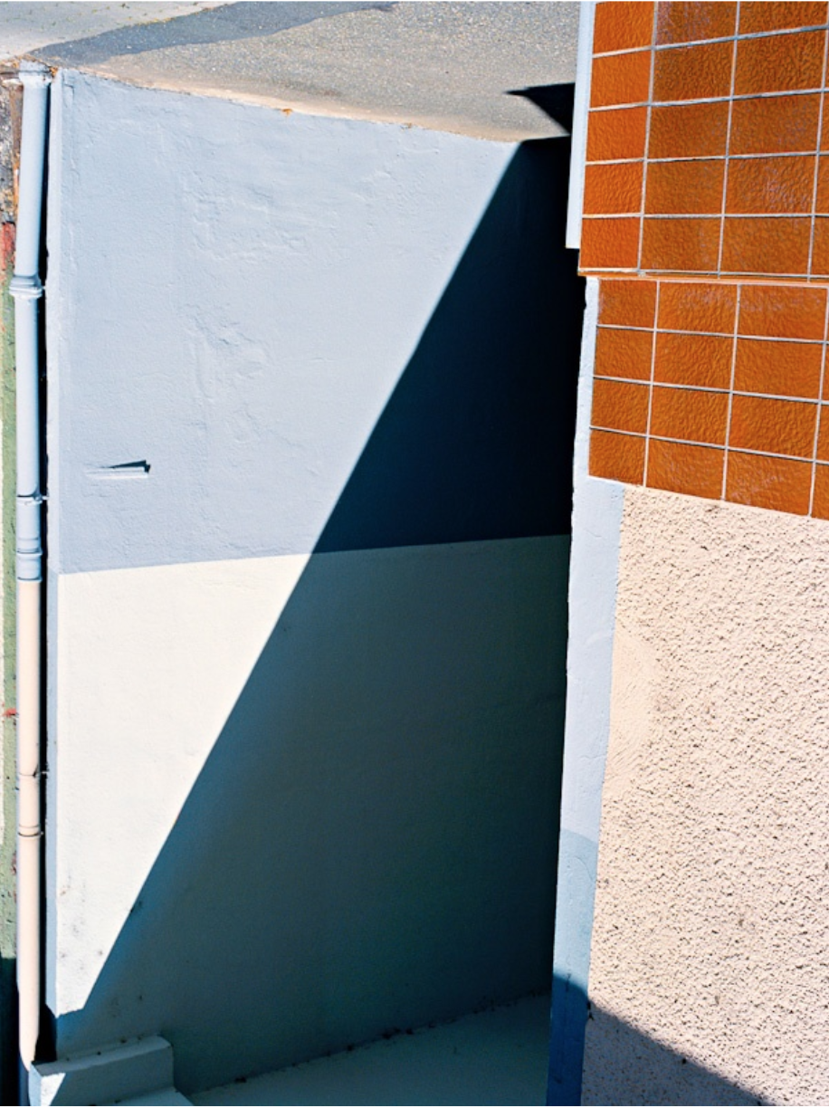
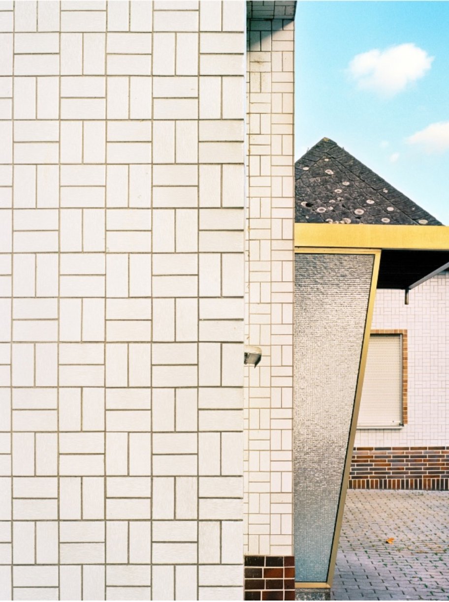
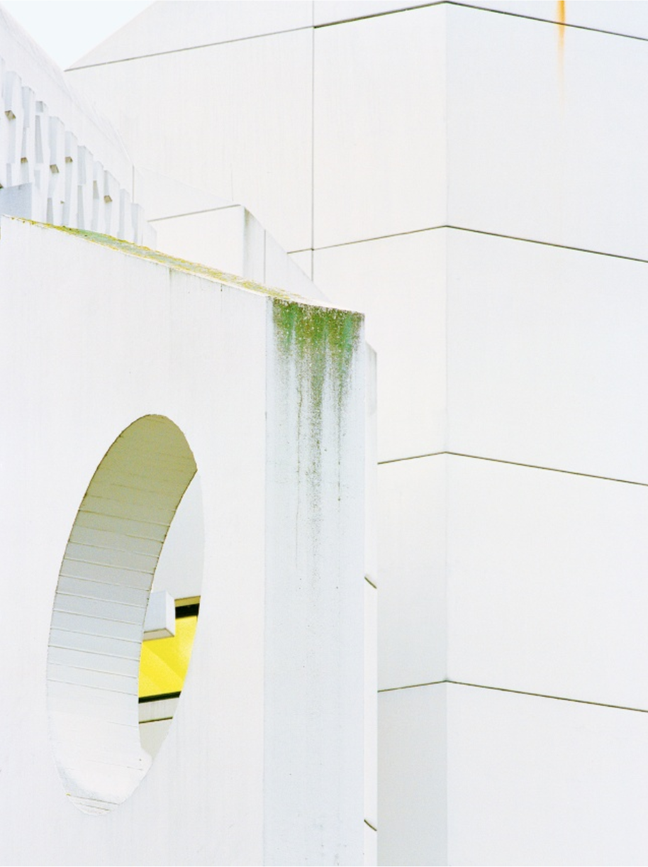
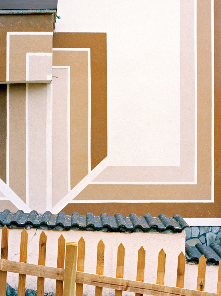
Andrea Grüetzner's photographs of the German city of Koblenz concentrate on the edges of buildings, their corners and, possibly, the corners of the city streets where they can be found. Like a building, a photograph has edges and corners but, unlike a building, a photograph is almost completely flat. Another obvious difference is that the three dimensional space of a structure in the real world is flattened when it is photographed. This can often result in strange associations between things that, in reality, might be very far apart. Grüetzner seems to be playing with these differences in this series of photographs. For example, in the third image, the brown fence and brick wall were, in reality, separated by some distance. In the photograph, however, they appear to be connected. This illusion is enhanced not only by the flatness of the photograph but by the similarity in colour and tone. In some of these images, the light is bright but relatively flat and uniform. In others, deep spaces create strong shadows so that the shadow almost takes on a physical form. The triangular shadow shape in image 5 is a good example. Grüetzner is attracted to patterns and colours, repetition and variation. Her compositions are carefully controlled. Vertical and horizontal lines run parallel and perpendicular to the edge of the photograph, a very difficult effect to achieve given the nature of camera lenses and almost inevitable barrel distortion. These pictures are precise and playful. The photographer takes great delight in odd juxtapositions and celebrates the ability of photography to create a kind of order from apparent visual chaos. |
|
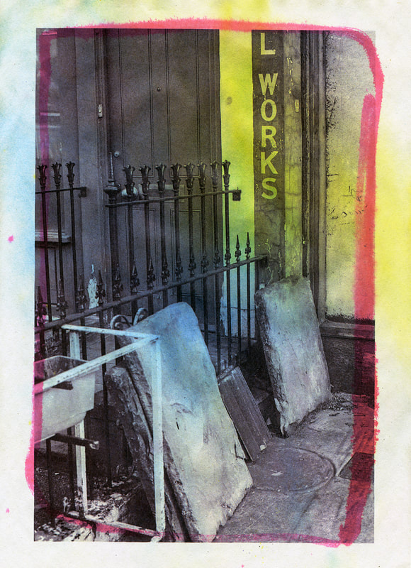
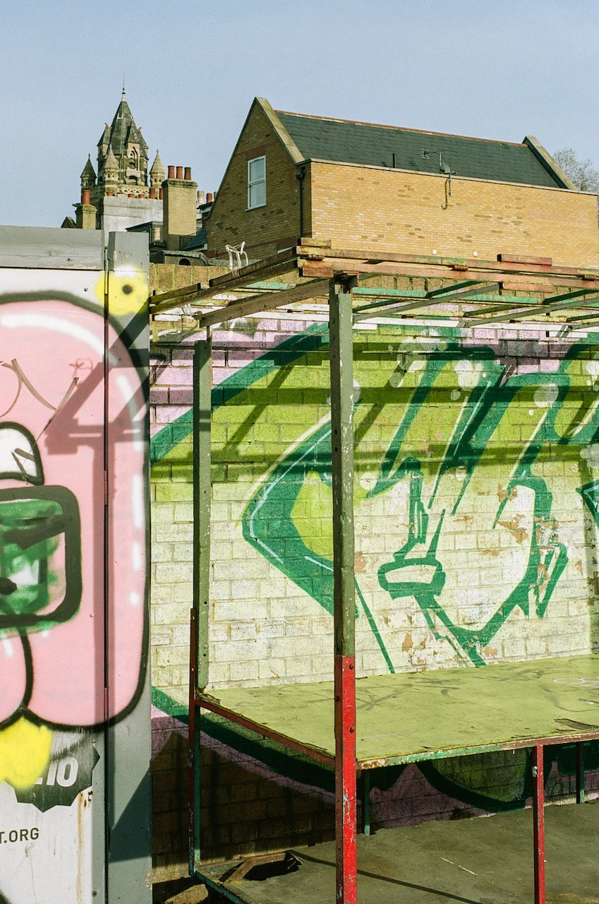
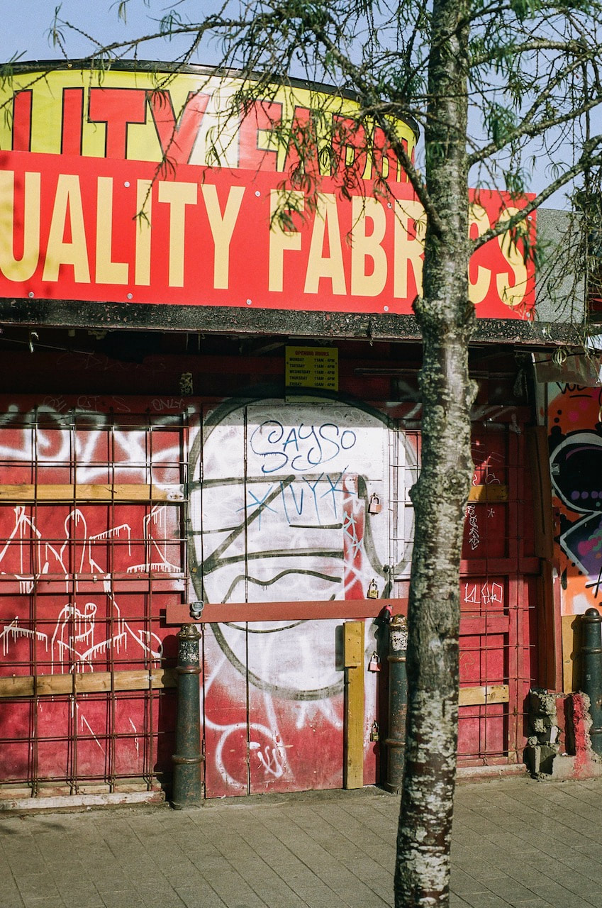
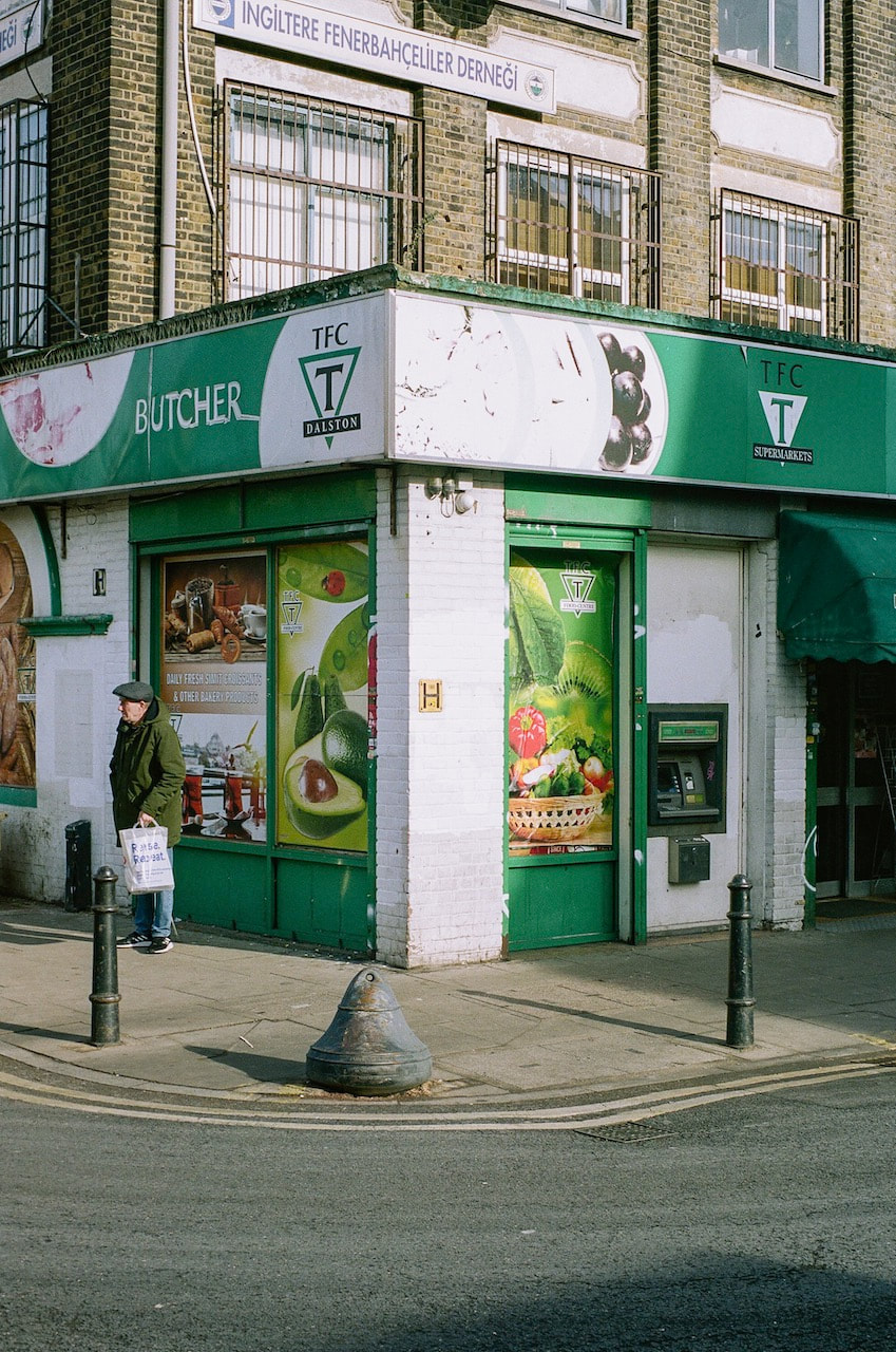
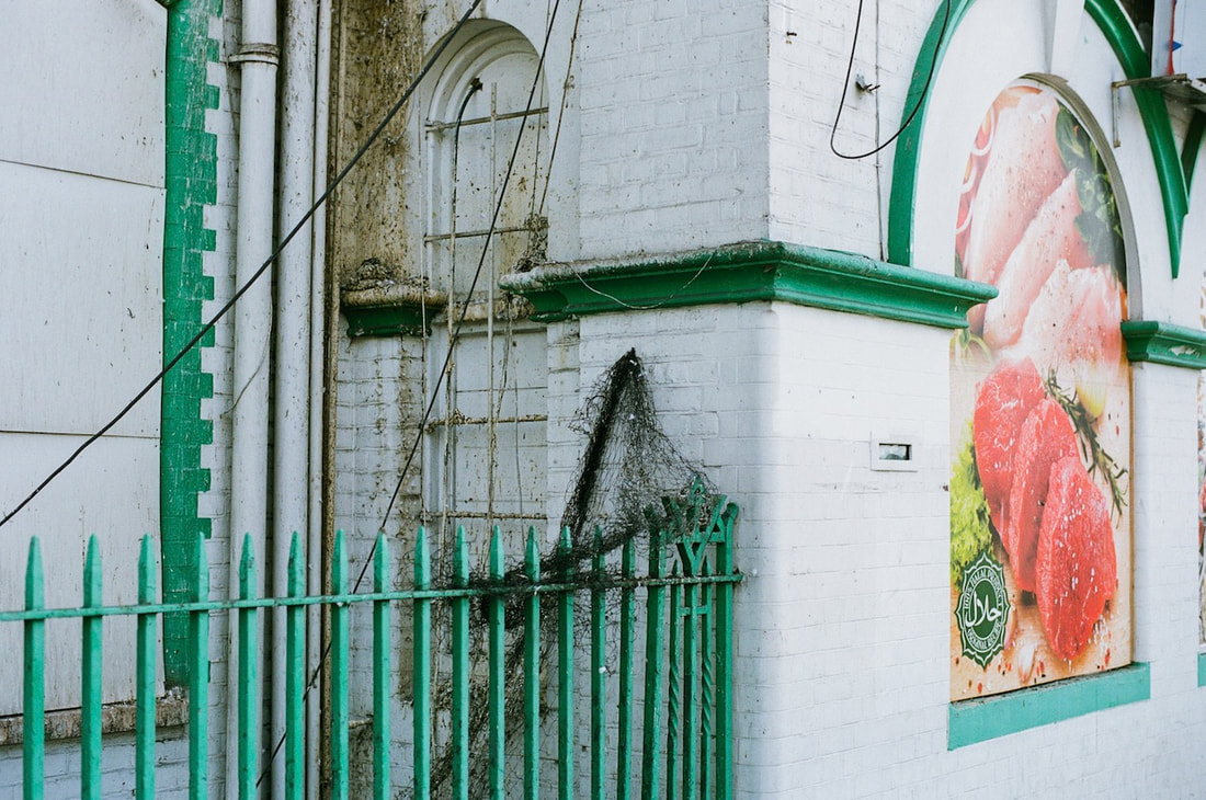
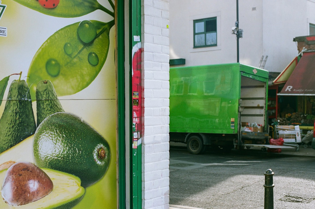
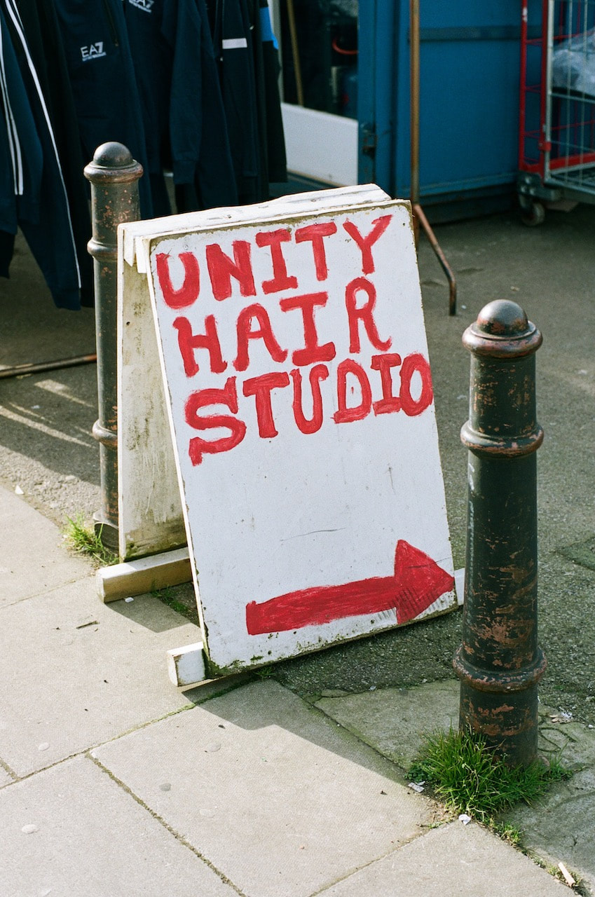
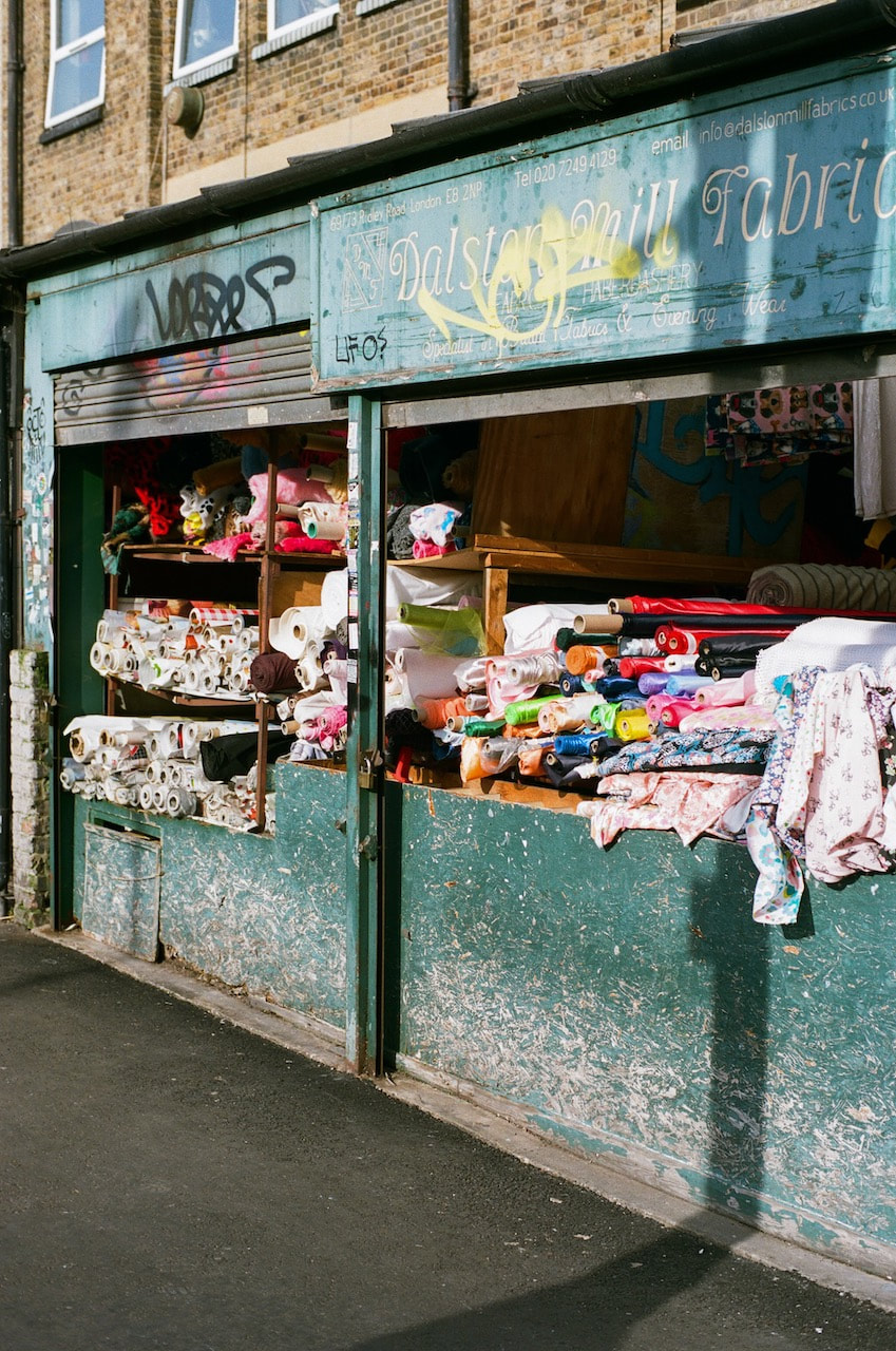
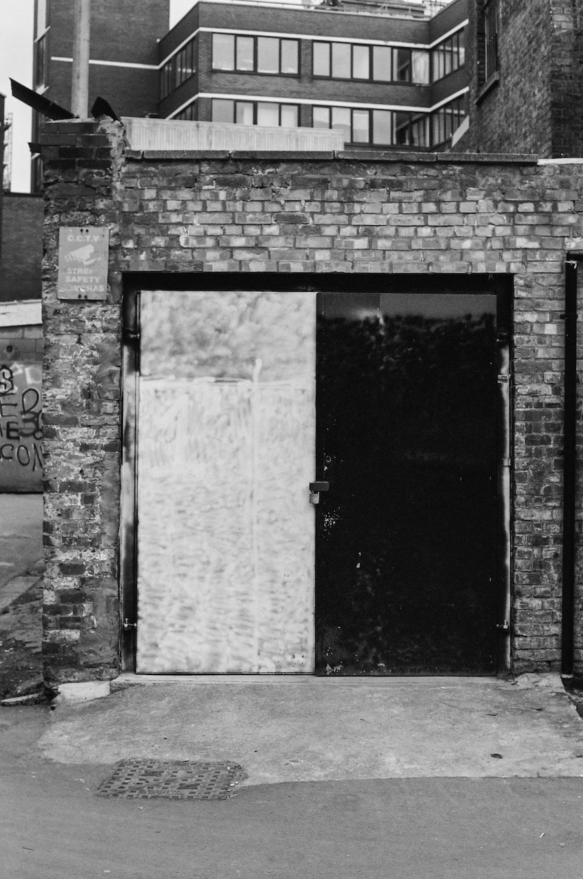
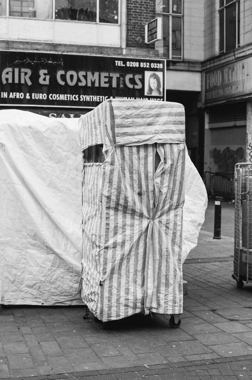
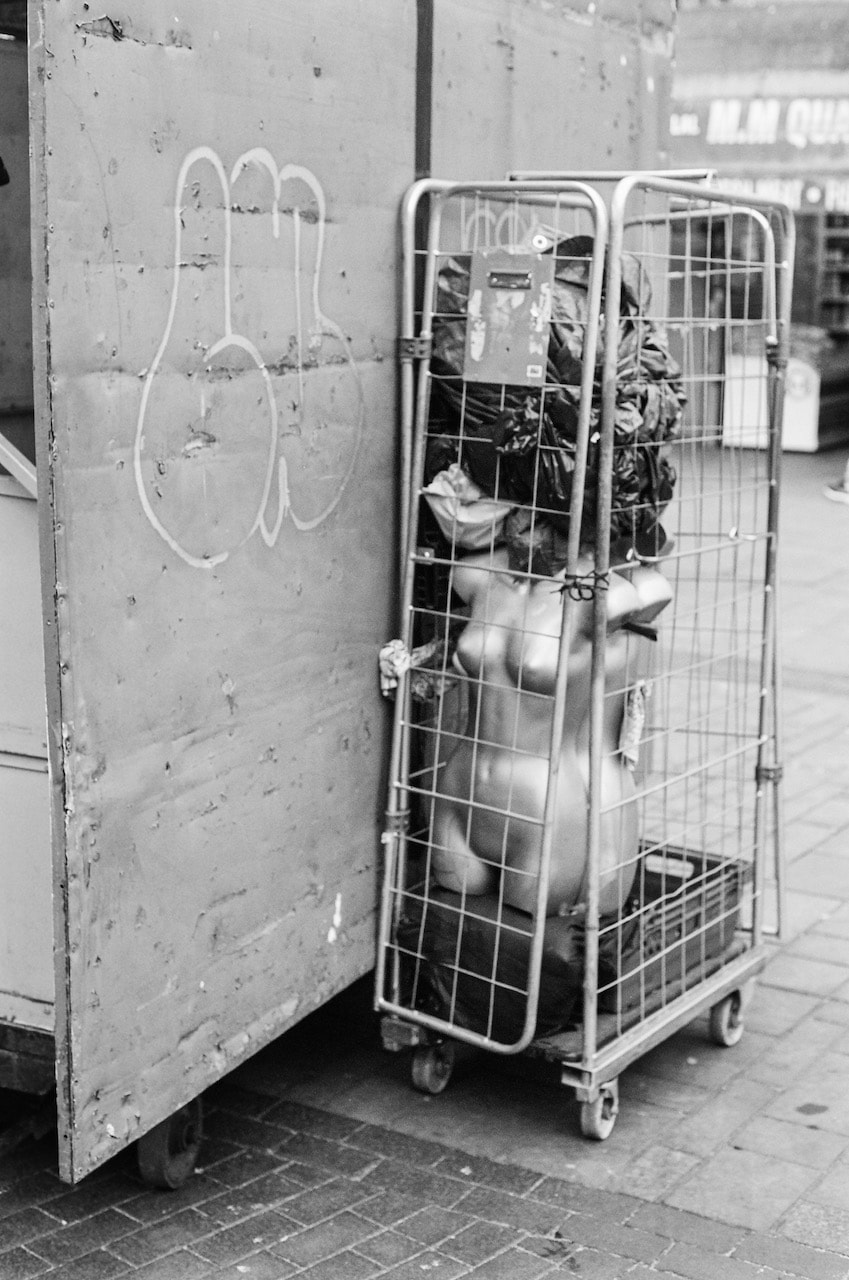
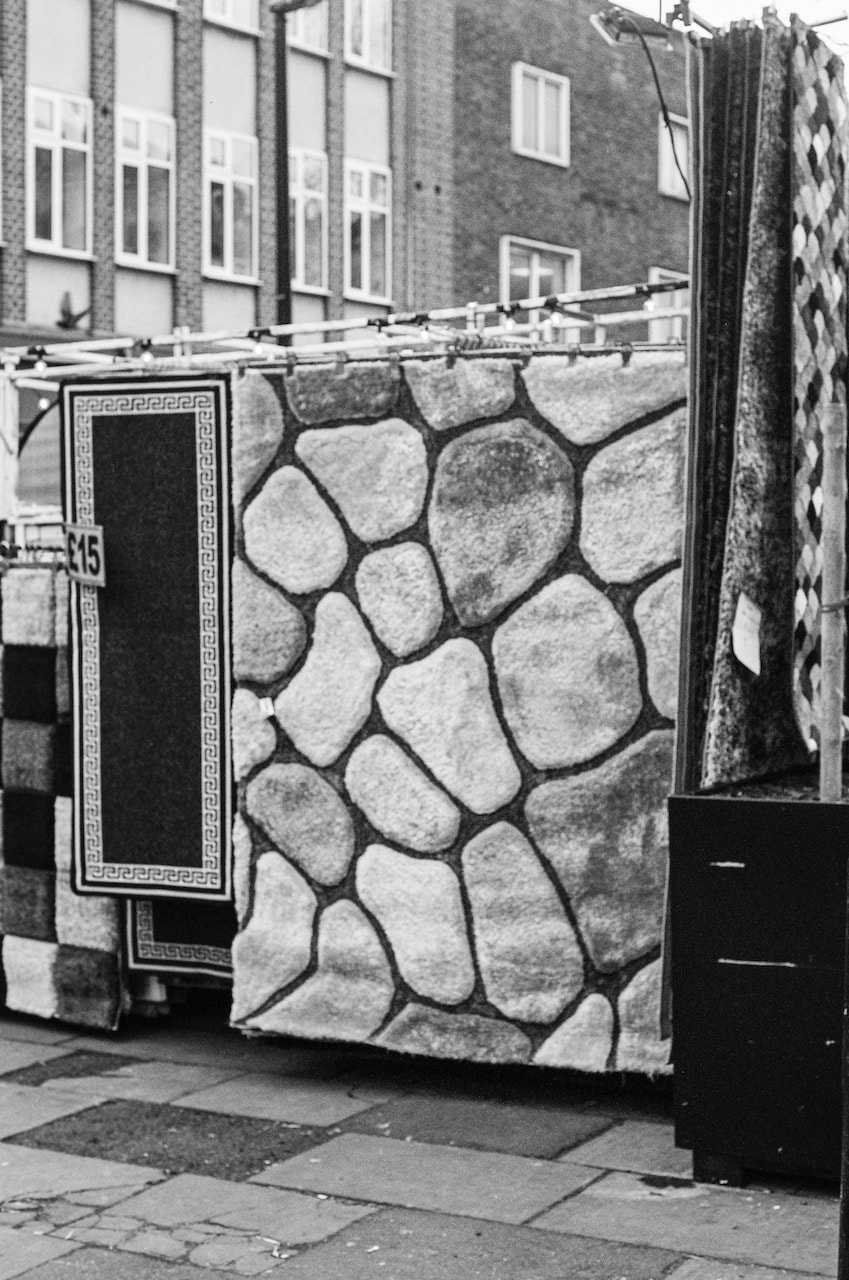
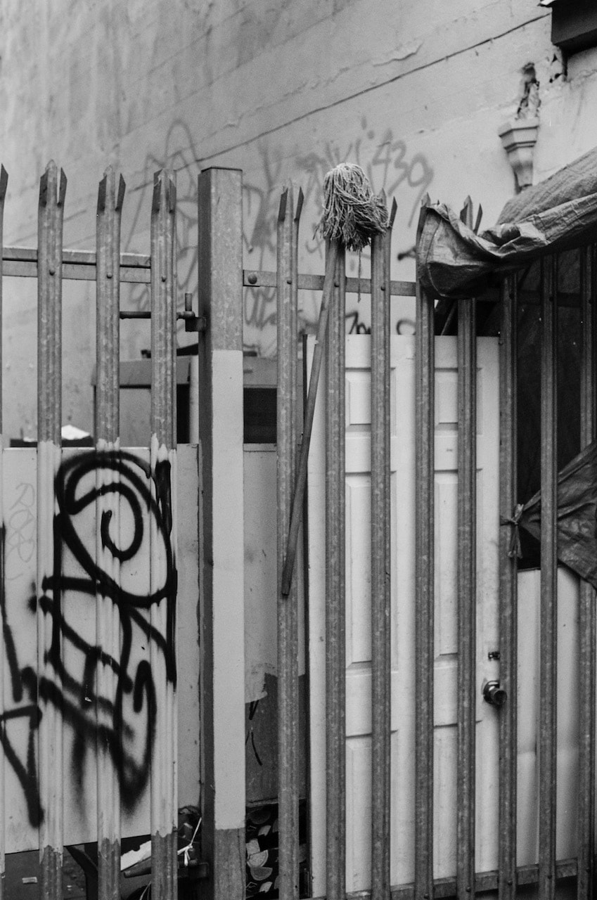
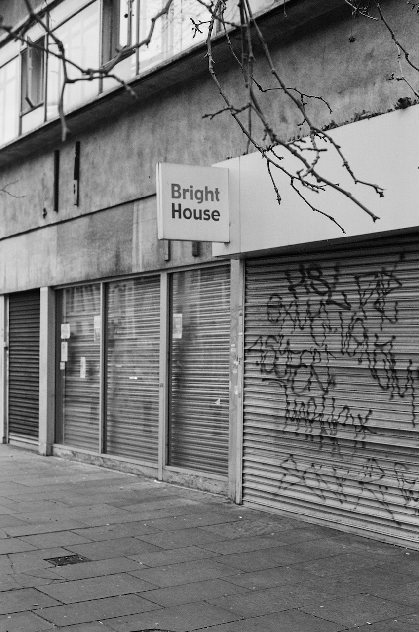
My response: Quality Fabrics
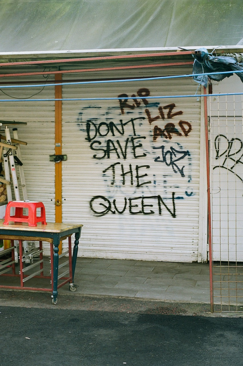
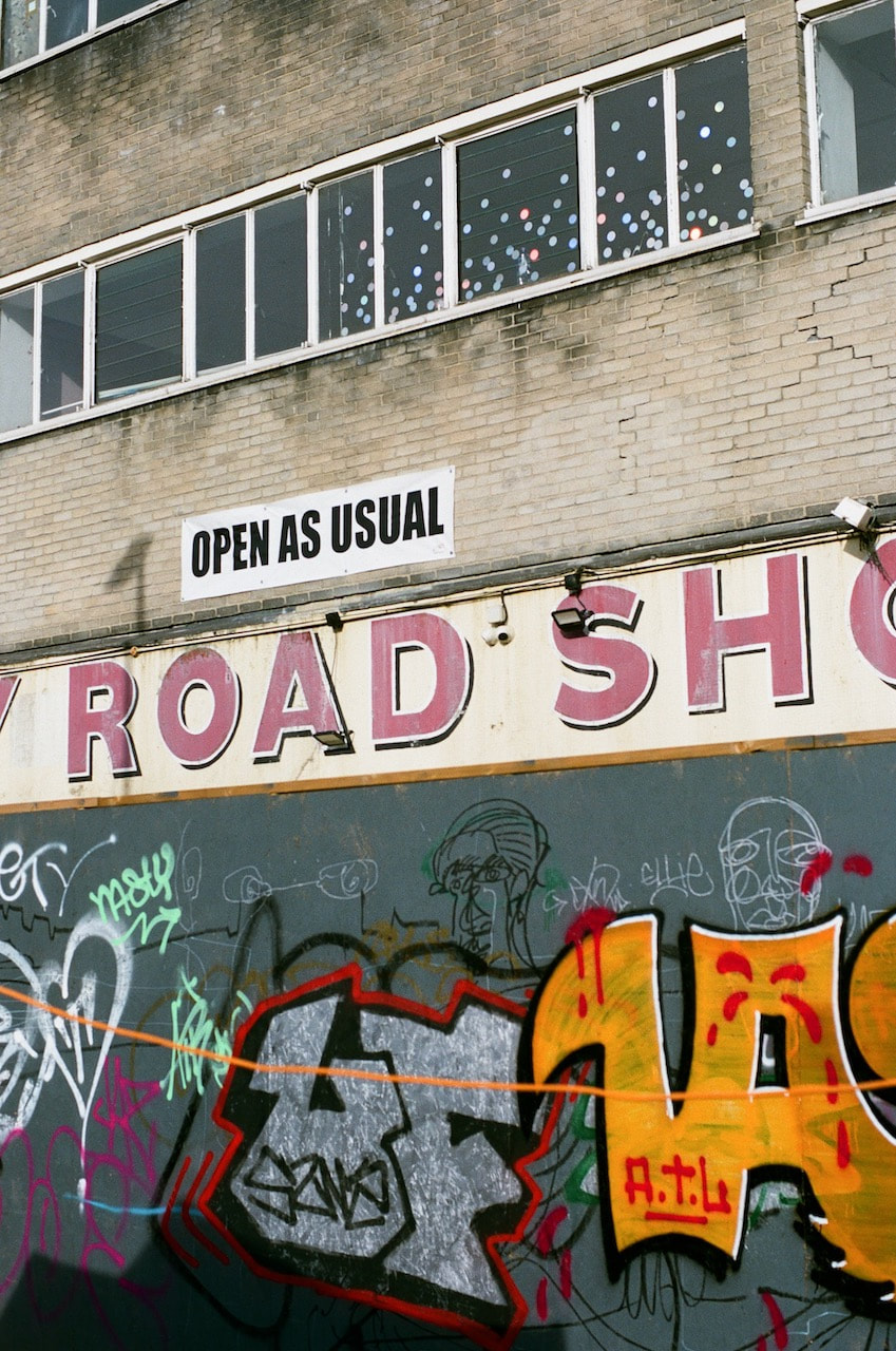
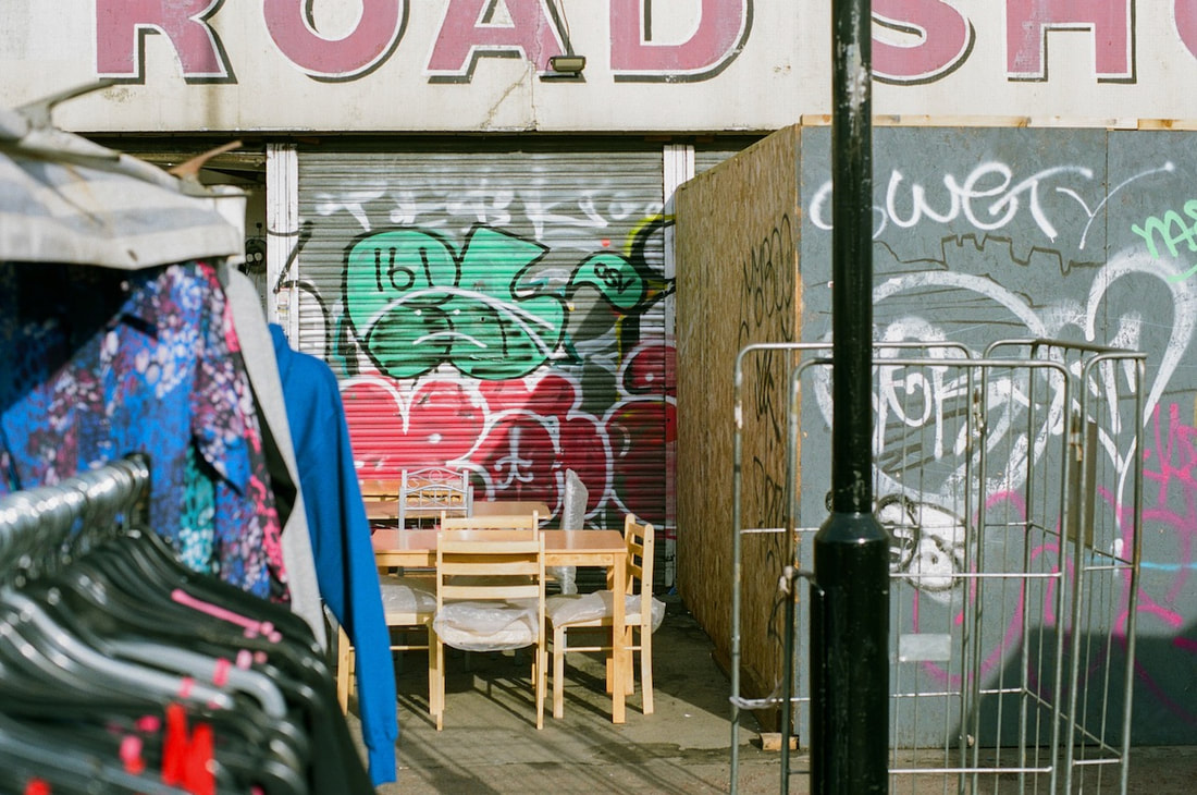
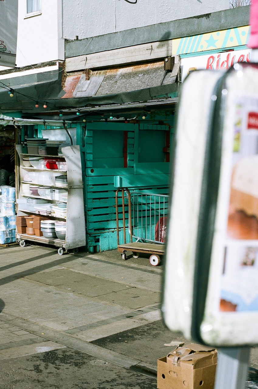
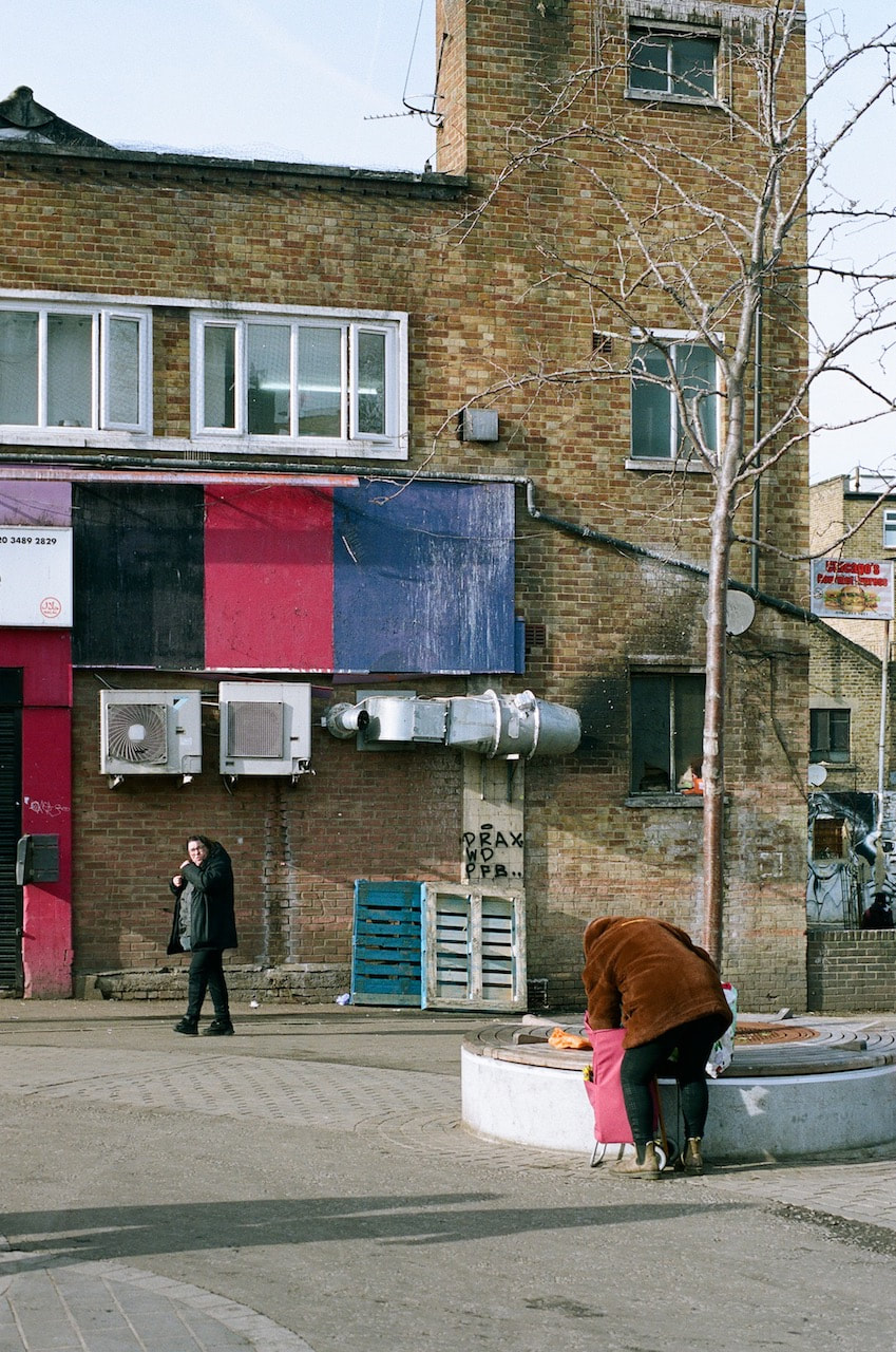
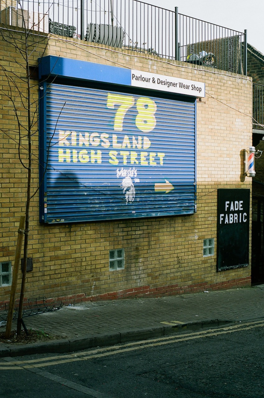
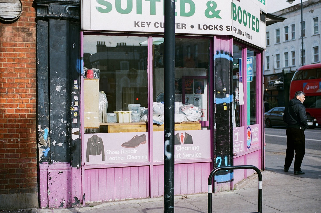
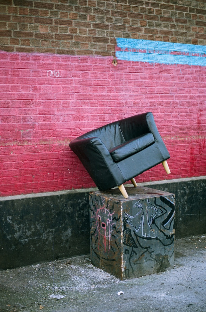
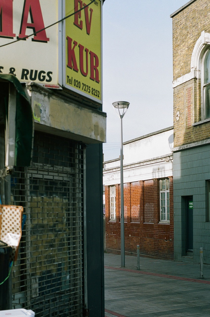
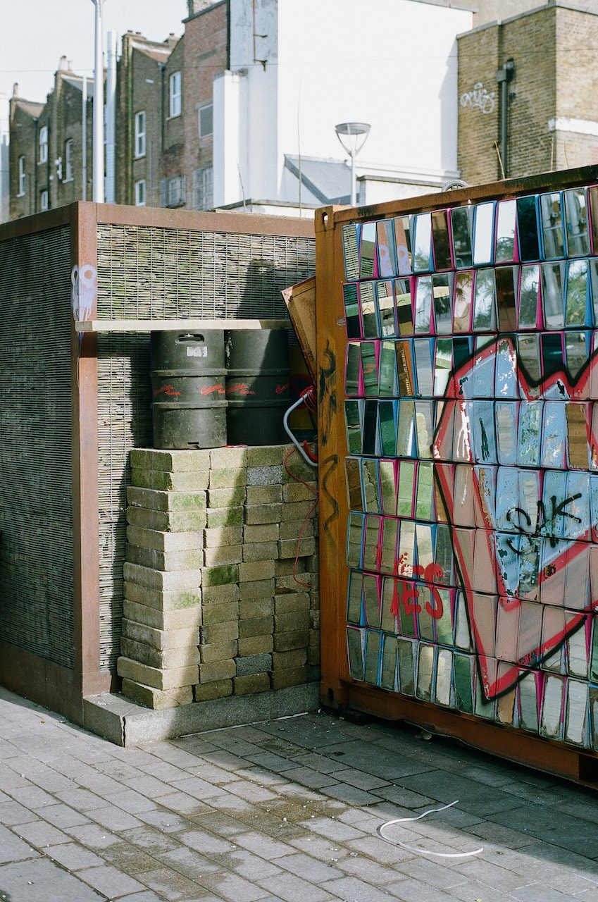
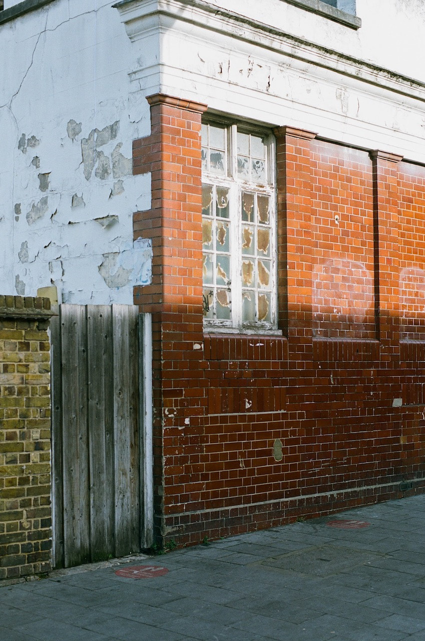
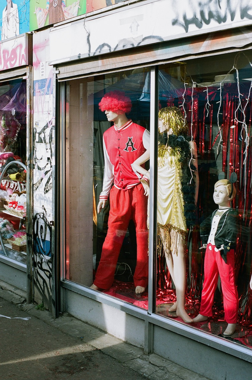
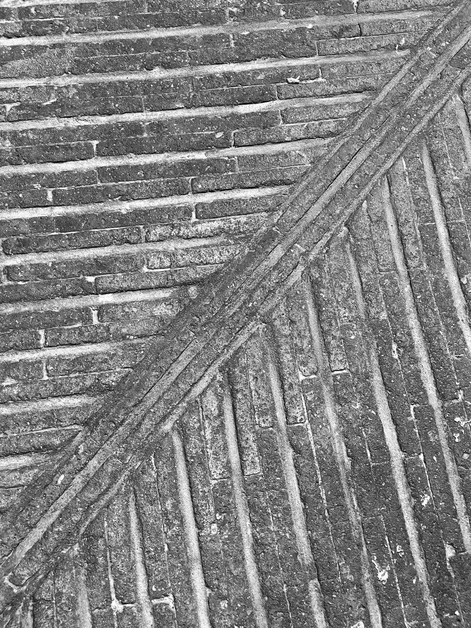
I decided to visit Ridley Road market in Dalston, East London. The pictures were made with a Yashica FX3 on Portra 160 film (rated at 100 ASA). The scans were then further processed in Lightroom. I tried to concentrate on the corners of buildings and streets and looked for opportunities to highlight the colours, textures and patterns of the market and high street. My pictures lack the clarity and rigorous abstraction of Andrea Grützner's compositions. However, I hope I have captured the slightly chaotic, eclectic and diverse quality of the physical environments of the market and surrounding streets by focusing predominantly on the floors and walls.
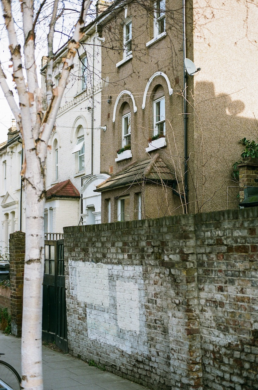
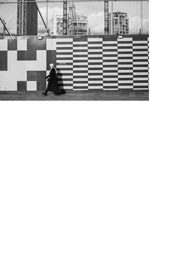
Response #2: A walk to King's Cross
These photographs were made with a digital SLR on a walk from Covent Garden to King’s Cross.
Again, I was interested in the abstract elements of the urban landscape - patterns, shapes and colours, in response to Andrea Grützner's photographs. Most of these pictures reveal the interaction of people and the environment, containing the traces of human presence. They are a little like stage sets, waiting for the 'actors' to walk into the spaces created by walls and floors.
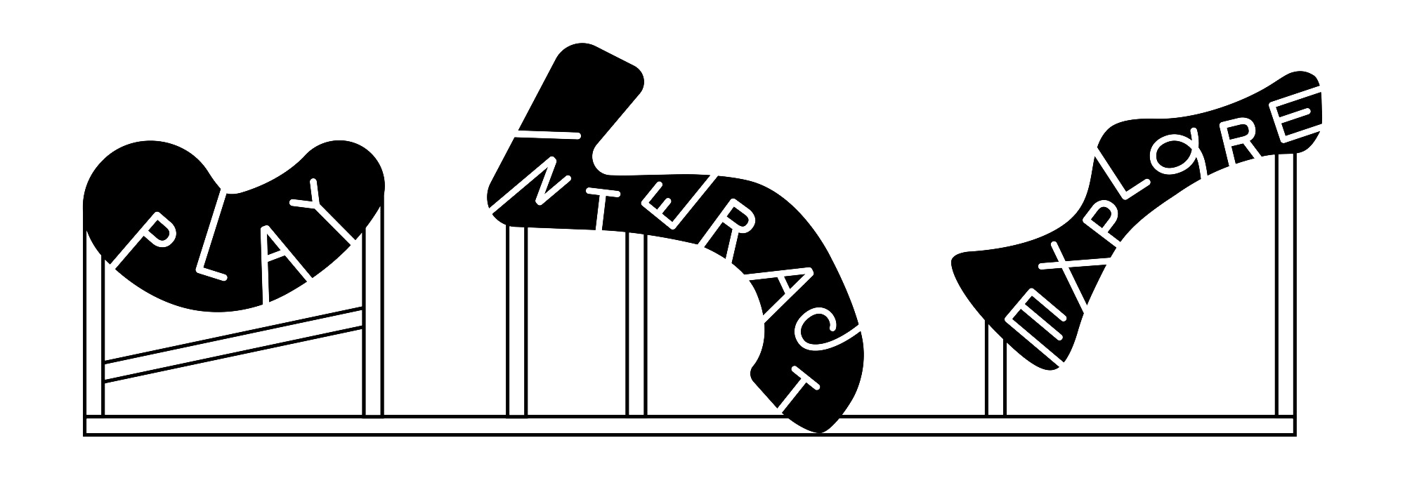
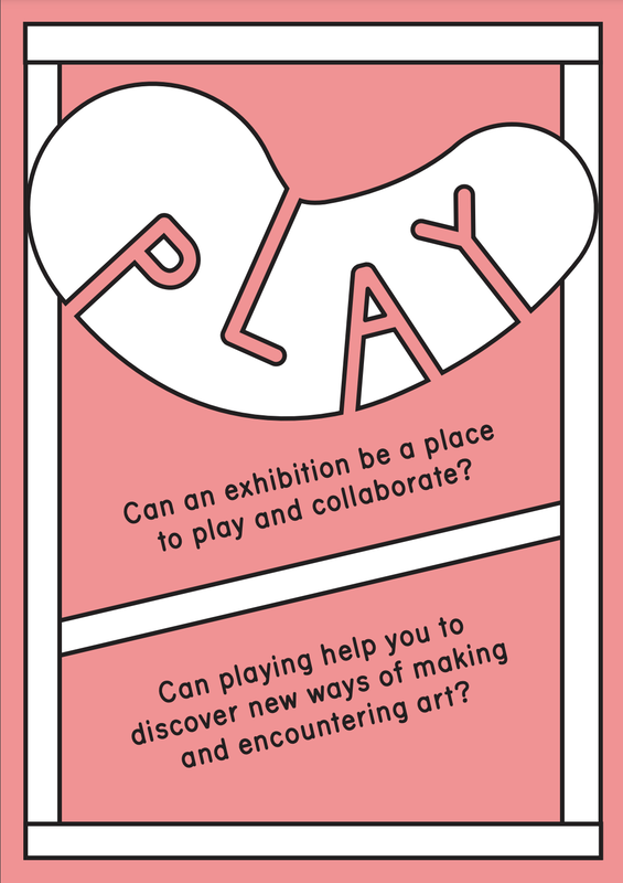
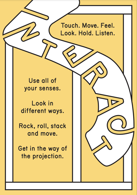
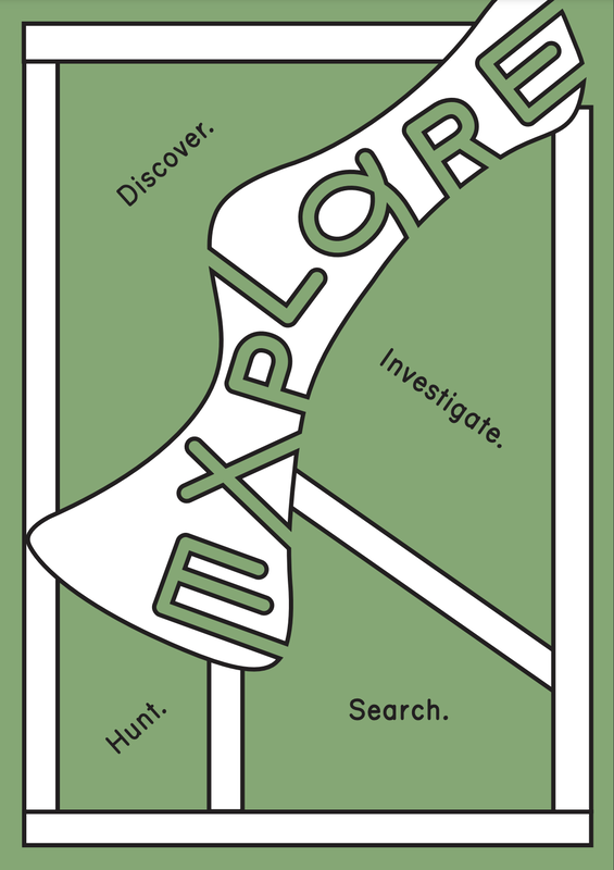
During half term I visited the Towner Art Gallery in Eastbourne to see an exhibition entitled Play, Interact, Explore by Leap Then Look. They had taken over one of the ground floor galleries, installing various materials and objects that encouraged experimental interaction by visitors. Not surprisingly, it was very popular with families and young children! The artists had made fantastic use of the floors, walls and ceilings.
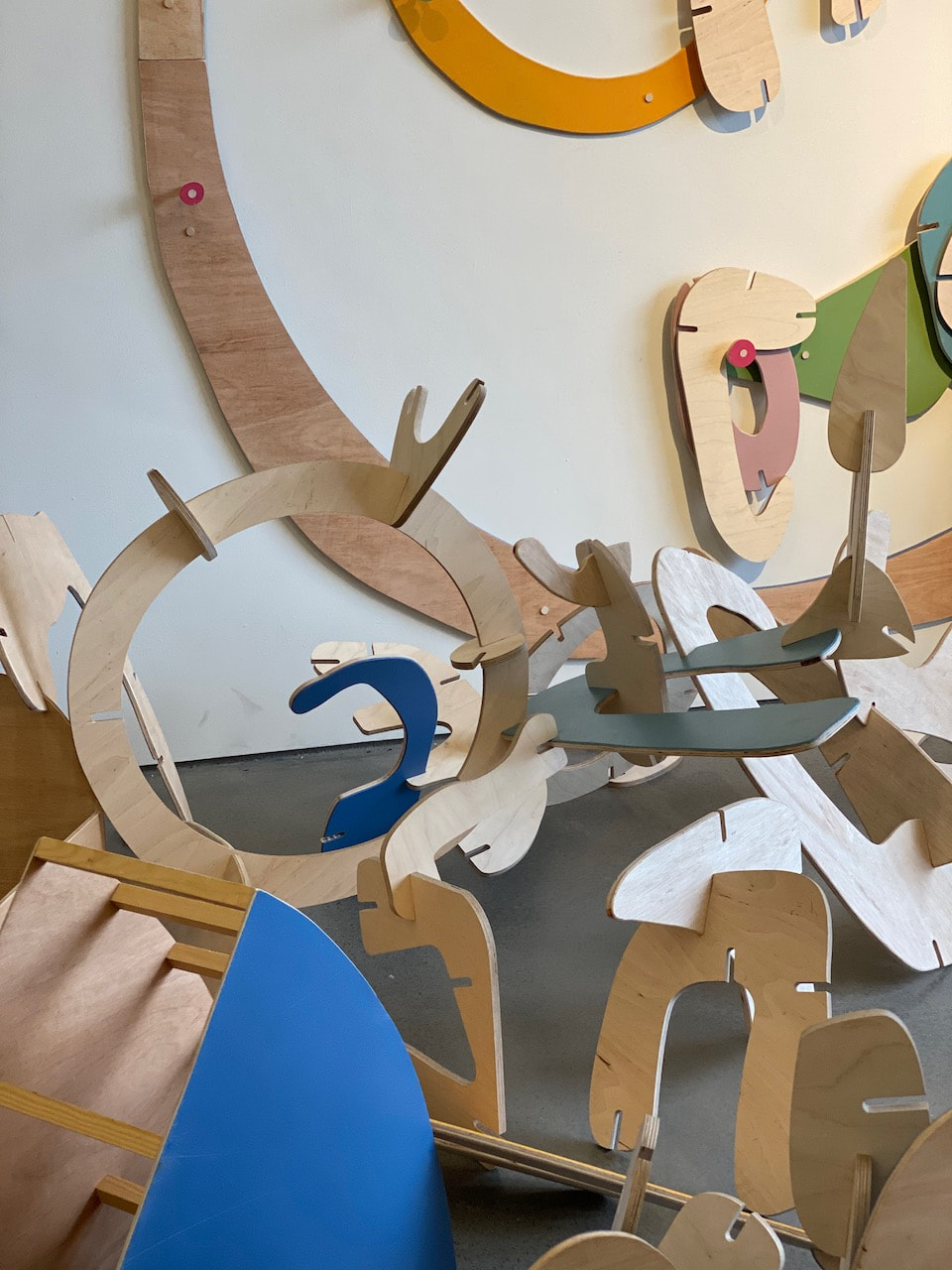

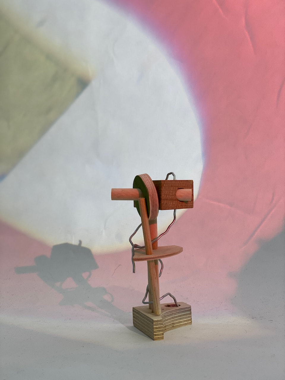
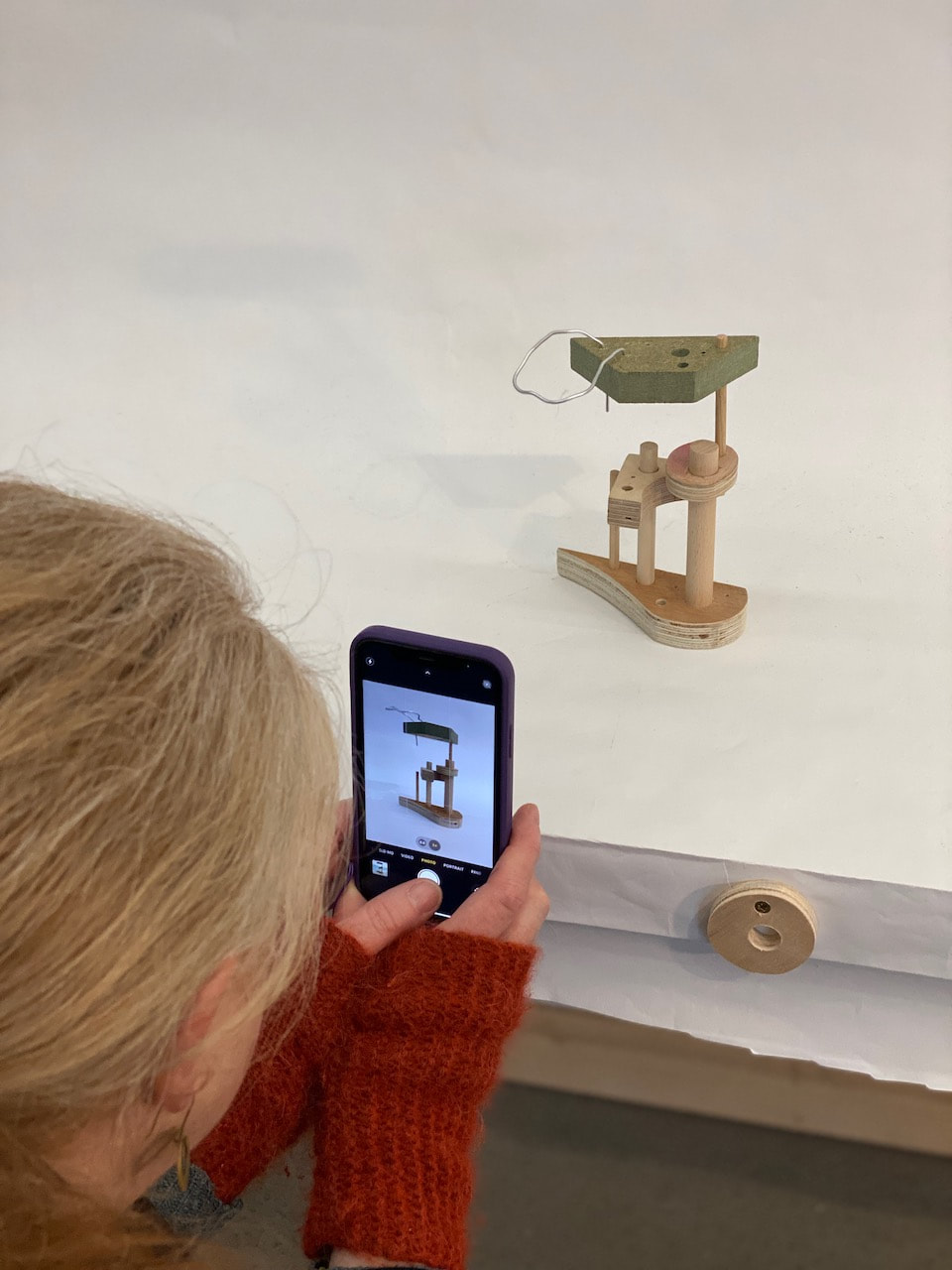
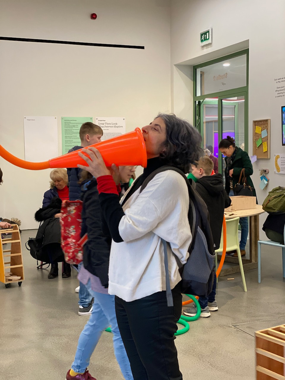
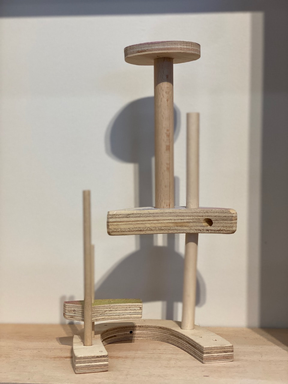
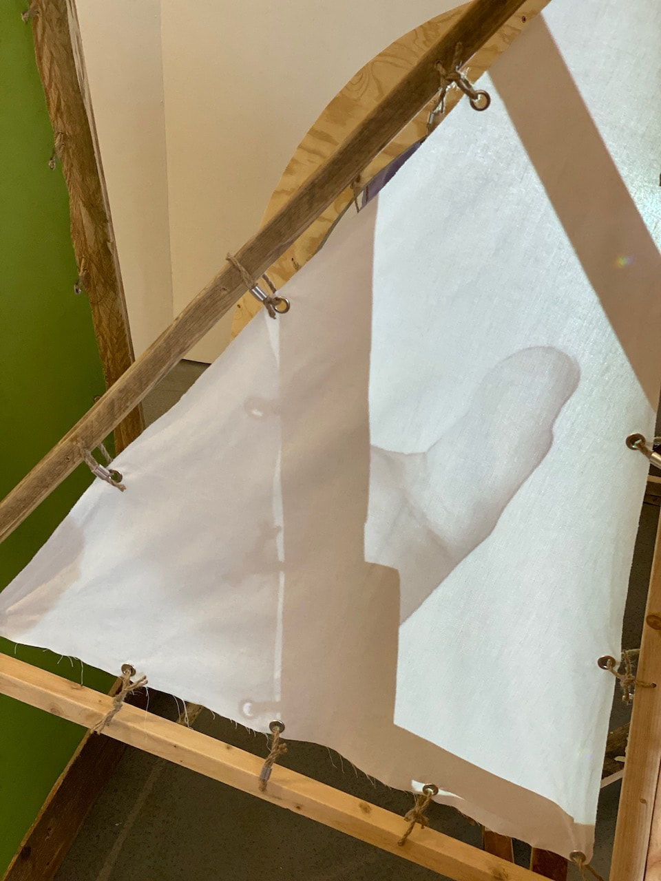
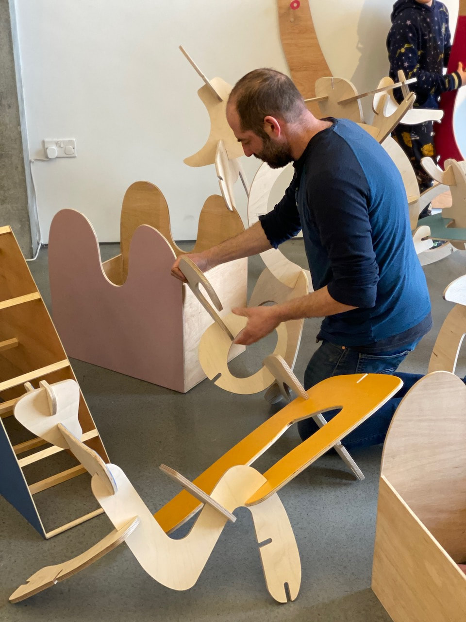
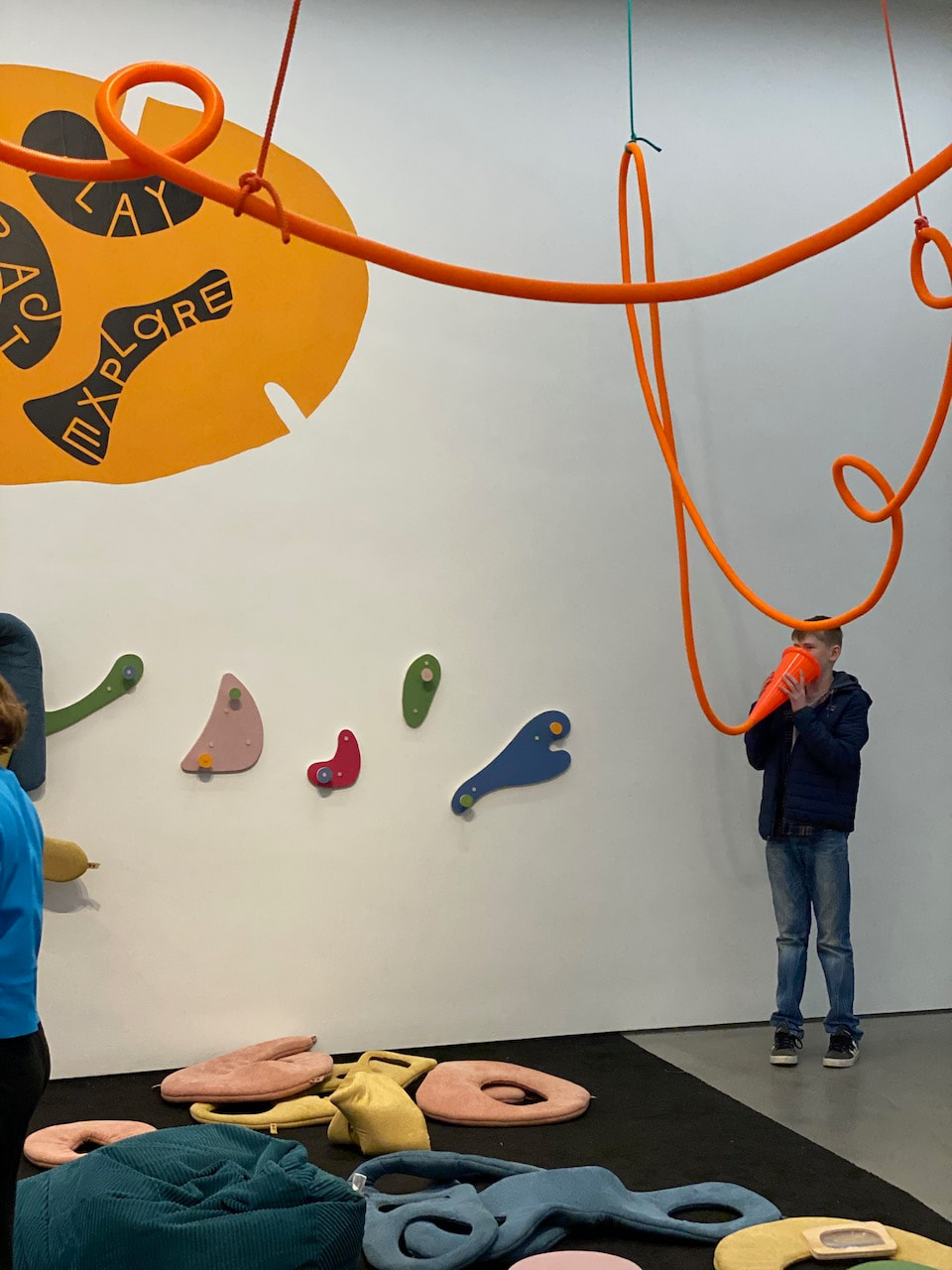
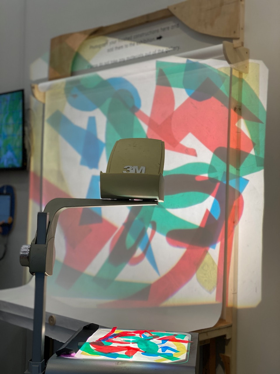
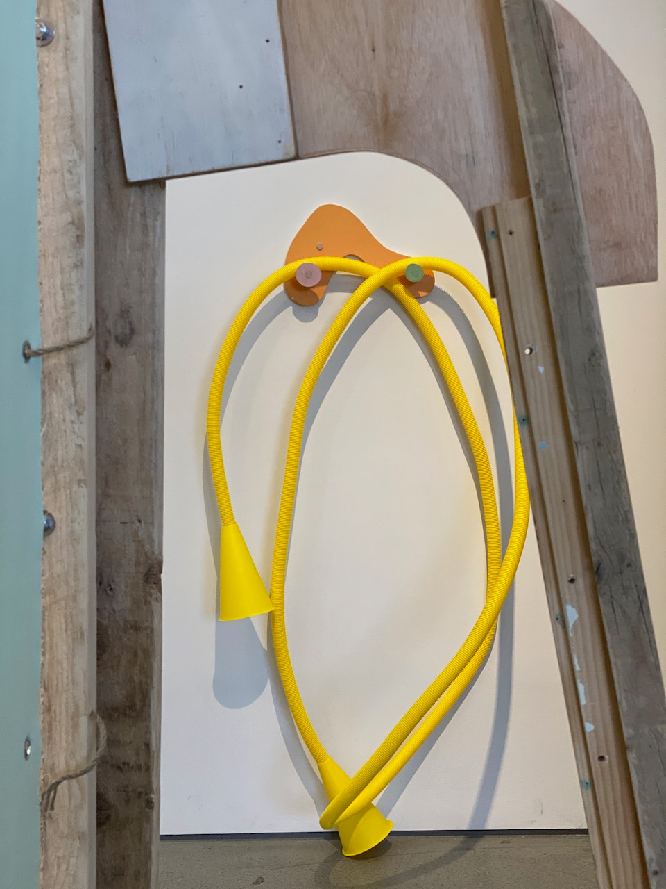
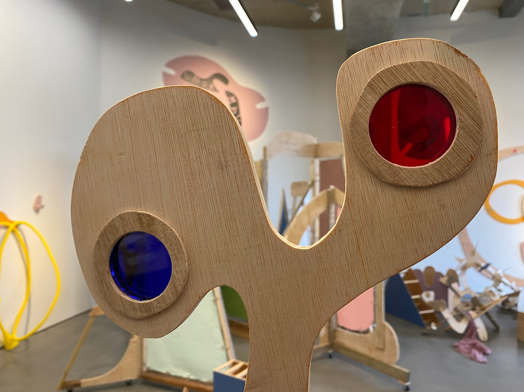
The exhibition handouts supported visitors to think about the ways in which they could play, interact and explore. The colours, textures and shapes were really inviting and visitors became quickly absorbed in various kinds of making and performing. People were encouraged to make photographs of the things they made and there were several projection devices. It made me wonder whether photography exhibitions could be similarly interactive.
|
|
|
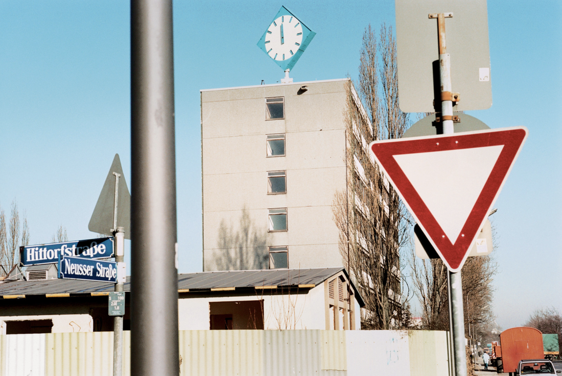
Joachim Brohm's landscape in flux
In his series 'Areal', photographer Joachim Brohm documents the slow transformation of a post-industrial landscape on the outskirts of a German town. He returns to the same location over a number of months, carefully recording the jumble of surfaces, the evidence of construction and the strange beauty in the very ordinary. These pictures are not part of the sublime landscape tradition. Brohm pays attention to the dirt, dust and rust, the parked cars and makeshift structures as they slowly make way for new buildings and infrastructure.
Brohm’s images are a mixture of bird’s eye views (presumably from nearby buildings) and deadpan frontal shots at ground level; his subjects are trucks and back lots, sheds and temporary structures, discarded items and construction rubble, an unspecific view of a generic process that could be happening almost anywhere (and is). He comes back to the same locations time and again, the same diamond shaped blue clock often hovering somewhere in the distance. His compositions are dense, often disorienting, with echoes of Lee Friedlander’s all over chaos.
-- Loring Knoblauch
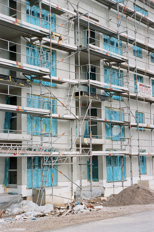
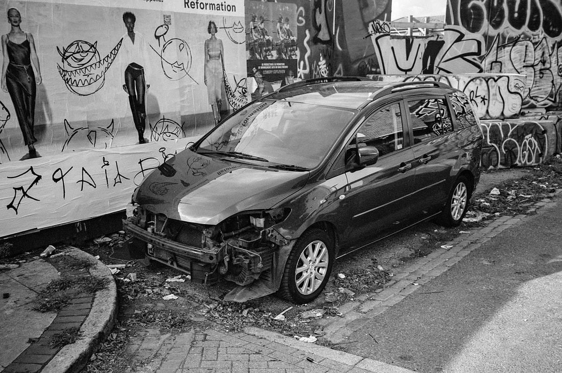
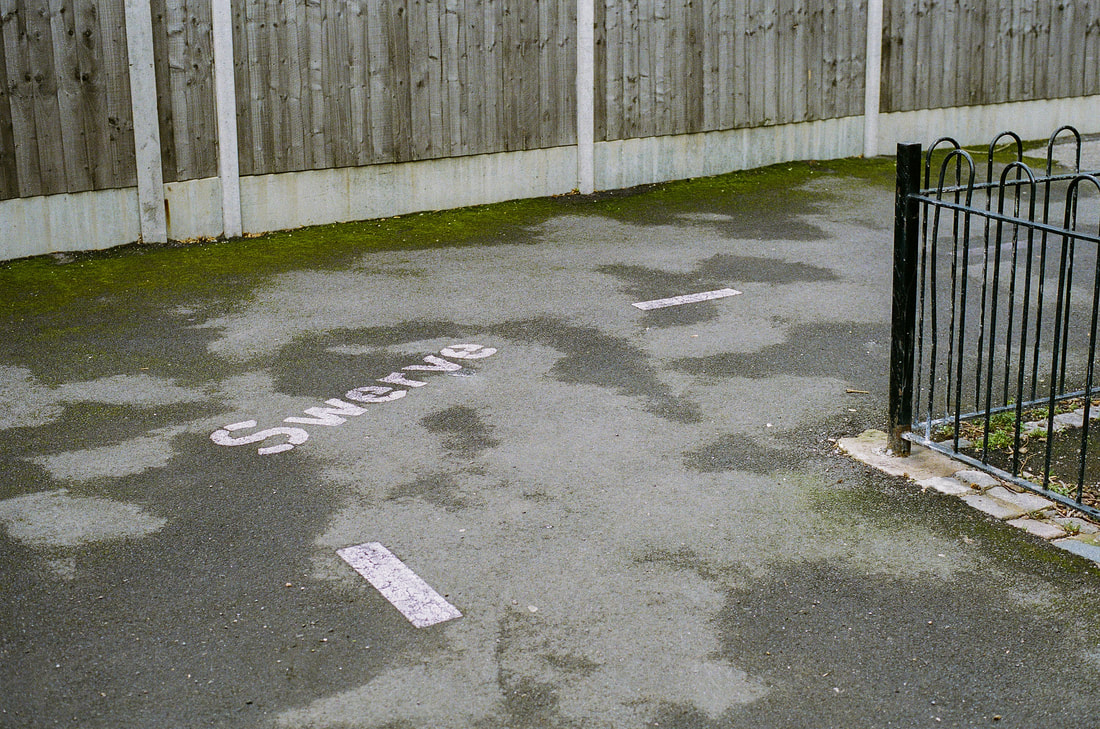
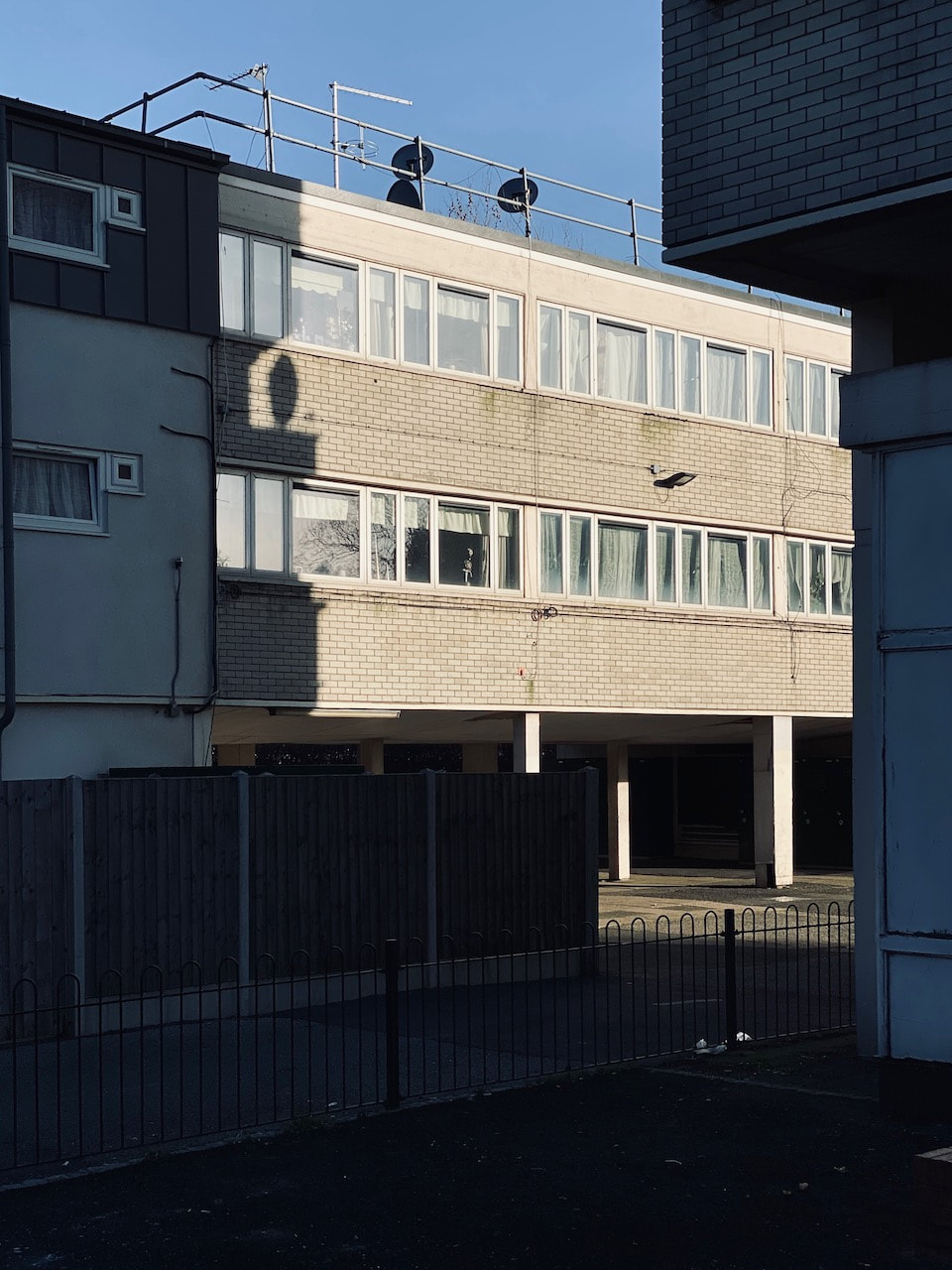
My response: Swerve
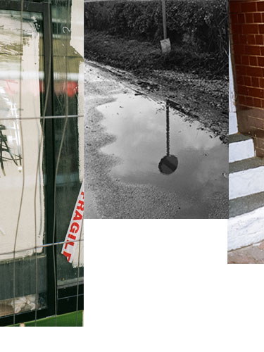
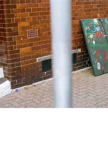
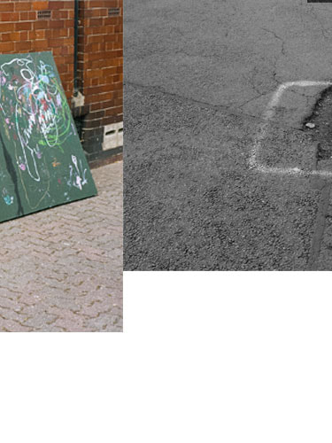
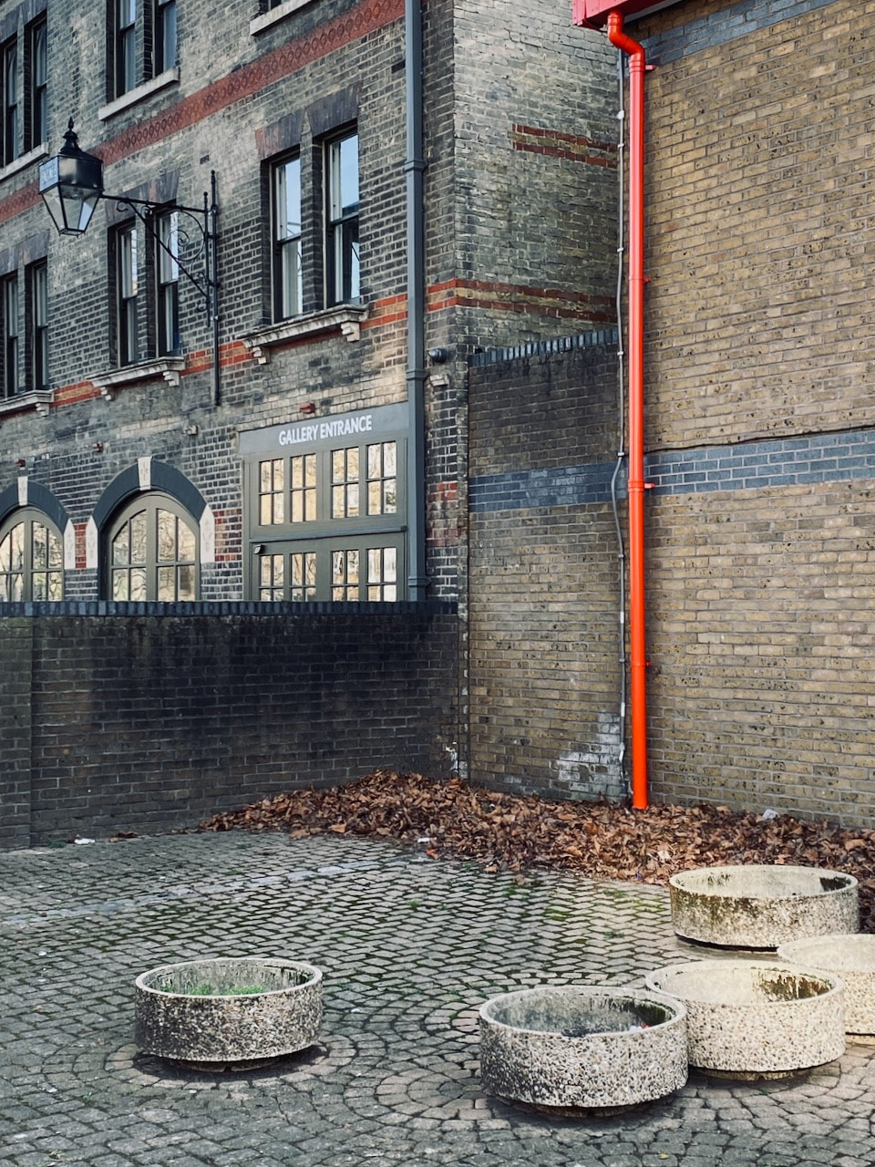
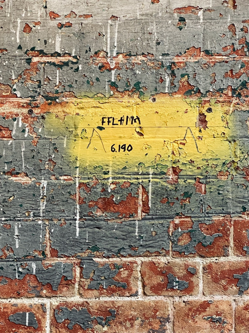
Gentrification is a feature of many communities in south east London. Property developers are constantly on the look-out for old buildings to buy up cheaply, refurbish and sell on at inflated prices. Sometimes, the buildings are demolished to make way for brand new properties. In the process, the character of a place can change. I have been photographing in Peckham for a while. These pictures, including those made very recently, are an attempt to describe the character of a place ell known to me by documenting its walls and floors.
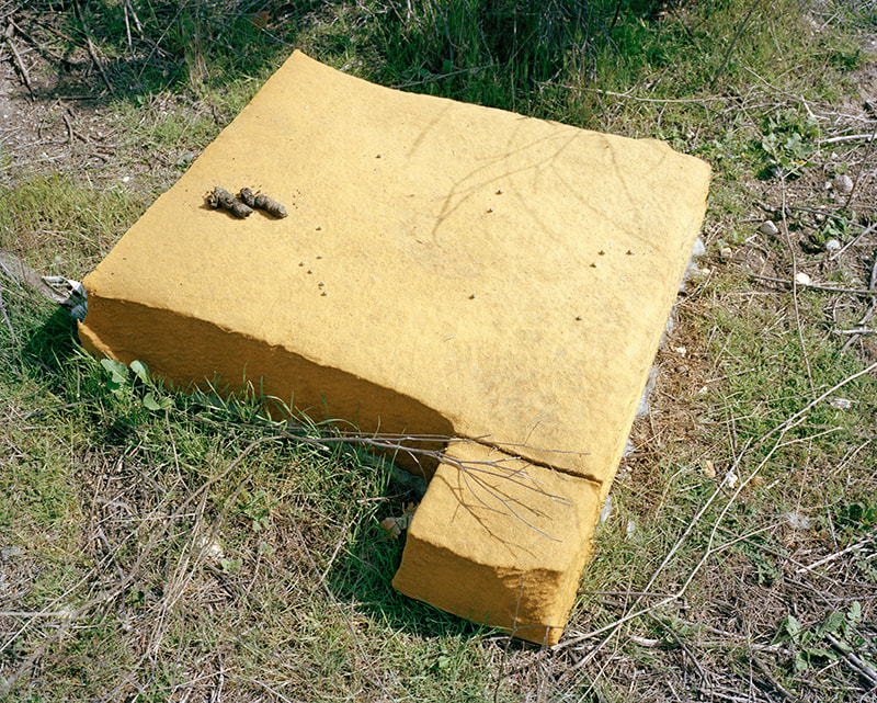
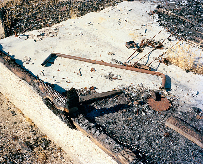
Seth Lower's floors
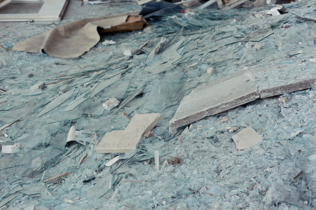
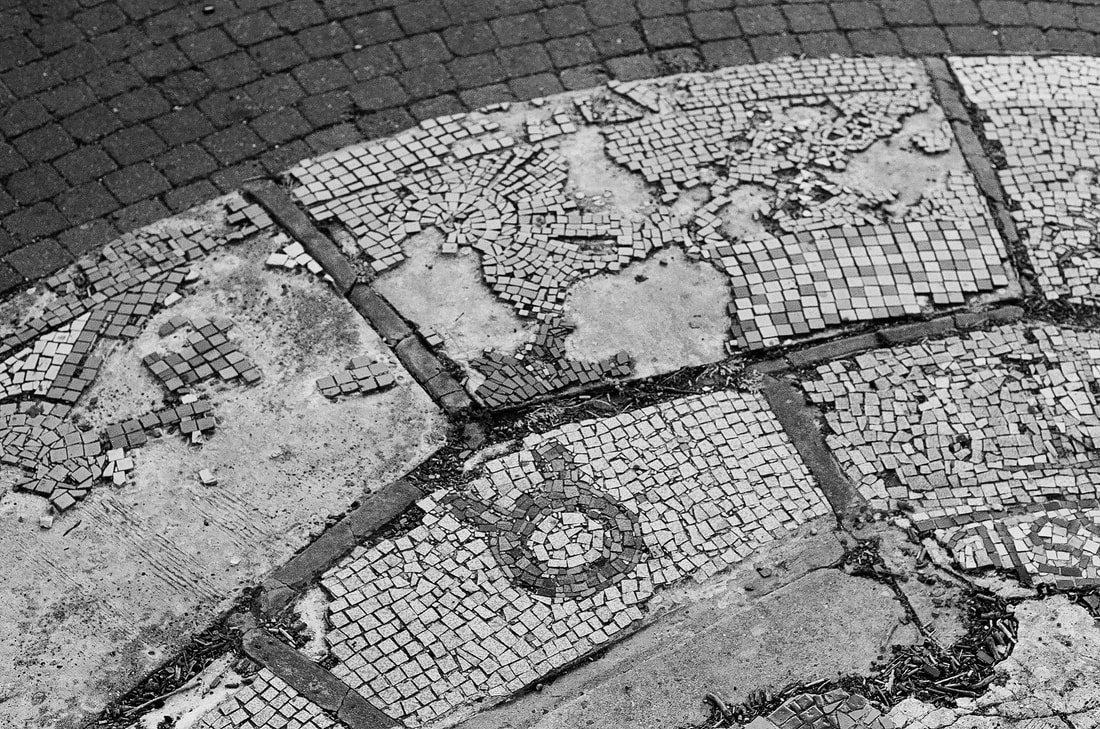
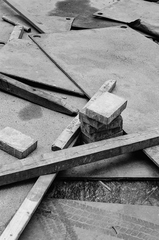
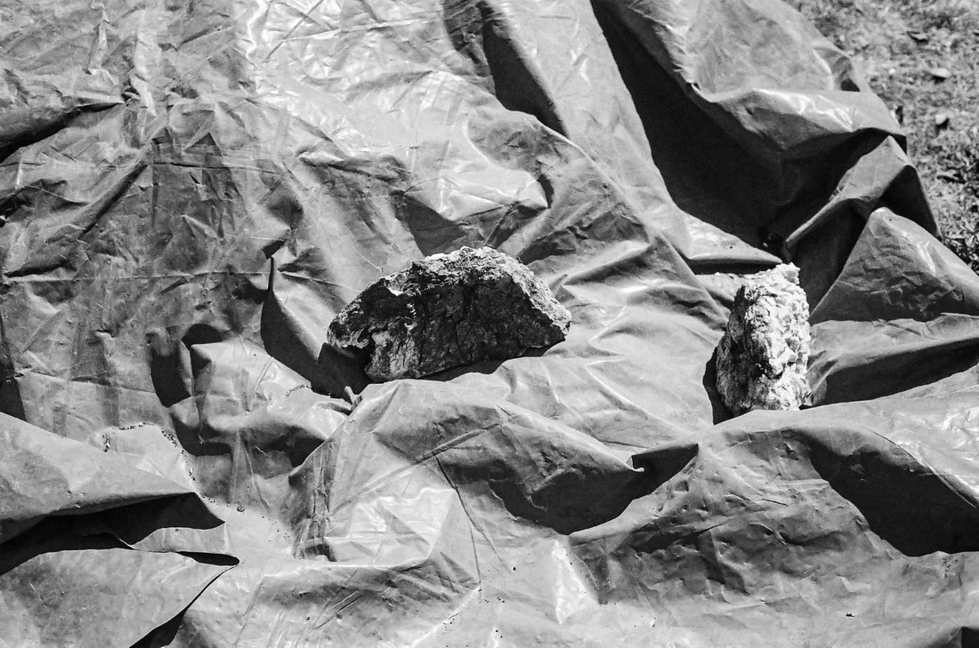
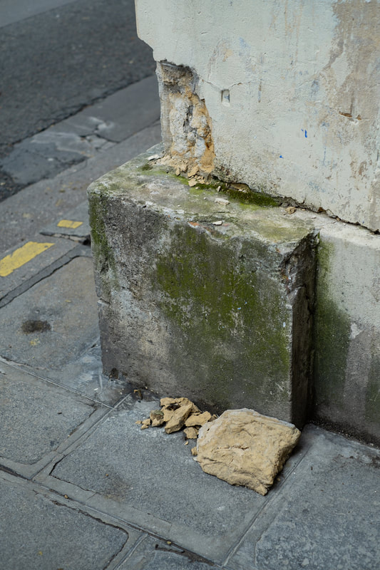
I really like Seth Lower's photographs. The following images all come from a series entitled 'Distant Memory / Repository of Evidence'. In amongst a variety of images of Los Angeles are several pictures looking down at the floor and the residue of some kind of human intervention - painted rocks, a bunt building, broken glass etc.
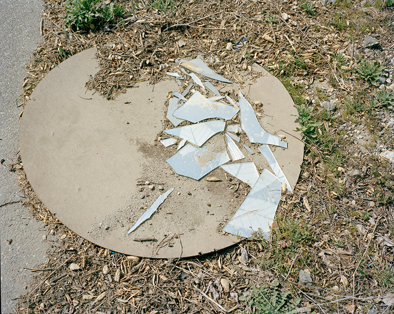
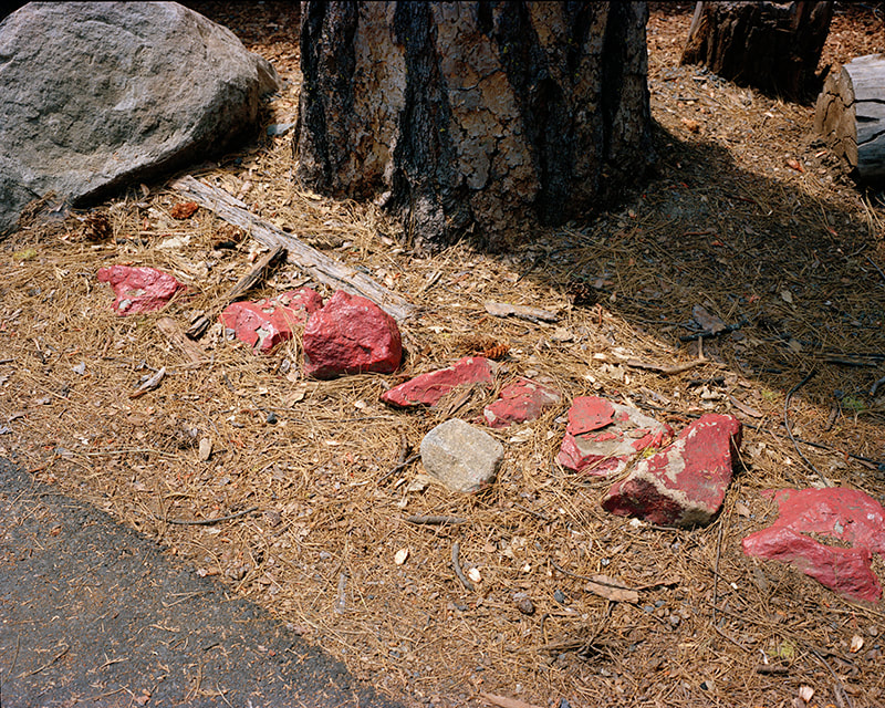
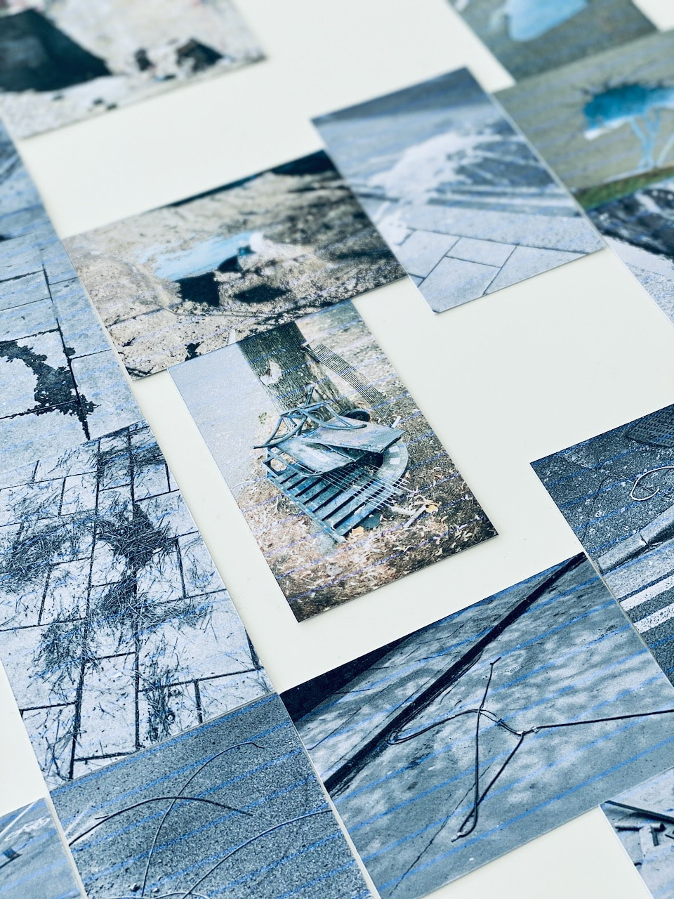
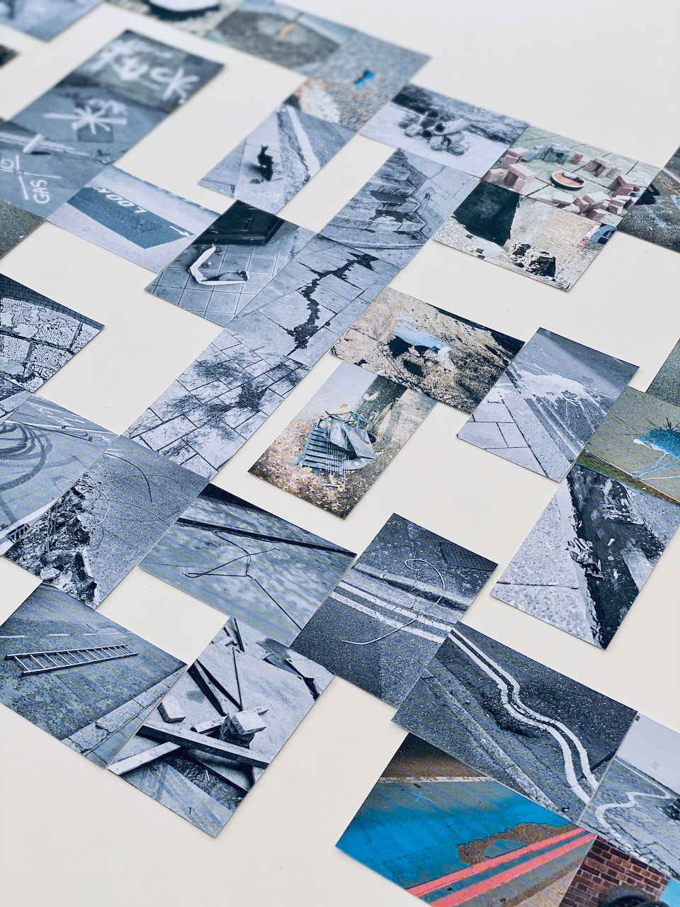
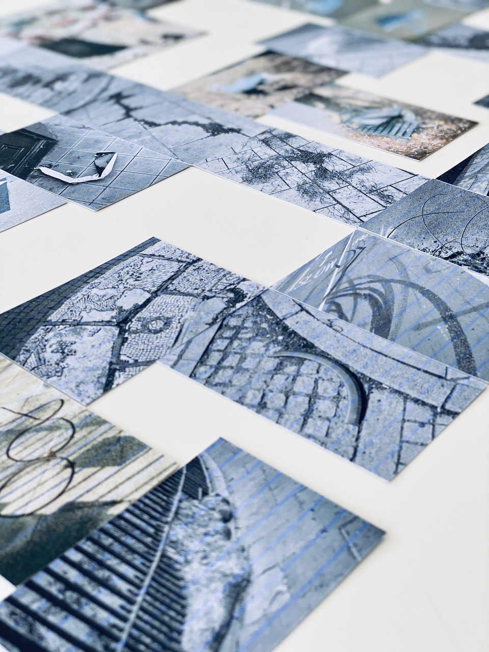
My response: Floor story
I have curated a series of pictures from my archive below, all featuring the act of looking down at the floor. I have ordered them in a particular sequence based on the formal properties of the images so that (hopefully) one picture 'talks' to the others either side. I really enjoyed this process and I'm relatively pleased with the results.

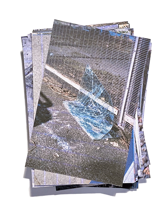
|
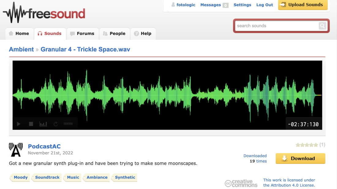
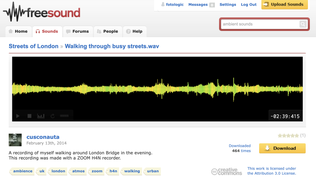
Floor Story: a photo game for two or more playersPartly inspired by the Play, Interact, Explore exhibition I had seen in Eastbourne, I wondered whether these pictures would make an interesting sorting exercise if they were reproduced as cards that could be used by two or more players, like dominoes. I made a video document of a version of the game, with a soundtrack combining ambient city noises and synthesised music from Freesound.org. I like the way the placement and final composition of the pictures is negotiated by the players and that this would be different each time the game was played.
|
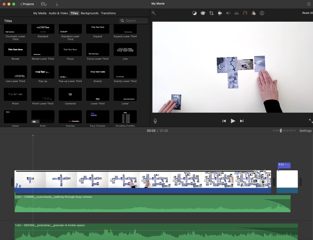
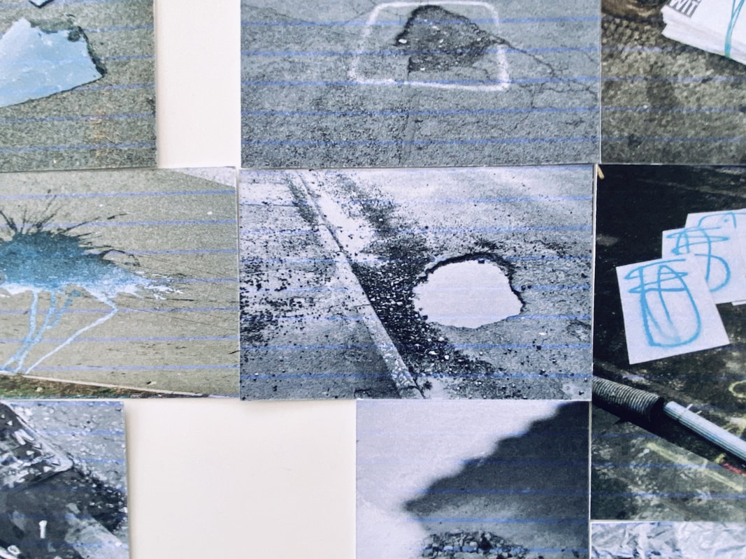
If I chose to develop this further, I would make better prints for the cards. You can see a blue line that runs through all of them and the black and white photographs have a blue tint. I used a cheap inkjet printer at home so I consider this a draft version of the game.
Floor Story Version #2
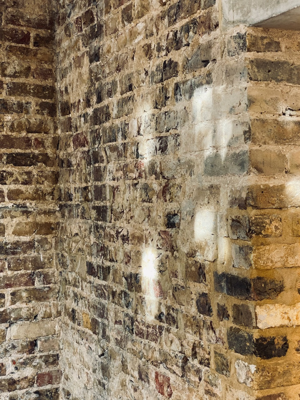
A trip to the South London Gallery
I visited the South London Gallery to see the Bloomberg New Contemporaries exhibition. On the way there and back I took pictures on my phone of floors and walls nearby. I also took pictures of the floors and walls of the gallery spaces. The old fire station across the road was recently converted into an exhibition space. The architects chose to strip back the structure of the old building to reveal the patina of the walls. Some of the old floors were also kept. I really like this appraoch to renovation that respects the original structure rather than covering it up with false walls and ceilings. I have deliberately mixed up the interior and exterior photographs in this gallery. The red background relates to the fire station's history and details in the exhibition and local environment.
I am begnning to wonder whether the process of exploring the surfaces of a particular location (it's floors, walls and ceilings) could be understood as a kind of game. I like the idea that public spaces are owned by ordinary people, not multinational corporations, business interests, relgious, medical political, governmental or law enforcement agencies. How do people play in and with their local spaces? How might photography help people to play, interact and explore the physical landscape?
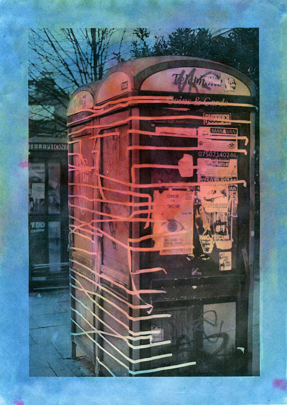
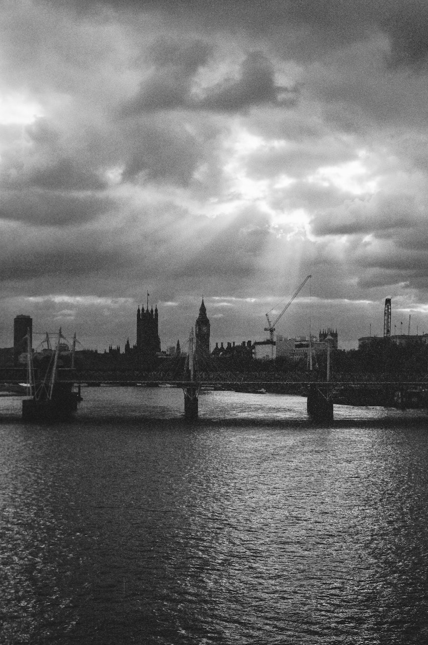
Psychogeography and the city as gameboard
Guy Debord, leader of the Situationist International, argued that society has become a series of spectacles, commodities having overtaken all aspects of life, and we, the public, have been reduced to passive receptacles who act only to serve capitalist power. The Situationists engaged in ‘psychogeographic’ research as a means of revealing our relationship to public spaces. Their methodologies and theories have profoundly influenced contemporary artists. The Situationists' most important concepts were:
- Psychogeography: "the study of the precise laws and specific effects of the geographical environment, consciously organised or not, on the emotions and behaviour of individuals." -- Guy Debord, 1959
- The Dérive: (to drift) "a mode of experimental behaviour linked to the conditions of urban society: a technique of rapid passage through varied ambiances." -- Guy Debord, 1958
|
|
To dérive was to notice the way in which certain areas, streets, or buildings resonate with states of mind, inclinations, and desires, and to seek out reasons for movement other than those for which an environment was designed. It was very much a matter of using an environment for one's own ends... |
|
What is the floors, walls (and ceilings?) of the city were treated as a playground, a kind of board game?
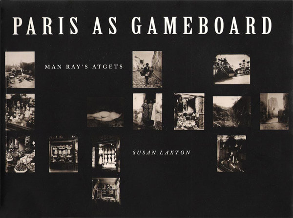
I discovered that the surrealist photographer and artist Man Ray created an album of pictures he owned by Eugene Atget. There is a book about the project entitled Paris as Gameboard. I wonder what the title implies? Did either Atget or Man Ray consider Paris to be a kind of game? In what ways do the sequence of Atget images assembled by Man Ray resemble a gameboard? Atget was certainly famous for paying very close attention to the surfaces of the city, its historic buildings and streets. The surrealists were also known for their interest in terrain vague, the liminal or undefined spaces of the city, usually found on the periphery. The Situationists further developed these explorations of city spaces into a more overtly political practice, reclaiming the streets as playgrounds. |
|
How might I incorporate these ideas into my own work?
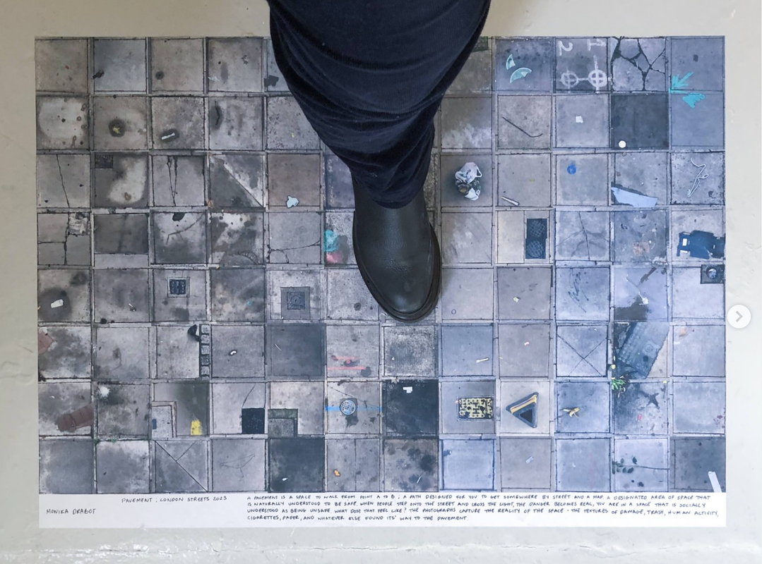
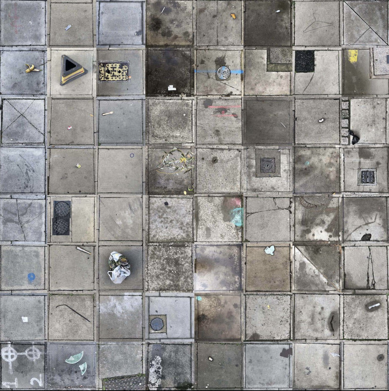
Monika Drabot's London Streets
I discovered Monika Drabot's work on Instagram. Her current exhibition, entitled Natural Comprehension, explores the way we interact with aspects of the city, its signs and surfaces. She has created a series of concertina books, each featuring one such element of the urban landscape. My favourites are the arrows, lines and paving stones sequences which are presented on her website as animated collages. The books are displayed on a shelf and one example as extendable sculpture attached to the wall and lit from above. The paving stones (and rubbish) are also presented as a floor based print. I really like the playful, interactive quality of this work and the way it encourages the viewer to re-see the mundane aspects of the city, to take ownership of their journeys and interactions with it, to treat it as a type of visual playground.
|
|
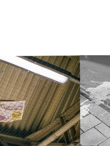
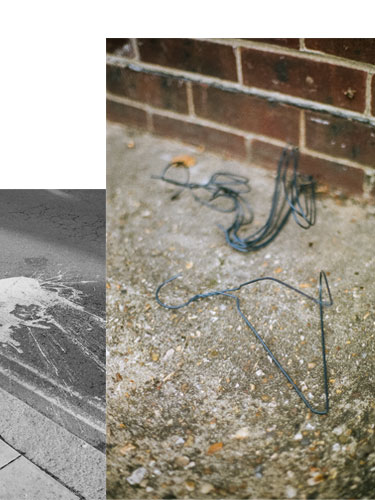
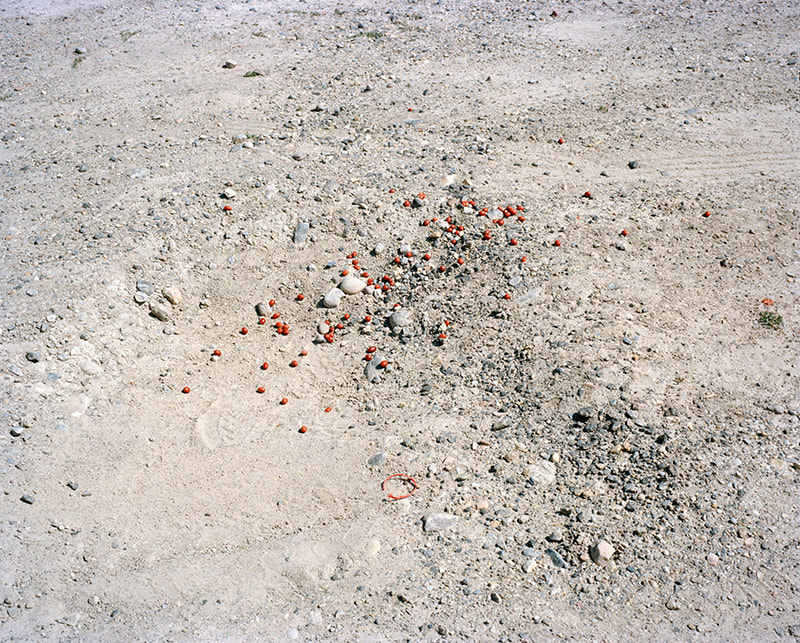
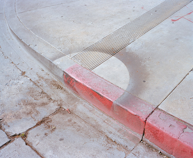
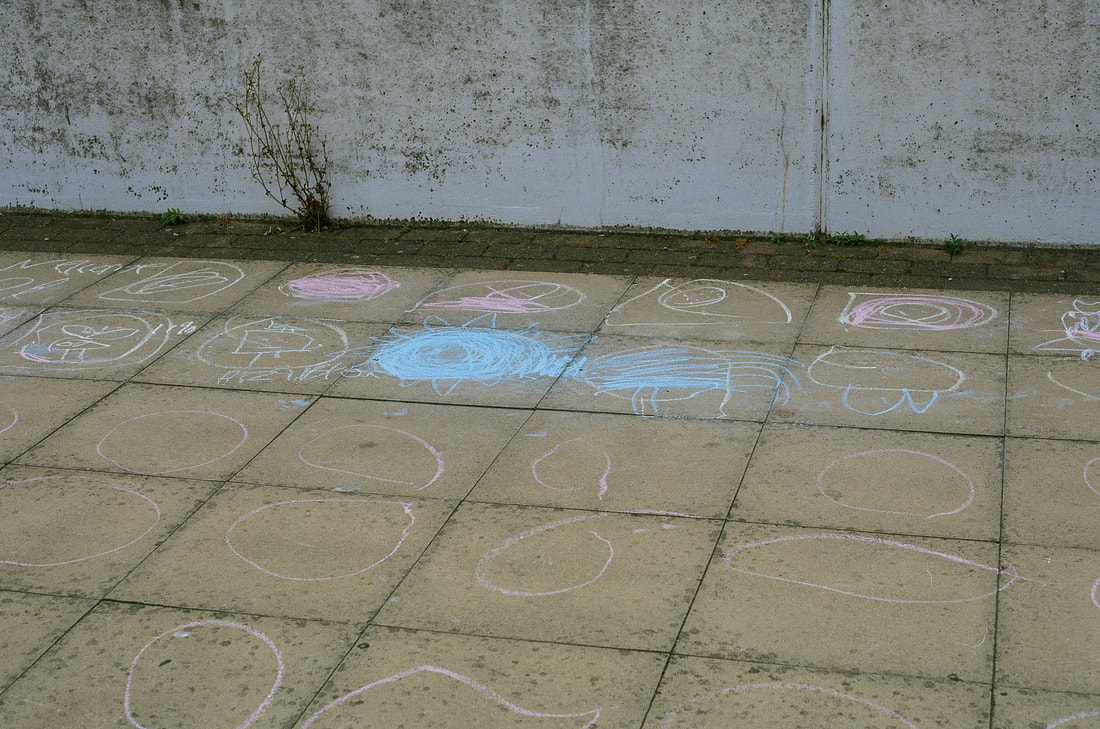
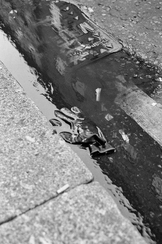
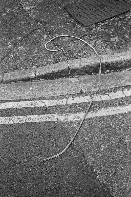
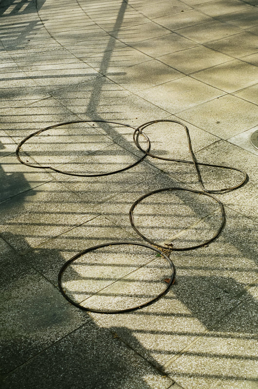
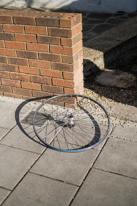
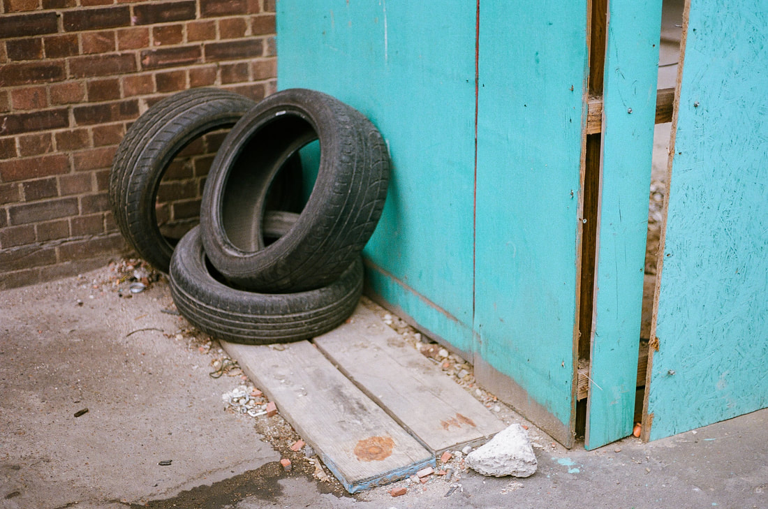
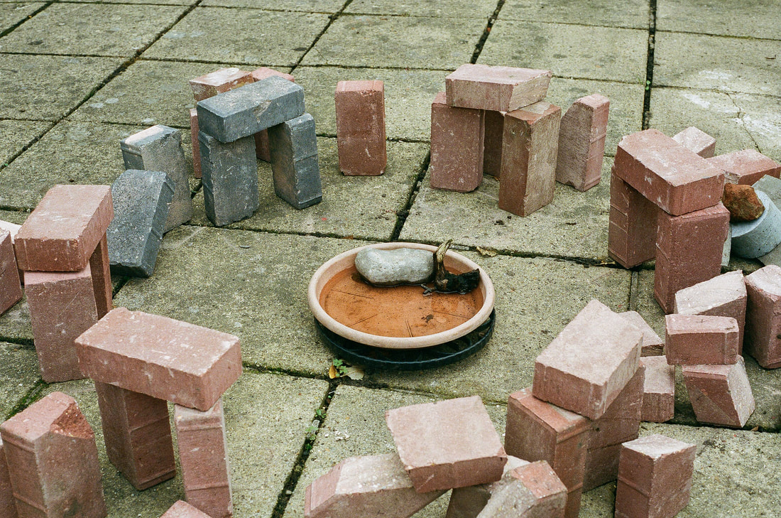
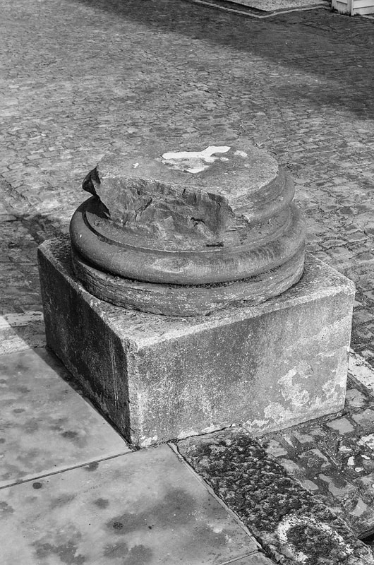
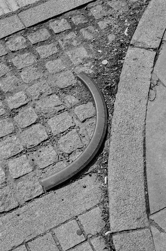
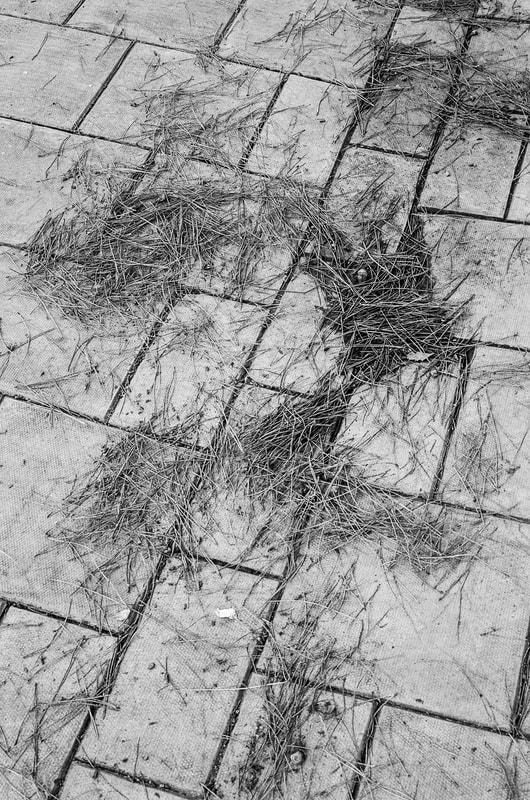
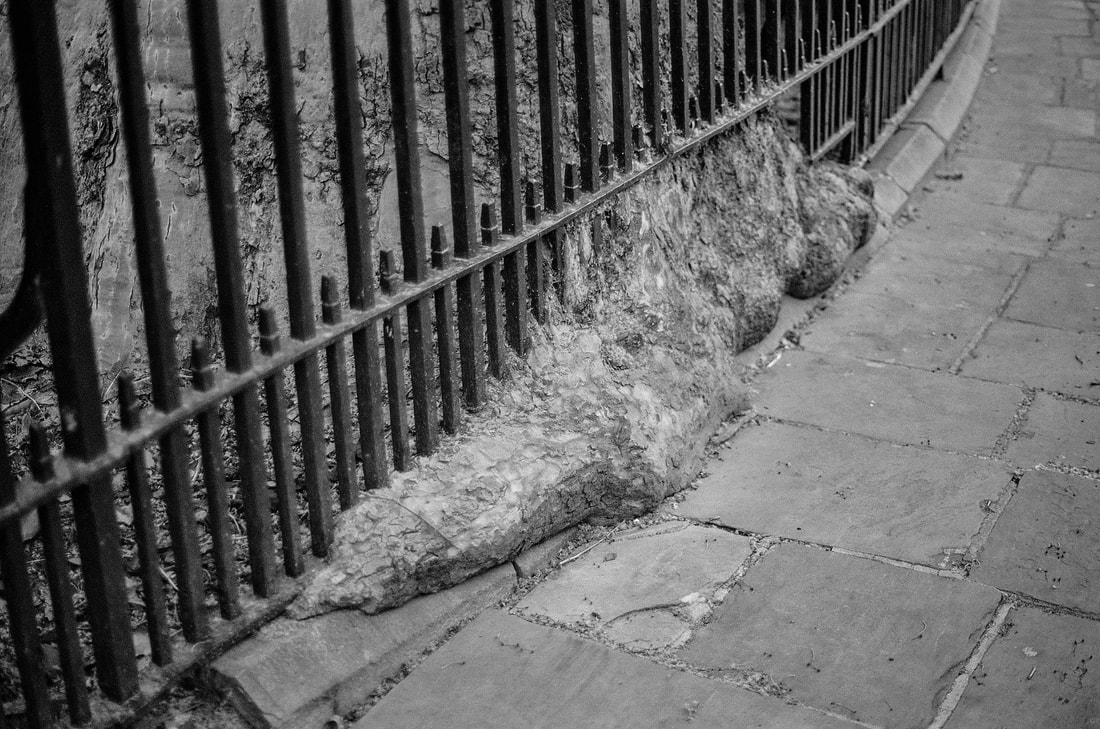
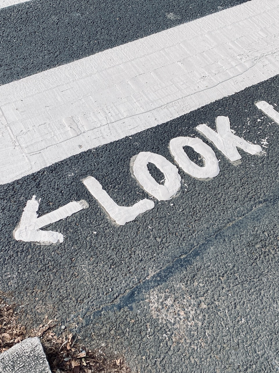
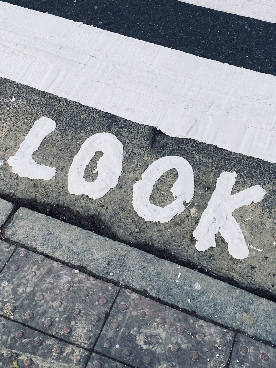
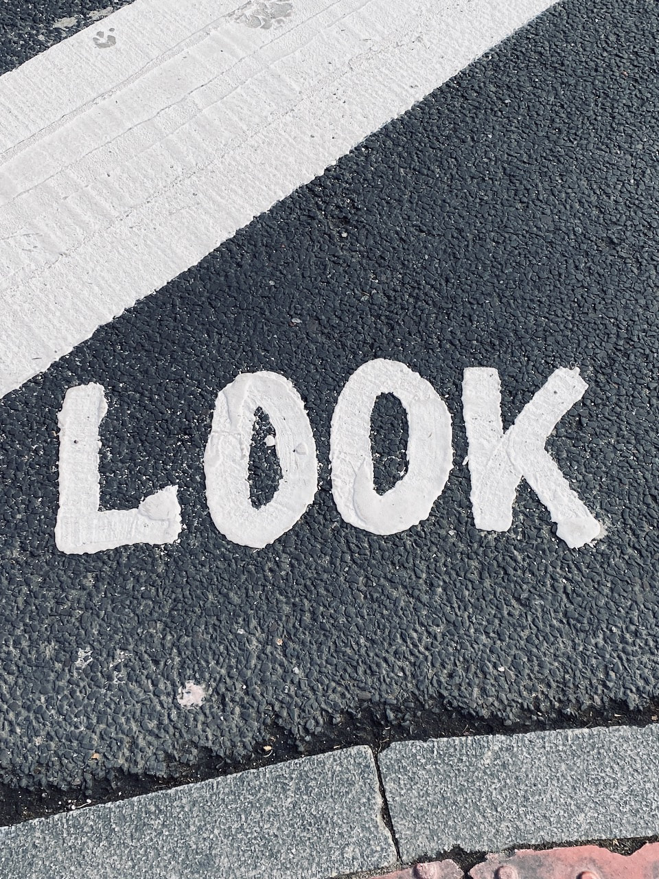
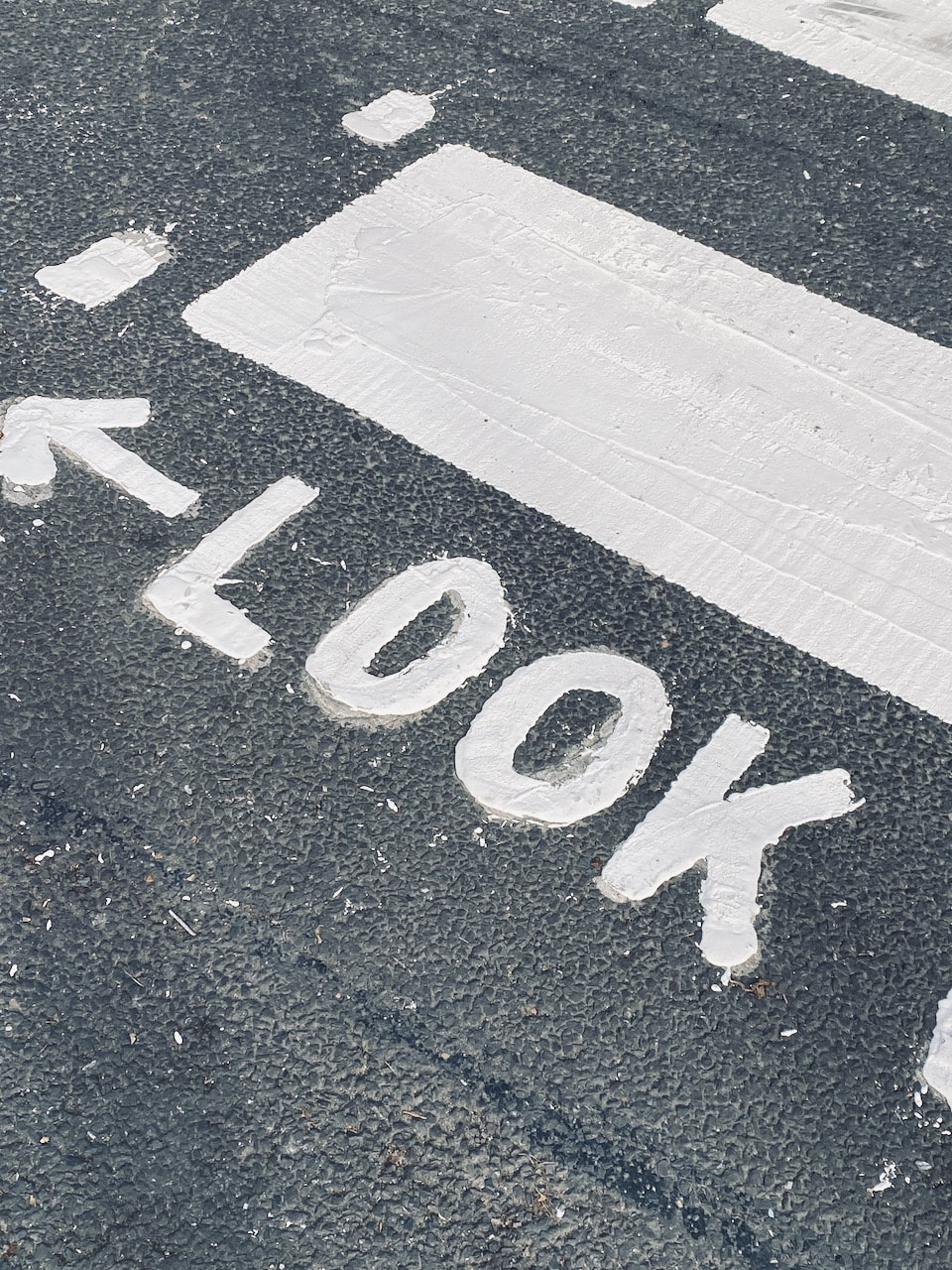
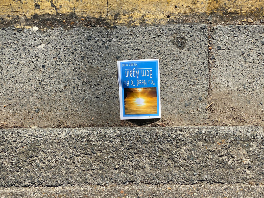
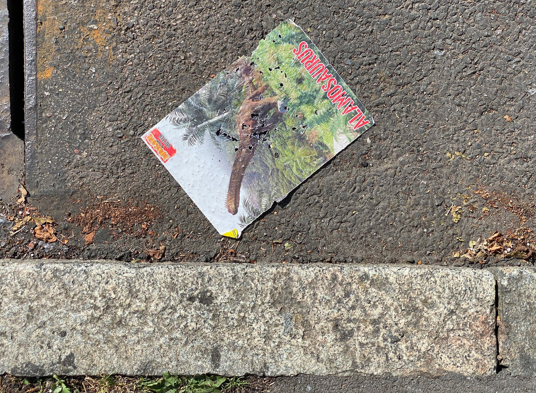
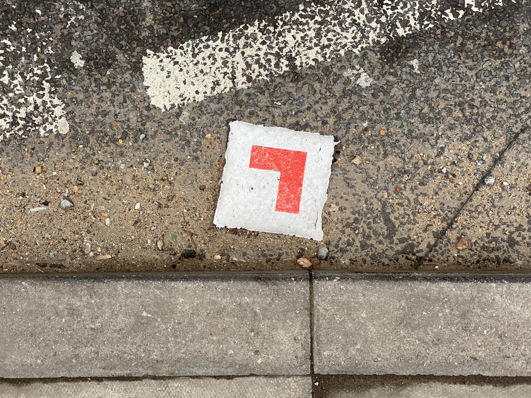
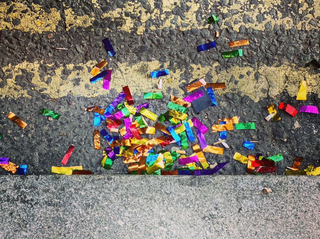
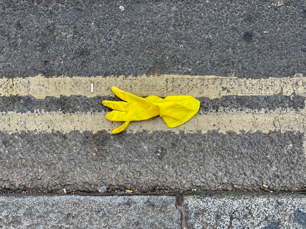
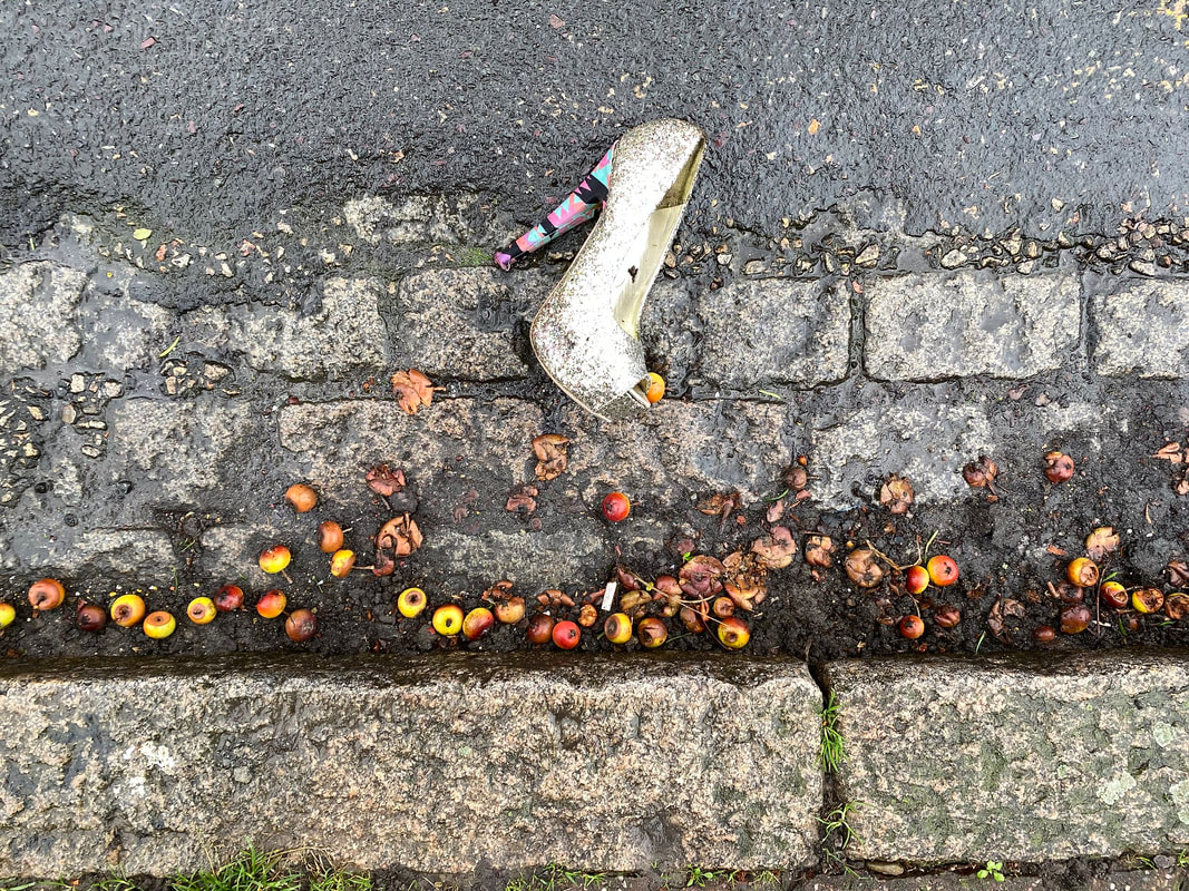
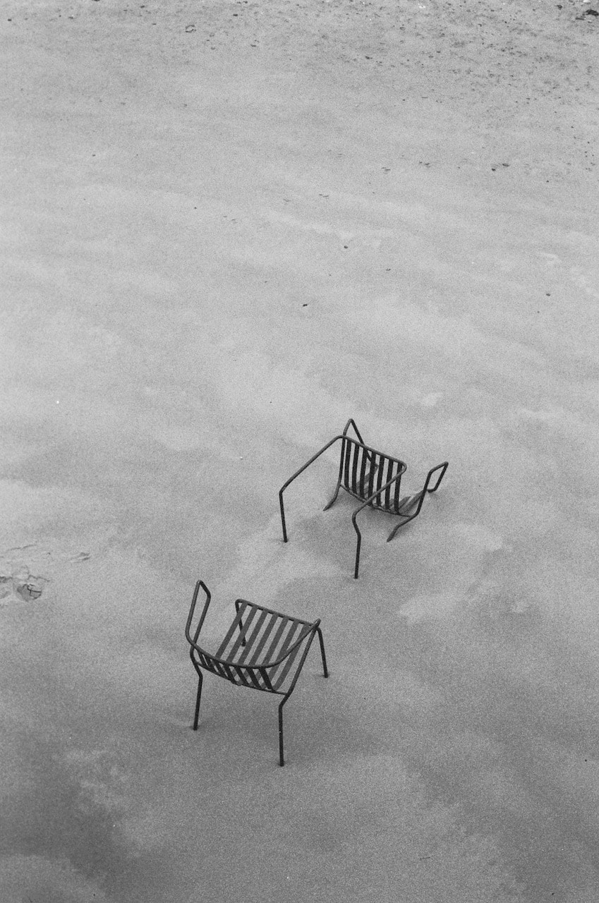
Response: LOOK
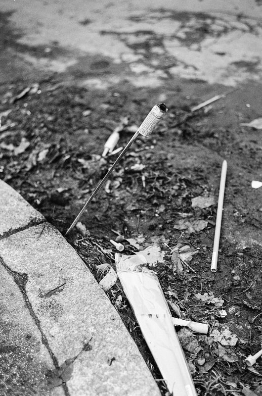
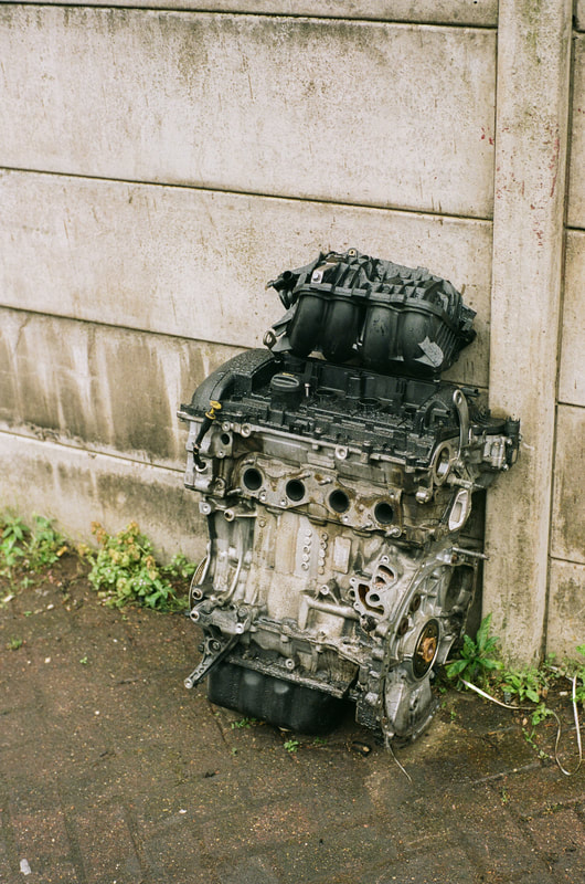
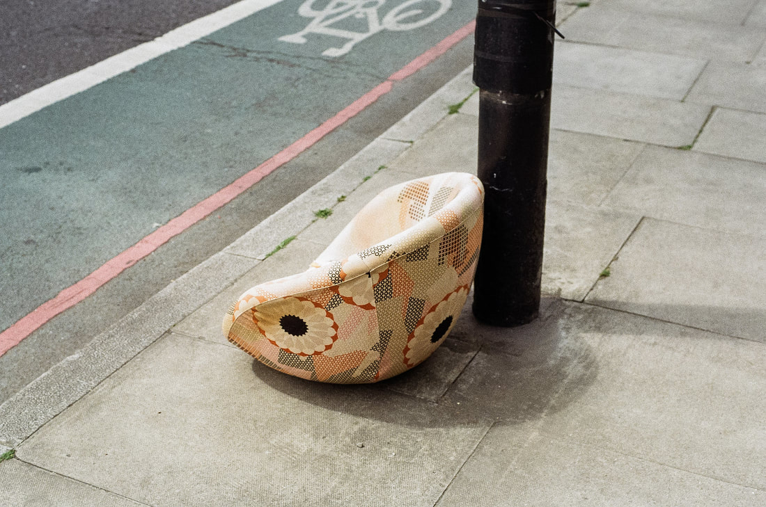
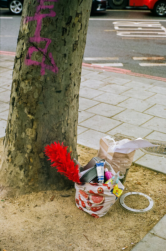
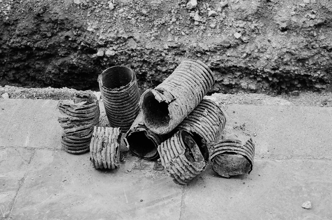
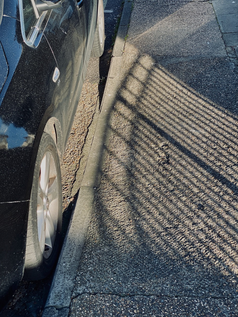
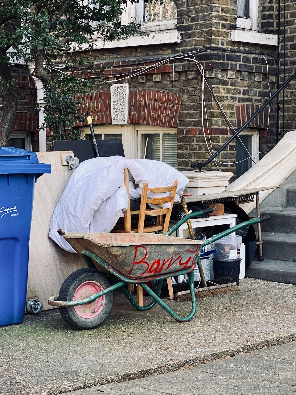
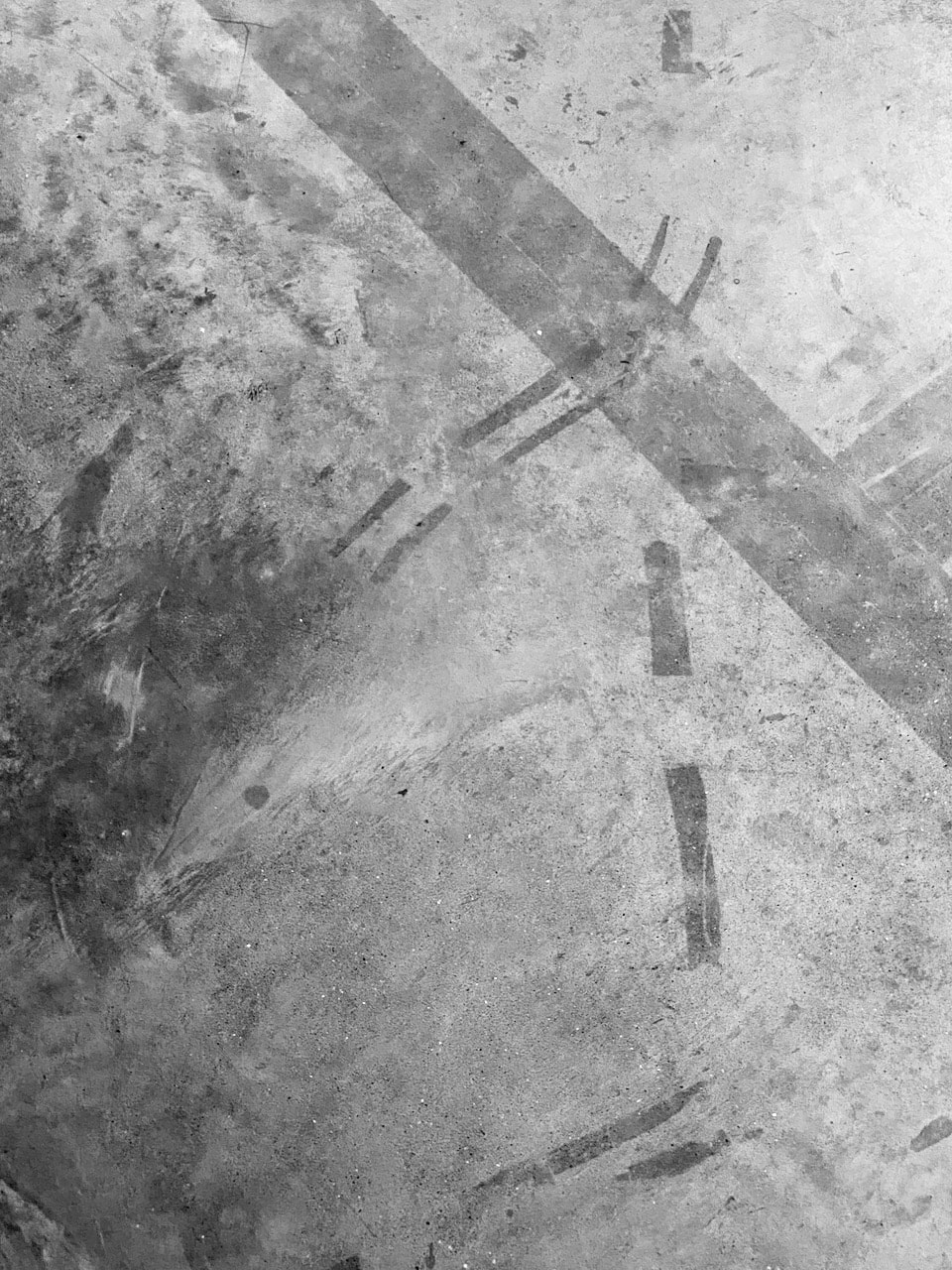
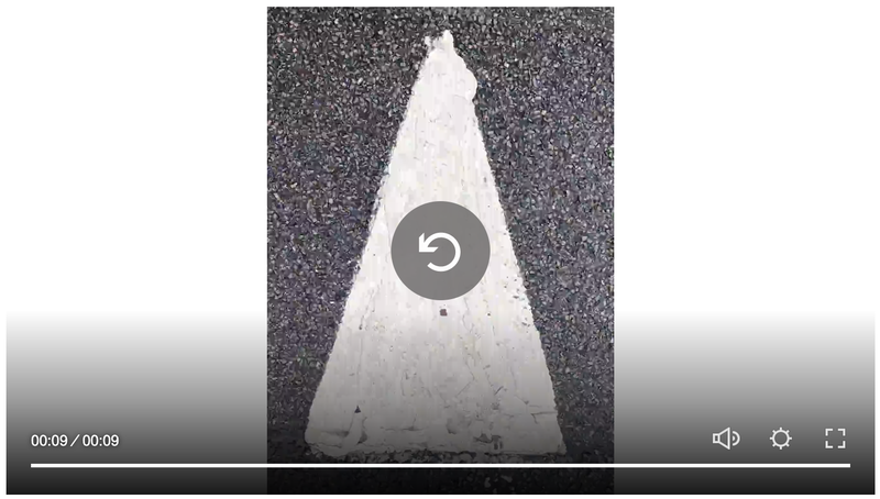
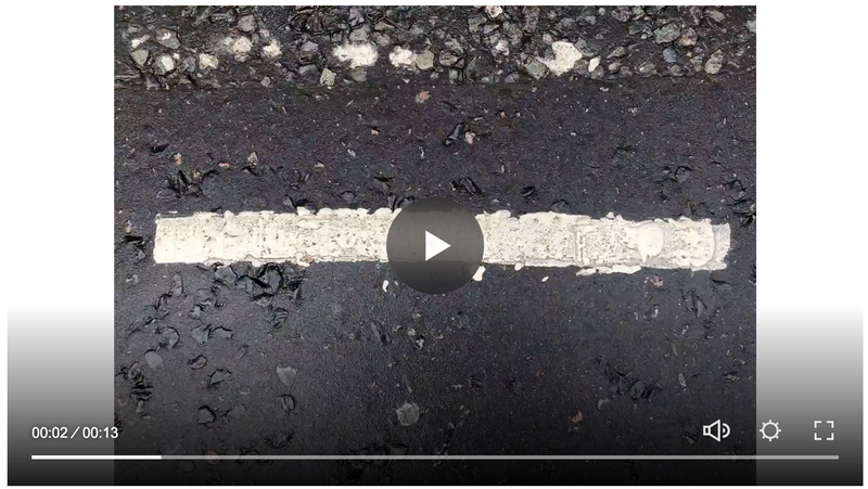
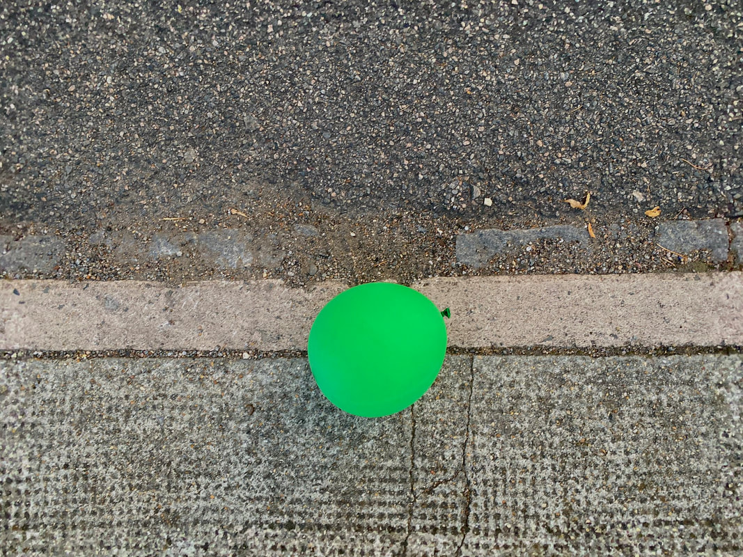
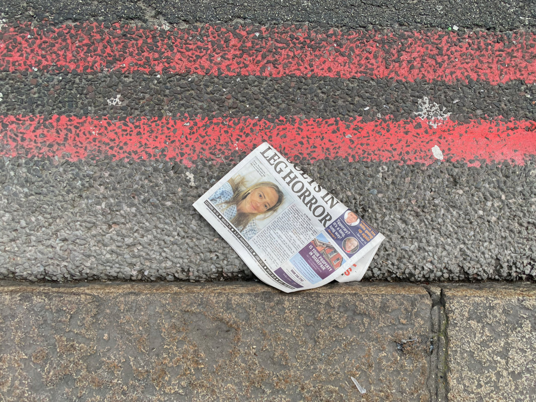
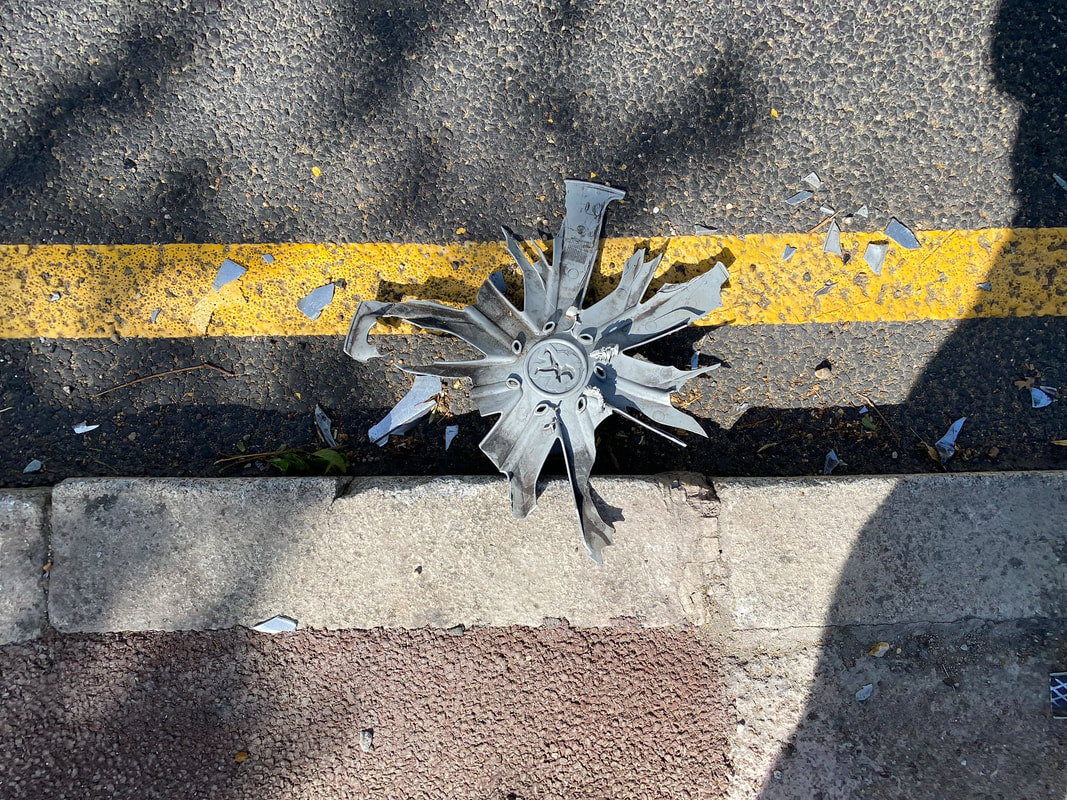
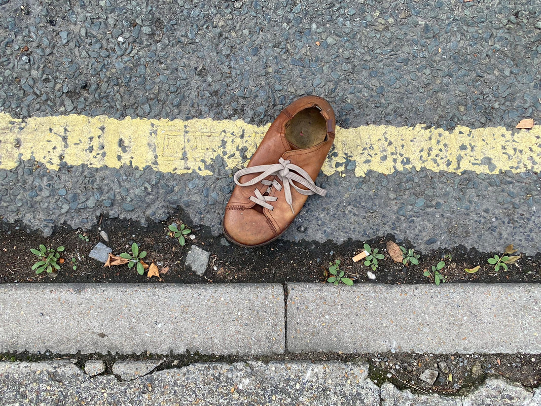
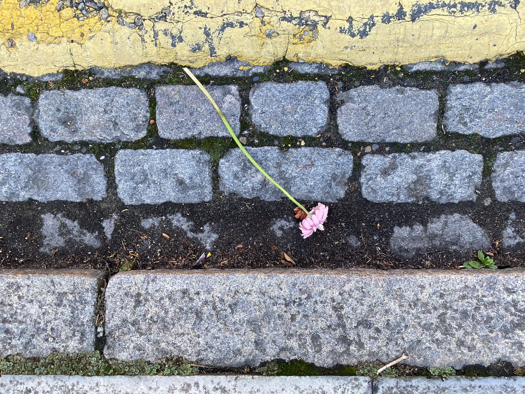
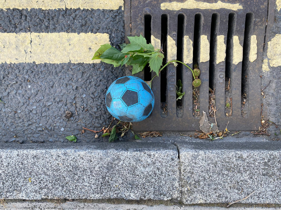
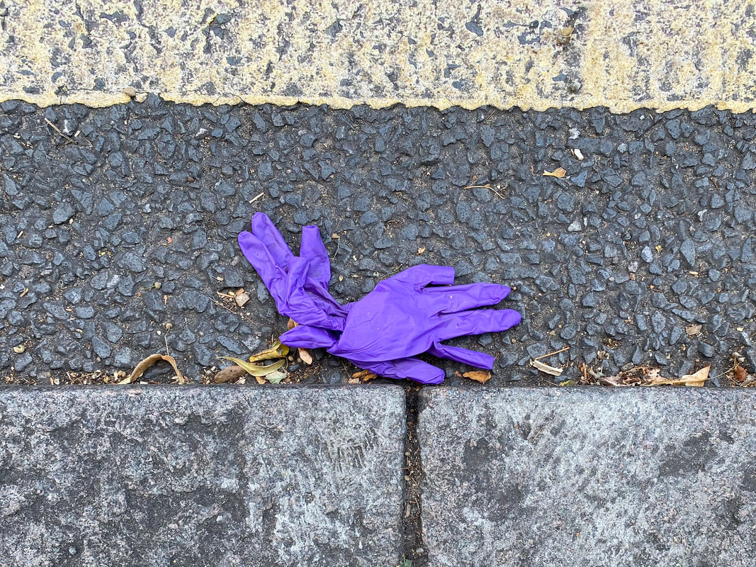
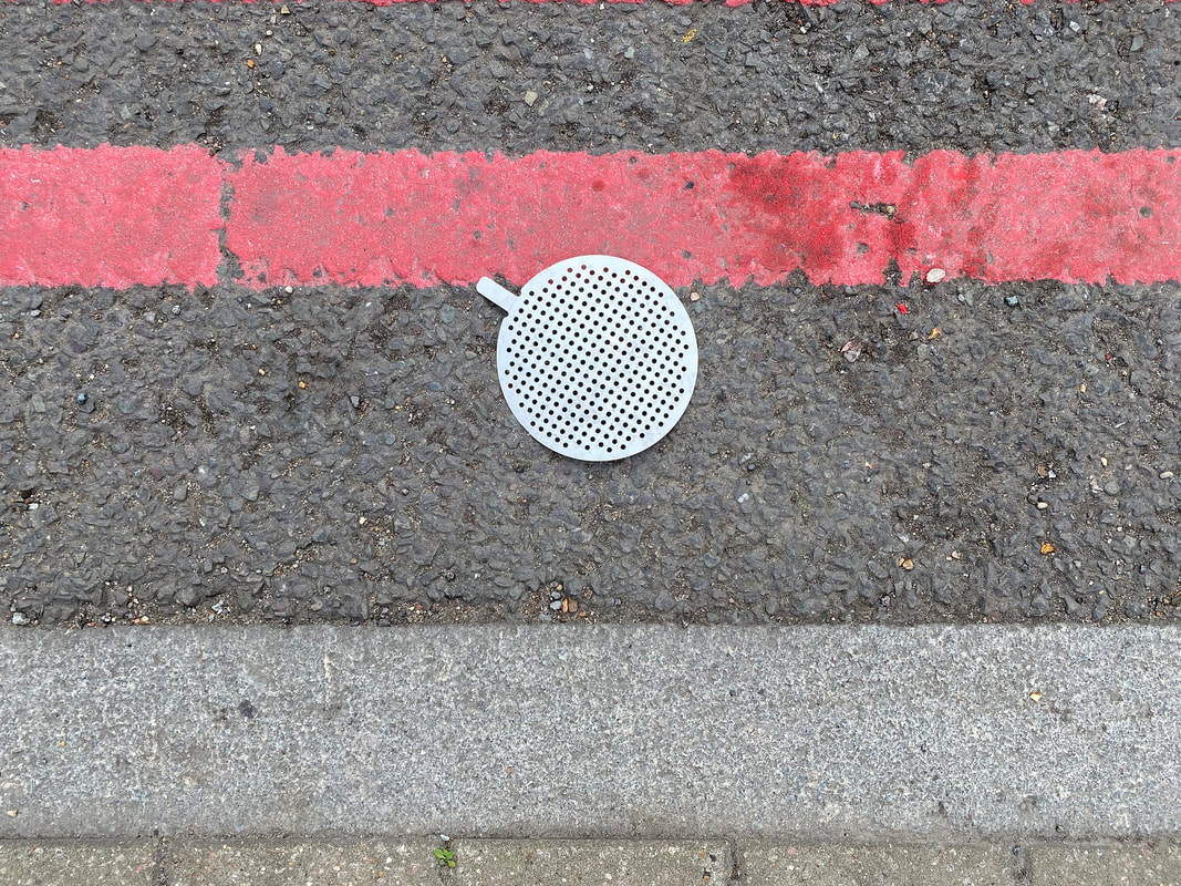
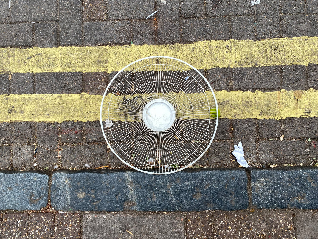
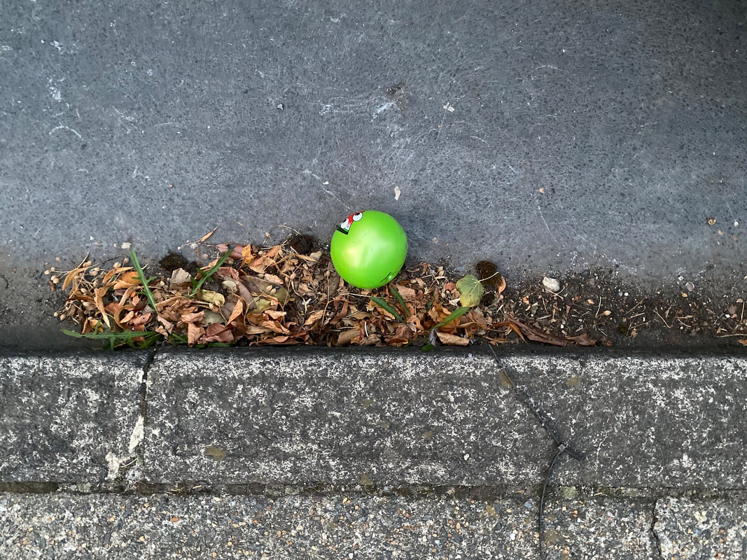
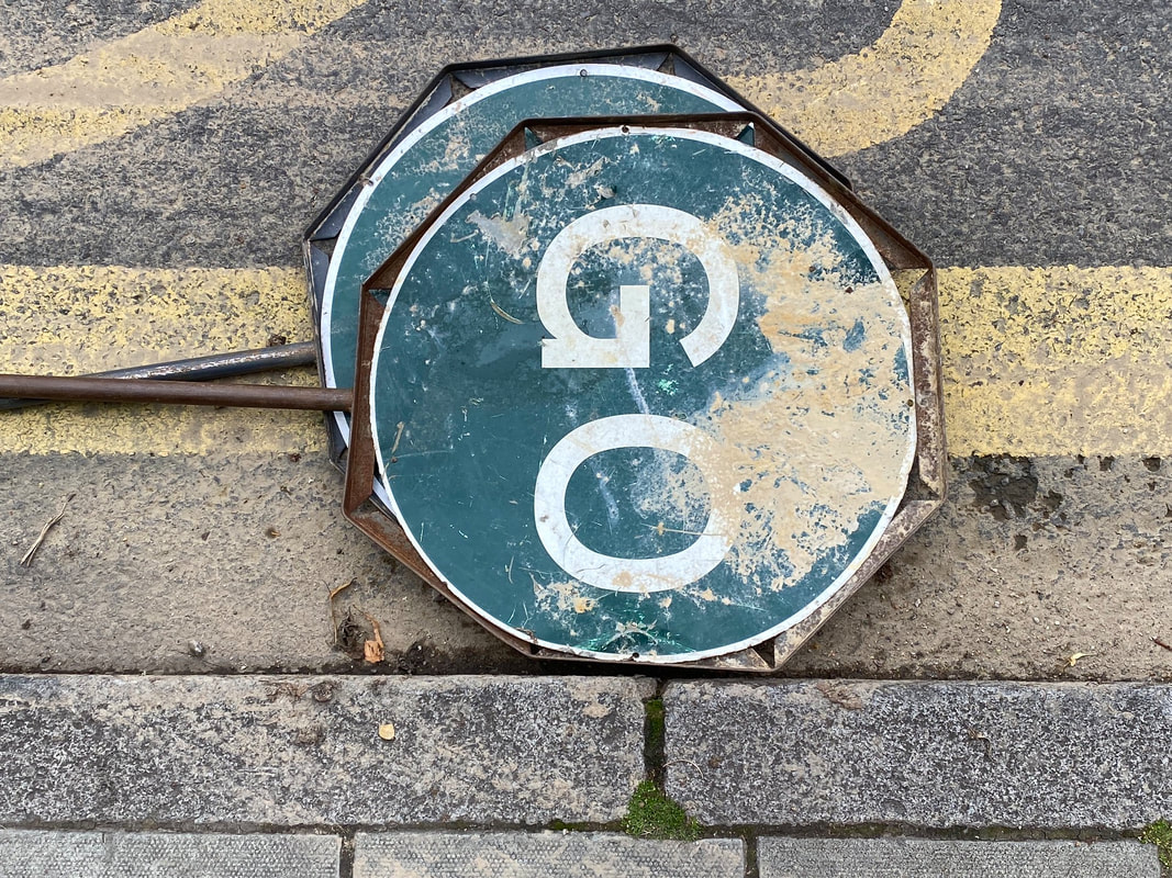
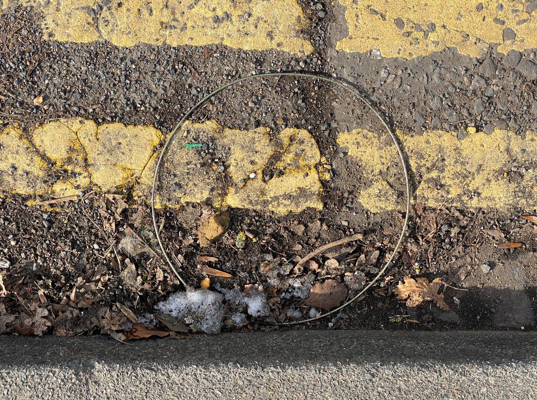
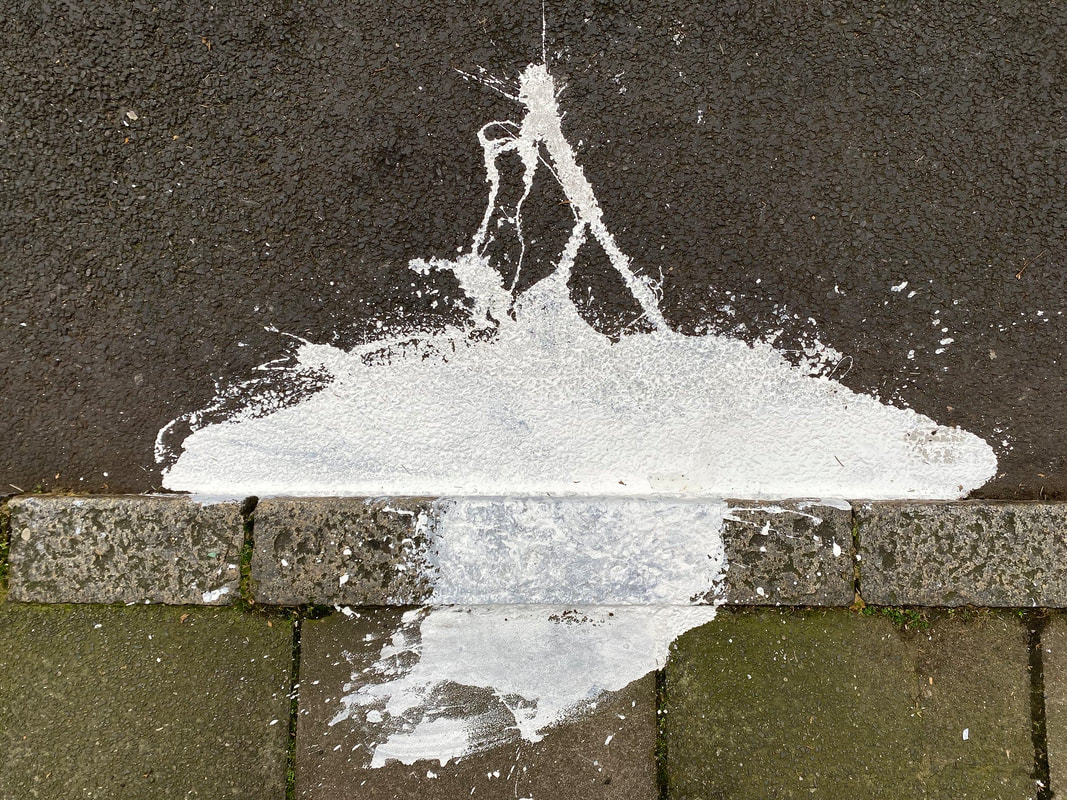
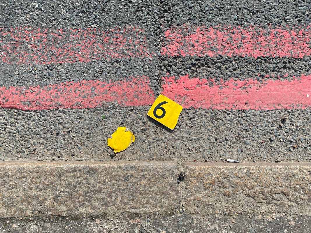
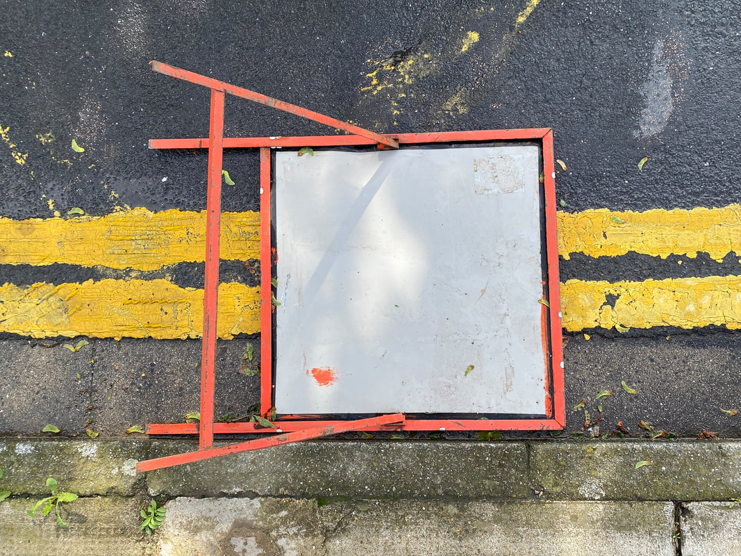
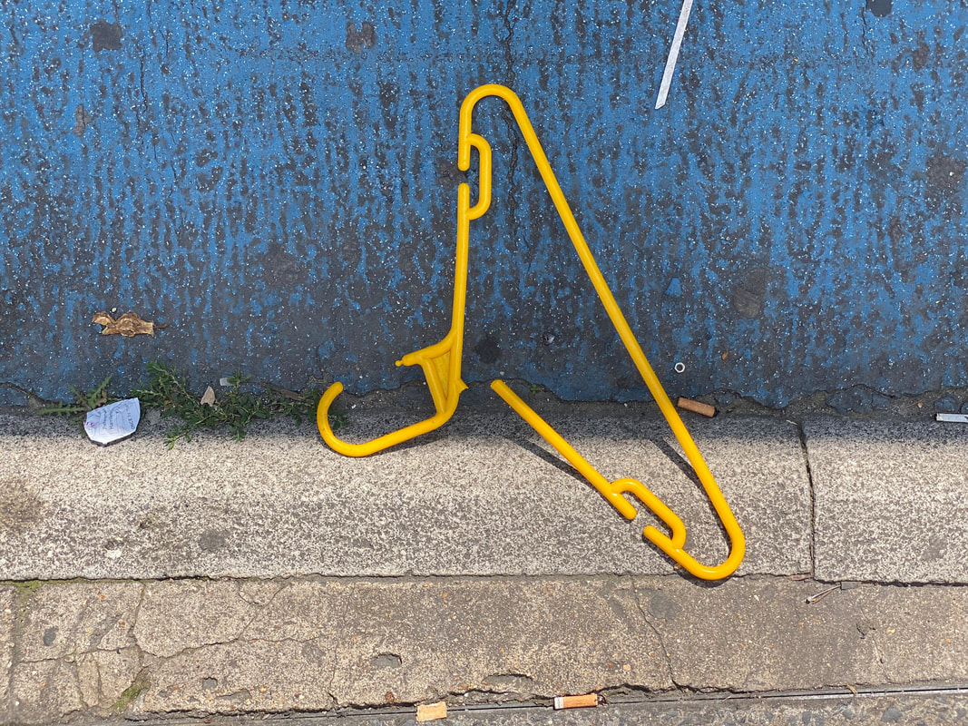
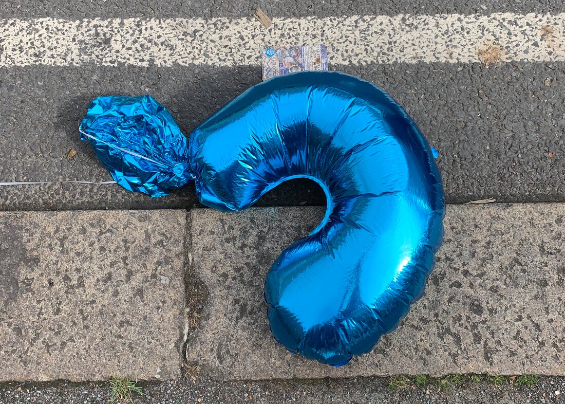
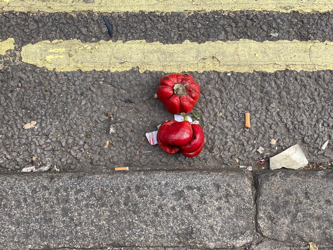
Response: Gutter Objects
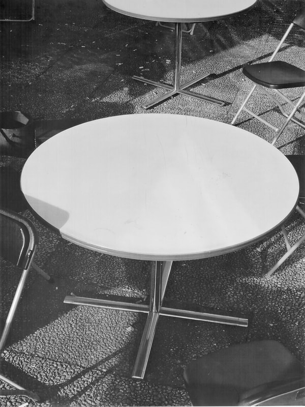
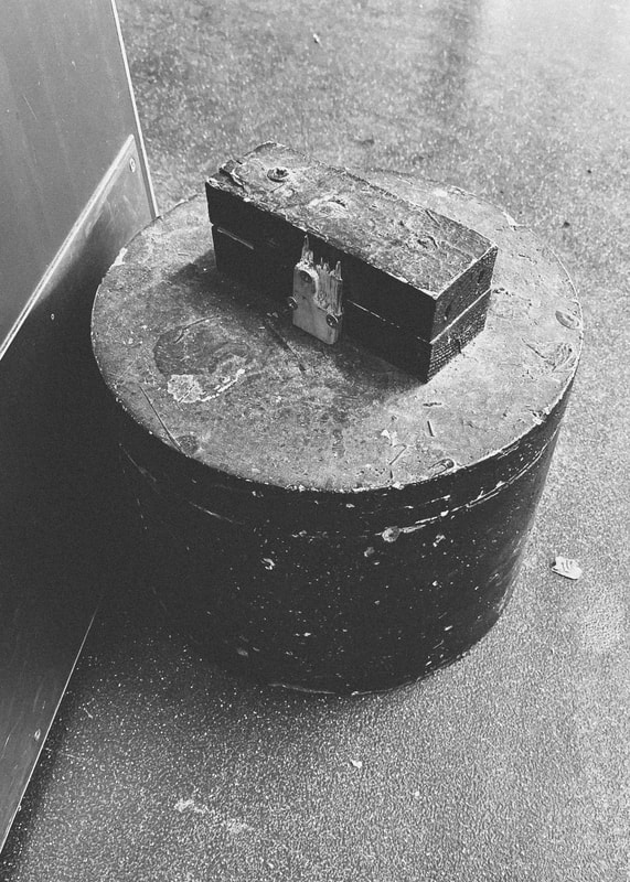
I have been collecting examples of objects that I see in the side of the road for a while. I'm really interested in the way these objects (or are they things?) come to rest against the curb stone and in relationship to the yellow and red lines in the road. I choose to photograph them from above with my phone, keeping the edge of the pavement as parallel as possible with the bottom edge of the picture frame. I like the way they look together in a grid.

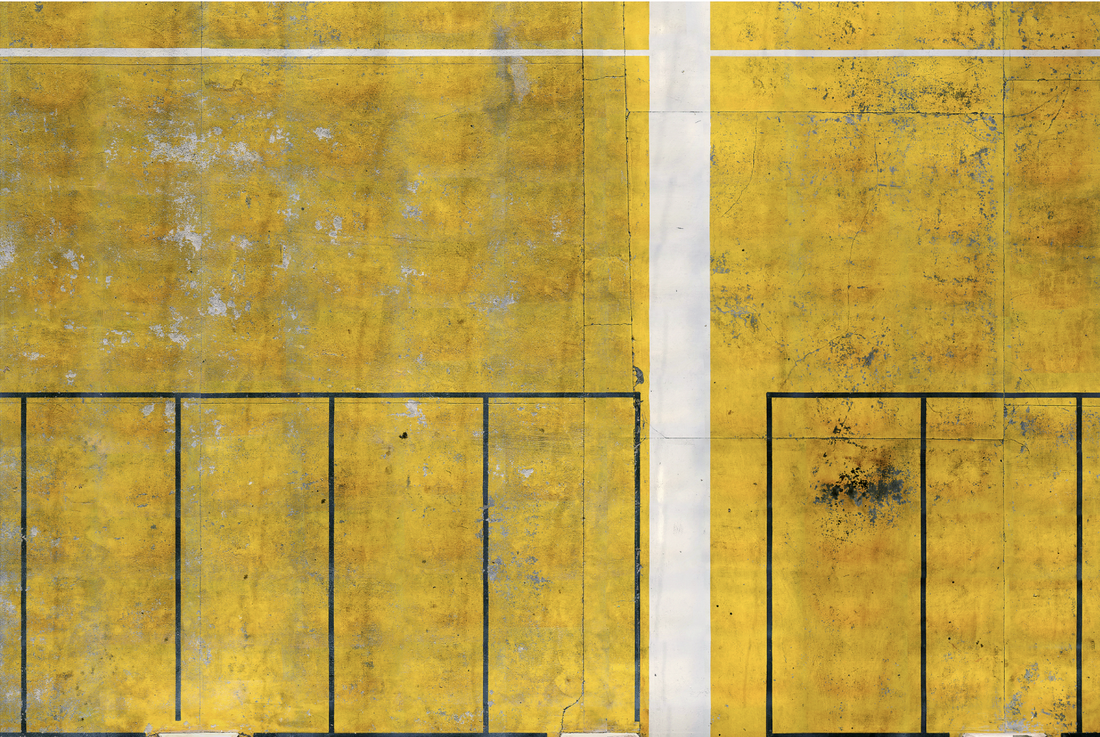
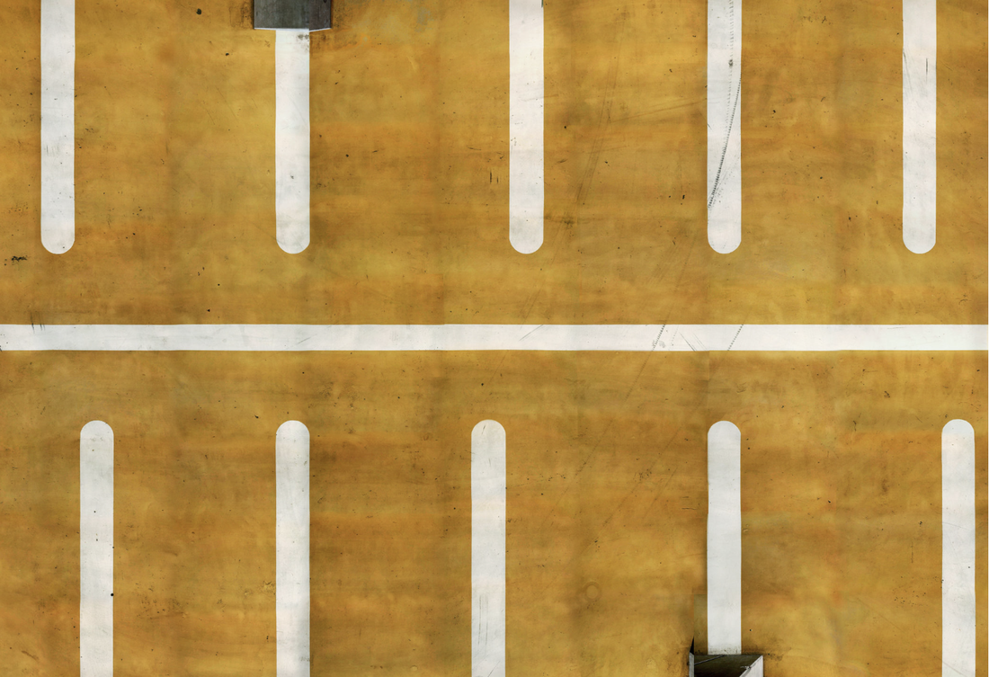
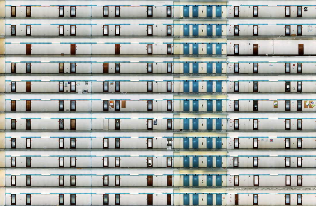
Andreas Gefeller's Supervisions
I am generally not very interested in using excessive amounts of computer technology in my photography. However, having been initially confused and a little alienated by Andreas Gefeller's digital landscapes, I am now intrigued to see if I can respond to them in some way. The text by Roland Nachtigäller on the artist's website (see quotation below) argues that Gefeller's work combines the two dominant approaches in photographic history - the objective desire to create reliable documents and the artist's interest in creating a subjective record of their response to some aspect of the visible world. The pictures that interest me the most are those that employ a grid-like structure, not unlike the references to abstract painting in Paul Winstanley's empty art rooms.
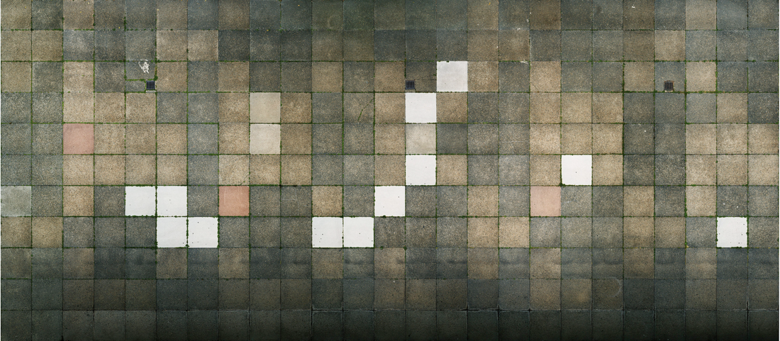
Andreas Gefeller - Untitled (Paving Slabs 1), Dresden, 2006
The image of paving slabs above is a particular favourite. It appears to have been digitally stitched together (in Photoshop?) from (I assume) a large number of photographs. How were these made? Could they have been taken from Google maps, for example, or perhaps taken by a drone camera? I really like the regularity of the grid but the diversity of tones and colours. It reminds me of enlarged pixels.
His images show the moment of the factual, and at the same time they integrate a considerable period of creation. They laconically view places of social life, and yet they are deserted at all times. They scan the urban surfaces without emotion and still tempt our perception into constructing a poetic, high-altitude perspective. And by using sophisticated processing technology, they finally combine the coldness of digital image storage with the painterly aspect from the early days of photography.
-- Roland Nachtigäller
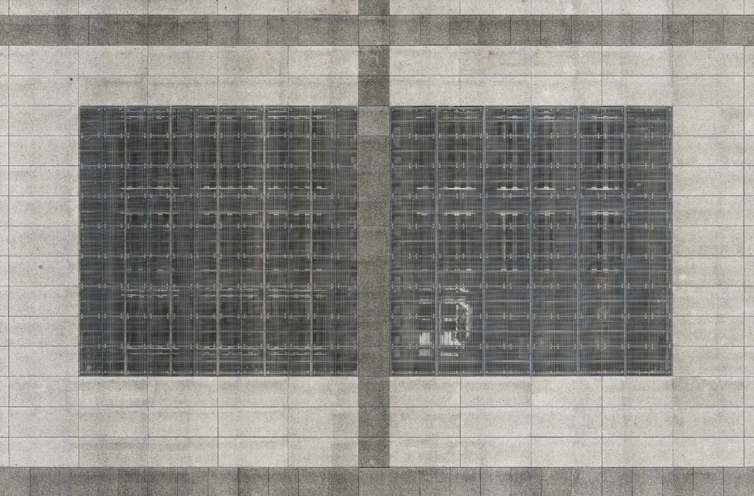
My plan was to see if I could create an image of my school's central concourse as if seen from above, inspired by Gefeller's approach. The following image is a screenshot, taken from Google Earth and then edited in Photoshop to remove the labels and adjust the perspective. However, even after some image sharpening the resolution is too low to identify the individual paving slabs on the concourse.
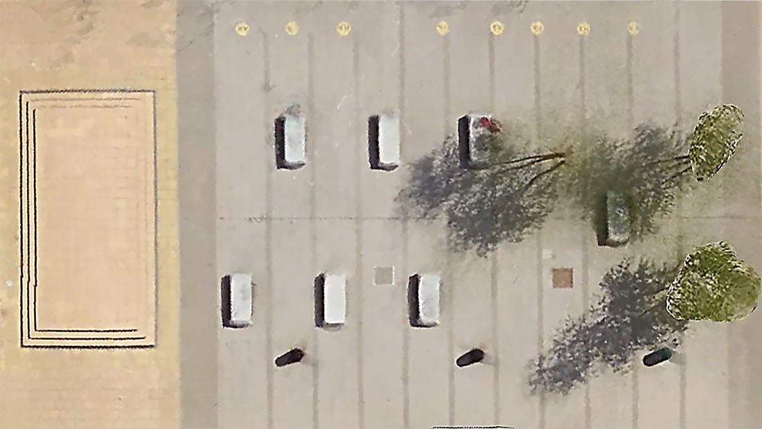
Ideally, I would use a drone to capture aerial images of particular sites but I don't have access to one. I suppose I could look for images of walls that have some kind of repeating pattern but, to be honest, this is not something that interests me. This experiment has reached a natural conclusion and it's not one I wish to pursue.
Back to the streets
I don't think the digital experiments of Andreas Gefeller really suit my kind of image making. The following pictures represent a return to what I love best, a direct engagement with the urban environment.
Concertina Book
I really like the idea of sharing these images in the form of a concertina book, partly because this type of book design has a sculptural quality. It can be read like a normal book but also be displayed as a 3D object. In order to plan what the book might look like I appropriated a design from artist Shona Grant's website, adding my own images. I like the idea of making my own book from scratch, learning how to bind it properly. An alternative to this would be to buy a ready made concertina sketchbook and simply glue in my sequence of printed images.
Mock-up of concertina book cover
|
Mock-up of concertina book inside pages
|
Mock-up of concertina book inside pages
|
Another mock-up
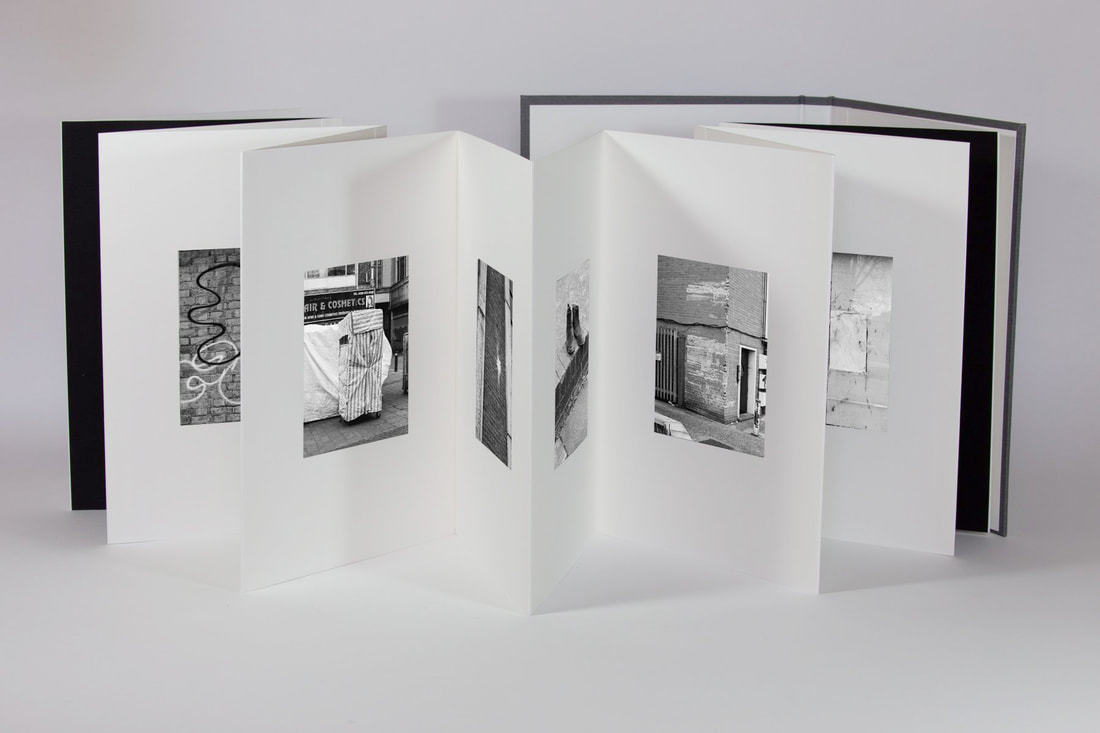
I noticed that Photobox had a promotional offer of 50% of all their products. I decided to attempt a layout for one of their more expensive lay flat photobooks. This is the result:
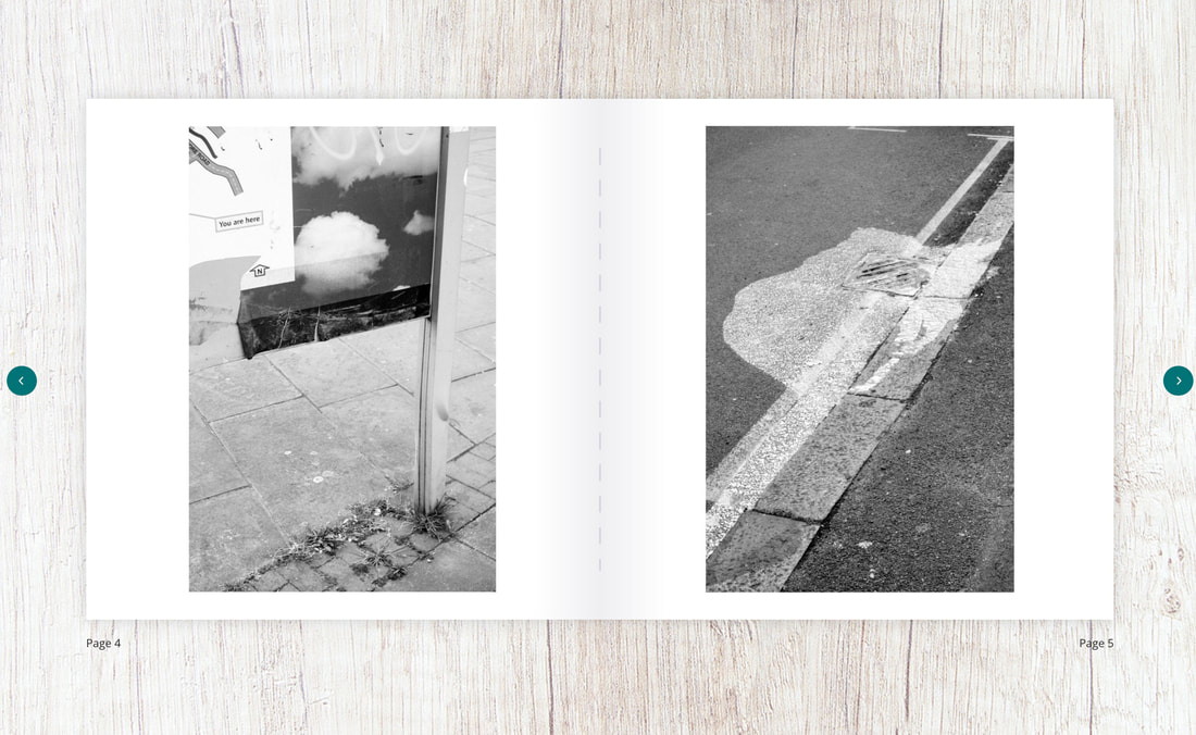
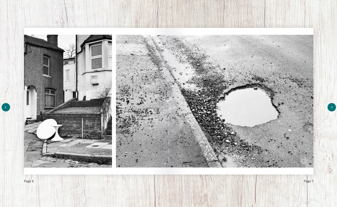
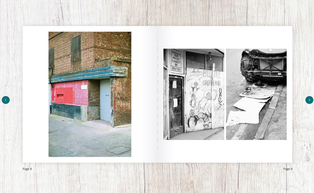
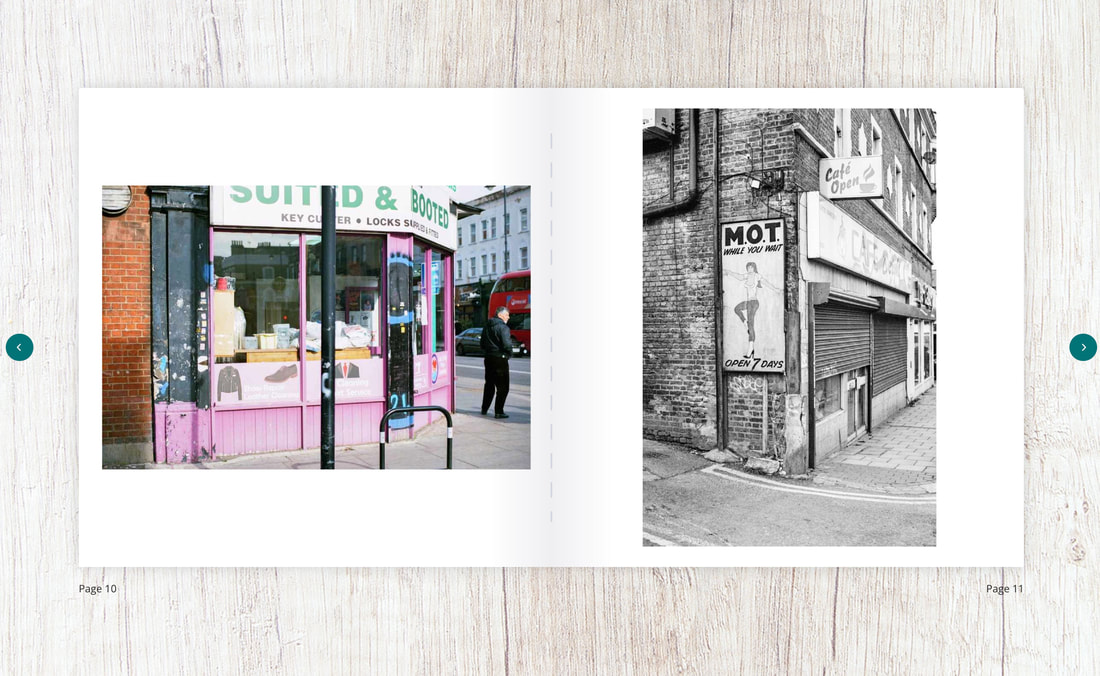
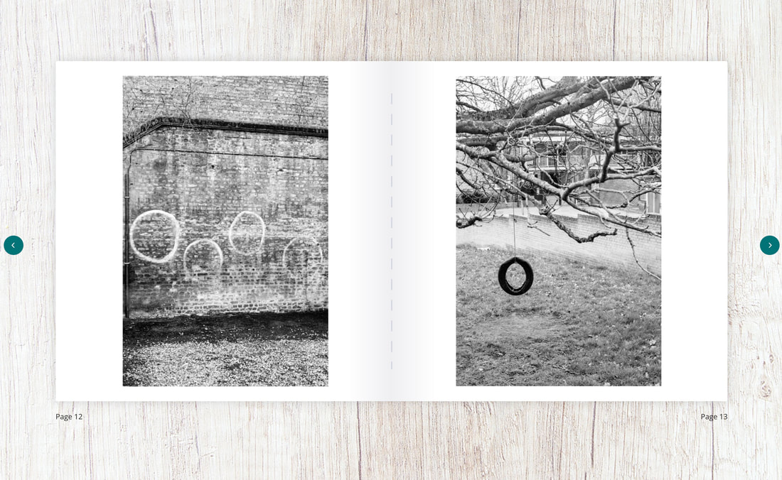
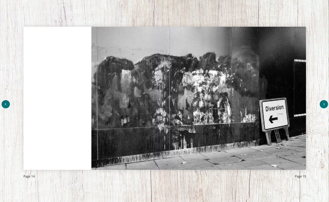
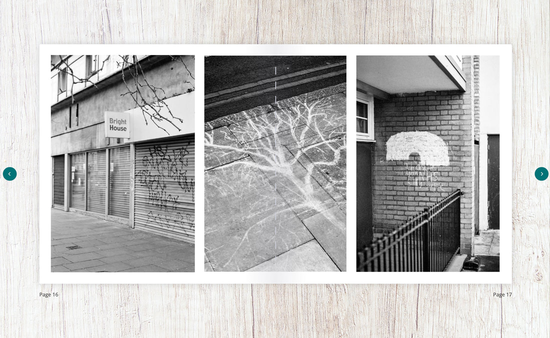
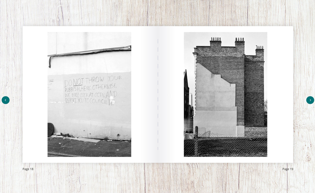
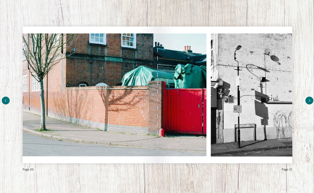
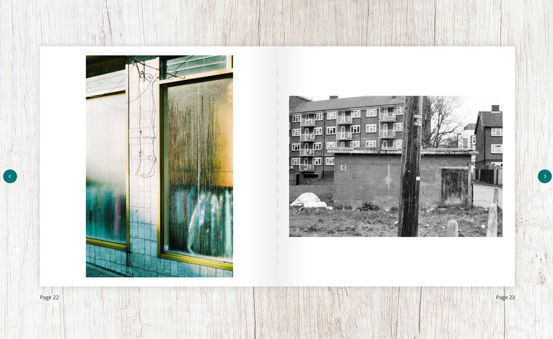
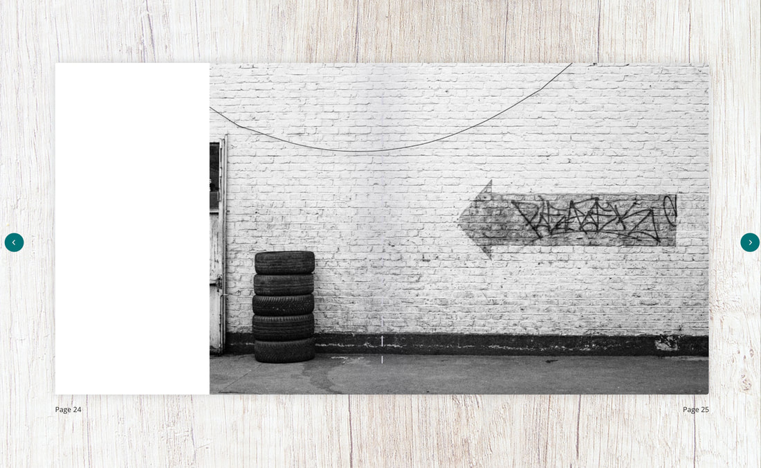
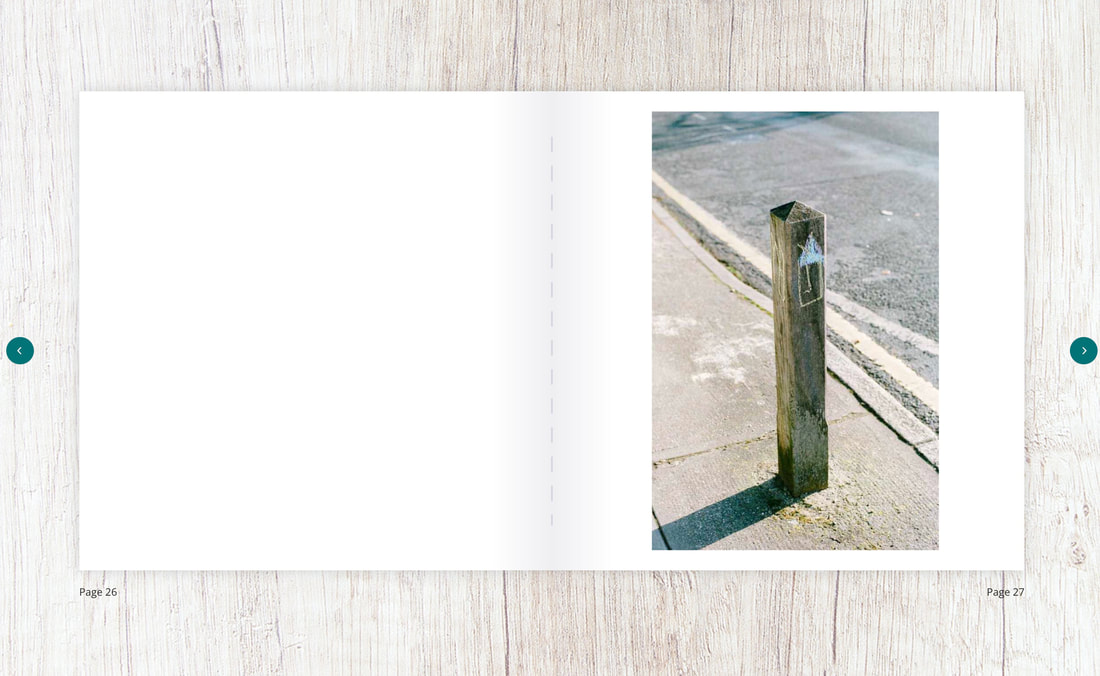
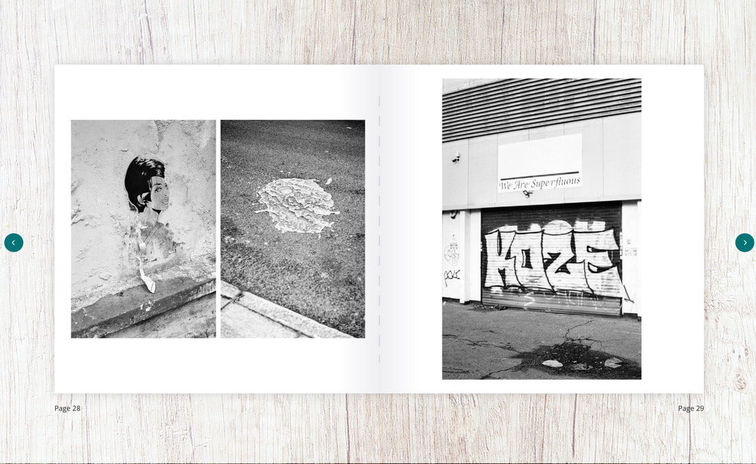
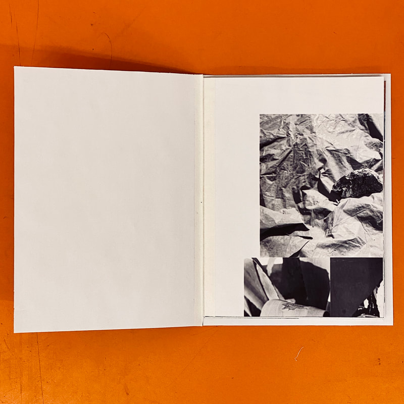
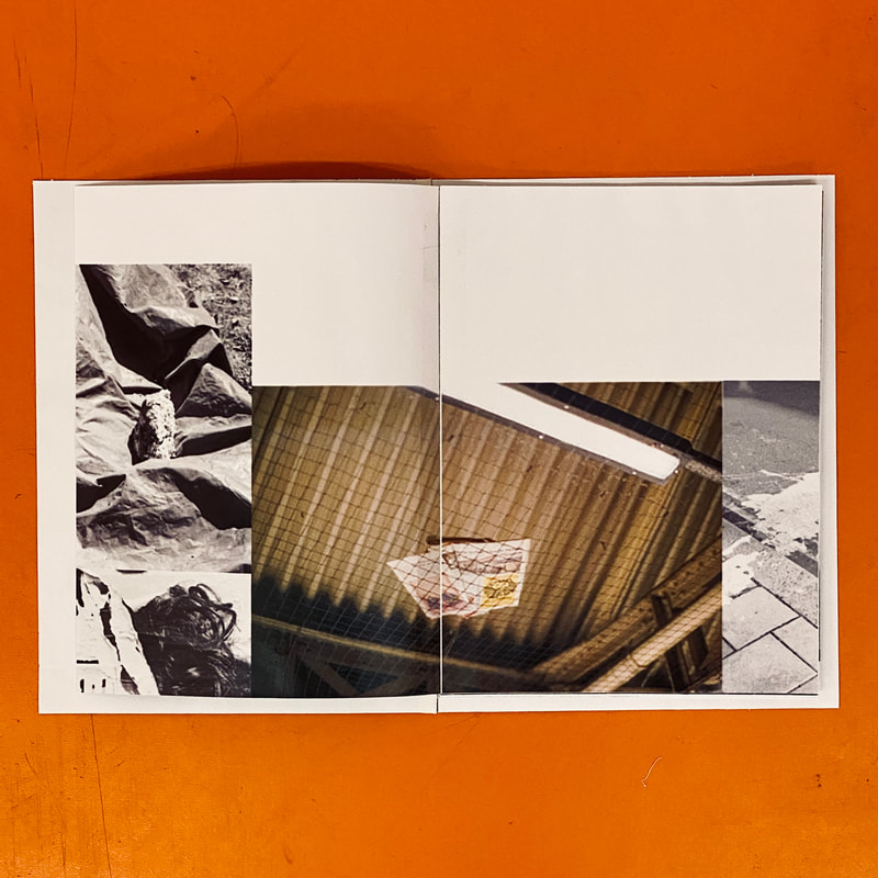
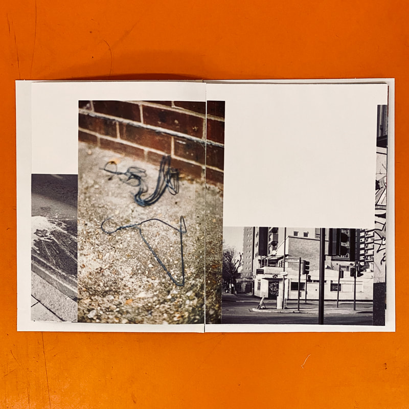
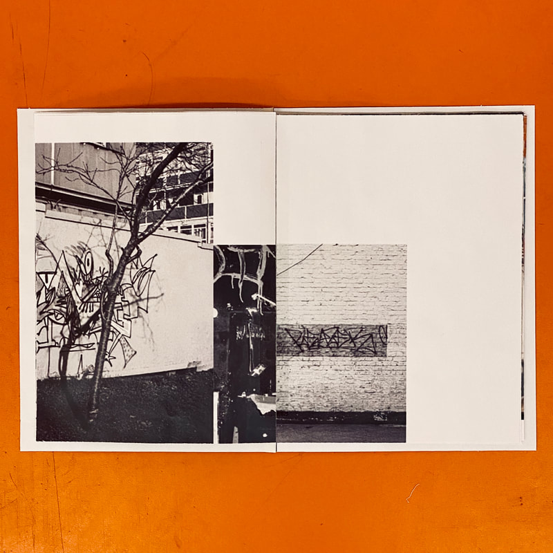
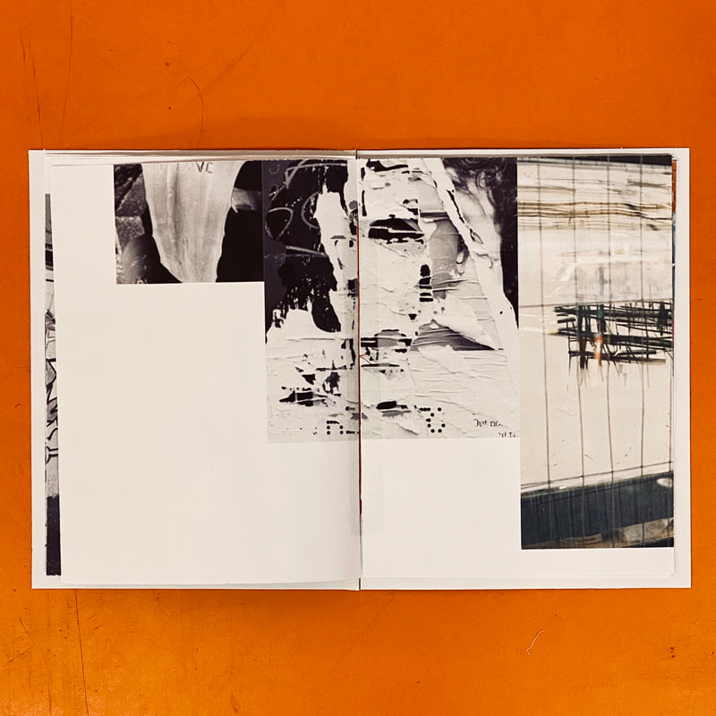
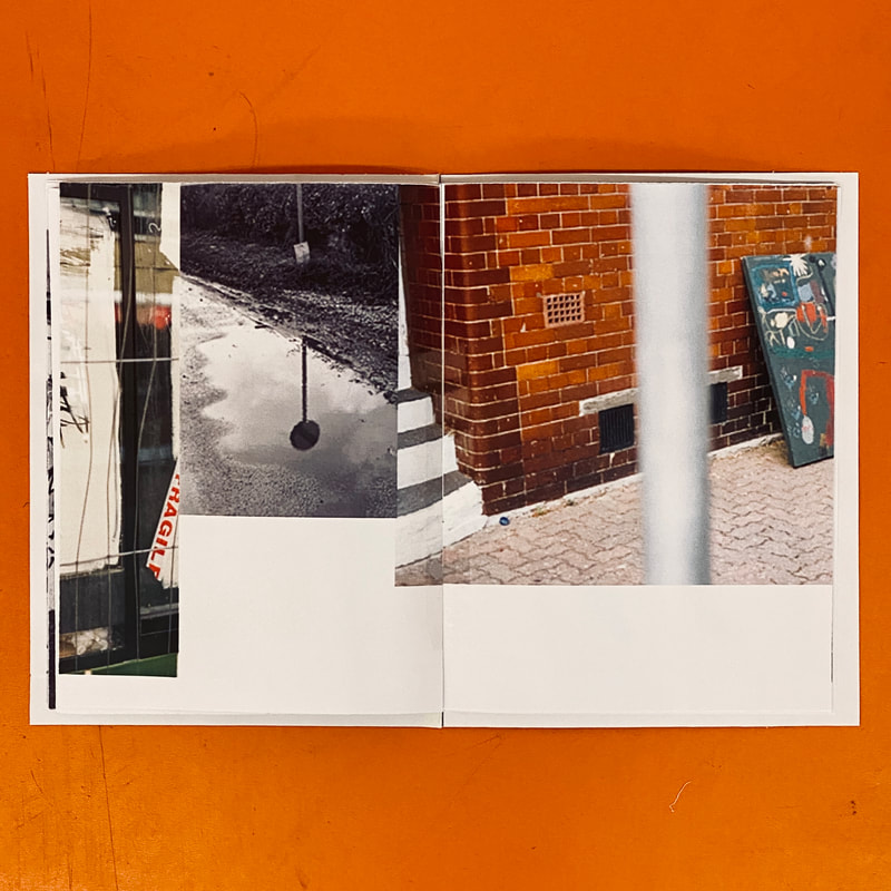
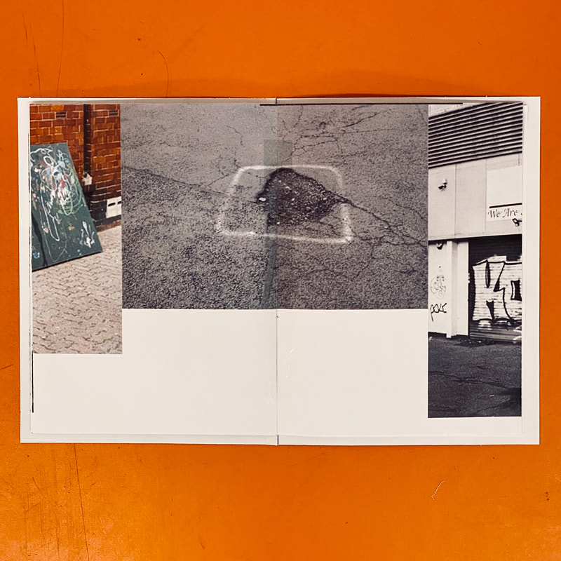
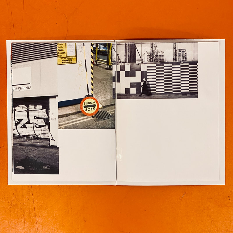
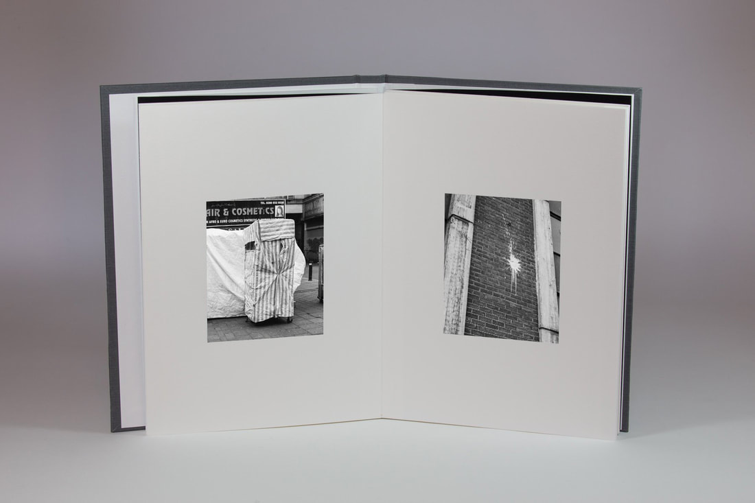
The printed book
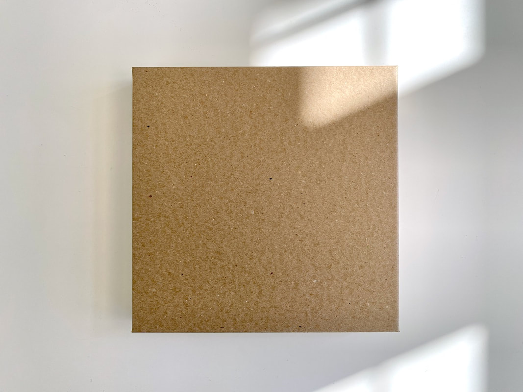
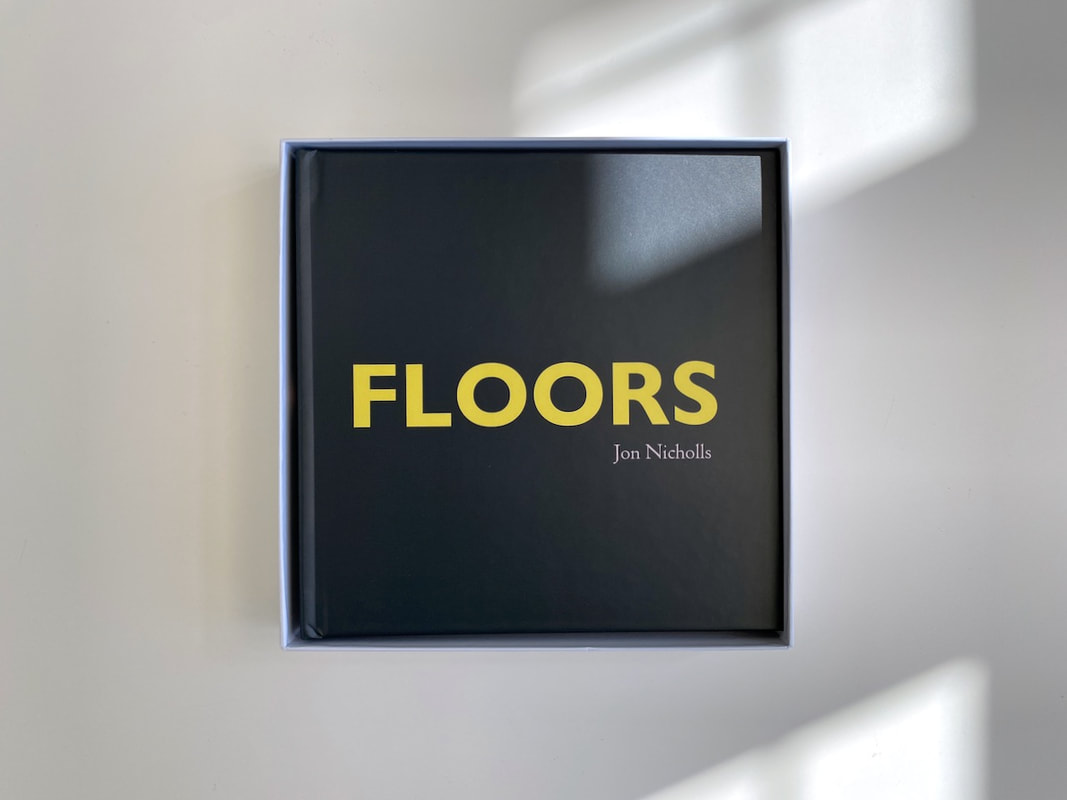
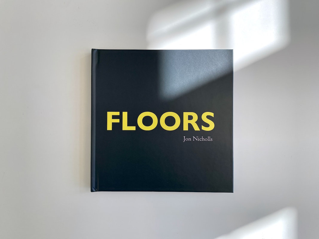
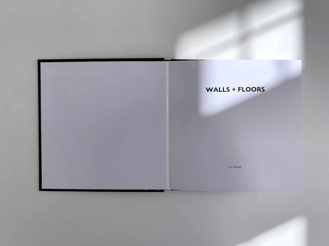
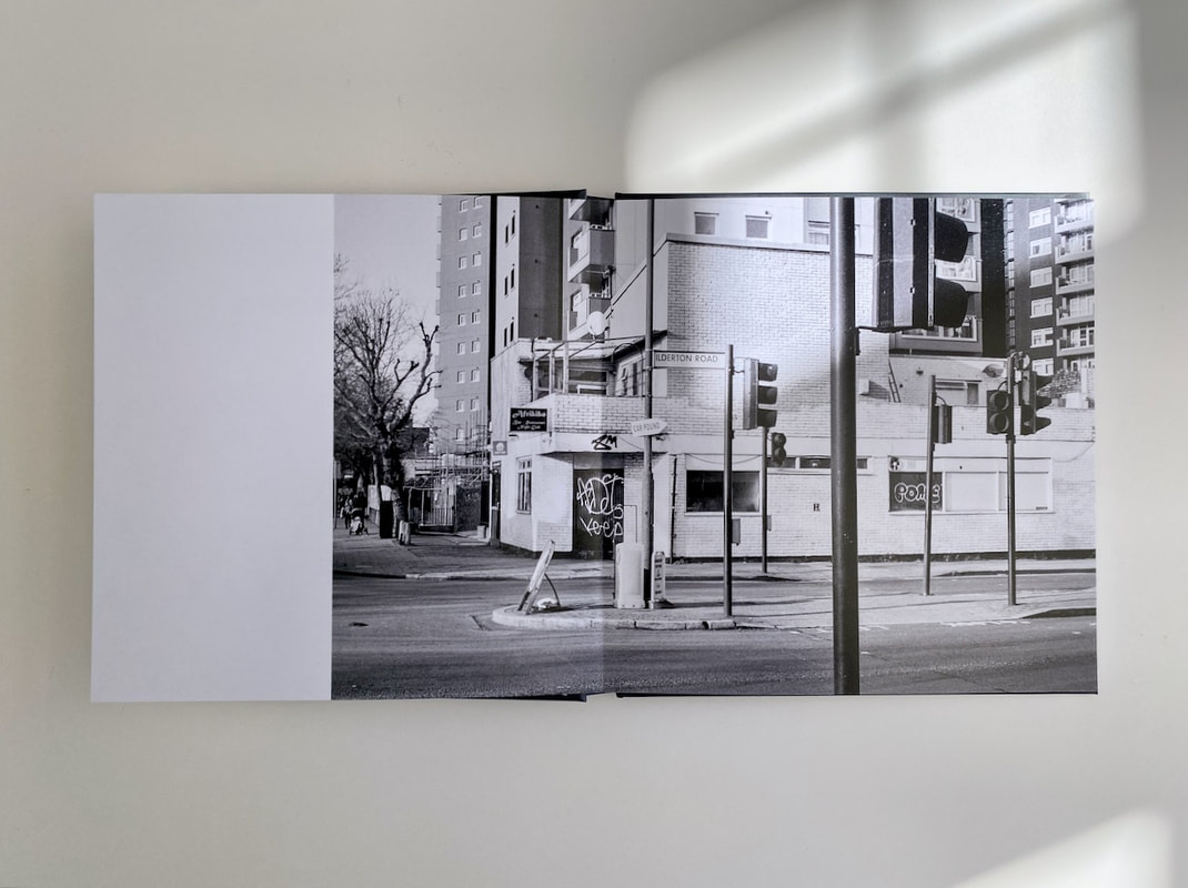
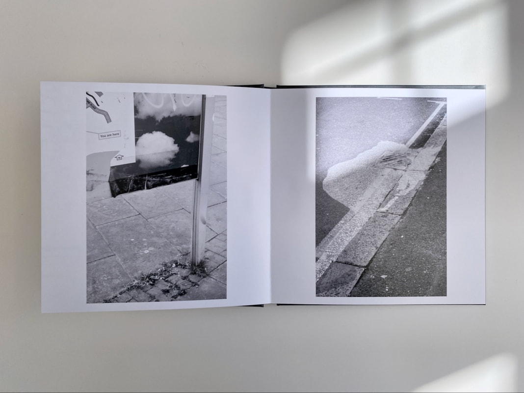
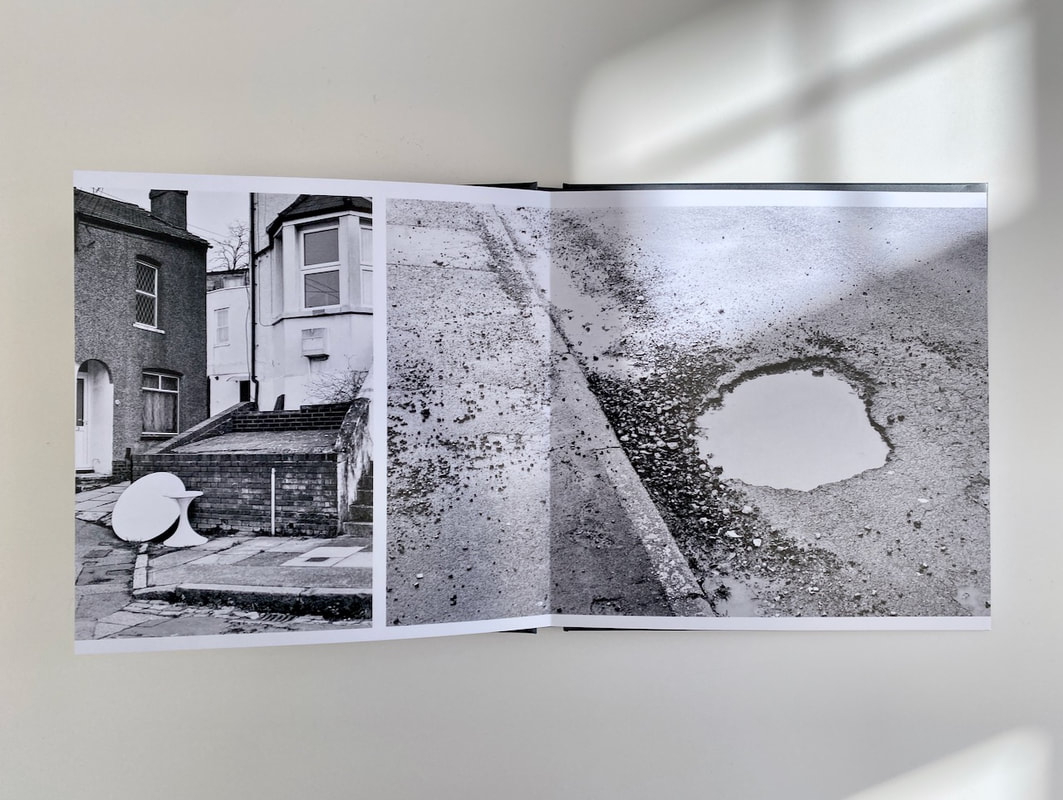
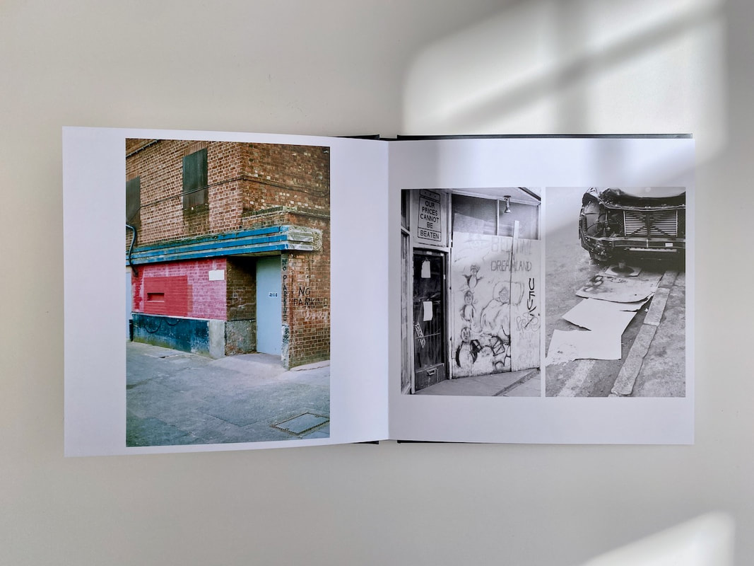
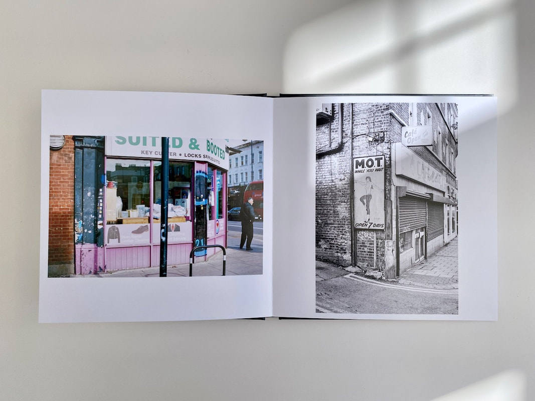
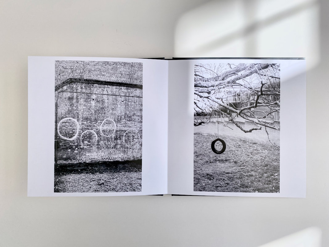
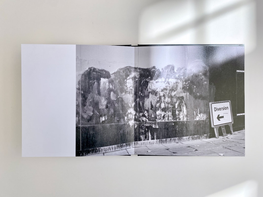
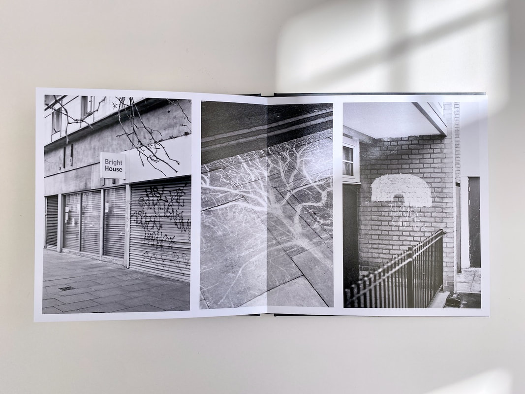
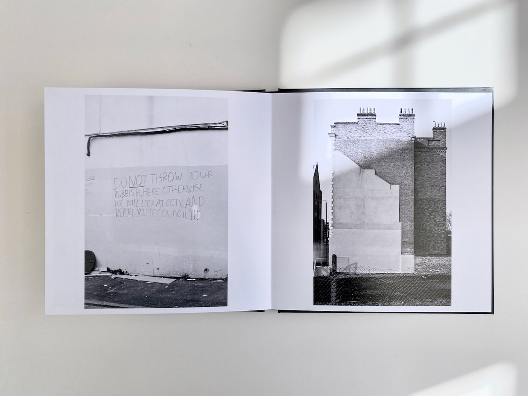
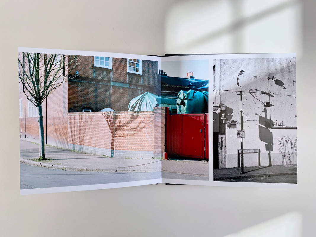
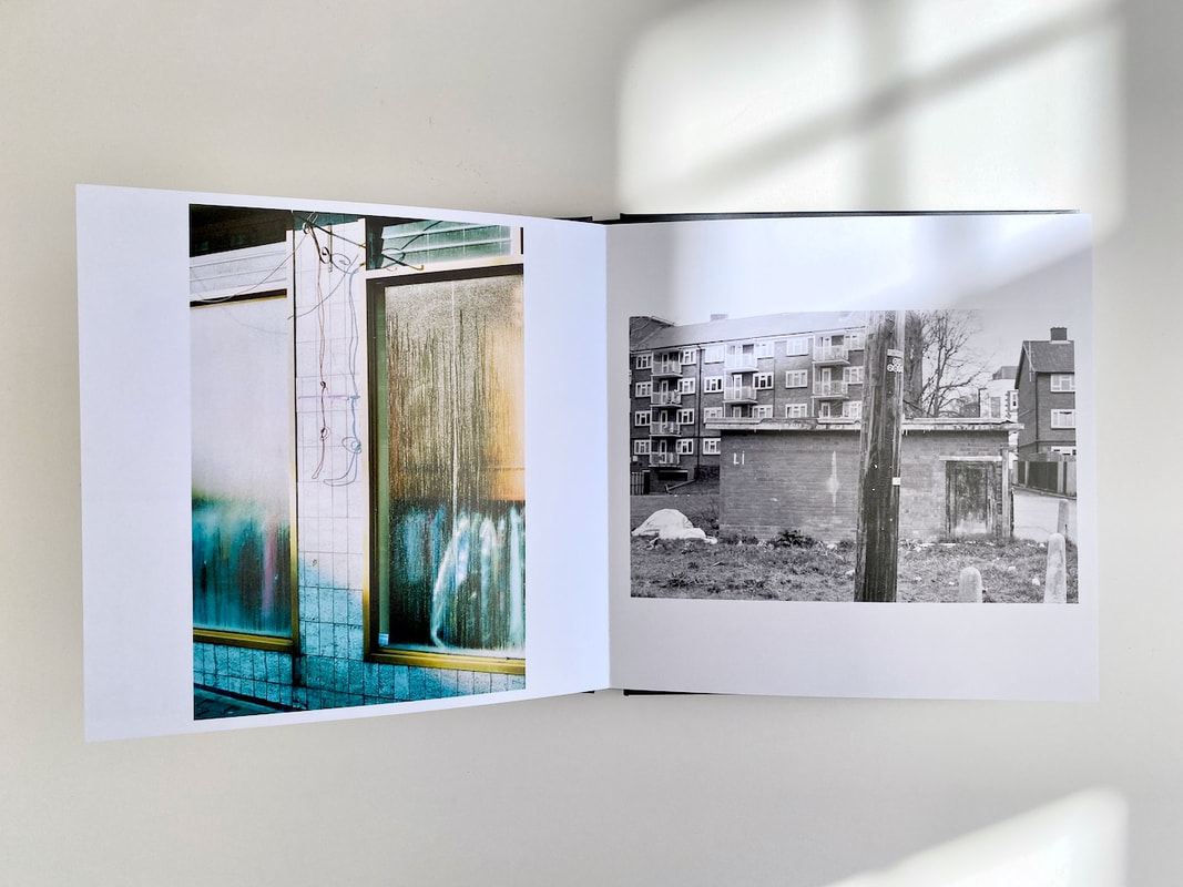
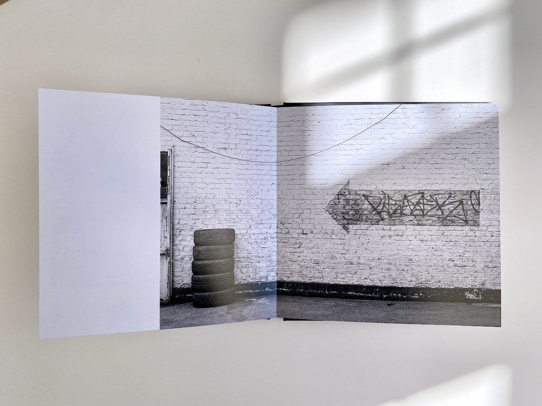
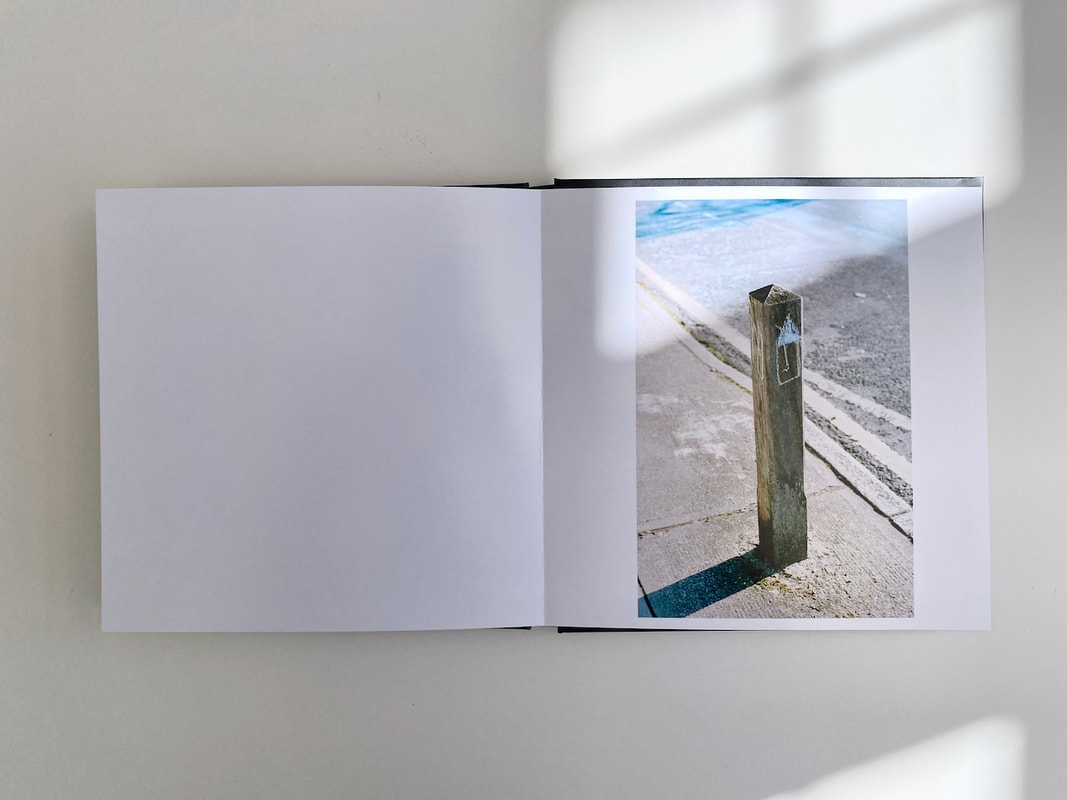
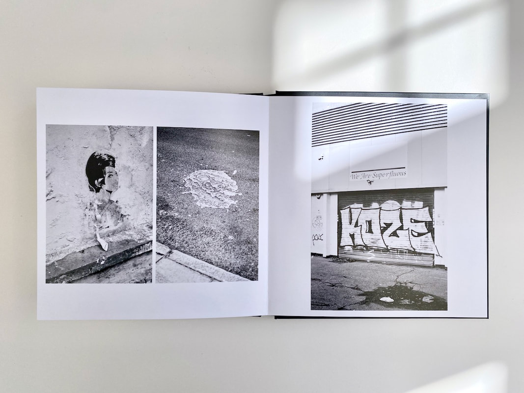
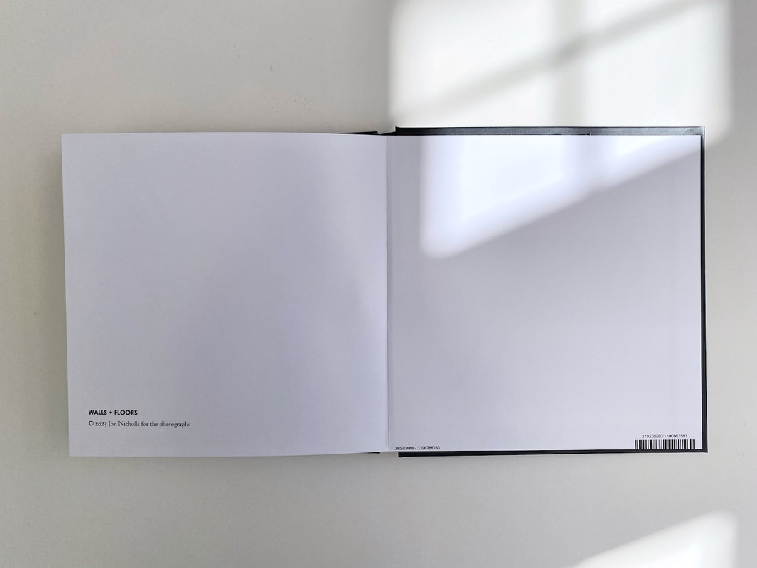
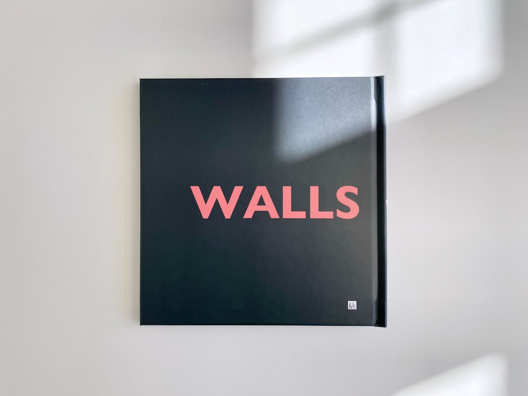
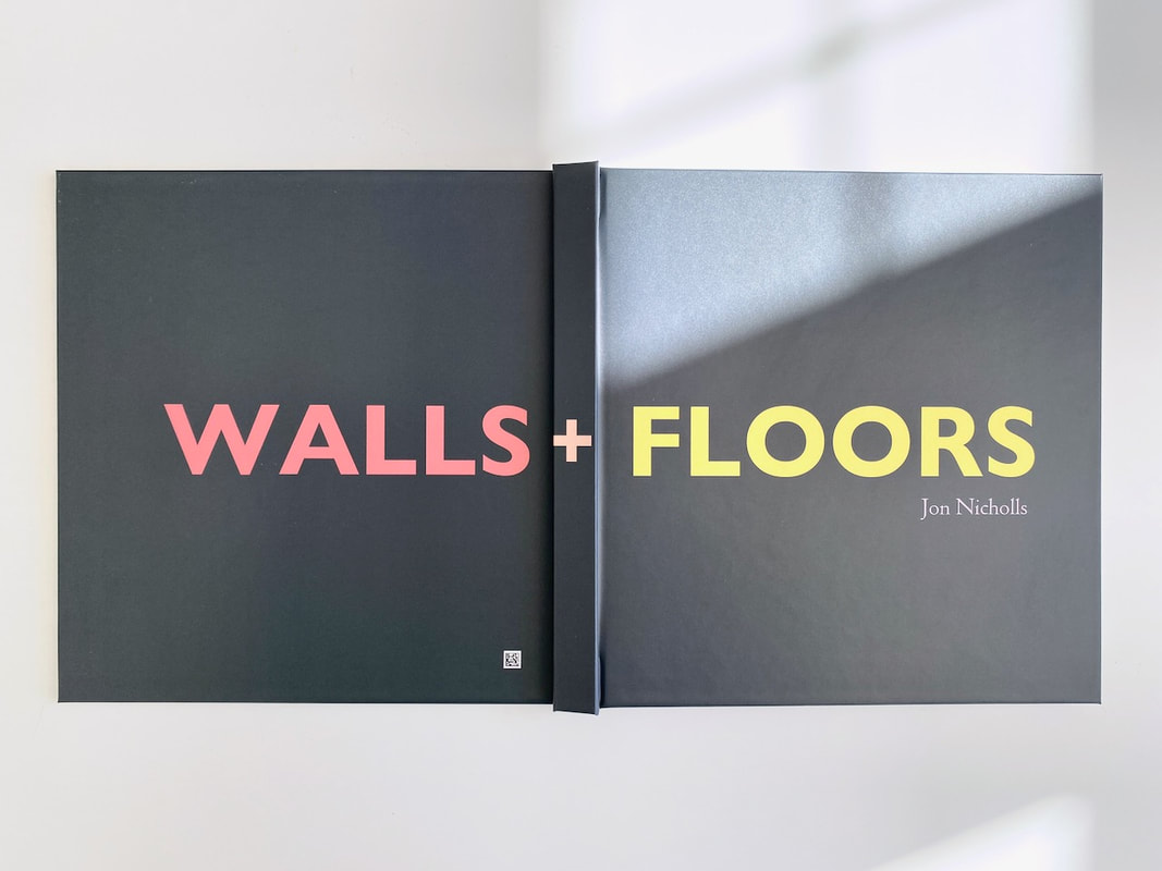
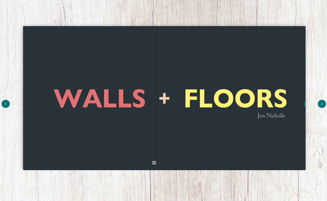
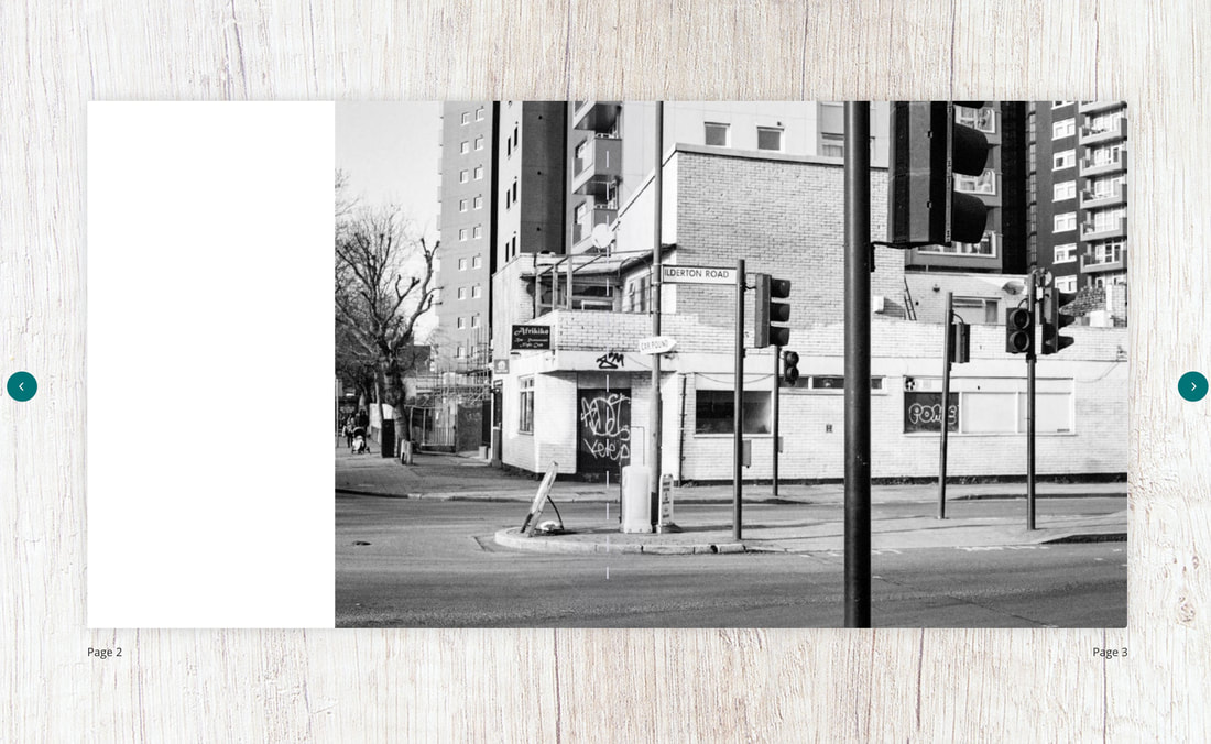
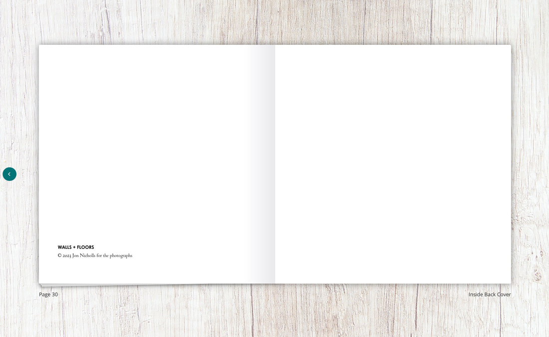
I'm relatively pleased with the printed version of the book. The lay flat format really helps to see those images that spread across the gutter. The paper is a good quality and the matt finish works well, reducing glare. I have mostly sequenced the images as diptychs, sometimes spread across two pages. There are two single images but these also are intended to be seen as a separated diptych. I like the simplicity of the cover design with the '+' sign only appearing on the spine. I may decide to tip in a photograph on the cover of the presentation box.
ESA Controlled Assessment Plan
During the three days of controlled assessment I have decided to create a hand made photobook. I will print a selection of the images I have taken over the last few weeks at 6x4. I will purchase a Concertina book (probably A5 size) so that I can present the finished artifact as both a conventional book and sculptural object. I like the idea that the pages of the book itself could be read as walls and the surface on which it is displayed as the floor.
Things to do:
- Order 6x4 prints (at least 60)
- Purchase concertina book